プレビュー準備中デザインリファレンスを見る
日本のWebデザインを、AIの制作リファレンスに。
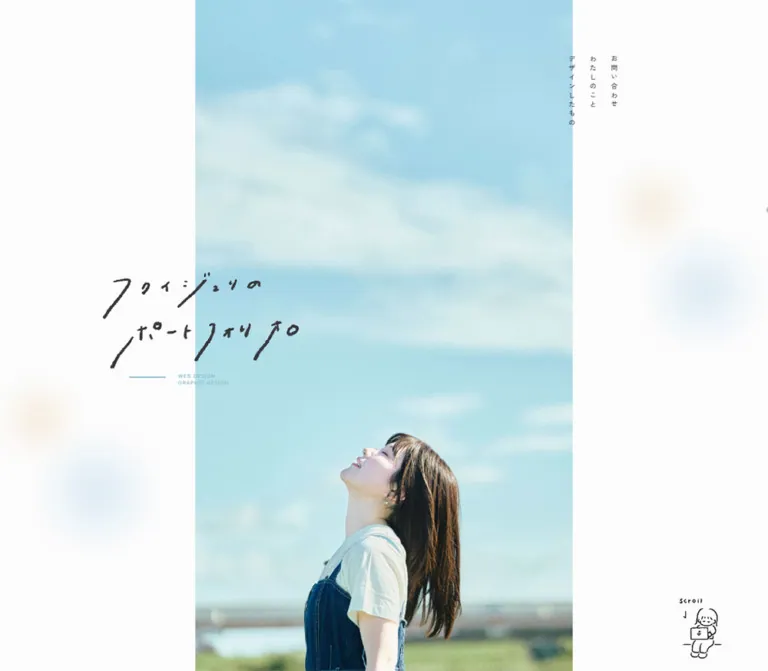
DESIGN REFERENCE
空色の写真と大きな余白に、手描き文字や人物イラストを重ねたポートフォリオ。縦書きナビゲーション、交互配置の制作実績、淡いグラデーションの問い合わせエリアが特徴です。
オリジナルサイトを見るAn airy personal portfolio shaped by sky photography, handwritten lettering, and small illustrated gestures.
Website: juri-portfolio.com Original URL: https://juri-portfolio.com/ Final URL: https://juri-portfolio.com/ Theme: a light canvas with charcoal text, muted blue accents, and pale blue–sand atmospheric decoration. Inspected: supplied browser evidence retrieved September 16, 2026, at 19:19:03.765 UTC — September 17, 2026, at 04:19:03.765 JST. Viewports: 1440 × 1000 desktop and 390 × 844 mobile, in CSS pixels. Scope: the current homepage, including the opening portrait, navigation affordances, four featured projects, biography text, illustration showcase, contact area, and footer. Project detail pages, the complete works page, the separate About page, and an opened navigation menu were not inspected.
This is a personal portfolio organized around work, personality, and a direct contact route. The desktop opening places a tall strip of blue-sky photography between broad off-white margins. A loose handwritten Japanese wordmark crosses the photograph’s left boundary. Three small vertical navigation labels occupy the right margin, while a sketch of a person using a laptop supplies the scroll cue.
Below the opening, the page gives individual projects substantial breathing room. Large rectangular mockups alternate sides with compact descriptions. Japanese headings use generous tracking, English labels stay small, and fine arrows indicate navigation without introducing heavy button fills. The closing contact area combines an arched pastel wash, oversized outlined lettering, a white email pill, and another hand-drawn character.
The page identifies its subject as “ふくい じゅり,” and its footer reads “© 2024 JURI FUKUI.” The copyright year is page content, not the inspection date.
An airy personal portfolio shaped by sky photography, handwritten lettering, and small illustrated gestures.
Website: juri-portfolio.com Original URL: https://juri-portfolio.com/ Final URL: https://juri-portfolio.com/ Theme: a light canvas with charcoal text, muted blue accents, and pale blue–sand atmospheric decoration. Inspected: supplied browser evidence retrieved September 16, 2026, at 19:19:03.765 UTC — September 17, 2026, at 04:19:03.765 JST. Viewports: 1440 × 1000 desktop and 390 × 844 mobile, in CSS pixels. Scope: the current homepage, including the opening portrait, navigation affordances, four featured projects, biography text, illustration showcase, contact area, and footer. Project detail pages, the complete works page, the separate About page, and an opened navigation menu were not inspected.
This is a personal portfolio organized around work, personality, and a direct contact route. The desktop opening places a tall strip of blue-sky photography between broad off-white margins. A loose handwritten Japanese wordmark crosses the photograph’s left boundary. Three small vertical navigation labels occupy the right margin, while a sketch of a person using a laptop supplies the scroll cue.
Below the opening, the page gives individual projects substantial breathing room. Large rectangular mockups alternate sides with compact descriptions. Japanese headings use generous tracking, English labels stay small, and fine arrows indicate navigation without introducing heavy button fills. The closing contact area combines an arched pastel wash, oversized outlined lettering, a white email pill, and another hand-drawn character.
The page identifies its subject as “ふくい じゅり,” and its footer reads “© 2024 JURI FUKUI.” The copyright year is page content, not the inspection date.
| Name | Value | Suggested token | Evidence and role |
|---|---|---|---|
| Near-white canvas | #fcfcfc |
--color-canvas |
Measured body background; the main page surface and desktop hero margins |
| Charcoal | #37383c |
--color-ink |
Measured body, heading, navigation, and project text color |
| Muted sky blue | #84b5c5 |
--color-accent |
Measured hero descriptor, circular-link labels, and email text; also present in an inline stroke-animation fragment |
| White | #ffffff |
--color-surface |
Measured email-link background; visually also used by outlined contact lettering |
| Pale rule gray | Approximately #d6d6d6 |
--color-rule |
Visual estimate for the large circular navigation outlines |
| Quiet metadata gray | Approximately #a6a6a6 |
--color-muted |
Visual estimate for project responsibility labels |
| Atmospheric blue | Approximately #c5dfe9 |
--color-wash-blue |
Suggested approximation of the contact wash and blurred blue decoration |
| Atmospheric sand | Approximately #efe9df |
--color-wash-sand |
Suggested approximation of the warm contact wash and cream decoration |
The exact interface palette is restrained: near-white, charcoal, muted blue, and white. Photography introduces stronger cyan, denim blue, skin tones, and natural greens. Those image colors should not become additional interface accent colors.
The pale blue and warm sand areas are diffuse, low-contrast fields rather than sharply bounded panels. The source gradient stops, opacity values, texture assets, and blur radii were not supplied. Treat the approximate colors as starting points for visual matching.
There is no evidence of a theme switcher or an alternate dark theme.
Measured stack: YakuHanJP_Narrow, "Zen Kaku Gothic New", sans-serif.
This stack appears on the body, Japanese navigation, section headings, project titles, descriptions, biography, and contact acknowledgment. The design pairs relatively modest type sizes with pronounced tracking. Hierarchy comes from weight, spacing, and placement as much as from size.
Use weight 700 for section headings, 500 for project titles and selected navigation labels, and 400 for body copy. Preserve the declared stack when available; do not describe the handwritten title as this font.
Measured stack: "Albert Sans", sans-serif.
This is confirmed on the two-line hero descriptor and email address. The English project category and responsibility labels visually fit the same restrained utility treatment, but their individual font declarations were not included. Using Albert Sans for those labels in a new implementation is a recommendation.
The hero title is visibly irregular handwritten artwork with long diagonal strokes and uneven baselines. The sampled H1 has no extracted text and a computed 15px font size, while its visible artwork occupies a much larger rectangle. Its visual scale must therefore be treated as an artwork dimension, not a 15px heading style.
The exact asset format, source path, and production method are unknown. Use authorized lettering artwork or commission equivalent lettering. A generic cursive font will not reproduce the letter shapes or their relationship to the portrait.
Values below are measured unless explicitly marked as estimates. Tracking is expressed in pixels to preserve the supplied evidence.
| Role | Desktop | Mobile | Weight | Tracking, desktop / mobile |
|---|---|---|---|---|
| Body default | 15px / 15px |
15px / 15px |
400 | 0.75px / 0.75px |
| Vertical hero navigation | 12px / 12px |
Not visible | 500 | 4.8px / — |
| Hero English descriptor | 9px / 12.6px |
10.4px / 14.56px |
400 / 500 | 1.35px / 1.56px |
| Section heading | 38px / 38px |
22px / 22px |
700 | 7.6px / 4.4px |
| Project title | 26px / 26px |
16px / 16px |
500 | 3.9px / 2.4px |
| Project description | 14px / 25.2px |
11px / 17.6px |
400 | 1.4px / 1.1px |
| Project detail cue | 12px / 12px |
10px / 10px |
400 | 0.96px / 0.8px |
| Circular-link label | 15px / 100px |
13px / 65px |
500 | 1.5px / 1.3px |
| Biography name | 26px / 26px |
18px / 18px |
500 | 3.9px / 2.7px |
| Biography paragraph | 15px / 30px |
13px / 26px |
400 | 0.75px / 0.75px |
| Illustration introduction | 15px / 30px |
12px / 18px |
400 | 0.75px / 0.75px |
| Contact acknowledgment | 22px / 22px |
13px / 13px |
500 | 3.3px / 1.95px |
| Email address | 15px / 15px |
11.5px / 11.5px |
400 | 1.8px / 1.38px |
| Desktop footer navigation | 14px / 14px |
Not visible | 500 | 2.24px / — |
| Outlined CONTACT lettering | Approximately 140–150px nominal size |
Approximately 50–55px nominal size |
Unverified | Visually wide; exact value unavailable |
The body’s 15px line height is a default, not the reading style for paragraphs. Project descriptions and biography paragraphs explicitly use more generous leading.
The desktop project H3 rectangle is 68px high because it includes 10px top padding, a 26px line box, and 32px bottom padding. On mobile, the equivalent rectangle is 40px: 8 + 16 + 16px. Do not mistake these outer heights for font sizes.
The source root computes to 10px. The Quick Start uses explicit pixel values with a conventional root rather than copying unknown source rem formulas.
Density: low, with long pauses between sections and compact information within each project. Geometry: square project imagery, fine straight rules, circular arrow controls, one pill-shaped email link, and a broad curved contact boundary.
These are observed layout intervals, not proof of a universal spacing system.
| Relationship | Desktop | Mobile | Basis |
|---|---|---|---|
| Hero bottom to works heading | 240px |
120px |
Calculated from section coordinates |
| Works heading bottom to first project | 160px |
80px |
Calculated |
| Gap between project rows | 160px |
60px |
Calculated from consecutive anchor rectangles |
| Last project bottom to all-works control | 160px |
60px |
Calculated |
| All-works control bottom to About section | 230px |
160px |
Measured section padding and coordinates |
| Biography name bottom to paragraph | 72px |
32px |
Calculated |
| Biography paragraph bottom to detail control | 64px |
32px |
Calculated |
| About section bottom padding | 240px |
160px |
Measured |
| Project text inset on a left-side desktop copy block | 30px |
10px inside the mobile row |
Calculated from anchor and text positions |
| Mobile project outer gutters | — | 20px |
Measured |
| Mobile biography outer gutters | — | 40px |
Measured |
A useful adaptation scale is 8, 10, 16, 20, 30, 32, 40, 60, 64, 80, 100, 120, 160, 230, 240px. Preserve the larger intervals where they establish the page’s rhythm; reducing everything to a compact card grid changes the design substantially.
| Element | Treatment | Evidence |
|---|---|---|
| Project images | Square corners | Visible in desktop capture |
| Illustration tiles | Square white rectangles | Visible in mobile gallery crop |
| Large arrow controls | Circles, approximately 100px desktop and 65px mobile |
Visual shape with matching measured control heights |
| Email link | 40px radius |
Measured at both viewports |
| Contact background | Broad elliptical upper edge | Visual observation; source geometry unavailable |
| Back-to-top arrow | Thin outlined circle | Visual observation |
| Element | Desktop, 1440 × 1000 | Mobile, 390 × 844 |
|---|---|---|
| Document height | Approximately 6292.44px |
Approximately 4940.09px |
| Hero section | 1440 × 1000px |
390 × 844px |
| Hero photograph | Approximately 562 × 1000px, centered |
Fills the visible hero width and height |
| Hero title artwork box | x 197.78, y 382.41, 376.19 × 180px |
x 26.13, y 260.83, 259.73 × 124.78px |
| Vertical navigation columns | Start near x 1062.69, then 39px intervals; y 75px |
Absent from visible layout |
| Header box | 80px high, transparent |
80px high, transparent |
| Menu-control anchor | 60 × 37.5px |
Approximately 62.39 × 62.39px |
| Works heading | y 1240px, text inset 300px |
y 964px, text inset 70px |
| Featured-project row | x 196px, width 1048px, height approximately 301.8px |
x 20px, width 350px, height approximately 362.2px |
| Biography text block | x 302px, width 462px |
x 40px, width 310px |
| Footer/contact region | Starts at y 5377.44px, height 915px |
Starts at y 4460.09px, height 480px |
| Email pill | 420 × 63px |
274 × 41.5px |
Coordinates are document coordinates except where the supplied sample reflects a viewport-positioned control. The photograph width is estimated from the screenshot, not from an image-element measurement.
Role: introduce the person and the visual character of the portfolio.
On desktop, center a narrow, full-height photograph between off-white margins. Its approximate bounds are x 439–1001px, leaving about 439px of margin on each side. The subject occupies the lower portion of the frame, looking upward into a large field of sky. The composition depends on this empty sky: it provides calm, scale, and room for the title.
Place the handwritten wordmark to the left of the photograph’s center, crossing the photograph’s left edge. Its measured box starts at x 197.78px, so most of the lettering begins on the plain canvas before extending into the sky.
Below it, arrange WEB DESIGN and GRAPHIC DESIGN as two small blue lines. A short horizontal blue rule sits to their left. The desktop paragraph has 142.5px left padding relative to the wordmark container; the mobile equivalent uses 104px. These offsets create a deliberate secondary alignment rather than centering the descriptor under the lettering.
Mobile changes the composition materially: the photograph becomes the complete background, the wordmark moves to about 31% of the viewport height, and its left edge sits approximately 26px from the screen edge. Preserve the person’s face and the sky above it when adjusting the crop.
Role: direct visitors to the three homepage sections.
The visible labels are “デザインしたもの,” “わたしのこと,” and “お問い合わせ.” They link to #works, #about, and #contact respectively.
The three columns sit in the upper-right white margin. They use 12px Japanese type, weight 500, and 4.8px tracking. Their horizontal start positions are approximately 39px apart. Use vertical Japanese text layout in an adaptation; the original writing-mode declaration was not included in the evidence.
These links are not visible in the mobile layout. Do not force them into a small horizontal row over the mobile photograph.
Role: provide an additional navigation entry point.
The visible mark consists of two thin horizontal lines, with no surrounding fill or rounded box. It appears at the upper right in the scrolled desktop screenshots and in both mobile captures. The opening desktop screenshot emphasizes the vertical links and does not visibly show the same two-line mark.
The mobile anchor’s measured box is approximately 62px square, while the visible lines are only about 30px wide. This distinction between a small visual mark and a larger interaction area is worth preserving.
The DOM contains menu-related labels for home, works, and about. No opened menu was captured, so its overlay color, arrangement, entrance animation, and dismissal behavior remain unverified.
Role: suggest that more work follows the opening viewport.
A small hand-drawn person with a laptop sits near the lower-right corner, accompanied by handwritten Scroll lettering and a downward arrow. Black, irregular linework keeps the cue personal and light. It is separate from the large portrait and does not compete with the title.
Its exact asset path and click behavior were not supplied. Treat the illustration as an observed scroll affordance, not evidence of a verified scroll button or looping animation.
Role: establish the works and biography sections.
Each section heading is a strongly tracked Japanese line preceded by a long, fine horizontal rule. The desktop heading text begins at 300px; the visible About rule is approximately 160px wide, beginning near 100px. The mobile heading begins at 70px, with a much shorter rule recommended to fit the available width.
Use 38px, weight 700, and 0.2em tracking on desktop; the measured mobile equivalent is 22px with the same proportional tracking. Keep the heading on the page canvas, without a colored band or panel behind it.
Role: combine a project preview, short context, responsibilities, and a detail route.
The homepage contains four project anchors in this order:
website.website.website.banner.The whole project row is an anchor. The visible “詳しくみる” cue is text within that anchor, not a separate nested link.
Desktop anatomy: a 1048px row contains a landscape preview and a copy region. Images alternate left, right, left, right. The visible fourth preview is approximately 503 × 302px, suggesting a 5:3 presentation ratio. Together with the row width, this supports a reusable two-column arrangement of approximately 503px + 42px + 503px; the precise source flex sizing was not supplied.
The copy is inset asymmetrically. Left-side titles begin at x 226px, while right-side titles begin at x 839px. Stack a small blue category label, a tracked 26px title, two short description lines, a quiet responsibility line, and an underlined detail cue with a thin arrow. Responsibility labels include direction / design / coding / wordpress, direction / design / coding, design, and banner design.
The project image has square corners and a broad, soft shadow. The row itself has no visible enclosing card border or filled card background.
Mobile anatomy: every row becomes a single vertical group within 20px outer gutters. Text begins 10px inside the row. The image-first arrangement is supported by the text positions and the row height; individual image rectangles were not included. A 350 × 210px media area is a reasonable calculated adaptation of the desktop ratio, not a directly measured mobile image size.
Project titles become 16px, descriptions 11px, and detail cues 10px. Responsibility lines are absent from the mobile rendered text, though their strings remain in the anchor extraction. Keep that distinction when describing the responsive behavior.
Role: offer a calm route to the full works page or extended biography.
A large thin circle encloses a small blue right arrow. The label sits outside the circle to its right. Desktop circles are approximately 100px in diameter; mobile circles are approximately 65px.
The works link reads “すべてみる” and goes to /works. The biography link reads “詳しくみる” and goes to /about.
The sampled label rectangles extend beyond their anchor rectangles. This is part of the observed source layout, but a new implementation should make the entire visible circle-and-label group one coherent hit target. Do not reproduce a potentially misleading mismatch between the visible label and its interactive bounds.
Role: introduce the portfolio owner and connect web design with illustration work.
The visible identity heading reads “ふくい じゅり.” The paragraph describes prior illustration activity, an interest in communicating through web design, study, and job seeking. These are statements in the current page copy, not independently verified biographical updates.
The desktop text column is 462px wide and starts at x 302px. The paragraph uses 15px / 30px, giving it a particularly unhurried rhythm. Mobile narrows the column to 310px, places it 40px from each side, and uses 13px / 26px.
The mobile name begins approximately 410px after the section heading’s bottom, much farther down than the desktop equivalent. The supplied screenshots do not show the intervening biography media. Its asset, crop, and exact ordering cannot be reconstructed from the text coordinates alone.
Role: demonstrate the softer, hand-drawn side of the portfolio.
The introductory text explains that rounded icon illustrations and hand-drawn illustrations are also available. The desktop text extraction includes references to shop icons, logos, calendars, educational illustrations, and other small-format artwork.
The mobile capture shows multiple rows of white rectangular artwork tiles, with neighboring tiles cropped at the screen edges. Visible pieces include delicate neutral line drawings and small shop marks. The tile shadows are lighter than the large project-preview shadows. A visible middle tile is approximately 160px wide; exact grid or track dimensions were not supplied.
Repeated labels in the desktop DOM may be consistent with duplicated gallery tracks, but they do not prove an autoplay carousel. Preserve the multirow, edge-cropped presentation without inventing its movement, speed, direction, or interaction model.
Role: close the portfolio with a direct invitation to contact the owner.
The desktop background rises into a broad shallow dome. A small illustrated character appears above “ご覧いただきありがとうございます.” Below that sits very large, widely spaced outlined CONTACT lettering. The lettering is visually decorative; it is not present in the supplied extracted text.
A short explanatory sentence precedes a centered white email pill. The pill displays peche.toitoitoi@gmail.com and links to the matching mailto: URL. A fine blue border, blue address text, and a small diagonal arrow make it the clearest bounded action on the page.
The desktop pill is 420 × 63px with a measured 40px radius. Its mobile counterpart is 274 × 41.5px, retaining the radius and shrinking the address to 11.5px.
In the desktop capture, the colored contact field occupies approximately 850px of the 915px footer region, followed by a roughly 65px plain footer strip. These divisions are calculated from screenshot boundaries and the measured footer position.
The mobile capture differs: the pastel background ends abruptly about 245px below the dome’s top, partially cutting through the outlined CONTACT lettering. The explanatory sentence and email pill sit below on near-white. This is an observed captured state. Its cause and intendedness are unverified; do not quietly describe it as a fully visible mobile heading.
Role: provide a return route while continuing the character motif.
The scrolled captures show a hand-drawn person holding an outlined circle with an upward chevron. The visible desktop circle is approximately 70px across; the mobile circle is approximately 40px. The figure extends below the circle, making the total visual component considerably taller than the arrow target alone.
A link to https://juri-portfolio.com/# is present. The return-to-top result was not exercised. The sampled mobile wrapper is below the viewport and carries a DownAnime declaration, whereas the scrolled screenshot shows the composed control on screen. These are state-specific observations, not contradictory measurements of one settled position.
Role: provide compact closing navigation and identity.
Desktop places “トップ,” “デザインしたもの,” and “わたしのこと” along the left side of a plain footer strip, separated visually by slashes. The copyright sits to the right.
The mobile rendered text and screenshot retain the copyright but do not show the desktop footer links. The copyright is small, widely tracked, and centered near the bottom.
| Element or evidence | Supplied value | What is established | What remains unknown |
|---|---|---|---|
| Hero English descriptor | opacity 0.6s, transform 0.6s |
Opacity and transform transitions are declared | Initial transform, trigger, delay, and exact reveal sequence |
| Menu-control anchor | 0.6s transition |
A transition duration is present | Open-menu behavior and changed properties |
| Project title, paragraph, and detail cue | 0.4s transition |
Shared duration on these text elements | Hover appearance, color changes, and any image movement |
| Email link | 0.3s transition |
A short transition is declared | Hover fill, arrow movement, and focus appearance |
| Mobile return-control wrapper | 0.5s forwards DownAnime |
A named animation is attached in the sampled state | Full keyframes, trigger threshold, and displacement |
Inline circle1 keyframe fragment |
Dash array changes from 0 314.159… to 314.159… 314.159…; stroke #84b5c5 |
A circular-stroke drawing definition exists | Its target element, duration, and activation condition |
| Section and project links | Actual anchor destinations | Native navigation routes are present | Smooth scrolling, transition routing, and destination-page behavior |
| Illustration gallery | Repeated labels and cropped rows | Content repetition and visual overflow | Whether the gallery moves automatically or supports dragging |
Many sampled elements report only transition: all. Without a nonzero duration and a changing state, that is not evidence of visible animation.
The browser preparation process waited for document readiness, image decoding, sampled layout stability, and eligible finite animations within stated limits. It temporarily paused perpetual animations during readiness checks and resumed them afterward. This does not provide a recording of those animations or prove that every delayed element had appeared.
Recommended motion character: retain short, quiet transitions around 300–600ms. Use a small fade or translation only where it helps reveal content, and keep decorative loops optional. Do not infer parallax, bouncing mascots, or animated gallery tracks from the static images.
| Surface | Appearance | Purpose |
|---|---|---|
| Page canvas | Flat #fcfcfc |
Unifies the long page and makes empty space deliberate |
| Hero photography | Tall blue-sky portrait | Supplies the largest color field and personal identity |
| Ambient decoration | Very soft blue and cream patches | Adds warmth without creating new content containers |
| Project preview | Square image with a broad soft shadow | Separates work imagery from the plain page |
| Project copy | Text directly on the canvas | Keeps projects editorial and open |
| Illustration tile | White rectangle with a light shadow | Gives delicate artwork a consistent presentation field |
| Circular link | Transparent interior, fine gray outline, blue arrow | Makes navigation visible without a solid button mass |
| Contact field | Pale blue–sand wash with a curved top | Marks the closing section through a large atmospheric shape |
| Email action | White pill with a fine blue edge | Creates a clear contact affordance |
| Footer strip | Plain near-white | Provides a quiet ending |
The page does use soft shadows, but selectively around presented work. It does not use a general system of elevated rounded cards for every content block.
The hero photograph shows a person looking upward outdoors, with long dark hair, a white shirt, and dark denim clothing. The sky occupies most of the frame. Preserve the photographic exposure, airy cyan cast, and extensive space above the subject; a tightly cropped headshot would change the opening’s balance.
The featured banner project is shown on a black phone standing in a light architectural setting. Strong photographic shadows within that image contrast with the soft external shadow around the preview. Keep the supplied mockup as a complete composition rather than cropping directly into the phone screen.
The supporting illustrations use thin, uneven black lines and rounded human figures. They appear as a laptop user in the hero, an appreciative character in the contact area, and a figure holding the return control. Their role is functional and emotional: each accompanies a specific page action or transition.
The visible artwork tiles use pale neutrals, fine outlines, and small marks. Avoid replacing them with high-saturation illustrations or a uniform stock icon family.
Fine grain is visible in the photography and pastel field. The evidence does not establish whether that grain comes from image assets, compositing, or CSS. Any added texture should remain subtle enough that the page still reads as light and clean.
No original image URLs or asset filenames were included in the supplied evidence. The following are visual asset references, not downloadable path claims.
| Asset | Evidence | Reuse guidance |
|---|---|---|
| Outdoor hero portrait | Desktop and mobile opening captures | Preserve sky space and use responsive focal cropping |
| Handwritten Japanese wordmark | Both opening captures | Treat as identity artwork; supply an accessible text equivalent |
| Laptop-user scroll illustration | Both opening captures | Preserve the loose linework and small scale |
| Phone mockup for the banner project | Desktop project capture | Preserve its landscape composition and square corners |
| Illustration tiles | Mobile gallery/contact capture | Keep original artwork proportions and light presentation surfaces |
| Contact character | Desktop and mobile contact captures | Use above the acknowledgment line |
| Back-to-top character | Scrolled desktop and mobile captures | Preserve the relationship between figure and circular arrow |
| Pastel contact wash | Desktop and mobile contact captures | Approximate with gradients only when an authorized source asset is unavailable |
The opening fills one viewport vertically. Its photograph occupies approximately 39% of the viewport width, while the lettering crosses from the left margin into the image. The right margin remains mostly open except for vertical navigation and blurred decorative color.
The works section starts after a 240px pause. Its 1048px row width leaves 196px outer margins at the inspected desktop width. Four rows alternate media and text, separated by 160px gaps. The full works section ends with another generously spaced circular link before the biography begins.
The biography text uses a narrower reading column than the project rows. The illustration showcase then loosens the composition into repeated visual tiles. The contact area returns to strong central alignment for the character, acknowledgment, decorative lettering, and email address.
The opening photograph expands to the full 390 × 844px viewport. The title scales to approximately 260px wide and moves to x 26px, y 261px. The vertical navigation disappears, while the two-line menu mark remains at the upper right.
Works begin 120px below the hero. Project rows stack within 20px gutters and use 60px gaps. Their titles, descriptions, and detail cues all shrink; responsibility lines are omitted from the visible mobile text.
The biography uses wider 40px gutters and retains double-spaced body leading. Its intervening media arrangement is not visually documented. The illustration area remains wider than the viewport’s visible crop, rather than becoming a conventional full-width list of large cards.
The contact area becomes shorter and changes its background coverage. The captured outlined title is partially clipped at the transition to the white lower area. The email action remains centered, and the footer navigation is absent.
Only two viewport sizes were supplied. The source breakpoint, tablet composition, short-landscape behavior, and browser-chrome viewport handling are unknown. A breakpoint around 800–900px is a reasonable implementation recommendation, not a measured source rule.
The hero height equals the viewport height in both samples. This does not establish whether the source uses vh, svh, dvh, JavaScript sizing, or another mechanism. The Quick Start recommends 100svh for a stable mobile opening.
These are recommendations for a new implementation, not verified features of the original page:
11px to at least 13–14px when content density permits.44px target for the email action and compact icon controls, even when their visible geometry is smaller.#fcfcfc.#37383c.#84b5c5.#ffffff.#c5dfe9 and #efe9df.#d6d6d6.“Create an airy Japanese personal portfolio using a near-white canvas, charcoal text, muted blue accents, a central outdoor portrait, and original hand-lettered title artwork. On desktop, keep the photograph narrow and full height with wide margins; overlap the title across its left edge and place three small vertical navigation labels in the right margin. Use Zen Kaku Gothic New through the declared Japanese stack, with Albert Sans for the confirmed English utility roles. Follow the opening with four generously spaced project rows that alternate image and text. Use square landscape mockups, small category labels, tracked Japanese titles, short descriptions, and thin underlined detail cues. Add a narrow biography, a delicate illustration showcase, and a broad arched pastel contact area with a character drawing and a white email pill. On mobile, expand the hero photograph to full width, stack projects, and replace the visible vertical navigation with a compact two-line menu affordance. Keep unknown interactions and missing artwork explicitly unresolved.”
This is an implementation starting point, not recovered source CSS. It reproduces measured desktop and mobile proportions where evidence is available and uses explicit approximations for image sizing, gradients, shadows, and the breakpoint.
Expected structure: .hero contains a .hero-photo, a .hero-brand holding .hero-wordmark and .hero-services, and .hero-nav. Each .work-row is one anchor containing .work-media and .work-copy; the copy contains category, title, description, role, and detail elements. A .circle-link contains .circle-link__icon plus its label. The contact section uses .contact-main, followed by .site-footer.
Supply authorized photo, wordmark, and character assets. No source image paths are implied. The CSS keeps content visible without a reveal script; menu behavior, return-control visibility, and any gallery motion require separate implementation.
The mobile contact wash is deliberately extended to keep the decorative heading visible, and the email target is increased to at least 44px. The unseen biography media is not reconstructed.
:root {
  /* Measured interface colors */
  --color-canvas: #fcfcfc;
  --color-ink: #37383c;
  --color-accent: #84b5c5;
  --color-surface: #fff;

  /* Visual approximations */
  --color-rule: #d6d6d6;
  --color-muted: #a6a6a6;
  --color-wash-blue: #c5dfe9;
  --color-wash-sand: #efe9df;
  --shadow-work: 0 18px 48px rgb(0 0 0 / 14%);
  --shadow-tile: 0 3px 15px rgb(0 0 0 / 6%);

  /* Confirmed font stacks */
  --font-jp: YakuHanJP_Narrow, 'Zen Kaku Gothic New', sans-serif;
  --font-latin: 'Albert Sans', sans-serif;

  /* Measured desktop typography */
  --text-section: 38px;
  --text-project: 26px;
  --text-description: 14px;
  --leading-description: 1.8;
  --text-detail: 12px;
  --text-biography: 15px;
  --tracking-section: 0.2em;
  --tracking-title: 0.15em;

  /* Measured or calculated layout relationships */
  --content-width: 1048px;
  --hero-after: 240px;
  --heading-after: 160px;
  --project-gap: 160px;
  --works-bottom: 230px;
  --about-bottom: 240px;
  --circle-size: 100px;
  --radius-mail: 40px;

  /* Durations observed on selected elements */
  --motion-short: 300ms;
  --motion-work: 400ms;
  --motion-reveal: 600ms;
}

* { box-sizing: border-box; }

body {
  margin: 0;
  color: var(--color-ink);
  background: var(--color-canvas);
  font-family: var(--font-jp);
  font-size: 15px;
  line-height: 1.8;
  letter-spacing: 0.05em;
}

img { display: block; max-width: 100%; }
a { color: inherit; }
button { font: inherit; }

:where(a, button):focus-visible {
  outline: 2px solid var(--color-ink);
  outline-offset: 6px;
}

.hero {
  position: relative;
  isolation: isolate;
  height: 100vh;
  height: 100svh;
  min-height: 560px;
}

.hero-photo {
  position: absolute;
  inset-block: 0;
  left: 50%;
  width: 39.03%;
  height: 100%;
  transform: translateX(-50%);
  object-fit: cover;
  object-position: center;
}

/* Positions approximate the measured desktop composition. */
.hero-brand {
  position: absolute;
  z-index: 1;
  top: 38.24%;
  left: 13.735%;
  width: 26.124%;
}

.hero-wordmark {
  display: block;
  width: 100%;
  margin: 0;
  aspect-ratio: 2.09;
  object-fit: contain;
}

.hero-services {
  position: relative;
  margin: 0;
  padding: 7.5px 0 22.5px 142.5px;
  color: var(--color-accent);
  font-family: var(--font-latin);
  font-size: 9px;
  font-weight: 400;
  line-height: 1.4;
  letter-spacing: 0.15em;
  transition: opacity var(--motion-reveal),
              transform var(--motion-reveal);
}

.hero-services::before {
  content: '';
  position: absolute;
  top: 13px;
  left: 52.5px;
  width: 68px;
  border-top: 1px solid currentColor;
}

.hero-nav {
  position: absolute;
  top: 75px;
  left: 73.8%;
  display: flex;
  gap: 22px;
}

.hero-nav a {
  writing-mode: vertical-rl;
  text-decoration: none;
  font-size: 12px;
  font-weight: 500;
  line-height: 17px;
  letter-spacing: 4.8px;
}

/* A semantic button is recommended for the menu trigger. */
.menu-toggle {
  position: fixed;
  z-index: 20;
  top: 10px;
  right: 14px;
  display: grid;
  place-content: center;
  gap: 10px;
  width: 60px;
  height: 44px;
  padding: 0;
  border: 0;
  color: var(--color-ink);
  background: transparent;
  cursor: pointer;
  transition: opacity var(--motion-reveal);
}

.menu-toggle::before,
.menu-toggle::after {
  content: '';
  display: block;
  width: 37px;
  height: 1px;
  background: currentColor;
}

.hero-scroll {
  position: absolute;
  right: 4.5%;
  bottom: 20px;
  width: 80px;
}

.works {
  margin-top: var(--hero-after);
  padding-bottom: var(--works-bottom);
}

.section-title {
  position: relative;
  margin: 0;
  padding-left: clamp(70px, 20.833vw, 360px);
  font-size: var(--text-section);
  font-weight: 700;
  line-height: 1;
  letter-spacing: var(--tracking-section);
}

.section-title::before {
  content: '';
  position: absolute;
  top: 50%;
  left: clamp(20px, 6.944vw, 120px);
  width: clamp(30px, 11.111vw, 190px);
  border-top: 1px solid currentColor;
}

.work-list {
  display: grid;
  gap: var(--project-gap);
  width: min(var(--content-width), calc(100% - 80px));
  margin: var(--heading-after) auto 0;
}

.work-row {
  display: grid;
  grid-template-columns: minmax(0, 1fr) minmax(0, 1fr);
  align-items: center;
  gap: 42px;
  text-decoration: none;
}

.work-media {
  width: 100%;
  aspect-ratio: 5 / 3;
  object-fit: cover;
  border-radius: 0;
  box-shadow: var(--shadow-work);
}

.work-copy { min-width: 0; padding-inline: 98px 20px; }
.work-row:nth-child(even) .work-media { grid-column: 2; grid-row: 1; }
.work-row:nth-child(even) .work-copy {
  grid-column: 1;
  grid-row: 1;
  padding-inline: 30px 88px;
}

/* English metadata styling is an adaptation. */
.work-category,
.work-role {
  margin: 0;
  font-family: var(--font-latin);
  font-size: 12px;
  line-height: 1.4;
  letter-spacing: 0.15em;
}

.work-category { color: var(--color-accent); }
.work-role { margin-top: 16px; color: var(--color-muted); }

.work-title {
  margin: 0;
  padding: 10px 0 32px;
  font-size: var(--text-project);
  font-weight: 500;
  line-height: 1;
  letter-spacing: var(--tracking-title);
}

.work-description {
  margin: 0;
  font-size: var(--text-description);
  line-height: var(--leading-description);
  letter-spacing: 0.1em;
}

.work-detail {
  display: table;
  margin: 20px 0 0 auto;
  padding-bottom: 3px;
  border-bottom: 1px solid currentColor;
  font-size: var(--text-detail);
  line-height: 1;
  letter-spacing: 0.08em;
}

.work-title,
.work-description,
.work-detail { transition: opacity var(--motion-work); }

.circle-link {
  display: flex;
  align-items: center;
  gap: 35px;
  width: fit-content;
  min-height: var(--circle-size);
  color: var(--color-accent);
  text-decoration: none;
  font-size: 15px;
  font-weight: 500;
  letter-spacing: 0.1em;
}

.circle-link__icon {
  display: grid;
  flex: 0 0 var(--circle-size);
  place-items: center;
  width: var(--circle-size);
  height: var(--circle-size);
  border: 1px solid var(--color-rule);
  border-radius: 50%;
}

.works > .circle-link { margin: var(--project-gap) auto 0; }
.about { padding-bottom: var(--about-bottom); }

/* This places the text only; unseen biography media is omitted. */
.about-copy {
  width: min(462px, calc(100% - 80px));
  margin-top: 160px;
  margin-left: max(40px, calc((100vw - 1048px) / 2 + 106px));
}

.about-name {
  margin: 0 0 72px;
  font-size: 26px;
  font-weight: 500;
  line-height: 1;
  letter-spacing: 0.15em;
}

.about-copy p {
  margin: 0;
  font-size: var(--text-biography);
  line-height: 2;
}

.about-copy .circle-link { margin-top: 64px; }

.illustration-gallery { margin-top: 160px; }
.illustration-intro { margin: 0 20px 40px; text-align: center; }
.illustration-row {
  display: flex;
  gap: 24px;
  overflow: hidden;
  padding: 16px 0;
}
.illustration-tile {
  flex: 0 0 180px;
  margin: 0;
  background: var(--color-surface);
  box-shadow: var(--shadow-tile);
}
.illustration-tile img { width: 100%; height: auto; }

.contact-main {
  position: relative;
  isolation: isolate;
  min-height: 850px;
  padding: 215px 24px 100px;
  text-align: center;
}

/* The gradient and curve are visual approximations. */
.contact-main::before {
  content: '';
  position: absolute;
  z-index: -1;
  inset: 0;
  border-radius: 50% 50% 0 0 / 82px 82px 0 0;
  background: linear-gradient(115deg,
    var(--color-wash-blue),
    #dce5e5 58%,
    var(--color-wash-sand));
}

.contact-mascot { width: 90px; height: 90px; margin: 0 auto; object-fit: contain; }
.contact-thanks {
  margin: 25px 0 38px;
  font-size: 22px;
  font-weight: 500;
  line-height: 1;
  letter-spacing: 0.15em;
}

/* Display font and size are recommended approximations. */
.contact-word {
  margin: 0 0 35px;
  color: transparent;
  font-family: var(--font-latin);
  font-size: clamp(80px, 10.14vw, 160px);
  font-weight: 500;
  line-height: 1.05;
  letter-spacing: 0.14em;
  -webkit-text-stroke: 1.5px #fff;
}

.contact-intro { margin: 0 0 18px; font-size: 15px; line-height: 24px; }
.contact-mail {
  display: flex;
  align-items: center;
  justify-content: center;
  gap: 12px;
  width: min(420px, 100%);
  min-height: 63px;
  margin-inline: auto;
  padding: 12px 20px;
  border: 1px solid var(--color-accent);
  border-radius: var(--radius-mail);
  color: var(--color-accent);
  background: var(--color-surface);
  font-family: var(--font-latin);
  font-size: 15px;
  line-height: 1;
  letter-spacing: 0.12em;
  text-decoration: none;
  transition: color var(--motion-short), border-color var(--motion-short);
}

.site-footer {
  display: flex;
  align-items: center;
  justify-content: space-between;
  gap: 24px;
  width: min(1080px, calc(100% - 80px));
  min-height: 65px;
  margin-inline: auto;
}
.footer-nav { display: flex; gap: 32px; }
.footer-nav a { font-size: 14px; font-weight: 500; letter-spacing: 0.16em; text-decoration: none; }
.copyright { margin: 0; font-family: var(--font-latin); font-size: 11px; letter-spacing: 0.15em; }

.back-top {
  position: fixed;
  z-index: 10;
  right: 70px;
  bottom: 80px;
  width: 70px;
  text-decoration: none;
}
.back-top[hidden] { display: none; }
.back-top__circle {
  display: grid;
  place-items: center;
  width: 100%;
  aspect-ratio: 1;
  border: 1px solid currentColor;
  border-radius: 50%;
}
.back-top__figure { width: 100%; height: auto; }

/* Hover outcomes below are recommendations, not observed states. */
@media (hover: hover) {
  .work-row:hover .work-detail { opacity: 0.7; }
  .contact-mail:hover { color: var(--color-ink); border-color: var(--color-ink); }
}

/* Recommended breakpoint; the source breakpoint was not supplied. */
@media (max-width: 900px) {
  :root {
    --text-section: 22px;
    --text-project: 16px;
    --text-description: 11px;
    --leading-description: 1.6;
    --text-detail: 10px;
    --text-biography: 13px;
    --hero-after: 120px;
    --heading-after: 80px;
    --project-gap: 60px;
    --works-bottom: 160px;
    --about-bottom: 160px;
    --circle-size: 65px;
  }

  .hero { min-height: 0; }
  .hero-photo { inset: 0; width: 100%; transform: none; object-position: center bottom; }
  .hero-brand { top: 30.904%; left: 6.7%; width: 66.6%; }
  .hero-services { padding: 2px 0 0 104px; font-size: 10.4px; font-weight: 500; }
  .hero-services::before { top: 9px; left: 49px; width: 41px; }
  .hero-nav { display: none; }
  .hero-scroll { right: 12px; bottom: 8px; width: 55px; }

  .menu-toggle { top: 5px; right: 10px; width: 62px; height: 62px; }
  .menu-toggle::before,
  .menu-toggle::after { width: 30px; }

  .section-title { padding-left: 70px; }
  .section-title::before { left: 20px; width: 30px; }
  .work-list { width: calc(100% - 40px); }
  .work-row { grid-template-columns: minmax(0, 1fr); gap: 30px; }
  .work-row:nth-child(even) .work-media,
  .work-row:nth-child(even) .work-copy { grid-column: auto; grid-row: auto; }
  .work-copy,
  .work-row:nth-child(even) .work-copy { padding-inline: 10px; }
  .work-title { padding: 8px 0 16px; }
  .work-role { display: none; }
  .work-detail { margin: 21px 0 0; }
  .circle-link { gap: 17px; font-size: 13px; }

  .about-copy { width: calc(100% - 80px); margin: 80px 40px 0; }
  .about-name { margin-bottom: 32px; font-size: 18px; }
  .about-copy .circle-link { margin-top: 32px; }
  .illustration-intro { font-size: 12px; line-height: 1.5; }
  .illustration-row { gap: 24px; }
  .illustration-tile { flex-basis: 160px; }

  .contact-main { min-height: 415px; padding: 125px 20px 44px; }
  .contact-main::before {
    bottom: auto;
    height: 300px;
    border-radius: 50% 50% 0 0 / 50px 50px 0 0;
  }
  .contact-mascot { width: 50px; height: 50px; }
  .contact-thanks { margin: 13px 0 20px; font-size: 13px; line-height: 18px; }
  .contact-word { margin-bottom: 28px; font-size: clamp(38px, 13.33vw, 60px); line-height: 1.1; letter-spacing: 0.1em; -webkit-text-stroke-width: 1px; }
  .contact-intro { margin-bottom: 12px; font-size: 11px; line-height: 1.7; }
  .contact-mail { width: min(274px, 100%); min-height: 44px; font-size: 11.5px; }
  .site-footer { justify-content: center; width: 100%; padding-inline: 48px; }
  .footer-nav { display: none; }
  .copyright { font-size: 9px; }
  .back-top { right: 8px; bottom: 8px; width: 40px; }
}

@media (prefers-reduced-motion: reduce) {
  *, *::before, *::after {
    animation: none !important;
    transition: none !important;
    scroll-behavior: auto !important;
  }
}
Optional aliases for a project already using Tailwind v4. This is not evidence that the original uses Tailwind. Define the preceding custom properties first.
@theme inline {
  --color-portfolio-canvas: var(--color-canvas);
  --color-portfolio-ink: var(--color-ink);
  --color-portfolio-accent: var(--color-accent);
  --color-portfolio-surface: var(--color-surface);
  --color-portfolio-rule: var(--color-rule);
  --font-portfolio-jp: var(--font-jp);
  --font-portfolio-latin: var(--font-latin);
  --text-portfolio-section: var(--text-section);
  --text-portfolio-project: var(--text-project);
  --text-portfolio-description: var(--text-description);
  --text-portfolio-detail: var(--text-detail);
  --spacing-portfolio-row: var(--project-gap);
  --spacing-portfolio-circle: var(--circle-size);
  --radius-portfolio-mail: var(--radius-mail);
  --shadow-portfolio-work: var(--shadow-work);
  --shadow-portfolio-tile: var(--shadow-tile);
}
200, with the original and final URLs identical. The document title is portfolio.2026-09-16T19:19:03.765Z, corresponding to September 17, 2026, at 04:19:03.765 JST. This is the supplied retrieval timestamp, not an independently repeated inspection.6292.44px document height. Current-page captures show the opening, the fourth featured project and transition toward About, and the contact/footer region.4940.09px document height. Current-page captures show the opening and the illustration/contact/footer region./works, /about, the email mailto: link, and a /# return link. Destinations and mail-client behavior were not exercised.This reference describes the current supplied homepage evidence. Measured values, visual estimates, and recommended implementation choices are intentionally kept distinct.
# Juri Fukui / Portfolio — Style Reference

> An airy personal portfolio shaped by sky photography, handwritten lettering, and small illustrated gestures.

**Website:** [juri-portfolio.com](https://juri-portfolio.com/)
**Original URL:** https://juri-portfolio.com/
**Final URL:** https://juri-portfolio.com/
**Theme:** a light canvas with charcoal text, muted blue accents, and pale blue–sand atmospheric decoration.
**Inspected:** supplied browser evidence retrieved September 16, 2026, at 19:19:03.765 UTC — September 17, 2026, at 04:19:03.765 JST.
**Viewports:** 1440 × 1000 desktop and 390 × 844 mobile, in CSS pixels.
**Scope:** the current homepage, including the opening portrait, navigation affordances, four featured projects, biography text, illustration showcase, contact area, and footer. Project detail pages, the complete works page, the separate About page, and an opened navigation menu were not inspected.

This is a personal portfolio organized around work, personality, and a direct contact route. The desktop opening places a tall strip of blue-sky photography between broad off-white margins. A loose handwritten Japanese wordmark crosses the photograph’s left boundary. Three small vertical navigation labels occupy the right margin, while a sketch of a person using a laptop supplies the scroll cue.

Below the opening, the page gives individual projects substantial breathing room. Large rectangular mockups alternate sides with compact descriptions. Japanese headings use generous tracking, English labels stay small, and fine arrows indicate navigation without introducing heavy button fills. The closing contact area combines an arched pastel wash, oversized outlined lettering, a white email pill, and another hand-drawn character.

The page identifies its subject as “ふくい じゅり,” and its footer reads “© 2024 JURI FUKUI.” The copyright year is page content, not the inspection date.
# Juri Fukui / Portfolio — Style Reference

> An airy personal portfolio shaped by sky photography, handwritten lettering, and small illustrated gestures.

**Website:** [juri-portfolio.com](https://juri-portfolio.com/)
**Original URL:** https://juri-portfolio.com/
**Final URL:** https://juri-portfolio.com/
**Theme:** a light canvas with charcoal text, muted blue accents, and pale blue–sand atmospheric decoration.
**Inspected:** supplied browser evidence retrieved September 16, 2026, at 19:19:03.765 UTC — September 17, 2026, at 04:19:03.765 JST.
**Viewports:** 1440 × 1000 desktop and 390 × 844 mobile, in CSS pixels.
**Scope:** the current homepage, including the opening portrait, navigation affordances, four featured projects, biography text, illustration showcase, contact area, and footer. Project detail pages, the complete works page, the separate About page, and an opened navigation menu were not inspected.

This is a personal portfolio organized around work, personality, and a direct contact route. The desktop opening places a tall strip of blue-sky photography between broad off-white margins. A loose handwritten Japanese wordmark crosses the photograph’s left boundary. Three small vertical navigation labels occupy the right margin, while a sketch of a person using a laptop supplies the scroll cue.

Below the opening, the page gives individual projects substantial breathing room. Large rectangular mockups alternate sides with compact descriptions. Japanese headings use generous tracking, English labels stay small, and fine arrows indicate navigation without introducing heavy button fills. The closing contact area combines an arched pastel wash, oversized outlined lettering, a white email pill, and another hand-drawn character.

The page identifies its subject as “ふくい じゅり,” and its footer reads “© 2024 JURI FUKUI.” The copyright year is page content, not the inspection date.

## How to Read This Reference

- **Measured** values come from the supplied rendered DOM and computed-style samples. These include element coordinates, typography, colors, document heights, and selected transition declarations.
- **Calculated** values are arithmetic derived from those measurements, such as the gap between consecutive project rows.
- **Visual estimates** come from the five current-page screenshots. They describe photograph boundaries, shadows, illustration sizes, gradients, and other details without corresponding style samples.
- **Recommendations** describe a reusable implementation. The CSS, proposed breakpoint, gradient stops, and accessibility additions are not recovered source code.
- No source custom properties were returned. All token names in this document are implementation aliases.
- The declared font stacks are known; individual font-file loading and the font used to create the handwritten artwork were not independently verified.
- Static captures establish appearance at the captured positions. They do not establish hover outcomes, menu behavior, animation timing between frames, or delayed content completeness.

## Tokens — Colors

### Default Palette

| Name | Value | Suggested token | Evidence and role |
| --- | --- | --- | --- |
| Near-white canvas | `#fcfcfc` | `--color-canvas` | Measured body background; the main page surface and desktop hero margins |
| Charcoal | `#37383c` | `--color-ink` | Measured body, heading, navigation, and project text color |
| Muted sky blue | `#84b5c5` | `--color-accent` | Measured hero descriptor, circular-link labels, and email text; also present in an inline stroke-animation fragment |
| White | `#ffffff` | `--color-surface` | Measured email-link background; visually also used by outlined contact lettering |
| Pale rule gray | Approximately `#d6d6d6` | `--color-rule` | Visual estimate for the large circular navigation outlines |
| Quiet metadata gray | Approximately `#a6a6a6` | `--color-muted` | Visual estimate for project responsibility labels |
| Atmospheric blue | Approximately `#c5dfe9` | `--color-wash-blue` | Suggested approximation of the contact wash and blurred blue decoration |
| Atmospheric sand | Approximately `#efe9df` | `--color-wash-sand` | Suggested approximation of the warm contact wash and cream decoration |

The exact interface palette is restrained: near-white, charcoal, muted blue, and white. Photography introduces stronger cyan, denim blue, skin tones, and natural greens. Those image colors should not become additional interface accent colors.

The pale blue and warm sand areas are diffuse, low-contrast fields rather than sharply bounded panels. The source gradient stops, opacity values, texture assets, and blur radii were not supplied. Treat the approximate colors as starting points for visual matching.

There is no evidence of a theme switcher or an alternate dark theme.

## Tokens — Typography

### Japanese Interface Typeface

**Measured stack:** `YakuHanJP_Narrow, "Zen Kaku Gothic New", sans-serif`.

This stack appears on the body, Japanese navigation, section headings, project titles, descriptions, biography, and contact acknowledgment. The design pairs relatively modest type sizes with pronounced tracking. Hierarchy comes from weight, spacing, and placement as much as from size.

Use weight `700` for section headings, `500` for project titles and selected navigation labels, and `400` for body copy. Preserve the declared stack when available; do not describe the handwritten title as this font.

### English Utility Typeface

**Measured stack:** `"Albert Sans", sans-serif`.

This is confirmed on the two-line hero descriptor and email address. The English project category and responsibility labels visually fit the same restrained utility treatment, but their individual font declarations were not included. Using Albert Sans for those labels in a new implementation is a recommendation.

### Hand-Lettered Identity

The hero title is visibly irregular handwritten artwork with long diagonal strokes and uneven baselines. The sampled H1 has no extracted text and a computed `15px` font size, while its visible artwork occupies a much larger rectangle. Its visual scale must therefore be treated as an artwork dimension, not a 15px heading style.

The exact asset format, source path, and production method are unknown. Use authorized lettering artwork or commission equivalent lettering. A generic cursive font will not reproduce the letter shapes or their relationship to the portrait.

### Type Scale

Values below are measured unless explicitly marked as estimates. Tracking is expressed in pixels to preserve the supplied evidence.

| Role | Desktop | Mobile | Weight | Tracking, desktop / mobile |
| --- | --- | --- | --- | --- |
| Body default | `15px / 15px` | `15px / 15px` | 400 | `0.75px / 0.75px` |
| Vertical hero navigation | `12px / 12px` | Not visible | 500 | `4.8px / —` |
| Hero English descriptor | `9px / 12.6px` | `10.4px / 14.56px` | 400 / 500 | `1.35px / 1.56px` |
| Section heading | `38px / 38px` | `22px / 22px` | 700 | `7.6px / 4.4px` |
| Project title | `26px / 26px` | `16px / 16px` | 500 | `3.9px / 2.4px` |
| Project description | `14px / 25.2px` | `11px / 17.6px` | 400 | `1.4px / 1.1px` |
| Project detail cue | `12px / 12px` | `10px / 10px` | 400 | `0.96px / 0.8px` |
| Circular-link label | `15px / 100px` | `13px / 65px` | 500 | `1.5px / 1.3px` |
| Biography name | `26px / 26px` | `18px / 18px` | 500 | `3.9px / 2.7px` |
| Biography paragraph | `15px / 30px` | `13px / 26px` | 400 | `0.75px / 0.75px` |
| Illustration introduction | `15px / 30px` | `12px / 18px` | 400 | `0.75px / 0.75px` |
| Contact acknowledgment | `22px / 22px` | `13px / 13px` | 500 | `3.3px / 1.95px` |
| Email address | `15px / 15px` | `11.5px / 11.5px` | 400 | `1.8px / 1.38px` |
| Desktop footer navigation | `14px / 14px` | Not visible | 500 | `2.24px / —` |
| Outlined CONTACT lettering | Approximately `140–150px` nominal size | Approximately `50–55px` nominal size | Unverified | Visually wide; exact value unavailable |

The body’s `15px` line height is a default, not the reading style for paragraphs. Project descriptions and biography paragraphs explicitly use more generous leading.

The desktop project H3 rectangle is `68px` high because it includes `10px` top padding, a `26px` line box, and `32px` bottom padding. On mobile, the equivalent rectangle is `40px`: `8 + 16 + 16px`. Do not mistake these outer heights for font sizes.

The source root computes to `10px`. The Quick Start uses explicit pixel values with a conventional root rather than copying unknown source rem formulas.

## Tokens — Spacing & Shapes

**Density:** low, with long pauses between sections and compact information within each project.
**Geometry:** square project imagery, fine straight rules, circular arrow controls, one pill-shaped email link, and a broad curved contact boundary.

### Spacing Scale

These are observed layout intervals, not proof of a universal spacing system.

| Relationship | Desktop | Mobile | Basis |
| --- | --- | --- | --- |
| Hero bottom to works heading | `240px` | `120px` | Calculated from section coordinates |
| Works heading bottom to first project | `160px` | `80px` | Calculated |
| Gap between project rows | `160px` | `60px` | Calculated from consecutive anchor rectangles |
| Last project bottom to all-works control | `160px` | `60px` | Calculated |
| All-works control bottom to About section | `230px` | `160px` | Measured section padding and coordinates |
| Biography name bottom to paragraph | `72px` | `32px` | Calculated |
| Biography paragraph bottom to detail control | `64px` | `32px` | Calculated |
| About section bottom padding | `240px` | `160px` | Measured |
| Project text inset on a left-side desktop copy block | `30px` | `10px` inside the mobile row | Calculated from anchor and text positions |
| Mobile project outer gutters | — | `20px` | Measured |
| Mobile biography outer gutters | — | `40px` | Measured |

A useful adaptation scale is `8, 10, 16, 20, 30, 32, 40, 60, 64, 80, 100, 120, 160, 230, 240px`. Preserve the larger intervals where they establish the page’s rhythm; reducing everything to a compact card grid changes the design substantially.

### Border Radius

| Element | Treatment | Evidence |
| --- | --- | --- |
| Project images | Square corners | Visible in desktop capture |
| Illustration tiles | Square white rectangles | Visible in mobile gallery crop |
| Large arrow controls | Circles, approximately `100px` desktop and `65px` mobile | Visual shape with matching measured control heights |
| Email link | `40px` radius | Measured at both viewports |
| Contact background | Broad elliptical upper edge | Visual observation; source geometry unavailable |
| Back-to-top arrow | Thin outlined circle | Visual observation |

### Layout Measurements

| Element | Desktop, 1440 × 1000 | Mobile, 390 × 844 |
| --- | --- | --- |
| Document height | Approximately `6292.44px` | Approximately `4940.09px` |
| Hero section | `1440 × 1000px` | `390 × 844px` |
| Hero photograph | Approximately `562 × 1000px`, centered | Fills the visible hero width and height |
| Hero title artwork box | `x 197.78`, `y 382.41`, `376.19 × 180px` | `x 26.13`, `y 260.83`, `259.73 × 124.78px` |
| Vertical navigation columns | Start near `x 1062.69`, then `39px` intervals; `y 75px` | Absent from visible layout |
| Header box | `80px` high, transparent | `80px` high, transparent |
| Menu-control anchor | `60 × 37.5px` | Approximately `62.39 × 62.39px` |
| Works heading | `y 1240px`, text inset `300px` | `y 964px`, text inset `70px` |
| Featured-project row | `x 196px`, width `1048px`, height approximately `301.8px` | `x 20px`, width `350px`, height approximately `362.2px` |
| Biography text block | `x 302px`, width `462px` | `x 40px`, width `310px` |
| Footer/contact region | Starts at `y 5377.44px`, height `915px` | Starts at `y 4460.09px`, height `480px` |
| Email pill | `420 × 63px` | `274 × 41.5px` |

Coordinates are document coordinates except where the supplied sample reflects a viewport-positioned control. The photograph width is estimated from the screenshot, not from an image-element measurement.

## Components

### Opening Portrait and Wordmark

**Role:** introduce the person and the visual character of the portfolio.

On desktop, center a narrow, full-height photograph between off-white margins. Its approximate bounds are `x 439–1001px`, leaving about `439px` of margin on each side. The subject occupies the lower portion of the frame, looking upward into a large field of sky. The composition depends on this empty sky: it provides calm, scale, and room for the title.

Place the handwritten wordmark to the left of the photograph’s center, crossing the photograph’s left edge. Its measured box starts at `x 197.78px`, so most of the lettering begins on the plain canvas before extending into the sky.

Below it, arrange `WEB DESIGN` and `GRAPHIC DESIGN` as two small blue lines. A short horizontal blue rule sits to their left. The desktop paragraph has `142.5px` left padding relative to the wordmark container; the mobile equivalent uses `104px`. These offsets create a deliberate secondary alignment rather than centering the descriptor under the lettering.

Mobile changes the composition materially: the photograph becomes the complete background, the wordmark moves to about `31%` of the viewport height, and its left edge sits approximately `26px` from the screen edge. Preserve the person’s face and the sky above it when adjusting the crop.

### Vertical Hero Navigation

**Role:** direct visitors to the three homepage sections.

The visible labels are “デザインしたもの,” “わたしのこと,” and “お問い合わせ.” They link to `#works`, `#about`, and `#contact` respectively.

The three columns sit in the upper-right white margin. They use `12px` Japanese type, weight `500`, and `4.8px` tracking. Their horizontal start positions are approximately `39px` apart. Use vertical Japanese text layout in an adaptation; the original writing-mode declaration was not included in the evidence.

These links are not visible in the mobile layout. Do not force them into a small horizontal row over the mobile photograph.

### Compact Menu Control

**Role:** provide an additional navigation entry point.

The visible mark consists of two thin horizontal lines, with no surrounding fill or rounded box. It appears at the upper right in the scrolled desktop screenshots and in both mobile captures. The opening desktop screenshot emphasizes the vertical links and does not visibly show the same two-line mark.

The mobile anchor’s measured box is approximately `62px` square, while the visible lines are only about `30px` wide. This distinction between a small visual mark and a larger interaction area is worth preserving.

The DOM contains menu-related labels for home, works, and about. No opened menu was captured, so its overlay color, arrangement, entrance animation, and dismissal behavior remain unverified.

### Illustrated Scroll Cue

**Role:** suggest that more work follows the opening viewport.

A small hand-drawn person with a laptop sits near the lower-right corner, accompanied by handwritten `Scroll` lettering and a downward arrow. Black, irregular linework keeps the cue personal and light. It is separate from the large portrait and does not compete with the title.

Its exact asset path and click behavior were not supplied. Treat the illustration as an observed scroll affordance, not evidence of a verified scroll button or looping animation.

### Section Heading with Leading Rule

**Role:** establish the works and biography sections.

Each section heading is a strongly tracked Japanese line preceded by a long, fine horizontal rule. The desktop heading text begins at `300px`; the visible About rule is approximately `160px` wide, beginning near `100px`. The mobile heading begins at `70px`, with a much shorter rule recommended to fit the available width.

Use `38px`, weight `700`, and `0.2em` tracking on desktop; the measured mobile equivalent is `22px` with the same proportional tracking. Keep the heading on the page canvas, without a colored band or panel behind it.

### Featured Project Row

**Role:** combine a project preview, short context, responsibilities, and a detail route.

The homepage contains four project anchors in this order:

1. “aomugi菓子店,” categorized as `website`.
2. “ポートフォリオ,” categorized as `website`.
3. “Figma講座LP,” categorized as `website`.
4. “鉄道会社 サイト内バナー,” categorized as `banner`.

The whole project row is an anchor. The visible “詳しくみる” cue is text within that anchor, not a separate nested link.

**Desktop anatomy:** a `1048px` row contains a landscape preview and a copy region. Images alternate left, right, left, right. The visible fourth preview is approximately `503 × 302px`, suggesting a `5:3` presentation ratio. Together with the row width, this supports a reusable two-column arrangement of approximately `503px + 42px + 503px`; the precise source flex sizing was not supplied.

The copy is inset asymmetrically. Left-side titles begin at `x 226px`, while right-side titles begin at `x 839px`. Stack a small blue category label, a tracked `26px` title, two short description lines, a quiet responsibility line, and an underlined detail cue with a thin arrow. Responsibility labels include `direction / design / coding / wordpress`, `direction / design / coding`, `design`, and `banner design`.

The project image has square corners and a broad, soft shadow. The row itself has no visible enclosing card border or filled card background.

**Mobile anatomy:** every row becomes a single vertical group within `20px` outer gutters. Text begins `10px` inside the row. The image-first arrangement is supported by the text positions and the row height; individual image rectangles were not included. A `350 × 210px` media area is a reasonable calculated adaptation of the desktop ratio, not a directly measured mobile image size.

Project titles become `16px`, descriptions `11px`, and detail cues `10px`. Responsibility lines are absent from the mobile rendered text, though their strings remain in the anchor extraction. Keep that distinction when describing the responsive behavior.

### Circular Navigation Link

**Role:** offer a calm route to the full works page or extended biography.

A large thin circle encloses a small blue right arrow. The label sits outside the circle to its right. Desktop circles are approximately `100px` in diameter; mobile circles are approximately `65px`.

The works link reads “すべてみる” and goes to `/works`. The biography link reads “詳しくみる” and goes to `/about`.

The sampled label rectangles extend beyond their anchor rectangles. This is part of the observed source layout, but a new implementation should make the entire visible circle-and-label group one coherent hit target. Do not reproduce a potentially misleading mismatch between the visible label and its interactive bounds.

### Biography Block

**Role:** introduce the portfolio owner and connect web design with illustration work.

The visible identity heading reads “ふくい じゅり.” The paragraph describes prior illustration activity, an interest in communicating through web design, study, and job seeking. These are statements in the current page copy, not independently verified biographical updates.

The desktop text column is `462px` wide and starts at `x 302px`. The paragraph uses `15px / 30px`, giving it a particularly unhurried rhythm. Mobile narrows the column to `310px`, places it `40px` from each side, and uses `13px / 26px`.

The mobile name begins approximately `410px` after the section heading’s bottom, much farther down than the desktop equivalent. The supplied screenshots do not show the intervening biography media. Its asset, crop, and exact ordering cannot be reconstructed from the text coordinates alone.

### Illustration Showcase

**Role:** demonstrate the softer, hand-drawn side of the portfolio.

The introductory text explains that rounded icon illustrations and hand-drawn illustrations are also available. The desktop text extraction includes references to shop icons, logos, calendars, educational illustrations, and other small-format artwork.

The mobile capture shows multiple rows of white rectangular artwork tiles, with neighboring tiles cropped at the screen edges. Visible pieces include delicate neutral line drawings and small shop marks. The tile shadows are lighter than the large project-preview shadows. A visible middle tile is approximately `160px` wide; exact grid or track dimensions were not supplied.

Repeated labels in the desktop DOM may be consistent with duplicated gallery tracks, but they do not prove an autoplay carousel. Preserve the multirow, edge-cropped presentation without inventing its movement, speed, direction, or interaction model.

### Contact Area and Email Pill

**Role:** close the portfolio with a direct invitation to contact the owner.

The desktop background rises into a broad shallow dome. A small illustrated character appears above “ご覧いただきありがとうございます.” Below that sits very large, widely spaced outlined `CONTACT` lettering. The lettering is visually decorative; it is not present in the supplied extracted text.

A short explanatory sentence precedes a centered white email pill. The pill displays `peche.toitoitoi@gmail.com` and links to the matching `mailto:` URL. A fine blue border, blue address text, and a small diagonal arrow make it the clearest bounded action on the page.

The desktop pill is `420 × 63px` with a measured `40px` radius. Its mobile counterpart is `274 × 41.5px`, retaining the radius and shrinking the address to `11.5px`.

In the desktop capture, the colored contact field occupies approximately `850px` of the `915px` footer region, followed by a roughly `65px` plain footer strip. These divisions are calculated from screenshot boundaries and the measured footer position.

The mobile capture differs: the pastel background ends abruptly about `245px` below the dome’s top, partially cutting through the outlined `CONTACT` lettering. The explanatory sentence and email pill sit below on near-white. This is an observed captured state. Its cause and intendedness are unverified; do not quietly describe it as a fully visible mobile heading.

### Illustrated Back-to-Top Control

**Role:** provide a return route while continuing the character motif.

The scrolled captures show a hand-drawn person holding an outlined circle with an upward chevron. The visible desktop circle is approximately `70px` across; the mobile circle is approximately `40px`. The figure extends below the circle, making the total visual component considerably taller than the arrow target alone.

A link to `https://juri-portfolio.com/#` is present. The return-to-top result was not exercised. The sampled mobile wrapper is below the viewport and carries a `DownAnime` declaration, whereas the scrolled screenshot shows the composed control on screen. These are state-specific observations, not contradictory measurements of one settled position.

### Footer Navigation and Copyright

**Role:** provide compact closing navigation and identity.

Desktop places “トップ,” “デザインしたもの,” and “わたしのこと” along the left side of a plain footer strip, separated visually by slashes. The copyright sits to the right.

The mobile rendered text and screenshot retain the copyright but do not show the desktop footer links. The copyright is small, widely tracked, and centered near the bottom.

## Tokens — Motion & Interaction

| Element or evidence | Supplied value | What is established | What remains unknown |
| --- | --- | --- | --- |
| Hero English descriptor | `opacity 0.6s, transform 0.6s` | Opacity and transform transitions are declared | Initial transform, trigger, delay, and exact reveal sequence |
| Menu-control anchor | `0.6s` transition | A transition duration is present | Open-menu behavior and changed properties |
| Project title, paragraph, and detail cue | `0.4s` transition | Shared duration on these text elements | Hover appearance, color changes, and any image movement |
| Email link | `0.3s` transition | A short transition is declared | Hover fill, arrow movement, and focus appearance |
| Mobile return-control wrapper | `0.5s forwards DownAnime` | A named animation is attached in the sampled state | Full keyframes, trigger threshold, and displacement |
| Inline `circle1` keyframe fragment | Dash array changes from `0 314.159…` to `314.159… 314.159…`; stroke `#84b5c5` | A circular-stroke drawing definition exists | Its target element, duration, and activation condition |
| Section and project links | Actual anchor destinations | Native navigation routes are present | Smooth scrolling, transition routing, and destination-page behavior |
| Illustration gallery | Repeated labels and cropped rows | Content repetition and visual overflow | Whether the gallery moves automatically or supports dragging |

Many sampled elements report only `transition: all`. Without a nonzero duration and a changing state, that is not evidence of visible animation.

The browser preparation process waited for document readiness, image decoding, sampled layout stability, and eligible finite animations within stated limits. It temporarily paused perpetual animations during readiness checks and resumed them afterward. This does not provide a recording of those animations or prove that every delayed element had appeared.

**Recommended motion character:** retain short, quiet transitions around `300–600ms`. Use a small fade or translation only where it helps reveal content, and keep decorative loops optional. Do not infer parallax, bouncing mascots, or animated gallery tracks from the static images.

## Surfaces

| Surface | Appearance | Purpose |
| --- | --- | --- |
| Page canvas | Flat `#fcfcfc` | Unifies the long page and makes empty space deliberate |
| Hero photography | Tall blue-sky portrait | Supplies the largest color field and personal identity |
| Ambient decoration | Very soft blue and cream patches | Adds warmth without creating new content containers |
| Project preview | Square image with a broad soft shadow | Separates work imagery from the plain page |
| Project copy | Text directly on the canvas | Keeps projects editorial and open |
| Illustration tile | White rectangle with a light shadow | Gives delicate artwork a consistent presentation field |
| Circular link | Transparent interior, fine gray outline, blue arrow | Makes navigation visible without a solid button mass |
| Contact field | Pale blue–sand wash with a curved top | Marks the closing section through a large atmospheric shape |
| Email action | White pill with a fine blue edge | Creates a clear contact affordance |
| Footer strip | Plain near-white | Provides a quiet ending |

The page does use soft shadows, but selectively around presented work. It does not use a general system of elevated rounded cards for every content block.

## Imagery

The hero photograph shows a person looking upward outdoors, with long dark hair, a white shirt, and dark denim clothing. The sky occupies most of the frame. Preserve the photographic exposure, airy cyan cast, and extensive space above the subject; a tightly cropped headshot would change the opening’s balance.

The featured banner project is shown on a black phone standing in a light architectural setting. Strong photographic shadows within that image contrast with the soft external shadow around the preview. Keep the supplied mockup as a complete composition rather than cropping directly into the phone screen.

The supporting illustrations use thin, uneven black lines and rounded human figures. They appear as a laptop user in the hero, an appreciative character in the contact area, and a figure holding the return control. Their role is functional and emotional: each accompanies a specific page action or transition.

The visible artwork tiles use pale neutrals, fine outlines, and small marks. Avoid replacing them with high-saturation illustrations or a uniform stock icon family.

Fine grain is visible in the photography and pastel field. The evidence does not establish whether that grain comes from image assets, compositing, or CSS. Any added texture should remain subtle enough that the page still reads as light and clean.

### Observed Asset References

No original image URLs or asset filenames were included in the supplied evidence. The following are visual asset references, not downloadable path claims.

| Asset | Evidence | Reuse guidance |
| --- | --- | --- |
| Outdoor hero portrait | Desktop and mobile opening captures | Preserve sky space and use responsive focal cropping |
| Handwritten Japanese wordmark | Both opening captures | Treat as identity artwork; supply an accessible text equivalent |
| Laptop-user scroll illustration | Both opening captures | Preserve the loose linework and small scale |
| Phone mockup for the banner project | Desktop project capture | Preserve its landscape composition and square corners |
| Illustration tiles | Mobile gallery/contact capture | Keep original artwork proportions and light presentation surfaces |
| Contact character | Desktop and mobile contact captures | Use above the acknowledgment line |
| Back-to-top character | Scrolled desktop and mobile captures | Preserve the relationship between figure and circular arrow |
| Pastel contact wash | Desktop and mobile contact captures | Approximate with gradients only when an authorized source asset is unavailable |

## Layout & Responsive Behavior

### Desktop Composition

The opening fills one viewport vertically. Its photograph occupies approximately `39%` of the viewport width, while the lettering crosses from the left margin into the image. The right margin remains mostly open except for vertical navigation and blurred decorative color.

The works section starts after a `240px` pause. Its `1048px` row width leaves `196px` outer margins at the inspected desktop width. Four rows alternate media and text, separated by `160px` gaps. The full works section ends with another generously spaced circular link before the biography begins.

The biography text uses a narrower reading column than the project rows. The illustration showcase then loosens the composition into repeated visual tiles. The contact area returns to strong central alignment for the character, acknowledgment, decorative lettering, and email address.

### Mobile Composition

The opening photograph expands to the full `390 × 844px` viewport. The title scales to approximately `260px` wide and moves to `x 26px`, `y 261px`. The vertical navigation disappears, while the two-line menu mark remains at the upper right.

Works begin `120px` below the hero. Project rows stack within `20px` gutters and use `60px` gaps. Their titles, descriptions, and detail cues all shrink; responsibility lines are omitted from the visible mobile text.

The biography uses wider `40px` gutters and retains double-spaced body leading. Its intervening media arrangement is not visually documented. The illustration area remains wider than the viewport’s visible crop, rather than becoming a conventional full-width list of large cards.

The contact area becomes shorter and changes its background coverage. The captured outlined title is partially clipped at the transition to the white lower area. The email action remains centered, and the footer navigation is absent.

### Implementation Boundaries

Only two viewport sizes were supplied. The source breakpoint, tablet composition, short-landscape behavior, and browser-chrome viewport handling are unknown. A breakpoint around `800–900px` is a reasonable implementation recommendation, not a measured source rule.

The hero height equals the viewport height in both samples. This does not establish whether the source uses `vh`, `svh`, `dvh`, JavaScript sizing, or another mechanism. The Quick Start recommends `100svh` for a stable mobile opening.

## Do’s and Don’ts

### Do

- Preserve the desktop relationship between a narrow central photograph and broad near-white margins.
- Let the handwritten wordmark cross the photograph boundary.
- Keep the mobile hero photographic and full width, with enough sky above the subject.
- Use the measured charcoal, near-white, and muted blue as the core interface palette.
- Pair tracked Japanese typography with compact English utility text.
- Preserve alternating desktop project rows and image-first mobile groups.
- Give work previews square corners and selective soft shadows.
- Keep section gaps substantially larger than the spacing inside a project description.
- Use thin rules, small arrows, circular navigation, and one restrained email pill.
- Connect each character illustration to its local role: scrolling, appreciation, or returning upward.
- Document the clipped mobile contact heading as a captured limitation.

### Don’t

- Don’t turn the portfolio into a generic sales page with feature cards, pricing, and repeated conversion buttons.
- Don’t replace the handwritten identity with an arbitrary script font.
- Don’t stretch the desktop portrait across the entire screen.
- Don’t tightly crop the subject and remove the sky that supports the title.
- Don’t wrap every text block in a rounded card or add heavy borders.
- Don’t convert the pale atmospheric decoration into vivid gradients or glossy effects.
- Don’t assume hidden menu content proves an inspected menu design.
- Don’t claim autoplay, parallax, or hover movement without interaction evidence.
- Don’t treat the decorative CONTACT lettering as the only accessible contact heading.
- Don’t copy the source’s small mobile text or overflowed link bounds without considering readability and hit targets.
- Don’t invent asset paths, unseen biography imagery, or current production credits.

## Recommended Implementation Additions

These are recommendations for a new implementation, not verified features of the original page:

- Give the menu control a semantic button, an accessible name, and an expanded state tied to its actual navigation panel.
- Give the wordmark a meaningful text equivalent. Empty extracted H1 text alone does not establish whether the original already has an accessible name.
- Keep each project as one coherent link, with the visible detail cue inside it and no nested anchors.
- Make the complete circle-and-label navigation group interactive rather than allowing the label to protrude beyond its target.
- Consider increasing mobile project descriptions from the measured `11px` to at least `13–14px` when content density permits.
- Use a darker text treatment for essential blue labels where necessary; the measured accent is pale on white.
- Keep the contact heading fully visible on mobile. Preserve the curved wash and white lower area while adjusting their boundary or the heading position.
- Provide at least a `44px` target for the email action and compact icon controls, even when their visible geometry is smaller.
- Hide purely decorative character artwork from assistive technology when the adjacent control already provides the full meaning.
- If the gallery moves, provide reduced-motion behavior and a pause mechanism where appropriate. Its motion is not established by the supplied evidence.
- Reserve space around the floating return control so it cannot cover the email link or copyright at narrow widths.

## Agent Prompt Guide

### Quick Color Reference

- Main canvas: measured `#fcfcfc`.
- Japanese text and fine dark linework: measured `#37383c`.
- English hero descriptor, circle-link labels, and email text: measured `#84b5c5`.
- Email surface: measured `#ffffff`.
- Contact wash starting points: estimated `#c5dfe9` and `#efe9df`.
- Circular border starting point: estimated `#d6d6d6`.
- Shadows belong primarily to project imagery and illustration tiles.

### Overall Prompt

“Create an airy Japanese personal portfolio using a near-white canvas, charcoal text, muted blue accents, a central outdoor portrait, and original hand-lettered title artwork. On desktop, keep the photograph narrow and full height with wide margins; overlap the title across its left edge and place three small vertical navigation labels in the right margin. Use Zen Kaku Gothic New through the declared Japanese stack, with Albert Sans for the confirmed English utility roles. Follow the opening with four generously spaced project rows that alternate image and text. Use square landscape mockups, small category labels, tracked Japanese titles, short descriptions, and thin underlined detail cues. Add a narrow biography, a delicate illustration showcase, and a broad arched pastel contact area with a character drawing and a white email pill. On mobile, expand the hero photograph to full width, stack projects, and replace the visible vertical navigation with a compact two-line menu affordance. Keep unknown interactions and missing artwork explicitly unresolved.”

### Example Component Prompts

1. **Hero:** “At 1440 × 1000, place an approximately 562px-wide portrait strip at the center. Leave most of the photograph as blue sky, with the person in the lower portion. Position a roughly 376 × 180px hand-lettered title near x 198, y 382 so it overlaps the image boundary. Add tiny blue two-line service text and a short rule beneath it. At 390 × 844, make the photo fill the viewport and place a roughly 260px-wide title near x 26, y 261.”
2. **Project row:** “Build one whole-row project link, approximately 1048px wide on desktop. Pair a square-cornered 5:3 mockup with a compact text stack; alternate the media side on successive rows. Use a 26px tracked Japanese title, 14px description with 25.2px leading, quiet responsibility metadata, and an underlined detail cue. Stack media above text on mobile with 20px outer gutters.”
3. **Circular navigation:** “Create a thin outlined circle containing a small blue arrow, with a tracked Japanese label to its right. Use a 100px circle on desktop and 65px on mobile. Make the entire visible group one link. Keep the background transparent and avoid a filled button treatment.”
4. **Contact:** “Create a pale blue–sand contact field with a shallow elliptical top, a small hand-drawn character, a centered Japanese acknowledgment, large white outlined CONTACT lettering, and a white email pill with a fine blue border. Use a 420 × 63px desktop pill. On mobile, retain a white lower panel and ensure the outlined lettering is fully visible; this is an improvement over the supplied clipped capture.”
5. **Illustration showcase:** “Present delicate shop marks and rounded line illustrations on square-cornered white tiles with light shadows. Show multiple rows and crop neighboring tiles at the viewport edges. Do not add autoplay or dragging unless separately specified.”

## Quick Start

### CSS Custom Properties

This is an implementation starting point, not recovered source CSS. It reproduces measured desktop and mobile proportions where evidence is available and uses explicit approximations for image sizing, gradients, shadows, and the breakpoint.

Expected structure: `.hero` contains a `.hero-photo`, a `.hero-brand` holding `.hero-wordmark` and `.hero-services`, and `.hero-nav`. Each `.work-row` is one anchor containing `.work-media` and `.work-copy`; the copy contains category, title, description, role, and detail elements. A `.circle-link` contains `.circle-link__icon` plus its label. The contact section uses `.contact-main`, followed by `.site-footer`.

Supply authorized photo, wordmark, and character assets. No source image paths are implied. The CSS keeps content visible without a reveal script; menu behavior, return-control visibility, and any gallery motion require separate implementation.

The mobile contact wash is deliberately extended to keep the decorative heading visible, and the email target is increased to at least `44px`. The unseen biography media is not reconstructed.

```css
:root {
  /* Measured interface colors */
  --color-canvas: #fcfcfc;
  --color-ink: #37383c;
  --color-accent: #84b5c5;
  --color-surface: #fff;

  /* Visual approximations */
  --color-rule: #d6d6d6;
  --color-muted: #a6a6a6;
  --color-wash-blue: #c5dfe9;
  --color-wash-sand: #efe9df;
  --shadow-work: 0 18px 48px rgb(0 0 0 / 14%);
  --shadow-tile: 0 3px 15px rgb(0 0 0 / 6%);

  /* Confirmed font stacks */
  --font-jp: YakuHanJP_Narrow, 'Zen Kaku Gothic New', sans-serif;
  --font-latin: 'Albert Sans', sans-serif;

  /* Measured desktop typography */
  --text-section: 38px;
  --text-project: 26px;
  --text-description: 14px;
  --leading-description: 1.8;
  --text-detail: 12px;
  --text-biography: 15px;
  --tracking-section: 0.2em;
  --tracking-title: 0.15em;

  /* Measured or calculated layout relationships */
  --content-width: 1048px;
  --hero-after: 240px;
  --heading-after: 160px;
  --project-gap: 160px;
  --works-bottom: 230px;
  --about-bottom: 240px;
  --circle-size: 100px;
  --radius-mail: 40px;

  /* Durations observed on selected elements */
  --motion-short: 300ms;
  --motion-work: 400ms;
  --motion-reveal: 600ms;
}

* { box-sizing: border-box; }

body {
  margin: 0;
  color: var(--color-ink);
  background: var(--color-canvas);
  font-family: var(--font-jp);
  font-size: 15px;
  line-height: 1.8;
  letter-spacing: 0.05em;
}

img { display: block; max-width: 100%; }
a { color: inherit; }
button { font: inherit; }

:where(a, button):focus-visible {
  outline: 2px solid var(--color-ink);
  outline-offset: 6px;
}

.hero {
  position: relative;
  isolation: isolate;
  height: 100vh;
  height: 100svh;
  min-height: 560px;
}

.hero-photo {
  position: absolute;
  inset-block: 0;
  left: 50%;
  width: 39.03%;
  height: 100%;
  transform: translateX(-50%);
  object-fit: cover;
  object-position: center;
}

/* Positions approximate the measured desktop composition. */
.hero-brand {
  position: absolute;
  z-index: 1;
  top: 38.24%;
  left: 13.735%;
  width: 26.124%;
}

.hero-wordmark {
  display: block;
  width: 100%;
  margin: 0;
  aspect-ratio: 2.09;
  object-fit: contain;
}

.hero-services {
  position: relative;
  margin: 0;
  padding: 7.5px 0 22.5px 142.5px;
  color: var(--color-accent);
  font-family: var(--font-latin);
  font-size: 9px;
  font-weight: 400;
  line-height: 1.4;
  letter-spacing: 0.15em;
  transition: opacity var(--motion-reveal),
              transform var(--motion-reveal);
}

.hero-services::before {
  content: '';
  position: absolute;
  top: 13px;
  left: 52.5px;
  width: 68px;
  border-top: 1px solid currentColor;
}

.hero-nav {
  position: absolute;
  top: 75px;
  left: 73.8%;
  display: flex;
  gap: 22px;
}

.hero-nav a {
  writing-mode: vertical-rl;
  text-decoration: none;
  font-size: 12px;
  font-weight: 500;
  line-height: 17px;
  letter-spacing: 4.8px;
}

/* A semantic button is recommended for the menu trigger. */
.menu-toggle {
  position: fixed;
  z-index: 20;
  top: 10px;
  right: 14px;
  display: grid;
  place-content: center;
  gap: 10px;
  width: 60px;
  height: 44px;
  padding: 0;
  border: 0;
  color: var(--color-ink);
  background: transparent;
  cursor: pointer;
  transition: opacity var(--motion-reveal);
}

.menu-toggle::before,
.menu-toggle::after {
  content: '';
  display: block;
  width: 37px;
  height: 1px;
  background: currentColor;
}

.hero-scroll {
  position: absolute;
  right: 4.5%;
  bottom: 20px;
  width: 80px;
}

.works {
  margin-top: var(--hero-after);
  padding-bottom: var(--works-bottom);
}

.section-title {
  position: relative;
  margin: 0;
  padding-left: clamp(70px, 20.833vw, 360px);
  font-size: var(--text-section);
  font-weight: 700;
  line-height: 1;
  letter-spacing: var(--tracking-section);
}

.section-title::before {
  content: '';
  position: absolute;
  top: 50%;
  left: clamp(20px, 6.944vw, 120px);
  width: clamp(30px, 11.111vw, 190px);
  border-top: 1px solid currentColor;
}

.work-list {
  display: grid;
  gap: var(--project-gap);
  width: min(var(--content-width), calc(100% - 80px));
  margin: var(--heading-after) auto 0;
}

.work-row {
  display: grid;
  grid-template-columns: minmax(0, 1fr) minmax(0, 1fr);
  align-items: center;
  gap: 42px;
  text-decoration: none;
}

.work-media {
  width: 100%;
  aspect-ratio: 5 / 3;
  object-fit: cover;
  border-radius: 0;
  box-shadow: var(--shadow-work);
}

.work-copy { min-width: 0; padding-inline: 98px 20px; }
.work-row:nth-child(even) .work-media { grid-column: 2; grid-row: 1; }
.work-row:nth-child(even) .work-copy {
  grid-column: 1;
  grid-row: 1;
  padding-inline: 30px 88px;
}

/* English metadata styling is an adaptation. */
.work-category,
.work-role {
  margin: 0;
  font-family: var(--font-latin);
  font-size: 12px;
  line-height: 1.4;
  letter-spacing: 0.15em;
}

.work-category { color: var(--color-accent); }
.work-role { margin-top: 16px; color: var(--color-muted); }

.work-title {
  margin: 0;
  padding: 10px 0 32px;
  font-size: var(--text-project);
  font-weight: 500;
  line-height: 1;
  letter-spacing: var(--tracking-title);
}

.work-description {
  margin: 0;
  font-size: var(--text-description);
  line-height: var(--leading-description);
  letter-spacing: 0.1em;
}

.work-detail {
  display: table;
  margin: 20px 0 0 auto;
  padding-bottom: 3px;
  border-bottom: 1px solid currentColor;
  font-size: var(--text-detail);
  line-height: 1;
  letter-spacing: 0.08em;
}

.work-title,
.work-description,
.work-detail { transition: opacity var(--motion-work); }

.circle-link {
  display: flex;
  align-items: center;
  gap: 35px;
  width: fit-content;
  min-height: var(--circle-size);
  color: var(--color-accent);
  text-decoration: none;
  font-size: 15px;
  font-weight: 500;
  letter-spacing: 0.1em;
}

.circle-link__icon {
  display: grid;
  flex: 0 0 var(--circle-size);
  place-items: center;
  width: var(--circle-size);
  height: var(--circle-size);
  border: 1px solid var(--color-rule);
  border-radius: 50%;
}

.works > .circle-link { margin: var(--project-gap) auto 0; }
.about { padding-bottom: var(--about-bottom); }

/* This places the text only; unseen biography media is omitted. */
.about-copy {
  width: min(462px, calc(100% - 80px));
  margin-top: 160px;
  margin-left: max(40px, calc((100vw - 1048px) / 2 + 106px));
}

.about-name {
  margin: 0 0 72px;
  font-size: 26px;
  font-weight: 500;
  line-height: 1;
  letter-spacing: 0.15em;
}

.about-copy p {
  margin: 0;
  font-size: var(--text-biography);
  line-height: 2;
}

.about-copy .circle-link { margin-top: 64px; }

.illustration-gallery { margin-top: 160px; }
.illustration-intro { margin: 0 20px 40px; text-align: center; }
.illustration-row {
  display: flex;
  gap: 24px;
  overflow: hidden;
  padding: 16px 0;
}
.illustration-tile {
  flex: 0 0 180px;
  margin: 0;
  background: var(--color-surface);
  box-shadow: var(--shadow-tile);
}
.illustration-tile img { width: 100%; height: auto; }

.contact-main {
  position: relative;
  isolation: isolate;
  min-height: 850px;
  padding: 215px 24px 100px;
  text-align: center;
}

/* The gradient and curve are visual approximations. */
.contact-main::before {
  content: '';
  position: absolute;
  z-index: -1;
  inset: 0;
  border-radius: 50% 50% 0 0 / 82px 82px 0 0;
  background: linear-gradient(115deg,
    var(--color-wash-blue),
    #dce5e5 58%,
    var(--color-wash-sand));
}

.contact-mascot { width: 90px; height: 90px; margin: 0 auto; object-fit: contain; }
.contact-thanks {
  margin: 25px 0 38px;
  font-size: 22px;
  font-weight: 500;
  line-height: 1;
  letter-spacing: 0.15em;
}

/* Display font and size are recommended approximations. */
.contact-word {
  margin: 0 0 35px;
  color: transparent;
  font-family: var(--font-latin);
  font-size: clamp(80px, 10.14vw, 160px);
  font-weight: 500;
  line-height: 1.05;
  letter-spacing: 0.14em;
  -webkit-text-stroke: 1.5px #fff;
}

.contact-intro { margin: 0 0 18px; font-size: 15px; line-height: 24px; }
.contact-mail {
  display: flex;
  align-items: center;
  justify-content: center;
  gap: 12px;
  width: min(420px, 100%);
  min-height: 63px;
  margin-inline: auto;
  padding: 12px 20px;
  border: 1px solid var(--color-accent);
  border-radius: var(--radius-mail);
  color: var(--color-accent);
  background: var(--color-surface);
  font-family: var(--font-latin);
  font-size: 15px;
  line-height: 1;
  letter-spacing: 0.12em;
  text-decoration: none;
  transition: color var(--motion-short), border-color var(--motion-short);
}

.site-footer {
  display: flex;
  align-items: center;
  justify-content: space-between;
  gap: 24px;
  width: min(1080px, calc(100% - 80px));
  min-height: 65px;
  margin-inline: auto;
}
.footer-nav { display: flex; gap: 32px; }
.footer-nav a { font-size: 14px; font-weight: 500; letter-spacing: 0.16em; text-decoration: none; }
.copyright { margin: 0; font-family: var(--font-latin); font-size: 11px; letter-spacing: 0.15em; }

.back-top {
  position: fixed;
  z-index: 10;
  right: 70px;
  bottom: 80px;
  width: 70px;
  text-decoration: none;
}
.back-top[hidden] { display: none; }
.back-top__circle {
  display: grid;
  place-items: center;
  width: 100%;
  aspect-ratio: 1;
  border: 1px solid currentColor;
  border-radius: 50%;
}
.back-top__figure { width: 100%; height: auto; }

/* Hover outcomes below are recommendations, not observed states. */
@media (hover: hover) {
  .work-row:hover .work-detail { opacity: 0.7; }
  .contact-mail:hover { color: var(--color-ink); border-color: var(--color-ink); }
}

/* Recommended breakpoint; the source breakpoint was not supplied. */
@media (max-width: 900px) {
  :root {
    --text-section: 22px;
    --text-project: 16px;
    --text-description: 11px;
    --leading-description: 1.6;
    --text-detail: 10px;
    --text-biography: 13px;
    --hero-after: 120px;
    --heading-after: 80px;
    --project-gap: 60px;
    --works-bottom: 160px;
    --about-bottom: 160px;
    --circle-size: 65px;
  }

  .hero { min-height: 0; }
  .hero-photo { inset: 0; width: 100%; transform: none; object-position: center bottom; }
  .hero-brand { top: 30.904%; left: 6.7%; width: 66.6%; }
  .hero-services { padding: 2px 0 0 104px; font-size: 10.4px; font-weight: 500; }
  .hero-services::before { top: 9px; left: 49px; width: 41px; }
  .hero-nav { display: none; }
  .hero-scroll { right: 12px; bottom: 8px; width: 55px; }

  .menu-toggle { top: 5px; right: 10px; width: 62px; height: 62px; }
  .menu-toggle::before,
  .menu-toggle::after { width: 30px; }

  .section-title { padding-left: 70px; }
  .section-title::before { left: 20px; width: 30px; }
  .work-list { width: calc(100% - 40px); }
  .work-row { grid-template-columns: minmax(0, 1fr); gap: 30px; }
  .work-row:nth-child(even) .work-media,
  .work-row:nth-child(even) .work-copy { grid-column: auto; grid-row: auto; }
  .work-copy,
  .work-row:nth-child(even) .work-copy { padding-inline: 10px; }
  .work-title { padding: 8px 0 16px; }
  .work-role { display: none; }
  .work-detail { margin: 21px 0 0; }
  .circle-link { gap: 17px; font-size: 13px; }

  .about-copy { width: calc(100% - 80px); margin: 80px 40px 0; }
  .about-name { margin-bottom: 32px; font-size: 18px; }
  .about-copy .circle-link { margin-top: 32px; }
  .illustration-intro { font-size: 12px; line-height: 1.5; }
  .illustration-row { gap: 24px; }
  .illustration-tile { flex-basis: 160px; }

  .contact-main { min-height: 415px; padding: 125px 20px 44px; }
  .contact-main::before {
    bottom: auto;
    height: 300px;
    border-radius: 50% 50% 0 0 / 50px 50px 0 0;
  }
  .contact-mascot { width: 50px; height: 50px; }
  .contact-thanks { margin: 13px 0 20px; font-size: 13px; line-height: 18px; }
  .contact-word { margin-bottom: 28px; font-size: clamp(38px, 13.33vw, 60px); line-height: 1.1; letter-spacing: 0.1em; -webkit-text-stroke-width: 1px; }
  .contact-intro { margin-bottom: 12px; font-size: 11px; line-height: 1.7; }
  .contact-mail { width: min(274px, 100%); min-height: 44px; font-size: 11.5px; }
  .site-footer { justify-content: center; width: 100%; padding-inline: 48px; }
  .footer-nav { display: none; }
  .copyright { font-size: 9px; }
  .back-top { right: 8px; bottom: 8px; width: 40px; }
}

@media (prefers-reduced-motion: reduce) {
  *, *::before, *::after {
    animation: none !important;
    transition: none !important;
    scroll-behavior: auto !important;
  }
}
```

### Tailwind v4 Token Mapping

Optional aliases for a project already using Tailwind v4. This is not evidence that the original uses Tailwind. Define the preceding custom properties first.

```css
@theme inline {
  --color-portfolio-canvas: var(--color-canvas);
  --color-portfolio-ink: var(--color-ink);
  --color-portfolio-accent: var(--color-accent);
  --color-portfolio-surface: var(--color-surface);
  --color-portfolio-rule: var(--color-rule);
  --font-portfolio-jp: var(--font-jp);
  --font-portfolio-latin: var(--font-latin);
  --text-portfolio-section: var(--text-section);
  --text-portfolio-project: var(--text-project);
  --text-portfolio-description: var(--text-description);
  --text-portfolio-detail: var(--text-detail);
  --spacing-portfolio-row: var(--project-gap);
  --spacing-portfolio-circle: var(--circle-size);
  --radius-portfolio-mail: var(--radius-mail);
  --shadow-portfolio-work: var(--shadow-work);
  --shadow-portfolio-tile: var(--shadow-tile);
}
```

## Sources & Evidence

- [Current original homepage](https://juri-portfolio.com/): supplied browser evidence reports HTTP `200`, with the original and final URLs identical. The document title is `portfolio`.
- **Session timestamp:** evidence retrieved `2026-09-16T19:19:03.765Z`, corresponding to September 17, 2026, at 04:19:03.765 JST. This is the supplied retrieval timestamp, not an independently repeated inspection.
- **Desktop evidence:** 1440 × 1000 CSS pixels; approximately `6292.44px` document height. Current-page captures show the opening, the fourth featured project and transition toward About, and the contact/footer region.
- **Mobile evidence:** 390 × 844 CSS pixels; approximately `4940.09px` document height. Current-page captures show the opening and the illustration/contact/footer region.
- **Rendered DOM and computed styles:** source for the font stacks, exact interface colors, type sizes, weights, tracking, element rectangles, section spacing, anchor destinations, and selected transition declarations. No custom properties or image source URLs were returned.
- **Observed navigation targets:** homepage section anchors, four project-detail routes, `/works`, `/about`, the email `mailto:` link, and a `/#` return link. Destinations and mail-client behavior were not exercised.
- **Inspection limitations:** no opened menu, hover sequence, keyboard traversal, motion recording, gallery interaction, intermediate viewport, or complete biography-media view was supplied. SharedWorkers and service workers were disabled during the browser inspection. Readiness checks were bounded and do not prove semantic completeness.

This reference describes the current supplied homepage evidence. Measured values, visual estimates, and recommended implementation choices are intentionally kept distinct.スタイルやページの種類、ジャンルが近いデザインを集めました。