プレビュー準備中デザインリファレンスを見る
DESIGN REFERENCE
株式会社コモドデザイン|街と暮らしをつなぐリノベーション
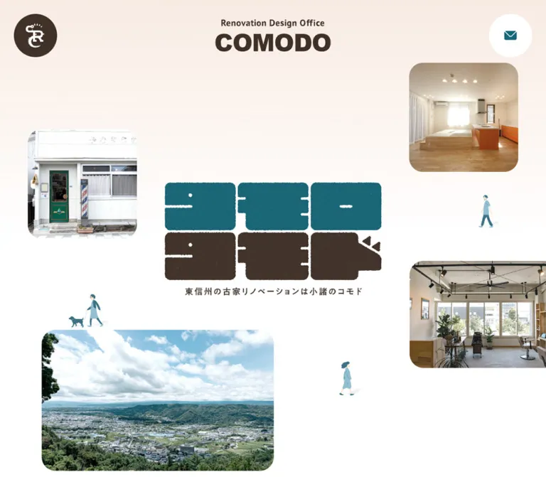
青緑とこげ茶の質感あるロゴ、街並みや施工写真、小さな人物イラストを余白に配置。丸みのある写真と親しみやすい文字組みが特徴のリノベーション会社サイト。
COMODO — Style Reference
A neighborhood renovation practice expressed through rounded photographs, tiny pedestrians, and textured teal-and-brown lettering.
Original URL: sr-comodo.com Final URL: sr-comodo.com — unchanged; reported HTTP 200. Theme: light, with white space, warm brown text, teal accents, and a pale peach wash. Inspected: October 2, 2026, at 02:33 JST; supplied retrieval timestamp: October 1, 2026, 17:33:03.097 UTC. Viewports: 1440 × 1000 and 390 × 844 CSS pixels. Scope: the current corporate homepage for 株式会社コモドデザイン, including its opening composition, community introduction, news, commercial and residential projects, company and shop introductions, contact block, and footer. Visual captures cover the desktop opening, project grid, and footer, plus the mobile opening and footer. Rendered DOM measurements cover the longer homepage. Linked destination pages and an opened navigation menu were not inspected.
COMODO presents renovation as participation in everyday neighborhood life. Photographs show existing storefronts, lived-in interiors, shop owners, and the surrounding town. Small illustrated people occupy the white space between those photographs. At the center, two rows of chunky Japanese lettering combine a teal upper row with a brown lower row that ends in an animal-like profile. Its rough edges and fine grain give the otherwise clean interface a handmade character.
The homepage moves from an open, asymmetrical scene into orderly project collections, then ends with a substantial contact-and-directory block. Broad margins and rounded image corners connect these different compositions. This is a corporate site with work, news, company, and shop navigation; its structure should remain useful for browsing beyond the first screen.
閉じる
COMODO — Style Reference
A neighborhood renovation practice expressed through rounded photographs, tiny pedestrians, and textured teal-and-brown lettering.
Original URL: sr-comodo.com Final URL: sr-comodo.com — unchanged; reported HTTP 200. Theme: light, with white space, warm brown text, teal accents, and a pale peach wash. Inspected: October 2, 2026, at 02:33 JST; supplied retrieval timestamp: October 1, 2026, 17:33:03.097 UTC. Viewports: 1440 × 1000 and 390 × 844 CSS pixels. Scope: the current corporate homepage for 株式会社コモドデザイン, including its opening composition, community introduction, news, commercial and residential projects, company and shop introductions, contact block, and footer. Visual captures cover the desktop opening, project grid, and footer, plus the mobile opening and footer. Rendered DOM measurements cover the longer homepage. Linked destination pages and an opened navigation menu were not inspected.
COMODO presents renovation as participation in everyday neighborhood life. Photographs show existing storefronts, lived-in interiors, shop owners, and the surrounding town. Small illustrated people occupy the white space between those photographs. At the center, two rows of chunky Japanese lettering combine a teal upper row with a brown lower row that ends in an animal-like profile. Its rough edges and fine grain give the otherwise clean interface a handmade character.
The homepage moves from an open, asymmetrical scene into orderly project collections, then ends with a substantial contact-and-directory block. Broad margins and rounded image corners connect these different compositions. This is a corporate site with work, news, company, and shop navigation; its structure should remain useful for browsing beyond the first screen.
How to Read This Reference
- Measured means a value appears in the supplied rendered DOM or computed-style evidence. Coordinates are CSS pixels; tables round long decimals for readability.
- Calculated means a ratio or difference derived from those measurements. A matching viewport percentage does not establish the original CSS formula.
- Estimated means a visual approximation from the original-page captures. Peach colors, photograph radii, and some image dimensions fall into this category.
- Recommended means an implementation choice for reuse. The CSS selectors, responsive interpolation, intermediate breakpoints, accessibility treatments, and optional texture hooks below are recommendations.
- Font evidence establishes the computed family stack, not the exact font file used for every glyph. Image-based lettering is treated separately from interface typography.
- Interaction limits: scrolling and settled states are documented. Menu opening, hover outcomes, keyboard behavior, contact submission, and decorative animation paths were not exercised.
Tokens — Colors
Default Palette
| Name | Value | Suggested token | Evidence and role |
|---|---|---|---|
| White Canvas | #FFFFFF |
--color-canvas |
Measured body background and white contact-button fills; also the main visual space between photographs |
| Warm Brown | #403128 |
--color-ink |
Measured body text, navigation, introductory CTA fill, and footer text; visually shared by the brown artwork |
| Deep Teal | #166678 |
--color-accent |
Measured contact-link text and lower footer CTA fill; visually echoed by the menu circle, hero artwork, and large contact surface |
| Pale Peach | Approximately #FAE9DE |
--color-peach |
Estimated from the footer surface and warm page wash; no exact computed peach value was supplied |
| Reversed White | #FFFFFF |
--color-on-accent |
Measured contact heading, supporting text, and filled-button labels |
The teal and brown have different jobs. Brown carries most reading and navigation. Teal marks consultation and the more conspicuous utility controls. Photographs supply additional color naturally: wood, green plants, red joinery, blue sky, and clothing do not become extra interface accents.
The pale wash is visible near the top of multiple viewport captures, fading toward white. Its repetition is consistent with a viewport-related background layer, but the actual background image, positioning, and gradient stops were not exported. The Quick Start approximates this treatment with a fixed gradient.
Fine grain is visible in the large teal contact area, its smaller teal CTA, and the hero lettering. Treat this as a surface or artwork texture rather than a new palette color. Avoid applying grain to ordinary text or over every photograph.
The exported custom properties include numerous WordPress preset colors, gradients, and shadows. Their presence does not establish visible use. They are excluded from this reference's palette and elevation rules.
Theme Presets
Only the supplied light appearance is evidenced. No theme picker, dark mode, or alternate palette was demonstrated.
Tokens — Typography
Interface Family
- Computed stack:
Lato, 'Noto Sans JP', sans-serif. - Body weight:
500. - Navigation, section headings, and prominent button labels:
700. - Body leading:
1.8at both measured widths. - Body tracking:
0.05em, equivalent to approximately0.843pxon desktop and0.7pxon mobile. - Character: readable Japanese sans-serif text paired with compact Latin lettering and numerals. The slightly open tracking supports the relaxed spacing of the layout.
The root HTML element reports Times, but the body and sampled interface elements use the stack above. Times is not evidence of a serif heading system here.
Artwork and Brand Lettering
The top COMODO wordmark, circular emblem, and large Japanese hero mark are visual assets. The empty text content of the measured hero h1 does not identify a font or establish whether an accessible image alternative exists. Preserve the lettering as authorized artwork, and provide a meaningful accessible heading in a new implementation.
Do not recreate the main mark by setting ordinary Japanese text in a heavy sans-serif. Its irregular outlines, nearly solid character shapes, surface grain, and animal silhouette are specific to the artwork.
Type Scale
| Role | Desktop | Mobile | Weight and spacing | Evidence |
|---|---|---|---|---|
| Body text | 16.8668px / 30.3602px |
14px / 25.2px |
500; tracking 0.05em |
Measured |
| Desktop primary navigation | 16.8668px / 75px |
Hidden in the initial mobile capture | 700; tracking 0.8433px |
Measured; 75px is a navigation alignment line box |
| Standard section heading | 29.5168px / 44.2753px |
19.6px / 29.4px |
700; tracking 0.1em |
Measured |
| Community introduction | 16.8668px / 42.1669px |
14px / 35px |
500; leading 2.5 |
Measured |
| Project location/client | 15.1801px / 27.3242px |
12.6px / 22.68px |
500; inherited body tracking in pixels |
Measured |
| Project title | Approximately 20–22px, with about 36px line spacing |
Approximately 16–18px, with about 29px line spacing |
Bold | Desktop visual estimate; wrapping differences support the approximate line spacing |
| Contact-block heading | 21.9268px / 39.4682px |
17.5px / 31.5px |
700; tracking 0.1em |
Measured |
| Primary CTA label | 16.8668px / 16.8668px |
14px / 14px |
700; vertically centered through padding |
Measured |
| Privacy link | 15.1801px / 27.3242px |
12.6px / 22.68px |
500; underlined visually |
Measured size; observed decoration |
| Copyright | 13.4934px / 24.2881px |
11.2px / 20.16px |
500; tracking 0.1em |
Measured |
| Small company-side aside | 13.4934px / 20.2401px |
11.2px / 16.8px |
500 |
Measured |
Section headings scale more strongly than body text: the desktop heading is approximately 1.75× the body size, while the mobile heading is 1.4×. Do not shrink the whole desktop page uniformly.
Editorial Heading Direction
The company heading occupies a narrow 132.84 × 292.16px rectangle on desktop and 88.22 × 194.05px on mobile. The shop heading occupies a single narrow column, approximately 44.28 × 203.42px and 29.41 × 135.11px respectively. These dimensions strongly indicate vertically composed Japanese headings. The exported properties do not include writing-mode, and these sections are not shown in the supplied visual crops. Using writing-mode: vertical-rl is therefore an evidence-informed implementation recommendation, not a recovered declaration.
Tokens — Spacing & Shapes
Responsive Unit
No source sizing formula was supplied. Several measurements correspond to viewport proportions:
- Header inset:
36px / 1440pxand9.75px / 390px, both2.5vw. - Standard content:
1152px, or80vw, on desktop;331.5px, or85vw, on mobile. - Project-column gap:
72px, equivalent to5vw, on desktop. - Standard section top padding:
144px, equivalent to10vw, on desktop;97.5px, equivalent to25vw, on mobile. - Hero heading width:
576px, or40vw, on desktop;351px, or90vw, on mobile.
These are endpoint relationships. Breakpoints, minimums, maximums, and behavior at other widths remain unverified.
Spacing Scale
| Use | Desktop | Mobile | Status |
|---|---|---|---|
| Header outer inset | 36px |
9.75px |
Measured |
| Main content side margin | 144px |
29.25px |
Measured |
| Three-column horizontal gap | 72px |
Not applicable | Calculated from measured card positions |
| Vertical gap between mobile project anchors | Not applicable | 58.5px |
Calculated from measured bounds |
| Heading-to-grid gap | Approximately 29.52px |
Approximately 19.59px |
Calculated |
| Standard section top padding | 144px |
97.5px |
Measured |
| Introductory CTA vertical padding | 25.3001px |
21px |
Measured |
| Introductory CTA horizontal padding | 67.4671px |
56px |
Measured |
| Space before footer contact surface | 216px |
117px |
Measured footer top padding |
| Gap between large contact buttons | Approximately 21.61px horizontally |
16px vertically |
Calculated |
| Mobile footer navigation pitch | Not applicable | 42px |
Calculated: 21px link bounds followed by 21px spacing |
Whitespace is a structural feature. The introduction is allowed to unfold before news and projects begin, and the project collections have substantial separation from neighboring sections.
Border Radius
| Element | Desktop | Mobile | Evidence |
|---|---|---|---|
| Header contact control | 50% on a 67.5px square |
50% on a 48.75px square |
Measured |
| Introductory CTA | 33.7335px |
28px |
Measured |
| Large contact buttons | 50.6003px |
42px |
Measured |
| Lower footer CTA | 33.7335px |
28px |
Measured |
| Desktop project photographs | Approximately 34–36px |
Not visually measured | Estimated from desktop capture |
| Hero photograph corners | Approximately 34–36px |
Approximately 10–12px |
Estimated; varies with the smaller image scale |
| Combined contact/footer outer corners | Approximately 36px |
Approximately 20px |
Estimated |
| Project category label | Fully rounded capsule | Not visually measured | Desktop observation |
The project anchor itself has no measured background, border radius, or padded card surface. The visible rounding belongs to the photograph, while the text sits directly on the page.
Layout Measurements
| Element | 1440 × 1000 | 390 × 844 | Interpretation |
|---|---|---|---|
| Document height | 8054.16px |
10199.22px |
Long corporate homepage |
| Header bounds | 1440 × 147px |
390 × 68.25px |
Initial header, not the height of the persistent circular controls |
| Header wordmark link | 182.25 × 67.5px |
131.625 × 48.75px |
Link boxes; intrinsic artwork may include internal space |
| Hero heading | 576 × 310.02px at (432, 344.99) |
351 × 190.41px at (19.5, 326.80) |
Centered at the viewport midpoint |
| Main collection width | 1152px |
331.5px |
Centered content container |
| Project column width | 336px |
331.5px |
Mobile cards retain almost the same width as one desktop column |
| Introductory CTA | 337.33 × 67.45px |
280 × 56px |
Brown pill |
| Large contact button | 410.39 × 101.19px |
298.34 × 84px |
Two across, then stacked |
| Footer outer width | 1353px |
370.5px |
Wider than the primary text container |
| Lower footer CTA | 337.33 × 67.45px |
331.5 × 56px |
Teal pill |
Components
Header and Persistent Corner Controls
Role: establish identity and keep navigation and consultation reachable.
On desktop, a brown circular emblem occupies the upper-left corner. The COMODO wordmark sits beside it, followed by five bold text links: コモドのリノベ, 施工事例, 会社概要, 雑貨店 估謨堂, and お知らせ. A separate white circle containing a teal envelope sits at the upper right.
The desktop emblem and contact circles measure 67.5px; both start 36px from their respective outer edges. The wordmark link begins at approximately x = 120.36px. The navigation begins at approximately x = 435.83px.
On mobile, the wordmark is centered independently of the two corner controls. The circles become 48.75px with 9.75px outer insets, and the horizontal navigation is absent. This three-part alignment is important: centering the entire logo-and-emblem group would not match the capture.
In the scrolled desktop and mobile captures, a teal circle with three white horizontal lines occupies the upper-left position. The contact circle remains in the upper-right position. This establishes a persistent corner-control treatment and a changed visible navigation state. It does not establish the switch threshold, transition sequence, or opened-menu appearance.
The envelope links to /contact/. The opened destination was not inspected. Keep the home emblem and menu button semantically distinct when implementing their alternate states.
Opening Neighborhood Composition
Role: connect the studio's identity to buildings, people, and place.
The central heading is artwork rather than a conventional text headline. Its measured center is exactly the viewport center at both supplied sizes: approximately (720, 500) on desktop and (195, 422) on mobile. The Japanese caption beneath the main lettering reads 東信州の古家リノベーションは小諸のコモド in the supplied capture.
Four photographic subjects orbit this mark:
- A pale storefront with a green door at the left.
- A bright residential interior with wood flooring at the upper right.
- A salon interior at the lower right.
- A broad town-and-hills view toward the lower left.
The composition is asymmetrical, with unequal photograph sizes and generous empty space. On desktop, the storefront and upper-right interior are approximately 288px squares. The landscape begins around (108, 738) and is approximately 612px wide. The right-hand salon and lower landscape extend beyond the visible crop of the opening capture.
Mobile recomposes the scene. The upper-right interior becomes roughly 117px square. The storefront is partly clipped at the left edge, the salon is partly clipped at the right, and the town view becomes approximately 175.5px wide. The central mark becomes proportionally much larger, occupying 90% of the viewport width.
Small blue and teal figures appear in the gaps and occasionally overlap photographs. One walks a dog; another carries a bag. Their drawing style is loose and lightly shaded. They depict movement, but the supplied evidence does not establish whether or how each figure animates.
Community Introduction
Role: explain the relationship between renovation and neighborhood connections.
This content belongs to the same long opening section as the visual introduction. That section measures about 2608.8px high on desktop and 1969.7px on mobile; those values must not be mistaken for the height of the first-screen hero alone.
The narrative begins with 人と人、店と店、店と人。 and describes connections growing through the studio. The paragraph uses a deliberately slow 2.5 line-height: approximately 42.17px on desktop and 35px on mobile. Its measured height corresponds to nine lines at each width.
An image-based secondary heading is present in the DOM, but its artwork is outside the supplied visual crops. Its bounds are approximately 460.8 × 313.8px on desktop and 331.5 × 226.2px on mobile. Do not invent its lettering or illustration.
A centered brown pill labeled コモドのリノベ links to /renovation/. It uses white bold text and a fully rounded silhouette.
News Collection
Role: give the homepage a continuing local and business context.
The お知らせ section contains three linked entries with dates, titles, and category text. On desktop, their anchors align to the same three-column system as the projects: 336px columns beginning at x = 144, 552, and 960. On mobile, the entries become a single column at x = 29.25px with a width of 331.5px.
The お知らせ一覧 link appears beside the desktop heading and after the entries on mobile. Preserve this hierarchy and document order. The supplied news dates are in 2024; their age alone does not indicate that the currently accessible website is discontinued.
The visual crops do not show the news cards directly, so their image crops and detailed decorative treatments are not specified here.
Renovation Project Card
Role: make a completed project the primary browsing target.
The desktop card anatomy is clear in the supplied project capture:
- A large portrait photograph with rounded corners.
- A bold, left-aligned title, naturally wrapping to one or two lines.
- A smaller location and client line.
- A compact brown category pill with white text.
The card has no enclosing colored surface, border, or visible shadow. A single anchor groups the project information and links to its detail page. Keep the category label inside that anchor unless it has an independently implemented destination; do not create nested links.
The photograph appears close to a 4:5 portrait ratio. That ratio is a visual estimate, not an exported image measurement. The first commercial row shows a merchandise-filled interior, the owners of a salon, and a compact red-fronted food shop. These are different subjects with a consistent frame treatment.
The first title, テナントを店舗兼自宅へ, fits on one line in the desktop capture. The next two titles occupy two lines. Their metadata follows the natural title height instead of being artificially forced onto a common baseline.
Project Collection Header and Index Link
Role: separate the two principal work categories while keeping their archives accessible.
The two sections are titled 店舗リノベーション and 住宅リノベーション. Desktop headings sit at the left of the 1152px container, with their index links aligned at the right. The links combine bold brown text with a small brown circle containing a white right-pointing triangle.
Use this small directional circle for archive and footer navigation. It has less visual weight than the large consultation pills. The link destination is an archive; the triangle is not evidence of video playback.
On mobile, the index link follows all three cards. The DOM measures the link across the content width, but does not supply its horizontal alignment property. A new implementation can right-align its contents while retaining that full-width layout box.
Company and Shop Introductions
Role: connect the work portfolio to the organization and its retail activity.
The company introduction includes the heading 不便なところ 綺麗にしたいところ お聞かせください, a short explanation of the COMODO name, and a link to /company/. A small aside contains えっ!コモドオオトカゲじゃないの?.
The shop introduction names 雑貨屋 估謨堂, describes miscellaneous goods, handmade products, coffee, and coffee equipment, and links to /zakka/.
Measured desktop sections use flex layout. Their body-copy columns are 288px wide: the company text is toward the left and the shop text toward the right. On mobile, the sections switch to block layout with 331.5px body-copy widths and narrow centered heading rectangles. This supports an alternating editorial composition rather than another project-card grid.
The sections' full photographic presentation is outside the supplied visual captures. Preserve the measured text relationships, but do not assign unverified photo subjects, crops, or asset paths.
Consultation Panel
Role: provide a prominent, reassuring endpoint for inquiries.
A broad teal surface begins the footer assembly. It has rounded upper corners, subtle visible grain, a centered white heading, two white pill-shaped actions, and a short white explanatory paragraph. The heading reads お気軽にご相談ください.
On desktop, the two actions sit side by side. Each measures approximately 410.39 × 101.19px, with a 21.61px gap. The telephone action pairs a small phone icon with a larger number and a smaller hours line. The other pairs an envelope with ご相談はこちら.
The measured telephone destination is tel:0267-26-3310; the displayed hours are 9:00 - 18:00 (土・日・祝日を除く). The consultation destination is /contact/. These are evidenced links, not tested call or form workflows.
On mobile, the actions become a centered stack of 298.34 × 84px pills with a 16px gap. The panel remains wider than the main content, while its inner text aligns with the 331.5px content width.
Footer Directory
Role: repeat identity, provide a complete navigation route, and retain contact access.
The pale peach lower surface touches the teal consultation panel without a gap. Together they form one large rounded assembly. The desktop footer divides into three regions:
- A brand lockup, the company name 株式会社コモドデザイン, and the address
〒384-0014 長野県小諸市荒町2-6-7. - Six navigation links in two columns, each preceded by a brown circular directional icon.
- Instagram and Facebook links, a teal consultation pill, and an underlined privacy link.
The mobile footer stacks these regions. The identity and address are centered, the six navigation links form one left-aligned column within a narrower centered area, and the social links share one row. The teal consultation pill spans the 331.5px inner width.
The mobile brand link is wider than the visible artwork. Do not stretch the logo simply because its anchor measures 331.5px across.
Copyright Line
Role: close the page without adding another dense surface.
©COMODO All Rights Reserved. is centered on white below the rounded footer assembly. It uses smaller brown text with 0.1em tracking. A generous gap separates it from the peach panel. The copyright is outside that colored panel, even though it remains within the footer element's overall measured bounds.
Tokens — Motion & Interaction
| Treatment | Supplied evidence | What can be concluded |
|---|---|---|
| Hero heading transition | opacity 2s ease-in-out, top 2s ease-in-out at both widths |
A two-second transition is defined; its trigger and starting position were not captured |
| Header envelope link | 0.1s ease-in transition |
A short transition is defined; the destination values and visible hover outcome are unknown |
| Upper-left control after scrolling | Brown emblem in opening captures; teal hamburger in scrolled captures | A distinct scrolled presentation exists; threshold and animation are unverified |
| Corner-control persistence | Controls remain at the same viewport corners in supplied scroll captures | Persistent positioning is visually supported; the exported properties do not include position |
| Project, archive, and navigation links | Rendered anchors with explicit destinations | Navigation affordances are present; target-page behavior was not tested |
| Telephone and inquiry actions | tel: and /contact/ links |
Their intended destinations are known; resulting workflows are unverified |
| Walking figures | Static captured figures in different responsive compositions | Animation, path, speed, and looping cannot be established |
| Other sampled elements | Many report animation: none and transition: all |
This does not establish a page-wide absence of motion or a meaningful nonzero transition |
The capture process waited for document loading, image decoding, and sampled layout stability, and temporarily paused perpetual animations during readiness checks before resuming them. That process does not reveal every delayed animation or prove that a static capture represents a permanently static element.
For reuse, keep the supplied long hero transition optional and restrained. Do not add parallax, continuous drifting, image zoom, or a sliding menu and describe them as observed features. The Quick Start leaves decorative figures static and the hero visible by default.
Surfaces
| Surface | Appearance | Structural purpose |
|---|---|---|
| Main page | White with a pale warm wash toward the viewport top | Holds the open neighborhood composition and long reading sequence |
| Project content | Transparent card wrappers on the page | Lets photography and text establish grouping |
| Photographic frame | Rounded crop without visible elevation | Unifies heterogeneous buildings, people, and interiors |
| Brown navigation accents | Flat circles and capsules | Establishes secondary actions and project categories |
| Contact surface | Textured teal with white content | Creates the strongest inquiry area |
| Contact action | White capsule with teal content | Separates telephone and written consultation clearly |
| Footer directory | Pale peach, brown content | Provides a warmer, quieter information area |
| Copyright area | White with small brown text | Gives the page a spacious ending |
There is no evidenced general-purpose shadow system. Depth comes from photographic content, overlapping hero placement, and changes in surface color. Rounded photographs should not acquire floating-card shadows in an adaptation.
Imagery
Photography is specific to place and use. The opening storefront retains the visual character of an older street building. Renovated rooms show timber, daylight, practical fixtures, and plants. The project collection includes people within their own business environment, rather than limiting the portfolio to empty architectural interiors. The landscape establishes the wider town around the projects.
Retain natural color and readable spatial detail. The photographs are not globally converted to teal, brown, monochrome, or a heavy warm filter. Their rounded crops provide the shared visual system.
The small illustrated people use teal, pale blue, cream, and soft shadows. Their scale is deliberately much smaller than the architecture and main lettering. They connect isolated photographs across the white canvas without becoming large mascot panels.
The central lettering is more textured and irregular than the interface. Preserve this distinction: rough artwork, clean sans-serif text, rounded photographic crops, and simple utility icons.
Observed Asset References
No image src URLs, original SVG markup, texture filenames, or font-file URLs are included in the supplied evidence. The references below identify observed assets by subject and location rather than inventing paths.
| Asset | Observed location | Reuse guidance |
|---|---|---|
| Circular brown emblem | Initial header and footer lockup | Preserve the authorized artwork and its white internal mark |
| COMODO wordmark | Desktop header, centered mobile header, footer | Keep its descriptor and wordmark proportions |
| Two-row Japanese hero lettering | Center of the initial viewport | Use artwork; preserve grain, irregular contours, and the animal-like ending |
| Green-door storefront photograph | Left side of the hero | Allow intentional edge cropping on mobile |
| Bright residential interior | Upper-right hero | Use a compact rounded square |
| Salon photograph | Lower-right hero | Preserve its partly off-canvas mobile presentation |
| Town landscape | Lower-left hero | Use a broader landscape proportion |
| Small pedestrian illustrations | White space and occasional photo overlap | Keep separate from meaningful content and avoid obstructing controls |
| Commercial project photography | Three-card desktop row | Preserve a consistent portrait crop across varied subjects |
| Teal grain | Contact panel and lower CTA | Use a subtle texture layer if a suitable asset is available |
Use original assets only when authorized and available. The CSS shell alone cannot reproduce the identity of the custom lettering and illustrations.
Layout & Responsive Behavior
Desktop Composition
At 1440px, the header distributes identity and navigation across the upper edge. The hero mark occupies 40vw and centers on the viewport midpoint. The photography uses a free composition rather than a four-cell grid, including intentional partial visibility at the viewport edges.
Below the introduction, the news and project collections use an 80vw container. Three 336px columns and two 72px gaps exactly fill its 1152px width. Archive links sit opposite their headings. Company and shop introductions then depart from this grid with alternating narrow text positions.
The contact/footer assembly is wider, measuring 1353px, and sits close to the page edges. Its broad teal upper half and peach directory base create a distinct final destination.
Mobile Composition
At 390px, the wordmark moves to the horizontal center while the corner controls remain separate. The hero artwork expands to 90vw. Photographs are moved and resized individually; the layout is not a scaled-down desktop screenshot.
The content container becomes 85vw. Each project is 331.5px wide, only 4.5px narrower than a desktop project column. This preserves the importance of the photographs and explains why mobile requires a much longer document. The measured document grows by approximately 2145px, or 26.6%.
News and project archives move below their respective collections. Contact actions stack. The footer navigation becomes a single column, while Instagram and Facebook remain adjacent. The outer footer width becomes 95vw, leaving 9.75px side gutters.
Boundaries and Unknowns
- Only the two stated viewport sizes were inspected. The original tablet behavior and breakpoints are unknown.
- Project stacking is established by DOM geometry even though a separate mobile project screenshot was not supplied.
- Header menu opening, focus order, and body-scroll behavior were not tested.
- The supplied data does not establish safe-area handling, orientation behavior, browser zoom behavior, or reduced-motion support.
- Long section heights are observations, not recommended fixed heights. Let content determine document flow in a new implementation.
Do’s and Don’ts
Do
- Use measured brown
#403128for reading and teal#166678for consultation accents. - Keep most content on white, with pale peach reserved for the wash and footer directory.
- Center the hero artwork on the viewport while arranging surrounding photographs independently.
- Preserve the handmade artwork as artwork, including its rough edges and two-color structure.
- Use small pedestrian illustrations to connect the architecture to everyday activity.
- Keep project photographs large, rounded, and unboxed.
- Preserve separate commercial and residential work collections.
- Let title wrapping determine the position of each card's metadata.
- Recompose the hero and stack collections on mobile.
- Keep the footer useful as a directory, with company details, social links, and clear consultation actions.
Don’t
- Do not turn the homepage into a short sales funnel that removes work, news, company, or shop navigation.
- Do not force the hero photographs into equal tiles.
- Do not replace custom Japanese lettering with a heavy generic font.
- Do not introduce glossy gradients, glass panels, or a shadow on every project.
- Do not mistake the exported WordPress preset palette for the visible brand palette.
- Do not interpret the hero
h1font size as the visible size of the artwork lettering. - Do not shrink mobile project images to miniature desktop proportions.
- Do not treat the small triangular navigation icons as media-play controls.
- Do not invent animation loops, menu transitions, hover zooms, or breakpoint values and label them as observed.
- Do not reuse the estimated peach color as though it were a measured source token.
Recommended Implementation Additions
These are recommendations for a new implementation, not verified features of the inspected site:
- Give the menu button and envelope link explicit accessible names. The exported empty text strings do not reveal whether the original already has suitable names.
- Use one meaningful accessible heading for the hero artwork. Mark decorative figures with empty alternatives and prevent them from intercepting pointer events.
- Keep the home emblem as a link and the menu opener as a button. Implement their visible states without leaving hidden duplicate controls in the focus order.
- Provide visible keyboard focus indicators on white, peach, brown, and teal surfaces.
- Enlarge mobile footer navigation hit areas to at least
44pxhigh; the exported link rectangles are only21pxhigh. - Honor reduced-motion preferences. Leave the heading visible and stop optional decorative motion without hiding content.
- Clip deliberate hero overflow within the hero, rather than suppressing horizontal overflow across the entire site and potentially masking content errors.
- Preserve image dimensions or aspect ratios to prevent layout shifts. Load later project images lazily while prioritizing the visible opening assets appropriately.
- Verify contrast against the final textured surfaces, especially for small white labels and teal text.
- Test intermediate widths and longer copy. The supplied endpoint measurements do not define a complete responsive system.
Agent Prompt Guide
Quick Color Reference
- Main page:
#FFFFFF. - Text, ordinary navigation, and category capsules:
#403128. - Consultation, menu circle, and teal artwork:
#166678. - Footer peach: approximately
#FAE9DE; confirm against approved artwork before treating it as final. - Large consultation buttons: white with teal text.
- Texture: fine grain on selected teal surfaces and brand artwork, not a general overlay on all content.
Overall Prompt
“Create a Japanese renovation company's corporate homepage inspired by COMODO's neighborhood-oriented composition. Use a white canvas, warm brown #403128 text, teal #166678 consultation accents, and a pale peach footer. Center custom two-color Japanese lettering in the first viewport, surrounded by asymmetrically positioned rounded photographs of a storefront, a renovated home, a salon, and the surrounding town. Add small, lightly shaded pedestrian illustrations in the open space. Follow with a generously spaced introduction, news, separate commercial and residential project collections, company and shop introductions, and a wide teal contact panel attached to a peach directory footer. Use the computed font stack Lato, Noto Sans JP, sans-serif. On mobile, center the header wordmark, recompose the hero photographs, expand the main artwork, and turn the collections into one large-photo column. Keep cards unboxed and avoid shadows.”
Example Component Prompts
- Hero: “Build a full first-viewport composition with the artwork centered at 50% width and height. At 1440px, give the artwork 576px width. Place unequal rounded building photographs around it, with a wide town view near the lower left. At 390px, use a 351px artwork width and independently reposition the photographs, including deliberate side cropping. Keep decorative people small.”
- Project card: “Create one linked renovation project with a roughly 4:5 portrait photo, approximately 36px desktop corner rounding, a bold brown title, a smaller client/location line, and a compact brown category capsule. Use no outer card fill, border, or shadow. Allow metadata to follow the natural title height.”
- Project collection: “At 1440px, use a centered 1152px collection with three 336px columns separated by 72px gaps. Put the category heading on the left and a small text-and-circle archive link on the right. At 390px, use one 331.5px column and move the archive link after the cards.”
- Contact panel: “Create a broad subtly grained teal panel with rounded upper corners, a centered white consultation heading, and two white pill actions. The desktop actions are approximately 410 × 101px. Stack them at approximately 298 × 84px on mobile. Include a phone number with a smaller hours line and a separate envelope action.”
- Footer: “Attach a pale peach directory directly below the teal contact panel. On desktop, place identity and address at left, six links in two columns at center, and social links plus a teal inquiry pill at right. On mobile, stack the identity, a single navigation column, one social row, and a full-width inquiry pill. Put the small copyright on white beneath the rounded assembly.”
- Motion restraint: “Keep the page complete with motion disabled. If an entrance is implemented, use the evidenced two-second ease-in-out opacity and position treatment for the hero heading. Do not invent looping pedestrian paths or hover zoom as source behavior. Provide reduced-motion handling and independently implement the menu's accessible state.”
Quick Start
CSS Custom Properties
This is a usable adaptation of the measured endpoints, not the original stylesheet. The 60rem breakpoint, fluid interpolation, estimated photo ratios and radii, and background gradient are recommendations. The original font stack is declared, but font files are not bundled. No asset URLs are invented.
Use .hero__mark for an image-containing semantic heading and the four .hero__photo modifiers for the corresponding photographs. Within .collection, place the heading, grid, and archive link in that document order; CSS moves the archive link beside the heading on desktop. Put .contact-panel and .footer-directory inside .footer-panels, with .copyright after that wrapper.
The optional .is-scrolled class is an application state hook. A script must manage it and the menu separately; this reference does not prescribe the original scroll threshold. Supply authorized artwork and, optionally, a grain image through --grain-image.
:root {
  /* Measured interface colors; peach is a visual approximation. */
  --color-canvas: #ffffff;
  --color-ink: #403128;
  --color-accent: #166678;
  --color-peach: #fae9de;
  --color-on-accent: #ffffff;
  --grain-image: none;

  --font-body: Lato, 'Noto Sans JP', sans-serif;
  --text-body: clamp(14px, 1.17131vw, 16.8668px);
  --text-section: clamp(19.6px, 2.04978vw, 29.5168px);
  --text-small: calc(var(--text-body) * 0.9);
  --text-caption: calc(var(--text-body) * 0.8);
  --text-card: 21px; /* Estimated project-title size. */
  --tracking-body: calc(var(--text-body) * 0.05);
  --leading-body: 1.8;
  --leading-story: 2.5;

  --content-width: 80%;
  --header-inset: 2.5vw;
  --control-size: 67.5px;
  --column-gap: 5vw;
  --section-space: 10vw;
  --radius-photo: 36px; /* Visual approximation. */
  --radius-shell: 36px; /* Visual approximation. */
  --motion-hero: 2s ease-in-out;
}

* { box-sizing: border-box; }

body.comodo-page {
  margin: 0;
  color: var(--color-ink);
  background-color: var(--color-canvas);
  /* Recommended approximation of the repeated viewport wash. */
  background-image: linear-gradient(var(--color-peach), #fff 55vh);
  background-attachment: fixed;
  background-repeat: no-repeat;
  font-family: var(--font-body);
  font-size: var(--text-body);
  font-weight: 500;
  line-height: var(--leading-body);
  letter-spacing: var(--tracking-body);
}

img { display: block; max-width: 100%; }
a { color: inherit; }
button { font: inherit; }
.content { width: var(--content-width); margin-inline: auto; }
.page-section { padding-block-start: var(--section-space); }

.site-header {
  position: absolute;
  inset: 0 0 auto;
  z-index: 30;
  height: 147px;
  padding: var(--header-inset);
}

.header-brand {
  position: absolute;
  top: var(--header-inset);
  left: calc(var(--header-inset) + var(--control-size) + var(--text-body));
  display: flex;
  align-items: center;
  width: 182.25px;
  height: var(--control-size);
}

.primary-nav {
  position: absolute;
  top: var(--header-inset);
  left: 30.27%;
  display: flex;
  gap: 2em;
  font-weight: 700;
  line-height: 75px;
}
.primary-nav a { text-decoration: none; white-space: nowrap; }

.corner-control {
  position: fixed;
  top: var(--header-inset);
  z-index: 50;
  display: grid;
  place-items: center;
  width: var(--control-size);
  height: var(--control-size);
  padding: 0;
  border: 0;
  border-radius: 50%;
}
.control-home, .control-menu { left: var(--header-inset); }
.control-home { color: #fff; background: var(--color-ink); }
.control-menu { color: #fff; background: var(--color-accent); }
.control-contact {
  right: var(--header-inset);
  color: var(--color-accent);
  background: #fff;
  transition: color 100ms ease-in, background-color 100ms ease-in;
}
.comodo-page:not(.is-scrolled) .control-menu { display: none; }
.is-scrolled .control-home { display: none; }
.is-scrolled .header-brand,
.is-scrolled .primary-nav { visibility: hidden; }

.hero {
  position: relative;
  min-height: 100svh;
  overflow: hidden;
  isolation: isolate;
}
.hero__mark {
  position: absolute;
  z-index: 2;
  left: 50%;
  top: 50%;
  width: 40vw;
  margin: 0;
  transform: translate(-50%, -50%);
  transition: opacity var(--motion-hero), top var(--motion-hero);
}
.hero__mark img { width: 100%; height: auto; }
.hero__photo {
  position: absolute;
  margin: 0;
  overflow: hidden;
  border-radius: var(--radius-photo);
}
.hero__photo img { width: 100%; height: 100%; object-fit: cover; }

/* Approximate placements from the desktop opening capture. */
.hero__photo--store {
  left: 5vw; top: 21.2svh; width: 20vw; aspect-ratio: 1;
}
.hero__photo--home {
  left: 75vw; top: 3.9svh; width: 20vw; aspect-ratio: 1;
}
.hero__photo--salon {
  left: 75vw; top: 55.8svh; width: 30vw; aspect-ratio: 3 / 2;
}
.hero__photo--town {
  left: 7.5vw; top: 73.8svh; width: 42.5vw; aspect-ratio: 5 / 3;
}
.hero__person { position: absolute; height: auto; pointer-events: none; }
.hero__person--dog { left: 12.5%; top: 57%; width: 7%; }
.hero__person--walk { left: 87.7%; top: 36%; width: 4%; }
.hero__person--lower { left: 62.7%; top: 78%; width: 4.5%; }

.intro-copy {
  text-align: center;
  line-height: var(--leading-story);
}

.pill {
  position: relative;
  display: flex;
  align-items: center;
  justify-content: center;
  min-height: 4em;
  padding: 1.5em 3em;
  border-radius: 999px;
  font-weight: 700;
  line-height: 1;
  text-align: center;
  text-decoration: none;
}
.pill__icon { position: absolute; left: 2em; }
.pill--brown { color: #fff; background: var(--color-ink); }
.intro-cta { width: 20em; max-width: 100%; margin-inline: auto; }

.collection {
  display: grid;
  grid-template-columns: minmax(0, 1fr) auto;
  gap: var(--text-section) 1em;
}
.collection__title {
  grid-column: 1;
  grid-row: 1;
  margin: 0;
  font-size: var(--text-section);
  font-weight: 700;
  line-height: 1.5;
  letter-spacing: 0.1em;
}
.collection__grid {
  grid-column: 1 / -1;
  grid-row: 2;
  display: grid;
  grid-template-columns: repeat(3, minmax(0, 1fr));
  gap: var(--column-gap);
}
.collection__more {
  grid-column: 2;
  grid-row: 1;
  align-self: start;
  display: flex;
  align-items: center;
  justify-content: flex-end;
  gap: 1em;
  font-weight: 700;
  line-height: 1.5;
  text-decoration: none;
}
.arrow-dot {
  display: inline-grid;
  place-items: center;
  flex: 0 0 1.5em;
  width: 1.5em;
  height: 1.5em;
  border-radius: 50%;
  color: #fff;
  background: var(--color-ink);
}

.work-card { display: block; min-width: 0; text-decoration: none; }
.work-card__image {
  width: 100%;
  aspect-ratio: 4 / 5; /* Estimated photograph ratio. */
  object-fit: cover;
  border-radius: var(--radius-photo);
}
.work-card__title {
  margin: 0.8em 0 0.35em;
  font-size: var(--text-card);
  font-weight: 700;
  line-height: 1.73;
}
.work-card__meta { margin: 0 0 0.5em; font-size: var(--text-small); }
.work-card__tag {
  display: inline-block;
  padding: 0.6em 1em;
  border-radius: 999px;
  color: #fff;
  background: var(--color-ink);
  font-size: var(--text-caption);
  line-height: 1.5;
}

/* Recommended interpretation of the narrow heading geometry. */
.editorial-title {
  margin-inline: auto;
  writing-mode: vertical-rl;
  text-orientation: upright;
  font-size: var(--text-section);
  line-height: 1.5;
  letter-spacing: 0.1em;
}

.footer-shell {
  width: calc(100% - 87px);
  margin-inline: auto;
  padding-block-start: 15vw;
}
.footer-panels { overflow: hidden; border-radius: var(--radius-shell); }
.contact-panel {
  padding: 5vw;
  color: #fff;
  background-color: var(--color-accent);
  background-image: var(--grain-image);
  text-align: center;
}
.contact-panel__title {
  margin: 0;
  font-size: calc(var(--text-body) * 1.3);
  line-height: 1.8;
  letter-spacing: 0.1em;
}
.contact-actions {
  display: grid;
  grid-template-columns: repeat(2, minmax(0, 1fr));
  gap: 21.6px;
  max-width: 842.4px;
  margin: 32px auto 16px;
}
.contact-action {
  min-height: 6em;
  color: var(--color-accent);
  background: #fff;
}
.contact-action__number { display: block; font-size: 1.6em; line-height: 1.2; }
.contact-action__hours { display: block; margin-top: 0.4em; font-size: 0.8em; }
.contact-panel__copy { margin: 0; padding-top: 2em; }

.footer-directory {
  display: grid;
  grid-template-columns: 1fr 1.1fr 1fr;
  gap: 5vw;
  align-items: start;
  padding: 5vw;
  background: var(--color-peach);
}
.footer-brand img { width: min(100%, 290px); height: auto; }
.footer-company { margin: 1em 0 0; font-size: 1em; }
.footer-address { margin: 0; font-style: normal; }
.footer-nav { display: grid; grid-template-columns: repeat(2, 1fr); }
.footer-nav a {
  display: flex;
  align-items: center;
  gap: 1em;
  min-height: 54.5px;
  text-decoration: none;
}
.footer-social { display: flex; justify-content: center; gap: 2em; }
.footer-cta {
  margin-top: 2em;
  color: #fff;
  background-color: var(--color-accent);
  background-image: var(--grain-image);
}
.footer-privacy { display: block; margin-top: 1.3em; text-align: center; font-size: var(--text-small); }
.copyright {
  margin: 0;
  padding: 80px 0 24px;
  font-size: var(--text-caption);
  letter-spacing: 0.1em;
  text-align: center;
}

/* Recommended breakpoint; the original threshold is unknown. */
@media (max-width: 60rem) {
  :root {
    --content-width: 85%;
    --control-size: 48.75px;
    --section-space: 25vw;
    --text-body: 14px;
    --text-section: 19.6px;
    --text-card: 16.8px;
    --radius-photo: 24px;
    --radius-shell: 20px;
  }
  .site-header { height: 68.25px; }
  .header-brand { left: 50%; width: 131.625px; transform: translateX(-50%); }
  .primary-nav { display: none; }
  .hero__mark { width: min(90vw, 576px); }
  .hero__photo { border-radius: 11px; }
  .hero__photo--store { left: -2.5vw; top: 18.6svh; width: 35vw; }
  .hero__photo--home { left: 65vw; top: 14.45svh; width: 30vw; }
  .hero__photo--salon { left: 67.5vw; top: 68svh; width: 38vw; }
  .hero__photo--town { left: 10vw; top: 73.6svh; width: 45vw; }
  .hero__person--dog { left: 31%; top: 29%; width: 15%; }
  .hero__person--walk { left: 80%; top: 22%; width: 8%; }
  .hero__person--lower { left: 53.5%; top: 66%; width: 8.5%; }

  .collection { grid-template-columns: minmax(0, 1fr); gap: 19.6px 0; }
  .collection__grid { grid-template-columns: minmax(0, 1fr); gap: 58.5px; }
  .collection__more { grid-column: 1; grid-row: 3; margin-top: 28.4px; }

  .footer-shell { width: 95%; padding-top: 30vw; }
  .contact-panel { padding: 39px 19.5px 19.5px; }
  .contact-panel__title { font-size: 17.5px; }
  .contact-actions { grid-template-columns: 1fr; width: 90%; gap: 16px; margin-top: 26.25px; }
  .contact-panel__copy { padding-top: 7px; }
  .footer-directory { grid-template-columns: 1fr; gap: 39px; padding: 39px 19.5px; }
  .footer-brand { text-align: center; }
  .footer-brand img { width: 185px; margin-inline: auto; }
  .footer-company { margin-top: 2em; }
  .footer-nav { grid-template-columns: 1fr; width: 80.34%; margin-inline: auto; }
  .footer-nav a { min-height: 44px; } /* Recommended larger touch target. */
  .copyright { padding-top: 70px; }
}

/* Recommended keyboard focus treatment for light and dark surfaces. */
.comodo-page :is(a, button):focus-visible {
  outline: 3px solid var(--color-ink);
  outline-offset: 5px;
  box-shadow: 0 0 0 3px #fff;
}

@media (prefers-reduced-motion: reduce) {
  .hero__mark, .corner-control { transition: none; }
  .hero__person { animation: none; }
}
The hero placements above approximate the visible photographs; they do not recover unseen asset boundaries. Keep image focal points adjustable per asset. The secondary editorial sections and an opened menu need their own implementation because their full visual anatomy is not supplied.
Tailwind v4 Token Mapping
Optional aliases for a project already using Tailwind v4. This is not evidence that the original site uses Tailwind. Define the custom properties above first.
@theme inline {
  --color-canvas: #ffffff;
  --color-ink: #403128;
  --color-accent: #166678;
  --color-peach: #fae9de; /* Estimated. */

  --font-site: Lato, 'Noto Sans JP', sans-serif;
  --text-site-body: var(--text-body);
  --text-site-heading: var(--text-section);
  --text-site-small: var(--text-small);
  --text-site-caption: var(--text-caption);

  --spacing-site-section: var(--section-space);
  --spacing-site-columns: var(--column-gap);
  --spacing-site-control: var(--control-size);
  --radius-site-photo: var(--radius-photo);
  --radius-site-shell: var(--radius-shell);
}
Sources & Evidence
- Current COMODO homepage: original and final URL; reported HTTP 200. The rendered page title and footer independently identify 株式会社コモドデザイン.
- Capture timestamp: October 1, 2026, 17:33:03.097 UTC, equivalent to October 2, 2026, 02:33:03.097 JST.
- Desktop evidence: 1440 × 1000 CSS pixels; opening composition, project collection, and contact/footer captures; rendered document height approximately 8054.16px.
- Mobile evidence: 390 × 844 CSS pixels; opening and footer captures; rendered document height approximately 10199.22px.
- Rendered DOM and computed styles: element rectangles, text and link destinations, font stack, sizes, weights, line heights, tracking, selected fills and radii, layout modes, and transition strings. These support the measured token tables.
- Observed states: settled opening views and scrolled views showing persistent corner controls. Navigation destinations were recorded from anchors, not opened as additional sources.
- Inspection limits: no direct image-file paths, complete stylesheet rules, font-file verification, opened-menu capture, hover test, form interaction, keyboard test, reduced-motion test, or intermediate viewport inspection was supplied. Some homepage sections are represented by DOM evidence without a corresponding visual crop. SharedWorkers and service workers were disabled during the supplied inspection.
This reference describes the current homepage represented by those captures and measurements. Estimates and implementation recommendations are identified separately from original-page observations.
# COMODO — Style Reference

> A neighborhood renovation practice expressed through rounded photographs, tiny pedestrians, and textured teal-and-brown lettering.

**Original URL:** [sr-comodo.com](https://sr-comodo.com/)
**Final URL:** [sr-comodo.com](https://sr-comodo.com/) — unchanged; reported HTTP 200.
**Theme:** light, with white space, warm brown text, teal accents, and a pale peach wash.
**Inspected:** October 2, 2026, at 02:33 JST; supplied retrieval timestamp: October 1, 2026, 17:33:03.097 UTC.
**Viewports:** 1440 × 1000 and 390 × 844 CSS pixels.
**Scope:** the current corporate homepage for 株式会社コモドデザイン, including its opening composition, community introduction, news, commercial and residential projects, company and shop introductions, contact block, and footer. Visual captures cover the desktop opening, project grid, and footer, plus the mobile opening and footer. Rendered DOM measurements cover the longer homepage. Linked destination pages and an opened navigation menu were not inspected.

COMODO presents renovation as participation in everyday neighborhood life. Photographs show existing storefronts, lived-in interiors, shop owners, and the surrounding town. Small illustrated people occupy the white space between those photographs. At the center, two rows of chunky Japanese lettering combine a teal upper row with a brown lower row that ends in an animal-like profile. Its rough edges and fine grain give the otherwise clean interface a handmade character.

The homepage moves from an open, asymmetrical scene into orderly project collections, then ends with a substantial contact-and-directory block. Broad margins and rounded image corners connect these different compositions. This is a corporate site with work, news, company, and shop navigation; its structure should remain useful for browsing beyond the first screen.
閉じる
# COMODO — Style Reference

> A neighborhood renovation practice expressed through rounded photographs, tiny pedestrians, and textured teal-and-brown lettering.

**Original URL:** [sr-comodo.com](https://sr-comodo.com/)
**Final URL:** [sr-comodo.com](https://sr-comodo.com/) — unchanged; reported HTTP 200.
**Theme:** light, with white space, warm brown text, teal accents, and a pale peach wash.
**Inspected:** October 2, 2026, at 02:33 JST; supplied retrieval timestamp: October 1, 2026, 17:33:03.097 UTC.
**Viewports:** 1440 × 1000 and 390 × 844 CSS pixels.
**Scope:** the current corporate homepage for 株式会社コモドデザイン, including its opening composition, community introduction, news, commercial and residential projects, company and shop introductions, contact block, and footer. Visual captures cover the desktop opening, project grid, and footer, plus the mobile opening and footer. Rendered DOM measurements cover the longer homepage. Linked destination pages and an opened navigation menu were not inspected.

COMODO presents renovation as participation in everyday neighborhood life. Photographs show existing storefronts, lived-in interiors, shop owners, and the surrounding town. Small illustrated people occupy the white space between those photographs. At the center, two rows of chunky Japanese lettering combine a teal upper row with a brown lower row that ends in an animal-like profile. Its rough edges and fine grain give the otherwise clean interface a handmade character.

The homepage moves from an open, asymmetrical scene into orderly project collections, then ends with a substantial contact-and-directory block. Broad margins and rounded image corners connect these different compositions. This is a corporate site with work, news, company, and shop navigation; its structure should remain useful for browsing beyond the first screen.

## How to Read This Reference

- **Measured** means a value appears in the supplied rendered DOM or computed-style evidence. Coordinates are CSS pixels; tables round long decimals for readability.
- **Calculated** means a ratio or difference derived from those measurements. A matching viewport percentage does not establish the original CSS formula.
- **Estimated** means a visual approximation from the original-page captures. Peach colors, photograph radii, and some image dimensions fall into this category.
- **Recommended** means an implementation choice for reuse. The CSS selectors, responsive interpolation, intermediate breakpoints, accessibility treatments, and optional texture hooks below are recommendations.
- **Font evidence** establishes the computed family stack, not the exact font file used for every glyph. Image-based lettering is treated separately from interface typography.
- **Interaction limits:** scrolling and settled states are documented. Menu opening, hover outcomes, keyboard behavior, contact submission, and decorative animation paths were not exercised.

## Tokens — Colors

### Default Palette

| Name | Value | Suggested token | Evidence and role |
| --- | --- | --- | --- |
| White Canvas | `#FFFFFF` | `--color-canvas` | Measured body background and white contact-button fills; also the main visual space between photographs |
| Warm Brown | `#403128` | `--color-ink` | Measured body text, navigation, introductory CTA fill, and footer text; visually shared by the brown artwork |
| Deep Teal | `#166678` | `--color-accent` | Measured contact-link text and lower footer CTA fill; visually echoed by the menu circle, hero artwork, and large contact surface |
| Pale Peach | Approximately `#FAE9DE` | `--color-peach` | Estimated from the footer surface and warm page wash; no exact computed peach value was supplied |
| Reversed White | `#FFFFFF` | `--color-on-accent` | Measured contact heading, supporting text, and filled-button labels |

The teal and brown have different jobs. Brown carries most reading and navigation. Teal marks consultation and the more conspicuous utility controls. Photographs supply additional color naturally: wood, green plants, red joinery, blue sky, and clothing do not become extra interface accents.

The pale wash is visible near the top of multiple viewport captures, fading toward white. Its repetition is consistent with a viewport-related background layer, but the actual background image, positioning, and gradient stops were not exported. The Quick Start approximates this treatment with a fixed gradient.

Fine grain is visible in the large teal contact area, its smaller teal CTA, and the hero lettering. Treat this as a surface or artwork texture rather than a new palette color. Avoid applying grain to ordinary text or over every photograph.

The exported custom properties include numerous WordPress preset colors, gradients, and shadows. Their presence does not establish visible use. They are excluded from this reference's palette and elevation rules.

### Theme Presets

Only the supplied light appearance is evidenced. No theme picker, dark mode, or alternate palette was demonstrated.

## Tokens — Typography

### Interface Family

- **Computed stack:** `Lato, 'Noto Sans JP', sans-serif`.
- **Body weight:** `500`.
- **Navigation, section headings, and prominent button labels:** `700`.
- **Body leading:** `1.8` at both measured widths.
- **Body tracking:** `0.05em`, equivalent to approximately `0.843px` on desktop and `0.7px` on mobile.
- **Character:** readable Japanese sans-serif text paired with compact Latin lettering and numerals. The slightly open tracking supports the relaxed spacing of the layout.

The root HTML element reports Times, but the body and sampled interface elements use the stack above. Times is not evidence of a serif heading system here.

### Artwork and Brand Lettering

The top COMODO wordmark, circular emblem, and large Japanese hero mark are visual assets. The empty text content of the measured hero `h1` does not identify a font or establish whether an accessible image alternative exists. Preserve the lettering as authorized artwork, and provide a meaningful accessible heading in a new implementation.

Do not recreate the main mark by setting ordinary Japanese text in a heavy sans-serif. Its irregular outlines, nearly solid character shapes, surface grain, and animal silhouette are specific to the artwork.

### Type Scale

| Role | Desktop | Mobile | Weight and spacing | Evidence |
| --- | --- | --- | --- | --- |
| Body text | `16.8668px / 30.3602px` | `14px / 25.2px` | `500`; tracking `0.05em` | Measured |
| Desktop primary navigation | `16.8668px / 75px` | Hidden in the initial mobile capture | `700`; tracking `0.8433px` | Measured; 75px is a navigation alignment line box |
| Standard section heading | `29.5168px / 44.2753px` | `19.6px / 29.4px` | `700`; tracking `0.1em` | Measured |
| Community introduction | `16.8668px / 42.1669px` | `14px / 35px` | `500`; leading `2.5` | Measured |
| Project location/client | `15.1801px / 27.3242px` | `12.6px / 22.68px` | `500`; inherited body tracking in pixels | Measured |
| Project title | Approximately `20–22px`, with about `36px` line spacing | Approximately `16–18px`, with about `29px` line spacing | Bold | Desktop visual estimate; wrapping differences support the approximate line spacing |
| Contact-block heading | `21.9268px / 39.4682px` | `17.5px / 31.5px` | `700`; tracking `0.1em` | Measured |
| Primary CTA label | `16.8668px / 16.8668px` | `14px / 14px` | `700`; vertically centered through padding | Measured |
| Privacy link | `15.1801px / 27.3242px` | `12.6px / 22.68px` | `500`; underlined visually | Measured size; observed decoration |
| Copyright | `13.4934px / 24.2881px` | `11.2px / 20.16px` | `500`; tracking `0.1em` | Measured |
| Small company-side aside | `13.4934px / 20.2401px` | `11.2px / 16.8px` | `500` | Measured |

Section headings scale more strongly than body text: the desktop heading is approximately `1.75×` the body size, while the mobile heading is `1.4×`. Do not shrink the whole desktop page uniformly.

### Editorial Heading Direction

The company heading occupies a narrow `132.84 × 292.16px` rectangle on desktop and `88.22 × 194.05px` on mobile. The shop heading occupies a single narrow column, approximately `44.28 × 203.42px` and `29.41 × 135.11px` respectively. These dimensions strongly indicate vertically composed Japanese headings. The exported properties do not include `writing-mode`, and these sections are not shown in the supplied visual crops. Using `writing-mode: vertical-rl` is therefore an evidence-informed implementation recommendation, not a recovered declaration.

## Tokens — Spacing & Shapes

### Responsive Unit

No source sizing formula was supplied. Several measurements correspond to viewport proportions:

- Header inset: `36px / 1440px` and `9.75px / 390px`, both `2.5vw`.
- Standard content: `1152px`, or `80vw`, on desktop; `331.5px`, or `85vw`, on mobile.
- Project-column gap: `72px`, equivalent to `5vw`, on desktop.
- Standard section top padding: `144px`, equivalent to `10vw`, on desktop; `97.5px`, equivalent to `25vw`, on mobile.
- Hero heading width: `576px`, or `40vw`, on desktop; `351px`, or `90vw`, on mobile.

These are endpoint relationships. Breakpoints, minimums, maximums, and behavior at other widths remain unverified.

### Spacing Scale

| Use | Desktop | Mobile | Status |
| --- | --- | --- | --- |
| Header outer inset | `36px` | `9.75px` | Measured |
| Main content side margin | `144px` | `29.25px` | Measured |
| Three-column horizontal gap | `72px` | Not applicable | Calculated from measured card positions |
| Vertical gap between mobile project anchors | Not applicable | `58.5px` | Calculated from measured bounds |
| Heading-to-grid gap | Approximately `29.52px` | Approximately `19.59px` | Calculated |
| Standard section top padding | `144px` | `97.5px` | Measured |
| Introductory CTA vertical padding | `25.3001px` | `21px` | Measured |
| Introductory CTA horizontal padding | `67.4671px` | `56px` | Measured |
| Space before footer contact surface | `216px` | `117px` | Measured footer top padding |
| Gap between large contact buttons | Approximately `21.61px` horizontally | `16px` vertically | Calculated |
| Mobile footer navigation pitch | Not applicable | `42px` | Calculated: 21px link bounds followed by 21px spacing |

Whitespace is a structural feature. The introduction is allowed to unfold before news and projects begin, and the project collections have substantial separation from neighboring sections.

### Border Radius

| Element | Desktop | Mobile | Evidence |
| --- | --- | --- | --- |
| Header contact control | `50%` on a `67.5px` square | `50%` on a `48.75px` square | Measured |
| Introductory CTA | `33.7335px` | `28px` | Measured |
| Large contact buttons | `50.6003px` | `42px` | Measured |
| Lower footer CTA | `33.7335px` | `28px` | Measured |
| Desktop project photographs | Approximately `34–36px` | Not visually measured | Estimated from desktop capture |
| Hero photograph corners | Approximately `34–36px` | Approximately `10–12px` | Estimated; varies with the smaller image scale |
| Combined contact/footer outer corners | Approximately `36px` | Approximately `20px` | Estimated |
| Project category label | Fully rounded capsule | Not visually measured | Desktop observation |

The project anchor itself has no measured background, border radius, or padded card surface. The visible rounding belongs to the photograph, while the text sits directly on the page.

### Layout Measurements

| Element | 1440 × 1000 | 390 × 844 | Interpretation |
| --- | --- | --- | --- |
| Document height | `8054.16px` | `10199.22px` | Long corporate homepage |
| Header bounds | `1440 × 147px` | `390 × 68.25px` | Initial header, not the height of the persistent circular controls |
| Header wordmark link | `182.25 × 67.5px` | `131.625 × 48.75px` | Link boxes; intrinsic artwork may include internal space |
| Hero heading | `576 × 310.02px` at `(432, 344.99)` | `351 × 190.41px` at `(19.5, 326.80)` | Centered at the viewport midpoint |
| Main collection width | `1152px` | `331.5px` | Centered content container |
| Project column width | `336px` | `331.5px` | Mobile cards retain almost the same width as one desktop column |
| Introductory CTA | `337.33 × 67.45px` | `280 × 56px` | Brown pill |
| Large contact button | `410.39 × 101.19px` | `298.34 × 84px` | Two across, then stacked |
| Footer outer width | `1353px` | `370.5px` | Wider than the primary text container |
| Lower footer CTA | `337.33 × 67.45px` | `331.5 × 56px` | Teal pill |

## Components

### Header and Persistent Corner Controls

**Role:** establish identity and keep navigation and consultation reachable.

On desktop, a brown circular emblem occupies the upper-left corner. The COMODO wordmark sits beside it, followed by five bold text links: `コモドのリノベ`, `施工事例`, `会社概要`, `雑貨店 估謨堂`, and `お知らせ`. A separate white circle containing a teal envelope sits at the upper right.

The desktop emblem and contact circles measure `67.5px`; both start `36px` from their respective outer edges. The wordmark link begins at approximately `x = 120.36px`. The navigation begins at approximately `x = 435.83px`.

On mobile, the wordmark is centered independently of the two corner controls. The circles become `48.75px` with `9.75px` outer insets, and the horizontal navigation is absent. This three-part alignment is important: centering the entire logo-and-emblem group would not match the capture.

In the scrolled desktop and mobile captures, a teal circle with three white horizontal lines occupies the upper-left position. The contact circle remains in the upper-right position. This establishes a persistent corner-control treatment and a changed visible navigation state. It does not establish the switch threshold, transition sequence, or opened-menu appearance.

The envelope links to `/contact/`. The opened destination was not inspected. Keep the home emblem and menu button semantically distinct when implementing their alternate states.

### Opening Neighborhood Composition

**Role:** connect the studio's identity to buildings, people, and place.

The central heading is artwork rather than a conventional text headline. Its measured center is exactly the viewport center at both supplied sizes: approximately `(720, 500)` on desktop and `(195, 422)` on mobile. The Japanese caption beneath the main lettering reads `東信州の古家リノベーションは小諸のコモド` in the supplied capture.

Four photographic subjects orbit this mark:

1. A pale storefront with a green door at the left.
2. A bright residential interior with wood flooring at the upper right.
3. A salon interior at the lower right.
4. A broad town-and-hills view toward the lower left.

The composition is asymmetrical, with unequal photograph sizes and generous empty space. On desktop, the storefront and upper-right interior are approximately `288px` squares. The landscape begins around `(108, 738)` and is approximately `612px` wide. The right-hand salon and lower landscape extend beyond the visible crop of the opening capture.

Mobile recomposes the scene. The upper-right interior becomes roughly `117px` square. The storefront is partly clipped at the left edge, the salon is partly clipped at the right, and the town view becomes approximately `175.5px` wide. The central mark becomes proportionally much larger, occupying `90%` of the viewport width.

Small blue and teal figures appear in the gaps and occasionally overlap photographs. One walks a dog; another carries a bag. Their drawing style is loose and lightly shaded. They depict movement, but the supplied evidence does not establish whether or how each figure animates.

### Community Introduction

**Role:** explain the relationship between renovation and neighborhood connections.

This content belongs to the same long opening section as the visual introduction. That section measures about `2608.8px` high on desktop and `1969.7px` on mobile; those values must not be mistaken for the height of the first-screen hero alone.

The narrative begins with `人と人、店と店、店と人。` and describes connections growing through the studio. The paragraph uses a deliberately slow `2.5` line-height: approximately `42.17px` on desktop and `35px` on mobile. Its measured height corresponds to nine lines at each width.

An image-based secondary heading is present in the DOM, but its artwork is outside the supplied visual crops. Its bounds are approximately `460.8 × 313.8px` on desktop and `331.5 × 226.2px` on mobile. Do not invent its lettering or illustration.

A centered brown pill labeled `コモドのリノベ` links to `/renovation/`. It uses white bold text and a fully rounded silhouette.

### News Collection

**Role:** give the homepage a continuing local and business context.

The `お知らせ` section contains three linked entries with dates, titles, and category text. On desktop, their anchors align to the same three-column system as the projects: `336px` columns beginning at `x = 144`, `552`, and `960`. On mobile, the entries become a single column at `x = 29.25px` with a width of `331.5px`.

The `お知らせ一覧` link appears beside the desktop heading and after the entries on mobile. Preserve this hierarchy and document order. The supplied news dates are in 2024; their age alone does not indicate that the currently accessible website is discontinued.

The visual crops do not show the news cards directly, so their image crops and detailed decorative treatments are not specified here.

### Renovation Project Card

**Role:** make a completed project the primary browsing target.

The desktop card anatomy is clear in the supplied project capture:

1. A large portrait photograph with rounded corners.
2. A bold, left-aligned title, naturally wrapping to one or two lines.
3. A smaller location and client line.
4. A compact brown category pill with white text.

The card has no enclosing colored surface, border, or visible shadow. A single anchor groups the project information and links to its detail page. Keep the category label inside that anchor unless it has an independently implemented destination; do not create nested links.

The photograph appears close to a `4:5` portrait ratio. That ratio is a visual estimate, not an exported image measurement. The first commercial row shows a merchandise-filled interior, the owners of a salon, and a compact red-fronted food shop. These are different subjects with a consistent frame treatment.

The first title, `テナントを店舗兼自宅へ`, fits on one line in the desktop capture. The next two titles occupy two lines. Their metadata follows the natural title height instead of being artificially forced onto a common baseline.

### Project Collection Header and Index Link

**Role:** separate the two principal work categories while keeping their archives accessible.

The two sections are titled `店舗リノベーション` and `住宅リノベーション`. Desktop headings sit at the left of the `1152px` container, with their index links aligned at the right. The links combine bold brown text with a small brown circle containing a white right-pointing triangle.

Use this small directional circle for archive and footer navigation. It has less visual weight than the large consultation pills. The link destination is an archive; the triangle is not evidence of video playback.

On mobile, the index link follows all three cards. The DOM measures the link across the content width, but does not supply its horizontal alignment property. A new implementation can right-align its contents while retaining that full-width layout box.

### Company and Shop Introductions

**Role:** connect the work portfolio to the organization and its retail activity.

The company introduction includes the heading `不便なところ 綺麗にしたいところ お聞かせください`, a short explanation of the COMODO name, and a link to `/company/`. A small aside contains `えっ!コモドオオトカゲじゃないの?`.

The shop introduction names `雑貨屋 估謨堂`, describes miscellaneous goods, handmade products, coffee, and coffee equipment, and links to `/zakka/`.

Measured desktop sections use flex layout. Their body-copy columns are `288px` wide: the company text is toward the left and the shop text toward the right. On mobile, the sections switch to block layout with `331.5px` body-copy widths and narrow centered heading rectangles. This supports an alternating editorial composition rather than another project-card grid.

The sections' full photographic presentation is outside the supplied visual captures. Preserve the measured text relationships, but do not assign unverified photo subjects, crops, or asset paths.

### Consultation Panel

**Role:** provide a prominent, reassuring endpoint for inquiries.

A broad teal surface begins the footer assembly. It has rounded upper corners, subtle visible grain, a centered white heading, two white pill-shaped actions, and a short white explanatory paragraph. The heading reads `お気軽にご相談ください`.

On desktop, the two actions sit side by side. Each measures approximately `410.39 × 101.19px`, with a `21.61px` gap. The telephone action pairs a small phone icon with a larger number and a smaller hours line. The other pairs an envelope with `ご相談はこちら`.

The measured telephone destination is `tel:0267-26-3310`; the displayed hours are `9:00 - 18:00 (土・日・祝日を除く)`. The consultation destination is `/contact/`. These are evidenced links, not tested call or form workflows.

On mobile, the actions become a centered stack of `298.34 × 84px` pills with a `16px` gap. The panel remains wider than the main content, while its inner text aligns with the `331.5px` content width.

### Footer Directory

**Role:** repeat identity, provide a complete navigation route, and retain contact access.

The pale peach lower surface touches the teal consultation panel without a gap. Together they form one large rounded assembly. The desktop footer divides into three regions:

- A brand lockup, the company name 株式会社コモドデザイン, and the address `〒384-0014 長野県小諸市荒町2-6-7`.
- Six navigation links in two columns, each preceded by a brown circular directional icon.
- Instagram and Facebook links, a teal consultation pill, and an underlined privacy link.

The mobile footer stacks these regions. The identity and address are centered, the six navigation links form one left-aligned column within a narrower centered area, and the social links share one row. The teal consultation pill spans the `331.5px` inner width.

The mobile brand link is wider than the visible artwork. Do not stretch the logo simply because its anchor measures `331.5px` across.

### Copyright Line

**Role:** close the page without adding another dense surface.

`©COMODO All Rights Reserved.` is centered on white below the rounded footer assembly. It uses smaller brown text with `0.1em` tracking. A generous gap separates it from the peach panel. The copyright is outside that colored panel, even though it remains within the footer element's overall measured bounds.

## Tokens — Motion & Interaction

| Treatment | Supplied evidence | What can be concluded |
| --- | --- | --- |
| Hero heading transition | `opacity 2s ease-in-out, top 2s ease-in-out` at both widths | A two-second transition is defined; its trigger and starting position were not captured |
| Header envelope link | `0.1s ease-in` transition | A short transition is defined; the destination values and visible hover outcome are unknown |
| Upper-left control after scrolling | Brown emblem in opening captures; teal hamburger in scrolled captures | A distinct scrolled presentation exists; threshold and animation are unverified |
| Corner-control persistence | Controls remain at the same viewport corners in supplied scroll captures | Persistent positioning is visually supported; the exported properties do not include `position` |
| Project, archive, and navigation links | Rendered anchors with explicit destinations | Navigation affordances are present; target-page behavior was not tested |
| Telephone and inquiry actions | `tel:` and `/contact/` links | Their intended destinations are known; resulting workflows are unverified |
| Walking figures | Static captured figures in different responsive compositions | Animation, path, speed, and looping cannot be established |
| Other sampled elements | Many report `animation: none` and `transition: all` | This does not establish a page-wide absence of motion or a meaningful nonzero transition |

The capture process waited for document loading, image decoding, and sampled layout stability, and temporarily paused perpetual animations during readiness checks before resuming them. That process does not reveal every delayed animation or prove that a static capture represents a permanently static element.

For reuse, keep the supplied long hero transition optional and restrained. Do not add parallax, continuous drifting, image zoom, or a sliding menu and describe them as observed features. The Quick Start leaves decorative figures static and the hero visible by default.

## Surfaces

| Surface | Appearance | Structural purpose |
| --- | --- | --- |
| Main page | White with a pale warm wash toward the viewport top | Holds the open neighborhood composition and long reading sequence |
| Project content | Transparent card wrappers on the page | Lets photography and text establish grouping |
| Photographic frame | Rounded crop without visible elevation | Unifies heterogeneous buildings, people, and interiors |
| Brown navigation accents | Flat circles and capsules | Establishes secondary actions and project categories |
| Contact surface | Textured teal with white content | Creates the strongest inquiry area |
| Contact action | White capsule with teal content | Separates telephone and written consultation clearly |
| Footer directory | Pale peach, brown content | Provides a warmer, quieter information area |
| Copyright area | White with small brown text | Gives the page a spacious ending |

There is no evidenced general-purpose shadow system. Depth comes from photographic content, overlapping hero placement, and changes in surface color. Rounded photographs should not acquire floating-card shadows in an adaptation.

## Imagery

Photography is specific to place and use. The opening storefront retains the visual character of an older street building. Renovated rooms show timber, daylight, practical fixtures, and plants. The project collection includes people within their own business environment, rather than limiting the portfolio to empty architectural interiors. The landscape establishes the wider town around the projects.

Retain natural color and readable spatial detail. The photographs are not globally converted to teal, brown, monochrome, or a heavy warm filter. Their rounded crops provide the shared visual system.

The small illustrated people use teal, pale blue, cream, and soft shadows. Their scale is deliberately much smaller than the architecture and main lettering. They connect isolated photographs across the white canvas without becoming large mascot panels.

The central lettering is more textured and irregular than the interface. Preserve this distinction: rough artwork, clean sans-serif text, rounded photographic crops, and simple utility icons.

### Observed Asset References

No image `src` URLs, original SVG markup, texture filenames, or font-file URLs are included in the supplied evidence. The references below identify observed assets by subject and location rather than inventing paths.

| Asset | Observed location | Reuse guidance |
| --- | --- | --- |
| Circular brown emblem | Initial header and footer lockup | Preserve the authorized artwork and its white internal mark |
| COMODO wordmark | Desktop header, centered mobile header, footer | Keep its descriptor and wordmark proportions |
| Two-row Japanese hero lettering | Center of the initial viewport | Use artwork; preserve grain, irregular contours, and the animal-like ending |
| Green-door storefront photograph | Left side of the hero | Allow intentional edge cropping on mobile |
| Bright residential interior | Upper-right hero | Use a compact rounded square |
| Salon photograph | Lower-right hero | Preserve its partly off-canvas mobile presentation |
| Town landscape | Lower-left hero | Use a broader landscape proportion |
| Small pedestrian illustrations | White space and occasional photo overlap | Keep separate from meaningful content and avoid obstructing controls |
| Commercial project photography | Three-card desktop row | Preserve a consistent portrait crop across varied subjects |
| Teal grain | Contact panel and lower CTA | Use a subtle texture layer if a suitable asset is available |

Use original assets only when authorized and available. The CSS shell alone cannot reproduce the identity of the custom lettering and illustrations.

## Layout & Responsive Behavior

### Desktop Composition

At `1440px`, the header distributes identity and navigation across the upper edge. The hero mark occupies `40vw` and centers on the viewport midpoint. The photography uses a free composition rather than a four-cell grid, including intentional partial visibility at the viewport edges.

Below the introduction, the news and project collections use an `80vw` container. Three `336px` columns and two `72px` gaps exactly fill its `1152px` width. Archive links sit opposite their headings. Company and shop introductions then depart from this grid with alternating narrow text positions.

The contact/footer assembly is wider, measuring `1353px`, and sits close to the page edges. Its broad teal upper half and peach directory base create a distinct final destination.

### Mobile Composition

At `390px`, the wordmark moves to the horizontal center while the corner controls remain separate. The hero artwork expands to `90vw`. Photographs are moved and resized individually; the layout is not a scaled-down desktop screenshot.

The content container becomes `85vw`. Each project is `331.5px` wide, only `4.5px` narrower than a desktop project column. This preserves the importance of the photographs and explains why mobile requires a much longer document. The measured document grows by approximately `2145px`, or `26.6%`.

News and project archives move below their respective collections. Contact actions stack. The footer navigation becomes a single column, while Instagram and Facebook remain adjacent. The outer footer width becomes `95vw`, leaving `9.75px` side gutters.

### Boundaries and Unknowns

- Only the two stated viewport sizes were inspected. The original tablet behavior and breakpoints are unknown.
- Project stacking is established by DOM geometry even though a separate mobile project screenshot was not supplied.
- Header menu opening, focus order, and body-scroll behavior were not tested.
- The supplied data does not establish safe-area handling, orientation behavior, browser zoom behavior, or reduced-motion support.
- Long section heights are observations, not recommended fixed heights. Let content determine document flow in a new implementation.

## Do’s and Don’ts

### Do

- Use measured brown `#403128` for reading and teal `#166678` for consultation accents.
- Keep most content on white, with pale peach reserved for the wash and footer directory.
- Center the hero artwork on the viewport while arranging surrounding photographs independently.
- Preserve the handmade artwork as artwork, including its rough edges and two-color structure.
- Use small pedestrian illustrations to connect the architecture to everyday activity.
- Keep project photographs large, rounded, and unboxed.
- Preserve separate commercial and residential work collections.
- Let title wrapping determine the position of each card's metadata.
- Recompose the hero and stack collections on mobile.
- Keep the footer useful as a directory, with company details, social links, and clear consultation actions.

### Don’t

- Do not turn the homepage into a short sales funnel that removes work, news, company, or shop navigation.
- Do not force the hero photographs into equal tiles.
- Do not replace custom Japanese lettering with a heavy generic font.
- Do not introduce glossy gradients, glass panels, or a shadow on every project.
- Do not mistake the exported WordPress preset palette for the visible brand palette.
- Do not interpret the hero `h1` font size as the visible size of the artwork lettering.
- Do not shrink mobile project images to miniature desktop proportions.
- Do not treat the small triangular navigation icons as media-play controls.
- Do not invent animation loops, menu transitions, hover zooms, or breakpoint values and label them as observed.
- Do not reuse the estimated peach color as though it were a measured source token.

## Recommended Implementation Additions

These are recommendations for a new implementation, not verified features of the inspected site:

- Give the menu button and envelope link explicit accessible names. The exported empty text strings do not reveal whether the original already has suitable names.
- Use one meaningful accessible heading for the hero artwork. Mark decorative figures with empty alternatives and prevent them from intercepting pointer events.
- Keep the home emblem as a link and the menu opener as a button. Implement their visible states without leaving hidden duplicate controls in the focus order.
- Provide visible keyboard focus indicators on white, peach, brown, and teal surfaces.
- Enlarge mobile footer navigation hit areas to at least `44px` high; the exported link rectangles are only `21px` high.
- Honor reduced-motion preferences. Leave the heading visible and stop optional decorative motion without hiding content.
- Clip deliberate hero overflow within the hero, rather than suppressing horizontal overflow across the entire site and potentially masking content errors.
- Preserve image dimensions or aspect ratios to prevent layout shifts. Load later project images lazily while prioritizing the visible opening assets appropriately.
- Verify contrast against the final textured surfaces, especially for small white labels and teal text.
- Test intermediate widths and longer copy. The supplied endpoint measurements do not define a complete responsive system.

## Agent Prompt Guide

### Quick Color Reference

- Main page: `#FFFFFF`.
- Text, ordinary navigation, and category capsules: `#403128`.
- Consultation, menu circle, and teal artwork: `#166678`.
- Footer peach: approximately `#FAE9DE`; confirm against approved artwork before treating it as final.
- Large consultation buttons: white with teal text.
- Texture: fine grain on selected teal surfaces and brand artwork, not a general overlay on all content.

### Overall Prompt

“Create a Japanese renovation company's corporate homepage inspired by COMODO's neighborhood-oriented composition. Use a white canvas, warm brown `#403128` text, teal `#166678` consultation accents, and a pale peach footer. Center custom two-color Japanese lettering in the first viewport, surrounded by asymmetrically positioned rounded photographs of a storefront, a renovated home, a salon, and the surrounding town. Add small, lightly shaded pedestrian illustrations in the open space. Follow with a generously spaced introduction, news, separate commercial and residential project collections, company and shop introductions, and a wide teal contact panel attached to a peach directory footer. Use the computed font stack Lato, Noto Sans JP, sans-serif. On mobile, center the header wordmark, recompose the hero photographs, expand the main artwork, and turn the collections into one large-photo column. Keep cards unboxed and avoid shadows.”

### Example Component Prompts

1. **Hero:** “Build a full first-viewport composition with the artwork centered at 50% width and height. At 1440px, give the artwork 576px width. Place unequal rounded building photographs around it, with a wide town view near the lower left. At 390px, use a 351px artwork width and independently reposition the photographs, including deliberate side cropping. Keep decorative people small.”
2. **Project card:** “Create one linked renovation project with a roughly 4:5 portrait photo, approximately 36px desktop corner rounding, a bold brown title, a smaller client/location line, and a compact brown category capsule. Use no outer card fill, border, or shadow. Allow metadata to follow the natural title height.”
3. **Project collection:** “At 1440px, use a centered 1152px collection with three 336px columns separated by 72px gaps. Put the category heading on the left and a small text-and-circle archive link on the right. At 390px, use one 331.5px column and move the archive link after the cards.”
4. **Contact panel:** “Create a broad subtly grained teal panel with rounded upper corners, a centered white consultation heading, and two white pill actions. The desktop actions are approximately 410 × 101px. Stack them at approximately 298 × 84px on mobile. Include a phone number with a smaller hours line and a separate envelope action.”
5. **Footer:** “Attach a pale peach directory directly below the teal contact panel. On desktop, place identity and address at left, six links in two columns at center, and social links plus a teal inquiry pill at right. On mobile, stack the identity, a single navigation column, one social row, and a full-width inquiry pill. Put the small copyright on white beneath the rounded assembly.”
6. **Motion restraint:** “Keep the page complete with motion disabled. If an entrance is implemented, use the evidenced two-second ease-in-out opacity and position treatment for the hero heading. Do not invent looping pedestrian paths or hover zoom as source behavior. Provide reduced-motion handling and independently implement the menu's accessible state.”

## Quick Start

### CSS Custom Properties

This is a usable adaptation of the measured endpoints, not the original stylesheet. The `60rem` breakpoint, fluid interpolation, estimated photo ratios and radii, and background gradient are recommendations. The original font stack is declared, but font files are not bundled. No asset URLs are invented.

Use `.hero__mark` for an image-containing semantic heading and the four `.hero__photo` modifiers for the corresponding photographs. Within `.collection`, place the heading, grid, and archive link in that document order; CSS moves the archive link beside the heading on desktop. Put `.contact-panel` and `.footer-directory` inside `.footer-panels`, with `.copyright` after that wrapper.

The optional `.is-scrolled` class is an application state hook. A script must manage it and the menu separately; this reference does not prescribe the original scroll threshold. Supply authorized artwork and, optionally, a grain image through `--grain-image`.

```css
:root {
  /* Measured interface colors; peach is a visual approximation. */
  --color-canvas: #ffffff;
  --color-ink: #403128;
  --color-accent: #166678;
  --color-peach: #fae9de;
  --color-on-accent: #ffffff;
  --grain-image: none;

  --font-body: Lato, 'Noto Sans JP', sans-serif;
  --text-body: clamp(14px, 1.17131vw, 16.8668px);
  --text-section: clamp(19.6px, 2.04978vw, 29.5168px);
  --text-small: calc(var(--text-body) * 0.9);
  --text-caption: calc(var(--text-body) * 0.8);
  --text-card: 21px; /* Estimated project-title size. */
  --tracking-body: calc(var(--text-body) * 0.05);
  --leading-body: 1.8;
  --leading-story: 2.5;

  --content-width: 80%;
  --header-inset: 2.5vw;
  --control-size: 67.5px;
  --column-gap: 5vw;
  --section-space: 10vw;
  --radius-photo: 36px; /* Visual approximation. */
  --radius-shell: 36px; /* Visual approximation. */
  --motion-hero: 2s ease-in-out;
}

* { box-sizing: border-box; }

body.comodo-page {
  margin: 0;
  color: var(--color-ink);
  background-color: var(--color-canvas);
  /* Recommended approximation of the repeated viewport wash. */
  background-image: linear-gradient(var(--color-peach), #fff 55vh);
  background-attachment: fixed;
  background-repeat: no-repeat;
  font-family: var(--font-body);
  font-size: var(--text-body);
  font-weight: 500;
  line-height: var(--leading-body);
  letter-spacing: var(--tracking-body);
}

img { display: block; max-width: 100%; }
a { color: inherit; }
button { font: inherit; }
.content { width: var(--content-width); margin-inline: auto; }
.page-section { padding-block-start: var(--section-space); }

.site-header {
  position: absolute;
  inset: 0 0 auto;
  z-index: 30;
  height: 147px;
  padding: var(--header-inset);
}

.header-brand {
  position: absolute;
  top: var(--header-inset);
  left: calc(var(--header-inset) + var(--control-size) + var(--text-body));
  display: flex;
  align-items: center;
  width: 182.25px;
  height: var(--control-size);
}

.primary-nav {
  position: absolute;
  top: var(--header-inset);
  left: 30.27%;
  display: flex;
  gap: 2em;
  font-weight: 700;
  line-height: 75px;
}
.primary-nav a { text-decoration: none; white-space: nowrap; }

.corner-control {
  position: fixed;
  top: var(--header-inset);
  z-index: 50;
  display: grid;
  place-items: center;
  width: var(--control-size);
  height: var(--control-size);
  padding: 0;
  border: 0;
  border-radius: 50%;
}
.control-home, .control-menu { left: var(--header-inset); }
.control-home { color: #fff; background: var(--color-ink); }
.control-menu { color: #fff; background: var(--color-accent); }
.control-contact {
  right: var(--header-inset);
  color: var(--color-accent);
  background: #fff;
  transition: color 100ms ease-in, background-color 100ms ease-in;
}
.comodo-page:not(.is-scrolled) .control-menu { display: none; }
.is-scrolled .control-home { display: none; }
.is-scrolled .header-brand,
.is-scrolled .primary-nav { visibility: hidden; }

.hero {
  position: relative;
  min-height: 100svh;
  overflow: hidden;
  isolation: isolate;
}
.hero__mark {
  position: absolute;
  z-index: 2;
  left: 50%;
  top: 50%;
  width: 40vw;
  margin: 0;
  transform: translate(-50%, -50%);
  transition: opacity var(--motion-hero), top var(--motion-hero);
}
.hero__mark img { width: 100%; height: auto; }
.hero__photo {
  position: absolute;
  margin: 0;
  overflow: hidden;
  border-radius: var(--radius-photo);
}
.hero__photo img { width: 100%; height: 100%; object-fit: cover; }

/* Approximate placements from the desktop opening capture. */
.hero__photo--store {
  left: 5vw; top: 21.2svh; width: 20vw; aspect-ratio: 1;
}
.hero__photo--home {
  left: 75vw; top: 3.9svh; width: 20vw; aspect-ratio: 1;
}
.hero__photo--salon {
  left: 75vw; top: 55.8svh; width: 30vw; aspect-ratio: 3 / 2;
}
.hero__photo--town {
  left: 7.5vw; top: 73.8svh; width: 42.5vw; aspect-ratio: 5 / 3;
}
.hero__person { position: absolute; height: auto; pointer-events: none; }
.hero__person--dog { left: 12.5%; top: 57%; width: 7%; }
.hero__person--walk { left: 87.7%; top: 36%; width: 4%; }
.hero__person--lower { left: 62.7%; top: 78%; width: 4.5%; }

.intro-copy {
  text-align: center;
  line-height: var(--leading-story);
}

.pill {
  position: relative;
  display: flex;
  align-items: center;
  justify-content: center;
  min-height: 4em;
  padding: 1.5em 3em;
  border-radius: 999px;
  font-weight: 700;
  line-height: 1;
  text-align: center;
  text-decoration: none;
}
.pill__icon { position: absolute; left: 2em; }
.pill--brown { color: #fff; background: var(--color-ink); }
.intro-cta { width: 20em; max-width: 100%; margin-inline: auto; }

.collection {
  display: grid;
  grid-template-columns: minmax(0, 1fr) auto;
  gap: var(--text-section) 1em;
}
.collection__title {
  grid-column: 1;
  grid-row: 1;
  margin: 0;
  font-size: var(--text-section);
  font-weight: 700;
  line-height: 1.5;
  letter-spacing: 0.1em;
}
.collection__grid {
  grid-column: 1 / -1;
  grid-row: 2;
  display: grid;
  grid-template-columns: repeat(3, minmax(0, 1fr));
  gap: var(--column-gap);
}
.collection__more {
  grid-column: 2;
  grid-row: 1;
  align-self: start;
  display: flex;
  align-items: center;
  justify-content: flex-end;
  gap: 1em;
  font-weight: 700;
  line-height: 1.5;
  text-decoration: none;
}
.arrow-dot {
  display: inline-grid;
  place-items: center;
  flex: 0 0 1.5em;
  width: 1.5em;
  height: 1.5em;
  border-radius: 50%;
  color: #fff;
  background: var(--color-ink);
}

.work-card { display: block; min-width: 0; text-decoration: none; }
.work-card__image {
  width: 100%;
  aspect-ratio: 4 / 5; /* Estimated photograph ratio. */
  object-fit: cover;
  border-radius: var(--radius-photo);
}
.work-card__title {
  margin: 0.8em 0 0.35em;
  font-size: var(--text-card);
  font-weight: 700;
  line-height: 1.73;
}
.work-card__meta { margin: 0 0 0.5em; font-size: var(--text-small); }
.work-card__tag {
  display: inline-block;
  padding: 0.6em 1em;
  border-radius: 999px;
  color: #fff;
  background: var(--color-ink);
  font-size: var(--text-caption);
  line-height: 1.5;
}

/* Recommended interpretation of the narrow heading geometry. */
.editorial-title {
  margin-inline: auto;
  writing-mode: vertical-rl;
  text-orientation: upright;
  font-size: var(--text-section);
  line-height: 1.5;
  letter-spacing: 0.1em;
}

.footer-shell {
  width: calc(100% - 87px);
  margin-inline: auto;
  padding-block-start: 15vw;
}
.footer-panels { overflow: hidden; border-radius: var(--radius-shell); }
.contact-panel {
  padding: 5vw;
  color: #fff;
  background-color: var(--color-accent);
  background-image: var(--grain-image);
  text-align: center;
}
.contact-panel__title {
  margin: 0;
  font-size: calc(var(--text-body) * 1.3);
  line-height: 1.8;
  letter-spacing: 0.1em;
}
.contact-actions {
  display: grid;
  grid-template-columns: repeat(2, minmax(0, 1fr));
  gap: 21.6px;
  max-width: 842.4px;
  margin: 32px auto 16px;
}
.contact-action {
  min-height: 6em;
  color: var(--color-accent);
  background: #fff;
}
.contact-action__number { display: block; font-size: 1.6em; line-height: 1.2; }
.contact-action__hours { display: block; margin-top: 0.4em; font-size: 0.8em; }
.contact-panel__copy { margin: 0; padding-top: 2em; }

.footer-directory {
  display: grid;
  grid-template-columns: 1fr 1.1fr 1fr;
  gap: 5vw;
  align-items: start;
  padding: 5vw;
  background: var(--color-peach);
}
.footer-brand img { width: min(100%, 290px); height: auto; }
.footer-company { margin: 1em 0 0; font-size: 1em; }
.footer-address { margin: 0; font-style: normal; }
.footer-nav { display: grid; grid-template-columns: repeat(2, 1fr); }
.footer-nav a {
  display: flex;
  align-items: center;
  gap: 1em;
  min-height: 54.5px;
  text-decoration: none;
}
.footer-social { display: flex; justify-content: center; gap: 2em; }
.footer-cta {
  margin-top: 2em;
  color: #fff;
  background-color: var(--color-accent);
  background-image: var(--grain-image);
}
.footer-privacy { display: block; margin-top: 1.3em; text-align: center; font-size: var(--text-small); }
.copyright {
  margin: 0;
  padding: 80px 0 24px;
  font-size: var(--text-caption);
  letter-spacing: 0.1em;
  text-align: center;
}

/* Recommended breakpoint; the original threshold is unknown. */
@media (max-width: 60rem) {
  :root {
    --content-width: 85%;
    --control-size: 48.75px;
    --section-space: 25vw;
    --text-body: 14px;
    --text-section: 19.6px;
    --text-card: 16.8px;
    --radius-photo: 24px;
    --radius-shell: 20px;
  }
  .site-header { height: 68.25px; }
  .header-brand { left: 50%; width: 131.625px; transform: translateX(-50%); }
  .primary-nav { display: none; }
  .hero__mark { width: min(90vw, 576px); }
  .hero__photo { border-radius: 11px; }
  .hero__photo--store { left: -2.5vw; top: 18.6svh; width: 35vw; }
  .hero__photo--home { left: 65vw; top: 14.45svh; width: 30vw; }
  .hero__photo--salon { left: 67.5vw; top: 68svh; width: 38vw; }
  .hero__photo--town { left: 10vw; top: 73.6svh; width: 45vw; }
  .hero__person--dog { left: 31%; top: 29%; width: 15%; }
  .hero__person--walk { left: 80%; top: 22%; width: 8%; }
  .hero__person--lower { left: 53.5%; top: 66%; width: 8.5%; }

  .collection { grid-template-columns: minmax(0, 1fr); gap: 19.6px 0; }
  .collection__grid { grid-template-columns: minmax(0, 1fr); gap: 58.5px; }
  .collection__more { grid-column: 1; grid-row: 3; margin-top: 28.4px; }

  .footer-shell { width: 95%; padding-top: 30vw; }
  .contact-panel { padding: 39px 19.5px 19.5px; }
  .contact-panel__title { font-size: 17.5px; }
  .contact-actions { grid-template-columns: 1fr; width: 90%; gap: 16px; margin-top: 26.25px; }
  .contact-panel__copy { padding-top: 7px; }
  .footer-directory { grid-template-columns: 1fr; gap: 39px; padding: 39px 19.5px; }
  .footer-brand { text-align: center; }
  .footer-brand img { width: 185px; margin-inline: auto; }
  .footer-company { margin-top: 2em; }
  .footer-nav { grid-template-columns: 1fr; width: 80.34%; margin-inline: auto; }
  .footer-nav a { min-height: 44px; } /* Recommended larger touch target. */
  .copyright { padding-top: 70px; }
}

/* Recommended keyboard focus treatment for light and dark surfaces. */
.comodo-page :is(a, button):focus-visible {
  outline: 3px solid var(--color-ink);
  outline-offset: 5px;
  box-shadow: 0 0 0 3px #fff;
}

@media (prefers-reduced-motion: reduce) {
  .hero__mark, .corner-control { transition: none; }
  .hero__person { animation: none; }
}
```

The hero placements above approximate the visible photographs; they do not recover unseen asset boundaries. Keep image focal points adjustable per asset. The secondary editorial sections and an opened menu need their own implementation because their full visual anatomy is not supplied.

### Tailwind v4 Token Mapping

Optional aliases for a project already using Tailwind v4. This is not evidence that the original site uses Tailwind. Define the custom properties above first.

```css
@theme inline {
  --color-canvas: #ffffff;
  --color-ink: #403128;
  --color-accent: #166678;
  --color-peach: #fae9de; /* Estimated. */

  --font-site: Lato, 'Noto Sans JP', sans-serif;
  --text-site-body: var(--text-body);
  --text-site-heading: var(--text-section);
  --text-site-small: var(--text-small);
  --text-site-caption: var(--text-caption);

  --spacing-site-section: var(--section-space);
  --spacing-site-columns: var(--column-gap);
  --spacing-site-control: var(--control-size);
  --radius-site-photo: var(--radius-photo);
  --radius-site-shell: var(--radius-shell);
}
```

## Sources & Evidence

- [Current COMODO homepage](https://sr-comodo.com/): original and final URL; reported HTTP 200. The rendered page title and footer independently identify 株式会社コモドデザイン.
- **Capture timestamp:** October 1, 2026, 17:33:03.097 UTC, equivalent to October 2, 2026, 02:33:03.097 JST.
- **Desktop evidence:** 1440 × 1000 CSS pixels; opening composition, project collection, and contact/footer captures; rendered document height approximately 8054.16px.
- **Mobile evidence:** 390 × 844 CSS pixels; opening and footer captures; rendered document height approximately 10199.22px.
- **Rendered DOM and computed styles:** element rectangles, text and link destinations, font stack, sizes, weights, line heights, tracking, selected fills and radii, layout modes, and transition strings. These support the measured token tables.
- **Observed states:** settled opening views and scrolled views showing persistent corner controls. Navigation destinations were recorded from anchors, not opened as additional sources.
- **Inspection limits:** no direct image-file paths, complete stylesheet rules, font-file verification, opened-menu capture, hover test, form interaction, keyboard test, reduced-motion test, or intermediate viewport inspection was supplied. Some homepage sections are represented by DOM evidence without a corresponding visual crop. SharedWorkers and service workers were disabled during the supplied inspection.

This reference describes the current homepage represented by those captures and measurements. Estimates and implementation recommendations are identified separately from original-page observations.関連するデザイン
スタイルやページの種類、ジャンルが近いデザインを集めました。