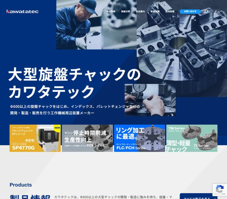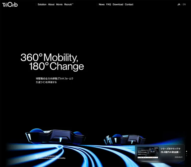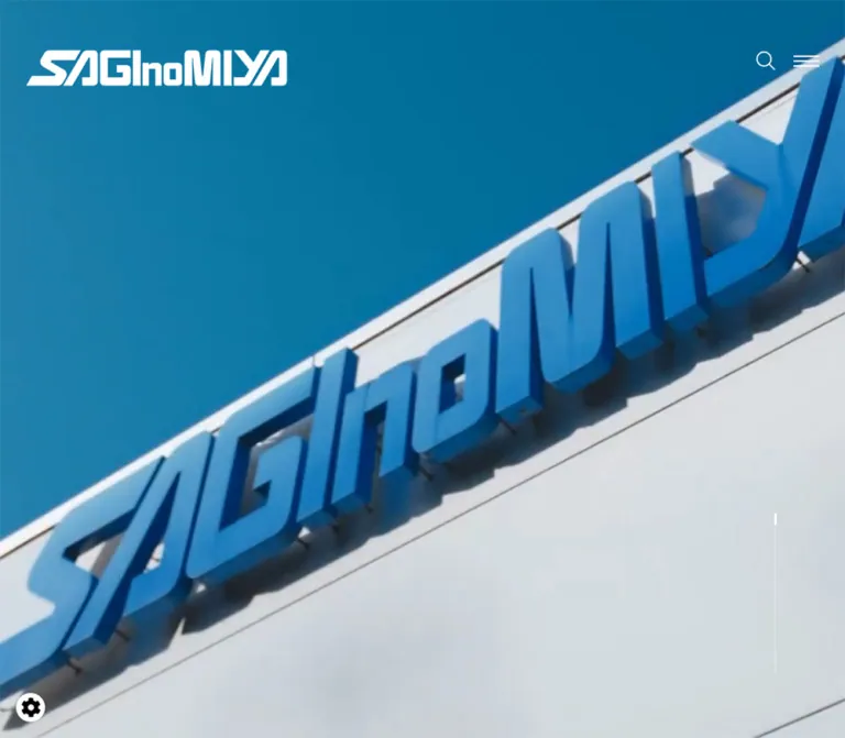
プレビュー準備中デザインリファレンスを見る
日本のWebデザインを、AIの制作リファレンスに。
DESIGN REFERENCE
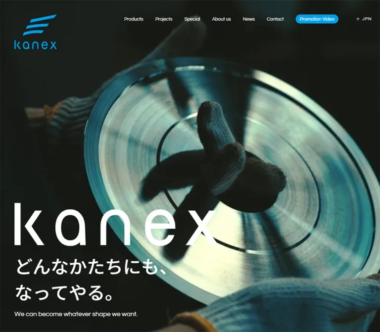
青・黒・白の配色と大きなワードマークが印象的な工業用刃物メーカーの企業サイト。工場風景、和英タイポグラフィ、製品紹介、研究開発事例を組み合わせています。
オリジナルサイトを見るIndustrial precision expressed through cyan identity, expansive imagery, and unusually confident typography.
Website: kanex-tool.co.jp Original URL: https://www.kanex-tool.co.jp/ Final URL: https://www.kanex-tool.co.jp/ Theme: a dark opening scene followed by white, cyan, and black content sections; no selectable theme was verified. Inspected: September 22, 2026, at 14:07:57.762 UTC / 23:07:57.762 JST, according to the supplied browser record. Viewports: 1440 × 1000 and 390 × 844 CSS pixels. Scope: the current Japanese corporate homepage. The supplied screenshots visually document the opening viewport; rendered DOM and computed styles additionally document About us, Special, Products, Projects, News, and the contact/footer region. Linked pages and expanded controls were not visually inspected.
KANEX presents industrial cutting tools through a combination of restrained corporate navigation and oversized brand expression. A small cyan logo occupies the upper left, while a much larger white wordmark anchors the lower left of the opening scene. The Japanese statement, “どんなかたちにも、なってやる。”, appears below it in two lines, followed by a smaller English translation. The composition leaves a large uninterrupted field between the navigation and the identity block.
The homepage continues into a broader company introduction. Its recorded structure alternates a white editorial area, a cyan Special section, a black Products section, and white Projects and News sections. English headings establish the hierarchy; Japanese text supplies technical and corporate detail. Rounded geometry is concentrated in the Promotion Video control, while most measured containers remain square.
The company name, カネックス刃物工業株式会社, is supported by the original page title and header text. No production-credit claim is made here.
Industrial precision expressed through cyan identity, expansive imagery, and unusually confident typography.
Website: kanex-tool.co.jp Original URL: https://www.kanex-tool.co.jp/ Final URL: https://www.kanex-tool.co.jp/ Theme: a dark opening scene followed by white, cyan, and black content sections; no selectable theme was verified. Inspected: September 22, 2026, at 14:07:57.762 UTC / 23:07:57.762 JST, according to the supplied browser record. Viewports: 1440 × 1000 and 390 × 844 CSS pixels. Scope: the current Japanese corporate homepage. The supplied screenshots visually document the opening viewport; rendered DOM and computed styles additionally document About us, Special, Products, Projects, News, and the contact/footer region. Linked pages and expanded controls were not visually inspected.
KANEX presents industrial cutting tools through a combination of restrained corporate navigation and oversized brand expression. A small cyan logo occupies the upper left, while a much larger white wordmark anchors the lower left of the opening scene. The Japanese statement, “どんなかたちにも、なってやる。”, appears below it in two lines, followed by a smaller English translation. The composition leaves a large uninterrupted field between the navigation and the identity block.
The homepage continues into a broader company introduction. Its recorded structure alternates a white editorial area, a cyan Special section, a black Products section, and white Projects and News sections. English headings establish the hierarchy; Japanese text supplies technical and corporate detail. Rounded geometry is concentrated in the Promotion Video control, while most measured containers remain square.
The company name, カネックス刃物工業株式会社, is supported by the original page title and header text. No production-credit claim is made here.
| Name | Value | Evidence | Role / suggested alias |
|---|---|---|---|
| KANEX Cyan | #00a0e9 |
Computed Promotion Video fill and Special section background | Identity accent, media action, full-width feature surface; --color-brand |
| White | #ffffff |
Source --color-bg, main background, computed reversed text |
Editorial canvas and text over dark/cyan regions; --color-paper |
| Black | #000000 |
Source --color-txt, --color-bg2, Products background |
Editorial text and product-section canvas; --color-ink |
| Opening Dark | Approximately #0e1210 |
Visual estimate from the desktop opening captures | Suggested media fallback only; --color-hero-fallback |
| Subtle Black Rule | rgba(0,0,0,0.15) |
Source --color-line2 |
Available divider token; placement is not established by the screenshots |
| Muted Black | rgba(0,0,0,0.5) |
Source --color-txt3 |
Available secondary-text token; not a verified universal caption color |
| Form Gray | #f5f5f5 |
Source input-background variables | Declared form surface; the contact form itself was not inspected |
Cyan is both a small accent and an architectural color. It fills the compact desktop video button and the entire recorded Special section. Preserve that change of scale instead of applying blue indiscriminately to every link or heading.
The opening dark is not the source body background: the body and main element compute to white. The dark appearance belongs to the opening visual region. Likewise, a transparent child background does not prove that imagery or another colored layer is absent beneath it.
#00a0e9.The stylesheet also exposes a #007aff library token. There is no evidence that it replaces KANEX Cyan as the site's identity color.
Questrial, sans-serif.400 throughout the sampled English headings, product names, telephone numbers, and navigation.normal in the sampled elements.--font-en."Noto Sans JP", sans-serif.400 for sampled body copy, project titles, and product subtitles; 500 for the opening Japanese statement.--font-ja."Orelega One", serif.400.--font-feature.Keep this face localized. It is not the general heading font.
The large lowercase kanex wordmark is visible, but its sampled paragraph has no extracted text and reports an inherited 10px font size. Its measured graphic container is therefore more useful than that inherited font declaration.
Treat the wordmark as brand artwork. Do not approximate its letterforms with Questrial and then compensate with extreme letter spacing. Its asset format and URL were not supplied.
All sizes below are computed values unless described as an effective line box.
| Role | Desktop | Mobile | Weight / line-height notes |
|---|---|---|---|
| Desktop navigation | 15px |
Hidden from the closed header | Questrial 400; normal line height |
| Mobile menu links in DOM | — | 24px / 24px |
Questrial 400; menu-open appearance unverified |
| Hero Japanese statement | 60px |
24px |
Noto Sans JP 500; two-line boxes of 180px and 72px |
| Hero English translation | 20px |
14px |
Questrial 400; boxes of 30px and 21px |
| About us heading | 64px / 64px |
40px / 40px |
Questrial 400 |
| About body | 16px |
15px |
Noto Sans JP 400; source line height is normal |
| Large Special marquee | 180px / 180px |
40px / 40px |
Orelega One 400 |
| Small repeated Special captions | 12px |
10px |
Questrial 400 |
| Special Japanese heading | 80px / 90px |
40px, normal |
Mobile two-line box is 120px high |
| Special description | 24px / 30px |
15px, normal |
Noto Sans JP 400 |
| Products / Projects headings | 86px / 86px |
64px / 64px |
Questrial 400 |
| Products / Projects counts | 32px / 32px |
16px / 16px |
Questrial 400; aligned near heading top |
| Products / Projects introduction | 16px |
14px |
Noto Sans JP 400 |
| Product index | 14px |
14px |
Questrial 400 |
| Product English name | 64px |
36px |
Questrial 400; boxes of 96px and 54px |
| Product Japanese name | 24px |
14px |
Noto Sans JP 400 |
| Project headline | 30px / 36px |
20px, normal |
Mobile lines occupy approximately 30px each |
| Project secondary detail | 16px |
13px |
Noto Sans JP 400 |
| News heading | 80px / 80px |
48px / 48px |
Questrial 400 |
| News headline | 20px |
14px |
Noto Sans JP 400 |
| Footer contact introduction | 20px |
16px |
Noto Sans JP 400 |
| Footer telephone | 64px |
40px |
Questrial 400 |
| Desktop footer navigation | 30px |
Not present in mobile visible-text extraction | Questrial 400 |
| Footer social links / copyright | 16px |
13px |
Questrial 400 |
The source root is 10px at both inspected widths. Its 6rem is therefore 60px, not 96px. Container elements often inherit a 10px font even when their children are visibly larger; do not mistake those wrapper values for the intended label size.
For the opening Japanese statement, line-height: 1.5 reproduces the measured two-line heights. That is a useful implementation choice, not the literal computed declaration, which was normal.
Base: a 10px source root with component-specific values. Density: sparse at section scale, compact in navigation and utility controls. Primary horizontal inset: 48px desktop and 20px mobile.
| Source token / use | Desktop | Mobile | Interpretation |
|---|---|---|---|
--gap |
4.8rem = 48px |
2rem = 20px |
Main gutter and product-panel separation |
--space-xs2 |
48px |
20px |
Matches primary inset |
--space-xs3 |
48px |
60px |
A distinct responsive token; not interchangeable with the gutter |
--space-rg |
100px |
60px |
Larger internal separation |
--space-md2 |
120px |
40px |
Intermediate section spacing |
--space-xl |
200px |
80px |
Matches Projects and News vertical padding |
--space-xl2 |
200px |
40px |
Alternate section-spacing token |
--space-xl3 |
200px |
60px |
Alternate section-spacing token |
| Hero artwork-to-copy gap | 20px |
10px |
Calculated from measured rectangles |
| Hero copy-to-translation gap | 20px |
10px |
Calculated from measured rectangles |
| Desktop navigation gap | 40px |
— | Calculated between successive anchor boxes |
| News row vertical padding | 20px |
10px |
Directly computed |
The scale is not a uniform eight-point system. Keep the deliberate 20/48/60/80/100/200px relationships rather than rounding everything to multiples of eight.
| Element | Recorded value | Guidance |
|---|---|---|
| Promotion Video buttons | 100px |
Fully rounded pill at the observed heights |
| Sampled product wrappers and links | 0px |
Preserve rectangular geometry |
| Sampled editorial sections and news links | 0px |
Use typography and spacing for hierarchy |
| Source line tokens | 1px, with a 2px current-color variant |
Available rule vocabulary; exact usage requires component verification |
The opening captures do not establish a shadow or glass-surface system. Blur custom properties exist, but they are insufficient evidence to introduce blurred panels into this reference.
| Element | Desktop, 1440 × 1000 | Mobile, 390 × 844 |
|---|---|---|
| Main inset content width | 1344px |
350px |
| Header padding | 48px |
20px |
| Sampled header box height | 126px |
52px |
| Header logo, visual estimate | About 140 × 115px |
About 56 × 46px |
| Hero wordmark container | 768 × 168.55px, at (48, 533.45) |
243 × 53.33px, at (20, 657.67) |
| Hero Japanese copy box | 1344 × 180px, at (48, 722) |
350 × 72px, at (20, 721) |
| Hero translation box | 1344 × 30px, at (48, 922) |
350 × 21px, at (20, 803) |
| Space below hero translation | 48px |
20px |
| Header video pill | 141 × 30px |
Not shown in the closed header |
| Mobile menu glyph/button box | — | 40 × 11px, at (330, 20.5) |
| Product panel | 940 × 904px |
350 × 397px |
| Product panel separation | 48px, horizontal |
20px, vertical |
| Projects introduction column | About 397.08px |
350px |
| Projects entries column | About 820.36px |
350px |
| Typical desktop news row | About 1344 × 70px |
Mobile rows vary with wrapping |
The header's measured box height is not its complete visual extent: the logo reaches below it. Source header-height variables also differ from that box: 211px for the desktop normal header, 70px for its sticky token, and 86px for both mobile tokens. Their active positioning behavior was not demonstrated.
Role: company identity, primary destinations, media access, and language utility.
The opening header is transparent over the dark scene. Place the cyan symbol-and-wordmark lockup at the upper left. A single navigation row occupies the upper right: Products, Projects, Special, About us, News, Contact, Promotion Video, and the language utility.
The six ordinary destination links use white 15px Questrial, with 8px vertical padding and approximately 40px gaps. Their measured boxes are 39px high. The video button is the only filled item: 141 × 30px, cyan, and fully rounded. The language utility sits farther to the right and displays a small plus sign beside JPN.
Do not copy the extracted ProductsProducts strings into visible navigation. They indicate duplicate underlying text nodes, while the screenshot shows one label. A rollover treatment is plausible, but its actual transformation was not observed.
Role: preserve identity and navigation access without compressing the desktop link row.
At 390px, the opening header shows the smaller cyan logo at (20, 20), JPN near the upper right, and two thin horizontal menu strokes. The full desktop navigation and blue video pill are absent from the closed-header screenshot.
The DOM separately records six full-width menu links at x = 20px, each 350px wide and 40px high, with 24px Questrial labels. Their recorded vertical positions run from approximately 118px to 329px. The menu structure also contains a white video pill with cyan text, a 40px telephone number, and a contact link.
These values document available menu content, not a verified open state. The panel's painted background, opening direction, close behavior, focus handling, and language-selection behavior remain unverified. JPN and ENG appear in the DOM, but no successful language change is documented.
Recommended: preserve the slender two-line drawing inside a larger, at least 44px-high interactive target.
Role: deliver the company's identity and brand statement before the detailed corporate content.
The opening composition fills the inspected viewport. Its main content sits at the lower left in three layers:
kanex wordmark graphic.On desktop, the wordmark is 768px wide. On mobile it is 243px wide. The Japanese type changes from 60px to 24px, while the English translation changes from 20px to 14px. Both layouts retain the same two Japanese lines and align the bottom of the translation with the page inset.
The three desktop captures show an almost uniform dark background. The mobile captures reveal an industrial interior: a pale upper window, a dark central wall or doorway, and a textured floor toward the bottom. A small silhouette changes near the upper edge between mobile captures, consistent with moving footage. Media type, autoplay settings, duration, sound, and poster behavior were not supplied.
Keep the large middle area available for imagery. The desktop frames do not establish that the design intentionally uses a permanently empty black background.
Role: explain the company's flexible, technically precise approach to custom industrial blades.
The recorded desktop layout separates a 64px English heading on the left from a narrow Japanese text block toward the far right. That paragraph is approximately 303px wide at x = 1089px. This is a strongly asymmetric composition, not a centered paragraph beneath a title.
On mobile, both heading and paragraph use the 350px content width; the heading reduces to 40px and body copy to 15px. An original-page link to /about/ follows the body, but its visual symbol or label was not extracted.
The section occupies a large recorded layout region and has staggered opacity/transform transitions. Its final visible media composition and scroll sequence cannot be recovered from those bounds alone.
Role: introduce the relationship between industrial tools and the shapes they create.
The section computes to exact cyan with white text. Recorded vertical padding is 130px on desktop and 60px on mobile. A large Orelega One phrase, “What Shape Is This?”, repeats horizontally, accompanied by smaller Questrial repetitions.
The large phrase is 180px high on desktop and 40px on mobile. This pronounced change is component-specific; it is not a uniform scale-down of the entire site.
Below it, the Japanese heading “どんなかたちに、なっている?” uses 80px type with 90px leading on desktop and 40px type on mobile. Desktop copy begins at x = 104px, deeper than the standard 48px inset. Mobile copy returns to the standard 20px inset.
An original-page link leads to /special/. Its exact visual affordance was not supplied. The moving text is directly supported by computed animation declarations; the full section artwork is not visually documented.
Role: combine a large English section name with a compact inventory marker.
Products and Projects use 86px Questrial headings on desktop and 64px headings on mobile. Their adjacent counts are 32px and 16px respectively, aligned near the top of the heading rather than its baseline.
The observed counts are 16 for Products and 8 for Projects. The homepage extracts four product-category entries and six project entries. Treat the counts as source content, not as counts to regenerate from those visible preview arrays.
Role: introduce custom tool manufacturing and link to four product categories.
The section background is black. Its heading, description, and View all Products link are white. Desktop top padding is 200px; mobile padding is 80px above and below.
Four linked category panels appear in this order:
| Index | English label | Japanese label | Destination fragment |
|---|---|---|---|
(01) |
Carbide Tool | 超硬工具 | /products/#area-item-01 |
(02) |
Diamond Tool | ダイヤモンド工具(PCD工具) | /products/#area-item-02 |
(03) |
Chip saw | チップソー | /products/#area-item-03 |
(04) |
Drill / Endmill | ドリル・エンドミル | /products/#area-item-04 |
On desktop, their 940 × 904px boxes share a y coordinate and begin at x = 48, 1036, 2024, and 3012px. This establishes a horizontal arrangement extending beyond the viewport. It does not establish whether wheel input, dragging, a pinned scene, or another mechanism moves the panels.
On mobile, all four panels are vertically stacked at x = 20px, each 350 × 397px, separated by 20px.
Each panel has a three-part label near its lower left: the index, large English product name, and Japanese product name. The internal left and bottom insets are 48px desktop and 20px mobile. Ten-pixel gaps separate the label tiers.
Categories 01 and 03 use white labels; 02 and 04 use black labels. Their media and exact background fills were not supplied. Preserve the two foreground variants, but verify contrast against actual authorized imagery before selecting the underlying surface.
The whole category panel is a link. Avoid placing a separate competing button inside it.
Role: demonstrate technical development, research collaboration, and company practices.
The desktop section divides into a narrow introduction column and a wider list. The left column begins at x = 48px and is about 397px wide. Entries begin at x = 571.64px and are about 820.36px wide, leaving roughly 126.56px between columns.
The introduction combines the Projects heading and count, a Japanese paragraph, and View all Projects. Six linked entries cover a patented saw, a CFRP drill, university research cooperation, a skill-map initiative, a manufacturing spinning-top competition, and a 3S initiative.
Project headlines use 30px Japanese type with 36px leading. Secondary details, such as a patent number or research collaboration, use 16px type. Entry geometry reserves substantial space above the headline, but the actual media pixels and crop ratios were not included.
On mobile, the introduction and entries become a single 350px column. Headlines reduce to 20px and details to 13px. Long titles wrap naturally. Keep the technical qualifier and project name associated within the same linked entry.
Role: provide recent company announcements without turning them into large feature cards.
The recorded section has 200px vertical padding on desktop and 80px on mobile. News uses an 80px desktop heading and a 48px mobile heading. View all News sits to the right in the desktop header; the mobile header becomes a taller block containing the link below the heading.
Four announcement links are recorded. Desktop rows span the 1344px content width and have 20px vertical padding around 20px headlines. Mobile rows span 350px, use 10px vertical padding, and wrap 14px text within an approximately 322px title region.
Successive row coordinates suggest a fine divider interval, but row border declarations were not included. A 1px subtle rule is a reasonable adaptation, not a confirmed screenshot detail. No standalone date column was extracted; do not invent one.
Role: turn the corporate introduction into a practical inquiry path.
The footer content includes a short Japanese invitation to discuss manufacturing, estimates, delivery schedules, and research; the telephone link 0944-88-1708; and “メールでお問い合わせ”. The latter links to /contact/, not to a mailto: address.
The phone is a major typographic element: 64px Questrial on desktop and 40px on mobile. Desktop navigation uses 30px Questrial. The footer video control is a white pill with cyan text, approximately 205.88 × 46px.
Social links are text labels for Twitter, instagram, and facebook. Their desktop size is 16px, reducing to 13px on mobile. The recorded copyright is “© 2024”; it is source content, not the inspection date.
White footer text is confirmed, but the underlying visual surface is not. The footer also overlaps other section coordinates in the supplied geometry. Do not infer a particular reveal animation or hardcode those overlapping offsets without further inspection.
| Treatment | Recorded value / evidence | Confidence and practical interpretation |
|---|---|---|
| Header padding, opacity, visibility | 250ms cubic-bezier(0.215, 0.61, 0.355, 1) |
Computed transition; trigger and resulting header state unverified |
| Navigation and many content links | 600ms cubic-bezier(0.215, 0.61, 0.355, 1) |
Computed transition; changed properties and hover appearance not demonstrated |
| Editorial text reveals | Opacity and transform, 1000ms cubic-bezier(0.165, 0.84, 0.44, 1) |
Computed on About, Special, and Projects text |
| Reveal delays | 350ms, 500ms, 650ms |
Computed on different text/detail groups; do not apply one delay universally |
| Special desktop marquee | 60.2s linear infinite loopslider-x |
Directly declared on repeated large text |
| Special mobile marquee | 13.7s linear infinite loopslider-x |
Directly declared; the mobile repeat is much narrower |
| Modal transition token | 800ms cubic-bezier(0.215, 0.61, 0.355, 1) |
Variable only; no modal-open state supplied |
| Sitemap transition token | 900ms cubic-bezier(0.165, 0.84, 0.44, 1) |
Variable only; menu animation not demonstrated |
| Hover opacity token | 0.5 |
Variable only; not proof that every link fades to half opacity |
| Opening background change | Small difference between mobile frames | Consistent with moving footage; playback mechanics unverified |
The motion vocabulary combines long, linear repetition with slower eased interface transitions. Avoid introducing unrelated elastic or bouncing motion.
The observation protocol temporarily pauses perpetual animation during readiness checks and resumes it afterward. Finite motion is awaited within a time limit. That protocol does not establish that every scroll scene has completed or that all delayed media appeared.
No supplied result demonstrates opening Promotion Video, switching language, expanding the mobile menu, hovering a product, or moving the desktop product sequence. Keep those behaviors outside the set of verified interactions.
| Layer | Supported appearance | Implementation implication |
|---|---|---|
| Main canvas | White | Supports black editorial typography |
| Opening visual region | Very dark desktop frames; industrial scene on mobile | Supply a dark fallback and preserve readable white text |
| Opening header | Transparent | Overlay identity and navigation without an opaque toolbar |
| Special section | Cyan #00a0e9 |
Treat as a full section surface, not a small card |
| Products section | Black | Separate technical categories from the white editorial sections |
| Product panels | Transparent sampled wrappers; alternating label colors | Actual image/fill layers require verification |
| Projects and News | Transparent sections over a white main element | Keep editorial structure open and typography-led |
| Promotion controls | Cyan/white and white/cyan pills | The clearest repeated rounded component |
| Footer | White text; underlying paint unverified | Select and test an appropriate contrast surface in an adaptation |
A general elevated-card system is not established by the evidence. Avoid adding shadows, rounded containers, and translucent panels as default decoration.
The original mobile captures show an industrial interior with deep shadow, pale window light, a muted green cast, and a visibly textured floor. The scene is cropped to cover a tall phone viewport. Its large dark areas help the white identity block remain legible.
The cyan header symbol consists of three rising, curved slash-like forms above the lowercase wordmark. The larger hero wordmark appears without the symbol. These two uses of the same identity create hierarchy through scale and placement.
Product and project content is clearly present in the DOM, but its image elements, file URLs, and visual subjects were not supplied. Do not invent exact tool photographs, illustrations, masks, or hover crops from the textual category names.
| Asset or region | Evidence available | Asset URL / format |
|---|---|---|
| Header identity lockup | Original desktop and mobile screenshots | Not supplied |
| Large hero wordmark | Screenshots plus measured graphic container | Not supplied |
| Opening industrial scene | Two original mobile frames | Not supplied; playback format unverified |
| Product visual regions | Panel bounds and overlaid label styles | Media not supplied |
| Project visual regions | Entry and headline geometry | Media not supplied |
Use authorized identity and industrial media assets when available. The CSS shell can reproduce placement and scale, but it cannot reconstruct the brand artwork or establish the missing imagery.
The opening content is bottom-aligned with the same inset used horizontally: 48px on desktop and 20px on mobile. Its dimensions explain the layout more reliably than a fixed top offset.
Desktop content height is approximately 168.55 + 20 + 180 + 20 + 30 = 418.55px. Subtracting that and the 48px bottom inset from the 1000px viewport yields the observed 533.45px wordmark position.
Mobile content height is approximately 53.33 + 10 + 72 + 10 + 21 = 166.33px. Subtracting that and the 20px inset from 844px yields the observed 657.67px position.
This relationship is practical to reuse. Do not hardcode top: 533px or top: 658px.
| Area | Desktop | Mobile |
|---|---|---|
| Header | Full navigation, video pill, language utility | Logo, language utility, two-line menu trigger |
| Hero | 768px wordmark, 60px Japanese statement | 243px wordmark, 24px Japanese statement |
| About | Widely separated heading and narrow paragraph | Full-width heading and paragraph |
| Special marquee | 180px serif text | 40px serif text |
| Products | Four panels arranged horizontally beyond viewport width | Four panels stacked vertically |
| Projects | Introduction beside a wider entry list | One content column |
| News header | Heading and archive link share a row | Heading and link occupy a taller block |
| Footer | Large contact area with navigation column | Contact and social text retained; desktop navigation absent from visible-text extraction |
Source breakpoint variables include 561, 768, 1024, 1281, and 1441px lower boundaries. Their presence does not identify which rule changes each component. Only the two supplied endpoint layouts are confirmed. The Quick Start uses explicit, recommended breakpoints rather than presenting them as recovered media queries.
The browser reports document heights of only 1000px and 844px, while main-element bounds extend to approximately 20,306px and 12,214px. Body height is reported as zero, and some section and footer bounds overlap.
These measurements are consistent with a managed or transformed layout, but they do not identify its implementation. Do not recreate the enormous offsets as empty spacers, infer a specific scrolling library, or treat the reported document height as the complete content length. A normal document-flow adaptation is safer until the scrolling behavior can be inspected directly.
#00a0e9, black, and white.These are recommendations for a new implementation, not verified features of the original:
#00a0e9.#ffffff.#000000.#0e1210, an estimate rather than a recovered source token.“Create a Japanese industrial-tool corporate homepage inspired by the supplied KANEX reference. Use a small cyan identity lockup in the upper left and an expansive opening media scene with a large white wordmark anchored at the lower left. Follow it with a two-line Japanese statement and a small English translation. Use Questrial for English navigation and large section headings, Noto Sans JP for Japanese content, and Orelega One only for a repeating Special-section phrase. Build white editorial sections, a cyan feature section, and a black Products section. At desktop widths, arrange large product panels horizontally and place the Projects introduction beside its entry list. On phones, use 20px gutters, a compact menu trigger, and stacked product panels. Preserve the corporate navigation, news, telephone, and contact paths. Treat unverified media and interaction details as explicit implementation choices.”
This adaptation uses measured pixel equivalents without changing the root font size. Load the three recorded font families through your project's authorized font setup. Supply identity and media assets separately; no source asset URLs were provided.
Structure the opening as .hero containing .site-header, optional .hero__media, and .hero__content. The header contains a brand element and a right-hand group with navigation and utilities. The wordmark class belongs on authorized artwork. Place each Japanese hero line in its own span.
The product track below uses native horizontal scrolling as a recommended fallback. It does not reproduce an unverified scroll-driven sequence. The footer uses a recommended black surface because its original fill is unknown. Breakpoints are adaptation choices.
:root {
  /* Measured core colors */
  --color-brand: #00a0e9;
  --color-paper: #ffffff;
  --color-ink: #000000;
  --color-rule: rgba(0, 0, 0, 0.15);

  /* Estimated opening fallback, not a recovered source color */
  --color-hero-fallback: #0e1210;

  --font-en: 'Questrial', sans-serif;
  --font-ja: 'Noto Sans JP', sans-serif;
  --font-feature: 'Orelega One', serif;

  --gutter: 48px;
  --section-space: 200px;
  --hero-wordmark: 768px;
  --hero-gap: 20px;
  --hero-ja-size: 60px;
  --hero-en-size: 20px;
  --section-title-size: 86px;
  --section-count-size: 32px;
  --product-name-size: 64px;
  --product-ja-size: 24px;
  --product-height: 904px;
  --pill-radius: 100px;

  --ease-interface: cubic-bezier(0.215, 0.61, 0.355, 1);
  --ease-reveal: cubic-bezier(0.165, 0.84, 0.44, 1);
  --motion-link: 600ms var(--ease-interface);
  --motion-reveal: 1000ms var(--ease-reveal);
  --marquee-duration: 60.2s;
}

* { box-sizing: border-box; }
body { margin: 0; }
button, input { font: inherit; }

.kanex-page {
  color: var(--color-ink);
  background: var(--color-paper);
  font-family: var(--font-ja);
  font-size: 16px;
  line-height: 1.5;
}

.kanex-page a { color: inherit; }
.kanex-page img { max-inline-size: 100%; }
.container { padding-inline: var(--gutter); }

.hero {
  position: relative;
  isolation: isolate;
  display: grid;
  align-items: end;
  min-block-size: 100vh;
  min-block-size: 100svh;
  padding: 210px var(--gutter) var(--gutter);
  color: var(--color-paper);
  background: var(--color-hero-fallback);
}

.hero__media {
  position: absolute;
  inset: 0;
  z-index: -1;
  inline-size: 100%;
  block-size: 100%;
  object-fit: cover;
}

.site-header {
  position: absolute;
  inset: 0 0 auto;
  z-index: 2;
  display: flex;
  align-items: flex-start;
  justify-content: space-between;
  gap: 32px;
  padding: var(--gutter);
  color: var(--color-paper);
}

.header__brand {
  display: block;
  flex: 0 0 auto;
  inline-size: 140px; /* Visual estimate */
}

.header__right,
.header__nav,
.header__utilities {
  display: flex;
  align-items: center;
}

.header__right { gap: 60px; min-block-size: 30px; }
.header__nav { gap: 40px; block-size: 30px; }
.header__utilities { gap: 21px; }

.header__nav a {
  padding-block: 8px;
  font: 400 15px/23px var(--font-en);
  text-decoration: none;
}

.promotion {
  display: inline-flex;
  align-items: center;
  justify-content: center;
  min-inline-size: 141px;
  min-block-size: 30px;
  padding: 3px 10px;
  border: 0;
  border-radius: var(--pill-radius);
  color: var(--color-paper);
  background: var(--color-brand);
  font: 400 15px/1.4 var(--font-en);
  cursor: pointer;
}

.promotion--inverse {
  color: var(--color-brand);
  background: var(--color-paper);
}

.header__language {
  border: 0;
  padding: 0;
  color: inherit;
  background: transparent;
  font: 400 14px/1 var(--font-en);
}

.header__menu { display: none; }

.hero__wordmark {
  display: block;
  inline-size: var(--hero-wordmark);
  max-inline-size: 100%;
  block-size: auto;
  margin: 0;
}

.hero__statement {
  margin: var(--hero-gap) 0 0;
  font-size: var(--hero-ja-size);
  font-weight: 500;
  line-height: 1.5;
}

.hero__statement span { display: block; }
.hero__translation {
  margin: var(--hero-gap) 0 0;
  font: 400 var(--hero-en-size)/1.5 var(--font-en);
}

.section { padding-block: var(--section-space); }
.section-heading { display: flex; align-items: flex-start; }
.section-heading h2 {
  margin: 0;
  font: 400 var(--section-title-size)/1 var(--font-en);
}
.section-heading__count {
  font: 400 var(--section-count-size)/1 var(--font-en);
}
.section-intro { max-inline-size: 640px; }

.special {
  overflow: hidden;
  padding-block: 130px;
  color: var(--color-paper);
  background: var(--color-brand);
}
.special__inner { padding-inline: 104px; }
.special__title {
  font-size: 80px;
  font-weight: 400;
  line-height: 1.125;
}

/* Adapted loop: exactly two equal groups, second group aria-hidden */
.marquee__track {
  display: flex;
  inline-size: max-content;
  animation: shape-loop var(--marquee-duration) linear infinite;
}
.marquee__group {
  flex: none;
  padding-inline-start: var(--gutter);
  white-space: nowrap;
  font: 400 180px/1 var(--font-feature);
}
@keyframes shape-loop {
  to { transform: translateX(-50%); }
}

.products {
  color: var(--color-paper);
  background: var(--color-ink);
}
.products__track {
  display: flex;
  gap: var(--gutter);
  overflow-x: auto;
  padding: 24px var(--gutter);
  scroll-snap-type: x proximity;
  scroll-padding-inline: var(--gutter);
}
.product {
  position: relative;
  display: block;
  flex: 0 0 min(940px, calc(100vw - 2 * var(--gutter)));
  min-block-size: var(--product-height);
  overflow: hidden;
  scroll-snap-align: start;
  color: var(--color-paper);
  text-decoration: none;
}
.product__media {
  position: absolute;
  inset: 0;
  inline-size: 100%;
  block-size: 100%;
  object-fit: cover; /* Recommended crop behavior */
}
.product--light {
  color: var(--color-ink);
  background: var(--color-paper); /* Recommended fallback */
}
.product__copy {
  position: relative;
  display: flex;
  flex-direction: column;
  justify-content: flex-end;
  min-block-size: inherit;
  padding: var(--gutter);
}
.product__index { margin: 0 0 10px; font: 14px/1.5 var(--font-en); }
.product__name {
  margin: 0 0 10px;
  font: 400 var(--product-name-size)/1.5 var(--font-en);
}
.product__japanese {
  margin: 0;
  font-size: var(--product-ja-size);
  font-weight: 400;
}

.projects__layout {
  display: grid;
  grid-template-columns: minmax(0, 397fr) minmax(0, 820fr);
  gap: clamp(40px, 8.79vw, 126.56px);
}
.projects__list { display: grid; gap: 100px; min-inline-size: 0; }
.project { display: block; text-decoration: none; }
.project__title { margin: 24px 0 0; font-size: 30px; line-height: 1.2; font-weight: 400; }
.project__detail { margin: 20px 0 0; font-size: 16px; }

.news__heading { font: 400 80px/1 var(--font-en); }
.news__row {
  display: block;
  padding-block: 20px;
  border-bottom: 1px solid var(--color-rule); /* Recommended divider */
  text-decoration: none;
}
.news__row h3 { margin: 0; font-size: 20px; font-weight: 400; }

.site-footer {
  padding: var(--gutter);
  color: var(--color-paper);
  background: var(--color-ink); /* Recommended; original fill unverified */
}
.footer__phone { font: 400 64px/1.5 var(--font-en); text-decoration: none; }

/* Recommended feedback; original hover appearance was not captured */
.kanex-page :focus-visible { outline: 2px solid currentColor; outline-offset: 5px; }
@media (hover: hover) {
  .header__nav a:hover { text-decoration: underline; text-underline-offset: 5px; }
}

/* Recommended navigation breakpoint */
@media (max-width: 1279px) {
  .header__nav { display: none; }
  .header__right { gap: 0; }
  .header__menu {
    display: grid;
    align-content: center;
    gap: 9px;
    inline-size: 40px;
    block-size: 44px;
    margin-block: -16px;
    padding: 0;
    border: 0;
    color: inherit;
    background: transparent;
  }
  .header__menu::before,
  .header__menu::after {
    content: '';
    block-size: 1px;
    background: currentColor;
  }
}

/* Recommended content breakpoint; values match the supplied phone endpoint */
@media (max-width: 767px) {
  :root {
    --gutter: 20px;
    --section-space: 80px;
    --hero-wordmark: 243px;
    --hero-gap: 10px;
    --hero-ja-size: 24px;
    --hero-en-size: 14px;
    --section-title-size: 64px;
    --section-count-size: 16px;
    --product-name-size: 36px;
    --product-ja-size: 14px;
    --product-height: 397px;
    --marquee-duration: 13.7s;
  }
  .hero { padding-block-start: 100px; }
  .header__brand { inline-size: 56px; }
  .header__right { min-block-size: 12px; }
  .header__language { font-size: 12px; }
  .section-intro { font-size: 14px; }
  .special { padding-block: 60px; }
  .special__inner { padding-inline: var(--gutter); }
  .special__title { font-size: 40px; line-height: 1.5; }
  .marquee__group { font-size: 40px; }
  .products__track { display: grid; overflow: visible; scroll-snap-type: none; }
  .product { inline-size: 100%; }
  .projects__layout { grid-template-columns: minmax(0, 1fr); gap: 60px; }
  .projects__list { gap: 60px; }
  .project__title { font-size: 20px; line-height: 1.5; }
  .project__detail { margin-block-start: 10px; font-size: 13px; }
  .news__heading { font-size: 48px; }
  .news__row { padding-block: 10px; }
  .news__row h3 { font-size: 14px; }
  .footer__phone { font-size: 40px; }
}

@media (prefers-reduced-motion: reduce) {
  .marquee__track { animation: none; }
  .kanex-page [data-reveal] {
    opacity: 1;
    transform: none;
    transition: none;
  }
}
The artwork must retain its intrinsic proportions for the hero calculations to match. Media loading, menu state, language switching, and video controls require separate implementation. Do not hide essential text behind a reveal class until the corresponding script has initialized successfully.
Optional aliases for a project already using Tailwind v4. These do not imply that the original site uses Tailwind. Define the preceding custom properties first.
@theme inline {
  --color-kanex: var(--color-brand);
  --color-canvas: var(--color-paper);
  --color-editorial: var(--color-ink);
  --color-opening: var(--color-hero-fallback);
  --font-english: var(--font-en);
  --font-japanese: var(--font-ja);
  --font-special: var(--font-feature);
  --text-hero-japanese: var(--hero-ja-size);
  --text-hero-english: var(--hero-en-size);
  --text-section: var(--section-title-size);
  --text-section-count: var(--section-count-size);
  --text-product: var(--product-name-size);
  --spacing-page: var(--gutter);
  --spacing-section: var(--section-space);
  --radius-promotion: var(--pill-radius);
}
This reference describes the current captured homepage. Exact source measurements, visual estimates, and implementation recommendations are distinguished throughout; the Quick Start provides a usable responsive foundation without claiming to recover unobserved behavior.
# KANEX — Style Reference

> Industrial precision expressed through cyan identity, expansive imagery, and unusually confident typography.

**Website:** [kanex-tool.co.jp](https://www.kanex-tool.co.jp/)
**Original URL:** https://www.kanex-tool.co.jp/
**Final URL:** https://www.kanex-tool.co.jp/
**Theme:** a dark opening scene followed by white, cyan, and black content sections; no selectable theme was verified.
**Inspected:** September 22, 2026, at 14:07:57.762 UTC / 23:07:57.762 JST, according to the supplied browser record.
**Viewports:** 1440 × 1000 and 390 × 844 CSS pixels.
**Scope:** the current Japanese corporate homepage. The supplied screenshots visually document the opening viewport; rendered DOM and computed styles additionally document About us, Special, Products, Projects, News, and the contact/footer region. Linked pages and expanded controls were not visually inspected.

KANEX presents industrial cutting tools through a combination of restrained corporate navigation and oversized brand expression. A small cyan logo occupies the upper left, while a much larger white wordmark anchors the lower left of the opening scene. The Japanese statement, “どんなかたちにも、なってやる。”, appears below it in two lines, followed by a smaller English translation. The composition leaves a large uninterrupted field between the navigation and the identity block.

The homepage continues into a broader company introduction. Its recorded structure alternates a white editorial area, a cyan Special section, a black Products section, and white Projects and News sections. English headings establish the hierarchy; Japanese text supplies technical and corporate detail. Rounded geometry is concentrated in the Promotion Video control, while most measured containers remain square.

The company name, カネックス刃物工業株式会社, is supported by the original page title and header text. No production-credit claim is made here.
# KANEX — Style Reference

> Industrial precision expressed through cyan identity, expansive imagery, and unusually confident typography.

**Website:** [kanex-tool.co.jp](https://www.kanex-tool.co.jp/)
**Original URL:** https://www.kanex-tool.co.jp/
**Final URL:** https://www.kanex-tool.co.jp/
**Theme:** a dark opening scene followed by white, cyan, and black content sections; no selectable theme was verified.
**Inspected:** September 22, 2026, at 14:07:57.762 UTC / 23:07:57.762 JST, according to the supplied browser record.
**Viewports:** 1440 × 1000 and 390 × 844 CSS pixels.
**Scope:** the current Japanese corporate homepage. The supplied screenshots visually document the opening viewport; rendered DOM and computed styles additionally document About us, Special, Products, Projects, News, and the contact/footer region. Linked pages and expanded controls were not visually inspected.

KANEX presents industrial cutting tools through a combination of restrained corporate navigation and oversized brand expression. A small cyan logo occupies the upper left, while a much larger white wordmark anchors the lower left of the opening scene. The Japanese statement, “どんなかたちにも、なってやる。”, appears below it in two lines, followed by a smaller English translation. The composition leaves a large uninterrupted field between the navigation and the identity block.

The homepage continues into a broader company introduction. Its recorded structure alternates a white editorial area, a cyan Special section, a black Products section, and white Projects and News sections. English headings establish the hierarchy; Japanese text supplies technical and corporate detail. Rounded geometry is concentrated in the Promotion Video control, while most measured containers remain square.

The company name, カネックス刃物工業株式会社, is supported by the original page title and header text. No production-credit claim is made here.

## How to Read This Reference

- **Measured** means a value appears in the supplied rendered DOM, computed styles, or custom properties. Values are rounded where subpixel precision adds little practical value.
- **Visually observed** means it is visible in the original-page desktop or mobile captures. All five original-page captures show the opening composition.
- **Estimated** means an approximate visual measurement or color interpretation. Estimates are not source CSS values.
- **Recommended** means implementation guidance for a new build. The Quick Start is an adaptation, not recovered source code.
- Lower-page component geometry is supported by DOM evidence, but its imagery, clipping, stacking, and final animated appearance are not independently confirmed by screenshots.
- Computed font families establish the declared stacks. Downloaded font files and glyph-level fallback behavior were not separately audited.
- Duplicate link labels occur in the extraction. Only one label is visible per desktop navigation item; duplicate strings must not be reproduced as ordinary visible copy.

## Tokens — Colors

### Default Palette

| Name | Value | Evidence | Role / suggested alias |
| --- | --- | --- | --- |
| KANEX Cyan | `#00a0e9` | Computed Promotion Video fill and Special section background | Identity accent, media action, full-width feature surface; `--color-brand` |
| White | `#ffffff` | Source `--color-bg`, main background, computed reversed text | Editorial canvas and text over dark/cyan regions; `--color-paper` |
| Black | `#000000` | Source `--color-txt`, `--color-bg2`, Products background | Editorial text and product-section canvas; `--color-ink` |
| Opening Dark | Approximately `#0e1210` | Visual estimate from the desktop opening captures | Suggested media fallback only; `--color-hero-fallback` |
| Subtle Black Rule | `rgba(0,0,0,0.15)` | Source `--color-line2` | Available divider token; placement is not established by the screenshots |
| Muted Black | `rgba(0,0,0,0.5)` | Source `--color-txt3` | Available secondary-text token; not a verified universal caption color |
| Form Gray | `#f5f5f5` | Source input-background variables | Declared form surface; the contact form itself was not inspected |

Cyan is both a small accent and an architectural color. It fills the compact desktop video button and the entire recorded Special section. Preserve that change of scale instead of applying blue indiscriminately to every link or heading.

The opening dark is not the source body background: the body and main element compute to white. The dark appearance belongs to the opening visual region. Likewise, a transparent child background does not prove that imagery or another colored layer is absent beneath it.

### Surface Variants

- **Opening:** white typography over a very dark scene, with cyan identity and a cyan video control.
- **Editorial sections:** black text over the white main canvas, according to the recorded styles.
- **Special:** white text over exact cyan `#00a0e9`.
- **Products:** a black section with white introduction text; individual product labels alternate between white and black.
- **Footer controls:** white text and a white Promotion Video pill with cyan text are recorded. The footer's underlying painted background was not established.

The stylesheet also exposes a `#007aff` library token. There is no evidence that it replaces KANEX Cyan as the site's identity color.

## Tokens — Typography

### Questrial — English Navigation and Editorial Headings

- **Computed stack:** `Questrial, sans-serif`.
- **Weight:** `400` throughout the sampled English headings, product names, telephone numbers, and navigation.
- **Role:** clean, open English labels with a strong size hierarchy rather than heavy weights.
- **Tracking:** `normal` in the sampled elements.
- **Suggested alias:** `--font-en`.

### Noto Sans JP — Japanese Content

- **Computed stack:** `"Noto Sans JP", sans-serif`.
- **Weight:** `400` for sampled body copy, project titles, and product subtitles; `500` for the opening Japanese statement.
- **Role:** legible technical descriptions and a direct Japanese brand voice.
- **Suggested alias:** `--font-ja`.

### Orelega One — Special-Section Marquee

- **Computed stack:** `"Orelega One", serif`.
- **Weight:** `400`.
- **Role:** the large repeating “What Shape Is This?” phrase.
- **Character:** a distinct serif interruption within an otherwise sans-serif system.
- **Suggested alias:** `--font-feature`.

Keep this face localized. It is not the general heading font.

### Brand Artwork

The large lowercase `kanex` wordmark is visible, but its sampled paragraph has no extracted text and reports an inherited 10px font size. Its measured graphic container is therefore more useful than that inherited font declaration.

Treat the wordmark as brand artwork. Do not approximate its letterforms with Questrial and then compensate with extreme letter spacing. Its asset format and URL were not supplied.

### Type Scale

All sizes below are computed values unless described as an effective line box.

| Role | Desktop | Mobile | Weight / line-height notes |
| --- | --- | --- | --- |
| Desktop navigation | `15px` | Hidden from the closed header | Questrial 400; `normal` line height |
| Mobile menu links in DOM | — | `24px / 24px` | Questrial 400; menu-open appearance unverified |
| Hero Japanese statement | `60px` | `24px` | Noto Sans JP 500; two-line boxes of 180px and 72px |
| Hero English translation | `20px` | `14px` | Questrial 400; boxes of 30px and 21px |
| About us heading | `64px / 64px` | `40px / 40px` | Questrial 400 |
| About body | `16px` | `15px` | Noto Sans JP 400; source line height is `normal` |
| Large Special marquee | `180px / 180px` | `40px / 40px` | Orelega One 400 |
| Small repeated Special captions | `12px` | `10px` | Questrial 400 |
| Special Japanese heading | `80px / 90px` | `40px`, `normal` | Mobile two-line box is 120px high |
| Special description | `24px / 30px` | `15px`, `normal` | Noto Sans JP 400 |
| Products / Projects headings | `86px / 86px` | `64px / 64px` | Questrial 400 |
| Products / Projects counts | `32px / 32px` | `16px / 16px` | Questrial 400; aligned near heading top |
| Products / Projects introduction | `16px` | `14px` | Noto Sans JP 400 |
| Product index | `14px` | `14px` | Questrial 400 |
| Product English name | `64px` | `36px` | Questrial 400; boxes of 96px and 54px |
| Product Japanese name | `24px` | `14px` | Noto Sans JP 400 |
| Project headline | `30px / 36px` | `20px`, `normal` | Mobile lines occupy approximately 30px each |
| Project secondary detail | `16px` | `13px` | Noto Sans JP 400 |
| News heading | `80px / 80px` | `48px / 48px` | Questrial 400 |
| News headline | `20px` | `14px` | Noto Sans JP 400 |
| Footer contact introduction | `20px` | `16px` | Noto Sans JP 400 |
| Footer telephone | `64px` | `40px` | Questrial 400 |
| Desktop footer navigation | `30px` | Not present in mobile visible-text extraction | Questrial 400 |
| Footer social links / copyright | `16px` | `13px` | Questrial 400 |

The source root is **10px at both inspected widths**. Its `6rem` is therefore 60px, not 96px. Container elements often inherit a 10px font even when their children are visibly larger; do not mistake those wrapper values for the intended label size.

For the opening Japanese statement, `line-height: 1.5` reproduces the measured two-line heights. That is a useful implementation choice, not the literal computed declaration, which was `normal`.

## Tokens — Spacing & Shapes

**Base:** a 10px source root with component-specific values.
**Density:** sparse at section scale, compact in navigation and utility controls.
**Primary horizontal inset:** 48px desktop and 20px mobile.

### Spacing Scale

| Source token / use | Desktop | Mobile | Interpretation |
| --- | --- | --- | --- |
| `--gap` | `4.8rem = 48px` | `2rem = 20px` | Main gutter and product-panel separation |
| `--space-xs2` | `48px` | `20px` | Matches primary inset |
| `--space-xs3` | `48px` | `60px` | A distinct responsive token; not interchangeable with the gutter |
| `--space-rg` | `100px` | `60px` | Larger internal separation |
| `--space-md2` | `120px` | `40px` | Intermediate section spacing |
| `--space-xl` | `200px` | `80px` | Matches Projects and News vertical padding |
| `--space-xl2` | `200px` | `40px` | Alternate section-spacing token |
| `--space-xl3` | `200px` | `60px` | Alternate section-spacing token |
| Hero artwork-to-copy gap | `20px` | `10px` | Calculated from measured rectangles |
| Hero copy-to-translation gap | `20px` | `10px` | Calculated from measured rectangles |
| Desktop navigation gap | `40px` | — | Calculated between successive anchor boxes |
| News row vertical padding | `20px` | `10px` | Directly computed |

The scale is not a uniform eight-point system. Keep the deliberate 20/48/60/80/100/200px relationships rather than rounding everything to multiples of eight.

### Border Radius

| Element | Recorded value | Guidance |
| --- | --- | --- |
| Promotion Video buttons | `100px` | Fully rounded pill at the observed heights |
| Sampled product wrappers and links | `0px` | Preserve rectangular geometry |
| Sampled editorial sections and news links | `0px` | Use typography and spacing for hierarchy |
| Source line tokens | `1px`, with a `2px` current-color variant | Available rule vocabulary; exact usage requires component verification |

The opening captures do not establish a shadow or glass-surface system. Blur custom properties exist, but they are insufficient evidence to introduce blurred panels into this reference.

### Layout Measurements

| Element | Desktop, 1440 × 1000 | Mobile, 390 × 844 |
| --- | --- | --- |
| Main inset content width | `1344px` | `350px` |
| Header padding | `48px` | `20px` |
| Sampled header box height | `126px` | `52px` |
| Header logo, visual estimate | About `140 × 115px` | About `56 × 46px` |
| Hero wordmark container | `768 × 168.55px`, at `(48, 533.45)` | `243 × 53.33px`, at `(20, 657.67)` |
| Hero Japanese copy box | `1344 × 180px`, at `(48, 722)` | `350 × 72px`, at `(20, 721)` |
| Hero translation box | `1344 × 30px`, at `(48, 922)` | `350 × 21px`, at `(20, 803)` |
| Space below hero translation | `48px` | `20px` |
| Header video pill | `141 × 30px` | Not shown in the closed header |
| Mobile menu glyph/button box | — | `40 × 11px`, at `(330, 20.5)` |
| Product panel | `940 × 904px` | `350 × 397px` |
| Product panel separation | `48px`, horizontal | `20px`, vertical |
| Projects introduction column | About `397.08px` | `350px` |
| Projects entries column | About `820.36px` | `350px` |
| Typical desktop news row | About `1344 × 70px` | Mobile rows vary with wrapping |

The header's measured box height is not its complete visual extent: the logo reaches below it. Source header-height variables also differ from that box: 211px for the desktop normal header, 70px for its sticky token, and 86px for both mobile tokens. Their active positioning behavior was not demonstrated.

## Components

### Desktop Header

**Role:** company identity, primary destinations, media access, and language utility.

The opening header is transparent over the dark scene. Place the cyan symbol-and-wordmark lockup at the upper left. A single navigation row occupies the upper right: Products, Projects, Special, About us, News, Contact, Promotion Video, and the language utility.

The six ordinary destination links use white 15px Questrial, with 8px vertical padding and approximately 40px gaps. Their measured boxes are 39px high. The video button is the only filled item: 141 × 30px, cyan, and fully rounded. The language utility sits farther to the right and displays a small plus sign beside JPN.

Do not copy the extracted `ProductsProducts` strings into visible navigation. They indicate duplicate underlying text nodes, while the screenshot shows one label. A rollover treatment is plausible, but its actual transformation was not observed.

### Mobile Header and Menu Evidence

**Role:** preserve identity and navigation access without compressing the desktop link row.

At 390px, the opening header shows the smaller cyan logo at `(20, 20)`, JPN near the upper right, and two thin horizontal menu strokes. The full desktop navigation and blue video pill are absent from the closed-header screenshot.

The DOM separately records six full-width menu links at x = 20px, each 350px wide and 40px high, with 24px Questrial labels. Their recorded vertical positions run from approximately 118px to 329px. The menu structure also contains a white video pill with cyan text, a 40px telephone number, and a contact link.

These values document available menu content, not a verified open state. The panel's painted background, opening direction, close behavior, focus handling, and language-selection behavior remain unverified. JPN and ENG appear in the DOM, but no successful language change is documented.

**Recommended:** preserve the slender two-line drawing inside a larger, at least 44px-high interactive target.

### Opening Hero

**Role:** deliver the company's identity and brand statement before the detailed corporate content.

The opening composition fills the inspected viewport. Its main content sits at the lower left in three layers:

1. A large white `kanex` wordmark graphic.
2. The Japanese statement “どんなかたちにも、” followed by “なってやる。”.
3. The English line “We can become whatever shape we want.”

On desktop, the wordmark is 768px wide. On mobile it is 243px wide. The Japanese type changes from 60px to 24px, while the English translation changes from 20px to 14px. Both layouts retain the same two Japanese lines and align the bottom of the translation with the page inset.

The three desktop captures show an almost uniform dark background. The mobile captures reveal an industrial interior: a pale upper window, a dark central wall or doorway, and a textured floor toward the bottom. A small silhouette changes near the upper edge between mobile captures, consistent with moving footage. Media type, autoplay settings, duration, sound, and poster behavior were not supplied.

Keep the large middle area available for imagery. The desktop frames do not establish that the design intentionally uses a permanently empty black background.

### About us Introduction

**Role:** explain the company's flexible, technically precise approach to custom industrial blades.

The recorded desktop layout separates a 64px English heading on the left from a narrow Japanese text block toward the far right. That paragraph is approximately 303px wide at x = 1089px. This is a strongly asymmetric composition, not a centered paragraph beneath a title.

On mobile, both heading and paragraph use the 350px content width; the heading reduces to 40px and body copy to 15px. An original-page link to `/about/` follows the body, but its visual symbol or label was not extracted.

The section occupies a large recorded layout region and has staggered opacity/transform transitions. Its final visible media composition and scroll sequence cannot be recovered from those bounds alone.

### Special — What Shape Is This?

**Role:** introduce the relationship between industrial tools and the shapes they create.

The section computes to exact cyan with white text. Recorded vertical padding is 130px on desktop and 60px on mobile. A large Orelega One phrase, “What Shape Is This?”, repeats horizontally, accompanied by smaller Questrial repetitions.

The large phrase is 180px high on desktop and 40px on mobile. This pronounced change is component-specific; it is not a uniform scale-down of the entire site.

Below it, the Japanese heading “どんなかたちに、なっている?” uses 80px type with 90px leading on desktop and 40px type on mobile. Desktop copy begins at x = 104px, deeper than the standard 48px inset. Mobile copy returns to the standard 20px inset.

An original-page link leads to `/special/`. Its exact visual affordance was not supplied. The moving text is directly supported by computed animation declarations; the full section artwork is not visually documented.

### Section Heading with Count

**Role:** combine a large English section name with a compact inventory marker.

Products and Projects use 86px Questrial headings on desktop and 64px headings on mobile. Their adjacent counts are 32px and 16px respectively, aligned near the top of the heading rather than its baseline.

The observed counts are `16` for Products and `8` for Projects. The homepage extracts four product-category entries and six project entries. Treat the counts as source content, not as counts to regenerate from those visible preview arrays.

### Products Introduction and Panels

**Role:** introduce custom tool manufacturing and link to four product categories.

The section background is black. Its heading, description, and View all Products link are white. Desktop top padding is 200px; mobile padding is 80px above and below.

Four linked category panels appear in this order:

| Index | English label | Japanese label | Destination fragment |
| --- | --- | --- | --- |
| `(01)` | Carbide Tool | 超硬工具 | `/products/#area-item-01` |
| `(02)` | Diamond Tool | ダイヤモンド工具(PCD工具) | `/products/#area-item-02` |
| `(03)` | Chip saw | チップソー | `/products/#area-item-03` |
| `(04)` | Drill / Endmill | ドリル・エンドミル | `/products/#area-item-04` |

On desktop, their 940 × 904px boxes share a y coordinate and begin at x = 48, 1036, 2024, and 3012px. This establishes a horizontal arrangement extending beyond the viewport. It does not establish whether wheel input, dragging, a pinned scene, or another mechanism moves the panels.

On mobile, all four panels are vertically stacked at x = 20px, each 350 × 397px, separated by 20px.

Each panel has a three-part label near its lower left: the index, large English product name, and Japanese product name. The internal left and bottom insets are 48px desktop and 20px mobile. Ten-pixel gaps separate the label tiers.

Categories 01 and 03 use white labels; 02 and 04 use black labels. Their media and exact background fills were not supplied. Preserve the two foreground variants, but verify contrast against actual authorized imagery before selecting the underlying surface.

The whole category panel is a link. Avoid placing a separate competing button inside it.

### Projects Editorial List

**Role:** demonstrate technical development, research collaboration, and company practices.

The desktop section divides into a narrow introduction column and a wider list. The left column begins at x = 48px and is about 397px wide. Entries begin at x = 571.64px and are about 820.36px wide, leaving roughly 126.56px between columns.

The introduction combines the Projects heading and count, a Japanese paragraph, and View all Projects. Six linked entries cover a patented saw, a CFRP drill, university research cooperation, a skill-map initiative, a manufacturing spinning-top competition, and a 3S initiative.

Project headlines use 30px Japanese type with 36px leading. Secondary details, such as a patent number or research collaboration, use 16px type. Entry geometry reserves substantial space above the headline, but the actual media pixels and crop ratios were not included.

On mobile, the introduction and entries become a single 350px column. Headlines reduce to 20px and details to 13px. Long titles wrap naturally. Keep the technical qualifier and project name associated within the same linked entry.

### News List

**Role:** provide recent company announcements without turning them into large feature cards.

The recorded section has 200px vertical padding on desktop and 80px on mobile. News uses an 80px desktop heading and a 48px mobile heading. View all News sits to the right in the desktop header; the mobile header becomes a taller block containing the link below the heading.

Four announcement links are recorded. Desktop rows span the 1344px content width and have 20px vertical padding around 20px headlines. Mobile rows span 350px, use 10px vertical padding, and wrap 14px text within an approximately 322px title region.

Successive row coordinates suggest a fine divider interval, but row border declarations were not included. A 1px subtle rule is a reasonable adaptation, not a confirmed screenshot detail. No standalone date column was extracted; do not invent one.

### Contact and Footer

**Role:** turn the corporate introduction into a practical inquiry path.

The footer content includes a short Japanese invitation to discuss manufacturing, estimates, delivery schedules, and research; the telephone link `0944-88-1708`; and “メールでお問い合わせ”. The latter links to `/contact/`, not to a `mailto:` address.

The phone is a major typographic element: 64px Questrial on desktop and 40px on mobile. Desktop navigation uses 30px Questrial. The footer video control is a white pill with cyan text, approximately 205.88 × 46px.

Social links are text labels for Twitter, instagram, and facebook. Their desktop size is 16px, reducing to 13px on mobile. The recorded copyright is “© 2024”; it is source content, not the inspection date.

White footer text is confirmed, but the underlying visual surface is not. The footer also overlaps other section coordinates in the supplied geometry. Do not infer a particular reveal animation or hardcode those overlapping offsets without further inspection.

## Tokens — Motion & Interaction

| Treatment | Recorded value / evidence | Confidence and practical interpretation |
| --- | --- | --- |
| Header padding, opacity, visibility | `250ms cubic-bezier(0.215, 0.61, 0.355, 1)` | Computed transition; trigger and resulting header state unverified |
| Navigation and many content links | `600ms cubic-bezier(0.215, 0.61, 0.355, 1)` | Computed transition; changed properties and hover appearance not demonstrated |
| Editorial text reveals | Opacity and transform, `1000ms cubic-bezier(0.165, 0.84, 0.44, 1)` | Computed on About, Special, and Projects text |
| Reveal delays | `350ms`, `500ms`, `650ms` | Computed on different text/detail groups; do not apply one delay universally |
| Special desktop marquee | `60.2s linear infinite loopslider-x` | Directly declared on repeated large text |
| Special mobile marquee | `13.7s linear infinite loopslider-x` | Directly declared; the mobile repeat is much narrower |
| Modal transition token | `800ms cubic-bezier(0.215, 0.61, 0.355, 1)` | Variable only; no modal-open state supplied |
| Sitemap transition token | `900ms cubic-bezier(0.165, 0.84, 0.44, 1)` | Variable only; menu animation not demonstrated |
| Hover opacity token | `0.5` | Variable only; not proof that every link fades to half opacity |
| Opening background change | Small difference between mobile frames | Consistent with moving footage; playback mechanics unverified |

The motion vocabulary combines long, linear repetition with slower eased interface transitions. Avoid introducing unrelated elastic or bouncing motion.

The observation protocol temporarily pauses perpetual animation during readiness checks and resumes it afterward. Finite motion is awaited within a time limit. That protocol does not establish that every scroll scene has completed or that all delayed media appeared.

No supplied result demonstrates opening Promotion Video, switching language, expanding the mobile menu, hovering a product, or moving the desktop product sequence. Keep those behaviors outside the set of verified interactions.

## Surfaces

| Layer | Supported appearance | Implementation implication |
| --- | --- | --- |
| Main canvas | White | Supports black editorial typography |
| Opening visual region | Very dark desktop frames; industrial scene on mobile | Supply a dark fallback and preserve readable white text |
| Opening header | Transparent | Overlay identity and navigation without an opaque toolbar |
| Special section | Cyan `#00a0e9` | Treat as a full section surface, not a small card |
| Products section | Black | Separate technical categories from the white editorial sections |
| Product panels | Transparent sampled wrappers; alternating label colors | Actual image/fill layers require verification |
| Projects and News | Transparent sections over a white main element | Keep editorial structure open and typography-led |
| Promotion controls | Cyan/white and white/cyan pills | The clearest repeated rounded component |
| Footer | White text; underlying paint unverified | Select and test an appropriate contrast surface in an adaptation |

A general elevated-card system is not established by the evidence. Avoid adding shadows, rounded containers, and translucent panels as default decoration.

## Imagery

The original mobile captures show an industrial interior with deep shadow, pale window light, a muted green cast, and a visibly textured floor. The scene is cropped to cover a tall phone viewport. Its large dark areas help the white identity block remain legible.

The cyan header symbol consists of three rising, curved slash-like forms above the lowercase wordmark. The larger hero wordmark appears without the symbol. These two uses of the same identity create hierarchy through scale and placement.

Product and project content is clearly present in the DOM, but its image elements, file URLs, and visual subjects were not supplied. Do not invent exact tool photographs, illustrations, masks, or hover crops from the textual category names.

### Observed Asset References

| Asset or region | Evidence available | Asset URL / format |
| --- | --- | --- |
| Header identity lockup | Original desktop and mobile screenshots | Not supplied |
| Large hero wordmark | Screenshots plus measured graphic container | Not supplied |
| Opening industrial scene | Two original mobile frames | Not supplied; playback format unverified |
| Product visual regions | Panel bounds and overlaid label styles | Media not supplied |
| Project visual regions | Entry and headline geometry | Media not supplied |

Use authorized identity and industrial media assets when available. The CSS shell can reproduce placement and scale, but it cannot reconstruct the brand artwork or establish the missing imagery.

## Layout & Responsive Behavior

### Opening Composition

The opening content is bottom-aligned with the same inset used horizontally: 48px on desktop and 20px on mobile. Its dimensions explain the layout more reliably than a fixed top offset.

Desktop content height is approximately `168.55 + 20 + 180 + 20 + 30 = 418.55px`. Subtracting that and the 48px bottom inset from the 1000px viewport yields the observed 533.45px wordmark position.

Mobile content height is approximately `53.33 + 10 + 72 + 10 + 21 = 166.33px`. Subtracting that and the 20px inset from 844px yields the observed 657.67px position.

This relationship is practical to reuse. Do not hardcode `top: 533px` or `top: 658px`.

### Structural Changes

| Area | Desktop | Mobile |
| --- | --- | --- |
| Header | Full navigation, video pill, language utility | Logo, language utility, two-line menu trigger |
| Hero | 768px wordmark, 60px Japanese statement | 243px wordmark, 24px Japanese statement |
| About | Widely separated heading and narrow paragraph | Full-width heading and paragraph |
| Special marquee | 180px serif text | 40px serif text |
| Products | Four panels arranged horizontally beyond viewport width | Four panels stacked vertically |
| Projects | Introduction beside a wider entry list | One content column |
| News header | Heading and archive link share a row | Heading and link occupy a taller block |
| Footer | Large contact area with navigation column | Contact and social text retained; desktop navigation absent from visible-text extraction |

Source breakpoint variables include 561, 768, 1024, 1281, and 1441px lower boundaries. Their presence does not identify which rule changes each component. Only the two supplied endpoint layouts are confirmed. The Quick Start uses explicit, recommended breakpoints rather than presenting them as recovered media queries.

### Scroll Geometry Limitation

The browser reports document heights of only 1000px and 844px, while main-element bounds extend to approximately 20,306px and 12,214px. Body height is reported as zero, and some section and footer bounds overlap.

These measurements are consistent with a managed or transformed layout, but they do not identify its implementation. Do not recreate the enormous offsets as empty spacers, infer a specific scrolling library, or treat the reported document height as the complete content length. A normal document-flow adaptation is safer until the scrolling behavior can be inspected directly.

## Do’s and Don’ts

### Do

- Keep the primary palette exact: cyan `#00a0e9`, black, and white.
- Preserve the small header lockup and much larger lower-left hero wordmark.
- Anchor the hero content through its bottom inset rather than fixed top coordinates.
- Use Questrial for sampled English roles and Noto Sans JP for Japanese content.
- Reserve Orelega One for the Special marquee.
- Keep the Japanese opening statement on its observed two lines.
- Retain the 48px desktop and 20px mobile gutters.
- Preserve the desktop horizontal / mobile vertical product relationship.
- Keep the Products and Projects counts distinct from the number of homepage previews.
- Use white and black product-label variants according to the underlying media.
- Maintain ordinary destination links, a telephone link, and a contact-page link.
- Label new accessibility and interaction behavior as an implementation addition.

### Don’t

- Don’t reduce the homepage to a single promotional hero; its corporate content structure is substantial.
- Don’t infer a permanently blank desktop background from the captured dark frames.
- Don’t typeset the brand wordmark as generic tracked text.
- Don’t replace the large section headings with small, bold card titles.
- Don’t distribute the decorative serif across every section.
- Don’t make every action a cyan pill; the observed pill treatment is specific to Promotion Video.
- Don’t reproduce duplicated DOM labels as duplicated visible or accessible text.
- Don’t invent project photography, asset paths, menu surfaces, or video-player behavior.
- Don’t mistake declared motion tokens for tested interactions.
- Don’t copy large offscreen coordinates into a static page as blank space.
- Don’t assume a 16px root when converting the source's rem values.

## Recommended Implementation Additions

These are recommendations for a new implementation, not verified features of the original:

- Give the menu and language utilities explicit accessible names and keyboard-operable controls. Expose expanded state and manage focus if a menu panel is implemented.
- Increase the menu's interactive area while preserving its 40 × 11px visual drawing.
- Give the page a meaningful heading structure even when the principal identity is artwork.
- Mark decorative marquee copies and duplicate rollover labels as hidden from assistive technology.
- Provide a static media fallback and a user-accessible pause mechanism for persistent background motion.
- Respect reduced-motion preferences by pausing the marquee and suppressing nonessential reveals. Stop media playback separately in JavaScript; CSS alone cannot pause a video.
- Use a keyboard-accessible horizontal scroller as a fallback for desktop products. Keep every category reachable without a specialized wheel gesture.
- Check white-on-cyan contrast at the actual font size. The exact brand pair is approximately 2.9:1, so small text needs an adapted darker surface or darker foreground where accessibility requirements apply.
- Verify text contrast across all media frames, not just the initial poster.
- Keep content visible when animation initialization fails, and allow the hero to grow on short screens or at increased text size.

## Agent Prompt Guide

### Quick Color Reference

- Brand and Special section: `#00a0e9`.
- Main editorial background: `#ffffff`.
- Editorial text and Products background: `#000000`.
- Opening fallback: approximately `#0e1210`, an estimate rather than a recovered source token.
- Opening text: white.
- Header Promotion Video: cyan pill with white text.
- Recorded secondary Promotion Video variant: white pill with cyan text.
- Footer background: unverified; choose a contrast-safe surface explicitly for an adaptation.

### Overall Prompt

“Create a Japanese industrial-tool corporate homepage inspired by the supplied KANEX reference. Use a small cyan identity lockup in the upper left and an expansive opening media scene with a large white wordmark anchored at the lower left. Follow it with a two-line Japanese statement and a small English translation. Use Questrial for English navigation and large section headings, Noto Sans JP for Japanese content, and Orelega One only for a repeating Special-section phrase. Build white editorial sections, a cyan feature section, and a black Products section. At desktop widths, arrange large product panels horizontally and place the Projects introduction beside its entry list. On phones, use 20px gutters, a compact menu trigger, and stacked product panels. Preserve the corporate navigation, news, telephone, and contact paths. Treat unverified media and interaction details as explicit implementation choices.”

### Example Component Prompts

1. **Opening hero:** “Build a full-height industrial scene with a transparent header. At 1440 × 1000, place a 768px-wide authorized wordmark 48px from the left, followed by two lines of 60px Japanese text and a 20px English translation. Keep the translation 48px above the bottom. At 390 × 844, use a 243px wordmark, 24px Japanese text, 14px English text, and 20px outer insets. Preserve an open central image field.”
2. **Product panel:** “Create a square-cornered, fully linked tool-category panel with an index, large English name, and smaller Japanese name near its lower left. Use 940 × 904px desktop panels with 48px separation; stack 350 × 397px panels with 20px gaps at the supplied phone width. Provide light-text and dark-text variants without inventing the original media.”
3. **Special section:** “Use exact cyan as a full-width surface. Set a repeating ‘What Shape Is This?’ phrase in Orelega One, 180px on the desktop reference and 40px on the phone reference. Pair it with a large Japanese heading and restrained supporting text. If animated, use a linear loop and offer reduced-motion behavior.”
4. **Projects section:** “Arrange a narrow English-heading and Japanese-introduction column beside a wider list of technical projects. Use regular 30px Japanese headlines with 36px leading and 16px secondary details. Collapse to one column on mobile, with 20px headlines and 13px details. Keep patent and research details attached to their project.”
5. **Mobile navigation:** “Preserve a small cyan lockup at the upper left, a language utility near the upper right, and two thin white menu strokes. Implement an accessible expanded menu using the recorded six destinations, video action, telephone, and contact link. Treat the panel background and opening behavior as new design decisions because the expanded original was not shown.”

## Quick Start

### CSS Custom Properties

This adaptation uses measured pixel equivalents without changing the root font size. Load the three recorded font families through your project's authorized font setup. Supply identity and media assets separately; no source asset URLs were provided.

Structure the opening as `.hero` containing `.site-header`, optional `.hero__media`, and `.hero__content`. The header contains a brand element and a right-hand group with navigation and utilities. The wordmark class belongs on authorized artwork. Place each Japanese hero line in its own span.

The product track below uses native horizontal scrolling as a recommended fallback. It does not reproduce an unverified scroll-driven sequence. The footer uses a recommended black surface because its original fill is unknown. Breakpoints are adaptation choices.

```css
:root {
  /* Measured core colors */
  --color-brand: #00a0e9;
  --color-paper: #ffffff;
  --color-ink: #000000;
  --color-rule: rgba(0, 0, 0, 0.15);

  /* Estimated opening fallback, not a recovered source color */
  --color-hero-fallback: #0e1210;

  --font-en: 'Questrial', sans-serif;
  --font-ja: 'Noto Sans JP', sans-serif;
  --font-feature: 'Orelega One', serif;

  --gutter: 48px;
  --section-space: 200px;
  --hero-wordmark: 768px;
  --hero-gap: 20px;
  --hero-ja-size: 60px;
  --hero-en-size: 20px;
  --section-title-size: 86px;
  --section-count-size: 32px;
  --product-name-size: 64px;
  --product-ja-size: 24px;
  --product-height: 904px;
  --pill-radius: 100px;

  --ease-interface: cubic-bezier(0.215, 0.61, 0.355, 1);
  --ease-reveal: cubic-bezier(0.165, 0.84, 0.44, 1);
  --motion-link: 600ms var(--ease-interface);
  --motion-reveal: 1000ms var(--ease-reveal);
  --marquee-duration: 60.2s;
}

* { box-sizing: border-box; }
body { margin: 0; }
button, input { font: inherit; }

.kanex-page {
  color: var(--color-ink);
  background: var(--color-paper);
  font-family: var(--font-ja);
  font-size: 16px;
  line-height: 1.5;
}

.kanex-page a { color: inherit; }
.kanex-page img { max-inline-size: 100%; }
.container { padding-inline: var(--gutter); }

.hero {
  position: relative;
  isolation: isolate;
  display: grid;
  align-items: end;
  min-block-size: 100vh;
  min-block-size: 100svh;
  padding: 210px var(--gutter) var(--gutter);
  color: var(--color-paper);
  background: var(--color-hero-fallback);
}

.hero__media {
  position: absolute;
  inset: 0;
  z-index: -1;
  inline-size: 100%;
  block-size: 100%;
  object-fit: cover;
}

.site-header {
  position: absolute;
  inset: 0 0 auto;
  z-index: 2;
  display: flex;
  align-items: flex-start;
  justify-content: space-between;
  gap: 32px;
  padding: var(--gutter);
  color: var(--color-paper);
}

.header__brand {
  display: block;
  flex: 0 0 auto;
  inline-size: 140px; /* Visual estimate */
}

.header__right,
.header__nav,
.header__utilities {
  display: flex;
  align-items: center;
}

.header__right { gap: 60px; min-block-size: 30px; }
.header__nav { gap: 40px; block-size: 30px; }
.header__utilities { gap: 21px; }

.header__nav a {
  padding-block: 8px;
  font: 400 15px/23px var(--font-en);
  text-decoration: none;
}

.promotion {
  display: inline-flex;
  align-items: center;
  justify-content: center;
  min-inline-size: 141px;
  min-block-size: 30px;
  padding: 3px 10px;
  border: 0;
  border-radius: var(--pill-radius);
  color: var(--color-paper);
  background: var(--color-brand);
  font: 400 15px/1.4 var(--font-en);
  cursor: pointer;
}

.promotion--inverse {
  color: var(--color-brand);
  background: var(--color-paper);
}

.header__language {
  border: 0;
  padding: 0;
  color: inherit;
  background: transparent;
  font: 400 14px/1 var(--font-en);
}

.header__menu { display: none; }

.hero__wordmark {
  display: block;
  inline-size: var(--hero-wordmark);
  max-inline-size: 100%;
  block-size: auto;
  margin: 0;
}

.hero__statement {
  margin: var(--hero-gap) 0 0;
  font-size: var(--hero-ja-size);
  font-weight: 500;
  line-height: 1.5;
}

.hero__statement span { display: block; }
.hero__translation {
  margin: var(--hero-gap) 0 0;
  font: 400 var(--hero-en-size)/1.5 var(--font-en);
}

.section { padding-block: var(--section-space); }
.section-heading { display: flex; align-items: flex-start; }
.section-heading h2 {
  margin: 0;
  font: 400 var(--section-title-size)/1 var(--font-en);
}
.section-heading__count {
  font: 400 var(--section-count-size)/1 var(--font-en);
}
.section-intro { max-inline-size: 640px; }

.special {
  overflow: hidden;
  padding-block: 130px;
  color: var(--color-paper);
  background: var(--color-brand);
}
.special__inner { padding-inline: 104px; }
.special__title {
  font-size: 80px;
  font-weight: 400;
  line-height: 1.125;
}

/* Adapted loop: exactly two equal groups, second group aria-hidden */
.marquee__track {
  display: flex;
  inline-size: max-content;
  animation: shape-loop var(--marquee-duration) linear infinite;
}
.marquee__group {
  flex: none;
  padding-inline-start: var(--gutter);
  white-space: nowrap;
  font: 400 180px/1 var(--font-feature);
}
@keyframes shape-loop {
  to { transform: translateX(-50%); }
}

.products {
  color: var(--color-paper);
  background: var(--color-ink);
}
.products__track {
  display: flex;
  gap: var(--gutter);
  overflow-x: auto;
  padding: 24px var(--gutter);
  scroll-snap-type: x proximity;
  scroll-padding-inline: var(--gutter);
}
.product {
  position: relative;
  display: block;
  flex: 0 0 min(940px, calc(100vw - 2 * var(--gutter)));
  min-block-size: var(--product-height);
  overflow: hidden;
  scroll-snap-align: start;
  color: var(--color-paper);
  text-decoration: none;
}
.product__media {
  position: absolute;
  inset: 0;
  inline-size: 100%;
  block-size: 100%;
  object-fit: cover; /* Recommended crop behavior */
}
.product--light {
  color: var(--color-ink);
  background: var(--color-paper); /* Recommended fallback */
}
.product__copy {
  position: relative;
  display: flex;
  flex-direction: column;
  justify-content: flex-end;
  min-block-size: inherit;
  padding: var(--gutter);
}
.product__index { margin: 0 0 10px; font: 14px/1.5 var(--font-en); }
.product__name {
  margin: 0 0 10px;
  font: 400 var(--product-name-size)/1.5 var(--font-en);
}
.product__japanese {
  margin: 0;
  font-size: var(--product-ja-size);
  font-weight: 400;
}

.projects__layout {
  display: grid;
  grid-template-columns: minmax(0, 397fr) minmax(0, 820fr);
  gap: clamp(40px, 8.79vw, 126.56px);
}
.projects__list { display: grid; gap: 100px; min-inline-size: 0; }
.project { display: block; text-decoration: none; }
.project__title { margin: 24px 0 0; font-size: 30px; line-height: 1.2; font-weight: 400; }
.project__detail { margin: 20px 0 0; font-size: 16px; }

.news__heading { font: 400 80px/1 var(--font-en); }
.news__row {
  display: block;
  padding-block: 20px;
  border-bottom: 1px solid var(--color-rule); /* Recommended divider */
  text-decoration: none;
}
.news__row h3 { margin: 0; font-size: 20px; font-weight: 400; }

.site-footer {
  padding: var(--gutter);
  color: var(--color-paper);
  background: var(--color-ink); /* Recommended; original fill unverified */
}
.footer__phone { font: 400 64px/1.5 var(--font-en); text-decoration: none; }

/* Recommended feedback; original hover appearance was not captured */
.kanex-page :focus-visible { outline: 2px solid currentColor; outline-offset: 5px; }
@media (hover: hover) {
  .header__nav a:hover { text-decoration: underline; text-underline-offset: 5px; }
}

/* Recommended navigation breakpoint */
@media (max-width: 1279px) {
  .header__nav { display: none; }
  .header__right { gap: 0; }
  .header__menu {
    display: grid;
    align-content: center;
    gap: 9px;
    inline-size: 40px;
    block-size: 44px;
    margin-block: -16px;
    padding: 0;
    border: 0;
    color: inherit;
    background: transparent;
  }
  .header__menu::before,
  .header__menu::after {
    content: '';
    block-size: 1px;
    background: currentColor;
  }
}

/* Recommended content breakpoint; values match the supplied phone endpoint */
@media (max-width: 767px) {
  :root {
    --gutter: 20px;
    --section-space: 80px;
    --hero-wordmark: 243px;
    --hero-gap: 10px;
    --hero-ja-size: 24px;
    --hero-en-size: 14px;
    --section-title-size: 64px;
    --section-count-size: 16px;
    --product-name-size: 36px;
    --product-ja-size: 14px;
    --product-height: 397px;
    --marquee-duration: 13.7s;
  }
  .hero { padding-block-start: 100px; }
  .header__brand { inline-size: 56px; }
  .header__right { min-block-size: 12px; }
  .header__language { font-size: 12px; }
  .section-intro { font-size: 14px; }
  .special { padding-block: 60px; }
  .special__inner { padding-inline: var(--gutter); }
  .special__title { font-size: 40px; line-height: 1.5; }
  .marquee__group { font-size: 40px; }
  .products__track { display: grid; overflow: visible; scroll-snap-type: none; }
  .product { inline-size: 100%; }
  .projects__layout { grid-template-columns: minmax(0, 1fr); gap: 60px; }
  .projects__list { gap: 60px; }
  .project__title { font-size: 20px; line-height: 1.5; }
  .project__detail { margin-block-start: 10px; font-size: 13px; }
  .news__heading { font-size: 48px; }
  .news__row { padding-block: 10px; }
  .news__row h3 { font-size: 14px; }
  .footer__phone { font-size: 40px; }
}

@media (prefers-reduced-motion: reduce) {
  .marquee__track { animation: none; }
  .kanex-page [data-reveal] {
    opacity: 1;
    transform: none;
    transition: none;
  }
}
```

The artwork must retain its intrinsic proportions for the hero calculations to match. Media loading, menu state, language switching, and video controls require separate implementation. Do not hide essential text behind a reveal class until the corresponding script has initialized successfully.

### Tailwind v4 Token Mapping

Optional aliases for a project already using Tailwind v4. These do not imply that the original site uses Tailwind. Define the preceding custom properties first.

```css
@theme inline {
  --color-kanex: var(--color-brand);
  --color-canvas: var(--color-paper);
  --color-editorial: var(--color-ink);
  --color-opening: var(--color-hero-fallback);
  --font-english: var(--font-en);
  --font-japanese: var(--font-ja);
  --font-special: var(--font-feature);
  --text-hero-japanese: var(--hero-ja-size);
  --text-hero-english: var(--hero-en-size);
  --text-section: var(--section-title-size);
  --text-section-count: var(--section-count-size);
  --text-product: var(--product-name-size);
  --spacing-page: var(--gutter);
  --spacing-section: var(--section-space);
  --radius-promotion: var(--pill-radius);
}
```

## Sources & Evidence

- **Inspected original and final website:** [KANEX corporate homepage](https://www.kanex-tool.co.jp/). Both supplied URLs are identical; the reported HTTP status is 200.
- **Capture timestamp:** September 22, 2026, 14:07:57.762 UTC / 23:07:57.762 JST.
- **Original-page visual evidence:** three desktop opening captures at 1440 × 1000 and two mobile opening captures at 390 × 844. These support the header, wordmark, opening copy, visible media treatment, and endpoint composition.
- **Rendered DOM and computed styles:** supplied at both viewports. They support the recorded section order, text, link destinations, fonts, colors, dimensions, custom properties, transition declarations, and marquee animation values.
- **Original-page link destinations:** Products, Projects, Special, About us, News, Contact, telephone, and social links were extracted from the homepage. Their destination pages were not independently inspected for this document.
- **Readiness limitations:** the supplied process waits for document load, finite motion, text/layout stability, and image decoding within stated time limits. Perpetual motion is temporarily paused and resumed. Delayed media, hidden states, and complete scroll-driven behavior are not guaranteed by those checks. SharedWorkers and service workers were disabled during inspection.
- **Analysis boundary:** this reference was prepared exclusively from the supplied original-page captures and rendered evidence. No additional browsing, commands, or file inspection was performed. No lower-page screenshot, expanded menu, promotion-player state, language change, or tested hover state was available.

This reference describes the current captured homepage. Exact source measurements, visual estimates, and implementation recommendations are distinguished throughout; the Quick Start provides a usable responsive foundation without claiming to recover unobserved behavior.スタイルやページの種類、ジャンルが近いデザインを集めました。