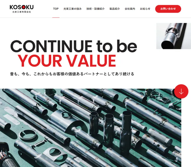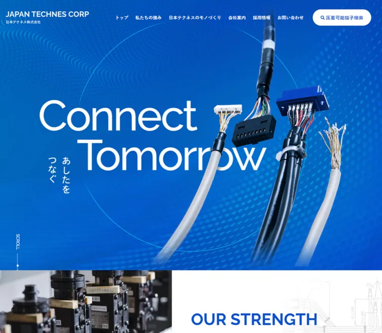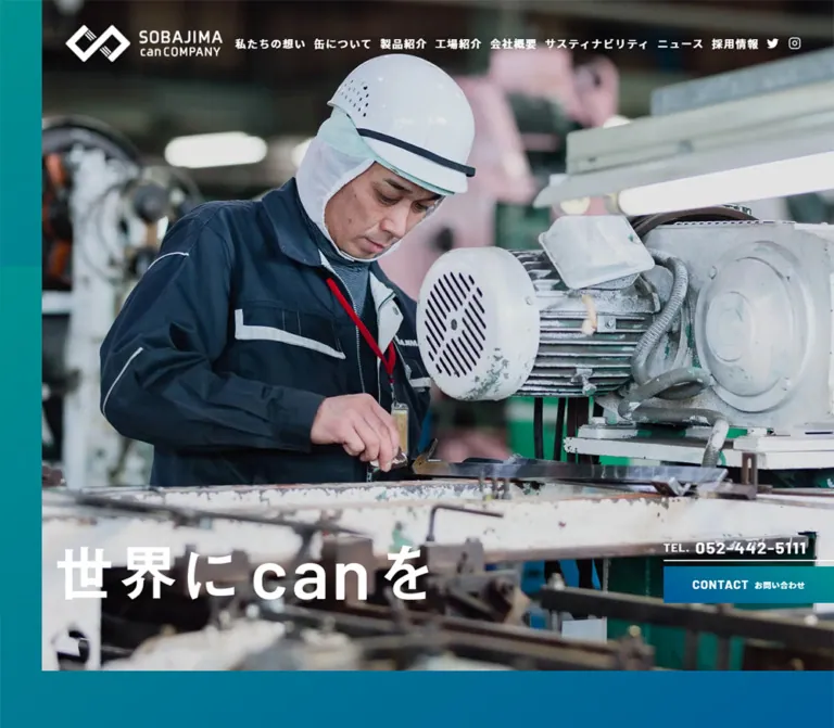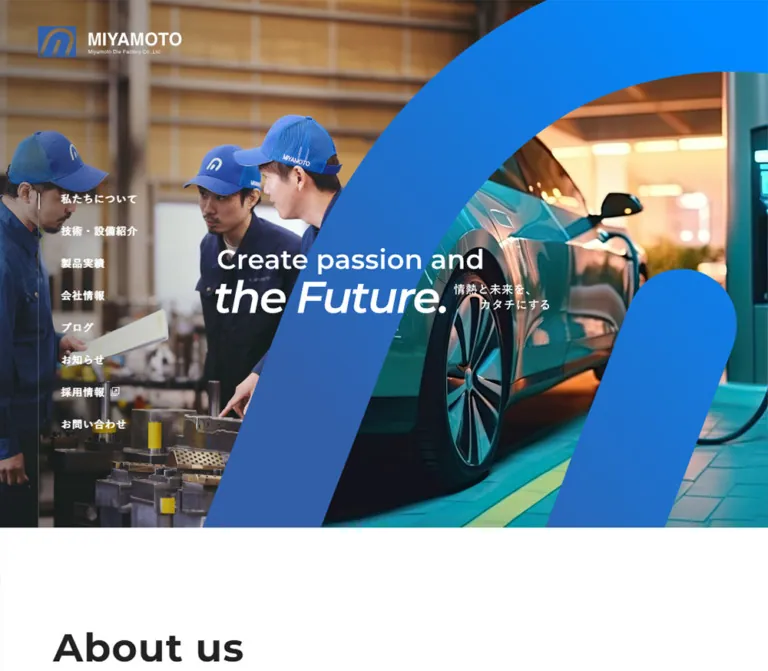
プレビュー準備中デザインリファレンスを見る
Nichia Steel Works — Style Reference
Industrial scale, fine wire-like lines, and a calm white-and-blue corporate framework.
Original URL: https://www.nichiasteel.co.jp/ Final URL: https://www.nichiasteel.co.jp/ Theme: light, with white surfaces, blue feature sections, and restrained orange accents. Inspected: supplied browser record retrieved October 2, 2026, at 01:30:44.686 JST / October 1, 2026, at 16:30:44.686 UTC. Viewports: 1440 × 1000 desktop and 390 × 844 mobile, in CSS pixels. Scope: the current corporate homepage. Visual evidence covers the desktop opening, product section, and footer, plus the mobile opening and footer. Rendered text and computed element samples additionally cover policy, strengths, company information, sustainability, news, recruitment, and search-related content. Linked destination pages and open navigation states were not inspected.
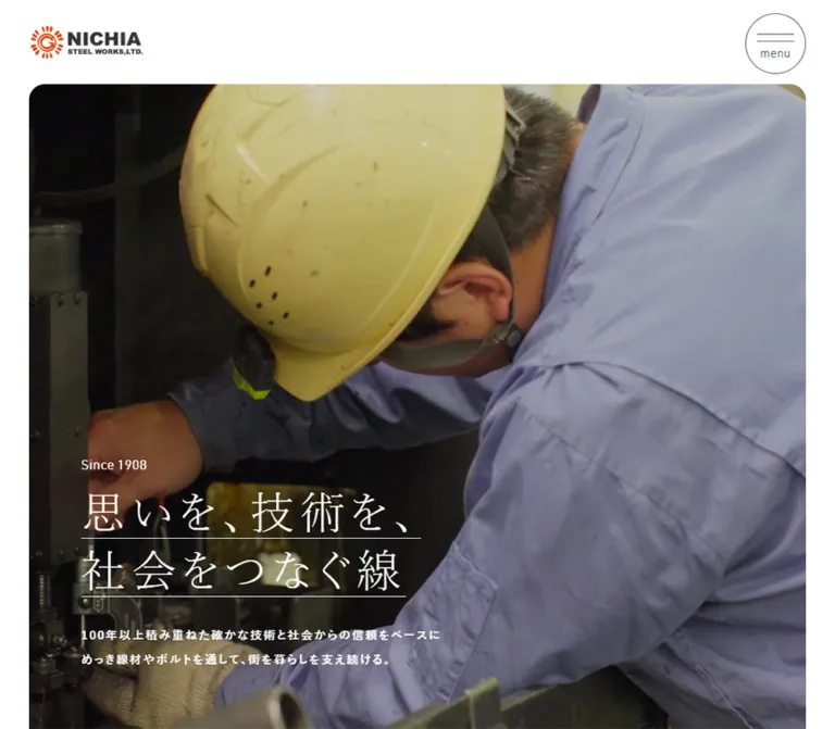
Nichia Steel Works presents manufacturing through large factory imagery and an unusually restrained interface. The opening pairs industrial equipment with white Japanese Mincho lettering, two fine headline underlines, and the small historical marker “Since 1908.” Below it, generous white space, blue section labels, numbered product links, and pale background fields organize a substantial corporate information architecture.
The page serves several audiences: product buyers, technical researchers, investors, job applicants, and general company visitors. Preserve those parallel routes when adapting the design. Its identity comes from the relationship between an expansive industrial image, precise typography, and practical navigation—not from a single conversion sequence.
Fine-line details reinforce the subject matter. A small crossed-wire motif precedes “Our Products,” a larger faint mesh pattern sits behind the product photograph, and thin rules separate product entries. Orange remains concentrated in the logo, small directional marks, and recruitment typography.
閉じる
Nichia Steel Works — Style Reference
Industrial scale, fine wire-like lines, and a calm white-and-blue corporate framework.
Original URL: https://www.nichiasteel.co.jp/ Final URL: https://www.nichiasteel.co.jp/ Theme: light, with white surfaces, blue feature sections, and restrained orange accents. Inspected: supplied browser record retrieved October 2, 2026, at 01:30:44.686 JST / October 1, 2026, at 16:30:44.686 UTC. Viewports: 1440 × 1000 desktop and 390 × 844 mobile, in CSS pixels. Scope: the current corporate homepage. Visual evidence covers the desktop opening, product section, and footer, plus the mobile opening and footer. Rendered text and computed element samples additionally cover policy, strengths, company information, sustainability, news, recruitment, and search-related content. Linked destination pages and open navigation states were not inspected.
Nichia Steel Works presents manufacturing through large factory imagery and an unusually restrained interface. The opening pairs industrial equipment with white Japanese Mincho lettering, two fine headline underlines, and the small historical marker “Since 1908.” Below it, generous white space, blue section labels, numbered product links, and pale background fields organize a substantial corporate information architecture.
The page serves several audiences: product buyers, technical researchers, investors, job applicants, and general company visitors. Preserve those parallel routes when adapting the design. Its identity comes from the relationship between an expansive industrial image, precise typography, and practical navigation—not from a single conversion sequence.
Fine-line details reinforce the subject matter. A small crossed-wire motif precedes “Our Products,” a larger faint mesh pattern sits behind the product photograph, and thin rules separate product entries. Orange remains concentrated in the logo, small directional marks, and recruitment typography.
How to Read This Reference
- Measured means a value appears in the supplied computed-style or element-rectangle evidence. Values below are usually rounded to two decimal places.
- Visual estimate means a dimension or treatment is inferred from the current-page screenshots. Estimated colors were not extracted from source CSS.
- Derived means arithmetic based on measured values, such as subtracting the header inset from a section height.
- Recommended means an implementation choice for a new site. Breakpoints, interpolation formulas, accessibility additions, and the Quick Start are recommendations unless explicitly identified otherwise.
- DOM presence does not establish visibility. The record includes nonzero rectangles for navigation and search content absent from the screenshots. Those entries must not be assembled into one simultaneously visible layout.
- The measured document heights are approximately 11,939px desktop and 11,157px mobile. These are captured states, not suggested fixed page heights.
- All custom-property names introduced here are descriptive aliases. The supplied root variables do not expose a complete site design-token system.
Tokens — Colors
Default Palette
| Name | Value | Suggested token | Evidence and role |
|---|---|---|---|
| White | #ffffff |
--color-white |
Measured body background and reversed text; dominant page surface |
| Corporate Blue | #006eaf |
--color-blue |
Measured contact/search-submit fills, strengths background, and mobile catalog panel |
| Black | #000000 |
--color-text |
Measured main text and many heading containers |
| Navigation Charcoal | #333333 |
--color-nav |
Measured desktop navigation links |
| Search Slate | #525760 |
--color-slate |
Measured product-search fill and mobile menu caption |
| Cool Section White | #f5f8fb |
--color-section |
Measured company-information background |
| Neutral Pale Gray | #f4f4f6 |
--color-soft |
Measured news background and mobile contact panel |
| Muted Blue Gray | #7e889a |
--color-muted |
Measured mobile footer sublinks |
| Recruitment Rust | #d4420a |
--color-recruit |
Measured mobile recruitment label and Mincho headline |
| Logo / Direction Orange | Approximately #e94709 |
--color-accent-estimate |
Visual approximation only; logo artwork and small arrows appear brighter than recruitment rust |
| Divider Gray | Approximately #d5d8e1 |
--color-rule-estimate |
Visual approximation for product rules and the mobile footer divider |
White and blue establish the system. Slate distinguishes product search from the blue contact action. The two pale backgrounds are close but not identical: company content is cooler, while the news and contact surfaces are more neutral.
The brighter logo orange is not a measured replacement for #d4420a. Keep the original logo artwork intact, and treat any CSS approximation for small arrows as provisional.
Color Behavior
The strengths section uses a measured blue background and white article headings and paragraphs. In the desktop product capture, blue also appears as an image tint at the end of the preceding section. The exact image-overlay implementation was not supplied.
The hero appears darkened enough to support white text, but its overlay color and opacity were not measured. A contrast scrim is appropriate in an adaptation; its opacity should be tested against the actual media.
Root variables include WordPress colors and --swiper-theme-color: #007aff. These are not the observed corporate blue. Use the computed visible value #006eaf rather than treating every library variable as a brand token.
No alternate color theme or theme switch was observed.
Tokens — Typography
Japanese Sans — Navigation, Body, and Section Content
The measured stack begins with Hiragino Sans, followed by Hiragino Kaku Gothic ProN, localized Hiragino and Yu Gothic names, Yu Gothic Medium, YuGothic, Noto Sans JP, BIZ UDPGothic, Meiryo, Helvetica Neue, Arial, and sans-serif.
This is a declared fallback stack, not confirmation that every listed family was loaded or rendered. Keep the Japanese system-font character and generous tracking. Standard body text uses weight 400; policy paragraphs and many controls use 600; mobile footer group links use 700.
Measured body tracking equals approximately 0.1em, with a 2 line-height ratio at both inspected widths. This creates a deliberate, spacious rhythm even where the copy is dense.
Japanese Mincho — Hero and Recruitment
The measured display stack is ヒラギノ明朝 Pro W3, Hiragino Mincho Pro, 游明朝, YuMincho, HG明朝E, MS P明朝, MS 明朝, serif.
The opening headline uses weight 400, line height 1.1, and tracking 0.13em. It is split into two explicit lines:
思いを、技術を、 社会をつなぐ線
Each visible line has a fine underline. This treatment is part of the hero message, not a link affordance.
The mobile recruitment headline uses the same declared Mincho stack at weight 500, with 0.15em tracking and rust-colored text.
DIN — Verified Utility Uses
- The mobile
menucaption declaresDin Regular, sans-serif. - The mobile
CatalogandContactheadings declareDin Demi, sans-serif. - Both records report CSS weight
400; the latter family name already identifies a demi variant. - Other English labels look narrow and technical, but their individual computed font families were not supplied. Do not automatically assign all English text to DIN as an observed fact.
Font-file URLs and loading success were not provided. A new implementation must supply appropriately licensed files or accept a sans-serif fallback.
Type Scale
Sizes and line heights below are measured computed values, not recommended rounded tokens.
| Role | Desktop size / line height | Mobile size / line height | Weight and notes |
|---|---|---|---|
| Body | 15.61 / 31.22px |
13.04 / 26.07px |
400; tracking 1.56 / 1.30px |
| Desktop navigation | 14.41 / 28.82px |
Hidden in opening capture | 600 |
| Hero headline | 69.38 / 76.32px |
32.53 / 35.78px |
Mincho 400; tracking 9.02 / 4.23px |
| Hero supporting copy | 17.22 / 34.43px |
12.07 / 24.15px |
Sans 600 |
| Policy statement | 47.82 / 76.51px |
31.26 / 50.01px |
600; tracking 0.1em |
| Standard section-heading container | 39.65 / 79.30px |
24.22 / 48.44px |
Parent reports 400; child typography is not fully sampled |
| Strength article heading | 28.82 / 43.24px |
21.11 / 31.67px |
600 |
| Product category heading | 23.22 / 37.15px |
18.07 / 28.92px |
600 |
| Search field-group heading | 22.96 / 41.32px |
16.10 / 28.98px |
600; visibility state unverified |
| Company card heading | 17.61 / 35.22px |
15.04 / 30.07px |
600 |
| Standard text-and-circle link | 15.74 / 31.48px |
14.02 / 28.05px |
600 |
| Sustainability statement | 37.80 / 60.47px |
24.22 / 38.75px |
600; tracking 0.05em |
| News heading container | 56.08 / 112.16px |
30.37 / 60.73px |
Parent values; bilingual children can differ |
| News item title | 15.61 / 23.41px |
13.04 / 19.56px |
400 |
| Recruitment headline | Not sampled | 25.31 / 37.96px |
Mincho 500 |
| Catalog / Contact heading | Not sampled | 30.37 / 33.40px |
Din Demi, CSS weight 400 |
| Menu caption | Not visible | 12.07 / 12.07px |
Din Regular, 400, normal tracking |
| Footer sublink | Not sampled | 13.01 / 26.02px |
400, muted blue gray |
The computed HTML root size is 10px at both viewports. The page body overrides the root font family and size. Do not use the root's Times declaration as the visible page font, and do not copy source rem quantities into a conventional 16px-root project without conversion.
Tokens — Spacing & Shapes
Density: generous section spacing around compact navigation, long-form copy, and structured lists.
Layout principle: use a wide outer frame for the header and hero, a narrower inner container for most content, and occasional images that extend beyond that inner container.
Spacing Scale
The evidence does not reveal a single underlying spacing formula. These are measured examples that establish the rhythm.
| Use | Desktop | Mobile | Status |
|---|---|---|---|
| Header horizontal inset | 46.08px |
20.37px |
Measured padding |
| Common inner content left edge | 133.02px |
21.58px |
Measured examples from company/news content |
| Policy copy width | 434.22px |
349.28px |
Measured |
| Hero headline-to-description gap | 41.63px |
19.52px |
Derived from text rectangles |
| Policy section top padding | 136.94px |
51.22px |
Measured |
| Strengths top / bottom padding | 110.86 / 76.08px |
50.86 / 50.37px |
Measured |
| Products top padding | 112.16px |
60.73px |
Measured |
| Company section top padding | 93.47px |
50.61px |
Measured |
| Sustainability top padding | 140.20px |
75.92px |
Measured |
| News top / bottom padding | 112.16 / 93.47px |
60.73 / 50.61px |
Measured |
| News row vertical padding | 28.69px |
20.12px |
Measured |
| Company card horizontal gap | 37.38px |
Stacked | Derived from adjacent rectangles |
| Mobile footer top / bottom padding | — | 60.73 / 20px |
Measured |
For a reusable system, a practical rounded spacing set is 8, 16, 20, 32, 40, 60, 96, and 140px. This is a recommendation, not an extracted source scale.
Border Radius
| Element | Treatment | Evidence |
|---|---|---|
| Search and contact pills | 9999px |
Measured |
| Mobile menu control | Circular, approximately 60px diameter |
Visual estimate |
| Product link terminal | Pale circle, approximately 49px diameter on desktop |
Visual estimate |
| Large closing CTA terminal | White circle, approximately 83px diameter on desktop |
Visual estimate |
| Product photograph | Approximately 10px upper corner rounding |
Visual estimate |
| Mobile hero | Clearly rounded lower corners, approximately 18–20px |
Visual estimate |
| Desktop hero upper edge | Appears square in the supplied opening | Visual observation; bottom is outside the capture |
| Section fields and closing CTA panels | Square outer edges | Visual observation |
Avoid introducing a universal rounded-card treatment. Rounding belongs to media edges and directional controls; the page's main fields remain broad and rectilinear.
Layout Measurements
| Element | Desktop | Mobile |
|---|---|---|
| Opening header | 1440 × 116.08px |
390 × 90.36px |
| Header logo link | 145.03 × 44.67px |
130.17 × 40.09px |
| Header search pill | 133.28 × 45.03px |
Not visible in closed header |
| Header contact pill | 162.11 × 45.03px |
Not visible in closed header |
| Opening section, including header inset | 1070px tall |
708.56px tall |
| Hero headline origin | x 135.63, y 640.34px |
x 41.33, y 477.78px |
| Hero headline box | 531.05 × 166.53px |
328.31 × 78.06px |
| Standard inner container example | 1173.95px wide |
346.83px wide |
| Product link row | 517 × 112.89px |
349 × 70.39px |
| Company card | Approximately 366.40 × 228.46px |
346.83 × 211.75px |
| Standard text-and-circle link height | 48.69px |
40.11px |
| Catalog / Contact panel | Two equal desktop halves, visually observed | Each 390 × 202.44px, measured |
| Footer | Visually inspected; full rectangle not sampled | 852.42px tall in the captured state |
The mobile hero image occupies approximately 349.28 × 618.20px, derived from its visible side insets and the section/header measurements. The corresponding desktop section leaves approximately 953.92px below its header inset, but the desktop screenshot does not expose the media's bottom edge.
Components
Corporate Header
Role: brand identity, primary site navigation, product search, and contact access.
The desktop opening has a white visual background with the logo at the left, seven primary navigation labels across the center, and two utility pills at the right. The first three topics—company, products, and technology—have small blue downward chevrons beneath their labels. Other topics appear as plain navigation links.
The search pill uses slate with a white magnifying-glass icon and 製品検索. The contact pill uses blue with an envelope icon and お問い合わせ. Both are about 45px high, with fully rounded ends and semibold text.
The desktop header remains visible at the top of the scrolled product and footer captures. Its visible height there is approximately 99px, compared with the measured 116.08px opening state. This supports a persistent header with a size change, but its exact scroll threshold and positioning implementation were not supplied.
On mobile, the opening displays the logo and a thin outlined circular control containing two horizontal strokes above menu. The desktop links and utility pills are absent from that closed state. The mobile footer capture does not show the header, so do not assume identical persistent-header behavior on both devices.
Navigation Content — DOM Evidence Only
The DOM contains company, product, and technology navigation groups, including secondary links and desktop entries arranged in columns. Several submenu headings and cards have computed dimensions even though they are absent from the closed-header screenshots.
This establishes available navigation content, not a tested menu interaction. Hover activation, click behavior, focus handling, opening animation, backdrop, and mobile submenu expansion remain unverified.
For an adaptation, retain the full hierarchy and provide explicit keyboard-operable disclosure controls. Do not make hovering the only way to reach secondary pages.
Industrial Hero
Role: connect the company's history and technical work to everyday infrastructure.
The desktop media begins below the header inside approximately 46px side margins. It shows a factory interior with machinery, steel framing, and a worker. The text is placed low and left, with about 90px between its left edge and the media boundary.
The copy stack contains:
- A small white
Since 1908marker. - Two large Mincho lines with separate thin underlines.
- A substantial gap.
- Two desktop lines of semibold supporting copy.
At 390px, the media becomes a tall portrait crop with roughly 20px outer margins. The supplied mobile image shows a closer manufacturing scene with an orange heated element. The headline remains two lines, while the supporting text occupies three measured line boxes. The text starts approximately 21px inside the image's left edge.
Different factory scenes appear across the current desktop and mobile captures. They are consistent with a media-led opening, but the evidence does not establish the media element type, playback sequence, autoplay settings, or mobile-specific asset selection.
Adaptation guidance: keep the message as live text, use authorized factory imagery, preserve the two-line Mincho hierarchy, and test the darkening treatment against bright machinery and highlights. Do not bake the entire hero into a screenshot.
Policy Introduction
Role: explain the business and its contribution before presenting product routes.
The section is labeled Our Policy and contains the two-line statement めっき技術で / 社会に貢献する, followed by two detailed paragraphs and a company-information link.
The desktop text column is measured at 434.22px wide, offset well inside the page. The mobile column expands to approximately 349px with a 20px left inset. Policy paragraphs use weight 600, making this introduction firmer than the regular-weight strengths and sustainability prose.
The mobile opening reveals the top of a factory photograph after approximately 51px of white space below the hero. The image is shifted right and reaches the viewport edge. DOM positions place the policy heading and prose farther down, supporting an image-before-copy mobile sequence. The complete image composition was not supplied.
Bilingual Section Heading
Role: provide a repeated orientation cue across a long page.
The product screenshot shows a small blue English label above a much larger black Japanese heading. A compact crossed-wire symbol sits immediately before Our Products. The Japanese title is visually heavier than the label.
Use separate elements for the English eyebrow and Japanese heading rather than styling the combined heading container as one uniform text run. Parent computed values in the evidence do not describe every child span.
The wire motif should remain a small contextual marker. Avoid enlarging it into a prominent decorative logo or repeating it behind every paragraph.
Strengths Sequence
Role: explain four operational strengths through numbered editorial entries.
The section uses a full-width blue field and contains four numbered topics: product variety, solution-oriented sales, technical development, and production/delivery capacity. Measured article headings and paragraphs are white.
At desktop width, the four article-heading rectangles have x positions of approximately 899, 2161, 3424, and 4687px. Their horizontal step is about 1263px, and each text region is approximately 521px wide. This supports a horizontally arranged track rather than four ordinary vertical desktop articles.
The desktop strengths section reports an approximately 838px rectangle, while the product section begins much farther down the document. These offsets are compatible with an extended staged presentation, but they do not prove a particular pinned-scroll or carousel implementation. Do not recreate the difference as an arbitrary blank spacer.
On mobile, all four articles share an approximately 21.58px left edge and appear at progressively lower y positions within a 2954px section. The technical-information link follows the fourth entry; on desktop, its measured position is near the section heading.
Preserve: numbered order, blue background, white copy, editorial image/text grouping, and a straightforward vertical mobile reading path.
Product Image and Numbered Link List
Role: route visitors to five product families.
This is the clearest below-fold visual signature in the supplied desktop evidence. A large close-up of coiled metal wire sits on the left, while the heading and category list occupy the right. The photograph begins at about x46px and is approximately 634px wide. The heading begins around x784px, leaving roughly 104px between the photograph and the text column.
A white panel is offset over a pale background, producing depth through alignment rather than shadow. A faint wire-mesh pattern appears behind the photograph at the far left.
Each category row contains:
- A small blue two-digit index.
- A black semibold Japanese category name.
- A pale circular terminal at the right.
- A fine gray horizontal divider.
The visible circle contains a tiny orange mark. The capture does not resolve it as a complete arrow, so do not infer a specific arrow animation from that frame. Larger closing CTA circles clearly show orange chevrons.
The five categories are 普通線材製品, 三次加工製品, 建材加工製品, 特殊線材製品, and 鋲螺(ボルト)製品. Their anchors link to category pages; they are not established accordion buttons.
Descriptions exist in the DOM, but the visible desktop rows show compact labels. Their visibility trigger was not tested. Do not display all descriptions by default solely because their text and rectangles are present in the dump.
At mobile width, the measured list spans approximately 349px, and row height drops from 112.89px to 70.39px. The product image's mobile position and behavior are not established by the supplied screenshots.
Product Search Entry and Form Content
Role: offer product discovery by category, application, or keyword.
The header provides a verified link to /products/?s=. The homepage text also includes 製品検索はこちら and search-related groups labeled 取り扱い製品から探す, 用途から探す, and フリーワードで探す, with a 製品を探す button.
The submit button is measured as a blue pill, approximately 175.58 × 48.77px on desktop and 146.66 × 40.73px on mobile. However, the search content's placement relative to surrounding sections is ambiguous in the extracted rectangles, and no open form screenshot was supplied.
Treat these as confirmed labels and controls whose presentation state remains unverified. Do not invent select options, filter logic, query parameter names, modal behavior, or submission results.
Company Information
Role: provide institutional context and routes into company details.
The section has a measured #f5f8fb background. It includes an Our Company heading, a history feature with explanatory copy and a detail link, and three linked entries for the top message, locations, and company overview.
The three secondary entries are approximately 366px wide on desktop with 37px gaps. Mobile measurements place them in a single column at approximately 347px wide. Each has a media-sized area above a semibold title, but the supplied current-page screenshots do not establish the exact image subjects.
Keep the history feature more prominent than the three supporting routes. Use the pale field to group the section without adding independent card shadows.
Sustainability Statement
Role: connect manufacturing activity to longer-term social and environmental goals.
A small English label precedes a two-line Japanese statement, a regular-weight paragraph, and a text-and-circle link. The desktop text region is approximately 522px wide; mobile uses the standard approximately 347px content width.
The statement uses sans-serif rather than the hero's Mincho. Its measured scale falls from 37.80px to 24.22px. Preserve that distinction: the hero and recruitment carry the editorial serif voice, while explanatory corporate sections remain sans-serif.
The supplied evidence does not establish the complete accompanying imagery or decorative background.
IR News and General News
Role: keep investor disclosures and broader company updates distinct.
The rendered text contains two groups, IR News and News, each with four entries and a list-page link. Entry anatomy is date, category label, and article title.
The news region uses measured #f4f4f6. Desktop IR entries occupy a 540.25px-wide column. The provided desktop element excerpt does not include matching general-news geometry, so a paired desktop arrangement is plausible but not fully measured. Mobile data explicitly places the two groups sequentially.
Measured row height is approximately 142.77px for sampled desktop IR entries and 109.50px on mobile. News-title line height is 1.5, tighter than the main body's 2. Several long titles report only one line of height; the exact clipping or truncation rule was not supplied.
For an adaptation, keep dates and categories scannable and allow long titles to wrap when necessary. Treat any change to source truncation as a deliberate readability improvement.
Recruitment Feature
Role: provide an expressive route for prospective employees.
The mobile DOM shows a recruitment label, the two-line Mincho statement 鉄を変える、 / 自分を変える, supporting copy, and a centered link. Both the label and headline use measured rust #d4420a.
The mobile section is approximately 482px tall. The headline is 25.31px with weight 500, providing a smaller echo of the opening's serif typography. Reveal-related transition declarations are present, but the exact visual sequence and background imagery were not captured.
Catalog and Contact Panels
Role: close the main content with two clear service destinations.
On desktop, the panels split the viewport into equal halves. Catalog uses a blue field and white text; Contact uses a pale gray field with blue text. Each has a large English heading, a smaller Japanese instruction, and a white circular terminal with an orange right chevron.
On mobile, the measured panels stack in the same order, each spanning 390px and measuring 202.44px high. The headings use Din Demi at 30.37px. These are broad linked panels, not small boxed buttons.
Corporate Footer
Role: repeat the site hierarchy and provide institutional contact information.
Desktop places the logo and address block at the left, with a wide navigation area on the right. A thin dark rule runs above the navigation groups. Company, products, technology, and recruitment form the main columns; news, IR, sustainability, and privacy appear as a separate vertical group below.
Mobile materially reorders the layout. The sitemap comes first in two columns, separated by a fine vertical rule. Company and products occupy the first row; technology and recruitment follow. Additional utility links remain in the left column. The logo and address block move beneath the sitemap, followed by centered copyright.
Measured mobile sublink columns are approximately 153.30px wide, beginning at x21.58px and x215.11px. Sublinks use muted blue gray, a small leading dash, and about 26px line height. The logo link is 185 × 57px.
The visible copyright reads © 2022 NICHIA STEEL WORKS. This is page content, not evidence that the current design was produced or launched in 2022.
Tokens — Motion & Interaction
The supplied record contains computed transition declarations and settled captures, not a full interaction recording.
| Element | Measured declaration or observed state | What can be concluded |
|---|---|---|
| Header | height 1s, top 1s |
Height and vertical-position transitions are defined; scroll trigger unverified |
| Logo heading wrapper | opacity 0.5s, visibility 0.5s |
Visibility changes are styled; triggering state unverified |
| Hero section | opacity 1s |
A fade is defined; startup sequence unverified |
| Policy first paragraph | opacity 1s, transform 1s |
Reveal-style transition is defined |
| Policy second paragraph | Same properties, 0.1s delay |
A small stagger is defined |
| Sustainability paragraph | opacity 1s, transform 1s |
Reveal-style transition is defined |
| Product anchors | 0.5s |
Transition duration is present; changed properties and end state not established |
| News anchors | background-color 0.5s, color 0.5s |
Color transitions are defined; actual hover colors unverified |
| Recruitment elements | 1s opacity/transform transitions, sampled delays of 0.2s and 0.6s |
Staggered styling exists; complete sequence unverified |
| Desktop strengths | Successive article rectangles lie horizontally outside the viewport | A horizontal arrangement exists; scrolling, dragging, and autoplay behavior unverified |
| Hero imagery | Different factory scenes in current viewport captures | Media variation exists; playback type and timing unverified |
Many elements report only transition: all, with no positive duration shown. That is not sufficient evidence of a visible animation. Likewise, sampled animation: none does not rule out video, JavaScript transforms, or animations on unlisted elements.
For an adaptation, use calm fades and restrained color changes. Avoid inventing rapid carousels, image zooms, or scroll-linked effects solely from the presence of a library variable. Keep the mobile strengths content readable without a horizontal interaction.
Surfaces
| Surface | Appearance | Structural purpose |
|---|---|---|
| Main canvas | White | Creates continuity across a long corporate page |
| Header | Visually white, without a prominent shadow | Keeps navigation readable over changing content |
| Hero media | Dark industrial imagery with reversed type | Establishes scale and working context |
| Strengths field | Solid corporate blue with white article copy | Separates the main technical narrative |
| Product composition | White panel offset against a pale surrounding field | Organizes image and linked categories |
| Company section | Cool pale blue-white | Groups institutional routes |
| News section | Neutral pale gray | Supports dense, repeated information |
| Catalog panel | Blue, reversed text | Strong closing navigation destination |
| Contact panel | Pale gray, blue text | Companion destination with equal visual weight |
| Footer | White, thin rules, muted subordinate links | Makes a large sitemap feel orderly |
No general drop-shadow elevation system is visible. Separation comes from background changes, large spacing, rules, and the edges of photographs.
Imagery
Factory imagery supplies the visual weight. The current opening shows equipment, structural steel, a worker, and close manufacturing detail. The product section uses a sharply focused coil of wire with cool metallic highlights and a blurred workshop background.
Favor real working environments, material texture, machine scale, and repeated lines. The geometry of the coil, factory framing, mesh ornament, and headline rules forms a coherent visual vocabulary.
Cropping changes substantially between the broad desktop opening and the tall phone opening. A new implementation should choose focal points per viewport rather than simply shrinking a wide photograph. Use ordinary photographic rendering; there is no evidence for pixelation, halftone processing, or posterization.
Observed Asset References
Asset URLs were not included in the supplied evidence. These descriptions identify visible roles without inventing filenames.
| Asset or motif | Where observed | Reuse guidance |
|---|---|---|
| Orange emblem and dark NICHIA wordmark | Current desktop/mobile header and footer | Use an authorized logo asset; preserve its proportions |
| Factory interior with worker | Current desktop opening | Preserve working context and space for lower-left text |
| Close manufacturing scene with orange heated element | Current mobile opening | Use an intentional portrait crop |
| Coiled wire photograph | Current desktop product section | Keep material detail and cool metallic highlights |
| Factory photograph beginning below the hero | Current mobile opening | Preserve the offset-to-right composition where appropriate |
| Small crossed-wire marker | Current desktop product heading | Recreate as a subtle decorative line motif if the asset is unavailable |
| Large faint mesh pattern | Current desktop product photograph background | Keep contrast low so it does not compete with the photograph |
| Search, envelope, chevrons, menu strokes | Current header and closing panels | Simple line icons are sufficient; original file format is unknown |
Company, sustainability, strengths, and recruitment content is represented in the DOM, but the full imagery for those sections was not visually supplied. Do not invent specific landscapes, portraits, or factory scenes as original-page findings.
Layout & Responsive Behavior
Desktop Composition
The header and hero use a wide frame, with approximately 46px side insets at 1440px. Most informational sections use a narrower container of approximately 1174px centered on the page. The product image breaks outward toward the wide frame while its text remains nearer the inner grid.
This produces useful asymmetry: media feels expansive, while text retains manageable line lengths. Policy text is narrower still, at approximately 434px. Sustainability uses approximately 522px, and the sampled IR list is approximately 540px wide.
The product screenshot shows substantial whitespace before the list and image. Preserve the breathing room without encoding screenshot scroll positions as absolute layout coordinates.
Mobile Composition
At 390px, common horizontal insets are approximately 20–23px. The design switches navigation mode, changes image proportions, reduces typography, and reorders content rather than scaling the entire desktop canvas.
| Feature | Desktop evidence | Mobile evidence |
|---|---|---|
| Header | Full navigation and two pills | Logo and circular menu control |
| Hero | Wide factory scene; 69.38px headline | Portrait scene; 32.53px headline |
| Policy copy | Narrow offset column | Nearly full content width after introductory imagery |
| Strengths | Horizontal article positions | Four vertically stacked articles |
| Technical-information link | Near strengths heading | After the fourth strengths article |
| Product rows | 517px wide, 112.89px tall | 349px wide, 70.39px tall |
| Company routes | Three adjacent cards | Three stacked cards |
| News | IR column measured; complete desktop pairing not supplied | IR then general news in sequence |
| Closing panels | Two equal halves | Catalog then Contact, full width |
| Footer | Identity left, sitemap right | Two-column sitemap, then identity block |
The supplied --vh values are 10px on desktop and 8.44px on mobile, matching one percent of the respective viewport heights. The declarations that consume this variable were not supplied, so a specific hero-height formula cannot be reconstructed from it.
Implementation Boundaries
Only two viewport sizes were inspected. Exact breakpoints, tablet layouts, landscape behavior, maximum-width rules, and interpolation formulas remain unknown.
For a new implementation, 768px for content stacking and 1200px for switching to compact navigation are reasonable starting points. They are recommendations and must be tested with the full Japanese labels. Keep content height automatic at increased text size and avoid forcing the measured document heights.
Do’s and Don’ts
Do
- Use measured corporate blue
#006eafwith a predominantly white canvas. - Keep slate product search distinct from blue contact access.
- Pair Japanese Mincho hero lettering with practical Japanese sans-serif navigation and prose.
- Preserve the small
Since 1908marker and two separately underlined hero lines when reproducing the opening composition. - Build with both a wide media frame and a narrower text container.
- Use real factory and material photography with deliberate mobile crops.
- Keep product categories as spacious numbered links with fine dividers.
- Use mesh and crossed-wire details sparingly.
- Stack the strengths narrative vertically on mobile.
- Preserve the mobile footer's two-column sitemap and identity block below it.
- Keep catalog, contact, products, technology, IR, and recruitment as distinct routes.
Don’t
- Do not turn every section into a rounded card or apply a general shadow system.
- Do not replace the restrained palette with unrelated category colors.
- Do not use orange as the default fill for every action.
- Do not assign DIN to every English label without font evidence.
- Do not treat parent heading styles as measurements of every nested text span.
- Do not render hidden navigation or search content simply because it appears in the DOM dump.
- Do not implement product links as accordions without an explicit design decision.
- Do not assume the desktop strengths arrangement proves a particular carousel or scroll library.
- Do not force the mobile page into desktop horizontal storytelling.
- Do not infer a production date from the footer copyright year.
- Do not replace working industrial imagery with generic abstract technology graphics.
Recommended Implementation Additions
These are recommendations for a new implementation, not verified features of the original page:
- Give the logo link a meaningful accessible name and use a clear document heading hierarchy. The sampled original places the hero message in a paragraph and uses an image-containing H1 for the brand.
- Make menu disclosure state explicit with
aria-expandedandaria-controls. Test keyboard access and focus return. - Maintain at least 44px interactive targets where practical. Several measured mobile text-and-circle links and the search-submit button are about 40px high.
- Check the 12–13px mobile supporting text at real device size and increased text settings. A 14–16px reading size may improve accessibility while retaining the composition.
- Verify the muted footer-link color against the intended background. A darker blue gray may be preferable for small text.
- If moving hero media is used, provide a poster, a pause mechanism where appropriate, and reduced-motion behavior. Avoid depending on a successful autoplay request for legibility.
- Let long news titles wrap or expose their full text through an accessible link name.
- Keep all four strengths reachable without scroll hijacking or pointer-only dragging.
- Provide labels and clear validation for search fields; verify the actual query contract before implementing submission.
- Keep reveal content visible when JavaScript fails. Do not begin with essential copy permanently hidden in CSS.
Agent Prompt Guide
Quick Color Reference
- Main surface:
#ffffff. - Corporate blue:
#006eaf. - Search utility:
#525760. - Main text:
#000000; desktop navigation:#333333. - Company field:
#f5f8fb. - News and contact field:
#f4f4f6. - Footer sublinks: observed
#7e889a, subject to accessibility review. - Recruitment text: measured
#d4420a. - Small brighter orange arrows: use an asset-derived value;
#e94709is only a visual approximation.
Overall Prompt
“Create a Japanese steel-manufacturing corporate homepage with a white canvas, corporate blue #006eaf, slate search controls, and restrained orange directional details. Use a wide factory-image opening with lower-left white Mincho copy, a small historical label, and separate fine underlines beneath two headline lines. Pair this with tracked Japanese sans-serif navigation and spacious explanatory text. Build a long corporate information structure for policy, four strengths, five numbered product categories, company information, sustainability, IR, news, recruitment, catalog, and contact. Use a wide outer media frame and narrower text containers, fine rules, pale section backgrounds, and very limited rounding. On mobile, use a circular menu control, a tall hero crop, vertical strengths, stacked company routes, and a two-column footer sitemap above the identity block. Treat menu, search, and horizontal-story behavior as implementation decisions requiring explicit specifications.”
Example Component Prompts
- Hero: “Build a portrait-aware factory hero with live Japanese Mincho text reading ‘思いを、技術を、 / 社会をつなぐ線’. Add ‘Since 1908’ above it and compact semibold supporting copy below. Use white text, fine separate underlines, an image-specific dark scrim, and no oversized filled CTA.”
- Product section: “Place a large close-up photograph of coiled wire on the left and a five-row product navigation list on the right. Add a small blue ‘Our Products’ eyebrow with a crossed-wire motif above ‘製品情報’. Give each row a blue two-digit index, black semibold title, pale circular terminal, and thin gray separator. Avoid card shadows.”
- Header: “Create a white desktop header with the NICHIA logo, seven compact Japanese navigation topics, a slate ‘製品検索’ pill, and a blue ‘お問い合わせ’ pill. At compact widths, show the logo and a 60px outlined circle containing menu strokes and the word ‘menu’. Implement an accessible disclosure pattern without inventing source-specific animation.”
- Closing links: “Create adjacent Catalog and Contact panels. Use blue with white text for Catalog and pale gray with blue text for Contact. Add a large English heading, Japanese instruction, and white circular orange-chevron terminal. Stack both full-width panels on mobile.”
- Footer: “Create a white corporate sitemap with black group headings, muted blue-gray sublinks, and small leading dashes. On desktop, place the identity block left of four navigation groups. On mobile, place a two-column sitemap with a fine central divider first, then the logo and address, then centered copyright.”
Quick Start
CSS Custom Properties
This is a recommended adaptation, not the original stylesheet. Exact colors come from computed evidence; fluid formulas interpolate approximate proportions between the two inspected widths. The implementation keeps a conventional root size, uses a static hero image by default, and does not reproduce unverified menus, search overlays, or scroll choreography.
The compact-navigation and stacking breakpoints are proposed values. The brighter accent, divider color, image radii, and hero scrim remain visual approximations.
:root {
  /* Measured colors */
  --color-white: #fff;
  --color-blue: #006eaf;
  --color-text: #000;
  --color-nav: #333;
  --color-slate: #525760;
  --color-section: #f5f8fb;
  --color-soft: #f4f4f6;
  --color-muted: #7e889a;
  --color-recruit: #d4420a;

  /* Visual approximations, not extracted source values */
  --color-accent: #e94709;
  --color-rule: #d5d8e1;

  /* Shortened versions of observed fallback stacks */
  --font-ui: 'Hiragino Sans', 'Hiragino Kaku Gothic ProN',
    'Yu Gothic Medium', YuGothic, 'Noto Sans JP',
    'BIZ UDPGothic', Meiryo, 'Helvetica Neue', Arial, sans-serif;
  --font-editorial: 'Hiragino Mincho Pro', YuMincho, serif;
  --font-utility: 'Din Regular', sans-serif;
  --font-display-en: 'Din Demi', sans-serif;

  /* Recommended interpolation between captured sizes */
  --text-body: clamp(13.04px, calc(12.08px + 0.245vw), 15.61px);
  --text-hero: clamp(32.53px, calc(18.84px + 3.51vw), 69.38px);
  --text-section: clamp(24.22px, calc(18.49px + 1.469vw), 39.65px);
  --text-product: clamp(18.07px, calc(16.16px + 0.49vw), 23.22px);
  --leading-body: 2;
  --tracking-body: 0.1em;

  --edge: clamp(20.37px, calc(10.82px + 2.449vw), 46.08px);
  --content-edge: clamp(21.58px, 3.2vw, 46.08px);
  --content-max: 1174px;
  --section-space: clamp(60px, 7.8vw, 112px);
  --header-height: 116.08px;
  --radius-pill: 9999px;
  --radius-image: 10px;
  --rule-width: 1px;
  --motion-color: 500ms;
}

* { box-sizing: border-box; }

body {
  margin: 0;
  color: var(--color-text);
  background: var(--color-white);
  font-family: var(--font-ui);
  font-size: var(--text-body);
  line-height: var(--leading-body);
  letter-spacing: var(--tracking-body);
}

img { display: block; max-width: 100%; height: auto; }
a { color: inherit; }
button, input, select { font: inherit; }
button { cursor: pointer; }

.content {
  width: min(var(--content-max), calc(100% - 2 * var(--content-edge)));
  margin-inline: auto;
}

.site-header {
  position: sticky;
  top: 0;
  z-index: 20;
  display: flex;
  align-items: center;
  gap: 24px;
  min-height: var(--header-height);
  padding-inline: var(--edge);
  background: var(--color-white);
}

.site-logo { flex: 0 0 auto; width: 145.03px; }
.site-nav { margin-left: auto; }
.site-nav ul {
  display: flex;
  align-items: center;
  gap: clamp(16px, 2.1vw, 30px);
  margin: 0;
  padding: 0;
  list-style: none;
}
.site-nav a {
  color: var(--color-nav);
  font-size: 14.41px;
  font-weight: 600;
  text-decoration: none;
  white-space: nowrap;
}
.header-actions { display: flex; gap: 18.69px; }

.pill {
  display: inline-flex;
  align-items: center;
  justify-content: center;
  gap: 12px;
  min-height: 45.03px;
  padding: 7px 20px;
  border: 0;
  border-radius: var(--radius-pill);
  color: var(--color-white);
  background: var(--color-blue);
  font-size: 14.41px;
  font-weight: 600;
  line-height: 2;
  text-decoration: none;
}
.pill--search { background: var(--color-slate); }
.pill svg { width: 16px; height: 16px; flex: 0 0 auto; }

.menu-toggle {
  display: none;
  width: 60px;
  height: 60px;
  padding: 12px;
  border: 1px solid var(--color-slate);
  border-radius: 50%;
  color: var(--color-slate);
  background: var(--color-white);
  font: 12.07px/1 var(--font-utility);
}
.menu-toggle__lines {
  display: block;
  width: 30px;
  height: 7px;
  margin: 0 auto 6px;
  border-block: 1px solid currentColor;
}

.hero {
  position: relative;
  isolation: isolate;
  display: flex;
  align-items: flex-end;
  min-height: 953.92px;
  margin-inline: var(--edge);
  overflow: hidden;
  color: var(--color-white);
  background: #26312f;
}
.hero__media, .hero::after {
  position: absolute;
  inset: 0;
  width: 100%;
  height: 100%;
}
.hero__media { z-index: -2; object-fit: cover; }
.hero::after {
  content: '';
  z-index: -1;
  /* Recommended contrast treatment; source opacity is unknown. */
  background: linear-gradient(180deg, #0000001f, #00000066);
}
.hero__copy {
  width: min(531.05px, calc(100% - 2 * 89.55px));
  margin: 64px 0 152.63px 89.55px;
}
.hero__eyebrow {
  margin: 0 0 22px;
  font-size: 18px;
  letter-spacing: 0;
}
.hero__title {
  margin: 0;
  font-family: var(--font-editorial);
  font-size: var(--text-hero);
  font-weight: 400;
  line-height: 1.1;
  letter-spacing: 0.13em;
}
.hero__line {
  display: block;
  width: fit-content;
  max-width: 100%;
  padding-bottom: 0.08em;
  border-bottom: 1px solid currentColor;
}
.hero__line + .hero__line { margin-top: 0.1em; }
.hero__description {
  margin: 41.63px 0 0;
  font-size: 17.22px;
  font-weight: 600;
  line-height: 2;
}

.section { padding-block: var(--section-space); }
.section--company { background: var(--color-section); }
.section--news { background: var(--color-soft); }
.section--blue { color: white; background: var(--color-blue); }
.section-eyebrow {
  display: flex;
  align-items: center;
  gap: 8px;
  margin: 0 0 12px;
  color: var(--color-blue);
  font-size: 15px;
  font-weight: 600;
  letter-spacing: 0.04em;
}
.section-title {
  margin: 0;
  font-size: var(--text-section);
  font-weight: 600;
  line-height: 1.5;
}
.section--blue .section-eyebrow { color: white; }

.products {
  display: grid;
  grid-template-columns: 1.227fr 1fr;
  align-items: start;
  gap: clamp(40px, 7.22vw, 104px);
  margin-inline: var(--edge) max(var(--edge), calc((100vw - 1162px) / 2));
}
.products__media { margin-top: 40px; }
.products__media img {
  width: 100%;
  border-radius: var(--radius-image);
}
.product-list { margin: 48px 0 0; padding: 0; list-style: none; }
.product-list > li { border-top: var(--rule-width) solid var(--color-rule); }
.product-list > li:last-child { border-bottom: var(--rule-width) solid var(--color-rule); }
.product-link {
  display: grid;
  grid-template-columns: auto minmax(0, 1fr) auto;
  align-items: center;
  gap: 10px;
  min-height: 112.89px;
  padding: 20px 0 20px 18px;
  text-decoration: none;
  transition: color var(--motion-color);
}
.product-link__number {
  color: var(--color-blue);
  font-size: 15px;
  font-weight: 600;
  letter-spacing: 0;
}
.product-link__title {
  font-size: var(--text-product);
  font-weight: 600;
  line-height: 1.6;
}
.arrow-circle {
  display: inline-grid;
  place-items: center;
  width: 49px;
  aspect-ratio: 1;
  border-radius: 50%;
  color: var(--color-accent);
  background: var(--color-soft);
}
.arrow-circle::before {
  content: '';
  width: 6px;
  height: 6px;
  border-top: 1px solid currentColor;
  border-right: 1px solid currentColor;
  transform: rotate(45deg);
}

.company-grid {
  display: grid;
  grid-template-columns: repeat(3, minmax(0, 1fr));
  gap: 37.38px;
}
.company-card { text-decoration: none; }
.company-card__title { margin: 16px 0 0; font-size: 17.61px; font-weight: 600; }

.news-list { margin: 28px 0 0; padding: 0; list-style: none; }
.news-link {
  display: block;
  padding-block: 28.69px;
  border-bottom: 1px solid var(--color-rule);
  text-decoration: none;
  transition: color 500ms, background-color 500ms;
}
.news-meta { display: flex; flex-wrap: wrap; gap: 16px; }
.news-title { margin: 16px 0 0; font-size: inherit; font-weight: 400; line-height: 1.5; }

.closing-links { display: grid; grid-template-columns: 1fr 1fr; }
.closing-link {
  position: relative;
  display: grid;
  place-content: center;
  min-height: 280px;
  padding: 48px 110px;
  color: white;
  background: var(--color-blue);
  text-align: center;
  text-decoration: none;
}
.closing-link--contact { color: var(--color-blue); background: var(--color-soft); }
.closing-link__title { margin: 0; font: 48px/1.1 var(--font-display-en); letter-spacing: 0; }
.closing-link__label { margin: 16px 0 0; font-weight: 600; }
.closing-link .arrow-circle {
  position: absolute;
  right: 28px;
  bottom: 20px;
  width: 83px;
  background: white;
}

.site-footer { padding-block: 112px 24px; }
.footer-layout { display: grid; grid-template-columns: 250px 1fr; gap: 56px; }
.footer-identity img { width: 185px; }
.footer-address { margin-top: 32px; font-size: 12px; line-height: 1.8; letter-spacing: 0; }
.footer-nav {
  position: relative;
  display: grid;
  grid-template-columns: repeat(4, minmax(0, 1fr));
  gap: 34px 26px;
  padding-top: 40px;
  border-top: 1px solid var(--color-slate);
}
.footer-group__title { margin: 0 0 10px; font-size: inherit; font-weight: 700; }
.footer-group ul { margin: 0; padding: 0; list-style: none; }
.footer-group li a {
  position: relative;
  display: block;
  padding-left: 17px;
  color: var(--color-muted);
  font-size: 14px;
  text-decoration: none;
}
.footer-group li a::before { content: '-'; position: absolute; left: 0; }
.footer-group--utility { grid-column: 1; }
.copyright { margin: 140px 0 0; text-align: center; font-size: 13px; letter-spacing: 0.08em; }

/* Recommended keyboard feedback. */
:where(a, button, input, select):focus-visible {
  outline: 2px solid var(--color-blue);
  outline-offset: 4px;
}
.section--blue :focus-visible { outline-color: white; }

@media (hover: hover) {
  /* Proposed end states; source hover colors were not supplied. */
  .product-link:hover, .news-link:hover { color: var(--color-blue); }
  .footer-group a:hover { text-decoration: underline; }
}

@media (max-width: 1199.98px) {
  :root { --header-height: 90.36px; }
  .site-logo { width: 130.17px; }
  .site-nav, .header-actions { display: none; }
  .menu-toggle { display: block; margin-left: auto; }
}

@media (max-width: 767.98px) {
  /* Mobile header persistence was not established; use normal flow. */
  .site-header { position: relative; }
  .hero { min-height: 618.20px; border-radius: 0 0 18px 18px; }
  .hero__copy {
    /* A right inset is retained as a readability improvement. */
    width: calc(100% - 2 * 20.97px);
    margin: 48px 20.97px 60.73px;
  }
  .hero__eyebrow { margin-bottom: 18px; font-size: 14px; }
  .hero__description { margin-top: 19.52px; font-size: 12.07px; }
  .products { grid-template-columns: 1fr; gap: 32px; margin-inline: var(--edge); }
  /* Proposed mobile image placement; original placement is unverified. */
  .products__media { margin-top: 0; }
  .product-list { margin-top: 24px; }
  .product-link { min-height: 70.39px; padding: 14px 0; gap: 10px; }
  .product-link__number { font-size: 13px; }
  .arrow-circle { width: 40px; }
  .company-grid { grid-template-columns: 1fr; gap: 20px; }
  .company-card__title { font-size: 15.04px; }
  .news-link { padding-block: 20.12px; }
  .closing-links { grid-template-columns: 1fr; }
  .closing-link { min-height: 202.44px; padding: 40px 76px; }
  .closing-link__title { font-size: 30.37px; }
  .closing-link__label { margin-top: 8px; font-size: 13.04px; }
  .closing-link .arrow-circle { width: 48px; right: 20px; bottom: 20px; }
  .site-footer { padding-block: 60.73px 20px; }
  .footer-layout { display: flex; flex-direction: column; gap: 50px; }
  .footer-nav {
    order: 0;
    grid-template-columns: repeat(2, minmax(0, 1fr));
    gap: 30px 40px;
    padding-top: 0;
    border-top: 0;
  }
  .footer-nav::before {
    content: '';
    position: absolute;
    top: 0;
    bottom: 0;
    left: 50%;
    border-left: 1px solid var(--color-rule);
  }
  .footer-identity { order: 1; }
  .footer-group li a { font-size: 13.01px; line-height: 2; }
  .copyright { margin-top: 44px; }
  .pill { min-height: 44px; }
}

@media (prefers-reduced-motion: reduce) {
  .product-link, .news-link { transition: none; }
  /* Moving media must also be paused or replaced in application logic. */
}
Minimal Component Markup
The asset filenames below are implementation placeholders, not observed source URLs. Replace them with authorized media. The hero uses an H1 as a recommended semantic improvement. The product terminal uses a clear chevron as an adaptation of the site's directional language; the original product screenshot only resolves a small orange mark.
<section class='hero' aria-labelledby='hero-title'>
  <img class='hero__media' src='/media/factory-poster.webp' alt=''>
  <div class='hero__copy'>
    <p class='hero__eyebrow'>Since 1908</p>
    <h1 class='hero__title' id='hero-title' lang='ja'>
      <span class='hero__line'>思いを、技術を、</span>
      <span class='hero__line'>社会をつなぐ線</span>
    </h1>
    <p class='hero__description' lang='ja'>
      100年以上積み重ねた確かな技術と社会からの信頼をベースに<br>
      めっき線材やボルトを通して、街を暮らしを支え続ける。
    </p>
  </div>
</section>

<section class='section products' aria-labelledby='products-title'>
  <div class='products__media'>
    <img src='/media/wire-coil.webp' alt='Coiled metal wire in a factory'>
  </div>
  <div>
    <p class='section-eyebrow'>Our Products</p>
    <h2 class='section-title' id='products-title' lang='ja'>製品情報</h2>
    <ol class='product-list'>
      <li>
        <a class='product-link' href='/products/products_cat/product-wire'>
          <span class='product-link__number' aria-hidden='true'>01</span>
          <span class='product-link__title' lang='ja'>普通線材製品</span>
          <span class='arrow-circle' aria-hidden='true'></span>
        </a>
      </li>
      <!-- Add the remaining four categories using the same structure. -->
    </ol>
  </div>
</section>
A complete adaptation still needs the actual navigation disclosure, search integration, licensed assets, and any selected media controls. The CSS intentionally leaves content visible without reveal scripting. The footer classes expect identity and navigation as sibling regions; each sitemap group is a direct child of .footer-nav.
Tailwind v4 Token Mapping
Optional aliases for a project already using Tailwind v4. This does not identify the original site's framework. Define the custom properties above first.
@theme inline {
  --color-corporate: var(--color-blue);
  --color-canvas: var(--color-white);
  --color-search: var(--color-slate);
  --color-company: var(--color-section);
  --color-news: var(--color-soft);
  --color-subtle-text: var(--color-muted);
  --color-recruitment: var(--color-recruit);
  --font-sans: var(--font-ui);
  --font-mincho: var(--font-editorial);
  --font-din-utility: var(--font-utility);
  --font-din-display: var(--font-display-en);
  --text-body-copy: var(--text-body);
  --text-hero-copy: var(--text-hero);
  --text-section-heading: var(--text-section);
  --text-product-heading: var(--text-product);
  --spacing-page-edge: var(--edge);
  --spacing-section: var(--section-space);
  --radius-media: var(--radius-image);
  --radius-control: var(--radius-pill);
}
Sources & Evidence
- Inspected original and final page: Nichia Steel Works. The supplied record reports HTTP
200, with no change between original and final URLs. - Capture record: retrieved
2026-10-01T16:30:44.686Z, equivalent to October 2, 2026, at 01:30:44.686 JST. Separate per-image timestamps were not supplied. - Desktop evidence: 1440 × 1000 screenshots of the opening, product section, and footer; rendered text, links, root custom properties, computed typography, colors, transition declarations, and element rectangles. Recorded document height: approximately 11,939px.
- Mobile evidence: 390 × 844 opening and footer screenshots with corresponding DOM and computed-style samples. Recorded document height: approximately 11,157px.
- Observed scope: initial loading and scrolling through the supplied capture process. No menu opening, product hover, search submission, news click, or destination-page interaction is documented.
- Capture limitations: the process waited for initial observation, layout/text stability, finite visible animations, and image decoding within bounded timeouts. Perpetual animations were temporarily paused during readiness checks and resumed. These checks do not prove that all delayed content or interaction states were captured.
- Environment limitations: SharedWorkers and service workers were disabled during inspection. Raw stylesheets, asset URLs, font files, complete visibility flags, and media playback attributes were not supplied.
This reference describes the current homepage represented by that evidence. Measurements are viewport-specific; visual estimates and implementation recommendations are explicitly separated from source findings.
# Nichia Steel Works — Style Reference

> Industrial scale, fine wire-like lines, and a calm white-and-blue corporate framework.

**Original URL:** [https://www.nichiasteel.co.jp/](https://www.nichiasteel.co.jp/)
**Final URL:** [https://www.nichiasteel.co.jp/](https://www.nichiasteel.co.jp/)
**Theme:** light, with white surfaces, blue feature sections, and restrained orange accents.
**Inspected:** supplied browser record retrieved October 2, 2026, at 01:30:44.686 JST / October 1, 2026, at 16:30:44.686 UTC.
**Viewports:** 1440 × 1000 desktop and 390 × 844 mobile, in CSS pixels.
**Scope:** the current corporate homepage. Visual evidence covers the desktop opening, product section, and footer, plus the mobile opening and footer. Rendered text and computed element samples additionally cover policy, strengths, company information, sustainability, news, recruitment, and search-related content. Linked destination pages and open navigation states were not inspected.

Nichia Steel Works presents manufacturing through large factory imagery and an unusually restrained interface. The opening pairs industrial equipment with white Japanese Mincho lettering, two fine headline underlines, and the small historical marker “Since 1908.” Below it, generous white space, blue section labels, numbered product links, and pale background fields organize a substantial corporate information architecture.

The page serves several audiences: product buyers, technical researchers, investors, job applicants, and general company visitors. Preserve those parallel routes when adapting the design. Its identity comes from the relationship between an expansive industrial image, precise typography, and practical navigation—not from a single conversion sequence.

Fine-line details reinforce the subject matter. A small crossed-wire motif precedes “Our Products,” a larger faint mesh pattern sits behind the product photograph, and thin rules separate product entries. Orange remains concentrated in the logo, small directional marks, and recruitment typography.
閉じる
# Nichia Steel Works — Style Reference

> Industrial scale, fine wire-like lines, and a calm white-and-blue corporate framework.

**Original URL:** [https://www.nichiasteel.co.jp/](https://www.nichiasteel.co.jp/)
**Final URL:** [https://www.nichiasteel.co.jp/](https://www.nichiasteel.co.jp/)
**Theme:** light, with white surfaces, blue feature sections, and restrained orange accents.
**Inspected:** supplied browser record retrieved October 2, 2026, at 01:30:44.686 JST / October 1, 2026, at 16:30:44.686 UTC.
**Viewports:** 1440 × 1000 desktop and 390 × 844 mobile, in CSS pixels.
**Scope:** the current corporate homepage. Visual evidence covers the desktop opening, product section, and footer, plus the mobile opening and footer. Rendered text and computed element samples additionally cover policy, strengths, company information, sustainability, news, recruitment, and search-related content. Linked destination pages and open navigation states were not inspected.

Nichia Steel Works presents manufacturing through large factory imagery and an unusually restrained interface. The opening pairs industrial equipment with white Japanese Mincho lettering, two fine headline underlines, and the small historical marker “Since 1908.” Below it, generous white space, blue section labels, numbered product links, and pale background fields organize a substantial corporate information architecture.

The page serves several audiences: product buyers, technical researchers, investors, job applicants, and general company visitors. Preserve those parallel routes when adapting the design. Its identity comes from the relationship between an expansive industrial image, precise typography, and practical navigation—not from a single conversion sequence.

Fine-line details reinforce the subject matter. A small crossed-wire motif precedes “Our Products,” a larger faint mesh pattern sits behind the product photograph, and thin rules separate product entries. Orange remains concentrated in the logo, small directional marks, and recruitment typography.

## How to Read This Reference

- **Measured** means a value appears in the supplied computed-style or element-rectangle evidence. Values below are usually rounded to two decimal places.
- **Visual estimate** means a dimension or treatment is inferred from the current-page screenshots. Estimated colors were not extracted from source CSS.
- **Derived** means arithmetic based on measured values, such as subtracting the header inset from a section height.
- **Recommended** means an implementation choice for a new site. Breakpoints, interpolation formulas, accessibility additions, and the Quick Start are recommendations unless explicitly identified otherwise.
- **DOM presence does not establish visibility.** The record includes nonzero rectangles for navigation and search content absent from the screenshots. Those entries must not be assembled into one simultaneously visible layout.
- The measured document heights are approximately **11,939px desktop** and **11,157px mobile**. These are captured states, not suggested fixed page heights.
- All custom-property names introduced here are descriptive aliases. The supplied root variables do not expose a complete site design-token system.

## Tokens — Colors

### Default Palette

| Name | Value | Suggested token | Evidence and role |
| --- | --- | --- | --- |
| White | `#ffffff` | `--color-white` | Measured body background and reversed text; dominant page surface |
| Corporate Blue | `#006eaf` | `--color-blue` | Measured contact/search-submit fills, strengths background, and mobile catalog panel |
| Black | `#000000` | `--color-text` | Measured main text and many heading containers |
| Navigation Charcoal | `#333333` | `--color-nav` | Measured desktop navigation links |
| Search Slate | `#525760` | `--color-slate` | Measured product-search fill and mobile menu caption |
| Cool Section White | `#f5f8fb` | `--color-section` | Measured company-information background |
| Neutral Pale Gray | `#f4f4f6` | `--color-soft` | Measured news background and mobile contact panel |
| Muted Blue Gray | `#7e889a` | `--color-muted` | Measured mobile footer sublinks |
| Recruitment Rust | `#d4420a` | `--color-recruit` | Measured mobile recruitment label and Mincho headline |
| Logo / Direction Orange | Approximately `#e94709` | `--color-accent-estimate` | Visual approximation only; logo artwork and small arrows appear brighter than recruitment rust |
| Divider Gray | Approximately `#d5d8e1` | `--color-rule-estimate` | Visual approximation for product rules and the mobile footer divider |

White and blue establish the system. Slate distinguishes product search from the blue contact action. The two pale backgrounds are close but not identical: company content is cooler, while the news and contact surfaces are more neutral.

The brighter logo orange is not a measured replacement for `#d4420a`. Keep the original logo artwork intact, and treat any CSS approximation for small arrows as provisional.

### Color Behavior

The strengths section uses a measured blue background and white article headings and paragraphs. In the desktop product capture, blue also appears as an image tint at the end of the preceding section. The exact image-overlay implementation was not supplied.

The hero appears darkened enough to support white text, but its overlay color and opacity were not measured. A contrast scrim is appropriate in an adaptation; its opacity should be tested against the actual media.

Root variables include WordPress colors and `--swiper-theme-color: #007aff`. These are not the observed corporate blue. Use the computed visible value `#006eaf` rather than treating every library variable as a brand token.

No alternate color theme or theme switch was observed.

## Tokens — Typography

### Japanese Sans — Navigation, Body, and Section Content

The measured stack begins with `Hiragino Sans`, followed by `Hiragino Kaku Gothic ProN`, localized Hiragino and Yu Gothic names, `Yu Gothic Medium`, `YuGothic`, `Noto Sans JP`, `BIZ UDPGothic`, `Meiryo`, `Helvetica Neue`, `Arial`, and `sans-serif`.

This is a declared fallback stack, not confirmation that every listed family was loaded or rendered. Keep the Japanese system-font character and generous tracking. Standard body text uses weight `400`; policy paragraphs and many controls use `600`; mobile footer group links use `700`.

Measured body tracking equals approximately `0.1em`, with a `2` line-height ratio at both inspected widths. This creates a deliberate, spacious rhythm even where the copy is dense.

### Japanese Mincho — Hero and Recruitment

The measured display stack is `ヒラギノ明朝 Pro W3`, `Hiragino Mincho Pro`, `游明朝`, `YuMincho`, `HG明朝E`, `MS P明朝`, `MS 明朝`, `serif`.

The opening headline uses weight `400`, line height `1.1`, and tracking `0.13em`. It is split into two explicit lines:

> 思いを、技術を、
> 社会をつなぐ線

Each visible line has a fine underline. This treatment is part of the hero message, not a link affordance.

The mobile recruitment headline uses the same declared Mincho stack at weight `500`, with `0.15em` tracking and rust-colored text.

### DIN — Verified Utility Uses

- The mobile `menu` caption declares **`Din Regular`, sans-serif**.
- The mobile `Catalog` and `Contact` headings declare **`Din Demi`, sans-serif**.
- Both records report CSS weight `400`; the latter family name already identifies a demi variant.
- Other English labels look narrow and technical, but their individual computed font families were not supplied. Do not automatically assign all English text to DIN as an observed fact.

Font-file URLs and loading success were not provided. A new implementation must supply appropriately licensed files or accept a sans-serif fallback.

### Type Scale

Sizes and line heights below are measured computed values, not recommended rounded tokens.

| Role | Desktop size / line height | Mobile size / line height | Weight and notes |
| --- | --- | --- | --- |
| Body | `15.61 / 31.22px` | `13.04 / 26.07px` | `400`; tracking `1.56 / 1.30px` |
| Desktop navigation | `14.41 / 28.82px` | Hidden in opening capture | `600` |
| Hero headline | `69.38 / 76.32px` | `32.53 / 35.78px` | Mincho `400`; tracking `9.02 / 4.23px` |
| Hero supporting copy | `17.22 / 34.43px` | `12.07 / 24.15px` | Sans `600` |
| Policy statement | `47.82 / 76.51px` | `31.26 / 50.01px` | `600`; tracking `0.1em` |
| Standard section-heading container | `39.65 / 79.30px` | `24.22 / 48.44px` | Parent reports `400`; child typography is not fully sampled |
| Strength article heading | `28.82 / 43.24px` | `21.11 / 31.67px` | `600` |
| Product category heading | `23.22 / 37.15px` | `18.07 / 28.92px` | `600` |
| Search field-group heading | `22.96 / 41.32px` | `16.10 / 28.98px` | `600`; visibility state unverified |
| Company card heading | `17.61 / 35.22px` | `15.04 / 30.07px` | `600` |
| Standard text-and-circle link | `15.74 / 31.48px` | `14.02 / 28.05px` | `600` |
| Sustainability statement | `37.80 / 60.47px` | `24.22 / 38.75px` | `600`; tracking `0.05em` |
| News heading container | `56.08 / 112.16px` | `30.37 / 60.73px` | Parent values; bilingual children can differ |
| News item title | `15.61 / 23.41px` | `13.04 / 19.56px` | `400` |
| Recruitment headline | Not sampled | `25.31 / 37.96px` | Mincho `500` |
| Catalog / Contact heading | Not sampled | `30.37 / 33.40px` | `Din Demi`, CSS weight `400` |
| Menu caption | Not visible | `12.07 / 12.07px` | `Din Regular`, `400`, normal tracking |
| Footer sublink | Not sampled | `13.01 / 26.02px` | `400`, muted blue gray |

The computed `HTML` root size is `10px` at both viewports. The page body overrides the root font family and size. Do not use the root's `Times` declaration as the visible page font, and do not copy source rem quantities into a conventional 16px-root project without conversion.

## Tokens — Spacing & Shapes

**Density:** generous section spacing around compact navigation, long-form copy, and structured lists.

**Layout principle:** use a wide outer frame for the header and hero, a narrower inner container for most content, and occasional images that extend beyond that inner container.

### Spacing Scale

The evidence does not reveal a single underlying spacing formula. These are measured examples that establish the rhythm.

| Use | Desktop | Mobile | Status |
| --- | --- | --- | --- |
| Header horizontal inset | `46.08px` | `20.37px` | Measured padding |
| Common inner content left edge | `133.02px` | `21.58px` | Measured examples from company/news content |
| Policy copy width | `434.22px` | `349.28px` | Measured |
| Hero headline-to-description gap | `41.63px` | `19.52px` | Derived from text rectangles |
| Policy section top padding | `136.94px` | `51.22px` | Measured |
| Strengths top / bottom padding | `110.86 / 76.08px` | `50.86 / 50.37px` | Measured |
| Products top padding | `112.16px` | `60.73px` | Measured |
| Company section top padding | `93.47px` | `50.61px` | Measured |
| Sustainability top padding | `140.20px` | `75.92px` | Measured |
| News top / bottom padding | `112.16 / 93.47px` | `60.73 / 50.61px` | Measured |
| News row vertical padding | `28.69px` | `20.12px` | Measured |
| Company card horizontal gap | `37.38px` | Stacked | Derived from adjacent rectangles |
| Mobile footer top / bottom padding | — | `60.73 / 20px` | Measured |

For a reusable system, a practical rounded spacing set is **8, 16, 20, 32, 40, 60, 96, and 140px**. This is a recommendation, not an extracted source scale.

### Border Radius

| Element | Treatment | Evidence |
| --- | --- | --- |
| Search and contact pills | `9999px` | Measured |
| Mobile menu control | Circular, approximately `60px` diameter | Visual estimate |
| Product link terminal | Pale circle, approximately `49px` diameter on desktop | Visual estimate |
| Large closing CTA terminal | White circle, approximately `83px` diameter on desktop | Visual estimate |
| Product photograph | Approximately `10px` upper corner rounding | Visual estimate |
| Mobile hero | Clearly rounded lower corners, approximately `18–20px` | Visual estimate |
| Desktop hero upper edge | Appears square in the supplied opening | Visual observation; bottom is outside the capture |
| Section fields and closing CTA panels | Square outer edges | Visual observation |

Avoid introducing a universal rounded-card treatment. Rounding belongs to media edges and directional controls; the page's main fields remain broad and rectilinear.

### Layout Measurements

| Element | Desktop | Mobile |
| --- | --- | --- |
| Opening header | `1440 × 116.08px` | `390 × 90.36px` |
| Header logo link | `145.03 × 44.67px` | `130.17 × 40.09px` |
| Header search pill | `133.28 × 45.03px` | Not visible in closed header |
| Header contact pill | `162.11 × 45.03px` | Not visible in closed header |
| Opening section, including header inset | `1070px` tall | `708.56px` tall |
| Hero headline origin | `x 135.63, y 640.34px` | `x 41.33, y 477.78px` |
| Hero headline box | `531.05 × 166.53px` | `328.31 × 78.06px` |
| Standard inner container example | `1173.95px` wide | `346.83px` wide |
| Product link row | `517 × 112.89px` | `349 × 70.39px` |
| Company card | Approximately `366.40 × 228.46px` | `346.83 × 211.75px` |
| Standard text-and-circle link height | `48.69px` | `40.11px` |
| Catalog / Contact panel | Two equal desktop halves, visually observed | Each `390 × 202.44px`, measured |
| Footer | Visually inspected; full rectangle not sampled | `852.42px` tall in the captured state |

The mobile hero image occupies approximately `349.28 × 618.20px`, derived from its visible side insets and the section/header measurements. The corresponding desktop section leaves approximately `953.92px` below its header inset, but the desktop screenshot does not expose the media's bottom edge.

## Components

### Corporate Header

**Role:** brand identity, primary site navigation, product search, and contact access.

The desktop opening has a white visual background with the logo at the left, seven primary navigation labels across the center, and two utility pills at the right. The first three topics—company, products, and technology—have small blue downward chevrons beneath their labels. Other topics appear as plain navigation links.

The search pill uses slate with a white magnifying-glass icon and `製品検索`. The contact pill uses blue with an envelope icon and `お問い合わせ`. Both are about 45px high, with fully rounded ends and semibold text.

The desktop header remains visible at the top of the scrolled product and footer captures. Its visible height there is approximately 99px, compared with the measured 116.08px opening state. This supports a persistent header with a size change, but its exact scroll threshold and positioning implementation were not supplied.

On mobile, the opening displays the logo and a thin outlined circular control containing two horizontal strokes above `menu`. The desktop links and utility pills are absent from that closed state. The mobile footer capture does not show the header, so do not assume identical persistent-header behavior on both devices.

### Navigation Content — DOM Evidence Only

The DOM contains company, product, and technology navigation groups, including secondary links and desktop entries arranged in columns. Several submenu headings and cards have computed dimensions even though they are absent from the closed-header screenshots.

This establishes available navigation content, not a tested menu interaction. Hover activation, click behavior, focus handling, opening animation, backdrop, and mobile submenu expansion remain unverified.

For an adaptation, retain the full hierarchy and provide explicit keyboard-operable disclosure controls. Do not make hovering the only way to reach secondary pages.

### Industrial Hero

**Role:** connect the company's history and technical work to everyday infrastructure.

The desktop media begins below the header inside approximately 46px side margins. It shows a factory interior with machinery, steel framing, and a worker. The text is placed low and left, with about 90px between its left edge and the media boundary.

The copy stack contains:

1. A small white `Since 1908` marker.
2. Two large Mincho lines with separate thin underlines.
3. A substantial gap.
4. Two desktop lines of semibold supporting copy.

At 390px, the media becomes a tall portrait crop with roughly 20px outer margins. The supplied mobile image shows a closer manufacturing scene with an orange heated element. The headline remains two lines, while the supporting text occupies three measured line boxes. The text starts approximately 21px inside the image's left edge.

Different factory scenes appear across the current desktop and mobile captures. They are consistent with a media-led opening, but the evidence does not establish the media element type, playback sequence, autoplay settings, or mobile-specific asset selection.

**Adaptation guidance:** keep the message as live text, use authorized factory imagery, preserve the two-line Mincho hierarchy, and test the darkening treatment against bright machinery and highlights. Do not bake the entire hero into a screenshot.

### Policy Introduction

**Role:** explain the business and its contribution before presenting product routes.

The section is labeled `Our Policy` and contains the two-line statement `めっき技術で / 社会に貢献する`, followed by two detailed paragraphs and a company-information link.

The desktop text column is measured at 434.22px wide, offset well inside the page. The mobile column expands to approximately 349px with a 20px left inset. Policy paragraphs use weight `600`, making this introduction firmer than the regular-weight strengths and sustainability prose.

The mobile opening reveals the top of a factory photograph after approximately 51px of white space below the hero. The image is shifted right and reaches the viewport edge. DOM positions place the policy heading and prose farther down, supporting an image-before-copy mobile sequence. The complete image composition was not supplied.

### Bilingual Section Heading

**Role:** provide a repeated orientation cue across a long page.

The product screenshot shows a small blue English label above a much larger black Japanese heading. A compact crossed-wire symbol sits immediately before `Our Products`. The Japanese title is visually heavier than the label.

Use separate elements for the English eyebrow and Japanese heading rather than styling the combined heading container as one uniform text run. Parent computed values in the evidence do not describe every child span.

The wire motif should remain a small contextual marker. Avoid enlarging it into a prominent decorative logo or repeating it behind every paragraph.

### Strengths Sequence

**Role:** explain four operational strengths through numbered editorial entries.

The section uses a full-width blue field and contains four numbered topics: product variety, solution-oriented sales, technical development, and production/delivery capacity. Measured article headings and paragraphs are white.

At desktop width, the four article-heading rectangles have x positions of approximately `899`, `2161`, `3424`, and `4687px`. Their horizontal step is about `1263px`, and each text region is approximately `521px` wide. This supports a horizontally arranged track rather than four ordinary vertical desktop articles.

The desktop strengths section reports an approximately 838px rectangle, while the product section begins much farther down the document. These offsets are compatible with an extended staged presentation, but they do not prove a particular pinned-scroll or carousel implementation. Do not recreate the difference as an arbitrary blank spacer.

On mobile, all four articles share an approximately 21.58px left edge and appear at progressively lower y positions within a 2954px section. The technical-information link follows the fourth entry; on desktop, its measured position is near the section heading.

**Preserve:** numbered order, blue background, white copy, editorial image/text grouping, and a straightforward vertical mobile reading path.

### Product Image and Numbered Link List

**Role:** route visitors to five product families.

This is the clearest below-fold visual signature in the supplied desktop evidence. A large close-up of coiled metal wire sits on the left, while the heading and category list occupy the right. The photograph begins at about x46px and is approximately 634px wide. The heading begins around x784px, leaving roughly 104px between the photograph and the text column.

A white panel is offset over a pale background, producing depth through alignment rather than shadow. A faint wire-mesh pattern appears behind the photograph at the far left.

Each category row contains:

- A small blue two-digit index.
- A black semibold Japanese category name.
- A pale circular terminal at the right.
- A fine gray horizontal divider.

The visible circle contains a tiny orange mark. The capture does not resolve it as a complete arrow, so do not infer a specific arrow animation from that frame. Larger closing CTA circles clearly show orange chevrons.

The five categories are `普通線材製品`, `三次加工製品`, `建材加工製品`, `特殊線材製品`, and `鋲螺(ボルト)製品`. Their anchors link to category pages; they are not established accordion buttons.

Descriptions exist in the DOM, but the visible desktop rows show compact labels. Their visibility trigger was not tested. Do not display all descriptions by default solely because their text and rectangles are present in the dump.

At mobile width, the measured list spans approximately 349px, and row height drops from 112.89px to 70.39px. The product image's mobile position and behavior are not established by the supplied screenshots.

### Product Search Entry and Form Content

**Role:** offer product discovery by category, application, or keyword.

The header provides a verified link to `/products/?s=`. The homepage text also includes `製品検索はこちら` and search-related groups labeled `取り扱い製品から探す`, `用途から探す`, and `フリーワードで探す`, with a `製品を探す` button.

The submit button is measured as a blue pill, approximately `175.58 × 48.77px` on desktop and `146.66 × 40.73px` on mobile. However, the search content's placement relative to surrounding sections is ambiguous in the extracted rectangles, and no open form screenshot was supplied.

Treat these as confirmed labels and controls whose presentation state remains unverified. Do not invent select options, filter logic, query parameter names, modal behavior, or submission results.

### Company Information

**Role:** provide institutional context and routes into company details.

The section has a measured `#f5f8fb` background. It includes an `Our Company` heading, a history feature with explanatory copy and a detail link, and three linked entries for the top message, locations, and company overview.

The three secondary entries are approximately 366px wide on desktop with 37px gaps. Mobile measurements place them in a single column at approximately 347px wide. Each has a media-sized area above a semibold title, but the supplied current-page screenshots do not establish the exact image subjects.

Keep the history feature more prominent than the three supporting routes. Use the pale field to group the section without adding independent card shadows.

### Sustainability Statement

**Role:** connect manufacturing activity to longer-term social and environmental goals.

A small English label precedes a two-line Japanese statement, a regular-weight paragraph, and a text-and-circle link. The desktop text region is approximately 522px wide; mobile uses the standard approximately 347px content width.

The statement uses sans-serif rather than the hero's Mincho. Its measured scale falls from 37.80px to 24.22px. Preserve that distinction: the hero and recruitment carry the editorial serif voice, while explanatory corporate sections remain sans-serif.

The supplied evidence does not establish the complete accompanying imagery or decorative background.

### IR News and General News

**Role:** keep investor disclosures and broader company updates distinct.

The rendered text contains two groups, `IR News` and `News`, each with four entries and a list-page link. Entry anatomy is date, category label, and article title.

The news region uses measured `#f4f4f6`. Desktop IR entries occupy a 540.25px-wide column. The provided desktop element excerpt does not include matching general-news geometry, so a paired desktop arrangement is plausible but not fully measured. Mobile data explicitly places the two groups sequentially.

Measured row height is approximately 142.77px for sampled desktop IR entries and 109.50px on mobile. News-title line height is `1.5`, tighter than the main body's `2`. Several long titles report only one line of height; the exact clipping or truncation rule was not supplied.

For an adaptation, keep dates and categories scannable and allow long titles to wrap when necessary. Treat any change to source truncation as a deliberate readability improvement.

### Recruitment Feature

**Role:** provide an expressive route for prospective employees.

The mobile DOM shows a recruitment label, the two-line Mincho statement `鉄を変える、 / 自分を変える`, supporting copy, and a centered link. Both the label and headline use measured rust `#d4420a`.

The mobile section is approximately 482px tall. The headline is 25.31px with weight `500`, providing a smaller echo of the opening's serif typography. Reveal-related transition declarations are present, but the exact visual sequence and background imagery were not captured.

### Catalog and Contact Panels

**Role:** close the main content with two clear service destinations.

On desktop, the panels split the viewport into equal halves. `Catalog` uses a blue field and white text; `Contact` uses a pale gray field with blue text. Each has a large English heading, a smaller Japanese instruction, and a white circular terminal with an orange right chevron.

On mobile, the measured panels stack in the same order, each spanning 390px and measuring 202.44px high. The headings use `Din Demi` at 30.37px. These are broad linked panels, not small boxed buttons.

### Corporate Footer

**Role:** repeat the site hierarchy and provide institutional contact information.

Desktop places the logo and address block at the left, with a wide navigation area on the right. A thin dark rule runs above the navigation groups. Company, products, technology, and recruitment form the main columns; news, IR, sustainability, and privacy appear as a separate vertical group below.

Mobile materially reorders the layout. The sitemap comes first in two columns, separated by a fine vertical rule. Company and products occupy the first row; technology and recruitment follow. Additional utility links remain in the left column. The logo and address block move beneath the sitemap, followed by centered copyright.

Measured mobile sublink columns are approximately 153.30px wide, beginning at x21.58px and x215.11px. Sublinks use muted blue gray, a small leading dash, and about 26px line height. The logo link is `185 × 57px`.

The visible copyright reads `© 2022 NICHIA STEEL WORKS.` This is page content, not evidence that the current design was produced or launched in 2022.

## Tokens — Motion & Interaction

The supplied record contains computed transition declarations and settled captures, not a full interaction recording.

| Element | Measured declaration or observed state | What can be concluded |
| --- | --- | --- |
| Header | `height 1s, top 1s` | Height and vertical-position transitions are defined; scroll trigger unverified |
| Logo heading wrapper | `opacity 0.5s, visibility 0.5s` | Visibility changes are styled; triggering state unverified |
| Hero section | `opacity 1s` | A fade is defined; startup sequence unverified |
| Policy first paragraph | `opacity 1s, transform 1s` | Reveal-style transition is defined |
| Policy second paragraph | Same properties, `0.1s` delay | A small stagger is defined |
| Sustainability paragraph | `opacity 1s, transform 1s` | Reveal-style transition is defined |
| Product anchors | `0.5s` | Transition duration is present; changed properties and end state not established |
| News anchors | `background-color 0.5s, color 0.5s` | Color transitions are defined; actual hover colors unverified |
| Recruitment elements | `1s` opacity/transform transitions, sampled delays of `0.2s` and `0.6s` | Staggered styling exists; complete sequence unverified |
| Desktop strengths | Successive article rectangles lie horizontally outside the viewport | A horizontal arrangement exists; scrolling, dragging, and autoplay behavior unverified |
| Hero imagery | Different factory scenes in current viewport captures | Media variation exists; playback type and timing unverified |

Many elements report only `transition: all`, with no positive duration shown. That is not sufficient evidence of a visible animation. Likewise, sampled `animation: none` does not rule out video, JavaScript transforms, or animations on unlisted elements.

For an adaptation, use calm fades and restrained color changes. Avoid inventing rapid carousels, image zooms, or scroll-linked effects solely from the presence of a library variable. Keep the mobile strengths content readable without a horizontal interaction.

## Surfaces

| Surface | Appearance | Structural purpose |
| --- | --- | --- |
| Main canvas | White | Creates continuity across a long corporate page |
| Header | Visually white, without a prominent shadow | Keeps navigation readable over changing content |
| Hero media | Dark industrial imagery with reversed type | Establishes scale and working context |
| Strengths field | Solid corporate blue with white article copy | Separates the main technical narrative |
| Product composition | White panel offset against a pale surrounding field | Organizes image and linked categories |
| Company section | Cool pale blue-white | Groups institutional routes |
| News section | Neutral pale gray | Supports dense, repeated information |
| Catalog panel | Blue, reversed text | Strong closing navigation destination |
| Contact panel | Pale gray, blue text | Companion destination with equal visual weight |
| Footer | White, thin rules, muted subordinate links | Makes a large sitemap feel orderly |

No general drop-shadow elevation system is visible. Separation comes from background changes, large spacing, rules, and the edges of photographs.

## Imagery

Factory imagery supplies the visual weight. The current opening shows equipment, structural steel, a worker, and close manufacturing detail. The product section uses a sharply focused coil of wire with cool metallic highlights and a blurred workshop background.

Favor real working environments, material texture, machine scale, and repeated lines. The geometry of the coil, factory framing, mesh ornament, and headline rules forms a coherent visual vocabulary.

Cropping changes substantially between the broad desktop opening and the tall phone opening. A new implementation should choose focal points per viewport rather than simply shrinking a wide photograph. Use ordinary photographic rendering; there is no evidence for pixelation, halftone processing, or posterization.

### Observed Asset References

Asset URLs were not included in the supplied evidence. These descriptions identify visible roles without inventing filenames.

| Asset or motif | Where observed | Reuse guidance |
| --- | --- | --- |
| Orange emblem and dark NICHIA wordmark | Current desktop/mobile header and footer | Use an authorized logo asset; preserve its proportions |
| Factory interior with worker | Current desktop opening | Preserve working context and space for lower-left text |
| Close manufacturing scene with orange heated element | Current mobile opening | Use an intentional portrait crop |
| Coiled wire photograph | Current desktop product section | Keep material detail and cool metallic highlights |
| Factory photograph beginning below the hero | Current mobile opening | Preserve the offset-to-right composition where appropriate |
| Small crossed-wire marker | Current desktop product heading | Recreate as a subtle decorative line motif if the asset is unavailable |
| Large faint mesh pattern | Current desktop product photograph background | Keep contrast low so it does not compete with the photograph |
| Search, envelope, chevrons, menu strokes | Current header and closing panels | Simple line icons are sufficient; original file format is unknown |

Company, sustainability, strengths, and recruitment content is represented in the DOM, but the full imagery for those sections was not visually supplied. Do not invent specific landscapes, portraits, or factory scenes as original-page findings.

## Layout & Responsive Behavior

### Desktop Composition

The header and hero use a wide frame, with approximately 46px side insets at 1440px. Most informational sections use a narrower container of approximately 1174px centered on the page. The product image breaks outward toward the wide frame while its text remains nearer the inner grid.

This produces useful asymmetry: media feels expansive, while text retains manageable line lengths. Policy text is narrower still, at approximately 434px. Sustainability uses approximately 522px, and the sampled IR list is approximately 540px wide.

The product screenshot shows substantial whitespace before the list and image. Preserve the breathing room without encoding screenshot scroll positions as absolute layout coordinates.

### Mobile Composition

At 390px, common horizontal insets are approximately 20–23px. The design switches navigation mode, changes image proportions, reduces typography, and reorders content rather than scaling the entire desktop canvas.

| Feature | Desktop evidence | Mobile evidence |
| --- | --- | --- |
| Header | Full navigation and two pills | Logo and circular menu control |
| Hero | Wide factory scene; 69.38px headline | Portrait scene; 32.53px headline |
| Policy copy | Narrow offset column | Nearly full content width after introductory imagery |
| Strengths | Horizontal article positions | Four vertically stacked articles |
| Technical-information link | Near strengths heading | After the fourth strengths article |
| Product rows | 517px wide, 112.89px tall | 349px wide, 70.39px tall |
| Company routes | Three adjacent cards | Three stacked cards |
| News | IR column measured; complete desktop pairing not supplied | IR then general news in sequence |
| Closing panels | Two equal halves | Catalog then Contact, full width |
| Footer | Identity left, sitemap right | Two-column sitemap, then identity block |

The supplied `--vh` values are `10px` on desktop and `8.44px` on mobile, matching one percent of the respective viewport heights. The declarations that consume this variable were not supplied, so a specific hero-height formula cannot be reconstructed from it.

### Implementation Boundaries

Only two viewport sizes were inspected. Exact breakpoints, tablet layouts, landscape behavior, maximum-width rules, and interpolation formulas remain unknown.

For a new implementation, **768px for content stacking** and **1200px for switching to compact navigation** are reasonable starting points. They are recommendations and must be tested with the full Japanese labels. Keep content height automatic at increased text size and avoid forcing the measured document heights.

## Do’s and Don’ts

### Do

- Use measured corporate blue `#006eaf` with a predominantly white canvas.
- Keep slate product search distinct from blue contact access.
- Pair Japanese Mincho hero lettering with practical Japanese sans-serif navigation and prose.
- Preserve the small `Since 1908` marker and two separately underlined hero lines when reproducing the opening composition.
- Build with both a wide media frame and a narrower text container.
- Use real factory and material photography with deliberate mobile crops.
- Keep product categories as spacious numbered links with fine dividers.
- Use mesh and crossed-wire details sparingly.
- Stack the strengths narrative vertically on mobile.
- Preserve the mobile footer's two-column sitemap and identity block below it.
- Keep catalog, contact, products, technology, IR, and recruitment as distinct routes.

### Don’t

- Do not turn every section into a rounded card or apply a general shadow system.
- Do not replace the restrained palette with unrelated category colors.
- Do not use orange as the default fill for every action.
- Do not assign DIN to every English label without font evidence.
- Do not treat parent heading styles as measurements of every nested text span.
- Do not render hidden navigation or search content simply because it appears in the DOM dump.
- Do not implement product links as accordions without an explicit design decision.
- Do not assume the desktop strengths arrangement proves a particular carousel or scroll library.
- Do not force the mobile page into desktop horizontal storytelling.
- Do not infer a production date from the footer copyright year.
- Do not replace working industrial imagery with generic abstract technology graphics.

## Recommended Implementation Additions

These are recommendations for a new implementation, not verified features of the original page:

- Give the logo link a meaningful accessible name and use a clear document heading hierarchy. The sampled original places the hero message in a paragraph and uses an image-containing H1 for the brand.
- Make menu disclosure state explicit with `aria-expanded` and `aria-controls`. Test keyboard access and focus return.
- Maintain at least 44px interactive targets where practical. Several measured mobile text-and-circle links and the search-submit button are about 40px high.
- Check the 12–13px mobile supporting text at real device size and increased text settings. A 14–16px reading size may improve accessibility while retaining the composition.
- Verify the muted footer-link color against the intended background. A darker blue gray may be preferable for small text.
- If moving hero media is used, provide a poster, a pause mechanism where appropriate, and reduced-motion behavior. Avoid depending on a successful autoplay request for legibility.
- Let long news titles wrap or expose their full text through an accessible link name.
- Keep all four strengths reachable without scroll hijacking or pointer-only dragging.
- Provide labels and clear validation for search fields; verify the actual query contract before implementing submission.
- Keep reveal content visible when JavaScript fails. Do not begin with essential copy permanently hidden in CSS.

## Agent Prompt Guide

### Quick Color Reference

- Main surface: `#ffffff`.
- Corporate blue: `#006eaf`.
- Search utility: `#525760`.
- Main text: `#000000`; desktop navigation: `#333333`.
- Company field: `#f5f8fb`.
- News and contact field: `#f4f4f6`.
- Footer sublinks: observed `#7e889a`, subject to accessibility review.
- Recruitment text: measured `#d4420a`.
- Small brighter orange arrows: use an asset-derived value; `#e94709` is only a visual approximation.

### Overall Prompt

“Create a Japanese steel-manufacturing corporate homepage with a white canvas, corporate blue #006eaf, slate search controls, and restrained orange directional details. Use a wide factory-image opening with lower-left white Mincho copy, a small historical label, and separate fine underlines beneath two headline lines. Pair this with tracked Japanese sans-serif navigation and spacious explanatory text. Build a long corporate information structure for policy, four strengths, five numbered product categories, company information, sustainability, IR, news, recruitment, catalog, and contact. Use a wide outer media frame and narrower text containers, fine rules, pale section backgrounds, and very limited rounding. On mobile, use a circular menu control, a tall hero crop, vertical strengths, stacked company routes, and a two-column footer sitemap above the identity block. Treat menu, search, and horizontal-story behavior as implementation decisions requiring explicit specifications.”

### Example Component Prompts

1. **Hero:** “Build a portrait-aware factory hero with live Japanese Mincho text reading ‘思いを、技術を、 / 社会をつなぐ線’. Add ‘Since 1908’ above it and compact semibold supporting copy below. Use white text, fine separate underlines, an image-specific dark scrim, and no oversized filled CTA.”
2. **Product section:** “Place a large close-up photograph of coiled wire on the left and a five-row product navigation list on the right. Add a small blue ‘Our Products’ eyebrow with a crossed-wire motif above ‘製品情報’. Give each row a blue two-digit index, black semibold title, pale circular terminal, and thin gray separator. Avoid card shadows.”
3. **Header:** “Create a white desktop header with the NICHIA logo, seven compact Japanese navigation topics, a slate ‘製品検索’ pill, and a blue ‘お問い合わせ’ pill. At compact widths, show the logo and a 60px outlined circle containing menu strokes and the word ‘menu’. Implement an accessible disclosure pattern without inventing source-specific animation.”
4. **Closing links:** “Create adjacent Catalog and Contact panels. Use blue with white text for Catalog and pale gray with blue text for Contact. Add a large English heading, Japanese instruction, and white circular orange-chevron terminal. Stack both full-width panels on mobile.”
5. **Footer:** “Create a white corporate sitemap with black group headings, muted blue-gray sublinks, and small leading dashes. On desktop, place the identity block left of four navigation groups. On mobile, place a two-column sitemap with a fine central divider first, then the logo and address, then centered copyright.”

## Quick Start

### CSS Custom Properties

This is a **recommended adaptation**, not the original stylesheet. Exact colors come from computed evidence; fluid formulas interpolate approximate proportions between the two inspected widths. The implementation keeps a conventional root size, uses a static hero image by default, and does not reproduce unverified menus, search overlays, or scroll choreography.

The compact-navigation and stacking breakpoints are proposed values. The brighter accent, divider color, image radii, and hero scrim remain visual approximations.

```css
:root {
  /* Measured colors */
  --color-white: #fff;
  --color-blue: #006eaf;
  --color-text: #000;
  --color-nav: #333;
  --color-slate: #525760;
  --color-section: #f5f8fb;
  --color-soft: #f4f4f6;
  --color-muted: #7e889a;
  --color-recruit: #d4420a;

  /* Visual approximations, not extracted source values */
  --color-accent: #e94709;
  --color-rule: #d5d8e1;

  /* Shortened versions of observed fallback stacks */
  --font-ui: 'Hiragino Sans', 'Hiragino Kaku Gothic ProN',
    'Yu Gothic Medium', YuGothic, 'Noto Sans JP',
    'BIZ UDPGothic', Meiryo, 'Helvetica Neue', Arial, sans-serif;
  --font-editorial: 'Hiragino Mincho Pro', YuMincho, serif;
  --font-utility: 'Din Regular', sans-serif;
  --font-display-en: 'Din Demi', sans-serif;

  /* Recommended interpolation between captured sizes */
  --text-body: clamp(13.04px, calc(12.08px + 0.245vw), 15.61px);
  --text-hero: clamp(32.53px, calc(18.84px + 3.51vw), 69.38px);
  --text-section: clamp(24.22px, calc(18.49px + 1.469vw), 39.65px);
  --text-product: clamp(18.07px, calc(16.16px + 0.49vw), 23.22px);
  --leading-body: 2;
  --tracking-body: 0.1em;

  --edge: clamp(20.37px, calc(10.82px + 2.449vw), 46.08px);
  --content-edge: clamp(21.58px, 3.2vw, 46.08px);
  --content-max: 1174px;
  --section-space: clamp(60px, 7.8vw, 112px);
  --header-height: 116.08px;
  --radius-pill: 9999px;
  --radius-image: 10px;
  --rule-width: 1px;
  --motion-color: 500ms;
}

* { box-sizing: border-box; }

body {
  margin: 0;
  color: var(--color-text);
  background: var(--color-white);
  font-family: var(--font-ui);
  font-size: var(--text-body);
  line-height: var(--leading-body);
  letter-spacing: var(--tracking-body);
}

img { display: block; max-width: 100%; height: auto; }
a { color: inherit; }
button, input, select { font: inherit; }
button { cursor: pointer; }

.content {
  width: min(var(--content-max), calc(100% - 2 * var(--content-edge)));
  margin-inline: auto;
}

.site-header {
  position: sticky;
  top: 0;
  z-index: 20;
  display: flex;
  align-items: center;
  gap: 24px;
  min-height: var(--header-height);
  padding-inline: var(--edge);
  background: var(--color-white);
}

.site-logo { flex: 0 0 auto; width: 145.03px; }
.site-nav { margin-left: auto; }
.site-nav ul {
  display: flex;
  align-items: center;
  gap: clamp(16px, 2.1vw, 30px);
  margin: 0;
  padding: 0;
  list-style: none;
}
.site-nav a {
  color: var(--color-nav);
  font-size: 14.41px;
  font-weight: 600;
  text-decoration: none;
  white-space: nowrap;
}
.header-actions { display: flex; gap: 18.69px; }

.pill {
  display: inline-flex;
  align-items: center;
  justify-content: center;
  gap: 12px;
  min-height: 45.03px;
  padding: 7px 20px;
  border: 0;
  border-radius: var(--radius-pill);
  color: var(--color-white);
  background: var(--color-blue);
  font-size: 14.41px;
  font-weight: 600;
  line-height: 2;
  text-decoration: none;
}
.pill--search { background: var(--color-slate); }
.pill svg { width: 16px; height: 16px; flex: 0 0 auto; }

.menu-toggle {
  display: none;
  width: 60px;
  height: 60px;
  padding: 12px;
  border: 1px solid var(--color-slate);
  border-radius: 50%;
  color: var(--color-slate);
  background: var(--color-white);
  font: 12.07px/1 var(--font-utility);
}
.menu-toggle__lines {
  display: block;
  width: 30px;
  height: 7px;
  margin: 0 auto 6px;
  border-block: 1px solid currentColor;
}

.hero {
  position: relative;
  isolation: isolate;
  display: flex;
  align-items: flex-end;
  min-height: 953.92px;
  margin-inline: var(--edge);
  overflow: hidden;
  color: var(--color-white);
  background: #26312f;
}
.hero__media, .hero::after {
  position: absolute;
  inset: 0;
  width: 100%;
  height: 100%;
}
.hero__media { z-index: -2; object-fit: cover; }
.hero::after {
  content: '';
  z-index: -1;
  /* Recommended contrast treatment; source opacity is unknown. */
  background: linear-gradient(180deg, #0000001f, #00000066);
}
.hero__copy {
  width: min(531.05px, calc(100% - 2 * 89.55px));
  margin: 64px 0 152.63px 89.55px;
}
.hero__eyebrow {
  margin: 0 0 22px;
  font-size: 18px;
  letter-spacing: 0;
}
.hero__title {
  margin: 0;
  font-family: var(--font-editorial);
  font-size: var(--text-hero);
  font-weight: 400;
  line-height: 1.1;
  letter-spacing: 0.13em;
}
.hero__line {
  display: block;
  width: fit-content;
  max-width: 100%;
  padding-bottom: 0.08em;
  border-bottom: 1px solid currentColor;
}
.hero__line + .hero__line { margin-top: 0.1em; }
.hero__description {
  margin: 41.63px 0 0;
  font-size: 17.22px;
  font-weight: 600;
  line-height: 2;
}

.section { padding-block: var(--section-space); }
.section--company { background: var(--color-section); }
.section--news { background: var(--color-soft); }
.section--blue { color: white; background: var(--color-blue); }
.section-eyebrow {
  display: flex;
  align-items: center;
  gap: 8px;
  margin: 0 0 12px;
  color: var(--color-blue);
  font-size: 15px;
  font-weight: 600;
  letter-spacing: 0.04em;
}
.section-title {
  margin: 0;
  font-size: var(--text-section);
  font-weight: 600;
  line-height: 1.5;
}
.section--blue .section-eyebrow { color: white; }

.products {
  display: grid;
  grid-template-columns: 1.227fr 1fr;
  align-items: start;
  gap: clamp(40px, 7.22vw, 104px);
  margin-inline: var(--edge) max(var(--edge), calc((100vw - 1162px) / 2));
}
.products__media { margin-top: 40px; }
.products__media img {
  width: 100%;
  border-radius: var(--radius-image);
}
.product-list { margin: 48px 0 0; padding: 0; list-style: none; }
.product-list > li { border-top: var(--rule-width) solid var(--color-rule); }
.product-list > li:last-child { border-bottom: var(--rule-width) solid var(--color-rule); }
.product-link {
  display: grid;
  grid-template-columns: auto minmax(0, 1fr) auto;
  align-items: center;
  gap: 10px;
  min-height: 112.89px;
  padding: 20px 0 20px 18px;
  text-decoration: none;
  transition: color var(--motion-color);
}
.product-link__number {
  color: var(--color-blue);
  font-size: 15px;
  font-weight: 600;
  letter-spacing: 0;
}
.product-link__title {
  font-size: var(--text-product);
  font-weight: 600;
  line-height: 1.6;
}
.arrow-circle {
  display: inline-grid;
  place-items: center;
  width: 49px;
  aspect-ratio: 1;
  border-radius: 50%;
  color: var(--color-accent);
  background: var(--color-soft);
}
.arrow-circle::before {
  content: '';
  width: 6px;
  height: 6px;
  border-top: 1px solid currentColor;
  border-right: 1px solid currentColor;
  transform: rotate(45deg);
}

.company-grid {
  display: grid;
  grid-template-columns: repeat(3, minmax(0, 1fr));
  gap: 37.38px;
}
.company-card { text-decoration: none; }
.company-card__title { margin: 16px 0 0; font-size: 17.61px; font-weight: 600; }

.news-list { margin: 28px 0 0; padding: 0; list-style: none; }
.news-link {
  display: block;
  padding-block: 28.69px;
  border-bottom: 1px solid var(--color-rule);
  text-decoration: none;
  transition: color 500ms, background-color 500ms;
}
.news-meta { display: flex; flex-wrap: wrap; gap: 16px; }
.news-title { margin: 16px 0 0; font-size: inherit; font-weight: 400; line-height: 1.5; }

.closing-links { display: grid; grid-template-columns: 1fr 1fr; }
.closing-link {
  position: relative;
  display: grid;
  place-content: center;
  min-height: 280px;
  padding: 48px 110px;
  color: white;
  background: var(--color-blue);
  text-align: center;
  text-decoration: none;
}
.closing-link--contact { color: var(--color-blue); background: var(--color-soft); }
.closing-link__title { margin: 0; font: 48px/1.1 var(--font-display-en); letter-spacing: 0; }
.closing-link__label { margin: 16px 0 0; font-weight: 600; }
.closing-link .arrow-circle {
  position: absolute;
  right: 28px;
  bottom: 20px;
  width: 83px;
  background: white;
}

.site-footer { padding-block: 112px 24px; }
.footer-layout { display: grid; grid-template-columns: 250px 1fr; gap: 56px; }
.footer-identity img { width: 185px; }
.footer-address { margin-top: 32px; font-size: 12px; line-height: 1.8; letter-spacing: 0; }
.footer-nav {
  position: relative;
  display: grid;
  grid-template-columns: repeat(4, minmax(0, 1fr));
  gap: 34px 26px;
  padding-top: 40px;
  border-top: 1px solid var(--color-slate);
}
.footer-group__title { margin: 0 0 10px; font-size: inherit; font-weight: 700; }
.footer-group ul { margin: 0; padding: 0; list-style: none; }
.footer-group li a {
  position: relative;
  display: block;
  padding-left: 17px;
  color: var(--color-muted);
  font-size: 14px;
  text-decoration: none;
}
.footer-group li a::before { content: '-'; position: absolute; left: 0; }
.footer-group--utility { grid-column: 1; }
.copyright { margin: 140px 0 0; text-align: center; font-size: 13px; letter-spacing: 0.08em; }

/* Recommended keyboard feedback. */
:where(a, button, input, select):focus-visible {
  outline: 2px solid var(--color-blue);
  outline-offset: 4px;
}
.section--blue :focus-visible { outline-color: white; }

@media (hover: hover) {
  /* Proposed end states; source hover colors were not supplied. */
  .product-link:hover, .news-link:hover { color: var(--color-blue); }
  .footer-group a:hover { text-decoration: underline; }
}

@media (max-width: 1199.98px) {
  :root { --header-height: 90.36px; }
  .site-logo { width: 130.17px; }
  .site-nav, .header-actions { display: none; }
  .menu-toggle { display: block; margin-left: auto; }
}

@media (max-width: 767.98px) {
  /* Mobile header persistence was not established; use normal flow. */
  .site-header { position: relative; }
  .hero { min-height: 618.20px; border-radius: 0 0 18px 18px; }
  .hero__copy {
    /* A right inset is retained as a readability improvement. */
    width: calc(100% - 2 * 20.97px);
    margin: 48px 20.97px 60.73px;
  }
  .hero__eyebrow { margin-bottom: 18px; font-size: 14px; }
  .hero__description { margin-top: 19.52px; font-size: 12.07px; }
  .products { grid-template-columns: 1fr; gap: 32px; margin-inline: var(--edge); }
  /* Proposed mobile image placement; original placement is unverified. */
  .products__media { margin-top: 0; }
  .product-list { margin-top: 24px; }
  .product-link { min-height: 70.39px; padding: 14px 0; gap: 10px; }
  .product-link__number { font-size: 13px; }
  .arrow-circle { width: 40px; }
  .company-grid { grid-template-columns: 1fr; gap: 20px; }
  .company-card__title { font-size: 15.04px; }
  .news-link { padding-block: 20.12px; }
  .closing-links { grid-template-columns: 1fr; }
  .closing-link { min-height: 202.44px; padding: 40px 76px; }
  .closing-link__title { font-size: 30.37px; }
  .closing-link__label { margin-top: 8px; font-size: 13.04px; }
  .closing-link .arrow-circle { width: 48px; right: 20px; bottom: 20px; }
  .site-footer { padding-block: 60.73px 20px; }
  .footer-layout { display: flex; flex-direction: column; gap: 50px; }
  .footer-nav {
    order: 0;
    grid-template-columns: repeat(2, minmax(0, 1fr));
    gap: 30px 40px;
    padding-top: 0;
    border-top: 0;
  }
  .footer-nav::before {
    content: '';
    position: absolute;
    top: 0;
    bottom: 0;
    left: 50%;
    border-left: 1px solid var(--color-rule);
  }
  .footer-identity { order: 1; }
  .footer-group li a { font-size: 13.01px; line-height: 2; }
  .copyright { margin-top: 44px; }
  .pill { min-height: 44px; }
}

@media (prefers-reduced-motion: reduce) {
  .product-link, .news-link { transition: none; }
  /* Moving media must also be paused or replaced in application logic. */
}
```

### Minimal Component Markup

The asset filenames below are implementation placeholders, not observed source URLs. Replace them with authorized media. The hero uses an H1 as a recommended semantic improvement. The product terminal uses a clear chevron as an adaptation of the site's directional language; the original product screenshot only resolves a small orange mark.

```html
<section class='hero' aria-labelledby='hero-title'>
  <img class='hero__media' src='/media/factory-poster.webp' alt=''>
  <div class='hero__copy'>
    <p class='hero__eyebrow'>Since 1908</p>
    <h1 class='hero__title' id='hero-title' lang='ja'>
      <span class='hero__line'>思いを、技術を、</span>
      <span class='hero__line'>社会をつなぐ線</span>
    </h1>
    <p class='hero__description' lang='ja'>
      100年以上積み重ねた確かな技術と社会からの信頼をベースに<br>
      めっき線材やボルトを通して、街を暮らしを支え続ける。
    </p>
  </div>
</section>

<section class='section products' aria-labelledby='products-title'>
  <div class='products__media'>
    <img src='/media/wire-coil.webp' alt='Coiled metal wire in a factory'>
  </div>
  <div>
    <p class='section-eyebrow'>Our Products</p>
    <h2 class='section-title' id='products-title' lang='ja'>製品情報</h2>
    <ol class='product-list'>
      <li>
        <a class='product-link' href='/products/products_cat/product-wire'>
          <span class='product-link__number' aria-hidden='true'>01</span>
          <span class='product-link__title' lang='ja'>普通線材製品</span>
          <span class='arrow-circle' aria-hidden='true'></span>
        </a>
      </li>
      <!-- Add the remaining four categories using the same structure. -->
    </ol>
  </div>
</section>
```

A complete adaptation still needs the actual navigation disclosure, search integration, licensed assets, and any selected media controls. The CSS intentionally leaves content visible without reveal scripting. The footer classes expect identity and navigation as sibling regions; each sitemap group is a direct child of `.footer-nav`.

### Tailwind v4 Token Mapping

Optional aliases for a project already using Tailwind v4. This does not identify the original site's framework. Define the custom properties above first.

```css
@theme inline {
  --color-corporate: var(--color-blue);
  --color-canvas: var(--color-white);
  --color-search: var(--color-slate);
  --color-company: var(--color-section);
  --color-news: var(--color-soft);
  --color-subtle-text: var(--color-muted);
  --color-recruitment: var(--color-recruit);
  --font-sans: var(--font-ui);
  --font-mincho: var(--font-editorial);
  --font-din-utility: var(--font-utility);
  --font-din-display: var(--font-display-en);
  --text-body-copy: var(--text-body);
  --text-hero-copy: var(--text-hero);
  --text-section-heading: var(--text-section);
  --text-product-heading: var(--text-product);
  --spacing-page-edge: var(--edge);
  --spacing-section: var(--section-space);
  --radius-media: var(--radius-image);
  --radius-control: var(--radius-pill);
}
```

## Sources & Evidence

- **Inspected original and final page:** [Nichia Steel Works](https://www.nichiasteel.co.jp/). The supplied record reports HTTP `200`, with no change between original and final URLs.
- **Capture record:** retrieved `2026-10-01T16:30:44.686Z`, equivalent to October 2, 2026, at 01:30:44.686 JST. Separate per-image timestamps were not supplied.
- **Desktop evidence:** 1440 × 1000 screenshots of the opening, product section, and footer; rendered text, links, root custom properties, computed typography, colors, transition declarations, and element rectangles. Recorded document height: approximately 11,939px.
- **Mobile evidence:** 390 × 844 opening and footer screenshots with corresponding DOM and computed-style samples. Recorded document height: approximately 11,157px.
- **Observed scope:** initial loading and scrolling through the supplied capture process. No menu opening, product hover, search submission, news click, or destination-page interaction is documented.
- **Capture limitations:** the process waited for initial observation, layout/text stability, finite visible animations, and image decoding within bounded timeouts. Perpetual animations were temporarily paused during readiness checks and resumed. These checks do not prove that all delayed content or interaction states were captured.
- **Environment limitations:** SharedWorkers and service workers were disabled during inspection. Raw stylesheets, asset URLs, font files, complete visibility flags, and media playback attributes were not supplied.

This reference describes the current homepage represented by that evidence. Measurements are viewport-specific; visual estimates and implementation recommendations are explicitly separated from source findings.関連するデザイン
スタイルやページの種類、ジャンルが近いデザインを集めました。