プレビュー準備中デザインリファレンスを見る
DESIGN REFERENCE
川﨑胃腸科・内科クリニック|白と紺、縦書きと写真がつくる穏やかな医療サイト
明朝体と大きな余白、自然光の院内写真を組み合わせたクリニックサイト。淡い背景色で診療案内を整理し、スマートフォンでは文章や診療項目、アクセス情報の配置を組み替えています。
Kawasaki Gastroenterology & Internal Medicine Clinic — Style Reference
Navy Mincho typography, expansive white space, and warm photographs of everyday care.
Original URL: https://kawasaki-ichouka.com/
Final URL: https://kawasaki-ichouka.com/
Theme: light; white canvas, navy typography, and two very pale supporting surfaces.
Inspected: October 2, 2026, 05:46 JST; supplied retrieval timestamp: 2026-10-01T20:46:56.238Z.
Viewports: desktop 1440 × 1000 CSS pixels; mobile 390 × 844 CSS pixels.
Scope: the current public homepage, including its opening composition, care statement, announcement content, interior photography, clinical departments, consultation information, reservation explanation, map, and footer. Visual evidence consists of three desktop crops and two mobile crops, supplemented by rendered DOM measurements and computed styles. Linked pages and expanded navigation states were not inspected.
The homepage for 川﨑胃腸科・内科クリニック combines a considered editorial presentation with practical patient information. Its character comes from regular-weight Japanese Mincho text, slender navy marks, small outlined or filled capsules, and unusually generous intervals between sections. Photography supplies warmth through wood, leather, plants, books, artwork, and interactions between staff and patients.
The structure supports several patient tasks: understanding the clinic, choosing a clinical department, reading announcements, checking hours, joining the consultation queue, and finding the address. On desktop, a large care photograph and vertical copy establish the opening. Below it, the layout moves through quieter editorial content into increasingly practical information. Mobile changes the composition substantially, including horizontal narrative text, compact department rows, and a map placed before the reservation explanation.
閉じる
Kawasaki Gastroenterology & Internal Medicine Clinic — Style Reference
Navy Mincho typography, expansive white space, and warm photographs of everyday care.
Original URL: https://kawasaki-ichouka.com/
Final URL: https://kawasaki-ichouka.com/
Theme: light; white canvas, navy typography, and two very pale supporting surfaces.
Inspected: October 2, 2026, 05:46 JST; supplied retrieval timestamp: 2026-10-01T20:46:56.238Z.
Viewports: desktop 1440 × 1000 CSS pixels; mobile 390 × 844 CSS pixels.
Scope: the current public homepage, including its opening composition, care statement, announcement content, interior photography, clinical departments, consultation information, reservation explanation, map, and footer. Visual evidence consists of three desktop crops and two mobile crops, supplemented by rendered DOM measurements and computed styles. Linked pages and expanded navigation states were not inspected.
The homepage for 川﨑胃腸科・内科クリニック combines a considered editorial presentation with practical patient information. Its character comes from regular-weight Japanese Mincho text, slender navy marks, small outlined or filled capsules, and unusually generous intervals between sections. Photography supplies warmth through wood, leather, plants, books, artwork, and interactions between staff and patients.
The structure supports several patient tasks: understanding the clinic, choosing a clinical department, reading announcements, checking hours, joining the consultation queue, and finding the address. On desktop, a large care photograph and vertical copy establish the opening. Below it, the layout moves through quieter editorial content into increasingly practical information. Mobile changes the composition substantially, including horizontal narrative text, compact department rows, and a map placed before the reservation explanation.
How to Read This Reference
- Measured means a value supplied by the rendered DOM or computed-style evidence. Measurements describe the two inspected viewport states, not an independently recovered stylesheet.
- Estimated means a visual approximation from the supplied current-page screenshots. Estimated corner radii and image bounds are identified explicitly.
- Recommended means a reusable implementation choice. Suggested breakpoints, accessibility improvements, and CSS classes are not claims about the original implementation.
- Source tokens retain the actual custom-property names where available. Other token names are descriptive aliases.
- A declared font family does not prove which font file rendered every glyph. Font loading and individual glyph resolution were not supplied.
- Several image-like labels have empty anchor or heading text. Their container font size is not a reliable measurement of the visible lettering. Likewise, a short inline anchor rectangle is not the full height of its contained image.
- The mobile opening capture contains no visible hero photograph. This is a documented capture state; the evidence does not establish whether the image was intentionally suppressed, unavailable, or awaiting another state.
Tokens — Colors
Core Palette
| Name | Value | Source or alias | Evidence and role |
|---|---|---|---|
| White canvas | #FFFFFF |
Alias --color-canvas |
Measured body background at both viewports; also measured on desktop department links |
| Navy ink | #1C4370 |
Source --color-navy |
Measured body text, headings, links, and filled directions/reservation controls |
| Pale blue surface | #F1F8F9 |
Source --color-bg-blue-light |
Measured clinical-department panel background at both viewports |
| Pale lavender surface | #F2F4FB |
Source --color-bg-navy-light |
Declared token; visually consistent with the reservation note. That note's own background was not separately sampled |
| Secondary navy | #4C637E |
Source --color-navy-light |
Declared token; a specific rendered assignment was not established |
| Navy rule | #D5DCE5 |
Source --color-line-navy |
Declared line token; suitable for the visibly delicate panel and table boundaries |
| Lighter navy rule | #E6EAEF |
Source --color-line-navy-light |
Declared line token; individual border assignments were not supplied |
The interface is predominantly white and navy. Pale blue groups the clinical departments; a slightly lavender note separates queue instructions from the surrounding page. Filled navy appears in small, purposeful controls rather than large promotional bands.
Photographs, watercolor details, payment logos, and the map introduce additional colors. These are content colors, not evidence of a larger UI accent palette. The many generic CMS color and gradient presets in the supplied properties are not demonstrated design tokens for this homepage.
Color Application
- Keep the main text and fine arrow strokes in navy.
- Use white text on navy for directions and the footer reservation control.
- Use the pale surfaces to group information without creating heavy card elevation.
- Let warm image colors remain localized to photographs.
- Do not infer alternate themes or a dark mode; neither was observed.
Tokens — Typography
Japanese Editorial Text
Measured body stack:
'FOT-筑紫明朝 Pr6 M', '游明朝体', '游明朝', YuMincho,
'ヒラギノ明朝 ProN', 'Hiragino Mincho ProN',
'MS P明朝', 'MS PMincho', serif
The source exposes this stack as --font-min-m. Sampled body text, paragraph text, navigation anchors, and headings generally report weight 400. The effect is restrained and literary, with tracking and line spacing doing more hierarchical work than bold weight.
A second stack, --font-min-d, starts with FOT-筑紫明朝 Pr6 D. Its declaration is present, but the supplied samples do not establish a particular visible use. Do not automatically assign it to all headings.
Telephone and Latin Utilities
- Header telephone: measured
HalisGR-SLight, sans-serif, exposed as--font-sans-slight. - Footer telephone: measured
HalisGR-Book, sans-serif, exposed as--font-sans-book. - Additional declaration:
--font-sans-sbookcontainsHalisGR-SBook, sans-serif; no specific sampled role was established. - Additional declaration:
--font-serifcontainsACaslonPro-Regular, sans-serif. Preserve awareness of the actual sans-serif fallback, but do not assign this family to an unverified component.
Small English subtitles and the multi-line English clinic name visually contrast with the Japanese Mincho text. Their exact family was not independently sampled. A Halis family is a reasonable implementation choice when licensed and available, but that assignment should remain labeled as a recommendation.
Lettering Assets and Container Metrics
The clinic wordmark has a distinctive narrow shape. The main vertical catchphrase is visible in the screenshots, while its sampled H2 text is empty. Treat these as supplied lettering or artwork whose internal construction remains unverified. Do not claim an SVG format or infer a font from appearance alone.
The hero heading container measures 164 × 281px on desktop and 94 × 161.05px on mobile. Its computed font sizes, 21px and 19.5px, should not be used as the visible catchphrase's type size.
Type Scale
All values below are measured unless identified otherwise. Desktop and mobile values are shown separately rather than interpolated into an invented fluid scale.
| Role | Desktop size / line height | Mobile size / line height | Tracking and notes |
|---|---|---|---|
| Body baseline | 14 / 14px |
13 / 13px |
Inherited baseline only; paragraphs override it |
| Clinic/location descriptor | 14 / 14px |
11 / 11px |
1.96px desktop; 1.1px mobile |
| Header telephone | 29 / 29px |
Not visible in mobile header | 0.58px; HalisGR-SLight |
| Footer telephone | 27 / 27px |
22 / 22px |
1.08px / 0.88px; HalisGR-Book |
| Care-statement paragraphs | 17 / 35.7px |
13 / 26px |
2.72px / 0.52px |
| Mobile care-statement title | Desktop artwork/container requires separate treatment | 24 / 38.4px |
Mobile tracking 3.84px |
| Opening announcement link | 15 / 15px |
12 / 12px |
1.5px / 1.2px |
| Announcement heading | 16 / 27.2px |
14 / 22.4px |
1.28px / 1.12px |
| Department introduction | 22 / 41.8px |
13 / 24.7px |
2.64px / 1.69px |
| Reservation-note title | 16 / 16px |
16 / 16px |
1.6px at both sizes |
| Reservation-note paragraph | 15 / 27px |
13 / 24.7px |
0.9px / 0.52px |
| Directions control | 16 / 16px |
13 / 13px |
2.56px / 1.3px |
| Footer reservation control | 15 / 15px |
13 / 13px |
1.5px / 1.3px |
Do not copy the body's 1 line-height into ordinary running text. The readable character of the page depends on paragraph-specific values around 1.8–2.1.
Tokens — Spacing & Shapes
There is no verified universal spacing unit. The source uses distinct desktop pixel measurements and mobile insets that correspond to different proportions of the viewport. A reusable system should preserve these relationships instead of forcing everything into one eight-pixel grid.
Measured Spacing
| Use | Desktop | Mobile |
|---|---|---|
| Header padding | 55px 40px 0 65px |
32px 25.34px 0 |
| Care-statement horizontal space | Centered 890px section |
35.09px side padding |
| Gap after care statement before announcements | Approximately 140px from section bounds |
80px from section bounds |
| Announcement section width | 1000px |
390px, with 11.69px side padding |
| Department panel padding | 48px 44px 60px |
32px 19.5px 25.34px |
| Section-heading to department-panel gap | 55px |
32px |
| Reservation-note text inset | 34px, derived from aligned bounds |
30px, derived from aligned bounds |
| Map/note group width | 1040px |
343.19px |
| Gap before footer | 180px |
100px |
| Footer padding | 0 0 50px 55px |
0 29.25px 60px |
At 390px, the measured header, statement, and footer side insets correspond to approximately 6.5vw, 9vw, and 7.5vw. Those are calculated equivalents at one viewport, not verified source formulas.
Shapes
| Element | Value | Status |
|---|---|---|
| Desktop department panel | 14px radius |
Measured |
| Mobile department panel | 0 radius |
Measured |
| Reservation and directions capsules | 30px radius |
Measured |
| Desktop department detail links | 30px radius |
Measured |
| Mobile department overlay links | 0 radius |
Measured |
| Hero upper-right corner | Approximately 80px |
Screenshot estimate |
| Shared white department surface | Approximately 10–12px |
Screenshot estimate |
| Reservation-note surface | Approximately 6px |
Screenshot estimate |
| Interior photographs | Visually square corners | Observed appearance |
The large hero corner is a compositional gesture. Smaller radii organize information, and capsules identify actions. Avoid applying the hero's generous rounding to every photograph and content block.
Layout Measurements
| Element | Desktop | Mobile |
|---|---|---|
| Header height | 190px |
80px |
| Hero catchphrase bounds | 164 × 281px |
94 × 161.05px |
| Catchphrase position in opening viewport | Approximately x 1085, y 283.14 |
x 270, y 100 |
| Care statement | 890 × 473.28px section |
390 × 481.78px including padding |
| Department panel | 1240 × 697.59px |
390 × 470.41px |
| Department content/link width | Approximately 309.33px per desktop item |
319px row link |
| Mobile department row link | Not applicable | 319 × 88px, repeated at 102px intervals |
| Reservation/map group | 1040 × 261.17px |
343.19 × 587.13px |
| Footer | 1440 × 285.02px |
390 × 351.98px |
| Reported document height | Approximately 6354px |
Approximately 4726px |
The shorter mobile document does not mean the desktop page simply stacks into one column. It uses smaller compositions, different service-item anatomy, and reduced footer content.
Components
Header
Role: identify the clinic and expose navigation, telephone contact, and queue reservation.
The desktop header is a large white band. The wordmark sits at the left, followed by an unboxed navigation group, a comparatively large telephone number, and an outlined reservation capsule. The measured logo-link width is 317px. Navigation anchors generally have 12px 11px padding and 40px height.
The header telephone uses the lighter Halis face at 29px, making it prominent without introducing a bold weight or a filled background. The reservation control measures 127 × 32px with a 30px radius.
On mobile, the wordmark link becomes 200px wide. A small horizontal clinic/location descriptor appears above it. The right side contains the compact 順番予約 control and a three-line menu icon. The visible reservation anchor is only about 56.61 × 20px, with 10px text. A larger touch target is recommended for a new implementation.
The desktop navigation and telephone are absent from the mobile opening capture. The menu's open state, desktop submenu behavior, and header stickiness were not verified. Department submenu links in the DOM do not prove that a dropdown was visibly open.
Hero and Opening Announcement Strip
Role: communicate attentiveness before introducing practical information.
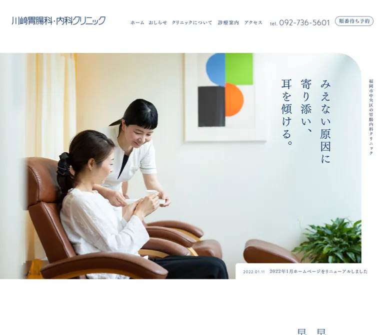
The desktop photograph begins directly below the 190px header. It extends from the left edge to approximately x 1365, leaving a narrow white rail on the right. Its upper-right corner is broadly rounded. The staff-and-patient interaction occupies the left half, while the pale wall provides room for the three-column vertical catchphrase:
みえない原因に 寄り添い、 耳を傾ける。
A small vertical clinic/location descriptor sits in the outer right rail. The composition depends on the asymmetry between a substantial photograph, a quiet copy area, and the narrow descriptor.
A white announcement strip overlaps the lower-right portion of the opening. Its visible desktop link has 18px 30px 18px 24px padding and a 52px height. The current screenshot shows a date followed by a short announcement title. Keep the date secondary and the title on a restrained horizontal line.
The mobile capture retains the vertical catchphrase at the upper right but shows a white hero field with no photograph. The announcement appears around y 422px, with 12px type and a 33px link height. The care statement starts around y 516px.
Repeated announcement entries exist in the DOM, and different items appear in the two opening captures. This suggests a cycling or clipped announcement component, but its interval, animation, controls, and pause behavior remain unverified. A static current-announcement link is the evidence-safe starting point for a reusable implementation.
Care Statement
Role: give the clinical philosophy a personal, reflective voice.
The desktop section is centered at approximately x 275, with a width of 890px. Paragraphs occupy tall, narrow rectangles of roughly 473px height. Their geometry indicates a vertical editorial composition; the supplied style fields do not include the actual writing-mode declaration. Paragraph type is 17px, with 35.7px line height and 2.72px tracking.
On mobile, the section becomes horizontal prose with approximately 35px side insets. The title 早期に発見、早期に治療。 wraps into two lines at 24px / 38.4px, with 3.84px tracking. Body paragraphs use 13px / 26px, with a measured 14px gap between successive paragraph boxes.
A pale pair of organic watercolor forms sits near the title in the mobile capture. The text link 見えない原因に耳を傾ける leads to /about; its mobile bounds place it toward the right beneath the statement.
Preserve paragraph grouping and deliberate short lines. Dense, full-width prose would lose the quiet rhythm of this section.
Announcement List
Role: surface timely clinical notices and availability information.
Four announcement headings are present, covering patient instructions, vaccination, temporary closures, and endoscopy availability. On desktop, the section is 1000px wide and its heading rows are approximately 69px high. On mobile, the content width is approximately 366.63px, with row heights ranging from 82.39px to 127.17px as titles wrap.
This is a text-led component. Dates and headings carry the hierarchy; there is no evidence of a thumbnail-card presentation. Detailed notice text also exists in the DOM, but an expanded state was not supplied. Do not assert accordion behavior or invent disclosure icons without further evidence.
For an adaptation, retain clear row separation and allow long Japanese titles to wrap naturally. Any added accordion behavior should use actual buttons with explicit expanded states.
Interior Photography Pair
Role: make the physical environment tangible between information sections.
The desktop middle capture shows two neighboring interior photographs: a clinic sign and artwork on the left, and a warm waiting-area scene with books, furniture, framed art, and flowers on the right.
The visible widths are approximately 545px each, with a 20px gap, forming a centered band about 1110px wide. These are screenshot estimates. The crop does not establish the images' complete heights or native aspect ratios.
Keep the pair visually quiet: straight edges, no captions competing with the images, and generous white space before the centered department heading. The mobile arrangement of this pair was not visually documented.
Clinical Department Panel
Role: group the three principal service pathways.
A centered Japanese section heading sits above the English subtitle Clinical Department. The panel begins 55px below the heading's measured box on desktop and 32px below it on mobile.
The desktop panel is 1240px wide, with a pale blue fill, 14px radius, and 48px 44px 60px padding. A centered, two-line introduction uses 22px / 41.8px Mincho text. Beneath it is one shared white inset surface containing three service columns.
The shared surface matters: these are not three independent floating cards. Fine vertical dotted separators and internal padding distinguish the columns. Each column contains:
- A clinical photograph.
- A Japanese service title.
- A smaller English service label.
- A wide capsule detail link.
The observed destinations are /gastroscopy, /colonoscopy, and /internal. Desktop detail links measure approximately 309.33 × 48px, with 15px text, 1.5px tracking, and a 30px radius.
On mobile, the outer pale-blue panel spans the full 390px width and loses its radius. The introduction becomes 13px / 24.7px and wraps across three lines. Service items become compact horizontal rows rather than tall stacked cards. The linked image slot is 100px wide; the heading begins 122px to its right, consistent with a 22px gap. Each main row link measures 319 × 88px, with 14px between successive row starts after accounting for height.
The mobile link geometry indicates an overlay spanning the row. Its exact layering and visual arrow were not supplied. A recommended implementation is one accessible link per row, avoiding nested or duplicated focus targets.
Consultation Hours, Referrals, and Payments
Role: consolidate the practical details needed before a visit.
The desktop lower information area uses two columns. The left contains clinic contact information, a timetable, and a narrow important-notice row. The right contains referral information, a list of hospitals, short notes, and payment logos.
The timetable uses fine horizontal rules, restrained navy labels, small circle/dash availability marks, and smaller reception-cutoff text below the main times. A pale label distinguishes the endoscopy-only interval. The visual treatment is closer to a carefully typeset schedule than a heavy bordered spreadsheet.
The important-notice row combines a compact label, a vertical divider, and a single-line linked title that visibly truncates in the desktop capture. Preserve access to the complete notice through its link.
The payment strip shows Visa, Mastercard, JCB, American Express, and Diners Club marks. Their original brand colors remain intact. They are functional content, not a new decorative color system.
On mobile, the information section becomes a single block with 29.25px side padding. The Sunday/holiday closure note appears immediately after the timetable. Hospital names wrap where needed. The upper portion of the desktop information section is not fully represented in the supplied visual crops, so its unsampled imagery and spacing should not be reconstructed from assumption.
Reservation Explanation
Role: explain the online queue and the expected arrival process.
A pale lavender box contains an underlined-looking title, one explanatory paragraph, and two smaller notes. On desktop it occupies the left side of a two-column group, approximately 500px wide. The heading begins 34px inside the panel; the main paragraph uses 15px / 27px and 0.9px tracking.
The mobile panel is approximately 343px wide, with 30px internal horizontal padding. Its heading remains 16px, while the paragraph becomes 13px / 24.7px. The supplied mobile screenshot shows a panel about 302px high and a small corner radius.
The text describes a consultation queue, including notification and arrival instructions. Keep the distinction between joining that queue and contacting the clinic for examination reservations. This explanation is informational; it should not be flattened into a generic booking slogan.
Map and Directions
Role: help patients plan the journey to the clinic.
The desktop map sits to the right of the reservation note in a 1040px group with an approximately 40px gap. The visible map is about 500px wide. A filled navy capsule overlays its lower-right corner.
The directions control measures 142.25 × 42px on desktop, with 16px text, 2.56px tracking, and asymmetric padding reserving room for a fine right arrow. On mobile it becomes 125.20 × 39px, with 13px text.
The supplied link points to a Google Maps directions URL containing the clinic address. The destination was not opened, and map panning or zooming was not exercised.
On mobile, the map appears above the reservation explanation, despite the explanation preceding it in the supplied DOM text. Preserve that observed visual order when matching the mobile composition, while also considering keyboard and screen-reader reading order in a new implementation.
Footer and Return-to-Top Control
Role: repeat the essential identity and contact paths at the end of the page.
The desktop footer begins 180px after the map/note group. It has three broad content areas:
- Screening-registration text, the clinic wordmark, a three-line English clinic name, and small copyright text.
- A filled reservation capsule, two underlined informational lines, address, telephone, fax, and closure information.
- Two compact navigation lists and a fine upward arrow at the far right.
The footer wordmark link is 244px wide on desktop. The telephone is 27px in HalisGR-Book. Navigation links use 15px Mincho text and approximately 31px row heights.
Mobile becomes a single column with 29.25px side padding and a 100px preceding gap. The wordmark link is 230px wide, the telephone is 22px, and the English display name and navigation lists are absent from the visible mobile footer. The reservation, address, telephone, fax, closure note, and copyright remain.
The return-to-top anchor points to /#. Its measured box is 65 × 78px on desktop and 58 × 67.36px on mobile, including 20px padding. The visible arrow is much smaller than that box. Smooth scrolling and sticky positioning were not verified.
Tokens — Motion & Interaction
| Element or behavior | Evidence | What can be reused safely |
|---|---|---|
| Desktop links | Computed transition 0.15s ease-out |
A short 150ms ease-out response; changed properties and hover endpoints remain unverified |
| Mobile links | Serialized transition all, without a nonzero duration |
Do not assume the desktop transition duration applies on mobile |
| Sampled element animations | animation: none |
No named animation on those sampled elements at capture time; this does not prove the entire page is static |
| Opening announcements | Repeated DOM entries and different visible items across captures | Preserve the compact announcement slot; cycling mechanics are unverified |
| Mobile menu | Closed icon visible | Opening, closing, focus behavior, and overlay appearance remain unverified |
| Announcement bodies | Additional text in the DOM | Disclosure behavior remains unverified |
| Reservation action | Anchor to https://ssc7.doctorqube.com/kawasaki-ichouka/ |
Preserve the queue-reservation purpose; the external flow was not tested |
| Telephone | tel:092-736-5601 anchors |
Native telephone-link behavior is represented by the href |
| Directions | Google Maps directions href | Preserve an explicit route action; no map interaction was tested |
| Return to top | Anchor to /# |
A top-of-page destination; scrolling animation is unverified |
The capture process waited for document readiness, sampled layout stability, visible image decoding, and finite animation settling within stated limits. Perpetual animations were temporarily paused during checks and resumed afterward. Those checks do not establish that every delayed asset appeared or that all possible motion was observed.
Recommended motion: use subtle link feedback and avoid introducing parallax, continuous floating decorations, dramatic image zooms, or animated counters. If a news rotation is added, provide a pause mechanism and reduced-motion behavior. Keep content usable without animation.
Surfaces
| Layer | Appearance | Function |
|---|---|---|
| Page | Solid white | Continuous reading canvas and broad section intervals |
| Hero | Full-color photograph with one large rounded corner | Human introduction and visual identity |
| Department grouping | Pale blue with 14px desktop radius |
Groups related clinical pathways |
| Department interior | White with a fine border and dotted separators | Separates three choices within one shared surface |
| Reservation note | Very pale lavender with small rounding | Distinguishes explanatory guidance |
| Schedule | White with thin horizontal rules | Organizes dense operational information |
| Action capsule | Navy fill and white type, or a fine navy outline | Marks a small number of practical actions |
There is no visible general-purpose shadow system in the supplied captures. Separation comes from whitespace, pale fills, thin rules, and modest changes in shape.
Imagery
The photographs show a lived-in clinical environment rather than an abstract medical brand. Warm wood, brown seating, books, framed artwork, curtains, and plants soften the clinical setting. Staff-patient interaction is shown at a comfortable distance, with natural light and room context remaining visible.
The hero depends on subject placement: care activity toward the left and a pale, relatively quiet area toward the right. A replacement image should support that composition. Do not put text over a busy face, monitor, or high-contrast plant cluster.
Small watercolor forms add a soft, translucent counterpoint to the precise typography. In the mobile care section, paired pale green-blue shapes appear beside the title; a pink-and-blue cluster appears near the lower desktop information area. Their exact anatomy and asset construction are not established, so describe and reuse their visual qualities without inventing medical meanings.
Observed Asset References
No original image URLs, filenames, SVG markup, or native image dimensions were included in the evidence. The references below identify visible roles, not downloadable assets.
| Asset role | Current-page evidence | Reuse guidance |
|---|---|---|
| Hero care photograph | Desktop opening capture | Keep the interaction left and calm wall space right |
| Clinic wordmark | Desktop/mobile header and footer | Use authorized artwork; do not substitute an arbitrary font and call it exact |
| Vertical catchphrase | Both opening captures | Preserve its three-column arrangement and measured bounds |
| Interior sign photograph | Desktop middle capture, left image | Retain warm light, sign, and framed artwork |
| Waiting-area photograph | Desktop middle capture, right image | Preserve books, furniture, art, and flowers as environmental detail |
| Department photography | Desktop middle capture and service DOM structure | Use clinical scenes appropriate to each department |
| Watercolor details | Mobile opening and desktop lower capture | Keep pale, small, and secondary to text |
| Payment marks | Desktop lower capture | Use accurate, authorized brand marks |
| Map | Desktop and mobile lower captures | Preserve location legibility and a separate directions action |
CSS can reproduce the layout and token system. It cannot supply the clinic's identity artwork or recreate the photographed environment.
Layout & Responsive Behavior
Observed Changes
| Area | Desktop at 1440px |
Mobile at 390px |
|---|---|---|
| Header | 190px high; full navigation and telephone |
80px high; small descriptor, wordmark, queue link, menu icon |
| Hero | Large photograph, vertical copy, outer descriptor rail | Vertical copy over a blank captured field; descriptor moved to header |
| Care statement | Tall, narrow text geometry indicating vertical composition | Horizontal paragraphs and a two-line title |
| Announcements | Wide, mostly single-line heading rows | Taller rows with natural wrapping |
| Department surface | Centered 1240px panel, rounded corners |
Full width, square outer corners |
| Department choices | Three photographic columns with capsule links | Three compact horizontal rows with broad link overlays |
| Practical information | Two columns | One column with narrower type and wrapping |
| Map and note | Note left, map right | Map first, note second |
| Footer | Multiple content groups, English name, navigation | Essential contact information in one column |
The layout uses several widths rather than one universal container: approximately 890px for the statement, 1000px for announcements, 1110px for the observed photo pair, 1240px for departments, and 1040px for the map/note group. This changing rhythm is part of the design.
No source media-query thresholds were provided. The CSS below recommends an earlier header collapse at 1200px and a main layout change at 767px. These are practical adaptation breakpoints, not recovered original values. Tablet and intermediate-width behavior require testing.
The mobile blank hero should remain an explicit evidence limitation. If matching that capture is necessary, implement it as a selectable capture state. Do not conclude that all mobile visits intentionally omit the photograph.
Do’s and Don’ts
Do
- Use the exact navy
#1C4370against a predominantly white canvas. - Preserve the distinction between pale-blue service grouping and the lavender reservation note.
- Keep Japanese body copy regular-weight, generously led, and carefully tracked.
- Pair Mincho text with lighter Latin telephone numerals.
- Preserve the large asymmetric desktop hero and its narrow outer descriptor rail.
- Treat wordmarks and catchphrases as identity assets when their construction is unknown.
- Use one shared white surface for the desktop service columns.
- Recompose service items into compact horizontal rows on mobile.
- Retain the mobile map-before-note order and the simplified footer.
- Use patient-care and interior photographs that leave room for the layout's quiet areas.
- Keep the distinction between joining the consultation queue and arranging examinations by telephone.
- Mark uncertain motion, asset visibility, and font resolution as unverified.
Don’t
- Don't replace the restrained interface with oversized promotional headlines and repeated full-width CTAs.
- Don't make every section a shadowed, rounded card.
- Don't introduce an unrelated bright action color.
- Don't apply bold sans-serif typography across all Japanese content.
- Don't use the inherited body line-height of
1for paragraphs. - Don't interpret an image anchor's
21pxor22pxline box as the image height. - Don't treat a heading container's font size as the size of lettering inside an image.
- Don't assume three desktop service columns become three tall mobile cards.
- Don't infer a carousel duration, dropdown animation, or accordion from DOM presence alone.
- Don't turn the missing mobile hero photograph into an asserted permanent design rule.
- Don't treat generic CMS preset gradients as part of the visible palette.
Recommended Implementation Additions
These are recommendations for a new implementation, not verified original features:
- Give the menu icon and return-to-top arrow explicit accessible names. If a mobile navigation panel is added, manage focus and expose its expanded state.
- Preserve the small visual reservation capsule while expanding its usable touch target to at least
44 × 44pxwhere practical. - Supply accessible text for lettering assets, especially the clinic identity and hero catchphrase. Decorative watercolor artwork should have empty alternative text.
- Use semantic table headers and accessible meanings for timetable circles and dashes.
- Make each mobile department row one coherent link, with a visible focus outline and no nested anchors.
- Keep essential consultation and booking information available as text, independent of image loading.
- Ensure long announcement titles remain fully accessible even when visually truncated in narrow utility rows.
- Match visual and logical reading order for the mobile map and reservation note wherever possible.
- Load properly licensed fonts and test their fallbacks. The supplied declarations do not include usable font files.
- If announcements rotate, allow pausing and avoid repeatedly announcing cloned items to assistive technology.
- Test enlarged text, intermediate widths, and map fallbacks; only two viewport sizes were supplied.
Agent Prompt Guide
Quick Color Reference
- Canvas:
#FFFFFF. - Main text, arrows, and filled actions:
#1C4370. - Clinical grouping:
#F1F8F9. - Reservation guidance:
#F2F4FB, matching the declared token and observed pale-lavender appearance. - Fine rules:
#D5DCE5and#E6EAEF. - Color outside the interface: warm photography, pale watercolor forms, payment marks, and map content.
Overall Prompt
“Create a Japanese clinic homepage with a white canvas, navy #1C4370 typography, regular-weight Mincho text, generous paragraph leading, and substantial white space between sections. Use a warm care photograph across most of the desktop opening, with one large rounded upper-right corner, vertical copy on its quiet right side, and a narrow vertical clinic descriptor outside the photograph. Follow with a reflective care statement, compact dated notices, interior photography, and a pale-blue clinical-department panel containing three columns inside one white surface. Finish with consultation information, a map, a pale-lavender queue explanation, and a practical contact footer. On mobile, use horizontal prose, compact service rows, the map before the note, and a reduced footer. Treat mobile hero-image visibility as a configurable state because the supplied capture was blank.”
Example Component Prompts
- Header: “Build a spacious white desktop clinic header with a narrow navy wordmark, quiet text navigation, a light sans-serif telephone number, and a small outlined queue-reservation capsule. At narrow widths, show the clinic descriptor above a smaller wordmark and place a compact reservation control beside a three-line menu icon.”
- Care statement: “Set a short Japanese clinical philosophy in regular Mincho with generous leading. Use a tall editorial composition on desktop and horizontal paragraphs on mobile. The mobile title is
24px / 38.4pxwith0.16emtracking; place a very pale organic watercolor detail beside it.” - Department group: “Create a centered pale-blue
#F1F8F9panel with a14pxdesktop radius. Place a two-line Mincho introduction above one white inset surface. Divide that surface into three photographic service columns using fine dotted separators, Japanese titles, small English subtitles, and restrained capsule links.” - Mobile department row: “Convert each department to an approximately
88px-high row with a100pximage slot, a22pxgap, and compact title/subtitle content. Make the row one accessible link. Keep the outer pale-blue section full width with square corners.” - Arrival information: “Pair a map with a pale-lavender queue explanation. Use a small navy directions capsule over the map's lower-right corner. Desktop places the explanation left and map right; mobile places the map above the explanation with approximately
25pxseparation.” - Footer: “Create a white clinic footer with small registration text, the navy wordmark, a filled queue-reservation capsule, underlined booking guidance, address, telephone, fax, closure information, and a fine upward arrow. Keep the desktop English name and navigation groups, but simplify mobile to essential contact information.”
Quick Start
CSS Custom Properties
This is an implementation scaffold, not recovered source CSS. It uses the measured palette and typography, with estimated geometry and recommended responsive behavior explicitly noted. Supply authorized photographs and lettering assets separately. The .hero-copy class below expects a lettering image or equivalent artwork, so its width is independent of the inherited heading font size.
For service items, use an image, a title/subtitle group, and one link containing a .service-link-label. The mobile rule expands that link over the item. Keep the markup free of nested links.
:root {
  /* Measured colors and declared source tokens */
  --color-canvas: #ffffff;
  --color-navy: #1c4370;
  --color-navy-light: #4c637e;
  --color-bg-blue-light: #f1f8f9;
  --color-bg-navy-light: #f2f4fb;
  --color-line-navy: #d5dce5;
  --color-line-navy-light: #e6eaef;

  /* Observed family declarations; font files are not included */
  --font-jp: 'FOT-筑紫明朝 Pr6 M', '游明朝体', '游明朝',
    YuMincho, 'ヒラギノ明朝 ProN', 'Hiragino Mincho ProN',
    'MS P明朝', 'MS PMincho', serif;
  --font-phone-light: 'HalisGR-SLight', sans-serif;
  --font-latin: 'HalisGR-Book', sans-serif;

  --width-statement: 890px;
  --width-news: 1000px;
  --width-practical: 1040px;
  --width-departments: 1240px;
  --radius-panel: 14px;
  --radius-pill: 30px;
  --radius-note: 6px; /* Screenshot estimate */
  --motion-link: 150ms ease-out;
}

* { box-sizing: border-box; }

body {
  margin: 0;
  color: var(--color-navy);
  background: var(--color-canvas);
  font-family: var(--font-jp);
  font-size: 14px;
  font-weight: 400;
  line-height: 1.9; /* Readable scaffold, not the source body baseline */
}

a { color: inherit; }
img { display: block; max-width: 100%; }
button { font: inherit; color: inherit; }
h1, h2, h3, p { margin-block-start: 0; }
h1, h2, h3 { font-weight: 400; }

.site-header {
  position: relative;
  display: flex;
  align-items: flex-start;
  gap: 20px;
  height: 190px;
  padding: 55px 40px 0 65px;
}

.header-brand { flex: 0 0 317px; }
.header-brand img { width: 100%; }
.brand-caption, .mobile-tools { display: none; }
.site-nav { display: flex; margin-inline-start: auto; }
.site-nav a { padding: 12px 11px; text-decoration: none; }
.header-phone {
  white-space: nowrap;
  font: 400 29px/1 var(--font-phone-light);
  letter-spacing: 0.02em;
  text-decoration: none;
}

/* A larger interactive wrapper can contain a small visible capsule. */
.compact-action {
  display: inline-flex;
  align-items: center;
  justify-content: center;
  min-height: 44px;
  text-decoration: none;
}
.compact-action > span {
  display: block;
  padding: 6px 12px;
  border: 1px solid currentColor;
  border-radius: var(--radius-pill);
  line-height: 1.2;
}

.hero {
  position: relative;
  height: 810px; /* Opening-composition approximation */
}
.hero-media {
  width: calc(100% - 75px);
  height: 100%;
  overflow: hidden;
  border-top-right-radius: 80px; /* Screenshot estimate */
}
.hero-media img { width: 100%; height: 100%; object-fit: cover; }
.hero-copy {
  position: absolute;
  top: 93px;
  right: 191px;
  width: 164px;
  margin: 0;
}
.hero-copy img { width: 100%; height: auto; }
.hero-descriptor {
  position: absolute;
  top: 86px;
  right: 36px;
  writing-mode: vertical-rl;
  font-size: 14px;
  line-height: 1;
  letter-spacing: 0.14em;
}
.hero-news {
  position: absolute;
  right: 0;
  bottom: 0;
  display: flex;
  align-items: center;
  gap: 16px;
  width: 61.3%;
  min-height: 54px;
  padding: 18px 24px;
  border-top-left-radius: 10px;
  background: var(--color-canvas);
  font-size: 15px;
  line-height: 16px;
  letter-spacing: 0.1em;
  text-decoration: none;
}
.hero-news time { flex: none; font-family: var(--font-latin); }
.hero-news-title {
  min-width: 0;
  overflow: hidden;
  white-space: nowrap;
  text-overflow: ellipsis;
}

/* Recommended reconstruction of the tall desktop text geometry. */
.philosophy {
  display: flex;
  flex-direction: row-reverse;
  gap: 60px;
  width: min(var(--width-statement), calc(100% - 70px));
  margin: 200px auto 140px;
}
.philosophy-title {
  flex: none;
  writing-mode: vertical-rl;
  font-size: 30px; /* Adaptation value for live text */
  line-height: 1.7;
  letter-spacing: 0.16em;
}
.philosophy-copy {
  writing-mode: vertical-rl;
  height: 474px;
  font-size: 17px;
  line-height: 2.1;
  letter-spacing: 0.16em;
}
.philosophy-copy p { margin: 0 0 0 24px; }

.announcements {
  width: min(var(--width-news), calc(100% - 24px));
  margin-inline: auto;
}
.announcement-row {
  padding-block: 20px;
  border-bottom: 1px solid var(--color-line-navy-light);
  font-size: 16px;
  line-height: 1.7;
  letter-spacing: 0.08em;
}

.photo-pair {
  display: grid;
  grid-template-columns: repeat(2, minmax(0, 1fr));
  gap: 20px;
  width: min(1110px, calc(100% - 48px));
  margin: 140px auto;
}
.photo-pair img { width: 100%; height: auto; }
.section-heading { margin: 0 0 55px; text-align: center; }
.section-heading small {
  display: block;
  margin-top: 14px;
  font: 12px/1.4 var(--font-latin);
  letter-spacing: 0.16em;
  text-transform: uppercase;
}

.department-panel {
  width: min(var(--width-departments), calc(100% - 80px));
  margin-inline: auto;
  padding: 48px 44px 60px;
  border-radius: var(--radius-panel);
  background: var(--color-bg-blue-light);
}
.department-intro {
  margin-bottom: 40px;
  text-align: center;
  font-size: 22px;
  line-height: 1.9;
  letter-spacing: 0.12em;
}
.service-grid {
  display: grid;
  grid-template-columns: repeat(3, minmax(0, 1fr));
  padding-block: 36px;
  border: 1px solid var(--color-line-navy);
  border-radius: 12px; /* Screenshot estimate */
  background: var(--color-canvas);
}
.service-item { position: relative; min-width: 0; padding-inline: 37px; }
.service-item + .service-item {
  border-inline-start: 1px dotted var(--color-line-navy);
}
.service-photo {
  width: 100%;
  aspect-ratio: 4 / 3; /* Suggested crop; native ratio is unverified */
  object-fit: cover;
}
.service-title { margin: 24px 0 0; font-size: 18px; line-height: 1.5; }
.service-subtitle {
  display: block;
  margin-top: 5px;
  font: 12px/1.4 var(--font-latin);
  letter-spacing: 0.12em;
}
.service-link {
  display: block;
  margin-top: 28px;
  min-height: 48px;
  padding: 12px 14px;
  border: 1px solid var(--color-line-navy);
  border-radius: var(--radius-pill);
  background: var(--color-canvas);
  font-size: 15px;
  line-height: 22px;
  letter-spacing: 0.1em;
  text-align: center;
  text-decoration: none;
}

.hours-table { width: 100%; border-collapse: collapse; }
.hours-table th, .hours-table td {
  padding: 10px 6px;
  border-bottom: 1px solid var(--color-line-navy-light);
  text-align: center;
  font-weight: 400;
}
.hours-table th:first-child { text-align: left; }
.hours-table small { display: block; font-size: 10px; }

.visit-grid {
  display: grid;
  grid-template-columns: repeat(2, minmax(0, 1fr));
  gap: 40px;
  width: min(var(--width-practical), calc(100% - 48px));
  margin: 75px auto 0;
}
.queue-note {
  padding: 34px;
  border-radius: var(--radius-note);
  background: var(--color-bg-navy-light);
}
.queue-note h2 { font-size: 16px; line-height: 1.3; letter-spacing: 0.1em; }
.queue-note p { font-size: 15px; line-height: 1.8; letter-spacing: 0.06em; }
.queue-note ul { margin-bottom: 0; padding-inline-start: 1.5em; font-size: 12px; }
.map-panel { position: relative; min-height: 261px; }
.map-panel > img, .map-panel > iframe {
  display: block;
  width: 100%;
  height: 100%;
  min-height: 261px;
  border: 0;
  object-fit: cover;
}
.pill {
  display: inline-flex;
  align-items: center;
  gap: 14px;
  min-height: 44px; /* Recommended touch target */
  padding: 8px 20px;
  border-radius: var(--radius-pill);
  color: var(--color-canvas);
  background: var(--color-navy);
  line-height: 1.4;
  letter-spacing: 0.1em;
  text-decoration: none;
}
.map-directions { position: absolute; right: 15px; bottom: 18px; }

.site-footer {
  display: flex;
  align-items: flex-end;
  gap: 60px;
  margin-top: 180px;
  padding: 0 30px 50px 55px;
}
.footer-brand { flex: 0 0 305px; }
.footer-brand img { width: 244px; }
.footer-english {
  font-family: var(--font-latin);
  letter-spacing: 0.14em;
  line-height: 1.8;
}
.footer-phone {
  white-space: nowrap;
  font: 27px/1 var(--font-latin);
  letter-spacing: 0.04em;
  text-decoration: none;
}
.footer-nav { columns: 2; }
.footer-nav a { display: block; padding-block: 6px; text-decoration: none; }
.to-top { margin-inline-start: auto; padding: 20px; }

/* Recommended keyboard and hover treatments; endpoints were not observed. */
a:focus-visible, button:focus-visible {
  outline: 2px solid var(--color-navy);
  outline-offset: 4px;
}
@media (hover: hover) {
  a { transition: opacity var(--motion-link); }
  a:hover { opacity: 0.75; }
}

/* Suggested breakpoint for the wide header, not a recovered source value. */
@media (max-width: 1200px) {
  .site-header { height: 80px; padding: 32px 6.5vw 0; }
  .header-brand { flex-basis: 200px; }
  .brand-caption {
    display: block;
    margin-bottom: 12px;
    font-size: 11px;
    line-height: 1;
    letter-spacing: 0.1em;
  }
  .site-nav, .header-phone, .header-reserve { display: none; }
  .mobile-tools {
    position: absolute;
    top: 20px;
    right: 14px;
    display: flex;
    align-items: center;
    gap: 4px;
  }
  .mobile-tools .compact-action > span { padding: 3px 7px; font-size: 10px; }
  .menu-toggle { width: 44px; height: 44px; padding: 10px; border: 0; background: none; }
}

/* Suggested main layout breakpoint. */
@media (max-width: 767px) {
  body { font-size: 13px; }
  .hero { height: 376px; }
  .hero-media { width: 100%; border-radius: 0; }
  .hero-copy { top: 20px; right: 26px; width: 94px; }
  .hero-descriptor { display: none; }

  /* Optional reproduction of the supplied blank mobile capture only. */
  .clinic-page[data-mobile-hero='blank'] .hero-media { visibility: hidden; }

  .hero-news {
    width: 100%;
    min-height: 33px;
    gap: 12px;
    padding: 10px 18px;
    border-radius: 0;
    font-size: 12px;
    line-height: 13px;
  }
  .philosophy { display: block; width: auto; margin: 60px 0 80px; padding-inline: 9vw; }
  .philosophy-title {
    writing-mode: horizontal-tb;
    font-size: 24px;
    line-height: 1.6;
    letter-spacing: 0.16em;
  }
  .philosophy-copy {
    writing-mode: horizontal-tb;
    height: auto;
    font-size: 13px;
    line-height: 2;
    letter-spacing: 0.04em;
  }
  .philosophy-copy p { margin: 0 0 14px; }
  .announcement-row { font-size: 14px; line-height: 1.6; }
  .photo-pair { gap: 10px; margin-block: 80px; }
  .section-heading { margin-bottom: 32px; }
  .department-panel { width: 100%; padding: 32px 5vw 6.5vw; border-radius: 0; }
  .department-intro { font-size: 13px; line-height: 1.9; letter-spacing: 0.13em; }
  .service-grid { display: block; padding: 16px 15px; }
  .service-item {
    display: grid;
    grid-template-columns: 100px minmax(0, 1fr);
    align-items: center;
    gap: 22px;
    min-height: 88px;
    padding: 0;
  }
  .service-item + .service-item { margin-top: 14px; border: 0; }
  .service-photo { width: 100px; }
  .service-title { margin: 0; font-size: 14px; }
  .service-subtitle { font-size: 10px; }
  .service-link {
    position: absolute;
    inset: 0;
    min-height: 0;
    margin: 0;
    padding: 0;
    border: 0;
    border-radius: 0;
    background: transparent;
  }
  .service-link-label {
    position: absolute;
    width: 1px;
    height: 1px;
    overflow: hidden;
    clip-path: inset(50%);
    white-space: nowrap;
  }
  .visit-grid { grid-template-columns: 1fr; width: 88%; gap: 25px; }
  .map-panel { order: -1; }
  .queue-note { padding: 30px; }
  .queue-note p { font-size: 13px; line-height: 1.9; letter-spacing: 0.04em; }
  .site-footer { display: block; margin-top: 100px; padding: 0 7.5vw 60px; }
  .footer-brand img { width: 230px; }
  .footer-english, .footer-nav { display: none; }
  .footer-phone { font-size: 22px; }
  .to-top { display: block; width: fit-content; margin-inline-start: auto; }
}

@media (prefers-reduced-motion: reduce) {
  a { transition: none; }
}
The scaffold intentionally leaves menu behavior, notice disclosure, announcement rotation, and map integration to separate implementation. Its mobile photo-pair arrangement and live-text title sizing are recommendations because those exact details were not measured. The optional blank-hero attribute reproduces the supplied state without asserting why the original capture looked that way.
Tailwind v4 Token Mapping
Optional aliases for a project already using Tailwind v4. This does not imply that the original website uses Tailwind. Define the custom properties above first.
@theme inline {
  --color-canvas: #ffffff;
  --color-ink: #1c4370;
  --color-ink-muted: #4c637e;
  --color-clinical: #f1f8f9;
  --color-note: #f2f4fb;
  --color-rule: #d5dce5;
  --color-rule-light: #e6eaef;

  --font-editorial: var(--font-jp);
  --font-utility: var(--font-latin);
  --font-phone: var(--font-phone-light);

  --text-body-mobile: 13px;
  --text-body-desktop: 15px;
  --text-statement-mobile: 24px;
  --text-phone-mobile: 22px;
  --text-phone-desktop: 29px;

  --radius-panel: 14px;
  --radius-note: 6px;
  --radius-pill: 30px;
}
Sources & Evidence
- Inspected original website: https://kawasaki-ichouka.com/.
- Final URL: https://kawasaki-ichouka.com/, unchanged from the original; supplied HTTP status
200. - Capture timestamp:
2026-10-01T20:46:56.238Z, corresponding to October 2, 2026, 05:46 JST. - Desktop evidence:
1440 × 1000viewport, approximately6354pxdocument height; opening, middle, and lower-page screenshots; rendered text, hrefs, element bounds, computed typography, transition summaries, and custom properties. - Mobile evidence:
390 × 844viewport, approximately4726pxdocument height; opening and lower-page screenshots plus equivalent rendered DOM and style evidence. - Observed states: the supplied settled captures at their respective scroll positions. The evidence documents the closed mobile menu, visible links, and responsive layouts; it does not document successful interaction with menus, disclosures, external reservation pages, map controls, or the return-to-top control.
- Limitations: no original asset URLs, font files, complete stylesheet, source media queries, hover endpoints, or animation timelines were supplied. Some heading and link rectangles describe containers rather than visible artwork. The mobile hero photograph is absent from the supplied capture, with its cause unresolved. Only two viewport sizes were inspected.
This reference describes the current homepage represented by that evidence. Measurements, visual estimates, and recommended implementation choices are distinguished throughout; no additional browsing or file inspection was performed.
# Kawasaki Gastroenterology & Internal Medicine Clinic — Style Reference

> Navy Mincho typography, expansive white space, and warm photographs of everyday care.

**Original URL:** [https://kawasaki-ichouka.com/](https://kawasaki-ichouka.com/)
**Final URL:** [https://kawasaki-ichouka.com/](https://kawasaki-ichouka.com/)
**Theme:** light; white canvas, navy typography, and two very pale supporting surfaces.
**Inspected:** October 2, 2026, 05:46 JST; supplied retrieval timestamp: `2026-10-01T20:46:56.238Z`.
**Viewports:** desktop `1440 × 1000` CSS pixels; mobile `390 × 844` CSS pixels.
**Scope:** the current public homepage, including its opening composition, care statement, announcement content, interior photography, clinical departments, consultation information, reservation explanation, map, and footer. Visual evidence consists of three desktop crops and two mobile crops, supplemented by rendered DOM measurements and computed styles. Linked pages and expanded navigation states were not inspected.

The homepage for 川﨑胃腸科・内科クリニック combines a considered editorial presentation with practical patient information. Its character comes from regular-weight Japanese Mincho text, slender navy marks, small outlined or filled capsules, and unusually generous intervals between sections. Photography supplies warmth through wood, leather, plants, books, artwork, and interactions between staff and patients.

The structure supports several patient tasks: understanding the clinic, choosing a clinical department, reading announcements, checking hours, joining the consultation queue, and finding the address. On desktop, a large care photograph and vertical copy establish the opening. Below it, the layout moves through quieter editorial content into increasingly practical information. Mobile changes the composition substantially, including horizontal narrative text, compact department rows, and a map placed before the reservation explanation.
閉じる
# Kawasaki Gastroenterology & Internal Medicine Clinic — Style Reference

> Navy Mincho typography, expansive white space, and warm photographs of everyday care.

**Original URL:** [https://kawasaki-ichouka.com/](https://kawasaki-ichouka.com/)
**Final URL:** [https://kawasaki-ichouka.com/](https://kawasaki-ichouka.com/)
**Theme:** light; white canvas, navy typography, and two very pale supporting surfaces.
**Inspected:** October 2, 2026, 05:46 JST; supplied retrieval timestamp: `2026-10-01T20:46:56.238Z`.
**Viewports:** desktop `1440 × 1000` CSS pixels; mobile `390 × 844` CSS pixels.
**Scope:** the current public homepage, including its opening composition, care statement, announcement content, interior photography, clinical departments, consultation information, reservation explanation, map, and footer. Visual evidence consists of three desktop crops and two mobile crops, supplemented by rendered DOM measurements and computed styles. Linked pages and expanded navigation states were not inspected.

The homepage for 川﨑胃腸科・内科クリニック combines a considered editorial presentation with practical patient information. Its character comes from regular-weight Japanese Mincho text, slender navy marks, small outlined or filled capsules, and unusually generous intervals between sections. Photography supplies warmth through wood, leather, plants, books, artwork, and interactions between staff and patients.

The structure supports several patient tasks: understanding the clinic, choosing a clinical department, reading announcements, checking hours, joining the consultation queue, and finding the address. On desktop, a large care photograph and vertical copy establish the opening. Below it, the layout moves through quieter editorial content into increasingly practical information. Mobile changes the composition substantially, including horizontal narrative text, compact department rows, and a map placed before the reservation explanation.

## How to Read This Reference

- **Measured** means a value supplied by the rendered DOM or computed-style evidence. Measurements describe the two inspected viewport states, not an independently recovered stylesheet.
- **Estimated** means a visual approximation from the supplied current-page screenshots. Estimated corner radii and image bounds are identified explicitly.
- **Recommended** means a reusable implementation choice. Suggested breakpoints, accessibility improvements, and CSS classes are not claims about the original implementation.
- **Source tokens** retain the actual custom-property names where available. Other token names are descriptive aliases.
- A declared font family does not prove which font file rendered every glyph. Font loading and individual glyph resolution were not supplied.
- Several image-like labels have empty anchor or heading text. Their container font size is not a reliable measurement of the visible lettering. Likewise, a short inline anchor rectangle is not the full height of its contained image.
- The mobile opening capture contains no visible hero photograph. This is a documented capture state; the evidence does not establish whether the image was intentionally suppressed, unavailable, or awaiting another state.

## Tokens — Colors

### Core Palette

| Name | Value | Source or alias | Evidence and role |
| --- | --- | --- | --- |
| White canvas | `#FFFFFF` | Alias `--color-canvas` | Measured body background at both viewports; also measured on desktop department links |
| Navy ink | `#1C4370` | Source `--color-navy` | Measured body text, headings, links, and filled directions/reservation controls |
| Pale blue surface | `#F1F8F9` | Source `--color-bg-blue-light` | Measured clinical-department panel background at both viewports |
| Pale lavender surface | `#F2F4FB` | Source `--color-bg-navy-light` | Declared token; visually consistent with the reservation note. That note's own background was not separately sampled |
| Secondary navy | `#4C637E` | Source `--color-navy-light` | Declared token; a specific rendered assignment was not established |
| Navy rule | `#D5DCE5` | Source `--color-line-navy` | Declared line token; suitable for the visibly delicate panel and table boundaries |
| Lighter navy rule | `#E6EAEF` | Source `--color-line-navy-light` | Declared line token; individual border assignments were not supplied |

The interface is predominantly white and navy. Pale blue groups the clinical departments; a slightly lavender note separates queue instructions from the surrounding page. Filled navy appears in small, purposeful controls rather than large promotional bands.

Photographs, watercolor details, payment logos, and the map introduce additional colors. These are content colors, not evidence of a larger UI accent palette. The many generic CMS color and gradient presets in the supplied properties are not demonstrated design tokens for this homepage.

### Color Application

- Keep the main text and fine arrow strokes in navy.
- Use white text on navy for directions and the footer reservation control.
- Use the pale surfaces to group information without creating heavy card elevation.
- Let warm image colors remain localized to photographs.
- Do not infer alternate themes or a dark mode; neither was observed.

## Tokens — Typography

### Japanese Editorial Text

**Measured body stack:**

```css
'FOT-筑紫明朝 Pr6 M', '游明朝体', '游明朝', YuMincho,
'ヒラギノ明朝 ProN', 'Hiragino Mincho ProN',
'MS P明朝', 'MS PMincho', serif
```

The source exposes this stack as `--font-min-m`. Sampled body text, paragraph text, navigation anchors, and headings generally report weight `400`. The effect is restrained and literary, with tracking and line spacing doing more hierarchical work than bold weight.

A second stack, `--font-min-d`, starts with `FOT-筑紫明朝 Pr6 D`. Its declaration is present, but the supplied samples do not establish a particular visible use. Do not automatically assign it to all headings.

### Telephone and Latin Utilities

- **Header telephone:** measured `HalisGR-SLight, sans-serif`, exposed as `--font-sans-slight`.
- **Footer telephone:** measured `HalisGR-Book, sans-serif`, exposed as `--font-sans-book`.
- **Additional declaration:** `--font-sans-sbook` contains `HalisGR-SBook, sans-serif`; no specific sampled role was established.
- **Additional declaration:** `--font-serif` contains `ACaslonPro-Regular, sans-serif`. Preserve awareness of the actual sans-serif fallback, but do not assign this family to an unverified component.

Small English subtitles and the multi-line English clinic name visually contrast with the Japanese Mincho text. Their exact family was not independently sampled. A Halis family is a reasonable implementation choice when licensed and available, but that assignment should remain labeled as a recommendation.

### Lettering Assets and Container Metrics

The clinic wordmark has a distinctive narrow shape. The main vertical catchphrase is visible in the screenshots, while its sampled `H2` text is empty. Treat these as supplied lettering or artwork whose internal construction remains unverified. Do not claim an SVG format or infer a font from appearance alone.

The hero heading container measures `164 × 281px` on desktop and `94 × 161.05px` on mobile. Its computed font sizes, `21px` and `19.5px`, should not be used as the visible catchphrase's type size.

### Type Scale

All values below are measured unless identified otherwise. Desktop and mobile values are shown separately rather than interpolated into an invented fluid scale.

| Role | Desktop size / line height | Mobile size / line height | Tracking and notes |
| --- | --- | --- | --- |
| Body baseline | `14 / 14px` | `13 / 13px` | Inherited baseline only; paragraphs override it |
| Clinic/location descriptor | `14 / 14px` | `11 / 11px` | `1.96px` desktop; `1.1px` mobile |
| Header telephone | `29 / 29px` | Not visible in mobile header | `0.58px`; HalisGR-SLight |
| Footer telephone | `27 / 27px` | `22 / 22px` | `1.08px` / `0.88px`; HalisGR-Book |
| Care-statement paragraphs | `17 / 35.7px` | `13 / 26px` | `2.72px` / `0.52px` |
| Mobile care-statement title | Desktop artwork/container requires separate treatment | `24 / 38.4px` | Mobile tracking `3.84px` |
| Opening announcement link | `15 / 15px` | `12 / 12px` | `1.5px` / `1.2px` |
| Announcement heading | `16 / 27.2px` | `14 / 22.4px` | `1.28px` / `1.12px` |
| Department introduction | `22 / 41.8px` | `13 / 24.7px` | `2.64px` / `1.69px` |
| Reservation-note title | `16 / 16px` | `16 / 16px` | `1.6px` at both sizes |
| Reservation-note paragraph | `15 / 27px` | `13 / 24.7px` | `0.9px` / `0.52px` |
| Directions control | `16 / 16px` | `13 / 13px` | `2.56px` / `1.3px` |
| Footer reservation control | `15 / 15px` | `13 / 13px` | `1.5px` / `1.3px` |

Do not copy the body's `1` line-height into ordinary running text. The readable character of the page depends on paragraph-specific values around `1.8–2.1`.

## Tokens — Spacing & Shapes

There is no verified universal spacing unit. The source uses distinct desktop pixel measurements and mobile insets that correspond to different proportions of the viewport. A reusable system should preserve these relationships instead of forcing everything into one eight-pixel grid.

### Measured Spacing

| Use | Desktop | Mobile |
| --- | --- | --- |
| Header padding | `55px 40px 0 65px` | `32px 25.34px 0` |
| Care-statement horizontal space | Centered `890px` section | `35.09px` side padding |
| Gap after care statement before announcements | Approximately `140px` from section bounds | `80px` from section bounds |
| Announcement section width | `1000px` | `390px`, with `11.69px` side padding |
| Department panel padding | `48px 44px 60px` | `32px 19.5px 25.34px` |
| Section-heading to department-panel gap | `55px` | `32px` |
| Reservation-note text inset | `34px`, derived from aligned bounds | `30px`, derived from aligned bounds |
| Map/note group width | `1040px` | `343.19px` |
| Gap before footer | `180px` | `100px` |
| Footer padding | `0 0 50px 55px` | `0 29.25px 60px` |

At `390px`, the measured header, statement, and footer side insets correspond to approximately `6.5vw`, `9vw`, and `7.5vw`. Those are calculated equivalents at one viewport, not verified source formulas.

### Shapes

| Element | Value | Status |
| --- | --- | --- |
| Desktop department panel | `14px` radius | Measured |
| Mobile department panel | `0` radius | Measured |
| Reservation and directions capsules | `30px` radius | Measured |
| Desktop department detail links | `30px` radius | Measured |
| Mobile department overlay links | `0` radius | Measured |
| Hero upper-right corner | Approximately `80px` | Screenshot estimate |
| Shared white department surface | Approximately `10–12px` | Screenshot estimate |
| Reservation-note surface | Approximately `6px` | Screenshot estimate |
| Interior photographs | Visually square corners | Observed appearance |

The large hero corner is a compositional gesture. Smaller radii organize information, and capsules identify actions. Avoid applying the hero's generous rounding to every photograph and content block.

### Layout Measurements

| Element | Desktop | Mobile |
| --- | --- | --- |
| Header height | `190px` | `80px` |
| Hero catchphrase bounds | `164 × 281px` | `94 × 161.05px` |
| Catchphrase position in opening viewport | Approximately `x 1085, y 283.14` | `x 270, y 100` |
| Care statement | `890 × 473.28px` section | `390 × 481.78px` including padding |
| Department panel | `1240 × 697.59px` | `390 × 470.41px` |
| Department content/link width | Approximately `309.33px` per desktop item | `319px` row link |
| Mobile department row link | Not applicable | `319 × 88px`, repeated at `102px` intervals |
| Reservation/map group | `1040 × 261.17px` | `343.19 × 587.13px` |
| Footer | `1440 × 285.02px` | `390 × 351.98px` |
| Reported document height | Approximately `6354px` | Approximately `4726px` |

The shorter mobile document does not mean the desktop page simply stacks into one column. It uses smaller compositions, different service-item anatomy, and reduced footer content.

## Components

### Header

**Role:** identify the clinic and expose navigation, telephone contact, and queue reservation.

The desktop header is a large white band. The wordmark sits at the left, followed by an unboxed navigation group, a comparatively large telephone number, and an outlined reservation capsule. The measured logo-link width is `317px`. Navigation anchors generally have `12px 11px` padding and `40px` height.

The header telephone uses the lighter Halis face at `29px`, making it prominent without introducing a bold weight or a filled background. The reservation control measures `127 × 32px` with a `30px` radius.

On mobile, the wordmark link becomes `200px` wide. A small horizontal clinic/location descriptor appears above it. The right side contains the compact `順番予約` control and a three-line menu icon. The visible reservation anchor is only about `56.61 × 20px`, with `10px` text. A larger touch target is recommended for a new implementation.

The desktop navigation and telephone are absent from the mobile opening capture. The menu's open state, desktop submenu behavior, and header stickiness were not verified. Department submenu links in the DOM do not prove that a dropdown was visibly open.

### Hero and Opening Announcement Strip

**Role:** communicate attentiveness before introducing practical information.

The desktop photograph begins directly below the `190px` header. It extends from the left edge to approximately `x 1365`, leaving a narrow white rail on the right. Its upper-right corner is broadly rounded. The staff-and-patient interaction occupies the left half, while the pale wall provides room for the three-column vertical catchphrase:

`みえない原因に 寄り添い、 耳を傾ける。`

A small vertical clinic/location descriptor sits in the outer right rail. The composition depends on the asymmetry between a substantial photograph, a quiet copy area, and the narrow descriptor.

A white announcement strip overlaps the lower-right portion of the opening. Its visible desktop link has `18px 30px 18px 24px` padding and a `52px` height. The current screenshot shows a date followed by a short announcement title. Keep the date secondary and the title on a restrained horizontal line.

The mobile capture retains the vertical catchphrase at the upper right but shows a white hero field with no photograph. The announcement appears around `y 422px`, with `12px` type and a `33px` link height. The care statement starts around `y 516px`.

Repeated announcement entries exist in the DOM, and different items appear in the two opening captures. This suggests a cycling or clipped announcement component, but its interval, animation, controls, and pause behavior remain unverified. A static current-announcement link is the evidence-safe starting point for a reusable implementation.

### Care Statement

**Role:** give the clinical philosophy a personal, reflective voice.

The desktop section is centered at approximately `x 275`, with a width of `890px`. Paragraphs occupy tall, narrow rectangles of roughly `473px` height. Their geometry indicates a vertical editorial composition; the supplied style fields do not include the actual `writing-mode` declaration. Paragraph type is `17px`, with `35.7px` line height and `2.72px` tracking.

On mobile, the section becomes horizontal prose with approximately `35px` side insets. The title `早期に発見、早期に治療。` wraps into two lines at `24px / 38.4px`, with `3.84px` tracking. Body paragraphs use `13px / 26px`, with a measured `14px` gap between successive paragraph boxes.

A pale pair of organic watercolor forms sits near the title in the mobile capture. The text link `見えない原因に耳を傾ける` leads to `/about`; its mobile bounds place it toward the right beneath the statement.

Preserve paragraph grouping and deliberate short lines. Dense, full-width prose would lose the quiet rhythm of this section.

### Announcement List

**Role:** surface timely clinical notices and availability information.

Four announcement headings are present, covering patient instructions, vaccination, temporary closures, and endoscopy availability. On desktop, the section is `1000px` wide and its heading rows are approximately `69px` high. On mobile, the content width is approximately `366.63px`, with row heights ranging from `82.39px` to `127.17px` as titles wrap.

This is a text-led component. Dates and headings carry the hierarchy; there is no evidence of a thumbnail-card presentation. Detailed notice text also exists in the DOM, but an expanded state was not supplied. Do not assert accordion behavior or invent disclosure icons without further evidence.

For an adaptation, retain clear row separation and allow long Japanese titles to wrap naturally. Any added accordion behavior should use actual buttons with explicit expanded states.

### Interior Photography Pair

**Role:** make the physical environment tangible between information sections.

The desktop middle capture shows two neighboring interior photographs: a clinic sign and artwork on the left, and a warm waiting-area scene with books, furniture, framed art, and flowers on the right.

The visible widths are approximately `545px` each, with a `20px` gap, forming a centered band about `1110px` wide. These are screenshot estimates. The crop does not establish the images' complete heights or native aspect ratios.

Keep the pair visually quiet: straight edges, no captions competing with the images, and generous white space before the centered department heading. The mobile arrangement of this pair was not visually documented.

### Clinical Department Panel

**Role:** group the three principal service pathways.

A centered Japanese section heading sits above the English subtitle `Clinical Department`. The panel begins `55px` below the heading's measured box on desktop and `32px` below it on mobile.

The desktop panel is `1240px` wide, with a pale blue fill, `14px` radius, and `48px 44px 60px` padding. A centered, two-line introduction uses `22px / 41.8px` Mincho text. Beneath it is one shared white inset surface containing three service columns.

The shared surface matters: these are not three independent floating cards. Fine vertical dotted separators and internal padding distinguish the columns. Each column contains:

1. A clinical photograph.
2. A Japanese service title.
3. A smaller English service label.
4. A wide capsule detail link.

The observed destinations are `/gastroscopy`, `/colonoscopy`, and `/internal`. Desktop detail links measure approximately `309.33 × 48px`, with `15px` text, `1.5px` tracking, and a `30px` radius.

On mobile, the outer pale-blue panel spans the full `390px` width and loses its radius. The introduction becomes `13px / 24.7px` and wraps across three lines. Service items become compact horizontal rows rather than tall stacked cards. The linked image slot is `100px` wide; the heading begins `122px` to its right, consistent with a `22px` gap. Each main row link measures `319 × 88px`, with `14px` between successive row starts after accounting for height.

The mobile link geometry indicates an overlay spanning the row. Its exact layering and visual arrow were not supplied. A recommended implementation is one accessible link per row, avoiding nested or duplicated focus targets.

### Consultation Hours, Referrals, and Payments

**Role:** consolidate the practical details needed before a visit.

The desktop lower information area uses two columns. The left contains clinic contact information, a timetable, and a narrow important-notice row. The right contains referral information, a list of hospitals, short notes, and payment logos.

The timetable uses fine horizontal rules, restrained navy labels, small circle/dash availability marks, and smaller reception-cutoff text below the main times. A pale label distinguishes the endoscopy-only interval. The visual treatment is closer to a carefully typeset schedule than a heavy bordered spreadsheet.

The important-notice row combines a compact label, a vertical divider, and a single-line linked title that visibly truncates in the desktop capture. Preserve access to the complete notice through its link.

The payment strip shows Visa, Mastercard, JCB, American Express, and Diners Club marks. Their original brand colors remain intact. They are functional content, not a new decorative color system.

On mobile, the information section becomes a single block with `29.25px` side padding. The Sunday/holiday closure note appears immediately after the timetable. Hospital names wrap where needed. The upper portion of the desktop information section is not fully represented in the supplied visual crops, so its unsampled imagery and spacing should not be reconstructed from assumption.

### Reservation Explanation

**Role:** explain the online queue and the expected arrival process.

A pale lavender box contains an underlined-looking title, one explanatory paragraph, and two smaller notes. On desktop it occupies the left side of a two-column group, approximately `500px` wide. The heading begins `34px` inside the panel; the main paragraph uses `15px / 27px` and `0.9px` tracking.

The mobile panel is approximately `343px` wide, with `30px` internal horizontal padding. Its heading remains `16px`, while the paragraph becomes `13px / 24.7px`. The supplied mobile screenshot shows a panel about `302px` high and a small corner radius.

The text describes a consultation queue, including notification and arrival instructions. Keep the distinction between joining that queue and contacting the clinic for examination reservations. This explanation is informational; it should not be flattened into a generic booking slogan.

### Map and Directions

**Role:** help patients plan the journey to the clinic.

The desktop map sits to the right of the reservation note in a `1040px` group with an approximately `40px` gap. The visible map is about `500px` wide. A filled navy capsule overlays its lower-right corner.

The directions control measures `142.25 × 42px` on desktop, with `16px` text, `2.56px` tracking, and asymmetric padding reserving room for a fine right arrow. On mobile it becomes `125.20 × 39px`, with `13px` text.

The supplied link points to a Google Maps directions URL containing the clinic address. The destination was not opened, and map panning or zooming was not exercised.

On mobile, the map appears above the reservation explanation, despite the explanation preceding it in the supplied DOM text. Preserve that observed visual order when matching the mobile composition, while also considering keyboard and screen-reader reading order in a new implementation.

### Footer and Return-to-Top Control

**Role:** repeat the essential identity and contact paths at the end of the page.

The desktop footer begins `180px` after the map/note group. It has three broad content areas:

- Screening-registration text, the clinic wordmark, a three-line English clinic name, and small copyright text.
- A filled reservation capsule, two underlined informational lines, address, telephone, fax, and closure information.
- Two compact navigation lists and a fine upward arrow at the far right.

The footer wordmark link is `244px` wide on desktop. The telephone is `27px` in HalisGR-Book. Navigation links use `15px` Mincho text and approximately `31px` row heights.

Mobile becomes a single column with `29.25px` side padding and a `100px` preceding gap. The wordmark link is `230px` wide, the telephone is `22px`, and the English display name and navigation lists are absent from the visible mobile footer. The reservation, address, telephone, fax, closure note, and copyright remain.

The return-to-top anchor points to `/#`. Its measured box is `65 × 78px` on desktop and `58 × 67.36px` on mobile, including `20px` padding. The visible arrow is much smaller than that box. Smooth scrolling and sticky positioning were not verified.

## Tokens — Motion & Interaction

| Element or behavior | Evidence | What can be reused safely |
| --- | --- | --- |
| Desktop links | Computed transition `0.15s ease-out` | A short `150ms ease-out` response; changed properties and hover endpoints remain unverified |
| Mobile links | Serialized transition `all`, without a nonzero duration | Do not assume the desktop transition duration applies on mobile |
| Sampled element animations | `animation: none` | No named animation on those sampled elements at capture time; this does not prove the entire page is static |
| Opening announcements | Repeated DOM entries and different visible items across captures | Preserve the compact announcement slot; cycling mechanics are unverified |
| Mobile menu | Closed icon visible | Opening, closing, focus behavior, and overlay appearance remain unverified |
| Announcement bodies | Additional text in the DOM | Disclosure behavior remains unverified |
| Reservation action | Anchor to `https://ssc7.doctorqube.com/kawasaki-ichouka/` | Preserve the queue-reservation purpose; the external flow was not tested |
| Telephone | `tel:092-736-5601` anchors | Native telephone-link behavior is represented by the href |
| Directions | Google Maps directions href | Preserve an explicit route action; no map interaction was tested |
| Return to top | Anchor to `/#` | A top-of-page destination; scrolling animation is unverified |

The capture process waited for document readiness, sampled layout stability, visible image decoding, and finite animation settling within stated limits. Perpetual animations were temporarily paused during checks and resumed afterward. Those checks do not establish that every delayed asset appeared or that all possible motion was observed.

**Recommended motion:** use subtle link feedback and avoid introducing parallax, continuous floating decorations, dramatic image zooms, or animated counters. If a news rotation is added, provide a pause mechanism and reduced-motion behavior. Keep content usable without animation.

## Surfaces

| Layer | Appearance | Function |
| --- | --- | --- |
| Page | Solid white | Continuous reading canvas and broad section intervals |
| Hero | Full-color photograph with one large rounded corner | Human introduction and visual identity |
| Department grouping | Pale blue with `14px` desktop radius | Groups related clinical pathways |
| Department interior | White with a fine border and dotted separators | Separates three choices within one shared surface |
| Reservation note | Very pale lavender with small rounding | Distinguishes explanatory guidance |
| Schedule | White with thin horizontal rules | Organizes dense operational information |
| Action capsule | Navy fill and white type, or a fine navy outline | Marks a small number of practical actions |

There is no visible general-purpose shadow system in the supplied captures. Separation comes from whitespace, pale fills, thin rules, and modest changes in shape.

## Imagery

The photographs show a lived-in clinical environment rather than an abstract medical brand. Warm wood, brown seating, books, framed artwork, curtains, and plants soften the clinical setting. Staff-patient interaction is shown at a comfortable distance, with natural light and room context remaining visible.

The hero depends on subject placement: care activity toward the left and a pale, relatively quiet area toward the right. A replacement image should support that composition. Do not put text over a busy face, monitor, or high-contrast plant cluster.

Small watercolor forms add a soft, translucent counterpoint to the precise typography. In the mobile care section, paired pale green-blue shapes appear beside the title; a pink-and-blue cluster appears near the lower desktop information area. Their exact anatomy and asset construction are not established, so describe and reuse their visual qualities without inventing medical meanings.

### Observed Asset References

No original image URLs, filenames, SVG markup, or native image dimensions were included in the evidence. The references below identify visible roles, not downloadable assets.

| Asset role | Current-page evidence | Reuse guidance |
| --- | --- | --- |
| Hero care photograph | Desktop opening capture | Keep the interaction left and calm wall space right |
| Clinic wordmark | Desktop/mobile header and footer | Use authorized artwork; do not substitute an arbitrary font and call it exact |
| Vertical catchphrase | Both opening captures | Preserve its three-column arrangement and measured bounds |
| Interior sign photograph | Desktop middle capture, left image | Retain warm light, sign, and framed artwork |
| Waiting-area photograph | Desktop middle capture, right image | Preserve books, furniture, art, and flowers as environmental detail |
| Department photography | Desktop middle capture and service DOM structure | Use clinical scenes appropriate to each department |
| Watercolor details | Mobile opening and desktop lower capture | Keep pale, small, and secondary to text |
| Payment marks | Desktop lower capture | Use accurate, authorized brand marks |
| Map | Desktop and mobile lower captures | Preserve location legibility and a separate directions action |

CSS can reproduce the layout and token system. It cannot supply the clinic's identity artwork or recreate the photographed environment.

## Layout & Responsive Behavior

### Observed Changes

| Area | Desktop at `1440px` | Mobile at `390px` |
| --- | --- | --- |
| Header | `190px` high; full navigation and telephone | `80px` high; small descriptor, wordmark, queue link, menu icon |
| Hero | Large photograph, vertical copy, outer descriptor rail | Vertical copy over a blank captured field; descriptor moved to header |
| Care statement | Tall, narrow text geometry indicating vertical composition | Horizontal paragraphs and a two-line title |
| Announcements | Wide, mostly single-line heading rows | Taller rows with natural wrapping |
| Department surface | Centered `1240px` panel, rounded corners | Full width, square outer corners |
| Department choices | Three photographic columns with capsule links | Three compact horizontal rows with broad link overlays |
| Practical information | Two columns | One column with narrower type and wrapping |
| Map and note | Note left, map right | Map first, note second |
| Footer | Multiple content groups, English name, navigation | Essential contact information in one column |

The layout uses several widths rather than one universal container: approximately `890px` for the statement, `1000px` for announcements, `1110px` for the observed photo pair, `1240px` for departments, and `1040px` for the map/note group. This changing rhythm is part of the design.

No source media-query thresholds were provided. The CSS below recommends an earlier header collapse at `1200px` and a main layout change at `767px`. These are practical adaptation breakpoints, not recovered original values. Tablet and intermediate-width behavior require testing.

The mobile blank hero should remain an explicit evidence limitation. If matching that capture is necessary, implement it as a selectable capture state. Do not conclude that all mobile visits intentionally omit the photograph.

## Do’s and Don’ts

### Do

- Use the exact navy `#1C4370` against a predominantly white canvas.
- Preserve the distinction between pale-blue service grouping and the lavender reservation note.
- Keep Japanese body copy regular-weight, generously led, and carefully tracked.
- Pair Mincho text with lighter Latin telephone numerals.
- Preserve the large asymmetric desktop hero and its narrow outer descriptor rail.
- Treat wordmarks and catchphrases as identity assets when their construction is unknown.
- Use one shared white surface for the desktop service columns.
- Recompose service items into compact horizontal rows on mobile.
- Retain the mobile map-before-note order and the simplified footer.
- Use patient-care and interior photographs that leave room for the layout's quiet areas.
- Keep the distinction between joining the consultation queue and arranging examinations by telephone.
- Mark uncertain motion, asset visibility, and font resolution as unverified.

### Don’t

- Don't replace the restrained interface with oversized promotional headlines and repeated full-width CTAs.
- Don't make every section a shadowed, rounded card.
- Don't introduce an unrelated bright action color.
- Don't apply bold sans-serif typography across all Japanese content.
- Don't use the inherited body line-height of `1` for paragraphs.
- Don't interpret an image anchor's `21px` or `22px` line box as the image height.
- Don't treat a heading container's font size as the size of lettering inside an image.
- Don't assume three desktop service columns become three tall mobile cards.
- Don't infer a carousel duration, dropdown animation, or accordion from DOM presence alone.
- Don't turn the missing mobile hero photograph into an asserted permanent design rule.
- Don't treat generic CMS preset gradients as part of the visible palette.

## Recommended Implementation Additions

These are recommendations for a new implementation, not verified original features:

- Give the menu icon and return-to-top arrow explicit accessible names. If a mobile navigation panel is added, manage focus and expose its expanded state.
- Preserve the small visual reservation capsule while expanding its usable touch target to at least `44 × 44px` where practical.
- Supply accessible text for lettering assets, especially the clinic identity and hero catchphrase. Decorative watercolor artwork should have empty alternative text.
- Use semantic table headers and accessible meanings for timetable circles and dashes.
- Make each mobile department row one coherent link, with a visible focus outline and no nested anchors.
- Keep essential consultation and booking information available as text, independent of image loading.
- Ensure long announcement titles remain fully accessible even when visually truncated in narrow utility rows.
- Match visual and logical reading order for the mobile map and reservation note wherever possible.
- Load properly licensed fonts and test their fallbacks. The supplied declarations do not include usable font files.
- If announcements rotate, allow pausing and avoid repeatedly announcing cloned items to assistive technology.
- Test enlarged text, intermediate widths, and map fallbacks; only two viewport sizes were supplied.

## Agent Prompt Guide

### Quick Color Reference

- Canvas: `#FFFFFF`.
- Main text, arrows, and filled actions: `#1C4370`.
- Clinical grouping: `#F1F8F9`.
- Reservation guidance: `#F2F4FB`, matching the declared token and observed pale-lavender appearance.
- Fine rules: `#D5DCE5` and `#E6EAEF`.
- Color outside the interface: warm photography, pale watercolor forms, payment marks, and map content.

### Overall Prompt

“Create a Japanese clinic homepage with a white canvas, navy `#1C4370` typography, regular-weight Mincho text, generous paragraph leading, and substantial white space between sections. Use a warm care photograph across most of the desktop opening, with one large rounded upper-right corner, vertical copy on its quiet right side, and a narrow vertical clinic descriptor outside the photograph. Follow with a reflective care statement, compact dated notices, interior photography, and a pale-blue clinical-department panel containing three columns inside one white surface. Finish with consultation information, a map, a pale-lavender queue explanation, and a practical contact footer. On mobile, use horizontal prose, compact service rows, the map before the note, and a reduced footer. Treat mobile hero-image visibility as a configurable state because the supplied capture was blank.”

### Example Component Prompts

1. **Header:** “Build a spacious white desktop clinic header with a narrow navy wordmark, quiet text navigation, a light sans-serif telephone number, and a small outlined queue-reservation capsule. At narrow widths, show the clinic descriptor above a smaller wordmark and place a compact reservation control beside a three-line menu icon.”
2. **Care statement:** “Set a short Japanese clinical philosophy in regular Mincho with generous leading. Use a tall editorial composition on desktop and horizontal paragraphs on mobile. The mobile title is `24px / 38.4px` with `0.16em` tracking; place a very pale organic watercolor detail beside it.”
3. **Department group:** “Create a centered pale-blue `#F1F8F9` panel with a `14px` desktop radius. Place a two-line Mincho introduction above one white inset surface. Divide that surface into three photographic service columns using fine dotted separators, Japanese titles, small English subtitles, and restrained capsule links.”
4. **Mobile department row:** “Convert each department to an approximately `88px`-high row with a `100px` image slot, a `22px` gap, and compact title/subtitle content. Make the row one accessible link. Keep the outer pale-blue section full width with square corners.”
5. **Arrival information:** “Pair a map with a pale-lavender queue explanation. Use a small navy directions capsule over the map's lower-right corner. Desktop places the explanation left and map right; mobile places the map above the explanation with approximately `25px` separation.”
6. **Footer:** “Create a white clinic footer with small registration text, the navy wordmark, a filled queue-reservation capsule, underlined booking guidance, address, telephone, fax, closure information, and a fine upward arrow. Keep the desktop English name and navigation groups, but simplify mobile to essential contact information.”

## Quick Start

### CSS Custom Properties

This is an implementation scaffold, not recovered source CSS. It uses the measured palette and typography, with estimated geometry and recommended responsive behavior explicitly noted. Supply authorized photographs and lettering assets separately. The `.hero-copy` class below expects a lettering image or equivalent artwork, so its width is independent of the inherited heading font size.

For service items, use an image, a title/subtitle group, and one link containing a `.service-link-label`. The mobile rule expands that link over the item. Keep the markup free of nested links.

```css
:root {
  /* Measured colors and declared source tokens */
  --color-canvas: #ffffff;
  --color-navy: #1c4370;
  --color-navy-light: #4c637e;
  --color-bg-blue-light: #f1f8f9;
  --color-bg-navy-light: #f2f4fb;
  --color-line-navy: #d5dce5;
  --color-line-navy-light: #e6eaef;

  /* Observed family declarations; font files are not included */
  --font-jp: 'FOT-筑紫明朝 Pr6 M', '游明朝体', '游明朝',
    YuMincho, 'ヒラギノ明朝 ProN', 'Hiragino Mincho ProN',
    'MS P明朝', 'MS PMincho', serif;
  --font-phone-light: 'HalisGR-SLight', sans-serif;
  --font-latin: 'HalisGR-Book', sans-serif;

  --width-statement: 890px;
  --width-news: 1000px;
  --width-practical: 1040px;
  --width-departments: 1240px;
  --radius-panel: 14px;
  --radius-pill: 30px;
  --radius-note: 6px; /* Screenshot estimate */
  --motion-link: 150ms ease-out;
}

* { box-sizing: border-box; }

body {
  margin: 0;
  color: var(--color-navy);
  background: var(--color-canvas);
  font-family: var(--font-jp);
  font-size: 14px;
  font-weight: 400;
  line-height: 1.9; /* Readable scaffold, not the source body baseline */
}

a { color: inherit; }
img { display: block; max-width: 100%; }
button { font: inherit; color: inherit; }
h1, h2, h3, p { margin-block-start: 0; }
h1, h2, h3 { font-weight: 400; }

.site-header {
  position: relative;
  display: flex;
  align-items: flex-start;
  gap: 20px;
  height: 190px;
  padding: 55px 40px 0 65px;
}

.header-brand { flex: 0 0 317px; }
.header-brand img { width: 100%; }
.brand-caption, .mobile-tools { display: none; }
.site-nav { display: flex; margin-inline-start: auto; }
.site-nav a { padding: 12px 11px; text-decoration: none; }
.header-phone {
  white-space: nowrap;
  font: 400 29px/1 var(--font-phone-light);
  letter-spacing: 0.02em;
  text-decoration: none;
}

/* A larger interactive wrapper can contain a small visible capsule. */
.compact-action {
  display: inline-flex;
  align-items: center;
  justify-content: center;
  min-height: 44px;
  text-decoration: none;
}
.compact-action > span {
  display: block;
  padding: 6px 12px;
  border: 1px solid currentColor;
  border-radius: var(--radius-pill);
  line-height: 1.2;
}

.hero {
  position: relative;
  height: 810px; /* Opening-composition approximation */
}
.hero-media {
  width: calc(100% - 75px);
  height: 100%;
  overflow: hidden;
  border-top-right-radius: 80px; /* Screenshot estimate */
}
.hero-media img { width: 100%; height: 100%; object-fit: cover; }
.hero-copy {
  position: absolute;
  top: 93px;
  right: 191px;
  width: 164px;
  margin: 0;
}
.hero-copy img { width: 100%; height: auto; }
.hero-descriptor {
  position: absolute;
  top: 86px;
  right: 36px;
  writing-mode: vertical-rl;
  font-size: 14px;
  line-height: 1;
  letter-spacing: 0.14em;
}
.hero-news {
  position: absolute;
  right: 0;
  bottom: 0;
  display: flex;
  align-items: center;
  gap: 16px;
  width: 61.3%;
  min-height: 54px;
  padding: 18px 24px;
  border-top-left-radius: 10px;
  background: var(--color-canvas);
  font-size: 15px;
  line-height: 16px;
  letter-spacing: 0.1em;
  text-decoration: none;
}
.hero-news time { flex: none; font-family: var(--font-latin); }
.hero-news-title {
  min-width: 0;
  overflow: hidden;
  white-space: nowrap;
  text-overflow: ellipsis;
}

/* Recommended reconstruction of the tall desktop text geometry. */
.philosophy {
  display: flex;
  flex-direction: row-reverse;
  gap: 60px;
  width: min(var(--width-statement), calc(100% - 70px));
  margin: 200px auto 140px;
}
.philosophy-title {
  flex: none;
  writing-mode: vertical-rl;
  font-size: 30px; /* Adaptation value for live text */
  line-height: 1.7;
  letter-spacing: 0.16em;
}
.philosophy-copy {
  writing-mode: vertical-rl;
  height: 474px;
  font-size: 17px;
  line-height: 2.1;
  letter-spacing: 0.16em;
}
.philosophy-copy p { margin: 0 0 0 24px; }

.announcements {
  width: min(var(--width-news), calc(100% - 24px));
  margin-inline: auto;
}
.announcement-row {
  padding-block: 20px;
  border-bottom: 1px solid var(--color-line-navy-light);
  font-size: 16px;
  line-height: 1.7;
  letter-spacing: 0.08em;
}

.photo-pair {
  display: grid;
  grid-template-columns: repeat(2, minmax(0, 1fr));
  gap: 20px;
  width: min(1110px, calc(100% - 48px));
  margin: 140px auto;
}
.photo-pair img { width: 100%; height: auto; }
.section-heading { margin: 0 0 55px; text-align: center; }
.section-heading small {
  display: block;
  margin-top: 14px;
  font: 12px/1.4 var(--font-latin);
  letter-spacing: 0.16em;
  text-transform: uppercase;
}

.department-panel {
  width: min(var(--width-departments), calc(100% - 80px));
  margin-inline: auto;
  padding: 48px 44px 60px;
  border-radius: var(--radius-panel);
  background: var(--color-bg-blue-light);
}
.department-intro {
  margin-bottom: 40px;
  text-align: center;
  font-size: 22px;
  line-height: 1.9;
  letter-spacing: 0.12em;
}
.service-grid {
  display: grid;
  grid-template-columns: repeat(3, minmax(0, 1fr));
  padding-block: 36px;
  border: 1px solid var(--color-line-navy);
  border-radius: 12px; /* Screenshot estimate */
  background: var(--color-canvas);
}
.service-item { position: relative; min-width: 0; padding-inline: 37px; }
.service-item + .service-item {
  border-inline-start: 1px dotted var(--color-line-navy);
}
.service-photo {
  width: 100%;
  aspect-ratio: 4 / 3; /* Suggested crop; native ratio is unverified */
  object-fit: cover;
}
.service-title { margin: 24px 0 0; font-size: 18px; line-height: 1.5; }
.service-subtitle {
  display: block;
  margin-top: 5px;
  font: 12px/1.4 var(--font-latin);
  letter-spacing: 0.12em;
}
.service-link {
  display: block;
  margin-top: 28px;
  min-height: 48px;
  padding: 12px 14px;
  border: 1px solid var(--color-line-navy);
  border-radius: var(--radius-pill);
  background: var(--color-canvas);
  font-size: 15px;
  line-height: 22px;
  letter-spacing: 0.1em;
  text-align: center;
  text-decoration: none;
}

.hours-table { width: 100%; border-collapse: collapse; }
.hours-table th, .hours-table td {
  padding: 10px 6px;
  border-bottom: 1px solid var(--color-line-navy-light);
  text-align: center;
  font-weight: 400;
}
.hours-table th:first-child { text-align: left; }
.hours-table small { display: block; font-size: 10px; }

.visit-grid {
  display: grid;
  grid-template-columns: repeat(2, minmax(0, 1fr));
  gap: 40px;
  width: min(var(--width-practical), calc(100% - 48px));
  margin: 75px auto 0;
}
.queue-note {
  padding: 34px;
  border-radius: var(--radius-note);
  background: var(--color-bg-navy-light);
}
.queue-note h2 { font-size: 16px; line-height: 1.3; letter-spacing: 0.1em; }
.queue-note p { font-size: 15px; line-height: 1.8; letter-spacing: 0.06em; }
.queue-note ul { margin-bottom: 0; padding-inline-start: 1.5em; font-size: 12px; }
.map-panel { position: relative; min-height: 261px; }
.map-panel > img, .map-panel > iframe {
  display: block;
  width: 100%;
  height: 100%;
  min-height: 261px;
  border: 0;
  object-fit: cover;
}
.pill {
  display: inline-flex;
  align-items: center;
  gap: 14px;
  min-height: 44px; /* Recommended touch target */
  padding: 8px 20px;
  border-radius: var(--radius-pill);
  color: var(--color-canvas);
  background: var(--color-navy);
  line-height: 1.4;
  letter-spacing: 0.1em;
  text-decoration: none;
}
.map-directions { position: absolute; right: 15px; bottom: 18px; }

.site-footer {
  display: flex;
  align-items: flex-end;
  gap: 60px;
  margin-top: 180px;
  padding: 0 30px 50px 55px;
}
.footer-brand { flex: 0 0 305px; }
.footer-brand img { width: 244px; }
.footer-english {
  font-family: var(--font-latin);
  letter-spacing: 0.14em;
  line-height: 1.8;
}
.footer-phone {
  white-space: nowrap;
  font: 27px/1 var(--font-latin);
  letter-spacing: 0.04em;
  text-decoration: none;
}
.footer-nav { columns: 2; }
.footer-nav a { display: block; padding-block: 6px; text-decoration: none; }
.to-top { margin-inline-start: auto; padding: 20px; }

/* Recommended keyboard and hover treatments; endpoints were not observed. */
a:focus-visible, button:focus-visible {
  outline: 2px solid var(--color-navy);
  outline-offset: 4px;
}
@media (hover: hover) {
  a { transition: opacity var(--motion-link); }
  a:hover { opacity: 0.75; }
}

/* Suggested breakpoint for the wide header, not a recovered source value. */
@media (max-width: 1200px) {
  .site-header { height: 80px; padding: 32px 6.5vw 0; }
  .header-brand { flex-basis: 200px; }
  .brand-caption {
    display: block;
    margin-bottom: 12px;
    font-size: 11px;
    line-height: 1;
    letter-spacing: 0.1em;
  }
  .site-nav, .header-phone, .header-reserve { display: none; }
  .mobile-tools {
    position: absolute;
    top: 20px;
    right: 14px;
    display: flex;
    align-items: center;
    gap: 4px;
  }
  .mobile-tools .compact-action > span { padding: 3px 7px; font-size: 10px; }
  .menu-toggle { width: 44px; height: 44px; padding: 10px; border: 0; background: none; }
}

/* Suggested main layout breakpoint. */
@media (max-width: 767px) {
  body { font-size: 13px; }
  .hero { height: 376px; }
  .hero-media { width: 100%; border-radius: 0; }
  .hero-copy { top: 20px; right: 26px; width: 94px; }
  .hero-descriptor { display: none; }

  /* Optional reproduction of the supplied blank mobile capture only. */
  .clinic-page[data-mobile-hero='blank'] .hero-media { visibility: hidden; }

  .hero-news {
    width: 100%;
    min-height: 33px;
    gap: 12px;
    padding: 10px 18px;
    border-radius: 0;
    font-size: 12px;
    line-height: 13px;
  }
  .philosophy { display: block; width: auto; margin: 60px 0 80px; padding-inline: 9vw; }
  .philosophy-title {
    writing-mode: horizontal-tb;
    font-size: 24px;
    line-height: 1.6;
    letter-spacing: 0.16em;
  }
  .philosophy-copy {
    writing-mode: horizontal-tb;
    height: auto;
    font-size: 13px;
    line-height: 2;
    letter-spacing: 0.04em;
  }
  .philosophy-copy p { margin: 0 0 14px; }
  .announcement-row { font-size: 14px; line-height: 1.6; }
  .photo-pair { gap: 10px; margin-block: 80px; }
  .section-heading { margin-bottom: 32px; }
  .department-panel { width: 100%; padding: 32px 5vw 6.5vw; border-radius: 0; }
  .department-intro { font-size: 13px; line-height: 1.9; letter-spacing: 0.13em; }
  .service-grid { display: block; padding: 16px 15px; }
  .service-item {
    display: grid;
    grid-template-columns: 100px minmax(0, 1fr);
    align-items: center;
    gap: 22px;
    min-height: 88px;
    padding: 0;
  }
  .service-item + .service-item { margin-top: 14px; border: 0; }
  .service-photo { width: 100px; }
  .service-title { margin: 0; font-size: 14px; }
  .service-subtitle { font-size: 10px; }
  .service-link {
    position: absolute;
    inset: 0;
    min-height: 0;
    margin: 0;
    padding: 0;
    border: 0;
    border-radius: 0;
    background: transparent;
  }
  .service-link-label {
    position: absolute;
    width: 1px;
    height: 1px;
    overflow: hidden;
    clip-path: inset(50%);
    white-space: nowrap;
  }
  .visit-grid { grid-template-columns: 1fr; width: 88%; gap: 25px; }
  .map-panel { order: -1; }
  .queue-note { padding: 30px; }
  .queue-note p { font-size: 13px; line-height: 1.9; letter-spacing: 0.04em; }
  .site-footer { display: block; margin-top: 100px; padding: 0 7.5vw 60px; }
  .footer-brand img { width: 230px; }
  .footer-english, .footer-nav { display: none; }
  .footer-phone { font-size: 22px; }
  .to-top { display: block; width: fit-content; margin-inline-start: auto; }
}

@media (prefers-reduced-motion: reduce) {
  a { transition: none; }
}
```

The scaffold intentionally leaves menu behavior, notice disclosure, announcement rotation, and map integration to separate implementation. Its mobile photo-pair arrangement and live-text title sizing are recommendations because those exact details were not measured. The optional blank-hero attribute reproduces the supplied state without asserting why the original capture looked that way.

### Tailwind v4 Token Mapping

Optional aliases for a project already using Tailwind v4. This does not imply that the original website uses Tailwind. Define the custom properties above first.

```css
@theme inline {
  --color-canvas: #ffffff;
  --color-ink: #1c4370;
  --color-ink-muted: #4c637e;
  --color-clinical: #f1f8f9;
  --color-note: #f2f4fb;
  --color-rule: #d5dce5;
  --color-rule-light: #e6eaef;

  --font-editorial: var(--font-jp);
  --font-utility: var(--font-latin);
  --font-phone: var(--font-phone-light);

  --text-body-mobile: 13px;
  --text-body-desktop: 15px;
  --text-statement-mobile: 24px;
  --text-phone-mobile: 22px;
  --text-phone-desktop: 29px;

  --radius-panel: 14px;
  --radius-note: 6px;
  --radius-pill: 30px;
}
```

## Sources & Evidence

- **Inspected original website:** [https://kawasaki-ichouka.com/](https://kawasaki-ichouka.com/).
- **Final URL:** [https://kawasaki-ichouka.com/](https://kawasaki-ichouka.com/), unchanged from the original; supplied HTTP status `200`.
- **Capture timestamp:** `2026-10-01T20:46:56.238Z`, corresponding to October 2, 2026, 05:46 JST.
- **Desktop evidence:** `1440 × 1000` viewport, approximately `6354px` document height; opening, middle, and lower-page screenshots; rendered text, hrefs, element bounds, computed typography, transition summaries, and custom properties.
- **Mobile evidence:** `390 × 844` viewport, approximately `4726px` document height; opening and lower-page screenshots plus equivalent rendered DOM and style evidence.
- **Observed states:** the supplied settled captures at their respective scroll positions. The evidence documents the closed mobile menu, visible links, and responsive layouts; it does not document successful interaction with menus, disclosures, external reservation pages, map controls, or the return-to-top control.
- **Limitations:** no original asset URLs, font files, complete stylesheet, source media queries, hover endpoints, or animation timelines were supplied. Some heading and link rectangles describe containers rather than visible artwork. The mobile hero photograph is absent from the supplied capture, with its cause unresolved. Only two viewport sizes were inspected.

This reference describes the current homepage represented by that evidence. Measurements, visual estimates, and recommended implementation choices are distinguished throughout; no additional browsing or file inspection was performed.関連するデザイン
スタイルやページの種類、ジャンルが近いデザインを集めました。