プレビュー準備中デザインリファレンスを見る
日本のWebデザインを、AIの制作リファレンスに。
DESIGN REFERENCE
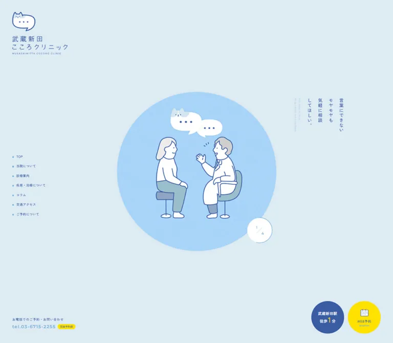
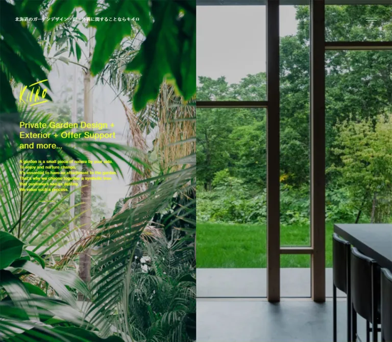
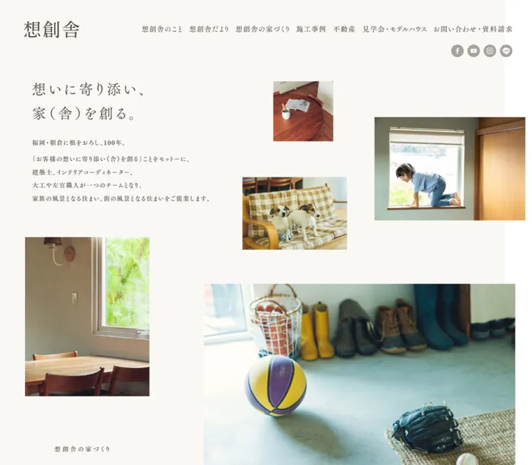
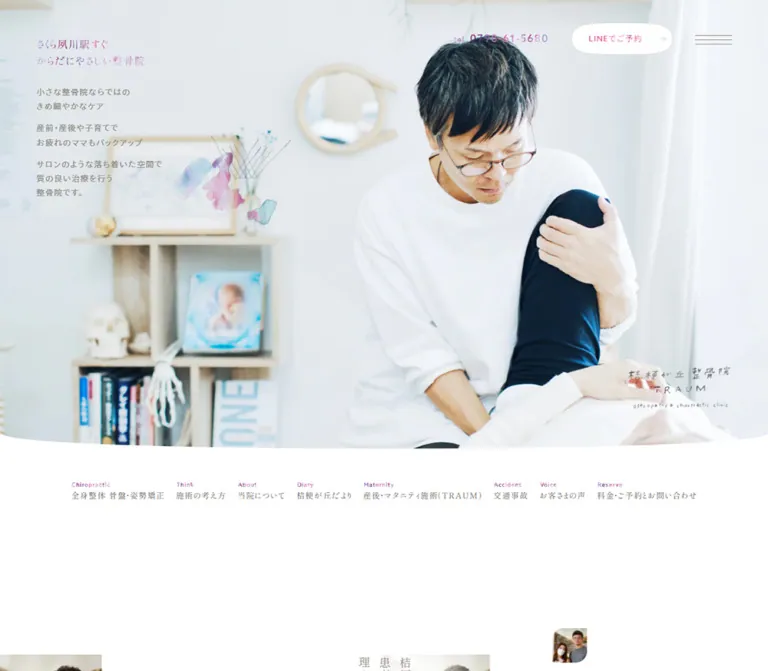
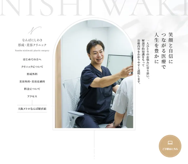
白い余白、繊細な明朝体と欧文セリフ体、アーチ型の写真、縦書きのコピーが印象的なクリニックサイト。淡いゴールドの予約導線を軸に、診療案内・院長紹介・お知らせ・アクセスを整理しています。
オリジナルサイトを見るA white, architectural clinic website with Mincho typography, arched photography, and a warm gold reservation seal.
Website: nishiwaki-plasticsurgery.com Original URL: https://nishiwaki-plasticsurgery.com/ Final URL: https://nishiwaki-plasticsurgery.com/ Theme: light; white surfaces, charcoal text, pale gray details, and a restrained gold action accent. Inspected: September 17, 2026, Japan Standard Time. The supplied retrieval timestamp is September 16, 2026, at 19:03:29.912 UTC, equivalent to September 17 at 04:03:29.912 JST. Viewports: 1440 × 1000 desktop and 390 × 844 mobile CSS pixels. The recorded document widths are 1425px and 375px respectively, leaving a 15px scrollbar gutter in each capture. Scope: the current clinic homepage: identity and navigation, hero, three promises, two medical service introductions, doctor introduction, media references, news, columns, social links, specialist-site links, an interior-image section, access information, footer, and persistent reservation control. Visual evidence includes desktop hero, doctor, and access/footer crops, plus mobile hero and access/footer crops. Other sections are documented from the supplied rendered DOM and computed styles. The mobile menu is represented in the DOM but was not shown open.
The website belongs to なんばにしわき形成・美容クリニック and presents a full clinic information architecture. Treatment categories, pricing, visitor guidance, articles, access, and reservations remain distinct destinations. Its homepage introduces the practice through measured typography and generous space rather than compressing everything into a single conversion sequence.
The central visual relationship is between the clinic's architecture and the interface. A tall arch frames the opening photograph; pale interior materials, curved doorways, fine outlines, and soft foliage-like shadows extend that architectural feeling. Japanese text uses a substantial Mincho weight, while large English section labels use a lighter, high-contrast serif. The reservation control supplies the clearest warm color on an otherwise nearly monochrome canvas.
A white, architectural clinic website with Mincho typography, arched photography, and a warm gold reservation seal.
Website: nishiwaki-plasticsurgery.com Original URL: https://nishiwaki-plasticsurgery.com/ Final URL: https://nishiwaki-plasticsurgery.com/ Theme: light; white surfaces, charcoal text, pale gray details, and a restrained gold action accent. Inspected: September 17, 2026, Japan Standard Time. The supplied retrieval timestamp is September 16, 2026, at 19:03:29.912 UTC, equivalent to September 17 at 04:03:29.912 JST. Viewports: 1440 × 1000 desktop and 390 × 844 mobile CSS pixels. The recorded document widths are 1425px and 375px respectively, leaving a 15px scrollbar gutter in each capture. Scope: the current clinic homepage: identity and navigation, hero, three promises, two medical service introductions, doctor introduction, media references, news, columns, social links, specialist-site links, an interior-image section, access information, footer, and persistent reservation control. Visual evidence includes desktop hero, doctor, and access/footer crops, plus mobile hero and access/footer crops. Other sections are documented from the supplied rendered DOM and computed styles. The mobile menu is represented in the DOM but was not shown open.
The website belongs to なんばにしわき形成・美容クリニック and presents a full clinic information architecture. Treatment categories, pricing, visitor guidance, articles, access, and reservations remain distinct destinations. Its homepage introduces the practice through measured typography and generous space rather than compressing everything into a single conversion sequence.
The central visual relationship is between the clinic's architecture and the interface. A tall arch frames the opening photograph; pale interior materials, curved doorways, fine outlines, and soft foliage-like shadows extend that architectural feeling. Japanese text uses a substantial Mincho weight, while large English section labels use a lighter, high-contrast serif. The reservation control supplies the clearest warm color on an otherwise nearly monochrome canvas.
On desktop, a logo and vertical navigation occupy the left, the arch sits in the center, and Japanese copy runs vertically on the right. Mobile reorganizes this composition into a horizontal logo, circular menu button, arched image, centered horizontal copy, and a fixed reservation pill. Preserve that change in composition when adapting the design.
| Name | Value | Evidence | Role |
|---|---|---|---|
| White Canvas | #ffffff |
Exact source --main-bg: #fff; computed HTML background |
Page background and the dominant visible surface |
| Charcoal Text | #333333 |
Exact source --main-color: #333; computed text color |
Japanese copy, English headings, navigation, and most line icons |
| Reservation Gold | Approximately #d1af82 |
Visual estimate; this RGB base also occurs in the exact selection token | Visible reservation-control fill; its background layer was not included in the element sample |
| Light Gray | #e3e3e3 |
Exact source --light-gray-bg |
Useful alias for the very pale structural lines visible in the captures; individual border colors were not measured |
| Mid Gray | #c4c4c4 |
Exact source --gray-bg |
Muted detail color; visually consistent with secondary outlines and menu strokes |
| Decorative Wordmark | rgba(204, 204, 204, 0.45) |
Exact computed color | Oversized, partially clipped NISHIWAKI lettering |
| Media Label Gray | #dbdbdb |
Exact computed rgb(219, 219, 219) |
Large MEDIA RELEASE label |
The decorative wordmark would flatten to approximately #e8e8e8 over pure white. Its actual appearance also depends on the background beneath it.
The reservation anchor itself reports a transparent computed background even though the screenshot shows a gold fill. Its visible fill therefore comes from a rendering layer not represented by that single background property. Do not interpret the transparent anchor value as a transparent-looking button.
| Source variable | Exact value | Interpretation limit |
|---|---|---|
--selection-color |
#d1af824d |
Gold with approximately 30% alpha; the variable exists, but a selected-text state was not captured |
--gray-color |
#e2d6c366 |
Warm beige with 40% alpha; element-level application was not established |
--hover-color |
#1f798d |
A teal interaction token is declared; its application and visible hover state were not verified |
--tap-highlight-color |
#fff3 |
White with 20% alpha; mobile tap feedback was not exercised |
The exported custom properties also contain numerous CMS preset colors, gradients, and shadows. Their presence does not make them part of the observed visual palette. The supplied screenshots support a white, charcoal, pale gray, and gold system, without a general colorful gradient or elevated-card treatment.
YakuHanMP, 'Shippori Mincho', serif.--font-family.600 throughout the sampled Japanese headings, paragraphs, links, and controls.2.2. Do not use the body's 16px line box for paragraphs.--font-family-noyakuhan: 'Shippori Mincho', serif is declared. Its specific usage was not identified.The Japanese typography is not uniformly thin. The measured weight is 600, which keeps modestly sized text present against the large white areas.
Cormorant, serif.400.PROMISE and DOCTOR, service labels, and smaller English subtitles beneath the news headings.0.04em for section labels; 0.045em for the large background wordmark; 0.06em for MEDIA RELEASE.The font pairing carries much of the identity: a substantial Japanese serif beside a finer English display serif. A uniformly light sans-serif replacement would change both the tone and the hierarchy.
The logo combines a pale calligraphic mark, Japanese clinic name, and a small English line. The captures show a stacked desktop header lockup and a horizontal mobile/footer lockup. The exact lettering construction and source asset files were not supplied; do not recreate the logo by assuming it uses the surrounding text fonts.
Visible symbols include a laptop for reservations, two short menu strokes, an Instagram outline, thin directional arrows, and small outlined circles on the hero frame. Their asset format and icon library were not identified.
All values below are measured computed styles unless marked otherwise.
| Role | Desktop size / line height | Mobile size / line height | Weight and tracking |
|---|---|---|---|
Decorative NISHIWAKI |
263.7px / 263.7px |
71.42px / 71.42px |
Cormorant 400; 0.045em |
| Hero headline | 29px / 29px |
23px / 23px |
Japanese stack 600; 0.15em |
| Hero supporting copy | 17px / 17px |
15px / 15px |
600; normal tracking; separate line/column gaps |
| Major English section label | 62px / 62px |
49.6px / 49.6px |
Cormorant 400; 0.04em |
| Major Japanese section label | 21px / 21px |
16.8px / 16.8px |
600; 0.02em |
| English service label | 56px / 56px |
44.8px / 44.8px |
Cormorant 400; 0.04em |
| Japanese service label | 22px / 22px |
17.6px / 17.6px |
600; 0.02em |
| Promise item heading | 25px / 37.5px |
21.875px / 32.813px |
600; normal tracking |
| Promise item number | 20px / 20px |
17.5px / 17.5px |
600; 0.04em |
| Main prose | 16px / 35.2px |
14px / 30.8px |
600; usually normal tracking |
| Doctor prose | 16px / 35.2px |
14px / 30.8px |
600; 0.02em |
| Service caution text | 12px / 26.4px |
10.5px / 23.1px |
600; normal tracking |
| Standard pill label | 16px / 16px |
14.512px / 14.512px |
600; 0.8px tracking |
| News/column Japanese heading | 24px / 24px |
22px / 22px |
600; normal tracking |
| News/column English subtitle | 14px / 14px |
13px / 13px |
Cormorant 400; 0.04em |
| News/column row | 14px / 22.4px |
13px / 20.8px |
600; 0.08em |
| Media display label | 50px / 50px |
38.235px / 38.235px |
Cormorant 400; 0.06em |
| Telephone and fax | 14.4px / 27.36px |
12.6px / 23.94px |
600; normal tracking |
| Desktop footer child link | 13px / 13px |
Not visibly rendered in the mobile footer | 600; 0.8px tracking |
| Copyright | 12px / 12px |
12px / 12px |
600; 0.8px tracking |
The wordmark sizes are consistent with approximately 18.3125vw across the two viewport widths. This is a calculated relationship, not a recovered source declaration.
Different components use different responsive reductions. Major section labels shrink to 80% of their desktop size; paragraph text shrinks to 87.5%; the hero follows another scale. Do not apply one blanket transform to the entire mobile page.
Density: low overall, with long editorial pauses and compact text details. Primary shapes: a tall arch, circles, long capsules, straight photographic rectangles, and fine rules. Elevation: no general shadow-based card system is visible.
The following recurring measurements provide a practical vocabulary without claiming that the original site uses a universal spacing grid.
| Use | Desktop | Mobile | Evidence |
|---|---|---|---|
| Broad content inset | 114px |
30px |
Measured; both equal 8% of the recorded document width |
| Japanese/English major-heading separation | About 10px |
About 8px |
Calculated from measured rectangles |
| Hero headline column/line gap | 15px |
11.897px |
Measured flex gap |
| Hero support column/line gap | 11px |
9.706px |
Measured flex gap |
| Header navigation start-to-start interval | 46px |
Desktop navigation hidden | Calculated from six measured link positions |
| Stacked service-link gap | 18px |
18px |
Calculated from measured control rectangles |
| News row vertical padding | 28px each side |
26px each side |
Measured |
| News row internal gap | 14px |
13px |
Measured |
| Hero-to-promise separation | Approximately 180px after the desktop hero bottom |
62px after the mobile supporting copy |
Calculated from recorded bounds |
| Gap between mobile service sections | Not applicable; side by side | 96px |
Calculated |
| Gap between mobile news and column sections | Not applicable; side by side | 120px |
Calculated |
| Footer padding | 212px 0 80px |
72.8px 0 187.2px |
Measured |
Large section intervals are deliberate. The desktop service pair begins about 321px after the promise section, and the doctor section begins 325px after the service pair. These are measured layout relationships, not recommended minimums for every screen.
| Element | Observed treatment | Implementation guidance |
|---|---|---|
| Hero image | Semicircular upper arch with straight sides and square lower corners | Use a dedicated arch mask, not a uniformly rounded rectangle |
| Hero outer frame | Matching arch outline separated from the image by a narrow white inset | Approximately 1–2px stroke and 8–16px total inset are visual estimates |
| Secondary links | Fully rounded capsule | Source computed radius is 1440px desktop and 844px mobile; 999px is a reusable equivalent |
| Reservation control | Circle on desktop; capsule on mobile | Shape changes with layout, not merely scale |
| Mobile menu trigger | 50% radius |
Measured circular button |
| Social account links | 50% radius |
Measured circular link boxes |
| Doctor photograph | Straight rectangular edges in the visible crop | Do not apply the hero arch to every photograph |
| Specialist-site links | 0 radius |
Measured rectangular link boxes |
| Structural dividers | Pale, thin lines | Approximately 1–2px visually; no prominent dark enclosing boxes |
| Element | Desktop | Mobile | Status |
|---|---|---|---|
| Recorded document | 1425 × 8225.17px |
375 × 11075.06px |
Measured |
| Broad section container | 1197px wide at x = 114px |
315px wide at x = 30px |
Measured |
| Header logo link | 212 × 154.78px at approximately (114, 201.59) |
240.23 × 61.13px at approximately (11.28, 54.08) |
Measured; different lockups |
| Hero outer arch | Approximately 627 × 857px, beginning near (399, 132) |
Approximately 315 × 429px, beginning near (30, 143) |
Screenshot estimates |
| Standard secondary link | 350 × 60px |
315 × 54.41px |
Measured; doctor link is 312.63px wide on mobile |
| Promise text column | 333.47px |
315px |
Measured |
| Service panel | 472.73px wide |
315px wide |
Measured |
| Gap between desktop service panels | 69.45px |
Stacked | Calculated |
| Doctor prose column | 764px |
312.63px |
Measured |
| News/column section | 570.56px each |
315px each |
Measured |
| Social link | 295 × 295px |
236 × 236px |
Measured |
| Specialist-site link | 415 × 121.63px |
315 × 92.66px |
Measured |
| Mobile menu trigger | Not shown in desktop layout | 61.27 × 61.27px |
Measured |
| Persistent reservation link | 140 × 140px |
255.77 × 58.95px |
Measured |
Source variables --section-width: 1344 and --section-width-narrow: 1200 are unitless strings in the export. Their consuming CSS was not supplied. The starter interprets them as practical pixel caps, explicitly as an adaptation.
Role: introduce the clinic and expose the main information hierarchy.
The desktop logo occupies a narrow column to the left of the hero image. Below it, six centered text links lead to visitor guidance, clinic information, plastic surgery, cosmetic services, pricing, and access. Each uses 16px Mincho text with 0.8px tracking. Their measured starting positions are 46px apart, producing generous space without oversized controls.
The station-access statement, 大阪メトロなんば駅直結, sits below the navigation between thin horizontal rules. A short vertical line above the upper rule visually connects it to the navigation. This is a location reassurance detail, not another filled action button.
The oversized NISHIWAKI text crosses the upper page and is intentionally clipped above and at the sides. At desktop size, its recorded x coordinate is −18px and its y coordinate is approximately −98px. Keep it pale and subordinate to the actual clinic identity.
The captures do not establish that this desktop navigation remains fixed while scrolling. Only the reservation control clearly persists in the supplied lower-page views.
Role: make the clinic feel personal and architecturally coherent.
The desktop opening frame shows the doctor speaking with a patient. The mobile opening frame shows a pale corridor with arched doorways, warm wood, and light stone flooring. Both occupy the same tall arch composition.
The frame has four layers:
The circles are decorative in the supplied evidence. No control semantics, drag behavior, or slider interaction was established.
The two captures contain different photographs. This does not establish whether the site uses a timed slideshow, responsive image selection, or another state change. Preserve the evidenced geometry without inventing a slide duration or transition.
Role: state the clinic's approach with quiet emphasis.
The headline reads 笑顔と自信に / つながる医療で / 人生を豊かに. On desktop, its three parts form vertical columns at the right of the photograph. The supporting statement forms three smaller vertical columns immediately to their left.
The headline uses 29px type, 0.15em tracking, and 15px between columns. The supporting text uses 17px type and 11px gaps. The supporting block begins approximately 43px below the headline block.
On mobile, the headline becomes three centered horizontal lines at 23px. It begins near y = 639px, below the image and a fine vertical connector. The supporting copy follows near y = 776px at 15px. Keep the Japanese reading order correct when switching writing modes; avoid rotating a complete horizontal paragraph as an image.
Role: retain identity while freeing the narrow viewport for the hero.
A horizontal logo sits near the upper left. A white circular button with a pale outline and two short gray strokes sits near the upper right. Its measured size is approximately 61px, at x = 292.94px and y = 65.52px in the recorded 375px document width.
The same button remains visible in the lower mobile capture, supporting persistent viewport placement. The horizontal logo does not appear there.
The DOM contains a viewport-sized mobile menu region with a top-level home link, category buttons, nested links, pricing, access, reservation, and Instagram. Category buttons have measured 17.68px text and approximately 71.75px row heights. This structure suggests expandable groups, but their activation, expanded appearance, focus behavior, and opening animation were not exercised. Hidden descendant rectangles are not evidence that all submenu items appear simultaneously.
Role: keep booking available throughout the information-rich homepage.
The visible label is ご予約はこちら, linking to /reserve/.
On desktop, the control is a 140px gold circle with a fine inset white ring. A white laptop symbol sits above the label. The anchor has a measured 20px internal gap and sits approximately 50px from the content viewport's right and bottom edges.
On mobile, it becomes a centered capsule measuring approximately 255.77 × 58.95px. Icon and label sit in one horizontal row with a measured 9.07px gap. Its captured bottom clearance is approximately 18px. The inner white outline follows the capsule rather than remaining circular.
The mobile hero capture shows this fixed control covering part of the supporting copy at that scroll position. This is an observed overlap, not a recommended layout goal. A new implementation should provide adequate reading and focus clearance around fixed controls.
Role: give major sections an editorial rhythm.
For promises and the doctor introduction, a large Cormorant English label sits above a smaller Japanese heading. Desktop sizes are 62px and 21px, with an approximately 10px separation. Mobile uses 49.6px and 16.8px with about 8px between them.
The service panels use a slightly smaller pair: 56px English and 22px Japanese on desktop, reducing to 44.8px and 17.6px on mobile.
News and columns deliberately reverse the emphasis: Japanese appears first at 24px desktop or 22px mobile, followed by a small 14px or 13px English subtitle. Do not apply the large English-heading pattern indiscriminately to every section.
Role: establish the clinic's approach before introducing treatment categories.
The section contains three numbered groups, 01, 02, and 03, with headings about direct physician involvement, private rooms, and ongoing medical development. Each group has a number, a substantial upper visual interval, a two-line heading, and explanatory prose.
On desktop, the three text columns are approximately 333px wide. The center group's number and heading begin 105px lower than the corresponding elements in the outer groups. This stagger creates a gentle rhythm across the page.
On mobile, the groups become one sequence within the 315px container. Headings use 21.875px text with 1.5 line height; paragraphs use 14px text with 2.2 line height. A full-width capsule link to /visitor/ closes the section.
The supplied text-element samples do not identify the media assets or masks in the upper portions of these groups. Their exact subjects and image treatment should remain unspecified.
Role: distinguish plastic surgery from cosmetic surgery and dermatology.
Desktop presents two equal-width sections side by side. Each has an upper visual region, a centered bilingual heading, prose, and two capsule links. The plastic-surgery section also contains a smaller caution paragraph.
The first English heading begins approximately 382px below the desktop panel top and 259px below the mobile panel top. This establishes a substantial lead-in region, but the supplied image crops and text-node export do not establish its exact artwork or masking.
Each desktop panel is about 473px wide. Its 350px links are staggered: the first aligns to the left, and the second aligns to the right, offset by approximately 123px. On mobile both links span the 315px panel and align to the same edges, with an 18px vertical gap.
The observed destinations distinguish overview and detail:
/plastic-surgery/#about and /plastic-surgery/#disease./cosmetic/#about and /cosmetic/#menu.Role: move from the homepage overview into a related information page.
The visible doctor-section example has a white or transparent surface, a thin gray outline, centered Mincho label, and a small right arrow near the right edge. Its desktop dimensions are 350 × 60px. There is no visible shadow.
Keep the arrow secondary to the text, with room at the right independent of the label's width. Use an actual link for navigation. The measured source animates background-position; the precise hover fill or sweep was not captured.
Role: connect the medical information to the named physician.
A rectangular doctor portrait sits above the centered DOCTOR heading and ご挨拶 label. A short vertical Japanese caption beside the image identifies 院長 西脇 仁. The supplied desktop crop starts partway through the portrait; this must not be copied as an intentional headless image crop.
Below the heading, two left-aligned paragraphs occupy a centered 764px desktop column. They use 16px text, 35.2px line height, and 0.02em tracking. A centered capsule link to /about/ follows.
Thin vertical lines frame the wider section. The mobile DOM reports a 530px outer section centered beyond the 375px document, while its actual prose remains approximately 313px wide within the screen. Treat the oversized outer frame separately from readable content when adapting it; do not allow the prose to inherit that overflow.
Role: provide access to external physician coverage.
The band follows the doctor introduction within the wider framed region. Its desktop layout uses a flex container with 45px gaps, 45px vertical padding, and approximately 60px horizontal padding. A pale Cormorant MEDIA RELEASE label accompanies a short explanatory sentence.
The mobile DOM contains four rectangular external media links, each approximately 312.63 × 125.05px, arranged vertically with 20px gaps. Equivalent link records are absent from the desktop sample. This is a capture difference, not proof that those links are intentionally mobile-only.
The supplied evidence identifies their destinations but does not provide sufficient visual detail to reconstruct the banners themselves.
Role: expose current clinic updates and educational articles without overwhelming the homepage.
Two desktop sections, each approximately 570.56px wide, sit side by side. Each contains five dated links and a small right-aligned 一覧で見る link. Dates and titles share a horizontal row. The title begins 149px after the section's left edge, consistent with a 135px date allocation and 14px gap.
Desktop rows use 14px text, 1.6 line height, 0.08em tracking, and 28px vertical padding. One-line rows are approximately 78.39px tall; two-line article rows are approximately 100.78px tall. Consecutive row positions include an additional approximately 1px interval, consistent with thin separators.
Mobile stacks the date above the title. Rows use 13px text, 20.8px line height, 26px vertical padding, and a 13px internal gap. A one-line title produces a row approximately 106.59px tall. The full news section precedes the column section with 120px between them.
Retain the text-list structure. The evidence does not support turning each article into a thumbnail card.
Role: distinguish the clinic, director, and staff Instagram accounts.
The DOM records three circular links with identical geometry. Desktop circles measure 295px across and begin 282px apart horizontally, so their bounding boxes overlap by 13px. Mobile circles measure 236px across and begin approximately 217.61px apart vertically, producing an approximately 18.39px bounding-box overlap.
Each contains an Instagram identifier, a clinic-name line, and an account-role label. Desktop role labels use 18px text; mobile uses 14.4px.
Their circular geometry and typography are measured. Detailed border and fill treatment is not visible in the supplied page crops, so avoid inventing decorated card surfaces for them.
Role: connect related specialist information and show the physical environment.
Two rectangular specialist links appear side by side on desktop and stack on mobile. Their measured dimensions are approximately 415 × 121.63px desktop and 315 × 92.66px mobile. Their labels identify skin-treatment and eye-surgery specialist sites.
A full-width interior-image section follows. Its recorded height is approximately 580.61px desktop and 395.55px mobile. The DOM confirms the section's purpose, but the supplied crops do not establish its complete image arrangement or whether it moves. Do not assign carousel controls, autoplay, or a scrolling speed without further evidence.
Role: make practical visiting information easy to locate near the end of the page.
The desktop access crop shows a reception photograph and map side by side, followed by consultation hours and contact details to their right. The photograph and map each occupy approximately 297 × 385px in the visible capture; these dimensions are visual estimates.
The hours table uses thin gray internal rules, compact Mincho labels, and open space rather than a boxed card. It shows 10:00〜19:00, circle marks from Monday through Saturday, and a diagonal mark for Sunday/public holidays. The address, telephone/fax line, and walking directions follow in distinct text groups.
The mobile crop confirms the map above the hours table, followed by address, telephone/fax, and walking directions. The reception photograph's mobile position is outside the supplied crop and remains unspecified.
The telephone is an actual tel:0666492489 link. The map is visibly rendered, but map interaction and navigation were not tested. Preserve a text address and directions alongside any map integration.
Role: close the page with a quiet navigation directory and retained contact context.
Desktop uses a broad four-part composition: horizontal clinic identity at left, two groups of hierarchical links in the middle, and menu/pricing/social links at right. An outlined upward arrow links to /#l-wrapper. Parent navigation uses 16px text; subordinate links use 13px text and approximately 30px vertical intervals.
The footer has unusually generous measured top padding of 212px and bottom padding of 80px. Pale foliage-like shadows continue across the white background. The copyright reads © Namba nishiwaki plastic surgery.
The mobile footer visibly reduces to a 24px Instagram symbol and copyright, with substantial bottom whitespace. The desktop directory and logo are not visible in the supplied mobile footer, although related text remains in the raw DOM. The menu trigger and reservation pill remain available over the page.
| Treatment | Evidence | What can be concluded |
|---|---|---|
| Header/footer text-link transition | background-position 0.4s |
A background-position transition is declared; its start and end visuals were not captured |
| Secondary capsules | background-position 1.8s cubic-bezier(0.23, 1, 0.32, 1) |
A long eased background-position transition is declared |
| Social circles and specialist links | Same 1.8s background-position transition |
These controls share a source interaction timing |
| Reservation control | scale 0.4s plus the same 1.8s background-position transition |
Scale can transition; the actual hover scale is unknown |
| General transition token | .4s cubic-bezier(0.390, 0.575, 0.565, 1.000) |
Reusable source timing exists; application varies by component |
| Hero photographs | Different desktop and mobile frames | Image variation exists; timing and cause are unverified |
| Mobile menu | Trigger button and hierarchical menu DOM | Structure exists; opening, closing, and expansion behavior were not exercised |
| Access and top links | #access and #l-wrapper destinations |
Anchor targets are present; smooth-scroll behavior is unverified |
| Persistent controls | Same reservation position in multiple page crops; menu trigger persists on mobile | Persistent viewport placement is visually supported |
Most sampled text elements report animation: none. This does not establish that the complete site has no animation, especially for images, pseudo-elements, or script-controlled layers that were not included in the sample.
The capture process waited for initial rendering, finite motion, layout/text stability, and image decoding within stated time limits. Perpetual animations were temporarily paused during readiness checks and resumed afterward. Static captures therefore cannot establish a complete motion sequence.
Recommended adaptation: use restrained color and outline transitions, preserve the source timing where useful, and avoid adding large parallax travel or continuous zoom merely to make the page feel animated. If a slideshow is introduced, document it as new behavior and provide reduced-motion handling.
| Layer | Observed appearance | Design role |
|---|---|---|
| Page canvas | Pure white | Creates the dominant impression of cleanliness and space |
| Decorative backdrop | Extremely pale wordmark and soft organic shadows | Adds atmosphere without becoming a competing content layer |
| Hero image frame | Fine arch outline, white inset, small circular marks | Connects the interface to the clinic's curved architecture |
| Editorial sections | White, largely unboxed, separated by space and occasional rules | Keeps the long homepage coherent without card repetition |
| Secondary controls | White/transparent capsules with pale outlines | Offers navigation at a lower visual priority than reservations |
| Reservation control | Warm gold with white icon, text, and inset outline | Provides the main persistent action accent |
| Access table | White cells and fine internal lines | Organizes practical information compactly |
| Footer | White with pale background shadows | Continues the page atmosphere through the final screen |
The decorative shadows are visual background imagery, not evidence of a component elevation system. Avoid translating them into drop shadows around every section.
The observed photography combines clinical interaction and architecture. The desktop hero shows a doctor in dark navy scrubs during a consultation. Mobile shows a bright corridor with warm neutral materials and repeated arches. The access section shows a curved reception desk, pale walls, a timber door, and gray flooring. A separate doctor portrait appears above the introduction.
The photographic palette is low in saturation: white, warm stone, light timber, gray, muted blue, and navy. Navy comes primarily from clothing and photographic content; it is not established as a general interface token.
The evidence does not provide source image filenames or asset URLs. The following are descriptive asset roles, not invented paths.
| Asset role | Observed content | Treatment and limitations |
|---|---|---|
| Desktop header identity | Calligraphic mark with stacked clinic lettering | Approximately 212 × 155px link box; lettering source unknown |
| Mobile/footer identity | Horizontal mark and clinic lettering | Approximately 240 × 61px on mobile; desktop footer link approximately 320 × 81px |
| Desktop hero frame | Doctor speaking with a patient | Tall arch; preserve the face and interaction within the crop |
| Mobile hero frame | Bright interior corridor with curved openings | Same arch language; different frame does not establish a responsive asset rule |
| Doctor introduction portrait | Doctor in navy scrubs | Rectangular photograph; upper portion lies outside the supplied scrolled crop |
| Access photograph | Reception desk and interior | Straight rectangular crop beside the map on desktop |
| Decorative background | Soft branch/foliage-like shadows | Very low contrast; exact opacity and asset construction unknown |
| Reservation symbol | White laptop outline | Centered above the label on desktop and beside it on mobile |
| Navigation symbols | Menu strokes, Instagram outline, thin arrows | Simple linework; exact icon source unknown |
Recommended image preparation: use genuine, authorized clinic photographs; supply responsive image sizes; set explicit image dimensions to stabilize the long page; and choose subject-specific focal points for the arch crop. Keep photographs naturally rendered. There is no evidence for grain, duotone processing, pixelation, or heavy color filters.
At both measured layouts, the broad section container occupies exactly 84% of the recorded document width: 1197px out of 1425px on desktop and 315px out of 375px on mobile. This supports an 8% side-inset model at those sizes. The original breakpoint and maximum-width formula are not available.
The desktop document is approximately 8225px tall; mobile is approximately 11075px tall. These heights are consequences of current content and layout, not fixed implementation targets.
The opening composition is asymmetric in content but centered around the arch. A narrow identity/navigation column sits left, the approximately 627px-wide arch sits near the document center, and vertical copy occupies the right. Later sections alternate between broad three-column promises, a narrower two-column service pair, a centered doctor composition, and two editorial lists.
The geometry creates variety without introducing many background colors. The middle promise is lowered; service buttons are offset; social circles have overlapping bounding boxes; the doctor copy is narrower than its outer frame.
The observed mobile changes are structural:
The mobile doctor section's outer frame is wider than the viewport, while its readable content remains inset. A reusable implementation should clip only decorative overflow and retain normal text flow.
Only two viewport sizes were supplied. There is no evidence for tablet layouts, intermediate breakpoints, landscape phones, enlarged text, safe-area handling, or browser zoom behavior.
The CSS starter below uses a recommended 64rem breakpoint to separate the two compositions. Test the transition against actual content. Do not introduce a hardcoded 15px blank strip to imitate the captures; the measured width difference belongs to the inspection browser's scrollbar layout.
These recommendations are additions for a new implementation, not verified features of the original website.
aria-expanded, and aria-controls. If the menu is modal, implement focus containment, Escape handling, and focus return.#d1af82 fill is approximately 2.1:1. An accessible adaptation can use charcoal text and iconography on that gold, or a darker tested gold fill.#ffffff.#333333.#d1af82; estimated from the supplied appearance and related source token.#e3e3e3; individual border assignment is an adaptation.#c4c4c4.rgba(204, 204, 204, 0.45).#1f798d identified as a declared interaction token, not an observed large-area accent.“Create a Japanese clinic homepage inspired by Namba Nishiwaki Plastic Surgery. Use a white canvas, charcoal text, generous space, Shippori Mincho at weight 600 for Japanese, and Cormorant at weight 400 for English display labels. On desktop, arrange a stacked clinic identity and vertical navigation to the left of a tall arched photograph, with vertical Japanese headline and supporting copy to the right. Place very pale oversized lettering across the top and subtle foliage-like shadows in the background. Continue with three numbered promises, two distinct service introductions, a centered doctor profile, dated news and article lists, access information, and a quiet directory footer. Use thin gray outlines and capsule information links. Keep a gold reservation circle fixed near the desktop lower right; change it to a centered horizontal pill on mobile. Recompose the page into a single column on phones, with a horizontal logo, circular menu button, and horizontal hero copy. Treat motion and asset selection as implementation decisions unless separately specified.”
DOCTOR label and smaller Japanese heading. Use a 764px maximum prose column with 16px Mincho text and 2.2 line height, followed by a 350 × 60px outlined capsule link. Keep fine framing rules and generous whitespace.”This is a reusable adaptation of the measured typography and geometry. It is not the original stylesheet. Gold and individual border assignments are approximations; the 64rem breakpoint, hover endpoint, safe-area handling, and focus styling are recommendations. The fonts must be loaded separately from appropriate licensed sources.
Markup contract: .hero contains .hero-nav, a figure.hero-frame with an image, and .hero-copy. The copy contains .hero-headline and .hero-support, each with three spans in reading order. Supply a separate horizontal .mobile-brand and an accessible .menu-toggle. Use actual links for .pill and .reserve. Menu functionality, image changes, and map integration require separate implementation.
:root {
  /* Exact source colors unless noted */
  --color-paper: #ffffff;
  --color-ink: #333333;
  --color-line: #e3e3e3;
  --color-muted: #c4c4c4;
  --color-wordmark: rgb(204 204 204 / 45%);
  --color-media: #dbdbdb;
  --color-selection: #d1af824d;
  --color-gold: #d1af82; /* Estimated visible reservation fill */
  --color-focus: #1f798d; /* Recommended use of a declared source token */

  --font-japanese: YakuHanMP, 'Shippori Mincho', serif;
  --font-display: Cormorant, serif;
  --weight-copy: 600;
  --weight-display: 400;

  --text-body: 14px;
  --text-hero: 23px;
  --text-section-en: 49.6px;
  --text-section-ja: 16.8px;
  --text-service-en: 44.8px;
  --text-service-ja: 17.6px;
  --text-promise: 21.875px;
  --text-control: 14.512px;
  --leading-body: 2.2;

  --content-width: 84%;
  --content-max: 1344px; /* Adaptation of a unitless source value */
  --content-narrow: 1200px;
  --doctor-copy: 764px;
  --radius-pill: 999px;
  --control-height: 54.41px;
  --safe-bottom: env(safe-area-inset-bottom, 0px);

  --motion-ui: 400ms cubic-bezier(0.39, 0.575, 0.565, 1);
  --motion-source-sweep: 1800ms cubic-bezier(0.23, 1, 0.32, 1);
}

* {
  box-sizing: border-box;
}

body {
  margin: 0;
  color: var(--color-ink);
  background: var(--color-paper);
  font-family: var(--font-japanese);
  font-weight: var(--weight-copy);
}

button,
input,
select,
textarea {
  font: inherit;
}

img {
  display: block;
  max-width: 100%;
}

button,
a {
  -webkit-tap-highlight-color: #fff3;
}

::selection {
  background: var(--color-selection);
}

.clinic-shell {
  position: relative;
  overflow-x: clip;
}

.content {
  width: var(--content-width);
  max-width: var(--content-max);
  margin-inline: auto;
}

.prose {
  font-size: var(--text-body);
  line-height: var(--leading-body);
  overflow-wrap: anywhere;
}

.prose p {
  margin: 0 0 1em;
}

.background-wordmark {
  position: absolute;
  z-index: 0;
  top: -0.372em;
  left: -1.25vw;
  margin: 0;
  color: var(--color-wordmark);
  font-family: var(--font-display);
  font-size: 18.3125vw; /* Calculated relationship between captures */
  font-weight: var(--weight-display);
  line-height: 1;
  letter-spacing: 0.045em;
  text-transform: uppercase;
  white-space: nowrap;
  pointer-events: none;
  user-select: none;
}

.mobile-brand {
  position: absolute;
  z-index: 2;
  top: 54px;
  left: 3%;
  width: 240px;
  max-width: calc(100% - 116px);
}

.menu-toggle {
  position: fixed;
  z-index: 30;
  top: 65.5px;
  right: 20.8px;
  display: grid;
  place-content: center;
  gap: 6px;
  width: 61.27px;
  height: 61.27px;
  padding: 0;
  border: 1px solid var(--color-muted);
  border-radius: 50%;
  background: var(--color-paper);
  cursor: pointer;
}

.menu-toggle span {
  display: block;
  width: 18px;
  height: 2px;
  background: var(--color-muted);
}

.hero {
  position: relative;
  display: grid;
  padding-top: 143px;
}

.hero-nav {
  display: none;
}

.hero-frame {
  position: relative;
  display: grid;
  width: 100%;
  aspect-ratio: 627 / 857;
  margin: 0;
  padding: 8px;
  border: 1px solid var(--color-line);
  border-radius: 50% 50% 0 0 / 36.6% 36.6% 0 0;
}

.hero-frame img {
  width: 100%;
  height: 100%;
  min-height: 0;
  object-fit: cover;
  border-radius: 50% 50% 0 0 / 36% 36% 0 0;
}

.hero-frame::before,
.hero-frame::after {
  content: '';
  position: absolute;
  width: 8px;
  height: 8px;
  border: 1px solid var(--color-line);
  border-radius: 50%;
  background: var(--color-paper);
  pointer-events: none;
}

.hero-frame::before {
  left: -5px;
  bottom: 3%;
}

.hero-frame::after {
  right: -5px;
  top: 57%;
}

.hero-copy {
  display: grid;
  justify-items: center;
  gap: 44px;
  margin-top: 66px;
  text-align: center;
}

.hero-headline,
.hero-support {
  display: flex;
  flex-direction: column;
  margin: 0;
  line-height: 1;
}

.hero-headline {
  gap: 11.9px;
  font-size: var(--text-hero);
  letter-spacing: 0.15em;
}

.hero-support {
  gap: 9.71px;
  font-size: 15px;
  letter-spacing: normal;
}

.section-heading {
  display: grid;
  gap: 8px;
  text-align: center;
}

.section-heading .en,
.section-heading .ja {
  margin: 0;
  line-height: 1;
}

.section-heading .en {
  font-family: var(--font-display);
  font-size: var(--text-section-en);
  font-weight: var(--weight-display);
  letter-spacing: 0.04em;
  text-transform: uppercase;
}

.section-heading .ja {
  font-size: var(--text-section-ja);
  font-weight: var(--weight-copy);
  letter-spacing: 0.02em;
}

.service-heading .en {
  font-size: var(--text-service-en);
}

.service-heading .ja {
  font-size: var(--text-service-ja);
}

.promise-grid {
  display: grid;
  gap: 52.5px;
}

.promise-card h3 {
  font-size: var(--text-promise);
  line-height: 1.5;
  font-weight: var(--weight-copy);
}

.services {
  display: grid;
  gap: 96px;
  width: var(--content-width);
  max-width: var(--content-narrow);
  margin-inline: auto;
}

.service-links {
  display: grid;
  gap: 18px;
  margin-top: 28px;
}

.pill {
  position: relative;
  display: flex;
  align-items: center;
  justify-content: center;
  width: min(100%, 350px);
  min-height: var(--control-height);
  padding: 12px 42px;
  border: 1px solid var(--color-muted);
  border-radius: var(--radius-pill);
  color: var(--color-ink);
  background: transparent;
  font-size: var(--text-control);
  line-height: 1.4;
  letter-spacing: 0.8px;
  text-align: center;
  text-decoration: none;
  transition: border-color var(--motion-ui);
}

.pill::after {
  content: '→';
  position: absolute;
  right: 20px;
  top: 50%;
  transform: translateY(-50%);
  font-weight: 400;
}

.service-links .pill:last-child {
  justify-self: end;
}

.doctor-copy {
  width: min(100%, var(--doctor-copy));
  margin-inline: auto;
  letter-spacing: 0.02em;
}

.doctor-copy > .pill {
  margin: 36.75px auto 0;
}

.updates {
  display: grid;
  gap: 120px;
}

.update-heading {
  text-align: center;
}

.update-heading h2 {
  margin: 0 0 10px;
  font-size: 22px;
  font-weight: var(--weight-copy);
}

.update-heading .en {
  margin: 0;
  font: 400 13px / 1 var(--font-display);
  letter-spacing: 0.04em;
  text-transform: uppercase;
}

.news-row {
  display: grid;
  grid-template-columns: minmax(0, 1fr);
  gap: 13px;
  padding-block: 26px;
  border-bottom: 1px solid var(--color-line);
  color: inherit;
  font-size: 13px;
  line-height: 1.6;
  letter-spacing: 0.08em;
  text-decoration: none;
}

.news-row > * {
  min-width: 0;
  margin: 0;
}

.access {
  display: grid;
  gap: 28px;
}

.hours {
  width: 100%;
  border-collapse: collapse;
  font-size: 13px; /* Recommended starting size */
  line-height: 1.5;
}

.hours th,
.hours td {
  padding: 14px 4px;
  border-right: 1px solid var(--color-line);
  font-weight: var(--weight-copy);
  text-align: center;
}

.hours tr > :last-child {
  border-right: 0;
}

.hours thead th {
  border-bottom: 1px solid var(--color-line);
}

.site-footer {
  padding: 72.8px 0 calc(187.2px + var(--safe-bottom));
}

.footer-brand,
.footer-nav {
  display: none;
}

.copyright {
  margin-top: 33px;
  font-size: 12px;
  line-height: 1.5;
  letter-spacing: 0.8px;
}

.reserve {
  position: fixed;
  z-index: 40;
  left: 50%;
  bottom: calc(18px + var(--safe-bottom));
  display: flex;
  align-items: center;
  justify-content: center;
  gap: 9.07px;
  width: min(255.77px, calc(100% - 48px));
  min-height: 58.95px;
  padding: 12px 20px;
  border-radius: var(--radius-pill);
  color: #ffffff;
  background: var(--color-gold);
  font-size: var(--text-control);
  line-height: 1.4;
  letter-spacing: 0.8px;
  text-decoration: none;
  transform: translateX(-50%);
  transition: scale 400ms;
}

.reserve::before {
  content: '';
  position: absolute;
  inset: 5px;
  border: 1px solid rgb(255 255 255 / 75%);
  border-radius: inherit;
  pointer-events: none;
}

.reserve svg {
  width: 30px;
  height: 24px;
  flex: none;
}

/* Recommended contrast option, distinct from the observed white label */
.reserve--high-contrast {
  color: var(--color-ink);
}

/* Recommended clearance for fixed controls */
.clinic-shell :is(a, button, input, select, textarea) {
  scroll-margin-block: 100px;
}

.clinic-shell :focus-visible {
  outline: 2px solid var(--color-focus);
  outline-offset: 4px;
}

@media (hover: hover) {
  .pill:hover {
    border-color: var(--color-ink);
  }

  .reserve:hover {
    scale: 1.025; /* Recommended endpoint; original endpoint unknown */
  }
}

/* Recommended breakpoint; not recovered from source CSS */
@media (min-width: 64rem) {
  :root {
    --text-body: 16px;
    --text-hero: 29px;
    --text-section-en: 62px;
    --text-section-ja: 21px;
    --text-service-en: 56px;
    --text-service-ja: 22px;
    --text-promise: 25px;
    --text-control: 16px;
    --control-height: 60px;
  }

  .mobile-brand,
  .menu-toggle {
    display: none;
  }

  .hero {
    grid-template-columns: minmax(0, 1fr) 52.4% minmax(0, 1fr);
    column-gap: 5.26%;
    align-items: start;
    padding-top: 132px;
  }

  .hero-nav {
    display: block;
    width: min(100%, 212px);
    margin-top: 70px;
    text-align: center;
  }

  .hero-nav .brand {
    display: block;
    margin-bottom: 40px;
  }

  .hero-nav nav {
    display: flex;
    flex-direction: column;
    align-items: center;
    gap: 30px;
  }

  .hero-nav nav a {
    color: inherit;
    font-size: 16px;
    line-height: 1;
    letter-spacing: 0.8px;
    text-decoration: none;
  }

  .station-note {
    width: max-content;
    max-width: 100%;
    margin: 46px auto 0;
    padding: 14px 4px;
    border-block: 1px solid var(--color-muted);
    font-size: 16px;
    line-height: 1;
  }

  .hero-frame {
    padding: 14px;
    border-width: 2px;
  }

  .hero-frame::before,
  .hero-frame::after {
    width: 12px;
    height: 12px;
  }

  .hero-frame::before {
    left: -7px;
    bottom: 21%;
  }

  .hero-frame::after {
    right: -7px;
    top: 46%;
  }

  .hero-copy {
    display: flex;
    flex-direction: row-reverse;
    align-items: flex-start;
    gap: 32px;
    margin-top: 92px;
    text-align: start;
  }

  .hero-headline,
  .hero-support {
    flex-direction: row-reverse;
  }

  .hero-headline {
    gap: 15px;
  }

  .hero-support {
    gap: 11px;
    margin-top: 43px;
    font-size: 17px;
  }

  .hero-headline > span,
  .hero-support > span {
    writing-mode: vertical-rl;
    white-space: nowrap;
  }

  .section-heading {
    gap: 10px;
  }

  .promise-grid {
    grid-template-columns: repeat(3, minmax(0, 1fr));
    gap: 8.2%;
  }

  .promise-card:nth-child(2) {
    margin-top: 105px;
  }

  .services {
    grid-template-columns: repeat(2, minmax(0, 1fr));
    gap: 6.84%;
    width: 71.22%;
  }

  .updates {
    grid-template-columns: repeat(2, minmax(0, 1fr));
    gap: 4.668%;
  }

  .update-heading h2 {
    font-size: 24px;
  }

  .update-heading .en {
    font-size: 14px;
  }

  .news-row {
    grid-template-columns: 135px minmax(0, 1fr);
    gap: 14px;
    padding-block: 28px;
    font-size: 14px;
  }

  .access {
    grid-template-columns: minmax(0, 1.25fr) minmax(0, 1fr);
    gap: 40px;
  }

  .site-footer {
    padding-block: 212px 80px;
  }

  .footer-brand,
  .footer-nav {
    display: block;
  }

  .footer-layout {
    display: grid;
    grid-template-columns: 1.5fr repeat(3, minmax(0, 1fr));
    gap: 40px;
  }

  .reserve {
    left: auto;
    right: 50px;
    bottom: 50px;
    flex-direction: column;
    gap: 20px;
    width: 140px;
    height: 140px;
    padding: 20px 12px;
    transform: none;
  }

  .reserve::before {
    inset: 6px;
  }
}

@media (prefers-reduced-motion: reduce) {
  .pill,
  .reserve {
    transition: none;
  }

  .reserve:hover {
    scale: 1;
  }
}
The starter intentionally leaves section media, decorative background imagery, full menu behavior, and external media banners to the actual project assets and content. The source background-position transitions cannot be faithfully reconstructed from timing alone, so the starter uses a simple recommended outline hover for secondary links.
Optional aliases for a project already using Tailwind v4. Define the custom properties above first. This mapping does not claim that the original site uses Tailwind.
@theme inline {
  --color-paper: var(--color-paper);
  --color-clinic-ink: var(--color-ink);
  --color-clinic-line: var(--color-line);
  --color-clinic-gold: var(--color-gold);
  --color-clinic-muted: var(--color-muted);

  --font-clinic: var(--font-japanese);
  --font-editorial: var(--font-display);

  --text-clinic-body: var(--text-body);
  --text-clinic-hero: var(--text-hero);
  --text-clinic-section: var(--text-section-en);
  --text-clinic-control: var(--text-control);

  --radius-clinic-pill: 999px;
  --spacing-clinic-control: var(--control-height);
  --spacing-clinic-doctor: 764px;
}
When incorporating this mapping, use a distinct Tailwind alias for the paper color if your build treats a same-name reference as a custom-property cycle; for example, map --color-clinic-paper to the existing --color-paper token.
2026-09-16T19:03:29.912Z, equivalent to September 17, 2026, at 04:03:29.912 JST.This document describes the supplied current homepage evidence. Measured values, calculated relationships, visual estimates, and implementation recommendations are distinguished throughout.
# Namba Nishiwaki Plastic Surgery — Style Reference

> A white, architectural clinic website with Mincho typography, arched photography, and a warm gold reservation seal.

**Website:** [nishiwaki-plasticsurgery.com](https://nishiwaki-plasticsurgery.com/)
**Original URL:** https://nishiwaki-plasticsurgery.com/
**Final URL:** https://nishiwaki-plasticsurgery.com/
**Theme:** light; white surfaces, charcoal text, pale gray details, and a restrained gold action accent.
**Inspected:** September 17, 2026, Japan Standard Time. The supplied retrieval timestamp is September 16, 2026, at 19:03:29.912 UTC, equivalent to September 17 at 04:03:29.912 JST.
**Viewports:** 1440 × 1000 desktop and 390 × 844 mobile CSS pixels. The recorded document widths are 1425px and 375px respectively, leaving a 15px scrollbar gutter in each capture.
**Scope:** the current clinic homepage: identity and navigation, hero, three promises, two medical service introductions, doctor introduction, media references, news, columns, social links, specialist-site links, an interior-image section, access information, footer, and persistent reservation control. Visual evidence includes desktop hero, doctor, and access/footer crops, plus mobile hero and access/footer crops. Other sections are documented from the supplied rendered DOM and computed styles. The mobile menu is represented in the DOM but was not shown open.

The website belongs to なんばにしわき形成・美容クリニック and presents a full clinic information architecture. Treatment categories, pricing, visitor guidance, articles, access, and reservations remain distinct destinations. Its homepage introduces the practice through measured typography and generous space rather than compressing everything into a single conversion sequence.

The central visual relationship is between the clinic's architecture and the interface. A tall arch frames the opening photograph; pale interior materials, curved doorways, fine outlines, and soft foliage-like shadows extend that architectural feeling. Japanese text uses a substantial Mincho weight, while large English section labels use a lighter, high-contrast serif. The reservation control supplies the clearest warm color on an otherwise nearly monochrome canvas.
# Namba Nishiwaki Plastic Surgery — Style Reference

> A white, architectural clinic website with Mincho typography, arched photography, and a warm gold reservation seal.

**Website:** [nishiwaki-plasticsurgery.com](https://nishiwaki-plasticsurgery.com/)
**Original URL:** https://nishiwaki-plasticsurgery.com/
**Final URL:** https://nishiwaki-plasticsurgery.com/
**Theme:** light; white surfaces, charcoal text, pale gray details, and a restrained gold action accent.
**Inspected:** September 17, 2026, Japan Standard Time. The supplied retrieval timestamp is September 16, 2026, at 19:03:29.912 UTC, equivalent to September 17 at 04:03:29.912 JST.
**Viewports:** 1440 × 1000 desktop and 390 × 844 mobile CSS pixels. The recorded document widths are 1425px and 375px respectively, leaving a 15px scrollbar gutter in each capture.
**Scope:** the current clinic homepage: identity and navigation, hero, three promises, two medical service introductions, doctor introduction, media references, news, columns, social links, specialist-site links, an interior-image section, access information, footer, and persistent reservation control. Visual evidence includes desktop hero, doctor, and access/footer crops, plus mobile hero and access/footer crops. Other sections are documented from the supplied rendered DOM and computed styles. The mobile menu is represented in the DOM but was not shown open.

The website belongs to なんばにしわき形成・美容クリニック and presents a full clinic information architecture. Treatment categories, pricing, visitor guidance, articles, access, and reservations remain distinct destinations. Its homepage introduces the practice through measured typography and generous space rather than compressing everything into a single conversion sequence.

The central visual relationship is between the clinic's architecture and the interface. A tall arch frames the opening photograph; pale interior materials, curved doorways, fine outlines, and soft foliage-like shadows extend that architectural feeling. Japanese text uses a substantial Mincho weight, while large English section labels use a lighter, high-contrast serif. The reservation control supplies the clearest warm color on an otherwise nearly monochrome canvas.

On desktop, a logo and vertical navigation occupy the left, the arch sits in the center, and Japanese copy runs vertically on the right. Mobile reorganizes this composition into a horizontal logo, circular menu button, arched image, centered horizontal copy, and a fixed reservation pill. Preserve that change in composition when adapting the design.

## How to Read This Reference

- **Measured** values come directly from the supplied rendered element rectangles, computed styles, or custom properties. Decimal measurements are rounded for readability unless precision explains a relationship.
- **Calculated** values are arithmetic relationships between those measurements. They do not establish the original CSS formula.
- **Visual estimates** describe the supplied original-page screenshots where a corresponding computed property was unavailable.
- **Recommendations** describe reusable implementation choices. The CSS starter, breakpoint, focus treatment, and accessibility improvements are adaptations rather than recovered source code.
- **Named tokens** are descriptive aliases unless a source variable is explicitly identified.
- **Evidence limits matter:** no additional browsing, file inspection, hover testing, menu activation, or reservation flow testing was performed. A declared transition is not proof of its visible endpoint.

## Tokens — Colors

### Default Palette

| Name | Value | Evidence | Role |
| --- | --- | --- | --- |
| White Canvas | `#ffffff` | Exact source `--main-bg: #fff`; computed HTML background | Page background and the dominant visible surface |
| Charcoal Text | `#333333` | Exact source `--main-color: #333`; computed text color | Japanese copy, English headings, navigation, and most line icons |
| Reservation Gold | Approximately `#d1af82` | Visual estimate; this RGB base also occurs in the exact selection token | Visible reservation-control fill; its background layer was not included in the element sample |
| Light Gray | `#e3e3e3` | Exact source `--light-gray-bg` | Useful alias for the very pale structural lines visible in the captures; individual border colors were not measured |
| Mid Gray | `#c4c4c4` | Exact source `--gray-bg` | Muted detail color; visually consistent with secondary outlines and menu strokes |
| Decorative Wordmark | `rgba(204, 204, 204, 0.45)` | Exact computed color | Oversized, partially clipped `NISHIWAKI` lettering |
| Media Label Gray | `#dbdbdb` | Exact computed `rgb(219, 219, 219)` | Large `MEDIA RELEASE` label |

The decorative wordmark would flatten to approximately `#e8e8e8` over pure white. Its actual appearance also depends on the background beneath it.

The reservation anchor itself reports a transparent computed background even though the screenshot shows a gold fill. Its visible fill therefore comes from a rendering layer not represented by that single background property. Do not interpret the transparent anchor value as a transparent-looking button.

### Additional Source Variables

| Source variable | Exact value | Interpretation limit |
| --- | --- | --- |
| `--selection-color` | `#d1af824d` | Gold with approximately 30% alpha; the variable exists, but a selected-text state was not captured |
| `--gray-color` | `#e2d6c366` | Warm beige with 40% alpha; element-level application was not established |
| `--hover-color` | `#1f798d` | A teal interaction token is declared; its application and visible hover state were not verified |
| `--tap-highlight-color` | `#fff3` | White with 20% alpha; mobile tap feedback was not exercised |

The exported custom properties also contain numerous CMS preset colors, gradients, and shadows. Their presence does not make them part of the observed visual palette. The supplied screenshots support a white, charcoal, pale gray, and gold system, without a general colorful gradient or elevated-card treatment.

## Tokens — Typography

### Japanese Text — Shippori Mincho

- **Computed stack:** `YakuHanMP, 'Shippori Mincho', serif`.
- **Source variable:** `--font-family`.
- **Weight:** `600` throughout the sampled Japanese headings, paragraphs, links, and controls.
- **Character:** clear Mincho stroke contrast, deliberate punctuation spacing, and a calm editorial tone.
- **Body behavior:** the body element has a 16px line height, but actual prose overrides it to `2.2`. Do not use the body's 16px line box for paragraphs.
- **Alternative source stack:** `--font-family-noyakuhan: 'Shippori Mincho', serif` is declared. Its specific usage was not identified.

The Japanese typography is not uniformly thin. The measured weight is 600, which keeps modestly sized text present against the large white areas.

### English Display Text — Cormorant

- **Computed stack:** `Cormorant, serif`.
- **Weight:** `400`.
- **Roles:** the oversized background wordmark, large section labels such as `PROMISE` and `DOCTOR`, service labels, and smaller English subtitles beneath the news headings.
- **Tracking:** generally `0.04em` for section labels; `0.045em` for the large background wordmark; `0.06em` for `MEDIA RELEASE`.
- **Presentation:** sampled text strings are lowercase in several DOM records but appear uppercase in the rendered interface.

The font pairing carries much of the identity: a substantial Japanese serif beside a finer English display serif. A uniformly light sans-serif replacement would change both the tone and the hierarchy.

### Logo and Symbols

The logo combines a pale calligraphic mark, Japanese clinic name, and a small English line. The captures show a stacked desktop header lockup and a horizontal mobile/footer lockup. The exact lettering construction and source asset files were not supplied; do not recreate the logo by assuming it uses the surrounding text fonts.

Visible symbols include a laptop for reservations, two short menu strokes, an Instagram outline, thin directional arrows, and small outlined circles on the hero frame. Their asset format and icon library were not identified.

### Type Scale

All values below are measured computed styles unless marked otherwise.

| Role | Desktop size / line height | Mobile size / line height | Weight and tracking |
| --- | --- | --- | --- |
| Decorative `NISHIWAKI` | `263.7px / 263.7px` | `71.42px / 71.42px` | Cormorant 400; `0.045em` |
| Hero headline | `29px / 29px` | `23px / 23px` | Japanese stack 600; `0.15em` |
| Hero supporting copy | `17px / 17px` | `15px / 15px` | 600; normal tracking; separate line/column gaps |
| Major English section label | `62px / 62px` | `49.6px / 49.6px` | Cormorant 400; `0.04em` |
| Major Japanese section label | `21px / 21px` | `16.8px / 16.8px` | 600; `0.02em` |
| English service label | `56px / 56px` | `44.8px / 44.8px` | Cormorant 400; `0.04em` |
| Japanese service label | `22px / 22px` | `17.6px / 17.6px` | 600; `0.02em` |
| Promise item heading | `25px / 37.5px` | `21.875px / 32.813px` | 600; normal tracking |
| Promise item number | `20px / 20px` | `17.5px / 17.5px` | 600; `0.04em` |
| Main prose | `16px / 35.2px` | `14px / 30.8px` | 600; usually normal tracking |
| Doctor prose | `16px / 35.2px` | `14px / 30.8px` | 600; `0.02em` |
| Service caution text | `12px / 26.4px` | `10.5px / 23.1px` | 600; normal tracking |
| Standard pill label | `16px / 16px` | `14.512px / 14.512px` | 600; `0.8px` tracking |
| News/column Japanese heading | `24px / 24px` | `22px / 22px` | 600; normal tracking |
| News/column English subtitle | `14px / 14px` | `13px / 13px` | Cormorant 400; `0.04em` |
| News/column row | `14px / 22.4px` | `13px / 20.8px` | 600; `0.08em` |
| Media display label | `50px / 50px` | `38.235px / 38.235px` | Cormorant 400; `0.06em` |
| Telephone and fax | `14.4px / 27.36px` | `12.6px / 23.94px` | 600; normal tracking |
| Desktop footer child link | `13px / 13px` | Not visibly rendered in the mobile footer | 600; `0.8px` tracking |
| Copyright | `12px / 12px` | `12px / 12px` | 600; `0.8px` tracking |

The wordmark sizes are consistent with approximately `18.3125vw` across the two viewport widths. This is a calculated relationship, not a recovered source declaration.

Different components use different responsive reductions. Major section labels shrink to 80% of their desktop size; paragraph text shrinks to 87.5%; the hero follows another scale. Do not apply one blanket transform to the entire mobile page.

## Tokens — Spacing & Shapes

**Density:** low overall, with long editorial pauses and compact text details.
**Primary shapes:** a tall arch, circles, long capsules, straight photographic rectangles, and fine rules.
**Elevation:** no general shadow-based card system is visible.

### Spacing Scale

The following recurring measurements provide a practical vocabulary without claiming that the original site uses a universal spacing grid.

| Use | Desktop | Mobile | Evidence |
| --- | --- | --- | --- |
| Broad content inset | `114px` | `30px` | Measured; both equal 8% of the recorded document width |
| Japanese/English major-heading separation | About `10px` | About `8px` | Calculated from measured rectangles |
| Hero headline column/line gap | `15px` | `11.897px` | Measured flex gap |
| Hero support column/line gap | `11px` | `9.706px` | Measured flex gap |
| Header navigation start-to-start interval | `46px` | Desktop navigation hidden | Calculated from six measured link positions |
| Stacked service-link gap | `18px` | `18px` | Calculated from measured control rectangles |
| News row vertical padding | `28px` each side | `26px` each side | Measured |
| News row internal gap | `14px` | `13px` | Measured |
| Hero-to-promise separation | Approximately `180px` after the desktop hero bottom | `62px` after the mobile supporting copy | Calculated from recorded bounds |
| Gap between mobile service sections | Not applicable; side by side | `96px` | Calculated |
| Gap between mobile news and column sections | Not applicable; side by side | `120px` | Calculated |
| Footer padding | `212px 0 80px` | `72.8px 0 187.2px` | Measured |

Large section intervals are deliberate. The desktop service pair begins about 321px after the promise section, and the doctor section begins 325px after the service pair. These are measured layout relationships, not recommended minimums for every screen.

### Border Radius and Linework

| Element | Observed treatment | Implementation guidance |
| --- | --- | --- |
| Hero image | Semicircular upper arch with straight sides and square lower corners | Use a dedicated arch mask, not a uniformly rounded rectangle |
| Hero outer frame | Matching arch outline separated from the image by a narrow white inset | Approximately 1–2px stroke and 8–16px total inset are visual estimates |
| Secondary links | Fully rounded capsule | Source computed radius is `1440px` desktop and `844px` mobile; `999px` is a reusable equivalent |
| Reservation control | Circle on desktop; capsule on mobile | Shape changes with layout, not merely scale |
| Mobile menu trigger | `50%` radius | Measured circular button |
| Social account links | `50%` radius | Measured circular link boxes |
| Doctor photograph | Straight rectangular edges in the visible crop | Do not apply the hero arch to every photograph |
| Specialist-site links | `0` radius | Measured rectangular link boxes |
| Structural dividers | Pale, thin lines | Approximately 1–2px visually; no prominent dark enclosing boxes |

### Layout Measurements

| Element | Desktop | Mobile | Status |
| --- | --- | --- | --- |
| Recorded document | `1425 × 8225.17px` | `375 × 11075.06px` | Measured |
| Broad section container | `1197px` wide at x = `114px` | `315px` wide at x = `30px` | Measured |
| Header logo link | `212 × 154.78px` at approximately `(114, 201.59)` | `240.23 × 61.13px` at approximately `(11.28, 54.08)` | Measured; different lockups |
| Hero outer arch | Approximately `627 × 857px`, beginning near `(399, 132)` | Approximately `315 × 429px`, beginning near `(30, 143)` | Screenshot estimates |
| Standard secondary link | `350 × 60px` | `315 × 54.41px` | Measured; doctor link is `312.63px` wide on mobile |
| Promise text column | `333.47px` | `315px` | Measured |
| Service panel | `472.73px` wide | `315px` wide | Measured |
| Gap between desktop service panels | `69.45px` | Stacked | Calculated |
| Doctor prose column | `764px` | `312.63px` | Measured |
| News/column section | `570.56px` each | `315px` each | Measured |
| Social link | `295 × 295px` | `236 × 236px` | Measured |
| Specialist-site link | `415 × 121.63px` | `315 × 92.66px` | Measured |
| Mobile menu trigger | Not shown in desktop layout | `61.27 × 61.27px` | Measured |
| Persistent reservation link | `140 × 140px` | `255.77 × 58.95px` | Measured |

Source variables `--section-width: 1344` and `--section-width-narrow: 1200` are unitless strings in the export. Their consuming CSS was not supplied. The starter interprets them as practical pixel caps, explicitly as an adaptation.

## Components

### Desktop Identity and Navigation

**Role:** introduce the clinic and expose the main information hierarchy.

The desktop logo occupies a narrow column to the left of the hero image. Below it, six centered text links lead to visitor guidance, clinic information, plastic surgery, cosmetic services, pricing, and access. Each uses 16px Mincho text with 0.8px tracking. Their measured starting positions are 46px apart, producing generous space without oversized controls.

The station-access statement, `大阪メトロなんば駅直結`, sits below the navigation between thin horizontal rules. A short vertical line above the upper rule visually connects it to the navigation. This is a location reassurance detail, not another filled action button.

The oversized `NISHIWAKI` text crosses the upper page and is intentionally clipped above and at the sides. At desktop size, its recorded x coordinate is −18px and its y coordinate is approximately −98px. Keep it pale and subordinate to the actual clinic identity.

The captures do not establish that this desktop navigation remains fixed while scrolling. Only the reservation control clearly persists in the supplied lower-page views.

### Arched Hero Photograph

**Role:** make the clinic feel personal and architecturally coherent.

The desktop opening frame shows the doctor speaking with a patient. The mobile opening frame shows a pale corridor with arched doorways, warm wood, and light stone flooring. Both occupy the same tall arch composition.

The frame has four layers:

1. A thin pale outline tracing an arch and straight lower sides.
2. A white inset separating the outline from the photograph.
3. A photograph clipped to a matching inner arch.
4. Small outlined circular marks interrupting the outer line at different heights.

The circles are decorative in the supplied evidence. No control semantics, drag behavior, or slider interaction was established.

The two captures contain different photographs. This does not establish whether the site uses a timed slideshow, responsive image selection, or another state change. Preserve the evidenced geometry without inventing a slide duration or transition.

### Hero Copy

**Role:** state the clinic's approach with quiet emphasis.

The headline reads `笑顔と自信に / つながる医療で / 人生を豊かに`. On desktop, its three parts form vertical columns at the right of the photograph. The supporting statement forms three smaller vertical columns immediately to their left.

The headline uses 29px type, 0.15em tracking, and 15px between columns. The supporting text uses 17px type and 11px gaps. The supporting block begins approximately 43px below the headline block.

On mobile, the headline becomes three centered horizontal lines at 23px. It begins near y = 639px, below the image and a fine vertical connector. The supporting copy follows near y = 776px at 15px. Keep the Japanese reading order correct when switching writing modes; avoid rotating a complete horizontal paragraph as an image.

### Mobile Identity and Menu Trigger

**Role:** retain identity while freeing the narrow viewport for the hero.

A horizontal logo sits near the upper left. A white circular button with a pale outline and two short gray strokes sits near the upper right. Its measured size is approximately 61px, at x = 292.94px and y = 65.52px in the recorded 375px document width.

The same button remains visible in the lower mobile capture, supporting persistent viewport placement. The horizontal logo does not appear there.

The DOM contains a viewport-sized mobile menu region with a top-level home link, category buttons, nested links, pricing, access, reservation, and Instagram. Category buttons have measured 17.68px text and approximately 71.75px row heights. This structure suggests expandable groups, but their activation, expanded appearance, focus behavior, and opening animation were not exercised. Hidden descendant rectangles are not evidence that all submenu items appear simultaneously.

### Persistent Reservation Control

**Role:** keep booking available throughout the information-rich homepage.

The visible label is `ご予約はこちら`, linking to `/reserve/`.

On desktop, the control is a 140px gold circle with a fine inset white ring. A white laptop symbol sits above the label. The anchor has a measured 20px internal gap and sits approximately 50px from the content viewport's right and bottom edges.

On mobile, it becomes a centered capsule measuring approximately 255.77 × 58.95px. Icon and label sit in one horizontal row with a measured 9.07px gap. Its captured bottom clearance is approximately 18px. The inner white outline follows the capsule rather than remaining circular.

The mobile hero capture shows this fixed control covering part of the supporting copy at that scroll position. This is an observed overlap, not a recommended layout goal. A new implementation should provide adequate reading and focus clearance around fixed controls.

### Bilingual Section Heading

**Role:** give major sections an editorial rhythm.

For promises and the doctor introduction, a large Cormorant English label sits above a smaller Japanese heading. Desktop sizes are 62px and 21px, with an approximately 10px separation. Mobile uses 49.6px and 16.8px with about 8px between them.

The service panels use a slightly smaller pair: 56px English and 22px Japanese on desktop, reducing to 44.8px and 17.6px on mobile.

News and columns deliberately reverse the emphasis: Japanese appears first at 24px desktop or 22px mobile, followed by a small 14px or 13px English subtitle. Do not apply the large English-heading pattern indiscriminately to every section.

### Three Promises

**Role:** establish the clinic's approach before introducing treatment categories.

The section contains three numbered groups, `01`, `02`, and `03`, with headings about direct physician involvement, private rooms, and ongoing medical development. Each group has a number, a substantial upper visual interval, a two-line heading, and explanatory prose.

On desktop, the three text columns are approximately 333px wide. The center group's number and heading begin 105px lower than the corresponding elements in the outer groups. This stagger creates a gentle rhythm across the page.

On mobile, the groups become one sequence within the 315px container. Headings use 21.875px text with 1.5 line height; paragraphs use 14px text with 2.2 line height. A full-width capsule link to `/visitor/` closes the section.

The supplied text-element samples do not identify the media assets or masks in the upper portions of these groups. Their exact subjects and image treatment should remain unspecified.

### Paired Service Introductions

**Role:** distinguish plastic surgery from cosmetic surgery and dermatology.

Desktop presents two equal-width sections side by side. Each has an upper visual region, a centered bilingual heading, prose, and two capsule links. The plastic-surgery section also contains a smaller caution paragraph.

The first English heading begins approximately 382px below the desktop panel top and 259px below the mobile panel top. This establishes a substantial lead-in region, but the supplied image crops and text-node export do not establish its exact artwork or masking.

Each desktop panel is about 473px wide. Its 350px links are staggered: the first aligns to the left, and the second aligns to the right, offset by approximately 123px. On mobile both links span the 315px panel and align to the same edges, with an 18px vertical gap.

The observed destinations distinguish overview and detail:

- Plastic surgery: `/plastic-surgery/#about` and `/plastic-surgery/#disease`.
- Cosmetic services: `/cosmetic/#about` and `/cosmetic/#menu`.

### Secondary Capsule Link

**Role:** move from the homepage overview into a related information page.

The visible doctor-section example has a white or transparent surface, a thin gray outline, centered Mincho label, and a small right arrow near the right edge. Its desktop dimensions are 350 × 60px. There is no visible shadow.

Keep the arrow secondary to the text, with room at the right independent of the label's width. Use an actual link for navigation. The measured source animates `background-position`; the precise hover fill or sweep was not captured.

### Doctor Introduction

**Role:** connect the medical information to the named physician.

A rectangular doctor portrait sits above the centered `DOCTOR` heading and `ご挨拶` label. A short vertical Japanese caption beside the image identifies `院長 西脇 仁`. The supplied desktop crop starts partway through the portrait; this must not be copied as an intentional headless image crop.

Below the heading, two left-aligned paragraphs occupy a centered 764px desktop column. They use 16px text, 35.2px line height, and 0.02em tracking. A centered capsule link to `/about/` follows.

Thin vertical lines frame the wider section. The mobile DOM reports a 530px outer section centered beyond the 375px document, while its actual prose remains approximately 313px wide within the screen. Treat the oversized outer frame separately from readable content when adapting it; do not allow the prose to inherit that overflow.

### Media Reference Band

**Role:** provide access to external physician coverage.

The band follows the doctor introduction within the wider framed region. Its desktop layout uses a flex container with 45px gaps, 45px vertical padding, and approximately 60px horizontal padding. A pale Cormorant `MEDIA RELEASE` label accompanies a short explanatory sentence.

The mobile DOM contains four rectangular external media links, each approximately 312.63 × 125.05px, arranged vertically with 20px gaps. Equivalent link records are absent from the desktop sample. This is a capture difference, not proof that those links are intentionally mobile-only.

The supplied evidence identifies their destinations but does not provide sufficient visual detail to reconstruct the banners themselves.

### News and Director Columns

**Role:** expose current clinic updates and educational articles without overwhelming the homepage.

Two desktop sections, each approximately 570.56px wide, sit side by side. Each contains five dated links and a small right-aligned `一覧で見る` link. Dates and titles share a horizontal row. The title begins 149px after the section's left edge, consistent with a 135px date allocation and 14px gap.

Desktop rows use 14px text, 1.6 line height, 0.08em tracking, and 28px vertical padding. One-line rows are approximately 78.39px tall; two-line article rows are approximately 100.78px tall. Consecutive row positions include an additional approximately 1px interval, consistent with thin separators.

Mobile stacks the date above the title. Rows use 13px text, 20.8px line height, 26px vertical padding, and a 13px internal gap. A one-line title produces a row approximately 106.59px tall. The full news section precedes the column section with 120px between them.

Retain the text-list structure. The evidence does not support turning each article into a thumbnail card.

### Social Account Circles

**Role:** distinguish the clinic, director, and staff Instagram accounts.

The DOM records three circular links with identical geometry. Desktop circles measure 295px across and begin 282px apart horizontally, so their bounding boxes overlap by 13px. Mobile circles measure 236px across and begin approximately 217.61px apart vertically, producing an approximately 18.39px bounding-box overlap.

Each contains an Instagram identifier, a clinic-name line, and an account-role label. Desktop role labels use 18px text; mobile uses 14.4px.

Their circular geometry and typography are measured. Detailed border and fill treatment is not visible in the supplied page crops, so avoid inventing decorated card surfaces for them.

### Specialist-Site Links and Interior Section

**Role:** connect related specialist information and show the physical environment.

Two rectangular specialist links appear side by side on desktop and stack on mobile. Their measured dimensions are approximately 415 × 121.63px desktop and 315 × 92.66px mobile. Their labels identify skin-treatment and eye-surgery specialist sites.

A full-width interior-image section follows. Its recorded height is approximately 580.61px desktop and 395.55px mobile. The DOM confirms the section's purpose, but the supplied crops do not establish its complete image arrangement or whether it moves. Do not assign carousel controls, autoplay, or a scrolling speed without further evidence.

### Access and Consultation Hours

**Role:** make practical visiting information easy to locate near the end of the page.

The desktop access crop shows a reception photograph and map side by side, followed by consultation hours and contact details to their right. The photograph and map each occupy approximately 297 × 385px in the visible capture; these dimensions are visual estimates.

The hours table uses thin gray internal rules, compact Mincho labels, and open space rather than a boxed card. It shows `10:00〜19:00`, circle marks from Monday through Saturday, and a diagonal mark for Sunday/public holidays. The address, telephone/fax line, and walking directions follow in distinct text groups.

The mobile crop confirms the map above the hours table, followed by address, telephone/fax, and walking directions. The reception photograph's mobile position is outside the supplied crop and remains unspecified.

The telephone is an actual `tel:0666492489` link. The map is visibly rendered, but map interaction and navigation were not tested. Preserve a text address and directions alongside any map integration.

### Footer

**Role:** close the page with a quiet navigation directory and retained contact context.

Desktop uses a broad four-part composition: horizontal clinic identity at left, two groups of hierarchical links in the middle, and menu/pricing/social links at right. An outlined upward arrow links to `/#l-wrapper`. Parent navigation uses 16px text; subordinate links use 13px text and approximately 30px vertical intervals.

The footer has unusually generous measured top padding of 212px and bottom padding of 80px. Pale foliage-like shadows continue across the white background. The copyright reads `© Namba nishiwaki plastic surgery`.

The mobile footer visibly reduces to a 24px Instagram symbol and copyright, with substantial bottom whitespace. The desktop directory and logo are not visible in the supplied mobile footer, although related text remains in the raw DOM. The menu trigger and reservation pill remain available over the page.

## Tokens — Motion & Interaction

| Treatment | Evidence | What can be concluded |
| --- | --- | --- |
| Header/footer text-link transition | `background-position 0.4s` | A background-position transition is declared; its start and end visuals were not captured |
| Secondary capsules | `background-position 1.8s cubic-bezier(0.23, 1, 0.32, 1)` | A long eased background-position transition is declared |
| Social circles and specialist links | Same `1.8s` background-position transition | These controls share a source interaction timing |
| Reservation control | `scale 0.4s` plus the same `1.8s` background-position transition | Scale can transition; the actual hover scale is unknown |
| General transition token | `.4s cubic-bezier(0.390, 0.575, 0.565, 1.000)` | Reusable source timing exists; application varies by component |
| Hero photographs | Different desktop and mobile frames | Image variation exists; timing and cause are unverified |
| Mobile menu | Trigger button and hierarchical menu DOM | Structure exists; opening, closing, and expansion behavior were not exercised |
| Access and top links | `#access` and `#l-wrapper` destinations | Anchor targets are present; smooth-scroll behavior is unverified |
| Persistent controls | Same reservation position in multiple page crops; menu trigger persists on mobile | Persistent viewport placement is visually supported |

Most sampled text elements report `animation: none`. This does not establish that the complete site has no animation, especially for images, pseudo-elements, or script-controlled layers that were not included in the sample.

The capture process waited for initial rendering, finite motion, layout/text stability, and image decoding within stated time limits. Perpetual animations were temporarily paused during readiness checks and resumed afterward. Static captures therefore cannot establish a complete motion sequence.

**Recommended adaptation:** use restrained color and outline transitions, preserve the source timing where useful, and avoid adding large parallax travel or continuous zoom merely to make the page feel animated. If a slideshow is introduced, document it as new behavior and provide reduced-motion handling.

## Surfaces

| Layer | Observed appearance | Design role |
| --- | --- | --- |
| Page canvas | Pure white | Creates the dominant impression of cleanliness and space |
| Decorative backdrop | Extremely pale wordmark and soft organic shadows | Adds atmosphere without becoming a competing content layer |
| Hero image frame | Fine arch outline, white inset, small circular marks | Connects the interface to the clinic's curved architecture |
| Editorial sections | White, largely unboxed, separated by space and occasional rules | Keeps the long homepage coherent without card repetition |
| Secondary controls | White/transparent capsules with pale outlines | Offers navigation at a lower visual priority than reservations |
| Reservation control | Warm gold with white icon, text, and inset outline | Provides the main persistent action accent |
| Access table | White cells and fine internal lines | Organizes practical information compactly |
| Footer | White with pale background shadows | Continues the page atmosphere through the final screen |

The decorative shadows are visual background imagery, not evidence of a component elevation system. Avoid translating them into drop shadows around every section.

## Imagery

The observed photography combines clinical interaction and architecture. The desktop hero shows a doctor in dark navy scrubs during a consultation. Mobile shows a bright corridor with warm neutral materials and repeated arches. The access section shows a curved reception desk, pale walls, a timber door, and gray flooring. A separate doctor portrait appears above the introduction.

The photographic palette is low in saturation: white, warm stone, light timber, gray, muted blue, and navy. Navy comes primarily from clothing and photographic content; it is not established as a general interface token.

### Observed Asset References

The evidence does not provide source image filenames or asset URLs. The following are descriptive asset roles, not invented paths.

| Asset role | Observed content | Treatment and limitations |
| --- | --- | --- |
| Desktop header identity | Calligraphic mark with stacked clinic lettering | Approximately 212 × 155px link box; lettering source unknown |
| Mobile/footer identity | Horizontal mark and clinic lettering | Approximately 240 × 61px on mobile; desktop footer link approximately 320 × 81px |
| Desktop hero frame | Doctor speaking with a patient | Tall arch; preserve the face and interaction within the crop |
| Mobile hero frame | Bright interior corridor with curved openings | Same arch language; different frame does not establish a responsive asset rule |
| Doctor introduction portrait | Doctor in navy scrubs | Rectangular photograph; upper portion lies outside the supplied scrolled crop |
| Access photograph | Reception desk and interior | Straight rectangular crop beside the map on desktop |
| Decorative background | Soft branch/foliage-like shadows | Very low contrast; exact opacity and asset construction unknown |
| Reservation symbol | White laptop outline | Centered above the label on desktop and beside it on mobile |
| Navigation symbols | Menu strokes, Instagram outline, thin arrows | Simple linework; exact icon source unknown |

**Recommended image preparation:** use genuine, authorized clinic photographs; supply responsive image sizes; set explicit image dimensions to stabilize the long page; and choose subject-specific focal points for the arch crop. Keep photographs naturally rendered. There is no evidence for grain, duotone processing, pixelation, or heavy color filters.

## Layout & Responsive Behavior

### Content Width and Page Rhythm

At both measured layouts, the broad section container occupies exactly 84% of the recorded document width: 1197px out of 1425px on desktop and 315px out of 375px on mobile. This supports an 8% side-inset model at those sizes. The original breakpoint and maximum-width formula are not available.

The desktop document is approximately 8225px tall; mobile is approximately 11075px tall. These heights are consequences of current content and layout, not fixed implementation targets.

### Desktop Composition

The opening composition is asymmetric in content but centered around the arch. A narrow identity/navigation column sits left, the approximately 627px-wide arch sits near the document center, and vertical copy occupies the right. Later sections alternate between broad three-column promises, a narrower two-column service pair, a centered doctor composition, and two editorial lists.

The geometry creates variety without introducing many background colors. The middle promise is lowered; service buttons are offset; social circles have overlapping bounding boxes; the doctor copy is narrower than its outer frame.

### Mobile Composition

The observed mobile changes are structural:

- Desktop navigation gives way to the horizontal identity and persistent circular menu trigger.
- The hero image precedes the copy, and vertical writing becomes centered horizontal lines.
- Promise groups and service panels stack within approximately 315px.
- Service buttons align to one width instead of alternating left and right.
- News dates move above titles, and news precedes columns.
- Social circles form a vertical sequence.
- Specialist-site links stack.
- The map precedes hours and address information.
- The visible footer directory is removed, leaving Instagram and copyright.
- The fixed reservation circle becomes a horizontal pill near the bottom center.

The mobile doctor section's outer frame is wider than the viewport, while its readable content remains inset. A reusable implementation should clip only decorative overflow and retain normal text flow.

### Responsive Implementation Boundaries

Only two viewport sizes were supplied. There is no evidence for tablet layouts, intermediate breakpoints, landscape phones, enlarged text, safe-area handling, or browser zoom behavior.

The CSS starter below uses a recommended 64rem breakpoint to separate the two compositions. Test the transition against actual content. Do not introduce a hardcoded 15px blank strip to imitate the captures; the measured width difference belongs to the inspection browser's scrollbar layout.

## Do’s and Don’ts

### Do

- Use pure white as the dominant surface and charcoal for readable text.
- Pair the measured Japanese Mincho stack at weight 600 with Cormorant at weight 400.
- Preserve the distinction between large English major-section labels and small English news subtitles.
- Give the hero a true arch with a separate fine outer frame and white inset.
- Keep the gold reservation action visually distinct from outlined information links.
- Preserve real clinic photography and its quiet material palette.
- Use long prose line heights: the measured ratio is 2.2.
- Retain staggered desktop composition where it is evidenced, then simplify alignment on mobile.
- Keep treatment overview links, detailed treatment links, news, and access as separate information destinations.
- Treat circular border marks as decoration unless actual interaction evidence is available.
- Reserve enough space for fixed mobile controls in a new implementation.

### Don’t

- Do not turn every section into a rounded, shadowed card.
- Do not replace the near-monochrome interface with colorful CMS preset gradients.
- Do not use the faint background wordmark color for essential body text.
- Do not set all Japanese text to a thin weight or replace the font pairing with one generic sans-serif.
- Do not apply the hero's arch to every photograph.
- Do not recreate the cropped doctor screenshot as a deliberately headless portrait.
- Do not assume the different hero photographs prove a particular slideshow behavior.
- Do not invent menu animation, hover colors, parallax, or map behavior from static captures.
- Do not scale the whole desktop page down for mobile; the writing direction, navigation, lists, and reservation shape change.
- Do not copy hidden menu geometry as an already expanded visible layout.
- Do not use the document height as a fixed page height.

## Recommended Implementation Additions

These recommendations are additions for a new implementation, not verified features of the original website.

- Give the mobile menu trigger an accessible name, `aria-expanded`, and `aria-controls`. If the menu is modal, implement focus containment, Escape handling, and focus return.
- Use actual links for information destinations and buttons for menu expansion. Provide a clear keyboard focus indicator.
- Preserve Japanese DOM reading order while switching between vertical and horizontal presentation. Mark purely decorative wordmarks and frame details as hidden from assistive technology.
- Ensure the logo link has a useful accessible name, without assuming that an empty text field in the export means the original lacks one.
- Review reservation-label contrast. White against the estimated `#d1af82` fill is approximately 2.1:1. An accessible adaptation can use charcoal text and iconography on that gold, or a darker tested gold fill.
- Increase the 10.5px mobile caution text where practical; it is an observed value, not an ideal minimum for important instructions.
- Leave bottom and scroll clearance for the reservation pill, including safe-area insets. Check focused links and the hero's supporting copy for obstruction.
- Preserve text addresses, hours, telephone links, and directions independently of the map. Label the map frame if one is used.
- Implement the hours grid as a real table with header associations and textual equivalents for open/closed marks.
- Load only the font weights used, configure fallbacks, and verify Japanese wrapping after fonts load. Font binaries and loading behavior were not included in the evidence.
- Respect reduced motion for any introduced transitions or image changes. Avoid autoplay claims or controls unless the implementation actually includes them.

## Agent Prompt Guide

### Quick Color Reference

- Canvas and major surfaces: exact `#ffffff`.
- Main text: exact `#333333`.
- Reservation fill: approximately `#d1af82`; estimated from the supplied appearance and related source token.
- Structural pale gray: source `#e3e3e3`; individual border assignment is an adaptation.
- Secondary gray: source `#c4c4c4`.
- Background wordmark: exact `rgba(204, 204, 204, 0.45)`.
- Keep teal `#1f798d` identified as a declared interaction token, not an observed large-area accent.

### Overall Prompt

“Create a Japanese clinic homepage inspired by Namba Nishiwaki Plastic Surgery. Use a white canvas, charcoal text, generous space, Shippori Mincho at weight 600 for Japanese, and Cormorant at weight 400 for English display labels. On desktop, arrange a stacked clinic identity and vertical navigation to the left of a tall arched photograph, with vertical Japanese headline and supporting copy to the right. Place very pale oversized lettering across the top and subtle foliage-like shadows in the background. Continue with three numbered promises, two distinct service introductions, a centered doctor profile, dated news and article lists, access information, and a quiet directory footer. Use thin gray outlines and capsule information links. Keep a gold reservation circle fixed near the desktop lower right; change it to a centered horizontal pill on mobile. Recompose the page into a single column on phones, with a horizontal logo, circular menu button, and horizontal hero copy. Treat motion and asset selection as implementation decisions unless separately specified.”

### Example Component Prompts

1. **Hero:** “Create a tall photographic arch with a semicircular top, straight sides, square lower corners, a fine pale outer outline, and a narrow white inset. Add small outlined circles as decorative interruptions in the frame. On desktop, place the image between a narrow navigation column and vertical Japanese copy. On mobile, place the headline below it in three centered lines.”
2. **Doctor introduction:** “Place a rectangular physician portrait above a centered Cormorant `DOCTOR` label and smaller Japanese heading. Use a 764px maximum prose column with 16px Mincho text and 2.2 line height, followed by a 350 × 60px outlined capsule link. Keep fine framing rules and generous whitespace.”
3. **Service pair:** “Build two equal-width service introductions with centered bilingual headings, readable left-aligned prose, and two outlined capsule links per service. On desktop, align the first link left and the second right. On mobile, stack the sections and make both links the same full width.”
4. **News list:** “Use a plain editorial list with five dated links, thin separators, and no thumbnail cards. Desktop rows place a date column beside the title; mobile rows place the date above the title. Use compact tracked Mincho text with generous row padding.”
5. **Reservation control:** “Create a warm gold reservation control with a fine inset white border and a simple laptop symbol. Use a 140px circle with icon above label on desktop and an approximately 256 × 59px capsule with horizontal contents on mobile. Provide an accessible contrast option and safe-area clearance.”
6. **Access/footer:** “Place a clinic reception photograph and map beside consultation hours and address details on desktop. Use a thin-rule hours table and clear text directions. Stack practical information on mobile. Finish with a spacious white footer, subtle background shadows, and small serif copyright text.”

## Quick Start

### CSS Custom Properties

This is a reusable adaptation of the measured typography and geometry. It is not the original stylesheet. Gold and individual border assignments are approximations; the 64rem breakpoint, hover endpoint, safe-area handling, and focus styling are recommendations. The fonts must be loaded separately from appropriate licensed sources.

**Markup contract:** `.hero` contains `.hero-nav`, a `figure.hero-frame` with an image, and `.hero-copy`. The copy contains `.hero-headline` and `.hero-support`, each with three spans in reading order. Supply a separate horizontal `.mobile-brand` and an accessible `.menu-toggle`. Use actual links for `.pill` and `.reserve`. Menu functionality, image changes, and map integration require separate implementation.

```css
:root {
  /* Exact source colors unless noted */
  --color-paper: #ffffff;
  --color-ink: #333333;
  --color-line: #e3e3e3;
  --color-muted: #c4c4c4;
  --color-wordmark: rgb(204 204 204 / 45%);
  --color-media: #dbdbdb;
  --color-selection: #d1af824d;
  --color-gold: #d1af82; /* Estimated visible reservation fill */
  --color-focus: #1f798d; /* Recommended use of a declared source token */

  --font-japanese: YakuHanMP, 'Shippori Mincho', serif;
  --font-display: Cormorant, serif;
  --weight-copy: 600;
  --weight-display: 400;

  --text-body: 14px;
  --text-hero: 23px;
  --text-section-en: 49.6px;
  --text-section-ja: 16.8px;
  --text-service-en: 44.8px;
  --text-service-ja: 17.6px;
  --text-promise: 21.875px;
  --text-control: 14.512px;
  --leading-body: 2.2;

  --content-width: 84%;
  --content-max: 1344px; /* Adaptation of a unitless source value */
  --content-narrow: 1200px;
  --doctor-copy: 764px;
  --radius-pill: 999px;
  --control-height: 54.41px;
  --safe-bottom: env(safe-area-inset-bottom, 0px);

  --motion-ui: 400ms cubic-bezier(0.39, 0.575, 0.565, 1);
  --motion-source-sweep: 1800ms cubic-bezier(0.23, 1, 0.32, 1);
}

* {
  box-sizing: border-box;
}

body {
  margin: 0;
  color: var(--color-ink);
  background: var(--color-paper);
  font-family: var(--font-japanese);
  font-weight: var(--weight-copy);
}

button,
input,
select,
textarea {
  font: inherit;
}

img {
  display: block;
  max-width: 100%;
}

button,
a {
  -webkit-tap-highlight-color: #fff3;
}

::selection {
  background: var(--color-selection);
}

.clinic-shell {
  position: relative;
  overflow-x: clip;
}

.content {
  width: var(--content-width);
  max-width: var(--content-max);
  margin-inline: auto;
}

.prose {
  font-size: var(--text-body);
  line-height: var(--leading-body);
  overflow-wrap: anywhere;
}

.prose p {
  margin: 0 0 1em;
}

.background-wordmark {
  position: absolute;
  z-index: 0;
  top: -0.372em;
  left: -1.25vw;
  margin: 0;
  color: var(--color-wordmark);
  font-family: var(--font-display);
  font-size: 18.3125vw; /* Calculated relationship between captures */
  font-weight: var(--weight-display);
  line-height: 1;
  letter-spacing: 0.045em;
  text-transform: uppercase;
  white-space: nowrap;
  pointer-events: none;
  user-select: none;
}

.mobile-brand {
  position: absolute;
  z-index: 2;
  top: 54px;
  left: 3%;
  width: 240px;
  max-width: calc(100% - 116px);
}

.menu-toggle {
  position: fixed;
  z-index: 30;
  top: 65.5px;
  right: 20.8px;
  display: grid;
  place-content: center;
  gap: 6px;
  width: 61.27px;
  height: 61.27px;
  padding: 0;
  border: 1px solid var(--color-muted);
  border-radius: 50%;
  background: var(--color-paper);
  cursor: pointer;
}

.menu-toggle span {
  display: block;
  width: 18px;
  height: 2px;
  background: var(--color-muted);
}

.hero {
  position: relative;
  display: grid;
  padding-top: 143px;
}

.hero-nav {
  display: none;
}

.hero-frame {
  position: relative;
  display: grid;
  width: 100%;
  aspect-ratio: 627 / 857;
  margin: 0;
  padding: 8px;
  border: 1px solid var(--color-line);
  border-radius: 50% 50% 0 0 / 36.6% 36.6% 0 0;
}

.hero-frame img {
  width: 100%;
  height: 100%;
  min-height: 0;
  object-fit: cover;
  border-radius: 50% 50% 0 0 / 36% 36% 0 0;
}

.hero-frame::before,
.hero-frame::after {
  content: '';
  position: absolute;
  width: 8px;
  height: 8px;
  border: 1px solid var(--color-line);
  border-radius: 50%;
  background: var(--color-paper);
  pointer-events: none;
}

.hero-frame::before {
  left: -5px;
  bottom: 3%;
}

.hero-frame::after {
  right: -5px;
  top: 57%;
}

.hero-copy {
  display: grid;
  justify-items: center;
  gap: 44px;
  margin-top: 66px;
  text-align: center;
}

.hero-headline,
.hero-support {
  display: flex;
  flex-direction: column;
  margin: 0;
  line-height: 1;
}

.hero-headline {
  gap: 11.9px;
  font-size: var(--text-hero);
  letter-spacing: 0.15em;
}

.hero-support {
  gap: 9.71px;
  font-size: 15px;
  letter-spacing: normal;
}

.section-heading {
  display: grid;
  gap: 8px;
  text-align: center;
}

.section-heading .en,
.section-heading .ja {
  margin: 0;
  line-height: 1;
}

.section-heading .en {
  font-family: var(--font-display);
  font-size: var(--text-section-en);
  font-weight: var(--weight-display);
  letter-spacing: 0.04em;
  text-transform: uppercase;
}

.section-heading .ja {
  font-size: var(--text-section-ja);
  font-weight: var(--weight-copy);
  letter-spacing: 0.02em;
}

.service-heading .en {
  font-size: var(--text-service-en);
}

.service-heading .ja {
  font-size: var(--text-service-ja);
}

.promise-grid {
  display: grid;
  gap: 52.5px;
}

.promise-card h3 {
  font-size: var(--text-promise);
  line-height: 1.5;
  font-weight: var(--weight-copy);
}

.services {
  display: grid;
  gap: 96px;
  width: var(--content-width);
  max-width: var(--content-narrow);
  margin-inline: auto;
}

.service-links {
  display: grid;
  gap: 18px;
  margin-top: 28px;
}

.pill {
  position: relative;
  display: flex;
  align-items: center;
  justify-content: center;
  width: min(100%, 350px);
  min-height: var(--control-height);
  padding: 12px 42px;
  border: 1px solid var(--color-muted);
  border-radius: var(--radius-pill);
  color: var(--color-ink);
  background: transparent;
  font-size: var(--text-control);
  line-height: 1.4;
  letter-spacing: 0.8px;
  text-align: center;
  text-decoration: none;
  transition: border-color var(--motion-ui);
}

.pill::after {
  content: '→';
  position: absolute;
  right: 20px;
  top: 50%;
  transform: translateY(-50%);
  font-weight: 400;
}

.service-links .pill:last-child {
  justify-self: end;
}

.doctor-copy {
  width: min(100%, var(--doctor-copy));
  margin-inline: auto;
  letter-spacing: 0.02em;
}

.doctor-copy > .pill {
  margin: 36.75px auto 0;
}

.updates {
  display: grid;
  gap: 120px;
}

.update-heading {
  text-align: center;
}

.update-heading h2 {
  margin: 0 0 10px;
  font-size: 22px;
  font-weight: var(--weight-copy);
}

.update-heading .en {
  margin: 0;
  font: 400 13px / 1 var(--font-display);
  letter-spacing: 0.04em;
  text-transform: uppercase;
}

.news-row {
  display: grid;
  grid-template-columns: minmax(0, 1fr);
  gap: 13px;
  padding-block: 26px;
  border-bottom: 1px solid var(--color-line);
  color: inherit;
  font-size: 13px;
  line-height: 1.6;
  letter-spacing: 0.08em;
  text-decoration: none;
}

.news-row > * {
  min-width: 0;
  margin: 0;
}

.access {
  display: grid;
  gap: 28px;
}

.hours {
  width: 100%;
  border-collapse: collapse;
  font-size: 13px; /* Recommended starting size */
  line-height: 1.5;
}

.hours th,
.hours td {
  padding: 14px 4px;
  border-right: 1px solid var(--color-line);
  font-weight: var(--weight-copy);
  text-align: center;
}

.hours tr > :last-child {
  border-right: 0;
}

.hours thead th {
  border-bottom: 1px solid var(--color-line);
}

.site-footer {
  padding: 72.8px 0 calc(187.2px + var(--safe-bottom));
}

.footer-brand,
.footer-nav {
  display: none;
}

.copyright {
  margin-top: 33px;
  font-size: 12px;
  line-height: 1.5;
  letter-spacing: 0.8px;
}

.reserve {
  position: fixed;
  z-index: 40;
  left: 50%;
  bottom: calc(18px + var(--safe-bottom));
  display: flex;
  align-items: center;
  justify-content: center;
  gap: 9.07px;
  width: min(255.77px, calc(100% - 48px));
  min-height: 58.95px;
  padding: 12px 20px;
  border-radius: var(--radius-pill);
  color: #ffffff;
  background: var(--color-gold);
  font-size: var(--text-control);
  line-height: 1.4;
  letter-spacing: 0.8px;
  text-decoration: none;
  transform: translateX(-50%);
  transition: scale 400ms;
}

.reserve::before {
  content: '';
  position: absolute;
  inset: 5px;
  border: 1px solid rgb(255 255 255 / 75%);
  border-radius: inherit;
  pointer-events: none;
}

.reserve svg {
  width: 30px;
  height: 24px;
  flex: none;
}

/* Recommended contrast option, distinct from the observed white label */
.reserve--high-contrast {
  color: var(--color-ink);
}

/* Recommended clearance for fixed controls */
.clinic-shell :is(a, button, input, select, textarea) {
  scroll-margin-block: 100px;
}

.clinic-shell :focus-visible {
  outline: 2px solid var(--color-focus);
  outline-offset: 4px;
}

@media (hover: hover) {
  .pill:hover {
    border-color: var(--color-ink);
  }

  .reserve:hover {
    scale: 1.025; /* Recommended endpoint; original endpoint unknown */
  }
}

/* Recommended breakpoint; not recovered from source CSS */
@media (min-width: 64rem) {
  :root {
    --text-body: 16px;
    --text-hero: 29px;
    --text-section-en: 62px;
    --text-section-ja: 21px;
    --text-service-en: 56px;
    --text-service-ja: 22px;
    --text-promise: 25px;
    --text-control: 16px;
    --control-height: 60px;
  }

  .mobile-brand,
  .menu-toggle {
    display: none;
  }

  .hero {
    grid-template-columns: minmax(0, 1fr) 52.4% minmax(0, 1fr);
    column-gap: 5.26%;
    align-items: start;
    padding-top: 132px;
  }

  .hero-nav {
    display: block;
    width: min(100%, 212px);
    margin-top: 70px;
    text-align: center;
  }

  .hero-nav .brand {
    display: block;
    margin-bottom: 40px;
  }

  .hero-nav nav {
    display: flex;
    flex-direction: column;
    align-items: center;
    gap: 30px;
  }

  .hero-nav nav a {
    color: inherit;
    font-size: 16px;
    line-height: 1;
    letter-spacing: 0.8px;
    text-decoration: none;
  }

  .station-note {
    width: max-content;
    max-width: 100%;
    margin: 46px auto 0;
    padding: 14px 4px;
    border-block: 1px solid var(--color-muted);
    font-size: 16px;
    line-height: 1;
  }

  .hero-frame {
    padding: 14px;
    border-width: 2px;
  }

  .hero-frame::before,
  .hero-frame::after {
    width: 12px;
    height: 12px;
  }

  .hero-frame::before {
    left: -7px;
    bottom: 21%;
  }

  .hero-frame::after {
    right: -7px;
    top: 46%;
  }

  .hero-copy {
    display: flex;
    flex-direction: row-reverse;
    align-items: flex-start;
    gap: 32px;
    margin-top: 92px;
    text-align: start;
  }

  .hero-headline,
  .hero-support {
    flex-direction: row-reverse;
  }

  .hero-headline {
    gap: 15px;
  }

  .hero-support {
    gap: 11px;
    margin-top: 43px;
    font-size: 17px;
  }

  .hero-headline > span,
  .hero-support > span {
    writing-mode: vertical-rl;
    white-space: nowrap;
  }

  .section-heading {
    gap: 10px;
  }

  .promise-grid {
    grid-template-columns: repeat(3, minmax(0, 1fr));
    gap: 8.2%;
  }

  .promise-card:nth-child(2) {
    margin-top: 105px;
  }

  .services {
    grid-template-columns: repeat(2, minmax(0, 1fr));
    gap: 6.84%;
    width: 71.22%;
  }

  .updates {
    grid-template-columns: repeat(2, minmax(0, 1fr));
    gap: 4.668%;
  }

  .update-heading h2 {
    font-size: 24px;
  }

  .update-heading .en {
    font-size: 14px;
  }

  .news-row {
    grid-template-columns: 135px minmax(0, 1fr);
    gap: 14px;
    padding-block: 28px;
    font-size: 14px;
  }

  .access {
    grid-template-columns: minmax(0, 1.25fr) minmax(0, 1fr);
    gap: 40px;
  }

  .site-footer {
    padding-block: 212px 80px;
  }

  .footer-brand,
  .footer-nav {
    display: block;
  }

  .footer-layout {
    display: grid;
    grid-template-columns: 1.5fr repeat(3, minmax(0, 1fr));
    gap: 40px;
  }

  .reserve {
    left: auto;
    right: 50px;
    bottom: 50px;
    flex-direction: column;
    gap: 20px;
    width: 140px;
    height: 140px;
    padding: 20px 12px;
    transform: none;
  }

  .reserve::before {
    inset: 6px;
  }
}

@media (prefers-reduced-motion: reduce) {
  .pill,
  .reserve {
    transition: none;
  }

  .reserve:hover {
    scale: 1;
  }
}
```

The starter intentionally leaves section media, decorative background imagery, full menu behavior, and external media banners to the actual project assets and content. The source background-position transitions cannot be faithfully reconstructed from timing alone, so the starter uses a simple recommended outline hover for secondary links.

### Tailwind v4 Token Mapping

Optional aliases for a project already using Tailwind v4. Define the custom properties above first. This mapping does not claim that the original site uses Tailwind.

```css
@theme inline {
  --color-paper: var(--color-paper);
  --color-clinic-ink: var(--color-ink);
  --color-clinic-line: var(--color-line);
  --color-clinic-gold: var(--color-gold);
  --color-clinic-muted: var(--color-muted);

  --font-clinic: var(--font-japanese);
  --font-editorial: var(--font-display);

  --text-clinic-body: var(--text-body);
  --text-clinic-hero: var(--text-hero);
  --text-clinic-section: var(--text-section-en);
  --text-clinic-control: var(--text-control);

  --radius-clinic-pill: 999px;
  --spacing-clinic-control: var(--control-height);
  --spacing-clinic-doctor: 764px;
}
```

When incorporating this mapping, use a distinct Tailwind alias for the paper color if your build treats a same-name reference as a custom-property cycle; for example, map `--color-clinic-paper` to the existing `--color-paper` token.

## Sources & Evidence

- [Current original homepage](https://nishiwaki-plasticsurgery.com/): supplied HTTP 200 result, page identity, visible text, original and final URL, link destinations, rendered DOM, computed typography, element rectangles, and custom properties. The original and final URLs are identical.
- **Capture timestamp:** `2026-09-16T19:03:29.912Z`, equivalent to September 17, 2026, at 04:03:29.912 JST.
- **Desktop evidence:** 1440 × 1000 viewport; 1425px recorded document width; approximately 8225.17px document height; supplied hero, doctor-section, and access/footer images.
- **Mobile evidence:** 390 × 844 viewport; 375px recorded document width; approximately 11075.06px document height; supplied hero and access/footer images.
- **Observed page structure:** visitor information, two treatment categories, doctor introduction, media references, news, columns, social accounts, specialist-site links, interior imagery, access details, footer, and reservation link. The homepage itself identifies the clinic and director.
- **Interaction evidence:** actual link destinations and declared transitions are recorded. Persistent reservation placement and mobile menu-button placement are supported by the supplied crops. No menu activation, hover endpoint, booking flow, map interaction, or timed image sequence was supplied.
- **Inspection limitations:** only two viewport sizes and selected visual crops were available. The DOM sample does not provide complete image URLs, pseudo-element styling, font binaries, all border declarations, or the original media queries. Capture readiness checks do not establish completeness of delayed content. No external destination was inspected for this reference.

This document describes the supplied current homepage evidence. Measured values, calculated relationships, visual estimates, and implementation recommendations are distinguished throughout.スタイルやページの種類、ジャンルが近いデザインを集めました。