プレビュー準備中デザインリファレンスを見る
DESIGN REFERENCE
フジオカデンタルクリニック|写真のコラージュと青が伝えるやさしい医療
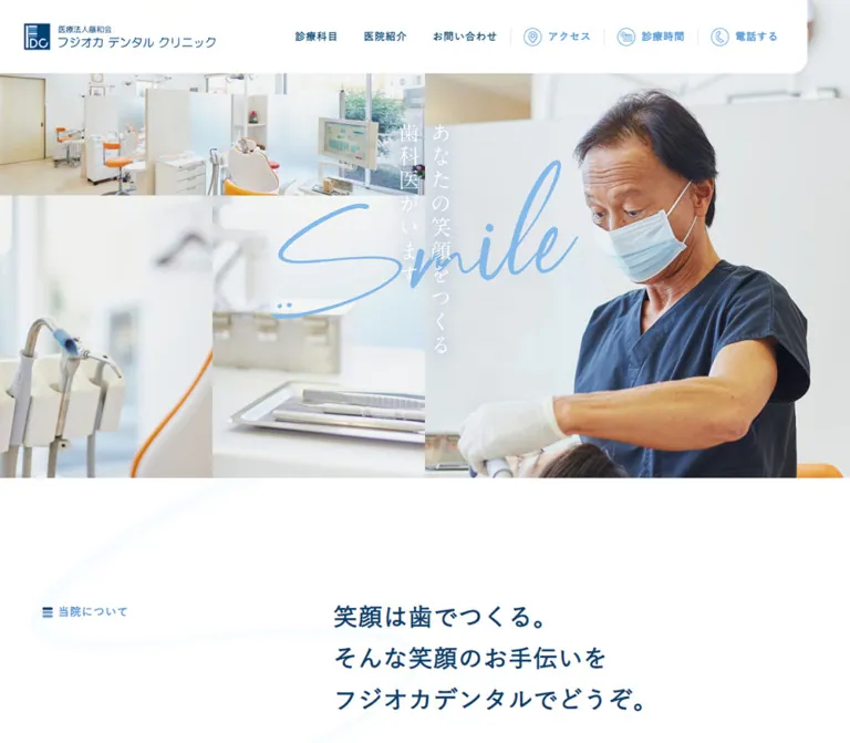
明るい院内写真と診療風景を組み合わせ、縦書きコピーと手書き文字を重ねた歯科医院サイト。白い余白、紺と水色、見やすい医院情報が安心感をつくります。
Fujioka Dental Clinic — Style Reference
Bright clinical photography, generous white space, and reassuring blue typography, joined by a handwritten smile.
Original URL: fujioka-dental.jp/index.html
Final URL: fujioka-dental.jp/index.html — unchanged; recorded HTTP status 200.
Theme: a light page with navy headings, light-blue accents, and a navy footer. No selectable theme was established.
Inspected: supplied inspection record dated October 2, 2026, 00:29:07 JST; timestamp 2026-10-01T15:29:07.717Z.
Viewports: desktop 1440 × 1000 and mobile 390 × 844 CSS pixels.
Scope: the current clinic homepage: photographic opening, introduction, treatment index, two practice features, information for two branches, contact band, and footer. Screenshots directly show the desktop opening, features, contact band and footer, plus the mobile opening and footer. Other sections are supported by rendered text and selected element measurements.
Fujioka Dental Clinic presents a calm, approachable medical practice through bright rooms, close views of equipment, and people receiving care. White occupies most of the page. Deep navy provides authority without the severity of black, while a lighter blue identifies section labels, utility navigation, telephone numbers, and map links. Warm skin tones and orange dental chairs remain within the photography.
The opening is the most distinctive composition: a tightly joined photographic mosaic, white vertical Japanese copy, and a large light-blue handwritten “Smile.” A white navigation plate overlaps the images, with a rounded lower-right corner. Below it, the rhythm becomes much more spacious: an offset introduction, a treatment index, broad feature photographs, and substantial practical information for each branch. This is a long clinic homepage whose navigation supports ongoing patient needs.
閉じる
Fujioka Dental Clinic — Style Reference
Bright clinical photography, generous white space, and reassuring blue typography, joined by a handwritten smile.
Original URL: fujioka-dental.jp/index.html
Final URL: fujioka-dental.jp/index.html — unchanged; recorded HTTP status 200.
Theme: a light page with navy headings, light-blue accents, and a navy footer. No selectable theme was established.
Inspected: supplied inspection record dated October 2, 2026, 00:29:07 JST; timestamp 2026-10-01T15:29:07.717Z.
Viewports: desktop 1440 × 1000 and mobile 390 × 844 CSS pixels.
Scope: the current clinic homepage: photographic opening, introduction, treatment index, two practice features, information for two branches, contact band, and footer. Screenshots directly show the desktop opening, features, contact band and footer, plus the mobile opening and footer. Other sections are supported by rendered text and selected element measurements.
Fujioka Dental Clinic presents a calm, approachable medical practice through bright rooms, close views of equipment, and people receiving care. White occupies most of the page. Deep navy provides authority without the severity of black, while a lighter blue identifies section labels, utility navigation, telephone numbers, and map links. Warm skin tones and orange dental chairs remain within the photography.
The opening is the most distinctive composition: a tightly joined photographic mosaic, white vertical Japanese copy, and a large light-blue handwritten “Smile.” A white navigation plate overlaps the images, with a rounded lower-right corner. Below it, the rhythm becomes much more spacious: an offset introduction, a treatment index, broad feature photographs, and substantial practical information for each branch. This is a long clinic homepage whose navigation supports ongoing patient needs.
How to Read This Reference
- Measured means supplied rendered DOM geometry or computed styles. Values are CSS pixels unless stated otherwise; tables round some fractional measurements.
- Visual estimate means an approximation from the supplied original-page screenshots. It is not a sampled color or a recovered stylesheet declaration.
- Calculated means arithmetic applied to measured geometry, such as a column gap or width percentage.
- Recommended means an implementation choice for a new project. The Quick Start uses these choices where source rules are unavailable.
- Token names are descriptive aliases. The supplied original custom properties only expose two Swiper defaults; they do not establish the site's complete token system.
- An element appearing in the DOM, with a bounding box, does not prove that it is visible. Auxiliary navigation markup is present, but its open state was not demonstrated.
- Exact breakpoints, asset URLs, complete stylesheets, hover endpoints, and menu operation were not supplied.
Tokens — Colors
Default Palette
| Name | Value | Suggested token | Evidence and role |
|---|---|---|---|
| White | #ffffff |
--clinic-white |
Measured page background and reversed text; visually the header plate and main content canvas |
| Clinic Navy | #00406c |
--clinic-navy |
Measured headings, primary desktop navigation, and footer background |
| Utility Blue | #5298d6 |
--clinic-blue |
Measured section labels, header utility links, main telephone links, and map links |
| Pale Blue Backing | #cde2f3 |
--clinic-pale |
Measured hero section background beneath the photographs |
| Body Gray | #333333 |
--clinic-text |
Measured default body and descriptive text |
| Intro Gray | #333b40 |
--clinic-intro-text |
Measured introduction paragraph color |
| Muted Reversed Text | rgba(255,255,255,.5) |
--clinic-muted-white |
Measured copyright color over navy |
| Signature Blue | Approximately #82b9e8 |
--clinic-signature |
Visual estimate for the handwritten “Smile”; preserve the authorized artwork's own color when available |
| Faint Flourish | Approximately #f5faff |
--clinic-flourish |
Visual estimate for oversized background curves around content sections |
Photographic Color Treatments
The contact band is visibly blue, with dental equipment still discernible beneath it. Its sampled section background is transparent, so the blue appearance comes from another layer or asset that was not included in the computed-style evidence.
Recommended approximation: place rgba(0,64,108,.80) over a bright equipment photograph. Adjust against the reference image; the source overlay opacity was not measured. The resulting field should be softer and lighter than the solid navy footer immediately below it.
The hero photographs also appear bright and softly washed. The evidence does not establish whether this comes from image processing, an overlay, or both. Avoid applying an arbitrary heavy opacity reduction to all images.
The supplied custom property --swiper-theme-color: #007aff is a library default. It is not evidence that saturated system blue belongs in the visible brand palette.
Tokens — Typography
Japanese Interface and Body Text
Measured family declaration:
font-family: '游ゴシック体', YuGothic, '游ゴシック Medium',
  'Yu Gothic Medium', '游ゴシック', 'Yu Gothic', sans-serif;
This stack is used for navigation, introduction copy, treatment descriptions, feature headings, branch information, and contact labels. It is a declaration, not proof of which fallback supplied every rendered glyph.
Body copy uses weight 400. Most headings and navigation use 600; section eyebrows use 700. General tracking is 1px. Main editorial headings use approximately 0.03em, measured as different pixel values at the two viewports.
The baseline body treatment is 16px / 25.6px. Introductory prose keeps the same size but increases line height to 32px, producing a slower, more reassuring reading rhythm.
Numbers and Latin Utility Text
Measured family declaration: Montserrat, sans-serif.
Montserrat is declared for telephone numbers, “Google Map” links, and copyright. Main branch telephone numbers are considerably larger than body copy, while footer telephone numbers stay at 18px. Preserve this distinction between prominent patient actions and repeated footer details.
Hero Lettering and Brand Assets
The hero contains thin white vertical Japanese lettering and a large blue handwritten “Smile.” Their font families were not exposed in the supplied text samples. Treat them as artwork until the actual implementation is available; do not assign an invented script or Japanese serif family.
The logo combines a compact navy emblem with the clinic name. Its inline anchor reports a 16px height, which is not a reliable measurement of the visible logo artwork. Use its measured width and the screenshot proportions instead.
Type Scale
| Role | Desktop size / line height | Mobile size / line height | Weight and notes |
|---|---|---|---|
| Body descriptions | 16 / 25.6px |
16 / 25.6px |
400; 1px tracking |
| Introduction paragraph | 16 / 32px |
16 / 32px |
400; Intro Gray |
| Primary navigation | 16 / 25.6px |
Desktop row not visible | 600 |
| Section eyebrow | 17.696 / 21.235px |
16.016 / 19.219px |
700; Utility Blue |
| Introduction H1 | 39.664 / 67.429px |
24.229 / 36.344px |
600; approximately 0.03em tracking |
| Treatment H2 | 39.184 / 62.694px |
20.284 / 32.454px |
600; desktop geometry indicates vertical text |
| Feature H2 | 35.664 / 57.062px |
20.229 / 32.366px |
600 |
| Branch H3 | 35.664 / 57.062px |
20.229 / 32.366px |
600; 1px tracking |
| Feature caption heading | 19.52 / 31.232px |
16.055 / 25.688px |
600; Clinic Navy |
| Branch utility label | 17.739 / 28.383px |
16.028 / 25.644px |
600 |
| Main telephone number | 31.696 / 50.714px |
30.016 / 48.026px |
Montserrat, 400 |
| Detail link | 18 / 28.8px |
18 / 28.8px |
Japanese stack, 600 |
| Map link / footer telephone | 18 / 28.8px |
18 / 28.8px |
Montserrat, 400 |
| Contact-band heading | 30.432 / 48.691px |
20.142 / 32.227px |
600; white |
| Contact-card introductory line | 23.52 / 37.632px |
20.055 / 32.088px |
400; white |
| Contact-card action label | 30.912 / 49.459px |
24.087 / 28.904px |
600; mobile line height is tighter |
| Copyright | 17.52 / 28.032px |
14.055 / 22.488px |
Montserrat, 400; normal tracking |
These are two measured endpoint sets. The complete fluid sizing formulas were not supplied. Do not scale all text proportionally with viewport width: body copy remains 16px, and the main phone number remains approximately 30px on mobile.
Tokens — Spacing & Shapes
Density: generous editorial spacing around readable, moderately sized text. Practical details become denser inside branch information and the footer.
No universal spacing unit was established. The measurements show a combination of fixed utility spacing and large gaps proportional to viewport width.
Layout Measurements
| Element | Desktop at 1440px | Mobile at 390px | Evidence |
|---|---|---|---|
| Document height | Approximately 7470px |
Approximately 7676px |
Measured document heights |
| Header outer box | 1440 × 115px |
390 × 64px |
Measured |
| Visible white header plate | Approximately 1368 × 115px |
Approximately 220 × 64px |
Screenshot estimate; outer header is transparent |
| Header logo width | 299.97px |
184.81px |
Measured anchor widths |
| Hero | 1440 × 810px |
390 × 844px |
Measured |
| Main content width in features/footer | 1200px, starting at x=120 |
342px, starting at x=24 |
Measured |
| Feature columns | Two 570px columns |
One 342px column |
Measured text widths; screenshots confirm desktop pairing |
| Feature-column gap | 60px |
Stacked | Calculated from x=120 and x=750 |
| Feature photograph | Approximately 570 × 352px |
Not directly pictured | Desktop visual estimate |
| Contact action group | 948px total |
Approximately 343.22px |
Calculated from measured card boxes |
| Contact cards | Each 450 × 207.75px |
343.22 × 172.64px and 343.22 × 163px |
Measured; mobile heights differ |
| Contact-card gap | 48px horizontally |
20px vertically |
Calculated |
| Contact band | 492.58px high |
535.23px high |
Measured |
| Footer | 471.58px high |
870.86px high |
Measured |
Section Spacing
| Use | Desktop measurement | Mobile measurement | Interpretation |
|---|---|---|---|
| Introduction top padding | 216px |
58.5px |
Both equal 15vw at the measured widths |
| Introduction bottom padding | 115.188px |
31.188px |
Approximately 8vw |
| Features top padding | 244.797px |
66.297px |
Approximately 17vw |
| Branch-section top padding | 172.797px |
46.797px |
Approximately 12vw |
| Second branch bottom padding | 288px |
78px |
Both equal 20vw |
| Treatments top padding | 244.797px |
93.594px |
Approximately 17vw desktop and 24vw mobile |
| Treatments bottom padding | 144px |
163.797px |
Mobile does not simply compress every gap |
| Contact-band padding | Approximately 86.39px on all sides |
39px vertical, 23.39px horizontal |
Approximately 6vw desktop; 10vw 6vw mobile |
| Footer padding | 80px 0 16px |
48px 0 32px |
Measured fixed values |
The viewport-unit interpretations above are calculated matches, not recovered source declarations.
Border Radius and Rules
| Element | Value | Status |
|---|---|---|
| Contact cards | 10px radius |
Measured |
| Feature photographs | Approximately 12px radius |
Visual estimate |
| Header plate lower-right corner | Approximately 24px radius |
Visual estimate |
| Hero mosaic joins | Square, without visible gutters | Observed in screenshots |
| Utility icon enclosures | Circular | Observed; approximately 28px in desktop header |
| Contact icon enclosures | Circular, approximately 52px |
Visual estimate |
| Contact-card outline | Fine white rule, approximately 1px |
Visual estimate |
| Footer and navigation dividers | Fine, low-contrast light rules | Observed; exact alpha not supplied |
Components
Overlapping Header Plate
Role: brand recognition, primary navigation, and immediate access to practical information.
The desktop header's outer element spans the viewport, but the visible white plate ends about 72px before the right edge. Its rounded lower-right corner softens the large rectangular shape. The logo starts near x=41px; the primary navigation begins near x=562px.
The navigation has two distinct groups:
- Navy text links: “診療科目”, “医院紹介”, and “お問い合わせ”.
- Light-blue icon-and-label links: “アクセス”, “診療時間”, and “電話する”. Fine vertical separators divide the utility group.
The first group uses roughly 40px between text boxes. Utility icons are thin outlines inside circles, with labels to their right. There is no large filled appointment button in the observed header.
On mobile, the white plate holds only the compact logo. A separate two-line menu control appears at the upper right, over the photograph. The same control remains visible in the bottom-page capture, supporting a persistent-control interpretation. The supplied styles do not establish its exact positioning rule or open behavior.
Photographic Hero Mosaic
Role: communicate the atmosphere of the clinic before the detailed introduction.
At desktop, the hero measures 1440 × 810px, exactly a 16:9 rectangle at this viewport. Its visible composition contains four photographic regions:
- A wide clinic-room image across the upper-left half.
- A close-up of dental handpieces in the lower-left quarter.
- An instrument-tray close-up beside it.
- A clinician treating a patient across the right half.
The seams are square and flush. The images do not behave visually like separated cards. Keep the clinician's face, upper body, and working hands legible within the right-hand crop.
White vertical copy reads “あなたの笑顔をつくる” and “歯科医がいます”. The blue “Smile” crosses this vertical composition. Its measured wrapper is approximately 547.19 × 283.02px, centered at the hero's midpoint. On mobile, the wrapper becomes 273 × 141.20px, centered horizontally and approximately 40% down the hero.
The mobile mosaic is rearranged: room and tray imagery span the upper width, while equipment and the clinician occupy the lower left and right. The entire hero fills the captured 844px viewport height. Reproduce this art direction with different image regions or crops rather than shrinking a single desktop composite.
Introduction Block
Role: explain the practice's attitude and establish the two-branch organization.
The desktop introduction begins after the hero with 216px of top padding. A small blue eyebrow, “当院について”, occupies the left side. The main copy begins at x=576px in a 720px column.
The H1 is a three-line navy statement beginning “笑顔は歯でつくる。” It is measured at 39.664px, with unusually open 1.7 line height. The explanatory paragraph below uses 16px / 32px and describes the practice's emphasis on comfort and gentle care.
At 390px, the eyebrow, H1, and paragraph stack in a 342px column with 24px side margins. The H1 becomes approximately 24.23px / 1.5; the body retains its desktop size and line height. The layout change carries more of the adaptation than text shrinking.
A faint oversized curve is visible around this broader visual system. Its asset and exact opacity were not supplied.
Treatment Index
Role: introduce six areas of care and link to the dedicated treatment page.
Rendered text confirms six entries: “一般歯科”, “予防歯科”, “口腔外科”, “小児歯科”, “インプラント”, and “審美歯科”. Each combines a treatment name with a short explanatory paragraph. A shared “詳しくはこちら” link points to /care/.
Desktop text positions establish two columns and three rows. The descriptive text columns are about 331.22px wide, beginning near x=570px and x=1050px. The heading occupies a narrow, tall box to the left: approximately 125.38 × 363.20px. Together with the eyebrow's narrow box, this geometry indicates a vertical heading arrangement; the actual writing-mode declaration was not included.
On mobile, entries form one vertical sequence. Their text boxes are approximately 246.25px wide and start near x=128.38px. The heading returns to a wide, two-line box. This section has stronger left offsets than the standard 24px content margin; do not apply one universal column rule to every section.
No screenshot of this section or service-icon asset inventory was supplied. Text order and responsive geometry are established; exact icon shapes and surrounding decoration remain unverified.
Practice Feature Pair
Role: make patient-centered values concrete through recognizable situations.
A centered blue eyebrow introduces a large centered navy heading: “ひとりひとりに合わせた最良の治療をご提案いたします”. Beneath it are two equal-width feature blocks separated by 60px.
Each block contains a broad photograph with modest rounded corners, followed by a navy semibold sentence and an unboxed gray paragraph. The left image shows an older adult in conversation with a healthcare professional. The right shows a child undergoing a dental examination. Their bright, gentle treatment connects the page's medical setting with family familiarity.
The text sits directly on white; there is no visible enclosing card surface, border, or elevation shadow. At desktop, captions use approximately 19.52px, while paragraphs use 16px. Mobile DOM positions confirm that the two image-and-text groups stack and retain the 342px content width.
Branch Information Sections
Role: make hours, telephone numbers, addresses, and travel information available for each location.
Two independent sections are headed “三木院” and “北鈴蘭台分院”. Each includes a weekly timetable, a reservation/contact label, a large telephone link, a clinic-detail link, an address, a map link, parking information, and station access directions.
The timetable text establishes one time column, seven weekday/holiday columns, and two session rows. Preserve the branches' different opening patterns, the Miki Saturday-afternoon exception, and the second branch's reception cutoff note. Table cell styling was not included in the supplied samples.
Desktop contact and access information occupy two roughly 535.8px columns. The left begins at x=120px; the right begins at approximately x=724.2px. On mobile, these groups stack at x=24px with a 342px width. The phone number stays prominent at approximately 30px, and the clinic-detail link moves beneath it.
There is substantial content space between each branch heading and its practical details. The supplied element samples do not provide a complete inventory of the intervening media, so exact gallery structure and image arrangement should not be invented.
Contact Band and Outlined Action Cards
Role: provide two clear routes to the clinic's contact information.
A full-width photographic band has a strong blue wash and centered white heading. Two transparent outlined cards sit below it. Each card contains a circular line icon, a regular-weight introductory line, and a larger semibold action label.
Desktop cards measure 450 × 207.75px, separated by 48px. The web card uses a computer/message symbol and “お問い合わせフォーム”; the phone card uses a handset and “電話する”. Their white outlines and 10px corners define the controls without a solid button fill.
On mobile, the heading wraps to two lines and the cards stack with 20px between them. Their recorded heights differ slightly, so equal mobile heights are an optional normalization, not an observed source rule.
Observed destinations: the web action links to /contact/. The phone-labelled card links to /contact/index.php#contact; it is not a direct tel: action. Direct dialing is available through the branch telephone-number links.
Footer
Role: repeat the clinic identity and essential contact/navigation information at the end of the page.
The footer is a solid #00406c field. The brand is reversed to white. The original-page identity names “医療法人藤和会” and “フジオカデンタルクリニック”.
Desktop branch details occupy two 600px columns in a 1200px container. Each has a semibold branch name, address, and an 18px Montserrat telephone link with a small circular handset icon. A fine horizontal rule separates these details from the final row: four navigation links on the left and muted copyright on the right.
At mobile width, the branches stack, addresses wrap deliberately, and navigation becomes four full-width rows with fine separators and approximately 82.6px row-to-row spacing. Copyright appears beneath them at approximately 14px.
The mobile screenshot is a scrolled footer view, not evidence of an opened menu. Its top is cropped relative to the footer's actual start; use the measured 48px top padding rather than the apparent screenshot-top clearance.
Navigation and Link Semantics
| Visible action | Recorded destination | What is established |
|---|---|---|
| “診療科目” | /care/ |
Treatment-page link |
| “医院紹介” | /clinic/ |
Clinic-information link |
| “お問い合わせ” | /contact/ |
Contact-page link |
| “アクセス” and “診療時間” | /index.html#top_info |
Shared in-page destination; scroll behavior untested |
| Header “電話する” | /contact#contact |
Contact-page section link |
| Contact-band “電話する” | /contact/index.php#contact |
Contact-page section link |
| Branch phone numbers | tel:0794-85-1114, tel:078-593-2406 |
Direct telephone-link semantics |
| “Google Map” | Two supplied external map short links | Map destinations exist; destination pages were not inspected |
The second branch detail link contains /clinic/index.html?id=#clinic_kitasuzuran. Its actual navigation result was not tested. Verify that destination when implementing or maintaining the site.
Tokens — Motion & Interaction
| Element or behavior | Supplied evidence | Safe interpretation |
|---|---|---|
| Primary and utility navigation | Computed transition 0.4s |
A 400ms transition is declared; changed properties and end states are unknown |
| Main telephone and map links | Computed transition 0.4s |
Same duration; no verified hover appearance |
| Contact cards and their text | Computed transition 0.6s |
A 600ms transition is declared on the card and text |
| Sampled headings and sections | Animation reported as none |
No active CSS animation was reported for those sampled elements |
| Many base elements | Transition reported only as all |
This does not establish a nonzero animation duration |
| Mobile menu | Control visible in top and bottom captures | Persistence is supported; opening, closing, focus behavior, and animation are unverified |
| Hero imagery | Static supplied frames | No verified slide sequence, autoplay interval, video, or parallax |
| Swiper variables | Theme color and navigation-size defaults present | Insufficient evidence to identify a working carousel |
No clicked, hovered, or keyboard-operated states were supplied. Keep link destinations separate from claims that their resulting interactions were tested.
Recommended adaptation: retain restrained color or opacity feedback, with 400ms for ordinary navigation and up to 600ms for the large contact cards. Avoid adding card lifts, springs, or a continuously moving hero as if they were original features. Provide reduced-motion behavior for any new transitions.
Surfaces
| Surface | Appearance | Purpose |
|---|---|---|
| Main canvas | Solid white | Gives photography and navy type room to breathe |
| Header plate | Opaque white with one rounded lower corner | Keeps identity and navigation legible over the collage |
| Hero | Flush photographs over pale blue backing | Establishes the clinic's atmosphere |
| Editorial content | White, with very faint oversized curves | Adds a gentle visual rhythm without enclosing every section |
| Feature blocks | Photograph followed by text on the canvas | Keeps the patient imagery prominent |
| Contact band | Blue-washed photograph | Creates a clear final action area |
| Contact controls | Transparent fill, white outline | Separates actions while retaining the background image |
| Footer | Solid navy with white and half-opacity white text | Provides a stable closing information field |
No general elevated-card or shadow system is visible in the supplied screenshots. Structure comes from photographic boundaries, white space, headings, and thin rules.
Imagery
Use high-key dental photography with cool whites, soft daylight, and believable human activity. The hero combines environmental context with close detail: room, equipment, tray, and treatment. This mixture is more specific than a single smiling portrait.
Preserve the relationship between image crops. The clinician anchors the right side on desktop, while the room and equipment establish context on the left. On mobile, the clinician remains recognizable in the lower-right region. A uniform center crop of a single wide image would lose these relationships.
The feature images are broader patient stories: conversation with an older adult and care for a child. Their role is warmth and reassurance. The evidence does not identify the people, photographer, or image supplier.
The oversized “Smile” has a loose handwritten stroke and a small smile-like flourish near its lower-left end. It should remain a distinctive graphic rather than becoming ordinary headline typography. The accompanying Japanese vertical copy is slender and white, with a different visual character from the semibold sans-serif headings below.
Icons use fine outlines and circular enclosures. Header icons cover location, hours, and telephone; contact cards use web messaging and telephone; footer telephone links repeat the handset motif. Their source format and icon library are unknown.
Observed Asset References
No original image src, SVG path, or background-image URL was included in the evidence. The following is a visual inventory, not a fabricated filename list.
| Asset | Observed use | Implementation guidance |
|---|---|---|
| Navy clinic emblem and wordmark | Desktop and mobile header | Preserve the lockup and small organization line |
| White clinic wordmark | Footer | Use a reversed asset with the same identity |
| Bright clinic-room photograph | Upper hero region | Retain windows, equipment, and warm chair accents |
| Dental handpiece close-up | Lower-left hero region | Preserve its soft depth and vertical equipment shapes |
| Instrument-tray close-up | Hero collage | Use an independent crop for mobile |
| Clinician treating a patient | Right desktop hero; lower-right mobile | Keep face, hands, and treatment context within the crop |
| “Smile” graphic | Overlapping hero center | Preserve handwriting and transparent surrounding space |
| Vertical Japanese slogan | Hero center | Retain readable wording and vertical composition |
| Older-adult consultation photograph | First feature block | Broad landscape framing with two-person interaction |
| Child dental-examination photograph | Second feature block | Broad landscape framing, gentle treatment context |
| Dental-equipment background | Contact band | Keep visible detail beneath a strong blue wash |
| Very pale decorative curves | Content-section background | Decorative, low contrast, and noninteractive |
Use authorized assets where available. CSS can reproduce the layout and color relationships, but it cannot reproduce the particular photographs or handwritten identity by itself.
Layout & Responsive Behavior
Desktop Composition
The desktop document is approximately 7470px tall. The hero occupies the first 810px; the header overlaps it rather than consuming an additional 115px above it. The following introduction does not begin its text immediately at the hero edge: its eyebrow appears around document y=1026px.
Features and footer share a measured 1200px content width with 120px side margins. The introduction and treatments use more asymmetrical internal arrangements. A measured media region between the introduction and treatments begins at x=120px and extends to the right viewport edge, but its exact asset structure was not supplied.
The feature pair is balanced and centered. Branch sections return to practical information columns. The contact cards occupy a narrower centered group, while their background spans the entire page.
Mobile Composition
At 390 × 844, the hero occupies the full initial viewport. The desktop navigation row disappears, the logo plate narrows, and the menu control remains at the upper right.
Most content becomes a 342px column with 24px gutters. The introduction moves from an offset two-part composition to a sequential stack. Treatments become six rows, features become two stacked image-and-text groups, branch details become single-column blocks, contact cards stack, and the footer becomes considerably taller.
The mobile page is approximately 7676px tall, only modestly taller than desktop despite the stacking. Much of the difference is balanced by smaller headings, reduced viewport-based section gaps, and rearranged media. This does not justify uniformly reducing all spacing: the treatment section retains substantial bottom space.
Calculated Hero Placement
The measured signature wrapper is consistent with these proportions:
- Desktop width:
547.19 / 1440 ≈ 38%; center at50%of hero height. - Mobile width:
273 / 390 = 70%; center at approximately40%of hero height. - Desktop hero ratio:
1440 / 810 = 16 / 9. - Mobile hero height: equal to the captured viewport height.
These are useful reconstruction rules. They are not proof of the source CSS syntax.
Responsive Limits
Only two viewports were supplied. Tablet behavior, landscape phones, exact breakpoint locations, safe-area handling, and browser-toolbar effects were not established. The 64rem breakpoint and 100svh mobile hero in the Quick Start are recommendations.
Do’s and Don’ts
Do
- Build the visual hierarchy around white,
#00406c, and#5298d6. - Preserve the four-part hero collage and its different mobile arrangement.
- Keep the handwritten signature separate from ordinary interface typography.
- Use the white header plate's rounded lower-right corner as a recognizable shape.
- Retain
16pxbody text and generous introductory line spacing on mobile. - Use large photographs with modest rounding and text directly beneath them.
- Keep branch hours, direct phone links, addresses, and access details grouped by location.
- Distinguish the large light-blue telephone numbers from smaller white footer repeats.
- Let viewport-based section gaps coexist with fixed, readable utility spacing.
- Use fine circular line icons and restrained outlined contact controls.
Don't
- Don't flatten the mobile hero into a narrow crop of the complete desktop mosaic.
- Don't identify the hero lettering with an unsupported font name.
- Don't put every content block inside a rounded, shadowed card.
- Don't promote orange chair upholstery into an unrelated interface accent color.
- Don't replace the pale handwritten overlay with a heavy solid headline.
- Don't make all phone-labelled links direct dialing when their observed destinations are contact pages.
- Don't mistake the mobile footer capture for an opened navigation panel.
- Don't infer a working slideshow from Swiper custom properties alone.
- Don't use hidden auxiliary navigation measurements as visible hero layout measurements.
- Don't collapse the page into a single conversion panel and remove the two branches' practical information.
Recommended Implementation Additions
These are recommendations for a new implementation, not verified features of the original page.
- Give the menu button an accessible name and maintain
aria-expanded. If it opens a modal navigation panel, implement focus management, Escape dismissal, and focus restoration. - Make the hero slogan available as text or an appropriate text alternative. Decorative duplicate lettering should not be announced twice.
- Verify the contrast of light-blue text on white and white vertical copy over bright photographs. Use darker text or a localized image treatment where needed.
- Use semantic tables for opening hours, with clear row/column headers and a text explanation of open and closed symbols. Keep each branch's exceptions attached to its own table.
- Keep interactive targets comfortably tappable without reducing the visible fine-line icon style. A recommended minimum target is
44 × 44px. - Give keyboard focus a clear navy or white outline, depending on the surface. Hover effects alone are insufficient.
- Supply responsive image sizes and explicit dimensions. Prioritize the initial hero assets and defer lower-page photographs appropriately.
- Keep phone links associated with branch names, and verify the unusual second-branch detail URL before reuse.
- If a persistent mobile control overlaps footer text at other widths, reserve clearance or adjust its placement.
Agent Prompt Guide
Quick Color Reference
- Main canvas and header:
#ffffff. - Headings, primary navigation, footer:
#00406c. - Section labels, utility navigation, prominent phone and map links:
#5298d6. - Hero backing:
#cde2f3. - Body text:
#333333; introduction prose:#333b40. - Hero signature: approximately
#82b9e8, subject to the actual artwork. - Contact controls: white type and fine white outlines over a blue-washed photograph.
- Copyright: white at
50%opacity over navy.
Overall Prompt
“Create a Japanese dental-clinic homepage inspired by Fujioka Dental Clinic. Use a white canvas, deep navy #00406c, light blue #5298d6, Yu Gothic-family interface text, and Montserrat for telephone numbers and Latin utility text. Open with a flush four-part mosaic of a bright dental room, equipment, an instrument tray, and a clinician treating a patient. Overlay slender white vertical Japanese copy and a large pale-blue handwritten signature. Place a white navigation plate over the top, rounding only its lower-right corner. Continue with an offset introduction, six treatment summaries, two broad patient photographs with unboxed captions, separate information sections for two branches, outlined contact cards over blue-washed photography, and a navy footer. Preserve generous whitespace and mobile body readability.”
Example Component Prompts
- Header: “A white navigation plate overlapping a bright clinical photograph. Place a compact navy clinic logo at left, three semibold navy text links at right, then three light-blue circular line icons with labels and fine vertical separators. Round the plate's lower-right corner. On mobile, retain a small logo plate and a separate two-line menu button.”
- Responsive hero: “Arrange four authorized dental photographs without gutters. Desktop: room across the upper-left half, equipment and tray beneath it, clinician across the right half. Mobile: room and tray across the upper width, equipment and clinician in the lower two columns. Keep vertical white copy centered and a handwritten blue signature at roughly 70% of mobile width.”
- Feature pair: “Two 570px-wide landscape photographs separated by 60px on a white desktop canvas. Use approximately 12px image corners, navy semibold captions, and 16px gray paragraphs. Add a centered blue eyebrow and a larger navy heading above. Stack the complete image-and-text groups on mobile.”
- Branch information: “Create a readable clinic section with a navy branch heading, semantic weekly opening-hours table, prominent light-blue Montserrat telephone number, clinic-detail link, address, map link, parking note, and station directions. Use two information columns on desktop and one 342px column at a 390px viewport.”
- Contact and footer: “Place two transparent white-outlined contact cards over a blue-washed dental photograph. Each has a circular line icon, a regular introductory line, and a larger semibold action. Follow with a solid navy footer containing a reversed clinic logo, two branch address groups, fine separators, and understated copyright. Stack cards and navigation rows on mobile.”
Quick Start
CSS Custom Properties
This is a usable adaptation, not an extracted stylesheet. Colors and font declarations use measured evidence. Rounded image corners, the header corner, hero crops, responsive formulas, breakpoint, table rules, and hover endpoints are recommendations.
Use .container for standard sections. The hero expects .hero-media to contain four images with the classes .hero-room, .hero-tools, .hero-tray, and .hero-dentist; overlay .hero-slogan and .hero-signature as authorized transparent artwork. The header expects a brand, primary navigation, and utility navigation. Asset URLs and font loading must be supplied by the implementing project.
:root {
  /* Measured palette */
  --clinic-white: #ffffff;
  --clinic-navy: #00406c;
  --clinic-blue: #5298d6;
  --clinic-pale: #cde2f3;
  --clinic-text: #333333;
  --clinic-intro-text: #333b40;
  --clinic-muted-white: rgb(255 255 255 / 50%);

  /* Visual approximations */
  --clinic-signature: #82b9e8;
  --clinic-flourish: #f5faff;
  --contact-wash: rgb(0 64 108 / 80%);
  --reversed-rule: rgb(255 255 255 / 30%);

  /* Observed font declarations */
  --font-ja: '游ゴシック体', YuGothic, '游ゴシック Medium',
    'Yu Gothic Medium', '游ゴシック', 'Yu Gothic', sans-serif;
  --font-latin: Montserrat, sans-serif;

  /* Recommended fluid approximations of measured endpoints */
  --text-body: 16px;
  --text-eyebrow: clamp(16px, 1.23vw, 17.696px);
  --text-intro: clamp(24px, 2.754vw, 39.664px);
  --text-section: clamp(20px, 2.477vw, 35.664px);
  --text-feature: clamp(16px, 1.356vw, 19.52px);
  --text-phone: clamp(30px, 2.202vw, 31.696px);
  --text-contact: clamp(20px, 2.114vw, 30.432px);
  --text-action: clamp(24px, 2.147vw, 30.912px);

  --content-max: 1200px;
  --page-gutter: 24px;
  --feature-gap: 60px;
  --contact-gap: 48px;
  --radius-action: 10px;
  --radius-photo: 12px;
  --radius-header: 24px;

  /* Durations observed; properties and easing are recommendations */
  --motion-link: 400ms ease;
  --motion-contact: 600ms ease;
}

* { box-sizing: border-box; }

body {
  margin: 0;
  color: var(--clinic-text);
  background: var(--clinic-white);
  font-family: var(--font-ja);
  font-size: var(--text-body);
  font-weight: 400;
  line-height: 1.6;
  letter-spacing: 1px;
}

img { display: block; max-width: 100%; }
a { color: inherit; }
button { font: inherit; }

.container {
  width: min(var(--content-max), calc(100% - 2 * var(--page-gutter)));
  margin-inline: auto;
}

.site-header {
  position: absolute;
  inset: 0 0 auto;
  z-index: 10;
}

.header-plate {
  display: flex;
  align-items: center;
  justify-content: space-between;
  gap: 32px;
  width: 95%;
  height: 115px;
  padding-inline: 2.85vw;
  border-bottom-right-radius: var(--radius-header);
  background: var(--clinic-white);
}

.header-brand { flex: 0 0 300px; }
.header-brand img { width: 100%; height: auto; }
.header-nav, .primary-nav, .utility-nav {
  display: flex;
  align-items: center;
}
.primary-nav { gap: 40px; }
.utility-nav { margin-left: 20px; }

.header-nav a {
  color: var(--clinic-navy);
  font-size: 16px;
  font-weight: 600;
  text-decoration: none;
  white-space: nowrap;
  transition: color var(--motion-link);
}

.utility-nav a {
  display: flex;
  align-items: center;
  gap: 10px;
  padding-inline: 20px;
  border-left: 1px solid #dddddd;
  color: var(--clinic-blue);
}
.utility-nav a:last-child { padding-right: 0; }
.utility-nav .icon { width: 28px; height: 28px; }
.menu-toggle { display: none; }

.hero {
  position: relative;
  height: auto;
  aspect-ratio: 16 / 9;
  overflow: hidden;
  background: var(--clinic-pale);
}

.hero-media {
  position: absolute;
  inset: 0;
  display: grid;
  grid-template-columns: repeat(4, minmax(0, 1fr));
  grid-template-rows: 41% 59%;
}

.hero-media img {
  width: 100%;
  height: 100%;
  min-height: 0;
  object-fit: cover;
}
.hero-room { grid-area: 1 / 1 / 2 / 3; }
.hero-tools { grid-area: 2 / 1 / 3 / 2; }
.hero-tray { grid-area: 2 / 2 / 3 / 3; }
.hero-dentist { grid-area: 1 / 3 / 3 / 5; }

.hero-signature, .hero-slogan {
  position: absolute;
  left: 50%;
  top: 50%;
  height: auto;
  transform: translate(-50%, -50%);
  pointer-events: none;
}
.hero-slogan { z-index: 1; width: 100px; }
.hero-signature { z-index: 2; width: 38%; }

.section-eyebrow {
  display: flex;
  align-items: center;
  gap: 8px;
  margin: 0;
  color: var(--clinic-blue);
  font-size: var(--text-eyebrow);
  font-weight: 700;
  line-height: 1.2;
}
.section-eyebrow .icon { width: 16px; height: 16px; }

.section-title {
  margin: 32px 0 0;
  color: var(--clinic-navy);
  font-size: var(--text-section);
  font-weight: 600;
  line-height: 1.6;
  letter-spacing: .03em;
}

.about { padding-block: 15vw 8vw; }
.about-grid {
  display: grid;
  grid-template-columns: 38% 60%;
}
.about h1 {
  margin: 0;
  color: var(--clinic-navy);
  font-size: var(--text-intro);
  font-weight: 600;
  line-height: 1.7;
  letter-spacing: .03em;
}
.about-copy p {
  margin: 48px 0 0;
  color: var(--clinic-intro-text);
  line-height: 2;
}

/* Recommended structural treatment for the DOM-supported care section */
.care { padding-block: 17vw 10vw; }
.care-layout {
  display: grid;
  grid-template-columns: 240px minmax(0, 1fr);
  gap: 96px;
}
.care-heading .section-title { writing-mode: vertical-rl; }
.care-items {
  display: grid;
  grid-template-columns: repeat(2, minmax(0, 1fr));
  gap: 48px 60px;
}
.care-item h3 { margin: 0 0 8px; color: var(--clinic-navy); }
.care-item p { margin: 0; }

.features { padding-top: 17vw; }
.features > .container > .section-eyebrow { justify-content: center; }
.features > .container > .section-title { text-align: center; }
.feature-grid {
  display: grid;
  grid-template-columns: repeat(2, minmax(0, 1fr));
  gap: var(--feature-gap);
  margin-top: 6vw;
}
.feature-photo {
  width: 100%;
  aspect-ratio: 570 / 352;
  object-fit: cover;
  border-radius: var(--radius-photo);
}
.feature-title {
  margin: 20px 0 8px;
  color: var(--clinic-navy);
  font-size: var(--text-feature);
  font-weight: 600;
  line-height: 1.6;
}
.feature-description { margin: 0; }

.branch { padding-block: 12vw 32px; }
.branch--last { padding-bottom: 20vw; }
.branch > .container > .section-title { margin-top: 0; text-align: center; }
.branch-info {
  display: grid;
  grid-template-columns: repeat(2, minmax(0, 1fr));
  gap: 6%;
  width: 95%;
}
.branch-label { color: var(--clinic-navy); font-weight: 600; }
.phone-link {
  display: inline-flex;
  align-items: center;
  gap: 10px;
  color: var(--clinic-blue);
  font-family: var(--font-latin);
  font-size: var(--text-phone);
  line-height: 1.6;
  text-decoration: none;
}
.map-link {
  color: var(--clinic-blue);
  font-family: var(--font-latin);
  font-size: 18px;
}
.detail-link { font-size: 18px; font-weight: 600; }

/* Recommended table styling; original cell styles were not supplied */
.hours-wrap { max-width: 100%; overflow-x: auto; }
.hours-table { width: 100%; border-collapse: collapse; }
.hours-table th, .hours-table td {
  padding: 10px 8px;
  border-bottom: 1px solid var(--clinic-pale);
  text-align: center;
}
.hours-table th { color: var(--clinic-navy); }

.contact-band {
  padding: 6vw;
  color: var(--clinic-white);
  background-color: var(--clinic-navy);
  background-image:
    linear-gradient(var(--contact-wash), var(--contact-wash)),
    var(--contact-photo, none);
  background-position: center;
  background-size: cover;
}
.contact-heading {
  margin: 0;
  text-align: center;
  font-size: var(--text-contact);
  font-weight: 600;
  line-height: 1.6;
}
.contact-actions {
  display: grid;
  grid-template-columns: repeat(2, minmax(0, 1fr));
  gap: var(--contact-gap);
  width: min(948px, 100%);
  margin: 4.4vw auto 0;
}
.contact-card {
  display: flex;
  flex-direction: column;
  align-items: center;
  justify-content: center;
  min-height: 208px;
  padding: 25px 16px;
  border: 1px solid currentColor;
  border-radius: var(--radius-action);
  color: inherit;
  text-align: center;
  text-decoration: none;
  transition: background-color var(--motion-contact);
}
.contact-card .icon { width: 52px; height: 52px; margin-bottom: 16px; }
.contact-card p { margin: 0; }
.contact-kicker { font-size: clamp(20px, 1.634vw, 23.52px); }
.contact-label { font-size: var(--text-action); font-weight: 600; }

.site-footer {
  padding: 80px 0 16px;
  color: var(--clinic-white);
  background: var(--clinic-navy);
}
.footer-brand { width: 356px; max-width: 90%; }
.footer-branches {
  display: grid;
  grid-template-columns: repeat(2, minmax(0, 1fr));
  margin-top: 48px;
}
.footer-branch h3 { margin: 0 0 8px; font-size: var(--text-eyebrow); }
.footer-branch address { font-style: normal; }
.footer-branch .phone-link { margin-top: 8px; color: inherit; font-size: 18px; }
.footer-bottom {
  display: flex;
  align-items: center;
  justify-content: space-between;
  gap: 24px;
  margin-top: 60px;
  padding-block: 40px;
  border-top: 1px solid var(--reversed-rule);
}
.footer-nav { display: flex; gap: 40px; }
.footer-nav a { font-weight: 600; text-decoration: none; }
.copyright {
  margin: 0;
  color: var(--clinic-muted-white);
  font-family: var(--font-latin);
  font-size: clamp(14px, 1.217vw, 17.52px);
  letter-spacing: normal;
}

/* Recommended interaction endpoints */
:where(a, button):focus-visible {
  outline: 2px solid currentColor;
  outline-offset: 5px;
}
@media (hover: hover) {
  .primary-nav a:hover { color: var(--clinic-blue); }
  .contact-card:hover { background-color: rgb(255 255 255 / 12%); }
}

/* Recommended breakpoint, not recovered from the source */
@media (max-width: 64rem) {
  .header-plate {
    width: min(220px, calc(100% - 80px));
    height: 64px;
    padding-inline: 18px;
  }
  .header-brand { flex: 1 1 auto; min-width: 0; }
  .header-nav { display: none; }
  .menu-toggle {
    position: fixed;
    top: 8px;
    right: 16px;
    z-index: 30;
    display: grid;
    place-content: center;
    gap: 5px;
    width: 48px;
    height: 48px;
    padding: 0;
    border: 0;
    color: var(--clinic-navy);
    background: transparent;
    cursor: pointer;
  }
  .menu-toggle::before, .menu-toggle::after {
    content: '';
    width: 32px;
    height: 2px;
    background: currentColor;
  }
  /* Apply this class when the control overlaps a dark surface. */
  .menu-toggle.on-dark { color: var(--clinic-white); }

  .hero { height: 100svh; aspect-ratio: auto; }
  .hero-media {
    grid-template-columns: repeat(2, minmax(0, 1fr));
    grid-template-rows: 19% 29.5% 51.5%;
  }
  .hero-room { grid-area: 1 / 1 / 2 / 3; }
  .hero-tray { grid-area: 2 / 1 / 3 / 3; }
  .hero-tools { grid-area: 3 / 1 / 4 / 2; }
  .hero-dentist { grid-area: 3 / 2 / 4 / 3; }
  .hero-signature { top: 40%; width: 70%; }
  .hero-slogan { width: 88px; }

  .about-grid { grid-template-columns: minmax(0, 1fr); gap: 16px; }
  .about h1 { line-height: 1.5; }
  .about-copy p { margin-top: 24px; }
  .section-title { margin-top: 24px; }

  .care { padding-block: 24vw 42vw; }
  .care-layout { grid-template-columns: minmax(0, 1fr); gap: 32px; }
  .care-heading .section-title { writing-mode: horizontal-tb; }
  .care-items { grid-template-columns: minmax(0, 1fr); gap: 24px; }

  .feature-grid { grid-template-columns: minmax(0, 1fr); gap: 32px; margin-top: 40px; }
  .feature-title { margin-top: 16px; }
  .branch-info { grid-template-columns: minmax(0, 1fr); gap: 24px; width: 100%; }

  .contact-band { padding: 10vw 6vw; }
  .contact-actions { grid-template-columns: minmax(0, 1fr); gap: 20px; }
  .contact-card { min-height: 172px; padding-block: 16px; }
  .contact-label { line-height: 1.2; }

  .site-footer { padding-block: 48px 32px; }
  .footer-branches { grid-template-columns: minmax(0, 1fr); gap: 28px; margin-top: 32px; }
  .footer-bottom {
    display: block;
    margin-top: 36px;
    padding: 0;
    border-top: 0;
  }
  .footer-nav { display: block; }
  .footer-nav a {
    display: block;
    padding-block: 28px;
    border-top: 1px solid var(--reversed-rule);
  }
  .copyright { margin-top: 40px; }
}

@media (prefers-reduced-motion: reduce) {
  .header-nav a, .contact-card { transition: none; }
}
Assign --contact-photo to an authorized url(...) in the implementing project's stylesheet. Adjust each hero image's object-position against its actual asset. The CSS intentionally leaves menu state management to the application; a visible menu button alone is not a complete navigation implementation.
The treatment layout and timetable styles above provide a practical starting point where screenshot coverage is missing. They should not be treated as a pixel-accurate reconstruction of those unseen sections.
Tailwind v4 Token Mapping
Optional aliases for a project already using Tailwind v4. This does not imply that the original website uses Tailwind. Define the custom properties above first.
@theme inline {
  --color-clinic-navy: var(--clinic-navy);
  --color-clinic-blue: var(--clinic-blue);
  --color-clinic-pale: var(--clinic-pale);
  --color-clinic-text: var(--clinic-text);
  --color-clinic-flourish: var(--clinic-flourish);

  --font-clinic: var(--font-ja);
  --font-numbers: var(--font-latin);

  --text-clinic-body: var(--text-body);
  --text-clinic-section: var(--text-section);
  --text-clinic-phone: var(--text-phone);

  --spacing-clinic-gutter: var(--page-gutter);
  --spacing-clinic-feature-gap: var(--feature-gap);

  --radius-clinic-action: var(--radius-action);
  --radius-clinic-photo: var(--radius-photo);
  --radius-clinic-header: var(--radius-header);
}
Sources & Evidence
- Original and final website: Fujioka Dental Clinic. The supplied inspection records the same original and final URL with HTTP
200. - Inspection date: record timestamp
2026-10-01T15:29:07.717Z, corresponding to October 2, 2026, 00:29:07 JST. - Desktop evidence:
1440 × 1000viewport, approximately7470pxdocument height; original-page screenshots of the opening, feature pair, contact band, and footer; rendered text, link destinations, selected computed styles, and element rectangles. - Mobile evidence:
390 × 844viewport, approximately7676pxdocument height; original-page screenshots of the opening and scrolled footer; corresponding rendered DOM and computed measurements. - Interaction evidence: link targets and declared transition durations were supplied. No menu opening, hover endpoint, form submission, external destination, carousel sequence, or keyboard flow was demonstrated.
- Capture limitations: the collection procedure waited for document load, image decoding, finite motion, and sampled layout/text stability within finite limits. Perpetual animations were temporarily paused during readiness checks and resumed afterward. These procedures do not establish that delayed content or every interaction was inspected.
- Analysis limits: this reference uses the supplied current-page evidence only. It does not include a complete stylesheet, original asset URLs, intermediate responsive widths, or independent testing of linked pages. Values identified as estimates, calculated relationships, and implementation recommendations should remain distinguishable from measured source facts.
# Fujioka Dental Clinic — Style Reference

> Bright clinical photography, generous white space, and reassuring blue typography, joined by a handwritten smile.

**Original URL:** [fujioka-dental.jp/index.html](https://fujioka-dental.jp/index.html)
**Final URL:** [fujioka-dental.jp/index.html](https://fujioka-dental.jp/index.html) — unchanged; recorded HTTP status `200`.
**Theme:** a light page with navy headings, light-blue accents, and a navy footer. No selectable theme was established.
**Inspected:** supplied inspection record dated October 2, 2026, 00:29:07 JST; timestamp `2026-10-01T15:29:07.717Z`.
**Viewports:** desktop `1440 × 1000` and mobile `390 × 844` CSS pixels.
**Scope:** the current clinic homepage: photographic opening, introduction, treatment index, two practice features, information for two branches, contact band, and footer. Screenshots directly show the desktop opening, features, contact band and footer, plus the mobile opening and footer. Other sections are supported by rendered text and selected element measurements.

Fujioka Dental Clinic presents a calm, approachable medical practice through bright rooms, close views of equipment, and people receiving care. White occupies most of the page. Deep navy provides authority without the severity of black, while a lighter blue identifies section labels, utility navigation, telephone numbers, and map links. Warm skin tones and orange dental chairs remain within the photography.

The opening is the most distinctive composition: a tightly joined photographic mosaic, white vertical Japanese copy, and a large light-blue handwritten “Smile.” A white navigation plate overlaps the images, with a rounded lower-right corner. Below it, the rhythm becomes much more spacious: an offset introduction, a treatment index, broad feature photographs, and substantial practical information for each branch. This is a long clinic homepage whose navigation supports ongoing patient needs.
閉じる
# Fujioka Dental Clinic — Style Reference

> Bright clinical photography, generous white space, and reassuring blue typography, joined by a handwritten smile.

**Original URL:** [fujioka-dental.jp/index.html](https://fujioka-dental.jp/index.html)
**Final URL:** [fujioka-dental.jp/index.html](https://fujioka-dental.jp/index.html) — unchanged; recorded HTTP status `200`.
**Theme:** a light page with navy headings, light-blue accents, and a navy footer. No selectable theme was established.
**Inspected:** supplied inspection record dated October 2, 2026, 00:29:07 JST; timestamp `2026-10-01T15:29:07.717Z`.
**Viewports:** desktop `1440 × 1000` and mobile `390 × 844` CSS pixels.
**Scope:** the current clinic homepage: photographic opening, introduction, treatment index, two practice features, information for two branches, contact band, and footer. Screenshots directly show the desktop opening, features, contact band and footer, plus the mobile opening and footer. Other sections are supported by rendered text and selected element measurements.

Fujioka Dental Clinic presents a calm, approachable medical practice through bright rooms, close views of equipment, and people receiving care. White occupies most of the page. Deep navy provides authority without the severity of black, while a lighter blue identifies section labels, utility navigation, telephone numbers, and map links. Warm skin tones and orange dental chairs remain within the photography.

The opening is the most distinctive composition: a tightly joined photographic mosaic, white vertical Japanese copy, and a large light-blue handwritten “Smile.” A white navigation plate overlaps the images, with a rounded lower-right corner. Below it, the rhythm becomes much more spacious: an offset introduction, a treatment index, broad feature photographs, and substantial practical information for each branch. This is a long clinic homepage whose navigation supports ongoing patient needs.

## How to Read This Reference

- **Measured** means supplied rendered DOM geometry or computed styles. Values are CSS pixels unless stated otherwise; tables round some fractional measurements.
- **Visual estimate** means an approximation from the supplied original-page screenshots. It is not a sampled color or a recovered stylesheet declaration.
- **Calculated** means arithmetic applied to measured geometry, such as a column gap or width percentage.
- **Recommended** means an implementation choice for a new project. The Quick Start uses these choices where source rules are unavailable.
- Token names are descriptive aliases. The supplied original custom properties only expose two Swiper defaults; they do not establish the site's complete token system.
- An element appearing in the DOM, with a bounding box, does not prove that it is visible. Auxiliary navigation markup is present, but its open state was not demonstrated.
- Exact breakpoints, asset URLs, complete stylesheets, hover endpoints, and menu operation were not supplied.

## Tokens — Colors

### Default Palette

| Name | Value | Suggested token | Evidence and role |
| --- | --- | --- | --- |
| White | `#ffffff` | `--clinic-white` | Measured page background and reversed text; visually the header plate and main content canvas |
| Clinic Navy | `#00406c` | `--clinic-navy` | Measured headings, primary desktop navigation, and footer background |
| Utility Blue | `#5298d6` | `--clinic-blue` | Measured section labels, header utility links, main telephone links, and map links |
| Pale Blue Backing | `#cde2f3` | `--clinic-pale` | Measured hero section background beneath the photographs |
| Body Gray | `#333333` | `--clinic-text` | Measured default body and descriptive text |
| Intro Gray | `#333b40` | `--clinic-intro-text` | Measured introduction paragraph color |
| Muted Reversed Text | `rgba(255,255,255,.5)` | `--clinic-muted-white` | Measured copyright color over navy |
| Signature Blue | Approximately `#82b9e8` | `--clinic-signature` | Visual estimate for the handwritten “Smile”; preserve the authorized artwork's own color when available |
| Faint Flourish | Approximately `#f5faff` | `--clinic-flourish` | Visual estimate for oversized background curves around content sections |

### Photographic Color Treatments

The contact band is visibly blue, with dental equipment still discernible beneath it. Its sampled section background is transparent, so the blue appearance comes from another layer or asset that was not included in the computed-style evidence.

**Recommended approximation:** place `rgba(0,64,108,.80)` over a bright equipment photograph. Adjust against the reference image; the source overlay opacity was not measured. The resulting field should be softer and lighter than the solid navy footer immediately below it.

The hero photographs also appear bright and softly washed. The evidence does not establish whether this comes from image processing, an overlay, or both. Avoid applying an arbitrary heavy opacity reduction to all images.

The supplied custom property `--swiper-theme-color: #007aff` is a library default. It is not evidence that saturated system blue belongs in the visible brand palette.

## Tokens — Typography

### Japanese Interface and Body Text

**Measured family declaration:**

```css
font-family: '游ゴシック体', YuGothic, '游ゴシック Medium',
  'Yu Gothic Medium', '游ゴシック', 'Yu Gothic', sans-serif;
```

This stack is used for navigation, introduction copy, treatment descriptions, feature headings, branch information, and contact labels. It is a declaration, not proof of which fallback supplied every rendered glyph.

Body copy uses weight `400`. Most headings and navigation use `600`; section eyebrows use `700`. General tracking is `1px`. Main editorial headings use approximately `0.03em`, measured as different pixel values at the two viewports.

The baseline body treatment is `16px / 25.6px`. Introductory prose keeps the same size but increases line height to `32px`, producing a slower, more reassuring reading rhythm.

### Numbers and Latin Utility Text

**Measured family declaration:** `Montserrat, sans-serif`.

Montserrat is declared for telephone numbers, “Google Map” links, and copyright. Main branch telephone numbers are considerably larger than body copy, while footer telephone numbers stay at `18px`. Preserve this distinction between prominent patient actions and repeated footer details.

### Hero Lettering and Brand Assets

The hero contains thin white vertical Japanese lettering and a large blue handwritten “Smile.” Their font families were not exposed in the supplied text samples. Treat them as artwork until the actual implementation is available; do not assign an invented script or Japanese serif family.

The logo combines a compact navy emblem with the clinic name. Its inline anchor reports a `16px` height, which is not a reliable measurement of the visible logo artwork. Use its measured width and the screenshot proportions instead.

### Type Scale

| Role | Desktop size / line height | Mobile size / line height | Weight and notes |
| --- | --- | --- | --- |
| Body descriptions | `16 / 25.6px` | `16 / 25.6px` | `400`; `1px` tracking |
| Introduction paragraph | `16 / 32px` | `16 / 32px` | `400`; Intro Gray |
| Primary navigation | `16 / 25.6px` | Desktop row not visible | `600` |
| Section eyebrow | `17.696 / 21.235px` | `16.016 / 19.219px` | `700`; Utility Blue |
| Introduction H1 | `39.664 / 67.429px` | `24.229 / 36.344px` | `600`; approximately `0.03em` tracking |
| Treatment H2 | `39.184 / 62.694px` | `20.284 / 32.454px` | `600`; desktop geometry indicates vertical text |
| Feature H2 | `35.664 / 57.062px` | `20.229 / 32.366px` | `600` |
| Branch H3 | `35.664 / 57.062px` | `20.229 / 32.366px` | `600`; `1px` tracking |
| Feature caption heading | `19.52 / 31.232px` | `16.055 / 25.688px` | `600`; Clinic Navy |
| Branch utility label | `17.739 / 28.383px` | `16.028 / 25.644px` | `600` |
| Main telephone number | `31.696 / 50.714px` | `30.016 / 48.026px` | Montserrat, `400` |
| Detail link | `18 / 28.8px` | `18 / 28.8px` | Japanese stack, `600` |
| Map link / footer telephone | `18 / 28.8px` | `18 / 28.8px` | Montserrat, `400` |
| Contact-band heading | `30.432 / 48.691px` | `20.142 / 32.227px` | `600`; white |
| Contact-card introductory line | `23.52 / 37.632px` | `20.055 / 32.088px` | `400`; white |
| Contact-card action label | `30.912 / 49.459px` | `24.087 / 28.904px` | `600`; mobile line height is tighter |
| Copyright | `17.52 / 28.032px` | `14.055 / 22.488px` | Montserrat, `400`; normal tracking |

These are two measured endpoint sets. The complete fluid sizing formulas were not supplied. Do not scale all text proportionally with viewport width: body copy remains `16px`, and the main phone number remains approximately `30px` on mobile.

## Tokens — Spacing & Shapes

**Density:** generous editorial spacing around readable, moderately sized text. Practical details become denser inside branch information and the footer.

No universal spacing unit was established. The measurements show a combination of fixed utility spacing and large gaps proportional to viewport width.

### Layout Measurements

| Element | Desktop at 1440px | Mobile at 390px | Evidence |
| --- | --- | --- | --- |
| Document height | Approximately `7470px` | Approximately `7676px` | Measured document heights |
| Header outer box | `1440 × 115px` | `390 × 64px` | Measured |
| Visible white header plate | Approximately `1368 × 115px` | Approximately `220 × 64px` | Screenshot estimate; outer header is transparent |
| Header logo width | `299.97px` | `184.81px` | Measured anchor widths |
| Hero | `1440 × 810px` | `390 × 844px` | Measured |
| Main content width in features/footer | `1200px`, starting at `x=120` | `342px`, starting at `x=24` | Measured |
| Feature columns | Two `570px` columns | One `342px` column | Measured text widths; screenshots confirm desktop pairing |
| Feature-column gap | `60px` | Stacked | Calculated from `x=120` and `x=750` |
| Feature photograph | Approximately `570 × 352px` | Not directly pictured | Desktop visual estimate |
| Contact action group | `948px` total | Approximately `343.22px` | Calculated from measured card boxes |
| Contact cards | Each `450 × 207.75px` | `343.22 × 172.64px` and `343.22 × 163px` | Measured; mobile heights differ |
| Contact-card gap | `48px` horizontally | `20px` vertically | Calculated |
| Contact band | `492.58px` high | `535.23px` high | Measured |
| Footer | `471.58px` high | `870.86px` high | Measured |

### Section Spacing

| Use | Desktop measurement | Mobile measurement | Interpretation |
| --- | --- | --- | --- |
| Introduction top padding | `216px` | `58.5px` | Both equal `15vw` at the measured widths |
| Introduction bottom padding | `115.188px` | `31.188px` | Approximately `8vw` |
| Features top padding | `244.797px` | `66.297px` | Approximately `17vw` |
| Branch-section top padding | `172.797px` | `46.797px` | Approximately `12vw` |
| Second branch bottom padding | `288px` | `78px` | Both equal `20vw` |
| Treatments top padding | `244.797px` | `93.594px` | Approximately `17vw` desktop and `24vw` mobile |
| Treatments bottom padding | `144px` | `163.797px` | Mobile does not simply compress every gap |
| Contact-band padding | Approximately `86.39px` on all sides | `39px` vertical, `23.39px` horizontal | Approximately `6vw` desktop; `10vw 6vw` mobile |
| Footer padding | `80px 0 16px` | `48px 0 32px` | Measured fixed values |

The viewport-unit interpretations above are calculated matches, not recovered source declarations.

### Border Radius and Rules

| Element | Value | Status |
| --- | --- | --- |
| Contact cards | `10px` radius | Measured |
| Feature photographs | Approximately `12px` radius | Visual estimate |
| Header plate lower-right corner | Approximately `24px` radius | Visual estimate |
| Hero mosaic joins | Square, without visible gutters | Observed in screenshots |
| Utility icon enclosures | Circular | Observed; approximately `28px` in desktop header |
| Contact icon enclosures | Circular, approximately `52px` | Visual estimate |
| Contact-card outline | Fine white rule, approximately `1px` | Visual estimate |
| Footer and navigation dividers | Fine, low-contrast light rules | Observed; exact alpha not supplied |

## Components

### Overlapping Header Plate

**Role:** brand recognition, primary navigation, and immediate access to practical information.

The desktop header's outer element spans the viewport, but the visible white plate ends about `72px` before the right edge. Its rounded lower-right corner softens the large rectangular shape. The logo starts near `x=41px`; the primary navigation begins near `x=562px`.

The navigation has two distinct groups:

- Navy text links: “診療科目”, “医院紹介”, and “お問い合わせ”.
- Light-blue icon-and-label links: “アクセス”, “診療時間”, and “電話する”. Fine vertical separators divide the utility group.

The first group uses roughly `40px` between text boxes. Utility icons are thin outlines inside circles, with labels to their right. There is no large filled appointment button in the observed header.

On mobile, the white plate holds only the compact logo. A separate two-line menu control appears at the upper right, over the photograph. The same control remains visible in the bottom-page capture, supporting a persistent-control interpretation. The supplied styles do not establish its exact positioning rule or open behavior.

### Photographic Hero Mosaic

**Role:** communicate the atmosphere of the clinic before the detailed introduction.

At desktop, the hero measures `1440 × 810px`, exactly a `16:9` rectangle at this viewport. Its visible composition contains four photographic regions:

1. A wide clinic-room image across the upper-left half.
2. A close-up of dental handpieces in the lower-left quarter.
3. An instrument-tray close-up beside it.
4. A clinician treating a patient across the right half.

The seams are square and flush. The images do not behave visually like separated cards. Keep the clinician's face, upper body, and working hands legible within the right-hand crop.

White vertical copy reads “あなたの笑顔をつくる” and “歯科医がいます”. The blue “Smile” crosses this vertical composition. Its measured wrapper is approximately `547.19 × 283.02px`, centered at the hero's midpoint. On mobile, the wrapper becomes `273 × 141.20px`, centered horizontally and approximately `40%` down the hero.

The mobile mosaic is rearranged: room and tray imagery span the upper width, while equipment and the clinician occupy the lower left and right. The entire hero fills the captured `844px` viewport height. Reproduce this art direction with different image regions or crops rather than shrinking a single desktop composite.

### Introduction Block

**Role:** explain the practice's attitude and establish the two-branch organization.

The desktop introduction begins after the hero with `216px` of top padding. A small blue eyebrow, “当院について”, occupies the left side. The main copy begins at `x=576px` in a `720px` column.

The H1 is a three-line navy statement beginning “笑顔は歯でつくる。” It is measured at `39.664px`, with unusually open `1.7` line height. The explanatory paragraph below uses `16px / 32px` and describes the practice's emphasis on comfort and gentle care.

At `390px`, the eyebrow, H1, and paragraph stack in a `342px` column with `24px` side margins. The H1 becomes approximately `24.23px / 1.5`; the body retains its desktop size and line height. The layout change carries more of the adaptation than text shrinking.

A faint oversized curve is visible around this broader visual system. Its asset and exact opacity were not supplied.

### Treatment Index

**Role:** introduce six areas of care and link to the dedicated treatment page.

Rendered text confirms six entries: “一般歯科”, “予防歯科”, “口腔外科”, “小児歯科”, “インプラント”, and “審美歯科”. Each combines a treatment name with a short explanatory paragraph. A shared “詳しくはこちら” link points to `/care/`.

Desktop text positions establish two columns and three rows. The descriptive text columns are about `331.22px` wide, beginning near `x=570px` and `x=1050px`. The heading occupies a narrow, tall box to the left: approximately `125.38 × 363.20px`. Together with the eyebrow's narrow box, this geometry indicates a vertical heading arrangement; the actual writing-mode declaration was not included.

On mobile, entries form one vertical sequence. Their text boxes are approximately `246.25px` wide and start near `x=128.38px`. The heading returns to a wide, two-line box. This section has stronger left offsets than the standard `24px` content margin; do not apply one universal column rule to every section.

No screenshot of this section or service-icon asset inventory was supplied. Text order and responsive geometry are established; exact icon shapes and surrounding decoration remain unverified.

### Practice Feature Pair

**Role:** make patient-centered values concrete through recognizable situations.

A centered blue eyebrow introduces a large centered navy heading: “ひとりひとりに合わせた最良の治療をご提案いたします”. Beneath it are two equal-width feature blocks separated by `60px`.

Each block contains a broad photograph with modest rounded corners, followed by a navy semibold sentence and an unboxed gray paragraph. The left image shows an older adult in conversation with a healthcare professional. The right shows a child undergoing a dental examination. Their bright, gentle treatment connects the page's medical setting with family familiarity.

The text sits directly on white; there is no visible enclosing card surface, border, or elevation shadow. At desktop, captions use approximately `19.52px`, while paragraphs use `16px`. Mobile DOM positions confirm that the two image-and-text groups stack and retain the `342px` content width.

### Branch Information Sections

**Role:** make hours, telephone numbers, addresses, and travel information available for each location.

Two independent sections are headed “三木院” and “北鈴蘭台分院”. Each includes a weekly timetable, a reservation/contact label, a large telephone link, a clinic-detail link, an address, a map link, parking information, and station access directions.

The timetable text establishes one time column, seven weekday/holiday columns, and two session rows. Preserve the branches' different opening patterns, the Miki Saturday-afternoon exception, and the second branch's reception cutoff note. Table cell styling was not included in the supplied samples.

Desktop contact and access information occupy two roughly `535.8px` columns. The left begins at `x=120px`; the right begins at approximately `x=724.2px`. On mobile, these groups stack at `x=24px` with a `342px` width. The phone number stays prominent at approximately `30px`, and the clinic-detail link moves beneath it.

There is substantial content space between each branch heading and its practical details. The supplied element samples do not provide a complete inventory of the intervening media, so exact gallery structure and image arrangement should not be invented.

### Contact Band and Outlined Action Cards

**Role:** provide two clear routes to the clinic's contact information.

A full-width photographic band has a strong blue wash and centered white heading. Two transparent outlined cards sit below it. Each card contains a circular line icon, a regular-weight introductory line, and a larger semibold action label.

Desktop cards measure `450 × 207.75px`, separated by `48px`. The web card uses a computer/message symbol and “お問い合わせフォーム”; the phone card uses a handset and “電話する”. Their white outlines and `10px` corners define the controls without a solid button fill.

On mobile, the heading wraps to two lines and the cards stack with `20px` between them. Their recorded heights differ slightly, so equal mobile heights are an optional normalization, not an observed source rule.

**Observed destinations:** the web action links to `/contact/`. The phone-labelled card links to `/contact/index.php#contact`; it is not a direct `tel:` action. Direct dialing is available through the branch telephone-number links.

### Footer

**Role:** repeat the clinic identity and essential contact/navigation information at the end of the page.

The footer is a solid `#00406c` field. The brand is reversed to white. The original-page identity names “医療法人藤和会” and “フジオカデンタルクリニック”.

Desktop branch details occupy two `600px` columns in a `1200px` container. Each has a semibold branch name, address, and an `18px` Montserrat telephone link with a small circular handset icon. A fine horizontal rule separates these details from the final row: four navigation links on the left and muted copyright on the right.

At mobile width, the branches stack, addresses wrap deliberately, and navigation becomes four full-width rows with fine separators and approximately `82.6px` row-to-row spacing. Copyright appears beneath them at approximately `14px`.

The mobile screenshot is a scrolled footer view, not evidence of an opened menu. Its top is cropped relative to the footer's actual start; use the measured `48px` top padding rather than the apparent screenshot-top clearance.

### Navigation and Link Semantics

| Visible action | Recorded destination | What is established |
| --- | --- | --- |
| “診療科目” | `/care/` | Treatment-page link |
| “医院紹介” | `/clinic/` | Clinic-information link |
| “お問い合わせ” | `/contact/` | Contact-page link |
| “アクセス” and “診療時間” | `/index.html#top_info` | Shared in-page destination; scroll behavior untested |
| Header “電話する” | `/contact#contact` | Contact-page section link |
| Contact-band “電話する” | `/contact/index.php#contact` | Contact-page section link |
| Branch phone numbers | `tel:0794-85-1114`, `tel:078-593-2406` | Direct telephone-link semantics |
| “Google Map” | Two supplied external map short links | Map destinations exist; destination pages were not inspected |

The second branch detail link contains `/clinic/index.html?id=#clinic_kitasuzuran`. Its actual navigation result was not tested. Verify that destination when implementing or maintaining the site.

## Tokens — Motion & Interaction

| Element or behavior | Supplied evidence | Safe interpretation |
| --- | --- | --- |
| Primary and utility navigation | Computed transition `0.4s` | A 400ms transition is declared; changed properties and end states are unknown |
| Main telephone and map links | Computed transition `0.4s` | Same duration; no verified hover appearance |
| Contact cards and their text | Computed transition `0.6s` | A 600ms transition is declared on the card and text |
| Sampled headings and sections | Animation reported as `none` | No active CSS animation was reported for those sampled elements |
| Many base elements | Transition reported only as `all` | This does not establish a nonzero animation duration |
| Mobile menu | Control visible in top and bottom captures | Persistence is supported; opening, closing, focus behavior, and animation are unverified |
| Hero imagery | Static supplied frames | No verified slide sequence, autoplay interval, video, or parallax |
| Swiper variables | Theme color and navigation-size defaults present | Insufficient evidence to identify a working carousel |

No clicked, hovered, or keyboard-operated states were supplied. Keep link destinations separate from claims that their resulting interactions were tested.

**Recommended adaptation:** retain restrained color or opacity feedback, with `400ms` for ordinary navigation and up to `600ms` for the large contact cards. Avoid adding card lifts, springs, or a continuously moving hero as if they were original features. Provide reduced-motion behavior for any new transitions.

## Surfaces

| Surface | Appearance | Purpose |
| --- | --- | --- |
| Main canvas | Solid white | Gives photography and navy type room to breathe |
| Header plate | Opaque white with one rounded lower corner | Keeps identity and navigation legible over the collage |
| Hero | Flush photographs over pale blue backing | Establishes the clinic's atmosphere |
| Editorial content | White, with very faint oversized curves | Adds a gentle visual rhythm without enclosing every section |
| Feature blocks | Photograph followed by text on the canvas | Keeps the patient imagery prominent |
| Contact band | Blue-washed photograph | Creates a clear final action area |
| Contact controls | Transparent fill, white outline | Separates actions while retaining the background image |
| Footer | Solid navy with white and half-opacity white text | Provides a stable closing information field |

No general elevated-card or shadow system is visible in the supplied screenshots. Structure comes from photographic boundaries, white space, headings, and thin rules.

## Imagery

Use high-key dental photography with cool whites, soft daylight, and believable human activity. The hero combines environmental context with close detail: room, equipment, tray, and treatment. This mixture is more specific than a single smiling portrait.

Preserve the relationship between image crops. The clinician anchors the right side on desktop, while the room and equipment establish context on the left. On mobile, the clinician remains recognizable in the lower-right region. A uniform center crop of a single wide image would lose these relationships.

The feature images are broader patient stories: conversation with an older adult and care for a child. Their role is warmth and reassurance. The evidence does not identify the people, photographer, or image supplier.

The oversized “Smile” has a loose handwritten stroke and a small smile-like flourish near its lower-left end. It should remain a distinctive graphic rather than becoming ordinary headline typography. The accompanying Japanese vertical copy is slender and white, with a different visual character from the semibold sans-serif headings below.

Icons use fine outlines and circular enclosures. Header icons cover location, hours, and telephone; contact cards use web messaging and telephone; footer telephone links repeat the handset motif. Their source format and icon library are unknown.

### Observed Asset References

No original image `src`, SVG path, or background-image URL was included in the evidence. The following is a visual inventory, not a fabricated filename list.

| Asset | Observed use | Implementation guidance |
| --- | --- | --- |
| Navy clinic emblem and wordmark | Desktop and mobile header | Preserve the lockup and small organization line |
| White clinic wordmark | Footer | Use a reversed asset with the same identity |
| Bright clinic-room photograph | Upper hero region | Retain windows, equipment, and warm chair accents |
| Dental handpiece close-up | Lower-left hero region | Preserve its soft depth and vertical equipment shapes |
| Instrument-tray close-up | Hero collage | Use an independent crop for mobile |
| Clinician treating a patient | Right desktop hero; lower-right mobile | Keep face, hands, and treatment context within the crop |
| “Smile” graphic | Overlapping hero center | Preserve handwriting and transparent surrounding space |
| Vertical Japanese slogan | Hero center | Retain readable wording and vertical composition |
| Older-adult consultation photograph | First feature block | Broad landscape framing with two-person interaction |
| Child dental-examination photograph | Second feature block | Broad landscape framing, gentle treatment context |
| Dental-equipment background | Contact band | Keep visible detail beneath a strong blue wash |
| Very pale decorative curves | Content-section background | Decorative, low contrast, and noninteractive |

Use authorized assets where available. CSS can reproduce the layout and color relationships, but it cannot reproduce the particular photographs or handwritten identity by itself.

## Layout & Responsive Behavior

### Desktop Composition

The desktop document is approximately `7470px` tall. The hero occupies the first `810px`; the header overlaps it rather than consuming an additional `115px` above it. The following introduction does not begin its text immediately at the hero edge: its eyebrow appears around document `y=1026px`.

Features and footer share a measured `1200px` content width with `120px` side margins. The introduction and treatments use more asymmetrical internal arrangements. A measured media region between the introduction and treatments begins at `x=120px` and extends to the right viewport edge, but its exact asset structure was not supplied.

The feature pair is balanced and centered. Branch sections return to practical information columns. The contact cards occupy a narrower centered group, while their background spans the entire page.

### Mobile Composition

At `390 × 844`, the hero occupies the full initial viewport. The desktop navigation row disappears, the logo plate narrows, and the menu control remains at the upper right.

Most content becomes a `342px` column with `24px` gutters. The introduction moves from an offset two-part composition to a sequential stack. Treatments become six rows, features become two stacked image-and-text groups, branch details become single-column blocks, contact cards stack, and the footer becomes considerably taller.

The mobile page is approximately `7676px` tall, only modestly taller than desktop despite the stacking. Much of the difference is balanced by smaller headings, reduced viewport-based section gaps, and rearranged media. This does not justify uniformly reducing all spacing: the treatment section retains substantial bottom space.

### Calculated Hero Placement

The measured signature wrapper is consistent with these proportions:

- Desktop width: `547.19 / 1440 ≈ 38%`; center at `50%` of hero height.
- Mobile width: `273 / 390 = 70%`; center at approximately `40%` of hero height.
- Desktop hero ratio: `1440 / 810 = 16 / 9`.
- Mobile hero height: equal to the captured viewport height.

These are useful reconstruction rules. They are not proof of the source CSS syntax.

### Responsive Limits

Only two viewports were supplied. Tablet behavior, landscape phones, exact breakpoint locations, safe-area handling, and browser-toolbar effects were not established. The `64rem` breakpoint and `100svh` mobile hero in the Quick Start are recommendations.

## Do’s and Don’ts

### Do

- Build the visual hierarchy around white, `#00406c`, and `#5298d6`.
- Preserve the four-part hero collage and its different mobile arrangement.
- Keep the handwritten signature separate from ordinary interface typography.
- Use the white header plate's rounded lower-right corner as a recognizable shape.
- Retain `16px` body text and generous introductory line spacing on mobile.
- Use large photographs with modest rounding and text directly beneath them.
- Keep branch hours, direct phone links, addresses, and access details grouped by location.
- Distinguish the large light-blue telephone numbers from smaller white footer repeats.
- Let viewport-based section gaps coexist with fixed, readable utility spacing.
- Use fine circular line icons and restrained outlined contact controls.

### Don't

- Don't flatten the mobile hero into a narrow crop of the complete desktop mosaic.
- Don't identify the hero lettering with an unsupported font name.
- Don't put every content block inside a rounded, shadowed card.
- Don't promote orange chair upholstery into an unrelated interface accent color.
- Don't replace the pale handwritten overlay with a heavy solid headline.
- Don't make all phone-labelled links direct dialing when their observed destinations are contact pages.
- Don't mistake the mobile footer capture for an opened navigation panel.
- Don't infer a working slideshow from Swiper custom properties alone.
- Don't use hidden auxiliary navigation measurements as visible hero layout measurements.
- Don't collapse the page into a single conversion panel and remove the two branches' practical information.

## Recommended Implementation Additions

These are recommendations for a new implementation, not verified features of the original page.

- Give the menu button an accessible name and maintain `aria-expanded`. If it opens a modal navigation panel, implement focus management, Escape dismissal, and focus restoration.
- Make the hero slogan available as text or an appropriate text alternative. Decorative duplicate lettering should not be announced twice.
- Verify the contrast of light-blue text on white and white vertical copy over bright photographs. Use darker text or a localized image treatment where needed.
- Use semantic tables for opening hours, with clear row/column headers and a text explanation of open and closed symbols. Keep each branch's exceptions attached to its own table.
- Keep interactive targets comfortably tappable without reducing the visible fine-line icon style. A recommended minimum target is `44 × 44px`.
- Give keyboard focus a clear navy or white outline, depending on the surface. Hover effects alone are insufficient.
- Supply responsive image sizes and explicit dimensions. Prioritize the initial hero assets and defer lower-page photographs appropriately.
- Keep phone links associated with branch names, and verify the unusual second-branch detail URL before reuse.
- If a persistent mobile control overlaps footer text at other widths, reserve clearance or adjust its placement.

## Agent Prompt Guide

### Quick Color Reference

- Main canvas and header: `#ffffff`.
- Headings, primary navigation, footer: `#00406c`.
- Section labels, utility navigation, prominent phone and map links: `#5298d6`.
- Hero backing: `#cde2f3`.
- Body text: `#333333`; introduction prose: `#333b40`.
- Hero signature: approximately `#82b9e8`, subject to the actual artwork.
- Contact controls: white type and fine white outlines over a blue-washed photograph.
- Copyright: white at `50%` opacity over navy.

### Overall Prompt

“Create a Japanese dental-clinic homepage inspired by Fujioka Dental Clinic. Use a white canvas, deep navy `#00406c`, light blue `#5298d6`, Yu Gothic-family interface text, and Montserrat for telephone numbers and Latin utility text. Open with a flush four-part mosaic of a bright dental room, equipment, an instrument tray, and a clinician treating a patient. Overlay slender white vertical Japanese copy and a large pale-blue handwritten signature. Place a white navigation plate over the top, rounding only its lower-right corner. Continue with an offset introduction, six treatment summaries, two broad patient photographs with unboxed captions, separate information sections for two branches, outlined contact cards over blue-washed photography, and a navy footer. Preserve generous whitespace and mobile body readability.”

### Example Component Prompts

1. **Header:** “A white navigation plate overlapping a bright clinical photograph. Place a compact navy clinic logo at left, three semibold navy text links at right, then three light-blue circular line icons with labels and fine vertical separators. Round the plate's lower-right corner. On mobile, retain a small logo plate and a separate two-line menu button.”
2. **Responsive hero:** “Arrange four authorized dental photographs without gutters. Desktop: room across the upper-left half, equipment and tray beneath it, clinician across the right half. Mobile: room and tray across the upper width, equipment and clinician in the lower two columns. Keep vertical white copy centered and a handwritten blue signature at roughly 70% of mobile width.”
3. **Feature pair:** “Two 570px-wide landscape photographs separated by 60px on a white desktop canvas. Use approximately 12px image corners, navy semibold captions, and 16px gray paragraphs. Add a centered blue eyebrow and a larger navy heading above. Stack the complete image-and-text groups on mobile.”
4. **Branch information:** “Create a readable clinic section with a navy branch heading, semantic weekly opening-hours table, prominent light-blue Montserrat telephone number, clinic-detail link, address, map link, parking note, and station directions. Use two information columns on desktop and one 342px column at a 390px viewport.”
5. **Contact and footer:** “Place two transparent white-outlined contact cards over a blue-washed dental photograph. Each has a circular line icon, a regular introductory line, and a larger semibold action. Follow with a solid navy footer containing a reversed clinic logo, two branch address groups, fine separators, and understated copyright. Stack cards and navigation rows on mobile.”

## Quick Start

### CSS Custom Properties

This is a usable adaptation, not an extracted stylesheet. Colors and font declarations use measured evidence. Rounded image corners, the header corner, hero crops, responsive formulas, breakpoint, table rules, and hover endpoints are recommendations.

Use `.container` for standard sections. The hero expects `.hero-media` to contain four images with the classes `.hero-room`, `.hero-tools`, `.hero-tray`, and `.hero-dentist`; overlay `.hero-slogan` and `.hero-signature` as authorized transparent artwork. The header expects a brand, primary navigation, and utility navigation. Asset URLs and font loading must be supplied by the implementing project.

```css
:root {
  /* Measured palette */
  --clinic-white: #ffffff;
  --clinic-navy: #00406c;
  --clinic-blue: #5298d6;
  --clinic-pale: #cde2f3;
  --clinic-text: #333333;
  --clinic-intro-text: #333b40;
  --clinic-muted-white: rgb(255 255 255 / 50%);

  /* Visual approximations */
  --clinic-signature: #82b9e8;
  --clinic-flourish: #f5faff;
  --contact-wash: rgb(0 64 108 / 80%);
  --reversed-rule: rgb(255 255 255 / 30%);

  /* Observed font declarations */
  --font-ja: '游ゴシック体', YuGothic, '游ゴシック Medium',
    'Yu Gothic Medium', '游ゴシック', 'Yu Gothic', sans-serif;
  --font-latin: Montserrat, sans-serif;

  /* Recommended fluid approximations of measured endpoints */
  --text-body: 16px;
  --text-eyebrow: clamp(16px, 1.23vw, 17.696px);
  --text-intro: clamp(24px, 2.754vw, 39.664px);
  --text-section: clamp(20px, 2.477vw, 35.664px);
  --text-feature: clamp(16px, 1.356vw, 19.52px);
  --text-phone: clamp(30px, 2.202vw, 31.696px);
  --text-contact: clamp(20px, 2.114vw, 30.432px);
  --text-action: clamp(24px, 2.147vw, 30.912px);

  --content-max: 1200px;
  --page-gutter: 24px;
  --feature-gap: 60px;
  --contact-gap: 48px;
  --radius-action: 10px;
  --radius-photo: 12px;
  --radius-header: 24px;

  /* Durations observed; properties and easing are recommendations */
  --motion-link: 400ms ease;
  --motion-contact: 600ms ease;
}

* { box-sizing: border-box; }

body {
  margin: 0;
  color: var(--clinic-text);
  background: var(--clinic-white);
  font-family: var(--font-ja);
  font-size: var(--text-body);
  font-weight: 400;
  line-height: 1.6;
  letter-spacing: 1px;
}

img { display: block; max-width: 100%; }
a { color: inherit; }
button { font: inherit; }

.container {
  width: min(var(--content-max), calc(100% - 2 * var(--page-gutter)));
  margin-inline: auto;
}

.site-header {
  position: absolute;
  inset: 0 0 auto;
  z-index: 10;
}

.header-plate {
  display: flex;
  align-items: center;
  justify-content: space-between;
  gap: 32px;
  width: 95%;
  height: 115px;
  padding-inline: 2.85vw;
  border-bottom-right-radius: var(--radius-header);
  background: var(--clinic-white);
}

.header-brand { flex: 0 0 300px; }
.header-brand img { width: 100%; height: auto; }
.header-nav, .primary-nav, .utility-nav {
  display: flex;
  align-items: center;
}
.primary-nav { gap: 40px; }
.utility-nav { margin-left: 20px; }

.header-nav a {
  color: var(--clinic-navy);
  font-size: 16px;
  font-weight: 600;
  text-decoration: none;
  white-space: nowrap;
  transition: color var(--motion-link);
}

.utility-nav a {
  display: flex;
  align-items: center;
  gap: 10px;
  padding-inline: 20px;
  border-left: 1px solid #dddddd;
  color: var(--clinic-blue);
}
.utility-nav a:last-child { padding-right: 0; }
.utility-nav .icon { width: 28px; height: 28px; }
.menu-toggle { display: none; }

.hero {
  position: relative;
  height: auto;
  aspect-ratio: 16 / 9;
  overflow: hidden;
  background: var(--clinic-pale);
}

.hero-media {
  position: absolute;
  inset: 0;
  display: grid;
  grid-template-columns: repeat(4, minmax(0, 1fr));
  grid-template-rows: 41% 59%;
}

.hero-media img {
  width: 100%;
  height: 100%;
  min-height: 0;
  object-fit: cover;
}
.hero-room { grid-area: 1 / 1 / 2 / 3; }
.hero-tools { grid-area: 2 / 1 / 3 / 2; }
.hero-tray { grid-area: 2 / 2 / 3 / 3; }
.hero-dentist { grid-area: 1 / 3 / 3 / 5; }

.hero-signature, .hero-slogan {
  position: absolute;
  left: 50%;
  top: 50%;
  height: auto;
  transform: translate(-50%, -50%);
  pointer-events: none;
}
.hero-slogan { z-index: 1; width: 100px; }
.hero-signature { z-index: 2; width: 38%; }

.section-eyebrow {
  display: flex;
  align-items: center;
  gap: 8px;
  margin: 0;
  color: var(--clinic-blue);
  font-size: var(--text-eyebrow);
  font-weight: 700;
  line-height: 1.2;
}
.section-eyebrow .icon { width: 16px; height: 16px; }

.section-title {
  margin: 32px 0 0;
  color: var(--clinic-navy);
  font-size: var(--text-section);
  font-weight: 600;
  line-height: 1.6;
  letter-spacing: .03em;
}

.about { padding-block: 15vw 8vw; }
.about-grid {
  display: grid;
  grid-template-columns: 38% 60%;
}
.about h1 {
  margin: 0;
  color: var(--clinic-navy);
  font-size: var(--text-intro);
  font-weight: 600;
  line-height: 1.7;
  letter-spacing: .03em;
}
.about-copy p {
  margin: 48px 0 0;
  color: var(--clinic-intro-text);
  line-height: 2;
}

/* Recommended structural treatment for the DOM-supported care section */
.care { padding-block: 17vw 10vw; }
.care-layout {
  display: grid;
  grid-template-columns: 240px minmax(0, 1fr);
  gap: 96px;
}
.care-heading .section-title { writing-mode: vertical-rl; }
.care-items {
  display: grid;
  grid-template-columns: repeat(2, minmax(0, 1fr));
  gap: 48px 60px;
}
.care-item h3 { margin: 0 0 8px; color: var(--clinic-navy); }
.care-item p { margin: 0; }

.features { padding-top: 17vw; }
.features > .container > .section-eyebrow { justify-content: center; }
.features > .container > .section-title { text-align: center; }
.feature-grid {
  display: grid;
  grid-template-columns: repeat(2, minmax(0, 1fr));
  gap: var(--feature-gap);
  margin-top: 6vw;
}
.feature-photo {
  width: 100%;
  aspect-ratio: 570 / 352;
  object-fit: cover;
  border-radius: var(--radius-photo);
}
.feature-title {
  margin: 20px 0 8px;
  color: var(--clinic-navy);
  font-size: var(--text-feature);
  font-weight: 600;
  line-height: 1.6;
}
.feature-description { margin: 0; }

.branch { padding-block: 12vw 32px; }
.branch--last { padding-bottom: 20vw; }
.branch > .container > .section-title { margin-top: 0; text-align: center; }
.branch-info {
  display: grid;
  grid-template-columns: repeat(2, minmax(0, 1fr));
  gap: 6%;
  width: 95%;
}
.branch-label { color: var(--clinic-navy); font-weight: 600; }
.phone-link {
  display: inline-flex;
  align-items: center;
  gap: 10px;
  color: var(--clinic-blue);
  font-family: var(--font-latin);
  font-size: var(--text-phone);
  line-height: 1.6;
  text-decoration: none;
}
.map-link {
  color: var(--clinic-blue);
  font-family: var(--font-latin);
  font-size: 18px;
}
.detail-link { font-size: 18px; font-weight: 600; }

/* Recommended table styling; original cell styles were not supplied */
.hours-wrap { max-width: 100%; overflow-x: auto; }
.hours-table { width: 100%; border-collapse: collapse; }
.hours-table th, .hours-table td {
  padding: 10px 8px;
  border-bottom: 1px solid var(--clinic-pale);
  text-align: center;
}
.hours-table th { color: var(--clinic-navy); }

.contact-band {
  padding: 6vw;
  color: var(--clinic-white);
  background-color: var(--clinic-navy);
  background-image:
    linear-gradient(var(--contact-wash), var(--contact-wash)),
    var(--contact-photo, none);
  background-position: center;
  background-size: cover;
}
.contact-heading {
  margin: 0;
  text-align: center;
  font-size: var(--text-contact);
  font-weight: 600;
  line-height: 1.6;
}
.contact-actions {
  display: grid;
  grid-template-columns: repeat(2, minmax(0, 1fr));
  gap: var(--contact-gap);
  width: min(948px, 100%);
  margin: 4.4vw auto 0;
}
.contact-card {
  display: flex;
  flex-direction: column;
  align-items: center;
  justify-content: center;
  min-height: 208px;
  padding: 25px 16px;
  border: 1px solid currentColor;
  border-radius: var(--radius-action);
  color: inherit;
  text-align: center;
  text-decoration: none;
  transition: background-color var(--motion-contact);
}
.contact-card .icon { width: 52px; height: 52px; margin-bottom: 16px; }
.contact-card p { margin: 0; }
.contact-kicker { font-size: clamp(20px, 1.634vw, 23.52px); }
.contact-label { font-size: var(--text-action); font-weight: 600; }

.site-footer {
  padding: 80px 0 16px;
  color: var(--clinic-white);
  background: var(--clinic-navy);
}
.footer-brand { width: 356px; max-width: 90%; }
.footer-branches {
  display: grid;
  grid-template-columns: repeat(2, minmax(0, 1fr));
  margin-top: 48px;
}
.footer-branch h3 { margin: 0 0 8px; font-size: var(--text-eyebrow); }
.footer-branch address { font-style: normal; }
.footer-branch .phone-link { margin-top: 8px; color: inherit; font-size: 18px; }
.footer-bottom {
  display: flex;
  align-items: center;
  justify-content: space-between;
  gap: 24px;
  margin-top: 60px;
  padding-block: 40px;
  border-top: 1px solid var(--reversed-rule);
}
.footer-nav { display: flex; gap: 40px; }
.footer-nav a { font-weight: 600; text-decoration: none; }
.copyright {
  margin: 0;
  color: var(--clinic-muted-white);
  font-family: var(--font-latin);
  font-size: clamp(14px, 1.217vw, 17.52px);
  letter-spacing: normal;
}

/* Recommended interaction endpoints */
:where(a, button):focus-visible {
  outline: 2px solid currentColor;
  outline-offset: 5px;
}
@media (hover: hover) {
  .primary-nav a:hover { color: var(--clinic-blue); }
  .contact-card:hover { background-color: rgb(255 255 255 / 12%); }
}

/* Recommended breakpoint, not recovered from the source */
@media (max-width: 64rem) {
  .header-plate {
    width: min(220px, calc(100% - 80px));
    height: 64px;
    padding-inline: 18px;
  }
  .header-brand { flex: 1 1 auto; min-width: 0; }
  .header-nav { display: none; }
  .menu-toggle {
    position: fixed;
    top: 8px;
    right: 16px;
    z-index: 30;
    display: grid;
    place-content: center;
    gap: 5px;
    width: 48px;
    height: 48px;
    padding: 0;
    border: 0;
    color: var(--clinic-navy);
    background: transparent;
    cursor: pointer;
  }
  .menu-toggle::before, .menu-toggle::after {
    content: '';
    width: 32px;
    height: 2px;
    background: currentColor;
  }
  /* Apply this class when the control overlaps a dark surface. */
  .menu-toggle.on-dark { color: var(--clinic-white); }

  .hero { height: 100svh; aspect-ratio: auto; }
  .hero-media {
    grid-template-columns: repeat(2, minmax(0, 1fr));
    grid-template-rows: 19% 29.5% 51.5%;
  }
  .hero-room { grid-area: 1 / 1 / 2 / 3; }
  .hero-tray { grid-area: 2 / 1 / 3 / 3; }
  .hero-tools { grid-area: 3 / 1 / 4 / 2; }
  .hero-dentist { grid-area: 3 / 2 / 4 / 3; }
  .hero-signature { top: 40%; width: 70%; }
  .hero-slogan { width: 88px; }

  .about-grid { grid-template-columns: minmax(0, 1fr); gap: 16px; }
  .about h1 { line-height: 1.5; }
  .about-copy p { margin-top: 24px; }
  .section-title { margin-top: 24px; }

  .care { padding-block: 24vw 42vw; }
  .care-layout { grid-template-columns: minmax(0, 1fr); gap: 32px; }
  .care-heading .section-title { writing-mode: horizontal-tb; }
  .care-items { grid-template-columns: minmax(0, 1fr); gap: 24px; }

  .feature-grid { grid-template-columns: minmax(0, 1fr); gap: 32px; margin-top: 40px; }
  .feature-title { margin-top: 16px; }
  .branch-info { grid-template-columns: minmax(0, 1fr); gap: 24px; width: 100%; }

  .contact-band { padding: 10vw 6vw; }
  .contact-actions { grid-template-columns: minmax(0, 1fr); gap: 20px; }
  .contact-card { min-height: 172px; padding-block: 16px; }
  .contact-label { line-height: 1.2; }

  .site-footer { padding-block: 48px 32px; }
  .footer-branches { grid-template-columns: minmax(0, 1fr); gap: 28px; margin-top: 32px; }
  .footer-bottom {
    display: block;
    margin-top: 36px;
    padding: 0;
    border-top: 0;
  }
  .footer-nav { display: block; }
  .footer-nav a {
    display: block;
    padding-block: 28px;
    border-top: 1px solid var(--reversed-rule);
  }
  .copyright { margin-top: 40px; }
}

@media (prefers-reduced-motion: reduce) {
  .header-nav a, .contact-card { transition: none; }
}
```

Assign `--contact-photo` to an authorized `url(...)` in the implementing project's stylesheet. Adjust each hero image's `object-position` against its actual asset. The CSS intentionally leaves menu state management to the application; a visible menu button alone is not a complete navigation implementation.

The treatment layout and timetable styles above provide a practical starting point where screenshot coverage is missing. They should not be treated as a pixel-accurate reconstruction of those unseen sections.

### Tailwind v4 Token Mapping

Optional aliases for a project already using Tailwind v4. This does not imply that the original website uses Tailwind. Define the custom properties above first.

```css
@theme inline {
  --color-clinic-navy: var(--clinic-navy);
  --color-clinic-blue: var(--clinic-blue);
  --color-clinic-pale: var(--clinic-pale);
  --color-clinic-text: var(--clinic-text);
  --color-clinic-flourish: var(--clinic-flourish);

  --font-clinic: var(--font-ja);
  --font-numbers: var(--font-latin);

  --text-clinic-body: var(--text-body);
  --text-clinic-section: var(--text-section);
  --text-clinic-phone: var(--text-phone);

  --spacing-clinic-gutter: var(--page-gutter);
  --spacing-clinic-feature-gap: var(--feature-gap);

  --radius-clinic-action: var(--radius-action);
  --radius-clinic-photo: var(--radius-photo);
  --radius-clinic-header: var(--radius-header);
}
```

## Sources & Evidence

- **Original and final website:** [Fujioka Dental Clinic](https://fujioka-dental.jp/index.html). The supplied inspection records the same original and final URL with HTTP `200`.
- **Inspection date:** record timestamp `2026-10-01T15:29:07.717Z`, corresponding to October 2, 2026, 00:29:07 JST.
- **Desktop evidence:** `1440 × 1000` viewport, approximately `7470px` document height; original-page screenshots of the opening, feature pair, contact band, and footer; rendered text, link destinations, selected computed styles, and element rectangles.
- **Mobile evidence:** `390 × 844` viewport, approximately `7676px` document height; original-page screenshots of the opening and scrolled footer; corresponding rendered DOM and computed measurements.
- **Interaction evidence:** link targets and declared transition durations were supplied. No menu opening, hover endpoint, form submission, external destination, carousel sequence, or keyboard flow was demonstrated.
- **Capture limitations:** the collection procedure waited for document load, image decoding, finite motion, and sampled layout/text stability within finite limits. Perpetual animations were temporarily paused during readiness checks and resumed afterward. These procedures do not establish that delayed content or every interaction was inspected.
- **Analysis limits:** this reference uses the supplied current-page evidence only. It does not include a complete stylesheet, original asset URLs, intermediate responsive widths, or independent testing of linked pages. Values identified as estimates, calculated relationships, and implementation recommendations should remain distinguishable from measured source facts.
関連するデザイン
スタイルやページの種類、ジャンルが近いデザインを集めました。