プレビュー準備中デザインリファレンスを見る
DESIGN REFERENCE
株式会社 工房|水色のイラストで事業をつなぐコーポレートサイト
交通システムや建築事業を柔らかなイラストで紹介。広い余白、大小の英字見出し、暖色の相談ボタン、濃色フッターが特徴の企業サイト。
KOBO / 株式会社 工房 — Style Reference
A white corporate canvas threaded with cyan illustrations, generous space, and warm utility controls.
Original URL: https://www.khobho.co.jp/
Final URL: https://www.khobho.co.jp/
Theme: light main content, a dark footer, and warm event and consultation accents; no theme switch was evidenced.
Inspected: October 2, 2026, Japan Standard Time. The supplied inspection record is timestamped 2026-10-01T19:59:21.678Z, equivalent to October 2 at 04:59:21.678 JST.
Viewports: desktop 1440 × 1000 and mobile 390 × 844 CSS pixels.
Scope: the current corporate homepage, including its illustrated opening, news, business introduction, products, case studies, construction projects, company information, recruitment, contact links, event interface, and footer. Visual captures cover the desktop opening, construction section, and footer, plus the mobile opening and footer. Other sections are documented from supplied rendered text, links, and computed element measurements.
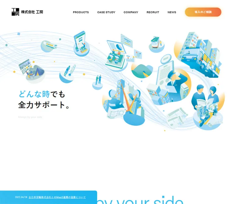
KOBO presents several businesses through one approachable visual world. Pale blue flow lines connect small illustrated scenes of transport, software, construction, and newspaper distribution. The illustrations have rounded silhouettes, soft grain, and occasional yellow highlights. They occupy a broad white field rather than separate feature cards.
The surrounding interface is more restrained: a persistent white header, compact navigation, large light-weight English section titles, bold Japanese labels, and readable Japanese body text. Cyan identifies the brand and editorial links. Orange and coral distinguish consultation and event controls. A deep blue-green footer provides a substantial ending to a long corporate homepage.
The page is a navigation hub for products, customer stories, company information, recruitment, and support. Its reference value lies in the relationship between an expansive illustrated opening and a dense, practical corporate information structure.
閉じる
KOBO / 株式会社 工房 — Style Reference
A white corporate canvas threaded with cyan illustrations, generous space, and warm utility controls.
Original URL: https://www.khobho.co.jp/
Final URL: https://www.khobho.co.jp/
Theme: light main content, a dark footer, and warm event and consultation accents; no theme switch was evidenced.
Inspected: October 2, 2026, Japan Standard Time. The supplied inspection record is timestamped 2026-10-01T19:59:21.678Z, equivalent to October 2 at 04:59:21.678 JST.
Viewports: desktop 1440 × 1000 and mobile 390 × 844 CSS pixels.
Scope: the current corporate homepage, including its illustrated opening, news, business introduction, products, case studies, construction projects, company information, recruitment, contact links, event interface, and footer. Visual captures cover the desktop opening, construction section, and footer, plus the mobile opening and footer. Other sections are documented from supplied rendered text, links, and computed element measurements.
KOBO presents several businesses through one approachable visual world. Pale blue flow lines connect small illustrated scenes of transport, software, construction, and newspaper distribution. The illustrations have rounded silhouettes, soft grain, and occasional yellow highlights. They occupy a broad white field rather than separate feature cards.
The surrounding interface is more restrained: a persistent white header, compact navigation, large light-weight English section titles, bold Japanese labels, and readable Japanese body text. Cyan identifies the brand and editorial links. Orange and coral distinguish consultation and event controls. A deep blue-green footer provides a substantial ending to a long corporate homepage.
The page is a navigation hub for products, customer stories, company information, recruitment, and support. Its reference value lies in the relationship between an expansive illustrated opening and a dense, practical corporate information structure.
How to Read This Reference
- Measured means a value appears in the supplied rendered DOM or computed-style record. Measurements describe the captured state, not a recovered responsive formula.
- Calculated means a value is derived from measured coordinates, such as the gap between adjacent case-study items.
- Visual estimate means a dimension or color is approximated from a supplied current-page screenshot. No independent pixel sampling was performed.
- Recommendation means guidance for a new implementation. Recommended CSS, breakpoints, accessibility behavior, and interaction wiring are not claims about the original code.
- Token names such as
--kobo-cyanare implementation aliases. The supplied source custom properties do not expose a comprehensive brand token system. - Some sampled parents report
font-size: 0px, browser-blue link colors, or a 16px heading size while the visible child content looks different. Use the screenshots to interpret those parents; do not copy their inherited values as the visible design. - Rendered text includes repeated carousel entries and offscreen navigation. DOM presence alone does not establish that an item was visible or that an interaction was exercised.
Tokens — Colors
Default Palette
| Name | Value | Evidence | Suggested token | Role |
|---|---|---|---|---|
| White canvas | #ffffff |
Measured on HTML and body | --kobo-white |
Main page background; visually also the header surface |
| Brand cyan | #37bef0 |
Measured as rgb(55, 190, 240) |
--kobo-cyan |
Japanese section labels, editorial links, news headings, and business labels |
| News blue | #378cf0 |
Measured as rgb(55, 140, 240) |
--kobo-news-blue |
Filled announcement-category pills |
| Black display text | #000000 |
Measured | --kobo-black |
Large English headings and sampled body text |
| Soft black | #1a1a1a |
Measured | --kobo-ink |
Case-study names, company links, and dark category text |
| Pale tagline | #e1e6e8 |
Measured | --kobo-pale |
The opening phrase Always by your side |
| Construction surface | Approximately #f4f7f8 |
Visual estimate | --kobo-surface |
Pale rectangular field behind the construction heading and image strip |
| Footer blue-green | Approximately #1b2d32 |
Visual estimate | --kobo-footer |
Large footer background |
| Footer secondary text | Approximately #b7bec0 |
Visual estimate | --kobo-footer-muted |
Footer links and copyright |
| Event coral | Approximately #f76740 |
Visual estimate | --kobo-coral |
Circular event control and warm accent treatment |
| Consultation amber | Approximately #f8b63d |
Visual estimate | --kobo-amber |
Yellow end of the consultation gradient |
The exact cyan and the slightly darker announcement blue serve different purposes. Preserve that distinction. The artwork contains additional mint, sky-blue, turquoise, and yellow tones, but these are illustration colors rather than evidence of additional interface status tokens.
Warm Accent Treatments
The desktop consultation pill visibly runs from amber at the left to orange at the right, with a soft warm halo. The expanded event panel uses a coral-to-orange vertical gradient and allows some underlying artwork to remain visible. Its approximate endpoints are #f55154 and #f58054; neither endpoint nor opacity was supplied as a computed value.
The circular event launcher is more consistently coral than the consultation pill. These two utilities belong to the same warm family while remaining visually distinguishable.
Theme Presets
No selectable themes were evidenced. The footer is a dark section within the same page. Do not interpret it as a site-wide dark mode.
The supplied --swiper-theme-color: #007aff is a library custom property, not evidence that the page's brand cyan should be replaced. Likewise, browser-blue colors sampled on link wrappers do not describe the visible navigation lettering.
Tokens — Typography
Japanese Interface and Body Text
Measured source stack:
'游ゴシック体', YuGothic, '游ゴシック', 'Yu Gothic',
'メイリオ', Meiryo, Arial, Verdana, 'MS Pゴシック', sans-serif
The root is a conventional 16px, with default weight 400 and tracking 0.32px, equivalent to 0.02em. Longer introductory and product paragraphs explicitly use 16px / 32px and normal letter spacing at both inspected widths.
The body therefore stays readable on mobile; the layout changes more than the paragraph size. Japanese section labels are bold and widely tracked, establishing a compact second line beneath the much larger English title.
English Display and Utility Text
Measured declared family: acumin-pro, sans-serif.
This family appears on large English titles, the opening English tagline, PICK UP, and READ MORE. The large section titles use weight 300, while the news heading uses weight 700. The computed declaration is established; the supplied record does not independently prove which font file rendered every glyph.
Use a light sans-serif display face only when its availability and licensing are established. Otherwise, preserve the proportions with a suitable sans-serif fallback without inventing a font-file URL.
Hero and Navigation Caveat
The headline is visibly large and bold, approximately 48px on desktop and 32px on mobile. Its sampled H1 wrapper reports 16px / 400, so that wrapper does not expose the visible lettering's complete styling. Desktop navigation wrappers report 0px, although the screenshots show compact bold uppercase labels around 14px.
These are visual estimates for recreation, not measured font declarations. The logo is graphic artwork and should not be rebuilt by choosing a similar-looking typeface.
Type Scale
| Role | Desktop | Mobile | Weight and tracking | Evidence |
|---|---|---|---|---|
Main English section title, such as Case study and Company |
88px / 88px |
48px / 48px |
300, normal tracking |
Measured |
Products title |
72px / 72px |
48px / 48px |
300, normal tracking |
Measured |
Construction title |
56px / 56px |
38px / 38px |
300, normal tracking |
Measured |
| Main Japanese section label | 18px, approximately 27px element height |
16px, approximately 24px element height |
700, 0.1em |
Measured; line-height is reported as normal |
| Construction Japanese label | 18px |
14px |
700, 0.1em |
Measured |
| Hero headline | Approximately 48px |
Approximately 32px |
Visually bold | Visual estimate |
| Hero English tagline | 16.2px / 16.2px |
14px / 14px |
400, 0.02em |
Measured |
| News group heading | 32px |
32px |
700, 0.02em |
Measured |
| Body paragraphs | 16px / 32px |
16px / 32px |
400, normal tracking |
Measured |
| Case-study primary name | 20px / 34px |
18px / 30.6px |
400, 0.02em |
Measured |
| Case-study secondary name | 16px |
14px |
400, 0.02em |
Measured |
| News category pill | 12px / 12px |
12px / 12px |
500, 0.02em |
Measured |
READ MORE label |
18px |
18px |
400, 0.02em |
Measured |
News VIEW ALL link |
18px |
18px |
400, normal tracking |
Measured |
Case-study VIEW ALL link |
18px |
16px |
400, normal tracking |
Measured |
| Desktop navigation | Approximately 14px |
Replaced by menu control | Visually bold | Visual estimate |
The contrast between light English display text and bold Japanese labels is more distinctive than a large collection of font sizes. Preserve the pairing and its generous separation from body copy.
Tokens — Spacing & Shapes
Base: measured 16px root; no custom unit system was established. Density: expansive section layouts, compact metadata, and a dense footer.
Spacing Scale
These are recurring measured dimensions, not proof of a universal spacing framework.
| Use | Desktop | Mobile | Evidence |
|---|---|---|---|
| News-row internal gap | 14px |
4px |
Measured |
| News-row vertical padding | 16px |
16px |
Measured |
| Category-pill padding | 5px 7px |
5px 7px |
Measured |
| News content side inset | 244px |
24px |
Measured |
| Main editorial left inset | Commonly 200px |
Approximately 24.95px |
Measured on introduction and case-study regions |
| Header logo left inset | 72px |
Approximately 24.95px |
Measured |
| English-title to Japanese-label gap | Commonly 20px |
Commonly 10px |
Calculated from title and label rectangles |
| Case-study horizontal gap | 72px |
24px |
Calculated from adjacent anchors |
| News section top padding | 90px |
90px |
Measured |
| Introduction top padding | 150px |
120px |
Measured |
| Case-study section top padding | 180px |
180px |
Measured |
| Company-link vertical padding | 28px |
Not supplied | Measured desktop value |
Use several alignment systems deliberately: the header is close to the outside edge, news is centered in a narrower column, and major editorial sections use a substantial left inset. Flattening everything into one centered container loses this composition.
Border Radius
| Element | Value | Evidence |
|---|---|---|
| Desktop consultation pill | 24px on a 48px-high anchor |
Measured |
| News category pill | 50px |
Measured |
| Case-study anchor wrapper | 0px |
Measured; inner image corners were not sampled |
| Construction image strip | Visually square corners | Screenshot observation |
| Floating event control | Circular | Screenshot observation |
| Mobile consultation control | Circular | Screenshot observation |
| Mobile news teaser | Small rounded upper-right corner | Visual observation; approximately 10px |
Layout Measurements
| Element | Desktop at 1440 × 1000 | Mobile at 390 × 844 | Status |
|---|---|---|---|
| Header | 1440 × 90px |
390 × 56px |
Measured |
| Header logo box | 166 × 34.94px |
101 × 21.25px |
Measured |
| Social-link box | 48 × 48px |
30 × 30px |
Measured; glyph is smaller |
| Header consultation anchor | 193 × 48px |
Not visible in the closed header | Measured desktop |
| Opening section | 1440 × 1000px |
390 × 844px |
Measured |
| Hero headline box | 340.58 × 113.41px, at approximately (324, 617.45) |
237.63 × 76.56px, at approximately (20.80, 657.74) |
Measured wrapper bounds |
| News content width | 952px |
342px |
Measured |
| Introduction paragraph width | 670px |
Approximately 340.08px |
Measured |
| Case-study anchor | 342 × 663px |
264 × 518.86px |
Measured; not an image-only measurement |
| Construction image height | Approximately 180.69px |
200px |
Measured |
| Expanded event panel | Approximately 313px wide, below the header |
Expanded appearance not captured | Visual estimate |
| Event launcher diameter | Approximately 134px |
Approximately 67px |
Visual estimate |
| Document height | 10539px |
10142px |
Supplied browser measurement |
Document heights describe the inspected content and state. They are not target heights to hardcode. Some section rectangles overlap, and repeated rails extend far outside the viewport; these measurements should not be treated as a simple stack of independent fixed-height blocks.
Components
Persistent Header
Role: corporate identity, primary navigation, social access, and consultation.
The desktop header is a 90px white band with a restrained shadow beneath it. The logo sits at x: 72px, while the navigation begins around x: 478px. Five uppercase links—PRODUCTS, CASE STUDY, COMPANY, RECRUIT, and NEWS—lead into an X icon and the warm consultation pill.
The navigation link boxes span the header height. Their measured horizontal separations are about 51px between the five text-link boxes. The consultation pill begins at x: 1175px and leaves 72px to the viewport edge.
At 390px, the header becomes 56px tall. Its 101px-wide logo remains left aligned. The X control remains visible, and two thin cyan horizontal strokes form the menu affordance at the right. The desktop text navigation and pill are absent from the visible closed header.
The header stays at the viewport top in the supplied scrolled screenshots. Fixed versus sticky positioning is not exposed by the recorded properties. Mobile menu links are present offscreen to the right, but an opened menu was not captured.
Illustrated Business Hero
Role: establish one visual identity across the company's different businesses.
The opening occupies one viewport at both inspected sizes. Its artwork is composed of separate illustrated scenes connected by fine pale-blue flowing lines. The most prominent subjects include a bus and city buildings, a transport worker with a document, construction workers and a crane, newspaper readers and distribution imagery, software screens, and smaller service figures.
On desktop, the artwork spreads across the middle and right side, leaving white space above and below. The two-line headline sits low in the composition at approximately (324, 617). In the first line, どんな時 is cyan and でも is dark; the second line, 全力サポート。, is dark. The pale English tagline sits approximately 40px below the measured headline box.
The initial desktop event panel covers the left 313px of the viewport below the header. Treat this as a separate utility layer over the scene, not as the hero's permanent colored background.
On mobile, the scenes form a taller diagonal arrangement, with intentional cropping at the left and right edges. The bus scene moves toward the upper right, construction occupies the left, and the newspaper scene sits lower right. The headline is below most of the illustration field, close to the bottom of the viewport. This composition cannot be reproduced by shrinking the desktop scene uniformly.
The DOM establishes three business links inside the hero: bus systems, newspaper-store systems, and architecture. Their text labels are not clearly visible in the supplied opening screenshots. The exact label-reveal behavior, hover treatment, and illustration animation remain unverified.
Event Calendar and Floating Event Control
Role: make current exhibitions and events discoverable throughout the page.
The desktop opening shows an expanded left panel beginning beneath the header. It contains a bold two-line Japanese heading, a fine horizontal divider, a large month number, and four compact event entries. Each entry combines a date range, small regional badge, and underlined event title. Oversized translucent vertical lettering runs along the panel's right edge.
The panel is warm coral at the top and orange lower down. Its translucency lets faint illustration details show through. Small event text is densely packed; it should remain subordinate to the hero's main message.
Later desktop captures show a coral circular launcher at approximately (1256, 816), about 134px in diameter, with roughly 50px clearance from the right and bottom edges. Its label is split over two lines and followed by a thin plus sign. A soft coral halo distinguishes it from the white page.
Mobile captures show the compact form at approximately (301, 686), around 67px across. The same event content and a 閉じる label exist in the mobile DOM, but the expanded mobile panel was not visually inspected.
Both expanded and compact states are evidenced. The action or scroll threshold that switches them, their transition timing, dismissal persistence, and focus behavior were not recorded.
Consultation CTA
Role: provide a direct route to implementation advice.
The desktop 導入のご相談 anchor is a 193 × 48px pill with a measured 24px radius. It has a left-to-right amber/orange gradient, white bold-looking text, and a warm shadow. The destination is /support/.
In the mobile footer capture, consultation appears as a second floating circle below the event launcher. It is approximately 64px in diameter and about 16px above the viewport bottom. Its label wraps into two lines. It is not visible in the supplied initial mobile screenshot, so its visibility conditions should not be assumed.
Use the warm gradient for this utility, rather than applying it to every editorial link. READ MORE and VIEW ALL use the cooler, lighter brand treatment.
Mobile News Teaser
Role: surface one news item inside the opening viewport.
At the bottom of the mobile opening, a cyan strip spans the 390px width and is 70px tall. A small date sits at left, and a white linked title fills the remaining width. The visible long title is abbreviated within this compact region. The upper-right corner is softly rounded.
The DOM contains repeated 70px-high items, consistent with a cycling list. Only one displayed state is established; autoplay, direction, dwell time, and user controls were not verified.
The pale English hero tagline meets this strip and is partially obscured in the capture. A new implementation should retain the news component while allocating enough vertical space to keep meaningful text clear.
News Index
Role: present featured notices and recent releases in a compact, scannable list.
Two groups follow the opening: PICK UP and ニュースリリース. Both measured heading styles use 32px bold text in brand cyan. The content occupies a centered 952px column on desktop and a 342px column with 24px side margins on mobile.
Desktop entries are 65px high with 16px vertical padding, a date, category pill, and linked title. The measured inter-item gap inside the flex row is 14px. Announcement pills are blue with white 12px text; the recruitment category uses dark text on a white background. A border treatment for that white category was not supplied.
Mobile retains the 16px vertical padding, reduces the internal gap to 4px, and allows titles to occupy more vertical space. Most sampled rows are 109px tall; the shorter final notice is 85px. Do not impose a universal fixed mobile height.
A cyan VIEW ALL link follows the groups. Its sampled anchor reserves 30px of space on the right; the supplied data does not establish the exact accompanying graphic.
Brand Statement and Editorial Links
Role: connect the illustrated promise to the company's services.
The introductory section repeats the support message and explains software development, homebuilding, and cloud-center operation. On desktop, the section has 200px horizontal insets and 150px top padding. Its principal paragraph is 670px wide with 16px type and 32px leading. On mobile, the paragraph is about 340px wide with the same typography.
READ MORE uses an 18px cyan English label within a much larger 213 × 82px flex anchor. Preserve that distinction between visible label size and generous interactive footprint. A measured background-size transition exists on the label, but its exact hover appearance was not captured.
Bilingual Section Heading
Role: establish a consistent hierarchy across different business sections.
Pair a light English display title with a smaller, bold Japanese label. Examples include Products / 製品情報, Case study / 導入事例, Construction / 施工実績, and Company / 会社概要.
The Japanese label is normally cyan on light surfaces and white in reversed sections. Its tracking is consistently 0.1em. Desktop English sizes vary by hierarchy: 88px for major editorial sections, 72px for Products, and 56px for Construction. Mobile reduces them to 48px, 48px, and 38px respectively.
This is not a single interchangeable heading size. Construction is deliberately quieter than Case study, and the news headings use a separate bold treatment.
Products Overview
Role: introduce the breadth of transport-related software and reservation services.
The measured desktop text column is 347px wide at approximately x: 209px; the surrounding section has an 80px left inset. The title, Japanese label, body, and READ MORE text are all white. On mobile, the text column becomes approximately 340px wide at x: 24.95px.
The product paragraph retains 16px / 32px typography and a six-line measured height of 192px at both inspected widths. Its narrow desktop measure is therefore a compositional choice rather than merely a consequence of screen size.
The reversed type is established by computed styles. The exact background artwork and background color of the complete section are not visible in the supplied section screenshots, so they should not be invented from the white text alone.
Case-Study Rail
Role: expose multiple customer stories through a horizontally extended sequence.
Desktop anchors measure 342px wide and begin at x: 200px, 614px, and 1028px. The calculated gap is 72px. Mobile anchors are 264px wide with a 24px gap, beginning at approximately x: 24.95px and 312.95px. The next item consequently remains partially exposed at the viewport edge.
Each recorded item contains product names and customer-name text. Primary customer names use 20px / 34px on desktop and 18px / 30.6px on mobile. A second name line uses 16px and 14px respectively. The supplied DOM repeats customer names within items; preserve the intended editorial hierarchy without automatically introducing duplicate accessible announcements in a new implementation.
The complete anchor heights are 663px and approximately 519px. These measurements include more than an image; they must not be used as image aspect ratios. Inner media crops and detailed product-tag styling were not supplied.
Eight distinct customer destinations recur across repeated sequences. Those copies indicate rail implementation structure, not twenty-four unique case studies. Looping playback, drag behavior, and controls were not exercised.
Construction Photo Strip
Role: introduce the architectural business using real completed work.
The desktop capture shows a pale rectangular surface beginning at x: 200px and extending to the right viewport edge. Inside it, the title begins around x: 306px. A construction-worker illustration rises above the photographs at the upper right, linking the section back to the hero's visual world.
Five photographs sit edge to edge in one strip. They mix narrow vertical views with wider interiors and exteriors. Their measured common height is approximately 180.69px. The widths are approximately 126, 270, 270, 126, 270px, creating a rhythm of narrow and wide frames instead of equal cards.
The mobile DOM retains 200px-high images. Narrow images are approximately 139.89px wide and wider ones 300px. Repeated sequences extend horizontally outside the viewport. This is a rail at a readable image scale, not five tiny thumbnails squeezed into a phone width.
The anchors link to individual architectural projects on www.kobo-house.jp. The image asset URLs themselves were not supplied. The photos have no visible gutters, raised containers, or rounded-card framing in the desktop capture.
Company, Sustainability, and Recruitment
Role: support corporate research and hiring alongside product discovery.
The desktop Company text starts around x: 837px, establishing a right-side information column. The 88px English title sits above a cyan Japanese label, a two-line paragraph, and three substantial links: business information, company information, and the corporate message. Each desktop link is approximately 479px wide and 83px high, with 28px vertical padding and bold 18px text.
On mobile, Company switches from a measured flex section to a block section. Its title aligns with the approximately 25px page inset and uses 48px type. The adjacent desktop media and the mobile media crop are not independently characterized by the provided screenshots.
The desktop SDGs block is measured at 720px wide, exactly half the inspected viewport, with white display and label text. The rendered page also includes About kobo, recruitment information, employee interviews, and application links. Their content and destinations are established, but their complete visual treatments are outside the screenshot coverage.
Contact and Related-Service Links
Role: provide routes to the wider service ecosystem and general inquiries.
The rendered page includes bus booking, Japan Bus Online, editorial services, architecture, video channels, and an overseas-company destination. These are business links, not production-credit evidence.
A Contact link with Japanese explanatory text points to /contact/. Keep it distinct from the consultation link to /support/ and from the remote-support service. The evidence establishes these different destinations but does not supply enough component styling to specify the entire contact band precisely.
Footer and Page-Top Control
Role: provide a comprehensive secondary navigation system.
The desktop footer is a broad deep blue-green field. Four information groups begin around x: 80px, 327px, 633px, and 837px: products, company, recruitment, and utility destinations. Group headings are bold white; subordinate links are muted gray. Text sits directly on the dark surface without card containers.
The footer includes a privacy emblem, the blue-and-gray KOBO logo, and the copyright line Copyright © 2019 KOBO CO.,LTD. All Rights Reserved. The copyright year is page content, not the inspection date or evidence of a redesign date.
In the mobile footer capture, company and recruitment links occupy two columns. The case-study and news destinations share a row, while consultation, remote support, contact, and privacy links continue as a left-aligned stack. The lower logo is centered. The fixed warm controls overlap the far-right portion of the copyright area in the captured state.
A slim upward arrow appears on the right. The rendered links include /#wrapper, supporting a page-top destination. Smooth scrolling and exact click behavior were not exercised.
A cyan strip about 4px wide appears along the far-left edge in scrolled captures, with different visible extents. Its interpretation as a scroll-progress indicator remains unverified.
Tokens — Motion & Interaction
| Element or treatment | Supplied value or evidence | What can be concluded |
|---|---|---|
| Header | 0.4s transition |
A 400ms transition is declared; its triggered property and state change are not demonstrated |
| Social link | 0.4s transition |
A short transition is available; hover appearance is unverified |
| Consultation anchor | box-shadow 0.4s, plus the prefixed equivalent |
Shadow changes are declared; this is not evidence of a specific movement or scale effect |
| News anchors | 0.4s transition |
Links have transition styling; the actual changed property is unspecified in the supplied field |
| Introductory paragraph and Company section | top 0.6s cubic-bezier(0.25, 0.46, 0.45, 0.94), opacity 0.4s |
Position and opacity transitions are declared; trigger, offset, and threshold were not recorded |
READ MORE label |
background-size 0.5s cubic-bezier(0.165, 0.84, 0.44, 1) |
A background-size transition is declared; the full hover treatment is not shown |
| Case-study rail | Repeated items, offscreen coordinates, and Swiper custom properties | A slider-oriented structure is present; autoplay, drag, loop timing, and controls remain unverified |
| Mobile construction strip | Repeated image sequences with fractional horizontal positions | Horizontal rail structure is established; animation timing is not |
| Event interface | Expanded desktop panel and compact launchers in different captures | Both states exist; the switching trigger and transition are unknown |
| Mobile navigation | Closed header screenshot and links positioned beyond the right edge | Offscreen navigation exists; its opened layout and keyboard behavior are unverified |
| Page-top arrow | Visible arrow and a /#wrapper link |
A top-of-page destination exists; scroll animation is unverified |
Most sampled elements report animation: none. This does not establish that the entire site is static: parent transforms, scripts, unsampled children, and image animation are outside those individual declarations.
The capture procedure waited for load, visible image decoding, finite motion, and sampled layout stability. Perpetual animations were temporarily paused during readiness checks and resumed afterward. The still images therefore cannot establish movement speed or the absence of continuous motion.
Recommended adaptation: use the measured 400–600ms range for restrained interface transitions, keep content visible by default, and provide a reduced-motion path. If implementing entrance effects, a small transform can replace layout-changing top animation, but that is an implementation improvement rather than the measured source technique.
Surfaces
| Layer | Appearance | Purpose |
|---|---|---|
| Main canvas | White | Gives the connected illustrations and large titles room to breathe |
| Persistent header | White with a subtle lower shadow | Keeps navigation readable over scrolling content |
| Construction field | Very pale cool gray | Groups architectural photographs without a card grid |
| Reversed content regions | Measured white text; complete backgrounds not supplied | Establishes alternate section emphasis |
| Event panel | Translucent coral-to-orange gradient | Holds current event information over the opening scene |
| Consultation control | Amber-to-orange gradient and warm halo | Distinguishes a high-priority utility |
| Event launcher | Coral circle and soft halo | Maintains event access in a compact state |
| News category | Blue pill with white text | Adds compact content metadata |
| Footer | Deep blue-green with white and muted gray type | Houses dense secondary navigation |
There is no evidence of a general elevated-card system. Most structure comes from spacing, large background fields, typography, and image alignment. The strongest shadows belong to the header and floating warm controls.
Imagery
The opening artwork uses an isometric-inspired perspective without forcing every object into a rigid technical grid. Small platforms, curved cutouts, and rounded silhouettes allow each business scene to read as a self-contained vignette. Fine pale-blue lines connect those scenes into one composition.
The palette is mostly cyan, turquoise, pale mint, and white, with yellow accents on clothing, buildings, and abstract shapes. Subtle grain and soft shading prevent the illustrations from feeling like flat dashboard icons. People are simplified, friendly, and integrated with recognizable work objects: a bus, a crane, buildings, software displays, and newspapers.
Architecture photography provides a deliberate material change. Warm timber, dark interiors, glass, gardens, and building facades introduce real surfaces after the illustrated corporate story. Keep those photographs photographic; the supplied construction strip does not apply the hero's cyan illustration treatment to them.
Observed Asset References
| Asset role | Evidence in current captures | Reuse guidance |
|---|---|---|
| KOBO identity mark | Desktop and mobile header; both footer captures | Preserve the blue ribbon-like symbol and gray outlined lettering as an authorized asset |
| Connected business illustrations | Desktop and mobile opening | Prepare responsive compositions or independently positioned scenes; avoid a single indiscriminate cover crop |
| Fine blue flow lines | Opening backgrounds | Keep them behind the scenes and lighter than the main cyan interface color |
| Construction-worker vignette | Desktop construction capture | Use as a visual bridge between the hero artwork and project photography |
| Five architectural photographs | Desktop construction strip and matching linked DOM entries | Preserve mixed portrait and landscape proportions at a shared height |
| X symbol | Header captures | Keep visually small while providing a sufficiently large interactive target |
| Privacy emblem | Desktop and mobile footer | Treat as supplied organization-specific imagery, not a generic decorative trust badge |
No image source URLs or original asset filenames were included in the observation record. Linked project URLs identify destinations, not downloadable image paths. Do not invent an asset directory or assume the hero is one flattened bitmap.
Layout & Responsive Behavior
Desktop Composition
The page combines several different horizontal systems:
- A header with 72px outside spacing at 1440px.
- An illustrated opening spanning the viewport, with the main headline offset to accommodate the visible event panel.
- A centered 952px news column.
- Editorial sections commonly aligned to a 200px left inset.
- A 347px product text column within a much larger section.
- A case-study rail with three full 342px items visible across the measured main area.
- A construction field extending to the right edge.
- A right-positioned Company text column and a broad four-group footer.
These changing widths create the page's rhythm. Preserve large intervals between major sections and tighter spacing inside lists. Avoid applying the same card width and padding everywhere.
Mobile Changes
The mobile header compresses from 90px to 56px and replaces the desktop navigation row with a menu affordance. Main editorial insets are generally about 25px; news uses 24px.
The opening artwork is rearranged and cropped as a tall scene. The headline moves below most of the imagery. A 70px news teaser occupies the bottom of the opening, while the event launcher remains near the lower right.
Large English titles decrease substantially, but paragraphs retain 16px text and 32px leading. Case-study items become 264px wide with 24px gaps, showing the start of the following item. Construction photos retain a 200px height and continue horizontally. Company content changes from a flex layout to a block layout. Footer navigation becomes a narrower combination of paired columns and full-width utility links.
The measured page remains long: 10142px on mobile versus 10539px on desktop. It should not be condensed into a short campaign page merely because the viewport is narrow.
Responsive Limits
Only the two stated viewport sizes were supplied. The exact breakpoint, tablet composition, landscape-phone behavior, browser zoom behavior, and safe-area rules are unknown. A breakpoint around 960px is a practical starting recommendation for the Quick Start, not a recovered source value.
The source captures also show text near floating controls and the opening ticker. For a new implementation, reserve space for those utilities and test short viewport heights rather than relying only on width-based breakpoints.
Do’s and Don’ts
Do
- Keep white as the dominant canvas and use the measured
#37bef0as the main interface cyan. - Distinguish the darker
#378cf0news pills from the broader brand color. - Pair light English display headings with bold, tracked Japanese labels.
- Preserve 16px / 32px body typography across the inspected desktop and mobile scales.
- Use connected business illustrations with soft texture and ample white space.
- Recompose the illustration scene for mobile instead of shrinking it uniformly.
- Reserve warm gradients and halos for event and consultation utilities.
- Keep the mixed-width architectural photographs edge to edge at a common height.
- Preserve the exposed next item in horizontal content rails.
- Treat event information, news, recruitment, and support as substantial corporate navigation needs.
- Keep the dark footer broad, organized, and typographically simple.
- Distinguish actual clickable bounds from the smaller visible label or icon.
Don’t
- Don't replace the corporate information structure with a single conversion funnel.
- Don't turn every section into a uniform rounded-card grid.
- Don't rebuild the graphic logo with ordinary text.
- Don't use sampled
0pxnavigation wrappers or the 16pxH1parent as the visible type scale. - Don't treat carousel copies as separate customer stories.
- Don't use a whole case-study anchor's height as an image aspect ratio.
- Don't add orange fills to every editorial link or heading.
- Don't make all architectural photographs the same width.
- Don't infer autoplay, parallax, hover reveals, or event-panel triggers from still images.
- Don't use offscreen mobile-menu text as evidence that the menu was open.
- Don't let fixed utilities cover meaningful text or keyboard focus in a new implementation.
- Don't invent image paths, font files, production roles, or unseen section backgrounds.
Recommended Implementation Additions
These are recommendations for a new implementation, not verified features of the original page:
- Give the logo, social link, menu button, event button, image-only project links, and page-top control explicit accessible names.
- Use a minimum 44px interactive target for the mobile social and menu controls even when their visible artwork is smaller.
- Connect menu and event controls to their panels with
aria-controlsand accurate expanded states. If a panel is modal, implement focus containment, Escape dismissal, and focus return. - Keep carousel duplicates out of the accessibility tree and keyboard sequence. Provide manual navigation and a pause mechanism if adding automatic movement.
- Preserve access to complete news titles even when a teaser displays an abbreviated version.
- Increase the contrast of the pale English tagline when it communicates meaningful content. The original measured pale gray should not become the default body-text color.
- Check white text over the amber portion of consultation gradients. A darker action background may be needed for small text.
- Reserve space above the mobile teaser and beside floating controls. Let footer copyright wrap instead of disappearing beneath them.
- Keep essential body copy and links visible when motion is reduced or script initialization fails.
- Use responsive image sizing and modern formats where authorized assets are available. Prioritize the initial artwork and defer lower-page media without delaying text.
Agent Prompt Guide
Quick Color Reference
- Main canvas: measured
#ffffff. - Main brand and editorial accent: measured
#37bef0. - Announcement pill: measured
#378cf0with white text. - Dark text: measured
#000000and#1a1a1a. - Opening English tagline: measured
#e1e6e8; improve contrast when needed. - Construction field: estimated
#f4f7f8. - Footer: estimated
#1b2d32with muted gray links. - Event control: estimated coral
#f76740. - Consultation control: estimated amber
#f8b63dto coral/orange.
Overall Prompt
“Create a Japanese corporate homepage for a company spanning transport software, related business systems, and architecture. Use a predominantly white canvas, brand cyan #37bef0, softly textured illustrations of people and business tools connected by fine pale-blue lines, and generous asymmetrical spacing. Build a persistent white header with compact navigation, a small social icon, and one amber-to-orange consultation pill. Pair large light-weight English section titles with smaller bold Japanese labels. Include a readable news list, horizontal customer-story rail, mixed-width architectural photo strip, company and recruitment routes, and a broad dark blue-green footer. On mobile, recompose the opening illustrations vertically, retain readable body text, and replace the desktop navigation with a menu control. Keep the event utility coral and separate from the main editorial links.”
Example Component Prompts
- Header: “A 90px white desktop corporate header with the logo 72px from the left edge, five compact uppercase navigation links, a small X icon, and a 193 × 48px amber-to-orange consultation pill. On a 390px phone, use a 56px header, a 101px-wide logo, the social icon, and a two-line cyan menu symbol. Keep accessible touch targets larger than the artwork.”
- Illustrated opening: “A white viewport-scale composition of cyan and mint business vignettes: bus transport, software screens, construction workers, and newspaper distribution. Connect them with fine pale-blue flowing lines. Place a bold two-line Japanese promise low in the composition, with only the opening phrase in cyan. Use a separately composed mobile arrangement rather than scaling the desktop artwork as one image.”
- News list: “A centered 952px desktop news column with 32px bold cyan group titles. Each row combines a date, a small blue category pill, and a Japanese linked title. Use 16px vertical padding and allow titles to wrap on mobile within 24px side margins. End with a restrained cyan VIEW ALL link.”
- Construction section: “A pale cool-gray field offset from the desktop left edge, a 56px light English Construction title, and an 18px bold cyan Japanese label. Place a small construction illustration above an edge-to-edge photo strip with alternating narrow and wide images at a common 181px height. On mobile, use a 38px title and horizontally accessible 200px-high photos.”
- Event utility: “A warm coral event panel containing a month, compact date ranges, regional labels, and underlined titles. Provide a separate compact circular launcher with two lines of white text and a thin plus sign. Keep its interaction accessible and do not assume the original page's unverified opening trigger.”
- Footer: “A deep blue-green corporate footer with four desktop information groups, white bold headings, muted gray links, a privacy emblem, and the brand logo near the bottom. Reflow company and recruitment into paired mobile columns and place utility links below. Reserve clear space for floating actions and allow copyright text to wrap.”
Quick Start
CSS Custom Properties
This is a reusable adaptation, not a recovered stylesheet. Exact measured colors and type sizes are retained where available. Estimated surface colors, shadows, hero letter styling, the 960px breakpoint, and interaction enhancements are recommendations. Authorized artwork, real content, and panel state management must be supplied separately.
:root {
  /* Measured colors */
  --kobo-white: #ffffff;
  --kobo-cyan: #37bef0;
  --kobo-news-blue: #378cf0;
  --kobo-black: #000000;
  --kobo-ink: #1a1a1a;
  --kobo-pale: #e1e6e8;

  /* Visual approximations */
  --kobo-surface: #f4f7f8;
  --kobo-footer: #1b2d32;
  --kobo-footer-muted: #b7bec0;
  --kobo-coral: #f76740;
  --kobo-amber: #f8b63d;

  /* Measured declared families; font files are not bundled */
  --kobo-font-body: '游ゴシック体', YuGothic, '游ゴシック',
    'Yu Gothic', 'メイリオ', Meiryo, Arial, Verdana,
    'MS Pゴシック', sans-serif;
  --kobo-font-display: acumin-pro, sans-serif;

  /* Desktop dimensions; intermediate scaling is an adaptation */
  --kobo-header-height: 90px;
  --kobo-header-inset: 5vw;
  --kobo-section-inset: clamp(24px, 13.8889vw, 200px);
  --kobo-news-width: 952px;
  --kobo-case-width: 342px;
  --kobo-case-gap: 72px;
  --kobo-title-size: 88px;
  --kobo-product-title: 72px;
  --kobo-construction-title: 56px;
  --kobo-label-size: 18px;
  --kobo-event-size: 134px;

  /* Measured timings, reused for recommended states */
  --kobo-ui-duration: 400ms;
  --kobo-reveal-duration: 600ms;
  --kobo-reveal-ease: cubic-bezier(0.25, 0.46, 0.45, 0.94);
  --kobo-link-ease: cubic-bezier(0.165, 0.84, 0.44, 1);

  /* Recommended shadow approximations */
  --kobo-header-shadow: 0 4px 14px rgb(0 0 0 / 8%);
  --kobo-warm-shadow: 0 0 16px rgb(247 103 64 / 28%);
}

* { box-sizing: border-box; }

html {
  font-size: 16px;
  scroll-padding-top: calc(var(--kobo-header-height) + 24px);
}

body {
  margin: 0;
  color: var(--kobo-ink);
  background: var(--kobo-white);
  font-family: var(--kobo-font-body);
  letter-spacing: 0.02em;
}

button, input, select, textarea { font: inherit; }
button { cursor: pointer; }
img { display: block; max-width: 100%; }
a { color: inherit; }
[hidden] { display: none !important; }

.site-header {
  position: fixed;
  z-index: 50;
  inset: 0 0 auto;
  height: var(--kobo-header-height);
  padding-inline: var(--kobo-header-inset);
  display: flex;
  align-items: center;
  gap: 20px;
  background: var(--kobo-white);
  box-shadow: var(--kobo-header-shadow);
}

.site-brand { flex: 0 0 auto; }
.site-brand img { width: 166px; height: auto; }

.desktop-nav {
  display: flex;
  align-items: center;
  gap: clamp(24px, 3.56vw, 51.3px);
  margin-inline-start: auto;
}

.desktop-nav a {
  display: flex;
  align-items: center;
  min-height: var(--kobo-header-height);
  font-size: 14px;
  font-weight: 700;
  text-decoration: none;
}

.social-link {
  display: grid;
  place-items: center;
  width: 48px;
  height: 48px;
  flex: 0 0 auto;
}

.consult-link {
  display: inline-flex;
  align-items: center;
  justify-content: center;
  width: 193px;
  min-height: 48px;
  flex: 0 0 auto;
  border-radius: 24px;
  color: white;
  background: linear-gradient(90deg, var(--kobo-amber), var(--kobo-coral));
  box-shadow: var(--kobo-warm-shadow);
  font-weight: 700;
  text-decoration: none;
  transition: box-shadow var(--kobo-ui-duration);
}

.menu-toggle {
  display: none;
  width: 44px;
  height: 44px;
  padding: 6px;
  border: 0;
  background: transparent;
}

.menu-toggle::before,
.menu-toggle::after {
  content: '';
  display: block;
  height: 1px;
  margin-block: 7px;
  background: var(--kobo-cyan);
}

.hero {
  position: relative;
  height: 100svh;
  min-height: 800px;
  overflow: clip;
  background: white;
}

/* Supply separately composed desktop and mobile artwork. */
.hero-media {
  position: absolute;
  inset: var(--kobo-header-height) 0 0;
}

.hero-media img {
  width: 100%;
  height: 100%;
  object-fit: contain;
}

.hero-copy {
  position: absolute;
  z-index: 2;
  top: 61.75%;
  left: 22.5%;
  max-width: calc(100% - 22.5% - 24px);
}

/* Visual approximation of the visible headline, not its sampled parent. */
.hero-copy h1 {
  margin: 0;
  color: var(--kobo-ink);
  font-size: 48px;
  font-weight: 700;
  line-height: 1.18;
  letter-spacing: 0;
}

.hero-copy h1 .accent { color: var(--kobo-cyan); }
.hero-copy h1 .line { display: block; }

.hero-tagline {
  margin: 40px 0 0;
  color: var(--kobo-pale);
  font-family: var(--kobo-font-display);
  font-size: 16.2px;
  line-height: 1;
}

.section-heading { margin: 0; font-weight: inherit; }

.section-title {
  display: block;
  color: var(--kobo-black);
  font-family: var(--kobo-font-display);
  font-size: var(--kobo-title-size);
  font-weight: 300;
  line-height: 1;
  letter-spacing: 0;
}

.section-label {
  display: block;
  margin-top: 20px;
  color: var(--kobo-cyan);
  font-size: var(--kobo-label-size);
  font-weight: 700;
  line-height: 1.5;
  letter-spacing: 0.1em;
}

.body-copy {
  font-size: 16px;
  line-height: 2;
  letter-spacing: 0;
}

.editorial-section {
  padding: 120px var(--kobo-section-inset);
}

.intro-copy { max-width: 670px; }
.products-title { font-size: var(--kobo-product-title); }

/* Apply only to a region with a supplied, contrast-tested background. */
.section-inverse .section-title,
.section-inverse .section-label,
.section-inverse .body-copy,
.section-inverse .read-more { color: white; }

.read-more {
  display: inline-flex;
  align-items: center;
  min-width: 213px;
  min-height: 82px;
  color: var(--kobo-cyan);
  font-family: var(--kobo-font-display);
  font-size: 18px;
  text-decoration: none;
}

.read-more span {
  background: linear-gradient(currentColor, currentColor) left bottom / 0 1px no-repeat;
  transition: background-size 500ms var(--kobo-link-ease);
}

.news-section { padding-top: 90px; }

.news-inner {
  width: min(var(--kobo-news-width), calc(100% - 48px));
  margin-inline: auto;
}

.news-heading {
  margin: 0 0 8px;
  color: var(--kobo-cyan);
  font-family: var(--kobo-font-display);
  font-size: 32px;
  font-weight: 700;
}

/* Grid is a recommended implementation of the measured row anatomy. */
.news-row {
  display: grid;
  grid-template-columns: auto auto minmax(0, 1fr);
  align-items: center;
  gap: 14px;
  min-height: 65px;
  padding: 16px 47px 16px 0;
  text-decoration: none;
}

.news-date { font-size: 12px; white-space: nowrap; }
.news-title { min-width: 0; line-height: 1.5; overflow-wrap: anywhere; }

.news-category {
  display: inline-block;
  justify-self: start;
  padding: 5px 7px;
  border-radius: 50px;
  color: white;
  background: var(--kobo-news-blue);
  font-size: 12px;
  font-weight: 500;
  line-height: 1;
}

.case-section { padding-inline-start: var(--kobo-section-inset); }

/* Manual scrolling and proximity snapping are recommended additions. */
.case-rail {
  display: flex;
  gap: var(--kobo-case-gap);
  margin-top: 64px;
  padding: 4px 24px 24px 4px;
  overflow-x: auto;
  scroll-snap-type: x proximity;
}

.case-card {
  flex: 0 0 var(--kobo-case-width);
  scroll-snap-align: start;
  color: var(--kobo-ink);
  text-decoration: none;
}

.case-name { margin: 20px 0 0; font-size: 20px; line-height: 1.7; }
.case-meta { margin: 15px 0 0; font-size: 16px; }

.construction {
  margin-inline-start: var(--kobo-section-inset);
  padding: 80px 5vw 130px 106px;
  background: var(--kobo-surface);
}

.construction .section-title { font-size: var(--kobo-construction-title); }

.construction-strip {
  display: flex;
  gap: 0;
  margin-top: 40px;
  overflow-x: auto;
}

.construction-strip a { flex: 0 0 auto; }
.construction-strip img { width: auto; max-width: none; height: 180.69px; }

.event-trigger {
  position: fixed;
  z-index: 60;
  right: 50px;
  bottom: 50px;
  display: grid;
  place-content: center;
  gap: 8px;
  width: var(--kobo-event-size);
  height: var(--kobo-event-size);
  border: 0;
  border-radius: 50%;
  color: white;
  background: var(--kobo-coral);
  box-shadow: var(--kobo-warm-shadow);
  font-weight: 700;
  line-height: 1.5;
  text-align: center;
}

.event-plus { font-size: 28px; font-weight: 400; line-height: 1; }

/* Toggle hidden and aria-expanded using accessible panel state handling. */
.event-panel {
  position: fixed;
  z-index: 55;
  top: var(--kobo-header-height);
  bottom: 0;
  left: 0;
  width: min(313px, 100%);
  padding: 36px 40px;
  overflow-y: auto;
  color: white;
  background: linear-gradient(180deg, rgb(245 81 84 / 95%), rgb(245 128 84 / 95%));
}

.event-panel a { text-underline-offset: 3px; }
.mobile-news-teaser { display: none; }

.site-footer {
  padding: 90px 80px 70px;
  color: white;
  background: var(--kobo-footer);
}

.footer-grid {
  display: grid;
  grid-template-columns: 200px 260px 160px minmax(0, 1fr);
  gap: 46px;
}

.footer-heading { margin: 0 0 24px; font-size: 16px; font-weight: 700; }
.footer-links { margin: 0; padding: 0; list-style: none; }
.footer-links li + li { margin-top: 10px; }
.footer-links a { color: var(--kobo-footer-muted); line-height: 1.5; text-decoration: none; }

.footer-bottom {
  display: flex;
  align-items: center;
  gap: 100px;
  margin-top: 140px;
}

.footer-brand { width: 166px; height: auto; }
.footer-copyright { color: var(--kobo-footer-muted); font-size: 14px; line-height: 1.7; }

/* Recommended focus treatment. */
:where(a, button, summary, [tabindex]):focus-visible {
  outline: 3px solid #00658c;
  outline-offset: 4px;
}

.site-footer :focus-visible,
.event-panel :focus-visible { outline-color: white; }

@media (hover: hover) {
  .read-more:hover span { background-size: 100% 1px; }
  .consult-link:hover { box-shadow: 0 0 22px rgb(247 103 64 / 42%); }
  .footer-links a:hover { color: white; text-decoration: underline; }
}

/* Recommended breakpoint; only 1440px and 390px were inspected. */
@media (max-width: 960px) {
  :root {
    --kobo-header-height: 56px;
    --kobo-header-inset: 6.4vw;
    --kobo-section-inset: 6.4vw;
    --kobo-case-width: 264px;
    --kobo-case-gap: 24px;
    --kobo-title-size: 48px;
    --kobo-product-title: 48px;
    --kobo-construction-title: 38px;
    --kobo-label-size: 16px;
    --kobo-event-size: 68px;
  }

  .site-header { gap: 4px; }
  .site-brand img { width: 101px; }
  .desktop-nav, .site-header .consult-link { display: none; }
  .social-link { width: 44px; height: 44px; margin-inline-start: auto; }
  .menu-toggle { display: block; }

  /* Move copy upward enough to clear the teaser in this adaptation. */
  .hero-copy { top: auto; bottom: 96px; left: 5.333%; max-width: calc(100% - 42px); }
  .hero-copy h1 { font-size: 32px; line-height: 1.2; }
  .hero-tagline { margin-top: 28px; font-size: 14px; }
  .section-label { margin-top: 10px; }
  .editorial-section { padding-block: 100px; }

  .news-row {
    grid-template-columns: auto 1fr;
    gap: 4px 14px;
    padding: 16px 0;
  }
  .news-title { grid-column: 1 / -1; }
  .case-name { font-size: 18px; }
  .case-meta { font-size: 14px; }

  .construction { padding: 40px 24px 100px 31px; }
  .construction .section-label { font-size: 14px; }
  .construction-strip img { height: 200px; }

  .event-trigger {
    right: 22px;
    bottom: calc(92px + env(safe-area-inset-bottom, 0px));
    gap: 2px;
    font-size: 10px;
  }
  .event-plus { font-size: 18px; }
  .event-panel { width: min(340px, calc(100% - 24px)); padding: 28px 24px; }

  .mobile-news-teaser {
    position: absolute;
    inset: auto 0 0;
    display: grid;
    grid-template-columns: auto minmax(0, 1fr);
    align-items: center;
    gap: 12px;
    min-height: 70px;
    padding: 12px 17px 12px 12px;
    border-radius: 0 10px 0 0;
    color: white;
    background: var(--kobo-cyan);
  }

  .site-footer { padding: 64px 24px 180px; }
  .footer-grid { grid-template-columns: repeat(2, minmax(0, 1fr)); gap: 32px 24px; }
  .footer-products, .footer-utilities { grid-column: 1 / -1; }
  .footer-bottom { flex-direction: column; gap: 16px; margin-top: 80px; }
  .footer-copyright { margin: 0; font-size: 12px; text-align: center; overflow-wrap: anywhere; }
}

@media (prefers-reduced-motion: reduce) {
  .consult-link, .read-more span { transition: none; }
  .case-rail { scroll-snap-type: none; }
}
The sample leaves media sizing inside case-study items to the actual assets because their image rectangles were not supplied. It also leaves product backgrounds, mobile menu appearance, and carousel automation unspecified. The event launcher's compact label is an approximation; increase its diameter and label size if legibility testing requires it.
Minimal Component Markup
This heading pattern preserves the bilingual visual hierarchy while using one semantic heading. The link pattern keeps a generous interactive area around a smaller visible label.
<h2 class="section-heading">
  <span class="section-title" lang="en">Case study</span>
  <span class="section-label" lang="ja">導入事例</span>
</h2>

<a class="read-more" href="/product/">
  <span>READ MORE</span>
</a>

<button
  class="event-trigger"
  type="button"
  aria-controls="event-panel"
  aria-expanded="false"
>
  <span lang="ja">展示会<br>イベント情報</span>
  <span class="event-plus" aria-hidden="true">+</span>
</button>

<aside class="event-panel" id="event-panel" hidden aria-labelledby="event-title">
  <h2 id="event-title" lang="ja">展示会・イベント情報</h2>
  <!-- Insert real event dates, regions, links, and a close control. -->
</aside>
Wire the event button and close control to the same state, update aria-expanded, and return focus appropriately. The markup alone does not implement panel behavior.
Tailwind v4 Token Mapping
Optional aliases for a project already using Tailwind v4. This is not evidence that the original site uses Tailwind. Define the custom properties above first.
@theme inline {
  --color-kobo-cyan: var(--kobo-cyan);
  --color-kobo-news: var(--kobo-news-blue);
  --color-kobo-ink: var(--kobo-ink);
  --color-kobo-surface: var(--kobo-surface);
  --color-kobo-footer: var(--kobo-footer);
  --color-kobo-coral: var(--kobo-coral);
  --color-kobo-amber: var(--kobo-amber);

  --font-kobo-body: var(--kobo-font-body);
  --font-kobo-display: var(--kobo-font-display);

  --text-kobo-section: var(--kobo-title-size);
  --text-kobo-label: var(--kobo-label-size);
  --spacing-kobo-inset: var(--kobo-section-inset);
  --spacing-kobo-case: var(--kobo-case-width);
  --radius-kobo-pill: 24px;
}
Sources & Evidence
- Inspected original and final page: https://www.khobho.co.jp/. The supplied record reports HTTP
200, with no URL change. - Inspection timestamp:
2026-10-01T19:59:21.678Z, equivalent to October 2, 2026 at 04:59:21.678 JST. This is the capture record's timestamp; separate timestamps for each image were not supplied. - Desktop evidence: three current-page captures at
1440 × 1000, covering the opening with expanded event information, the construction photo strip, and the footer. The browser-reported document height is10539px. - Mobile evidence: two current-page captures at
390 × 844, covering the opening and footer. The browser-reported document height is10142px. - Rendered DOM and computed styles: supplied text, links, element rectangles, colors, declared font families, font sizes, weights, leading, tracking, padding, radii, transitions, and selected custom properties. These support the measured values in this document.
- State evidence: the persistent header at different scroll positions, expanded and compact event presentations, the closed mobile header, repeated horizontal content sequences, and the mobile opening news item. Click, hover, drag, keyboard, and opened-mobile-panel recordings were not supplied.
- Capture conditions: the initial observation lasted at least five seconds. Readiness checks waited for load, finite animation, sampled stability, and visible image decoding within bounded time limits. Continuous animation was paused during readiness checks and then resumed. SharedWorkers and service workers were disabled.
- Limitations: no additional browsing, file inspection, interaction testing, original asset inventory, font-network verification, or complete stylesheet inspection was performed for this reference. Visual descriptions of sections outside the supplied screenshots are limited to the provided DOM evidence. Exact breakpoints, animation triggers, tablet behavior, and unexercised interaction states remain unverified.
This reference describes the current homepage in the supplied inspection. Its reusable CSS and prompts translate the observed design into implementation guidance without claiming to reproduce unobserved behavior.
# KOBO / 株式会社 工房 — Style Reference

> A white corporate canvas threaded with cyan illustrations, generous space, and warm utility controls.

**Original URL:** [https://www.khobho.co.jp/](https://www.khobho.co.jp/)
**Final URL:** [https://www.khobho.co.jp/](https://www.khobho.co.jp/)
**Theme:** light main content, a dark footer, and warm event and consultation accents; no theme switch was evidenced.
**Inspected:** October 2, 2026, Japan Standard Time. The supplied inspection record is timestamped `2026-10-01T19:59:21.678Z`, equivalent to October 2 at 04:59:21.678 JST.
**Viewports:** desktop `1440 × 1000` and mobile `390 × 844` CSS pixels.
**Scope:** the current corporate homepage, including its illustrated opening, news, business introduction, products, case studies, construction projects, company information, recruitment, contact links, event interface, and footer. Visual captures cover the desktop opening, construction section, and footer, plus the mobile opening and footer. Other sections are documented from supplied rendered text, links, and computed element measurements.

KOBO presents several businesses through one approachable visual world. Pale blue flow lines connect small illustrated scenes of transport, software, construction, and newspaper distribution. The illustrations have rounded silhouettes, soft grain, and occasional yellow highlights. They occupy a broad white field rather than separate feature cards.

The surrounding interface is more restrained: a persistent white header, compact navigation, large light-weight English section titles, bold Japanese labels, and readable Japanese body text. Cyan identifies the brand and editorial links. Orange and coral distinguish consultation and event controls. A deep blue-green footer provides a substantial ending to a long corporate homepage.

The page is a navigation hub for products, customer stories, company information, recruitment, and support. Its reference value lies in the relationship between an expansive illustrated opening and a dense, practical corporate information structure.
閉じる
# KOBO / 株式会社 工房 — Style Reference

> A white corporate canvas threaded with cyan illustrations, generous space, and warm utility controls.

**Original URL:** [https://www.khobho.co.jp/](https://www.khobho.co.jp/)
**Final URL:** [https://www.khobho.co.jp/](https://www.khobho.co.jp/)
**Theme:** light main content, a dark footer, and warm event and consultation accents; no theme switch was evidenced.
**Inspected:** October 2, 2026, Japan Standard Time. The supplied inspection record is timestamped `2026-10-01T19:59:21.678Z`, equivalent to October 2 at 04:59:21.678 JST.
**Viewports:** desktop `1440 × 1000` and mobile `390 × 844` CSS pixels.
**Scope:** the current corporate homepage, including its illustrated opening, news, business introduction, products, case studies, construction projects, company information, recruitment, contact links, event interface, and footer. Visual captures cover the desktop opening, construction section, and footer, plus the mobile opening and footer. Other sections are documented from supplied rendered text, links, and computed element measurements.

KOBO presents several businesses through one approachable visual world. Pale blue flow lines connect small illustrated scenes of transport, software, construction, and newspaper distribution. The illustrations have rounded silhouettes, soft grain, and occasional yellow highlights. They occupy a broad white field rather than separate feature cards.

The surrounding interface is more restrained: a persistent white header, compact navigation, large light-weight English section titles, bold Japanese labels, and readable Japanese body text. Cyan identifies the brand and editorial links. Orange and coral distinguish consultation and event controls. A deep blue-green footer provides a substantial ending to a long corporate homepage.

The page is a navigation hub for products, customer stories, company information, recruitment, and support. Its reference value lies in the relationship between an expansive illustrated opening and a dense, practical corporate information structure.

## How to Read This Reference

- **Measured** means a value appears in the supplied rendered DOM or computed-style record. Measurements describe the captured state, not a recovered responsive formula.
- **Calculated** means a value is derived from measured coordinates, such as the gap between adjacent case-study items.
- **Visual estimate** means a dimension or color is approximated from a supplied current-page screenshot. No independent pixel sampling was performed.
- **Recommendation** means guidance for a new implementation. Recommended CSS, breakpoints, accessibility behavior, and interaction wiring are not claims about the original code.
- Token names such as `--kobo-cyan` are implementation aliases. The supplied source custom properties do not expose a comprehensive brand token system.
- Some sampled parents report `font-size: 0px`, browser-blue link colors, or a 16px heading size while the visible child content looks different. Use the screenshots to interpret those parents; do not copy their inherited values as the visible design.
- Rendered text includes repeated carousel entries and offscreen navigation. DOM presence alone does not establish that an item was visible or that an interaction was exercised.

## Tokens — Colors

### Default Palette

| Name | Value | Evidence | Suggested token | Role |
| --- | --- | --- | --- | --- |
| White canvas | `#ffffff` | Measured on HTML and body | `--kobo-white` | Main page background; visually also the header surface |
| Brand cyan | `#37bef0` | Measured as `rgb(55, 190, 240)` | `--kobo-cyan` | Japanese section labels, editorial links, news headings, and business labels |
| News blue | `#378cf0` | Measured as `rgb(55, 140, 240)` | `--kobo-news-blue` | Filled announcement-category pills |
| Black display text | `#000000` | Measured | `--kobo-black` | Large English headings and sampled body text |
| Soft black | `#1a1a1a` | Measured | `--kobo-ink` | Case-study names, company links, and dark category text |
| Pale tagline | `#e1e6e8` | Measured | `--kobo-pale` | The opening phrase `Always by your side` |
| Construction surface | Approximately `#f4f7f8` | Visual estimate | `--kobo-surface` | Pale rectangular field behind the construction heading and image strip |
| Footer blue-green | Approximately `#1b2d32` | Visual estimate | `--kobo-footer` | Large footer background |
| Footer secondary text | Approximately `#b7bec0` | Visual estimate | `--kobo-footer-muted` | Footer links and copyright |
| Event coral | Approximately `#f76740` | Visual estimate | `--kobo-coral` | Circular event control and warm accent treatment |
| Consultation amber | Approximately `#f8b63d` | Visual estimate | `--kobo-amber` | Yellow end of the consultation gradient |

The exact cyan and the slightly darker announcement blue serve different purposes. Preserve that distinction. The artwork contains additional mint, sky-blue, turquoise, and yellow tones, but these are illustration colors rather than evidence of additional interface status tokens.

### Warm Accent Treatments

The desktop consultation pill visibly runs from amber at the left to orange at the right, with a soft warm halo. The expanded event panel uses a coral-to-orange vertical gradient and allows some underlying artwork to remain visible. Its approximate endpoints are `#f55154` and `#f58054`; neither endpoint nor opacity was supplied as a computed value.

The circular event launcher is more consistently coral than the consultation pill. These two utilities belong to the same warm family while remaining visually distinguishable.

### Theme Presets

No selectable themes were evidenced. The footer is a dark section within the same page. Do not interpret it as a site-wide dark mode.

The supplied `--swiper-theme-color: #007aff` is a library custom property, not evidence that the page's brand cyan should be replaced. Likewise, browser-blue colors sampled on link wrappers do not describe the visible navigation lettering.

## Tokens — Typography

### Japanese Interface and Body Text

**Measured source stack:**

```css
'游ゴシック体', YuGothic, '游ゴシック', 'Yu Gothic',
'メイリオ', Meiryo, Arial, Verdana, 'MS Pゴシック', sans-serif
```

The root is a conventional `16px`, with default weight `400` and tracking `0.32px`, equivalent to `0.02em`. Longer introductory and product paragraphs explicitly use `16px / 32px` and normal letter spacing at both inspected widths.

The body therefore stays readable on mobile; the layout changes more than the paragraph size. Japanese section labels are bold and widely tracked, establishing a compact second line beneath the much larger English title.

### English Display and Utility Text

**Measured declared family:** `acumin-pro, sans-serif`.

This family appears on large English titles, the opening English tagline, `PICK UP`, and `READ MORE`. The large section titles use weight `300`, while the news heading uses weight `700`. The computed declaration is established; the supplied record does not independently prove which font file rendered every glyph.

Use a light sans-serif display face only when its availability and licensing are established. Otherwise, preserve the proportions with a suitable sans-serif fallback without inventing a font-file URL.

### Hero and Navigation Caveat

The headline is visibly large and bold, approximately 48px on desktop and 32px on mobile. Its sampled `H1` wrapper reports `16px / 400`, so that wrapper does not expose the visible lettering's complete styling. Desktop navigation wrappers report `0px`, although the screenshots show compact bold uppercase labels around 14px.

These are visual estimates for recreation, not measured font declarations. The logo is graphic artwork and should not be rebuilt by choosing a similar-looking typeface.

### Type Scale

| Role | Desktop | Mobile | Weight and tracking | Evidence |
| --- | --- | --- | --- | --- |
| Main English section title, such as `Case study` and `Company` | `88px / 88px` | `48px / 48px` | `300`, normal tracking | Measured |
| `Products` title | `72px / 72px` | `48px / 48px` | `300`, normal tracking | Measured |
| `Construction` title | `56px / 56px` | `38px / 38px` | `300`, normal tracking | Measured |
| Main Japanese section label | `18px`, approximately 27px element height | `16px`, approximately 24px element height | `700`, `0.1em` | Measured; line-height is reported as normal |
| Construction Japanese label | `18px` | `14px` | `700`, `0.1em` | Measured |
| Hero headline | Approximately `48px` | Approximately `32px` | Visually bold | Visual estimate |
| Hero English tagline | `16.2px / 16.2px` | `14px / 14px` | `400`, `0.02em` | Measured |
| News group heading | `32px` | `32px` | `700`, `0.02em` | Measured |
| Body paragraphs | `16px / 32px` | `16px / 32px` | `400`, normal tracking | Measured |
| Case-study primary name | `20px / 34px` | `18px / 30.6px` | `400`, `0.02em` | Measured |
| Case-study secondary name | `16px` | `14px` | `400`, `0.02em` | Measured |
| News category pill | `12px / 12px` | `12px / 12px` | `500`, `0.02em` | Measured |
| `READ MORE` label | `18px` | `18px` | `400`, `0.02em` | Measured |
| News `VIEW ALL` link | `18px` | `18px` | `400`, normal tracking | Measured |
| Case-study `VIEW ALL` link | `18px` | `16px` | `400`, normal tracking | Measured |
| Desktop navigation | Approximately `14px` | Replaced by menu control | Visually bold | Visual estimate |

The contrast between light English display text and bold Japanese labels is more distinctive than a large collection of font sizes. Preserve the pairing and its generous separation from body copy.

## Tokens — Spacing & Shapes

**Base:** measured 16px root; no custom unit system was established.
**Density:** expansive section layouts, compact metadata, and a dense footer.

### Spacing Scale

These are recurring measured dimensions, not proof of a universal spacing framework.

| Use | Desktop | Mobile | Evidence |
| --- | --- | --- | --- |
| News-row internal gap | `14px` | `4px` | Measured |
| News-row vertical padding | `16px` | `16px` | Measured |
| Category-pill padding | `5px 7px` | `5px 7px` | Measured |
| News content side inset | `244px` | `24px` | Measured |
| Main editorial left inset | Commonly `200px` | Approximately `24.95px` | Measured on introduction and case-study regions |
| Header logo left inset | `72px` | Approximately `24.95px` | Measured |
| English-title to Japanese-label gap | Commonly `20px` | Commonly `10px` | Calculated from title and label rectangles |
| Case-study horizontal gap | `72px` | `24px` | Calculated from adjacent anchors |
| News section top padding | `90px` | `90px` | Measured |
| Introduction top padding | `150px` | `120px` | Measured |
| Case-study section top padding | `180px` | `180px` | Measured |
| Company-link vertical padding | `28px` | Not supplied | Measured desktop value |

Use several alignment systems deliberately: the header is close to the outside edge, news is centered in a narrower column, and major editorial sections use a substantial left inset. Flattening everything into one centered container loses this composition.

### Border Radius

| Element | Value | Evidence |
| --- | --- | --- |
| Desktop consultation pill | `24px` on a 48px-high anchor | Measured |
| News category pill | `50px` | Measured |
| Case-study anchor wrapper | `0px` | Measured; inner image corners were not sampled |
| Construction image strip | Visually square corners | Screenshot observation |
| Floating event control | Circular | Screenshot observation |
| Mobile consultation control | Circular | Screenshot observation |
| Mobile news teaser | Small rounded upper-right corner | Visual observation; approximately 10px |

### Layout Measurements

| Element | Desktop at 1440 × 1000 | Mobile at 390 × 844 | Status |
| --- | --- | --- | --- |
| Header | `1440 × 90px` | `390 × 56px` | Measured |
| Header logo box | `166 × 34.94px` | `101 × 21.25px` | Measured |
| Social-link box | `48 × 48px` | `30 × 30px` | Measured; glyph is smaller |
| Header consultation anchor | `193 × 48px` | Not visible in the closed header | Measured desktop |
| Opening section | `1440 × 1000px` | `390 × 844px` | Measured |
| Hero headline box | `340.58 × 113.41px`, at approximately `(324, 617.45)` | `237.63 × 76.56px`, at approximately `(20.80, 657.74)` | Measured wrapper bounds |
| News content width | `952px` | `342px` | Measured |
| Introduction paragraph width | `670px` | Approximately `340.08px` | Measured |
| Case-study anchor | `342 × 663px` | `264 × 518.86px` | Measured; not an image-only measurement |
| Construction image height | Approximately `180.69px` | `200px` | Measured |
| Expanded event panel | Approximately `313px` wide, below the header | Expanded appearance not captured | Visual estimate |
| Event launcher diameter | Approximately `134px` | Approximately `67px` | Visual estimate |
| Document height | `10539px` | `10142px` | Supplied browser measurement |

Document heights describe the inspected content and state. They are not target heights to hardcode. Some section rectangles overlap, and repeated rails extend far outside the viewport; these measurements should not be treated as a simple stack of independent fixed-height blocks.

## Components

### Persistent Header

**Role:** corporate identity, primary navigation, social access, and consultation.

The desktop header is a 90px white band with a restrained shadow beneath it. The logo sits at `x: 72px`, while the navigation begins around `x: 478px`. Five uppercase links—`PRODUCTS`, `CASE STUDY`, `COMPANY`, `RECRUIT`, and `NEWS`—lead into an X icon and the warm consultation pill.

The navigation link boxes span the header height. Their measured horizontal separations are about 51px between the five text-link boxes. The consultation pill begins at `x: 1175px` and leaves 72px to the viewport edge.

At 390px, the header becomes 56px tall. Its 101px-wide logo remains left aligned. The X control remains visible, and two thin cyan horizontal strokes form the menu affordance at the right. The desktop text navigation and pill are absent from the visible closed header.

The header stays at the viewport top in the supplied scrolled screenshots. Fixed versus sticky positioning is not exposed by the recorded properties. Mobile menu links are present offscreen to the right, but an opened menu was not captured.

### Illustrated Business Hero

**Role:** establish one visual identity across the company's different businesses.

The opening occupies one viewport at both inspected sizes. Its artwork is composed of separate illustrated scenes connected by fine pale-blue flowing lines. The most prominent subjects include a bus and city buildings, a transport worker with a document, construction workers and a crane, newspaper readers and distribution imagery, software screens, and smaller service figures.

On desktop, the artwork spreads across the middle and right side, leaving white space above and below. The two-line headline sits low in the composition at approximately `(324, 617)`. In the first line, `どんな時` is cyan and `でも` is dark; the second line, `全力サポート。`, is dark. The pale English tagline sits approximately 40px below the measured headline box.

The initial desktop event panel covers the left 313px of the viewport below the header. Treat this as a separate utility layer over the scene, not as the hero's permanent colored background.

On mobile, the scenes form a taller diagonal arrangement, with intentional cropping at the left and right edges. The bus scene moves toward the upper right, construction occupies the left, and the newspaper scene sits lower right. The headline is below most of the illustration field, close to the bottom of the viewport. This composition cannot be reproduced by shrinking the desktop scene uniformly.

The DOM establishes three business links inside the hero: bus systems, newspaper-store systems, and architecture. Their text labels are not clearly visible in the supplied opening screenshots. The exact label-reveal behavior, hover treatment, and illustration animation remain unverified.

### Event Calendar and Floating Event Control

**Role:** make current exhibitions and events discoverable throughout the page.

The desktop opening shows an expanded left panel beginning beneath the header. It contains a bold two-line Japanese heading, a fine horizontal divider, a large month number, and four compact event entries. Each entry combines a date range, small regional badge, and underlined event title. Oversized translucent vertical lettering runs along the panel's right edge.

The panel is warm coral at the top and orange lower down. Its translucency lets faint illustration details show through. Small event text is densely packed; it should remain subordinate to the hero's main message.

Later desktop captures show a coral circular launcher at approximately `(1256, 816)`, about 134px in diameter, with roughly 50px clearance from the right and bottom edges. Its label is split over two lines and followed by a thin plus sign. A soft coral halo distinguishes it from the white page.

Mobile captures show the compact form at approximately `(301, 686)`, around 67px across. The same event content and a `閉じる` label exist in the mobile DOM, but the expanded mobile panel was not visually inspected.

Both expanded and compact states are evidenced. The action or scroll threshold that switches them, their transition timing, dismissal persistence, and focus behavior were not recorded.

### Consultation CTA

**Role:** provide a direct route to implementation advice.

The desktop `導入のご相談` anchor is a 193 × 48px pill with a measured 24px radius. It has a left-to-right amber/orange gradient, white bold-looking text, and a warm shadow. The destination is `/support/`.

In the mobile footer capture, consultation appears as a second floating circle below the event launcher. It is approximately 64px in diameter and about 16px above the viewport bottom. Its label wraps into two lines. It is not visible in the supplied initial mobile screenshot, so its visibility conditions should not be assumed.

Use the warm gradient for this utility, rather than applying it to every editorial link. `READ MORE` and `VIEW ALL` use the cooler, lighter brand treatment.

### Mobile News Teaser

**Role:** surface one news item inside the opening viewport.

At the bottom of the mobile opening, a cyan strip spans the 390px width and is 70px tall. A small date sits at left, and a white linked title fills the remaining width. The visible long title is abbreviated within this compact region. The upper-right corner is softly rounded.

The DOM contains repeated 70px-high items, consistent with a cycling list. Only one displayed state is established; autoplay, direction, dwell time, and user controls were not verified.

The pale English hero tagline meets this strip and is partially obscured in the capture. A new implementation should retain the news component while allocating enough vertical space to keep meaningful text clear.

### News Index

**Role:** present featured notices and recent releases in a compact, scannable list.

Two groups follow the opening: `PICK UP` and `ニュースリリース`. Both measured heading styles use 32px bold text in brand cyan. The content occupies a centered 952px column on desktop and a 342px column with 24px side margins on mobile.

Desktop entries are 65px high with 16px vertical padding, a date, category pill, and linked title. The measured inter-item gap inside the flex row is 14px. Announcement pills are blue with white 12px text; the recruitment category uses dark text on a white background. A border treatment for that white category was not supplied.

Mobile retains the 16px vertical padding, reduces the internal gap to 4px, and allows titles to occupy more vertical space. Most sampled rows are 109px tall; the shorter final notice is 85px. Do not impose a universal fixed mobile height.

A cyan `VIEW ALL` link follows the groups. Its sampled anchor reserves 30px of space on the right; the supplied data does not establish the exact accompanying graphic.

### Brand Statement and Editorial Links

**Role:** connect the illustrated promise to the company's services.

The introductory section repeats the support message and explains software development, homebuilding, and cloud-center operation. On desktop, the section has 200px horizontal insets and 150px top padding. Its principal paragraph is 670px wide with 16px type and 32px leading. On mobile, the paragraph is about 340px wide with the same typography.

`READ MORE` uses an 18px cyan English label within a much larger `213 × 82px` flex anchor. Preserve that distinction between visible label size and generous interactive footprint. A measured background-size transition exists on the label, but its exact hover appearance was not captured.

### Bilingual Section Heading

**Role:** establish a consistent hierarchy across different business sections.

Pair a light English display title with a smaller, bold Japanese label. Examples include `Products` / `製品情報`, `Case study` / `導入事例`, `Construction` / `施工実績`, and `Company` / `会社概要`.

The Japanese label is normally cyan on light surfaces and white in reversed sections. Its tracking is consistently `0.1em`. Desktop English sizes vary by hierarchy: 88px for major editorial sections, 72px for Products, and 56px for Construction. Mobile reduces them to 48px, 48px, and 38px respectively.

This is not a single interchangeable heading size. Construction is deliberately quieter than Case study, and the news headings use a separate bold treatment.

### Products Overview

**Role:** introduce the breadth of transport-related software and reservation services.

The measured desktop text column is 347px wide at approximately `x: 209px`; the surrounding section has an 80px left inset. The title, Japanese label, body, and `READ MORE` text are all white. On mobile, the text column becomes approximately 340px wide at `x: 24.95px`.

The product paragraph retains `16px / 32px` typography and a six-line measured height of 192px at both inspected widths. Its narrow desktop measure is therefore a compositional choice rather than merely a consequence of screen size.

The reversed type is established by computed styles. The exact background artwork and background color of the complete section are not visible in the supplied section screenshots, so they should not be invented from the white text alone.

### Case-Study Rail

**Role:** expose multiple customer stories through a horizontally extended sequence.

Desktop anchors measure 342px wide and begin at `x: 200px`, `614px`, and `1028px`. The calculated gap is 72px. Mobile anchors are 264px wide with a 24px gap, beginning at approximately `x: 24.95px` and `312.95px`. The next item consequently remains partially exposed at the viewport edge.

Each recorded item contains product names and customer-name text. Primary customer names use 20px / 34px on desktop and 18px / 30.6px on mobile. A second name line uses 16px and 14px respectively. The supplied DOM repeats customer names within items; preserve the intended editorial hierarchy without automatically introducing duplicate accessible announcements in a new implementation.

The complete anchor heights are 663px and approximately 519px. These measurements include more than an image; they must not be used as image aspect ratios. Inner media crops and detailed product-tag styling were not supplied.

Eight distinct customer destinations recur across repeated sequences. Those copies indicate rail implementation structure, not twenty-four unique case studies. Looping playback, drag behavior, and controls were not exercised.

### Construction Photo Strip

**Role:** introduce the architectural business using real completed work.

The desktop capture shows a pale rectangular surface beginning at `x: 200px` and extending to the right viewport edge. Inside it, the title begins around `x: 306px`. A construction-worker illustration rises above the photographs at the upper right, linking the section back to the hero's visual world.

Five photographs sit edge to edge in one strip. They mix narrow vertical views with wider interiors and exteriors. Their measured common height is approximately 180.69px. The widths are approximately `126, 270, 270, 126, 270px`, creating a rhythm of narrow and wide frames instead of equal cards.

The mobile DOM retains 200px-high images. Narrow images are approximately 139.89px wide and wider ones 300px. Repeated sequences extend horizontally outside the viewport. This is a rail at a readable image scale, not five tiny thumbnails squeezed into a phone width.

The anchors link to individual architectural projects on `www.kobo-house.jp`. The image asset URLs themselves were not supplied. The photos have no visible gutters, raised containers, or rounded-card framing in the desktop capture.

### Company, Sustainability, and Recruitment

**Role:** support corporate research and hiring alongside product discovery.

The desktop Company text starts around `x: 837px`, establishing a right-side information column. The 88px English title sits above a cyan Japanese label, a two-line paragraph, and three substantial links: business information, company information, and the corporate message. Each desktop link is approximately 479px wide and 83px high, with 28px vertical padding and bold 18px text.

On mobile, Company switches from a measured flex section to a block section. Its title aligns with the approximately 25px page inset and uses 48px type. The adjacent desktop media and the mobile media crop are not independently characterized by the provided screenshots.

The desktop SDGs block is measured at 720px wide, exactly half the inspected viewport, with white display and label text. The rendered page also includes `About kobo`, recruitment information, employee interviews, and application links. Their content and destinations are established, but their complete visual treatments are outside the screenshot coverage.

### Contact and Related-Service Links

**Role:** provide routes to the wider service ecosystem and general inquiries.

The rendered page includes bus booking, Japan Bus Online, editorial services, architecture, video channels, and an overseas-company destination. These are business links, not production-credit evidence.

A `Contact` link with Japanese explanatory text points to `/contact/`. Keep it distinct from the consultation link to `/support/` and from the remote-support service. The evidence establishes these different destinations but does not supply enough component styling to specify the entire contact band precisely.

### Footer and Page-Top Control

**Role:** provide a comprehensive secondary navigation system.

The desktop footer is a broad deep blue-green field. Four information groups begin around `x: 80px`, `327px`, `633px`, and `837px`: products, company, recruitment, and utility destinations. Group headings are bold white; subordinate links are muted gray. Text sits directly on the dark surface without card containers.

The footer includes a privacy emblem, the blue-and-gray KOBO logo, and the copyright line `Copyright © 2019 KOBO CO.,LTD. All Rights Reserved.` The copyright year is page content, not the inspection date or evidence of a redesign date.

In the mobile footer capture, company and recruitment links occupy two columns. The case-study and news destinations share a row, while consultation, remote support, contact, and privacy links continue as a left-aligned stack. The lower logo is centered. The fixed warm controls overlap the far-right portion of the copyright area in the captured state.

A slim upward arrow appears on the right. The rendered links include `/#wrapper`, supporting a page-top destination. Smooth scrolling and exact click behavior were not exercised.

A cyan strip about 4px wide appears along the far-left edge in scrolled captures, with different visible extents. Its interpretation as a scroll-progress indicator remains unverified.

## Tokens — Motion & Interaction

| Element or treatment | Supplied value or evidence | What can be concluded |
| --- | --- | --- |
| Header | `0.4s` transition | A 400ms transition is declared; its triggered property and state change are not demonstrated |
| Social link | `0.4s` transition | A short transition is available; hover appearance is unverified |
| Consultation anchor | `box-shadow 0.4s`, plus the prefixed equivalent | Shadow changes are declared; this is not evidence of a specific movement or scale effect |
| News anchors | `0.4s` transition | Links have transition styling; the actual changed property is unspecified in the supplied field |
| Introductory paragraph and Company section | `top 0.6s cubic-bezier(0.25, 0.46, 0.45, 0.94), opacity 0.4s` | Position and opacity transitions are declared; trigger, offset, and threshold were not recorded |
| `READ MORE` label | `background-size 0.5s cubic-bezier(0.165, 0.84, 0.44, 1)` | A background-size transition is declared; the full hover treatment is not shown |
| Case-study rail | Repeated items, offscreen coordinates, and Swiper custom properties | A slider-oriented structure is present; autoplay, drag, loop timing, and controls remain unverified |
| Mobile construction strip | Repeated image sequences with fractional horizontal positions | Horizontal rail structure is established; animation timing is not |
| Event interface | Expanded desktop panel and compact launchers in different captures | Both states exist; the switching trigger and transition are unknown |
| Mobile navigation | Closed header screenshot and links positioned beyond the right edge | Offscreen navigation exists; its opened layout and keyboard behavior are unverified |
| Page-top arrow | Visible arrow and a `/#wrapper` link | A top-of-page destination exists; scroll animation is unverified |

Most sampled elements report `animation: none`. This does not establish that the entire site is static: parent transforms, scripts, unsampled children, and image animation are outside those individual declarations.

The capture procedure waited for load, visible image decoding, finite motion, and sampled layout stability. Perpetual animations were temporarily paused during readiness checks and resumed afterward. The still images therefore cannot establish movement speed or the absence of continuous motion.

**Recommended adaptation:** use the measured 400–600ms range for restrained interface transitions, keep content visible by default, and provide a reduced-motion path. If implementing entrance effects, a small transform can replace layout-changing `top` animation, but that is an implementation improvement rather than the measured source technique.

## Surfaces

| Layer | Appearance | Purpose |
| --- | --- | --- |
| Main canvas | White | Gives the connected illustrations and large titles room to breathe |
| Persistent header | White with a subtle lower shadow | Keeps navigation readable over scrolling content |
| Construction field | Very pale cool gray | Groups architectural photographs without a card grid |
| Reversed content regions | Measured white text; complete backgrounds not supplied | Establishes alternate section emphasis |
| Event panel | Translucent coral-to-orange gradient | Holds current event information over the opening scene |
| Consultation control | Amber-to-orange gradient and warm halo | Distinguishes a high-priority utility |
| Event launcher | Coral circle and soft halo | Maintains event access in a compact state |
| News category | Blue pill with white text | Adds compact content metadata |
| Footer | Deep blue-green with white and muted gray type | Houses dense secondary navigation |

There is no evidence of a general elevated-card system. Most structure comes from spacing, large background fields, typography, and image alignment. The strongest shadows belong to the header and floating warm controls.

## Imagery

The opening artwork uses an isometric-inspired perspective without forcing every object into a rigid technical grid. Small platforms, curved cutouts, and rounded silhouettes allow each business scene to read as a self-contained vignette. Fine pale-blue lines connect those scenes into one composition.

The palette is mostly cyan, turquoise, pale mint, and white, with yellow accents on clothing, buildings, and abstract shapes. Subtle grain and soft shading prevent the illustrations from feeling like flat dashboard icons. People are simplified, friendly, and integrated with recognizable work objects: a bus, a crane, buildings, software displays, and newspapers.

Architecture photography provides a deliberate material change. Warm timber, dark interiors, glass, gardens, and building facades introduce real surfaces after the illustrated corporate story. Keep those photographs photographic; the supplied construction strip does not apply the hero's cyan illustration treatment to them.

### Observed Asset References

| Asset role | Evidence in current captures | Reuse guidance |
| --- | --- | --- |
| KOBO identity mark | Desktop and mobile header; both footer captures | Preserve the blue ribbon-like symbol and gray outlined lettering as an authorized asset |
| Connected business illustrations | Desktop and mobile opening | Prepare responsive compositions or independently positioned scenes; avoid a single indiscriminate cover crop |
| Fine blue flow lines | Opening backgrounds | Keep them behind the scenes and lighter than the main cyan interface color |
| Construction-worker vignette | Desktop construction capture | Use as a visual bridge between the hero artwork and project photography |
| Five architectural photographs | Desktop construction strip and matching linked DOM entries | Preserve mixed portrait and landscape proportions at a shared height |
| X symbol | Header captures | Keep visually small while providing a sufficiently large interactive target |
| Privacy emblem | Desktop and mobile footer | Treat as supplied organization-specific imagery, not a generic decorative trust badge |

No image source URLs or original asset filenames were included in the observation record. Linked project URLs identify destinations, not downloadable image paths. Do not invent an asset directory or assume the hero is one flattened bitmap.

## Layout & Responsive Behavior

### Desktop Composition

The page combines several different horizontal systems:

- A header with 72px outside spacing at 1440px.
- An illustrated opening spanning the viewport, with the main headline offset to accommodate the visible event panel.
- A centered 952px news column.
- Editorial sections commonly aligned to a 200px left inset.
- A 347px product text column within a much larger section.
- A case-study rail with three full 342px items visible across the measured main area.
- A construction field extending to the right edge.
- A right-positioned Company text column and a broad four-group footer.

These changing widths create the page's rhythm. Preserve large intervals between major sections and tighter spacing inside lists. Avoid applying the same card width and padding everywhere.

### Mobile Changes

The mobile header compresses from 90px to 56px and replaces the desktop navigation row with a menu affordance. Main editorial insets are generally about 25px; news uses 24px.

The opening artwork is rearranged and cropped as a tall scene. The headline moves below most of the imagery. A 70px news teaser occupies the bottom of the opening, while the event launcher remains near the lower right.

Large English titles decrease substantially, but paragraphs retain 16px text and 32px leading. Case-study items become 264px wide with 24px gaps, showing the start of the following item. Construction photos retain a 200px height and continue horizontally. Company content changes from a flex layout to a block layout. Footer navigation becomes a narrower combination of paired columns and full-width utility links.

The measured page remains long: 10142px on mobile versus 10539px on desktop. It should not be condensed into a short campaign page merely because the viewport is narrow.

### Responsive Limits

Only the two stated viewport sizes were supplied. The exact breakpoint, tablet composition, landscape-phone behavior, browser zoom behavior, and safe-area rules are unknown. A breakpoint around 960px is a practical starting recommendation for the Quick Start, not a recovered source value.

The source captures also show text near floating controls and the opening ticker. For a new implementation, reserve space for those utilities and test short viewport heights rather than relying only on width-based breakpoints.

## Do’s and Don’ts

### Do

- Keep white as the dominant canvas and use the measured `#37bef0` as the main interface cyan.
- Distinguish the darker `#378cf0` news pills from the broader brand color.
- Pair light English display headings with bold, tracked Japanese labels.
- Preserve 16px / 32px body typography across the inspected desktop and mobile scales.
- Use connected business illustrations with soft texture and ample white space.
- Recompose the illustration scene for mobile instead of shrinking it uniformly.
- Reserve warm gradients and halos for event and consultation utilities.
- Keep the mixed-width architectural photographs edge to edge at a common height.
- Preserve the exposed next item in horizontal content rails.
- Treat event information, news, recruitment, and support as substantial corporate navigation needs.
- Keep the dark footer broad, organized, and typographically simple.
- Distinguish actual clickable bounds from the smaller visible label or icon.

### Don’t

- Don't replace the corporate information structure with a single conversion funnel.
- Don't turn every section into a uniform rounded-card grid.
- Don't rebuild the graphic logo with ordinary text.
- Don't use sampled `0px` navigation wrappers or the 16px `H1` parent as the visible type scale.
- Don't treat carousel copies as separate customer stories.
- Don't use a whole case-study anchor's height as an image aspect ratio.
- Don't add orange fills to every editorial link or heading.
- Don't make all architectural photographs the same width.
- Don't infer autoplay, parallax, hover reveals, or event-panel triggers from still images.
- Don't use offscreen mobile-menu text as evidence that the menu was open.
- Don't let fixed utilities cover meaningful text or keyboard focus in a new implementation.
- Don't invent image paths, font files, production roles, or unseen section backgrounds.

## Recommended Implementation Additions

These are recommendations for a new implementation, not verified features of the original page:

- Give the logo, social link, menu button, event button, image-only project links, and page-top control explicit accessible names.
- Use a minimum 44px interactive target for the mobile social and menu controls even when their visible artwork is smaller.
- Connect menu and event controls to their panels with `aria-controls` and accurate expanded states. If a panel is modal, implement focus containment, Escape dismissal, and focus return.
- Keep carousel duplicates out of the accessibility tree and keyboard sequence. Provide manual navigation and a pause mechanism if adding automatic movement.
- Preserve access to complete news titles even when a teaser displays an abbreviated version.
- Increase the contrast of the pale English tagline when it communicates meaningful content. The original measured pale gray should not become the default body-text color.
- Check white text over the amber portion of consultation gradients. A darker action background may be needed for small text.
- Reserve space above the mobile teaser and beside floating controls. Let footer copyright wrap instead of disappearing beneath them.
- Keep essential body copy and links visible when motion is reduced or script initialization fails.
- Use responsive image sizing and modern formats where authorized assets are available. Prioritize the initial artwork and defer lower-page media without delaying text.

## Agent Prompt Guide

### Quick Color Reference

- Main canvas: measured `#ffffff`.
- Main brand and editorial accent: measured `#37bef0`.
- Announcement pill: measured `#378cf0` with white text.
- Dark text: measured `#000000` and `#1a1a1a`.
- Opening English tagline: measured `#e1e6e8`; improve contrast when needed.
- Construction field: estimated `#f4f7f8`.
- Footer: estimated `#1b2d32` with muted gray links.
- Event control: estimated coral `#f76740`.
- Consultation control: estimated amber `#f8b63d` to coral/orange.

### Overall Prompt

“Create a Japanese corporate homepage for a company spanning transport software, related business systems, and architecture. Use a predominantly white canvas, brand cyan `#37bef0`, softly textured illustrations of people and business tools connected by fine pale-blue lines, and generous asymmetrical spacing. Build a persistent white header with compact navigation, a small social icon, and one amber-to-orange consultation pill. Pair large light-weight English section titles with smaller bold Japanese labels. Include a readable news list, horizontal customer-story rail, mixed-width architectural photo strip, company and recruitment routes, and a broad dark blue-green footer. On mobile, recompose the opening illustrations vertically, retain readable body text, and replace the desktop navigation with a menu control. Keep the event utility coral and separate from the main editorial links.”

### Example Component Prompts

1. **Header:** “A 90px white desktop corporate header with the logo 72px from the left edge, five compact uppercase navigation links, a small X icon, and a 193 × 48px amber-to-orange consultation pill. On a 390px phone, use a 56px header, a 101px-wide logo, the social icon, and a two-line cyan menu symbol. Keep accessible touch targets larger than the artwork.”
2. **Illustrated opening:** “A white viewport-scale composition of cyan and mint business vignettes: bus transport, software screens, construction workers, and newspaper distribution. Connect them with fine pale-blue flowing lines. Place a bold two-line Japanese promise low in the composition, with only the opening phrase in cyan. Use a separately composed mobile arrangement rather than scaling the desktop artwork as one image.”
3. **News list:** “A centered 952px desktop news column with 32px bold cyan group titles. Each row combines a date, a small blue category pill, and a Japanese linked title. Use 16px vertical padding and allow titles to wrap on mobile within 24px side margins. End with a restrained cyan VIEW ALL link.”
4. **Construction section:** “A pale cool-gray field offset from the desktop left edge, a 56px light English Construction title, and an 18px bold cyan Japanese label. Place a small construction illustration above an edge-to-edge photo strip with alternating narrow and wide images at a common 181px height. On mobile, use a 38px title and horizontally accessible 200px-high photos.”
5. **Event utility:** “A warm coral event panel containing a month, compact date ranges, regional labels, and underlined titles. Provide a separate compact circular launcher with two lines of white text and a thin plus sign. Keep its interaction accessible and do not assume the original page's unverified opening trigger.”
6. **Footer:** “A deep blue-green corporate footer with four desktop information groups, white bold headings, muted gray links, a privacy emblem, and the brand logo near the bottom. Reflow company and recruitment into paired mobile columns and place utility links below. Reserve clear space for floating actions and allow copyright text to wrap.”

## Quick Start

### CSS Custom Properties

This is a reusable adaptation, not a recovered stylesheet. Exact measured colors and type sizes are retained where available. Estimated surface colors, shadows, hero letter styling, the 960px breakpoint, and interaction enhancements are recommendations. Authorized artwork, real content, and panel state management must be supplied separately.

```css
:root {
  /* Measured colors */
  --kobo-white: #ffffff;
  --kobo-cyan: #37bef0;
  --kobo-news-blue: #378cf0;
  --kobo-black: #000000;
  --kobo-ink: #1a1a1a;
  --kobo-pale: #e1e6e8;

  /* Visual approximations */
  --kobo-surface: #f4f7f8;
  --kobo-footer: #1b2d32;
  --kobo-footer-muted: #b7bec0;
  --kobo-coral: #f76740;
  --kobo-amber: #f8b63d;

  /* Measured declared families; font files are not bundled */
  --kobo-font-body: '游ゴシック体', YuGothic, '游ゴシック',
    'Yu Gothic', 'メイリオ', Meiryo, Arial, Verdana,
    'MS Pゴシック', sans-serif;
  --kobo-font-display: acumin-pro, sans-serif;

  /* Desktop dimensions; intermediate scaling is an adaptation */
  --kobo-header-height: 90px;
  --kobo-header-inset: 5vw;
  --kobo-section-inset: clamp(24px, 13.8889vw, 200px);
  --kobo-news-width: 952px;
  --kobo-case-width: 342px;
  --kobo-case-gap: 72px;
  --kobo-title-size: 88px;
  --kobo-product-title: 72px;
  --kobo-construction-title: 56px;
  --kobo-label-size: 18px;
  --kobo-event-size: 134px;

  /* Measured timings, reused for recommended states */
  --kobo-ui-duration: 400ms;
  --kobo-reveal-duration: 600ms;
  --kobo-reveal-ease: cubic-bezier(0.25, 0.46, 0.45, 0.94);
  --kobo-link-ease: cubic-bezier(0.165, 0.84, 0.44, 1);

  /* Recommended shadow approximations */
  --kobo-header-shadow: 0 4px 14px rgb(0 0 0 / 8%);
  --kobo-warm-shadow: 0 0 16px rgb(247 103 64 / 28%);
}

* { box-sizing: border-box; }

html {
  font-size: 16px;
  scroll-padding-top: calc(var(--kobo-header-height) + 24px);
}

body {
  margin: 0;
  color: var(--kobo-ink);
  background: var(--kobo-white);
  font-family: var(--kobo-font-body);
  letter-spacing: 0.02em;
}

button, input, select, textarea { font: inherit; }
button { cursor: pointer; }
img { display: block; max-width: 100%; }
a { color: inherit; }
[hidden] { display: none !important; }

.site-header {
  position: fixed;
  z-index: 50;
  inset: 0 0 auto;
  height: var(--kobo-header-height);
  padding-inline: var(--kobo-header-inset);
  display: flex;
  align-items: center;
  gap: 20px;
  background: var(--kobo-white);
  box-shadow: var(--kobo-header-shadow);
}

.site-brand { flex: 0 0 auto; }
.site-brand img { width: 166px; height: auto; }

.desktop-nav {
  display: flex;
  align-items: center;
  gap: clamp(24px, 3.56vw, 51.3px);
  margin-inline-start: auto;
}

.desktop-nav a {
  display: flex;
  align-items: center;
  min-height: var(--kobo-header-height);
  font-size: 14px;
  font-weight: 700;
  text-decoration: none;
}

.social-link {
  display: grid;
  place-items: center;
  width: 48px;
  height: 48px;
  flex: 0 0 auto;
}

.consult-link {
  display: inline-flex;
  align-items: center;
  justify-content: center;
  width: 193px;
  min-height: 48px;
  flex: 0 0 auto;
  border-radius: 24px;
  color: white;
  background: linear-gradient(90deg, var(--kobo-amber), var(--kobo-coral));
  box-shadow: var(--kobo-warm-shadow);
  font-weight: 700;
  text-decoration: none;
  transition: box-shadow var(--kobo-ui-duration);
}

.menu-toggle {
  display: none;
  width: 44px;
  height: 44px;
  padding: 6px;
  border: 0;
  background: transparent;
}

.menu-toggle::before,
.menu-toggle::after {
  content: '';
  display: block;
  height: 1px;
  margin-block: 7px;
  background: var(--kobo-cyan);
}

.hero {
  position: relative;
  height: 100svh;
  min-height: 800px;
  overflow: clip;
  background: white;
}

/* Supply separately composed desktop and mobile artwork. */
.hero-media {
  position: absolute;
  inset: var(--kobo-header-height) 0 0;
}

.hero-media img {
  width: 100%;
  height: 100%;
  object-fit: contain;
}

.hero-copy {
  position: absolute;
  z-index: 2;
  top: 61.75%;
  left: 22.5%;
  max-width: calc(100% - 22.5% - 24px);
}

/* Visual approximation of the visible headline, not its sampled parent. */
.hero-copy h1 {
  margin: 0;
  color: var(--kobo-ink);
  font-size: 48px;
  font-weight: 700;
  line-height: 1.18;
  letter-spacing: 0;
}

.hero-copy h1 .accent { color: var(--kobo-cyan); }
.hero-copy h1 .line { display: block; }

.hero-tagline {
  margin: 40px 0 0;
  color: var(--kobo-pale);
  font-family: var(--kobo-font-display);
  font-size: 16.2px;
  line-height: 1;
}

.section-heading { margin: 0; font-weight: inherit; }

.section-title {
  display: block;
  color: var(--kobo-black);
  font-family: var(--kobo-font-display);
  font-size: var(--kobo-title-size);
  font-weight: 300;
  line-height: 1;
  letter-spacing: 0;
}

.section-label {
  display: block;
  margin-top: 20px;
  color: var(--kobo-cyan);
  font-size: var(--kobo-label-size);
  font-weight: 700;
  line-height: 1.5;
  letter-spacing: 0.1em;
}

.body-copy {
  font-size: 16px;
  line-height: 2;
  letter-spacing: 0;
}

.editorial-section {
  padding: 120px var(--kobo-section-inset);
}

.intro-copy { max-width: 670px; }
.products-title { font-size: var(--kobo-product-title); }

/* Apply only to a region with a supplied, contrast-tested background. */
.section-inverse .section-title,
.section-inverse .section-label,
.section-inverse .body-copy,
.section-inverse .read-more { color: white; }

.read-more {
  display: inline-flex;
  align-items: center;
  min-width: 213px;
  min-height: 82px;
  color: var(--kobo-cyan);
  font-family: var(--kobo-font-display);
  font-size: 18px;
  text-decoration: none;
}

.read-more span {
  background: linear-gradient(currentColor, currentColor) left bottom / 0 1px no-repeat;
  transition: background-size 500ms var(--kobo-link-ease);
}

.news-section { padding-top: 90px; }

.news-inner {
  width: min(var(--kobo-news-width), calc(100% - 48px));
  margin-inline: auto;
}

.news-heading {
  margin: 0 0 8px;
  color: var(--kobo-cyan);
  font-family: var(--kobo-font-display);
  font-size: 32px;
  font-weight: 700;
}

/* Grid is a recommended implementation of the measured row anatomy. */
.news-row {
  display: grid;
  grid-template-columns: auto auto minmax(0, 1fr);
  align-items: center;
  gap: 14px;
  min-height: 65px;
  padding: 16px 47px 16px 0;
  text-decoration: none;
}

.news-date { font-size: 12px; white-space: nowrap; }
.news-title { min-width: 0; line-height: 1.5; overflow-wrap: anywhere; }

.news-category {
  display: inline-block;
  justify-self: start;
  padding: 5px 7px;
  border-radius: 50px;
  color: white;
  background: var(--kobo-news-blue);
  font-size: 12px;
  font-weight: 500;
  line-height: 1;
}

.case-section { padding-inline-start: var(--kobo-section-inset); }

/* Manual scrolling and proximity snapping are recommended additions. */
.case-rail {
  display: flex;
  gap: var(--kobo-case-gap);
  margin-top: 64px;
  padding: 4px 24px 24px 4px;
  overflow-x: auto;
  scroll-snap-type: x proximity;
}

.case-card {
  flex: 0 0 var(--kobo-case-width);
  scroll-snap-align: start;
  color: var(--kobo-ink);
  text-decoration: none;
}

.case-name { margin: 20px 0 0; font-size: 20px; line-height: 1.7; }
.case-meta { margin: 15px 0 0; font-size: 16px; }

.construction {
  margin-inline-start: var(--kobo-section-inset);
  padding: 80px 5vw 130px 106px;
  background: var(--kobo-surface);
}

.construction .section-title { font-size: var(--kobo-construction-title); }

.construction-strip {
  display: flex;
  gap: 0;
  margin-top: 40px;
  overflow-x: auto;
}

.construction-strip a { flex: 0 0 auto; }
.construction-strip img { width: auto; max-width: none; height: 180.69px; }

.event-trigger {
  position: fixed;
  z-index: 60;
  right: 50px;
  bottom: 50px;
  display: grid;
  place-content: center;
  gap: 8px;
  width: var(--kobo-event-size);
  height: var(--kobo-event-size);
  border: 0;
  border-radius: 50%;
  color: white;
  background: var(--kobo-coral);
  box-shadow: var(--kobo-warm-shadow);
  font-weight: 700;
  line-height: 1.5;
  text-align: center;
}

.event-plus { font-size: 28px; font-weight: 400; line-height: 1; }

/* Toggle hidden and aria-expanded using accessible panel state handling. */
.event-panel {
  position: fixed;
  z-index: 55;
  top: var(--kobo-header-height);
  bottom: 0;
  left: 0;
  width: min(313px, 100%);
  padding: 36px 40px;
  overflow-y: auto;
  color: white;
  background: linear-gradient(180deg, rgb(245 81 84 / 95%), rgb(245 128 84 / 95%));
}

.event-panel a { text-underline-offset: 3px; }
.mobile-news-teaser { display: none; }

.site-footer {
  padding: 90px 80px 70px;
  color: white;
  background: var(--kobo-footer);
}

.footer-grid {
  display: grid;
  grid-template-columns: 200px 260px 160px minmax(0, 1fr);
  gap: 46px;
}

.footer-heading { margin: 0 0 24px; font-size: 16px; font-weight: 700; }
.footer-links { margin: 0; padding: 0; list-style: none; }
.footer-links li + li { margin-top: 10px; }
.footer-links a { color: var(--kobo-footer-muted); line-height: 1.5; text-decoration: none; }

.footer-bottom {
  display: flex;
  align-items: center;
  gap: 100px;
  margin-top: 140px;
}

.footer-brand { width: 166px; height: auto; }
.footer-copyright { color: var(--kobo-footer-muted); font-size: 14px; line-height: 1.7; }

/* Recommended focus treatment. */
:where(a, button, summary, [tabindex]):focus-visible {
  outline: 3px solid #00658c;
  outline-offset: 4px;
}

.site-footer :focus-visible,
.event-panel :focus-visible { outline-color: white; }

@media (hover: hover) {
  .read-more:hover span { background-size: 100% 1px; }
  .consult-link:hover { box-shadow: 0 0 22px rgb(247 103 64 / 42%); }
  .footer-links a:hover { color: white; text-decoration: underline; }
}

/* Recommended breakpoint; only 1440px and 390px were inspected. */
@media (max-width: 960px) {
  :root {
    --kobo-header-height: 56px;
    --kobo-header-inset: 6.4vw;
    --kobo-section-inset: 6.4vw;
    --kobo-case-width: 264px;
    --kobo-case-gap: 24px;
    --kobo-title-size: 48px;
    --kobo-product-title: 48px;
    --kobo-construction-title: 38px;
    --kobo-label-size: 16px;
    --kobo-event-size: 68px;
  }

  .site-header { gap: 4px; }
  .site-brand img { width: 101px; }
  .desktop-nav, .site-header .consult-link { display: none; }
  .social-link { width: 44px; height: 44px; margin-inline-start: auto; }
  .menu-toggle { display: block; }

  /* Move copy upward enough to clear the teaser in this adaptation. */
  .hero-copy { top: auto; bottom: 96px; left: 5.333%; max-width: calc(100% - 42px); }
  .hero-copy h1 { font-size: 32px; line-height: 1.2; }
  .hero-tagline { margin-top: 28px; font-size: 14px; }
  .section-label { margin-top: 10px; }
  .editorial-section { padding-block: 100px; }

  .news-row {
    grid-template-columns: auto 1fr;
    gap: 4px 14px;
    padding: 16px 0;
  }
  .news-title { grid-column: 1 / -1; }
  .case-name { font-size: 18px; }
  .case-meta { font-size: 14px; }

  .construction { padding: 40px 24px 100px 31px; }
  .construction .section-label { font-size: 14px; }
  .construction-strip img { height: 200px; }

  .event-trigger {
    right: 22px;
    bottom: calc(92px + env(safe-area-inset-bottom, 0px));
    gap: 2px;
    font-size: 10px;
  }
  .event-plus { font-size: 18px; }
  .event-panel { width: min(340px, calc(100% - 24px)); padding: 28px 24px; }

  .mobile-news-teaser {
    position: absolute;
    inset: auto 0 0;
    display: grid;
    grid-template-columns: auto minmax(0, 1fr);
    align-items: center;
    gap: 12px;
    min-height: 70px;
    padding: 12px 17px 12px 12px;
    border-radius: 0 10px 0 0;
    color: white;
    background: var(--kobo-cyan);
  }

  .site-footer { padding: 64px 24px 180px; }
  .footer-grid { grid-template-columns: repeat(2, minmax(0, 1fr)); gap: 32px 24px; }
  .footer-products, .footer-utilities { grid-column: 1 / -1; }
  .footer-bottom { flex-direction: column; gap: 16px; margin-top: 80px; }
  .footer-copyright { margin: 0; font-size: 12px; text-align: center; overflow-wrap: anywhere; }
}

@media (prefers-reduced-motion: reduce) {
  .consult-link, .read-more span { transition: none; }
  .case-rail { scroll-snap-type: none; }
}
```

The sample leaves media sizing inside case-study items to the actual assets because their image rectangles were not supplied. It also leaves product backgrounds, mobile menu appearance, and carousel automation unspecified. The event launcher's compact label is an approximation; increase its diameter and label size if legibility testing requires it.

### Minimal Component Markup

This heading pattern preserves the bilingual visual hierarchy while using one semantic heading. The link pattern keeps a generous interactive area around a smaller visible label.

```html
<h2 class="section-heading">
  <span class="section-title" lang="en">Case study</span>
  <span class="section-label" lang="ja">導入事例</span>
</h2>

<a class="read-more" href="/product/">
  <span>READ MORE</span>
</a>

<button
  class="event-trigger"
  type="button"
  aria-controls="event-panel"
  aria-expanded="false"
>
  <span lang="ja">展示会<br>イベント情報</span>
  <span class="event-plus" aria-hidden="true">+</span>
</button>

<aside class="event-panel" id="event-panel" hidden aria-labelledby="event-title">
  <h2 id="event-title" lang="ja">展示会・イベント情報</h2>
  <!-- Insert real event dates, regions, links, and a close control. -->
</aside>
```

Wire the event button and close control to the same state, update `aria-expanded`, and return focus appropriately. The markup alone does not implement panel behavior.

### Tailwind v4 Token Mapping

Optional aliases for a project already using Tailwind v4. This is not evidence that the original site uses Tailwind. Define the custom properties above first.

```css
@theme inline {
  --color-kobo-cyan: var(--kobo-cyan);
  --color-kobo-news: var(--kobo-news-blue);
  --color-kobo-ink: var(--kobo-ink);
  --color-kobo-surface: var(--kobo-surface);
  --color-kobo-footer: var(--kobo-footer);
  --color-kobo-coral: var(--kobo-coral);
  --color-kobo-amber: var(--kobo-amber);

  --font-kobo-body: var(--kobo-font-body);
  --font-kobo-display: var(--kobo-font-display);

  --text-kobo-section: var(--kobo-title-size);
  --text-kobo-label: var(--kobo-label-size);
  --spacing-kobo-inset: var(--kobo-section-inset);
  --spacing-kobo-case: var(--kobo-case-width);
  --radius-kobo-pill: 24px;
}
```

## Sources & Evidence

- **Inspected original and final page:** [https://www.khobho.co.jp/](https://www.khobho.co.jp/). The supplied record reports HTTP `200`, with no URL change.
- **Inspection timestamp:** `2026-10-01T19:59:21.678Z`, equivalent to October 2, 2026 at 04:59:21.678 JST. This is the capture record's timestamp; separate timestamps for each image were not supplied.
- **Desktop evidence:** three current-page captures at `1440 × 1000`, covering the opening with expanded event information, the construction photo strip, and the footer. The browser-reported document height is `10539px`.
- **Mobile evidence:** two current-page captures at `390 × 844`, covering the opening and footer. The browser-reported document height is `10142px`.
- **Rendered DOM and computed styles:** supplied text, links, element rectangles, colors, declared font families, font sizes, weights, leading, tracking, padding, radii, transitions, and selected custom properties. These support the measured values in this document.
- **State evidence:** the persistent header at different scroll positions, expanded and compact event presentations, the closed mobile header, repeated horizontal content sequences, and the mobile opening news item. Click, hover, drag, keyboard, and opened-mobile-panel recordings were not supplied.
- **Capture conditions:** the initial observation lasted at least five seconds. Readiness checks waited for load, finite animation, sampled stability, and visible image decoding within bounded time limits. Continuous animation was paused during readiness checks and then resumed. SharedWorkers and service workers were disabled.
- **Limitations:** no additional browsing, file inspection, interaction testing, original asset inventory, font-network verification, or complete stylesheet inspection was performed for this reference. Visual descriptions of sections outside the supplied screenshots are limited to the provided DOM evidence. Exact breakpoints, animation triggers, tablet behavior, and unexercised interaction states remain unverified.

This reference describes the current homepage in the supplied inspection. Its reusable CSS and prompts translate the observed design into implementation guidance without claiming to reproduce unobserved behavior.関連するデザイン
スタイルやページの種類、ジャンルが近いデザインを集めました。