プレビュー準備中デザインリファレンスを見る
DESIGN REFERENCE
株式会社リーピー|大胆な幾何学モチーフのコーポレートサイト
白い余白に水色・緑・ミントの三角形モチーフを大きく配置。赤い相談ボタン、制作実績のグリッド、モバイル専用ナビゲーションを備えたWeb制作会社のサイト。
Leapy — Corporate Website Style Reference
An expansive white canvas, a three-color triangular loop, and unmistakable red consultation buttons.
Original URL: https://leapy.jp/
Final URL: https://leapy.jp/ — HTTP 200, unchanged destination.
Inspected: September 24, 2026, 05:47 JST. Supplied retrieval timestamp: 2026-09-23T20:47:05.346Z.
Viewports: desktop 1440 × 1000 CSS pixels; mobile 390 × 844 CSS pixels.
Theme: predominantly white, with cool brand graphics, warm neutral accents, black text, and red conversion controls.
Scope: the current corporate homepage, using three desktop captures, two mobile captures, and the supplied rendered DOM and computed styles. Visual coverage includes the opening view, desktop portfolio grid, regional projects, sponsorships, affiliated logos, and lower-page chrome. Other homepage sections have DOM evidence but incomplete visual coverage. Linked pages and expanded menus were not independently inspected.
Leapy presents a substantial corporate website for a web production and marketing business. Its homepage combines a service directory, company narrative, customer interviews, project portfolio, publishing activity, and repeated consultation opportunities. The original page identifies the company as 株式会社リーピー and ends with © Leapy Inc.; the evidence does not identify a separate designer or developer for this homepage.
The strongest visual signature is an oversized hollow triangular motif assembled from cyan, green, and mint segments. Rounded turns soften its geometry, while cropped circles, a warm diagonal ribbon, and very pale background shapes extend the identity across a spacious white canvas. Black Japanese typography provides structure. Red pills establish the consultation hierarchy; blue appears in supporting exploration controls. The portfolio introduces varied client imagery without surrounding every item with a heavy card frame.
Mobile is deliberately recomposed. The decorative artwork occupies the upper opening area, the headline begins around 320px down the page, the main CTA fills the content column, and persistent navigation moves to the bottom. A floating video promotion is also present and substantially obscures that bottom navigation in the supplied captures.
閉じる
Leapy — Corporate Website Style Reference
An expansive white canvas, a three-color triangular loop, and unmistakable red consultation buttons.
Original URL: https://leapy.jp/
Final URL: https://leapy.jp/ — HTTP 200, unchanged destination.
Inspected: September 24, 2026, 05:47 JST. Supplied retrieval timestamp: 2026-09-23T20:47:05.346Z.
Viewports: desktop 1440 × 1000 CSS pixels; mobile 390 × 844 CSS pixels.
Theme: predominantly white, with cool brand graphics, warm neutral accents, black text, and red conversion controls.
Scope: the current corporate homepage, using three desktop captures, two mobile captures, and the supplied rendered DOM and computed styles. Visual coverage includes the opening view, desktop portfolio grid, regional projects, sponsorships, affiliated logos, and lower-page chrome. Other homepage sections have DOM evidence but incomplete visual coverage. Linked pages and expanded menus were not independently inspected.
Leapy presents a substantial corporate website for a web production and marketing business. Its homepage combines a service directory, company narrative, customer interviews, project portfolio, publishing activity, and repeated consultation opportunities. The original page identifies the company as 株式会社リーピー and ends with © Leapy Inc.; the evidence does not identify a separate designer or developer for this homepage.
The strongest visual signature is an oversized hollow triangular motif assembled from cyan, green, and mint segments. Rounded turns soften its geometry, while cropped circles, a warm diagonal ribbon, and very pale background shapes extend the identity across a spacious white canvas. Black Japanese typography provides structure. Red pills establish the consultation hierarchy; blue appears in supporting exploration controls. The portfolio introduces varied client imagery without surrounding every item with a heavy card frame.
Mobile is deliberately recomposed. The decorative artwork occupies the upper opening area, the headline begins around 320px down the page, the main CTA fills the content column, and persistent navigation moves to the bottom. A floating video promotion is also present and substantially obscures that bottom navigation in the supplied captures.
How to Read This Reference
- Measured means a value explicitly supplied by computed styles or element bounds. Measurements are CSS pixels unless stated otherwise.
- Calculated means arithmetic based on those measurements, such as a container occupying 86% of the viewport.
- Estimated means a visual reading of the current screenshots. It is not an exact sampled color or recovered CSS rule.
- Source tokens retain their actual custom-property names. Other token names are implementation aliases introduced here.
- Recommendations describe a reusable implementation, including the CSS starter. Unobserved breakpoints, hover results, menu behavior, and accessibility improvements are labeled accordingly.
- Visibility matters: the DOM includes menu content with nonzero bounds that is absent from the screenshots. Such nodes establish available content and styling, but do not prove that a menu was open.
- Fonts: computed family declarations are available. Independent font-file inspection and per-glyph font verification were not performed.
Tokens — Colors
Default Palette
| Name | Value | Source token or evidence | Role and confidence |
|---|---|---|---|
| Canvas White | #ffffff |
--clr-wht; measured body background |
Main page canvas, white buttons, and service-card surfaces |
| Text Black | #000000 |
--clr-text-primary, --clr-blk |
Measured headline and primary text color |
| Brand Cyan | #4fbfec |
--clr-sub-02 |
Source token consistent with the large cyan motif and small help accent; artwork pixels were not independently sampled |
| Brand Green | #3bb68b |
--clr-sub-03 |
Source token consistent with the green segment of the brand motif |
| Brand Mint | #80d4d4 |
--clr-sub-01 |
Source token consistent with the mint motif; measured on menu-related English headings |
| Consultation Red | #f83838 |
--clr-secondary-default |
Measured desktop header CTA and desktop/mobile main consultation buttons |
| Mobile Header Red | #e02828 |
Computed rgb(224, 40, 40) |
Measured mobile header consultation button; distinct from the main CTA red |
| Exploration Blue | #437dd5 |
--clr-primary-default |
Measured mobile Reason pagination and its 詳しく見る button |
| Deep Navy | #1e3443 |
--clr-sub-04 |
Measured mobile bottom-navigation text and a menu contact-label background; visually related to the wordmark |
| Warm Neutral | #f4f0ec |
--clr-bg-02 |
Measured active mobile home-navigation background; visually consistent with warm decorative and panel accents |
| Pale Surface | #f9f9f9 |
--clr-bg-01 |
Available source surface token; the sponsorship and affiliated-logo regions appear similarly pale |
| Secondary Text | #504a4a |
--clr-text-secondary |
Measured explanatory copy in Concept, Reason, and menu descriptions |
| Muted Gray | #7e7e7e |
--clr-mono-05 |
Available source token suitable for the visually gray portfolio taxonomy; that selector was not measured |
| Inactive Gray | #c4c4c4 |
--clr-mono-03 |
Measured inactive mobile Reason pagination dots |
| Light Line | #e2e2e2 |
--clr-mono-02 |
Available source neutral for fine boundaries |
The source also declares blue variants #1d59b5 and #5f97eb, red variants #c62d2d, #c4000b, and #f25353, and a muted teal #74bbb2. Their presence does not establish which interaction state uses them.
Preserve the color hierarchy: the large cool shapes carry identity; red marks consultation; blue supports exploration; black carries the reading structure. Client screenshots and sponsorship artwork retain their own colors. They should not be recolored into a uniform brand palette.
There is no evidence of a selectable theme system. The body's background transition is a stylesheet declaration, not proof of a theme control.
Tokens — Typography
Japanese Text
- Primary declared family:
Shuei KakuGo Gin M. - Body fallbacks:
YuGothic,Yu Gothic, localized Hiragino aliases,Hiragino Kaku Gothic ProN, thensans-serif. - Bold declared family:
Shuei KakuGo Gin B. - Character: clear Japanese Gothic text with generous leading and visible tracking. The overall effect is confident and readable rather than compressed.
- Weight detail: many elements using the B family still compute to
font-weight: 500. Preserve the family distinction; simply applying weight 700 to the regular family is not an equivalent specification.
English and Mixed Text
- English source token:
--font-en: "Outfit", sans-serif. - Mixed regular token:
--font-mix: "Outfit", "Shuei KakuGo Gin M", sans-serif. - Mixed bold token:
--font-mix-b: "Outfit", "Shuei KakuGo Gin B", sans-serif. - Outfit is explicitly measured on menu-related English headings and telephone numbers. Mixed bold stacks appear on primary buttons and mobile navigation.
- The Leapy wordmark is an image-based identity element in the supplied evidence. Do not recreate it by typing the brand name in a guessed font.
Type Scale
All values in this table are measured. Menu-related rows describe DOM styling, not a visually inspected open menu.
| Role | Desktop size / line height | Mobile size / line height | Tracking and family |
|---|---|---|---|
| Root size | 16px |
14px |
Root scaling differs between captures |
| Body | 16px / 28px |
14px / 25.2px |
M family, weight 500, 0.08em |
| Hero headline | 42px / 68.88px |
22.62px / 37.0968px |
B family, weight 700, 0.06em |
| Hero introduction | 16px / 29.76px |
12.25px / 22.785px |
B family, weight 500, 0.08em |
| Hero assistance link | 16px / 28px |
12.25px / 22.05px |
B family, weight 700; tracking 1.28px / 1.12px |
| Main consultation CTA | 16px / 28px |
14px / 25.2px |
Mixed B stack, weight 500, 0.08em |
| Visible header CTA | 12px / 21px |
12px / 15.6px |
Desktop B family; mobile body stack |
| Desktop navigation | 14px / 24.5px |
Not displayed in the mobile top bar | B family, weight 500, 1.28px tracking |
| Concept statement | 43.92px / 65.88px |
24px / 36px |
B family, weight 700, 0.08em |
| Concept narrative | 20px / 42px |
14px / 29.4px |
B family, weight 500; tracking 1.2px / 0.9px |
| Reason card title | 23px / 39.1px |
17px / 26.35px |
B family, weight 700 |
| Reason card body | 14.5px / 29px |
13px / 25.35px |
M family, secondary text color |
| English menu group | 40px / 56px |
28px / 39.2px |
Outfit, weight 400, 0.06em |
| Menu telephone number | 32px / 32px |
24px / 24px |
Outfit, weight 600 |
| Mobile bottom navigation | Not present in desktop captures | 11.5px / 13.8px |
Mixed B stack, weight 600, 0.02em |
Portfolio titles and taxonomy appear approximately 13–14px in the desktop screenshot. The sponsorship heading appears approximately 32px on desktop and 20px on mobile. These are visual estimates, not computed measurements.
Main section headings pair English labels such as Concept, Reason, and Service with Japanese captions. Their parent H2 elements were measured, but the individual English child spans were not included in the style sample. Do not interpret the parent's 16px or 14px size as the size of every visible child.
Tokens — Spacing & Shapes
Layout character: broad section spacing, restrained content framing, rounded conversion controls, and square portfolio screenshots.
The measured hero and Concept content widths correspond closely to an 86% container, leaving 7% gutters: approximately 100.8px on desktop and 27.3px on mobile. The desktop Works grid uses a wider, visually estimated 90% container, leaving 72px gutters.
Spacing Scale
| Use | Desktop | Mobile | Evidence |
|---|---|---|---|
| Hero headline to introduction | 34px |
16px |
Calculated from measured bounds |
| Introduction to assistance link | 16px |
8px |
Calculated from measured bounds |
| Assistance link to main CTA | 56px |
32px |
Calculated from measured bounds |
| Help symbol to label | 8px |
7px |
Measured flex gap |
| Header CTA internal padding | 8px 18px |
0 16px |
Measured |
| Main CTA padding | 18px 48px 18px 32px |
14px 40px |
Measured |
| Concept section padding | 150px 0 120px |
56px 0 64px |
Measured |
| Concept section label to statement | 80px |
32px |
Calculated from measured bounds |
| Mobile production-card gap | Not measured | 12px |
Calculated from measured card positions |
| Mobile Reason card gap | Not applicable to desktop columns | 16px |
Calculated from measured card positions |
| Desktop Works column gap | About 38px |
Not visually established | Screenshot estimate |
| Desktop Works row gap | About 72–80px after the tallest card |
Not visually established | Screenshot estimate |
Border Radius
| Element | Value | Evidence |
|---|---|---|
| Main consultation CTA | 100px |
Measured; produces a pill at the observed heights |
| Desktop header CTA | 720px |
Measured; effectively a pill |
| Mobile header CTA | 195px |
Measured; effectively a pill |
| Mobile production cards | 12px |
Measured |
| Menu option cards and rectangular menu CTAs | 4px |
Measured DOM styling |
| Portfolio screenshots | Approximately 0 |
Screenshot estimate |
| Sponsorship tiles | Approximately 0 |
Screenshot estimate |
| Floating promotion frame | Approximately 20px |
Screenshot estimate |
| Desktop menu control | Circle, about 48px diameter |
Screenshot estimate |
| Promotion close control | Circle, about 24px diameter |
Screenshot estimate |
Layout Measurements
| Element | Desktop 1440 × 1000 |
Mobile 390 × 844 |
Status |
|---|---|---|---|
| Initial header element | 1440 × 114px |
390 × 100px |
Measured |
| Scrolled header strip | About 80px high |
About 56px high |
Screenshot estimate |
| Initial logo | 168 × 40.30px, x 30px |
120 × 28.78px, x 19.5px |
Measured |
| Hero section | 952px high |
864.81px high |
Measured |
| Hero top padding | 146px |
320px |
Measured |
| Hero headline origin | x 100.81, y 336.5 |
x 27.30, y 320 |
Measured |
| Hero text box | 728.41px wide |
335.39px wide |
Measured |
| Main CTA | 400 × 64px |
335.39 × 53.19px |
Measured |
| Consultation log panel | About 510 × 206px, near lower right |
About 350px wide, below CTA |
Screenshot estimate |
| Works thumbnail | About 296 × 166px |
No current mobile Works screenshot supplied | Screenshot estimate |
| Sponsorship tile | About 600 × 186px |
About 335 × 98–99px |
Screenshot estimate |
| Floating promotion | About 280 × 173px |
About 312 × 188px |
Screenshot estimate |
| Mobile bottom bar | Absent | x 10px, approximately 370 × 56px, y 778px |
Derived from measured links and screenshot |
The source declares --fv-peek: 48px. The desktop hero height of 952px equals the viewport height minus 48px, but the complete source height rule was not supplied. The mobile hero extends beyond the 844px viewport; do not force it into the desktop height relationship.
Components
Persistent Header
Role: brand identification, section discovery, document requests, and consultation.
The initial desktop header is transparent over the artwork. Its anatomy is a logo at left, seven compact navigation categories, an outlined document-request pill, a red consultation pill with an envelope icon, and a circular menu control at the far right. Small gray downward triangles accompany several navigation labels.
Measured desktop navigation links are 56px high with 7.5px horizontal padding. The document-request control measures approximately 111.13 × 39px; the consultation control measures 172.42 × 37px. Both use 12px text. The menu circle is approximately 48px across, with a black outline and two short horizontal strokes.
In the scrolled screenshots, the header remains at the top on an opaque white strip. This establishes persistent behavior, but the supplied computed properties do not distinguish a fixed implementation from a sticky one or expose its activation threshold.
At 390px, the visible top bar contains only the 120px logo and a 159.67 × 32px consultation pill. The full navigation and document-request control are absent from the visible bar. Menu access appears in the mobile bottom navigation.
Navigation Panels — DOM Evidence
Role: expose the breadth of services, work categories, company information, and publishing.
The DOM contains expanded navigation structures even though they are not visible in the supplied screenshots. On desktop, the service structure includes a 240px introduction column, paired production links approximately 246.5px wide, and an additional service area approximately 427px wide. Primary production links use 17px / 27.2px text and 10px 32px 10px 16px padding. Supporting links use smaller text and 4px corners.
Other menu-related nodes use mint Outfit headings, white Japanese links, and contact controls. A contact label has a navy background. These measurements can inform a later menu implementation, but they do not establish the entire panel background, opening animation, hover trigger, focus behavior, or open-state layout.
Hero Composition
Role: state the company's proposition and give an immediate consultation route.
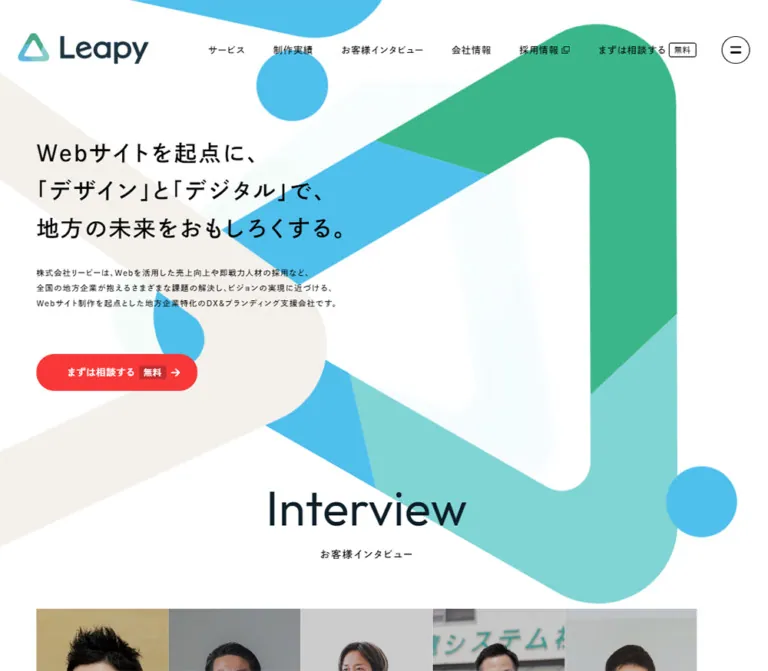
The desktop composition places the text block toward the left and the large colored loop toward the right. The headline reads Webサイトを起点に、“地方の未来”をおもしろくする。 across two lines. It is followed by a three-line introduction, a small assistance link, and a wide red CTA.
The main motif is a thick, hollow triangle with rounded corners and flat cyan, green, and mint segments. Its large white center is essential: the artwork feels open, not like a solid colored illustration. A cropped cyan shape and circle appear near the top; a warm diagonal ribbon enters from the left; a much paler triangular form sits behind the content.
On mobile, the motif moves into the upper area and is heavily cropped at the right edge. The headline begins at y 320px, followed by introduction, assistance link, and CTA. This is a change in composition, not a uniformly scaled desktop layout.
Implementation recommendation: use an authorized vector or suitably sized image for the brand artwork, with separate mobile art direction when needed. Place decorative layers behind the copy and exclude them from pointer interaction and the accessibility tree. No original artwork URL or file format was supplied.
Consultation Button Family
Role: maintain one recognizable conversion action across a long page.
The main まずは相談してみる button is a red pill with white text and a small envelope toward the right. At desktop it is 400 × 64px; at mobile it spans the 335.39px content column and is approximately 53.19px high. Its mixed bold font stack and generous tracking match the surrounding Japanese typography.
The header version is smaller, with the mobile header using a darker measured red. Document-request buttons use a white surface and dark outline in the visible desktop header. Menu-related contact controls also include 4px rectangular variants; the pill is therefore a strong primary pattern, not the shape of every button on the site.
The DOM confirms that consultation links target https://leapy.jp/contact/ and document requests target https://leapy.jp/e-book/company/p6643/. The destination pages were not inspected.
Assistance Link
Role: provide an additional route for learning about the business.
A small cyan circular question symbol precedes the black label リーピーについて”ChatGPT”に聞いてみる. The row has no surrounding card. It sits 16px below the introduction on desktop and 8px below it on mobile.
The supplied href points to an external ChatGPT URL with a prefilled query. This establishes the link destination type only. No resulting conversation, response, or interaction was tested.
Consultation Activity Panel
Role: present dated activity and a cumulative consultation figure.
The opening desktop screenshot places this panel at the lower right, separate from the hero copy. It has a softly rounded outline, a pale warm header, a prominent 4,794 figure, and a compact list of dates and activity descriptions. The lower rows fade visually into white. The floating promotion covers part of the panel.
On mobile, the panel moves below the main CTA and spans most of the viewport with approximately 20px outer margins. It is again partly covered by the promotion and bottom navigation.
The cumulative consultation value and the client-company count are different metrics. The client-company count appears as zero in one desktop DOM sample and 1,420 in the mobile sample. This may reflect initialization or delayed behavior; a count-up animation was not demonstrated. Do not reproduce the zero as a deliberate final state or treat either metric as a timeless design token.
Section Labels and Concept Narrative
Role: establish a readable rhythm through the long corporate story.
Main section headings pair an English label with a smaller Japanese caption. Concept then introduces a large Japanese statement, several generously led paragraphs, a smaller qualifying paragraph, and another consultation CTA.
Measured Concept section padding changes from 150px 0 120px on desktop to 56px 0 64px on mobile. Its statement changes from 43.92px / 65.88px to 24px / 36px. Narrative text uses an unusually open line height of 2.1, helping long Japanese passages remain spacious.
Preserve the separation between section labeling, the principal statement, narrative, and action. The evidence does not support giving every paragraph its own boxed card.
Reason Cards
Role: organize three reasons to choose the company.
The desktop DOM places three title columns at x approximately 108, 550.66, and 993.33px, each with an inner width near 338.66px. Each reason contains a numbered label, a bold Japanese heading, explanatory paragraphs, and applicable notes. Card artwork and complete outer-surface styling are not established by the supplied screenshots.
Mobile uses a horizontal arrangement. Card heading boxes are approximately 304.19px wide, begin at x 27.30, and repeat every 320.19px, giving a 16px gap. The content has 20px side insets. Three pagination buttons are present: the active indicator is a blue 22 × 8px pill, while the others are gray 8 × 8px circles. A blue full-width 詳しく見る button follows.
The geometry and pagination support a carousel interpretation. Swipe behavior, autoplay, looping, and button responses remain untested.
Two-Stage Service Directory
Role: distinguish website creation from ongoing support.
The content separates STEP 1 with つくる from STEP 2 with 育てる. Production entries combine an uppercase English category, a Japanese service title, and a short benefit statement. The four production categories cover corporate, recruitment, commerce, and brand websites. Ongoing services cover marketing and recruiting support.
At 390px, production entries form a measured two-column grid. Cards are approximately 161.7px wide, with a 12px gap, white backgrounds, 12px corners, 22px 14px 50px padding, and an 8px internal gap. The first row is about 194.78px high; the second is about 173.78px high. Avoid forcing all rows to an arbitrary identical height when the source allows content-dependent sizing.
The measured mobile marketing entry is a full-width transparent block with no corner radius, 44px right padding, and a 5px internal gap. The second stage therefore changes its presentation rather than repeating the small production cards unchanged.
Portfolio Grid
Role: demonstrate the range of completed work.
The desktop screenshot shows four columns inside approximately 72px side gutters. Each entry contains a wide website screenshot, a black project title, and gray taxonomy text. The title usually combines the client name with the site type. Taxonomy lists industries and locations with slash separators and wraps naturally across lines.
Screenshots are approximately 296 × 166px, close to 16:9. They have square corners and sit directly above the text without a rounded outer card. Broad, cool shadows or halos create gentle separation around imagery. The source declares a matching blue-tinted shadow token, although its application to these specific images was not measured.
The screenshot preserves the variety of client work: hospitality interiors, a bus and mountain landscape, education/event graphics, recruitment layouts, software branding, ceramics, and relocation information. That variety is the content, not visual noise to be normalized away.
The supplied desktop text includes 19 homepage project entries, while the mobile text includes 10. This establishes different captured content sets, not the mechanism responsible. A current mobile Works screenshot was not supplied, so its column count is unverified.
Interviews, News, and Blog Modules — DOM Evidence
Role: support credibility and keep the corporate homepage current.
Interview entries contain a quoted outcome or assessment, company information, an industry or region, and the representative's name or role. News entries pair a date with a linked headline. Blog entries add a weekday, author, category, title, and excerpt; the page exposes three publishing categories.
These content relationships are supported by the supplied DOM. Exact image crops, card surfaces, tab states, sliders, and hover treatments are not established by the current captures. Preserve the content anatomy without inventing a photographed interview layout or an untested tab interaction.
Regional Projects and Sponsorships
Role: connect the company identity to local initiatives.
The lower desktop capture shows a four-column project area with images above multiline black descriptions. The mobile capture shows two columns for the visible regional-project entries, with approximately 27px outside margins and a 12px internal gap.
Below this is a centered 協賛 heading and two pale sponsorship tiles. Desktop tiles are approximately 600 × 186px, displayed side by side with an approximately 38px gap. Each combines a contained logo or event image on the left with black explanatory text on the right.
At 390px, the tiles stack vertically at approximately 335px wide and 98–99px high, separated by about 12px. Their internal image-and-text arrangement remains horizontal. The event image is approximately 116px wide on mobile; logos retain their own proportions rather than being cropped into identical photographs.
Affiliated Logos and Copyright
Role: close the page with related properties and legal identity.
A pale horizontal band contains affiliated brand marks, including 地方採用WORKS, Leap career, Pace, and GIFU42. Desktop uses a broad row; the mobile screenshot shows smaller marks wrapping into additional rows. Preserve each logo's intrinsic aspect ratio and visual scale.
The desktop page ends with a solid black copyright strip and small centered white text. Much of the corresponding mobile lower region is covered by the promotion and persistent navigation, so its complete arrangement cannot be recovered from that capture.
Floating Video Promotion
Role: advertise a short introductory video throughout the page.
The promotion appears in all five current screenshots. It uses a pale rounded frame, a broad gray shadow, an inset graphic, and a small circular close control at the upper-right edge.
The inset design combines a green field, a yellow numeral, white Japanese copy, a navy speech-bubble label, a diagonal photograph of people working around a table, and a white viewing strip with a play triangle. The visible CTA reads 無料で視聴する. The evidence does not establish which parts are live text versus an image asset.
Estimated desktop frame geometry is 280 × 173px, positioned roughly 50px from the right and bottom. Mobile geometry is approximately 312 × 188px, roughly 16px from the right and bottom. At the mobile viewport, the frame covers about 18% of the screen area, calculated from these estimates, and overlaps most of the bottom navigation.
The close affordance and video prompt are visible. Dismissal persistence, destination, playback, and opening behavior were not tested.
Mobile Bottom Navigation
Role: retain primary navigation while the mobile top bar prioritizes identity and consultation.
Five destinations or controls are represented: トップ, 選ばれる理由, 制作実績, 会社概要, and MENU. The first four links have measured 74px-wide, 56px-high boxes beginning at x 10px and y 778px. This yields a five-position bar approximately 370px wide, inset 10px from the sides and bottom.
Text uses the mixed bold stack at 11.5px / 13.8px with 0.02em tracking. The active home item has a warm neutral background; measured link text is navy. The screenshot suggests a rounded outer container and a darker menu area, but the promotion obscures much of the bar.
Do not move this navigation into the mobile top bar when reproducing the observed information hierarchy. In a new implementation, keep the promotion clear of its hit areas.
Tokens — Motion & Interaction
The following are declared transition values, not a frame-by-frame motion recording.
| Element or token | Supplied value | What is established |
|---|---|---|
| General transition token | all .4s ease-out |
Available default timing; many links compute to 400ms ease-out |
| Fast transition token | all .2s ease-out |
Token exists; specific visible use was not established |
| Header and logo wrapper | 0.3s |
Transition duration declared; scrolled header appearance differs |
| Hero headline | 0.8s |
Transition declared; initial transform or opacity values were not supplied |
| Hero introduction | 0.8s 0.2s |
Transition includes a 200ms delay |
| Reveal-style sections and headings | opacity 0.45s cubic-bezier(0.22, 0.61, 0.36, 1), transform 0.45s cubic-bezier(0.22, 0.61, 0.36, 1) |
Both properties and easing are measured; start/end offsets are unknown |
| Desktop header consultation CTA | background-color 1s |
Color transition declared; hover endpoint not inspected |
| Desktop document-request pill | 1s |
Transition declared; changing properties not established |
| Body background | background 0.4s |
Background transition declared |
| Mobile Reason pagination | 0.4s ease-out |
Transition available on measured indicators |
The sampled elements report animation: none. This does not prove that decorative descendants, scripts, or unsampled elements never animate. No evidence establishes continuous triangle rotation, parallax, a scrolling activity ticker, or an autoplaying interview carousel.
The capture procedure waited for initial loading and finite motion, traversed scroll positions, and temporarily paused perpetual animations during readiness checks before resuming them. It did not exercise menus, hover states, pagination, video playback, or the promotion's close control. The zero versus 1,420 client-count samples also show why snapshot stability should not be confused with complete verification of delayed behavior.
Recommended motion approach: retain short ease-out control transitions and restrained opacity/transform reveals. Keep content visible without JavaScript, supply reduced-motion alternatives, and add continuous movement only when separately specified and tested.
Surfaces
| Layer | Appearance | Structural purpose |
|---|---|---|
| Page canvas | White | Gives the colored motif and black typography room |
| Decorative backdrop | Flat cool segments, warm ribbon, very faint ghost shapes | Extends the logo language without creating content boxes |
| Portfolio entries | Unboxed text beneath square images | Lets the work supply visual variety |
| Production cards | White, 12px corners in measured mobile cards | Groups service categories |
| Sponsorship tiles | Pale neutral, visually square corners | Contains logos and concise partnership text |
| Consultation log | Rounded light panel with a warm header and fading rows | Separates dated activity from hero copy |
| Promotion | Rounded pale frame with pronounced soft shadow | Floats above page content |
| Affiliated-logo band | Pale neutral | Groups related brands near the page end |
| Copyright strip | Black with centered white text | Provides a clear desktop endpoint |
The measured shadow token is:
--shadow-01: 0 0 40px 0 rgba(69, 131, 175, 0.3);
This is a broad blue halo with no directional offset. It suits the visual separation around portfolio imagery, but that exact selector-to-token mapping was not supplied. The floating promotion has a more directional gray shadow by visual inspection. Do not use one generic elevation style for every component.
Imagery
The brand artwork is geometric and clean. Its rounded triangular loop uses large contiguous color areas, a generous hollow center, and purposeful cropping. The observed appearance does not require a gradient, metallic treatment, glass effect, or 3D extrusion.
Portfolio imagery consists of website previews, with their original typography, photography, illustration, and client branding intact. These images function as evidence of work. Preserve the full composition of each prepared thumbnail and its consistent wide frame; avoid arbitrary crops through important website headings.
Regional projects add event graphics and media previews. Sponsorship tiles mix a sports-team emblem with a football-event image. The affiliated strip uses logos with different proportions. Use object-fit: contain for these identity assets rather than forcing them into a shared crop.
Observed Asset References
No original image src URLs, filenames, or vector paths were supplied. The following is an asset inventory by visible role, not a fabricated download manifest.
| Asset role | Observed treatment | Implementation guidance |
|---|---|---|
| Leapy logo | Three-color triangular symbol with dark wordmark | Use the authorized identity asset; maintain aspect ratio |
| Main brand motif | Large segmented hollow triangle with rounded turns | Prefer scalable artwork; art-direct its mobile crop |
| Supporting hero graphics | Cyan circle, cropped blue shape, warm ribbon, pale triangle | Keep decorative and behind text |
| Portfolio previews | Wide website screenshots, approximately 16:9 | Preserve client colors and prepared compositions |
| Regional-project images | Event posters and media-page previews | Keep image above its descriptive text |
| Sponsorship art | Logo or event graphic beside copy | Contain within a consistent media slot |
| Affiliated marks | Mixed widths and aspect ratios | Align optically and allow wrapping |
| Video promotion | Green graphic with diagonal workplace photograph | Preserve its composition; provide an accessible equivalent for essential text |
No image asset was downloaded or generated for this reference.
Layout & Responsive Behavior
Observed Page Structure
The main DOM sequence is: hero, client proof, Concept, Reason, Service, Contact, Interview, Works, About Us, News, Blog, and another Contact section. Footer-related content adds navigation, policy links, client/security information, regional projects, sponsorships, affiliated logos, and copyright.
Navigation-panel text appears before the main content in the extraction. It should not be mistaken for an always-visible section at the top of the page.
Desktop and Mobile Comparison
| Pattern | Desktop evidence | Mobile evidence |
|---|---|---|
| Top navigation | Full navigation, two utility CTAs, circular menu control | Logo and consultation pill only |
| Scrolled header | White strip about 80px high | White strip about 56px high |
| Hero art | Large motif primarily at right beside text | Motif occupies the upper opening area and crops beyond the right edge |
| Hero content | Headline begins near x 101, y 337 | Headline begins near x 27, y 320 |
| Main CTA | 400px wide | Fills the approximately 335px content column |
| Consultation activity | Lower-right hero panel | Panel below the CTA |
| Reason content | Three parallel text columns | Horizontal cards with three pagination indicators |
| Production services | Content hierarchy established; full desktop layout not sampled | Two measured columns |
| Works | Four visible columns | Fewer captured entries; visual column count unknown |
| Regional projects | Four columns in lower capture | Two visible columns |
| Sponsorships | Two horizontal tiles side by side | Two stacked tiles, each retaining image beside text |
| Affiliated logos | Broad horizontal row | Smaller wrapping arrangement |
| Persistent mobile navigation | Absent | Five-position bottom bar |
| Floating promotion | Small lower-right overlay | Larger proportion of viewport; overlaps bottom navigation |
Measured document heights were approximately 17,237px on desktop and 14,227px on mobile. These are capture-state measurements, not layout targets. Different visible content sets, section arrangements, and delayed behavior prevent deriving a universal page-height ratio.
The actual media-query breakpoints were not supplied. The CSS starter uses 768px and 1200px boundaries as recommendations. Only the 390px and 1440px layouts are directly evidenced.
Do’s and Don’ts
Do
- Preserve the white canvas and the oversized cyan, green, and mint triangular artwork.
- Keep a substantial hollow center in the main motif and crop decorative edges intentionally.
- Use the measured Japanese font families when properly available, with explicit fallbacks.
- Retain generous Japanese line height and tracking, especially in the hero and Concept narrative.
- Keep consultation red distinct from exploration blue.
- Give the hero and narrative approximately 7% side gutters at the observed widths.
- Present desktop work in four unboxed columns with wide, square-cornered previews.
- Keep project titles and gray taxonomy below their images.
- Preserve horizontal image-and-text anatomy inside sponsorship tiles when they stack on mobile.
- Recompose the mobile hero and retain its separate bottom navigation.
- Keep observed values, visual estimates, and new implementation decisions clearly separated.
Don't
- Don't compress the entire corporate homepage into a single campaign layout.
- Don't replace the triangular brand artwork with generic gradient blobs.
- Don't use the consultation red as the background of every section or badge.
- Don't give portfolio screenshots the same rounded frame as service cards or the video promotion.
- Don't recolor client work to match Leapy's brand palette.
- Don't infer open-menu appearance from DOM coordinates alone.
- Don't invent parallax, continuous rotation, autoplay, or count-up timings.
- Don't assume the mobile portfolio grid has the same columns as another mobile section.
- Don't hardcode consultation and client counts as permanent visual constants.
- Don't treat the floating promotion's obstruction of mobile navigation as a desirable interaction requirement.
- Don't invent asset paths, font loading URLs, or production credits.
Recommended Implementation Additions
These are recommendations for new work, not verified features of the original page:
- Keep the mobile promotion above the bottom navigation, or reduce it to a compact dismissible trigger. Preserve access to all five navigation positions.
- Enlarge the promotion close button's hit area to at least 44px while retaining its small visible circle. Give the button an accessible name and implement predictable dismissal.
- Use buttons for menu toggles and pagination, real links for navigation, and explicit expanded or selected states where appropriate. Avoid copying
javascript:href patterns. - Preserve a clear keyboard focus ring. Ensure fixed UI does not cover focused controls or anchor targets.
- Check the contrast of small white text on red and blue controls. A documented darker red token can support an accessible variant after verification.
- Supply a readable fallback for the small mobile hero introduction and test Japanese wrapping with the actual fonts and text zoom.
- Make horizontal Reason content operable without a swipe gesture; expose controls and a useful selected-state label.
- Keep final metric values available without animation. Respect reduced motion and avoid hiding essential content until a reveal script runs.
- Provide text alternatives for project previews and promotion content; mark purely decorative brand shapes as decorative.
Agent Prompt Guide
Quick Color Reference
- Main canvas:
#ffffff. - Primary text:
#000000. - Brand geometry: cyan
#4fbfec, green#3bb68b, mint#80d4d4. - Consultation:
#f83838; the observed mobile header variant is#e02828. - Supporting exploration controls:
#437dd5. - Navy utility text:
#1e3443. - Warm neutral:
#f4f0ec; pale surface token:#f9f9f9. - Secondary explanatory copy:
#504a4a. - Broad source shadow:
0 0 40px rgba(69, 131, 175, 0.3).
Overall Prompt
“Create a substantial Japanese corporate homepage inspired by the current Leapy design. Use a white canvas, black Japanese Gothic typography, generous line spacing, and an oversized hollow triangular motif with rounded turns and flat cyan, green, and mint segments. Place a two-line proposition at the left of the desktop hero, followed by a short introduction, a small help link, and a 400 × 64px red consultation pill. Use a persistent desktop header with a logo, compact navigation, outlined document-request control, red contact control, and circular menu button. Continue with company narrative, reasons, a service directory, interviews, a four-column desktop portfolio, publishing, and regional partnerships. Portfolio entries have square wide screenshots, plain titles, and gray taxonomy. At 390px, move the artwork above the hero text, use approximately 27px content gutters, make the main CTA full width, and provide separate bottom navigation. Treat unverified interactions and intermediate breakpoints as explicit implementation decisions.”
Example Component Prompts
- Hero: “Build a white desktop hero with a left-aligned Japanese headline at 42px, 1.64 line height, and 0.06em tracking. Use an oversized three-color rounded triangular loop at right, a pale warm ribbon entering from the left, and restrained ghost geometry. Recompose the mobile view so text begins below an approximately 320px decorative opening area.”
- Consultation button: “Create a red
#f83838pill with white Japanese text, a small right-side envelope, a 100px radius, and the Outfit/Shuei bold mixed stack. Desktop size is 400 × 64px; mobile fills a 335px column at roughly 53px high. Useまずは相談してみるas the source label.” - Portfolio: “Create a four-column desktop portfolio in a 90%-wide container. Use approximately 296 × 166px square-cornered website previews, a broad cool shadow around imagery, plain black project titles, and gray slash-separated industry/location metadata. Keep text outside any boxed card. Mobile column count must be an explicit new decision.”
- Reason carousel: “Create a mobile horizontal set of approximately 304px cards with 16px gaps and 20px internal side padding. Use 17px Japanese headings and 13px body text with open leading. Show a blue 22 × 8px selected indicator and two gray 8px dots. Do not assume autoplay.”
- Sponsorship tiles: “Create two pale, square-cornered desktop tiles with contained partnership imagery at left and concise black copy at right. Stack the tiles on mobile while retaining the internal horizontal layout. Keep logos uncropped and the section heading centered.”
- Mobile persistent UI: “Use a compact logo/contact top bar and a five-position bottom navigation with navy labels and a warm active-home surface. A green introductory-video promotion may float above the page, but reserve clearance above the bottom bar and provide an accessible close control. That clearance is an improvement over the captured overlap.”
Quick Start
CSS Custom Properties
This is an unexecuted implementation starter, not recovered site CSS. Colors and font names are source-backed; measured dimensions are reused where available. Artwork positioning, intermediate breakpoints, unspecified hover endpoints, and the mobile Works grid are adaptations.
Use semantic links and buttons with these component classes. Supply authorized logo, decorative-art, project, and promotion assets separately. Font loading, menu state, carousel controls, and promotion dismissal require application integration. The mobile promotion below is intentionally lifted above navigation as a recommended improvement.
:root {
  /* Source-backed colors */
  --color-canvas: #fff;
  --color-ink: #000;
  --color-secondary-text: #504a4a;
  --color-muted: #7e7e7e;
  --color-cyan: #4fbfec;
  --color-green: #3bb68b;
  --color-mint: #80d4d4;
  --color-navy: #1e3443;
  --color-action: #f83838;
  --color-action-mobile: #e02828;
  --color-action-dark: #c62d2d;
  --color-explore: #437dd5;
  --color-warm: #f4f0ec;
  --color-surface: #f9f9f9;
  --color-frame: #f2f2f2;
  --color-line: #e2e2e2;
  --color-inactive: #c4c4c4;

  /* Source families; load licensed fonts separately */
  --font-jp: 'Shuei KakuGo Gin M', YuGothic, 'Yu Gothic',
    'Hiragino Kaku Gothic ProN', sans-serif;
  --font-jp-bold: 'Shuei KakuGo Gin B', YuGothic,
    'Yu Gothic', sans-serif;
  --font-en: 'Outfit', sans-serif;
  --font-mixed-bold: 'Outfit', 'Shuei KakuGo Gin B',
    'Yu Gothic', sans-serif;

  /* Measured desktop type */
  --text-body: 16px;
  --text-hero: 42px;
  --text-statement: 43.92px;
  --leading-body: 1.75;
  --tracking-body: 0.08em;

  /* Reusable layout aliases */
  --content-width: 86%;
  --wide-content-width: 90%;
  --hero-peek: 48px;
  --radius-pill: 100px;
  --radius-card: 12px;
  --radius-float: 20px;
  --shadow-brand: 0 0 40px 0 rgb(69 131 175 / 30%);
  --shadow-float: 0 20px 40px rgb(0 0 0 / 16%);
  --ease-reveal: cubic-bezier(0.22, 0.61, 0.36, 1);
  --motion-default: 400ms ease-out;
  --safe-bottom: env(safe-area-inset-bottom, 0px);
}

* { box-sizing: border-box; }

body {
  margin: 0;
  color: var(--color-ink);
  background: var(--color-canvas);
  font-family: var(--font-jp);
  font-size: var(--text-body);
  font-weight: 500;
  line-height: var(--leading-body);
  letter-spacing: var(--tracking-body);
}

img { display: block; max-width: 100%; }
button, input, textarea, select { font: inherit; }
button { cursor: pointer; }
[hidden] { display: none !important; }

.container {
  width: var(--content-width);
  margin-inline: auto;
}

.container--wide { width: var(--wide-content-width); }

.site-header {
  position: fixed;
  inset: 0 0 auto;
  z-index: 50;
  display: flex;
  align-items: center;
  gap: 12px;
  min-height: 114px;
  padding: 58px 24px 0 30px;
  transition: background-color 300ms, padding 300ms;
}

.site-header.is-scrolled {
  min-height: 80px;
  padding-block: 12px;
  background: var(--color-canvas);
}

.site-header__brand {
  flex: none;
  width: 168px;
}

.site-header__brand img { width: 100%; height: auto; }

.site-nav {
  display: flex;
  align-items: center;
  margin-left: auto;
}

.site-nav a {
  display: flex;
  align-items: center;
  min-height: 56px;
  padding-inline: 7.5px;
  color: inherit;
  font-family: var(--font-jp-bold);
  font-size: 14px;
  line-height: 1.75;
  letter-spacing: 1.28px;
  text-decoration: none;
}

.header-actions {
  display: flex;
  align-items: center;
  gap: 8px;
  flex: none;
}

.pill {
  position: relative;
  display: flex;
  align-items: center;
  justify-content: center;
  width: 400px;
  max-width: 100%;
  padding: 18px 48px 18px 32px;
  border: 0;
  border-radius: var(--radius-pill);
  color: #fff;
  background: var(--color-action);
  font-family: var(--font-mixed-bold);
  font-size: 16px;
  font-weight: 500;
  line-height: 28px;
  letter-spacing: 0.08em;
  text-align: center;
  text-decoration: none;
  transition: background-color var(--motion-default);
}

.pill__icon {
  position: absolute;
  right: 32px;
  width: 16px;
  height: 16px;
}

.pill--header {
  width: auto;
  gap: 6px;
  padding: 8px 18px;
  font-family: var(--font-jp-bold);
  font-size: 12px;
  line-height: 21px;
  letter-spacing: 1.28px;
}

.pill--outline {
  border: 1px solid var(--color-navy);
  color: var(--color-ink);
  background: #fff;
}

.pill--explore { background: var(--color-explore); }

.menu-circle {
  display: grid;
  place-items: center;
  width: 48px;
  height: 48px;
  padding: 0;
  border: 2px solid currentColor;
  border-radius: 50%;
  color: var(--color-ink);
  background: transparent;
}

.hero {
  position: relative;
  isolation: isolate;
  display: flex;
  align-items: center;
  min-height: calc(100svh - var(--hero-peek));
  padding-top: 146px;
}

/* Use an art-directed picture with authorized decorative artwork. */
.hero__art {
  position: absolute;
  inset: 0;
  z-index: -1;
  overflow: hidden;
  pointer-events: none;
}

.hero__art img {
  width: 100%;
  height: 100%;
  object-fit: cover;
}

.hero__copy { max-width: 730px; }

.hero__title {
  margin: 0;
  font-family: var(--font-jp-bold);
  font-size: var(--text-hero);
  font-weight: 700;
  line-height: 1.64;
  letter-spacing: 0.06em;
}

.hero__summary {
  margin: 34px 0 0;
  font-family: var(--font-jp-bold);
  font-size: 16px;
  line-height: 1.86;
  letter-spacing: 0.08em;
}

.hero__assist {
  display: flex;
  align-items: center;
  gap: 8px;
  margin-top: 16px;
  color: inherit;
  font-family: var(--font-jp-bold);
  font-size: 16px;
  font-weight: 700;
  line-height: 28px;
  text-decoration: none;
}

.hero__help-symbol {
  display: grid;
  place-items: center;
  flex: none;
  width: 18px;
  height: 18px;
  border-radius: 50%;
  color: #fff;
  background: var(--color-cyan);
  font-size: 12px;
  line-height: 1;
}

.hero__actions { margin-top: 56px; }

/* Panel dimensions and placement are screenshot approximations. */
.consultation-log {
  position: absolute;
  right: 34px;
  bottom: 32px;
  width: 510px;
  max-width: calc(100% - 40px);
  overflow: hidden;
  border-radius: 18px;
  background: #fff;
  box-shadow: 0 0 24px rgb(69 131 175 / 12%);
}

.consultation-log__heading {
  display: flex;
  align-items: baseline;
  justify-content: center;
  gap: 4px;
  margin: 0;
  padding: 12px 20px;
  background: var(--color-warm);
  font-family: var(--font-jp-bold);
}

.consultation-log__rows {
  max-height: 150px;
  overflow: hidden;
  margin: 0;
  padding: 16px 20px;
  list-style: none;
  font-size: 14px;
  line-height: 25px;
  mask-image: linear-gradient(#000 55%, transparent);
}

.section { padding-block: 120px; }
.section--concept { padding-block: 150px 120px; }

.section-statement {
  margin: 0;
  font-family: var(--font-jp-bold);
  font-size: var(--text-statement);
  font-weight: 700;
  line-height: 1.5;
  letter-spacing: 0.08em;
}

.concept-copy {
  font-family: var(--font-jp-bold);
  font-size: 20px;
  line-height: 2.1;
  letter-spacing: 0.06em;
}

.reason-grid {
  display: grid;
  grid-template-columns: repeat(3, minmax(0, 1fr));
  gap: 32px;
}

.reason-card { padding-inline: 36px; }

.reason-card h3 {
  font-family: var(--font-jp-bold);
  font-size: 23px;
  line-height: 1.7;
}

.reason-card p {
  color: var(--color-secondary-text);
  font-size: 14.5px;
  line-height: 2;
}

.works-grid {
  display: grid;
  grid-template-columns: repeat(4, minmax(0, 1fr));
  gap: 76px 38px;
}

.work-card {
  min-width: 0;
  color: inherit;
  text-decoration: none;
}

.work-card__image {
  width: 100%;
  aspect-ratio: 16 / 9;
  object-fit: cover;
  border-radius: 0;
  box-shadow: var(--shadow-brand);
}

/* Portfolio text values are visual approximations. */
.work-card__title {
  margin: 14px 0 8px;
  font-size: 13px;
  font-weight: 500;
  line-height: 1.65;
  letter-spacing: 0.02em;
}

.work-card__meta {
  margin: 0;
  color: var(--color-muted);
  font-size: 13px;
  line-height: 1.6;
  letter-spacing: 0;
}

.sponsor-grid {
  display: grid;
  grid-template-columns: repeat(2, minmax(0, 1fr));
  gap: 38px;
}

.sponsor-card {
  display: grid;
  grid-template-columns: 200px minmax(0, 1fr);
  align-items: center;
  gap: 16px;
  min-height: 186px;
  padding: 32px 40px;
  background: var(--color-surface);
}

.sponsor-card img {
  width: 100%;
  max-height: 122px;
  object-fit: contain;
}

.sponsor-card p { margin: 0; }

.partner-strip {
  display: flex;
  flex-wrap: wrap;
  align-items: center;
  justify-content: center;
  gap: 40px;
  padding: 64px 7%;
  background: var(--color-surface);
}

.partner-strip img {
  width: auto;
  max-width: 310px;
  max-height: 48px;
  object-fit: contain;
}

.copyright {
  padding: 24px;
  color: #fff;
  background: #000;
  font-family: var(--font-en);
  font-size: 14px;
  text-align: center;
}

.promo {
  position: fixed;
  right: 50px;
  bottom: 50px;
  z-index: 60;
  width: 280px;
  padding: 16px;
  border: 1px solid var(--color-line);
  border-radius: var(--radius-float);
  background: var(--color-frame);
  box-shadow: var(--shadow-float);
}

.promo img { width: 100%; height: auto; border-radius: 8px; }

/* A 44px hit area can contain a smaller visible close-circle icon. */
.promo__close {
  position: absolute;
  top: -22px;
  right: -22px;
  display: grid;
  place-items: center;
  width: 44px;
  height: 44px;
  padding: 0;
  border: 0;
  color: var(--color-navy);
  background: transparent;
}

.mobile-nav { display: none; }

/* Content stays visible until an optional reveal controller is added. */
.reveal {
  opacity: 1;
  transform: none;
  transition: opacity 450ms var(--ease-reveal),
    transform 450ms var(--ease-reveal);
}

/* Recommended focus treatment and hover endpoint. */
:where(a, button):focus-visible {
  outline: 3px solid var(--color-navy);
  outline-offset: 4px;
}

@media (hover: hover) {
  .pill:not(.pill--outline):not(.pill--explore):hover {
    background: var(--color-action-dark);
  }
}

/* Recommended intermediate layout; no tablet capture was supplied. */
@media (min-width: 768px) and (max-width: 1199px) {
  .site-nav { display: none; }
  .header-actions { margin-left: auto; }
  .works-grid { grid-template-columns: repeat(3, minmax(0, 1fr)); }
  .sponsor-card { grid-template-columns: 35% minmax(0, 1fr); }
}

@media (max-width: 767px) {
  :root {
    --text-body: 14px;
    --text-hero: clamp(20px, 5.8vw, 26px);
    --text-statement: 24px;
    --leading-body: 1.8;
  }

  body { padding-bottom: calc(76px + var(--safe-bottom)); }

  .site-header {
    min-height: 100px;
    padding: 0 16px 0 5%;
  }

  .site-header.is-scrolled {
    min-height: 56px;
    padding-block: 0;
  }

  .site-header__brand { width: 120px; }
  .site-nav, .header-download, .menu-circle { display: none; }
  .header-actions { margin-left: auto; }

  .pill {
    width: 100%;
    padding: 14px 40px;
    font-size: 14px;
    line-height: 25.2px;
  }

  .pill--header {
    width: auto;
    height: 32px;
    padding: 0 16px;
    background: var(--color-action-mobile);
    font-family: var(--font-jp);
    font-size: 12px;
    line-height: 15.6px;
    letter-spacing: 1.12px;
  }

  .hero {
    display: block;
    min-height: 0;
    padding: 320px 0 32px;
  }

  .hero__summary {
    margin-top: 16px;
    font-size: 12.25px;
    line-height: 1.86;
  }

  .hero__assist {
    gap: 7px;
    margin-top: 8px;
    font-size: 12.25px;
    line-height: 22.05px;
  }

  .hero__help-symbol { width: 15px; height: 15px; }
  .hero__actions { margin-top: 32px; }

  .consultation-log {
    position: relative;
    inset: auto;
    width: calc(100% - 40px);
    margin: 40px auto 0;
  }

  .consultation-log__rows { font-size: 11px; }
  .section, .section--concept { padding-block: 56px 64px; }

  .concept-copy {
    font-size: 14px;
    line-height: 2.1;
    letter-spacing: 0.9px;
  }

  /* Native scrolling is a recommendation, not the verified source mechanism. */
  .reason-grid {
    width: calc(100% + 7vw);
    grid-template-columns: none;
    grid-auto-flow: column;
    grid-auto-columns: 78vw;
    gap: 16px;
    overflow-x: auto;
    padding-right: 7vw;
    scroll-snap-type: x proximity;
  }

  .reason-card { padding-inline: 20px; scroll-snap-align: start; }
  .reason-card h3 { font-size: 17px; line-height: 1.55; }
  .reason-card p { font-size: 13px; line-height: 1.95; }

  /* Recommended mobile Works layout; its actual columns were not captured. */
  .works-grid {
    grid-template-columns: repeat(2, minmax(0, 1fr));
    gap: 40px 12px;
  }

  .sponsor-grid { grid-template-columns: 1fr; gap: 12px; }

  .sponsor-card {
    grid-template-columns: 116px minmax(0, 1fr);
    min-height: 98px;
    padding: 14px 16px;
    font-size: 12px;
    line-height: 1.8;
  }

  .sponsor-card img { max-height: 72px; }
  .partner-strip { gap: 14px; padding: 28px 7%; }
  .partner-strip img { max-width: 160px; max-height: 28px; }

  .mobile-nav {
    position: fixed;
    inset: auto 10px calc(10px + var(--safe-bottom));
    z-index: 55;
    display: grid;
    grid-template-columns: repeat(5, minmax(0, 1fr));
    overflow: hidden;
    border-radius: 16px;
    background: var(--color-warm);
    box-shadow: 0 0 24px rgb(30 52 67 / 12%);
  }

  .mobile-nav :where(a, button) {
    display: grid;
    place-items: center;
    min-width: 0;
    min-height: 56px;
    padding: 2.3px 2px 0;
    border: 0;
    color: var(--color-navy);
    background: transparent;
    font-family: var(--font-mixed-bold);
    font-size: 11.5px;
    font-weight: 600;
    line-height: 13.8px;
    letter-spacing: 0.02em;
    text-align: center;
    text-decoration: none;
  }

  .mobile-nav .mobile-nav__menu {
    color: #fff;
    background: var(--color-navy);
  }

  .promo {
    right: 16px;
    width: min(312px, calc(100vw - 32px));
    /* Recommended clearance; the observed inset was about 16px. */
    bottom: calc(82px + var(--safe-bottom));
  }
}

@media (prefers-reduced-motion: reduce) {
  .site-header, .pill, .reveal { transition: none; }
  .reason-grid { scroll-behavior: auto; scroll-snap-type: none; }
}
Tailwind v4 Token Mapping
Optional aliases for a project already using Tailwind v4. These do not imply that the original site uses Tailwind. Define the custom properties above first.
@theme inline {
  --color-canvas: #fff;
  --color-ink: #000;
  --color-brand-cyan: #4fbfec;
  --color-brand-green: #3bb68b;
  --color-brand-mint: #80d4d4;
  --color-brand-navy: #1e3443;
  --color-consultation: #f83838;
  --color-exploration: #437dd5;
  --color-warm-surface: #f4f0ec;
  --color-pale-surface: #f9f9f9;
  --color-copy-secondary: #504a4a;

  --font-japanese: var(--font-jp);
  --font-japanese-bold: var(--font-jp-bold);
  --font-english: var(--font-en);
  --font-action: var(--font-mixed-bold);

  --text-hero: var(--text-hero);
  --text-statement: var(--text-statement);
  --spacing-page-gutter: 7vw;
  --radius-action: 100px;
  --radius-service: 12px;
  --radius-promotion: 20px;
  --shadow-portfolio: 0 0 40px 0 rgb(69 131 175 / 30%);
}
Sources & Evidence
- Inspected original and final page: https://leapy.jp/. The supplied observation reports HTTP 200 and the same original/final URL. Retrieval timestamp:
2026-09-23T20:47:05.346Z, corresponding to September 24, 2026, 05:47 JST. - Desktop visual evidence: three current-page captures at
1440 × 1000, covering the opening hero, a scrolled portfolio view, and regional/sponsorship/footer content. - Mobile visual evidence: two current-page captures at
390 × 844, covering the opening hero and lower regional/sponsorship/footer content. The floating promotion obscures parts of the consultation panel, bottom navigation, and lower page. - Rendered DOM and computed styles: supplied text, link destinations, custom properties, font stacks, element bounds, padding, gaps, radii, and transition declarations for both viewports. The element sample includes menu-related nodes that were not visibly open and does not provide exhaustive styles for every section or child span.
- Observed state changes: scrolled captures retain top navigation with a white background; mobile and desktop differ in content arrangement and navigation placement. No direct click, hover, keyboard, carousel, video, or dismissal results were supplied.
- Capture limitations: the collection waited for loading, finite visible motion, sampled layout/text stability, and image decoding within stated limits. Perpetual motion was paused during readiness checks and resumed afterward. Delayed content and unexercised interaction states remain unverified. SharedWorkers and service workers were disabled during inspection.
- Analysis boundaries: no additional browsing, command execution, file inspection, asset retrieval, or implementation testing was performed. Source image paths, exact media queries, complete animation definitions, and homepage production credits were not available.
This reference describes the supplied current homepage evidence. The CSS and prompts are reusable adaptations with their uncertain or recommended behavior identified explicitly.
# Leapy — Corporate Website Style Reference

> An expansive white canvas, a three-color triangular loop, and unmistakable red consultation buttons.

**Original URL:** [https://leapy.jp/](https://leapy.jp/)
**Final URL:** [https://leapy.jp/](https://leapy.jp/) — HTTP 200, unchanged destination.
**Inspected:** September 24, 2026, 05:47 JST. Supplied retrieval timestamp: `2026-09-23T20:47:05.346Z`.
**Viewports:** desktop `1440 × 1000` CSS pixels; mobile `390 × 844` CSS pixels.
**Theme:** predominantly white, with cool brand graphics, warm neutral accents, black text, and red conversion controls.
**Scope:** the current corporate homepage, using three desktop captures, two mobile captures, and the supplied rendered DOM and computed styles. Visual coverage includes the opening view, desktop portfolio grid, regional projects, sponsorships, affiliated logos, and lower-page chrome. Other homepage sections have DOM evidence but incomplete visual coverage. Linked pages and expanded menus were not independently inspected.

Leapy presents a substantial corporate website for a web production and marketing business. Its homepage combines a service directory, company narrative, customer interviews, project portfolio, publishing activity, and repeated consultation opportunities. The original page identifies the company as 株式会社リーピー and ends with `© Leapy Inc.`; the evidence does not identify a separate designer or developer for this homepage.

The strongest visual signature is an oversized hollow triangular motif assembled from cyan, green, and mint segments. Rounded turns soften its geometry, while cropped circles, a warm diagonal ribbon, and very pale background shapes extend the identity across a spacious white canvas. Black Japanese typography provides structure. Red pills establish the consultation hierarchy; blue appears in supporting exploration controls. The portfolio introduces varied client imagery without surrounding every item with a heavy card frame.

Mobile is deliberately recomposed. The decorative artwork occupies the upper opening area, the headline begins around 320px down the page, the main CTA fills the content column, and persistent navigation moves to the bottom. A floating video promotion is also present and substantially obscures that bottom navigation in the supplied captures.
閉じる
# Leapy — Corporate Website Style Reference

> An expansive white canvas, a three-color triangular loop, and unmistakable red consultation buttons.

**Original URL:** [https://leapy.jp/](https://leapy.jp/)
**Final URL:** [https://leapy.jp/](https://leapy.jp/) — HTTP 200, unchanged destination.
**Inspected:** September 24, 2026, 05:47 JST. Supplied retrieval timestamp: `2026-09-23T20:47:05.346Z`.
**Viewports:** desktop `1440 × 1000` CSS pixels; mobile `390 × 844` CSS pixels.
**Theme:** predominantly white, with cool brand graphics, warm neutral accents, black text, and red conversion controls.
**Scope:** the current corporate homepage, using three desktop captures, two mobile captures, and the supplied rendered DOM and computed styles. Visual coverage includes the opening view, desktop portfolio grid, regional projects, sponsorships, affiliated logos, and lower-page chrome. Other homepage sections have DOM evidence but incomplete visual coverage. Linked pages and expanded menus were not independently inspected.

Leapy presents a substantial corporate website for a web production and marketing business. Its homepage combines a service directory, company narrative, customer interviews, project portfolio, publishing activity, and repeated consultation opportunities. The original page identifies the company as 株式会社リーピー and ends with `© Leapy Inc.`; the evidence does not identify a separate designer or developer for this homepage.

The strongest visual signature is an oversized hollow triangular motif assembled from cyan, green, and mint segments. Rounded turns soften its geometry, while cropped circles, a warm diagonal ribbon, and very pale background shapes extend the identity across a spacious white canvas. Black Japanese typography provides structure. Red pills establish the consultation hierarchy; blue appears in supporting exploration controls. The portfolio introduces varied client imagery without surrounding every item with a heavy card frame.

Mobile is deliberately recomposed. The decorative artwork occupies the upper opening area, the headline begins around 320px down the page, the main CTA fills the content column, and persistent navigation moves to the bottom. A floating video promotion is also present and substantially obscures that bottom navigation in the supplied captures.

## How to Read This Reference

- **Measured** means a value explicitly supplied by computed styles or element bounds. Measurements are CSS pixels unless stated otherwise.
- **Calculated** means arithmetic based on those measurements, such as a container occupying 86% of the viewport.
- **Estimated** means a visual reading of the current screenshots. It is not an exact sampled color or recovered CSS rule.
- **Source tokens** retain their actual custom-property names. Other token names are implementation aliases introduced here.
- **Recommendations** describe a reusable implementation, including the CSS starter. Unobserved breakpoints, hover results, menu behavior, and accessibility improvements are labeled accordingly.
- **Visibility matters:** the DOM includes menu content with nonzero bounds that is absent from the screenshots. Such nodes establish available content and styling, but do not prove that a menu was open.
- **Fonts:** computed family declarations are available. Independent font-file inspection and per-glyph font verification were not performed.

## Tokens — Colors

### Default Palette

| Name | Value | Source token or evidence | Role and confidence |
| --- | --- | --- | --- |
| Canvas White | `#ffffff` | `--clr-wht`; measured body background | Main page canvas, white buttons, and service-card surfaces |
| Text Black | `#000000` | `--clr-text-primary`, `--clr-blk` | Measured headline and primary text color |
| Brand Cyan | `#4fbfec` | `--clr-sub-02` | Source token consistent with the large cyan motif and small help accent; artwork pixels were not independently sampled |
| Brand Green | `#3bb68b` | `--clr-sub-03` | Source token consistent with the green segment of the brand motif |
| Brand Mint | `#80d4d4` | `--clr-sub-01` | Source token consistent with the mint motif; measured on menu-related English headings |
| Consultation Red | `#f83838` | `--clr-secondary-default` | Measured desktop header CTA and desktop/mobile main consultation buttons |
| Mobile Header Red | `#e02828` | Computed `rgb(224, 40, 40)` | Measured mobile header consultation button; distinct from the main CTA red |
| Exploration Blue | `#437dd5` | `--clr-primary-default` | Measured mobile Reason pagination and its `詳しく見る` button |
| Deep Navy | `#1e3443` | `--clr-sub-04` | Measured mobile bottom-navigation text and a menu contact-label background; visually related to the wordmark |
| Warm Neutral | `#f4f0ec` | `--clr-bg-02` | Measured active mobile home-navigation background; visually consistent with warm decorative and panel accents |
| Pale Surface | `#f9f9f9` | `--clr-bg-01` | Available source surface token; the sponsorship and affiliated-logo regions appear similarly pale |
| Secondary Text | `#504a4a` | `--clr-text-secondary` | Measured explanatory copy in Concept, Reason, and menu descriptions |
| Muted Gray | `#7e7e7e` | `--clr-mono-05` | Available source token suitable for the visually gray portfolio taxonomy; that selector was not measured |
| Inactive Gray | `#c4c4c4` | `--clr-mono-03` | Measured inactive mobile Reason pagination dots |
| Light Line | `#e2e2e2` | `--clr-mono-02` | Available source neutral for fine boundaries |

The source also declares blue variants `#1d59b5` and `#5f97eb`, red variants `#c62d2d`, `#c4000b`, and `#f25353`, and a muted teal `#74bbb2`. Their presence does not establish which interaction state uses them.

**Preserve the color hierarchy:** the large cool shapes carry identity; red marks consultation; blue supports exploration; black carries the reading structure. Client screenshots and sponsorship artwork retain their own colors. They should not be recolored into a uniform brand palette.

There is no evidence of a selectable theme system. The body's background transition is a stylesheet declaration, not proof of a theme control.

## Tokens — Typography

### Japanese Text

- **Primary declared family:** `Shuei KakuGo Gin M`.
- **Body fallbacks:** `YuGothic`, `Yu Gothic`, localized Hiragino aliases, `Hiragino Kaku Gothic ProN`, then `sans-serif`.
- **Bold declared family:** `Shuei KakuGo Gin B`.
- **Character:** clear Japanese Gothic text with generous leading and visible tracking. The overall effect is confident and readable rather than compressed.
- **Weight detail:** many elements using the B family still compute to `font-weight: 500`. Preserve the family distinction; simply applying weight 700 to the regular family is not an equivalent specification.

### English and Mixed Text

- **English source token:** `--font-en: "Outfit", sans-serif`.
- **Mixed regular token:** `--font-mix: "Outfit", "Shuei KakuGo Gin M", sans-serif`.
- **Mixed bold token:** `--font-mix-b: "Outfit", "Shuei KakuGo Gin B", sans-serif`.
- Outfit is explicitly measured on menu-related English headings and telephone numbers. Mixed bold stacks appear on primary buttons and mobile navigation.
- The Leapy wordmark is an image-based identity element in the supplied evidence. Do not recreate it by typing the brand name in a guessed font.

### Type Scale

All values in this table are measured. Menu-related rows describe DOM styling, not a visually inspected open menu.

| Role | Desktop size / line height | Mobile size / line height | Tracking and family |
| --- | --- | --- | --- |
| Root size | `16px` | `14px` | Root scaling differs between captures |
| Body | `16px / 28px` | `14px / 25.2px` | M family, weight 500, `0.08em` |
| Hero headline | `42px / 68.88px` | `22.62px / 37.0968px` | B family, weight 700, `0.06em` |
| Hero introduction | `16px / 29.76px` | `12.25px / 22.785px` | B family, weight 500, `0.08em` |
| Hero assistance link | `16px / 28px` | `12.25px / 22.05px` | B family, weight 700; tracking `1.28px` / `1.12px` |
| Main consultation CTA | `16px / 28px` | `14px / 25.2px` | Mixed B stack, weight 500, `0.08em` |
| Visible header CTA | `12px / 21px` | `12px / 15.6px` | Desktop B family; mobile body stack |
| Desktop navigation | `14px / 24.5px` | Not displayed in the mobile top bar | B family, weight 500, `1.28px` tracking |
| Concept statement | `43.92px / 65.88px` | `24px / 36px` | B family, weight 700, `0.08em` |
| Concept narrative | `20px / 42px` | `14px / 29.4px` | B family, weight 500; tracking `1.2px` / `0.9px` |
| Reason card title | `23px / 39.1px` | `17px / 26.35px` | B family, weight 700 |
| Reason card body | `14.5px / 29px` | `13px / 25.35px` | M family, secondary text color |
| English menu group | `40px / 56px` | `28px / 39.2px` | Outfit, weight 400, `0.06em` |
| Menu telephone number | `32px / 32px` | `24px / 24px` | Outfit, weight 600 |
| Mobile bottom navigation | Not present in desktop captures | `11.5px / 13.8px` | Mixed B stack, weight 600, `0.02em` |

Portfolio titles and taxonomy appear approximately `13–14px` in the desktop screenshot. The sponsorship heading appears approximately `32px` on desktop and `20px` on mobile. These are visual estimates, not computed measurements.

Main section headings pair English labels such as `Concept`, `Reason`, and `Service` with Japanese captions. Their parent H2 elements were measured, but the individual English child spans were not included in the style sample. Do not interpret the parent's 16px or 14px size as the size of every visible child.

## Tokens — Spacing & Shapes

**Layout character:** broad section spacing, restrained content framing, rounded conversion controls, and square portfolio screenshots.

The measured hero and Concept content widths correspond closely to an **86% container**, leaving 7% gutters: approximately `100.8px` on desktop and `27.3px` on mobile. The desktop Works grid uses a wider, visually estimated **90% container**, leaving `72px` gutters.

### Spacing Scale

| Use | Desktop | Mobile | Evidence |
| --- | --- | --- | --- |
| Hero headline to introduction | `34px` | `16px` | Calculated from measured bounds |
| Introduction to assistance link | `16px` | `8px` | Calculated from measured bounds |
| Assistance link to main CTA | `56px` | `32px` | Calculated from measured bounds |
| Help symbol to label | `8px` | `7px` | Measured flex gap |
| Header CTA internal padding | `8px 18px` | `0 16px` | Measured |
| Main CTA padding | `18px 48px 18px 32px` | `14px 40px` | Measured |
| Concept section padding | `150px 0 120px` | `56px 0 64px` | Measured |
| Concept section label to statement | `80px` | `32px` | Calculated from measured bounds |
| Mobile production-card gap | Not measured | `12px` | Calculated from measured card positions |
| Mobile Reason card gap | Not applicable to desktop columns | `16px` | Calculated from measured card positions |
| Desktop Works column gap | About `38px` | Not visually established | Screenshot estimate |
| Desktop Works row gap | About `72–80px` after the tallest card | Not visually established | Screenshot estimate |

### Border Radius

| Element | Value | Evidence |
| --- | --- | --- |
| Main consultation CTA | `100px` | Measured; produces a pill at the observed heights |
| Desktop header CTA | `720px` | Measured; effectively a pill |
| Mobile header CTA | `195px` | Measured; effectively a pill |
| Mobile production cards | `12px` | Measured |
| Menu option cards and rectangular menu CTAs | `4px` | Measured DOM styling |
| Portfolio screenshots | Approximately `0` | Screenshot estimate |
| Sponsorship tiles | Approximately `0` | Screenshot estimate |
| Floating promotion frame | Approximately `20px` | Screenshot estimate |
| Desktop menu control | Circle, about `48px` diameter | Screenshot estimate |
| Promotion close control | Circle, about `24px` diameter | Screenshot estimate |

### Layout Measurements

| Element | Desktop `1440 × 1000` | Mobile `390 × 844` | Status |
| --- | --- | --- | --- |
| Initial header element | `1440 × 114px` | `390 × 100px` | Measured |
| Scrolled header strip | About `80px` high | About `56px` high | Screenshot estimate |
| Initial logo | `168 × 40.30px`, x `30px` | `120 × 28.78px`, x `19.5px` | Measured |
| Hero section | `952px` high | `864.81px` high | Measured |
| Hero top padding | `146px` | `320px` | Measured |
| Hero headline origin | x `100.81`, y `336.5` | x `27.30`, y `320` | Measured |
| Hero text box | `728.41px` wide | `335.39px` wide | Measured |
| Main CTA | `400 × 64px` | `335.39 × 53.19px` | Measured |
| Consultation log panel | About `510 × 206px`, near lower right | About `350px` wide, below CTA | Screenshot estimate |
| Works thumbnail | About `296 × 166px` | No current mobile Works screenshot supplied | Screenshot estimate |
| Sponsorship tile | About `600 × 186px` | About `335 × 98–99px` | Screenshot estimate |
| Floating promotion | About `280 × 173px` | About `312 × 188px` | Screenshot estimate |
| Mobile bottom bar | Absent | x `10px`, approximately `370 × 56px`, y `778px` | Derived from measured links and screenshot |

The source declares `--fv-peek: 48px`. The desktop hero height of 952px equals the viewport height minus 48px, but the complete source height rule was not supplied. The mobile hero extends beyond the 844px viewport; do not force it into the desktop height relationship.

## Components

### Persistent Header

**Role:** brand identification, section discovery, document requests, and consultation.

The initial desktop header is transparent over the artwork. Its anatomy is a logo at left, seven compact navigation categories, an outlined document-request pill, a red consultation pill with an envelope icon, and a circular menu control at the far right. Small gray downward triangles accompany several navigation labels.

Measured desktop navigation links are 56px high with `7.5px` horizontal padding. The document-request control measures approximately `111.13 × 39px`; the consultation control measures `172.42 × 37px`. Both use 12px text. The menu circle is approximately 48px across, with a black outline and two short horizontal strokes.

In the scrolled screenshots, the header remains at the top on an opaque white strip. This establishes persistent behavior, but the supplied computed properties do not distinguish a fixed implementation from a sticky one or expose its activation threshold.

At 390px, the visible top bar contains only the 120px logo and a `159.67 × 32px` consultation pill. The full navigation and document-request control are absent from the visible bar. Menu access appears in the mobile bottom navigation.

### Navigation Panels — DOM Evidence

**Role:** expose the breadth of services, work categories, company information, and publishing.

The DOM contains expanded navigation structures even though they are not visible in the supplied screenshots. On desktop, the service structure includes a 240px introduction column, paired production links approximately 246.5px wide, and an additional service area approximately 427px wide. Primary production links use `17px / 27.2px` text and `10px 32px 10px 16px` padding. Supporting links use smaller text and 4px corners.

Other menu-related nodes use mint Outfit headings, white Japanese links, and contact controls. A contact label has a navy background. These measurements can inform a later menu implementation, but they do not establish the entire panel background, opening animation, hover trigger, focus behavior, or open-state layout.

### Hero Composition

**Role:** state the company's proposition and give an immediate consultation route.

The desktop composition places the text block toward the left and the large colored loop toward the right. The headline reads `Webサイトを起点に、“地方の未来”をおもしろくする。` across two lines. It is followed by a three-line introduction, a small assistance link, and a wide red CTA.

The main motif is a thick, hollow triangle with rounded corners and flat cyan, green, and mint segments. Its large white center is essential: the artwork feels open, not like a solid colored illustration. A cropped cyan shape and circle appear near the top; a warm diagonal ribbon enters from the left; a much paler triangular form sits behind the content.

On mobile, the motif moves into the upper area and is heavily cropped at the right edge. The headline begins at y `320px`, followed by introduction, assistance link, and CTA. This is a change in composition, not a uniformly scaled desktop layout.

**Implementation recommendation:** use an authorized vector or suitably sized image for the brand artwork, with separate mobile art direction when needed. Place decorative layers behind the copy and exclude them from pointer interaction and the accessibility tree. No original artwork URL or file format was supplied.

### Consultation Button Family

**Role:** maintain one recognizable conversion action across a long page.

The main `まずは相談してみる` button is a red pill with white text and a small envelope toward the right. At desktop it is `400 × 64px`; at mobile it spans the 335.39px content column and is approximately 53.19px high. Its mixed bold font stack and generous tracking match the surrounding Japanese typography.

The header version is smaller, with the mobile header using a darker measured red. Document-request buttons use a white surface and dark outline in the visible desktop header. Menu-related contact controls also include 4px rectangular variants; the pill is therefore a strong primary pattern, not the shape of every button on the site.

The DOM confirms that consultation links target `https://leapy.jp/contact/` and document requests target `https://leapy.jp/e-book/company/p6643/`. The destination pages were not inspected.

### Assistance Link

**Role:** provide an additional route for learning about the business.

A small cyan circular question symbol precedes the black label `リーピーについて”ChatGPT”に聞いてみる`. The row has no surrounding card. It sits 16px below the introduction on desktop and 8px below it on mobile.

The supplied href points to an external ChatGPT URL with a prefilled query. This establishes the link destination type only. No resulting conversation, response, or interaction was tested.

### Consultation Activity Panel

**Role:** present dated activity and a cumulative consultation figure.

The opening desktop screenshot places this panel at the lower right, separate from the hero copy. It has a softly rounded outline, a pale warm header, a prominent `4,794` figure, and a compact list of dates and activity descriptions. The lower rows fade visually into white. The floating promotion covers part of the panel.

On mobile, the panel moves below the main CTA and spans most of the viewport with approximately 20px outer margins. It is again partly covered by the promotion and bottom navigation.

The cumulative consultation value and the client-company count are different metrics. The client-company count appears as zero in one desktop DOM sample and 1,420 in the mobile sample. This may reflect initialization or delayed behavior; a count-up animation was not demonstrated. Do not reproduce the zero as a deliberate final state or treat either metric as a timeless design token.

### Section Labels and Concept Narrative

**Role:** establish a readable rhythm through the long corporate story.

Main section headings pair an English label with a smaller Japanese caption. Concept then introduces a large Japanese statement, several generously led paragraphs, a smaller qualifying paragraph, and another consultation CTA.

Measured Concept section padding changes from `150px 0 120px` on desktop to `56px 0 64px` on mobile. Its statement changes from `43.92px / 65.88px` to `24px / 36px`. Narrative text uses an unusually open line height of 2.1, helping long Japanese passages remain spacious.

Preserve the separation between section labeling, the principal statement, narrative, and action. The evidence does not support giving every paragraph its own boxed card.

### Reason Cards

**Role:** organize three reasons to choose the company.

The desktop DOM places three title columns at x approximately `108`, `550.66`, and `993.33px`, each with an inner width near 338.66px. Each reason contains a numbered label, a bold Japanese heading, explanatory paragraphs, and applicable notes. Card artwork and complete outer-surface styling are not established by the supplied screenshots.

Mobile uses a horizontal arrangement. Card heading boxes are approximately `304.19px` wide, begin at x `27.30`, and repeat every `320.19px`, giving a 16px gap. The content has 20px side insets. Three pagination buttons are present: the active indicator is a blue `22 × 8px` pill, while the others are gray `8 × 8px` circles. A blue full-width `詳しく見る` button follows.

The geometry and pagination support a carousel interpretation. Swipe behavior, autoplay, looping, and button responses remain untested.

### Two-Stage Service Directory

**Role:** distinguish website creation from ongoing support.

The content separates `STEP 1` with `つくる` from `STEP 2` with `育てる`. Production entries combine an uppercase English category, a Japanese service title, and a short benefit statement. The four production categories cover corporate, recruitment, commerce, and brand websites. Ongoing services cover marketing and recruiting support.

At 390px, production entries form a measured two-column grid. Cards are approximately 161.7px wide, with a 12px gap, white backgrounds, 12px corners, `22px 14px 50px` padding, and an 8px internal gap. The first row is about 194.78px high; the second is about 173.78px high. Avoid forcing all rows to an arbitrary identical height when the source allows content-dependent sizing.

The measured mobile marketing entry is a full-width transparent block with no corner radius, `44px` right padding, and a 5px internal gap. The second stage therefore changes its presentation rather than repeating the small production cards unchanged.

### Portfolio Grid

**Role:** demonstrate the range of completed work.

The desktop screenshot shows four columns inside approximately 72px side gutters. Each entry contains a wide website screenshot, a black project title, and gray taxonomy text. The title usually combines the client name with the site type. Taxonomy lists industries and locations with slash separators and wraps naturally across lines.

Screenshots are approximately `296 × 166px`, close to 16:9. They have square corners and sit directly above the text without a rounded outer card. Broad, cool shadows or halos create gentle separation around imagery. The source declares a matching blue-tinted shadow token, although its application to these specific images was not measured.

The screenshot preserves the variety of client work: hospitality interiors, a bus and mountain landscape, education/event graphics, recruitment layouts, software branding, ceramics, and relocation information. That variety is the content, not visual noise to be normalized away.

The supplied desktop text includes 19 homepage project entries, while the mobile text includes 10. This establishes different captured content sets, not the mechanism responsible. A current mobile Works screenshot was not supplied, so its column count is unverified.

### Interviews, News, and Blog Modules — DOM Evidence

**Role:** support credibility and keep the corporate homepage current.

Interview entries contain a quoted outcome or assessment, company information, an industry or region, and the representative's name or role. News entries pair a date with a linked headline. Blog entries add a weekday, author, category, title, and excerpt; the page exposes three publishing categories.

These content relationships are supported by the supplied DOM. Exact image crops, card surfaces, tab states, sliders, and hover treatments are not established by the current captures. Preserve the content anatomy without inventing a photographed interview layout or an untested tab interaction.

### Regional Projects and Sponsorships

**Role:** connect the company identity to local initiatives.

The lower desktop capture shows a four-column project area with images above multiline black descriptions. The mobile capture shows two columns for the visible regional-project entries, with approximately 27px outside margins and a 12px internal gap.

Below this is a centered `協賛` heading and two pale sponsorship tiles. Desktop tiles are approximately `600 × 186px`, displayed side by side with an approximately 38px gap. Each combines a contained logo or event image on the left with black explanatory text on the right.

At 390px, the tiles stack vertically at approximately 335px wide and 98–99px high, separated by about 12px. Their internal image-and-text arrangement remains horizontal. The event image is approximately 116px wide on mobile; logos retain their own proportions rather than being cropped into identical photographs.

### Affiliated Logos and Copyright

**Role:** close the page with related properties and legal identity.

A pale horizontal band contains affiliated brand marks, including 地方採用WORKS, Leap career, Pace, and GIFU42. Desktop uses a broad row; the mobile screenshot shows smaller marks wrapping into additional rows. Preserve each logo's intrinsic aspect ratio and visual scale.

The desktop page ends with a solid black copyright strip and small centered white text. Much of the corresponding mobile lower region is covered by the promotion and persistent navigation, so its complete arrangement cannot be recovered from that capture.

### Floating Video Promotion

**Role:** advertise a short introductory video throughout the page.

The promotion appears in all five current screenshots. It uses a pale rounded frame, a broad gray shadow, an inset graphic, and a small circular close control at the upper-right edge.

The inset design combines a green field, a yellow numeral, white Japanese copy, a navy speech-bubble label, a diagonal photograph of people working around a table, and a white viewing strip with a play triangle. The visible CTA reads `無料で視聴する`. The evidence does not establish which parts are live text versus an image asset.

Estimated desktop frame geometry is `280 × 173px`, positioned roughly 50px from the right and bottom. Mobile geometry is approximately `312 × 188px`, roughly 16px from the right and bottom. At the mobile viewport, the frame covers about 18% of the screen area, calculated from these estimates, and overlaps most of the bottom navigation.

The close affordance and video prompt are visible. Dismissal persistence, destination, playback, and opening behavior were not tested.

### Mobile Bottom Navigation

**Role:** retain primary navigation while the mobile top bar prioritizes identity and consultation.

Five destinations or controls are represented: `トップ`, `選ばれる理由`, `制作実績`, `会社概要`, and `MENU`. The first four links have measured 74px-wide, 56px-high boxes beginning at x 10px and y 778px. This yields a five-position bar approximately 370px wide, inset 10px from the sides and bottom.

Text uses the mixed bold stack at `11.5px / 13.8px` with `0.02em` tracking. The active home item has a warm neutral background; measured link text is navy. The screenshot suggests a rounded outer container and a darker menu area, but the promotion obscures much of the bar.

Do not move this navigation into the mobile top bar when reproducing the observed information hierarchy. In a new implementation, keep the promotion clear of its hit areas.

## Tokens — Motion & Interaction

The following are **declared transition values**, not a frame-by-frame motion recording.

| Element or token | Supplied value | What is established |
| --- | --- | --- |
| General transition token | `all .4s ease-out` | Available default timing; many links compute to 400ms ease-out |
| Fast transition token | `all .2s ease-out` | Token exists; specific visible use was not established |
| Header and logo wrapper | `0.3s` | Transition duration declared; scrolled header appearance differs |
| Hero headline | `0.8s` | Transition declared; initial transform or opacity values were not supplied |
| Hero introduction | `0.8s 0.2s` | Transition includes a 200ms delay |
| Reveal-style sections and headings | `opacity 0.45s cubic-bezier(0.22, 0.61, 0.36, 1), transform 0.45s cubic-bezier(0.22, 0.61, 0.36, 1)` | Both properties and easing are measured; start/end offsets are unknown |
| Desktop header consultation CTA | `background-color 1s` | Color transition declared; hover endpoint not inspected |
| Desktop document-request pill | `1s` | Transition declared; changing properties not established |
| Body background | `background 0.4s` | Background transition declared |
| Mobile Reason pagination | `0.4s ease-out` | Transition available on measured indicators |

The sampled elements report `animation: none`. This does not prove that decorative descendants, scripts, or unsampled elements never animate. No evidence establishes continuous triangle rotation, parallax, a scrolling activity ticker, or an autoplaying interview carousel.

The capture procedure waited for initial loading and finite motion, traversed scroll positions, and temporarily paused perpetual animations during readiness checks before resuming them. It did not exercise menus, hover states, pagination, video playback, or the promotion's close control. The zero versus 1,420 client-count samples also show why snapshot stability should not be confused with complete verification of delayed behavior.

**Recommended motion approach:** retain short ease-out control transitions and restrained opacity/transform reveals. Keep content visible without JavaScript, supply reduced-motion alternatives, and add continuous movement only when separately specified and tested.

## Surfaces

| Layer | Appearance | Structural purpose |
| --- | --- | --- |
| Page canvas | White | Gives the colored motif and black typography room |
| Decorative backdrop | Flat cool segments, warm ribbon, very faint ghost shapes | Extends the logo language without creating content boxes |
| Portfolio entries | Unboxed text beneath square images | Lets the work supply visual variety |
| Production cards | White, 12px corners in measured mobile cards | Groups service categories |
| Sponsorship tiles | Pale neutral, visually square corners | Contains logos and concise partnership text |
| Consultation log | Rounded light panel with a warm header and fading rows | Separates dated activity from hero copy |
| Promotion | Rounded pale frame with pronounced soft shadow | Floats above page content |
| Affiliated-logo band | Pale neutral | Groups related brands near the page end |
| Copyright strip | Black with centered white text | Provides a clear desktop endpoint |

The measured shadow token is:

```css
--shadow-01: 0 0 40px 0 rgba(69, 131, 175, 0.3);
```

This is a broad blue halo with no directional offset. It suits the visual separation around portfolio imagery, but that exact selector-to-token mapping was not supplied. The floating promotion has a more directional gray shadow by visual inspection. Do not use one generic elevation style for every component.

## Imagery

The brand artwork is geometric and clean. Its rounded triangular loop uses large contiguous color areas, a generous hollow center, and purposeful cropping. The observed appearance does not require a gradient, metallic treatment, glass effect, or 3D extrusion.

Portfolio imagery consists of website previews, with their original typography, photography, illustration, and client branding intact. These images function as evidence of work. Preserve the full composition of each prepared thumbnail and its consistent wide frame; avoid arbitrary crops through important website headings.

Regional projects add event graphics and media previews. Sponsorship tiles mix a sports-team emblem with a football-event image. The affiliated strip uses logos with different proportions. Use `object-fit: contain` for these identity assets rather than forcing them into a shared crop.

### Observed Asset References

No original image `src` URLs, filenames, or vector paths were supplied. The following is an asset inventory by visible role, not a fabricated download manifest.

| Asset role | Observed treatment | Implementation guidance |
| --- | --- | --- |
| Leapy logo | Three-color triangular symbol with dark wordmark | Use the authorized identity asset; maintain aspect ratio |
| Main brand motif | Large segmented hollow triangle with rounded turns | Prefer scalable artwork; art-direct its mobile crop |
| Supporting hero graphics | Cyan circle, cropped blue shape, warm ribbon, pale triangle | Keep decorative and behind text |
| Portfolio previews | Wide website screenshots, approximately 16:9 | Preserve client colors and prepared compositions |
| Regional-project images | Event posters and media-page previews | Keep image above its descriptive text |
| Sponsorship art | Logo or event graphic beside copy | Contain within a consistent media slot |
| Affiliated marks | Mixed widths and aspect ratios | Align optically and allow wrapping |
| Video promotion | Green graphic with diagonal workplace photograph | Preserve its composition; provide an accessible equivalent for essential text |

No image asset was downloaded or generated for this reference.

## Layout & Responsive Behavior

### Observed Page Structure

The main DOM sequence is: hero, client proof, Concept, Reason, Service, Contact, Interview, Works, About Us, News, Blog, and another Contact section. Footer-related content adds navigation, policy links, client/security information, regional projects, sponsorships, affiliated logos, and copyright.

Navigation-panel text appears before the main content in the extraction. It should not be mistaken for an always-visible section at the top of the page.

### Desktop and Mobile Comparison

| Pattern | Desktop evidence | Mobile evidence |
| --- | --- | --- |
| Top navigation | Full navigation, two utility CTAs, circular menu control | Logo and consultation pill only |
| Scrolled header | White strip about 80px high | White strip about 56px high |
| Hero art | Large motif primarily at right beside text | Motif occupies the upper opening area and crops beyond the right edge |
| Hero content | Headline begins near x 101, y 337 | Headline begins near x 27, y 320 |
| Main CTA | 400px wide | Fills the approximately 335px content column |
| Consultation activity | Lower-right hero panel | Panel below the CTA |
| Reason content | Three parallel text columns | Horizontal cards with three pagination indicators |
| Production services | Content hierarchy established; full desktop layout not sampled | Two measured columns |
| Works | Four visible columns | Fewer captured entries; visual column count unknown |
| Regional projects | Four columns in lower capture | Two visible columns |
| Sponsorships | Two horizontal tiles side by side | Two stacked tiles, each retaining image beside text |
| Affiliated logos | Broad horizontal row | Smaller wrapping arrangement |
| Persistent mobile navigation | Absent | Five-position bottom bar |
| Floating promotion | Small lower-right overlay | Larger proportion of viewport; overlaps bottom navigation |

Measured document heights were approximately `17,237px` on desktop and `14,227px` on mobile. These are capture-state measurements, not layout targets. Different visible content sets, section arrangements, and delayed behavior prevent deriving a universal page-height ratio.

The actual media-query breakpoints were not supplied. The CSS starter uses 768px and 1200px boundaries as recommendations. Only the 390px and 1440px layouts are directly evidenced.

## Do’s and Don’ts

### Do

- Preserve the white canvas and the oversized cyan, green, and mint triangular artwork.
- Keep a substantial hollow center in the main motif and crop decorative edges intentionally.
- Use the measured Japanese font families when properly available, with explicit fallbacks.
- Retain generous Japanese line height and tracking, especially in the hero and Concept narrative.
- Keep consultation red distinct from exploration blue.
- Give the hero and narrative approximately 7% side gutters at the observed widths.
- Present desktop work in four unboxed columns with wide, square-cornered previews.
- Keep project titles and gray taxonomy below their images.
- Preserve horizontal image-and-text anatomy inside sponsorship tiles when they stack on mobile.
- Recompose the mobile hero and retain its separate bottom navigation.
- Keep observed values, visual estimates, and new implementation decisions clearly separated.

### Don't

- Don't compress the entire corporate homepage into a single campaign layout.
- Don't replace the triangular brand artwork with generic gradient blobs.
- Don't use the consultation red as the background of every section or badge.
- Don't give portfolio screenshots the same rounded frame as service cards or the video promotion.
- Don't recolor client work to match Leapy's brand palette.
- Don't infer open-menu appearance from DOM coordinates alone.
- Don't invent parallax, continuous rotation, autoplay, or count-up timings.
- Don't assume the mobile portfolio grid has the same columns as another mobile section.
- Don't hardcode consultation and client counts as permanent visual constants.
- Don't treat the floating promotion's obstruction of mobile navigation as a desirable interaction requirement.
- Don't invent asset paths, font loading URLs, or production credits.

## Recommended Implementation Additions

These are recommendations for new work, not verified features of the original page:

- Keep the mobile promotion above the bottom navigation, or reduce it to a compact dismissible trigger. Preserve access to all five navigation positions.
- Enlarge the promotion close button's hit area to at least 44px while retaining its small visible circle. Give the button an accessible name and implement predictable dismissal.
- Use buttons for menu toggles and pagination, real links for navigation, and explicit expanded or selected states where appropriate. Avoid copying `javascript:` href patterns.
- Preserve a clear keyboard focus ring. Ensure fixed UI does not cover focused controls or anchor targets.
- Check the contrast of small white text on red and blue controls. A documented darker red token can support an accessible variant after verification.
- Supply a readable fallback for the small mobile hero introduction and test Japanese wrapping with the actual fonts and text zoom.
- Make horizontal Reason content operable without a swipe gesture; expose controls and a useful selected-state label.
- Keep final metric values available without animation. Respect reduced motion and avoid hiding essential content until a reveal script runs.
- Provide text alternatives for project previews and promotion content; mark purely decorative brand shapes as decorative.

## Agent Prompt Guide

### Quick Color Reference

- Main canvas: `#ffffff`.
- Primary text: `#000000`.
- Brand geometry: cyan `#4fbfec`, green `#3bb68b`, mint `#80d4d4`.
- Consultation: `#f83838`; the observed mobile header variant is `#e02828`.
- Supporting exploration controls: `#437dd5`.
- Navy utility text: `#1e3443`.
- Warm neutral: `#f4f0ec`; pale surface token: `#f9f9f9`.
- Secondary explanatory copy: `#504a4a`.
- Broad source shadow: `0 0 40px rgba(69, 131, 175, 0.3)`.

### Overall Prompt

“Create a substantial Japanese corporate homepage inspired by the current Leapy design. Use a white canvas, black Japanese Gothic typography, generous line spacing, and an oversized hollow triangular motif with rounded turns and flat cyan, green, and mint segments. Place a two-line proposition at the left of the desktop hero, followed by a short introduction, a small help link, and a 400 × 64px red consultation pill. Use a persistent desktop header with a logo, compact navigation, outlined document-request control, red contact control, and circular menu button. Continue with company narrative, reasons, a service directory, interviews, a four-column desktop portfolio, publishing, and regional partnerships. Portfolio entries have square wide screenshots, plain titles, and gray taxonomy. At 390px, move the artwork above the hero text, use approximately 27px content gutters, make the main CTA full width, and provide separate bottom navigation. Treat unverified interactions and intermediate breakpoints as explicit implementation decisions.”

### Example Component Prompts

1. **Hero:** “Build a white desktop hero with a left-aligned Japanese headline at 42px, 1.64 line height, and 0.06em tracking. Use an oversized three-color rounded triangular loop at right, a pale warm ribbon entering from the left, and restrained ghost geometry. Recompose the mobile view so text begins below an approximately 320px decorative opening area.”
2. **Consultation button:** “Create a red `#f83838` pill with white Japanese text, a small right-side envelope, a 100px radius, and the Outfit/Shuei bold mixed stack. Desktop size is 400 × 64px; mobile fills a 335px column at roughly 53px high. Use `まずは相談してみる` as the source label.”
3. **Portfolio:** “Create a four-column desktop portfolio in a 90%-wide container. Use approximately 296 × 166px square-cornered website previews, a broad cool shadow around imagery, plain black project titles, and gray slash-separated industry/location metadata. Keep text outside any boxed card. Mobile column count must be an explicit new decision.”
4. **Reason carousel:** “Create a mobile horizontal set of approximately 304px cards with 16px gaps and 20px internal side padding. Use 17px Japanese headings and 13px body text with open leading. Show a blue 22 × 8px selected indicator and two gray 8px dots. Do not assume autoplay.”
5. **Sponsorship tiles:** “Create two pale, square-cornered desktop tiles with contained partnership imagery at left and concise black copy at right. Stack the tiles on mobile while retaining the internal horizontal layout. Keep logos uncropped and the section heading centered.”
6. **Mobile persistent UI:** “Use a compact logo/contact top bar and a five-position bottom navigation with navy labels and a warm active-home surface. A green introductory-video promotion may float above the page, but reserve clearance above the bottom bar and provide an accessible close control. That clearance is an improvement over the captured overlap.”

## Quick Start

### CSS Custom Properties

This is an **unexecuted implementation starter**, not recovered site CSS. Colors and font names are source-backed; measured dimensions are reused where available. Artwork positioning, intermediate breakpoints, unspecified hover endpoints, and the mobile Works grid are adaptations.

Use semantic links and buttons with these component classes. Supply authorized logo, decorative-art, project, and promotion assets separately. Font loading, menu state, carousel controls, and promotion dismissal require application integration. The mobile promotion below is intentionally lifted above navigation as a recommended improvement.

```css
:root {
  /* Source-backed colors */
  --color-canvas: #fff;
  --color-ink: #000;
  --color-secondary-text: #504a4a;
  --color-muted: #7e7e7e;
  --color-cyan: #4fbfec;
  --color-green: #3bb68b;
  --color-mint: #80d4d4;
  --color-navy: #1e3443;
  --color-action: #f83838;
  --color-action-mobile: #e02828;
  --color-action-dark: #c62d2d;
  --color-explore: #437dd5;
  --color-warm: #f4f0ec;
  --color-surface: #f9f9f9;
  --color-frame: #f2f2f2;
  --color-line: #e2e2e2;
  --color-inactive: #c4c4c4;

  /* Source families; load licensed fonts separately */
  --font-jp: 'Shuei KakuGo Gin M', YuGothic, 'Yu Gothic',
    'Hiragino Kaku Gothic ProN', sans-serif;
  --font-jp-bold: 'Shuei KakuGo Gin B', YuGothic,
    'Yu Gothic', sans-serif;
  --font-en: 'Outfit', sans-serif;
  --font-mixed-bold: 'Outfit', 'Shuei KakuGo Gin B',
    'Yu Gothic', sans-serif;

  /* Measured desktop type */
  --text-body: 16px;
  --text-hero: 42px;
  --text-statement: 43.92px;
  --leading-body: 1.75;
  --tracking-body: 0.08em;

  /* Reusable layout aliases */
  --content-width: 86%;
  --wide-content-width: 90%;
  --hero-peek: 48px;
  --radius-pill: 100px;
  --radius-card: 12px;
  --radius-float: 20px;
  --shadow-brand: 0 0 40px 0 rgb(69 131 175 / 30%);
  --shadow-float: 0 20px 40px rgb(0 0 0 / 16%);
  --ease-reveal: cubic-bezier(0.22, 0.61, 0.36, 1);
  --motion-default: 400ms ease-out;
  --safe-bottom: env(safe-area-inset-bottom, 0px);
}

* { box-sizing: border-box; }

body {
  margin: 0;
  color: var(--color-ink);
  background: var(--color-canvas);
  font-family: var(--font-jp);
  font-size: var(--text-body);
  font-weight: 500;
  line-height: var(--leading-body);
  letter-spacing: var(--tracking-body);
}

img { display: block; max-width: 100%; }
button, input, textarea, select { font: inherit; }
button { cursor: pointer; }
[hidden] { display: none !important; }

.container {
  width: var(--content-width);
  margin-inline: auto;
}

.container--wide { width: var(--wide-content-width); }

.site-header {
  position: fixed;
  inset: 0 0 auto;
  z-index: 50;
  display: flex;
  align-items: center;
  gap: 12px;
  min-height: 114px;
  padding: 58px 24px 0 30px;
  transition: background-color 300ms, padding 300ms;
}

.site-header.is-scrolled {
  min-height: 80px;
  padding-block: 12px;
  background: var(--color-canvas);
}

.site-header__brand {
  flex: none;
  width: 168px;
}

.site-header__brand img { width: 100%; height: auto; }

.site-nav {
  display: flex;
  align-items: center;
  margin-left: auto;
}

.site-nav a {
  display: flex;
  align-items: center;
  min-height: 56px;
  padding-inline: 7.5px;
  color: inherit;
  font-family: var(--font-jp-bold);
  font-size: 14px;
  line-height: 1.75;
  letter-spacing: 1.28px;
  text-decoration: none;
}

.header-actions {
  display: flex;
  align-items: center;
  gap: 8px;
  flex: none;
}

.pill {
  position: relative;
  display: flex;
  align-items: center;
  justify-content: center;
  width: 400px;
  max-width: 100%;
  padding: 18px 48px 18px 32px;
  border: 0;
  border-radius: var(--radius-pill);
  color: #fff;
  background: var(--color-action);
  font-family: var(--font-mixed-bold);
  font-size: 16px;
  font-weight: 500;
  line-height: 28px;
  letter-spacing: 0.08em;
  text-align: center;
  text-decoration: none;
  transition: background-color var(--motion-default);
}

.pill__icon {
  position: absolute;
  right: 32px;
  width: 16px;
  height: 16px;
}

.pill--header {
  width: auto;
  gap: 6px;
  padding: 8px 18px;
  font-family: var(--font-jp-bold);
  font-size: 12px;
  line-height: 21px;
  letter-spacing: 1.28px;
}

.pill--outline {
  border: 1px solid var(--color-navy);
  color: var(--color-ink);
  background: #fff;
}

.pill--explore { background: var(--color-explore); }

.menu-circle {
  display: grid;
  place-items: center;
  width: 48px;
  height: 48px;
  padding: 0;
  border: 2px solid currentColor;
  border-radius: 50%;
  color: var(--color-ink);
  background: transparent;
}

.hero {
  position: relative;
  isolation: isolate;
  display: flex;
  align-items: center;
  min-height: calc(100svh - var(--hero-peek));
  padding-top: 146px;
}

/* Use an art-directed picture with authorized decorative artwork. */
.hero__art {
  position: absolute;
  inset: 0;
  z-index: -1;
  overflow: hidden;
  pointer-events: none;
}

.hero__art img {
  width: 100%;
  height: 100%;
  object-fit: cover;
}

.hero__copy { max-width: 730px; }

.hero__title {
  margin: 0;
  font-family: var(--font-jp-bold);
  font-size: var(--text-hero);
  font-weight: 700;
  line-height: 1.64;
  letter-spacing: 0.06em;
}

.hero__summary {
  margin: 34px 0 0;
  font-family: var(--font-jp-bold);
  font-size: 16px;
  line-height: 1.86;
  letter-spacing: 0.08em;
}

.hero__assist {
  display: flex;
  align-items: center;
  gap: 8px;
  margin-top: 16px;
  color: inherit;
  font-family: var(--font-jp-bold);
  font-size: 16px;
  font-weight: 700;
  line-height: 28px;
  text-decoration: none;
}

.hero__help-symbol {
  display: grid;
  place-items: center;
  flex: none;
  width: 18px;
  height: 18px;
  border-radius: 50%;
  color: #fff;
  background: var(--color-cyan);
  font-size: 12px;
  line-height: 1;
}

.hero__actions { margin-top: 56px; }

/* Panel dimensions and placement are screenshot approximations. */
.consultation-log {
  position: absolute;
  right: 34px;
  bottom: 32px;
  width: 510px;
  max-width: calc(100% - 40px);
  overflow: hidden;
  border-radius: 18px;
  background: #fff;
  box-shadow: 0 0 24px rgb(69 131 175 / 12%);
}

.consultation-log__heading {
  display: flex;
  align-items: baseline;
  justify-content: center;
  gap: 4px;
  margin: 0;
  padding: 12px 20px;
  background: var(--color-warm);
  font-family: var(--font-jp-bold);
}

.consultation-log__rows {
  max-height: 150px;
  overflow: hidden;
  margin: 0;
  padding: 16px 20px;
  list-style: none;
  font-size: 14px;
  line-height: 25px;
  mask-image: linear-gradient(#000 55%, transparent);
}

.section { padding-block: 120px; }
.section--concept { padding-block: 150px 120px; }

.section-statement {
  margin: 0;
  font-family: var(--font-jp-bold);
  font-size: var(--text-statement);
  font-weight: 700;
  line-height: 1.5;
  letter-spacing: 0.08em;
}

.concept-copy {
  font-family: var(--font-jp-bold);
  font-size: 20px;
  line-height: 2.1;
  letter-spacing: 0.06em;
}

.reason-grid {
  display: grid;
  grid-template-columns: repeat(3, minmax(0, 1fr));
  gap: 32px;
}

.reason-card { padding-inline: 36px; }

.reason-card h3 {
  font-family: var(--font-jp-bold);
  font-size: 23px;
  line-height: 1.7;
}

.reason-card p {
  color: var(--color-secondary-text);
  font-size: 14.5px;
  line-height: 2;
}

.works-grid {
  display: grid;
  grid-template-columns: repeat(4, minmax(0, 1fr));
  gap: 76px 38px;
}

.work-card {
  min-width: 0;
  color: inherit;
  text-decoration: none;
}

.work-card__image {
  width: 100%;
  aspect-ratio: 16 / 9;
  object-fit: cover;
  border-radius: 0;
  box-shadow: var(--shadow-brand);
}

/* Portfolio text values are visual approximations. */
.work-card__title {
  margin: 14px 0 8px;
  font-size: 13px;
  font-weight: 500;
  line-height: 1.65;
  letter-spacing: 0.02em;
}

.work-card__meta {
  margin: 0;
  color: var(--color-muted);
  font-size: 13px;
  line-height: 1.6;
  letter-spacing: 0;
}

.sponsor-grid {
  display: grid;
  grid-template-columns: repeat(2, minmax(0, 1fr));
  gap: 38px;
}

.sponsor-card {
  display: grid;
  grid-template-columns: 200px minmax(0, 1fr);
  align-items: center;
  gap: 16px;
  min-height: 186px;
  padding: 32px 40px;
  background: var(--color-surface);
}

.sponsor-card img {
  width: 100%;
  max-height: 122px;
  object-fit: contain;
}

.sponsor-card p { margin: 0; }

.partner-strip {
  display: flex;
  flex-wrap: wrap;
  align-items: center;
  justify-content: center;
  gap: 40px;
  padding: 64px 7%;
  background: var(--color-surface);
}

.partner-strip img {
  width: auto;
  max-width: 310px;
  max-height: 48px;
  object-fit: contain;
}

.copyright {
  padding: 24px;
  color: #fff;
  background: #000;
  font-family: var(--font-en);
  font-size: 14px;
  text-align: center;
}

.promo {
  position: fixed;
  right: 50px;
  bottom: 50px;
  z-index: 60;
  width: 280px;
  padding: 16px;
  border: 1px solid var(--color-line);
  border-radius: var(--radius-float);
  background: var(--color-frame);
  box-shadow: var(--shadow-float);
}

.promo img { width: 100%; height: auto; border-radius: 8px; }

/* A 44px hit area can contain a smaller visible close-circle icon. */
.promo__close {
  position: absolute;
  top: -22px;
  right: -22px;
  display: grid;
  place-items: center;
  width: 44px;
  height: 44px;
  padding: 0;
  border: 0;
  color: var(--color-navy);
  background: transparent;
}

.mobile-nav { display: none; }

/* Content stays visible until an optional reveal controller is added. */
.reveal {
  opacity: 1;
  transform: none;
  transition: opacity 450ms var(--ease-reveal),
    transform 450ms var(--ease-reveal);
}

/* Recommended focus treatment and hover endpoint. */
:where(a, button):focus-visible {
  outline: 3px solid var(--color-navy);
  outline-offset: 4px;
}

@media (hover: hover) {
  .pill:not(.pill--outline):not(.pill--explore):hover {
    background: var(--color-action-dark);
  }
}

/* Recommended intermediate layout; no tablet capture was supplied. */
@media (min-width: 768px) and (max-width: 1199px) {
  .site-nav { display: none; }
  .header-actions { margin-left: auto; }
  .works-grid { grid-template-columns: repeat(3, minmax(0, 1fr)); }
  .sponsor-card { grid-template-columns: 35% minmax(0, 1fr); }
}

@media (max-width: 767px) {
  :root {
    --text-body: 14px;
    --text-hero: clamp(20px, 5.8vw, 26px);
    --text-statement: 24px;
    --leading-body: 1.8;
  }

  body { padding-bottom: calc(76px + var(--safe-bottom)); }

  .site-header {
    min-height: 100px;
    padding: 0 16px 0 5%;
  }

  .site-header.is-scrolled {
    min-height: 56px;
    padding-block: 0;
  }

  .site-header__brand { width: 120px; }
  .site-nav, .header-download, .menu-circle { display: none; }
  .header-actions { margin-left: auto; }

  .pill {
    width: 100%;
    padding: 14px 40px;
    font-size: 14px;
    line-height: 25.2px;
  }

  .pill--header {
    width: auto;
    height: 32px;
    padding: 0 16px;
    background: var(--color-action-mobile);
    font-family: var(--font-jp);
    font-size: 12px;
    line-height: 15.6px;
    letter-spacing: 1.12px;
  }

  .hero {
    display: block;
    min-height: 0;
    padding: 320px 0 32px;
  }

  .hero__summary {
    margin-top: 16px;
    font-size: 12.25px;
    line-height: 1.86;
  }

  .hero__assist {
    gap: 7px;
    margin-top: 8px;
    font-size: 12.25px;
    line-height: 22.05px;
  }

  .hero__help-symbol { width: 15px; height: 15px; }
  .hero__actions { margin-top: 32px; }

  .consultation-log {
    position: relative;
    inset: auto;
    width: calc(100% - 40px);
    margin: 40px auto 0;
  }

  .consultation-log__rows { font-size: 11px; }
  .section, .section--concept { padding-block: 56px 64px; }

  .concept-copy {
    font-size: 14px;
    line-height: 2.1;
    letter-spacing: 0.9px;
  }

  /* Native scrolling is a recommendation, not the verified source mechanism. */
  .reason-grid {
    width: calc(100% + 7vw);
    grid-template-columns: none;
    grid-auto-flow: column;
    grid-auto-columns: 78vw;
    gap: 16px;
    overflow-x: auto;
    padding-right: 7vw;
    scroll-snap-type: x proximity;
  }

  .reason-card { padding-inline: 20px; scroll-snap-align: start; }
  .reason-card h3 { font-size: 17px; line-height: 1.55; }
  .reason-card p { font-size: 13px; line-height: 1.95; }

  /* Recommended mobile Works layout; its actual columns were not captured. */
  .works-grid {
    grid-template-columns: repeat(2, minmax(0, 1fr));
    gap: 40px 12px;
  }

  .sponsor-grid { grid-template-columns: 1fr; gap: 12px; }

  .sponsor-card {
    grid-template-columns: 116px minmax(0, 1fr);
    min-height: 98px;
    padding: 14px 16px;
    font-size: 12px;
    line-height: 1.8;
  }

  .sponsor-card img { max-height: 72px; }
  .partner-strip { gap: 14px; padding: 28px 7%; }
  .partner-strip img { max-width: 160px; max-height: 28px; }

  .mobile-nav {
    position: fixed;
    inset: auto 10px calc(10px + var(--safe-bottom));
    z-index: 55;
    display: grid;
    grid-template-columns: repeat(5, minmax(0, 1fr));
    overflow: hidden;
    border-radius: 16px;
    background: var(--color-warm);
    box-shadow: 0 0 24px rgb(30 52 67 / 12%);
  }

  .mobile-nav :where(a, button) {
    display: grid;
    place-items: center;
    min-width: 0;
    min-height: 56px;
    padding: 2.3px 2px 0;
    border: 0;
    color: var(--color-navy);
    background: transparent;
    font-family: var(--font-mixed-bold);
    font-size: 11.5px;
    font-weight: 600;
    line-height: 13.8px;
    letter-spacing: 0.02em;
    text-align: center;
    text-decoration: none;
  }

  .mobile-nav .mobile-nav__menu {
    color: #fff;
    background: var(--color-navy);
  }

  .promo {
    right: 16px;
    width: min(312px, calc(100vw - 32px));
    /* Recommended clearance; the observed inset was about 16px. */
    bottom: calc(82px + var(--safe-bottom));
  }
}

@media (prefers-reduced-motion: reduce) {
  .site-header, .pill, .reveal { transition: none; }
  .reason-grid { scroll-behavior: auto; scroll-snap-type: none; }
}
```

### Tailwind v4 Token Mapping

Optional aliases for a project already using Tailwind v4. These do not imply that the original site uses Tailwind. Define the custom properties above first.

```css
@theme inline {
  --color-canvas: #fff;
  --color-ink: #000;
  --color-brand-cyan: #4fbfec;
  --color-brand-green: #3bb68b;
  --color-brand-mint: #80d4d4;
  --color-brand-navy: #1e3443;
  --color-consultation: #f83838;
  --color-exploration: #437dd5;
  --color-warm-surface: #f4f0ec;
  --color-pale-surface: #f9f9f9;
  --color-copy-secondary: #504a4a;

  --font-japanese: var(--font-jp);
  --font-japanese-bold: var(--font-jp-bold);
  --font-english: var(--font-en);
  --font-action: var(--font-mixed-bold);

  --text-hero: var(--text-hero);
  --text-statement: var(--text-statement);
  --spacing-page-gutter: 7vw;
  --radius-action: 100px;
  --radius-service: 12px;
  --radius-promotion: 20px;
  --shadow-portfolio: 0 0 40px 0 rgb(69 131 175 / 30%);
}
```

## Sources & Evidence

- **Inspected original and final page:** [https://leapy.jp/](https://leapy.jp/). The supplied observation reports HTTP 200 and the same original/final URL. Retrieval timestamp: `2026-09-23T20:47:05.346Z`, corresponding to September 24, 2026, 05:47 JST.
- **Desktop visual evidence:** three current-page captures at `1440 × 1000`, covering the opening hero, a scrolled portfolio view, and regional/sponsorship/footer content.
- **Mobile visual evidence:** two current-page captures at `390 × 844`, covering the opening hero and lower regional/sponsorship/footer content. The floating promotion obscures parts of the consultation panel, bottom navigation, and lower page.
- **Rendered DOM and computed styles:** supplied text, link destinations, custom properties, font stacks, element bounds, padding, gaps, radii, and transition declarations for both viewports. The element sample includes menu-related nodes that were not visibly open and does not provide exhaustive styles for every section or child span.
- **Observed state changes:** scrolled captures retain top navigation with a white background; mobile and desktop differ in content arrangement and navigation placement. No direct click, hover, keyboard, carousel, video, or dismissal results were supplied.
- **Capture limitations:** the collection waited for loading, finite visible motion, sampled layout/text stability, and image decoding within stated limits. Perpetual motion was paused during readiness checks and resumed afterward. Delayed content and unexercised interaction states remain unverified. SharedWorkers and service workers were disabled during inspection.
- **Analysis boundaries:** no additional browsing, command execution, file inspection, asset retrieval, or implementation testing was performed. Source image paths, exact media queries, complete animation definitions, and homepage production credits were not available.

This reference describes the supplied current homepage evidence. The CSS and prompts are reusable adaptations with their uncertain or recommended behavior identified explicitly.関連するデザイン
スタイルやページの種類、ジャンルが近いデザインを集めました。