プレビュー準備中デザインリファレンスを見る
日本のWebデザインを、AIの制作リファレンスに。
DESIGN REFERENCE
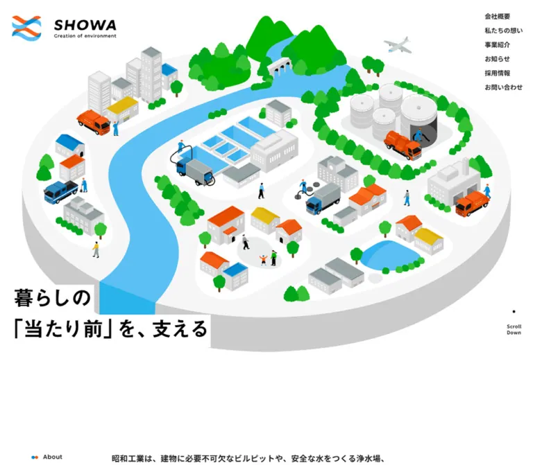
街と社会インフラを描く大きなアイソメトリックイラスト、広い余白、青とオレンジのアクセントが特徴。モバイルではイラストのトリミングと縦積みの情報構成で世界観を保っています。
オリジナルサイトを見るA miniature city makes essential maintenance visible, surrounded by white space and the colors of flowing water.
Original URL: https://showa-kogyo.com/
Final URL: https://showa-kogyo.com/
Theme: light; white canvas, pale-gray sections, blue details, and an orange contact action.
Inspected: September 22, 2026. Supplied browser retrieval: 2026-09-22T14:37:18.144Z, or 23:37 JST.
Viewports: 1440 × 1000 and 390 × 844 CSS pixels.
Scope: the current corporate homepage. Visual captures cover the desktop opening, Company section, contact area, and footer, plus the mobile opening and contact/footer. Rendered DOM and computed-style samples additionally cover About, services, news, and recruitment. Destination pages and an opened navigation menu were not inspected.
SHOWA presents infrastructure maintenance through an approachable illustrated town. A broad river connects houses, water-treatment basins, fuel tanks, factories, workers, and specialized vehicles. Bright green trees and mountains make the industrial subject feel connected to everyday life. The illustration carries most of the opening screen's color and detail; the surrounding interface stays quiet.
Below the opening, the homepage becomes a spacious corporate directory. English section labels introduce Japanese headings and explanatory copy. Services, company information, news, recruitment, and contact each have their own place. Large gaps, flat gray surfaces, wave boundaries, and rounded action links establish rhythm without a general shadow or elevated-card system.
The mobile layout preserves the same identity through a deliberate crop of the illustrated town, a centered headline below it, a compact logo header, and a three-dot menu control. It is a considered recomposition rather than a uniformly reduced desktop page.
A miniature city makes essential maintenance visible, surrounded by white space and the colors of flowing water.
Original URL: https://showa-kogyo.com/
Final URL: https://showa-kogyo.com/
Theme: light; white canvas, pale-gray sections, blue details, and an orange contact action.
Inspected: September 22, 2026. Supplied browser retrieval: 2026-09-22T14:37:18.144Z, or 23:37 JST.
Viewports: 1440 × 1000 and 390 × 844 CSS pixels.
Scope: the current corporate homepage. Visual captures cover the desktop opening, Company section, contact area, and footer, plus the mobile opening and contact/footer. Rendered DOM and computed-style samples additionally cover About, services, news, and recruitment. Destination pages and an opened navigation menu were not inspected.
SHOWA presents infrastructure maintenance through an approachable illustrated town. A broad river connects houses, water-treatment basins, fuel tanks, factories, workers, and specialized vehicles. Bright green trees and mountains make the industrial subject feel connected to everyday life. The illustration carries most of the opening screen's color and detail; the surrounding interface stays quiet.
Below the opening, the homepage becomes a spacious corporate directory. English section labels introduce Japanese headings and explanatory copy. Services, company information, news, recruitment, and contact each have their own place. Large gaps, flat gray surfaces, wave boundaries, and rounded action links establish rhythm without a general shadow or elevated-card system.
The mobile layout preserves the same identity through a deliberate crop of the illustrated town, a centered headline below it, a compact logo header, and a three-dot menu control. It is a considered recomposition rather than a uniformly reduced desktop page.
Some sampled desktop boxes differ from the settled screenshots. For example, the Company link measures approximately 234 × 63px in the DOM sample but appears approximately 260 × 70px in the supplied scrolled capture. Both dimensions differ by a factor of 0.9. This is consistent with a transformed state, but the responsible transform and its timing were not supplied. Treat sampled bounds and settled visual estimates separately.
Several parent elements inherit a font size close to 1px, and some semantic headings occupy 1 × 1px boxes. Those measurements do not describe the large visible lettering. Nested elements or visual representations carry the visible typography. Likewise, repeated heading text in the DOM must not be reproduced as two readable headings.
| Name | Value | Reference token | Evidence and role |
|---|---|---|---|
| Canvas White | #ffffff |
--color-canvas |
Source white property and measured white news action; visually the main page and footer canvas |
| Text Charcoal | #212121 |
--color-text |
Measured body and paragraph color: rgb(33, 33, 33) |
| Heading Black | #000000 |
--color-heading |
Measured section headings and horizontal desktop navigation |
| Service Gray | #f5f5f5 |
--color-soft |
Measured service-card fill: rgb(245, 245, 245); also a close visual match for broad gray regions |
| Action Gray | #ededed |
--color-action-soft |
Measured standard detail-link fill: rgb(237, 237, 237) |
| Contact Orange | #f75e18 |
--color-orange |
Measured contact-link fill: rgb(247, 94, 24) |
| Interface Blue | approximately #0094d6 |
--color-blue |
Visual estimate for circular arrow backgrounds and section-label dots |
| River Blue | approximately #58c2eb |
--color-water |
Visual estimate for the river and lighter blue ribbon |
| Landscape Green | approximately #00b600 |
--color-landscape |
Visual estimate for the brightest mountains and vegetation; artwork color rather than a general UI token |
| Island Gray | approximately #cccccc |
--color-island |
Visual estimate for the illustrated platform's side face |
The exact blue, green, ribbon, and logo colors were not present in the supplied computed element samples. Their aliases above are practical approximations, not recovered brand specifications.
White dominates the interface. Pale gray creates gentle section changes and service-card boundaries. Black and charcoal establish a clear text hierarchy. Orange is the strongest action color at the contact area, while blue appears in smaller navigational details.
Green is prominent inside the hero illustration, but it does not become the page's button or heading color. The illustration can contain many colors while the surrounding interface remains restrained.
The extracted properties also include generic WordPress colors, gradients, and shadows. Their presence does not establish visible use. Do not substitute the preset orange #ff6900 for the measured contact fill, or introduce preset gradients and shadows into the design.
Measured family: 'Noto Sans JP', sans-serif.
The supplied document includes a font request naming Noto Sans JP at weight 700. Computed text elements use both 400 and 700; the available evidence does not establish which font file supplied every rendered weight. Preserve the measured weight distinctions rather than assuming all Japanese text is bold.
Service, Company, and Recruit headings are strong, plain sans-serif statements. Supporting paragraphs use generous line height and small positive tracking. This combination keeps dense Japanese copy readable without introducing a separate editorial typeface.
Declared source property: --f-en: 'Poppins', sans-serif.
The supplied font request names Poppins at weight 600. English labels and the large Contact title visually fit that geometric direction, but their individual computed font-family values were not included. Poppins is therefore a supported implementation choice, with per-element application unverified.
The SHOWA wordmark, small English tagline, and footer lockup have distinctive proportions and italic lettering. Preserve the supplied brand artwork when available. The evidence does not identify a typeface that can recreate the logo accurately.
| Role | Desktop | Mobile | Weight and tracking | Status |
|---|---|---|---|---|
| Persistent desktop navigation | 15px, normal line height |
Replaced by menu control | 700 |
Measured |
| Service heading | 50px / 75px |
28px / 44.8px |
700; -0.02em |
Measured |
| Company heading | 42px / 67.2px |
28px / 44.8px |
700; desktop normal tracking, mobile -0.02em |
Measured |
| Recruit heading | 43px / 61.92px |
28px / 44.8px |
700; mobile -0.02em |
Measured |
| About introduction | 20px / 40px |
14px / 28px |
400; 0.03em |
Measured |
| Company and Recruit copy | 17px / 32.3px |
14px / 28px |
700; 0.03em |
Measured |
| News category link | 14px, normal line height |
14px, normal line height |
400 |
Measured |
| Menu-list links present in DOM | 17px, normal line height |
17px, normal line height |
700 |
Measured; opened state not visually verified |
| Visible hero statement | Approximately 48–50px |
Approximately 32px |
Visually bold | Screenshot estimate; hidden H1 is not its size reference |
| Company eyebrow | Approximately 18px |
Not pictured | Medium or semibold appearance | Screenshot estimate |
| Contact heading | Approximately 84px |
Approximately 56px |
Semibold appearance | Screenshot estimate |
| Action-link labels | Approximately 16–17px |
Approximately 16px |
Standard links lighter than the contact label | Screenshot estimate |
| Copyright | Approximately 13px |
Approximately 11px |
Small sans-serif | Screenshot estimate |
The visible hero statement reads 暮らしの followed by 「当たり前」を、支える. The semantic H1 contains the related wording 暮らしの「当たり前」を支えています。. Preserve the intended accessible meaning without treating the hidden H1's measured 1px size as a visual token.
| Property or measurement | Desktop | Mobile |
|---|---|---|
Source --base-vw |
1366 |
375 |
Source --vw |
14.4px |
3.9px |
Source --vh |
10px |
8.44px |
| Computed root font size | 1.05417px |
1.04px |
Source --m-space |
35px |
35px |
Source --m-top |
75px |
37px |
The root sizes match viewport width / --base-vw expressed in CSS pixels at both inspected widths. This relationship is calculated from the samples; the complete root rule and breakpoint are unavailable.
Do not copy large source rem values into a conventional 16px root. The Quick Start below uses ordinary pixel and viewport values instead. The separate source property --_base-font-size-px: 16px is not the computed root size in these captures.
| Use | Value | Evidence |
|---|---|---|
| Main desktop Company gutter | 84.33px |
Measured; approximately 5.86vw |
| Wider desktop section/footer gutter | 63.25px |
Measured at service heading and footer identity |
| Mobile content gutter | 35px |
Measured repeatedly |
| Mobile content width | 320px |
Measured at 390px viewport width |
| Mobile standard action width | 296px |
Measured; centered at x = 47px for several actions |
| Desktop hero top padding | 31px |
Measured |
| Mobile hero top padding | 103px |
Measured |
| About top padding | Desktop 202px; mobile 147px |
Measured |
| Mobile gap between service cards | Approximately 27px |
Calculated from successive sampled bounds |
| Standard action corner radius | 30px |
Measured |
| Contact action corner radius | 30px |
Measured |
| Service-card corner radius | 0 |
Measured |
| Arrow disk | Approximately 30px desktop; 32px mobile |
Screenshot estimate |
| Section-label dots | Approximately 8px each |
Screenshot estimate |
| Element | Desktop, 1440 × 1000 | Mobile, 390 × 844 | Interpretation |
|---|---|---|---|
| Document height | 6767.39px |
6915.27px |
Measured current content |
| Opening section | 1440 × 927.03px |
390 × 844px |
Desktop is artwork-led; mobile fills the inspected viewport |
| Persistent header surface | Approximately 86px high |
Approximately 70px high |
Screenshot estimate; outer HEADER box itself measures zero height |
| Persistent logo link | 175 × 44.17px |
170 × 43px |
Measured |
| Service section | 795.41px high |
2069.16px high |
Measured; four cards stack on mobile |
| Service card | Approximately 332.06 × 338.58px |
Approximately 320 × 379.39px |
Sampled bounds; desktop transforms may affect these figures |
| Company content section | 1271.34 × 256.89px |
320 × 402.80px |
Measured |
| Standard Company action | Sampled 234 × 63px; visually about 260 × 70px |
296 × 74px |
Keep the two desktop evidence states distinct |
| Contact action | 320 × 84px |
296 × 74px |
Measured |
| Recruit section | 1403.02px high |
1046.59px high |
Measured; do not interpret all remaining height as empty space |
| Combined contact/footer region | 1043.08px high |
745.33px high |
Measured |
Shapes have different jobs. Service entries remain square. Action links have rounded rectangles with circular arrow inserts. Wave edges connect large surfaces. The illustrated island supplies depth through a visible gray side face; that is part of the artwork, not a card shadow.
Role: identify the company while leaving the town illustration dominant.
The opening places a large brand lockup near the top-left corner, approximately 256px wide at x ≈ 33px. Six Japanese navigation links form a compact vertical list at the upper right. Their measured anchors start at x = 1310px, with 24px-high boxes on a 34px vertical pitch.
The labels are 会社概要, 私たちの想い, 事業紹介, お知らせ, 採用情報, and お問い合わせ. The list sits directly on white without a panel, divider, or filled button treatment.
A second, horizontal header exists separately. Its logo and links are above the viewport in the opening DOM sample, then appear at the top of the scrolled desktop captures. The evidence establishes these two presentations, but not the exact switching threshold or animation.
Role: keep identity and site navigation available in the supplied scrolled views.
The desktop header is a white strip approximately 86px high. The measured logo link is 175px wide with a 30px left inset. Six bold 15px links extend across the right side. Their positions imply approximately 52px between adjacent text boxes.
On mobile, the white header is approximately 70px high. The logo sits at 18px, 13.5px and measures 170 × 43px. A horizontal three-dot control sits near the right edge. There is no visible horizontal navigation row.
The exported button text includes Close, while the captured control looks like three dots. Seven navigation entries, including トップ, are also present in the DOM. This does not prove that the menu was open: no opened-menu screenshot or activation trace was supplied.
Role: explain the company's relationship to ordinary life before presenting detailed services.
The desktop illustration occupies nearly the full width, with a visible footprint approximately from x = 70px to 1370px. A river winds from green mountains through a light-gray island containing buildings, treatment facilities, storage tanks, workers, and vehicles. A small airplane adds scale and a sense of a wider city.
The visible headline overlaps the lower-left area on separate white backing strips. Its two lines feel integrated with the illustration rather than placed in a conventional text-and-image column. A small black dot and the words Scroll Down sit near the lower-right edge.
On mobile, the scene begins around y = 103px and ends around y = 463px. It extends beyond both horizontal edges, preserving readable structures instead of shrinking the entire island into a tiny thumbnail. The headline moves into its own centered white area around y = 550–625px. The scroll cue moves to the bottom center.
The hero contains no visible contact button. Its immediate job is orientation and identity; service and contact actions appear later.
Role: translate the illustrated infrastructure into a short explanation of the business.
The desktop section is a horizontal arrangement with an English label on the left and an explanatory block on the right. Its measured left inset is 84.33px, and its flex gap is approximately 130.72px. The introduction uses 20px text with a spacious 40px line height.
On mobile, the section becomes a block layout with 35px gutters. The label precedes a 320px-wide paragraph at 14px / 28px. A substantial 147px top padding maintains the slow transition from the opening screen.
The DOM confirms the introduction's content and layout, but a dedicated visual capture of this section was not supplied.
Role: expose the company's principal service categories.
The desktop service section puts a large two-line heading and detail action to the left of a two-by-two arrangement of linked entries. The heading uses 50px / 75px and slightly tight tracking. The four links identify:
廃棄物収集運搬事業給排水施設維持管理事業燃料タンク事業その他環境整備事業Each card is a single anchor with a two-digit number and category name. Measured surfaces are #f5f5f5, square-cornered, and padded approximately 20px at the top, 21px horizontally, and 24px at the bottom on desktop.
Mobile cards form one vertical sequence, each approximately 320 × 379px, with 27px between sampled boxes. Padding changes to 20px 20px 28px. The general service detail action moves below all four cards and measures 296 × 74px.
The links target /services/#service1 through /services/#service4. Exact internal media placement and card artwork are not recoverable from the supplied parent-element samples, so they should not be invented as observed facts.
Role: connect the miniature illustrated world to a real urban environment.
The desktop Company capture shows a full-width city photograph beneath the persistent header. Roughly 202px of the photograph is visible in that scrolled frame. Buildings fill the crop without a text overlay.
This is a visible remainder of a photo region, not evidence that the original banner is exactly 202px high. Its complete height, native dimensions, asset path, and mobile presentation were not supplied.
Role: introduce the organization and its environmental responsibility.
A small Company label begins the section, preceded by adjacent blue and orange dots. Below it, the large Japanese heading 昭和工業について sits on the left. A small worker-and-service-truck illustration extends the hero's visual language into the content area.
A paragraph occupies the right column, followed by a right-aligned gray detail link. In the settled screenshot, the paragraph begins around x = 685px; the sampled DOM records a narrower, inset box, consistent with the measurement caveat above.
The Japanese heading is measured at 42px / 67.2px. Supporting text is 17px / 32.3px, weight 700, with 0.03em tracking. The detail link reads 詳しくはこちら and includes a white arrow inside a blue circle.
On mobile, the heading and paragraph use the same 320px content width. The heading becomes 28px / 44.8px, the paragraph 14px / 28px, and the action sits below at 296 × 74px. The desktop illustration's mobile placement is unverified.
Role: provide a consistent route from a summary section to its destination.
Anatomy: rounded rectangular surface, Japanese label, flexible space, and a circular arrow insert at the right. The Company screenshot shows a gray surface around 260 × 70px, a 30px corner radius, and a roughly 30px blue disk. There is no visible border or shadow.
The measured desktop Company padding is 20px 22px 20px 41px. Mobile uses 23px 24px 19px 39px, with a 296 × 74px box. The news variant has a white surface, allowing it to contrast against its surrounding section.
Anchor-level font sizes in the export are inherited sizing units, not the visible label size. Use the approximately 16px screenshot appearance when building the reusable control, then verify against actual text rendering.
Role: soften the transition between large content regions and repeat the idea of flowing water.
The bottom of the desktop Company capture has a shallow, regular wave separating white content from a pale-gray region. Its visible crest-to-trough difference is approximately 40px, with a repeating wavelength around 190px.
This gray boundary is simpler than the interlaced orange-and-blue ribbon visible near the mobile contact section. Keep the two treatments distinct. Neither is an ordinary straight border, card radius, or generic gradient.
Role: provide a compact current-information entry point.
The DOM contains a News & Topics heading, a ニュース category link, one article titled ホームページができました。, the date 2024.02.28, and a もっと見る action.
The sampled article anchor measures approximately 503 × 106px on desktop and 320 × 94px on mobile. Mobile padding is 20px 10px 20px 20px; its more-link sits below and measures 296 × 74px.
The supplied evidence does not establish a carousel, filtering behavior, additional articles, or a full news-card visual treatment. The category anchor is a link; it was not demonstrated as an interactive filter.
Role: connect the maintenance work to a recruitment message.
The section contains an English Recruit label, a two-line Japanese heading, supporting copy, and a standard detail action. The heading reads 暮らしの「当たり前」を followed by 支える仕事.
Measured type is 43px / 61.92px on desktop and 28px / 44.8px on mobile. Supporting copy follows the 17px / 32.3px desktop and 14px / 28px mobile body system.
The overall section is large: approximately 1403px high on desktop and 1047px on mobile. The supplied DOM sample does not enumerate all decorative or media children. Do not interpret the unaccounted area as verified blank space or invent a particular recruitment photograph.
Role: present the strongest action near the end of the homepage.
On desktop, a large Contact title and orange action sit next to each other in the middle of a broad pale-gray band. The heading is visually about 84px; the button is measured at 320 × 84px with a 30px radius.
The label お問い合わせはこちら appears in white. Its right-hand insert is a white circle with a black arrow, reversing the blue-circle treatment of ordinary detail links. The action leads to /contact/; it is not a contact form embedded in this homepage.
Mobile stacks the approximately 56px title above a 296 × 74px button. A multicolor wave ribbon is visible above the gray region. The button is centered at x = 47px, and generous vertical space remains below it before the white footer.
Role: provide company identity, practical contact information, and secondary navigation.
The desktop footer puts the company lockup and address on the left and six vertically arranged links on the right. The measured identity link begins at x = 63.25px and has a 315 × 68.11px box. Navigation entries have 24px-high boxes on a 40px pitch.
The original-page footer identifies the operator as 株式会社 昭和工業 and displays a Fukuoka address, telephone number, fax number, and copyright. Those are current-page observations, independent of any production attribution.
Mobile retains the identity and address at a 35px left inset. The visible footer artwork is approximately 245px wide, although its anchor box measures 320px. The desktop footer navigation is absent from the supplied mobile footer capture. Small copyright text sits near the bottom with substantial breathing room above it.
| Treatment | Supplied value or observation | What can be concluded |
|---|---|---|
| About paragraph transition | opacity 0.8s cubic-bezier(0.68, -0.55, 0.265, 1.55) and matching transform transition |
Both properties are configured for an overshooting transition; trigger and starting values were not supplied |
| Company paragraph transition | Same 0.8s opacity and transform declarations |
A matching transition vocabulary exists |
Source --transition-scale |
600ms cubic-bezier(0.68, -0.55, 0.265, 1.55) |
Reusable source token; component assignment unverified |
Source --ease-hover |
cubic-bezier(0.25, 0, 0, 1) |
Declared easing only; no specific hovered state was captured |
Source --ease-in |
cubic-bezier(0.55, 0.055, 0.675, 0.19) |
Declared easing only |
| Global transition duration | 0.2s |
Framework-level property; not proof every control animates for 200ms |
| Desktop header presentation | Vertical hero navigation in opening; horizontal header in scrolled captures | Two observed presentations; exact scroll threshold and transition unverified |
| Service and detail links | Real destination anchors supplied | Navigational intent verified; destination contents not inspected |
| Three-dot mobile control | Button and menu-related DOM exist | Open/close appearance, keyboard behavior, and focus handling unverified |
| Hero scene and wave graphics | Static screenshots supplied | Vehicle, airplane, water, and ribbon animation cannot be confirmed |
Repeated headings and scaled-looking desktop bounds may be related to presentation effects, but they do not establish a specific text-reveal animation. Do not invent looping trucks, parallax, cursor following, or a bouncy menu opening.
The browser capture process waited for initial rendering and finite motion, with bounded readiness checks, and temporarily paused perpetual animations during those checks. This improves screenshot stability but is not a motion recording or a complete interaction test. Sampled animation: none on parent elements also does not prove that every descendant is static.
For reuse, keep motion secondary to the illustrations and navigation. The source's overshooting transition curve is available when appropriate, but motion distances, triggers, hover effects, and reduced-motion behavior require explicit implementation decisions.
| Layer | Appearance | Purpose |
|---|---|---|
| Main canvas | White, largely uninterrupted | Gives the illustrated scene and Japanese text room |
| Service entries | Flat #f5f5f5, square corners |
Groups each numbered service link |
| Ordinary action | #ededed, 30px corners |
Consistent navigation to detail pages |
| News action | White, 30px corners |
Maintains separation within its surrounding region |
| Contact region | Pale gray, broad and open | Isolates the strongest end-of-page action |
| Contact action | Measured #f75e18, white label, white arrow disk |
High visual emphasis |
| Section boundary | Shallow gray wave | Connects large regions through the water motif |
| Brand ribbon | Interlaced blue and orange waves | Repeats the logo's flowing geometry |
| Footer | White with dark text | Practical company information |
There is no visible general-purpose elevation system. Avoid adding floating cards, blurred backdrops, glossy gradients, or decorative shadows to every component. The town illustration already provides visual complexity and depth.
The main illustration is a clean isometric diorama. Buildings use pale-gray faces and simple window marks. Roofs, vehicles, water, and vegetation carry saturated color. Workers are small but purposeful: hoses, tanks, trucks, and treatment basins make the services legible without technical diagrams.
The island has an elliptical footprint and a thick gray side face. The river cuts through the composition, linking the distant mountains to the foreground. This water path is more important to the composition than an evenly distributed collection of unrelated buildings.
The company illustration reuses a worker and specialized truck as a smaller isolated motif. The city photograph introduces real-world texture while retaining an architectural subject. Logos and ribbons connect these different image types through blue and orange.
Use crisp, smooth illustration edges rather than pixel-art rendering. Asset format, animation method, and native resolution were not supplied; the vector-like appearance does not prove SVG delivery.
No original image filenames or asset URLs were included in the supplied evidence. The following identifies visible assets without inventing paths.
| Asset | Where observed | Reuse guidance |
|---|---|---|
| SHOWA logo and tagline | Desktop and mobile headers | Preserve the complete lockup and its proportions |
| Large infrastructure town | Desktop and mobile opening | Use a wide master composition with a planned mobile crop |
| Worker and service truck | Desktop Company section | Reuse the same illustration language at a smaller scale |
| Urban photograph | Desktop view above Company | Use an architectural crop; full source dimensions unverified |
| Gray wave boundary | Bottom of desktop Company capture | Keep the low amplitude and regular rhythm |
| Interlaced color ribbon | Mobile contact capture | Preserve the crossing blue/orange bands rather than substituting straight stripes |
| Japanese company lockup | Desktop and mobile footer | Use the footer-specific artwork, including its English line |
The large illustration and brand artwork are essential assets. CSS can reproduce layout and controls, but generic icons or a stock city photograph will not recreate the opening's identity. Use authorized original artwork or commission a new composition with equivalent subject clarity.
| Area | Desktop | Mobile |
|---|---|---|
| Opening navigation | Large logo and vertical links | Compact persistent logo and three-dot button |
| Scrolled header | Horizontal navigation in white strip | Same compact logo/menu presentation |
| Hero scene | Nearly complete island across the viewport | Horizontally cropped scene at a useful viewing scale |
| Hero statement | Lower-left overlap on white backing strips | Centered below the scene |
| Scroll cue | Lower right, words split across lines | Bottom center, words on one line |
| About | Label and introduction side by side | Label above narrower paragraph |
| Service overview | Left introduction beside two-by-two cards | Heading, four stacked cards, then detail action |
| Company | Heading/illustration beside paragraph and action | Heading and paragraph stack; action below |
| Contact | Title and action in a horizontal group | Centered vertical stack |
| Footer | Identity left, navigation right | Identity and contact details; desktop footer list absent |
The mobile document is only about 148px taller than the desktop document even though the service section grows by approximately 1274px. Other sections change height substantially: recruitment and the combined contact/footer region both become shorter. Do not derive mobile page length by stacking every desktop section at its original height.
The exact responsive breakpoint was not supplied. The evidence verifies the layouts at 390px and 1440px, not intermediate widths, landscape phones, or tablets.
Recommended: use a breakpoint near 1024px for switching the full navigation to the compact header, then validate the actual link widths. This is an implementation starting point, not an observed source value.
Keep mobile text inside 35px gutters at the inspected width. At narrower widths, reduce those gutters modestly rather than compressing Japanese body text below a readable size. Crop only the decorative hero stage; do not hide horizontal overflow globally to conceal content-layout errors.
The mobile hero occupies exactly the inspected 844px height. A 100svh layout with a sensible minimum height is a recommended adaptation, but the source's actual height rule was not supplied. Preserve enough room for the scene, headline, and scroll cue on short screens.
1px parent font measurements as visible text sizes.These are recommendations for a new implementation, not verified features of the original page.
aria-expanded, and aria-controls. The sampled button box is only about 25 × 6px; provide an actual interactive area of at least 44 × 44px without enlarging the dots./service, while several other service links use /services/; destination behavior was not inspected.#ffffff.#212121; major headings #000000.#f5f5f5.#ededed.#f75e18.#0094d6.#58c2eb.“Create a Japanese corporate homepage for an environmental maintenance company, inspired by the observed SHOWA composition. Lead with a large isometric town on an elliptical gray island: a blue river connects green mountains, residential buildings, treatment basins, fuel tanks, service trucks, and workers. Surround it with a white interface, bold Noto Sans JP headings, spacious paragraphs, and restrained Poppins-style English section labels. On desktop, place a large logo at the upper left, vertical navigation at the upper right, and a two-line Japanese statement on white backing strips at the lower left. Continue with About, four numbered service links, Company, news, recruitment, and a contact/footer area. Keep service cards square and pale gray; use rounded gray detail links with blue arrow disks. Reserve a large orange action for the contact band. On mobile, crop the town horizontally, move the headline beneath it, stack service cards, and replace navigation with a three-dot control.”
暮らしの and 「当たり前」を、支える on separate white-backed lines near the lower left. On a 390px phone, preserve the scene's scale with side cropping and center the statement below it.”#f5f5f5 surfaces and square corners. Use a two-by-two arrangement beside the desktop service introduction, then one 320px-wide column inside 35px mobile gutters. Keep any commissioned card imagery consistent with the infrastructure illustration; do not assume an unverified source asset.”#f75e18 action labeled お問い合わせはこちら. Use a white circular insert with a black arrow. Set the desktop action to 320 × 84px and the mobile action to 296 × 74px; stack the heading and action on mobile.”This is a reusable adaptation, not recovered source CSS. It uses a conventional root size, measured colors and typography where available, and explicitly estimated artwork sizing. Load the named fonts separately and supply authorized logo, illustration, and wave assets. The 1024px breakpoint is recommended rather than measured.
:root {
  /* Measured interface colors */
  --color-canvas: #ffffff;
  --color-text: #212121;
  --color-heading: #000000;
  --color-soft: #f5f5f5;
  --color-action-soft: #ededed;
  --color-orange: #f75e18;

  /* Visual approximations */
  --color-blue: #0094d6;
  --color-water: #58c2eb;

  /* Supported font families */
  --font-ja: 'Noto Sans JP', sans-serif;
  --font-en: 'Poppins', sans-serif;
  --weight-regular: 400;
  --weight-bold: 700;

  /* Desktop measurements and adaptation aliases */
  --text-body: 17px;
  --text-section: 42px;
  --leading-body: 1.9;
  --tracking-body: 0.03em;
  --gutter: 5.8565vw;
  --gutter-wide: 4.3924vw;
  --header-height: 86px;
  --radius-action: 30px;
  --arrow-size: 30px;

  /* Recommended spacing vocabulary */
  --space-small: 16px;
  --space-medium: 32px;
  --space-large: 80px;
  --space-section: 140px;

  /* Source-supported transition values */
  --motion-reveal: 800ms cubic-bezier(0.68, -0.55, 0.265, 1.55);
  --motion-scale: 600ms cubic-bezier(0.68, -0.55, 0.265, 1.55);

  /* Recommended combination of supplied duration and easing */
  --motion-feedback: 200ms cubic-bezier(0.25, 0, 0, 1);
}

* {
  box-sizing: border-box;
}

html {
  font-size: 100%;
  scroll-padding-top: calc(var(--header-height) + 16px);
}

body {
  margin: 0;
}

.showa-page {
  color: var(--color-text);
  background: var(--color-canvas);
  font-family: var(--font-ja);
  font-weight: var(--weight-regular);
}

.showa-page img {
  display: block;
  max-inline-size: 100%;
}

.content-shell {
  margin-inline: var(--gutter);
}

.content-shell--wide {
  margin-inline: var(--gutter-wide);
}

.site-header {
  position: fixed;
  z-index: 20;
  inset: 0 0 auto;
  display: flex;
  align-items: center;
  justify-content: space-between;
  min-block-size: var(--header-height);
  padding: 20px 40px 20px 30px;
  background: var(--color-canvas);
}

.site-header__brand {
  display: block;
  inline-size: 175px;
  flex-shrink: 0;
}

.site-header__brand img {
  inline-size: 100%;
  block-size: auto;
}

.site-nav {
  display: flex;
  align-items: center;
  gap: 52px;
}

.site-nav a {
  color: var(--color-heading);
  font-size: 15px;
  font-weight: var(--weight-bold);
  text-decoration: none;
  white-space: nowrap;
}

/* Integration hook; a scroll observer must set this state. */
.site-header[data-hero='true'] {
  transform: translateY(-100%);
}

.menu-toggle {
  display: none;
  align-items: center;
  justify-content: center;
  gap: 4px;
  inline-size: 44px;
  block-size: 44px;
  padding: 10px;
  border: 0;
  background: transparent;
  color: var(--color-heading);
  cursor: pointer;
}

.menu-toggle__dot {
  inline-size: 4px;
  block-size: 4px;
  border-radius: 50%;
  background: currentColor;
}

/* Approximate the inspected desktop composition. */
.hero {
  position: relative;
  block-size: max(700px, 64.38vw);
  overflow: hidden;
  background: var(--color-canvas);
}

.hero-brand {
  position: absolute;
  z-index: 2;
  inset: 31px auto auto 33px;
  inline-size: 256px;
}

.hero-scene {
  position: absolute;
  inset-block-start: 31px;
  inset-inline-start: 50%;
  inline-size: 90.28%;
  transform: translateX(-50%);
}

.hero-scene img {
  inline-size: 100%;
  block-size: auto;
}

.hero-nav {
  position: absolute;
  z-index: 2;
  inset: 32px 0 auto auto;
  display: grid;
  gap: 10px;
  inline-size: 130px;
}

.hero-nav a {
  color: var(--color-text);
  font-size: 16px;
  font-weight: var(--weight-bold);
  line-height: 24px;
  text-decoration: none;
}

.hero-copy {
  position: absolute;
  z-index: 2;
  inset-inline-start: 35px;
  inset-block-end: 20px;
  margin: 0;
  color: var(--color-heading);
  font-size: 48px;
  font-weight: var(--weight-bold);
  line-height: 1.44;
}

.hero-copy > span {
  display: table;
  padding-inline-end: 6px;
  background: var(--color-canvas);
}

.scroll-cue {
  position: absolute;
  inset-inline-end: 30px;
  inset-block-end: 25px;
  font-family: var(--font-en);
  font-size: 13px;
  line-height: 1.2;
  text-align: center;
}

.scroll-cue::before {
  content: '';
  display: block;
  inline-size: 6px;
  block-size: 6px;
  margin: 0 auto 18px;
  border-radius: 50%;
  background: var(--color-heading);
}

.scroll-cue__words {
  max-inline-size: 42px;
}

.section-label {
  display: flex;
  align-items: center;
  gap: 12px;
  margin: 0 0 44px;
  font-family: var(--font-en);
  font-size: 18px;
  font-weight: 600;
}

.section-label::before {
  content: '';
  inline-size: 8px;
  block-size: 8px;
  margin-inline-end: 9px;
  border-radius: 50%;
  background: var(--color-blue);
  box-shadow: 9px 0 0 var(--color-orange);
}

.section-title {
  margin: 0;
  color: var(--color-heading);
  font-size: var(--text-section);
  font-weight: var(--weight-bold);
  line-height: 1.6;
}

.body-copy {
  margin: 0;
  font-size: var(--text-body);
  font-weight: var(--weight-bold);
  line-height: var(--leading-body);
  letter-spacing: var(--tracking-body);
}

.about-section {
  display: grid;
  grid-template-columns: auto minmax(0, 817px);
  gap: 130px;
  padding-block-start: 202px;
}

.about-copy {
  margin: 0;
  font-size: 20px;
  font-weight: var(--weight-regular);
  line-height: 2;
  letter-spacing: 0.03em;
}

.service-layout {
  display: grid;
  grid-template-columns: minmax(300px, 490px) minmax(0, 1fr);
  gap: 80px;
  margin-block: var(--space-section);
}

.service-title {
  font-size: 50px;
  line-height: 1.5;
  letter-spacing: -0.02em;
}

.service-list {
  display: grid;
  grid-template-columns: repeat(2, minmax(0, 1fr));
  gap: 80px 68px;
  margin: 0;
  padding: 0;
  list-style: none;
}

.service-card {
  display: flex;
  flex-direction: column;
  justify-content: flex-end;
  min-block-size: 339px;
  block-size: 100%;
  padding: 20px 21px 24px;
  border-radius: 0;
  color: var(--color-text);
  background: var(--color-soft);
  text-decoration: none;
}

/* Internal card media needs its own verified or commissioned asset. */
.service-card__number {
  font-family: var(--font-en);
  font-size: 16px;
  font-weight: 600;
}

.service-card__title {
  margin: 12px 0 0;
  font-size: 17px;
  font-weight: var(--weight-bold);
}

.company-grid {
  display: grid;
  grid-template-columns: minmax(0, 0.9fr) minmax(0, 1.1fr);
  gap: 56px;
}

.company-illustration {
  inline-size: 160px;
  margin: 0 25px 0 auto;
}

.button-link {
  display: flex;
  align-items: center;
  justify-content: space-between;
  gap: 20px;
  inline-size: 260px;
  max-inline-size: 100%;
  min-block-size: 70px;
  padding: 20px 22px 20px 41px;
  border-radius: var(--radius-action);
  color: var(--color-text);
  background: var(--color-action-soft);
  font-size: 16px;
  line-height: 1.5;
  text-decoration: none;
}

.button-link__icon {
  display: grid;
  place-items: center;
  flex: 0 0 var(--arrow-size);
  inline-size: var(--arrow-size);
  block-size: var(--arrow-size);
  border-radius: 50%;
  color: var(--color-canvas);
  background: var(--color-blue);
  font-family: sans-serif;
  font-weight: var(--weight-bold);
  line-height: 1;
  transition: transform var(--motion-feedback);
}

.company-grid .button-link {
  margin-block-start: 28px;
  margin-inline-start: auto;
}

.button-link--white {
  background: var(--color-canvas);
}

.contact-band {
  padding: 140px 35px 190px;
  background: var(--color-soft);
}

.contact-band__inner {
  display: flex;
  align-items: center;
  justify-content: center;
  gap: 80px;
}

.contact-title {
  margin: 0;
  font-family: var(--font-en);
  font-size: 84px;
  font-weight: 600;
  line-height: 1.2;
}

.button-link--contact {
  inline-size: 320px;
  min-block-size: 84px;
  padding: 27px 21px 27px 41px;
  color: var(--color-canvas);
  background: var(--color-orange);
  font-weight: var(--weight-bold);
}

.button-link--contact .button-link__icon {
  color: var(--color-heading);
  background: var(--color-canvas);
}

.footer-main {
  display: grid;
  grid-template-columns: minmax(0, 1fr) auto;
  gap: 48px;
  min-block-size: 522px;
  padding: 80px var(--gutter-wide) 40px;
  background: var(--color-canvas);
}

.footer-brand {
  display: block;
  inline-size: 315px;
  max-inline-size: 100%;
}

.footer-address {
  margin-block-start: 36px;
  font-size: 18px;
  font-style: normal;
  line-height: 1.4;
}

.footer-nav {
  display: grid;
  align-content: start;
  gap: 16px;
  margin-inline-end: 6.6vw;
}

.footer-nav a {
  color: var(--color-text);
  font-size: 16px;
  font-weight: var(--weight-bold);
  line-height: 24px;
  text-decoration: none;
}

.footer-copyright {
  grid-column: 1 / -1;
  align-self: end;
  margin: 90px 0 0;
  font-family: var(--font-en);
  font-size: 13px;
}

/* Supply separate gray-wave and color-ribbon artwork. */
.wave-asset {
  display: block;
  inline-size: 100%;
  block-size: auto;
}

/* Content remains visible until a reveal system is deliberately added. */
.reveal {
  transition:
    opacity var(--motion-reveal),
    transform var(--motion-reveal);
}

.showa-page :focus-visible {
  outline: 3px solid var(--color-text);
  outline-offset: 4px;
}

/* Recommended feedback; this displacement was not observed. */
@media (hover: hover) {
  .button-link:hover .button-link__icon {
    transform: translateX(2px);
  }
}

/* Recommended breakpoint; the source breakpoint is unknown. */
@media (max-width: 1023px) {
  :root {
    --gutter: 35px;
    --gutter-wide: 35px;
    --header-height: 70px;
    --text-body: 14px;
    --text-section: 28px;
    --leading-body: 2;
    --arrow-size: 32px;
    --space-section: 100px;
  }

  .site-header,
  .site-header[data-hero='true'] {
    padding: 13px 25px 13px 18px;
    transform: none;
  }

  .site-header__brand {
    inline-size: 170px;
  }

  .site-nav,
  .hero-brand,
  .hero-nav {
    display: none;
  }

  .menu-toggle {
    display: flex;
  }

  .hero {
    block-size: 100svh;
    min-block-size: 760px;
  }

  /* Estimated crop; tune against the actual artwork bounds. */
  .hero-scene {
    inset-block-start: 103px;
    inline-size: 134%;
  }

  .hero-copy {
    inset: 64.5% 0 auto;
    font-size: 32px;
    line-height: 1.5;
    text-align: center;
  }

  .hero-copy > span {
    margin-inline: auto;
    padding: 0;
  }

  .scroll-cue {
    inset-inline: 0;
    inset-block-end: 26px;
  }

  .scroll-cue__words {
    max-inline-size: none;
  }

  .about-section {
    display: block;
    padding-block-start: 147px;
  }

  .about-copy {
    font-size: 14px;
    line-height: 2;
  }

  .section-label {
    margin-block-end: 28px;
    font-size: 16px;
  }

  .section-title,
  .service-title {
    font-size: 28px;
    line-height: 1.6;
    letter-spacing: -0.02em;
  }

  .service-layout,
  .company-grid {
    grid-template-columns: minmax(0, 1fr);
    gap: 32px;
  }

  .service-list {
    grid-template-columns: minmax(0, 1fr);
    gap: 27px;
  }

  .service-card {
    min-block-size: 379px;
    padding: 20px 20px 28px;
  }

  .button-link,
  .button-link--contact {
    inline-size: 296px;
    min-block-size: 74px;
    margin-inline: auto;
    padding: 23px 24px 19px 39px;
  }

  .button-link--contact {
    padding-inline: 27px 25px;
  }

  .company-grid .button-link {
    margin-block-start: 48px;
    margin-inline: auto;
  }

  .contact-band {
    padding: 80px 35px 107px;
  }

  .contact-band__inner {
    flex-direction: column;
    gap: 32px;
  }

  .contact-title {
    font-size: 56px;
  }

  .footer-main {
    display: block;
    min-block-size: 0;
    padding: 52px 35px 40px;
  }

  .footer-brand {
    inline-size: 245px;
  }

  .footer-address {
    margin-block-start: 36px;
    font-size: 16px;
    line-height: 1.6;
  }

  .footer-nav {
    display: none;
  }

  .footer-copyright {
    margin-block-start: 62px;
    font-size: 11px;
  }
}

/* Recommended accommodation below the inspected phone width. */
@media (max-width: 359px) {
  :root {
    --gutter: 24px;
    --gutter-wide: 24px;
  }

  .hero-copy {
    font-size: 28px;
  }
}

@media (prefers-reduced-motion: reduce) {
  .reveal,
  .button-link__icon {
    transition: none;
  }

  .button-link:hover .button-link__icon {
    transform: none;
  }
}
The mobile service detail action should follow the card list in the accessible document order. Desktop placement can be achieved with named grid areas. Do not rely on visually reordering a keyboard-focused action across unrelated content.
This example uses a verified destination and visible source label. The arrow character is a practical substitute for the supplied site's graphical arrow, not a recovered asset.
<section class='contact-band' aria-labelledby='contact-heading'>
  <div class='contact-band__inner'>
    <h2 class='contact-title' id='contact-heading'>Contact</h2>
    <a class='button-link button-link--contact'
       href='https://showa-kogyo.com/contact/'>
      <span>お問い合わせはこちら</span>
      <span class='button-link__icon' aria-hidden='true'>→</span>
    </a>
  </div>
</section>
The menu toggle requires a real menu controller before use. The CSS above provides only the closed control and header layout. Gray waves and the interlaced color ribbon also require separate artwork; their original paths were not supplied.
Optional aliases for an implementation already using Tailwind v4. This does not imply that the original site uses Tailwind.
@theme inline {
  --color-canvas: #ffffff;
  --color-ink: #212121;
  --color-heading: #000000;
  --color-surface: #f5f5f5;
  --color-action-soft: #ededed;
  --color-contact: #f75e18;

  /* Approximate blue from the supplied visual evidence. */
  --color-brand-blue: #0094d6;

  --font-japanese: 'Noto Sans JP', sans-serif;
  --font-english: 'Poppins', sans-serif;

  --text-copy: var(--text-body);
  --text-section-heading: var(--text-section);
  --spacing-page-gutter: var(--gutter);
  --radius-action: 30px;
}
200, page identity, visible company information, and rendered navigation targets.2026-09-22T14:37:18.144Z: desktop viewport 1440 × 1000, mobile viewport 390 × 844 CSS pixels.Only the supplied evidence was used. No additional browsing, file inspection, hover testing, menu activation, or form interaction was performed. Original asset URLs, complete stylesheets, exact breakpoints, font rendering for every nested label, and continuous motion recordings were unavailable. Computed styles, screenshot estimates, calculations, and implementation recommendations are distinguished throughout.
# SHOWA KOGYO — Style Reference

> A miniature city makes essential maintenance visible, surrounded by white space and the colors of flowing water.

**Original URL:** [https://showa-kogyo.com/](https://showa-kogyo.com/)
**Final URL:** [https://showa-kogyo.com/](https://showa-kogyo.com/)
**Theme:** light; white canvas, pale-gray sections, blue details, and an orange contact action.
**Inspected:** September 22, 2026. Supplied browser retrieval: `2026-09-22T14:37:18.144Z`, or 23:37 JST.
**Viewports:** 1440 × 1000 and 390 × 844 CSS pixels.
**Scope:** the current corporate homepage. Visual captures cover the desktop opening, Company section, contact area, and footer, plus the mobile opening and contact/footer. Rendered DOM and computed-style samples additionally cover About, services, news, and recruitment. Destination pages and an opened navigation menu were not inspected.

SHOWA presents infrastructure maintenance through an approachable illustrated town. A broad river connects houses, water-treatment basins, fuel tanks, factories, workers, and specialized vehicles. Bright green trees and mountains make the industrial subject feel connected to everyday life. The illustration carries most of the opening screen's color and detail; the surrounding interface stays quiet.

Below the opening, the homepage becomes a spacious corporate directory. English section labels introduce Japanese headings and explanatory copy. Services, company information, news, recruitment, and contact each have their own place. Large gaps, flat gray surfaces, wave boundaries, and rounded action links establish rhythm without a general shadow or elevated-card system.

The mobile layout preserves the same identity through a deliberate crop of the illustrated town, a centered headline below it, a compact logo header, and a three-dot menu control. It is a considered recomposition rather than a uniformly reduced desktop page.
# SHOWA KOGYO — Style Reference

> A miniature city makes essential maintenance visible, surrounded by white space and the colors of flowing water.

**Original URL:** [https://showa-kogyo.com/](https://showa-kogyo.com/)
**Final URL:** [https://showa-kogyo.com/](https://showa-kogyo.com/)
**Theme:** light; white canvas, pale-gray sections, blue details, and an orange contact action.
**Inspected:** September 22, 2026. Supplied browser retrieval: `2026-09-22T14:37:18.144Z`, or 23:37 JST.
**Viewports:** 1440 × 1000 and 390 × 844 CSS pixels.
**Scope:** the current corporate homepage. Visual captures cover the desktop opening, Company section, contact area, and footer, plus the mobile opening and contact/footer. Rendered DOM and computed-style samples additionally cover About, services, news, and recruitment. Destination pages and an opened navigation menu were not inspected.

SHOWA presents infrastructure maintenance through an approachable illustrated town. A broad river connects houses, water-treatment basins, fuel tanks, factories, workers, and specialized vehicles. Bright green trees and mountains make the industrial subject feel connected to everyday life. The illustration carries most of the opening screen's color and detail; the surrounding interface stays quiet.

Below the opening, the homepage becomes a spacious corporate directory. English section labels introduce Japanese headings and explanatory copy. Services, company information, news, recruitment, and contact each have their own place. Large gaps, flat gray surfaces, wave boundaries, and rounded action links establish rhythm without a general shadow or elevated-card system.

The mobile layout preserves the same identity through a deliberate crop of the illustrated town, a centered headline below it, a compact logo header, and a three-dot menu control. It is a considered recomposition rather than a uniformly reduced desktop page.

## How to Read This Reference

- **Measured** means an explicit computed style, custom property, or rendered bounding box supplied with the original-page evidence.
- **Visual estimate** means an approximate reading of the supplied current-page screenshots. Estimated colors were not obtained by pixel sampling.
- **Calculated** means arithmetic using supplied measurements. It does not establish an unprovided CSS declaration.
- **Recommended** means an implementation choice for reuse, including the CSS and prompts below.
- All named tokens are reference aliases unless explicitly identified as source properties.

Some sampled desktop boxes differ from the settled screenshots. For example, the Company link measures approximately `234 × 63px` in the DOM sample but appears approximately `260 × 70px` in the supplied scrolled capture. Both dimensions differ by a factor of `0.9`. This is consistent with a transformed state, but the responsible transform and its timing were not supplied. Treat sampled bounds and settled visual estimates separately.

Several parent elements inherit a font size close to `1px`, and some semantic headings occupy `1 × 1px` boxes. Those measurements do not describe the large visible lettering. Nested elements or visual representations carry the visible typography. Likewise, repeated heading text in the DOM must not be reproduced as two readable headings.

## Tokens — Colors

### Default Palette

| Name | Value | Reference token | Evidence and role |
| --- | --- | --- | --- |
| Canvas White | `#ffffff` | `--color-canvas` | Source white property and measured white news action; visually the main page and footer canvas |
| Text Charcoal | `#212121` | `--color-text` | Measured body and paragraph color: `rgb(33, 33, 33)` |
| Heading Black | `#000000` | `--color-heading` | Measured section headings and horizontal desktop navigation |
| Service Gray | `#f5f5f5` | `--color-soft` | Measured service-card fill: `rgb(245, 245, 245)`; also a close visual match for broad gray regions |
| Action Gray | `#ededed` | `--color-action-soft` | Measured standard detail-link fill: `rgb(237, 237, 237)` |
| Contact Orange | `#f75e18` | `--color-orange` | Measured contact-link fill: `rgb(247, 94, 24)` |
| Interface Blue | approximately `#0094d6` | `--color-blue` | Visual estimate for circular arrow backgrounds and section-label dots |
| River Blue | approximately `#58c2eb` | `--color-water` | Visual estimate for the river and lighter blue ribbon |
| Landscape Green | approximately `#00b600` | `--color-landscape` | Visual estimate for the brightest mountains and vegetation; artwork color rather than a general UI token |
| Island Gray | approximately `#cccccc` | `--color-island` | Visual estimate for the illustrated platform's side face |

The exact blue, green, ribbon, and logo colors were not present in the supplied computed element samples. Their aliases above are practical approximations, not recovered brand specifications.

### Color Distribution

White dominates the interface. Pale gray creates gentle section changes and service-card boundaries. Black and charcoal establish a clear text hierarchy. Orange is the strongest action color at the contact area, while blue appears in smaller navigational details.

Green is prominent inside the hero illustration, but it does not become the page's button or heading color. The illustration can contain many colors while the surrounding interface remains restrained.

The extracted properties also include generic WordPress colors, gradients, and shadows. Their presence does not establish visible use. Do not substitute the preset orange `#ff6900` for the measured contact fill, or introduce preset gradients and shadows into the design.

## Tokens — Typography

### Japanese Text

**Measured family:** `'Noto Sans JP', sans-serif`.

The supplied document includes a font request naming Noto Sans JP at weight `700`. Computed text elements use both `400` and `700`; the available evidence does not establish which font file supplied every rendered weight. Preserve the measured weight distinctions rather than assuming all Japanese text is bold.

Service, Company, and Recruit headings are strong, plain sans-serif statements. Supporting paragraphs use generous line height and small positive tracking. This combination keeps dense Japanese copy readable without introducing a separate editorial typeface.

### English Labels

**Declared source property:** `--f-en: 'Poppins', sans-serif`.

The supplied font request names Poppins at weight `600`. English labels and the large Contact title visually fit that geometric direction, but their individual computed font-family values were not included. Poppins is therefore a supported implementation choice, with per-element application unverified.

### Brand Lettering

The SHOWA wordmark, small English tagline, and footer lockup have distinctive proportions and italic lettering. Preserve the supplied brand artwork when available. The evidence does not identify a typeface that can recreate the logo accurately.

### Type Scale

| Role | Desktop | Mobile | Weight and tracking | Status |
| --- | --- | --- | --- | --- |
| Persistent desktop navigation | `15px`, normal line height | Replaced by menu control | `700` | Measured |
| Service heading | `50px / 75px` | `28px / 44.8px` | `700`; `-0.02em` | Measured |
| Company heading | `42px / 67.2px` | `28px / 44.8px` | `700`; desktop normal tracking, mobile `-0.02em` | Measured |
| Recruit heading | `43px / 61.92px` | `28px / 44.8px` | `700`; mobile `-0.02em` | Measured |
| About introduction | `20px / 40px` | `14px / 28px` | `400`; `0.03em` | Measured |
| Company and Recruit copy | `17px / 32.3px` | `14px / 28px` | `700`; `0.03em` | Measured |
| News category link | `14px`, normal line height | `14px`, normal line height | `400` | Measured |
| Menu-list links present in DOM | `17px`, normal line height | `17px`, normal line height | `700` | Measured; opened state not visually verified |
| Visible hero statement | Approximately `48–50px` | Approximately `32px` | Visually bold | Screenshot estimate; hidden H1 is not its size reference |
| Company eyebrow | Approximately `18px` | Not pictured | Medium or semibold appearance | Screenshot estimate |
| Contact heading | Approximately `84px` | Approximately `56px` | Semibold appearance | Screenshot estimate |
| Action-link labels | Approximately `16–17px` | Approximately `16px` | Standard links lighter than the contact label | Screenshot estimate |
| Copyright | Approximately `13px` | Approximately `11px` | Small sans-serif | Screenshot estimate |

The visible hero statement reads `暮らしの` followed by `「当たり前」を、支える`. The semantic H1 contains the related wording `暮らしの「当たり前」を支えています。`. Preserve the intended accessible meaning without treating the hidden H1's measured `1px` size as a visual token.

## Tokens — Spacing & Shapes

### Source Sizing Model

| Property or measurement | Desktop | Mobile |
| --- | --- | --- |
| Source `--base-vw` | `1366` | `375` |
| Source `--vw` | `14.4px` | `3.9px` |
| Source `--vh` | `10px` | `8.44px` |
| Computed root font size | `1.05417px` | `1.04px` |
| Source `--m-space` | `35px` | `35px` |
| Source `--m-top` | `75px` | `37px` |

The root sizes match `viewport width / --base-vw` expressed in CSS pixels at both inspected widths. This relationship is calculated from the samples; the complete root rule and breakpoint are unavailable.

Do not copy large source `rem` values into a conventional `16px` root. The Quick Start below uses ordinary pixel and viewport values instead. The separate source property `--_base-font-size-px: 16px` is not the computed root size in these captures.

### Spacing and Geometry

| Use | Value | Evidence |
| --- | --- | --- |
| Main desktop Company gutter | `84.33px` | Measured; approximately `5.86vw` |
| Wider desktop section/footer gutter | `63.25px` | Measured at service heading and footer identity |
| Mobile content gutter | `35px` | Measured repeatedly |
| Mobile content width | `320px` | Measured at 390px viewport width |
| Mobile standard action width | `296px` | Measured; centered at `x = 47px` for several actions |
| Desktop hero top padding | `31px` | Measured |
| Mobile hero top padding | `103px` | Measured |
| About top padding | Desktop `202px`; mobile `147px` | Measured |
| Mobile gap between service cards | Approximately `27px` | Calculated from successive sampled bounds |
| Standard action corner radius | `30px` | Measured |
| Contact action corner radius | `30px` | Measured |
| Service-card corner radius | `0` | Measured |
| Arrow disk | Approximately `30px` desktop; `32px` mobile | Screenshot estimate |
| Section-label dots | Approximately `8px` each | Screenshot estimate |

### Layout Measurements

| Element | Desktop, 1440 × 1000 | Mobile, 390 × 844 | Interpretation |
| --- | --- | --- | --- |
| Document height | `6767.39px` | `6915.27px` | Measured current content |
| Opening section | `1440 × 927.03px` | `390 × 844px` | Desktop is artwork-led; mobile fills the inspected viewport |
| Persistent header surface | Approximately `86px` high | Approximately `70px` high | Screenshot estimate; outer HEADER box itself measures zero height |
| Persistent logo link | `175 × 44.17px` | `170 × 43px` | Measured |
| Service section | `795.41px` high | `2069.16px` high | Measured; four cards stack on mobile |
| Service card | Approximately `332.06 × 338.58px` | Approximately `320 × 379.39px` | Sampled bounds; desktop transforms may affect these figures |
| Company content section | `1271.34 × 256.89px` | `320 × 402.80px` | Measured |
| Standard Company action | Sampled `234 × 63px`; visually about `260 × 70px` | `296 × 74px` | Keep the two desktop evidence states distinct |
| Contact action | `320 × 84px` | `296 × 74px` | Measured |
| Recruit section | `1403.02px` high | `1046.59px` high | Measured; do not interpret all remaining height as empty space |
| Combined contact/footer region | `1043.08px` high | `745.33px` high | Measured |

Shapes have different jobs. Service entries remain square. Action links have rounded rectangles with circular arrow inserts. Wave edges connect large surfaces. The illustrated island supplies depth through a visible gray side face; that is part of the artwork, not a card shadow.

## Components

### Desktop Opening Identity and Navigation

**Role:** identify the company while leaving the town illustration dominant.

The opening places a large brand lockup near the top-left corner, approximately `256px` wide at `x ≈ 33px`. Six Japanese navigation links form a compact vertical list at the upper right. Their measured anchors start at `x = 1310px`, with `24px`-high boxes on a `34px` vertical pitch.

The labels are `会社概要`, `私たちの想い`, `事業紹介`, `お知らせ`, `採用情報`, and `お問い合わせ`. The list sits directly on white without a panel, divider, or filled button treatment.

A second, horizontal header exists separately. Its logo and links are above the viewport in the opening DOM sample, then appear at the top of the scrolled desktop captures. The evidence establishes these two presentations, but not the exact switching threshold or animation.

### Persistent Header

**Role:** keep identity and site navigation available in the supplied scrolled views.

The desktop header is a white strip approximately `86px` high. The measured logo link is `175px` wide with a `30px` left inset. Six bold `15px` links extend across the right side. Their positions imply approximately `52px` between adjacent text boxes.

On mobile, the white header is approximately `70px` high. The logo sits at `18px, 13.5px` and measures `170 × 43px`. A horizontal three-dot control sits near the right edge. There is no visible horizontal navigation row.

The exported button text includes `Close`, while the captured control looks like three dots. Seven navigation entries, including `トップ`, are also present in the DOM. This does not prove that the menu was open: no opened-menu screenshot or activation trace was supplied.

### Illustrated Hero

**Role:** explain the company's relationship to ordinary life before presenting detailed services.

The desktop illustration occupies nearly the full width, with a visible footprint approximately from `x = 70px` to `1370px`. A river winds from green mountains through a light-gray island containing buildings, treatment facilities, storage tanks, workers, and vehicles. A small airplane adds scale and a sense of a wider city.

The visible headline overlaps the lower-left area on separate white backing strips. Its two lines feel integrated with the illustration rather than placed in a conventional text-and-image column. A small black dot and the words Scroll Down sit near the lower-right edge.

On mobile, the scene begins around `y = 103px` and ends around `y = 463px`. It extends beyond both horizontal edges, preserving readable structures instead of shrinking the entire island into a tiny thumbnail. The headline moves into its own centered white area around `y = 550–625px`. The scroll cue moves to the bottom center.

The hero contains no visible contact button. Its immediate job is orientation and identity; service and contact actions appear later.

### About Introduction

**Role:** translate the illustrated infrastructure into a short explanation of the business.

The desktop section is a horizontal arrangement with an English label on the left and an explanatory block on the right. Its measured left inset is `84.33px`, and its flex gap is approximately `130.72px`. The introduction uses `20px` text with a spacious `40px` line height.

On mobile, the section becomes a block layout with `35px` gutters. The label precedes a `320px`-wide paragraph at `14px / 28px`. A substantial `147px` top padding maintains the slow transition from the opening screen.

The DOM confirms the introduction's content and layout, but a dedicated visual capture of this section was not supplied.

### Service Overview and Four Linked Entries

**Role:** expose the company's principal service categories.

The desktop service section puts a large two-line heading and detail action to the left of a two-by-two arrangement of linked entries. The heading uses `50px / 75px` and slightly tight tracking. The four links identify:

1. `廃棄物収集運搬事業`
2. `給排水施設維持管理事業`
3. `燃料タンク事業`
4. `その他環境整備事業`

Each card is a single anchor with a two-digit number and category name. Measured surfaces are `#f5f5f5`, square-cornered, and padded approximately `20px` at the top, `21px` horizontally, and `24px` at the bottom on desktop.

Mobile cards form one vertical sequence, each approximately `320 × 379px`, with `27px` between sampled boxes. Padding changes to `20px 20px 28px`. The general service detail action moves below all four cards and measures `296 × 74px`.

The links target `/services/#service1` through `/services/#service4`. Exact internal media placement and card artwork are not recoverable from the supplied parent-element samples, so they should not be invented as observed facts.

### City Photography

**Role:** connect the miniature illustrated world to a real urban environment.

The desktop Company capture shows a full-width city photograph beneath the persistent header. Roughly `202px` of the photograph is visible in that scrolled frame. Buildings fill the crop without a text overlay.

This is a visible remainder of a photo region, not evidence that the original banner is exactly `202px` high. Its complete height, native dimensions, asset path, and mobile presentation were not supplied.

### Company Section

**Role:** introduce the organization and its environmental responsibility.

A small Company label begins the section, preceded by adjacent blue and orange dots. Below it, the large Japanese heading `昭和工業について` sits on the left. A small worker-and-service-truck illustration extends the hero's visual language into the content area.

A paragraph occupies the right column, followed by a right-aligned gray detail link. In the settled screenshot, the paragraph begins around `x = 685px`; the sampled DOM records a narrower, inset box, consistent with the measurement caveat above.

The Japanese heading is measured at `42px / 67.2px`. Supporting text is `17px / 32.3px`, weight `700`, with `0.03em` tracking. The detail link reads `詳しくはこちら` and includes a white arrow inside a blue circle.

On mobile, the heading and paragraph use the same `320px` content width. The heading becomes `28px / 44.8px`, the paragraph `14px / 28px`, and the action sits below at `296 × 74px`. The desktop illustration's mobile placement is unverified.

### Standard Detail Link

**Role:** provide a consistent route from a summary section to its destination.

Anatomy: rounded rectangular surface, Japanese label, flexible space, and a circular arrow insert at the right. The Company screenshot shows a gray surface around `260 × 70px`, a `30px` corner radius, and a roughly `30px` blue disk. There is no visible border or shadow.

The measured desktop Company padding is `20px 22px 20px 41px`. Mobile uses `23px 24px 19px 39px`, with a `296 × 74px` box. The news variant has a white surface, allowing it to contrast against its surrounding section.

Anchor-level font sizes in the export are inherited sizing units, not the visible label size. Use the approximately `16px` screenshot appearance when building the reusable control, then verify against actual text rendering.

### Wave Section Boundary

**Role:** soften the transition between large content regions and repeat the idea of flowing water.

The bottom of the desktop Company capture has a shallow, regular wave separating white content from a pale-gray region. Its visible crest-to-trough difference is approximately `40px`, with a repeating wavelength around `190px`.

This gray boundary is simpler than the interlaced orange-and-blue ribbon visible near the mobile contact section. Keep the two treatments distinct. Neither is an ordinary straight border, card radius, or generic gradient.

### News & Topics

**Role:** provide a compact current-information entry point.

The DOM contains a News & Topics heading, a `ニュース` category link, one article titled `ホームページができました。`, the date `2024.02.28`, and a `もっと見る` action.

The sampled article anchor measures approximately `503 × 106px` on desktop and `320 × 94px` on mobile. Mobile padding is `20px 10px 20px 20px`; its more-link sits below and measures `296 × 74px`.

The supplied evidence does not establish a carousel, filtering behavior, additional articles, or a full news-card visual treatment. The category anchor is a link; it was not demonstrated as an interactive filter.

### Recruit Section

**Role:** connect the maintenance work to a recruitment message.

The section contains an English Recruit label, a two-line Japanese heading, supporting copy, and a standard detail action. The heading reads `暮らしの「当たり前」を` followed by `支える仕事`.

Measured type is `43px / 61.92px` on desktop and `28px / 44.8px` on mobile. Supporting copy follows the `17px / 32.3px` desktop and `14px / 28px` mobile body system.

The overall section is large: approximately `1403px` high on desktop and `1047px` on mobile. The supplied DOM sample does not enumerate all decorative or media children. Do not interpret the unaccounted area as verified blank space or invent a particular recruitment photograph.

### Contact Band

**Role:** present the strongest action near the end of the homepage.

On desktop, a large Contact title and orange action sit next to each other in the middle of a broad pale-gray band. The heading is visually about `84px`; the button is measured at `320 × 84px` with a `30px` radius.

The label `お問い合わせはこちら` appears in white. Its right-hand insert is a white circle with a black arrow, reversing the blue-circle treatment of ordinary detail links. The action leads to `/contact/`; it is not a contact form embedded in this homepage.

Mobile stacks the approximately `56px` title above a `296 × 74px` button. A multicolor wave ribbon is visible above the gray region. The button is centered at `x = 47px`, and generous vertical space remains below it before the white footer.

### Footer

**Role:** provide company identity, practical contact information, and secondary navigation.

The desktop footer puts the company lockup and address on the left and six vertically arranged links on the right. The measured identity link begins at `x = 63.25px` and has a `315 × 68.11px` box. Navigation entries have `24px`-high boxes on a `40px` pitch.

The original-page footer identifies the operator as `株式会社 昭和工業` and displays a Fukuoka address, telephone number, fax number, and copyright. Those are current-page observations, independent of any production attribution.

Mobile retains the identity and address at a `35px` left inset. The visible footer artwork is approximately `245px` wide, although its anchor box measures `320px`. The desktop footer navigation is absent from the supplied mobile footer capture. Small copyright text sits near the bottom with substantial breathing room above it.

## Tokens — Motion & Interaction

| Treatment | Supplied value or observation | What can be concluded |
| --- | --- | --- |
| About paragraph transition | `opacity 0.8s cubic-bezier(0.68, -0.55, 0.265, 1.55)` and matching transform transition | Both properties are configured for an overshooting transition; trigger and starting values were not supplied |
| Company paragraph transition | Same `0.8s` opacity and transform declarations | A matching transition vocabulary exists |
| Source `--transition-scale` | `600ms cubic-bezier(0.68, -0.55, 0.265, 1.55)` | Reusable source token; component assignment unverified |
| Source `--ease-hover` | `cubic-bezier(0.25, 0, 0, 1)` | Declared easing only; no specific hovered state was captured |
| Source `--ease-in` | `cubic-bezier(0.55, 0.055, 0.675, 0.19)` | Declared easing only |
| Global transition duration | `0.2s` | Framework-level property; not proof every control animates for 200ms |
| Desktop header presentation | Vertical hero navigation in opening; horizontal header in scrolled captures | Two observed presentations; exact scroll threshold and transition unverified |
| Service and detail links | Real destination anchors supplied | Navigational intent verified; destination contents not inspected |
| Three-dot mobile control | Button and menu-related DOM exist | Open/close appearance, keyboard behavior, and focus handling unverified |
| Hero scene and wave graphics | Static screenshots supplied | Vehicle, airplane, water, and ribbon animation cannot be confirmed |

Repeated headings and scaled-looking desktop bounds may be related to presentation effects, but they do not establish a specific text-reveal animation. Do not invent looping trucks, parallax, cursor following, or a bouncy menu opening.

The browser capture process waited for initial rendering and finite motion, with bounded readiness checks, and temporarily paused perpetual animations during those checks. This improves screenshot stability but is not a motion recording or a complete interaction test. Sampled `animation: none` on parent elements also does not prove that every descendant is static.

For reuse, keep motion secondary to the illustrations and navigation. The source's overshooting transition curve is available when appropriate, but motion distances, triggers, hover effects, and reduced-motion behavior require explicit implementation decisions.

## Surfaces

| Layer | Appearance | Purpose |
| --- | --- | --- |
| Main canvas | White, largely uninterrupted | Gives the illustrated scene and Japanese text room |
| Service entries | Flat `#f5f5f5`, square corners | Groups each numbered service link |
| Ordinary action | `#ededed`, `30px` corners | Consistent navigation to detail pages |
| News action | White, `30px` corners | Maintains separation within its surrounding region |
| Contact region | Pale gray, broad and open | Isolates the strongest end-of-page action |
| Contact action | Measured `#f75e18`, white label, white arrow disk | High visual emphasis |
| Section boundary | Shallow gray wave | Connects large regions through the water motif |
| Brand ribbon | Interlaced blue and orange waves | Repeats the logo's flowing geometry |
| Footer | White with dark text | Practical company information |

There is no visible general-purpose elevation system. Avoid adding floating cards, blurred backdrops, glossy gradients, or decorative shadows to every component. The town illustration already provides visual complexity and depth.

## Imagery

The main illustration is a clean isometric diorama. Buildings use pale-gray faces and simple window marks. Roofs, vehicles, water, and vegetation carry saturated color. Workers are small but purposeful: hoses, tanks, trucks, and treatment basins make the services legible without technical diagrams.

The island has an elliptical footprint and a thick gray side face. The river cuts through the composition, linking the distant mountains to the foreground. This water path is more important to the composition than an evenly distributed collection of unrelated buildings.

The company illustration reuses a worker and specialized truck as a smaller isolated motif. The city photograph introduces real-world texture while retaining an architectural subject. Logos and ribbons connect these different image types through blue and orange.

Use crisp, smooth illustration edges rather than pixel-art rendering. Asset format, animation method, and native resolution were not supplied; the vector-like appearance does not prove SVG delivery.

### Observed Asset References

No original image filenames or asset URLs were included in the supplied evidence. The following identifies visible assets without inventing paths.

| Asset | Where observed | Reuse guidance |
| --- | --- | --- |
| SHOWA logo and tagline | Desktop and mobile headers | Preserve the complete lockup and its proportions |
| Large infrastructure town | Desktop and mobile opening | Use a wide master composition with a planned mobile crop |
| Worker and service truck | Desktop Company section | Reuse the same illustration language at a smaller scale |
| Urban photograph | Desktop view above Company | Use an architectural crop; full source dimensions unverified |
| Gray wave boundary | Bottom of desktop Company capture | Keep the low amplitude and regular rhythm |
| Interlaced color ribbon | Mobile contact capture | Preserve the crossing blue/orange bands rather than substituting straight stripes |
| Japanese company lockup | Desktop and mobile footer | Use the footer-specific artwork, including its English line |

The large illustration and brand artwork are essential assets. CSS can reproduce layout and controls, but generic icons or a stock city photograph will not recreate the opening's identity. Use authorized original artwork or commission a new composition with equivalent subject clarity.

## Layout & Responsive Behavior

### Observed Changes

| Area | Desktop | Mobile |
| --- | --- | --- |
| Opening navigation | Large logo and vertical links | Compact persistent logo and three-dot button |
| Scrolled header | Horizontal navigation in white strip | Same compact logo/menu presentation |
| Hero scene | Nearly complete island across the viewport | Horizontally cropped scene at a useful viewing scale |
| Hero statement | Lower-left overlap on white backing strips | Centered below the scene |
| Scroll cue | Lower right, words split across lines | Bottom center, words on one line |
| About | Label and introduction side by side | Label above narrower paragraph |
| Service overview | Left introduction beside two-by-two cards | Heading, four stacked cards, then detail action |
| Company | Heading/illustration beside paragraph and action | Heading and paragraph stack; action below |
| Contact | Title and action in a horizontal group | Centered vertical stack |
| Footer | Identity left, navigation right | Identity and contact details; desktop footer list absent |

The mobile document is only about `148px` taller than the desktop document even though the service section grows by approximately `1274px`. Other sections change height substantially: recruitment and the combined contact/footer region both become shorter. Do not derive mobile page length by stacking every desktop section at its original height.

### Breakpoints and Scaling Limits

The exact responsive breakpoint was not supplied. The evidence verifies the layouts at 390px and 1440px, not intermediate widths, landscape phones, or tablets.

**Recommended:** use a breakpoint near `1024px` for switching the full navigation to the compact header, then validate the actual link widths. This is an implementation starting point, not an observed source value.

Keep mobile text inside `35px` gutters at the inspected width. At narrower widths, reduce those gutters modestly rather than compressing Japanese body text below a readable size. Crop only the decorative hero stage; do not hide horizontal overflow globally to conceal content-layout errors.

The mobile hero occupies exactly the inspected `844px` height. A `100svh` layout with a sensible minimum height is a recommended adaptation, but the source's actual height rule was not supplied. Preserve enough room for the scene, headline, and scroll cue on short screens.

## Do’s and Don’ts

### Do

- Make the infrastructure diorama the opening's main visual event.
- Keep the river, workers, and service facilities recognizable within the composition.
- Use white space to separate dense artwork from corporate information.
- Preserve the split between black typography, blue utility details, and orange contact emphasis.
- Keep numbered service cards flat and square-cornered.
- Use rounded action links with a separate circular arrow insert.
- Reuse small illustration details beyond the hero to maintain continuity.
- Preserve the large desktop-to-mobile composition changes.
- Treat body copy as readable information, with the observed generous line height.
- Distinguish sampled transformed boxes from settled screenshot dimensions.

### Don’t

- Don’t convert the homepage into a single-purpose sales funnel with repeated orange actions in every section.
- Don’t shrink the entire town until its infrastructure becomes unreadable on mobile.
- Don’t use the artwork's green as an invented interface action color.
- Don’t round every service card or add a universal drop shadow.
- Don’t replace the flowing ribbon with an unrelated gradient decoration.
- Don’t reproduce the logo by guessing a font and typing its name.
- Don’t use `1px` parent font measurements as visible text sizes.
- Don’t render duplicated DOM heading strings twice.
- Don’t infer open-menu behavior from hidden or unexercised menu elements.
- Don’t invent asset filenames, hero animation, or a service-card media treatment absent from the evidence.

## Recommended Implementation Additions

These are recommendations for a new implementation, not verified features of the original page.

- Give the three-dot control an explicit accessible name, `aria-expanded`, and `aria-controls`. The sampled button box is only about `25 × 6px`; provide an actual interactive area of at least `44 × 44px` without enlarging the dots.
- If the menu becomes a modal overlay, implement keyboard dismissal, appropriate focus management, and a reliable return to the trigger.
- Keep a single accessible version of each heading. Mark decorative duplicate lettering and arrow graphics as hidden from assistive technology.
- Use paragraphs for explanatory prose even where the source export identifies an H3. Preserve a logical heading hierarchy.
- Check white text on the orange contact action at its final size. Adjust the functional button color or text treatment if the required contrast is not met, while retaining the artwork's brand colors.
- Provide dark, clearly visible focus outlines on all linked cards and actions.
- Respect reduced-motion preferences. Keep all content available if reveal scripts fail or are disabled.
- Define image dimensions or aspect ratios to reserve space. Prioritize the hero asset and load lower-page images progressively.
- Give meaningful illustrations useful text alternatives where they explain services; use empty alternatives for purely decorative repeats.
- Validate route consistency. The supplied desktop header includes `/service`, while several other service links use `/services/`; destination behavior was not inspected.
- Test the crop, navigation fit, and long Japanese labels at widths between the two supplied viewports.

## Agent Prompt Guide

### Quick Color Reference

- Canvas: `#ffffff`.
- Text: measured `#212121`; major headings `#000000`.
- Service surfaces: measured `#f5f5f5`.
- Ordinary detail links: measured `#ededed`.
- Contact action: measured `#f75e18`.
- Utility blue: approximate `#0094d6`.
- River blue: approximate `#58c2eb`.
- Bright green belongs mainly inside the illustration.
- Gray wave boundaries and interlaced brand ribbons provide section transitions.

### Overall Prompt

“Create a Japanese corporate homepage for an environmental maintenance company, inspired by the observed SHOWA composition. Lead with a large isometric town on an elliptical gray island: a blue river connects green mountains, residential buildings, treatment basins, fuel tanks, service trucks, and workers. Surround it with a white interface, bold Noto Sans JP headings, spacious paragraphs, and restrained Poppins-style English section labels. On desktop, place a large logo at the upper left, vertical navigation at the upper right, and a two-line Japanese statement on white backing strips at the lower left. Continue with About, four numbered service links, Company, news, recruitment, and a contact/footer area. Keep service cards square and pale gray; use rounded gray detail links with blue arrow disks. Reserve a large orange action for the contact band. On mobile, crop the town horizontally, move the headline beneath it, stack service cards, and replace navigation with a three-dot control.”

### Example Component Prompts

1. **Hero:** “A white corporate opening dominated by a clean isometric infrastructure town. Use a winding blue river, gray buildings and tanks, saturated green vegetation, and small orange or blue service trucks. Set `暮らしの` and `「当たり前」を、支える` on separate white-backed lines near the lower left. On a 390px phone, preserve the scene's scale with side cropping and center the statement below it.”
2. **Company section:** “Create a broad white section with an English Company label preceded by two small blue and orange dots. Place a bold Japanese company heading and a small worker/truck illustration in the left column. Put generously spaced Japanese copy and a right-aligned gray detail link in the right column. Finish with a shallow pale-gray wave boundary.”
3. **Service navigation:** “Build four numbered service anchors with flat `#f5f5f5` surfaces and square corners. Use a two-by-two arrangement beside the desktop service introduction, then one 320px-wide column inside 35px mobile gutters. Keep any commissioned card imagery consistent with the infrastructure illustration; do not assume an unverified source asset.”
4. **Contact action:** “A pale-gray contact band with a large dark English Contact heading and a rounded orange `#f75e18` action labeled `お問い合わせはこちら`. Use a white circular insert with a black arrow. Set the desktop action to 320 × 84px and the mobile action to 296 × 74px; stack the heading and action on mobile.”
5. **Mobile header:** “A 70px white header with a 170px-wide brand lockup inset 18px from the left. Place three small horizontal black dots near the right edge inside a 44px accessible button. Do not invent the opened-menu visual state from the closed-header reference.”

## Quick Start

### CSS Custom Properties

This is a reusable adaptation, not recovered source CSS. It uses a conventional root size, measured colors and typography where available, and explicitly estimated artwork sizing. Load the named fonts separately and supply authorized logo, illustration, and wave assets. The `1024px` breakpoint is recommended rather than measured.

```css
:root {
  /* Measured interface colors */
  --color-canvas: #ffffff;
  --color-text: #212121;
  --color-heading: #000000;
  --color-soft: #f5f5f5;
  --color-action-soft: #ededed;
  --color-orange: #f75e18;

  /* Visual approximations */
  --color-blue: #0094d6;
  --color-water: #58c2eb;

  /* Supported font families */
  --font-ja: 'Noto Sans JP', sans-serif;
  --font-en: 'Poppins', sans-serif;
  --weight-regular: 400;
  --weight-bold: 700;

  /* Desktop measurements and adaptation aliases */
  --text-body: 17px;
  --text-section: 42px;
  --leading-body: 1.9;
  --tracking-body: 0.03em;
  --gutter: 5.8565vw;
  --gutter-wide: 4.3924vw;
  --header-height: 86px;
  --radius-action: 30px;
  --arrow-size: 30px;

  /* Recommended spacing vocabulary */
  --space-small: 16px;
  --space-medium: 32px;
  --space-large: 80px;
  --space-section: 140px;

  /* Source-supported transition values */
  --motion-reveal: 800ms cubic-bezier(0.68, -0.55, 0.265, 1.55);
  --motion-scale: 600ms cubic-bezier(0.68, -0.55, 0.265, 1.55);

  /* Recommended combination of supplied duration and easing */
  --motion-feedback: 200ms cubic-bezier(0.25, 0, 0, 1);
}

* {
  box-sizing: border-box;
}

html {
  font-size: 100%;
  scroll-padding-top: calc(var(--header-height) + 16px);
}

body {
  margin: 0;
}

.showa-page {
  color: var(--color-text);
  background: var(--color-canvas);
  font-family: var(--font-ja);
  font-weight: var(--weight-regular);
}

.showa-page img {
  display: block;
  max-inline-size: 100%;
}

.content-shell {
  margin-inline: var(--gutter);
}

.content-shell--wide {
  margin-inline: var(--gutter-wide);
}

.site-header {
  position: fixed;
  z-index: 20;
  inset: 0 0 auto;
  display: flex;
  align-items: center;
  justify-content: space-between;
  min-block-size: var(--header-height);
  padding: 20px 40px 20px 30px;
  background: var(--color-canvas);
}

.site-header__brand {
  display: block;
  inline-size: 175px;
  flex-shrink: 0;
}

.site-header__brand img {
  inline-size: 100%;
  block-size: auto;
}

.site-nav {
  display: flex;
  align-items: center;
  gap: 52px;
}

.site-nav a {
  color: var(--color-heading);
  font-size: 15px;
  font-weight: var(--weight-bold);
  text-decoration: none;
  white-space: nowrap;
}

/* Integration hook; a scroll observer must set this state. */
.site-header[data-hero='true'] {
  transform: translateY(-100%);
}

.menu-toggle {
  display: none;
  align-items: center;
  justify-content: center;
  gap: 4px;
  inline-size: 44px;
  block-size: 44px;
  padding: 10px;
  border: 0;
  background: transparent;
  color: var(--color-heading);
  cursor: pointer;
}

.menu-toggle__dot {
  inline-size: 4px;
  block-size: 4px;
  border-radius: 50%;
  background: currentColor;
}

/* Approximate the inspected desktop composition. */
.hero {
  position: relative;
  block-size: max(700px, 64.38vw);
  overflow: hidden;
  background: var(--color-canvas);
}

.hero-brand {
  position: absolute;
  z-index: 2;
  inset: 31px auto auto 33px;
  inline-size: 256px;
}

.hero-scene {
  position: absolute;
  inset-block-start: 31px;
  inset-inline-start: 50%;
  inline-size: 90.28%;
  transform: translateX(-50%);
}

.hero-scene img {
  inline-size: 100%;
  block-size: auto;
}

.hero-nav {
  position: absolute;
  z-index: 2;
  inset: 32px 0 auto auto;
  display: grid;
  gap: 10px;
  inline-size: 130px;
}

.hero-nav a {
  color: var(--color-text);
  font-size: 16px;
  font-weight: var(--weight-bold);
  line-height: 24px;
  text-decoration: none;
}

.hero-copy {
  position: absolute;
  z-index: 2;
  inset-inline-start: 35px;
  inset-block-end: 20px;
  margin: 0;
  color: var(--color-heading);
  font-size: 48px;
  font-weight: var(--weight-bold);
  line-height: 1.44;
}

.hero-copy > span {
  display: table;
  padding-inline-end: 6px;
  background: var(--color-canvas);
}

.scroll-cue {
  position: absolute;
  inset-inline-end: 30px;
  inset-block-end: 25px;
  font-family: var(--font-en);
  font-size: 13px;
  line-height: 1.2;
  text-align: center;
}

.scroll-cue::before {
  content: '';
  display: block;
  inline-size: 6px;
  block-size: 6px;
  margin: 0 auto 18px;
  border-radius: 50%;
  background: var(--color-heading);
}

.scroll-cue__words {
  max-inline-size: 42px;
}

.section-label {
  display: flex;
  align-items: center;
  gap: 12px;
  margin: 0 0 44px;
  font-family: var(--font-en);
  font-size: 18px;
  font-weight: 600;
}

.section-label::before {
  content: '';
  inline-size: 8px;
  block-size: 8px;
  margin-inline-end: 9px;
  border-radius: 50%;
  background: var(--color-blue);
  box-shadow: 9px 0 0 var(--color-orange);
}

.section-title {
  margin: 0;
  color: var(--color-heading);
  font-size: var(--text-section);
  font-weight: var(--weight-bold);
  line-height: 1.6;
}

.body-copy {
  margin: 0;
  font-size: var(--text-body);
  font-weight: var(--weight-bold);
  line-height: var(--leading-body);
  letter-spacing: var(--tracking-body);
}

.about-section {
  display: grid;
  grid-template-columns: auto minmax(0, 817px);
  gap: 130px;
  padding-block-start: 202px;
}

.about-copy {
  margin: 0;
  font-size: 20px;
  font-weight: var(--weight-regular);
  line-height: 2;
  letter-spacing: 0.03em;
}

.service-layout {
  display: grid;
  grid-template-columns: minmax(300px, 490px) minmax(0, 1fr);
  gap: 80px;
  margin-block: var(--space-section);
}

.service-title {
  font-size: 50px;
  line-height: 1.5;
  letter-spacing: -0.02em;
}

.service-list {
  display: grid;
  grid-template-columns: repeat(2, minmax(0, 1fr));
  gap: 80px 68px;
  margin: 0;
  padding: 0;
  list-style: none;
}

.service-card {
  display: flex;
  flex-direction: column;
  justify-content: flex-end;
  min-block-size: 339px;
  block-size: 100%;
  padding: 20px 21px 24px;
  border-radius: 0;
  color: var(--color-text);
  background: var(--color-soft);
  text-decoration: none;
}

/* Internal card media needs its own verified or commissioned asset. */
.service-card__number {
  font-family: var(--font-en);
  font-size: 16px;
  font-weight: 600;
}

.service-card__title {
  margin: 12px 0 0;
  font-size: 17px;
  font-weight: var(--weight-bold);
}

.company-grid {
  display: grid;
  grid-template-columns: minmax(0, 0.9fr) minmax(0, 1.1fr);
  gap: 56px;
}

.company-illustration {
  inline-size: 160px;
  margin: 0 25px 0 auto;
}

.button-link {
  display: flex;
  align-items: center;
  justify-content: space-between;
  gap: 20px;
  inline-size: 260px;
  max-inline-size: 100%;
  min-block-size: 70px;
  padding: 20px 22px 20px 41px;
  border-radius: var(--radius-action);
  color: var(--color-text);
  background: var(--color-action-soft);
  font-size: 16px;
  line-height: 1.5;
  text-decoration: none;
}

.button-link__icon {
  display: grid;
  place-items: center;
  flex: 0 0 var(--arrow-size);
  inline-size: var(--arrow-size);
  block-size: var(--arrow-size);
  border-radius: 50%;
  color: var(--color-canvas);
  background: var(--color-blue);
  font-family: sans-serif;
  font-weight: var(--weight-bold);
  line-height: 1;
  transition: transform var(--motion-feedback);
}

.company-grid .button-link {
  margin-block-start: 28px;
  margin-inline-start: auto;
}

.button-link--white {
  background: var(--color-canvas);
}

.contact-band {
  padding: 140px 35px 190px;
  background: var(--color-soft);
}

.contact-band__inner {
  display: flex;
  align-items: center;
  justify-content: center;
  gap: 80px;
}

.contact-title {
  margin: 0;
  font-family: var(--font-en);
  font-size: 84px;
  font-weight: 600;
  line-height: 1.2;
}

.button-link--contact {
  inline-size: 320px;
  min-block-size: 84px;
  padding: 27px 21px 27px 41px;
  color: var(--color-canvas);
  background: var(--color-orange);
  font-weight: var(--weight-bold);
}

.button-link--contact .button-link__icon {
  color: var(--color-heading);
  background: var(--color-canvas);
}

.footer-main {
  display: grid;
  grid-template-columns: minmax(0, 1fr) auto;
  gap: 48px;
  min-block-size: 522px;
  padding: 80px var(--gutter-wide) 40px;
  background: var(--color-canvas);
}

.footer-brand {
  display: block;
  inline-size: 315px;
  max-inline-size: 100%;
}

.footer-address {
  margin-block-start: 36px;
  font-size: 18px;
  font-style: normal;
  line-height: 1.4;
}

.footer-nav {
  display: grid;
  align-content: start;
  gap: 16px;
  margin-inline-end: 6.6vw;
}

.footer-nav a {
  color: var(--color-text);
  font-size: 16px;
  font-weight: var(--weight-bold);
  line-height: 24px;
  text-decoration: none;
}

.footer-copyright {
  grid-column: 1 / -1;
  align-self: end;
  margin: 90px 0 0;
  font-family: var(--font-en);
  font-size: 13px;
}

/* Supply separate gray-wave and color-ribbon artwork. */
.wave-asset {
  display: block;
  inline-size: 100%;
  block-size: auto;
}

/* Content remains visible until a reveal system is deliberately added. */
.reveal {
  transition:
    opacity var(--motion-reveal),
    transform var(--motion-reveal);
}

.showa-page :focus-visible {
  outline: 3px solid var(--color-text);
  outline-offset: 4px;
}

/* Recommended feedback; this displacement was not observed. */
@media (hover: hover) {
  .button-link:hover .button-link__icon {
    transform: translateX(2px);
  }
}

/* Recommended breakpoint; the source breakpoint is unknown. */
@media (max-width: 1023px) {
  :root {
    --gutter: 35px;
    --gutter-wide: 35px;
    --header-height: 70px;
    --text-body: 14px;
    --text-section: 28px;
    --leading-body: 2;
    --arrow-size: 32px;
    --space-section: 100px;
  }

  .site-header,
  .site-header[data-hero='true'] {
    padding: 13px 25px 13px 18px;
    transform: none;
  }

  .site-header__brand {
    inline-size: 170px;
  }

  .site-nav,
  .hero-brand,
  .hero-nav {
    display: none;
  }

  .menu-toggle {
    display: flex;
  }

  .hero {
    block-size: 100svh;
    min-block-size: 760px;
  }

  /* Estimated crop; tune against the actual artwork bounds. */
  .hero-scene {
    inset-block-start: 103px;
    inline-size: 134%;
  }

  .hero-copy {
    inset: 64.5% 0 auto;
    font-size: 32px;
    line-height: 1.5;
    text-align: center;
  }

  .hero-copy > span {
    margin-inline: auto;
    padding: 0;
  }

  .scroll-cue {
    inset-inline: 0;
    inset-block-end: 26px;
  }

  .scroll-cue__words {
    max-inline-size: none;
  }

  .about-section {
    display: block;
    padding-block-start: 147px;
  }

  .about-copy {
    font-size: 14px;
    line-height: 2;
  }

  .section-label {
    margin-block-end: 28px;
    font-size: 16px;
  }

  .section-title,
  .service-title {
    font-size: 28px;
    line-height: 1.6;
    letter-spacing: -0.02em;
  }

  .service-layout,
  .company-grid {
    grid-template-columns: minmax(0, 1fr);
    gap: 32px;
  }

  .service-list {
    grid-template-columns: minmax(0, 1fr);
    gap: 27px;
  }

  .service-card {
    min-block-size: 379px;
    padding: 20px 20px 28px;
  }

  .button-link,
  .button-link--contact {
    inline-size: 296px;
    min-block-size: 74px;
    margin-inline: auto;
    padding: 23px 24px 19px 39px;
  }

  .button-link--contact {
    padding-inline: 27px 25px;
  }

  .company-grid .button-link {
    margin-block-start: 48px;
    margin-inline: auto;
  }

  .contact-band {
    padding: 80px 35px 107px;
  }

  .contact-band__inner {
    flex-direction: column;
    gap: 32px;
  }

  .contact-title {
    font-size: 56px;
  }

  .footer-main {
    display: block;
    min-block-size: 0;
    padding: 52px 35px 40px;
  }

  .footer-brand {
    inline-size: 245px;
  }

  .footer-address {
    margin-block-start: 36px;
    font-size: 16px;
    line-height: 1.6;
  }

  .footer-nav {
    display: none;
  }

  .footer-copyright {
    margin-block-start: 62px;
    font-size: 11px;
  }
}

/* Recommended accommodation below the inspected phone width. */
@media (max-width: 359px) {
  :root {
    --gutter: 24px;
    --gutter-wide: 24px;
  }

  .hero-copy {
    font-size: 28px;
  }
}

@media (prefers-reduced-motion: reduce) {
  .reveal,
  .button-link__icon {
    transition: none;
  }

  .button-link:hover .button-link__icon {
    transform: none;
  }
}
```

The mobile service detail action should follow the card list in the accessible document order. Desktop placement can be achieved with named grid areas. Do not rely on visually reordering a keyboard-focused action across unrelated content.

### Minimal Component Markup

This example uses a verified destination and visible source label. The arrow character is a practical substitute for the supplied site's graphical arrow, not a recovered asset.

```html
<section class='contact-band' aria-labelledby='contact-heading'>
  <div class='contact-band__inner'>
    <h2 class='contact-title' id='contact-heading'>Contact</h2>
    <a class='button-link button-link--contact'
       href='https://showa-kogyo.com/contact/'>
      <span>お問い合わせはこちら</span>
      <span class='button-link__icon' aria-hidden='true'>→</span>
    </a>
  </div>
</section>
```

The menu toggle requires a real menu controller before use. The CSS above provides only the closed control and header layout. Gray waves and the interlaced color ribbon also require separate artwork; their original paths were not supplied.

### Tailwind v4 Token Mapping

Optional aliases for an implementation already using Tailwind v4. This does not imply that the original site uses Tailwind.

```css
@theme inline {
  --color-canvas: #ffffff;
  --color-ink: #212121;
  --color-heading: #000000;
  --color-surface: #f5f5f5;
  --color-action-soft: #ededed;
  --color-contact: #f75e18;

  /* Approximate blue from the supplied visual evidence. */
  --color-brand-blue: #0094d6;

  --font-japanese: 'Noto Sans JP', sans-serif;
  --font-english: 'Poppins', sans-serif;

  --text-copy: var(--text-body);
  --text-section-heading: var(--text-section);
  --spacing-page-gutter: var(--gutter);
  --radius-action: 30px;
}
```

## Sources & Evidence

- [SHOWA KOGYO current homepage](https://showa-kogyo.com/): original and final URL, supplied HTTP status `200`, page identity, visible company information, and rendered navigation targets.
- Supplied browser retrieval dated `2026-09-22T14:37:18.144Z`: desktop viewport `1440 × 1000`, mobile viewport `390 × 844` CSS pixels.
- Five supplied original-page captures: desktop opening, desktop Company view, desktop contact/footer, mobile opening, and mobile contact/footer. These are the visual authority for composition, artwork, cropping, and visible header states.
- Supplied rendered DOM and computed-style samples: element bounds, colors, typography, padding, corner radii, transition declarations, custom properties, and page heights across the homepage.
- Observed navigation targets include company, mission, services, news, recruitment, and contact destinations. These URLs were present in the homepage evidence; their destination pages were not inspected.

Only the supplied evidence was used. No additional browsing, file inspection, hover testing, menu activation, or form interaction was performed. Original asset URLs, complete stylesheets, exact breakpoints, font rendering for every nested label, and continuous motion recordings were unavailable. Computed styles, screenshot estimates, calculations, and implementation recommendations are distinguished throughout.スタイルやページの種類、ジャンルが近いデザインを集めました。