プレビュー準備中デザインリファレンスを見る
日本のWebデザインを、AIの制作リファレンスに。
DESIGN REFERENCE
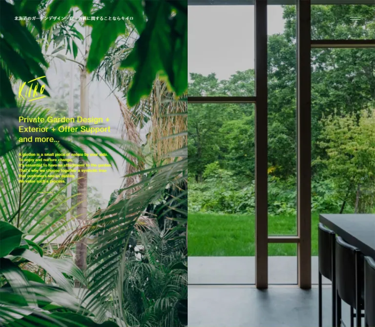
植物と建築の写真を大胆に配置し、深緑・淡いセージ・蛍光イエローで構成した造園会社のサイト。非対称の余白、和欧の書体の使い分け、スマートフォンでの構成変更を計測値付きで解説。
オリジナルサイトを見るImmersive greenery, quiet architectural framing, and a sharp stroke of fluorescent yellow.
Website: kiiro-d.com
Original URL: https://kiiro-d.com/
Final URL: https://kiiro-d.com/
Theme: alternating deep forest green, pale sage, and photographic sections; fluorescent yellow accents in the opening identity.
Inspected: September 23, 2026, 01:01 JST. Supplied retrieval timestamp: 2026-09-22T16:01:10.861Z.
Viewports: desktop 1440 × 1000 and mobile 390 × 844 CSS pixels.
Scope: the current corporate homepage, including its opening composition, statement, three services, closed Workflow control, About section, Works, Voice, Blog, Information, Contact, and footer. Visual captures cover the desktop opening, Workflow/About, and Contact/footer, plus the mobile opening and footer. Rendered DOM measurements extend through the complete homepage at both widths. Open navigation, expanded Workflow content, destination pages, and form submission were not inspected.
KIIRO presents garden and exterior design through a relationship between plants and lived-in architecture. Its opening pairs dense foliage with a view through tall windows into a garden. A small hand-drawn yellow wordmark and compact English copy sit over the photographs. The photographs supply the scale; the typography stays restrained.
The rest of the homepage moves through pale and dark green fields, spacious editorial text, numbered services, a photographic company introduction, and article collections. English grotesk labels coexist with English serif service titles and Japanese Mincho headings. The footer is a substantial navigation and company-information section. This is a corporate and portfolio homepage with several browsing paths, rather than a single-purpose conversion page.
Immersive greenery, quiet architectural framing, and a sharp stroke of fluorescent yellow.
Website: kiiro-d.com
Original URL: https://kiiro-d.com/
Final URL: https://kiiro-d.com/
Theme: alternating deep forest green, pale sage, and photographic sections; fluorescent yellow accents in the opening identity.
Inspected: September 23, 2026, 01:01 JST. Supplied retrieval timestamp: 2026-09-22T16:01:10.861Z.
Viewports: desktop 1440 × 1000 and mobile 390 × 844 CSS pixels.
Scope: the current corporate homepage, including its opening composition, statement, three services, closed Workflow control, About section, Works, Voice, Blog, Information, Contact, and footer. Visual captures cover the desktop opening, Workflow/About, and Contact/footer, plus the mobile opening and footer. Rendered DOM measurements extend through the complete homepage at both widths. Open navigation, expanded Workflow content, destination pages, and form submission were not inspected.
KIIRO presents garden and exterior design through a relationship between plants and lived-in architecture. Its opening pairs dense foliage with a view through tall windows into a garden. A small hand-drawn yellow wordmark and compact English copy sit over the photographs. The photographs supply the scale; the typography stays restrained.
The rest of the homepage moves through pale and dark green fields, spacious editorial text, numbered services, a photographic company introduction, and article collections. English grotesk labels coexist with English serif service titles and Japanese Mincho headings. The footer is a substantial navigation and company-information section. This is a corporate and portfolio homepage with several browsing paths, rather than a single-purpose conversion page.
font-family strings. The evidence does not independently establish the loaded font file or the font used for every individual glyph.10px, while the body is 16px. The Quick Start uses explicit pixel values and does not require changing the application's root size.| Name | Value | Suggested token | Evidence and role |
|---|---|---|---|
| Forest | #35453F |
--color-forest |
Measured rgb(53, 69, 63); service background, footer, filled controls, and statement text |
| Pale Sage | #E1E3D9 |
--color-sage |
Measured rgb(225, 227, 217); Statement and Voice/Blog backgrounds, service text, and Workflow button text |
| Electric Yellow | #EEFF1D |
--color-yellow |
Measured rgb(238, 255, 29) on the hero identity and English copy |
| Contact Sage | #CBCEC1 |
--color-contact |
Measured rgb(203, 206, 193); Contact background |
| Footer Silver | #DBDBDB |
--color-footer-text |
Measured rgb(219, 219, 219); footer navigation and company information |
| White | #FFFFFF |
--color-white |
Measured on the opening Japanese descriptor, About text, and Contact button text |
| Black | #000000 |
--color-black |
Measured on article headings, news, and Contact copy |
The yellow is concentrated in the hero identity. It is not the default action color: both the Workflow button and Contact link use forest green. Pale sage and forest also exchange foreground/background roles between the statement and services.
The About capture contains another conspicuous yellow area beside the vertical Garden Designer label. Its exact color was not included in the computed samples, and its purpose is unresolved. Do not treat it as an independently measured color token.
Works and Information have transparent computed section backgrounds. Their final underlying canvas color is not established by the supplied element samples or the selected screenshots. White is a reasonable implementation fallback, but it should not be reported as a measured section fill.
The supplied custom properties include standard WordPress palette, gradient, spacing, and shadow presets. Their presence does not show that those values are used in the visible design. The site's measured forest, sage, and yellow palette should drive the reference, rather than the preset catalog.
| Role | Computed family | Observed weight | Character and application |
|---|---|---|---|
| Japanese body and company information | ryo-gothic-plusn, sans-serif |
400 |
Clear Japanese Gothic text with generous paragraph leading |
| English hero copy, small labels, category links, Workflow and About headings | NHaasGroteskTXPro-55Rg |
400 |
Restrained grotesk lettering; often tracked at 0.04em |
| Footer navigation, email, Contact heading, social links | NHaasGroteskDSPro-45Lt |
400 |
Visually light display treatment; computed weight remains 400 |
| Opening Japanese descriptor | yu-gothic-pr6n, sans-serif |
400 |
Very small white text at the upper left |
| Statement headline, article titles, About editorial link | "Shippori Mincho", serif |
400 |
Japanese editorial contrast within the largely Gothic interface |
| Service numbers and English titles; Works, Voice, Blog, Information heading elements | adobe-garamond-pro, serif |
400 |
Quiet English serif hierarchy |
The hand-drawn KIIRO wordmark is visual artwork, not evidence of a script font. Preserve an authorized logo asset instead of substituting a cursive typeface.
The measured heading family applies to the sampled heading element. Smaller Japanese companion labels may have their own descendant styling, which was not separately supplied.
Values below are measured desktop → mobile values. Line heights are shown separately where they materially affect the composition.
| Role | Font size | Line height | Tracking | Notes |
|---|---|---|---|---|
| Opening Japanese descriptor | 12 → 10px |
13.8 → 11.5px |
Normal | One line on desktop, two on mobile |
| Hero English service summary | 21 → 15px |
27.3 → 19.5px |
0.04em |
Three deliberate lines at both widths |
| Hero English paragraph | 10 → 8px |
15 → 12px |
0.06em |
Six lines; unusually small mobile text |
| Statement English introduction | 13 → 11px |
23.4 → 19.8px |
0.04em |
Mobile bounding geometry requires caution |
| Statement label | 13 → 11px |
14.95 → 12.65px |
0.04em |
Small section marker |
| Statement Japanese headline | 34 → 22px |
51 → 33px |
0.06em |
Two-line Mincho headline |
| Statement body | 14 → 12px |
32.9 → 26.4px |
0.06em |
Approximately 2.35 → 2.2 leading |
| Service number | 21 → 15px |
24.15 → 17.25px |
Normal | English serif |
| Service English title | 24 → 21px |
27.6 → 24.15px |
Normal | English serif |
| Service Japanese subtitle | 13 → 10px |
14.95 → 11.5px |
Normal | Smaller explanatory line |
| Service body | 14 → 12px |
29.96 → 25.2px |
0.06em |
Approximately 2.14 → 2.1 leading |
| Workflow heading | 21 → 16px |
24.15 → 18.4px |
0.04em |
Grotesk, not the service serif |
| About heading | 19 → 16px |
21.85 → 18.4px |
0.04em |
White, above a fine rule |
| Article collection heading | 30 → 22px |
34.5 → 25.3px |
0.04em |
Works, Voice, Blog, Information |
| Category and utility links | 13 → 11px |
14.95 → 12.65px |
0.04em |
Includes View all |
| Article title | 16 → 14px |
24 → 21px |
Normal | Japanese Mincho |
| News metadata | 13 → 10px |
14.95 → 11.5px |
0.04em |
Date and News |
| News title | 14 → 12px |
25.2 → 21.6px |
0.06em |
Japanese Gothic |
| Contact heading | 28 → 18px |
32.2 → 20.7px |
0.04em |
Light grotesk |
| Contact button | 16 → 16px |
18.4px |
0.06em |
Retains its size on mobile |
| Footer navigation | 27 → 22px |
31.05 → 25.3px |
0.06em |
Two columns at both widths |
| Company name | 17 → 17px |
26.69 → 27.2px |
0.78 → 0.66px |
Retains its size |
| Footer details | 13 → 11px |
20.41 → 17.6px |
0.06em |
Address, hours, and business information |
20 → 16px |
23 → 18.4px |
0.06em |
Larger than neighboring details |
Hierarchy comes from typeface changes, spacing, alignment, and contrasting surfaces. The sampled text does not rely on a ladder of bold weights.
| Element | Desktop measurement | Mobile measurement | Interpretation |
|---|---|---|---|
| Opening region | 1440 × 1000px |
390 × 844px |
Occupies the first viewport in both captures |
| Hero photo division | At x ≈ 720px |
At y ≈ 422px |
Visually observed equal halves: horizontal → vertical |
| Main narrative container | 900px, starting at x = 270px |
343.22px, starting at x = 23.39px |
Statement and About alignment |
| Collection container | 1075px, starting at x = 182.5px |
343.22px, starting at x = 23.39px |
Works, Voice, Blog, Contact headings |
| Mobile general gutter | — | 23.39px |
Approximately 6vw; content width approximately 88vw |
| Hero copy left edge | 70.55px |
19.11px |
Approximately 4.9vw at both widths |
| Hero copy width | 260.91px |
208.73px |
Separate from the wider narrative container |
| Service text width | Usually 357px |
Usually 343.19px |
The commercial paragraph is an exception at 349px |
| Desktop service text anchors | x = 270, 813, 270px |
Headings preserve alternating placement | Left, right, left rhythm |
| Article column width | 326.08px |
343.22px |
A mobile card is slightly wider than one desktop column |
| Article column gap | 48.38px, calculated |
Single column | Three columns fit the 1075px container |
| News list | 791px, starting at x = 379px |
343.22px, starting at x = 23.39px |
Desktop list is offset inside the narrative region |
| Workflow button | 293 × 54.23px |
308.11 × 53.80px |
Mobile button follows the panel's available inner width |
| Contact button | 329 × 58.39px |
234 × 58.39px |
Height is preserved; mobile width equals 60vw |
| Footer | 508.64px high |
884.45px high |
Navigation and business information stack on mobile |
| Complete document | 9867.06px high |
11426.36px high |
Content-driven result, not a fixed-height target |
This is a collection of observed recurring distances, not evidence of a single source spacing scale.
| Use | Desktop | Mobile |
|---|---|---|
| Header right inset | 40px |
23.39px |
| Menu button top | 36px |
19px |
| Hero title-to-paragraph gap | 22.5px |
22.5px |
| Statement top padding | 85px |
55px |
| Statement headline left inset within its container | 78px |
47.70px |
| Statement body left inset within its container | 193px |
47.70px |
| Service section top / bottom padding | 254 / 286px |
59 / 124px |
| Workflow/About overlap | 60px, calculated |
60px, calculated |
| About top / bottom padding | 228 / 97px |
162 / 93px |
| Works top / bottom padding | 163 / 253px |
107 / 87px |
| Category-to-main-card gap | 15px |
10px |
| Between successive mobile cards | — | 60px from preceding main link to next category |
| Information top / bottom padding | 206 / 217px |
92 / 100px |
| Contact top / bottom padding | 108 / 174px |
72 / 96px |
| Footer business-group separation | Approximately 35px |
Approximately 35px |
The large intervals are part of the design. A compact uniform section-padding scale would lose its slow rhythm and asymmetric composition.
| Element | Value or observation |
|---|---|
| Workflow button | Measured 5px radius |
| Contact button | Measured 2px radius |
| Sampled content/link boxes | Measured 0px radius |
| Menu | Two thin horizontal strokes; approximately 30px visible width |
| About and Contact separators | Visually thin, approximately 1px; exact border declarations were not supplied |
| Hero underline | Approximately 96px long and 1px thick in both captures |
| Back-to-top mark | Thin, irregular oval outline around an upward arrow; not a large filled circle |
There is no visible general-purpose shadow or floating-card system in the inspected screenshots.
The opening Japanese H1 sits directly over the photography. Its desktop rectangle begins at 40, 45px; mobile begins at 23.39, 28px. The mobile text is arranged as two short lines. It describes the business and region without competing with the photographs.
The menu is a transparent 31 × 31px button at the upper right. Two white strokes supply the visible icon. Its location remains in the same viewport corner in the supplied scrolled captures, supporting persistent placement; the actual positioning declaration was not included.
The menu was not opened. Do not invent its panel dimensions, background, animation, focus handling, or visible link arrangement from the hidden header text.
Anatomy: two edge-to-edge photographs, a small upper-left Japanese descriptor, an upper-right menu, a yellow logo, three-line English summary, six-line English paragraph, and a short yellow rule.
Desktop divides the viewport into two equal vertical photo panels. Dense tropical foliage fills the left; a tall window frame, garden, and cropped interior furniture occupy the right. There is no gutter between them.
Mobile stacks the same subjects into two equal horizontal panels. The yellow information block crosses the image seam: the logo and most of the title sit over the upper foliage, while the paragraph sits over the lower architectural view. Do not split that copy into separate captions attached to the two images.
The logo's containing H2 box begins at y = 288px on desktop and 293.40px on mobile. Its measured heights are 108.75px and 80.20px; these include space beyond the visible logo artwork. The visible artwork is approximately 78 × 72px and 60 × 56px, estimated from the captures.
The English summary begins at y = 396.75px desktop and 373.60px mobile. Preserve the actual wording when reproducing this page: Private Garden Design +, Exterior + Offer Support, and and more.... The later service heading separately uses After Support.
No CTA is present in the opening capture. The image pairing and compact yellow identity provide the initial emphasis.
A pale sage field follows immediately after the opening viewport. Within a 900px desktop container, the English introduction and Statement marker align to the container edge. The Japanese headline moves 78px inward, and the Japanese body moves 193px inward. This produces a stepped composition rather than a centered text column.
The headline is the two-line Mincho phrase 運命と思える、 / 緑との出会いを。. Its 34px / 51px desktop typography drops to 22px / 33px on mobile. Body leading remains unusually generous.
On mobile, the headline and body share a 47.70px internal inset. The English introduction has a measured bounding rectangle of 79.19 × 242.83px. Transform information and a visual capture of this region are absent. That rectangle could reflect transformed content; it is not sufficient evidence for either a literal 79px text column or a specific rotation. The Quick Start therefore leaves that introduction in readable normal flow.
The dark forest section contains three services: Private Garden & Exterior, Commercial Exterior, and After Support.
Each sampled group combines an English serif number, an English serif title, a small Japanese Gothic subtitle, a generously led Japanese paragraph, and links where applicable. Desktop text anchors alternate left, right, left within the narrative width. The first and third text blocks are 357px wide at x = 270px; the second title block begins at x = 813px.
Mobile retains asymmetry in the headings: the commercial heading begins at x = 161.41px, while the first and third begin at 23.39px. Paragraphs return to nearly the full content width. Large vertical gaps between headings and paragraphs indicate substantial intervening layout space, but the supplied evidence does not identify the service media assets or their exact bounds.
Service links are restrained text treatments, measuring 200px wide on desktop and 169px on mobile, with 7px bottom padding. Mobile links are centered. Preserve the chapter rhythm instead of turning the services into three uniform promotional cards.
The Workflow callout is a pale rectangular panel against forest green. In the desktop screenshot it begins near x = 216px, reaches the right edge, and is approximately 235.67px high. The section behind it overlaps the start of About by 60px.
Inside, the English heading and Japanese explanation sit on the left. A forest button with ワークフローを見る and a small plus mark sits to their right. Measured desktop anchors are x = 324px for the text and 641.77px for the button. The gap after the text block is approximately 110px.
Mobile places the heading, description, and button in a vertical sequence. All begin at x = 58.5px; the button is 308.11px wide, nearly the full inner panel width.
The control is a button, not an observed navigation link. Hidden DOM text includes workflow steps, but the expanded state was not captured. Its disclosure mechanism, expanded height, and animation remain unverified.
The About section uses a full-width photographic background with palm-like fronds and a subdued, dark appearance. A white About KIIRO : heading and fine rule span the 900px desktop narrative container.
The introduction paragraph occupies a 432px left column at 14px / 29.96px. Instagram sits below it. The right region contains a vertical Garden Designer label, handwritten yellow artwork, and a media area. In the supplied capture, a flat yellow rectangle approximately 315 × 229px occupies that area. It could be a reveal layer, an intentional graphic, or an incomplete state; the evidence does not resolve which. Do not invent a portrait, a designer name, or a permanent yellow-card component.
A centered Voice : label, Japanese Mincho editorial link, and View more follow the two-column introduction. Both editorial links point to the site's Kiiro Blog category, not to the customer-testimonial archive.
Mobile places the paragraph before the designer area, then Instagram, then the editorial link group. This is a change in reading order, not just a reduction in column width.
Works, Voice, Blog, and Information pair a large English heading with a smaller Japanese companion label. View all sits at the opposite edge of the same horizontal heading row.
The heading element uses adobe-garamond-pro, serif at 30px desktop and 22px mobile. The utility link remains a small grotesk label, with a measured width of 82px at both sizes. On mobile the row spans the 343.22px content width.
Contact is a deliberate exception: its heading uses the light grotesk family and a top rule.
Anatomy: a separate category link beginning with #, followed by a main entry link containing media, a Mincho title, and View more.
The category anchor and entry anchor are siblings in the rendered evidence. Preserve that relationship; do not nest one interactive link inside another.
Desktop displays three 326.08px columns with calculated 48.38px gaps. Mobile displays a single 343.22px column with 60px between the end of one main entry link and the next category label. These are editorial entries, with no measured rounded container or elevated surface.
The offset from the main entry's top to its title is 232.38px desktop and 255.81px mobile. A 3:2 image followed by 15px desktop or 27px mobile spacing reproduces those offsets. Because image rectangles were not supplied, this is a reconstruction estimate, not a verified source image ratio.
Titles grow naturally: the sampled desktop testimonial headings occupy two or three 24px lines. Their mobile equivalents occupy two 21px lines. The mobile card is wider than one desktop column, and its type is smaller, so a mobile title can use fewer lines.
Works has its own section. Voice and Blog share the same measured pale-sage section, with a second collection heading introducing Blog. There is no evidence of a tab switch or carousel.
Information presents three linked news rows. Desktop rows begin at x = 379px and span 791px; date, News, and the Japanese title are arranged horizontally. The measured row height is approximately 123.19px, including 71px top and 26px bottom padding.
Mobile keeps date and category together on a first line, followed by a full-width title. Both metadata boxes are 60px wide. Rows are approximately 112.09px high, with 53px top and 13px bottom padding.
This section uses small type and generous vertical separation. Avoid turning the dates and categories into prominent colored badges. The measured rectangle heights are consistent with a fine additional row boundary, but exact border styling was not supplied.
A distinct, slightly darker sage field closes the main content. A thin top rule introduces the Contact heading and Japanese label. The centered explanation is followed by a forest-filled link labeled お問い合わせフォームへ, with a small rightward mark.
The button measures 329 × 58.39px desktop and 234 × 58.39px mobile, uses a 2px radius, and retains 16px text at both widths. Its 20px top and bottom padding explains the consistent height.
The whole section measures 583.97px desktop and 385.27px mobile. Preserve the open space above and below the action; the button is an isolated destination link, not an inline form.
The footer uses forest green and silver text. Its desktop structure places a two-column navigation group on the left and company information to the right. A small vertical Content label sits farther left. Instagram appears well below the navigation links.
Navigation rows pair About / Information, Works / Contact, and Voice / Blog. Desktop links are 27px; mobile links are 22px. The two-column link arrangement remains on mobile even though the larger footer structure stacks.
The inspected original page identifies the operator as 株式会社 キイロ. The business block contains its postal address, map link, opening hours, email, and construction-business permit information. These are actual company details in the source footer, not production credits.
On mobile, navigation and Instagram form an upper group, separated by a full-width fine rule from the business information below. The business text begins at x = 61.22px and spans 267.56px. ©Kiiro appears at the lower right in the mobile evidence.
Back to Top pairs small text with an upward arrow inside a thin irregular oval. The measured link is 142.22 × 44.11px desktop and 108.09 × 34.41px mobile. Its destination is the homepage # anchor. Smooth scrolling was not demonstrated.
| Element or behavior | Supplied evidence | What can be concluded |
|---|---|---|
| Workflow button | Computed transition of 0.3s |
A transition is declared; its visual endpoint and expanded behavior were not inspected |
| Contact link | Computed transition of 0.3s |
Timing is known; hover colors or opacity changes are not |
| Instagram and map links | Computed transition of 0.3s |
Some link feedback is prepared; its exact treatment is unknown |
| About editorial text link | Computed transition of 0.3s |
A declared transition exists; no activated state was supplied |
| Many other sampled elements | Transition serialized as all |
This alone does not establish a nonzero duration or visible motion |
| Sampled text and section elements | animation: none |
No animation was reported on those elements at sampling time |
| Menu placement | Same upper-right corner in scrolled screenshots | Persistent placement is visually supported; opening behavior is unknown |
| About yellow rectangle | One settled captured appearance | Not enough evidence to identify a reveal animation or its timing |
| Back-to-top link | Homepage # destination |
Anchor intent is clear; easing, duration, and scrolling method are unverified |
The capture procedure waited for document load, image decoding, visible finite animation, and sampled layout stability. Initial observation lasted at least five seconds. Perpetual animations were paused during readiness checks and then resumed. These checks do not establish that the site has no animation or that every delayed state completed.
For a new implementation, a restrained 300ms opacity transition is compatible with the measured timing, but it is a recommendation. Avoid inventing parallax, autoplay hero slides, scroll-triggered letter animation, or elaborate menu transitions and describing them as original behavior.
| Surface | Appearance | Function |
|---|---|---|
| Opening | Edge-to-edge plant and architecture photography | Establishes the relationship between greenery and daily life |
| Statement | Pale sage with forest text | Quiet, spacious explanation of the practice |
| Services | Forest with pale sage text | Long, numbered service narrative |
| Workflow panel | Pale rectangular inset against forest | Concentrated interaction between service and company sections |
| About | Dark photographic field with white text | Company introduction and designer-related content |
| Works and Information | Transparent sampled section backgrounds | Final underlying fill is not established in the supplied samples |
| Voice and Blog | Shared pale sage field with black text | Related editorial collections |
| Contact | Contact sage with a forest action | Clear inquiry destination |
| Footer | Forest with silver text | Navigation, company details, and return-to-top utility |
Surface changes organize the long page. There is no need for a separate rounded card background behind every item.
The opening depends on two complementary subjects. One is close, dense, and organic: overlapping foliage with strong foreground shapes. The other is spatial and architectural: upright window mullions, a garden beyond, and cropped interior furniture. The straight window geometry balances the irregular leaves.
On desktop, both subjects receive equal width and full viewport height. On mobile, they receive equal height and full viewport width. This changes the crops substantially. Use independent image elements or independently positioned backgrounds so each subject can be art-directed without distorting its aspect ratio.
The About background is another plant photograph, with silhouetted fronds against a blurred neutral setting. It appears heavily subdued behind white copy. The capture does not establish whether the darkness is baked into the asset, added by an overlay, or produced through another effect. Any CSS overlay opacity in an adaptation must be tuned and labeled as a recommendation.
The original image URLs, intrinsic dimensions, and file formats were not supplied. The project and article media areas are present in the page structure, but their specific photographs cannot be assessed from the selected screenshots.
| Visual asset | Evidence | Reuse guidance |
|---|---|---|
| Dense foliage hero image | Desktop and mobile opening captures | Preserve layered leaves, deep greens, and independent crop control |
| Interior-to-garden hero image | Desktop and mobile opening captures | Preserve vertical window framing and the visible relationship between room and garden |
| Yellow KIIRO wordmark | Desktop and mobile opening captures | Use an authorized artwork asset; do not replace it with generic script typography |
| About plant background | Desktop Workflow/About capture | Match tonal restraint; exact asset path and overlay strength are unknown |
| Designer-area artwork/media | Partially visible in the desktop About capture | Content and yellow covering state remain unresolved |
| Instagram, map, and envelope marks | Footer and About captures | Small supporting symbols; icon library or asset format is not identified |
| Back-to-top outline and arrow | Desktop and mobile footer captures | Thin, slightly irregular oval appearance; a CSS ellipse is only an approximation |
Use original assets when authorized and supplied. For a new brand, choose photography with the same compositional relationship rather than reproducing someone else's logo or claiming unidentified images as original assets.
The two observed widths establish several real structural changes. They do not establish the original breakpoint or its interpolation rules.
| Region | Desktop behavior | Mobile behavior |
|---|---|---|
| Hero media | Two side-by-side photographs | Two stacked photographs, with copy crossing the seam |
| Opening descriptor | One compact line | Two lines |
| Narrative container | Centered 900px region |
Approximately 88vw with 6vw gutters |
| Statement text | Headline and paragraph have different left insets | Both use approximately 47.70px internal inset |
| Service headings | Left/right/left text anchors | Alternating heading placement remains; paragraphs become broad |
| Workflow | Text and button share a row | Heading, description, and button stack |
| About | Introductory copy left, designer region right | Paragraph, designer area, social link, then editorial link group |
| Article collections | Three columns | One column; all three entries remain present |
| News | Date, category, and title share a row | Metadata above the title |
| Contact | 329px button |
234px button with unchanged height and text size |
| Footer | Navigation and company details side by side | Navigation above company details; navigation itself remains two columns |
A practical reconstruction can use width: min(900px, 88%) for narrative content and width: min(1075px, 88%) for collections. These formulas reproduce the inspected container widths to rounding precision, but they are recommended formulas, not recovered source CSS.
The mobile hero's copy starts about 34.76% down the viewport, compared with 28.8% on desktop. Those are calculated from one captured height each. Prefer testing the composition at additional heights instead of assuming those percentages are the original universal rule.
There are also content differences between viewport variants: the footer About anchor targets #about on desktop and #about-sp on mobile. The About Instagram destination differs between desktop and mobile, while the footer Instagram destination stays consistent. These are observed link differences, not evidence about the identity of a designer or site producer.
The full mobile document is longer primarily because collection entries and footer groups stack. Do not reproduce the document height with fixed section heights; let actual copy and media determine it.
#35453F, pale sage #E1E3D9, and hero yellow #EEFF1D as the core palette.#CBCEC1 distinct from the statement background.These are recommendations for a new implementation, not verified features of the original:
31px menu artwork while expanding its interactive target to at least 44 × 44px.aria-expanded, and a relationship to its controlled navigation. Add appropriate keyboard behavior when its actual presentation is implemented.aria-expanded and aria-controls, and ensure expanded content is available to keyboard and screen-reader users.8–10px sizes. The visual reference can retain compact secondary text, but required information should remain readable.#35453F.#E1E3D9.#EEFF1D.#CBCEC1.#DBDBDB.#FFFFFF.#000000.“Create a Japanese garden and exterior design company's editorial homepage using the current KIIRO composition as a style reference. Open with two equal photographic panels: dense foliage and an architectural view into a garden. Place compact fluorescent-yellow identity artwork and English copy over the left side, plus a small white Japanese descriptor and a two-line menu icon. On mobile, stack the photographs and let the copy cross their seam. Continue through pale sage statements, deep forest service chapters with alternating text positions, an offset Workflow panel, a dark plant-photo About section, and restrained article collections. Use Japanese Mincho for editorial titles, Japanese Gothic for body copy, English serif service titles, and light grotesk utilities. Preserve generous spacing and a substantial company-information footer. Treat unobserved interactions and unresolved media as implementation decisions, not source facts.”
This is an implementation starter, not extracted source CSS. It reproduces measured colors, typography roles, principal widths, the hero transformation, collection rhythm, Workflow, About, Contact, and footer structure. It intentionally leaves service-media arrangements and unobserved interactive panels to further design work.
The 767px breakpoint, photographic overlay strengths, 3:2 entry images, hover opacity, and enlarged menu target are recommendations. Font declarations need authorized font files or installed fonts; the fallbacks below remain usable without them. Supply authorized hero images, a logo, and an optional About background. No original asset paths are known.
Expected structure: .hero-media contains two images; .hero-copy contains a logo box, summary, paragraph, and rule. An .entry contains a category anchor followed by a separate .entry-link anchor. The footer grid contains .footer-nav and .footer-details, with .footer-details-inner wrapping business copy. Include a real id='top' target for the return link.
:root {
  /* Measured colors */
  --color-forest: #35453f;
  --color-sage: #e1e3d9;
  --color-yellow: #eeff1d;
  --color-contact: #cbcec1;
  --color-footer-text: #dbdbdb;
  --color-white: #fff;
  --color-black: #000;

  /* Observed family names with recommended fallbacks */
  --font-body: ryo-gothic-plusn, sans-serif;
  --font-ui: NHaasGroteskTXPro-55Rg, sans-serif;
  --font-light: NHaasGroteskDSPro-45Lt, sans-serif;
  --font-descriptor: yu-gothic-pr6n, sans-serif;
  --font-jp-editorial: 'Shippori Mincho', serif;
  --font-en-editorial: adobe-garamond-pro, serif;

  --text-hero: 21px;
  --text-micro: 10px;
  --text-body: 14px;
  --text-utility: 13px;
  --text-collection: 30px;
  --text-entry: 16px;
  --tracking-ui: 0.04em;
  --tracking-body: 0.06em;
  --leading-body: 2.14;

  --width-narrative: 900px;
  --width-wide: 1075px;
  --width-hero-copy: 260.91px;
  --gap-columns: 48.38px;
  --radius-workflow: 5px;
  --radius-contact: 2px;
  --rule: 1px;
  --feedback-duration: 300ms;

  /* Recommended overlays; tune against the supplied assets */
  --hero-shade: rgb(0 0 0 / 18%);
  --about-shade: rgb(0 0 0 / 55%);
}

* { box-sizing: border-box; }
body {
  margin: 0;
  color: var(--color-black);
  background: var(--color-white);
  font: 400 16px/1.15 var(--font-body);
}
img { display: block; max-width: 100%; }
a { color: inherit; }
button { font: inherit; }
.container-narrative {
  width: min(var(--width-narrative), 88%);
  margin-inline: auto;
}
.container-wide {
  width: min(var(--width-wide), 88%);
  margin-inline: auto;
}
.body-copy {
  font: 400 var(--text-body)/var(--leading-body) var(--font-body);
  letter-spacing: var(--tracking-body);
}

/* Recommended 44px target around the compact menu artwork */
.menu-toggle {
  position: fixed;
  z-index: 30;
  inset-block-start: 29.5px;
  inset-inline-end: 33.5px;
  display: grid;
  place-items: center;
  width: 44px;
  height: 44px;
  padding: 0;
  border: 0;
  color: var(--color-white);
  background: transparent;
  cursor: pointer;
}
.menu-lines {
  width: 31px;
  height: 7px;
  border-block: 1px solid currentColor;
}
/* Set this class through the application's surface-aware logic. */
.menu-toggle.is-over-light { color: var(--color-forest); }

.hero {
  position: relative;
  isolation: isolate;
  min-height: 100svh;
  color: var(--color-yellow);
  background: var(--color-forest);
}
.hero-media {
  position: absolute;
  z-index: -1;
  inset: 0;
  display: grid;
  grid-template-columns: repeat(2, minmax(0, 1fr));
}
.hero-media img {
  width: 100%;
  height: 100%;
  min-height: 0;
  object-fit: cover;
  object-position: var(--crop, 50% 50%);
}
.hero-media::after {
  content: '';
  position: absolute;
  inset: 0;
  background: var(--hero-shade);
  pointer-events: none;
}
.hero-kicker {
  position: absolute;
  inset-block-start: 45px;
  inset-inline-start: 40px;
  max-width: calc(100% - 130px);
  margin: 0;
  color: var(--color-white);
  font: 400 12px/1.15 var(--font-descriptor);
}
.hero-copy {
  width: min(var(--width-hero-copy), 90.2%);
  margin-inline-start: 4.9vw;
  padding-block: 28.8svh 40px;
  font-family: var(--font-ui);
}
.hero-logo-box {
  height: 108.75px;
  margin: 0;
}
.hero-logo-box img {
  width: 78px;
  height: 72px;
  object-fit: contain;
  object-position: left top;
}
.hero-summary {
  margin: 0;
  font-size: var(--text-hero);
  line-height: 1.3;
  letter-spacing: var(--tracking-ui);
}
.hero-note {
  margin: 22.5px 0 0;
  font-size: var(--text-micro);
  line-height: 1.5;
  letter-spacing: var(--tracking-body);
}
.hero-rule {
  width: 96px;
  margin: 22.5px 0 0;
  border: 0;
  border-top: 1px solid currentColor;
}

.statement {
  padding-block: 85px 132px;
  color: var(--color-forest);
  background: var(--color-sage);
}
.statement-intro {
  margin: 0;
  font: 400 13px/1.8 var(--font-ui);
  letter-spacing: var(--tracking-ui);
}
.statement-label {
  margin: 102px 0 0;
  font: 400 13px/1.15 var(--font-ui);
  letter-spacing: var(--tracking-ui);
}
.statement-quote {
  margin: 96px 0 122px;
  padding-inline-start: 78px;
  font: 400 34px/1.5 var(--font-jp-editorial);
  letter-spacing: var(--tracking-body);
}
.statement-body {
  margin: 0;
  padding: 0 0 113px 193px;
  font: 400 14px/2.35 var(--font-body);
  letter-spacing: var(--tracking-body);
}

.workflow {
  position: relative;
  z-index: 2;
  background: var(--color-forest);
}
.workflow-panel {
  display: flex;
  align-items: center;
  gap: 110px;
  margin-inline-start: 15%;
  padding: 90.72px 7.5vw;
  color: var(--color-forest);
  background: var(--color-sage);
}
.workflow-title {
  margin: 0 0 14px;
  font: 400 21px/1.15 var(--font-ui);
  letter-spacing: var(--tracking-ui);
}
.workflow-description {
  margin: 0;
  font: 400 14px/1.15 var(--font-body);
  letter-spacing: var(--tracking-body);
}
.workflow-button {
  position: relative;
  flex: 0 0 293px;
  min-height: 54.23px;
  padding: 16px 40px;
  border: 0;
  border-radius: var(--radius-workflow);
  color: var(--color-sage);
  background: var(--color-forest);
  font-size: 13px;
  letter-spacing: var(--tracking-body);
  cursor: pointer;
}
.workflow-button::after {
  content: '+';
  position: absolute;
  inset-inline-end: 20px;
  inset-block-start: 50%;
  transform: translateY(-50%);
}

.about {
  position: relative;
  margin-block-start: -60px;
  padding-block: 228px 97px;
  color: var(--color-white);
  background: var(--color-forest) var(--about-image, none) center/cover;
}
.about::before {
  content: '';
  position: absolute;
  inset: 0;
  background: var(--about-shade);
}
.about > .container-narrative { position: relative; }
.about-title {
  margin: 0;
  padding-block-end: 16px;
  border-bottom: 1px solid rgb(255 255 255 / 30%);
  font: 400 19px/1.15 var(--font-ui);
  letter-spacing: var(--tracking-ui);
}
.about-grid {
  display: grid;
  grid-template-columns: 48% 35%;
  gap: 17%;
  margin-block-start: 75px;
}
.about-copy { margin: 0; }
.profile-media { position: relative; margin: 0; }
.profile-media img { width: 100%; height: auto; }
.profile-label {
  position: absolute;
  inset-block-start: 0;
  inset-inline-start: -21px;
  margin: 0;
  writing-mode: vertical-rl;
  font: 400 13px/1.15 var(--font-ui);
  letter-spacing: var(--tracking-ui);
}
.about-voice { margin-block-start: 68px; text-align: center; }

.collection { padding-block: 163px 253px; }
.editorial-surface { background: var(--color-sage); }
.section-head {
  display: flex;
  align-items: center;
  justify-content: space-between;
  gap: 20px;
}
.section-title {
  margin: 0;
  font: 400 var(--text-collection)/1.15 var(--font-en-editorial);
  letter-spacing: var(--tracking-ui);
}
.section-title small {
  margin-inline-start: 16px;
  font: 400 13px/1.5 var(--font-body);
  letter-spacing: var(--tracking-body);
}
.view-all {
  flex: 0 0 82px;
  font: 400 var(--text-utility)/1.15 var(--font-ui);
  letter-spacing: var(--tracking-ui);
  text-decoration: none;
}
.entry-grid {
  display: grid;
  grid-template-columns: repeat(3, minmax(0, 1fr));
  gap: 60px var(--gap-columns);
  margin-block-start: 86px;
}
.entry { min-width: 0; }
.entry-category {
  display: block;
  margin-block-end: 15px;
  font: 400 var(--text-utility)/1.15 var(--font-ui);
  letter-spacing: var(--tracking-ui);
  text-decoration: none;
}
.entry-link { display: block; text-decoration: none; }
.entry-image {
  width: 100%;
  aspect-ratio: 3 / 2; /* Reconstruction estimate, not a measured image ratio. */
  object-fit: cover;
  border-radius: 0;
}
.entry-title {
  margin: 15px 0 36px;
  font: 400 var(--text-entry)/1.5 var(--font-jp-editorial);
  overflow-wrap: anywhere;
}
.entry-more,
.line-link {
  display: block;
  width: 169px;
  padding-block-end: 7px;
  border-bottom: 1px solid currentColor;
  font: 400 var(--text-utility)/1.15 var(--font-ui);
  letter-spacing: var(--tracking-ui);
  text-decoration: none;
}

.contact {
  padding-block: 108px 174px;
  background: var(--color-contact);
}
.contact-title {
  margin: 0;
  padding-block-start: 19px;
  border-top: 1px solid rgb(0 0 0 / 45%);
  font: 400 28px/1.15 var(--font-light);
  letter-spacing: var(--tracking-ui);
}
.contact-title small {
  margin-inline-start: 16px;
  font: 400 14px/1.5 var(--font-body);
}
.contact-body { margin-block-start: 122px; text-align: center; }
.contact-body p {
  margin: 0;
  font: 400 14px/2.1 var(--font-body);
  letter-spacing: var(--tracking-body);
}
.contact-button {
  position: relative;
  display: block;
  width: min(329px, 100%);
  margin: 40px auto 0;
  padding: 20px 36px;
  border-radius: var(--radius-contact);
  color: var(--color-white);
  background: var(--color-forest);
  font: 400 16px/1.15 var(--font-body);
  letter-spacing: var(--tracking-body);
  text-decoration: none;
}
.contact-button::after {
  content: '▸';
  position: absolute;
  inset-inline-end: 24px;
  font-size: 10px;
}

.site-footer {
  padding-block: 40px 123px;
  color: var(--color-footer-text);
  background: var(--color-forest);
  font-family: var(--font-light);
}
.footer-top {
  display: flex;
  justify-content: flex-end;
  width: min(1017.6px, 88%);
  margin-inline: auto;
}
.back-top {
  display: inline-flex;
  align-items: center;
  gap: 18px;
  min-height: 44.1px;
  font-size: 14px;
  text-decoration: none;
}
.back-top-mark {
  display: grid;
  place-items: center;
  width: 48px;
  height: 40px;
  border: 1px solid currentColor;
  border-radius: 50%; /* Approximation of the irregular source outline. */
  transform: rotate(-20deg);
}
.back-top-mark > span { transform: rotate(20deg); }
.footer-grid {
  position: relative;
  display: grid;
  grid-template-columns: 345px 322px;
  gap: 116px;
  width: min(1082.4px, 88%);
  margin: -5px auto 0;
}
.footer-label {
  position: absolute;
  inset-inline-start: -84.5px;
  inset-block-start: 0;
  margin: 0;
  writing-mode: vertical-rl;
  font-size: 13px;
  opacity: 0.5;
}
.footer-links {
  display: grid;
  grid-template-columns: repeat(2, minmax(0, 1fr));
  gap: 25px 0;
}
.footer-links a {
  font-size: 27px;
  line-height: 1.15;
  letter-spacing: 0.06em;
  text-decoration: none;
}
.footer-social { margin-block-start: 138px; font-size: 13px; }
.footer-details {
  font: 400 13px/1.57 var(--font-body);
  letter-spacing: 0.06em;
}
.footer-details address { font-style: normal; }
.footer-details p { margin: 0; }
.footer-company { font-size: 17px; }
.footer-group { margin-block-start: 35px; }
.footer-email {
  display: inline-block;
  margin-block-start: 5px;
  font: 400 20px/1.15 var(--font-light);
  text-decoration: none;
  overflow-wrap: anywhere;
}
.footer-copyright { display: none; }

/* Recommended feedback; original endpoints were not supplied. */
a, button { transition: opacity var(--feedback-duration); }
@media (hover: hover) {
  a:hover, button:hover { opacity: 0.8; }
}
:where(a, button):focus-visible {
  outline: 2px solid currentColor;
  outline-offset: 5px;
}

/* Recommended intermediate-width protection for the footer and panel. */
@media (min-width: 768px) and (max-width: 1199px) {
  .workflow-panel { gap: 5vw; padding-inline: 6vw; }
  .footer-grid {
    grid-template-columns: minmax(0, 1fr) minmax(0, 1fr);
    gap: 8vw;
  }
  .footer-label { inset-inline-start: -4vw; }
}

/* Recommended breakpoint; only the two endpoint viewports were observed. */
@media (max-width: 767px) {
  :root {
    --text-hero: 15px;
    --text-micro: 8px;
    --text-body: 12px;
    --text-utility: 11px;
    --text-collection: 22px;
    --text-entry: 14px;
    --width-hero-copy: 208.73px;
    --leading-body: 2.1;
  }
  .menu-toggle {
    inset-block-start: 12.5px;
    inset-inline-end: calc(6vw - 6.5px);
  }
  .hero-media {
    grid-template-columns: minmax(0, 1fr);
    grid-template-rows: repeat(2, minmax(0, 1fr));
  }
  .hero-kicker {
    inset-block-start: 28px;
    inset-inline-start: 6vw;
    width: 229.41px;
    max-width: calc(100% - 100px);
    font-size: 10px;
  }
  .hero-copy { padding-block-start: 34.76svh; }
  .hero-logo-box { height: 80.2px; }
  .hero-logo-box img { width: 60px; height: 56px; }

  .statement { padding-block: 55px 0; }
  .statement-intro, .statement-label { font-size: 11px; }
  .statement-quote {
    margin: 80px 0 55px;
    padding-inline-start: 47.7px;
    font-size: 22px;
  }
  .statement-body {
    padding: 0 0 233px 47.7px;
    font-size: 12px;
    line-height: 2.2;
  }

  .workflow-panel {
    display: block;
    margin-inline-start: 9vw;
    padding: 39px 6vw;
  }
  .workflow-title { font-size: 16px; }
  .workflow-description { font-size: 12px; }
  .workflow-button {
    width: 100%;
    min-height: 53.8px;
    margin-block-start: 28px;
    padding-block: 20px;
    font-size: 12px;
  }
  .about { padding-block: 162px 93px; }
  .about-title { padding-block-end: 11px; font-size: 16px; }
  .about-grid {
    grid-template-columns: minmax(0, 1fr);
    gap: 41px;
    margin-block-start: 25px;
  }
  .profile-media { width: 80%; margin-inline: auto; }
  .profile-label { font-size: 10px; }

  .collection { padding-block: 107px 87px; }
  .section-title small { margin-inline-start: 10px; font-size: 11px; }
  .entry-grid {
    grid-template-columns: minmax(0, 1fr);
    margin-block-start: 65px;
  }
  .entry-category { margin-block-end: 10px; }
  .entry-title { margin: 27px 0 7px; }

  .contact { padding-block: 72px 96px; }
  .contact-title { padding-block-start: 8px; font-size: 18px; }
  .contact-title small { font-size: 12px; }
  .contact-body { margin-block-start: 64px; }
  .contact-body p { font-size: 12px; }
  .contact-button { width: min(234px, 100%); padding-inline: 24px; }
  .contact-button::after { inset-inline-end: 12px; }

  .site-footer { padding-block-end: 27px; }
  .back-top { min-height: 34.4px; gap: 12px; font-size: 11px; }
  .back-top-mark { width: 37px; height: 30px; }
  .footer-grid { display: block; width: 100%; margin-block-start: 43px; }
  .footer-label {
    position: static;
    margin-inline-start: 6vw;
    font-size: 11px;
  }
  .footer-nav { width: 230px; max-width: 78%; margin: 37px 0 0 15.7vw; }
  .footer-links { gap: 20px 0; }
  .footer-links a { font-size: 22px; }
  .footer-social { margin-block-start: 49px; font-size: 11px; }
  .footer-details {
    margin-block-start: 43px;
    padding-block-start: 49px;
    border-top: 1px solid rgb(0 0 0 / 25%);
    font-size: 11px;
    line-height: 1.6;
  }
  .footer-details-inner { width: 68.6%; margin-inline: auto; }
  .footer-email { font-size: 16px; }
  .footer-copyright {
    display: block;
    margin: 60px 6vw 0;
    font-size: 11px;
    text-align: right;
    opacity: 0.5;
  }
}

/* Recommended accessibility behavior for added transitions. */
@media (prefers-reduced-motion: reduce) {
  a, button { transition: none; }
  html { scroll-behavior: auto; }
}
The very small hero note deliberately reflects the observed endpoint values. For production work, increase it when it carries required information, and retest the copy block's position across the image seam. The CSS does not implement navigation opening, Workflow expansion, original image-reveal behavior, or contact-form functionality.
Optional aliases for a project already using Tailwind v4. This is not evidence that the original site uses Tailwind. Define the properties above first.
@theme inline {
  --color-forest: #35453f;
  --color-sage: #e1e3d9;
  --color-electric-yellow: #eeff1d;
  --color-contact-sage: #cbcec1;
  --color-footer-silver: #dbdbdb;

  --font-body: ryo-gothic-plusn, sans-serif;
  --font-ui: NHaasGroteskTXPro-55Rg, sans-serif;
  --font-light: NHaasGroteskDSPro-45Lt, sans-serif;
  --font-jp-editorial: 'Shippori Mincho', serif;
  --font-en-editorial: adobe-garamond-pro, serif;

  --text-hero-copy: var(--text-hero);
  --text-body-copy: var(--text-body);
  --text-utility-copy: var(--text-utility);
  --text-collection-heading: var(--text-collection);
  --text-entry-heading: var(--text-entry);

  --spacing-narrative: 900px;
  --spacing-wide: 1075px;
  --spacing-column-gap: 48.38px;
  --spacing-entry-gap: 60px;
  --radius-workflow-control: 5px;
  --radius-contact-control: 2px;
}
200; the final URL is unchanged.2026-09-22T16:01:10.861Z, equivalent to September 23, 2026, 01:01:10.861 JST. Individual screenshot timestamps were not supplied separately.1440 × 1000 CSS-pixel viewport; rendered document height 9867.0625px. Screenshots show the opening, Workflow/About transition, and Contact/footer. Element measurements cover the full homepage.390 × 844 CSS-pixel viewport; rendered document height 11426.359375px. Screenshots show the opening and footer. Element measurements cover the full homepage.This reference describes the current homepage in the supplied evidence. Exact measurements, visual estimates, calculated relationships, and recommended implementation choices are kept separate throughout.
# KIIRO — Style Reference

> Immersive greenery, quiet architectural framing, and a sharp stroke of fluorescent yellow.

**Website:** [kiiro-d.com](https://kiiro-d.com/)
**Original URL:** https://kiiro-d.com/
**Final URL:** https://kiiro-d.com/
**Theme:** alternating deep forest green, pale sage, and photographic sections; fluorescent yellow accents in the opening identity.
**Inspected:** September 23, 2026, 01:01 JST. Supplied retrieval timestamp: `2026-09-22T16:01:10.861Z`.
**Viewports:** desktop `1440 × 1000` and mobile `390 × 844` CSS pixels.
**Scope:** the current corporate homepage, including its opening composition, statement, three services, closed Workflow control, About section, Works, Voice, Blog, Information, Contact, and footer. Visual captures cover the desktop opening, Workflow/About, and Contact/footer, plus the mobile opening and footer. Rendered DOM measurements extend through the complete homepage at both widths. Open navigation, expanded Workflow content, destination pages, and form submission were not inspected.

KIIRO presents garden and exterior design through a relationship between plants and lived-in architecture. Its opening pairs dense foliage with a view through tall windows into a garden. A small hand-drawn yellow wordmark and compact English copy sit over the photographs. The photographs supply the scale; the typography stays restrained.

The rest of the homepage moves through pale and dark green fields, spacious editorial text, numbered services, a photographic company introduction, and article collections. English grotesk labels coexist with English serif service titles and Japanese Mincho headings. The footer is a substantial navigation and company-information section. This is a corporate and portfolio homepage with several browsing paths, rather than a single-purpose conversion page.
# KIIRO — Style Reference

> Immersive greenery, quiet architectural framing, and a sharp stroke of fluorescent yellow.

**Website:** [kiiro-d.com](https://kiiro-d.com/)
**Original URL:** https://kiiro-d.com/
**Final URL:** https://kiiro-d.com/
**Theme:** alternating deep forest green, pale sage, and photographic sections; fluorescent yellow accents in the opening identity.
**Inspected:** September 23, 2026, 01:01 JST. Supplied retrieval timestamp: `2026-09-22T16:01:10.861Z`.
**Viewports:** desktop `1440 × 1000` and mobile `390 × 844` CSS pixels.
**Scope:** the current corporate homepage, including its opening composition, statement, three services, closed Workflow control, About section, Works, Voice, Blog, Information, Contact, and footer. Visual captures cover the desktop opening, Workflow/About, and Contact/footer, plus the mobile opening and footer. Rendered DOM measurements extend through the complete homepage at both widths. Open navigation, expanded Workflow content, destination pages, and form submission were not inspected.

KIIRO presents garden and exterior design through a relationship between plants and lived-in architecture. Its opening pairs dense foliage with a view through tall windows into a garden. A small hand-drawn yellow wordmark and compact English copy sit over the photographs. The photographs supply the scale; the typography stays restrained.

The rest of the homepage moves through pale and dark green fields, spacious editorial text, numbered services, a photographic company introduction, and article collections. English grotesk labels coexist with English serif service titles and Japanese Mincho headings. The footer is a substantial navigation and company-information section. This is a corporate and portfolio homepage with several browsing paths, rather than a single-purpose conversion page.

## How to Read This Reference

- **Measured** values come from the supplied rendered element rectangles and computed styles. Decimal measurements are rounded for readability.
- **Visually observed** details come from the supplied current-page captures. Approximate image bounds, line thicknesses, and photographic treatments are identified as estimates.
- **Calculated** values are arithmetic relationships between measured rectangles, such as column gaps or viewport percentages. They are not recovered CSS declarations.
- **Recommended** values are implementation choices for a new build, including the breakpoint, accessible target sizes, image proportions where image measurements are absent, and hover behavior.
- Font names are the actual computed `font-family` strings. The evidence does not independently establish the loaded font file or the font used for every individual glyph.
- The original root size is `10px`, while the body is `16px`. The Quick Start uses explicit pixel values and does not require changing the application's root size.
- No additional browsing, commands, or file access were used. The supplied observations are the authority for this reference.

## Tokens — Colors

### Core Palette

| Name | Value | Suggested token | Evidence and role |
| --- | --- | --- | --- |
| Forest | `#35453F` | `--color-forest` | Measured `rgb(53, 69, 63)`; service background, footer, filled controls, and statement text |
| Pale Sage | `#E1E3D9` | `--color-sage` | Measured `rgb(225, 227, 217)`; Statement and Voice/Blog backgrounds, service text, and Workflow button text |
| Electric Yellow | `#EEFF1D` | `--color-yellow` | Measured `rgb(238, 255, 29)` on the hero identity and English copy |
| Contact Sage | `#CBCEC1` | `--color-contact` | Measured `rgb(203, 206, 193)`; Contact background |
| Footer Silver | `#DBDBDB` | `--color-footer-text` | Measured `rgb(219, 219, 219)`; footer navigation and company information |
| White | `#FFFFFF` | `--color-white` | Measured on the opening Japanese descriptor, About text, and Contact button text |
| Black | `#000000` | `--color-black` | Measured on article headings, news, and Contact copy |

### Color Application

The yellow is concentrated in the hero identity. It is not the default action color: both the Workflow button and Contact link use forest green. Pale sage and forest also exchange foreground/background roles between the statement and services.

The About capture contains another conspicuous yellow area beside the vertical `Garden Designer` label. Its exact color was not included in the computed samples, and its purpose is unresolved. Do not treat it as an independently measured color token.

Works and Information have transparent computed section backgrounds. Their final underlying canvas color is not established by the supplied element samples or the selected screenshots. White is a reasonable implementation fallback, but it should not be reported as a measured section fill.

The supplied custom properties include standard WordPress palette, gradient, spacing, and shadow presets. Their presence does not show that those values are used in the visible design. The site's measured forest, sage, and yellow palette should drive the reference, rather than the preset catalog.

## Tokens — Typography

### Declared Font Families

| Role | Computed family | Observed weight | Character and application |
| --- | --- | --- | --- |
| Japanese body and company information | `ryo-gothic-plusn, sans-serif` | `400` | Clear Japanese Gothic text with generous paragraph leading |
| English hero copy, small labels, category links, Workflow and About headings | `NHaasGroteskTXPro-55Rg` | `400` | Restrained grotesk lettering; often tracked at `0.04em` |
| Footer navigation, email, Contact heading, social links | `NHaasGroteskDSPro-45Lt` | `400` | Visually light display treatment; computed weight remains `400` |
| Opening Japanese descriptor | `yu-gothic-pr6n, sans-serif` | `400` | Very small white text at the upper left |
| Statement headline, article titles, About editorial link | `"Shippori Mincho", serif` | `400` | Japanese editorial contrast within the largely Gothic interface |
| Service numbers and English titles; Works, Voice, Blog, Information heading elements | `adobe-garamond-pro, serif` | `400` | Quiet English serif hierarchy |

The hand-drawn KIIRO wordmark is visual artwork, not evidence of a script font. Preserve an authorized logo asset instead of substituting a cursive typeface.

The measured heading family applies to the sampled heading element. Smaller Japanese companion labels may have their own descendant styling, which was not separately supplied.

### Type Scale

Values below are measured desktop → mobile values. Line heights are shown separately where they materially affect the composition.

| Role | Font size | Line height | Tracking | Notes |
| --- | --- | --- | --- | --- |
| Opening Japanese descriptor | `12 → 10px` | `13.8 → 11.5px` | Normal | One line on desktop, two on mobile |
| Hero English service summary | `21 → 15px` | `27.3 → 19.5px` | `0.04em` | Three deliberate lines at both widths |
| Hero English paragraph | `10 → 8px` | `15 → 12px` | `0.06em` | Six lines; unusually small mobile text |
| Statement English introduction | `13 → 11px` | `23.4 → 19.8px` | `0.04em` | Mobile bounding geometry requires caution |
| Statement label | `13 → 11px` | `14.95 → 12.65px` | `0.04em` | Small section marker |
| Statement Japanese headline | `34 → 22px` | `51 → 33px` | `0.06em` | Two-line Mincho headline |
| Statement body | `14 → 12px` | `32.9 → 26.4px` | `0.06em` | Approximately `2.35 → 2.2` leading |
| Service number | `21 → 15px` | `24.15 → 17.25px` | Normal | English serif |
| Service English title | `24 → 21px` | `27.6 → 24.15px` | Normal | English serif |
| Service Japanese subtitle | `13 → 10px` | `14.95 → 11.5px` | Normal | Smaller explanatory line |
| Service body | `14 → 12px` | `29.96 → 25.2px` | `0.06em` | Approximately `2.14 → 2.1` leading |
| Workflow heading | `21 → 16px` | `24.15 → 18.4px` | `0.04em` | Grotesk, not the service serif |
| About heading | `19 → 16px` | `21.85 → 18.4px` | `0.04em` | White, above a fine rule |
| Article collection heading | `30 → 22px` | `34.5 → 25.3px` | `0.04em` | Works, Voice, Blog, Information |
| Category and utility links | `13 → 11px` | `14.95 → 12.65px` | `0.04em` | Includes `View all` |
| Article title | `16 → 14px` | `24 → 21px` | Normal | Japanese Mincho |
| News metadata | `13 → 10px` | `14.95 → 11.5px` | `0.04em` | Date and `News` |
| News title | `14 → 12px` | `25.2 → 21.6px` | `0.06em` | Japanese Gothic |
| Contact heading | `28 → 18px` | `32.2 → 20.7px` | `0.04em` | Light grotesk |
| Contact button | `16 → 16px` | `18.4px` | `0.06em` | Retains its size on mobile |
| Footer navigation | `27 → 22px` | `31.05 → 25.3px` | `0.06em` | Two columns at both widths |
| Company name | `17 → 17px` | `26.69 → 27.2px` | `0.78 → 0.66px` | Retains its size |
| Footer details | `13 → 11px` | `20.41 → 17.6px` | `0.06em` | Address, hours, and business information |
| Email | `20 → 16px` | `23 → 18.4px` | `0.06em` | Larger than neighboring details |

Hierarchy comes from typeface changes, spacing, alignment, and contrasting surfaces. The sampled text does not rely on a ladder of bold weights.

## Tokens — Spacing & Shapes

### Layout Measurements

| Element | Desktop measurement | Mobile measurement | Interpretation |
| --- | --- | --- | --- |
| Opening region | `1440 × 1000px` | `390 × 844px` | Occupies the first viewport in both captures |
| Hero photo division | At `x ≈ 720px` | At `y ≈ 422px` | Visually observed equal halves: horizontal → vertical |
| Main narrative container | `900px`, starting at `x = 270px` | `343.22px`, starting at `x = 23.39px` | Statement and About alignment |
| Collection container | `1075px`, starting at `x = 182.5px` | `343.22px`, starting at `x = 23.39px` | Works, Voice, Blog, Contact headings |
| Mobile general gutter | — | `23.39px` | Approximately `6vw`; content width approximately `88vw` |
| Hero copy left edge | `70.55px` | `19.11px` | Approximately `4.9vw` at both widths |
| Hero copy width | `260.91px` | `208.73px` | Separate from the wider narrative container |
| Service text width | Usually `357px` | Usually `343.19px` | The commercial paragraph is an exception at `349px` |
| Desktop service text anchors | `x = 270`, `813`, `270px` | Headings preserve alternating placement | Left, right, left rhythm |
| Article column width | `326.08px` | `343.22px` | A mobile card is slightly wider than one desktop column |
| Article column gap | `48.38px`, calculated | Single column | Three columns fit the `1075px` container |
| News list | `791px`, starting at `x = 379px` | `343.22px`, starting at `x = 23.39px` | Desktop list is offset inside the narrative region |
| Workflow button | `293 × 54.23px` | `308.11 × 53.80px` | Mobile button follows the panel's available inner width |
| Contact button | `329 × 58.39px` | `234 × 58.39px` | Height is preserved; mobile width equals `60vw` |
| Footer | `508.64px` high | `884.45px` high | Navigation and business information stack on mobile |
| Complete document | `9867.06px` high | `11426.36px` high | Content-driven result, not a fixed-height target |

### Spacing Scale

This is a collection of observed recurring distances, not evidence of a single source spacing scale.

| Use | Desktop | Mobile |
| --- | --- | --- |
| Header right inset | `40px` | `23.39px` |
| Menu button top | `36px` | `19px` |
| Hero title-to-paragraph gap | `22.5px` | `22.5px` |
| Statement top padding | `85px` | `55px` |
| Statement headline left inset within its container | `78px` | `47.70px` |
| Statement body left inset within its container | `193px` | `47.70px` |
| Service section top / bottom padding | `254 / 286px` | `59 / 124px` |
| Workflow/About overlap | `60px`, calculated | `60px`, calculated |
| About top / bottom padding | `228 / 97px` | `162 / 93px` |
| Works top / bottom padding | `163 / 253px` | `107 / 87px` |
| Category-to-main-card gap | `15px` | `10px` |
| Between successive mobile cards | — | `60px` from preceding main link to next category |
| Information top / bottom padding | `206 / 217px` | `92 / 100px` |
| Contact top / bottom padding | `108 / 174px` | `72 / 96px` |
| Footer business-group separation | Approximately `35px` | Approximately `35px` |

The large intervals are part of the design. A compact uniform section-padding scale would lose its slow rhythm and asymmetric composition.

### Border Radius and Linework

| Element | Value or observation |
| --- | --- |
| Workflow button | Measured `5px` radius |
| Contact button | Measured `2px` radius |
| Sampled content/link boxes | Measured `0px` radius |
| Menu | Two thin horizontal strokes; approximately `30px` visible width |
| About and Contact separators | Visually thin, approximately `1px`; exact border declarations were not supplied |
| Hero underline | Approximately `96px` long and `1px` thick in both captures |
| Back-to-top mark | Thin, irregular oval outline around an upward arrow; not a large filled circle |

There is no visible general-purpose shadow or floating-card system in the inspected screenshots.

## Components

### Persistent Menu and Opening Descriptor

The opening Japanese H1 sits directly over the photography. Its desktop rectangle begins at `40, 45px`; mobile begins at `23.39, 28px`. The mobile text is arranged as two short lines. It describes the business and region without competing with the photographs.

The menu is a transparent `31 × 31px` button at the upper right. Two white strokes supply the visible icon. Its location remains in the same viewport corner in the supplied scrolled captures, supporting persistent placement; the actual positioning declaration was not included.

The menu was not opened. Do not invent its panel dimensions, background, animation, focus handling, or visible link arrangement from the hidden header text.

### Split Photographic Hero

**Anatomy:** two edge-to-edge photographs, a small upper-left Japanese descriptor, an upper-right menu, a yellow logo, three-line English summary, six-line English paragraph, and a short yellow rule.

Desktop divides the viewport into two equal vertical photo panels. Dense tropical foliage fills the left; a tall window frame, garden, and cropped interior furniture occupy the right. There is no gutter between them.

Mobile stacks the same subjects into two equal horizontal panels. The yellow information block crosses the image seam: the logo and most of the title sit over the upper foliage, while the paragraph sits over the lower architectural view. Do not split that copy into separate captions attached to the two images.

The logo's containing H2 box begins at `y = 288px` on desktop and `293.40px` on mobile. Its measured heights are `108.75px` and `80.20px`; these include space beyond the visible logo artwork. The visible artwork is approximately `78 × 72px` and `60 × 56px`, estimated from the captures.

The English summary begins at `y = 396.75px` desktop and `373.60px` mobile. Preserve the actual wording when reproducing this page: `Private Garden Design +`, `Exterior + Offer Support`, and `and more...`. The later service heading separately uses `After Support`.

No CTA is present in the opening capture. The image pairing and compact yellow identity provide the initial emphasis.

### Statement

A pale sage field follows immediately after the opening viewport. Within a `900px` desktop container, the English introduction and `Statement` marker align to the container edge. The Japanese headline moves `78px` inward, and the Japanese body moves `193px` inward. This produces a stepped composition rather than a centered text column.

The headline is the two-line Mincho phrase `運命と思える、` / `緑との出会いを。`. Its `34px / 51px` desktop typography drops to `22px / 33px` on mobile. Body leading remains unusually generous.

On mobile, the headline and body share a `47.70px` internal inset. The English introduction has a measured bounding rectangle of `79.19 × 242.83px`. Transform information and a visual capture of this region are absent. That rectangle could reflect transformed content; it is not sufficient evidence for either a literal `79px` text column or a specific rotation. The Quick Start therefore leaves that introduction in readable normal flow.

### Numbered Service Chapters

The dark forest section contains three services: `Private Garden & Exterior`, `Commercial Exterior`, and `After Support`.

Each sampled group combines an English serif number, an English serif title, a small Japanese Gothic subtitle, a generously led Japanese paragraph, and links where applicable. Desktop text anchors alternate left, right, left within the narrative width. The first and third text blocks are `357px` wide at `x = 270px`; the second title block begins at `x = 813px`.

Mobile retains asymmetry in the headings: the commercial heading begins at `x = 161.41px`, while the first and third begin at `23.39px`. Paragraphs return to nearly the full content width. Large vertical gaps between headings and paragraphs indicate substantial intervening layout space, but the supplied evidence does not identify the service media assets or their exact bounds.

Service links are restrained text treatments, measuring `200px` wide on desktop and `169px` on mobile, with `7px` bottom padding. Mobile links are centered. Preserve the chapter rhythm instead of turning the services into three uniform promotional cards.

### Workflow Panel

The Workflow callout is a pale rectangular panel against forest green. In the desktop screenshot it begins near `x = 216px`, reaches the right edge, and is approximately `235.67px` high. The section behind it overlaps the start of About by `60px`.

Inside, the English heading and Japanese explanation sit on the left. A forest button with `ワークフローを見る` and a small plus mark sits to their right. Measured desktop anchors are `x = 324px` for the text and `641.77px` for the button. The gap after the text block is approximately `110px`.

Mobile places the heading, description, and button in a vertical sequence. All begin at `x = 58.5px`; the button is `308.11px` wide, nearly the full inner panel width.

The control is a button, not an observed navigation link. Hidden DOM text includes workflow steps, but the expanded state was not captured. Its disclosure mechanism, expanded height, and animation remain unverified.

### About and Designer Area

The About section uses a full-width photographic background with palm-like fronds and a subdued, dark appearance. A white `About KIIRO :` heading and fine rule span the `900px` desktop narrative container.

The introduction paragraph occupies a `432px` left column at `14px / 29.96px`. Instagram sits below it. The right region contains a vertical `Garden Designer` label, handwritten yellow artwork, and a media area. In the supplied capture, a flat yellow rectangle approximately `315 × 229px` occupies that area. It could be a reveal layer, an intentional graphic, or an incomplete state; the evidence does not resolve which. Do not invent a portrait, a designer name, or a permanent yellow-card component.

A centered `Voice :` label, Japanese Mincho editorial link, and `View more` follow the two-column introduction. Both editorial links point to the site's Kiiro Blog category, not to the customer-testimonial archive.

Mobile places the paragraph before the designer area, then Instagram, then the editorial link group. This is a change in reading order, not just a reduction in column width.

### Collection Heading

Works, Voice, Blog, and Information pair a large English heading with a smaller Japanese companion label. `View all` sits at the opposite edge of the same horizontal heading row.

The heading element uses `adobe-garamond-pro, serif` at `30px` desktop and `22px` mobile. The utility link remains a small grotesk label, with a measured width of `82px` at both sizes. On mobile the row spans the `343.22px` content width.

Contact is a deliberate exception: its heading uses the light grotesk family and a top rule.

### Works, Voice, and Blog Entry

**Anatomy:** a separate category link beginning with `#`, followed by a main entry link containing media, a Mincho title, and `View more`.

The category anchor and entry anchor are siblings in the rendered evidence. Preserve that relationship; do not nest one interactive link inside another.

Desktop displays three `326.08px` columns with calculated `48.38px` gaps. Mobile displays a single `343.22px` column with `60px` between the end of one main entry link and the next category label. These are editorial entries, with no measured rounded container or elevated surface.

The offset from the main entry's top to its title is `232.38px` desktop and `255.81px` mobile. A `3:2` image followed by `15px` desktop or `27px` mobile spacing reproduces those offsets. Because image rectangles were not supplied, this is a reconstruction estimate, not a verified source image ratio.

Titles grow naturally: the sampled desktop testimonial headings occupy two or three `24px` lines. Their mobile equivalents occupy two `21px` lines. The mobile card is wider than one desktop column, and its type is smaller, so a mobile title can use fewer lines.

Works has its own section. Voice and Blog share the same measured pale-sage section, with a second collection heading introducing Blog. There is no evidence of a tab switch or carousel.

### Information List

Information presents three linked news rows. Desktop rows begin at `x = 379px` and span `791px`; date, `News`, and the Japanese title are arranged horizontally. The measured row height is approximately `123.19px`, including `71px` top and `26px` bottom padding.

Mobile keeps date and category together on a first line, followed by a full-width title. Both metadata boxes are `60px` wide. Rows are approximately `112.09px` high, with `53px` top and `13px` bottom padding.

This section uses small type and generous vertical separation. Avoid turning the dates and categories into prominent colored badges. The measured rectangle heights are consistent with a fine additional row boundary, but exact border styling was not supplied.

### Contact Section

A distinct, slightly darker sage field closes the main content. A thin top rule introduces the `Contact` heading and Japanese label. The centered explanation is followed by a forest-filled link labeled `お問い合わせフォームへ`, with a small rightward mark.

The button measures `329 × 58.39px` desktop and `234 × 58.39px` mobile, uses a `2px` radius, and retains `16px` text at both widths. Its `20px` top and bottom padding explains the consistent height.

The whole section measures `583.97px` desktop and `385.27px` mobile. Preserve the open space above and below the action; the button is an isolated destination link, not an inline form.

### Footer and Back to Top

The footer uses forest green and silver text. Its desktop structure places a two-column navigation group on the left and company information to the right. A small vertical `Content` label sits farther left. Instagram appears well below the navigation links.

Navigation rows pair `About` / `Information`, `Works` / `Contact`, and `Voice` / `Blog`. Desktop links are `27px`; mobile links are `22px`. The two-column link arrangement remains on mobile even though the larger footer structure stacks.

The inspected original page identifies the operator as `株式会社 キイロ`. The business block contains its postal address, map link, opening hours, email, and construction-business permit information. These are actual company details in the source footer, not production credits.

On mobile, navigation and Instagram form an upper group, separated by a full-width fine rule from the business information below. The business text begins at `x = 61.22px` and spans `267.56px`. `©Kiiro` appears at the lower right in the mobile evidence.

`Back to Top` pairs small text with an upward arrow inside a thin irregular oval. The measured link is `142.22 × 44.11px` desktop and `108.09 × 34.41px` mobile. Its destination is the homepage `#` anchor. Smooth scrolling was not demonstrated.

## Tokens — Motion & Interaction

| Element or behavior | Supplied evidence | What can be concluded |
| --- | --- | --- |
| Workflow button | Computed transition of `0.3s` | A transition is declared; its visual endpoint and expanded behavior were not inspected |
| Contact link | Computed transition of `0.3s` | Timing is known; hover colors or opacity changes are not |
| Instagram and map links | Computed transition of `0.3s` | Some link feedback is prepared; its exact treatment is unknown |
| About editorial text link | Computed transition of `0.3s` | A declared transition exists; no activated state was supplied |
| Many other sampled elements | Transition serialized as `all` | This alone does not establish a nonzero duration or visible motion |
| Sampled text and section elements | `animation: none` | No animation was reported on those elements at sampling time |
| Menu placement | Same upper-right corner in scrolled screenshots | Persistent placement is visually supported; opening behavior is unknown |
| About yellow rectangle | One settled captured appearance | Not enough evidence to identify a reveal animation or its timing |
| Back-to-top link | Homepage `#` destination | Anchor intent is clear; easing, duration, and scrolling method are unverified |

The capture procedure waited for document load, image decoding, visible finite animation, and sampled layout stability. Initial observation lasted at least five seconds. Perpetual animations were paused during readiness checks and then resumed. These checks do not establish that the site has no animation or that every delayed state completed.

For a new implementation, a restrained `300ms` opacity transition is compatible with the measured timing, but it is a recommendation. Avoid inventing parallax, autoplay hero slides, scroll-triggered letter animation, or elaborate menu transitions and describing them as original behavior.

## Surfaces

| Surface | Appearance | Function |
| --- | --- | --- |
| Opening | Edge-to-edge plant and architecture photography | Establishes the relationship between greenery and daily life |
| Statement | Pale sage with forest text | Quiet, spacious explanation of the practice |
| Services | Forest with pale sage text | Long, numbered service narrative |
| Workflow panel | Pale rectangular inset against forest | Concentrated interaction between service and company sections |
| About | Dark photographic field with white text | Company introduction and designer-related content |
| Works and Information | Transparent sampled section backgrounds | Final underlying fill is not established in the supplied samples |
| Voice and Blog | Shared pale sage field with black text | Related editorial collections |
| Contact | Contact sage with a forest action | Clear inquiry destination |
| Footer | Forest with silver text | Navigation, company details, and return-to-top utility |

Surface changes organize the long page. There is no need for a separate rounded card background behind every item.

## Imagery

The opening depends on two complementary subjects. One is close, dense, and organic: overlapping foliage with strong foreground shapes. The other is spatial and architectural: upright window mullions, a garden beyond, and cropped interior furniture. The straight window geometry balances the irregular leaves.

On desktop, both subjects receive equal width and full viewport height. On mobile, they receive equal height and full viewport width. This changes the crops substantially. Use independent image elements or independently positioned backgrounds so each subject can be art-directed without distorting its aspect ratio.

The About background is another plant photograph, with silhouetted fronds against a blurred neutral setting. It appears heavily subdued behind white copy. The capture does not establish whether the darkness is baked into the asset, added by an overlay, or produced through another effect. Any CSS overlay opacity in an adaptation must be tuned and labeled as a recommendation.

The original image URLs, intrinsic dimensions, and file formats were not supplied. The project and article media areas are present in the page structure, but their specific photographs cannot be assessed from the selected screenshots.

### Observed Asset References

| Visual asset | Evidence | Reuse guidance |
| --- | --- | --- |
| Dense foliage hero image | Desktop and mobile opening captures | Preserve layered leaves, deep greens, and independent crop control |
| Interior-to-garden hero image | Desktop and mobile opening captures | Preserve vertical window framing and the visible relationship between room and garden |
| Yellow KIIRO wordmark | Desktop and mobile opening captures | Use an authorized artwork asset; do not replace it with generic script typography |
| About plant background | Desktop Workflow/About capture | Match tonal restraint; exact asset path and overlay strength are unknown |
| Designer-area artwork/media | Partially visible in the desktop About capture | Content and yellow covering state remain unresolved |
| Instagram, map, and envelope marks | Footer and About captures | Small supporting symbols; icon library or asset format is not identified |
| Back-to-top outline and arrow | Desktop and mobile footer captures | Thin, slightly irregular oval appearance; a CSS ellipse is only an approximation |

Use original assets when authorized and supplied. For a new brand, choose photography with the same compositional relationship rather than reproducing someone else's logo or claiming unidentified images as original assets.

## Layout & Responsive Behavior

The two observed widths establish several real structural changes. They do not establish the original breakpoint or its interpolation rules.

| Region | Desktop behavior | Mobile behavior |
| --- | --- | --- |
| Hero media | Two side-by-side photographs | Two stacked photographs, with copy crossing the seam |
| Opening descriptor | One compact line | Two lines |
| Narrative container | Centered `900px` region | Approximately `88vw` with `6vw` gutters |
| Statement text | Headline and paragraph have different left insets | Both use approximately `47.70px` internal inset |
| Service headings | Left/right/left text anchors | Alternating heading placement remains; paragraphs become broad |
| Workflow | Text and button share a row | Heading, description, and button stack |
| About | Introductory copy left, designer region right | Paragraph, designer area, social link, then editorial link group |
| Article collections | Three columns | One column; all three entries remain present |
| News | Date, category, and title share a row | Metadata above the title |
| Contact | `329px` button | `234px` button with unchanged height and text size |
| Footer | Navigation and company details side by side | Navigation above company details; navigation itself remains two columns |

A practical reconstruction can use `width: min(900px, 88%)` for narrative content and `width: min(1075px, 88%)` for collections. These formulas reproduce the inspected container widths to rounding precision, but they are recommended formulas, not recovered source CSS.

The mobile hero's copy starts about `34.76%` down the viewport, compared with `28.8%` on desktop. Those are calculated from one captured height each. Prefer testing the composition at additional heights instead of assuming those percentages are the original universal rule.

There are also content differences between viewport variants: the footer About anchor targets `#about` on desktop and `#about-sp` on mobile. The About Instagram destination differs between desktop and mobile, while the footer Instagram destination stays consistent. These are observed link differences, not evidence about the identity of a designer or site producer.

The full mobile document is longer primarily because collection entries and footer groups stack. Do not reproduce the document height with fixed section heights; let actual copy and media determine it.

## Do’s and Don’ts

### Do

- Preserve the two-image opening and its side-by-side to stacked transformation.
- Keep the yellow identity compact and attached to the photographic composition.
- Use measured forest `#35453F`, pale sage `#E1E3D9`, and hero yellow `#EEFF1D` as the core palette.
- Keep Contact's darker sage `#CBCEC1` distinct from the statement background.
- Preserve the contrast between Japanese Gothic body text, Mincho editorial headings, English serif service titles, and grotesk utility labels.
- Use broad section spacing and deliberate left/right offsets.
- Keep service headings asymmetric on mobile while allowing paragraphs to span the content width.
- Treat category links and main entry links as separate interactive elements.
- Keep the Contact button's comfortable height when its width reduces.
- Preserve a useful footer with navigation, business information, map, social link, and email.
- Mark uncertain media states and untested interactions explicitly.

### Don't

- Don't turn every service or article into a rounded, shadowed card.
- Don't enlarge the hero into a conventional oversized headline with multiple buttons.
- Don't use fluorescent yellow as the fill for every primary action.
- Don't replace all font roles with one generic sans-serif or a heavy bold hierarchy.
- Don't use one flattened hero screenshot for both breakpoints.
- Don't shrink the entire desktop layout proportionally to fit mobile.
- Don't infer a portrait or designer name from the unresolved About media area.
- Don't interpret the mobile statement's narrow bounding rectangle as a proven CSS width or rotation.
- Don't treat generic WordPress presets as evidence of the page's visible gradients or shadows.
- Don't claim smooth scrolling, menu transitions, image reveals, or Workflow expansion behavior without an observed state.

## Recommended Implementation Additions

These are recommendations for a new implementation, not verified features of the original:

- Preserve the `31px` menu artwork while expanding its interactive target to at least `44 × 44px`.
- Give the menu an accessible name, `aria-expanded`, and a relationship to its controlled navigation. Add appropriate keyboard behavior when its actual presentation is implemented.
- If Workflow becomes an inline disclosure, use a button with `aria-expanded` and `aria-controls`, and ensure expanded content is available to keyboard and screen-reader users.
- Increase essential mobile microcopy above the observed `8–10px` sizes. The visual reference can retain compact secondary text, but required information should remain readable.
- Test text contrast over both hero crops and over pale surfaces behind the persistent menu. Adjust background treatment or menu color according to the surface.
- Provide visible keyboard focus and reduced-motion behavior. Keep hover feedback supplemental to a working link or button.
- Use descriptive image alternatives for project photographs. Decorative background images and icons next to visible labels can have empty alternatives or be hidden from assistive technology.
- Keep entry titles flexible rather than clamping them to equal heights without checking the full Japanese text.
- Resolve the About media state and differing social destinations before reproducing them in a production site.
- Test the contact destination separately. The homepage contains a news item concerning a contact-form problem; the inspection does not establish the form's current operability.

## Agent Prompt Guide

### Quick Color Reference

- Forest surfaces and filled actions: `#35453F`.
- Statement and editorial sage: `#E1E3D9`.
- Hero lettering and identity: `#EEFF1D`.
- Contact field: `#CBCEC1`.
- Footer text: `#DBDBDB`.
- About and photo-overlay text: `#FFFFFF`.
- Article and news text: `#000000`.
- Separation: fine rules, photographic boundaries, and broad background fields; no general shadow elevation system.

### Overall Prompt

“Create a Japanese garden and exterior design company's editorial homepage using the current KIIRO composition as a style reference. Open with two equal photographic panels: dense foliage and an architectural view into a garden. Place compact fluorescent-yellow identity artwork and English copy over the left side, plus a small white Japanese descriptor and a two-line menu icon. On mobile, stack the photographs and let the copy cross their seam. Continue through pale sage statements, deep forest service chapters with alternating text positions, an offset Workflow panel, a dark plant-photo About section, and restrained article collections. Use Japanese Mincho for editorial titles, Japanese Gothic for body copy, English serif service titles, and light grotesk utilities. Preserve generous spacing and a substantial company-information footer. Treat unobserved interactions and unresolved media as implementation decisions, not source facts.”

### Example Component Prompts

1. **Hero:** “Build a full-viewport, two-image opening with no gutter. Desktop has two equal columns; mobile has two equal rows. Keep the yellow copy block at approximately 4.9vw from the left, with a small hand-drawn brand asset, a three-line English service summary, six compact lines of supporting text, and a short rule. Use separate crop controls for each photograph.”
2. **Service chapter:** “Use a deep forest background with pale sage text. Stack a small serif number, a 24px English serif title, a small Japanese Gothic subtitle, and a 14px paragraph with roughly 30px leading. Alternate chapter text between the left and right sides of a 900px desktop container. On mobile retain the heading offsets while allowing body copy to use the broad content column.”
3. **Workflow:** “Place an offset pale-sage rectangular panel across the transition into a dark photographic section. On desktop arrange the Workflow heading and explanation beside a 293px forest button with a small plus mark. On mobile stack the text and button. Use a 5px button radius and implement disclosure behavior accessibly only after choosing its actual expanded design.”
4. **Article collection:** “Create a three-column desktop editorial collection with 326px entries and about 48px gutters. Each entry has a separate small category link, media, a Japanese Mincho title, and a restrained View more label. Stack entries into one approximately 88vw column on mobile with 60px gaps. Use no card shadow or rounded container.”
5. **Contact and footer:** “Place a quiet sage Contact section above a forest footer. Use a fine heading rule, centered explanatory text, and a forest link with a 2px radius and approximately 58px height. The footer has two navigation columns beside company details on desktop, then stacked navigation and company groups on mobile. Include a small vertical Content label and an outlined oval back-to-top mark.”

## Quick Start

### CSS Custom Properties

This is an implementation starter, not extracted source CSS. It reproduces measured colors, typography roles, principal widths, the hero transformation, collection rhythm, Workflow, About, Contact, and footer structure. It intentionally leaves service-media arrangements and unobserved interactive panels to further design work.

The `767px` breakpoint, photographic overlay strengths, `3:2` entry images, hover opacity, and enlarged menu target are recommendations. Font declarations need authorized font files or installed fonts; the fallbacks below remain usable without them. Supply authorized hero images, a logo, and an optional About background. No original asset paths are known.

Expected structure: `.hero-media` contains two images; `.hero-copy` contains a logo box, summary, paragraph, and rule. An `.entry` contains a category anchor followed by a separate `.entry-link` anchor. The footer grid contains `.footer-nav` and `.footer-details`, with `.footer-details-inner` wrapping business copy. Include a real `id='top'` target for the return link.

```css
:root {
  /* Measured colors */
  --color-forest: #35453f;
  --color-sage: #e1e3d9;
  --color-yellow: #eeff1d;
  --color-contact: #cbcec1;
  --color-footer-text: #dbdbdb;
  --color-white: #fff;
  --color-black: #000;

  /* Observed family names with recommended fallbacks */
  --font-body: ryo-gothic-plusn, sans-serif;
  --font-ui: NHaasGroteskTXPro-55Rg, sans-serif;
  --font-light: NHaasGroteskDSPro-45Lt, sans-serif;
  --font-descriptor: yu-gothic-pr6n, sans-serif;
  --font-jp-editorial: 'Shippori Mincho', serif;
  --font-en-editorial: adobe-garamond-pro, serif;

  --text-hero: 21px;
  --text-micro: 10px;
  --text-body: 14px;
  --text-utility: 13px;
  --text-collection: 30px;
  --text-entry: 16px;
  --tracking-ui: 0.04em;
  --tracking-body: 0.06em;
  --leading-body: 2.14;

  --width-narrative: 900px;
  --width-wide: 1075px;
  --width-hero-copy: 260.91px;
  --gap-columns: 48.38px;
  --radius-workflow: 5px;
  --radius-contact: 2px;
  --rule: 1px;
  --feedback-duration: 300ms;

  /* Recommended overlays; tune against the supplied assets */
  --hero-shade: rgb(0 0 0 / 18%);
  --about-shade: rgb(0 0 0 / 55%);
}

* { box-sizing: border-box; }
body {
  margin: 0;
  color: var(--color-black);
  background: var(--color-white);
  font: 400 16px/1.15 var(--font-body);
}
img { display: block; max-width: 100%; }
a { color: inherit; }
button { font: inherit; }
.container-narrative {
  width: min(var(--width-narrative), 88%);
  margin-inline: auto;
}
.container-wide {
  width: min(var(--width-wide), 88%);
  margin-inline: auto;
}
.body-copy {
  font: 400 var(--text-body)/var(--leading-body) var(--font-body);
  letter-spacing: var(--tracking-body);
}

/* Recommended 44px target around the compact menu artwork */
.menu-toggle {
  position: fixed;
  z-index: 30;
  inset-block-start: 29.5px;
  inset-inline-end: 33.5px;
  display: grid;
  place-items: center;
  width: 44px;
  height: 44px;
  padding: 0;
  border: 0;
  color: var(--color-white);
  background: transparent;
  cursor: pointer;
}
.menu-lines {
  width: 31px;
  height: 7px;
  border-block: 1px solid currentColor;
}
/* Set this class through the application's surface-aware logic. */
.menu-toggle.is-over-light { color: var(--color-forest); }

.hero {
  position: relative;
  isolation: isolate;
  min-height: 100svh;
  color: var(--color-yellow);
  background: var(--color-forest);
}
.hero-media {
  position: absolute;
  z-index: -1;
  inset: 0;
  display: grid;
  grid-template-columns: repeat(2, minmax(0, 1fr));
}
.hero-media img {
  width: 100%;
  height: 100%;
  min-height: 0;
  object-fit: cover;
  object-position: var(--crop, 50% 50%);
}
.hero-media::after {
  content: '';
  position: absolute;
  inset: 0;
  background: var(--hero-shade);
  pointer-events: none;
}
.hero-kicker {
  position: absolute;
  inset-block-start: 45px;
  inset-inline-start: 40px;
  max-width: calc(100% - 130px);
  margin: 0;
  color: var(--color-white);
  font: 400 12px/1.15 var(--font-descriptor);
}
.hero-copy {
  width: min(var(--width-hero-copy), 90.2%);
  margin-inline-start: 4.9vw;
  padding-block: 28.8svh 40px;
  font-family: var(--font-ui);
}
.hero-logo-box {
  height: 108.75px;
  margin: 0;
}
.hero-logo-box img {
  width: 78px;
  height: 72px;
  object-fit: contain;
  object-position: left top;
}
.hero-summary {
  margin: 0;
  font-size: var(--text-hero);
  line-height: 1.3;
  letter-spacing: var(--tracking-ui);
}
.hero-note {
  margin: 22.5px 0 0;
  font-size: var(--text-micro);
  line-height: 1.5;
  letter-spacing: var(--tracking-body);
}
.hero-rule {
  width: 96px;
  margin: 22.5px 0 0;
  border: 0;
  border-top: 1px solid currentColor;
}

.statement {
  padding-block: 85px 132px;
  color: var(--color-forest);
  background: var(--color-sage);
}
.statement-intro {
  margin: 0;
  font: 400 13px/1.8 var(--font-ui);
  letter-spacing: var(--tracking-ui);
}
.statement-label {
  margin: 102px 0 0;
  font: 400 13px/1.15 var(--font-ui);
  letter-spacing: var(--tracking-ui);
}
.statement-quote {
  margin: 96px 0 122px;
  padding-inline-start: 78px;
  font: 400 34px/1.5 var(--font-jp-editorial);
  letter-spacing: var(--tracking-body);
}
.statement-body {
  margin: 0;
  padding: 0 0 113px 193px;
  font: 400 14px/2.35 var(--font-body);
  letter-spacing: var(--tracking-body);
}

.workflow {
  position: relative;
  z-index: 2;
  background: var(--color-forest);
}
.workflow-panel {
  display: flex;
  align-items: center;
  gap: 110px;
  margin-inline-start: 15%;
  padding: 90.72px 7.5vw;
  color: var(--color-forest);
  background: var(--color-sage);
}
.workflow-title {
  margin: 0 0 14px;
  font: 400 21px/1.15 var(--font-ui);
  letter-spacing: var(--tracking-ui);
}
.workflow-description {
  margin: 0;
  font: 400 14px/1.15 var(--font-body);
  letter-spacing: var(--tracking-body);
}
.workflow-button {
  position: relative;
  flex: 0 0 293px;
  min-height: 54.23px;
  padding: 16px 40px;
  border: 0;
  border-radius: var(--radius-workflow);
  color: var(--color-sage);
  background: var(--color-forest);
  font-size: 13px;
  letter-spacing: var(--tracking-body);
  cursor: pointer;
}
.workflow-button::after {
  content: '+';
  position: absolute;
  inset-inline-end: 20px;
  inset-block-start: 50%;
  transform: translateY(-50%);
}

.about {
  position: relative;
  margin-block-start: -60px;
  padding-block: 228px 97px;
  color: var(--color-white);
  background: var(--color-forest) var(--about-image, none) center/cover;
}
.about::before {
  content: '';
  position: absolute;
  inset: 0;
  background: var(--about-shade);
}
.about > .container-narrative { position: relative; }
.about-title {
  margin: 0;
  padding-block-end: 16px;
  border-bottom: 1px solid rgb(255 255 255 / 30%);
  font: 400 19px/1.15 var(--font-ui);
  letter-spacing: var(--tracking-ui);
}
.about-grid {
  display: grid;
  grid-template-columns: 48% 35%;
  gap: 17%;
  margin-block-start: 75px;
}
.about-copy { margin: 0; }
.profile-media { position: relative; margin: 0; }
.profile-media img { width: 100%; height: auto; }
.profile-label {
  position: absolute;
  inset-block-start: 0;
  inset-inline-start: -21px;
  margin: 0;
  writing-mode: vertical-rl;
  font: 400 13px/1.15 var(--font-ui);
  letter-spacing: var(--tracking-ui);
}
.about-voice { margin-block-start: 68px; text-align: center; }

.collection { padding-block: 163px 253px; }
.editorial-surface { background: var(--color-sage); }
.section-head {
  display: flex;
  align-items: center;
  justify-content: space-between;
  gap: 20px;
}
.section-title {
  margin: 0;
  font: 400 var(--text-collection)/1.15 var(--font-en-editorial);
  letter-spacing: var(--tracking-ui);
}
.section-title small {
  margin-inline-start: 16px;
  font: 400 13px/1.5 var(--font-body);
  letter-spacing: var(--tracking-body);
}
.view-all {
  flex: 0 0 82px;
  font: 400 var(--text-utility)/1.15 var(--font-ui);
  letter-spacing: var(--tracking-ui);
  text-decoration: none;
}
.entry-grid {
  display: grid;
  grid-template-columns: repeat(3, minmax(0, 1fr));
  gap: 60px var(--gap-columns);
  margin-block-start: 86px;
}
.entry { min-width: 0; }
.entry-category {
  display: block;
  margin-block-end: 15px;
  font: 400 var(--text-utility)/1.15 var(--font-ui);
  letter-spacing: var(--tracking-ui);
  text-decoration: none;
}
.entry-link { display: block; text-decoration: none; }
.entry-image {
  width: 100%;
  aspect-ratio: 3 / 2; /* Reconstruction estimate, not a measured image ratio. */
  object-fit: cover;
  border-radius: 0;
}
.entry-title {
  margin: 15px 0 36px;
  font: 400 var(--text-entry)/1.5 var(--font-jp-editorial);
  overflow-wrap: anywhere;
}
.entry-more,
.line-link {
  display: block;
  width: 169px;
  padding-block-end: 7px;
  border-bottom: 1px solid currentColor;
  font: 400 var(--text-utility)/1.15 var(--font-ui);
  letter-spacing: var(--tracking-ui);
  text-decoration: none;
}

.contact {
  padding-block: 108px 174px;
  background: var(--color-contact);
}
.contact-title {
  margin: 0;
  padding-block-start: 19px;
  border-top: 1px solid rgb(0 0 0 / 45%);
  font: 400 28px/1.15 var(--font-light);
  letter-spacing: var(--tracking-ui);
}
.contact-title small {
  margin-inline-start: 16px;
  font: 400 14px/1.5 var(--font-body);
}
.contact-body { margin-block-start: 122px; text-align: center; }
.contact-body p {
  margin: 0;
  font: 400 14px/2.1 var(--font-body);
  letter-spacing: var(--tracking-body);
}
.contact-button {
  position: relative;
  display: block;
  width: min(329px, 100%);
  margin: 40px auto 0;
  padding: 20px 36px;
  border-radius: var(--radius-contact);
  color: var(--color-white);
  background: var(--color-forest);
  font: 400 16px/1.15 var(--font-body);
  letter-spacing: var(--tracking-body);
  text-decoration: none;
}
.contact-button::after {
  content: '▸';
  position: absolute;
  inset-inline-end: 24px;
  font-size: 10px;
}

.site-footer {
  padding-block: 40px 123px;
  color: var(--color-footer-text);
  background: var(--color-forest);
  font-family: var(--font-light);
}
.footer-top {
  display: flex;
  justify-content: flex-end;
  width: min(1017.6px, 88%);
  margin-inline: auto;
}
.back-top {
  display: inline-flex;
  align-items: center;
  gap: 18px;
  min-height: 44.1px;
  font-size: 14px;
  text-decoration: none;
}
.back-top-mark {
  display: grid;
  place-items: center;
  width: 48px;
  height: 40px;
  border: 1px solid currentColor;
  border-radius: 50%; /* Approximation of the irregular source outline. */
  transform: rotate(-20deg);
}
.back-top-mark > span { transform: rotate(20deg); }
.footer-grid {
  position: relative;
  display: grid;
  grid-template-columns: 345px 322px;
  gap: 116px;
  width: min(1082.4px, 88%);
  margin: -5px auto 0;
}
.footer-label {
  position: absolute;
  inset-inline-start: -84.5px;
  inset-block-start: 0;
  margin: 0;
  writing-mode: vertical-rl;
  font-size: 13px;
  opacity: 0.5;
}
.footer-links {
  display: grid;
  grid-template-columns: repeat(2, minmax(0, 1fr));
  gap: 25px 0;
}
.footer-links a {
  font-size: 27px;
  line-height: 1.15;
  letter-spacing: 0.06em;
  text-decoration: none;
}
.footer-social { margin-block-start: 138px; font-size: 13px; }
.footer-details {
  font: 400 13px/1.57 var(--font-body);
  letter-spacing: 0.06em;
}
.footer-details address { font-style: normal; }
.footer-details p { margin: 0; }
.footer-company { font-size: 17px; }
.footer-group { margin-block-start: 35px; }
.footer-email {
  display: inline-block;
  margin-block-start: 5px;
  font: 400 20px/1.15 var(--font-light);
  text-decoration: none;
  overflow-wrap: anywhere;
}
.footer-copyright { display: none; }

/* Recommended feedback; original endpoints were not supplied. */
a, button { transition: opacity var(--feedback-duration); }
@media (hover: hover) {
  a:hover, button:hover { opacity: 0.8; }
}
:where(a, button):focus-visible {
  outline: 2px solid currentColor;
  outline-offset: 5px;
}

/* Recommended intermediate-width protection for the footer and panel. */
@media (min-width: 768px) and (max-width: 1199px) {
  .workflow-panel { gap: 5vw; padding-inline: 6vw; }
  .footer-grid {
    grid-template-columns: minmax(0, 1fr) minmax(0, 1fr);
    gap: 8vw;
  }
  .footer-label { inset-inline-start: -4vw; }
}

/* Recommended breakpoint; only the two endpoint viewports were observed. */
@media (max-width: 767px) {
  :root {
    --text-hero: 15px;
    --text-micro: 8px;
    --text-body: 12px;
    --text-utility: 11px;
    --text-collection: 22px;
    --text-entry: 14px;
    --width-hero-copy: 208.73px;
    --leading-body: 2.1;
  }
  .menu-toggle {
    inset-block-start: 12.5px;
    inset-inline-end: calc(6vw - 6.5px);
  }
  .hero-media {
    grid-template-columns: minmax(0, 1fr);
    grid-template-rows: repeat(2, minmax(0, 1fr));
  }
  .hero-kicker {
    inset-block-start: 28px;
    inset-inline-start: 6vw;
    width: 229.41px;
    max-width: calc(100% - 100px);
    font-size: 10px;
  }
  .hero-copy { padding-block-start: 34.76svh; }
  .hero-logo-box { height: 80.2px; }
  .hero-logo-box img { width: 60px; height: 56px; }

  .statement { padding-block: 55px 0; }
  .statement-intro, .statement-label { font-size: 11px; }
  .statement-quote {
    margin: 80px 0 55px;
    padding-inline-start: 47.7px;
    font-size: 22px;
  }
  .statement-body {
    padding: 0 0 233px 47.7px;
    font-size: 12px;
    line-height: 2.2;
  }

  .workflow-panel {
    display: block;
    margin-inline-start: 9vw;
    padding: 39px 6vw;
  }
  .workflow-title { font-size: 16px; }
  .workflow-description { font-size: 12px; }
  .workflow-button {
    width: 100%;
    min-height: 53.8px;
    margin-block-start: 28px;
    padding-block: 20px;
    font-size: 12px;
  }
  .about { padding-block: 162px 93px; }
  .about-title { padding-block-end: 11px; font-size: 16px; }
  .about-grid {
    grid-template-columns: minmax(0, 1fr);
    gap: 41px;
    margin-block-start: 25px;
  }
  .profile-media { width: 80%; margin-inline: auto; }
  .profile-label { font-size: 10px; }

  .collection { padding-block: 107px 87px; }
  .section-title small { margin-inline-start: 10px; font-size: 11px; }
  .entry-grid {
    grid-template-columns: minmax(0, 1fr);
    margin-block-start: 65px;
  }
  .entry-category { margin-block-end: 10px; }
  .entry-title { margin: 27px 0 7px; }

  .contact { padding-block: 72px 96px; }
  .contact-title { padding-block-start: 8px; font-size: 18px; }
  .contact-title small { font-size: 12px; }
  .contact-body { margin-block-start: 64px; }
  .contact-body p { font-size: 12px; }
  .contact-button { width: min(234px, 100%); padding-inline: 24px; }
  .contact-button::after { inset-inline-end: 12px; }

  .site-footer { padding-block-end: 27px; }
  .back-top { min-height: 34.4px; gap: 12px; font-size: 11px; }
  .back-top-mark { width: 37px; height: 30px; }
  .footer-grid { display: block; width: 100%; margin-block-start: 43px; }
  .footer-label {
    position: static;
    margin-inline-start: 6vw;
    font-size: 11px;
  }
  .footer-nav { width: 230px; max-width: 78%; margin: 37px 0 0 15.7vw; }
  .footer-links { gap: 20px 0; }
  .footer-links a { font-size: 22px; }
  .footer-social { margin-block-start: 49px; font-size: 11px; }
  .footer-details {
    margin-block-start: 43px;
    padding-block-start: 49px;
    border-top: 1px solid rgb(0 0 0 / 25%);
    font-size: 11px;
    line-height: 1.6;
  }
  .footer-details-inner { width: 68.6%; margin-inline: auto; }
  .footer-email { font-size: 16px; }
  .footer-copyright {
    display: block;
    margin: 60px 6vw 0;
    font-size: 11px;
    text-align: right;
    opacity: 0.5;
  }
}

/* Recommended accessibility behavior for added transitions. */
@media (prefers-reduced-motion: reduce) {
  a, button { transition: none; }
  html { scroll-behavior: auto; }
}
```

The very small hero note deliberately reflects the observed endpoint values. For production work, increase it when it carries required information, and retest the copy block's position across the image seam. The CSS does not implement navigation opening, Workflow expansion, original image-reveal behavior, or contact-form functionality.

### Tailwind v4 Token Mapping

Optional aliases for a project already using Tailwind v4. This is not evidence that the original site uses Tailwind. Define the properties above first.

```css
@theme inline {
  --color-forest: #35453f;
  --color-sage: #e1e3d9;
  --color-electric-yellow: #eeff1d;
  --color-contact-sage: #cbcec1;
  --color-footer-silver: #dbdbdb;

  --font-body: ryo-gothic-plusn, sans-serif;
  --font-ui: NHaasGroteskTXPro-55Rg, sans-serif;
  --font-light: NHaasGroteskDSPro-45Lt, sans-serif;
  --font-jp-editorial: 'Shippori Mincho', serif;
  --font-en-editorial: adobe-garamond-pro, serif;

  --text-hero-copy: var(--text-hero);
  --text-body-copy: var(--text-body);
  --text-utility-copy: var(--text-utility);
  --text-collection-heading: var(--text-collection);
  --text-entry-heading: var(--text-entry);

  --spacing-narrative: 900px;
  --spacing-wide: 1075px;
  --spacing-column-gap: 48.38px;
  --spacing-entry-gap: 60px;
  --radius-workflow-control: 5px;
  --radius-contact-control: 2px;
}
```

## Sources & Evidence

- **Original and final page:** [KIIRO homepage](https://kiiro-d.com/). The supplied response status is `200`; the final URL is unchanged.
- **Capture record:** retrieved at `2026-09-22T16:01:10.861Z`, equivalent to September 23, 2026, 01:01:10.861 JST. Individual screenshot timestamps were not supplied separately.
- **Desktop evidence:** `1440 × 1000` CSS-pixel viewport; rendered document height `9867.0625px`. Screenshots show the opening, Workflow/About transition, and Contact/footer. Element measurements cover the full homepage.
- **Mobile evidence:** `390 × 844` CSS-pixel viewport; rendered document height `11426.359375px`. Screenshots show the opening and footer. Element measurements cover the full homepage.
- **Rendered DOM and computed styles:** element rectangles, text, link destinations, colors, font-family strings, font sizes, weights, leading, tracking, selected padding, radii, transition strings, and animation values supplied with both viewport observations.
- **Observed browsing scope:** initial loading and scrolling through the homepage. Menu activation, Workflow expansion, hover endpoints, keyboard operation, destination navigation, and form submission were not demonstrated.
- **Inspection limitations:** image source URLs, image rectangles, complete stylesheets, pseudo-element styles, transform values, font-file verification, and intermediate-width captures were not supplied. Readiness checks had finite time limits, and delayed content or unresolved media may remain. SharedWorkers and service workers were disabled during inspection.

This reference describes the current homepage in the supplied evidence. Exact measurements, visual estimates, calculated relationships, and recommended implementation choices are kept separate throughout.スタイルやページの種類、ジャンルが近いデザインを集めました。