プレビュー準備中デザインリファレンスを見る
日本のWebデザインを、AIの制作リファレンスに。
DESIGN REFERENCE
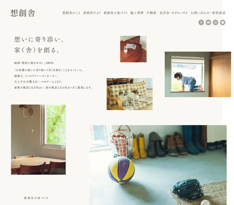
温かな白地と明朝体、日常を切り取った非対称の写真配置が特徴の工務店サイト。施工事例や便りを端正に並べ、控えめな金色で見学・採用への導線を添える。
オリジナルサイトを見るA homebuilder’s journal told through quiet Mincho typography, generous space, and photographs of everyday life.
Website: sososya.com Original URL: https://sososya.com/ Final URL: https://sososya.com/ Theme: light in both supplied viewport observations Inspected: September 23, 2026, 00:58 JST; supplied retrieval timestamp: September 22, 2026, 15:58:26.181 UTC Viewports: desktop 1440 × 1000 CSS pixels; mobile 390 × 844 CSS pixels Scope: the current corporate homepage, including its opening composition, building philosophy, project previews, journal, photographic strip, client interviews, model-house invitation, recruitment banner, and footer. Visual coverage comprises three desktop captures and two mobile captures, supplemented by rendered text, links, element rectangles, computed styles, and root custom properties. Linked destination pages and open navigation states were not inspected.
Sososya presents housebuilding through the things that make a house inhabited: a child at a window, dogs on a sofa, a timber table, and shoes beside an entrance. These photographs sit at different sizes and heights across a pale opening field. The asymmetry feels deliberate because the text is restrained: brown-gray Mincho lettering, measured tracking, long line spacing, and almost no decorative interface framing.
This is a substantial company homepage with several browsing paths. Brand philosophy, completed work, current construction news, resident interviews, visits, and recruitment share the page. Its rhythm alternates loose photographic compositions with orderly collections of links. Gold identifies small English labels and a prominent model-house action; white space supplies most of the separation.
The mobile opening is independently composed. A full-width window photograph carries a white two-line statement, with company identity above it. The introduction moves below the photograph, and the smaller lifestyle images begin farther down. Preserve this change of composition when adapting the design.
A homebuilder’s journal told through quiet Mincho typography, generous space, and photographs of everyday life.
Website: sososya.com Original URL: https://sososya.com/ Final URL: https://sososya.com/ Theme: light in both supplied viewport observations Inspected: September 23, 2026, 00:58 JST; supplied retrieval timestamp: September 22, 2026, 15:58:26.181 UTC Viewports: desktop 1440 × 1000 CSS pixels; mobile 390 × 844 CSS pixels Scope: the current corporate homepage, including its opening composition, building philosophy, project previews, journal, photographic strip, client interviews, model-house invitation, recruitment banner, and footer. Visual coverage comprises three desktop captures and two mobile captures, supplemented by rendered text, links, element rectangles, computed styles, and root custom properties. Linked destination pages and open navigation states were not inspected.
Sososya presents housebuilding through the things that make a house inhabited: a child at a window, dogs on a sofa, a timber table, and shoes beside an entrance. These photographs sit at different sizes and heights across a pale opening field. The asymmetry feels deliberate because the text is restrained: brown-gray Mincho lettering, measured tracking, long line spacing, and almost no decorative interface framing.
This is a substantial company homepage with several browsing paths. Brand philosophy, completed work, current construction news, resident interviews, visits, and recruitment share the page. Its rhythm alternates loose photographic compositions with orderly collections of links. Gold identifies small English labels and a prominent model-house action; white space supplies most of the separation.
The mobile opening is independently composed. A full-width window photograph carries a white two-line statement, with company identity above it. The introduction moves below the photograph, and the smaller lifestyle images begin farther down. Preserve this change of composition when adapting the design.
| Name | Value | Source token | Evidence and role |
|---|---|---|---|
| White canvas | #FFFFFF |
--color-bg |
Measured body background; the dominant lower-page canvas and background of the interview action |
| Brown-gray ink | #524B40 |
--color-text |
Measured navigation, headings, paragraphs, and footer text |
| Muted gold | #C6A648 |
--color-gold |
Measured English journal label and model-house button background |
| Warm beige | #FBFAF7 |
--color-bg-beige |
Source-declared; suitable for reproducing the visibly warm opening field, whose exact applied background declaration was not included |
| Pale gold paper | #FCFAF4 |
--color-bg-gold |
Source-declared supporting surface color; exact application unverified |
| Muted gray | #8A867F |
--color-gray |
Source-declared; a close visual reference for subdued status treatments, without a verified badge color sample |
| Fine gray rule | #E8E7E5 |
--color-border-gray-light |
Source-declared; suitable for the faint recruitment outline visible in the captures |
| Darker gray | #A8A59F |
--color-border-gray-dark |
Source-declared; visually consistent with subdued social circles, but their exact fill was not measured |
The mobile opening headline and model-house action use measured white text. Keep white-on-photography confined to the mobile opening composition; the desktop headline is brown-gray on a pale field.
| Source token | Value | Interpretation |
|---|---|---|
--color-border-beige |
#D1CDBF |
Available warm rule color |
--color-border-beige-light |
#F2EBE0 |
Available very pale warm rule color |
--color-border-gray |
#D6D6D6 |
Available neutral rule color |
--color-brown |
#9B7A5F |
Available supporting brown |
These supporting variables should not become an expanded palette of colored cards. The visible interface depends primarily on white, warm off-white, brown-gray text, and small gold accents. The green and blue in the footer’s partner mark belong to that mark, rather than establishing additional action colors.
The root also contains standard publishing-platform colors, gradients, and shadow presets. Their presence does not demonstrate visible use on this homepage. No alternate color theme was observed.
The measured body stack begins with 'FOT-筑紫Aオールド明朝 Pr6N M{pm}', followed by Japanese Mincho fallbacks and serif. Main display headings instead begin with 'FOT-筑紫Aオールド明朝 Pr6N R{pm}'.
The shared fallback sequence is:
'游明朝体', '游明朝', YuMincho,
'ヒラギノ明朝 ProN', 'Hiragino Mincho ProN',
'MS P明朝', 'MS PMincho', serif
--font-min-m: body copy, desktop navigation, category links, and many small headings.--font-min-r: opening statement, philosophy display heading, project names, interview titles, and several footer links.--font-min-d: starts with 'FOT-筑紫Aオールド明朝 Pr6N D'; measured on the gold model-house action.--font-min-r-v: starts with 'FOT-筑紫Aオールド明朝 Pr6N R'; measured on the footer’s vertical performance text.Most sampled elements use CSS font-weight: 400, including the D-family button. Family suffixes and CSS numeric weights are separate facts. Do not translate every M-family declaration into font-weight: 500.
The journal eyebrow uses acumin-pro-wide, sans-serif, source --font-sans, at weight 300. It is small, gold, and widely tracked. This secondary voice also visually characterizes the recruitment eyebrow and company microcopy, although their individual computed typography was not supplied.
Source variables also declare a Garamond serif stack and a Japanese Gothic stack beginning with 'Noto Sans JP'. Their use on the visible dates or other specific components was not established. Do not assign them to those components as a measured fact.
The header wordmark and footer emblem are visibly different identity treatments. The header is a restrained horizontal name; the footer combines a small house-like emblem, roman lettering, and expressive Japanese lettering. Preserve supplied brand artwork when available. Empty text in the link extraction does not identify its file format or prove that it is ordinary live text.
All values below are measured CSS values. Tracking is expressed in em, calculated from the supplied pixel values.
| Role | Desktop size / line height | Mobile size / line height | Desktop → mobile tracking |
|---|---|---|---|
| Primary navigation | 18 / 18px |
Hidden in closed mobile state | 0.07em |
| Opening statement | 38 / 62.7px |
30 / 51px |
0.14 → 0.14em |
| Opening introduction | 16 / 33.6px |
16 / 32.8px |
0.10 → 0.06em |
| Philosophy eyebrow | 15 / 15px |
12 / 12px |
0.25 → 0.24em |
| Philosophy display heading | 38 / 58.9px |
23 / 35.65px |
0.17 → 0.14em |
| Philosophy body | 16 / 39.2px |
13 / 26.65px |
0.12 → 0.06em |
| Project title | 16 / 25.6px |
12 / 19.2px |
0.10 → 0.10em |
| English journal eyebrow | 12 / 12px |
10 / 10px |
0.12 → 0.12em |
| Japanese journal heading | 28 / 42px |
20 / 20px |
0.12 → 0.10em |
| Journal article title | 15 / 24px |
13 / 20.15px |
0.08 → 0.02em |
| Interview section label | 13 / 13px |
12 / 12px |
0.30 → 0.16em |
| Interview introduction | 13 / 29.9px |
13 / 27.95px |
0.18 → 0.12em |
| Interview article title | 17 / 17px |
14 / 22.4px |
0.14 → 0.14em |
| Model-house introduction | 17 / 34px |
15 / 28.5px |
0.10 → 0.08em |
| Gold model-house action | 21 / 21px |
13 / 13px |
0.10 → 0.10em |
| Footer company name | 16 / 28.8px |
13 / 21.45px |
0.06 → 0.08em |
The journal’s Japanese heading is a measured exception to the predominantly regular weights: it uses 700 in both viewports. Its family changes from M on desktop to R on mobile.
The browser root is 16px; the body is 14px. Large areas of actual reading text explicitly override that body size. Do not reproduce the sampled 14px body line height as a universal paragraph default.
Character: expansive section spacing, modest type, rectangular photography, and selective rounded controls.
The following are observed dimensions or calculated gaps, not evidence of a single source spacing scale.
| Relationship | Desktop | Mobile | Evidence |
|---|---|---|---|
| Opening copy left edge | 96–97px |
38–39px |
Measured |
| Opening prose width | 461.61px |
312px |
Measured |
| Headline to introductory paragraph | 28px |
Composition changes | Calculated from measured rectangles |
| Gap between opening paragraphs | 8px |
10px |
Calculated |
| Navigation link padding | 10px 11px |
Not applicable in closed state | Measured |
| Journal grid column gap | 42px |
20.59px |
Calculated |
| Project grid column gap | 57px |
27.81px |
Calculated |
| Project grid row gap | 30px |
28px |
Calculated |
| Interview list row gap | 34px |
30px |
Calculated |
| Recruitment side margin | About 133px |
About 28px |
Screenshot geometry, consistent with link widths |
The mobile prose is 80% of viewport width at the inspected size. The mobile journal uses approximately 88%. These are measured proportions at one width, not recovered source formulas. Retain different inset systems for reading copy and image collections.
| Element | Value or appearance | Evidence |
|---|---|---|
| Photographs and ordinary content links | Square corners | Visible captures; sampled link radii are 0 |
| Four informational actions near the projects | 30px |
Measured |
| Interview overview action | 30px |
Measured |
| Gold model-house action | 50px |
Measured |
| Scrolled desktop navigation | Capsule, approximately 30px radius |
Screenshot estimate |
| Social icons and ended-event badge | Circular | Screenshot observation |
| Recruitment banner | Square, fine outline | Screenshot observation |
| Element | Desktop 1440 × 1000 | Mobile 390 × 844 |
|---|---|---|
| Document height | 5191.91px |
5743.95px |
| Opening statement rectangle | 462.61 × 125.38px, at 96, 184 |
239.11 × 102px, at 38, 282.88 |
| Journal section width | 1126px, starting at x=157 |
Full-width section; inner cards begin at x=23.39 |
| Journal card width | 250px, four columns |
161.31px, two columns |
| Project card width | 256.5px, two columns |
151.77px, two columns |
| Interview list link | 487 × 99px |
327.63 × 66px |
| Informational action | 204 × 46px |
333.36 × 40px |
| Model-house action | 428 × 61px |
314 × 39px |
| Recruitment artwork | Approximately 1174 × 280px |
Approximately 334 × 215px |
| Social link box | 39 × 40px |
35 × 37px |
Do not use the document heights as fixed page heights. They depend on the content, viewport, and captured state.
Role: identity and access to the company’s main content areas.
At the desktop opening, the wordmark sits near the upper-left corner, while seven Japanese navigation labels run across the upper-right. Their measured link boxes start at y=50px; each uses 18px Mincho text, 0.07em tracking, and 10px 11px padding.
The visible labels include 想創舎のこと, 想創舎だより, 想創舎の家づくり, 施工事例, 不動産, 見学会・モデルハウス, and お問い合わせ・資料請求. A second, smaller utility row combines an underlined recruitment link with Facebook, YouTube, Instagram, and LINE icons.
In the scrolled desktop captures, the primary navigation remains near the top inside a white capsule. Its estimated footprint is 1034 × 61px, beginning around x=374, y=39. A very faint shadow separates it from the page. The opening wordmark and utility row are absent from these cropped header states.
This persistent visual behavior is observed. The CSS positioning mechanism, activation threshold, and transition between states are not supplied.
The mobile opening shows a roughly 100px-wide wordmark at x=30, a small English company/address block below it, and a three-line menu icon near x=306, y=44. The icon’s lines are approximately 52px wide. It has no visible circular or filled button background.
The menu icon also remains near the same viewport location in the lower-page mobile capture. The desktop navigation and its utility row are absent from the closed mobile state. The menu was not opened; overlay layout, animation, focus management, and submenu triggers are unverified.
Role: connect the building service to lived experience before presenting projects or practical actions.
The desktop headline, 想いに寄り添い、家(舎)を創る。, is two lines of regular Mincho at 38px. It occupies the left side of the composition, followed by a short introductory line and a four-line paragraph. The prose uses 16px text with 33.6px leading.
Around this text, five visible photographic subjects have independent positions and scales. Approximate screenshot measurements are:
| Photograph | Desktop placement | Visual function |
|---|---|---|
| Timber table with an open book | x≈716, y≈195, 165 × 166px |
Small quiet detail high in the composition |
| Child at a window | x≈989, y≈293, 430 × 294px |
Largest upper photograph and a human focal point |
| Two dogs on a checked sofa | x≈626, y≈458, 289 × 202px |
Mid-sized domestic detail between the larger images |
| Dining table beside a window | x≈80, y≈589, width 337px |
Tall image below the opening copy; lower edge is outside the capture |
| Shoes and boots at an entrance | x≈541, y≈752, width 850px |
Broad lower image; full height is not visible |
Photographs have sharp rectangular edges, no captions in this opening view, no card backgrounds, and no visible shadows. The pale background stops short of the desktop’s right edge, while the child photograph extends into the white margin. This slight misalignment is part of the composition.
On mobile, the opening instead uses a window close-up covering approximately the first 431px of the page. The white headline begins at measured y=282.88px. The introduction begins below the photograph at y=482.88px, with 39px side margins. The table photograph reappears at approximately 44, 740, around 87 × 87px; the child photograph starts farther right and lower. Only the beginning of this mobile collage is visually supplied.
Role: connect the company’s approach to examples of completed work.
The rendered desktop measurements place the philosophy on the left and a two-by-two project collection on the right. The philosophy combines a small tracked label, a two-line 38px heading, and unusually open 39.2px paragraph leading. The copy discusses homes becoming more beautiful with age.
The project collection has a small section title and three category links above four project entries. Each project link combines a preview area, locality, and regular Mincho project name. Desktop cards are 256.5px wide with a 57px horizontal gap. There is no measured rounded card container.
Four related links provide routes to company information, previous work, housebuilding, and insulation panels. Their measured action boxes form two columns on desktop: 204px wide, 46px high, with a 30px radius. Border and arrow details for these actions are not available in the supplied screenshots.
On mobile, philosophy precedes the project grid. Its heading becomes 23px; body copy becomes 13px with 26.65px leading. The source renders the sampled philosophy paragraphs inline on mobile, allowing a more continuous text flow instead of preserving every desktop paragraph break. The project grid retains two columns. The four informational actions become a single vertical stack of approximately 333px-wide links.
The section’s content, geometry, and typography are DOM-supported; its full photographic appearance was not included in a dedicated capture.
Role: surface events, construction updates, and company news.
The desktop section starts with a small gold Letter from Sososya eyebrow over a larger Japanese heading, 想創舎だより. Category navigation aligns toward the right. Thin vertical separators divide categories; the event entry includes a small circular downward indicator.
The categories link to archive URLs. Their presence does not establish client-side filtering. Additional event-category links exist in the rendered evidence, but no expanded category state was captured.
Below the header, four unboxed article links form a single row. Each contains:
250 × 187.5px in the desktop screenshot.The event card carries a muted circular 終了 badge overlapping its upper-left corner. The badge is approximately 49px across. Its textual status is meaningful content, not an ornamental circle.
Article heights vary with title wrapping and event information. Do not force every card into a large equal-height box with a pinned button. At 390px, the four entries form two columns and two rows; titles reduce to 13px with less tracking. The exact mobile date placement and category-control appearance were not visually captured.
A wide band of architectural photographs appears below the journal. In the desktop capture it spans the viewport and is about 300px high. Images have different widths: broad interior scenes alternate with narrower room and balcony views, and a building exterior is clipped at the right edge.
Keep a consistent strip height while allowing varied photographic aspect ratios. The boundaries are almost flush, with only very fine separations. No controls or verified movement are present in the supplied evidence. It should not automatically be described as an autoplay carousel.
Role: introduce completed spaces through their occupants’ stories.
The desktop interview section is a measured flex layout, 1086px wide. The text and three interview links occupy the right side, beginning around x=756. Each link is a compact horizontal row: a preview region at the left and client name, story title, and place/date metadata to the right.
The row measures 487 × 99px; rows are separated by 34px. Small client labels use 11px type, while story titles use 17px regular Mincho with 0.14em tracking. A 46px-high rounded overview link closes the list.
The mobile section becomes a block layout. Its text/list region is about 328px wide, each row is 66px high, and story titles become 14px with 22.4px leading. The overview action is approximately 336px wide and 40px high.
These are measured structural observations. The left-hand visual and any image-based interview title are not sufficiently exposed to specify their artwork or transitions.
Role: offer a practical next step after the editorial content.
The section includes an invitation, the model-house name and address, a telephone link, and a gold action labeled 見学会・モデルハウス. A pale, subtly textured field is partially visible in the lower desktop capture; its material source and exact color were not supplied.
The action is a notable increase in emphasis: measured #C6A648 background, white D-family Mincho text, and a 50px radius. Desktop dimensions are 428 × 61px with 21px lettering. Mobile dimensions are 314 × 39px with 13px lettering.
The mobile content is substantially rearranged and uses an offset text column starting at x=80px in the measured elements. Do not turn the whole lower page into repeated gold calls to action; this button stands out because most earlier links are quiet.
Role: present working at the company as a continuation of the people-centered visual story.
The desktop banner is a very lightly outlined rectangle, approximately 1174 × 280px. Inside it, the content does not follow equal columns:
On mobile, the banner becomes approximately 334 × 215px. Two people photographs occupy the upper portion, the vertical message moves to the right, and the invitation runs horizontally along the bottom. The separate model-house image and desktop arrow are not visible.
The source extraction does not resolve whether all banner text is live HTML or part of composed artwork. For a new implementation, keep essential recruitment copy available as semantic text and use responsive art direction for the photographs.
Role: finish with identity, contact information, practical links, and social destinations.
The desktop footer spreads content horizontally across a white field: emblem at the left, company details beside it, three underlined utility links in the middle, and a partner mark, recruitment link, and social circles on the right. Large empty space separates this region from the recruitment banner.
The original page explicitly identifies the operator as 株式会社 手嶋組, with an Asakura address and telephone number. This is company identification, not a website production credit.
On mobile, the visible sequence changes: recruitment text link, contact/FAQ/shop links, then the brand emblem and company details. The partner mark and social circles sit to the right of the lower identity area. Footer links remain underlined and typographic; they do not become a dense accordion or a dark full-width panel.
| Treatment | Evidence | What can be concluded |
|---|---|---|
| Desktop links | Computed transition: 0.15s ease-out on navigation, cards, actions, and social links |
A short transition is declared; exact changed properties and hover endpoints were not captured |
| Mobile links | Samples report transition: all without an explicit nonzero duration |
Timed mobile feedback is not established |
| Persistent desktop navigation | White capsule visible near the top in multiple scrolled captures | The navigation persists visually; threshold and animation are unknown |
| Persistent mobile menu icon | Same upper-right location in opening and lower-page captures | Persistent access is visible; open state is unverified |
| Event badge | 終了 visible on one card |
A content status is shown; no user-triggered state change was tested |
| Gallery strip | One static arrangement is supplied | Autoplay, dragging, looping, and speed are unverified |
| Sampled element animations | Listed as none |
This does not exclude motion on unsampled images, pseudo-elements, or script-controlled descendants |
The capture process waited for document load, visible image decoding, sampled stability, and relevant finite animations, within stated time limits. Perpetual animations were paused during readiness checks and then resumed. Consequently, the screenshots support settled appearance, not an animation timeline.
Recommended: use restrained, short feedback for links; leave the main content readable before any reveal effect. If photographic movement is introduced, provide a static reduced-motion state. Parallax, scroll scrubbing, automatic gallery movement, and animated menu transformations are not established source behaviors.
| Layer | Appearance | Purpose |
|---|---|---|
| Main page | White | Neutral base for photography and reading |
| Opening field | Warm off-white, visually offset on desktop | Holds the loose collage together |
| Article and project entries | Unboxed images and text | Makes the content feel editorial rather than dashboard-like |
| Persistent navigation | White capsule with a faint apparent shadow | Maintains legibility over changing page content |
| Model-house field | Pale, lightly textured appearance in the visible crop | Separates the visit invitation |
| Primary visit action | Solid gold, white lettering, pill shape | Concentrates action emphasis |
| Recruitment banner | White with a very fine rectangular outline | Contains a separate photographic composition |
| Social/status marks | Small subdued circles | Compact utility and status information |
There is no broad shadow-based elevation system. Most structure comes from empty space, alignment, rectangular image edges, and type hierarchy.
Photography is the main expressive material. The opening favors warm timber, soft daylight, fabric, ordinary objects, pets, and people using a home. The architectural strip emphasizes open interiors, glazing, timber floors, and views through connected rooms. Construction news introduces less polished, documentary images alongside editorial calendar artwork.
Preserve natural color and material variation. The warmth is visible in the images, but no global photographic filter was measured. Avoid applying a uniform sepia treatment to reproduce what may simply be lighting and original image grading.
Cropping varies by role: a small square detail, a wider human scene, a tall room fragment, and a broad entrance image coexist in the opening. The journal is more regular. Recruitment uses a separate collage with people at work. This variation is more important than making every image share one aspect ratio.
No image src, srcset, CSS background URL, or asset manifest was supplied. The following are visual references, not recoverable file paths.
| Asset group | Observed content | Implementation guidance |
|---|---|---|
| Header identity | Horizontal Japanese wordmark | Use authorized brand artwork; preserve its modest width |
| Mobile opening | Close-up of a window frame and outside greenery | Art-direct for the headline and identity placement |
| Desktop lifestyle collage | Table/book, child, dogs, dining area, footwear | Use independent image slots and subject-aware crops |
| Journal thumbnails | Event calendar, building structure, exterior, construction floor | Permit different source content within consistent thumbnail frames |
| Architectural strip | Several interiors and an exterior | Keep a common height and varying widths |
| Recruitment | Staff conversations and a miniature house | Provide distinct desktop and mobile arrangements |
| Footer identity | Illustrated emblem and expressive lettering | Keep separate from the simpler header wordmark |
| Partner/social marks | Partner logo and four social-service symbols | Use actual marks rather than approximating their lettering |
The page uses several related widths rather than one universal container. The opening ranges almost across the viewport, with text inset around 96px. The journal is a centered 1126px region. The interview section is narrower at 1086px. The recruitment banner expands to approximately 1174px, and the footer has its own broad horizontal layout.
The opening’s photographic edges intentionally ignore some of the text alignments. Later collections restore order through repeated thumbnail sizes and consistent gaps. Preserve this alternation between looseness and regularity.
| Area | Observed change at 390px |
|---|---|
| Header | Desktop labels replaced by a three-line menu control; company microcopy appears beneath the wordmark |
| Opening | Full-width photograph with white headline; introduction moves below it |
| Reading copy | Approximately 39px side margins; opening text remains 16px |
| Philosophy | Heading and body become smaller; prose changes to a more continuous flow |
| Projects | Remain a two-column grid with approximately 152px cards |
| Related actions | Two desktop columns become one vertical stack |
| Journal | Four desktop columns become two columns and two rows |
| Interviews | Section becomes block flow; compact image/text rows remain horizontal |
| Model-house invitation | Content and action reposition; button becomes approximately 314px wide |
| Recruitment | Independently rearranged compact collage |
| Footer | Utility links move above the lower identity and partner/social grouping |
Do not interpret responsive design here as proportional shrinking. The opening changes image strategy, several type roles have different reductions, and the footer changes its reading order. At the same time, image collections retain useful two-column density on the phone.
Exact media-query breakpoints, tablet behavior, landscape behavior, and larger desktop caps were not supplied. The Quick Start uses an explicitly recommended breakpoint and should be checked between the two observed widths.
These recommendations are not verified features of the original page:
aria-expanded, and a relationship to its controlled navigation. Implement keyboard focus behavior when its actual open design is specified.h2.#FFFFFF.#FBFAF7; exact opening application unverified.#524B40.#C6A648.#E8E7E5.#8A867F.“Create a Japanese homebuilder’s corporate homepage inspired by Sososya. Use a white canvas, a subtly warm opening field, brown-gray Mincho text, small tracked English eyebrows, and sparse muted-gold accents. On desktop, place a modest two-line statement and airy introductory copy at the left, surrounded by an asymmetric collage of domestic photographs at different sizes and heights. Continue with a building philosophy, a two-by-two project grid, four unboxed journal entries, a full-width strip of architectural photography, compact client interviews, a gold model-house invitation, a carefully composed recruitment banner, and a spacious white footer. On mobile, replace the desktop opening with a full-width window photograph carrying a white headline, move the introduction below it, retain two-column image collections, and rearrange recruitment and footer content. Keep photographs rectangular and avoid a general card-shadow system.”
This is a reusable adaptation, not recovered source CSS. It preserves verified colors, font declarations, major type sizes, and selected geometry. The 1200px breakpoint, fallback layout behavior, unobserved photograph aspect ratios, hover endpoint, and navigation shadow are recommendations.
Use authorized image assets. Expected opening anatomy is .hero containing .hero-cover, .hero-copy with .hero-title and .hero-intro, followed by .hero-collage with five individually named image elements. The mobile cover is separate from the collage. Add .is-pinned to the desktop navigation through application logic; the original activation threshold is unknown.
The collage’s unseen lower mobile arrangement is deliberately a simple flowing adaptation. It does not claim to reproduce an unobserved original layout. Font-family declarations also require separately licensed and loaded fonts to match the original; otherwise the fallbacks apply.
:root {
  /* Verified source colors and supporting source tokens */
  --paper: #ffffff;
  --paper-warm: #fbfaf7;
  --ink: #524b40;
  --gold: #c6a648;
  --muted: #8a867f;
  --rule: #e8e7e5;

  /* Source family names; no font files are bundled here */
  --font-body: 'FOT-筑紫Aオールド明朝 Pr6N M{pm}',
    '游明朝体', '游明朝', YuMincho, 'Hiragino Mincho ProN', serif;
  --font-heading: 'FOT-筑紫Aオールド明朝 Pr6N R{pm}',
    '游明朝体', '游明朝', YuMincho, 'Hiragino Mincho ProN', serif;
  --font-action: 'FOT-筑紫Aオールド明朝 Pr6N D',
    YuMincho, 'Hiragino Mincho ProN', serif;
  --font-utility: acumin-pro-wide, sans-serif;

  --hero-size: 38px;
  --hero-leading: 1.65;
  --intro-leading: 2.1;
  --content-width: 1126px;
  --radius-action: 30px;
  --motion-link: 150ms ease-out;
}

* { box-sizing: border-box; }
html { font-size: 16px; }
body {
  margin: 0;
  color: var(--ink);
  background: var(--paper);
  font: 400 14px/1.7 var(--font-body);
}
img { display: block; max-width: 100%; }
a { color: inherit; }
button { font: inherit; }
.container { width: min(var(--content-width), 88%); margin-inline: auto; }

/* Recommended visible focus and explicit transition properties */
a, button {
  transition: color var(--motion-link), opacity var(--motion-link);
}
:focus-visible { outline: 2px solid var(--ink); outline-offset: 5px; }
@media (hover: hover) {
  .text-link:hover { opacity: 0.7; }
}

.site-header {
  position: absolute;
  z-index: 30;
  top: 50px;
  left: 65px;
  right: 53px;
  display: flex;
  align-items: flex-start;
  justify-content: space-between;
}
.brand { display: block; width: 134px; }
.desktop-nav { display: flex; align-items: center; }
.desktop-nav a {
  display: block;
  padding: 10px 11px;
  font-size: 18px;
  line-height: 1;
  letter-spacing: 0.07em;
  text-decoration: none;
  white-space: nowrap;
}
.desktop-nav.is-pinned {
  position: fixed;
  top: 39px;
  right: 32px;
  min-height: 61px;
  padding-inline: 23px;
  border-radius: 999px;
  background: var(--paper);
  box-shadow: 0 2px 12px rgb(82 75 64 / 4%);
}
.mobile-menu { display: none; }
.mobile-company { display: none; }

.hero {
  position: relative;
  isolation: isolate;
  min-height: max(1000px, 76.4vw);
}
.hero::before {
  content: '';
  position: absolute;
  z-index: -1;
  inset: 0 6.25% 0 0;
  background: var(--paper-warm);
}
.hero-cover { display: none; }
.hero-copy {
  position: relative;
  z-index: 1;
  top: 184px;
  left: 6.6667%;
  width: 32.125%;
}
.hero-title {
  margin: 0;
  font: 400 var(--hero-size)/var(--hero-leading) var(--font-heading);
  letter-spacing: 0.14em;
}
.hero-intro {
  margin: 28px 0 0 1px;
  font-size: 16px;
  line-height: var(--intro-leading);
  letter-spacing: 0.1em;
}
.hero-intro p { margin: 0; }
.hero-intro p + p { margin-top: 8px; }
.hero-collage { position: absolute; inset: 0; }
.hero-collage img { position: absolute; object-fit: cover; }
.photo-table {
  left: 49.7222%; top: 13.5417vw;
  width: 11.4583%; aspect-ratio: 1;
}
.photo-child {
  left: 68.6806%; top: 20.3472vw;
  width: 29.8611%; aspect-ratio: 430 / 294;
}
.photo-dogs {
  left: 43.4722%; top: 31.8056vw;
  width: 20.0694%; aspect-ratio: 289 / 202;
}
/* Full heights were not captured: these two crop ratios are adaptations. */
.photo-dining {
  left: 5.5556%; top: 40.9028vw;
  width: 23.4028%; aspect-ratio: 3 / 4;
}
.photo-entry {
  left: 37.5694%; top: 52.2222vw;
  width: 59.0278%; aspect-ratio: 17 / 7;
}

.eyebrow {
  margin: 0 0 16px;
  color: var(--gold);
  font: 300 12px/1 var(--font-utility);
  letter-spacing: 0.12em;
}
.section-title {
  margin: 0;
  font-size: 28px;
  line-height: 1.5;
  letter-spacing: 0.12em;
}
.project-grid {
  display: grid;
  grid-template-columns: repeat(2, minmax(0, 1fr));
  gap: 30px 57px;
}
.project-title {
  margin: 10px 0 0;
  font: 400 16px/1.6 var(--font-heading);
  letter-spacing: 0.1em;
}

.journal { margin-block: 160px 80px; }
.journal-heading {
  display: flex;
  align-items: flex-end;
  justify-content: space-between;
  gap: 32px;
  margin-bottom: 43px;
}
.journal-categories { display: flex; flex-wrap: wrap; }
.journal-categories a {
  padding: 3px 19px 3px 17px;
  font-size: 16px;
  line-height: 1;
  letter-spacing: 0.06em;
  text-decoration: none;
}
.journal-categories a + a { border-left: 1px solid #a8a59f; }
.news-grid {
  display: grid;
  grid-template-columns: repeat(4, minmax(0, 1fr));
  gap: 42px;
}
.news-card { position: relative; display: block; text-decoration: none; }
.news-card img { width: 100%; aspect-ratio: 4 / 3; object-fit: cover; }
.news-card h3 {
  margin: 11px 0 4px;
  font-size: 15px;
  font-weight: 400;
  line-height: 1.6;
  letter-spacing: 0.08em;
}
.news-card__category { margin: 0; font-size: 12px; line-height: 1.6; }
.news-card__date {
  position: absolute;
  right: calc(100% + 6px);
  top: 120px;
  writing-mode: vertical-rl;
  font-size: 11px;
  letter-spacing: 0.12em;
}
.news-card__status {
  position: absolute;
  z-index: 1;
  top: -12px;
  left: -22px;
  display: grid;
  place-items: center;
  width: 49px;
  height: 49px;
  border-radius: 50%;
  color: white;
  background: var(--muted);
  font-size: 12px;
}

/* Static scrollable adaptation; no autoplay behavior is implied. */
.photo-strip { display: flex; gap: 1px; overflow-x: auto; }
.photo-strip img { flex: 0 0 auto; width: auto; height: 300px; }

.pill-link {
  display: flex;
  align-items: center;
  justify-content: space-between;
  gap: 20px;
  min-height: 46px;
  padding: 13px 26px 16px 28px;
  border: 1px solid var(--rule);
  border-radius: var(--radius-action);
  font-size: 15px;
  line-height: 1;
  letter-spacing: 0.14em;
  text-decoration: none;
}
.visit-link {
  width: min(428px, 100%);
  min-height: 61px;
  padding: 19px 26px 21px 28px;
  border: 0;
  border-radius: 50px;
  color: white;
  background: var(--gold);
  font: 400 21px/1 var(--font-action);
  letter-spacing: 0.1em;
}
/* Optional higher-contrast action variant. */
.visit-link--strong { background: var(--ink); }

.recruit-banner {
  position: relative;
  display: block;
  width: min(1174px, calc(100% - 56px));
  min-height: 280px;
  margin: 120px auto 0;
  border: 1px solid var(--rule);
  text-decoration: none;
}
.recruit-banner img { position: absolute; object-fit: cover; }
.recruit-photo-wide { left: 10.8%; top: 19%; width: 23%; aspect-ratio: 270 / 196; }
.recruit-photo-tall { left: 38.6%; top: 10.4%; width: 11.5%; aspect-ratio: 3 / 4; }
.recruit-photo-model { right: 6%; top: 17%; width: 12%; aspect-ratio: 4 / 3; }
.recruit-vertical {
  position: absolute;
  left: 2.2%; top: 9%;
  margin: 0;
  writing-mode: vertical-rl;
  font-size: 16px;
  line-height: 1.8;
  letter-spacing: 0.12em;
}
.recruit-copy { position: absolute; left: 55.4%; top: 48%; }
.recruit-copy h2 {
  margin: 20px 0 0;
  font: 400 26px/1.6 var(--font-heading);
  letter-spacing: 0.14em;
}

.site-footer {
  width: min(1280px, calc(100% - 160px));
  margin: 260px auto 0;
  padding-bottom: 60px;
  display: grid;
  grid-template-columns: 130px 163px minmax(0, 1fr) auto;
  align-items: end;
  gap: 53px;
}
.footer-links { display: grid; gap: 5px; }
.footer-links a {
  width: fit-content;
  padding-block: 5px;
  text-underline-offset: 3px;
  letter-spacing: 0.12em;
}
.social-links { display: flex; }
/* Larger targets are recommended; visible artwork can remain small. */
.social-links a { display: grid; place-items: center; width: 44px; height: 44px; }
.social-links img, .social-links svg { width: 30px; height: 30px; }

@media (max-width: 1199px) {
  :root { --hero-size: 30px; --hero-leading: 1.7; --intro-leading: 2.05; }
  .site-header { top: 38px; left: 30px; right: 30px; }
  .brand { width: 100px; }
  .desktop-nav { display: none; }
  .mobile-company {
    display: block;
    margin-top: 18px;
    font: 300 10px/1.8 var(--font-utility);
    letter-spacing: 0.06em;
  }
  .mobile-menu {
    position: fixed;
    top: 30px;
    right: 25px;
    display: grid;
    align-content: center;
    gap: 6px;
    width: 64px;
    height: 44px;
    padding: 0 6px;
    border: 0;
    color: var(--muted);
    background: transparent;
  }
  .mobile-menu span { display: block; height: 1px; background: currentColor; }
  .hero { min-height: 0; padding-bottom: 64px; background: var(--paper-warm); }
  .hero::before { display: none; }
  .hero-cover {
    display: block;
    position: absolute;
    inset: 0 0 auto;
    width: 100%;
    height: clamp(431px, 110.5vw, 600px);
    object-fit: cover;
  }
  .hero-copy {
    top: auto; left: auto; width: auto;
    padding: calc(clamp(431px, 110.5vw, 600px) - 148.125px) 10% 0;
  }
  .hero-title { color: white; }
  .hero-intro { max-width: 40rem; margin: 98px 0 0; letter-spacing: 0.06em; }
  .hero-intro p + p { margin-top: 10px; }
  .hero-collage {
    position: relative;
    display: grid;
    grid-template-columns: 49.23% 1fr;
    row-gap: 28px;
    margin-top: 50px;
  }
  .hero-collage img { position: static; width: 100%; height: auto; }
  .hero-collage .photo-table { width: 22.3vw; margin-left: 11.28vw; }
  .hero-collage .photo-child { margin-top: 46px; }
  .hero-collage .photo-dogs,
  .hero-collage .photo-dining { width: 90%; margin-inline: auto; }
  .hero-collage .photo-entry { grid-column: 1 / -1; width: 88%; margin-inline: auto; }
  .project-grid { gap: 28px; }
  .project-title { font-size: 12px; }
  .journal { margin-block: 115px 60px; }
  .journal-heading { display: block; margin-bottom: 35px; }
  .eyebrow { font-size: 10px; }
  .section-title { font-family: var(--font-heading); font-size: 20px; line-height: 1; }
  .journal-categories { margin-top: 24px; gap: 8px; }
  .journal-categories a { padding: 6px 10px; font-size: 13px; }
  .news-grid { grid-template-columns: repeat(2, minmax(0, 1fr)); gap: 38px 20.6px; }
  .news-card h3 { font-size: 13px; line-height: 1.55; letter-spacing: 0.02em; }
  /* Mobile date placement is an adaptation, not a measured original rule. */
  .news-card__date { position: static; display: block; writing-mode: horizontal-tb; margin-top: 8px; }
  .news-card__status { width: 40px; height: 40px; left: -10px; }
  .photo-strip img { height: 180px; }
  .pill-link { min-height: 40px; padding: 12px 24px 13px 26px; font-size: 13px; }
  .visit-link { width: min(314px, 100%); min-height: 39px; padding: 13px; font-size: 13px; }
  .recruit-banner { min-height: 215px; margin-top: 80px; }
  .recruit-photo-wide { left: 5%; top: 9.5%; width: 45.5%; }
  .recruit-photo-tall { left: 58.4%; top: 26.5%; width: 22%; }
  .recruit-photo-model { display: none; }
  .recruit-vertical { left: auto; right: 3.5%; top: 5%; font-size: 12px; }
  .recruit-copy { left: 6%; top: 72%; }
  .recruit-copy .eyebrow { margin-bottom: 8px; }
  .recruit-copy h2 { margin: 0; font-size: 18px; line-height: 1.5; letter-spacing: 0.08em; }
  .site-footer {
    width: 86%; margin-top: 140px; padding-bottom: 30px;
    grid-template-columns: minmax(0, 1fr) auto;
    gap: 28px 16px;
  }
  .footer-links { grid-column: 1 / -1; grid-row: 1; }
  .social-links img, .social-links svg { width: 27px; height: 27px; }
  .social-links a { width: 36px; min-height: 44px; }
}

@media (prefers-reduced-motion: reduce) {
  a, button { transition: none; }
  .photo-strip { scroll-behavior: auto; }
}
For production, complete the footer’s explicit grid areas for the actual identity, address, recruitment, and partner content. Keep decorative collage placement separate from the reading order. The measured original’s very compact controls can be enlarged without changing their visible lettering or icon diameter.
Optional mapping for a project that already uses Tailwind v4. It relies on the properties above and does not imply that the original site uses Tailwind.
@theme inline {
  --color-paper: var(--paper);
  --color-paper-warm: var(--paper-warm);
  --color-ink: var(--ink);
  --color-gold: var(--gold);
  --color-muted: var(--muted);
  --color-rule: var(--rule);

  --font-editorial: var(--font-body);
  --font-display: var(--font-heading);
  --font-utility-label: var(--font-utility);

  --text-opening: var(--hero-size);
  --text-introduction: 16px;
  --text-journal: 15px;
  --text-caption: 12px;

  --radius-action: 30px;
  --radius-visit: 50px;
}
2026-09-22T15:58:26.181Z, equivalent to September 23, 2026, 00:58:26.181 JST. This reference analyzes that supplied inspection, not a separate browsing session.This reference describes the current homepage evidenced by the supplied inspection. Screenshot estimates, declared-but-unassigned tokens, and recommended implementation choices remain explicitly distinguished from measured original behavior.
# Sososya — Style Reference

> A homebuilder’s journal told through quiet Mincho typography, generous space, and photographs of everyday life.

**Website:** [sososya.com](https://sososya.com/)
**Original URL:** https://sososya.com/
**Final URL:** https://sososya.com/
**Theme:** light in both supplied viewport observations
**Inspected:** September 23, 2026, 00:58 JST; supplied retrieval timestamp: September 22, 2026, 15:58:26.181 UTC
**Viewports:** desktop 1440 × 1000 CSS pixels; mobile 390 × 844 CSS pixels
**Scope:** the current corporate homepage, including its opening composition, building philosophy, project previews, journal, photographic strip, client interviews, model-house invitation, recruitment banner, and footer. Visual coverage comprises three desktop captures and two mobile captures, supplemented by rendered text, links, element rectangles, computed styles, and root custom properties. Linked destination pages and open navigation states were not inspected.

Sososya presents housebuilding through the things that make a house inhabited: a child at a window, dogs on a sofa, a timber table, and shoes beside an entrance. These photographs sit at different sizes and heights across a pale opening field. The asymmetry feels deliberate because the text is restrained: brown-gray Mincho lettering, measured tracking, long line spacing, and almost no decorative interface framing.

This is a substantial company homepage with several browsing paths. Brand philosophy, completed work, current construction news, resident interviews, visits, and recruitment share the page. Its rhythm alternates loose photographic compositions with orderly collections of links. Gold identifies small English labels and a prominent model-house action; white space supplies most of the separation.

The mobile opening is independently composed. A full-width window photograph carries a white two-line statement, with company identity above it. The introduction moves below the photograph, and the smaller lifestyle images begin farther down. Preserve this change of composition when adapting the design.
# Sososya — Style Reference

> A homebuilder’s journal told through quiet Mincho typography, generous space, and photographs of everyday life.

**Website:** [sososya.com](https://sososya.com/)
**Original URL:** https://sososya.com/
**Final URL:** https://sososya.com/
**Theme:** light in both supplied viewport observations
**Inspected:** September 23, 2026, 00:58 JST; supplied retrieval timestamp: September 22, 2026, 15:58:26.181 UTC
**Viewports:** desktop 1440 × 1000 CSS pixels; mobile 390 × 844 CSS pixels
**Scope:** the current corporate homepage, including its opening composition, building philosophy, project previews, journal, photographic strip, client interviews, model-house invitation, recruitment banner, and footer. Visual coverage comprises three desktop captures and two mobile captures, supplemented by rendered text, links, element rectangles, computed styles, and root custom properties. Linked destination pages and open navigation states were not inspected.

Sososya presents housebuilding through the things that make a house inhabited: a child at a window, dogs on a sofa, a timber table, and shoes beside an entrance. These photographs sit at different sizes and heights across a pale opening field. The asymmetry feels deliberate because the text is restrained: brown-gray Mincho lettering, measured tracking, long line spacing, and almost no decorative interface framing.

This is a substantial company homepage with several browsing paths. Brand philosophy, completed work, current construction news, resident interviews, visits, and recruitment share the page. Its rhythm alternates loose photographic compositions with orderly collections of links. Gold identifies small English labels and a prominent model-house action; white space supplies most of the separation.

The mobile opening is independently composed. A full-width window photograph carries a white two-line statement, with company identity above it. The introduction moves below the photograph, and the smaller lifestyle images begin farther down. Preserve this change of composition when adapting the design.

## How to Read This Reference

- **Measured** means a value appears directly in the supplied computed styles or element rectangles. Measurements describe the captured viewport, not an inferred universal CSS formula.
- **Source-declared** means a custom property exists in the supplied root styles. Its presence alone does not establish where it is used.
- **Estimated** means a dimension or treatment is judged from an original-page screenshot. Such values are approximate and were not pixel-sampled programmatically.
- **Recommended** means an implementation choice for reuse, including the CSS below. Recommendations are not claims about the original implementation.
- Font stacks are verified declarations; individual downloaded font files and actual glyph-level fallback resolution were not supplied.
- Some logo and recruitment links have empty extracted text and a 24px inline rectangle. That rectangle is not the height of their visible artwork. Use the screenshots to understand their visual footprint.
- Coordinates belong to their respective snapshots. Do not combine a scrolled screenshot’s viewport coordinates with initial DOM coordinates as if they were one continuous measurement.

## Tokens — Colors

### Default Palette

| Name | Value | Source token | Evidence and role |
| --- | --- | --- | --- |
| White canvas | `#FFFFFF` | `--color-bg` | Measured body background; the dominant lower-page canvas and background of the interview action |
| Brown-gray ink | `#524B40` | `--color-text` | Measured navigation, headings, paragraphs, and footer text |
| Muted gold | `#C6A648` | `--color-gold` | Measured English journal label and model-house button background |
| Warm beige | `#FBFAF7` | `--color-bg-beige` | Source-declared; suitable for reproducing the visibly warm opening field, whose exact applied background declaration was not included |
| Pale gold paper | `#FCFAF4` | `--color-bg-gold` | Source-declared supporting surface color; exact application unverified |
| Muted gray | `#8A867F` | `--color-gray` | Source-declared; a close visual reference for subdued status treatments, without a verified badge color sample |
| Fine gray rule | `#E8E7E5` | `--color-border-gray-light` | Source-declared; suitable for the faint recruitment outline visible in the captures |
| Darker gray | `#A8A59F` | `--color-border-gray-dark` | Source-declared; visually consistent with subdued social circles, but their exact fill was not measured |

The mobile opening headline and model-house action use measured white text. Keep white-on-photography confined to the mobile opening composition; the desktop headline is brown-gray on a pale field.

### Supporting Source Tokens

| Source token | Value | Interpretation |
| --- | --- | --- |
| `--color-border-beige` | `#D1CDBF` | Available warm rule color |
| `--color-border-beige-light` | `#F2EBE0` | Available very pale warm rule color |
| `--color-border-gray` | `#D6D6D6` | Available neutral rule color |
| `--color-brown` | `#9B7A5F` | Available supporting brown |

These supporting variables should not become an expanded palette of colored cards. The visible interface depends primarily on white, warm off-white, brown-gray text, and small gold accents. The green and blue in the footer’s partner mark belong to that mark, rather than establishing additional action colors.

The root also contains standard publishing-platform colors, gradients, and shadow presets. Their presence does not demonstrate visible use on this homepage. No alternate color theme was observed.

## Tokens — Typography

### Japanese Mincho — Main Text and Headings

The measured body stack begins with `'FOT-筑紫Aオールド明朝 Pr6N M{pm}'`, followed by Japanese Mincho fallbacks and `serif`. Main display headings instead begin with `'FOT-筑紫Aオールド明朝 Pr6N R{pm}'`.

The shared fallback sequence is:

```css
'游明朝体', '游明朝', YuMincho,
'ヒラギノ明朝 ProN', 'Hiragino Mincho ProN',
'MS P明朝', 'MS PMincho', serif
```

- **Source `--font-min-m`:** body copy, desktop navigation, category links, and many small headings.
- **Source `--font-min-r`:** opening statement, philosophy display heading, project names, interview titles, and several footer links.
- **Source `--font-min-d`:** starts with `'FOT-筑紫Aオールド明朝 Pr6N D'`; measured on the gold model-house action.
- **Source `--font-min-r-v`:** starts with `'FOT-筑紫Aオールド明朝 Pr6N R'`; measured on the footer’s vertical performance text.

Most sampled elements use CSS `font-weight: 400`, including the D-family button. Family suffixes and CSS numeric weights are separate facts. Do not translate every M-family declaration into `font-weight: 500`.

### English Utility Labels

The journal eyebrow uses `acumin-pro-wide, sans-serif`, source `--font-sans`, at weight `300`. It is small, gold, and widely tracked. This secondary voice also visually characterizes the recruitment eyebrow and company microcopy, although their individual computed typography was not supplied.

Source variables also declare a Garamond serif stack and a Japanese Gothic stack beginning with `'Noto Sans JP'`. Their use on the visible dates or other specific components was not established. Do not assign them to those components as a measured fact.

### Brand Lettering

The header wordmark and footer emblem are visibly different identity treatments. The header is a restrained horizontal name; the footer combines a small house-like emblem, roman lettering, and expressive Japanese lettering. Preserve supplied brand artwork when available. Empty text in the link extraction does not identify its file format or prove that it is ordinary live text.

### Type Scale

All values below are measured CSS values. Tracking is expressed in `em`, calculated from the supplied pixel values.

| Role | Desktop size / line height | Mobile size / line height | Desktop → mobile tracking |
| --- | --- | --- | --- |
| Primary navigation | `18 / 18px` | Hidden in closed mobile state | `0.07em` |
| Opening statement | `38 / 62.7px` | `30 / 51px` | `0.14 → 0.14em` |
| Opening introduction | `16 / 33.6px` | `16 / 32.8px` | `0.10 → 0.06em` |
| Philosophy eyebrow | `15 / 15px` | `12 / 12px` | `0.25 → 0.24em` |
| Philosophy display heading | `38 / 58.9px` | `23 / 35.65px` | `0.17 → 0.14em` |
| Philosophy body | `16 / 39.2px` | `13 / 26.65px` | `0.12 → 0.06em` |
| Project title | `16 / 25.6px` | `12 / 19.2px` | `0.10 → 0.10em` |
| English journal eyebrow | `12 / 12px` | `10 / 10px` | `0.12 → 0.12em` |
| Japanese journal heading | `28 / 42px` | `20 / 20px` | `0.12 → 0.10em` |
| Journal article title | `15 / 24px` | `13 / 20.15px` | `0.08 → 0.02em` |
| Interview section label | `13 / 13px` | `12 / 12px` | `0.30 → 0.16em` |
| Interview introduction | `13 / 29.9px` | `13 / 27.95px` | `0.18 → 0.12em` |
| Interview article title | `17 / 17px` | `14 / 22.4px` | `0.14 → 0.14em` |
| Model-house introduction | `17 / 34px` | `15 / 28.5px` | `0.10 → 0.08em` |
| Gold model-house action | `21 / 21px` | `13 / 13px` | `0.10 → 0.10em` |
| Footer company name | `16 / 28.8px` | `13 / 21.45px` | `0.06 → 0.08em` |

The journal’s Japanese heading is a measured exception to the predominantly regular weights: it uses `700` in both viewports. Its family changes from M on desktop to R on mobile.

The browser root is 16px; the body is 14px. Large areas of actual reading text explicitly override that body size. Do not reproduce the sampled 14px body line height as a universal paragraph default.

## Tokens — Spacing & Shapes

**Character:** expansive section spacing, modest type, rectangular photography, and selective rounded controls.

### Spacing Scale

The following are observed dimensions or calculated gaps, not evidence of a single source spacing scale.

| Relationship | Desktop | Mobile | Evidence |
| --- | --- | --- | --- |
| Opening copy left edge | `96–97px` | `38–39px` | Measured |
| Opening prose width | `461.61px` | `312px` | Measured |
| Headline to introductory paragraph | `28px` | Composition changes | Calculated from measured rectangles |
| Gap between opening paragraphs | `8px` | `10px` | Calculated |
| Navigation link padding | `10px 11px` | Not applicable in closed state | Measured |
| Journal grid column gap | `42px` | `20.59px` | Calculated |
| Project grid column gap | `57px` | `27.81px` | Calculated |
| Project grid row gap | `30px` | `28px` | Calculated |
| Interview list row gap | `34px` | `30px` | Calculated |
| Recruitment side margin | About `133px` | About `28px` | Screenshot geometry, consistent with link widths |

The mobile prose is 80% of viewport width at the inspected size. The mobile journal uses approximately 88%. These are measured proportions at one width, not recovered source formulas. Retain different inset systems for reading copy and image collections.

### Border Radius

| Element | Value or appearance | Evidence |
| --- | --- | --- |
| Photographs and ordinary content links | Square corners | Visible captures; sampled link radii are `0` |
| Four informational actions near the projects | `30px` | Measured |
| Interview overview action | `30px` | Measured |
| Gold model-house action | `50px` | Measured |
| Scrolled desktop navigation | Capsule, approximately `30px` radius | Screenshot estimate |
| Social icons and ended-event badge | Circular | Screenshot observation |
| Recruitment banner | Square, fine outline | Screenshot observation |

### Layout Measurements

| Element | Desktop 1440 × 1000 | Mobile 390 × 844 |
| --- | --- | --- |
| Document height | `5191.91px` | `5743.95px` |
| Opening statement rectangle | `462.61 × 125.38px`, at `96, 184` | `239.11 × 102px`, at `38, 282.88` |
| Journal section width | `1126px`, starting at `x=157` | Full-width section; inner cards begin at `x=23.39` |
| Journal card width | `250px`, four columns | `161.31px`, two columns |
| Project card width | `256.5px`, two columns | `151.77px`, two columns |
| Interview list link | `487 × 99px` | `327.63 × 66px` |
| Informational action | `204 × 46px` | `333.36 × 40px` |
| Model-house action | `428 × 61px` | `314 × 39px` |
| Recruitment artwork | Approximately `1174 × 280px` | Approximately `334 × 215px` |
| Social link box | `39 × 40px` | `35 × 37px` |

Do not use the document heights as fixed page heights. They depend on the content, viewport, and captured state.

## Components

### Site Header and Persistent Navigation

**Role:** identity and access to the company’s main content areas.

At the desktop opening, the wordmark sits near the upper-left corner, while seven Japanese navigation labels run across the upper-right. Their measured link boxes start at `y=50px`; each uses 18px Mincho text, `0.07em` tracking, and `10px 11px` padding.

The visible labels include `想創舎のこと`, `想創舎だより`, `想創舎の家づくり`, `施工事例`, `不動産`, `見学会・モデルハウス`, and `お問い合わせ・資料請求`. A second, smaller utility row combines an underlined recruitment link with Facebook, YouTube, Instagram, and LINE icons.

In the scrolled desktop captures, the primary navigation remains near the top inside a white capsule. Its estimated footprint is `1034 × 61px`, beginning around `x=374, y=39`. A very faint shadow separates it from the page. The opening wordmark and utility row are absent from these cropped header states.

This persistent visual behavior is observed. The CSS positioning mechanism, activation threshold, and transition between states are not supplied.

### Mobile Header

The mobile opening shows a roughly 100px-wide wordmark at `x=30`, a small English company/address block below it, and a three-line menu icon near `x=306, y=44`. The icon’s lines are approximately 52px wide. It has no visible circular or filled button background.

The menu icon also remains near the same viewport location in the lower-page mobile capture. The desktop navigation and its utility row are absent from the closed mobile state. The menu was not opened; overlay layout, animation, focus management, and submenu triggers are unverified.

### Opening Statement and Lifestyle Collage

**Role:** connect the building service to lived experience before presenting projects or practical actions.

The desktop headline, `想いに寄り添い、家(舎)を創る。`, is two lines of regular Mincho at 38px. It occupies the left side of the composition, followed by a short introductory line and a four-line paragraph. The prose uses 16px text with 33.6px leading.

Around this text, five visible photographic subjects have independent positions and scales. Approximate screenshot measurements are:

| Photograph | Desktop placement | Visual function |
| --- | --- | --- |
| Timber table with an open book | `x≈716, y≈195`, `165 × 166px` | Small quiet detail high in the composition |
| Child at a window | `x≈989, y≈293`, `430 × 294px` | Largest upper photograph and a human focal point |
| Two dogs on a checked sofa | `x≈626, y≈458`, `289 × 202px` | Mid-sized domestic detail between the larger images |
| Dining table beside a window | `x≈80, y≈589`, width `337px` | Tall image below the opening copy; lower edge is outside the capture |
| Shoes and boots at an entrance | `x≈541, y≈752`, width `850px` | Broad lower image; full height is not visible |

Photographs have sharp rectangular edges, no captions in this opening view, no card backgrounds, and no visible shadows. The pale background stops short of the desktop’s right edge, while the child photograph extends into the white margin. This slight misalignment is part of the composition.

On mobile, the opening instead uses a window close-up covering approximately the first 431px of the page. The white headline begins at measured `y=282.88px`. The introduction begins below the photograph at `y=482.88px`, with 39px side margins. The table photograph reappears at approximately `44, 740`, around `87 × 87px`; the child photograph starts farther right and lower. Only the beginning of this mobile collage is visually supplied.

### Building Philosophy and Project Previews

**Role:** connect the company’s approach to examples of completed work.

The rendered desktop measurements place the philosophy on the left and a two-by-two project collection on the right. The philosophy combines a small tracked label, a two-line 38px heading, and unusually open 39.2px paragraph leading. The copy discusses homes becoming more beautiful with age.

The project collection has a small section title and three category links above four project entries. Each project link combines a preview area, locality, and regular Mincho project name. Desktop cards are 256.5px wide with a 57px horizontal gap. There is no measured rounded card container.

Four related links provide routes to company information, previous work, housebuilding, and insulation panels. Their measured action boxes form two columns on desktop: 204px wide, 46px high, with a 30px radius. Border and arrow details for these actions are not available in the supplied screenshots.

On mobile, philosophy precedes the project grid. Its heading becomes 23px; body copy becomes 13px with 26.65px leading. The source renders the sampled philosophy paragraphs inline on mobile, allowing a more continuous text flow instead of preserving every desktop paragraph break. The project grid retains two columns. The four informational actions become a single vertical stack of approximately 333px-wide links.

The section’s content, geometry, and typography are DOM-supported; its full photographic appearance was not included in a dedicated capture.

### Journal Section

**Role:** surface events, construction updates, and company news.

The desktop section starts with a small gold `Letter from Sososya` eyebrow over a larger Japanese heading, `想創舎だより`. Category navigation aligns toward the right. Thin vertical separators divide categories; the event entry includes a small circular downward indicator.

The categories link to archive URLs. Their presence does not establish client-side filtering. Additional event-category links exist in the rendered evidence, but no expanded category state was captured.

Below the header, four unboxed article links form a single row. Each contains:

1. A rectangular thumbnail, approximately `250 × 187.5px` in the desktop screenshot.
2. A small date placed vertically outside the left edge of the thumbnail.
3. A 15px title with 24px leading.
4. A smaller category line.
5. An additional schedule line for the event entry.

The event card carries a muted circular `終了` badge overlapping its upper-left corner. The badge is approximately 49px across. Its textual status is meaningful content, not an ornamental circle.

Article heights vary with title wrapping and event information. Do not force every card into a large equal-height box with a pinned button. At 390px, the four entries form two columns and two rows; titles reduce to 13px with less tracking. The exact mobile date placement and category-control appearance were not visually captured.

### Full-Width Photographic Strip

A wide band of architectural photographs appears below the journal. In the desktop capture it spans the viewport and is about 300px high. Images have different widths: broad interior scenes alternate with narrower room and balcony views, and a building exterior is clipped at the right edge.

Keep a consistent strip height while allowing varied photographic aspect ratios. The boundaries are almost flush, with only very fine separations. No controls or verified movement are present in the supplied evidence. It should not automatically be described as an autoplay carousel.

### Client Interviews

**Role:** introduce completed spaces through their occupants’ stories.

The desktop interview section is a measured flex layout, 1086px wide. The text and three interview links occupy the right side, beginning around `x=756`. Each link is a compact horizontal row: a preview region at the left and client name, story title, and place/date metadata to the right.

The row measures `487 × 99px`; rows are separated by 34px. Small client labels use 11px type, while story titles use 17px regular Mincho with `0.14em` tracking. A 46px-high rounded overview link closes the list.

The mobile section becomes a block layout. Its text/list region is about 328px wide, each row is 66px high, and story titles become 14px with 22.4px leading. The overview action is approximately 336px wide and 40px high.

These are measured structural observations. The left-hand visual and any image-based interview title are not sufficiently exposed to specify their artwork or transitions.

### Model-House Invitation

**Role:** offer a practical next step after the editorial content.

The section includes an invitation, the model-house name and address, a telephone link, and a gold action labeled `見学会・モデルハウス`. A pale, subtly textured field is partially visible in the lower desktop capture; its material source and exact color were not supplied.

The action is a notable increase in emphasis: measured `#C6A648` background, white D-family Mincho text, and a 50px radius. Desktop dimensions are `428 × 61px` with 21px lettering. Mobile dimensions are `314 × 39px` with 13px lettering.

The mobile content is substantially rearranged and uses an offset text column starting at `x=80px` in the measured elements. Do not turn the whole lower page into repeated gold calls to action; this button stands out because most earlier links are quiet.

### Recruitment Banner

**Role:** present working at the company as a continuation of the people-centered visual story.

The desktop banner is a very lightly outlined rectangle, approximately `1174 × 280px`. Inside it, the content does not follow equal columns:

- A short vertical Japanese message sits near the left edge.
- A broad photograph of a consultation sits left of center.
- A smaller portrait photograph of a staff conversation is raised beside it.
- A gold English eyebrow and a two-line recruitment invitation occupy the center-right.
- A small model-house photograph sits near the upper-right.
- A thin right-pointing arrow sits near the lower-right.

On mobile, the banner becomes approximately `334 × 215px`. Two people photographs occupy the upper portion, the vertical message moves to the right, and the invitation runs horizontally along the bottom. The separate model-house image and desktop arrow are not visible.

The source extraction does not resolve whether all banner text is live HTML or part of composed artwork. For a new implementation, keep essential recruitment copy available as semantic text and use responsive art direction for the photographs.

### Footer

**Role:** finish with identity, contact information, practical links, and social destinations.

The desktop footer spreads content horizontally across a white field: emblem at the left, company details beside it, three underlined utility links in the middle, and a partner mark, recruitment link, and social circles on the right. Large empty space separates this region from the recruitment banner.

The original page explicitly identifies the operator as `株式会社 手嶋組`, with an Asakura address and telephone number. This is company identification, not a website production credit.

On mobile, the visible sequence changes: recruitment text link, contact/FAQ/shop links, then the brand emblem and company details. The partner mark and social circles sit to the right of the lower identity area. Footer links remain underlined and typographic; they do not become a dense accordion or a dark full-width panel.

## Tokens — Motion & Interaction

| Treatment | Evidence | What can be concluded |
| --- | --- | --- |
| Desktop links | Computed `transition: 0.15s ease-out` on navigation, cards, actions, and social links | A short transition is declared; exact changed properties and hover endpoints were not captured |
| Mobile links | Samples report `transition: all` without an explicit nonzero duration | Timed mobile feedback is not established |
| Persistent desktop navigation | White capsule visible near the top in multiple scrolled captures | The navigation persists visually; threshold and animation are unknown |
| Persistent mobile menu icon | Same upper-right location in opening and lower-page captures | Persistent access is visible; open state is unverified |
| Event badge | `終了` visible on one card | A content status is shown; no user-triggered state change was tested |
| Gallery strip | One static arrangement is supplied | Autoplay, dragging, looping, and speed are unverified |
| Sampled element animations | Listed as `none` | This does not exclude motion on unsampled images, pseudo-elements, or script-controlled descendants |

The capture process waited for document load, visible image decoding, sampled stability, and relevant finite animations, within stated time limits. Perpetual animations were paused during readiness checks and then resumed. Consequently, the screenshots support settled appearance, not an animation timeline.

**Recommended:** use restrained, short feedback for links; leave the main content readable before any reveal effect. If photographic movement is introduced, provide a static reduced-motion state. Parallax, scroll scrubbing, automatic gallery movement, and animated menu transformations are not established source behaviors.

## Surfaces

| Layer | Appearance | Purpose |
| --- | --- | --- |
| Main page | White | Neutral base for photography and reading |
| Opening field | Warm off-white, visually offset on desktop | Holds the loose collage together |
| Article and project entries | Unboxed images and text | Makes the content feel editorial rather than dashboard-like |
| Persistent navigation | White capsule with a faint apparent shadow | Maintains legibility over changing page content |
| Model-house field | Pale, lightly textured appearance in the visible crop | Separates the visit invitation |
| Primary visit action | Solid gold, white lettering, pill shape | Concentrates action emphasis |
| Recruitment banner | White with a very fine rectangular outline | Contains a separate photographic composition |
| Social/status marks | Small subdued circles | Compact utility and status information |

There is no broad shadow-based elevation system. Most structure comes from empty space, alignment, rectangular image edges, and type hierarchy.

## Imagery

Photography is the main expressive material. The opening favors warm timber, soft daylight, fabric, ordinary objects, pets, and people using a home. The architectural strip emphasizes open interiors, glazing, timber floors, and views through connected rooms. Construction news introduces less polished, documentary images alongside editorial calendar artwork.

Preserve natural color and material variation. The warmth is visible in the images, but no global photographic filter was measured. Avoid applying a uniform sepia treatment to reproduce what may simply be lighting and original image grading.

Cropping varies by role: a small square detail, a wider human scene, a tall room fragment, and a broad entrance image coexist in the opening. The journal is more regular. Recruitment uses a separate collage with people at work. This variation is more important than making every image share one aspect ratio.

### Observed Asset References

No image `src`, `srcset`, CSS background URL, or asset manifest was supplied. The following are visual references, not recoverable file paths.

| Asset group | Observed content | Implementation guidance |
| --- | --- | --- |
| Header identity | Horizontal Japanese wordmark | Use authorized brand artwork; preserve its modest width |
| Mobile opening | Close-up of a window frame and outside greenery | Art-direct for the headline and identity placement |
| Desktop lifestyle collage | Table/book, child, dogs, dining area, footwear | Use independent image slots and subject-aware crops |
| Journal thumbnails | Event calendar, building structure, exterior, construction floor | Permit different source content within consistent thumbnail frames |
| Architectural strip | Several interiors and an exterior | Keep a common height and varying widths |
| Recruitment | Staff conversations and a miniature house | Provide distinct desktop and mobile arrangements |
| Footer identity | Illustrated emblem and expressive lettering | Keep separate from the simpler header wordmark |
| Partner/social marks | Partner logo and four social-service symbols | Use actual marks rather than approximating their lettering |

## Layout & Responsive Behavior

### Desktop Composition

The page uses several related widths rather than one universal container. The opening ranges almost across the viewport, with text inset around 96px. The journal is a centered 1126px region. The interview section is narrower at 1086px. The recruitment banner expands to approximately 1174px, and the footer has its own broad horizontal layout.

The opening’s photographic edges intentionally ignore some of the text alignments. Later collections restore order through repeated thumbnail sizes and consistent gaps. Preserve this alternation between looseness and regularity.

### Mobile Composition

| Area | Observed change at 390px |
| --- | --- |
| Header | Desktop labels replaced by a three-line menu control; company microcopy appears beneath the wordmark |
| Opening | Full-width photograph with white headline; introduction moves below it |
| Reading copy | Approximately 39px side margins; opening text remains 16px |
| Philosophy | Heading and body become smaller; prose changes to a more continuous flow |
| Projects | Remain a two-column grid with approximately 152px cards |
| Related actions | Two desktop columns become one vertical stack |
| Journal | Four desktop columns become two columns and two rows |
| Interviews | Section becomes block flow; compact image/text rows remain horizontal |
| Model-house invitation | Content and action reposition; button becomes approximately 314px wide |
| Recruitment | Independently rearranged compact collage |
| Footer | Utility links move above the lower identity and partner/social grouping |

Do not interpret responsive design here as proportional shrinking. The opening changes image strategy, several type roles have different reductions, and the footer changes its reading order. At the same time, image collections retain useful two-column density on the phone.

Exact media-query breakpoints, tablet behavior, landscape behavior, and larger desktop caps were not supplied. The Quick Start uses an explicitly recommended breakpoint and should be checked between the two observed widths.

## Do’s and Don’ts

### Do

- Use brown-gray Mincho text on white and subtly warm surfaces.
- Preserve the contrast between small English eyebrows and expressive Japanese typography.
- Keep opening copy at a human scale: 38px desktop heading and 16px introduction.
- Build the desktop opening from separately positioned photographs of different sizes.
- Give mobile its own photographic opening and white headline treatment.
- Let people, pets, objects, and ordinary domestic details carry the emotional content.
- Keep journal and project entries unboxed, with square images and restrained metadata.
- Preserve two-column project and journal layouts at the inspected phone width.
- Reserve strong gold fill for selected actions, especially the model-house invitation.
- Treat recruitment and the footer as designed compositions with their own spacing.

### Don't

- Do not compress this multi-purpose homepage into a single conversion funnel.
- Do not replace the opening collage with equal-sized rounded cards.
- Do not make every section heading oversized, heavy, or sans-serif.
- Do not apply a uniform thumbnail ratio to every photographic role.
- Do not turn archive links into simulated filters without implementing that behavior.
- Do not infer autoplay or parallax from a static photographic strip.
- Do not expose dormant submenu content merely because it appears in the DOM evidence.
- Do not use platform preset gradients and shadows as if they were the visible brand system.
- Do not measure composed artwork from the 24px inline rectangle of its parent link.
- Do not invent image URLs, font downloads, menu transitions, or production credits.

## Recommended Implementation Additions

These recommendations are not verified features of the original page:

- Give the menu button an accessible name, `aria-expanded`, and a relationship to its controlled navigation. Implement keyboard focus behavior when its actual open design is specified.
- Enlarge icon hit areas without enlarging their visible circles. The measured original social link boxes are smaller than a recommended 44px target.
- Keep visible keyboard focus on quiet text links and the large recruitment link.
- Check small gold text on white and white text on gold for contrast. Offer a darker action treatment where necessary while retaining gold as an accent.
- Keep recruitment and identity text accessible even when artwork contains lettering.
- Preserve meaningful event status and schedules as text, not color alone.
- Provide image dimensions, responsive sources, and subject-aware crops. Prioritize the opening image and defer lower-page photography where appropriate.
- Use a clear page-heading hierarchy in a new implementation; the sampled original opening statement is an `h2`.
- Test longer article titles, browser text enlargement, and widths between 390px and 1440px. Avoid reproducing clipping through fixed text heights.

## Agent Prompt Guide

### Quick Color Reference

- Main page: `#FFFFFF`.
- Warm supporting field: source `#FBFAF7`; exact opening application unverified.
- Main text: `#524B40`.
- English eyebrows and principal visit action: `#C6A648`.
- Fine outlines: source `#E8E7E5`.
- Muted status reference: source `#8A867F`.
- Keep partner-logo colors inside the supplied identity artwork.

### Overall Prompt

“Create a Japanese homebuilder’s corporate homepage inspired by Sososya. Use a white canvas, a subtly warm opening field, brown-gray Mincho text, small tracked English eyebrows, and sparse muted-gold accents. On desktop, place a modest two-line statement and airy introductory copy at the left, surrounded by an asymmetric collage of domestic photographs at different sizes and heights. Continue with a building philosophy, a two-by-two project grid, four unboxed journal entries, a full-width strip of architectural photography, compact client interviews, a gold model-house invitation, a carefully composed recruitment banner, and a spacious white footer. On mobile, replace the desktop opening with a full-width window photograph carrying a white headline, move the introduction below it, retain two-column image collections, and rearrange recruitment and footer content. Keep photographs rectangular and avoid a general card-shadow system.”

### Example Component Prompts

1. **Desktop opening:** “Compose five square-cornered photographs across a warm pale field: a small timber-table detail high near the center, a larger child-at-window scene at the right, dogs on a sofa below the center, a tall dining scene at the lower-left, and a broad entrance photograph lower-right. Place a 38px regular Mincho statement and 16px airy copy at the upper-left. Use independent alignments and generous empty space.”
2. **Mobile opening:** “At 390px wide, use a full-width window photograph approximately 431px high. Place a modest wordmark and company microcopy near the upper-left, a thin three-line menu at the upper-right, and a two-line white 30px Mincho statement near the bottom. Put the 16px introduction below the photograph with 39px side margins.”
3. **Journal:** “Build a white editorial section with a tiny gold English eyebrow, a Japanese Mincho heading, and archive links separated by fine vertical rules. Use four 250px-wide image-and-text entries on desktop and two columns on mobile. Keep dates small, titles regular, and categories understated. One event entry has a small overlapping gray circle labeled 終了 and a schedule line.”
4. **Recruitment banner:** “Create a very lightly outlined rectangular recruitment composition with two staff-conversation photographs at different scales, a short vertical Japanese message, a small gold English eyebrow, an understated invitation, and a fine arrow. Add a small model-house photograph only in the wider arrangement. Recompose the content into a 334px-wide mobile banner.”
5. **Footer:** “Use a generous white footer with the supplied emblem, modest Mincho company details, underlined contact/FAQ/shop links, a partner mark, a restrained recruitment link, and small gray circular social icons. On mobile, place utility links above the identity area and retain a compact partner/social grouping at the right.”

## Quick Start

### CSS Custom Properties

This is a reusable adaptation, not recovered source CSS. It preserves verified colors, font declarations, major type sizes, and selected geometry. The 1200px breakpoint, fallback layout behavior, unobserved photograph aspect ratios, hover endpoint, and navigation shadow are recommendations.

Use authorized image assets. Expected opening anatomy is `.hero` containing `.hero-cover`, `.hero-copy` with `.hero-title` and `.hero-intro`, followed by `.hero-collage` with five individually named image elements. The mobile cover is separate from the collage. Add `.is-pinned` to the desktop navigation through application logic; the original activation threshold is unknown.

The collage’s unseen lower mobile arrangement is deliberately a simple flowing adaptation. It does not claim to reproduce an unobserved original layout. Font-family declarations also require separately licensed and loaded fonts to match the original; otherwise the fallbacks apply.

```css
:root {
  /* Verified source colors and supporting source tokens */
  --paper: #ffffff;
  --paper-warm: #fbfaf7;
  --ink: #524b40;
  --gold: #c6a648;
  --muted: #8a867f;
  --rule: #e8e7e5;

  /* Source family names; no font files are bundled here */
  --font-body: 'FOT-筑紫Aオールド明朝 Pr6N M{pm}',
    '游明朝体', '游明朝', YuMincho, 'Hiragino Mincho ProN', serif;
  --font-heading: 'FOT-筑紫Aオールド明朝 Pr6N R{pm}',
    '游明朝体', '游明朝', YuMincho, 'Hiragino Mincho ProN', serif;
  --font-action: 'FOT-筑紫Aオールド明朝 Pr6N D',
    YuMincho, 'Hiragino Mincho ProN', serif;
  --font-utility: acumin-pro-wide, sans-serif;

  --hero-size: 38px;
  --hero-leading: 1.65;
  --intro-leading: 2.1;
  --content-width: 1126px;
  --radius-action: 30px;
  --motion-link: 150ms ease-out;
}

* { box-sizing: border-box; }
html { font-size: 16px; }
body {
  margin: 0;
  color: var(--ink);
  background: var(--paper);
  font: 400 14px/1.7 var(--font-body);
}
img { display: block; max-width: 100%; }
a { color: inherit; }
button { font: inherit; }
.container { width: min(var(--content-width), 88%); margin-inline: auto; }

/* Recommended visible focus and explicit transition properties */
a, button {
  transition: color var(--motion-link), opacity var(--motion-link);
}
:focus-visible { outline: 2px solid var(--ink); outline-offset: 5px; }
@media (hover: hover) {
  .text-link:hover { opacity: 0.7; }
}

.site-header {
  position: absolute;
  z-index: 30;
  top: 50px;
  left: 65px;
  right: 53px;
  display: flex;
  align-items: flex-start;
  justify-content: space-between;
}
.brand { display: block; width: 134px; }
.desktop-nav { display: flex; align-items: center; }
.desktop-nav a {
  display: block;
  padding: 10px 11px;
  font-size: 18px;
  line-height: 1;
  letter-spacing: 0.07em;
  text-decoration: none;
  white-space: nowrap;
}
.desktop-nav.is-pinned {
  position: fixed;
  top: 39px;
  right: 32px;
  min-height: 61px;
  padding-inline: 23px;
  border-radius: 999px;
  background: var(--paper);
  box-shadow: 0 2px 12px rgb(82 75 64 / 4%);
}
.mobile-menu { display: none; }
.mobile-company { display: none; }

.hero {
  position: relative;
  isolation: isolate;
  min-height: max(1000px, 76.4vw);
}
.hero::before {
  content: '';
  position: absolute;
  z-index: -1;
  inset: 0 6.25% 0 0;
  background: var(--paper-warm);
}
.hero-cover { display: none; }
.hero-copy {
  position: relative;
  z-index: 1;
  top: 184px;
  left: 6.6667%;
  width: 32.125%;
}
.hero-title {
  margin: 0;
  font: 400 var(--hero-size)/var(--hero-leading) var(--font-heading);
  letter-spacing: 0.14em;
}
.hero-intro {
  margin: 28px 0 0 1px;
  font-size: 16px;
  line-height: var(--intro-leading);
  letter-spacing: 0.1em;
}
.hero-intro p { margin: 0; }
.hero-intro p + p { margin-top: 8px; }
.hero-collage { position: absolute; inset: 0; }
.hero-collage img { position: absolute; object-fit: cover; }
.photo-table {
  left: 49.7222%; top: 13.5417vw;
  width: 11.4583%; aspect-ratio: 1;
}
.photo-child {
  left: 68.6806%; top: 20.3472vw;
  width: 29.8611%; aspect-ratio: 430 / 294;
}
.photo-dogs {
  left: 43.4722%; top: 31.8056vw;
  width: 20.0694%; aspect-ratio: 289 / 202;
}
/* Full heights were not captured: these two crop ratios are adaptations. */
.photo-dining {
  left: 5.5556%; top: 40.9028vw;
  width: 23.4028%; aspect-ratio: 3 / 4;
}
.photo-entry {
  left: 37.5694%; top: 52.2222vw;
  width: 59.0278%; aspect-ratio: 17 / 7;
}

.eyebrow {
  margin: 0 0 16px;
  color: var(--gold);
  font: 300 12px/1 var(--font-utility);
  letter-spacing: 0.12em;
}
.section-title {
  margin: 0;
  font-size: 28px;
  line-height: 1.5;
  letter-spacing: 0.12em;
}
.project-grid {
  display: grid;
  grid-template-columns: repeat(2, minmax(0, 1fr));
  gap: 30px 57px;
}
.project-title {
  margin: 10px 0 0;
  font: 400 16px/1.6 var(--font-heading);
  letter-spacing: 0.1em;
}

.journal { margin-block: 160px 80px; }
.journal-heading {
  display: flex;
  align-items: flex-end;
  justify-content: space-between;
  gap: 32px;
  margin-bottom: 43px;
}
.journal-categories { display: flex; flex-wrap: wrap; }
.journal-categories a {
  padding: 3px 19px 3px 17px;
  font-size: 16px;
  line-height: 1;
  letter-spacing: 0.06em;
  text-decoration: none;
}
.journal-categories a + a { border-left: 1px solid #a8a59f; }
.news-grid {
  display: grid;
  grid-template-columns: repeat(4, minmax(0, 1fr));
  gap: 42px;
}
.news-card { position: relative; display: block; text-decoration: none; }
.news-card img { width: 100%; aspect-ratio: 4 / 3; object-fit: cover; }
.news-card h3 {
  margin: 11px 0 4px;
  font-size: 15px;
  font-weight: 400;
  line-height: 1.6;
  letter-spacing: 0.08em;
}
.news-card__category { margin: 0; font-size: 12px; line-height: 1.6; }
.news-card__date {
  position: absolute;
  right: calc(100% + 6px);
  top: 120px;
  writing-mode: vertical-rl;
  font-size: 11px;
  letter-spacing: 0.12em;
}
.news-card__status {
  position: absolute;
  z-index: 1;
  top: -12px;
  left: -22px;
  display: grid;
  place-items: center;
  width: 49px;
  height: 49px;
  border-radius: 50%;
  color: white;
  background: var(--muted);
  font-size: 12px;
}

/* Static scrollable adaptation; no autoplay behavior is implied. */
.photo-strip { display: flex; gap: 1px; overflow-x: auto; }
.photo-strip img { flex: 0 0 auto; width: auto; height: 300px; }

.pill-link {
  display: flex;
  align-items: center;
  justify-content: space-between;
  gap: 20px;
  min-height: 46px;
  padding: 13px 26px 16px 28px;
  border: 1px solid var(--rule);
  border-radius: var(--radius-action);
  font-size: 15px;
  line-height: 1;
  letter-spacing: 0.14em;
  text-decoration: none;
}
.visit-link {
  width: min(428px, 100%);
  min-height: 61px;
  padding: 19px 26px 21px 28px;
  border: 0;
  border-radius: 50px;
  color: white;
  background: var(--gold);
  font: 400 21px/1 var(--font-action);
  letter-spacing: 0.1em;
}
/* Optional higher-contrast action variant. */
.visit-link--strong { background: var(--ink); }

.recruit-banner {
  position: relative;
  display: block;
  width: min(1174px, calc(100% - 56px));
  min-height: 280px;
  margin: 120px auto 0;
  border: 1px solid var(--rule);
  text-decoration: none;
}
.recruit-banner img { position: absolute; object-fit: cover; }
.recruit-photo-wide { left: 10.8%; top: 19%; width: 23%; aspect-ratio: 270 / 196; }
.recruit-photo-tall { left: 38.6%; top: 10.4%; width: 11.5%; aspect-ratio: 3 / 4; }
.recruit-photo-model { right: 6%; top: 17%; width: 12%; aspect-ratio: 4 / 3; }
.recruit-vertical {
  position: absolute;
  left: 2.2%; top: 9%;
  margin: 0;
  writing-mode: vertical-rl;
  font-size: 16px;
  line-height: 1.8;
  letter-spacing: 0.12em;
}
.recruit-copy { position: absolute; left: 55.4%; top: 48%; }
.recruit-copy h2 {
  margin: 20px 0 0;
  font: 400 26px/1.6 var(--font-heading);
  letter-spacing: 0.14em;
}

.site-footer {
  width: min(1280px, calc(100% - 160px));
  margin: 260px auto 0;
  padding-bottom: 60px;
  display: grid;
  grid-template-columns: 130px 163px minmax(0, 1fr) auto;
  align-items: end;
  gap: 53px;
}
.footer-links { display: grid; gap: 5px; }
.footer-links a {
  width: fit-content;
  padding-block: 5px;
  text-underline-offset: 3px;
  letter-spacing: 0.12em;
}
.social-links { display: flex; }
/* Larger targets are recommended; visible artwork can remain small. */
.social-links a { display: grid; place-items: center; width: 44px; height: 44px; }
.social-links img, .social-links svg { width: 30px; height: 30px; }

@media (max-width: 1199px) {
  :root { --hero-size: 30px; --hero-leading: 1.7; --intro-leading: 2.05; }
  .site-header { top: 38px; left: 30px; right: 30px; }
  .brand { width: 100px; }
  .desktop-nav { display: none; }
  .mobile-company {
    display: block;
    margin-top: 18px;
    font: 300 10px/1.8 var(--font-utility);
    letter-spacing: 0.06em;
  }
  .mobile-menu {
    position: fixed;
    top: 30px;
    right: 25px;
    display: grid;
    align-content: center;
    gap: 6px;
    width: 64px;
    height: 44px;
    padding: 0 6px;
    border: 0;
    color: var(--muted);
    background: transparent;
  }
  .mobile-menu span { display: block; height: 1px; background: currentColor; }
  .hero { min-height: 0; padding-bottom: 64px; background: var(--paper-warm); }
  .hero::before { display: none; }
  .hero-cover {
    display: block;
    position: absolute;
    inset: 0 0 auto;
    width: 100%;
    height: clamp(431px, 110.5vw, 600px);
    object-fit: cover;
  }
  .hero-copy {
    top: auto; left: auto; width: auto;
    padding: calc(clamp(431px, 110.5vw, 600px) - 148.125px) 10% 0;
  }
  .hero-title { color: white; }
  .hero-intro { max-width: 40rem; margin: 98px 0 0; letter-spacing: 0.06em; }
  .hero-intro p + p { margin-top: 10px; }
  .hero-collage {
    position: relative;
    display: grid;
    grid-template-columns: 49.23% 1fr;
    row-gap: 28px;
    margin-top: 50px;
  }
  .hero-collage img { position: static; width: 100%; height: auto; }
  .hero-collage .photo-table { width: 22.3vw; margin-left: 11.28vw; }
  .hero-collage .photo-child { margin-top: 46px; }
  .hero-collage .photo-dogs,
  .hero-collage .photo-dining { width: 90%; margin-inline: auto; }
  .hero-collage .photo-entry { grid-column: 1 / -1; width: 88%; margin-inline: auto; }
  .project-grid { gap: 28px; }
  .project-title { font-size: 12px; }
  .journal { margin-block: 115px 60px; }
  .journal-heading { display: block; margin-bottom: 35px; }
  .eyebrow { font-size: 10px; }
  .section-title { font-family: var(--font-heading); font-size: 20px; line-height: 1; }
  .journal-categories { margin-top: 24px; gap: 8px; }
  .journal-categories a { padding: 6px 10px; font-size: 13px; }
  .news-grid { grid-template-columns: repeat(2, minmax(0, 1fr)); gap: 38px 20.6px; }
  .news-card h3 { font-size: 13px; line-height: 1.55; letter-spacing: 0.02em; }
  /* Mobile date placement is an adaptation, not a measured original rule. */
  .news-card__date { position: static; display: block; writing-mode: horizontal-tb; margin-top: 8px; }
  .news-card__status { width: 40px; height: 40px; left: -10px; }
  .photo-strip img { height: 180px; }
  .pill-link { min-height: 40px; padding: 12px 24px 13px 26px; font-size: 13px; }
  .visit-link { width: min(314px, 100%); min-height: 39px; padding: 13px; font-size: 13px; }
  .recruit-banner { min-height: 215px; margin-top: 80px; }
  .recruit-photo-wide { left: 5%; top: 9.5%; width: 45.5%; }
  .recruit-photo-tall { left: 58.4%; top: 26.5%; width: 22%; }
  .recruit-photo-model { display: none; }
  .recruit-vertical { left: auto; right: 3.5%; top: 5%; font-size: 12px; }
  .recruit-copy { left: 6%; top: 72%; }
  .recruit-copy .eyebrow { margin-bottom: 8px; }
  .recruit-copy h2 { margin: 0; font-size: 18px; line-height: 1.5; letter-spacing: 0.08em; }
  .site-footer {
    width: 86%; margin-top: 140px; padding-bottom: 30px;
    grid-template-columns: minmax(0, 1fr) auto;
    gap: 28px 16px;
  }
  .footer-links { grid-column: 1 / -1; grid-row: 1; }
  .social-links img, .social-links svg { width: 27px; height: 27px; }
  .social-links a { width: 36px; min-height: 44px; }
}

@media (prefers-reduced-motion: reduce) {
  a, button { transition: none; }
  .photo-strip { scroll-behavior: auto; }
}
```

For production, complete the footer’s explicit grid areas for the actual identity, address, recruitment, and partner content. Keep decorative collage placement separate from the reading order. The measured original’s very compact controls can be enlarged without changing their visible lettering or icon diameter.

### Tailwind v4 Token Mapping

Optional mapping for a project that already uses Tailwind v4. It relies on the properties above and does not imply that the original site uses Tailwind.

```css
@theme inline {
  --color-paper: var(--paper);
  --color-paper-warm: var(--paper-warm);
  --color-ink: var(--ink);
  --color-gold: var(--gold);
  --color-muted: var(--muted);
  --color-rule: var(--rule);

  --font-editorial: var(--font-body);
  --font-display: var(--font-heading);
  --font-utility-label: var(--font-utility);

  --text-opening: var(--hero-size);
  --text-introduction: 16px;
  --text-journal: 15px;
  --text-caption: 12px;

  --radius-action: 30px;
  --radius-visit: 50px;
}
```

## Sources & Evidence

- **Inspected original and final page:** [https://sososya.com/](https://sososya.com/), reported HTTP 200 with no URL change.
- **Capture time:** supplied retrieval timestamp `2026-09-22T15:58:26.181Z`, equivalent to September 23, 2026, 00:58:26.181 JST. This reference analyzes that supplied inspection, not a separate browsing session.
- **Desktop evidence:** 1440 × 1000 CSS-pixel viewport; opening, journal/photo-strip, and recruitment/footer captures; rendered document height approximately 5192px.
- **Mobile evidence:** 390 × 844 CSS-pixel viewport; opening and recruitment/footer captures; rendered document height approximately 5744px.
- **Computed evidence:** rendered text and destination links, element rectangles, font families, sizes, weights, line heights, tracking, padding, radii, transition strings, animation strings, and root custom properties for both viewports.
- **Observed state changes:** differences between opening and scrolled header appearances, and between desktop and mobile composition. No menu opening, category selection, article navigation, form submission, or gallery manipulation is documented.
- **Limitations:** no full stylesheet, image-path inventory, verified font-download records, exact media-query rules, open-menu screenshots, hover endpoints, or motion timeline was supplied. Some middle sections are described from DOM geometry rather than a dedicated visual capture. Child pages linked from the homepage were not inspected.

This reference describes the current homepage evidenced by the supplied inspection. Screenshot estimates, declared-but-unassigned tokens, and recommended implementation choices remain explicitly distinguished from measured original behavior.スタイルやページの種類、ジャンルが近いデザインを集めました。