プレビュー準備中デザインリファレンスを見る
DESIGN REFERENCE
嘉宝|菊正宗
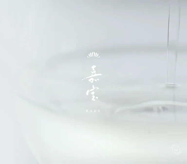
淡いグレーの背景に白い筆文字と金色のアクセントを重ねた、日本酒「嘉宝」のブランドページ。明朝体、縦組み、大きな余白を使い、酒造りから味わい・しつらえ・製品情報へと導く構成。
KAHO / 菊正宗 — Style Reference
White calligraphy suspended over a pale stream of liquid, with gold accents and the spacious rhythm of a Japanese editorial feature.
Website: 嘉宝|菊正宗 Original URL: https://www.kikumasamune.co.jp/products/kaho/ Final URL: https://www.kikumasamune.co.jp/products/kaho/ Theme: light, with cool gray imagery, white identity graphics, muted gold, and dark editorial text. Inspected: October 2, 2026, at 01:05:53.835 JST; supplied retrieval timestamp: October 1, 2026, at 16:05:53.835 UTC. Viewports: desktop 1440 × 1000 CSS pixels; mobile 390 × 844 CSS pixels. Scope: supplied current-page captures and rendered DOM/computed-style evidence. Visual captures show desktop opening states, the mobile hero, and desktop/mobile purchase and footer areas. Middle-page structure, typography, and controls are documented primarily through the DOM. Menu expansion, story-detail views, gallery activation, and purchase navigation were not demonstrated.
KAHO is a dedicated product and brand page within the Kikumasamune corporate website. It presents the sake through brewing philosophy, rice and water, craftsmanship, tasting, packaging, and product specifications before linking to the official shop. The experience is a long editorial journey rather than an on-page shopping catalog.
The visual identity depends on restraint: near-white liquid imagery, a white chrysanthemum emblem, expressive Japanese calligraphy, fine serif typography, and generous separation between elements. Gold marks narrative emphasis and purchase actions. Dark blue-black text supports the longer packaging essays. On mobile, the page changes its composition substantially while retaining the spacious pacing.
閉じる
KAHO / 菊正宗 — Style Reference
White calligraphy suspended over a pale stream of liquid, with gold accents and the spacious rhythm of a Japanese editorial feature.
Website: 嘉宝|菊正宗 Original URL: https://www.kikumasamune.co.jp/products/kaho/ Final URL: https://www.kikumasamune.co.jp/products/kaho/ Theme: light, with cool gray imagery, white identity graphics, muted gold, and dark editorial text. Inspected: October 2, 2026, at 01:05:53.835 JST; supplied retrieval timestamp: October 1, 2026, at 16:05:53.835 UTC. Viewports: desktop 1440 × 1000 CSS pixels; mobile 390 × 844 CSS pixels. Scope: supplied current-page captures and rendered DOM/computed-style evidence. Visual captures show desktop opening states, the mobile hero, and desktop/mobile purchase and footer areas. Middle-page structure, typography, and controls are documented primarily through the DOM. Menu expansion, story-detail views, gallery activation, and purchase navigation were not demonstrated.
KAHO is a dedicated product and brand page within the Kikumasamune corporate website. It presents the sake through brewing philosophy, rice and water, craftsmanship, tasting, packaging, and product specifications before linking to the official shop. The experience is a long editorial journey rather than an on-page shopping catalog.
The visual identity depends on restraint: near-white liquid imagery, a white chrysanthemum emblem, expressive Japanese calligraphy, fine serif typography, and generous separation between elements. Gold marks narrative emphasis and purchase actions. Dark blue-black text supports the longer packaging essays. On mobile, the page changes its composition substantially while retaining the spacious pacing.
How to Read This Reference
- Measured means a value appears in the supplied computed styles or element rectangles. Tables round most measurements to two decimal places.
- Visual estimate means an appearance or approximate color judged from an attached current-page capture. These estimates were not obtained by pixel sampling.
- Inferred means the DOM geometry supports an interpretation, but the relevant CSS property or interaction was not supplied.
- Recommended means implementation guidance for a new project. Proposed breakpoints, CSS aliases, accessibility treatments, and fallback behavior are not original source code.
- Element rectangles do not establish visibility. The evidence includes navigation and offscreen elements with measurable bounds even when they are absent from the capture.
- The two desktop opening captures show a centered company seal and an almost blank, softly blurred text state. They do not establish the final desktop hero appearance or the timing of the opening sequence.
- The supplied inspection includes stability and animation waiting, but this does not prove that every delayed scene completed. Static captures also cannot establish whether the liquid imagery is video, canvas, an animated image, or a still.
Tokens — Colors
Default Palette
The following hexadecimal values are direct conversions of supplied computed RGB values. Token names are implementation aliases, not discovered source variables.
| Name | Measured value | Suggested token | Observed role |
|---|---|---|---|
| Cool Paper | #EBEEF0 |
--color-paper |
Body background beneath the page's imagery and transparent sections |
| White | #FFFFFF |
--color-white |
Hero identity, header link, navigation text, product copy, footer identity and links |
| Champagne Gold | #C2A475 |
--color-gold |
Craft headings, continuation buttons, several section headings, purchase button background |
| Deep Gold | #A48452 |
--color-gold-deep |
Tasting copy and heading; backgrounds of certain unlabeled circular controls |
| Blue-black Ink | #191B28 |
--color-ink |
Default body color and long packaging/brand essays |
| Olive Ink | #686339 |
--color-olive |
Mobile introductory philosophy paragraphs |
Rendered Appearance
| Appearance | Visual estimate | Interpretation |
|---|---|---|
| Opening fog | Approximately #DFE5E7 |
The desktop opening field is slightly darker than the computed body background |
| Footer mist | Approximately #C7D1D5 |
A cool gray image field with a faint liquid stream and reflected light |
| Pale end of purchase fill | Approximately #D6C29F |
The captured pill looks lighter at its left side than the computed gold base |
The screenshot's gray field is not adequately described by the body background alone. Imagery supplies tonal variation, reflected highlights, and soft shadows. Likewise, the purchase button has a subtle tonal sweep and shadow in the capture, but its background-image and box-shadow declarations were not supplied. Any reproduced gradient or shadow must therefore be labeled an approximation.
The source exposes --swiper-theme-color: #007aff, but the supplied captures do not show a corresponding blue accent. Treat it as an ancillary library token, not part of the visible brand palette. Black computed values on some buttons also do not establish black visible icon artwork.
Tokens — Typography
Japanese Editorial Serif
Measured body stack: YakuHanMP_Noto, "Noto Serif CJK JP", "Noto Serif JP", serif.
The introductory tall text blocks use "Noto Serif CJK JP", "Noto Serif JP", serif without the first family. Supplied markup references Noto Serif JP weights 400 and 500. Some headings compute to weight 700; the evidence does not establish whether that weight uses a separate font resource, synthesis, or graphic content.
A computed family declaration identifies the requested stack, not the actual font used for every glyph. No font-file or glyph-resolution inspection was supplied.
The overall character is fine, formal, and open. Regular-weight text carries most of the narrative. Medium-weight gold titles and buttons add emphasis without introducing heavy sans-serif UI.
Calligraphy and Identity Graphics
The visible 嘉宝 wordmark is expressive calligraphy. The company seal, chrysanthemum emblem, and footer company lettering also have distinct graphic forms. Preserve these as authorized artwork; ordinary serif text will not reproduce their strokes or proportions.
The hero H1 has a computed font size near 31px, but its measured box is approximately 150 × 269px on desktop and 100 × 180px on mobile. Do not mistake the computed font size for the displayed calligraphic artwork's scale. The capture shows a larger identity stack consisting of an emblem, the wordmark, and a spaced KAHO caption.
Type Scale
Sizes and line heights below are measured in CSS pixels. They describe the sampled elements, not a recovered universal scale.
| Role | Desktop size / line height | Mobile size / line height | Weight | Tracking |
|---|---|---|---|---|
| Body default and main menu links | 15.81 / 36.90 |
15.60 / 36.40 |
400 | 0.79px desktop; 1.56px mobile |
| Narrative paragraphs | 17.92 / 42.17 |
13.52 / 36.40 |
400 | Usually 0.79px / 1.56px; some mobile paragraphs differ |
| Emphasized essay paragraphs | 21.08 / 42.17 |
14.56 / 38.48 |
400 | 0.79px / 1.56px |
| Tall introductory prose | 17.92 / 52.71 |
13.52 / 36.40 |
400 | 3.23px / 2.70px in the brewery introduction |
| Section H2 computed text | 23.72 / 55.34 |
23.40 / 54.60 |
700 | 0.79px / 1.56px; graphical treatment may determine visible size |
| Craft story title | 42.17 / 42.17 |
28.08 / 28.08 |
500 | 10.54px desktop; 7.58px for two mobile titles |
| Long mobile craft title | — | 28.08 / 28.08 |
500 | Reduced to 4.21px |
続きを見る |
16.87 / 16.87 |
14.56 / 14.56 |
500 | 4.22px / 2.91px |
| Main purchase button | 21.08 / 21.08 |
15.60 / 15.60 |
500 | 1.69px / 0.78px |
| Product volume | 21.08 / 21.08 |
16.64 / 16.64 |
400 | 0.1em |
| Product specifications | 13.70 / 29.52 |
12.48 / 24.96 |
400 | 0.79px / 1.56px |
| Privacy link | 14.76 / 34.44 |
12.48 / 29.12 |
400 | 0.79px / 1.56px |
| Alcohol notice | 12.65 / 29.52 |
12.48 / 20.80 |
400 | Normal |
| Copyright | 16.87 / 39.36 |
9.36 / 14.56 |
400 | 0.1em |
The unusually generous leading is central to the design. A mobile paragraph at 13.52px uses a 36.4px line height, approximately 2.69 times its font size. Keep this distinction between small glyphs and broad vertical rhythm when adapting the page.
Vertical Composition
Tall, narrow introductory text rectangles strongly indicate vertical text composition. For example, the mobile brewery introduction contains two prose blocks approximately 72.75px wide and 416px tall. The corresponding desktop blocks are approximately 158.11px and 210.81px wide, both 296.05px tall.
writing-mode was not included in the supplied computed properties. Using writing-mode: vertical-rl is a recommended implementation of this inferred composition, not a verified source declaration. Keep semantic Japanese text separate from calligraphic artwork.
Tokens — Spacing & Shapes
There is no evidence of one universal spacing system. Repeated values such as 10.54px and 21.08px on desktop, and 10.4px and 20.8px on mobile, suggest scaled authoring units, but the actual responsive formula was not supplied.
Spacing Measurements
| Use | Desktop | Mobile | Interpretation |
|---|---|---|---|
| Header logo left inset | 53.75px |
20.80px |
Header sits closer to the screen edge than most desktop editorial copy |
| Header top position | 48.48px |
21.83px |
Measured header rectangle |
| Common content left inset | 130.70–193.95px |
Often 20.80px |
Desktop uses several offset editorial alignments |
| Full-width mobile text area | — | 348.41px |
Approximately 20.8px margins on both sides |
| Gallery thumbnail gap | 20px |
15px |
Calculated from adjacent measured rectangles |
| Gallery vertical offset between groups | 20px |
20px |
Present in sampled geometry; cause not established |
| Footer top padding | 105.42px |
83.20px |
Separates purchase section from the main footer logo |
| Footer bottom padding | 37.95px |
41.60px |
Measured padding |
| Footer social-icon gap | Approximately 49.53px |
Approximately 39.52px |
Calculated edge-to-edge spacing |
| Alcohol notice padding | 6.33px 21.08px |
10.40px 20.80px 9.36px |
White rectangular notice |
Geometry
| Element | Desktop | Mobile |
|---|---|---|
| Header emblem | 68.52 × 29.52px |
53.03 × 22.88px |
| Menu button rectangle | 54.81 × 54.81px |
36.39 × 36.39px |
| Hero H1 rectangle | 149.69 × 268.81px |
99.83 × 179.50px |
| Scroll / top circle | 57.97px diameter |
41.59px diameter |
| Main purchase pill | 516.53 × 94.88px |
348.41 × 64.47px |
| Purchase pill radius | 100px |
100px |
| Gallery thumbnail button | 210.83 × 274.08px |
151 × 195.52px |
| Gallery thumbnail radius | 10px |
5px |
| Footer company logo | 171.83 × 130.70px |
134.16 × 102.95px |
| Alcohol notice | 1100.55 × 44.16px |
348.41 × 104.94px |
| Footer height | 685.33px |
723.61px |
Most content has no visible enclosing card. Rounded geometry is reserved for the purchase pill, circular navigation cues, and the measured gallery thumbnail controls. The alcohol notice retains square corners and a visually thin white outline.
Components
Opening Brand State
The first desktop capture presents a white company seal centered on a pale gray field. The seal includes vertical company lettering, a small chrysanthemum mark, and a surrounding botanical wreath. Its visible footprint is approximately 280px square, estimated from the capture.
A second desktop capture is almost entirely gray, with faint blurred central lettering. Treat these as captured opening states. Their exact order, duration, dismissal conditions, and relationship to asset loading are unverified. Neither should be reproduced as a permanent empty hero.
For a new implementation, show the meaningful hero immediately as a fallback. An optional opening sequence should never be required to reach the content.
Hero Identity and Liquid Background
The mobile hero fills the initial 390 × 844 viewport with pale liquid imagery. A narrow descending stream and its reflection sit behind the central identity. White artwork forms a vertical stack: chrysanthemum emblem, calligraphic 嘉宝, and widely spaced KAHO lettering.
The measured H1 begins at x 138.31, y 321.33 and occupies 99.83 × 179.50px. This rectangle excludes the entire emblem-and-caption stack. The visual stack extends approximately from y 254 to y 560 in the capture.
A thin circular scroll cue sits near the lower-right corner. Its measured mobile anchor is 41.59px square at x 327.61, y 754.58, and targets #intro-story. The capture shows a downward chevron and small circular SCROLL lettering. The desktop counterpart is a button with an opacity transition; its click effect was not supplied.
The mobile opening section measures 2007.70px tall because its DOM also contains later introductory material. Do not stretch the initial hero image to that full section height.
Sparse Header and Navigation
The header consists of a white chrysanthemum link at the upper left and a three-line menu control at the upper right. There is no opaque navigation bar behind them in the footer captures. The mobile hero capture does not visibly show this header, although its geometry exists in the DOM. Header visibility appears state-dependent, but its trigger is unverified.
The navigation DOM contains five internal destinations: トップ, 想い, 味わう, しつらえ, and 製品情報. These are followed by ネットショップ and four social links. Desktop menu-link boxes are approximately 221.38px wide; mobile boxes are 166.39px wide. The sampled links form a right-side vertical group.
The menu's open appearance, backdrop, focus behavior, and closing animation were not captured. Do not infer a particular drawer width or modal treatment solely from these link bounds.
Introductory Philosophy and Brewery Prose
This section pairs a narrow gold heading with tall blocks of restrained serif copy. The mobile philosophy text is olive; the following brewery introduction is white. On mobile, the philosophy heading is positioned near the right edge while the prose occupies narrow columns to its left.
The brewery introduction uses exceptionally wide spacing between text columns and generous tracking within the prose. Its gold heading measures approximately 104 × 293px on mobile, next to two 72.75 × 416px prose blocks.
Preserve the composition as a group. Simply centering every paragraph below a heading would lose the spatial relationship between the heading, the vertical reading direction, and the background scene.
Craftsmanship Sequence
The craft sequence introduces three subjects: premium Yamada Nishiki rice, Miyamizu water, and the contemporary traditional brewery. Each has a descriptive lead-in, a large gold title, quoted testimony, and a 続きを見る button.
Desktop headings have x positions extending far beyond the viewport—approximately 3053px, 4896px, and 6703px—while the containing scene measures one viewport high. This supports a horizontal staged arrangement. It does not establish whether wheel scrolling, a pinned timeline, dragging, or another mechanism moves the sequence.
Mobile places the three titles at approximately y 3807, 4751, and 5681, within a 3354.30px-tall section. This is a substantive change to a vertical narrative.
Continuation buttons are unfilled and gold, with widely tracked medium-weight text. Their rectangles measure 161.25 × 41.11px on desktop and 128.95 × 31.19px on mobile. The result of activating them was not inspected; do not invent accordion or modal contents.
Tasting and Pairing Copy
The tasting section uses Deep Gold for both its heading and paragraphs. The copy discusses the sake's flavor and food pairings, including local fish and beef. The desktop text block is approximately 618.48px wide at x 130.70. Mobile uses 348.41px with 20.8px side margins.
The content remains an editorial passage, with long line heights and distinct paragraph groups. It is not presented in the evidence as a collection of ingredient badges, tasting-score cards, or restaurant tiles. Preserve that reading rhythm.
The section's imagery was not visible in the supplied middle-page captures, so exact food photographs, crops, and image placement cannot be specified.
Packaging and Brand Essays
The packaging section combines gold display headings with dark body text. Desktop text blocks alternate between left and right positions: examples include x 171.81 with a 406.83px width and x 831.72 with a 425.53px width. Another passage uses a 493.52px-wide block.
Mobile moves these passages to a common left inset around 20.8px but retains varied widths—approximately 256.38px, 294.86px, 328.13px, and 348.41px. The result is a paced editorial composition rather than a single uniform text column.
Selected paragraphs increase in size without becoming bold. This is the main text-level emphasis technique: larger regular serif copy, extra separation, and deliberate line breaks.
The source prose describes white labels and boxes, letterpress relief, and recycled packaging material. These are statements in the page content; the supplied captures do not independently verify the detailed appearance of those materials in the gallery.
Gallery Strip
The DOM contains a horizontal sequence of portrait thumbnail buttons with modest rounded corners. Desktop buttons measure 210.83 × 274.08px; mobile buttons measure 151 × 195.52px. Their proportions are close to 10:13.
Adjacent buttons are separated by 20px on desktop and 15px on mobile. Some sampled groups sit 20px lower than others. Buttons declare transitions for shadow, opacity, and translation. Separate narrow controls span approximately the thumbnail height at the sides of the visible region.
The asset contents and activated state were not captured. Repeated offscreen buttons must not be counted as distinct editorial images without further evidence; a gallery implementation may contain repeated items. Automatic movement, dragging, lightboxes, and selection semantics remain unverified.
Product Presentation and Specifications
Two product volumes—720mL and 1800mL—appear in parallel on both desktop and mobile. On desktop, each product has its own nearby product title. On mobile, the visible text sequence contains the two volume labels followed by a shared product-name block.
The measurements support keeping the two volume positions side by side on a phone. They do not establish the exact bottle-image dimensions, because those image rectangles were not included.
Specifications sit beneath the product presentation as a compact text block: approximately 912.75px wide on desktop and 348.41px on mobile. The text lists rice, water, brewing methods, alcohol content, and serving temperature. Mobile uses many deliberate line breaks and a 24.96px line height. A semantic definition list is a useful implementation adaptation, provided it preserves the compact appearance.
Main Purchase Action
The main CTA reads 菊正宗のネットショップで購入する and points to the observed official-shop URL: https://www.kikumasamune.shop/c/liquor/sake/kahou.
Its anatomy is simple: a large gold pill, centered white medium-weight serif text, a 100px radius, and a subtle visible shadow. The measured desktop dimensions are 516.53 × 94.88px. Mobile expands the button to the main content width, 348.41px, with a 64.47px height.
A purchase-introduction paragraph sits above it. This is one line on desktop at 23.19px and two lines on mobile at 15.6px. The CTA's computed transition changes opacity over 460ms; the hover endpoint was not supplied.
Desktop Purchase Tab
The desktop footer capture shows a small gold tab attached to the lower-right edge, containing a bottle-and-box thumbnail beside ネットショップで購入する. Its sampled anchor rectangle is approximately 201.34 × 73.78px.
The tab declares a 1.2-second transition for opacity, visibility, and translation. Its measured rectangle and captured position differ slightly, so its final translation should not be reconstructed from one rectangle. No corresponding purchase tab is visible in the mobile capture or listed as a mobile purchase link. Its persistence rules and appearance threshold remain unverified.
Footer and Return-to-top Control
The footer continues the cool liquid imagery and uses white throughout. Its centered sequence is company logo, social icons, privacy link, an outlined alcohol notice, and copyright. Large vertical spaces make the footer feel like a closing brand scene.
The social row contains Facebook, the Twitter bird, Instagram, and YouTube. Retain the observed bird icon when referencing this captured design; the linked domain and visible artwork do not imply a different icon. Icon dimensions vary naturally by platform, rather than occupying identical visible squares.
The notice is one line within a broad rectangle on desktop and four lines within a taller rectangle on mobile. Copyright similarly changes from one desktop line to two small mobile lines.
A circular PAGE TOP cue sits toward the right and links to #gotop. Its destination is verified; smooth scrolling, rotation, or other animated behavior is not.
Tokens — Motion & Interaction
These values are supplied computed transition declarations. They establish transition channels and timings, not that a particular interaction was exercised.
| Element or treatment | Measured declaration | Evidence boundary |
|---|---|---|
| Header and footer brand links | opacity 0.46s |
Hover endpoint not supplied |
| Menu links and social links | color 0.46s |
Target color and active state unverified |
| Menu shop link | border-color, background-color, color, each 0.46s |
Open-menu appearance not captured |
| Craft continuation button | color 0.46s |
Expanded result unverified |
| Craft title reveal | translate and opacity, each 1.2s cubic-bezier(0.215, 0.61, 0.355, 1) |
Start/end offsets and trigger unverified |
| Craft introductory heading | translate, filter, opacity, each with the same 1.2s easing |
Filter type and magnitude not supplied |
| Desktop purchase tab | opacity, visibility, translate, each with the same 1.2s easing |
Visibility threshold unverified |
| Hero scroll cue | opacity 1.2s cubic-bezier(0.645, 0.045, 0.355, 1) 0.4s |
A 400ms delay is declared; trigger unverified |
| Gallery thumbnails | box-shadow, opacity, translate, each 0.46s |
Hover/selection endpoints not supplied |
| Gallery side controls | translate 0.46s |
Direction and displacement unverified |
| Product heading | filter 1.2s cubic-bezier(0.215, 0.61, 0.355, 1) |
Filter effect not supplied |
| Certain unlabeled circular buttons | scale 0.46s |
Their purpose cannot be assigned from the evidence |
The supported motion vocabulary is smooth and measured: 460ms control feedback and 1.2-second editorial reveals. Avoid inventing constant spinning text, elaborate parallax, autoplay timings, sound, or spring motion.
Many sampled elements report animation: none. This does not rule out JavaScript animation, media playback, animated descendants, or pseudo-elements. Likewise, a bare transition: all does not establish a visible timed effect.
Recommended adaptation: keep content visible by default, progressively enhance only verified-ready elements, and disable optional translation/filter effects for reduced motion. Reproduce the liquid scene with a still image unless actual motion assets and behavior are available.
Surfaces
| Layer | Appearance | Structural purpose |
|---|---|---|
| Base document | Measured Cool Paper | Fallback behind transparent scenes |
| Hero | Pale liquid imagery and white identity | Establishes atmosphere through image scale and negative space |
| Narrative scenes | Transparent section backgrounds in sampled styles | The underlying image or surrounding composition determines appearance |
| Editorial copy | Dark ink or gold without an enclosing card | Separates passages through placement and typography |
| Purchase action | Gold pill with a subtle visible tonal sweep and shadow | Concentrates the strongest actionable shape |
| Gallery controls | Portrait buttons with small radii | Contains image interaction without introducing a broad card system |
| Footer | Cool gray image field, white symbols and copy | Provides a quiet closing scene |
| Alcohol notice | Transparent interior, thin white rectangle | Distinguishes required notice text |
Do not derive unseen section backgrounds from text color alone. White prose suggests a contrasting scene, but its actual image and darkness were not documented in the supplied middle-page captures.
Imagery
The directly visible image language is pale, reflective, and nearly monochrome. A descending liquid stream provides a fine vertical line; ripples, reflections, and soft tonal transitions give depth without hard edges. White artwork sits over this atmosphere rather than inside a separate content panel.
The mobile crop concentrates the stream near the identity, while the desktop footer leaves the liquid detail toward the right. These are observed compositions, not proof of one shared asset or a particular object-position setting.
The white brand graphics carry much of the page's recognizability. Their irregular brushwork contrasts with the fine, regular serif text. The tiny bottle-and-box image in the desktop purchase tab adds a concrete product reference without competing with the large closing logo.
Observed Asset References
No original media filenames, image URLs, or file formats were supplied. The references below identify evidence, not downloadable assets.
| Asset or content | Evidence | Reuse guidance |
|---|---|---|
| Company seal with wreath | First desktop opening capture | Preserve as authorized artwork; do not approximate it with ordinary text |
| Hero chrysanthemum and KAHO identity | Mobile hero capture | Keep emblem, calligraphy, and Roman caption distinct |
| Liquid-stream scene | Mobile hero and desktop/mobile footer captures | Obtain the actual media or create a clearly labeled replacement; motion format is unknown |
| Header emblem | Desktop/mobile footer captures and measured links | Preserve its compact horizontal proportions |
| Footer company logo | Both footer captures | Use a separate correctly proportioned footer lockup |
| Four social symbols | Both footer captures and link destinations | Use the observed platform forms with accessible link names |
| Bottle-and-box miniature | Desktop purchase tab capture | Preserve the small product reference beside the text |
| Craft and gallery imagery | Associated section and control DOM only | Exact pictures and crops are not documented |
Avoid adding decorative rice illustrations, gold foil textures, brewery portraits, or food photography as if they had been visually confirmed. They may be appropriate commissioned assets, but they are not established by these captures.
Layout & Responsive Behavior
Measured Comparison
| Area | Desktop 1440 × 1000 | Mobile 390 × 844 |
|---|---|---|
| Document height | Approximately 24,145.78px |
Approximately 15,833.22px |
| Opening section | 1000px tall |
2007.70px, including later introductory material |
| Craft sequence | Viewport-height scene with content extending horizontally | Approximately 3354.30px tall, with vertically separated stories |
| Tasting section | Approximately 2784.03px tall |
Approximately 2063.03px tall |
| Packaging section | Approximately 5080.94px tall |
Approximately 4370.19px tall |
| Gallery thumbnails | 210.83px wide; 20px gaps |
151px wide; 15px gaps |
| Product volumes | Two parallel labels with repeated titles | Two parallel labels followed by a shared title block |
| Main CTA | Centered 516.53px width |
Content-width 348.41px |
| Desktop purchase tab | Visible in the footer capture | Not present in supplied mobile evidence |
| Footer notice | Broad single-line rectangle | Narrow four-line rectangle |
These document heights are capture measurements, not recommended CSS heights. They can include scene spacing and animation-related layout. Hardcoding them would reproduce empty distance without reproducing the corresponding storytelling behavior.
The mobile version does more than scale down. It reduces craft-title size, changes tracking for long titles, converts the craft sequence to a vertical arrangement, moves essay blocks to a shared left inset, and adjusts line breaks. The footer becomes taller even though the overall document is shorter.
Some vertical-looking headings remain tall on mobile. Others recompose: the heading in the bottling passage changes from a desktop rectangle of approximately 233 × 491px to a mobile rectangle of approximately 280 × 107px. This supports alternate heading composition rather than one globally scaled artwork.
The source exposes --vh: 10px and --vh-always: 10px on desktop, and 8.44px for both on mobile. These equal one percent of the inspected viewport heights. Their update behavior and exact usage are not supplied. A new implementation can use modern viewport units while testing browser-chrome changes and orientation.
No tablet, landscape-phone, or intermediate-width capture was provided. Any breakpoint introduced below is a recommendation, not a recovered original breakpoint.
Do’s and Don’ts
Do
- Build the visible atmosphere from cool liquid imagery, white identity artwork, and limited gold accents.
- Preserve the distinction between the graphic calligraphy and the serif text system.
- Keep long leading and deliberate paragraph separation, especially on mobile.
- Retain offset editorial text widths instead of forcing every section into one uniform grid.
- Treat the craft sequence as a different composition on desktop and mobile.
- Keep both product volumes in parallel at the observed phone width.
- Use the large gold pill as the principal purchase action.
- Preserve the footer's centered identity, social row, open spacing, and outlined notice.
- Separate verified transition declarations from untested interaction behavior.
- Provide meaningful static content while optional imagery or motion loads.
Don’t
- Do not treat the almost blank desktop opening capture as the completed page design.
- Do not use the computed H1 font size to recreate the calligraphic wordmark.
- Do not turn the editorial passages into a generic grid of rounded feature cards.
- Do not promote the unused blue library token into the brand palette.
- Do not introduce saturated gradients, heavy black panels, or large decorative shadows without new design intent.
- Do not assume every measured offscreen element was visible to the visitor.
- Do not invent gallery photographs, detail overlays, menu backdrops, or autoplay behavior.
- Do not hardcode the measured 24,146px desktop document height.
- Do not reduce the mobile experience to a compressed desktop scene.
- Do not reproduce faint white text without checking readability over the actual background media.
Recommended Implementation Additions
These are improvements for an adaptation, not verified features of the original page:
- Check text and control contrast against the lightest frame of any background media. Use darker editorial text or a localized tonal adjustment where necessary; a pale gray fallback with white text needs particular attention.
- Enlarge interaction hit areas to at least 44 × 44px. The measured mobile menu button, scroll circle, and continuation buttons have smaller dimensions in at least one direction.
- Give the menu button an accessible name and expanded state. If the implementation uses a modal menu, implement focus containment and restore focus on close.
- Name the scroll, return-to-top, gallery, and social controls explicitly. The extracted blank text on icon links does not establish whether accessible names already exist.
- Preserve headings, product names, and specifications as semantic text. Give identity artwork meaningful alternatives without repeating the same name unnecessarily.
- Keep content accessible without reveal scripts. A failed opening sequence should not leave an empty or permanently blurred screen.
- Provide reduced-motion behavior and a still alternative for any moving media. Do not require scroll-driven animation to understand the craft stories.
- Make gallery navigation keyboard-operable. Native horizontal overflow is a reasonable fallback if the original carousel behavior cannot be reproduced reliably.
- Reassess the smallest mobile text. The measured 9.36px copyright and 13.52px narrative copy are fidelity references, not minimum readability recommendations.
- Retain the observed alcohol notice as readable page content. No age-gate interaction was demonstrated.
Agent Prompt Guide
Quick Color Reference
- Document fallback:
#EBEEF0. - Main editorial ink:
#191B28. - White identity and overlaid UI:
#FFFFFF. - Gold titles and purchase base:
#C2A475. - Deeper tasting gold:
#A48452. - Mobile introductory olive:
#686339. - Approximate image-field fallback:
#C7D1D5; this is an estimate, not a measured source fill. - Approximate pale purchase-gradient end:
#D6C29F; the source gradient declaration is unavailable.
Overall Prompt
“Create a Japanese premium-sake product and brand page inspired by the supplied current KAHO evidence. Use pale liquid imagery, white chrysanthemum and calligraphic identity artwork, a Japanese serif stack, muted gold #C2A475, deeper gold #A48452, and dark editorial ink #191B28. Organize the page as a long sequence of philosophy, craftsmanship, tasting, packaging essays, two product volumes, specifications, purchase, and a spacious footer. Use tall Japanese text compositions and offset narrow prose blocks. On mobile, present the craft stories vertically, keep the two volume positions side by side, and make the purchase pill nearly full width. Use measured 460ms control transitions and optional 1.2-second reveals, with visible static defaults. Do not invent unobserved media, overlay contents, or animation mechanics.”
Example Component Prompts
- Hero: “A pale liquid-stream scene filling the first phone viewport. Center an authorized white chrysanthemum emblem above calligraphic
嘉宝artwork and a widely trackedKAHOcaption. Place a fine circular downward cue near the lower-right edge. Keep the imagery quiet and leave substantial empty space.” - Craft story: “A Japanese serif story about rice, water, or brewing craftsmanship. Use a gold medium-weight title at approximately 42px on desktop and 28px on mobile, open tracking, quoted testimony, and an unfilled
続きを見るbutton. Stack stories vertically on phones. Use supplied imagery only.” - Packaging essay: “Place regular dark serif paragraphs in offset desktop columns around 407–494px wide. Use approximately 18px text with 42px leading and selected 21px emphasis paragraphs. On mobile, move to a 21px left inset with intentionally varied column widths and generous paragraph gaps.”
- Purchase and footer: “Create a centered champagne-gold purchase pill, approximately 517 × 95px on desktop and 348 × 64px at a 390px phone width. Follow with a white company logo, four white social symbols, a privacy link, a thin outlined alcohol notice, and copyright over a pale liquid background.”
- Gallery fallback: “Create an accessible horizontal strip of portrait image buttons using authorized assets. Use approximately 211 × 274px tiles with 20px gaps and 10px radii on desktop; 151 × 196px tiles with 15px gaps and 5px radii on mobile. Provide keyboard navigation without assuming a lightbox or autoplay.”
Quick Start
CSS Custom Properties
This is an adaptation using measured anchor values, not recovered site CSS. The 48rem breakpoint, responsive gutter formula, fallback backgrounds, hover endpoint, and shadow are recommendations. It intentionally avoids a loading overlay and hidden-by-default content. Load authorized fonts and identity/media assets separately; no original asset URLs were exposed.
Use semantic HTML: a header with a brand link and button, a hero with a decorative media element and accessible identity, editorial sections, a two-column product group, a purchase link, and a footer. The .kaho-media class can be applied to an image or an appropriately controlled video. The CSS does not implement menu logic, horizontal storytelling, or gallery detail views.
:root {
  /* Measured source colors */
  --color-paper: #ebeef0;
  --color-white: #fff;
  --color-ink: #191b28;
  --color-gold: #c2a475;
  --color-gold-deep: #a48452;
  --color-olive: #686339;

  /* Visual estimates for optional fallbacks */
  --color-mist: #c7d1d5;
  --color-gold-light: #d6c29f;

  --font-editorial: YakuHanMP_Noto, 'Noto Serif CJK JP',
    'Noto Serif JP', serif;
  --text-base: 15.8126px;
  --text-body: 17.9209px;
  --text-lead: 21.0835px;
  --text-craft: 42.1669px;
  --leading-base: 36.896px;
  --leading-body: 42.1669px;
  --tracking-body: 0.79063px;

  /* Recommended interpolation between inspected layouts */
  --page-gutter: clamp(20.8px, 9.077vw, 130.7px);
  --header-inset: 53.75px;
  --header-top: 48.48px;
  --menu-art-size: 54.81px;
  --circle-size: 57.97px;
  --gallery-width: 210.83px;
  --gallery-height: 274.08px;
  --gallery-gap: 20px;
  --gallery-radius: 10px;

  /* Measured transition vocabulary */
  --motion-control: 460ms;
  --motion-reveal: 1200ms;
  --ease-reveal: cubic-bezier(0.215, 0.61, 0.355, 1);
  --ease-cue: cubic-bezier(0.645, 0.045, 0.355, 1);
}

* { box-sizing: border-box; }
body { margin: 0; }

.kaho-page {
  color: var(--color-ink);
  background: var(--color-paper);
  font-family: var(--font-editorial);
  font-size: var(--text-base);
  font-weight: 400;
  line-height: var(--leading-base);
  letter-spacing: var(--tracking-body);
}

.kaho-page a { color: inherit; }
.kaho-page button { font: inherit; }

/* Fixed placement is an adaptation of the persistent-looking header. */
.kaho-header {
  position: fixed;
  z-index: 30;
  inset: var(--header-top) var(--header-inset) auto;
  display: flex;
  align-items: center;
  justify-content: space-between;
  color: var(--color-white);
  pointer-events: none;
}

.kaho-header > * { pointer-events: auto; }
.kaho-header__brand { display: block; width: 68.52px; }
.kaho-header__brand img { display: block; width: 100%; }

.kaho-menu-toggle {
  display: grid;
  place-content: center;
  gap: 10px;
  width: max(44px, var(--menu-art-size));
  height: max(44px, var(--menu-art-size));
  padding: 0;
  border: 0;
  color: inherit;
  background: transparent;
  cursor: pointer;
}

.kaho-menu-toggle span {
  display: block;
  width: var(--menu-art-size);
  height: 1px;
  background: currentColor;
}

.kaho-hero {
  position: relative;
  isolation: isolate;
  display: grid;
  place-items: center;
  min-height: 100vh;
  min-height: 100svh;
  color: var(--color-white);
  background: var(--color-mist);
}

.kaho-media {
  position: absolute;
  z-index: 0;
  inset: 0;
  width: 100%;
  height: 100%;
  object-fit: cover;
  pointer-events: none;
}

.kaho-hero__identity {
  position: relative;
  z-index: 1;
  display: grid;
  justify-items: center;
  gap: 36px;
}

/* Use actual artwork; these widths reference the measured H1 boxes. */
.kaho-wordmark { display: block; width: 149.69px; height: auto; }
.kaho-roman {
  margin: 0;
  font-size: 14px;
  line-height: 1;
  letter-spacing: 0.5em;
}

.kaho-circle {
  position: absolute;
  z-index: 2;
  right: var(--header-inset);
  bottom: 8vh;
  display: grid;
  place-items: center;
  width: var(--circle-size);
  height: var(--circle-size);
  border: 1px solid currentColor;
  border-radius: 50%;
  color: inherit;
  background: transparent;
  text-decoration: none;
}

.kaho-circle::before {
  content: '';
  width: 12px;
  height: 12px;
  border-right: 1px solid currentColor;
  border-bottom: 1px solid currentColor;
  transform: translateY(-3px) rotate(45deg);
}

.kaho-circle.is-up::before {
  transform: translateY(3px) rotate(225deg);
}

/* Expand the hit area without enlarging the visible ring. */
.kaho-circle::after { content: ''; position: absolute; inset: -8px; }

.kaho-section {
  padding: clamp(83.2px, 10vw, 160px) var(--page-gutter);
}

.kaho-prose {
  max-width: 493.52px;
  font-size: var(--text-body);
  line-height: var(--leading-body);
}

.kaho-prose.is-offset { margin-left: auto; }
.kaho-prose p { margin: 0; }
.kaho-prose p + p { margin-top: 50.6px; }
.kaho-prose .lead { font-size: var(--text-lead); }
.kaho-prose.is-tasting { color: var(--color-gold-deep); }

/* Recommended interpretation of the tall introductory text geometry. */
.kaho-vertical-prose {
  writing-mode: vertical-rl;
  text-orientation: mixed;
  max-inline-size: 296.05px;
  font-size: 17.9209px;
  line-height: 52.7086px;
  letter-spacing: 3.22577px;
}

.kaho-craft-title {
  margin: 0;
  color: var(--color-gold);
  font-size: var(--text-craft);
  font-weight: 500;
  line-height: 1;
  letter-spacing: 0.25em;
}

.kaho-more {
  display: inline-flex;
  align-items: center;
  justify-content: center;
  min-height: 44px;
  padding: 0;
  border: 0;
  color: var(--color-gold);
  background: transparent;
  font-size: 16.8668px;
  font-weight: 500;
  line-height: 1;
  letter-spacing: 0.25em;
  cursor: pointer;
  transition: color var(--motion-control);
}

/* Native overflow is a recommended fallback, not the recovered carousel. */
.kaho-gallery {
  display: flex;
  gap: var(--gallery-gap);
  overflow-x: auto;
  padding: 24px var(--page-gutter);
  scroll-snap-type: x proximity;
}

.kaho-gallery__item {
  flex: 0 0 var(--gallery-width);
  height: var(--gallery-height);
  padding: 0;
  overflow: hidden;
  border: 0;
  border-radius: var(--gallery-radius);
  background: transparent;
  scroll-snap-align: center;
  transition: opacity var(--motion-control),
    translate var(--motion-control), box-shadow var(--motion-control);
}

.kaho-gallery__item img {
  display: block;
  width: 100%;
  height: 100%;
  object-fit: cover;
}

.kaho-products {
  display: grid;
  grid-template-columns: repeat(2, minmax(0, 1fr));
  gap: clamp(20px, 6vw, 90px);
  text-align: center;
}

.kaho-products img { display: block; max-width: 100%; margin-inline: auto; }
.kaho-volume { font-size: 21.0835px; line-height: 1; letter-spacing: 0.1em; }

.kaho-specs {
  max-width: 912.75px;
  margin-inline: auto;
  font-size: 13.7042px;
  line-height: 29.5168px;
}

.kaho-purchase {
  padding: 80px var(--page-gutter) 21.08px;
  text-align: center;
}

.kaho-buy {
  display: flex;
  align-items: center;
  justify-content: center;
  width: min(100%, 516.53px);
  min-height: 94.88px;
  margin-inline: auto;
  padding: 18px 24px 22px;
  border-radius: 100px;
  color: var(--color-white) !important;
  background: var(--color-gold);
  /* Approximate the visible tonal sweep and shadow. */
  background-image: linear-gradient(110deg,
    var(--color-gold-light), var(--color-gold));
  box-shadow: 0 5px 10px rgb(25 27 40 / 12%);
  font-size: 21.0835px;
  font-weight: 500;
  line-height: 1.4;
  letter-spacing: 0.08em;
  text-decoration: none;
  transition: opacity var(--motion-control);
}

.kaho-footer {
  position: relative;
  isolation: isolate;
  padding: 105.42px 0 37.95px;
  color: var(--color-white);
  background: var(--color-mist);
  text-align: center;
}

.kaho-footer > :not(.kaho-media) { position: relative; z-index: 1; }
.kaho-footer__brand { display: block; width: 171.83px; margin-inline: auto; }
.kaho-footer__brand img { display: block; width: 100%; }

.kaho-socials {
  display: flex;
  align-items: center;
  justify-content: center;
  gap: 49.53px;
  margin: 127.55px 0 56px;
}

.kaho-socials a { display: grid; place-items: center; min-height: 44px; }
.kaho-socials svg { display: block; width: auto; height: 34px; }
.kaho-privacy { font-size: 14.7584px; text-decoration: none; }

.kaho-notice {
  width: min(calc(100% - 2 * var(--page-gutter)), 1100.55px);
  margin: 44px auto 0;
  padding: 6.33px 21.08px;
  border: 1px solid currentColor;
  font-size: 12.6501px;
  line-height: 29.5168px;
  letter-spacing: normal;
}

.kaho-copyright {
  margin: 35.83px var(--page-gutter) 0;
  font-size: 16.8668px;
  line-height: 39.3558px;
  letter-spacing: 0.1em;
}

.kaho-footer > .kaho-circle { position: absolute; bottom: 215px; }

/* Recommended focus treatment; verify against actual media. */
.kaho-page :focus-visible {
  outline: 2px solid var(--color-ink);
  outline-offset: 5px;
  box-shadow: 0 0 0 5px var(--color-white);
}

@media (hover: hover) {
  /* Recommended endpoint; the original endpoint was not supplied. */
  .kaho-buy:hover { opacity: 0.86; }
}

/* Recommended breakpoint, anchored to the inspected phone dimensions. */
@media (max-width: 48rem) {
  :root {
    --text-base: 15.6px;
    --text-body: 13.52px;
    --text-lead: 14.56px;
    --text-craft: 28.08px;
    --leading-base: 36.4px;
    --leading-body: 36.4px;
    --tracking-body: 1.56px;
    --page-gutter: clamp(16px, 5.333vw, 24px);
    --header-inset: 20.8px;
    --header-top: 21.83px;
    --menu-art-size: 36.39px;
    --circle-size: 41.59px;
    --gallery-width: 151px;
    --gallery-height: 195.52px;
    --gallery-gap: 15px;
    --gallery-radius: 5px;
  }

  .kaho-header__brand { width: 53.03px; }
  .kaho-wordmark { width: 99.83px; }
  .kaho-hero > .kaho-circle { bottom: 47.8px; }
  .kaho-prose.is-offset { margin-left: 0; }
  .kaho-prose p + p { margin-top: 29.12px; }
  .kaho-prose .lead { line-height: 38.48px; }
  .kaho-vertical-prose {
    max-inline-size: 416px;
    font-size: 13.52px;
    line-height: 36.4px;
    letter-spacing: 2.704px;
  }
  .kaho-craft-title { letter-spacing: 0.27em; }
  .kaho-craft-title.is-long { letter-spacing: 0.15em; }
  .kaho-more { font-size: 14.56px; letter-spacing: 0.2em; }
  .kaho-volume { font-size: 16.64px; }
  .kaho-specs { font-size: 12.48px; line-height: 24.96px; }
  .kaho-buy {
    min-height: 64.47px;
    padding: 14px 20px 18px;
    font-size: 15.6px;
    letter-spacing: 0.05em;
  }
  .kaho-footer { padding: 83.2px 0 41.6px; }
  .kaho-footer__brand { width: 134.16px; }
  .kaho-socials { gap: 39.52px; margin: 99.83px 0 36px; }
  .kaho-socials svg { height: 26px; }
  .kaho-privacy { font-size: 12.48px; }
  .kaho-notice {
    margin-top: 116px;
    padding: 10.4px 20.8px 9.36px;
    font-size: 12.48px;
    line-height: 20.8px;
  }
  .kaho-copyright {
    margin-top: 57.2px;
    font-size: 9.36px;
    line-height: 14.56px;
  }
  .kaho-footer > .kaho-circle { bottom: 271.44px; }
}

/* Recommended opt-in transition; content is never initially hidden here. */
.kaho-reveal {
  transition: opacity var(--motion-reveal) var(--ease-reveal),
    translate var(--motion-reveal) var(--ease-reveal),
    filter var(--motion-reveal) var(--ease-reveal);
}

@media (prefers-reduced-motion: reduce) {
  .kaho-page *, .kaho-page *::before, .kaho-page *::after {
    animation: none !important;
    transition: none !important;
    scroll-behavior: auto !important;
  }
  .kaho-reveal { opacity: 1; translate: none; filter: none; }
}
The example preserves the small measured text sizes for reference. Before production use, adjust them and the white-on-mist contrast as described above. CSS cannot pause an independently playing video; implement reduced-motion media handling in the application if moving media is used.
Tailwind v4 Token Mapping
Optional mapping for an existing Tailwind v4 project. Define the custom properties above first. These utilities are implementation aliases and do not imply that the original site uses Tailwind.
@theme inline {
  --color-kaho-paper: var(--color-paper);
  --color-kaho-ink: var(--color-ink);
  --color-kaho-white: var(--color-white);
  --color-kaho-gold: var(--color-gold);
  --color-kaho-gold-deep: var(--color-gold-deep);
  --color-kaho-olive: var(--color-olive);

  --font-kaho: var(--font-editorial);
  --text-kaho-body: var(--text-body);
  --text-kaho-lead: var(--text-lead);
  --text-kaho-craft: var(--text-craft);

  --spacing-kaho-gutter: var(--page-gutter);
  --spacing-kaho-gallery: var(--gallery-width);
  --radius-kaho-gallery: var(--gallery-radius);
  --radius-kaho-pill: 100px;
  --ease-kaho-reveal: var(--ease-reveal);
}
Sources & Evidence
- Inspected original and final page: 嘉宝|菊正宗. The supplied inspection reports HTTP 200 and identical original/final URLs.
- Capture timestamp:
2026-10-01T16:05:53.835Z, equivalent to October 2, 2026, 01:05:53.835 JST. Individual screenshot timestamps were not provided separately. - Actual inspected viewports: 1440 × 1000 and 390 × 844 CSS pixels. Document heights were approximately 24,145.78px and 15,833.22px respectively.
- Visual evidence: two desktop opening-state captures, a desktop purchase/footer capture, a mobile hero capture, and a mobile purchase/footer capture. Visual estimates in this document use only those current-page captures.
- Rendered evidence: page text, internal and external link targets, element bounding rectangles, computed font declarations, colors, padding, radii, transition declarations, and the supplied viewport-related custom properties.
- Original-page identity: the footer links to the Kikumasamune corporate website and displays
Copyright Kiku-Masamune Sake Brewing Co.,Ltd. All Rights Reserved.No web-production credit was identified in the supplied original-page evidence. - Inspection procedure: the supplied browser process waited for document loading, relevant finite motion, sampled layout/text stability, and image decoding within its stated limits, and traversed intermediate scroll positions. This does not establish completion of every delayed scene or interaction.
- Limitations: no additional browsing, file access, or interaction testing was performed for this reference. Media URLs, full stylesheets, resolved font files, menu-open visuals, detail views, gallery results, precise scroll orchestration, reduced-motion support, and intermediate responsive breakpoints remain unverified.
This reference describes the current page represented by the supplied inspection. Measured values, visual estimates, inferred composition, and implementation recommendations are identified separately throughout.
# KAHO / 菊正宗 — Style Reference

> White calligraphy suspended over a pale stream of liquid, with gold accents and the spacious rhythm of a Japanese editorial feature.

**Website:** [嘉宝|菊正宗](https://www.kikumasamune.co.jp/products/kaho/)
**Original URL:** https://www.kikumasamune.co.jp/products/kaho/
**Final URL:** https://www.kikumasamune.co.jp/products/kaho/
**Theme:** light, with cool gray imagery, white identity graphics, muted gold, and dark editorial text.
**Inspected:** October 2, 2026, at 01:05:53.835 JST; supplied retrieval timestamp: October 1, 2026, at 16:05:53.835 UTC.
**Viewports:** desktop 1440 × 1000 CSS pixels; mobile 390 × 844 CSS pixels.
**Scope:** supplied current-page captures and rendered DOM/computed-style evidence. Visual captures show desktop opening states, the mobile hero, and desktop/mobile purchase and footer areas. Middle-page structure, typography, and controls are documented primarily through the DOM. Menu expansion, story-detail views, gallery activation, and purchase navigation were not demonstrated.

KAHO is a dedicated product and brand page within the Kikumasamune corporate website. It presents the sake through brewing philosophy, rice and water, craftsmanship, tasting, packaging, and product specifications before linking to the official shop. The experience is a long editorial journey rather than an on-page shopping catalog.

The visual identity depends on restraint: near-white liquid imagery, a white chrysanthemum emblem, expressive Japanese calligraphy, fine serif typography, and generous separation between elements. Gold marks narrative emphasis and purchase actions. Dark blue-black text supports the longer packaging essays. On mobile, the page changes its composition substantially while retaining the spacious pacing.
閉じる
# KAHO / 菊正宗 — Style Reference

> White calligraphy suspended over a pale stream of liquid, with gold accents and the spacious rhythm of a Japanese editorial feature.

**Website:** [嘉宝|菊正宗](https://www.kikumasamune.co.jp/products/kaho/)
**Original URL:** https://www.kikumasamune.co.jp/products/kaho/
**Final URL:** https://www.kikumasamune.co.jp/products/kaho/
**Theme:** light, with cool gray imagery, white identity graphics, muted gold, and dark editorial text.
**Inspected:** October 2, 2026, at 01:05:53.835 JST; supplied retrieval timestamp: October 1, 2026, at 16:05:53.835 UTC.
**Viewports:** desktop 1440 × 1000 CSS pixels; mobile 390 × 844 CSS pixels.
**Scope:** supplied current-page captures and rendered DOM/computed-style evidence. Visual captures show desktop opening states, the mobile hero, and desktop/mobile purchase and footer areas. Middle-page structure, typography, and controls are documented primarily through the DOM. Menu expansion, story-detail views, gallery activation, and purchase navigation were not demonstrated.

KAHO is a dedicated product and brand page within the Kikumasamune corporate website. It presents the sake through brewing philosophy, rice and water, craftsmanship, tasting, packaging, and product specifications before linking to the official shop. The experience is a long editorial journey rather than an on-page shopping catalog.

The visual identity depends on restraint: near-white liquid imagery, a white chrysanthemum emblem, expressive Japanese calligraphy, fine serif typography, and generous separation between elements. Gold marks narrative emphasis and purchase actions. Dark blue-black text supports the longer packaging essays. On mobile, the page changes its composition substantially while retaining the spacious pacing.

## How to Read This Reference

- **Measured** means a value appears in the supplied computed styles or element rectangles. Tables round most measurements to two decimal places.
- **Visual estimate** means an appearance or approximate color judged from an attached current-page capture. These estimates were not obtained by pixel sampling.
- **Inferred** means the DOM geometry supports an interpretation, but the relevant CSS property or interaction was not supplied.
- **Recommended** means implementation guidance for a new project. Proposed breakpoints, CSS aliases, accessibility treatments, and fallback behavior are not original source code.
- Element rectangles do not establish visibility. The evidence includes navigation and offscreen elements with measurable bounds even when they are absent from the capture.
- The two desktop opening captures show a centered company seal and an almost blank, softly blurred text state. They do not establish the final desktop hero appearance or the timing of the opening sequence.
- The supplied inspection includes stability and animation waiting, but this does not prove that every delayed scene completed. Static captures also cannot establish whether the liquid imagery is video, canvas, an animated image, or a still.

## Tokens — Colors

### Default Palette

The following hexadecimal values are direct conversions of supplied computed RGB values. Token names are implementation aliases, not discovered source variables.

| Name | Measured value | Suggested token | Observed role |
| --- | --- | --- | --- |
| Cool Paper | `#EBEEF0` | `--color-paper` | Body background beneath the page's imagery and transparent sections |
| White | `#FFFFFF` | `--color-white` | Hero identity, header link, navigation text, product copy, footer identity and links |
| Champagne Gold | `#C2A475` | `--color-gold` | Craft headings, continuation buttons, several section headings, purchase button background |
| Deep Gold | `#A48452` | `--color-gold-deep` | Tasting copy and heading; backgrounds of certain unlabeled circular controls |
| Blue-black Ink | `#191B28` | `--color-ink` | Default body color and long packaging/brand essays |
| Olive Ink | `#686339` | `--color-olive` | Mobile introductory philosophy paragraphs |

### Rendered Appearance

| Appearance | Visual estimate | Interpretation |
| --- | --- | --- |
| Opening fog | Approximately `#DFE5E7` | The desktop opening field is slightly darker than the computed body background |
| Footer mist | Approximately `#C7D1D5` | A cool gray image field with a faint liquid stream and reflected light |
| Pale end of purchase fill | Approximately `#D6C29F` | The captured pill looks lighter at its left side than the computed gold base |

The screenshot's gray field is not adequately described by the body background alone. Imagery supplies tonal variation, reflected highlights, and soft shadows. Likewise, the purchase button has a subtle tonal sweep and shadow in the capture, but its background-image and box-shadow declarations were not supplied. Any reproduced gradient or shadow must therefore be labeled an approximation.

The source exposes `--swiper-theme-color: #007aff`, but the supplied captures do not show a corresponding blue accent. Treat it as an ancillary library token, not part of the visible brand palette. Black computed values on some buttons also do not establish black visible icon artwork.

## Tokens — Typography

### Japanese Editorial Serif

**Measured body stack:** `YakuHanMP_Noto, "Noto Serif CJK JP", "Noto Serif JP", serif`.

The introductory tall text blocks use `"Noto Serif CJK JP", "Noto Serif JP", serif` without the first family. Supplied markup references Noto Serif JP weights 400 and 500. Some headings compute to weight 700; the evidence does not establish whether that weight uses a separate font resource, synthesis, or graphic content.

A computed family declaration identifies the requested stack, not the actual font used for every glyph. No font-file or glyph-resolution inspection was supplied.

The overall character is fine, formal, and open. Regular-weight text carries most of the narrative. Medium-weight gold titles and buttons add emphasis without introducing heavy sans-serif UI.

### Calligraphy and Identity Graphics

The visible `嘉宝` wordmark is expressive calligraphy. The company seal, chrysanthemum emblem, and footer company lettering also have distinct graphic forms. Preserve these as authorized artwork; ordinary serif text will not reproduce their strokes or proportions.

The hero H1 has a computed font size near 31px, but its measured box is approximately 150 × 269px on desktop and 100 × 180px on mobile. Do not mistake the computed font size for the displayed calligraphic artwork's scale. The capture shows a larger identity stack consisting of an emblem, the wordmark, and a spaced `KAHO` caption.

### Type Scale

Sizes and line heights below are measured in CSS pixels. They describe the sampled elements, not a recovered universal scale.

| Role | Desktop size / line height | Mobile size / line height | Weight | Tracking |
| --- | --- | --- | --- | --- |
| Body default and main menu links | `15.81 / 36.90` | `15.60 / 36.40` | 400 | `0.79px` desktop; `1.56px` mobile |
| Narrative paragraphs | `17.92 / 42.17` | `13.52 / 36.40` | 400 | Usually `0.79px` / `1.56px`; some mobile paragraphs differ |
| Emphasized essay paragraphs | `21.08 / 42.17` | `14.56 / 38.48` | 400 | `0.79px` / `1.56px` |
| Tall introductory prose | `17.92 / 52.71` | `13.52 / 36.40` | 400 | `3.23px` / `2.70px` in the brewery introduction |
| Section H2 computed text | `23.72 / 55.34` | `23.40 / 54.60` | 700 | `0.79px` / `1.56px`; graphical treatment may determine visible size |
| Craft story title | `42.17 / 42.17` | `28.08 / 28.08` | 500 | `10.54px` desktop; `7.58px` for two mobile titles |
| Long mobile craft title | — | `28.08 / 28.08` | 500 | Reduced to `4.21px` |
| `続きを見る` | `16.87 / 16.87` | `14.56 / 14.56` | 500 | `4.22px` / `2.91px` |
| Main purchase button | `21.08 / 21.08` | `15.60 / 15.60` | 500 | `1.69px` / `0.78px` |
| Product volume | `21.08 / 21.08` | `16.64 / 16.64` | 400 | `0.1em` |
| Product specifications | `13.70 / 29.52` | `12.48 / 24.96` | 400 | `0.79px` / `1.56px` |
| Privacy link | `14.76 / 34.44` | `12.48 / 29.12` | 400 | `0.79px` / `1.56px` |
| Alcohol notice | `12.65 / 29.52` | `12.48 / 20.80` | 400 | Normal |
| Copyright | `16.87 / 39.36` | `9.36 / 14.56` | 400 | `0.1em` |

The unusually generous leading is central to the design. A mobile paragraph at 13.52px uses a 36.4px line height, approximately 2.69 times its font size. Keep this distinction between small glyphs and broad vertical rhythm when adapting the page.

### Vertical Composition

Tall, narrow introductory text rectangles strongly indicate vertical text composition. For example, the mobile brewery introduction contains two prose blocks approximately 72.75px wide and 416px tall. The corresponding desktop blocks are approximately 158.11px and 210.81px wide, both 296.05px tall.

`writing-mode` was not included in the supplied computed properties. Using `writing-mode: vertical-rl` is a recommended implementation of this inferred composition, not a verified source declaration. Keep semantic Japanese text separate from calligraphic artwork.

## Tokens — Spacing & Shapes

There is no evidence of one universal spacing system. Repeated values such as 10.54px and 21.08px on desktop, and 10.4px and 20.8px on mobile, suggest scaled authoring units, but the actual responsive formula was not supplied.

### Spacing Measurements

| Use | Desktop | Mobile | Interpretation |
| --- | --- | --- | --- |
| Header logo left inset | `53.75px` | `20.80px` | Header sits closer to the screen edge than most desktop editorial copy |
| Header top position | `48.48px` | `21.83px` | Measured header rectangle |
| Common content left inset | `130.70–193.95px` | Often `20.80px` | Desktop uses several offset editorial alignments |
| Full-width mobile text area | — | `348.41px` | Approximately 20.8px margins on both sides |
| Gallery thumbnail gap | `20px` | `15px` | Calculated from adjacent measured rectangles |
| Gallery vertical offset between groups | `20px` | `20px` | Present in sampled geometry; cause not established |
| Footer top padding | `105.42px` | `83.20px` | Separates purchase section from the main footer logo |
| Footer bottom padding | `37.95px` | `41.60px` | Measured padding |
| Footer social-icon gap | Approximately `49.53px` | Approximately `39.52px` | Calculated edge-to-edge spacing |
| Alcohol notice padding | `6.33px 21.08px` | `10.40px 20.80px 9.36px` | White rectangular notice |

### Geometry

| Element | Desktop | Mobile |
| --- | --- | --- |
| Header emblem | `68.52 × 29.52px` | `53.03 × 22.88px` |
| Menu button rectangle | `54.81 × 54.81px` | `36.39 × 36.39px` |
| Hero H1 rectangle | `149.69 × 268.81px` | `99.83 × 179.50px` |
| Scroll / top circle | `57.97px` diameter | `41.59px` diameter |
| Main purchase pill | `516.53 × 94.88px` | `348.41 × 64.47px` |
| Purchase pill radius | `100px` | `100px` |
| Gallery thumbnail button | `210.83 × 274.08px` | `151 × 195.52px` |
| Gallery thumbnail radius | `10px` | `5px` |
| Footer company logo | `171.83 × 130.70px` | `134.16 × 102.95px` |
| Alcohol notice | `1100.55 × 44.16px` | `348.41 × 104.94px` |
| Footer height | `685.33px` | `723.61px` |

Most content has no visible enclosing card. Rounded geometry is reserved for the purchase pill, circular navigation cues, and the measured gallery thumbnail controls. The alcohol notice retains square corners and a visually thin white outline.

## Components

### Opening Brand State

The first desktop capture presents a white company seal centered on a pale gray field. The seal includes vertical company lettering, a small chrysanthemum mark, and a surrounding botanical wreath. Its visible footprint is approximately 280px square, estimated from the capture.

A second desktop capture is almost entirely gray, with faint blurred central lettering. Treat these as captured opening states. Their exact order, duration, dismissal conditions, and relationship to asset loading are unverified. Neither should be reproduced as a permanent empty hero.

For a new implementation, show the meaningful hero immediately as a fallback. An optional opening sequence should never be required to reach the content.

### Hero Identity and Liquid Background

The mobile hero fills the initial 390 × 844 viewport with pale liquid imagery. A narrow descending stream and its reflection sit behind the central identity. White artwork forms a vertical stack: chrysanthemum emblem, calligraphic `嘉宝`, and widely spaced `KAHO` lettering.

The measured H1 begins at x 138.31, y 321.33 and occupies 99.83 × 179.50px. This rectangle excludes the entire emblem-and-caption stack. The visual stack extends approximately from y 254 to y 560 in the capture.

A thin circular scroll cue sits near the lower-right corner. Its measured mobile anchor is 41.59px square at x 327.61, y 754.58, and targets `#intro-story`. The capture shows a downward chevron and small circular `SCROLL` lettering. The desktop counterpart is a button with an opacity transition; its click effect was not supplied.

The mobile opening section measures 2007.70px tall because its DOM also contains later introductory material. Do not stretch the initial hero image to that full section height.

### Sparse Header and Navigation

The header consists of a white chrysanthemum link at the upper left and a three-line menu control at the upper right. There is no opaque navigation bar behind them in the footer captures. The mobile hero capture does not visibly show this header, although its geometry exists in the DOM. Header visibility appears state-dependent, but its trigger is unverified.

The navigation DOM contains five internal destinations: `トップ`, `想い`, `味わう`, `しつらえ`, and `製品情報`. These are followed by `ネットショップ` and four social links. Desktop menu-link boxes are approximately 221.38px wide; mobile boxes are 166.39px wide. The sampled links form a right-side vertical group.

The menu's open appearance, backdrop, focus behavior, and closing animation were not captured. Do not infer a particular drawer width or modal treatment solely from these link bounds.

### Introductory Philosophy and Brewery Prose

This section pairs a narrow gold heading with tall blocks of restrained serif copy. The mobile philosophy text is olive; the following brewery introduction is white. On mobile, the philosophy heading is positioned near the right edge while the prose occupies narrow columns to its left.

The brewery introduction uses exceptionally wide spacing between text columns and generous tracking within the prose. Its gold heading measures approximately 104 × 293px on mobile, next to two 72.75 × 416px prose blocks.

Preserve the composition as a group. Simply centering every paragraph below a heading would lose the spatial relationship between the heading, the vertical reading direction, and the background scene.

### Craftsmanship Sequence

The craft sequence introduces three subjects: premium Yamada Nishiki rice, Miyamizu water, and the contemporary traditional brewery. Each has a descriptive lead-in, a large gold title, quoted testimony, and a `続きを見る` button.

Desktop headings have x positions extending far beyond the viewport—approximately 3053px, 4896px, and 6703px—while the containing scene measures one viewport high. This supports a horizontal staged arrangement. It does not establish whether wheel scrolling, a pinned timeline, dragging, or another mechanism moves the sequence.

Mobile places the three titles at approximately y 3807, 4751, and 5681, within a 3354.30px-tall section. This is a substantive change to a vertical narrative.

Continuation buttons are unfilled and gold, with widely tracked medium-weight text. Their rectangles measure 161.25 × 41.11px on desktop and 128.95 × 31.19px on mobile. The result of activating them was not inspected; do not invent accordion or modal contents.

### Tasting and Pairing Copy

The tasting section uses Deep Gold for both its heading and paragraphs. The copy discusses the sake's flavor and food pairings, including local fish and beef. The desktop text block is approximately 618.48px wide at x 130.70. Mobile uses 348.41px with 20.8px side margins.

The content remains an editorial passage, with long line heights and distinct paragraph groups. It is not presented in the evidence as a collection of ingredient badges, tasting-score cards, or restaurant tiles. Preserve that reading rhythm.

The section's imagery was not visible in the supplied middle-page captures, so exact food photographs, crops, and image placement cannot be specified.

### Packaging and Brand Essays

The packaging section combines gold display headings with dark body text. Desktop text blocks alternate between left and right positions: examples include x 171.81 with a 406.83px width and x 831.72 with a 425.53px width. Another passage uses a 493.52px-wide block.

Mobile moves these passages to a common left inset around 20.8px but retains varied widths—approximately 256.38px, 294.86px, 328.13px, and 348.41px. The result is a paced editorial composition rather than a single uniform text column.

Selected paragraphs increase in size without becoming bold. This is the main text-level emphasis technique: larger regular serif copy, extra separation, and deliberate line breaks.

The source prose describes white labels and boxes, letterpress relief, and recycled packaging material. These are statements in the page content; the supplied captures do not independently verify the detailed appearance of those materials in the gallery.

### Gallery Strip

The DOM contains a horizontal sequence of portrait thumbnail buttons with modest rounded corners. Desktop buttons measure 210.83 × 274.08px; mobile buttons measure 151 × 195.52px. Their proportions are close to 10:13.

Adjacent buttons are separated by 20px on desktop and 15px on mobile. Some sampled groups sit 20px lower than others. Buttons declare transitions for shadow, opacity, and translation. Separate narrow controls span approximately the thumbnail height at the sides of the visible region.

The asset contents and activated state were not captured. Repeated offscreen buttons must not be counted as distinct editorial images without further evidence; a gallery implementation may contain repeated items. Automatic movement, dragging, lightboxes, and selection semantics remain unverified.

### Product Presentation and Specifications

Two product volumes—`720mL` and `1800mL`—appear in parallel on both desktop and mobile. On desktop, each product has its own nearby product title. On mobile, the visible text sequence contains the two volume labels followed by a shared product-name block.

The measurements support keeping the two volume positions side by side on a phone. They do not establish the exact bottle-image dimensions, because those image rectangles were not included.

Specifications sit beneath the product presentation as a compact text block: approximately 912.75px wide on desktop and 348.41px on mobile. The text lists rice, water, brewing methods, alcohol content, and serving temperature. Mobile uses many deliberate line breaks and a 24.96px line height. A semantic definition list is a useful implementation adaptation, provided it preserves the compact appearance.

### Main Purchase Action

The main CTA reads `菊正宗のネットショップで購入する` and points to the observed official-shop URL: `https://www.kikumasamune.shop/c/liquor/sake/kahou`.

Its anatomy is simple: a large gold pill, centered white medium-weight serif text, a 100px radius, and a subtle visible shadow. The measured desktop dimensions are 516.53 × 94.88px. Mobile expands the button to the main content width, 348.41px, with a 64.47px height.

A purchase-introduction paragraph sits above it. This is one line on desktop at 23.19px and two lines on mobile at 15.6px. The CTA's computed transition changes opacity over 460ms; the hover endpoint was not supplied.

### Desktop Purchase Tab

The desktop footer capture shows a small gold tab attached to the lower-right edge, containing a bottle-and-box thumbnail beside `ネットショップで購入する`. Its sampled anchor rectangle is approximately 201.34 × 73.78px.

The tab declares a 1.2-second transition for opacity, visibility, and translation. Its measured rectangle and captured position differ slightly, so its final translation should not be reconstructed from one rectangle. No corresponding purchase tab is visible in the mobile capture or listed as a mobile purchase link. Its persistence rules and appearance threshold remain unverified.

### Footer and Return-to-top Control

The footer continues the cool liquid imagery and uses white throughout. Its centered sequence is company logo, social icons, privacy link, an outlined alcohol notice, and copyright. Large vertical spaces make the footer feel like a closing brand scene.

The social row contains Facebook, the Twitter bird, Instagram, and YouTube. Retain the observed bird icon when referencing this captured design; the linked domain and visible artwork do not imply a different icon. Icon dimensions vary naturally by platform, rather than occupying identical visible squares.

The notice is one line within a broad rectangle on desktop and four lines within a taller rectangle on mobile. Copyright similarly changes from one desktop line to two small mobile lines.

A circular `PAGE TOP` cue sits toward the right and links to `#gotop`. Its destination is verified; smooth scrolling, rotation, or other animated behavior is not.

## Tokens — Motion & Interaction

These values are supplied computed transition declarations. They establish transition channels and timings, not that a particular interaction was exercised.

| Element or treatment | Measured declaration | Evidence boundary |
| --- | --- | --- |
| Header and footer brand links | `opacity 0.46s` | Hover endpoint not supplied |
| Menu links and social links | `color 0.46s` | Target color and active state unverified |
| Menu shop link | `border-color`, `background-color`, `color`, each `0.46s` | Open-menu appearance not captured |
| Craft continuation button | `color 0.46s` | Expanded result unverified |
| Craft title reveal | `translate` and `opacity`, each `1.2s cubic-bezier(0.215, 0.61, 0.355, 1)` | Start/end offsets and trigger unverified |
| Craft introductory heading | `translate`, `filter`, `opacity`, each with the same `1.2s` easing | Filter type and magnitude not supplied |
| Desktop purchase tab | `opacity`, `visibility`, `translate`, each with the same `1.2s` easing | Visibility threshold unverified |
| Hero scroll cue | `opacity 1.2s cubic-bezier(0.645, 0.045, 0.355, 1) 0.4s` | A 400ms delay is declared; trigger unverified |
| Gallery thumbnails | `box-shadow`, `opacity`, `translate`, each `0.46s` | Hover/selection endpoints not supplied |
| Gallery side controls | `translate 0.46s` | Direction and displacement unverified |
| Product heading | `filter 1.2s cubic-bezier(0.215, 0.61, 0.355, 1)` | Filter effect not supplied |
| Certain unlabeled circular buttons | `scale 0.46s` | Their purpose cannot be assigned from the evidence |

The supported motion vocabulary is smooth and measured: 460ms control feedback and 1.2-second editorial reveals. Avoid inventing constant spinning text, elaborate parallax, autoplay timings, sound, or spring motion.

Many sampled elements report `animation: none`. This does not rule out JavaScript animation, media playback, animated descendants, or pseudo-elements. Likewise, a bare `transition: all` does not establish a visible timed effect.

**Recommended adaptation:** keep content visible by default, progressively enhance only verified-ready elements, and disable optional translation/filter effects for reduced motion. Reproduce the liquid scene with a still image unless actual motion assets and behavior are available.

## Surfaces

| Layer | Appearance | Structural purpose |
| --- | --- | --- |
| Base document | Measured Cool Paper | Fallback behind transparent scenes |
| Hero | Pale liquid imagery and white identity | Establishes atmosphere through image scale and negative space |
| Narrative scenes | Transparent section backgrounds in sampled styles | The underlying image or surrounding composition determines appearance |
| Editorial copy | Dark ink or gold without an enclosing card | Separates passages through placement and typography |
| Purchase action | Gold pill with a subtle visible tonal sweep and shadow | Concentrates the strongest actionable shape |
| Gallery controls | Portrait buttons with small radii | Contains image interaction without introducing a broad card system |
| Footer | Cool gray image field, white symbols and copy | Provides a quiet closing scene |
| Alcohol notice | Transparent interior, thin white rectangle | Distinguishes required notice text |

Do not derive unseen section backgrounds from text color alone. White prose suggests a contrasting scene, but its actual image and darkness were not documented in the supplied middle-page captures.

## Imagery

The directly visible image language is pale, reflective, and nearly monochrome. A descending liquid stream provides a fine vertical line; ripples, reflections, and soft tonal transitions give depth without hard edges. White artwork sits over this atmosphere rather than inside a separate content panel.

The mobile crop concentrates the stream near the identity, while the desktop footer leaves the liquid detail toward the right. These are observed compositions, not proof of one shared asset or a particular `object-position` setting.

The white brand graphics carry much of the page's recognizability. Their irregular brushwork contrasts with the fine, regular serif text. The tiny bottle-and-box image in the desktop purchase tab adds a concrete product reference without competing with the large closing logo.

### Observed Asset References

No original media filenames, image URLs, or file formats were supplied. The references below identify evidence, not downloadable assets.

| Asset or content | Evidence | Reuse guidance |
| --- | --- | --- |
| Company seal with wreath | First desktop opening capture | Preserve as authorized artwork; do not approximate it with ordinary text |
| Hero chrysanthemum and KAHO identity | Mobile hero capture | Keep emblem, calligraphy, and Roman caption distinct |
| Liquid-stream scene | Mobile hero and desktop/mobile footer captures | Obtain the actual media or create a clearly labeled replacement; motion format is unknown |
| Header emblem | Desktop/mobile footer captures and measured links | Preserve its compact horizontal proportions |
| Footer company logo | Both footer captures | Use a separate correctly proportioned footer lockup |
| Four social symbols | Both footer captures and link destinations | Use the observed platform forms with accessible link names |
| Bottle-and-box miniature | Desktop purchase tab capture | Preserve the small product reference beside the text |
| Craft and gallery imagery | Associated section and control DOM only | Exact pictures and crops are not documented |

Avoid adding decorative rice illustrations, gold foil textures, brewery portraits, or food photography as if they had been visually confirmed. They may be appropriate commissioned assets, but they are not established by these captures.

## Layout & Responsive Behavior

### Measured Comparison

| Area | Desktop 1440 × 1000 | Mobile 390 × 844 |
| --- | --- | --- |
| Document height | Approximately `24,145.78px` | Approximately `15,833.22px` |
| Opening section | `1000px` tall | `2007.70px`, including later introductory material |
| Craft sequence | Viewport-height scene with content extending horizontally | Approximately `3354.30px` tall, with vertically separated stories |
| Tasting section | Approximately `2784.03px` tall | Approximately `2063.03px` tall |
| Packaging section | Approximately `5080.94px` tall | Approximately `4370.19px` tall |
| Gallery thumbnails | `210.83px` wide; `20px` gaps | `151px` wide; `15px` gaps |
| Product volumes | Two parallel labels with repeated titles | Two parallel labels followed by a shared title block |
| Main CTA | Centered `516.53px` width | Content-width `348.41px` |
| Desktop purchase tab | Visible in the footer capture | Not present in supplied mobile evidence |
| Footer notice | Broad single-line rectangle | Narrow four-line rectangle |

These document heights are capture measurements, not recommended CSS heights. They can include scene spacing and animation-related layout. Hardcoding them would reproduce empty distance without reproducing the corresponding storytelling behavior.

The mobile version does more than scale down. It reduces craft-title size, changes tracking for long titles, converts the craft sequence to a vertical arrangement, moves essay blocks to a shared left inset, and adjusts line breaks. The footer becomes taller even though the overall document is shorter.

Some vertical-looking headings remain tall on mobile. Others recompose: the heading in the bottling passage changes from a desktop rectangle of approximately 233 × 491px to a mobile rectangle of approximately 280 × 107px. This supports alternate heading composition rather than one globally scaled artwork.

The source exposes `--vh: 10px` and `--vh-always: 10px` on desktop, and `8.44px` for both on mobile. These equal one percent of the inspected viewport heights. Their update behavior and exact usage are not supplied. A new implementation can use modern viewport units while testing browser-chrome changes and orientation.

No tablet, landscape-phone, or intermediate-width capture was provided. Any breakpoint introduced below is a recommendation, not a recovered original breakpoint.

## Do’s and Don’ts

### Do

- Build the visible atmosphere from cool liquid imagery, white identity artwork, and limited gold accents.
- Preserve the distinction between the graphic calligraphy and the serif text system.
- Keep long leading and deliberate paragraph separation, especially on mobile.
- Retain offset editorial text widths instead of forcing every section into one uniform grid.
- Treat the craft sequence as a different composition on desktop and mobile.
- Keep both product volumes in parallel at the observed phone width.
- Use the large gold pill as the principal purchase action.
- Preserve the footer's centered identity, social row, open spacing, and outlined notice.
- Separate verified transition declarations from untested interaction behavior.
- Provide meaningful static content while optional imagery or motion loads.

### Don’t

- Do not treat the almost blank desktop opening capture as the completed page design.
- Do not use the computed H1 font size to recreate the calligraphic wordmark.
- Do not turn the editorial passages into a generic grid of rounded feature cards.
- Do not promote the unused blue library token into the brand palette.
- Do not introduce saturated gradients, heavy black panels, or large decorative shadows without new design intent.
- Do not assume every measured offscreen element was visible to the visitor.
- Do not invent gallery photographs, detail overlays, menu backdrops, or autoplay behavior.
- Do not hardcode the measured 24,146px desktop document height.
- Do not reduce the mobile experience to a compressed desktop scene.
- Do not reproduce faint white text without checking readability over the actual background media.

## Recommended Implementation Additions

These are improvements for an adaptation, not verified features of the original page:

- Check text and control contrast against the lightest frame of any background media. Use darker editorial text or a localized tonal adjustment where necessary; a pale gray fallback with white text needs particular attention.
- Enlarge interaction hit areas to at least 44 × 44px. The measured mobile menu button, scroll circle, and continuation buttons have smaller dimensions in at least one direction.
- Give the menu button an accessible name and expanded state. If the implementation uses a modal menu, implement focus containment and restore focus on close.
- Name the scroll, return-to-top, gallery, and social controls explicitly. The extracted blank text on icon links does not establish whether accessible names already exist.
- Preserve headings, product names, and specifications as semantic text. Give identity artwork meaningful alternatives without repeating the same name unnecessarily.
- Keep content accessible without reveal scripts. A failed opening sequence should not leave an empty or permanently blurred screen.
- Provide reduced-motion behavior and a still alternative for any moving media. Do not require scroll-driven animation to understand the craft stories.
- Make gallery navigation keyboard-operable. Native horizontal overflow is a reasonable fallback if the original carousel behavior cannot be reproduced reliably.
- Reassess the smallest mobile text. The measured 9.36px copyright and 13.52px narrative copy are fidelity references, not minimum readability recommendations.
- Retain the observed alcohol notice as readable page content. No age-gate interaction was demonstrated.

## Agent Prompt Guide

### Quick Color Reference

- Document fallback: `#EBEEF0`.
- Main editorial ink: `#191B28`.
- White identity and overlaid UI: `#FFFFFF`.
- Gold titles and purchase base: `#C2A475`.
- Deeper tasting gold: `#A48452`.
- Mobile introductory olive: `#686339`.
- Approximate image-field fallback: `#C7D1D5`; this is an estimate, not a measured source fill.
- Approximate pale purchase-gradient end: `#D6C29F`; the source gradient declaration is unavailable.

### Overall Prompt

“Create a Japanese premium-sake product and brand page inspired by the supplied current KAHO evidence. Use pale liquid imagery, white chrysanthemum and calligraphic identity artwork, a Japanese serif stack, muted gold `#C2A475`, deeper gold `#A48452`, and dark editorial ink `#191B28`. Organize the page as a long sequence of philosophy, craftsmanship, tasting, packaging essays, two product volumes, specifications, purchase, and a spacious footer. Use tall Japanese text compositions and offset narrow prose blocks. On mobile, present the craft stories vertically, keep the two volume positions side by side, and make the purchase pill nearly full width. Use measured 460ms control transitions and optional 1.2-second reveals, with visible static defaults. Do not invent unobserved media, overlay contents, or animation mechanics.”

### Example Component Prompts

1. **Hero:** “A pale liquid-stream scene filling the first phone viewport. Center an authorized white chrysanthemum emblem above calligraphic `嘉宝` artwork and a widely tracked `KAHO` caption. Place a fine circular downward cue near the lower-right edge. Keep the imagery quiet and leave substantial empty space.”
2. **Craft story:** “A Japanese serif story about rice, water, or brewing craftsmanship. Use a gold medium-weight title at approximately 42px on desktop and 28px on mobile, open tracking, quoted testimony, and an unfilled `続きを見る` button. Stack stories vertically on phones. Use supplied imagery only.”
3. **Packaging essay:** “Place regular dark serif paragraphs in offset desktop columns around 407–494px wide. Use approximately 18px text with 42px leading and selected 21px emphasis paragraphs. On mobile, move to a 21px left inset with intentionally varied column widths and generous paragraph gaps.”
4. **Purchase and footer:** “Create a centered champagne-gold purchase pill, approximately 517 × 95px on desktop and 348 × 64px at a 390px phone width. Follow with a white company logo, four white social symbols, a privacy link, a thin outlined alcohol notice, and copyright over a pale liquid background.”
5. **Gallery fallback:** “Create an accessible horizontal strip of portrait image buttons using authorized assets. Use approximately 211 × 274px tiles with 20px gaps and 10px radii on desktop; 151 × 196px tiles with 15px gaps and 5px radii on mobile. Provide keyboard navigation without assuming a lightbox or autoplay.”

## Quick Start

### CSS Custom Properties

This is an adaptation using measured anchor values, not recovered site CSS. The 48rem breakpoint, responsive gutter formula, fallback backgrounds, hover endpoint, and shadow are recommendations. It intentionally avoids a loading overlay and hidden-by-default content. Load authorized fonts and identity/media assets separately; no original asset URLs were exposed.

Use semantic HTML: a header with a brand link and button, a hero with a decorative media element and accessible identity, editorial sections, a two-column product group, a purchase link, and a footer. The `.kaho-media` class can be applied to an image or an appropriately controlled video. The CSS does not implement menu logic, horizontal storytelling, or gallery detail views.

```css
:root {
  /* Measured source colors */
  --color-paper: #ebeef0;
  --color-white: #fff;
  --color-ink: #191b28;
  --color-gold: #c2a475;
  --color-gold-deep: #a48452;
  --color-olive: #686339;

  /* Visual estimates for optional fallbacks */
  --color-mist: #c7d1d5;
  --color-gold-light: #d6c29f;

  --font-editorial: YakuHanMP_Noto, 'Noto Serif CJK JP',
    'Noto Serif JP', serif;
  --text-base: 15.8126px;
  --text-body: 17.9209px;
  --text-lead: 21.0835px;
  --text-craft: 42.1669px;
  --leading-base: 36.896px;
  --leading-body: 42.1669px;
  --tracking-body: 0.79063px;

  /* Recommended interpolation between inspected layouts */
  --page-gutter: clamp(20.8px, 9.077vw, 130.7px);
  --header-inset: 53.75px;
  --header-top: 48.48px;
  --menu-art-size: 54.81px;
  --circle-size: 57.97px;
  --gallery-width: 210.83px;
  --gallery-height: 274.08px;
  --gallery-gap: 20px;
  --gallery-radius: 10px;

  /* Measured transition vocabulary */
  --motion-control: 460ms;
  --motion-reveal: 1200ms;
  --ease-reveal: cubic-bezier(0.215, 0.61, 0.355, 1);
  --ease-cue: cubic-bezier(0.645, 0.045, 0.355, 1);
}

* { box-sizing: border-box; }
body { margin: 0; }

.kaho-page {
  color: var(--color-ink);
  background: var(--color-paper);
  font-family: var(--font-editorial);
  font-size: var(--text-base);
  font-weight: 400;
  line-height: var(--leading-base);
  letter-spacing: var(--tracking-body);
}

.kaho-page a { color: inherit; }
.kaho-page button { font: inherit; }

/* Fixed placement is an adaptation of the persistent-looking header. */
.kaho-header {
  position: fixed;
  z-index: 30;
  inset: var(--header-top) var(--header-inset) auto;
  display: flex;
  align-items: center;
  justify-content: space-between;
  color: var(--color-white);
  pointer-events: none;
}

.kaho-header > * { pointer-events: auto; }
.kaho-header__brand { display: block; width: 68.52px; }
.kaho-header__brand img { display: block; width: 100%; }

.kaho-menu-toggle {
  display: grid;
  place-content: center;
  gap: 10px;
  width: max(44px, var(--menu-art-size));
  height: max(44px, var(--menu-art-size));
  padding: 0;
  border: 0;
  color: inherit;
  background: transparent;
  cursor: pointer;
}

.kaho-menu-toggle span {
  display: block;
  width: var(--menu-art-size);
  height: 1px;
  background: currentColor;
}

.kaho-hero {
  position: relative;
  isolation: isolate;
  display: grid;
  place-items: center;
  min-height: 100vh;
  min-height: 100svh;
  color: var(--color-white);
  background: var(--color-mist);
}

.kaho-media {
  position: absolute;
  z-index: 0;
  inset: 0;
  width: 100%;
  height: 100%;
  object-fit: cover;
  pointer-events: none;
}

.kaho-hero__identity {
  position: relative;
  z-index: 1;
  display: grid;
  justify-items: center;
  gap: 36px;
}

/* Use actual artwork; these widths reference the measured H1 boxes. */
.kaho-wordmark { display: block; width: 149.69px; height: auto; }
.kaho-roman {
  margin: 0;
  font-size: 14px;
  line-height: 1;
  letter-spacing: 0.5em;
}

.kaho-circle {
  position: absolute;
  z-index: 2;
  right: var(--header-inset);
  bottom: 8vh;
  display: grid;
  place-items: center;
  width: var(--circle-size);
  height: var(--circle-size);
  border: 1px solid currentColor;
  border-radius: 50%;
  color: inherit;
  background: transparent;
  text-decoration: none;
}

.kaho-circle::before {
  content: '';
  width: 12px;
  height: 12px;
  border-right: 1px solid currentColor;
  border-bottom: 1px solid currentColor;
  transform: translateY(-3px) rotate(45deg);
}

.kaho-circle.is-up::before {
  transform: translateY(3px) rotate(225deg);
}

/* Expand the hit area without enlarging the visible ring. */
.kaho-circle::after { content: ''; position: absolute; inset: -8px; }

.kaho-section {
  padding: clamp(83.2px, 10vw, 160px) var(--page-gutter);
}

.kaho-prose {
  max-width: 493.52px;
  font-size: var(--text-body);
  line-height: var(--leading-body);
}

.kaho-prose.is-offset { margin-left: auto; }
.kaho-prose p { margin: 0; }
.kaho-prose p + p { margin-top: 50.6px; }
.kaho-prose .lead { font-size: var(--text-lead); }
.kaho-prose.is-tasting { color: var(--color-gold-deep); }

/* Recommended interpretation of the tall introductory text geometry. */
.kaho-vertical-prose {
  writing-mode: vertical-rl;
  text-orientation: mixed;
  max-inline-size: 296.05px;
  font-size: 17.9209px;
  line-height: 52.7086px;
  letter-spacing: 3.22577px;
}

.kaho-craft-title {
  margin: 0;
  color: var(--color-gold);
  font-size: var(--text-craft);
  font-weight: 500;
  line-height: 1;
  letter-spacing: 0.25em;
}

.kaho-more {
  display: inline-flex;
  align-items: center;
  justify-content: center;
  min-height: 44px;
  padding: 0;
  border: 0;
  color: var(--color-gold);
  background: transparent;
  font-size: 16.8668px;
  font-weight: 500;
  line-height: 1;
  letter-spacing: 0.25em;
  cursor: pointer;
  transition: color var(--motion-control);
}

/* Native overflow is a recommended fallback, not the recovered carousel. */
.kaho-gallery {
  display: flex;
  gap: var(--gallery-gap);
  overflow-x: auto;
  padding: 24px var(--page-gutter);
  scroll-snap-type: x proximity;
}

.kaho-gallery__item {
  flex: 0 0 var(--gallery-width);
  height: var(--gallery-height);
  padding: 0;
  overflow: hidden;
  border: 0;
  border-radius: var(--gallery-radius);
  background: transparent;
  scroll-snap-align: center;
  transition: opacity var(--motion-control),
    translate var(--motion-control), box-shadow var(--motion-control);
}

.kaho-gallery__item img {
  display: block;
  width: 100%;
  height: 100%;
  object-fit: cover;
}

.kaho-products {
  display: grid;
  grid-template-columns: repeat(2, minmax(0, 1fr));
  gap: clamp(20px, 6vw, 90px);
  text-align: center;
}

.kaho-products img { display: block; max-width: 100%; margin-inline: auto; }
.kaho-volume { font-size: 21.0835px; line-height: 1; letter-spacing: 0.1em; }

.kaho-specs {
  max-width: 912.75px;
  margin-inline: auto;
  font-size: 13.7042px;
  line-height: 29.5168px;
}

.kaho-purchase {
  padding: 80px var(--page-gutter) 21.08px;
  text-align: center;
}

.kaho-buy {
  display: flex;
  align-items: center;
  justify-content: center;
  width: min(100%, 516.53px);
  min-height: 94.88px;
  margin-inline: auto;
  padding: 18px 24px 22px;
  border-radius: 100px;
  color: var(--color-white) !important;
  background: var(--color-gold);
  /* Approximate the visible tonal sweep and shadow. */
  background-image: linear-gradient(110deg,
    var(--color-gold-light), var(--color-gold));
  box-shadow: 0 5px 10px rgb(25 27 40 / 12%);
  font-size: 21.0835px;
  font-weight: 500;
  line-height: 1.4;
  letter-spacing: 0.08em;
  text-decoration: none;
  transition: opacity var(--motion-control);
}

.kaho-footer {
  position: relative;
  isolation: isolate;
  padding: 105.42px 0 37.95px;
  color: var(--color-white);
  background: var(--color-mist);
  text-align: center;
}

.kaho-footer > :not(.kaho-media) { position: relative; z-index: 1; }
.kaho-footer__brand { display: block; width: 171.83px; margin-inline: auto; }
.kaho-footer__brand img { display: block; width: 100%; }

.kaho-socials {
  display: flex;
  align-items: center;
  justify-content: center;
  gap: 49.53px;
  margin: 127.55px 0 56px;
}

.kaho-socials a { display: grid; place-items: center; min-height: 44px; }
.kaho-socials svg { display: block; width: auto; height: 34px; }
.kaho-privacy { font-size: 14.7584px; text-decoration: none; }

.kaho-notice {
  width: min(calc(100% - 2 * var(--page-gutter)), 1100.55px);
  margin: 44px auto 0;
  padding: 6.33px 21.08px;
  border: 1px solid currentColor;
  font-size: 12.6501px;
  line-height: 29.5168px;
  letter-spacing: normal;
}

.kaho-copyright {
  margin: 35.83px var(--page-gutter) 0;
  font-size: 16.8668px;
  line-height: 39.3558px;
  letter-spacing: 0.1em;
}

.kaho-footer > .kaho-circle { position: absolute; bottom: 215px; }

/* Recommended focus treatment; verify against actual media. */
.kaho-page :focus-visible {
  outline: 2px solid var(--color-ink);
  outline-offset: 5px;
  box-shadow: 0 0 0 5px var(--color-white);
}

@media (hover: hover) {
  /* Recommended endpoint; the original endpoint was not supplied. */
  .kaho-buy:hover { opacity: 0.86; }
}

/* Recommended breakpoint, anchored to the inspected phone dimensions. */
@media (max-width: 48rem) {
  :root {
    --text-base: 15.6px;
    --text-body: 13.52px;
    --text-lead: 14.56px;
    --text-craft: 28.08px;
    --leading-base: 36.4px;
    --leading-body: 36.4px;
    --tracking-body: 1.56px;
    --page-gutter: clamp(16px, 5.333vw, 24px);
    --header-inset: 20.8px;
    --header-top: 21.83px;
    --menu-art-size: 36.39px;
    --circle-size: 41.59px;
    --gallery-width: 151px;
    --gallery-height: 195.52px;
    --gallery-gap: 15px;
    --gallery-radius: 5px;
  }

  .kaho-header__brand { width: 53.03px; }
  .kaho-wordmark { width: 99.83px; }
  .kaho-hero > .kaho-circle { bottom: 47.8px; }
  .kaho-prose.is-offset { margin-left: 0; }
  .kaho-prose p + p { margin-top: 29.12px; }
  .kaho-prose .lead { line-height: 38.48px; }
  .kaho-vertical-prose {
    max-inline-size: 416px;
    font-size: 13.52px;
    line-height: 36.4px;
    letter-spacing: 2.704px;
  }
  .kaho-craft-title { letter-spacing: 0.27em; }
  .kaho-craft-title.is-long { letter-spacing: 0.15em; }
  .kaho-more { font-size: 14.56px; letter-spacing: 0.2em; }
  .kaho-volume { font-size: 16.64px; }
  .kaho-specs { font-size: 12.48px; line-height: 24.96px; }
  .kaho-buy {
    min-height: 64.47px;
    padding: 14px 20px 18px;
    font-size: 15.6px;
    letter-spacing: 0.05em;
  }
  .kaho-footer { padding: 83.2px 0 41.6px; }
  .kaho-footer__brand { width: 134.16px; }
  .kaho-socials { gap: 39.52px; margin: 99.83px 0 36px; }
  .kaho-socials svg { height: 26px; }
  .kaho-privacy { font-size: 12.48px; }
  .kaho-notice {
    margin-top: 116px;
    padding: 10.4px 20.8px 9.36px;
    font-size: 12.48px;
    line-height: 20.8px;
  }
  .kaho-copyright {
    margin-top: 57.2px;
    font-size: 9.36px;
    line-height: 14.56px;
  }
  .kaho-footer > .kaho-circle { bottom: 271.44px; }
}

/* Recommended opt-in transition; content is never initially hidden here. */
.kaho-reveal {
  transition: opacity var(--motion-reveal) var(--ease-reveal),
    translate var(--motion-reveal) var(--ease-reveal),
    filter var(--motion-reveal) var(--ease-reveal);
}

@media (prefers-reduced-motion: reduce) {
  .kaho-page *, .kaho-page *::before, .kaho-page *::after {
    animation: none !important;
    transition: none !important;
    scroll-behavior: auto !important;
  }
  .kaho-reveal { opacity: 1; translate: none; filter: none; }
}
```

The example preserves the small measured text sizes for reference. Before production use, adjust them and the white-on-mist contrast as described above. CSS cannot pause an independently playing video; implement reduced-motion media handling in the application if moving media is used.

### Tailwind v4 Token Mapping

Optional mapping for an existing Tailwind v4 project. Define the custom properties above first. These utilities are implementation aliases and do not imply that the original site uses Tailwind.

```css
@theme inline {
  --color-kaho-paper: var(--color-paper);
  --color-kaho-ink: var(--color-ink);
  --color-kaho-white: var(--color-white);
  --color-kaho-gold: var(--color-gold);
  --color-kaho-gold-deep: var(--color-gold-deep);
  --color-kaho-olive: var(--color-olive);

  --font-kaho: var(--font-editorial);
  --text-kaho-body: var(--text-body);
  --text-kaho-lead: var(--text-lead);
  --text-kaho-craft: var(--text-craft);

  --spacing-kaho-gutter: var(--page-gutter);
  --spacing-kaho-gallery: var(--gallery-width);
  --radius-kaho-gallery: var(--gallery-radius);
  --radius-kaho-pill: 100px;
  --ease-kaho-reveal: var(--ease-reveal);
}
```

## Sources & Evidence

- **Inspected original and final page:** [嘉宝|菊正宗](https://www.kikumasamune.co.jp/products/kaho/). The supplied inspection reports HTTP 200 and identical original/final URLs.
- **Capture timestamp:** `2026-10-01T16:05:53.835Z`, equivalent to October 2, 2026, 01:05:53.835 JST. Individual screenshot timestamps were not provided separately.
- **Actual inspected viewports:** 1440 × 1000 and 390 × 844 CSS pixels. Document heights were approximately 24,145.78px and 15,833.22px respectively.
- **Visual evidence:** two desktop opening-state captures, a desktop purchase/footer capture, a mobile hero capture, and a mobile purchase/footer capture. Visual estimates in this document use only those current-page captures.
- **Rendered evidence:** page text, internal and external link targets, element bounding rectangles, computed font declarations, colors, padding, radii, transition declarations, and the supplied viewport-related custom properties.
- **Original-page identity:** the footer links to the [Kikumasamune corporate website](https://www.kikumasamune.co.jp/) and displays `Copyright Kiku-Masamune Sake Brewing Co.,Ltd. All Rights Reserved.` No web-production credit was identified in the supplied original-page evidence.
- **Inspection procedure:** the supplied browser process waited for document loading, relevant finite motion, sampled layout/text stability, and image decoding within its stated limits, and traversed intermediate scroll positions. This does not establish completion of every delayed scene or interaction.
- **Limitations:** no additional browsing, file access, or interaction testing was performed for this reference. Media URLs, full stylesheets, resolved font files, menu-open visuals, detail views, gallery results, precise scroll orchestration, reduced-motion support, and intermediate responsive breakpoints remain unverified.

This reference describes the current page represented by the supplied inspection. Measured values, visual estimates, inferred composition, and implementation recommendations are identified separately throughout.関連するデザイン
スタイルやページの種類、ジャンルが近いデザインを集めました。