プレビュー準備中デザインリファレンスを見る
DESIGN REFERENCE
株式会社キラメキ|余白とピンクのシンボルが印象的な映像制作ポートフォリオ
白い余白、大きなセリフ体のメッセージ、鮮やかなピンクのシンボルを組み合わせたクリエイティブプロダクションのサイト。大小の作品画像を非対称に配置し、スマートフォンでも複数列の構成を維持しています。
kirameki inc. — Style Reference
A white editorial canvas punctuated by a magenta spark and a carefully paced sequence of cinematic work.
Website: kirameki.cc
Original URL: https://www.kirameki.cc/
Final URL: https://www.kirameki.cc/
Theme: light in the supplied captures; white surfaces, charcoal text, and a vivid pink accent.
Inspected: October 2, 2026, at 00:17:23 JST; supplied retrieval timestamp 2026-10-01T15:17:23.455Z.
Viewports: desktop 1440 × 1000 and mobile 390 × 844 CSS pixels.
Scope: the current homepage, including its opening masthead, project archive, company and artist links, bilingual manifesto, news item, and footer. Evidence consists of supplied browser captures and rendered DOM/computed-style samples. Linked pages and the opened menu were not inspected.
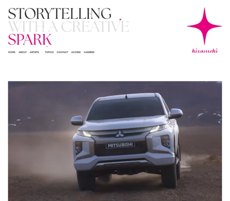
Kirameki presents its production work through an unusually spacious corporate portfolio. The opening statement, ‘STORYTELLING / WITH A CREATIVE / SPARK,’ uses three tightly stacked lines of high-contrast serif lettering. Charcoal, pale gray, and pink assign a different emphasis to each line. A large four-point spark and a cursive wordmark balance the statement on desktop. Photography then takes over: campaign stills, portraits, products, cinematic scenes, and occasional illustration are presented without enclosing card surfaces.
The defining layout is an editorial sequence of differently sized projects. Full-width images alternate with small groups, half-width projects, and larger compositions with deliberate empty space. The mobile page preserves this variety, including three small thumbnails across a row. Farther down, company information gives way to a pink bilingual manifesto and a centered, exceptionally quiet footer.
閉じる
kirameki inc. — Style Reference
A white editorial canvas punctuated by a magenta spark and a carefully paced sequence of cinematic work.
Website: kirameki.cc
Original URL: https://www.kirameki.cc/
Final URL: https://www.kirameki.cc/
Theme: light in the supplied captures; white surfaces, charcoal text, and a vivid pink accent.
Inspected: October 2, 2026, at 00:17:23 JST; supplied retrieval timestamp 2026-10-01T15:17:23.455Z.
Viewports: desktop 1440 × 1000 and mobile 390 × 844 CSS pixels.
Scope: the current homepage, including its opening masthead, project archive, company and artist links, bilingual manifesto, news item, and footer. Evidence consists of supplied browser captures and rendered DOM/computed-style samples. Linked pages and the opened menu were not inspected.
Kirameki presents its production work through an unusually spacious corporate portfolio. The opening statement, ‘STORYTELLING / WITH A CREATIVE / SPARK,’ uses three tightly stacked lines of high-contrast serif lettering. Charcoal, pale gray, and pink assign a different emphasis to each line. A large four-point spark and a cursive wordmark balance the statement on desktop. Photography then takes over: campaign stills, portraits, products, cinematic scenes, and occasional illustration are presented without enclosing card surfaces.
The defining layout is an editorial sequence of differently sized projects. Full-width images alternate with small groups, half-width projects, and larger compositions with deliberate empty space. The mobile page preserves this variety, including three small thumbnails across a row. Farther down, company information gives way to a pink bilingual manifesto and a centered, exceptionally quiet footer.
How to Read This Reference
- Measured means a value appears directly in the supplied rendered DOM or computed styles. Element coordinates are document coordinates unless otherwise stated.
- Derived means arithmetic from measured geometry, such as a column gap or an alpha color composited over white.
- Estimated means a visual reading of the supplied screenshots. No independent pixel-color sampling was performed.
- Recommended means a reusable implementation choice. Recommended CSS, breakpoints, fallbacks, accessibility changes, and interaction behavior are not claims about the original implementation.
- Token names introduced here are descriptive aliases. Only properties explicitly identified as source properties were present in the supplied evidence.
- Computed styles on an enclosing link do not necessarily describe its visible caption, SVG lettering, or other descendants. In particular, the inherited
18pxbody size is not the size of every visible project label. - The captures establish two responsive states. They do not establish the original breakpoint, every intermediate layout, or the behavior of unexercised controls.
Tokens — Colors
Default Palette
| Name | Value | Suggested token | Evidence and role |
|---|---|---|---|
| White Canvas | #ffffff |
--color-paper |
Measured HTML/body background at both viewports; also the visible background throughout the supplied captures. |
| Kirameki Pink | #e4007f |
--color-accent |
Measured manifesto text color, rgb(228, 0, 127). Recommended reference accent for the wider brand system. The logo and decorative artwork look closely related, but their individual fill values were not supplied. |
| Main Ink | rgba(0, 0, 0, 0.8) |
--color-ink-source |
Measured body and navigation text. Over white this produces #333333, used by the direct-color alias --color-ink. |
| Secondary Ink | rgba(0, 0, 0, 0.6) |
--color-secondary-source |
Measured news-link color. Over white this produces #666666, used by --color-secondary. |
| Quiet Ink | rgba(0, 0, 0, 0.32) |
--color-muted-source |
Measured address and legal-link color. Over white the rounded channel value is #adadad, used by --color-muted. |
| Pale Headline | Approximately #dddddd |
--color-headline-soft |
Screenshot estimate for ‘WITH A CREATIVE.’ Its own computed color was not included. |
| Hairline Gray | Approximately #dddddd–#e5e5e5 |
--color-rule |
Screenshot estimate for arrow outlines and the short mobile caption divider. |
| Menu Black | #000000 |
--color-menu-initial |
Measured initial mobile menu-button color; the opening screenshot shows black strokes. Later screenshots show pink strokes. |
Use pink as a signature and a typographic voice: the spark, selected lettering, small separators, the manifesto, and the scrolled menu mark. The surrounding interface stays neutral. Bright cyan, gold, dark blue, and other strong colors belong to individual project images, not to a multi-color UI palette.
The direct charcoal and gray values above assume a white background. If adapting the design to changing backgrounds, preserve the distinction between source alpha colors and their white-background equivalents.
Theme and State Limits
The supplied evidence contains no verified theme selector. HTML and body declare a background-color transition, but that declaration alone does not establish a dark theme or a particular scroll-driven background change. Describe the observed white presentation without inventing additional color modes.
Tokens — Typography
Editorial Masthead Lettering
The three-line opening statement has sharp contrast between thin hairlines and heavy vertical strokes, uppercase forms, and tight line stacking. At desktop size, the lettering occupies roughly the left 760px of the opening composition; on mobile, it becomes a compact block roughly 230px wide.
Font identity is unverified. The supplied element samples do not identify the font or rendering method of this statement. The root element's Times declaration is not sufficient evidence that the visible statement uses Times. It may involve lettering artwork or separately styled descendants.
For an adaptation, prefer authorized original lettering. A high-contrast serif fallback can approximate the hierarchy, but it must be labeled an approximation. The Quick Start uses a conventional serif stack only for that purpose.
Navigation — TT Fors DemiBold
- Measured family:
TT_Fors_DemiBold. - Measured CSS weight:
400; the family name itself identifies the DemiBold face. - Roles confirmed: desktop primary navigation, footer navigation, and
FB/IGlinks. - Character: compact, assertive uppercase sans-serif forms that contrast with the masthead's fine serif lettering.
- Do not automatically apply an additional
700weight to this named face; that can produce synthetic bolding.
Japanese Text
The body declares a Yu Gothic-based system stack. Manifesto paragraphs explicitly use MFW-YuGoPr6N-Medium before the fallback stack. The Japanese address uses MFW-YuGoPr6N-Demi at CSS weight 500.
These are measured family declarations, not independently verified font-file downloads. Preserve the intended Japanese/Latin distinction without inventing font asset URLs.
English Text — Neue Haas Unica
- Measured family:
neue-haas-unica, followed by Helvetica Neue, Helvetica, Arial, and additional fallbacks. - Manifesto weight:
300. - Address and legal-link weight:
400. - Role: open, quiet English paragraphs and restrained utility information.
The lighter English manifesto face complements the Japanese text without turning the two languages into identical blocks.
Brand Wordmark
The cursive ‘kirameki’ signature is a brand graphic in the visual composition. Its generating font or asset path was not established. Use approved artwork rather than substituting an arbitrary script font and presenting it as the original.
Type Scale
Unless marked estimated, values below are measured computed styles.
| Role | Desktop | Mobile | Notes |
|---|---|---|---|
| Inherited body baseline | 18px / 18px, weight 400 |
Same | An inheritance baseline, not a universal visible text size. |
| Opening statement | Estimated 90–96px nominal size |
Estimated 27–29px nominal size |
Visual estimate only; actual font metrics and rendering method unknown. |
| Header navigation | 15.075px / 20.25px |
Hidden in the opening capture | TT_Fors_DemiBold; tracking -0.3015px, equivalent to -0.02em. |
| Footer WORK / ABOUT / ARTISTS | 18.27px / 37.8px |
20.5px / 21px |
The primary footer group becomes larger on mobile. |
| Footer TOPICS / CONTACT / ACCESS / CAREERS | 18.27px / 37.8px |
14.65px / 26px |
Mobile places these in a separate smaller row. |
| Footer FB / IG | 18.27px / 37.8px |
14.65px / 19.5px |
Same named navigation family. |
| Japanese manifesto | 19.17px / 36px, weight 400 |
14px / 26px, weight 400 |
Tracking 0.001em. |
| English manifesto | 20.07px / 36px, weight 300 |
14.65px / 26px, weight 300 |
Normal tracking. |
| Japanese address | 11.25px / 15.138px, weight 500 |
11px / 14.625px, weight 500 |
Tracking 0.001em. |
| English address | 11.25px / 15.1875px |
11.5px / 14.625px |
Weight 400. |
| Legal links | 11.25px / 15.1875px |
11.5px / 14.625px |
Quiet gray, uppercase. |
| Standard project titles | Estimated 14–15px in the desktop middle capture |
Individual child styles not supplied | Do not use the enclosing link's 18px as a verified caption size. |
| Lead project title | Below the opening desktop crop | Estimated 12–13px |
Mobile ‘LION NONIO’ label. |
| Project categories | Estimated 10–12px |
Estimated 11–12px for the lead project |
Parenthesized labels such as (FILM) and (FILM,PRINT). |
The identity depends on the contrast between the large statement and small supporting typography. Increasing every caption to headline scale would erase that hierarchy.
Tokens — Spacing & Shapes
Source Scaling Properties
| Source property | Desktop value | Mobile value |
|---|---|---|
--raw-scale |
0.9px |
1.04px |
--font-scale |
0.9px |
1px |
--vw |
14.4px |
3.9px |
--vh, --vh-max, --vh-variable |
10px |
8.44px |
--scrollbar-width |
0px |
0px |
These are measured length-valued custom properties. The supplied evidence does not include their defining formulas or breakpoint rules. The HTML font size remains 16px; these values must not be interpreted as a tiny root font size.
Layout Measurements
| Element or relationship | Desktop, 1440px wide | Mobile, 390px wide | Evidence |
|---|---|---|---|
| Main left/right inset | 50.39px |
18px |
Measured project positions. Desktop is consistent with 3.5vw. |
| Main content width | 1339.22px |
354px |
Measured full-width work regions. |
| Small project width | 307.80px |
111.98px |
Measured. |
| Gap between adjacent small projects | 36px |
9px |
Derived from measured x positions. |
| Half-width project | 651.61px |
172.5px |
Measured SHISEIDO PROFESSIONAL and BIRKENSTOCK regions. |
| Large project | 995.41px |
232.98px |
Measured Clé de Peau and Mitsubishi regions. |
| Lead project top | y = 508.09px |
y = 390.44px |
Measured. |
| Lead desktop media-region box | 1339.22 × 753.30px |
— | Measured work-link box, consistent with 16:9. |
| Lead mobile image | — | Approximately 354 × 199.13px |
Width measured; height derived from 16:9 and supported by the screenshot. |
| Lead mobile link including caption | — | 354 × 334.81px |
Measured; do not mistake this complete box for an image ratio. |
| Header logo-link box | 218.70 × 284.39px |
137.31 × 178.56px |
Measured. Visible mobile artwork occupies less than the reserved box. |
| Inner company-content width | 1013.41px |
318px |
Measured ABOUT and ARTISTS links. |
| Inner company-content left edge | 213.30px |
36px |
Measured. |
| Manifesto language column | 506.70px each |
354px, stacked |
Measured paragraph widths and positions. |
| Document height | 14790.97px |
8022.33px |
Measured body height. |
Spacing Scale
| Use | Desktop evidence | Mobile evidence |
|---|---|---|
| Header navigation gap | Approximately 19.8px between ordinary adjacent labels, derived |
Header navigation absent from the opening state |
| Standard small-project row interval | 395.27px between sampled row starts |
205.25px between sampled row starts |
| Image-bottom to next standard row | Approximately 221.39px, including caption space |
Approximately 142px, including caption space |
| ABOUT / ARTISTS section top padding | 121.5px |
0px |
| ABOUT / ARTISTS heading top padding | 67.5px |
39px |
| Manifesto section top padding | 202.5px |
105px |
| First manifesto paragraph top padding | 94.5px in both languages |
Japanese 45px; English 39px |
| Later manifesto paragraph top padding | 40.5px |
Japanese 45px; English 39px |
| Footer padding | 40.5px 0 67.5px |
39px 0 |
The image-bottom intervals are not pure CSS gaps: captions occupy part of the space. Use the distinction when reproducing the page; adding the complete interval below an already sized caption would make the layout too tall.
Border Radius and Shapes
- Measured: sampled project-link containers have
0pxborder radius. - Estimated: image corners appear square or only minimally softened, roughly
0–2px. - Estimated: outlined arrow controls are approximately
34–36pxacross on desktop and about20pxon the lead mobile project. Their strokes are thin and pale. - Observed: the brand symbol is a four-point spark with long axial tips and deeply curved inward sides. It is not a conventional five-point star.
- Observed: tiny versions of the spark punctuate the typography and footer. They are accent marks, not general-purpose list bullets.
- No enclosing project-card fill, drop shadow, or substantial border is visible in the supplied captures.
Components
Opening Masthead
Role: establish the company's voice and identity before the project sequence.
On desktop, the statement begins near the 50px left inset and roughly 50px from the viewport top. Its three lines retain their specific order and tonal progression: dark ‘STORYTELLING,’ pale ‘WITH A CREATIVE,’ and pink ‘SPARK.’ Small pink spark details punctuate the otherwise typographic composition.
The logo link sits at x = 1170.91px, y = 46.39px, leaving a large empty middle region between the statement and the brand mark. The navigation occupies a narrow line underneath the statement at y = 317.19px. The first project does not begin until y = 508.09px.
On mobile, the statement moves to approximately 18px from the left and 20px from the top. The spark is centered separately below it: the measured logo-link box starts at x = 126.34px, y = 146.88px. The opening screenshot shows the spark without a visible cursive signature underneath, although the link reserves a taller box. Preserve that distinction between visible artwork and element bounds.
Primary Navigation and Menu Trigger
Role: provide access to the company's principal sections without overwhelming the imagery.
The desktop header shows WORK, ABOUT, ARTISTS, a small separator, then TOPICS, CONTACT, ACCESS, and CAREERS. The links are unboxed uppercase text. ACCESS points to /contact/#access; it is not an independently verified page.
The initial desktop menu button has a measured box at y = -22.5px, outside the viewport. In the supplied scrolled desktop captures, a pink three-line menu mark appears near the upper-right corner. This supports a persistent corner treatment after scrolling, but the exact reveal threshold and positioning logic were not supplied.
Mobile starts with the menu icon already visible at x = 354px, y = 20px, with a measured 18 × 17px box. It is black in the opening capture and pink in the lower-page capture. Its supplied accessible text is メニューを開く.
The opened menu was not captured. Do not invent a drawer direction, overlay color, full-screen layout, close animation, or focus behavior as an observed feature.
Signature Spark and Wordmark
Role: repeat the brand identity at the beginning and end of the long page.
The desktop masthead pairs the tall pink spark with a small cursive wordmark below it. Near the end of the page, a similar lockup is centered independently of the navigation. Screenshot estimates put the footer lockup at roughly 220px wide on desktop and 112px wide on mobile.
The closing lockup is surrounded by significant white space. In the desktop bottom capture, it occupies the upper center while the news and navigation remain much lower. On mobile, the lockup follows the last English manifesto lines and precedes the dated news item.
Use the original brand geometry when authorized. Replacing it with a generic sparkle icon would change a central identifying feature.
Featured Project
Role: introduce a selected work at a scale large enough for the image to dominate.
The first current project is LION NONIO. Its supplied image shows two people against a saturated blue background, with white NONIO lettering incorporated into the artwork. This lettering belongs to the project asset, not to a reusable website overlay.
The desktop image spans the full 1339.22px content width. The mobile version spans 354px, maintaining a wide cinematic image before the caption.
Featured captions have a richer hierarchy than ordinary project captions:
- A Japanese descriptive line, such as
息から始まる気持ちの通うコミュニケーション. - A lighter English description: ‘Communication that connects our hearts, starting with a breath.’
- A project/client label.
- A small parenthesized media category.
- An outlined right-arrow affordance.
The desktop MUBI capture shows the Japanese description at the left, the English description in a broader middle region, and the project name/category toward the right. On mobile, the first project's descriptions stack above the title and category. A very short horizontal rule separates the descriptive text from the project label; the arrow sits at the right of the lower caption area.
Project destinations are evidenced as links, including /work/lion-nonio-2/ and /work/mubi/. Their destination-page layouts were not inspected.
Standard Project Item
Role: present a work compactly within the larger editorial sequence.
An item consists of an exposed image rectangle, a dark project title, a smaller gray category, and a fine outlined arrow to the right of the caption. Titles can wrap naturally to two lines, as visible for NHK, LONGINES, and SONY projects in the desktop middle capture.
The title and category sit directly on the page canvas. There is no padded card background. The image supplies the boundary and visual density; the caption remains small and understated.
Use the project title as part of the link's accessible name. An arrow inside the same link should remain decorative rather than becoming a second redundant navigation target.
Editorial Project Composition
Role: vary pacing and importance throughout a substantial archive.
Desktop geometry is consistent with four base columns of approximately 307.8px, separated by 36px. Projects use one, two, three, or four column widths. Many rows contain only three small projects, leaving the fourth column empty. Other rows deliberately omit an interior position or place a small item beside a much larger project.
The current sequence demonstrates specific compositions:
- The lead LION NONIO project spans the full width.
- The following PARCO / PARCO / Hitachi group occupies three small desktop columns.
- LION HADAKARA sits at the left while SHISEIDO PROFESSIONAL occupies the right half.
- Clé de Peau uses a large left region, with a small BALMUDA project offset at the right.
- MUBI returns to a full-width feature.
- Mitsubishi uses a large left region with JINS aligned alongside its lower portion.
These placements are editorial choices. A dense masonry algorithm would fill the intentional gaps and change the rhythm.
Some projects contain multiple image references and taller regions. VISIT KOCHI has a measured small-project region approximately three ordinary image heights tall; Me and Honda is approximately two. JR EAST uses a portrait-format region. The evidence supports these differing structures, but not a particular slideshow or animation mechanism.
ALL WORK Gateway
Role: transition from selected projects into the broader work index.
The ALL WORK link points to /work/. Its measured box is substantial: approximately 1013.39 × 563.89px on desktop and 390 × 217.02px on mobile. It should not be interpreted as a small conventional text button merely because its extracted label is short.
Its complete visual treatment was not included in the supplied screenshots. Preserve the measured role and generous allocation of space, but do not invent its artwork, hover effect, or animation.
ABOUT and ARTISTS Gateways
Role: connect the portfolio to company capabilities and artist management.
Both gateways are broad links containing Japanese and English explanatory copy plus a section label. On desktop they occupy an inner 1013.41px width, inset farther than the project grid. Mobile uses a 318px width with 36px side insets.
The ABOUT copy describes a one-stop creative team driven by passion and attention to detail. ARTISTS describes international creative management and a network extending across film production and related fields. These are company-navigation sections, not a generic feature-card grid.
The rendered evidence references home-text-ab-pc.svg and home-text-ar-pc.svg within these sections. Their appearance and behavior were not separately inspected. The parent H2's inherited 18px style therefore cannot establish the visible lettering size. Repeated SVG references do not by themselves prove a marquee.
Bilingual Manifesto
Role: slow the page down and articulate the company's creative philosophy.
This section changes the text voice to pink while retaining the white background. The Japanese heading is 煌めきという、閃きへ。; its English counterpart reads ‘A SPARK OF INSPIRATION.’ Paragraphs are arranged as short poetic statements with large intervals between them.
Desktop places Japanese and English in adjacent 506.70px regions, beginning at x = 213.30px and x = 720px. Both languages use 36px line height, but different font sizes and weights.
Mobile stacks Japanese before English, each using the 354px main content width. The lower screenshot shows centered English lines in pink. Mobile line height is 26px, with deliberate paragraph spacing retained rather than compressed into an ordinary dense body-text block.
News Link
Role: introduce a small current update between the signature mark and the footer navigation.
The inspected update displays 2026.9.1 and a Japanese announcement about cinematographer Benjamin Michel joining management. The destination is /topics/10013/.
On desktop, the link uses display: flex and occupies a centered, single-line region approximately 568.53 × 20.25px. On mobile, it becomes a 318 × 71.5px block: the date appears above a centered, wrapping announcement. The text color is measured as black at 60% opacity.
Treat the date as content, not as the capture date or a permanent decorative token.
Footer
Role: provide a concise second navigation system and company details after the long visual sequence.
A tiny pink spark introduces the footer. Desktop places all seven navigation links in one centered row, with a visual separation after ARTISTS. Social links occupy a second row. Company identity, Japanese and English address lines, and legal links sit below in much smaller, quieter type.
Mobile establishes a stronger hierarchy:
WORK,ABOUT, andARTISTSform a large20.5pxfirst row.TOPICS,CONTACT,ACCESS, andCAREERSform a smaller14.65pxsecond row.FBandIGsit in their own compact centered row.- Company, address, and legal information remain centered below.
The original footer independently identifies the operator as 株式会社キラメキ / kirameki inc. The address is linked to a map. Social destinations are evidenced, but their external pages were not inspected.
Tokens — Motion & Interaction
| Treatment | Supplied evidence | What can be concluded |
|---|---|---|
| HTML/body background transition | background-color 0.45s linear |
A declared 450ms transition exists. The triggering state and alternate colors are unverified. |
| Desktop menu-button movement | transform 0.5s cubic-bezier(0.165, 0.84, 0.44, 1) |
A declared 500ms transform transition; initial offscreen geometry and later visible captures support a reveal/change of placement. Exact trigger remains unknown. |
| Mobile menu-button color | color 0.5s ease-in-out |
A declared 500ms color transition. Opening and lower captures show black and pink states respectively. |
| News-link feedback | color 0.2s ease-out, fill 0.2s ease-out |
A declared 200ms color/fill transition. The target hover colors were not provided. |
| Project navigation | Work-item URLs in rendered links | Items expose navigation destinations. Click results were not exercised. |
| Corner menu persistence | Similar upper-right position in scrolled captures | A persistent corner affordance is visually supported; exact fixed/sticky implementation was not supplied. |
| Media changes, spark motion, and section-lettering motion | Still captures, repeated references, and partial style samples | Playback, looping, image cycling, parallax, pointer following, and marquee behavior are unverified. |
Many sampled elements report animation: none. That does not rule out video, JavaScript animation, SVG internals, pseudo-elements, or animated descendants. Likewise, a generic transition: all without a useful nonzero duration does not justify inventing a transition timing.
Recommended adaptation: keep feedback restrained and short. Use color changes and clear focus indicators first. Add media or decorative motion only with a specific implementation purpose, and provide reduced-motion behavior. No autoplay or hover-preview requirement can be derived from these captures.
Surfaces
| Layer | Appearance | Role |
|---|---|---|
| Page canvas | Solid white | Continuous background through the supplied opening, middle, and footer views. |
| Project surface | Image directly on white | Defines each work without a containing card. |
| Caption region | Transparent, dark and gray type | Separates descriptive text, project identity, and category. |
| Brand emphasis | Pink lettering and spark artwork | Gives a consistent identity across otherwise varied campaign images. |
| Arrow affordance | Thin pale outline, small directional stroke | Quiet indication of project navigation. |
| Footer information | White background, low-emphasis gray text | Keeps legal and address information visually secondary. |
There is no visible elevation hierarchy based on shadows, glass effects, or colored panels. Hierarchy comes from image size, empty space, alignment, typography, and the recurrence of the pink symbol.
Imagery
Project imagery is varied because the site represents a production company's work. The supplied captures show human-centered advertising against strong color, a dark cinematic street scene, colorful illustrated title imagery, a formal watch portrait, a low-light performance image, and an automotive sequence. Preserve the individual color grading and art direction of each project.
Most ordinary film thumbnails are close to 16:9. However, the archive also contains stacked image groups and portrait print work. Set aspect ratios by media type rather than forcing every project into the same crop.
The large lead image creates scale through width, not through a text overlay or full-screen background. On desktop it extends below the first viewport; on mobile the entire image and its caption fit within the opening screen. Both treatments preserve the relationship between a restrained website shell and visually rich client work.
Observed Asset References
Paths are references found in the supplied original-page evidence. They are not files bundled with this document, and no additional retrieval was performed.
| Asset or reference | Observed path | Evidence-supported use |
|---|---|---|
| LION NONIO image | /uploads/2026/06/thumbnail_03.jpg |
Lead project image; visible in desktop and mobile opening captures. |
| PARCO summer image | /uploads/2026/05/PARCO_Summer_01.jpg |
Small project following the lead feature. |
| PARCO spring image | /uploads/2026/03/PARCO26_00.jpg |
Adjacent small project. |
| NHK title image | /uploads/2023/01/01_comecome_003-1.jpg |
Colorful image in the desktop middle capture. |
| LONGINES image | /uploads/2023/02/motoki_longines_16×9.jpg |
Portrait-oriented composition within a wide thumbnail. |
| SONY Xperia image | /uploads/2023/02/1-17124_sony_217.jpg |
Work containing multiple image references. |
| VISIT KOCHI images | /uploads/2023/02/1.jpg, /uploads/2023/02/kochi_peace_006.jpg, /uploads/2023/02/kochi_food_001.jpg |
Multi-image project structure supported by a taller measured region. |
| ABOUT lettering reference | /assets/202510151433/img/home-text-ab-pc.svg |
Present in the ABOUT section; exact rendered artwork not supplied. |
| ARTISTS lettering reference | /assets/202510151433/img/home-text-ar-pc.svg |
Present in the ARTISTS section; exact rendered artwork not supplied. |
No verified asset path was supplied for the main spark, cursive wordmark, or opening statement. Do not invent those paths. Serialized image markup in the extracted text should not be treated as literal visible page copy.
Layout & Responsive Behavior
Desktop Structure
At 1440px, the outer project region is approximately 93vw, centered with 3.5vw margins. Its small project positions establish a four-column rhythm:
50.39 → 394.19 → 737.98 → 1081.81px
The measured widths are consistent with these derived relationships:
Content width W ≈ 1339.22px
Gap G = 36px
Small width ≈ (W - 3G) / 4 = 307.80px
Half width ≈ 2 × small + G = 651.61px
Large width ≈ 3 × small + 2G = 995.41px
Full width = W
These equations describe the observed geometry; they are not recovered source CSS. Preserve the distinction between the four-column framework and rows that deliberately contain fewer than four items.
Mobile Structure
At 390px, the main content width is 354px with 18px margins. Standard small-project groups remain three across:
Content width W = 354px
Gap G = 9px
Small width ≈ (W - 2G) / 3 = 112px
Two-thirds width ≈ 2 × small + G = 233px
Half width = (W - G) / 2 = 172.5px
Full width = 354px
The half-width case is a separate composition, not an integer span of a simple three-column grid. A six-subcolumn implementation can represent both thirds and halves cleanly.
Observed Transformations
| Desktop | Mobile |
|---|---|
| Statement at upper left, logo at upper right | Compact statement at upper left, centered spark below |
| Text navigation under statement | Opening navigation omitted; small menu button visible |
| Four-column underlying project rhythm | Three small projects across, with separate half-width compositions |
| Large work spans three of four base columns | Corresponding large work spans two of three base columns |
| Featured description distributed horizontally | Japanese, English, and project metadata stack vertically |
Company gateways use approximately 1013px inner width |
Company gateways use 318px, inset 36px |
| Manifesto languages side by side | Japanese followed by English |
| Footer navigation in one row | Large primary row and smaller secondary row |
| News date and headline inline | Date above a wrapping headline |
The shorter mobile document does not imply that the project archive is removed. The supplied mobile text includes the same work sequence, while the images and spatial intervals become substantially smaller.
The original breakpoint is unknown. The Quick Start uses 48rem as a recommended implementation boundary, not an observed source value. Tablet, landscape, very narrow screens, zoom behavior, and widths above 1440px require separate validation.
Do’s and Don’ts
Do
- Build the homepage as a corporate portfolio with a substantial work sequence and meaningful company navigation.
- Preserve white as the dominant surface and use pink as a recurring brand signature.
- Retain the three-line masthead wording and its dark / pale / pink hierarchy when using the original content.
- Pair expressive serif lettering with compact sans-serif navigation and quiet bilingual text.
- Use deliberate project sizing: small, half-width, large, and full-width.
- Keep empty desktop grid positions where the composition calls for them.
- Preserve three-across small-project groups in the observed mobile adaptation.
- Keep project captions on the canvas beneath imagery.
- Allow print work and multi-image projects to have their own dimensions.
- Maintain the desktop bilingual manifesto columns and mobile reading order.
- Repeat the spark at large and very small scales without turning every element pink.
- Preserve the larger mobile footer emphasis on WORK, ABOUT, and ARTISTS.
Don’t
- Don't replace the work sequence with a generic marketing hero, feature cards, and a dominant conversion button.
- Don't fill every desktop gap with automatic masonry packing.
- Don't assume all mobile projects become full-width cards.
- Don't crop portrait print work or stacked imagery into a universal
16:9box. - Don't wrap project images in elevated, heavily rounded containers.
- Don't promote colors from individual campaign images into new interface tokens.
- Don't present a guessed serif or script font as the original brand typography.
- Don't use the parent link's
18pxcomputed size as proof of caption or artwork lettering size. - Don't add play buttons, hover videos, carousels, or parallax and label them observed behavior.
- Don't reconstruct an opened menu from the trigger alone.
- Don't remove the large pauses around the manifesto and closing identity simply to shorten the page.
Recommended Implementation Additions
These are recommendations for an adaptation, not verified features of the original:
- Preserve the menu's existing accessible name and add appropriate expanded-state and controlled-region relationships when implementing its panel. Test focus entry, Escape, and focus return.
- Increase the menu's interactive target to at least
44 × 44pxwhile retaining its small visible strokes. The measured18 × 17pxmobile button box is much smaller. - Make project links keyboard-operable with visible focus outlines. Keep decorative arrows out of the accessibility tree when they duplicate the containing link.
- Provide meaningful image alternatives when a picture communicates information beyond the adjacent title. Empty alternatives can remain appropriate when the caption fully supplies the link's purpose.
- Reassess the pale legal text and category labels for contrast and readability. A darker utility-text option can preserve the restrained appearance while improving access.
- Keep mobile project titles readable within the observed small-column layout; test long titles, text enlargement, and a narrow
320pxviewport. - Use semantic language attributes for Japanese and English passages and preserve logical reading order independently of desktop placement.
- Reserve media dimensions, load the lead image promptly, and defer below-fold images. Preserve portrait and stacked-media ratios to prevent layout shifts.
- Provide static or paused alternatives if motion is later added. Do not infer permission for audible playback from a film category label.
- Load any named commercial fonts only through authorized assets. Supply fallbacks and test their effect on the tightly composed navigation.
Agent Prompt Guide
Quick Color Reference
- Canvas:
#ffffff. - Main type: source black at
80%; direct white-background equivalent#333333. - Secondary/news type: source black at
60%; equivalent#666666. - Address/legal type: source black at
32%; approximate equivalent#adadad. - Manifesto accent: measured
#e4007f. - Pale middle masthead line: approximately
#dddddd; estimated. - Arrow outlines and tiny dividers: very light gray; estimated.
- Photography: retain each campaign's own color treatment.
Overall Prompt
“Create an editorial corporate portfolio for a film and creative production company. Use a white canvas, charcoal interface text, a vivid pink four-point spark, and a large three-line high-contrast serif statement. Keep the statement dark, pale gray, and pink across its three lines. Place compact uppercase sans-serif navigation below it and the brand lockup at the upper right on desktop. Begin the work archive with a full-width cinematic image, then alternate small project groups, half-width projects, large images, and intentional empty positions. Use exposed images with small captions and thin outlined arrow affordances, without card backgrounds or shadows. On mobile, center the opening spark beneath the compact statement and preserve three-across small-project groups. Finish with company and artist gateways, a pink bilingual manifesto, a centered brand lockup, a small news item, and a two-level mobile footer.”
Example Component Prompts
- Masthead: “At 1440px, use about 50px side margins. Place a three-line uppercase serif statement at the upper left and a roughly 219px-wide spark-and-signature lockup at the upper right. Set small uppercase navigation around 15px below the statement. Leave enough white space for the lead image to begin around y = 508px. Treat the display font as an approved asset or an explicitly approximate substitute.”
- Project row: “Build a four-column editorial framework with approximately 308px small images and 36px gaps at 1440px. Place three projects in the first three positions and leave the last position empty. Use near-16:9 images, small dark titles, pale category labels, and thin outlined arrows. Do not add card fills or shadows.”
- Mobile portfolio: “At 390px, use 18px outside margins and 9px gaps. Preserve three small thumbnails of approximately 112px per row. Allow 172.5px half-width and 233px larger projects in special compositions. Stack the full-width feature's Japanese summary, English summary, title, and category below its 354px image.”
- Manifesto: “Present short Japanese and English creative statements in pink on white. Desktop uses two adjacent language columns with approximately 36px line height; mobile stacks the languages and uses 26px line height. Preserve generous paragraph intervals and a quiet, centered mobile treatment.”
- Footer: “Center a pink spark-and-script lockup above a small dated news item. Add a tiny pink spark before the footer navigation. On mobile, make WORK, ABOUT, and ARTISTS a larger first row, followed by a smaller row of TOPICS, CONTACT, ACCESS, and CAREERS. Place FB and IG below, then small gray company, address, and legal information.”
Quick Start
CSS Custom Properties
This is a recommended implementation scaffold, not copied source CSS. It targets the two supplied viewport states. Main widths and column relationships follow measured geometry; display lettering, project-caption sizes, row spacing, and intermediate-width behavior are approximations where child styles or original formulas were unavailable.
The scaffold uses twelve subcolumns on desktop and six on mobile. This supports the observed quarter, half, three-quarter, third, and two-third compositions without falsely attributing that grid implementation to the original site.
Markup contract: use .masthead for the opening statement, navigation, and brand artwork. Each .work-row contains linked .work items, with .work-media followed by .work-meta. A descriptive feature uses .work-caption containing Japanese summary, English summary, and metadata. Use approved spark and wordmark artwork inside .brand__symbol and .brand__wordmark. No unverified asset URL is required by the CSS.
:root {
  /* Measured colors and direct equivalents over white. */
  --color-paper: #ffffff;
  --color-accent: #e4007f;
  --color-ink: #333333;
  --color-secondary: #666666;
  --color-muted: #adadad;

  /* Screenshot estimates for artwork and fine rules. */
  --color-headline-soft: #dddddd;
  --color-rule: #e2e2e2;

  /* Observed family names; load authorized font assets separately. */
  --font-body: 'Yu Gothic Medium', 'Yu Gothic', Arial, sans-serif;
  --font-jp: 'MFW-YuGoPr6N-Medium', var(--font-body);
  --font-en: 'neue-haas-unica', 'Helvetica Neue', Helvetica, Arial, sans-serif;
  --font-nav: 'TT_Fors_DemiBold', Arial, sans-serif;

  /* Recommended approximation, not an identified source font. */
  --font-editorial: Georgia, 'Times New Roman', serif;

  /* Desktop relationships derived from the 1440px capture. */
  --page-inset: 3.5vw;
  --gallery-gap: 2.5vw;
  --inner-width: 70.375vw;
  --section-space: 14.0625vw;
  --masthead-height: 35.2843vw;
  --brand-width: 15.1877vw;

  --text-nav: 15.075px;
  --text-project: 15px;
  --text-category: 11.25px;
  --text-display: clamp(48px, 6.667vw, 96px);
  --text-jp-manifesto: 19.17px;
  --text-en-manifesto: 20.07px;
  --leading-manifesto: 36px;

  /* Approximate caption-plus-gap rhythm, not recovered source CSS. */
  --project-meta-height: 71px;
  --project-row-gap: 150px;

  --motion-background: 450ms linear;
  --motion-menu: 500ms cubic-bezier(0.165, 0.84, 0.44, 1);
  --motion-link: 200ms ease-out;
}

* {
  box-sizing: border-box;
}

body {
  margin: 0;
  color: var(--color-ink);
  background: var(--color-paper);
  font-family: var(--font-body);
  font-size: 18px;
  line-height: 1;
}

a {
  color: inherit;
}

.masthead,
.gallery {
  width: calc(100% - 2 * var(--page-inset));
  margin-inline: auto;
}

.masthead {
  position: relative;
  min-height: var(--masthead-height);
  padding-top: 3.2216vw;
}

.masthead__statement {
  margin: 0;
  font-family: var(--font-editorial);
  font-size: var(--text-display);
  font-weight: 400;
  line-height: 0.84;
  letter-spacing: -0.045em;
}

.masthead__statement > span {
  display: block;
  white-space: nowrap;
}

.masthead__statement > span:nth-child(2) {
  color: var(--color-headline-soft);
}

.masthead__statement > span:nth-child(3) {
  color: var(--color-accent);
}

.masthead-brand {
  position: absolute;
  top: 3.2216vw;
  right: 0;
  width: var(--brand-width);
  color: var(--color-accent);
}

.brand__symbol,
.brand__wordmark {
  display: block;
  width: 100%;
  height: auto;
}

.brand__wordmark {
  width: 75%;
  margin: 22px auto 0;
}

.desktop-nav {
  display: flex;
  align-items: center;
  gap: 19.8px;
  margin-top: 29px;
}

.desktop-nav a {
  font-family: var(--font-nav);
  font-size: var(--text-nav);
  font-weight: 400;
  line-height: 20.25px;
  letter-spacing: -0.02em;
  text-decoration: none;
}

.nav-separator {
  color: #cccccc;
}

/* The visible icon stays small inside a recommended 44px target. */
.menu-toggle {
  position: fixed;
  z-index: 20;
  top: 25px;
  right: calc(var(--page-inset) - 6.25px);
  display: none;
  place-items: center;
  width: 44px;
  height: 44px;
  padding: 0;
  border: 0;
  color: var(--color-accent);
  background: transparent;
  cursor: pointer;
}

.menu-toggle__icon {
  display: block;
  width: 31.5px;
  height: 13.5px;
  background:
    linear-gradient(currentColor, currentColor) top / 100% 1px no-repeat,
    linear-gradient(currentColor, currentColor) center / 100% 1px no-repeat,
    linear-gradient(currentColor, currentColor) bottom / 100% 1px no-repeat;
}

/* Integration hook: choose and test the threshold separately. */
html[data-scrolled='true'] .menu-toggle {
  display: grid;
  color: var(--color-accent);
}

.work-row {
  display: grid;
  grid-template-columns: repeat(12, minmax(0, 1fr));
  column-gap: var(--gallery-gap);
  margin-bottom: var(--project-row-gap);
}

.work {
  display: block;
  min-width: 0;
  grid-column: span 3;
  text-decoration: none;
}

.work--half {
  grid-column: span 6;
}

.work--large {
  grid-column: span 9;
}

.work--full {
  grid-column: 1 / -1;
}

.work--last {
  grid-column: 10 / span 3;
}

.work--right-half {
  grid-column: 7 / span 6;
}

.work-media img {
  display: block;
  width: 100%;
  height: auto;
  aspect-ratio: 16 / 9;
  object-fit: cover;
  border-radius: 0;
}

/* Multiple images retain their vertical sequence. */
.work-media--stack {
  display: grid;
  gap: 0;
}

.work-media--print img {
  aspect-ratio: auto;
  object-fit: contain;
}

.work-meta {
  display: grid;
  grid-template-columns: minmax(0, 1fr) auto;
  align-items: start;
  gap: 12px;
  min-height: var(--project-meta-height);
  padding-top: 10px;
}

.work-title {
  margin: 0;
  font-family: var(--font-en);
  font-size: var(--text-project);
  font-weight: 400;
  line-height: 1.35;
  text-transform: uppercase;
  overflow-wrap: anywhere;
}

.work-category {
  display: block;
  margin-top: 5px;
  color: var(--color-muted);
  font-family: var(--font-en);
  font-size: var(--text-category);
  line-height: 1.35;
}

.work-arrow {
  display: grid;
  place-items: center;
  width: 35px;
  height: 35px;
  border: 1px solid var(--color-rule);
  border-radius: 50%;
  color: var(--color-secondary);
  font: 18px/1 Arial, sans-serif;
}

/* Desktop feature-caption proportions are screenshot approximations. */
.work-caption {
  display: grid;
  grid-template-columns: 26% 48.5% minmax(0, 1fr);
  min-height: var(--project-meta-height);
  padding-top: 10px;
}

.work-caption .work-meta {
  min-height: 0;
  padding-top: 0;
}

.work-summary {
  margin: 0;
  padding-right: 20px;
  font-size: 14px;
  line-height: 20.25px;
}

.work-summary--en {
  color: var(--color-secondary);
  font-family: var(--font-en);
}

.company-gateway {
  display: block;
  width: var(--inner-width);
  margin: var(--section-space) auto;
  text-decoration: none;
}

.manifesto {
  display: grid;
  grid-template-columns: repeat(2, minmax(0, 1fr));
  width: var(--inner-width);
  margin: var(--section-space) auto 0;
  padding-top: var(--section-space);
  color: var(--color-accent);
}

.manifesto p {
  margin: 0;
  padding-top: 40.5px;
  line-height: var(--leading-manifesto);
}

.manifesto__jp p {
  font-family: var(--font-jp);
  font-size: var(--text-jp-manifesto);
  font-weight: 400;
  letter-spacing: 0.001em;
}

.manifesto__en p {
  font-family: var(--font-en);
  font-size: var(--text-en-manifesto);
  font-weight: 300;
}

.manifesto__jp p:first-of-type,
.manifesto__en p:first-of-type {
  padding-top: 94.5px;
}

.closing-brand {
  width: 220px;
  margin: 202px auto 0;
  color: var(--color-accent);
}

.news-link {
  display: flex;
  justify-content: center;
  gap: 12px;
  width: var(--inner-width);
  margin: 280px auto 0;
  color: var(--color-secondary);
  font-size: 14px;
  line-height: 20.25px;
  text-align: center;
  text-decoration: none;
  transition: color var(--motion-link), fill var(--motion-link);
}

.site-footer {
  position: relative;
  margin-top: 37px;
  padding: 40.5px var(--page-inset) 67.5px;
  text-align: center;
}

.footer-spark {
  position: absolute;
  top: 0;
  left: 50%;
  width: 14px;
  height: auto;
  color: var(--color-accent);
  transform: translateX(-50%);
}

.footer-nav,
.footer-nav__primary,
.footer-nav__secondary,
.footer-social {
  display: flex;
  justify-content: center;
  align-items: center;
  gap: 19.8px;
}

.footer-nav a,
.footer-social a {
  font-family: var(--font-nav);
  font-size: 18.27px;
  font-weight: 400;
  line-height: 37.8px;
  text-decoration: none;
}

.footer-social {
  margin-top: 16px;
}

.footer-details {
  margin-top: 28px;
  color: var(--color-muted);
  font-family: var(--font-en);
  font-size: 11.25px;
  line-height: 1.8;
}

.footer-legal {
  display: flex;
  justify-content: center;
  gap: 19px;
  margin-top: 27px;
}

.footer-details a {
  text-decoration: none;
}

/* Recommended focus and hover feedback, not verified source states. */
a:focus-visible,
button:focus-visible {
  outline: 2px solid var(--color-accent);
  outline-offset: 5px;
}

@media (hover: hover) {
  .desktop-nav a:hover,
  .footer-nav a:hover,
  .footer-social a:hover,
  .news-link:hover {
    color: var(--color-accent);
  }
}

/* Recommended breakpoint; the original boundary was not supplied. */
@media (max-width: 47.999rem) {
  :root {
    --page-inset: 18px;
    --gallery-gap: 9px;
    --inner-width: calc(100% - 72px);
    --section-space: 105px;
    --masthead-height: clamp(360px, 100.113vw, 440px);
    --brand-width: 137.3125px;
    --text-display: 28.5px;
    --text-project: 12px;
    --text-category: 11px;
    --text-jp-manifesto: 14px;
    --text-en-manifesto: 14.65px;
    --leading-manifesto: 26px;
    --project-meta-height: 65px;
    --project-row-gap: 77px;
  }

  .masthead {
    padding-top: 18px;
  }

  .masthead__statement {
    line-height: 0.93;
  }

  .masthead-brand {
    top: 146.875px;
    right: auto;
    left: 50%;
    transform: translateX(-50%);
  }

  /* Matches the visible opening capture; not a source-code claim. */
  .masthead-brand .brand__wordmark {
    visibility: hidden;
  }

  .desktop-nav {
    display: none;
  }

  .menu-toggle {
    top: 6.5px;
    right: 5px;
    display: grid;
    color: #000000;
    transition: color 500ms ease-in-out;
  }

  .menu-toggle__icon {
    width: 18px;
    height: 17px;
  }

  .work-row {
    grid-template-columns: repeat(6, minmax(0, 1fr));
  }

  .work {
    grid-column: span 2;
  }

  .work--half {
    grid-column: span 3;
  }

  .work--large {
    grid-column: span 4;
  }

  .work--full {
    grid-column: 1 / -1;
  }

  .work--last {
    grid-column: 5 / span 2;
  }

  .work--right-half {
    grid-column: 4 / span 3;
  }

  .work-row--feature {
    margin-bottom: 139px;
  }

  .work-arrow {
    width: 20px;
    height: 20px;
    font-size: 12px;
  }

  .work-caption {
    display: block;
    min-height: 0;
    padding-top: 16px;
  }

  .work-summary {
    padding-right: 0;
    font-size: 14px;
    line-height: 20px;
  }

  .work-summary--en {
    margin-top: 6px;
    color: var(--color-muted);
  }

  .work-caption .work-meta {
    position: relative;
    margin-top: 14px;
    padding-top: 10px;
  }

  .work-caption .work-meta::before {
    content: '';
    position: absolute;
    top: 0;
    left: 0;
    width: 14px;
    border-top: 1px solid #cccccc;
  }

  .manifesto {
    width: calc(100% - 36px);
    grid-template-columns: minmax(0, 1fr);
    text-align: center;
  }

  .manifesto__jp p,
  .manifesto__jp p:first-of-type {
    padding-top: 45px;
  }

  .manifesto__en {
    margin-top: 90px;
  }

  .manifesto__en p,
  .manifesto__en p:first-of-type {
    padding-top: 39px;
  }

  .closing-brand {
    width: 112px;
    margin-top: 84px;
  }

  .closing-brand .brand__wordmark {
    margin-top: 12px;
  }

  .news-link {
    display: block;
    margin-top: 140px;
    line-height: 20.25px;
  }

  .news-link time {
    display: block;
    margin-bottom: 12px;
  }

  .site-footer {
    padding-block: 39px;
  }

  .footer-nav {
    flex-direction: column;
    gap: 15px;
  }

  .footer-nav__primary,
  .footer-nav__secondary,
  .footer-social {
    gap: 12px;
  }

  .footer-nav__primary a {
    font-size: 20.5px;
    line-height: 21px;
  }

  .footer-nav__secondary a {
    font-size: 14.65px;
    line-height: 26px;
  }

  .footer-nav .nav-separator {
    display: none;
  }

  .footer-social {
    margin-top: 20px;
  }

  .footer-social a {
    font-size: 14.65px;
    line-height: 19.5px;
  }

  .footer-details {
    margin-top: 24px;
    font-size: 11.5px;
    line-height: 1.65;
  }

  .footer-legal {
    gap: 16px;
    margin-top: 20px;
  }
}

/* Recommended reduced-motion baseline for this scaffold. */
@media (prefers-reduced-motion: reduce) {
  .menu-toggle,
  .news-link {
    transition: none;
  }
}
Exact vertical offsets in mixed-size project rows need per-composition styling. In particular, a project aligned beside the lower part of a large image should use an explicit row variant rather than a dense auto-packing rule. The scaffold establishes sizing and hierarchy without inventing the original positioning algorithm.
The menu's data-scrolled attribute is an integration hook, not a complete menu implementation. Opening behavior, routing, authorized media, and font loading must be supplied separately.
Tailwind v4 Token Mapping
Optional aliases for an implementation already using Tailwind v4. Define the custom properties above first. This does not imply that the original website uses Tailwind.
@theme inline {
  --color-canvas: var(--color-paper);
  --color-brand: var(--color-accent);
  --color-main-ink: var(--color-ink);
  --color-secondary-ink: var(--color-secondary);
  --color-quiet-ink: var(--color-muted);
  --color-fine-rule: var(--color-rule);

  --font-navigation: var(--font-nav);
  --font-latin-body: var(--font-en);
  --font-japanese-body: var(--font-jp);
  --font-display-fallback: var(--font-editorial);

  --text-project-label: var(--text-project);
  --text-project-category: var(--text-category);
  --text-opening-statement: var(--text-display);

  --spacing-page-inset: var(--page-inset);
  --spacing-gallery-gap: var(--gallery-gap);
  --spacing-section-pause: var(--section-space);
}
Sources & Evidence
- Inspected original and final page: 株式会社キラメキ | kirameki inc.. The supplied browser observation reports HTTP
200and the same original/final URL. - Capture time:
2026-10-01T15:17:23.455Z, equivalent to October 2, 2026, 00:17:23 JST. This document analyzes that supplied inspection; it does not claim an additional live visit. - Desktop evidence:
1440 × 1000CSS-pixel viewport, opening/middle/bottom captures, rendered text and links, computed-style samples, and document geometry. Measured body height:14790.96875px. - Mobile evidence:
390 × 844CSS-pixel viewport, opening/bottom captures, rendered text and links, computed-style samples, and document geometry. Measured body height:8022.328125px. - Observed navigation references: project links under
/work/, the work index, ABOUT, ARTISTS, TOPICS, CONTACT, the contact-page access anchor, CAREERS, social links, a map link, and legal pages. Their presence is evidenced; destination contents were not inspected. - Capture readiness limits: the supplied process observed the initial page for at least five seconds and checked load, finite animation settling, sampled layout/text stability, and visible image decoding. Perpetual animations were paused during readiness checks and then resumed. Those checks do not prove that every delayed state or interaction was captured.
- Unverified behavior: opened-menu appearance, exact scroll thresholds, hover target states, media playback, image cycling, decorative animation, intermediate breakpoints, and detailed appearances of uncaptured company gateway artwork.
- Measurement limits: the supplied styles sample selected elements rather than every descendant. Screenshot estimates, derived geometry, and recommended CSS are labeled separately throughout this reference.
This reference describes the current homepage represented by the supplied original-site evidence. It preserves its corporate portfolio structure, responsive project compositions, and typography hierarchy while keeping unverified implementation details explicit.
# kirameki inc. — Style Reference

> A white editorial canvas punctuated by a magenta spark and a carefully paced sequence of cinematic work.

**Website:** [kirameki.cc](https://www.kirameki.cc/)
**Original URL:** https://www.kirameki.cc/
**Final URL:** https://www.kirameki.cc/
**Theme:** light in the supplied captures; white surfaces, charcoal text, and a vivid pink accent.
**Inspected:** October 2, 2026, at 00:17:23 JST; supplied retrieval timestamp `2026-10-01T15:17:23.455Z`.
**Viewports:** desktop `1440 × 1000` and mobile `390 × 844` CSS pixels.
**Scope:** the current homepage, including its opening masthead, project archive, company and artist links, bilingual manifesto, news item, and footer. Evidence consists of supplied browser captures and rendered DOM/computed-style samples. Linked pages and the opened menu were not inspected.

Kirameki presents its production work through an unusually spacious corporate portfolio. The opening statement, ‘STORYTELLING / WITH A CREATIVE / SPARK,’ uses three tightly stacked lines of high-contrast serif lettering. Charcoal, pale gray, and pink assign a different emphasis to each line. A large four-point spark and a cursive wordmark balance the statement on desktop. Photography then takes over: campaign stills, portraits, products, cinematic scenes, and occasional illustration are presented without enclosing card surfaces.

The defining layout is an editorial sequence of differently sized projects. Full-width images alternate with small groups, half-width projects, and larger compositions with deliberate empty space. The mobile page preserves this variety, including three small thumbnails across a row. Farther down, company information gives way to a pink bilingual manifesto and a centered, exceptionally quiet footer.
閉じる
# kirameki inc. — Style Reference

> A white editorial canvas punctuated by a magenta spark and a carefully paced sequence of cinematic work.

**Website:** [kirameki.cc](https://www.kirameki.cc/)
**Original URL:** https://www.kirameki.cc/
**Final URL:** https://www.kirameki.cc/
**Theme:** light in the supplied captures; white surfaces, charcoal text, and a vivid pink accent.
**Inspected:** October 2, 2026, at 00:17:23 JST; supplied retrieval timestamp `2026-10-01T15:17:23.455Z`.
**Viewports:** desktop `1440 × 1000` and mobile `390 × 844` CSS pixels.
**Scope:** the current homepage, including its opening masthead, project archive, company and artist links, bilingual manifesto, news item, and footer. Evidence consists of supplied browser captures and rendered DOM/computed-style samples. Linked pages and the opened menu were not inspected.

Kirameki presents its production work through an unusually spacious corporate portfolio. The opening statement, ‘STORYTELLING / WITH A CREATIVE / SPARK,’ uses three tightly stacked lines of high-contrast serif lettering. Charcoal, pale gray, and pink assign a different emphasis to each line. A large four-point spark and a cursive wordmark balance the statement on desktop. Photography then takes over: campaign stills, portraits, products, cinematic scenes, and occasional illustration are presented without enclosing card surfaces.

The defining layout is an editorial sequence of differently sized projects. Full-width images alternate with small groups, half-width projects, and larger compositions with deliberate empty space. The mobile page preserves this variety, including three small thumbnails across a row. Farther down, company information gives way to a pink bilingual manifesto and a centered, exceptionally quiet footer.

## How to Read This Reference

- **Measured** means a value appears directly in the supplied rendered DOM or computed styles. Element coordinates are document coordinates unless otherwise stated.
- **Derived** means arithmetic from measured geometry, such as a column gap or an alpha color composited over white.
- **Estimated** means a visual reading of the supplied screenshots. No independent pixel-color sampling was performed.
- **Recommended** means a reusable implementation choice. Recommended CSS, breakpoints, fallbacks, accessibility changes, and interaction behavior are not claims about the original implementation.
- Token names introduced here are descriptive aliases. Only properties explicitly identified as source properties were present in the supplied evidence.
- Computed styles on an enclosing link do not necessarily describe its visible caption, SVG lettering, or other descendants. In particular, the inherited `18px` body size is not the size of every visible project label.
- The captures establish two responsive states. They do not establish the original breakpoint, every intermediate layout, or the behavior of unexercised controls.

## Tokens — Colors

### Default Palette

| Name | Value | Suggested token | Evidence and role |
| --- | --- | --- | --- |
| White Canvas | `#ffffff` | `--color-paper` | Measured HTML/body background at both viewports; also the visible background throughout the supplied captures. |
| Kirameki Pink | `#e4007f` | `--color-accent` | Measured manifesto text color, `rgb(228, 0, 127)`. Recommended reference accent for the wider brand system. The logo and decorative artwork look closely related, but their individual fill values were not supplied. |
| Main Ink | `rgba(0, 0, 0, 0.8)` | `--color-ink-source` | Measured body and navigation text. Over white this produces `#333333`, used by the direct-color alias `--color-ink`. |
| Secondary Ink | `rgba(0, 0, 0, 0.6)` | `--color-secondary-source` | Measured news-link color. Over white this produces `#666666`, used by `--color-secondary`. |
| Quiet Ink | `rgba(0, 0, 0, 0.32)` | `--color-muted-source` | Measured address and legal-link color. Over white the rounded channel value is `#adadad`, used by `--color-muted`. |
| Pale Headline | Approximately `#dddddd` | `--color-headline-soft` | Screenshot estimate for ‘WITH A CREATIVE.’ Its own computed color was not included. |
| Hairline Gray | Approximately `#dddddd`–`#e5e5e5` | `--color-rule` | Screenshot estimate for arrow outlines and the short mobile caption divider. |
| Menu Black | `#000000` | `--color-menu-initial` | Measured initial mobile menu-button color; the opening screenshot shows black strokes. Later screenshots show pink strokes. |

Use pink as a signature and a typographic voice: the spark, selected lettering, small separators, the manifesto, and the scrolled menu mark. The surrounding interface stays neutral. Bright cyan, gold, dark blue, and other strong colors belong to individual project images, not to a multi-color UI palette.

The direct charcoal and gray values above assume a white background. If adapting the design to changing backgrounds, preserve the distinction between source alpha colors and their white-background equivalents.

### Theme and State Limits

The supplied evidence contains no verified theme selector. HTML and body declare a background-color transition, but that declaration alone does not establish a dark theme or a particular scroll-driven background change. Describe the observed white presentation without inventing additional color modes.

## Tokens — Typography

### Editorial Masthead Lettering

The three-line opening statement has sharp contrast between thin hairlines and heavy vertical strokes, uppercase forms, and tight line stacking. At desktop size, the lettering occupies roughly the left `760px` of the opening composition; on mobile, it becomes a compact block roughly `230px` wide.

**Font identity is unverified.** The supplied element samples do not identify the font or rendering method of this statement. The root element's `Times` declaration is not sufficient evidence that the visible statement uses Times. It may involve lettering artwork or separately styled descendants.

For an adaptation, prefer authorized original lettering. A high-contrast serif fallback can approximate the hierarchy, but it must be labeled an approximation. The Quick Start uses a conventional serif stack only for that purpose.

### Navigation — TT Fors DemiBold

- **Measured family:** `TT_Fors_DemiBold`.
- **Measured CSS weight:** `400`; the family name itself identifies the DemiBold face.
- **Roles confirmed:** desktop primary navigation, footer navigation, and `FB` / `IG` links.
- **Character:** compact, assertive uppercase sans-serif forms that contrast with the masthead's fine serif lettering.
- Do not automatically apply an additional `700` weight to this named face; that can produce synthetic bolding.

### Japanese Text

The body declares a Yu Gothic-based system stack. Manifesto paragraphs explicitly use `MFW-YuGoPr6N-Medium` before the fallback stack. The Japanese address uses `MFW-YuGoPr6N-Demi` at CSS weight `500`.

These are measured family declarations, not independently verified font-file downloads. Preserve the intended Japanese/Latin distinction without inventing font asset URLs.

### English Text — Neue Haas Unica

- **Measured family:** `neue-haas-unica`, followed by Helvetica Neue, Helvetica, Arial, and additional fallbacks.
- **Manifesto weight:** `300`.
- **Address and legal-link weight:** `400`.
- **Role:** open, quiet English paragraphs and restrained utility information.

The lighter English manifesto face complements the Japanese text without turning the two languages into identical blocks.

### Brand Wordmark

The cursive ‘kirameki’ signature is a brand graphic in the visual composition. Its generating font or asset path was not established. Use approved artwork rather than substituting an arbitrary script font and presenting it as the original.

### Type Scale

Unless marked estimated, values below are measured computed styles.

| Role | Desktop | Mobile | Notes |
| --- | --- | --- | --- |
| Inherited body baseline | `18px / 18px`, weight `400` | Same | An inheritance baseline, not a universal visible text size. |
| Opening statement | Estimated `90–96px` nominal size | Estimated `27–29px` nominal size | Visual estimate only; actual font metrics and rendering method unknown. |
| Header navigation | `15.075px / 20.25px` | Hidden in the opening capture | `TT_Fors_DemiBold`; tracking `-0.3015px`, equivalent to `-0.02em`. |
| Footer WORK / ABOUT / ARTISTS | `18.27px / 37.8px` | `20.5px / 21px` | The primary footer group becomes larger on mobile. |
| Footer TOPICS / CONTACT / ACCESS / CAREERS | `18.27px / 37.8px` | `14.65px / 26px` | Mobile places these in a separate smaller row. |
| Footer FB / IG | `18.27px / 37.8px` | `14.65px / 19.5px` | Same named navigation family. |
| Japanese manifesto | `19.17px / 36px`, weight `400` | `14px / 26px`, weight `400` | Tracking `0.001em`. |
| English manifesto | `20.07px / 36px`, weight `300` | `14.65px / 26px`, weight `300` | Normal tracking. |
| Japanese address | `11.25px / 15.138px`, weight `500` | `11px / 14.625px`, weight `500` | Tracking `0.001em`. |
| English address | `11.25px / 15.1875px` | `11.5px / 14.625px` | Weight `400`. |
| Legal links | `11.25px / 15.1875px` | `11.5px / 14.625px` | Quiet gray, uppercase. |
| Standard project titles | Estimated `14–15px` in the desktop middle capture | Individual child styles not supplied | Do not use the enclosing link's `18px` as a verified caption size. |
| Lead project title | Below the opening desktop crop | Estimated `12–13px` | Mobile ‘LION NONIO’ label. |
| Project categories | Estimated `10–12px` | Estimated `11–12px` for the lead project | Parenthesized labels such as `(FILM)` and `(FILM,PRINT)`. |

The identity depends on the contrast between the large statement and small supporting typography. Increasing every caption to headline scale would erase that hierarchy.

## Tokens — Spacing & Shapes

### Source Scaling Properties

| Source property | Desktop value | Mobile value |
| --- | --- | --- |
| `--raw-scale` | `0.9px` | `1.04px` |
| `--font-scale` | `0.9px` | `1px` |
| `--vw` | `14.4px` | `3.9px` |
| `--vh`, `--vh-max`, `--vh-variable` | `10px` | `8.44px` |
| `--scrollbar-width` | `0px` | `0px` |

These are measured length-valued custom properties. The supplied evidence does not include their defining formulas or breakpoint rules. The HTML font size remains `16px`; these values must not be interpreted as a tiny root font size.

### Layout Measurements

| Element or relationship | Desktop, 1440px wide | Mobile, 390px wide | Evidence |
| --- | --- | --- | --- |
| Main left/right inset | `50.39px` | `18px` | Measured project positions. Desktop is consistent with `3.5vw`. |
| Main content width | `1339.22px` | `354px` | Measured full-width work regions. |
| Small project width | `307.80px` | `111.98px` | Measured. |
| Gap between adjacent small projects | `36px` | `9px` | Derived from measured x positions. |
| Half-width project | `651.61px` | `172.5px` | Measured SHISEIDO PROFESSIONAL and BIRKENSTOCK regions. |
| Large project | `995.41px` | `232.98px` | Measured Clé de Peau and Mitsubishi regions. |
| Lead project top | `y = 508.09px` | `y = 390.44px` | Measured. |
| Lead desktop media-region box | `1339.22 × 753.30px` | — | Measured work-link box, consistent with `16:9`. |
| Lead mobile image | — | Approximately `354 × 199.13px` | Width measured; height derived from `16:9` and supported by the screenshot. |
| Lead mobile link including caption | — | `354 × 334.81px` | Measured; do not mistake this complete box for an image ratio. |
| Header logo-link box | `218.70 × 284.39px` | `137.31 × 178.56px` | Measured. Visible mobile artwork occupies less than the reserved box. |
| Inner company-content width | `1013.41px` | `318px` | Measured ABOUT and ARTISTS links. |
| Inner company-content left edge | `213.30px` | `36px` | Measured. |
| Manifesto language column | `506.70px` each | `354px`, stacked | Measured paragraph widths and positions. |
| Document height | `14790.97px` | `8022.33px` | Measured body height. |

### Spacing Scale

| Use | Desktop evidence | Mobile evidence |
| --- | --- | --- |
| Header navigation gap | Approximately `19.8px` between ordinary adjacent labels, derived | Header navigation absent from the opening state |
| Standard small-project row interval | `395.27px` between sampled row starts | `205.25px` between sampled row starts |
| Image-bottom to next standard row | Approximately `221.39px`, including caption space | Approximately `142px`, including caption space |
| ABOUT / ARTISTS section top padding | `121.5px` | `0px` |
| ABOUT / ARTISTS heading top padding | `67.5px` | `39px` |
| Manifesto section top padding | `202.5px` | `105px` |
| First manifesto paragraph top padding | `94.5px` in both languages | Japanese `45px`; English `39px` |
| Later manifesto paragraph top padding | `40.5px` | Japanese `45px`; English `39px` |
| Footer padding | `40.5px 0 67.5px` | `39px 0` |

The image-bottom intervals are not pure CSS gaps: captions occupy part of the space. Use the distinction when reproducing the page; adding the complete interval below an already sized caption would make the layout too tall.

### Border Radius and Shapes

- **Measured:** sampled project-link containers have `0px` border radius.
- **Estimated:** image corners appear square or only minimally softened, roughly `0–2px`.
- **Estimated:** outlined arrow controls are approximately `34–36px` across on desktop and about `20px` on the lead mobile project. Their strokes are thin and pale.
- **Observed:** the brand symbol is a four-point spark with long axial tips and deeply curved inward sides. It is not a conventional five-point star.
- **Observed:** tiny versions of the spark punctuate the typography and footer. They are accent marks, not general-purpose list bullets.
- No enclosing project-card fill, drop shadow, or substantial border is visible in the supplied captures.

## Components

### Opening Masthead

**Role:** establish the company's voice and identity before the project sequence.

On desktop, the statement begins near the `50px` left inset and roughly `50px` from the viewport top. Its three lines retain their specific order and tonal progression: dark ‘STORYTELLING,’ pale ‘WITH A CREATIVE,’ and pink ‘SPARK.’ Small pink spark details punctuate the otherwise typographic composition.

The logo link sits at `x = 1170.91px`, `y = 46.39px`, leaving a large empty middle region between the statement and the brand mark. The navigation occupies a narrow line underneath the statement at `y = 317.19px`. The first project does not begin until `y = 508.09px`.

On mobile, the statement moves to approximately `18px` from the left and `20px` from the top. The spark is centered separately below it: the measured logo-link box starts at `x = 126.34px`, `y = 146.88px`. The opening screenshot shows the spark without a visible cursive signature underneath, although the link reserves a taller box. Preserve that distinction between visible artwork and element bounds.

### Primary Navigation and Menu Trigger

**Role:** provide access to the company's principal sections without overwhelming the imagery.

The desktop header shows `WORK`, `ABOUT`, `ARTISTS`, a small separator, then `TOPICS`, `CONTACT`, `ACCESS`, and `CAREERS`. The links are unboxed uppercase text. `ACCESS` points to `/contact/#access`; it is not an independently verified page.

The initial desktop menu button has a measured box at `y = -22.5px`, outside the viewport. In the supplied scrolled desktop captures, a pink three-line menu mark appears near the upper-right corner. This supports a persistent corner treatment after scrolling, but the exact reveal threshold and positioning logic were not supplied.

Mobile starts with the menu icon already visible at `x = 354px`, `y = 20px`, with a measured `18 × 17px` box. It is black in the opening capture and pink in the lower-page capture. Its supplied accessible text is `メニューを開く`.

The opened menu was not captured. Do not invent a drawer direction, overlay color, full-screen layout, close animation, or focus behavior as an observed feature.

### Signature Spark and Wordmark

**Role:** repeat the brand identity at the beginning and end of the long page.

The desktop masthead pairs the tall pink spark with a small cursive wordmark below it. Near the end of the page, a similar lockup is centered independently of the navigation. Screenshot estimates put the footer lockup at roughly `220px` wide on desktop and `112px` wide on mobile.

The closing lockup is surrounded by significant white space. In the desktop bottom capture, it occupies the upper center while the news and navigation remain much lower. On mobile, the lockup follows the last English manifesto lines and precedes the dated news item.

Use the original brand geometry when authorized. Replacing it with a generic sparkle icon would change a central identifying feature.

### Featured Project

**Role:** introduce a selected work at a scale large enough for the image to dominate.

The first current project is LION NONIO. Its supplied image shows two people against a saturated blue background, with white NONIO lettering incorporated into the artwork. This lettering belongs to the project asset, not to a reusable website overlay.

The desktop image spans the full `1339.22px` content width. The mobile version spans `354px`, maintaining a wide cinematic image before the caption.

Featured captions have a richer hierarchy than ordinary project captions:

1. A Japanese descriptive line, such as `息から始まる気持ちの通うコミュニケーション`.
2. A lighter English description: ‘Communication that connects our hearts, starting with a breath.’
3. A project/client label.
4. A small parenthesized media category.
5. An outlined right-arrow affordance.

The desktop MUBI capture shows the Japanese description at the left, the English description in a broader middle region, and the project name/category toward the right. On mobile, the first project's descriptions stack above the title and category. A very short horizontal rule separates the descriptive text from the project label; the arrow sits at the right of the lower caption area.

Project destinations are evidenced as links, including `/work/lion-nonio-2/` and `/work/mubi/`. Their destination-page layouts were not inspected.

### Standard Project Item

**Role:** present a work compactly within the larger editorial sequence.

An item consists of an exposed image rectangle, a dark project title, a smaller gray category, and a fine outlined arrow to the right of the caption. Titles can wrap naturally to two lines, as visible for NHK, LONGINES, and SONY projects in the desktop middle capture.

The title and category sit directly on the page canvas. There is no padded card background. The image supplies the boundary and visual density; the caption remains small and understated.

Use the project title as part of the link's accessible name. An arrow inside the same link should remain decorative rather than becoming a second redundant navigation target.

### Editorial Project Composition

**Role:** vary pacing and importance throughout a substantial archive.

Desktop geometry is consistent with four base columns of approximately `307.8px`, separated by `36px`. Projects use one, two, three, or four column widths. Many rows contain only three small projects, leaving the fourth column empty. Other rows deliberately omit an interior position or place a small item beside a much larger project.

The current sequence demonstrates specific compositions:

- The lead LION NONIO project spans the full width.
- The following PARCO / PARCO / Hitachi group occupies three small desktop columns.
- LION HADAKARA sits at the left while SHISEIDO PROFESSIONAL occupies the right half.
- Clé de Peau uses a large left region, with a small BALMUDA project offset at the right.
- MUBI returns to a full-width feature.
- Mitsubishi uses a large left region with JINS aligned alongside its lower portion.

These placements are editorial choices. A dense masonry algorithm would fill the intentional gaps and change the rhythm.

Some projects contain multiple image references and taller regions. VISIT KOCHI has a measured small-project region approximately three ordinary image heights tall; Me and Honda is approximately two. JR EAST uses a portrait-format region. The evidence supports these differing structures, but not a particular slideshow or animation mechanism.

### ALL WORK Gateway

**Role:** transition from selected projects into the broader work index.

The `ALL WORK` link points to `/work/`. Its measured box is substantial: approximately `1013.39 × 563.89px` on desktop and `390 × 217.02px` on mobile. It should not be interpreted as a small conventional text button merely because its extracted label is short.

Its complete visual treatment was not included in the supplied screenshots. Preserve the measured role and generous allocation of space, but do not invent its artwork, hover effect, or animation.

### ABOUT and ARTISTS Gateways

**Role:** connect the portfolio to company capabilities and artist management.

Both gateways are broad links containing Japanese and English explanatory copy plus a section label. On desktop they occupy an inner `1013.41px` width, inset farther than the project grid. Mobile uses a `318px` width with `36px` side insets.

The ABOUT copy describes a one-stop creative team driven by passion and attention to detail. ARTISTS describes international creative management and a network extending across film production and related fields. These are company-navigation sections, not a generic feature-card grid.

The rendered evidence references `home-text-ab-pc.svg` and `home-text-ar-pc.svg` within these sections. Their appearance and behavior were not separately inspected. The parent H2's inherited `18px` style therefore cannot establish the visible lettering size. Repeated SVG references do not by themselves prove a marquee.

### Bilingual Manifesto

**Role:** slow the page down and articulate the company's creative philosophy.

This section changes the text voice to pink while retaining the white background. The Japanese heading is `煌めきという、閃きへ。`; its English counterpart reads ‘A SPARK OF INSPIRATION.’ Paragraphs are arranged as short poetic statements with large intervals between them.

Desktop places Japanese and English in adjacent `506.70px` regions, beginning at `x = 213.30px` and `x = 720px`. Both languages use `36px` line height, but different font sizes and weights.

Mobile stacks Japanese before English, each using the `354px` main content width. The lower screenshot shows centered English lines in pink. Mobile line height is `26px`, with deliberate paragraph spacing retained rather than compressed into an ordinary dense body-text block.

### News Link

**Role:** introduce a small current update between the signature mark and the footer navigation.

The inspected update displays `2026.9.1` and a Japanese announcement about cinematographer Benjamin Michel joining management. The destination is `/topics/10013/`.

On desktop, the link uses `display: flex` and occupies a centered, single-line region approximately `568.53 × 20.25px`. On mobile, it becomes a `318 × 71.5px` block: the date appears above a centered, wrapping announcement. The text color is measured as black at `60%` opacity.

Treat the date as content, not as the capture date or a permanent decorative token.

### Footer

**Role:** provide a concise second navigation system and company details after the long visual sequence.

A tiny pink spark introduces the footer. Desktop places all seven navigation links in one centered row, with a visual separation after ARTISTS. Social links occupy a second row. Company identity, Japanese and English address lines, and legal links sit below in much smaller, quieter type.

Mobile establishes a stronger hierarchy:

- `WORK`, `ABOUT`, and `ARTISTS` form a large `20.5px` first row.
- `TOPICS`, `CONTACT`, `ACCESS`, and `CAREERS` form a smaller `14.65px` second row.
- `FB` and `IG` sit in their own compact centered row.
- Company, address, and legal information remain centered below.

The original footer independently identifies the operator as 株式会社キラメキ / kirameki inc. The address is linked to a map. Social destinations are evidenced, but their external pages were not inspected.

## Tokens — Motion & Interaction

| Treatment | Supplied evidence | What can be concluded |
| --- | --- | --- |
| HTML/body background transition | `background-color 0.45s linear` | A declared 450ms transition exists. The triggering state and alternate colors are unverified. |
| Desktop menu-button movement | `transform 0.5s cubic-bezier(0.165, 0.84, 0.44, 1)` | A declared 500ms transform transition; initial offscreen geometry and later visible captures support a reveal/change of placement. Exact trigger remains unknown. |
| Mobile menu-button color | `color 0.5s ease-in-out` | A declared 500ms color transition. Opening and lower captures show black and pink states respectively. |
| News-link feedback | `color 0.2s ease-out, fill 0.2s ease-out` | A declared 200ms color/fill transition. The target hover colors were not provided. |
| Project navigation | Work-item URLs in rendered links | Items expose navigation destinations. Click results were not exercised. |
| Corner menu persistence | Similar upper-right position in scrolled captures | A persistent corner affordance is visually supported; exact fixed/sticky implementation was not supplied. |
| Media changes, spark motion, and section-lettering motion | Still captures, repeated references, and partial style samples | Playback, looping, image cycling, parallax, pointer following, and marquee behavior are unverified. |

Many sampled elements report `animation: none`. That does not rule out video, JavaScript animation, SVG internals, pseudo-elements, or animated descendants. Likewise, a generic `transition: all` without a useful nonzero duration does not justify inventing a transition timing.

**Recommended adaptation:** keep feedback restrained and short. Use color changes and clear focus indicators first. Add media or decorative motion only with a specific implementation purpose, and provide reduced-motion behavior. No autoplay or hover-preview requirement can be derived from these captures.

## Surfaces

| Layer | Appearance | Role |
| --- | --- | --- |
| Page canvas | Solid white | Continuous background through the supplied opening, middle, and footer views. |
| Project surface | Image directly on white | Defines each work without a containing card. |
| Caption region | Transparent, dark and gray type | Separates descriptive text, project identity, and category. |
| Brand emphasis | Pink lettering and spark artwork | Gives a consistent identity across otherwise varied campaign images. |
| Arrow affordance | Thin pale outline, small directional stroke | Quiet indication of project navigation. |
| Footer information | White background, low-emphasis gray text | Keeps legal and address information visually secondary. |

There is no visible elevation hierarchy based on shadows, glass effects, or colored panels. Hierarchy comes from image size, empty space, alignment, typography, and the recurrence of the pink symbol.

## Imagery

Project imagery is varied because the site represents a production company's work. The supplied captures show human-centered advertising against strong color, a dark cinematic street scene, colorful illustrated title imagery, a formal watch portrait, a low-light performance image, and an automotive sequence. Preserve the individual color grading and art direction of each project.

Most ordinary film thumbnails are close to `16:9`. However, the archive also contains stacked image groups and portrait print work. Set aspect ratios by media type rather than forcing every project into the same crop.

The large lead image creates scale through width, not through a text overlay or full-screen background. On desktop it extends below the first viewport; on mobile the entire image and its caption fit within the opening screen. Both treatments preserve the relationship between a restrained website shell and visually rich client work.

### Observed Asset References

Paths are references found in the supplied original-page evidence. They are not files bundled with this document, and no additional retrieval was performed.

| Asset or reference | Observed path | Evidence-supported use |
| --- | --- | --- |
| LION NONIO image | `/uploads/2026/06/thumbnail_03.jpg` | Lead project image; visible in desktop and mobile opening captures. |
| PARCO summer image | `/uploads/2026/05/PARCO_Summer_01.jpg` | Small project following the lead feature. |
| PARCO spring image | `/uploads/2026/03/PARCO26_00.jpg` | Adjacent small project. |
| NHK title image | `/uploads/2023/01/01_comecome_003-1.jpg` | Colorful image in the desktop middle capture. |
| LONGINES image | `/uploads/2023/02/motoki_longines_16×9.jpg` | Portrait-oriented composition within a wide thumbnail. |
| SONY Xperia image | `/uploads/2023/02/1-17124_sony_217.jpg` | Work containing multiple image references. |
| VISIT KOCHI images | `/uploads/2023/02/1.jpg`, `/uploads/2023/02/kochi_peace_006.jpg`, `/uploads/2023/02/kochi_food_001.jpg` | Multi-image project structure supported by a taller measured region. |
| ABOUT lettering reference | `/assets/202510151433/img/home-text-ab-pc.svg` | Present in the ABOUT section; exact rendered artwork not supplied. |
| ARTISTS lettering reference | `/assets/202510151433/img/home-text-ar-pc.svg` | Present in the ARTISTS section; exact rendered artwork not supplied. |

No verified asset path was supplied for the main spark, cursive wordmark, or opening statement. Do not invent those paths. Serialized image markup in the extracted text should not be treated as literal visible page copy.

## Layout & Responsive Behavior

### Desktop Structure

At `1440px`, the outer project region is approximately `93vw`, centered with `3.5vw` margins. Its small project positions establish a four-column rhythm:

`50.39 → 394.19 → 737.98 → 1081.81px`

The measured widths are consistent with these derived relationships:

```text
Content width W ≈ 1339.22px
Gap G = 36px
Small width ≈ (W - 3G) / 4 = 307.80px
Half width ≈ 2 × small + G = 651.61px
Large width ≈ 3 × small + 2G = 995.41px
Full width = W
```

These equations describe the observed geometry; they are not recovered source CSS. Preserve the distinction between the four-column framework and rows that deliberately contain fewer than four items.

### Mobile Structure

At `390px`, the main content width is `354px` with `18px` margins. Standard small-project groups remain three across:

```text
Content width W = 354px
Gap G = 9px
Small width ≈ (W - 2G) / 3 = 112px
Two-thirds width ≈ 2 × small + G = 233px
Half width = (W - G) / 2 = 172.5px
Full width = 354px
```

The half-width case is a separate composition, not an integer span of a simple three-column grid. A six-subcolumn implementation can represent both thirds and halves cleanly.

### Observed Transformations

| Desktop | Mobile |
| --- | --- |
| Statement at upper left, logo at upper right | Compact statement at upper left, centered spark below |
| Text navigation under statement | Opening navigation omitted; small menu button visible |
| Four-column underlying project rhythm | Three small projects across, with separate half-width compositions |
| Large work spans three of four base columns | Corresponding large work spans two of three base columns |
| Featured description distributed horizontally | Japanese, English, and project metadata stack vertically |
| Company gateways use approximately `1013px` inner width | Company gateways use `318px`, inset `36px` |
| Manifesto languages side by side | Japanese followed by English |
| Footer navigation in one row | Large primary row and smaller secondary row |
| News date and headline inline | Date above a wrapping headline |

The shorter mobile document does not imply that the project archive is removed. The supplied mobile text includes the same work sequence, while the images and spatial intervals become substantially smaller.

The original breakpoint is unknown. The Quick Start uses `48rem` as a recommended implementation boundary, not an observed source value. Tablet, landscape, very narrow screens, zoom behavior, and widths above `1440px` require separate validation.

## Do’s and Don’ts

### Do

- Build the homepage as a corporate portfolio with a substantial work sequence and meaningful company navigation.
- Preserve white as the dominant surface and use pink as a recurring brand signature.
- Retain the three-line masthead wording and its dark / pale / pink hierarchy when using the original content.
- Pair expressive serif lettering with compact sans-serif navigation and quiet bilingual text.
- Use deliberate project sizing: small, half-width, large, and full-width.
- Keep empty desktop grid positions where the composition calls for them.
- Preserve three-across small-project groups in the observed mobile adaptation.
- Keep project captions on the canvas beneath imagery.
- Allow print work and multi-image projects to have their own dimensions.
- Maintain the desktop bilingual manifesto columns and mobile reading order.
- Repeat the spark at large and very small scales without turning every element pink.
- Preserve the larger mobile footer emphasis on WORK, ABOUT, and ARTISTS.

### Don’t

- Don't replace the work sequence with a generic marketing hero, feature cards, and a dominant conversion button.
- Don't fill every desktop gap with automatic masonry packing.
- Don't assume all mobile projects become full-width cards.
- Don't crop portrait print work or stacked imagery into a universal `16:9` box.
- Don't wrap project images in elevated, heavily rounded containers.
- Don't promote colors from individual campaign images into new interface tokens.
- Don't present a guessed serif or script font as the original brand typography.
- Don't use the parent link's `18px` computed size as proof of caption or artwork lettering size.
- Don't add play buttons, hover videos, carousels, or parallax and label them observed behavior.
- Don't reconstruct an opened menu from the trigger alone.
- Don't remove the large pauses around the manifesto and closing identity simply to shorten the page.

## Recommended Implementation Additions

These are recommendations for an adaptation, not verified features of the original:

- Preserve the menu's existing accessible name and add appropriate expanded-state and controlled-region relationships when implementing its panel. Test focus entry, Escape, and focus return.
- Increase the menu's interactive target to at least `44 × 44px` while retaining its small visible strokes. The measured `18 × 17px` mobile button box is much smaller.
- Make project links keyboard-operable with visible focus outlines. Keep decorative arrows out of the accessibility tree when they duplicate the containing link.
- Provide meaningful image alternatives when a picture communicates information beyond the adjacent title. Empty alternatives can remain appropriate when the caption fully supplies the link's purpose.
- Reassess the pale legal text and category labels for contrast and readability. A darker utility-text option can preserve the restrained appearance while improving access.
- Keep mobile project titles readable within the observed small-column layout; test long titles, text enlargement, and a narrow `320px` viewport.
- Use semantic language attributes for Japanese and English passages and preserve logical reading order independently of desktop placement.
- Reserve media dimensions, load the lead image promptly, and defer below-fold images. Preserve portrait and stacked-media ratios to prevent layout shifts.
- Provide static or paused alternatives if motion is later added. Do not infer permission for audible playback from a film category label.
- Load any named commercial fonts only through authorized assets. Supply fallbacks and test their effect on the tightly composed navigation.

## Agent Prompt Guide

### Quick Color Reference

- Canvas: `#ffffff`.
- Main type: source black at `80%`; direct white-background equivalent `#333333`.
- Secondary/news type: source black at `60%`; equivalent `#666666`.
- Address/legal type: source black at `32%`; approximate equivalent `#adadad`.
- Manifesto accent: measured `#e4007f`.
- Pale middle masthead line: approximately `#dddddd`; estimated.
- Arrow outlines and tiny dividers: very light gray; estimated.
- Photography: retain each campaign's own color treatment.

### Overall Prompt

“Create an editorial corporate portfolio for a film and creative production company. Use a white canvas, charcoal interface text, a vivid pink four-point spark, and a large three-line high-contrast serif statement. Keep the statement dark, pale gray, and pink across its three lines. Place compact uppercase sans-serif navigation below it and the brand lockup at the upper right on desktop. Begin the work archive with a full-width cinematic image, then alternate small project groups, half-width projects, large images, and intentional empty positions. Use exposed images with small captions and thin outlined arrow affordances, without card backgrounds or shadows. On mobile, center the opening spark beneath the compact statement and preserve three-across small-project groups. Finish with company and artist gateways, a pink bilingual manifesto, a centered brand lockup, a small news item, and a two-level mobile footer.”

### Example Component Prompts

1. **Masthead:** “At 1440px, use about 50px side margins. Place a three-line uppercase serif statement at the upper left and a roughly 219px-wide spark-and-signature lockup at the upper right. Set small uppercase navigation around 15px below the statement. Leave enough white space for the lead image to begin around y = 508px. Treat the display font as an approved asset or an explicitly approximate substitute.”
2. **Project row:** “Build a four-column editorial framework with approximately 308px small images and 36px gaps at 1440px. Place three projects in the first three positions and leave the last position empty. Use near-16:9 images, small dark titles, pale category labels, and thin outlined arrows. Do not add card fills or shadows.”
3. **Mobile portfolio:** “At 390px, use 18px outside margins and 9px gaps. Preserve three small thumbnails of approximately 112px per row. Allow 172.5px half-width and 233px larger projects in special compositions. Stack the full-width feature's Japanese summary, English summary, title, and category below its 354px image.”
4. **Manifesto:** “Present short Japanese and English creative statements in pink on white. Desktop uses two adjacent language columns with approximately 36px line height; mobile stacks the languages and uses 26px line height. Preserve generous paragraph intervals and a quiet, centered mobile treatment.”
5. **Footer:** “Center a pink spark-and-script lockup above a small dated news item. Add a tiny pink spark before the footer navigation. On mobile, make WORK, ABOUT, and ARTISTS a larger first row, followed by a smaller row of TOPICS, CONTACT, ACCESS, and CAREERS. Place FB and IG below, then small gray company, address, and legal information.”

## Quick Start

### CSS Custom Properties

This is a recommended implementation scaffold, not copied source CSS. It targets the two supplied viewport states. Main widths and column relationships follow measured geometry; display lettering, project-caption sizes, row spacing, and intermediate-width behavior are approximations where child styles or original formulas were unavailable.

The scaffold uses twelve subcolumns on desktop and six on mobile. This supports the observed quarter, half, three-quarter, third, and two-third compositions without falsely attributing that grid implementation to the original site.

**Markup contract:** use `.masthead` for the opening statement, navigation, and brand artwork. Each `.work-row` contains linked `.work` items, with `.work-media` followed by `.work-meta`. A descriptive feature uses `.work-caption` containing Japanese summary, English summary, and metadata. Use approved spark and wordmark artwork inside `.brand__symbol` and `.brand__wordmark`. No unverified asset URL is required by the CSS.

```css
:root {
  /* Measured colors and direct equivalents over white. */
  --color-paper: #ffffff;
  --color-accent: #e4007f;
  --color-ink: #333333;
  --color-secondary: #666666;
  --color-muted: #adadad;

  /* Screenshot estimates for artwork and fine rules. */
  --color-headline-soft: #dddddd;
  --color-rule: #e2e2e2;

  /* Observed family names; load authorized font assets separately. */
  --font-body: 'Yu Gothic Medium', 'Yu Gothic', Arial, sans-serif;
  --font-jp: 'MFW-YuGoPr6N-Medium', var(--font-body);
  --font-en: 'neue-haas-unica', 'Helvetica Neue', Helvetica, Arial, sans-serif;
  --font-nav: 'TT_Fors_DemiBold', Arial, sans-serif;

  /* Recommended approximation, not an identified source font. */
  --font-editorial: Georgia, 'Times New Roman', serif;

  /* Desktop relationships derived from the 1440px capture. */
  --page-inset: 3.5vw;
  --gallery-gap: 2.5vw;
  --inner-width: 70.375vw;
  --section-space: 14.0625vw;
  --masthead-height: 35.2843vw;
  --brand-width: 15.1877vw;

  --text-nav: 15.075px;
  --text-project: 15px;
  --text-category: 11.25px;
  --text-display: clamp(48px, 6.667vw, 96px);
  --text-jp-manifesto: 19.17px;
  --text-en-manifesto: 20.07px;
  --leading-manifesto: 36px;

  /* Approximate caption-plus-gap rhythm, not recovered source CSS. */
  --project-meta-height: 71px;
  --project-row-gap: 150px;

  --motion-background: 450ms linear;
  --motion-menu: 500ms cubic-bezier(0.165, 0.84, 0.44, 1);
  --motion-link: 200ms ease-out;
}

* {
  box-sizing: border-box;
}

body {
  margin: 0;
  color: var(--color-ink);
  background: var(--color-paper);
  font-family: var(--font-body);
  font-size: 18px;
  line-height: 1;
}

a {
  color: inherit;
}

.masthead,
.gallery {
  width: calc(100% - 2 * var(--page-inset));
  margin-inline: auto;
}

.masthead {
  position: relative;
  min-height: var(--masthead-height);
  padding-top: 3.2216vw;
}

.masthead__statement {
  margin: 0;
  font-family: var(--font-editorial);
  font-size: var(--text-display);
  font-weight: 400;
  line-height: 0.84;
  letter-spacing: -0.045em;
}

.masthead__statement > span {
  display: block;
  white-space: nowrap;
}

.masthead__statement > span:nth-child(2) {
  color: var(--color-headline-soft);
}

.masthead__statement > span:nth-child(3) {
  color: var(--color-accent);
}

.masthead-brand {
  position: absolute;
  top: 3.2216vw;
  right: 0;
  width: var(--brand-width);
  color: var(--color-accent);
}

.brand__symbol,
.brand__wordmark {
  display: block;
  width: 100%;
  height: auto;
}

.brand__wordmark {
  width: 75%;
  margin: 22px auto 0;
}

.desktop-nav {
  display: flex;
  align-items: center;
  gap: 19.8px;
  margin-top: 29px;
}

.desktop-nav a {
  font-family: var(--font-nav);
  font-size: var(--text-nav);
  font-weight: 400;
  line-height: 20.25px;
  letter-spacing: -0.02em;
  text-decoration: none;
}

.nav-separator {
  color: #cccccc;
}

/* The visible icon stays small inside a recommended 44px target. */
.menu-toggle {
  position: fixed;
  z-index: 20;
  top: 25px;
  right: calc(var(--page-inset) - 6.25px);
  display: none;
  place-items: center;
  width: 44px;
  height: 44px;
  padding: 0;
  border: 0;
  color: var(--color-accent);
  background: transparent;
  cursor: pointer;
}

.menu-toggle__icon {
  display: block;
  width: 31.5px;
  height: 13.5px;
  background:
    linear-gradient(currentColor, currentColor) top / 100% 1px no-repeat,
    linear-gradient(currentColor, currentColor) center / 100% 1px no-repeat,
    linear-gradient(currentColor, currentColor) bottom / 100% 1px no-repeat;
}

/* Integration hook: choose and test the threshold separately. */
html[data-scrolled='true'] .menu-toggle {
  display: grid;
  color: var(--color-accent);
}

.work-row {
  display: grid;
  grid-template-columns: repeat(12, minmax(0, 1fr));
  column-gap: var(--gallery-gap);
  margin-bottom: var(--project-row-gap);
}

.work {
  display: block;
  min-width: 0;
  grid-column: span 3;
  text-decoration: none;
}

.work--half {
  grid-column: span 6;
}

.work--large {
  grid-column: span 9;
}

.work--full {
  grid-column: 1 / -1;
}

.work--last {
  grid-column: 10 / span 3;
}

.work--right-half {
  grid-column: 7 / span 6;
}

.work-media img {
  display: block;
  width: 100%;
  height: auto;
  aspect-ratio: 16 / 9;
  object-fit: cover;
  border-radius: 0;
}

/* Multiple images retain their vertical sequence. */
.work-media--stack {
  display: grid;
  gap: 0;
}

.work-media--print img {
  aspect-ratio: auto;
  object-fit: contain;
}

.work-meta {
  display: grid;
  grid-template-columns: minmax(0, 1fr) auto;
  align-items: start;
  gap: 12px;
  min-height: var(--project-meta-height);
  padding-top: 10px;
}

.work-title {
  margin: 0;
  font-family: var(--font-en);
  font-size: var(--text-project);
  font-weight: 400;
  line-height: 1.35;
  text-transform: uppercase;
  overflow-wrap: anywhere;
}

.work-category {
  display: block;
  margin-top: 5px;
  color: var(--color-muted);
  font-family: var(--font-en);
  font-size: var(--text-category);
  line-height: 1.35;
}

.work-arrow {
  display: grid;
  place-items: center;
  width: 35px;
  height: 35px;
  border: 1px solid var(--color-rule);
  border-radius: 50%;
  color: var(--color-secondary);
  font: 18px/1 Arial, sans-serif;
}

/* Desktop feature-caption proportions are screenshot approximations. */
.work-caption {
  display: grid;
  grid-template-columns: 26% 48.5% minmax(0, 1fr);
  min-height: var(--project-meta-height);
  padding-top: 10px;
}

.work-caption .work-meta {
  min-height: 0;
  padding-top: 0;
}

.work-summary {
  margin: 0;
  padding-right: 20px;
  font-size: 14px;
  line-height: 20.25px;
}

.work-summary--en {
  color: var(--color-secondary);
  font-family: var(--font-en);
}

.company-gateway {
  display: block;
  width: var(--inner-width);
  margin: var(--section-space) auto;
  text-decoration: none;
}

.manifesto {
  display: grid;
  grid-template-columns: repeat(2, minmax(0, 1fr));
  width: var(--inner-width);
  margin: var(--section-space) auto 0;
  padding-top: var(--section-space);
  color: var(--color-accent);
}

.manifesto p {
  margin: 0;
  padding-top: 40.5px;
  line-height: var(--leading-manifesto);
}

.manifesto__jp p {
  font-family: var(--font-jp);
  font-size: var(--text-jp-manifesto);
  font-weight: 400;
  letter-spacing: 0.001em;
}

.manifesto__en p {
  font-family: var(--font-en);
  font-size: var(--text-en-manifesto);
  font-weight: 300;
}

.manifesto__jp p:first-of-type,
.manifesto__en p:first-of-type {
  padding-top: 94.5px;
}

.closing-brand {
  width: 220px;
  margin: 202px auto 0;
  color: var(--color-accent);
}

.news-link {
  display: flex;
  justify-content: center;
  gap: 12px;
  width: var(--inner-width);
  margin: 280px auto 0;
  color: var(--color-secondary);
  font-size: 14px;
  line-height: 20.25px;
  text-align: center;
  text-decoration: none;
  transition: color var(--motion-link), fill var(--motion-link);
}

.site-footer {
  position: relative;
  margin-top: 37px;
  padding: 40.5px var(--page-inset) 67.5px;
  text-align: center;
}

.footer-spark {
  position: absolute;
  top: 0;
  left: 50%;
  width: 14px;
  height: auto;
  color: var(--color-accent);
  transform: translateX(-50%);
}

.footer-nav,
.footer-nav__primary,
.footer-nav__secondary,
.footer-social {
  display: flex;
  justify-content: center;
  align-items: center;
  gap: 19.8px;
}

.footer-nav a,
.footer-social a {
  font-family: var(--font-nav);
  font-size: 18.27px;
  font-weight: 400;
  line-height: 37.8px;
  text-decoration: none;
}

.footer-social {
  margin-top: 16px;
}

.footer-details {
  margin-top: 28px;
  color: var(--color-muted);
  font-family: var(--font-en);
  font-size: 11.25px;
  line-height: 1.8;
}

.footer-legal {
  display: flex;
  justify-content: center;
  gap: 19px;
  margin-top: 27px;
}

.footer-details a {
  text-decoration: none;
}

/* Recommended focus and hover feedback, not verified source states. */
a:focus-visible,
button:focus-visible {
  outline: 2px solid var(--color-accent);
  outline-offset: 5px;
}

@media (hover: hover) {
  .desktop-nav a:hover,
  .footer-nav a:hover,
  .footer-social a:hover,
  .news-link:hover {
    color: var(--color-accent);
  }
}

/* Recommended breakpoint; the original boundary was not supplied. */
@media (max-width: 47.999rem) {
  :root {
    --page-inset: 18px;
    --gallery-gap: 9px;
    --inner-width: calc(100% - 72px);
    --section-space: 105px;
    --masthead-height: clamp(360px, 100.113vw, 440px);
    --brand-width: 137.3125px;
    --text-display: 28.5px;
    --text-project: 12px;
    --text-category: 11px;
    --text-jp-manifesto: 14px;
    --text-en-manifesto: 14.65px;
    --leading-manifesto: 26px;
    --project-meta-height: 65px;
    --project-row-gap: 77px;
  }

  .masthead {
    padding-top: 18px;
  }

  .masthead__statement {
    line-height: 0.93;
  }

  .masthead-brand {
    top: 146.875px;
    right: auto;
    left: 50%;
    transform: translateX(-50%);
  }

  /* Matches the visible opening capture; not a source-code claim. */
  .masthead-brand .brand__wordmark {
    visibility: hidden;
  }

  .desktop-nav {
    display: none;
  }

  .menu-toggle {
    top: 6.5px;
    right: 5px;
    display: grid;
    color: #000000;
    transition: color 500ms ease-in-out;
  }

  .menu-toggle__icon {
    width: 18px;
    height: 17px;
  }

  .work-row {
    grid-template-columns: repeat(6, minmax(0, 1fr));
  }

  .work {
    grid-column: span 2;
  }

  .work--half {
    grid-column: span 3;
  }

  .work--large {
    grid-column: span 4;
  }

  .work--full {
    grid-column: 1 / -1;
  }

  .work--last {
    grid-column: 5 / span 2;
  }

  .work--right-half {
    grid-column: 4 / span 3;
  }

  .work-row--feature {
    margin-bottom: 139px;
  }

  .work-arrow {
    width: 20px;
    height: 20px;
    font-size: 12px;
  }

  .work-caption {
    display: block;
    min-height: 0;
    padding-top: 16px;
  }

  .work-summary {
    padding-right: 0;
    font-size: 14px;
    line-height: 20px;
  }

  .work-summary--en {
    margin-top: 6px;
    color: var(--color-muted);
  }

  .work-caption .work-meta {
    position: relative;
    margin-top: 14px;
    padding-top: 10px;
  }

  .work-caption .work-meta::before {
    content: '';
    position: absolute;
    top: 0;
    left: 0;
    width: 14px;
    border-top: 1px solid #cccccc;
  }

  .manifesto {
    width: calc(100% - 36px);
    grid-template-columns: minmax(0, 1fr);
    text-align: center;
  }

  .manifesto__jp p,
  .manifesto__jp p:first-of-type {
    padding-top: 45px;
  }

  .manifesto__en {
    margin-top: 90px;
  }

  .manifesto__en p,
  .manifesto__en p:first-of-type {
    padding-top: 39px;
  }

  .closing-brand {
    width: 112px;
    margin-top: 84px;
  }

  .closing-brand .brand__wordmark {
    margin-top: 12px;
  }

  .news-link {
    display: block;
    margin-top: 140px;
    line-height: 20.25px;
  }

  .news-link time {
    display: block;
    margin-bottom: 12px;
  }

  .site-footer {
    padding-block: 39px;
  }

  .footer-nav {
    flex-direction: column;
    gap: 15px;
  }

  .footer-nav__primary,
  .footer-nav__secondary,
  .footer-social {
    gap: 12px;
  }

  .footer-nav__primary a {
    font-size: 20.5px;
    line-height: 21px;
  }

  .footer-nav__secondary a {
    font-size: 14.65px;
    line-height: 26px;
  }

  .footer-nav .nav-separator {
    display: none;
  }

  .footer-social {
    margin-top: 20px;
  }

  .footer-social a {
    font-size: 14.65px;
    line-height: 19.5px;
  }

  .footer-details {
    margin-top: 24px;
    font-size: 11.5px;
    line-height: 1.65;
  }

  .footer-legal {
    gap: 16px;
    margin-top: 20px;
  }
}

/* Recommended reduced-motion baseline for this scaffold. */
@media (prefers-reduced-motion: reduce) {
  .menu-toggle,
  .news-link {
    transition: none;
  }
}
```

Exact vertical offsets in mixed-size project rows need per-composition styling. In particular, a project aligned beside the lower part of a large image should use an explicit row variant rather than a dense auto-packing rule. The scaffold establishes sizing and hierarchy without inventing the original positioning algorithm.

The menu's `data-scrolled` attribute is an integration hook, not a complete menu implementation. Opening behavior, routing, authorized media, and font loading must be supplied separately.

### Tailwind v4 Token Mapping

Optional aliases for an implementation already using Tailwind v4. Define the custom properties above first. This does not imply that the original website uses Tailwind.

```css
@theme inline {
  --color-canvas: var(--color-paper);
  --color-brand: var(--color-accent);
  --color-main-ink: var(--color-ink);
  --color-secondary-ink: var(--color-secondary);
  --color-quiet-ink: var(--color-muted);
  --color-fine-rule: var(--color-rule);

  --font-navigation: var(--font-nav);
  --font-latin-body: var(--font-en);
  --font-japanese-body: var(--font-jp);
  --font-display-fallback: var(--font-editorial);

  --text-project-label: var(--text-project);
  --text-project-category: var(--text-category);
  --text-opening-statement: var(--text-display);

  --spacing-page-inset: var(--page-inset);
  --spacing-gallery-gap: var(--gallery-gap);
  --spacing-section-pause: var(--section-space);
}
```

## Sources & Evidence

- **Inspected original and final page:** [株式会社キラメキ | kirameki inc.](https://www.kirameki.cc/). The supplied browser observation reports HTTP `200` and the same original/final URL.
- **Capture time:** `2026-10-01T15:17:23.455Z`, equivalent to October 2, 2026, 00:17:23 JST. This document analyzes that supplied inspection; it does not claim an additional live visit.
- **Desktop evidence:** `1440 × 1000` CSS-pixel viewport, opening/middle/bottom captures, rendered text and links, computed-style samples, and document geometry. Measured body height: `14790.96875px`.
- **Mobile evidence:** `390 × 844` CSS-pixel viewport, opening/bottom captures, rendered text and links, computed-style samples, and document geometry. Measured body height: `8022.328125px`.
- **Observed navigation references:** project links under `/work/`, the work index, ABOUT, ARTISTS, TOPICS, CONTACT, the contact-page access anchor, CAREERS, social links, a map link, and legal pages. Their presence is evidenced; destination contents were not inspected.
- **Capture readiness limits:** the supplied process observed the initial page for at least five seconds and checked load, finite animation settling, sampled layout/text stability, and visible image decoding. Perpetual animations were paused during readiness checks and then resumed. Those checks do not prove that every delayed state or interaction was captured.
- **Unverified behavior:** opened-menu appearance, exact scroll thresholds, hover target states, media playback, image cycling, decorative animation, intermediate breakpoints, and detailed appearances of uncaptured company gateway artwork.
- **Measurement limits:** the supplied styles sample selected elements rather than every descendant. Screenshot estimates, derived geometry, and recommended CSS are labeled separately throughout this reference.

This reference describes the current homepage represented by the supplied original-site evidence. It preserves its corporate portfolio structure, responsive project compositions, and typography hierarchy while keeping unverified implementation details explicit.関連するデザイン
スタイルやページの種類、ジャンルが近いデザインを集めました。