プレビュー準備中デザインリファレンスを見る
日本のWebデザインを、AIの制作リファレンスに。
DESIGN REFERENCE
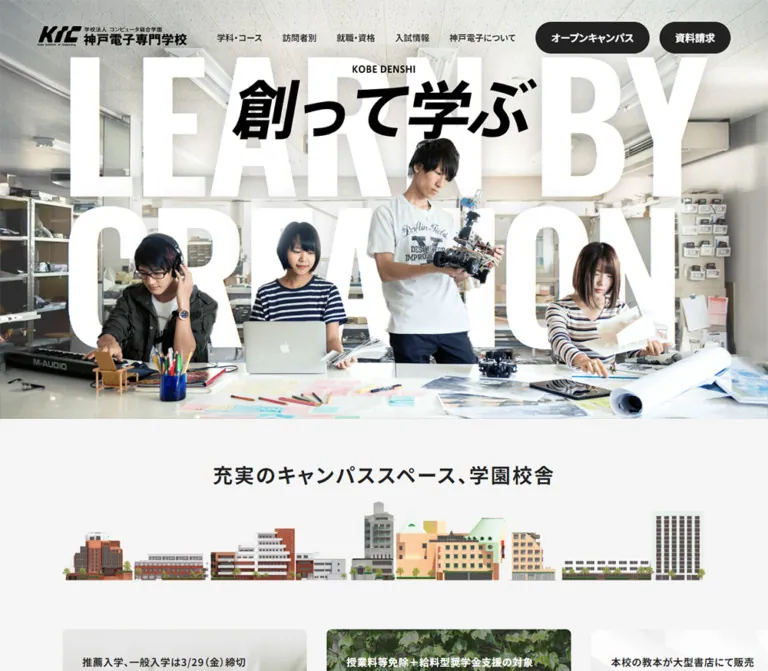
実習風景に巨大な英字と「創って学ぶ」を重ね、白・グレー・黒の基調で学科、イベント、訪問者別情報を整理。カード比率や導線をスマートフォン向けに組み替える学校サイト。
オリジナルサイトを見るA working classroom becomes a typographic poster, followed by a spacious, practical school directory.
Website: www.kobedenshi.ac.jp Original URL: https://www.kobedenshi.ac.jp/ Final URL: https://www.kobedenshi.ac.jp/ Reported response: HTTP 200; the original and final URLs are identical. Theme: light content surfaces, dark actions, and a near-black footer. A user-selectable theme was not observed. Inspected: September 23, 2026, at 00:58:39 JST, through the supplied browser evidence. The recorded timestamp is September 22, 2026, at 15:58:39.607 UTC. Viewports: desktop 1440 × 1000 CSS pixels; mobile 390 × 844 CSS pixels. Scope: the current institutional homepage, including its opening composition, campus introduction, promotions, event pathways, course gateway, audience navigation, news, related-site links, admissions pathways, and footer. Visual coverage consists of three desktop captures and two mobile captures; rendered text and computed measurements extend beyond those image regions. Linked destination pages were not inspected.
Kobe Denshi combines the scale of a campaign poster with the organization of a comprehensive school website. The opening photograph shows students making things in a real workshop: a robot, a laptop, drawings, musical equipment, and a crowded worktable. Huge white English lettering occupies the same space as the photograph, while the black Japanese message, “創って学ぶ,” provides a second focal point. A compact institutional logo and restrained black pill buttons keep the identity and primary actions legible above this composition.
Below the hero, the site becomes an information system. Large Japanese headings, generous section spacing, consistent card edges, and a small vocabulary of arrows organize many routes through the school. Photography supplies most of the color. Pale gray surfaces and dark text keep events, audience portraits, and news artwork from competing with unrelated interface decoration. The long footer shifts to near-black and exposes the breadth of the institution through directories, supporting links, contact information, and social accounts.
A working classroom becomes a typographic poster, followed by a spacious, practical school directory.
Website: www.kobedenshi.ac.jp Original URL: https://www.kobedenshi.ac.jp/ Final URL: https://www.kobedenshi.ac.jp/ Reported response: HTTP 200; the original and final URLs are identical. Theme: light content surfaces, dark actions, and a near-black footer. A user-selectable theme was not observed. Inspected: September 23, 2026, at 00:58:39 JST, through the supplied browser evidence. The recorded timestamp is September 22, 2026, at 15:58:39.607 UTC. Viewports: desktop 1440 × 1000 CSS pixels; mobile 390 × 844 CSS pixels. Scope: the current institutional homepage, including its opening composition, campus introduction, promotions, event pathways, course gateway, audience navigation, news, related-site links, admissions pathways, and footer. Visual coverage consists of three desktop captures and two mobile captures; rendered text and computed measurements extend beyond those image regions. Linked destination pages were not inspected.
Kobe Denshi combines the scale of a campaign poster with the organization of a comprehensive school website. The opening photograph shows students making things in a real workshop: a robot, a laptop, drawings, musical equipment, and a crowded worktable. Huge white English lettering occupies the same space as the photograph, while the black Japanese message, “創って学ぶ,” provides a second focal point. A compact institutional logo and restrained black pill buttons keep the identity and primary actions legible above this composition.
Below the hero, the site becomes an information system. Large Japanese headings, generous section spacing, consistent card edges, and a small vocabulary of arrows organize many routes through the school. Photography supplies most of the color. Pale gray surfaces and dark text keep events, audience portraits, and news artwork from competing with unrelated interface decoration. The long footer shifts to near-black and exposes the breadth of the institution through directories, supporting links, contact information, and social accounts.
The captured hero has conspicuous wrapping and clipping. At desktop width, the first English phrase occupies two measured line boxes; on mobile, the image shows “LEARN,” “BY,” “CREATI,” and “ON” across successive lines. Record this as the current captured rendering. The evidence does not establish whether its cause is font availability, layout rules, or another rendering condition.
| Name | Value | Source evidence | Role and confidence |
|---|---|---|---|
| Page Gray | #F5F5F5 |
--bg_gray, --theme-light-bg-secondary; computed body background |
Measured main page canvas |
| Ink | #222222 |
--black, --theme-light-text-body, --theme-light-button-normal |
Measured body text and filled header actions |
| White | #FFFFFF |
--white, --theme-light-bg-tertiary |
Measured feature card, utility cards, news cards, and reversed text |
| News Gray | #EBEBEB |
--border_gray; computed news-section background |
Measured full-width news band; the source variable name does not limit it to borders |
| Footer Black | #111111 |
--theme-dark-bg-primary |
Declared token corresponding to the visually near-black footer; a footer element's computed background was not included |
| Dark Card | #333333 |
--theme-dark-bg-tertiary; computed course-link backgrounds |
Measured desktop course directory tiles |
| Description Ink | #444444 |
--theme-light-text-description |
Declared secondary text color; not independently measured on every descriptive paragraph |
| Medium Gray | #9F9F9F |
--gray |
Declared neutral; useful as an adaptation for muted footer links, whose exact computed color is unavailable |
| Light Description | #CCCCCC |
--theme-dark-text-description, --line |
Declared dark-surface description and line values |
| Alternate Light Surface | #EEEEEE |
--theme-light-bg-primary |
Declared surface; do not substitute it for the measured #EBEBEB news band |
The dominant relationship is pale gray / white / dark ink. The gold anniversary emblem is a localized visual accent, not evidence of a general gold button or heading token. Its exact color was not supplied.
Light and dark custom-property names coexist in the source. They support different page regions; they do not prove the existence of a theme switch.
These are exact declared values. Their semantic associations follow the supplied variable names and corresponding course labels. The provided screenshots do not establish the full visible application of these colors inside the course section.
| Source token | Value | Associated subject |
|---|---|---|
--it |
#32A7D8 |
IT and information processing |
--hardware |
#2788C5 |
Hardware, robotics, and electronics |
--business |
#1D67B1 |
Information business |
--gamesoft |
#E1C300 |
Game planning and development |
--esports |
#F4B60A |
Esports |
--threedcg |
#EA90B1 |
3D computer graphics |
--animation |
#D86595 |
Animation |
--voiceactor |
#CC3982 |
Voice acting and performance |
--technique |
#901A6B |
Sound production technology |
--create |
#AF176C |
Sound creation |
--graphic |
#94C749 |
Graphic and web design |
--industrial |
#57AA5D |
Industrial design |
--architecture |
#007C58 |
Architecture and interiors |
Additional declared colors include --blue: #122A77, --lightblue: #3755B0, --bluebg: #EFF3F9, --orange: #EE7824, --red: #FF1616, and --error: #FF3333. Their presence is not a reason to introduce colorful global CTAs. The observed primary actions are dark neutral pills.
Computed family stack: Noto Sans JP, ヒラギノ角ゴ Pro W3, Hiragino Kaku Gothic Pro, メイリオ, Meiryo, Osaka, Arial, Helvetica, Verdana, MS Pゴシック, sans-serif, MS Pゴシック, MS PGothic.
The body uses 14px regular text with a 21px line height. Headings and navigation generally use weight 700. Large Japanese headings are substantial but clean, with measured tracking commonly equal to 0.04em. Labels inside photographic cards use wider 0.08em tracking.
The generous rhythm comes from both spacing and line height: section headings commonly use 1.4, introductory prose uses 1.8, and portrait-card titles use 1.25.
The hero paragraphs declare Oswald, sans-serif, weight 400. At 1440px width, their font size is 316.8px with a 278.784px line height. At 390px width, both become 97.5px with a 97.5px line height.
The declaration identifies the intended stack, but the supplied rendered letterforms and wrapping must remain the visual authority. Do not claim that a particular Oswald file loaded successfully. The hero's extreme scale is measurable regardless of the font-resolution question.
Several small captions over photographs also declare Oswald. Japanese glyphs can be supplied by fallback fonts; the evidence does not identify their actual glyph font.
Treat the institutional logo and the heavy, slanted “創って学ぶ” treatment as artwork. The sampled hero-message containers have empty text values, so their appearance cannot be attributed to a named font from this evidence. Recreating them with an arbitrary bold font would lose the original proportions and letter shaping.
Values below are measured unless explicitly marked as estimates.
| Role | Desktop size / line height | Mobile size / line height | Weight | Tracking |
|---|---|---|---|---|
| Body default | 14 / 21px | 14 / 21px | 400 | Normal |
| Header navigation | 14.4 / 21.6px | Menu entries: 20 / 30px | 700 | Normal |
| Navigation-panel heading | 20 / 30px | 20 / 30px | 700 | 0.8px |
| Navigation-panel return label | Not shown | 12 / 18px | 700 | Normal |
| Hero: first English paragraph | 316.8 / 278.784px | 97.5 / 97.5px | 400 | −2px / normal |
| Hero: second English paragraph | 316.8 / 278.784px | 97.5 / 97.5px | 400 | −11px / −1px |
| Campus introduction heading | 32 / 32px | Not present in the mobile rendered text | 700 | Normal |
| Campus supporting sentence | 15 / 15px | 14 / 19.6px | 400 / 700 | Normal |
| Event-section overline | 18 / 27px | 16 / 24px | 700 | 0.04em |
| Event-section headline | 60.48 / 84.672px | 40 / 56px | 700 | 0.04em |
| Course-gateway headline | 60.48 / 84.672px | 48 / 67.2px | 700 | 0.04em |
| Audience and news headlines | 48 / 67.2px | 36 / 50.4px | 700 | 0.04em |
| Audience introduction prose | 18 / 32.4px | 16 / 28.8px | 400 | 0.04em |
| Promotional-card headline | Approximately 28 / 39.2px | 28 / 39.2px | 700 | 0.04em |
| Event-card title | 28.8 / 36px | 24 / 30px | 700 | 0.08em |
| Audience-photo title | 32 / 40px | 24 / 30px | 700 | 0.08em |
| News-card title | 16 / 28.8px | 16 / 28.8px | 700 | 0.64px |
| Utility-link title | 16 / 28.8px | 16 / 24px | 700 | Normal |
| Standard section button | 16 / 24px | 16 / 24px | 700 | 0.64px |
| Footer links | Approximately 14px | Approximately 14px | Visually regular | Not measured |
| Footer group headings | Approximately 16px | Approximately 16px | Visually bold | Not measured |
The hero sizes equal 22vw at the desktop sample and 25vw at the phone sample. These are numerical equivalences, not proof of the source formulas or breakpoint.
Density: large outer intervals with compact internal controls. Primary geometry: modestly rounded rectangles, fully rounded pills, and circular arrow marks. Layout anchor: a 1240px desktop content span, reduced to 340px on the inspected phone.
| Use | Measured value | Notes |
|---|---|---|
| Desktop content gutter | 100px | Repeated content starts at x = 100 and ends at x = 1340 |
| Mobile content gutter | 25px | Main content width is 390 − 50 = 340px |
| Desktop header padding | 35px 60px 0 | Computed padding; rendered bounds extend slightly outside the viewport |
| Mobile header padding | 25px 20px | Separate from the 25px main-content gutter |
| Four-column directory gap | 32px horizontal | Audience and course-link grids |
| Course-link row gap | 24px | Derived from successive measured row positions |
| Event-card gap | 30px desktop; 16px mobile | Derived from card positions |
| Promotional/news rail gap | 30px desktop; 16px mobile | Card gutters, excluding internal padding |
| Photo-card desktop text inset | 24px horizontal; 40px top | Audience cards |
| Photo-card mobile text inset | 20px | Audience and event cards |
| Promotion copy inset | 20px horizontal; 24px top | Measured from anchor and text bounds |
| News-copy horizontal inset | 20px | Card width minus title width |
| Feature-card padding | 12px 12px 12px 16px | Same padding at both viewports |
| Feature-card content gap | 20px desktop; 8px mobile | Computed flex gap |
| Standard section padding | 50px vertically desktop; 40px mobile | Several content sections; not the entire visible separation between every section |
| News-section padding | 155px vertically desktop; 90px mobile | A deliberately larger interval |
| Heading-to-card interval | 50px desktop; 35px mobile | Measured in event, audience, and news regions |
There is no evidence of one universal spacing multiplier. Preserve the recurring values while allowing the hero, news section, and footer their own rhythms.
| Element | Value | Evidence |
|---|---|---|
| Feature card | 8px | Computed |
| Promotional-card link | 8px | Computed |
| Utility audience link | 8px | Computed |
| News-card link | 8px | Computed |
| Desktop course tile | 8px | Computed |
| Header and section pills | 100px | Computed; produces a capsule at the measured heights |
| News previous control | 100% | Computed |
| Audience-photo clipping | Approximately 8px | Visual estimate; the sampled outer anchor itself reports 0px |
| Mobile navigation promotional entries | 4px | Computed inside an unexercised menu structure |
Apply rounding to the correct layer. A square-cornered outer anchor can contain a rounded photograph; the anchor's computed radius alone does not describe the final silhouette.
| Element | Desktop: 1440 × 1000 | Mobile: 390 × 844 |
|---|---|---|
| Reported document height | 9674px | 10028px |
| Main inner width | 1240px | 340px |
| Header height | 84.41px | 74px |
| Header logo link | 240 × 37px | 180 × 24px |
| Visible hero photograph region | Approximately 1440 × 790px | Approximately 390 × 720px |
| Learning feature card | 373 × 124px | 340 × 127.98px |
| Promotional card | 287.5 × 451.44px | 258 × 405.11px |
| Event card | 393.33 × 393.33px | 340 × 228.05px |
| Audience photo card | 286 × 452.34px | 340 × 228.05px |
| Audience utility link | 286 × 80px | 340 × 90px |
| Main course tile | 286 × 90px | Not established as a visible mobile tile |
| News card | 288 × 417.09px | 281 × 409.17px |
| Header open-campus action | 168.86 × 49.41px | Replaced in the opening view by a bottom action pair |
| Header information-request action | 107.61 × 49.41px | Bottom action pair; screenshot estimate of 50px height |
| News previous button | 58 × 58px | Not present in the supplied mobile rendered controls |
The hero-photograph measurements are screenshot estimates, not sampled image-element bounds. The document-height values are the reported page metrics; body rectangles separately extend 30px above the viewport. Do not copy that offset into a new layout as an intentional spacing token.
Role: institutional identity, broad site navigation, and two high-priority admission actions.
The desktop header is transparent over the classroom image. A 240px-wide logo sits left. Seven compact navigation categories occupy the middle/right region, followed by “オープンキャンパス” and “資料請求.” Navigation is bold at 14.4px. The two actions use #222 fills, white text, approximately 49px height, and a 100px radius. Their measured separation is 16px.
The logo link begins near x = 52.8 rather than exactly 60px because the rendered header rectangle is slightly wider than the viewport. The computed padding is the more reusable value; the overshoot is an observation, not a recommended layout technique.
At 390px, the opening header contains the 180 × 24px logo and a small hamburger symbol near the right edge. The desktop navigation and header pills are not visible in that opening image. The header remains transparent over the photograph. Fixed positioning, scroll-direction hiding, and a scrolled background state were not verified.
Role: expose the school's extensive information architecture.
The desktop DOM contains panel headings at 20px and course links at 16px. Sampled course entries are approximately 279.4 × 74px, with 12px vertical padding and a 12px internal gap. Other panel entries are approximately 310.45 × 64px with 20px vertical padding. Their coordinates form three columns.
Mobile panel entries become large single-column rows: commonly 340 × 70px at 20 / 30px. Course rows have a narrower 306px content width and can become 84px tall when text wraps. A 12 / 18px return label, “メインメニューに戻る,” appears in the structure.
Many mobile panel rectangles begin around x = 413, outside the 390px viewport. This supports an offscreen panel structure. It does not establish the opening gesture, focus behavior, sliding duration, or visual appearance of the active menu.
Role: express the school's making-centered identity before presenting the directory.
The background is a bright, detailed classroom scene. Four people are visible across the desktop composition; the standing student with the robot creates the main vertical anchor. The table and tools establish a shared practical workspace. The phone crop preserves the central student, adjacent students, and table while giving much of the upper area to the room's ceiling.
The English text is a supergraphic, not a conventional heading block. Both measured paragraphs are full viewport width. On desktop, the first begins at y = 70 and has a 557.56px rectangle, equal to two line boxes at the measured line height. The second begins at y = 627.56 and also measures 557.56px tall. Much of this typography extends beyond the visible photographic area. The opening capture visibly shows the first phrase wrapping and clipping.
The black Japanese hero artwork is centered above the standing student's head on desktop. Its sampled container is about 565.92 × 113.91px at x = 437.04, y = 162.91. A smaller “KOBE DENSHI” mark sits above it.
On mobile, the small mark moves to about y = 478 and the Japanese-message container to y = 501. The standing student visually overlaps the lettering. The exact image layering, mask, or compositing technique was not supplied; do not identify an unobserved PNG, SVG mask, or video implementation.
Role: connect the expressive hero to an explanation of the teaching approach.
The desktop card is a white, rounded rectangle in the hero's lower-right area, at x = 1027, y = 638. It contains a left text region, an outlined circular arrow near the lower-left, and a small landscape image on the right. The label introduces the teaching approach; the larger question reads “「創って学ぶ」とは?”
Its measured anatomy is 373 × 124px, 8px radius, asymmetric 12/16px padding, and a 20px gap. The right-hand photograph appears approximately 140 × 100px. The sampled left text wrapper uses weight 700 and wide 0.12em tracking; its nested larger title was not separately sampled.
On mobile the card becomes a normal-looking block below the photograph at x = 25, y = 766.8, width 340px. The gap contracts to 8px and the small text wrapper changes from 14 / 21px to 12 / 18px. The opening bottom actions overlap part of this card in the supplied phone image.
Its destination is the learning-features page; that page's contents were not inspected.
Role: provide an institutional bridge between the hero and current recruitment information.
The desktop opening capture shows a gold “68th / since1958” emblem beside a centered campus heading and a short supporting sentence. The heading is 32px bold; the sentence is 15px regular. This compact identity group sits within a broad pale-gray area.
The mobile rendered text omits the campus heading while retaining the historical supporting sentence at 14px bold with a 19.6px line height. The supplied phone image does not extend far enough to establish this section's complete visual composition.
Only a small upper fragment of the following campus graphic is visible in the desktop capture. Its full artwork should not be reconstructed from the available image coverage.
Role: highlight current application, event, parent, and financial-support pathways.
Four measured promotional links cover AO entry, autumn open campus, parent guidance, and tuition-support eligibility. Desktop cards are 287.5px wide and approximately 451.44px high, arranged with 30px gaps. They have 8px rounded link bounds, a small bold introduction, and a roughly 28px headline with 1.4 leading.
Copy starts 20px from the sides and 24px from the top. Text color varies between dark and white according to the individual card. Full promotional artwork is not visible in the supplied screenshots, so its specific subjects and background treatments are not established here.
At phone width, each card is 258px wide and approximately 405.11px tall. Successive cards begin at x = 25, 299, 573, and 847. This establishes a horizontal track with 16px gaps and offscreen continuation. It does not establish autoplay, swipe mechanics, or a carousel library.
Role: distinguish an in-person open campus, industry seminars, and video-based school introductions.
An 18px desktop overline leads into a 60.48px headline. Three equal event links follow: approximately 393.33px square, separated by 30px. The copy is inset about 28.8px, with a small caption above a 28.8px title. White text appears on the open-campus card; the other measured titles are dark.
On mobile, the heading becomes 40px and wraps to two lines. Cards stack vertically at 340 × 228.05px with 16px gaps. Text insets become 20px and card titles become 24 / 30px. These are art-directed proportion changes, not scaled-down desktop squares.
A centered pill link to the event index follows the cards. It measures approximately 242.89 × 56px on desktop and 234.89 × 50px on mobile.
Role: introduce the school's subject breadth and provide direct course routes.
The DOM describes three areas and eighteen departments. A large white headline and a white pill link create the gateway. On desktop the headline is 60.48px; on mobile it remains unusually large at 48px and wraps into a narrow, three-line composition. The mobile text region is approximately 244.66px wide, centered within the page.
Below the desktop gateway, fifteen broad subject links form four columns. These links group the department offerings rather than mapping one card to each of the eighteen departments. Each measured tile is 286 × 90px, with a #333 fill, white text, 8px corners, 20px horizontal padding, and a 20px internal gap. Column gaps are 32px and row gaps are 24px.
The main-content course tiles are not present as visible links in the mobile rendered text/link sequence, although course choices remain in the navigation structure. The precise mobile display rule is not supplied. The course-index pill remains clearly represented.
The gateway's full background imagery is outside the supplied screenshot coverage. White text measurements alone do not identify the background asset or its movement.
Role: help different visitors find relevant information without knowing the school's internal structure.
The desktop introduction pairs a left heading with right-hand prose. The heading is 48 / 67.2px, approximately 514.81px wide. The paragraph is 18 / 32.4px in a roughly 546.95px region. The layout combines editorial hierarchy with a restrained two-column explanation.
On mobile, the heading becomes 36 / 50.4px and occupies three lines. The paragraph moves below it at 16 / 28.8px. This is a deliberate change in composition; the desktop side-by-side structure does not remain compressed into two narrow columns.
Role: route high-school students, parents, international students, and returning adult/university learners.
Four tall photographs align to the 1240px content span. Each card is 286 × 452.34px, with 32px between cards. Their content is specific: a school student at a desk, a parent couple, a student working on drawings, and a young adult holding papers outdoors.
An introductory caption and large white title sit near the top-left. The title uses 32 / 40px and 0.08em tracking. A white circular arrow marker appears near the lower-left; its diameter is approximately 48px by visual estimate. Rounded image clipping is visible even though the outer link's computed radius is zero.
Mobile cards become wide 340 × 228.05px blocks, stacked with 16px gaps. Titles reduce to 24 / 30px, and copy begins 20px from the top and left. Preserve this portrait-to-landscape transformation when adapting the component.
Role: give teachers, companies, graduates, and current students quieter secondary routes.
These are white rectangular links below the photo cards, with bold dark labels and thin outlined circular arrows at the right. Desktop links measure 286 × 80px with 8px corners and 18px 70px 18px 28px padding. The large right inset reserves the arrow region.
On mobile they become full-width, 340 × 90px links in one column, separated by 12px. Their padding changes to 14px 65px 14px 25px. Although the photo cards become shorter on mobile, these utility links become taller.
Role: show current institutional activity and industry connections.
The news region occupies a full-width #EBEBEB band. Its 155px desktop top and bottom padding make it a major chapter in the page. A small “ニュース” label sits above the 48px “最新のお知らせ” heading. The cards begin 50px after the heading's measured box.
News cards are white, 8px-rounded links with an image, date, and bold title. The first measured desktop card is 288 × 417.09px; title text is inset 20px and uses 16 / 28.8px. The supplied screenshot shows varied artwork: a game-sound seminar image, an illustrated trip graphic, an official ceremony photograph, and a game-show announcement. These varied content images sit inside one consistent interface frame.
The desktop track continues beyond the right edge, with part of another card visible. A 58px white circular previous button is measured; “Previous” and “Next” controls appear in the desktop rendered text. Their actual response to activation was not tested.
On mobile the background remains full bleed, padding reduces to 90px, and the heading becomes 36px. Cards remain in a horizontal sequence at 281px wide, with 16px gaps. Their approximately 409.17px height is close to the desktop cards, maintaining readable text instead of shrinking the entire card.
Role: connect campus-life channels and supporting information to the main recruitment journey.
The rendered content includes Japanese-language study, the associated graduate-school site, social channels, admissions information, and an information-request pathway. These modules occur after the news section and before the footer directory.
The text hierarchy and destinations are established, but their full visual treatment is outside the supplied screenshot coverage. Do not invent their image crops, card colors, or hover treatments. Retain the observed distinction between school information, related institutions, and social accounts when extending the page.
Role: provide a comprehensive site directory and a clear institutional signature.
The lower desktop footer is a large near-black field aligned to the same 100px gutters as the main content. Four visible directory groups cover visitors, admissions, employment/qualifications, and school information. White bold group labels sit above muted links with generous line spacing. The DOM also includes a detailed course directory above the captured lower-footer region.
Thin horizontal rules separate the directory, secondary links, and supporting banners. The captured banner row contains four wide images, approximately 286 × 100px each, mixing game-related artwork, a building image, and institutional branding. These are supporting outbound routes, not evidence of production credits.
A white institutional logo anchors the lower-left area. The address and telephone/fax details follow, with the official social label and six monochrome social marks to the right. The marks represent LINE, Facebook, X, YouTube, Instagram, and TikTok. A small copyright line closes the footer.
The screenshot suggests approximately 40px social icon circles and 14px secondary text; these are visual estimates rather than computed measurements.
Role: preserve useful routes and contact details in a narrower, shorter directory.
The phone capture uses 25px side gutters. Visitor links become two columns. The utility links below also use two columns, but with stronger white type and enough vertical room for the long media label to wrap. There are no visible separators in this captured lower segment.
The white logo is approximately 238px wide by visual estimate. Address details sit below it, followed by an official-social label and six evenly distributed social icons in one row. Copyright text is approximately 11px and fits on one line in the supplied image.
The mobile rendered text contains top-level course, admissions, employment, and school-information links, while the detailed desktop subdirectories are absent from that sequence. An accordion interaction was not observed and should not be asserted.
Role: keep open-campus and information-request routes prominent in the opening phone view.
Two dark pills sit near the viewport bottom, with white labels and right-pointing chevrons. The open-campus action is wider than the information-request action. Visual estimates are approximately 209px and 135px wide, 50px high, with a 12px gap and about 17px outer margins.
They appear over the learning feature card rather than consuming a separate visible layout row. Their viewport-bottom placement looks fixed, but no positioning property was supplied. They are absent from the supplied footer screenshot, so continuous persistence and footer-suppression behavior remain unverified.
| Element or treatment | Supplied computed value or evidence | What is established | What remains unverified |
|---|---|---|---|
| Header background | 0.3s ease-in-out |
A background transition is declared at both viewports | Trigger and resulting background |
| Header transform | 0.8s ease-in-out |
A transform transition is declared | Scroll-direction behavior, distance, and fixed/sticky positioning |
| Hero English text | Transform: 0.6s ease-in-out; opacity: 0.5s ease-in-out |
Transform and opacity transitions are declared | Entrance sequence, translation distance, and scroll coupling |
| Desktop learning feature | Opacity: 0.5s ease-in-out, delay 0.5s |
A delayed opacity transition is declared | Exact trigger and initial opacity |
| Desktop header pills | 0.3s ease-in-out |
A nonzero transition duration is supplied | Hover colors, inversion, or movement |
| Desktop section pills | 0.3s ease-in-out |
Transition timing is supplied on sampled links | Hover endpoint and active state |
| News navigation | Previous/Next controls; 58px previous-button circle | Carousel-like navigation controls exist | Click result, looping, autoplay, and keyboard behavior |
| Mobile promotion/news tracks | Sequential offscreen card rectangles | Horizontal continuation exists | Native scrolling versus scripted movement and gesture support |
| Mobile navigation | Offscreen panels and a return label | A nested panel structure exists | Opening animation, focus handling, and escape behavior |
Many sampled elements report transition: all without a nonzero duration and animation: none. This does not establish a visible animation, and it does not rule out JavaScript-driven effects elsewhere.
The capture routine waited for document load, image decoding, finite motion, and sampled layout/text stability within stated limits. Perpetual animations were temporarily paused during readiness checks and resumed afterward. These precautions do not reveal the full motion design from still images.
Recommended adaptation: use the measured ease-in-out timings for modest opacity and transform changes. Keep navigation and text visible when animation is disabled. Do not introduce parallax, continuous marquees, autoplaying carousels, or dramatic zoom effects as if they were observed features.
| Layer | Appearance | Structural purpose |
|---|---|---|
| Opening hero | Full-width classroom photograph with white and black lettering | Brand expression and practical-learning identity |
| Main canvas | #F5F5F5 |
Calm space around a large quantity of information |
| Feature and utility cards | White with small rounded corners | Local link grouping without heavy elevation |
| Course links | #333 with white text |
Dense subject navigation within the course region |
| News chapter | Full-width #EBEBEB field |
Separates current content from audience navigation |
| News cards | White, rounded, image above text | Unifies varied editorial imagery |
| Primary actions | #222 capsule with white text |
Consistent recruitment emphasis |
| Footer | Visually near-black, matching declared #111 |
Dense directory and institutional closure |
No strong general drop-shadow system is visible. Separation comes from surface contrast, whitespace, typography, image edges, and thin footer rules. The hero feature card floats through placement and contrast rather than conspicuous elevation.
The opening photography is specific to practical education. Preserve visible tools, hands, working posture, classroom fixtures, and the shared table. The setting is bright and slightly cool, with natural-looking institutional interiors rather than a heavily tinted advertising background. The central standing student provides a useful focal point for both wide and narrow crops.
Audience photography is more individually targeted. Each image communicates a visitor type through setting, clothing, pose, and activity. The interface overlays remain consistent even as the subjects change. Mobile requires separate crop decisions because tall portrait cards become wide landscape cards.
News artwork is intentionally varied. Game illustrations, event posters, and documentary photographs remain recognizable in their own styles. Avoid applying one monochrome filter to every content image merely because the interface is mostly monochrome.
Logos, the Japanese hero message, the anniversary emblem, and branded footer banners should be treated as supplied artwork. The simple chevrons and circle outlines can be recreated with CSS or SVG. No icon-library identity was provided.
The evidence does not include image src values or an asset manifest. The following are visual asset roles, not invented filenames or download paths.
| Asset role | Observed content | Evidence scope |
|---|---|---|
| Header institution logo | Dark KIC mark and school name | Desktop and mobile opening captures |
| Footer institution logo | White institution mark and school name | Desktop and mobile footer captures |
| Hero photograph | Students, robot, laptop, drawings, equipment, and shared worktable | Desktop and mobile opening captures |
| Japanese hero lettering | Heavy, slanted “創って学ぶ” with a smaller English mark | Opening captures and empty-text DOM containers |
| Learning feature image | A person examining or making a physical object | Desktop feature card; partial mobile card |
| Anniversary emblem | Gold “68th” and “since1958” | Desktop opening capture |
| Audience portraits | Student, parents, international-student pathway, adult/university pathway | Desktop audience capture; mobile proportions supplied by DOM |
| News images | Seminar artwork, trip graphic, ceremony photo, game-show graphic | Desktop news capture and associated rendered labels |
| Footer banners | Game-related artwork, building photograph, institution branding, career-game artwork | Desktop footer capture |
| Social marks | LINE, Facebook, X, YouTube, Instagram, TikTok | Both footer captures |
Use approved school imagery when available. CSS can reproduce the spacing and component system, but it cannot replace the identity carried by the classroom photograph and custom lettering.
The desktop page is a long institutional homepage, with a reported height of 9674px. The mobile page is slightly longer at 10028px despite omitting some detailed directory text. Stacking event and audience modules increases the vertical flow, while horizontally continued promotion/news tracks avoid stacking every item.
| Region | Desktop | Mobile |
|---|---|---|
| Header | Logo, seven navigation categories, two action pills | Smaller logo and hamburger symbol |
| Hero | Wide classroom composition; enormous clipped English text; centered Japanese artwork near the top | Tall classroom crop; English text wraps into four visible lines; Japanese artwork moves lower |
| Learning feature | Positioned over the lower-right hero | 340px block below the photograph |
| Recruitment promotions | Four narrow cards across the content span | 258px cards continuing horizontally |
| Event pathways | Three square cards in a row | Three wide cards stacked vertically |
| Course gateway | Broad 60.48px heading and desktop subject directory | Narrow 48px heading and course-index route; main subject-grid visibility not fully established |
| Audience introduction | Heading and prose side by side | Heading above prose |
| Audience portraits | Four tall cards | Four wide stacked cards |
| Audience utility links | Four columns, 80px tall | One column, 90px tall |
| News | Approximately four full cards with continuation | One full card and offscreen continuation |
| Footer | Extensive directories and horizontal supporting modules | Simplified text sequence, two-column visitor/utility links, stacked identity details |
| Primary recruitment actions | Header pills | Bottom action pair visible in the opening capture |
The mobile composition retains large type. The course headline is larger than the other mobile section headlines, while news-card text remains 16px at both sizes. This selective resizing is more faithful than scaling all desktop typography by one ratio.
Only two viewport widths were supplied. Exact breakpoints, intermediate tablet behavior, landscape-phone behavior, and wide-monitor limits are unknown. The Quick Start therefore labels its media-query thresholds as recommendations.
#F5F5F5, #222, white, and the #EBEBEB news band.These are improvements for a new implementation, not verified properties of the original site:
#F5F5F5.#222222.#FFFFFF.#EBEBEB.#111111.#333333.“Create a comprehensive Japanese vocational-school homepage inspired by the current Kobe Denshi reference. Begin with a bright, full-width workshop photograph showing students making things. Overlay extremely large white English lettering and a bold black Japanese graphic message, with a compact institutional logo and dark pill actions above. Use a pale-gray canvas, Noto Sans JP as the declared Japanese UI family, bold headings, 8px card corners, and circular arrow marks. Organize event pathways, a course gateway, visitor-specific photography, news, related links, and a substantial dark footer. At 1440px, align ordinary content to a 1240px span; at 390px, use 25px gutters. Turn desktop portrait audience cards into wide stacked phone cards, while keeping promotions and news in horizontally continued tracks. Treat font loading, hero clipping, menu states, and motion as explicit implementation decisions rather than inventing unverified source behavior.”
#EBEBEB section with 155px desktop vertical padding, a small bold overline, and a 48px Japanese heading. Follow with white 8px-rounded image/date/title cards approximately 288px wide. Keep 16px titles and horizontal continuation on mobile, with 281px cards and 90px section padding.”This is an implementation starter, not extracted source CSS. Pixel values preserve the measured anchors without changing the document root to 10px. Fluid formulas are chosen to pass through the supplied measurements. The 1279px header breakpoint and 767px content breakpoint are recommendations; the original breakpoints were not supplied.
The hero needs approved imagery and lettering assets. The optional foreground layer is an implementation hook for reproducing the observed overlap, not a claim about the original asset architecture. Font files must be provided separately; declaring a family does not load it.
:root {
  /* Measured colors and declared source-color equivalents */
  --kd-canvas: #f5f5f5;
  --kd-ink: #222222;
  --kd-white: #ffffff;
  --kd-news: #ebebeb;
  --kd-footer: #111111;
  --kd-dark-card: #333333;
  --kd-muted: #9f9f9f;
  --kd-description: #444444;

  /* Shortened source-family adaptation; font files load separately */
  --kd-font-body: 'Noto Sans JP', 'Hiragino Kaku Gothic Pro',
    Meiryo, Arial, Helvetica, sans-serif;
  --kd-font-display: Oswald, sans-serif;

  --kd-content: 1240px;
  --kd-gutter: clamp(25px, 6.9444vw, 100px);
  --kd-radius: 8px;
  --kd-pill-radius: 100px;
  --kd-grid-gap: 32px;
  --kd-section-space: 50px;
  --kd-news-space: 155px;
  --kd-safe-bottom: env(safe-area-inset-bottom, 0px);

  --kd-text-body: 14px;
  --kd-text-section: 48px;
  --kd-text-major: clamp(40px, 4.2vw, 60.48px);
  --kd-leading-body: 1.5;
  --kd-leading-title: 1.4;
  --kd-leading-copy: 1.8;
  --kd-tracking-title: 0.04em;
  --kd-tracking-card: 0.08em;

  /* Timings present in the supplied computed styles */
  --kd-motion-control: 300ms ease-in-out;
  --kd-motion-header: 800ms ease-in-out;
  --kd-motion-hero: 600ms ease-in-out;
  --kd-motion-fade: 500ms ease-in-out;
}

* { box-sizing: border-box; }

html { font-size: 100%; }

body {
  margin: 0;
  color: var(--kd-ink);
  background: var(--kd-canvas);
  font: 400 var(--kd-text-body) / var(--kd-leading-body)
    var(--kd-font-body);
}

img { display: block; max-width: 100%; }
button, input, select, textarea { font: inherit; }

.kd-container {
  width: min(var(--kd-content), calc(100% - 2 * var(--kd-gutter)));
  margin-inline: auto;
}

.kd-section { padding-block: var(--kd-section-space); }

.kd-overline {
  margin: 0;
  padding-block: 10px;
  font-size: 18px;
  font-weight: 700;
  line-height: 1.5;
  letter-spacing: 0.04em;
}

.kd-heading {
  margin: 0;
  font-size: var(--kd-text-section);
  font-weight: 700;
  line-height: var(--kd-leading-title);
  letter-spacing: var(--kd-tracking-title);
}

.kd-heading--major { font-size: var(--kd-text-major); }

.kd-pill {
  display: inline-flex;
  align-items: center;
  justify-content: center;
  gap: 15px;
  min-height: 54px;
  padding: 14px 28px 16px;
  border: 0;
  border-radius: var(--kd-pill-radius);
  color: var(--kd-white);
  background: var(--kd-ink);
  font-size: 16px;
  font-weight: 700;
  line-height: 24px;
  letter-spacing: 0.04em;
  text-decoration: none;
  transition: opacity var(--kd-motion-control);
}

.kd-pill--light {
  color: var(--kd-ink);
  background: var(--kd-white);
}

.kd-header {
  position: absolute;
  z-index: 20;
  inset: 0 0 auto;
  display: flex;
  align-items: center;
  gap: 32px;
  padding: 35px 60px 0;
  transition: background var(--kd-motion-control),
    transform var(--kd-motion-header);
}

.kd-brand { flex: 0 0 240px; }
.kd-brand img { width: 240px; height: 37px; object-fit: contain; }

.kd-header-nav {
  display: flex;
  align-items: center;
  gap: 20px;
  margin-left: auto;
}

.kd-header-nav a {
  color: inherit;
  font-size: 14.4px;
  font-weight: 700;
  text-decoration: none;
  white-space: nowrap;
}

.kd-header-actions { display: flex; gap: 16px; }

.kd-header-actions .kd-pill {
  min-height: 49.4px;
  padding: 16px 24px 17px;
  font-size: 14.4px;
  line-height: 1;
  letter-spacing: normal;
  white-space: nowrap;
}

.kd-menu-toggle { display: none; }

/* The feature link is a sibling of the clipped hero. */
.kd-hero-block { position: relative; }

.kd-hero {
  position: relative;
  isolation: isolate;
  height: 790px;
  overflow: hidden;
}

.kd-hero-photo,
.kd-hero-foreground {
  position: absolute;
  inset: 0;
  width: 100%;
  height: 100%;
  object-fit: cover;
  object-position: center;
}

.kd-hero-photo { z-index: 0; }
.kd-hero-foreground { z-index: 3; pointer-events: none; }

.kd-hero-type {
  position: absolute;
  z-index: 1;
  inset: 70px 0 auto;
  color: var(--kd-white);
  font-family: var(--kd-font-display);
  font-size: 22vw;
  font-weight: 400;
  line-height: 0.88;
  pointer-events: none;
}

.kd-hero-type p {
  margin: 0;
  letter-spacing: -2px;
  overflow-wrap: anywhere;
  transition: transform var(--kd-motion-hero),
    opacity var(--kd-motion-fade);
}

.kd-hero-type p + p { letter-spacing: -11px; }

/* Artwork sizing is approximate; use the actual asset proportions. */
.kd-hero-lockup {
  position: absolute;
  z-index: 2;
  top: 140px;
  left: 50%;
  width: min(566px, 100%);
  transform: translateX(-50%);
}

.kd-hero-lockup__eyebrow { width: 115px; margin: 0 auto 9px; }
.kd-hero-lockup__message { width: 100%; height: auto; }

.kd-feature-link {
  position: absolute;
  z-index: 5;
  right: 40px;
  bottom: 28px;
  display: flex;
  align-items: center;
  gap: 20px;
  width: 373px;
  min-height: 124px;
  padding: 12px 12px 12px 16px;
  border-radius: var(--kd-radius);
  color: var(--kd-ink);
  background: var(--kd-white);
  text-decoration: none;
}

.kd-feature-link__copy { flex: 1; min-width: 0; }
.kd-feature-link__image { width: 140px; height: 100px; object-fit: cover; }

.kd-promo-track,
.kd-event-grid,
.kd-audience-grid,
.kd-utility-grid,
.kd-course-grid {
  display: grid;
  grid-template-columns: repeat(4, minmax(0, 1fr));
  gap: var(--kd-grid-gap);
}

.kd-promo-track { gap: 30px; }
.kd-event-grid { grid-template-columns: repeat(3, minmax(0, 1fr)); gap: 30px; }
.kd-course-grid { gap: 24px 32px; }
.kd-after-heading { margin-top: 50px; }

.kd-photo-link,
.kd-promo-card {
  position: relative;
  display: block;
  overflow: hidden;
  border-radius: var(--kd-radius);
  color: var(--kd-white);
  text-decoration: none;
  background: var(--kd-dark-card);
}

.kd-photo-link > img,
.kd-promo-card > img {
  position: absolute;
  inset: 0;
  width: 100%;
  height: 100%;
  object-fit: cover;
}

.kd-audience-card { aspect-ratio: 286 / 452.34; }
.kd-event-card { aspect-ratio: 1; }
.kd-promo-card { aspect-ratio: 287.5 / 451.44; }

.kd-photo-copy { position: relative; z-index: 1; padding: 40px 24px; }
.kd-event-card .kd-photo-copy { padding: 28.8px; }
.kd-promo-card .kd-photo-copy { padding: 24px 20px; }

.kd-photo-caption {
  margin: 0 0 12px;
  font-size: 14.4px;
  font-weight: 700;
  line-height: 1.2;
  letter-spacing: 0.04em;
}

.kd-photo-title {
  margin: 0;
  font-size: 32px;
  font-weight: 700;
  line-height: 1.25;
  letter-spacing: var(--kd-tracking-card);
}

.kd-event-card .kd-photo-title { font-size: 28.8px; }
.kd-promo-card .kd-photo-title { font-size: 28px; line-height: 1.4; letter-spacing: 0.04em; }
.kd-photo-link--dark-text { color: var(--kd-ink); }

.kd-circle-arrow {
  display: grid;
  place-items: center;
  width: 48px;
  height: 48px;
  border-radius: 50%;
  color: var(--kd-ink);
  background: var(--kd-white);
}

.kd-circle-arrow::after {
  content: '';
  width: 8px;
  height: 8px;
  border-top: 2px solid currentColor;
  border-right: 2px solid currentColor;
  transform: rotate(45deg);
}

.kd-photo-link > .kd-circle-arrow {
  position: absolute;
  z-index: 2;
  left: 24px;
  bottom: 24px;
}

.kd-utility-grid { margin-top: 30px; }

.kd-utility-link {
  position: relative;
  display: flex;
  align-items: center;
  min-height: 80px;
  padding: 18px 70px 18px 28px;
  border-radius: var(--kd-radius);
  color: var(--kd-ink);
  background: var(--kd-white);
  font-size: 16px;
  font-weight: 700;
  line-height: 1.8;
  text-decoration: none;
}

.kd-utility-link .kd-circle-arrow {
  position: absolute;
  right: 24px;
  width: 34px;
  height: 34px;
  border: 1px solid currentColor;
}

.kd-course-link {
  display: flex;
  align-items: center;
  gap: 20px;
  min-height: 90px;
  padding-inline: 20px;
  border-radius: var(--kd-radius);
  color: var(--kd-white);
  background: var(--kd-dark-card);
  text-decoration: none;
}

.kd-news { padding-block: var(--kd-news-space); background: var(--kd-news); }

/* Native horizontal scrolling is a recommended implementation. */
.kd-news-track {
  display: flex;
  gap: 30px;
  overflow-x: auto;
  padding-bottom: 8px;
}

.kd-news-card {
  flex: 0 0 288px;
  min-height: 417px;
  overflow: hidden;
  border-radius: var(--kd-radius);
  color: var(--kd-ink);
  background: var(--kd-white);
  text-decoration: none;
}

/* The thumbnail ratio is a starter choice, not a measured source value. */
.kd-news-card > img { width: 100%; aspect-ratio: 16 / 9; object-fit: cover; }
.kd-news-card__body { padding: 20px; }
.kd-news-card h3 { margin: 12px 0 0; font-size: 16px; line-height: 1.8; letter-spacing: 0.04em; }

.kd-footer { padding-block: 80px 40px; color: var(--kd-white); background: var(--kd-footer); }
.kd-footer-grid { display: grid; grid-template-columns: repeat(4, minmax(0, 1fr)); gap: 32px; }
.kd-footer h3 { margin: 0 0 32px; font-size: 16px; }
.kd-footer ul { margin: 0; padding: 0; list-style: none; }
.kd-footer li + li { margin-top: 14px; }
.kd-footer a { color: inherit; text-decoration: none; }
.kd-footer .kd-footer-secondary { color: var(--kd-muted); }
.kd-footer-rule { margin-block: 50px; border: 0; border-top: 1px solid #444; }
.kd-footer-visitor-links { display: grid; gap: 14px; }
.kd-footer-utility { display: flex; flex-wrap: wrap; gap: 16px 40px; }
.kd-socials { display: flex; align-items: center; gap: 12px; }
.kd-socials a { display: grid; place-items: center; width: 44px; height: 44px; }
.kd-socials img { width: 40px; height: 40px; }
.kd-mobile-actions { display: none; }

/* Recommended interaction feedback; original hover endpoints are unknown. */
@media (hover: hover) {
  .kd-pill:hover { opacity: 0.82; }
}

:where(a, button):focus-visible {
  outline: 2px solid var(--kd-ink);
  outline-offset: 4px;
  box-shadow: 0 0 0 4px var(--kd-white);
}

/* Recommended header breakpoint. Wire the toggle to an accessible menu. */
@media (max-width: 1279px) {
  .kd-header { padding: 25px 20px; justify-content: space-between; }
  .kd-brand { flex-basis: 180px; }
  .kd-brand img { width: 180px; height: 24px; }
  .kd-header-nav, .kd-header-actions { display: none; }
  .kd-menu-toggle { display: grid; place-items: center; width: 44px; height: 44px; margin-block: -10px; border: 0; color: inherit; background: transparent; }
}

/* Recommended content breakpoint, anchored to the 390px measurements. */
@media (max-width: 767px) {
  :root {
    --kd-gutter: 25px;
    --kd-grid-gap: 16px;
    --kd-section-space: 40px;
    --kd-news-space: 90px;
    --kd-text-section: 36px;
    --kd-text-major: 40px;
  }

  html { scroll-padding-bottom: calc(90px + var(--kd-safe-bottom)); }
  body { padding-bottom: calc(90px + var(--kd-safe-bottom)); }
  .kd-overline { font-size: 16px; }
  .kd-after-heading { margin-top: 35px; }
  .kd-course-heading { font-size: 48px; }
  .kd-pill { min-height: 48px; padding: 12px 24px; }

  .kd-hero { height: 720px; }
  .kd-hero-type { font-size: 25vw; line-height: 1; }
  .kd-hero-type p { letter-spacing: normal; }
  .kd-hero-type p + p { letter-spacing: -1px; }
  .kd-hero-lockup { top: 478px; width: 100%; }
  .kd-hero-lockup__eyebrow { width: 105px; }
  .kd-hero-lockup__message { width: calc(100% - 60px); margin-inline: auto; }

  .kd-feature-link {
    position: relative;
    right: auto;
    bottom: auto;
    width: calc(100% - 50px);
    min-height: 128px;
    margin: 47px auto 34px;
    gap: 8px;
  }
  .kd-feature-link__image { width: 36%; height: 104px; }

  .kd-promo-track { display: flex; gap: 16px; overflow-x: auto; }
  .kd-promo-card { flex: 0 0 258px; aspect-ratio: 258 / 405.11; }
  .kd-event-grid, .kd-audience-grid, .kd-utility-grid { grid-template-columns: 1fr; }
  .kd-event-card, .kd-audience-card { aspect-ratio: 340 / 228.05; }
  .kd-photo-copy, .kd-event-card .kd-photo-copy { padding: 20px; }
  .kd-photo-caption { margin-bottom: 5px; font-size: 14px; line-height: 1.5; }
  .kd-photo-title, .kd-event-card .kd-photo-title { font-size: 24px; }
  .kd-photo-link > .kd-circle-arrow { left: 20px; bottom: 20px; }

  .kd-utility-grid { gap: 12px; }
  .kd-utility-link { min-height: 90px; padding: 14px 65px 14px 25px; line-height: 1.5; }

  /* Starter simplification: retain a visible course-index link nearby. */
  .kd-course-grid { display: none; }

  .kd-news-track { gap: 16px; }
  .kd-news-card { flex-basis: 281px; min-height: 409px; }

  .kd-footer { padding-block: 50px 40px; }
  .kd-footer-grid { grid-template-columns: 1fr; }
  .kd-footer-visitor-links { grid-template-columns: repeat(2, minmax(0, 1fr)); gap: 22px 16px; }
  .kd-footer-utility { display: grid; grid-template-columns: repeat(2, minmax(0, 1fr)); gap: 28px 16px; font-size: 16px; font-weight: 700; }
  .kd-socials { justify-content: space-between; gap: 0; }

  /* Fixed placement is an adaptation; original persistence is unverified. */
  .kd-mobile-actions {
    position: fixed;
    z-index: 30;
    left: 17px;
    right: 17px;
    bottom: calc(19px + var(--kd-safe-bottom));
    display: grid;
    grid-template-columns: 1.55fr 1fr;
    gap: 12px;
  }
  .kd-mobile-actions .kd-pill { min-height: 50px; padding: 12px 20px; font-size: 14px; letter-spacing: normal; }
}

@media (prefers-reduced-motion: reduce) {
  .kd-header, .kd-hero-type p, .kd-pill { transition: none; }
  .kd-hero-type p { opacity: 1; }
}
Markup contract: place .kd-feature-link beside .kd-hero inside .kd-hero-block. Put image and copy elements inside each card anchor. Use .kd-circle-arrow as a decorative child with aria-hidden="true". Use the actual page title as the semantic h1; the hero's repeated English lettering can be decorative when equivalent meaning is already available.
The starter deliberately leaves menu state management and carousel controls to the application. It uses native horizontal overflow for the two rails. Its mobile course-grid simplification requires a visible course-index link, and its fixed action bar includes extra page-bottom clearance. These are usable adaptations rather than verified source behaviors.
Optional aliases for a project that already uses Tailwind v4. This does not imply that the original site uses Tailwind. Define the preceding custom properties first.
@theme inline {
  --color-campus-canvas: var(--kd-canvas);
  --color-campus-ink: var(--kd-ink);
  --color-campus-surface: var(--kd-white);
  --color-campus-news: var(--kd-news);
  --color-campus-footer: var(--kd-footer);
  --color-campus-dark-card: var(--kd-dark-card);
  --color-campus-muted: var(--kd-muted);

  --font-campus: var(--kd-font-body);
  --font-campus-display: var(--kd-font-display);

  --text-campus-body: var(--kd-text-body);
  --text-campus-section: var(--kd-text-section);
  --text-campus-major: var(--kd-text-major);

  --radius-campus-card: var(--kd-radius);
  --radius-campus-pill: var(--kd-pill-radius);
  --spacing-campus-gutter: var(--kd-gutter);
  --spacing-campus-section: var(--kd-section-space);
  --spacing-campus-news: var(--kd-news-space);
}
2026-09-22T15:58:39.607Z, equivalent to September 23, 2026, 00:58:39.607 JST.This reference describes the current page represented by those captures and measurements. It does not claim an additional live visit, identify unverified production contributors, or reconstruct unobserved states.
# Kobe Denshi — Style Reference

> A working classroom becomes a typographic poster, followed by a spacious, practical school directory.

**Website:** [www.kobedenshi.ac.jp](https://www.kobedenshi.ac.jp/)
**Original URL:** https://www.kobedenshi.ac.jp/
**Final URL:** https://www.kobedenshi.ac.jp/
**Reported response:** HTTP 200; the original and final URLs are identical.
**Theme:** light content surfaces, dark actions, and a near-black footer. A user-selectable theme was not observed.
**Inspected:** September 23, 2026, at 00:58:39 JST, through the supplied browser evidence. The recorded timestamp is September 22, 2026, at 15:58:39.607 UTC.
**Viewports:** desktop 1440 × 1000 CSS pixels; mobile 390 × 844 CSS pixels.
**Scope:** the current institutional homepage, including its opening composition, campus introduction, promotions, event pathways, course gateway, audience navigation, news, related-site links, admissions pathways, and footer. Visual coverage consists of three desktop captures and two mobile captures; rendered text and computed measurements extend beyond those image regions. Linked destination pages were not inspected.

Kobe Denshi combines the scale of a campaign poster with the organization of a comprehensive school website. The opening photograph shows students making things in a real workshop: a robot, a laptop, drawings, musical equipment, and a crowded worktable. Huge white English lettering occupies the same space as the photograph, while the black Japanese message, “創って学ぶ,” provides a second focal point. A compact institutional logo and restrained black pill buttons keep the identity and primary actions legible above this composition.

Below the hero, the site becomes an information system. Large Japanese headings, generous section spacing, consistent card edges, and a small vocabulary of arrows organize many routes through the school. Photography supplies most of the color. Pale gray surfaces and dark text keep events, audience portraits, and news artwork from competing with unrelated interface decoration. The long footer shifts to near-black and exposes the breadth of the institution through directories, supporting links, contact information, and social accounts.
# Kobe Denshi — Style Reference

> A working classroom becomes a typographic poster, followed by a spacious, practical school directory.

**Website:** [www.kobedenshi.ac.jp](https://www.kobedenshi.ac.jp/)
**Original URL:** https://www.kobedenshi.ac.jp/
**Final URL:** https://www.kobedenshi.ac.jp/
**Reported response:** HTTP 200; the original and final URLs are identical.
**Theme:** light content surfaces, dark actions, and a near-black footer. A user-selectable theme was not observed.
**Inspected:** September 23, 2026, at 00:58:39 JST, through the supplied browser evidence. The recorded timestamp is September 22, 2026, at 15:58:39.607 UTC.
**Viewports:** desktop 1440 × 1000 CSS pixels; mobile 390 × 844 CSS pixels.
**Scope:** the current institutional homepage, including its opening composition, campus introduction, promotions, event pathways, course gateway, audience navigation, news, related-site links, admissions pathways, and footer. Visual coverage consists of three desktop captures and two mobile captures; rendered text and computed measurements extend beyond those image regions. Linked destination pages were not inspected.

Kobe Denshi combines the scale of a campaign poster with the organization of a comprehensive school website. The opening photograph shows students making things in a real workshop: a robot, a laptop, drawings, musical equipment, and a crowded worktable. Huge white English lettering occupies the same space as the photograph, while the black Japanese message, “創って学ぶ,” provides a second focal point. A compact institutional logo and restrained black pill buttons keep the identity and primary actions legible above this composition.

Below the hero, the site becomes an information system. Large Japanese headings, generous section spacing, consistent card edges, and a small vocabulary of arrows organize many routes through the school. Photography supplies most of the color. Pale gray surfaces and dark text keep events, audience portraits, and news artwork from competing with unrelated interface decoration. The long footer shifts to near-black and exposes the breadth of the institution through directories, supporting links, contact information, and social accounts.

## How to Read This Reference

- **Measured** values come from the supplied rendered DOM, computed styles, or element rectangles. Dimensions are rounded where useful.
- **Visual estimates** describe screenshot details whose computed styles were not supplied, such as footer spacing and some image corner radii.
- **Declared tokens** are actual custom properties in the supplied evidence. Their presence does not establish that every token appears visibly on this page.
- **Recommendations** describe implementation choices for a new build. Proposed breakpoints, CSS architecture, focus styles, and asset handling are not recovered source code.
- **Font declarations are not font-load verification.** The evidence names Noto Sans JP and Oswald, but it does not report which font file supplied each rendered glyph.
- **DOM presence is not visibility.** Navigation-panel entries have measured rectangles even when the opening screenshot shows a closed menu. Those measurements establish structure, not an exercised open state.
- **The CSS Quick Start uses implementation aliases.** It preserves measured anchors while keeping a conventional root font size. The original root computes to 10px; the visible body overrides the root's default serif family.

The captured hero has conspicuous wrapping and clipping. At desktop width, the first English phrase occupies two measured line boxes; on mobile, the image shows “LEARN,” “BY,” “CREATI,” and “ON” across successive lines. Record this as the current captured rendering. The evidence does not establish whether its cause is font availability, layout rules, or another rendering condition.

## Tokens — Colors

### Default Palette

| Name | Value | Source evidence | Role and confidence |
| --- | --- | --- | --- |
| Page Gray | `#F5F5F5` | `--bg_gray`, `--theme-light-bg-secondary`; computed body background | Measured main page canvas |
| Ink | `#222222` | `--black`, `--theme-light-text-body`, `--theme-light-button-normal` | Measured body text and filled header actions |
| White | `#FFFFFF` | `--white`, `--theme-light-bg-tertiary` | Measured feature card, utility cards, news cards, and reversed text |
| News Gray | `#EBEBEB` | `--border_gray`; computed news-section background | Measured full-width news band; the source variable name does not limit it to borders |
| Footer Black | `#111111` | `--theme-dark-bg-primary` | Declared token corresponding to the visually near-black footer; a footer element's computed background was not included |
| Dark Card | `#333333` | `--theme-dark-bg-tertiary`; computed course-link backgrounds | Measured desktop course directory tiles |
| Description Ink | `#444444` | `--theme-light-text-description` | Declared secondary text color; not independently measured on every descriptive paragraph |
| Medium Gray | `#9F9F9F` | `--gray` | Declared neutral; useful as an adaptation for muted footer links, whose exact computed color is unavailable |
| Light Description | `#CCCCCC` | `--theme-dark-text-description`, `--line` | Declared dark-surface description and line values |
| Alternate Light Surface | `#EEEEEE` | `--theme-light-bg-primary` | Declared surface; do not substitute it for the measured `#EBEBEB` news band |

The dominant relationship is pale gray / white / dark ink. The gold anniversary emblem is a localized visual accent, not evidence of a general gold button or heading token. Its exact color was not supplied.

Light and dark custom-property names coexist in the source. They support different page regions; they do not prove the existence of a theme switch.

### Department Color Tokens

These are exact declared values. Their semantic associations follow the supplied variable names and corresponding course labels. The provided screenshots do not establish the full visible application of these colors inside the course section.

| Source token | Value | Associated subject |
| --- | --- | --- |
| `--it` | `#32A7D8` | IT and information processing |
| `--hardware` | `#2788C5` | Hardware, robotics, and electronics |
| `--business` | `#1D67B1` | Information business |
| `--gamesoft` | `#E1C300` | Game planning and development |
| `--esports` | `#F4B60A` | Esports |
| `--threedcg` | `#EA90B1` | 3D computer graphics |
| `--animation` | `#D86595` | Animation |
| `--voiceactor` | `#CC3982` | Voice acting and performance |
| `--technique` | `#901A6B` | Sound production technology |
| `--create` | `#AF176C` | Sound creation |
| `--graphic` | `#94C749` | Graphic and web design |
| `--industrial` | `#57AA5D` | Industrial design |
| `--architecture` | `#007C58` | Architecture and interiors |

Additional declared colors include `--blue: #122A77`, `--lightblue: #3755B0`, `--bluebg: #EFF3F9`, `--orange: #EE7824`, `--red: #FF1616`, and `--error: #FF3333`. Their presence is not a reason to introduce colorful global CTAs. The observed primary actions are dark neutral pills.

## Tokens — Typography

### Japanese Interface and Body

**Computed family stack:** `Noto Sans JP`, `ヒラギノ角ゴ Pro W3`, `Hiragino Kaku Gothic Pro`, `メイリオ`, `Meiryo`, `Osaka`, `Arial`, `Helvetica`, `Verdana`, `MS Pゴシック`, `sans-serif`, `MS Pゴシック`, `MS PGothic`.

The body uses 14px regular text with a 21px line height. Headings and navigation generally use weight 700. Large Japanese headings are substantial but clean, with measured tracking commonly equal to `0.04em`. Labels inside photographic cards use wider `0.08em` tracking.

The generous rhythm comes from both spacing and line height: section headings commonly use `1.4`, introductory prose uses `1.8`, and portrait-card titles use `1.25`.

### English Display Lettering

The hero paragraphs declare `Oswald, sans-serif`, weight 400. At 1440px width, their font size is 316.8px with a 278.784px line height. At 390px width, both become 97.5px with a 97.5px line height.

The declaration identifies the intended stack, but the supplied rendered letterforms and wrapping must remain the visual authority. Do not claim that a particular Oswald file loaded successfully. The hero's extreme scale is measurable regardless of the font-resolution question.

Several small captions over photographs also declare Oswald. Japanese glyphs can be supplied by fallback fonts; the evidence does not identify their actual glyph font.

### Logo and Japanese Hero Message

Treat the institutional logo and the heavy, slanted “創って学ぶ” treatment as artwork. The sampled hero-message containers have empty text values, so their appearance cannot be attributed to a named font from this evidence. Recreating them with an arbitrary bold font would lose the original proportions and letter shaping.

### Type Scale

Values below are measured unless explicitly marked as estimates.

| Role | Desktop size / line height | Mobile size / line height | Weight | Tracking |
| --- | --- | --- | --- | --- |
| Body default | 14 / 21px | 14 / 21px | 400 | Normal |
| Header navigation | 14.4 / 21.6px | Menu entries: 20 / 30px | 700 | Normal |
| Navigation-panel heading | 20 / 30px | 20 / 30px | 700 | 0.8px |
| Navigation-panel return label | Not shown | 12 / 18px | 700 | Normal |
| Hero: first English paragraph | 316.8 / 278.784px | 97.5 / 97.5px | 400 | −2px / normal |
| Hero: second English paragraph | 316.8 / 278.784px | 97.5 / 97.5px | 400 | −11px / −1px |
| Campus introduction heading | 32 / 32px | Not present in the mobile rendered text | 700 | Normal |
| Campus supporting sentence | 15 / 15px | 14 / 19.6px | 400 / 700 | Normal |
| Event-section overline | 18 / 27px | 16 / 24px | 700 | 0.04em |
| Event-section headline | 60.48 / 84.672px | 40 / 56px | 700 | 0.04em |
| Course-gateway headline | 60.48 / 84.672px | 48 / 67.2px | 700 | 0.04em |
| Audience and news headlines | 48 / 67.2px | 36 / 50.4px | 700 | 0.04em |
| Audience introduction prose | 18 / 32.4px | 16 / 28.8px | 400 | 0.04em |
| Promotional-card headline | Approximately 28 / 39.2px | 28 / 39.2px | 700 | 0.04em |
| Event-card title | 28.8 / 36px | 24 / 30px | 700 | 0.08em |
| Audience-photo title | 32 / 40px | 24 / 30px | 700 | 0.08em |
| News-card title | 16 / 28.8px | 16 / 28.8px | 700 | 0.64px |
| Utility-link title | 16 / 28.8px | 16 / 24px | 700 | Normal |
| Standard section button | 16 / 24px | 16 / 24px | 700 | 0.64px |
| Footer links | Approximately 14px | Approximately 14px | Visually regular | Not measured |
| Footer group headings | Approximately 16px | Approximately 16px | Visually bold | Not measured |

The hero sizes equal `22vw` at the desktop sample and `25vw` at the phone sample. These are numerical equivalences, not proof of the source formulas or breakpoint.

## Tokens — Spacing & Shapes

**Density:** large outer intervals with compact internal controls.
**Primary geometry:** modestly rounded rectangles, fully rounded pills, and circular arrow marks.
**Layout anchor:** a 1240px desktop content span, reduced to 340px on the inspected phone.

### Spacing Scale

| Use | Measured value | Notes |
| --- | --- | --- |
| Desktop content gutter | 100px | Repeated content starts at x = 100 and ends at x = 1340 |
| Mobile content gutter | 25px | Main content width is 390 − 50 = 340px |
| Desktop header padding | 35px 60px 0 | Computed padding; rendered bounds extend slightly outside the viewport |
| Mobile header padding | 25px 20px | Separate from the 25px main-content gutter |
| Four-column directory gap | 32px horizontal | Audience and course-link grids |
| Course-link row gap | 24px | Derived from successive measured row positions |
| Event-card gap | 30px desktop; 16px mobile | Derived from card positions |
| Promotional/news rail gap | 30px desktop; 16px mobile | Card gutters, excluding internal padding |
| Photo-card desktop text inset | 24px horizontal; 40px top | Audience cards |
| Photo-card mobile text inset | 20px | Audience and event cards |
| Promotion copy inset | 20px horizontal; 24px top | Measured from anchor and text bounds |
| News-copy horizontal inset | 20px | Card width minus title width |
| Feature-card padding | 12px 12px 12px 16px | Same padding at both viewports |
| Feature-card content gap | 20px desktop; 8px mobile | Computed flex gap |
| Standard section padding | 50px vertically desktop; 40px mobile | Several content sections; not the entire visible separation between every section |
| News-section padding | 155px vertically desktop; 90px mobile | A deliberately larger interval |
| Heading-to-card interval | 50px desktop; 35px mobile | Measured in event, audience, and news regions |

There is no evidence of one universal spacing multiplier. Preserve the recurring values while allowing the hero, news section, and footer their own rhythms.

### Border Radius

| Element | Value | Evidence |
| --- | --- | --- |
| Feature card | 8px | Computed |
| Promotional-card link | 8px | Computed |
| Utility audience link | 8px | Computed |
| News-card link | 8px | Computed |
| Desktop course tile | 8px | Computed |
| Header and section pills | 100px | Computed; produces a capsule at the measured heights |
| News previous control | 100% | Computed |
| Audience-photo clipping | Approximately 8px | Visual estimate; the sampled outer anchor itself reports 0px |
| Mobile navigation promotional entries | 4px | Computed inside an unexercised menu structure |

Apply rounding to the correct layer. A square-cornered outer anchor can contain a rounded photograph; the anchor's computed radius alone does not describe the final silhouette.

### Layout Measurements

| Element | Desktop: 1440 × 1000 | Mobile: 390 × 844 |
| --- | --- | --- |
| Reported document height | 9674px | 10028px |
| Main inner width | 1240px | 340px |
| Header height | 84.41px | 74px |
| Header logo link | 240 × 37px | 180 × 24px |
| Visible hero photograph region | Approximately 1440 × 790px | Approximately 390 × 720px |
| Learning feature card | 373 × 124px | 340 × 127.98px |
| Promotional card | 287.5 × 451.44px | 258 × 405.11px |
| Event card | 393.33 × 393.33px | 340 × 228.05px |
| Audience photo card | 286 × 452.34px | 340 × 228.05px |
| Audience utility link | 286 × 80px | 340 × 90px |
| Main course tile | 286 × 90px | Not established as a visible mobile tile |
| News card | 288 × 417.09px | 281 × 409.17px |
| Header open-campus action | 168.86 × 49.41px | Replaced in the opening view by a bottom action pair |
| Header information-request action | 107.61 × 49.41px | Bottom action pair; screenshot estimate of 50px height |
| News previous button | 58 × 58px | Not present in the supplied mobile rendered controls |

The hero-photograph measurements are screenshot estimates, not sampled image-element bounds. The document-height values are the reported page metrics; body rectangles separately extend 30px above the viewport. Do not copy that offset into a new layout as an intentional spacing token.

## Components

### Global Header

**Role:** institutional identity, broad site navigation, and two high-priority admission actions.

The desktop header is transparent over the classroom image. A 240px-wide logo sits left. Seven compact navigation categories occupy the middle/right region, followed by “オープンキャンパス” and “資料請求.” Navigation is bold at 14.4px. The two actions use `#222` fills, white text, approximately 49px height, and a 100px radius. Their measured separation is 16px.

The logo link begins near x = 52.8 rather than exactly 60px because the rendered header rectangle is slightly wider than the viewport. The computed padding is the more reusable value; the overshoot is an observation, not a recommended layout technique.

At 390px, the opening header contains the 180 × 24px logo and a small hamburger symbol near the right edge. The desktop navigation and header pills are not visible in that opening image. The header remains transparent over the photograph. Fixed positioning, scroll-direction hiding, and a scrolled background state were not verified.

### Navigation Panels

**Role:** expose the school's extensive information architecture.

The desktop DOM contains panel headings at 20px and course links at 16px. Sampled course entries are approximately 279.4 × 74px, with 12px vertical padding and a 12px internal gap. Other panel entries are approximately 310.45 × 64px with 20px vertical padding. Their coordinates form three columns.

Mobile panel entries become large single-column rows: commonly 340 × 70px at 20 / 30px. Course rows have a narrower 306px content width and can become 84px tall when text wraps. A 12 / 18px return label, “メインメニューに戻る,” appears in the structure.

Many mobile panel rectangles begin around x = 413, outside the 390px viewport. This supports an offscreen panel structure. It does not establish the opening gesture, focus behavior, sliding duration, or visual appearance of the active menu.

### Layered Classroom Hero

**Role:** express the school's making-centered identity before presenting the directory.

The background is a bright, detailed classroom scene. Four people are visible across the desktop composition; the standing student with the robot creates the main vertical anchor. The table and tools establish a shared practical workspace. The phone crop preserves the central student, adjacent students, and table while giving much of the upper area to the room's ceiling.

The English text is a supergraphic, not a conventional heading block. Both measured paragraphs are full viewport width. On desktop, the first begins at y = 70 and has a 557.56px rectangle, equal to two line boxes at the measured line height. The second begins at y = 627.56 and also measures 557.56px tall. Much of this typography extends beyond the visible photographic area. The opening capture visibly shows the first phrase wrapping and clipping.

The black Japanese hero artwork is centered above the standing student's head on desktop. Its sampled container is about 565.92 × 113.91px at x = 437.04, y = 162.91. A smaller “KOBE DENSHI” mark sits above it.

On mobile, the small mark moves to about y = 478 and the Japanese-message container to y = 501. The standing student visually overlaps the lettering. The exact image layering, mask, or compositing technique was not supplied; do not identify an unobserved PNG, SVG mask, or video implementation.

### Learning Feature Card

**Role:** connect the expressive hero to an explanation of the teaching approach.

The desktop card is a white, rounded rectangle in the hero's lower-right area, at x = 1027, y = 638. It contains a left text region, an outlined circular arrow near the lower-left, and a small landscape image on the right. The label introduces the teaching approach; the larger question reads “「創って学ぶ」とは?”

Its measured anatomy is 373 × 124px, 8px radius, asymmetric 12/16px padding, and a 20px gap. The right-hand photograph appears approximately 140 × 100px. The sampled left text wrapper uses weight 700 and wide `0.12em` tracking; its nested larger title was not separately sampled.

On mobile the card becomes a normal-looking block below the photograph at x = 25, y = 766.8, width 340px. The gap contracts to 8px and the small text wrapper changes from 14 / 21px to 12 / 18px. The opening bottom actions overlap part of this card in the supplied phone image.

Its destination is [the learning-features page](https://www.kobedenshi.ac.jp/info/features.html); that page's contents were not inspected.

### Campus Introduction and Anniversary Emblem

**Role:** provide an institutional bridge between the hero and current recruitment information.

The desktop opening capture shows a gold “68th / since1958” emblem beside a centered campus heading and a short supporting sentence. The heading is 32px bold; the sentence is 15px regular. This compact identity group sits within a broad pale-gray area.

The mobile rendered text omits the campus heading while retaining the historical supporting sentence at 14px bold with a 19.6px line height. The supplied phone image does not extend far enough to establish this section's complete visual composition.

Only a small upper fragment of the following campus graphic is visible in the desktop capture. Its full artwork should not be reconstructed from the available image coverage.

### Recruitment Promotion Rail

**Role:** highlight current application, event, parent, and financial-support pathways.

Four measured promotional links cover AO entry, autumn open campus, parent guidance, and tuition-support eligibility. Desktop cards are 287.5px wide and approximately 451.44px high, arranged with 30px gaps. They have 8px rounded link bounds, a small bold introduction, and a roughly 28px headline with `1.4` leading.

Copy starts 20px from the sides and 24px from the top. Text color varies between dark and white according to the individual card. Full promotional artwork is not visible in the supplied screenshots, so its specific subjects and background treatments are not established here.

At phone width, each card is 258px wide and approximately 405.11px tall. Successive cards begin at x = 25, 299, 573, and 847. This establishes a horizontal track with 16px gaps and offscreen continuation. It does not establish autoplay, swipe mechanics, or a carousel library.

### Event Pathway Cards

**Role:** distinguish an in-person open campus, industry seminars, and video-based school introductions.

An 18px desktop overline leads into a 60.48px headline. Three equal event links follow: approximately 393.33px square, separated by 30px. The copy is inset about 28.8px, with a small caption above a 28.8px title. White text appears on the open-campus card; the other measured titles are dark.

On mobile, the heading becomes 40px and wraps to two lines. Cards stack vertically at 340 × 228.05px with 16px gaps. Text insets become 20px and card titles become 24 / 30px. These are art-directed proportion changes, not scaled-down desktop squares.

A centered pill link to the event index follows the cards. It measures approximately 242.89 × 56px on desktop and 234.89 × 50px on mobile.

### Course Gateway and Directory

**Role:** introduce the school's subject breadth and provide direct course routes.

The DOM describes three areas and eighteen departments. A large white headline and a white pill link create the gateway. On desktop the headline is 60.48px; on mobile it remains unusually large at 48px and wraps into a narrow, three-line composition. The mobile text region is approximately 244.66px wide, centered within the page.

Below the desktop gateway, fifteen broad subject links form four columns. These links group the department offerings rather than mapping one card to each of the eighteen departments. Each measured tile is 286 × 90px, with a `#333` fill, white text, 8px corners, 20px horizontal padding, and a 20px internal gap. Column gaps are 32px and row gaps are 24px.

The main-content course tiles are not present as visible links in the mobile rendered text/link sequence, although course choices remain in the navigation structure. The precise mobile display rule is not supplied. The course-index pill remains clearly represented.

The gateway's full background imagery is outside the supplied screenshot coverage. White text measurements alone do not identify the background asset or its movement.

### Audience Introduction

**Role:** help different visitors find relevant information without knowing the school's internal structure.

The desktop introduction pairs a left heading with right-hand prose. The heading is 48 / 67.2px, approximately 514.81px wide. The paragraph is 18 / 32.4px in a roughly 546.95px region. The layout combines editorial hierarchy with a restrained two-column explanation.

On mobile, the heading becomes 36 / 50.4px and occupies three lines. The paragraph moves below it at 16 / 28.8px. This is a deliberate change in composition; the desktop side-by-side structure does not remain compressed into two narrow columns.

### Audience Photo Cards

**Role:** route high-school students, parents, international students, and returning adult/university learners.

Four tall photographs align to the 1240px content span. Each card is 286 × 452.34px, with 32px between cards. Their content is specific: a school student at a desk, a parent couple, a student working on drawings, and a young adult holding papers outdoors.

An introductory caption and large white title sit near the top-left. The title uses 32 / 40px and `0.08em` tracking. A white circular arrow marker appears near the lower-left; its diameter is approximately 48px by visual estimate. Rounded image clipping is visible even though the outer link's computed radius is zero.

Mobile cards become wide 340 × 228.05px blocks, stacked with 16px gaps. Titles reduce to 24 / 30px, and copy begins 20px from the top and left. Preserve this portrait-to-landscape transformation when adapting the component.

### Audience Utility Links

**Role:** give teachers, companies, graduates, and current students quieter secondary routes.

These are white rectangular links below the photo cards, with bold dark labels and thin outlined circular arrows at the right. Desktop links measure 286 × 80px with 8px corners and `18px 70px 18px 28px` padding. The large right inset reserves the arrow region.

On mobile they become full-width, 340 × 90px links in one column, separated by 12px. Their padding changes to `14px 65px 14px 25px`. Although the photo cards become shorter on mobile, these utility links become taller.

### News Section and Cards

**Role:** show current institutional activity and industry connections.

The news region occupies a full-width `#EBEBEB` band. Its 155px desktop top and bottom padding make it a major chapter in the page. A small “ニュース” label sits above the 48px “最新のお知らせ” heading. The cards begin 50px after the heading's measured box.

News cards are white, 8px-rounded links with an image, date, and bold title. The first measured desktop card is 288 × 417.09px; title text is inset 20px and uses 16 / 28.8px. The supplied screenshot shows varied artwork: a game-sound seminar image, an illustrated trip graphic, an official ceremony photograph, and a game-show announcement. These varied content images sit inside one consistent interface frame.

The desktop track continues beyond the right edge, with part of another card visible. A 58px white circular previous button is measured; “Previous” and “Next” controls appear in the desktop rendered text. Their actual response to activation was not tested.

On mobile the background remains full bleed, padding reduces to 90px, and the heading becomes 36px. Cards remain in a horizontal sequence at 281px wide, with 16px gaps. Their approximately 409.17px height is close to the desktop cards, maintaining readable text instead of shrinking the entire card.

### Related Sites and Admissions Pathways

**Role:** connect campus-life channels and supporting information to the main recruitment journey.

The rendered content includes Japanese-language study, the associated graduate-school site, social channels, admissions information, and an information-request pathway. These modules occur after the news section and before the footer directory.

The text hierarchy and destinations are established, but their full visual treatment is outside the supplied screenshot coverage. Do not invent their image crops, card colors, or hover treatments. Retain the observed distinction between school information, related institutions, and social accounts when extending the page.

### Desktop Footer

**Role:** provide a comprehensive site directory and a clear institutional signature.

The lower desktop footer is a large near-black field aligned to the same 100px gutters as the main content. Four visible directory groups cover visitors, admissions, employment/qualifications, and school information. White bold group labels sit above muted links with generous line spacing. The DOM also includes a detailed course directory above the captured lower-footer region.

Thin horizontal rules separate the directory, secondary links, and supporting banners. The captured banner row contains four wide images, approximately 286 × 100px each, mixing game-related artwork, a building image, and institutional branding. These are supporting outbound routes, not evidence of production credits.

A white institutional logo anchors the lower-left area. The address and telephone/fax details follow, with the official social label and six monochrome social marks to the right. The marks represent LINE, Facebook, X, YouTube, Instagram, and TikTok. A small copyright line closes the footer.

The screenshot suggests approximately 40px social icon circles and 14px secondary text; these are visual estimates rather than computed measurements.

### Mobile Footer

**Role:** preserve useful routes and contact details in a narrower, shorter directory.

The phone capture uses 25px side gutters. Visitor links become two columns. The utility links below also use two columns, but with stronger white type and enough vertical room for the long media label to wrap. There are no visible separators in this captured lower segment.

The white logo is approximately 238px wide by visual estimate. Address details sit below it, followed by an official-social label and six evenly distributed social icons in one row. Copyright text is approximately 11px and fits on one line in the supplied image.

The mobile rendered text contains top-level course, admissions, employment, and school-information links, while the detailed desktop subdirectories are absent from that sequence. An accordion interaction was not observed and should not be asserted.

### Mobile Bottom Actions

**Role:** keep open-campus and information-request routes prominent in the opening phone view.

Two dark pills sit near the viewport bottom, with white labels and right-pointing chevrons. The open-campus action is wider than the information-request action. Visual estimates are approximately 209px and 135px wide, 50px high, with a 12px gap and about 17px outer margins.

They appear over the learning feature card rather than consuming a separate visible layout row. Their viewport-bottom placement looks fixed, but no positioning property was supplied. They are absent from the supplied footer screenshot, so continuous persistence and footer-suppression behavior remain unverified.

## Tokens — Motion & Interaction

| Element or treatment | Supplied computed value or evidence | What is established | What remains unverified |
| --- | --- | --- | --- |
| Header background | `0.3s ease-in-out` | A background transition is declared at both viewports | Trigger and resulting background |
| Header transform | `0.8s ease-in-out` | A transform transition is declared | Scroll-direction behavior, distance, and fixed/sticky positioning |
| Hero English text | Transform: `0.6s ease-in-out`; opacity: `0.5s ease-in-out` | Transform and opacity transitions are declared | Entrance sequence, translation distance, and scroll coupling |
| Desktop learning feature | Opacity: `0.5s ease-in-out`, delay `0.5s` | A delayed opacity transition is declared | Exact trigger and initial opacity |
| Desktop header pills | `0.3s ease-in-out` | A nonzero transition duration is supplied | Hover colors, inversion, or movement |
| Desktop section pills | `0.3s ease-in-out` | Transition timing is supplied on sampled links | Hover endpoint and active state |
| News navigation | Previous/Next controls; 58px previous-button circle | Carousel-like navigation controls exist | Click result, looping, autoplay, and keyboard behavior |
| Mobile promotion/news tracks | Sequential offscreen card rectangles | Horizontal continuation exists | Native scrolling versus scripted movement and gesture support |
| Mobile navigation | Offscreen panels and a return label | A nested panel structure exists | Opening animation, focus handling, and escape behavior |

Many sampled elements report `transition: all` without a nonzero duration and `animation: none`. This does not establish a visible animation, and it does not rule out JavaScript-driven effects elsewhere.

The capture routine waited for document load, image decoding, finite motion, and sampled layout/text stability within stated limits. Perpetual animations were temporarily paused during readiness checks and resumed afterward. These precautions do not reveal the full motion design from still images.

**Recommended adaptation:** use the measured ease-in-out timings for modest opacity and transform changes. Keep navigation and text visible when animation is disabled. Do not introduce parallax, continuous marquees, autoplaying carousels, or dramatic zoom effects as if they were observed features.

## Surfaces

| Layer | Appearance | Structural purpose |
| --- | --- | --- |
| Opening hero | Full-width classroom photograph with white and black lettering | Brand expression and practical-learning identity |
| Main canvas | `#F5F5F5` | Calm space around a large quantity of information |
| Feature and utility cards | White with small rounded corners | Local link grouping without heavy elevation |
| Course links | `#333` with white text | Dense subject navigation within the course region |
| News chapter | Full-width `#EBEBEB` field | Separates current content from audience navigation |
| News cards | White, rounded, image above text | Unifies varied editorial imagery |
| Primary actions | `#222` capsule with white text | Consistent recruitment emphasis |
| Footer | Visually near-black, matching declared `#111` | Dense directory and institutional closure |

No strong general drop-shadow system is visible. Separation comes from surface contrast, whitespace, typography, image edges, and thin footer rules. The hero feature card floats through placement and contrast rather than conspicuous elevation.

## Imagery

The opening photography is specific to practical education. Preserve visible tools, hands, working posture, classroom fixtures, and the shared table. The setting is bright and slightly cool, with natural-looking institutional interiors rather than a heavily tinted advertising background. The central standing student provides a useful focal point for both wide and narrow crops.

Audience photography is more individually targeted. Each image communicates a visitor type through setting, clothing, pose, and activity. The interface overlays remain consistent even as the subjects change. Mobile requires separate crop decisions because tall portrait cards become wide landscape cards.

News artwork is intentionally varied. Game illustrations, event posters, and documentary photographs remain recognizable in their own styles. Avoid applying one monochrome filter to every content image merely because the interface is mostly monochrome.

Logos, the Japanese hero message, the anniversary emblem, and branded footer banners should be treated as supplied artwork. The simple chevrons and circle outlines can be recreated with CSS or SVG. No icon-library identity was provided.

### Observed Asset References

The evidence does not include image `src` values or an asset manifest. The following are visual asset roles, not invented filenames or download paths.

| Asset role | Observed content | Evidence scope |
| --- | --- | --- |
| Header institution logo | Dark KIC mark and school name | Desktop and mobile opening captures |
| Footer institution logo | White institution mark and school name | Desktop and mobile footer captures |
| Hero photograph | Students, robot, laptop, drawings, equipment, and shared worktable | Desktop and mobile opening captures |
| Japanese hero lettering | Heavy, slanted “創って学ぶ” with a smaller English mark | Opening captures and empty-text DOM containers |
| Learning feature image | A person examining or making a physical object | Desktop feature card; partial mobile card |
| Anniversary emblem | Gold “68th” and “since1958” | Desktop opening capture |
| Audience portraits | Student, parents, international-student pathway, adult/university pathway | Desktop audience capture; mobile proportions supplied by DOM |
| News images | Seminar artwork, trip graphic, ceremony photo, game-show graphic | Desktop news capture and associated rendered labels |
| Footer banners | Game-related artwork, building photograph, institution branding, career-game artwork | Desktop footer capture |
| Social marks | LINE, Facebook, X, YouTube, Instagram, TikTok | Both footer captures |

Use approved school imagery when available. CSS can reproduce the spacing and component system, but it cannot replace the identity carried by the classroom photograph and custom lettering.

## Layout & Responsive Behavior

The desktop page is a long institutional homepage, with a reported height of 9674px. The mobile page is slightly longer at 10028px despite omitting some detailed directory text. Stacking event and audience modules increases the vertical flow, while horizontally continued promotion/news tracks avoid stacking every item.

### Observed Changes

| Region | Desktop | Mobile |
| --- | --- | --- |
| Header | Logo, seven navigation categories, two action pills | Smaller logo and hamburger symbol |
| Hero | Wide classroom composition; enormous clipped English text; centered Japanese artwork near the top | Tall classroom crop; English text wraps into four visible lines; Japanese artwork moves lower |
| Learning feature | Positioned over the lower-right hero | 340px block below the photograph |
| Recruitment promotions | Four narrow cards across the content span | 258px cards continuing horizontally |
| Event pathways | Three square cards in a row | Three wide cards stacked vertically |
| Course gateway | Broad 60.48px heading and desktop subject directory | Narrow 48px heading and course-index route; main subject-grid visibility not fully established |
| Audience introduction | Heading and prose side by side | Heading above prose |
| Audience portraits | Four tall cards | Four wide stacked cards |
| Audience utility links | Four columns, 80px tall | One column, 90px tall |
| News | Approximately four full cards with continuation | One full card and offscreen continuation |
| Footer | Extensive directories and horizontal supporting modules | Simplified text sequence, two-column visitor/utility links, stacked identity details |
| Primary recruitment actions | Header pills | Bottom action pair visible in the opening capture |

The mobile composition retains large type. The course headline is larger than the other mobile section headlines, while news-card text remains 16px at both sizes. This selective resizing is more faithful than scaling all desktop typography by one ratio.

Only two viewport widths were supplied. Exact breakpoints, intermediate tablet behavior, landscape-phone behavior, and wide-monitor limits are unknown. The Quick Start therefore labels its media-query thresholds as recommendations.

## Do’s and Don’ts

### Do

- Build the page as a school information hub, preserving distinct event, course, audience, news, and admissions routes.
- Keep the neutral interface anchored by `#F5F5F5`, `#222`, white, and the `#EBEBEB` news band.
- Let photography provide most of the color and institutional specificity.
- Maintain the contrast between oversized hero lettering and compact, useful navigation.
- Use 8px card corners, circular arrows, and fully rounded action pills as distinct shapes.
- Align desktop sections to a 1240px content span at the inspected width.
- Preserve 25px phone gutters while allowing the hero and news background to reach the screen edges.
- Change audience and event image proportions on mobile rather than merely narrowing the desktop cards.
- Keep promotional and news tracks visibly capable of continuing beyond the first card.
- Preserve the white logo, directory hierarchy, contact details, and social identities in the dark footer.
- Distinguish declared font families from verified font rendering when matching the hero.

### Don’t

- Don't reduce the institutional homepage to a single-purpose recruitment landing page.
- Don't turn every department color into a competing global action color.
- Don't use large soft shadows, glass panels, or excessive corner rounding to separate every module.
- Don't replace the workshop photograph with a generic technology background or abstract gradient.
- Don't identify the Japanese hero lettering as a font without asset evidence.
- Don't assume the current hero phrases fit neatly into two complete lines; the supplied captures show wrapping and clipping.
- Don't preserve tall portrait proportions for the mobile audience cards.
- Don't shrink news text simply because the card track is viewed on a phone.
- Don't describe an accordion, sticky header, autoplay carousel, or parallax effect as verified.
- Don't treat offscreen navigation-panel text as content visibly covering the opening hero.
- Don't remove institutional utility links in pursuit of a visually minimal footer.

## Recommended Implementation Additions

These are improvements for a new implementation, not verified properties of the original site:

- Provide a reliable font-loading strategy and test the English supergraphic with both loaded and fallback fonts. Keep a readable semantic heading available even when the visual text is clipped.
- Use responsive image sources or carefully selected focal positions for the classroom and audience photographs. Reserve image dimensions to limit layout shifts.
- Keep essential card text away from busy image regions and validate contrast for each crop. Add a restrained local overlay only where needed.
- Give the hamburger, circular arrows, and social links accessible names. Decorative arrows inside named links should not create extra focus stops.
- Use keyboard-operable navigation panels with an explicit expanded state, predictable focus movement, and a clear return/close action.
- Make horizontally continued content reachable without relying exclusively on drag gestures. If a scripted carousel is used, provide functioning controls and sensible focus behavior.
- Reserve safe-area and focus clearance for any fixed mobile action bar. The supplied opening image shows it overlapping the learning card; a new build should keep important content reachable.
- Preserve the course-index route when simplifying the mobile directory. Avoid making a subject accessible only through an unverified menu interaction.
- Respect reduced-motion preferences and ensure content does not remain transparent when an entrance animation is skipped.
- Use semantic dates, heading levels, lists, and navigation landmarks. The decorative English paragraphs should not substitute for the page's meaningful heading structure.

## Agent Prompt Guide

### Quick Color Reference

- Main canvas: `#F5F5F5`.
- Main text and filled actions: `#222222`.
- Cards and reversed labels: `#FFFFFF`.
- News section: `#EBEBEB`.
- Dark footer approximation using the declared source token: `#111111`.
- Desktop course tiles: `#333333`.
- Department colors: secondary taxonomy tokens, not a global rainbow palette.
- Anniversary gold: localized artwork; no exact reusable color was measured.

### Overall Prompt

“Create a comprehensive Japanese vocational-school homepage inspired by the current Kobe Denshi reference. Begin with a bright, full-width workshop photograph showing students making things. Overlay extremely large white English lettering and a bold black Japanese graphic message, with a compact institutional logo and dark pill actions above. Use a pale-gray canvas, Noto Sans JP as the declared Japanese UI family, bold headings, 8px card corners, and circular arrow marks. Organize event pathways, a course gateway, visitor-specific photography, news, related links, and a substantial dark footer. At 1440px, align ordinary content to a 1240px span; at 390px, use 25px gutters. Turn desktop portrait audience cards into wide stacked phone cards, while keeping promotions and news in horizontally continued tracks. Treat font loading, hero clipping, menu states, and motion as explicit implementation decisions rather than inventing unverified source behavior.”

### Example Component Prompts

1. **Header:** “A transparent school-site header over a bright classroom photograph: compact black institutional logo at left, bold 14.4px Japanese navigation at right, followed by two black capsule links. At phone width show a smaller logo and hamburger; provide separate bottom recruitment actions.”
2. **Learning feature:** “A white 373 × 124px learning-explanation card with 8px corners, compact bold copy on the left, a thin circular arrow, and a small landscape photograph on the right. Place it over the desktop hero's lower-right area; move it below the photograph as a 340px-wide card on a 390px phone.”
3. **Audience cards:** “Four 286 × 452px portrait links with real audience photography, white top-left labels, 32px bold titles, and a white circular arrow near the bottom-left. Use 32px desktop gaps. On mobile, stack 340 × 228px landscape cards with 16px gaps and 24px titles.”
4. **Utility link:** “A quiet white 8px-rounded link, 286 × 80px on desktop, with a bold dark 16px label and thin outlined circle-chevron at the right. On mobile use a full-width 340 × 90px row with generous right-side arrow clearance.”
5. **News chapter:** “A full-width `#EBEBEB` section with 155px desktop vertical padding, a small bold overline, and a 48px Japanese heading. Follow with white 8px-rounded image/date/title cards approximately 288px wide. Keep 16px titles and horizontal continuation on mobile, with 281px cards and 90px section padding.”
6. **Footer:** “A near-black institutional footer aligned to 100px desktop gutters, with four directory columns, muted links, thin rules, supporting image banners, a white school logo, address details, and six monochrome social marks. On a phone use 25px gutters, two-column visitor and utility links, then stack the identity and contact information.”

## Quick Start

### CSS Custom Properties

This is an implementation starter, not extracted source CSS. Pixel values preserve the measured anchors without changing the document root to 10px. Fluid formulas are chosen to pass through the supplied measurements. The 1279px header breakpoint and 767px content breakpoint are recommendations; the original breakpoints were not supplied.

The hero needs approved imagery and lettering assets. The optional foreground layer is an implementation hook for reproducing the observed overlap, not a claim about the original asset architecture. Font files must be provided separately; declaring a family does not load it.

```css
:root {
  /* Measured colors and declared source-color equivalents */
  --kd-canvas: #f5f5f5;
  --kd-ink: #222222;
  --kd-white: #ffffff;
  --kd-news: #ebebeb;
  --kd-footer: #111111;
  --kd-dark-card: #333333;
  --kd-muted: #9f9f9f;
  --kd-description: #444444;

  /* Shortened source-family adaptation; font files load separately */
  --kd-font-body: 'Noto Sans JP', 'Hiragino Kaku Gothic Pro',
    Meiryo, Arial, Helvetica, sans-serif;
  --kd-font-display: Oswald, sans-serif;

  --kd-content: 1240px;
  --kd-gutter: clamp(25px, 6.9444vw, 100px);
  --kd-radius: 8px;
  --kd-pill-radius: 100px;
  --kd-grid-gap: 32px;
  --kd-section-space: 50px;
  --kd-news-space: 155px;
  --kd-safe-bottom: env(safe-area-inset-bottom, 0px);

  --kd-text-body: 14px;
  --kd-text-section: 48px;
  --kd-text-major: clamp(40px, 4.2vw, 60.48px);
  --kd-leading-body: 1.5;
  --kd-leading-title: 1.4;
  --kd-leading-copy: 1.8;
  --kd-tracking-title: 0.04em;
  --kd-tracking-card: 0.08em;

  /* Timings present in the supplied computed styles */
  --kd-motion-control: 300ms ease-in-out;
  --kd-motion-header: 800ms ease-in-out;
  --kd-motion-hero: 600ms ease-in-out;
  --kd-motion-fade: 500ms ease-in-out;
}

* { box-sizing: border-box; }

html { font-size: 100%; }

body {
  margin: 0;
  color: var(--kd-ink);
  background: var(--kd-canvas);
  font: 400 var(--kd-text-body) / var(--kd-leading-body)
    var(--kd-font-body);
}

img { display: block; max-width: 100%; }
button, input, select, textarea { font: inherit; }

.kd-container {
  width: min(var(--kd-content), calc(100% - 2 * var(--kd-gutter)));
  margin-inline: auto;
}

.kd-section { padding-block: var(--kd-section-space); }

.kd-overline {
  margin: 0;
  padding-block: 10px;
  font-size: 18px;
  font-weight: 700;
  line-height: 1.5;
  letter-spacing: 0.04em;
}

.kd-heading {
  margin: 0;
  font-size: var(--kd-text-section);
  font-weight: 700;
  line-height: var(--kd-leading-title);
  letter-spacing: var(--kd-tracking-title);
}

.kd-heading--major { font-size: var(--kd-text-major); }

.kd-pill {
  display: inline-flex;
  align-items: center;
  justify-content: center;
  gap: 15px;
  min-height: 54px;
  padding: 14px 28px 16px;
  border: 0;
  border-radius: var(--kd-pill-radius);
  color: var(--kd-white);
  background: var(--kd-ink);
  font-size: 16px;
  font-weight: 700;
  line-height: 24px;
  letter-spacing: 0.04em;
  text-decoration: none;
  transition: opacity var(--kd-motion-control);
}

.kd-pill--light {
  color: var(--kd-ink);
  background: var(--kd-white);
}

.kd-header {
  position: absolute;
  z-index: 20;
  inset: 0 0 auto;
  display: flex;
  align-items: center;
  gap: 32px;
  padding: 35px 60px 0;
  transition: background var(--kd-motion-control),
    transform var(--kd-motion-header);
}

.kd-brand { flex: 0 0 240px; }
.kd-brand img { width: 240px; height: 37px; object-fit: contain; }

.kd-header-nav {
  display: flex;
  align-items: center;
  gap: 20px;
  margin-left: auto;
}

.kd-header-nav a {
  color: inherit;
  font-size: 14.4px;
  font-weight: 700;
  text-decoration: none;
  white-space: nowrap;
}

.kd-header-actions { display: flex; gap: 16px; }

.kd-header-actions .kd-pill {
  min-height: 49.4px;
  padding: 16px 24px 17px;
  font-size: 14.4px;
  line-height: 1;
  letter-spacing: normal;
  white-space: nowrap;
}

.kd-menu-toggle { display: none; }

/* The feature link is a sibling of the clipped hero. */
.kd-hero-block { position: relative; }

.kd-hero {
  position: relative;
  isolation: isolate;
  height: 790px;
  overflow: hidden;
}

.kd-hero-photo,
.kd-hero-foreground {
  position: absolute;
  inset: 0;
  width: 100%;
  height: 100%;
  object-fit: cover;
  object-position: center;
}

.kd-hero-photo { z-index: 0; }
.kd-hero-foreground { z-index: 3; pointer-events: none; }

.kd-hero-type {
  position: absolute;
  z-index: 1;
  inset: 70px 0 auto;
  color: var(--kd-white);
  font-family: var(--kd-font-display);
  font-size: 22vw;
  font-weight: 400;
  line-height: 0.88;
  pointer-events: none;
}

.kd-hero-type p {
  margin: 0;
  letter-spacing: -2px;
  overflow-wrap: anywhere;
  transition: transform var(--kd-motion-hero),
    opacity var(--kd-motion-fade);
}

.kd-hero-type p + p { letter-spacing: -11px; }

/* Artwork sizing is approximate; use the actual asset proportions. */
.kd-hero-lockup {
  position: absolute;
  z-index: 2;
  top: 140px;
  left: 50%;
  width: min(566px, 100%);
  transform: translateX(-50%);
}

.kd-hero-lockup__eyebrow { width: 115px; margin: 0 auto 9px; }
.kd-hero-lockup__message { width: 100%; height: auto; }

.kd-feature-link {
  position: absolute;
  z-index: 5;
  right: 40px;
  bottom: 28px;
  display: flex;
  align-items: center;
  gap: 20px;
  width: 373px;
  min-height: 124px;
  padding: 12px 12px 12px 16px;
  border-radius: var(--kd-radius);
  color: var(--kd-ink);
  background: var(--kd-white);
  text-decoration: none;
}

.kd-feature-link__copy { flex: 1; min-width: 0; }
.kd-feature-link__image { width: 140px; height: 100px; object-fit: cover; }

.kd-promo-track,
.kd-event-grid,
.kd-audience-grid,
.kd-utility-grid,
.kd-course-grid {
  display: grid;
  grid-template-columns: repeat(4, minmax(0, 1fr));
  gap: var(--kd-grid-gap);
}

.kd-promo-track { gap: 30px; }
.kd-event-grid { grid-template-columns: repeat(3, minmax(0, 1fr)); gap: 30px; }
.kd-course-grid { gap: 24px 32px; }
.kd-after-heading { margin-top: 50px; }

.kd-photo-link,
.kd-promo-card {
  position: relative;
  display: block;
  overflow: hidden;
  border-radius: var(--kd-radius);
  color: var(--kd-white);
  text-decoration: none;
  background: var(--kd-dark-card);
}

.kd-photo-link > img,
.kd-promo-card > img {
  position: absolute;
  inset: 0;
  width: 100%;
  height: 100%;
  object-fit: cover;
}

.kd-audience-card { aspect-ratio: 286 / 452.34; }
.kd-event-card { aspect-ratio: 1; }
.kd-promo-card { aspect-ratio: 287.5 / 451.44; }

.kd-photo-copy { position: relative; z-index: 1; padding: 40px 24px; }
.kd-event-card .kd-photo-copy { padding: 28.8px; }
.kd-promo-card .kd-photo-copy { padding: 24px 20px; }

.kd-photo-caption {
  margin: 0 0 12px;
  font-size: 14.4px;
  font-weight: 700;
  line-height: 1.2;
  letter-spacing: 0.04em;
}

.kd-photo-title {
  margin: 0;
  font-size: 32px;
  font-weight: 700;
  line-height: 1.25;
  letter-spacing: var(--kd-tracking-card);
}

.kd-event-card .kd-photo-title { font-size: 28.8px; }
.kd-promo-card .kd-photo-title { font-size: 28px; line-height: 1.4; letter-spacing: 0.04em; }
.kd-photo-link--dark-text { color: var(--kd-ink); }

.kd-circle-arrow {
  display: grid;
  place-items: center;
  width: 48px;
  height: 48px;
  border-radius: 50%;
  color: var(--kd-ink);
  background: var(--kd-white);
}

.kd-circle-arrow::after {
  content: '';
  width: 8px;
  height: 8px;
  border-top: 2px solid currentColor;
  border-right: 2px solid currentColor;
  transform: rotate(45deg);
}

.kd-photo-link > .kd-circle-arrow {
  position: absolute;
  z-index: 2;
  left: 24px;
  bottom: 24px;
}

.kd-utility-grid { margin-top: 30px; }

.kd-utility-link {
  position: relative;
  display: flex;
  align-items: center;
  min-height: 80px;
  padding: 18px 70px 18px 28px;
  border-radius: var(--kd-radius);
  color: var(--kd-ink);
  background: var(--kd-white);
  font-size: 16px;
  font-weight: 700;
  line-height: 1.8;
  text-decoration: none;
}

.kd-utility-link .kd-circle-arrow {
  position: absolute;
  right: 24px;
  width: 34px;
  height: 34px;
  border: 1px solid currentColor;
}

.kd-course-link {
  display: flex;
  align-items: center;
  gap: 20px;
  min-height: 90px;
  padding-inline: 20px;
  border-radius: var(--kd-radius);
  color: var(--kd-white);
  background: var(--kd-dark-card);
  text-decoration: none;
}

.kd-news { padding-block: var(--kd-news-space); background: var(--kd-news); }

/* Native horizontal scrolling is a recommended implementation. */
.kd-news-track {
  display: flex;
  gap: 30px;
  overflow-x: auto;
  padding-bottom: 8px;
}

.kd-news-card {
  flex: 0 0 288px;
  min-height: 417px;
  overflow: hidden;
  border-radius: var(--kd-radius);
  color: var(--kd-ink);
  background: var(--kd-white);
  text-decoration: none;
}

/* The thumbnail ratio is a starter choice, not a measured source value. */
.kd-news-card > img { width: 100%; aspect-ratio: 16 / 9; object-fit: cover; }
.kd-news-card__body { padding: 20px; }
.kd-news-card h3 { margin: 12px 0 0; font-size: 16px; line-height: 1.8; letter-spacing: 0.04em; }

.kd-footer { padding-block: 80px 40px; color: var(--kd-white); background: var(--kd-footer); }
.kd-footer-grid { display: grid; grid-template-columns: repeat(4, minmax(0, 1fr)); gap: 32px; }
.kd-footer h3 { margin: 0 0 32px; font-size: 16px; }
.kd-footer ul { margin: 0; padding: 0; list-style: none; }
.kd-footer li + li { margin-top: 14px; }
.kd-footer a { color: inherit; text-decoration: none; }
.kd-footer .kd-footer-secondary { color: var(--kd-muted); }
.kd-footer-rule { margin-block: 50px; border: 0; border-top: 1px solid #444; }
.kd-footer-visitor-links { display: grid; gap: 14px; }
.kd-footer-utility { display: flex; flex-wrap: wrap; gap: 16px 40px; }
.kd-socials { display: flex; align-items: center; gap: 12px; }
.kd-socials a { display: grid; place-items: center; width: 44px; height: 44px; }
.kd-socials img { width: 40px; height: 40px; }
.kd-mobile-actions { display: none; }

/* Recommended interaction feedback; original hover endpoints are unknown. */
@media (hover: hover) {
  .kd-pill:hover { opacity: 0.82; }
}

:where(a, button):focus-visible {
  outline: 2px solid var(--kd-ink);
  outline-offset: 4px;
  box-shadow: 0 0 0 4px var(--kd-white);
}

/* Recommended header breakpoint. Wire the toggle to an accessible menu. */
@media (max-width: 1279px) {
  .kd-header { padding: 25px 20px; justify-content: space-between; }
  .kd-brand { flex-basis: 180px; }
  .kd-brand img { width: 180px; height: 24px; }
  .kd-header-nav, .kd-header-actions { display: none; }
  .kd-menu-toggle { display: grid; place-items: center; width: 44px; height: 44px; margin-block: -10px; border: 0; color: inherit; background: transparent; }
}

/* Recommended content breakpoint, anchored to the 390px measurements. */
@media (max-width: 767px) {
  :root {
    --kd-gutter: 25px;
    --kd-grid-gap: 16px;
    --kd-section-space: 40px;
    --kd-news-space: 90px;
    --kd-text-section: 36px;
    --kd-text-major: 40px;
  }

  html { scroll-padding-bottom: calc(90px + var(--kd-safe-bottom)); }
  body { padding-bottom: calc(90px + var(--kd-safe-bottom)); }
  .kd-overline { font-size: 16px; }
  .kd-after-heading { margin-top: 35px; }
  .kd-course-heading { font-size: 48px; }
  .kd-pill { min-height: 48px; padding: 12px 24px; }

  .kd-hero { height: 720px; }
  .kd-hero-type { font-size: 25vw; line-height: 1; }
  .kd-hero-type p { letter-spacing: normal; }
  .kd-hero-type p + p { letter-spacing: -1px; }
  .kd-hero-lockup { top: 478px; width: 100%; }
  .kd-hero-lockup__eyebrow { width: 105px; }
  .kd-hero-lockup__message { width: calc(100% - 60px); margin-inline: auto; }

  .kd-feature-link {
    position: relative;
    right: auto;
    bottom: auto;
    width: calc(100% - 50px);
    min-height: 128px;
    margin: 47px auto 34px;
    gap: 8px;
  }
  .kd-feature-link__image { width: 36%; height: 104px; }

  .kd-promo-track { display: flex; gap: 16px; overflow-x: auto; }
  .kd-promo-card { flex: 0 0 258px; aspect-ratio: 258 / 405.11; }
  .kd-event-grid, .kd-audience-grid, .kd-utility-grid { grid-template-columns: 1fr; }
  .kd-event-card, .kd-audience-card { aspect-ratio: 340 / 228.05; }
  .kd-photo-copy, .kd-event-card .kd-photo-copy { padding: 20px; }
  .kd-photo-caption { margin-bottom: 5px; font-size: 14px; line-height: 1.5; }
  .kd-photo-title, .kd-event-card .kd-photo-title { font-size: 24px; }
  .kd-photo-link > .kd-circle-arrow { left: 20px; bottom: 20px; }

  .kd-utility-grid { gap: 12px; }
  .kd-utility-link { min-height: 90px; padding: 14px 65px 14px 25px; line-height: 1.5; }

  /* Starter simplification: retain a visible course-index link nearby. */
  .kd-course-grid { display: none; }

  .kd-news-track { gap: 16px; }
  .kd-news-card { flex-basis: 281px; min-height: 409px; }

  .kd-footer { padding-block: 50px 40px; }
  .kd-footer-grid { grid-template-columns: 1fr; }
  .kd-footer-visitor-links { grid-template-columns: repeat(2, minmax(0, 1fr)); gap: 22px 16px; }
  .kd-footer-utility { display: grid; grid-template-columns: repeat(2, minmax(0, 1fr)); gap: 28px 16px; font-size: 16px; font-weight: 700; }
  .kd-socials { justify-content: space-between; gap: 0; }

  /* Fixed placement is an adaptation; original persistence is unverified. */
  .kd-mobile-actions {
    position: fixed;
    z-index: 30;
    left: 17px;
    right: 17px;
    bottom: calc(19px + var(--kd-safe-bottom));
    display: grid;
    grid-template-columns: 1.55fr 1fr;
    gap: 12px;
  }
  .kd-mobile-actions .kd-pill { min-height: 50px; padding: 12px 20px; font-size: 14px; letter-spacing: normal; }
}

@media (prefers-reduced-motion: reduce) {
  .kd-header, .kd-hero-type p, .kd-pill { transition: none; }
  .kd-hero-type p { opacity: 1; }
}
```

**Markup contract:** place `.kd-feature-link` beside `.kd-hero` inside `.kd-hero-block`. Put image and copy elements inside each card anchor. Use `.kd-circle-arrow` as a decorative child with `aria-hidden="true"`. Use the actual page title as the semantic `h1`; the hero's repeated English lettering can be decorative when equivalent meaning is already available.

The starter deliberately leaves menu state management and carousel controls to the application. It uses native horizontal overflow for the two rails. Its mobile course-grid simplification requires a visible course-index link, and its fixed action bar includes extra page-bottom clearance. These are usable adaptations rather than verified source behaviors.

### Tailwind v4 Token Mapping

Optional aliases for a project that already uses Tailwind v4. This does not imply that the original site uses Tailwind. Define the preceding custom properties first.

```css
@theme inline {
  --color-campus-canvas: var(--kd-canvas);
  --color-campus-ink: var(--kd-ink);
  --color-campus-surface: var(--kd-white);
  --color-campus-news: var(--kd-news);
  --color-campus-footer: var(--kd-footer);
  --color-campus-dark-card: var(--kd-dark-card);
  --color-campus-muted: var(--kd-muted);

  --font-campus: var(--kd-font-body);
  --font-campus-display: var(--kd-font-display);

  --text-campus-body: var(--kd-text-body);
  --text-campus-section: var(--kd-text-section);
  --text-campus-major: var(--kd-text-major);

  --radius-campus-card: var(--kd-radius);
  --radius-campus-pill: var(--kd-pill-radius);
  --spacing-campus-gutter: var(--kd-gutter);
  --spacing-campus-section: var(--kd-section-space);
  --spacing-campus-news: var(--kd-news-space);
}
```

## Sources & Evidence

- [Kobe Denshi homepage — original and final URL](https://www.kobedenshi.ac.jp/): the supplied browser observation reports HTTP 200 and records retrieval at `2026-09-22T15:58:39.607Z`, equivalent to September 23, 2026, 00:58:39.607 JST.
- **Desktop visual evidence:** three 1440 × 1000 captures showing the opening hero and campus introduction, the audience/news boundary, and the lower footer.
- **Mobile visual evidence:** two 390 × 844 captures showing the opening hero with bottom actions and the lower footer.
- **Rendered DOM evidence:** page text, link destinations, document heights, selected element rectangles, font declarations, colors, padding, gaps, radii, and computed transition declarations at both viewports.
- **Original-page custom properties:** neutral light/dark surface values and department color tokens supplied with both viewport observations.
- **Observed interaction scope:** automated page loading and scrolling through settled positions. No menu opening, hover state, carousel activation, form submission, or destination-page interaction was supplied.
- **Inspection limitations:** no image-source manifest, font-network verification, complete stylesheet, open-menu capture, or motion recording. Some middle-page regions are supported by DOM measurements without corresponding full visual captures. Footer details rely more heavily on screenshot estimates.

This reference describes the current page represented by those captures and measurements. It does not claim an additional live visit, identify unverified production contributors, or reconstruct unobserved states.スタイルやページの種類、ジャンルが近いデザインを集めました。