プレビュー準備中デザインリファレンスを見る
DESIGN REFERENCE
株式会社Prism Partner|横スクロールとプリズムが印象的な企業サイト
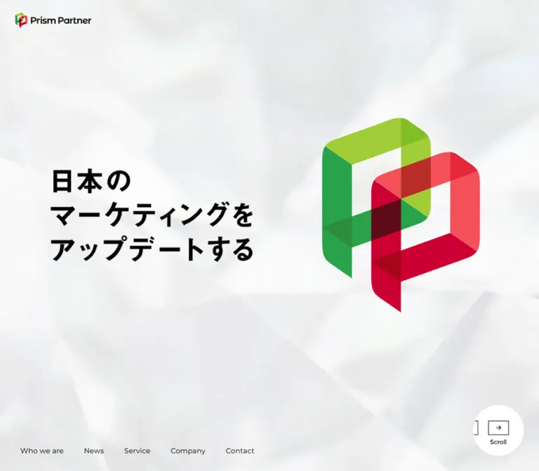
淡い幾何学背景に鮮やかなブランドマークを配し、大きな欧文見出しで事業情報を展開するコーポレートサイト。デスクトップの横方向構成を、モバイルでは縦方向に再編しています。
Prism Partner — Style Reference
A spacious corporate presentation framed by pale facets, monumental chapter titles, and an interlocking red-and-green emblem.
Original URL: https://www.prismpartner.co.jp/ Final URL: https://www.prismpartner.co.jp/ Theme: predominantly light, with photographic chapter media and a permanent charcoal footer. Inspected: October 2, 2026, at approximately 02:07 JST; the supplied retrieval timestamp is October 1, 2026, 17:07:08.896 UTC. Viewports: 1440 × 1000 desktop and 390 × 844 mobile, in CSS pixels. Scope: the current corporate homepage. Visual captures cover the desktop opening, a desktop Service chapter view, the desktop footer, the mobile opening, and the mobile footer. Rendered DOM and computed styles additionally document Index, Who we are, Value, News, service navigation and descriptions, Company, Contact, and closed-state mobile menu content. Destination pages and interaction outcomes were not inspected.
Prism Partner presents its advertising and sales-promotion business through a sequence of large, deliberately spaced chapters. Black Japanese copy and bold geometric English headings sit on a pale neutral canvas. The red-and-green brand emblem supplies most of the opening screen’s color; the same two color families distinguish the service categories deeper in the page. The company identity is independently supported by the homepage title and Company information.
Desktop uses a very wide horizontal arrangement of viewport-height content. Its opening balances a three-line Japanese statement on the left against a large emblem on the right. Small navigation remains near the lower edge in the captured opening and Service views. Mobile reorganizes the document into vertical flow, stacks the emblem above the statement, and replaces the bottom navigation row with a circular menu control.
The essential relationships are scale and restraint: a small corner identity, a very large central brand gesture, oversized chapter typography, widely spaced informational content, and a dark terminal footer. The page contains real corporate information, news, and service explanations; its structure should remain a corporate website rather than being reduced to a conversion-only composition.
閉じる
Prism Partner — Style Reference
A spacious corporate presentation framed by pale facets, monumental chapter titles, and an interlocking red-and-green emblem.
Original URL: https://www.prismpartner.co.jp/ Final URL: https://www.prismpartner.co.jp/ Theme: predominantly light, with photographic chapter media and a permanent charcoal footer. Inspected: October 2, 2026, at approximately 02:07 JST; the supplied retrieval timestamp is October 1, 2026, 17:07:08.896 UTC. Viewports: 1440 × 1000 desktop and 390 × 844 mobile, in CSS pixels. Scope: the current corporate homepage. Visual captures cover the desktop opening, a desktop Service chapter view, the desktop footer, the mobile opening, and the mobile footer. Rendered DOM and computed styles additionally document Index, Who we are, Value, News, service navigation and descriptions, Company, Contact, and closed-state mobile menu content. Destination pages and interaction outcomes were not inspected.
Prism Partner presents its advertising and sales-promotion business through a sequence of large, deliberately spaced chapters. Black Japanese copy and bold geometric English headings sit on a pale neutral canvas. The red-and-green brand emblem supplies most of the opening screen’s color; the same two color families distinguish the service categories deeper in the page. The company identity is independently supported by the homepage title and Company information.
Desktop uses a very wide horizontal arrangement of viewport-height content. Its opening balances a three-line Japanese statement on the left against a large emblem on the right. Small navigation remains near the lower edge in the captured opening and Service views. Mobile reorganizes the document into vertical flow, stacks the emblem above the statement, and replaces the bottom navigation row with a circular menu control.
The essential relationships are scale and restraint: a small corner identity, a very large central brand gesture, oversized chapter typography, widely spaced informational content, and a dark terminal footer. The page contains real corporate information, news, and service explanations; its structure should remain a corporate website rather than being reduced to a conversion-only composition.
How to Read This Reference
- Measured means a value explicitly supplied by the rendered DOM or computed-style evidence. Tables round some values to two decimals for readability.
- Visual estimate means an approximate size or position read from an original-page capture. These are not extracted CSS declarations or programmatic pixel samples.
- Calculated means arithmetic applied to supplied measurements, such as an inset derived from an element’s position and width.
- Recommended means guidance for a new implementation. The CSS, breakpoint, accessibility additions, and unverified state treatments below are adaptations.
- Token names beginning with
--pp-are descriptive aliases created for this reference. They are not claimed to be original source variables. - Computed font stacks identify declared families, not a separate verification of every downloaded font file. The wordmark remains artwork.
- Offscreen elements appear in the supplied DOM. Their dimensions can describe component construction, but their initial coordinates do not prove their eventual visible position or interaction state.
Tokens — Colors
Default Palette
| Name | Value | Suggested token | Evidence and role |
|---|---|---|---|
| Pale Canvas | #efefef |
--pp-paper |
Measured HTML background at both viewports. The opening artwork produces lighter and cooler variations above it. |
| Black Ink | #000000 |
--pp-ink |
Measured primary text and Contact Form background. |
| White | #ffffff |
--pp-white |
Measured Service cover heading, footer text, and Contact Form label. |
| Charcoal | #1f1f1f |
--pp-charcoal |
Measured footer background at both viewports. |
| Sales Red | #cc0033 |
--pp-sales |
Measured service 01 number and Japanese service name. |
| Advertising Green | #82be28 |
--pp-ad |
Measured service 02 number and Japanese service name. |
| Date Gray | #939393 |
--pp-muted |
Measured news-date text at both viewports. |
The emblem contains additional lime, green, coral, red, and dark overlap facets. Their exact individual fills were not supplied. Preserve an authorized emblem asset rather than repainting all its faces with the two service-label colors.
The opening background is not a flat white surface. Broad translucent-looking planes create a softly lit, cool gray field with very low contrast. Its appearance should come from an image or another deliberately authored background treatment, not from adding shadows to every component.
The mobile menu button reports #efefef as its computed background, while its visible circular face appears nearly white. The evidence does not include enough pseudo-element styling to reconcile those layers precisely.
Color Usage
- Keep most reading surfaces neutral and most copy black.
- Use Sales Red and Advertising Green to distinguish service identities, with numbers and labels reinforcing the distinction.
- Reverse the Service chapter title to white over darkened photographic media.
- Use charcoal for the footer as a strong ending to the light sequence.
- There is no evidence of a user-selectable color theme.
The exported custom-property list also contains generic WordPress palette, gradient, and shadow presets. Their presence does not establish that those presets style the inspected components. They are not the design palette for this reference.
Tokens — Typography
Japanese Text
Measured stack: "Noto Sans JP", "Hiragino Kaku Gothic ProN", "Hiragino Sans", Meiryo, sans-serif.
The default body weight is 500; prominent Japanese statements and service subheadings use 700. Paragraphs often have generous line spacing, approximately 1.85–2.17 in the sampled content roles. This gives dense business copy breathing room without introducing decorative containers.
The opening statement is visibly heavy Japanese sans-serif lettering. Its font declaration was not included in the supplied element samples, and the statement is absent from the extracted text list. Do not claim that its visible lettering is necessarily an HTML heading using the body font.
English Headings and Navigation
Measured stack: Montserrat, "Noto Sans JP", "Hiragino Kaku Gothic ProN", "Hiragino Sans", Meiryo, sans-serif.
Montserrat is declared for chapter titles, English service titles, navigation, dates, numbers, and legal text. Chapter titles use weight 700, while most utility text and service numbers use 500. The large English words provide the strongest typographic landmarks in the document.
The logo’s lettering is part of the brand lockup. Its appearance should not be reconstructed by typing the company name in Montserrat.
Type Scale
Values below are measured unless explicitly identified as visual estimates. Size and line height are shown as size / line-height in pixels.
| Role | Weight | Desktop | Mobile | Notes |
|---|---|---|---|---|
| Default body | 500 | 14 / 24.08 |
14.58 / 25.07 |
Inherited baseline, not every paragraph’s final size. |
| Main chapter title | 700 | 161.41 / 196.93 |
52.07 / 63.52 |
Who we are, News, Service, and Company. |
| Index heading | 700 | 92.05 / 112.30 |
41.65 / 50.82 |
Smaller than the main chapter titles. |
| Index link | 500 | 28.01 / 28.01 |
16.66 / 16.66 |
Padding enlarges the complete row. |
| Mission statement | 700 | 40.02 / 82.84 |
16.66 / 33.32 |
Japanese statement in Who we are. |
| Company introduction paragraph | 500 | 24.01 / 52.11 |
13.54 / 25.04 |
Separate from the bold mission statement. |
| Value heading | 700 | 84.04 / 100.85 |
41.65 / 49.98 |
English label. |
| Value statements | 500 | 24.01 / 24.01 |
15.62 / 15.62 |
Rows are substantially taller than the text line. |
| News date | 500 | 20.01 / 24.41 |
13.54 / 16.52 |
Montserrat, Date Gray. |
| News title | 500 | 21.34 / 37.35 |
13.54 / 25.04 |
Japanese stack. |
| Service-menu English title | 700 | 26.68 / 34.68 |
18.74 / 25.12 |
Two-line examples occur at both sizes. |
| Service detail number | 500 | 69.37 / 84.63 |
35.40 / 43.19 |
Red 01 or green 02. |
| Service detail English title | 700 | 84.04 / 94.13 |
36.45 / 41.91 |
Large, tightly grouped display text. |
| Service detail Japanese title | 700 | 28.01 / 42.02 |
16.66 / 24.99 |
Category accent color. |
| Service description | 500 | 18.68 / 36.04 |
13.54 / 25.04 |
Comfortable paragraph leading. |
| Contact heading | 700 | 110.72 / 135.08 |
52.07 / 63.52 |
Desktop is smaller than the main chapter covers. |
| Contact Form label | 500 | 16 / 24 |
14.58 / 21.87 |
Tracking is -0.04em. |
| Footer navigation | 500 | 14 / 17.08 |
16.66 / 20.33 |
Mobile links are larger than desktop links. |
| PAGE TOP label | 700 | 21 / 25.62 |
13.54 / 16.52 |
Different scale and arrow direction by layout. |
| Footer legal text | 500 | 11 / 13.42 |
11.45 / 13.97 |
Smallest measured reading role. |
Opening statement, visual estimate: approximately 64–68px on desktop and 30–32px on mobile. Desktop uses three lines: “日本の”, “マーケティングを”, and “アップデートする”. Mobile combines the first two phrases into one line and places “アップデートする” on the second.
Most sampled text has normal letter spacing. The slightly tightened pill-button labels are a specific exception, not a reason to tighten all typography.
Tokens — Spacing & Shapes
Density: large scene-level whitespace, compact navigation, and moderately padded content components.
The original root font size is measured at 10px on desktop and 10.413px on mobile. The source also exposes --vw: 1440px and --vw: 390px respectively. The rules that produce those values were not provided; neither a universal scaling formula nor an exact breakpoint can be recovered from these two samples.
Spacing Scale
These are component-specific observations, not evidence of a universal spacing ladder.
| Use | Desktop | Mobile | Evidence |
|---|---|---|---|
| Corner brand inset | 30px left, 25px top for H1 box |
About 15.61px left |
Measured rectangles; mobile inline link top is 17.61px. |
| Bottom navigation link padding | 20px each side |
Not used in the captured mobile opening | Computed padding. |
| Standard mobile content gutter | — | 26.03px |
Repeated heading, card, service, and footer coordinates. |
| Index side inset | Layout-specific | 41.64px |
Measured heading and link positions. |
| Index row vertical padding | 20.01px |
16.66px |
Computed padding. |
| News card horizontal padding | 46.69px |
26.03px |
Computed padding. |
| News card vertical padding | Content centered in a 280.13px box |
31.24px |
Computed mobile padding. |
| Gap between first four desktop news cards | About 66.69px |
About 20.81px between sampled initial rows |
Calculated from consecutive rectangles. |
| Footer vertical padding | 133.40px |
104.13px |
Computed padding. |
| Footer content left edge | 173.41px within the footer |
26.03px |
Calculated desktop local position; measured mobile position. |
| Main chapter title left offset within its desktop section | About 293.47px |
26.03px |
Calculated desktop section-relative position. |
Border Radius
| Element | Desktop | Mobile |
|---|---|---|
| Chapter surfaces and footer | 0 in sampled elements |
0 in sampled elements |
| News link box | 26.68px |
15.62px |
| View More link | 25px |
26.03px |
| Contact Form link | 35px |
31.24px |
| Mobile menu control | — | 50%, approximately 52.06px diameter |
| Opening Scroll control | Approximately 100px circular face |
Replaced by a vertical scroll cue |
News links have rounded geometry even though their sampled backgrounds are transparent. Rounded corners do not prove a white card fill or an elevation shadow; surrounding and pseudo-element surfaces were not supplied.
Layout Measurements
| Element | Desktop | Mobile |
|---|---|---|
| Opening viewport | 1440 × 1000px |
390 × 844px |
| Main element | 32640.44 × 1000px, flex |
390 × 15222.02px, block |
| Reported document height | 33641px |
15953px |
| Main chapter title box | About 1013.83 × 196.91px; Who we are is slightly wider |
337.94 × 63.52px |
| Index link box | 480.23 × 68.02px |
306.72 × 49.97px |
| News link box | 426.88 × 280.13px |
337.94px wide; sampled heights approximately 109–167px |
| Service detail text column | 573.61px |
337.94px |
| Contact section | 1440 × 1000px |
390 × 638.31px |
| Footer | 1441 × 1000px |
390 × 730.69px |
| Footer logo link | 250 × 50px |
218.67 × 43.73px |
The large desktop document height accompanies a horizontally arranged presentation. It should not be interpreted as a conventional 33,641px stack of visible sections, nor copied as a hardcoded spacer without understanding the original scroll controller.
Components
Corner Identity
Role: quiet, continuous brand recognition while the main scene changes.
The desktop H1 box sits at (30, 25) and measures 150 × 30px. The brand remains at the upper left in the captured Service view. On mobile, the top brand link starts around x = 15.61px and has a measured inline width of 161.39px; its inline rectangle is not the complete visible image height.
Use the full-color symbol with a black wordmark on light scenes. The footer uses the full-color symbol with a white wordmark. Preserve the lockup’s internal spacing and proportions.
The captures support persistent placement across the opening and Service scenes, but the supplied styles do not identify the exact fixed-position or visibility implementation.
Opening Brand Scene
Role: introduce the company’s central statement with minimal interface competition.
Desktop anatomy:
- A full-viewport, pale faceted backdrop.
- A small brand lockup at the upper left.
- A heavy three-line Japanese statement toward the left center.
- A large interlocking emblem toward the right center.
- A small navigation row along the lower left edge.
- A white circular Scroll control at the lower right.
Visual estimates at 1440 × 1000: the statement occupies roughly x = 130–665px; the emblem occupies approximately x = 847–1262px, y = 204–717px, or about 415 × 513px. The emblem is substantially taller than the statement block.
Mobile reorganizes the hierarchy. The emblem appears around (112, 260) at approximately 166 × 205px. The centered two-line statement follows near y = 501px, spanning almost the full width between roughly 23px side margins. Large areas of soft background remain above and below this central group.
The desktop Scroll face is approximately 100px in diameter with 30px right and bottom clearance. It contains a thin rectangular arrow enclosure and a small “Scroll” caption. The arrow points right, matching the desktop presentation axis. Mobile instead shows “Scroll down” vertically near the lower left, with a downward arrow.
Desktop Bottom Navigation and Chapter Status
Role: maintain access to the five main corporate destinations and orient the viewer within the chapter sequence.
The links are “Who we are”, “News”, “Service”, “Company”, and “Contact”. Each measured link is 80px tall, beginning at y = 920px in the 1000px viewport. The first box begins at x = 20px; its 20px horizontal padding puts the visible label near x = 40px.
Use Montserrat 14px, weight 500, with simple unboxed text. The measured anchor destinations are homepage fragments, including #whoweare, #news, and #service.
The Service capture adds a fine horizontal rule above the navigation and a right-aligned “Section 4” / “Service” indicator. Part of the rule is darker than the remainder. Its precise progress calculation and update behavior were not supplied, so a continuous percentage-progress model should not be assumed.
Mobile Menu Control and Menu Content
Role: compact access to navigation when the horizontal bottom row is absent.
The closed-state button measures 52.06 × 52.06px at approximately (322.33, 776.33). This gives about 15.61px clearance from the right and bottom of the 390 × 844 viewport. Its visible face contains two short green horizontal strokes.
The button’s DOM text is “Menu”. Offscreen menu content includes a second brand link, four primary text links, a black Contact pill, and Privacy Policy. Text links use Montserrat at 17.70px, with approximately 62.5px row height.
The menu’s News link targets /news/, and its Contact link targets /contact/. This differs from the homepage-fragment destinations used by the desktop bottom navigation and footer.
The open menu was not visually captured or clicked. Its final panel width, entrance direction, overlay treatment, focus behavior, and close interaction are unverified. Do not turn the offscreen coordinates into a claimed open-state layout.
Index
Role: introduce the chapter structure explicitly.
The Index heading accompanies five links, each pairing a destination name with a section label: Who we are / Section 2 through Contact / Section 6. Desktop separates the heading and the link stack across a broad horizontal section. Links are approximately 480px wide and 68px tall.
Mobile places the heading and list in a narrower column with approximately 41.64px side insets. Rows become roughly 307 × 50px. The heading begins after approximately 166.61px of section top padding.
Keep the name and section identifier in one coherent link. The relationship is informational navigation, not a collection of promotional cards.
Chapter Cover
Role: create a strong visual pause before a major content area.
Main chapter titles use Montserrat 161.41px, weight 700, with a line height near 196.93px on desktop. The cover combines the large English title with a smaller “Section” identifier and a fine horizontal rule.
The supplied Service view places white typography over a darkened business-media frame showing a laptop with a line chart and a person’s hand in the foreground. The title’s visible glyphs dominate the center-right area.
A pale strip approximately 326px wide remains at the left of this particular capture. Given the measured horizontal section arrangement, this should be treated as the viewport’s position within the sequence, not evidence of a permanent 326px sidebar.
Mobile Service typography is measured at 52.07px, still white. A mobile Service screenshot was not supplied, so its exact media crop and visual composition remain unverified.
Who we are and Value
Role: explain the partnership’s marketing proposition and organizational principles.
The DOM identifies three distinct typographic layers: a chapter cover, a bold Japanese mission statement, and a more spacious explanatory paragraph. Desktop gives the mission approximately a 766px text width and the explanatory paragraph about 720px.
The Value portion combines an English heading with eight short Japanese statements. Measured desktop statement rows are approximately 447.72 × 80.03px; mobile rows are 337.94 × 54.14px. This is a rhythmic text sequence, not evidence of eight independent cards.
The extracted text separates emphasized phrases inside the statements. Exact emphasis styling was not supplied, so preserve the semantic distinction without inventing colored highlights or underlines.
Several mobile Value rectangles initially sit beyond the viewport at approximately x = 1026px. This may relate to reveal positioning; the final visible state and trigger are not documented.
News Category Area and News Links
Role: expose recent corporate updates and routes into the news archive.
The category labels are “All”, “イベント”, “プレスリリース”, “お知らせ”, and “メディア掲載”. The evidence documents these labels and the associated article groups, but not a category-selection action or its resulting animation.
Each article link contains a gray date, a Japanese title, and sometimes a category label. Desktop article boxes are approximately 427 × 280px, with 46.69px horizontal padding and a 26.68px radius. The initial measured entries advance horizontally with approximately 66.69px gaps.
Mobile changes the article presentation into vertically arranged links, 337.94px wide, with 31.24px vertical padding, 26.03px horizontal padding, and a 15.62px radius. Their heights vary with the content. Dates and titles both use approximately 13.54px, distinguished by family, color, and leading.
Several category-specific groups share coordinates in the DOM. Do not concatenate all extracted entries into one visible list, or interpret their overlapping initial coordinates as proof of a visible rendering defect. Visibility and category state are not fully represented by this export.
The View More anchor targets /news/. Its desktop box is approximately 151.83 × 50px, with a 25px radius and asymmetric padding that reserves more space on the right. The mobile measurement is about 152.75 × 52.06px, but its initial offscreen position is not a verified final placement.
Service Menu
Role: distinguish the two service families before their detailed explanations.
Each menu item contains a two-digit number, a bold English service name, and a Japanese service label. The pairings are:
01/ “Digital Sales Promotion” / “デジタル販促”, accented in Sales Red.02/ “Digital Ad Promotion” / “デジタル広告”, accented in Advertising Green.
Desktop stacks the menu items vertically. Each measured link is about 199.09 × 168.08px. Mobile places the two links side by side: approximately 155.94px each, separated by 26.06px, inside the standard content gutters.
The links target #service-1 and #service-2. These are separate detail destinations, not evidence of mutually exclusive tabs.
Service Detail
Role: explain each offering through a large bilingual title and a process-oriented narrative.
The title group contains a large colored number, an even more prominent black English title, and a smaller colored Japanese heading. Desktop content columns measure 573.61px; mobile columns measure 337.94px.
Sales promotion includes four process labels describing campaign announcement, product purchase, points allocation, and subsequent customer outreach. Digital advertising includes three labels describing member data, industry-specific segments, and delivery.
Those process contents are supported by extracted text. Their diagram shapes, icons, connectors, and transitions were not included in the supplied captures or element samples. Do not invent a particular illustrated flowchart and attribute it to the original.
Maintain the red/green distinction throughout the related number and Japanese heading. Keep the larger English title black rather than filling an entire service section with its category color.
Company Information
Role: provide factual company details after the service narrative.
The DOM contains seven label/value groups covering company name, representatives, location, capital, ownership ratio, establishment date, and business activities. The company-name value is “株式会社Prism Partner”.
The chapter title follows the same large English heading system as News and Who we are. Individual information-row styling was not supplied, so row borders, label widths, and mobile stacking details cannot be specified as observed facts.
Recommended implementation: use a semantic description list with wrapping values, or a properly structured information table when the content warrants it. Keep this region typographically aligned with the rest of the site.
Contact
Role: provide a clear route to the separate inquiry form.
Desktop uses a full-viewport section with a centered Contact heading at 110.72px, a Japanese explanatory paragraph approximately 724.97px wide, a black Contact Form pill, and a separate Privacy Policy link.
The Contact Form link measures approximately 180.91 × 70px, with a 35px radius, white 16px Montserrat text, and 20px left / 55px right padding. The exported styles establish the reserved right-side space, but not the exact icon artwork within it.
Mobile uses a 638.31px-high section with 135.37px vertical padding. The heading becomes 52.07px; the explanatory copy wraps into four lines in the supplied text and geometry. The pill measures approximately 174.70 × 62.47px, with a 31.24px radius.
The anchor targets /contact/; the form itself was not inspected. The homepage component is a form entry point, not an embedded form.
Footer
Role: close the sequence with company identity, office information, navigation, legal links, and a return route.
The footer uses measured Charcoal #1f1f1f and white typography. The brand symbol keeps its colors while the wordmark reverses to white.
Desktop anatomy:
- A
250 × 50pxbrand link near(173.41, 133.39)within the footer. - An Office label and the Japanese office address below it.
- A large area of deliberate empty space.
- A horizontal navigation row near
y = 755px. - Privacy Policy and copyright near
y = 853px. - A tall, subtle vertical divider around
x = 994px, estimated from the capture. - A PAGE TOP link centered in the right-hand region, with a thin circular left-arrow icon.
Mobile changes to a single main column with 104.13px vertical padding and 26.03px horizontal padding. The brand link becomes approximately 218.67 × 43.73px; office text wraps naturally. Navigation becomes a vertical list with about 46.34px between successive link tops.
At the bottom, Privacy Policy and copyright stack on the left. PAGE TOP occupies a compact region on the right, separated by a short vertical rule. Its arrow points upward in the mobile capture. Both desktop and mobile links target #mv; the click animation was not tested.
The mobile footer starts approximately 113px below the top of its supplied viewport because part of the preceding light section remains visible. That offset is a capture position, not a built-in footer top margin.
Tokens — Motion & Interaction
Measured Transition Declarations
| Element | Supplied declaration | What it establishes |
|---|---|---|
| Index links | opacity 0.4s cubic-bezier(0.43, 0.05, 0.17, 1) |
A defined opacity transition; the target opacity and trigger were not recorded. |
| View More | background 0.4s cubic-bezier(0.43, 0.05, 0.17, 1) |
A defined background transition; destination colors were not recorded. |
| Contact pills | background 0.4s cubic-bezier(0.43, 0.05, 0.17, 1) |
The same background-transition timing. |
| Footer navigation and privacy links | background-size 0.4s cubic-bezier(0.43, 0.05, 0.17, 1) |
A background-size transition, consistent with a possible line treatment; its visual endpoints are unverified. |
| Mobile Menu button | visibility 0.4s …, opacity 0.4s … with the same curve |
Visibility and opacity transitions on the control, not proof of the menu panel’s entrance behavior. |
Use --pp-transition: 400ms cubic-bezier(0.43, 0.05, 0.17, 1) as a reusable alias for these measured timings.
Presentation Movement and Limits
The desktop flex geometry, offscreen section positions, Service capture, and terminal footer support a horizontal presentation. The very tall reported document alongside a viewport-height horizontal main is consistent with vertical scroll input driving lateral travel. The exact input mapping, JavaScript controller, easing, pinning, and any snapping behavior were not supplied.
Mobile changes the main element to block layout and places major sections at increasing vertical coordinates. Some children still begin offscreen, so vertical document flow does not prove that all internal motion disappears.
Static captures cannot establish whether the faceted opening background or Service media is animated, video-based, canvas-based, or entirely static. No animation duration should be invented for either.
The supplied capture process waited for loading, image decoding, and sampled stability, and temporarily paused perpetual animations during readiness checks. That improves capture reliability but does not verify every delayed reveal or interaction. Sampled animation: none values do not rule out JavaScript, media, canvas, or pseudo-element motion elsewhere.
Surfaces
| Surface | Appearance | Construction guidance |
|---|---|---|
| Opening | Cool, very pale faceted field | Let the background artwork create depth while the foreground stays crisp. |
| General content canvas | Measured #efefef beneath transparent sampled elements |
Preserve broad uninterrupted space. |
| Service cover | Darkened photographic media with white type | Use a restrained contrast overlay; its exact original opacity is unknown. |
| News links | Rounded boxes with transparent sampled backgrounds | Keep the measured padding and radius; do not assume an unverified white fill or shadow. |
| Primary contact action | Black pill, white label | Strong contrast, restrained size, generous reserved trailing space. |
| Footer | Solid #1f1f1f |
Organize with spacing and subtle rules rather than raised containers. |
| Utility controls | Circular faces and thin arrow enclosures | Keep linework simple and secondary to the chapter typography. |
No site-wide elevation system is established by the evidence. The generic shadow presets in the custom-property export should not be applied as though they were observed component styles.
Imagery
Brand Emblem
The main emblem resembles two interlocking ribbon-like P forms. Lime and green facets occupy the upper-left structure; coral and crimson facets occupy the lower-right structure. Darker intersections create a sense of layered transparency. Large internal openings keep the mark light despite its scale.
Use a sharp asset with its full negative space intact. The mark’s broad flat faces and rounded outer bends are more important than adding realistic lighting or bevels. Do not crop it into a thumbnail container or replace it with an approximate generic chain symbol.
Opening Background
The background consists of large, softly shaded planes in white and cool pale gray. Their edges are intentionally low contrast. The emblem and black Japanese statement remain the sharpest elements.
Desktop and mobile show different crops and arrangements within the viewport. A responsive asset or crop strategy is needed, but the supplied evidence does not identify the underlying file or rendering mechanism.
Service Media
The Service cover shows a laptop displaying line charts, with a person and work surface in the foreground. The media is cropped to fill a large scene and visually darkened. Preserve the relationship between subdued business imagery and oversized white type.
The capture is only a media frame. It does not establish that the source is a video, nor identify playback, looping, or audio behavior.
Observed Asset References
No resolved image URLs or asset filenames were included in the supplied evidence. The following are asset roles, not downloadable paths.
| Asset role | Evidence | Reuse requirement |
|---|---|---|
| Full-color symbol with black wordmark | Desktop and mobile opening captures | Authorized original lockup or an appropriate replacement brand asset. |
| Full-color symbol with white wordmark | Desktop and mobile footer captures | Preserve the symbol colors when reversing the lettering. |
| Large standalone emblem | Both opening captures | Preserve aspect ratio, facet colors, and internal openings. |
| Pale faceted background | Both opening captures | Provide responsive crops; rendering technology is unverified. |
| Service business-media frame | Desktop Service capture | Preserve subject visibility and heading contrast. |
| Directional utility icons | Opening and footer captures | Thin, simple arrow forms; desktop and mobile directions differ. |
Layout & Responsive Behavior
Desktop: Horizontal Chapter Sequence
The measured main element is display: flex, about 32640px wide, and exactly 1000px high at the inspected viewport. Sections appear at increasing horizontal coordinates. Index alone spans approximately 3688px; Service spans approximately 10725px, reflecting multiple content stages rather than a single viewport-wide tile.
The footer begins beyond the main at approximately x = 32640px and occupies another viewport-height surface. It is part of the horizontal ending, not simply a conventional desktop footer beneath a short vertical homepage.
Do not equate every chapter with one screen. Chapter covers, descriptive copy, service menus, and process content can occupy successive horizontal stages. The measured widths document one layout state; they are not a responsive sizing formula.
Mobile: Vertical Document Flow
At 390px, main becomes display: block, 390px wide, and approximately 15222px high. The footer follows it vertically. The opening occupies the initial 844px viewport; Index begins at y = 844px.
Most content uses about 26px side gutters, giving a reading width near 338px. Index is more inset, with about 42px gutters and a 307px column. News links stack, service detail titles shrink substantially, and the footer navigation changes from a horizontal row to a vertical list.
The service menu is a useful exception to a simple stacking rule: its two desktop items are vertically separated, while mobile places them side by side in two equal columns.
Responsive Comparison
| Relationship | Desktop | Mobile |
|---|---|---|
| Main presentation | Wide horizontal flex sequence | Vertical block document |
| Hero composition | Statement left, emblem right | Emblem above centered statement |
| Opening statement | Three lines | Two lines |
| Primary navigation | Bottom text row | Circular menu control in captured opening |
| Main chapter title | About 161px |
About 52px |
| News links | Broad horizontal sequence | Vertical content-width links |
| Service menu | Two vertically separated items | Two side-by-side items |
| Service title | About 84px |
About 36px |
| Footer navigation | Horizontal | Vertical |
| PAGE TOP icon | Left arrow | Up arrow |
Only these two viewport sizes were inspected. The exact breakpoint, intermediate tablet behavior, landscape-phone behavior, zoom handling, and safe-area rules remain unverified.
Recommended breakpoint for the Quick Start: 60rem with a conventional 16px root. This is a practical adaptation boundary, not an extracted source breakpoint.
Do’s and Don’ts
Do
- Preserve the contrast between quiet interface text and very large chapter headings.
- Keep the opening emblem whole, colorful, and surrounded by pale space.
- Use the measured Japanese and English font stacks for their respective roles.
- Preserve Sales Red
#cc0033and Advertising Green#82be28as service identifiers. - Treat the desktop chapter sequence and mobile vertical flow as distinct compositions.
- Keep the opening statement’s three-line desktop and two-line mobile arrangements intentional.
- Retain the rounded news-link geometry without inventing an unsupported shadow system.
- Preserve the footer’s large desktop empty space and compact mobile legal/navigation grouping.
- Keep real anchor destinations, article links, and the separate Contact Form route available.
Don't
- Don't turn every chapter into an interchangeable card grid.
- Don't reduce the mobile page to a scaled-down horizontal desktop layout.
- Don't treat the pale strip in the Service capture as a permanent sidebar.
- Don't infer a complete open-menu design from its initial offscreen rectangles.
- Don't render all extracted news category groups simultaneously.
- Don't recolor the emblem using only the two service accent tokens.
- Don't apply unrelated WordPress preset gradients or shadows simply because they appear in the export.
- Don't claim a video, WebGL scene, scroll-snap system, or animation library without direct evidence.
- Don't hardcode the observed document length as the architecture of a new page.
- Don't use an image-only statement without providing an equivalent accessible heading in a new implementation.
Recommended Implementation Additions
These are recommendations for a new implementation, not verified features of the original site:
- Provide an accessible primary heading for the Japanese opening statement, even when its visible lettering is supplied as artwork.
- Keep section navigation usable through real fragment links. If adding a custom horizontal scroll controller, preserve keyboard navigation, deep links, browser history, and access when scripts fail.
- Make the mobile menu a real button with an accessible name, expanded state, controlled panel relationship, Escape handling, and appropriate focus management.
- Ensure hidden menu or category content cannot remain accidentally focusable. The supplied DOM export does not establish whether the original already handles this.
- Offer a reduced-motion path that removes lateral reveal effects and decorative continuous movement while retaining every content section.
- Verify contrast for small gray dates and green service labels. Use darker text variants where needed without changing the emblem artwork.
- Consider increasing the approximately 13.5px mobile body text and 11.5px legal text for reading-heavy implementations.
- Reserve image dimensions, preserve meaningful logo alternatives, and use empty alternatives for purely decorative facets.
- Make long news titles accessible without relying on an undocumented truncation treatment.
Agent Prompt Guide
Quick Color Reference
- Canvas:
#efefefbeneath pale faceted artwork. - Main text:
#000000. - Reversed text:
#ffffff. - Footer:
#1f1f1f. - Sales promotion identifiers:
#cc0033. - Digital advertising identifiers:
#82be28. - News dates:
#939393. - Emblem: retain the complete multicolor asset; its full palette was not extracted.
Overall Prompt
“Create a Japanese corporate website with a spacious sequence of large chapters inspired by the inspected Prism Partner homepage. Use a pale gray canvas, soft faceted background imagery, black Japanese sans-serif copy, and bold Montserrat English chapter titles. On desktop, arrange viewport-height scenes across a horizontal presentation, keeping compact navigation near the lower edge. Open with a three-line Japanese statement on the left and a large authorized geometric brand emblem on the right. On mobile, use vertical document flow, place the emblem above a centered two-line statement, and provide a small circular menu control. Distinguish two service families with red and green numbers and Japanese labels. End with a charcoal footer containing the reversed brand lockup, office information, navigation, legal text, and a directional return link. Preserve genuine corporate content and implement accessible navigation.”
Example Component Prompts
- Opening scene: “Build a 1440 × 1000 composition with a pale faceted background, a 150px-wide corner brand lockup, heavy Japanese copy around 66px on the left, and an approximately 415 × 513px emblem on the right. Keep the bottom navigation small. At 390 × 844, place a roughly 166 × 205px emblem above centered two-line copy around 31px.”
- Service cover: “Create a large business-media chapter cover with a subdued laptop-and-chart image, an oversized white Montserrat Service title, and a smaller Section label followed by a thin rule. Let the scene participate in horizontal desktop travel; do not add a permanent left sidebar based on a partially visible frame.”
- News link: “Create a rounded corporate news link with a gray Montserrat date, a black Japanese title, and an optional category label. Use approximately 427 × 280px on desktop with 47px side padding. On mobile, use the content width, 31px vertical padding, 26px side padding, and natural content height. Keep any unverified fill or hover treatment explicitly optional.”
- Service detail: “Stack a colored service number, a large bold black English title, and a smaller Japanese heading in the same accent color. Use red for sales promotion and green for advertising. Follow with generously led Japanese copy. Use about a 574px text column on desktop and 338px at the inspected mobile width.”
- Footer: “Create a charcoal corporate footer with a white wordmark and full-color symbol. On desktop, leave substantial empty space between office information and bottom navigation, and place a left-arrow PAGE TOP action beyond a vertical divider. On mobile, stack navigation vertically and place an upward return action beside the legal text.”
When asking an agent to implement movement, distinguish required behavior from evidence. The reference establishes horizontal desktop organization and certain 400ms transitions, but not a complete original animation specification.
Quick Start
CSS Custom Properties
The following is an adaptation using ordinary CSS pixels and a conventional root font size. It preserves key measured colors, typography, component dimensions, and responsive relationships without pretending to reproduce the unknown source sizing formulas.
The desktop track uses native horizontal overflow as a working baseline. It does not implement vertical-wheel-to-horizontal translation, chapter-progress synchronization, reveal choreography, or a menu controller. Make the track keyboard-focusable and give it an accessible name if using this baseline. Each direct .pp-scene represents one stage; longer chapters can contain multiple stages.
Supply authorized assets through image elements and the --pp-hero-image / --pp-service-image properties. Their default none values are intentional because no asset URLs were supplied.
:root {
  /* Measured colors, expressed as reusable aliases. */
  --pp-paper: #efefef;
  --pp-ink: #000000;
  --pp-white: #ffffff;
  --pp-charcoal: #1f1f1f;
  --pp-sales: #cc0033;
  --pp-ad: #82be28;
  --pp-muted: #939393;

  --pp-font-ja: "Noto Sans JP", "Hiragino Kaku Gothic ProN",
    "Hiragino Sans", Meiryo, sans-serif;
  --pp-font-en: Montserrat, var(--pp-font-ja);
  --pp-weight-medium: 500;
  --pp-weight-bold: 700;

  /* Mobile sample values; not a recovered source formula. */
  --pp-gutter: 26.0325px;
  --pp-chapter-size: 52.065px;
  --pp-copy-size: 13.5369px;
  --pp-service-size: 36.4455px;
  --pp-news-radius: 15.6195px;
  --pp-transition: 400ms cubic-bezier(0.43, 0.05, 0.17, 1);

  --pp-hero-image: none;
  --pp-service-image: none;
}

* { box-sizing: border-box; }

body {
  margin: 0;
  color: var(--pp-ink);
  background: var(--pp-paper);
  font-family: var(--pp-font-ja);
  font-size: 14.5782px;
  font-weight: var(--pp-weight-medium);
  line-height: 1.72;
}

button, input, textarea { font: inherit; }
img { display: block; max-inline-size: 100%; }
a { color: inherit; }

.pp-track { display: block; }
.pp-scene { position: relative; min-inline-size: 0; }

.pp-brand {
  position: absolute;
  z-index: 2;
  inset-block-start: 15.61px;
  inset-inline-start: 15.61px;
  inline-size: 161.39px;
}

.pp-brand img { inline-size: 100%; block-size: auto; }

.pp-hero {
  min-block-size: 100svh;
  display: grid;
  grid-template-areas: "mark" "title";
  justify-items: center;
  align-content: center;
  gap: 35px;
  padding: 85px 20px;
  background-color: var(--pp-paper);
  background-image: var(--pp-hero-image);
  background-position: center;
  background-size: cover;
}

.pp-hero__mark {
  grid-area: mark;
  inline-size: 166px;
  block-size: auto;
}

.pp-hero__title {
  grid-area: title;
  margin: 0;
  font-size: clamp(26px, 8vw, 31.2px);
  font-weight: 700;
  line-height: 1.38;
  text-align: center;
}

/* Use three phrase spans; only the last starts a mobile line. */
.pp-hero__title span { display: inline; }
.pp-hero__title span:last-child { display: block; }

.pp-dock, .pp-scroll { display: none; }

.pp-scroll-hint {
  position: absolute;
  inset-inline-start: 15.61px;
  inset-block-end: 15.61px;
  writing-mode: vertical-rl;
  font-family: var(--pp-font-en);
  font-size: 12px;
}

.pp-menu {
  position: fixed;
  z-index: 20;
  inset-inline-end: max(15.61px, env(safe-area-inset-right));
  inset-block-end: max(15.61px, env(safe-area-inset-bottom));
  inline-size: 52.0625px;
  block-size: 52.0625px;
  display: grid;
  place-items: center;
  padding: 0;
  border: 0;
  border-radius: 50%;
  background: var(--pp-white); /* Visual face approximation. */
  cursor: pointer;
  transition: opacity var(--pp-transition), visibility var(--pp-transition);
}

.pp-menu::before {
  content: "";
  inline-size: 21px;
  block-size: 1px;
  background: var(--pp-ad);
  box-shadow: 0 6px 0 var(--pp-ad);
  transform: translateY(-3px);
}

.pp-content { padding: 100px var(--pp-gutter); }

.pp-chapter-title {
  margin: 0;
  font-family: var(--pp-font-en);
  font-size: var(--pp-chapter-size);
  font-weight: 700;
  line-height: 1.22;
}

.pp-copy {
  font-size: var(--pp-copy-size);
  line-height: 1.85;
  overflow-wrap: anywhere;
}

.pp-cover {
  min-block-size: 70svh;
  display: flex;
  flex-direction: column;
  justify-content: center;
  padding: 100px var(--pp-gutter);
  isolation: isolate;
  color: var(--pp-white);
  background: #777 var(--pp-service-image) center / cover no-repeat;
}

.pp-cover::before {
  content: "";
  position: absolute;
  inset: 0;
  z-index: -1;
  background: rgb(0 0 0 / 35%); /* Recommended approximation. */
}

.pp-section-line {
  display: flex;
  align-items: center;
  gap: 32px;
  margin-block-start: 32px;
  font-family: var(--pp-font-en);
}

.pp-section-line::after {
  content: "";
  flex: 1;
  border-block-start: 1px solid rgb(255 255 255 / 55%);
}

.pp-index-link {
  display: flex;
  justify-content: space-between;
  gap: 20px;
  padding-block: 16.6608px;
  font: 500 16.6608px/1 var(--pp-font-en);
  text-decoration: none;
  transition: opacity var(--pp-transition);
}

.pp-news-list {
  display: grid;
  gap: 20.81px;
}

.pp-news-card {
  display: block;
  min-inline-size: 0;
  padding: 31.239px 26.0325px;
  border-radius: var(--pp-news-radius);
  color: var(--pp-ink);
  background: transparent;
  text-decoration: none;
}

.pp-news-card__date {
  margin: 0 0 5.2px;
  color: var(--pp-muted);
  font: 500 13.5369px/1.22 var(--pp-font-en);
}

.pp-news-card__title {
  margin: 0;
  font-size: 13.5369px;
  font-weight: 500;
  line-height: 1.85;
  overflow-wrap: anywhere;
}

.pp-service-menu {
  display: grid;
  grid-template-columns: repeat(2, minmax(0, 1fr));
  gap: 26.06px;
}

.pp-service { --pp-accent: var(--pp-sales); }
.pp-service--ad { --pp-accent: var(--pp-ad); }

.pp-service__number {
  margin: 0 0 10.41px;
  color: var(--pp-accent);
  font: 500 35.4042px/1.22 var(--pp-font-en);
}

.pp-service__title {
  margin: 0;
  font: 700 var(--pp-service-size)/1.15 var(--pp-font-en);
}

.pp-service__label {
  margin: 5.2px 0 31.24px;
  color: var(--pp-accent);
  font-size: 16.6608px;
  font-weight: 700;
  line-height: 1.5;
}

.pp-pill {
  display: inline-flex;
  align-items: center;
  min-block-size: 62.478px;
  padding-inline: 20.826px 57.2715px;
  border-radius: 999px;
  color: var(--pp-white);
  background: var(--pp-ink);
  font: 500 14.5782px/1.5 var(--pp-font-en);
  letter-spacing: -0.04em;
  text-decoration: none;
  transition: background var(--pp-transition);
}

.pp-footer {
  display: grid;
  grid-template-columns: minmax(0, 1fr) 125px;
  grid-template-areas:
    "brand brand"
    "office office"
    "links links"
    "legal top";
  padding: 104.13px var(--pp-gutter);
  color: var(--pp-white);
  background: var(--pp-charcoal);
}

.pp-footer__brand { grid-area: brand; inline-size: 218.67px; }
.pp-footer__office { grid-area: office; margin-block-start: 52px; }
.pp-footer__office p { margin: 4px 0 0; }

.pp-footer__nav {
  grid-area: links;
  display: flex;
  flex-direction: column;
  gap: 26.03px;
  margin-block-start: 52px;
  font: 500 16.6608px/1.22 var(--pp-font-en);
}

.pp-footer__nav a { text-decoration: none; }

.pp-footer__legal {
  grid-area: legal;
  display: flex;
  flex-direction: column;
  gap: 20.83px;
  margin-block-start: 52px;
  font: 500 11.4543px/1.22 var(--pp-font-en);
}

.pp-footer__legal p { margin: 0; }

.pp-to-top {
  grid-area: top;
  display: flex;
  align-items: center;
  justify-content: center;
  gap: 10px;
  margin-block-start: 52px;
  border-inline-start: 1px solid rgb(255 255 255 / 12%);
  font: 700 13.5369px/1.22 var(--pp-font-en);
  text-decoration: none;
}

.pp-to-top__icon {
  display: grid;
  place-items: center;
  inline-size: 21px;
  block-size: 21px;
  border: 1px solid rgb(255 255 255 / 20%);
  border-radius: 50%;
}

.pp-to-top__icon::before { content: "↑"; }

/* Recommended interaction endpoints; only timing is source-derived. */
@media (hover: hover) {
  .pp-index-link:hover { opacity: 0.65; }
  .pp-pill:hover { background: var(--pp-charcoal); }
  .pp-news-card:hover .pp-news-card__title { text-decoration: underline; }
  .pp-footer__nav a:hover { text-decoration: underline; }
}

:where(a, button, [tabindex]):focus-visible {
  outline: 2px solid currentColor;
  outline-offset: 4px;
}

.pp-pill:focus-visible { outline-color: var(--pp-ink); }

/* Adaptation breakpoint, not the original site's verified breakpoint. */
@media (min-width: 60rem) {
  :root {
    --pp-chapter-size: clamp(100px, 11.2093vw, 161.414px);
    --pp-copy-size: 18.676px;
    --pp-service-size: clamp(56px, 5.83625vw, 84.042px);
    --pp-news-radius: 26.68px;
  }

  body { font-size: 14px; }

  .pp-track {
    display: flex;
    block-size: 100svh;
    overflow-x: auto;
    overflow-y: hidden;
  }

  .pp-scene {
    flex: 0 0 100%;
    block-size: 100%;
    overflow-y: auto;
  }

  .pp-brand {
    inset-block-start: 25px;
    inset-inline-start: 30px;
    inline-size: 150px;
  }

  .pp-hero {
    grid-template-areas: "title mark";
    grid-template-columns: minmax(0, 1fr) auto;
    align-items: center;
    justify-items: start;
    gap: 80px;
    padding: 0 12.3vw 80px 9.03vw;
  }

  .pp-hero__mark { inline-size: clamp(290px, 28.8194vw, 415px); }
  .pp-hero__title {
    font-size: clamp(44px, 4.5833vw, 66px);
    line-height: 1.4;
    text-align: start;
  }
  .pp-hero__title span { display: block; }

  .pp-menu, .pp-scroll-hint { display: none; }

  .pp-dock {
    position: absolute;
    z-index: 2;
    inset-inline-start: 20px;
    inset-block-end: 0;
    display: flex;
    block-size: 80px;
    font: 500 14px/1 var(--pp-font-en);
  }

  .pp-dock a {
    display: flex;
    align-items: center;
    padding-inline: 20px;
    text-decoration: none;
  }

  .pp-scroll {
    position: absolute;
    inset-inline-end: 30px;
    inset-block-end: 30px;
    display: grid;
    align-content: center;
    justify-items: center;
    gap: 6px;
    inline-size: 100px;
    block-size: 100px;
    border-radius: 50%;
    background: var(--pp-white);
    font: 500 12px/1 var(--pp-font-en);
    text-decoration: none;
  }

  .pp-scroll__arrow {
    display: grid;
    place-items: center;
    inline-size: 40px;
    block-size: 28px;
    border: 1px solid currentColor;
  }

  .pp-cover {
    min-block-size: 100svh;
    padding: 0 6vw 80px 20.38vw;
  }

  .pp-section-line { margin-block-start: 48px; font-size: 36px; }
  .pp-content { padding: 100px 8vw; }
  .pp-index-link { padding-block: 20.01px; font-size: 28.014px; }

  .pp-news-list { display: flex; gap: 66.69px; }
  .pp-news-card {
    flex: 0 0 426.875px;
    display: flex;
    flex-direction: column;
    justify-content: center;
    min-block-size: 280.125px;
    padding: 30px 46.69px;
  }
  .pp-news-card__date { font-size: 20.01px; margin-block-end: 6.67px; }
  .pp-news-card__title { font-size: 21.344px; line-height: 1.75; }

  .pp-service-menu { grid-template-columns: 199.09px; gap: 93.38px; }
  .pp-service__number { font-size: 69.368px; margin-block-end: 20.01px; }
  .pp-service__title { line-height: 1.12; }
  .pp-service__label { font-size: 28.014px; }
  .pp-service .pp-copy { max-inline-size: 573.609px; line-height: 1.93; }
  .pp-pill { min-block-size: 70px; padding-inline: 20px 55px; font-size: 16px; }

  .pp-footer {
    grid-template-columns: minmax(0, 1fr) 31vw;
    grid-template-rows: auto auto minmax(20px, 1fr) auto auto;
    grid-template-areas:
      "brand top"
      "office top"
      ". top"
      "links top"
      "legal top";
    padding: 133.4px 0 133.4px 12.04vw;
  }

  .pp-footer__brand { inline-size: 250px; }
  .pp-footer__office { margin-block-start: 66px; }
  .pp-footer__nav {
    flex-direction: row;
    gap: 40px;
    margin: 0;
    font-size: 14px;
  }
  .pp-footer__legal {
    flex-direction: row;
    justify-content: space-between;
    max-inline-size: 460px;
    margin-block-start: 78px;
    font-size: 11px;
  }
  .pp-to-top { gap: 20px; margin: 0; font-size: 21px; }
  .pp-to-top__icon {
    inline-size: 40px;
    block-size: 40px;
    transform: rotate(-90deg);
  }
}

/* Recommended reduced-motion behavior for this adaptation. */
@media (prefers-reduced-motion: reduce) {
  .pp-track { scroll-behavior: auto; }
  .pp-track *, .pp-menu {
    animation: none !important;
    transition: none !important;
  }
}
Markup contract: use real links for navigation and PAGE TOP, with matching section IDs. Use an image for .pp-hero__mark; use three adjacent phrase spans inside .pp-hero__title. Give .pp-menu an accessible label and connect it to a separately implemented menu panel. Footer children use the class names shown by its grid areas. Treat icon spans as decorative when the link already has a readable label.
The .pp-brand and .pp-dock rules above are scene-local primitives. A production implementation may promote them into shared persistent chrome, but must then coordinate their visibility, colors, and active-section state, including the footer transition. Do not claim that this CSS alone reproduces the original scroll system.
Tailwind v4 Token Mapping
Optional aliases for a project already using Tailwind v4. This does not claim that the original site uses Tailwind. Define the preceding properties first.
@theme inline {
  --color-prism-paper: var(--pp-paper);
  --color-prism-ink: var(--pp-ink);
  --color-prism-white: var(--pp-white);
  --color-prism-charcoal: var(--pp-charcoal);
  --color-prism-sales: var(--pp-sales);
  --color-prism-ad: var(--pp-ad);
  --color-prism-muted: var(--pp-muted);

  --font-prism-ja: var(--pp-font-ja);
  --font-prism-en: var(--pp-font-en);

  --text-prism-chapter: var(--pp-chapter-size);
  --text-prism-copy: var(--pp-copy-size);
  --text-prism-service: var(--pp-service-size);

  --spacing-prism-gutter: var(--pp-gutter);
  --radius-prism-news: var(--pp-news-radius);
}
Sources & Evidence
- Original and final website: https://www.prismpartner.co.jp/. The supplied browser record reports HTTP 200 and no URL change.
- Inspection record: retrieved at
2026-10-01T17:07:08.896Z, equivalent to October 2, 2026, 02:07:08.896 JST. This is the supplied inspection timestamp, not a claim of an additional live visit. - Desktop evidence: 1440 × 1000 screenshots of the opening, a Service chapter position, and the footer, plus rendered text, links, element rectangles, computed styles, and custom properties.
- Mobile evidence: 390 × 844 screenshots of the opening and footer, plus the corresponding rendered DOM and computed-style export.
- Interaction scope: the supplied capture workflow traversed intermediate scroll positions. Link targets and selected transition declarations are documented. Menu opening, news filtering, contact submission, hover endpoints, and PAGE TOP click behavior were not independently exercised in the supplied evidence.
- Inspection limitations: raw stylesheets, resolved media URLs, complete pseudo-element styles, font-resource loading, and scroll-controller code were not supplied. SharedWorkers and service workers were disabled during collection. Initial offscreen rectangles and stable screenshots do not establish every later reveal state.
This reference describes the current homepage represented by those observations. Measured values, visual estimates, and implementation recommendations are distinguished throughout; the Quick Start is a reusable adaptation rather than a reconstruction of unobserved source code.
# Prism Partner — Style Reference

> A spacious corporate presentation framed by pale facets, monumental chapter titles, and an interlocking red-and-green emblem.

**Original URL:** [https://www.prismpartner.co.jp/](https://www.prismpartner.co.jp/)
**Final URL:** [https://www.prismpartner.co.jp/](https://www.prismpartner.co.jp/)
**Theme:** predominantly light, with photographic chapter media and a permanent charcoal footer.
**Inspected:** October 2, 2026, at approximately 02:07 JST; the supplied retrieval timestamp is October 1, 2026, 17:07:08.896 UTC.
**Viewports:** 1440 × 1000 desktop and 390 × 844 mobile, in CSS pixels.
**Scope:** the current corporate homepage. Visual captures cover the desktop opening, a desktop Service chapter view, the desktop footer, the mobile opening, and the mobile footer. Rendered DOM and computed styles additionally document Index, Who we are, Value, News, service navigation and descriptions, Company, Contact, and closed-state mobile menu content. Destination pages and interaction outcomes were not inspected.

Prism Partner presents its advertising and sales-promotion business through a sequence of large, deliberately spaced chapters. Black Japanese copy and bold geometric English headings sit on a pale neutral canvas. The red-and-green brand emblem supplies most of the opening screen’s color; the same two color families distinguish the service categories deeper in the page. The company identity is independently supported by the homepage title and Company information.

Desktop uses a very wide horizontal arrangement of viewport-height content. Its opening balances a three-line Japanese statement on the left against a large emblem on the right. Small navigation remains near the lower edge in the captured opening and Service views. Mobile reorganizes the document into vertical flow, stacks the emblem above the statement, and replaces the bottom navigation row with a circular menu control.

The essential relationships are scale and restraint: a small corner identity, a very large central brand gesture, oversized chapter typography, widely spaced informational content, and a dark terminal footer. The page contains real corporate information, news, and service explanations; its structure should remain a corporate website rather than being reduced to a conversion-only composition.
閉じる
# Prism Partner — Style Reference

> A spacious corporate presentation framed by pale facets, monumental chapter titles, and an interlocking red-and-green emblem.

**Original URL:** [https://www.prismpartner.co.jp/](https://www.prismpartner.co.jp/)
**Final URL:** [https://www.prismpartner.co.jp/](https://www.prismpartner.co.jp/)
**Theme:** predominantly light, with photographic chapter media and a permanent charcoal footer.
**Inspected:** October 2, 2026, at approximately 02:07 JST; the supplied retrieval timestamp is October 1, 2026, 17:07:08.896 UTC.
**Viewports:** 1440 × 1000 desktop and 390 × 844 mobile, in CSS pixels.
**Scope:** the current corporate homepage. Visual captures cover the desktop opening, a desktop Service chapter view, the desktop footer, the mobile opening, and the mobile footer. Rendered DOM and computed styles additionally document Index, Who we are, Value, News, service navigation and descriptions, Company, Contact, and closed-state mobile menu content. Destination pages and interaction outcomes were not inspected.

Prism Partner presents its advertising and sales-promotion business through a sequence of large, deliberately spaced chapters. Black Japanese copy and bold geometric English headings sit on a pale neutral canvas. The red-and-green brand emblem supplies most of the opening screen’s color; the same two color families distinguish the service categories deeper in the page. The company identity is independently supported by the homepage title and Company information.

Desktop uses a very wide horizontal arrangement of viewport-height content. Its opening balances a three-line Japanese statement on the left against a large emblem on the right. Small navigation remains near the lower edge in the captured opening and Service views. Mobile reorganizes the document into vertical flow, stacks the emblem above the statement, and replaces the bottom navigation row with a circular menu control.

The essential relationships are scale and restraint: a small corner identity, a very large central brand gesture, oversized chapter typography, widely spaced informational content, and a dark terminal footer. The page contains real corporate information, news, and service explanations; its structure should remain a corporate website rather than being reduced to a conversion-only composition.

## How to Read This Reference

- **Measured** means a value explicitly supplied by the rendered DOM or computed-style evidence. Tables round some values to two decimals for readability.
- **Visual estimate** means an approximate size or position read from an original-page capture. These are not extracted CSS declarations or programmatic pixel samples.
- **Calculated** means arithmetic applied to supplied measurements, such as an inset derived from an element’s position and width.
- **Recommended** means guidance for a new implementation. The CSS, breakpoint, accessibility additions, and unverified state treatments below are adaptations.
- Token names beginning with `--pp-` are descriptive aliases created for this reference. They are not claimed to be original source variables.
- Computed font stacks identify declared families, not a separate verification of every downloaded font file. The wordmark remains artwork.
- Offscreen elements appear in the supplied DOM. Their dimensions can describe component construction, but their initial coordinates do not prove their eventual visible position or interaction state.

## Tokens — Colors

### Default Palette

| Name | Value | Suggested token | Evidence and role |
| --- | --- | --- | --- |
| Pale Canvas | `#efefef` | `--pp-paper` | Measured HTML background at both viewports. The opening artwork produces lighter and cooler variations above it. |
| Black Ink | `#000000` | `--pp-ink` | Measured primary text and Contact Form background. |
| White | `#ffffff` | `--pp-white` | Measured Service cover heading, footer text, and Contact Form label. |
| Charcoal | `#1f1f1f` | `--pp-charcoal` | Measured footer background at both viewports. |
| Sales Red | `#cc0033` | `--pp-sales` | Measured service 01 number and Japanese service name. |
| Advertising Green | `#82be28` | `--pp-ad` | Measured service 02 number and Japanese service name. |
| Date Gray | `#939393` | `--pp-muted` | Measured news-date text at both viewports. |

The emblem contains additional lime, green, coral, red, and dark overlap facets. Their exact individual fills were not supplied. Preserve an authorized emblem asset rather than repainting all its faces with the two service-label colors.

The opening background is not a flat white surface. Broad translucent-looking planes create a softly lit, cool gray field with very low contrast. Its appearance should come from an image or another deliberately authored background treatment, not from adding shadows to every component.

The mobile menu button reports `#efefef` as its computed background, while its visible circular face appears nearly white. The evidence does not include enough pseudo-element styling to reconcile those layers precisely.

### Color Usage

- Keep most reading surfaces neutral and most copy black.
- Use Sales Red and Advertising Green to distinguish service identities, with numbers and labels reinforcing the distinction.
- Reverse the Service chapter title to white over darkened photographic media.
- Use charcoal for the footer as a strong ending to the light sequence.
- There is no evidence of a user-selectable color theme.

The exported custom-property list also contains generic WordPress palette, gradient, and shadow presets. Their presence does not establish that those presets style the inspected components. They are not the design palette for this reference.

## Tokens — Typography

### Japanese Text

**Measured stack:** `"Noto Sans JP", "Hiragino Kaku Gothic ProN", "Hiragino Sans", Meiryo, sans-serif`.

The default body weight is `500`; prominent Japanese statements and service subheadings use `700`. Paragraphs often have generous line spacing, approximately `1.85–2.17` in the sampled content roles. This gives dense business copy breathing room without introducing decorative containers.

The opening statement is visibly heavy Japanese sans-serif lettering. Its font declaration was not included in the supplied element samples, and the statement is absent from the extracted text list. Do not claim that its visible lettering is necessarily an HTML heading using the body font.

### English Headings and Navigation

**Measured stack:** `Montserrat, "Noto Sans JP", "Hiragino Kaku Gothic ProN", "Hiragino Sans", Meiryo, sans-serif`.

Montserrat is declared for chapter titles, English service titles, navigation, dates, numbers, and legal text. Chapter titles use weight `700`, while most utility text and service numbers use `500`. The large English words provide the strongest typographic landmarks in the document.

The logo’s lettering is part of the brand lockup. Its appearance should not be reconstructed by typing the company name in Montserrat.

### Type Scale

Values below are measured unless explicitly identified as visual estimates. Size and line height are shown as `size / line-height` in pixels.

| Role | Weight | Desktop | Mobile | Notes |
| --- | --- | --- | --- | --- |
| Default body | 500 | `14 / 24.08` | `14.58 / 25.07` | Inherited baseline, not every paragraph’s final size. |
| Main chapter title | 700 | `161.41 / 196.93` | `52.07 / 63.52` | Who we are, News, Service, and Company. |
| Index heading | 700 | `92.05 / 112.30` | `41.65 / 50.82` | Smaller than the main chapter titles. |
| Index link | 500 | `28.01 / 28.01` | `16.66 / 16.66` | Padding enlarges the complete row. |
| Mission statement | 700 | `40.02 / 82.84` | `16.66 / 33.32` | Japanese statement in Who we are. |
| Company introduction paragraph | 500 | `24.01 / 52.11` | `13.54 / 25.04` | Separate from the bold mission statement. |
| Value heading | 700 | `84.04 / 100.85` | `41.65 / 49.98` | English label. |
| Value statements | 500 | `24.01 / 24.01` | `15.62 / 15.62` | Rows are substantially taller than the text line. |
| News date | 500 | `20.01 / 24.41` | `13.54 / 16.52` | Montserrat, Date Gray. |
| News title | 500 | `21.34 / 37.35` | `13.54 / 25.04` | Japanese stack. |
| Service-menu English title | 700 | `26.68 / 34.68` | `18.74 / 25.12` | Two-line examples occur at both sizes. |
| Service detail number | 500 | `69.37 / 84.63` | `35.40 / 43.19` | Red 01 or green 02. |
| Service detail English title | 700 | `84.04 / 94.13` | `36.45 / 41.91` | Large, tightly grouped display text. |
| Service detail Japanese title | 700 | `28.01 / 42.02` | `16.66 / 24.99` | Category accent color. |
| Service description | 500 | `18.68 / 36.04` | `13.54 / 25.04` | Comfortable paragraph leading. |
| Contact heading | 700 | `110.72 / 135.08` | `52.07 / 63.52` | Desktop is smaller than the main chapter covers. |
| Contact Form label | 500 | `16 / 24` | `14.58 / 21.87` | Tracking is `-0.04em`. |
| Footer navigation | 500 | `14 / 17.08` | `16.66 / 20.33` | Mobile links are larger than desktop links. |
| PAGE TOP label | 700 | `21 / 25.62` | `13.54 / 16.52` | Different scale and arrow direction by layout. |
| Footer legal text | 500 | `11 / 13.42` | `11.45 / 13.97` | Smallest measured reading role. |

**Opening statement, visual estimate:** approximately `64–68px` on desktop and `30–32px` on mobile. Desktop uses three lines: “日本の”, “マーケティングを”, and “アップデートする”. Mobile combines the first two phrases into one line and places “アップデートする” on the second.

Most sampled text has normal letter spacing. The slightly tightened pill-button labels are a specific exception, not a reason to tighten all typography.

## Tokens — Spacing & Shapes

**Density:** large scene-level whitespace, compact navigation, and moderately padded content components.

The original root font size is measured at `10px` on desktop and `10.413px` on mobile. The source also exposes `--vw: 1440px` and `--vw: 390px` respectively. The rules that produce those values were not provided; neither a universal scaling formula nor an exact breakpoint can be recovered from these two samples.

### Spacing Scale

These are component-specific observations, not evidence of a universal spacing ladder.

| Use | Desktop | Mobile | Evidence |
| --- | --- | --- | --- |
| Corner brand inset | `30px` left, `25px` top for H1 box | About `15.61px` left | Measured rectangles; mobile inline link top is `17.61px`. |
| Bottom navigation link padding | `20px` each side | Not used in the captured mobile opening | Computed padding. |
| Standard mobile content gutter | — | `26.03px` | Repeated heading, card, service, and footer coordinates. |
| Index side inset | Layout-specific | `41.64px` | Measured heading and link positions. |
| Index row vertical padding | `20.01px` | `16.66px` | Computed padding. |
| News card horizontal padding | `46.69px` | `26.03px` | Computed padding. |
| News card vertical padding | Content centered in a `280.13px` box | `31.24px` | Computed mobile padding. |
| Gap between first four desktop news cards | About `66.69px` | About `20.81px` between sampled initial rows | Calculated from consecutive rectangles. |
| Footer vertical padding | `133.40px` | `104.13px` | Computed padding. |
| Footer content left edge | `173.41px` within the footer | `26.03px` | Calculated desktop local position; measured mobile position. |
| Main chapter title left offset within its desktop section | About `293.47px` | `26.03px` | Calculated desktop section-relative position. |

### Border Radius

| Element | Desktop | Mobile |
| --- | --- | --- |
| Chapter surfaces and footer | `0` in sampled elements | `0` in sampled elements |
| News link box | `26.68px` | `15.62px` |
| View More link | `25px` | `26.03px` |
| Contact Form link | `35px` | `31.24px` |
| Mobile menu control | — | `50%`, approximately `52.06px` diameter |
| Opening Scroll control | Approximately `100px` circular face | Replaced by a vertical scroll cue |

News links have rounded geometry even though their sampled backgrounds are transparent. Rounded corners do not prove a white card fill or an elevation shadow; surrounding and pseudo-element surfaces were not supplied.

### Layout Measurements

| Element | Desktop | Mobile |
| --- | --- | --- |
| Opening viewport | `1440 × 1000px` | `390 × 844px` |
| Main element | `32640.44 × 1000px`, flex | `390 × 15222.02px`, block |
| Reported document height | `33641px` | `15953px` |
| Main chapter title box | About `1013.83 × 196.91px`; Who we are is slightly wider | `337.94 × 63.52px` |
| Index link box | `480.23 × 68.02px` | `306.72 × 49.97px` |
| News link box | `426.88 × 280.13px` | `337.94px` wide; sampled heights approximately `109–167px` |
| Service detail text column | `573.61px` | `337.94px` |
| Contact section | `1440 × 1000px` | `390 × 638.31px` |
| Footer | `1441 × 1000px` | `390 × 730.69px` |
| Footer logo link | `250 × 50px` | `218.67 × 43.73px` |

The large desktop document height accompanies a horizontally arranged presentation. It should not be interpreted as a conventional 33,641px stack of visible sections, nor copied as a hardcoded spacer without understanding the original scroll controller.

## Components

### Corner Identity

**Role:** quiet, continuous brand recognition while the main scene changes.

The desktop H1 box sits at `(30, 25)` and measures `150 × 30px`. The brand remains at the upper left in the captured Service view. On mobile, the top brand link starts around `x = 15.61px` and has a measured inline width of `161.39px`; its inline rectangle is not the complete visible image height.

Use the full-color symbol with a black wordmark on light scenes. The footer uses the full-color symbol with a white wordmark. Preserve the lockup’s internal spacing and proportions.

The captures support persistent placement across the opening and Service scenes, but the supplied styles do not identify the exact fixed-position or visibility implementation.

### Opening Brand Scene

**Role:** introduce the company’s central statement with minimal interface competition.

Desktop anatomy:

1. A full-viewport, pale faceted backdrop.
2. A small brand lockup at the upper left.
3. A heavy three-line Japanese statement toward the left center.
4. A large interlocking emblem toward the right center.
5. A small navigation row along the lower left edge.
6. A white circular Scroll control at the lower right.

**Visual estimates at 1440 × 1000:** the statement occupies roughly `x = 130–665px`; the emblem occupies approximately `x = 847–1262px`, `y = 204–717px`, or about `415 × 513px`. The emblem is substantially taller than the statement block.

Mobile reorganizes the hierarchy. The emblem appears around `(112, 260)` at approximately `166 × 205px`. The centered two-line statement follows near `y = 501px`, spanning almost the full width between roughly 23px side margins. Large areas of soft background remain above and below this central group.

The desktop Scroll face is approximately `100px` in diameter with 30px right and bottom clearance. It contains a thin rectangular arrow enclosure and a small “Scroll” caption. The arrow points right, matching the desktop presentation axis. Mobile instead shows “Scroll down” vertically near the lower left, with a downward arrow.

### Desktop Bottom Navigation and Chapter Status

**Role:** maintain access to the five main corporate destinations and orient the viewer within the chapter sequence.

The links are “Who we are”, “News”, “Service”, “Company”, and “Contact”. Each measured link is 80px tall, beginning at `y = 920px` in the 1000px viewport. The first box begins at `x = 20px`; its 20px horizontal padding puts the visible label near `x = 40px`.

Use Montserrat `14px`, weight `500`, with simple unboxed text. The measured anchor destinations are homepage fragments, including `#whoweare`, `#news`, and `#service`.

The Service capture adds a fine horizontal rule above the navigation and a right-aligned “Section 4” / “Service” indicator. Part of the rule is darker than the remainder. Its precise progress calculation and update behavior were not supplied, so a continuous percentage-progress model should not be assumed.

### Mobile Menu Control and Menu Content

**Role:** compact access to navigation when the horizontal bottom row is absent.

The closed-state button measures `52.06 × 52.06px` at approximately `(322.33, 776.33)`. This gives about `15.61px` clearance from the right and bottom of the 390 × 844 viewport. Its visible face contains two short green horizontal strokes.

The button’s DOM text is “Menu”. Offscreen menu content includes a second brand link, four primary text links, a black Contact pill, and Privacy Policy. Text links use Montserrat at `17.70px`, with approximately `62.5px` row height.

The menu’s News link targets `/news/`, and its Contact link targets `/contact/`. This differs from the homepage-fragment destinations used by the desktop bottom navigation and footer.

The open menu was not visually captured or clicked. Its final panel width, entrance direction, overlay treatment, focus behavior, and close interaction are unverified. Do not turn the offscreen coordinates into a claimed open-state layout.

### Index

**Role:** introduce the chapter structure explicitly.

The Index heading accompanies five links, each pairing a destination name with a section label: Who we are / Section 2 through Contact / Section 6. Desktop separates the heading and the link stack across a broad horizontal section. Links are approximately `480px` wide and `68px` tall.

Mobile places the heading and list in a narrower column with approximately `41.64px` side insets. Rows become roughly `307 × 50px`. The heading begins after approximately `166.61px` of section top padding.

Keep the name and section identifier in one coherent link. The relationship is informational navigation, not a collection of promotional cards.

### Chapter Cover

**Role:** create a strong visual pause before a major content area.

Main chapter titles use Montserrat `161.41px`, weight `700`, with a line height near `196.93px` on desktop. The cover combines the large English title with a smaller “Section” identifier and a fine horizontal rule.

The supplied Service view places white typography over a darkened business-media frame showing a laptop with a line chart and a person’s hand in the foreground. The title’s visible glyphs dominate the center-right area.

A pale strip approximately 326px wide remains at the left of this particular capture. Given the measured horizontal section arrangement, this should be treated as the viewport’s position within the sequence, not evidence of a permanent 326px sidebar.

Mobile Service typography is measured at `52.07px`, still white. A mobile Service screenshot was not supplied, so its exact media crop and visual composition remain unverified.

### Who we are and Value

**Role:** explain the partnership’s marketing proposition and organizational principles.

The DOM identifies three distinct typographic layers: a chapter cover, a bold Japanese mission statement, and a more spacious explanatory paragraph. Desktop gives the mission approximately a `766px` text width and the explanatory paragraph about `720px`.

The Value portion combines an English heading with eight short Japanese statements. Measured desktop statement rows are approximately `447.72 × 80.03px`; mobile rows are `337.94 × 54.14px`. This is a rhythmic text sequence, not evidence of eight independent cards.

The extracted text separates emphasized phrases inside the statements. Exact emphasis styling was not supplied, so preserve the semantic distinction without inventing colored highlights or underlines.

Several mobile Value rectangles initially sit beyond the viewport at approximately `x = 1026px`. This may relate to reveal positioning; the final visible state and trigger are not documented.

### News Category Area and News Links

**Role:** expose recent corporate updates and routes into the news archive.

The category labels are “All”, “イベント”, “プレスリリース”, “お知らせ”, and “メディア掲載”. The evidence documents these labels and the associated article groups, but not a category-selection action or its resulting animation.

Each article link contains a gray date, a Japanese title, and sometimes a category label. Desktop article boxes are approximately `427 × 280px`, with `46.69px` horizontal padding and a `26.68px` radius. The initial measured entries advance horizontally with approximately `66.69px` gaps.

Mobile changes the article presentation into vertically arranged links, `337.94px` wide, with `31.24px` vertical padding, `26.03px` horizontal padding, and a `15.62px` radius. Their heights vary with the content. Dates and titles both use approximately `13.54px`, distinguished by family, color, and leading.

Several category-specific groups share coordinates in the DOM. Do not concatenate all extracted entries into one visible list, or interpret their overlapping initial coordinates as proof of a visible rendering defect. Visibility and category state are not fully represented by this export.

The View More anchor targets `/news/`. Its desktop box is approximately `151.83 × 50px`, with a 25px radius and asymmetric padding that reserves more space on the right. The mobile measurement is about `152.75 × 52.06px`, but its initial offscreen position is not a verified final placement.

### Service Menu

**Role:** distinguish the two service families before their detailed explanations.

Each menu item contains a two-digit number, a bold English service name, and a Japanese service label. The pairings are:

- `01` / “Digital Sales Promotion” / “デジタル販促”, accented in Sales Red.
- `02` / “Digital Ad Promotion” / “デジタル広告”, accented in Advertising Green.

Desktop stacks the menu items vertically. Each measured link is about `199.09 × 168.08px`. Mobile places the two links side by side: approximately `155.94px` each, separated by `26.06px`, inside the standard content gutters.

The links target `#service-1` and `#service-2`. These are separate detail destinations, not evidence of mutually exclusive tabs.

### Service Detail

**Role:** explain each offering through a large bilingual title and a process-oriented narrative.

The title group contains a large colored number, an even more prominent black English title, and a smaller colored Japanese heading. Desktop content columns measure `573.61px`; mobile columns measure `337.94px`.

Sales promotion includes four process labels describing campaign announcement, product purchase, points allocation, and subsequent customer outreach. Digital advertising includes three labels describing member data, industry-specific segments, and delivery.

Those process contents are supported by extracted text. Their diagram shapes, icons, connectors, and transitions were not included in the supplied captures or element samples. Do not invent a particular illustrated flowchart and attribute it to the original.

Maintain the red/green distinction throughout the related number and Japanese heading. Keep the larger English title black rather than filling an entire service section with its category color.

### Company Information

**Role:** provide factual company details after the service narrative.

The DOM contains seven label/value groups covering company name, representatives, location, capital, ownership ratio, establishment date, and business activities. The company-name value is “株式会社Prism Partner”.

The chapter title follows the same large English heading system as News and Who we are. Individual information-row styling was not supplied, so row borders, label widths, and mobile stacking details cannot be specified as observed facts.

**Recommended implementation:** use a semantic description list with wrapping values, or a properly structured information table when the content warrants it. Keep this region typographically aligned with the rest of the site.

### Contact

**Role:** provide a clear route to the separate inquiry form.

Desktop uses a full-viewport section with a centered Contact heading at `110.72px`, a Japanese explanatory paragraph approximately `724.97px` wide, a black Contact Form pill, and a separate Privacy Policy link.

The Contact Form link measures approximately `180.91 × 70px`, with a `35px` radius, white `16px` Montserrat text, and `20px` left / `55px` right padding. The exported styles establish the reserved right-side space, but not the exact icon artwork within it.

Mobile uses a `638.31px`-high section with `135.37px` vertical padding. The heading becomes `52.07px`; the explanatory copy wraps into four lines in the supplied text and geometry. The pill measures approximately `174.70 × 62.47px`, with a `31.24px` radius.

The anchor targets `/contact/`; the form itself was not inspected. The homepage component is a form entry point, not an embedded form.

### Footer

**Role:** close the sequence with company identity, office information, navigation, legal links, and a return route.

The footer uses measured Charcoal `#1f1f1f` and white typography. The brand symbol keeps its colors while the wordmark reverses to white.

Desktop anatomy:

- A `250 × 50px` brand link near `(173.41, 133.39)` within the footer.
- An Office label and the Japanese office address below it.
- A large area of deliberate empty space.
- A horizontal navigation row near `y = 755px`.
- Privacy Policy and copyright near `y = 853px`.
- A tall, subtle vertical divider around `x = 994px`, estimated from the capture.
- A PAGE TOP link centered in the right-hand region, with a thin circular left-arrow icon.

Mobile changes to a single main column with `104.13px` vertical padding and `26.03px` horizontal padding. The brand link becomes approximately `218.67 × 43.73px`; office text wraps naturally. Navigation becomes a vertical list with about `46.34px` between successive link tops.

At the bottom, Privacy Policy and copyright stack on the left. PAGE TOP occupies a compact region on the right, separated by a short vertical rule. Its arrow points upward in the mobile capture. Both desktop and mobile links target `#mv`; the click animation was not tested.

The mobile footer starts approximately 113px below the top of its supplied viewport because part of the preceding light section remains visible. That offset is a capture position, not a built-in footer top margin.

## Tokens — Motion & Interaction

### Measured Transition Declarations

| Element | Supplied declaration | What it establishes |
| --- | --- | --- |
| Index links | `opacity 0.4s cubic-bezier(0.43, 0.05, 0.17, 1)` | A defined opacity transition; the target opacity and trigger were not recorded. |
| View More | `background 0.4s cubic-bezier(0.43, 0.05, 0.17, 1)` | A defined background transition; destination colors were not recorded. |
| Contact pills | `background 0.4s cubic-bezier(0.43, 0.05, 0.17, 1)` | The same background-transition timing. |
| Footer navigation and privacy links | `background-size 0.4s cubic-bezier(0.43, 0.05, 0.17, 1)` | A background-size transition, consistent with a possible line treatment; its visual endpoints are unverified. |
| Mobile Menu button | `visibility 0.4s …, opacity 0.4s …` with the same curve | Visibility and opacity transitions on the control, not proof of the menu panel’s entrance behavior. |

Use `--pp-transition: 400ms cubic-bezier(0.43, 0.05, 0.17, 1)` as a reusable alias for these measured timings.

### Presentation Movement and Limits

The desktop flex geometry, offscreen section positions, Service capture, and terminal footer support a horizontal presentation. The very tall reported document alongside a viewport-height horizontal main is consistent with vertical scroll input driving lateral travel. The exact input mapping, JavaScript controller, easing, pinning, and any snapping behavior were not supplied.

Mobile changes the main element to block layout and places major sections at increasing vertical coordinates. Some children still begin offscreen, so vertical document flow does not prove that all internal motion disappears.

Static captures cannot establish whether the faceted opening background or Service media is animated, video-based, canvas-based, or entirely static. No animation duration should be invented for either.

The supplied capture process waited for loading, image decoding, and sampled stability, and temporarily paused perpetual animations during readiness checks. That improves capture reliability but does not verify every delayed reveal or interaction. Sampled `animation: none` values do not rule out JavaScript, media, canvas, or pseudo-element motion elsewhere.

## Surfaces

| Surface | Appearance | Construction guidance |
| --- | --- | --- |
| Opening | Cool, very pale faceted field | Let the background artwork create depth while the foreground stays crisp. |
| General content canvas | Measured `#efefef` beneath transparent sampled elements | Preserve broad uninterrupted space. |
| Service cover | Darkened photographic media with white type | Use a restrained contrast overlay; its exact original opacity is unknown. |
| News links | Rounded boxes with transparent sampled backgrounds | Keep the measured padding and radius; do not assume an unverified white fill or shadow. |
| Primary contact action | Black pill, white label | Strong contrast, restrained size, generous reserved trailing space. |
| Footer | Solid `#1f1f1f` | Organize with spacing and subtle rules rather than raised containers. |
| Utility controls | Circular faces and thin arrow enclosures | Keep linework simple and secondary to the chapter typography. |

No site-wide elevation system is established by the evidence. The generic shadow presets in the custom-property export should not be applied as though they were observed component styles.

## Imagery

### Brand Emblem

The main emblem resembles two interlocking ribbon-like P forms. Lime and green facets occupy the upper-left structure; coral and crimson facets occupy the lower-right structure. Darker intersections create a sense of layered transparency. Large internal openings keep the mark light despite its scale.

Use a sharp asset with its full negative space intact. The mark’s broad flat faces and rounded outer bends are more important than adding realistic lighting or bevels. Do not crop it into a thumbnail container or replace it with an approximate generic chain symbol.

### Opening Background

The background consists of large, softly shaded planes in white and cool pale gray. Their edges are intentionally low contrast. The emblem and black Japanese statement remain the sharpest elements.

Desktop and mobile show different crops and arrangements within the viewport. A responsive asset or crop strategy is needed, but the supplied evidence does not identify the underlying file or rendering mechanism.

### Service Media

The Service cover shows a laptop displaying line charts, with a person and work surface in the foreground. The media is cropped to fill a large scene and visually darkened. Preserve the relationship between subdued business imagery and oversized white type.

The capture is only a media frame. It does not establish that the source is a video, nor identify playback, looping, or audio behavior.

### Observed Asset References

No resolved image URLs or asset filenames were included in the supplied evidence. The following are asset roles, not downloadable paths.

| Asset role | Evidence | Reuse requirement |
| --- | --- | --- |
| Full-color symbol with black wordmark | Desktop and mobile opening captures | Authorized original lockup or an appropriate replacement brand asset. |
| Full-color symbol with white wordmark | Desktop and mobile footer captures | Preserve the symbol colors when reversing the lettering. |
| Large standalone emblem | Both opening captures | Preserve aspect ratio, facet colors, and internal openings. |
| Pale faceted background | Both opening captures | Provide responsive crops; rendering technology is unverified. |
| Service business-media frame | Desktop Service capture | Preserve subject visibility and heading contrast. |
| Directional utility icons | Opening and footer captures | Thin, simple arrow forms; desktop and mobile directions differ. |

## Layout & Responsive Behavior

### Desktop: Horizontal Chapter Sequence

The measured main element is `display: flex`, about `32640px` wide, and exactly `1000px` high at the inspected viewport. Sections appear at increasing horizontal coordinates. Index alone spans approximately `3688px`; Service spans approximately `10725px`, reflecting multiple content stages rather than a single viewport-wide tile.

The footer begins beyond the main at approximately `x = 32640px` and occupies another viewport-height surface. It is part of the horizontal ending, not simply a conventional desktop footer beneath a short vertical homepage.

Do not equate every chapter with one screen. Chapter covers, descriptive copy, service menus, and process content can occupy successive horizontal stages. The measured widths document one layout state; they are not a responsive sizing formula.

### Mobile: Vertical Document Flow

At 390px, main becomes `display: block`, `390px` wide, and approximately `15222px` high. The footer follows it vertically. The opening occupies the initial 844px viewport; Index begins at `y = 844px`.

Most content uses about 26px side gutters, giving a reading width near 338px. Index is more inset, with about 42px gutters and a 307px column. News links stack, service detail titles shrink substantially, and the footer navigation changes from a horizontal row to a vertical list.

The service menu is a useful exception to a simple stacking rule: its two desktop items are vertically separated, while mobile places them side by side in two equal columns.

### Responsive Comparison

| Relationship | Desktop | Mobile |
| --- | --- | --- |
| Main presentation | Wide horizontal flex sequence | Vertical block document |
| Hero composition | Statement left, emblem right | Emblem above centered statement |
| Opening statement | Three lines | Two lines |
| Primary navigation | Bottom text row | Circular menu control in captured opening |
| Main chapter title | About `161px` | About `52px` |
| News links | Broad horizontal sequence | Vertical content-width links |
| Service menu | Two vertically separated items | Two side-by-side items |
| Service title | About `84px` | About `36px` |
| Footer navigation | Horizontal | Vertical |
| PAGE TOP icon | Left arrow | Up arrow |

Only these two viewport sizes were inspected. The exact breakpoint, intermediate tablet behavior, landscape-phone behavior, zoom handling, and safe-area rules remain unverified.

**Recommended breakpoint for the Quick Start:** `60rem` with a conventional 16px root. This is a practical adaptation boundary, not an extracted source breakpoint.

## Do’s and Don’ts

### Do

- Preserve the contrast between quiet interface text and very large chapter headings.
- Keep the opening emblem whole, colorful, and surrounded by pale space.
- Use the measured Japanese and English font stacks for their respective roles.
- Preserve Sales Red `#cc0033` and Advertising Green `#82be28` as service identifiers.
- Treat the desktop chapter sequence and mobile vertical flow as distinct compositions.
- Keep the opening statement’s three-line desktop and two-line mobile arrangements intentional.
- Retain the rounded news-link geometry without inventing an unsupported shadow system.
- Preserve the footer’s large desktop empty space and compact mobile legal/navigation grouping.
- Keep real anchor destinations, article links, and the separate Contact Form route available.

### Don't

- Don't turn every chapter into an interchangeable card grid.
- Don't reduce the mobile page to a scaled-down horizontal desktop layout.
- Don't treat the pale strip in the Service capture as a permanent sidebar.
- Don't infer a complete open-menu design from its initial offscreen rectangles.
- Don't render all extracted news category groups simultaneously.
- Don't recolor the emblem using only the two service accent tokens.
- Don't apply unrelated WordPress preset gradients or shadows simply because they appear in the export.
- Don't claim a video, WebGL scene, scroll-snap system, or animation library without direct evidence.
- Don't hardcode the observed document length as the architecture of a new page.
- Don't use an image-only statement without providing an equivalent accessible heading in a new implementation.

## Recommended Implementation Additions

These are recommendations for a new implementation, not verified features of the original site:

- Provide an accessible primary heading for the Japanese opening statement, even when its visible lettering is supplied as artwork.
- Keep section navigation usable through real fragment links. If adding a custom horizontal scroll controller, preserve keyboard navigation, deep links, browser history, and access when scripts fail.
- Make the mobile menu a real button with an accessible name, expanded state, controlled panel relationship, Escape handling, and appropriate focus management.
- Ensure hidden menu or category content cannot remain accidentally focusable. The supplied DOM export does not establish whether the original already handles this.
- Offer a reduced-motion path that removes lateral reveal effects and decorative continuous movement while retaining every content section.
- Verify contrast for small gray dates and green service labels. Use darker text variants where needed without changing the emblem artwork.
- Consider increasing the approximately 13.5px mobile body text and 11.5px legal text for reading-heavy implementations.
- Reserve image dimensions, preserve meaningful logo alternatives, and use empty alternatives for purely decorative facets.
- Make long news titles accessible without relying on an undocumented truncation treatment.

## Agent Prompt Guide

### Quick Color Reference

- Canvas: `#efefef` beneath pale faceted artwork.
- Main text: `#000000`.
- Reversed text: `#ffffff`.
- Footer: `#1f1f1f`.
- Sales promotion identifiers: `#cc0033`.
- Digital advertising identifiers: `#82be28`.
- News dates: `#939393`.
- Emblem: retain the complete multicolor asset; its full palette was not extracted.

### Overall Prompt

“Create a Japanese corporate website with a spacious sequence of large chapters inspired by the inspected Prism Partner homepage. Use a pale gray canvas, soft faceted background imagery, black Japanese sans-serif copy, and bold Montserrat English chapter titles. On desktop, arrange viewport-height scenes across a horizontal presentation, keeping compact navigation near the lower edge. Open with a three-line Japanese statement on the left and a large authorized geometric brand emblem on the right. On mobile, use vertical document flow, place the emblem above a centered two-line statement, and provide a small circular menu control. Distinguish two service families with red and green numbers and Japanese labels. End with a charcoal footer containing the reversed brand lockup, office information, navigation, legal text, and a directional return link. Preserve genuine corporate content and implement accessible navigation.”

### Example Component Prompts

1. **Opening scene:** “Build a 1440 × 1000 composition with a pale faceted background, a 150px-wide corner brand lockup, heavy Japanese copy around 66px on the left, and an approximately 415 × 513px emblem on the right. Keep the bottom navigation small. At 390 × 844, place a roughly 166 × 205px emblem above centered two-line copy around 31px.”
2. **Service cover:** “Create a large business-media chapter cover with a subdued laptop-and-chart image, an oversized white Montserrat Service title, and a smaller Section label followed by a thin rule. Let the scene participate in horizontal desktop travel; do not add a permanent left sidebar based on a partially visible frame.”
3. **News link:** “Create a rounded corporate news link with a gray Montserrat date, a black Japanese title, and an optional category label. Use approximately 427 × 280px on desktop with 47px side padding. On mobile, use the content width, 31px vertical padding, 26px side padding, and natural content height. Keep any unverified fill or hover treatment explicitly optional.”
4. **Service detail:** “Stack a colored service number, a large bold black English title, and a smaller Japanese heading in the same accent color. Use red for sales promotion and green for advertising. Follow with generously led Japanese copy. Use about a 574px text column on desktop and 338px at the inspected mobile width.”
5. **Footer:** “Create a charcoal corporate footer with a white wordmark and full-color symbol. On desktop, leave substantial empty space between office information and bottom navigation, and place a left-arrow PAGE TOP action beyond a vertical divider. On mobile, stack navigation vertically and place an upward return action beside the legal text.”

When asking an agent to implement movement, distinguish required behavior from evidence. The reference establishes horizontal desktop organization and certain 400ms transitions, but not a complete original animation specification.

## Quick Start

### CSS Custom Properties

The following is an adaptation using ordinary CSS pixels and a conventional root font size. It preserves key measured colors, typography, component dimensions, and responsive relationships without pretending to reproduce the unknown source sizing formulas.

The desktop track uses **native horizontal overflow** as a working baseline. It does not implement vertical-wheel-to-horizontal translation, chapter-progress synchronization, reveal choreography, or a menu controller. Make the track keyboard-focusable and give it an accessible name if using this baseline. Each direct `.pp-scene` represents one stage; longer chapters can contain multiple stages.

Supply authorized assets through image elements and the `--pp-hero-image` / `--pp-service-image` properties. Their default `none` values are intentional because no asset URLs were supplied.

```css
:root {
  /* Measured colors, expressed as reusable aliases. */
  --pp-paper: #efefef;
  --pp-ink: #000000;
  --pp-white: #ffffff;
  --pp-charcoal: #1f1f1f;
  --pp-sales: #cc0033;
  --pp-ad: #82be28;
  --pp-muted: #939393;

  --pp-font-ja: "Noto Sans JP", "Hiragino Kaku Gothic ProN",
    "Hiragino Sans", Meiryo, sans-serif;
  --pp-font-en: Montserrat, var(--pp-font-ja);
  --pp-weight-medium: 500;
  --pp-weight-bold: 700;

  /* Mobile sample values; not a recovered source formula. */
  --pp-gutter: 26.0325px;
  --pp-chapter-size: 52.065px;
  --pp-copy-size: 13.5369px;
  --pp-service-size: 36.4455px;
  --pp-news-radius: 15.6195px;
  --pp-transition: 400ms cubic-bezier(0.43, 0.05, 0.17, 1);

  --pp-hero-image: none;
  --pp-service-image: none;
}

* { box-sizing: border-box; }

body {
  margin: 0;
  color: var(--pp-ink);
  background: var(--pp-paper);
  font-family: var(--pp-font-ja);
  font-size: 14.5782px;
  font-weight: var(--pp-weight-medium);
  line-height: 1.72;
}

button, input, textarea { font: inherit; }
img { display: block; max-inline-size: 100%; }
a { color: inherit; }

.pp-track { display: block; }
.pp-scene { position: relative; min-inline-size: 0; }

.pp-brand {
  position: absolute;
  z-index: 2;
  inset-block-start: 15.61px;
  inset-inline-start: 15.61px;
  inline-size: 161.39px;
}

.pp-brand img { inline-size: 100%; block-size: auto; }

.pp-hero {
  min-block-size: 100svh;
  display: grid;
  grid-template-areas: "mark" "title";
  justify-items: center;
  align-content: center;
  gap: 35px;
  padding: 85px 20px;
  background-color: var(--pp-paper);
  background-image: var(--pp-hero-image);
  background-position: center;
  background-size: cover;
}

.pp-hero__mark {
  grid-area: mark;
  inline-size: 166px;
  block-size: auto;
}

.pp-hero__title {
  grid-area: title;
  margin: 0;
  font-size: clamp(26px, 8vw, 31.2px);
  font-weight: 700;
  line-height: 1.38;
  text-align: center;
}

/* Use three phrase spans; only the last starts a mobile line. */
.pp-hero__title span { display: inline; }
.pp-hero__title span:last-child { display: block; }

.pp-dock, .pp-scroll { display: none; }

.pp-scroll-hint {
  position: absolute;
  inset-inline-start: 15.61px;
  inset-block-end: 15.61px;
  writing-mode: vertical-rl;
  font-family: var(--pp-font-en);
  font-size: 12px;
}

.pp-menu {
  position: fixed;
  z-index: 20;
  inset-inline-end: max(15.61px, env(safe-area-inset-right));
  inset-block-end: max(15.61px, env(safe-area-inset-bottom));
  inline-size: 52.0625px;
  block-size: 52.0625px;
  display: grid;
  place-items: center;
  padding: 0;
  border: 0;
  border-radius: 50%;
  background: var(--pp-white); /* Visual face approximation. */
  cursor: pointer;
  transition: opacity var(--pp-transition), visibility var(--pp-transition);
}

.pp-menu::before {
  content: "";
  inline-size: 21px;
  block-size: 1px;
  background: var(--pp-ad);
  box-shadow: 0 6px 0 var(--pp-ad);
  transform: translateY(-3px);
}

.pp-content { padding: 100px var(--pp-gutter); }

.pp-chapter-title {
  margin: 0;
  font-family: var(--pp-font-en);
  font-size: var(--pp-chapter-size);
  font-weight: 700;
  line-height: 1.22;
}

.pp-copy {
  font-size: var(--pp-copy-size);
  line-height: 1.85;
  overflow-wrap: anywhere;
}

.pp-cover {
  min-block-size: 70svh;
  display: flex;
  flex-direction: column;
  justify-content: center;
  padding: 100px var(--pp-gutter);
  isolation: isolate;
  color: var(--pp-white);
  background: #777 var(--pp-service-image) center / cover no-repeat;
}

.pp-cover::before {
  content: "";
  position: absolute;
  inset: 0;
  z-index: -1;
  background: rgb(0 0 0 / 35%); /* Recommended approximation. */
}

.pp-section-line {
  display: flex;
  align-items: center;
  gap: 32px;
  margin-block-start: 32px;
  font-family: var(--pp-font-en);
}

.pp-section-line::after {
  content: "";
  flex: 1;
  border-block-start: 1px solid rgb(255 255 255 / 55%);
}

.pp-index-link {
  display: flex;
  justify-content: space-between;
  gap: 20px;
  padding-block: 16.6608px;
  font: 500 16.6608px/1 var(--pp-font-en);
  text-decoration: none;
  transition: opacity var(--pp-transition);
}

.pp-news-list {
  display: grid;
  gap: 20.81px;
}

.pp-news-card {
  display: block;
  min-inline-size: 0;
  padding: 31.239px 26.0325px;
  border-radius: var(--pp-news-radius);
  color: var(--pp-ink);
  background: transparent;
  text-decoration: none;
}

.pp-news-card__date {
  margin: 0 0 5.2px;
  color: var(--pp-muted);
  font: 500 13.5369px/1.22 var(--pp-font-en);
}

.pp-news-card__title {
  margin: 0;
  font-size: 13.5369px;
  font-weight: 500;
  line-height: 1.85;
  overflow-wrap: anywhere;
}

.pp-service-menu {
  display: grid;
  grid-template-columns: repeat(2, minmax(0, 1fr));
  gap: 26.06px;
}

.pp-service { --pp-accent: var(--pp-sales); }
.pp-service--ad { --pp-accent: var(--pp-ad); }

.pp-service__number {
  margin: 0 0 10.41px;
  color: var(--pp-accent);
  font: 500 35.4042px/1.22 var(--pp-font-en);
}

.pp-service__title {
  margin: 0;
  font: 700 var(--pp-service-size)/1.15 var(--pp-font-en);
}

.pp-service__label {
  margin: 5.2px 0 31.24px;
  color: var(--pp-accent);
  font-size: 16.6608px;
  font-weight: 700;
  line-height: 1.5;
}

.pp-pill {
  display: inline-flex;
  align-items: center;
  min-block-size: 62.478px;
  padding-inline: 20.826px 57.2715px;
  border-radius: 999px;
  color: var(--pp-white);
  background: var(--pp-ink);
  font: 500 14.5782px/1.5 var(--pp-font-en);
  letter-spacing: -0.04em;
  text-decoration: none;
  transition: background var(--pp-transition);
}

.pp-footer {
  display: grid;
  grid-template-columns: minmax(0, 1fr) 125px;
  grid-template-areas:
    "brand brand"
    "office office"
    "links links"
    "legal top";
  padding: 104.13px var(--pp-gutter);
  color: var(--pp-white);
  background: var(--pp-charcoal);
}

.pp-footer__brand { grid-area: brand; inline-size: 218.67px; }
.pp-footer__office { grid-area: office; margin-block-start: 52px; }
.pp-footer__office p { margin: 4px 0 0; }

.pp-footer__nav {
  grid-area: links;
  display: flex;
  flex-direction: column;
  gap: 26.03px;
  margin-block-start: 52px;
  font: 500 16.6608px/1.22 var(--pp-font-en);
}

.pp-footer__nav a { text-decoration: none; }

.pp-footer__legal {
  grid-area: legal;
  display: flex;
  flex-direction: column;
  gap: 20.83px;
  margin-block-start: 52px;
  font: 500 11.4543px/1.22 var(--pp-font-en);
}

.pp-footer__legal p { margin: 0; }

.pp-to-top {
  grid-area: top;
  display: flex;
  align-items: center;
  justify-content: center;
  gap: 10px;
  margin-block-start: 52px;
  border-inline-start: 1px solid rgb(255 255 255 / 12%);
  font: 700 13.5369px/1.22 var(--pp-font-en);
  text-decoration: none;
}

.pp-to-top__icon {
  display: grid;
  place-items: center;
  inline-size: 21px;
  block-size: 21px;
  border: 1px solid rgb(255 255 255 / 20%);
  border-radius: 50%;
}

.pp-to-top__icon::before { content: "↑"; }

/* Recommended interaction endpoints; only timing is source-derived. */
@media (hover: hover) {
  .pp-index-link:hover { opacity: 0.65; }
  .pp-pill:hover { background: var(--pp-charcoal); }
  .pp-news-card:hover .pp-news-card__title { text-decoration: underline; }
  .pp-footer__nav a:hover { text-decoration: underline; }
}

:where(a, button, [tabindex]):focus-visible {
  outline: 2px solid currentColor;
  outline-offset: 4px;
}

.pp-pill:focus-visible { outline-color: var(--pp-ink); }

/* Adaptation breakpoint, not the original site's verified breakpoint. */
@media (min-width: 60rem) {
  :root {
    --pp-chapter-size: clamp(100px, 11.2093vw, 161.414px);
    --pp-copy-size: 18.676px;
    --pp-service-size: clamp(56px, 5.83625vw, 84.042px);
    --pp-news-radius: 26.68px;
  }

  body { font-size: 14px; }

  .pp-track {
    display: flex;
    block-size: 100svh;
    overflow-x: auto;
    overflow-y: hidden;
  }

  .pp-scene {
    flex: 0 0 100%;
    block-size: 100%;
    overflow-y: auto;
  }

  .pp-brand {
    inset-block-start: 25px;
    inset-inline-start: 30px;
    inline-size: 150px;
  }

  .pp-hero {
    grid-template-areas: "title mark";
    grid-template-columns: minmax(0, 1fr) auto;
    align-items: center;
    justify-items: start;
    gap: 80px;
    padding: 0 12.3vw 80px 9.03vw;
  }

  .pp-hero__mark { inline-size: clamp(290px, 28.8194vw, 415px); }
  .pp-hero__title {
    font-size: clamp(44px, 4.5833vw, 66px);
    line-height: 1.4;
    text-align: start;
  }
  .pp-hero__title span { display: block; }

  .pp-menu, .pp-scroll-hint { display: none; }

  .pp-dock {
    position: absolute;
    z-index: 2;
    inset-inline-start: 20px;
    inset-block-end: 0;
    display: flex;
    block-size: 80px;
    font: 500 14px/1 var(--pp-font-en);
  }

  .pp-dock a {
    display: flex;
    align-items: center;
    padding-inline: 20px;
    text-decoration: none;
  }

  .pp-scroll {
    position: absolute;
    inset-inline-end: 30px;
    inset-block-end: 30px;
    display: grid;
    align-content: center;
    justify-items: center;
    gap: 6px;
    inline-size: 100px;
    block-size: 100px;
    border-radius: 50%;
    background: var(--pp-white);
    font: 500 12px/1 var(--pp-font-en);
    text-decoration: none;
  }

  .pp-scroll__arrow {
    display: grid;
    place-items: center;
    inline-size: 40px;
    block-size: 28px;
    border: 1px solid currentColor;
  }

  .pp-cover {
    min-block-size: 100svh;
    padding: 0 6vw 80px 20.38vw;
  }

  .pp-section-line { margin-block-start: 48px; font-size: 36px; }
  .pp-content { padding: 100px 8vw; }
  .pp-index-link { padding-block: 20.01px; font-size: 28.014px; }

  .pp-news-list { display: flex; gap: 66.69px; }
  .pp-news-card {
    flex: 0 0 426.875px;
    display: flex;
    flex-direction: column;
    justify-content: center;
    min-block-size: 280.125px;
    padding: 30px 46.69px;
  }
  .pp-news-card__date { font-size: 20.01px; margin-block-end: 6.67px; }
  .pp-news-card__title { font-size: 21.344px; line-height: 1.75; }

  .pp-service-menu { grid-template-columns: 199.09px; gap: 93.38px; }
  .pp-service__number { font-size: 69.368px; margin-block-end: 20.01px; }
  .pp-service__title { line-height: 1.12; }
  .pp-service__label { font-size: 28.014px; }
  .pp-service .pp-copy { max-inline-size: 573.609px; line-height: 1.93; }
  .pp-pill { min-block-size: 70px; padding-inline: 20px 55px; font-size: 16px; }

  .pp-footer {
    grid-template-columns: minmax(0, 1fr) 31vw;
    grid-template-rows: auto auto minmax(20px, 1fr) auto auto;
    grid-template-areas:
      "brand top"
      "office top"
      ". top"
      "links top"
      "legal top";
    padding: 133.4px 0 133.4px 12.04vw;
  }

  .pp-footer__brand { inline-size: 250px; }
  .pp-footer__office { margin-block-start: 66px; }
  .pp-footer__nav {
    flex-direction: row;
    gap: 40px;
    margin: 0;
    font-size: 14px;
  }
  .pp-footer__legal {
    flex-direction: row;
    justify-content: space-between;
    max-inline-size: 460px;
    margin-block-start: 78px;
    font-size: 11px;
  }
  .pp-to-top { gap: 20px; margin: 0; font-size: 21px; }
  .pp-to-top__icon {
    inline-size: 40px;
    block-size: 40px;
    transform: rotate(-90deg);
  }
}

/* Recommended reduced-motion behavior for this adaptation. */
@media (prefers-reduced-motion: reduce) {
  .pp-track { scroll-behavior: auto; }
  .pp-track *, .pp-menu {
    animation: none !important;
    transition: none !important;
  }
}
```

**Markup contract:** use real links for navigation and PAGE TOP, with matching section IDs. Use an image for `.pp-hero__mark`; use three adjacent phrase spans inside `.pp-hero__title`. Give `.pp-menu` an accessible label and connect it to a separately implemented menu panel. Footer children use the class names shown by its grid areas. Treat icon spans as decorative when the link already has a readable label.

The `.pp-brand` and `.pp-dock` rules above are scene-local primitives. A production implementation may promote them into shared persistent chrome, but must then coordinate their visibility, colors, and active-section state, including the footer transition. Do not claim that this CSS alone reproduces the original scroll system.

### Tailwind v4 Token Mapping

Optional aliases for a project already using Tailwind v4. This does not claim that the original site uses Tailwind. Define the preceding properties first.

```css
@theme inline {
  --color-prism-paper: var(--pp-paper);
  --color-prism-ink: var(--pp-ink);
  --color-prism-white: var(--pp-white);
  --color-prism-charcoal: var(--pp-charcoal);
  --color-prism-sales: var(--pp-sales);
  --color-prism-ad: var(--pp-ad);
  --color-prism-muted: var(--pp-muted);

  --font-prism-ja: var(--pp-font-ja);
  --font-prism-en: var(--pp-font-en);

  --text-prism-chapter: var(--pp-chapter-size);
  --text-prism-copy: var(--pp-copy-size);
  --text-prism-service: var(--pp-service-size);

  --spacing-prism-gutter: var(--pp-gutter);
  --radius-prism-news: var(--pp-news-radius);
}
```

## Sources & Evidence

- **Original and final website:** [https://www.prismpartner.co.jp/](https://www.prismpartner.co.jp/). The supplied browser record reports HTTP 200 and no URL change.
- **Inspection record:** retrieved at `2026-10-01T17:07:08.896Z`, equivalent to October 2, 2026, 02:07:08.896 JST. This is the supplied inspection timestamp, not a claim of an additional live visit.
- **Desktop evidence:** 1440 × 1000 screenshots of the opening, a Service chapter position, and the footer, plus rendered text, links, element rectangles, computed styles, and custom properties.
- **Mobile evidence:** 390 × 844 screenshots of the opening and footer, plus the corresponding rendered DOM and computed-style export.
- **Interaction scope:** the supplied capture workflow traversed intermediate scroll positions. Link targets and selected transition declarations are documented. Menu opening, news filtering, contact submission, hover endpoints, and PAGE TOP click behavior were not independently exercised in the supplied evidence.
- **Inspection limitations:** raw stylesheets, resolved media URLs, complete pseudo-element styles, font-resource loading, and scroll-controller code were not supplied. SharedWorkers and service workers were disabled during collection. Initial offscreen rectangles and stable screenshots do not establish every later reveal state.

This reference describes the current homepage represented by those observations. Measured values, visual estimates, and implementation recommendations are distinguished throughout; the Quick Start is a reusable adaptation rather than a reconstruction of unobserved source code.関連するデザイン
スタイルやページの種類、ジャンルが近いデザインを集めました。