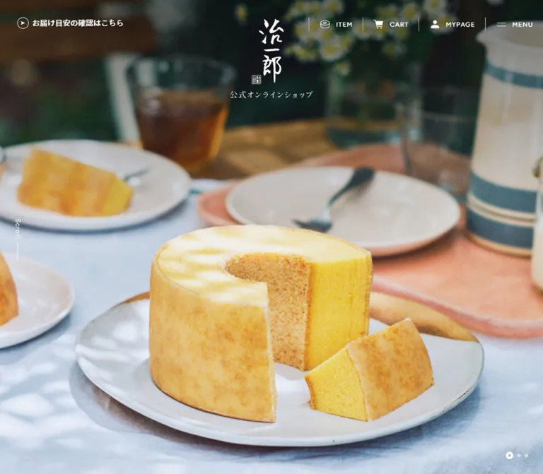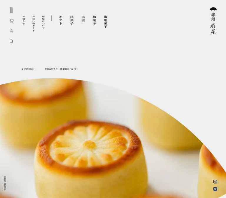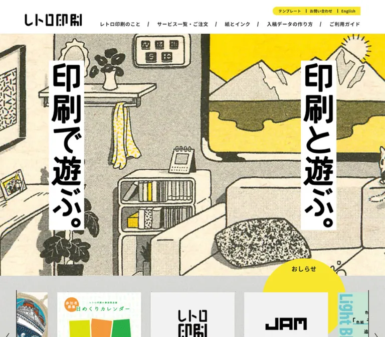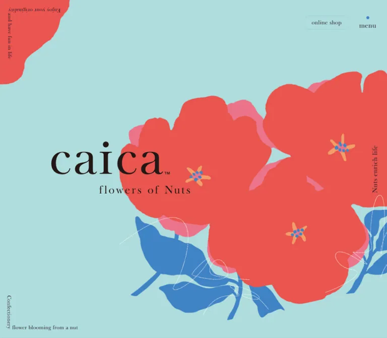
プレビュー準備中デザインリファレンスを見る
日本のWebデザインを、AIの制作リファレンスに。
DESIGN REFERENCE
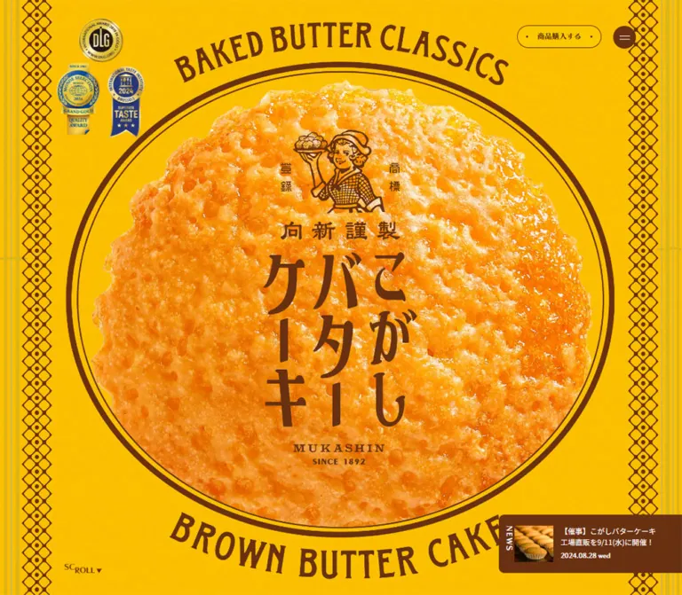
鮮やかな黄色と濃茶、焼き菓子の接写、レトロな飾り罫でパッケージの世界観を展開。素材紹介から商品一覧・店舗案内までつなぐ、むか新のこがしバターケーキ公式ブランドサイト。
オリジナルサイトを見るA golden confectionery wrapper expanded into an immersive product website.
Website: kogashibutter.com
Original URL: https://kogashibutter.com/
Final URL: https://kogashibutter.com/
Theme: saturated butter yellow and dark brown, with photographic white space in the closing brand story.
Inspected: September 17, 2026, at 05:08 JST; supplied retrieval timestamp: September 16, 2026, 20:08:28.733Z.
Viewports: desktop 1440 × 1000 and mobile 390 × 844 CSS pixels.
Scope: the current product-brand website: opening composition, a framed heritage scene, ingredient and serving information, eight-product lineup, gift inquiries, store information, news, closing photography, and footer. Visual evidence covers three desktop captures and two mobile captures; supplied rendered DOM measurements extend into the middle sections. Menu opening, purchasing, carousel changes, and complete scroll choreography were not exercised in the supplied evidence.
The site translates the cake's packaging into the surrounding interface. Bright yellow carries a fine grain; deep brown supplies lettering, outlines, borders, and controls. An enormous photograph of the cake's textured surface sits behind an illustrated bakery emblem and Japanese product lettering. Curved English captions and repeating diamond ornaments make the first screen feel like an oversized confectionery label.
The experience continues beyond product promotion into a usable catalog, gift inquiry routes, store details, and dated news. Its visual rhythm alternates between dense packaging graphics and generous photographic scenes. On mobile, the cake extends beyond the screen edges, controls move into new positions, and the catalog retains two columns. Preserve these deliberate changes instead of simply shrinking the desktop composition.
A golden confectionery wrapper expanded into an immersive product website.
Website: kogashibutter.com
Original URL: https://kogashibutter.com/
Final URL: https://kogashibutter.com/
Theme: saturated butter yellow and dark brown, with photographic white space in the closing brand story.
Inspected: September 17, 2026, at 05:08 JST; supplied retrieval timestamp: September 16, 2026, 20:08:28.733Z.
Viewports: desktop 1440 × 1000 and mobile 390 × 844 CSS pixels.
Scope: the current product-brand website: opening composition, a framed heritage scene, ingredient and serving information, eight-product lineup, gift inquiries, store information, news, closing photography, and footer. Visual evidence covers three desktop captures and two mobile captures; supplied rendered DOM measurements extend into the middle sections. Menu opening, purchasing, carousel changes, and complete scroll choreography were not exercised in the supplied evidence.
The site translates the cake's packaging into the surrounding interface. Bright yellow carries a fine grain; deep brown supplies lettering, outlines, borders, and controls. An enormous photograph of the cake's textured surface sits behind an illustrated bakery emblem and Japanese product lettering. Curved English captions and repeating diamond ornaments make the first screen feel like an oversized confectionery label.
The experience continues beyond product promotion into a usable catalog, gift inquiry routes, store details, and dated news. Its visual rhythm alternates between dense packaging graphics and generous photographic scenes. On mobile, the cake extends beyond the screen edges, controls move into new positions, and the catalog retains two columns. Preserve these deliberate changes instead of simply shrinking the desktop composition.
| Name | Value | Source / suggested token | Evidence and role |
|---|---|---|---|
| Butter Yellow | #fcc800 |
Source --c-base; alias --color-butter |
Exact source variable and computed purchase-button fill. Visually dominates the hero, framed scene, and footer. |
| Brown Ink | #693111 |
Source --c-brown; alias --color-ink |
Exact source variable and computed body text/menu-button color. Connects typography, outlines, and packaging graphics. |
| Warm Beige | #ede5c8 |
Source --c-beige; alias --color-beige |
Declared source token. Its precise visible placement is not established by the supplied captures. |
| Reversed White | #ffffff |
Alias --color-reverse |
Computed hero-news text and navigation-link text. The closed-menu screenshots do not establish the full navigation surface. |
| Inactive Gray | #cccccc |
Alias --color-inactive |
Computed inactive store-gallery pagination dots. A utility color, not a major brand accent. |
The yellow is visibly textured. The evidence includes a --z-noise variable and fine-grained variation in the screenshots, but it does not identify the texture asset, opacity, blending mode, or generation method. Treat the grain as a separate visual layer over the exact base color.
The near-white closing photograph is image content; no exact CSS background value was supplied for that region. Likewise, blue and metallic tones inside award emblems belong to those images rather than to the general interface palette.
Calculated solid-color contrast: brown against yellow is approximately 6.5:1; white against brown is approximately 10.3:1. Yellow against white is only about 1.6:1. These calculations exclude grain and photography. The golden closing-story text requires a separate contrast assessment against its actual image region.
Use yellow as the environment and brown as the organizing ink. The hero-news panel provides a small reversed brown surface. Purchase buttons remain yellow with a thin brown outline, so their prominence comes from placement and shape rather than a new accent color. The white photographic ending provides a tonal pause before the yellow footer returns.
No alternate theme or dark-mode control is established by the evidence.
Noto Sans JP, sans-serif.--f-jp.400 for general paragraphs; 500 for product names and serving details.0.08em tracking on both inspected layouts.The evidence also contains a Google Fonts stylesheet reference for Noto Sans JP. Computed family declarations establish the requested stack, but do not independently verify the rendered font file for every glyph.
fot-chiaro-std, sans-serif.--f-chiaro.400; purchase labels use 700.Retain this exact declared family when the font is licensed and available. The supplied evidence does not justify assigning its name to all lettering inside the brand artwork.
The curved English captions, central Japanese product mark, and bakery emblem should be treated as a coordinated graphic lockup. Their letterforms, curvature, spacing, and relationship to the cake photograph carry the identity. Asset URLs and the implementation of those curves were not supplied.
A separate H1 containing こがしバターケーキ measures 1 × 1px in both DOM samples. This supports retaining a semantic page title independently of the visible graphic composition.
| Role | Desktop measurement | Mobile measurement | Weight / spacing |
|---|---|---|---|
| Root and inherited body size | 15.2381px |
16px |
Body weight 400 |
| Ingredient paragraph | 15.2381px / 32.381px |
14px / 28px |
400; 0.08em tracking |
| Ingredient subheading | 30.4762px / 47.5429px |
24px / 39.84px |
Display family, 400 |
| Introductory ingredient question | 30.4762px / 51.2px |
24px / 48px |
Two lines on mobile |
| BUTTER display heading | 121.905px, normal leading |
59px, normal leading |
Display family, 400 |
| BROWN / SUGAR / LEMON heading | 91.4286px / 96px |
54px / 64.8px |
Explicit multiline composition |
| LINEUP heading | 68.5714px / 68.5714px |
56px / 71.68px |
Display family, 400 |
| SHOP heading | 68.5714px, normal leading |
56px, normal leading |
Do not copy LINEUP leading automatically |
| Japanese lineup label | 20.9524px / 30.381px |
18px / 27px |
Display family, 400 |
| Serving-step label | 20.9524px / 22.8381px |
18px / 23.4px |
Display family, 400 |
| Serving details | 13.3333px / 24.6667px |
13px / 24.05px |
Sans serif, 500, 0.04em tracking |
| Product name | 17.1429px / 20.5714px |
13px / 19.89px |
Sans serif, 500 |
| Price-row parent | 19.0476px, normal leading |
16px, normal leading |
Display family; individual numeral sizes not supplied |
| Purchase label | 15.2381px |
14px |
Display family, 700 |
| Hero-news link | 15.2381px / 22.8571px |
12px / 18px |
Sans serif, 400 |
| Featured store name | 22.8571px |
24px |
Display family, 0.08em tracking |
| Store detail links | 13.3333px / 22.6667px |
14px / 23.8px |
Sans serif, 0.04em tracking |
The HTML element reports Times, but the body and sampled content declare their own families. Do not interpret the HTML default as the site's primary typeface.
The desktop sample declares --base-vw: 1512 and --vw: 1440px; mobile declares --base-vw: 390 and --vw: 390px. The desktop root size is consistent with:
16 × 1440 / 1512 = 15.2381px
This is a calculated relationship, not a recovered root-size formula. Mobile components also receive explicit changes in type size, layout, and spacing. A single proportional scale cannot reproduce both layouts. The actual breakpoint and any scaling caps remain unknown.
| Use | Desktop | Mobile | Interpretation |
|---|---|---|---|
| Step-number / label gap | 3.8095px |
4px |
Fine inline spacing |
| Serving-detail gap | 7.619px |
Changes to block layout | Details wrap within narrower mobile columns |
| Ingredient heading-to-copy gap | About 24.92px |
16px |
Calculated from sampled rectangles |
| Catalog left / right margins | About 120px / 120px |
19px / 17px |
Component-specific insets |
| Catalog column gap | About 27.61px |
16px |
Calculated from card coordinates |
| Catalog row gap | About 52.38px |
46px |
Calculated between card bounds |
| Store-finder button gap | About 38.09px, horizontal |
24px, vertical |
Two-column to stacked arrangement |
| Shop section top padding | 120.952px |
61px |
Measured section padding |
| Footer bottom padding | 0px on sampled footer |
114px |
Additional mobile clearance |
These values form several local spacing systems. The asymmetric ingredient layouts, catalog margins, and decorative rails should not all be forced onto one universal container.
| Element | Desktop | Mobile | Evidence |
|---|---|---|---|
| Menu control | 47.61 × 47.61px |
52 × 52px |
Measured; brown circle |
| Main purchase link | 175.23 × 47.61px |
160 × 50px in the footer capture |
Measured; pill |
| Mobile hero purchase button | Not present in desktop sample | 119 × 44px |
Measured; separate button labeled 購入する |
| Purchase radius | 65.7143px |
69px |
Computed; both render as fully rounded pills |
| Gift inquiry link | 457.14 × 51.56px |
278 × 57px |
Measured |
| Store-finder link | 579.53 × 91.56px |
357 × 79px |
Measured |
| Store-finder radius | 47.619px |
41px |
Computed |
| Catalog item | 381.58 × 316.64px |
169 × 203.75px |
Measured for the sampled items |
| Footer | About 384.72px high |
About 534.44px high |
Measured section bounds |
| Purchase outline | Approximately 1px |
Approximately 1px |
Screenshot estimate; border width absent from supplied style fields |
| Heritage frame stroke | Approximately 4px |
Not visually captured | Screenshot estimate |
Rounded shapes are selective: circular menu control, pill links, rounded news-panel corners, and the large medallion. The catalog anchors themselves have zero radius and transparent backgrounds in the supplied measurements.
Role: make the website feel continuous with the physical wrapper.
The opening and footer use a yellow field with fine grain. Repeating brown diamond motifs run vertically near the desktop hero edges. Fainter parallel stripes sit farther outward. The footer repeats the diamond motif at the outer edges.
In the desktop opening, the diamond bands are approximately 48–50px wide and begin around 38px from the viewport edges. These are screenshot estimates. The mobile opening omits the visible side bands, giving the cake maximum width; the mobile footer restores edge bands approximately 34px wide.
Implement rails as decorative assets or carefully authored vectors. Keep them outside text hit areas and ignore them in the accessibility tree. The source's exact vector or raster construction is unknown.
Role: provide navigation and an immediate commerce route without a full-width header band.
The sampled header occupies zero layout height. Controls float over the artwork rather than reserving a conventional navigation row.
At the desktop opening, the menu is positioned at approximately x: 1297.16, y: 53.33. Its right clearance is approximately 95.23px. The purchase pill begins at x: 1097.16, y: 52.38, leaving approximately 24.77px between the two controls. Two thin light lines form the menu glyph.
At 390px wide, the menu moves to top: 18px, right: 16px, and grows to 52px. It remains visible in the mobile footer capture. The opening instead places a compact 購入する button near the bottom right, while the footer has a centered 商品購入する pill.
The desktop purchase link points to the Mukashin category URL recorded in the DOM. The mobile hero control is a BUTTON; its action was not tested. Do not assume all purchase controls share the same implementation merely because their intent is similar.
Role: communicate product identity through scale, texture, and packaging recognition.
The opening section measures exactly one inspected viewport: 1440 × 1000 on desktop and 390 × 844 on mobile. Its anatomy is:
BAKED BUTTER CLASSICS and BROWN BUTTER CAKE.MUKASHIN / SINCE 1892 signature.The desktop ring occupies approximately x: 260–1180 and y: 105–905; these bounds are screenshot estimates, not an intrinsic asset size. The full lockup extends above and below that ring through its curved captions.
Mobile preserves the dominance of the product. The medallion and cake extend beyond the horizontal edges instead of being reduced to a small centered badge. The visible lockup runs roughly from y: 100 to 630, leaving room for the awards above and news/purchase controls below.
The award cluster changes from a staggered desktop grouping to a compact horizontal mobile arrangement. Preserve the actual badge proportions and embedded lettering.
Role: expose a current announcement without weakening the hero artwork.
On desktop, the dock attaches to the lower right. The measured link rectangle is 380.94 × 121.88px, with its bottom approximately 45.7px above the viewport edge. Visually it has a brown panel, rounded left corners, a vertical NEWS label, a small bakery photograph, a two-line Japanese headline, and a smaller date below.
The displayed current item is dated 2026.07.22. It links to the announcement URL provided in the DOM; its destination was not inspected.
On mobile, the brown painted panel sits flush against the lower left and is approximately 236 × 112px in the screenshot. The thumbnail and text remain side by side, while the vertical NEWS label disappears. The DOM link rectangle spans 390px, so its full bounds should not be mistaken for the visible brown panel width. The separate purchase button occupies the remaining lower-right area.
Use white text and a dense image/text arrangement. This is a compact editorial dock, not a large modal or a generic toast.
Role: slow the visual pace and connect the product to craft and longevity.
The supplied desktop middle capture shows a nearly full-viewport yellow scene enclosed by brown ornamental corner flourishes and thin connecting rules. The frame is inset approximately 35–40px from the viewport edges.
Two centered lines of Japanese copy sit around the vertical middle. A photographic hand enters from the right, holding a single cake across the lower portion. The image's scale makes the cake tangible while the large empty upper field keeps attention on the statement.
Four small dots form a vertical group near the left edge; the last is brown and the other three are light in this frame. This is evidence of a state indicator, but not proof that the dots are clickable, automatically advancing, or tied to a particular number of scroll chapters.
The framing, hand photograph, and copy are directly visible. Their entrance order and synchronization are not established by a still capture.
Role: explain the product through expressive headings and readable supporting copy.
The DOM establishes two ingredient compositions: butter, followed by brown sugar and lemon. Large English display words are paired with Japanese labels, shorter feature headings, and explanatory paragraphs.
Desktop measurements show deliberately offset copy rather than a uniform centered column. The butter paragraph is about 380.94px wide; the brown-sugar/lemon paragraph is about 438.09px wide. On mobile, both paragraphs use a 294px width starting at x: 78px, leaving an asymmetric composition.
The Japanese feature headings use 30.48px desktop type and 24px mobile type. On mobile, the sugar-and-lemon heading becomes three lines. Preserve the relationship between giant display words and much smaller explanatory text.
These sections are supported by text and geometry, not by supplied middle-section screenshots. Their complete image arrangements, background surfaces, and exact overlap effects remain unverified.
Role: turn product appreciation into a simple three-step instruction sequence.
The content contains three numbered stages: カップから外す, あたためる, and できあがり. Heating details distinguish microwave and toaster instructions, with the final stage adding a short flavor note.
Desktop label coordinates establish three horizontal groups. Mobile is more specific than a generic single-column stack: step 1 is centered above, while steps 2 and 3 share the next row. The microwave and toaster details become block text beneath the left group.
Use display typography for the numbered headings and slightly heavier sans-serif text for the practical instructions. Preserve semantic reading order even when the visual layout changes. The exact supporting illustration assets were not supplied.
Role: connect the brand narrative to individual product pages.
The lineup contains eight linked items: six cake package sizes and two cake-and-sablé assortments. Each item has a presentation region above a Japanese product name, followed by a price row containing 税込, the amount, and 円.
Desktop uses three columns. The first row begins at x: 120, 529.19, and 938.38, with item widths of approximately 381.58px. Mobile uses two columns at x: 19 and 204, each 169px wide. This produces three desktop rows and four mobile rows.
There is approximately 258.08px between the top of a desktop card and its title, and 132px on mobile. Those measurements include the upper presentation region and any intervening spacing; they are not verified image heights.
Product names use medium-weight sans serif. Desktop examples occupy one measured line, while mobile examples occupy two. The price-row container uses the display family with a small inline gap. Individual numeral styling was not included in the sample.
The anchors have transparent backgrounds, no padding, and zero radius. The provided captures do not establish the inner image framing, so avoid inventing a white card surface or an image crop as a source fact.
Role: offer an alternative route for customers planning larger or occasion-specific orders.
The content includes a short introduction, occasion labels, explanatory copy, and the link ご注文について問い合わせる.
On desktop, the explanatory paragraph is approximately 657.16px wide and the link is 457.14px wide. On mobile, both narrow to 278px, centered with 56px side margins. Copy uses 14px / 28px on mobile and retains 0.08em tracking.
Keep this block quieter than the main product display. Its purpose is consultation, with enough space for several lines of explanation.
Role: provide a physical purchasing route and practical visit information.
The featured location is MUKASHINplus, with address, map link, telephone, hours, payment methods, closing day, transport, parking, and a detail link. Those are structured information fields, so a definition list is a suitable implementation recommendation.
Desktop measurements place the details in a narrower left region and gallery pagination farther right. Mobile pagination precedes a nearly full-width store-information block at x: 17, width 356px. The complete gallery imagery was not included in the screenshots.
Three pagination buttons are present. The selected dot is approximately 1.4× the diameter of the inactive dots: 10.65px versus 7.61px on desktop and 7px versus 5px on mobile. These small visible marks should receive larger invisible hit areas in a new implementation.
Two substantial store-finder pills follow. They appear side by side on desktop and stack on mobile, with 24px between them. Preserve their distinction between direct stores and other stockists.
Role: provide a compact chronological index below store information.
The DOM contains three entries, each combining a date, weekday, and Japanese announcement title. Desktop link rectangles are approximately 672.41px wide with an 8px nominal internal gap. Mobile entries are 325px wide and about 71.83px tall, allowing the text to wrap.
Use typographic hierarchy and spacing rather than turning these entries into large promotional cards. The desktop source defines an opacity transition on these links; the final hover opacity was not supplied.
Role: move from product detail to an everyday emotional context.
The desktop closing capture shows a child holding the yellow package against a soft, nearly white photographic background. Japanese brand-story copy sits in the open left side, followed by the larger line あなたの、おかし日和に。.
The mobile ending shows the photograph above the footer, with the child and package filling the narrow crop. The visible photographic fragment is about 309px high in the final screenshot; it is only the ending portion of the larger story section, not proof that the whole mobile story is a 309px panel.
Preserve the soft light, white clothing, and clear yellow package. The image should provide a calm contrast to the dense opening graphics.
Role: close the page with the same packaging identity and provide a memorable route upward.
The desktop footer combines left-side section links, a large central brand composition, right-side contact and official-site links, and a packaged-cake return control. Copyright text identifies Mukashin Co.,Ltd. on the inspected page.
The central footer graphic repeats the curved English caption and brown ring but uses a simpler Japanese product-title arrangement than the opening. It should not be replaced with a tiny generic logo.
The return control pairs a slightly angled packaged cake with おかわり! and PAGE TO TOP. Its href is #pagetop. The artwork is part of the control's identity; its resting angle is not proof of a hover rotation.
On mobile, the footer becomes a centered vertical composition: brand graphic, packaged-cake return control, copyright, then a purchase pill. Desktop footer link columns are absent from the visible mobile footer; navigation entries remain present elsewhere in the mobile DOM.
Role: expose the main content destinations and external contact routes.
The DOM includes links for product features, serving instructions, lineup, shops, contact, and the official brand site. Product-feature anchors differ by layout: #productfeatures_pc on desktop and #productfeatures_sp on mobile.
Menu-link text measures 22.8571px on desktop and 20px on mobile, using the display family. Some desktop rectangles are transformed beyond the viewport; the mobile DOM contains centered menu entries and an additional purchase link.
No open-menu screenshot or interaction trace was supplied. Its complete surface, opening trajectory, focus behavior, and closing behavior are therefore not verified.
| Element / treatment | Supplied computed value | What the evidence establishes |
|---|---|---|
| Opening section opacity | 0.8s cubic-bezier(0.23, 1, 0.32, 1) |
An opacity transition is declared; its trigger is not identified. |
| Circular menu control | transform 1s cubic-bezier(0.68, -0.55, 0.265, 1.55) |
A transform transition with overshoot-capable easing; no specific rotation or scale endpoint is established. |
| Page-top control, desktop | transform 0.8s cubic-bezier(0.68, -0.55, 0.265, 1.55) 0.4s |
Transform duration and delay are recorded. |
| Page-top control, mobile | Same transition with 0.5s delay |
Mobile timing differs. |
| Store pagination dots | transform 0.2s linear |
Short size/state feedback is defined. |
| Desktop news-list links | opacity 0.3s cubic-bezier(0.25, 0, 0, 1) |
An opacity transition is defined; endpoint is unknown. |
| Decorative mobile paragraphs near serving content | 10s linear infinite yuge |
A perpetual named animation is active in the sample; its keyframes and visual path were not supplied. |
The source also declares --ease-out-weak, --ease-in, and other easing aliases. Their existence does not establish where each is applied.
The document measures approximately 25,769px high on desktop and 23,054px on mobile. A following large section is recorded at y: 15,000px on desktop and 12,660px on mobile—exactly fifteen times the respective viewport height. Together with the framed scene and displaced child rectangles, this is consistent with a substantial staged scroll sequence.
It does not establish the exact pinning mechanism, scroll-scrubbing rules, scene count, or animation timeline. Do not recreate the recorded distance as a giant empty margin. A new implementation should explicitly define its own scene progression, or use ordinary document flow until the original behavior can be verified.
The supplied inspection waited for load, visible image decoding, finite motion, and sampled stability within stated limits. Perpetual animations were paused for readiness checks and then resumed. This improves screenshot reliability, but does not verify delayed content, hover behavior, menu operation, gallery autoplay, or reduced-motion support.
Confirmed hrefs include the product category, individual product pages, contact, store information, map, telephone, section anchors, and page top. Their presence establishes destinations, not successful navigation or transaction behavior. No checkout or external destination was inspected.
| Surface | Appearance | Evidence / implementation implication |
|---|---|---|
| Hero and footer | Grain over saturated yellow | Directly visible; use the exact base token beneath a separate texture. |
| Hero-news panel | Brown field with white text | Directly visible; one concentrated reversed surface. |
| Purchase pills | Yellow fill, brown text and fine outline | Fill and type colors measured; outline appearance visible. |
| Heritage scene | Yellow field inside decorative brown framing | Directly visible in the desktop middle capture. |
| Product-link containers | Transparent, unpadded, square | Computed anchor styles; inner imagery not visually documented. |
| Closing brand image | Soft near-white photographic field | Image-owned color and light; exact background token unknown. |
| Inactive pagination | Small gray dots | Computed #cccccc; selected dot uses yellow. |
The visible interface does not rely on a general shadow or elevation system. Separation comes from ink outlines, illustration boundaries, large-scale composition, and occasional reversed color. Transparent container styles in uncaptured sections do not prove the final visible background beneath them.
The defining image is a close-up of the cake, with crisp pores, glossy highlights, golden edges, and a sugar-like surface texture. The photograph must remain appetizing and materially detailed at a very large scale. A flat illustration or a small stock-food thumbnail would lose the central effect.
The brand graphics add a different register: an engraved-looking bakery figure, formal Japanese lettering, condensed curved English capitals, double rules, diamond chains, and ornamental corners. Keep this artwork crisp while leaving the cake and lifestyle photography naturally detailed. Do not apply pixelated rendering to these photographs.
No original image URLs, filenames, SVG markup, or intrinsic dimensions were included in the supplied evidence. The following are visual references, not downloadable asset paths.
| Asset | Supplied visual evidence | Treatment |
|---|---|---|
| Cake close-up | Desktop opening and mobile opening | Large isolated silhouette, richly textured surface, intentional mobile edge cropping |
| Hero brand lockup | Desktop and mobile opening | Bakery figure, Japanese lettering, curved English captions, brown linework |
| Award emblems | Desktop and mobile opening | Three distinct emblems; desktop staggered arrangement, mobile compact row |
| Diamond rails and fine outer stripes | Desktop opening; desktop/mobile footer | Repeated packaging ornament, brown on yellow |
| Hand holding a cake | Desktop framed scene | Natural skin tones, large cutout-like composition entering from the right |
| Bakery news photograph | Desktop and mobile hero dock | Small rectangular crop showing cakes in production |
| Child with yellow package | Desktop closing story and mobile ending | Soft bright photography with the package retained as a color anchor |
| Packaged cake return graphic | Desktop and mobile footer | Slightly angled package combined with an upward-navigation caption |
| Fine yellow grain | Opening, framed scene, footer | Subtle texture; source method unknown |
The product and store DOM measurements identify presentation areas, but their complete image assets are not visible in the supplied captures. Keep those image choices explicit when implementing a new reference.
Use authorized brand artwork where available. The reusable CSS can reproduce layout and controls; it cannot recover the original lettering, product photography, or ornament assets.
1200px, arranged in three columns with about 27.61px gaps.52px circle at top: 18px, right: 16px.119 × 44px purchase button occupies the lower right.294px wide with a pronounced left inset, preserving editorial asymmetry.169px items and 16px gaps.534px tall, compared with approximately 385px on desktop, and ends with a centered purchase pill.These are two observed layouts, not evidence of every intermediate breakpoint. Tablet arrangements, landscape behavior, and browser toolbar resizing were not tested. The CSS Quick Start uses a recommended breakpoint and should be validated at intermediate widths.
#fcc800 and brown #693111 as the dominant pair.These are recommendations for a new implementation, not verified features of the inspected website:
44 × 44px interaction areas without enlarging their visible artwork.#fcc800.#693111.#ede5c8: declared supporting token; original placement unverified.“Create a Japanese confectionery product website inspired by the supplied Kogashi Butter Cake reference. Build the visual identity around saturated yellow #fcc800, dark brown #693111, fine packaging grain, a huge detailed cake photograph, a brown bakery emblem, curved English lettering, and repeating diamond borders. Use a floating circular menu and outlined yellow purchase pills. Continue into ingredient storytelling, serving instructions, an eight-item product catalog, gift inquiries, store information, news, and a soft bright lifestyle ending. At 390px, intentionally crop the oversized hero artwork, place the news panel lower left and a compact purchase control lower right, and keep the catalog in two columns. Use the supplied assets for branded lettering; do not invent original asset URLs or unverified scroll choreography.”
“Use the documented easing values only where corresponding state changes are implemented: a 1s overshoot-capable transform transition for the menu control, 0.8s transforms for the page-top graphic, and 0.2s linear pagination feedback. Do not infer a rotation angle, scroll timeline, or autoplay behavior. Provide a static, fully readable reduced-motion version.”
This is a reusable adaptation, not the recovered stylesheet. It preserves several measured dimensions at the two supplied viewports while keeping a conventional root font size. The 48rem breakpoint, desktop scaling cap, image-slot ratios, safe-area handling, and simplified layer levels are recommendations.
Load fonts separately. Supply authorized imagery through image elements and optional --grain-image and --rail-image custom properties; those properties intentionally default to no image. Hero sizing is a starting point for a complete brand lockup and must be adjusted to the actual artwork bounds.
Use .butter-site as the page wrapper, .packaging on yellow decorated regions, .hero-bottom for the news/purchase group, and .product-grid for linked .product-card items. The CSS does not manufacture missing artwork or implement unverified navigation and scroll timelines.
:root {
  /* Exact observed brand colors */
  --color-butter: #fcc800;
  --color-ink: #693111;
  --color-beige: #ede5c8;
  --color-reverse: #ffffff;
  --color-inactive: #cccccc;

  /* Observed requested font families */
  --font-jp: 'Noto Sans JP', sans-serif;
  --font-display: 'fot-chiaro-std', sans-serif;

  /* Recommended scaling; matches the measured desktop ratio */
  --u: min(1px, calc(100vw / 1512));
  --content-width: calc(1260 * var(--u));
  --text-body: max(14px, calc(16 * var(--u)));
  --text-display: calc(72 * var(--u));
  --text-feature: calc(32 * var(--u));
  --text-product: max(13px, calc(18 * var(--u)));
  --grid-column-gap: calc(29 * var(--u));
  --grid-row-gap: calc(55 * var(--u));
  --control-size: calc(50 * var(--u));
  --radius-pill: 999px;

  /* Easing values recorded in the source */
  --ease-out: cubic-bezier(0.23, 1, 0.32, 1);
  --ease-back: cubic-bezier(0.68, -0.55, 0.265, 1.55);
  --ease-hover: cubic-bezier(0.25, 0, 0, 1);

  /* Supply authorized textures; no original paths were provided */
  --grain-image: none;
  --rail-image: none;
}

* { box-sizing: border-box; }
html { font-size: 16px; }
body { margin: 0; }
button, a { -webkit-tap-highlight-color: transparent; }
button { font: inherit; }

.butter-site {
  color: var(--color-ink);
  background: var(--color-butter);
  font-family: var(--font-jp);
  font-size: var(--text-body);
}

.content-width {
  width: min(var(--content-width), calc(100% - 36px));
  margin-inline: auto;
}

.packaging {
  position: relative;
  isolation: isolate;
  background-color: var(--color-butter);
  background-image: var(--grain-image);
}

.packaging::before,
.packaging::after {
  content: '';
  position: absolute;
  inset-block: 0;
  width: calc(52 * var(--u));
  background-image: var(--rail-image);
  background-size: 100% auto;
  background-repeat: repeat-y;
  pointer-events: none;
  z-index: 1;
}
.packaging::before { left: calc(40 * var(--u)); }
.packaging::after { right: calc(40 * var(--u)); }

.hero {
  min-height: 100vh;
  min-height: 100svh;
  overflow: hidden;
}

.hero-lockup {
  position: absolute;
  top: 3%;
  left: 50%;
  width: min(68vw, 980px);
  height: 94%;
  object-fit: contain;
  transform: translateX(-50%);
}

.floating-tools {
  position: fixed;
  top: calc(56 * var(--u));
  right: calc(100 * var(--u));
  display: flex;
  align-items: center;
  gap: calc(26 * var(--u));
  z-index: 30;
}

.purchase-pill {
  display: inline-flex;
  align-items: center;
  justify-content: center;
  gap: 1em;
  width: calc(184 * var(--u));
  min-height: max(44px, var(--control-size));
  border: 1px solid var(--color-ink);
  border-radius: var(--radius-pill);
  color: var(--color-ink);
  background: var(--color-butter);
  font: 700 var(--text-body) var(--font-display);
  text-decoration: none;
}
.purchase-pill::before,
.purchase-pill::after {
  content: '';
  width: 3px;
  height: 3px;
  border-radius: 50%;
  background: currentColor;
}

.menu-button {
  position: relative;
  width: max(44px, var(--control-size));
  height: max(44px, var(--control-size));
  padding: 0;
  border: 0;
  border-radius: 50%;
  color: var(--color-reverse);
  background: var(--color-ink);
  cursor: pointer;
  transition: transform 1s var(--ease-back);
}
.menu-button::before,
.menu-button::after {
  content: '';
  position: absolute;
  left: 50%;
  width: 22px;
  height: 1px;
  background: currentColor;
  transform: translateX(-50%);
}
.menu-button::before { top: calc(50% - 4px); }
.menu-button::after { top: calc(50% + 3px); }

.hero-bottom {
  position: absolute;
  right: 0;
  bottom: calc(48 * var(--u));
  z-index: 10;
}
.news-card {
  display: grid;
  grid-template-columns: 1em 80px minmax(0, 1fr);
  align-items: center;
  gap: 12px;
  width: calc(400 * var(--u));
  min-height: calc(128 * var(--u));
  padding: 18px 14px;
  border-radius: 12px 0 0 12px;
  color: var(--color-reverse);
  background: var(--color-ink);
  font-size: var(--text-body);
  line-height: 1.5;
  text-decoration: none;
}
.news-card__label {
  writing-mode: vertical-rl;
  font-family: var(--font-display);
  letter-spacing: 0.16em;
}
.news-card__image {
  display: block;
  width: 80px;
  height: 76px;
  object-fit: cover;
}
.news-card p { margin: 0; }
.news-card time { display: block; margin-top: 6px; }
.hero-buy { display: none; }

/* Structural frame only; ornamental corners require artwork */
.heritage-scene {
  position: relative;
  min-height: 100svh;
  padding: 36px;
}
.heritage-frame {
  min-height: calc(100svh - 72px);
  border: 4px solid var(--color-ink);
}

.section-word {
  margin: 0;
  font: 400 var(--text-display)/1 var(--font-display);
}
.feature-heading {
  font: 400 var(--text-feature)/1.56 var(--font-display);
}
.feature-copy {
  font-size: var(--text-body);
  line-height: 2.125;
  letter-spacing: 0.08em;
}

.product-grid {
  display: grid;
  grid-template-columns: repeat(3, minmax(0, 1fr));
  column-gap: var(--grid-column-gap);
  row-gap: var(--grid-row-gap);
}
.product-card {
  min-width: 0;
  color: inherit;
  text-decoration: none;
}
.product-card__image {
  display: block;
  width: 100%;
  aspect-ratio: 1.6;
  margin-bottom: calc(20 * var(--u));
  object-fit: contain;
}
.product-card__title {
  margin: 0;
  font-size: var(--text-product);
  font-weight: 500;
  line-height: 1.2;
}
.product-card__price {
  display: flex;
  align-items: baseline;
  gap: calc(4 * var(--u));
  margin: 0;
  font: 400 calc(20 * var(--u))/2 var(--font-display);
}

.serving-steps,
.store-actions {
  display: grid;
  gap: calc(40 * var(--u));
}
.serving-steps { grid-template-columns: repeat(3, minmax(0, 1fr)); }
.store-actions { grid-template-columns: repeat(2, minmax(0, 1fr)); }
.store-action {
  display: flex;
  align-items: center;
  justify-content: center;
  min-height: calc(96 * var(--u));
  padding: 24px;
  border: 1px solid currentColor;
  border-radius: var(--radius-pill);
  color: inherit;
  text-decoration: none;
}

.brand-footer {
  min-height: calc(404 * var(--u));
  overflow: hidden;
}
.brand-footer::before { left: 0; }
.brand-footer::after { right: 0; }
.footer-purchase { display: none; }

/* Recommended keyboard focus and text alternative utility */
.butter-site :focus-visible {
  outline: 3px solid currentColor;
  outline-offset: 5px;
}
.visually-hidden {
  position: absolute;
  width: 1px;
  height: 1px;
  padding: 0;
  overflow: hidden;
  clip-path: inset(50%);
  white-space: nowrap;
  border: 0;
}

@media (max-width: 48rem) {
  :root {
    --u: 1px;
    --text-body: 14px;
    --text-display: 56px;
    --text-feature: 24px;
    --text-product: 13px;
    --grid-column-gap: 16px;
    --grid-row-gap: 46px;
    --control-size: 52px;
  }

  .floating-tools { top: 18px; right: 16px; }
  .floating-tools .purchase-pill { display: none; }
  .hero::before, .hero::after { display: none; }
  .hero-lockup { top: 98px; width: 128%; height: 540px; }

  .hero-bottom {
    inset-inline: 0;
    bottom: 0;
    display: grid;
    grid-template-columns: minmax(0, 1fr) 119px;
    align-items: center;
    gap: 19px;
    padding-right: 16px;
  }
  .news-card {
    grid-template-columns: 84px minmax(0, 1fr);
    gap: 15px;
    width: auto;
    min-height: 112px;
    padding: 12px 9px;
    border-radius: 0 12px 12px 0;
    font-size: 12px;
    line-height: 1.5;
  }
  .news-card__label { display: none; }
  .news-card__image { width: 84px; height: 80px; }
  .hero-buy { display: inline-flex; width: 119px; min-height: 44px; }

  .feature-heading { line-height: 1.66; }
  .feature-copy { line-height: 2; }
  .product-grid { grid-template-columns: repeat(2, minmax(0, 1fr)); }
  .product-card__image { aspect-ratio: 1.4; margin-bottom: 12px; }
  .product-card__title { line-height: 1.53; }
  .product-card__price { font-size: 16px; gap: 4px; }

  .serving-steps { grid-template-columns: repeat(2, minmax(0, 1fr)); }
  .serving-steps > :first-child { grid-column: 1 / -1; }
  .store-actions { grid-template-columns: 1fr; gap: 24px; }
  .store-action { min-height: 79px; }

  .brand-footer {
    min-height: 534px;
    padding-bottom: calc(114px + env(safe-area-inset-bottom, 0px));
    text-align: center;
  }
  .brand-footer::before, .brand-footer::after { width: 34px; }
  .footer-link-columns { display: none; }
  .footer-purchase {
    display: inline-flex;
    width: 160px;
    min-height: 50px;
  }
}

@media (prefers-reduced-motion: reduce) {
  .butter-site *,
  .butter-site *::before,
  .butter-site *::after {
    animation: none !important;
    transition: none !important;
    scroll-behavior: auto !important;
  }
  /* Apply only to actual reveal wrappers, not positioning artwork */
  .butter-site [data-reveal] {
    opacity: 1 !important;
    transform: none !important;
  }
}
The example keeps the catalog near the measured 1200px desktop width and uses a recommended symmetric 18px mobile inset, yielding two 169px columns at 390px. The original mobile margins were slightly asymmetric at 19px and 17px.
The product image aspect ratios are recommendations fitted to the observed space before the titles. They are not recovered intrinsic image ratios. The ornamental frame, hero lettering, footer composition, and award positioning still require asset-specific work.
Optional aliases for projects already using Tailwind v4. These do not imply that the original site uses Tailwind. Define the custom properties above first.
@theme inline {
  --color-butter: #fcc800;
  --color-ink: #693111;
  --color-beige: #ede5c8;
  --color-reverse: #ffffff;
  --color-inactive: #cccccc;

  --font-japanese: var(--font-jp);
  --font-brand: var(--font-display);

  --text-copy: var(--text-body);
  --text-section: var(--text-display);
  --text-feature-title: var(--text-feature);
  --text-product-name: var(--text-product);

  --spacing-catalog-column: var(--grid-column-gap);
  --spacing-catalog-row: var(--grid-row-gap);
  --radius-pill: 999px;
}
200 response, rendered page text, links, custom properties, computed styles, and element rectangles. Original and final URLs are identical.2026-09-16T20:08:28.733Z, equivalent to September 17, 2026, at 05:08 JST. This reference analyzes that supplied inspection; it does not claim a separate live visit.1440 × 1000 captures covering the opening, framed hand-and-cake scene, and closing story/footer.390 × 844 captures covering the opening and closing photograph/footer.All measured claims refer to the supplied current-page evidence. Screenshot estimates and recommended implementation choices are labeled separately.
# Kogashi Butter Cake / Mukashin — Style Reference

> A golden confectionery wrapper expanded into an immersive product website.

**Website:** [kogashibutter.com](https://kogashibutter.com/)
**Original URL:** https://kogashibutter.com/
**Final URL:** https://kogashibutter.com/
**Theme:** saturated butter yellow and dark brown, with photographic white space in the closing brand story.
**Inspected:** September 17, 2026, at 05:08 JST; supplied retrieval timestamp: September 16, 2026, `20:08:28.733Z`.
**Viewports:** desktop `1440 × 1000` and mobile `390 × 844` CSS pixels.
**Scope:** the current product-brand website: opening composition, a framed heritage scene, ingredient and serving information, eight-product lineup, gift inquiries, store information, news, closing photography, and footer. Visual evidence covers three desktop captures and two mobile captures; supplied rendered DOM measurements extend into the middle sections. Menu opening, purchasing, carousel changes, and complete scroll choreography were not exercised in the supplied evidence.

The site translates the cake's packaging into the surrounding interface. Bright yellow carries a fine grain; deep brown supplies lettering, outlines, borders, and controls. An enormous photograph of the cake's textured surface sits behind an illustrated bakery emblem and Japanese product lettering. Curved English captions and repeating diamond ornaments make the first screen feel like an oversized confectionery label.

The experience continues beyond product promotion into a usable catalog, gift inquiry routes, store details, and dated news. Its visual rhythm alternates between dense packaging graphics and generous photographic scenes. On mobile, the cake extends beyond the screen edges, controls move into new positions, and the catalog retains two columns. Preserve these deliberate changes instead of simply shrinking the desktop composition.
# Kogashi Butter Cake / Mukashin — Style Reference

> A golden confectionery wrapper expanded into an immersive product website.

**Website:** [kogashibutter.com](https://kogashibutter.com/)
**Original URL:** https://kogashibutter.com/
**Final URL:** https://kogashibutter.com/
**Theme:** saturated butter yellow and dark brown, with photographic white space in the closing brand story.
**Inspected:** September 17, 2026, at 05:08 JST; supplied retrieval timestamp: September 16, 2026, `20:08:28.733Z`.
**Viewports:** desktop `1440 × 1000` and mobile `390 × 844` CSS pixels.
**Scope:** the current product-brand website: opening composition, a framed heritage scene, ingredient and serving information, eight-product lineup, gift inquiries, store information, news, closing photography, and footer. Visual evidence covers three desktop captures and two mobile captures; supplied rendered DOM measurements extend into the middle sections. Menu opening, purchasing, carousel changes, and complete scroll choreography were not exercised in the supplied evidence.

The site translates the cake's packaging into the surrounding interface. Bright yellow carries a fine grain; deep brown supplies lettering, outlines, borders, and controls. An enormous photograph of the cake's textured surface sits behind an illustrated bakery emblem and Japanese product lettering. Curved English captions and repeating diamond ornaments make the first screen feel like an oversized confectionery label.

The experience continues beyond product promotion into a usable catalog, gift inquiry routes, store details, and dated news. Its visual rhythm alternates between dense packaging graphics and generous photographic scenes. On mobile, the cake extends beyond the screen edges, controls move into new positions, and the catalog retains two columns. Preserve these deliberate changes instead of simply shrinking the desktop composition.

## How to Read This Reference

- **Measured** values come from the supplied rendered DOM, computed styles, custom properties, and element rectangles. Unless stated otherwise, dimensions are CSS pixels.
- **Calculated** values are arithmetic derived from those measurements, such as catalog gaps or proportional scaling.
- **Estimated** values describe visible screenshot geometry where no corresponding measurement was supplied. They are not pixel-sampled colors or recovered stylesheet declarations.
- **Recommended** values belong to the reusable implementation below. They are explicitly separate from observed behavior.
- **Source variables** retain their original names. Other token names are descriptive implementation aliases.
- The screenshots and DOM samples represent different captured states. Transformed elements can have rectangles outside their section or document bounds. Their recorded coordinates are not reliable substitutes for normal-flow margins.
- Repeated labels in extracted text do not mean that multiple copies were visibly displayed. The purchase and navigation labels appear once in the supplied screenshots.

## Tokens — Colors

### Default Palette

| Name | Value | Source / suggested token | Evidence and role |
| --- | --- | --- | --- |
| Butter Yellow | `#fcc800` | Source `--c-base`; alias `--color-butter` | Exact source variable and computed purchase-button fill. Visually dominates the hero, framed scene, and footer. |
| Brown Ink | `#693111` | Source `--c-brown`; alias `--color-ink` | Exact source variable and computed body text/menu-button color. Connects typography, outlines, and packaging graphics. |
| Warm Beige | `#ede5c8` | Source `--c-beige`; alias `--color-beige` | Declared source token. Its precise visible placement is not established by the supplied captures. |
| Reversed White | `#ffffff` | Alias `--color-reverse` | Computed hero-news text and navigation-link text. The closed-menu screenshots do not establish the full navigation surface. |
| Inactive Gray | `#cccccc` | Alias `--color-inactive` | Computed inactive store-gallery pagination dots. A utility color, not a major brand accent. |

The yellow is visibly textured. The evidence includes a `--z-noise` variable and fine-grained variation in the screenshots, but it does not identify the texture asset, opacity, blending mode, or generation method. Treat the grain as a separate visual layer over the exact base color.

The near-white closing photograph is image content; no exact CSS background value was supplied for that region. Likewise, blue and metallic tones inside award emblems belong to those images rather than to the general interface palette.

**Calculated solid-color contrast:** brown against yellow is approximately `6.5:1`; white against brown is approximately `10.3:1`. Yellow against white is only about `1.6:1`. These calculations exclude grain and photography. The golden closing-story text requires a separate contrast assessment against its actual image region.

### Color Distribution

Use yellow as the environment and brown as the organizing ink. The hero-news panel provides a small reversed brown surface. Purchase buttons remain yellow with a thin brown outline, so their prominence comes from placement and shape rather than a new accent color. The white photographic ending provides a tonal pause before the yellow footer returns.

No alternate theme or dark-mode control is established by the evidence.

## Tokens — Typography

### Japanese Body and Product Information

- **Computed family:** `Noto Sans JP, sans-serif`.
- **Source variable:** `--f-jp`.
- **Observed weights:** `400` for general paragraphs; `500` for product names and serving details.
- **Role:** clear information beneath the expressive packaging graphics.
- **Paragraph rhythm:** ingredient copy uses generous leading and `0.08em` tracking on both inspected layouts.

The evidence also contains a Google Fonts stylesheet reference for Noto Sans JP. Computed family declarations establish the requested stack, but do not independently verify the rendered font file for every glyph.

### Display and Characterful Utility Text

- **Computed family:** `fot-chiaro-std, sans-serif`.
- **Source variable:** `--f-chiaro`.
- **Observed uses:** ingredient display words, section headings, Japanese subheadings, serving-step labels, price-row containers, purchase labels, and the desktop scroll cue.
- **Observed weights:** predominantly `400`; purchase labels use `700`.

Retain this exact declared family when the font is licensed and available. The supplied evidence does not justify assigning its name to all lettering inside the brand artwork.

### Packaging Lettering

The curved English captions, central Japanese product mark, and bakery emblem should be treated as a coordinated graphic lockup. Their letterforms, curvature, spacing, and relationship to the cake photograph carry the identity. Asset URLs and the implementation of those curves were not supplied.

A separate `H1` containing `こがしバターケーキ` measures `1 × 1px` in both DOM samples. This supports retaining a semantic page title independently of the visible graphic composition.

### Type Scale

| Role | Desktop measurement | Mobile measurement | Weight / spacing |
| --- | --- | --- | --- |
| Root and inherited body size | `15.2381px` | `16px` | Body weight `400` |
| Ingredient paragraph | `15.2381px / 32.381px` | `14px / 28px` | `400`; `0.08em` tracking |
| Ingredient subheading | `30.4762px / 47.5429px` | `24px / 39.84px` | Display family, `400` |
| Introductory ingredient question | `30.4762px / 51.2px` | `24px / 48px` | Two lines on mobile |
| BUTTER display heading | `121.905px`, normal leading | `59px`, normal leading | Display family, `400` |
| BROWN / SUGAR / LEMON heading | `91.4286px / 96px` | `54px / 64.8px` | Explicit multiline composition |
| LINEUP heading | `68.5714px / 68.5714px` | `56px / 71.68px` | Display family, `400` |
| SHOP heading | `68.5714px`, normal leading | `56px`, normal leading | Do not copy LINEUP leading automatically |
| Japanese lineup label | `20.9524px / 30.381px` | `18px / 27px` | Display family, `400` |
| Serving-step label | `20.9524px / 22.8381px` | `18px / 23.4px` | Display family, `400` |
| Serving details | `13.3333px / 24.6667px` | `13px / 24.05px` | Sans serif, `500`, `0.04em` tracking |
| Product name | `17.1429px / 20.5714px` | `13px / 19.89px` | Sans serif, `500` |
| Price-row parent | `19.0476px`, normal leading | `16px`, normal leading | Display family; individual numeral sizes not supplied |
| Purchase label | `15.2381px` | `14px` | Display family, `700` |
| Hero-news link | `15.2381px / 22.8571px` | `12px / 18px` | Sans serif, `400` |
| Featured store name | `22.8571px` | `24px` | Display family, `0.08em` tracking |
| Store detail links | `13.3333px / 22.6667px` | `14px / 23.8px` | Sans serif, `0.04em` tracking |

The HTML element reports `Times`, but the body and sampled content declare their own families. Do not interpret the HTML default as the site's primary typeface.

## Tokens — Spacing & Shapes

### Scaling Evidence

The desktop sample declares `--base-vw: 1512` and `--vw: 1440px`; mobile declares `--base-vw: 390` and `--vw: 390px`. The desktop root size is consistent with:

`16 × 1440 / 1512 = 15.2381px`

This is a **calculated relationship**, not a recovered root-size formula. Mobile components also receive explicit changes in type size, layout, and spacing. A single proportional scale cannot reproduce both layouts. The actual breakpoint and any scaling caps remain unknown.

### Spacing Measurements

| Use | Desktop | Mobile | Interpretation |
| --- | --- | --- | --- |
| Step-number / label gap | `3.8095px` | `4px` | Fine inline spacing |
| Serving-detail gap | `7.619px` | Changes to block layout | Details wrap within narrower mobile columns |
| Ingredient heading-to-copy gap | About `24.92px` | `16px` | Calculated from sampled rectangles |
| Catalog left / right margins | About `120px / 120px` | `19px / 17px` | Component-specific insets |
| Catalog column gap | About `27.61px` | `16px` | Calculated from card coordinates |
| Catalog row gap | About `52.38px` | `46px` | Calculated between card bounds |
| Store-finder button gap | About `38.09px`, horizontal | `24px`, vertical | Two-column to stacked arrangement |
| Shop section top padding | `120.952px` | `61px` | Measured section padding |
| Footer bottom padding | `0px` on sampled footer | `114px` | Additional mobile clearance |

These values form several local spacing systems. The asymmetric ingredient layouts, catalog margins, and decorative rails should not all be forced onto one universal container.

### Geometry

| Element | Desktop | Mobile | Evidence |
| --- | --- | --- | --- |
| Menu control | `47.61 × 47.61px` | `52 × 52px` | Measured; brown circle |
| Main purchase link | `175.23 × 47.61px` | `160 × 50px` in the footer capture | Measured; pill |
| Mobile hero purchase button | Not present in desktop sample | `119 × 44px` | Measured; separate button labeled `購入する` |
| Purchase radius | `65.7143px` | `69px` | Computed; both render as fully rounded pills |
| Gift inquiry link | `457.14 × 51.56px` | `278 × 57px` | Measured |
| Store-finder link | `579.53 × 91.56px` | `357 × 79px` | Measured |
| Store-finder radius | `47.619px` | `41px` | Computed |
| Catalog item | `381.58 × 316.64px` | `169 × 203.75px` | Measured for the sampled items |
| Footer | About `384.72px` high | About `534.44px` high | Measured section bounds |
| Purchase outline | Approximately `1px` | Approximately `1px` | Screenshot estimate; border width absent from supplied style fields |
| Heritage frame stroke | Approximately `4px` | Not visually captured | Screenshot estimate |

Rounded shapes are selective: circular menu control, pill links, rounded news-panel corners, and the large medallion. The catalog anchors themselves have zero radius and transparent backgrounds in the supplied measurements.

## Components

### Packaging Canvas and Decorative Rails

**Role:** make the website feel continuous with the physical wrapper.

The opening and footer use a yellow field with fine grain. Repeating brown diamond motifs run vertically near the desktop hero edges. Fainter parallel stripes sit farther outward. The footer repeats the diamond motif at the outer edges.

In the desktop opening, the diamond bands are approximately `48–50px` wide and begin around `38px` from the viewport edges. These are screenshot estimates. The mobile opening omits the visible side bands, giving the cake maximum width; the mobile footer restores edge bands approximately `34px` wide.

Implement rails as decorative assets or carefully authored vectors. Keep them outside text hit areas and ignore them in the accessibility tree. The source's exact vector or raster construction is unknown.

### Floating Menu and Purchase Controls

**Role:** provide navigation and an immediate commerce route without a full-width header band.

The sampled header occupies zero layout height. Controls float over the artwork rather than reserving a conventional navigation row.

At the desktop opening, the menu is positioned at approximately `x: 1297.16`, `y: 53.33`. Its right clearance is approximately `95.23px`. The purchase pill begins at `x: 1097.16`, `y: 52.38`, leaving approximately `24.77px` between the two controls. Two thin light lines form the menu glyph.

At `390px` wide, the menu moves to `top: 18px`, `right: 16px`, and grows to `52px`. It remains visible in the mobile footer capture. The opening instead places a compact `購入する` button near the bottom right, while the footer has a centered `商品購入する` pill.

The desktop purchase link points to the Mukashin category URL recorded in the DOM. The mobile hero control is a `BUTTON`; its action was not tested. Do not assume all purchase controls share the same implementation merely because their intent is similar.

### Hero Medallion

**Role:** communicate product identity through scale, texture, and packaging recognition.

The opening section measures exactly one inspected viewport: `1440 × 1000` on desktop and `390 × 844` on mobile. Its anatomy is:

1. A full yellow textured field.
2. A huge cake photograph with a visibly irregular baked edge.
3. A brown double-outline medallion surrounding the photograph.
4. Curved upper and lower English captions: `BAKED BUTTER CLASSICS` and `BROWN BUTTER CAKE`.
5. A centered bakery figure, Japanese brand lettering, and the small `MUKASHIN / SINCE 1892` signature.
6. Three award emblems near the upper left.
7. Floating controls, a news panel, and a desktop scroll cue.

The desktop ring occupies approximately `x: 260–1180` and `y: 105–905`; these bounds are screenshot estimates, not an intrinsic asset size. The full lockup extends above and below that ring through its curved captions.

Mobile preserves the dominance of the product. The medallion and cake extend beyond the horizontal edges instead of being reduced to a small centered badge. The visible lockup runs roughly from `y: 100` to `630`, leaving room for the awards above and news/purchase controls below.

The award cluster changes from a staggered desktop grouping to a compact horizontal mobile arrangement. Preserve the actual badge proportions and embedded lettering.

### Hero News Dock

**Role:** expose a current announcement without weakening the hero artwork.

On desktop, the dock attaches to the lower right. The measured link rectangle is `380.94 × 121.88px`, with its bottom approximately `45.7px` above the viewport edge. Visually it has a brown panel, rounded left corners, a vertical `NEWS` label, a small bakery photograph, a two-line Japanese headline, and a smaller date below.

The displayed current item is dated `2026.07.22`. It links to the announcement URL provided in the DOM; its destination was not inspected.

On mobile, the brown painted panel sits flush against the lower left and is approximately `236 × 112px` in the screenshot. The thumbnail and text remain side by side, while the vertical `NEWS` label disappears. The DOM link rectangle spans `390px`, so its full bounds should not be mistaken for the visible brown panel width. The separate purchase button occupies the remaining lower-right area.

Use white text and a dense image/text arrangement. This is a compact editorial dock, not a large modal or a generic toast.

### Framed Heritage Scene

**Role:** slow the visual pace and connect the product to craft and longevity.

The supplied desktop middle capture shows a nearly full-viewport yellow scene enclosed by brown ornamental corner flourishes and thin connecting rules. The frame is inset approximately `35–40px` from the viewport edges.

Two centered lines of Japanese copy sit around the vertical middle. A photographic hand enters from the right, holding a single cake across the lower portion. The image's scale makes the cake tangible while the large empty upper field keeps attention on the statement.

Four small dots form a vertical group near the left edge; the last is brown and the other three are light in this frame. This is evidence of a state indicator, but not proof that the dots are clickable, automatically advancing, or tied to a particular number of scroll chapters.

The framing, hand photograph, and copy are directly visible. Their entrance order and synchronization are not established by a still capture.

### Ingredient Editorial Sections

**Role:** explain the product through expressive headings and readable supporting copy.

The DOM establishes two ingredient compositions: butter, followed by brown sugar and lemon. Large English display words are paired with Japanese labels, shorter feature headings, and explanatory paragraphs.

Desktop measurements show deliberately offset copy rather than a uniform centered column. The butter paragraph is about `380.94px` wide; the brown-sugar/lemon paragraph is about `438.09px` wide. On mobile, both paragraphs use a `294px` width starting at `x: 78px`, leaving an asymmetric composition.

The Japanese feature headings use `30.48px` desktop type and `24px` mobile type. On mobile, the sugar-and-lemon heading becomes three lines. Preserve the relationship between giant display words and much smaller explanatory text.

These sections are supported by text and geometry, not by supplied middle-section screenshots. Their complete image arrangements, background surfaces, and exact overlap effects remain unverified.

### Serving Guide

**Role:** turn product appreciation into a simple three-step instruction sequence.

The content contains three numbered stages: `カップから外す`, `あたためる`, and `できあがり`. Heating details distinguish microwave and toaster instructions, with the final stage adding a short flavor note.

Desktop label coordinates establish three horizontal groups. Mobile is more specific than a generic single-column stack: step 1 is centered above, while steps 2 and 3 share the next row. The microwave and toaster details become block text beneath the left group.

Use display typography for the numbered headings and slightly heavier sans-serif text for the practical instructions. Preserve semantic reading order even when the visual layout changes. The exact supporting illustration assets were not supplied.

### Product Lineup

**Role:** connect the brand narrative to individual product pages.

The lineup contains eight linked items: six cake package sizes and two cake-and-sablé assortments. Each item has a presentation region above a Japanese product name, followed by a price row containing `税込`, the amount, and `円`.

Desktop uses three columns. The first row begins at `x: 120`, `529.19`, and `938.38`, with item widths of approximately `381.58px`. Mobile uses two columns at `x: 19` and `204`, each `169px` wide. This produces three desktop rows and four mobile rows.

There is approximately `258.08px` between the top of a desktop card and its title, and `132px` on mobile. Those measurements include the upper presentation region and any intervening spacing; they are not verified image heights.

Product names use medium-weight sans serif. Desktop examples occupy one measured line, while mobile examples occupy two. The price-row container uses the display family with a small inline gap. Individual numeral styling was not included in the sample.

The anchors have transparent backgrounds, no padding, and zero radius. The provided captures do not establish the inner image framing, so avoid inventing a white card surface or an image crop as a source fact.

### Gift Inquiry Block

**Role:** offer an alternative route for customers planning larger or occasion-specific orders.

The content includes a short introduction, occasion labels, explanatory copy, and the link `ご注文について問い合わせる`.

On desktop, the explanatory paragraph is approximately `657.16px` wide and the link is `457.14px` wide. On mobile, both narrow to `278px`, centered with `56px` side margins. Copy uses `14px / 28px` on mobile and retains `0.08em` tracking.

Keep this block quieter than the main product display. Its purpose is consultation, with enough space for several lines of explanation.

### Featured Store and Store Finder

**Role:** provide a physical purchasing route and practical visit information.

The featured location is `MUKASHINplus`, with address, map link, telephone, hours, payment methods, closing day, transport, parking, and a detail link. Those are structured information fields, so a definition list is a suitable implementation recommendation.

Desktop measurements place the details in a narrower left region and gallery pagination farther right. Mobile pagination precedes a nearly full-width store-information block at `x: 17`, width `356px`. The complete gallery imagery was not included in the screenshots.

Three pagination buttons are present. The selected dot is approximately `1.4×` the diameter of the inactive dots: `10.65px` versus `7.61px` on desktop and `7px` versus `5px` on mobile. These small visible marks should receive larger invisible hit areas in a new implementation.

Two substantial store-finder pills follow. They appear side by side on desktop and stack on mobile, with `24px` between them. Preserve their distinction between direct stores and other stockists.

### News List

**Role:** provide a compact chronological index below store information.

The DOM contains three entries, each combining a date, weekday, and Japanese announcement title. Desktop link rectangles are approximately `672.41px` wide with an `8px` nominal internal gap. Mobile entries are `325px` wide and about `71.83px` tall, allowing the text to wrap.

Use typographic hierarchy and spacing rather than turning these entries into large promotional cards. The desktop source defines an opacity transition on these links; the final hover opacity was not supplied.

### Closing Brand Story

**Role:** move from product detail to an everyday emotional context.

The desktop closing capture shows a child holding the yellow package against a soft, nearly white photographic background. Japanese brand-story copy sits in the open left side, followed by the larger line `あなたの、おかし日和に。`.

The mobile ending shows the photograph above the footer, with the child and package filling the narrow crop. The visible photographic fragment is about `309px` high in the final screenshot; it is only the ending portion of the larger story section, not proof that the whole mobile story is a `309px` panel.

Preserve the soft light, white clothing, and clear yellow package. The image should provide a calm contrast to the dense opening graphics.

### Footer and Packaged-Cake Return Link

**Role:** close the page with the same packaging identity and provide a memorable route upward.

The desktop footer combines left-side section links, a large central brand composition, right-side contact and official-site links, and a packaged-cake return control. Copyright text identifies `Mukashin Co.,Ltd.` on the inspected page.

The central footer graphic repeats the curved English caption and brown ring but uses a simpler Japanese product-title arrangement than the opening. It should not be replaced with a tiny generic logo.

The return control pairs a slightly angled packaged cake with `おかわり!` and `PAGE TO TOP`. Its href is `#pagetop`. The artwork is part of the control's identity; its resting angle is not proof of a hover rotation.

On mobile, the footer becomes a centered vertical composition: brand graphic, packaged-cake return control, copyright, then a purchase pill. Desktop footer link columns are absent from the visible mobile footer; navigation entries remain present elsewhere in the mobile DOM.

### Navigation Content

**Role:** expose the main content destinations and external contact routes.

The DOM includes links for product features, serving instructions, lineup, shops, contact, and the official brand site. Product-feature anchors differ by layout: `#productfeatures_pc` on desktop and `#productfeatures_sp` on mobile.

Menu-link text measures `22.8571px` on desktop and `20px` on mobile, using the display family. Some desktop rectangles are transformed beyond the viewport; the mobile DOM contains centered menu entries and an additional purchase link.

No open-menu screenshot or interaction trace was supplied. Its complete surface, opening trajectory, focus behavior, and closing behavior are therefore not verified.

## Tokens — Motion & Interaction

### Recorded Motion Definitions

| Element / treatment | Supplied computed value | What the evidence establishes |
| --- | --- | --- |
| Opening section opacity | `0.8s cubic-bezier(0.23, 1, 0.32, 1)` | An opacity transition is declared; its trigger is not identified. |
| Circular menu control | `transform 1s cubic-bezier(0.68, -0.55, 0.265, 1.55)` | A transform transition with overshoot-capable easing; no specific rotation or scale endpoint is established. |
| Page-top control, desktop | `transform 0.8s cubic-bezier(0.68, -0.55, 0.265, 1.55) 0.4s` | Transform duration and delay are recorded. |
| Page-top control, mobile | Same transition with `0.5s` delay | Mobile timing differs. |
| Store pagination dots | `transform 0.2s linear` | Short size/state feedback is defined. |
| Desktop news-list links | `opacity 0.3s cubic-bezier(0.25, 0, 0, 1)` | An opacity transition is defined; endpoint is unknown. |
| Decorative mobile paragraphs near serving content | `10s linear infinite yuge` | A perpetual named animation is active in the sample; its keyframes and visual path were not supplied. |

The source also declares `--ease-out-weak`, `--ease-in`, and other easing aliases. Their existence does not establish where each is applied.

### Scroll Evidence and Limits

The document measures approximately `25,769px` high on desktop and `23,054px` on mobile. A following large section is recorded at `y: 15,000px` on desktop and `12,660px` on mobile—exactly fifteen times the respective viewport height. Together with the framed scene and displaced child rectangles, this is consistent with a substantial staged scroll sequence.

It does **not** establish the exact pinning mechanism, scroll-scrubbing rules, scene count, or animation timeline. Do not recreate the recorded distance as a giant empty margin. A new implementation should explicitly define its own scene progression, or use ordinary document flow until the original behavior can be verified.

The supplied inspection waited for load, visible image decoding, finite motion, and sampled stability within stated limits. Perpetual animations were paused for readiness checks and then resumed. This improves screenshot reliability, but does not verify delayed content, hover behavior, menu operation, gallery autoplay, or reduced-motion support.

### Interaction Inventory

Confirmed hrefs include the product category, individual product pages, contact, store information, map, telephone, section anchors, and page top. Their presence establishes destinations, not successful navigation or transaction behavior. No checkout or external destination was inspected.

## Surfaces

| Surface | Appearance | Evidence / implementation implication |
| --- | --- | --- |
| Hero and footer | Grain over saturated yellow | Directly visible; use the exact base token beneath a separate texture. |
| Hero-news panel | Brown field with white text | Directly visible; one concentrated reversed surface. |
| Purchase pills | Yellow fill, brown text and fine outline | Fill and type colors measured; outline appearance visible. |
| Heritage scene | Yellow field inside decorative brown framing | Directly visible in the desktop middle capture. |
| Product-link containers | Transparent, unpadded, square | Computed anchor styles; inner imagery not visually documented. |
| Closing brand image | Soft near-white photographic field | Image-owned color and light; exact background token unknown. |
| Inactive pagination | Small gray dots | Computed `#cccccc`; selected dot uses yellow. |

The visible interface does not rely on a general shadow or elevation system. Separation comes from ink outlines, illustration boundaries, large-scale composition, and occasional reversed color. Transparent container styles in uncaptured sections do not prove the final visible background beneath them.

## Imagery

The defining image is a close-up of the cake, with crisp pores, glossy highlights, golden edges, and a sugar-like surface texture. The photograph must remain appetizing and materially detailed at a very large scale. A flat illustration or a small stock-food thumbnail would lose the central effect.

The brand graphics add a different register: an engraved-looking bakery figure, formal Japanese lettering, condensed curved English capitals, double rules, diamond chains, and ornamental corners. Keep this artwork crisp while leaving the cake and lifestyle photography naturally detailed. Do not apply pixelated rendering to these photographs.

### Observed Asset References

No original image URLs, filenames, SVG markup, or intrinsic dimensions were included in the supplied evidence. The following are visual references, not downloadable asset paths.

| Asset | Supplied visual evidence | Treatment |
| --- | --- | --- |
| Cake close-up | Desktop opening and mobile opening | Large isolated silhouette, richly textured surface, intentional mobile edge cropping |
| Hero brand lockup | Desktop and mobile opening | Bakery figure, Japanese lettering, curved English captions, brown linework |
| Award emblems | Desktop and mobile opening | Three distinct emblems; desktop staggered arrangement, mobile compact row |
| Diamond rails and fine outer stripes | Desktop opening; desktop/mobile footer | Repeated packaging ornament, brown on yellow |
| Hand holding a cake | Desktop framed scene | Natural skin tones, large cutout-like composition entering from the right |
| Bakery news photograph | Desktop and mobile hero dock | Small rectangular crop showing cakes in production |
| Child with yellow package | Desktop closing story and mobile ending | Soft bright photography with the package retained as a color anchor |
| Packaged cake return graphic | Desktop and mobile footer | Slightly angled package combined with an upward-navigation caption |
| Fine yellow grain | Opening, framed scene, footer | Subtle texture; source method unknown |

The product and store DOM measurements identify presentation areas, but their complete image assets are not visible in the supplied captures. Keep those image choices explicit when implementing a new reference.

Use authorized brand artwork where available. The reusable CSS can reproduce layout and controls; it cannot recover the original lettering, product photography, or ornament assets.

## Layout & Responsive Behavior

### Desktop: 1440 × 1000

- The opening fills the viewport, with the product medallion centered and utility controls floating at the upper right.
- Decorative rails flank the composition, while the award cluster occupies the upper-left interior.
- The news dock sits at the lower right; the scroll cue appears at the lower left.
- The catalog occupies approximately `1200px`, arranged in three columns with about `27.61px` gaps.
- Serving steps use three horizontal groups.
- Store-finder controls share a row.
- The closing story combines left-side copy with photography; the footer distributes navigation around a large central brand graphic.

### Mobile: 390 × 844

- The cake lockup becomes wider than the viewport and is intentionally cropped horizontally.
- The opening's decorative side rails disappear, while the footer retains them.
- The menu uses a `52px` circle at `top: 18px`, `right: 16px`.
- The hero-news panel moves to the lower left; a `119 × 44px` purchase button occupies the lower right.
- Ingredient paragraphs become `294px` wide with a pronounced left inset, preserving editorial asymmetry.
- Serving step 1 sits above steps 2 and 3, which share a row.
- The catalog remains two columns, with `169px` items and `16px` gaps.
- Store information becomes nearly full width, and the two store-finder links stack.
- The footer becomes approximately `534px` tall, compared with approximately `385px` on desktop, and ends with a centered purchase pill.

These are two observed layouts, not evidence of every intermediate breakpoint. Tablet arrangements, landscape behavior, and browser toolbar resizing were not tested. The CSS Quick Start uses a recommended breakpoint and should be validated at intermediate widths.

## Do’s and Don’ts

### Do

- Use exact yellow `#fcc800` and brown `#693111` as the dominant pair.
- Preserve the cake's oversized scale, irregular edge, and detailed baked texture.
- Treat curved lettering, bakery emblem, and outlines as one coordinated brand composition.
- Keep fine grain separate from the base color so it can be adjusted without shifting the palette.
- Make the mobile hero feel deliberately cropped and composed.
- Retain the two-column mobile catalog and its readable two-line product names.
- Use the display family for expressive headings and the sans-serif family for practical information.
- Preserve the framed hand-and-cake scene's generous empty space.
- Reuse packaging motifs in the footer and the page-top control.
- Keep product information, store routes, and dated news useful beneath the decorative storytelling.

### Don’t

- Don’t replace the medallion with a conventional text-left, image-right hero.
- Don’t assign an invented font name to lettering embedded in the brand artwork.
- Don’t turn every content block into a rounded white card with a shadow.
- Don’t add unrelated CTA colors or broad gradients over the yellow canvas.
- Don’t shrink the mobile cake until the whole desktop composition fits comfortably inside the screen.
- Don’t reduce the mobile catalog to one column by default.
- Don’t treat transparent anchor backgrounds as proof of every surrounding section surface.
- Don’t reproduce duplicate extracted labels as duplicate visible text.
- Don’t infer menu motion, carousel autoplay, or hover rotation from a transition declaration alone.
- Don’t copy transformed document coordinates into fixed spacing values or manufacture a fifteen-screen blank gap.

## Recommended Implementation Additions

These are recommendations for a new implementation, not verified features of the inspected website:

- Give the menu an accessible name and expose its expanded state. Manage focus and Escape behavior when a menu implementation is added.
- Keep one semantic page title and provide meaningful alternatives for the product graphic. Mark purely decorative lettering, rails, grain, and flourishes appropriately.
- Give tiny pagination dots at least `44 × 44px` interaction areas without enlarging their visible artwork.
- Preserve usable product links and section navigation when decorative animation is disabled or fails to load.
- Respect reduced motion. Reveal essential copy immediately and replace any extended pinned sequence with a straightforward reading order.
- Check contrast for golden story text against the near-white photography; use darker brown where necessary.
- Use responsive image sources and explicit dimensions. Keep the primary cake image sharp while avoiding unnecessarily large downloads for small news thumbnails.
- Load the display font only when available under an appropriate license; test a fallback before relying on its particular line metrics.
- Test at intermediate widths and short landscape heights so the hero dock, purchase button, and cake lockup remain separate.
- Keep footer purchase controls clear of device safe areas and ensure all content remains reachable at increased text sizes.

## Agent Prompt Guide

### Quick Color Reference

- Main environment: Butter Yellow `#fcc800`.
- Text, borders, graphic outlines, and menu circle: Brown Ink `#693111`.
- Hero-news panel: brown with white text.
- Purchase control: yellow fill, brown outline, brown label.
- Warm Beige `#ede5c8`: declared supporting token; original placement unverified.
- Fine grain: separate texture layer, with intensity chosen through visual comparison.

### Overall Prompt

“Create a Japanese confectionery product website inspired by the supplied Kogashi Butter Cake reference. Build the visual identity around saturated yellow `#fcc800`, dark brown `#693111`, fine packaging grain, a huge detailed cake photograph, a brown bakery emblem, curved English lettering, and repeating diamond borders. Use a floating circular menu and outlined yellow purchase pills. Continue into ingredient storytelling, serving instructions, an eight-item product catalog, gift inquiries, store information, news, and a soft bright lifestyle ending. At 390px, intentionally crop the oversized hero artwork, place the news panel lower left and a compact purchase control lower right, and keep the catalog in two columns. Use the supplied assets for branded lettering; do not invent original asset URLs or unverified scroll choreography.”

### Example Component Prompts

1. **Hero:** “A full-height yellow confectionery-wrapper composition with subtle grain, an enormous golden cake photograph inside a brown double-outline medallion, curved English captions, and a centered Japanese brand graphic. Put three small award emblems at upper left and a brown circular menu at upper right. Preserve the deliberate horizontal crop on mobile.”
2. **News dock:** “A compact brown news panel attached to the desktop hero's lower-right edge, with rounded left corners, a vertical white NEWS label, a small bakery photograph, Japanese headline, and date. On mobile, move the painted panel to the lower left, remove the vertical label, and reserve a separate lower-right purchase button.”
3. **Heritage scene:** “A spacious yellow field inside thin brown rules and ornamental corner flourishes. Center two short lines of Japanese craft copy above a large photograph of an open hand holding one golden cake. Let the hand enter from the right and keep the upper half spacious. Any transition behavior must be specified separately.”
4. **Product grid:** “Create linked confectionery items without raised card containers. Use three columns across a 1200px desktop region and two 169px columns at a 390px viewport. Each item contains an image area, medium-weight Japanese product name, and compact tax/price row. Use brown text and retain two-line names on mobile.”
5. **Footer:** “Return to the yellow packaging field with brown diamond rails and a large curved brand graphic. On desktop, distribute section and contact links to either side. On mobile, center the brand, a packaged-cake PAGE TO TOP control, copyright, and a final outlined purchase pill.”

### Evidence-Aware Motion Prompt

“Use the documented easing values only where corresponding state changes are implemented: a 1s overshoot-capable transform transition for the menu control, 0.8s transforms for the page-top graphic, and 0.2s linear pagination feedback. Do not infer a rotation angle, scroll timeline, or autoplay behavior. Provide a static, fully readable reduced-motion version.”

## Quick Start

### CSS Custom Properties

This is a reusable **adaptation**, not the recovered stylesheet. It preserves several measured dimensions at the two supplied viewports while keeping a conventional root font size. The `48rem` breakpoint, desktop scaling cap, image-slot ratios, safe-area handling, and simplified layer levels are recommendations.

Load fonts separately. Supply authorized imagery through image elements and optional `--grain-image` and `--rail-image` custom properties; those properties intentionally default to no image. Hero sizing is a starting point for a complete brand lockup and must be adjusted to the actual artwork bounds.

Use `.butter-site` as the page wrapper, `.packaging` on yellow decorated regions, `.hero-bottom` for the news/purchase group, and `.product-grid` for linked `.product-card` items. The CSS does not manufacture missing artwork or implement unverified navigation and scroll timelines.

```css
:root {
  /* Exact observed brand colors */
  --color-butter: #fcc800;
  --color-ink: #693111;
  --color-beige: #ede5c8;
  --color-reverse: #ffffff;
  --color-inactive: #cccccc;

  /* Observed requested font families */
  --font-jp: 'Noto Sans JP', sans-serif;
  --font-display: 'fot-chiaro-std', sans-serif;

  /* Recommended scaling; matches the measured desktop ratio */
  --u: min(1px, calc(100vw / 1512));
  --content-width: calc(1260 * var(--u));
  --text-body: max(14px, calc(16 * var(--u)));
  --text-display: calc(72 * var(--u));
  --text-feature: calc(32 * var(--u));
  --text-product: max(13px, calc(18 * var(--u)));
  --grid-column-gap: calc(29 * var(--u));
  --grid-row-gap: calc(55 * var(--u));
  --control-size: calc(50 * var(--u));
  --radius-pill: 999px;

  /* Easing values recorded in the source */
  --ease-out: cubic-bezier(0.23, 1, 0.32, 1);
  --ease-back: cubic-bezier(0.68, -0.55, 0.265, 1.55);
  --ease-hover: cubic-bezier(0.25, 0, 0, 1);

  /* Supply authorized textures; no original paths were provided */
  --grain-image: none;
  --rail-image: none;
}

* { box-sizing: border-box; }
html { font-size: 16px; }
body { margin: 0; }
button, a { -webkit-tap-highlight-color: transparent; }
button { font: inherit; }

.butter-site {
  color: var(--color-ink);
  background: var(--color-butter);
  font-family: var(--font-jp);
  font-size: var(--text-body);
}

.content-width {
  width: min(var(--content-width), calc(100% - 36px));
  margin-inline: auto;
}

.packaging {
  position: relative;
  isolation: isolate;
  background-color: var(--color-butter);
  background-image: var(--grain-image);
}

.packaging::before,
.packaging::after {
  content: '';
  position: absolute;
  inset-block: 0;
  width: calc(52 * var(--u));
  background-image: var(--rail-image);
  background-size: 100% auto;
  background-repeat: repeat-y;
  pointer-events: none;
  z-index: 1;
}
.packaging::before { left: calc(40 * var(--u)); }
.packaging::after { right: calc(40 * var(--u)); }

.hero {
  min-height: 100vh;
  min-height: 100svh;
  overflow: hidden;
}

.hero-lockup {
  position: absolute;
  top: 3%;
  left: 50%;
  width: min(68vw, 980px);
  height: 94%;
  object-fit: contain;
  transform: translateX(-50%);
}

.floating-tools {
  position: fixed;
  top: calc(56 * var(--u));
  right: calc(100 * var(--u));
  display: flex;
  align-items: center;
  gap: calc(26 * var(--u));
  z-index: 30;
}

.purchase-pill {
  display: inline-flex;
  align-items: center;
  justify-content: center;
  gap: 1em;
  width: calc(184 * var(--u));
  min-height: max(44px, var(--control-size));
  border: 1px solid var(--color-ink);
  border-radius: var(--radius-pill);
  color: var(--color-ink);
  background: var(--color-butter);
  font: 700 var(--text-body) var(--font-display);
  text-decoration: none;
}
.purchase-pill::before,
.purchase-pill::after {
  content: '';
  width: 3px;
  height: 3px;
  border-radius: 50%;
  background: currentColor;
}

.menu-button {
  position: relative;
  width: max(44px, var(--control-size));
  height: max(44px, var(--control-size));
  padding: 0;
  border: 0;
  border-radius: 50%;
  color: var(--color-reverse);
  background: var(--color-ink);
  cursor: pointer;
  transition: transform 1s var(--ease-back);
}
.menu-button::before,
.menu-button::after {
  content: '';
  position: absolute;
  left: 50%;
  width: 22px;
  height: 1px;
  background: currentColor;
  transform: translateX(-50%);
}
.menu-button::before { top: calc(50% - 4px); }
.menu-button::after { top: calc(50% + 3px); }

.hero-bottom {
  position: absolute;
  right: 0;
  bottom: calc(48 * var(--u));
  z-index: 10;
}
.news-card {
  display: grid;
  grid-template-columns: 1em 80px minmax(0, 1fr);
  align-items: center;
  gap: 12px;
  width: calc(400 * var(--u));
  min-height: calc(128 * var(--u));
  padding: 18px 14px;
  border-radius: 12px 0 0 12px;
  color: var(--color-reverse);
  background: var(--color-ink);
  font-size: var(--text-body);
  line-height: 1.5;
  text-decoration: none;
}
.news-card__label {
  writing-mode: vertical-rl;
  font-family: var(--font-display);
  letter-spacing: 0.16em;
}
.news-card__image {
  display: block;
  width: 80px;
  height: 76px;
  object-fit: cover;
}
.news-card p { margin: 0; }
.news-card time { display: block; margin-top: 6px; }
.hero-buy { display: none; }

/* Structural frame only; ornamental corners require artwork */
.heritage-scene {
  position: relative;
  min-height: 100svh;
  padding: 36px;
}
.heritage-frame {
  min-height: calc(100svh - 72px);
  border: 4px solid var(--color-ink);
}

.section-word {
  margin: 0;
  font: 400 var(--text-display)/1 var(--font-display);
}
.feature-heading {
  font: 400 var(--text-feature)/1.56 var(--font-display);
}
.feature-copy {
  font-size: var(--text-body);
  line-height: 2.125;
  letter-spacing: 0.08em;
}

.product-grid {
  display: grid;
  grid-template-columns: repeat(3, minmax(0, 1fr));
  column-gap: var(--grid-column-gap);
  row-gap: var(--grid-row-gap);
}
.product-card {
  min-width: 0;
  color: inherit;
  text-decoration: none;
}
.product-card__image {
  display: block;
  width: 100%;
  aspect-ratio: 1.6;
  margin-bottom: calc(20 * var(--u));
  object-fit: contain;
}
.product-card__title {
  margin: 0;
  font-size: var(--text-product);
  font-weight: 500;
  line-height: 1.2;
}
.product-card__price {
  display: flex;
  align-items: baseline;
  gap: calc(4 * var(--u));
  margin: 0;
  font: 400 calc(20 * var(--u))/2 var(--font-display);
}

.serving-steps,
.store-actions {
  display: grid;
  gap: calc(40 * var(--u));
}
.serving-steps { grid-template-columns: repeat(3, minmax(0, 1fr)); }
.store-actions { grid-template-columns: repeat(2, minmax(0, 1fr)); }
.store-action {
  display: flex;
  align-items: center;
  justify-content: center;
  min-height: calc(96 * var(--u));
  padding: 24px;
  border: 1px solid currentColor;
  border-radius: var(--radius-pill);
  color: inherit;
  text-decoration: none;
}

.brand-footer {
  min-height: calc(404 * var(--u));
  overflow: hidden;
}
.brand-footer::before { left: 0; }
.brand-footer::after { right: 0; }
.footer-purchase { display: none; }

/* Recommended keyboard focus and text alternative utility */
.butter-site :focus-visible {
  outline: 3px solid currentColor;
  outline-offset: 5px;
}
.visually-hidden {
  position: absolute;
  width: 1px;
  height: 1px;
  padding: 0;
  overflow: hidden;
  clip-path: inset(50%);
  white-space: nowrap;
  border: 0;
}

@media (max-width: 48rem) {
  :root {
    --u: 1px;
    --text-body: 14px;
    --text-display: 56px;
    --text-feature: 24px;
    --text-product: 13px;
    --grid-column-gap: 16px;
    --grid-row-gap: 46px;
    --control-size: 52px;
  }

  .floating-tools { top: 18px; right: 16px; }
  .floating-tools .purchase-pill { display: none; }
  .hero::before, .hero::after { display: none; }
  .hero-lockup { top: 98px; width: 128%; height: 540px; }

  .hero-bottom {
    inset-inline: 0;
    bottom: 0;
    display: grid;
    grid-template-columns: minmax(0, 1fr) 119px;
    align-items: center;
    gap: 19px;
    padding-right: 16px;
  }
  .news-card {
    grid-template-columns: 84px minmax(0, 1fr);
    gap: 15px;
    width: auto;
    min-height: 112px;
    padding: 12px 9px;
    border-radius: 0 12px 12px 0;
    font-size: 12px;
    line-height: 1.5;
  }
  .news-card__label { display: none; }
  .news-card__image { width: 84px; height: 80px; }
  .hero-buy { display: inline-flex; width: 119px; min-height: 44px; }

  .feature-heading { line-height: 1.66; }
  .feature-copy { line-height: 2; }
  .product-grid { grid-template-columns: repeat(2, minmax(0, 1fr)); }
  .product-card__image { aspect-ratio: 1.4; margin-bottom: 12px; }
  .product-card__title { line-height: 1.53; }
  .product-card__price { font-size: 16px; gap: 4px; }

  .serving-steps { grid-template-columns: repeat(2, minmax(0, 1fr)); }
  .serving-steps > :first-child { grid-column: 1 / -1; }
  .store-actions { grid-template-columns: 1fr; gap: 24px; }
  .store-action { min-height: 79px; }

  .brand-footer {
    min-height: 534px;
    padding-bottom: calc(114px + env(safe-area-inset-bottom, 0px));
    text-align: center;
  }
  .brand-footer::before, .brand-footer::after { width: 34px; }
  .footer-link-columns { display: none; }
  .footer-purchase {
    display: inline-flex;
    width: 160px;
    min-height: 50px;
  }
}

@media (prefers-reduced-motion: reduce) {
  .butter-site *,
  .butter-site *::before,
  .butter-site *::after {
    animation: none !important;
    transition: none !important;
    scroll-behavior: auto !important;
  }
  /* Apply only to actual reveal wrappers, not positioning artwork */
  .butter-site [data-reveal] {
    opacity: 1 !important;
    transform: none !important;
  }
}
```

The example keeps the catalog near the measured `1200px` desktop width and uses a recommended symmetric `18px` mobile inset, yielding two `169px` columns at `390px`. The original mobile margins were slightly asymmetric at `19px` and `17px`.

The product image aspect ratios are recommendations fitted to the observed space before the titles. They are not recovered intrinsic image ratios. The ornamental frame, hero lettering, footer composition, and award positioning still require asset-specific work.

### Tailwind v4 Token Mapping

Optional aliases for projects already using Tailwind v4. These do not imply that the original site uses Tailwind. Define the custom properties above first.

```css
@theme inline {
  --color-butter: #fcc800;
  --color-ink: #693111;
  --color-beige: #ede5c8;
  --color-reverse: #ffffff;
  --color-inactive: #cccccc;

  --font-japanese: var(--font-jp);
  --font-brand: var(--font-display);

  --text-copy: var(--text-body);
  --text-section: var(--text-display);
  --text-feature-title: var(--text-feature);
  --text-product-name: var(--text-product);

  --spacing-catalog-column: var(--grid-column-gap);
  --spacing-catalog-row: var(--grid-row-gap);
  --radius-pill: 999px;
}
```

## Sources & Evidence

- [Kogashi Butter Cake — original and final inspected URL](https://kogashibutter.com/): supplied successful `200` response, rendered page text, links, custom properties, computed styles, and element rectangles. Original and final URLs are identical.
- **Capture time:** supplied retrieval timestamp `2026-09-16T20:08:28.733Z`, equivalent to September 17, 2026, at 05:08 JST. This reference analyzes that supplied inspection; it does not claim a separate live visit.
- **Desktop visual evidence:** three `1440 × 1000` captures covering the opening, framed hand-and-cake scene, and closing story/footer.
- **Mobile visual evidence:** two `390 × 844` captures covering the opening and closing photograph/footer.
- **Rendered DOM evidence:** measurements at both viewports establish typography, control dimensions, product-grid geometry, responsive content changes, document height, navigation destinations, and several motion declarations.
- **Inspection procedure:** the supplied browser observation waited for loading, finite motion, sampled stability, and visible image decoding within stated limits. SharedWorkers and service workers were disabled. These conditions do not establish complete behavior across all states.
- **Limitations:** no original asset URLs, complete stylesheet, JavaScript timeline, opened navigation capture, tested purchase action, gallery interaction, tablet capture, or reduced-motion inspection was supplied. External links were recorded as destinations; their target pages were not inspected.

All measured claims refer to the supplied current-page evidence. Screenshot estimates and recommended implementation choices are labeled separately.スタイルやページの種類、ジャンルが近いデザインを集めました。