プレビュー準備中デザインリファレンスを見る
DESIGN REFERENCE
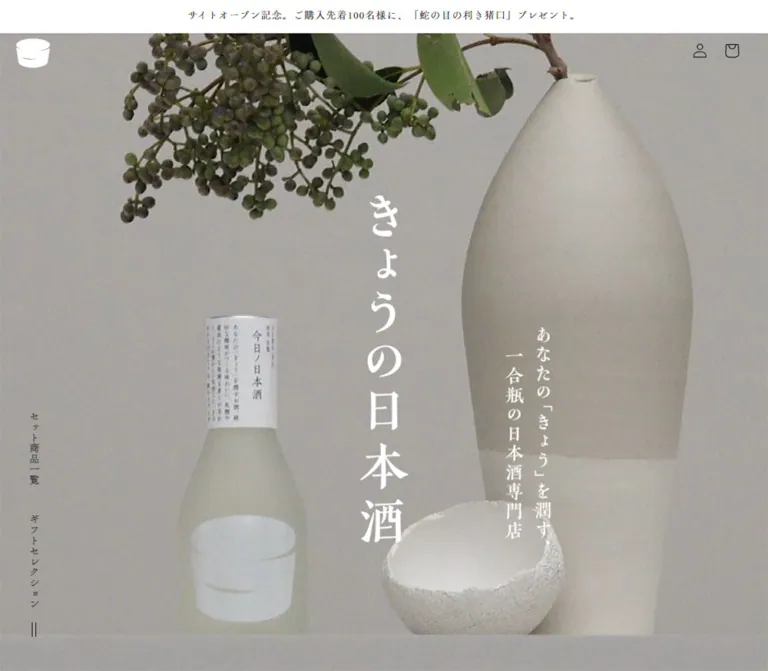
きょうの日本酒 — 一合瓶の日本酒専門店
縦書きの明朝体、静物写真、白と淡いグレー、大きな余白で構成された日本酒のECサイト。商品紹介から読み物、フッターまで和の編集感を統一。
きょうの日本酒 — Style Reference
A sake shop arranged like a quiet still life, with vertical Japanese type and the spaciousness of a printed catalog.
Website: kyouno.jp Original URL: https://kyouno.jp/ Final URL: https://kyouno.jp/ Theme: light, with white text over the opening photograph Inspected: October 2, 2026, at 00:58 JST; supplied retrieval timestamp: October 1, 2026, at 15:58:13.381 UTC Viewports: desktop 1440 × 1000 and mobile 390 × 844 CSS pixels Scope: the current store homepage: opening visual, brand introduction, regular sets, gifts, wrapping accessory, sake vessels and tools, gallery, journal, stockists and awards, news, shipping, individual sake collection, brewery map, and footer. Visual captures cover the desktop opening, merchandise section, and footer, plus the mobile opening and footer. Rendered DOM evidence covers the longer page at both sizes. Linked pages and purchase flows were not inspected.
The homepage combines commerce with editorial discovery. Small sake bottles, ceramic vessels, glass, foliage, and brass objects create a domestic atmosphere. Almost all interface color comes from white, near-black, and pale warm gray; photography supplies the olive, straw, and metallic tones. Fine serif text and long vertical Japanese columns connect the website to the bottle labels.
The composition is deliberately uneven. A narrow navigation rail occupies the desktop left edge, utility icons sit at the upper right, and section introductions often occupy a separate right-hand column. Products appear as unboxed photographs with titles and prices. Generous empty areas remain visible between these groups. The footer extends the same language through vertical navigation and a very large, pale cup motif.
閉じる
きょうの日本酒 — Style Reference
A sake shop arranged like a quiet still life, with vertical Japanese type and the spaciousness of a printed catalog.
Website: kyouno.jp Original URL: https://kyouno.jp/ Final URL: https://kyouno.jp/ Theme: light, with white text over the opening photograph Inspected: October 2, 2026, at 00:58 JST; supplied retrieval timestamp: October 1, 2026, at 15:58:13.381 UTC Viewports: desktop 1440 × 1000 and mobile 390 × 844 CSS pixels Scope: the current store homepage: opening visual, brand introduction, regular sets, gifts, wrapping accessory, sake vessels and tools, gallery, journal, stockists and awards, news, shipping, individual sake collection, brewery map, and footer. Visual captures cover the desktop opening, merchandise section, and footer, plus the mobile opening and footer. Rendered DOM evidence covers the longer page at both sizes. Linked pages and purchase flows were not inspected.
The homepage combines commerce with editorial discovery. Small sake bottles, ceramic vessels, glass, foliage, and brass objects create a domestic atmosphere. Almost all interface color comes from white, near-black, and pale warm gray; photography supplies the olive, straw, and metallic tones. Fine serif text and long vertical Japanese columns connect the website to the bottle labels.
The composition is deliberately uneven. A narrow navigation rail occupies the desktop left edge, utility icons sit at the upper right, and section introductions often occupy a separate right-hand column. Products appear as unboxed photographs with titles and prices. Generous empty areas remain visible between these groups. The footer extends the same language through vertical navigation and a very large, pale cup motif.
How to Read This Reference
- Measured means a value appears in the supplied computed styles, element rectangles, or source custom properties. Measurements use CSS pixels unless stated otherwise.
- Calculated means arithmetic based on those measurements, such as a grid width or an alpha-composited color.
- Estimated means a visual approximation from the current screenshots. Hero lettering, some artwork bounds, and decorative colors were not separately measured in the DOM.
- Recommended means an implementation choice for a new site. It is not a claim about the original implementation.
- Token names introduced here are descriptive aliases. Original variable names are identified explicitly.
- The extracted element records do not include every CSS property. Vertical text is visually evident, but its exact source
writing-modedeclaration is not included. - A declared font family establishes the requested stack, not proof that every font file successfully supplied every glyph.
Tokens — Colors
Default Palette
| Name | Value | Evidence / token | Role |
|---|---|---|---|
| White | #ffffff |
Measured body background; source --color-background: 255, 255, 255 |
Main canvas, product surroundings, reversed hero lettering |
| Ink | #121212 |
Measured body text; source --color-base-text: 18, 18, 18 |
Titles, prices, navigation, utility outlines |
| Soft Ink | rgba(18, 18, 18, 0.75) |
Measured desktop rail links and slider buttons | Quieter navigation and controls |
| Secondary Gray | #f3f3f3 |
Source --color-base-background-2 and --gradient-base-background-2 |
Available secondary surface; exact assignment to every pale section is unverified |
| Warm Mist | #e2e1dd4d |
Source --collection-bg-color |
Translucent warm neutral surface token |
| Warm Mist on White | Approximately #f6f6f5 |
Calculated from Warm Mist over white | Useful direct-color approximation for pale panels; not a sampled footer color |
| Fine Border | #0000000d |
Source --product-border-color |
Very faint separation, approximately 5.1% black |
| Muted Sand | Approximately #bdb8a5 |
Screenshot estimate | Footer social-symbol color |
| Chat Charcoal | Approximately #41413f |
Screenshot estimate; appearance varies between captures | Floating chat launcher |
The opening photography is gray and warm rather than brightly saturated. The white brand title remains distinct because it sits over quiet midtones. Product images use pale studio backgrounds, allowing their square boundaries to be visible without a surrounding card border.
The stylesheet also declares blue #334fb4 as a secondary accent. It is not established as a recurring visible accent in the supplied captures. Do not promote this unused declaration into the primary action color.
Theme Presets
Only one light visual system is evidenced. The white hero identity and gray identity over white content are contextual treatments, not evidence of a user-selectable theme switch.
Tokens — Typography
Declared Serif Stack
Measured family: adobe-garamond-pro, fot-tsukuaoldmin-pr6n, serif.
The same stack is declared on the body, product titles, section copy, navigation, and ordinary links. Its appearance combines delicate Japanese Mincho forms with traditional Latin serif numerals and lettering. Use the exact declared identifiers when the corresponding fonts are available; the evidence does not establish font-file URLs or licensing arrangements.
Measured body weight: 300.
Measured general tracking: 0.6px.
Measured body line height: 1.8.
This light weight is central to the page. Hierarchy comes primarily from size, orientation, placement, and whitespace. The source bold token is 600, while the inspected desktop rail links compute to 700; these should not be flattened into a single assumed weight.
Vertical and Horizontal Roles
Vertical Japanese appears in the hero title, hero supporting copy, desktop rail, section introductions, selected desktop set titles, collection labels, and footer navigation. Product names beneath the vessel photographs remain horizontal. Prices, journal titles, news entries, and ordinary browse links also remain horizontal.
For a new implementation, use writing-mode: vertical-rl and appropriate Japanese punctuation handling on specific text groups. Do not rotate a horizontal paragraph or apply right-to-left direction to the entire document. Keep Latin product fragments and numeric prices readable in their intended orientation.
The hero and footer wordmarks may use artwork rather than ordinary text; the supplied element records do not establish their rendering mechanism. Do not infer their exact font size from an enclosing link box.
Type Scale
| Role | Desktop | Mobile | Weight / tracking | Evidence |
|---|---|---|---|---|
| Body | 16px / 28.8px |
15px / 27px |
300, 0.6px |
Measured |
| Section introduction | 20px / 32px |
18px / 28.8px |
300, 0.6px |
Measured |
| Desktop set title | 24px / 31.2px |
Replaced by horizontal card title treatment | 300, 0.6px |
Measured |
| Product card title | 20px / 26px |
20px / 26px |
300, 0.6px |
Measured |
| Journal card title | 14px / 18.2px |
14px / 18.2px |
300, 0.6px |
Measured |
| Main browse link | 18px / 32.4px |
16px / 28.8px |
300, 0.6px |
Measured; some desktop gallery links use 16px |
| Small purchase link | 14px / 14px |
Not the same mobile component | 300, 2.24px |
Measured desktop |
| Standard commerce button | 15px / 18px |
15px / 18px in offscreen notification markup |
300, 1px |
Measured styling; notification was not opened |
| Desktop rail link | 14px / 25.2px |
Not visibly displayed | 700, 0.6px |
Measured |
| Footer primary link | 20px / 36px |
18px / 32.4px |
300, 0.6px |
Measured |
| Footer secondary link | 14px / 25.2px |
Same | 300, 0.6px |
Measured |
| Footer policy link | 10px / 18px |
Same | 300, 0.6px |
Measured |
| Hero brand lettering | Approximately 60–64px |
Approximately 36–40px |
Visual weight only | Screenshot estimate; may be artwork |
| Goods section heading | Approximately 32px |
Not directly measured | Light serif appearance | Desktop screenshot estimate |
The source HTML root is 10px, so its 120rem page-width token equals 1200px. Do not copy source rem values into a conventional 16px-root project without conversion.
Tokens — Spacing & Shapes
Density: sparse at the page level, compact within product information. Geometry: square product images and buttons, thin lines, no general card elevation.
Spacing Scale
| Use | Value | Status |
|---|---|---|
| General tracking | 0.6px |
Measured |
| Fine rules | Approximately 1px |
Visual estimate; several source control borders are explicitly 1px |
| Footer sublink detail gap | 8px |
Measured |
| Rail link padding | 12px 12px 12px 10px |
Measured |
| Mobile regular/gift grid outer inset | 15px |
Measured card positions |
| Mobile goods and journal inset | 25px |
Measured card positions |
| Mobile grid gap | 20px |
Source variables and measured horizontal positions |
| Desktop grid gap | 40px |
Source variables and measured horizontal positions |
| Image-to-title space in goods cards | Approximately 18px |
Screenshot estimate |
| Ordinary browse-link height | 40px |
Measured |
| Account/cart target | 44 × 44px |
Measured at both viewports |
| Standard commerce-button height | 47px |
Measured |
| Mobile section base padding | 75px top/bottom in several section rules |
Explicit supplied CSS fragments; not universal |
| Gallery base padding | 60px top/bottom |
Explicit supplied CSS fragment |
| Desktop rail width | 92px |
Measured |
| Chat edge offset | 20px |
Source variable and visible placement |
There is no verified universal eight-point spacing system. The repeated 20px and 40px gaps coexist with 15px and 25px insets, large section-specific spaces, and asymmetric compositions.
Border Radius
| Element | Value | Status |
|---|---|---|
| Product, collection, and blog cards | 0 |
Source tokens |
| Media | 0 |
Source --media-radius |
| Buttons and inputs | 0 |
Source tokens |
| Chat launcher | Approximately 18–20px on a 50px square |
Screenshot estimate |
| Badge radius | 4rem, equivalent to 40px |
Declared token; exact visible badge shape not established |
The rounded chat launcher is an exception to the store's square geometry. It should not become the model for every card or action.
Layout Measurements
| Element | Desktop 1440 × 1000 | Mobile 390 × 844 | Evidence |
|---|---|---|---|
| Opening section | 1440 × 1000px |
390 × 844px |
Measured |
| Document height | About 10860.4px |
About 12552.2px |
Measured at retrieval |
| Source page-width token | 1200px |
Same declared token; actual layout adapts | Calculated from 120rem and 10px root |
| Main desktop content span | x = 212–1228, width 1016px |
Varies by section | Measured endpoints |
| Goods image/grid region | 742px wide |
340px wide |
Desktop calculated from card bounds; mobile measured endpoints |
| Goods card width | 155.5px |
160px |
Measured title boxes; desktop images visually square at the same width |
| Goods columns | Four, then a fifth item at the right of the next row | Two, with the fifth item at the right of the third row | Screenshot and DOM positions |
| Regular/gift mobile card width | Not a direct desktop equivalent | 170px |
Measured |
| Journal card width | 220.64px |
150px |
Measured |
| Journal card horizontal step | 260.64px |
170px |
Calculated; includes 40px / 20px gap |
| Slider button | 36 × 36px |
36 × 36px |
Measured |
| Footer pale panel | Approximately 1200 × 560px |
Approximately 390 × 756px |
Screenshot estimate |
| Footer brand artwork/link height | 280px |
240px |
Measured link extent, not font size |
The desktop goods width follows 4 × 155.5 + 3 × 40 = 742px. On mobile it follows 2 × 160 + 20 = 340px, with 25px at each side. These relationships are more useful than imposing a generic full-width four-column catalog.
Components
Persistent Edge Navigation
Role: maintain shopping access while leaving the photography and page compositions open.
On desktop, the header is a transparent, 92px-wide strip occupying the left side of the viewport. Its measured padding is 56px 0 120px. A small cup silhouette appears near the upper left; the two vertical links, 商品一覧 and ギフトセット, sit much lower in the rail. Each has its own padded interaction area.
At the upper right, account and bag outlines sit inside adjacent 44px-square links. Their measured desktop positions are (1324, 48) and (1368, 48). On mobile they move to (299, 16) and (343, 16), retaining their target dimensions.
The cup symbol is white over the opening photograph and pale gray over the white content captures. The mechanism that changes its appearance is not supplied. The same edge controls remain visible in the footer screenshots, supporting viewport-persistent placement.
The mobile capture retains the cup and utility icons but does not show the desktop shopping rail. Do not reproduce the extracted mobile header wrapper's 1px width as an intended visible header dimension; it does not describe the whole mobile navigation presentation.
Opening Still Life
Role: establish the brand's scale, materials, and mood before the product catalog.
The opening section occupies one full inspected viewport. The desktop scene combines a translucent sake bottle on the left, a brass mobile extending through the upper right, a glass base, and a light vessel. The mobile scene uses a bottle, leafy branch, large vase, and bowl. Both use a restrained gray setting and soft material contrast.
The vertical brand name, きょうの日本酒, is centered around the viewport's horizontal midpoint. Supporting vertical copy sits to its right and begins lower. The current desktop title occupies roughly the middle half of the viewport height; the mobile title occupies roughly the central third.
The quiet lower area is part of the opening composition. In the supplied scenes, a tabletop or tonal boundary occurs around y = 858 on desktop and y = 642 on mobile. It is not the end of the hero section.
A small two-stroke, pause-shaped mark appears near the lower left. Its behavior, accessible name, media type, and relationship to the different scenes are unverified. Do not infer a timed carousel or video from still captures alone.
Brand Introduction
Role: explain the one-serving bottle concept before shopping categories.
The rendered copy describes a selection discovered across Japan and delivered in an appropriate quantity. It is followed by a quiet text link to the brand page and a section about scenes featuring the product.
The desktop introduction section is approximately 890px tall, while mobile is approximately 716px tall. The brand link uses an 18px desktop or 16px mobile serif treatment in a 40px-high box. This is an editorial transition with substantial breathing room, rather than a compact promotional banner.
Its complete imagery and arrangement are not shown in the supplied screenshots; avoid inventing an exact image montage from the DOM text.
Vertical Section Introduction
Role: give a merchandise group an editorial heading and short explanation.
The goods capture shows a thin vertical rule above a vertical section title on the far right. Short vertical body columns sit to its left. The products occupy a separate, larger region on the left. At desktop size, the measured goods introduction is 96px wide, with 20px / 32px type.
The heading does not sit across the top of every card. It forms its own quiet column, allowing empty space below and beside it. A browse link appears near the section's lower right.
Mobile introduction copy retains vertical composition and changes to 18px / 28.8px. For the goods section, its measured width is approximately 86.4px. The product grid begins below this introduction area, rather than compressing four columns beside it.
Regular Set Presentation
Role: introduce three ways to choose sake.
The desktop DOM contains three numbered entries, with short vertical titles, descriptive copy, shipping/status text, price information, and small 購入はこちら links. Title links use 24px / 31.2px; the purchase links use compact 14px text with 2.24px tracking.
The mobile structure changes substantially. It presents horizontal 20px product titles in 170px-wide cards, with separate price and availability information. The first item appears in the right column and the second in the left; the third begins the next row on the right. Two items carry 売り切れ text in the supplied mobile record.
Do not shrink the desktop narrative layout until it fits a phone. Preserve the distinction between desktop storytelling and mobile product selection.
Gift Set Presentation
Role: organize gifts around their recipient and drinking occasion.
Desktop groups the offer into three concepts. Each concept combines a short title, explanatory copy, shipping information, and both three-bottle and six-bottle prices. The measured title positions indicate a staggered arrangement, not a single uniform row.
Mobile exposes six distinct cards with variant-specific URLs. For each concept, the six-bottle variant appears on the left and the three-bottle variant on the right. Cards measure 170px wide with a 20px gap.
This ordering differs from the right-first goods grid. Use section-specific placement rules rather than globally reversing every product list. Variant links should preserve the selected quantity.
Goods Product Card
Role: browse vessels, candles, and small drinking accessories.
The visible anatomy is simple:
- A square, pale studio photograph with no rounded corners.
- A horizontal serif product name,
20px / 26px, aligned left. - A smaller price on its own line, with generous separation from neighboring cards.
There is no enclosing colored panel, visible card shadow, rating row, or large filled action. The linked product name is directly evidenced; whole-card click behavior was not tested.
On desktop, the first DOM item, 木村硝子店 ピッコロ 10oz, sits at the right of the four-column image region. The next items proceed leftward. The fifth product, 蛇の目の利き猪口, begins the second row at the right. Unequal title lengths produce two- and three-line names without forcing every title to the same visible height.
The pale image ground is an important part of the asset, not necessarily a CSS card fill. Preserve the complete object and its surrounding air.
Wrapping Accessory
Role: offer a small companion purchase alongside descriptive copy.
The desktop record includes an image/product information area for おすそわけ袋, a 20px title, price, and a white rectangular add-to-cart control. The control is approximately 220.64 × 47px, with 15px text, 1px tracking, and an explicit box-shadow 0.1s transition.
The corresponding mobile record retains the product link and price but does not include that visible add-to-cart button. The extracted desktop button contains both normal and sold-out wording in its node text; this does not prove both labels are simultaneously visible.
Browse Link
Role: connect a curated section to its larger collection.
Examples include 商品一覧を見る, ギフトセットを見る, and すべて見る. The goods screenshot shows a thin baseline and a small right arrow, with a darker short line beneath the arrow segment. The link is visually restrained and aligned near the right edge of its section.
The measured desktop goods link is approximately 170.2 × 40px; mobile is 156.2 × 40px. Use content-dependent width rather than forcing every browse link into one button size.
Gallery and Journal
Role: connect the store to objects, people, music, and everyday drinking scenes.
The gallery has three image links, a short description, and a browse link. Its image-link positions differ between desktop and mobile, supporting a composed group rather than a uniform product grid. Exact image crops are not supplied.
The journal uses a horizontal sequence of article cards. Desktop title boxes are approximately 220.64px wide with 40px between cards. Mobile uses 150px titles with a 20px gap. Cards continue beyond the viewport at both sizes. Two 36px-square buttons appear below the track, and a separate browse link leads to the journal category.
Article titles stay at 14px / 18.2px on both viewports. Longer text therefore wraps into more lines on mobile. Article dates are present in the rendered text. Slider advancement, swipe handling, snapping, and hover states were not exercised.
Stockists, News, and Shipping
Role: provide practical context without changing the editorial voice.
The stockist/award section groups stores, hotels, temporary appearances, and awards. News uses dated links rather than large promotional cards. On desktop, the news links occupy a roughly 622.5px-wide area beginning near x = 605; social links sit separately near x = 212. On mobile, the news rows occupy 340px between 25px margins, and social links move below them.
News rows use the body scale and retain roughly 24px of vertical space between measured link boxes. Long mobile headlines wrap naturally to two lines.
Shipping content explains delivery conditions and the free-shipping threshold. Treat prices and thresholds as managed content. The supplied values are a snapshot, not permanent design tokens.
Individual Sake Collection and Map
Role: expose the breadth of the selection and its regional origins.
The collection is another horizontal sequence, with vertically composed labels combining prefecture/brewery, sake name, and specification. The measured link height is 208px on both viewports. Typical text-box width changes from approximately 85px to 78px; these are label bounds, not the full card width.
A pale map with brewery marks appears before the footer in the desktop capture. Its visible region is approximately 742px wide, matching the goods image region. A linked map document is present in the DOM, but its contents were not opened.
Footer
Role: close the page with a complete navigation index and a large expression of the cup identity.
The desktop footer is a pale inset panel, approximately 1200px wide, with a huge white cup shape occupying much of its left side. A black vertical brand wordmark anchors the right. Navigation groups progress leftward: shopping, collection/about links, secondary information, policies, and social symbols. Much of the vertical text shares a lower alignment, producing varied column lengths above it.
The hierarchy is measured: 20px primary links, 14px secondary links, and 10px policy links. Fine vertical strokes extend beneath several subordinate links. Social symbols form a small horizontal group in muted sand. The copyright is vertical on the left side of the desktop composition.
On mobile, the footer spans the viewport. The wordmark stays at the upper right, the main navigation forms the first group, and support/policy links form a second group below. Social symbols sit near the lower left; the copyright moves to a vertical position near the right edge. The oversized cup remains visible behind the upper navigation.
A horizontal alcohol-age notice sits below the pale panel. In the mobile capture, persistent corner controls crowd this bottom area. Preserve the content but improve clearance in a new implementation.
Floating Chat Launcher
Role: persistent support access.
The current captures show a dark, approximately 50px-square launcher with rounded corners and a small outlined speech-bubble symbol. It sits 20px from the right and bottom edges on both viewports. A slight shadow is visible.
The source exposes chat-related custom properties, including a 768px breakpoint and a 20px activator offset. The chat panel itself was not opened. Do not extrapolate its typography, form fields, or conversation behavior from the launcher.
Tokens — Motion & Interaction
| Treatment | Evidence | Practical interpretation |
|---|---|---|
| Default duration | Source --duration-default: .2s |
Available timing token; no specific hero transition established |
| Long duration | Source --duration-long: .5s |
Available timing token; assignment to visible effects unverified |
| Commerce-button transition | Computed box-shadow 0.1s |
Directly evidenced transition declaration; hover result not captured |
| General element transitions | Many records report all without a meaningful duration |
Insufficient to claim active animation |
| Sampled node animation | Records report none |
Applies to sampled elements only; does not rule out media or animation elsewhere |
| Hero scenes | Different still-life scenes appear in desktop and mobile captures | Could reflect media state or responsive art direction; mechanism unknown |
| Pause-shaped mark | Visible at the lower left in opening and footer captures | Apparent media affordance; action not verified |
| Horizontal tracks | Offscreen cards and paired buttons in the DOM | Track structure evidenced; advancement and gesture behavior unverified |
| Persistent chrome | Same corner controls visible at separated scroll positions | Persistent visual placement supported; exact positioning implementation not captured |
| Cart notification | Offscreen title and checkout controls in the DOM | Existing markup, not an observed open state or successful cart action |
The capture process waited for document loading, visible image decoding, and sampled stability. It temporarily paused perpetual animations during readiness checks and resumed them afterward. This supports analysis of the captured compositions, but does not establish animation timing, complete delayed content, or interaction semantics.
Recommended motion: keep any added feedback quiet and brief. A 200ms opacity or underline transition fits the declared default duration. If implementing moving hero media, provide a working pause control and reduced-motion alternative. Neither recommendation should be described as verified original behavior.
Surfaces
| Layer | Appearance | Function |
|---|---|---|
| Main page | White | Leaves typography and photography visually independent |
| Hero | Full-viewport muted photograph | Establishes material atmosphere and identity |
| Product image ground | Pale gray or warm neutral within each photograph | Separates objects without card decoration |
| Editorial section | Pale neutral visible at the gallery boundary | Marks a change in content rhythm |
| Footer | Very light warm neutral with oversized white cup artwork | Creates a quiet, recognizable closing composition |
| Browse action | Transparent with fine rule and arrow | Keeps navigation legible without a large fill |
| Commerce control | Square white outline or near-black fill, depending on context | Functional purchase hierarchy |
| Chat | Dark rounded square with slight shadow | Deliberate exception for persistent support |
Product, collection, and blog card shadow tokens are zero or disabled. Nonzero shadow blur and offset variables do not establish visible shadows when opacity is zero. Avoid importing a generic elevation system.
Imagery
The defining imagery is tactile still-life photography. Translucent glass, matte white ceramics, thin metal rods, brass discs, soft foliage, and lightly colored sake are placed against quiet neutral backgrounds. Lighting is diffuse, with modest contrast and visible texture. The photographs feel observed rather than polished into glossy advertising renders.
The desktop hero allows the brass mobile to crop beyond the upper and right edges. The mobile hero gives the foliage and vase a different prominence while keeping the bottle and bowl visible. Preserve a clear central lane for the vertical title and another quieter lane for the smaller copy.
Product packshots use square frames, consistent pale backgrounds, and ample object clearance. Candles provide a restrained yellow note; the tasting cup introduces a small blue detail. These colors belong to the products, not an expanded interface palette.
Observed Asset References
The supplied evidence does not include verified image-file URLs for the following assets. Descriptions identify their visible roles; they are not invented filenames.
| Asset | Current evidence | Implementation guidance |
|---|---|---|
| Cup silhouette | Desktop/mobile upper-left identity | Use a clean silhouette or authorized original artwork; preserve small-scale legibility |
| Desktop opening still life | Bottle, brass mobile, glass base, light vessel | Keep broad neutral areas and natural cropping |
| Mobile opening still life | Bottle, foliage, large vase, bowl | Use an independently composed crop where required |
| Hero vertical title and copy | White lettering over both opening scenes | Preserve contrast and position; confirm whether supplied assets already contain lettering |
| Five goods photographs | Glass, two candle products, gold leaf, tasting cup | Retain square boundaries and complete product silhouettes |
| Brewery map | Pale map and brewery marks above the footer | Preserve legibility and provide an accessible destination label |
| Footer cup motif | Oversized white shape on a pale panel | Treat as decoration and keep it out of the accessibility tree |
| Footer wordmark | Black vertical brand identity | Preserve aspect ratio; measured link heights are 280px and 240px |
No photographer, illustrator, or website production credit is established by the inspected original-page evidence.
Layout & Responsive Behavior
Desktop Composition
At 1440px, the visible merchandise/content alignment runs from x = 212 to x = 1228. This is a 1016px span centered in the viewport. The footer panel is wider, approximately 1200px, while the hero fills the whole viewport. Keep these three widths distinct.
The goods section divides its content into a 742px image grid on the left and a separate introduction area on the right. The large empty lower-left region is a consequence of five products arranged across four columns. Do not fill it with unnecessary content or stretch the fifth product across the row.
Journal and sake-collection tracks extend horizontally beyond the visible frame. The main document still scrolls vertically; horizontal overflow belongs to these components, not to the whole page.
Mobile Composition
At 390px, the hero remains 844px tall. The desktop shopping rail disappears, while account/cart targets retain their 44px size. The logo remains near the upper-left corner.
Product sections use two columns. Regular and gift cards occupy a 360px-wide region with 15px outside margins. Goods use a 340px-wide region with 25px margins. The 20px gap remains consistent, producing 170px and 160px cards respectively.
Vertical section introductions survive the narrower viewport. Desktop narrative set presentations become simpler product cards; gift concepts expand into separate quantity variants. Journal cards narrow to 150px and continue horizontally. The footer wraps its navigation groups into two levels without abandoning vertical Japanese text.
Measured Section Heights
These values describe the captured content, not fixed-height requirements for implementation.
| Section | Desktop | Mobile |
|---|---|---|
| Brand introduction | 890.3px |
715.8px |
| Regular sets | 1227.6px |
996.4px |
| Gift sets | 1234.4px |
1349.7px |
| Goods | 899px |
1360.7px |
| Gallery | 521.1px |
671.2px |
| Journal | 670.8px |
753.5px |
| Shipping | 809.6px |
1083px |
| Individual collection and map region | 909px |
1353.8px |
Some supplied section-style fragments contain a min-width: 750px query. The chat component separately declares 768px. The complete responsive rules are not supplied, so neither value should be asserted as the single global breakpoint.
Tablet, landscape-phone, zoomed, and intermediate-width layouts were not captured. New implementations should test them explicitly, particularly the vertical footer and the narrow product titles.
Do’s and Don’ts
Do
- Build the page around white, near-black, and very pale warm neutral surfaces.
- Preserve the light serif stack, measured tracking, and generous line height.
- Use vertical Japanese deliberately for identity, introductions, and footer navigation.
- Keep ordinary product titles and prices horizontal.
- Retain distinct widths for the full-bleed hero, main content, image grid, and footer.
- Give objects room inside their photographs and give photographs room on the page.
- Preserve section-specific product ordering, including mobile gift quantity pairs.
- Use thin rules and small arrows for browse links.
- Keep desktop narrative presentations and mobile product cards as distinct compositions.
- Carry the cup motif through the small logo and the oversized footer decoration.
- Separate directly measured values from visual estimates and proposed behavior.
Don’t
- Do not turn every section into an identical centered heading and rounded-card grid.
- Do not make the entire page right-to-left to obtain one reversed product row.
- Do not replace vertical typography with rotated horizontal text.
- Do not inflate prices, badges, or purchase links into the dominant visual feature.
- Do not introduce glossy gradients, strong card shadows, or unrelated accent colors.
- Do not crop vessels or bottles tightly enough to lose their silhouette and surrounding air.
- Do not assume that every offscreen DOM control was visibly open or tested.
- Do not invent hero playback timing, parallax, fade behavior, or slider gestures.
- Do not use an inherited badge or blue-accent token as evidence of a dominant visible style.
- Do not preserve tiny policy text or corner-control overlap without considering readability.
Recommended Implementation Additions
These are recommendations for a new implementation, not verified features of the original site:
- Retain the evidenced skip-link concept and ensure that it becomes clearly visible on keyboard focus.
- Give the cup/home link, account, cart, slider controls, map link, and chat launcher explicit accessible names.
- Maintain at least 44px interaction targets for icon controls; the original slider buttons measure 36px and can be expanded without enlarging their symbols.
- Use semantic headings and lists underneath the visual vertical composition. Keep keyboard order consistent with the intended reading sequence.
- Increase policy text above the observed 10px where possible, especially on phones.
- Reserve space around floating chat and media controls so that the alcohol-age notice and footer links remain unobstructed.
- Make availability and selected gift quantity available as text, not only as visual styling.
- If the hero uses motion, provide a working pause state, reduced-motion fallback, and stable text placement.
- Supply appropriate mobile image compositions and explicit image dimensions to prevent layout shifts.
- Verify font loading, fallback line breaks, vertical punctuation, and mixed Japanese/Latin product names before fixing component heights.
Agent Prompt Guide
Quick Color Reference
- Main canvas:
#ffffff. - Main ink:
#121212. - Quiet controls:
rgba(18, 18, 18, 0.75). - Available secondary surface:
#f3f3f3. - Warm translucent surface:
#e2e1dd4d; approximately#f6f6f5over white. - Footer social symbols: muted sand, approximately
#bdb8a5, estimated. - Hero lettering: white over a muted photographic midtone.
- Primary browse treatment: text, fine rule, and arrow.
Overall Prompt
“Create a Japanese sake storefront with the quiet editorial character of きょうの日本酒. Use a white canvas, near-black ink, very pale warm gray panels, and light Japanese Mincho/Latin serif typography. Open with a full-viewport still-life photograph featuring a small sake bottle, ceramics, glass, and restrained natural materials. Center a vertical Japanese brand title and place smaller vertical copy to its right. On desktop, keep a narrow left navigation rail and account/cart icons at the upper right. Arrange unboxed square product photographs beside right-aligned vertical section introductions. Use generous whitespace, horizontal product names and prices, and fine-rule browse links. On mobile, use two product columns and preserve vertical introductions. Finish with vertical navigation over an oversized pale cup motif. Treat motion as an explicit implementation decision because its original behavior is not established.”
Example Component Prompts
- Goods section: “Build a white merchandise section with a 742px image region at a 1440px viewport. Place four 155.5px square packshots with 40px gaps, starting from the right; the fifth item begins the next row on the right. Add 20px light serif titles and small prices beneath. Put a vertical title, short vertical copy, and a fine rule in a separate right column.”
- Mobile gift selection: “Create a two-column gift grid with 15px outer margins and a 20px gap at 390px. Each card is 170px wide. Pair the six-bottle variant on the left with the three-bottle variant on the right. Use horizontal 20px serif names, separate prices, square images, and variant-specific links.”
- Opening visual: “Compose a muted still life with a small translucent sake bottle, white ceramic vessel, foliage or brass, and a quiet gray background. Leave a central vertical lane for white Japanese branding and a smaller lane to the right for supporting copy. Maintain a full-viewport composition with a calm lower area.”
- Footer: “Create a pale warm-gray footer with a huge white cup silhouette, a black vertical brand wordmark at the right, and groups of vertical Japanese links aligned toward a shared lower edge. Use 20px, 14px, and smaller policy tiers on desktop. On mobile, wrap groups into two levels while keeping the brand at the upper right and social symbols near the lower left.”
- Browse link: “Use an unfilled serif text link in a 40px-high area with a fine baseline and a small right arrow. Give the arrow segment a darker short underline. Keep width dependent on the label and avoid a large rounded button.”
Quick Start
CSS Custom Properties
This is a reusable adaptation, not recovered source CSS. It preserves measured endpoint dimensions where practical and keeps a conventional root font size. Hero type sizes, decorative colors, and feedback are explicitly approximations or recommendations. Supply image assets separately; no asset filenames below are claimed to come from the original site.
The merchandise structure is .collection-section > .collection-head + .product-grid + .collection-more. Give only right-first grids data-flow='right'. Mobile gift pairs should retain normal left-to-right placement.
The 1100px composition breakpoint below is a recommended fit safeguard. It is not a recovered source breakpoint. The original evidence exposes 750px queries only for some section styles.
:root {
  /* Measured colors and declared source palette */
  --kyou-paper: #ffffff;
  --kyou-ink: #121212;
  --kyou-ink-soft: rgba(18, 18, 18, 0.75);
  --kyou-gray: #f3f3f3;
  --kyou-mist: #e2e1dd4d;
  --kyou-hairline: #0000000d;

  /* Screenshot approximations */
  --kyou-sand: #bdb8a5;
  --kyou-chat: #41413f;

  /* Measured declared family; font files must be supplied separately */
  --kyou-serif: adobe-garamond-pro, fot-tsukuaoldmin-pr6n, serif;
  --kyou-weight: 300;
  --kyou-tracking: 0.6px;
  --kyou-body: 15px;
  --kyou-intro: 18px;
  --kyou-product: 20px;
  --kyou-journal: 14px;
  --kyou-link: 16px;

  /* Converted source dimensions and measured endpoint geometry */
  --kyou-page: 1200px;
  --kyou-content: 1016px;
  --kyou-rail: 92px;
  --kyou-gap: 20px;
  --kyou-inset: 25px;
  --kyou-section-space: 75px;
  --kyou-target: 44px;

  /* Source duration token, used here for recommended feedback */
  --kyou-feedback: 200ms;
}

* {
  box-sizing: border-box;
}

body {
  margin: 0;
  color: var(--kyou-ink);
  background: var(--kyou-paper);
  font-family: var(--kyou-serif);
  font-size: var(--kyou-body);
  font-weight: var(--kyou-weight);
  line-height: 1.8;
  letter-spacing: var(--kyou-tracking);
}

button,
input,
select {
  font: inherit;
}

a {
  color: inherit;
}

img {
  display: block;
  max-width: 100%;
}

.vertical-copy {
  writing-mode: vertical-rl;
  text-orientation: mixed;
}

.content-frame {
  width: calc(100% - 2 * var(--kyou-inset));
  max-width: var(--kyou-content);
  margin-inline: auto;
}

/* The application chooses the identity color for the current surface. */
.site-logo {
  position: fixed;
  z-index: 30;
  top: 16px;
  left: 15px;
  width: 46px;
  min-height: var(--kyou-target);
  color: #e2e1dd;
}

.site-logo[data-surface='hero'] {
  color: white;
}

.site-logo svg {
  display: block;
  width: 100%;
  fill: currentColor;
}

.utility-nav {
  position: fixed;
  z-index: 30;
  top: 16px;
  right: 3px;
  display: flex;
}

.icon-link {
  display: grid;
  place-items: center;
  width: var(--kyou-target);
  height: var(--kyou-target);
  text-decoration: none;
}

.icon-link svg {
  width: 20px;
  height: 20px;
  fill: none;
  stroke: currentColor;
  stroke-width: 1;
}

.side-nav {
  display: none;
}

/* Hero dimensions are observed; text sizes and crop positions are estimates. */
.hero {
  position: relative;
  height: 100vh;
  height: 100svh;
  overflow: hidden;
  background: #b8b6b0;
}

.hero picture,
.hero-media {
  position: absolute;
  inset: 0;
  width: 100%;
  height: 100%;
}

.hero-media {
  object-fit: cover;
  object-position: center;
}

.hero-title {
  position: absolute;
  top: 50%;
  left: 50%;
  margin: 0;
  transform: translate(-50%, -50%);
  writing-mode: vertical-rl;
  color: white;
  font-size: 36px;
  font-weight: 400;
  line-height: 1.15;
  letter-spacing: 0.1em;
  white-space: nowrap;
}

.hero-copy {
  position: absolute;
  top: 43%;
  left: calc(50% + 88px);
  margin: 0;
  writing-mode: vertical-rl;
  color: white;
  font-size: 16px;
  line-height: 1.6;
}

/* Mobile merchandise: 340px content width at a 390px viewport. */
.collection-section {
  display: grid;
  gap: 40px;
  padding-block: var(--kyou-section-space);
}

.collection-head {
  display: flex;
  flex-direction: row-reverse;
  align-items: flex-start;
  justify-self: end;
  gap: 24px;
}

.collection-title {
  margin: 0;
  writing-mode: vertical-rl;
  font-size: 28px;
  font-weight: 300;
  line-height: 1.2;
}

.collection-title::before {
  content: '';
  display: block;
  width: 1px;
  height: 72px;
  margin: 0 auto 24px;
  background: currentColor;
}

.collection-intro {
  margin: 0;
  writing-mode: vertical-rl;
  font-size: var(--kyou-intro);
  line-height: 1.6;
}

.product-grid {
  display: grid;
  grid-template-columns: repeat(2, minmax(0, 1fr));
  gap: 40px var(--kyou-gap);
  margin: 0;
  padding: 0;
  list-style: none;
}

.product-grid[data-flow='right'] {
  direction: rtl;
}

.product-grid > li {
  min-width: 0;
  direction: ltr;
}

.product-card {
  color: inherit;
  text-decoration: none;
}

.product-image {
  width: 100%;
  aspect-ratio: 1;
  object-fit: contain;
  border-radius: 0;
}

.product-title {
  margin: 18px 0 8px;
  font-size: var(--kyou-product);
  font-weight: 300;
  line-height: 1.3;
  overflow-wrap: anywhere;
}

.product-price {
  margin: 0;
  font-size: 16px;
  line-height: 1.8;
}

.collection-more {
  justify-self: end;
}

.browse-link {
  display: inline-flex;
  align-items: center;
  justify-content: space-between;
  gap: 12px;
  min-height: 40px;
  border-bottom: 1px solid var(--kyou-hairline);
  font-size: var(--kyou-link);
  text-decoration: none;
}

.browse-link__arrow {
  display: grid;
  place-items: center;
  align-self: stretch;
  width: 32px;
  border-bottom: 1px solid currentColor;
}

.commerce-button {
  display: inline-flex;
  align-items: center;
  justify-content: center;
  min-height: 47px;
  padding: 8px 30px;
  border: 1px solid var(--kyou-ink);
  border-radius: 0;
  color: var(--kyou-ink);
  background: white;
  font-size: 15px;
  line-height: 18px;
  letter-spacing: 1px;
}

/* A scrollable adaptation; original gesture and snap behavior are unverified. */
.journal-track {
  display: grid;
  grid-auto-flow: column;
  grid-auto-columns: 150px;
  gap: 20px;
  max-width: 100%;
  overflow-x: auto;
  padding-block: 4px 16px;
}

.journal-title {
  margin: 16px 0 8px;
  font-size: 14px;
  font-weight: 300;
  line-height: 1.3;
}

/* Footer groups keep vertical text while wrapping at narrow widths. */
.footer-panel {
  position: relative;
  isolation: isolate;
  display: grid;
  grid-template-columns: minmax(0, 1fr) 40px;
  gap: 72px 32px;
  padding: 60px 15px 64px;
  background: var(--kyou-mist);
}

.footer-art {
  position: absolute;
  z-index: -1;
  inset: 0;
  overflow: hidden;
  pointer-events: none;
}

.footer-art img {
  position: absolute;
  top: -20px;
  left: -390px;
  width: 800px;
  max-width: none;
}

.footer-brand {
  grid-column: 2;
  grid-row: 1;
  width: 40px;
  height: 240px;
  object-fit: contain;
}

.footer-main,
.footer-secondary {
  grid-column: 1;
  display: flex;
  flex-direction: row-reverse;
  align-items: flex-end;
  gap: 24px;
}

.footer-main {
  grid-row: 1;
  padding-top: 70px;
}

.footer-secondary {
  justify-content: flex-end;
}

.footer-group {
  display: flex;
  flex-direction: row-reverse;
  align-items: flex-end;
}

.footer-group a {
  writing-mode: vertical-rl;
  font-size: 18px;
  line-height: 1.8;
  text-decoration: none;
}

.footer-group--secondary a {
  font-size: 14px;
}

/* Readability recommendation: larger than the observed 10px policy text. */
.footer-group--legal a {
  font-size: 12px;
}

.footer-social {
  grid-column: 1;
  display: flex;
  gap: 16px;
  color: var(--kyou-sand);
}

.footer-copyright {
  grid-column: 2;
  grid-row: 2 / 4;
  align-self: end;
  margin: 0;
  writing-mode: vertical-rl;
  font-size: 10px;
}

.age-notice {
  max-width: var(--kyou-page);
  margin: 12px auto 0;
  padding: 0 15px 80px;
  font-size: 14px;
}

.chat-launcher {
  position: fixed;
  z-index: 40;
  right: 20px;
  bottom: calc(20px + env(safe-area-inset-bottom, 0px));
  display: grid;
  place-items: center;
  width: 50px;
  height: 50px;
  border: 0;
  border-radius: 20px;
  color: white;
  background: var(--kyou-chat);
  box-shadow: 0 2px 4px rgb(0 0 0 / 12%);
}

/* Recommended keyboard and hover feedback. */
:where(a, button, input, select):focus-visible {
  outline: 2px solid currentColor;
  outline-offset: 4px;
}

@media (hover: hover) {
  .browse-link,
  .product-card {
    transition: opacity var(--kyou-feedback) ease;
  }

  .browse-link:hover,
  .product-card:hover {
    opacity: 0.72;
  }
}

@media (min-width: 750px) {
  :root {
    --kyou-body: 16px;
    --kyou-intro: 20px;
    --kyou-link: 18px;
  }
}

/* Recommended breakpoint for the full desktop merchandise composition. */
@media (min-width: 1100px) {
  :root {
    --kyou-gap: 40px;
    --kyou-section-space: 112px;
  }

  .content-frame {
    width: calc(100% - 224px);
  }

  .site-logo {
    top: 56px;
    left: 23px;
  }

  .utility-nav {
    top: 48px;
    right: 28px;
  }

  .side-nav {
    position: fixed;
    z-index: 25;
    inset: 0 auto 0 0;
    display: flex;
    flex-direction: column;
    align-items: center;
    justify-content: flex-end;
    gap: 16px;
    width: var(--kyou-rail);
    padding: 56px 0 120px;
    pointer-events: none;
  }

  .side-nav a {
    padding: 12px 12px 12px 10px;
    writing-mode: vertical-rl;
    color: var(--kyou-ink-soft);
    font-size: 14px;
    font-weight: 700;
    text-decoration: none;
    pointer-events: auto;
  }

  .hero-title {
    font-size: 60px;
    letter-spacing: 0.12em;
  }

  .hero-copy {
    top: 44%;
    left: calc(50% + 160px);
    font-size: 22px;
  }

  .collection-section {
    grid-template-columns: minmax(0, 1fr) 194px;
    column-gap: 80px;
  }

  .collection-head {
    grid-column: 2;
    grid-row: 1;
    gap: 28px;
  }

  .collection-title {
    font-size: 32px;
  }

  .collection-title::before {
    height: 100px;
  }

  .product-grid {
    grid-column: 1;
    grid-row: 1;
    grid-template-columns: repeat(4, minmax(0, 1fr));
    row-gap: 60px;
  }

  .collection-more {
    grid-column: 2;
  }

  .journal-track {
    grid-auto-columns: 220.64px;
    gap: 40px;
  }
}

/* Recommended separate threshold for the wide footer arrangement. */
@media (min-width: 1200px) {
  .footer-panel {
    display: flex;
    align-items: flex-end;
    justify-content: flex-end;
    gap: 56px;
    width: calc(100% - 80px);
    max-width: var(--kyou-page);
    margin-inline: auto;
    padding: 150px 92px 130px;
  }

  .footer-art img {
    top: auto;
    bottom: 0;
    left: -110px;
    width: 940px;
  }

  .footer-brand {
    order: 4;
    flex: 0 0 40px;
    height: 280px;
  }

  .footer-main {
    order: 3;
    gap: 56px;
    padding-top: 0;
  }

  .footer-secondary {
    order: 2;
    gap: 56px;
  }

  .footer-social {
    order: 1;
  }

  .footer-group a {
    font-size: 20px;
  }

  .footer-group--secondary a {
    font-size: 14px;
  }

  .footer-group--legal a {
    font-size: 12px;
  }

  .footer-copyright {
    position: absolute;
    left: 92px;
    bottom: 130px;
  }
}

@media (prefers-reduced-motion: reduce) {
  .browse-link,
  .product-card {
    transition: none;
  }
}
Use real links for destinations and buttons for state changes. The CSS does not implement cart updates, chat, hero playback, or slider controls. Those behaviors require explicit application logic and verification.
Tailwind v4 Token Mapping
Optional aliases for a project already using Tailwind v4. This is not evidence that the original site uses Tailwind. Define the custom properties above first.
@theme inline {
  --color-paper: var(--kyou-paper);
  --color-ink: var(--kyou-ink);
  --color-ink-soft: var(--kyou-ink-soft);
  --color-mist: var(--kyou-mist);
  --color-hairline: var(--kyou-hairline);
  --color-sand: var(--kyou-sand);

  --font-editorial: var(--kyou-serif);

  --text-body: var(--kyou-body);
  --text-intro: var(--kyou-intro);
  --text-product: var(--kyou-product);
  --text-journal: var(--kyou-journal);
  --text-browse: var(--kyou-link);

  --spacing-gutter: var(--kyou-gap);
  --spacing-inset: var(--kyou-inset);
  --spacing-rail: var(--kyou-rail);
  --spacing-target: var(--kyou-target);

  --radius-card: 0px;
  --radius-chat: 20px;
}
Sources & Evidence
- Inspected original and final website: https://kyouno.jp/. The supplied browser record reports HTTP 200 and the same original/final URL.
- Capture time: October 1, 2026, 15:58:13.381 UTC, corresponding to October 2, 2026, 00:58:13.381 JST.
- Desktop evidence: 1440 × 1000 CSS pixels; opening, goods-section, and footer screenshots; rendered text, links, element rectangles, and computed styles across the homepage.
- Mobile evidence: 390 × 844 CSS pixels; opening and footer screenshots; rendered text, links, element rectangles, and computed styles across the homepage.
- Direct operator evidence: the original page footer displays
© 2022 きょうの日本酒株式会社. The copyright year is page content, not the inspection date. - Interaction scope: supplied loading and scrolling observations only. Links, sliders, cart, account, chat, and the pause-shaped control were not activated in the provided record.
- Inspection limitations: image-file paths, full stylesheets, font-file loading results, media timelines, hover/focus screenshots, and intermediate responsive viewports were not supplied. Some DOM content is offscreen, and some nodes contain implementation text or alternate state labels that should not be treated as simultaneous visible UI. A social-feed section has zero measured height, so a populated feed is not established. SharedWorkers and service workers were disabled during the supplied inspection.
This reference describes the current homepage evidenced by the supplied captures and rendered measurements. CSS adaptations, accessibility improvements, and unmeasured decorative values are labeled separately from observed behavior.
# きょうの日本酒 — Style Reference

> A sake shop arranged like a quiet still life, with vertical Japanese type and the spaciousness of a printed catalog.

**Website:** [kyouno.jp](https://kyouno.jp/)
**Original URL:** https://kyouno.jp/
**Final URL:** https://kyouno.jp/
**Theme:** light, with white text over the opening photograph
**Inspected:** October 2, 2026, at 00:58 JST; supplied retrieval timestamp: October 1, 2026, at 15:58:13.381 UTC
**Viewports:** desktop 1440 × 1000 and mobile 390 × 844 CSS pixels
**Scope:** the current store homepage: opening visual, brand introduction, regular sets, gifts, wrapping accessory, sake vessels and tools, gallery, journal, stockists and awards, news, shipping, individual sake collection, brewery map, and footer. Visual captures cover the desktop opening, merchandise section, and footer, plus the mobile opening and footer. Rendered DOM evidence covers the longer page at both sizes. Linked pages and purchase flows were not inspected.

The homepage combines commerce with editorial discovery. Small sake bottles, ceramic vessels, glass, foliage, and brass objects create a domestic atmosphere. Almost all interface color comes from white, near-black, and pale warm gray; photography supplies the olive, straw, and metallic tones. Fine serif text and long vertical Japanese columns connect the website to the bottle labels.

The composition is deliberately uneven. A narrow navigation rail occupies the desktop left edge, utility icons sit at the upper right, and section introductions often occupy a separate right-hand column. Products appear as unboxed photographs with titles and prices. Generous empty areas remain visible between these groups. The footer extends the same language through vertical navigation and a very large, pale cup motif.
閉じる
# きょうの日本酒 — Style Reference

> A sake shop arranged like a quiet still life, with vertical Japanese type and the spaciousness of a printed catalog.

**Website:** [kyouno.jp](https://kyouno.jp/)
**Original URL:** https://kyouno.jp/
**Final URL:** https://kyouno.jp/
**Theme:** light, with white text over the opening photograph
**Inspected:** October 2, 2026, at 00:58 JST; supplied retrieval timestamp: October 1, 2026, at 15:58:13.381 UTC
**Viewports:** desktop 1440 × 1000 and mobile 390 × 844 CSS pixels
**Scope:** the current store homepage: opening visual, brand introduction, regular sets, gifts, wrapping accessory, sake vessels and tools, gallery, journal, stockists and awards, news, shipping, individual sake collection, brewery map, and footer. Visual captures cover the desktop opening, merchandise section, and footer, plus the mobile opening and footer. Rendered DOM evidence covers the longer page at both sizes. Linked pages and purchase flows were not inspected.

The homepage combines commerce with editorial discovery. Small sake bottles, ceramic vessels, glass, foliage, and brass objects create a domestic atmosphere. Almost all interface color comes from white, near-black, and pale warm gray; photography supplies the olive, straw, and metallic tones. Fine serif text and long vertical Japanese columns connect the website to the bottle labels.

The composition is deliberately uneven. A narrow navigation rail occupies the desktop left edge, utility icons sit at the upper right, and section introductions often occupy a separate right-hand column. Products appear as unboxed photographs with titles and prices. Generous empty areas remain visible between these groups. The footer extends the same language through vertical navigation and a very large, pale cup motif.

## How to Read This Reference

- **Measured** means a value appears in the supplied computed styles, element rectangles, or source custom properties. Measurements use CSS pixels unless stated otherwise.
- **Calculated** means arithmetic based on those measurements, such as a grid width or an alpha-composited color.
- **Estimated** means a visual approximation from the current screenshots. Hero lettering, some artwork bounds, and decorative colors were not separately measured in the DOM.
- **Recommended** means an implementation choice for a new site. It is not a claim about the original implementation.
- Token names introduced here are descriptive aliases. Original variable names are identified explicitly.
- The extracted element records do not include every CSS property. Vertical text is visually evident, but its exact source `writing-mode` declaration is not included.
- A declared font family establishes the requested stack, not proof that every font file successfully supplied every glyph.

## Tokens — Colors

### Default Palette

| Name | Value | Evidence / token | Role |
| --- | --- | --- | --- |
| White | `#ffffff` | Measured body background; source `--color-background: 255, 255, 255` | Main canvas, product surroundings, reversed hero lettering |
| Ink | `#121212` | Measured body text; source `--color-base-text: 18, 18, 18` | Titles, prices, navigation, utility outlines |
| Soft Ink | `rgba(18, 18, 18, 0.75)` | Measured desktop rail links and slider buttons | Quieter navigation and controls |
| Secondary Gray | `#f3f3f3` | Source `--color-base-background-2` and `--gradient-base-background-2` | Available secondary surface; exact assignment to every pale section is unverified |
| Warm Mist | `#e2e1dd4d` | Source `--collection-bg-color` | Translucent warm neutral surface token |
| Warm Mist on White | Approximately `#f6f6f5` | Calculated from Warm Mist over white | Useful direct-color approximation for pale panels; not a sampled footer color |
| Fine Border | `#0000000d` | Source `--product-border-color` | Very faint separation, approximately 5.1% black |
| Muted Sand | Approximately `#bdb8a5` | Screenshot estimate | Footer social-symbol color |
| Chat Charcoal | Approximately `#41413f` | Screenshot estimate; appearance varies between captures | Floating chat launcher |

The opening photography is gray and warm rather than brightly saturated. The white brand title remains distinct because it sits over quiet midtones. Product images use pale studio backgrounds, allowing their square boundaries to be visible without a surrounding card border.

The stylesheet also declares blue `#334fb4` as a secondary accent. It is not established as a recurring visible accent in the supplied captures. Do not promote this unused declaration into the primary action color.

### Theme Presets

Only one light visual system is evidenced. The white hero identity and gray identity over white content are contextual treatments, not evidence of a user-selectable theme switch.

## Tokens — Typography

### Declared Serif Stack

**Measured family:** `adobe-garamond-pro, fot-tsukuaoldmin-pr6n, serif`.

The same stack is declared on the body, product titles, section copy, navigation, and ordinary links. Its appearance combines delicate Japanese Mincho forms with traditional Latin serif numerals and lettering. Use the exact declared identifiers when the corresponding fonts are available; the evidence does not establish font-file URLs or licensing arrangements.

**Measured body weight:** `300`.
**Measured general tracking:** `0.6px`.
**Measured body line height:** `1.8`.

This light weight is central to the page. Hierarchy comes primarily from size, orientation, placement, and whitespace. The source bold token is `600`, while the inspected desktop rail links compute to `700`; these should not be flattened into a single assumed weight.

### Vertical and Horizontal Roles

Vertical Japanese appears in the hero title, hero supporting copy, desktop rail, section introductions, selected desktop set titles, collection labels, and footer navigation. Product names beneath the vessel photographs remain horizontal. Prices, journal titles, news entries, and ordinary browse links also remain horizontal.

For a new implementation, use `writing-mode: vertical-rl` and appropriate Japanese punctuation handling on specific text groups. Do not rotate a horizontal paragraph or apply right-to-left direction to the entire document. Keep Latin product fragments and numeric prices readable in their intended orientation.

The hero and footer wordmarks may use artwork rather than ordinary text; the supplied element records do not establish their rendering mechanism. Do not infer their exact font size from an enclosing link box.

### Type Scale

| Role | Desktop | Mobile | Weight / tracking | Evidence |
| --- | --- | --- | --- | --- |
| Body | `16px / 28.8px` | `15px / 27px` | `300`, `0.6px` | Measured |
| Section introduction | `20px / 32px` | `18px / 28.8px` | `300`, `0.6px` | Measured |
| Desktop set title | `24px / 31.2px` | Replaced by horizontal card title treatment | `300`, `0.6px` | Measured |
| Product card title | `20px / 26px` | `20px / 26px` | `300`, `0.6px` | Measured |
| Journal card title | `14px / 18.2px` | `14px / 18.2px` | `300`, `0.6px` | Measured |
| Main browse link | `18px / 32.4px` | `16px / 28.8px` | `300`, `0.6px` | Measured; some desktop gallery links use 16px |
| Small purchase link | `14px / 14px` | Not the same mobile component | `300`, `2.24px` | Measured desktop |
| Standard commerce button | `15px / 18px` | `15px / 18px` in offscreen notification markup | `300`, `1px` | Measured styling; notification was not opened |
| Desktop rail link | `14px / 25.2px` | Not visibly displayed | `700`, `0.6px` | Measured |
| Footer primary link | `20px / 36px` | `18px / 32.4px` | `300`, `0.6px` | Measured |
| Footer secondary link | `14px / 25.2px` | Same | `300`, `0.6px` | Measured |
| Footer policy link | `10px / 18px` | Same | `300`, `0.6px` | Measured |
| Hero brand lettering | Approximately `60–64px` | Approximately `36–40px` | Visual weight only | Screenshot estimate; may be artwork |
| Goods section heading | Approximately `32px` | Not directly measured | Light serif appearance | Desktop screenshot estimate |

The source HTML root is `10px`, so its `120rem` page-width token equals `1200px`. Do not copy source rem values into a conventional 16px-root project without conversion.

## Tokens — Spacing & Shapes

**Density:** sparse at the page level, compact within product information.
**Geometry:** square product images and buttons, thin lines, no general card elevation.

### Spacing Scale

| Use | Value | Status |
| --- | --- | --- |
| General tracking | `0.6px` | Measured |
| Fine rules | Approximately `1px` | Visual estimate; several source control borders are explicitly 1px |
| Footer sublink detail gap | `8px` | Measured |
| Rail link padding | `12px 12px 12px 10px` | Measured |
| Mobile regular/gift grid outer inset | `15px` | Measured card positions |
| Mobile goods and journal inset | `25px` | Measured card positions |
| Mobile grid gap | `20px` | Source variables and measured horizontal positions |
| Desktop grid gap | `40px` | Source variables and measured horizontal positions |
| Image-to-title space in goods cards | Approximately `18px` | Screenshot estimate |
| Ordinary browse-link height | `40px` | Measured |
| Account/cart target | `44 × 44px` | Measured at both viewports |
| Standard commerce-button height | `47px` | Measured |
| Mobile section base padding | `75px` top/bottom in several section rules | Explicit supplied CSS fragments; not universal |
| Gallery base padding | `60px` top/bottom | Explicit supplied CSS fragment |
| Desktop rail width | `92px` | Measured |
| Chat edge offset | `20px` | Source variable and visible placement |

There is no verified universal eight-point spacing system. The repeated 20px and 40px gaps coexist with 15px and 25px insets, large section-specific spaces, and asymmetric compositions.

### Border Radius

| Element | Value | Status |
| --- | --- | --- |
| Product, collection, and blog cards | `0` | Source tokens |
| Media | `0` | Source `--media-radius` |
| Buttons and inputs | `0` | Source tokens |
| Chat launcher | Approximately `18–20px` on a 50px square | Screenshot estimate |
| Badge radius | `4rem`, equivalent to `40px` | Declared token; exact visible badge shape not established |

The rounded chat launcher is an exception to the store's square geometry. It should not become the model for every card or action.

### Layout Measurements

| Element | Desktop 1440 × 1000 | Mobile 390 × 844 | Evidence |
| --- | --- | --- | --- |
| Opening section | `1440 × 1000px` | `390 × 844px` | Measured |
| Document height | About `10860.4px` | About `12552.2px` | Measured at retrieval |
| Source page-width token | `1200px` | Same declared token; actual layout adapts | Calculated from 120rem and 10px root |
| Main desktop content span | `x = 212–1228`, width `1016px` | Varies by section | Measured endpoints |
| Goods image/grid region | `742px` wide | `340px` wide | Desktop calculated from card bounds; mobile measured endpoints |
| Goods card width | `155.5px` | `160px` | Measured title boxes; desktop images visually square at the same width |
| Goods columns | Four, then a fifth item at the right of the next row | Two, with the fifth item at the right of the third row | Screenshot and DOM positions |
| Regular/gift mobile card width | Not a direct desktop equivalent | `170px` | Measured |
| Journal card width | `220.64px` | `150px` | Measured |
| Journal card horizontal step | `260.64px` | `170px` | Calculated; includes 40px / 20px gap |
| Slider button | `36 × 36px` | `36 × 36px` | Measured |
| Footer pale panel | Approximately `1200 × 560px` | Approximately `390 × 756px` | Screenshot estimate |
| Footer brand artwork/link height | `280px` | `240px` | Measured link extent, not font size |

The desktop goods width follows `4 × 155.5 + 3 × 40 = 742px`. On mobile it follows `2 × 160 + 20 = 340px`, with 25px at each side. These relationships are more useful than imposing a generic full-width four-column catalog.

## Components

### Persistent Edge Navigation

**Role:** maintain shopping access while leaving the photography and page compositions open.

On desktop, the header is a transparent, 92px-wide strip occupying the left side of the viewport. Its measured padding is `56px 0 120px`. A small cup silhouette appears near the upper left; the two vertical links, `商品一覧` and `ギフトセット`, sit much lower in the rail. Each has its own padded interaction area.

At the upper right, account and bag outlines sit inside adjacent 44px-square links. Their measured desktop positions are `(1324, 48)` and `(1368, 48)`. On mobile they move to `(299, 16)` and `(343, 16)`, retaining their target dimensions.

The cup symbol is white over the opening photograph and pale gray over the white content captures. The mechanism that changes its appearance is not supplied. The same edge controls remain visible in the footer screenshots, supporting viewport-persistent placement.

The mobile capture retains the cup and utility icons but does not show the desktop shopping rail. Do not reproduce the extracted mobile header wrapper's 1px width as an intended visible header dimension; it does not describe the whole mobile navigation presentation.

### Opening Still Life

**Role:** establish the brand's scale, materials, and mood before the product catalog.

The opening section occupies one full inspected viewport. The desktop scene combines a translucent sake bottle on the left, a brass mobile extending through the upper right, a glass base, and a light vessel. The mobile scene uses a bottle, leafy branch, large vase, and bowl. Both use a restrained gray setting and soft material contrast.

The vertical brand name, `きょうの日本酒`, is centered around the viewport's horizontal midpoint. Supporting vertical copy sits to its right and begins lower. The current desktop title occupies roughly the middle half of the viewport height; the mobile title occupies roughly the central third.

The quiet lower area is part of the opening composition. In the supplied scenes, a tabletop or tonal boundary occurs around y = 858 on desktop and y = 642 on mobile. It is not the end of the hero section.

A small two-stroke, pause-shaped mark appears near the lower left. Its behavior, accessible name, media type, and relationship to the different scenes are unverified. Do not infer a timed carousel or video from still captures alone.

### Brand Introduction

**Role:** explain the one-serving bottle concept before shopping categories.

The rendered copy describes a selection discovered across Japan and delivered in an appropriate quantity. It is followed by a quiet text link to the brand page and a section about scenes featuring the product.

The desktop introduction section is approximately 890px tall, while mobile is approximately 716px tall. The brand link uses an 18px desktop or 16px mobile serif treatment in a 40px-high box. This is an editorial transition with substantial breathing room, rather than a compact promotional banner.

Its complete imagery and arrangement are not shown in the supplied screenshots; avoid inventing an exact image montage from the DOM text.

### Vertical Section Introduction

**Role:** give a merchandise group an editorial heading and short explanation.

The goods capture shows a thin vertical rule above a vertical section title on the far right. Short vertical body columns sit to its left. The products occupy a separate, larger region on the left. At desktop size, the measured goods introduction is 96px wide, with `20px / 32px` type.

The heading does not sit across the top of every card. It forms its own quiet column, allowing empty space below and beside it. A browse link appears near the section's lower right.

Mobile introduction copy retains vertical composition and changes to `18px / 28.8px`. For the goods section, its measured width is approximately 86.4px. The product grid begins below this introduction area, rather than compressing four columns beside it.

### Regular Set Presentation

**Role:** introduce three ways to choose sake.

The desktop DOM contains three numbered entries, with short vertical titles, descriptive copy, shipping/status text, price information, and small `購入はこちら` links. Title links use `24px / 31.2px`; the purchase links use compact 14px text with 2.24px tracking.

The mobile structure changes substantially. It presents horizontal 20px product titles in 170px-wide cards, with separate price and availability information. The first item appears in the right column and the second in the left; the third begins the next row on the right. Two items carry `売り切れ` text in the supplied mobile record.

Do not shrink the desktop narrative layout until it fits a phone. Preserve the distinction between desktop storytelling and mobile product selection.

### Gift Set Presentation

**Role:** organize gifts around their recipient and drinking occasion.

Desktop groups the offer into three concepts. Each concept combines a short title, explanatory copy, shipping information, and both three-bottle and six-bottle prices. The measured title positions indicate a staggered arrangement, not a single uniform row.

Mobile exposes six distinct cards with variant-specific URLs. For each concept, the six-bottle variant appears on the left and the three-bottle variant on the right. Cards measure 170px wide with a 20px gap.

This ordering differs from the right-first goods grid. Use section-specific placement rules rather than globally reversing every product list. Variant links should preserve the selected quantity.

### Goods Product Card

**Role:** browse vessels, candles, and small drinking accessories.

The visible anatomy is simple:

1. A square, pale studio photograph with no rounded corners.
2. A horizontal serif product name, `20px / 26px`, aligned left.
3. A smaller price on its own line, with generous separation from neighboring cards.

There is no enclosing colored panel, visible card shadow, rating row, or large filled action. The linked product name is directly evidenced; whole-card click behavior was not tested.

On desktop, the first DOM item, `木村硝子店 ピッコロ 10oz`, sits at the right of the four-column image region. The next items proceed leftward. The fifth product, `蛇の目の利き猪口`, begins the second row at the right. Unequal title lengths produce two- and three-line names without forcing every title to the same visible height.

The pale image ground is an important part of the asset, not necessarily a CSS card fill. Preserve the complete object and its surrounding air.

### Wrapping Accessory

**Role:** offer a small companion purchase alongside descriptive copy.

The desktop record includes an image/product information area for `おすそわけ袋`, a 20px title, price, and a white rectangular add-to-cart control. The control is approximately `220.64 × 47px`, with 15px text, 1px tracking, and an explicit `box-shadow 0.1s` transition.

The corresponding mobile record retains the product link and price but does not include that visible add-to-cart button. The extracted desktop button contains both normal and sold-out wording in its node text; this does not prove both labels are simultaneously visible.

### Browse Link

**Role:** connect a curated section to its larger collection.

Examples include `商品一覧を見る`, `ギフトセットを見る`, and `すべて見る`. The goods screenshot shows a thin baseline and a small right arrow, with a darker short line beneath the arrow segment. The link is visually restrained and aligned near the right edge of its section.

The measured desktop goods link is approximately `170.2 × 40px`; mobile is `156.2 × 40px`. Use content-dependent width rather than forcing every browse link into one button size.

### Gallery and Journal

**Role:** connect the store to objects, people, music, and everyday drinking scenes.

The gallery has three image links, a short description, and a browse link. Its image-link positions differ between desktop and mobile, supporting a composed group rather than a uniform product grid. Exact image crops are not supplied.

The journal uses a horizontal sequence of article cards. Desktop title boxes are approximately 220.64px wide with 40px between cards. Mobile uses 150px titles with a 20px gap. Cards continue beyond the viewport at both sizes. Two 36px-square buttons appear below the track, and a separate browse link leads to the journal category.

Article titles stay at `14px / 18.2px` on both viewports. Longer text therefore wraps into more lines on mobile. Article dates are present in the rendered text. Slider advancement, swipe handling, snapping, and hover states were not exercised.

### Stockists, News, and Shipping

**Role:** provide practical context without changing the editorial voice.

The stockist/award section groups stores, hotels, temporary appearances, and awards. News uses dated links rather than large promotional cards. On desktop, the news links occupy a roughly 622.5px-wide area beginning near x = 605; social links sit separately near x = 212. On mobile, the news rows occupy 340px between 25px margins, and social links move below them.

News rows use the body scale and retain roughly 24px of vertical space between measured link boxes. Long mobile headlines wrap naturally to two lines.

Shipping content explains delivery conditions and the free-shipping threshold. Treat prices and thresholds as managed content. The supplied values are a snapshot, not permanent design tokens.

### Individual Sake Collection and Map

**Role:** expose the breadth of the selection and its regional origins.

The collection is another horizontal sequence, with vertically composed labels combining prefecture/brewery, sake name, and specification. The measured link height is 208px on both viewports. Typical text-box width changes from approximately 85px to 78px; these are label bounds, not the full card width.

A pale map with brewery marks appears before the footer in the desktop capture. Its visible region is approximately 742px wide, matching the goods image region. A linked map document is present in the DOM, but its contents were not opened.

### Footer

**Role:** close the page with a complete navigation index and a large expression of the cup identity.

The desktop footer is a pale inset panel, approximately 1200px wide, with a huge white cup shape occupying much of its left side. A black vertical brand wordmark anchors the right. Navigation groups progress leftward: shopping, collection/about links, secondary information, policies, and social symbols. Much of the vertical text shares a lower alignment, producing varied column lengths above it.

The hierarchy is measured: 20px primary links, 14px secondary links, and 10px policy links. Fine vertical strokes extend beneath several subordinate links. Social symbols form a small horizontal group in muted sand. The copyright is vertical on the left side of the desktop composition.

On mobile, the footer spans the viewport. The wordmark stays at the upper right, the main navigation forms the first group, and support/policy links form a second group below. Social symbols sit near the lower left; the copyright moves to a vertical position near the right edge. The oversized cup remains visible behind the upper navigation.

A horizontal alcohol-age notice sits below the pale panel. In the mobile capture, persistent corner controls crowd this bottom area. Preserve the content but improve clearance in a new implementation.

### Floating Chat Launcher

**Role:** persistent support access.

The current captures show a dark, approximately 50px-square launcher with rounded corners and a small outlined speech-bubble symbol. It sits 20px from the right and bottom edges on both viewports. A slight shadow is visible.

The source exposes chat-related custom properties, including a 768px breakpoint and a 20px activator offset. The chat panel itself was not opened. Do not extrapolate its typography, form fields, or conversation behavior from the launcher.

## Tokens — Motion & Interaction

| Treatment | Evidence | Practical interpretation |
| --- | --- | --- |
| Default duration | Source `--duration-default: .2s` | Available timing token; no specific hero transition established |
| Long duration | Source `--duration-long: .5s` | Available timing token; assignment to visible effects unverified |
| Commerce-button transition | Computed `box-shadow 0.1s` | Directly evidenced transition declaration; hover result not captured |
| General element transitions | Many records report `all` without a meaningful duration | Insufficient to claim active animation |
| Sampled node animation | Records report `none` | Applies to sampled elements only; does not rule out media or animation elsewhere |
| Hero scenes | Different still-life scenes appear in desktop and mobile captures | Could reflect media state or responsive art direction; mechanism unknown |
| Pause-shaped mark | Visible at the lower left in opening and footer captures | Apparent media affordance; action not verified |
| Horizontal tracks | Offscreen cards and paired buttons in the DOM | Track structure evidenced; advancement and gesture behavior unverified |
| Persistent chrome | Same corner controls visible at separated scroll positions | Persistent visual placement supported; exact positioning implementation not captured |
| Cart notification | Offscreen title and checkout controls in the DOM | Existing markup, not an observed open state or successful cart action |

The capture process waited for document loading, visible image decoding, and sampled stability. It temporarily paused perpetual animations during readiness checks and resumed them afterward. This supports analysis of the captured compositions, but does not establish animation timing, complete delayed content, or interaction semantics.

**Recommended motion:** keep any added feedback quiet and brief. A 200ms opacity or underline transition fits the declared default duration. If implementing moving hero media, provide a working pause control and reduced-motion alternative. Neither recommendation should be described as verified original behavior.

## Surfaces

| Layer | Appearance | Function |
| --- | --- | --- |
| Main page | White | Leaves typography and photography visually independent |
| Hero | Full-viewport muted photograph | Establishes material atmosphere and identity |
| Product image ground | Pale gray or warm neutral within each photograph | Separates objects without card decoration |
| Editorial section | Pale neutral visible at the gallery boundary | Marks a change in content rhythm |
| Footer | Very light warm neutral with oversized white cup artwork | Creates a quiet, recognizable closing composition |
| Browse action | Transparent with fine rule and arrow | Keeps navigation legible without a large fill |
| Commerce control | Square white outline or near-black fill, depending on context | Functional purchase hierarchy |
| Chat | Dark rounded square with slight shadow | Deliberate exception for persistent support |

Product, collection, and blog card shadow tokens are zero or disabled. Nonzero shadow blur and offset variables do not establish visible shadows when opacity is zero. Avoid importing a generic elevation system.

## Imagery

The defining imagery is tactile still-life photography. Translucent glass, matte white ceramics, thin metal rods, brass discs, soft foliage, and lightly colored sake are placed against quiet neutral backgrounds. Lighting is diffuse, with modest contrast and visible texture. The photographs feel observed rather than polished into glossy advertising renders.

The desktop hero allows the brass mobile to crop beyond the upper and right edges. The mobile hero gives the foliage and vase a different prominence while keeping the bottle and bowl visible. Preserve a clear central lane for the vertical title and another quieter lane for the smaller copy.

Product packshots use square frames, consistent pale backgrounds, and ample object clearance. Candles provide a restrained yellow note; the tasting cup introduces a small blue detail. These colors belong to the products, not an expanded interface palette.

### Observed Asset References

The supplied evidence does not include verified image-file URLs for the following assets. Descriptions identify their visible roles; they are not invented filenames.

| Asset | Current evidence | Implementation guidance |
| --- | --- | --- |
| Cup silhouette | Desktop/mobile upper-left identity | Use a clean silhouette or authorized original artwork; preserve small-scale legibility |
| Desktop opening still life | Bottle, brass mobile, glass base, light vessel | Keep broad neutral areas and natural cropping |
| Mobile opening still life | Bottle, foliage, large vase, bowl | Use an independently composed crop where required |
| Hero vertical title and copy | White lettering over both opening scenes | Preserve contrast and position; confirm whether supplied assets already contain lettering |
| Five goods photographs | Glass, two candle products, gold leaf, tasting cup | Retain square boundaries and complete product silhouettes |
| Brewery map | Pale map and brewery marks above the footer | Preserve legibility and provide an accessible destination label |
| Footer cup motif | Oversized white shape on a pale panel | Treat as decoration and keep it out of the accessibility tree |
| Footer wordmark | Black vertical brand identity | Preserve aspect ratio; measured link heights are 280px and 240px |

No photographer, illustrator, or website production credit is established by the inspected original-page evidence.

## Layout & Responsive Behavior

### Desktop Composition

At 1440px, the visible merchandise/content alignment runs from x = 212 to x = 1228. This is a 1016px span centered in the viewport. The footer panel is wider, approximately 1200px, while the hero fills the whole viewport. Keep these three widths distinct.

The goods section divides its content into a 742px image grid on the left and a separate introduction area on the right. The large empty lower-left region is a consequence of five products arranged across four columns. Do not fill it with unnecessary content or stretch the fifth product across the row.

Journal and sake-collection tracks extend horizontally beyond the visible frame. The main document still scrolls vertically; horizontal overflow belongs to these components, not to the whole page.

### Mobile Composition

At 390px, the hero remains 844px tall. The desktop shopping rail disappears, while account/cart targets retain their 44px size. The logo remains near the upper-left corner.

Product sections use two columns. Regular and gift cards occupy a 360px-wide region with 15px outside margins. Goods use a 340px-wide region with 25px margins. The 20px gap remains consistent, producing 170px and 160px cards respectively.

Vertical section introductions survive the narrower viewport. Desktop narrative set presentations become simpler product cards; gift concepts expand into separate quantity variants. Journal cards narrow to 150px and continue horizontally. The footer wraps its navigation groups into two levels without abandoning vertical Japanese text.

### Measured Section Heights

These values describe the captured content, not fixed-height requirements for implementation.

| Section | Desktop | Mobile |
| --- | --- | --- |
| Brand introduction | `890.3px` | `715.8px` |
| Regular sets | `1227.6px` | `996.4px` |
| Gift sets | `1234.4px` | `1349.7px` |
| Goods | `899px` | `1360.7px` |
| Gallery | `521.1px` | `671.2px` |
| Journal | `670.8px` | `753.5px` |
| Shipping | `809.6px` | `1083px` |
| Individual collection and map region | `909px` | `1353.8px` |

Some supplied section-style fragments contain a `min-width: 750px` query. The chat component separately declares 768px. The complete responsive rules are not supplied, so neither value should be asserted as the single global breakpoint.

Tablet, landscape-phone, zoomed, and intermediate-width layouts were not captured. New implementations should test them explicitly, particularly the vertical footer and the narrow product titles.

## Do’s and Don’ts

### Do

- Build the page around white, near-black, and very pale warm neutral surfaces.
- Preserve the light serif stack, measured tracking, and generous line height.
- Use vertical Japanese deliberately for identity, introductions, and footer navigation.
- Keep ordinary product titles and prices horizontal.
- Retain distinct widths for the full-bleed hero, main content, image grid, and footer.
- Give objects room inside their photographs and give photographs room on the page.
- Preserve section-specific product ordering, including mobile gift quantity pairs.
- Use thin rules and small arrows for browse links.
- Keep desktop narrative presentations and mobile product cards as distinct compositions.
- Carry the cup motif through the small logo and the oversized footer decoration.
- Separate directly measured values from visual estimates and proposed behavior.

### Don’t

- Do not turn every section into an identical centered heading and rounded-card grid.
- Do not make the entire page right-to-left to obtain one reversed product row.
- Do not replace vertical typography with rotated horizontal text.
- Do not inflate prices, badges, or purchase links into the dominant visual feature.
- Do not introduce glossy gradients, strong card shadows, or unrelated accent colors.
- Do not crop vessels or bottles tightly enough to lose their silhouette and surrounding air.
- Do not assume that every offscreen DOM control was visibly open or tested.
- Do not invent hero playback timing, parallax, fade behavior, or slider gestures.
- Do not use an inherited badge or blue-accent token as evidence of a dominant visible style.
- Do not preserve tiny policy text or corner-control overlap without considering readability.

## Recommended Implementation Additions

These are recommendations for a new implementation, not verified features of the original site:

- Retain the evidenced skip-link concept and ensure that it becomes clearly visible on keyboard focus.
- Give the cup/home link, account, cart, slider controls, map link, and chat launcher explicit accessible names.
- Maintain at least 44px interaction targets for icon controls; the original slider buttons measure 36px and can be expanded without enlarging their symbols.
- Use semantic headings and lists underneath the visual vertical composition. Keep keyboard order consistent with the intended reading sequence.
- Increase policy text above the observed 10px where possible, especially on phones.
- Reserve space around floating chat and media controls so that the alcohol-age notice and footer links remain unobstructed.
- Make availability and selected gift quantity available as text, not only as visual styling.
- If the hero uses motion, provide a working pause state, reduced-motion fallback, and stable text placement.
- Supply appropriate mobile image compositions and explicit image dimensions to prevent layout shifts.
- Verify font loading, fallback line breaks, vertical punctuation, and mixed Japanese/Latin product names before fixing component heights.

## Agent Prompt Guide

### Quick Color Reference

- Main canvas: `#ffffff`.
- Main ink: `#121212`.
- Quiet controls: `rgba(18, 18, 18, 0.75)`.
- Available secondary surface: `#f3f3f3`.
- Warm translucent surface: `#e2e1dd4d`; approximately `#f6f6f5` over white.
- Footer social symbols: muted sand, approximately `#bdb8a5`, estimated.
- Hero lettering: white over a muted photographic midtone.
- Primary browse treatment: text, fine rule, and arrow.

### Overall Prompt

“Create a Japanese sake storefront with the quiet editorial character of きょうの日本酒. Use a white canvas, near-black ink, very pale warm gray panels, and light Japanese Mincho/Latin serif typography. Open with a full-viewport still-life photograph featuring a small sake bottle, ceramics, glass, and restrained natural materials. Center a vertical Japanese brand title and place smaller vertical copy to its right. On desktop, keep a narrow left navigation rail and account/cart icons at the upper right. Arrange unboxed square product photographs beside right-aligned vertical section introductions. Use generous whitespace, horizontal product names and prices, and fine-rule browse links. On mobile, use two product columns and preserve vertical introductions. Finish with vertical navigation over an oversized pale cup motif. Treat motion as an explicit implementation decision because its original behavior is not established.”

### Example Component Prompts

1. **Goods section:** “Build a white merchandise section with a 742px image region at a 1440px viewport. Place four 155.5px square packshots with 40px gaps, starting from the right; the fifth item begins the next row on the right. Add 20px light serif titles and small prices beneath. Put a vertical title, short vertical copy, and a fine rule in a separate right column.”
2. **Mobile gift selection:** “Create a two-column gift grid with 15px outer margins and a 20px gap at 390px. Each card is 170px wide. Pair the six-bottle variant on the left with the three-bottle variant on the right. Use horizontal 20px serif names, separate prices, square images, and variant-specific links.”
3. **Opening visual:** “Compose a muted still life with a small translucent sake bottle, white ceramic vessel, foliage or brass, and a quiet gray background. Leave a central vertical lane for white Japanese branding and a smaller lane to the right for supporting copy. Maintain a full-viewport composition with a calm lower area.”
4. **Footer:** “Create a pale warm-gray footer with a huge white cup silhouette, a black vertical brand wordmark at the right, and groups of vertical Japanese links aligned toward a shared lower edge. Use 20px, 14px, and smaller policy tiers on desktop. On mobile, wrap groups into two levels while keeping the brand at the upper right and social symbols near the lower left.”
5. **Browse link:** “Use an unfilled serif text link in a 40px-high area with a fine baseline and a small right arrow. Give the arrow segment a darker short underline. Keep width dependent on the label and avoid a large rounded button.”

## Quick Start

### CSS Custom Properties

This is a reusable adaptation, not recovered source CSS. It preserves measured endpoint dimensions where practical and keeps a conventional root font size. Hero type sizes, decorative colors, and feedback are explicitly approximations or recommendations. Supply image assets separately; no asset filenames below are claimed to come from the original site.

The merchandise structure is `.collection-section > .collection-head + .product-grid + .collection-more`. Give only right-first grids `data-flow='right'`. Mobile gift pairs should retain normal left-to-right placement.

The 1100px composition breakpoint below is a recommended fit safeguard. It is not a recovered source breakpoint. The original evidence exposes 750px queries only for some section styles.

```css
:root {
  /* Measured colors and declared source palette */
  --kyou-paper: #ffffff;
  --kyou-ink: #121212;
  --kyou-ink-soft: rgba(18, 18, 18, 0.75);
  --kyou-gray: #f3f3f3;
  --kyou-mist: #e2e1dd4d;
  --kyou-hairline: #0000000d;

  /* Screenshot approximations */
  --kyou-sand: #bdb8a5;
  --kyou-chat: #41413f;

  /* Measured declared family; font files must be supplied separately */
  --kyou-serif: adobe-garamond-pro, fot-tsukuaoldmin-pr6n, serif;
  --kyou-weight: 300;
  --kyou-tracking: 0.6px;
  --kyou-body: 15px;
  --kyou-intro: 18px;
  --kyou-product: 20px;
  --kyou-journal: 14px;
  --kyou-link: 16px;

  /* Converted source dimensions and measured endpoint geometry */
  --kyou-page: 1200px;
  --kyou-content: 1016px;
  --kyou-rail: 92px;
  --kyou-gap: 20px;
  --kyou-inset: 25px;
  --kyou-section-space: 75px;
  --kyou-target: 44px;

  /* Source duration token, used here for recommended feedback */
  --kyou-feedback: 200ms;
}

* {
  box-sizing: border-box;
}

body {
  margin: 0;
  color: var(--kyou-ink);
  background: var(--kyou-paper);
  font-family: var(--kyou-serif);
  font-size: var(--kyou-body);
  font-weight: var(--kyou-weight);
  line-height: 1.8;
  letter-spacing: var(--kyou-tracking);
}

button,
input,
select {
  font: inherit;
}

a {
  color: inherit;
}

img {
  display: block;
  max-width: 100%;
}

.vertical-copy {
  writing-mode: vertical-rl;
  text-orientation: mixed;
}

.content-frame {
  width: calc(100% - 2 * var(--kyou-inset));
  max-width: var(--kyou-content);
  margin-inline: auto;
}

/* The application chooses the identity color for the current surface. */
.site-logo {
  position: fixed;
  z-index: 30;
  top: 16px;
  left: 15px;
  width: 46px;
  min-height: var(--kyou-target);
  color: #e2e1dd;
}

.site-logo[data-surface='hero'] {
  color: white;
}

.site-logo svg {
  display: block;
  width: 100%;
  fill: currentColor;
}

.utility-nav {
  position: fixed;
  z-index: 30;
  top: 16px;
  right: 3px;
  display: flex;
}

.icon-link {
  display: grid;
  place-items: center;
  width: var(--kyou-target);
  height: var(--kyou-target);
  text-decoration: none;
}

.icon-link svg {
  width: 20px;
  height: 20px;
  fill: none;
  stroke: currentColor;
  stroke-width: 1;
}

.side-nav {
  display: none;
}

/* Hero dimensions are observed; text sizes and crop positions are estimates. */
.hero {
  position: relative;
  height: 100vh;
  height: 100svh;
  overflow: hidden;
  background: #b8b6b0;
}

.hero picture,
.hero-media {
  position: absolute;
  inset: 0;
  width: 100%;
  height: 100%;
}

.hero-media {
  object-fit: cover;
  object-position: center;
}

.hero-title {
  position: absolute;
  top: 50%;
  left: 50%;
  margin: 0;
  transform: translate(-50%, -50%);
  writing-mode: vertical-rl;
  color: white;
  font-size: 36px;
  font-weight: 400;
  line-height: 1.15;
  letter-spacing: 0.1em;
  white-space: nowrap;
}

.hero-copy {
  position: absolute;
  top: 43%;
  left: calc(50% + 88px);
  margin: 0;
  writing-mode: vertical-rl;
  color: white;
  font-size: 16px;
  line-height: 1.6;
}

/* Mobile merchandise: 340px content width at a 390px viewport. */
.collection-section {
  display: grid;
  gap: 40px;
  padding-block: var(--kyou-section-space);
}

.collection-head {
  display: flex;
  flex-direction: row-reverse;
  align-items: flex-start;
  justify-self: end;
  gap: 24px;
}

.collection-title {
  margin: 0;
  writing-mode: vertical-rl;
  font-size: 28px;
  font-weight: 300;
  line-height: 1.2;
}

.collection-title::before {
  content: '';
  display: block;
  width: 1px;
  height: 72px;
  margin: 0 auto 24px;
  background: currentColor;
}

.collection-intro {
  margin: 0;
  writing-mode: vertical-rl;
  font-size: var(--kyou-intro);
  line-height: 1.6;
}

.product-grid {
  display: grid;
  grid-template-columns: repeat(2, minmax(0, 1fr));
  gap: 40px var(--kyou-gap);
  margin: 0;
  padding: 0;
  list-style: none;
}

.product-grid[data-flow='right'] {
  direction: rtl;
}

.product-grid > li {
  min-width: 0;
  direction: ltr;
}

.product-card {
  color: inherit;
  text-decoration: none;
}

.product-image {
  width: 100%;
  aspect-ratio: 1;
  object-fit: contain;
  border-radius: 0;
}

.product-title {
  margin: 18px 0 8px;
  font-size: var(--kyou-product);
  font-weight: 300;
  line-height: 1.3;
  overflow-wrap: anywhere;
}

.product-price {
  margin: 0;
  font-size: 16px;
  line-height: 1.8;
}

.collection-more {
  justify-self: end;
}

.browse-link {
  display: inline-flex;
  align-items: center;
  justify-content: space-between;
  gap: 12px;
  min-height: 40px;
  border-bottom: 1px solid var(--kyou-hairline);
  font-size: var(--kyou-link);
  text-decoration: none;
}

.browse-link__arrow {
  display: grid;
  place-items: center;
  align-self: stretch;
  width: 32px;
  border-bottom: 1px solid currentColor;
}

.commerce-button {
  display: inline-flex;
  align-items: center;
  justify-content: center;
  min-height: 47px;
  padding: 8px 30px;
  border: 1px solid var(--kyou-ink);
  border-radius: 0;
  color: var(--kyou-ink);
  background: white;
  font-size: 15px;
  line-height: 18px;
  letter-spacing: 1px;
}

/* A scrollable adaptation; original gesture and snap behavior are unverified. */
.journal-track {
  display: grid;
  grid-auto-flow: column;
  grid-auto-columns: 150px;
  gap: 20px;
  max-width: 100%;
  overflow-x: auto;
  padding-block: 4px 16px;
}

.journal-title {
  margin: 16px 0 8px;
  font-size: 14px;
  font-weight: 300;
  line-height: 1.3;
}

/* Footer groups keep vertical text while wrapping at narrow widths. */
.footer-panel {
  position: relative;
  isolation: isolate;
  display: grid;
  grid-template-columns: minmax(0, 1fr) 40px;
  gap: 72px 32px;
  padding: 60px 15px 64px;
  background: var(--kyou-mist);
}

.footer-art {
  position: absolute;
  z-index: -1;
  inset: 0;
  overflow: hidden;
  pointer-events: none;
}

.footer-art img {
  position: absolute;
  top: -20px;
  left: -390px;
  width: 800px;
  max-width: none;
}

.footer-brand {
  grid-column: 2;
  grid-row: 1;
  width: 40px;
  height: 240px;
  object-fit: contain;
}

.footer-main,
.footer-secondary {
  grid-column: 1;
  display: flex;
  flex-direction: row-reverse;
  align-items: flex-end;
  gap: 24px;
}

.footer-main {
  grid-row: 1;
  padding-top: 70px;
}

.footer-secondary {
  justify-content: flex-end;
}

.footer-group {
  display: flex;
  flex-direction: row-reverse;
  align-items: flex-end;
}

.footer-group a {
  writing-mode: vertical-rl;
  font-size: 18px;
  line-height: 1.8;
  text-decoration: none;
}

.footer-group--secondary a {
  font-size: 14px;
}

/* Readability recommendation: larger than the observed 10px policy text. */
.footer-group--legal a {
  font-size: 12px;
}

.footer-social {
  grid-column: 1;
  display: flex;
  gap: 16px;
  color: var(--kyou-sand);
}

.footer-copyright {
  grid-column: 2;
  grid-row: 2 / 4;
  align-self: end;
  margin: 0;
  writing-mode: vertical-rl;
  font-size: 10px;
}

.age-notice {
  max-width: var(--kyou-page);
  margin: 12px auto 0;
  padding: 0 15px 80px;
  font-size: 14px;
}

.chat-launcher {
  position: fixed;
  z-index: 40;
  right: 20px;
  bottom: calc(20px + env(safe-area-inset-bottom, 0px));
  display: grid;
  place-items: center;
  width: 50px;
  height: 50px;
  border: 0;
  border-radius: 20px;
  color: white;
  background: var(--kyou-chat);
  box-shadow: 0 2px 4px rgb(0 0 0 / 12%);
}

/* Recommended keyboard and hover feedback. */
:where(a, button, input, select):focus-visible {
  outline: 2px solid currentColor;
  outline-offset: 4px;
}

@media (hover: hover) {
  .browse-link,
  .product-card {
    transition: opacity var(--kyou-feedback) ease;
  }

  .browse-link:hover,
  .product-card:hover {
    opacity: 0.72;
  }
}

@media (min-width: 750px) {
  :root {
    --kyou-body: 16px;
    --kyou-intro: 20px;
    --kyou-link: 18px;
  }
}

/* Recommended breakpoint for the full desktop merchandise composition. */
@media (min-width: 1100px) {
  :root {
    --kyou-gap: 40px;
    --kyou-section-space: 112px;
  }

  .content-frame {
    width: calc(100% - 224px);
  }

  .site-logo {
    top: 56px;
    left: 23px;
  }

  .utility-nav {
    top: 48px;
    right: 28px;
  }

  .side-nav {
    position: fixed;
    z-index: 25;
    inset: 0 auto 0 0;
    display: flex;
    flex-direction: column;
    align-items: center;
    justify-content: flex-end;
    gap: 16px;
    width: var(--kyou-rail);
    padding: 56px 0 120px;
    pointer-events: none;
  }

  .side-nav a {
    padding: 12px 12px 12px 10px;
    writing-mode: vertical-rl;
    color: var(--kyou-ink-soft);
    font-size: 14px;
    font-weight: 700;
    text-decoration: none;
    pointer-events: auto;
  }

  .hero-title {
    font-size: 60px;
    letter-spacing: 0.12em;
  }

  .hero-copy {
    top: 44%;
    left: calc(50% + 160px);
    font-size: 22px;
  }

  .collection-section {
    grid-template-columns: minmax(0, 1fr) 194px;
    column-gap: 80px;
  }

  .collection-head {
    grid-column: 2;
    grid-row: 1;
    gap: 28px;
  }

  .collection-title {
    font-size: 32px;
  }

  .collection-title::before {
    height: 100px;
  }

  .product-grid {
    grid-column: 1;
    grid-row: 1;
    grid-template-columns: repeat(4, minmax(0, 1fr));
    row-gap: 60px;
  }

  .collection-more {
    grid-column: 2;
  }

  .journal-track {
    grid-auto-columns: 220.64px;
    gap: 40px;
  }
}

/* Recommended separate threshold for the wide footer arrangement. */
@media (min-width: 1200px) {
  .footer-panel {
    display: flex;
    align-items: flex-end;
    justify-content: flex-end;
    gap: 56px;
    width: calc(100% - 80px);
    max-width: var(--kyou-page);
    margin-inline: auto;
    padding: 150px 92px 130px;
  }

  .footer-art img {
    top: auto;
    bottom: 0;
    left: -110px;
    width: 940px;
  }

  .footer-brand {
    order: 4;
    flex: 0 0 40px;
    height: 280px;
  }

  .footer-main {
    order: 3;
    gap: 56px;
    padding-top: 0;
  }

  .footer-secondary {
    order: 2;
    gap: 56px;
  }

  .footer-social {
    order: 1;
  }

  .footer-group a {
    font-size: 20px;
  }

  .footer-group--secondary a {
    font-size: 14px;
  }

  .footer-group--legal a {
    font-size: 12px;
  }

  .footer-copyright {
    position: absolute;
    left: 92px;
    bottom: 130px;
  }
}

@media (prefers-reduced-motion: reduce) {
  .browse-link,
  .product-card {
    transition: none;
  }
}
```

Use real links for destinations and buttons for state changes. The CSS does not implement cart updates, chat, hero playback, or slider controls. Those behaviors require explicit application logic and verification.

### Tailwind v4 Token Mapping

Optional aliases for a project already using Tailwind v4. This is not evidence that the original site uses Tailwind. Define the custom properties above first.

```css
@theme inline {
  --color-paper: var(--kyou-paper);
  --color-ink: var(--kyou-ink);
  --color-ink-soft: var(--kyou-ink-soft);
  --color-mist: var(--kyou-mist);
  --color-hairline: var(--kyou-hairline);
  --color-sand: var(--kyou-sand);

  --font-editorial: var(--kyou-serif);

  --text-body: var(--kyou-body);
  --text-intro: var(--kyou-intro);
  --text-product: var(--kyou-product);
  --text-journal: var(--kyou-journal);
  --text-browse: var(--kyou-link);

  --spacing-gutter: var(--kyou-gap);
  --spacing-inset: var(--kyou-inset);
  --spacing-rail: var(--kyou-rail);
  --spacing-target: var(--kyou-target);

  --radius-card: 0px;
  --radius-chat: 20px;
}
```

## Sources & Evidence

- **Inspected original and final website:** [https://kyouno.jp/](https://kyouno.jp/). The supplied browser record reports HTTP 200 and the same original/final URL.
- **Capture time:** October 1, 2026, 15:58:13.381 UTC, corresponding to October 2, 2026, 00:58:13.381 JST.
- **Desktop evidence:** 1440 × 1000 CSS pixels; opening, goods-section, and footer screenshots; rendered text, links, element rectangles, and computed styles across the homepage.
- **Mobile evidence:** 390 × 844 CSS pixels; opening and footer screenshots; rendered text, links, element rectangles, and computed styles across the homepage.
- **Direct operator evidence:** the original page footer displays `© 2022 きょうの日本酒株式会社`. The copyright year is page content, not the inspection date.
- **Interaction scope:** supplied loading and scrolling observations only. Links, sliders, cart, account, chat, and the pause-shaped control were not activated in the provided record.
- **Inspection limitations:** image-file paths, full stylesheets, font-file loading results, media timelines, hover/focus screenshots, and intermediate responsive viewports were not supplied. Some DOM content is offscreen, and some nodes contain implementation text or alternate state labels that should not be treated as simultaneous visible UI. A social-feed section has zero measured height, so a populated feed is not established. SharedWorkers and service workers were disabled during the supplied inspection.

This reference describes the current homepage evidenced by the supplied captures and rendered measurements. CSS adaptations, accessibility improvements, and unmeasured decorative values are labeled separately from observed behavior.関連するデザイン
スタイルやページの種類、ジャンルが近いデザインを集めました。