プレビュー準備中デザインリファレンスを見る
DESIGN REFERENCE
株式会社LIFE DESIGN|ライフデザイン
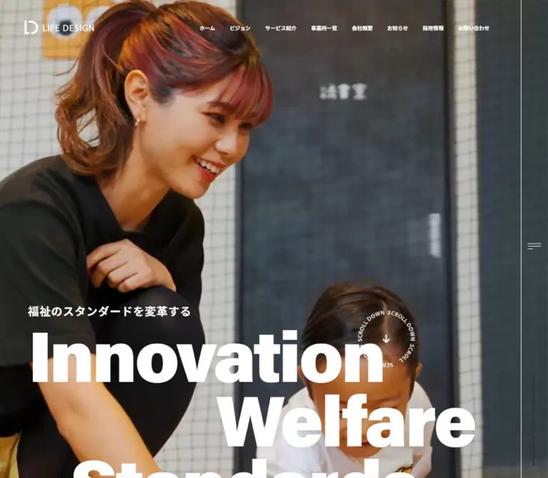
福祉の現場写真と極太の英字タイポグラフィが印象的なコーポレートサイト。横に展開するサービス紹介、非対称の見出し、鮮やかな黄色のフッターが特徴です。
LIFE DESIGN — Style Reference
Everyday welfare scenes framed by monumental English typography, a narrow navigation rail, and a sun-yellow corporate directory.
Website: life-design.okinawa Original URL: https://life-design.okinawa/ Final URL: https://life-design.okinawa/ Theme: dark photographic opening and charcoal surfaces, a warm-gray gallery, teal and white contact panels, and a yellow footer. Inspected: September 23, 2026, Japan Standard Time. Supplied retrieval timestamp: September 22, 2026, 21:28:27.905 UTC, equivalent to September 23, 06:28:27.905 JST. Viewports: desktop 1440 × 1000 CSS pixels; mobile 390 × 844 CSS pixels. Scope: the current corporate homepage: opening identity, mission, seven service entries, facility gallery, recruitment, information, Instagram link, contact panels, and footer. Five original-page captures provide desktop opening/gallery/footer and mobile opening/footer views. Rendered DOM and computed styles extend the evidence to the intervening sections. Linked pages and opened navigation states were not inspected.
LIFE DESIGN pairs the scale and confidence of a contemporary creative company with photographs of welfare work and distinctive facilities. Its strongest device is typographic: enormous, tightly spaced English words occupy different horizontal starting positions, while Japanese copy explains the company’s purpose in a more measured rhythm. The opening line, “福祉のスタンダードを変革する,” is the semantic H1; “Innovation / Welfare / Standards” supplies the visual monument beneath it.
This is a corporate homepage with several parallel destinations. Services, facilities, company information, recruitment, news, and contact all have their own roles. The structure should retain that breadth. A narrow desktop rail, partially visible horizontal content, large areas of breathing room, and a dense yellow footer connect the different sections without enclosing everything in uniform cards.
閉じる
LIFE DESIGN — Style Reference
Everyday welfare scenes framed by monumental English typography, a narrow navigation rail, and a sun-yellow corporate directory.
Website: life-design.okinawa Original URL: https://life-design.okinawa/ Final URL: https://life-design.okinawa/ Theme: dark photographic opening and charcoal surfaces, a warm-gray gallery, teal and white contact panels, and a yellow footer. Inspected: September 23, 2026, Japan Standard Time. Supplied retrieval timestamp: September 22, 2026, 21:28:27.905 UTC, equivalent to September 23, 06:28:27.905 JST. Viewports: desktop 1440 × 1000 CSS pixels; mobile 390 × 844 CSS pixels. Scope: the current corporate homepage: opening identity, mission, seven service entries, facility gallery, recruitment, information, Instagram link, contact panels, and footer. Five original-page captures provide desktop opening/gallery/footer and mobile opening/footer views. Rendered DOM and computed styles extend the evidence to the intervening sections. Linked pages and opened navigation states were not inspected.
LIFE DESIGN pairs the scale and confidence of a contemporary creative company with photographs of welfare work and distinctive facilities. Its strongest device is typographic: enormous, tightly spaced English words occupy different horizontal starting positions, while Japanese copy explains the company’s purpose in a more measured rhythm. The opening line, “福祉のスタンダードを変革する,” is the semantic H1; “Innovation / Welfare / Standards” supplies the visual monument beneath it.
This is a corporate homepage with several parallel destinations. Services, facilities, company information, recruitment, news, and contact all have their own roles. The structure should retain that breadth. A narrow desktop rail, partially visible horizontal content, large areas of breathing room, and a dense yellow footer connect the different sections without enclosing everything in uniform cards.
How to Read This Reference
- Measured means recorded in the supplied computed styles or element rectangles. Values are CSS pixels unless stated otherwise.
- Calculated means arithmetic based on those recorded values, such as converting source
remtokens or subtracting adjacent card positions. - Estimated means visually approximated from an original-page screenshot. These estimates are not stylesheet measurements.
- Recommended means an implementation choice for a new project. Suggested breakpoints, accessibility changes, and Quick Start formulas are not claims about the original source.
- Font names below are recorded font-family declarations. The evidence does not independently establish which downloaded font file rendered every glyph.
- The DOM includes menu content that is not visible in the opening screenshots. Its presence and dimensions do not establish that the menu was opened or tested.
- Some transformed or positioned descendants have coordinates that do not align with their parent’s normal-flow rectangle. Use local proportions and the screenshots together; do not turn every recorded Y coordinate into an absolute positioning rule.
Tokens — Colors
Default Palette
| Name | Value | Source / reusable alias | Role and evidence |
|---|---|---|---|
| Charcoal | #292929 |
Source --color, --color-link, --color-service; alias --ld-ink |
Recorded main background and primary dark text; visible dark contact surround and footer arrows |
| Warm Gray | #edebeb |
Source --color-bg; alias --ld-paper |
Visible gallery field and desktop rail; recorded inactive information-category fill |
| White | #ffffff |
Computed foregrounds and surfaces; alias --ld-white |
Hero typography, navigation, large display text, recruitment contact card, circular controls |
| Footer Yellow | #f1d252 |
Computed footer background rgb(241, 210, 82); alias --ld-yellow |
Large closing color field; dark directory text and white oversized slogan |
| Contact Teal | #20aaac |
Source --color-005; alias --ld-teal |
Recorded contact-panel background; visible in the desktop footer capture |
| Dark Section Shade | rgba(0, 0, 0, 0.67) |
Computed opening-section background | Recorded on the section containing the opening and mission; its compositing relationship to the media is not fully exposed |
| Secondary Control White | #f5f5f5 |
Computed information control background | One sampled circular information control; state semantics were not verified |
The palette works through large changes in surface, rather than many small colored badges. Yellow is a major closing field. Teal is concentrated in the contact destination. White display type dominates the opening and dark sections.
The section shade is a computed background value, not proof that an independent 67% black overlay sits over the visible photograph. Likewise, transparent section backgrounds do not establish their final visible surface: the main container has a background transition, and the supplied screenshots represent particular scroll states.
Declared Accent Palette
These custom properties are present in both viewport records. Only the teal contact use is directly mapped to a visible component in the supplied evidence.
| Source variable | Value | Evidence status |
|---|---|---|
--color-001 |
#FF952C |
Declared orange; component assignment unverified |
--color-002 |
#18BA94 |
Declared green-teal; component assignment unverified |
--color-003 |
#5751EF |
Declared violet; component assignment unverified |
--color-004 |
#E0425A |
Declared rose; component assignment unverified |
--color-005 |
#20AAAC |
Matches the contact-panel background |
--color-006 |
#37BE66 |
Declared green; component assignment unverified |
--color-007 |
#537AFA |
Declared blue; component assignment unverified |
--color-008 |
#E4135B |
Declared pink-red; component assignment unverified |
Do not assign these eight colors to the seven services by sequence. The supplied evidence does not establish that mapping. Generic CMS gradient and shadow presets are also present, but they do not demonstrate a visible gradient or elevation system on this homepage.
Tokens — Typography
Acumin Pro — English Display and Utility Type
- Recorded family:
acumin-pro, sans-serif. - Principal weight:
900for the hero, service heading, service identifiers, gallery heading, recruitment statement, information heading, and contact titles. - Supporting weights:
700for several labels and links, the Instagram heading, and the footer slogan;500for news dates and the small service introduction. - Characteristic tracking:
-0.03emacross most large English text. - Characteristic leading: approximately
0.9in the hero,1for several section titles, and1.06in recruitment. - Role: creates strong horizontal silhouettes, stepped line alignment, and controlled clipping at the page edges.
Do not infer the wordmark’s font from these text declarations. The logo is visually distinct artwork.
Noto Sans JP — Japanese Content and Navigation
- Recorded stack:
"Noto Sans JP", "Hiragino Kaku Gothic ProN", "ヒラギノ角ゴ ProN", "Hiragino Kaku Gothic Pro", "ヒラギノ角ゴ Pro", メイリオ, Meiryo, sans-serif. - Weights:
400for mission prose and contact explanations,500for service descriptions,700for navigation and many headings, and900for the main mission heading. - Tracking: generally normal in prose;
0.05emon the opening Japanese statement, mission heading, and news titles. - Role: balances the compressed English display language with clear Japanese explanation.
Type Scale
All entries below are measured. Sizes and leading are shown as font-size / line-height.
| Role | Desktop | Mobile | Weight / tracking |
|---|---|---|---|
| Root and inherited body | 14.4 / 21.6px |
16.64 / 24.96px |
400, normal |
| Desktop primary navigation | 13.5 / 20.25px |
Not displayed in the opening view | 700, normal |
| Opening Japanese H1 | 28.8 / 63.9px |
18.72 / 28.08px |
700, 0.05em |
| Hero English words | 185.4 / 166.86px |
58.24 / 53px |
900, -0.03em |
| Mission label | 34.2 / 51.3px |
24.96 / 37.44px |
700, -0.03em |
| Mission Japanese H2 | 46.8 / 65.52px |
35.36 / 49.504px |
900, 0.05em |
| Mission prose | 16.2 / 35.64px |
16.64 / 33.28px |
400, normal |
| Our Service | 118.8 / 104.4px |
63.44 / 63.44px |
900, -0.03em |
| Service number and brand | 36 / 36px |
29.12 / 29.12px |
900, -0.03em |
| Service Japanese title | 21.6 / 22.68px |
18.72 / 26.208px |
700, normal |
| Service description | 12.6 / 20.7px |
14.56 / 23.92px |
500, normal |
| Gallery display words | 135 / 135px |
83.2 / 83.2px |
900, -0.03em |
| Recruitment display words | 140.4 / 148.824px |
56.16 / 59.53px |
900, -0.03em |
| Information heading | 79.2 / 79.2px |
56.16 / 56.16px |
900, -0.03em |
| News title | 18 / 27px |
16.64 / 26.624px |
700, 0.05em |
| News date | 17.1 / 25.65px |
19.76 / 29.64px |
500, -0.03em |
| Read more text | 18 / 27px |
20.8 / 31.2px |
700, normal |
| Contact us | 68.4 / 68.4px |
49.92 / 49.92px |
900, -0.03em |
| Join our team | 43.2 / 43.2px |
38.48 / 38.48px |
900, -0.03em |
| Footer slogan | 225 / 225px |
124.8 / 124.8px |
700, -0.03em |
| Footer copyright | 18 / 27px |
14.56 / 21.84px |
700, 0.03em |
| Desktop rail copyright | 9 / 13.5px |
Not present in the supplied mobile view | 400, 0.03em |
The mobile design is not a uniform reduction. Mission prose, service descriptions, dates, and Read more labels are larger in CSS pixels on mobile than on desktop, while the largest display words shrink substantially.
Tokens — Spacing & Shapes
Density: very large display and media regions, restrained controls, long editorial pauses, and compact directory links.
Source Units
The measured root font size is 14.4px on desktop and 16.64px on mobile. Therefore a source rem changes between these captures. The exact root-sizing formula and original breakpoint are not supplied.
| Source token | Desktop declaration / calculated size | Mobile declaration / calculated size |
|---|---|---|
--header-height |
5rem → 72px |
3.5rem → 58.24px |
--footer-height |
58.125rem → 837px |
47.375rem → 788.32px |
--img-radius |
0.5rem → 7.2px |
0.25rem → 4.16px |
--img-radius-right |
0.5rem 0 0 0.5rem |
0.25rem 0 0 0.25rem |
The header element itself has a recorded height of zero in both captures. Its positioned children supply the visible interface; the header-height variable is not a measured normal-flow header box.
Spacing Scale
| Use | Desktop | Mobile | Status |
|---|---|---|---|
| Opening content left inset | 72px |
20.797px |
Measured |
| Deeper content / footer left inset | 162px |
20.797px |
Measured on representative elements |
| Header logo left / top | 63 / 54px |
20.797 / 17.672px |
Measured wrapper position |
| Desktop navigation item gap | Approximately 37.8px |
Not applicable | Calculated from adjacent links |
| Service-card gap | 40px |
15px |
Calculated from adjacent cards |
| Gallery-image gap | Approximately 23px |
Not visually established | Screenshot estimate |
| Information-card gap | 32px horizontally |
Approximately 24.95px vertically |
Calculated |
| Contact-panel gap | 28.8px horizontally |
Approximately 9.36px vertically |
Calculated |
| Gallery-control gap | Approximately 10.8px |
Approximately 8.31px |
Calculated |
| Footer primary-link row pitch | Approximately 51.3px |
Approximately 49.92px |
Calculated |
Border Radius
| Element | Recorded or estimated treatment |
|---|---|
| Ordinary text links and service/news anchor boxes | 0px in sampled styles |
| Image token | 7.2px desktop; 4.16px mobile, calculated from source values |
| Contact panels | 10.8px desktop; 6.24px mobile, measured |
| Information-category pills | 18px desktop; 18.72px mobile, measured |
| Gallery and information arrow controls | 100%, measured |
| Lower dark main-content boundary in footer captures | Rounded and inset; approximately 28–32px desktop and 16px mobile corner radii by visual estimate |
Do not apply the contact-panel radius to every element. Most of the composition is rectangular; circles identify directional controls, and pills identify information categories.
Layout Measurements
| Element | Desktop | Mobile |
|---|---|---|
| Document height | 8675px |
9741px |
| Header logo wrapper width | 180px |
118.547px |
| Menu-button box | 70.188 × 70.188px |
54.078 × 58.234px |
| Right rail | About 70.2px wide |
Not shown |
| Hero word starting X positions | 72, 558, 181.797px |
20.797, 155.984, 20.797px |
| First section, including mission | 2420.188px high |
2156.469px high |
| First service anchor | 436 × 660.391px |
308 × 533.547px |
| Gallery arrow button | 68.391px diameter |
58.234px diameter |
| Central gallery photograph | Approximately 778 × 519px in the screenshot |
Image box not supplied |
| First information anchor | 448 × 403.484px |
348.406 × 339.063px |
| Contact anchor | 734.406 × 264.594px |
348.406 × 187.188px |
| Recruitment contact anchor | 352.797 × 264.594px |
348.406 × 124.797px |
| Footer logo link width | 253.797px |
186.078px |
The gallery photograph is approximately 3:2, based on screenshot geometry. The first section height includes the mission, so it should not be used as the height of a single hero image.
Components
Global Header and Right Rail
Role: establish identity, expose corporate destinations, and preserve access to navigation during the long page.
The desktop opening has a white logo at the upper left and eight white Japanese links running across the upper right. Their recorded text starts at X 538.891px, with the final contact link ending near X 1288.813px. The logo wrapper starts at X 63px. This leaves a substantial central gap between identity and navigation.
The current mark combines a four-part geometric emblem with an uppercase LIFE DESIGN wordmark. Use the actual authorized artwork; a generic text treatment will not reproduce its condensed proportions.
A fine vertical rule separates a roughly 70px rail at the right edge. An asymmetric three-line menu glyph sits around mid-height, and a very small vertical copyright line appears lower down. The rail remains visible in the opening, gallery, and footer captures. It is transparent over the opening imagery and light over the lower captured sections.
On mobile, the horizontal navigation and right rail disappear. The white logo moves to an approximately 21px left inset, while the menu control moves to the top right. The logo and menu occupy a compact band without a visible filled header surface in the opening screenshot.
The DOM contains a second navigation system with English names and Japanese subtitles. Its English text is 36px / 900 on desktop and 31.2px / 900 on mobile. Those are recorded menu styles, not an observed opened-menu composition. Backdrop appearance, focus behavior, and opening choreography remain unverified.
Opening Hero
Role: communicate the company’s ambition while grounding it in people and care.
The desktop screenshot uses a full-bleed welfare scene: adults and children working together in an interior with activity materials, netting, tiled surfaces, and a climbing wall. The white identity and message are placed directly over that scene.
The text group sits low in the opening viewport. The Japanese H1 starts at Y 624.438px; the first English line’s box starts at Y 679.344px. Each English word occupies its own paragraph. “Welfare” is strongly indented to the right; “Standards” starts between the left edge and that indentation. The third line falls below the initial desktop screenshot, so fitting every word into exactly one viewport would change the composition.
A circular SCROLL DOWN prompt with a central downward arrow appears near the right side of the first English line. Its diameter is approximately 140–150px by screenshot estimate. Its click target and rotational behavior were not tested.
At 390 × 844, the Japanese line starts around Y 481px, and all three English words fit between approximately Y 519px and 678px. “Innovation” and “Standards” share the left edge, while “Welfare” remains indented. The mobile media field is almost black with faint underlying tonal detail. This establishes the captured appearance, but not whether a video was playing, paused, unloaded, or intentionally dark at that moment.
Mission Section
Role: turn the oversized promise into a readable explanation.
The desktop DOM records a two-part arrangement: a 270px-wide Mission label region at X 72px, followed by the main content beginning at X 405px. The gap between those regions is approximately 63px.
The content contains a Japanese H2, several prose paragraphs, an emphasized Japanese statement, and a Read more link to /vision. The H2 uses 46.8px / 900, while the prose uses 16.2px with a generous 35.64px line height. Preserve that contrast between compact, heavy headings and slow, spacious reading.
Mobile stacks the label, heading, prose, and link near the same 20.8px left edge. The H2 wraps into a taller block, and prose moves to 16.64px / 33.28px. The sample prose region is slightly wider than the main heading region; this is a recorded detail, not a recommendation to allow arbitrary overflow.
Read more is an inline-flex anchor with text and a directional-control region. Its desktop padding is 18px, with a 21.6px gap; the mobile anchor removes that padding and uses an 18.72px gap. The exact icon artwork is not included in the selected element records.
Service Introduction and Horizontal Cards
Role: explain the breadth of provision and link to seven distinct services.
On desktop, the Our Service introduction begins at X 72px and spans approximately 460.8px. Its large English title occupies two lines. A small English explanation and a three-line Japanese introduction sit below it.
The first service begins at X 622.797px; subsequent anchors advance horizontally by 476px, comprising a 436px card and 40px gap. This is a horizontal sequence extending outside the viewport, not a wrapped grid.
Each recorded card has a whole-card anchor, a vertically oriented number/brand label near its right edge, a Japanese H3, and a compact explanatory paragraph. There is a tall leading region before the H3: approximately 567px from the anchor’s top on desktop and 401px on mobile. The selected DOM records do not expose the corresponding media nodes, so their exact images, crops, and dimensions remain unverified.
The seven recorded identifiers are:
01 SOU FIRST02 SOU NEXT03 Aloha04 SOU CONNECT05 LIFE DESIGN MARKETING06 it School Uruma07 LIFE DESIGN WELLBE
Long names can occupy more than one vertical text column. Do not force every identifier into one narrow line at the expense of legibility.
On mobile, the introduction sits above the strip and Our Service becomes a single horizontal title. Cards remain horizontal at 308px wide with 15px gaps; the first starts at X 20.797px and the next at X 343.797px, leaving part of the next item within the viewport. Preserve this continuation cue. Dragging, looping, automatic advancement, and wheel behavior were not verified.
Facility Gallery
Role: make the physical environments part of the company’s identity.
The desktop capture shows a broad warm-gray field with large landscape photographs. A building facade fills the central image, with blue sky, a black-and-white graphic exterior, windows, and a visible company sign. Adjacent photographs extend beyond both sides of the visible composition; one includes interior artwork.
The center image is approximately 778 × 519px, with small rounded corners and roughly 23px gaps to its neighbors. Keep these as large photographs, not small thumbnails. A pair of white circular arrow buttons appears above the images toward the right.
The DOM also records a large horizontal sequence containing LIFE DESIGN, Gallery, and Facility. Its display text measures 135px on desktop and 83.2px on mobile. Text repetition and offscreen positions establish an overflowing composition, but not an animation speed or direction.
On mobile, the explanatory Japanese copy wraps to two lines. The two 58.234px arrow controls are centered below the media region rather than above it on the right. Their combined group is approximately 124.8px wide.
Recruitment Feature
Role: present recruitment as a major part of the corporate story.
The measured display reads “Challenging / Innovation,” accompanied by Japanese explanatory copy, Read more, and a job-category section. On desktop the second English word is indented from X 162px to X 441px; on mobile both words begin at X 41.594px.
A repeated RECRUIT treatment occupies a narrow vertical edge. Part of the recruitment media field is visible at the bottom of the gallery screenshot, but the complete scene is not supplied. Do not invent its subject or its movement.
Three job-category anchors point to the company’s recruitment subdomain. Desktop boxes measure 300 × 160px. Mobile positions include a central item around X 88.922px, a preceding item partly outside the left edge, and another partly outside the right edge. That supports a horizontal presentation on mobile, not a simple three-item vertical stack. Their image labels and interaction sequence were not captured.
Information Section
Role: surface recent company activity and provide access to the news archive.
Desktop structure is an editorial heading above a left category/control column and a horizontal article sequence. Information uses 79.2px / 900. Category links include ALL, “ニュース,” and LD TIMES; ALL is charcoal with white text, while the other sampled pills have warm-gray fills and dark text.
The first article starts at X 448.188px and measures 448px wide. The next begins 480px later, establishing a 32px gap. Each anchor includes an upper content region, date, and Japanese H3. The supplied selection does not identify the article-image asset URLs.
Six articles appear in the current DOM, dated from April through September 2026. They have genuine article destinations; the category controls also have archive URLs. Do not describe the categories as an in-place filter without testing that behavior.
Mobile changes the layout substantially: category pills become a horizontal row, all six articles become a vertical list at approximately 348.4px wide, and View all moves below the list. The information section grows from approximately 636px to 2458px high in the recorded layouts. This is an important reason the mobile page remains long.
Instagram Feature
Role: provide a prominent outbound social destination.
The whole recorded feature is an anchor to the company’s Instagram account. Its text hierarchy is LIFE DESIGN above Instagram, using white Acumin Pro. Instagram measures 109.8px on desktop and 67.6px on mobile.
The anchor occupies a substantial region: approximately 749px high on desktop and 694px on mobile. Its media composition is not included in the supplied screenshots or selected asset data. Do not assume a live feed, tile grid, hover collage, or embedded social widget.
Contact and Recruitment Panels
Role: offer two clear closing destinations.
A dark surrounding surface contains a larger teal Contact us panel and a smaller white Join our team panel. Desktop dimensions establish a width ratio of approximately 2.08:1, with equal 264.6px heights and a 28.8px gap.
Each panel is a large anchor with a prominent English title, supporting Japanese text, and a circular directional mark. Recorded desktop padding is 43.2px 46.8px 45px; radius is 10.8px. The contact title uses 68.4px, while the recruitment title uses 43.2px and wraps across two lines.
The desktop footer screenshot shows the dark main-content boundary inset and rounded above the yellow footer. The contact panels are visibly affected by that closing composition. Their measured DOM dimensions should not be treated as invariant screen dimensions during every scroll state.
Mobile stacks both anchors at 348.4px wide. Contact is about 187.2px high, recruitment about 124.8px, and the gap is about 9.36px. Padding becomes 20.8px 24.96px. The Japanese recruitment subtitle is not present in the mobile rendered-text sequence, although it remains part of the anchor’s supplied text record; its exact visibility rule was not provided.
Yellow Footer Directory
Role: close the visual narrative while preserving comprehensive navigation.
The yellow footer begins with a huge white “Innovation Welfare Standards” line. It is intentionally wider than the visible area and clipped horizontally. A fine white divider separates this slogan band from the directory below. Do not reduce the slogan until the entire phrase fits: its cropped scale is part of the design.
On desktop, the black brand sits at the left, a primary navigation column starts around X 736px, and a service directory starts around X 1013px. Primary links pair text with small dark circular arrows. Service entries use simpler leading arrows and permit multiline names. Copyright, privacy, and the Instagram icon form a lower utility row.
On mobile, the logo moves above the directory, but the two navigation columns remain side by side. Their starting positions are approximately X 20.8px and X 166.4px. The left primary-link region is approximately 106px wide; the service column has about 203px available. Copyright moves below the columns, and privacy plus Instagram occupy a further row.
The mobile screenshot retains a generous yellow area below these utilities. Avoid collapsing the footer into a tight accordion solely to save vertical space.
Tokens — Motion & Interaction
Recorded Transitions
These values are measured transition declarations. They describe available CSS behavior; they do not prove that a particular hover, menu opening, or scroll-triggered transition was exercised.
| Target | Recorded timing | Recorded properties / limitation |
|---|---|---|
| Common anchors | 300ms cubic-bezier(0.37, 0, 0.63, 1) |
Color, background, border, and box shadow; destination-state values not supplied |
| Menu button | 400ms cubic-bezier(0.5, 1, 0.89, 1) |
Property list not narrowed in the supplied shorthand |
| Gallery and information arrow buttons | 300ms cubic-bezier(0.5, 1, 0.89, 1) |
Circular controls; resulting hover treatment unverified |
| Contact panels and View all | 300ms cubic-bezier(0.5, 1, 0.89, 1) |
Transition recorded, exact changed properties not established |
| Main background | 300ms cubic-bezier(0.5, 1, 0.89, 1) |
Supports a changing main surface |
| Main transform and border radius | 800ms cubic-bezier(0.65, 0, 0.35, 1) |
Consistent with the inset, rounded closing composition; exact trigger and transform values unverified |
| Gallery-section background | 300ms cubic-bezier(0.5, 1, 0.89, 1) |
Background transition recorded |
Observed Affordances and Limits
- The supplied collection traversed scroll positions. It provides opening, intermediate gallery, and footer states, not a recorded interaction walkthrough.
- Service cards extend horizontally on both viewports. Information cards are horizontal on desktop and vertical on mobile.
- Gallery previous/next buttons are visible. Their click results, disabled states, looping, and keyboard behavior were not tested.
- The circular scroll prompt and repeated oversized text suggest motion-oriented composition, but rotation, marquee timing, and scroll coupling are not established.
- Sampled elements report
animation: none. This does not rule out animation on descendants, pseudo-elements, media, or JavaScript-managed transforms. - The background medium is not identified by the supplied media-node data. Do not specify autoplay, mute state, loop duration, or mobile playback policy as observed facts.
For an adaptation, use the recorded short easing curves for small UI changes. Keep decorative movement optional until a clear purpose and reduced-motion behavior have been defined.
Surfaces
| Layer | Appearance | Purpose / confidence |
|---|---|---|
| Opening | Full-bleed scene with white type; mobile capture is nearly black | Visually confirmed at both supplied opening viewports |
| Mission and service context | White text associated with the recorded dark main surface | Supported by DOM foregrounds and main background; complete section screenshots not supplied |
| Gallery | Warm-gray field with large photographs and white circular controls | Directly visible in the desktop capture |
| Information UI | Dark text, charcoal selected category, gray inactive categories | Computed component styles; full section background not independently pictured |
| Closing contact surround | Charcoal, inset and rounded near the footer | Directly visible in desktop and mobile footer captures |
| Contact destinations | Teal primary panel and white recruitment panel | Measured styles and partially visible closing screenshots |
| Footer | Yellow with dark directory text and oversized white slogan | Directly visible at both viewports |
There is no demonstrated general-purpose shadow system. Separation comes from changes in surface color, typography, photograph boundaries, thin rules, and limited rounded shapes.
Imagery
The observed photographs make the organization tangible. The opening shows shared activity between adults and children rather than an abstract promise. The gallery gives substantial space to a branded building exterior and designed interiors. Industrial materials, climbing equipment, art, graphic facade treatments, and blue sky contribute more character than generic corporate stock photography would.
Preserve broad contextual framing. In the hero, people coexist with the room around them; the typography occupies the lower field. In the gallery, the building is shown as a whole architectural subject within a landscape frame. Use deliberate focal positioning at each breakpoint instead of assuming a centered crop will preserve both faces and text clearance.
The current logo has a four-part emblem and compact uppercase lettering, white in the opening and black in the footer. Keep it as artwork. The interface’s supporting graphics are simple: arrows, circles, fine rules, a three-stroke menu glyph, and an Instagram outline mark.
Observed Asset References
The evidence does not include original image src, video src, logo-file paths, or font-file URLs. The following identifies the observed material without inventing filenames.
| Material | Evidence | Asset availability |
|---|---|---|
| Opening welfare scene | Desktop opening screenshot | Visible; direct asset URL not supplied |
| Dark mobile opening media field | Mobile opening screenshot | Visible state; underlying media and playback status unknown |
| Branded building exterior | Desktop gallery screenshot | Visible; approximately 3:2 displayed frame |
| Adjacent interior artwork | Right side of desktop gallery screenshot | Partially visible; direct asset URL not supplied |
| Current white and black wordmarks | Desktop/mobile opening and footer screenshots | Visible; original logo path not supplied |
| Service and information media regions | Component geometry in the DOM | Exact image nodes and subjects not supplied |
Use authorized, contextually relevant imagery when implementing this reference. CSS can reproduce the hierarchy and shell; it cannot replace the identity carried by the actual people, facilities, and brand artwork.
Layout & Responsive Behavior
Desktop Composition
The page combines full-width surfaces with several alignment depths. The hero and service introduction use a 72px left inset, while gallery explanation, recruitment, information, contact, and footer elements commonly begin around 162px. The mission text begins even farther inward at 405px. These nested alignments create rhythm without relying on one centered container for every section.
The right rail overlays or reserves a visible edge of approximately 70px, while recorded full-width section rectangles still span 1440px. Keep the distinction between full-bleed backgrounds and foreground content clear.
Horizontal sequences are section-specific. Service cards continue beyond the viewport beside their introduction. Gallery photographs show neighbors around a large central image. Information uses a category/control column beside horizontal article cards. These are different compositions, not one reusable carousel size applied everywhere.
Mobile Composition
At 390 × 844, the most common content inset is approximately 20.8px, leaving 348.4px for the main column. Important changes are directly supported by the supplied records:
| Component | Desktop | Mobile |
|---|---|---|
| Navigation | Logo, eight links, right rail | Smaller logo and top-right menu button |
| Hero | Very large staggered words; final line below initial fold | Three visible lines; first and third share a left edge |
| Mission | Label beside prose column | Label and content stacked |
| Service introduction | Two-line English heading beside cards | One-line English heading above cards |
| Services | 436px horizontal cards |
308px horizontal cards with a next-item preview |
| Gallery controls | Above images, toward the right | Below media, centered |
| Recruitment title | Second line indented | Both lines use the same left edge |
| Information | Horizontal articles beside vertical categories | Vertical article list below horizontal categories |
| Contact panels | Unequal-width side-by-side anchors | Full-column stacked anchors |
| Footer | Brand beside two navigation columns | Brand above two retained navigation columns |
Only these two viewports were inspected. The exact breakpoint, tablet treatment, landscape behavior, and original root-size formula are unknown. A practical adaptation should interpolate between these endpoints and verify intermediate widths independently.
Do not introduce page-wide horizontal scrolling to preserve the oversized material. Confine overflow to the relevant text band or content track, while keeping essential headings and Japanese body copy readable.
Do’s and Don’ts
Do
- Use heavy Acumin Pro-style English display text with tight
-0.03emtracking and clear Japanese supporting content. - Preserve the three-word hero structure and the distinct indentation of Welfare.
- Keep the corporate destinations, seven services, news, recruitment, and contact pathways intact.
- Use the measured yellow footer, warm-gray gallery field, charcoal structure, and teal contact panel as large color regions.
- Retain a narrow desktop rail and relocate its navigation affordance to the mobile header.
- Keep service cards horizontal on mobile while allowing news to become a vertical list.
- Show adjacent gallery imagery at desktop scale to communicate a larger collection.
- Keep the mobile footer’s two navigation columns and allow service names to wrap.
- Separate measured transition declarations from unverified animation behavior.
- Use source logo and photographic assets when available and authorized.
Don’t
- Don’t compress the corporate homepage into a single-purpose conversion funnel.
- Don’t replace all horizontal sections with one uniform grid of rounded cards.
- Don’t center every display line or make all headings share the same scale.
- Don’t shrink the footer slogan to fit its entire phrase inside the viewport.
- Don’t treat the almost-black mobile hero capture as proof of an intentional permanent solid background.
- Don’t invent a video source, autoplay policy, carousel loop, marquee speed, or menu choreography.
- Don’t assign declared accent colors to services without component-level evidence.
- Don’t apply CMS shadow or gradient presets merely because their variables appear in the DOM.
- Don’t copy source
remvalues into a conventional root without recalculating their dimensions. - Don’t use absolute document Y coordinates to reproduce transformed or scroll-dependent states.
Recommended Implementation Additions
These are recommendations for a new implementation, not verified features of the original:
- Give menu, carousel arrows, Instagram icons, and back-to-top controls accessible names. An empty text field in this evidence does not establish whether the original already has an ARIA label.
- Keep all navigation and card anchors keyboard-operable with visible focus. If a menu is modal, manage focus, Escape, and background interaction explicitly.
- Provide a reliable still image beneath any hero video. Preserve the message if playback is unavailable or reduced motion is requested.
- If horizontal tracks advance automatically, offer pause controls. Keep native scrolling or an equivalent accessible navigation mechanism available.
- Review teal-panel contrast. White against the recorded solid
#20aaacis approximately2.8:1, calculated from those colors, so meaningful white text needs a darker surface or another contrast treatment. - Treat white text on yellow as decorative only when the same message is available accessibly elsewhere. Hide duplicated decorative slogans from assistive technology when appropriate.
- Preserve at least a comfortable reading size for Japanese descriptions. The observed desktop
12.6pxservice copy is a candidate for a modest increase in an adaptation. - Give mobile category links comfortable hit areas even though the recorded visible pills are only about
27pxhigh. - Avoid making tiny vertical copyright text carry essential information. The regular footer already provides the company copyright.
- Ensure children’s and staff imagery has appropriate usage permissions and suitable text alternatives for its role.
Agent Prompt Guide
Quick Color Reference
- Structural charcoal and dark text:
#292929. - Gallery canvas and light rail:
#edebeb. - Reversed display type and circular controls:
#ffffff. - Contact panel:
#20aaac. - Closing footer:
#f1d252. - Use solid surfaces and fine rules; no general shadow or glossy gradient treatment is established.
Overall Prompt
“Create a Japanese welfare company’s corporate homepage inspired by the current LIFE DESIGN composition. Pair authentic photographs of shared activities and distinctive facilities with extremely bold English display typography and clear Japanese explanation. Use a staggered three-line Innovation / Welfare / Standards statement, a white opening logo and navigation, and a narrow desktop rail containing a small menu glyph and vertical copyright. Follow with a spacious mission, seven horizontal service entries with vertical number/brand labels, a warm-gray landscape gallery, a prominent recruitment feature, company news, and large contact destinations. Finish with a clipped white slogan on a yellow footer and a comprehensive dark-text directory. On mobile, move the menu to the top right, stack mission and contact content, retain horizontal services, turn news into a vertical list, and keep two footer navigation columns. Distinguish verified layout from optional motion.”
Example Component Prompts
- Opening: “Build a full-bleed welfare photograph with a small white brand at the upper left, Japanese navigation across the upper right, and monumental white words near the lower part of the viewport. Use a Japanese H1 above three separate heavy English lines. Indent Welfare strongly and keep compact negative tracking. At 390px width, use approximately 58px display text and return Standards to the left edge.”
- Services: “Create a charcoal service section with a large English introduction and seven linked entries extending horizontally. Each entry has a tall leading content area, a vertical number and brand near its right edge, a Japanese title, and a short explanation. At mobile width, place the introduction above a 308px-wide horizontal sequence with 15px gaps.”
- Gallery: “Use a warm-gray canvas, large landscape facility photographs with approximately 7px desktop corner rounding, visible neighboring images, and simple white circular previous/next controls. Move the controls below the media and center them on mobile. Do not add autoplay unless separately specified.”
- Information: “Use a heavy Information heading, compact category pills, dates, and Japanese article titles. On desktop, put categories beside 448px-wide horizontal article cards. On mobile, place categories in a row above a single-column list with roughly 21px side insets.”
- Closing directory: “Place teal Contact us and white Join our team destinations inside a dark rounded closing region. Follow with a yellow footer, oversized clipped white slogan, black brand artwork, two navigation groups, small circular arrows on primary links, and simpler arrows on service links. On mobile, stack the contact panels and move the logo above the two directory columns.”
Quick Start
CSS Custom Properties
This is a recommended implementation foundation, not extracted source CSS. It preserves the recorded palette and approximates the measured dimensions at the two supplied viewports.
The --ld-u formulas below are fitted to produce 14.4px at 1440px and 16.64px at 390px. Their bounds and the 960px composition breakpoint are implementation choices. A separate 1200px navigation cutoff prevents the eight-link row from becoming crowded. None of these breakpoints was supplied by the original evidence.
Use licensed Acumin Pro and available Noto Sans JP assets where appropriate. The fallback stack works without them but will change text widths. No original asset paths or font-loading URLs are assumed.
:root {
  /* Recorded palette, with implementation aliases. */
  --ld-ink: #292929;
  --ld-paper: #edebeb;
  --ld-white: #ffffff;
  --ld-yellow: #f1d252;
  --ld-teal: #20aaac;

  --ld-font-body: 'Noto Sans JP', 'Hiragino Kaku Gothic ProN', Meiryo, sans-serif;
  --ld-font-display: acumin-pro, sans-serif;

  /* Fitted scale: this is not a recovered source formula. */
  --ld-u: clamp(12px, 1vw, 16px);
  --ld-inset: calc(5 * var(--ld-u));
  --ld-deep-inset: calc(11.25 * var(--ld-u));
  --ld-rail: calc(4.875 * var(--ld-u));
  --ld-header: calc(5 * var(--ld-u));
  --ld-image-radius: calc(0.5 * var(--ld-u));
  --ld-panel-radius: calc(0.75 * var(--ld-u));
  --ld-control: calc(4.75 * var(--ld-u));
  --ld-display-size: calc(12.875 * var(--ld-u));

  --ld-ease-link: cubic-bezier(0.37, 0, 0.63, 1);
  --ld-ease-control: cubic-bezier(0.5, 1, 0.89, 1);
  --ld-ease-surface: cubic-bezier(0.65, 0, 0.35, 1);
  --ld-fast: 300ms;
  --ld-menu-time: 400ms;
  --ld-surface-time: 800ms;
}

* { box-sizing: border-box; }
body {
  margin: 0;
  color: var(--ld-ink);
  background: var(--ld-paper);
  font: 400 var(--ld-u)/1.5 var(--ld-font-body);
}
img, video { display: block; max-inline-size: 100%; }
a { color: inherit; }
button { font: inherit; cursor: pointer; }
.ld-page { overflow-x: clip; }
.ld-inset { padding-inline: var(--ld-inset); }
.ld-deep-inset { padding-inline: var(--ld-deep-inset); }
.ld-display {
  font-family: var(--ld-font-display);
  font-weight: 900;
  letter-spacing: -0.03em;
}

.ld-header {
  position: absolute;
  z-index: 20;
  inset: calc(3.75 * var(--ld-u)) calc(10.5 * var(--ld-u)) auto
    calc(4.375 * var(--ld-u));
  display: flex;
  align-items: center;
  justify-content: space-between;
  gap: 2rem;
  color: var(--ld-white);
}
.ld-logo { inline-size: calc(12.5 * var(--ld-u)); }
.ld-primary-nav {
  display: flex;
  gap: calc(2.625 * var(--ld-u));
  font-size: calc(0.9375 * var(--ld-u));
  font-weight: 700;
  white-space: nowrap;
}
.ld-primary-nav a { text-decoration: none; }
.ld-rail {
  position: fixed;
  z-index: 30;
  inset: 0 0 0 auto;
  inline-size: var(--ld-rail);
  border-inline-start: 1px solid rgb(41 41 41 / 25%);
  background: var(--ld-paper);
}
.ld-rail.is-over-media {
  background: transparent;
  border-color: rgb(255 255 255 / 65%);
}
.ld-rail-copyright {
  position: absolute;
  inset: auto 35% 2rem auto;
  writing-mode: vertical-rl;
  font: 400 9px/1.5 var(--ld-font-display);
  letter-spacing: 0.03em;
}
/* Keep the menu button outside the rail in the DOM. */
.ld-menu {
  position: fixed;
  z-index: 40;
  inset: 50% 0 auto auto;
  transform: translateY(-50%);
  inline-size: var(--ld-rail);
  block-size: var(--ld-rail);
  border: 0;
  background: transparent;
  color: inherit;
  transition: color var(--ld-menu-time) var(--ld-ease-control);
}

.ld-hero {
  position: relative;
  isolation: isolate;
  padding: 62.44svh var(--ld-inset) calc(16.25 * var(--ld-u));
  color: var(--ld-white);
  background: var(--ld-ink);
}
.ld-hero-media {
  position: absolute;
  z-index: -2;
  inset: 0;
  inline-size: 100%;
  block-size: 100%;
  object-fit: cover;
}
.ld-hero::before {
  content: '';
  position: absolute;
  z-index: -1;
  inset: 0;
  /* Recommended starting shade; calibrate to the actual media. */
  background: rgb(0 0 0 / 35%);
}
.ld-hero h1 {
  margin: 0;
  font-size: calc(2 * var(--ld-u));
  line-height: 2.21875;
  letter-spacing: 0.05em;
}
.ld-hero-words {
  margin-block-start: calc(-0.625 * var(--ld-u));
  font: 900 var(--ld-display-size)/0.9 var(--ld-font-display);
  letter-spacing: -0.03em;
}
.ld-hero-words > span { display: block; }
.ld-hero-words > span:nth-child(2) { padding-inline-start: 37.5%; }
.ld-hero-words > span:nth-child(3) { padding-inline-start: 8.4722%; }

.ld-mission {
  display: grid;
  grid-template-columns: calc(18.75 * var(--ld-u)) minmax(0, 1fr);
  gap: calc(4.375 * var(--ld-u));
  padding: 0 var(--ld-inset) calc(12.5 * var(--ld-u));
  color: var(--ld-white);
  background: var(--ld-ink);
}
.ld-mission h2 {
  margin-block: 0 calc(3.75 * var(--ld-u));
  font-size: calc(3.25 * var(--ld-u));
  font-weight: 900;
  line-height: 1.4;
  letter-spacing: 0.05em;
}
.ld-mission-copy {
  font-size: calc(1.125 * var(--ld-u));
  line-height: 2.2;
}

.ld-service {
  display: grid;
  grid-template-columns: 32vw minmax(0, 1fr);
  gap: calc(6.25 * var(--ld-u));
  padding: calc(10 * var(--ld-u)) 0 var(--ld-inset) var(--ld-inset);
  color: var(--ld-white);
  background: var(--ld-ink);
}
.ld-service-title {
  margin: 0;
  font-size: calc(8.25 * var(--ld-u));
  line-height: 0.879;
}
.ld-service-title > span { display: block; }
.ld-track {
  display: flex;
  min-inline-size: 0;
  overflow-x: auto;
  overscroll-behavior-x: contain;
  scroll-snap-type: x proximity;
}
.ld-service-track { gap: 40px; }
.ld-service-card {
  position: relative;
  flex: 0 0 436px;
  padding: 27px 18px 0 0;
  text-decoration: none;
  scroll-snap-align: start;
}
.ld-service-media {
  /* Recommended placeholder ratio; source image dimensions are unknown. */
  aspect-ratio: 3 / 4;
  object-fit: cover;
  inline-size: 100%;
  border-radius: var(--ld-image-radius);
}
.ld-service-index {
  position: absolute;
  inset: 0 0 auto auto;
  writing-mode: vertical-rl;
  font-size: calc(2.5 * var(--ld-u));
  line-height: 1;
}
.ld-service-card h3 {
  font-size: calc(1.5 * var(--ld-u));
  line-height: 1.05;
}
.ld-service-description {
  font-size: calc(0.875 * var(--ld-u));
  font-weight: 500;
  line-height: 1.643;
}

.ld-gallery {
  padding-block: calc(12.5 * var(--ld-u));
  background: var(--ld-paper);
}
.ld-gallery-track { gap: calc(1.6 * var(--ld-u)); }
.ld-gallery-slide {
  flex: 0 0 54vw;
  margin: 0;
  scroll-snap-align: center;
}
.ld-gallery-slide img {
  inline-size: 100%;
  aspect-ratio: 3 / 2;
  object-fit: cover;
  border-radius: var(--ld-image-radius);
}
.ld-gallery-controls {
  display: flex;
  justify-content: flex-end;
  gap: calc(0.75 * var(--ld-u));
  margin: 0 var(--ld-deep-inset) 2rem;
}
.ld-round-control {
  display: inline-grid;
  place-items: center;
  flex-shrink: 0;
  inline-size: var(--ld-control);
  block-size: var(--ld-control);
  padding: 0;
  border: 0;
  border-radius: 50%;
  color: var(--ld-ink);
  background: var(--ld-white);
}

.ld-information {
  padding: var(--ld-inset) var(--ld-deep-inset);
  /* Recommended light surface using the recorded palette. */
  background: var(--ld-paper);
}
.ld-information h2 {
  font-size: calc(5.5 * var(--ld-u));
  line-height: 1;
}
.ld-news-layout {
  display: grid;
  grid-template-columns: calc(13.875 * var(--ld-u)) minmax(0, 1fr);
  gap: calc(6 * var(--ld-u));
}
.ld-categories { display: flex; flex-direction: column; gap: 0.75rem; }
.ld-category {
  align-self: flex-start;
  padding: 0.4em 2em;
  border-radius: 999px;
  background: var(--ld-paper);
  text-decoration: none;
  font-weight: 700;
}
.ld-category[aria-current='page'] {
  color: var(--ld-white);
  background: var(--ld-ink);
}
.ld-news-track { gap: 32px; }
.ld-news-card {
  flex: 0 0 448px;
  text-decoration: none;
  scroll-snap-align: start;
}
.ld-news-card h3 {
  font-size: calc(1.25 * var(--ld-u));
  line-height: 1.5;
  letter-spacing: 0.05em;
}

.ld-contact-group {
  display: grid;
  grid-template-columns: 2.08fr 1fr;
  gap: calc(2 * var(--ld-u));
  padding: var(--ld-inset) var(--ld-deep-inset);
  background: var(--ld-ink);
}
.ld-action {
  display: flex;
  flex-direction: column;
  justify-content: space-between;
  gap: calc(2 * var(--ld-u));
  min-block-size: calc(18.375 * var(--ld-u));
  padding: calc(3 * var(--ld-u)) calc(3.25 * var(--ld-u));
  border-radius: var(--ld-panel-radius);
  color: var(--ld-white);
  background: var(--ld-teal);
  text-decoration: none;
}
.ld-action--recruit { color: var(--ld-ink); background: var(--ld-white); }
.ld-action-title { margin: 0; font-size: calc(4.75 * var(--ld-u)); line-height: 1; }
.ld-action--recruit .ld-action-title { font-size: calc(3 * var(--ld-u)); }
.ld-action-bottom { display: flex; align-items: center; justify-content: space-between; gap: 1rem; }
/* Optional contrast improvement for meaningful panel text. */
.ld-action--accessible { background: #08797b; }

.ld-footer { background: var(--ld-yellow); }
.ld-footer-slogan {
  overflow: hidden;
  margin: 0;
  border-block-end: 1px solid var(--ld-white);
  color: var(--ld-white);
  font: 700 calc(15.625 * var(--ld-u))/1 var(--ld-font-display);
  letter-spacing: -0.03em;
  white-space: nowrap;
}
.ld-footer-grid {
  display: grid;
  grid-template-columns: 2.3fr 1fr 1.15fr;
  gap: calc(3 * var(--ld-u));
  padding: calc(8 * var(--ld-u)) var(--ld-deep-inset) 0;
}
.ld-footer-logo { inline-size: calc(17.625 * var(--ld-u)); }
.ld-footer-primary, .ld-footer-services {
  display: flex;
  flex-direction: column;
  align-items: flex-start;
}
.ld-footer-primary { gap: calc(1.875 * var(--ld-u)); }
.ld-footer-services { gap: calc(0.925 * var(--ld-u)); }
.ld-footer-grid a { text-decoration: none; }
.ld-footer-legal {
  display: flex;
  flex-wrap: wrap;
  align-items: center;
  gap: calc(3 * var(--ld-u));
  padding: calc(5 * var(--ld-u)) var(--ld-deep-inset) calc(8 * var(--ld-u));
}

@media (max-width: 1200px) {
  .ld-primary-nav { display: none; }
}

@media (max-width: 960px) {
  :root {
    --ld-u: clamp(14px, 4.2666667vw, 18px);
    --ld-inset: calc(1.25 * var(--ld-u));
    --ld-deep-inset: var(--ld-inset);
    --ld-rail: 0px;
    --ld-header: calc(3.5 * var(--ld-u));
    --ld-image-radius: calc(0.25 * var(--ld-u));
    --ld-panel-radius: calc(0.375 * var(--ld-u));
    --ld-control: calc(3.5 * var(--ld-u));
    --ld-display-size: calc(3.5 * var(--ld-u));
  }
  .ld-header { inset: calc(1.0625 * var(--ld-u)) var(--ld-inset) auto; }
  .ld-logo { inline-size: calc(7.125 * var(--ld-u)); }
  .ld-rail { display: none; }
  .ld-menu {
    inset: 0 calc(0.625 * var(--ld-u)) auto auto;
    transform: none;
    inline-size: calc(3.25 * var(--ld-u));
    block-size: var(--ld-header);
  }
  .ld-hero { padding-block: 56.97svh calc(12.875 * var(--ld-u)); }
  .ld-hero h1 { font-size: calc(1.125 * var(--ld-u)); line-height: 1.5; }
  .ld-hero-words { margin-block-start: calc(0.625 * var(--ld-u)); line-height: 0.91; }
  .ld-hero-words > span:nth-child(2) { padding-inline-start: 38.8%; }
  .ld-hero-words > span:nth-child(3) { padding-inline-start: 0; }
  .ld-mission { grid-template-columns: minmax(0, 1fr); gap: calc(4 * var(--ld-u)); }
  .ld-mission h2 { font-size: calc(2.125 * var(--ld-u)); }
  .ld-mission-copy { font-size: var(--ld-u); line-height: 2; }
  .ld-service { display: block; padding-inline-start: var(--ld-inset); }
  .ld-service-title { display: flex; gap: 0.25em; font-size: calc(3.8125 * var(--ld-u)); line-height: 1; }
  .ld-service-track { gap: 15px; margin-block-start: 3rem; }
  .ld-service-card { flex-basis: min(308px, 82vw); padding: 15.6px 15.6px 0 0; }
  .ld-service-index { font-size: calc(1.75 * var(--ld-u)); }
  .ld-service-card h3 { font-size: calc(1.125 * var(--ld-u)); line-height: 1.4; }
  .ld-gallery { display: flex; flex-direction: column; }
  .ld-gallery-slide { flex-basis: calc(100vw - 2 * var(--ld-inset)); }
  .ld-gallery-controls { order: 2; justify-content: center; margin: 2rem 0 0; }
  .ld-information h2 { font-size: calc(3.375 * var(--ld-u)); }
  .ld-news-layout { display: block; }
  .ld-categories { flex-direction: row; flex-wrap: wrap; gap: 0.5rem; margin-block-end: 2rem; }
  .ld-news-track { display: grid; overflow: visible; gap: calc(1.5 * var(--ld-u)); }
  .ld-news-card { min-inline-size: 0; }
  .ld-news-card h3 { font-size: var(--ld-u); line-height: 1.6; }
  .ld-contact-group { grid-template-columns: minmax(0, 1fr); gap: calc(0.5625 * var(--ld-u)); }
  .ld-action { min-block-size: calc(11.25 * var(--ld-u)); padding: calc(1.25 * var(--ld-u)) calc(1.5 * var(--ld-u)); }
  .ld-action-title { font-size: calc(3 * var(--ld-u)); }
  .ld-action--recruit { min-block-size: calc(7.5 * var(--ld-u)); }
  .ld-action--recruit .ld-action-title { font-size: calc(2.3125 * var(--ld-u)); }
  .ld-footer-slogan { font-size: calc(7.5 * var(--ld-u)); }
  .ld-footer-grid { grid-template-columns: calc(6.375 * var(--ld-u)) minmax(0, 1fr); gap: calc(2.375 * var(--ld-u)); padding-block-start: calc(4.5 * var(--ld-u)); }
  .ld-footer-brand { grid-column: 1 / -1; }
  .ld-footer-logo { inline-size: calc(11.182 * var(--ld-u)); }
  .ld-footer-legal { gap: 1.25rem; }
  .ld-footer-copyright { flex-basis: 100%; }
}

/* Recommended focus treatment, independent of pointer hover. */
.ld-page :focus-visible,
.ld-menu:focus-visible {
  outline: 3px solid currentColor;
  outline-offset: 5px;
}

@media (prefers-reduced-motion: reduce) {
  .ld-page *, .ld-page *::before, .ld-page *::after, .ld-menu {
    animation: none !important;
    transition: none !important;
    scroll-behavior: auto !important;
  }
}
Use three spans inside .ld-hero-words. A service anchor can contain a media element, .ld-service-index, an H3, and .ld-service-description. Gallery figures belong inside .ld-gallery-track; place .ld-gallery-controls as its sibling. Keep the menu button outside the rail so hiding the rail does not hide mobile navigation.
The foundation leaves tracks natively scrollable. Arrow-button behavior, menu state, media controls, and any scroll-dependent surface transform require separate implementation. The .is-over-media rail modifier must be driven by an explicit state decision. The code does not invent a carousel library or scroll-animation trigger.
The service media ratio, hero shade, information background, and responsive interpolation are recommended approximations. The contact subtitle may be retained on mobile for clarity, allowing the panel to grow. Essential video playback must also be paused through media logic when reduced motion is requested; CSS alone does not pause video.
Tailwind v4 Token Mapping
Optional aliases for a project already using Tailwind v4. This does not imply that the original website uses Tailwind. Define the properties above first.
@theme inline {
  --color-ink: var(--ld-ink);
  --color-paper: var(--ld-paper);
  --color-brand-yellow: var(--ld-yellow);
  --color-contact-teal: var(--ld-teal);
  --font-body: var(--ld-font-body);
  --font-display: var(--ld-font-display);
  --text-hero: var(--ld-display-size);
  --spacing-page-inset: var(--ld-inset);
  --spacing-deep-inset: var(--ld-deep-inset);
  --spacing-round-control: var(--ld-control);
  --radius-image: var(--ld-image-radius);
  --radius-panel: var(--ld-panel-radius);
  --ease-link: var(--ld-ease-link);
  --ease-control: var(--ld-ease-control);
}
Sources & Evidence
- LIFE DESIGN — original and final homepage: supplied HTTP
200response, page title, rendered text, link destinations, custom properties, computed styles, and element rectangles. Original and final URLs are identical. - Capture timestamp:
2026-09-22T21:28:27.905Z, corresponding to September 23, 2026 in Japan. Desktop viewport1440 × 1000; mobile viewport390 × 844. - Original-page visual evidence: desktop opening, gallery, and footer captures; mobile opening and footer captures. These establish actual imagery, clipping, color relationships, rail placement, logo treatment, and the mobile footer arrangement.
- Rendered layout evidence: document heights of
8675pxand9741px; component measurements and font declarations for the intervening mission, services, recruitment, information, Instagram, and contact sections. - Interaction scope: the collection traversed scroll positions and waited for sampled stability. No menu opening, carousel-button result, category-link navigation, hover sequence, or media-control sequence was supplied.
- Collection limitations: readiness checks included finite-motion and image-decoding waits with time limits; perpetual animations were paused during checks and resumed afterward. Shared workers and service workers were disabled. These procedures do not establish that every delayed state or media behavior was fully observed.
- Implementation limitations: original stylesheet selectors, media URLs, font files, exact breakpoints, and animation-controller code were not supplied. Quick Start CSS is an adaptation and was not browser-tested as part of this analysis.
This reference describes the current homepage evidenced by the supplied captures and rendered records. Measured values, screenshot estimates, and recommended implementation choices are identified separately throughout.
# LIFE DESIGN — Style Reference

> Everyday welfare scenes framed by monumental English typography, a narrow navigation rail, and a sun-yellow corporate directory.

**Website:** [life-design.okinawa](https://life-design.okinawa/)
**Original URL:** https://life-design.okinawa/
**Final URL:** https://life-design.okinawa/
**Theme:** dark photographic opening and charcoal surfaces, a warm-gray gallery, teal and white contact panels, and a yellow footer.
**Inspected:** September 23, 2026, Japan Standard Time. Supplied retrieval timestamp: September 22, 2026, 21:28:27.905 UTC, equivalent to September 23, 06:28:27.905 JST.
**Viewports:** desktop 1440 × 1000 CSS pixels; mobile 390 × 844 CSS pixels.
**Scope:** the current corporate homepage: opening identity, mission, seven service entries, facility gallery, recruitment, information, Instagram link, contact panels, and footer. Five original-page captures provide desktop opening/gallery/footer and mobile opening/footer views. Rendered DOM and computed styles extend the evidence to the intervening sections. Linked pages and opened navigation states were not inspected.

LIFE DESIGN pairs the scale and confidence of a contemporary creative company with photographs of welfare work and distinctive facilities. Its strongest device is typographic: enormous, tightly spaced English words occupy different horizontal starting positions, while Japanese copy explains the company’s purpose in a more measured rhythm. The opening line, “福祉のスタンダードを変革する,” is the semantic H1; “Innovation / Welfare / Standards” supplies the visual monument beneath it.

This is a corporate homepage with several parallel destinations. Services, facilities, company information, recruitment, news, and contact all have their own roles. The structure should retain that breadth. A narrow desktop rail, partially visible horizontal content, large areas of breathing room, and a dense yellow footer connect the different sections without enclosing everything in uniform cards.
閉じる
# LIFE DESIGN — Style Reference

> Everyday welfare scenes framed by monumental English typography, a narrow navigation rail, and a sun-yellow corporate directory.

**Website:** [life-design.okinawa](https://life-design.okinawa/)
**Original URL:** https://life-design.okinawa/
**Final URL:** https://life-design.okinawa/
**Theme:** dark photographic opening and charcoal surfaces, a warm-gray gallery, teal and white contact panels, and a yellow footer.
**Inspected:** September 23, 2026, Japan Standard Time. Supplied retrieval timestamp: September 22, 2026, 21:28:27.905 UTC, equivalent to September 23, 06:28:27.905 JST.
**Viewports:** desktop 1440 × 1000 CSS pixels; mobile 390 × 844 CSS pixels.
**Scope:** the current corporate homepage: opening identity, mission, seven service entries, facility gallery, recruitment, information, Instagram link, contact panels, and footer. Five original-page captures provide desktop opening/gallery/footer and mobile opening/footer views. Rendered DOM and computed styles extend the evidence to the intervening sections. Linked pages and opened navigation states were not inspected.

LIFE DESIGN pairs the scale and confidence of a contemporary creative company with photographs of welfare work and distinctive facilities. Its strongest device is typographic: enormous, tightly spaced English words occupy different horizontal starting positions, while Japanese copy explains the company’s purpose in a more measured rhythm. The opening line, “福祉のスタンダードを変革する,” is the semantic H1; “Innovation / Welfare / Standards” supplies the visual monument beneath it.

This is a corporate homepage with several parallel destinations. Services, facilities, company information, recruitment, news, and contact all have their own roles. The structure should retain that breadth. A narrow desktop rail, partially visible horizontal content, large areas of breathing room, and a dense yellow footer connect the different sections without enclosing everything in uniform cards.

## How to Read This Reference

- **Measured** means recorded in the supplied computed styles or element rectangles. Values are CSS pixels unless stated otherwise.
- **Calculated** means arithmetic based on those recorded values, such as converting source `rem` tokens or subtracting adjacent card positions.
- **Estimated** means visually approximated from an original-page screenshot. These estimates are not stylesheet measurements.
- **Recommended** means an implementation choice for a new project. Suggested breakpoints, accessibility changes, and Quick Start formulas are not claims about the original source.
- Font names below are **recorded font-family declarations**. The evidence does not independently establish which downloaded font file rendered every glyph.
- The DOM includes menu content that is not visible in the opening screenshots. Its presence and dimensions do not establish that the menu was opened or tested.
- Some transformed or positioned descendants have coordinates that do not align with their parent’s normal-flow rectangle. Use local proportions and the screenshots together; do not turn every recorded Y coordinate into an absolute positioning rule.

## Tokens — Colors

### Default Palette

| Name | Value | Source / reusable alias | Role and evidence |
| --- | --- | --- | --- |
| Charcoal | `#292929` | Source `--color`, `--color-link`, `--color-service`; alias `--ld-ink` | Recorded main background and primary dark text; visible dark contact surround and footer arrows |
| Warm Gray | `#edebeb` | Source `--color-bg`; alias `--ld-paper` | Visible gallery field and desktop rail; recorded inactive information-category fill |
| White | `#ffffff` | Computed foregrounds and surfaces; alias `--ld-white` | Hero typography, navigation, large display text, recruitment contact card, circular controls |
| Footer Yellow | `#f1d252` | Computed footer background `rgb(241, 210, 82)`; alias `--ld-yellow` | Large closing color field; dark directory text and white oversized slogan |
| Contact Teal | `#20aaac` | Source `--color-005`; alias `--ld-teal` | Recorded contact-panel background; visible in the desktop footer capture |
| Dark Section Shade | `rgba(0, 0, 0, 0.67)` | Computed opening-section background | Recorded on the section containing the opening and mission; its compositing relationship to the media is not fully exposed |
| Secondary Control White | `#f5f5f5` | Computed information control background | One sampled circular information control; state semantics were not verified |

The palette works through large changes in surface, rather than many small colored badges. Yellow is a major closing field. Teal is concentrated in the contact destination. White display type dominates the opening and dark sections.

The section shade is a computed background value, not proof that an independent 67% black overlay sits over the visible photograph. Likewise, transparent section backgrounds do not establish their final visible surface: the main container has a background transition, and the supplied screenshots represent particular scroll states.

### Declared Accent Palette

These custom properties are present in both viewport records. Only the teal contact use is directly mapped to a visible component in the supplied evidence.

| Source variable | Value | Evidence status |
| --- | --- | --- |
| `--color-001` | `#FF952C` | Declared orange; component assignment unverified |
| `--color-002` | `#18BA94` | Declared green-teal; component assignment unverified |
| `--color-003` | `#5751EF` | Declared violet; component assignment unverified |
| `--color-004` | `#E0425A` | Declared rose; component assignment unverified |
| `--color-005` | `#20AAAC` | Matches the contact-panel background |
| `--color-006` | `#37BE66` | Declared green; component assignment unverified |
| `--color-007` | `#537AFA` | Declared blue; component assignment unverified |
| `--color-008` | `#E4135B` | Declared pink-red; component assignment unverified |

Do not assign these eight colors to the seven services by sequence. The supplied evidence does not establish that mapping. Generic CMS gradient and shadow presets are also present, but they do not demonstrate a visible gradient or elevation system on this homepage.

## Tokens — Typography

### Acumin Pro — English Display and Utility Type

- **Recorded family:** `acumin-pro, sans-serif`.
- **Principal weight:** `900` for the hero, service heading, service identifiers, gallery heading, recruitment statement, information heading, and contact titles.
- **Supporting weights:** `700` for several labels and links, the Instagram heading, and the footer slogan; `500` for news dates and the small service introduction.
- **Characteristic tracking:** `-0.03em` across most large English text.
- **Characteristic leading:** approximately `0.9` in the hero, `1` for several section titles, and `1.06` in recruitment.
- **Role:** creates strong horizontal silhouettes, stepped line alignment, and controlled clipping at the page edges.

Do not infer the wordmark’s font from these text declarations. The logo is visually distinct artwork.

### Noto Sans JP — Japanese Content and Navigation

- **Recorded stack:** `"Noto Sans JP", "Hiragino Kaku Gothic ProN", "ヒラギノ角ゴ ProN", "Hiragino Kaku Gothic Pro", "ヒラギノ角ゴ Pro", メイリオ, Meiryo, sans-serif`.
- **Weights:** `400` for mission prose and contact explanations, `500` for service descriptions, `700` for navigation and many headings, and `900` for the main mission heading.
- **Tracking:** generally normal in prose; `0.05em` on the opening Japanese statement, mission heading, and news titles.
- **Role:** balances the compressed English display language with clear Japanese explanation.

### Type Scale

All entries below are measured. Sizes and leading are shown as `font-size / line-height`.

| Role | Desktop | Mobile | Weight / tracking |
| --- | --- | --- | --- |
| Root and inherited body | `14.4 / 21.6px` | `16.64 / 24.96px` | `400`, normal |
| Desktop primary navigation | `13.5 / 20.25px` | Not displayed in the opening view | `700`, normal |
| Opening Japanese H1 | `28.8 / 63.9px` | `18.72 / 28.08px` | `700`, `0.05em` |
| Hero English words | `185.4 / 166.86px` | `58.24 / 53px` | `900`, `-0.03em` |
| Mission label | `34.2 / 51.3px` | `24.96 / 37.44px` | `700`, `-0.03em` |
| Mission Japanese H2 | `46.8 / 65.52px` | `35.36 / 49.504px` | `900`, `0.05em` |
| Mission prose | `16.2 / 35.64px` | `16.64 / 33.28px` | `400`, normal |
| Our Service | `118.8 / 104.4px` | `63.44 / 63.44px` | `900`, `-0.03em` |
| Service number and brand | `36 / 36px` | `29.12 / 29.12px` | `900`, `-0.03em` |
| Service Japanese title | `21.6 / 22.68px` | `18.72 / 26.208px` | `700`, normal |
| Service description | `12.6 / 20.7px` | `14.56 / 23.92px` | `500`, normal |
| Gallery display words | `135 / 135px` | `83.2 / 83.2px` | `900`, `-0.03em` |
| Recruitment display words | `140.4 / 148.824px` | `56.16 / 59.53px` | `900`, `-0.03em` |
| Information heading | `79.2 / 79.2px` | `56.16 / 56.16px` | `900`, `-0.03em` |
| News title | `18 / 27px` | `16.64 / 26.624px` | `700`, `0.05em` |
| News date | `17.1 / 25.65px` | `19.76 / 29.64px` | `500`, `-0.03em` |
| Read more text | `18 / 27px` | `20.8 / 31.2px` | `700`, normal |
| Contact us | `68.4 / 68.4px` | `49.92 / 49.92px` | `900`, `-0.03em` |
| Join our team | `43.2 / 43.2px` | `38.48 / 38.48px` | `900`, `-0.03em` |
| Footer slogan | `225 / 225px` | `124.8 / 124.8px` | `700`, `-0.03em` |
| Footer copyright | `18 / 27px` | `14.56 / 21.84px` | `700`, `0.03em` |
| Desktop rail copyright | `9 / 13.5px` | Not present in the supplied mobile view | `400`, `0.03em` |

The mobile design is not a uniform reduction. Mission prose, service descriptions, dates, and Read more labels are larger in CSS pixels on mobile than on desktop, while the largest display words shrink substantially.

## Tokens — Spacing & Shapes

**Density:** very large display and media regions, restrained controls, long editorial pauses, and compact directory links.

### Source Units

The measured root font size is `14.4px` on desktop and `16.64px` on mobile. Therefore a source `rem` changes between these captures. The exact root-sizing formula and original breakpoint are not supplied.

| Source token | Desktop declaration / calculated size | Mobile declaration / calculated size |
| --- | --- | --- |
| `--header-height` | `5rem` → `72px` | `3.5rem` → `58.24px` |
| `--footer-height` | `58.125rem` → `837px` | `47.375rem` → `788.32px` |
| `--img-radius` | `0.5rem` → `7.2px` | `0.25rem` → `4.16px` |
| `--img-radius-right` | `0.5rem 0 0 0.5rem` | `0.25rem 0 0 0.25rem` |

The header element itself has a recorded height of zero in both captures. Its positioned children supply the visible interface; the header-height variable is not a measured normal-flow header box.

### Spacing Scale

| Use | Desktop | Mobile | Status |
| --- | --- | --- | --- |
| Opening content left inset | `72px` | `20.797px` | Measured |
| Deeper content / footer left inset | `162px` | `20.797px` | Measured on representative elements |
| Header logo left / top | `63 / 54px` | `20.797 / 17.672px` | Measured wrapper position |
| Desktop navigation item gap | Approximately `37.8px` | Not applicable | Calculated from adjacent links |
| Service-card gap | `40px` | `15px` | Calculated from adjacent cards |
| Gallery-image gap | Approximately `23px` | Not visually established | Screenshot estimate |
| Information-card gap | `32px` horizontally | Approximately `24.95px` vertically | Calculated |
| Contact-panel gap | `28.8px` horizontally | Approximately `9.36px` vertically | Calculated |
| Gallery-control gap | Approximately `10.8px` | Approximately `8.31px` | Calculated |
| Footer primary-link row pitch | Approximately `51.3px` | Approximately `49.92px` | Calculated |

### Border Radius

| Element | Recorded or estimated treatment |
| --- | --- |
| Ordinary text links and service/news anchor boxes | `0px` in sampled styles |
| Image token | `7.2px` desktop; `4.16px` mobile, calculated from source values |
| Contact panels | `10.8px` desktop; `6.24px` mobile, measured |
| Information-category pills | `18px` desktop; `18.72px` mobile, measured |
| Gallery and information arrow controls | `100%`, measured |
| Lower dark main-content boundary in footer captures | Rounded and inset; approximately `28–32px` desktop and `16px` mobile corner radii by visual estimate |

Do not apply the contact-panel radius to every element. Most of the composition is rectangular; circles identify directional controls, and pills identify information categories.

### Layout Measurements

| Element | Desktop | Mobile |
| --- | --- | --- |
| Document height | `8675px` | `9741px` |
| Header logo wrapper width | `180px` | `118.547px` |
| Menu-button box | `70.188 × 70.188px` | `54.078 × 58.234px` |
| Right rail | About `70.2px` wide | Not shown |
| Hero word starting X positions | `72`, `558`, `181.797px` | `20.797`, `155.984`, `20.797px` |
| First section, including mission | `2420.188px` high | `2156.469px` high |
| First service anchor | `436 × 660.391px` | `308 × 533.547px` |
| Gallery arrow button | `68.391px` diameter | `58.234px` diameter |
| Central gallery photograph | Approximately `778 × 519px` in the screenshot | Image box not supplied |
| First information anchor | `448 × 403.484px` | `348.406 × 339.063px` |
| Contact anchor | `734.406 × 264.594px` | `348.406 × 187.188px` |
| Recruitment contact anchor | `352.797 × 264.594px` | `348.406 × 124.797px` |
| Footer logo link width | `253.797px` | `186.078px` |

The gallery photograph is approximately `3:2`, based on screenshot geometry. The first section height includes the mission, so it should not be used as the height of a single hero image.

## Components

### Global Header and Right Rail

**Role:** establish identity, expose corporate destinations, and preserve access to navigation during the long page.

The desktop opening has a white logo at the upper left and eight white Japanese links running across the upper right. Their recorded text starts at X `538.891px`, with the final contact link ending near X `1288.813px`. The logo wrapper starts at X `63px`. This leaves a substantial central gap between identity and navigation.

The current mark combines a four-part geometric emblem with an uppercase LIFE DESIGN wordmark. Use the actual authorized artwork; a generic text treatment will not reproduce its condensed proportions.

A fine vertical rule separates a roughly `70px` rail at the right edge. An asymmetric three-line menu glyph sits around mid-height, and a very small vertical copyright line appears lower down. The rail remains visible in the opening, gallery, and footer captures. It is transparent over the opening imagery and light over the lower captured sections.

On mobile, the horizontal navigation and right rail disappear. The white logo moves to an approximately `21px` left inset, while the menu control moves to the top right. The logo and menu occupy a compact band without a visible filled header surface in the opening screenshot.

The DOM contains a second navigation system with English names and Japanese subtitles. Its English text is `36px / 900` on desktop and `31.2px / 900` on mobile. Those are recorded menu styles, not an observed opened-menu composition. Backdrop appearance, focus behavior, and opening choreography remain unverified.

### Opening Hero

**Role:** communicate the company’s ambition while grounding it in people and care.

The desktop screenshot uses a full-bleed welfare scene: adults and children working together in an interior with activity materials, netting, tiled surfaces, and a climbing wall. The white identity and message are placed directly over that scene.

The text group sits low in the opening viewport. The Japanese H1 starts at Y `624.438px`; the first English line’s box starts at Y `679.344px`. Each English word occupies its own paragraph. “Welfare” is strongly indented to the right; “Standards” starts between the left edge and that indentation. The third line falls below the initial desktop screenshot, so fitting every word into exactly one viewport would change the composition.

A circular SCROLL DOWN prompt with a central downward arrow appears near the right side of the first English line. Its diameter is approximately `140–150px` by screenshot estimate. Its click target and rotational behavior were not tested.

At `390 × 844`, the Japanese line starts around Y `481px`, and all three English words fit between approximately Y `519px` and `678px`. “Innovation” and “Standards” share the left edge, while “Welfare” remains indented. The mobile media field is almost black with faint underlying tonal detail. This establishes the captured appearance, but not whether a video was playing, paused, unloaded, or intentionally dark at that moment.

### Mission Section

**Role:** turn the oversized promise into a readable explanation.

The desktop DOM records a two-part arrangement: a `270px`-wide Mission label region at X `72px`, followed by the main content beginning at X `405px`. The gap between those regions is approximately `63px`.

The content contains a Japanese H2, several prose paragraphs, an emphasized Japanese statement, and a Read more link to `/vision`. The H2 uses `46.8px / 900`, while the prose uses `16.2px` with a generous `35.64px` line height. Preserve that contrast between compact, heavy headings and slow, spacious reading.

Mobile stacks the label, heading, prose, and link near the same `20.8px` left edge. The H2 wraps into a taller block, and prose moves to `16.64px / 33.28px`. The sample prose region is slightly wider than the main heading region; this is a recorded detail, not a recommendation to allow arbitrary overflow.

Read more is an inline-flex anchor with text and a directional-control region. Its desktop padding is `18px`, with a `21.6px` gap; the mobile anchor removes that padding and uses an `18.72px` gap. The exact icon artwork is not included in the selected element records.

### Service Introduction and Horizontal Cards

**Role:** explain the breadth of provision and link to seven distinct services.

On desktop, the Our Service introduction begins at X `72px` and spans approximately `460.8px`. Its large English title occupies two lines. A small English explanation and a three-line Japanese introduction sit below it.

The first service begins at X `622.797px`; subsequent anchors advance horizontally by `476px`, comprising a `436px` card and `40px` gap. This is a horizontal sequence extending outside the viewport, not a wrapped grid.

Each recorded card has a whole-card anchor, a vertically oriented number/brand label near its right edge, a Japanese H3, and a compact explanatory paragraph. There is a tall leading region before the H3: approximately `567px` from the anchor’s top on desktop and `401px` on mobile. The selected DOM records do not expose the corresponding media nodes, so their exact images, crops, and dimensions remain unverified.

The seven recorded identifiers are:

1. `01 SOU FIRST`
2. `02 SOU NEXT`
3. `03 Aloha`
4. `04 SOU CONNECT`
5. `05 LIFE DESIGN MARKETING`
6. `06 it School Uruma`
7. `07 LIFE DESIGN WELLBE`

Long names can occupy more than one vertical text column. Do not force every identifier into one narrow line at the expense of legibility.

On mobile, the introduction sits above the strip and Our Service becomes a single horizontal title. Cards remain horizontal at `308px` wide with `15px` gaps; the first starts at X `20.797px` and the next at X `343.797px`, leaving part of the next item within the viewport. Preserve this continuation cue. Dragging, looping, automatic advancement, and wheel behavior were not verified.

### Facility Gallery

**Role:** make the physical environments part of the company’s identity.

The desktop capture shows a broad warm-gray field with large landscape photographs. A building facade fills the central image, with blue sky, a black-and-white graphic exterior, windows, and a visible company sign. Adjacent photographs extend beyond both sides of the visible composition; one includes interior artwork.

The center image is approximately `778 × 519px`, with small rounded corners and roughly `23px` gaps to its neighbors. Keep these as large photographs, not small thumbnails. A pair of white circular arrow buttons appears above the images toward the right.

The DOM also records a large horizontal sequence containing LIFE DESIGN, Gallery, and Facility. Its display text measures `135px` on desktop and `83.2px` on mobile. Text repetition and offscreen positions establish an overflowing composition, but not an animation speed or direction.

On mobile, the explanatory Japanese copy wraps to two lines. The two `58.234px` arrow controls are centered below the media region rather than above it on the right. Their combined group is approximately `124.8px` wide.

### Recruitment Feature

**Role:** present recruitment as a major part of the corporate story.

The measured display reads “Challenging / Innovation,” accompanied by Japanese explanatory copy, Read more, and a job-category section. On desktop the second English word is indented from X `162px` to X `441px`; on mobile both words begin at X `41.594px`.

A repeated RECRUIT treatment occupies a narrow vertical edge. Part of the recruitment media field is visible at the bottom of the gallery screenshot, but the complete scene is not supplied. Do not invent its subject or its movement.

Three job-category anchors point to the company’s recruitment subdomain. Desktop boxes measure `300 × 160px`. Mobile positions include a central item around X `88.922px`, a preceding item partly outside the left edge, and another partly outside the right edge. That supports a horizontal presentation on mobile, not a simple three-item vertical stack. Their image labels and interaction sequence were not captured.

### Information Section

**Role:** surface recent company activity and provide access to the news archive.

Desktop structure is an editorial heading above a left category/control column and a horizontal article sequence. Information uses `79.2px / 900`. Category links include ALL, “ニュース,” and LD TIMES; ALL is charcoal with white text, while the other sampled pills have warm-gray fills and dark text.

The first article starts at X `448.188px` and measures `448px` wide. The next begins `480px` later, establishing a `32px` gap. Each anchor includes an upper content region, date, and Japanese H3. The supplied selection does not identify the article-image asset URLs.

Six articles appear in the current DOM, dated from April through September 2026. They have genuine article destinations; the category controls also have archive URLs. Do not describe the categories as an in-place filter without testing that behavior.

Mobile changes the layout substantially: category pills become a horizontal row, all six articles become a vertical list at approximately `348.4px` wide, and View all moves below the list. The information section grows from approximately `636px` to `2458px` high in the recorded layouts. This is an important reason the mobile page remains long.

### Instagram Feature

**Role:** provide a prominent outbound social destination.

The whole recorded feature is an anchor to the company’s Instagram account. Its text hierarchy is LIFE DESIGN above Instagram, using white Acumin Pro. Instagram measures `109.8px` on desktop and `67.6px` on mobile.

The anchor occupies a substantial region: approximately `749px` high on desktop and `694px` on mobile. Its media composition is not included in the supplied screenshots or selected asset data. Do not assume a live feed, tile grid, hover collage, or embedded social widget.

### Contact and Recruitment Panels

**Role:** offer two clear closing destinations.

A dark surrounding surface contains a larger teal Contact us panel and a smaller white Join our team panel. Desktop dimensions establish a width ratio of approximately `2.08:1`, with equal `264.6px` heights and a `28.8px` gap.

Each panel is a large anchor with a prominent English title, supporting Japanese text, and a circular directional mark. Recorded desktop padding is `43.2px 46.8px 45px`; radius is `10.8px`. The contact title uses `68.4px`, while the recruitment title uses `43.2px` and wraps across two lines.

The desktop footer screenshot shows the dark main-content boundary inset and rounded above the yellow footer. The contact panels are visibly affected by that closing composition. Their measured DOM dimensions should not be treated as invariant screen dimensions during every scroll state.

Mobile stacks both anchors at `348.4px` wide. Contact is about `187.2px` high, recruitment about `124.8px`, and the gap is about `9.36px`. Padding becomes `20.8px 24.96px`. The Japanese recruitment subtitle is not present in the mobile rendered-text sequence, although it remains part of the anchor’s supplied text record; its exact visibility rule was not provided.

### Yellow Footer Directory

**Role:** close the visual narrative while preserving comprehensive navigation.

The yellow footer begins with a huge white “Innovation Welfare Standards” line. It is intentionally wider than the visible area and clipped horizontally. A fine white divider separates this slogan band from the directory below. Do not reduce the slogan until the entire phrase fits: its cropped scale is part of the design.

On desktop, the black brand sits at the left, a primary navigation column starts around X `736px`, and a service directory starts around X `1013px`. Primary links pair text with small dark circular arrows. Service entries use simpler leading arrows and permit multiline names. Copyright, privacy, and the Instagram icon form a lower utility row.

On mobile, the logo moves above the directory, but the two navigation columns remain side by side. Their starting positions are approximately X `20.8px` and X `166.4px`. The left primary-link region is approximately `106px` wide; the service column has about `203px` available. Copyright moves below the columns, and privacy plus Instagram occupy a further row.

The mobile screenshot retains a generous yellow area below these utilities. Avoid collapsing the footer into a tight accordion solely to save vertical space.

## Tokens — Motion & Interaction

### Recorded Transitions

These values are measured transition declarations. They describe available CSS behavior; they do not prove that a particular hover, menu opening, or scroll-triggered transition was exercised.

| Target | Recorded timing | Recorded properties / limitation |
| --- | --- | --- |
| Common anchors | `300ms cubic-bezier(0.37, 0, 0.63, 1)` | Color, background, border, and box shadow; destination-state values not supplied |
| Menu button | `400ms cubic-bezier(0.5, 1, 0.89, 1)` | Property list not narrowed in the supplied shorthand |
| Gallery and information arrow buttons | `300ms cubic-bezier(0.5, 1, 0.89, 1)` | Circular controls; resulting hover treatment unverified |
| Contact panels and View all | `300ms cubic-bezier(0.5, 1, 0.89, 1)` | Transition recorded, exact changed properties not established |
| Main background | `300ms cubic-bezier(0.5, 1, 0.89, 1)` | Supports a changing main surface |
| Main transform and border radius | `800ms cubic-bezier(0.65, 0, 0.35, 1)` | Consistent with the inset, rounded closing composition; exact trigger and transform values unverified |
| Gallery-section background | `300ms cubic-bezier(0.5, 1, 0.89, 1)` | Background transition recorded |

### Observed Affordances and Limits

- The supplied collection traversed scroll positions. It provides opening, intermediate gallery, and footer states, not a recorded interaction walkthrough.
- Service cards extend horizontally on both viewports. Information cards are horizontal on desktop and vertical on mobile.
- Gallery previous/next buttons are visible. Their click results, disabled states, looping, and keyboard behavior were not tested.
- The circular scroll prompt and repeated oversized text suggest motion-oriented composition, but rotation, marquee timing, and scroll coupling are not established.
- Sampled elements report `animation: none`. This does not rule out animation on descendants, pseudo-elements, media, or JavaScript-managed transforms.
- The background medium is not identified by the supplied media-node data. Do not specify autoplay, mute state, loop duration, or mobile playback policy as observed facts.

For an adaptation, use the recorded short easing curves for small UI changes. Keep decorative movement optional until a clear purpose and reduced-motion behavior have been defined.

## Surfaces

| Layer | Appearance | Purpose / confidence |
| --- | --- | --- |
| Opening | Full-bleed scene with white type; mobile capture is nearly black | Visually confirmed at both supplied opening viewports |
| Mission and service context | White text associated with the recorded dark main surface | Supported by DOM foregrounds and main background; complete section screenshots not supplied |
| Gallery | Warm-gray field with large photographs and white circular controls | Directly visible in the desktop capture |
| Information UI | Dark text, charcoal selected category, gray inactive categories | Computed component styles; full section background not independently pictured |
| Closing contact surround | Charcoal, inset and rounded near the footer | Directly visible in desktop and mobile footer captures |
| Contact destinations | Teal primary panel and white recruitment panel | Measured styles and partially visible closing screenshots |
| Footer | Yellow with dark directory text and oversized white slogan | Directly visible at both viewports |

There is no demonstrated general-purpose shadow system. Separation comes from changes in surface color, typography, photograph boundaries, thin rules, and limited rounded shapes.

## Imagery

The observed photographs make the organization tangible. The opening shows shared activity between adults and children rather than an abstract promise. The gallery gives substantial space to a branded building exterior and designed interiors. Industrial materials, climbing equipment, art, graphic facade treatments, and blue sky contribute more character than generic corporate stock photography would.

Preserve broad contextual framing. In the hero, people coexist with the room around them; the typography occupies the lower field. In the gallery, the building is shown as a whole architectural subject within a landscape frame. Use deliberate focal positioning at each breakpoint instead of assuming a centered crop will preserve both faces and text clearance.

The current logo has a four-part emblem and compact uppercase lettering, white in the opening and black in the footer. Keep it as artwork. The interface’s supporting graphics are simple: arrows, circles, fine rules, a three-stroke menu glyph, and an Instagram outline mark.

### Observed Asset References

The evidence does not include original image `src`, video `src`, logo-file paths, or font-file URLs. The following identifies the observed material without inventing filenames.

| Material | Evidence | Asset availability |
| --- | --- | --- |
| Opening welfare scene | Desktop opening screenshot | Visible; direct asset URL not supplied |
| Dark mobile opening media field | Mobile opening screenshot | Visible state; underlying media and playback status unknown |
| Branded building exterior | Desktop gallery screenshot | Visible; approximately `3:2` displayed frame |
| Adjacent interior artwork | Right side of desktop gallery screenshot | Partially visible; direct asset URL not supplied |
| Current white and black wordmarks | Desktop/mobile opening and footer screenshots | Visible; original logo path not supplied |
| Service and information media regions | Component geometry in the DOM | Exact image nodes and subjects not supplied |

Use authorized, contextually relevant imagery when implementing this reference. CSS can reproduce the hierarchy and shell; it cannot replace the identity carried by the actual people, facilities, and brand artwork.

## Layout & Responsive Behavior

### Desktop Composition

The page combines full-width surfaces with several alignment depths. The hero and service introduction use a `72px` left inset, while gallery explanation, recruitment, information, contact, and footer elements commonly begin around `162px`. The mission text begins even farther inward at `405px`. These nested alignments create rhythm without relying on one centered container for every section.

The right rail overlays or reserves a visible edge of approximately `70px`, while recorded full-width section rectangles still span `1440px`. Keep the distinction between full-bleed backgrounds and foreground content clear.

Horizontal sequences are section-specific. Service cards continue beyond the viewport beside their introduction. Gallery photographs show neighbors around a large central image. Information uses a category/control column beside horizontal article cards. These are different compositions, not one reusable carousel size applied everywhere.

### Mobile Composition

At `390 × 844`, the most common content inset is approximately `20.8px`, leaving `348.4px` for the main column. Important changes are directly supported by the supplied records:

| Component | Desktop | Mobile |
| --- | --- | --- |
| Navigation | Logo, eight links, right rail | Smaller logo and top-right menu button |
| Hero | Very large staggered words; final line below initial fold | Three visible lines; first and third share a left edge |
| Mission | Label beside prose column | Label and content stacked |
| Service introduction | Two-line English heading beside cards | One-line English heading above cards |
| Services | `436px` horizontal cards | `308px` horizontal cards with a next-item preview |
| Gallery controls | Above images, toward the right | Below media, centered |
| Recruitment title | Second line indented | Both lines use the same left edge |
| Information | Horizontal articles beside vertical categories | Vertical article list below horizontal categories |
| Contact panels | Unequal-width side-by-side anchors | Full-column stacked anchors |
| Footer | Brand beside two navigation columns | Brand above two retained navigation columns |

Only these two viewports were inspected. The exact breakpoint, tablet treatment, landscape behavior, and original root-size formula are unknown. A practical adaptation should interpolate between these endpoints and verify intermediate widths independently.

Do not introduce page-wide horizontal scrolling to preserve the oversized material. Confine overflow to the relevant text band or content track, while keeping essential headings and Japanese body copy readable.

## Do’s and Don’ts

### Do

- Use heavy Acumin Pro-style English display text with tight `-0.03em` tracking and clear Japanese supporting content.
- Preserve the three-word hero structure and the distinct indentation of Welfare.
- Keep the corporate destinations, seven services, news, recruitment, and contact pathways intact.
- Use the measured yellow footer, warm-gray gallery field, charcoal structure, and teal contact panel as large color regions.
- Retain a narrow desktop rail and relocate its navigation affordance to the mobile header.
- Keep service cards horizontal on mobile while allowing news to become a vertical list.
- Show adjacent gallery imagery at desktop scale to communicate a larger collection.
- Keep the mobile footer’s two navigation columns and allow service names to wrap.
- Separate measured transition declarations from unverified animation behavior.
- Use source logo and photographic assets when available and authorized.

### Don’t

- Don’t compress the corporate homepage into a single-purpose conversion funnel.
- Don’t replace all horizontal sections with one uniform grid of rounded cards.
- Don’t center every display line or make all headings share the same scale.
- Don’t shrink the footer slogan to fit its entire phrase inside the viewport.
- Don’t treat the almost-black mobile hero capture as proof of an intentional permanent solid background.
- Don’t invent a video source, autoplay policy, carousel loop, marquee speed, or menu choreography.
- Don’t assign declared accent colors to services without component-level evidence.
- Don’t apply CMS shadow or gradient presets merely because their variables appear in the DOM.
- Don’t copy source `rem` values into a conventional root without recalculating their dimensions.
- Don’t use absolute document Y coordinates to reproduce transformed or scroll-dependent states.

## Recommended Implementation Additions

These are recommendations for a new implementation, not verified features of the original:

- Give menu, carousel arrows, Instagram icons, and back-to-top controls accessible names. An empty text field in this evidence does not establish whether the original already has an ARIA label.
- Keep all navigation and card anchors keyboard-operable with visible focus. If a menu is modal, manage focus, Escape, and background interaction explicitly.
- Provide a reliable still image beneath any hero video. Preserve the message if playback is unavailable or reduced motion is requested.
- If horizontal tracks advance automatically, offer pause controls. Keep native scrolling or an equivalent accessible navigation mechanism available.
- Review teal-panel contrast. White against the recorded solid `#20aaac` is approximately `2.8:1`, calculated from those colors, so meaningful white text needs a darker surface or another contrast treatment.
- Treat white text on yellow as decorative only when the same message is available accessibly elsewhere. Hide duplicated decorative slogans from assistive technology when appropriate.
- Preserve at least a comfortable reading size for Japanese descriptions. The observed desktop `12.6px` service copy is a candidate for a modest increase in an adaptation.
- Give mobile category links comfortable hit areas even though the recorded visible pills are only about `27px` high.
- Avoid making tiny vertical copyright text carry essential information. The regular footer already provides the company copyright.
- Ensure children’s and staff imagery has appropriate usage permissions and suitable text alternatives for its role.

## Agent Prompt Guide

### Quick Color Reference

- Structural charcoal and dark text: `#292929`.
- Gallery canvas and light rail: `#edebeb`.
- Reversed display type and circular controls: `#ffffff`.
- Contact panel: `#20aaac`.
- Closing footer: `#f1d252`.
- Use solid surfaces and fine rules; no general shadow or glossy gradient treatment is established.

### Overall Prompt

“Create a Japanese welfare company’s corporate homepage inspired by the current LIFE DESIGN composition. Pair authentic photographs of shared activities and distinctive facilities with extremely bold English display typography and clear Japanese explanation. Use a staggered three-line Innovation / Welfare / Standards statement, a white opening logo and navigation, and a narrow desktop rail containing a small menu glyph and vertical copyright. Follow with a spacious mission, seven horizontal service entries with vertical number/brand labels, a warm-gray landscape gallery, a prominent recruitment feature, company news, and large contact destinations. Finish with a clipped white slogan on a yellow footer and a comprehensive dark-text directory. On mobile, move the menu to the top right, stack mission and contact content, retain horizontal services, turn news into a vertical list, and keep two footer navigation columns. Distinguish verified layout from optional motion.”

### Example Component Prompts

1. **Opening:** “Build a full-bleed welfare photograph with a small white brand at the upper left, Japanese navigation across the upper right, and monumental white words near the lower part of the viewport. Use a Japanese H1 above three separate heavy English lines. Indent Welfare strongly and keep compact negative tracking. At 390px width, use approximately 58px display text and return Standards to the left edge.”
2. **Services:** “Create a charcoal service section with a large English introduction and seven linked entries extending horizontally. Each entry has a tall leading content area, a vertical number and brand near its right edge, a Japanese title, and a short explanation. At mobile width, place the introduction above a 308px-wide horizontal sequence with 15px gaps.”
3. **Gallery:** “Use a warm-gray canvas, large landscape facility photographs with approximately 7px desktop corner rounding, visible neighboring images, and simple white circular previous/next controls. Move the controls below the media and center them on mobile. Do not add autoplay unless separately specified.”
4. **Information:** “Use a heavy Information heading, compact category pills, dates, and Japanese article titles. On desktop, put categories beside 448px-wide horizontal article cards. On mobile, place categories in a row above a single-column list with roughly 21px side insets.”
5. **Closing directory:** “Place teal Contact us and white Join our team destinations inside a dark rounded closing region. Follow with a yellow footer, oversized clipped white slogan, black brand artwork, two navigation groups, small circular arrows on primary links, and simpler arrows on service links. On mobile, stack the contact panels and move the logo above the two directory columns.”

## Quick Start

### CSS Custom Properties

This is a recommended implementation foundation, not extracted source CSS. It preserves the recorded palette and approximates the measured dimensions at the two supplied viewports.

The `--ld-u` formulas below are fitted to produce `14.4px` at 1440px and `16.64px` at 390px. Their bounds and the `960px` composition breakpoint are implementation choices. A separate `1200px` navigation cutoff prevents the eight-link row from becoming crowded. None of these breakpoints was supplied by the original evidence.

Use licensed Acumin Pro and available Noto Sans JP assets where appropriate. The fallback stack works without them but will change text widths. No original asset paths or font-loading URLs are assumed.

```css
:root {
  /* Recorded palette, with implementation aliases. */
  --ld-ink: #292929;
  --ld-paper: #edebeb;
  --ld-white: #ffffff;
  --ld-yellow: #f1d252;
  --ld-teal: #20aaac;

  --ld-font-body: 'Noto Sans JP', 'Hiragino Kaku Gothic ProN', Meiryo, sans-serif;
  --ld-font-display: acumin-pro, sans-serif;

  /* Fitted scale: this is not a recovered source formula. */
  --ld-u: clamp(12px, 1vw, 16px);
  --ld-inset: calc(5 * var(--ld-u));
  --ld-deep-inset: calc(11.25 * var(--ld-u));
  --ld-rail: calc(4.875 * var(--ld-u));
  --ld-header: calc(5 * var(--ld-u));
  --ld-image-radius: calc(0.5 * var(--ld-u));
  --ld-panel-radius: calc(0.75 * var(--ld-u));
  --ld-control: calc(4.75 * var(--ld-u));
  --ld-display-size: calc(12.875 * var(--ld-u));

  --ld-ease-link: cubic-bezier(0.37, 0, 0.63, 1);
  --ld-ease-control: cubic-bezier(0.5, 1, 0.89, 1);
  --ld-ease-surface: cubic-bezier(0.65, 0, 0.35, 1);
  --ld-fast: 300ms;
  --ld-menu-time: 400ms;
  --ld-surface-time: 800ms;
}

* { box-sizing: border-box; }
body {
  margin: 0;
  color: var(--ld-ink);
  background: var(--ld-paper);
  font: 400 var(--ld-u)/1.5 var(--ld-font-body);
}
img, video { display: block; max-inline-size: 100%; }
a { color: inherit; }
button { font: inherit; cursor: pointer; }
.ld-page { overflow-x: clip; }
.ld-inset { padding-inline: var(--ld-inset); }
.ld-deep-inset { padding-inline: var(--ld-deep-inset); }
.ld-display {
  font-family: var(--ld-font-display);
  font-weight: 900;
  letter-spacing: -0.03em;
}

.ld-header {
  position: absolute;
  z-index: 20;
  inset: calc(3.75 * var(--ld-u)) calc(10.5 * var(--ld-u)) auto
    calc(4.375 * var(--ld-u));
  display: flex;
  align-items: center;
  justify-content: space-between;
  gap: 2rem;
  color: var(--ld-white);
}
.ld-logo { inline-size: calc(12.5 * var(--ld-u)); }
.ld-primary-nav {
  display: flex;
  gap: calc(2.625 * var(--ld-u));
  font-size: calc(0.9375 * var(--ld-u));
  font-weight: 700;
  white-space: nowrap;
}
.ld-primary-nav a { text-decoration: none; }
.ld-rail {
  position: fixed;
  z-index: 30;
  inset: 0 0 0 auto;
  inline-size: var(--ld-rail);
  border-inline-start: 1px solid rgb(41 41 41 / 25%);
  background: var(--ld-paper);
}
.ld-rail.is-over-media {
  background: transparent;
  border-color: rgb(255 255 255 / 65%);
}
.ld-rail-copyright {
  position: absolute;
  inset: auto 35% 2rem auto;
  writing-mode: vertical-rl;
  font: 400 9px/1.5 var(--ld-font-display);
  letter-spacing: 0.03em;
}
/* Keep the menu button outside the rail in the DOM. */
.ld-menu {
  position: fixed;
  z-index: 40;
  inset: 50% 0 auto auto;
  transform: translateY(-50%);
  inline-size: var(--ld-rail);
  block-size: var(--ld-rail);
  border: 0;
  background: transparent;
  color: inherit;
  transition: color var(--ld-menu-time) var(--ld-ease-control);
}

.ld-hero {
  position: relative;
  isolation: isolate;
  padding: 62.44svh var(--ld-inset) calc(16.25 * var(--ld-u));
  color: var(--ld-white);
  background: var(--ld-ink);
}
.ld-hero-media {
  position: absolute;
  z-index: -2;
  inset: 0;
  inline-size: 100%;
  block-size: 100%;
  object-fit: cover;
}
.ld-hero::before {
  content: '';
  position: absolute;
  z-index: -1;
  inset: 0;
  /* Recommended starting shade; calibrate to the actual media. */
  background: rgb(0 0 0 / 35%);
}
.ld-hero h1 {
  margin: 0;
  font-size: calc(2 * var(--ld-u));
  line-height: 2.21875;
  letter-spacing: 0.05em;
}
.ld-hero-words {
  margin-block-start: calc(-0.625 * var(--ld-u));
  font: 900 var(--ld-display-size)/0.9 var(--ld-font-display);
  letter-spacing: -0.03em;
}
.ld-hero-words > span { display: block; }
.ld-hero-words > span:nth-child(2) { padding-inline-start: 37.5%; }
.ld-hero-words > span:nth-child(3) { padding-inline-start: 8.4722%; }

.ld-mission {
  display: grid;
  grid-template-columns: calc(18.75 * var(--ld-u)) minmax(0, 1fr);
  gap: calc(4.375 * var(--ld-u));
  padding: 0 var(--ld-inset) calc(12.5 * var(--ld-u));
  color: var(--ld-white);
  background: var(--ld-ink);
}
.ld-mission h2 {
  margin-block: 0 calc(3.75 * var(--ld-u));
  font-size: calc(3.25 * var(--ld-u));
  font-weight: 900;
  line-height: 1.4;
  letter-spacing: 0.05em;
}
.ld-mission-copy {
  font-size: calc(1.125 * var(--ld-u));
  line-height: 2.2;
}

.ld-service {
  display: grid;
  grid-template-columns: 32vw minmax(0, 1fr);
  gap: calc(6.25 * var(--ld-u));
  padding: calc(10 * var(--ld-u)) 0 var(--ld-inset) var(--ld-inset);
  color: var(--ld-white);
  background: var(--ld-ink);
}
.ld-service-title {
  margin: 0;
  font-size: calc(8.25 * var(--ld-u));
  line-height: 0.879;
}
.ld-service-title > span { display: block; }
.ld-track {
  display: flex;
  min-inline-size: 0;
  overflow-x: auto;
  overscroll-behavior-x: contain;
  scroll-snap-type: x proximity;
}
.ld-service-track { gap: 40px; }
.ld-service-card {
  position: relative;
  flex: 0 0 436px;
  padding: 27px 18px 0 0;
  text-decoration: none;
  scroll-snap-align: start;
}
.ld-service-media {
  /* Recommended placeholder ratio; source image dimensions are unknown. */
  aspect-ratio: 3 / 4;
  object-fit: cover;
  inline-size: 100%;
  border-radius: var(--ld-image-radius);
}
.ld-service-index {
  position: absolute;
  inset: 0 0 auto auto;
  writing-mode: vertical-rl;
  font-size: calc(2.5 * var(--ld-u));
  line-height: 1;
}
.ld-service-card h3 {
  font-size: calc(1.5 * var(--ld-u));
  line-height: 1.05;
}
.ld-service-description {
  font-size: calc(0.875 * var(--ld-u));
  font-weight: 500;
  line-height: 1.643;
}

.ld-gallery {
  padding-block: calc(12.5 * var(--ld-u));
  background: var(--ld-paper);
}
.ld-gallery-track { gap: calc(1.6 * var(--ld-u)); }
.ld-gallery-slide {
  flex: 0 0 54vw;
  margin: 0;
  scroll-snap-align: center;
}
.ld-gallery-slide img {
  inline-size: 100%;
  aspect-ratio: 3 / 2;
  object-fit: cover;
  border-radius: var(--ld-image-radius);
}
.ld-gallery-controls {
  display: flex;
  justify-content: flex-end;
  gap: calc(0.75 * var(--ld-u));
  margin: 0 var(--ld-deep-inset) 2rem;
}
.ld-round-control {
  display: inline-grid;
  place-items: center;
  flex-shrink: 0;
  inline-size: var(--ld-control);
  block-size: var(--ld-control);
  padding: 0;
  border: 0;
  border-radius: 50%;
  color: var(--ld-ink);
  background: var(--ld-white);
}

.ld-information {
  padding: var(--ld-inset) var(--ld-deep-inset);
  /* Recommended light surface using the recorded palette. */
  background: var(--ld-paper);
}
.ld-information h2 {
  font-size: calc(5.5 * var(--ld-u));
  line-height: 1;
}
.ld-news-layout {
  display: grid;
  grid-template-columns: calc(13.875 * var(--ld-u)) minmax(0, 1fr);
  gap: calc(6 * var(--ld-u));
}
.ld-categories { display: flex; flex-direction: column; gap: 0.75rem; }
.ld-category {
  align-self: flex-start;
  padding: 0.4em 2em;
  border-radius: 999px;
  background: var(--ld-paper);
  text-decoration: none;
  font-weight: 700;
}
.ld-category[aria-current='page'] {
  color: var(--ld-white);
  background: var(--ld-ink);
}
.ld-news-track { gap: 32px; }
.ld-news-card {
  flex: 0 0 448px;
  text-decoration: none;
  scroll-snap-align: start;
}
.ld-news-card h3 {
  font-size: calc(1.25 * var(--ld-u));
  line-height: 1.5;
  letter-spacing: 0.05em;
}

.ld-contact-group {
  display: grid;
  grid-template-columns: 2.08fr 1fr;
  gap: calc(2 * var(--ld-u));
  padding: var(--ld-inset) var(--ld-deep-inset);
  background: var(--ld-ink);
}
.ld-action {
  display: flex;
  flex-direction: column;
  justify-content: space-between;
  gap: calc(2 * var(--ld-u));
  min-block-size: calc(18.375 * var(--ld-u));
  padding: calc(3 * var(--ld-u)) calc(3.25 * var(--ld-u));
  border-radius: var(--ld-panel-radius);
  color: var(--ld-white);
  background: var(--ld-teal);
  text-decoration: none;
}
.ld-action--recruit { color: var(--ld-ink); background: var(--ld-white); }
.ld-action-title { margin: 0; font-size: calc(4.75 * var(--ld-u)); line-height: 1; }
.ld-action--recruit .ld-action-title { font-size: calc(3 * var(--ld-u)); }
.ld-action-bottom { display: flex; align-items: center; justify-content: space-between; gap: 1rem; }
/* Optional contrast improvement for meaningful panel text. */
.ld-action--accessible { background: #08797b; }

.ld-footer { background: var(--ld-yellow); }
.ld-footer-slogan {
  overflow: hidden;
  margin: 0;
  border-block-end: 1px solid var(--ld-white);
  color: var(--ld-white);
  font: 700 calc(15.625 * var(--ld-u))/1 var(--ld-font-display);
  letter-spacing: -0.03em;
  white-space: nowrap;
}
.ld-footer-grid {
  display: grid;
  grid-template-columns: 2.3fr 1fr 1.15fr;
  gap: calc(3 * var(--ld-u));
  padding: calc(8 * var(--ld-u)) var(--ld-deep-inset) 0;
}
.ld-footer-logo { inline-size: calc(17.625 * var(--ld-u)); }
.ld-footer-primary, .ld-footer-services {
  display: flex;
  flex-direction: column;
  align-items: flex-start;
}
.ld-footer-primary { gap: calc(1.875 * var(--ld-u)); }
.ld-footer-services { gap: calc(0.925 * var(--ld-u)); }
.ld-footer-grid a { text-decoration: none; }
.ld-footer-legal {
  display: flex;
  flex-wrap: wrap;
  align-items: center;
  gap: calc(3 * var(--ld-u));
  padding: calc(5 * var(--ld-u)) var(--ld-deep-inset) calc(8 * var(--ld-u));
}

@media (max-width: 1200px) {
  .ld-primary-nav { display: none; }
}

@media (max-width: 960px) {
  :root {
    --ld-u: clamp(14px, 4.2666667vw, 18px);
    --ld-inset: calc(1.25 * var(--ld-u));
    --ld-deep-inset: var(--ld-inset);
    --ld-rail: 0px;
    --ld-header: calc(3.5 * var(--ld-u));
    --ld-image-radius: calc(0.25 * var(--ld-u));
    --ld-panel-radius: calc(0.375 * var(--ld-u));
    --ld-control: calc(3.5 * var(--ld-u));
    --ld-display-size: calc(3.5 * var(--ld-u));
  }
  .ld-header { inset: calc(1.0625 * var(--ld-u)) var(--ld-inset) auto; }
  .ld-logo { inline-size: calc(7.125 * var(--ld-u)); }
  .ld-rail { display: none; }
  .ld-menu {
    inset: 0 calc(0.625 * var(--ld-u)) auto auto;
    transform: none;
    inline-size: calc(3.25 * var(--ld-u));
    block-size: var(--ld-header);
  }
  .ld-hero { padding-block: 56.97svh calc(12.875 * var(--ld-u)); }
  .ld-hero h1 { font-size: calc(1.125 * var(--ld-u)); line-height: 1.5; }
  .ld-hero-words { margin-block-start: calc(0.625 * var(--ld-u)); line-height: 0.91; }
  .ld-hero-words > span:nth-child(2) { padding-inline-start: 38.8%; }
  .ld-hero-words > span:nth-child(3) { padding-inline-start: 0; }
  .ld-mission { grid-template-columns: minmax(0, 1fr); gap: calc(4 * var(--ld-u)); }
  .ld-mission h2 { font-size: calc(2.125 * var(--ld-u)); }
  .ld-mission-copy { font-size: var(--ld-u); line-height: 2; }
  .ld-service { display: block; padding-inline-start: var(--ld-inset); }
  .ld-service-title { display: flex; gap: 0.25em; font-size: calc(3.8125 * var(--ld-u)); line-height: 1; }
  .ld-service-track { gap: 15px; margin-block-start: 3rem; }
  .ld-service-card { flex-basis: min(308px, 82vw); padding: 15.6px 15.6px 0 0; }
  .ld-service-index { font-size: calc(1.75 * var(--ld-u)); }
  .ld-service-card h3 { font-size: calc(1.125 * var(--ld-u)); line-height: 1.4; }
  .ld-gallery { display: flex; flex-direction: column; }
  .ld-gallery-slide { flex-basis: calc(100vw - 2 * var(--ld-inset)); }
  .ld-gallery-controls { order: 2; justify-content: center; margin: 2rem 0 0; }
  .ld-information h2 { font-size: calc(3.375 * var(--ld-u)); }
  .ld-news-layout { display: block; }
  .ld-categories { flex-direction: row; flex-wrap: wrap; gap: 0.5rem; margin-block-end: 2rem; }
  .ld-news-track { display: grid; overflow: visible; gap: calc(1.5 * var(--ld-u)); }
  .ld-news-card { min-inline-size: 0; }
  .ld-news-card h3 { font-size: var(--ld-u); line-height: 1.6; }
  .ld-contact-group { grid-template-columns: minmax(0, 1fr); gap: calc(0.5625 * var(--ld-u)); }
  .ld-action { min-block-size: calc(11.25 * var(--ld-u)); padding: calc(1.25 * var(--ld-u)) calc(1.5 * var(--ld-u)); }
  .ld-action-title { font-size: calc(3 * var(--ld-u)); }
  .ld-action--recruit { min-block-size: calc(7.5 * var(--ld-u)); }
  .ld-action--recruit .ld-action-title { font-size: calc(2.3125 * var(--ld-u)); }
  .ld-footer-slogan { font-size: calc(7.5 * var(--ld-u)); }
  .ld-footer-grid { grid-template-columns: calc(6.375 * var(--ld-u)) minmax(0, 1fr); gap: calc(2.375 * var(--ld-u)); padding-block-start: calc(4.5 * var(--ld-u)); }
  .ld-footer-brand { grid-column: 1 / -1; }
  .ld-footer-logo { inline-size: calc(11.182 * var(--ld-u)); }
  .ld-footer-legal { gap: 1.25rem; }
  .ld-footer-copyright { flex-basis: 100%; }
}

/* Recommended focus treatment, independent of pointer hover. */
.ld-page :focus-visible,
.ld-menu:focus-visible {
  outline: 3px solid currentColor;
  outline-offset: 5px;
}

@media (prefers-reduced-motion: reduce) {
  .ld-page *, .ld-page *::before, .ld-page *::after, .ld-menu {
    animation: none !important;
    transition: none !important;
    scroll-behavior: auto !important;
  }
}
```

Use three spans inside `.ld-hero-words`. A service anchor can contain a media element, `.ld-service-index`, an H3, and `.ld-service-description`. Gallery figures belong inside `.ld-gallery-track`; place `.ld-gallery-controls` as its sibling. Keep the menu button outside the rail so hiding the rail does not hide mobile navigation.

The foundation leaves tracks natively scrollable. Arrow-button behavior, menu state, media controls, and any scroll-dependent surface transform require separate implementation. The `.is-over-media` rail modifier must be driven by an explicit state decision. The code does not invent a carousel library or scroll-animation trigger.

The service media ratio, hero shade, information background, and responsive interpolation are recommended approximations. The contact subtitle may be retained on mobile for clarity, allowing the panel to grow. Essential video playback must also be paused through media logic when reduced motion is requested; CSS alone does not pause video.

### Tailwind v4 Token Mapping

Optional aliases for a project already using Tailwind v4. This does not imply that the original website uses Tailwind. Define the properties above first.

```css
@theme inline {
  --color-ink: var(--ld-ink);
  --color-paper: var(--ld-paper);
  --color-brand-yellow: var(--ld-yellow);
  --color-contact-teal: var(--ld-teal);
  --font-body: var(--ld-font-body);
  --font-display: var(--ld-font-display);
  --text-hero: var(--ld-display-size);
  --spacing-page-inset: var(--ld-inset);
  --spacing-deep-inset: var(--ld-deep-inset);
  --spacing-round-control: var(--ld-control);
  --radius-image: var(--ld-image-radius);
  --radius-panel: var(--ld-panel-radius);
  --ease-link: var(--ld-ease-link);
  --ease-control: var(--ld-ease-control);
}
```

## Sources & Evidence

- [LIFE DESIGN — original and final homepage](https://life-design.okinawa/): supplied HTTP `200` response, page title, rendered text, link destinations, custom properties, computed styles, and element rectangles. Original and final URLs are identical.
- **Capture timestamp:** `2026-09-22T21:28:27.905Z`, corresponding to September 23, 2026 in Japan. Desktop viewport `1440 × 1000`; mobile viewport `390 × 844`.
- **Original-page visual evidence:** desktop opening, gallery, and footer captures; mobile opening and footer captures. These establish actual imagery, clipping, color relationships, rail placement, logo treatment, and the mobile footer arrangement.
- **Rendered layout evidence:** document heights of `8675px` and `9741px`; component measurements and font declarations for the intervening mission, services, recruitment, information, Instagram, and contact sections.
- **Interaction scope:** the collection traversed scroll positions and waited for sampled stability. No menu opening, carousel-button result, category-link navigation, hover sequence, or media-control sequence was supplied.
- **Collection limitations:** readiness checks included finite-motion and image-decoding waits with time limits; perpetual animations were paused during checks and resumed afterward. Shared workers and service workers were disabled. These procedures do not establish that every delayed state or media behavior was fully observed.
- **Implementation limitations:** original stylesheet selectors, media URLs, font files, exact breakpoints, and animation-controller code were not supplied. Quick Start CSS is an adaptation and was not browser-tested as part of this analysis.

This reference describes the current homepage evidenced by the supplied captures and rendered records. Measured values, screenshot estimates, and recommended implementation choices are identified separately throughout.関連するデザイン
スタイルやページの種類、ジャンルが近いデザインを集めました。