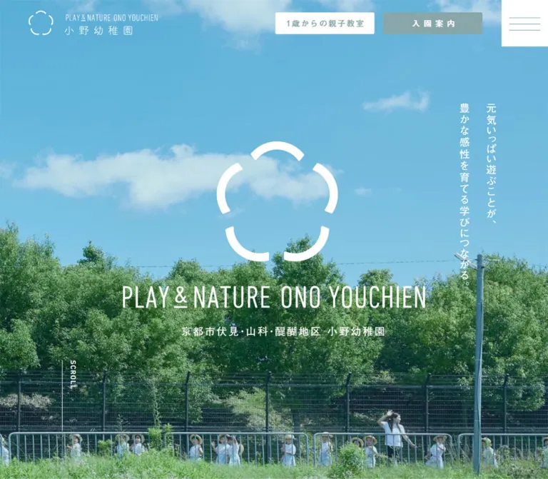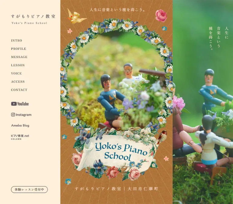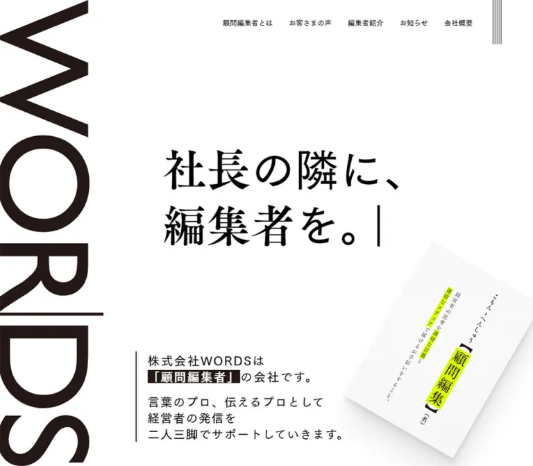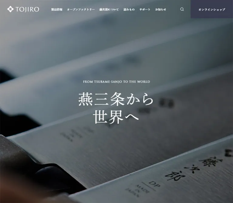
プレビュー準備中デザインリファレンスを見る
DESIGN REFERENCE
神戸女学院大学 音楽学部音楽学科
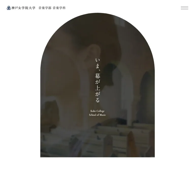
白い余白、アーチ型のメインビジュアル、縦書きコピーが印象的な大学音楽学科サイト。演奏写真と控えめな差し色を用い、専修紹介や学生活動を上品に伝える。
Kobe College School of Music — Style Reference
A dark photographic arch surrounded by white space, followed by the measured rhythm of an academic prospectus.
Website / original URL: m.kobe-c.ac.jp Final URL: https://m.kobe-c.ac.jp/ Theme: light, with muted editorial accents and a dark photographic opening. Inspected: October 2, 2026, at 04:35:57 JST; supplied retrieval timestamp: October 1, 2026, 19:35:57.699 UTC. Viewports: desktop 1440 × 1000 CSS px; mobile 390 × 844 CSS px. Scope: the current music department homepage, using the supplied original-page screenshots and rendered DOM measurements. Visual captures cover the desktop opening, course-card rail, lower desktop sitemap, mobile opening, and mobile closing banners/footer. DOM evidence also covers Topics, News, Event, Feature, Curriculum, Program, CampusLife, Career, and Instructor.
This is a full institutional homepage with editorial, academic, admissions, and navigation functions. Its defining relationship is between generous white space and carefully framed imagery. The desktop opening presents a single tall arch containing darkened photography, a vertical Japanese statement, and a small English school name. Below it, the page alternates news lists, horizontal card tracks, academic introductions, and larger editorial sections.
The interface combines a Japanese Gothic body stack, verified Mincho treatments on selected editorial text, and Cormorant on several small English labels. Muted green, coral, and violet distinguish feature captions without turning the page into a collection of brightly colored panels. Portrait performance photographs, square white title plates, fine arrows, and restrained institutional branding carry most of the identity.
閉じる
Kobe College School of Music — Style Reference
A dark photographic arch surrounded by white space, followed by the measured rhythm of an academic prospectus.
Website / original URL: m.kobe-c.ac.jp Final URL: https://m.kobe-c.ac.jp/ Theme: light, with muted editorial accents and a dark photographic opening. Inspected: October 2, 2026, at 04:35:57 JST; supplied retrieval timestamp: October 1, 2026, 19:35:57.699 UTC. Viewports: desktop 1440 × 1000 CSS px; mobile 390 × 844 CSS px. Scope: the current music department homepage, using the supplied original-page screenshots and rendered DOM measurements. Visual captures cover the desktop opening, course-card rail, lower desktop sitemap, mobile opening, and mobile closing banners/footer. DOM evidence also covers Topics, News, Event, Feature, Curriculum, Program, CampusLife, Career, and Instructor.
This is a full institutional homepage with editorial, academic, admissions, and navigation functions. Its defining relationship is between generous white space and carefully framed imagery. The desktop opening presents a single tall arch containing darkened photography, a vertical Japanese statement, and a small English school name. Below it, the page alternates news lists, horizontal card tracks, academic introductions, and larger editorial sections.
The interface combines a Japanese Gothic body stack, verified Mincho treatments on selected editorial text, and Cormorant on several small English labels. Muted green, coral, and violet distinguish feature captions without turning the page into a collection of brightly colored panels. Portrait performance photographs, square white title plates, fine arrows, and restrained institutional branding carry most of the identity.
How to Read This Reference
- Measured — DOM: computed styles and element rectangles supplied by the browser. Values below are usually rounded to two decimals.
- Derived: arithmetic from those measurements, such as gaps between adjacent cards. These are not recovered stylesheet formulas.
- Estimated — image: visual estimates from the original-page screenshots. Color estimates are not pixel samples.
- Recommended: implementation choices for reuse, including the CSS Quick Start. They are not claims about the original source.
- Typography caveat: a parent heading's computed font does not establish the face or size of an independently styled child, SVG, or graphic. The supplied styles do not include every descendant.
- Capture caveat: screenshots and DOM samples are separate observations. Do not force their vertical coordinates into a single animation timeline.
- Mobile limitation: the opening mobile screenshot shows the header above an otherwise white viewport. The DOM still contains a full-height opening section and the English school name. The cause and eventual hero appearance are unverified.
All token names introduced here are descriptive implementation aliases unless explicitly identified as source custom properties.
Tokens — Colors
Default Palette
| Name | Value | Suggested token | Evidence and role |
|---|---|---|---|
| White Canvas | #FFFFFF |
--color-canvas |
Measured body and footer background; also measured on course-title plates |
| Body Charcoal | #444444 |
--color-text |
Measured body copy, navigation, and many links |
| Heading Ink | #111111 |
--color-heading |
Measured on course heading containers, Program titles, and contact text |
| Warm Program Surface | #F9F6F4 |
--color-program |
Measured Program section background at both widths |
| Muted Note | #999999 |
--color-muted |
Measured curriculum disclaimer and employment-note text |
| Encounter Green | #56815C |
--color-green |
Measured first Feature English caption |
| Exploration Coral | #DD8371 |
--color-coral |
Measured second Feature English caption |
| Music Violet | #67659A |
--color-violet |
Measured third Feature caption and alumni-story heading/link |
The three feature accents are semantic editorial markers. Their confirmed use is on specific text, not as a universal set of filled buttons or section backgrounds.
Supporting Visual Accents
| Appearance | Approximation | Evidence and intended use |
|---|---|---|
| Deep slate in the hero | Approximately #293341 |
Image estimate of the dark upper photographic field; this is a composite appearance, not a measured overlay color |
| Warm tan course rule | Approximately #B99573 |
Image estimate of the narrow rule above instrumental-course title plates |
| Soft pink course rule | Approximately #E8AAA6 |
Image estimate of the voice-course title accent |
| Pale blue-gray action circle | Approximately #BBC4CF |
Image estimate from the mobile information-request banner |
| Warm footer eyebrow | Approximately #B58262 |
Image estimate of the small English sitemap labels |
| Fine neutral border | Approximately #D5D5D5 |
Image estimate of affiliate-tile borders and the contact divider |
| Closing gradient | Pale aqua to pale yellow | Visible behind the mobile closing banners; exact stops, direction, and underlying implementation were not supplied |
Do not treat the hero's apparent slate as a flat replacement for the photograph. Its darkness comes from the complete image treatment, whose compositing parameters are unavailable.
The extracted custom properties include generic WordPress and slider-library colors. Their presence does not establish visible brand use. In particular, the library blue #007AFF is not evidence for a blue CTA system.
Theme Presets
Only one light presentation is evidenced. No theme selector or alternate palette was inspected.
Tokens — Typography
Japanese Body and Navigation
Measured source stack: 游ゴシック体, YuGothic, 'Hiragino Kaku Gothic ProN', 'Hiragino Sans', 'Noto Sans JP', 'BIZ UDPGothic', Meiryo, 'Helvetica Neue', Arial, sans-serif.
The sampled body text uses weight 400, a line height of approximately 2, and letter spacing equal to approximately 0.05em. This creates relaxed Japanese paragraphs without relying on large body text. The mobile body is notably small at approximately 12px; a larger reading size is recommended for adaptations.
A declared stack identifies available choices, not the font file that actually rendered each glyph.
Japanese Editorial Serif
Measured source stack: 游明朝, YuMincho, 'ヒラギノ明朝 Pro W3', 'Hiragino Mincho Pro', HG明朝E, 'MS P明朝', 'MS 明朝', serif.
Verified uses include the department-learning link, the alumni-story headline, and the footer contact label. These are regular-weight, composed treatments rather than heavy display headlines.
The desktop course-card labels and hero statement also look serif in the supplied screenshots. Their exact child-level font declarations were not supplied, so those visual observations should not be promoted into additional measured font assignments.
English Editorial Labels
Measured family: Cormorant, serif, weight 400.
Confirmed uses include:
View alllinks beside Topics, News, and Event.- The three English Feature captions.
- The alumni-story
View morelink.
Do not assign Cormorant to every English heading as a source fact. Several large heading containers report the Japanese Gothic stack, and their inner styling is not available.
Identity and Opening Copy
The header identity is a graphic lockup: crest, university name, and department designation. Its H1 has no extracted text, so ordinary H1 font measurements do not describe the visible wordmark.
The desktop opening statement, いま、幕が上がる, is visibly arranged in a single vertical column. Its apparent size is approximately 32–34px, with a small two-line English label beneath it. These sizes are image estimates, not computed text measurements.
Type Scale
| Role | Desktop | Mobile | Evidence / interpretation |
|---|---|---|---|
| Body copy | 15.48px / 30.96px |
12.05px / 24.10px |
Measured; weight 400 |
| Body tracking | 0.774px |
0.602px |
Measured; approximately 0.05em |
| Feature paragraph | 15.61px / 31.22px |
13.04px / 26.07px |
Measured; slightly larger than the base body |
| Compact section-heading container | 47.39px |
30.24px |
Topics, News, Event; child typography not fully sampled |
| Large section-heading container | 93.47px |
50.61px |
Feature, Curriculum, Program, Career, Instructor |
| Feature Japanese H3 container | 25.09px |
19.09px |
Tall, narrow measured rectangles; inner treatment not fully captured |
| Program H3 | 22.69px |
14.12px |
Measured container size |
| Feature English caption | 14.35px / 14.35px |
10.06px / 10.06px |
Cormorant; colored by feature |
Standard View all |
14.74px |
13.02px |
Cormorant |
| General detail-link container | 16.48px |
13.05px |
Measured on major, campus, career, and instructor links |
| Alumni editorial headline | 26.82px / 37.55px |
19.11px / 26.75px |
Measured Mincho; violet |
| Curriculum disclaimer | 13.61px / 27.22px |
11.04px / 22.07px |
Measured muted text |
| Desktop sitemap link | 13.61px / 30.96px |
Not visibly present | Measured desktop navigation |
| Contact label | 17.35px |
13.06px |
Measured Mincho; 0.1em tracking |
The heading-container line height often remains inherited from the body even when its font-size value is much larger. Do not copy that combination onto a plain text heading and assume it reproduces the rendered design. Inspect the child structure or use an explicitly recommended heading line height.
Tokens — Spacing & Shapes
Overall density: spacious section composition, modest text sizes, close grouping within individual content units.
The source root is 10px at both inspected widths. Body sizes and many dimensions change independently. A universal viewport scale or a single source spacing formula cannot be established from two snapshots.
Spacing Scale
| Use | Desktop | Mobile | Status |
|---|---|---|---|
| Main content side inset | 141.70px |
20.36px |
Measured |
| Visible header identity left edge | 46.08px |
20.36px |
Measured |
| Logo-link internal padding | 15.48px |
12.05px |
Measured |
| Topics card gap | 30px |
20px |
Derived from adjacent rectangles |
| Course card gap | 30px |
30px |
Derived |
| Paired promotional-banner gap | 46.73px horizontally |
Approximately 20.23px vertically for closing banners |
Derived |
| News column separation from Event | Approximately 77.38px |
Stacked sections | Derived |
| Course-title plate padding | 20px 30px 20px 1px |
20px 0 20px 1px |
Measured |
| Course description top separation | Approximately 15.47px |
Description absent from rendered text | Derived / observed |
| Footer vertical padding | 56.08px |
30.37px |
Measured |
| Program top / bottom padding | 37.39px / 93.47px |
20.24px / 50.61px |
Measured |
Several later desktop section boundaries are separated by roughly 100–150px; corresponding mobile gaps are often roughly 45–81px. These are recurring observed intervals, not a complete source spacing scale.
Border Radius
| Element | Treatment | Evidence |
|---|---|---|
| Opening media | Semicircular top with vertical sides and square bottom corners | Desktop screenshot |
| Course plates and links | 0px |
Measured |
| Program section | 10px |
Measured at both widths |
| Closing action buttons | Circles | Mobile screenshot; approximately 40px diameter |
| Affiliate tiles | Square corners | Screenshot |
The arch is a specific opening motif. Repeating its curvature on every photograph or card would change the observed hierarchy.
Layout Measurements
| Element | Desktop 1440 × 1000 | Mobile 390 × 844 |
|---|---|---|
| Document height | 14929.64px |
12681.86px |
| Header rectangle | 1440 × 102.81px |
390 × 55.67px |
| Header identity graphic box | 357.53 × 24.84px |
248.47 × 17.27px |
| Main content width | 1156.58px |
349.28px |
| Narrow Program content width | 1007.05px |
349.28px |
| Opening section | 1440 × 1000px |
390 × 844px |
| Visible desktop arch | Approximately 672 × 850px, starting near (384, 75) |
Not visible in the supplied opening capture |
| Topics card | 266.75 × 399.66px |
263.84 × 382.91px |
| News list width | 539.59px |
349.28px |
| Course card width | 340.94px |
285.83px |
| First course card total height | 595.38px |
470.91px |
| Secondary curriculum link width | 476.47px |
166.86px, still two columns |
| Closing information-request banner | 554.92 × 252.64px |
349.28 × 159.02px |
| Closing open-campus banner | 554.92 × 250.61px |
349.28 × 157.73px |
| Affiliate tile | Approximately 275.61 × 81.31px |
Approximately 172.05 × 50.77px |
| Footer height | 1457.41px |
429.78px |
A desktop arch of approximately 672px width needs a top-circle radius of approximately 336px. With an 850px total height, its vertical corner radius is about 39.5% of the box height. This is derived geometry for a CSS approximation, not a recovered source declaration.
Components
Institutional Header
Role: maintain school identity and a compact global navigation entry point.
The crest and horizontal Japanese wordmark sit at the upper left; three thin horizontal menu strokes sit at the upper right. The header spans the viewport and remains visible at the top of the supplied scrolled captures. This supports a persistent-header interpretation, although its positioning declaration was not included.
At desktop size, the identity begins approximately 46px from the left and 39px from the top. On mobile, it begins approximately 20px from the left and 19px from the top. The graphic scales down without becoming a stacked wordmark.
The visible menu strokes are approximately 47px wide on desktop and 26px on mobile. Their actual interactive bounds were not supplied. No expanded navigation state was inspected. The large navigation collection in the desktop lower-page capture is supported by the footer DOM; it should not be described as a demonstrated menu overlay.
Arched Opening
Role: establish the school's musical and architectural atmosphere before the informational page begins.
The desktop composition contains one centered, tall media window. Its rounded crown forms a near-semicircle, while its lower corners stay square. The surrounding canvas is completely white, with approximately equal 75px clearances above and below the arch in this capture.
The image field is dark enough for white vertical copy. Campus architecture and a faint human figure are visible within the supplied frame. The central Japanese statement is followed by Kobe College and School of Music on two small horizontal lines.
Use the silhouette, centered alignment, and scale relationship as the reusable anatomy. The evidence does not establish whether the underlying media is a video, layered stills, or another treatment. Playback, looping, sound, and a scroll-driven transformation are unverified.
The mobile screenshot does not show this media window. Its blank content area is a capture limitation to investigate, not an intentional design pattern to reproduce.
Promotional Pair Before Topics
Role: expose timely academic or admissions information before the news content.
Two image-style links precede Topics in the rendered document: one points to summer classes and one to the new-major page. Desktop link boxes are approximately 554.92 × 179px and sit side by side. Mobile boxes are approximately 349.28 × 112.66px and stack with a 10.11px gap.
Their full artwork is outside the supplied visual captures. The measured proportions and link destinations are usable; their colors, typography, and imagery should not be invented.
Section Heading and Index Link
Role: distinguish editorial sections while keeping their archives reachable.
Topics, News, and Event use a compact heading scale with a View all link aligned toward the right edge of the relevant content region. On desktop, each News/Event heading belongs to its own half-width column. On mobile, both headers span the same 349.28px content width in separate vertical sections.
Major content sections have much larger heading-container sizes: approximately 93.47px on desktop and 50.61px on mobile. English section names are paired with Japanese descriptors in the rendered content. Preserve the bilingual hierarchy without assuming all child text shares the parent's measured font size.
Use small directional arrows and quiet text links. A large filled conversion button beside every heading would be inconsistent with the observed emphasis.
Topics Rail
Role: a browsable sequence of recent stories and announcements.
Each linked item contains a segmented month/day/weekday date, story content, and optional category labels. Five entries are supplied. The first four desktop card rectangles fit mostly across the content region, while the fifth continues beyond the viewport. Mobile card widths remain close to their desktop size, so one complete card and part of the next can fit.
Desktop cards are 266.75px wide with 30px gaps. Mobile cards are 263.84px wide with 20px gaps. This is a continuing horizontal track rather than a four-column grid compressed to fit the phone.
The DOM shows different title positions within otherwise equal outer card rectangles. Do not infer a uniform internal image height from the outer dimensions. Horizontal dragging, autoplay, snapping, and arrow controls were not exercised.
News List and Event List
Role: separate general announcements from time-specific performances and activities.
Desktop uses two parallel columns of approximately 539.6px. News links group a date and category metadata above a title. Seven rows are measured, each approximately 102.45px high, with approximately 15.48px top and bottom padding. Their successive positions leave a nominal 1px separation.
Event entries use a media-sized area at left and a text region at right. Desktop text begins approximately 211.16px after the link's left edge; the measured internal gap is 28.69px. The three event rows are approximately 182.47px high with 20px between them.
On mobile, News appears first and Event follows below it. News rows measure approximately 90.70px. Event entries retain their side-by-side internal relationship, using a 20.12px gap and approximately 211.61px text width. Their heights vary with the event information rather than remaining equal.
Some measured title boxes occupy one or two line heights despite long text. The exact truncation or clipping rule was not supplied. Preserve full titles in accessible content and verify any visual shortening before implementation.
Three-Part Feature Sequence
Role: express the department's educational character through three distinct themes.
The rendered sequence covers encounters, finding one's music, and applying music in society. Each has a Japanese heading, a number from 01 to 03, an English caption, and a short Japanese paragraph.
Desktop paragraph blocks alternate between left and right positions and are approximately 427.61px wide. The Japanese heading rectangles are tall and narrow, consistent with a vertical editorial arrangement, though this section is not independently shown in the screenshots. On mobile, paragraphs become full content-width blocks while the heading rectangles alternate near opposite edges.
The confirmed English-caption colors are green, coral, and violet, in that order. Keep them as restrained distinctions within a largely white composition. The image content and full arrangement of this section are not established by the supplied visual captures.
Major Introductions
Role: explain the two academic pathways before presenting their individual links.
The Curriculum section introduces the current two-major structure and retains a separate route for students admitted through 2023. Do not collapse those cohort-specific destinations into one undifferentiated curriculum link.
Desktop major-introduction headings occupy tall, narrow boxes beside descriptive text. The first major's paragraph sits on the right in a 313.78px column; the second major's paragraph sits on the left at the same width. Their detail-link boxes are approximately 177.08 × 66.08px.
Mobile introduction headings and paragraphs occupy the full 349.28px content width. Their View more links move to the right and measure approximately 128.16 × 40.36px. This is a material reflow, not a miniature copy of the desktop composition.
Course Card Rail
Role: provide visually distinct entry points into instrumental, vocal, and music-creation study.
The desktop screenshot shows three complete card widths and part of a fourth. The imagery is specific: pianist at a grand piano, violinist in formal performance dress, vocalist in front of an ensemble, and a partial music-production workspace.
Each course link contains:
- A tall, square-cornered photograph.
- A white title plate placed across the lower-left portion of the photograph on desktop.
- A narrow colored rule along the plate's upper edge.
- A Japanese course name, an optional smaller specialization label, and a fine right-pointing arrow.
- A Japanese description below the media, aligned to the card's left edge.
Desktop cards are 340.94px wide with 30px gaps. Title plates are content-sized: approximately 232.55px for keyboard study, 261.81px for the string/wind/percussion label, and 162.09px for voice. The longer music-creation label uses a taller plate. Avoid forcing these plates to an equal width.
The visible photograph tops are cut by the persistent header in the supplied scrolled screenshot. Their visible fragments are not the full source-image aspect ratio.
Derived media allocation: the first desktop title plate ends 487.05px below the card's top. On mobile, the title begins 408.31px below the card's top. These figures are consistent with a 7:10 media slot at the measured card widths if the photograph begins at the link's top. Because the image node itself was not measured, use 7:10 as a supported implementation approximation rather than a confirmed source rule.
Mobile cards remain on a horizontal track at 285.83px wide. Their title plates expand to the card width and begin below the inferred media slot. Course descriptions disappear from the rendered page text and have no supplied mobile paragraph rectangles, although their strings remain in the serialized link content. This supports a compact mobile presentation, not deletion of the underlying course information.
Secondary Curriculum Pair
Role: retain access to graduate study and the earlier undergraduate curriculum.
Desktop links are approximately 476.47px wide and include title plates, English labels, and descriptive paragraphs. Mobile retains two columns at approximately 166.86px each, with a derived 15.55px gap. The descriptions are absent from the mobile rendered text; long labels wrap into taller title plates.
This pair behaves differently from the course rail. Preserve the distinction between two compact secondary destinations and a continuing series of portrait course cards.
Program Surface
Role: group common subjects, international study, qualifications, and teacher preparation.
This is the clearest measured background change: #F9F6F4, with a 10px radius on the section box. Desktop content uses a narrower 1007.05px region and four links arranged in two columns. Each link is approximately 480.16px wide.
On mobile, the four links become a single sequence of 349.28px-wide blocks. Text is inset approximately 70.84px from each link's left edge, compared with approximately 130.84px on desktop. That offset is an important compositional feature; these are not simply centered text cards.
Admissions and Scholarship links follow the four programs. They sit side by side on desktop and stack on mobile. Their artwork and border details are not independently visible, so the measured layout should be separated from any proposed decorative treatment.
Campus Life, Career, and Instructor
Role: continue the prospectus with student experience, outcomes, alumni stories, and faculty information.
CampusLife contains three numbered destinations: student interviews, facilities, and the academic year. Its measured heading region is tall, and the child positions suggest a specialized horizontal or layered composition. Mobile rectangles overlap or extend outside the viewport. Without a corresponding capture or interaction record, these coordinates do not prove an accordion, tab system, or a usable simultaneous three-column layout.
Career combines an outcomes introduction with an alumni-story link. The alumni headline is a verified Mincho treatment in violet: approximately 26.82px on desktop and 19.11px on mobile. Its View more uses Cormorant. A note explains the employment-rate denominator, but no numeric rate is present in the supplied text; do not invent one.
Instructor uses the same large section-heading scale and provides a faculty destination. On mobile, its paragraph spans the content width and its detail link aligns right. These sections use content and typography to maintain continuity, rather than adding a new button or card style for every subject.
Closing Information and Open-Campus Banners
Role: present two prominent next steps near the end of the homepage.
Desktop link rectangles form a two-column pair. On mobile, they stack at approximately 349px wide with a 20px gap.
The visible information-request artwork has a pale field, repeated crest-like ornaments, a widely tracked English school label, the Japanese action 資料請求, and a circular blue-gray arrow. The open-campus artwork pairs architectural detail and green foliage with large white English lettering and a violet circular arrow.
A soft aqua-to-yellow field appears behind these mobile banners and continues around their outer edges. This is a localized closing accent; most of the page remains white.
The request link points to the university admissions-information route, while the open-campus banner points to the department's open-campus route. Neither destination was opened during this analysis.
Affiliate Links and Footer Identity
Role: connect the department to related institutional and alumni resources.
Four small branded tiles appear in one desktop row and a two-by-two mobile grid. The mobile tiles are approximately 172px wide with 5.17px gaps. They have very light borders and no visible elevation.
Below them, the mobile department identity is centered. A full-width お問い合わせ row follows, with a fine right arrow and a horizontal divider. Three small social symbols—X, Instagram, and Facebook—sit centered beneath it, followed by a small copyright line.
The social glyphs are visually small, but their measured mobile link rectangles are approximately 43–45px wide and 45px high. Preserve that distinction between graphic size and interaction size.
Desktop Sitemap
Role: expose the site's extensive academic and informational structure.
The desktop footer includes department information, concerts, two curriculum cohorts, programs, student life, student/alumni achievements, careers, admissions, and news. In the visible lower row, Program, Campus Life, Stories, Job, and Admission form five widely separated groups, with Information continuing below.
Each group combines a small warm-colored English eyebrow, a larger Japanese title, and compact charcoal links. Very pale oversized curved lettering is partially visible behind the upper-right area. Its exact typeface and construction are unknown.
Social links and policy/contact utilities align toward the desktop footer's right side. This expanded sitemap and the policy utility are absent from the supplied mobile rendered text and visible footer. The mobile footer is approximately 430px tall, compared with approximately 1457px on desktop. No mobile accordion replacement was demonstrated.
Tokens — Motion & Interaction
| Element or treatment | Supplied computed transition | What the evidence establishes |
|---|---|---|
| Header | opacity 1s, transform 1s, background-color 1s |
These properties can transition; trigger and end states are unverified |
| Opening section | opacity 1s |
A fade is defined; the complete entrance sequence was not captured |
| Promotional image links | opacity 0.6s ease-out |
Opacity feedback is available; exact hover opacity is unknown |
| Topics / News / Event title containers | color 0.6s ease-out |
Color feedback is defined; target color was not recorded |
| Curriculum introduction paragraph | transform 1s 0.6s, opacity 0.6s 0.6s |
Delayed movement and opacity transitions are defined |
| Program, Career, Instructor sections | opacity 1s, transform 1s |
Section-level reveal properties are present |
| Mobile social links | 0.6s |
A transition duration is recorded, without enough detail to establish the changed property |
Vendor-prefixed duplicate transform entries have been omitted from this table for clarity.
The captured element samples report animation: none. This does not establish that the page has no moving media, JavaScript animation, or animation on unsampled descendants.
Observed interaction scope: the browser traversed vertical scroll positions, and the header remained visible across the supplied scrolled captures. Link destinations and offscreen horizontal card positions are evidenced. No menu opening, horizontal dragging, carousel advance, hover endpoint, form submission, or media control was tested.
For reuse, preserve the measured slow, restrained transition vocabulary. Use explicit properties instead of animating layout indiscriminately. Any proposed arrow movement, card zoom, swipe snapping, or hover color should be labeled as an addition until independently verified.
Surfaces
| Layer | Appearance | Purpose |
|---|---|---|
| Main canvas | White | Continuous institutional and editorial setting |
| Opening media | Dark photographic composite inside an arch | Establishes atmosphere and supports reversed copy |
| Course title plate | Flat white rectangle, narrow colored top rule | Connects course identity to the photograph |
| Program section | Warm off-white, 10px radius | Groups practical academic opportunities |
| Closing banner field | Pale aqua/yellow gradient in mobile capture | Gives the final action area a localized visual change |
| Affiliate tile | White with a fine gray border | Holds unrelated brand artwork in a consistent small format |
| Footer | White, fine divider, compact text and symbols | Organizes extensive navigation without visual weight |
No general shadow-based elevation system is visible in the supplied captures. Separation comes from whitespace, image edges, title plates, fine borders, and a small number of background changes.
Imagery
Photography presents actual musical activity and campus character. In the course rail, instrument, performer, formal dress, and stage setting identify the subject immediately. Faces and instruments may be cropped, but the relationship between the performer and their activity remains legible.
The opening image receives a much darker treatment than the course photographs. The closing open-campus photograph is bright and green, creating a distinct final accent. Avoid applying one uniform filter to all images: their tonal differences serve different roles.
Keep course photographs rectangular, preserve useful instrument detail, and allow the white title plate to cover only the intended lower region. Do not replace these specific scenes with generic music-note illustrations.
Observed Asset References
No image src, video src, or font-file URLs were supplied. The entries below identify observed visual roles and their associated destinations, not downloadable asset paths. Destinations were not opened.
| Visual role | Evidence | Associated destination |
|---|---|---|
| Header and footer institutional lockup | Desktop and mobile captures | Homepage |
| Arched dark opening media | Desktop opening capture | Homepage; media URL unknown |
| Pianist course image | Desktop course capture | Keyboard study |
| Violinist course image | Desktop course capture | Instrumental study |
| Vocalist course image | Desktop course capture | Voice study |
| Music-production workspace | Partial image at the right of the course capture | Music creation |
| Pale information-request artwork | Mobile closing capture | Admissions information |
| Architecture and foliage banner | Mobile closing capture | Open campus |
| Four affiliate artworks | Mobile footer capture | Outreach, institutional collaboration, university, and alumni-related links in the rendered DOM |
Use authorized institutional artwork where available. CSS can reproduce the framing and composition, but it cannot supply the actual crest, wordmark, performance photographs, or campaign artwork.
Layout & Responsive Behavior
The desktop page balances a broad main content region with narrower editorial columns. Most section starts align near x = 141.70px, while the Program content narrows to a region beginning near x = 216.47px. Horizontal rails continue past the main content boundary and reveal partial neighboring items.
Mobile uses a consistent approximately 20.36px content inset. It does not simply stack every desktop component: Topics and courses retain horizontal tracks, while the graduate/earlier-curriculum pair remains two columns.
| Component | Desktop observation | Mobile observation |
|---|---|---|
| Header | Wide identity and menu at opposite edges | Smaller identity; same horizontal relationship |
| Opening | Centered photographic arch is visible | Header visible; hero content not visible in this capture |
| Early promotional pair | Two columns | Stacked, approximately 10px gap |
| Topics | Multiple cards across a continuing track | One card plus a partial neighbor |
| News and Event | Parallel columns | News followed by Event |
| Feature paragraphs | Alternating editorial columns | Full-width paragraphs |
| Major introduction | Tall heading and side description | Full-width heading and description; right-aligned detail link |
| Course rail | 340.94px cards; descriptions visible | 285.83px cards; descriptions not rendered visibly |
| Secondary curriculum links | Two large links with descriptions | Two compact links without visible descriptions |
| Program | Two-column collection | Four stacked links |
| Closing banners | Two columns | Two stacked banners |
| Affiliate links | Four in one row | Two-by-two grid |
| Footer navigation | Large multi-group sitemap | Expanded sitemap absent |
The actual breakpoint rules were not supplied. A 768px breakpoint in the Quick Start is a recommendation, not a source measurement. Tablet, landscape-phone, larger-desktop, browser-zoom, and intermediate-width states were not inspected.
The source custom property --vh equals 10px on desktop and 8.44px on mobile, matching one percent of the inspected viewport height. Its presence does not reveal how all sections consume it. The opening section itself measures one viewport high at both widths.
Document height should remain content-driven. The measured 14.93k and 12.68k pixel lengths are records of these states, not values to hardcode. Likewise, the large measured distance between the opening and the first promotional links is not enough evidence to invent a prolonged blank section or a scroll animation.
Do’s and Don’ts
Do
- Preserve the white canvas and the contrast between a single dark arch and the quieter content below.
- Keep the institutional crest and wordmark as one coherent graphic lockup.
- Use regular-weight Japanese body text with generous line spacing.
- Reserve verified Mincho and Cormorant treatments for their documented roles, or clearly label broader use as an adaptation.
- Keep portrait course imagery, flat overlapping title plates, thin accent rules, and fine arrows together.
- Preserve content-sized desktop title plates and the compact mobile course treatment.
- Maintain different responsive rules for rails, paired links, news columns, and the sitemap.
- Keep current and earlier curriculum cohorts clearly distinguishable.
- Use the warm Program surface and closing gradient as localized changes within a predominantly white page.
- Keep small social symbols inside practical interaction targets.
Don’t
- Don't reduce the institutional homepage to a single conversion funnel with interchangeable feature cards.
- Don't turn every image into an arch or every card into a rounded panel.
- Don't add heavy shadows, glass blur, or bold color fills as a default surface system.
- Don't stretch all course title plates to identical widths on desktop.
- Don't use a screenshot's header-clipped photo fragment as its original aspect ratio.
- Don't assume a parent H2's computed font describes every visible child glyph.
- Don't treat generic library colors as the school's palette.
- Don't describe the desktop footer sitemap as an inspected open-menu state.
- Don't invent hero autoplay, audio, parallax, carousel controls, or hover endpoints.
- Don't reproduce the blank mobile opening as an intentional aesthetic choice.
Recommended Implementation Additions
These are recommendations for a new implementation, not verified features of the original:
- Provide a visible static hero fallback that works before media or animation initialization. Essential content should be visible by default.
- Give the menu button an accessible name,
aria-expanded, and a controlled navigation region. Implement keyboard focus management if it opens an overlay. - Use 44px or larger interaction targets where practical, even when the visible arrow or menu strokes are smaller.
- Raise ordinary mobile reading text to at least 14px while preserving the spacious line-height relationship. The measured original base is approximately 12.05px.
- Keep long story and event titles available to assistive technology and on their destination pages if the visual layout truncates them.
- Make horizontal rails operable by keyboard and touch without trapping vertical page scrolling. Native overflow is a useful baseline; snapping is optional.
- If optional course summaries are visually removed on mobile, retain essential distinctions in the visible title and accessible destination.
- Keep privacy and full navigation routes reachable on mobile even if the expanded desktop sitemap is omitted.
- Verify contrast for small colored captions and muted notes; several decorative colors should not automatically become body-text colors.
- Offer reduced-motion behavior and a pause mechanism if moving hero media is used. Do not make content revelation depend on animation finishing.
Agent Prompt Guide
Quick Color Reference
- Canvas and title plates:
#FFFFFF. - Body and navigation:
#444444. - Strong heading text:
#111111. - Program background:
#F9F6F4. - Feature captions: green
#56815C, coral#DD8371, violet#67659A. - Muted notes: measured
#999999; verify accessibility before reuse. - Hero: darkened photography, not a flat slate rectangle.
- Course accent rules, footer eyebrows, and closing gradient: visually observed, exact values unmeasured.
Overall Prompt
“Create a Japanese university music-department homepage with the restraint of an academic prospectus. Use a white canvas, charcoal text, a compact institutional identity at the upper left, and a thin three-line menu at the upper right. Open with one centered portrait media window with a semicircular crown and square lower corners. Place a short vertical Japanese statement over darkened campus photography, followed by a small two-line English school label. Continue with editorial news, event information, educational features, curriculum pathways, portrait course cards, student life, faculty, admissions banners, and a substantial desktop sitemap. Use generous margins, regular Japanese Gothic body text, selective Mincho editorial text, and small Cormorant labels. Preserve subtle green, coral, and violet accents. Reflow each component deliberately on mobile; retain horizontal course rails and provide a reliable visible hero fallback.”
Example Component Prompts
- Opening: “Build a white desktop opening with an approximately 672 × 850px centered photographic arch at a 1440 × 1000 viewport. Use a semicircular crown, straight sides, square bottom corners, dark imagery, and the vertical source copy
いま、幕が上がる. Keep the school label small and horizontal below it. Do not assume a video or scroll effect.” - Course rail: “Create 341px portrait course links separated by 30px. Each has a performance photograph, a content-width white title plate overlapping its lower-left edge, a thin tan or pink top rule, a small right arrow, and a relaxed description beneath. Use approximately 286px cards on a 390px phone; allow a partial next card and move the title plate below the image.”
- News and events: “Place a dated announcement list beside an event list in two approximately 540px desktop columns. Use small metadata, regular charcoal text, generous row spacing, and quiet Cormorant
View alllinks. Stack the lists on mobile while retaining each event's internal media-and-text arrangement.” - Closing banners: “Stack two 349px-wide mobile campaign banners: a pale institutional information-request graphic with a circular arrow, then a bright architectural and foliage photograph with white event lettering and a violet arrow. Place a subtle aqua-to-pale-yellow field behind this localized area.”
- Footer: “Use four thinly bordered affiliate tiles, a restrained school wordmark, a contact row with a fine arrow and divider, and small social icons with generous hit areas. On desktop, add a broad multi-group academic sitemap with warm English eyebrows, Japanese group titles, and compact links. Do not invent a mobile accordion.”
Quick Start
CSS Custom Properties
This is an implementation scaffold, not the original stylesheet. It uses measured colors and endpoint dimensions, a conventional root font size, and recommended responsive behavior. The large heading interpolation is fitted to the two supplied measurements; the original fluid formula is unknown.
The mobile body size is deliberately raised to 14px. The mobile hero, 768px breakpoint, native scrolling, optional scroll snapping, and hover endpoints are recommendations. The 7:10 course image slot is the derived approximation described above.
Expected component anatomy:
.site-headercontains a linked graphic.brandand a named.menu-togglebutton..hero-archcontains authorized media and.hero-copy; the latter holds.hero-statementand.hero-school..course-cardis one link containing.course-visualand an optional.course-description..course-visualcontains an image and.course-label; the label holds a title, optional specialization, and decorative arrow..railcontains course links;.rail--topicsuses the narrower topic-card dimensions.
Supply actual authorized images through markup. No asset paths or font download URLs are assumed here. Cormorant requires a separately configured font resource if the project does not already provide it.
:root {
  /* Measured colors */
  --color-canvas: #ffffff;
  --color-text: #444444;
  --color-heading: #111111;
  --color-program: #f9f6f4;
  --color-muted: #999999;
  --color-green: #56815c;
  --color-coral: #dd8371;
  --color-violet: #67659a;

  /* Visual approximations, not sampled source colors */
  --color-rule: #d5d5d5;
  --color-course-tan: #b99573;
  --color-course-pink: #e8aaa6;
  --color-footer-eyebrow: #b58262;

  /* Latin-name selections from the observed font stacks */
  --font-body: YuGothic, 'Hiragino Kaku Gothic ProN',
    'Hiragino Sans', 'Noto Sans JP', 'BIZ UDPGothic',
    Meiryo, 'Helvetica Neue', Arial, sans-serif;
  --font-editorial: YuMincho, 'Hiragino Mincho Pro', serif;
  --font-english: Cormorant, serif;

  --text-body: 15.4775px;
  --text-small: 13.6082px;
  --text-link: 14.7389px;
  --text-course: 22.694px;
  --text-section: clamp(50.6123px,
    calc(34.6939px + 4.08163vw), 93.4694px);
  --text-section-small: clamp(30.2449px,
    calc(23.8775px + 1.63266vw), 47.3878px);
  --leading-body: 2;
  --tracking-body: 0.05em;

  --content-max: 1156.5781px;
  --content-narrow: 1007.0469px;
  --edge-min: 20.3594px;
  --page-gutter: max(var(--edge-min),
    calc((100vw - var(--content-max)) / 2));
  --header-height: 102.8125px;
  --header-inset: 46.0781px;
  --brand-width: 357.5313px;
  --menu-line-width: 47px;
  --menu-line-gap: 8px;

  --course-width: 340.9375px;
  --topic-width: 266.75px;
  --rail-gap: 30px;
  --section-space: 112px;
  --radius-program: 10px;
  --duration-link: 600ms;
  --duration-reveal: 1000ms;
}

* {
  box-sizing: border-box;
}

body {
  margin: 0;
  color: var(--color-text);
  background: var(--color-canvas);
  font-family: var(--font-body);
  font-size: var(--text-body);
  font-weight: 400;
  line-height: var(--leading-body);
  letter-spacing: var(--tracking-body);
}

img {
  display: block;
  max-inline-size: 100%;
}

button {
  font: inherit;
}

.container {
  inline-size: calc(100% - 2 * var(--edge-min));
  max-inline-size: var(--content-max);
  margin-inline: auto;
}

.section {
  margin-block-start: var(--section-space);
}

/* Persistent positioning is supported by the captures.
   The opaque white background is a reuse choice. */
.site-header {
  position: fixed;
  inset: 0 0 auto;
  z-index: 30;
  display: flex;
  align-items: center;
  justify-content: space-between;
  block-size: var(--header-height);
  padding-inline: var(--header-inset);
  background: var(--color-canvas);
}

.brand {
  display: block;
  max-inline-size: calc(100% - 64px);
}

.brand img {
  inline-size: var(--brand-width);
  block-size: auto;
}

.menu-toggle {
  display: flex;
  flex-direction: column;
  align-items: flex-end;
  justify-content: center;
  gap: var(--menu-line-gap);
  inline-size: max(44px, var(--menu-line-width));
  min-block-size: 44px;
  padding: 0;
  border: 0;
  color: var(--color-text);
  background: transparent;
  cursor: pointer;
}

.menu-toggle span {
  inline-size: var(--menu-line-width);
  block-size: 1px;
  background: currentColor;
}

.hero {
  display: grid;
  place-items: center;
  min-block-size: 100svh;
  padding: 7.5svh var(--edge-min);
}

.hero-arch {
  position: relative;
  isolation: isolate;
  inline-size: min(672px, 100%, calc(85svh * 0.790588));
  aspect-ratio: 672 / 850;
  overflow: hidden;
  border-radius: 50% 50% 0 0 / 39.53% 39.53% 0 0;
  background: #293341;
}

.hero-arch > img,
.hero-arch > video {
  inline-size: 100%;
  block-size: 100%;
  object-fit: cover;
}

/* Adjust against the actual media; this opacity is recommended. */
.hero-arch::after {
  position: absolute;
  inset: 0;
  z-index: 1;
  background: rgb(20 27 38 / 58%);
  content: '';
  pointer-events: none;
}

.hero-copy {
  position: absolute;
  inset: 0;
  z-index: 2;
  display: grid;
  align-content: center;
  justify-items: center;
  gap: 36px;
  color: #ffffff;
  text-align: center;
}

.hero-statement {
  margin: 0;
  font-family: var(--font-editorial);
  font-size: 32px;
  font-weight: 400;
  line-height: 1.4;
  letter-spacing: 0.08em;
  writing-mode: vertical-rl;
}

.hero-school {
  margin: 0;
  font-family: serif;
  font-size: 14px;
  line-height: 1.6;
}

.section-head {
  display: flex;
  align-items: baseline;
  justify-content: space-between;
  gap: 24px;
  margin-block-end: 40px;
}

.section-title {
  margin: 0;
  font-size: var(--text-section);
  font-weight: 400;
  line-height: 1.1;
}

.section-title--small {
  font-size: var(--text-section-small);
}

.text-link {
  display: inline-flex;
  align-items: center;
  gap: 20px;
  min-block-size: 44px;
  color: inherit;
  font-family: var(--font-english);
  font-size: var(--text-link);
  text-decoration: none;
}

.arrow {
  position: relative;
  display: inline-block;
  flex: 0 0 22px;
  inline-size: 22px;
  block-size: 1px;
  background: currentColor;
}

.arrow::after {
  position: absolute;
  inset: auto 0 0 auto;
  inline-size: 6px;
  block-size: 1px;
  background: currentColor;
  content: '';
  transform: rotate(28deg);
  transform-origin: right center;
}

/* Native overflow and proximity snapping are recommendations. */
.rail {
  display: flex;
  align-items: flex-start;
  gap: var(--rail-gap);
  overflow-x: auto;
  padding: 5px var(--page-gutter) 20px;
  scroll-padding-inline: var(--page-gutter);
  scroll-snap-type: x proximity;
}

.course-card {
  flex: 0 0 min(var(--course-width),
    calc(100vw - 2 * var(--edge-min)));
  color: inherit;
  text-decoration: none;
  scroll-snap-align: start;
}

.course-visual {
  position: relative;
}

.course-visual > img {
  inline-size: 100%;
  aspect-ratio: 7 / 10;
  object-fit: cover;
}

.course-label {
  position: absolute;
  inset: auto auto 0 0;
  display: flex;
  align-items: center;
  gap: 14px;
  max-inline-size: 100%;
  padding: 20px 30px 20px 1px;
  color: var(--color-heading);
  background: var(--color-canvas);
}

.course-label::before {
  position: absolute;
  inset: -5px 0 auto;
  block-size: 5px;
  background: var(--course-accent, var(--color-course-tan));
  content: '';
}

.course-title {
  margin: 0;
  font-family: var(--font-editorial);
  font-size: var(--text-course);
  font-weight: 400;
  line-height: 1.6;
  transition: color var(--duration-link) ease-out;
}

.course-label small {
  font-size: 13px;
  line-height: 1.5;
}

.course-description {
  margin: 15.4775px 0 0;
}

.course-card--voice {
  --course-accent: var(--color-course-pink);
}

.rail--topics > * {
  flex: 0 0 var(--topic-width);
  scroll-snap-align: start;
}

.news-event {
  display: grid;
  grid-template-columns: repeat(2, minmax(0, 1fr));
  gap: 77.38px;
}

.news-row {
  display: block;
  padding-block: 15.4775px;
  border-block-end: 1px solid var(--color-rule);
  color: inherit;
  text-decoration: none;
}

.news-row h3 {
  margin: 8px 0 0;
  font: inherit;
}

.program {
  padding-block: 37.3877px 93.4694px;
  border-radius: var(--radius-program);
  background: var(--color-program);
}

.program .container {
  max-inline-size: var(--content-narrow);
}

.program-grid {
  display: grid;
  grid-template-columns: repeat(2, minmax(0, 1fr));
  gap: 38px 46.73px;
}

.closing-banners {
  padding-block-end: 74.78px;
  background: linear-gradient(110deg, #a6eff0, #f5f6ca);
}

.banner-grid {
  display: grid;
  grid-template-columns: repeat(2, minmax(0, 1fr));
  gap: 46.73px;
}

.banner-grid a,
.affiliate-grid a {
  display: block;
  transition: opacity var(--duration-link) ease-out;
}

.banner-grid img,
.affiliate-grid img {
  inline-size: 100%;
  block-size: auto;
}

.site-footer {
  padding-block: 56.0816px;
  background: var(--color-canvas);
}

.affiliate-grid {
  display: grid;
  grid-template-columns: repeat(4, minmax(0, 1fr));
  gap: 18.03px;
}

.affiliate-grid a {
  border: 1px solid var(--color-rule);
}

.footer-sitemap {
  display: grid;
  grid-template-columns: repeat(5, minmax(0, 1fr));
  gap: 56px 30px;
  margin-block-start: 70px;
}

.footer-eyebrow {
  color: var(--color-footer-eyebrow);
  font-family: var(--font-english);
  font-size: 13px;
}

.footer-sitemap a {
  color: inherit;
  font-size: var(--text-small);
  text-decoration: none;
}

.contact-row {
  display: flex;
  align-items: center;
  justify-content: space-between;
  min-block-size: 50px;
  border-block-end: 1px solid var(--color-rule);
  color: var(--color-heading);
  font-family: var(--font-editorial);
  letter-spacing: 0.1em;
  text-decoration: none;
}

.social-links {
  display: flex;
  justify-content: flex-end;
}

.social-links a {
  display: grid;
  place-items: center;
  min-inline-size: 44px;
  min-block-size: 44px;
  color: var(--color-text);
}

/* Recommended endpoints; the original endpoints were not sampled. */
@media (hover: hover) {
  .course-card:hover .course-title {
    color: var(--color-violet);
  }

  .banner-grid a:hover,
  .affiliate-grid a:hover {
    opacity: 0.8;
  }
}

:where(a, button):focus-visible {
  outline: 2px solid var(--color-violet);
  outline-offset: 4px;
}

@media (max-width: 48rem) {
  :root {
    /* Recommended reading size; measured original: 12.049px. */
    --text-body: 14px;
    --text-small: 12px;
    --text-link: 13.0246px;
    --text-course: 17px;
    --header-height: 55.6719px;
    --header-inset: 20.3594px;
    --brand-width: 248.4688px;
    --menu-line-width: 26px;
    --menu-line-gap: 3.5px;
    --course-width: 285.8281px;
    --topic-width: 263.8438px;
    --section-space: 60px;
  }

  /* A visible mobile opening is an explicit fallback recommendation. */
  .hero {
    padding-block: calc(var(--header-height) + 32px) 32px;
  }

  .hero-arch {
    inline-size: 100%;
  }

  .hero-statement {
    font-size: 24px;
  }

  .hero-copy {
    gap: 24px;
  }

  .hero-school {
    font-size: 12px;
  }

  .section-head {
    gap: 16px;
    margin-block-end: 30px;
  }

  .rail--topics {
    gap: 20px;
  }

  .course-label {
    position: relative;
    inset: auto;
    inline-size: 100%;
    padding: 20px 0 20px 1px;
  }

  .course-description {
    display: none;
  }

  .news-event,
  .program-grid,
  .banner-grid {
    grid-template-columns: minmax(0, 1fr);
  }

  .news-event {
    gap: 60px;
  }

  .program {
    padding-block: 20.2449px 50.6122px;
  }

  .program-grid {
    gap: 25px;
  }

  .banner-grid {
    gap: 20.23px;
  }

  .closing-banners {
    padding-block-end: 40.4898px;
  }

  .site-footer {
    padding-block: 30.3674px;
  }

  .affiliate-grid {
    grid-template-columns: repeat(2, minmax(0, 1fr));
    gap: 5.17px;
  }

  /* Keep full navigation reachable through another accessible route. */
  .footer-sitemap {
    display: none;
  }

  .social-links {
    justify-content: center;
    margin-block-start: 30px;
  }
}

/* Content is visible by default; no reveal class is required. */
@media (prefers-reduced-motion: reduce) {
  .music-site *,
  .music-site *::before,
  .music-site *::after {
    animation: none !important;
    transition: none !important;
    scroll-behavior: auto !important;
  }
}
The scaffold does not implement the menu state, supply imagery, or reconstruct the unverified CampusLife interaction. Add those only from verified requirements. The hero overlay must be tuned to the actual media; applying it to an already darkened image may over-darken the result.
Tailwind v4 Token Mapping
Optional aliases for a project that already uses Tailwind v4. This does not imply the original website uses Tailwind. Define the properties above first.
@theme inline {
  --color-canvas: #ffffff;
  --color-text: #444444;
  --color-heading: #111111;
  --color-program: #f9f6f4;
  --color-muted: #999999;
  --color-feature-green: #56815c;
  --color-feature-coral: #dd8371;
  --color-feature-violet: #67659a;

  --font-sans: var(--font-body);
  --font-serif: var(--font-editorial);
  --font-caption: var(--font-english);

  --text-reading: var(--text-body);
  --text-section-display: var(--text-section);
  --text-section-compact: var(--text-section-small);

  --spacing-page-gutter: var(--page-gutter);
  --spacing-course: var(--course-width);
  --spacing-rail: var(--rail-gap);
  --radius-program-panel: 10px;
}
Sources & Evidence
- Inspected original and final page: Kobe College School of Music. The supplied browser record reports HTTP 200 and identical original/final URLs.
- Capture timestamp:
2026-10-01T19:35:57.699Z, equivalent to October 2, 2026, 04:35:57.699 JST. - Desktop evidence: 1440 × 1000 CSS-pixel viewport; original-page captures of the opening arch, course-card rail, and lower sitemap/footer; rendered document height approximately 14929.64px.
- Mobile evidence: 390 × 844 CSS-pixel viewport; original-page captures of the initial header/white content area and the closing banners/footer; rendered document height approximately 12681.86px.
- Rendered evidence: page text, link destinations, computed font stacks, colors, sizes, spacing, transition strings, and selected element rectangles for both widths. Image source URLs, complete child styles, and the full stylesheet were not included.
- Readiness procedure: the supplied browser observation waited for document load, finite animation readiness, sampled layout/text stability, and visible image decoding within stated limits. Perpetual animations were paused for readiness checks and resumed. These checks do not prove semantic completeness or successful delayed media initialization.
- Observed navigation scope: vertical scroll traversal only. Menus, horizontal rails, hover states, media behavior, and linked destination pages were not independently exercised.
This reference describes the supplied current-page state. The mobile opening remains visually unresolved, intermediate responsive widths are untested, and all added interaction behavior and CSS adaptation choices are labeled as recommendations.
# Kobe College School of Music — Style Reference

> A dark photographic arch surrounded by white space, followed by the measured rhythm of an academic prospectus.

**Website / original URL:** [m.kobe-c.ac.jp](https://m.kobe-c.ac.jp/)
**Final URL:** [https://m.kobe-c.ac.jp/](https://m.kobe-c.ac.jp/)
**Theme:** light, with muted editorial accents and a dark photographic opening.
**Inspected:** October 2, 2026, at 04:35:57 JST; supplied retrieval timestamp: October 1, 2026, 19:35:57.699 UTC.
**Viewports:** desktop 1440 × 1000 CSS px; mobile 390 × 844 CSS px.
**Scope:** the current music department homepage, using the supplied original-page screenshots and rendered DOM measurements. Visual captures cover the desktop opening, course-card rail, lower desktop sitemap, mobile opening, and mobile closing banners/footer. DOM evidence also covers Topics, News, Event, Feature, Curriculum, Program, CampusLife, Career, and Instructor.

This is a full institutional homepage with editorial, academic, admissions, and navigation functions. Its defining relationship is between generous white space and carefully framed imagery. The desktop opening presents a single tall arch containing darkened photography, a vertical Japanese statement, and a small English school name. Below it, the page alternates news lists, horizontal card tracks, academic introductions, and larger editorial sections.

The interface combines a Japanese Gothic body stack, verified Mincho treatments on selected editorial text, and Cormorant on several small English labels. Muted green, coral, and violet distinguish feature captions without turning the page into a collection of brightly colored panels. Portrait performance photographs, square white title plates, fine arrows, and restrained institutional branding carry most of the identity.
閉じる
# Kobe College School of Music — Style Reference

> A dark photographic arch surrounded by white space, followed by the measured rhythm of an academic prospectus.

**Website / original URL:** [m.kobe-c.ac.jp](https://m.kobe-c.ac.jp/)
**Final URL:** [https://m.kobe-c.ac.jp/](https://m.kobe-c.ac.jp/)
**Theme:** light, with muted editorial accents and a dark photographic opening.
**Inspected:** October 2, 2026, at 04:35:57 JST; supplied retrieval timestamp: October 1, 2026, 19:35:57.699 UTC.
**Viewports:** desktop 1440 × 1000 CSS px; mobile 390 × 844 CSS px.
**Scope:** the current music department homepage, using the supplied original-page screenshots and rendered DOM measurements. Visual captures cover the desktop opening, course-card rail, lower desktop sitemap, mobile opening, and mobile closing banners/footer. DOM evidence also covers Topics, News, Event, Feature, Curriculum, Program, CampusLife, Career, and Instructor.

This is a full institutional homepage with editorial, academic, admissions, and navigation functions. Its defining relationship is between generous white space and carefully framed imagery. The desktop opening presents a single tall arch containing darkened photography, a vertical Japanese statement, and a small English school name. Below it, the page alternates news lists, horizontal card tracks, academic introductions, and larger editorial sections.

The interface combines a Japanese Gothic body stack, verified Mincho treatments on selected editorial text, and Cormorant on several small English labels. Muted green, coral, and violet distinguish feature captions without turning the page into a collection of brightly colored panels. Portrait performance photographs, square white title plates, fine arrows, and restrained institutional branding carry most of the identity.

## How to Read This Reference

- **Measured — DOM:** computed styles and element rectangles supplied by the browser. Values below are usually rounded to two decimals.
- **Derived:** arithmetic from those measurements, such as gaps between adjacent cards. These are not recovered stylesheet formulas.
- **Estimated — image:** visual estimates from the original-page screenshots. Color estimates are not pixel samples.
- **Recommended:** implementation choices for reuse, including the CSS Quick Start. They are not claims about the original source.
- **Typography caveat:** a parent heading's computed font does not establish the face or size of an independently styled child, SVG, or graphic. The supplied styles do not include every descendant.
- **Capture caveat:** screenshots and DOM samples are separate observations. Do not force their vertical coordinates into a single animation timeline.
- **Mobile limitation:** the opening mobile screenshot shows the header above an otherwise white viewport. The DOM still contains a full-height opening section and the English school name. The cause and eventual hero appearance are unverified.

All token names introduced here are descriptive implementation aliases unless explicitly identified as source custom properties.

## Tokens — Colors

### Default Palette

| Name | Value | Suggested token | Evidence and role |
| --- | --- | --- | --- |
| White Canvas | `#FFFFFF` | `--color-canvas` | Measured body and footer background; also measured on course-title plates |
| Body Charcoal | `#444444` | `--color-text` | Measured body copy, navigation, and many links |
| Heading Ink | `#111111` | `--color-heading` | Measured on course heading containers, Program titles, and contact text |
| Warm Program Surface | `#F9F6F4` | `--color-program` | Measured Program section background at both widths |
| Muted Note | `#999999` | `--color-muted` | Measured curriculum disclaimer and employment-note text |
| Encounter Green | `#56815C` | `--color-green` | Measured first Feature English caption |
| Exploration Coral | `#DD8371` | `--color-coral` | Measured second Feature English caption |
| Music Violet | `#67659A` | `--color-violet` | Measured third Feature caption and alumni-story heading/link |

The three feature accents are semantic editorial markers. Their confirmed use is on specific text, not as a universal set of filled buttons or section backgrounds.

### Supporting Visual Accents

| Appearance | Approximation | Evidence and intended use |
| --- | --- | --- |
| Deep slate in the hero | Approximately `#293341` | Image estimate of the dark upper photographic field; this is a composite appearance, not a measured overlay color |
| Warm tan course rule | Approximately `#B99573` | Image estimate of the narrow rule above instrumental-course title plates |
| Soft pink course rule | Approximately `#E8AAA6` | Image estimate of the voice-course title accent |
| Pale blue-gray action circle | Approximately `#BBC4CF` | Image estimate from the mobile information-request banner |
| Warm footer eyebrow | Approximately `#B58262` | Image estimate of the small English sitemap labels |
| Fine neutral border | Approximately `#D5D5D5` | Image estimate of affiliate-tile borders and the contact divider |
| Closing gradient | Pale aqua to pale yellow | Visible behind the mobile closing banners; exact stops, direction, and underlying implementation were not supplied |

Do not treat the hero's apparent slate as a flat replacement for the photograph. Its darkness comes from the complete image treatment, whose compositing parameters are unavailable.

The extracted custom properties include generic WordPress and slider-library colors. Their presence does not establish visible brand use. In particular, the library blue `#007AFF` is not evidence for a blue CTA system.

### Theme Presets

Only one light presentation is evidenced. No theme selector or alternate palette was inspected.

## Tokens — Typography

### Japanese Body and Navigation

**Measured source stack:** `游ゴシック体, YuGothic, 'Hiragino Kaku Gothic ProN', 'Hiragino Sans', 'Noto Sans JP', 'BIZ UDPGothic', Meiryo, 'Helvetica Neue', Arial, sans-serif`.

The sampled body text uses weight `400`, a line height of approximately `2`, and letter spacing equal to approximately `0.05em`. This creates relaxed Japanese paragraphs without relying on large body text. The mobile body is notably small at approximately 12px; a larger reading size is recommended for adaptations.

A declared stack identifies available choices, not the font file that actually rendered each glyph.

### Japanese Editorial Serif

**Measured source stack:** `游明朝, YuMincho, 'ヒラギノ明朝 Pro W3', 'Hiragino Mincho Pro', HG明朝E, 'MS P明朝', 'MS 明朝', serif`.

Verified uses include the department-learning link, the alumni-story headline, and the footer contact label. These are regular-weight, composed treatments rather than heavy display headlines.

The desktop course-card labels and hero statement also look serif in the supplied screenshots. Their exact child-level font declarations were not supplied, so those visual observations should not be promoted into additional measured font assignments.

### English Editorial Labels

**Measured family:** `Cormorant, serif`, weight `400`.

Confirmed uses include:

- `View all` links beside Topics, News, and Event.
- The three English Feature captions.
- The alumni-story `View more` link.

Do not assign Cormorant to every English heading as a source fact. Several large heading containers report the Japanese Gothic stack, and their inner styling is not available.

### Identity and Opening Copy

The header identity is a graphic lockup: crest, university name, and department designation. Its H1 has no extracted text, so ordinary H1 font measurements do not describe the visible wordmark.

The desktop opening statement, `いま、幕が上がる`, is visibly arranged in a single vertical column. Its apparent size is approximately 32–34px, with a small two-line English label beneath it. These sizes are image estimates, not computed text measurements.

### Type Scale

| Role | Desktop | Mobile | Evidence / interpretation |
| --- | --- | --- | --- |
| Body copy | `15.48px / 30.96px` | `12.05px / 24.10px` | Measured; weight 400 |
| Body tracking | `0.774px` | `0.602px` | Measured; approximately `0.05em` |
| Feature paragraph | `15.61px / 31.22px` | `13.04px / 26.07px` | Measured; slightly larger than the base body |
| Compact section-heading container | `47.39px` | `30.24px` | Topics, News, Event; child typography not fully sampled |
| Large section-heading container | `93.47px` | `50.61px` | Feature, Curriculum, Program, Career, Instructor |
| Feature Japanese H3 container | `25.09px` | `19.09px` | Tall, narrow measured rectangles; inner treatment not fully captured |
| Program H3 | `22.69px` | `14.12px` | Measured container size |
| Feature English caption | `14.35px / 14.35px` | `10.06px / 10.06px` | Cormorant; colored by feature |
| Standard `View all` | `14.74px` | `13.02px` | Cormorant |
| General detail-link container | `16.48px` | `13.05px` | Measured on major, campus, career, and instructor links |
| Alumni editorial headline | `26.82px / 37.55px` | `19.11px / 26.75px` | Measured Mincho; violet |
| Curriculum disclaimer | `13.61px / 27.22px` | `11.04px / 22.07px` | Measured muted text |
| Desktop sitemap link | `13.61px / 30.96px` | Not visibly present | Measured desktop navigation |
| Contact label | `17.35px` | `13.06px` | Measured Mincho; `0.1em` tracking |

The heading-container line height often remains inherited from the body even when its font-size value is much larger. Do not copy that combination onto a plain text heading and assume it reproduces the rendered design. Inspect the child structure or use an explicitly recommended heading line height.

## Tokens — Spacing & Shapes

**Overall density:** spacious section composition, modest text sizes, close grouping within individual content units.

The source root is `10px` at both inspected widths. Body sizes and many dimensions change independently. A universal viewport scale or a single source spacing formula cannot be established from two snapshots.

### Spacing Scale

| Use | Desktop | Mobile | Status |
| --- | --- | --- | --- |
| Main content side inset | `141.70px` | `20.36px` | Measured |
| Visible header identity left edge | `46.08px` | `20.36px` | Measured |
| Logo-link internal padding | `15.48px` | `12.05px` | Measured |
| Topics card gap | `30px` | `20px` | Derived from adjacent rectangles |
| Course card gap | `30px` | `30px` | Derived |
| Paired promotional-banner gap | `46.73px` horizontally | Approximately `20.23px` vertically for closing banners | Derived |
| News column separation from Event | Approximately `77.38px` | Stacked sections | Derived |
| Course-title plate padding | `20px 30px 20px 1px` | `20px 0 20px 1px` | Measured |
| Course description top separation | Approximately `15.47px` | Description absent from rendered text | Derived / observed |
| Footer vertical padding | `56.08px` | `30.37px` | Measured |
| Program top / bottom padding | `37.39px / 93.47px` | `20.24px / 50.61px` | Measured |

Several later desktop section boundaries are separated by roughly 100–150px; corresponding mobile gaps are often roughly 45–81px. These are recurring observed intervals, not a complete source spacing scale.

### Border Radius

| Element | Treatment | Evidence |
| --- | --- | --- |
| Opening media | Semicircular top with vertical sides and square bottom corners | Desktop screenshot |
| Course plates and links | `0px` | Measured |
| Program section | `10px` | Measured at both widths |
| Closing action buttons | Circles | Mobile screenshot; approximately 40px diameter |
| Affiliate tiles | Square corners | Screenshot |

The arch is a specific opening motif. Repeating its curvature on every photograph or card would change the observed hierarchy.

### Layout Measurements

| Element | Desktop 1440 × 1000 | Mobile 390 × 844 |
| --- | --- | --- |
| Document height | `14929.64px` | `12681.86px` |
| Header rectangle | `1440 × 102.81px` | `390 × 55.67px` |
| Header identity graphic box | `357.53 × 24.84px` | `248.47 × 17.27px` |
| Main content width | `1156.58px` | `349.28px` |
| Narrow Program content width | `1007.05px` | `349.28px` |
| Opening section | `1440 × 1000px` | `390 × 844px` |
| Visible desktop arch | Approximately `672 × 850px`, starting near `(384, 75)` | Not visible in the supplied opening capture |
| Topics card | `266.75 × 399.66px` | `263.84 × 382.91px` |
| News list width | `539.59px` | `349.28px` |
| Course card width | `340.94px` | `285.83px` |
| First course card total height | `595.38px` | `470.91px` |
| Secondary curriculum link width | `476.47px` | `166.86px`, still two columns |
| Closing information-request banner | `554.92 × 252.64px` | `349.28 × 159.02px` |
| Closing open-campus banner | `554.92 × 250.61px` | `349.28 × 157.73px` |
| Affiliate tile | Approximately `275.61 × 81.31px` | Approximately `172.05 × 50.77px` |
| Footer height | `1457.41px` | `429.78px` |

A desktop arch of approximately 672px width needs a top-circle radius of approximately 336px. With an 850px total height, its vertical corner radius is about 39.5% of the box height. This is derived geometry for a CSS approximation, not a recovered source declaration.

## Components

### Institutional Header

**Role:** maintain school identity and a compact global navigation entry point.

The crest and horizontal Japanese wordmark sit at the upper left; three thin horizontal menu strokes sit at the upper right. The header spans the viewport and remains visible at the top of the supplied scrolled captures. This supports a persistent-header interpretation, although its positioning declaration was not included.

At desktop size, the identity begins approximately 46px from the left and 39px from the top. On mobile, it begins approximately 20px from the left and 19px from the top. The graphic scales down without becoming a stacked wordmark.

The visible menu strokes are approximately 47px wide on desktop and 26px on mobile. Their actual interactive bounds were not supplied. No expanded navigation state was inspected. The large navigation collection in the desktop lower-page capture is supported by the footer DOM; it should not be described as a demonstrated menu overlay.

### Arched Opening

**Role:** establish the school's musical and architectural atmosphere before the informational page begins.

The desktop composition contains one centered, tall media window. Its rounded crown forms a near-semicircle, while its lower corners stay square. The surrounding canvas is completely white, with approximately equal 75px clearances above and below the arch in this capture.

The image field is dark enough for white vertical copy. Campus architecture and a faint human figure are visible within the supplied frame. The central Japanese statement is followed by `Kobe College` and `School of Music` on two small horizontal lines.

Use the silhouette, centered alignment, and scale relationship as the reusable anatomy. The evidence does not establish whether the underlying media is a video, layered stills, or another treatment. Playback, looping, sound, and a scroll-driven transformation are unverified.

The mobile screenshot does not show this media window. Its blank content area is a capture limitation to investigate, not an intentional design pattern to reproduce.

### Promotional Pair Before Topics

**Role:** expose timely academic or admissions information before the news content.

Two image-style links precede Topics in the rendered document: one points to summer classes and one to the new-major page. Desktop link boxes are approximately 554.92 × 179px and sit side by side. Mobile boxes are approximately 349.28 × 112.66px and stack with a 10.11px gap.

Their full artwork is outside the supplied visual captures. The measured proportions and link destinations are usable; their colors, typography, and imagery should not be invented.

### Section Heading and Index Link

**Role:** distinguish editorial sections while keeping their archives reachable.

Topics, News, and Event use a compact heading scale with a `View all` link aligned toward the right edge of the relevant content region. On desktop, each News/Event heading belongs to its own half-width column. On mobile, both headers span the same 349.28px content width in separate vertical sections.

Major content sections have much larger heading-container sizes: approximately 93.47px on desktop and 50.61px on mobile. English section names are paired with Japanese descriptors in the rendered content. Preserve the bilingual hierarchy without assuming all child text shares the parent's measured font size.

Use small directional arrows and quiet text links. A large filled conversion button beside every heading would be inconsistent with the observed emphasis.

### Topics Rail

**Role:** a browsable sequence of recent stories and announcements.

Each linked item contains a segmented month/day/weekday date, story content, and optional category labels. Five entries are supplied. The first four desktop card rectangles fit mostly across the content region, while the fifth continues beyond the viewport. Mobile card widths remain close to their desktop size, so one complete card and part of the next can fit.

Desktop cards are 266.75px wide with 30px gaps. Mobile cards are 263.84px wide with 20px gaps. This is a continuing horizontal track rather than a four-column grid compressed to fit the phone.

The DOM shows different title positions within otherwise equal outer card rectangles. Do not infer a uniform internal image height from the outer dimensions. Horizontal dragging, autoplay, snapping, and arrow controls were not exercised.

### News List and Event List

**Role:** separate general announcements from time-specific performances and activities.

Desktop uses two parallel columns of approximately 539.6px. News links group a date and category metadata above a title. Seven rows are measured, each approximately 102.45px high, with approximately 15.48px top and bottom padding. Their successive positions leave a nominal 1px separation.

Event entries use a media-sized area at left and a text region at right. Desktop text begins approximately 211.16px after the link's left edge; the measured internal gap is 28.69px. The three event rows are approximately 182.47px high with 20px between them.

On mobile, News appears first and Event follows below it. News rows measure approximately 90.70px. Event entries retain their side-by-side internal relationship, using a 20.12px gap and approximately 211.61px text width. Their heights vary with the event information rather than remaining equal.

Some measured title boxes occupy one or two line heights despite long text. The exact truncation or clipping rule was not supplied. Preserve full titles in accessible content and verify any visual shortening before implementation.

### Three-Part Feature Sequence

**Role:** express the department's educational character through three distinct themes.

The rendered sequence covers encounters, finding one's music, and applying music in society. Each has a Japanese heading, a number from 01 to 03, an English caption, and a short Japanese paragraph.

Desktop paragraph blocks alternate between left and right positions and are approximately 427.61px wide. The Japanese heading rectangles are tall and narrow, consistent with a vertical editorial arrangement, though this section is not independently shown in the screenshots. On mobile, paragraphs become full content-width blocks while the heading rectangles alternate near opposite edges.

The confirmed English-caption colors are green, coral, and violet, in that order. Keep them as restrained distinctions within a largely white composition. The image content and full arrangement of this section are not established by the supplied visual captures.

### Major Introductions

**Role:** explain the two academic pathways before presenting their individual links.

The Curriculum section introduces the current two-major structure and retains a separate route for students admitted through 2023. Do not collapse those cohort-specific destinations into one undifferentiated curriculum link.

Desktop major-introduction headings occupy tall, narrow boxes beside descriptive text. The first major's paragraph sits on the right in a 313.78px column; the second major's paragraph sits on the left at the same width. Their detail-link boxes are approximately 177.08 × 66.08px.

Mobile introduction headings and paragraphs occupy the full 349.28px content width. Their `View more` links move to the right and measure approximately 128.16 × 40.36px. This is a material reflow, not a miniature copy of the desktop composition.

### Course Card Rail

**Role:** provide visually distinct entry points into instrumental, vocal, and music-creation study.

The desktop screenshot shows three complete card widths and part of a fourth. The imagery is specific: pianist at a grand piano, violinist in formal performance dress, vocalist in front of an ensemble, and a partial music-production workspace.

Each course link contains:

1. A tall, square-cornered photograph.
2. A white title plate placed across the lower-left portion of the photograph on desktop.
3. A narrow colored rule along the plate's upper edge.
4. A Japanese course name, an optional smaller specialization label, and a fine right-pointing arrow.
5. A Japanese description below the media, aligned to the card's left edge.

Desktop cards are 340.94px wide with 30px gaps. Title plates are content-sized: approximately 232.55px for keyboard study, 261.81px for the string/wind/percussion label, and 162.09px for voice. The longer music-creation label uses a taller plate. Avoid forcing these plates to an equal width.

The visible photograph tops are cut by the persistent header in the supplied scrolled screenshot. Their visible fragments are not the full source-image aspect ratio.

**Derived media allocation:** the first desktop title plate ends 487.05px below the card's top. On mobile, the title begins 408.31px below the card's top. These figures are consistent with a 7:10 media slot at the measured card widths if the photograph begins at the link's top. Because the image node itself was not measured, use 7:10 as a supported implementation approximation rather than a confirmed source rule.

Mobile cards remain on a horizontal track at 285.83px wide. Their title plates expand to the card width and begin below the inferred media slot. Course descriptions disappear from the rendered page text and have no supplied mobile paragraph rectangles, although their strings remain in the serialized link content. This supports a compact mobile presentation, not deletion of the underlying course information.

### Secondary Curriculum Pair

**Role:** retain access to graduate study and the earlier undergraduate curriculum.

Desktop links are approximately 476.47px wide and include title plates, English labels, and descriptive paragraphs. Mobile retains two columns at approximately 166.86px each, with a derived 15.55px gap. The descriptions are absent from the mobile rendered text; long labels wrap into taller title plates.

This pair behaves differently from the course rail. Preserve the distinction between two compact secondary destinations and a continuing series of portrait course cards.

### Program Surface

**Role:** group common subjects, international study, qualifications, and teacher preparation.

This is the clearest measured background change: `#F9F6F4`, with a 10px radius on the section box. Desktop content uses a narrower 1007.05px region and four links arranged in two columns. Each link is approximately 480.16px wide.

On mobile, the four links become a single sequence of 349.28px-wide blocks. Text is inset approximately 70.84px from each link's left edge, compared with approximately 130.84px on desktop. That offset is an important compositional feature; these are not simply centered text cards.

Admissions and Scholarship links follow the four programs. They sit side by side on desktop and stack on mobile. Their artwork and border details are not independently visible, so the measured layout should be separated from any proposed decorative treatment.

### Campus Life, Career, and Instructor

**Role:** continue the prospectus with student experience, outcomes, alumni stories, and faculty information.

CampusLife contains three numbered destinations: student interviews, facilities, and the academic year. Its measured heading region is tall, and the child positions suggest a specialized horizontal or layered composition. Mobile rectangles overlap or extend outside the viewport. Without a corresponding capture or interaction record, these coordinates do not prove an accordion, tab system, or a usable simultaneous three-column layout.

Career combines an outcomes introduction with an alumni-story link. The alumni headline is a verified Mincho treatment in violet: approximately 26.82px on desktop and 19.11px on mobile. Its `View more` uses Cormorant. A note explains the employment-rate denominator, but no numeric rate is present in the supplied text; do not invent one.

Instructor uses the same large section-heading scale and provides a faculty destination. On mobile, its paragraph spans the content width and its detail link aligns right. These sections use content and typography to maintain continuity, rather than adding a new button or card style for every subject.

### Closing Information and Open-Campus Banners

**Role:** present two prominent next steps near the end of the homepage.

Desktop link rectangles form a two-column pair. On mobile, they stack at approximately 349px wide with a 20px gap.

The visible information-request artwork has a pale field, repeated crest-like ornaments, a widely tracked English school label, the Japanese action `資料請求`, and a circular blue-gray arrow. The open-campus artwork pairs architectural detail and green foliage with large white English lettering and a violet circular arrow.

A soft aqua-to-yellow field appears behind these mobile banners and continues around their outer edges. This is a localized closing accent; most of the page remains white.

The request link points to the university admissions-information route, while the open-campus banner points to the department's open-campus route. Neither destination was opened during this analysis.

### Affiliate Links and Footer Identity

**Role:** connect the department to related institutional and alumni resources.

Four small branded tiles appear in one desktop row and a two-by-two mobile grid. The mobile tiles are approximately 172px wide with 5.17px gaps. They have very light borders and no visible elevation.

Below them, the mobile department identity is centered. A full-width `お問い合わせ` row follows, with a fine right arrow and a horizontal divider. Three small social symbols—X, Instagram, and Facebook—sit centered beneath it, followed by a small copyright line.

The social glyphs are visually small, but their measured mobile link rectangles are approximately 43–45px wide and 45px high. Preserve that distinction between graphic size and interaction size.

### Desktop Sitemap

**Role:** expose the site's extensive academic and informational structure.

The desktop footer includes department information, concerts, two curriculum cohorts, programs, student life, student/alumni achievements, careers, admissions, and news. In the visible lower row, Program, Campus Life, Stories, Job, and Admission form five widely separated groups, with Information continuing below.

Each group combines a small warm-colored English eyebrow, a larger Japanese title, and compact charcoal links. Very pale oversized curved lettering is partially visible behind the upper-right area. Its exact typeface and construction are unknown.

Social links and policy/contact utilities align toward the desktop footer's right side. This expanded sitemap and the policy utility are absent from the supplied mobile rendered text and visible footer. The mobile footer is approximately 430px tall, compared with approximately 1457px on desktop. No mobile accordion replacement was demonstrated.

## Tokens — Motion & Interaction

| Element or treatment | Supplied computed transition | What the evidence establishes |
| --- | --- | --- |
| Header | `opacity 1s, transform 1s, background-color 1s` | These properties can transition; trigger and end states are unverified |
| Opening section | `opacity 1s` | A fade is defined; the complete entrance sequence was not captured |
| Promotional image links | `opacity 0.6s ease-out` | Opacity feedback is available; exact hover opacity is unknown |
| Topics / News / Event title containers | `color 0.6s ease-out` | Color feedback is defined; target color was not recorded |
| Curriculum introduction paragraph | `transform 1s 0.6s, opacity 0.6s 0.6s` | Delayed movement and opacity transitions are defined |
| Program, Career, Instructor sections | `opacity 1s, transform 1s` | Section-level reveal properties are present |
| Mobile social links | `0.6s` | A transition duration is recorded, without enough detail to establish the changed property |

Vendor-prefixed duplicate transform entries have been omitted from this table for clarity.

The captured element samples report `animation: none`. This does not establish that the page has no moving media, JavaScript animation, or animation on unsampled descendants.

**Observed interaction scope:** the browser traversed vertical scroll positions, and the header remained visible across the supplied scrolled captures. Link destinations and offscreen horizontal card positions are evidenced. No menu opening, horizontal dragging, carousel advance, hover endpoint, form submission, or media control was tested.

For reuse, preserve the measured slow, restrained transition vocabulary. Use explicit properties instead of animating layout indiscriminately. Any proposed arrow movement, card zoom, swipe snapping, or hover color should be labeled as an addition until independently verified.

## Surfaces

| Layer | Appearance | Purpose |
| --- | --- | --- |
| Main canvas | White | Continuous institutional and editorial setting |
| Opening media | Dark photographic composite inside an arch | Establishes atmosphere and supports reversed copy |
| Course title plate | Flat white rectangle, narrow colored top rule | Connects course identity to the photograph |
| Program section | Warm off-white, 10px radius | Groups practical academic opportunities |
| Closing banner field | Pale aqua/yellow gradient in mobile capture | Gives the final action area a localized visual change |
| Affiliate tile | White with a fine gray border | Holds unrelated brand artwork in a consistent small format |
| Footer | White, fine divider, compact text and symbols | Organizes extensive navigation without visual weight |

No general shadow-based elevation system is visible in the supplied captures. Separation comes from whitespace, image edges, title plates, fine borders, and a small number of background changes.

## Imagery

Photography presents actual musical activity and campus character. In the course rail, instrument, performer, formal dress, and stage setting identify the subject immediately. Faces and instruments may be cropped, but the relationship between the performer and their activity remains legible.

The opening image receives a much darker treatment than the course photographs. The closing open-campus photograph is bright and green, creating a distinct final accent. Avoid applying one uniform filter to all images: their tonal differences serve different roles.

Keep course photographs rectangular, preserve useful instrument detail, and allow the white title plate to cover only the intended lower region. Do not replace these specific scenes with generic music-note illustrations.

### Observed Asset References

No image `src`, video `src`, or font-file URLs were supplied. The entries below identify observed visual roles and their associated destinations, not downloadable asset paths. Destinations were not opened.

| Visual role | Evidence | Associated destination |
| --- | --- | --- |
| Header and footer institutional lockup | Desktop and mobile captures | [Homepage](https://m.kobe-c.ac.jp/) |
| Arched dark opening media | Desktop opening capture | Homepage; media URL unknown |
| Pianist course image | Desktop course capture | [Keyboard study](https://m.kobe-c.ac.jp/curriculum/keyboard2) |
| Violinist course image | Desktop course capture | [Instrumental study](https://m.kobe-c.ac.jp/curriculum/instrumental2) |
| Vocalist course image | Desktop course capture | [Voice study](https://m.kobe-c.ac.jp/curriculum/voice2) |
| Music-production workspace | Partial image at the right of the course capture | [Music creation](https://m.kobe-c.ac.jp/curriculum/creation2) |
| Pale information-request artwork | Mobile closing capture | [Admissions information](https://www.kobe-c.ac.jp/admissions/info/search/) |
| Architecture and foliage banner | Mobile closing capture | [Open campus](https://m.kobe-c.ac.jp/admission/opencampus/) |
| Four affiliate artworks | Mobile footer capture | Outreach, institutional collaboration, university, and alumni-related links in the rendered DOM |

Use authorized institutional artwork where available. CSS can reproduce the framing and composition, but it cannot supply the actual crest, wordmark, performance photographs, or campaign artwork.

## Layout & Responsive Behavior

The desktop page balances a broad main content region with narrower editorial columns. Most section starts align near x = 141.70px, while the Program content narrows to a region beginning near x = 216.47px. Horizontal rails continue past the main content boundary and reveal partial neighboring items.

Mobile uses a consistent approximately 20.36px content inset. It does not simply stack every desktop component: Topics and courses retain horizontal tracks, while the graduate/earlier-curriculum pair remains two columns.

| Component | Desktop observation | Mobile observation |
| --- | --- | --- |
| Header | Wide identity and menu at opposite edges | Smaller identity; same horizontal relationship |
| Opening | Centered photographic arch is visible | Header visible; hero content not visible in this capture |
| Early promotional pair | Two columns | Stacked, approximately 10px gap |
| Topics | Multiple cards across a continuing track | One card plus a partial neighbor |
| News and Event | Parallel columns | News followed by Event |
| Feature paragraphs | Alternating editorial columns | Full-width paragraphs |
| Major introduction | Tall heading and side description | Full-width heading and description; right-aligned detail link |
| Course rail | 340.94px cards; descriptions visible | 285.83px cards; descriptions not rendered visibly |
| Secondary curriculum links | Two large links with descriptions | Two compact links without visible descriptions |
| Program | Two-column collection | Four stacked links |
| Closing banners | Two columns | Two stacked banners |
| Affiliate links | Four in one row | Two-by-two grid |
| Footer navigation | Large multi-group sitemap | Expanded sitemap absent |

The actual breakpoint rules were not supplied. A 768px breakpoint in the Quick Start is a recommendation, not a source measurement. Tablet, landscape-phone, larger-desktop, browser-zoom, and intermediate-width states were not inspected.

The source custom property `--vh` equals `10px` on desktop and `8.44px` on mobile, matching one percent of the inspected viewport height. Its presence does not reveal how all sections consume it. The opening section itself measures one viewport high at both widths.

Document height should remain content-driven. The measured 14.93k and 12.68k pixel lengths are records of these states, not values to hardcode. Likewise, the large measured distance between the opening and the first promotional links is not enough evidence to invent a prolonged blank section or a scroll animation.

## Do’s and Don’ts

### Do

- Preserve the white canvas and the contrast between a single dark arch and the quieter content below.
- Keep the institutional crest and wordmark as one coherent graphic lockup.
- Use regular-weight Japanese body text with generous line spacing.
- Reserve verified Mincho and Cormorant treatments for their documented roles, or clearly label broader use as an adaptation.
- Keep portrait course imagery, flat overlapping title plates, thin accent rules, and fine arrows together.
- Preserve content-sized desktop title plates and the compact mobile course treatment.
- Maintain different responsive rules for rails, paired links, news columns, and the sitemap.
- Keep current and earlier curriculum cohorts clearly distinguishable.
- Use the warm Program surface and closing gradient as localized changes within a predominantly white page.
- Keep small social symbols inside practical interaction targets.

### Don’t

- Don't reduce the institutional homepage to a single conversion funnel with interchangeable feature cards.
- Don't turn every image into an arch or every card into a rounded panel.
- Don't add heavy shadows, glass blur, or bold color fills as a default surface system.
- Don't stretch all course title plates to identical widths on desktop.
- Don't use a screenshot's header-clipped photo fragment as its original aspect ratio.
- Don't assume a parent H2's computed font describes every visible child glyph.
- Don't treat generic library colors as the school's palette.
- Don't describe the desktop footer sitemap as an inspected open-menu state.
- Don't invent hero autoplay, audio, parallax, carousel controls, or hover endpoints.
- Don't reproduce the blank mobile opening as an intentional aesthetic choice.

## Recommended Implementation Additions

These are recommendations for a new implementation, not verified features of the original:

- Provide a visible static hero fallback that works before media or animation initialization. Essential content should be visible by default.
- Give the menu button an accessible name, `aria-expanded`, and a controlled navigation region. Implement keyboard focus management if it opens an overlay.
- Use 44px or larger interaction targets where practical, even when the visible arrow or menu strokes are smaller.
- Raise ordinary mobile reading text to at least 14px while preserving the spacious line-height relationship. The measured original base is approximately 12.05px.
- Keep long story and event titles available to assistive technology and on their destination pages if the visual layout truncates them.
- Make horizontal rails operable by keyboard and touch without trapping vertical page scrolling. Native overflow is a useful baseline; snapping is optional.
- If optional course summaries are visually removed on mobile, retain essential distinctions in the visible title and accessible destination.
- Keep privacy and full navigation routes reachable on mobile even if the expanded desktop sitemap is omitted.
- Verify contrast for small colored captions and muted notes; several decorative colors should not automatically become body-text colors.
- Offer reduced-motion behavior and a pause mechanism if moving hero media is used. Do not make content revelation depend on animation finishing.

## Agent Prompt Guide

### Quick Color Reference

- Canvas and title plates: `#FFFFFF`.
- Body and navigation: `#444444`.
- Strong heading text: `#111111`.
- Program background: `#F9F6F4`.
- Feature captions: green `#56815C`, coral `#DD8371`, violet `#67659A`.
- Muted notes: measured `#999999`; verify accessibility before reuse.
- Hero: darkened photography, not a flat slate rectangle.
- Course accent rules, footer eyebrows, and closing gradient: visually observed, exact values unmeasured.

### Overall Prompt

“Create a Japanese university music-department homepage with the restraint of an academic prospectus. Use a white canvas, charcoal text, a compact institutional identity at the upper left, and a thin three-line menu at the upper right. Open with one centered portrait media window with a semicircular crown and square lower corners. Place a short vertical Japanese statement over darkened campus photography, followed by a small two-line English school label. Continue with editorial news, event information, educational features, curriculum pathways, portrait course cards, student life, faculty, admissions banners, and a substantial desktop sitemap. Use generous margins, regular Japanese Gothic body text, selective Mincho editorial text, and small Cormorant labels. Preserve subtle green, coral, and violet accents. Reflow each component deliberately on mobile; retain horizontal course rails and provide a reliable visible hero fallback.”

### Example Component Prompts

1. **Opening:** “Build a white desktop opening with an approximately 672 × 850px centered photographic arch at a 1440 × 1000 viewport. Use a semicircular crown, straight sides, square bottom corners, dark imagery, and the vertical source copy `いま、幕が上がる`. Keep the school label small and horizontal below it. Do not assume a video or scroll effect.”
2. **Course rail:** “Create 341px portrait course links separated by 30px. Each has a performance photograph, a content-width white title plate overlapping its lower-left edge, a thin tan or pink top rule, a small right arrow, and a relaxed description beneath. Use approximately 286px cards on a 390px phone; allow a partial next card and move the title plate below the image.”
3. **News and events:** “Place a dated announcement list beside an event list in two approximately 540px desktop columns. Use small metadata, regular charcoal text, generous row spacing, and quiet Cormorant `View all` links. Stack the lists on mobile while retaining each event's internal media-and-text arrangement.”
4. **Closing banners:** “Stack two 349px-wide mobile campaign banners: a pale institutional information-request graphic with a circular arrow, then a bright architectural and foliage photograph with white event lettering and a violet arrow. Place a subtle aqua-to-pale-yellow field behind this localized area.”
5. **Footer:** “Use four thinly bordered affiliate tiles, a restrained school wordmark, a contact row with a fine arrow and divider, and small social icons with generous hit areas. On desktop, add a broad multi-group academic sitemap with warm English eyebrows, Japanese group titles, and compact links. Do not invent a mobile accordion.”

## Quick Start

### CSS Custom Properties

This is an implementation scaffold, not the original stylesheet. It uses measured colors and endpoint dimensions, a conventional root font size, and recommended responsive behavior. The large heading interpolation is fitted to the two supplied measurements; the original fluid formula is unknown.

The mobile body size is deliberately raised to 14px. The mobile hero, 768px breakpoint, native scrolling, optional scroll snapping, and hover endpoints are recommendations. The 7:10 course image slot is the derived approximation described above.

Expected component anatomy:

- `.site-header` contains a linked graphic `.brand` and a named `.menu-toggle` button.
- `.hero-arch` contains authorized media and `.hero-copy`; the latter holds `.hero-statement` and `.hero-school`.
- `.course-card` is one link containing `.course-visual` and an optional `.course-description`.
- `.course-visual` contains an image and `.course-label`; the label holds a title, optional specialization, and decorative arrow.
- `.rail` contains course links; `.rail--topics` uses the narrower topic-card dimensions.

Supply actual authorized images through markup. No asset paths or font download URLs are assumed here. Cormorant requires a separately configured font resource if the project does not already provide it.

```css
:root {
  /* Measured colors */
  --color-canvas: #ffffff;
  --color-text: #444444;
  --color-heading: #111111;
  --color-program: #f9f6f4;
  --color-muted: #999999;
  --color-green: #56815c;
  --color-coral: #dd8371;
  --color-violet: #67659a;

  /* Visual approximations, not sampled source colors */
  --color-rule: #d5d5d5;
  --color-course-tan: #b99573;
  --color-course-pink: #e8aaa6;
  --color-footer-eyebrow: #b58262;

  /* Latin-name selections from the observed font stacks */
  --font-body: YuGothic, 'Hiragino Kaku Gothic ProN',
    'Hiragino Sans', 'Noto Sans JP', 'BIZ UDPGothic',
    Meiryo, 'Helvetica Neue', Arial, sans-serif;
  --font-editorial: YuMincho, 'Hiragino Mincho Pro', serif;
  --font-english: Cormorant, serif;

  --text-body: 15.4775px;
  --text-small: 13.6082px;
  --text-link: 14.7389px;
  --text-course: 22.694px;
  --text-section: clamp(50.6123px,
    calc(34.6939px + 4.08163vw), 93.4694px);
  --text-section-small: clamp(30.2449px,
    calc(23.8775px + 1.63266vw), 47.3878px);
  --leading-body: 2;
  --tracking-body: 0.05em;

  --content-max: 1156.5781px;
  --content-narrow: 1007.0469px;
  --edge-min: 20.3594px;
  --page-gutter: max(var(--edge-min),
    calc((100vw - var(--content-max)) / 2));
  --header-height: 102.8125px;
  --header-inset: 46.0781px;
  --brand-width: 357.5313px;
  --menu-line-width: 47px;
  --menu-line-gap: 8px;

  --course-width: 340.9375px;
  --topic-width: 266.75px;
  --rail-gap: 30px;
  --section-space: 112px;
  --radius-program: 10px;
  --duration-link: 600ms;
  --duration-reveal: 1000ms;
}

* {
  box-sizing: border-box;
}

body {
  margin: 0;
  color: var(--color-text);
  background: var(--color-canvas);
  font-family: var(--font-body);
  font-size: var(--text-body);
  font-weight: 400;
  line-height: var(--leading-body);
  letter-spacing: var(--tracking-body);
}

img {
  display: block;
  max-inline-size: 100%;
}

button {
  font: inherit;
}

.container {
  inline-size: calc(100% - 2 * var(--edge-min));
  max-inline-size: var(--content-max);
  margin-inline: auto;
}

.section {
  margin-block-start: var(--section-space);
}

/* Persistent positioning is supported by the captures.
   The opaque white background is a reuse choice. */
.site-header {
  position: fixed;
  inset: 0 0 auto;
  z-index: 30;
  display: flex;
  align-items: center;
  justify-content: space-between;
  block-size: var(--header-height);
  padding-inline: var(--header-inset);
  background: var(--color-canvas);
}

.brand {
  display: block;
  max-inline-size: calc(100% - 64px);
}

.brand img {
  inline-size: var(--brand-width);
  block-size: auto;
}

.menu-toggle {
  display: flex;
  flex-direction: column;
  align-items: flex-end;
  justify-content: center;
  gap: var(--menu-line-gap);
  inline-size: max(44px, var(--menu-line-width));
  min-block-size: 44px;
  padding: 0;
  border: 0;
  color: var(--color-text);
  background: transparent;
  cursor: pointer;
}

.menu-toggle span {
  inline-size: var(--menu-line-width);
  block-size: 1px;
  background: currentColor;
}

.hero {
  display: grid;
  place-items: center;
  min-block-size: 100svh;
  padding: 7.5svh var(--edge-min);
}

.hero-arch {
  position: relative;
  isolation: isolate;
  inline-size: min(672px, 100%, calc(85svh * 0.790588));
  aspect-ratio: 672 / 850;
  overflow: hidden;
  border-radius: 50% 50% 0 0 / 39.53% 39.53% 0 0;
  background: #293341;
}

.hero-arch > img,
.hero-arch > video {
  inline-size: 100%;
  block-size: 100%;
  object-fit: cover;
}

/* Adjust against the actual media; this opacity is recommended. */
.hero-arch::after {
  position: absolute;
  inset: 0;
  z-index: 1;
  background: rgb(20 27 38 / 58%);
  content: '';
  pointer-events: none;
}

.hero-copy {
  position: absolute;
  inset: 0;
  z-index: 2;
  display: grid;
  align-content: center;
  justify-items: center;
  gap: 36px;
  color: #ffffff;
  text-align: center;
}

.hero-statement {
  margin: 0;
  font-family: var(--font-editorial);
  font-size: 32px;
  font-weight: 400;
  line-height: 1.4;
  letter-spacing: 0.08em;
  writing-mode: vertical-rl;
}

.hero-school {
  margin: 0;
  font-family: serif;
  font-size: 14px;
  line-height: 1.6;
}

.section-head {
  display: flex;
  align-items: baseline;
  justify-content: space-between;
  gap: 24px;
  margin-block-end: 40px;
}

.section-title {
  margin: 0;
  font-size: var(--text-section);
  font-weight: 400;
  line-height: 1.1;
}

.section-title--small {
  font-size: var(--text-section-small);
}

.text-link {
  display: inline-flex;
  align-items: center;
  gap: 20px;
  min-block-size: 44px;
  color: inherit;
  font-family: var(--font-english);
  font-size: var(--text-link);
  text-decoration: none;
}

.arrow {
  position: relative;
  display: inline-block;
  flex: 0 0 22px;
  inline-size: 22px;
  block-size: 1px;
  background: currentColor;
}

.arrow::after {
  position: absolute;
  inset: auto 0 0 auto;
  inline-size: 6px;
  block-size: 1px;
  background: currentColor;
  content: '';
  transform: rotate(28deg);
  transform-origin: right center;
}

/* Native overflow and proximity snapping are recommendations. */
.rail {
  display: flex;
  align-items: flex-start;
  gap: var(--rail-gap);
  overflow-x: auto;
  padding: 5px var(--page-gutter) 20px;
  scroll-padding-inline: var(--page-gutter);
  scroll-snap-type: x proximity;
}

.course-card {
  flex: 0 0 min(var(--course-width),
    calc(100vw - 2 * var(--edge-min)));
  color: inherit;
  text-decoration: none;
  scroll-snap-align: start;
}

.course-visual {
  position: relative;
}

.course-visual > img {
  inline-size: 100%;
  aspect-ratio: 7 / 10;
  object-fit: cover;
}

.course-label {
  position: absolute;
  inset: auto auto 0 0;
  display: flex;
  align-items: center;
  gap: 14px;
  max-inline-size: 100%;
  padding: 20px 30px 20px 1px;
  color: var(--color-heading);
  background: var(--color-canvas);
}

.course-label::before {
  position: absolute;
  inset: -5px 0 auto;
  block-size: 5px;
  background: var(--course-accent, var(--color-course-tan));
  content: '';
}

.course-title {
  margin: 0;
  font-family: var(--font-editorial);
  font-size: var(--text-course);
  font-weight: 400;
  line-height: 1.6;
  transition: color var(--duration-link) ease-out;
}

.course-label small {
  font-size: 13px;
  line-height: 1.5;
}

.course-description {
  margin: 15.4775px 0 0;
}

.course-card--voice {
  --course-accent: var(--color-course-pink);
}

.rail--topics > * {
  flex: 0 0 var(--topic-width);
  scroll-snap-align: start;
}

.news-event {
  display: grid;
  grid-template-columns: repeat(2, minmax(0, 1fr));
  gap: 77.38px;
}

.news-row {
  display: block;
  padding-block: 15.4775px;
  border-block-end: 1px solid var(--color-rule);
  color: inherit;
  text-decoration: none;
}

.news-row h3 {
  margin: 8px 0 0;
  font: inherit;
}

.program {
  padding-block: 37.3877px 93.4694px;
  border-radius: var(--radius-program);
  background: var(--color-program);
}

.program .container {
  max-inline-size: var(--content-narrow);
}

.program-grid {
  display: grid;
  grid-template-columns: repeat(2, minmax(0, 1fr));
  gap: 38px 46.73px;
}

.closing-banners {
  padding-block-end: 74.78px;
  background: linear-gradient(110deg, #a6eff0, #f5f6ca);
}

.banner-grid {
  display: grid;
  grid-template-columns: repeat(2, minmax(0, 1fr));
  gap: 46.73px;
}

.banner-grid a,
.affiliate-grid a {
  display: block;
  transition: opacity var(--duration-link) ease-out;
}

.banner-grid img,
.affiliate-grid img {
  inline-size: 100%;
  block-size: auto;
}

.site-footer {
  padding-block: 56.0816px;
  background: var(--color-canvas);
}

.affiliate-grid {
  display: grid;
  grid-template-columns: repeat(4, minmax(0, 1fr));
  gap: 18.03px;
}

.affiliate-grid a {
  border: 1px solid var(--color-rule);
}

.footer-sitemap {
  display: grid;
  grid-template-columns: repeat(5, minmax(0, 1fr));
  gap: 56px 30px;
  margin-block-start: 70px;
}

.footer-eyebrow {
  color: var(--color-footer-eyebrow);
  font-family: var(--font-english);
  font-size: 13px;
}

.footer-sitemap a {
  color: inherit;
  font-size: var(--text-small);
  text-decoration: none;
}

.contact-row {
  display: flex;
  align-items: center;
  justify-content: space-between;
  min-block-size: 50px;
  border-block-end: 1px solid var(--color-rule);
  color: var(--color-heading);
  font-family: var(--font-editorial);
  letter-spacing: 0.1em;
  text-decoration: none;
}

.social-links {
  display: flex;
  justify-content: flex-end;
}

.social-links a {
  display: grid;
  place-items: center;
  min-inline-size: 44px;
  min-block-size: 44px;
  color: var(--color-text);
}

/* Recommended endpoints; the original endpoints were not sampled. */
@media (hover: hover) {
  .course-card:hover .course-title {
    color: var(--color-violet);
  }

  .banner-grid a:hover,
  .affiliate-grid a:hover {
    opacity: 0.8;
  }
}

:where(a, button):focus-visible {
  outline: 2px solid var(--color-violet);
  outline-offset: 4px;
}

@media (max-width: 48rem) {
  :root {
    /* Recommended reading size; measured original: 12.049px. */
    --text-body: 14px;
    --text-small: 12px;
    --text-link: 13.0246px;
    --text-course: 17px;
    --header-height: 55.6719px;
    --header-inset: 20.3594px;
    --brand-width: 248.4688px;
    --menu-line-width: 26px;
    --menu-line-gap: 3.5px;
    --course-width: 285.8281px;
    --topic-width: 263.8438px;
    --section-space: 60px;
  }

  /* A visible mobile opening is an explicit fallback recommendation. */
  .hero {
    padding-block: calc(var(--header-height) + 32px) 32px;
  }

  .hero-arch {
    inline-size: 100%;
  }

  .hero-statement {
    font-size: 24px;
  }

  .hero-copy {
    gap: 24px;
  }

  .hero-school {
    font-size: 12px;
  }

  .section-head {
    gap: 16px;
    margin-block-end: 30px;
  }

  .rail--topics {
    gap: 20px;
  }

  .course-label {
    position: relative;
    inset: auto;
    inline-size: 100%;
    padding: 20px 0 20px 1px;
  }

  .course-description {
    display: none;
  }

  .news-event,
  .program-grid,
  .banner-grid {
    grid-template-columns: minmax(0, 1fr);
  }

  .news-event {
    gap: 60px;
  }

  .program {
    padding-block: 20.2449px 50.6122px;
  }

  .program-grid {
    gap: 25px;
  }

  .banner-grid {
    gap: 20.23px;
  }

  .closing-banners {
    padding-block-end: 40.4898px;
  }

  .site-footer {
    padding-block: 30.3674px;
  }

  .affiliate-grid {
    grid-template-columns: repeat(2, minmax(0, 1fr));
    gap: 5.17px;
  }

  /* Keep full navigation reachable through another accessible route. */
  .footer-sitemap {
    display: none;
  }

  .social-links {
    justify-content: center;
    margin-block-start: 30px;
  }
}

/* Content is visible by default; no reveal class is required. */
@media (prefers-reduced-motion: reduce) {
  .music-site *,
  .music-site *::before,
  .music-site *::after {
    animation: none !important;
    transition: none !important;
    scroll-behavior: auto !important;
  }
}
```

The scaffold does not implement the menu state, supply imagery, or reconstruct the unverified CampusLife interaction. Add those only from verified requirements. The hero overlay must be tuned to the actual media; applying it to an already darkened image may over-darken the result.

### Tailwind v4 Token Mapping

Optional aliases for a project that already uses Tailwind v4. This does not imply the original website uses Tailwind. Define the properties above first.

```css
@theme inline {
  --color-canvas: #ffffff;
  --color-text: #444444;
  --color-heading: #111111;
  --color-program: #f9f6f4;
  --color-muted: #999999;
  --color-feature-green: #56815c;
  --color-feature-coral: #dd8371;
  --color-feature-violet: #67659a;

  --font-sans: var(--font-body);
  --font-serif: var(--font-editorial);
  --font-caption: var(--font-english);

  --text-reading: var(--text-body);
  --text-section-display: var(--text-section);
  --text-section-compact: var(--text-section-small);

  --spacing-page-gutter: var(--page-gutter);
  --spacing-course: var(--course-width);
  --spacing-rail: var(--rail-gap);
  --radius-program-panel: 10px;
}
```

## Sources & Evidence

- **Inspected original and final page:** [Kobe College School of Music](https://m.kobe-c.ac.jp/). The supplied browser record reports HTTP 200 and identical original/final URLs.
- **Capture timestamp:** `2026-10-01T19:35:57.699Z`, equivalent to October 2, 2026, 04:35:57.699 JST.
- **Desktop evidence:** 1440 × 1000 CSS-pixel viewport; original-page captures of the opening arch, course-card rail, and lower sitemap/footer; rendered document height approximately 14929.64px.
- **Mobile evidence:** 390 × 844 CSS-pixel viewport; original-page captures of the initial header/white content area and the closing banners/footer; rendered document height approximately 12681.86px.
- **Rendered evidence:** page text, link destinations, computed font stacks, colors, sizes, spacing, transition strings, and selected element rectangles for both widths. Image source URLs, complete child styles, and the full stylesheet were not included.
- **Readiness procedure:** the supplied browser observation waited for document load, finite animation readiness, sampled layout/text stability, and visible image decoding within stated limits. Perpetual animations were paused for readiness checks and resumed. These checks do not prove semantic completeness or successful delayed media initialization.
- **Observed navigation scope:** vertical scroll traversal only. Menus, horizontal rails, hover states, media behavior, and linked destination pages were not independently exercised.

This reference describes the supplied current-page state. The mobile opening remains visually unresolved, intermediate responsive widths are untested, and all added interaction behavior and CSS adaptation choices are labeled as recommendations.関連するデザイン
スタイルやページの種類、ジャンルが近いデザインを集めました。