プレビュー準備中デザインリファレンスを見る
DESIGN REFERENCE
藤次郎|燕三条の包丁メーカー公式サイト
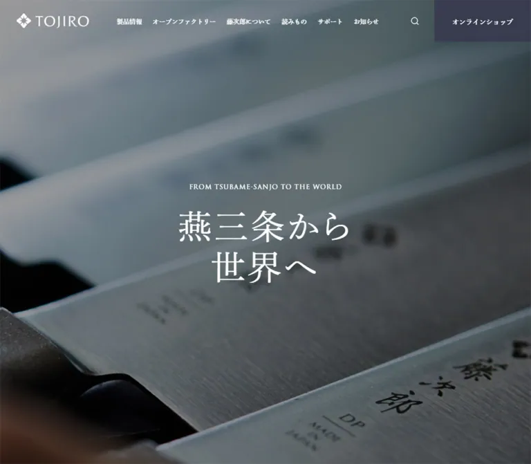
包丁の接写と大きな明朝体で職人のものづくりを伝える企業サイト。白と濃紺、広い余白、端正な英字見出しを軸に、製品・工場見学・読みもの・購入導線をまとめています。
TOJIRO JAPAN — Style Reference
Brushed steel, expansive white space, and precise Japanese typography frame a working knife manufacturer.
Website: tojiro.net Original URL: https://tojiro.net/ Final URL: https://tojiro.net/ Theme: light content surfaces, dark slate typography, and a dark photographic opening. Inspected: October 6, 2026, 01:18:49 JST; supplied retrieval timestamp: October 5, 2026, 16:18:49.370 UTC. Viewports: 1440 × 1000 desktop and 390 × 844 mobile, in CSS pixels. Scope: the current Japanese manufacturer homepage: opening header and hero, brand introduction, product gateway, news, factory information, editorial content, service and shopping links, sitemap, and footer. Visual captures cover the desktop hero, pickup news, and footer, plus the mobile hero and footer. Other sections are documented from supplied rendered DOM measurements. Linked pages and expanded interactive states were not inspected.
TOJIRO combines close-up knife imagery with a restrained corporate and editorial interface. The opening fills the viewport with diagonally arranged blades, darkened steel tones, a white wordmark, and a large two-line Japanese statement. Below it, white space and measured type hierarchy organize a substantial manufacturer website with several distinct visitor journeys.
Three type roles carry the identity: Japanese Mincho for expressive statements and section titles, classical Latin capitals for English labels, and Japanese Gothic for reading and utilities. Dark slate replaces pure black in most interface text. Warm bronze appears sparingly in links and selection details. Square geometry, thin rules, and quiet text links provide structure without a general shadow or rounded-card system.
閉じる
TOJIRO JAPAN — Style Reference
Brushed steel, expansive white space, and precise Japanese typography frame a working knife manufacturer.
Website: tojiro.net Original URL: https://tojiro.net/ Final URL: https://tojiro.net/ Theme: light content surfaces, dark slate typography, and a dark photographic opening. Inspected: October 6, 2026, 01:18:49 JST; supplied retrieval timestamp: October 5, 2026, 16:18:49.370 UTC. Viewports: 1440 × 1000 desktop and 390 × 844 mobile, in CSS pixels. Scope: the current Japanese manufacturer homepage: opening header and hero, brand introduction, product gateway, news, factory information, editorial content, service and shopping links, sitemap, and footer. Visual captures cover the desktop hero, pickup news, and footer, plus the mobile hero and footer. Other sections are documented from supplied rendered DOM measurements. Linked pages and expanded interactive states were not inspected.
TOJIRO combines close-up knife imagery with a restrained corporate and editorial interface. The opening fills the viewport with diagonally arranged blades, darkened steel tones, a white wordmark, and a large two-line Japanese statement. Below it, white space and measured type hierarchy organize a substantial manufacturer website with several distinct visitor journeys.
Three type roles carry the identity: Japanese Mincho for expressive statements and section titles, classical Latin capitals for English labels, and Japanese Gothic for reading and utilities. Dark slate replaces pure black in most interface text. Warm bronze appears sparingly in links and selection details. Square geometry, thin rules, and quiet text links provide structure without a general shadow or rounded-card system.
How to Read This Reference
- Measured means a value is present in the supplied computed styles, element bounds, asset attributes, or document dimensions. It does not mean the original stylesheet was independently downloaded.
- Calculated means simple arithmetic from those measurements, such as container margins or gaps between elements.
- Estimated means a visual approximation from the supplied original-page screenshots. Estimated colors were not sampled programmatically.
- Recommended means an implementation choice for a new project. Breakpoints, accessible behavior, and the Quick Start architecture fall into this category unless explicitly identified otherwise.
- Token names in this document are reusable aliases, not discovered source variables.
- Computed font-family stacks establish declared families. They do not independently verify which font rendered every glyph.
- Some elements have duplicate text, offscreen carousel positions, or transformed-looking coordinates. Their bounds must not be treated as a complete static document layout.
Tokens — Colors
Default Palette
| Name | Value | Suggested token | Evidence and role |
|---|---|---|---|
| Slate Ink | #383b4e |
--color-ink |
Measured: body text, section headings, footer links, and header shop background |
| White | #ffffff |
--color-paper |
Measured: body background, hero lettering, and lower shop button fill |
| Warm Bronze | #886f45 |
--color-accent |
Measured: selected editorial category and several link/control color values |
| Metadata Gray | #8c8c91 |
--color-muted |
Measured: dates, categories, mobile copyright, and language links |
| Index Gray | #6c6d6e |
--color-index |
Measured: pickup-card item numbers |
| Pale Gray Field | approximately #eeeeee |
--color-field |
Estimated: pickup background and bottom footer surface |
| Fine Divider | approximately #d5d6dc |
--color-rule |
Estimated: sitemap and mobile accordion separators |
Slate Ink is the principal brand interface color. The shop control uses the same slate as ordinary text, so its prominence comes from its solid rectangular area and placement. Bronze is a detail color, not a large conversion-button fill.
The hero contains blue-gray steel, near-black gaps, and a blurred warm foreground. These belong to the imagery rather than a set of reusable flat UI colors. The screenshot establishes a darkened visual treatment, but neither the original media grading nor an overlay opacity is supplied.
The DOM includes numerous standard WordPress color, gradient, and shadow presets. Their presence does not establish that the visible design uses them. Do not incorporate those preset blues, pinks, gradients, or shadows into the brand palette.
Theme Presets
No user-selectable theme was evidenced. White content areas, pale gray bands, and reversed white text are section treatments within one visual system.
Tokens — Typography
Japanese Mincho — Statements and Headings
Declared primary family: dnp-shuei-mincho-pr6n.
The recorded fallback stack includes Noto Serif JP, YuMincho, Hiragino Mincho ProN, and other Japanese serif families. Use this role for the opening statement, Japanese section headings, story links, and shopping labels.
The main hero uses weight 400; many smaller headings use 500. Preserve the contrast between delicate large characters and relatively modest section titles. Heavy bold Japanese headings would change the tone substantially.
Classical Latin Capitals — English Labels
Declared primary family: trajan-pro-3.
This family is declared for the hero's English line, NEWS, PICKUP, OPEN FACTORY, COLUMN, VISION, and HISTORY. Most examples use 0.08em tracking. The same family also carries the much larger two-line OUR PRODUCTS statement.
These labels act as editorial markers. Their spacing and proportions matter even when they are only 11–14px tall.
Japanese Gothic — Reading and Utilities
Declared primary family: dnp-shuei-gothic-gin-std.
The recorded stack continues through YuGothic, Yu Gothic Medium, Yu Gothic, Hiragino Kaku Gothic ProN, Meiryo, MS PGothic, Arial, Helvetica, Verdana, and sans-serif alternatives.
Body copy normally uses weight 500. Dates, categories, article text, sitemap links, and social links use this role. Desktop header navigation is an exception: it uses the Mincho stack.
Numerals and Brand Artwork
Pickup pagination explicitly declares Arial, weight 400, at 12px. Do not assume all numerals use the Latin display family.
Both TOJIRO logos are SVG assets. Their lettering is artwork, not evidence of an additional text font. Preserve the supplied horizontal header lockup and stacked footer lockup rather than recreating either with live text.
Type Scale
All values in this table are measured unless otherwise noted. Sizes are shown as font size / line height.
| Role | Desktop | Mobile | Weight and tracking |
|---|---|---|---|
| Main Japanese statement | 90 / 108px |
45 / 54px |
400; 0.08em |
| Secondary brand statement | 90 / 126px |
45 / 63px |
400; normal tracking |
OUR PRODUCTS |
86 / 86px |
39 / 39px |
400; 0.08em |
| Japanese section heading | 32 / 44.8px |
25 / 35px |
500; normal tracking |
| Japanese story-link title | 24 / 28.8px |
18 / 21.6px |
500 |
| Hero English line | 14 / 25.2px |
11 / 19.25px |
500; 0.08em |
| Section English eyebrow | 14 / 16.8px |
11 / 13.2px |
400; 0.08em |
PICKUP / LATEST NEWS |
18 / 25.2px |
16 / 22.4px |
400; 0.08em |
| Default body | 14 / 25.2px |
14 / 23.8px |
500 |
| Brand introduction | 16 / 32px |
14 / 28px |
500 |
| Factory description | 14 / 28px |
12 / 24px |
500 |
| Date and category metadata | 12 / 16.8px |
11 / 15.4px |
500 |
| Header navigation | 14 / 25.2px |
Hidden in captured state | 500; Mincho |
| Header shop label | 15 / 25.2px |
11 / 23.8px |
500; Mincho |
| Sitemap group heading | 18 / 27px |
16 / 24px |
500; Gothic |
| Sitemap child link | 13 / 18.2px |
Collapsed in captured state | 500; Gothic |
| Lower shop button | 18 / 25.2px |
16 / 23.8px |
500; Mincho |
| Pagination number | 12 / 40px |
12 / 40px |
Arial, 400 |
The desktop pickup headline appears approximately 20px in the screenshot. Its own computed font size is not included, so this remains a visual estimate rather than a measured heading token.
The root HTML size is 10px at both inspected widths. The Quick Start uses explicit pixel values and does not require changing a project's root size. If translating original rem values elsewhere, account for that 10px source root.
Tokens — Spacing & Shapes
Density: sparse brand presentation, moderately dense editorial lists, and compact footer navigation.
There is no established single spacing formula in the supplied evidence. Repeated values include 20, 24, 36, 48, 60, and 72px, but the site also uses component-specific dimensions.
Spacing Scale
| Use | Desktop | Mobile | Evidence |
|---|---|---|---|
| Main content side clearance | 130px |
24px |
Measured at the supplied widths |
| Header logo left clearance | 35px |
12px |
Measured |
| Hero eyebrow-to-title gap | 20px |
20px |
Calculated from element bounds |
| Section eyebrow-to-title gap | 10px |
8px |
Calculated from NEWS bounds |
| Latest-news row vertical padding | 36px |
24px |
Measured |
| Pickup track gap | 50px |
50px |
Calculated from successive card positions |
| Pickup heading-to-card gap | 44px |
36px |
Calculated |
| Pagination item gap | 20px |
20px |
Calculated between 40px controls |
| Factory paragraph line spacing | 28px |
24px |
Measured line height |
| Sitemap column gap | approximately 80px |
Not applicable | Calculated from three column positions |
| Mobile footer side clearance | Not applicable | 36px |
Measured |
Border Radius
| Element | Treatment | Evidence |
|---|---|---|
| Shop links and standard content links | Square | Measured 0px radius |
| Pickup cards | Square | Measured link radius and screenshot |
| Sitemap groups | Square, rule-separated | Screenshot |
| Pagination controls | Circle | Measured 100% radius, 40 × 40px |
| Images | Rectangular | Visible captures; no rounded mask evidenced |
Layout Measurements
| Element | Desktop at 1440 × 1000 | Mobile at 390 × 844 |
|---|---|---|
| Document height | 14299px |
11043px |
| Main content region | 1180px, beginning at x 130 |
342px, beginning at x 24 |
| Header logo | 164 × 34px |
116 × 24.05px |
| Header shop block | 215 × 93.2px |
117 × 61.8px |
| Hero copy group | Approximately 470.44 × 261.2px |
Approximately 235.22 × 166.5px |
| Brand introduction column | 600px |
342px |
| Product information link | 240 × 62.2px |
240 × 60.8px |
| Pickup card | 845 × 222px |
340px wide; sampled heights 332.6–357.8px |
| Latest-news list | Approximately 890px |
342px |
| Editorial article list | 890px, beginning at x 316 |
273px, beginning at x 81 |
| Factory slide text | 510px |
242px |
| Contact/support panel | 720 × 480px each |
390 × 257px each |
| Lower shop link | 420 × 83.2px |
285 × 73.8px |
| Sitemap column | Approximately 340px; three columns |
Full-width rows, usually 57px high |
The 1180px desktop container and 600px introduction width are measured outcomes at this viewport. Using them as maximum widths is a practical reconstruction choice, not a recovered source CSS rule.
Document height is contextual evidence, not a target to recreate with empty spacer elements. Some product bounds appear within the viewport despite their later position in the text sequence. The underlying positioning or scroll mechanism is not supplied.
Components
Overlay Header
Role: brand identity, primary navigation, search, and a consistently visible shopping entry in the opening composition.
At desktop width, place the horizontal white logo at x 35, approximately y 29.6. Navigation begins at x 259, giving a calculated 60px gap after the 164px logo. Adjacent navigation items have approximately 24px gaps. The labels cover products, factory visits, company information, editorial content, support, news, and recruitment.
The search artwork is 18 × 18px within a measured wrapper about 48 × 55.2px. At the far right, the slate shop block occupies 215 × 93.2px and meets the top and right viewport edges. Its square shape gives it weight without enlarging the label excessively.
On mobile, the logo becomes 116px wide at x 12. The navigation and visible search disappear from the captured header. A three-line menu symbol sits immediately before the shop block; its visible lines are approximately 34px wide. The shop block remains exposed at x 273, with a width of 117px and a height of 61.8px.
The opening header overlays the image. Persistence, scroll-triggered recoloring, menu contents, and search behavior were not demonstrated. Several desktop navigation labels are recorded as paragraph elements; this alone does not prove their interaction semantics.
Full-Viewport Knife Hero
Role: establish place, manufacturing identity, and the material character of the product.
The supplied opening captures are filled by close-up knife imagery. Repeated blade edges run diagonally across the frame. Soft focus in the upper background and warm blur near the lower edge create depth, while a dark treatment keeps white lettering legible.
Center the complete text group, not just the Japanese heading. On desktop it runs approximately from y 369.4 to 630.6, centered on the 1000px viewport. On mobile it runs from y 338.75 to 505.25, centered on the 844px viewport.
The English line reads FROM TSUBAME-SANJO TO THE WORLD. It occupies one line on desktop and two lines on mobile, breaking after TSUBAME-SANJO. Leave 20px before the Japanese heading. The Japanese statement keeps the same two-line structure: 燕三条から followed by 世界へ.
Desktop and mobile use 90px and 45px Japanese type respectively. Tracking stays proportional at 0.08em. The phone composition crops the image to preserve the blade rhythm rather than shrinking a desktop screenshot into a narrow frame.
The hero media URL and media element type are absent from the supplied evidence. Describe and implement the visible composition without claiming that it is a video, slideshow, or parallax sequence.
Brand Introduction and Story Links
Role: explain the manufacturer and offer routes into its values and history.
The introduction uses a centered 600px text column on desktop. Its paragraph is 16px / 32px, with enough leading to sustain a quiet pace. On mobile, the column becomes 342px wide with 24px side margins, and the paragraph changes to 14px / 28px.
The introductory statement is repeated in the rendered text. Two earlier copies have coincident bounds and different text colors. These are not evidence that all copies should be visibly stacked at once. Preserve one readable statement in a new static implementation unless the original layering behavior is separately established.
Below the paragraph, わたしたちの想い / VISION and 藤次郎の歴史 / HISTORY form distinct bilingual links. Desktop places them side by side; mobile stacks them centrally. Japanese link titles shrink from 24px to 18px. Measured mobile bounds leave approximately 60px between the two link blocks.
Product Gateway
Role: move from brand narrative to the product catalog.
The DOM establishes a large Japanese brand statement, a two-line OUR PRODUCTS heading, a short manufacturing description, and a centered 製品情報を見る link.
The English display heading measures 86px / 86px on desktop and 39px / 39px on mobile, with 0.08em tracking. The product link remains 240px wide at both widths, making it a stable visual anchor while the display typography scales down.
The available screenshots do not show this complete section. Its exact imagery, layering, and relationship to scrolling remain unverified. Reuse the measured type hierarchy and link proportions without inventing a product animation or copying isolated y coordinates into a static layout.
Bilingual Section Heading
Role: create a consistent transition between major content areas.
Place a small tracked English eyebrow above a larger Japanese title. Desktop examples use a 14px / 16.8px eyebrow, a 10px gap, and a 32px / 44.8px title. Mobile uses an 11px / 13.2px eyebrow, an 8px gap, and a 25px / 35px title.
The NEWS heading is centered. OPEN FACTORY and COLUMN begin at the main content left edge in the measured layouts. Their desktop overview links sit at the right edge of the same section heading region.
English overview links reserve 42px of left padding, providing room for a directional ornament. This is a compact text-link treatment rather than a filled button.
Pickup News Carousel
Role: give a small number of announcements greater prominence than the ordinary news list.
The desktop screenshot shows a pale gray full-width band, centered PICKUP label, and one complete horizontal card with portions of adjacent cards visible. The active card is centered at approximately x 297.5, with a measured size of 845 × 222px.
Its anatomy is:
- A left image region approximately
333 × 222px, estimated from the screenshot. - A white information region approximately 512px wide.
- A small item number aligned toward the upper-right corner.
- A Japanese headline and muted date/category line near the top.
- A small underlined
詳しく見るlink at the lower right.
The measured text start is 381px from the card's left edge. Combined with the estimated 333px image width, this indicates approximately 48px of left padding inside the information panel. The information area's right inset is approximately 20px.
Cards are separated by 50px. Small arrow controls sit just outside the complete center card. Beneath them, three 40px circular pagination boxes are arranged with 20px gaps. The selected number has a fine bronze ring in the screenshot; the others remain visually unboxed.
On mobile, each sampled card is 340px wide and changes from display: flex to display: block. The center card begins at x 25. Number stamps and the separate detail-link text are absent from the mobile rendered text. Card heights vary with content. Pagination text changes from 01, 02, 03 to 1, 2, 3.
Repeated entries and offscreen positions are consistent with a carousel track. The supplied screenshot and DOM sample show different centered announcements. This establishes a state difference, but does not establish autoplay, an interval, transition duration, or swipe behavior.
Latest News List
Role: make routine announcements easy to scan beneath the pickup presentation.
Desktop uses a small left label region and a wider list on the right. The label region begins at x 130 and is approximately 260px wide. The news list begins at x 420 and is approximately 890px wide, leaving a calculated 30px gap between the two regions.
Each entry is a horizontal image-and-text link with 36px vertical padding. The text starts 222px after the row's left edge. Image width is approximately 192px, inferred from asset proportions and row measurements, leaving roughly 30px for the gap.
On mobile, the heading sits above a 342px list. Entries retain a compact horizontal arrangement with 24px vertical padding. Text begins 100px after the row's left edge; this allocation includes the thumbnail and its gap. Dates reduce to 11px and wrap when necessary. Longer latest-news excerpt text present on desktop is absent from the mobile rendered text.
The ALL NEWS link moves from the desktop label area to the end of the mobile list. Preserve this change in information hierarchy instead of merely shrinking the desktop columns.
Open Factory Selector and Detail Slides
Role: introduce the factory, gallery, and atelier as distinct places to visit and understand.
The DOM contains a section heading, a set of differently sized facility links, repeated detail slides, previous/next controls, and VIEW MORE links. The facility-link rectangles do not form equal-sized cards. Their irregular proportions suggest a spatial selector; its exact artwork is not included in the screenshots.
Each detail slide includes an English facility label, a Japanese title, a descriptive paragraph, and a small overview link. The text region measures 510px wide on desktop and 242px on mobile. Paragraphs use generous double leading: 14px / 28px and 12px / 24px respectively.
Computed slide text is white, establishing reversed typography. The precise supporting background and crop cannot be identified from the provided captures. Avoid assigning a specific photo, map style, or animation based only on the facility names.
The mobile selector retains measured link bounds even though the corresponding labels are absent from the mobile text extract. It should not be described as completely removed.
Editorial Articles and Category Navigation
Role: provide practical knife knowledge and product-selection guidance.
The COLUMN section includes a bilingual heading, category navigation, five article links, and an overview link. Desktop categories include all content, knife knowledge, selection advice, customer voices, and a staff blog. The selected all-content link has the measured bronze color.
Desktop article rows occupy a 890px region beginning at x 316, with a 222px offset from each row's left edge to its text. This section has a different alignment from the latest-news list; do not force every content block onto one identical left edge.
On mobile, article blocks are 273px wide and begin at x 81, leaving 36px to the viewport's right edge. Their metadata begins at the same x coordinate as the block, substantially below its top, indicating a vertical image-and-copy arrangement. Excerpts remain present. The desktop category links are replaced in the text evidence by CATEGORY and すべて; the precise selector control was not captured.
This narrow, offset mobile article column is an observed detail. A centered 342px article list would be a deliberate adaptation, not a faithful description of this layout.
Contact, Support, and Shopping Gateways
Role: finish the content sequence with practical service and purchase routes.
Contact and support are adjacent 720 × 480px links on desktop. On mobile they become consecutive full-width panels measuring 390 × 257px. Each has a Japanese title and a small muted supporting line. Titles reduce from 20px to 18px; supporting text remains 12px.
The lower shopping region includes white supporting text and a centered white button with slate Mincho lettering. The button is 420 × 83.2px on desktop and 285 × 73.8px on mobile. Its background context is not visually documented in the supplied crops, so an exact media or surface treatment cannot be claimed.
The header shop link points to /shop/, while the lower purchase button points to https://store.tojiro.net/. These are distinct observed destinations. Their subsequent behavior was not inspected.
Desktop Sitemap and Mobile Accordion Rows
Role: expose the breadth of the manufacturer website without making the primary header carry every destination.
Desktop uses three approximately 340px columns separated by 80px gaps within the 1180px content region. Group headings use 18px Gothic text, thin horizontal dividers, and small rightward arrows where visible. The screenshot shows a short dark segment at the start of several otherwise light rules; approximately 30px is a useful visual estimate.
Child links use 13px / 18.2px type with 4px top and bottom padding. Measured rows are approximately 26.2px high, often separated by an additional 5px. Groups have substantially more vertical separation than individual links.
On mobile, the groups become full-width rows. Most measure 57px high: 24px line height, 16px padding above and below, and a thin separator. Labels start at x 24. A simple plus symbol sits near the right edge, approximately 16px square in the screenshot. The company-information row is slightly taller at 59px.
The captured mobile state shows collapsed groups. Opening behavior, exclusive versus multiple expansion, animation, and keyboard support were not tested. A new implementation should use explicit disclosure semantics rather than relying on a clickable paragraph.
Brand and Utility Footer
Role: close the page with identity, social destinations, policies, languages, and legal text.
A pale gray band follows the sitemap. Desktop places the stacked TOJIRO JAPAN logo near the left content edge, social links toward the right, and policy/language links in the rightmost column. The supplied logo asset declares 113 × 95px.
On mobile, the footer becomes approximately 486px tall in the measured document. Its internal side clearance increases to 36px. The logo is centered horizontally at x 138.5, approximately 60px below the footer's start.
Below the logo, retain two columns rather than stacking every utility link. Social links begin at x 36; policy and language links begin at x 234. Social names use 13px Gothic type with 36px of space reserved for the icon and separation. Policy and language text uses 12px. Copyright sits near the bottom-left at x 36, using 11px / 13.2px muted text.
The visible social destinations are X, Instagram, YouTube, and Facebook. Language labels remain a compact slash-separated line: JP / EN / CN / TW. Keep the icons neutral and visually secondary to the main brand mark.
Tokens — Motion & Interaction
| Treatment | Supplied evidence | What can be concluded |
|---|---|---|
| Ordinary links and many navigation items | Computed transition shorthand 0.2s |
A short transition is declared; the changed property and resulting hover appearance were not captured |
| Factory descriptive paragraphs | Computed transition shorthand 1s 0.2s |
A one-second transition with a 0.2-second delay is declared; trigger and animated property remain unknown |
| Facility selector links | Desktop 0.2s; mobile none |
A responsive difference in declared transition behavior |
| Pickup carousel | Arrows, pagination, repeated entries, and different centered items across samples | Multiple states are evidenced; autoplay, looping behavior, timing, and gestures remain unverified |
| Factory carousel | Repeated slide content and previous/next controls | A carousel-like structure is evidenced; control responses were not exercised |
| Mobile menu | Three-line symbol in screenshot | Closed-state appearance only |
| Mobile sitemap | Plus symbols and collapsed content | Disclosure affordance only; open state not supplied |
| Hero media | Static captures of knife imagery | No reliable evidence for playback, crossfade, parallax, or scrubbing |
Many sampled elements report animation: none, and some report only transition: all without a nonzero duration. Neither observation proves that the whole page is static: parent transforms, scripts, or media can operate outside those individual samples.
The supplied capture process waited for load and sampled visual stability, temporarily paused perpetual animations during readiness checks, and resumed them afterward. It does not establish a complete motion specification.
For a new implementation, restrained 200ms color or opacity feedback fits the measured link timing. Reduced-motion handling, focus states, and any carousel controller are recommended additions, not verified original features.
Surfaces
| Layer | Appearance | Purpose |
|---|---|---|
| Opening | Full-bleed darkened knife imagery with white text | Immediate material and brand identity |
| Main canvas | White with slate text | Brand explanation, editorial lists, and navigation |
| Pickup field | Pale gray, estimated near #eeeeee |
Separates promoted announcements from ordinary news |
| Pickup information panel | White rectangle | Provides a stable reading area beside the image |
| Header shop link | Solid measured #383b4e |
Strong navigation emphasis at the viewport edge |
| Lower shop link | White rectangle with slate text | Purchase entry within a reversed-text section |
| Sitemap | White with fine gray rules | Dense but orderly navigation |
| Utility footer | Pale gray | Calm closing field for brand and secondary links |
No general elevation system is visible. Avoid introducing card shadows, glass surfaces, pill containers, or gradient-backed interface sections merely because the platform's global presets include them.
Imagery
The opening's visual strength comes from real material detail: ground metal, engraved markings, repeated blade geometry, shallow focus, and the contrast between cool steel and a warmer blurred foreground. Preserve the diagonal rhythm and enough darker space behind the centered lettering.
At phone width, the frame remains immersive. Cropping changes which knives and foreground details are visible; the image is not reduced to a short banner above the text. A cover-style crop is a useful implementation recommendation, but the original object-fit and object-position values were not supplied.
The pickup capture shows both a slate TOJIRO brand image and factory exterior photography. The DOM also identifies editorial photographs and event banners. Different source aspect ratios coexist: many thumbnails are 604 × 403px, while the brand news image is 600 × 314px. Do not assume every source image is already 3:2.
Observed Asset References
Paths are relative to https://tojiro.net/. These assets were referenced in the supplied original-page DOM; no additional asset browsing was performed.
| Asset | Observed path | Evidence and use |
|---|---|---|
| Horizontal logo | /2021/wp-content/themes/tojiro2026/img/common/logo.svg |
Declared 164 × 34px; header identity |
| Stacked logo | /2021/wp-content/themes/tojiro2026/img/common/logo_2.svg |
Declared 113 × 95px; footer identity |
| Search icon | /2021/wp-content/themes/tojiro2026/img/common/icon_search.svg |
Declared 18 × 18px |
| External-link mark | /2021/wp-content/themes/tojiro2026/img/common/icon_blank.svg |
Declared 13 × 11px; selected footer destinations |
| Brand news image | /2021/wp-content/uploads/2021/04/M7UIpZ7g.jpg |
Declared 600 × 314px; news announcement |
| Factory exterior | /2021/wp-content/uploads/2023/03/of-604x403.jpg |
Declared 604 × 403px; factory-related news and reading |
| Event banner | /2021/wp-content/uploads/2026/08/banner-604x403.jpg |
Declared 604 × 403px; pickup/news content |
| Vegetable-knife article image | /2021/wp-content/uploads/2026/03/DSC00322-604x403.jpg |
Declared 604 × 403px; editorial article |
| Small-knife article image | /2021/wp-content/uploads/2025/12/DSC00387-604x403.jpg |
Declared 604 × 403px; editorial article |
Use authorized original assets when available. The hero's specific asset URL is unknown; do not substitute an invented source path or treat a screenshot as the original media file.
Layout & Responsive Behavior
The homepage retains its overall information sequence across desktop and mobile, while individual regions change structure. The measured document is approximately 14.3k pixels tall on desktop and 11.0k on mobile. This difference includes responsive visibility, wrapping, layout, and potentially positioning effects; it cannot be attributed to one cause.
| Region | Desktop observation | Mobile observation |
|---|---|---|
| Header | Full navigation, search, and shop block | Compact logo, menu symbol, and exposed shop block |
| Hero | One English line; 90px Japanese title | Two English lines; 45px Japanese title |
| Introduction | Centered 600px column | 342px column with 24px side clearance |
| Story links | Side by side | Stacked centrally |
| Pickup | Horizontal image and information panel | Block arrangement, 340px card width |
| Latest news | Left label region and right list | Heading above compact horizontal rows; overview link below |
| Editorial list | Wide horizontal rows | Narrow 273px vertical blocks offset to the right |
| Contact and support | Two equal side-by-side panels | Two full-width stacked panels |
| Sitemap | Three expanded columns | Full-width collapsed disclosure rows |
| Utility footer | Logo left, links right | Centered logo above two utility columns |
Only two widths were supplied. The actual source breakpoints and interpolation formulas are unknown. The Quick Start uses recommended breakpoints of 1100px for header compression and 767px for the main mobile composition; neither is a claimed original value.
The hero's mobile image crop, English line break, and smaller logo all matter. Reducing font size alone will not reproduce the phone composition. Likewise, the footer requires a structural change, not a smaller three-column sitemap.
Do’s and Don’ts
Do
- Keep Slate Ink
#383b4eas the principal interface color and white as the main reading surface. - Preserve the separation between Japanese Mincho, Latin display capitals, and Gothic reading text.
- Center the complete hero copy group within the viewport and retain the two-line Japanese statement.
- Give imagery enough area to communicate steel texture and manufacturing character.
- Keep the shop entry square, solid, and attached to the opening header's right edge.
- Use small tracked English labels to organize larger Japanese headings.
- Preserve the distinction between promoted pickup cards and ordinary news rows.
- Keep fine rules, restrained arrows, small metadata, and generous section separation.
- Rebuild the mobile footer hierarchy with disclosures, a centered logo, and two utility columns.
- Keep product, service, factory, editorial, and recruitment routes visible in the overall information architecture.
Don’t
- Don't replace the homepage's multiple visitor journeys with a single sales funnel.
- Don't use a single sans-serif family for all typography.
- Don't turn all links into rounded filled buttons or all content into elevated cards.
- Don't promote bronze into a large competing brand field.
- Don't import unused WordPress preset gradients or shadows into the visual system.
- Don't stretch image assets or assume every thumbnail shares the same native aspect ratio.
- Don't reproduce duplicated carousel or hero DOM text as repeated visible content.
- Don't infer autoplay, video playback, sticky navigation, or parallax from static imagery and isolated bounds.
- Don't copy large document coordinates into artificial empty sections.
- Don't describe unpictured section backgrounds or unopened controls as verified designs.
Recommended Implementation Additions
These are recommendations for a new implementation, not claims about the original site's behavior:
- Give menu, search, previous/next, and pagination controls accessible names and visible keyboard focus.
- Use buttons for disclosure actions, with synchronized
aria-expanded, associated panels, and predictable keyboard operation. - Keep decorative carousel copies out of the accessibility tree and remove their descendants from keyboard navigation.
- If adding automatic slide changes or moving hero media, provide an appropriate pause mechanism and reduced-motion behavior.
- Enlarge the effective hit areas around small arrows and icons to at least 44px without enlarging their visible artwork.
- Review the contrast and readability of 11–12px gray metadata. A new project can use the measured darker Index Gray or larger text where needed.
- Keep the hero's meaningful heading as live text and use an appropriate heading hierarchy rather than copying logo-based heading markup mechanically.
- Provide useful image alternatives for editorial and factory content; use empty alternatives for purely decorative repetitions.
- Load licensed display fonts with sensible fallbacks and account for layout changes while fonts load.
- Reserve image dimensions and test the mobile image crop so the brand statement remains readable at narrow widths and browser text zoom.
Agent Prompt Guide
Quick Color Reference
- Primary text and header shop fill: measured
#383b4e. - Main canvas and reversed lettering: measured
#ffffff. - Selected-link detail: measured
#886f45. - Metadata: measured
#8c8c91. - Pickup and footer fields: estimated
#eeeeee. - Fine separators: estimated
#d5d6dc. - Hero darkness: tune against the chosen image; original overlay strength is unknown.
Overall Prompt
“Create a Japanese knife manufacturer's corporate and editorial homepage inspired by the current TOJIRO visual system. Open with full-viewport, darkened close-up knife imagery, a white SVG brand mark, restrained Mincho navigation, and a square slate shop link at the upper-right edge. Center a small tracked Latin eyebrow above a large two-line Japanese Mincho statement. Use white reading surfaces, slate text #383b4e, restrained bronze accents #886f45, Japanese Gothic body copy, and small classical English section labels. Continue through brand information, product discovery, pickup news, ordinary news, factory visits, articles, support, and shopping. Use square geometry and fine rules. On mobile, retain the exposed shop entry, halve the hero title from 90px to 45px, stack story links and pickup content, and replace the expanded sitemap with accessible disclosure rows. Treat unverified motion as a separate design decision.”
Example Component Prompts
- Opening hero: “A 1440 × 1000 opening view with diagonally arranged kitchen-knife blades filling the frame. Center the live Japanese copy
燕三条から/世界へat 90px with 1.2 line height and 0.08em tracking. Place a 14px tracked English eyebrow 20px above it. Use white lettering, a horizontal white brand mark at the upper left, and a 215px-wide slate shopping block at the upper right. Provide a separate 390 × 844 crop with 45px Japanese type.” - Pickup card: “A square 845 × 222px desktop news card on a pale gray carousel field. Use an approximately 333px-wide image on the left and a white information region on the right. Place a small index at the upper right, a restrained Japanese headline and gray metadata near the top, and a short underlined detail link at the bottom right. Add partial neighboring cards, small arrows, and three 40px pagination circles.”
- News list: “Within an approximately 1180px desktop region, place a compact English news heading in a 260px left column and an 890px image-and-text list to its right. Use 36px vertical row padding, slate Gothic text, small gray date/category lines, and no shadows. On a 390px phone, retain compact horizontal news rows inside 24px gutters and move the overview link below the list.”
- Bilingual section title: “A small uppercase classical serif eyebrow with 0.08em tracking above a 32px Japanese Mincho heading. Use slate ink on white and a 10px vertical gap. At phone width, change to an 11px eyebrow, 25px heading, and 8px gap.”
- Responsive footer: “Create a white three-column desktop sitemap with thin gray rules, slate 18px group headings, and 13px child links. Follow it with a pale gray footer containing a stacked brand logo at left and social, policy, and language links at right. On mobile, turn the sitemap into 57px disclosure rows with plus symbols, center the 113px-wide logo, and retain two utility-link columns within 36px side margins.”
- Editorial article block: “Create an image-led article list with Japanese titles, small date/category metadata, and useful excerpts. Desktop rows are approximately 890px wide. For the measured phone composition, stack image and text in a 273px column beginning 81px from the left edge of a 390px viewport. Keep the asymmetric white space deliberate and avoid rounded cards.”
Quick Start
CSS Custom Properties
This is a reusable adaptation of the supplied measurements, not an extraction of the original stylesheet. Confirmed values, estimates, and recommended choices are labeled. It keeps the project's root font size unchanged.
Expected structure: .hero contains .hero-media, .site-header, and .hero-copy; the copy contains .hero-kicker and .hero-title. Place an explicit line break in the Japanese title and a mobile-only break after TSUBAME-SANJO. Pickup cards contain an image and .pickup-content. Sitemap disclosure buttons directly precede their .sitemap-panel.
Supply authorized image assets and load the named fonts through a licensed arrangement. The font stacks below do not download font files. Menu, carousel pagination, and disclosure state controllers require separate behavior. The pickup track itself provides native horizontal scrolling as a recommended baseline.
:root {
  /* Measured interface colors */
  --color-ink: #383b4e;
  --color-paper: #ffffff;
  --color-accent: #886f45;
  --color-muted: #8c8c91;
  --color-index: #6c6d6e;

  /* Visual estimates */
  --color-field: #eeeeee;
  --color-rule: #d5d6dc;

  /* Declared primary families with shortened fallback stacks */
  --font-heading: 'dnp-shuei-mincho-pr6n', 'Noto Serif JP',
    YuMincho, 'Hiragino Mincho ProN', serif;
  --font-latin: 'trajan-pro-3', 'Noto Serif JP', serif;
  --font-body: 'dnp-shuei-gothic-gin-std', YuGothic,
    'Yu Gothic', 'Hiragino Kaku Gothic ProN', Meiryo, sans-serif;

  /* Measured desktop sizes */
  --text-hero: 90px;
  --text-products: 86px;
  --text-section: 32px;
  --text-eyebrow: 14px;
  --text-body: 14px;
  --text-meta: 12px;
  --tracking-display: 0.08em;
  --header-height: 93.2px;
  --hero-copy-width: 470.44px;

  /* Measured dimensions reused as recommended layout limits */
  --content-max: 1180px;
  --story-max: 600px;
  --page-gutter: 24px;
  --pickup-width: 845px;
  --pickup-gap: 50px;
  --rule-width: 1px;

  /* Recommended implementation settings */
  --section-space: 96px;
  --hero-shade: 0.24;
  --motion-link: 200ms;
}

* { box-sizing: border-box; }
body { margin: 0; }
img { display: block; max-width: 100%; }
button { font: inherit; }

.tojiro-page {
  color: var(--color-ink);
  background: var(--color-paper);
  font: 500 var(--text-body) / 1.8 var(--font-body);
}

.tojiro-page a {
  color: inherit;
  text-decoration: none;
  transition: color var(--motion-link), opacity var(--motion-link);
}

.container {
  width: min(var(--content-max), calc(100% - 2 * var(--page-gutter)));
  margin-inline: auto;
}

.section { padding-block: var(--section-space); }

.hero {
  position: relative;
  isolation: isolate;
  display: grid;
  place-items: center;
  min-height: 100vh;
  min-height: 100svh;
  color: white;
  background: var(--color-ink);
}

.hero-media,
.hero::after {
  position: absolute;
  inset: 0;
  width: 100%;
  height: 100%;
}

.hero-media {
  object-fit: cover;
  object-position: center;
  z-index: -2;
}

.hero::after {
  content: '';
  background: rgb(0 0 0 / var(--hero-shade));
  z-index: -1;
  pointer-events: none;
}

/* Tune the shade against the asset; set it to zero if already graded. */
.hero-copy {
  width: var(--hero-copy-width);
  max-width: calc(100% - 48px);
  text-align: center;
}

.hero-kicker {
  margin: 0 0 20px;
  font: 500 14px / 25.2px var(--font-latin);
  letter-spacing: var(--tracking-display);
}

.hero-kicker br { display: none; }

.hero-title {
  margin: 0;
  font: 400 var(--text-hero) / 1.2 var(--font-heading);
  letter-spacing: var(--tracking-display);
}

.site-header {
  position: absolute;
  inset: 0 0 auto;
  z-index: 2;
  display: flex;
  align-items: center;
  gap: 60px;
  min-height: var(--header-height);
  padding-left: 35px;
}

.header-logo { width: 164px; height: auto; }

.primary-nav {
  display: flex;
  align-items: center;
  gap: 24px;
  font: 500 14px / 25.2px var(--font-heading);
  white-space: nowrap;
}

.header-tools {
  display: flex;
  align-items: center;
  gap: 19px;
  margin-left: auto;
}

.search-toggle,
.menu-toggle {
  padding: 0;
  border: 0;
  color: inherit;
  background: transparent;
  cursor: pointer;
}

.search-toggle {
  display: grid;
  place-items: center;
  width: 48px;
  min-height: 55.2px;
}

.search-toggle img { width: 18px; height: 18px; }
.menu-toggle { display: none; }

.shop-link {
  display: grid;
  place-items: center;
  width: 215px;
  min-height: var(--header-height);
  padding-inline: 40px;
  color: white;
  background: var(--color-ink);
  font: 500 15px / 25.2px var(--font-heading);
  white-space: nowrap;
}

.story {
  width: min(var(--story-max), calc(100% - 48px));
  margin-inline: auto;
}

.story-copy { font-size: 16px; line-height: 2; }

.story-links {
  display: flex;
  justify-content: center;
  gap: 76px;
  margin-top: 72px;
  text-align: center;
}

.story-link-title {
  font: 500 24px / 1.2 var(--font-heading);
}

.eyebrow {
  margin: 0 0 10px;
  font: 400 var(--text-eyebrow) / 1.2 var(--font-latin);
  letter-spacing: var(--tracking-display);
}

.section-title {
  margin: 0;
  font: 500 var(--text-section) / 1.4 var(--font-heading);
}

.section-heading--center { text-align: center; }

.products-title {
  font: 400 var(--text-products) / 1 var(--font-latin);
  letter-spacing: var(--tracking-display);
}

.product-link {
  display: inline-block;
  width: 240px;
  padding: 18px 36px 17px;
  border: 1px solid currentColor;
  text-align: center;
}

.pickup {
  padding-block: 64px 60px;
  background: var(--color-field);
}

.pickup-heading {
  margin: 0 0 44px;
  text-align: center;
  font: 400 18px / 1.4 var(--font-latin);
  letter-spacing: var(--tracking-display);
}

/* Native scrolling is a recommended baseline, not recovered behavior. */
.pickup-track {
  display: flex;
  gap: var(--pickup-gap);
  overflow-x: auto;
  padding-inline: max(25px, calc((100% - var(--pickup-width)) / 2));
  scroll-snap-type: x mandatory;
  overscroll-behavior-inline: contain;
}

.pickup-card {
  flex: 0 0 min(var(--pickup-width), calc(100vw - 50px));
  display: grid;
  grid-template-columns: 333px minmax(0, 1fr);
  min-height: 222px;
  background: white;
  scroll-snap-align: center;
}

.pickup-image {
  width: 100%;
  height: 222px;
  object-fit: cover;
}

.pickup-content {
  display: flex;
  flex-direction: column;
  min-width: 0;
  padding: 20px 20px 20px 48px;
}

.pickup-index {
  align-self: flex-end;
  color: var(--color-index);
  font-size: 12px;
  line-height: 1.1;
}

/* Headline size is a visual approximation. */
.pickup-title { margin: 12px 0 6px; font-size: 20px; font-weight: 500; }
.meta { color: var(--color-muted); font-size: var(--text-meta); line-height: 1.4; }

.pickup-more {
  align-self: flex-end;
  margin-top: auto;
  padding-bottom: 6px;
  border-bottom: 1px solid currentColor;
}

.pagination {
  display: flex;
  justify-content: center;
  gap: 20px;
  margin-top: 48px;
}

.pagination button {
  width: 40px;
  height: 40px;
  padding: 0;
  border: 1px solid transparent;
  border-radius: 50%;
  color: var(--color-ink);
  background: transparent;
  font: 400 12px / 38px Arial, sans-serif;
  cursor: pointer;
}

.pagination [aria-current='true'] { border-color: var(--color-accent); }

.latest-news {
  display: grid;
  grid-template-columns: 260px minmax(0, 1fr);
  gap: 30px;
}

.news-row {
  display: grid;
  grid-template-columns: 192px minmax(0, 1fr);
  gap: 30px;
  padding-block: 36px;
  border-bottom: 1px solid var(--color-rule);
}

.news-row img { width: 100%; height: auto; }
.news-row > * { min-width: 0; }

.sitemap-grid {
  display: grid;
  grid-template-columns: repeat(3, minmax(0, 1fr));
  gap: 80px;
}

.sitemap-group + .sitemap-group { margin-top: 64px; }

.sitemap-title {
  display: flex;
  align-items: center;
  justify-content: space-between;
  width: 100%;
  padding: 0 0 18px;
  border: 0;
  border-bottom: 1px solid var(--color-rule);
  color: inherit;
  background: transparent;
  text-align: left;
  font: 500 18px / 27px var(--font-body);
}

.sitemap-panel { padding-top: 18px; }
.sitemap-panel a { display: block; padding-block: 4px; font-size: 13px; line-height: 1.4; }
.sitemap-panel a + a { margin-top: 5px; }

.site-footer {
  padding-block: 74px 54px;
  background: var(--color-field);
}

.footer-inner {
  display: grid;
  grid-template-columns: minmax(0, 1fr) 160px 120px;
  gap: 96px 40px;
}

.footer-logo { width: 113px; height: auto; }
.footer-social { display: grid; align-content: start; gap: 11px; font-size: 13px; }
.footer-policies { display: grid; align-content: start; gap: 20px; font-size: 12px; line-height: 1.4; }
.footer-languages { color: var(--color-muted); }
.footer-copyright { grid-column: 1 / -1; margin: 0; color: var(--color-muted); font-size: 11px; line-height: 1.2; }

/* Recommended header breakpoint; the original threshold is unknown. */
@media (max-width: 1100px) {
  .site-header { gap: 0; padding-left: 12px; }
  .header-logo { width: 116px; }
  .primary-nav, .search-toggle { display: none; }
  .header-tools { gap: 13.5px; }
  .menu-toggle { display: grid; align-content: center; justify-items: center; gap: 6px; width: 44px; height: 44px; }
  .menu-toggle span { width: 34px; height: 1px; background: currentColor; }
  .shop-link { width: 117px; min-height: 61.8px; padding-inline: 9px; font-size: 11px; line-height: 23.8px; }
  .site-header { min-height: 61.8px; }
}

/* Recommended composition breakpoint; values match the supplied phone. */
@media (max-width: 767px) {
  :root {
    --text-hero: 45px;
    --text-products: 39px;
    --text-section: 25px;
    --text-eyebrow: 11px;
    --text-meta: 11px;
    --hero-copy-width: 235.22px;
    --section-space: 60px;
  }

  .tojiro-page { line-height: 1.7; }
  .hero-kicker { font-size: 11px; line-height: 19.25px; }
  .hero-kicker br { display: initial; }
  .story-copy { font-size: 14px; }
  .story-links { flex-direction: column; align-items: center; gap: 60px; margin-top: 60px; }
  .story-link-title { font-size: 18px; }
  .eyebrow { margin-bottom: 8px; }
  .pickup-heading { margin-bottom: 36px; font-size: 16px; }
  .pickup-card { display: block; }
  .pickup-image { height: auto; aspect-ratio: 3 / 2; }
  .pickup-content { padding: 20px 0; background: var(--color-field); }
  .pickup-title { font-size: 18px; }
  .pickup-index, .pickup-more { display: none; }
  .latest-news { grid-template-columns: minmax(0, 1fr); gap: 12px; }
  .news-row { grid-template-columns: 85px minmax(0, 1fr); gap: 15px; padding-block: 24px; }
  .news-excerpt { display: none; }
  .sitemap-grid { display: block; width: 100%; }
  .sitemap-group + .sitemap-group { margin-top: 0; }
  .sitemap-title { min-height: 57px; padding: 16px 28px 16px 24px; font-size: 16px; line-height: 24px; }
  .sitemap-title[aria-expanded]::after { content: '+'; font: 400 24px / 1 Arial, sans-serif; }
  .sitemap-title[aria-expanded='true']::after { content: '−'; }
  .sitemap-panel { padding: 12px 24px 24px; }

  /* Add enhancement only after a working disclosure controller loads. */
  .is-enhanced .sitemap-title[aria-expanded='false'] + .sitemap-panel { display: none; }

  .site-footer { padding-block: 60px 48px; }
  .footer-inner { width: calc(100% - 72px); grid-template-columns: minmax(0, 1fr) 120px; gap: 70px 24px; }
  .footer-brand { grid-column: 1 / -1; justify-self: center; }
  .footer-copyright { margin-top: 4px; }
}

/* Recommended focus and reduced-motion behavior. */
.tojiro-page :focus-visible { outline: 2px solid currentColor; outline-offset: 4px; }

@media (hover: hover) {
  .tojiro-page .text-link:hover { color: var(--color-accent); }
}

@media (prefers-reduced-motion: reduce) {
  .tojiro-page *, .tojiro-page *::before, .tojiro-page *::after {
    animation: none !important;
    transition: none !important;
    scroll-behavior: auto !important;
  }
  .pickup-track { scroll-snap-type: none; }
}
The CSS intentionally does not invent the original product-stage positioning, factory artwork, expanded mobile menu, or hero playback. Its media crop, hover treatment, section padding, and native scrolling are adaptation choices. Synchronize disclosure accessibility state when switching between expanded desktop navigation and mobile controls. Test the integration at both recorded viewports and with longer content.
Tailwind v4 Token Mapping
Optional mapping for projects already using Tailwind v4. Define the custom properties above first. This is not evidence that the original site uses Tailwind.
@theme inline {
  --color-tojiro-ink: var(--color-ink);
  --color-tojiro-paper: var(--color-paper);
  --color-tojiro-accent: var(--color-accent);
  --color-tojiro-muted: var(--color-muted);
  --color-tojiro-field: var(--color-field);
  --color-tojiro-rule: var(--color-rule);

  --font-tojiro-heading: var(--font-heading);
  --font-tojiro-latin: var(--font-latin);
  --font-tojiro-body: var(--font-body);

  --text-tojiro-hero: var(--text-hero);
  --text-tojiro-section: var(--text-section);
  --text-tojiro-eyebrow: var(--text-eyebrow);
  --text-tojiro-meta: var(--text-meta);

  --spacing-tojiro-gutter: var(--page-gutter);
  --spacing-tojiro-section: var(--section-space);
}
Sources & Evidence
- Inspected original and final website: TOJIRO JAPAN. The supplied record reports HTTP 200 with no URL change.
- Capture timestamp:
2026-10-05T16:18:49.370Z, equivalent to October 6, 2026, 01:18:49.370 JST. - Desktop evidence: 1440 × 1000 viewport; recorded document height 14299px; opening, pickup-news, and footer screenshots; rendered text, links, element bounds, and computed styles.
- Mobile evidence: 390 × 844 viewport; recorded document height 11043px; opening and footer screenshots; rendered text, links, element bounds, and computed styles.
- Original-page identity evidence: the introductory paragraph names the manufacturer, and the footer carries
© TOJIRO Co., Ltd. All Rights Reserved. - Observed state coverage: initial rendering and supplied scrolled captures. Controls and their destinations appear in the DOM, but no click, hover, menu expansion, accordion expansion, search submission, or carousel-control test is documented.
- Capture limitations: readiness checks included load, finite-motion waiting, layout/text stability sampling, and visible image decoding, subject to time limits. Perpetual animations were paused temporarily during readiness checks. SharedWorkers and service workers were disabled. These conditions do not prove semantic completeness or expose every animation.
- Analysis limitations: no additional browsing, command execution, file inspection, pixel sampling, or runtime testing was performed. Exact breakpoints, hero media type, overlay opacity, several section backgrounds, and expanded interaction states remain unknown. The CSS and prompts are implementation guidance based on the supplied evidence.
# TOJIRO JAPAN — Style Reference

> Brushed steel, expansive white space, and precise Japanese typography frame a working knife manufacturer.

**Website:** [tojiro.net](https://tojiro.net/)
**Original URL:** https://tojiro.net/
**Final URL:** https://tojiro.net/
**Theme:** light content surfaces, dark slate typography, and a dark photographic opening.
**Inspected:** October 6, 2026, 01:18:49 JST; supplied retrieval timestamp: October 5, 2026, 16:18:49.370 UTC.
**Viewports:** 1440 × 1000 desktop and 390 × 844 mobile, in CSS pixels.
**Scope:** the current Japanese manufacturer homepage: opening header and hero, brand introduction, product gateway, news, factory information, editorial content, service and shopping links, sitemap, and footer. Visual captures cover the desktop hero, pickup news, and footer, plus the mobile hero and footer. Other sections are documented from supplied rendered DOM measurements. Linked pages and expanded interactive states were not inspected.

TOJIRO combines close-up knife imagery with a restrained corporate and editorial interface. The opening fills the viewport with diagonally arranged blades, darkened steel tones, a white wordmark, and a large two-line Japanese statement. Below it, white space and measured type hierarchy organize a substantial manufacturer website with several distinct visitor journeys.

Three type roles carry the identity: Japanese Mincho for expressive statements and section titles, classical Latin capitals for English labels, and Japanese Gothic for reading and utilities. Dark slate replaces pure black in most interface text. Warm bronze appears sparingly in links and selection details. Square geometry, thin rules, and quiet text links provide structure without a general shadow or rounded-card system.
閉じる
# TOJIRO JAPAN — Style Reference

> Brushed steel, expansive white space, and precise Japanese typography frame a working knife manufacturer.

**Website:** [tojiro.net](https://tojiro.net/)
**Original URL:** https://tojiro.net/
**Final URL:** https://tojiro.net/
**Theme:** light content surfaces, dark slate typography, and a dark photographic opening.
**Inspected:** October 6, 2026, 01:18:49 JST; supplied retrieval timestamp: October 5, 2026, 16:18:49.370 UTC.
**Viewports:** 1440 × 1000 desktop and 390 × 844 mobile, in CSS pixels.
**Scope:** the current Japanese manufacturer homepage: opening header and hero, brand introduction, product gateway, news, factory information, editorial content, service and shopping links, sitemap, and footer. Visual captures cover the desktop hero, pickup news, and footer, plus the mobile hero and footer. Other sections are documented from supplied rendered DOM measurements. Linked pages and expanded interactive states were not inspected.

TOJIRO combines close-up knife imagery with a restrained corporate and editorial interface. The opening fills the viewport with diagonally arranged blades, darkened steel tones, a white wordmark, and a large two-line Japanese statement. Below it, white space and measured type hierarchy organize a substantial manufacturer website with several distinct visitor journeys.

Three type roles carry the identity: Japanese Mincho for expressive statements and section titles, classical Latin capitals for English labels, and Japanese Gothic for reading and utilities. Dark slate replaces pure black in most interface text. Warm bronze appears sparingly in links and selection details. Square geometry, thin rules, and quiet text links provide structure without a general shadow or rounded-card system.

## How to Read This Reference

- **Measured** means a value is present in the supplied computed styles, element bounds, asset attributes, or document dimensions. It does not mean the original stylesheet was independently downloaded.
- **Calculated** means simple arithmetic from those measurements, such as container margins or gaps between elements.
- **Estimated** means a visual approximation from the supplied original-page screenshots. Estimated colors were not sampled programmatically.
- **Recommended** means an implementation choice for a new project. Breakpoints, accessible behavior, and the Quick Start architecture fall into this category unless explicitly identified otherwise.
- Token names in this document are reusable aliases, not discovered source variables.
- Computed font-family stacks establish declared families. They do not independently verify which font rendered every glyph.
- Some elements have duplicate text, offscreen carousel positions, or transformed-looking coordinates. Their bounds must not be treated as a complete static document layout.

## Tokens — Colors

### Default Palette

| Name | Value | Suggested token | Evidence and role |
| --- | --- | --- | --- |
| Slate Ink | `#383b4e` | `--color-ink` | Measured: body text, section headings, footer links, and header shop background |
| White | `#ffffff` | `--color-paper` | Measured: body background, hero lettering, and lower shop button fill |
| Warm Bronze | `#886f45` | `--color-accent` | Measured: selected editorial category and several link/control color values |
| Metadata Gray | `#8c8c91` | `--color-muted` | Measured: dates, categories, mobile copyright, and language links |
| Index Gray | `#6c6d6e` | `--color-index` | Measured: pickup-card item numbers |
| Pale Gray Field | approximately `#eeeeee` | `--color-field` | Estimated: pickup background and bottom footer surface |
| Fine Divider | approximately `#d5d6dc` | `--color-rule` | Estimated: sitemap and mobile accordion separators |

Slate Ink is the principal brand interface color. The shop control uses the same slate as ordinary text, so its prominence comes from its solid rectangular area and placement. Bronze is a detail color, not a large conversion-button fill.

The hero contains blue-gray steel, near-black gaps, and a blurred warm foreground. These belong to the imagery rather than a set of reusable flat UI colors. The screenshot establishes a darkened visual treatment, but neither the original media grading nor an overlay opacity is supplied.

The DOM includes numerous standard WordPress color, gradient, and shadow presets. Their presence does not establish that the visible design uses them. Do not incorporate those preset blues, pinks, gradients, or shadows into the brand palette.

### Theme Presets

No user-selectable theme was evidenced. White content areas, pale gray bands, and reversed white text are section treatments within one visual system.

## Tokens — Typography

### Japanese Mincho — Statements and Headings

**Declared primary family:** `dnp-shuei-mincho-pr6n`.

The recorded fallback stack includes `Noto Serif JP`, YuMincho, Hiragino Mincho ProN, and other Japanese serif families. Use this role for the opening statement, Japanese section headings, story links, and shopping labels.

The main hero uses weight `400`; many smaller headings use `500`. Preserve the contrast between delicate large characters and relatively modest section titles. Heavy bold Japanese headings would change the tone substantially.

### Classical Latin Capitals — English Labels

**Declared primary family:** `trajan-pro-3`.

This family is declared for the hero's English line, `NEWS`, `PICKUP`, `OPEN FACTORY`, `COLUMN`, `VISION`, and `HISTORY`. Most examples use `0.08em` tracking. The same family also carries the much larger two-line `OUR PRODUCTS` statement.

These labels act as editorial markers. Their spacing and proportions matter even when they are only 11–14px tall.

### Japanese Gothic — Reading and Utilities

**Declared primary family:** `dnp-shuei-gothic-gin-std`.

The recorded stack continues through YuGothic, Yu Gothic Medium, Yu Gothic, Hiragino Kaku Gothic ProN, Meiryo, MS PGothic, Arial, Helvetica, Verdana, and sans-serif alternatives.

Body copy normally uses weight `500`. Dates, categories, article text, sitemap links, and social links use this role. Desktop header navigation is an exception: it uses the Mincho stack.

### Numerals and Brand Artwork

Pickup pagination explicitly declares `Arial`, weight `400`, at `12px`. Do not assume all numerals use the Latin display family.

Both TOJIRO logos are SVG assets. Their lettering is artwork, not evidence of an additional text font. Preserve the supplied horizontal header lockup and stacked footer lockup rather than recreating either with live text.

### Type Scale

All values in this table are measured unless otherwise noted. Sizes are shown as font size / line height.

| Role | Desktop | Mobile | Weight and tracking |
| --- | --- | --- | --- |
| Main Japanese statement | `90 / 108px` | `45 / 54px` | `400`; `0.08em` |
| Secondary brand statement | `90 / 126px` | `45 / 63px` | `400`; normal tracking |
| `OUR PRODUCTS` | `86 / 86px` | `39 / 39px` | `400`; `0.08em` |
| Japanese section heading | `32 / 44.8px` | `25 / 35px` | `500`; normal tracking |
| Japanese story-link title | `24 / 28.8px` | `18 / 21.6px` | `500` |
| Hero English line | `14 / 25.2px` | `11 / 19.25px` | `500`; `0.08em` |
| Section English eyebrow | `14 / 16.8px` | `11 / 13.2px` | `400`; `0.08em` |
| `PICKUP` / `LATEST NEWS` | `18 / 25.2px` | `16 / 22.4px` | `400`; `0.08em` |
| Default body | `14 / 25.2px` | `14 / 23.8px` | `500` |
| Brand introduction | `16 / 32px` | `14 / 28px` | `500` |
| Factory description | `14 / 28px` | `12 / 24px` | `500` |
| Date and category metadata | `12 / 16.8px` | `11 / 15.4px` | `500` |
| Header navigation | `14 / 25.2px` | Hidden in captured state | `500`; Mincho |
| Header shop label | `15 / 25.2px` | `11 / 23.8px` | `500`; Mincho |
| Sitemap group heading | `18 / 27px` | `16 / 24px` | `500`; Gothic |
| Sitemap child link | `13 / 18.2px` | Collapsed in captured state | `500`; Gothic |
| Lower shop button | `18 / 25.2px` | `16 / 23.8px` | `500`; Mincho |
| Pagination number | `12 / 40px` | `12 / 40px` | Arial, `400` |

The desktop pickup headline appears approximately 20px in the screenshot. Its own computed font size is not included, so this remains a visual estimate rather than a measured heading token.

The root HTML size is `10px` at both inspected widths. The Quick Start uses explicit pixel values and does not require changing a project's root size. If translating original rem values elsewhere, account for that 10px source root.

## Tokens — Spacing & Shapes

**Density:** sparse brand presentation, moderately dense editorial lists, and compact footer navigation.

There is no established single spacing formula in the supplied evidence. Repeated values include 20, 24, 36, 48, 60, and 72px, but the site also uses component-specific dimensions.

### Spacing Scale

| Use | Desktop | Mobile | Evidence |
| --- | --- | --- | --- |
| Main content side clearance | `130px` | `24px` | Measured at the supplied widths |
| Header logo left clearance | `35px` | `12px` | Measured |
| Hero eyebrow-to-title gap | `20px` | `20px` | Calculated from element bounds |
| Section eyebrow-to-title gap | `10px` | `8px` | Calculated from NEWS bounds |
| Latest-news row vertical padding | `36px` | `24px` | Measured |
| Pickup track gap | `50px` | `50px` | Calculated from successive card positions |
| Pickup heading-to-card gap | `44px` | `36px` | Calculated |
| Pagination item gap | `20px` | `20px` | Calculated between 40px controls |
| Factory paragraph line spacing | `28px` | `24px` | Measured line height |
| Sitemap column gap | approximately `80px` | Not applicable | Calculated from three column positions |
| Mobile footer side clearance | Not applicable | `36px` | Measured |

### Border Radius

| Element | Treatment | Evidence |
| --- | --- | --- |
| Shop links and standard content links | Square | Measured `0px` radius |
| Pickup cards | Square | Measured link radius and screenshot |
| Sitemap groups | Square, rule-separated | Screenshot |
| Pagination controls | Circle | Measured `100%` radius, `40 × 40px` |
| Images | Rectangular | Visible captures; no rounded mask evidenced |

### Layout Measurements

| Element | Desktop at 1440 × 1000 | Mobile at 390 × 844 |
| --- | --- | --- |
| Document height | `14299px` | `11043px` |
| Main content region | `1180px`, beginning at x `130` | `342px`, beginning at x `24` |
| Header logo | `164 × 34px` | `116 × 24.05px` |
| Header shop block | `215 × 93.2px` | `117 × 61.8px` |
| Hero copy group | Approximately `470.44 × 261.2px` | Approximately `235.22 × 166.5px` |
| Brand introduction column | `600px` | `342px` |
| Product information link | `240 × 62.2px` | `240 × 60.8px` |
| Pickup card | `845 × 222px` | `340px` wide; sampled heights `332.6–357.8px` |
| Latest-news list | Approximately `890px` | `342px` |
| Editorial article list | `890px`, beginning at x `316` | `273px`, beginning at x `81` |
| Factory slide text | `510px` | `242px` |
| Contact/support panel | `720 × 480px` each | `390 × 257px` each |
| Lower shop link | `420 × 83.2px` | `285 × 73.8px` |
| Sitemap column | Approximately `340px`; three columns | Full-width rows, usually `57px` high |

The `1180px` desktop container and `600px` introduction width are measured outcomes at this viewport. Using them as maximum widths is a practical reconstruction choice, not a recovered source CSS rule.

Document height is contextual evidence, not a target to recreate with empty spacer elements. Some product bounds appear within the viewport despite their later position in the text sequence. The underlying positioning or scroll mechanism is not supplied.

## Components

### Overlay Header

**Role:** brand identity, primary navigation, search, and a consistently visible shopping entry in the opening composition.

At desktop width, place the horizontal white logo at x `35`, approximately y `29.6`. Navigation begins at x `259`, giving a calculated 60px gap after the 164px logo. Adjacent navigation items have approximately 24px gaps. The labels cover products, factory visits, company information, editorial content, support, news, and recruitment.

The search artwork is `18 × 18px` within a measured wrapper about `48 × 55.2px`. At the far right, the slate shop block occupies `215 × 93.2px` and meets the top and right viewport edges. Its square shape gives it weight without enlarging the label excessively.

On mobile, the logo becomes 116px wide at x `12`. The navigation and visible search disappear from the captured header. A three-line menu symbol sits immediately before the shop block; its visible lines are approximately 34px wide. The shop block remains exposed at x `273`, with a width of `117px` and a height of `61.8px`.

The opening header overlays the image. Persistence, scroll-triggered recoloring, menu contents, and search behavior were not demonstrated. Several desktop navigation labels are recorded as paragraph elements; this alone does not prove their interaction semantics.

### Full-Viewport Knife Hero

**Role:** establish place, manufacturing identity, and the material character of the product.

The supplied opening captures are filled by close-up knife imagery. Repeated blade edges run diagonally across the frame. Soft focus in the upper background and warm blur near the lower edge create depth, while a dark treatment keeps white lettering legible.

Center the complete text group, not just the Japanese heading. On desktop it runs approximately from y `369.4` to `630.6`, centered on the 1000px viewport. On mobile it runs from y `338.75` to `505.25`, centered on the 844px viewport.

The English line reads `FROM TSUBAME-SANJO TO THE WORLD`. It occupies one line on desktop and two lines on mobile, breaking after `TSUBAME-SANJO`. Leave 20px before the Japanese heading. The Japanese statement keeps the same two-line structure: `燕三条から` followed by `世界へ`.

Desktop and mobile use 90px and 45px Japanese type respectively. Tracking stays proportional at `0.08em`. The phone composition crops the image to preserve the blade rhythm rather than shrinking a desktop screenshot into a narrow frame.

The hero media URL and media element type are absent from the supplied evidence. Describe and implement the visible composition without claiming that it is a video, slideshow, or parallax sequence.

### Brand Introduction and Story Links

**Role:** explain the manufacturer and offer routes into its values and history.

The introduction uses a centered 600px text column on desktop. Its paragraph is `16px / 32px`, with enough leading to sustain a quiet pace. On mobile, the column becomes 342px wide with 24px side margins, and the paragraph changes to `14px / 28px`.

The introductory statement is repeated in the rendered text. Two earlier copies have coincident bounds and different text colors. These are not evidence that all copies should be visibly stacked at once. Preserve one readable statement in a new static implementation unless the original layering behavior is separately established.

Below the paragraph, `わたしたちの想い` / `VISION` and `藤次郎の歴史` / `HISTORY` form distinct bilingual links. Desktop places them side by side; mobile stacks them centrally. Japanese link titles shrink from 24px to 18px. Measured mobile bounds leave approximately 60px between the two link blocks.

### Product Gateway

**Role:** move from brand narrative to the product catalog.

The DOM establishes a large Japanese brand statement, a two-line `OUR PRODUCTS` heading, a short manufacturing description, and a centered `製品情報を見る` link.

The English display heading measures `86px / 86px` on desktop and `39px / 39px` on mobile, with `0.08em` tracking. The product link remains 240px wide at both widths, making it a stable visual anchor while the display typography scales down.

The available screenshots do not show this complete section. Its exact imagery, layering, and relationship to scrolling remain unverified. Reuse the measured type hierarchy and link proportions without inventing a product animation or copying isolated y coordinates into a static layout.

### Bilingual Section Heading

**Role:** create a consistent transition between major content areas.

Place a small tracked English eyebrow above a larger Japanese title. Desktop examples use a `14px / 16.8px` eyebrow, a 10px gap, and a `32px / 44.8px` title. Mobile uses an `11px / 13.2px` eyebrow, an 8px gap, and a `25px / 35px` title.

The NEWS heading is centered. OPEN FACTORY and COLUMN begin at the main content left edge in the measured layouts. Their desktop overview links sit at the right edge of the same section heading region.

English overview links reserve 42px of left padding, providing room for a directional ornament. This is a compact text-link treatment rather than a filled button.

### Pickup News Carousel

**Role:** give a small number of announcements greater prominence than the ordinary news list.

The desktop screenshot shows a pale gray full-width band, centered `PICKUP` label, and one complete horizontal card with portions of adjacent cards visible. The active card is centered at approximately x `297.5`, with a measured size of `845 × 222px`.

Its anatomy is:

- A left image region approximately `333 × 222px`, estimated from the screenshot.
- A white information region approximately 512px wide.
- A small item number aligned toward the upper-right corner.
- A Japanese headline and muted date/category line near the top.
- A small underlined `詳しく見る` link at the lower right.

The measured text start is 381px from the card's left edge. Combined with the estimated 333px image width, this indicates approximately 48px of left padding inside the information panel. The information area's right inset is approximately 20px.

Cards are separated by 50px. Small arrow controls sit just outside the complete center card. Beneath them, three 40px circular pagination boxes are arranged with 20px gaps. The selected number has a fine bronze ring in the screenshot; the others remain visually unboxed.

On mobile, each sampled card is 340px wide and changes from `display: flex` to `display: block`. The center card begins at x `25`. Number stamps and the separate detail-link text are absent from the mobile rendered text. Card heights vary with content. Pagination text changes from `01`, `02`, `03` to `1`, `2`, `3`.

Repeated entries and offscreen positions are consistent with a carousel track. The supplied screenshot and DOM sample show different centered announcements. This establishes a state difference, but does not establish autoplay, an interval, transition duration, or swipe behavior.

### Latest News List

**Role:** make routine announcements easy to scan beneath the pickup presentation.

Desktop uses a small left label region and a wider list on the right. The label region begins at x `130` and is approximately 260px wide. The news list begins at x `420` and is approximately 890px wide, leaving a calculated 30px gap between the two regions.

Each entry is a horizontal image-and-text link with 36px vertical padding. The text starts 222px after the row's left edge. Image width is approximately 192px, inferred from asset proportions and row measurements, leaving roughly 30px for the gap.

On mobile, the heading sits above a 342px list. Entries retain a compact horizontal arrangement with 24px vertical padding. Text begins 100px after the row's left edge; this allocation includes the thumbnail and its gap. Dates reduce to 11px and wrap when necessary. Longer latest-news excerpt text present on desktop is absent from the mobile rendered text.

The `ALL NEWS` link moves from the desktop label area to the end of the mobile list. Preserve this change in information hierarchy instead of merely shrinking the desktop columns.

### Open Factory Selector and Detail Slides

**Role:** introduce the factory, gallery, and atelier as distinct places to visit and understand.

The DOM contains a section heading, a set of differently sized facility links, repeated detail slides, previous/next controls, and `VIEW MORE` links. The facility-link rectangles do not form equal-sized cards. Their irregular proportions suggest a spatial selector; its exact artwork is not included in the screenshots.

Each detail slide includes an English facility label, a Japanese title, a descriptive paragraph, and a small overview link. The text region measures 510px wide on desktop and 242px on mobile. Paragraphs use generous double leading: `14px / 28px` and `12px / 24px` respectively.

Computed slide text is white, establishing reversed typography. The precise supporting background and crop cannot be identified from the provided captures. Avoid assigning a specific photo, map style, or animation based only on the facility names.

The mobile selector retains measured link bounds even though the corresponding labels are absent from the mobile text extract. It should not be described as completely removed.

### Editorial Articles and Category Navigation

**Role:** provide practical knife knowledge and product-selection guidance.

The COLUMN section includes a bilingual heading, category navigation, five article links, and an overview link. Desktop categories include all content, knife knowledge, selection advice, customer voices, and a staff blog. The selected all-content link has the measured bronze color.

Desktop article rows occupy a 890px region beginning at x `316`, with a 222px offset from each row's left edge to its text. This section has a different alignment from the latest-news list; do not force every content block onto one identical left edge.

On mobile, article blocks are 273px wide and begin at x `81`, leaving 36px to the viewport's right edge. Their metadata begins at the same x coordinate as the block, substantially below its top, indicating a vertical image-and-copy arrangement. Excerpts remain present. The desktop category links are replaced in the text evidence by `CATEGORY` and `すべて`; the precise selector control was not captured.

This narrow, offset mobile article column is an observed detail. A centered 342px article list would be a deliberate adaptation, not a faithful description of this layout.

### Contact, Support, and Shopping Gateways

**Role:** finish the content sequence with practical service and purchase routes.

Contact and support are adjacent `720 × 480px` links on desktop. On mobile they become consecutive full-width panels measuring `390 × 257px`. Each has a Japanese title and a small muted supporting line. Titles reduce from 20px to 18px; supporting text remains 12px.

The lower shopping region includes white supporting text and a centered white button with slate Mincho lettering. The button is `420 × 83.2px` on desktop and `285 × 73.8px` on mobile. Its background context is not visually documented in the supplied crops, so an exact media or surface treatment cannot be claimed.

The header shop link points to `/shop/`, while the lower purchase button points to `https://store.tojiro.net/`. These are distinct observed destinations. Their subsequent behavior was not inspected.

### Desktop Sitemap and Mobile Accordion Rows

**Role:** expose the breadth of the manufacturer website without making the primary header carry every destination.

Desktop uses three approximately 340px columns separated by 80px gaps within the 1180px content region. Group headings use 18px Gothic text, thin horizontal dividers, and small rightward arrows where visible. The screenshot shows a short dark segment at the start of several otherwise light rules; approximately 30px is a useful visual estimate.

Child links use `13px / 18.2px` type with 4px top and bottom padding. Measured rows are approximately 26.2px high, often separated by an additional 5px. Groups have substantially more vertical separation than individual links.

On mobile, the groups become full-width rows. Most measure 57px high: 24px line height, 16px padding above and below, and a thin separator. Labels start at x `24`. A simple plus symbol sits near the right edge, approximately 16px square in the screenshot. The company-information row is slightly taller at 59px.

The captured mobile state shows collapsed groups. Opening behavior, exclusive versus multiple expansion, animation, and keyboard support were not tested. A new implementation should use explicit disclosure semantics rather than relying on a clickable paragraph.

### Brand and Utility Footer

**Role:** close the page with identity, social destinations, policies, languages, and legal text.

A pale gray band follows the sitemap. Desktop places the stacked TOJIRO JAPAN logo near the left content edge, social links toward the right, and policy/language links in the rightmost column. The supplied logo asset declares `113 × 95px`.

On mobile, the footer becomes approximately 486px tall in the measured document. Its internal side clearance increases to 36px. The logo is centered horizontally at x `138.5`, approximately 60px below the footer's start.

Below the logo, retain two columns rather than stacking every utility link. Social links begin at x `36`; policy and language links begin at x `234`. Social names use 13px Gothic type with 36px of space reserved for the icon and separation. Policy and language text uses 12px. Copyright sits near the bottom-left at x `36`, using `11px / 13.2px` muted text.

The visible social destinations are X, Instagram, YouTube, and Facebook. Language labels remain a compact slash-separated line: `JP / EN / CN / TW`. Keep the icons neutral and visually secondary to the main brand mark.

## Tokens — Motion & Interaction

| Treatment | Supplied evidence | What can be concluded |
| --- | --- | --- |
| Ordinary links and many navigation items | Computed transition shorthand `0.2s` | A short transition is declared; the changed property and resulting hover appearance were not captured |
| Factory descriptive paragraphs | Computed transition shorthand `1s 0.2s` | A one-second transition with a 0.2-second delay is declared; trigger and animated property remain unknown |
| Facility selector links | Desktop `0.2s`; mobile `none` | A responsive difference in declared transition behavior |
| Pickup carousel | Arrows, pagination, repeated entries, and different centered items across samples | Multiple states are evidenced; autoplay, looping behavior, timing, and gestures remain unverified |
| Factory carousel | Repeated slide content and previous/next controls | A carousel-like structure is evidenced; control responses were not exercised |
| Mobile menu | Three-line symbol in screenshot | Closed-state appearance only |
| Mobile sitemap | Plus symbols and collapsed content | Disclosure affordance only; open state not supplied |
| Hero media | Static captures of knife imagery | No reliable evidence for playback, crossfade, parallax, or scrubbing |

Many sampled elements report `animation: none`, and some report only `transition: all` without a nonzero duration. Neither observation proves that the whole page is static: parent transforms, scripts, or media can operate outside those individual samples.

The supplied capture process waited for load and sampled visual stability, temporarily paused perpetual animations during readiness checks, and resumed them afterward. It does not establish a complete motion specification.

For a new implementation, restrained 200ms color or opacity feedback fits the measured link timing. Reduced-motion handling, focus states, and any carousel controller are recommended additions, not verified original features.

## Surfaces

| Layer | Appearance | Purpose |
| --- | --- | --- |
| Opening | Full-bleed darkened knife imagery with white text | Immediate material and brand identity |
| Main canvas | White with slate text | Brand explanation, editorial lists, and navigation |
| Pickup field | Pale gray, estimated near `#eeeeee` | Separates promoted announcements from ordinary news |
| Pickup information panel | White rectangle | Provides a stable reading area beside the image |
| Header shop link | Solid measured `#383b4e` | Strong navigation emphasis at the viewport edge |
| Lower shop link | White rectangle with slate text | Purchase entry within a reversed-text section |
| Sitemap | White with fine gray rules | Dense but orderly navigation |
| Utility footer | Pale gray | Calm closing field for brand and secondary links |

No general elevation system is visible. Avoid introducing card shadows, glass surfaces, pill containers, or gradient-backed interface sections merely because the platform's global presets include them.

## Imagery

The opening's visual strength comes from real material detail: ground metal, engraved markings, repeated blade geometry, shallow focus, and the contrast between cool steel and a warmer blurred foreground. Preserve the diagonal rhythm and enough darker space behind the centered lettering.

At phone width, the frame remains immersive. Cropping changes which knives and foreground details are visible; the image is not reduced to a short banner above the text. A cover-style crop is a useful implementation recommendation, but the original object-fit and object-position values were not supplied.

The pickup capture shows both a slate TOJIRO brand image and factory exterior photography. The DOM also identifies editorial photographs and event banners. Different source aspect ratios coexist: many thumbnails are `604 × 403px`, while the brand news image is `600 × 314px`. Do not assume every source image is already 3:2.

### Observed Asset References

Paths are relative to `https://tojiro.net/`. These assets were referenced in the supplied original-page DOM; no additional asset browsing was performed.

| Asset | Observed path | Evidence and use |
| --- | --- | --- |
| Horizontal logo | `/2021/wp-content/themes/tojiro2026/img/common/logo.svg` | Declared `164 × 34px`; header identity |
| Stacked logo | `/2021/wp-content/themes/tojiro2026/img/common/logo_2.svg` | Declared `113 × 95px`; footer identity |
| Search icon | `/2021/wp-content/themes/tojiro2026/img/common/icon_search.svg` | Declared `18 × 18px` |
| External-link mark | `/2021/wp-content/themes/tojiro2026/img/common/icon_blank.svg` | Declared `13 × 11px`; selected footer destinations |
| Brand news image | `/2021/wp-content/uploads/2021/04/M7UIpZ7g.jpg` | Declared `600 × 314px`; news announcement |
| Factory exterior | `/2021/wp-content/uploads/2023/03/of-604x403.jpg` | Declared `604 × 403px`; factory-related news and reading |
| Event banner | `/2021/wp-content/uploads/2026/08/banner-604x403.jpg` | Declared `604 × 403px`; pickup/news content |
| Vegetable-knife article image | `/2021/wp-content/uploads/2026/03/DSC00322-604x403.jpg` | Declared `604 × 403px`; editorial article |
| Small-knife article image | `/2021/wp-content/uploads/2025/12/DSC00387-604x403.jpg` | Declared `604 × 403px`; editorial article |

Use authorized original assets when available. The hero's specific asset URL is unknown; do not substitute an invented source path or treat a screenshot as the original media file.

## Layout & Responsive Behavior

The homepage retains its overall information sequence across desktop and mobile, while individual regions change structure. The measured document is approximately 14.3k pixels tall on desktop and 11.0k on mobile. This difference includes responsive visibility, wrapping, layout, and potentially positioning effects; it cannot be attributed to one cause.

| Region | Desktop observation | Mobile observation |
| --- | --- | --- |
| Header | Full navigation, search, and shop block | Compact logo, menu symbol, and exposed shop block |
| Hero | One English line; 90px Japanese title | Two English lines; 45px Japanese title |
| Introduction | Centered 600px column | 342px column with 24px side clearance |
| Story links | Side by side | Stacked centrally |
| Pickup | Horizontal image and information panel | Block arrangement, 340px card width |
| Latest news | Left label region and right list | Heading above compact horizontal rows; overview link below |
| Editorial list | Wide horizontal rows | Narrow 273px vertical blocks offset to the right |
| Contact and support | Two equal side-by-side panels | Two full-width stacked panels |
| Sitemap | Three expanded columns | Full-width collapsed disclosure rows |
| Utility footer | Logo left, links right | Centered logo above two utility columns |

Only two widths were supplied. The actual source breakpoints and interpolation formulas are unknown. The Quick Start uses recommended breakpoints of 1100px for header compression and 767px for the main mobile composition; neither is a claimed original value.

The hero's mobile image crop, English line break, and smaller logo all matter. Reducing font size alone will not reproduce the phone composition. Likewise, the footer requires a structural change, not a smaller three-column sitemap.

## Do’s and Don’ts

### Do

- Keep Slate Ink `#383b4e` as the principal interface color and white as the main reading surface.
- Preserve the separation between Japanese Mincho, Latin display capitals, and Gothic reading text.
- Center the complete hero copy group within the viewport and retain the two-line Japanese statement.
- Give imagery enough area to communicate steel texture and manufacturing character.
- Keep the shop entry square, solid, and attached to the opening header's right edge.
- Use small tracked English labels to organize larger Japanese headings.
- Preserve the distinction between promoted pickup cards and ordinary news rows.
- Keep fine rules, restrained arrows, small metadata, and generous section separation.
- Rebuild the mobile footer hierarchy with disclosures, a centered logo, and two utility columns.
- Keep product, service, factory, editorial, and recruitment routes visible in the overall information architecture.

### Don’t

- Don't replace the homepage's multiple visitor journeys with a single sales funnel.
- Don't use a single sans-serif family for all typography.
- Don't turn all links into rounded filled buttons or all content into elevated cards.
- Don't promote bronze into a large competing brand field.
- Don't import unused WordPress preset gradients or shadows into the visual system.
- Don't stretch image assets or assume every thumbnail shares the same native aspect ratio.
- Don't reproduce duplicated carousel or hero DOM text as repeated visible content.
- Don't infer autoplay, video playback, sticky navigation, or parallax from static imagery and isolated bounds.
- Don't copy large document coordinates into artificial empty sections.
- Don't describe unpictured section backgrounds or unopened controls as verified designs.

## Recommended Implementation Additions

These are recommendations for a new implementation, not claims about the original site's behavior:

- Give menu, search, previous/next, and pagination controls accessible names and visible keyboard focus.
- Use buttons for disclosure actions, with synchronized `aria-expanded`, associated panels, and predictable keyboard operation.
- Keep decorative carousel copies out of the accessibility tree and remove their descendants from keyboard navigation.
- If adding automatic slide changes or moving hero media, provide an appropriate pause mechanism and reduced-motion behavior.
- Enlarge the effective hit areas around small arrows and icons to at least 44px without enlarging their visible artwork.
- Review the contrast and readability of 11–12px gray metadata. A new project can use the measured darker Index Gray or larger text where needed.
- Keep the hero's meaningful heading as live text and use an appropriate heading hierarchy rather than copying logo-based heading markup mechanically.
- Provide useful image alternatives for editorial and factory content; use empty alternatives for purely decorative repetitions.
- Load licensed display fonts with sensible fallbacks and account for layout changes while fonts load.
- Reserve image dimensions and test the mobile image crop so the brand statement remains readable at narrow widths and browser text zoom.

## Agent Prompt Guide

### Quick Color Reference

- Primary text and header shop fill: measured `#383b4e`.
- Main canvas and reversed lettering: measured `#ffffff`.
- Selected-link detail: measured `#886f45`.
- Metadata: measured `#8c8c91`.
- Pickup and footer fields: estimated `#eeeeee`.
- Fine separators: estimated `#d5d6dc`.
- Hero darkness: tune against the chosen image; original overlay strength is unknown.

### Overall Prompt

“Create a Japanese knife manufacturer's corporate and editorial homepage inspired by the current TOJIRO visual system. Open with full-viewport, darkened close-up knife imagery, a white SVG brand mark, restrained Mincho navigation, and a square slate shop link at the upper-right edge. Center a small tracked Latin eyebrow above a large two-line Japanese Mincho statement. Use white reading surfaces, slate text `#383b4e`, restrained bronze accents `#886f45`, Japanese Gothic body copy, and small classical English section labels. Continue through brand information, product discovery, pickup news, ordinary news, factory visits, articles, support, and shopping. Use square geometry and fine rules. On mobile, retain the exposed shop entry, halve the hero title from 90px to 45px, stack story links and pickup content, and replace the expanded sitemap with accessible disclosure rows. Treat unverified motion as a separate design decision.”

### Example Component Prompts

1. **Opening hero:** “A 1440 × 1000 opening view with diagonally arranged kitchen-knife blades filling the frame. Center the live Japanese copy `燕三条から` / `世界へ` at 90px with 1.2 line height and 0.08em tracking. Place a 14px tracked English eyebrow 20px above it. Use white lettering, a horizontal white brand mark at the upper left, and a 215px-wide slate shopping block at the upper right. Provide a separate 390 × 844 crop with 45px Japanese type.”
2. **Pickup card:** “A square 845 × 222px desktop news card on a pale gray carousel field. Use an approximately 333px-wide image on the left and a white information region on the right. Place a small index at the upper right, a restrained Japanese headline and gray metadata near the top, and a short underlined detail link at the bottom right. Add partial neighboring cards, small arrows, and three 40px pagination circles.”
3. **News list:** “Within an approximately 1180px desktop region, place a compact English news heading in a 260px left column and an 890px image-and-text list to its right. Use 36px vertical row padding, slate Gothic text, small gray date/category lines, and no shadows. On a 390px phone, retain compact horizontal news rows inside 24px gutters and move the overview link below the list.”
4. **Bilingual section title:** “A small uppercase classical serif eyebrow with 0.08em tracking above a 32px Japanese Mincho heading. Use slate ink on white and a 10px vertical gap. At phone width, change to an 11px eyebrow, 25px heading, and 8px gap.”
5. **Responsive footer:** “Create a white three-column desktop sitemap with thin gray rules, slate 18px group headings, and 13px child links. Follow it with a pale gray footer containing a stacked brand logo at left and social, policy, and language links at right. On mobile, turn the sitemap into 57px disclosure rows with plus symbols, center the 113px-wide logo, and retain two utility-link columns within 36px side margins.”
6. **Editorial article block:** “Create an image-led article list with Japanese titles, small date/category metadata, and useful excerpts. Desktop rows are approximately 890px wide. For the measured phone composition, stack image and text in a 273px column beginning 81px from the left edge of a 390px viewport. Keep the asymmetric white space deliberate and avoid rounded cards.”

## Quick Start

### CSS Custom Properties

This is a reusable adaptation of the supplied measurements, not an extraction of the original stylesheet. Confirmed values, estimates, and recommended choices are labeled. It keeps the project's root font size unchanged.

Expected structure: `.hero` contains `.hero-media`, `.site-header`, and `.hero-copy`; the copy contains `.hero-kicker` and `.hero-title`. Place an explicit line break in the Japanese title and a mobile-only break after `TSUBAME-SANJO`. Pickup cards contain an image and `.pickup-content`. Sitemap disclosure buttons directly precede their `.sitemap-panel`.

Supply authorized image assets and load the named fonts through a licensed arrangement. The font stacks below do not download font files. Menu, carousel pagination, and disclosure state controllers require separate behavior. The pickup track itself provides native horizontal scrolling as a recommended baseline.

```css
:root {
  /* Measured interface colors */
  --color-ink: #383b4e;
  --color-paper: #ffffff;
  --color-accent: #886f45;
  --color-muted: #8c8c91;
  --color-index: #6c6d6e;

  /* Visual estimates */
  --color-field: #eeeeee;
  --color-rule: #d5d6dc;

  /* Declared primary families with shortened fallback stacks */
  --font-heading: 'dnp-shuei-mincho-pr6n', 'Noto Serif JP',
    YuMincho, 'Hiragino Mincho ProN', serif;
  --font-latin: 'trajan-pro-3', 'Noto Serif JP', serif;
  --font-body: 'dnp-shuei-gothic-gin-std', YuGothic,
    'Yu Gothic', 'Hiragino Kaku Gothic ProN', Meiryo, sans-serif;

  /* Measured desktop sizes */
  --text-hero: 90px;
  --text-products: 86px;
  --text-section: 32px;
  --text-eyebrow: 14px;
  --text-body: 14px;
  --text-meta: 12px;
  --tracking-display: 0.08em;
  --header-height: 93.2px;
  --hero-copy-width: 470.44px;

  /* Measured dimensions reused as recommended layout limits */
  --content-max: 1180px;
  --story-max: 600px;
  --page-gutter: 24px;
  --pickup-width: 845px;
  --pickup-gap: 50px;
  --rule-width: 1px;

  /* Recommended implementation settings */
  --section-space: 96px;
  --hero-shade: 0.24;
  --motion-link: 200ms;
}

* { box-sizing: border-box; }
body { margin: 0; }
img { display: block; max-width: 100%; }
button { font: inherit; }

.tojiro-page {
  color: var(--color-ink);
  background: var(--color-paper);
  font: 500 var(--text-body) / 1.8 var(--font-body);
}

.tojiro-page a {
  color: inherit;
  text-decoration: none;
  transition: color var(--motion-link), opacity var(--motion-link);
}

.container {
  width: min(var(--content-max), calc(100% - 2 * var(--page-gutter)));
  margin-inline: auto;
}

.section { padding-block: var(--section-space); }

.hero {
  position: relative;
  isolation: isolate;
  display: grid;
  place-items: center;
  min-height: 100vh;
  min-height: 100svh;
  color: white;
  background: var(--color-ink);
}

.hero-media,
.hero::after {
  position: absolute;
  inset: 0;
  width: 100%;
  height: 100%;
}

.hero-media {
  object-fit: cover;
  object-position: center;
  z-index: -2;
}

.hero::after {
  content: '';
  background: rgb(0 0 0 / var(--hero-shade));
  z-index: -1;
  pointer-events: none;
}

/* Tune the shade against the asset; set it to zero if already graded. */
.hero-copy {
  width: var(--hero-copy-width);
  max-width: calc(100% - 48px);
  text-align: center;
}

.hero-kicker {
  margin: 0 0 20px;
  font: 500 14px / 25.2px var(--font-latin);
  letter-spacing: var(--tracking-display);
}

.hero-kicker br { display: none; }

.hero-title {
  margin: 0;
  font: 400 var(--text-hero) / 1.2 var(--font-heading);
  letter-spacing: var(--tracking-display);
}

.site-header {
  position: absolute;
  inset: 0 0 auto;
  z-index: 2;
  display: flex;
  align-items: center;
  gap: 60px;
  min-height: var(--header-height);
  padding-left: 35px;
}

.header-logo { width: 164px; height: auto; }

.primary-nav {
  display: flex;
  align-items: center;
  gap: 24px;
  font: 500 14px / 25.2px var(--font-heading);
  white-space: nowrap;
}

.header-tools {
  display: flex;
  align-items: center;
  gap: 19px;
  margin-left: auto;
}

.search-toggle,
.menu-toggle {
  padding: 0;
  border: 0;
  color: inherit;
  background: transparent;
  cursor: pointer;
}

.search-toggle {
  display: grid;
  place-items: center;
  width: 48px;
  min-height: 55.2px;
}

.search-toggle img { width: 18px; height: 18px; }
.menu-toggle { display: none; }

.shop-link {
  display: grid;
  place-items: center;
  width: 215px;
  min-height: var(--header-height);
  padding-inline: 40px;
  color: white;
  background: var(--color-ink);
  font: 500 15px / 25.2px var(--font-heading);
  white-space: nowrap;
}

.story {
  width: min(var(--story-max), calc(100% - 48px));
  margin-inline: auto;
}

.story-copy { font-size: 16px; line-height: 2; }

.story-links {
  display: flex;
  justify-content: center;
  gap: 76px;
  margin-top: 72px;
  text-align: center;
}

.story-link-title {
  font: 500 24px / 1.2 var(--font-heading);
}

.eyebrow {
  margin: 0 0 10px;
  font: 400 var(--text-eyebrow) / 1.2 var(--font-latin);
  letter-spacing: var(--tracking-display);
}

.section-title {
  margin: 0;
  font: 500 var(--text-section) / 1.4 var(--font-heading);
}

.section-heading--center { text-align: center; }

.products-title {
  font: 400 var(--text-products) / 1 var(--font-latin);
  letter-spacing: var(--tracking-display);
}

.product-link {
  display: inline-block;
  width: 240px;
  padding: 18px 36px 17px;
  border: 1px solid currentColor;
  text-align: center;
}

.pickup {
  padding-block: 64px 60px;
  background: var(--color-field);
}

.pickup-heading {
  margin: 0 0 44px;
  text-align: center;
  font: 400 18px / 1.4 var(--font-latin);
  letter-spacing: var(--tracking-display);
}

/* Native scrolling is a recommended baseline, not recovered behavior. */
.pickup-track {
  display: flex;
  gap: var(--pickup-gap);
  overflow-x: auto;
  padding-inline: max(25px, calc((100% - var(--pickup-width)) / 2));
  scroll-snap-type: x mandatory;
  overscroll-behavior-inline: contain;
}

.pickup-card {
  flex: 0 0 min(var(--pickup-width), calc(100vw - 50px));
  display: grid;
  grid-template-columns: 333px minmax(0, 1fr);
  min-height: 222px;
  background: white;
  scroll-snap-align: center;
}

.pickup-image {
  width: 100%;
  height: 222px;
  object-fit: cover;
}

.pickup-content {
  display: flex;
  flex-direction: column;
  min-width: 0;
  padding: 20px 20px 20px 48px;
}

.pickup-index {
  align-self: flex-end;
  color: var(--color-index);
  font-size: 12px;
  line-height: 1.1;
}

/* Headline size is a visual approximation. */
.pickup-title { margin: 12px 0 6px; font-size: 20px; font-weight: 500; }
.meta { color: var(--color-muted); font-size: var(--text-meta); line-height: 1.4; }

.pickup-more {
  align-self: flex-end;
  margin-top: auto;
  padding-bottom: 6px;
  border-bottom: 1px solid currentColor;
}

.pagination {
  display: flex;
  justify-content: center;
  gap: 20px;
  margin-top: 48px;
}

.pagination button {
  width: 40px;
  height: 40px;
  padding: 0;
  border: 1px solid transparent;
  border-radius: 50%;
  color: var(--color-ink);
  background: transparent;
  font: 400 12px / 38px Arial, sans-serif;
  cursor: pointer;
}

.pagination [aria-current='true'] { border-color: var(--color-accent); }

.latest-news {
  display: grid;
  grid-template-columns: 260px minmax(0, 1fr);
  gap: 30px;
}

.news-row {
  display: grid;
  grid-template-columns: 192px minmax(0, 1fr);
  gap: 30px;
  padding-block: 36px;
  border-bottom: 1px solid var(--color-rule);
}

.news-row img { width: 100%; height: auto; }
.news-row > * { min-width: 0; }

.sitemap-grid {
  display: grid;
  grid-template-columns: repeat(3, minmax(0, 1fr));
  gap: 80px;
}

.sitemap-group + .sitemap-group { margin-top: 64px; }

.sitemap-title {
  display: flex;
  align-items: center;
  justify-content: space-between;
  width: 100%;
  padding: 0 0 18px;
  border: 0;
  border-bottom: 1px solid var(--color-rule);
  color: inherit;
  background: transparent;
  text-align: left;
  font: 500 18px / 27px var(--font-body);
}

.sitemap-panel { padding-top: 18px; }
.sitemap-panel a { display: block; padding-block: 4px; font-size: 13px; line-height: 1.4; }
.sitemap-panel a + a { margin-top: 5px; }

.site-footer {
  padding-block: 74px 54px;
  background: var(--color-field);
}

.footer-inner {
  display: grid;
  grid-template-columns: minmax(0, 1fr) 160px 120px;
  gap: 96px 40px;
}

.footer-logo { width: 113px; height: auto; }
.footer-social { display: grid; align-content: start; gap: 11px; font-size: 13px; }
.footer-policies { display: grid; align-content: start; gap: 20px; font-size: 12px; line-height: 1.4; }
.footer-languages { color: var(--color-muted); }
.footer-copyright { grid-column: 1 / -1; margin: 0; color: var(--color-muted); font-size: 11px; line-height: 1.2; }

/* Recommended header breakpoint; the original threshold is unknown. */
@media (max-width: 1100px) {
  .site-header { gap: 0; padding-left: 12px; }
  .header-logo { width: 116px; }
  .primary-nav, .search-toggle { display: none; }
  .header-tools { gap: 13.5px; }
  .menu-toggle { display: grid; align-content: center; justify-items: center; gap: 6px; width: 44px; height: 44px; }
  .menu-toggle span { width: 34px; height: 1px; background: currentColor; }
  .shop-link { width: 117px; min-height: 61.8px; padding-inline: 9px; font-size: 11px; line-height: 23.8px; }
  .site-header { min-height: 61.8px; }
}

/* Recommended composition breakpoint; values match the supplied phone. */
@media (max-width: 767px) {
  :root {
    --text-hero: 45px;
    --text-products: 39px;
    --text-section: 25px;
    --text-eyebrow: 11px;
    --text-meta: 11px;
    --hero-copy-width: 235.22px;
    --section-space: 60px;
  }

  .tojiro-page { line-height: 1.7; }
  .hero-kicker { font-size: 11px; line-height: 19.25px; }
  .hero-kicker br { display: initial; }
  .story-copy { font-size: 14px; }
  .story-links { flex-direction: column; align-items: center; gap: 60px; margin-top: 60px; }
  .story-link-title { font-size: 18px; }
  .eyebrow { margin-bottom: 8px; }
  .pickup-heading { margin-bottom: 36px; font-size: 16px; }
  .pickup-card { display: block; }
  .pickup-image { height: auto; aspect-ratio: 3 / 2; }
  .pickup-content { padding: 20px 0; background: var(--color-field); }
  .pickup-title { font-size: 18px; }
  .pickup-index, .pickup-more { display: none; }
  .latest-news { grid-template-columns: minmax(0, 1fr); gap: 12px; }
  .news-row { grid-template-columns: 85px minmax(0, 1fr); gap: 15px; padding-block: 24px; }
  .news-excerpt { display: none; }
  .sitemap-grid { display: block; width: 100%; }
  .sitemap-group + .sitemap-group { margin-top: 0; }
  .sitemap-title { min-height: 57px; padding: 16px 28px 16px 24px; font-size: 16px; line-height: 24px; }
  .sitemap-title[aria-expanded]::after { content: '+'; font: 400 24px / 1 Arial, sans-serif; }
  .sitemap-title[aria-expanded='true']::after { content: '−'; }
  .sitemap-panel { padding: 12px 24px 24px; }

  /* Add enhancement only after a working disclosure controller loads. */
  .is-enhanced .sitemap-title[aria-expanded='false'] + .sitemap-panel { display: none; }

  .site-footer { padding-block: 60px 48px; }
  .footer-inner { width: calc(100% - 72px); grid-template-columns: minmax(0, 1fr) 120px; gap: 70px 24px; }
  .footer-brand { grid-column: 1 / -1; justify-self: center; }
  .footer-copyright { margin-top: 4px; }
}

/* Recommended focus and reduced-motion behavior. */
.tojiro-page :focus-visible { outline: 2px solid currentColor; outline-offset: 4px; }

@media (hover: hover) {
  .tojiro-page .text-link:hover { color: var(--color-accent); }
}

@media (prefers-reduced-motion: reduce) {
  .tojiro-page *, .tojiro-page *::before, .tojiro-page *::after {
    animation: none !important;
    transition: none !important;
    scroll-behavior: auto !important;
  }
  .pickup-track { scroll-snap-type: none; }
}
```

The CSS intentionally does not invent the original product-stage positioning, factory artwork, expanded mobile menu, or hero playback. Its media crop, hover treatment, section padding, and native scrolling are adaptation choices. Synchronize disclosure accessibility state when switching between expanded desktop navigation and mobile controls. Test the integration at both recorded viewports and with longer content.

### Tailwind v4 Token Mapping

Optional mapping for projects already using Tailwind v4. Define the custom properties above first. This is not evidence that the original site uses Tailwind.

```css
@theme inline {
  --color-tojiro-ink: var(--color-ink);
  --color-tojiro-paper: var(--color-paper);
  --color-tojiro-accent: var(--color-accent);
  --color-tojiro-muted: var(--color-muted);
  --color-tojiro-field: var(--color-field);
  --color-tojiro-rule: var(--color-rule);

  --font-tojiro-heading: var(--font-heading);
  --font-tojiro-latin: var(--font-latin);
  --font-tojiro-body: var(--font-body);

  --text-tojiro-hero: var(--text-hero);
  --text-tojiro-section: var(--text-section);
  --text-tojiro-eyebrow: var(--text-eyebrow);
  --text-tojiro-meta: var(--text-meta);

  --spacing-tojiro-gutter: var(--page-gutter);
  --spacing-tojiro-section: var(--section-space);
}
```

## Sources & Evidence

- **Inspected original and final website:** [TOJIRO JAPAN](https://tojiro.net/). The supplied record reports HTTP 200 with no URL change.
- **Capture timestamp:** `2026-10-05T16:18:49.370Z`, equivalent to October 6, 2026, 01:18:49.370 JST.
- **Desktop evidence:** 1440 × 1000 viewport; recorded document height 14299px; opening, pickup-news, and footer screenshots; rendered text, links, element bounds, and computed styles.
- **Mobile evidence:** 390 × 844 viewport; recorded document height 11043px; opening and footer screenshots; rendered text, links, element bounds, and computed styles.
- **Original-page identity evidence:** the introductory paragraph names the manufacturer, and the footer carries `© TOJIRO Co., Ltd. All Rights Reserved.`
- **Observed state coverage:** initial rendering and supplied scrolled captures. Controls and their destinations appear in the DOM, but no click, hover, menu expansion, accordion expansion, search submission, or carousel-control test is documented.
- **Capture limitations:** readiness checks included load, finite-motion waiting, layout/text stability sampling, and visible image decoding, subject to time limits. Perpetual animations were paused temporarily during readiness checks. SharedWorkers and service workers were disabled. These conditions do not prove semantic completeness or expose every animation.
- **Analysis limitations:** no additional browsing, command execution, file inspection, pixel sampling, or runtime testing was performed. Exact breakpoints, hero media type, overlay opacity, several section backgrounds, and expanded interaction states remain unknown. The CSS and prompts are implementation guidance based on the supplied evidence.
関連するデザイン
スタイルやページの種類、ジャンルが近いデザインを集めました。