プレビュー準備中デザインリファレンスを見る
Kobe College / New Music Majors — Style Reference
An airy music prospectus framed by fine waves, pastel color, and formal Japanese typography.
Website: Kobe College — New Music Majors Original URL: https://m.kobe-c.ac.jp/newmajor/ Final URL: https://m.kobe-c.ac.jp/newmajor/ Theme: light; white canvas with warm neutral and pale aqua sections Inspected: October 2, 2026, 00:41:54 JST; supplied retrieval timestamp: October 1, 2026, 15:41:54.980 UTC Viewports: desktop 1440 × 1000 and mobile 390 × 844 CSS pixels Scope: supplied desktop captures of the opening, a Music Expression program section, and the closing links/footer; mobile captures of the opening and closing; rendered text, link destinations, element bounds, and selected computed styles across the full document at both sizes. No additional browsing or interaction testing was performed.
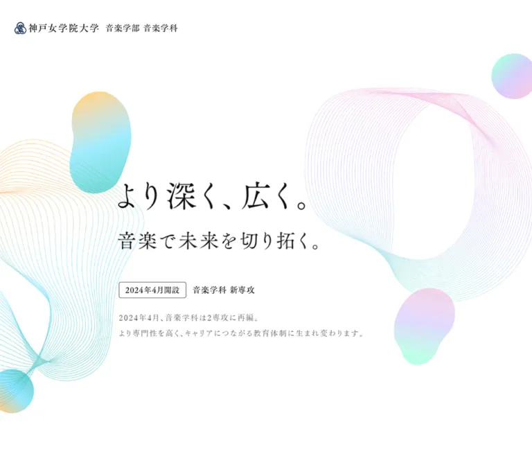
The page introduces two music majors through a long academic prospectus. Its opening is almost entirely white space: a small institutional wordmark, a large Japanese message, a compact April 2024 announcement, and pastel line fields entering from the edges. Fine Mincho-style lettering gives the message a formal, cultural character. Bodoni Moda is declared for English labels and large decorative English text, while Japanese sans-serif paragraphs carry the detailed curriculum information.
The defining relationship is between delicate abstraction and concrete educational photography. Hairline loops, softly colored organic shapes, tall rounded portraits, vertical major names, and curved program banners connect performance with career education. The closing links become especially practical on mobile, changing from three large desktop columns into compact image–label–arrow rows.
The current page still displays April 2024 announcement copy and a 2022 copyright. Those are content dates, not the inspection date or evidence that the URL is discontinued.
閉じる
Kobe College / New Music Majors — Style Reference
An airy music prospectus framed by fine waves, pastel color, and formal Japanese typography.
Website: Kobe College — New Music Majors Original URL: https://m.kobe-c.ac.jp/newmajor/ Final URL: https://m.kobe-c.ac.jp/newmajor/ Theme: light; white canvas with warm neutral and pale aqua sections Inspected: October 2, 2026, 00:41:54 JST; supplied retrieval timestamp: October 1, 2026, 15:41:54.980 UTC Viewports: desktop 1440 × 1000 and mobile 390 × 844 CSS pixels Scope: supplied desktop captures of the opening, a Music Expression program section, and the closing links/footer; mobile captures of the opening and closing; rendered text, link destinations, element bounds, and selected computed styles across the full document at both sizes. No additional browsing or interaction testing was performed.
The page introduces two music majors through a long academic prospectus. Its opening is almost entirely white space: a small institutional wordmark, a large Japanese message, a compact April 2024 announcement, and pastel line fields entering from the edges. Fine Mincho-style lettering gives the message a formal, cultural character. Bodoni Moda is declared for English labels and large decorative English text, while Japanese sans-serif paragraphs carry the detailed curriculum information.
The defining relationship is between delicate abstraction and concrete educational photography. Hairline loops, softly colored organic shapes, tall rounded portraits, vertical major names, and curved program banners connect performance with career education. The closing links become especially practical on mobile, changing from three large desktop columns into compact image–label–arrow rows.
The current page still displays April 2024 announcement copy and a 2022 copyright. Those are content dates, not the inspection date or evidence that the URL is discontinued.
How to Read This Reference
- Measured values come from the supplied rendered DOM and computed-style records. Values are rounded to two decimal places unless more precision is useful.
- Visual estimates describe the supplied original-page screenshots. They are not sampled color measurements or recovered CSS declarations.
- Recommendations describe a reusable implementation. Proposed breakpoints, gradient stops, and layout formulas are not claimed as original source code.
- Named tokens are reference aliases. The only supplied source custom property is
--vh, measured as10pxon desktop and8.44pxon mobile. - Element records do not include every child, pseudo-element, opacity, position rule, or image URL. A parent's computed appearance can differ from its visible descendants.
- The two viewport samples establish endpoint behavior. They do not establish the original interpolation formula, breakpoint locations, or behavior at every intermediate width.
Tokens — Colors
Measured Palette
| Name | Value | Suggested token | Evidence and role |
|---|---|---|---|
| White canvas | #ffffff |
--page |
Computed body, career section, overview section, and footer background |
| Heading ink | #111111 |
--ink |
Major names, many Japanese labels, navigation text, and department-site link |
| Reading gray | #444444 |
--body-ink |
Main paragraph text and copyright |
| Warm neutral | #f9f6f4 |
--warm-surface |
Computed background of the Feature section at both viewports |
| Expression aqua | #6fd5dd |
--expression |
Computed color of the large vertical “Music Expression” text |
| Career lavender | #dbc6fa |
--career |
Computed color of the large vertical “Music Career Design” text |
| Pale numbering | #e8e8e8 |
--number-ink |
Decorative 01 and 02 major numbers |
| Footnote gray | #999999 |
--muted |
Notes beneath the career statistics |
The screenshot's English major label looks lighter than its computed aqua value. Opacity, compositing, or descendant styling could account for this; those properties were not supplied. Keep the measured token and the observed appearance distinct.
Visual Gradient and Surface Approximations
These hex values are recommended starting points for recreating the screenshots, not recovered source values.
| Treatment | Approximation | Application |
|---|---|---|
| Pale aqua field | #e8f6f6 |
Background behind the photographed Music Expression section |
| Clear cyan | #36cbea |
Brighter portion of the program-title banner |
| Teal | #17b1ad |
Right side of that banner |
| Soft gold | #f7bf5f |
Small warm accents within blobs and banner gradients |
| Pastel pink | #edc8eb |
Organic forms and fine wave contours |
| Mint | #b5f4df |
Cool edge of the floating gradient shapes |
Keep the opening's color mostly in thin strokes and a few translucent-looking forms. The curriculum banner is a stronger colored surface, providing a deliberate increase in intensity deeper in the page. Do not spread that saturated banner treatment across every section.
The closing link panel also appears warm and nearly white. Its visible inner surface was not individually measured; the enclosing section reports white.
Tokens — Typography
Japanese Editorial Text
The measured serif stack begins with 游明朝, YuMincho and includes Hiragino Mincho Pro, Noto Serif JP, Japanese Mincho fallbacks, and serif.
Use this family category for major names, short statements, program titles, related-link titles, and the department-site button. Most measured desktop text uses weight 400. Selected mobile serif paragraphs and program headings use 500.
Typical tracking is 0.1em, giving short Japanese labels a spacious, deliberate rhythm. Longer introductory statements sometimes use 0.05em.
Japanese Reading Text
The measured sans-serif stack begins with Hiragino Sans and Hiragino Kaku Gothic ProN; it also includes Yu Gothic variants, Noto Sans JP, BIZ UDPGothic, Meiryo, Helvetica Neue, Arial, and sans-serif.
Most paragraphs use weight 400, 0.05em tracking, and a line height of 2. The opening explanatory prose uses 2.25. This unusually generous leading is a major contributor to the page's calm reading rhythm.
English Labels and Decorative Text
Declared family: "Bodoni Moda", serif.
It appears in English major names, related-link subtitles, oversized numbering, copyright, and vertical English labels. The declaration is verified; the supplied evidence does not identify the exact font file or prove which fallback rendered each glyph.
Wordmark and Hero Lettering
The institutional wordmark and hero headline are visible, but their sampled heading nodes have empty text. They appear to be graphic or separately constructed content. The source asset format was not supplied.
The large hero H1 reports a sans-serif family on its wrapper, while the visible Japanese lettering is distinctly serif-like. Do not use the wrapper's family to identify the artwork's typeface. Preserve authorized title artwork when available; a Mincho text recreation is an approximation.
Type Scale
Desktop and mobile values below are measured computed sizes, not a proposed universal scale.
| Role | Desktop size / line height | Mobile size / line height | Tracking | Notes |
|---|---|---|---|---|
| Hero H1 wrapper | 74.78 / 74.78px |
40.92 / 40.92px |
Inherited | Wrapper metrics; not proof of lettering font or second-line size |
| Hero explanatory text | 17.22 / 34.43px |
12.14 / 24.28px |
0.1em |
Serif; weight changes from 400 to 500 |
| General reading text | 15.61 / 31.22px |
13.04 / 26.07px |
0.05em |
Sans-serif |
| Opening long prose | 15.61 / 35.12px |
13.04 / 29.33px |
0.05em |
Sans-serif, 2.25 leading |
| Section H2 wrapper | 42.06 / 57.83px |
22.78 / 31.32px |
0.1em |
Child-level typography is not fully sampled |
| Major chooser title | 35.77 / 49.18px |
18.27 / 25.12px |
0.1em |
Serif |
| Vertical Japanese major name | 41.51 / 63.86px |
22.78 / 35.04px |
0.1em |
Serif |
| Vertical English major name | 72.31 / 72.31px |
40.49 / 40.49px |
0.05em |
Bodoni Moda declaration |
| Major introduction statement | 24.96 / 43.19px |
18.10 / 31.32px |
0.1em |
Serif |
| Curriculum/program title | 22.82 / 35.11px |
15.11 / 23.25px |
0.1em |
Serif |
| Smaller curriculum body | 15.35 / 30.69px |
11.06 / 22.12px |
0.05em |
Sans-serif |
| Related-link Japanese title | 27.78 / 42.74px |
13.39 / 20.60px |
0.1em |
Serif |
| Related-link English subtitle | 13.48 / 21.56px |
10.05 / 16.08px |
0.05em |
Bodoni Moda declaration |
| Footer department-site link | 15.22 / 24.35px |
10.07 / 16.12px |
0.05em |
Serif |
| Decorative major number | 92.16 / 23.04px |
40.73 / 10.18px |
Inherited | Deliberately compressed line box; unsuitable for normal prose |
The document root measures 10px at both widths. The Quick Start uses explicit pixel values and a conventional root, so its dimensions do not depend on that source setup.
Tokens — Spacing & Shapes
The evidence shows several fluid dimensions, but no single underlying spacing grid can be established. Preserve the hierarchy of broad section spacing, generous paragraph leading, and compact labels instead of claiming an exact eight-point system.
Layout Measurements
| Element or relationship | Desktop | Mobile | Status |
|---|---|---|---|
| First section height | 1000px |
844px |
Measured; exactly the supplied viewport height |
| Header height | 138.23px |
61.09px |
Measured |
| Header wordmark left inset | 66.08px |
22.28px |
Measured |
| Header wordmark link size | 381.33 × 28.16px |
218.80 × 16.16px |
Measured |
| Common content width | 1104.42px |
345.44px |
Measured |
| Common content left inset | 167.78px |
22.28px |
Measured |
| Opening prose width | 740px |
345.44px |
Measured |
| Hero H1 bounds | 736.55 × 168.23px |
312.56 × 92.05px |
Measured |
| Hero H1 origin | 350.80, 379.53px |
38.20, 367.31px |
Measured from viewport origin |
| Gap after H1 to announcement | 74.77px |
44.64px |
Calculated from measured bounds |
| Announcement-to-copy gap | 28.03px |
15.34px |
Calculated from measured bounds |
| Hero paragraph width | 734.69px |
221.52px |
Measured |
| Career/overview section inset | 136.94px |
51.22px |
Measured vertical padding |
| Major chooser column width | 408.75px |
150.44px |
Measured text boxes |
| Major chooser arrow target | 93.47px square |
50.61px square |
Measured |
| Related-link arrow target | 112.16px square |
60.73px square |
Measured |
| Footer height | 444.94px |
260.59px |
Measured |
Shape Vocabulary
| Element | Geometry | Evidence |
|---|---|---|
| Hero announcement badge | Thin rectangular outline with slight corner rounding | Screenshot; approximately 1px stroke |
| Performer photograph | Tall capsule, approximately 398 × 650px in the middle desktop capture |
Visual estimate |
| Program photograph | Approximately 400 × 250px, softly rounded corners |
Visual estimate |
| Program panel | Approximately 537px wide with modest rounding |
Visual estimate |
| Colored title band | Broad asymmetric curved bottom edge | Screenshot |
| Related-link arrow surface | White circle | Screenshot; outer anchor itself reports zero radius |
| Mobile related-link photograph | Near-circular crop, approximately 126px across |
Visual estimate |
| Footer link | 4.67px desktop radius; 2.53px mobile radius |
Measured |
| Floating decoration | Irregular oval or bean-shaped gradient forms | Screenshot |
Use several kinds of curvature intentionally. Portrait capsules, small image corners, circular arrow surfaces, and organic illustration shapes are different components, not one global border-radius token.
Components
Institutional Header
Role: establish the university and department before the main announcement.
The upper-left wordmark combines a small dark blue emblem with black Japanese institution and department lettering. It has ample white space around it and no visible enclosing bar, rule, or shadow in the opening capture.
On desktop, the wordmark link begins at approximately 66px, 55px. On mobile it begins at 22px, 22px. Its width decreases from about 381px to 219px, preserving the horizontal lockup.
A three-line menu control is visible at the mobile upper right. The button's measured box is 74.92 × 61.09px, substantially larger than the visible strokes. Keep that separation between visual icon size and touch target.
Section Navigation
Six anchor destinations are present in the rendered evidence:
| UI label | Destination |
|---|---|
はじめに |
#about |
新音楽学科の学びの特徴 |
#feature |
音楽表現専攻 |
#music-expression |
音楽キャリアデザイン専攻 |
#career-design |
卒業後の進路 |
#career |
概要 |
#path |
Measured menu-link rows are about 367 × 97px on desktop and 188 × 50px on mobile, with serif text and generous vertical padding. These rows are not visible in the supplied closed opening screenshots. Their coordinates do not establish an opened-menu appearance.
Opening, closing, focus handling, overlay treatment, and anchor-scroll animation were not exercised. Do not fabricate those interactions from the presence of a hamburger button.
Opening Hero
Role: communicate the academic change with a single memorable statement.
The anatomy is:
- A two-line headline graphic:
より深く、広く。followed by音楽で未来を切り拓く。 - An outlined
2024年4月開設badge beside the smaller音楽学科 新専攻label. - Two short serif explanatory statements.
- Large fine-line wave fields at the left and right edges.
- A few softly textured gradient forms, including a small upper-right circle.
The title is left aligned within a centrally positioned content box. The broad white opening above it is part of the composition. At the mobile viewport, the title begins around y=367px, below a large upper-right decorative field. It is not pushed directly beneath the header.
The desktop decoration frames a central reading area. Mobile uses stronger offscreen cropping: the right wave enters from above, and the left field enters lower down beside the announcement and body copy. The copy remains readable on white.
The announcement is informational. It should not be styled as a filled primary-action button.
Introductory Prose and Reorganization Comparison
Role: explain the shift from the previous course structure to two majors.
Two substantial paragraphs sit in a centered 740px desktop reading column. Mobile expands this column to the common 345px content width. Their 2.25 line height creates an editorial reading pace.
The labels 現在 and 2024年4月〜 introduce the before/after comparison. Their desktop boxes occupy separate columns of about 435px. On mobile, both occupy the same approximately 305px horizontal span at different vertical positions, verifying a stacked comparison.
The rendered text establishes the former and new major names, but the supplied screenshots do not show this comparison. Its internal diagram styling cannot be specified confidently.
Feature Section
Role: connect the educational tradition with the new curriculum.
The section has a measured warm background of #f9f6f4, an English “Feature” label, a Japanese section title, explanatory text, and three curriculum summaries.
The three summary text blocks align across desktop at roughly x=212, 591, and 970px, each about 258px wide. Mobile places them vertically at the same left inset, with approximately 305px of text width. Their titles remain serif; the explanatory paragraphs use sans-serif.
Do not infer illustration details for the large intervening area from its DOM height alone. Its full visual composition is outside the supplied captures.
Two-Major Chooser
Role: offer a direct comparison and entry point for each major.
Each column contains a Japanese title, an English subtitle, a pale oversized number, a substantial media/decorative region, a short statement, and a circular anchor link.
The important responsive behavior is that the chooser remains two columns on mobile. Desktop text columns are approximately 409px wide; mobile columns are approximately 150px, at x=22px and 217px. The longer Japanese title wraps to preserve the paired structure.
Numbers use pale gray and compressed line boxes, functioning as background hierarchy rather than primary reading text. Arrow targets decrease from about 93px to 51px.
Major Detail Stage
Role: retain a strong identity for each major while presenting extensive curriculum information.
The photographed desktop Music Expression section places four elements in a broad composition:
- Large pale English lettering running vertically near the left edge.
- A tall capsule photograph of a pianist.
- A black vertical Japanese major name to the photograph's right.
- A right-hand column of descriptions and program panels.
Fine wave lines sit behind the portrait, with a gradient form overlapping its lower edge. The photo and lettering create an identifiable visual stage alongside the detailed content.
The middle desktop capture pairs that stage with later program cards. This is consistent with a pinned or repeated stage, but the supplied records do not establish position: sticky, fixed positioning, or scroll-driven transforms.
Mobile retains the vertical label composition: the English label begins around x=22px, and the Japanese name around x=327px. The prose begins below the stage, around x=43px, in a 304px column. The evidence therefore supports a vertically sequenced mobile layout rather than squeezing the desktop text column beside the portrait.
For the Career Design major, the measured English label changes to lavender. Its full background treatment and photography are not visually supplied.
Curriculum Text Modules
Role: describe specializations, study abroad, ensembles, seminars, practical learning, and related opportunities.
Desktop detail paragraphs commonly occupy 400px in the right column. Their titles use 22.82px serif text; supporting paragraphs use approximately 15.35px sans-serif text with double leading.
On mobile, several ordinary curriculum text modules are more deeply inset than the introductory prose: approximately x=77px, width 270px. Their body type drops to about 11.06px. The special program descriptions use the wider 304px column and approximately 13.04px body type.
Preserve this distinction when documenting the original. For a new implementation, increasing the smallest body text is a reasonable readability improvement.
Featured Program Panel
Role: distinguish the named professional and career-design programs from ordinary curriculum paragraphs.
The visible panel uses a white rounded body with an integrated cyan-to-teal title area. A landscape teaching photograph protrudes above the colored area by approximately 100px. It is inset about 68px from either side of the roughly 537px panel.
Below the photograph, a two-line white serif title sits on the gradient. The colored band's lower edge curves downward into the white body. The description is dark gray, with generous line spacing and approximately 68px horizontal padding.
The sampled title paragraph reports dark text, while the screenshot visibly shows white lettering. The relevant descendant or styling layer is not included in the record; reproduce the visible white-on-gradient title for this component.
This is not an elevated card system. Separation comes from the aqua section field, white panel, image overlap, and curved colored band. No prominent drop shadow is visible.
Career Paths and Statistics
Role: connect the majors with employment, further study, and professional categories.
The text identifies two statistic groups, followed by career categories covering performance, music education, lifelong education, and music business. The statistic notes explicitly refer to fiscal year 2021.
The desktop text snapshot reports 0% and 0名; the mobile snapshot reports 100% and 4名. This difference is consistent with a dynamic counter state, but the triggering sequence and final desktop state were not verified. Do not treat the desktop zeros as confirmed results or present the mobile figures as current-year statistics.
Career-description text occupies a wider desktop column of about 705px, compared with approximately 301px on mobile. The supplied evidence does not expose every badge or statistic numeral style.
Department Overview
Role: present factual academic information after the exploratory content.
The section contains department name, intake, opening date, and available qualifications. Its background is white, with approximately 137px vertical padding on desktop and 51px on mobile.
A fine dotted divider is visible immediately above the mobile closing-link section. Other table-cell borders and exact row geometry are not supplied. A semantic definition list or table is recommended for adaptation, but the original markup structure is not fully established.
Closing Related Links
Role: lead readers to the department introduction, open campus information, and access page.
Desktop presents three parallel columns, each with a campus photograph, centered Japanese title, smaller English subtitle, and a large white circular arrow surface. The photographs show a campus building, architectural ceiling detail, and a bright corridor. Their upper edges are outside the supplied desktop crop, so their full source aspect ratios cannot be measured.
Mobile reorganizes each item into a row: near-circular photograph at the left, stacked Japanese/English labels in the middle, and a 61px white circle at the right. Rows repeat at approximately 147px vertical intervals. The warm panel has about 40px of visible top and bottom breathing room.
Observed destinations are:
| Label | Href |
|---|---|
音楽学科での学び / Introduction |
https://m.kobe-c.ac.jp/about/introduction |
オープンキャンパス / Open campus |
https://m.kobe-c.ac.jp/admission/opencampus |
アクセス / Access |
https://m.kobe-c.ac.jp/about/access |
These are observed link targets; their destination pages were not inspected. The arrow suggests navigation, but does not establish whether a new browser tab opens.
Footer
Role: close with institutional identity and a route to the department website.
Desktop places the wordmark at the left, the outlined 学科サイトへ link beside it, and copyright toward the right. The surrounding white space is substantial: measured padding is approximately 184px above and 219px below the main row.
Mobile centers the visible wordmark, places the department-site link across the 345px content width, and positions copyright near the lower right. The button is about 48px high despite its small text.
A very pale oversized English phrase is clipped along the bottom edge. Its repeated text also appears in the DOM. Treat it as decorative lettering; continuous marquee motion is not established by the supplied still images.
Tokens — Motion & Interaction
Measured Transition Declarations
| Element | Supplied declaration | What can be concluded |
|---|---|---|
| Header opacity | 0.8s cubic-bezier(0.55, 0.085, 0.68, 0.53) |
A fade transition is configured; its trigger is not established |
| Header transform | 0.8s cubic-bezier(0.215, 0.61, 0.355, 1) |
A transform transition is configured; travel distance is unknown |
| Introductory paragraphs | Transform 1.6s cubic-bezier(0.215, 0.61, 0.355, 1); opacity 1.2s |
Supports slow reveal styling, but does not identify the initiating event |
| Career subsection heading | Same transform/opacity durations with 0.4s delay |
A staggered transition is configured |
| Major arrow and footer link | color 0.4s |
Color change is configured; target color was not supplied |
| Mobile menu button | Opacity and transform 0.8s, with 9.6s delay in the sampled state |
Do not generalize this delay into normal button-response timing |
| Navigation copyright text | opacity 1.2s |
Fade declaration only |
Many sampled elements report animation: none. That does not rule out animation on unsampled children, SVG, pseudo-elements, or through JavaScript. Likewise, a transition declaration alone is not proof that the corresponding transition was observed playing.
The collection process waited for load, visible images, and sampled layout/text stability, with a 15-second overall readiness limit. Perpetual animations were paused during readiness checks and resumed afterward. There is no frame sequence from which to measure wave movement, blob morphing, letter staggering, or marquee speed.
Recommended adaptation: keep the decorative composition static by default. If reveals are added, make content visible without JavaScript, respect reduced-motion preferences, and avoid reproducing the sampled 9.6s delay as a prerequisite for navigation access.
Surfaces
| Layer | Appearance | Function |
|---|---|---|
| Opening and reading canvas | White | Gives fine typography and pastel artwork space |
| Feature section | Measured warm neutral #f9f6f4 |
Separates the curriculum overview |
| Photographed major section | Visually pale aqua | Groups portrait, vertical labels, and programs |
| Featured program body | White with modest corner rounding | Contains detailed reading text |
| Featured program heading | Stronger cyan/teal gradient with curved lower edge | Establishes program hierarchy |
| Closing links | Visually warm, nearly white panel | Groups three onward destinations |
| Arrow surfaces | White circles | Provides a quiet, recognizable action target |
| Footer | White with very pale oversized lettering | Returns to an open, formal ending |
The visual hierarchy uses area, spacing, and silhouette. A general shadow or glass-blur system is not evident.
Imagery
The opening artwork resembles layered musical resonance: many fine continuous contours form open loops and gently twisted fields. The lines transition through pastel gold, cyan, lavender, and pink. Their low visual weight lets them occupy large areas without competing with the headline.
Small gradient forms have softly irregular outlines and a visible fine-grain texture. They are more tactile than a flat CSS gradient, but do not have strong cast shadows or glossy highlights. A simple gradient blob is only an approximation.
Photography is natural and specific to the institution: performance at a grand piano, teaching at a piano, campus architecture, and a sunlit corridor. Preserve believable skin tones, recognizable instruments, and architectural light. The performer photograph uses a tall capsule crop; the program photograph is a rounded landscape crop; closing-link photos change silhouette on mobile.
Observed Asset References
Source image URLs and filenames were not included in the supplied evidence. The following are visual asset requirements, not invented source paths.
| Asset | Observed use | Implementation guidance |
|---|---|---|
| Institutional wordmark and emblem | Header and footer | Use authorized artwork; preserve its horizontal proportions |
| Two-line Japanese title | Opening hero | Preserve artwork where available; text recreation is approximate |
| Fine multicolor wave fields | Hero edges and portrait surround | Prefer purpose-made SVG paths with fine strokes |
| Textured organic gradient forms | Hero and portrait overlap | Preserve irregular contours and restrained grain |
| Pianist photograph | Major identity stage | Tall capsule crop with instrument and performer legible |
| Piano teaching photograph | Featured program panel | Landscape crop, approximately 8:5 in the supplied desktop view |
| Campus building/detail/corridor photographs | Closing links | Provide separate desktop and circular mobile crops where needed |
Do not replace the contour fields with a few thick concentric borders. Their density, changing curvature, and delicate stroke weight carry much of the identity.
Layout & Responsive Behavior
| Region | Desktop observation | Mobile observation |
|---|---|---|
| Hero | Full-height composition with central text and large edge artwork | Full-height composition with text lower in the viewport and stronger artwork cropping |
| Header | Large wordmark at generous left/top inset | Smaller wordmark plus visible upper-right menu control |
| Introductory prose | Centered 740px reading column |
Approximately 345px wide |
| Before/after comparison | Two horizontal groups | Groups stacked vertically |
| Feature summaries | Three aligned text columns | Three vertically sequenced blocks |
| Major chooser | Two columns | Still two columns |
| Major detail | Portrait/vertical labels beside reading column | Vertical label stage precedes the reading column |
| Curriculum text | Approximately 400px wide |
Approximately 270px for smaller modules; 304px for larger program descriptions |
| Related links | Three image/title/arrow columns | Three image–label–arrow rows |
| Footer | Wordmark, button, and copyright in a horizontal arrangement | Centered wordmark, full-width button, lower copyright |
Measured document heights are approximately 19,571px on desktop and 16,227px on mobile. This is a substantial scrolling page at both sizes. The smaller mobile document height reflects scaled imagery, spacing, and typography alongside selective stacking; it should not be treated as evidence of omitted content.
The hero height matches the viewport in both captures, and the source --vh equals one percent of each supplied height. The original height expression was not included. min-height: 100svh is a reasonable adaptation, with room for content to grow under text zoom.
Intermediate breakpoints and landscape-phone behavior are unverified. The Quick Start uses a recommended 900px transition point for its layout scaffold, not a recovered source breakpoint.
Do’s and Don’ts
Do
- Preserve the broad white opening and the comparatively low position of the hero text on mobile.
- Use Mincho-style Japanese editorial text, declared Bodoni Moda English accents, and sans-serif reading paragraphs in distinct roles.
- Keep generous paragraph leading, especially in the introductory prose.
- Frame the content with fine pastel curves and a small number of textured organic forms.
- Retain vertical major labels and tall portrait silhouettes as section identity.
- Keep the two-major chooser paired on mobile.
- Convert the three closing desktop links into photograph–label–arrow rows on mobile.
- Use stronger gradients selectively for the featured program title bands.
- Preserve observed content dates when quoting the current page.
- Distinguish visible appearance from incomplete parent-level computed styles.
Don’t
- Don't infer the hero lettering's font from its empty H1 wrapper.
- Don't flatten every photograph into the same rounded rectangle.
- Don't replace delicate wave contours with heavy outlines or generic blurred gradient backgrounds.
- Don't apply strong shadows to every program or link.
- Don't style the opening announcement as a large conversion button.
- Don't stack every two-column element indiscriminately at phone widths.
- Don't treat the differing statistic snapshots as verified current results.
- Don't claim a sticky portrait, animated marquee, morphing blobs, or an opened-menu design without further evidence.
- Don't assume that an anchor's zero border radius means its visible child surface is square.
Recommended Implementation Additions
These are recommendations for a new implementation, not verified features of the original page:
- Give the logo link, graphic headline, menu button, and arrow-only links meaningful accessible names. Empty extracted text is insufficient to assess their existing accessible names.
- Preserve one coherent accessible headline even if visual lettering is an image or split into individual characters.
- Mark contour art, duplicate English display text, and gradient forms as decorative.
- Consider a
14–16pxminimum for mobile reading text; the measured11.06pxcurriculum body is unusually small. - Implement the section navigation with keyboard access, visible focus, predictable closing behavior, and appropriate focus restoration.
- Keep statistic values readable without an animation completing. Associate their year and definition with the figures.
- Verify white title contrast across the entire program gradient. Darken the local title area if needed without changing the pale decorative palette elsewhere.
- Supply responsive images with explicit dimensions and deliberate focal points. Preserve the campus building and corridor subjects in circular crops.
- Ensure that long titles, increased text size, and translated content can expand components instead of clipping inside fixed-height artwork compositions.
Agent Prompt Guide
Quick Color Reference
- Main canvas and program bodies: measured
#ffffff. - Headings and labels: measured
#111111. - Reading text: measured
#444444. - Feature section: measured
#f9f6f4. - Expression English label: measured
#6fd5dd. - Career Design English label: measured
#dbc6fa. - Program gradient starting points: estimated
#36cbeato#17b1ad, with a small gold accent. - Pale aqua major field: estimated
#e8f6f6.
Overall Prompt
“Create an academic music-program reference page inspired by the supplied Kobe College design. Use a white canvas, extensive opening whitespace, formal Japanese Mincho-style editorial text, restrained Bodoni Moda English labels, and gray sans-serif paragraphs with double leading. Frame the opening with dense but delicate pastel contour lines and a few softly textured organic gradient forms. Introduce two majors in parallel, then give each a portrait-led identity stage with vertical Japanese and English labels. Use natural performance and teaching photography. Reserve stronger cyan-to-teal gradients for curved program-title bands above white reading panels. On mobile, preserve the paired major chooser, place detailed prose below the major stage, and convert the three closing links into circular-photo, bilingual-label, circular-arrow rows. Treat decorative motion as optional and keep all content usable without animation.”
Example Component Prompts
- Hero: “A full-height white university hero with a small horizontal institutional wordmark. Place
より深く、広く。above音楽で未来を切り拓く。in refined Japanese serif lettering. Add an outlined2024年4月開設badge, a compact major-announcement label, and two short serif lines. Keep fine pastel contour fields at the edges and preserve a broad white area above the title, especially on mobile.” - Major identity stage: “A pale aqua academic section with a tall capsule photograph of a pianist, large pale English lettering running vertically at the left, a black vertical Japanese major name at the right of the photograph, and fine wave lines behind the image. Pair it with a narrow, generously spaced curriculum column on desktop; move prose below the identity stage on phones.”
- Program panel: “A white panel with modest rounded corners. Overlap a rounded 8:5 teaching photograph above a cyan-to-teal title band. Use a small gold accent in the gradient, white two-line Japanese serif text, and an asymmetric curved lower edge. Place dark gray sans-serif copy below with double leading and broad side padding. Avoid a visible elevation shadow.”
- Related links: “Three quiet university navigation links on a warm near-white panel. Desktop uses three photo/title/subtitle/arrow columns. Mobile uses three rows with a roughly 126px circular campus photo, Japanese serif label over a small English serif subtitle, and a 61px white circular arrow target.”
- Footer: “A spacious white institutional footer with the wordmark, a thin outlined department-site link, small English copyright, and very pale oversized English lettering clipped along the lower edge. Stack the wordmark and full-width outlined link on mobile.”
Quick Start
CSS Custom Properties
This scaffold combines measured endpoint tokens with explicitly approximate layout and gradient treatments. It is not extracted site CSS. The hero's text treatment approximates the visible artwork; authorized title artwork, contour SVGs, wordmark, and photographs should be supplied separately. No source asset paths were available.
Use .hero__content for the headline, announcement, and introductory copy; .major-layout for a visual stage and reading column; .program-card__head for an overlapping photo followed by a title; and .related-card for an image, label group, and arrow. Menu behavior and reveal scripts are outside this CSS scaffold.
:root {
  /* Measured colors */
  --page: #ffffff;
  --ink: #111111;
  --body-ink: #444444;
  --warm-surface: #f9f6f4;
  --expression: #6fd5dd;
  --career: #dbc6fa;
  --number-ink: #e8e8e8;
  --muted: #999999;

  /* Visual approximations */
  --aqua-surface: #e8f6f6;
  --banner-cyan: #36cbea;
  --banner-teal: #17b1ad;
  --accent-gold: #f7bf5f;

  /* Subsets of the observed font stacks */
  --font-jp: YuMincho, 'Hiragino Mincho Pro',
    'Noto Serif JP', serif;
  --font-body: 'Hiragino Sans', 'Hiragino Kaku Gothic ProN',
    YuGothic, 'Noto Sans JP', 'BIZ UDPGothic', Meiryo,
    'Helvetica Neue', Arial, sans-serif;
  --font-en: 'Bodoni Moda', serif;

  /* Recommended interpolation between measured endpoints */
  --text-body: clamp(13.04px, calc(12.08px + 0.245vw), 15.61px);
  --text-section: clamp(22.78px, calc(15.62px + 1.837vw), 42.06px);
  --text-program: clamp(15.11px, calc(12.25px + 0.735vw), 22.82px);
  --leading-body: 2;
  --tracking-body: 0.05em;
  --tracking-editorial: 0.1em;

  --content-max: 1104.42px;
  --reading-max: 740px;
  --gutter: 22.28px;
  --section-space: clamp(51.22px, calc(19.38px + 8.163vw), 136.94px);
  --radius-card: 10px;
  --radius-button: 4.67px;
  --arrow-size: 112.16px;
  --card-inset: 68px;
  --photo-overlap: 100px;
}

* { box-sizing: border-box; }

body {
  margin: 0;
  color: var(--body-ink);
  background: var(--page);
  font-family: var(--font-body);
  font-size: var(--text-body);
  line-height: var(--leading-body);
  letter-spacing: var(--tracking-body);
}

img { display: block; max-width: 100%; }
button, a { -webkit-tap-highlight-color: transparent; }
a { color: inherit; }

.container {
  width: min(var(--content-max), calc(100% - 2 * var(--gutter)));
  margin-inline: auto;
}

.reading-column {
  width: min(var(--reading-max), calc(100% - 2 * var(--gutter)));
  margin-inline: auto;
  line-height: 2.25;
}

.section { padding-block: var(--section-space); }
.section--warm { background: var(--warm-surface); }
.section--aqua { background: var(--aqua-surface); }

.editorial-title {
  color: var(--ink);
  font-family: var(--font-jp);
  font-weight: 400;
  letter-spacing: var(--tracking-editorial);
}

.section-title {
  margin: 0 0 1.3em;
  font-size: var(--text-section);
  line-height: 1.375;
}

.english-label {
  font-family: var(--font-en);
  font-weight: 400;
  letter-spacing: 0.05em;
}

.site-header {
  position: absolute;
  inset: 0 0 auto;
  z-index: 5;
  display: flex;
  align-items: center;
  justify-content: space-between;
  min-height: 138.23px;
  padding-inline: 66.08px;
}

.site-logo { width: 381.33px; }

.hero {
  position: relative;
  isolation: isolate;
  min-height: 100vh;
  min-height: 100svh;
  overflow: hidden;
  overflow: clip;
}

.hero__content {
  position: relative;
  z-index: 1;
  width: min(736.55px, 80%);
  margin-inline: auto;
  padding-block: 37.95svh 100px;
}

/* Text approximation of the visible title artwork */
.hero__title {
  margin: 0;
  color: var(--ink);
  font-family: var(--font-jp);
  font-weight: 400;
  letter-spacing: 0.08em;
}

.hero__headline {
  display: block;
  font-size: 74.78px;
  line-height: 1;
}

.hero__subline {
  display: block;
  margin-top: 40px;
  font-size: 48px;
  line-height: 1.1;
}

.hero__announcement {
  display: flex;
  align-items: center;
  flex-wrap: wrap;
  gap: 16px;
  margin-top: 74.78px;
  color: var(--ink);
  font: 400 20px / 1.3 var(--font-jp);
}

.hero__badge {
  padding: 5px 14px;
  border: 1px solid currentColor;
  border-radius: 4px;
}

.hero__intro {
  margin-top: 28.03px;
  font: 400 17.22px / 2 var(--font-jp);
  letter-spacing: 0.1em;
}

.hero__intro p { margin: 0; }

/* Supply purpose-made contour artwork; positions are approximate. */
.hero__art {
  position: absolute;
  z-index: 0;
  pointer-events: none;
}

.hero__art--left { width: 450px; left: -108px; top: 29.5%; }
.hero__art--right { width: 550px; right: -2px; top: 13.7%; }

.feature-grid {
  display: grid;
  grid-template-columns: repeat(3, minmax(0, 1fr));
  gap: 40px;
}

.major-chooser {
  display: grid;
  grid-template-columns: repeat(2, minmax(0, 1fr));
  gap: clamp(44px, 11vw, 160px);
}

.major-chooser__item { min-width: 0; text-align: center; }
.major-chooser__number {
  color: var(--number-ink);
  font: 400 92.16px / 1 var(--font-en);
}

/* Approximate desktop composition, without assuming sticky behavior. */
.major-layout {
  display: grid;
  grid-template-columns: minmax(0, 1.2fr) minmax(0, 1fr);
  gap: 64px;
  align-items: start;
}

.major-stage { position: relative; min-width: 0; }
.major-stage__portrait {
  width: min(100%, 398px);
  aspect-ratio: 398 / 650;
  margin-inline: auto;
  object-fit: cover;
  border-radius: 999px;
}

.major-stage__english {
  color: var(--expression);
  font: 400 72.31px / 1 var(--font-en);
  letter-spacing: 0.05em;
  writing-mode: vertical-rl;
}

.major-stage--career .major-stage__english { color: var(--career); }
.major-stage__japanese {
  color: var(--ink);
  font: 400 41.51px / 1.54 var(--font-jp);
  letter-spacing: 0.1em;
  writing-mode: vertical-rl;
}

.program-card {
  margin-top: var(--photo-overlap);
  background: var(--page);
  border-radius: var(--radius-card);
}

.program-card__head {
  display: flow-root;
  padding: 0 var(--card-inset) 22px;
  border-radius: 10px 10px 50% 8% / 10px 10px 10% 4%;
  background:
    radial-gradient(ellipse at top left, var(--accent-gold), transparent 42%),
    linear-gradient(110deg, var(--banner-cyan), var(--banner-teal));
}

.program-card__photo {
  position: relative;
  top: calc(-1 * var(--photo-overlap));
  width: 100%;
  aspect-ratio: 8 / 5;
  margin-bottom: calc(-1 * var(--photo-overlap));
  object-fit: cover;
  border-radius: var(--radius-card);
}

.program-card__title {
  margin: 24px 0 0;
  color: white;
  font: 400 var(--text-program) / 1.54 var(--font-jp);
  letter-spacing: 0.1em;
}

.program-card__body { padding: 30px var(--card-inset) 60px; }
.program-card__body p { margin: 0; }

.related-panel {
  padding: 64px var(--gutter);
  background: var(--warm-surface);
}

.related-grid {
  display: grid;
  grid-template-columns: repeat(3, minmax(0, 1fr));
  gap: 36px;
  max-width: 1034px;
  margin-inline: auto;
}

.related-card { display: grid; justify-items: center; text-align: center; }
.related-card__image { width: 100%; height: auto; }
.related-card__labels { margin-top: 24px; }
.related-card__title {
  margin: 0;
  color: var(--ink);
  font: 400 27.78px / 1.54 var(--font-jp);
  letter-spacing: 0.1em;
}
.related-card__subtitle {
  margin: 12px 0 0;
  color: var(--ink);
  font: 400 13.48px / 1.6 var(--font-en);
}

.arrow-link {
  display: grid;
  place-items: center;
  width: var(--arrow-size);
  height: var(--arrow-size);
  margin-top: 28px;
  border-radius: 50%;
  background: var(--page);
  color: var(--body-ink);
  text-decoration: none;
}

.site-footer {
  position: relative;
  overflow: hidden;
  padding: 184.33px 66.08px 219.1px;
  background: var(--page);
}

.site-footer__row {
  position: relative;
  z-index: 1;
  display: flex;
  align-items: center;
  gap: 46px;
}

.department-link {
  display: inline-flex;
  align-items: center;
  justify-content: center;
  gap: 15.22px;
  padding: 7.61px 22.82px;
  border: 1px solid var(--ink);
  border-radius: var(--radius-button);
  color: var(--ink);
  font: 400 15.22px / 1.6 var(--font-jp);
  text-decoration: none;
  transition: color 0.4s;
}

.site-footer__copyright {
  margin-left: auto;
  font: 400 13.48px / 1.6 var(--font-en);
}

/* Recommended focus treatment */
a:focus-visible, button:focus-visible {
  outline: 2px solid var(--ink);
  outline-offset: 5px;
}

/* Recommended breakpoint, not recovered source CSS */
@media (max-width: 900px) {
  :root {
    --arrow-size: 60.73px;
    --card-inset: 20px;
    --photo-overlap: 70px;
    --radius-button: 2.53px;
  }

  .site-header { min-height: 61.09px; padding-inline: var(--gutter); }
  .site-logo { width: 218.8px; }
  .hero__content { padding-block: 43.52svh 80px; }
  .hero__headline { font-size: clamp(32px, 10.49vw, 60px); }
  .hero__subline { margin-top: 20px; font-size: clamp(21px, 6.23vw, 36px); line-height: 1.25; }
  .hero__announcement { margin-top: 44.64px; gap: 9px; font-size: 10.5px; }
  .hero__badge { padding: 3px 7px; border-radius: 2px; }
  .hero__intro { max-width: 221.52px; margin-top: 15.35px; font-size: 12.14px; font-weight: 500; }
  .hero__art--right { width: 280px; right: -122px; top: 130px; }
  .hero__art--left { width: 210px; left: -105px; top: 451px; }

  .feature-grid, .major-layout { grid-template-columns: 1fr; }
  .major-chooser { grid-template-columns: repeat(2, minmax(0, 1fr)); }
  .major-chooser__number { font-size: 40.73px; }
  .major-stage__english { font-size: 40.49px; }
  .major-stage__japanese { font-size: 22.78px; }
  .program-card__body { padding: 26px var(--card-inset) 40px; }

  .related-panel { padding-block: 40px; }
  .related-grid { grid-template-columns: 1fr; gap: 20px; }
  .related-card {
    grid-template-columns: 126px minmax(0, 1fr) var(--arrow-size);
    gap: 20px;
    align-items: center;
    justify-items: stretch;
    text-align: left;
  }
  .related-card__image { width: 126px; aspect-ratio: 1; object-fit: cover; border-radius: 50%; }
  .related-card__labels { margin: 0; min-width: 0; }
  .related-card__title { font-size: 13.39px; }
  .related-card__subtitle { margin-top: 6px; font-size: 10.05px; }
  .related-card .arrow-link { margin: 0; }

  .site-footer { padding: 41.96px var(--gutter) 42.45px; }
  .site-footer__row { flex-direction: column; gap: 24px; }
  .department-link { position: relative; width: 100%; min-height: 48.34px; padding: 15px; font-size: 10.07px; }
  .site-footer__copyright { width: 100%; margin: 46px 0 0; text-align: right; font-size: 10.05px; }
}

/* Recommended narrow-screen fallback beyond the inspected sizes */
@media (max-width: 370px) {
  .related-card { grid-template-columns: 96px minmax(0, 1fr) 48px; gap: 12px; }
  .related-card__image { width: 96px; }
  .related-card .arrow-link { width: 48px; height: 48px; }
}

@media (prefers-reduced-motion: reduce) {
  .department-link { transition: none; }
  html { scroll-behavior: auto; }
}
The scaffold intentionally leaves photographs at their intrinsic desktop ratio in the closing links because the supplied desktop crop does not reveal their full bounds. Set those ratios only after selecting the actual assets. Mobile circular crops and the observed program-photo ratio are specified separately.
Tailwind v4 Token Mapping
Optional aliases for a project already using Tailwind v4. This is not evidence that the original site uses Tailwind. Define the custom properties above first.
@theme inline {
  --color-canvas: var(--page);
  --color-heading: var(--ink);
  --color-reading: var(--body-ink);
  --color-warm: var(--warm-surface);
  --color-major-aqua: var(--expression);
  --color-major-lavender: var(--career);
  --font-editorial: var(--font-jp);
  --font-reading: var(--font-body);
  --font-english: var(--font-en);
  --text-reading: var(--text-body);
  --text-section-heading: var(--text-section);
  --text-program-heading: var(--text-program);
  --spacing-page-gutter: var(--gutter);
  --spacing-section-gap: var(--section-space);
  --radius-panel: var(--radius-card);
}
Sources & Evidence
- Original and final page: Kobe College — New Music Majors. Supplied response status: HTTP 200; original and final URL are identical.
- Supplied retrieval timestamp:
2026-10-01T15:41:54.980Z, equivalent to October 2, 2026, 00:41:54.980 JST. - Original-page screenshots: three desktop views at
1440 × 1000and two mobile views at390 × 844. - Rendered evidence at both viewports: document text, link hrefs, element rectangles, selected computed typography, colors, backgrounds, radii, transitions, and the
--vhcustom property. - The supplied collection traversed intermediate scroll positions and waited for sampled readiness. It did not establish every delayed state or the result of unexercised controls. SharedWorkers and service workers were disabled during collection.
- Limitations: no full stylesheet, image-source inventory, accessibility tree, menu-open capture, hover capture, motion recording, or verified original breakpoint definitions. Middle mobile sections are documented from rendered measurements and text rather than a supplied visual capture.
This reference describes the page served in the supplied October 2026 inspection. Measured declarations, screenshot estimates, and implementation recommendations are kept distinct throughout.
# Kobe College / New Music Majors — Style Reference

> An airy music prospectus framed by fine waves, pastel color, and formal Japanese typography.

**Website:** [Kobe College — New Music Majors](https://m.kobe-c.ac.jp/newmajor/)
**Original URL:** https://m.kobe-c.ac.jp/newmajor/
**Final URL:** https://m.kobe-c.ac.jp/newmajor/
**Theme:** light; white canvas with warm neutral and pale aqua sections
**Inspected:** October 2, 2026, 00:41:54 JST; supplied retrieval timestamp: October 1, 2026, 15:41:54.980 UTC
**Viewports:** desktop 1440 × 1000 and mobile 390 × 844 CSS pixels
**Scope:** supplied desktop captures of the opening, a Music Expression program section, and the closing links/footer; mobile captures of the opening and closing; rendered text, link destinations, element bounds, and selected computed styles across the full document at both sizes. No additional browsing or interaction testing was performed.

The page introduces two music majors through a long academic prospectus. Its opening is almost entirely white space: a small institutional wordmark, a large Japanese message, a compact April 2024 announcement, and pastel line fields entering from the edges. Fine Mincho-style lettering gives the message a formal, cultural character. Bodoni Moda is declared for English labels and large decorative English text, while Japanese sans-serif paragraphs carry the detailed curriculum information.

The defining relationship is between delicate abstraction and concrete educational photography. Hairline loops, softly colored organic shapes, tall rounded portraits, vertical major names, and curved program banners connect performance with career education. The closing links become especially practical on mobile, changing from three large desktop columns into compact image–label–arrow rows.

The current page still displays April 2024 announcement copy and a 2022 copyright. Those are content dates, not the inspection date or evidence that the URL is discontinued.
閉じる
# Kobe College / New Music Majors — Style Reference

> An airy music prospectus framed by fine waves, pastel color, and formal Japanese typography.

**Website:** [Kobe College — New Music Majors](https://m.kobe-c.ac.jp/newmajor/)
**Original URL:** https://m.kobe-c.ac.jp/newmajor/
**Final URL:** https://m.kobe-c.ac.jp/newmajor/
**Theme:** light; white canvas with warm neutral and pale aqua sections
**Inspected:** October 2, 2026, 00:41:54 JST; supplied retrieval timestamp: October 1, 2026, 15:41:54.980 UTC
**Viewports:** desktop 1440 × 1000 and mobile 390 × 844 CSS pixels
**Scope:** supplied desktop captures of the opening, a Music Expression program section, and the closing links/footer; mobile captures of the opening and closing; rendered text, link destinations, element bounds, and selected computed styles across the full document at both sizes. No additional browsing or interaction testing was performed.

The page introduces two music majors through a long academic prospectus. Its opening is almost entirely white space: a small institutional wordmark, a large Japanese message, a compact April 2024 announcement, and pastel line fields entering from the edges. Fine Mincho-style lettering gives the message a formal, cultural character. Bodoni Moda is declared for English labels and large decorative English text, while Japanese sans-serif paragraphs carry the detailed curriculum information.

The defining relationship is between delicate abstraction and concrete educational photography. Hairline loops, softly colored organic shapes, tall rounded portraits, vertical major names, and curved program banners connect performance with career education. The closing links become especially practical on mobile, changing from three large desktop columns into compact image–label–arrow rows.

The current page still displays April 2024 announcement copy and a 2022 copyright. Those are content dates, not the inspection date or evidence that the URL is discontinued.

## How to Read This Reference

- **Measured** values come from the supplied rendered DOM and computed-style records. Values are rounded to two decimal places unless more precision is useful.
- **Visual estimates** describe the supplied original-page screenshots. They are not sampled color measurements or recovered CSS declarations.
- **Recommendations** describe a reusable implementation. Proposed breakpoints, gradient stops, and layout formulas are not claimed as original source code.
- **Named tokens** are reference aliases. The only supplied source custom property is `--vh`, measured as `10px` on desktop and `8.44px` on mobile.
- Element records do not include every child, pseudo-element, opacity, position rule, or image URL. A parent's computed appearance can differ from its visible descendants.
- The two viewport samples establish endpoint behavior. They do not establish the original interpolation formula, breakpoint locations, or behavior at every intermediate width.

## Tokens — Colors

### Measured Palette

| Name | Value | Suggested token | Evidence and role |
| --- | --- | --- | --- |
| White canvas | `#ffffff` | `--page` | Computed body, career section, overview section, and footer background |
| Heading ink | `#111111` | `--ink` | Major names, many Japanese labels, navigation text, and department-site link |
| Reading gray | `#444444` | `--body-ink` | Main paragraph text and copyright |
| Warm neutral | `#f9f6f4` | `--warm-surface` | Computed background of the Feature section at both viewports |
| Expression aqua | `#6fd5dd` | `--expression` | Computed color of the large vertical “Music Expression” text |
| Career lavender | `#dbc6fa` | `--career` | Computed color of the large vertical “Music Career Design” text |
| Pale numbering | `#e8e8e8` | `--number-ink` | Decorative `01` and `02` major numbers |
| Footnote gray | `#999999` | `--muted` | Notes beneath the career statistics |

The screenshot's English major label looks lighter than its computed aqua value. Opacity, compositing, or descendant styling could account for this; those properties were not supplied. Keep the measured token and the observed appearance distinct.

### Visual Gradient and Surface Approximations

These hex values are recommended starting points for recreating the screenshots, not recovered source values.

| Treatment | Approximation | Application |
| --- | --- | --- |
| Pale aqua field | `#e8f6f6` | Background behind the photographed Music Expression section |
| Clear cyan | `#36cbea` | Brighter portion of the program-title banner |
| Teal | `#17b1ad` | Right side of that banner |
| Soft gold | `#f7bf5f` | Small warm accents within blobs and banner gradients |
| Pastel pink | `#edc8eb` | Organic forms and fine wave contours |
| Mint | `#b5f4df` | Cool edge of the floating gradient shapes |

Keep the opening's color mostly in thin strokes and a few translucent-looking forms. The curriculum banner is a stronger colored surface, providing a deliberate increase in intensity deeper in the page. Do not spread that saturated banner treatment across every section.

The closing link panel also appears warm and nearly white. Its visible inner surface was not individually measured; the enclosing section reports white.

## Tokens — Typography

### Japanese Editorial Text

The measured serif stack begins with `游明朝, YuMincho` and includes `Hiragino Mincho Pro`, `Noto Serif JP`, Japanese Mincho fallbacks, and `serif`.

Use this family category for major names, short statements, program titles, related-link titles, and the department-site button. Most measured desktop text uses weight `400`. Selected mobile serif paragraphs and program headings use `500`.

Typical tracking is `0.1em`, giving short Japanese labels a spacious, deliberate rhythm. Longer introductory statements sometimes use `0.05em`.

### Japanese Reading Text

The measured sans-serif stack begins with `Hiragino Sans` and `Hiragino Kaku Gothic ProN`; it also includes Yu Gothic variants, `Noto Sans JP`, `BIZ UDPGothic`, `Meiryo`, `Helvetica Neue`, `Arial`, and `sans-serif`.

Most paragraphs use weight `400`, `0.05em` tracking, and a line height of `2`. The opening explanatory prose uses `2.25`. This unusually generous leading is a major contributor to the page's calm reading rhythm.

### English Labels and Decorative Text

**Declared family:** `"Bodoni Moda", serif`.

It appears in English major names, related-link subtitles, oversized numbering, copyright, and vertical English labels. The declaration is verified; the supplied evidence does not identify the exact font file or prove which fallback rendered each glyph.

### Wordmark and Hero Lettering

The institutional wordmark and hero headline are visible, but their sampled heading nodes have empty text. They appear to be graphic or separately constructed content. The source asset format was not supplied.

The large hero H1 reports a sans-serif family on its wrapper, while the visible Japanese lettering is distinctly serif-like. Do not use the wrapper's family to identify the artwork's typeface. Preserve authorized title artwork when available; a Mincho text recreation is an approximation.

### Type Scale

Desktop and mobile values below are measured computed sizes, not a proposed universal scale.

| Role | Desktop size / line height | Mobile size / line height | Tracking | Notes |
| --- | --- | --- | --- | --- |
| Hero H1 wrapper | `74.78 / 74.78px` | `40.92 / 40.92px` | Inherited | Wrapper metrics; not proof of lettering font or second-line size |
| Hero explanatory text | `17.22 / 34.43px` | `12.14 / 24.28px` | `0.1em` | Serif; weight changes from 400 to 500 |
| General reading text | `15.61 / 31.22px` | `13.04 / 26.07px` | `0.05em` | Sans-serif |
| Opening long prose | `15.61 / 35.12px` | `13.04 / 29.33px` | `0.05em` | Sans-serif, 2.25 leading |
| Section H2 wrapper | `42.06 / 57.83px` | `22.78 / 31.32px` | `0.1em` | Child-level typography is not fully sampled |
| Major chooser title | `35.77 / 49.18px` | `18.27 / 25.12px` | `0.1em` | Serif |
| Vertical Japanese major name | `41.51 / 63.86px` | `22.78 / 35.04px` | `0.1em` | Serif |
| Vertical English major name | `72.31 / 72.31px` | `40.49 / 40.49px` | `0.05em` | Bodoni Moda declaration |
| Major introduction statement | `24.96 / 43.19px` | `18.10 / 31.32px` | `0.1em` | Serif |
| Curriculum/program title | `22.82 / 35.11px` | `15.11 / 23.25px` | `0.1em` | Serif |
| Smaller curriculum body | `15.35 / 30.69px` | `11.06 / 22.12px` | `0.05em` | Sans-serif |
| Related-link Japanese title | `27.78 / 42.74px` | `13.39 / 20.60px` | `0.1em` | Serif |
| Related-link English subtitle | `13.48 / 21.56px` | `10.05 / 16.08px` | `0.05em` | Bodoni Moda declaration |
| Footer department-site link | `15.22 / 24.35px` | `10.07 / 16.12px` | `0.05em` | Serif |
| Decorative major number | `92.16 / 23.04px` | `40.73 / 10.18px` | Inherited | Deliberately compressed line box; unsuitable for normal prose |

The document root measures `10px` at both widths. The Quick Start uses explicit pixel values and a conventional root, so its dimensions do not depend on that source setup.

## Tokens — Spacing & Shapes

The evidence shows several fluid dimensions, but no single underlying spacing grid can be established. Preserve the hierarchy of broad section spacing, generous paragraph leading, and compact labels instead of claiming an exact eight-point system.

### Layout Measurements

| Element or relationship | Desktop | Mobile | Status |
| --- | --- | --- | --- |
| First section height | `1000px` | `844px` | Measured; exactly the supplied viewport height |
| Header height | `138.23px` | `61.09px` | Measured |
| Header wordmark left inset | `66.08px` | `22.28px` | Measured |
| Header wordmark link size | `381.33 × 28.16px` | `218.80 × 16.16px` | Measured |
| Common content width | `1104.42px` | `345.44px` | Measured |
| Common content left inset | `167.78px` | `22.28px` | Measured |
| Opening prose width | `740px` | `345.44px` | Measured |
| Hero H1 bounds | `736.55 × 168.23px` | `312.56 × 92.05px` | Measured |
| Hero H1 origin | `350.80, 379.53px` | `38.20, 367.31px` | Measured from viewport origin |
| Gap after H1 to announcement | `74.77px` | `44.64px` | Calculated from measured bounds |
| Announcement-to-copy gap | `28.03px` | `15.34px` | Calculated from measured bounds |
| Hero paragraph width | `734.69px` | `221.52px` | Measured |
| Career/overview section inset | `136.94px` | `51.22px` | Measured vertical padding |
| Major chooser column width | `408.75px` | `150.44px` | Measured text boxes |
| Major chooser arrow target | `93.47px` square | `50.61px` square | Measured |
| Related-link arrow target | `112.16px` square | `60.73px` square | Measured |
| Footer height | `444.94px` | `260.59px` | Measured |

### Shape Vocabulary

| Element | Geometry | Evidence |
| --- | --- | --- |
| Hero announcement badge | Thin rectangular outline with slight corner rounding | Screenshot; approximately 1px stroke |
| Performer photograph | Tall capsule, approximately `398 × 650px` in the middle desktop capture | Visual estimate |
| Program photograph | Approximately `400 × 250px`, softly rounded corners | Visual estimate |
| Program panel | Approximately `537px` wide with modest rounding | Visual estimate |
| Colored title band | Broad asymmetric curved bottom edge | Screenshot |
| Related-link arrow surface | White circle | Screenshot; outer anchor itself reports zero radius |
| Mobile related-link photograph | Near-circular crop, approximately `126px` across | Visual estimate |
| Footer link | `4.67px` desktop radius; `2.53px` mobile radius | Measured |
| Floating decoration | Irregular oval or bean-shaped gradient forms | Screenshot |

Use several kinds of curvature intentionally. Portrait capsules, small image corners, circular arrow surfaces, and organic illustration shapes are different components, not one global border-radius token.

## Components

### Institutional Header

**Role:** establish the university and department before the main announcement.

The upper-left wordmark combines a small dark blue emblem with black Japanese institution and department lettering. It has ample white space around it and no visible enclosing bar, rule, or shadow in the opening capture.

On desktop, the wordmark link begins at approximately `66px, 55px`. On mobile it begins at `22px, 22px`. Its width decreases from about `381px` to `219px`, preserving the horizontal lockup.

A three-line menu control is visible at the mobile upper right. The button's measured box is `74.92 × 61.09px`, substantially larger than the visible strokes. Keep that separation between visual icon size and touch target.

### Section Navigation

Six anchor destinations are present in the rendered evidence:

| UI label | Destination |
| --- | --- |
| `はじめに` | `#about` |
| `新音楽学科の学びの特徴` | `#feature` |
| `音楽表現専攻` | `#music-expression` |
| `音楽キャリアデザイン専攻` | `#career-design` |
| `卒業後の進路` | `#career` |
| `概要` | `#path` |

Measured menu-link rows are about `367 × 97px` on desktop and `188 × 50px` on mobile, with serif text and generous vertical padding. These rows are not visible in the supplied closed opening screenshots. Their coordinates do not establish an opened-menu appearance.

Opening, closing, focus handling, overlay treatment, and anchor-scroll animation were not exercised. Do not fabricate those interactions from the presence of a hamburger button.

### Opening Hero

**Role:** communicate the academic change with a single memorable statement.

The anatomy is:

1. A two-line headline graphic: `より深く、広く。` followed by `音楽で未来を切り拓く。`
2. An outlined `2024年4月開設` badge beside the smaller `音楽学科 新専攻` label.
3. Two short serif explanatory statements.
4. Large fine-line wave fields at the left and right edges.
5. A few softly textured gradient forms, including a small upper-right circle.

The title is left aligned within a centrally positioned content box. The broad white opening above it is part of the composition. At the mobile viewport, the title begins around `y=367px`, below a large upper-right decorative field. It is not pushed directly beneath the header.

The desktop decoration frames a central reading area. Mobile uses stronger offscreen cropping: the right wave enters from above, and the left field enters lower down beside the announcement and body copy. The copy remains readable on white.

The announcement is informational. It should not be styled as a filled primary-action button.

### Introductory Prose and Reorganization Comparison

**Role:** explain the shift from the previous course structure to two majors.

Two substantial paragraphs sit in a centered `740px` desktop reading column. Mobile expands this column to the common `345px` content width. Their `2.25` line height creates an editorial reading pace.

The labels `現在` and `2024年4月〜` introduce the before/after comparison. Their desktop boxes occupy separate columns of about `435px`. On mobile, both occupy the same approximately `305px` horizontal span at different vertical positions, verifying a stacked comparison.

The rendered text establishes the former and new major names, but the supplied screenshots do not show this comparison. Its internal diagram styling cannot be specified confidently.

### Feature Section

**Role:** connect the educational tradition with the new curriculum.

The section has a measured warm background of `#f9f6f4`, an English “Feature” label, a Japanese section title, explanatory text, and three curriculum summaries.

The three summary text blocks align across desktop at roughly `x=212`, `591`, and `970px`, each about `258px` wide. Mobile places them vertically at the same left inset, with approximately `305px` of text width. Their titles remain serif; the explanatory paragraphs use sans-serif.

Do not infer illustration details for the large intervening area from its DOM height alone. Its full visual composition is outside the supplied captures.

### Two-Major Chooser

**Role:** offer a direct comparison and entry point for each major.

Each column contains a Japanese title, an English subtitle, a pale oversized number, a substantial media/decorative region, a short statement, and a circular anchor link.

The important responsive behavior is that the chooser **remains two columns on mobile**. Desktop text columns are approximately `409px` wide; mobile columns are approximately `150px`, at `x=22px` and `217px`. The longer Japanese title wraps to preserve the paired structure.

Numbers use pale gray and compressed line boxes, functioning as background hierarchy rather than primary reading text. Arrow targets decrease from about `93px` to `51px`.

### Major Detail Stage

**Role:** retain a strong identity for each major while presenting extensive curriculum information.

The photographed desktop Music Expression section places four elements in a broad composition:

- Large pale English lettering running vertically near the left edge.
- A tall capsule photograph of a pianist.
- A black vertical Japanese major name to the photograph's right.
- A right-hand column of descriptions and program panels.

Fine wave lines sit behind the portrait, with a gradient form overlapping its lower edge. The photo and lettering create an identifiable visual stage alongside the detailed content.

The middle desktop capture pairs that stage with later program cards. This is consistent with a pinned or repeated stage, but the supplied records do not establish `position: sticky`, fixed positioning, or scroll-driven transforms.

Mobile retains the vertical label composition: the English label begins around `x=22px`, and the Japanese name around `x=327px`. The prose begins below the stage, around `x=43px`, in a `304px` column. The evidence therefore supports a vertically sequenced mobile layout rather than squeezing the desktop text column beside the portrait.

For the Career Design major, the measured English label changes to lavender. Its full background treatment and photography are not visually supplied.

### Curriculum Text Modules

**Role:** describe specializations, study abroad, ensembles, seminars, practical learning, and related opportunities.

Desktop detail paragraphs commonly occupy `400px` in the right column. Their titles use `22.82px` serif text; supporting paragraphs use approximately `15.35px` sans-serif text with double leading.

On mobile, several ordinary curriculum text modules are more deeply inset than the introductory prose: approximately `x=77px`, width `270px`. Their body type drops to about `11.06px`. The special program descriptions use the wider `304px` column and approximately `13.04px` body type.

Preserve this distinction when documenting the original. For a new implementation, increasing the smallest body text is a reasonable readability improvement.

### Featured Program Panel

**Role:** distinguish the named professional and career-design programs from ordinary curriculum paragraphs.

The visible panel uses a white rounded body with an integrated cyan-to-teal title area. A landscape teaching photograph protrudes above the colored area by approximately `100px`. It is inset about `68px` from either side of the roughly `537px` panel.

Below the photograph, a two-line white serif title sits on the gradient. The colored band's lower edge curves downward into the white body. The description is dark gray, with generous line spacing and approximately `68px` horizontal padding.

The sampled title paragraph reports dark text, while the screenshot visibly shows white lettering. The relevant descendant or styling layer is not included in the record; reproduce the visible white-on-gradient title for this component.

This is not an elevated card system. Separation comes from the aqua section field, white panel, image overlap, and curved colored band. No prominent drop shadow is visible.

### Career Paths and Statistics

**Role:** connect the majors with employment, further study, and professional categories.

The text identifies two statistic groups, followed by career categories covering performance, music education, lifelong education, and music business. The statistic notes explicitly refer to fiscal year 2021.

The desktop text snapshot reports `0%` and `0名`; the mobile snapshot reports `100%` and `4名`. This difference is consistent with a dynamic counter state, but the triggering sequence and final desktop state were not verified. Do not treat the desktop zeros as confirmed results or present the mobile figures as current-year statistics.

Career-description text occupies a wider desktop column of about `705px`, compared with approximately `301px` on mobile. The supplied evidence does not expose every badge or statistic numeral style.

### Department Overview

**Role:** present factual academic information after the exploratory content.

The section contains department name, intake, opening date, and available qualifications. Its background is white, with approximately `137px` vertical padding on desktop and `51px` on mobile.

A fine dotted divider is visible immediately above the mobile closing-link section. Other table-cell borders and exact row geometry are not supplied. A semantic definition list or table is recommended for adaptation, but the original markup structure is not fully established.

### Closing Related Links

**Role:** lead readers to the department introduction, open campus information, and access page.

Desktop presents three parallel columns, each with a campus photograph, centered Japanese title, smaller English subtitle, and a large white circular arrow surface. The photographs show a campus building, architectural ceiling detail, and a bright corridor. Their upper edges are outside the supplied desktop crop, so their full source aspect ratios cannot be measured.

Mobile reorganizes each item into a row: near-circular photograph at the left, stacked Japanese/English labels in the middle, and a `61px` white circle at the right. Rows repeat at approximately `147px` vertical intervals. The warm panel has about `40px` of visible top and bottom breathing room.

Observed destinations are:

| Label | Href |
| --- | --- |
| `音楽学科での学び` / Introduction | `https://m.kobe-c.ac.jp/about/introduction` |
| `オープンキャンパス` / Open campus | `https://m.kobe-c.ac.jp/admission/opencampus` |
| `アクセス` / Access | `https://m.kobe-c.ac.jp/about/access` |

These are observed link targets; their destination pages were not inspected. The arrow suggests navigation, but does not establish whether a new browser tab opens.

### Footer

**Role:** close with institutional identity and a route to the department website.

Desktop places the wordmark at the left, the outlined `学科サイトへ` link beside it, and copyright toward the right. The surrounding white space is substantial: measured padding is approximately `184px` above and `219px` below the main row.

Mobile centers the visible wordmark, places the department-site link across the `345px` content width, and positions copyright near the lower right. The button is about `48px` high despite its small text.

A very pale oversized English phrase is clipped along the bottom edge. Its repeated text also appears in the DOM. Treat it as decorative lettering; continuous marquee motion is not established by the supplied still images.

## Tokens — Motion & Interaction

### Measured Transition Declarations

| Element | Supplied declaration | What can be concluded |
| --- | --- | --- |
| Header opacity | `0.8s cubic-bezier(0.55, 0.085, 0.68, 0.53)` | A fade transition is configured; its trigger is not established |
| Header transform | `0.8s cubic-bezier(0.215, 0.61, 0.355, 1)` | A transform transition is configured; travel distance is unknown |
| Introductory paragraphs | Transform `1.6s cubic-bezier(0.215, 0.61, 0.355, 1)`; opacity `1.2s` | Supports slow reveal styling, but does not identify the initiating event |
| Career subsection heading | Same transform/opacity durations with `0.4s` delay | A staggered transition is configured |
| Major arrow and footer link | `color 0.4s` | Color change is configured; target color was not supplied |
| Mobile menu button | Opacity and transform `0.8s`, with `9.6s` delay in the sampled state | Do not generalize this delay into normal button-response timing |
| Navigation copyright text | `opacity 1.2s` | Fade declaration only |

Many sampled elements report `animation: none`. That does not rule out animation on unsampled children, SVG, pseudo-elements, or through JavaScript. Likewise, a transition declaration alone is not proof that the corresponding transition was observed playing.

The collection process waited for load, visible images, and sampled layout/text stability, with a 15-second overall readiness limit. Perpetual animations were paused during readiness checks and resumed afterward. There is no frame sequence from which to measure wave movement, blob morphing, letter staggering, or marquee speed.

**Recommended adaptation:** keep the decorative composition static by default. If reveals are added, make content visible without JavaScript, respect reduced-motion preferences, and avoid reproducing the sampled `9.6s` delay as a prerequisite for navigation access.

## Surfaces

| Layer | Appearance | Function |
| --- | --- | --- |
| Opening and reading canvas | White | Gives fine typography and pastel artwork space |
| Feature section | Measured warm neutral `#f9f6f4` | Separates the curriculum overview |
| Photographed major section | Visually pale aqua | Groups portrait, vertical labels, and programs |
| Featured program body | White with modest corner rounding | Contains detailed reading text |
| Featured program heading | Stronger cyan/teal gradient with curved lower edge | Establishes program hierarchy |
| Closing links | Visually warm, nearly white panel | Groups three onward destinations |
| Arrow surfaces | White circles | Provides a quiet, recognizable action target |
| Footer | White with very pale oversized lettering | Returns to an open, formal ending |

The visual hierarchy uses area, spacing, and silhouette. A general shadow or glass-blur system is not evident.

## Imagery

The opening artwork resembles layered musical resonance: many fine continuous contours form open loops and gently twisted fields. The lines transition through pastel gold, cyan, lavender, and pink. Their low visual weight lets them occupy large areas without competing with the headline.

Small gradient forms have softly irregular outlines and a visible fine-grain texture. They are more tactile than a flat CSS gradient, but do not have strong cast shadows or glossy highlights. A simple gradient blob is only an approximation.

Photography is natural and specific to the institution: performance at a grand piano, teaching at a piano, campus architecture, and a sunlit corridor. Preserve believable skin tones, recognizable instruments, and architectural light. The performer photograph uses a tall capsule crop; the program photograph is a rounded landscape crop; closing-link photos change silhouette on mobile.

### Observed Asset References

Source image URLs and filenames were not included in the supplied evidence. The following are visual asset requirements, not invented source paths.

| Asset | Observed use | Implementation guidance |
| --- | --- | --- |
| Institutional wordmark and emblem | Header and footer | Use authorized artwork; preserve its horizontal proportions |
| Two-line Japanese title | Opening hero | Preserve artwork where available; text recreation is approximate |
| Fine multicolor wave fields | Hero edges and portrait surround | Prefer purpose-made SVG paths with fine strokes |
| Textured organic gradient forms | Hero and portrait overlap | Preserve irregular contours and restrained grain |
| Pianist photograph | Major identity stage | Tall capsule crop with instrument and performer legible |
| Piano teaching photograph | Featured program panel | Landscape crop, approximately 8:5 in the supplied desktop view |
| Campus building/detail/corridor photographs | Closing links | Provide separate desktop and circular mobile crops where needed |

Do not replace the contour fields with a few thick concentric borders. Their density, changing curvature, and delicate stroke weight carry much of the identity.

## Layout & Responsive Behavior

| Region | Desktop observation | Mobile observation |
| --- | --- | --- |
| Hero | Full-height composition with central text and large edge artwork | Full-height composition with text lower in the viewport and stronger artwork cropping |
| Header | Large wordmark at generous left/top inset | Smaller wordmark plus visible upper-right menu control |
| Introductory prose | Centered `740px` reading column | Approximately `345px` wide |
| Before/after comparison | Two horizontal groups | Groups stacked vertically |
| Feature summaries | Three aligned text columns | Three vertically sequenced blocks |
| Major chooser | Two columns | Still two columns |
| Major detail | Portrait/vertical labels beside reading column | Vertical label stage precedes the reading column |
| Curriculum text | Approximately `400px` wide | Approximately `270px` for smaller modules; `304px` for larger program descriptions |
| Related links | Three image/title/arrow columns | Three image–label–arrow rows |
| Footer | Wordmark, button, and copyright in a horizontal arrangement | Centered wordmark, full-width button, lower copyright |

Measured document heights are approximately `19,571px` on desktop and `16,227px` on mobile. This is a substantial scrolling page at both sizes. The smaller mobile document height reflects scaled imagery, spacing, and typography alongside selective stacking; it should not be treated as evidence of omitted content.

The hero height matches the viewport in both captures, and the source `--vh` equals one percent of each supplied height. The original height expression was not included. `min-height: 100svh` is a reasonable adaptation, with room for content to grow under text zoom.

Intermediate breakpoints and landscape-phone behavior are unverified. The Quick Start uses a recommended `900px` transition point for its layout scaffold, not a recovered source breakpoint.

## Do’s and Don’ts

### Do

- Preserve the broad white opening and the comparatively low position of the hero text on mobile.
- Use Mincho-style Japanese editorial text, declared Bodoni Moda English accents, and sans-serif reading paragraphs in distinct roles.
- Keep generous paragraph leading, especially in the introductory prose.
- Frame the content with fine pastel curves and a small number of textured organic forms.
- Retain vertical major labels and tall portrait silhouettes as section identity.
- Keep the two-major chooser paired on mobile.
- Convert the three closing desktop links into photograph–label–arrow rows on mobile.
- Use stronger gradients selectively for the featured program title bands.
- Preserve observed content dates when quoting the current page.
- Distinguish visible appearance from incomplete parent-level computed styles.

### Don’t

- Don't infer the hero lettering's font from its empty H1 wrapper.
- Don't flatten every photograph into the same rounded rectangle.
- Don't replace delicate wave contours with heavy outlines or generic blurred gradient backgrounds.
- Don't apply strong shadows to every program or link.
- Don't style the opening announcement as a large conversion button.
- Don't stack every two-column element indiscriminately at phone widths.
- Don't treat the differing statistic snapshots as verified current results.
- Don't claim a sticky portrait, animated marquee, morphing blobs, or an opened-menu design without further evidence.
- Don't assume that an anchor's zero border radius means its visible child surface is square.

## Recommended Implementation Additions

These are recommendations for a new implementation, not verified features of the original page:

- Give the logo link, graphic headline, menu button, and arrow-only links meaningful accessible names. Empty extracted text is insufficient to assess their existing accessible names.
- Preserve one coherent accessible headline even if visual lettering is an image or split into individual characters.
- Mark contour art, duplicate English display text, and gradient forms as decorative.
- Consider a `14–16px` minimum for mobile reading text; the measured `11.06px` curriculum body is unusually small.
- Implement the section navigation with keyboard access, visible focus, predictable closing behavior, and appropriate focus restoration.
- Keep statistic values readable without an animation completing. Associate their year and definition with the figures.
- Verify white title contrast across the entire program gradient. Darken the local title area if needed without changing the pale decorative palette elsewhere.
- Supply responsive images with explicit dimensions and deliberate focal points. Preserve the campus building and corridor subjects in circular crops.
- Ensure that long titles, increased text size, and translated content can expand components instead of clipping inside fixed-height artwork compositions.

## Agent Prompt Guide

### Quick Color Reference

- Main canvas and program bodies: measured `#ffffff`.
- Headings and labels: measured `#111111`.
- Reading text: measured `#444444`.
- Feature section: measured `#f9f6f4`.
- Expression English label: measured `#6fd5dd`.
- Career Design English label: measured `#dbc6fa`.
- Program gradient starting points: estimated `#36cbea` to `#17b1ad`, with a small gold accent.
- Pale aqua major field: estimated `#e8f6f6`.

### Overall Prompt

“Create an academic music-program reference page inspired by the supplied Kobe College design. Use a white canvas, extensive opening whitespace, formal Japanese Mincho-style editorial text, restrained Bodoni Moda English labels, and gray sans-serif paragraphs with double leading. Frame the opening with dense but delicate pastel contour lines and a few softly textured organic gradient forms. Introduce two majors in parallel, then give each a portrait-led identity stage with vertical Japanese and English labels. Use natural performance and teaching photography. Reserve stronger cyan-to-teal gradients for curved program-title bands above white reading panels. On mobile, preserve the paired major chooser, place detailed prose below the major stage, and convert the three closing links into circular-photo, bilingual-label, circular-arrow rows. Treat decorative motion as optional and keep all content usable without animation.”

### Example Component Prompts

1. **Hero:** “A full-height white university hero with a small horizontal institutional wordmark. Place `より深く、広く。` above `音楽で未来を切り拓く。` in refined Japanese serif lettering. Add an outlined `2024年4月開設` badge, a compact major-announcement label, and two short serif lines. Keep fine pastel contour fields at the edges and preserve a broad white area above the title, especially on mobile.”
2. **Major identity stage:** “A pale aqua academic section with a tall capsule photograph of a pianist, large pale English lettering running vertically at the left, a black vertical Japanese major name at the right of the photograph, and fine wave lines behind the image. Pair it with a narrow, generously spaced curriculum column on desktop; move prose below the identity stage on phones.”
3. **Program panel:** “A white panel with modest rounded corners. Overlap a rounded 8:5 teaching photograph above a cyan-to-teal title band. Use a small gold accent in the gradient, white two-line Japanese serif text, and an asymmetric curved lower edge. Place dark gray sans-serif copy below with double leading and broad side padding. Avoid a visible elevation shadow.”
4. **Related links:** “Three quiet university navigation links on a warm near-white panel. Desktop uses three photo/title/subtitle/arrow columns. Mobile uses three rows with a roughly 126px circular campus photo, Japanese serif label over a small English serif subtitle, and a 61px white circular arrow target.”
5. **Footer:** “A spacious white institutional footer with the wordmark, a thin outlined department-site link, small English copyright, and very pale oversized English lettering clipped along the lower edge. Stack the wordmark and full-width outlined link on mobile.”

## Quick Start

### CSS Custom Properties

This scaffold combines measured endpoint tokens with explicitly approximate layout and gradient treatments. It is not extracted site CSS. The hero's text treatment approximates the visible artwork; authorized title artwork, contour SVGs, wordmark, and photographs should be supplied separately. No source asset paths were available.

Use `.hero__content` for the headline, announcement, and introductory copy; `.major-layout` for a visual stage and reading column; `.program-card__head` for an overlapping photo followed by a title; and `.related-card` for an image, label group, and arrow. Menu behavior and reveal scripts are outside this CSS scaffold.

```css
:root {
  /* Measured colors */
  --page: #ffffff;
  --ink: #111111;
  --body-ink: #444444;
  --warm-surface: #f9f6f4;
  --expression: #6fd5dd;
  --career: #dbc6fa;
  --number-ink: #e8e8e8;
  --muted: #999999;

  /* Visual approximations */
  --aqua-surface: #e8f6f6;
  --banner-cyan: #36cbea;
  --banner-teal: #17b1ad;
  --accent-gold: #f7bf5f;

  /* Subsets of the observed font stacks */
  --font-jp: YuMincho, 'Hiragino Mincho Pro',
    'Noto Serif JP', serif;
  --font-body: 'Hiragino Sans', 'Hiragino Kaku Gothic ProN',
    YuGothic, 'Noto Sans JP', 'BIZ UDPGothic', Meiryo,
    'Helvetica Neue', Arial, sans-serif;
  --font-en: 'Bodoni Moda', serif;

  /* Recommended interpolation between measured endpoints */
  --text-body: clamp(13.04px, calc(12.08px + 0.245vw), 15.61px);
  --text-section: clamp(22.78px, calc(15.62px + 1.837vw), 42.06px);
  --text-program: clamp(15.11px, calc(12.25px + 0.735vw), 22.82px);
  --leading-body: 2;
  --tracking-body: 0.05em;
  --tracking-editorial: 0.1em;

  --content-max: 1104.42px;
  --reading-max: 740px;
  --gutter: 22.28px;
  --section-space: clamp(51.22px, calc(19.38px + 8.163vw), 136.94px);
  --radius-card: 10px;
  --radius-button: 4.67px;
  --arrow-size: 112.16px;
  --card-inset: 68px;
  --photo-overlap: 100px;
}

* { box-sizing: border-box; }

body {
  margin: 0;
  color: var(--body-ink);
  background: var(--page);
  font-family: var(--font-body);
  font-size: var(--text-body);
  line-height: var(--leading-body);
  letter-spacing: var(--tracking-body);
}

img { display: block; max-width: 100%; }
button, a { -webkit-tap-highlight-color: transparent; }
a { color: inherit; }

.container {
  width: min(var(--content-max), calc(100% - 2 * var(--gutter)));
  margin-inline: auto;
}

.reading-column {
  width: min(var(--reading-max), calc(100% - 2 * var(--gutter)));
  margin-inline: auto;
  line-height: 2.25;
}

.section { padding-block: var(--section-space); }
.section--warm { background: var(--warm-surface); }
.section--aqua { background: var(--aqua-surface); }

.editorial-title {
  color: var(--ink);
  font-family: var(--font-jp);
  font-weight: 400;
  letter-spacing: var(--tracking-editorial);
}

.section-title {
  margin: 0 0 1.3em;
  font-size: var(--text-section);
  line-height: 1.375;
}

.english-label {
  font-family: var(--font-en);
  font-weight: 400;
  letter-spacing: 0.05em;
}

.site-header {
  position: absolute;
  inset: 0 0 auto;
  z-index: 5;
  display: flex;
  align-items: center;
  justify-content: space-between;
  min-height: 138.23px;
  padding-inline: 66.08px;
}

.site-logo { width: 381.33px; }

.hero {
  position: relative;
  isolation: isolate;
  min-height: 100vh;
  min-height: 100svh;
  overflow: hidden;
  overflow: clip;
}

.hero__content {
  position: relative;
  z-index: 1;
  width: min(736.55px, 80%);
  margin-inline: auto;
  padding-block: 37.95svh 100px;
}

/* Text approximation of the visible title artwork */
.hero__title {
  margin: 0;
  color: var(--ink);
  font-family: var(--font-jp);
  font-weight: 400;
  letter-spacing: 0.08em;
}

.hero__headline {
  display: block;
  font-size: 74.78px;
  line-height: 1;
}

.hero__subline {
  display: block;
  margin-top: 40px;
  font-size: 48px;
  line-height: 1.1;
}

.hero__announcement {
  display: flex;
  align-items: center;
  flex-wrap: wrap;
  gap: 16px;
  margin-top: 74.78px;
  color: var(--ink);
  font: 400 20px / 1.3 var(--font-jp);
}

.hero__badge {
  padding: 5px 14px;
  border: 1px solid currentColor;
  border-radius: 4px;
}

.hero__intro {
  margin-top: 28.03px;
  font: 400 17.22px / 2 var(--font-jp);
  letter-spacing: 0.1em;
}

.hero__intro p { margin: 0; }

/* Supply purpose-made contour artwork; positions are approximate. */
.hero__art {
  position: absolute;
  z-index: 0;
  pointer-events: none;
}

.hero__art--left { width: 450px; left: -108px; top: 29.5%; }
.hero__art--right { width: 550px; right: -2px; top: 13.7%; }

.feature-grid {
  display: grid;
  grid-template-columns: repeat(3, minmax(0, 1fr));
  gap: 40px;
}

.major-chooser {
  display: grid;
  grid-template-columns: repeat(2, minmax(0, 1fr));
  gap: clamp(44px, 11vw, 160px);
}

.major-chooser__item { min-width: 0; text-align: center; }
.major-chooser__number {
  color: var(--number-ink);
  font: 400 92.16px / 1 var(--font-en);
}

/* Approximate desktop composition, without assuming sticky behavior. */
.major-layout {
  display: grid;
  grid-template-columns: minmax(0, 1.2fr) minmax(0, 1fr);
  gap: 64px;
  align-items: start;
}

.major-stage { position: relative; min-width: 0; }
.major-stage__portrait {
  width: min(100%, 398px);
  aspect-ratio: 398 / 650;
  margin-inline: auto;
  object-fit: cover;
  border-radius: 999px;
}

.major-stage__english {
  color: var(--expression);
  font: 400 72.31px / 1 var(--font-en);
  letter-spacing: 0.05em;
  writing-mode: vertical-rl;
}

.major-stage--career .major-stage__english { color: var(--career); }
.major-stage__japanese {
  color: var(--ink);
  font: 400 41.51px / 1.54 var(--font-jp);
  letter-spacing: 0.1em;
  writing-mode: vertical-rl;
}

.program-card {
  margin-top: var(--photo-overlap);
  background: var(--page);
  border-radius: var(--radius-card);
}

.program-card__head {
  display: flow-root;
  padding: 0 var(--card-inset) 22px;
  border-radius: 10px 10px 50% 8% / 10px 10px 10% 4%;
  background:
    radial-gradient(ellipse at top left, var(--accent-gold), transparent 42%),
    linear-gradient(110deg, var(--banner-cyan), var(--banner-teal));
}

.program-card__photo {
  position: relative;
  top: calc(-1 * var(--photo-overlap));
  width: 100%;
  aspect-ratio: 8 / 5;
  margin-bottom: calc(-1 * var(--photo-overlap));
  object-fit: cover;
  border-radius: var(--radius-card);
}

.program-card__title {
  margin: 24px 0 0;
  color: white;
  font: 400 var(--text-program) / 1.54 var(--font-jp);
  letter-spacing: 0.1em;
}

.program-card__body { padding: 30px var(--card-inset) 60px; }
.program-card__body p { margin: 0; }

.related-panel {
  padding: 64px var(--gutter);
  background: var(--warm-surface);
}

.related-grid {
  display: grid;
  grid-template-columns: repeat(3, minmax(0, 1fr));
  gap: 36px;
  max-width: 1034px;
  margin-inline: auto;
}

.related-card { display: grid; justify-items: center; text-align: center; }
.related-card__image { width: 100%; height: auto; }
.related-card__labels { margin-top: 24px; }
.related-card__title {
  margin: 0;
  color: var(--ink);
  font: 400 27.78px / 1.54 var(--font-jp);
  letter-spacing: 0.1em;
}
.related-card__subtitle {
  margin: 12px 0 0;
  color: var(--ink);
  font: 400 13.48px / 1.6 var(--font-en);
}

.arrow-link {
  display: grid;
  place-items: center;
  width: var(--arrow-size);
  height: var(--arrow-size);
  margin-top: 28px;
  border-radius: 50%;
  background: var(--page);
  color: var(--body-ink);
  text-decoration: none;
}

.site-footer {
  position: relative;
  overflow: hidden;
  padding: 184.33px 66.08px 219.1px;
  background: var(--page);
}

.site-footer__row {
  position: relative;
  z-index: 1;
  display: flex;
  align-items: center;
  gap: 46px;
}

.department-link {
  display: inline-flex;
  align-items: center;
  justify-content: center;
  gap: 15.22px;
  padding: 7.61px 22.82px;
  border: 1px solid var(--ink);
  border-radius: var(--radius-button);
  color: var(--ink);
  font: 400 15.22px / 1.6 var(--font-jp);
  text-decoration: none;
  transition: color 0.4s;
}

.site-footer__copyright {
  margin-left: auto;
  font: 400 13.48px / 1.6 var(--font-en);
}

/* Recommended focus treatment */
a:focus-visible, button:focus-visible {
  outline: 2px solid var(--ink);
  outline-offset: 5px;
}

/* Recommended breakpoint, not recovered source CSS */
@media (max-width: 900px) {
  :root {
    --arrow-size: 60.73px;
    --card-inset: 20px;
    --photo-overlap: 70px;
    --radius-button: 2.53px;
  }

  .site-header { min-height: 61.09px; padding-inline: var(--gutter); }
  .site-logo { width: 218.8px; }
  .hero__content { padding-block: 43.52svh 80px; }
  .hero__headline { font-size: clamp(32px, 10.49vw, 60px); }
  .hero__subline { margin-top: 20px; font-size: clamp(21px, 6.23vw, 36px); line-height: 1.25; }
  .hero__announcement { margin-top: 44.64px; gap: 9px; font-size: 10.5px; }
  .hero__badge { padding: 3px 7px; border-radius: 2px; }
  .hero__intro { max-width: 221.52px; margin-top: 15.35px; font-size: 12.14px; font-weight: 500; }
  .hero__art--right { width: 280px; right: -122px; top: 130px; }
  .hero__art--left { width: 210px; left: -105px; top: 451px; }

  .feature-grid, .major-layout { grid-template-columns: 1fr; }
  .major-chooser { grid-template-columns: repeat(2, minmax(0, 1fr)); }
  .major-chooser__number { font-size: 40.73px; }
  .major-stage__english { font-size: 40.49px; }
  .major-stage__japanese { font-size: 22.78px; }
  .program-card__body { padding: 26px var(--card-inset) 40px; }

  .related-panel { padding-block: 40px; }
  .related-grid { grid-template-columns: 1fr; gap: 20px; }
  .related-card {
    grid-template-columns: 126px minmax(0, 1fr) var(--arrow-size);
    gap: 20px;
    align-items: center;
    justify-items: stretch;
    text-align: left;
  }
  .related-card__image { width: 126px; aspect-ratio: 1; object-fit: cover; border-radius: 50%; }
  .related-card__labels { margin: 0; min-width: 0; }
  .related-card__title { font-size: 13.39px; }
  .related-card__subtitle { margin-top: 6px; font-size: 10.05px; }
  .related-card .arrow-link { margin: 0; }

  .site-footer { padding: 41.96px var(--gutter) 42.45px; }
  .site-footer__row { flex-direction: column; gap: 24px; }
  .department-link { position: relative; width: 100%; min-height: 48.34px; padding: 15px; font-size: 10.07px; }
  .site-footer__copyright { width: 100%; margin: 46px 0 0; text-align: right; font-size: 10.05px; }
}

/* Recommended narrow-screen fallback beyond the inspected sizes */
@media (max-width: 370px) {
  .related-card { grid-template-columns: 96px minmax(0, 1fr) 48px; gap: 12px; }
  .related-card__image { width: 96px; }
  .related-card .arrow-link { width: 48px; height: 48px; }
}

@media (prefers-reduced-motion: reduce) {
  .department-link { transition: none; }
  html { scroll-behavior: auto; }
}
```

The scaffold intentionally leaves photographs at their intrinsic desktop ratio in the closing links because the supplied desktop crop does not reveal their full bounds. Set those ratios only after selecting the actual assets. Mobile circular crops and the observed program-photo ratio are specified separately.

### Tailwind v4 Token Mapping

Optional aliases for a project already using Tailwind v4. This is not evidence that the original site uses Tailwind. Define the custom properties above first.

```css
@theme inline {
  --color-canvas: var(--page);
  --color-heading: var(--ink);
  --color-reading: var(--body-ink);
  --color-warm: var(--warm-surface);
  --color-major-aqua: var(--expression);
  --color-major-lavender: var(--career);
  --font-editorial: var(--font-jp);
  --font-reading: var(--font-body);
  --font-english: var(--font-en);
  --text-reading: var(--text-body);
  --text-section-heading: var(--text-section);
  --text-program-heading: var(--text-program);
  --spacing-page-gutter: var(--gutter);
  --spacing-section-gap: var(--section-space);
  --radius-panel: var(--radius-card);
}
```

## Sources & Evidence

- [Original and final page: Kobe College — New Music Majors](https://m.kobe-c.ac.jp/newmajor/). Supplied response status: HTTP 200; original and final URL are identical.
- Supplied retrieval timestamp: `2026-10-01T15:41:54.980Z`, equivalent to October 2, 2026, 00:41:54.980 JST.
- Original-page screenshots: three desktop views at `1440 × 1000` and two mobile views at `390 × 844`.
- Rendered evidence at both viewports: document text, link hrefs, element rectangles, selected computed typography, colors, backgrounds, radii, transitions, and the `--vh` custom property.
- The supplied collection traversed intermediate scroll positions and waited for sampled readiness. It did not establish every delayed state or the result of unexercised controls. SharedWorkers and service workers were disabled during collection.
- Limitations: no full stylesheet, image-source inventory, accessibility tree, menu-open capture, hover capture, motion recording, or verified original breakpoint definitions. Middle mobile sections are documented from rendered measurements and text rather than a supplied visual capture.

This reference describes the page served in the supplied October 2026 inspection. Measured declarations, screenshot estimates, and implementation recommendations are kept distinct throughout.関連するデザイン
スタイルやページの種類、ジャンルが近いデザインを集めました。