プレビュー準備中デザインリファレンスを見る
DESIGN REFERENCE
折り紙レター - ブラザー
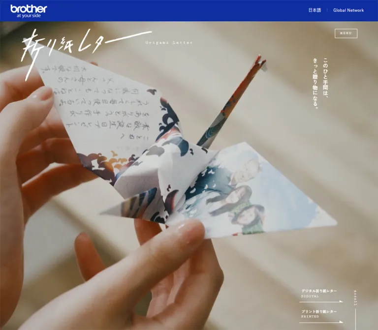
デジタルとプリントの折り紙レターを紹介するブラザーの特設サイト。青い企業ヘッダー、筆文字ロゴ、縦書きコピー、温かな写真と大きな余白で、手紙を贈る気持ちを伝えます。
Origami Letter / Brother — Style Reference
A handwritten gesture framed by cinematic photography, vertical Japanese copy, and generous white space.
Website: Origami Letter — Brother
Original URL: https://sdgsstory.global.brother/j/special/origami/
Final URL: https://sdgsstory.global.brother/j/special/origami/
Response: HTTP 200; original and final URLs are identical.
Theme: white editorial surfaces, dark gray typography, a persistent blue corporate header, and white interface details over photography.
Inspected: supplied capture dated October 2, 2026, 00:46:54.316 JST — October 1, 2026, 15:46:54.316 UTC.
Viewports: desktop 1440 × 1000 and mobile 390 × 844 CSS pixels.
Scope: the current Japanese project home page: opening hero, digital and printed letter introductions, concept narrative, recognition text, repeated service links, movie links, related-site banners, and footer. Menu and loading elements are present in the DOM, but their active states were not demonstrated. Linked creation experiences were not inspected.
Origami Letter introduces a free letter-making experience with digital and printed paths. The page combines an emotional family story with practical entry points into those services. Its identity comes from three different scales: a compact corporate blue bar, an expressive white brush-lettered project mark, and restrained Japanese copy arranged vertically over large photographic scenes.
Below the opening, the composition becomes an extended editorial sequence. Images of writing, folding, holding, and sharing paper alternate with short paragraphs on a white canvas. Desktop images and text occupy staggered positions rather than uniform cards. The substantial empty space gives individual gestures room to register. The final movie and related-site sections retain this quiet spacing even though their content is more functional.
閉じる
Origami Letter / Brother — Style Reference
A handwritten gesture framed by cinematic photography, vertical Japanese copy, and generous white space.
Website: Origami Letter — Brother
Original URL: https://sdgsstory.global.brother/j/special/origami/
Final URL: https://sdgsstory.global.brother/j/special/origami/
Response: HTTP 200; original and final URLs are identical.
Theme: white editorial surfaces, dark gray typography, a persistent blue corporate header, and white interface details over photography.
Inspected: supplied capture dated October 2, 2026, 00:46:54.316 JST — October 1, 2026, 15:46:54.316 UTC.
Viewports: desktop 1440 × 1000 and mobile 390 × 844 CSS pixels.
Scope: the current Japanese project home page: opening hero, digital and printed letter introductions, concept narrative, recognition text, repeated service links, movie links, related-site banners, and footer. Menu and loading elements are present in the DOM, but their active states were not demonstrated. Linked creation experiences were not inspected.
Origami Letter introduces a free letter-making experience with digital and printed paths. The page combines an emotional family story with practical entry points into those services. Its identity comes from three different scales: a compact corporate blue bar, an expressive white brush-lettered project mark, and restrained Japanese copy arranged vertically over large photographic scenes.
Below the opening, the composition becomes an extended editorial sequence. Images of writing, folding, holding, and sharing paper alternate with short paragraphs on a white canvas. Desktop images and text occupy staggered positions rather than uniform cards. The substantial empty space gives individual gestures room to register. The final movie and related-site sections retain this quiet spacing even though their content is more functional.
How to Read This Reference
- Measured values come from the supplied rendered DOM and computed styles. Tables round long decimals where appropriate.
- Visual estimates come from the original-page screenshots. They are explicitly marked, particularly for the corporate blue, image dimensions, play decoration, and fine rules.
- Calculated values are arithmetic derived from measured boxes, such as column gaps and percentage insets. They do not establish the original CSS formulas.
- Recommendations describe a reusable implementation. The proposed breakpoint, focus treatment, scrim opacity, and intermediate responsive behavior are not verified source settings.
- DOM presence is not interaction evidence. Menu entries, a Close button, and a loading label can be measured without proving that their active states were visible.
- Names below are implementation aliases. The only supplied custom property was
--vh, measured as10pxon desktop and8.44pxon mobile.
Tokens — Colors
Default Palette
| Name | Value | Suggested token | Evidence and role |
|---|---|---|---|
| Corporate Blue | Approximately #14329F |
--color-brand |
Visual estimate of the persistent corporate header. Its exact computed background color was not supplied. |
| Paper White | #FFFFFF |
--color-paper |
Measured body and footer background; also the measured hero text color. Visually forms the large editorial canvas. |
| Editorial Ink | #2A2C2E |
--color-ink |
Measured rgb(42, 44, 46) for body text, concept copy, headings, and many links. |
| Quiet Gray | #A9B0B1 |
--color-muted |
Measured mobile footer links and a secondary link in the menu DOM. Not the main paragraph color. |
| Loading Gray | #858585 |
--color-loading |
Measured on the DOM label 読み込み中; the visible loading presentation was not captured. |
| Transparent | rgba(0, 0, 0, 0) |
— | Measured on many sections and anchors. Their visible background depends on surrounding layers. |
The warm browns, pale sage clothing, cream paper, and muted blue patterns belong to the photography. They should not become a collection of unrelated interface accent colors. The consistent interface palette is blue, white, and dark gray.
Palette Behavior
The corporate bar remains blue across the supplied desktop and mobile scroll captures. Hero lettering and directional links reverse to white over imagery. Concept text and movie captions use dark gray on white.
The service-introduction section has measured white text while its sampled section background is transparent. Its complete backing layer was not separately captured. An implementation must provide a suitable image or dark backing; copying only the transparent section and white text onto the white body would lose the intended contrast.
No theme selector or alternate color mode is evidenced.
Tokens — Typography
Japanese Editorial Text
Measured family stack:
"Zen Kaku Gothic New", YuGothic, 游ゴシック,
"Hiragino Kaku Gothic ProN", "Hiragino Sans", Meiryo, sans-serif
Use this family role for the hero slogan, service names, concept paragraphs, section headings, and most Japanese labels. The measured weights are primarily 500 for expressive copy and headings, with 400 for explanatory paragraphs.
Most horizontal Japanese text uses 0.024em tracking. The vertical service titles and concept headline use a much more pronounced 0.14em. Their distinction is important: the page does not apply wide tracking indiscriminately to every paragraph.
These are computed font declarations, not a separate verification of every downloaded font file or rendered glyph.
English Utility Labels
Measured family stack:
"Cutive Mono", YuGothic, 游ゴシック,
"Hiragino Kaku Gothic ProN", "Hiragino Sans", Meiryo, sans-serif
The measured weight is 300. Small labels such as MENU, DIGITAL, and PRINTED have an airy, typewritten quality. MENU uses 0.22em tracking; the service sublabels use 0.14em.
Keep this utility voice subordinate to the imagery. It is a precise identifying detail, not a large display typeface.
Corporate Utilities and Inherited Text
The body and corporate utility controls declare the Japanese system stack without Zen Kaku Gothic New. 日本語 and Global Network stay at 12px in both inspected viewports.
The body’s inherited size is 12.6px on desktop and 14.0833px on mobile, but most visible editorial elements override it. Do not use the inherited body size as the universal paragraph token.
Project Wordmark
The Japanese project name is expressive brush artwork with long, irregular strokes. Its appearance cannot be attributed to a named font from the supplied evidence. Preserve it as authorized artwork rather than approximating it with a generic calligraphy font.
The measured home-link rectangle is not a reliable crop boundary for the entire visible wordmark: decorative strokes and the small English lettering extend beyond the simple proportions suggested by that rectangle.
Type Scale
Values below are computed font size / line height in CSS pixels.
| Role | Desktop | Mobile | Weight | Tracking |
|---|---|---|---|---|
| Corporate utilities | 12 / 12 |
12 / 12 |
400 |
Normal |
| Menu label | 12.6 / 12.6 |
10.83 / 10.83 |
300 |
0.22em |
| Hero vertical slogan | 19.8 / 39.6 |
13 / 23.83 |
500 |
0.024em |
| Introductory statement | 19.8 / 39.6 |
16.25 / 32.5 |
500 |
0.024em |
| Vertical service name | 25.2 / 25.2 |
28.17 / 28.17 |
500 |
0.14em |
| Service explanation | 14.4 / 27 |
13 / 20.58 |
400 |
0.024em |
| Concept vertical headline | 36 / 54 |
29.25 / 48.75 |
500 |
0.14em |
| Concept paragraph | 18 / 39.6 |
16.25 / 32.5 |
500 |
0.024em |
| Recognition heading | 18 / 18 |
17.33 / 32.5 |
500 |
0.024em |
| Recognition explanation | 12.6 / 25.2 |
13 / 26 |
400 |
0.024em |
| Movie heading | 37.8 / 37.8 |
28.17 / 28.17 |
500 |
0.024em |
| Movie introduction | 14.4 / 14.4 |
15.17 / 19.5 |
500 |
0.024em |
| Hero service-link label | 12.6 / 12.6 |
11.92 / 11.92 |
500 |
0.024em |
| Repeated service-link label | 16.2 / 16.2 |
17.33 / 21.67 |
500 |
0.024em |
DIGITAL / PRINTED |
10.8 / 10.8 |
10.83 / 10.83 |
300 |
0.14em |
| Footer utility labels | 10.8 / normal or 10.8 |
10.83 / normal or 10.83 |
500 |
0.024em |
Mobile is selectively recomposed rather than uniformly scaled down. The vertical service titles and repeated service-link labels are actually larger on the inspected phone than on desktop.
The root font sizes are 14.4px and 15.1667px respectively. Two snapshots do not establish a complete root-size formula, breakpoint, or maximum-width behavior.
Tokens — Spacing & Shapes
Density: spacious storytelling, compact utility controls. Geometry: square photographic frames, flat rectangular banners, fine directional rules, and circular play indicators.
Spacing Scale
These are observed component measurements, not a claim that the source uses one universal spacing scale.
| Use | Desktop | Mobile | Evidence |
|---|---|---|---|
| Corporate logo left inset | 30px |
10px |
Measured |
| Movie frame side inset | 90px |
16.25px |
Measured |
| Typical concept-copy left edge | About 169.29px |
About 32.12px |
Measured text bounds |
| Service section vertical padding | 180px |
108.33px |
Computed padding |
| Concept section top padding | 162px |
1px |
Computed section padding; internal mobile offsets still create space |
| Movie section top padding | 270px |
124.58px |
Computed padding |
| Related-site section top padding | 270px |
124.58px |
Computed padding |
| Related-site section bottom padding | 135px |
65px |
Computed padding |
| Desktop movie-column gap | 9px |
— | Calculated from measured anchors |
| Mobile movie-row gap | — | 32.5px |
Calculated from measured anchors |
| Repeated service-pair gap | 9px |
About 5.41px |
Calculated |
| Related-banner gap | About 21.59px |
About 21.66px |
Calculated |
| Hero service links above viewport bottom | 27px |
About 27.08px |
Calculated |
Border Radius and Rules
| Element | Treatment | Evidence |
|---|---|---|
| Menu button | Square corners | Computed radius 0px |
| Service and movie anchors | Square boxes | Computed radius 0px; imagery visibly rectangular |
| Related banners | Square corners | Visual observation |
| Menu outline | Approximately 1px, white over hero |
Visual estimate |
| Directional link underline | Approximately 1px, ending in a triangular point |
Visual estimate |
| Movie play surround | Dotted circle, approximately 82px across on desktop |
Visual estimate |
| Card elevation | No visible general shadow system | Screenshot observation |
Layout Measurements
| Element | Desktop 1440 × 1000 |
Mobile 390 × 844 |
|---|---|---|
| Document height | 6566px reported |
7618px reported |
| Hero section | 1440 × 1000px |
390 × 844px |
| Corporate bar | About 60px high visually |
50px high |
| Corporate logo link | 102 × 38.39px, at 30, 13 |
85 × 32px, at 10, 12 |
| Initial project home-link box | 493.19 × 108px, at 90, 108 |
346.66 × 154.73px, at 21.66, 84.66 |
| Menu button | 84.59 × 34.19px, at 1265.41, 108 |
75.83 × 29.25px, at 303.34, 60.83 |
| Hero slogan bounds | 76.81 × 202.66px, at 1173, 216 |
46.23 × 133.13px, at 171.89, 243.75 |
| Each hero service link | 156.02 × 72.97px |
137.13 × 37.81px |
| Concept paragraph width | About 471.42px |
About 325.77px |
| Each repeated service tile | 544.5 × 280px |
176.05 × 377.42px |
| Each movie link, including caption | 625.5 × 374.41px |
357.5 × 221.73px |
| Each related banner | 221.41 × 73.80px |
325 × 108.33px |
| Footer height | 36px |
About 43.06px |
Coordinates describe the supplied snapshot’s element boxes. They are reference measurements, not instructions to absolutely position the whole document.
Components
Corporate Header
Role: persistent parent-brand identity and global navigation.
A blue strip spans the viewport above the project experience. The white Brother logo and its tagline sit at the left. At the right, 日本語 precedes a fine separator and the Global Network link. There are no large navigation tabs, search field, or primary conversion button in this bar.
The bar remains at the top in the supplied scroll captures. Its visual height changes from approximately 60px on desktop to 50px on mobile. The corporate utility type remains 12px, while the logo width changes from 102px to 85px.
Keep this layer distinct from the project mark and menu. Combining both into one conventional navigation row would erase the page’s two levels of identity.
Project Wordmark and Menu
Role: project identity and access to local navigation.
The large initial wordmark occupies the upper-left hero area. On mobile it spans most of the screen width beneath the corporate bar. The outlined MENU button stays at the upper right, with thin white borders and widely tracked Cutive Mono lettering.
Scrolled captures show a smaller white project mark and the same menu control over the content area. This supports a compact scrolled presentation, but the transition trigger, scaling duration, and exact positioning logic are unverified.
The DOM includes ×CLOSE, HOME, the two service destinations, and legal links. On desktop, the three main menu-link boxes measure 279 × 233.34px and run horizontally. On mobile, they become 325 × 60.86px rows with approximately 16.25px between rows. These measurements describe the menu structure, not a visually confirmed open overlay.
Full-Viewport Hero
Role: establish the emotional premise before introducing the service details.
The hero occupies one entire viewport, including the region behind the corporate bar. Its visible background is a close photographic view of the letter-making experience. The desktop capture shows hands opening folded paper containing a family photograph and a written message. The mobile capture shows a close view of the digital letter on a phone.
Place the brush wordmark toward the upper left, the small vertical slogan in a separate quiet area, and the two understated service links near the lower edge. The desktop slogan sits toward the right. On mobile it moves to the horizontal center below the large wordmark.
The slogan is the semantic H1: このひと手間は、きっと贈り物になる。 Its visual scale is deliberately modest. The image and brush artwork provide the impact.
Background scenes differ between supplied captures, but the evidence does not establish the media element type, autoplay policy, loop duration, audio state, or shot sequence.
Directional Service Link
Role: offer a clear choice between digital and printed letters without overwhelming the image.
An unfilled anchor contains a Japanese label, a smaller English sublabel, and a thin bottom rule ending in a triangular point. Its color is white in the hero. There is no rounded button fill or shadow.
Desktop links stack vertically at the lower right. Each measured box is about 156 × 73px, with padding 27px 19.8px 14.4px 7.2px. The Japanese label is 12.6px; the English line is 10.8px with 0.14em tracking.
On mobile the links form a side-by-side pair near the bottom. Their measured boxes are about 137.13 × 37.81px, separated by 17.31px. Padding contracts to 0 10.83px 8.67px 4.33px.
The destinations are the observed /digital/ and /print/ paths. Their workflows were not inspected.
Scroll Cue
Role: suggest that the image-led opening continues into a longer page.
A very small vertical scroll label and fine vertical line sit near the lower-right edge. Its delicacy matches the English service sublabels. No clickable scroll action was demonstrated, so treat it as a visual cue unless an implementation explicitly adds keyboard-operable navigation.
Digital and Printed Service Introductions
Role: explain the difference between the two letter formats.
A centered introductory statement precedes two service presentations. Each contains an image link, a vertical Japanese service name, a short explanatory paragraph, and a sending link.
On desktop, the digital image-link box starts at x=90 and the printed box at x=810. Both are 432px wide and approximately 383px high. Their vertical titles sit to the right. The paragraphs are approximately 497.61px wide and use white 14.4px / 27px text.
Mobile stacks the two presentations and alternates their direction. The digital image-link box begins flush with the left edge at x=0, with its title near x=322.7. The printed image-link box begins at x=108.34 and reaches the right edge, while its title sits near x=39.98. Both image-link boxes are 281.66px wide, but their heights differ.
The mobile paragraphs return to a centered reading column of 315.25px. The sending-link boxes widen to 325px and about 47.2px high. Preserve the alternation of image and vertical title; stacking two identical centered cards would flatten this composition.
Concept Narrative
Role: connect the act of folding a letter with attention, time, and relationships.
The section opens with CONCEPT and a larger vertical version of the hero slogan. The desktop headline is 36px / 54px with 0.14em tracking, positioned toward the right of the opening composition. On mobile it is centered, with 29.25px / 48.75px type.
The supplied desktop middle capture shows an intentionally staggered sequence: a short paragraph at the left, a writing scene at the upper right, a folding scene below at the left, another paragraph at the right, and a larger close-up of passing the paper farther down. The photographs have clean rectangular edges and no surrounding card surface.
Several visible smaller photographs are approximately 460–470px wide, while a larger detail image is approximately 630px wide. These are visual estimates. The paragraph boxes are measured at approximately 471px wide.
Use short passages with generous line spacing. Desktop concept copy is 18px / 39.6px; mobile copy is 16.25px / 32.5px. Keep the text close to its associated gesture rather than collecting all prose into a dense introduction above an image gallery.
Recognition Note
Role: provide supporting context after the emotional narrative.
The source copy explains that the Japanese content updates an international ORIGAMI LETTER experience and names iF DESIGN AWARD and A’ Design Award & COMPETITION. These are statements made by the page; the award records were not independently inspected.
On desktop, the text block is approximately 444.26px wide, with an 18px heading and 12.6px / 25.2px explanation. Mobile uses a 313.31px block, a heading that wraps to two lines, and 13px / 26px explanatory text.
Keep this as a restrained editorial note. The evidence does not support inventing a trophy carousel, rating badges, or additional award graphics.
Repeated Service Pair
Role: return readers to the digital and printed options after the concept story.
Two image-based anchors appear side by side. Each ends with a Japanese sending label and a small DIGITAL or PRINTED sublabel.
The desktop pair uses two 544.5 × 280px anchor boxes with a 9px gap. Unlike the earlier service introductions, this pair remains two columns on mobile: each box is approximately 176.05 × 377.42px, with only about 5.41px between them.
The mobile Japanese labels wrap into two lines and increase to 17.33px. This is a deliberate change in composition. Do not apply a universal rule that turns every two-column section into one column.
The exact image cropping within these measured anchors was not separately supplied.
Movie Links
Role: provide two film versions of the family story.
A small MOVIE label precedes the Japanese heading CM動画 and a short introduction. Below it, two large photographic links lead to the uncut and fifteen-second versions.
Each desktop link contains a wide image, a centered white triangular play symbol within a dotted circle, and a centered caption underneath. The image proportions are visually consistent with 16:9. A muted darkening treatment keeps the white play mark legible; the exact overlay opacity was not measured.
The desktop link boxes are 625.5px wide, separated by 9px. Mobile stacks them at 357.5px wide with a 32.5px row gap. Captions sit directly on the white page, without an enclosing panel.
The rendered anchors point to https://youtu.be/wIET2uM-83c and https://youtu.be/RIDBUrNEVz4. A modal player, inline playback, new-tab behavior, and playback controls were not tested.
Related-Site Banners
Role: reconnect the project to the wider Brother content ecosystem.
Three image banners represent Brother Brand Story, SDGs Story, and the product site. Each is a complete graphic with its own artwork and lettering; do not recreate its internal typography from the surrounding page’s font tokens.
On desktop, they form a small centered row approximately 707.41px wide. Individual banners measure 221.41 × 73.80px. On mobile, they stack at 325 × 108.33px, becoming considerably larger than their desktop versions. The approximate 3:1 aspect ratio is preserved.
The surrounding whitespace is substantial: 270px top padding on desktop and 124.58px on mobile. This section is not a dense footer-link grid.
Legal Footer
Role: provide legal and environment links with a compact copyright line.
The desktop footer is a 36px white strip, with legal controls on the left and copyright at the right. Mobile uses an approximately 43px footer with centered legal links above the copyright line. Its legal text changes to the measured muted gray #A9B0B1.
利用規約 is a button in the DOM; 推奨環境 and プライバシーポリシー are links. The Terms button’s resulting presentation was not captured.
The visible footer identifies Brother Industries, Ltd. as the copyright holder. The corporate logo links to the Brother corporate website. No production studio or individual creator is identified by the inspected original-page evidence.
DOM-Only Loading State
A 読み込み中 paragraph is present with gray text, Zen Kaku Gothic New, and weight 500. Its measured size is 14.4px on desktop and 13px on mobile. No visible loading overlay, progress graphic, or dismissal animation was supplied, so its full component anatomy cannot be specified.
Tokens — Motion & Interaction
| Treatment | Supplied evidence | What can be reused |
|---|---|---|
| Menu color and border response | color 0.2s ease-out, border-color 0.2s ease-out |
A restrained 200ms color response; actual hover colors are unverified. |
| Hero service-label movement | transform 0.3s ease-in on Japanese and English labels |
A 300ms transform transition. Trigger, distance, and direction were not supplied. |
| Repeated service labels on desktop | transform 0.3s ease-in |
Same timing vocabulary for this desktop presentation. |
| Repeated service labels on mobile | Sample reports transition: all without an explicit duration |
Do not assume the desktop transition is active here. |
| Compact project identity | Smaller mark visible in scrolled captures | A compact state exists visually; its transition mechanism is unverified. |
| Hero imagery | Different scenes in current desktop and mobile captures | Cinematic image direction is evidenced; video playback properties are not. |
| Movie access | Two explicit YouTube anchor destinations | Preserve usable links even if enhanced playback is added. |
| Menu and Terms controls | Buttons and associated DOM content exist | Functional controls are indicated; opening, closing, focus behavior, and animation remain untested. |
Most sampled elements report animation: none. That does not establish that the page has no motion: video, JavaScript, pseudo-elements, and other unsampled nodes may behave separately.
Do not infer parallax, scroll snapping, elaborate reveal sequences, or continuous logo animation from the still captures. The supplied readiness process waited for finite visible motion and temporarily paused perpetual animations, but it did not provide a playback timeline or interaction recording.
Recommended motion direction: keep any added feedback small and secondary to the photographs. A short label translation can use the measured 300ms ease-in timing, but its amplitude must be treated as an implementation choice. Provide static alternatives for any moving hero media.
Surfaces
| Layer | Appearance | Purpose |
|---|---|---|
| Corporate header | Solid blue, white identity and utilities | Stable parent-brand frame |
| Hero image field | Edge-to-edge photographic scene | Emotional opening and physical context |
| Project controls | Transparent, white artwork and fine outlines | Navigation without large opaque surfaces |
| Service-introduction field | White text over a backing layer not fully isolated in the evidence | Explain the two formats |
| Concept canvas | White, dark gray text, staggered photographs | Slow editorial storytelling |
| Repeated service choices | Image-led square-cornered anchors | Return to the two creation paths |
| Movie region | White canvas, photographic links, dotted play indicators | Film access |
| Related-site region | White canvas with three rectangular banner assets | Corporate content navigation |
| Footer | Thin white strip; muted mobile text | Legal and copyright information |
The page does not use a general system of elevated cards, rounded panels, or translucent glass surfaces. Separation comes from whitespace, image boundaries, changes in text direction, and scale.
A narrow strip of photographic background remains visible above the footer in the supplied bottom captures. The exact clipping and background-layer implementation is not exposed by the sampled properties. Preserve the observed layering only with a verified implementation; do not invent a parallax mechanism to explain it.
Imagery
The photographic language is domestic and tactile: hands, folded paper, handwriting, family photographs, a smartphone, and quiet scenes of a daughter and father. The camera stays close to the act of making or receiving a message. Soft natural light and restrained clothing colors keep the paper and human gestures prominent.
Use a mixture of scales. Wide human scenes establish context; close-ups reveal folds, fingers, and printed detail. On desktop, large photographic areas are balanced by deliberate blank white regions. Avoid treating every image as an interchangeable thumbnail of the same size.
The hero crop must be art-directed for the available space. In the supplied phone capture, the background scene differs from the desktop opening, so it is not possible to determine whether the source uses a distinct mobile asset or simply a different moment of shared media.
Observed Asset References
No image filenames, video URLs, or font-file URLs were supplied. The following identifies visible asset roles without inventing paths.
| Asset role | Observed appearance | Implementation guidance |
|---|---|---|
| Corporate logo | White Brother logo with tagline | Use an authorized logo asset with its proportions intact. |
| Project wordmark | White brush lettering with small English project name | Preserve the artwork; do not substitute a guessed brush font. |
| Hero imagery | Hands opening a printed letter; digital letter on a phone | Supply responsive crops with room for white overlays. |
| Concept photographs | Writing, folding, examining, and sharing the letter | Preserve the narrative order and varied image scale. |
| Uncut movie thumbnail | Daughter looking at a phone, with visible letter text | Keep the thumbnail artwork and a separate accessible link label. |
| Short movie thumbnail | Daughter holding folded paper | Use the full rectangular image with play decoration above it. |
| Related-site banners | Brand Story, SDGs Story, and product-site artwork | Preserve the approximately 3:1 ratio and embedded lettering. |
Photography should render smoothly. Pixelated scaling, artificial paper textures across the interface, and generic origami illustrations would change the observed visual character.
Layout & Responsive Behavior
Page Sequence
The measured desktop document follows this order:
- Full-viewport hero:
y=0–1000. - Service introductions:
y=1000–2219.44. - Concept narrative, recognition, and repeated service choices:
y=2219.44–5221.44. - Movie section:
y=5221.44–6051.25. - Related-site banners:
y=6051.25–6530.05. - Footer: approximately
y=6530.05–6566.05.
On mobile, the corresponding boundaries are 844, 2498.69, 6239.16, 6995.69, and 7575.22px, followed by the footer. The longer document reflects stacked content and reworked proportions, not simply additional whitespace everywhere.
Responsive Comparison
| Relationship | Desktop | Mobile |
|---|---|---|
| Corporate identity | Logo left, utilities right | Same arrangement with a shorter bar |
| Project mark | Large upper-left artwork | Nearly full-width artwork beneath the bar |
| Hero slogan | Vertical, toward the right | Vertical, horizontally centered |
| Hero service actions | Two stacked links at lower right | Two links side by side near the bottom |
| Initial service introductions | Two parallel presentations | Stacked, with alternating image/title direction |
| Concept headline | Large vertical statement toward the right | Centered vertical statement |
| Concept prose | Alternating desktop columns | Centered reading column around 326px wide |
| Repeated service choices | Two columns | Still two columns, with taller anchors |
| Movies | Two columns | One column |
| Related banners | Small centered row | Large vertical stack |
| Footer | Legal links and copyright share a row | Two centered lines |
The desktop movie frame is 1260px wide with 90px side margins, equivalent to 6.25vw at the inspected width. The mobile movie frame is 357.5px wide with 16.25px margins, equivalent to about 4.167vw. Mobile prose usually uses a narrower column with approximately 32–38px side clearances.
These fractions are useful adaptation targets, but no intermediate-width screenshots or source media queries were supplied. A breakpoint near 48rem is a reasonable starter recommendation, not a discovered source value.
The corporate header remains above the content. The hero’s measured height already equals the full viewport, so adding an extra header-height offset to the hero would make the opening too tall. Use overlay positioning for the bar when reproducing this arrangement.
Do’s and Don’ts
Do
- Preserve the separation between the blue corporate header and the expressive project identity.
- Use the brush wordmark as artwork and keep its long strokes intact.
- Keep the hero slogan vertical and relatively small against the image.
- Pair Zen Kaku Gothic New editorial copy with small, tracked Cutive Mono utility labels.
- Preserve short paragraphs, generous line heights, and large white intervals.
- Alternate photographic scale and placement through the concept narrative.
- Retain square image edges, fine rules, and understated directional arrows.
- Stack the initial service presentations on mobile while keeping the later service pair in two columns.
- Enlarge and stack the related-site banners on mobile.
- Keep movie destinations functional as ordinary links.
Don’t
- Don’t replace the narrative with a uniform feature-card grid.
- Don’t make the hero slogan a giant horizontal marketing headline.
- Don’t turn every service link into a filled blue pill button.
- Don’t identify a brush font or production studio without direct evidence.
- Don’t promote colors found in photographs into extra interface accents.
- Don’t apply rounded corners, drop shadows, or glass effects throughout the page.
- Don’t shrink all typography by the same mobile ratio.
- Don’t assume that every desktop pair becomes a mobile stack.
- Don’t copy white service text without providing its contrasting backing layer.
- Don’t claim autoplay, parallax, menu animation, or modal playback from screenshots alone.
Recommended Implementation Additions
These are recommendations for a new implementation, not verified features of the original page:
- Give the menu button
aria-expandedandaria-controls. If it opens an overlay, support Escape, appropriate focus handling, and focus return. - Keep the visible menu rectangle delicate while providing a touch target of at least
44 × 44px. - Add a clear keyboard focus indicator to image links, directional links, movie links, and footer controls.
- Give linked banners meaningful accessible names; their visible text is embedded in images.
- Preserve the Japanese slogan as semantic text with vertical writing mode. Provide an accessible project name for the brush artwork.
- Improve the mobile footer’s contrast and target spacing when accessibility requirements take precedence over exact visual matching.
- If background video is used, provide a poster, reduced-motion behavior, and an appropriate pause mechanism. Avoid initiating audible playback without user action.
- Reserve media dimensions to prevent layout shifts. Load below-the-fold photography progressively without delaying the opening image.
- Check white text against every hero crop. Any scrim added for readability should remain subordinate to the photography.
- Test short phone heights, text enlargement, and intermediate widths; only two viewport sizes are evidenced here.
Agent Prompt Guide
Quick Color Reference
- Corporate bar: approximately
#14329F; visual estimate, not a confirmed brand specification. - Main canvas:
#FFFFFF. - Editorial text: measured
#2A2C2E. - Hero text, menu outline, and directional rules: white.
- Secondary mobile footer text: measured
#A9B0B1. - Warm brown, sage, cream, and pale blue: photographic colors, not additional UI accents.
Overall Prompt
“Create an editorial project home page for a digital and printed letter-making experience. Frame it with a compact, persistent deep-blue corporate header and a separate white brush-lettered project mark. Use a full-viewport photographic opening, a small vertical Japanese slogan, an outlined MENU control, and two fine underlined service links with tiny tracked English labels. Continue into a long white narrative with staggered domestic photographs, close-ups of hands and folded paper, short dark-gray paragraphs, and generous empty space. Use Zen Kaku Gothic New for Japanese editorial text and Cutive Mono for small English utilities. Preserve square image edges and avoid a general card-shadow system. On mobile, center the vertical slogan, place hero service links side by side, alternate the stacked service presentations, retain the later two-column service pair, and stack movies and related-site banners.”
Example Component Prompts
- Hero: “A full-height photographic scene of hands opening a personal folded letter. Overlay an authorized white brush wordmark at upper left, a small two-column vertical Japanese slogan toward the right, and two narrow white underlined service links at lower right. Keep the corporate blue bar as a separate persistent strip.”
- Directional link: “A transparent anchor with a Japanese label above a tiny Cutive Mono DIGITAL sublabel. Add a one-pixel bottom rule ending in a small triangular point. Square geometry, no fill, no shadow; use white over photography.”
- Concept sequence: “An expansive white editorial composition with a short paragraph at left, a writing photograph at upper right, a folding photograph lower left, and a larger detail photograph farther down. Use dark-gray 18px Japanese copy with approximately 40px line height and irregular vertical spacing.”
- Mobile service introduction: “A stacked service presentation with a large image reaching the left screen edge and a widely tracked vertical title at the right. Reverse the arrangement for the next service. Place explanatory copy in a centered 315px reading column at a 390px viewport.”
- Movie link: “A square-cornered 16:9 photographic thumbnail with a small white play triangle centered inside a dotted circular outline. Place the film caption directly below on white. Pair two thumbnails on desktop and stack them on mobile.”
- Related banners: “Three complete 3:1 banner artworks in a compact centered desktop row. At 390px, stack them at 325px wide with about 22px gaps and generous space above. Preserve the banners’ embedded branding.”
Quick Start
CSS Custom Properties
This is an implementation scaffold, not extracted source CSS. It uses measured endpoint sizes with a conventional root font size. The blue value, 48rem breakpoint, image scrim, compact-logo widths, and hover translation are recommendations or visual approximations.
Load the declared fonts and authorized artwork separately. No asset paths are invented here. The .is-compact class is an integration hook; scroll-state logic, menu behavior, and media playback need separate implementation.
Expected component relationships include .hero > .media-cover, .hero-actions > .arrow-link, .arrow-link > .link-label + .link-en, and .movie-link > .movie-thumb + .movie-caption.
:root {
  /* Measured colors, except the visually estimated corporate blue. */
  --color-brand: #14329f;
  --color-paper: #ffffff;
  --color-ink: #2a2c2e;
  --color-muted: #a9b0b1;

  --font-base: YuGothic, "游ゴシック", "Hiragino Kaku Gothic ProN",
    "Hiragino Sans", Meiryo, sans-serif;
  --font-jp: "Zen Kaku Gothic New", var(--font-base);
  --font-utility: "Cutive Mono", var(--font-base);

  --header-height: 60px;
  --frame-gutter: 6.25vw;
  --section-space: 180px;
  --section-gap: 270px;
  --text-body: 18px;
  --leading-body: 2.2;
  --tracking-jp: 0.024em;
  --tracking-vertical: 0.14em;
  --rule-width: 1px;
  --motion-label: transform 300ms ease-in;
}

* { box-sizing: border-box; }

body {
  margin: 0;
  color: var(--color-ink);
  background: var(--color-paper);
  font-family: var(--font-jp);
}

img { max-width: 100%; }
button, a { -webkit-tap-highlight-color: transparent; }

.frame { margin-inline: var(--frame-gutter); }

.corporate-bar {
  position: fixed;
  z-index: 50;
  inset: 0 0 auto;
  height: var(--header-height);
  display: flex;
  align-items: center;
  justify-content: space-between;
  padding-inline: 30px 40px;
  color: white;
  background: var(--color-brand);
  font: 400 12px / 1 var(--font-base);
}

.corporate-logo { display: block; width: 102px; }
.corporate-logo img { display: block; width: 100%; height: auto; }
.corporate-utilities { display: flex; align-items: center; gap: 16px; }
.corporate-utilities a { color: inherit; text-decoration: none; }

.project-mark {
  position: fixed;
  z-index: 30;
  top: 108px;
  left: var(--frame-gutter);
  display: block;
  width: 493px;
}

.project-mark img { display: block; width: 100%; height: auto; }

/* Approximate compact size; the original switching logic is unknown. */
.is-compact .project-mark { width: 185px; }

.menu-button {
  position: fixed;
  z-index: 40;
  top: 108px;
  right: var(--frame-gutter);
  display: grid;
  place-items: center;
  width: 84.59px;
  height: 34.19px;
  padding: 0;
  border: var(--rule-width) solid currentColor;
  border-radius: 0;
  color: white;
  background: transparent;
  font: 300 12.6px / 1 var(--font-utility);
  letter-spacing: 0.22em;
  cursor: pointer;
  transition: color 200ms ease-out, border-color 200ms ease-out;
}

/* Recommended larger hit area without enlarging the visible outline. */
.menu-button::after {
  content: "";
  position: absolute;
  inset: -8px 0;
}

.hero {
  position: relative;
  isolation: isolate;
  min-height: 100svh;
  overflow: hidden;
  color: white;
  background: var(--color-ink);
}

.media-cover {
  position: absolute;
  z-index: -1;
  inset: 0;
  display: block;
  width: 100%;
  height: 100%;
  object-fit: cover;
}

.hero__copy {
  position: absolute;
  top: 216px;
  right: 13.2vw;
  margin: 0;
  writing-mode: vertical-rl;
  text-orientation: upright;
  font: 500 19.8px / 2 var(--font-jp);
  letter-spacing: var(--tracking-jp);
}

.hero-actions {
  position: absolute;
  right: 10vw;
  bottom: 27px;
  display: grid;
  width: 156px;
}

.arrow-link {
  position: relative;
  display: block;
  padding: 27px 19.8px 14.4px 7.2px;
  border-bottom: var(--rule-width) solid currentColor;
  color: inherit;
  text-decoration: none;
}

.arrow-link::after {
  content: "";
  position: absolute;
  right: 0;
  bottom: 0;
  width: 12px;
  height: 7px;
  background: currentColor;
  clip-path: polygon(0 0, 100% 100%, 0 100%);
}

.link-label {
  display: block;
  font: 500 12.6px / 1 var(--font-jp);
  letter-spacing: var(--tracking-jp);
  transition: var(--motion-label);
}

.link-en {
  display: block;
  margin-top: 7.2px;
  font: 300 10.8px / 1 var(--font-utility);
  letter-spacing: 0.14em;
  transition: var(--motion-label);
}

.service-section {
  position: relative;
  isolation: isolate;
  padding-block: var(--section-space);
  color: white;
  /* Recommended fallback beneath an authorized background image. */
  background: var(--color-ink);
}

.service-intro {
  width: 85%;
  margin: 0 auto 136.8px;
  font: 500 19.8px / 2 var(--font-jp);
  letter-spacing: var(--tracking-jp);
}

.service-grid {
  display: grid;
  grid-template-columns: repeat(2, minmax(0, 1fr));
  gap: 180px;
}

.service-visual {
  display: grid;
  grid-template-columns: minmax(0, 432px) auto;
  align-items: end;
  gap: 54px;
}

.service-image img { display: block; width: 100%; height: auto; }

.service-title {
  margin: 0;
  writing-mode: vertical-rl;
  text-orientation: upright;
  font: 500 25.2px / 1 var(--font-jp);
  letter-spacing: var(--tracking-vertical);
}

.service-copy {
  margin-block: 45px 18px;
  font: 400 14.4px / 27px var(--font-jp);
  letter-spacing: var(--tracking-jp);
}

.story {
  padding-top: 162px;
  background: var(--color-paper);
}

.story-heading {
  margin: 0;
  writing-mode: vertical-rl;
  text-orientation: upright;
  font: 500 36px / 54px var(--font-jp);
  letter-spacing: var(--tracking-vertical);
}

/* A reusable staggered grid, not a reconstruction of every source offset. */
.story-grid {
  display: grid;
  grid-template-columns: repeat(2, minmax(0, 1fr));
  row-gap: 108px;
  align-items: start;
}

.story-copy {
  width: 75%;
  margin-inline: auto;
  font: 500 var(--text-body) / var(--leading-body) var(--font-jp);
  letter-spacing: var(--tracking-jp);
}

.story-photo { display: block; width: 74.3%; margin-inline: auto; }
.story-photo--wide { width: 100%; }
.story-offset { margin-top: 90px; }

.choice-grid {
  display: grid;
  grid-template-columns: repeat(2, minmax(0, 1fr));
  gap: 9px;
  margin-inline: 11.875vw;
}

.choice-link { display: block; color: inherit; text-decoration: none; }
.choice-link img { display: block; width: 100%; height: auto; }

.movies { padding-top: var(--section-gap); background: white; }

.section-heading {
  font: 500 37.8px / 1 var(--font-jp);
  letter-spacing: var(--tracking-jp);
}

.movie-grid {
  display: grid;
  grid-template-columns: repeat(2, minmax(0, 1fr));
  gap: 9px;
}

.movie-link { display: block; color: inherit; text-decoration: none; }
.movie-thumb { position: relative; aspect-ratio: 16 / 9; }
.movie-thumb img { display: block; width: 100%; height: 100%; object-fit: cover; }

/* Recommended approximation of the visible thumbnail darkening. */
.movie-thumb::after {
  content: "";
  position: absolute;
  inset: 0;
  background: rgb(0 0 0 / 20%);
  pointer-events: none;
}

.play-disc {
  position: absolute;
  z-index: 1;
  top: 50%;
  left: 50%;
  display: grid;
  place-items: center;
  width: 82px;
  aspect-ratio: 1;
  border: 1.5px dotted rgb(255 255 255 / 70%);
  border-radius: 50%;
  transform: translate(-50%, -50%);
  pointer-events: none;
}

.play-disc::before {
  content: "";
  width: 22px;
  height: 25px;
  margin-left: 4px;
  background: white;
  clip-path: polygon(0 0, 100% 50%, 0 100%);
}

.movie-caption { margin-top: 8px; text-align: center; }

.related-links {
  display: flex;
  justify-content: center;
  gap: 21.6px;
  padding: var(--section-gap) 0 135px;
  background: white;
}

.related-links a { display: block; width: 221.4px; }
.related-links img { display: block; width: 100%; aspect-ratio: 3 / 1; object-fit: contain; }

.site-footer {
  display: flex;
  align-items: center;
  justify-content: space-between;
  min-height: 36px;
  padding-inline: 14.4px;
  background: white;
  font: 500 10.8px / 1.4 var(--font-jp);
}

.footer-links { display: flex; flex-wrap: wrap; gap: 28px; }
.footer-links a, .footer-links button { color: inherit; }

/* Recommended keyboard feedback. */
:where(a, button):focus-visible {
  outline: 2px solid currentColor;
  outline-offset: 4px;
}

/* The timing is observed; the 3px distance is a recommendation. */
@media (hover: hover) {
  .arrow-link:hover :is(.link-label, .link-en) {
    transform: translateX(3px);
  }
}

/* Recommended breakpoint; only the endpoint layouts were inspected. */
@media (max-width: 48rem) {
  :root {
    --header-height: 50px;
    --frame-gutter: 4.166667vw;
    --section-space: 108.33px;
    --section-gap: 124.58px;
    --text-body: 16.25px;
    --leading-body: 2;
  }

  .corporate-bar { padding-inline: 10px 20px; }
  .corporate-logo { width: 85px; }

  .project-mark {
    top: 84.66px;
    left: 5.555556vw;
    width: 88.888889vw;
  }

  .is-compact .project-mark {
    top: 60.83px;
    left: var(--frame-gutter);
    width: 130px;
  }

  .menu-button {
    top: 60.83px;
    right: 10.83px;
    width: 75.83px;
    height: 29.25px;
    font-size: 10.83px;
  }

  .hero__copy {
    top: clamp(210px, 62.5vw, 280px);
    right: auto;
    left: 50%;
    transform: translateX(-50%);
    font-size: 13px;
    line-height: 23.83px;
  }

  .hero-actions {
    right: 12.62vw;
    left: 12.62vw;
    bottom: 27.08px;
    width: auto;
    grid-template-columns: repeat(2, minmax(0, 1fr));
    gap: 17.31px;
  }

  .arrow-link { padding: 0 10.83px 8.67px 4.33px; }
  .link-label { font-size: 11.92px; }
  .link-en { margin-top: 5.42px; font-size: 10.83px; }

  .service-intro {
    width: 80.833333%;
    margin-bottom: 130px;
    font-size: 16.25px;
    line-height: 32.5px;
  }

  .service-grid { grid-template-columns: 1fr; gap: 130px; }
  .service-grid.frame { margin-inline: 0; }

  .service-visual {
    grid-template-columns: 72.222222% 7.222222%;
    gap: 10.555556%;
  }

  .service--printed .service-visual { direction: rtl; }
  .service-title { direction: ltr; font-size: 28.17px; }

  .service-copy {
    width: 80.833333%;
    margin: 27.08px auto 32.5px;
    font-size: 13px;
    line-height: 20.58px;
  }

  .story { padding-top: 1px; }
  .story-heading { margin-inline: auto; font-size: 29.25px; line-height: 48.75px; }
  .story-grid { grid-template-columns: 1fr; row-gap: 64px; }
  .story-copy { width: 91%; }
  .story-offset { margin-top: 0; }

  .choice-grid {
    margin-inline: var(--frame-gutter);
    gap: 5.42px;
  }

  .section-heading { font-size: 28.17px; }
  .movie-grid { grid-template-columns: 1fr; gap: 32.5px; }

  .related-links {
    flex-direction: column;
    gap: 21.67px;
    padding: var(--section-gap) 8.333333vw 65px;
  }

  .related-links a { width: 100%; }

  .site-footer {
    flex-direction: column;
    justify-content: center;
    gap: 5px;
    min-height: 43.06px;
    color: var(--color-muted);
  }

  .footer-links { justify-content: center; gap: 14px; }
}

@media (prefers-reduced-motion: reduce) {
  .menu-button, .link-label, .link-en { transition: none; }
  .arrow-link:hover :is(.link-label, .link-en) { transform: none; }
}
For vertical Japanese copy, use real text and intentional line breaks with writing-mode: vertical-rl. Set image focal points per asset rather than applying one universal object-position. The CSS reduced-motion rule handles interface transitions only; pausing or replacing a video requires media logic.
Tailwind v4 Token Mapping
Optional aliases for a project already using Tailwind v4. This does not imply that the original page uses Tailwind. Define the custom properties above first.
@theme inline {
  --color-brand: #14329f;
  --color-paper: #ffffff;
  --color-ink: #2a2c2e;
  --color-muted: #a9b0b1;

  --font-editorial: var(--font-jp);
  --font-utility: "Cutive Mono", var(--font-base);

  --text-editorial: var(--text-body);
  --text-micro: 10.8px;
  --text-utility: 12px;

  --spacing-frame: var(--frame-gutter);
  --spacing-section: var(--section-space);
  --spacing-section-gap: var(--section-gap);
  --spacing-corporate-header: var(--header-height);

  --radius-panel: 0px;
}
Sources & Evidence
- Original and final inspected page: identical URLs, HTTP 200, page title
折り紙レター - ブラザー. - Capture timestamp:
2026-10-01T15:46:54.316Z, equivalent to October 2, 2026, 00:46:54.316 JST. - Desktop evidence: three original-page screenshots at
1440 × 1000, showing the opening, a middle concept passage, and the movie/banner/footer region; rendered DOM reports a6566pxdocument height. - Mobile evidence: two original-page screenshots at
390 × 844, showing the opening and lower-page region; rendered DOM reports a7618pxdocument height. - Computed evidence: element bounds, font declarations, sizes, weights, line heights, tracking, colors, padding, radii, selected transitions, link destinations, and
--vhvalues from both viewport snapshots. - Observation limits: the initial observation lasted at least five seconds and the capture process waited for layout, text, image decoding, and applicable finite motion to settle. These checks do not establish semantic completeness or demonstrate unexercised controls. SharedWorkers and service workers were disabled during inspection.
- Unverified behavior: open menu appearance, Terms presentation, hover endpoints, keyboard operation, media playback, hero timeline, compact-header trigger, intermediate breakpoints, and linked letter-creation workflows.
This reference describes the current supplied original-page evidence. The CSS and prompts adapt its observed visual relationships; they do not reconstruct unavailable source assets, hidden interactions, or an earlier design.
# Origami Letter / Brother — Style Reference

> A handwritten gesture framed by cinematic photography, vertical Japanese copy, and generous white space.

**Website:** [Origami Letter — Brother](https://sdgsstory.global.brother/j/special/origami/)
**Original URL:** https://sdgsstory.global.brother/j/special/origami/
**Final URL:** https://sdgsstory.global.brother/j/special/origami/
**Response:** HTTP 200; original and final URLs are identical.
**Theme:** white editorial surfaces, dark gray typography, a persistent blue corporate header, and white interface details over photography.
**Inspected:** supplied capture dated October 2, 2026, 00:46:54.316 JST — October 1, 2026, 15:46:54.316 UTC.
**Viewports:** desktop `1440 × 1000` and mobile `390 × 844` CSS pixels.
**Scope:** the current Japanese project home page: opening hero, digital and printed letter introductions, concept narrative, recognition text, repeated service links, movie links, related-site banners, and footer. Menu and loading elements are present in the DOM, but their active states were not demonstrated. Linked creation experiences were not inspected.

Origami Letter introduces a free letter-making experience with digital and printed paths. The page combines an emotional family story with practical entry points into those services. Its identity comes from three different scales: a compact corporate blue bar, an expressive white brush-lettered project mark, and restrained Japanese copy arranged vertically over large photographic scenes.

Below the opening, the composition becomes an extended editorial sequence. Images of writing, folding, holding, and sharing paper alternate with short paragraphs on a white canvas. Desktop images and text occupy staggered positions rather than uniform cards. The substantial empty space gives individual gestures room to register. The final movie and related-site sections retain this quiet spacing even though their content is more functional.
閉じる
# Origami Letter / Brother — Style Reference

> A handwritten gesture framed by cinematic photography, vertical Japanese copy, and generous white space.

**Website:** [Origami Letter — Brother](https://sdgsstory.global.brother/j/special/origami/)
**Original URL:** https://sdgsstory.global.brother/j/special/origami/
**Final URL:** https://sdgsstory.global.brother/j/special/origami/
**Response:** HTTP 200; original and final URLs are identical.
**Theme:** white editorial surfaces, dark gray typography, a persistent blue corporate header, and white interface details over photography.
**Inspected:** supplied capture dated October 2, 2026, 00:46:54.316 JST — October 1, 2026, 15:46:54.316 UTC.
**Viewports:** desktop `1440 × 1000` and mobile `390 × 844` CSS pixels.
**Scope:** the current Japanese project home page: opening hero, digital and printed letter introductions, concept narrative, recognition text, repeated service links, movie links, related-site banners, and footer. Menu and loading elements are present in the DOM, but their active states were not demonstrated. Linked creation experiences were not inspected.

Origami Letter introduces a free letter-making experience with digital and printed paths. The page combines an emotional family story with practical entry points into those services. Its identity comes from three different scales: a compact corporate blue bar, an expressive white brush-lettered project mark, and restrained Japanese copy arranged vertically over large photographic scenes.

Below the opening, the composition becomes an extended editorial sequence. Images of writing, folding, holding, and sharing paper alternate with short paragraphs on a white canvas. Desktop images and text occupy staggered positions rather than uniform cards. The substantial empty space gives individual gestures room to register. The final movie and related-site sections retain this quiet spacing even though their content is more functional.

## How to Read This Reference

- **Measured values** come from the supplied rendered DOM and computed styles. Tables round long decimals where appropriate.
- **Visual estimates** come from the original-page screenshots. They are explicitly marked, particularly for the corporate blue, image dimensions, play decoration, and fine rules.
- **Calculated values** are arithmetic derived from measured boxes, such as column gaps and percentage insets. They do not establish the original CSS formulas.
- **Recommendations** describe a reusable implementation. The proposed breakpoint, focus treatment, scrim opacity, and intermediate responsive behavior are not verified source settings.
- **DOM presence is not interaction evidence.** Menu entries, a Close button, and a loading label can be measured without proving that their active states were visible.
- **Names below are implementation aliases.** The only supplied custom property was `--vh`, measured as `10px` on desktop and `8.44px` on mobile.

## Tokens — Colors

### Default Palette

| Name | Value | Suggested token | Evidence and role |
| --- | --- | --- | --- |
| Corporate Blue | Approximately `#14329F` | `--color-brand` | Visual estimate of the persistent corporate header. Its exact computed background color was not supplied. |
| Paper White | `#FFFFFF` | `--color-paper` | Measured body and footer background; also the measured hero text color. Visually forms the large editorial canvas. |
| Editorial Ink | `#2A2C2E` | `--color-ink` | Measured `rgb(42, 44, 46)` for body text, concept copy, headings, and many links. |
| Quiet Gray | `#A9B0B1` | `--color-muted` | Measured mobile footer links and a secondary link in the menu DOM. Not the main paragraph color. |
| Loading Gray | `#858585` | `--color-loading` | Measured on the DOM label `読み込み中`; the visible loading presentation was not captured. |
| Transparent | `rgba(0, 0, 0, 0)` | — | Measured on many sections and anchors. Their visible background depends on surrounding layers. |

The warm browns, pale sage clothing, cream paper, and muted blue patterns belong to the photography. They should not become a collection of unrelated interface accent colors. The consistent interface palette is blue, white, and dark gray.

### Palette Behavior

The corporate bar remains blue across the supplied desktop and mobile scroll captures. Hero lettering and directional links reverse to white over imagery. Concept text and movie captions use dark gray on white.

The service-introduction section has measured white text while its sampled section background is transparent. Its complete backing layer was not separately captured. An implementation must provide a suitable image or dark backing; copying only the transparent section and white text onto the white body would lose the intended contrast.

No theme selector or alternate color mode is evidenced.

## Tokens — Typography

### Japanese Editorial Text

**Measured family stack:**

```css
"Zen Kaku Gothic New", YuGothic, 游ゴシック,
"Hiragino Kaku Gothic ProN", "Hiragino Sans", Meiryo, sans-serif
```

Use this family role for the hero slogan, service names, concept paragraphs, section headings, and most Japanese labels. The measured weights are primarily `500` for expressive copy and headings, with `400` for explanatory paragraphs.

Most horizontal Japanese text uses `0.024em` tracking. The vertical service titles and concept headline use a much more pronounced `0.14em`. Their distinction is important: the page does not apply wide tracking indiscriminately to every paragraph.

These are computed font declarations, not a separate verification of every downloaded font file or rendered glyph.

### English Utility Labels

**Measured family stack:**

```css
"Cutive Mono", YuGothic, 游ゴシック,
"Hiragino Kaku Gothic ProN", "Hiragino Sans", Meiryo, sans-serif
```

The measured weight is `300`. Small labels such as `MENU`, `DIGITAL`, and `PRINTED` have an airy, typewritten quality. `MENU` uses `0.22em` tracking; the service sublabels use `0.14em`.

Keep this utility voice subordinate to the imagery. It is a precise identifying detail, not a large display typeface.

### Corporate Utilities and Inherited Text

The body and corporate utility controls declare the Japanese system stack without Zen Kaku Gothic New. `日本語` and `Global Network` stay at `12px` in both inspected viewports.

The body’s inherited size is `12.6px` on desktop and `14.0833px` on mobile, but most visible editorial elements override it. Do not use the inherited body size as the universal paragraph token.

### Project Wordmark

The Japanese project name is expressive brush artwork with long, irregular strokes. Its appearance cannot be attributed to a named font from the supplied evidence. Preserve it as authorized artwork rather than approximating it with a generic calligraphy font.

The measured home-link rectangle is not a reliable crop boundary for the entire visible wordmark: decorative strokes and the small English lettering extend beyond the simple proportions suggested by that rectangle.

### Type Scale

Values below are computed font size / line height in CSS pixels.

| Role | Desktop | Mobile | Weight | Tracking |
| --- | --- | --- | --- | --- |
| Corporate utilities | `12 / 12` | `12 / 12` | `400` | Normal |
| Menu label | `12.6 / 12.6` | `10.83 / 10.83` | `300` | `0.22em` |
| Hero vertical slogan | `19.8 / 39.6` | `13 / 23.83` | `500` | `0.024em` |
| Introductory statement | `19.8 / 39.6` | `16.25 / 32.5` | `500` | `0.024em` |
| Vertical service name | `25.2 / 25.2` | `28.17 / 28.17` | `500` | `0.14em` |
| Service explanation | `14.4 / 27` | `13 / 20.58` | `400` | `0.024em` |
| Concept vertical headline | `36 / 54` | `29.25 / 48.75` | `500` | `0.14em` |
| Concept paragraph | `18 / 39.6` | `16.25 / 32.5` | `500` | `0.024em` |
| Recognition heading | `18 / 18` | `17.33 / 32.5` | `500` | `0.024em` |
| Recognition explanation | `12.6 / 25.2` | `13 / 26` | `400` | `0.024em` |
| Movie heading | `37.8 / 37.8` | `28.17 / 28.17` | `500` | `0.024em` |
| Movie introduction | `14.4 / 14.4` | `15.17 / 19.5` | `500` | `0.024em` |
| Hero service-link label | `12.6 / 12.6` | `11.92 / 11.92` | `500` | `0.024em` |
| Repeated service-link label | `16.2 / 16.2` | `17.33 / 21.67` | `500` | `0.024em` |
| `DIGITAL` / `PRINTED` | `10.8 / 10.8` | `10.83 / 10.83` | `300` | `0.14em` |
| Footer utility labels | `10.8 / normal or 10.8` | `10.83 / normal or 10.83` | `500` | `0.024em` |

Mobile is selectively recomposed rather than uniformly scaled down. The vertical service titles and repeated service-link labels are actually larger on the inspected phone than on desktop.

The root font sizes are `14.4px` and `15.1667px` respectively. Two snapshots do not establish a complete root-size formula, breakpoint, or maximum-width behavior.

## Tokens — Spacing & Shapes

**Density:** spacious storytelling, compact utility controls.
**Geometry:** square photographic frames, flat rectangular banners, fine directional rules, and circular play indicators.

### Spacing Scale

These are observed component measurements, not a claim that the source uses one universal spacing scale.

| Use | Desktop | Mobile | Evidence |
| --- | --- | --- | --- |
| Corporate logo left inset | `30px` | `10px` | Measured |
| Movie frame side inset | `90px` | `16.25px` | Measured |
| Typical concept-copy left edge | About `169.29px` | About `32.12px` | Measured text bounds |
| Service section vertical padding | `180px` | `108.33px` | Computed padding |
| Concept section top padding | `162px` | `1px` | Computed section padding; internal mobile offsets still create space |
| Movie section top padding | `270px` | `124.58px` | Computed padding |
| Related-site section top padding | `270px` | `124.58px` | Computed padding |
| Related-site section bottom padding | `135px` | `65px` | Computed padding |
| Desktop movie-column gap | `9px` | — | Calculated from measured anchors |
| Mobile movie-row gap | — | `32.5px` | Calculated from measured anchors |
| Repeated service-pair gap | `9px` | About `5.41px` | Calculated |
| Related-banner gap | About `21.59px` | About `21.66px` | Calculated |
| Hero service links above viewport bottom | `27px` | About `27.08px` | Calculated |

### Border Radius and Rules

| Element | Treatment | Evidence |
| --- | --- | --- |
| Menu button | Square corners | Computed radius `0px` |
| Service and movie anchors | Square boxes | Computed radius `0px`; imagery visibly rectangular |
| Related banners | Square corners | Visual observation |
| Menu outline | Approximately `1px`, white over hero | Visual estimate |
| Directional link underline | Approximately `1px`, ending in a triangular point | Visual estimate |
| Movie play surround | Dotted circle, approximately `82px` across on desktop | Visual estimate |
| Card elevation | No visible general shadow system | Screenshot observation |

### Layout Measurements

| Element | Desktop `1440 × 1000` | Mobile `390 × 844` |
| --- | --- | --- |
| Document height | `6566px` reported | `7618px` reported |
| Hero section | `1440 × 1000px` | `390 × 844px` |
| Corporate bar | About `60px` high visually | `50px` high |
| Corporate logo link | `102 × 38.39px`, at `30, 13` | `85 × 32px`, at `10, 12` |
| Initial project home-link box | `493.19 × 108px`, at `90, 108` | `346.66 × 154.73px`, at `21.66, 84.66` |
| Menu button | `84.59 × 34.19px`, at `1265.41, 108` | `75.83 × 29.25px`, at `303.34, 60.83` |
| Hero slogan bounds | `76.81 × 202.66px`, at `1173, 216` | `46.23 × 133.13px`, at `171.89, 243.75` |
| Each hero service link | `156.02 × 72.97px` | `137.13 × 37.81px` |
| Concept paragraph width | About `471.42px` | About `325.77px` |
| Each repeated service tile | `544.5 × 280px` | `176.05 × 377.42px` |
| Each movie link, including caption | `625.5 × 374.41px` | `357.5 × 221.73px` |
| Each related banner | `221.41 × 73.80px` | `325 × 108.33px` |
| Footer height | `36px` | About `43.06px` |

Coordinates describe the supplied snapshot’s element boxes. They are reference measurements, not instructions to absolutely position the whole document.

## Components

### Corporate Header

**Role:** persistent parent-brand identity and global navigation.

A blue strip spans the viewport above the project experience. The white Brother logo and its tagline sit at the left. At the right, `日本語` precedes a fine separator and the `Global Network` link. There are no large navigation tabs, search field, or primary conversion button in this bar.

The bar remains at the top in the supplied scroll captures. Its visual height changes from approximately `60px` on desktop to `50px` on mobile. The corporate utility type remains `12px`, while the logo width changes from `102px` to `85px`.

Keep this layer distinct from the project mark and menu. Combining both into one conventional navigation row would erase the page’s two levels of identity.

### Project Wordmark and Menu

**Role:** project identity and access to local navigation.

The large initial wordmark occupies the upper-left hero area. On mobile it spans most of the screen width beneath the corporate bar. The outlined `MENU` button stays at the upper right, with thin white borders and widely tracked Cutive Mono lettering.

Scrolled captures show a smaller white project mark and the same menu control over the content area. This supports a compact scrolled presentation, but the transition trigger, scaling duration, and exact positioning logic are unverified.

The DOM includes `×CLOSE`, `HOME`, the two service destinations, and legal links. On desktop, the three main menu-link boxes measure `279 × 233.34px` and run horizontally. On mobile, they become `325 × 60.86px` rows with approximately `16.25px` between rows. These measurements describe the menu structure, not a visually confirmed open overlay.

### Full-Viewport Hero

**Role:** establish the emotional premise before introducing the service details.

The hero occupies one entire viewport, including the region behind the corporate bar. Its visible background is a close photographic view of the letter-making experience. The desktop capture shows hands opening folded paper containing a family photograph and a written message. The mobile capture shows a close view of the digital letter on a phone.

Place the brush wordmark toward the upper left, the small vertical slogan in a separate quiet area, and the two understated service links near the lower edge. The desktop slogan sits toward the right. On mobile it moves to the horizontal center below the large wordmark.

The slogan is the semantic H1: `このひと手間は、きっと贈り物になる。` Its visual scale is deliberately modest. The image and brush artwork provide the impact.

Background scenes differ between supplied captures, but the evidence does not establish the media element type, autoplay policy, loop duration, audio state, or shot sequence.

### Directional Service Link

**Role:** offer a clear choice between digital and printed letters without overwhelming the image.

An unfilled anchor contains a Japanese label, a smaller English sublabel, and a thin bottom rule ending in a triangular point. Its color is white in the hero. There is no rounded button fill or shadow.

Desktop links stack vertically at the lower right. Each measured box is about `156 × 73px`, with padding `27px 19.8px 14.4px 7.2px`. The Japanese label is `12.6px`; the English line is `10.8px` with `0.14em` tracking.

On mobile the links form a side-by-side pair near the bottom. Their measured boxes are about `137.13 × 37.81px`, separated by `17.31px`. Padding contracts to `0 10.83px 8.67px 4.33px`.

The destinations are the observed `/digital/` and `/print/` paths. Their workflows were not inspected.

### Scroll Cue

**Role:** suggest that the image-led opening continues into a longer page.

A very small vertical `scroll` label and fine vertical line sit near the lower-right edge. Its delicacy matches the English service sublabels. No clickable scroll action was demonstrated, so treat it as a visual cue unless an implementation explicitly adds keyboard-operable navigation.

### Digital and Printed Service Introductions

**Role:** explain the difference between the two letter formats.

A centered introductory statement precedes two service presentations. Each contains an image link, a vertical Japanese service name, a short explanatory paragraph, and a sending link.

On desktop, the digital image-link box starts at `x=90` and the printed box at `x=810`. Both are `432px` wide and approximately `383px` high. Their vertical titles sit to the right. The paragraphs are approximately `497.61px` wide and use white `14.4px / 27px` text.

Mobile stacks the two presentations and alternates their direction. The digital image-link box begins flush with the left edge at `x=0`, with its title near `x=322.7`. The printed image-link box begins at `x=108.34` and reaches the right edge, while its title sits near `x=39.98`. Both image-link boxes are `281.66px` wide, but their heights differ.

The mobile paragraphs return to a centered reading column of `315.25px`. The sending-link boxes widen to `325px` and about `47.2px` high. Preserve the alternation of image and vertical title; stacking two identical centered cards would flatten this composition.

### Concept Narrative

**Role:** connect the act of folding a letter with attention, time, and relationships.

The section opens with `CONCEPT` and a larger vertical version of the hero slogan. The desktop headline is `36px / 54px` with `0.14em` tracking, positioned toward the right of the opening composition. On mobile it is centered, with `29.25px / 48.75px` type.

The supplied desktop middle capture shows an intentionally staggered sequence: a short paragraph at the left, a writing scene at the upper right, a folding scene below at the left, another paragraph at the right, and a larger close-up of passing the paper farther down. The photographs have clean rectangular edges and no surrounding card surface.

Several visible smaller photographs are approximately `460–470px` wide, while a larger detail image is approximately `630px` wide. These are visual estimates. The paragraph boxes are measured at approximately `471px` wide.

Use short passages with generous line spacing. Desktop concept copy is `18px / 39.6px`; mobile copy is `16.25px / 32.5px`. Keep the text close to its associated gesture rather than collecting all prose into a dense introduction above an image gallery.

### Recognition Note

**Role:** provide supporting context after the emotional narrative.

The source copy explains that the Japanese content updates an international ORIGAMI LETTER experience and names iF DESIGN AWARD and A’ Design Award & COMPETITION. These are statements made by the page; the award records were not independently inspected.

On desktop, the text block is approximately `444.26px` wide, with an `18px` heading and `12.6px / 25.2px` explanation. Mobile uses a `313.31px` block, a heading that wraps to two lines, and `13px / 26px` explanatory text.

Keep this as a restrained editorial note. The evidence does not support inventing a trophy carousel, rating badges, or additional award graphics.

### Repeated Service Pair

**Role:** return readers to the digital and printed options after the concept story.

Two image-based anchors appear side by side. Each ends with a Japanese sending label and a small `DIGITAL` or `PRINTED` sublabel.

The desktop pair uses two `544.5 × 280px` anchor boxes with a `9px` gap. Unlike the earlier service introductions, this pair remains two columns on mobile: each box is approximately `176.05 × 377.42px`, with only about `5.41px` between them.

The mobile Japanese labels wrap into two lines and increase to `17.33px`. This is a deliberate change in composition. Do not apply a universal rule that turns every two-column section into one column.

The exact image cropping within these measured anchors was not separately supplied.

### Movie Links

**Role:** provide two film versions of the family story.

A small `MOVIE` label precedes the Japanese heading `CM動画` and a short introduction. Below it, two large photographic links lead to the uncut and fifteen-second versions.

Each desktop link contains a wide image, a centered white triangular play symbol within a dotted circle, and a centered caption underneath. The image proportions are visually consistent with `16:9`. A muted darkening treatment keeps the white play mark legible; the exact overlay opacity was not measured.

The desktop link boxes are `625.5px` wide, separated by `9px`. Mobile stacks them at `357.5px` wide with a `32.5px` row gap. Captions sit directly on the white page, without an enclosing panel.

The rendered anchors point to `https://youtu.be/wIET2uM-83c` and `https://youtu.be/RIDBUrNEVz4`. A modal player, inline playback, new-tab behavior, and playback controls were not tested.

### Related-Site Banners

**Role:** reconnect the project to the wider Brother content ecosystem.

Three image banners represent Brother Brand Story, SDGs Story, and the product site. Each is a complete graphic with its own artwork and lettering; do not recreate its internal typography from the surrounding page’s font tokens.

On desktop, they form a small centered row approximately `707.41px` wide. Individual banners measure `221.41 × 73.80px`. On mobile, they stack at `325 × 108.33px`, becoming considerably larger than their desktop versions. The approximate `3:1` aspect ratio is preserved.

The surrounding whitespace is substantial: `270px` top padding on desktop and `124.58px` on mobile. This section is not a dense footer-link grid.

### Legal Footer

**Role:** provide legal and environment links with a compact copyright line.

The desktop footer is a `36px` white strip, with legal controls on the left and copyright at the right. Mobile uses an approximately `43px` footer with centered legal links above the copyright line. Its legal text changes to the measured muted gray `#A9B0B1`.

`利用規約` is a button in the DOM; `推奨環境` and `プライバシーポリシー` are links. The Terms button’s resulting presentation was not captured.

The visible footer identifies Brother Industries, Ltd. as the copyright holder. The corporate logo links to the Brother corporate website. No production studio or individual creator is identified by the inspected original-page evidence.

### DOM-Only Loading State

A `読み込み中` paragraph is present with gray text, Zen Kaku Gothic New, and weight `500`. Its measured size is `14.4px` on desktop and `13px` on mobile. No visible loading overlay, progress graphic, or dismissal animation was supplied, so its full component anatomy cannot be specified.

## Tokens — Motion & Interaction

| Treatment | Supplied evidence | What can be reused |
| --- | --- | --- |
| Menu color and border response | `color 0.2s ease-out, border-color 0.2s ease-out` | A restrained `200ms` color response; actual hover colors are unverified. |
| Hero service-label movement | `transform 0.3s ease-in` on Japanese and English labels | A `300ms` transform transition. Trigger, distance, and direction were not supplied. |
| Repeated service labels on desktop | `transform 0.3s ease-in` | Same timing vocabulary for this desktop presentation. |
| Repeated service labels on mobile | Sample reports `transition: all` without an explicit duration | Do not assume the desktop transition is active here. |
| Compact project identity | Smaller mark visible in scrolled captures | A compact state exists visually; its transition mechanism is unverified. |
| Hero imagery | Different scenes in current desktop and mobile captures | Cinematic image direction is evidenced; video playback properties are not. |
| Movie access | Two explicit YouTube anchor destinations | Preserve usable links even if enhanced playback is added. |
| Menu and Terms controls | Buttons and associated DOM content exist | Functional controls are indicated; opening, closing, focus behavior, and animation remain untested. |

Most sampled elements report `animation: none`. That does not establish that the page has no motion: video, JavaScript, pseudo-elements, and other unsampled nodes may behave separately.

Do not infer parallax, scroll snapping, elaborate reveal sequences, or continuous logo animation from the still captures. The supplied readiness process waited for finite visible motion and temporarily paused perpetual animations, but it did not provide a playback timeline or interaction recording.

**Recommended motion direction:** keep any added feedback small and secondary to the photographs. A short label translation can use the measured `300ms ease-in` timing, but its amplitude must be treated as an implementation choice. Provide static alternatives for any moving hero media.

## Surfaces

| Layer | Appearance | Purpose |
| --- | --- | --- |
| Corporate header | Solid blue, white identity and utilities | Stable parent-brand frame |
| Hero image field | Edge-to-edge photographic scene | Emotional opening and physical context |
| Project controls | Transparent, white artwork and fine outlines | Navigation without large opaque surfaces |
| Service-introduction field | White text over a backing layer not fully isolated in the evidence | Explain the two formats |
| Concept canvas | White, dark gray text, staggered photographs | Slow editorial storytelling |
| Repeated service choices | Image-led square-cornered anchors | Return to the two creation paths |
| Movie region | White canvas, photographic links, dotted play indicators | Film access |
| Related-site region | White canvas with three rectangular banner assets | Corporate content navigation |
| Footer | Thin white strip; muted mobile text | Legal and copyright information |

The page does not use a general system of elevated cards, rounded panels, or translucent glass surfaces. Separation comes from whitespace, image boundaries, changes in text direction, and scale.

A narrow strip of photographic background remains visible above the footer in the supplied bottom captures. The exact clipping and background-layer implementation is not exposed by the sampled properties. Preserve the observed layering only with a verified implementation; do not invent a parallax mechanism to explain it.

## Imagery

The photographic language is domestic and tactile: hands, folded paper, handwriting, family photographs, a smartphone, and quiet scenes of a daughter and father. The camera stays close to the act of making or receiving a message. Soft natural light and restrained clothing colors keep the paper and human gestures prominent.

Use a mixture of scales. Wide human scenes establish context; close-ups reveal folds, fingers, and printed detail. On desktop, large photographic areas are balanced by deliberate blank white regions. Avoid treating every image as an interchangeable thumbnail of the same size.

The hero crop must be art-directed for the available space. In the supplied phone capture, the background scene differs from the desktop opening, so it is not possible to determine whether the source uses a distinct mobile asset or simply a different moment of shared media.

### Observed Asset References

No image filenames, video URLs, or font-file URLs were supplied. The following identifies visible asset roles without inventing paths.

| Asset role | Observed appearance | Implementation guidance |
| --- | --- | --- |
| Corporate logo | White Brother logo with tagline | Use an authorized logo asset with its proportions intact. |
| Project wordmark | White brush lettering with small English project name | Preserve the artwork; do not substitute a guessed brush font. |
| Hero imagery | Hands opening a printed letter; digital letter on a phone | Supply responsive crops with room for white overlays. |
| Concept photographs | Writing, folding, examining, and sharing the letter | Preserve the narrative order and varied image scale. |
| Uncut movie thumbnail | Daughter looking at a phone, with visible letter text | Keep the thumbnail artwork and a separate accessible link label. |
| Short movie thumbnail | Daughter holding folded paper | Use the full rectangular image with play decoration above it. |
| Related-site banners | Brand Story, SDGs Story, and product-site artwork | Preserve the approximately `3:1` ratio and embedded lettering. |

Photography should render smoothly. Pixelated scaling, artificial paper textures across the interface, and generic origami illustrations would change the observed visual character.

## Layout & Responsive Behavior

### Page Sequence

The measured desktop document follows this order:

1. Full-viewport hero: `y=0–1000`.
2. Service introductions: `y=1000–2219.44`.
3. Concept narrative, recognition, and repeated service choices: `y=2219.44–5221.44`.
4. Movie section: `y=5221.44–6051.25`.
5. Related-site banners: `y=6051.25–6530.05`.
6. Footer: approximately `y=6530.05–6566.05`.

On mobile, the corresponding boundaries are `844`, `2498.69`, `6239.16`, `6995.69`, and `7575.22px`, followed by the footer. The longer document reflects stacked content and reworked proportions, not simply additional whitespace everywhere.

### Responsive Comparison

| Relationship | Desktop | Mobile |
| --- | --- | --- |
| Corporate identity | Logo left, utilities right | Same arrangement with a shorter bar |
| Project mark | Large upper-left artwork | Nearly full-width artwork beneath the bar |
| Hero slogan | Vertical, toward the right | Vertical, horizontally centered |
| Hero service actions | Two stacked links at lower right | Two links side by side near the bottom |
| Initial service introductions | Two parallel presentations | Stacked, with alternating image/title direction |
| Concept headline | Large vertical statement toward the right | Centered vertical statement |
| Concept prose | Alternating desktop columns | Centered reading column around `326px` wide |
| Repeated service choices | Two columns | Still two columns, with taller anchors |
| Movies | Two columns | One column |
| Related banners | Small centered row | Large vertical stack |
| Footer | Legal links and copyright share a row | Two centered lines |

The desktop movie frame is `1260px` wide with `90px` side margins, equivalent to `6.25vw` at the inspected width. The mobile movie frame is `357.5px` wide with `16.25px` margins, equivalent to about `4.167vw`. Mobile prose usually uses a narrower column with approximately `32–38px` side clearances.

These fractions are useful adaptation targets, but no intermediate-width screenshots or source media queries were supplied. A breakpoint near `48rem` is a reasonable starter recommendation, not a discovered source value.

The corporate header remains above the content. The hero’s measured height already equals the full viewport, so adding an extra header-height offset to the hero would make the opening too tall. Use overlay positioning for the bar when reproducing this arrangement.

## Do’s and Don’ts

### Do

- Preserve the separation between the blue corporate header and the expressive project identity.
- Use the brush wordmark as artwork and keep its long strokes intact.
- Keep the hero slogan vertical and relatively small against the image.
- Pair Zen Kaku Gothic New editorial copy with small, tracked Cutive Mono utility labels.
- Preserve short paragraphs, generous line heights, and large white intervals.
- Alternate photographic scale and placement through the concept narrative.
- Retain square image edges, fine rules, and understated directional arrows.
- Stack the initial service presentations on mobile while keeping the later service pair in two columns.
- Enlarge and stack the related-site banners on mobile.
- Keep movie destinations functional as ordinary links.

### Don’t

- Don’t replace the narrative with a uniform feature-card grid.
- Don’t make the hero slogan a giant horizontal marketing headline.
- Don’t turn every service link into a filled blue pill button.
- Don’t identify a brush font or production studio without direct evidence.
- Don’t promote colors found in photographs into extra interface accents.
- Don’t apply rounded corners, drop shadows, or glass effects throughout the page.
- Don’t shrink all typography by the same mobile ratio.
- Don’t assume that every desktop pair becomes a mobile stack.
- Don’t copy white service text without providing its contrasting backing layer.
- Don’t claim autoplay, parallax, menu animation, or modal playback from screenshots alone.

## Recommended Implementation Additions

These are recommendations for a new implementation, not verified features of the original page:

- Give the menu button `aria-expanded` and `aria-controls`. If it opens an overlay, support Escape, appropriate focus handling, and focus return.
- Keep the visible menu rectangle delicate while providing a touch target of at least `44 × 44px`.
- Add a clear keyboard focus indicator to image links, directional links, movie links, and footer controls.
- Give linked banners meaningful accessible names; their visible text is embedded in images.
- Preserve the Japanese slogan as semantic text with vertical writing mode. Provide an accessible project name for the brush artwork.
- Improve the mobile footer’s contrast and target spacing when accessibility requirements take precedence over exact visual matching.
- If background video is used, provide a poster, reduced-motion behavior, and an appropriate pause mechanism. Avoid initiating audible playback without user action.
- Reserve media dimensions to prevent layout shifts. Load below-the-fold photography progressively without delaying the opening image.
- Check white text against every hero crop. Any scrim added for readability should remain subordinate to the photography.
- Test short phone heights, text enlargement, and intermediate widths; only two viewport sizes are evidenced here.

## Agent Prompt Guide

### Quick Color Reference

- Corporate bar: approximately `#14329F`; visual estimate, not a confirmed brand specification.
- Main canvas: `#FFFFFF`.
- Editorial text: measured `#2A2C2E`.
- Hero text, menu outline, and directional rules: white.
- Secondary mobile footer text: measured `#A9B0B1`.
- Warm brown, sage, cream, and pale blue: photographic colors, not additional UI accents.

### Overall Prompt

“Create an editorial project home page for a digital and printed letter-making experience. Frame it with a compact, persistent deep-blue corporate header and a separate white brush-lettered project mark. Use a full-viewport photographic opening, a small vertical Japanese slogan, an outlined MENU control, and two fine underlined service links with tiny tracked English labels. Continue into a long white narrative with staggered domestic photographs, close-ups of hands and folded paper, short dark-gray paragraphs, and generous empty space. Use Zen Kaku Gothic New for Japanese editorial text and Cutive Mono for small English utilities. Preserve square image edges and avoid a general card-shadow system. On mobile, center the vertical slogan, place hero service links side by side, alternate the stacked service presentations, retain the later two-column service pair, and stack movies and related-site banners.”

### Example Component Prompts

1. **Hero:** “A full-height photographic scene of hands opening a personal folded letter. Overlay an authorized white brush wordmark at upper left, a small two-column vertical Japanese slogan toward the right, and two narrow white underlined service links at lower right. Keep the corporate blue bar as a separate persistent strip.”
2. **Directional link:** “A transparent anchor with a Japanese label above a tiny Cutive Mono DIGITAL sublabel. Add a one-pixel bottom rule ending in a small triangular point. Square geometry, no fill, no shadow; use white over photography.”
3. **Concept sequence:** “An expansive white editorial composition with a short paragraph at left, a writing photograph at upper right, a folding photograph lower left, and a larger detail photograph farther down. Use dark-gray 18px Japanese copy with approximately 40px line height and irregular vertical spacing.”
4. **Mobile service introduction:** “A stacked service presentation with a large image reaching the left screen edge and a widely tracked vertical title at the right. Reverse the arrangement for the next service. Place explanatory copy in a centered 315px reading column at a 390px viewport.”
5. **Movie link:** “A square-cornered 16:9 photographic thumbnail with a small white play triangle centered inside a dotted circular outline. Place the film caption directly below on white. Pair two thumbnails on desktop and stack them on mobile.”
6. **Related banners:** “Three complete 3:1 banner artworks in a compact centered desktop row. At 390px, stack them at 325px wide with about 22px gaps and generous space above. Preserve the banners’ embedded branding.”

## Quick Start

### CSS Custom Properties

This is an implementation scaffold, not extracted source CSS. It uses measured endpoint sizes with a conventional root font size. The blue value, `48rem` breakpoint, image scrim, compact-logo widths, and hover translation are recommendations or visual approximations.

Load the declared fonts and authorized artwork separately. No asset paths are invented here. The `.is-compact` class is an integration hook; scroll-state logic, menu behavior, and media playback need separate implementation.

Expected component relationships include `.hero > .media-cover`, `.hero-actions > .arrow-link`, `.arrow-link > .link-label + .link-en`, and `.movie-link > .movie-thumb + .movie-caption`.

```css
:root {
  /* Measured colors, except the visually estimated corporate blue. */
  --color-brand: #14329f;
  --color-paper: #ffffff;
  --color-ink: #2a2c2e;
  --color-muted: #a9b0b1;

  --font-base: YuGothic, "游ゴシック", "Hiragino Kaku Gothic ProN",
    "Hiragino Sans", Meiryo, sans-serif;
  --font-jp: "Zen Kaku Gothic New", var(--font-base);
  --font-utility: "Cutive Mono", var(--font-base);

  --header-height: 60px;
  --frame-gutter: 6.25vw;
  --section-space: 180px;
  --section-gap: 270px;
  --text-body: 18px;
  --leading-body: 2.2;
  --tracking-jp: 0.024em;
  --tracking-vertical: 0.14em;
  --rule-width: 1px;
  --motion-label: transform 300ms ease-in;
}

* { box-sizing: border-box; }

body {
  margin: 0;
  color: var(--color-ink);
  background: var(--color-paper);
  font-family: var(--font-jp);
}

img { max-width: 100%; }
button, a { -webkit-tap-highlight-color: transparent; }

.frame { margin-inline: var(--frame-gutter); }

.corporate-bar {
  position: fixed;
  z-index: 50;
  inset: 0 0 auto;
  height: var(--header-height);
  display: flex;
  align-items: center;
  justify-content: space-between;
  padding-inline: 30px 40px;
  color: white;
  background: var(--color-brand);
  font: 400 12px / 1 var(--font-base);
}

.corporate-logo { display: block; width: 102px; }
.corporate-logo img { display: block; width: 100%; height: auto; }
.corporate-utilities { display: flex; align-items: center; gap: 16px; }
.corporate-utilities a { color: inherit; text-decoration: none; }

.project-mark {
  position: fixed;
  z-index: 30;
  top: 108px;
  left: var(--frame-gutter);
  display: block;
  width: 493px;
}

.project-mark img { display: block; width: 100%; height: auto; }

/* Approximate compact size; the original switching logic is unknown. */
.is-compact .project-mark { width: 185px; }

.menu-button {
  position: fixed;
  z-index: 40;
  top: 108px;
  right: var(--frame-gutter);
  display: grid;
  place-items: center;
  width: 84.59px;
  height: 34.19px;
  padding: 0;
  border: var(--rule-width) solid currentColor;
  border-radius: 0;
  color: white;
  background: transparent;
  font: 300 12.6px / 1 var(--font-utility);
  letter-spacing: 0.22em;
  cursor: pointer;
  transition: color 200ms ease-out, border-color 200ms ease-out;
}

/* Recommended larger hit area without enlarging the visible outline. */
.menu-button::after {
  content: "";
  position: absolute;
  inset: -8px 0;
}

.hero {
  position: relative;
  isolation: isolate;
  min-height: 100svh;
  overflow: hidden;
  color: white;
  background: var(--color-ink);
}

.media-cover {
  position: absolute;
  z-index: -1;
  inset: 0;
  display: block;
  width: 100%;
  height: 100%;
  object-fit: cover;
}

.hero__copy {
  position: absolute;
  top: 216px;
  right: 13.2vw;
  margin: 0;
  writing-mode: vertical-rl;
  text-orientation: upright;
  font: 500 19.8px / 2 var(--font-jp);
  letter-spacing: var(--tracking-jp);
}

.hero-actions {
  position: absolute;
  right: 10vw;
  bottom: 27px;
  display: grid;
  width: 156px;
}

.arrow-link {
  position: relative;
  display: block;
  padding: 27px 19.8px 14.4px 7.2px;
  border-bottom: var(--rule-width) solid currentColor;
  color: inherit;
  text-decoration: none;
}

.arrow-link::after {
  content: "";
  position: absolute;
  right: 0;
  bottom: 0;
  width: 12px;
  height: 7px;
  background: currentColor;
  clip-path: polygon(0 0, 100% 100%, 0 100%);
}

.link-label {
  display: block;
  font: 500 12.6px / 1 var(--font-jp);
  letter-spacing: var(--tracking-jp);
  transition: var(--motion-label);
}

.link-en {
  display: block;
  margin-top: 7.2px;
  font: 300 10.8px / 1 var(--font-utility);
  letter-spacing: 0.14em;
  transition: var(--motion-label);
}

.service-section {
  position: relative;
  isolation: isolate;
  padding-block: var(--section-space);
  color: white;
  /* Recommended fallback beneath an authorized background image. */
  background: var(--color-ink);
}

.service-intro {
  width: 85%;
  margin: 0 auto 136.8px;
  font: 500 19.8px / 2 var(--font-jp);
  letter-spacing: var(--tracking-jp);
}

.service-grid {
  display: grid;
  grid-template-columns: repeat(2, minmax(0, 1fr));
  gap: 180px;
}

.service-visual {
  display: grid;
  grid-template-columns: minmax(0, 432px) auto;
  align-items: end;
  gap: 54px;
}

.service-image img { display: block; width: 100%; height: auto; }

.service-title {
  margin: 0;
  writing-mode: vertical-rl;
  text-orientation: upright;
  font: 500 25.2px / 1 var(--font-jp);
  letter-spacing: var(--tracking-vertical);
}

.service-copy {
  margin-block: 45px 18px;
  font: 400 14.4px / 27px var(--font-jp);
  letter-spacing: var(--tracking-jp);
}

.story {
  padding-top: 162px;
  background: var(--color-paper);
}

.story-heading {
  margin: 0;
  writing-mode: vertical-rl;
  text-orientation: upright;
  font: 500 36px / 54px var(--font-jp);
  letter-spacing: var(--tracking-vertical);
}

/* A reusable staggered grid, not a reconstruction of every source offset. */
.story-grid {
  display: grid;
  grid-template-columns: repeat(2, minmax(0, 1fr));
  row-gap: 108px;
  align-items: start;
}

.story-copy {
  width: 75%;
  margin-inline: auto;
  font: 500 var(--text-body) / var(--leading-body) var(--font-jp);
  letter-spacing: var(--tracking-jp);
}

.story-photo { display: block; width: 74.3%; margin-inline: auto; }
.story-photo--wide { width: 100%; }
.story-offset { margin-top: 90px; }

.choice-grid {
  display: grid;
  grid-template-columns: repeat(2, minmax(0, 1fr));
  gap: 9px;
  margin-inline: 11.875vw;
}

.choice-link { display: block; color: inherit; text-decoration: none; }
.choice-link img { display: block; width: 100%; height: auto; }

.movies { padding-top: var(--section-gap); background: white; }

.section-heading {
  font: 500 37.8px / 1 var(--font-jp);
  letter-spacing: var(--tracking-jp);
}

.movie-grid {
  display: grid;
  grid-template-columns: repeat(2, minmax(0, 1fr));
  gap: 9px;
}

.movie-link { display: block; color: inherit; text-decoration: none; }
.movie-thumb { position: relative; aspect-ratio: 16 / 9; }
.movie-thumb img { display: block; width: 100%; height: 100%; object-fit: cover; }

/* Recommended approximation of the visible thumbnail darkening. */
.movie-thumb::after {
  content: "";
  position: absolute;
  inset: 0;
  background: rgb(0 0 0 / 20%);
  pointer-events: none;
}

.play-disc {
  position: absolute;
  z-index: 1;
  top: 50%;
  left: 50%;
  display: grid;
  place-items: center;
  width: 82px;
  aspect-ratio: 1;
  border: 1.5px dotted rgb(255 255 255 / 70%);
  border-radius: 50%;
  transform: translate(-50%, -50%);
  pointer-events: none;
}

.play-disc::before {
  content: "";
  width: 22px;
  height: 25px;
  margin-left: 4px;
  background: white;
  clip-path: polygon(0 0, 100% 50%, 0 100%);
}

.movie-caption { margin-top: 8px; text-align: center; }

.related-links {
  display: flex;
  justify-content: center;
  gap: 21.6px;
  padding: var(--section-gap) 0 135px;
  background: white;
}

.related-links a { display: block; width: 221.4px; }
.related-links img { display: block; width: 100%; aspect-ratio: 3 / 1; object-fit: contain; }

.site-footer {
  display: flex;
  align-items: center;
  justify-content: space-between;
  min-height: 36px;
  padding-inline: 14.4px;
  background: white;
  font: 500 10.8px / 1.4 var(--font-jp);
}

.footer-links { display: flex; flex-wrap: wrap; gap: 28px; }
.footer-links a, .footer-links button { color: inherit; }

/* Recommended keyboard feedback. */
:where(a, button):focus-visible {
  outline: 2px solid currentColor;
  outline-offset: 4px;
}

/* The timing is observed; the 3px distance is a recommendation. */
@media (hover: hover) {
  .arrow-link:hover :is(.link-label, .link-en) {
    transform: translateX(3px);
  }
}

/* Recommended breakpoint; only the endpoint layouts were inspected. */
@media (max-width: 48rem) {
  :root {
    --header-height: 50px;
    --frame-gutter: 4.166667vw;
    --section-space: 108.33px;
    --section-gap: 124.58px;
    --text-body: 16.25px;
    --leading-body: 2;
  }

  .corporate-bar { padding-inline: 10px 20px; }
  .corporate-logo { width: 85px; }

  .project-mark {
    top: 84.66px;
    left: 5.555556vw;
    width: 88.888889vw;
  }

  .is-compact .project-mark {
    top: 60.83px;
    left: var(--frame-gutter);
    width: 130px;
  }

  .menu-button {
    top: 60.83px;
    right: 10.83px;
    width: 75.83px;
    height: 29.25px;
    font-size: 10.83px;
  }

  .hero__copy {
    top: clamp(210px, 62.5vw, 280px);
    right: auto;
    left: 50%;
    transform: translateX(-50%);
    font-size: 13px;
    line-height: 23.83px;
  }

  .hero-actions {
    right: 12.62vw;
    left: 12.62vw;
    bottom: 27.08px;
    width: auto;
    grid-template-columns: repeat(2, minmax(0, 1fr));
    gap: 17.31px;
  }

  .arrow-link { padding: 0 10.83px 8.67px 4.33px; }
  .link-label { font-size: 11.92px; }
  .link-en { margin-top: 5.42px; font-size: 10.83px; }

  .service-intro {
    width: 80.833333%;
    margin-bottom: 130px;
    font-size: 16.25px;
    line-height: 32.5px;
  }

  .service-grid { grid-template-columns: 1fr; gap: 130px; }
  .service-grid.frame { margin-inline: 0; }

  .service-visual {
    grid-template-columns: 72.222222% 7.222222%;
    gap: 10.555556%;
  }

  .service--printed .service-visual { direction: rtl; }
  .service-title { direction: ltr; font-size: 28.17px; }

  .service-copy {
    width: 80.833333%;
    margin: 27.08px auto 32.5px;
    font-size: 13px;
    line-height: 20.58px;
  }

  .story { padding-top: 1px; }
  .story-heading { margin-inline: auto; font-size: 29.25px; line-height: 48.75px; }
  .story-grid { grid-template-columns: 1fr; row-gap: 64px; }
  .story-copy { width: 91%; }
  .story-offset { margin-top: 0; }

  .choice-grid {
    margin-inline: var(--frame-gutter);
    gap: 5.42px;
  }

  .section-heading { font-size: 28.17px; }
  .movie-grid { grid-template-columns: 1fr; gap: 32.5px; }

  .related-links {
    flex-direction: column;
    gap: 21.67px;
    padding: var(--section-gap) 8.333333vw 65px;
  }

  .related-links a { width: 100%; }

  .site-footer {
    flex-direction: column;
    justify-content: center;
    gap: 5px;
    min-height: 43.06px;
    color: var(--color-muted);
  }

  .footer-links { justify-content: center; gap: 14px; }
}

@media (prefers-reduced-motion: reduce) {
  .menu-button, .link-label, .link-en { transition: none; }
  .arrow-link:hover :is(.link-label, .link-en) { transform: none; }
}
```

For vertical Japanese copy, use real text and intentional line breaks with `writing-mode: vertical-rl`. Set image focal points per asset rather than applying one universal `object-position`. The CSS reduced-motion rule handles interface transitions only; pausing or replacing a video requires media logic.

### Tailwind v4 Token Mapping

Optional aliases for a project already using Tailwind v4. This does not imply that the original page uses Tailwind. Define the custom properties above first.

```css
@theme inline {
  --color-brand: #14329f;
  --color-paper: #ffffff;
  --color-ink: #2a2c2e;
  --color-muted: #a9b0b1;

  --font-editorial: var(--font-jp);
  --font-utility: "Cutive Mono", var(--font-base);

  --text-editorial: var(--text-body);
  --text-micro: 10.8px;
  --text-utility: 12px;

  --spacing-frame: var(--frame-gutter);
  --spacing-section: var(--section-space);
  --spacing-section-gap: var(--section-gap);
  --spacing-corporate-header: var(--header-height);

  --radius-panel: 0px;
}
```

## Sources & Evidence

- [Original and final inspected page](https://sdgsstory.global.brother/j/special/origami/): identical URLs, HTTP 200, page title `折り紙レター - ブラザー`.
- **Capture timestamp:** `2026-10-01T15:46:54.316Z`, equivalent to October 2, 2026, 00:46:54.316 JST.
- **Desktop evidence:** three original-page screenshots at `1440 × 1000`, showing the opening, a middle concept passage, and the movie/banner/footer region; rendered DOM reports a `6566px` document height.
- **Mobile evidence:** two original-page screenshots at `390 × 844`, showing the opening and lower-page region; rendered DOM reports a `7618px` document height.
- **Computed evidence:** element bounds, font declarations, sizes, weights, line heights, tracking, colors, padding, radii, selected transitions, link destinations, and `--vh` values from both viewport snapshots.
- **Observation limits:** the initial observation lasted at least five seconds and the capture process waited for layout, text, image decoding, and applicable finite motion to settle. These checks do not establish semantic completeness or demonstrate unexercised controls. SharedWorkers and service workers were disabled during inspection.
- **Unverified behavior:** open menu appearance, Terms presentation, hover endpoints, keyboard operation, media playback, hero timeline, compact-header trigger, intermediate breakpoints, and linked letter-creation workflows.

This reference describes the current supplied original-page evidence. The CSS and prompts adapt its observed visual relationships; they do not reconstruct unavailable source assets, hidden interactions, or an earlier design.関連するデザイン
スタイルやページの種類、ジャンルが近いデザインを集めました。