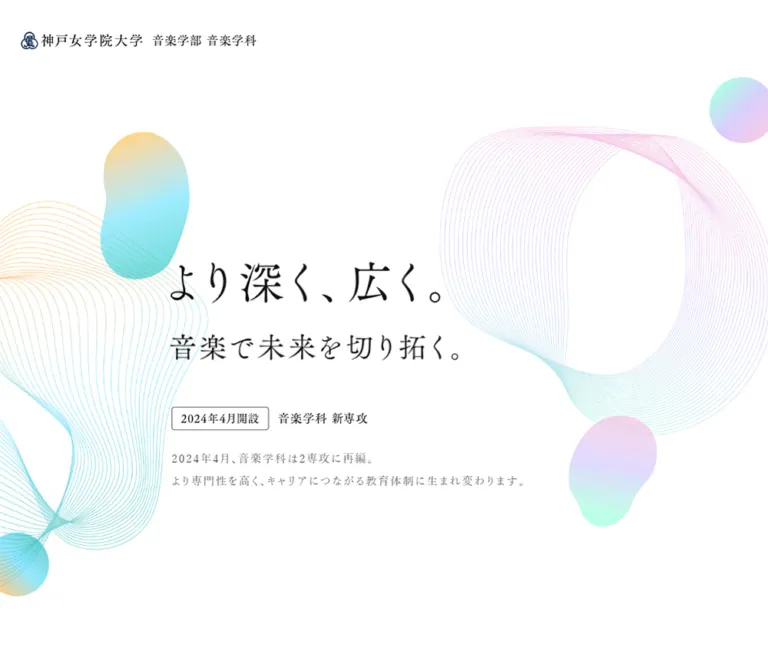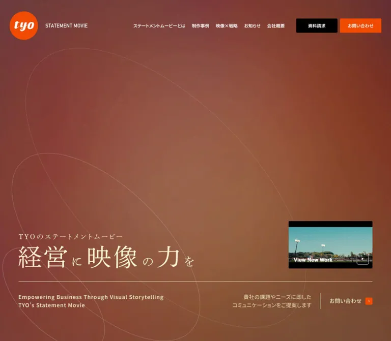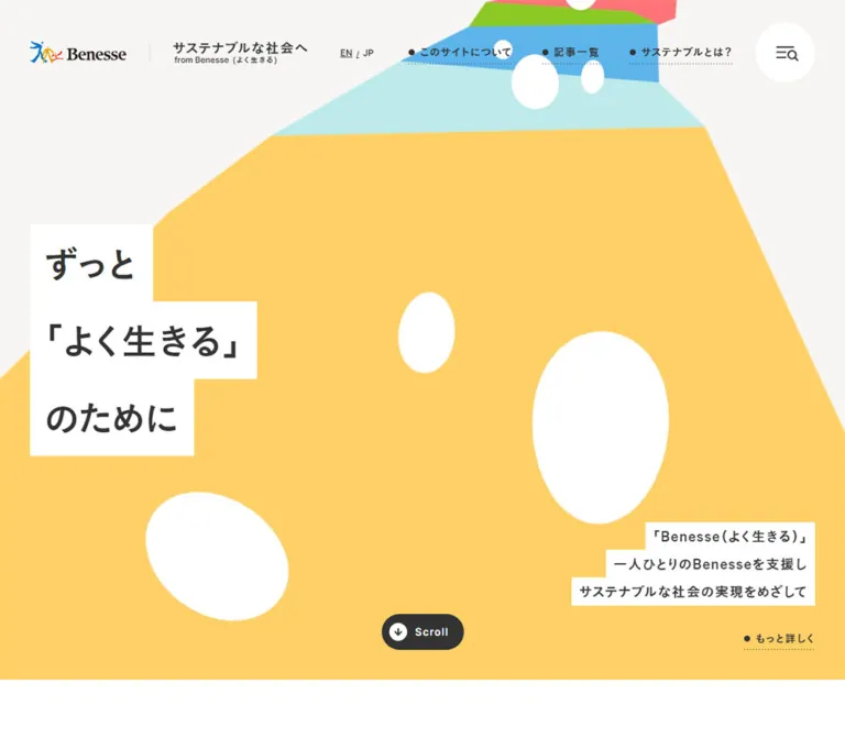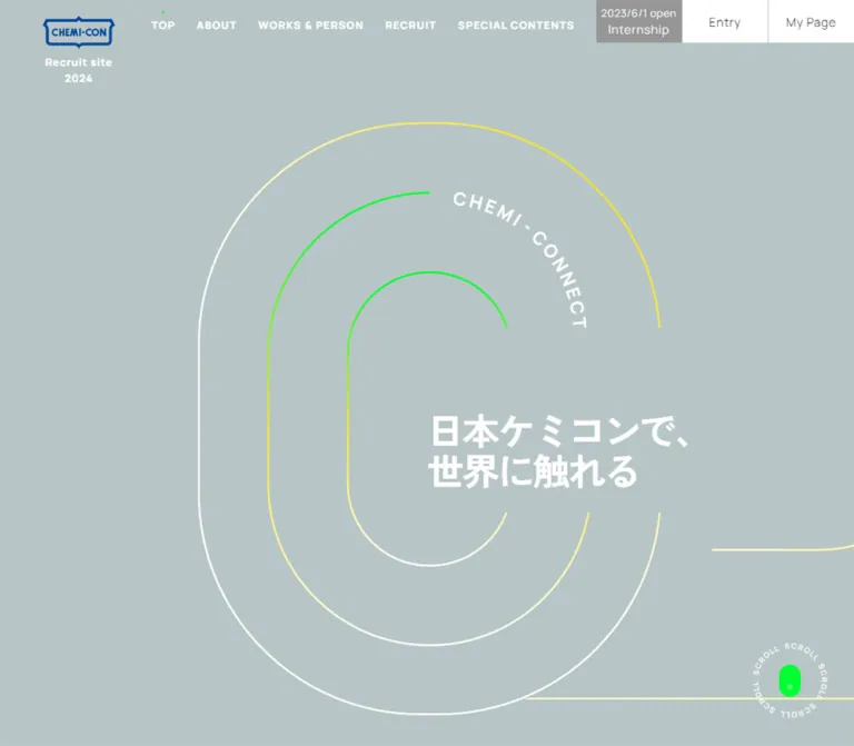
プレビュー準備中デザインリファレンスを見る
DESIGN REFERENCE
FiTO|縫製料金の自動見積りサービス
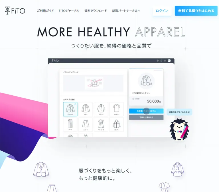
淡いグリッド背景にピンクと紫の布状グラフィック、ハリネズミのキャラクターを組み合わせたサービスサイト。軽やかな日英の文字組み、青いグラデーションのボタン、余白の大きな構成が特徴です。
FiTO Estimate — Style Reference
A pale drafting canvas crossed by colorful fabric, with a small hedgehog guiding the way.
Website: estimate.fito.jp Original URL: https://estimate.fito.jp/ Final URL: https://estimate.fito.jp/ Theme: light content canvas, saturated illustrated sections, and a dark footer Inspected: October 2, 2026, at 04:49 JST; supplied retrieval timestamp: October 1, 2026, at 19:49:10.468 UTC Viewports: desktop 1440 × 1000 CSS pixels; mobile 390 × 844 CSS pixels Scope: the current public service homepage, including its opening composition, introduction, benefit summaries, feature walkthroughs, registration panels, journal previews, news, guides, and footer. Linked application screens and other pages were not inspected.
FiTO presents a clothing-production service through a combination of technical precision and playful illustration. Almost-white paper, delicate construction lines, narrow dark lettering, and restrained controls establish the practical side. Large pink, indigo, lavender, and blue shapes resemble curling fabric. Garment illustrations, sewing tools, and the hedgehog character make the service approachable without replacing the information hierarchy.
This is a service homepage with an editorial and support layer. Its sequence moves from a broad promise to estimating, organizing garments, and ordering production, then continues into journal articles, news, guides, and related services. Registration is important, but it is one part of a broader website structure.
The current desktop and mobile captures show a large blank surface below the opening headline. The captured ORDER section also contains a blank panel. These surfaces establish observable size, position, and shadow treatment; their intended internal media and the reason for their blank appearance remain unverified. Do not invent application content inside them when documenting the inspected state.
閉じる
FiTO Estimate — Style Reference
A pale drafting canvas crossed by colorful fabric, with a small hedgehog guiding the way.
Website: estimate.fito.jp Original URL: https://estimate.fito.jp/ Final URL: https://estimate.fito.jp/ Theme: light content canvas, saturated illustrated sections, and a dark footer Inspected: October 2, 2026, at 04:49 JST; supplied retrieval timestamp: October 1, 2026, at 19:49:10.468 UTC Viewports: desktop 1440 × 1000 CSS pixels; mobile 390 × 844 CSS pixels Scope: the current public service homepage, including its opening composition, introduction, benefit summaries, feature walkthroughs, registration panels, journal previews, news, guides, and footer. Linked application screens and other pages were not inspected.
FiTO presents a clothing-production service through a combination of technical precision and playful illustration. Almost-white paper, delicate construction lines, narrow dark lettering, and restrained controls establish the practical side. Large pink, indigo, lavender, and blue shapes resemble curling fabric. Garment illustrations, sewing tools, and the hedgehog character make the service approachable without replacing the information hierarchy.
This is a service homepage with an editorial and support layer. Its sequence moves from a broad promise to estimating, organizing garments, and ordering production, then continues into journal articles, news, guides, and related services. Registration is important, but it is one part of a broader website structure.
The current desktop and mobile captures show a large blank surface below the opening headline. The captured ORDER section also contains a blank panel. These surfaces establish observable size, position, and shadow treatment; their intended internal media and the reason for their blank appearance remain unverified. Do not invent application content inside them when documenting the inspected state.
How to Read This Reference
- Measured means a value appears in the supplied rendered DOM or computed-style evidence. Element rectangles are CSS-pixel measurements and may include fractional rounding.
- Calculated means a value was derived from those measurements, such as the gap between adjacent links or columns.
- Estimated means a visual approximation from the current-page screenshots. This applies to decorative colors, shadow parameters, illustration sizes, and several panel dimensions.
- Recommended means a proposed implementation choice. Breakpoints, accessible enhancements, fallback behavior, and the Quick Start are not recovered source code.
- Named tokens are implementation aliases created for this reference. The supplied custom-property collection does not expose a semantic FiTO design-token system.
- Coverage differs by section. The opening, desktop ORDER composition, and footer are visually captured. Other sections have substantial DOM measurements but no supplied close-up of their rendered artwork.
- Interaction evidence is limited. Link destinations and some transition declarations are available. Menu opening, hover endpoints, horizontal dragging, media playback, and application workflows were not exercised.
Tokens — Colors
Measured Interface Palette
| Name | Value | Suggested token | Evidence and role |
|---|---|---|---|
| Paper | #fbfdfe |
--color-paper |
Computed HTML and body background at both viewports |
| Primary Ink | #00111f |
--color-ink |
Computed body text, navigation, Japanese headings, and article text |
| Display Ink | #151b26 |
--color-display |
Computed opening H1 color |
| Slate Heading | #313b47 |
--color-slate |
Journal heading element and View More links |
| Deep Heading | #1b2136 |
--color-heading-deep |
News and guide heading elements |
| Muted Text | #788494 |
--color-muted |
Journal introduction text |
| White | #ffffff |
--color-white |
CTA labels, COLLECTION and ORDER headings, footer navigation |
| Footer Charcoal | #222830 |
--color-footer |
Computed footer background |
| Related-Service Text | #d0d5db |
--color-footer-muted |
Footer links to the wider FiTO service family |
| Mobile Secondary Action | #3b3f45 |
--color-secondary-mobile |
Computed mobile download-button background |
| Social Disc | rgba(228, 231, 235, 0.15) |
--color-social-disc |
Computed circular social-link backgrounds |
Estimated Illustration and Effect Palette
These values are practical approximations, not sampled or computed source tokens.
| Name | Approximate value | Suggested token | Visible role |
|---|---|---|---|
| Fabric Pink | #ff87cf |
--color-fabric-pink |
Broad pink fabric surfaces and the ORDER field |
| Strong Pink | #f342ae |
--color-fabric-pink-deep |
Darker portions of folds and diagonal fabric |
| Fabric Indigo | #2b1c68 |
--color-fabric-indigo |
Dark fabric undersides and the wave above ORDER |
| Lavender Fold | #7865cc |
--color-fabric-lavender |
Small exposed reverse faces of the ribbon |
| Fabric Blue | #a4def1 |
--color-fabric-blue |
Pale blue fabric and garment accents |
| Bubble Blue | #ccefff |
--color-bubble |
The hedgehog's speech bubble |
| Action Blue | #209bfa |
--color-action-start |
Left side of the primary CTA gradient |
| Action Cyan | #4cd1f6 |
--color-action-end |
Right side of the primary CTA gradient |
| Construction Line | #e9edf0 |
--color-grid |
Very faint background guides; opacity also affects appearance |
The visual hierarchy depends on how these colors are distributed. The body remains mostly pale and quiet. Pink and indigo occupy large decorative areas, while the blue-to-cyan treatment identifies the primary action. The footer changes the entire field to charcoal rather than adding another colorful illustration behind small links.
The computed CTA background color is often transparent even though the screenshot shows a gradient. The supplied properties do not include every background image, pseudo-element, or paint layer. Likewise, the login link reports transparent text while rendering visibly blue. Reproduce the visible treatment; do not interpret those isolated values as instructions to hide the label.
Theme Behavior
Only one appearance was supplied. The dark footer and saturated feature sections are parts of that appearance, not evidence of selectable themes or automatic dark mode.
Tokens — Typography
Japanese Text — Tazugane Information Faces
Measured body stack: TazuganeInfoStdN-Light, sans-serif.
The same light face is declared for navigation, explanatory text, article titles, and most Japanese headings. It gives the page a thin, spacious appearance. Body tracking is consistently 0.8px; explanatory paragraphs often use a line height twice their font size.
Measured emphasized stack: TazuganeInfoStdN-Medium, sans-serif.
The medium face appears on registration and download actions, the audience-list heading, and the footer's service descriptor. Both named faces report font-weight: 400 in the supplied evidence. Their difference comes from separate family declarations, so changing every emphasized element to numeric weight 700 would alter the observed character.
These are computed family declarations. The evidence does not independently verify which font file supplied every rendered glyph. Use the named faces only when available and appropriately licensed; otherwise retain the proportions with an explicitly chosen sans-serif fallback.
English Display — Futura
Measured opening stack: FuturaLTPro-Book, sans-serif.
The H1 uses wide tracking and an uppercase geometric rhythm. MORE HEALTHY is filled; APPAREL is outlined in the screenshots. An approximately 1px text stroke is a reasonable implementation estimate, but the source stroke declaration was not supplied.
Measured journal heading stack: FuturaLTPro-Medium, sans-serif.
The journal H2 declares a larger size and generous tracking. Its extracted text combines FiTO and Journal, so the outer H2 measurement should not be treated as proof that every nested word has identical styling.
Measured View More stack: FuturaLTPro-Book, sans-serif, TazuganeInfoStdN-Light, sans-serif.
Type Scale
All values below are measured unless noted. Desktop and mobile refer to the two inspected viewports, not universal breakpoint rules.
| Role | Desktop size / line height | Mobile size / line height | Tracking and notes |
|---|---|---|---|
| Opening H1 | 56px / 78.4px |
32px / 44.8px |
4px; one desktop line, two mobile lines |
| Opening Japanese subtitle | 24px / 48px |
16px / 32px |
0.8px |
| Introduction heading | 32px / 48px |
20.8px / 31.2px |
Two lines at both measured positions |
| Introduction paragraph | 16px / 32px |
12.48px / 24.96px |
0.8px; unusually small on mobile |
| Benefit summary title | 19.2px / 38.4px |
18px / 36px |
Light Japanese face |
| Benefit summary paragraph | 14px / 28px |
14px / 28px |
Stable size across the two views |
| Feature H3 | 32px / 51.2px |
18px / 28.8px |
The full heading box also contains a smaller English label |
| ESTIMATE explanation | 16px / 24px |
12px / 18px |
Desktop single line; mobile two lines |
| First registration-panel title | 32px / 64px |
18.72px / 37.44px |
Later desktop registration title is smaller |
| Final registration-panel title | 24px / 48px |
18.72px / 37.44px |
Centered within the closing panel |
| Registration supporting line | 16px / 24px |
12px / 18px |
Light face |
| Main registration actions | 16px / 36px |
16px / 32px |
Medium face; vertical padding adds 16px |
| Journal H2 element | 64px / 64px |
40px / 40px |
Tracking changes from 5px to 4px |
| Journal introduction | 12px / 19.2px |
12px / 19.2px |
Muted slate text |
| Journal article title | 16px / 25.6px |
16px / 25.6px |
Stable editorial reading size |
| News and guide H2 elements | 24px / 24px |
24px / 24px |
Combined bilingual heading boxes are 60px tall |
| View More | 18px / 27px |
15px / 22.5px |
Includes 48px right padding |
| Desktop header navigation | 14px / 28px |
Hidden in the captured mobile header | Light face |
| Footer navigation | 14px / 21px |
14px / 21px |
White computed text |
| Footer legal links | 12px / 18px |
12px / 18px |
Small external-link marks |
| Related-service links | 12px / 18px |
14px / 21px |
These become larger on mobile |
The root remains a conventional 16px in both observations. Fractional mobile sizes do not establish a recoverable viewport-based formula. Use the measured endpoints for reference and label any interpolation as an implementation decision.
Tokens — Spacing & Shapes
Overall density: generous vertical space around illustrations and major panels; compact navigation, article metadata, and footer links.
Spacing model: several fixed values recur, but no single source spacing scale was exposed. A reusable 4px or 8px scale can support an adaptation while retaining the measured exceptions.
Spacing Measurements
| Relationship | Value | Status |
|---|---|---|
| Desktop header left and right inset | 24px |
Measured from logo and final CTA bounds |
| Mobile header left and right inset | 16px |
Measured from logo and menu bounds |
| Desktop logo-to-first-navigation gap | 56px |
Calculated |
| Desktop navigation link gap | 24px |
Calculated between adjacent link rectangles |
| Desktop login-to-signup gap | 16px |
Calculated |
| Desktop benefit-column gap | 64px |
Calculated |
| Main mobile text inset | 24px |
Measured for introduction, journal heading, news, and guides |
| Mobile benefit-text inset | 48px |
Measured; narrower than the main text column |
| Main CTA horizontal gap | 23px |
Calculated between two 278px actions |
| Mobile CTA vertical gap | 12px |
Calculated between two 48px actions |
| Desktop journal-card gap | 64px |
Calculated |
| Mobile journal-card gap | 24px |
Calculated |
| Footer navigation row pitch | 36px |
Calculated from successive 21px-high links |
| Footer top inset to brand link | 56px |
Measured at both widths |
Border Radius and Shape
| Element | Value or shape | Evidence |
|---|---|---|
| Desktop header and main CTA links | 4px |
Computed |
| Mobile main CTA links | 5.4px |
Computed |
| Social link discs | 100%, 32px square |
Computed |
| Opening media surface | Approximately square corners | Screenshot estimate |
| ORDER media surface | Approximately 30–32px corners |
Screenshot estimate |
| Closing registration panel | Approximately 20px lower corners |
Screenshot estimate |
| Speech bubble | Rounded rectangle with a downward pointer | Screenshot; exact geometry unavailable |
| Related-service outlines | Long pills | Screenshot; sampled inner anchors themselves report zero radius |
| Fabric boundaries | Broad asymmetric curves and folded reverse faces | Illustration geometry, not a generic radius token |
The related-service pills illustrate why element measurements and visual anatomy must be read together. The sampled links have border-radius: 0, while their surrounding outlines are visibly rounded. Apply the pill shape to the appropriate wrapper rather than claiming the inner anchor supplied it.
Layout Measurements
| Element | Desktop | Mobile | Status |
|---|---|---|---|
| Document height | 8399.48px |
8584.03px |
Measured; rounded summaries report 8399 and 8584 |
| Header | 1440 × 104px |
390 × 52px |
Measured |
| Header logo link | 99 × 40px, at (24, 32) |
70 × 28px, at (16, 12) |
Measured |
| Opening H1 box | 718.73 × 78.39px |
342 × 89.59px |
Measured |
| Opening media surface | About 820 × 507px, starting near (310, 299) |
About 342 × 211px, starting near (24, 267) |
Screenshot estimates |
| Introduction text column | 400px wide |
342px wide |
Measured |
| Benefit text columns | Three at approximately 286.93px each |
One at 294px |
Measured |
| Main editorial span | Approximately 988.8px |
342px between typical text gutters |
Calculated from section bounds |
| Closing registration panel | About 946px wide |
Outer panel bounds not supplied | Desktop screenshot estimate |
| Main CTA links | 278 × 52px |
207.80 × 48px |
Measured |
| Journal cards | 228.80px wide |
220px wide |
Measured |
| News and guide columns | 440px each |
Sections span 390px with 24px horizontal padding | Measured |
| Footer | 428px high |
763.69px high |
Measured |
| Footer inner span | Approximately 1188px |
342px |
Calculated from visible content bounds |
Components
Site Header
Role: identify the service and expose information, account access, and registration.
The desktop header is a transparent 104px-high band over the pale canvas. Its structure is a 99 × 40px logo link, five text links, and a right-aligned account-action pair. The five links cover guides, the journal, the character's tips, downloads, and sewing partners. Their 24px spacing produces a light horizontal rhythm rather than a dense application toolbar.
The login action is a white, softly shadowed rectangle with visible blue lettering. The registration action uses a blue-to-cyan gradient and white text. Both are 48px high with 4px corners; their widths are approximately 95px and 207.8px.
At 390px, the header becomes 52px tall. The logo shrinks to 70 × 28px, the desktop links and CTA pair disappear, and a 32 × 32px menu button occupies the right side. Its supplied label is “メニューを開閉する”. Three thin horizontal lines are visible.
Hidden menu text exists in the DOM, but the open menu was not captured. Its panel geometry, animation, focus behavior, and scroll locking are unverified. Header stickiness is also unverified.
Opening Headline and Drafting Canvas
Role: introduce the service promise through a large but light typographic composition.
Center MORE HEALTHY APPAREL above “つくりたい服を、納得の価格と品質で”. The English line combines solid and outlined letterforms, using the same restrained dark ink. On desktop, the headline occupies one line. On mobile, MORE HEALTHY is the first line and APPAREL is the second.
Keep the background almost white. Fine vertical guides and occasional cross marks suggest a drafting sheet. In the desktop opening capture, visible vertical guides lie near x=240, 560, 880, and 1200, a roughly 320px pitch. Mobile guides appear near x=101 and 273, a roughly 172px pitch. Horizontal guides are more selectively placed; the screenshots do not establish a universal square-grid repeat.
The headline has substantial breathing room around it, but it is not extremely heavy. Avoid replacing the geometric Book face with a condensed or extra-bold display treatment.
Opening Media Surface and Character Guide
Role: reserve the visual center for a service demonstration while placing a friendly guide at its lower right.
The observed desktop surface is approximately 820 × 507px, centered beneath the subtitle. It has a pale fill, nearly square corners, and a large diffuse shadow extending especially downward and to the right. Its interior is blank in the current capture.
The mobile surface is approximately 342 × 211px. Its apparent aspect ratio remains close to the desktop rectangle, but the surrounding artwork does not simply scale as one flattened image. The fabric overlaps much of the lower-left region, while the hedgehog remains legible at the right.
The hedgehog has a dark spiky silhouette, a cream face and body, and bright pink/cyan details. Above it sits a pale-blue speech bubble containing a short estimate-related message. Approximate visual sizes are 125px wide for the desktop character and 105px on mobile; the bubble is roughly 165px wide on desktop and 136px on mobile.
No clickable behavior was established for the character or bubble. Treat them as illustration unless a real action is separately specified.
Fabric Ribbon System
Role: connect otherwise quiet sections through a visual reference to cloth and garment making.
The opening ribbon enters from the left as a broad pink plane. Its edge bends down into an indigo underside, with lavender and pale blue exposed at folds. The shape extends beyond the viewport rather than ending inside a card.
The desktop ORDER capture expands this idea into a nearly full-screen pink field. A dark indigo wave cuts across the top, while an irregular pink edge reveals the pale page below. Small reverse-colored folds and soft shadows give the impression of layered material.
Preserve the large scale and cropped edges. A collection of small decorative blobs would not create the same spatial effect. Use custom vector paths or authorized artwork for the folds; a rounded rectangle with a gradient cannot express the visible geometry.
Introduction and Benefit Summaries
Role: explain the service before the larger feature walkthrough.
The introduction heading and paragraph form a narrow column. At desktop, the text is 400px wide, beginning near x=508; the heading begins around document y=1017. At mobile, the column uses 24px side gutters, and the heading begins around y=869, just below the supplied opening viewport.
The introductory paragraph describes making the necessary clothes at the necessary time and quantity. Its desktop type is 16px with 32px leading. The measured mobile version is 12.48px with 24.96px leading; this is an observed proportion, not an accessibility recommendation.
Three benefit summaries follow: estimating sewing cost and CO₂, managing intended garments, and handling production through delivery. Desktop places their text in three approximately 287px columns with 64px gaps. Mobile stacks them in a 294px column at x=48. Their title positions are separated by about 410.8px, showing substantial space for the associated visual compositions; the supplied evidence does not identify every visual within those spaces.
Keep these explanations integrated with the page. The text evidence does not establish a conventional bordered-card container for each benefit.
ESTIMATE, COLLECTION, and ORDER Walkthrough
Role: turn the three benefits into larger, staged explanations.
Each feature has a small English identifier above a Japanese H3. The Japanese heading uses 32px type on desktop and 18px on mobile. ESTIMATE additionally includes a sentence describing two estimation methods.
Desktop heading groups start near x=427. Mobile groups start at x=102, preserving space on the left for accompanying visual material. This is a deliberate offset composition rather than universal center alignment.
The ORDER capture provides the clearest visual anatomy: a hedgehog carrying a small box at the left, the label ORDER and a white Japanese heading, a stack of dark boxes toward the right, and a large rounded panel below. Colored shirts, skirts, jackets, and trousers are distributed along the outer edges. The central panel remains blank in the supplied current capture.
The measured COLLECTION and ORDER headings are white; ESTIMATE is dark ink. ORDER visibly uses the pink field. The complete ESTIMATE and COLLECTION backgrounds were not supplied as screenshots, so do not assign their full color compositions solely from heading colors.
The desktop walkthrough bounds are approximately 3230.9px high; the mobile bounds are approximately 1694.8px. This substantial compression is more specific than treating every feature as a fixed full-screen slide.
Repeated Registration Panel
Role: offer registration and a lower-commitment information download after the service explanation and again before the footer.
The panel contains, in order:
- A centered invitation heading: “無料で見積りをはじめてみる?”
- A short membership explanation.
- The primary registration link and secondary download link.
- An audience heading between fine dashed rules.
- Four short use cases with small blue bullets.
On desktop, the two actions are each 278 × 52px and sit 23px apart. Registration uses the bright blue gradient; the download action appears as a dark slate treatment. On mobile, the actions become a centered vertical pair, each approximately 207.8 × 48px, separated by 12px. The mobile secondary action has a measured solid background of #3b3f45.
The closing desktop instance sits in a pale, approximately 946px-wide rounded panel over diagonal fabric. Colored pins flank the heading, and a pink needle-and-thread illustration decorates the lower-left edge. The panel appears slightly translucent where decorative bands cross behind it; no backdrop-blur implementation was established.
Do not make both desktop panel titles identical in size. The first is measured at 32px; the final instance is 24px. Both mobile instances use 18.72px.
Journal Preview Strip
Role: add editorial context about garment production and greenhouse-gas reduction.
A Futura heading and a small muted Japanese introduction precede three article links. Each article includes an upper visual area, a title, a category such as VOICE or STORY, and an organization name. The article topics and text are available in the DOM; the supplied current screenshots do not establish the appearance or crop of the article imagery.
At desktop, cards are approximately 228.8px wide, with left edges at x=311.2, 604.0, and 896.8. Their 64px gaps create a sparse editorial row. Title length changes total card height; do not force every title into the same artificial line count.
At mobile, the cards remain in a horizontal row: 220px wide at x=80, 324, and 568, with 24px gaps. This proves an offscreen horizontal arrangement. It does not prove whether dragging, snapping, arrow controls, or automatic advancement is implemented. A usable horizontal scroller is a suitable recommendation for an adaptation.
The View More link is aligned toward the right edge and reserves 48px of right-side space for its visual direction cue.
News and Guide Lists
Role: provide current service information and practical support without introducing more large illustration panels.
Desktop presents two 440px columns within an approximately 988.8px span. News begins at x=225.6; Guide begins at x=774.4. Their top edges align around document y=6607.5.
The news list pairs dates with linked titles. On desktop, title links begin about 107px to the right of the column edge, leaving a date column. On mobile, title links start at the 24px text gutter, indicating a reflow away from that desktop arrangement.
Guide contains three text links and a View More action. At mobile, News and Guide become separate full-width sections with 24px internal gutters. Their text remains 16px. Long titles have compact measured boxes, but the supplied evidence does not reveal the exact truncation or clipping rule; do not infer an ellipsis solely from box height.
Footer and Service Family
Role: consolidate navigation, legal information, social access, and links to the broader FiTO ecosystem.
The footer is a full-width #222830 field. A large white FiTO mark with the “見積り” descriptor sits at the left. Desktop navigation is grouped to the right, followed by legal links and two social discs. A thin dashed divider separates this information from four outlined service-family pills and a quiet centered copyright line.
The desktop footer is 428px tall. Its main content spans approximately 1188px, leaving about 126px on each side. Social discs are 32px squares, separated by 12px.
On mobile, the footer grows to approximately 763.7px. The logo remains prominent rather than becoming a tiny utility mark. Navigation forms two columns at x=24 and x=195. Login and registration occupy the final row. Legal links wrap below, social discs move to the left, and the service-family pills stack vertically with about 10px between their 33px-high inner links.
The mobile screenshot shows a substantial pause before the copyright line. Preserve the footer's breathing room instead of compressing all links into a dense list.
Tokens — Motion & Interaction
| Treatment | Available evidence | What can be concluded |
|---|---|---|
| Header navigation links | color 0.3s ease-in-out |
A 300ms color transition is declared; the target color was not supplied |
| Footer navigation and legal links | color 0.3s ease-in-out |
Same restrained transition timing |
| View More links | color 0.3s ease-in-out |
Color transition is declared; arrow movement is unverified |
| Registration, download, and login actions | Computed transition shorthand 0.3s |
A 300ms transition exists; exact properties and endpoints are not established |
| Social discs | background-color 0.3s ease-in-out |
Background-color feedback is declared |
| Mobile menu | Button and accessible text present | Opening and closing behavior was not exercised |
| Journal strip | Cards extend beyond the mobile viewport | Horizontal arrangement is measured; swipe, snap, and autoplay are unverified |
| Fabric and character illustration | Static screenshots | No trajectory, duration, loop, or parallax behavior can be reconstructed |
| Large blank panels | Blank after the supplied readiness process | Internal media, loading state, and playback behavior remain unverified |
Many sampled elements report animation: none. Other entries expose only transition: all without a useful duration. Neither observation proves that every descendant, pseudo-element, media asset, or script is motionless.
The capture process waited for document load, relevant finite motion, layout/text stability, and visible image decoding within stated limits. It temporarily paused perpetual animations during readiness checks. That procedure is not evidence that any particular FiTO element actually has a perpetual animation, nor does it guarantee that all delayed content appeared.
For a new implementation, keep ordinary feedback near the measured 300ms duration. Any fabric drift, character animation, or scroll-linked movement should be treated as a separate creative addition, with a reduced-motion alternative.
Surfaces
| Layer | Appearance | Use |
|---|---|---|
| Main canvas | Almost-white #fbfdfe with faint guides |
The quiet structural foundation |
| Opening demonstration surface | Pale rectangle, almost square corners, broad soft shadow | Large visual center beneath the headline |
| Fabric planes | Saturated curved shapes with contrasting reverse faces | Section continuity and garment-making identity |
| ORDER demonstration surface | Pink rounded rectangle with a diffuse surrounding shadow | A tonal panel inside a pink section |
| Closing registration panel | Pale rounded surface over diagonal fabric | Separates conversion text from decorative color |
| Primary action | Blue-to-cyan fill with a small radius and soft blue shadow | Registration |
| Secondary action | Dark slate treatment with white text | Downloading information |
| Footer | Solid charcoal, fine dashed divider, outlined service pills | Dense but orderly utility content |
The shadow vocabulary is selective. Large media surfaces and buttons receive elevation; ordinary navigation and text lists rely on spacing and typography. Applying the same large shadow to every article or list item would make the page much heavier.
Imagery
The identifiable image language is vector-like and garment-specific: curling cloth, simplified clothing silhouettes, sewing pins, a needle with thread, parcels, and the hedgehog character. Broad flat color is combined with a few gradients, dark reverse faces, and soft shadows. Fine garment outlines appear near the lower portion of the mobile opening capture, providing a quieter counterpart to the filled clothing illustrations in ORDER.
The character uses a compact cream face against dark angular spines, small facial marks, and bright accent details. It is a distinct brand asset. A generic animal emoji or unrelated cartoon would not preserve the silhouette or visual role.
The desktop ORDER artwork places garments at the perimeter so the heading and central panel remain clear. The closing registration panel uses smaller sewing tools as punctuation around the action hierarchy. Preserve those differences in scale and purpose.
Observed Asset References
No image source paths, SVG files, or media URLs were supplied. The following inventory identifies visible artwork without inventing filenames.
| Asset | Current evidence | Implementation guidance |
|---|---|---|
| FiTO line logo | Desktop/mobile header and footer | Use an authorized logo asset; preserve its thin strokes |
| Hedgehog guide and speech bubble | Desktop/mobile opening captures | Keep character and text independently adaptable where possible |
| Fabric folds | Opening, ORDER, and closing registration captures | Use custom paths or authorized vector artwork with layered reverse faces |
| Filled garment illustrations | Desktop ORDER capture | Retain pink, indigo, and pale-blue coordination |
| Outline garments | Mobile opening capture | Keep fine linework and pale interiors |
| Parcels | ORDER heading group | Small contextual illustration, not a control |
| Pins, needle, and thread | Closing desktop registration panel | Supporting accents around the panel |
| Journal visual areas | DOM card structure and spacing only | Image content and crop are unverified |
| Demonstration media | Blank current surfaces | Obtain verified current assets or provide an explicit fallback |
CSS can reproduce the layout, text treatment, buttons, and approximate shadows. The identity of the fabric folds, logo, and character requires artwork. Do not draw conclusions about file format merely because an illustration looks vector-based.
Layout & Responsive Behavior
Page Sequence
The measured sequence is: header → opening and introduction → three benefit summaries → ESTIMATE / COLLECTION / ORDER walkthrough → first registration panel → journal previews → news and guides → final registration panel → footer.
| Region | Desktop document position | Mobile document position |
|---|---|---|
| Opening section | Starts at 104px; height 1704.28px |
Starts at 52px; height 2507.86px |
| Feature walkthrough | Starts at 1808.28px; height 3230.89px |
Starts at 2559.86px; height 1694.77px |
| First registration section | Starts at 4839.17px; height 731.34px |
Starts at 4254.63px; height 1404.45px |
| Journal | Starts at 5770.52px; height 636.97px |
Starts at 5739.08px; height 578.05px |
| News | Starts at 6607.48px |
Starts at 6397.13px |
| Guide | Starts at 6607.48px |
Starts at 6779.22px |
| Footer | Starts at 7971.48px |
Starts at 7820.34px |
These are element bounds, not recommended fixed section heights. On desktop, the first registration section begins 200px before the measured walkthrough section ends. This confirms overlapping section bounds, but not the particular CSS technique used to create them. Mobile records those two sections consecutively.
Responsive Changes That Are Established
- The header changes from a full navigation row to a compact logo-and-menu arrangement.
- The English headline breaks into two lines, while the Japanese subtitle remains one line at 390px.
- The opening demonstration rectangle becomes much narrower while the character and fabric retain a substantial visual presence.
- The introductory paragraph shrinks considerably; benefit and article paragraphs retain their separate size rules.
- Three benefit columns become a vertical sequence.
- Feature headings reduce from 32px to 18px and retain an offset from the left edge.
- Registration actions switch from a horizontal pair to a vertical pair.
- Journal previews remain horizontal and extend offscreen rather than forming a vertical stack.
- News and Guide switch from two columns to separate stacked sections.
- Footer navigation changes to two columns; related-service pills become a vertical list.
Only the 1440px and 390px widths were supplied. Exact breakpoints, tablet layouts, landscape-phone behavior, zoom behavior, and safe-area handling are unverified. The Quick Start uses explicit recommended breakpoints rather than presenting inferred source media queries.
Do’s and Don’ts
Do
- Keep the measured paper, ink, and footer colors exact when reproducing the interface shell.
- Use light Japanese typography with generous line height and restrained emphasis.
- Preserve the filled MORE HEALTHY / outlined APPAREL relationship.
- Let large fabric shapes enter and leave the viewport, with visible reverse faces at folds.
- Keep the hedgehog readable on mobile instead of shrinking the entire desktop composition uniformly.
- Separate small button radii from the much larger radius of the ORDER panel.
- Retain the full information architecture: service explanation, editorial material, support lists, and service-family footer.
- Preserve the mobile journal's horizontal arrangement while making its navigation usable.
- Use source artwork when authorized and available.
- Label estimated colors, geometry, and recommended behavior explicitly.
Don’t
- Do not treat the blank demonstration panels as evidence of a deliberately content-free final design.
- Do not invent application controls or current media content inside the panels.
- Do not turn the fine drafting guides into a high-contrast square grid.
- Do not make every heading bold or apply heavy geometric type to all Japanese copy.
- Do not use saturated pink as the default action color; the visible primary action is blue-to-cyan.
- Do not turn the fabric folds into unrelated floating blobs or generic gradient circles.
- Do not apply large rounded-card shadows to every text block.
- Do not claim the mobile menu, journal swipe, or decorative motion was tested.
- Do not infer a source breakpoint or fluid type formula from two viewport samples.
- Do not shrink footer links uniformly on mobile; related-service labels are measured larger there.
Recommended Implementation Additions
These are recommendations for an adaptation, not verified features of the original page.
- Provide a meaningful loading or unavailable state for demonstration media. Preserve the reserved dimensions to avoid layout shifts, but avoid an indefinitely unexplained blank panel.
- Keep essential mobile explanatory text at least around 14px where practical. The measured 12.48px introduction is a reproduction detail, not a target for general readability.
- Give the mobile menu an approximately 44px interaction area while retaining a thin, visually compact icon. Manage focus and expanded state if it opens a navigation panel.
- Make the journal row keyboard accessible and horizontally scrollable when cards extend beyond the viewport. Add controls only if the chosen interaction needs them.
- Verify contrast across the entire primary gradient, especially beneath white 16px labels. Adjust an adaptation's gradient or label treatment if needed.
- Preserve visible focus indicators on both pale and charcoal backgrounds.
- Mark decorative fabric, garment motifs, and tool illustrations as decorative. Give meaningful media and linked images useful alternatives.
- Ensure outline text remains readable when text stroke or custom fonts are unavailable.
- Avoid trapping important content behind oversized mobile artwork at increased text sizes.
- Honor reduced-motion preferences if adding fabric movement, character animation, or scroll effects.
Agent Prompt Guide
Quick Color Reference
- Measured canvas:
#fbfdfe. - Measured body ink:
#00111f; opening display ink:#151b26. - Measured footer:
#222830; related-service labels:#d0d5db. - Estimated fabric accents: pink
#ff87cf, deeper pink#f342ae, indigo#2b1c68, lavender#7865cc, pale blue#a4def1. - Estimated primary gradient:
#209bfato#4cd1f6. - Keep fine guides and cross marks much quieter than typography.
Overall Prompt
“Create a Japanese apparel-production service homepage inspired by the current FiTO reference. Use an almost-white #fbfdfe drafting canvas, dark #00111f text, light Japanese sans-serif typography, and widely tracked geometric English headings. Build an opening headline with filled MORE HEALTHY and outlined APPAREL, followed by a centered demonstration surface. Introduce broad pink and indigo fabric folds, pale-blue reverse faces, garment illustrations, and a small hedgehog guide using authorized assets. Continue through three service benefits, large feature explanations, registration/download panels, journal previews, news, guides, and a charcoal footer. Keep action buttons blue-to-cyan with small corners. On mobile, use a compact menu header, two-line English headline, stacked registration actions, a horizontal journal row, and a two-column footer navigation. Treat unspecified media and interactions as implementation requirements to resolve, not details to invent.”
Example Component Prompts
- Opening composition: “Center a light geometric uppercase heading on near-white paper with faint vertical drafting guides. Fill the first phrase in dark ink and outline the final word. Place a pale rectangular media surface below with a broad diffuse shadow. Let a large folded pink-and-indigo fabric shape cross the lower-left foreground and place a small hedgehog with a pale-blue speech bubble near the lower right.”
- Feature stage: “Create an ORDER section on a saturated pink fabric field. Use a small English eyebrow above a light white Japanese heading, a parcel-carrying character to the left, and a small stack of boxes to the right. Place a large rounded demonstration panel below, leaving garment illustrations around the perimeter. Use verified media content only.”
- Registration panel: “Place a centered Japanese invitation, a short supporting line, and two equal desktop actions inside a pale rounded panel. Use a blue-to-cyan registration button and a dark download button. Add an audience heading between dashed rules and four blue-bulleted use cases. Stack the actions on mobile and keep small sewing-tool illustrations outside the text.”
- Journal row: “Create a spacious editorial strip with a Futura-style English heading and a small muted Japanese introduction. Use three narrow article links with titles and category/organization metadata. Maintain 64px desktop gaps; on mobile retain 220px cards in a horizontal row with 24px gaps. Do not invent article photography or carousel behavior.”
- Footer: “Build a charcoal footer with a large thin white brand mark, restrained 14px navigation, small legal links, two circular social icons, a dashed separator, and four outlined related-service pills. On a 390px screen, use 24px side gutters, two navigation columns, stacked pills, and generous space before the copyright.”
Quick Start
CSS Custom Properties
This is a reusable static foundation, not the original stylesheet. Interface colors and several dimensions are measured; decorative colors, shadow recipes, layout caps, and media queries are adaptation choices. The named source fonts require separately supplied, authorized font files. No asset URLs are fabricated here.
The example uses a conventional root font size. It also enlarges the menu interaction area and keeps introductory mobile body text at 14px as recommended improvements.
:root {
  /* Measured interface colors */
  --color-paper: #fbfdfe;
  --color-ink: #00111f;
  --color-display: #151b26;
  --color-slate: #313b47;
  --color-muted: #788494;
  --color-white: #fff;
  --color-footer: #222830;
  --color-footer-muted: #d0d5db;
  --color-secondary-mobile: #3b3f45;
  --color-social-disc: rgba(228, 231, 235, 0.15);

  /* Estimated decorative colors */
  --color-fabric-pink: #ff87cf;
  --color-fabric-pink-deep: #f342ae;
  --color-fabric-indigo: #2b1c68;
  --color-fabric-lavender: #7865cc;
  --color-fabric-blue: #a4def1;
  --color-bubble: #ccefff;
  --color-action-start: #209bfa;
  --color-action-end: #4cd1f6;
  --color-grid: rgba(0, 17, 31, 0.035);

  /* Computed family names; files must be provided separately */
  --font-body: 'TazuganeInfoStdN-Light', sans-serif;
  --font-emphasis: 'TazuganeInfoStdN-Medium', sans-serif;
  --font-display: 'FuturaLTPro-Book', sans-serif;
  --font-display-medium: 'FuturaLTPro-Medium', sans-serif;
  --tracking-body: 0.8px;
  --tracking-display: 4px;

  /* Adaptation caps based on observed dimensions */
  --content-width: 988.8px;
  --footer-width: 1188px;
  --media-width: 820px;
  --cta-panel-width: 946px;
  --gutter: 24px;
  --grid-pitch: 320px;
  --radius-action: 4px;
  --radius-panel: 20px;
  --radius-demo: 32px;

  /* Estimated shadows, not recovered source values */
  --shadow-media: 24px 32px 70px rgba(34, 40, 48, 0.14);
  --shadow-panel: 0 10px 24px rgba(34, 40, 48, 0.06);
  --shadow-action: 0 5px 14px rgba(32, 155, 250, 0.16);
  --motion-feedback: 300ms ease-in-out;
}

* {
  box-sizing: border-box;
}

body {
  margin: 0;
  color: var(--color-ink);
  background: var(--color-paper);
  font-family: var(--font-body);
  font-size: 16px;
  font-weight: 400;
  line-height: 1.5;
  letter-spacing: var(--tracking-body);
}

button,
a {
  -webkit-tap-highlight-color: transparent;
}

button {
  font: inherit;
}

a {
  color: inherit;
}

img,
svg {
  max-inline-size: 100%;
}

.fito-page {
  position: relative;
  isolation: isolate;
  overflow-x: clip;
}

/* Approximate vertical guides; add deliberate cross marks as artwork. */
.fito-page::before {
  position: absolute;
  z-index: -1;
  inset: 0;
  content: '';
  pointer-events: none;
  background-image: repeating-linear-gradient(
    90deg,
    transparent 0 calc(var(--grid-pitch) - 1px),
    var(--color-grid) calc(var(--grid-pitch) - 1px) var(--grid-pitch)
  );
  background-position: center top;
}

.container {
  inline-size: min(var(--content-width), calc(100% - 48px));
  margin-inline: auto;
}

.site-header {
  min-block-size: 104px;
  display: flex;
  align-items: center;
  gap: 56px;
  padding-inline: 24px;
}

.site-logo {
  display: block;
  flex: 0 0 99px;
  inline-size: 99px;
  block-size: 40px;
}

.site-logo img,
.site-logo svg {
  display: block;
  inline-size: 100%;
  block-size: 100%;
  object-fit: contain;
}

.site-nav,
.header-actions {
  display: flex;
  align-items: center;
}

.site-nav {
  gap: 24px;
}

.site-nav a {
  font-size: 14px;
  line-height: 28px;
  text-decoration: none;
  white-space: nowrap;
  transition: color var(--motion-feedback);
}

.header-actions {
  gap: 16px;
  margin-inline-start: auto;
}

.button {
  display: inline-flex;
  align-items: center;
  justify-content: center;
  min-block-size: 48px;
  padding: 8px 16px;
  border: 0;
  border-radius: var(--radius-action);
  font-family: var(--font-emphasis);
  font-size: 16px;
  font-weight: 400;
  line-height: 32px;
  text-align: center;
  text-decoration: none;
  transition: opacity var(--motion-feedback);
}

.button--primary {
  color: var(--color-white);
  background: linear-gradient(
    100deg,
    var(--color-action-start),
    var(--color-action-end)
  );
  box-shadow: var(--shadow-action);
}

.button--login {
  color: var(--color-action-start);
  background: var(--color-white);
  box-shadow: var(--shadow-action);
}

.button--secondary {
  color: var(--color-white);
  background: linear-gradient(110deg, #292e38, #6d7c8b);
  box-shadow: var(--shadow-panel);
}

.menu-toggle {
  display: none;
  inline-size: 44px;
  block-size: 44px;
  margin-inline-start: auto;
  padding: 10px;
  border: 0;
  color: var(--color-ink);
  background: transparent;
}

.menu-toggle span {
  display: block;
  inline-size: 22px;
  block-size: 1px;
  margin-block: 6px;
  background: currentColor;
}

.hero {
  position: relative;
  padding-block: 19.2px 190px;
  text-align: center;
}

.hero-title {
  margin: 0;
  color: var(--color-display);
  font-family: var(--font-display);
  font-size: 56px;
  font-weight: 400;
  line-height: 1.4;
  letter-spacing: var(--tracking-display);
}

/* Filled text remains the fallback when stroke is unavailable. */
@supports (-webkit-text-stroke: 1px black) {
  .hero-title .outline {
    color: transparent;
    -webkit-text-stroke: 1px var(--color-ink);
  }
}

.hero-subtitle {
  margin: 0;
  font-size: 24px;
  line-height: 2;
}

.hero-stage {
  position: relative;
  inline-size: min(var(--media-width), calc(100% - 48px));
  margin: 49.6px auto 0;
}

.media-slot {
  margin: 0;
  aspect-ratio: 820 / 507;
  background: var(--color-paper);
  box-shadow: var(--shadow-media);
}

.media-slot > img,
.media-slot > video {
  display: block;
  inline-size: 100%;
  block-size: 100%;
  object-fit: contain;
}

/* Recommended explicit fallback instead of an unexplained blank. */
.media-fallback {
  display: grid;
  min-block-size: 100%;
  place-items: center;
  padding: 24px;
  color: var(--color-slate);
  font-size: 14px;
}

.hero-guide {
  position: absolute;
  right: -112px;
  bottom: -36px;
  display: grid;
  justify-items: center;
  gap: 16px;
  inline-size: 166px;
}

.hero-guide img {
  display: block;
  inline-size: 126px;
}

.speech-bubble {
  position: relative;
  margin: 0;
  padding: 12px 14px;
  border-radius: 10px;
  background: var(--color-bubble);
  font-size: 12px;
  line-height: 20px;
}

.speech-bubble::after {
  position: absolute;
  top: 100%;
  left: calc(50% - 7px);
  content: '';
  border: 7px solid transparent;
  border-top-color: var(--color-bubble);
}

.intro-copy {
  max-inline-size: 400px;
  margin-inline: auto;
}

.intro-copy h2 {
  margin: 0 0 38px;
  font-size: 32px;
  font-weight: 400;
  line-height: 48px;
}

.intro-copy p {
  margin: 0;
  font-size: 16px;
  line-height: 32px;
}

.benefit-grid {
  display: grid;
  grid-template-columns: repeat(3, minmax(0, 1fr));
  gap: 64px;
}

.benefit-title {
  font-size: 19.2px;
  font-weight: 400;
  line-height: 38.4px;
}

.benefit-copy {
  font-size: 14px;
  line-height: 28px;
}

.workflow--order {
  position: relative;
  padding: 100px 24px 180px;
  color: var(--color-white);
  background: var(--color-fabric-pink);
}

/* Supply the folded boundaries as separate authorized artwork. */
.workflow-heading {
  max-inline-size: 590px;
  margin: 0 auto 48px;
  font-size: 32px;
  font-weight: 400;
  line-height: 1.6;
}

.workflow-heading small {
  display: block;
  font-size: 12px;
  line-height: 20px;
}

.workflow-demo {
  max-inline-size: var(--media-width);
  margin-inline: auto;
  aspect-ratio: 820 / 507;
  border-radius: var(--radius-demo);
  background: var(--color-fabric-pink);
  box-shadow: var(--shadow-media);
}

.cta-panel {
  inline-size: min(var(--cta-panel-width), calc(100% - 48px));
  margin-inline: auto;
  padding: 56px 24px 80px;
  border-radius: var(--radius-panel);
  background: rgba(255, 255, 255, 0.94);
  box-shadow: var(--shadow-panel);
  text-align: center;
}

.cta-title {
  margin: 0;
  font-size: 24px;
  font-weight: 400;
  line-height: 48px;
}

.cta-panel--first .cta-title {
  font-size: 32px;
  line-height: 64px;
}

.cta-copy {
  margin: 0;
  font-size: 16px;
  line-height: 24px;
}

.cta-actions {
  display: flex;
  justify-content: center;
  gap: 23px;
  margin-block-start: 32px;
}

.cta-actions .button {
  inline-size: 278px;
  min-block-size: 52px;
  line-height: 36px;
}

.audience {
  max-inline-size: 606px;
  margin: 56px auto 0;
  padding-block-end: 24px;
  border-bottom: 1px dashed #b8c7d3;
  text-align: start;
}

.audience-title {
  display: flex;
  align-items: center;
  gap: 12px;
  margin: 0 0 24px;
  font-family: var(--font-emphasis);
  font-size: 16px;
  font-weight: 400;
  line-height: 32px;
  text-align: center;
}

.audience-title::before,
.audience-title::after {
  flex: 1;
  content: '';
  border-top: 1px dashed #b8c7d3;
}

.audience-list {
  display: grid;
  grid-template-columns: repeat(2, minmax(0, 1fr));
  gap: 8px 24px;
  margin: 0;
  padding-inline-start: 20px;
}

.audience-list li::marker {
  color: #35bde9;
}

.journal-title {
  margin: 0;
  color: var(--color-slate);
  font-family: var(--font-display-medium);
  font-size: 64px;
  font-weight: 400;
  line-height: 1;
  letter-spacing: 5px;
}

.journal-track {
  display: flex;
  justify-content: center;
  gap: 64px;
}

.journal-card {
  flex: 0 0 228.8px;
  color: var(--color-ink);
  text-decoration: none;
}

.journal-card p {
  font-size: 16px;
  line-height: 25.6px;
}

.information-grid {
  display: grid;
  grid-template-columns: repeat(2, minmax(0, 1fr));
  gap: 108.8px;
}

.site-footer {
  padding: 56px 24px 24px;
  color: var(--color-white);
  background: var(--color-footer);
}

.footer-inner {
  max-inline-size: var(--footer-width);
  margin-inline: auto;
}

.footer-top {
  display: flex;
  align-items: flex-start;
  justify-content: space-between;
  gap: 48px;
}

.footer-brand {
  max-inline-size: 213px;
  min-block-size: 54px;
}

.footer-nav {
  display: grid;
  grid-template-columns: repeat(3, max-content);
  gap: 15px 60px;
}

.footer-nav a {
  font-size: 14px;
  line-height: 21px;
  text-decoration: none;
}

.footer-legal-row {
  display: flex;
  align-items: center;
  justify-content: space-between;
  gap: 24px;
  margin-block-start: 64px;
}

.footer-legal {
  display: flex;
  flex-wrap: wrap;
  gap: 12px 24px;
  font-size: 12px;
  line-height: 18px;
}

.footer-socials {
  display: flex;
  gap: 12px;
}

.social-disc {
  display: grid;
  inline-size: 32px;
  block-size: 32px;
  place-items: center;
  border-radius: 50%;
  background: var(--color-social-disc);
  transition: background-color var(--motion-feedback);
}

.service-family {
  display: grid;
  grid-template-columns: repeat(4, minmax(0, 1fr));
  gap: 8px;
  margin-block-start: 24px;
  padding-block-start: 36px;
  border-top: 1px dashed #42505c;
}

.service-family a {
  display: flex;
  align-items: center;
  justify-content: center;
  min-block-size: 34px;
  padding: 6px 12px;
  border: 1px solid #35424e;
  border-radius: 999px;
  color: var(--color-footer-muted);
  font-size: 12px;
  line-height: 18px;
  text-align: center;
  text-decoration: none;
}

.footer-copyright {
  margin: 40px 0 0;
  color: var(--color-footer-muted);
  font-size: 12px;
  text-align: center;
}

/* Recommended focus and hover states; endpoints were not supplied. */
:focus-visible {
  outline: 2px solid var(--color-ink);
  outline-offset: 4px;
}

.site-footer :focus-visible {
  outline-color: var(--color-white);
}

@media (hover: hover) {
  .button:hover {
    opacity: 0.86;
  }

  .site-nav a:hover {
    color: #087cbd;
  }
}

/* Recommended header breakpoint, not an observed source rule. */
@media (max-width: 1199px) {
  .site-header {
    min-block-size: 52px;
    padding-inline: 16px;
  }

  .site-logo {
    flex-basis: 70px;
    inline-size: 70px;
    block-size: 28px;
  }

  .site-nav,
  .header-actions {
    display: none;
  }

  .menu-toggle {
    display: block;
  }

  .hero-guide {
    right: 0;
  }
}

/* Recommended content breakpoint, not an observed source rule. */
@media (max-width: 767px) {
  :root {
    --grid-pitch: 172px;
    --radius-action: 5.4px;
  }

  .hero {
    padding-block: 33.28px 360px;
  }

  .hero-title {
    padding-inline: 24px;
    font-size: 32px;
    line-height: 44.8px;
  }

  .hero-title > span {
    display: block;
  }

  .hero-subtitle {
    padding-inline: 16px;
    font-size: 16px;
    line-height: 32px;
  }

  .hero-stage {
    margin-block-start: 60px;
  }

  .hero-guide {
    right: -10px;
    bottom: -160px;
    inline-size: 136px;
  }

  .hero-guide img {
    inline-size: 106px;
  }

  .speech-bubble {
    padding: 8px 10px;
    font-size: 10px;
    line-height: 20px;
  }

  .intro-copy {
    max-inline-size: none;
  }

  .intro-copy h2 {
    margin-block-end: 25px;
    font-size: 20.8px;
    line-height: 31.2px;
  }

  .intro-copy p {
    font-size: 14px;
    line-height: 28px;
  }

  .benefit-grid {
    grid-template-columns: 1fr;
    gap: 64px;
    padding-inline: 24px;
  }

  .benefit-title {
    font-size: 18px;
    line-height: 36px;
  }

  .workflow-heading {
    margin-inline-start: 78px;
    font-size: 18px;
    line-height: 28.8px;
  }

  .cta-panel {
    padding: 48px 16px;
  }

  .cta-title,
  .cta-panel--first .cta-title {
    font-size: 18.72px;
    line-height: 37.44px;
  }

  .cta-copy {
    font-size: 12px;
    line-height: 18px;
  }

  .cta-actions {
    flex-direction: column;
    align-items: center;
    gap: 12px;
  }

  .cta-actions .button {
    inline-size: 207.8px;
    max-inline-size: 100%;
    min-block-size: 48px;
    line-height: 32px;
  }

  .button--secondary {
    background: var(--color-secondary-mobile);
  }

  .audience {
    max-inline-size: 265px;
  }

  .audience-list {
    grid-template-columns: 1fr;
  }

  .journal-title {
    font-size: 40px;
    letter-spacing: 4px;
  }

  /* Recommended scrolling behavior for the observed horizontal row. */
  .journal-track {
    justify-content: flex-start;
    gap: 24px;
    padding-inline: 80px;
    overflow-x: auto;
    scroll-snap-type: x proximity;
    scroll-padding-inline: 80px;
  }

  .journal-card {
    flex-basis: 220px;
    scroll-snap-align: start;
  }

  .information-grid {
    grid-template-columns: 1fr;
    gap: 42px;
  }

  .footer-top {
    flex-direction: column;
    gap: 42px;
  }

  .footer-nav {
    inline-size: 100%;
    grid-template-columns: repeat(2, minmax(0, 1fr));
    column-gap: 0;
  }

  .footer-legal-row {
    align-items: flex-start;
    flex-direction: column;
    margin-block-start: 52px;
    gap: 16px;
  }

  .footer-legal {
    column-gap: 16px;
  }

  .footer-socials {
    gap: 8px;
  }

  .service-family {
    grid-template-columns: 1fr;
    gap: 10px;
    margin-block-start: 28px;
  }

  .service-family a {
    font-size: 14px;
    line-height: 21px;
  }

  .footer-copyright {
    margin-block-start: 68px;
  }
}

@media (prefers-reduced-motion: reduce) {
  .button,
  .site-nav a,
  .social-disc {
    transition: none;
  }

  .journal-track {
    scroll-behavior: auto;
  }
}
Example Component Markup
This registration panel works with the CSS above. The Japanese text is quoted source UI copy. The heading element and list semantics are recommended implementation choices; the source's sampled invitation title was a paragraph.
<section class='cta-panel' aria-labelledby='registration-title'>
  <h2 class='cta-title' id='registration-title'>
    無料で見積りをはじめてみる?
  </h2>
  <p class='cta-copy'>
    会員登録後、すぐに見積りをはじめられます。
  </p>

  <div class='cta-actions'>
    <a class='button button--primary'
       href='https://estimate-app.fito.jp/signup'>
      無料で見積りをはじめる
    </a>
    <a class='button button--secondary'
       href='https://estimate.fito.jp/download'>
      資料ダウンロード
    </a>
  </div>

  <div class='audience'>
    <h3 class='audience-title'>こんな方にオススメです</h3>
    <ul class='audience-list'>
      <li>縫製料金をはやく知りたい</li>
      <li>服のサンプルを作りたい</li>
      <li>見積りから発注まで依頼したい</li>
      <li>作りたい服をまとめて管理したい</li>
    </ul>
  </div>
</section>
The media slots, character guide, fabric boundaries, and journal visuals require separately supplied assets. The CSS establishes component relationships without pretending to reproduce unavailable artwork or hidden application content.
Tailwind v4 Token Mapping
Optional mapping for an adaptation already using Tailwind v4. This does not establish the original site's framework or framework version. Define the custom properties above first.
@theme inline {
  --color-paper: #fbfdfe;
  --color-ink: #00111f;
  --color-display: #151b26;
  --color-footer: #222830;
  --color-muted: #788494;

  /* Estimated decorative aliases */
  --color-fabric-pink: #ff87cf;
  --color-fabric-indigo: #2b1c68;
  --color-fabric-blue: #a4def1;
  --color-action-blue: #209bfa;
  --color-action-cyan: #4cd1f6;

  --font-body: 'TazuganeInfoStdN-Light', sans-serif;
  --font-emphasis: 'TazuganeInfoStdN-Medium', sans-serif;
  --font-display: 'FuturaLTPro-Book', sans-serif;

  --text-caption: 12px;
  --text-navigation: 14px;
  --text-body: 16px;
  --text-hero-mobile: 32px;
  --text-hero-desktop: 56px;

  --spacing-page-gutter: 24px;
  --spacing-editorial-gap: 64px;
  --radius-action: 4px;
  --radius-panel: 20px;
  --radius-demo: 32px;
}
Sources & Evidence
- FiTO — current public homepage: original and final URL are identical; supplied HTTP status is 200. Page title: “FiTO - 縫製料金の自動見積りサービス”.
- Capture timestamp: October 1, 2026, 19:49:10.468 UTC, corresponding to October 2, 2026, 04:49:10.468 JST.
- Desktop evidence: 1440 × 1000 CSS-pixel viewport; opening, ORDER, and closing registration/footer captures; rendered document height approximately 8399.48px.
- Mobile evidence: 390 × 844 CSS-pixel viewport; opening and footer captures; rendered document height approximately 8584.03px.
- Rendered DOM and computed styles: element rectangles, text, link destinations, font-family declarations, font sizes, line heights, tracking, selected backgrounds, radii, and transition declarations for both viewports.
- Observed navigation targets: registration at
https://estimate-app.fito.jp/signup, login athttps://estimate-app.fito.jp/login, and local journal, news, guide, download, contact, and partner routes. These destinations were present as links; their pages and resulting workflows were not inspected. - Inspection limitations: no complete stylesheet, media source inventory, open-menu capture, hover-state capture, journal interaction recording, or application-session evidence was supplied. Large demonstration panels are blank in the current captures. Their intended content and the reason for that state remain unresolved.
This reference describes the supplied current page. Measurements apply to the recorded viewports; estimated artwork values and recommended implementation behavior are identified separately.
# FiTO Estimate — Style Reference

> A pale drafting canvas crossed by colorful fabric, with a small hedgehog guiding the way.

**Website:** [estimate.fito.jp](https://estimate.fito.jp/)
**Original URL:** https://estimate.fito.jp/
**Final URL:** https://estimate.fito.jp/
**Theme:** light content canvas, saturated illustrated sections, and a dark footer
**Inspected:** October 2, 2026, at 04:49 JST; supplied retrieval timestamp: October 1, 2026, at 19:49:10.468 UTC
**Viewports:** desktop 1440 × 1000 CSS pixels; mobile 390 × 844 CSS pixels
**Scope:** the current public service homepage, including its opening composition, introduction, benefit summaries, feature walkthroughs, registration panels, journal previews, news, guides, and footer. Linked application screens and other pages were not inspected.

FiTO presents a clothing-production service through a combination of technical precision and playful illustration. Almost-white paper, delicate construction lines, narrow dark lettering, and restrained controls establish the practical side. Large pink, indigo, lavender, and blue shapes resemble curling fabric. Garment illustrations, sewing tools, and the hedgehog character make the service approachable without replacing the information hierarchy.

This is a service homepage with an editorial and support layer. Its sequence moves from a broad promise to estimating, organizing garments, and ordering production, then continues into journal articles, news, guides, and related services. Registration is important, but it is one part of a broader website structure.

The current desktop and mobile captures show a large blank surface below the opening headline. The captured ORDER section also contains a blank panel. These surfaces establish observable size, position, and shadow treatment; their intended internal media and the reason for their blank appearance remain unverified. Do not invent application content inside them when documenting the inspected state.
閉じる
# FiTO Estimate — Style Reference

> A pale drafting canvas crossed by colorful fabric, with a small hedgehog guiding the way.

**Website:** [estimate.fito.jp](https://estimate.fito.jp/)
**Original URL:** https://estimate.fito.jp/
**Final URL:** https://estimate.fito.jp/
**Theme:** light content canvas, saturated illustrated sections, and a dark footer
**Inspected:** October 2, 2026, at 04:49 JST; supplied retrieval timestamp: October 1, 2026, at 19:49:10.468 UTC
**Viewports:** desktop 1440 × 1000 CSS pixels; mobile 390 × 844 CSS pixels
**Scope:** the current public service homepage, including its opening composition, introduction, benefit summaries, feature walkthroughs, registration panels, journal previews, news, guides, and footer. Linked application screens and other pages were not inspected.

FiTO presents a clothing-production service through a combination of technical precision and playful illustration. Almost-white paper, delicate construction lines, narrow dark lettering, and restrained controls establish the practical side. Large pink, indigo, lavender, and blue shapes resemble curling fabric. Garment illustrations, sewing tools, and the hedgehog character make the service approachable without replacing the information hierarchy.

This is a service homepage with an editorial and support layer. Its sequence moves from a broad promise to estimating, organizing garments, and ordering production, then continues into journal articles, news, guides, and related services. Registration is important, but it is one part of a broader website structure.

The current desktop and mobile captures show a large blank surface below the opening headline. The captured ORDER section also contains a blank panel. These surfaces establish observable size, position, and shadow treatment; their intended internal media and the reason for their blank appearance remain unverified. Do not invent application content inside them when documenting the inspected state.

## How to Read This Reference

- **Measured** means a value appears in the supplied rendered DOM or computed-style evidence. Element rectangles are CSS-pixel measurements and may include fractional rounding.
- **Calculated** means a value was derived from those measurements, such as the gap between adjacent links or columns.
- **Estimated** means a visual approximation from the current-page screenshots. This applies to decorative colors, shadow parameters, illustration sizes, and several panel dimensions.
- **Recommended** means a proposed implementation choice. Breakpoints, accessible enhancements, fallback behavior, and the Quick Start are not recovered source code.
- **Named tokens** are implementation aliases created for this reference. The supplied custom-property collection does not expose a semantic FiTO design-token system.
- **Coverage differs by section.** The opening, desktop ORDER composition, and footer are visually captured. Other sections have substantial DOM measurements but no supplied close-up of their rendered artwork.
- **Interaction evidence is limited.** Link destinations and some transition declarations are available. Menu opening, hover endpoints, horizontal dragging, media playback, and application workflows were not exercised.

## Tokens — Colors

### Measured Interface Palette

| Name | Value | Suggested token | Evidence and role |
| --- | --- | --- | --- |
| Paper | `#fbfdfe` | `--color-paper` | Computed HTML and body background at both viewports |
| Primary Ink | `#00111f` | `--color-ink` | Computed body text, navigation, Japanese headings, and article text |
| Display Ink | `#151b26` | `--color-display` | Computed opening H1 color |
| Slate Heading | `#313b47` | `--color-slate` | Journal heading element and View More links |
| Deep Heading | `#1b2136` | `--color-heading-deep` | News and guide heading elements |
| Muted Text | `#788494` | `--color-muted` | Journal introduction text |
| White | `#ffffff` | `--color-white` | CTA labels, COLLECTION and ORDER headings, footer navigation |
| Footer Charcoal | `#222830` | `--color-footer` | Computed footer background |
| Related-Service Text | `#d0d5db` | `--color-footer-muted` | Footer links to the wider FiTO service family |
| Mobile Secondary Action | `#3b3f45` | `--color-secondary-mobile` | Computed mobile download-button background |
| Social Disc | `rgba(228, 231, 235, 0.15)` | `--color-social-disc` | Computed circular social-link backgrounds |

### Estimated Illustration and Effect Palette

These values are practical approximations, not sampled or computed source tokens.

| Name | Approximate value | Suggested token | Visible role |
| --- | --- | --- | --- |
| Fabric Pink | `#ff87cf` | `--color-fabric-pink` | Broad pink fabric surfaces and the ORDER field |
| Strong Pink | `#f342ae` | `--color-fabric-pink-deep` | Darker portions of folds and diagonal fabric |
| Fabric Indigo | `#2b1c68` | `--color-fabric-indigo` | Dark fabric undersides and the wave above ORDER |
| Lavender Fold | `#7865cc` | `--color-fabric-lavender` | Small exposed reverse faces of the ribbon |
| Fabric Blue | `#a4def1` | `--color-fabric-blue` | Pale blue fabric and garment accents |
| Bubble Blue | `#ccefff` | `--color-bubble` | The hedgehog's speech bubble |
| Action Blue | `#209bfa` | `--color-action-start` | Left side of the primary CTA gradient |
| Action Cyan | `#4cd1f6` | `--color-action-end` | Right side of the primary CTA gradient |
| Construction Line | `#e9edf0` | `--color-grid` | Very faint background guides; opacity also affects appearance |

The visual hierarchy depends on how these colors are distributed. The body remains mostly pale and quiet. Pink and indigo occupy large decorative areas, while the blue-to-cyan treatment identifies the primary action. The footer changes the entire field to charcoal rather than adding another colorful illustration behind small links.

The computed CTA background color is often transparent even though the screenshot shows a gradient. The supplied properties do not include every background image, pseudo-element, or paint layer. Likewise, the login link reports transparent text while rendering visibly blue. Reproduce the visible treatment; do not interpret those isolated values as instructions to hide the label.

### Theme Behavior

Only one appearance was supplied. The dark footer and saturated feature sections are parts of that appearance, not evidence of selectable themes or automatic dark mode.

## Tokens — Typography

### Japanese Text — Tazugane Information Faces

**Measured body stack:** `TazuganeInfoStdN-Light, sans-serif`.

The same light face is declared for navigation, explanatory text, article titles, and most Japanese headings. It gives the page a thin, spacious appearance. Body tracking is consistently `0.8px`; explanatory paragraphs often use a line height twice their font size.

**Measured emphasized stack:** `TazuganeInfoStdN-Medium, sans-serif`.

The medium face appears on registration and download actions, the audience-list heading, and the footer's service descriptor. Both named faces report `font-weight: 400` in the supplied evidence. Their difference comes from separate family declarations, so changing every emphasized element to numeric weight 700 would alter the observed character.

These are computed family declarations. The evidence does not independently verify which font file supplied every rendered glyph. Use the named faces only when available and appropriately licensed; otherwise retain the proportions with an explicitly chosen sans-serif fallback.

### English Display — Futura

**Measured opening stack:** `FuturaLTPro-Book, sans-serif`.

The H1 uses wide tracking and an uppercase geometric rhythm. MORE HEALTHY is filled; APPAREL is outlined in the screenshots. An approximately 1px text stroke is a reasonable implementation estimate, but the source stroke declaration was not supplied.

**Measured journal heading stack:** `FuturaLTPro-Medium, sans-serif`.

The journal H2 declares a larger size and generous tracking. Its extracted text combines FiTO and Journal, so the outer H2 measurement should not be treated as proof that every nested word has identical styling.

**Measured View More stack:** `FuturaLTPro-Book, sans-serif, TazuganeInfoStdN-Light, sans-serif`.

### Type Scale

All values below are measured unless noted. Desktop and mobile refer to the two inspected viewports, not universal breakpoint rules.

| Role | Desktop size / line height | Mobile size / line height | Tracking and notes |
| --- | --- | --- | --- |
| Opening H1 | `56px / 78.4px` | `32px / 44.8px` | `4px`; one desktop line, two mobile lines |
| Opening Japanese subtitle | `24px / 48px` | `16px / 32px` | `0.8px` |
| Introduction heading | `32px / 48px` | `20.8px / 31.2px` | Two lines at both measured positions |
| Introduction paragraph | `16px / 32px` | `12.48px / 24.96px` | `0.8px`; unusually small on mobile |
| Benefit summary title | `19.2px / 38.4px` | `18px / 36px` | Light Japanese face |
| Benefit summary paragraph | `14px / 28px` | `14px / 28px` | Stable size across the two views |
| Feature H3 | `32px / 51.2px` | `18px / 28.8px` | The full heading box also contains a smaller English label |
| ESTIMATE explanation | `16px / 24px` | `12px / 18px` | Desktop single line; mobile two lines |
| First registration-panel title | `32px / 64px` | `18.72px / 37.44px` | Later desktop registration title is smaller |
| Final registration-panel title | `24px / 48px` | `18.72px / 37.44px` | Centered within the closing panel |
| Registration supporting line | `16px / 24px` | `12px / 18px` | Light face |
| Main registration actions | `16px / 36px` | `16px / 32px` | Medium face; vertical padding adds 16px |
| Journal H2 element | `64px / 64px` | `40px / 40px` | Tracking changes from `5px` to `4px` |
| Journal introduction | `12px / 19.2px` | `12px / 19.2px` | Muted slate text |
| Journal article title | `16px / 25.6px` | `16px / 25.6px` | Stable editorial reading size |
| News and guide H2 elements | `24px / 24px` | `24px / 24px` | Combined bilingual heading boxes are 60px tall |
| View More | `18px / 27px` | `15px / 22.5px` | Includes `48px` right padding |
| Desktop header navigation | `14px / 28px` | Hidden in the captured mobile header | Light face |
| Footer navigation | `14px / 21px` | `14px / 21px` | White computed text |
| Footer legal links | `12px / 18px` | `12px / 18px` | Small external-link marks |
| Related-service links | `12px / 18px` | `14px / 21px` | These become larger on mobile |

The root remains a conventional `16px` in both observations. Fractional mobile sizes do not establish a recoverable viewport-based formula. Use the measured endpoints for reference and label any interpolation as an implementation decision.

## Tokens — Spacing & Shapes

**Overall density:** generous vertical space around illustrations and major panels; compact navigation, article metadata, and footer links.

**Spacing model:** several fixed values recur, but no single source spacing scale was exposed. A reusable 4px or 8px scale can support an adaptation while retaining the measured exceptions.

### Spacing Measurements

| Relationship | Value | Status |
| --- | --- | --- |
| Desktop header left and right inset | `24px` | Measured from logo and final CTA bounds |
| Mobile header left and right inset | `16px` | Measured from logo and menu bounds |
| Desktop logo-to-first-navigation gap | `56px` | Calculated |
| Desktop navigation link gap | `24px` | Calculated between adjacent link rectangles |
| Desktop login-to-signup gap | `16px` | Calculated |
| Desktop benefit-column gap | `64px` | Calculated |
| Main mobile text inset | `24px` | Measured for introduction, journal heading, news, and guides |
| Mobile benefit-text inset | `48px` | Measured; narrower than the main text column |
| Main CTA horizontal gap | `23px` | Calculated between two 278px actions |
| Mobile CTA vertical gap | `12px` | Calculated between two 48px actions |
| Desktop journal-card gap | `64px` | Calculated |
| Mobile journal-card gap | `24px` | Calculated |
| Footer navigation row pitch | `36px` | Calculated from successive 21px-high links |
| Footer top inset to brand link | `56px` | Measured at both widths |

### Border Radius and Shape

| Element | Value or shape | Evidence |
| --- | --- | --- |
| Desktop header and main CTA links | `4px` | Computed |
| Mobile main CTA links | `5.4px` | Computed |
| Social link discs | `100%`, 32px square | Computed |
| Opening media surface | Approximately square corners | Screenshot estimate |
| ORDER media surface | Approximately `30–32px` corners | Screenshot estimate |
| Closing registration panel | Approximately `20px` lower corners | Screenshot estimate |
| Speech bubble | Rounded rectangle with a downward pointer | Screenshot; exact geometry unavailable |
| Related-service outlines | Long pills | Screenshot; sampled inner anchors themselves report zero radius |
| Fabric boundaries | Broad asymmetric curves and folded reverse faces | Illustration geometry, not a generic radius token |

The related-service pills illustrate why element measurements and visual anatomy must be read together. The sampled links have `border-radius: 0`, while their surrounding outlines are visibly rounded. Apply the pill shape to the appropriate wrapper rather than claiming the inner anchor supplied it.

### Layout Measurements

| Element | Desktop | Mobile | Status |
| --- | --- | --- | --- |
| Document height | `8399.48px` | `8584.03px` | Measured; rounded summaries report 8399 and 8584 |
| Header | `1440 × 104px` | `390 × 52px` | Measured |
| Header logo link | `99 × 40px`, at `(24, 32)` | `70 × 28px`, at `(16, 12)` | Measured |
| Opening H1 box | `718.73 × 78.39px` | `342 × 89.59px` | Measured |
| Opening media surface | About `820 × 507px`, starting near `(310, 299)` | About `342 × 211px`, starting near `(24, 267)` | Screenshot estimates |
| Introduction text column | `400px` wide | `342px` wide | Measured |
| Benefit text columns | Three at approximately `286.93px` each | One at `294px` | Measured |
| Main editorial span | Approximately `988.8px` | `342px` between typical text gutters | Calculated from section bounds |
| Closing registration panel | About `946px` wide | Outer panel bounds not supplied | Desktop screenshot estimate |
| Main CTA links | `278 × 52px` | `207.80 × 48px` | Measured |
| Journal cards | `228.80px` wide | `220px` wide | Measured |
| News and guide columns | `440px` each | Sections span 390px with 24px horizontal padding | Measured |
| Footer | `428px` high | `763.69px` high | Measured |
| Footer inner span | Approximately `1188px` | `342px` | Calculated from visible content bounds |

## Components

### Site Header

**Role:** identify the service and expose information, account access, and registration.

The desktop header is a transparent 104px-high band over the pale canvas. Its structure is a 99 × 40px logo link, five text links, and a right-aligned account-action pair. The five links cover guides, the journal, the character's tips, downloads, and sewing partners. Their 24px spacing produces a light horizontal rhythm rather than a dense application toolbar.

The login action is a white, softly shadowed rectangle with visible blue lettering. The registration action uses a blue-to-cyan gradient and white text. Both are 48px high with 4px corners; their widths are approximately 95px and 207.8px.

At 390px, the header becomes 52px tall. The logo shrinks to 70 × 28px, the desktop links and CTA pair disappear, and a 32 × 32px menu button occupies the right side. Its supplied label is “メニューを開閉する”. Three thin horizontal lines are visible.

Hidden menu text exists in the DOM, but the open menu was not captured. Its panel geometry, animation, focus behavior, and scroll locking are unverified. Header stickiness is also unverified.

### Opening Headline and Drafting Canvas

**Role:** introduce the service promise through a large but light typographic composition.

Center MORE HEALTHY APPAREL above “つくりたい服を、納得の価格と品質で”. The English line combines solid and outlined letterforms, using the same restrained dark ink. On desktop, the headline occupies one line. On mobile, MORE HEALTHY is the first line and APPAREL is the second.

Keep the background almost white. Fine vertical guides and occasional cross marks suggest a drafting sheet. In the desktop opening capture, visible vertical guides lie near x=240, 560, 880, and 1200, a roughly 320px pitch. Mobile guides appear near x=101 and 273, a roughly 172px pitch. Horizontal guides are more selectively placed; the screenshots do not establish a universal square-grid repeat.

The headline has substantial breathing room around it, but it is not extremely heavy. Avoid replacing the geometric Book face with a condensed or extra-bold display treatment.

### Opening Media Surface and Character Guide

**Role:** reserve the visual center for a service demonstration while placing a friendly guide at its lower right.

The observed desktop surface is approximately 820 × 507px, centered beneath the subtitle. It has a pale fill, nearly square corners, and a large diffuse shadow extending especially downward and to the right. Its interior is blank in the current capture.

The mobile surface is approximately 342 × 211px. Its apparent aspect ratio remains close to the desktop rectangle, but the surrounding artwork does not simply scale as one flattened image. The fabric overlaps much of the lower-left region, while the hedgehog remains legible at the right.

The hedgehog has a dark spiky silhouette, a cream face and body, and bright pink/cyan details. Above it sits a pale-blue speech bubble containing a short estimate-related message. Approximate visual sizes are 125px wide for the desktop character and 105px on mobile; the bubble is roughly 165px wide on desktop and 136px on mobile.

No clickable behavior was established for the character or bubble. Treat them as illustration unless a real action is separately specified.

### Fabric Ribbon System

**Role:** connect otherwise quiet sections through a visual reference to cloth and garment making.

The opening ribbon enters from the left as a broad pink plane. Its edge bends down into an indigo underside, with lavender and pale blue exposed at folds. The shape extends beyond the viewport rather than ending inside a card.

The desktop ORDER capture expands this idea into a nearly full-screen pink field. A dark indigo wave cuts across the top, while an irregular pink edge reveals the pale page below. Small reverse-colored folds and soft shadows give the impression of layered material.

Preserve the large scale and cropped edges. A collection of small decorative blobs would not create the same spatial effect. Use custom vector paths or authorized artwork for the folds; a rounded rectangle with a gradient cannot express the visible geometry.

### Introduction and Benefit Summaries

**Role:** explain the service before the larger feature walkthrough.

The introduction heading and paragraph form a narrow column. At desktop, the text is 400px wide, beginning near x=508; the heading begins around document y=1017. At mobile, the column uses 24px side gutters, and the heading begins around y=869, just below the supplied opening viewport.

The introductory paragraph describes making the necessary clothes at the necessary time and quantity. Its desktop type is 16px with 32px leading. The measured mobile version is 12.48px with 24.96px leading; this is an observed proportion, not an accessibility recommendation.

Three benefit summaries follow: estimating sewing cost and CO₂, managing intended garments, and handling production through delivery. Desktop places their text in three approximately 287px columns with 64px gaps. Mobile stacks them in a 294px column at x=48. Their title positions are separated by about 410.8px, showing substantial space for the associated visual compositions; the supplied evidence does not identify every visual within those spaces.

Keep these explanations integrated with the page. The text evidence does not establish a conventional bordered-card container for each benefit.

### ESTIMATE, COLLECTION, and ORDER Walkthrough

**Role:** turn the three benefits into larger, staged explanations.

Each feature has a small English identifier above a Japanese H3. The Japanese heading uses 32px type on desktop and 18px on mobile. ESTIMATE additionally includes a sentence describing two estimation methods.

Desktop heading groups start near x=427. Mobile groups start at x=102, preserving space on the left for accompanying visual material. This is a deliberate offset composition rather than universal center alignment.

The ORDER capture provides the clearest visual anatomy: a hedgehog carrying a small box at the left, the label ORDER and a white Japanese heading, a stack of dark boxes toward the right, and a large rounded panel below. Colored shirts, skirts, jackets, and trousers are distributed along the outer edges. The central panel remains blank in the supplied current capture.

The measured COLLECTION and ORDER headings are white; ESTIMATE is dark ink. ORDER visibly uses the pink field. The complete ESTIMATE and COLLECTION backgrounds were not supplied as screenshots, so do not assign their full color compositions solely from heading colors.

The desktop walkthrough bounds are approximately 3230.9px high; the mobile bounds are approximately 1694.8px. This substantial compression is more specific than treating every feature as a fixed full-screen slide.

### Repeated Registration Panel

**Role:** offer registration and a lower-commitment information download after the service explanation and again before the footer.

The panel contains, in order:

1. A centered invitation heading: “無料で見積りをはじめてみる?”
2. A short membership explanation.
3. The primary registration link and secondary download link.
4. An audience heading between fine dashed rules.
5. Four short use cases with small blue bullets.

On desktop, the two actions are each 278 × 52px and sit 23px apart. Registration uses the bright blue gradient; the download action appears as a dark slate treatment. On mobile, the actions become a centered vertical pair, each approximately 207.8 × 48px, separated by 12px. The mobile secondary action has a measured solid background of `#3b3f45`.

The closing desktop instance sits in a pale, approximately 946px-wide rounded panel over diagonal fabric. Colored pins flank the heading, and a pink needle-and-thread illustration decorates the lower-left edge. The panel appears slightly translucent where decorative bands cross behind it; no backdrop-blur implementation was established.

Do not make both desktop panel titles identical in size. The first is measured at 32px; the final instance is 24px. Both mobile instances use 18.72px.

### Journal Preview Strip

**Role:** add editorial context about garment production and greenhouse-gas reduction.

A Futura heading and a small muted Japanese introduction precede three article links. Each article includes an upper visual area, a title, a category such as VOICE or STORY, and an organization name. The article topics and text are available in the DOM; the supplied current screenshots do not establish the appearance or crop of the article imagery.

At desktop, cards are approximately 228.8px wide, with left edges at x=311.2, 604.0, and 896.8. Their 64px gaps create a sparse editorial row. Title length changes total card height; do not force every title into the same artificial line count.

At mobile, the cards remain in a horizontal row: 220px wide at x=80, 324, and 568, with 24px gaps. This proves an offscreen horizontal arrangement. It does not prove whether dragging, snapping, arrow controls, or automatic advancement is implemented. A usable horizontal scroller is a suitable recommendation for an adaptation.

The View More link is aligned toward the right edge and reserves 48px of right-side space for its visual direction cue.

### News and Guide Lists

**Role:** provide current service information and practical support without introducing more large illustration panels.

Desktop presents two 440px columns within an approximately 988.8px span. News begins at x=225.6; Guide begins at x=774.4. Their top edges align around document y=6607.5.

The news list pairs dates with linked titles. On desktop, title links begin about 107px to the right of the column edge, leaving a date column. On mobile, title links start at the 24px text gutter, indicating a reflow away from that desktop arrangement.

Guide contains three text links and a View More action. At mobile, News and Guide become separate full-width sections with 24px internal gutters. Their text remains 16px. Long titles have compact measured boxes, but the supplied evidence does not reveal the exact truncation or clipping rule; do not infer an ellipsis solely from box height.

### Footer and Service Family

**Role:** consolidate navigation, legal information, social access, and links to the broader FiTO ecosystem.

The footer is a full-width `#222830` field. A large white FiTO mark with the “見積り” descriptor sits at the left. Desktop navigation is grouped to the right, followed by legal links and two social discs. A thin dashed divider separates this information from four outlined service-family pills and a quiet centered copyright line.

The desktop footer is 428px tall. Its main content spans approximately 1188px, leaving about 126px on each side. Social discs are 32px squares, separated by 12px.

On mobile, the footer grows to approximately 763.7px. The logo remains prominent rather than becoming a tiny utility mark. Navigation forms two columns at x=24 and x=195. Login and registration occupy the final row. Legal links wrap below, social discs move to the left, and the service-family pills stack vertically with about 10px between their 33px-high inner links.

The mobile screenshot shows a substantial pause before the copyright line. Preserve the footer's breathing room instead of compressing all links into a dense list.

## Tokens — Motion & Interaction

| Treatment | Available evidence | What can be concluded |
| --- | --- | --- |
| Header navigation links | `color 0.3s ease-in-out` | A 300ms color transition is declared; the target color was not supplied |
| Footer navigation and legal links | `color 0.3s ease-in-out` | Same restrained transition timing |
| View More links | `color 0.3s ease-in-out` | Color transition is declared; arrow movement is unverified |
| Registration, download, and login actions | Computed transition shorthand `0.3s` | A 300ms transition exists; exact properties and endpoints are not established |
| Social discs | `background-color 0.3s ease-in-out` | Background-color feedback is declared |
| Mobile menu | Button and accessible text present | Opening and closing behavior was not exercised |
| Journal strip | Cards extend beyond the mobile viewport | Horizontal arrangement is measured; swipe, snap, and autoplay are unverified |
| Fabric and character illustration | Static screenshots | No trajectory, duration, loop, or parallax behavior can be reconstructed |
| Large blank panels | Blank after the supplied readiness process | Internal media, loading state, and playback behavior remain unverified |

Many sampled elements report `animation: none`. Other entries expose only `transition: all` without a useful duration. Neither observation proves that every descendant, pseudo-element, media asset, or script is motionless.

The capture process waited for document load, relevant finite motion, layout/text stability, and visible image decoding within stated limits. It temporarily paused perpetual animations during readiness checks. That procedure is not evidence that any particular FiTO element actually has a perpetual animation, nor does it guarantee that all delayed content appeared.

For a new implementation, keep ordinary feedback near the measured 300ms duration. Any fabric drift, character animation, or scroll-linked movement should be treated as a separate creative addition, with a reduced-motion alternative.

## Surfaces

| Layer | Appearance | Use |
| --- | --- | --- |
| Main canvas | Almost-white `#fbfdfe` with faint guides | The quiet structural foundation |
| Opening demonstration surface | Pale rectangle, almost square corners, broad soft shadow | Large visual center beneath the headline |
| Fabric planes | Saturated curved shapes with contrasting reverse faces | Section continuity and garment-making identity |
| ORDER demonstration surface | Pink rounded rectangle with a diffuse surrounding shadow | A tonal panel inside a pink section |
| Closing registration panel | Pale rounded surface over diagonal fabric | Separates conversion text from decorative color |
| Primary action | Blue-to-cyan fill with a small radius and soft blue shadow | Registration |
| Secondary action | Dark slate treatment with white text | Downloading information |
| Footer | Solid charcoal, fine dashed divider, outlined service pills | Dense but orderly utility content |

The shadow vocabulary is selective. Large media surfaces and buttons receive elevation; ordinary navigation and text lists rely on spacing and typography. Applying the same large shadow to every article or list item would make the page much heavier.

## Imagery

The identifiable image language is vector-like and garment-specific: curling cloth, simplified clothing silhouettes, sewing pins, a needle with thread, parcels, and the hedgehog character. Broad flat color is combined with a few gradients, dark reverse faces, and soft shadows. Fine garment outlines appear near the lower portion of the mobile opening capture, providing a quieter counterpart to the filled clothing illustrations in ORDER.

The character uses a compact cream face against dark angular spines, small facial marks, and bright accent details. It is a distinct brand asset. A generic animal emoji or unrelated cartoon would not preserve the silhouette or visual role.

The desktop ORDER artwork places garments at the perimeter so the heading and central panel remain clear. The closing registration panel uses smaller sewing tools as punctuation around the action hierarchy. Preserve those differences in scale and purpose.

### Observed Asset References

No image source paths, SVG files, or media URLs were supplied. The following inventory identifies visible artwork without inventing filenames.

| Asset | Current evidence | Implementation guidance |
| --- | --- | --- |
| FiTO line logo | Desktop/mobile header and footer | Use an authorized logo asset; preserve its thin strokes |
| Hedgehog guide and speech bubble | Desktop/mobile opening captures | Keep character and text independently adaptable where possible |
| Fabric folds | Opening, ORDER, and closing registration captures | Use custom paths or authorized vector artwork with layered reverse faces |
| Filled garment illustrations | Desktop ORDER capture | Retain pink, indigo, and pale-blue coordination |
| Outline garments | Mobile opening capture | Keep fine linework and pale interiors |
| Parcels | ORDER heading group | Small contextual illustration, not a control |
| Pins, needle, and thread | Closing desktop registration panel | Supporting accents around the panel |
| Journal visual areas | DOM card structure and spacing only | Image content and crop are unverified |
| Demonstration media | Blank current surfaces | Obtain verified current assets or provide an explicit fallback |

CSS can reproduce the layout, text treatment, buttons, and approximate shadows. The identity of the fabric folds, logo, and character requires artwork. Do not draw conclusions about file format merely because an illustration looks vector-based.

## Layout & Responsive Behavior

### Page Sequence

The measured sequence is: header → opening and introduction → three benefit summaries → ESTIMATE / COLLECTION / ORDER walkthrough → first registration panel → journal previews → news and guides → final registration panel → footer.

| Region | Desktop document position | Mobile document position |
| --- | --- | --- |
| Opening section | Starts at `104px`; height `1704.28px` | Starts at `52px`; height `2507.86px` |
| Feature walkthrough | Starts at `1808.28px`; height `3230.89px` | Starts at `2559.86px`; height `1694.77px` |
| First registration section | Starts at `4839.17px`; height `731.34px` | Starts at `4254.63px`; height `1404.45px` |
| Journal | Starts at `5770.52px`; height `636.97px` | Starts at `5739.08px`; height `578.05px` |
| News | Starts at `6607.48px` | Starts at `6397.13px` |
| Guide | Starts at `6607.48px` | Starts at `6779.22px` |
| Footer | Starts at `7971.48px` | Starts at `7820.34px` |

These are element bounds, not recommended fixed section heights. On desktop, the first registration section begins 200px before the measured walkthrough section ends. This confirms overlapping section bounds, but not the particular CSS technique used to create them. Mobile records those two sections consecutively.

### Responsive Changes That Are Established

- The header changes from a full navigation row to a compact logo-and-menu arrangement.
- The English headline breaks into two lines, while the Japanese subtitle remains one line at 390px.
- The opening demonstration rectangle becomes much narrower while the character and fabric retain a substantial visual presence.
- The introductory paragraph shrinks considerably; benefit and article paragraphs retain their separate size rules.
- Three benefit columns become a vertical sequence.
- Feature headings reduce from 32px to 18px and retain an offset from the left edge.
- Registration actions switch from a horizontal pair to a vertical pair.
- Journal previews remain horizontal and extend offscreen rather than forming a vertical stack.
- News and Guide switch from two columns to separate stacked sections.
- Footer navigation changes to two columns; related-service pills become a vertical list.

Only the 1440px and 390px widths were supplied. Exact breakpoints, tablet layouts, landscape-phone behavior, zoom behavior, and safe-area handling are unverified. The Quick Start uses explicit recommended breakpoints rather than presenting inferred source media queries.

## Do’s and Don’ts

### Do

- Keep the measured paper, ink, and footer colors exact when reproducing the interface shell.
- Use light Japanese typography with generous line height and restrained emphasis.
- Preserve the filled MORE HEALTHY / outlined APPAREL relationship.
- Let large fabric shapes enter and leave the viewport, with visible reverse faces at folds.
- Keep the hedgehog readable on mobile instead of shrinking the entire desktop composition uniformly.
- Separate small button radii from the much larger radius of the ORDER panel.
- Retain the full information architecture: service explanation, editorial material, support lists, and service-family footer.
- Preserve the mobile journal's horizontal arrangement while making its navigation usable.
- Use source artwork when authorized and available.
- Label estimated colors, geometry, and recommended behavior explicitly.

### Don’t

- Do not treat the blank demonstration panels as evidence of a deliberately content-free final design.
- Do not invent application controls or current media content inside the panels.
- Do not turn the fine drafting guides into a high-contrast square grid.
- Do not make every heading bold or apply heavy geometric type to all Japanese copy.
- Do not use saturated pink as the default action color; the visible primary action is blue-to-cyan.
- Do not turn the fabric folds into unrelated floating blobs or generic gradient circles.
- Do not apply large rounded-card shadows to every text block.
- Do not claim the mobile menu, journal swipe, or decorative motion was tested.
- Do not infer a source breakpoint or fluid type formula from two viewport samples.
- Do not shrink footer links uniformly on mobile; related-service labels are measured larger there.

## Recommended Implementation Additions

These are recommendations for an adaptation, not verified features of the original page.

- Provide a meaningful loading or unavailable state for demonstration media. Preserve the reserved dimensions to avoid layout shifts, but avoid an indefinitely unexplained blank panel.
- Keep essential mobile explanatory text at least around 14px where practical. The measured 12.48px introduction is a reproduction detail, not a target for general readability.
- Give the mobile menu an approximately 44px interaction area while retaining a thin, visually compact icon. Manage focus and expanded state if it opens a navigation panel.
- Make the journal row keyboard accessible and horizontally scrollable when cards extend beyond the viewport. Add controls only if the chosen interaction needs them.
- Verify contrast across the entire primary gradient, especially beneath white 16px labels. Adjust an adaptation's gradient or label treatment if needed.
- Preserve visible focus indicators on both pale and charcoal backgrounds.
- Mark decorative fabric, garment motifs, and tool illustrations as decorative. Give meaningful media and linked images useful alternatives.
- Ensure outline text remains readable when text stroke or custom fonts are unavailable.
- Avoid trapping important content behind oversized mobile artwork at increased text sizes.
- Honor reduced-motion preferences if adding fabric movement, character animation, or scroll effects.

## Agent Prompt Guide

### Quick Color Reference

- Measured canvas: `#fbfdfe`.
- Measured body ink: `#00111f`; opening display ink: `#151b26`.
- Measured footer: `#222830`; related-service labels: `#d0d5db`.
- Estimated fabric accents: pink `#ff87cf`, deeper pink `#f342ae`, indigo `#2b1c68`, lavender `#7865cc`, pale blue `#a4def1`.
- Estimated primary gradient: `#209bfa` to `#4cd1f6`.
- Keep fine guides and cross marks much quieter than typography.

### Overall Prompt

“Create a Japanese apparel-production service homepage inspired by the current FiTO reference. Use an almost-white `#fbfdfe` drafting canvas, dark `#00111f` text, light Japanese sans-serif typography, and widely tracked geometric English headings. Build an opening headline with filled MORE HEALTHY and outlined APPAREL, followed by a centered demonstration surface. Introduce broad pink and indigo fabric folds, pale-blue reverse faces, garment illustrations, and a small hedgehog guide using authorized assets. Continue through three service benefits, large feature explanations, registration/download panels, journal previews, news, guides, and a charcoal footer. Keep action buttons blue-to-cyan with small corners. On mobile, use a compact menu header, two-line English headline, stacked registration actions, a horizontal journal row, and a two-column footer navigation. Treat unspecified media and interactions as implementation requirements to resolve, not details to invent.”

### Example Component Prompts

1. **Opening composition:** “Center a light geometric uppercase heading on near-white paper with faint vertical drafting guides. Fill the first phrase in dark ink and outline the final word. Place a pale rectangular media surface below with a broad diffuse shadow. Let a large folded pink-and-indigo fabric shape cross the lower-left foreground and place a small hedgehog with a pale-blue speech bubble near the lower right.”
2. **Feature stage:** “Create an ORDER section on a saturated pink fabric field. Use a small English eyebrow above a light white Japanese heading, a parcel-carrying character to the left, and a small stack of boxes to the right. Place a large rounded demonstration panel below, leaving garment illustrations around the perimeter. Use verified media content only.”
3. **Registration panel:** “Place a centered Japanese invitation, a short supporting line, and two equal desktop actions inside a pale rounded panel. Use a blue-to-cyan registration button and a dark download button. Add an audience heading between dashed rules and four blue-bulleted use cases. Stack the actions on mobile and keep small sewing-tool illustrations outside the text.”
4. **Journal row:** “Create a spacious editorial strip with a Futura-style English heading and a small muted Japanese introduction. Use three narrow article links with titles and category/organization metadata. Maintain 64px desktop gaps; on mobile retain 220px cards in a horizontal row with 24px gaps. Do not invent article photography or carousel behavior.”
5. **Footer:** “Build a charcoal footer with a large thin white brand mark, restrained 14px navigation, small legal links, two circular social icons, a dashed separator, and four outlined related-service pills. On a 390px screen, use 24px side gutters, two navigation columns, stacked pills, and generous space before the copyright.”

## Quick Start

### CSS Custom Properties

This is a reusable static foundation, not the original stylesheet. Interface colors and several dimensions are measured; decorative colors, shadow recipes, layout caps, and media queries are adaptation choices. The named source fonts require separately supplied, authorized font files. No asset URLs are fabricated here.

The example uses a conventional root font size. It also enlarges the menu interaction area and keeps introductory mobile body text at 14px as recommended improvements.

```css
:root {
  /* Measured interface colors */
  --color-paper: #fbfdfe;
  --color-ink: #00111f;
  --color-display: #151b26;
  --color-slate: #313b47;
  --color-muted: #788494;
  --color-white: #fff;
  --color-footer: #222830;
  --color-footer-muted: #d0d5db;
  --color-secondary-mobile: #3b3f45;
  --color-social-disc: rgba(228, 231, 235, 0.15);

  /* Estimated decorative colors */
  --color-fabric-pink: #ff87cf;
  --color-fabric-pink-deep: #f342ae;
  --color-fabric-indigo: #2b1c68;
  --color-fabric-lavender: #7865cc;
  --color-fabric-blue: #a4def1;
  --color-bubble: #ccefff;
  --color-action-start: #209bfa;
  --color-action-end: #4cd1f6;
  --color-grid: rgba(0, 17, 31, 0.035);

  /* Computed family names; files must be provided separately */
  --font-body: 'TazuganeInfoStdN-Light', sans-serif;
  --font-emphasis: 'TazuganeInfoStdN-Medium', sans-serif;
  --font-display: 'FuturaLTPro-Book', sans-serif;
  --font-display-medium: 'FuturaLTPro-Medium', sans-serif;
  --tracking-body: 0.8px;
  --tracking-display: 4px;

  /* Adaptation caps based on observed dimensions */
  --content-width: 988.8px;
  --footer-width: 1188px;
  --media-width: 820px;
  --cta-panel-width: 946px;
  --gutter: 24px;
  --grid-pitch: 320px;
  --radius-action: 4px;
  --radius-panel: 20px;
  --radius-demo: 32px;

  /* Estimated shadows, not recovered source values */
  --shadow-media: 24px 32px 70px rgba(34, 40, 48, 0.14);
  --shadow-panel: 0 10px 24px rgba(34, 40, 48, 0.06);
  --shadow-action: 0 5px 14px rgba(32, 155, 250, 0.16);
  --motion-feedback: 300ms ease-in-out;
}

* {
  box-sizing: border-box;
}

body {
  margin: 0;
  color: var(--color-ink);
  background: var(--color-paper);
  font-family: var(--font-body);
  font-size: 16px;
  font-weight: 400;
  line-height: 1.5;
  letter-spacing: var(--tracking-body);
}

button,
a {
  -webkit-tap-highlight-color: transparent;
}

button {
  font: inherit;
}

a {
  color: inherit;
}

img,
svg {
  max-inline-size: 100%;
}

.fito-page {
  position: relative;
  isolation: isolate;
  overflow-x: clip;
}

/* Approximate vertical guides; add deliberate cross marks as artwork. */
.fito-page::before {
  position: absolute;
  z-index: -1;
  inset: 0;
  content: '';
  pointer-events: none;
  background-image: repeating-linear-gradient(
    90deg,
    transparent 0 calc(var(--grid-pitch) - 1px),
    var(--color-grid) calc(var(--grid-pitch) - 1px) var(--grid-pitch)
  );
  background-position: center top;
}

.container {
  inline-size: min(var(--content-width), calc(100% - 48px));
  margin-inline: auto;
}

.site-header {
  min-block-size: 104px;
  display: flex;
  align-items: center;
  gap: 56px;
  padding-inline: 24px;
}

.site-logo {
  display: block;
  flex: 0 0 99px;
  inline-size: 99px;
  block-size: 40px;
}

.site-logo img,
.site-logo svg {
  display: block;
  inline-size: 100%;
  block-size: 100%;
  object-fit: contain;
}

.site-nav,
.header-actions {
  display: flex;
  align-items: center;
}

.site-nav {
  gap: 24px;
}

.site-nav a {
  font-size: 14px;
  line-height: 28px;
  text-decoration: none;
  white-space: nowrap;
  transition: color var(--motion-feedback);
}

.header-actions {
  gap: 16px;
  margin-inline-start: auto;
}

.button {
  display: inline-flex;
  align-items: center;
  justify-content: center;
  min-block-size: 48px;
  padding: 8px 16px;
  border: 0;
  border-radius: var(--radius-action);
  font-family: var(--font-emphasis);
  font-size: 16px;
  font-weight: 400;
  line-height: 32px;
  text-align: center;
  text-decoration: none;
  transition: opacity var(--motion-feedback);
}

.button--primary {
  color: var(--color-white);
  background: linear-gradient(
    100deg,
    var(--color-action-start),
    var(--color-action-end)
  );
  box-shadow: var(--shadow-action);
}

.button--login {
  color: var(--color-action-start);
  background: var(--color-white);
  box-shadow: var(--shadow-action);
}

.button--secondary {
  color: var(--color-white);
  background: linear-gradient(110deg, #292e38, #6d7c8b);
  box-shadow: var(--shadow-panel);
}

.menu-toggle {
  display: none;
  inline-size: 44px;
  block-size: 44px;
  margin-inline-start: auto;
  padding: 10px;
  border: 0;
  color: var(--color-ink);
  background: transparent;
}

.menu-toggle span {
  display: block;
  inline-size: 22px;
  block-size: 1px;
  margin-block: 6px;
  background: currentColor;
}

.hero {
  position: relative;
  padding-block: 19.2px 190px;
  text-align: center;
}

.hero-title {
  margin: 0;
  color: var(--color-display);
  font-family: var(--font-display);
  font-size: 56px;
  font-weight: 400;
  line-height: 1.4;
  letter-spacing: var(--tracking-display);
}

/* Filled text remains the fallback when stroke is unavailable. */
@supports (-webkit-text-stroke: 1px black) {
  .hero-title .outline {
    color: transparent;
    -webkit-text-stroke: 1px var(--color-ink);
  }
}

.hero-subtitle {
  margin: 0;
  font-size: 24px;
  line-height: 2;
}

.hero-stage {
  position: relative;
  inline-size: min(var(--media-width), calc(100% - 48px));
  margin: 49.6px auto 0;
}

.media-slot {
  margin: 0;
  aspect-ratio: 820 / 507;
  background: var(--color-paper);
  box-shadow: var(--shadow-media);
}

.media-slot > img,
.media-slot > video {
  display: block;
  inline-size: 100%;
  block-size: 100%;
  object-fit: contain;
}

/* Recommended explicit fallback instead of an unexplained blank. */
.media-fallback {
  display: grid;
  min-block-size: 100%;
  place-items: center;
  padding: 24px;
  color: var(--color-slate);
  font-size: 14px;
}

.hero-guide {
  position: absolute;
  right: -112px;
  bottom: -36px;
  display: grid;
  justify-items: center;
  gap: 16px;
  inline-size: 166px;
}

.hero-guide img {
  display: block;
  inline-size: 126px;
}

.speech-bubble {
  position: relative;
  margin: 0;
  padding: 12px 14px;
  border-radius: 10px;
  background: var(--color-bubble);
  font-size: 12px;
  line-height: 20px;
}

.speech-bubble::after {
  position: absolute;
  top: 100%;
  left: calc(50% - 7px);
  content: '';
  border: 7px solid transparent;
  border-top-color: var(--color-bubble);
}

.intro-copy {
  max-inline-size: 400px;
  margin-inline: auto;
}

.intro-copy h2 {
  margin: 0 0 38px;
  font-size: 32px;
  font-weight: 400;
  line-height: 48px;
}

.intro-copy p {
  margin: 0;
  font-size: 16px;
  line-height: 32px;
}

.benefit-grid {
  display: grid;
  grid-template-columns: repeat(3, minmax(0, 1fr));
  gap: 64px;
}

.benefit-title {
  font-size: 19.2px;
  font-weight: 400;
  line-height: 38.4px;
}

.benefit-copy {
  font-size: 14px;
  line-height: 28px;
}

.workflow--order {
  position: relative;
  padding: 100px 24px 180px;
  color: var(--color-white);
  background: var(--color-fabric-pink);
}

/* Supply the folded boundaries as separate authorized artwork. */
.workflow-heading {
  max-inline-size: 590px;
  margin: 0 auto 48px;
  font-size: 32px;
  font-weight: 400;
  line-height: 1.6;
}

.workflow-heading small {
  display: block;
  font-size: 12px;
  line-height: 20px;
}

.workflow-demo {
  max-inline-size: var(--media-width);
  margin-inline: auto;
  aspect-ratio: 820 / 507;
  border-radius: var(--radius-demo);
  background: var(--color-fabric-pink);
  box-shadow: var(--shadow-media);
}

.cta-panel {
  inline-size: min(var(--cta-panel-width), calc(100% - 48px));
  margin-inline: auto;
  padding: 56px 24px 80px;
  border-radius: var(--radius-panel);
  background: rgba(255, 255, 255, 0.94);
  box-shadow: var(--shadow-panel);
  text-align: center;
}

.cta-title {
  margin: 0;
  font-size: 24px;
  font-weight: 400;
  line-height: 48px;
}

.cta-panel--first .cta-title {
  font-size: 32px;
  line-height: 64px;
}

.cta-copy {
  margin: 0;
  font-size: 16px;
  line-height: 24px;
}

.cta-actions {
  display: flex;
  justify-content: center;
  gap: 23px;
  margin-block-start: 32px;
}

.cta-actions .button {
  inline-size: 278px;
  min-block-size: 52px;
  line-height: 36px;
}

.audience {
  max-inline-size: 606px;
  margin: 56px auto 0;
  padding-block-end: 24px;
  border-bottom: 1px dashed #b8c7d3;
  text-align: start;
}

.audience-title {
  display: flex;
  align-items: center;
  gap: 12px;
  margin: 0 0 24px;
  font-family: var(--font-emphasis);
  font-size: 16px;
  font-weight: 400;
  line-height: 32px;
  text-align: center;
}

.audience-title::before,
.audience-title::after {
  flex: 1;
  content: '';
  border-top: 1px dashed #b8c7d3;
}

.audience-list {
  display: grid;
  grid-template-columns: repeat(2, minmax(0, 1fr));
  gap: 8px 24px;
  margin: 0;
  padding-inline-start: 20px;
}

.audience-list li::marker {
  color: #35bde9;
}

.journal-title {
  margin: 0;
  color: var(--color-slate);
  font-family: var(--font-display-medium);
  font-size: 64px;
  font-weight: 400;
  line-height: 1;
  letter-spacing: 5px;
}

.journal-track {
  display: flex;
  justify-content: center;
  gap: 64px;
}

.journal-card {
  flex: 0 0 228.8px;
  color: var(--color-ink);
  text-decoration: none;
}

.journal-card p {
  font-size: 16px;
  line-height: 25.6px;
}

.information-grid {
  display: grid;
  grid-template-columns: repeat(2, minmax(0, 1fr));
  gap: 108.8px;
}

.site-footer {
  padding: 56px 24px 24px;
  color: var(--color-white);
  background: var(--color-footer);
}

.footer-inner {
  max-inline-size: var(--footer-width);
  margin-inline: auto;
}

.footer-top {
  display: flex;
  align-items: flex-start;
  justify-content: space-between;
  gap: 48px;
}

.footer-brand {
  max-inline-size: 213px;
  min-block-size: 54px;
}

.footer-nav {
  display: grid;
  grid-template-columns: repeat(3, max-content);
  gap: 15px 60px;
}

.footer-nav a {
  font-size: 14px;
  line-height: 21px;
  text-decoration: none;
}

.footer-legal-row {
  display: flex;
  align-items: center;
  justify-content: space-between;
  gap: 24px;
  margin-block-start: 64px;
}

.footer-legal {
  display: flex;
  flex-wrap: wrap;
  gap: 12px 24px;
  font-size: 12px;
  line-height: 18px;
}

.footer-socials {
  display: flex;
  gap: 12px;
}

.social-disc {
  display: grid;
  inline-size: 32px;
  block-size: 32px;
  place-items: center;
  border-radius: 50%;
  background: var(--color-social-disc);
  transition: background-color var(--motion-feedback);
}

.service-family {
  display: grid;
  grid-template-columns: repeat(4, minmax(0, 1fr));
  gap: 8px;
  margin-block-start: 24px;
  padding-block-start: 36px;
  border-top: 1px dashed #42505c;
}

.service-family a {
  display: flex;
  align-items: center;
  justify-content: center;
  min-block-size: 34px;
  padding: 6px 12px;
  border: 1px solid #35424e;
  border-radius: 999px;
  color: var(--color-footer-muted);
  font-size: 12px;
  line-height: 18px;
  text-align: center;
  text-decoration: none;
}

.footer-copyright {
  margin: 40px 0 0;
  color: var(--color-footer-muted);
  font-size: 12px;
  text-align: center;
}

/* Recommended focus and hover states; endpoints were not supplied. */
:focus-visible {
  outline: 2px solid var(--color-ink);
  outline-offset: 4px;
}

.site-footer :focus-visible {
  outline-color: var(--color-white);
}

@media (hover: hover) {
  .button:hover {
    opacity: 0.86;
  }

  .site-nav a:hover {
    color: #087cbd;
  }
}

/* Recommended header breakpoint, not an observed source rule. */
@media (max-width: 1199px) {
  .site-header {
    min-block-size: 52px;
    padding-inline: 16px;
  }

  .site-logo {
    flex-basis: 70px;
    inline-size: 70px;
    block-size: 28px;
  }

  .site-nav,
  .header-actions {
    display: none;
  }

  .menu-toggle {
    display: block;
  }

  .hero-guide {
    right: 0;
  }
}

/* Recommended content breakpoint, not an observed source rule. */
@media (max-width: 767px) {
  :root {
    --grid-pitch: 172px;
    --radius-action: 5.4px;
  }

  .hero {
    padding-block: 33.28px 360px;
  }

  .hero-title {
    padding-inline: 24px;
    font-size: 32px;
    line-height: 44.8px;
  }

  .hero-title > span {
    display: block;
  }

  .hero-subtitle {
    padding-inline: 16px;
    font-size: 16px;
    line-height: 32px;
  }

  .hero-stage {
    margin-block-start: 60px;
  }

  .hero-guide {
    right: -10px;
    bottom: -160px;
    inline-size: 136px;
  }

  .hero-guide img {
    inline-size: 106px;
  }

  .speech-bubble {
    padding: 8px 10px;
    font-size: 10px;
    line-height: 20px;
  }

  .intro-copy {
    max-inline-size: none;
  }

  .intro-copy h2 {
    margin-block-end: 25px;
    font-size: 20.8px;
    line-height: 31.2px;
  }

  .intro-copy p {
    font-size: 14px;
    line-height: 28px;
  }

  .benefit-grid {
    grid-template-columns: 1fr;
    gap: 64px;
    padding-inline: 24px;
  }

  .benefit-title {
    font-size: 18px;
    line-height: 36px;
  }

  .workflow-heading {
    margin-inline-start: 78px;
    font-size: 18px;
    line-height: 28.8px;
  }

  .cta-panel {
    padding: 48px 16px;
  }

  .cta-title,
  .cta-panel--first .cta-title {
    font-size: 18.72px;
    line-height: 37.44px;
  }

  .cta-copy {
    font-size: 12px;
    line-height: 18px;
  }

  .cta-actions {
    flex-direction: column;
    align-items: center;
    gap: 12px;
  }

  .cta-actions .button {
    inline-size: 207.8px;
    max-inline-size: 100%;
    min-block-size: 48px;
    line-height: 32px;
  }

  .button--secondary {
    background: var(--color-secondary-mobile);
  }

  .audience {
    max-inline-size: 265px;
  }

  .audience-list {
    grid-template-columns: 1fr;
  }

  .journal-title {
    font-size: 40px;
    letter-spacing: 4px;
  }

  /* Recommended scrolling behavior for the observed horizontal row. */
  .journal-track {
    justify-content: flex-start;
    gap: 24px;
    padding-inline: 80px;
    overflow-x: auto;
    scroll-snap-type: x proximity;
    scroll-padding-inline: 80px;
  }

  .journal-card {
    flex-basis: 220px;
    scroll-snap-align: start;
  }

  .information-grid {
    grid-template-columns: 1fr;
    gap: 42px;
  }

  .footer-top {
    flex-direction: column;
    gap: 42px;
  }

  .footer-nav {
    inline-size: 100%;
    grid-template-columns: repeat(2, minmax(0, 1fr));
    column-gap: 0;
  }

  .footer-legal-row {
    align-items: flex-start;
    flex-direction: column;
    margin-block-start: 52px;
    gap: 16px;
  }

  .footer-legal {
    column-gap: 16px;
  }

  .footer-socials {
    gap: 8px;
  }

  .service-family {
    grid-template-columns: 1fr;
    gap: 10px;
    margin-block-start: 28px;
  }

  .service-family a {
    font-size: 14px;
    line-height: 21px;
  }

  .footer-copyright {
    margin-block-start: 68px;
  }
}

@media (prefers-reduced-motion: reduce) {
  .button,
  .site-nav a,
  .social-disc {
    transition: none;
  }

  .journal-track {
    scroll-behavior: auto;
  }
}
```

### Example Component Markup

This registration panel works with the CSS above. The Japanese text is quoted source UI copy. The heading element and list semantics are recommended implementation choices; the source's sampled invitation title was a paragraph.

```html
<section class='cta-panel' aria-labelledby='registration-title'>
  <h2 class='cta-title' id='registration-title'>
    無料で見積りをはじめてみる?
  </h2>
  <p class='cta-copy'>
    会員登録後、すぐに見積りをはじめられます。
  </p>

  <div class='cta-actions'>
    <a class='button button--primary'
       href='https://estimate-app.fito.jp/signup'>
      無料で見積りをはじめる
    </a>
    <a class='button button--secondary'
       href='https://estimate.fito.jp/download'>
      資料ダウンロード
    </a>
  </div>

  <div class='audience'>
    <h3 class='audience-title'>こんな方にオススメです</h3>
    <ul class='audience-list'>
      <li>縫製料金をはやく知りたい</li>
      <li>服のサンプルを作りたい</li>
      <li>見積りから発注まで依頼したい</li>
      <li>作りたい服をまとめて管理したい</li>
    </ul>
  </div>
</section>
```

The media slots, character guide, fabric boundaries, and journal visuals require separately supplied assets. The CSS establishes component relationships without pretending to reproduce unavailable artwork or hidden application content.

### Tailwind v4 Token Mapping

Optional mapping for an adaptation already using Tailwind v4. This does not establish the original site's framework or framework version. Define the custom properties above first.

```css
@theme inline {
  --color-paper: #fbfdfe;
  --color-ink: #00111f;
  --color-display: #151b26;
  --color-footer: #222830;
  --color-muted: #788494;

  /* Estimated decorative aliases */
  --color-fabric-pink: #ff87cf;
  --color-fabric-indigo: #2b1c68;
  --color-fabric-blue: #a4def1;
  --color-action-blue: #209bfa;
  --color-action-cyan: #4cd1f6;

  --font-body: 'TazuganeInfoStdN-Light', sans-serif;
  --font-emphasis: 'TazuganeInfoStdN-Medium', sans-serif;
  --font-display: 'FuturaLTPro-Book', sans-serif;

  --text-caption: 12px;
  --text-navigation: 14px;
  --text-body: 16px;
  --text-hero-mobile: 32px;
  --text-hero-desktop: 56px;

  --spacing-page-gutter: 24px;
  --spacing-editorial-gap: 64px;
  --radius-action: 4px;
  --radius-panel: 20px;
  --radius-demo: 32px;
}
```

## Sources & Evidence

- [FiTO — current public homepage](https://estimate.fito.jp/): original and final URL are identical; supplied HTTP status is 200. Page title: “FiTO - 縫製料金の自動見積りサービス”.
- **Capture timestamp:** October 1, 2026, 19:49:10.468 UTC, corresponding to October 2, 2026, 04:49:10.468 JST.
- **Desktop evidence:** 1440 × 1000 CSS-pixel viewport; opening, ORDER, and closing registration/footer captures; rendered document height approximately 8399.48px.
- **Mobile evidence:** 390 × 844 CSS-pixel viewport; opening and footer captures; rendered document height approximately 8584.03px.
- **Rendered DOM and computed styles:** element rectangles, text, link destinations, font-family declarations, font sizes, line heights, tracking, selected backgrounds, radii, and transition declarations for both viewports.
- **Observed navigation targets:** registration at `https://estimate-app.fito.jp/signup`, login at `https://estimate-app.fito.jp/login`, and local journal, news, guide, download, contact, and partner routes. These destinations were present as links; their pages and resulting workflows were not inspected.
- **Inspection limitations:** no complete stylesheet, media source inventory, open-menu capture, hover-state capture, journal interaction recording, or application-session evidence was supplied. Large demonstration panels are blank in the current captures. Their intended content and the reason for that state remain unresolved.

This reference describes the supplied current page. Measurements apply to the recorded viewports; estimated artwork values and recommended implementation behavior are identified separately.関連するデザイン
スタイルやページの種類、ジャンルが近いデザインを集めました。