プレビュー準備中デザインリファレンスを見る
DESIGN REFERENCE
メゾンカカオ 2021コレクション「EMOTIONAL」
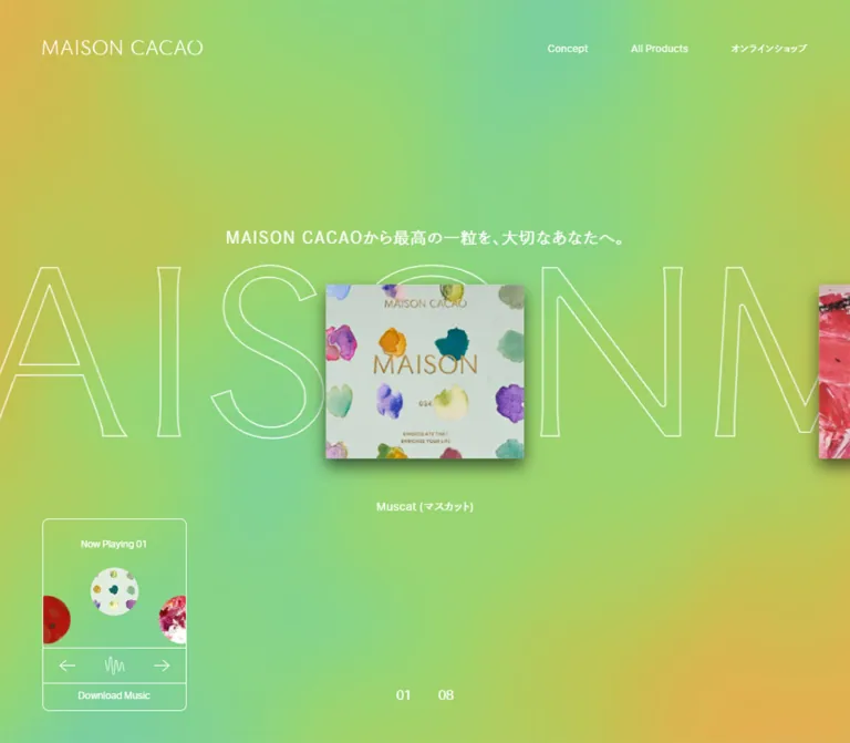
緑・黄・金色の柔らかなグラデーションに、水彩柄のパッケージと白い手書きロゴを浮かべたコレクションサイト。音楽再生の選択を入口に据え、余白と繊細な輪郭で世界観を伝えています。
MAISON CACAO / EMOTIONAL — Style Reference
Watercolor packaging suspended in a green-and-gold atmosphere, introduced by white handwritten lettering and a quiet invitation to listen.
Original URL: maisoncacao.com/valentine21/ Final URL: maisoncacao.com/valentine21/ Theme: luminous multicolor background, white interface details, and richly textured product artwork. Inspected: supplied inspection record retrieved October 6, 2026 at 01:11:14 JST; October 5, 2026 at 16:11:14 UTC. Viewports: 1440 × 1000 CSS pixels on desktop and 390 × 844 CSS pixels on mobile. Scope: three desktop captures and two mobile captures of the opening sound-choice screen, with rendered DOM and computed-style samples at both sizes. Navigation, introductory copy, eight product links, and music utilities are documented separately as DOM evidence. Their post-entry appearance and behavior were not exercised.
The current page identifies itself as the 2021 EMOTIONAL collection. That date belongs to the collection title; this reference describes the page currently served at the inspected URL. Its structure is a collection microsite with conceptual content, product-story links, and an external shop destination.
The visible opening is a restrained vertical composition. A thin handwritten Emotional mark occupies the upper portion, a small stack of watercolor-decorated packages sits near the viewport center, and a Japanese sound question appears above two equal circular choices. A soft field of lime, yellow, gold, and mint fills the entire screen. Broad empty areas make the package feel like an object floating in colored light.
The visual hierarchy depends on three different kinds of detail: expressive lettering, tangible packaging, and very simple interface controls. Keep those roles distinct when adapting the design.
閉じる
MAISON CACAO / EMOTIONAL — Style Reference
Watercolor packaging suspended in a green-and-gold atmosphere, introduced by white handwritten lettering and a quiet invitation to listen.
Original URL: maisoncacao.com/valentine21/ Final URL: maisoncacao.com/valentine21/ Theme: luminous multicolor background, white interface details, and richly textured product artwork. Inspected: supplied inspection record retrieved October 6, 2026 at 01:11:14 JST; October 5, 2026 at 16:11:14 UTC. Viewports: 1440 × 1000 CSS pixels on desktop and 390 × 844 CSS pixels on mobile. Scope: three desktop captures and two mobile captures of the opening sound-choice screen, with rendered DOM and computed-style samples at both sizes. Navigation, introductory copy, eight product links, and music utilities are documented separately as DOM evidence. Their post-entry appearance and behavior were not exercised.
The current page identifies itself as the 2021 EMOTIONAL collection. That date belongs to the collection title; this reference describes the page currently served at the inspected URL. Its structure is a collection microsite with conceptual content, product-story links, and an external shop destination.
The visible opening is a restrained vertical composition. A thin handwritten Emotional mark occupies the upper portion, a small stack of watercolor-decorated packages sits near the viewport center, and a Japanese sound question appears above two equal circular choices. A soft field of lime, yellow, gold, and mint fills the entire screen. Broad empty areas make the package feel like an object floating in colored light.
The visual hierarchy depends on three different kinds of detail: expressive lettering, tangible packaging, and very simple interface controls. Keep those roles distinct when adapting the design.
How to Read This Reference
- Measured — DOM identifies values supplied by rendered element rectangles or computed styles. These are CSS-pixel values at the stated viewport.
- Estimated — capture identifies visual measurements from the supplied screenshots. Bounds are approximate, and the background hex values are visual approximations rather than sampled pixels or recovered source colors.
- DOM only means an element exists in the rendered evidence but is not visibly presented in the opening screenshots. A bounding rectangle alone does not establish visibility; opacity, covering layers, and ancestor state were not supplied.
- Recommended identifies implementation choices for a new build. The CSS scaffold, breakpoint, ambient animation, focus treatment, and semantic markup are recommendations.
- All token names below are descriptive aliases. The supplied custom-property extraction was empty; these are not recovered source variable names.
- The final comparison image is excluded from design observations and measurements.
Tokens — Colors
Default Palette
| Name | Value | Suggested token | Role | Evidence |
|---|---|---|---|---|
| Interface White | #FFFFFF |
--color-ui |
Lettering, question, labels, and circular outlines | Text color measured as rgb(255, 255, 255); outlines visually consistent |
| Lime Light | #A3D469 |
--field-lime |
Large fresh green regions | Estimated from current captures |
| Yellow Green | #C2C853 |
--field-yellow |
Transitional field connecting green and gold | Estimated from current captures |
| Warm Gold | #E1B14D |
--field-gold |
Warm yellow-orange regions | Estimated from current captures |
| Soft Mint | #78CDA7 |
--field-mint |
Cooler green regions appearing in some frames | Estimated from current captures |
The background is a spatial blend rather than a collection of discrete interface surfaces. Color regions have broad, soft boundaries without visible banding or a sharp diagonal seam. Their distribution changes between captures while the foreground composition remains stable.
The supplied BODY background is transparent. It therefore does not reveal the source colors, gradient stops, or rendering method of the visible field. The colors above are practical reconstruction targets, not exact source declarations.
Artwork Colors
The front package introduces pale mint-gray paper, gold-colored lettering, and irregular teal, violet, pink, yellow, and sage watercolor marks. These belong to the artwork. They should not automatically become button colors, navigation accents, or category badges.
The interface has no visibly filled primary-action color in the inspected opening. Both sound choices use the same white outline and white label.
Tokens — Typography
Confirmed Interface Families
The computed-style evidence names three families:
| Family declaration | Confirmed role | Evidence limit |
|---|---|---|
aktiv-grotesk, sans-serif |
Body default, English header links, collection caption, social links, music download | A computed family declaration does not independently prove successful font-file loading |
dnp-shuei-gothic-gin-std, sans-serif |
Japanese navigation, introductory paragraph, product dedication text | Confirmed on those elements; the sound-question element was not individually sampled |
'Maison Cacao', serif |
Uppercase HOME, CONCEPT, and ALL PRODUCTS menu links | This declaration does not identify the handwritten Emotional lettering |
Most sampled interface text has weight 400. The introductory Japanese paragraph has weight 500. The opening has a light typographic character, with no large block of bold marketing copy visible.
Emotional Lettering
The visible Emotional mark is a thin, irregular signature-like composition. Its capital E has a long looping stroke; the remainder is narrow and loosely connected. It is approximately 350 × 160px on desktop and 210 × 96px on mobile.
Its font, asset format, and source URL were not supplied. Treat it as distinctive lettering that needs an authorized asset or a purpose-made equivalent. Do not identify it as one of the measured interface fonts.
Type Scale
Values are measured unless explicitly marked as capture estimates. DOM-only rows describe underlying content, not text simultaneously visible in the opening screen.
| Role | Desktop | Mobile | Weight and tracking | Visibility |
|---|---|---|---|---|
| Body default | 16px / 16px |
16px / 16px |
400, normal tracking |
Computed default |
| Sound question | Approximately 18px |
Approximately 12px |
Visually regular; exact rule unavailable | Visible, estimated |
| Yes / No labels | Approximately 16px |
Approximately 12px |
Visually regular; exact rule unavailable | Visible, estimated |
| Collection caption | 16px / 16px |
12px / 12px |
400; 0.32px / 0.24px tracking |
DOM only |
| English header navigation | 12px / 12px |
Direct links omitted from mobile sample | 400; 0.48px, equivalent to 0.04em |
DOM only |
| Japanese header shop link | 12px / 12px |
Direct link omitted from mobile sample | 400; 1.02px, equivalent to 0.085em |
DOM only |
| Uppercase menu links | 25px / 25px |
25px / 25px |
400; normal tracking |
DOM only |
| Japanese menu shop link | 25px / 25px |
25px / 25px |
400; 2.125px, equivalent to 0.085em |
DOM only |
| Social links | 12px / 12px |
12px / 12px |
400; 0.48px tracking |
DOM only |
| Introductory paragraph | 18px / 48px |
12px / 29px |
500; 1.53px / 1.02px tracking |
DOM only |
| Product dedication | 20px / 20px |
12px / 12px |
400; 1.36px tracking at both sizes |
DOM only |
| Download Music | 12px / 12px |
11px / 11px |
400; normal tracking |
DOM only |
The product dedication keeps a fixed 1.36px letter spacing while its font size decreases. Its relative tracking therefore grows from approximately 0.068em on desktop to 0.113em on mobile.
The brand H1 reports a 32px font size at both widths, but its measured box is 200 × 18.80px on desktop and 135 × 12.69px on mobile. Use those visible-layout dimensions when discussing the wordmark; the H1's declared font size is not its displayed logo height.
Tokens — Spacing & Shapes
The opening uses a few large vertical separations, a centered package, and two precisely spaced circles. There is no evidence of a universal spacing unit or an underlying grid framework.
Opening Composition
These measurements are estimated from the current captures. They describe the visible composition rather than recovered CSS rules.
| Element or distance | 1440 × 1000 | 390 × 844 |
|---|---|---|
| Horizontal centerline | Approximately 720px |
Approximately 195px |
| Emotional lettering width | Approximately 350px |
Approximately 210px |
| Emotional lettering top | Approximately 98px |
Approximately 174px |
| Visible package-stack footprint | Approximately 324 × 290px |
Approximately 184 × 165px |
| Package-stack top | Approximately 359px |
Approximately 343px |
| Sound-question visible top | Approximately 752px |
Approximately 575px |
| Choice-circle top | Approximately 808px |
Approximately 612px |
| Choice diameter | Approximately 80px |
Approximately 50px |
| Gap between circle edges | Approximately 40px |
Approximately 25px |
| Total choice-row width | Approximately 200px |
Approximately 125px |
| Lettering-to-package clear gap | Approximately 100px |
Approximately 74px |
| Package-to-question clear gap | Approximately 105px |
Approximately 68px |
| Circle outline | Approximately 1px |
Approximately 1px |
The overall foreground group occupies roughly 790px vertically on desktop and 490px on mobile. Both groups are centered approximately around the middle of the viewport. This is a useful implementation model, not a verified source layout formula.
DOM Layout Measurements
These elements are not separately visible in the opening captures.
| Element | Desktop measured rectangle | Mobile measured rectangle |
|---|---|---|
| Brand link | x:72, y:50, w:200, h:18.80 |
x:20, y:25, w:135, h:12.69 |
| First product link | x:551.98, y:352.64, w:336, h:294.70 |
x:104, y:342.17, w:182, h:159.63 |
| Introductory paragraph | x:470.22, y:332, w:499.56, h:336 |
x:28.48, y:320.5, w:333.05, h:203 |
| Product dedication | x:0, y:259.98, w:1440, h:20 |
x:0, y:279, w:390, h:12 |
| Download link | x:73, y:925, w:178, h:34 |
x:134.44, y:810, w:82.5, h:11 |
| Document height | 1000px |
844px |
The first product link is centered almost exactly at (720, 500) on desktop and (195, 422) on mobile. Its aspect ratio remains approximately 1.140:1.
Do not equate that link rectangle with the visible outer bounds of the opening package stack. They are different evidence items, and the opening includes overlapping artwork and shadow.
Shapes and Depth
| Treatment | Observation |
|---|---|
| Sound controls | Transparent circles with fine white outlines |
| Package edges | Near-rectangular artwork with overlapping, slightly rotated backing layers |
| Package shadow | Soft, darker shadow concentrated below and to the right |
| Interface corners | No rounded panel is visible in the opening |
| UI elevation | No general shadow system is visible |
The package shadow may be part of the image or a separate effect. Its implementation was not supplied. Preserve its visual contribution without assuming a particular CSS filter or shadow declaration.
Components
Ambient Background
Role: carries the emotional atmosphere across the full viewport.
The field reaches all four edges without a containing panel. Its colors merge over very large areas, allowing the white lettering and small package to remain visually isolated. Green can dominate one capture while gold occupies much more of another.
The foreground remains in the same position across desktop captures and across mobile captures. This supports treating the background as an independently changing layer. The evidence does not identify whether it uses CSS gradients, a canvas, a shader, video, or another technique.
For a new implementation, a small set of oversized radial gradients provides a practical approximation. Keep their edges soft and their contrast low. The package should remain the most detailed object on screen.
Emotional Lettermark
Role: establishes the collection identity before any navigation or explanatory copy becomes visible.
Center the lettering horizontally. On desktop it occupies about one quarter of the viewport width; on mobile it occupies a little over half. Its line quality is delicate and irregular, with generous clear space around its flourishes.
Preserve the original proportions and transparent background when an authorized asset is available. Avoid cropping the capital E's lower loop or treating the lettering as an ordinary line of body text.
Package Stack
Role: introduces the collection through a tangible branded object.
The front package is a pale mint-gray rectangle covered with scattered watercolor marks. MAISON CACAO appears near its top, MAISON is larger in the middle, and smaller printed details remain part of the image. Additional colored layers extend beyond the front package at the top, left, and bottom.
The small rotations and offsets make the stack feel casually assembled. A soft shadow lifts it away from the background. The image remains uncropped, with enough room to retain all backing layers and the shadow.
Use a single prepared composition when matching the opening. Recreating its lettering, paper texture, and watercolor shapes as ordinary HTML would change the artwork substantially.
Sound Choice
Role: asks about music before the visitor proceeds.
The visible anatomy is:
- Centered question:
音楽を流しますか?. - A horizontal row of two equal circular controls.
Yeson the left andNoon the right.
The choices share the same diameter, transparent fill, thin white border, and centered label. Neither option is visually promoted through a different color or a filled surface.
On desktop the circles are approximately 80px across with a 40px gap. On mobile they become approximately 50px across with a 25px gap. The mobile controls remain larger than their small text labels suggest.
No selection was recorded. The resulting scene, audio behavior, preference persistence, focus movement, and transition are unverified. Implementing the labels as semantic buttons and requiring the affirmative action before audible playback are recommendations.
Header Navigation — DOM Only
Role: provides collection-level navigation.
The desktop DOM contains the brand link at the upper left and three direct destinations near the upper right: Concept, All Products, and オンラインショップ. The latter links to the external online shop.
At 1440px width, the brand starts 72px from the left and 50px from the top. The direct links sit around y = 53px and end approximately 72px from the right edge. Their type is compact, regular, and white.
At 390px width, the brand rectangle moves to (20, 25) and shrinks to 135px wide. The direct navigation links are absent from the mobile link sample. A replacement menu control is not visible in the captures and cannot be specified from the supplied evidence.
The header element itself has zero measured height while its descendants have positioned rectangles. Its complete positioning rules were not provided.
Expanded Menu Content — DOM Only
Role: exposes the main routes and social destinations in a larger typographic arrangement.
The DOM includes HOME, CONCEPT, ALL PRODUCTS, the Japanese shop link, and a social row containing Facebook, Twitter, and Instagram. The uppercase entries use the declared Maison Cacao serif family at 25px. The Japanese entry also uses 25px type, with wider tracking.
The first three menu entries have approximately 49px between their measured top positions at both viewport sizes. Their sizes remain unchanged on mobile. The social row uses 12px type.
This supplies evidence for centered menu content, but not for its backdrop, trigger, open/close animation, focus behavior, or visible state. Do not display the menu over the opening merely because its text appears in the DOM export.
Collection Introduction — DOM Only
Role: communicates the collection's emotional premise.
The introductory Japanese paragraph describes thoughts for a loved one, beautiful boxes, and eight stories. It occupies seven line-height intervals in the supplied measurements: 336px at a 48px line height on desktop, and 203px at a 29px line height on mobile.
Its centered text block narrows from approximately 500px to 333px. Font size decreases from 18px to 12px while weight remains 500 and tracking remains equivalent to 0.085em.
A separate collection caption reads 2021 Collection “Emotional”. Its type decreases from 16px to 12px and retains 0.02em tracking.
The introduction's position overlaps the opening artwork in the DOM measurements. It should be treated as a separate potential presentation state, not as additional visible copy around the sound question. The transition sequence was not observed.
Product Link Track — DOM Only
Role: provides access to eight product stories.
The supplied DOM contains product links ending in:
maison/, love/, respect/, dear/, birth/, hero/, passion/, and eros/.
Their horizontal positions advance by exactly one viewport width: 1440px on desktop and 390px on mobile. Each link has the same dimensions within its viewport sample. This is direct evidence of an eight-position horizontal arrangement.
The first link is centered in the viewport. Each product also has a Japanese dedication at the same measured vertical position. The first reads MAISON CACAOから最高の一粒を、大切なあなたへ。.
The DOM contains the words Drag and View. These suggest intended interaction affordances, but no drag, swipe, hover, snapping, or selection was tested. The exact input mechanism and appearance of these hints remain unknown.
The export reports empty text for the product links. Image alternatives and accessible names were not supplied, so their accessibility cannot be concluded from this field alone.
Music Utility — DOM Only
Role: associates the collection with a listening experience and a downloadable resource.
The DOM contains Now Playing 01 and a Download Music link pointing to /valentine21/music/maison.mp3.
The download link changes substantially between viewport samples. On desktop it has a 178 × 34px rectangle near the lower left and 9px top padding. On mobile it becomes an 82.5 × 11px text-sized rectangle near the bottom, with no padding.
These measurements establish responsive relocation and sizing of the link. They do not establish the complete player surface, transport controls, album artwork, or whether audio was actually playing. The displayed status text alone is insufficient to verify playback.
Tokens — Motion & Interaction
| Treatment | Supplied evidence | What can be concluded |
|---|---|---|
| Ambient color field | Different color distributions across captures with stable foreground geometry | Background appearance changes; timing and rendering method are unknown |
| Opening sound gate | Present in all five current captures | It remains the visible entry state throughout the supplied evidence |
| Header opacity | opacity 0.6s cubic-bezier(0.3, 0.1, 0.2, 1) |
A 600ms opacity transition is defined; its trigger was not tested |
| Desktop navigation opacity | opacity 0.4s cubic-bezier(0.3, 0.1, 0.2, 1) |
A 400ms opacity transition is defined; exact states were not captured |
| Product arrangement | Link x positions separated by one viewport width | Horizontal layout is measured; navigation motion is unverified |
| Drag / View hints | Text present in the DOM | Affordance wording is known; pointer behavior is unverified |
| Music choice | Visible Yes and No controls | An audio preference is requested; response behavior was not exercised |
| Music download | Explicit MP3 link | A resource destination exists; download and playback were not tested |
Many sampled elements report animation: none, and some report only transition: all. These values do not describe unsampled layers or scripted motion. They also do not justify assigning a duration to the background.
The captures provide no basis for specifying a source animation loop, product spin, parallax effect, automatic slide interval, or sound-synchronized transition.
Recommended adaptation: use slow, low-amplitude background movement and keep the question, choices, and product still. An optional 18-second alternating gradient-layer transform is included in the scaffold as an approximation. Respect reduced-motion preferences and provide a stable background when movement is disabled.
Surfaces
| Layer | Appearance | Function |
|---|---|---|
| Full-screen canvas | Soft green, yellow, gold, and mint blends | Establishes the collection atmosphere |
| Lettering | Fine white strokes with transparent surroundings | Provides expressive identity |
| Product composition | Pale paper, watercolor marks, printed lettering, layered edges | Supplies tactile detail and visual focus |
| Product shadow | Soft dark falloff beneath the artwork | Separates the object from the field |
| Sound controls | Transparent interiors and fine white circular borders | Creates a lightweight interaction layer |
| Underlying sampled links | White text on transparent computed backgrounds | Supplies navigation without a measured filled surface |
The opening does not reveal a card system, section dividers, a footer, or panel-based elevation. Its structure comes from placement, scale, and the separation between detailed artwork and empty colored space.
Imagery
The central visual is packaging, not a photograph of the chocolate itself. Its watercolor marks retain irregular edges, variations in pigment density, and overlapping hues. The pale substrate makes the colored marks and gold-colored lettering feel delicate.
Preserve:
- The entire package-stack silhouette, including backing layers.
- The printed lettering as part of the artwork.
- The subtle variation and translucency of the watercolor marks.
- The small rotations between layers.
- The soft shadow and its room to extend beyond the object.
- Smooth image scaling suitable for photographic and painted detail.
The background is visually smooth; the paper and watercolor supply the fine texture. Applying a grain effect across every layer would change that relationship.
Observed Asset References
| Item | Available reference | Limitation |
|---|---|---|
| Emotional lettering | Visible in the five current captures | No asset URL, format, or intrinsic size supplied |
| Package stack | Visible in the five current captures | No image URL or separate layer assets supplied |
| Product destinations | Eight links under /valentine21/product/ |
Destinations were not opened |
| MAISON music resource | https://maisoncacao.com/valentine21/music/maison.mp3 |
Link observed; file not retrieved or played |
Use authorized artwork when available. CSS can approximate the field, spacing, and controls, but the recognizable package composition and lettering require visual assets.
Layout & Responsive Behavior
What Changes Between the Captured Sizes
The same opening hierarchy survives on mobile: lettering, package, question, then choices. It does not become a dense stack of navigation and explanatory content.
The package remains near the viewport midpoint. The mobile lettering moves farther down the screen proportionally, and the choices move upward proportionally. This compresses the overall composition around the center while retaining large empty areas above and below.
Different elements shrink by different amounts:
| Element | Approximate mobile-to-desktop ratio | Evidence |
|---|---|---|
| Emotional lettering width | 0.60 |
Capture estimate |
| Visible package-stack width | 0.57 |
Capture estimate |
| Choice diameter | 0.625 |
Capture estimate |
| Brand link width | 0.675 |
DOM measurement |
| Product link width | 0.542 |
DOM measurement |
| Introductory paragraph font size | 0.667 |
Computed style |
| Expanded menu font size | 1.00 |
Computed style |
A single transform applied to the entire desktop page would not reproduce these relationships.
Viewport Use
The document height equals the viewport height in both samples. This establishes a full-screen initial presentation without recorded vertical document growth. It does not prove that scrolling remains disabled after the sound gate is dismissed.
The measured product link occupies approximately 23.3% of desktop width and 46.7% of mobile width. Its aspect ratio remains stable. Two measurements are insufficient to recover its breakpoint or continuous sizing formula.
Recommended Responsive Model
Use a centered composition with separate desktop and mobile spacing tokens. Keep the package uncropped, size the lettering independently, and preserve the row of two sound choices.
The scaffold uses a 768px breakpoint as an implementation choice. It approximates an 800px-high desktop composition and a 500px-high mobile composition. On short screens, the containing page is allowed to grow and scroll so the controls remain reachable. The original behavior at intermediate widths, landscape sizes, zoom levels, and safe-area configurations was not inspected.
Do’s and Don’ts
Do
- Build the opening around one centered vertical composition.
- Let the softly blended color field occupy the entire viewport.
- Keep the Emotional lettering thin, expressive, and surrounded by clear space.
- Preserve the watercolor package artwork and its layered silhouette.
- Keep the product close to the vertical midpoint at both inspected sizes.
- Give Yes and No equal visual weight.
- Use fine white outlines and transparent control interiors.
- Scale lettering, artwork, controls, and paragraph typography independently.
- Treat DOM-only content as separate states until its presentation is verified.
- Distinguish exact white text and computed typography from estimated background colors.
- Keep the audio decision explicit.
Don’t
- Don’t add a filled purchase button to the observed sound-choice screen.
- Don’t replace the signature lettering with an arbitrarily named script font.
- Don’t crop the package stack into a generic square thumbnail.
- Don’t apply rounded-card styling or heavy interface shadows around the artwork.
- Don’t turn every watercolor pigment into a UI accent color.
- Don’t present the introductory paragraph, menu, and product links simultaneously over the gate.
- Don’t infer a mobile menu icon or player layout from DOM text alone.
- Don’t claim a source gradient formula, renderer, or animation duration from static frames.
- Don’t treat the collection year as evidence that the current URL is discontinued.
- Don’t assume that a displayed Now Playing label proves audible playback.
Recommended Implementation Additions
These are recommendations for a new implementation, not verified features of the original page:
- Use semantic buttons for Yes and No, with the question connected through an accessible group label.
- Move focus deliberately when leaving the opening, and keep inactive scenes out of the tab order and accessibility tree.
- Start audible media only after the affirmative choice. Provide a reachable way to change sound state afterward.
- Verify text and outline contrast across every background phase. Offer a darker local backing or a high-contrast mode if required.
- Provide a visible keyboard focus indicator that remains legible against both green and gold regions.
- Respect reduced-motion preferences and retain a static composition as a complete usable state.
- Give each image-based product destination an accessible name. The supplied link-text export is insufficient to establish existing naming.
- Add keyboard and touch alternatives if implementing the suggested horizontal product navigation.
- Preserve package aspect ratios and reserve image dimensions to prevent layout shifts.
- Keep choices reachable on short viewports and when text is enlarged.
- If primary artwork fails to load, retain readable collection identity and working sound controls.
Agent Prompt Guide
Quick Color Reference
- Interface white:
#FFFFFF, measured. - Lime field: approximately
#A3D469. - Yellow-green transition: approximately
#C2C853. - Warm golden field: approximately
#E1B14D. - Mint region: approximately
#78CDA7. - Package colors belong to the supplied artwork.
- Controls use transparent fills and fine white circular outlines.
Overall Prompt
“Create a full-screen opening for a Japanese chocolate collection inspired by the current MAISON CACAO EMOTIONAL entry screen. Use a softly blended lime, yellow-green, warm gold, and mint background. Center a delicate white handwritten collection mark above an uncropped watercolor package stack with subtle shadow. Place the Japanese question 音楽を流しますか? below the package, followed by equal outlined circular Yes and No buttons. Preserve broad empty space. At 1440 × 1000, target approximately 350px-wide lettering, a 324px-wide package composition, and 80px buttons. At 390 × 844, target approximately 210px lettering, 184px artwork, and 50px buttons. Treat these as visual estimates. Keep unverified navigation and product scenes separate from the opening.”
Example Component Prompts
- Ambient field: “Build a full-bleed background with broad, soft regions of lime, mint, yellow-green, and gold. Use the supplied color approximations as starting points. Avoid hard gradient seams. An optional slow drift may move the field while all foreground elements stay still; provide a static reduced-motion state.”
- Package presentation: “Place an authorized watercolor package-stack image close to the center of the viewport. Keep its irregular layered edges, printed lettering, and soft shadow intact. Use contain-style sizing with no crop, border, or surrounding card.”
- Sound choice: “Create a centered Japanese question above a row of equal transparent circular buttons labeled Yes and No. Use white labels and approximately 1px white outlines. Desktop circles are about 80px with a 40px gap; mobile circles are about 50px with a 25px gap. Add semantic grouping and a visible keyboard focus state.”
- Responsive composition: “Resize each part independently. Compress the vertical composition from roughly 800px to 500px while keeping the package near the viewport midpoint. Use about 60% of desktop lettering width and 62.5% of desktop button diameter on the observed phone layout. Allow short screens to scroll instead of clipping the choices.”
- Product navigation extension: “Use the DOM evidence to model eight horizontally arranged product destinations, each one viewport apart, with a centered image link and a dedication. Implement accessible navigation as an explicit addition. Do not claim that a particular swipe, drag, snap, or transition behavior was observed.”
Quick Start
CSS Custom Properties
This scaffold reproduces the visible opening at the two supplied sizes. Its geometry is fitted to capture estimates; it is not extracted source CSS. It reuses the confirmed page font stacks as a recommendation because the sound question's own font rule was not supplied.
The optional background animation is an approximation with a recommended duration. The exact source transition values for the header and navigation are retained as reusable tokens, although those hidden components are outside this opening scaffold.
:root {
  /* White is measured; field colors are visual approximations. */
  --color-ui: #ffffff;
  --field-lime: #a3d469;
  --field-yellow: #c2c853;
  --field-gold: #e1b14d;
  --field-mint: #78cda7;

  /* Confirmed page families; font files must be supplied separately. */
  --font-interface: aktiv-grotesk, sans-serif;
  --font-japanese: dnp-shuei-gothic-gin-std, sans-serif;
  --font-menu: 'Maison Cacao', serif;

  /* Recommended desktop geometry, fitted to the captures. */
  --entry-height: 800px;
  --brand-width: 350px;
  --stack-width: 324px;
  --stack-top: 260px;
  --question-top: 648px;
  --choices-top: 708px;
  --question-size: 18px;
  --question-leading: 24px;
  --choice-text-size: 16px;
  --choice-size: 80px;
  --choice-gap: 40px;
  --rule-width: 1px;

  /* Source transition values; their original triggers are unverified. */
  --ease-source: cubic-bezier(0.3, 0.1, 0.2, 1);
  --duration-header: 600ms;
  --duration-navigation: 400ms;

  /* Recommended values, not source measurements. */
  --duration-ambient: 18s;
  --color-focus: #254b38;
}

* {
  box-sizing: border-box;
}

html,
body {
  margin: 0;
}

.emotional-entry {
  position: relative;
  isolation: isolate;
  display: grid;
  place-items: center;
  min-height: 100vh;
  min-height: 100svh;
  padding: 24px 16px;
  padding-top: max(24px, env(safe-area-inset-top, 0px));
  padding-bottom: max(24px, env(safe-area-inset-bottom, 0px));
  overflow-x: clip;
  color: var(--color-ui);
  background: var(--field-yellow);
  font-family: var(--font-interface);
  font-weight: 400;
}

.emotional-entry::before {
  content: '';
  position: fixed;
  z-index: -1;
  inset: -12vmax;
  pointer-events: none;
  background:
    radial-gradient(
      ellipse at 32% 18%,
      var(--field-mint) 0%,
      transparent 48%
    ),
    radial-gradient(
      ellipse at 25% 68%,
      var(--field-lime) 0%,
      transparent 58%
    ),
    radial-gradient(
      ellipse at 88% 44%,
      var(--field-gold) 0%,
      transparent 58%
    ),
    linear-gradient(
      125deg,
      var(--field-yellow),
      var(--field-lime) 52%,
      var(--field-gold)
    );
}

.emotional-entry__stage {
  position: relative;
  width: 100%;
  height: var(--entry-height);
}

.emotional-entry__brand {
  position: absolute;
  top: 0;
  left: 50%;
  width: min(var(--brand-width), 90%);
  margin: 0;
  transform: translateX(-50%);
}

.emotional-entry__brand img {
  display: block;
  width: 100%;
  height: auto;
}

.emotional-entry__stack {
  position: absolute;
  top: var(--stack-top);
  left: 50%;
  display: block;
  width: min(var(--stack-width), 80%);
  height: auto;
  transform: translateX(-50%);
  object-fit: contain;
  /* Use prepared artwork with its shadow when available. */
}

.emotional-entry__question {
  position: absolute;
  top: var(--question-top);
  inset-inline: 0;
  margin: 0;
  color: var(--color-ui);
  font-family: var(--font-japanese);
  font-size: var(--question-size);
  font-weight: 400;
  line-height: var(--question-leading);
  text-align: center;
}

.emotional-entry__choices {
  position: absolute;
  top: var(--choices-top);
  left: 50%;
  display: flex;
  gap: var(--choice-gap);
  transform: translateX(-50%);
}

.sound-choice {
  display: grid;
  place-items: center;
  flex: 0 0 var(--choice-size);
  width: var(--choice-size);
  height: var(--choice-size);
  padding: 0;
  border: var(--rule-width) solid currentColor;
  border-radius: 50%;
  appearance: none;
  color: var(--color-ui);
  background: transparent;
  font-family: var(--font-interface);
  font-size: var(--choice-text-size);
  font-weight: 400;
  line-height: 1;
  cursor: pointer;
}

/* Recommended keyboard treatment; not observed in the captures. */
.sound-choice:focus-visible {
  outline: 2px solid var(--color-focus);
  outline-offset: 5px;
}

/* Optional recommended movement; add the class deliberately. */
.has-ambient-motion::before {
  animation: ambient-field var(--duration-ambient)
    ease-in-out infinite alternate;
}

@keyframes ambient-field {
  from {
    transform: translate3d(-2%, 1%, 0) scale(1.02);
  }
  to {
    transform: translate3d(3%, -2%, 0) scale(1.08);
  }
}

/* Recommended breakpoint; the source breakpoint is unknown. */
@media (width < 768px) {
  :root {
    --entry-height: 500px;
    --brand-width: 210px;
    --stack-width: 184px;
    --stack-top: 172px;
    --question-top: 399px;
    --choices-top: 440px;
    --question-size: 12px;
    --question-leading: 20px;
    --choice-text-size: 12px;
    --choice-size: 50px;
    --choice-gap: 25px;
  }
}

@media (prefers-reduced-motion: reduce) {
  .has-ambient-motion::before {
    animation: none;
    transform: none;
  }
}
A minimal semantic structure follows. The two local asset filenames are integration placeholders, not observed source paths. Replace them with authorized assets and their correct intrinsic dimensions. Button handlers, audio state, and subsequent scenes require application logic; this example only supplies the opening presentation.
<main class='emotional-entry' aria-label='EMOTIONAL collection'>
  <section class='emotional-entry__stage' aria-labelledby='entry-title'>
    <h1 class='emotional-entry__brand' id='entry-title'>
      <img
        src='/assets/emotional-lettering.svg'
        width='350'
        height='160'
        alt='Emotional'
      >
    </h1>

    <img
      class='emotional-entry__stack'
      src='/assets/collection-stack.webp'
      width='324'
      height='290'
      alt='MAISON CACAO packages decorated with colorful watercolor marks'
    >

    <p class='emotional-entry__question' id='sound-question' lang='ja'>
      音楽を流しますか?
    </p>

    <div
      class='emotional-entry__choices'
      role='group'
      aria-labelledby='sound-question'
    >
      <button class='sound-choice' type='button' data-sound='on'>Yes</button>
      <button class='sound-choice' type='button' data-sound='off'>No</button>
    </div>
  </section>
</main>
Tailwind v4 Token Mapping
Optional aliases for a project already using Tailwind v4. Define the custom properties above first. This mapping does not imply that the original page uses Tailwind.
@theme inline {
  --color-chalk: var(--color-ui);
  --color-field-lime: var(--field-lime);
  --color-field-yellow: var(--field-yellow);
  --color-field-gold: var(--field-gold);
  --color-field-mint: var(--field-mint);

  --font-sans: var(--font-interface);
  --font-jp: var(--font-japanese);
  --font-collection-menu: var(--font-menu);

  --text-sound-question: var(--question-size);
  --text-sound-choice: var(--choice-text-size);

  --spacing-entry-brand: var(--brand-width);
  --spacing-entry-stack: var(--stack-width);
  --spacing-sound-choice: var(--choice-size);
  --spacing-sound-gap: var(--choice-gap);

  --radius-sound-choice: 999px;
}
Sources & Evidence
- Inspected website: MAISON CACAO — 2021 NEW COLLECTION EMOTIONAL. Original and final URLs are identical; the supplied response status is HTTP 200.
- Inspection record: retrieved at
2026-10-05T16:11:14.055Z, equivalent to October 6, 2026 at 01:11:14.055 JST. - Current visual evidence: three 1440 × 1000 desktop captures and two 390 × 844 mobile captures. All show the sound-choice opening, with variations in the background color distribution.
- Rendered evidence: page title, extracted text, link destinations, element rectangles, computed typography, foreground colors, selected transition declarations, and document heights at both viewport sizes.
- Observed destinations: concept, product index, eight product-story links, the external online shop, social profiles, and the MAISON MP3 resource. These destinations were not visited or fetched for this reference.
- Capture conditions: the supplied process included an initial observation of at least five seconds, loading and image-readiness checks, and temporary handling of perpetual animations during readiness checks. These conditions do not prove that every delayed scene or interaction was observed.
- Limitations: no sound choice, menu opening, product navigation, hover, keyboard operation, download, or playback was tested. Exact background colors, image URLs, font-file loading, intermediate responsive rules, and the source background renderer remain unverified.
This reference describes the current opening and clearly identified DOM evidence. Visual estimates and implementation recommendations should be validated against the original assets and any subsequently inspected states before extending the experience.
# MAISON CACAO / EMOTIONAL — Style Reference

> Watercolor packaging suspended in a green-and-gold atmosphere, introduced by white handwritten lettering and a quiet invitation to listen.

**Original URL:** [maisoncacao.com/valentine21/](https://maisoncacao.com/valentine21/)
**Final URL:** [maisoncacao.com/valentine21/](https://maisoncacao.com/valentine21/)
**Theme:** luminous multicolor background, white interface details, and richly textured product artwork.
**Inspected:** supplied inspection record retrieved October 6, 2026 at 01:11:14 JST; October 5, 2026 at 16:11:14 UTC.
**Viewports:** 1440 × 1000 CSS pixels on desktop and 390 × 844 CSS pixels on mobile.
**Scope:** three desktop captures and two mobile captures of the opening sound-choice screen, with rendered DOM and computed-style samples at both sizes. Navigation, introductory copy, eight product links, and music utilities are documented separately as DOM evidence. Their post-entry appearance and behavior were not exercised.

The current page identifies itself as the 2021 EMOTIONAL collection. That date belongs to the collection title; this reference describes the page currently served at the inspected URL. Its structure is a collection microsite with conceptual content, product-story links, and an external shop destination.

The visible opening is a restrained vertical composition. A thin handwritten Emotional mark occupies the upper portion, a small stack of watercolor-decorated packages sits near the viewport center, and a Japanese sound question appears above two equal circular choices. A soft field of lime, yellow, gold, and mint fills the entire screen. Broad empty areas make the package feel like an object floating in colored light.

The visual hierarchy depends on three different kinds of detail: expressive lettering, tangible packaging, and very simple interface controls. Keep those roles distinct when adapting the design.
閉じる
# MAISON CACAO / EMOTIONAL — Style Reference

> Watercolor packaging suspended in a green-and-gold atmosphere, introduced by white handwritten lettering and a quiet invitation to listen.

**Original URL:** [maisoncacao.com/valentine21/](https://maisoncacao.com/valentine21/)
**Final URL:** [maisoncacao.com/valentine21/](https://maisoncacao.com/valentine21/)
**Theme:** luminous multicolor background, white interface details, and richly textured product artwork.
**Inspected:** supplied inspection record retrieved October 6, 2026 at 01:11:14 JST; October 5, 2026 at 16:11:14 UTC.
**Viewports:** 1440 × 1000 CSS pixels on desktop and 390 × 844 CSS pixels on mobile.
**Scope:** three desktop captures and two mobile captures of the opening sound-choice screen, with rendered DOM and computed-style samples at both sizes. Navigation, introductory copy, eight product links, and music utilities are documented separately as DOM evidence. Their post-entry appearance and behavior were not exercised.

The current page identifies itself as the 2021 EMOTIONAL collection. That date belongs to the collection title; this reference describes the page currently served at the inspected URL. Its structure is a collection microsite with conceptual content, product-story links, and an external shop destination.

The visible opening is a restrained vertical composition. A thin handwritten Emotional mark occupies the upper portion, a small stack of watercolor-decorated packages sits near the viewport center, and a Japanese sound question appears above two equal circular choices. A soft field of lime, yellow, gold, and mint fills the entire screen. Broad empty areas make the package feel like an object floating in colored light.

The visual hierarchy depends on three different kinds of detail: expressive lettering, tangible packaging, and very simple interface controls. Keep those roles distinct when adapting the design.

## How to Read This Reference

- **Measured — DOM** identifies values supplied by rendered element rectangles or computed styles. These are CSS-pixel values at the stated viewport.
- **Estimated — capture** identifies visual measurements from the supplied screenshots. Bounds are approximate, and the background hex values are visual approximations rather than sampled pixels or recovered source colors.
- **DOM only** means an element exists in the rendered evidence but is not visibly presented in the opening screenshots. A bounding rectangle alone does not establish visibility; opacity, covering layers, and ancestor state were not supplied.
- **Recommended** identifies implementation choices for a new build. The CSS scaffold, breakpoint, ambient animation, focus treatment, and semantic markup are recommendations.
- All token names below are descriptive aliases. The supplied custom-property extraction was empty; these are not recovered source variable names.
- The final comparison image is excluded from design observations and measurements.

## Tokens — Colors

### Default Palette

| Name | Value | Suggested token | Role | Evidence |
| --- | --- | --- | --- | --- |
| Interface White | `#FFFFFF` | `--color-ui` | Lettering, question, labels, and circular outlines | Text color measured as `rgb(255, 255, 255)`; outlines visually consistent |
| Lime Light | `#A3D469` | `--field-lime` | Large fresh green regions | Estimated from current captures |
| Yellow Green | `#C2C853` | `--field-yellow` | Transitional field connecting green and gold | Estimated from current captures |
| Warm Gold | `#E1B14D` | `--field-gold` | Warm yellow-orange regions | Estimated from current captures |
| Soft Mint | `#78CDA7` | `--field-mint` | Cooler green regions appearing in some frames | Estimated from current captures |

The background is a spatial blend rather than a collection of discrete interface surfaces. Color regions have broad, soft boundaries without visible banding or a sharp diagonal seam. Their distribution changes between captures while the foreground composition remains stable.

The supplied `BODY` background is transparent. It therefore does not reveal the source colors, gradient stops, or rendering method of the visible field. The colors above are practical reconstruction targets, not exact source declarations.

### Artwork Colors

The front package introduces pale mint-gray paper, gold-colored lettering, and irregular teal, violet, pink, yellow, and sage watercolor marks. These belong to the artwork. They should not automatically become button colors, navigation accents, or category badges.

The interface has no visibly filled primary-action color in the inspected opening. Both sound choices use the same white outline and white label.

## Tokens — Typography

### Confirmed Interface Families

The computed-style evidence names three families:

| Family declaration | Confirmed role | Evidence limit |
| --- | --- | --- |
| `aktiv-grotesk, sans-serif` | Body default, English header links, collection caption, social links, music download | A computed family declaration does not independently prove successful font-file loading |
| `dnp-shuei-gothic-gin-std, sans-serif` | Japanese navigation, introductory paragraph, product dedication text | Confirmed on those elements; the sound-question element was not individually sampled |
| `'Maison Cacao', serif` | Uppercase HOME, CONCEPT, and ALL PRODUCTS menu links | This declaration does not identify the handwritten Emotional lettering |

Most sampled interface text has weight `400`. The introductory Japanese paragraph has weight `500`. The opening has a light typographic character, with no large block of bold marketing copy visible.

### Emotional Lettering

The visible Emotional mark is a thin, irregular signature-like composition. Its capital E has a long looping stroke; the remainder is narrow and loosely connected. It is approximately 350 × 160px on desktop and 210 × 96px on mobile.

Its font, asset format, and source URL were not supplied. Treat it as distinctive lettering that needs an authorized asset or a purpose-made equivalent. Do not identify it as one of the measured interface fonts.

### Type Scale

Values are measured unless explicitly marked as capture estimates. DOM-only rows describe underlying content, not text simultaneously visible in the opening screen.

| Role | Desktop | Mobile | Weight and tracking | Visibility |
| --- | --- | --- | --- | --- |
| Body default | `16px / 16px` | `16px / 16px` | `400`, normal tracking | Computed default |
| Sound question | Approximately `18px` | Approximately `12px` | Visually regular; exact rule unavailable | Visible, estimated |
| Yes / No labels | Approximately `16px` | Approximately `12px` | Visually regular; exact rule unavailable | Visible, estimated |
| Collection caption | `16px / 16px` | `12px / 12px` | `400`; `0.32px` / `0.24px` tracking | DOM only |
| English header navigation | `12px / 12px` | Direct links omitted from mobile sample | `400`; `0.48px`, equivalent to `0.04em` | DOM only |
| Japanese header shop link | `12px / 12px` | Direct link omitted from mobile sample | `400`; `1.02px`, equivalent to `0.085em` | DOM only |
| Uppercase menu links | `25px / 25px` | `25px / 25px` | `400`; normal tracking | DOM only |
| Japanese menu shop link | `25px / 25px` | `25px / 25px` | `400`; `2.125px`, equivalent to `0.085em` | DOM only |
| Social links | `12px / 12px` | `12px / 12px` | `400`; `0.48px` tracking | DOM only |
| Introductory paragraph | `18px / 48px` | `12px / 29px` | `500`; `1.53px` / `1.02px` tracking | DOM only |
| Product dedication | `20px / 20px` | `12px / 12px` | `400`; `1.36px` tracking at both sizes | DOM only |
| Download Music | `12px / 12px` | `11px / 11px` | `400`; normal tracking | DOM only |

The product dedication keeps a fixed `1.36px` letter spacing while its font size decreases. Its relative tracking therefore grows from approximately `0.068em` on desktop to `0.113em` on mobile.

The brand H1 reports a `32px` font size at both widths, but its measured box is 200 × 18.80px on desktop and 135 × 12.69px on mobile. Use those visible-layout dimensions when discussing the wordmark; the H1's declared font size is not its displayed logo height.

## Tokens — Spacing & Shapes

The opening uses a few large vertical separations, a centered package, and two precisely spaced circles. There is no evidence of a universal spacing unit or an underlying grid framework.

### Opening Composition

These measurements are estimated from the current captures. They describe the visible composition rather than recovered CSS rules.

| Element or distance | 1440 × 1000 | 390 × 844 |
| --- | --- | --- |
| Horizontal centerline | Approximately `720px` | Approximately `195px` |
| Emotional lettering width | Approximately `350px` | Approximately `210px` |
| Emotional lettering top | Approximately `98px` | Approximately `174px` |
| Visible package-stack footprint | Approximately `324 × 290px` | Approximately `184 × 165px` |
| Package-stack top | Approximately `359px` | Approximately `343px` |
| Sound-question visible top | Approximately `752px` | Approximately `575px` |
| Choice-circle top | Approximately `808px` | Approximately `612px` |
| Choice diameter | Approximately `80px` | Approximately `50px` |
| Gap between circle edges | Approximately `40px` | Approximately `25px` |
| Total choice-row width | Approximately `200px` | Approximately `125px` |
| Lettering-to-package clear gap | Approximately `100px` | Approximately `74px` |
| Package-to-question clear gap | Approximately `105px` | Approximately `68px` |
| Circle outline | Approximately `1px` | Approximately `1px` |

The overall foreground group occupies roughly 790px vertically on desktop and 490px on mobile. Both groups are centered approximately around the middle of the viewport. This is a useful implementation model, not a verified source layout formula.

### DOM Layout Measurements

These elements are not separately visible in the opening captures.

| Element | Desktop measured rectangle | Mobile measured rectangle |
| --- | --- | --- |
| Brand link | `x:72, y:50, w:200, h:18.80` | `x:20, y:25, w:135, h:12.69` |
| First product link | `x:551.98, y:352.64, w:336, h:294.70` | `x:104, y:342.17, w:182, h:159.63` |
| Introductory paragraph | `x:470.22, y:332, w:499.56, h:336` | `x:28.48, y:320.5, w:333.05, h:203` |
| Product dedication | `x:0, y:259.98, w:1440, h:20` | `x:0, y:279, w:390, h:12` |
| Download link | `x:73, y:925, w:178, h:34` | `x:134.44, y:810, w:82.5, h:11` |
| Document height | `1000px` | `844px` |

The first product link is centered almost exactly at `(720, 500)` on desktop and `(195, 422)` on mobile. Its aspect ratio remains approximately `1.140:1`.

Do not equate that link rectangle with the visible outer bounds of the opening package stack. They are different evidence items, and the opening includes overlapping artwork and shadow.

### Shapes and Depth

| Treatment | Observation |
| --- | --- |
| Sound controls | Transparent circles with fine white outlines |
| Package edges | Near-rectangular artwork with overlapping, slightly rotated backing layers |
| Package shadow | Soft, darker shadow concentrated below and to the right |
| Interface corners | No rounded panel is visible in the opening |
| UI elevation | No general shadow system is visible |

The package shadow may be part of the image or a separate effect. Its implementation was not supplied. Preserve its visual contribution without assuming a particular CSS filter or shadow declaration.

## Components

### Ambient Background

**Role:** carries the emotional atmosphere across the full viewport.

The field reaches all four edges without a containing panel. Its colors merge over very large areas, allowing the white lettering and small package to remain visually isolated. Green can dominate one capture while gold occupies much more of another.

The foreground remains in the same position across desktop captures and across mobile captures. This supports treating the background as an independently changing layer. The evidence does not identify whether it uses CSS gradients, a canvas, a shader, video, or another technique.

For a new implementation, a small set of oversized radial gradients provides a practical approximation. Keep their edges soft and their contrast low. The package should remain the most detailed object on screen.

### Emotional Lettermark

**Role:** establishes the collection identity before any navigation or explanatory copy becomes visible.

Center the lettering horizontally. On desktop it occupies about one quarter of the viewport width; on mobile it occupies a little over half. Its line quality is delicate and irregular, with generous clear space around its flourishes.

Preserve the original proportions and transparent background when an authorized asset is available. Avoid cropping the capital E's lower loop or treating the lettering as an ordinary line of body text.

### Package Stack

**Role:** introduces the collection through a tangible branded object.

The front package is a pale mint-gray rectangle covered with scattered watercolor marks. MAISON CACAO appears near its top, MAISON is larger in the middle, and smaller printed details remain part of the image. Additional colored layers extend beyond the front package at the top, left, and bottom.

The small rotations and offsets make the stack feel casually assembled. A soft shadow lifts it away from the background. The image remains uncropped, with enough room to retain all backing layers and the shadow.

Use a single prepared composition when matching the opening. Recreating its lettering, paper texture, and watercolor shapes as ordinary HTML would change the artwork substantially.

### Sound Choice

**Role:** asks about music before the visitor proceeds.

The visible anatomy is:

1. Centered question: `音楽を流しますか?`.
2. A horizontal row of two equal circular controls.
3. `Yes` on the left and `No` on the right.

The choices share the same diameter, transparent fill, thin white border, and centered label. Neither option is visually promoted through a different color or a filled surface.

On desktop the circles are approximately 80px across with a 40px gap. On mobile they become approximately 50px across with a 25px gap. The mobile controls remain larger than their small text labels suggest.

No selection was recorded. The resulting scene, audio behavior, preference persistence, focus movement, and transition are unverified. Implementing the labels as semantic buttons and requiring the affirmative action before audible playback are recommendations.

### Header Navigation — DOM Only

**Role:** provides collection-level navigation.

The desktop DOM contains the brand link at the upper left and three direct destinations near the upper right: Concept, All Products, and `オンラインショップ`. The latter links to the external online shop.

At 1440px width, the brand starts 72px from the left and 50px from the top. The direct links sit around y = 53px and end approximately 72px from the right edge. Their type is compact, regular, and white.

At 390px width, the brand rectangle moves to `(20, 25)` and shrinks to 135px wide. The direct navigation links are absent from the mobile link sample. A replacement menu control is not visible in the captures and cannot be specified from the supplied evidence.

The header element itself has zero measured height while its descendants have positioned rectangles. Its complete positioning rules were not provided.

### Expanded Menu Content — DOM Only

**Role:** exposes the main routes and social destinations in a larger typographic arrangement.

The DOM includes HOME, CONCEPT, ALL PRODUCTS, the Japanese shop link, and a social row containing Facebook, Twitter, and Instagram. The uppercase entries use the declared Maison Cacao serif family at 25px. The Japanese entry also uses 25px type, with wider tracking.

The first three menu entries have approximately 49px between their measured top positions at both viewport sizes. Their sizes remain unchanged on mobile. The social row uses 12px type.

This supplies evidence for centered menu content, but not for its backdrop, trigger, open/close animation, focus behavior, or visible state. Do not display the menu over the opening merely because its text appears in the DOM export.

### Collection Introduction — DOM Only

**Role:** communicates the collection's emotional premise.

The introductory Japanese paragraph describes thoughts for a loved one, beautiful boxes, and eight stories. It occupies seven line-height intervals in the supplied measurements: 336px at a 48px line height on desktop, and 203px at a 29px line height on mobile.

Its centered text block narrows from approximately 500px to 333px. Font size decreases from 18px to 12px while weight remains 500 and tracking remains equivalent to `0.085em`.

A separate collection caption reads `2021 Collection “Emotional”`. Its type decreases from 16px to 12px and retains `0.02em` tracking.

The introduction's position overlaps the opening artwork in the DOM measurements. It should be treated as a separate potential presentation state, not as additional visible copy around the sound question. The transition sequence was not observed.

### Product Link Track — DOM Only

**Role:** provides access to eight product stories.

The supplied DOM contains product links ending in:

`maison/`, `love/`, `respect/`, `dear/`, `birth/`, `hero/`, `passion/`, and `eros/`.

Their horizontal positions advance by exactly one viewport width: 1440px on desktop and 390px on mobile. Each link has the same dimensions within its viewport sample. This is direct evidence of an eight-position horizontal arrangement.

The first link is centered in the viewport. Each product also has a Japanese dedication at the same measured vertical position. The first reads `MAISON CACAOから最高の一粒を、大切なあなたへ。`.

The DOM contains the words Drag and View. These suggest intended interaction affordances, but no drag, swipe, hover, snapping, or selection was tested. The exact input mechanism and appearance of these hints remain unknown.

The export reports empty text for the product links. Image alternatives and accessible names were not supplied, so their accessibility cannot be concluded from this field alone.

### Music Utility — DOM Only

**Role:** associates the collection with a listening experience and a downloadable resource.

The DOM contains `Now Playing 01` and a `Download Music` link pointing to `/valentine21/music/maison.mp3`.

The download link changes substantially between viewport samples. On desktop it has a 178 × 34px rectangle near the lower left and 9px top padding. On mobile it becomes an 82.5 × 11px text-sized rectangle near the bottom, with no padding.

These measurements establish responsive relocation and sizing of the link. They do not establish the complete player surface, transport controls, album artwork, or whether audio was actually playing. The displayed status text alone is insufficient to verify playback.

## Tokens — Motion & Interaction

| Treatment | Supplied evidence | What can be concluded |
| --- | --- | --- |
| Ambient color field | Different color distributions across captures with stable foreground geometry | Background appearance changes; timing and rendering method are unknown |
| Opening sound gate | Present in all five current captures | It remains the visible entry state throughout the supplied evidence |
| Header opacity | `opacity 0.6s cubic-bezier(0.3, 0.1, 0.2, 1)` | A 600ms opacity transition is defined; its trigger was not tested |
| Desktop navigation opacity | `opacity 0.4s cubic-bezier(0.3, 0.1, 0.2, 1)` | A 400ms opacity transition is defined; exact states were not captured |
| Product arrangement | Link x positions separated by one viewport width | Horizontal layout is measured; navigation motion is unverified |
| Drag / View hints | Text present in the DOM | Affordance wording is known; pointer behavior is unverified |
| Music choice | Visible Yes and No controls | An audio preference is requested; response behavior was not exercised |
| Music download | Explicit MP3 link | A resource destination exists; download and playback were not tested |

Many sampled elements report `animation: none`, and some report only `transition: all`. These values do not describe unsampled layers or scripted motion. They also do not justify assigning a duration to the background.

The captures provide no basis for specifying a source animation loop, product spin, parallax effect, automatic slide interval, or sound-synchronized transition.

**Recommended adaptation:** use slow, low-amplitude background movement and keep the question, choices, and product still. An optional 18-second alternating gradient-layer transform is included in the scaffold as an approximation. Respect reduced-motion preferences and provide a stable background when movement is disabled.

## Surfaces

| Layer | Appearance | Function |
| --- | --- | --- |
| Full-screen canvas | Soft green, yellow, gold, and mint blends | Establishes the collection atmosphere |
| Lettering | Fine white strokes with transparent surroundings | Provides expressive identity |
| Product composition | Pale paper, watercolor marks, printed lettering, layered edges | Supplies tactile detail and visual focus |
| Product shadow | Soft dark falloff beneath the artwork | Separates the object from the field |
| Sound controls | Transparent interiors and fine white circular borders | Creates a lightweight interaction layer |
| Underlying sampled links | White text on transparent computed backgrounds | Supplies navigation without a measured filled surface |

The opening does not reveal a card system, section dividers, a footer, or panel-based elevation. Its structure comes from placement, scale, and the separation between detailed artwork and empty colored space.

## Imagery

The central visual is packaging, not a photograph of the chocolate itself. Its watercolor marks retain irregular edges, variations in pigment density, and overlapping hues. The pale substrate makes the colored marks and gold-colored lettering feel delicate.

Preserve:

- The entire package-stack silhouette, including backing layers.
- The printed lettering as part of the artwork.
- The subtle variation and translucency of the watercolor marks.
- The small rotations between layers.
- The soft shadow and its room to extend beyond the object.
- Smooth image scaling suitable for photographic and painted detail.

The background is visually smooth; the paper and watercolor supply the fine texture. Applying a grain effect across every layer would change that relationship.

### Observed Asset References

| Item | Available reference | Limitation |
| --- | --- | --- |
| Emotional lettering | Visible in the five current captures | No asset URL, format, or intrinsic size supplied |
| Package stack | Visible in the five current captures | No image URL or separate layer assets supplied |
| Product destinations | Eight links under `/valentine21/product/` | Destinations were not opened |
| MAISON music resource | `https://maisoncacao.com/valentine21/music/maison.mp3` | Link observed; file not retrieved or played |

Use authorized artwork when available. CSS can approximate the field, spacing, and controls, but the recognizable package composition and lettering require visual assets.

## Layout & Responsive Behavior

### What Changes Between the Captured Sizes

The same opening hierarchy survives on mobile: lettering, package, question, then choices. It does not become a dense stack of navigation and explanatory content.

The package remains near the viewport midpoint. The mobile lettering moves farther down the screen proportionally, and the choices move upward proportionally. This compresses the overall composition around the center while retaining large empty areas above and below.

Different elements shrink by different amounts:

| Element | Approximate mobile-to-desktop ratio | Evidence |
| --- | --- | --- |
| Emotional lettering width | `0.60` | Capture estimate |
| Visible package-stack width | `0.57` | Capture estimate |
| Choice diameter | `0.625` | Capture estimate |
| Brand link width | `0.675` | DOM measurement |
| Product link width | `0.542` | DOM measurement |
| Introductory paragraph font size | `0.667` | Computed style |
| Expanded menu font size | `1.00` | Computed style |

A single transform applied to the entire desktop page would not reproduce these relationships.

### Viewport Use

The document height equals the viewport height in both samples. This establishes a full-screen initial presentation without recorded vertical document growth. It does not prove that scrolling remains disabled after the sound gate is dismissed.

The measured product link occupies approximately 23.3% of desktop width and 46.7% of mobile width. Its aspect ratio remains stable. Two measurements are insufficient to recover its breakpoint or continuous sizing formula.

### Recommended Responsive Model

Use a centered composition with separate desktop and mobile spacing tokens. Keep the package uncropped, size the lettering independently, and preserve the row of two sound choices.

The scaffold uses a 768px breakpoint as an implementation choice. It approximates an 800px-high desktop composition and a 500px-high mobile composition. On short screens, the containing page is allowed to grow and scroll so the controls remain reachable. The original behavior at intermediate widths, landscape sizes, zoom levels, and safe-area configurations was not inspected.

## Do’s and Don’ts

### Do

- Build the opening around one centered vertical composition.
- Let the softly blended color field occupy the entire viewport.
- Keep the Emotional lettering thin, expressive, and surrounded by clear space.
- Preserve the watercolor package artwork and its layered silhouette.
- Keep the product close to the vertical midpoint at both inspected sizes.
- Give Yes and No equal visual weight.
- Use fine white outlines and transparent control interiors.
- Scale lettering, artwork, controls, and paragraph typography independently.
- Treat DOM-only content as separate states until its presentation is verified.
- Distinguish exact white text and computed typography from estimated background colors.
- Keep the audio decision explicit.

### Don’t

- Don’t add a filled purchase button to the observed sound-choice screen.
- Don’t replace the signature lettering with an arbitrarily named script font.
- Don’t crop the package stack into a generic square thumbnail.
- Don’t apply rounded-card styling or heavy interface shadows around the artwork.
- Don’t turn every watercolor pigment into a UI accent color.
- Don’t present the introductory paragraph, menu, and product links simultaneously over the gate.
- Don’t infer a mobile menu icon or player layout from DOM text alone.
- Don’t claim a source gradient formula, renderer, or animation duration from static frames.
- Don’t treat the collection year as evidence that the current URL is discontinued.
- Don’t assume that a displayed Now Playing label proves audible playback.

## Recommended Implementation Additions

These are recommendations for a new implementation, not verified features of the original page:

- Use semantic buttons for Yes and No, with the question connected through an accessible group label.
- Move focus deliberately when leaving the opening, and keep inactive scenes out of the tab order and accessibility tree.
- Start audible media only after the affirmative choice. Provide a reachable way to change sound state afterward.
- Verify text and outline contrast across every background phase. Offer a darker local backing or a high-contrast mode if required.
- Provide a visible keyboard focus indicator that remains legible against both green and gold regions.
- Respect reduced-motion preferences and retain a static composition as a complete usable state.
- Give each image-based product destination an accessible name. The supplied link-text export is insufficient to establish existing naming.
- Add keyboard and touch alternatives if implementing the suggested horizontal product navigation.
- Preserve package aspect ratios and reserve image dimensions to prevent layout shifts.
- Keep choices reachable on short viewports and when text is enlarged.
- If primary artwork fails to load, retain readable collection identity and working sound controls.

## Agent Prompt Guide

### Quick Color Reference

- Interface white: `#FFFFFF`, measured.
- Lime field: approximately `#A3D469`.
- Yellow-green transition: approximately `#C2C853`.
- Warm golden field: approximately `#E1B14D`.
- Mint region: approximately `#78CDA7`.
- Package colors belong to the supplied artwork.
- Controls use transparent fills and fine white circular outlines.

### Overall Prompt

“Create a full-screen opening for a Japanese chocolate collection inspired by the current MAISON CACAO EMOTIONAL entry screen. Use a softly blended lime, yellow-green, warm gold, and mint background. Center a delicate white handwritten collection mark above an uncropped watercolor package stack with subtle shadow. Place the Japanese question 音楽を流しますか? below the package, followed by equal outlined circular Yes and No buttons. Preserve broad empty space. At 1440 × 1000, target approximately 350px-wide lettering, a 324px-wide package composition, and 80px buttons. At 390 × 844, target approximately 210px lettering, 184px artwork, and 50px buttons. Treat these as visual estimates. Keep unverified navigation and product scenes separate from the opening.”

### Example Component Prompts

1. **Ambient field:** “Build a full-bleed background with broad, soft regions of lime, mint, yellow-green, and gold. Use the supplied color approximations as starting points. Avoid hard gradient seams. An optional slow drift may move the field while all foreground elements stay still; provide a static reduced-motion state.”
2. **Package presentation:** “Place an authorized watercolor package-stack image close to the center of the viewport. Keep its irregular layered edges, printed lettering, and soft shadow intact. Use contain-style sizing with no crop, border, or surrounding card.”
3. **Sound choice:** “Create a centered Japanese question above a row of equal transparent circular buttons labeled Yes and No. Use white labels and approximately 1px white outlines. Desktop circles are about 80px with a 40px gap; mobile circles are about 50px with a 25px gap. Add semantic grouping and a visible keyboard focus state.”
4. **Responsive composition:** “Resize each part independently. Compress the vertical composition from roughly 800px to 500px while keeping the package near the viewport midpoint. Use about 60% of desktop lettering width and 62.5% of desktop button diameter on the observed phone layout. Allow short screens to scroll instead of clipping the choices.”
5. **Product navigation extension:** “Use the DOM evidence to model eight horizontally arranged product destinations, each one viewport apart, with a centered image link and a dedication. Implement accessible navigation as an explicit addition. Do not claim that a particular swipe, drag, snap, or transition behavior was observed.”

## Quick Start

### CSS Custom Properties

This scaffold reproduces the visible opening at the two supplied sizes. Its geometry is fitted to capture estimates; it is not extracted source CSS. It reuses the confirmed page font stacks as a recommendation because the sound question's own font rule was not supplied.

The optional background animation is an approximation with a recommended duration. The exact source transition values for the header and navigation are retained as reusable tokens, although those hidden components are outside this opening scaffold.

```css
:root {
  /* White is measured; field colors are visual approximations. */
  --color-ui: #ffffff;
  --field-lime: #a3d469;
  --field-yellow: #c2c853;
  --field-gold: #e1b14d;
  --field-mint: #78cda7;

  /* Confirmed page families; font files must be supplied separately. */
  --font-interface: aktiv-grotesk, sans-serif;
  --font-japanese: dnp-shuei-gothic-gin-std, sans-serif;
  --font-menu: 'Maison Cacao', serif;

  /* Recommended desktop geometry, fitted to the captures. */
  --entry-height: 800px;
  --brand-width: 350px;
  --stack-width: 324px;
  --stack-top: 260px;
  --question-top: 648px;
  --choices-top: 708px;
  --question-size: 18px;
  --question-leading: 24px;
  --choice-text-size: 16px;
  --choice-size: 80px;
  --choice-gap: 40px;
  --rule-width: 1px;

  /* Source transition values; their original triggers are unverified. */
  --ease-source: cubic-bezier(0.3, 0.1, 0.2, 1);
  --duration-header: 600ms;
  --duration-navigation: 400ms;

  /* Recommended values, not source measurements. */
  --duration-ambient: 18s;
  --color-focus: #254b38;
}

* {
  box-sizing: border-box;
}

html,
body {
  margin: 0;
}

.emotional-entry {
  position: relative;
  isolation: isolate;
  display: grid;
  place-items: center;
  min-height: 100vh;
  min-height: 100svh;
  padding: 24px 16px;
  padding-top: max(24px, env(safe-area-inset-top, 0px));
  padding-bottom: max(24px, env(safe-area-inset-bottom, 0px));
  overflow-x: clip;
  color: var(--color-ui);
  background: var(--field-yellow);
  font-family: var(--font-interface);
  font-weight: 400;
}

.emotional-entry::before {
  content: '';
  position: fixed;
  z-index: -1;
  inset: -12vmax;
  pointer-events: none;
  background:
    radial-gradient(
      ellipse at 32% 18%,
      var(--field-mint) 0%,
      transparent 48%
    ),
    radial-gradient(
      ellipse at 25% 68%,
      var(--field-lime) 0%,
      transparent 58%
    ),
    radial-gradient(
      ellipse at 88% 44%,
      var(--field-gold) 0%,
      transparent 58%
    ),
    linear-gradient(
      125deg,
      var(--field-yellow),
      var(--field-lime) 52%,
      var(--field-gold)
    );
}

.emotional-entry__stage {
  position: relative;
  width: 100%;
  height: var(--entry-height);
}

.emotional-entry__brand {
  position: absolute;
  top: 0;
  left: 50%;
  width: min(var(--brand-width), 90%);
  margin: 0;
  transform: translateX(-50%);
}

.emotional-entry__brand img {
  display: block;
  width: 100%;
  height: auto;
}

.emotional-entry__stack {
  position: absolute;
  top: var(--stack-top);
  left: 50%;
  display: block;
  width: min(var(--stack-width), 80%);
  height: auto;
  transform: translateX(-50%);
  object-fit: contain;
  /* Use prepared artwork with its shadow when available. */
}

.emotional-entry__question {
  position: absolute;
  top: var(--question-top);
  inset-inline: 0;
  margin: 0;
  color: var(--color-ui);
  font-family: var(--font-japanese);
  font-size: var(--question-size);
  font-weight: 400;
  line-height: var(--question-leading);
  text-align: center;
}

.emotional-entry__choices {
  position: absolute;
  top: var(--choices-top);
  left: 50%;
  display: flex;
  gap: var(--choice-gap);
  transform: translateX(-50%);
}

.sound-choice {
  display: grid;
  place-items: center;
  flex: 0 0 var(--choice-size);
  width: var(--choice-size);
  height: var(--choice-size);
  padding: 0;
  border: var(--rule-width) solid currentColor;
  border-radius: 50%;
  appearance: none;
  color: var(--color-ui);
  background: transparent;
  font-family: var(--font-interface);
  font-size: var(--choice-text-size);
  font-weight: 400;
  line-height: 1;
  cursor: pointer;
}

/* Recommended keyboard treatment; not observed in the captures. */
.sound-choice:focus-visible {
  outline: 2px solid var(--color-focus);
  outline-offset: 5px;
}

/* Optional recommended movement; add the class deliberately. */
.has-ambient-motion::before {
  animation: ambient-field var(--duration-ambient)
    ease-in-out infinite alternate;
}

@keyframes ambient-field {
  from {
    transform: translate3d(-2%, 1%, 0) scale(1.02);
  }
  to {
    transform: translate3d(3%, -2%, 0) scale(1.08);
  }
}

/* Recommended breakpoint; the source breakpoint is unknown. */
@media (width < 768px) {
  :root {
    --entry-height: 500px;
    --brand-width: 210px;
    --stack-width: 184px;
    --stack-top: 172px;
    --question-top: 399px;
    --choices-top: 440px;
    --question-size: 12px;
    --question-leading: 20px;
    --choice-text-size: 12px;
    --choice-size: 50px;
    --choice-gap: 25px;
  }
}

@media (prefers-reduced-motion: reduce) {
  .has-ambient-motion::before {
    animation: none;
    transform: none;
  }
}
```

A minimal semantic structure follows. The two local asset filenames are integration placeholders, not observed source paths. Replace them with authorized assets and their correct intrinsic dimensions. Button handlers, audio state, and subsequent scenes require application logic; this example only supplies the opening presentation.

```html
<main class='emotional-entry' aria-label='EMOTIONAL collection'>
  <section class='emotional-entry__stage' aria-labelledby='entry-title'>
    <h1 class='emotional-entry__brand' id='entry-title'>
      <img
        src='/assets/emotional-lettering.svg'
        width='350'
        height='160'
        alt='Emotional'
      >
    </h1>

    <img
      class='emotional-entry__stack'
      src='/assets/collection-stack.webp'
      width='324'
      height='290'
      alt='MAISON CACAO packages decorated with colorful watercolor marks'
    >

    <p class='emotional-entry__question' id='sound-question' lang='ja'>
      音楽を流しますか?
    </p>

    <div
      class='emotional-entry__choices'
      role='group'
      aria-labelledby='sound-question'
    >
      <button class='sound-choice' type='button' data-sound='on'>Yes</button>
      <button class='sound-choice' type='button' data-sound='off'>No</button>
    </div>
  </section>
</main>
```

### Tailwind v4 Token Mapping

Optional aliases for a project already using Tailwind v4. Define the custom properties above first. This mapping does not imply that the original page uses Tailwind.

```css
@theme inline {
  --color-chalk: var(--color-ui);
  --color-field-lime: var(--field-lime);
  --color-field-yellow: var(--field-yellow);
  --color-field-gold: var(--field-gold);
  --color-field-mint: var(--field-mint);

  --font-sans: var(--font-interface);
  --font-jp: var(--font-japanese);
  --font-collection-menu: var(--font-menu);

  --text-sound-question: var(--question-size);
  --text-sound-choice: var(--choice-text-size);

  --spacing-entry-brand: var(--brand-width);
  --spacing-entry-stack: var(--stack-width);
  --spacing-sound-choice: var(--choice-size);
  --spacing-sound-gap: var(--choice-gap);

  --radius-sound-choice: 999px;
}
```

## Sources & Evidence

- **Inspected website:** [MAISON CACAO — 2021 NEW COLLECTION EMOTIONAL](https://maisoncacao.com/valentine21/). Original and final URLs are identical; the supplied response status is HTTP 200.
- **Inspection record:** retrieved at `2026-10-05T16:11:14.055Z`, equivalent to October 6, 2026 at 01:11:14.055 JST.
- **Current visual evidence:** three 1440 × 1000 desktop captures and two 390 × 844 mobile captures. All show the sound-choice opening, with variations in the background color distribution.
- **Rendered evidence:** page title, extracted text, link destinations, element rectangles, computed typography, foreground colors, selected transition declarations, and document heights at both viewport sizes.
- **Observed destinations:** concept, product index, eight product-story links, the external online shop, social profiles, and the MAISON MP3 resource. These destinations were not visited or fetched for this reference.
- **Capture conditions:** the supplied process included an initial observation of at least five seconds, loading and image-readiness checks, and temporary handling of perpetual animations during readiness checks. These conditions do not prove that every delayed scene or interaction was observed.
- **Limitations:** no sound choice, menu opening, product navigation, hover, keyboard operation, download, or playback was tested. Exact background colors, image URLs, font-file loading, intermediate responsive rules, and the source background renderer remain unverified.

This reference describes the current opening and clearly identified DOM evidence. Visual estimates and implementation recommendations should be validated against the original assets and any subsequently inspected states before extending the experience.関連するデザイン
スタイルやページの種類、ジャンルが近いデザインを集めました。