プレビュー準備中デザインリファレンスを見る
日本のWebデザインを、AIの制作リファレンスに。
DESIGN REFERENCE
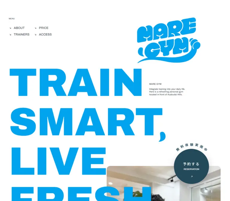
白い余白に大きな青い文字を重ね、円形の予約ボタンと楕円形の人物写真で親しみやすさを表現したパーソナルジムの公式サイト。
オリジナルサイトを見るBright blue lettering, open white space, and approachable portraits give personal training a fresh coastal identity.
Website: mare-gym.jp Original URL: https://mare-gym.jp/ Final URL: https://mare-gym.jp/ Theme: white content canvas with blue accents and a deep blue footer; no theme selector was verified. Inspected: September 17, 2026, Japan Standard Time. Supplied browser retrieval: September 16, 2026 at 20:19:33.823 UTC, equivalent to September 17 at 05:19:33.823 JST. Viewports: desktop 1440 × 1000 and mobile 390 × 844 CSS pixels. Scope: the current gym business homepage, including its navigation, opening composition, concept, About benefits, eight trainer profiles, pricing, supplementary programs, FAQ, reviews, two location descriptions, reservation links, and company footer. Visual captures cover the desktop opening, a trainer segment, and footer, plus the mobile opening and lower footer. Other sections are documented from the supplied rendered text and computed styles.
MARE GYM uses a strong difference in scale: enormous English lettering sits beside very small explanatory copy, while Japanese descriptions carry practical information. The main cyan is vivid and clean. Deep blue supports reservation controls, trainer panels, and the footer. Natural gym photography introduces warm wood, plants, mirrors, and people into the otherwise restrained palette.
The opening is an asymmetric composition. A small two-column menu sits at the upper left, a large illustrated logo occupies the upper right, and three lines of heavy type overlap a photograph below. A circular reservation link bridges white space and photography. Farther down, rounded trainer panels combine capsule-shaped portraits, compact biographies, and large Roman-letter names. The footer replaces the white canvas with a substantial dark field containing large navigation and a carefully spaced company table.
Bright blue lettering, open white space, and approachable portraits give personal training a fresh coastal identity.
Website: mare-gym.jp Original URL: https://mare-gym.jp/ Final URL: https://mare-gym.jp/ Theme: white content canvas with blue accents and a deep blue footer; no theme selector was verified. Inspected: September 17, 2026, Japan Standard Time. Supplied browser retrieval: September 16, 2026 at 20:19:33.823 UTC, equivalent to September 17 at 05:19:33.823 JST. Viewports: desktop 1440 × 1000 and mobile 390 × 844 CSS pixels. Scope: the current gym business homepage, including its navigation, opening composition, concept, About benefits, eight trainer profiles, pricing, supplementary programs, FAQ, reviews, two location descriptions, reservation links, and company footer. Visual captures cover the desktop opening, a trainer segment, and footer, plus the mobile opening and lower footer. Other sections are documented from the supplied rendered text and computed styles.
MARE GYM uses a strong difference in scale: enormous English lettering sits beside very small explanatory copy, while Japanese descriptions carry practical information. The main cyan is vivid and clean. Deep blue supports reservation controls, trainer panels, and the footer. Natural gym photography introduces warm wood, plants, mirrors, and people into the otherwise restrained palette.
The opening is an asymmetric composition. A small two-column menu sits at the upper left, a large illustrated logo occupies the upper right, and three lines of heavy type overlap a photograph below. A circular reservation link bridges white space and photography. Farther down, rounded trainer panels combine capsule-shaped portraits, compact biographies, and large Roman-letter names. The footer replaces the white canvas with a substantial dark field containing large navigation and a carefully spaced company table.
| Name | Value | Suggested token | Evidence and role |
|---|---|---|---|
| Clear White | #FFFFFF |
--color-page |
Measured body background and reversed text; dominant opening canvas |
| MARE Blue | #00A3EE |
--color-brand |
Measured hero lettering, major section headings, campaign emphasis, and pricing bonus text |
| Deep Sea | #244959 |
--color-deep |
Measured opening reservation background and its surrounding Japanese lettering; visually consistent with the footer and darkest trainer panel |
| Slate Text | #515A5E |
--color-text |
Measured navigation, supporting English text, Japanese headings, and pricing values |
| Secondary Slate | rgba(81, 90, 94, 0.75) |
--color-muted |
Measured concept label, benefit descriptions, and selected secondary labels |
| Reverse White | #FFFFFF |
--color-on-deep |
Measured trainer text and reservation labels |
Keep MARE Blue concentrated in display lettering and selected emphasis. Deep Sea creates a second, quieter form of prominence for actions and information-heavy areas. Photography supplies most of the warm colors.
| Name | Approximate value | Visible use | Reuse guidance |
|---|---|---|---|
| Royal Blue | approximately #395BA2 |
SHUN NAKAMURA panel in the desktop trainer capture | A supporting profile surface, not a replacement for the main cyan |
| Marine Blue | approximately #1B6891 |
EIDEN MORITA panel | Supports white biography text and natural portrait photography |
| Footer Action Blue | approximately #23A7DD |
Bright reservation disc against the dark footer | Visibly lighter than the footer; its exact source value was not supplied |
| Faint Reverse Rule | white at approximately 15–25% opacity | Company-table rules, hobby outlines, and small separators | Recommended approximation of the visible low-contrast linework |
The footer background is visually close to the measured Deep Sea value, but its own computed background was not included. The Quick Start reuses Deep Sea there as an explicit approximation.
Transparent gradient-related custom properties in the DOM do not establish a visible gradient system. The captured design is dominated by flat fills. Loading-related custom properties likewise do not establish the appearance of an observed loading screen.
Measured family: Archivo, associated with source variable --s-font-618c023f.
Archivo carries the oversized opening statement, major English section headings, Roman-letter trainer names, navigation, and small English captions. Its heavy display weight is central to the identity. The opening uses weight 900, line height 1, and tracking -0.01em; major section labels tighten line height further to 0.92.
Roman-letter trainer names use a different rhythm: 48px, weight 900, line height 48px, and positive tracking of 0.05em. Preserve this distinction rather than giving all bold text the hero's negative tracking.
Measured family: 'IBM Plex Sans JP', associated with source variable --s-font-2f8300be.
This family is declared for the concept statement, benefit headings and descriptions, trainer biographies, Japanese names, and pricing. Weights are generally substantial: 600 for benefit descriptions and 700 for biographies and many informational labels. Japanese paragraphs often use a generous 1.75 line height despite their small type size.
Measured family: 'IBM Plex Sans', associated with source variable --s-font-698591a0.
The supplied mobile styles declare this family for FAQ questions, answers, and review paragraphs. Japanese glyph fallback was not identified. A new implementation should explicitly provide a Japanese-capable fallback instead of assuming the Latin family alone covers the content.
The reservation's Japanese label reports Archivo as its computed family. This does not identify the actual font used for Japanese fallback glyphs.
All entries below are measured unless marked as estimates. Values describe computed typography, not the visible ink bounds of letters.
| Role | Desktop | Mobile | Weight / tracking |
|---|---|---|---|
| Opening statement | 180px / 180px |
48px / 48px |
900, -0.01em |
| ABOUT and TRAINERS headings | 180px / 165.6px |
56px / 51.52px |
900, -0.01em |
| PRICE heading | 180px / 165.6px |
64px / 58.88px |
900, -0.01em |
| FAQ and REVIEW headings | Not supplied | 36px / 33.12px |
900, -0.01em |
| WITH MARE GYM | 24px / 30px |
16px / 20px |
500, normal tracking |
| MENU caption | 9px / 11.25px |
10px / 12.5px |
500 |
| Opening navigation | 14px / 14px |
12px / 12px |
500 |
| English introduction | 10px / 12.5px |
10px / 12.5px |
500 |
| Small desktop brand H1 | 10px / 12.5px |
Not present in the visible mobile text export | 500 |
| Concept statement | 28px / 49px |
20px / 35px |
700 |
| Benefit heading | 24px / 30px |
20px / 25px |
700 |
| Benefit description | 14px / 24.5px |
13px / 22.75px |
600 |
| Japanese trainer name | 14px / 14px |
13px / 13px |
700, 0.2em |
| EIDEN / SENA Roman-letter names | 48px / 48px |
48px / 48px |
900, 0.05em |
| Trainer biography | 12px / 21px |
13px / 22.75px |
700, usually 0.05em |
| Trainer social handle | 10px / 10px |
13px / 13px |
500 |
| Hobby text | 12px / 18px |
13px / 19.5px |
700 |
| Reservation Japanese label | 16px / 16px |
13px / 13px |
400, 0.2em |
| RESERVATION caption | 10px / 10px |
10px / 10px |
400 |
| Reservation arc lettering | 14px / 17.5px |
Not visibly displayed | 700 |
| Price group label | 20px / 35px |
14px / 24.5px |
700 |
| Session quantity | 16px / 28px |
13px / 22.75px |
700 |
| Standard price amount | 28px / 49px |
16px / 28px |
700 |
| Ticket bonus note | 12px / 21px |
10px / 10px |
700, brand blue |
| FULL TIME program title | 80px / 80px |
56px / 56px |
700 |
| MARE PASS caption | 12px / 12px |
13px / 13px |
500, 0.5em |
| Mobile FAQ question | Not supplied | 14px / 21px |
600 |
| Mobile FAQ answer / review | Not supplied | 13px / 19.5px |
700 |
| Footer navigation | Approximately 40px |
Approximately 32px |
Visual estimate; much lighter than the hero |
Do not apply one proportional reduction to every mobile text style. The hero shrinks dramatically, trainer names remain at 48px, and biographies and social handles become slightly larger.
The logo is custom artwork. Its inflated letterforms, face-like details, and sweeping underline should not be described as an identified typeface. The inherited Times value on the root is also not representative of the visible interface typography.
Density: expansive composition around compact information. Unit system: ordinary CSS pixels are reported; no unusual root-size system was established.
These aliases summarize recurring or useful measured distances. They are not a recovered global spacing scale.
| Distance | Evidence | Suggested use |
|---|---|---|
8px |
Derived mobile navigation row gap: 20px row interval minus 12px text height | Compact navigation spacing |
14px |
Derived mobile concept label-to-paragraph gap | Label-to-content spacing |
16px |
Derived desktop navigation row gap; mobile trainer name-to-biography gap after the Roman name is also 16px for supplied examples | Small content separation |
20px |
Measured mobile page inset; derived mobile hero text-block gaps | Mobile outer gutter and internal rhythm |
24px |
Derived desktop gap between TRAIN's measured box and the introduction column | Small editorial side column |
30px |
Derived desktop MENU-to-link gap | Navigation group spacing |
40px |
Measured desktop left inset; approximately the trainer-panel internal padding in the screenshot | Desktop gutter and panel padding |
100px |
Approximately the measured mobile gap from the concept paragraph's end to ABOUT | Major mobile section separation |
200px |
Measured desktop gap from the concept paragraph's end to ABOUT | Major desktop section separation |
| Element | Value or shape | Confidence |
|---|---|---|
| Reservation disc | Source radius 999px; equal width and height |
Measured |
| Desktop trainer panels | Approximately 12px corners |
Visual estimate |
| Main desktop photograph | Approximately 12px corners |
Visual estimate |
| Main mobile photograph | Approximately 8px corners |
Visual estimate |
| Trainer portrait | Tall capsule with fully rounded ends | Visually observed; exact CSS radius unavailable |
| Hobby label | Small outlined pill | Visually observed |
| Company table | Approximately 1px horizontal rules, no enclosing box |
Visual estimate |
The circular reservation control has a broad soft shadow. Trainer panels appear flat. Use shadow selectively to make the reservation disc float across a boundary, rather than adding elevation to every content block.
| Element | Desktop 1440 × 1000 | Mobile 390 × 844 | Evidence |
|---|---|---|---|
| MENU caption origin | (40, 80) |
(20, 90) |
Measured |
| Logo link | (1016, 80), 289 × 208px |
(270, 20), 100 × 71.97px |
Measured |
| TRAIN line box | (40, 288), about 617.41 × 180px |
(20, 190.5), about 164.64 × 48px |
Measured |
| SMART line-box top | 468px |
238.5px |
Measured |
| LIVE FRESH line-box top | 648px |
286.5px |
Measured |
| English introduction | (681.41, 400.5), about 163.56 × 37.5px |
(20, 394.5), same dimensions |
Measured |
| Main photograph top-left | Approximately (656, 578) |
Approximately (20, 472) |
Screenshot estimate |
| Main photograph width | Approximately 744px |
Approximately 330px |
Screenshot estimate; full height is not shown |
| Opening reservation disc | (1184, 500), 160 × 160px |
(230, 422), 100 × 100px |
Measured |
| Concept text width | 570px |
350px |
Measured |
| Bottom trainer pair | Two approximately 670px panels with a 20px gap |
Text evidence places the profiles one after another | Desktop visual estimate / mobile DOM |
| Footer inner region | Approximately 1020px, centered |
Approximately 350px with 20px side insets |
Screenshot estimate |
| Document height | 16912.59px |
17689.08px |
Measured; not a target height to hardcode |
Role: immediate orientation and identity without a conventional navigation bar.
The menu consists of a tiny MENU caption above two columns of links. ABOUT and TRAINERS form the first column; PRICE and ACCESS form the second. Each link has a small diagonal down-right arrow. There is no enclosing surface, divider, or visible hamburger control in either opening capture.
Desktop link text begins at x=63 and x=178. Mobile text begins at x=39 and x=138. The mobile menu stays exposed and remains separate from the logo, which moves into the top-right corner and becomes only 100px wide.
The logo is an illustrated blue mark on white and appears white in the footer. Preserve its actual silhouette and internal negative space using an approved asset. The supplied evidence identifies a home link around the opening logo, but does not expose an image filename or its accessible name.
Role: establish the brand's energy and connect it to the real training environment.
The visible statement is arranged as TRAIN, SMART with a comma, and LIVE FRESH. At desktop size, three 180px line boxes start at y=288. LIVE FRESH crosses in front of the photograph, which starts lower and farther right. The graphic comma is visible even though the text export records SMART without punctuation.
A small MARE GYM heading and a three-line English introduction sit beside TRAIN. WITH MARE GYM sits below the large statement in gray. This arrangement depends on intentional scale contrast and overlap, not a centered headline above a full-width image.
Mobile changes the composition substantially. The statement becomes 48px and fits above the image. WITH MARE GYM follows after 20px, then the English introduction follows after another 20px. The small desktop brand heading is not visible in the mobile capture. The photograph starts at approximately y=472, with the reservation disc crossing its upper edge.
The original DOM uses paragraphs for the large slogan and a small brand H1 on desktop. For a new build, a single semantic H1 can contain the slogan's visual lines while retaining the same appearance.
Role: a repeated entry into trial booking.
An anchor forms the whole circular target. Its anatomy is a Japanese primary label, the small English caption RESERVATION, and a small up-right arrow below. On desktop, seven Japanese characters form an arc reading “無料体験実施中” outside the upper edge. The opening disc is 160px across; mobile reduces it to 100px and omits the visible arc.
The desktop primary label has 3.2px tracking. Mobile uses 2.6px tracking. The English caption remains 10px at both widths. White text reverses out of the dark opening disc. The footer version switches to a brighter blue against the dark footer.
The opening disc is centered almost exactly on the photograph's top boundary: its desktop center is y=580 and the photograph begins near y=578. Mobile places the center at y=472, matching the image's top. That boundary relationship is more reusable than an arbitrary viewport position.
Reservation links occur in the opening, pricing area, and footer. All supplied hrefs point to https://maregym.hacomono.jp/reserve/schedule/1/1/?trial=true. This is a recorded destination, not a tested booking flow. Fixed positioning, hover effects, and spinning arc lettering were not verified.
Role: translate the English visual statement into a concise Japanese explanation.
A 10px CONCEPT caption precedes a bold Japanese paragraph. On desktop, this is a 570px-wide block in the right half of the page, beginning at x=743. The paragraph uses 28px type with a 49px line height.
Mobile moves it to the normal 20px left inset and expands it to the available 350px. Type becomes 20px with a 35px line height. The gap below the caption reduces from approximately 70px on desktop to 14px on mobile. This is a deliberate reduction in both width asymmetry and vertical space.
Role: present three reasons to consider the gym.
The supplied content groups benefits under 01, 02, and 03: pricing and quality, trainer credentials, and an enrollment campaign. Large ABOUT and THE lettering precedes these items. Each benefit contains a small number, a compact bold Japanese heading, and a longer muted description. The campaign heading uses the main blue.
Desktop number positions are separated by approximately 460px, supporting a three-across arrangement. Mobile does not simply stack all three items: their number centers remain around x=160, 450, and 740 at the same vertical position. Description boxes are 240px wide at x=40, 330, and 620.
This establishes horizontal placement beyond the mobile viewport. It does not establish working swipe controls, autoplay, scroll snapping, or the container's overflow implementation. A reusable implementation can provide an accessible horizontal scroller, but that behavior must be labeled as an addition. The benefit imagery and complete enclosing shapes are not visible in the supplied captures.
Role: make individual trainers recognizable and approachable while providing substantial credentials and personality.
The rendered content contains eight profiles. The desktop capture shows a wide SHUN NAKAMURA panel above two narrower panels for EIDEN MORITA and SENA SAWAJI. The wide panel combines portrait and biography on the left with a large blue-tinted training photograph on the right. The narrower pair uses solid blue surfaces without that additional right-hand photograph.
Within the smaller panels, the visible anatomy is:
The smaller panels have approximately 40px padding and a 40px portrait-to-copy gap. Their upper edges align, but their bottoms do not: the longer EIDEN biography produces a visibly taller card. Let content determine height.
SHUN uses a filled first name and an outlined surname in the screenshot. EIDEN and SENA use filled names on both lines. The outlined treatment is visually established, but its exact stroke width and whether it is text or artwork were not supplied.
Mobile text measurements show profiles placed sequentially, centered metadata groups, and biographies at x=40 with a width of 310px. EIDEN and SENA retain 48px Roman-letter names. Exact mobile portrait dimensions and the treatment of the large training photographs are not visually established.
Instagram handles are individual links. There is no evidence that each entire panel is clickable or opens a profile modal.
Role: allow comparison of individual and pair training across payment methods.
The content forms a comparison between “お一人” and “お二人 (ペア)”, grouped by “チケット”, “月払い”, and “都度払い”. Pair pricing has a per-person clarification. Quantities, prices, and bonus notes are separate typographic levels.
Desktop measurements place the category area at x=40 with a 160px width. Individual session quantities begin at x=232, and pair quantities at x=832. Prices use 28px bold Japanese type; ticket bonus notes use 12px blue text. Repeated ticket rows are approximately 79px apart.
Mobile retains both comparison columns. The category region becomes 90px wide, and the two option columns occupy approximately 140px each inside a 370px-wide area. Quantity appears above price, with the applicable bonus note below. Prices reduce to 16px; quantities use 13px; bonus notes use 10px.
Both sets of prices are present together in the mobile measurements. Do not infer a tab switcher from the individual/pair labels. Some bonus text present in the desktop export is absent from the mobile visible-text export; its intended responsive visibility was not independently tested.
For reuse, implement the comparison as a semantic table and preserve the distinction between total price, session count, and per-person pricing. Table backgrounds and border details were not supplied as computed styles or screenshots.
Role: give recurring training and nutrition services their own typographic identities after the main comparison.
The MARE PASS offering contains a small widely tracked brand caption, a large two-line FULL TIME title, a reservation-frequency note, and a monthly price. The title uses 80px type on desktop and 56px on mobile. Its white text indicates a contrasting underlying surface, but the exact surface and geometry are not established by the supplied captures.
The mobile MEAL COACHING block uses a 13px Japanese descriptor, a 32px English title, a 15px COURSE caption, and a 16px monthly price. Treat these as distinct editorial blocks rather than inventing a uniform three-tier subscription-card system.
Role: answer practical concerns and provide longer personal accounts.
Three FAQ question-and-answer pairs are present in the rendered evidence. Mobile Q and A markers use 14px Archivo at weight 900. Q is muted slate; A is blue. Questions use 14px text with 21px leading, while answers use 13px with 19.5px leading.
Both questions and answers have rendered rectangles in the supplied state. No accordion click, expansion animation, or collapsed state was tested. A static, fully readable Q&A list is therefore the safest reference behavior.
Two long reviews follow. Their mobile paragraphs begin at x=96 and occupy 254px, producing a strongly indented text column. The evidence does not identify what occupies the space to their left. Do not invent reviewer avatars, star ratings, a review platform, or carousel controls.
Role: provide practical information for both current locations.
The rendered page includes Azabudai and Aoyama location blocks with ADDRESS, ACCESS, and OPEN HOUR labels. A TEL entry appears for Azabudai. Both locations list opening hours of 7:00–22:00.
Retain the repeated label/value structure and distinguish the two branches clearly. Exact location-section imagery, maps, panel dimensions, and map interactions were not supplied. The presence of address text is not evidence of an embedded map.
Role: close the page with another booking opportunity, large section navigation, and business information.
The desktop footer is a full-width deep blue surface with an approximately 1020px centered inner region. Its top area pairs a white logo at left with a bright circular reservation link and short explanatory text at right. A fine vertical divider separates the booking disc from the explanatory copy.
Below, large navigation occupies the left half and COMPANY information occupies the right. Navigation uses small diagonal arrows and approximately 40px white labels with a roughly 70px vertical rhythm. The footer uses TRAINER in the singular, while the opening uses TRAINERS.
The company block has six label/value rows. It identifies the company as “MARE合同会社”, independently supporting the operator identity. Labels occupy approximately 120px, followed by a 30px gap and a wider value column. Each column has its own faint horizontal rules rather than a single boxed table border. Most desktop rows are approximately 82px apart.
Mobile places company information below the navigation. The table keeps approximately 120px for labels and 200px for values, separated by 30px. Longer values wrap, and the representatives row becomes taller. The mobile capture clips the legal-link row at the right edge; this is an observed limitation, not a pattern to reproduce. Copyright appears on its own line below.
The recorded legal destinations are /terms, /law, and /privacy; those pages were not inspected.
| Target | Supplied declaration | What it establishes |
|---|---|---|
| Many text elements, links, and opening reservation | 0.3s cubic-bezier(0.4, 0.4, 0, 1) |
A common transition timing; no specific hover endpoint is established |
| Body background | background 0.5s cubic-bezier(0.4, 0.4, 0, 1) |
Background changes can transition; no theme-changing interaction was verified |
| Desktop ABOUT, TRAINERS, and PRICE headings | 0.6s ease-in-out 0.6s |
A 600ms transition with a 600ms delay |
| Desktop pricing reservation link | 0.8s ease-in-out 0.8s |
A longer delayed transition on this instance |
| Desktop individual/pair headings | 0.6s ease-in-out 1s |
Delayed transition declaration |
| Desktop pair-price clarification | 0.6s ease-in-out 1.1s |
A further staggered delay |
| Mobile major headings | Usually the common 300ms timing; TRAINERS has no nonzero duration in its supplied shorthand | Timing varies by breakpoint and element |
These declarations are not a complete animation specification. Starting opacity, transform values, trigger conditions, replay behavior, and keyframes were not supplied. Some transformed desktop rectangles suggest geometric treatment, but they do not prove a particular reveal direction or animation sequence.
The sampled nodes report animation: none. This does not rule out JavaScript animation, animated ancestors, or motion on unsampled elements. There is no verified evidence of continuous CTA rotation, a custom cursor, parallax, autoplaying media, or a sticky reservation button.
| Element | Evidence | Limitation |
|---|---|---|
| Opening and footer navigation | Links to #about, #trainers, #price, and #access |
Click behavior and smooth-scroll timing were not exercised |
| Reservation discs | External booking href on each supplied instance | Booking destination and new-tab behavior were not tested |
| Trainer handles | Individual Instagram hrefs | Destination pages were not inspected |
| Footer Instagram | Gym account link | No social overlay or embed was verified |
| Mobile benefit sequence | Multiple items positioned horizontally outside the viewport | Swipe, keyboard scrolling, snapping, and controls remain unverified |
| FAQ | Questions and answers have rendered content and geometry | No accordion interaction was established |
For a new implementation, use the common 300ms easing sparingly for link or color feedback. Keep essential information visible without a reveal animation. Any added movement should respect reduced-motion preferences.
| Layer | Appearance | Function |
|---|---|---|
| Main page | Flat white | Creates breathing room around oversized type and photography |
| Display layer | Solid cyan text | Provides identity and section hierarchy |
| Main imagery | Natural-color photographs with modest corner rounding | Shows the real environment and activity |
| Trainer information | Solid supporting blues with white text | Groups dense biographies and portraits |
| Trainer scene | Photography with a visible blue tint | Connects a profile to training activity; tint implementation unknown |
| Reservation | Circular filled surface with a soft shadow | Floats across the white/photo boundary |
| Footer | Large deep blue field | Groups booking, navigation, and company details |
| Footer rules and hobby labels | Thin, subdued outlines | Adds structure without heavy boxes |
The photographed wood and plants should remain image content. They do not imply beige or green interface surfaces. The visible design does not require a general gradient, glass, or elevated-card system.
The opening photograph shows a person performing a seated dumbbell curl in a bright gym. Mirrors, white structural surfaces, green plants, and warm wood flooring provide a clean everyday setting. The mobile crop makes the person, bench, and dumbbell especially legible.
Trainer portraits show people in black branded shirts against an enlarged blue-and-white gym logo. The capsule masks retain both face and torso. Their natural color contrasts with the solid blue panel around them. A separate training scene in the wide profile panel is visibly subdued through blue coloring.
A smaller rounded photograph overlaps the main image near the bottom of the mobile opening capture, beginning around x=160 and y=782. Only its upper portion is shown; do not infer its full dimensions or complete subject from that crop.
The logo is playful and substantial: rounded letter masses, face-like marks, and a sweeping lower stroke. The surrounding interface is more restrained, which allows the mark to carry much of the friendliness. Use the actual approved mark when reproducing this identity. For another business, commission independent artwork with a comparable degree of warmth rather than substituting ordinary bold text.
No original image URLs or filenames were supplied. The table identifies visual roles without inventing asset paths.
| Asset role | Evidence | Implementation guidance |
|---|---|---|
| Blue opening logo | Desktop and mobile opening captures | Preserve aspect ratio; measured link boxes are 289 × 208px and 100 × 71.97px |
| White footer logo | Desktop footer capture | Use an approved reverse-color version; approximately 250px wide |
| Main training photograph | Desktop and mobile opening captures | Preserve the training action and environmental context when cropping |
| Small overlapping photograph | Lower part of mobile opening capture | Treat as a secondary composition element; full image extent unavailable |
| Trainer portraits | Desktop trainer capture | Use tall capsule masks, approximately a 3:4 proportion |
| Wide training scene | Right half of the SHUN panel | Use a separate photograph with a blue treatment; exact blending method unknown |
Use responsive image sources and explicit dimensions when implementing. Avoid stretching portraits, replacing the gym with unrelated stock interiors, or applying the scene's blue tint to every photograph.
The opening uses a wide composition with a 40px main left inset. Navigation and logo do not share a compact horizontal bar. The logo occupies a large region above the photograph, while the slogan extends across the image boundary. Supporting copy remains narrow and deliberately small.
The concept moves into a right-hand column. Benefits occupy three horizontal positions. The trainer capture combines a wide feature panel with a two-column pair below. Pricing keeps category, individual, and pair information aligned across a broad comparison area. The footer introduces a narrower centered content region inside a full-width dark background.
| Area | Observed change |
|---|---|
| Navigation | Remains visible in two columns; link type becomes 12px |
| Logo | Moves to (270, 20) and reduces to 100px wide |
| Opening slogan | Changes from 180px to 48px; LIVE FRESH remains on one line at 390px |
| Supporting introduction | Moves below WITH MARE GYM; its 10px type and 163.56px width remain unchanged |
| Main photograph | Starts beneath the text at approximately y=472; approximately 330px wide |
| Reservation | Reduces from 160px to 100px; its arc lettering is not visibly displayed |
| Concept | Moves to x=20 and fills 350px; type becomes 20px |
| About benefits | Retain horizontal placement beyond the viewport |
| Trainer profiles | Become sequential; biographies occupy 310px and use 13px type |
| Standard pricing | Retains individual and pair columns, with quantity above price inside each option |
| Footer | Navigation precedes company information; values wrap within the right column |
| Legal links | Rightmost content is clipped in the supplied lower-footer capture |
The mobile view is not a uniformly scaled desktop page. Different components make different tradeoffs, and several retain horizontal relationships.
An inline stylesheet excerpt exposes a max-width: 840px breakpoint for responsive line-break visibility. This confirms that breakpoint's existence for those line breaks only. It does not establish that every layout transition occurs at 840px.
No intermediate tablet screenshot was supplied. The Quick Start uses 840px as an adaptation breakpoint, with an additional recommended trainer-layout adjustment at 1100px. Neither is presented as a complete reconstruction of the original breakpoint system.
#00A3EE, slate #515A5E, and dark reservation blue #244959.These are recommendations for a new implementation, not verified features of the original site:
#FFFFFF.#00A3EE.#515A5E.rgba(81, 90, 94, 0.75).#244959.#244959; use as an approximation.#395BA2 and #1B6891.“Create a Japanese personal-training business homepage using MARE GYM's observed visual principles: a white canvas, cyan #00A3EE, slate text #515A5E, and deep blue #244959. Use Archivo 900 for enormous English display lettering and IBM Plex Sans JP for compact Japanese information. Place a small visible two-column menu at the upper left and an approved illustrated logo at the upper right. On desktop, set a three-line statement at 180px with tight tracking and overlap its lower line across a bright gym photograph. Place a dark 160px circular reservation link across the photograph's top edge. Use blue trainer panels with capsule portraits, 48px Roman-letter names, dense white biographies, and small social handles. Include individual/pair pricing, readable Q&A, two location blocks, and a substantial dark company footer. At 390px, use a 48px opening statement, 20px page insets, a 100px booking disc, stacked trainer profiles, and side-by-side pricing. Keep unverified interactions simple and label new behavior as an implementation choice.”
#00A3EE, line height 1, and tracking -0.01em. At 1440px use 180px type and a right-aligned photograph under the lower lines. At 390px use 48px type, move supporting copy beneath the statement, and place the photograph below it.”This is a reusable structural adaptation. Exact colors and type sizes come from the measured values above. Supporting blues, radii, shadows, intermediate-width behavior, table surfaces, and mobile image arrangements are recommendations or visual approximations. Load approved font files separately; no font or photograph URLs were supplied.
The example assumes a .mare-site wrapper. A .page-shell contains .masthead followed by .hero. The hero contains .hero-title with three block spans, .hero-subtitle, .hero-copy, and .hero-media. Place the photograph and reservation anchor inside .hero-media. Trainer components use a portrait and a content wrapper. Company information uses a dl with alternating dt and dd children.
:root {
  /* Measured colors */
  --color-page: #ffffff;
  --color-brand: #00a3ee;
  --color-deep: #244959;
  --color-text: #515a5e;
  --color-muted: rgb(81 90 94 / 75%);
  --color-on-deep: #ffffff;

  /* Visual approximations */
  --color-profile-royal: #395ba2;
  --color-profile-marine: #1b6891;
  --color-footer-action: #23a7dd;
  --rule-on-deep: rgb(255 255 255 / 18%);
  --rule-on-light: rgb(81 90 94 / 18%);

  /* Measured families with recommended explicit fallbacks */
  --font-display: 'Archivo', 'IBM Plex Sans JP', sans-serif;
  --font-japanese: 'IBM Plex Sans JP', sans-serif;
  --font-reading: 'IBM Plex Sans', 'IBM Plex Sans JP', sans-serif;

  /* Endpoint sizes are measured; interpolation is recommended */
  --hero-size: clamp(72px, 12.5vw, 180px);
  --section-size: clamp(72px, 12.5vw, 180px);
  --page-gutter: 40px;
  --reservation-size: 160px;
  --radius-panel: 12px;
  --radius-photo: 12px;
  --footer-width: 1020px;
  --ease-ui: cubic-bezier(0.4, 0.4, 0, 1);
  --duration-ui: 300ms;
  --shadow-reservation: 0 18px 40px rgb(36 73 89 / 24%);
}

.mare-site,
.mare-site * {
  box-sizing: border-box;
}

.mare-site {
  color: var(--color-text);
  background: var(--color-page);
  font-family: var(--font-japanese);
}

.mare-site :where(h1, h2, h3, p, figure, dl, dd) {
  margin: 0;
}

.mare-site img {
  display: block;
  max-inline-size: 100%;
}

.mare-site a {
  color: inherit;
}

.page-shell {
  margin-inline: var(--page-gutter);
}

.masthead {
  position: relative;
  block-size: 288px;
  padding-block-start: 80px;
}

.brand-link {
  position: absolute;
  inset-block-start: 80px;
  inset-inline-end: clamp(0px, 6.6vw, 95px);
  inline-size: 289px;
}

.brand-link img {
  inline-size: 100%;
  block-size: auto;
}

.menu-caption {
  margin-block-end: 30px !important;
  font: 500 9px/1.25 var(--font-display);
}

.menu-links {
  display: grid;
  grid-auto-flow: column;
  grid-template-rows: repeat(2, auto);
  grid-template-columns: repeat(2, 95px);
  gap: 16px 20px;
}

.menu-links a {
  display: flex;
  align-items: center;
  gap: 12px;
  font: 500 14px/1 var(--font-display);
  text-decoration: none;
}

.menu-arrow {
  flex: 0 0 11px;
  font-size: 10px;
}

.hero {
  position: relative;
  isolation: isolate;
}

.hero-title {
  position: relative;
  z-index: 2;
  color: var(--color-brand);
  font: 900 var(--hero-size)/1 var(--font-display);
  letter-spacing: -0.01em;
}

.hero-title > span {
  display: block;
}

.hero-subtitle {
  position: relative;
  z-index: 2;
  padding-inline-start: 14px;
  font: 500 24px/1.25 var(--font-display);
}

.hero-copy {
  position: absolute;
  z-index: 2;
  inset-block-start: calc(0.5 * var(--hero-size));
  inset-inline-start: calc(3.43 * var(--hero-size) + 24px);
  inline-size: 164px;
  font: 500 10px/1.25 var(--font-display);
}

.hero-copy__brand {
  display: block;
  margin-block-end: 10px;
  font-weight: 500;
}

.hero-media {
  position: relative;
  z-index: 1;
  inline-size: 54.7059%;
  margin-inline-start: auto !important;
  margin-block-start: -280px !important;
}

.hero-photo {
  inline-size: 100%;
  block-size: auto;
  border-radius: var(--radius-photo);
}

.reservation {
  position: relative;
  display: flex;
  flex-direction: column;
  align-items: center;
  justify-content: center;
  inline-size: var(--reservation-size);
  block-size: var(--reservation-size);
  flex-shrink: 0;
  border-radius: 999px;
  color: var(--color-on-deep) !important;
  background: var(--color-deep);
  box-shadow: var(--shadow-reservation);
  text-align: center;
  text-decoration: none;
}

.hero-media > .reservation {
  position: absolute;
  inset-block-start: -78px;
  inset-inline-end: 56px;
}

.reservation__label {
  font: 400 16px/1 var(--font-display);
  letter-spacing: 0.2em;
}

.reservation__caption {
  margin-block-start: 10px;
  font: 400 10px/1 var(--font-display);
}

.reservation__arrow {
  position: absolute;
  inset-block-end: 28px;
  font: 400 12px/1 var(--font-display);
}

.reservation__arc {
  position: absolute;
  inset-block-start: -36px;
  inset-inline-start: -20px;
  inline-size: calc(100% + 40px);
  block-size: 60px;
  overflow: visible;
  fill: var(--color-deep);
  font: 700 14px var(--font-japanese);
  letter-spacing: 6px;
  pointer-events: none;
}

.section-title {
  color: var(--color-brand);
  font: 900 var(--section-size)/0.92 var(--font-display);
  letter-spacing: -0.01em;
}

.concept-copy {
  max-inline-size: 570px;
  margin-inline-start: auto !important;
  font: 700 28px/1.75 var(--font-japanese);
}

.benefit-rail {
  display: grid;
  grid-template-columns: repeat(3, minmax(0, 1fr));
  gap: 20px;
}

.benefit {
  min-inline-size: 0;
  padding: 20px;
}

.benefit h3 {
  font: 700 24px/1.25 var(--font-japanese);
}

.benefit p {
  margin-block-start: 20px;
  color: var(--color-muted);
  font: 600 14px/1.75 var(--font-japanese);
}

.trainer-grid {
  display: grid;
  grid-template-columns: repeat(2, minmax(0, 1fr));
  align-items: start;
  gap: 20px;
}

.trainer-card {
  display: grid;
  grid-template-columns: minmax(0, 258px) minmax(0, 1fr);
  align-items: center;
  gap: 40px;
  padding: 40px;
  border-radius: var(--radius-panel);
  color: var(--color-on-deep);
  background: var(--color-deep);
}

.trainer-card--marine {
  background: var(--color-profile-marine);
}

.trainer-featured {
  grid-column: 1 / -1;
  display: grid;
  grid-template-columns: minmax(0, 730fr) minmax(0, 630fr);
  overflow: hidden;
  border-radius: var(--radius-panel);
  background: var(--color-profile-royal);
}

.trainer-featured .trainer-card {
  background: transparent;
  border-radius: 0;
}

.trainer-portrait {
  inline-size: 100%;
  aspect-ratio: 258 / 347;
  object-fit: cover;
  border-radius: 999px;
}

.trainer-scene {
  inline-size: 100%;
  block-size: 100%;
  object-fit: cover;
  opacity: 0.4; /* Recommended approximation of the visible tint. */
}

.trainer-meta {
  display: flex;
  flex-wrap: wrap;
  align-items: center;
  gap: 12px 20px;
  margin-block-end: 20px;
}

.trainer-meta h3 {
  font: 700 14px/1 var(--font-japanese);
  letter-spacing: 0.2em;
}

.trainer-meta a {
  font: 500 10px/1 var(--font-display);
  text-underline-offset: 6px;
}

.trainer-name {
  margin-block-end: 16px !important;
  overflow-wrap: anywhere;
  font: 900 48px/1 var(--font-display);
  letter-spacing: 0.05em;
}

.trainer-name > span {
  display: block;
}

/* Optional visual approximation for the outlined surname variant. */
@supports (-webkit-text-stroke: 1px white) {
  .trainer-name__outline {
    color: transparent;
    -webkit-text-stroke: 1px white;
  }
}

.trainer-bio {
  font: 700 12px/1.75 var(--font-japanese);
  letter-spacing: 0.05em;
}

.trainer-hobby {
  display: flex;
  align-items: baseline;
  gap: 10px;
  margin-block-start: 20px;
  font: 700 12px/1.5 var(--font-japanese);
}

.trainer-hobby__label {
  padding: 4px 12px;
  border: 1px solid var(--rule-on-deep);
  border-radius: 999px;
}

/* Table rules and header fill are recommended adaptations. */
.price-table {
  inline-size: 100%;
  border-collapse: collapse;
  table-layout: fixed;
}

.price-table col:first-child {
  inline-size: 160px;
}

.price-table th,
.price-table td {
  padding: 20px 30px;
  border-block-end: 1px solid var(--rule-on-light);
  vertical-align: middle;
}

.price-table thead th:not(:first-child) {
  color: white;
  background: var(--color-deep);
}

.plan-option {
  display: flex;
  align-items: center;
  flex-wrap: wrap;
  gap: 10px 18px;
}

.plan-quantity {
  font: 700 16px/1.75 var(--font-japanese);
}

.plan-amount {
  font: 700 28px/1.75 var(--font-japanese);
}

.plan-bonus {
  color: var(--color-brand);
  font: 700 12px/1.75 var(--font-japanese);
}

.site-footer {
  padding: 100px var(--page-gutter) 60px;
  color: white;
  background: var(--color-deep);
}

.footer-inner {
  max-inline-size: var(--footer-width);
  margin-inline: auto;
}

.footer-top,
.footer-main {
  display: grid;
  grid-template-columns: repeat(2, minmax(0, 1fr));
}

.footer-top {
  align-items: center;
}

.footer-logo {
  inline-size: 250px;
  block-size: auto;
}

.footer-reservation {
  display: flex;
  justify-content: flex-end;
  align-items: center;
  gap: 30px;
}

.site-footer .reservation {
  background: var(--color-footer-action);
}

.site-footer .reservation__arc {
  fill: white;
}

.footer-reservation__copy {
  padding-inline-start: 30px;
  border-inline-start: 1px solid var(--rule-on-deep);
  font: 700 12px/1.4 var(--font-japanese);
}

.footer-main {
  margin-block-start: 70px;
}

.footer-nav {
  display: grid;
  align-content: start;
  gap: 24px;
}

.footer-nav a {
  display: flex;
  align-items: baseline;
  gap: 12px;
  font: 500 40px/1.15 var(--font-display);
  text-decoration: none;
}

.footer-nav .menu-arrow {
  font-size: 14px;
}

.company-list {
  display: grid;
  grid-template-columns: 120px minmax(0, 1fr);
  column-gap: 30px;
}

.company-list dt,
.company-list dd {
  min-inline-size: 0;
  padding-block: 20px 40px;
  border-block-start: 1px solid var(--rule-on-deep);
  overflow-wrap: anywhere;
}

.company-list dt {
  font: 400 12px/1.5 var(--font-japanese);
}

.company-list dd {
  font: 700 14px/1.5 var(--font-japanese);
}

.footer-bottom {
  display: flex;
  justify-content: space-between;
  gap: 24px;
  margin-block-start: 50px;
  color: rgb(255 255 255 / 72%);
  font: 400 12px/1.5 var(--font-display);
}

.footer-legal {
  display: flex;
  flex-wrap: wrap; /* Recommended correction to captured clipping. */
  gap: 12px 20px;
}

.mare-site :focus-visible {
  outline: 3px solid currentColor;
  outline-offset: 5px;
}

@media (max-width: 1100px) {
  /* Recommended intermediate-width protection. */
  .trainer-card {
    grid-template-columns: minmax(0, 42%) minmax(0, 1fr);
    gap: 24px;
    padding: 24px;
  }

  .trainer-name {
    font-size: 36px;
  }

  .footer-reservation {
    flex-wrap: wrap;
  }
}

@media (max-width: 840px) {
  :root {
    --page-gutter: 20px;
    --hero-size: clamp(38px, 12.3077vw, 48px);
    --section-size: 56px;
    --reservation-size: 100px;
    --radius-photo: 8px;
  }

  .masthead {
    block-size: 190.5px;
    padding-block-start: 90px;
  }

  .brand-link {
    inset-block-start: 20px;
    inset-inline-end: 0;
    inline-size: 100px;
  }

  .menu-caption {
    margin-block-end: 15px !important;
    font-size: 10px;
  }

  .menu-links {
    grid-template-columns: repeat(2, 79px);
    row-gap: 8px;
  }

  .menu-links a {
    gap: 10px;
    font-size: 12px;
  }

  .menu-arrow {
    flex-basis: 9px;
  }

  .hero-subtitle {
    margin-block-start: 20px !important;
    padding: 0;
    font-size: 16px;
  }

  .hero-copy {
    position: static;
    margin-block-start: 20px !important;
  }

  .hero-copy__brand {
    display: none;
  }

  .hero-media {
    inline-size: calc(100% - 20px);
    margin-inline-start: 0 !important;
    margin-block-start: 40px !important;
  }

  .hero-media > .reservation {
    inset-block-start: -50px;
    inset-inline-end: 20px;
  }

  .reservation__label {
    font-size: 13px;
  }

  .reservation__caption {
    margin-block-start: 4px;
  }

  .reservation__arrow {
    inset-block-end: 15px;
  }

  .reservation__arc {
    display: none;
  }

  .section-title--price {
    font-size: 64px;
  }

  .section-title--small {
    font-size: 36px;
  }

  .concept-copy {
    max-inline-size: none;
    font-size: 20px;
  }

  .benefit-rail {
    grid-template-columns: none;
    grid-auto-flow: column;
    grid-auto-columns: 280px;
    gap: 10px;
    overflow-x: auto;
    padding-block: 6px;
  }

  .benefit h3 {
    font-size: 20px;
  }

  .benefit p {
    font-size: 13px;
  }

  .trainer-grid,
  .trainer-featured,
  .trainer-card {
    grid-template-columns: minmax(0, 1fr);
  }

  .trainer-card {
    gap: 24px;
    padding: 24px 20px;
  }

  .trainer-portrait {
    max-inline-size: 240px;
    margin-inline: auto;
  }

  .trainer-meta {
    justify-content: center;
  }

  .trainer-meta h3,
  .trainer-meta a {
    font-size: 13px;
  }

  .trainer-name {
    font-size: 48px;
    text-align: center;
  }

  .trainer-bio,
  .trainer-hobby {
    font-size: 13px;
  }

  .trainer-hobby {
    justify-content: center;
    flex-wrap: wrap;
  }

  .trainer-scene {
    block-size: auto;
    aspect-ratio: 3 / 2;
  }

  .price-region {
    margin-inline: -10px;
  }

  .price-table col:first-child {
    inline-size: 90px;
  }

  .price-table th,
  .price-table td {
    padding: 16px 4px;
    font-size: 14px;
  }

  .plan-option {
    flex-direction: column;
    align-items: center;
    gap: 4px;
  }

  .plan-quantity {
    font-size: 13px;
  }

  .plan-amount {
    font-size: 16px;
  }

  .plan-bonus {
    font-size: 10px;
    line-height: 1;
  }

  .footer-top,
  .footer-main {
    grid-template-columns: minmax(0, 1fr);
    gap: 48px;
  }

  .footer-reservation {
    justify-content: flex-start;
    gap: 20px;
  }

  .footer-reservation__copy {
    padding-inline-start: 20px;
    max-inline-size: 210px;
  }

  .footer-nav a {
    font-size: 32px;
  }

  .company-list {
    grid-template-columns: min(120px, 34.3%) minmax(0, 1fr);
    column-gap: 30px;
  }

  .footer-bottom {
    flex-direction: column;
    align-items: flex-start;
    gap: 32px;
  }
}

@media (prefers-reduced-motion: reduce) {
  .mare-site *,
  .mare-site *::before,
  .mare-site *::after {
    animation: none !important;
    transition: none !important;
    scroll-behavior: auto !important;
  }
}
The CSS intentionally does not add reveal animations or hide content pending JavaScript. The mobile portrait maximum, featured-scene arrangement, and the 1100px adjustment are recommended behavior where the original captures do not establish exact geometry. Keep the 390px and 1440px endpoints as visual checkpoints, not as the only supported widths.
This is a recommended accessible implementation of the observed anatomy. The SVG curve is an approximation; give each repeated arc a unique path ID. The Japanese strings below quote the actual interface labels.
<a
  class="reservation"
  href="https://maregym.hacomono.jp/reserve/schedule/1/1/?trial=true"
  aria-label="予約する"
>
  <svg
    class="reservation__arc"
    viewBox="0 0 200 60"
    aria-hidden="true"
    focusable="false"
  >
    <defs>
      <path id="trial-arc-hero" d="M 20 55 Q 100 -20 180 55" />
    </defs>
    <text text-anchor="middle">
      <textPath href="#trial-arc-hero" startOffset="50%">
        無料体験実施中
      </textPath>
    </text>
  </svg>
  <span class="reservation__label">予約する</span>
  <span class="reservation__caption" aria-hidden="true">RESERVATION</span>
  <span class="reservation__arrow" aria-hidden="true">↗</span>
</a>
Optional aliases for a project already using Tailwind v4. This is not evidence that the original website uses Tailwind. Define the custom properties above first.
@theme inline {
  --color-mare-blue: var(--color-brand);
  --color-mare-deep: var(--color-deep);
  --color-mare-text: var(--color-text);
  --color-mare-muted: var(--color-muted);
  --color-mare-page: var(--color-page);

  --font-mare-display: var(--font-display);
  --font-mare-japanese: var(--font-japanese);
  --font-mare-reading: var(--font-reading);

  --text-mare-hero: var(--hero-size);
  --text-mare-section: var(--section-size);
  --text-mare-profile: 48px;

  --spacing-mare-gutter: var(--page-gutter);
  --spacing-mare-reservation: var(--reservation-size);
  --radius-mare-panel: var(--radius-panel);
  --radius-mare-photo: var(--radius-photo);
}
2026-09-16T20:19:33.823Z, equivalent to September 17, 2026 at 05:19:33.823 JST.This reference describes the current page represented by the supplied original-site evidence. Measured source values, screenshot estimates, and recommended additions remain separate throughout.
# MARE GYM — Style Reference

> Bright blue lettering, open white space, and approachable portraits give personal training a fresh coastal identity.

**Website:** [mare-gym.jp](https://mare-gym.jp/)
**Original URL:** https://mare-gym.jp/
**Final URL:** https://mare-gym.jp/
**Theme:** white content canvas with blue accents and a deep blue footer; no theme selector was verified.
**Inspected:** September 17, 2026, Japan Standard Time. Supplied browser retrieval: September 16, 2026 at 20:19:33.823 UTC, equivalent to September 17 at 05:19:33.823 JST.
**Viewports:** desktop 1440 × 1000 and mobile 390 × 844 CSS pixels.
**Scope:** the current gym business homepage, including its navigation, opening composition, concept, About benefits, eight trainer profiles, pricing, supplementary programs, FAQ, reviews, two location descriptions, reservation links, and company footer. Visual captures cover the desktop opening, a trainer segment, and footer, plus the mobile opening and lower footer. Other sections are documented from the supplied rendered text and computed styles.

MARE GYM uses a strong difference in scale: enormous English lettering sits beside very small explanatory copy, while Japanese descriptions carry practical information. The main cyan is vivid and clean. Deep blue supports reservation controls, trainer panels, and the footer. Natural gym photography introduces warm wood, plants, mirrors, and people into the otherwise restrained palette.

The opening is an asymmetric composition. A small two-column menu sits at the upper left, a large illustrated logo occupies the upper right, and three lines of heavy type overlap a photograph below. A circular reservation link bridges white space and photography. Farther down, rounded trainer panels combine capsule-shaped portraits, compact biographies, and large Roman-letter names. The footer replaces the white canvas with a substantial dark field containing large navigation and a carefully spaced company table.
# MARE GYM — Style Reference

> Bright blue lettering, open white space, and approachable portraits give personal training a fresh coastal identity.

**Website:** [mare-gym.jp](https://mare-gym.jp/)
**Original URL:** https://mare-gym.jp/
**Final URL:** https://mare-gym.jp/
**Theme:** white content canvas with blue accents and a deep blue footer; no theme selector was verified.
**Inspected:** September 17, 2026, Japan Standard Time. Supplied browser retrieval: September 16, 2026 at 20:19:33.823 UTC, equivalent to September 17 at 05:19:33.823 JST.
**Viewports:** desktop 1440 × 1000 and mobile 390 × 844 CSS pixels.
**Scope:** the current gym business homepage, including its navigation, opening composition, concept, About benefits, eight trainer profiles, pricing, supplementary programs, FAQ, reviews, two location descriptions, reservation links, and company footer. Visual captures cover the desktop opening, a trainer segment, and footer, plus the mobile opening and lower footer. Other sections are documented from the supplied rendered text and computed styles.

MARE GYM uses a strong difference in scale: enormous English lettering sits beside very small explanatory copy, while Japanese descriptions carry practical information. The main cyan is vivid and clean. Deep blue supports reservation controls, trainer panels, and the footer. Natural gym photography introduces warm wood, plants, mirrors, and people into the otherwise restrained palette.

The opening is an asymmetric composition. A small two-column menu sits at the upper left, a large illustrated logo occupies the upper right, and three lines of heavy type overlap a photograph below. A circular reservation link bridges white space and photography. Farther down, rounded trainer panels combine capsule-shaped portraits, compact biographies, and large Roman-letter names. The footer replaces the white canvas with a substantial dark field containing large navigation and a carefully spaced company table.

## How to Read This Reference

- **Measured** means a value appears in the supplied computed styles or element rectangles. Measurements are CSS pixels unless stated otherwise.
- **Visual estimate** means a dimension, color, or treatment was judged from an original-page capture. Estimated hex colors are working approximations, not sampled source declarations.
- **Derived** means a value was calculated from supplied measurements, such as the space between adjacent elements.
- **Recommended** means implementation guidance for a new build. The Quick Start is an adaptation, not recovered original source code.
- Named tokens are descriptive aliases. Only the font variables explicitly identified below are original custom properties.
- Some desktop element rectangles are visibly transformed: for example, a nominal 48px two-line trainer name has a bounding height of about 105.6px. Use computed type sizes for typography and settled screenshots for composition; do not treat every rectangle as an untransformed layout dimension.
- No additional browsing, file access, or interaction testing was performed for this reference.

## Tokens — Colors

### Default Palette

| Name | Value | Suggested token | Evidence and role |
| --- | --- | --- | --- |
| Clear White | `#FFFFFF` | `--color-page` | Measured body background and reversed text; dominant opening canvas |
| MARE Blue | `#00A3EE` | `--color-brand` | Measured hero lettering, major section headings, campaign emphasis, and pricing bonus text |
| Deep Sea | `#244959` | `--color-deep` | Measured opening reservation background and its surrounding Japanese lettering; visually consistent with the footer and darkest trainer panel |
| Slate Text | `#515A5E` | `--color-text` | Measured navigation, supporting English text, Japanese headings, and pricing values |
| Secondary Slate | `rgba(81, 90, 94, 0.75)` | `--color-muted` | Measured concept label, benefit descriptions, and selected secondary labels |
| Reverse White | `#FFFFFF` | `--color-on-deep` | Measured trainer text and reservation labels |

Keep MARE Blue concentrated in display lettering and selected emphasis. Deep Sea creates a second, quieter form of prominence for actions and information-heavy areas. Photography supplies most of the warm colors.

### Supporting Blues — Visual Estimates

| Name | Approximate value | Visible use | Reuse guidance |
| --- | --- | --- | --- |
| Royal Blue | approximately `#395BA2` | SHUN NAKAMURA panel in the desktop trainer capture | A supporting profile surface, not a replacement for the main cyan |
| Marine Blue | approximately `#1B6891` | EIDEN MORITA panel | Supports white biography text and natural portrait photography |
| Footer Action Blue | approximately `#23A7DD` | Bright reservation disc against the dark footer | Visibly lighter than the footer; its exact source value was not supplied |
| Faint Reverse Rule | white at approximately 15–25% opacity | Company-table rules, hobby outlines, and small separators | Recommended approximation of the visible low-contrast linework |

The footer background is visually close to the measured Deep Sea value, but its own computed background was not included. The Quick Start reuses Deep Sea there as an explicit approximation.

Transparent gradient-related custom properties in the DOM do not establish a visible gradient system. The captured design is dominated by flat fills. Loading-related custom properties likewise do not establish the appearance of an observed loading screen.

## Tokens — Typography

### Archivo — Display and English UI

**Measured family:** `Archivo`, associated with source variable `--s-font-618c023f`.

Archivo carries the oversized opening statement, major English section headings, Roman-letter trainer names, navigation, and small English captions. Its heavy display weight is central to the identity. The opening uses weight `900`, line height `1`, and tracking `-0.01em`; major section labels tighten line height further to `0.92`.

Roman-letter trainer names use a different rhythm: `48px`, weight `900`, line height `48px`, and positive tracking of `0.05em`. Preserve this distinction rather than giving all bold text the hero's negative tracking.

### IBM Plex Sans JP — Japanese Content

**Measured family:** `'IBM Plex Sans JP'`, associated with source variable `--s-font-2f8300be`.

This family is declared for the concept statement, benefit headings and descriptions, trainer biographies, Japanese names, and pricing. Weights are generally substantial: `600` for benefit descriptions and `700` for biographies and many informational labels. Japanese paragraphs often use a generous `1.75` line height despite their small type size.

### IBM Plex Sans — FAQ and Reviews

**Measured family:** `'IBM Plex Sans'`, associated with source variable `--s-font-698591a0`.

The supplied mobile styles declare this family for FAQ questions, answers, and review paragraphs. Japanese glyph fallback was not identified. A new implementation should explicitly provide a Japanese-capable fallback instead of assuming the Latin family alone covers the content.

The reservation's Japanese label reports `Archivo` as its computed family. This does not identify the actual font used for Japanese fallback glyphs.

### Type Scale

All entries below are measured unless marked as estimates. Values describe computed typography, not the visible ink bounds of letters.

| Role | Desktop | Mobile | Weight / tracking |
| --- | --- | --- | --- |
| Opening statement | `180px / 180px` | `48px / 48px` | `900`, `-0.01em` |
| ABOUT and TRAINERS headings | `180px / 165.6px` | `56px / 51.52px` | `900`, `-0.01em` |
| PRICE heading | `180px / 165.6px` | `64px / 58.88px` | `900`, `-0.01em` |
| FAQ and REVIEW headings | Not supplied | `36px / 33.12px` | `900`, `-0.01em` |
| WITH MARE GYM | `24px / 30px` | `16px / 20px` | `500`, normal tracking |
| MENU caption | `9px / 11.25px` | `10px / 12.5px` | `500` |
| Opening navigation | `14px / 14px` | `12px / 12px` | `500` |
| English introduction | `10px / 12.5px` | `10px / 12.5px` | `500` |
| Small desktop brand H1 | `10px / 12.5px` | Not present in the visible mobile text export | `500` |
| Concept statement | `28px / 49px` | `20px / 35px` | `700` |
| Benefit heading | `24px / 30px` | `20px / 25px` | `700` |
| Benefit description | `14px / 24.5px` | `13px / 22.75px` | `600` |
| Japanese trainer name | `14px / 14px` | `13px / 13px` | `700`, `0.2em` |
| EIDEN / SENA Roman-letter names | `48px / 48px` | `48px / 48px` | `900`, `0.05em` |
| Trainer biography | `12px / 21px` | `13px / 22.75px` | `700`, usually `0.05em` |
| Trainer social handle | `10px / 10px` | `13px / 13px` | `500` |
| Hobby text | `12px / 18px` | `13px / 19.5px` | `700` |
| Reservation Japanese label | `16px / 16px` | `13px / 13px` | `400`, `0.2em` |
| RESERVATION caption | `10px / 10px` | `10px / 10px` | `400` |
| Reservation arc lettering | `14px / 17.5px` | Not visibly displayed | `700` |
| Price group label | `20px / 35px` | `14px / 24.5px` | `700` |
| Session quantity | `16px / 28px` | `13px / 22.75px` | `700` |
| Standard price amount | `28px / 49px` | `16px / 28px` | `700` |
| Ticket bonus note | `12px / 21px` | `10px / 10px` | `700`, brand blue |
| FULL TIME program title | `80px / 80px` | `56px / 56px` | `700` |
| MARE PASS caption | `12px / 12px` | `13px / 13px` | `500`, `0.5em` |
| Mobile FAQ question | Not supplied | `14px / 21px` | `600` |
| Mobile FAQ answer / review | Not supplied | `13px / 19.5px` | `700` |
| Footer navigation | Approximately `40px` | Approximately `32px` | Visual estimate; much lighter than the hero |

Do not apply one proportional reduction to every mobile text style. The hero shrinks dramatically, trainer names remain at 48px, and biographies and social handles become slightly larger.

The logo is custom artwork. Its inflated letterforms, face-like details, and sweeping underline should not be described as an identified typeface. The inherited `Times` value on the root is also not representative of the visible interface typography.

## Tokens — Spacing & Shapes

**Density:** expansive composition around compact information.
**Unit system:** ordinary CSS pixels are reported; no unusual root-size system was established.

### Spacing Scale

These aliases summarize recurring or useful measured distances. They are not a recovered global spacing scale.

| Distance | Evidence | Suggested use |
| --- | --- | --- |
| `8px` | Derived mobile navigation row gap: 20px row interval minus 12px text height | Compact navigation spacing |
| `14px` | Derived mobile concept label-to-paragraph gap | Label-to-content spacing |
| `16px` | Derived desktop navigation row gap; mobile trainer name-to-biography gap after the Roman name is also 16px for supplied examples | Small content separation |
| `20px` | Measured mobile page inset; derived mobile hero text-block gaps | Mobile outer gutter and internal rhythm |
| `24px` | Derived desktop gap between TRAIN's measured box and the introduction column | Small editorial side column |
| `30px` | Derived desktop MENU-to-link gap | Navigation group spacing |
| `40px` | Measured desktop left inset; approximately the trainer-panel internal padding in the screenshot | Desktop gutter and panel padding |
| `100px` | Approximately the measured mobile gap from the concept paragraph's end to ABOUT | Major mobile section separation |
| `200px` | Measured desktop gap from the concept paragraph's end to ABOUT | Major desktop section separation |

### Border Radius and Edges

| Element | Value or shape | Confidence |
| --- | --- | --- |
| Reservation disc | Source radius `999px`; equal width and height | Measured |
| Desktop trainer panels | Approximately `12px` corners | Visual estimate |
| Main desktop photograph | Approximately `12px` corners | Visual estimate |
| Main mobile photograph | Approximately `8px` corners | Visual estimate |
| Trainer portrait | Tall capsule with fully rounded ends | Visually observed; exact CSS radius unavailable |
| Hobby label | Small outlined pill | Visually observed |
| Company table | Approximately `1px` horizontal rules, no enclosing box | Visual estimate |

The circular reservation control has a broad soft shadow. Trainer panels appear flat. Use shadow selectively to make the reservation disc float across a boundary, rather than adding elevation to every content block.

### Layout Measurements

| Element | Desktop 1440 × 1000 | Mobile 390 × 844 | Evidence |
| --- | --- | --- | --- |
| MENU caption origin | `(40, 80)` | `(20, 90)` | Measured |
| Logo link | `(1016, 80)`, `289 × 208px` | `(270, 20)`, `100 × 71.97px` | Measured |
| TRAIN line box | `(40, 288)`, about `617.41 × 180px` | `(20, 190.5)`, about `164.64 × 48px` | Measured |
| SMART line-box top | `468px` | `238.5px` | Measured |
| LIVE FRESH line-box top | `648px` | `286.5px` | Measured |
| English introduction | `(681.41, 400.5)`, about `163.56 × 37.5px` | `(20, 394.5)`, same dimensions | Measured |
| Main photograph top-left | Approximately `(656, 578)` | Approximately `(20, 472)` | Screenshot estimate |
| Main photograph width | Approximately `744px` | Approximately `330px` | Screenshot estimate; full height is not shown |
| Opening reservation disc | `(1184, 500)`, `160 × 160px` | `(230, 422)`, `100 × 100px` | Measured |
| Concept text width | `570px` | `350px` | Measured |
| Bottom trainer pair | Two approximately `670px` panels with a `20px` gap | Text evidence places the profiles one after another | Desktop visual estimate / mobile DOM |
| Footer inner region | Approximately `1020px`, centered | Approximately `350px` with `20px` side insets | Screenshot estimate |
| Document height | `16912.59px` | `17689.08px` | Measured; not a target height to hardcode |

## Components

### Opening Navigation and Logo

**Role:** immediate orientation and identity without a conventional navigation bar.

The menu consists of a tiny MENU caption above two columns of links. ABOUT and TRAINERS form the first column; PRICE and ACCESS form the second. Each link has a small diagonal down-right arrow. There is no enclosing surface, divider, or visible hamburger control in either opening capture.

Desktop link text begins at x=63 and x=178. Mobile text begins at x=39 and x=138. The mobile menu stays exposed and remains separate from the logo, which moves into the top-right corner and becomes only 100px wide.

The logo is an illustrated blue mark on white and appears white in the footer. Preserve its actual silhouette and internal negative space using an approved asset. The supplied evidence identifies a home link around the opening logo, but does not expose an image filename or its accessible name.

### Typographic Opening Composition

**Role:** establish the brand's energy and connect it to the real training environment.

The visible statement is arranged as TRAIN, SMART with a comma, and LIVE FRESH. At desktop size, three 180px line boxes start at y=288. LIVE FRESH crosses in front of the photograph, which starts lower and farther right. The graphic comma is visible even though the text export records SMART without punctuation.

A small MARE GYM heading and a three-line English introduction sit beside TRAIN. WITH MARE GYM sits below the large statement in gray. This arrangement depends on intentional scale contrast and overlap, not a centered headline above a full-width image.

Mobile changes the composition substantially. The statement becomes 48px and fits above the image. WITH MARE GYM follows after 20px, then the English introduction follows after another 20px. The small desktop brand heading is not visible in the mobile capture. The photograph starts at approximately y=472, with the reservation disc crossing its upper edge.

The original DOM uses paragraphs for the large slogan and a small brand H1 on desktop. For a new build, a single semantic H1 can contain the slogan's visual lines while retaining the same appearance.

### Reservation Disc

**Role:** a repeated entry into trial booking.

An anchor forms the whole circular target. Its anatomy is a Japanese primary label, the small English caption RESERVATION, and a small up-right arrow below. On desktop, seven Japanese characters form an arc reading “無料体験実施中” outside the upper edge. The opening disc is 160px across; mobile reduces it to 100px and omits the visible arc.

The desktop primary label has 3.2px tracking. Mobile uses 2.6px tracking. The English caption remains 10px at both widths. White text reverses out of the dark opening disc. The footer version switches to a brighter blue against the dark footer.

The opening disc is centered almost exactly on the photograph's top boundary: its desktop center is y=580 and the photograph begins near y=578. Mobile places the center at y=472, matching the image's top. That boundary relationship is more reusable than an arbitrary viewport position.

Reservation links occur in the opening, pricing area, and footer. All supplied hrefs point to `https://maregym.hacomono.jp/reserve/schedule/1/1/?trial=true`. This is a recorded destination, not a tested booking flow. Fixed positioning, hover effects, and spinning arc lettering were not verified.

### Concept Statement

**Role:** translate the English visual statement into a concise Japanese explanation.

A 10px CONCEPT caption precedes a bold Japanese paragraph. On desktop, this is a 570px-wide block in the right half of the page, beginning at x=743. The paragraph uses 28px type with a 49px line height.

Mobile moves it to the normal 20px left inset and expands it to the available 350px. Type becomes 20px with a 35px line height. The gap below the caption reduces from approximately 70px on desktop to 14px on mobile. This is a deliberate reduction in both width asymmetry and vertical space.

### About Benefits

**Role:** present three reasons to consider the gym.

The supplied content groups benefits under 01, 02, and 03: pricing and quality, trainer credentials, and an enrollment campaign. Large ABOUT and THE lettering precedes these items. Each benefit contains a small number, a compact bold Japanese heading, and a longer muted description. The campaign heading uses the main blue.

Desktop number positions are separated by approximately 460px, supporting a three-across arrangement. Mobile does not simply stack all three items: their number centers remain around x=160, 450, and 740 at the same vertical position. Description boxes are 240px wide at x=40, 330, and 620.

This establishes horizontal placement beyond the mobile viewport. It does not establish working swipe controls, autoplay, scroll snapping, or the container's overflow implementation. A reusable implementation can provide an accessible horizontal scroller, but that behavior must be labeled as an addition. The benefit imagery and complete enclosing shapes are not visible in the supplied captures.

### Trainer Profile Panels

**Role:** make individual trainers recognizable and approachable while providing substantial credentials and personality.

The rendered content contains eight profiles. The desktop capture shows a wide SHUN NAKAMURA panel above two narrower panels for EIDEN MORITA and SENA SAWAJI. The wide panel combines portrait and biography on the left with a large blue-tinted training photograph on the right. The narrower pair uses solid blue surfaces without that additional right-hand photograph.

Within the smaller panels, the visible anatomy is:

1. A tall capsule portrait, approximately 258 × 347px in the desktop capture.
2. A metadata row with a small tracked Japanese name and an Instagram handle.
3. A large Roman-letter name, split into two lines.
4. A compact white Japanese biography with generous line spacing.
5. An optional hobby row, beginning with the outlined label “趣味”.

The smaller panels have approximately 40px padding and a 40px portrait-to-copy gap. Their upper edges align, but their bottoms do not: the longer EIDEN biography produces a visibly taller card. Let content determine height.

SHUN uses a filled first name and an outlined surname in the screenshot. EIDEN and SENA use filled names on both lines. The outlined treatment is visually established, but its exact stroke width and whether it is text or artwork were not supplied.

Mobile text measurements show profiles placed sequentially, centered metadata groups, and biographies at x=40 with a width of 310px. EIDEN and SENA retain 48px Roman-letter names. Exact mobile portrait dimensions and the treatment of the large training photographs are not visually established.

Instagram handles are individual links. There is no evidence that each entire panel is clickable or opens a profile modal.

### Price Comparison

**Role:** allow comparison of individual and pair training across payment methods.

The content forms a comparison between “お一人” and “お二人 (ペア)”, grouped by “チケット”, “月払い”, and “都度払い”. Pair pricing has a per-person clarification. Quantities, prices, and bonus notes are separate typographic levels.

Desktop measurements place the category area at x=40 with a 160px width. Individual session quantities begin at x=232, and pair quantities at x=832. Prices use 28px bold Japanese type; ticket bonus notes use 12px blue text. Repeated ticket rows are approximately 79px apart.

Mobile retains both comparison columns. The category region becomes 90px wide, and the two option columns occupy approximately 140px each inside a 370px-wide area. Quantity appears above price, with the applicable bonus note below. Prices reduce to 16px; quantities use 13px; bonus notes use 10px.

Both sets of prices are present together in the mobile measurements. Do not infer a tab switcher from the individual/pair labels. Some bonus text present in the desktop export is absent from the mobile visible-text export; its intended responsive visibility was not independently tested.

For reuse, implement the comparison as a semantic table and preserve the distinction between total price, session count, and per-person pricing. Table backgrounds and border details were not supplied as computed styles or screenshots.

### Supplementary Programs

**Role:** give recurring training and nutrition services their own typographic identities after the main comparison.

The MARE PASS offering contains a small widely tracked brand caption, a large two-line FULL TIME title, a reservation-frequency note, and a monthly price. The title uses 80px type on desktop and 56px on mobile. Its white text indicates a contrasting underlying surface, but the exact surface and geometry are not established by the supplied captures.

The mobile MEAL COACHING block uses a 13px Japanese descriptor, a 32px English title, a 15px COURSE caption, and a 16px monthly price. Treat these as distinct editorial blocks rather than inventing a uniform three-tier subscription-card system.

### FAQ and Reviews

**Role:** answer practical concerns and provide longer personal accounts.

Three FAQ question-and-answer pairs are present in the rendered evidence. Mobile Q and A markers use 14px Archivo at weight 900. Q is muted slate; A is blue. Questions use 14px text with 21px leading, while answers use 13px with 19.5px leading.

Both questions and answers have rendered rectangles in the supplied state. No accordion click, expansion animation, or collapsed state was tested. A static, fully readable Q&A list is therefore the safest reference behavior.

Two long reviews follow. Their mobile paragraphs begin at x=96 and occupy 254px, producing a strongly indented text column. The evidence does not identify what occupies the space to their left. Do not invent reviewer avatars, star ratings, a review platform, or carousel controls.

### Access Details

**Role:** provide practical information for both current locations.

The rendered page includes Azabudai and Aoyama location blocks with ADDRESS, ACCESS, and OPEN HOUR labels. A TEL entry appears for Azabudai. Both locations list opening hours of 7:00–22:00.

Retain the repeated label/value structure and distinguish the two branches clearly. Exact location-section imagery, maps, panel dimensions, and map interactions were not supplied. The presence of address text is not evidence of an embedded map.

### Company Footer

**Role:** close the page with another booking opportunity, large section navigation, and business information.

The desktop footer is a full-width deep blue surface with an approximately 1020px centered inner region. Its top area pairs a white logo at left with a bright circular reservation link and short explanatory text at right. A fine vertical divider separates the booking disc from the explanatory copy.

Below, large navigation occupies the left half and COMPANY information occupies the right. Navigation uses small diagonal arrows and approximately 40px white labels with a roughly 70px vertical rhythm. The footer uses TRAINER in the singular, while the opening uses TRAINERS.

The company block has six label/value rows. It identifies the company as “MARE合同会社”, independently supporting the operator identity. Labels occupy approximately 120px, followed by a 30px gap and a wider value column. Each column has its own faint horizontal rules rather than a single boxed table border. Most desktop rows are approximately 82px apart.

Mobile places company information below the navigation. The table keeps approximately 120px for labels and 200px for values, separated by 30px. Longer values wrap, and the representatives row becomes taller. The mobile capture clips the legal-link row at the right edge; this is an observed limitation, not a pattern to reproduce. Copyright appears on its own line below.

The recorded legal destinations are `/terms`, `/law`, and `/privacy`; those pages were not inspected.

## Tokens — Motion & Interaction

### Measured Transition Declarations

| Target | Supplied declaration | What it establishes |
| --- | --- | --- |
| Many text elements, links, and opening reservation | `0.3s cubic-bezier(0.4, 0.4, 0, 1)` | A common transition timing; no specific hover endpoint is established |
| Body background | `background 0.5s cubic-bezier(0.4, 0.4, 0, 1)` | Background changes can transition; no theme-changing interaction was verified |
| Desktop ABOUT, TRAINERS, and PRICE headings | `0.6s ease-in-out 0.6s` | A 600ms transition with a 600ms delay |
| Desktop pricing reservation link | `0.8s ease-in-out 0.8s` | A longer delayed transition on this instance |
| Desktop individual/pair headings | `0.6s ease-in-out 1s` | Delayed transition declaration |
| Desktop pair-price clarification | `0.6s ease-in-out 1.1s` | A further staggered delay |
| Mobile major headings | Usually the common 300ms timing; TRAINERS has no nonzero duration in its supplied shorthand | Timing varies by breakpoint and element |

These declarations are not a complete animation specification. Starting opacity, transform values, trigger conditions, replay behavior, and keyframes were not supplied. Some transformed desktop rectangles suggest geometric treatment, but they do not prove a particular reveal direction or animation sequence.

The sampled nodes report `animation: none`. This does not rule out JavaScript animation, animated ancestors, or motion on unsampled elements. There is no verified evidence of continuous CTA rotation, a custom cursor, parallax, autoplaying media, or a sticky reservation button.

### Recorded Interaction Structure

| Element | Evidence | Limitation |
| --- | --- | --- |
| Opening and footer navigation | Links to `#about`, `#trainers`, `#price`, and `#access` | Click behavior and smooth-scroll timing were not exercised |
| Reservation discs | External booking href on each supplied instance | Booking destination and new-tab behavior were not tested |
| Trainer handles | Individual Instagram hrefs | Destination pages were not inspected |
| Footer Instagram | Gym account link | No social overlay or embed was verified |
| Mobile benefit sequence | Multiple items positioned horizontally outside the viewport | Swipe, keyboard scrolling, snapping, and controls remain unverified |
| FAQ | Questions and answers have rendered content and geometry | No accordion interaction was established |

For a new implementation, use the common 300ms easing sparingly for link or color feedback. Keep essential information visible without a reveal animation. Any added movement should respect reduced-motion preferences.

## Surfaces

| Layer | Appearance | Function |
| --- | --- | --- |
| Main page | Flat white | Creates breathing room around oversized type and photography |
| Display layer | Solid cyan text | Provides identity and section hierarchy |
| Main imagery | Natural-color photographs with modest corner rounding | Shows the real environment and activity |
| Trainer information | Solid supporting blues with white text | Groups dense biographies and portraits |
| Trainer scene | Photography with a visible blue tint | Connects a profile to training activity; tint implementation unknown |
| Reservation | Circular filled surface with a soft shadow | Floats across the white/photo boundary |
| Footer | Large deep blue field | Groups booking, navigation, and company details |
| Footer rules and hobby labels | Thin, subdued outlines | Adds structure without heavy boxes |

The photographed wood and plants should remain image content. They do not imply beige or green interface surfaces. The visible design does not require a general gradient, glass, or elevated-card system.

## Imagery

### Photography Direction

The opening photograph shows a person performing a seated dumbbell curl in a bright gym. Mirrors, white structural surfaces, green plants, and warm wood flooring provide a clean everyday setting. The mobile crop makes the person, bench, and dumbbell especially legible.

Trainer portraits show people in black branded shirts against an enlarged blue-and-white gym logo. The capsule masks retain both face and torso. Their natural color contrasts with the solid blue panel around them. A separate training scene in the wide profile panel is visibly subdued through blue coloring.

A smaller rounded photograph overlaps the main image near the bottom of the mobile opening capture, beginning around x=160 and y=782. Only its upper portion is shown; do not infer its full dimensions or complete subject from that crop.

### Brand Artwork

The logo is playful and substantial: rounded letter masses, face-like marks, and a sweeping lower stroke. The surrounding interface is more restrained, which allows the mark to carry much of the friendliness. Use the actual approved mark when reproducing this identity. For another business, commission independent artwork with a comparable degree of warmth rather than substituting ordinary bold text.

### Observed Asset References

No original image URLs or filenames were supplied. The table identifies visual roles without inventing asset paths.

| Asset role | Evidence | Implementation guidance |
| --- | --- | --- |
| Blue opening logo | Desktop and mobile opening captures | Preserve aspect ratio; measured link boxes are 289 × 208px and 100 × 71.97px |
| White footer logo | Desktop footer capture | Use an approved reverse-color version; approximately 250px wide |
| Main training photograph | Desktop and mobile opening captures | Preserve the training action and environmental context when cropping |
| Small overlapping photograph | Lower part of mobile opening capture | Treat as a secondary composition element; full image extent unavailable |
| Trainer portraits | Desktop trainer capture | Use tall capsule masks, approximately a 3:4 proportion |
| Wide training scene | Right half of the SHUN panel | Use a separate photograph with a blue treatment; exact blending method unknown |

Use responsive image sources and explicit dimensions when implementing. Avoid stretching portraits, replacing the gym with unrelated stock interiors, or applying the scene's blue tint to every photograph.

## Layout & Responsive Behavior

### Desktop Structure

The opening uses a wide composition with a 40px main left inset. Navigation and logo do not share a compact horizontal bar. The logo occupies a large region above the photograph, while the slogan extends across the image boundary. Supporting copy remains narrow and deliberately small.

The concept moves into a right-hand column. Benefits occupy three horizontal positions. The trainer capture combines a wide feature panel with a two-column pair below. Pricing keeps category, individual, and pair information aligned across a broad comparison area. The footer introduces a narrower centered content region inside a full-width dark background.

### Mobile Structure

| Area | Observed change |
| --- | --- |
| Navigation | Remains visible in two columns; link type becomes 12px |
| Logo | Moves to `(270, 20)` and reduces to 100px wide |
| Opening slogan | Changes from 180px to 48px; LIVE FRESH remains on one line at 390px |
| Supporting introduction | Moves below WITH MARE GYM; its 10px type and 163.56px width remain unchanged |
| Main photograph | Starts beneath the text at approximately y=472; approximately 330px wide |
| Reservation | Reduces from 160px to 100px; its arc lettering is not visibly displayed |
| Concept | Moves to x=20 and fills 350px; type becomes 20px |
| About benefits | Retain horizontal placement beyond the viewport |
| Trainer profiles | Become sequential; biographies occupy 310px and use 13px type |
| Standard pricing | Retains individual and pair columns, with quantity above price inside each option |
| Footer | Navigation precedes company information; values wrap within the right column |
| Legal links | Rightmost content is clipped in the supplied lower-footer capture |

The mobile view is not a uniformly scaled desktop page. Different components make different tradeoffs, and several retain horizontal relationships.

### Breakpoint Evidence and Limits

An inline stylesheet excerpt exposes a `max-width: 840px` breakpoint for responsive line-break visibility. This confirms that breakpoint's existence for those line breaks only. It does not establish that every layout transition occurs at 840px.

No intermediate tablet screenshot was supplied. The Quick Start uses 840px as an adaptation breakpoint, with an additional recommended trainer-layout adjustment at 1100px. Neither is presented as a complete reconstruction of the original breakpoint system.

## Do’s and Don’ts

### Do

- Preserve the measured cyan `#00A3EE`, slate `#515A5E`, and dark reservation blue `#244959`.
- Use Archivo at weight 900 for the opening and major English headings.
- Keep the strong size difference between display lettering and English utility copy.
- Let the desktop statement overlap photography while placing it above the photograph on mobile.
- Position the opening reservation disc across the photograph's top edge.
- Keep the compact menu visible on mobile.
- Use capsule portraits and content-driven heights for trainer panels.
- Preserve the positive tracking of trainer names and the generous leading of Japanese biographies.
- Keep individual and pair prices comparable side by side at the inspected mobile width.
- Treat the footer as a substantial dark information section with large navigation and fine rules.

### Don’t

- Don't make every mobile element shrink by the same ratio.
- Don't replace the opening with centered text and a generic full-width banner.
- Don't turn every reservation link into a rectangular button.
- Don't force the trainer panels to equal heights or truncate longer biographies.
- Don't assume all profile names use an outlined surname.
- Don't infer a hamburger menu, pricing tabs, FAQ accordion, or trainer carousel without evidence.
- Don't describe the circular lettering as rotating or the reservation disc as sticky.
- Don't turn transparent gradient variables into visible gradients.
- Don't replace the custom logo with a guessed font.
- Don't reproduce clipped legal navigation or hide important content to achieve the same document height.

## Recommended Implementation Additions

These are recommendations for a new implementation, not verified features of the original site:

- Use a meaningful H1 and a consistent heading hierarchy while preserving the display composition.
- Give each logo link an accessible name. Give reservation links one coherent label; hide decorative arc characters and arrows from assistive technology to avoid the scrambled character order seen in the text extraction.
- Provide visible keyboard focus and sufficiently large interaction areas around small navigation and social labels.
- Check contrast for small cyan text on white and small white text on bright blue. Use a darker functional-text variant where necessary while retaining cyan for large display type.
- Make the horizontal benefit sequence reachable by keyboard and touch. Keep focus indicators inside a visible scrolling region and provide a clear indication that more items exist.
- Use a semantic pricing table with explicit headers and a clear per-person note. Keep essential price explanations available at all widths.
- Wrap footer legal links instead of clipping them. Allow company values and long names to increase row height.
- Supply meaningful image alternatives for trainer portraits and informative training photographs. Decorative secondary images can have empty alternatives.
- Keep content readable before animation initializes and when reduced motion is requested.
- Validate the layout at intermediate widths, increased text size, and browser zoom; these conditions were not represented in the supplied evidence.

## Agent Prompt Guide

### Quick Color Reference

- Main canvas: `#FFFFFF`.
- Hero and major headings: `#00A3EE`.
- Standard text: `#515A5E`.
- Secondary text: `rgba(81, 90, 94, 0.75)`.
- Dark reservation surface: `#244959`.
- Footer and darkest trainer surface: visually consistent with `#244959`; use as an approximation.
- Supporting trainer blues: approximately `#395BA2` and `#1B6891`.
- Reservation elevation: one broad soft shadow; keep trainer panels flat.

### Overall Prompt

“Create a Japanese personal-training business homepage using MARE GYM's observed visual principles: a white canvas, cyan `#00A3EE`, slate text `#515A5E`, and deep blue `#244959`. Use Archivo 900 for enormous English display lettering and IBM Plex Sans JP for compact Japanese information. Place a small visible two-column menu at the upper left and an approved illustrated logo at the upper right. On desktop, set a three-line statement at 180px with tight tracking and overlap its lower line across a bright gym photograph. Place a dark 160px circular reservation link across the photograph's top edge. Use blue trainer panels with capsule portraits, 48px Roman-letter names, dense white biographies, and small social handles. Include individual/pair pricing, readable Q&A, two location blocks, and a substantial dark company footer. At 390px, use a 48px opening statement, 20px page insets, a 100px booking disc, stacked trainer profiles, and side-by-side pricing. Keep unverified interactions simple and label new behavior as an implementation choice.”

### Example Component Prompts

1. **Opening composition:** “Build an asymmetric white opening with TRAIN / SMART, / LIVE FRESH in Archivo 900, cyan `#00A3EE`, line height 1, and tracking -0.01em. At 1440px use 180px type and a right-aligned photograph under the lower lines. At 390px use 48px type, move supporting copy beneath the statement, and place the photograph below it.”
2. **Reservation disc:** “Create one circular anchor, 160px on desktop and 100px on mobile, with deep blue fill, white ‘予約する’, a 10px RESERVATION caption, and a small up-right arrow. Add a stationary desktop arc reading ‘無料体験実施中’. Center the disc over the photograph's upper edge and hide only the decorative arc on mobile.”
3. **Trainer panel:** “Create a flat marine-blue panel with approximately 12px corners, a tall capsule portrait, small tracked Japanese name and Instagram handle, a two-line 48px Roman-letter name, and white Japanese biography text at 12px/21px. Allow unequal card heights. Stack the content for mobile and increase the biography to 13px/22.75px.”
4. **Price comparison:** “Build an accessible comparison table for individual and pair personal training. Group ticket, monthly, and single-session options. Use 28px desktop prices and 16px mobile prices. Keep both option columns visible on a 390px screen and place quantity, amount, and bonus note vertically within each mobile cell.”
5. **Footer:** “Create a full-width deep blue footer with an approximately 1020px centered desktop interior. Pair a white approved logo with a bright circular reservation link above large arrow-led navigation and a six-row company definition list. Use 120px labels, a 30px gap, fine translucent rules, and wrapping values. Stack sections on mobile and wrap legal links.”
6. **Benefits adaptation:** “Preserve the three numbered benefits as a horizontal mobile sequence with approximately 240px text columns. Implement a native keyboard-accessible overflow scroller as a recommended addition. Do not invent autoplay or hide offscreen content from assistive technology.”

## Quick Start

### CSS Custom Properties

This is a reusable structural adaptation. Exact colors and type sizes come from the measured values above. Supporting blues, radii, shadows, intermediate-width behavior, table surfaces, and mobile image arrangements are recommendations or visual approximations. Load approved font files separately; no font or photograph URLs were supplied.

The example assumes a `.mare-site` wrapper. A `.page-shell` contains `.masthead` followed by `.hero`. The hero contains `.hero-title` with three block spans, `.hero-subtitle`, `.hero-copy`, and `.hero-media`. Place the photograph and reservation anchor inside `.hero-media`. Trainer components use a portrait and a content wrapper. Company information uses a `dl` with alternating `dt` and `dd` children.

```css
:root {
  /* Measured colors */
  --color-page: #ffffff;
  --color-brand: #00a3ee;
  --color-deep: #244959;
  --color-text: #515a5e;
  --color-muted: rgb(81 90 94 / 75%);
  --color-on-deep: #ffffff;

  /* Visual approximations */
  --color-profile-royal: #395ba2;
  --color-profile-marine: #1b6891;
  --color-footer-action: #23a7dd;
  --rule-on-deep: rgb(255 255 255 / 18%);
  --rule-on-light: rgb(81 90 94 / 18%);

  /* Measured families with recommended explicit fallbacks */
  --font-display: 'Archivo', 'IBM Plex Sans JP', sans-serif;
  --font-japanese: 'IBM Plex Sans JP', sans-serif;
  --font-reading: 'IBM Plex Sans', 'IBM Plex Sans JP', sans-serif;

  /* Endpoint sizes are measured; interpolation is recommended */
  --hero-size: clamp(72px, 12.5vw, 180px);
  --section-size: clamp(72px, 12.5vw, 180px);
  --page-gutter: 40px;
  --reservation-size: 160px;
  --radius-panel: 12px;
  --radius-photo: 12px;
  --footer-width: 1020px;
  --ease-ui: cubic-bezier(0.4, 0.4, 0, 1);
  --duration-ui: 300ms;
  --shadow-reservation: 0 18px 40px rgb(36 73 89 / 24%);
}

.mare-site,
.mare-site * {
  box-sizing: border-box;
}

.mare-site {
  color: var(--color-text);
  background: var(--color-page);
  font-family: var(--font-japanese);
}

.mare-site :where(h1, h2, h3, p, figure, dl, dd) {
  margin: 0;
}

.mare-site img {
  display: block;
  max-inline-size: 100%;
}

.mare-site a {
  color: inherit;
}

.page-shell {
  margin-inline: var(--page-gutter);
}

.masthead {
  position: relative;
  block-size: 288px;
  padding-block-start: 80px;
}

.brand-link {
  position: absolute;
  inset-block-start: 80px;
  inset-inline-end: clamp(0px, 6.6vw, 95px);
  inline-size: 289px;
}

.brand-link img {
  inline-size: 100%;
  block-size: auto;
}

.menu-caption {
  margin-block-end: 30px !important;
  font: 500 9px/1.25 var(--font-display);
}

.menu-links {
  display: grid;
  grid-auto-flow: column;
  grid-template-rows: repeat(2, auto);
  grid-template-columns: repeat(2, 95px);
  gap: 16px 20px;
}

.menu-links a {
  display: flex;
  align-items: center;
  gap: 12px;
  font: 500 14px/1 var(--font-display);
  text-decoration: none;
}

.menu-arrow {
  flex: 0 0 11px;
  font-size: 10px;
}

.hero {
  position: relative;
  isolation: isolate;
}

.hero-title {
  position: relative;
  z-index: 2;
  color: var(--color-brand);
  font: 900 var(--hero-size)/1 var(--font-display);
  letter-spacing: -0.01em;
}

.hero-title > span {
  display: block;
}

.hero-subtitle {
  position: relative;
  z-index: 2;
  padding-inline-start: 14px;
  font: 500 24px/1.25 var(--font-display);
}

.hero-copy {
  position: absolute;
  z-index: 2;
  inset-block-start: calc(0.5 * var(--hero-size));
  inset-inline-start: calc(3.43 * var(--hero-size) + 24px);
  inline-size: 164px;
  font: 500 10px/1.25 var(--font-display);
}

.hero-copy__brand {
  display: block;
  margin-block-end: 10px;
  font-weight: 500;
}

.hero-media {
  position: relative;
  z-index: 1;
  inline-size: 54.7059%;
  margin-inline-start: auto !important;
  margin-block-start: -280px !important;
}

.hero-photo {
  inline-size: 100%;
  block-size: auto;
  border-radius: var(--radius-photo);
}

.reservation {
  position: relative;
  display: flex;
  flex-direction: column;
  align-items: center;
  justify-content: center;
  inline-size: var(--reservation-size);
  block-size: var(--reservation-size);
  flex-shrink: 0;
  border-radius: 999px;
  color: var(--color-on-deep) !important;
  background: var(--color-deep);
  box-shadow: var(--shadow-reservation);
  text-align: center;
  text-decoration: none;
}

.hero-media > .reservation {
  position: absolute;
  inset-block-start: -78px;
  inset-inline-end: 56px;
}

.reservation__label {
  font: 400 16px/1 var(--font-display);
  letter-spacing: 0.2em;
}

.reservation__caption {
  margin-block-start: 10px;
  font: 400 10px/1 var(--font-display);
}

.reservation__arrow {
  position: absolute;
  inset-block-end: 28px;
  font: 400 12px/1 var(--font-display);
}

.reservation__arc {
  position: absolute;
  inset-block-start: -36px;
  inset-inline-start: -20px;
  inline-size: calc(100% + 40px);
  block-size: 60px;
  overflow: visible;
  fill: var(--color-deep);
  font: 700 14px var(--font-japanese);
  letter-spacing: 6px;
  pointer-events: none;
}

.section-title {
  color: var(--color-brand);
  font: 900 var(--section-size)/0.92 var(--font-display);
  letter-spacing: -0.01em;
}

.concept-copy {
  max-inline-size: 570px;
  margin-inline-start: auto !important;
  font: 700 28px/1.75 var(--font-japanese);
}

.benefit-rail {
  display: grid;
  grid-template-columns: repeat(3, minmax(0, 1fr));
  gap: 20px;
}

.benefit {
  min-inline-size: 0;
  padding: 20px;
}

.benefit h3 {
  font: 700 24px/1.25 var(--font-japanese);
}

.benefit p {
  margin-block-start: 20px;
  color: var(--color-muted);
  font: 600 14px/1.75 var(--font-japanese);
}

.trainer-grid {
  display: grid;
  grid-template-columns: repeat(2, minmax(0, 1fr));
  align-items: start;
  gap: 20px;
}

.trainer-card {
  display: grid;
  grid-template-columns: minmax(0, 258px) minmax(0, 1fr);
  align-items: center;
  gap: 40px;
  padding: 40px;
  border-radius: var(--radius-panel);
  color: var(--color-on-deep);
  background: var(--color-deep);
}

.trainer-card--marine {
  background: var(--color-profile-marine);
}

.trainer-featured {
  grid-column: 1 / -1;
  display: grid;
  grid-template-columns: minmax(0, 730fr) minmax(0, 630fr);
  overflow: hidden;
  border-radius: var(--radius-panel);
  background: var(--color-profile-royal);
}

.trainer-featured .trainer-card {
  background: transparent;
  border-radius: 0;
}

.trainer-portrait {
  inline-size: 100%;
  aspect-ratio: 258 / 347;
  object-fit: cover;
  border-radius: 999px;
}

.trainer-scene {
  inline-size: 100%;
  block-size: 100%;
  object-fit: cover;
  opacity: 0.4; /* Recommended approximation of the visible tint. */
}

.trainer-meta {
  display: flex;
  flex-wrap: wrap;
  align-items: center;
  gap: 12px 20px;
  margin-block-end: 20px;
}

.trainer-meta h3 {
  font: 700 14px/1 var(--font-japanese);
  letter-spacing: 0.2em;
}

.trainer-meta a {
  font: 500 10px/1 var(--font-display);
  text-underline-offset: 6px;
}

.trainer-name {
  margin-block-end: 16px !important;
  overflow-wrap: anywhere;
  font: 900 48px/1 var(--font-display);
  letter-spacing: 0.05em;
}

.trainer-name > span {
  display: block;
}

/* Optional visual approximation for the outlined surname variant. */
@supports (-webkit-text-stroke: 1px white) {
  .trainer-name__outline {
    color: transparent;
    -webkit-text-stroke: 1px white;
  }
}

.trainer-bio {
  font: 700 12px/1.75 var(--font-japanese);
  letter-spacing: 0.05em;
}

.trainer-hobby {
  display: flex;
  align-items: baseline;
  gap: 10px;
  margin-block-start: 20px;
  font: 700 12px/1.5 var(--font-japanese);
}

.trainer-hobby__label {
  padding: 4px 12px;
  border: 1px solid var(--rule-on-deep);
  border-radius: 999px;
}

/* Table rules and header fill are recommended adaptations. */
.price-table {
  inline-size: 100%;
  border-collapse: collapse;
  table-layout: fixed;
}

.price-table col:first-child {
  inline-size: 160px;
}

.price-table th,
.price-table td {
  padding: 20px 30px;
  border-block-end: 1px solid var(--rule-on-light);
  vertical-align: middle;
}

.price-table thead th:not(:first-child) {
  color: white;
  background: var(--color-deep);
}

.plan-option {
  display: flex;
  align-items: center;
  flex-wrap: wrap;
  gap: 10px 18px;
}

.plan-quantity {
  font: 700 16px/1.75 var(--font-japanese);
}

.plan-amount {
  font: 700 28px/1.75 var(--font-japanese);
}

.plan-bonus {
  color: var(--color-brand);
  font: 700 12px/1.75 var(--font-japanese);
}

.site-footer {
  padding: 100px var(--page-gutter) 60px;
  color: white;
  background: var(--color-deep);
}

.footer-inner {
  max-inline-size: var(--footer-width);
  margin-inline: auto;
}

.footer-top,
.footer-main {
  display: grid;
  grid-template-columns: repeat(2, minmax(0, 1fr));
}

.footer-top {
  align-items: center;
}

.footer-logo {
  inline-size: 250px;
  block-size: auto;
}

.footer-reservation {
  display: flex;
  justify-content: flex-end;
  align-items: center;
  gap: 30px;
}

.site-footer .reservation {
  background: var(--color-footer-action);
}

.site-footer .reservation__arc {
  fill: white;
}

.footer-reservation__copy {
  padding-inline-start: 30px;
  border-inline-start: 1px solid var(--rule-on-deep);
  font: 700 12px/1.4 var(--font-japanese);
}

.footer-main {
  margin-block-start: 70px;
}

.footer-nav {
  display: grid;
  align-content: start;
  gap: 24px;
}

.footer-nav a {
  display: flex;
  align-items: baseline;
  gap: 12px;
  font: 500 40px/1.15 var(--font-display);
  text-decoration: none;
}

.footer-nav .menu-arrow {
  font-size: 14px;
}

.company-list {
  display: grid;
  grid-template-columns: 120px minmax(0, 1fr);
  column-gap: 30px;
}

.company-list dt,
.company-list dd {
  min-inline-size: 0;
  padding-block: 20px 40px;
  border-block-start: 1px solid var(--rule-on-deep);
  overflow-wrap: anywhere;
}

.company-list dt {
  font: 400 12px/1.5 var(--font-japanese);
}

.company-list dd {
  font: 700 14px/1.5 var(--font-japanese);
}

.footer-bottom {
  display: flex;
  justify-content: space-between;
  gap: 24px;
  margin-block-start: 50px;
  color: rgb(255 255 255 / 72%);
  font: 400 12px/1.5 var(--font-display);
}

.footer-legal {
  display: flex;
  flex-wrap: wrap; /* Recommended correction to captured clipping. */
  gap: 12px 20px;
}

.mare-site :focus-visible {
  outline: 3px solid currentColor;
  outline-offset: 5px;
}

@media (max-width: 1100px) {
  /* Recommended intermediate-width protection. */
  .trainer-card {
    grid-template-columns: minmax(0, 42%) minmax(0, 1fr);
    gap: 24px;
    padding: 24px;
  }

  .trainer-name {
    font-size: 36px;
  }

  .footer-reservation {
    flex-wrap: wrap;
  }
}

@media (max-width: 840px) {
  :root {
    --page-gutter: 20px;
    --hero-size: clamp(38px, 12.3077vw, 48px);
    --section-size: 56px;
    --reservation-size: 100px;
    --radius-photo: 8px;
  }

  .masthead {
    block-size: 190.5px;
    padding-block-start: 90px;
  }

  .brand-link {
    inset-block-start: 20px;
    inset-inline-end: 0;
    inline-size: 100px;
  }

  .menu-caption {
    margin-block-end: 15px !important;
    font-size: 10px;
  }

  .menu-links {
    grid-template-columns: repeat(2, 79px);
    row-gap: 8px;
  }

  .menu-links a {
    gap: 10px;
    font-size: 12px;
  }

  .menu-arrow {
    flex-basis: 9px;
  }

  .hero-subtitle {
    margin-block-start: 20px !important;
    padding: 0;
    font-size: 16px;
  }

  .hero-copy {
    position: static;
    margin-block-start: 20px !important;
  }

  .hero-copy__brand {
    display: none;
  }

  .hero-media {
    inline-size: calc(100% - 20px);
    margin-inline-start: 0 !important;
    margin-block-start: 40px !important;
  }

  .hero-media > .reservation {
    inset-block-start: -50px;
    inset-inline-end: 20px;
  }

  .reservation__label {
    font-size: 13px;
  }

  .reservation__caption {
    margin-block-start: 4px;
  }

  .reservation__arrow {
    inset-block-end: 15px;
  }

  .reservation__arc {
    display: none;
  }

  .section-title--price {
    font-size: 64px;
  }

  .section-title--small {
    font-size: 36px;
  }

  .concept-copy {
    max-inline-size: none;
    font-size: 20px;
  }

  .benefit-rail {
    grid-template-columns: none;
    grid-auto-flow: column;
    grid-auto-columns: 280px;
    gap: 10px;
    overflow-x: auto;
    padding-block: 6px;
  }

  .benefit h3 {
    font-size: 20px;
  }

  .benefit p {
    font-size: 13px;
  }

  .trainer-grid,
  .trainer-featured,
  .trainer-card {
    grid-template-columns: minmax(0, 1fr);
  }

  .trainer-card {
    gap: 24px;
    padding: 24px 20px;
  }

  .trainer-portrait {
    max-inline-size: 240px;
    margin-inline: auto;
  }

  .trainer-meta {
    justify-content: center;
  }

  .trainer-meta h3,
  .trainer-meta a {
    font-size: 13px;
  }

  .trainer-name {
    font-size: 48px;
    text-align: center;
  }

  .trainer-bio,
  .trainer-hobby {
    font-size: 13px;
  }

  .trainer-hobby {
    justify-content: center;
    flex-wrap: wrap;
  }

  .trainer-scene {
    block-size: auto;
    aspect-ratio: 3 / 2;
  }

  .price-region {
    margin-inline: -10px;
  }

  .price-table col:first-child {
    inline-size: 90px;
  }

  .price-table th,
  .price-table td {
    padding: 16px 4px;
    font-size: 14px;
  }

  .plan-option {
    flex-direction: column;
    align-items: center;
    gap: 4px;
  }

  .plan-quantity {
    font-size: 13px;
  }

  .plan-amount {
    font-size: 16px;
  }

  .plan-bonus {
    font-size: 10px;
    line-height: 1;
  }

  .footer-top,
  .footer-main {
    grid-template-columns: minmax(0, 1fr);
    gap: 48px;
  }

  .footer-reservation {
    justify-content: flex-start;
    gap: 20px;
  }

  .footer-reservation__copy {
    padding-inline-start: 20px;
    max-inline-size: 210px;
  }

  .footer-nav a {
    font-size: 32px;
  }

  .company-list {
    grid-template-columns: min(120px, 34.3%) minmax(0, 1fr);
    column-gap: 30px;
  }

  .footer-bottom {
    flex-direction: column;
    align-items: flex-start;
    gap: 32px;
  }
}

@media (prefers-reduced-motion: reduce) {
  .mare-site *,
  .mare-site *::before,
  .mare-site *::after {
    animation: none !important;
    transition: none !important;
    scroll-behavior: auto !important;
  }
}
```

The CSS intentionally does not add reveal animations or hide content pending JavaScript. The mobile portrait maximum, featured-scene arrangement, and the 1100px adjustment are recommended behavior where the original captures do not establish exact geometry. Keep the 390px and 1440px endpoints as visual checkpoints, not as the only supported widths.

### Reservation Markup

This is a recommended accessible implementation of the observed anatomy. The SVG curve is an approximation; give each repeated arc a unique path ID. The Japanese strings below quote the actual interface labels.

```html
<a
  class="reservation"
  href="https://maregym.hacomono.jp/reserve/schedule/1/1/?trial=true"
  aria-label="予約する"
>
  <svg
    class="reservation__arc"
    viewBox="0 0 200 60"
    aria-hidden="true"
    focusable="false"
  >
    <defs>
      <path id="trial-arc-hero" d="M 20 55 Q 100 -20 180 55" />
    </defs>
    <text text-anchor="middle">
      <textPath href="#trial-arc-hero" startOffset="50%">
        無料体験実施中
      </textPath>
    </text>
  </svg>
  <span class="reservation__label">予約する</span>
  <span class="reservation__caption" aria-hidden="true">RESERVATION</span>
  <span class="reservation__arrow" aria-hidden="true">↗</span>
</a>
```

### Tailwind v4 Token Mapping

Optional aliases for a project already using Tailwind v4. This is not evidence that the original website uses Tailwind. Define the custom properties above first.

```css
@theme inline {
  --color-mare-blue: var(--color-brand);
  --color-mare-deep: var(--color-deep);
  --color-mare-text: var(--color-text);
  --color-mare-muted: var(--color-muted);
  --color-mare-page: var(--color-page);

  --font-mare-display: var(--font-display);
  --font-mare-japanese: var(--font-japanese);
  --font-mare-reading: var(--font-reading);

  --text-mare-hero: var(--hero-size);
  --text-mare-section: var(--section-size);
  --text-mare-profile: 48px;

  --spacing-mare-gutter: var(--page-gutter);
  --spacing-mare-reservation: var(--reservation-size);
  --radius-mare-panel: var(--radius-panel);
  --radius-mare-photo: var(--radius-photo);
}
```

## Sources & Evidence

- [MARE GYM — current homepage](https://mare-gym.jp/): original and final URL are identical; the supplied response reports HTTP 200 and the document title “MARE GYM (マーレジム)”.
- **Capture time:** supplied retrieval timestamp `2026-09-16T20:19:33.823Z`, equivalent to September 17, 2026 at 05:19:33.823 JST.
- **Desktop evidence:** 1440 × 1000 CSS-pixel viewport; original-page opening, trainer-segment, and footer captures; rendered text, hrefs, font variables, computed styles, and element rectangles. Measured document height: approximately 16912.59px.
- **Mobile evidence:** 390 × 844 CSS-pixel viewport; original-page opening and lower-footer captures, with rendered text and computed measurements extending through the informational sections. Measured document height: approximately 17689.08px.
- **Capture procedure:** the supplied browser notes describe an initial observation of at least five seconds, image decoding checks, layout/text stability checks, waiting for finite geometric motion, and traversal through intermediate scroll positions. Perpetual animations were paused during readiness checks and resumed afterward. SharedWorkers and service workers were disabled.
- **Interaction limits:** link destinations are recorded from rendered anchors. No click outcomes, hover states, keyboard flows, booking screens, social destinations, legal pages, or horizontal benefit gestures were independently tested.
- **Visual limits:** full screenshots of benefits, pricing, supplementary programs, FAQ, reviews, access, and mobile trainer panels were not supplied. Their descriptions distinguish rendered content and computed typography from unverified surfaces and behavior.
- **Implementation limits:** the Quick Start is authored guidance and was not executed or browser-tested during this analysis. Asset paths, exact image crop rules, complete breakpoints, and animation triggers remain unavailable.

This reference describes the current page represented by the supplied original-site evidence. Measured source values, screenshot estimates, and recommended additions remain separate throughout.スタイルやページの種類、ジャンルが近いデザインを集めました。