プレビュー準備中デザインリファレンスを見る
日本のWebデザインを、AIの制作リファレンスに。
DESIGN REFERENCE
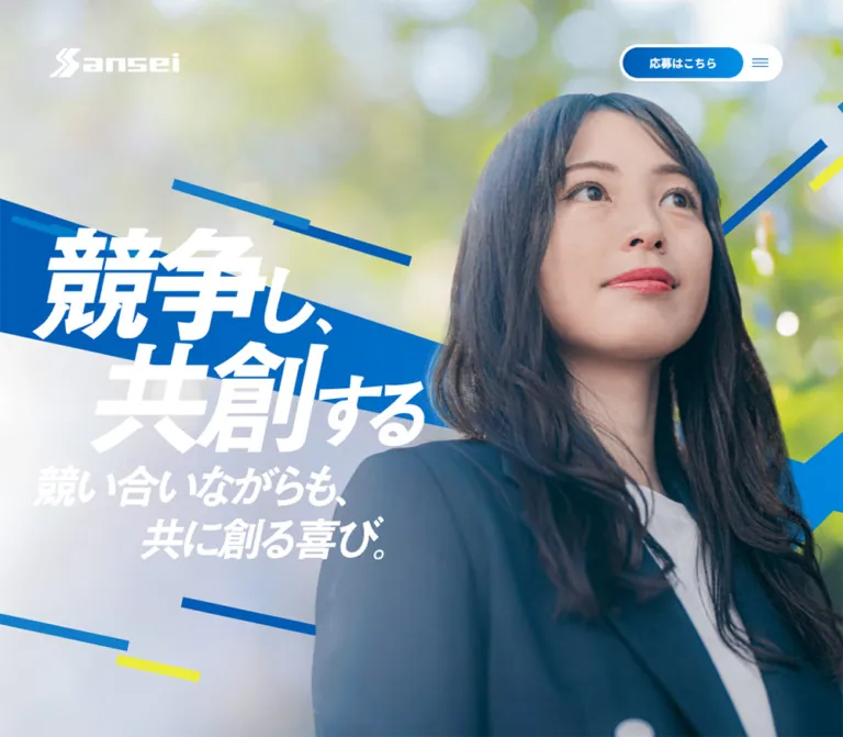
大きな人物写真、白い極太コピー、鮮やかな青と斜めの写真パネルが印象的な採用サイト。対談・社員インタビューを軸に、スマートフォンでは応募導線を画面下部へ移動する構成。
オリジナルサイトを見るLarge portraits, emphatic white lettering, and blue fields turn a recruitment homepage into a story about working together.
Original URL: sanseitechnos.co.jp/recruit/
Final URL: sanseitechnos.co.jp/recruit/ — unchanged; reported HTTP 200.
Theme: blue and white with full-color photography. No alternate theme was documented.
Inspected: supplied browser evidence retrieved September 23, 2026, at 00:45:12 JST / September 22, 2026, at 15:45:12 UTC.
Viewports: desktop 1440 × 1000 CSS pixels; mobile 390 × 844 CSS pixels.
Scope: the current recruitment homepage. Screenshots show the opening portrait, another desktop photographic composition, and desktop/mobile footers. Rendered text and selected computed styles also cover the philosophy introduction, leadership feature, business section, four cross-talk stories, and two employee interviews. Linked subpages and an opened navigation menu were not inspected.
The page introduces the employer through people and an unusually assertive typographic voice. An outdoor portrait fills the opening screen, with a white Sansei mark in one corner and a compact application/menu capsule opposite it. The slogan, “競争し、共創する,” is composed as large, forward-slanting lettering. Its staggered lines occupy the photograph’s open left side while the subject remains prominent on the right.
Below the opening, the evidence describes a long editorial recruitment homepage: company philosophy, leadership, business, conversations, individual career stories, and practical recruitment links. Heavy Japanese copy, small English section labels, generous vertical intervals, and broad blue or white surfaces establish the hierarchy. Angled photographic links provide a strong closing gesture. Rounded geometry is concentrated in controls; the content is not organized as a conventional collection of elevated cards.
Large portraits, emphatic white lettering, and blue fields turn a recruitment homepage into a story about working together.
Original URL: sanseitechnos.co.jp/recruit/
Final URL: sanseitechnos.co.jp/recruit/ — unchanged; reported HTTP 200.
Theme: blue and white with full-color photography. No alternate theme was documented.
Inspected: supplied browser evidence retrieved September 23, 2026, at 00:45:12 JST / September 22, 2026, at 15:45:12 UTC.
Viewports: desktop 1440 × 1000 CSS pixels; mobile 390 × 844 CSS pixels.
Scope: the current recruitment homepage. Screenshots show the opening portrait, another desktop photographic composition, and desktop/mobile footers. Rendered text and selected computed styles also cover the philosophy introduction, leadership feature, business section, four cross-talk stories, and two employee interviews. Linked subpages and an opened navigation menu were not inspected.
The page introduces the employer through people and an unusually assertive typographic voice. An outdoor portrait fills the opening screen, with a white Sansei mark in one corner and a compact application/menu capsule opposite it. The slogan, “競争し、共創する,” is composed as large, forward-slanting lettering. Its staggered lines occupy the photograph’s open left side while the subject remains prominent on the right.
Below the opening, the evidence describes a long editorial recruitment homepage: company philosophy, leadership, business, conversations, individual career stories, and practical recruitment links. Heavy Japanese copy, small English section labels, generous vertical intervals, and broad blue or white surfaces establish the hierarchy. Angled photographic links provide a strong closing gesture. Rounded geometry is concentrated in controls; the content is not organized as a conventional collection of elevated cards.
h1, h2, or h3 wrapper does not necessarily describe its artwork or styled descendants. In particular, the visible hero slogan must not be recreated using the wrapper’s inherited 16px font size.| Name | Value | Suggested token | Evidence and role |
|---|---|---|---|
| Structural Blue | #005CB5 |
--color-blue |
Measured rgb(0, 92, 181) on the body, cross-talk and interview section backgrounds, business text, and section-link text |
| White | #FFFFFF |
--color-white |
Measured on reversed text, white section links, and the business section background; visible in the brand and slogan artwork |
| Copyright Gray | #CECECE |
--color-muted |
Measured copyright text on both viewports |
| Visible Footer Blue | approximately #0080C5 |
--color-footer-estimate |
Visual estimate of the brighter blue field in the supplied footer screenshots; not a verified stylesheet value |
| Action Highlight | approximately #0094DF |
--color-action-estimate |
Approximation for the lighter end of the visible application-button blue treatment; exact gradient stops were not supplied |
The computed structural blue and the brighter apparent footer color should remain separate evidence categories. The footer element itself has a transparent computed background, and the provided data does not identify the complete rendering layer responsible for its visible color. Do not invent an overlay, gradient, filter, or color-correction mechanism to reconcile them.
The application link also reports a transparent background value while visibly appearing blue. Its color may come from an unreported background image, pseudo-element, or another layer. A blue gradient is a useful reproduction technique, not a verified source declaration.
Green foliage, dark navy clothing, pale office gray, and skin tones belong to the photography. They are not evidence of additional interface accent colors. Several wrappers inherit black text, but the visible design is predominantly white on blue or blue on white.
Measured family declaration: "Noto Sans JP", sans-serif.
The body uses 16px regular text with a 32px line height, but many important paragraphs explicitly use weight 900. This is a defining trait: the narrative has the force of display copy even when it is explaining the business or introducing an interview.
Negative tracking varies by role. Introductory statements use -0.1em; narrative paragraphs commonly use -0.04em; category labels use -0.08em; Japanese section-link labels use -0.12em. These are deliberate local treatments, not a suitable global letter-spacing rule.
Measured family declaration: outfit, sans-serif.
Outfit is declared for numbered interview and cross-talk labels, English VIEW ALL links, the desktop vertical recruitment annotation, and copyright text. Numbered labels use weight 500; action labels and the small hero annotation use 900. Font-file URLs and successful font loading were not independently verified.
The HTML element reports Times, but the body overrides it. Times is not evidence of a visible editorial serif system here.
The opening slogan has sharply slanted, tightly composed white lettering with large changes in character size and intentional line offsets. Its supporting line reads “競い合いながらも、共に創る喜び。”
The hero h1 has no extracted text despite the visible slogan. Footer slogan and photographic-link label containers also have empty extracted text. This supports treating these elements as graphic content for reproduction, but their exact asset formats and underlying typefaces were not supplied.
Use authorized artwork when available. A bold, oblique text fallback can preserve the message, but it will not reproduce the lettering. Verify accessible names separately; empty extracted text alone does not prove that an image lacks alternative text.
All values below are measured unless otherwise noted. Sizes are CSS pixels.
| Role | Desktop size / line height | Mobile size / line height | Weight | Tracking and notes |
|---|---|---|---|---|
| Body default | 16 / 32 |
16 / 32 |
400 | Normal |
| Persistent application label | 14 / 28 |
14 / 28 |
700 | Normal; size does not shrink on mobile |
| Philosophy introduction | 64 / 76.8 |
28 / 33.6 |
900 | -0.1em |
| Leadership paragraphs | 20 / 32 |
18 / 31.986 |
900 | -0.04em |
| Business paragraphs | 18 / 28.8 |
18 / 25.2 |
900 | -0.04em |
| Japanese section links | 18 / 36 |
15 / 30 |
900 | -0.12em |
English VIEW ALL links |
18 / 36 |
15 / 30 |
900 | Outfit; -0.04em |
| Cross-talk category | 32 / 32 |
23 / 23 |
900 | -0.08em |
| Cross-talk number | 20 / 40 |
Not present in visible mobile text | 500 | Outfit |
| Cross-talk summary | 16 / 26 |
Not present in visible mobile text | 900 | -0.04em |
| Interview introduction | 18 / 28.8 |
18 / 31.986 |
900 | -0.04em |
| Interview number | 20 / 40 |
18 / 18 |
500 | Outfit; mobile rectangle is vertically oriented |
| Interview title | 36 / 46.2852 |
32 / 41.1424 |
900 | -0.04em |
| Interview supporting line | 21.6 / 32.4 |
18 / 27 |
900 | Normal |
| Footer primary navigation | 18 / 36 |
16 / 32 |
700 | -0.02em |
| Footer secondary navigation | 16 / 32 |
Not visible | 400 | -0.02em |
| Footer utility links | 16 / 32 |
14 / 28 |
400 | -0.02em |
| Copyright | 16 / 32 |
12.5 / 25 |
500 / 300 | Outfit; lighter weight on mobile |
The desktop hero-side annotation uses Outfit at 17 / 20.4, weight 900, with a companion line at 10 / 12. These elements are absent from the visible mobile text extraction. Their presence in the desktop DOM does not establish their visibility in every animation state.
Base: a conventional measured 16px root, with bespoke pixel dimensions and responsive adjustments. No uniform modular spacing scale was established.
Density: expansive sections and photography, tightly packed display lettering, compact utility controls.
| Use | Desktop | Mobile | Status |
|---|---|---|---|
| Main content inset at inspected width | 100px |
Usually 20px |
Measured |
| Logo link position | 60px left, approximately 60px top |
10px left and top |
Measured |
| Application shell clearance | Approximately 75px right, 55px top |
Approximately 20px right and bottom |
Visual estimate of outer shell |
| Gap after hero heading box before introduction | 76px |
76px |
Calculated from DOM positions |
| Gap between introduction paragraphs | 50px |
25px |
Calculated from DOM positions |
| Introduction-to-link gap | 110px |
70px |
Calculated from DOM positions |
| Section-link left padding | 50px |
20px |
Measured |
| Intro section bottom padding | 300px |
128px |
Measured |
| Leadership section top / bottom padding | 212 / 168px |
62 / 154px |
Measured |
| Business section top / bottom padding | 150 / 165px |
80 / 165px |
Measured |
| Cross-talk section top / bottom padding | 290 / 340px |
100 / 230px |
Measured |
| Footer bottom padding | 67px |
67px |
Measured |
The large desktop content inset is not the header inset. Keep the brand, narrative content, and nested editorial columns on distinct alignment systems.
| Element | Value | Evidence |
|---|---|---|
| Application link | 29px |
Measured |
| White section link | 32px |
Measured at both sizes |
| Outer application/menu shell | Approximately 23px, visually a capsule |
Screenshot estimate |
| Footer arrow control | Circular, approximately 60px diameter on desktop |
Screenshot estimate |
| Footer photographic panels | Straight, angled edges | Visible; no rounded-card treatment |
| General narrative surfaces | Unboxed | Visible opening/footer and supported by section-level styling |
The footer photographic band rises to the right. The approximately 69.5px vertical offset across one 660.7px panel corresponds to an angle near 6°, calculated from the supplied geometry. This is a useful reproduction target, not proof of a particular skew() or clip-path declaration.
| Element | Desktop 1440 × 1000 | Mobile 390 × 844 |
|---|---|---|
| Document height | 16603.53px |
10791.83px |
| Header element height | 101px |
52px |
| Brand link box | 163 × 36.03px |
97 × 32px |
| Application link | 150 × 38px at (1166, 59) |
150 × 38px at (171, 782) |
| Main hero heading wrapper | 1240 × 1108.52px, x = 100 |
350 × 844px, x = 20 |
| Hero heading top padding | 324px |
422px, exactly half the captured viewport height |
| Intro paragraph width | 1240px wrapper |
270px |
| Section link | 293 × 64px |
206 × 48px |
| Interview link bounding rectangle | Approximately 432 × 642.23px |
Approximately 370 × 451.95px |
| Footer image-link bounding rectangle | Approximately 660.69 × 517.75px |
Approximately 350 × 274.29px |
The interview and footer link rectangles may include transforms. Do not use their bounding-box aspect ratios as verified native image dimensions.
The white Sansei mark appears directly over photography and over the blue footer, without an opaque navigation bar. Desktop positioning is approximately 60px from the top and left. The mobile link box starts at 10px, with the visible artwork vertically contained within its 32px height.
The mark remains in the same screen corner in the supplied opening and footer screenshots, supporting viewport-persistent placement. The exact position declaration was not included in the element sample.
Preserve the compact, wide silhouette and white reversal. The measured header height should not become a visible full-width white strip.
Role: persistent access to application and navigation.
The visible shell is approximately 203 × 46px: a white capsule containing a blue 150 × 38px application link and a narrow white menu area. The link reads “応募はこちら” in 14px bold Japanese text. The menu symbol consists of short blue horizontal strokes, approximately 20px wide.
The application link’s dimensions are identical on desktop and mobile. What changes is its anchor:
The documented application destination is /recruit/contact, without a trailing slash. The footer contact link uses /recruit/contact/. Navigation to either destination was not exercised.
For implementation, use a link and a separate menu button inside the shared shell. The shape should read as one compact unit while preserving two independent controls.
The desktop header contains a full navigation hierarchy whose sampled links begin beyond the visible viewport, at x positions such as 1636px. This supports a resting off-screen navigation structure. It does not verify its entrance direction, expanded appearance, backdrop, or keyboard behavior.
The hierarchy includes company information, four cross-talk categories, two employee interviews, recruitment information, contact, and external utility links. Header navigation uses 18px bold primary links and 15px regular secondary links in the supplied desktop sample.
Do not reproduce the off-screen coordinates as page overflow. A new implementation should intentionally hide and deactivate the closed menu, then manage its accessible state when opened.
The opening photograph fills the viewport width. A woman in dark business clothing occupies the right side of the desktop composition; green foliage and soft circular highlights leave a broad, quiet area to the left. The white slogan sits in that open area rather than in a separate panel.
The main lettering begins around x = 100px and y = 324px on desktop. Its visible graphic occupies roughly 600px of width. On mobile, the graphic begins around x = 20px and y = 422px and occupies approximately 270px of width. These graphic dimensions are visual estimates; the heading wrapper measurements are larger.
The mobile crop gives the face and upper body much more of the screen. The lettering overlaps the lower-left part of the portrait while the face remains readable in the upper-right portion. This is an intentional portrait composition, not simply a uniformly reduced desktop image.
A second desktop capture shows an office photograph across approximately the left 1200px, with a 240px strip of the outdoor portrait remaining on the right. It confirms another photographic composition. It does not establish whether the change is driven by time, scrolling, a wipe animation, or another mechanism.
Two blocks of white, weight-900 Japanese copy follow the hero heading region. The desktop setting is 64px / 1.2 with -0.1em tracking. Mobile uses 28px / 1.2 and retains a deliberately narrow 270px text column inside the wider 350px content area.
The text emphasizes collaboration with colleagues, customers, and suppliers. Line breaks are important to its rhetorical rhythm. The mobile version should preserve short, purposeful phrases rather than stretching the paragraph across every available pixel.
A white pill link to “サンセイフィロソフィ” follows. It is left aligned on desktop and centered on mobile at x = 92px.
Measured anatomy: a white flex container, blue text, 32px radius, fixed width and height, and substantial left padding.
Desktop links measure 293 × 64px, with 50px left padding. Mobile links measure 206 × 48px, with 20px left padding. Japanese labels use weight 900 and tight tracking; English VIEW ALL labels switch to Outfit and less compressed tracking.
The trailing region is not fully described by the supplied DOM. A directional arrow is a reasonable adaptation of the confirmed footer arrow motif, but its exact construction on these section links is unverified.
The business-section link has a white computed background on a white section. Its complete edge treatment was not captured. If reproducing this component on white, add a clearly labeled implementation choice such as a blue outline rather than assuming the original had one.
The leadership section introduces “トップ対談.” Desktop layout uses nested alignment: the heading wrapper begins at x = 180px, while the 425px-wide body column begins at x = 295px. The white body text is 20px, weight 900, with a 32px line height.
On mobile, the heading wrapper is offset toward the right at x = 110.5px and measures 260px wide. The body then returns to a near-full-width 351px column beginning at x = 19.5px. Text becomes 18px while keeping an approximately 32px line height.
This change preserves an asymmetrical heading composition followed by readable paragraphs. It should not be normalized into a centered heading and centered body merely because the screen is narrow. The complete photographic composition of this section was not supplied.
The business section reverses the palette: white background and Structural Blue text. Its heading occupies a tall, right-side region, while the explanatory copy sits to the left on desktop.
The desktop heading wrapper measures approximately 355 × 592px; the main text column is about 413px wide. On mobile, the heading wrapper remains right aligned at x = 212.5px, with a width of 158px and height of approximately 291px. The body follows below in a 341px-wide column.
Body type remains 18px and weight 900 on both viewports. Its line height tightens from 28.8px to 25.2px on mobile. The tall heading geometry is measured; the exact descendant typography and whether individual text runs use vertical writing were not supplied.
Four full-width links introduce sales, sales administration, engineering, and new employees. Each contains a Japanese story headline, a prominent category line, an English numbered identifier, and an explanatory summary in the desktop evidence.
Desktop text is divided into two broad regions: a 620px headline/category area beginning at x = 100px and a 558px summary area beginning at x = 782px. Category labels are 32px / 32px, weight 900; summaries are 16px / 26px, also weight 900.
On mobile, the visible text reduces to the headline and category, with a 350px content width and a 23px category label. Numbered labels and summaries remain in the anchor text data but are absent from the visible mobile text extraction. This is evidence of responsive suppression, not content deletion.
Measured desktop link rectangles are approximately 762px tall, but successive origins are about 611px apart. Mobile rectangles are approximately 359px tall, with origins 318px apart. These overlapping bounding rectangles may reflect transformed geometry. Do not translate them directly into negative margins or assume that story content physically overlaps.
The section ends with VIEW ALL, positioned toward the right on desktop and centered on mobile. Detailed story imagery is not visible in the supplied screenshots.
The desktop section combines an introductory column with two large interview links. The introduction begins at x = 100px; its paragraph is only 320px wide. The two link rectangles begin at x = 504px and x = 956px and measure approximately 432 × 642px. The second starts about 47.5px higher, continuing the page’s rising diagonal rhythm in the measured geometry.
Each link contains an Outfit number, a heavy Japanese title, and a smaller supporting statement. Text begins approximately 32px inside the desktop link rectangle.
On mobile, the introduction comes first, followed by the two links in a vertical sequence. Links start at x = 20px, measure 370px wide, and reach the right viewport edge. Titles begin 15px inside them. The numbered label has a narrow 18 × 131.47px rectangle, indicating a vertical presentation; the underlying rotation or writing-mode declaration was not provided.
The VIEW ALL link moves from beneath the desktop introduction to below both mobile interview links. Preserve this ordering change rather than leaving the action above the stories on every device.
Two large photographic destinations close the content: “数字で共に知るサンセイ” and “採用情報.” The visible photographs show an engraved company facade and hands at a keyboard. White labels sit near the lower-left edges, with blue circular arrow controls toward the right.
On desktop, the two panels sit side by side. Each measured bounding rectangle is approximately 661 × 518px; the first begins at x = 118.6px and the second at x = 779.3px. Their aligned diagonal edges rise to the right by approximately 6°.
On mobile, the panels stack, begin at x = 40px, and extend to the right edge. Each bounding rectangle is approximately 350 × 274px, while successive origins are 237.5px apart. That difference is consistent with the height contributed by the diagonal edge; it should not be treated as evidence of a separate overlapping-card interaction.
Keep the photos large, the edges crisp, the labels white, and the arrow controls circular. Rounded image cards and soft shadows would weaken this component’s identity.
The desktop footer combines a compact, stacked slogan graphic on the left with three navigation groups on the right. The main left container is 600px wide, but the visible slogan is substantially narrower, approximately 280px. Navigation groups begin at x = 740px, 980px, and 1160px.
Primary links are 18px bold. Secondary cross-talk and interview links are 16px regular. Utility links sit in a bottom row, with copyright aligned to the right. Small outlined external-link symbols accompany the corporate, privacy, and video destinations.
The mobile footer changes composition rather than simply scaling it:
The visible company identity and copyright independently identify Sansei Technos on the original page. The copyright year is 2023; it is not the inspection date or evidence of a redesign date.
| Evidence | What is established | What remains unverified |
|---|---|---|
Hero heading and introduction paragraphs report transition: 0.4s |
A 400ms transition value exists on sampled elements | Changed properties, easing, triggers, and complete sequence |
Section links report transition: 0.4s |
A 400ms transition value exists | Hover appearance and whether movement, opacity, or color changes |
Other elements report transition: all |
The extraction includes a transition-property-like value | A nonzero transition duration cannot be assumed |
Sampled elements report animation: none |
No CSS animation is reported on those sampled elements | Descendant, pseudo-element, JavaScript, or media-driven motion |
| Brand and application control persist in opening/footer captures | Viewport-persistent placement is visually supported | Exact positioning declarations and behavior on intermediate surfaces |
| Two desktop photographic compositions are supplied | More than one image state was captured | Autoplay, scroll scrubbing, timing, direction, and looping |
| Header navigation exists off-screen | A resting off-screen structure is supported | Opened menu layout and interaction behavior |
| Links expose destinations | Navigation intent is established | Destination-page behavior and form submission flow |
The inspection procedure waited for document load, image decoding, and sampled layout/text stability, with bounded waits for finite animation. Perpetual animations were temporarily paused during readiness checks and then resumed. This improves capture stability but does not establish that every delayed state or interaction was exercised.
Recommended adaptation: retain 400ms as a control-transition duration where useful, but choose properties and easing explicitly. Do not invent a continuous photo carousel or scroll animation from a single alternate image state. Under reduced motion, preserve the static portrait and diagonal layout while removing unnecessary movement.
| Surface | Appearance | Function |
|---|---|---|
| Opening photography | Full bleed, natural color, no surrounding card | Establishes people and atmosphere |
| Blue narrative field | Structural Blue in measured section backgrounds, reversed white copy | Connects editorial stories |
| Business section | White with blue text | Creates a strong tonal pause |
| Footer field | Bright blue in screenshots; exact final color unresolved | Holds identity, navigation, and closing information |
| Section link | White capsule with blue label | Repeated editorial navigation |
| Persistent application control | White shell, blue inner link, blue menu strokes | Keeps application and navigation available |
| Footer photographic links | Angled, edge-to-edge photos with white labels | Connects storytelling to facts and recruitment details |
There is no demonstrated general shadow-elevation system. Hierarchy comes from scale, color reversal, image boundaries, alignment, and the deliberate contrast between straight photographic edges and rounded controls.
Use employee-oriented portrait and workplace photography with strong subject separation. The opening combines a sharply readable face and dark clothing with soft green foliage and large highlights. The office image uses pale neutral surroundings, a person in the foreground, and additional workers receding into blur. The footer introduces more literal workplace details: a company facade and keyboard activity.
The opening needs compositional space for lettering. A generic centered portrait with equal detail everywhere would make the slogan difficult to place. Art-direct desktop and mobile crops separately, keeping the face clear and leaving a useful lower-left region on the phone.
The white brand and slogan graphics carry as much identity as the photography. Preserve their proportions and responsive variants. Do not infer a commercial font name from the artwork, and do not skew a photograph merely to imitate the slogan’s slant.
No original image URLs, filenames, or font-file URLs were supplied. These are identifiable visual assets, not downloadable asset paths.
| Asset | Evidence | Implementation guidance |
|---|---|---|
| White Sansei mark | Desktop/mobile opening and footer screenshots | Preserve the wide silhouette and white reversal |
| Outdoor portrait | Opening screenshots | Provide independently tuned desktop/mobile crops |
| Main slogan and supporting line | Opening screenshots; empty-text heading wrapper | Use authorized artwork or a clearly acknowledged text approximation |
| Office photograph | Second desktop screenshot | Treat as an observed alternate composition; do not infer its transition mechanism |
| Company facade photograph | Desktop footer screenshot | Retain architectural texture beneath the white label |
| Keyboard photograph | Desktop footer screenshot | Retain the close workplace-detail crop |
| Responsive footer slogan | Desktop/mobile footer screenshots | Use a stacked desktop arrangement and a wide mobile arrangement |
| Company/recruitment identity | Footer screenshots | Keep separate from the slogan so its mobile order can change |
The desktop homepage is not limited to a single viewport. The hero heading wrapper alone is approximately 1109px tall at a 1000px-high viewport. Mobile uses an 844px hero heading wrapper, matching the captured viewport height, with the slogan starting halfway down.
The core narrative width is 1240px on the inspected desktop and usually 350–351px on mobile. Several intentional exceptions matter: the mobile philosophy copy is 270px wide, the interview introduction is 296px wide, interview links reach the right edge, and footer image links begin 40px from the left.
| System | Desktop behavior | Mobile behavior |
|---|---|---|
| Brand | Larger, inset 60px | Smaller, inset 10px |
| Apply/menu capsule | Upper right | Lower right; same application-link size |
| Hero composition | Subject right, large lettering left | Close portrait crop; lettering lower left |
| Philosophy text | 64px display-like copy | 28px copy in a narrow column |
| Leadership content | Nested desktop columns | Offset heading followed by wide paragraphs |
| Business content | Text left, tall heading region right | Right-aligned heading region before body |
| Cross-talk | Headline/category plus numbered summary | Headline/category remain; summary and number suppressed |
| Interviews | Introduction beside two links | Introduction, stacked links, then VIEW ALL |
| Footer image links | Two panels across | Two panels stacked, right edge flush |
| Footer navigation | Three groups with sublinks | Two columns without visible sublinks |
| Footer slogan | Compact stacked graphic | Wide horizontal graphic |
These are rounded positions and heights from the supplied DOM. They document the captured page, not fixed heights recommended for implementation.
| Region | Desktop start / height | Mobile start / height |
|---|---|---|
| Opening and philosophy section | 0 / 2226.89px |
0 / 1417.75px |
| Leadership section | 2226.89 / 1292.89px |
1417.75 / 1253.63px |
| Business section | 3519.78 / 906.56px |
2671.38 / 1079.66px |
| Cross-talk section | 10732.75 / 3750.23px |
5831.03 / 1965.52px |
| Interview section | 14482.98 / 712.38px |
7796.55 / 1530px |
| Footer | 15324.36 / 1279.17px |
9458.55 / 1333.28px |
The element sample does not characterize the full interval between the business and cross-talk sections: approximately 6306px on desktop and 2080px on mobile. Do not reproduce that interval as a giant blank spacer or assign it an invented scroll-pinning duration. Its complete content and behavior require additional original-page inspection.
Only two responsive endpoints were supplied. The original breakpoints, tablet behavior, browser chrome response, and landscape-phone composition are unknown. The 60rem breakpoint in the Quick Start is a recommended starting point, not a recovered source value.
#005CB5 and white as the measured foundation.-0.1em tracking on every paragraph or on unrelated languages.These are recommendations for a new implementation, not verified features of the original:
aria-expanded and a menu relationship on the toggle.#005CB5.#FFFFFF.#CECECE.#0080C5.#0094DF.“Create a long Japanese recruitment homepage inspired by the current Sansei Technos reference. Use a full-width outdoor portrait with the subject on the right, a white brand mark at upper left, and a large graphic-style Japanese slogan arranged in staggered, forward-slanting lines on the left. Build the editorial sections with Structural Blue #005CB5, white surfaces, very heavy Noto Sans JP text, tightly controlled Japanese tracking, and Outfit labels for English numbering. Use broad unboxed story regions, an inverse white business section, large interview links, and an approximately six-degree rising photographic band before the footer. Keep a white application/menu capsule at upper right on desktop and lower right on mobile. Art-direct the phone portrait and footer separately. Treat all unspecified motion as unverified and provide a complete static state.”
This is a recommended implementation scaffold, not extracted source CSS. It preserves measured colors, type roles, control sizes, and major responsive relationships. Estimated colors are named explicitly. The 60rem breakpoint, hover treatment, image counter-transform, and interpolation formulas are adaptation choices.
Use .wrap for the main content width; .brand and .apply-menu for persistent controls; .hero__art for authorized slogan artwork; and the footer area classes for responsive ordering. Provide actual image assets and font loading separately. CSS alone does not implement menu state, navigation routing, or photographic transitions.
:root {
  /* Measured colors */
  --color-blue: #005cb5;
  --color-white: #fff;
  --color-muted: #cecece;

  /* Visual approximations, not recovered source values */
  --color-footer-estimate: #0080c5;
  --color-action-estimate: #0094df;

  /* Measured family declarations; load fonts separately */
  --font-jp: 'Noto Sans JP', sans-serif;
  --font-latin: 'Outfit', sans-serif;
  --weight-regular: 400;
  --weight-bold: 700;
  --weight-heavy: 900;

  --content-max: 1240px;
  --page-gutter: 40px;
  --text-intro: 64px;
  --text-category: 32px;
  --text-link: 18px;
  --link-width: 293px;
  --link-height: 64px;
  --link-inset: 50px;
  --radius-link: 32px;

  /* Angle is calculated approximately; easing is recommended */
  --photo-tilt: -6deg;
  --control-transition: 400ms ease;
}

* { box-sizing: border-box; }

body { margin: 0; }

.recruit-page {
  overflow-x: clip;
  color: var(--color-white);
  background: var(--color-blue);
  font: 400 16px / 2 var(--font-jp);
}

.recruit-page img {
  display: block;
  max-width: 100%;
}

.recruit-page a { color: inherit; }

.wrap {
  width: min(
    var(--content-max),
    calc(100% - 2 * var(--page-gutter))
  );
  margin-inline: auto;
}

.brand {
  position: fixed;
  z-index: 100;
  top: 60px;
  left: 60px;
  display: grid;
  align-items: center;
  width: 163px;
}

.brand img { width: 100%; height: auto; }

.apply-menu {
  position: fixed;
  z-index: 100;
  top: 55px;
  right: 75px;
  display: grid;
  grid-template-columns: 150px 1fr;
  width: 203px;
  height: 46px;
  padding: 4px;
  border-radius: 999px;
  background: var(--color-white);
}

.apply-menu__link {
  display: flex;
  align-items: center;
  justify-content: center;
  height: 38px;
  border-radius: 29px;
  background: linear-gradient(
    100deg, var(--color-blue), var(--color-action-estimate)
  );
  font: 700 14px / 28px var(--font-jp);
  text-decoration: none;
}

.recruit-page .apply-menu__link { color: var(--color-white); }

.apply-menu__toggle {
  display: grid;
  place-items: center;
  padding: 0;
  border: 0;
  color: var(--color-action-estimate);
  background: transparent;
  cursor: pointer;
}

.menu-lines {
  width: 20px;
  height: 1px;
  background: currentColor;
  box-shadow: 0 -4px currentColor, 0 4px currentColor;
}

/* The image and slogan must be supplied as separate assets. */
.hero {
  position: relative;
  isolation: isolate;
  overflow: hidden;
}

.hero__photo {
  position: absolute;
  z-index: -1;
  inset: 0;
  width: 100%;
  height: 100%;
  object-fit: cover;
  object-position: 70% center;
}

/* Interpolation matches the measured desktop endpoint. */
.hero__stage {
  padding-block: min(22.5vw, 324px) min(20vw, 288px);
}

.hero__heading { margin: 0; }

.hero__art {
  width: min(600px, 100%);
  height: auto;
}

.intro {
  padding-top: 76px;
  padding-bottom: 300px;
}

.intro__copy {
  margin: 0;
  font-size: var(--text-intro);
  font-weight: var(--weight-heavy);
  line-height: 1.2;
  letter-spacing: -0.1em;
}

.intro__copy + .intro__copy { margin-top: 50px; }
.intro__action { margin-top: 110px; }

.section-link {
  display: flex;
  align-items: center;
  justify-content: space-between;
  gap: 16px;
  width: min(var(--link-width), 100%);
  min-height: var(--link-height);
  padding-inline: var(--link-inset) 18px;
  border-radius: var(--radius-link);
  background: var(--color-white);
  font: 900 var(--text-link) / 2 var(--font-jp);
  letter-spacing: -0.12em;
  text-decoration: none;
  transition: opacity var(--control-transition);
}

.recruit-page .section-link { color: var(--color-blue); }

.section-link--latin {
  font-family: var(--font-latin);
  letter-spacing: -0.04em;
}

/* Recommended distinction when the surrounding surface is white. */
.section-link--on-white { border: 2px solid var(--color-blue); }

.business {
  padding-block: 150px 165px;
  color: var(--color-blue);
  background: var(--color-white);
}

.business__copy {
  max-width: 414px;
  font-size: 18px;
  font-weight: 900;
  line-height: 1.6;
  letter-spacing: -0.04em;
}

/* At 1240px, this produces 620px and 558px text columns. */
.story__content {
  display: grid;
  grid-template-columns: minmax(0, 1fr) minmax(0, 0.9fr);
  gap: 62px;
  padding-block: 72px;
}

.story__category {
  font-size: var(--text-category);
  font-weight: 900;
  line-height: 1;
  letter-spacing: -0.08em;
}

.story__number {
  font: 500 20px / 2 var(--font-latin);
}

.story__summary {
  font-size: 16px;
  font-weight: 900;
  line-height: 26px;
  letter-spacing: -0.04em;
}

/* Recommended construction for the measured diagonal silhouette. */
.footer-links {
  display: grid;
  grid-template-columns: repeat(2, minmax(0, 1fr));
  margin-inline-start: 8.236%;
  transform: skewY(var(--photo-tilt));
  transform-origin: right top;
}

.footer-image-link {
  position: relative;
  display: block;
  overflow: hidden;
  aspect-ratio: 28 / 19;
  color: var(--color-white);
}

/* Counter-skew photography; the ratio is a geometry adaptation. */
.footer-image-link__photo {
  width: 100%;
  height: 100%;
  object-fit: cover;
  transform: skewY(6deg) scale(1.18);
}

/* Live-text fallback; source label artwork typography is unknown. */
.footer-image-link__label {
  position: absolute;
  left: 25px;
  bottom: 24px;
  margin: 0;
  padding-right: 80px;
  font-size: clamp(22px, 2.5vw, 36px);
  font-weight: 900;
  line-height: 1.3;
}

.round-arrow {
  position: absolute;
  right: 32px;
  bottom: 32px;
  display: grid;
  place-items: center;
  width: 60px;
  height: 60px;
  border-radius: 50%;
  background: linear-gradient(
    var(--color-action-estimate), var(--color-blue)
  );
  transform: skewY(6deg);
}

.site-footer { background: var(--color-footer-estimate); }

.footer__inner {
  display: grid;
  grid-template-columns: repeat(2, minmax(0, 1fr));
  grid-template-areas:
    'brand nav'
    'company nav'
    'utilities copyright';
  gap: 56px 40px;
  padding-block: 210px 67px;
}

.footer__brand { grid-area: brand; }
.footer__brand img { width: 280px; height: auto; }
.footer__company { grid-area: company; }
.footer__utilities { grid-area: utilities; }
.footer__copyright { grid-area: copyright; }

.footer__nav {
  grid-area: nav;
  display: grid;
  grid-template-columns: 1.25fr 0.875fr 1.125fr;
  grid-template-areas: 'primary stories jobs';
  gap: 40px;
  align-content: start;
}

.footer__primary { grid-area: primary; }
.footer__stories { grid-area: stories; }
.footer__jobs { grid-area: jobs; }

.footer__group > a {
  display: block;
  margin-bottom: 14px;
  font-size: 18px;
  font-weight: 700;
  line-height: 2;
  letter-spacing: -0.02em;
  text-decoration: none;
}

.footer__subnav a {
  display: block;
  font-size: 16px;
  font-weight: 400;
  line-height: 2;
  letter-spacing: -0.02em;
  text-decoration: none;
}

.footer__utilities {
  display: flex;
  flex-wrap: wrap;
  align-items: start;
  gap: 5px 40px;
  font-size: 16px;
}

.footer__copyright {
  margin: 0;
  color: var(--color-muted);
  font: 500 16px / 2 var(--font-latin);
  text-align: right;
}

/* Recommended focus and hover behavior, not observed source states. */
.recruit-page :focus-visible {
  outline: 2px solid var(--color-white);
  outline-offset: 3px;
  box-shadow: 0 0 0 5px var(--color-blue);
}

@media (hover: hover) {
  .section-link:hover { opacity: 0.88; }
}

/* Recommended breakpoint; only 1440px and 390px were inspected. */
@media (max-width: 60rem) {
  :root {
    --page-gutter: 20px;
    --text-intro: 28px;
    --text-category: 23px;
    --text-link: 15px;
    --link-width: 206px;
    --link-height: 48px;
    --link-inset: 20px;
  }

  .brand {
    top: 10px;
    left: 10px;
    width: 97px;
    height: 32px;
  }

  .apply-menu {
    top: auto;
    right: max(20px, env(safe-area-inset-right, 0px));
    bottom: max(20px, env(safe-area-inset-bottom, 0px));
  }

  .hero__stage {
    min-height: 100vh;
    min-height: 100svh;
    padding-top: 50vh;
    padding-top: 50svh;
    padding-bottom: 0;
  }

  /* Starting focal point only; tune against the actual photograph. */
  .hero__photo { object-position: 72% center; }
  .hero__art { width: min(270px, 100%); }

  .intro { padding-bottom: 128px; }
  .intro__copy { max-width: 270px; }
  .intro__copy + .intro__copy { margin-top: 25px; }
  .intro__action { margin: 70px auto 0; }

  .business { padding-block: 80px 165px; }
  .business__copy { max-width: 341px; line-height: 1.4; }

  .story__content {
    display: block;
    padding-block: 20px 50px;
  }

  .story__details { display: none; }

  .footer-links {
    grid-template-columns: 1fr;
    margin-inline-start: 40px;
  }

  .footer-image-link__label { left: 10px; bottom: 20px; }
  .round-arrow { right: 20px; bottom: 20px; }

  .footer__inner {
    grid-template-columns: minmax(0, 1fr);
    grid-template-areas:
      'brand'
      'nav'
      'utilities'
      'company'
      'copyright';
    gap: 64px;
    padding-top: 90px;
    padding-bottom: calc(100px + env(safe-area-inset-bottom, 0px));
  }

  /* Supply the wide mobile slogan through a picture element. */
  .footer__brand img { width: 100%; }

  .footer__nav {
    grid-template-columns: minmax(0, 19fr) minmax(0, 14fr);
    grid-template-rows: 84px auto;
    grid-template-areas:
      'primary stories'
      'primary jobs';
    gap: 0 20px;
  }

  .footer__group > a {
    margin-bottom: 10px;
    font-size: 16px;
  }

  .footer__subnav { display: none; }
  .footer__utilities { gap: 5px 20px; font-size: 14px; }
  .footer__copyright { font-size: 12.5px; line-height: 25px; font-weight: 300; }
}

@media (prefers-reduced-motion: reduce) {
  .section-link { transition: none; }
  /* Keep static diagonal transforms; disable added motion separately. */
}
The scaffold deliberately leaves the unidentified middle-page interval unimplemented. It also does not guess the full leadership composition, heading artwork, interview image treatment, or an opened menu. Those require additional assets or inspection. The footer’s 28:19 pre-transform panel ratio is an approximation derived from the measured diagonal geometry, not a native image ratio.
Optional mapping for a project already using Tailwind v4. This does not imply the original website uses Tailwind. Define the custom properties above first.
@theme inline {
  --color-sansei: var(--color-blue);
  --color-recruit-white: var(--color-white);
  --color-recruit-muted: var(--color-muted);
  --color-footer-approx: var(--color-footer-estimate);
  --color-action-approx: var(--color-action-estimate);

  --font-recruit: var(--font-jp);
  --font-recruit-latin: var(--font-latin);

  --text-recruit-intro: var(--text-intro);
  --text-recruit-category: var(--text-category);
  --text-recruit-link: var(--text-link);

  --spacing-recruit-gutter: var(--page-gutter);
  --spacing-recruit-link-width: var(--link-width);
  --spacing-recruit-link-height: var(--link-height);
  --radius-recruit-link: var(--radius-link);
}
2026-09-22T15:45:12.389Z, equivalent to September 23, 2026, at 00:45:12.389 JST.Copyright © 2023 Sansei Technos Co.,Ltd. All rights reserved. Its corporate link points to sanseitechnos.co.jp.This reference describes the current supplied homepage evidence. Exact measurements, visual estimates, and recommended implementation choices are kept distinct throughout.
# Sansei Technos Recruitment — Style Reference

> Large portraits, emphatic white lettering, and blue fields turn a recruitment homepage into a story about working together.

**Original URL:** [sanseitechnos.co.jp/recruit/](https://www.sanseitechnos.co.jp/recruit/)
**Final URL:** [sanseitechnos.co.jp/recruit/](https://www.sanseitechnos.co.jp/recruit/) — unchanged; reported HTTP 200.
**Theme:** blue and white with full-color photography. No alternate theme was documented.
**Inspected:** supplied browser evidence retrieved September 23, 2026, at 00:45:12 JST / September 22, 2026, at 15:45:12 UTC.
**Viewports:** desktop 1440 × 1000 CSS pixels; mobile 390 × 844 CSS pixels.
**Scope:** the current recruitment homepage. Screenshots show the opening portrait, another desktop photographic composition, and desktop/mobile footers. Rendered text and selected computed styles also cover the philosophy introduction, leadership feature, business section, four cross-talk stories, and two employee interviews. Linked subpages and an opened navigation menu were not inspected.

The page introduces the employer through people and an unusually assertive typographic voice. An outdoor portrait fills the opening screen, with a white Sansei mark in one corner and a compact application/menu capsule opposite it. The slogan, “競争し、共創する,” is composed as large, forward-slanting lettering. Its staggered lines occupy the photograph’s open left side while the subject remains prominent on the right.

Below the opening, the evidence describes a long editorial recruitment homepage: company philosophy, leadership, business, conversations, individual career stories, and practical recruitment links. Heavy Japanese copy, small English section labels, generous vertical intervals, and broad blue or white surfaces establish the hierarchy. Angled photographic links provide a strong closing gesture. Rounded geometry is concentrated in controls; the content is not organized as a conventional collection of elevated cards.
# Sansei Technos Recruitment — Style Reference

> Large portraits, emphatic white lettering, and blue fields turn a recruitment homepage into a story about working together.

**Original URL:** [sanseitechnos.co.jp/recruit/](https://www.sanseitechnos.co.jp/recruit/)
**Final URL:** [sanseitechnos.co.jp/recruit/](https://www.sanseitechnos.co.jp/recruit/) — unchanged; reported HTTP 200.
**Theme:** blue and white with full-color photography. No alternate theme was documented.
**Inspected:** supplied browser evidence retrieved September 23, 2026, at 00:45:12 JST / September 22, 2026, at 15:45:12 UTC.
**Viewports:** desktop 1440 × 1000 CSS pixels; mobile 390 × 844 CSS pixels.
**Scope:** the current recruitment homepage. Screenshots show the opening portrait, another desktop photographic composition, and desktop/mobile footers. Rendered text and selected computed styles also cover the philosophy introduction, leadership feature, business section, four cross-talk stories, and two employee interviews. Linked subpages and an opened navigation menu were not inspected.

The page introduces the employer through people and an unusually assertive typographic voice. An outdoor portrait fills the opening screen, with a white Sansei mark in one corner and a compact application/menu capsule opposite it. The slogan, “競争し、共創する,” is composed as large, forward-slanting lettering. Its staggered lines occupy the photograph’s open left side while the subject remains prominent on the right.

Below the opening, the evidence describes a long editorial recruitment homepage: company philosophy, leadership, business, conversations, individual career stories, and practical recruitment links. Heavy Japanese copy, small English section labels, generous vertical intervals, and broad blue or white surfaces establish the hierarchy. Angled photographic links provide a strong closing gesture. Rounded geometry is concentrated in controls; the content is not organized as a conventional collection of elevated cards.

## How to Read This Reference

- **Measured** means reported by the supplied rendered DOM or computed-style evidence. Measurements describe the captured state, not necessarily an untransformed CSS layout box.
- **Visual estimate** means judged from the supplied original-page screenshots. Estimated colors were not programmatically sampled.
- **Calculated** means derived from reported measurements or visible geometry. It does not identify the source implementation.
- **Recommended** means a choice for a new implementation, including the CSS and prompts below. Recommendations are not claims about existing behavior.
- Token names are descriptive implementation aliases. The custom-property extraction was empty; no original token naming system was supplied.
- Typography measured on an `h1`, `h2`, or `h3` wrapper does not necessarily describe its artwork or styled descendants. In particular, the visible hero slogan must not be recreated using the wrapper’s inherited 16px font size.
- Visual coverage is strongest at the opening and footer. Middle-page typography and geometry have DOM support, but complete screenshots of those sections were not supplied.

## Tokens — Colors

### Default Palette

| Name | Value | Suggested token | Evidence and role |
| --- | --- | --- | --- |
| Structural Blue | `#005CB5` | `--color-blue` | Measured `rgb(0, 92, 181)` on the body, cross-talk and interview section backgrounds, business text, and section-link text |
| White | `#FFFFFF` | `--color-white` | Measured on reversed text, white section links, and the business section background; visible in the brand and slogan artwork |
| Copyright Gray | `#CECECE` | `--color-muted` | Measured copyright text on both viewports |
| Visible Footer Blue | approximately `#0080C5` | `--color-footer-estimate` | Visual estimate of the brighter blue field in the supplied footer screenshots; not a verified stylesheet value |
| Action Highlight | approximately `#0094DF` | `--color-action-estimate` | Approximation for the lighter end of the visible application-button blue treatment; exact gradient stops were not supplied |

The computed structural blue and the brighter apparent footer color should remain separate evidence categories. The footer element itself has a transparent computed background, and the provided data does not identify the complete rendering layer responsible for its visible color. Do not invent an overlay, gradient, filter, or color-correction mechanism to reconcile them.

The application link also reports a transparent `background` value while visibly appearing blue. Its color may come from an unreported background image, pseudo-element, or another layer. A blue gradient is a useful reproduction technique, not a verified source declaration.

Green foliage, dark navy clothing, pale office gray, and skin tones belong to the photography. They are not evidence of additional interface accent colors. Several wrappers inherit black text, but the visible design is predominantly white on blue or blue on white.

## Tokens — Typography

### Japanese Interface and Narrative Copy

**Measured family declaration:** `"Noto Sans JP", sans-serif`.

The body uses 16px regular text with a 32px line height, but many important paragraphs explicitly use weight `900`. This is a defining trait: the narrative has the force of display copy even when it is explaining the business or introducing an interview.

Negative tracking varies by role. Introductory statements use `-0.1em`; narrative paragraphs commonly use `-0.04em`; category labels use `-0.08em`; Japanese section-link labels use `-0.12em`. These are deliberate local treatments, not a suitable global letter-spacing rule.

### English Labels and Numbering

**Measured family declaration:** `outfit, sans-serif`.

Outfit is declared for numbered interview and cross-talk labels, English `VIEW ALL` links, the desktop vertical recruitment annotation, and copyright text. Numbered labels use weight `500`; action labels and the small hero annotation use `900`. Font-file URLs and successful font loading were not independently verified.

The HTML element reports `Times`, but the body overrides it. Times is not evidence of a visible editorial serif system here.

### Slogan and Heading Artwork

The opening slogan has sharply slanted, tightly composed white lettering with large changes in character size and intentional line offsets. Its supporting line reads “競い合いながらも、共に創る喜び。”

The hero `h1` has no extracted text despite the visible slogan. Footer slogan and photographic-link label containers also have empty extracted text. This supports treating these elements as graphic content for reproduction, but their exact asset formats and underlying typefaces were not supplied.

Use authorized artwork when available. A bold, oblique text fallback can preserve the message, but it will not reproduce the lettering. Verify accessible names separately; empty extracted text alone does not prove that an image lacks alternative text.

### Type Scale

All values below are measured unless otherwise noted. Sizes are CSS pixels.

| Role | Desktop size / line height | Mobile size / line height | Weight | Tracking and notes |
| --- | --- | --- | --- | --- |
| Body default | `16 / 32` | `16 / 32` | 400 | Normal |
| Persistent application label | `14 / 28` | `14 / 28` | 700 | Normal; size does not shrink on mobile |
| Philosophy introduction | `64 / 76.8` | `28 / 33.6` | 900 | `-0.1em` |
| Leadership paragraphs | `20 / 32` | `18 / 31.986` | 900 | `-0.04em` |
| Business paragraphs | `18 / 28.8` | `18 / 25.2` | 900 | `-0.04em` |
| Japanese section links | `18 / 36` | `15 / 30` | 900 | `-0.12em` |
| English `VIEW ALL` links | `18 / 36` | `15 / 30` | 900 | Outfit; `-0.04em` |
| Cross-talk category | `32 / 32` | `23 / 23` | 900 | `-0.08em` |
| Cross-talk number | `20 / 40` | Not present in visible mobile text | 500 | Outfit |
| Cross-talk summary | `16 / 26` | Not present in visible mobile text | 900 | `-0.04em` |
| Interview introduction | `18 / 28.8` | `18 / 31.986` | 900 | `-0.04em` |
| Interview number | `20 / 40` | `18 / 18` | 500 | Outfit; mobile rectangle is vertically oriented |
| Interview title | `36 / 46.2852` | `32 / 41.1424` | 900 | `-0.04em` |
| Interview supporting line | `21.6 / 32.4` | `18 / 27` | 900 | Normal |
| Footer primary navigation | `18 / 36` | `16 / 32` | 700 | `-0.02em` |
| Footer secondary navigation | `16 / 32` | Not visible | 400 | `-0.02em` |
| Footer utility links | `16 / 32` | `14 / 28` | 400 | `-0.02em` |
| Copyright | `16 / 32` | `12.5 / 25` | 500 / 300 | Outfit; lighter weight on mobile |

The desktop hero-side annotation uses Outfit at `17 / 20.4`, weight `900`, with a companion line at `10 / 12`. These elements are absent from the visible mobile text extraction. Their presence in the desktop DOM does not establish their visibility in every animation state.

## Tokens — Spacing & Shapes

**Base:** a conventional measured 16px root, with bespoke pixel dimensions and responsive adjustments. No uniform modular spacing scale was established.

**Density:** expansive sections and photography, tightly packed display lettering, compact utility controls.

### Spacing Scale

| Use | Desktop | Mobile | Status |
| --- | --- | --- | --- |
| Main content inset at inspected width | `100px` | Usually `20px` | Measured |
| Logo link position | `60px` left, approximately `60px` top | `10px` left and top | Measured |
| Application shell clearance | Approximately `75px` right, `55px` top | Approximately `20px` right and bottom | Visual estimate of outer shell |
| Gap after hero heading box before introduction | `76px` | `76px` | Calculated from DOM positions |
| Gap between introduction paragraphs | `50px` | `25px` | Calculated from DOM positions |
| Introduction-to-link gap | `110px` | `70px` | Calculated from DOM positions |
| Section-link left padding | `50px` | `20px` | Measured |
| Intro section bottom padding | `300px` | `128px` | Measured |
| Leadership section top / bottom padding | `212 / 168px` | `62 / 154px` | Measured |
| Business section top / bottom padding | `150 / 165px` | `80 / 165px` | Measured |
| Cross-talk section top / bottom padding | `290 / 340px` | `100 / 230px` | Measured |
| Footer bottom padding | `67px` | `67px` | Measured |

The large desktop content inset is not the header inset. Keep the brand, narrative content, and nested editorial columns on distinct alignment systems.

### Border Radius

| Element | Value | Evidence |
| --- | --- | --- |
| Application link | `29px` | Measured |
| White section link | `32px` | Measured at both sizes |
| Outer application/menu shell | Approximately `23px`, visually a capsule | Screenshot estimate |
| Footer arrow control | Circular, approximately `60px` diameter on desktop | Screenshot estimate |
| Footer photographic panels | Straight, angled edges | Visible; no rounded-card treatment |
| General narrative surfaces | Unboxed | Visible opening/footer and supported by section-level styling |

The footer photographic band rises to the right. The approximately 69.5px vertical offset across one 660.7px panel corresponds to an angle near **6°**, calculated from the supplied geometry. This is a useful reproduction target, not proof of a particular `skew()` or `clip-path` declaration.

### Layout Measurements

| Element | Desktop 1440 × 1000 | Mobile 390 × 844 |
| --- | --- | --- |
| Document height | `16603.53px` | `10791.83px` |
| Header element height | `101px` | `52px` |
| Brand link box | `163 × 36.03px` | `97 × 32px` |
| Application link | `150 × 38px` at `(1166, 59)` | `150 × 38px` at `(171, 782)` |
| Main hero heading wrapper | `1240 × 1108.52px`, x = `100` | `350 × 844px`, x = `20` |
| Hero heading top padding | `324px` | `422px`, exactly half the captured viewport height |
| Intro paragraph width | `1240px` wrapper | `270px` |
| Section link | `293 × 64px` | `206 × 48px` |
| Interview link bounding rectangle | Approximately `432 × 642.23px` | Approximately `370 × 451.95px` |
| Footer image-link bounding rectangle | Approximately `660.69 × 517.75px` | Approximately `350 × 274.29px` |

The interview and footer link rectangles may include transforms. Do not use their bounding-box aspect ratios as verified native image dimensions.

## Components

### Persistent Brand Mark

The white Sansei mark appears directly over photography and over the blue footer, without an opaque navigation bar. Desktop positioning is approximately 60px from the top and left. The mobile link box starts at 10px, with the visible artwork vertically contained within its 32px height.

The mark remains in the same screen corner in the supplied opening and footer screenshots, supporting viewport-persistent placement. The exact `position` declaration was not included in the element sample.

Preserve the compact, wide silhouette and white reversal. The measured header height should not become a visible full-width white strip.

### Apply / Menu Capsule

**Role:** persistent access to application and navigation.

The visible shell is approximately `203 × 46px`: a white capsule containing a blue `150 × 38px` application link and a narrow white menu area. The link reads “応募はこちら” in 14px bold Japanese text. The menu symbol consists of short blue horizontal strokes, approximately 20px wide.

The application link’s dimensions are identical on desktop and mobile. What changes is its anchor:

- Desktop: the shell sits near the upper-right corner.
- Mobile: it moves to the lower-right corner, approximately 20px from the bottom and right.

The documented application destination is `/recruit/contact`, without a trailing slash. The footer contact link uses `/recruit/contact/`. Navigation to either destination was not exercised.

For implementation, use a link and a separate menu button inside the shared shell. The shape should read as one compact unit while preserving two independent controls.

### Resting Navigation Structure

The desktop header contains a full navigation hierarchy whose sampled links begin beyond the visible viewport, at x positions such as `1636px`. This supports a resting off-screen navigation structure. It does not verify its entrance direction, expanded appearance, backdrop, or keyboard behavior.

The hierarchy includes company information, four cross-talk categories, two employee interviews, recruitment information, contact, and external utility links. Header navigation uses 18px bold primary links and 15px regular secondary links in the supplied desktop sample.

Do not reproduce the off-screen coordinates as page overflow. A new implementation should intentionally hide and deactivate the closed menu, then manage its accessible state when opened.

### Portrait Hero and Slogan

The opening photograph fills the viewport width. A woman in dark business clothing occupies the right side of the desktop composition; green foliage and soft circular highlights leave a broad, quiet area to the left. The white slogan sits in that open area rather than in a separate panel.

The main lettering begins around x = 100px and y = 324px on desktop. Its visible graphic occupies roughly 600px of width. On mobile, the graphic begins around x = 20px and y = 422px and occupies approximately 270px of width. These graphic dimensions are visual estimates; the heading wrapper measurements are larger.

The mobile crop gives the face and upper body much more of the screen. The lettering overlaps the lower-left part of the portrait while the face remains readable in the upper-right portion. This is an intentional portrait composition, not simply a uniformly reduced desktop image.

A second desktop capture shows an office photograph across approximately the left 1200px, with a 240px strip of the outdoor portrait remaining on the right. It confirms another photographic composition. It does not establish whether the change is driven by time, scrolling, a wipe animation, or another mechanism.

### Philosophy Introduction

Two blocks of white, weight-900 Japanese copy follow the hero heading region. The desktop setting is `64px / 1.2` with `-0.1em` tracking. Mobile uses `28px / 1.2` and retains a deliberately narrow 270px text column inside the wider 350px content area.

The text emphasizes collaboration with colleagues, customers, and suppliers. Line breaks are important to its rhetorical rhythm. The mobile version should preserve short, purposeful phrases rather than stretching the paragraph across every available pixel.

A white pill link to “サンセイフィロソフィ” follows. It is left aligned on desktop and centered on mobile at x = 92px.

### White Section Link

**Measured anatomy:** a white flex container, blue text, 32px radius, fixed width and height, and substantial left padding.

Desktop links measure `293 × 64px`, with 50px left padding. Mobile links measure `206 × 48px`, with 20px left padding. Japanese labels use weight `900` and tight tracking; English `VIEW ALL` labels switch to Outfit and less compressed tracking.

The trailing region is not fully described by the supplied DOM. A directional arrow is a reasonable adaptation of the confirmed footer arrow motif, but its exact construction on these section links is unverified.

The business-section link has a white computed background on a white section. Its complete edge treatment was not captured. If reproducing this component on white, add a clearly labeled implementation choice such as a blue outline rather than assuming the original had one.

### Leadership Story Feature

The leadership section introduces “トップ対談.” Desktop layout uses nested alignment: the heading wrapper begins at x = 180px, while the 425px-wide body column begins at x = 295px. The white body text is 20px, weight `900`, with a 32px line height.

On mobile, the heading wrapper is offset toward the right at x = 110.5px and measures 260px wide. The body then returns to a near-full-width 351px column beginning at x = 19.5px. Text becomes 18px while keeping an approximately 32px line height.

This change preserves an asymmetrical heading composition followed by readable paragraphs. It should not be normalized into a centered heading and centered body merely because the screen is narrow. The complete photographic composition of this section was not supplied.

### Business Feature

The business section reverses the palette: white background and Structural Blue text. Its heading occupies a tall, right-side region, while the explanatory copy sits to the left on desktop.

The desktop heading wrapper measures approximately `355 × 592px`; the main text column is about 413px wide. On mobile, the heading wrapper remains right aligned at x = 212.5px, with a width of 158px and height of approximately 291px. The body follows below in a 341px-wide column.

Body type remains 18px and weight `900` on both viewports. Its line height tightens from 28.8px to 25.2px on mobile. The tall heading geometry is measured; the exact descendant typography and whether individual text runs use vertical writing were not supplied.

### Cross-talk Story Rows

Four full-width links introduce sales, sales administration, engineering, and new employees. Each contains a Japanese story headline, a prominent category line, an English numbered identifier, and an explanatory summary in the desktop evidence.

Desktop text is divided into two broad regions: a 620px headline/category area beginning at x = 100px and a 558px summary area beginning at x = 782px. Category labels are `32px / 32px`, weight `900`; summaries are `16px / 26px`, also weight `900`.

On mobile, the visible text reduces to the headline and category, with a 350px content width and a 23px category label. Numbered labels and summaries remain in the anchor text data but are absent from the visible mobile text extraction. This is evidence of responsive suppression, not content deletion.

Measured desktop link rectangles are approximately 762px tall, but successive origins are about 611px apart. Mobile rectangles are approximately 359px tall, with origins 318px apart. These overlapping bounding rectangles may reflect transformed geometry. Do not translate them directly into negative margins or assume that story content physically overlaps.

The section ends with `VIEW ALL`, positioned toward the right on desktop and centered on mobile. Detailed story imagery is not visible in the supplied screenshots.

### Employee Interview Feature

The desktop section combines an introductory column with two large interview links. The introduction begins at x = 100px; its paragraph is only 320px wide. The two link rectangles begin at x = 504px and x = 956px and measure approximately `432 × 642px`. The second starts about 47.5px higher, continuing the page’s rising diagonal rhythm in the measured geometry.

Each link contains an Outfit number, a heavy Japanese title, and a smaller supporting statement. Text begins approximately 32px inside the desktop link rectangle.

On mobile, the introduction comes first, followed by the two links in a vertical sequence. Links start at x = 20px, measure 370px wide, and reach the right viewport edge. Titles begin 15px inside them. The numbered label has a narrow `18 × 131.47px` rectangle, indicating a vertical presentation; the underlying rotation or writing-mode declaration was not provided.

The `VIEW ALL` link moves from beneath the desktop introduction to below both mobile interview links. Preserve this ordering change rather than leaving the action above the stories on every device.

### Paired Footer Image Links

Two large photographic destinations close the content: “数字で共に知るサンセイ” and “採用情報.” The visible photographs show an engraved company facade and hands at a keyboard. White labels sit near the lower-left edges, with blue circular arrow controls toward the right.

On desktop, the two panels sit side by side. Each measured bounding rectangle is approximately `661 × 518px`; the first begins at x = 118.6px and the second at x = 779.3px. Their aligned diagonal edges rise to the right by approximately 6°.

On mobile, the panels stack, begin at x = 40px, and extend to the right edge. Each bounding rectangle is approximately `350 × 274px`, while successive origins are 237.5px apart. That difference is consistent with the height contributed by the diagonal edge; it should not be treated as evidence of a separate overlapping-card interaction.

Keep the photos large, the edges crisp, the labels white, and the arrow controls circular. Rounded image cards and soft shadows would weaken this component’s identity.

### Footer Identity and Navigation

The desktop footer combines a compact, stacked slogan graphic on the left with three navigation groups on the right. The main left container is 600px wide, but the visible slogan is substantially narrower, approximately 280px. Navigation groups begin at x = 740px, 980px, and 1160px.

Primary links are 18px bold. Secondary cross-talk and interview links are 16px regular. Utility links sit in a bottom row, with copyright aligned to the right. Small outlined external-link symbols accompany the corporate, privacy, and video destinations.

The mobile footer changes composition rather than simply scaling it:

- The slogan becomes a wide, compact arrangement across a 350px container, with the main phrase on one line.
- Navigation uses two columns beginning at x = 20px and x = 230px.
- Secondary category and interview links are not visible.
- Corporate and privacy links share one row; the video link wraps to the next.
- The company/recruitment identity moves below the utility links.
- Copyright wraps onto two right-aligned lines, above the persistent application capsule.

The visible company identity and copyright independently identify Sansei Technos on the original page. The copyright year is 2023; it is not the inspection date or evidence of a redesign date.

## Tokens — Motion & Interaction

| Evidence | What is established | What remains unverified |
| --- | --- | --- |
| Hero heading and introduction paragraphs report `transition: 0.4s` | A 400ms transition value exists on sampled elements | Changed properties, easing, triggers, and complete sequence |
| Section links report `transition: 0.4s` | A 400ms transition value exists | Hover appearance and whether movement, opacity, or color changes |
| Other elements report `transition: all` | The extraction includes a transition-property-like value | A nonzero transition duration cannot be assumed |
| Sampled elements report `animation: none` | No CSS animation is reported on those sampled elements | Descendant, pseudo-element, JavaScript, or media-driven motion |
| Brand and application control persist in opening/footer captures | Viewport-persistent placement is visually supported | Exact positioning declarations and behavior on intermediate surfaces |
| Two desktop photographic compositions are supplied | More than one image state was captured | Autoplay, scroll scrubbing, timing, direction, and looping |
| Header navigation exists off-screen | A resting off-screen structure is supported | Opened menu layout and interaction behavior |
| Links expose destinations | Navigation intent is established | Destination-page behavior and form submission flow |

The inspection procedure waited for document load, image decoding, and sampled layout/text stability, with bounded waits for finite animation. Perpetual animations were temporarily paused during readiness checks and then resumed. This improves capture stability but does not establish that every delayed state or interaction was exercised.

**Recommended adaptation:** retain 400ms as a control-transition duration where useful, but choose properties and easing explicitly. Do not invent a continuous photo carousel or scroll animation from a single alternate image state. Under reduced motion, preserve the static portrait and diagonal layout while removing unnecessary movement.

## Surfaces

| Surface | Appearance | Function |
| --- | --- | --- |
| Opening photography | Full bleed, natural color, no surrounding card | Establishes people and atmosphere |
| Blue narrative field | Structural Blue in measured section backgrounds, reversed white copy | Connects editorial stories |
| Business section | White with blue text | Creates a strong tonal pause |
| Footer field | Bright blue in screenshots; exact final color unresolved | Holds identity, navigation, and closing information |
| Section link | White capsule with blue label | Repeated editorial navigation |
| Persistent application control | White shell, blue inner link, blue menu strokes | Keeps application and navigation available |
| Footer photographic links | Angled, edge-to-edge photos with white labels | Connects storytelling to facts and recruitment details |

There is no demonstrated general shadow-elevation system. Hierarchy comes from scale, color reversal, image boundaries, alignment, and the deliberate contrast between straight photographic edges and rounded controls.

## Imagery

Use employee-oriented portrait and workplace photography with strong subject separation. The opening combines a sharply readable face and dark clothing with soft green foliage and large highlights. The office image uses pale neutral surroundings, a person in the foreground, and additional workers receding into blur. The footer introduces more literal workplace details: a company facade and keyboard activity.

The opening needs compositional space for lettering. A generic centered portrait with equal detail everywhere would make the slogan difficult to place. Art-direct desktop and mobile crops separately, keeping the face clear and leaving a useful lower-left region on the phone.

The white brand and slogan graphics carry as much identity as the photography. Preserve their proportions and responsive variants. Do not infer a commercial font name from the artwork, and do not skew a photograph merely to imitate the slogan’s slant.

### Observed Asset References

No original image URLs, filenames, or font-file URLs were supplied. These are identifiable visual assets, not downloadable asset paths.

| Asset | Evidence | Implementation guidance |
| --- | --- | --- |
| White Sansei mark | Desktop/mobile opening and footer screenshots | Preserve the wide silhouette and white reversal |
| Outdoor portrait | Opening screenshots | Provide independently tuned desktop/mobile crops |
| Main slogan and supporting line | Opening screenshots; empty-text heading wrapper | Use authorized artwork or a clearly acknowledged text approximation |
| Office photograph | Second desktop screenshot | Treat as an observed alternate composition; do not infer its transition mechanism |
| Company facade photograph | Desktop footer screenshot | Retain architectural texture beneath the white label |
| Keyboard photograph | Desktop footer screenshot | Retain the close workplace-detail crop |
| Responsive footer slogan | Desktop/mobile footer screenshots | Use a stacked desktop arrangement and a wide mobile arrangement |
| Company/recruitment identity | Footer screenshots | Keep separate from the slogan so its mobile order can change |

## Layout & Responsive Behavior

The desktop homepage is not limited to a single viewport. The hero heading wrapper alone is approximately 1109px tall at a 1000px-high viewport. Mobile uses an 844px hero heading wrapper, matching the captured viewport height, with the slogan starting halfway down.

The core narrative width is 1240px on the inspected desktop and usually 350–351px on mobile. Several intentional exceptions matter: the mobile philosophy copy is 270px wide, the interview introduction is 296px wide, interview links reach the right edge, and footer image links begin 40px from the left.

| System | Desktop behavior | Mobile behavior |
| --- | --- | --- |
| Brand | Larger, inset 60px | Smaller, inset 10px |
| Apply/menu capsule | Upper right | Lower right; same application-link size |
| Hero composition | Subject right, large lettering left | Close portrait crop; lettering lower left |
| Philosophy text | 64px display-like copy | 28px copy in a narrow column |
| Leadership content | Nested desktop columns | Offset heading followed by wide paragraphs |
| Business content | Text left, tall heading region right | Right-aligned heading region before body |
| Cross-talk | Headline/category plus numbered summary | Headline/category remain; summary and number suppressed |
| Interviews | Introduction beside two links | Introduction, stacked links, then `VIEW ALL` |
| Footer image links | Two panels across | Two panels stacked, right edge flush |
| Footer navigation | Three groups with sublinks | Two columns without visible sublinks |
| Footer slogan | Compact stacked graphic | Wide horizontal graphic |

### Captured Section Geometry

These are rounded positions and heights from the supplied DOM. They document the captured page, not fixed heights recommended for implementation.

| Region | Desktop start / height | Mobile start / height |
| --- | --- | --- |
| Opening and philosophy section | `0 / 2226.89px` | `0 / 1417.75px` |
| Leadership section | `2226.89 / 1292.89px` | `1417.75 / 1253.63px` |
| Business section | `3519.78 / 906.56px` | `2671.38 / 1079.66px` |
| Cross-talk section | `10732.75 / 3750.23px` | `5831.03 / 1965.52px` |
| Interview section | `14482.98 / 712.38px` | `7796.55 / 1530px` |
| Footer | `15324.36 / 1279.17px` | `9458.55 / 1333.28px` |

The element sample does not characterize the full interval between the business and cross-talk sections: approximately 6306px on desktop and 2080px on mobile. Do not reproduce that interval as a giant blank spacer or assign it an invented scroll-pinning duration. Its complete content and behavior require additional original-page inspection.

Only two responsive endpoints were supplied. The original breakpoints, tablet behavior, browser chrome response, and landscape-phone composition are unknown. The 60rem breakpoint in the Quick Start is a recommended starting point, not a recovered source value.

## Do’s and Don’ts

### Do

- Build a recruitment editorial homepage with multiple content destinations.
- Keep Structural Blue `#005CB5` and white as the measured foundation.
- Preserve the outdoor portrait’s open space for the white slogan.
- Use Noto Sans JP for Japanese interface text and Outfit for the documented English roles.
- Retain weight-900 narrative copy and role-specific negative tracking.
- Keep the application/menu capsule compact and move it to the bottom on mobile.
- Preserve distinct alignments for the brand, main content, and nested story columns.
- Use crisp photographic edges and an approximately 6° rising diagonal in the closing image band.
- Treat the mobile footer as a different composition with fewer visible navigation levels.
- Distinguish source measurements from visual approximations and implementation choices.

### Don’t

- Don’t convert every story into a small rounded card with a shadow.
- Don’t replace the white slogan artwork with ordinary 16px heading text based on its wrapper styles.
- Don’t introduce foliage green as a general UI accent simply because it appears in the portrait.
- Don’t claim the brighter footer estimate is a verified source hex value.
- Don’t use `-0.1em` tracking on every paragraph or on unrelated languages.
- Don’t scale the application control down with the rest of the mobile layout.
- Don’t assume the alternate photograph proves an autoplay carousel.
- Don’t infer native image ratios from transformed bounding rectangles.
- Don’t reproduce unexplained document intervals as empty layout space.
- Don’t remove static diagonal geometry when implementing reduced-motion support.

## Recommended Implementation Additions

These are recommendations for a new implementation, not verified features of the original:

- Give the graphic hero heading an accessible text equivalent and verify image-link names. Do not rely on visual lettering alone.
- Implement the application link and menu toggle as separate semantic controls. Expose `aria-expanded` and a menu relationship on the toggle.
- Keep closed off-screen navigation out of the focus order. If the opened navigation behaves as a modal, implement appropriate focus containment and Escape handling.
- Preserve visible button dimensions while providing comfortable touch targets, ideally at least 44px high.
- Add visible focus indicators that work over blue, white, and photography.
- Validate small white text against the final rendered footer and gradient colors. An estimated screenshot color is insufficient for a contrast audit.
- Keep essential content visible when JavaScript or motion is unavailable. Reduced motion should produce a complete static composition.
- Use responsive image sources and carefully chosen focal points. Reserve image dimensions to avoid layout movement.
- Account for mobile safe areas and leave content clearance above the persistent bottom capsule.
- Test Japanese line breaking at intermediate widths, particularly the narrow introduction and two-column footer.

## Agent Prompt Guide

### Quick Color Reference

- Measured structural blue: `#005CB5`.
- Measured white surfaces and reversed text: `#FFFFFF`.
- Measured copyright gray: `#CECECE`.
- Optional screenshot approximation for the visible footer: approximately `#0080C5`.
- Optional action-gradient highlight: approximately `#0094DF`.
- Photography supplies environmental greens and office neutrals; keep them out of the core UI palette.

### Overall Prompt

“Create a long Japanese recruitment homepage inspired by the current Sansei Technos reference. Use a full-width outdoor portrait with the subject on the right, a white brand mark at upper left, and a large graphic-style Japanese slogan arranged in staggered, forward-slanting lines on the left. Build the editorial sections with Structural Blue `#005CB5`, white surfaces, very heavy Noto Sans JP text, tightly controlled Japanese tracking, and Outfit labels for English numbering. Use broad unboxed story regions, an inverse white business section, large interview links, and an approximately six-degree rising photographic band before the footer. Keep a white application/menu capsule at upper right on desktop and lower right on mobile. Art-direct the phone portrait and footer separately. Treat all unspecified motion as unverified and provide a complete static state.”

### Example Component Prompts

1. **Portrait hero:** “Create a photographic opening with a clear face on the right and soft green bokeh to the left. Place a white graphic treatment of ‘競争し、共創する’ in two staggered lines, followed by ‘競い合いながらも、共に創る喜び。’. On a 390 × 844 phone composition, begin the approximately 270px-wide slogan near the vertical midpoint and keep the face unobscured.”
2. **Application capsule:** “Build one approximately 203 × 46px white capsule containing a 150 × 38px blue application link labeled ‘応募はこちら’ and a separate blue-stroke menu button. Use 14px bold Japanese text. Preserve the link size while moving the capsule from desktop upper right to mobile lower right.”
3. **Business feature:** “Create a spacious white section with blue weight-900 Japanese paragraphs at 18px. Place a tall heading composition toward the right and a narrower explanatory column to the left. On mobile, retain the right-offset heading before the full body column. Use a white capsule link with an explicitly chosen visible edge treatment.”
4. **Cross-talk collection:** “Create four broad story links with Japanese headlines and heavy category labels. On desktop, pair the headline region with an Outfit number and a bold explanatory summary. On mobile, retain the headline and category while suppressing the summary region. Avoid elevated cards and arbitrary negative margins derived from transformed screenshots.”
5. **Footer:** “Place two large angled photographic links above a blue footer: a company facade and hands at a keyboard. Use white labels and circular blue arrow controls. Below, arrange a compact slogan at left and three navigation groups at right. On mobile, stack the photographs, use a wide slogan variant, reduce navigation to two columns, and place company identity below utility links.”

## Quick Start

### CSS Custom Properties

This is a recommended implementation scaffold, not extracted source CSS. It preserves measured colors, type roles, control sizes, and major responsive relationships. Estimated colors are named explicitly. The 60rem breakpoint, hover treatment, image counter-transform, and interpolation formulas are adaptation choices.

Use `.wrap` for the main content width; `.brand` and `.apply-menu` for persistent controls; `.hero__art` for authorized slogan artwork; and the footer area classes for responsive ordering. Provide actual image assets and font loading separately. CSS alone does not implement menu state, navigation routing, or photographic transitions.

```css
:root {
  /* Measured colors */
  --color-blue: #005cb5;
  --color-white: #fff;
  --color-muted: #cecece;

  /* Visual approximations, not recovered source values */
  --color-footer-estimate: #0080c5;
  --color-action-estimate: #0094df;

  /* Measured family declarations; load fonts separately */
  --font-jp: 'Noto Sans JP', sans-serif;
  --font-latin: 'Outfit', sans-serif;
  --weight-regular: 400;
  --weight-bold: 700;
  --weight-heavy: 900;

  --content-max: 1240px;
  --page-gutter: 40px;
  --text-intro: 64px;
  --text-category: 32px;
  --text-link: 18px;
  --link-width: 293px;
  --link-height: 64px;
  --link-inset: 50px;
  --radius-link: 32px;

  /* Angle is calculated approximately; easing is recommended */
  --photo-tilt: -6deg;
  --control-transition: 400ms ease;
}

* { box-sizing: border-box; }

body { margin: 0; }

.recruit-page {
  overflow-x: clip;
  color: var(--color-white);
  background: var(--color-blue);
  font: 400 16px / 2 var(--font-jp);
}

.recruit-page img {
  display: block;
  max-width: 100%;
}

.recruit-page a { color: inherit; }

.wrap {
  width: min(
    var(--content-max),
    calc(100% - 2 * var(--page-gutter))
  );
  margin-inline: auto;
}

.brand {
  position: fixed;
  z-index: 100;
  top: 60px;
  left: 60px;
  display: grid;
  align-items: center;
  width: 163px;
}

.brand img { width: 100%; height: auto; }

.apply-menu {
  position: fixed;
  z-index: 100;
  top: 55px;
  right: 75px;
  display: grid;
  grid-template-columns: 150px 1fr;
  width: 203px;
  height: 46px;
  padding: 4px;
  border-radius: 999px;
  background: var(--color-white);
}

.apply-menu__link {
  display: flex;
  align-items: center;
  justify-content: center;
  height: 38px;
  border-radius: 29px;
  background: linear-gradient(
    100deg, var(--color-blue), var(--color-action-estimate)
  );
  font: 700 14px / 28px var(--font-jp);
  text-decoration: none;
}

.recruit-page .apply-menu__link { color: var(--color-white); }

.apply-menu__toggle {
  display: grid;
  place-items: center;
  padding: 0;
  border: 0;
  color: var(--color-action-estimate);
  background: transparent;
  cursor: pointer;
}

.menu-lines {
  width: 20px;
  height: 1px;
  background: currentColor;
  box-shadow: 0 -4px currentColor, 0 4px currentColor;
}

/* The image and slogan must be supplied as separate assets. */
.hero {
  position: relative;
  isolation: isolate;
  overflow: hidden;
}

.hero__photo {
  position: absolute;
  z-index: -1;
  inset: 0;
  width: 100%;
  height: 100%;
  object-fit: cover;
  object-position: 70% center;
}

/* Interpolation matches the measured desktop endpoint. */
.hero__stage {
  padding-block: min(22.5vw, 324px) min(20vw, 288px);
}

.hero__heading { margin: 0; }

.hero__art {
  width: min(600px, 100%);
  height: auto;
}

.intro {
  padding-top: 76px;
  padding-bottom: 300px;
}

.intro__copy {
  margin: 0;
  font-size: var(--text-intro);
  font-weight: var(--weight-heavy);
  line-height: 1.2;
  letter-spacing: -0.1em;
}

.intro__copy + .intro__copy { margin-top: 50px; }
.intro__action { margin-top: 110px; }

.section-link {
  display: flex;
  align-items: center;
  justify-content: space-between;
  gap: 16px;
  width: min(var(--link-width), 100%);
  min-height: var(--link-height);
  padding-inline: var(--link-inset) 18px;
  border-radius: var(--radius-link);
  background: var(--color-white);
  font: 900 var(--text-link) / 2 var(--font-jp);
  letter-spacing: -0.12em;
  text-decoration: none;
  transition: opacity var(--control-transition);
}

.recruit-page .section-link { color: var(--color-blue); }

.section-link--latin {
  font-family: var(--font-latin);
  letter-spacing: -0.04em;
}

/* Recommended distinction when the surrounding surface is white. */
.section-link--on-white { border: 2px solid var(--color-blue); }

.business {
  padding-block: 150px 165px;
  color: var(--color-blue);
  background: var(--color-white);
}

.business__copy {
  max-width: 414px;
  font-size: 18px;
  font-weight: 900;
  line-height: 1.6;
  letter-spacing: -0.04em;
}

/* At 1240px, this produces 620px and 558px text columns. */
.story__content {
  display: grid;
  grid-template-columns: minmax(0, 1fr) minmax(0, 0.9fr);
  gap: 62px;
  padding-block: 72px;
}

.story__category {
  font-size: var(--text-category);
  font-weight: 900;
  line-height: 1;
  letter-spacing: -0.08em;
}

.story__number {
  font: 500 20px / 2 var(--font-latin);
}

.story__summary {
  font-size: 16px;
  font-weight: 900;
  line-height: 26px;
  letter-spacing: -0.04em;
}

/* Recommended construction for the measured diagonal silhouette. */
.footer-links {
  display: grid;
  grid-template-columns: repeat(2, minmax(0, 1fr));
  margin-inline-start: 8.236%;
  transform: skewY(var(--photo-tilt));
  transform-origin: right top;
}

.footer-image-link {
  position: relative;
  display: block;
  overflow: hidden;
  aspect-ratio: 28 / 19;
  color: var(--color-white);
}

/* Counter-skew photography; the ratio is a geometry adaptation. */
.footer-image-link__photo {
  width: 100%;
  height: 100%;
  object-fit: cover;
  transform: skewY(6deg) scale(1.18);
}

/* Live-text fallback; source label artwork typography is unknown. */
.footer-image-link__label {
  position: absolute;
  left: 25px;
  bottom: 24px;
  margin: 0;
  padding-right: 80px;
  font-size: clamp(22px, 2.5vw, 36px);
  font-weight: 900;
  line-height: 1.3;
}

.round-arrow {
  position: absolute;
  right: 32px;
  bottom: 32px;
  display: grid;
  place-items: center;
  width: 60px;
  height: 60px;
  border-radius: 50%;
  background: linear-gradient(
    var(--color-action-estimate), var(--color-blue)
  );
  transform: skewY(6deg);
}

.site-footer { background: var(--color-footer-estimate); }

.footer__inner {
  display: grid;
  grid-template-columns: repeat(2, minmax(0, 1fr));
  grid-template-areas:
    'brand nav'
    'company nav'
    'utilities copyright';
  gap: 56px 40px;
  padding-block: 210px 67px;
}

.footer__brand { grid-area: brand; }
.footer__brand img { width: 280px; height: auto; }
.footer__company { grid-area: company; }
.footer__utilities { grid-area: utilities; }
.footer__copyright { grid-area: copyright; }

.footer__nav {
  grid-area: nav;
  display: grid;
  grid-template-columns: 1.25fr 0.875fr 1.125fr;
  grid-template-areas: 'primary stories jobs';
  gap: 40px;
  align-content: start;
}

.footer__primary { grid-area: primary; }
.footer__stories { grid-area: stories; }
.footer__jobs { grid-area: jobs; }

.footer__group > a {
  display: block;
  margin-bottom: 14px;
  font-size: 18px;
  font-weight: 700;
  line-height: 2;
  letter-spacing: -0.02em;
  text-decoration: none;
}

.footer__subnav a {
  display: block;
  font-size: 16px;
  font-weight: 400;
  line-height: 2;
  letter-spacing: -0.02em;
  text-decoration: none;
}

.footer__utilities {
  display: flex;
  flex-wrap: wrap;
  align-items: start;
  gap: 5px 40px;
  font-size: 16px;
}

.footer__copyright {
  margin: 0;
  color: var(--color-muted);
  font: 500 16px / 2 var(--font-latin);
  text-align: right;
}

/* Recommended focus and hover behavior, not observed source states. */
.recruit-page :focus-visible {
  outline: 2px solid var(--color-white);
  outline-offset: 3px;
  box-shadow: 0 0 0 5px var(--color-blue);
}

@media (hover: hover) {
  .section-link:hover { opacity: 0.88; }
}

/* Recommended breakpoint; only 1440px and 390px were inspected. */
@media (max-width: 60rem) {
  :root {
    --page-gutter: 20px;
    --text-intro: 28px;
    --text-category: 23px;
    --text-link: 15px;
    --link-width: 206px;
    --link-height: 48px;
    --link-inset: 20px;
  }

  .brand {
    top: 10px;
    left: 10px;
    width: 97px;
    height: 32px;
  }

  .apply-menu {
    top: auto;
    right: max(20px, env(safe-area-inset-right, 0px));
    bottom: max(20px, env(safe-area-inset-bottom, 0px));
  }

  .hero__stage {
    min-height: 100vh;
    min-height: 100svh;
    padding-top: 50vh;
    padding-top: 50svh;
    padding-bottom: 0;
  }

  /* Starting focal point only; tune against the actual photograph. */
  .hero__photo { object-position: 72% center; }
  .hero__art { width: min(270px, 100%); }

  .intro { padding-bottom: 128px; }
  .intro__copy { max-width: 270px; }
  .intro__copy + .intro__copy { margin-top: 25px; }
  .intro__action { margin: 70px auto 0; }

  .business { padding-block: 80px 165px; }
  .business__copy { max-width: 341px; line-height: 1.4; }

  .story__content {
    display: block;
    padding-block: 20px 50px;
  }

  .story__details { display: none; }

  .footer-links {
    grid-template-columns: 1fr;
    margin-inline-start: 40px;
  }

  .footer-image-link__label { left: 10px; bottom: 20px; }
  .round-arrow { right: 20px; bottom: 20px; }

  .footer__inner {
    grid-template-columns: minmax(0, 1fr);
    grid-template-areas:
      'brand'
      'nav'
      'utilities'
      'company'
      'copyright';
    gap: 64px;
    padding-top: 90px;
    padding-bottom: calc(100px + env(safe-area-inset-bottom, 0px));
  }

  /* Supply the wide mobile slogan through a picture element. */
  .footer__brand img { width: 100%; }

  .footer__nav {
    grid-template-columns: minmax(0, 19fr) minmax(0, 14fr);
    grid-template-rows: 84px auto;
    grid-template-areas:
      'primary stories'
      'primary jobs';
    gap: 0 20px;
  }

  .footer__group > a {
    margin-bottom: 10px;
    font-size: 16px;
  }

  .footer__subnav { display: none; }
  .footer__utilities { gap: 5px 20px; font-size: 14px; }
  .footer__copyright { font-size: 12.5px; line-height: 25px; font-weight: 300; }
}

@media (prefers-reduced-motion: reduce) {
  .section-link { transition: none; }
  /* Keep static diagonal transforms; disable added motion separately. */
}
```

The scaffold deliberately leaves the unidentified middle-page interval unimplemented. It also does not guess the full leadership composition, heading artwork, interview image treatment, or an opened menu. Those require additional assets or inspection. The footer’s 28:19 pre-transform panel ratio is an approximation derived from the measured diagonal geometry, not a native image ratio.

### Tailwind v4 Token Mapping

Optional mapping for a project already using Tailwind v4. This does not imply the original website uses Tailwind. Define the custom properties above first.

```css
@theme inline {
  --color-sansei: var(--color-blue);
  --color-recruit-white: var(--color-white);
  --color-recruit-muted: var(--color-muted);
  --color-footer-approx: var(--color-footer-estimate);
  --color-action-approx: var(--color-action-estimate);

  --font-recruit: var(--font-jp);
  --font-recruit-latin: var(--font-latin);

  --text-recruit-intro: var(--text-intro);
  --text-recruit-category: var(--text-category);
  --text-recruit-link: var(--text-link);

  --spacing-recruit-gutter: var(--page-gutter);
  --spacing-recruit-link-width: var(--link-width);
  --spacing-recruit-link-height: var(--link-height);
  --radius-recruit-link: var(--radius-link);
}
```

## Sources & Evidence

- **Original and final page:** [Sansei Technos Recruitment](https://www.sanseitechnos.co.jp/recruit/). The supplied browser record reports the same original/final URL and HTTP 200.
- **Capture time:** `2026-09-22T15:45:12.389Z`, equivalent to September 23, 2026, at 00:45:12.389 JST.
- **Desktop evidence:** 1440 × 1000 CSS-pixel viewport; opening portrait, another photographic composition, footer screenshot, rendered text, link destinations, element rectangles, and selected computed styles.
- **Mobile evidence:** 390 × 844 CSS-pixel viewport; opening and footer screenshots, rendered text, link destinations, element rectangles, and selected computed styles.
- **Supported identity:** the original-page footer displays the company/recruitment identity and `Copyright © 2023 Sansei Technos Co.,Ltd. All rights reserved.` Its corporate link points to [sanseitechnos.co.jp](https://www.sanseitechnos.co.jp/).
- **Inspection limits:** no additional browsing or commands were performed for this reference. Complete stylesheets, image URLs, font files, opened-menu states, hovered controls, keyboard interactions, application forms, and linked detail pages were not supplied. The sampled DOM does not characterize every part of the long page. Bounding rectangles can include transforms, and screenshot appearance cannot always be resolved from the provided computed properties.

This reference describes the current supplied homepage evidence. Exact measurements, visual estimates, and recommended implementation choices are kept distinct throughout.スタイルやページの種類、ジャンルが近いデザインを集めました。