プレビュー準備中デザインリファレンスを見る
DESIGN REFERENCE
me and you|手描きの線と余白がつなぐウェブマガジン
白地に重なるハートのロゴ、破線のタグ、自然な写真、等幅欧文が特徴。デスクトップの変則グリッドから、モバイルの画像と文章を並べた記事一覧へ切り替わる編集的なデザイン。
me and you little magazine & club — Style Reference
An open magazine page held together by handwritten hearts, stitched borders, and everyday photographs.
Original URL: https://meandyou.net/ Final URL: https://meandyou.net/ Theme: white canvas, charcoal text, restrained colored linework, and a pale pink news surface. Inspected: October 2, 2026, Japan Standard Time. Supplied retrieval timestamp: October 1, 2026, 20:04:09.091 UTC, equivalent to October 2, 05:04:09.091 JST. Viewports: desktop 1440 × 1000 CSS pixels; mobile 390 × 844 CSS pixels. Scope: the current magazine and community homepage, including its opening feature carousel, navigation, announcement strip, news/gallery block, article listings, section introductions, lower-page content links, and footer. Three desktop captures and two mobile captures show the opening, a desktop middle section, and footer states. Detailed computed-style samples primarily cover the upper article sections; the full rendered text establishes the broader content sequence.
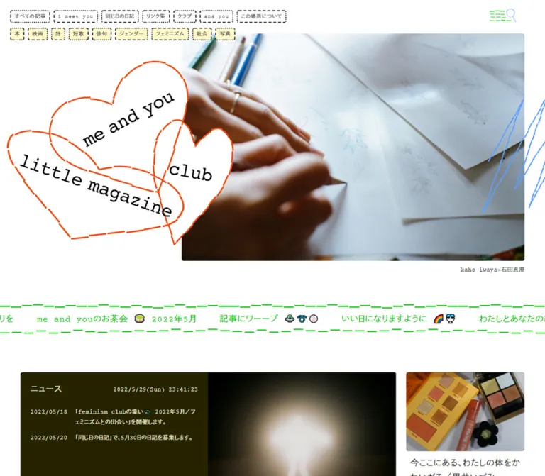
The page combines a disciplined editorial grid with deliberately uneven marks. Three overlapping orange-red hearts carry the publication name. Small category links have dotted or dashed outlines. Long horizontal rules look lightly drawn rather than mechanically uniform. A blue scribble crosses the feature photograph's outer edge, while a green-and-blue navigation graphic occupies the upper right.
Photography and text carry most of the page. Headlines use regular-weight Japanese gothic lettering, Latin text has a typewriter character, and dates are small and widely tracked. Broad white spaces separate the magazine's many subjects without boxing every item into a panel. The homepage is a substantial publication index with community, support, newsletter, and shop connections; its hierarchy supports browsing across many stories.
閉じる
me and you little magazine & club — Style Reference
An open magazine page held together by handwritten hearts, stitched borders, and everyday photographs.
Original URL: https://meandyou.net/ Final URL: https://meandyou.net/ Theme: white canvas, charcoal text, restrained colored linework, and a pale pink news surface. Inspected: October 2, 2026, Japan Standard Time. Supplied retrieval timestamp: October 1, 2026, 20:04:09.091 UTC, equivalent to October 2, 05:04:09.091 JST. Viewports: desktop 1440 × 1000 CSS pixels; mobile 390 × 844 CSS pixels. Scope: the current magazine and community homepage, including its opening feature carousel, navigation, announcement strip, news/gallery block, article listings, section introductions, lower-page content links, and footer. Three desktop captures and two mobile captures show the opening, a desktop middle section, and footer states. Detailed computed-style samples primarily cover the upper article sections; the full rendered text establishes the broader content sequence.
The page combines a disciplined editorial grid with deliberately uneven marks. Three overlapping orange-red hearts carry the publication name. Small category links have dotted or dashed outlines. Long horizontal rules look lightly drawn rather than mechanically uniform. A blue scribble crosses the feature photograph's outer edge, while a green-and-blue navigation graphic occupies the upper right.
Photography and text carry most of the page. Headlines use regular-weight Japanese gothic lettering, Latin text has a typewriter character, and dates are small and widely tracked. Broad white spaces separate the magazine's many subjects without boxing every item into a panel. The homepage is a substantial publication index with community, support, newsletter, and shop connections; its hierarchy supports browsing across many stories.
How to Read This Reference
- Measured means a value appears in the supplied rendered DOM or computed-style evidence. Values are rounded where extra decimals would not help implementation.
- Calculated means a relationship is derived from measured rectangles, such as a column gap or image ratio.
- Estimated means a visual approximation from a current-page screenshot. Estimated hex colors are not sampled or verified stylesheet values.
- Recommended means a proposed implementation choice. It does not describe a verified feature of the original.
- All custom-property names below are implementation aliases. The supplied custom-property extraction was empty; that does not establish that the original stylesheets contain no variables.
- Only the supplied evidence was analyzed. Linked destinations, source files, menu panels, and payment flows were not independently opened.
Tokens — Colors
Default Palette
| Name | Value | Suggested token | Evidence | Role |
|---|---|---|---|---|
| Canvas White | #ffffff |
--color-paper |
Measured body background | Page, article surfaces, navigation labels, and footer |
| Editorial Charcoal | #333333 |
--color-ink |
Measured body, heading, and link color | Main text and most utility content |
| Reversed White | #ffffff |
--color-on-photo |
Measured feature title and summary color | Text over the feature photograph |
| News Burgundy | #8e0026 |
--color-news-ink |
Measured news text color | News heading, timestamp, dates, and announcement links |
| Heart Orange | Approximately #ff4d24 |
--color-heart |
Visual estimate | Main heart outlines and the desktop footer's upper rule |
| Scribble Blue | Approximately #609aff |
--color-blue |
Visual estimate | Feature scribble, magnifier line, and mobile footer separator |
| Menu Green | Approximately #00dc20 |
--color-green |
Visual estimate | Short broken strokes in the navigation graphic |
| News Blush | Approximately #fff2f5 |
--color-news-paper |
Visual estimate | Desktop news panel |
| Rule Ink | Approximately #111111 |
--color-rule |
Visual estimate | Dark stitched separators and fine arrow artwork |
White dominates. The bright accents occupy strokes and small symbols rather than large filled areas. Burgundy belongs to the news module; it is not evidence of a global action color.
The feature image has a darkened lower region that makes its white caption readable. The appearance is visible, but its implementation, opacity, and gradient stops were not supplied. A bottom-weighted black gradient is a recommended approximation.
No theme picker or dark theme is evidenced. The blue mobile footer rule and orange desktop footer rule occur in different positions; they should not be interpreted as a verified theme switch or color animation.
Tokens — Typography
Shared Editorial Stack
Measured CSS family: courier-prime, dnp-shuei-gothic-kin-std, sans-serif.
This stack appears on body copy, headings, navigation, dates, news, and carousel captions. Its visible character combines typewriter-style Latin letters with clear Japanese gothic forms. The names above are supplied CSS family identifiers; individual resolved font files and glyph coverage were not independently verified.
Measured weight: 400 throughout the sampled text, including feature headlines and article titles. Some white text appears visually substantial against photography, but that is not evidence of a declared bold weight.
The HTML root reports Times at 12px on desktop and 9px on mobile. The body overrides that family and uses different sizing. Do not substitute Times for the editorial stack or scale every element by the root-size ratio.
Type Scale
Values below are measured computed values. Size and line height are in CSS pixels.
| Role | Desktop size / line height | Mobile size / line height | Tracking | Notes |
|---|---|---|---|---|
| Body and article summaries | 14 / 25.2 |
12.6 / 23.1 |
0.05em |
Relaxed line spacing despite small text |
| Article titles | 21 / 36.4 |
17.85 / 29.4 |
0.06em |
Regular weight; natural multi-line wrapping |
| Feature-photo headline | 30.8 / 44.8 |
19.95 / 30.45 |
0.06em |
White, placed near the image bottom |
| Feature-photo summary | 14 / 21 |
12.6 / 18.9 |
0.05em |
Tighter leading than ordinary body copy |
| Article category and date | 12.46 / 21 |
9.345 / 15.75 |
0.1em |
Small, strongly tracked metadata |
| Share label | 12.46 / 21 |
9.345 / 15.75 |
0.1em |
Inside a 50px-high anchor |
| Opening navigation labels | 12.46 / 12.46 |
Not visible in opening mobile capture | 0.1em |
Compact text inside approximately 31px-high stamps |
| Announcement-strip text | 21 / 36.4 |
17.85 / 29.4 |
0.06em |
Mixed Japanese, spaced Latin text, and emoji |
| News heading | 21 / 36.4 |
17.85 / 29.4 |
0.06em |
Burgundy |
| News timestamp | 14 / 25.2 |
12.6 / 23.1 |
0.05em |
Seconds are displayed |
| Feature-section heading | 40.6 / 60.2 |
24.15 / 38.85 |
0.1em |
Measured on the featured collection heading |
| Section introduction | 16.8 / 35 |
14.7 / 28.35 |
0.09em |
Broad leading and a quiet text-link action |
Hierarchy and Wrapping
Article titles remain complete rather than being visibly truncated in the supplied samples. Descriptions sit below them, followed by a right-aligned date. Desktop row heights accommodate the longest item, leaving extra white space in shorter cards.
The footer's large navigation links appear approximately 21px on desktop and 18px on mobile. These are screenshot estimates, not additional computed measurements. Footer tag text remains visibly larger than the very small mobile article metadata; do not assume all mobile labels use 9.345px.
Artwork Lettering
The tilted words inside the overlapping hearts and the loose corporate signature in the footer are graphic identity elements. Preserve their authored lettering, rotation, and overlap. Setting the same words in an ordinary heading does not reproduce either mark.
Tokens — Spacing & Shapes
Layout character: compact utility controls, generous editorial spacing, and almost no visual elevation.
The evidence contains recurring 8.33px, 12.5px, 16.67px, and 25px desktop measurements. Several mobile values are three quarters of their desktop counterparts, but body and heading sizes use different ratios. There is insufficient evidence to reconstruct a universal source spacing formula.
Spacing Scale
| Use | Desktop | Mobile | Evidence |
|---|---|---|---|
| Main content side margins | About 100px |
25px |
Measured rectangles |
| Standard article-column gap | About 25px |
Not applicable to the one-column list | Calculated from repeated card positions |
| Space between consecutive mobile article rows | — | 25px |
Calculated from card bounds |
| Navigation label horizontal padding | 8.333px |
Unverified | Measured |
| Opening navigation horizontal separation | About 8.33px |
Navigation absent in this state | Calculated |
| Opening navigation row separation | 12.5px |
Navigation absent in this state | Calculated from 31px labels |
| Desktop article text side inset | About 10px |
0px within the information column |
Measured |
| Category-to-title top padding | 12.5px |
9.375px |
Measured |
| Summary top padding | 16.667px |
12.5px |
Measured |
| Date top padding | 12.5px |
9.375px |
Measured |
| News panel text inset | About 25px |
About 18.75px |
Desktop inferred from panel edge; mobile calculated |
| Feature-photo caption left inset | About 25px |
About 18.75px |
Calculated from image and text rectangles |
| Collection-to-next-section separation | About 116.7px |
87.5px |
Calculated for the sampled collection boundary |
Border Radius
| Element | Value | Evidence and interpretation |
|---|---|---|
| Desktop category anchors | About 5px |
Measured; mildly softened rectangular stamps |
| Desktop article anchors | About 5px |
Measured; the image corners also appear subtly rounded |
| Mobile article anchors | About 3.75px |
Measured |
| Feature-photo frame | Visually square | Screenshot observation; no frame radius supplied |
| Shop link | Capsule outline | Screenshot observation; exact radius unverified |
| Long separators | No enclosing surface | Broken horizontal strokes, not panel borders |
Layout Measurements
| Element | Desktop 1440 × 1000 | Mobile 390 × 844 | Evidence |
|---|---|---|---|
| Main content width | About 1240px |
340px |
Measured |
| Standard article width | 291.25px |
340px |
Measured |
| Wide article width | 607.5px |
Returns to 340px |
Measured |
| Desktop grid relationship | Four tracks; wide item equals two tracks plus one gap | Single list | Calculated and visually confirmed |
| Feature image | 860 × 573.31px |
390 × 259.98px |
Measured; effectively 3:2 |
| Feature image origin | x 479.98, y 83.31 |
x 0, y 97.48 |
Measured opening states |
| Large desktop logo anchor | 431.98 × 361.05px |
Separate left logo absent | Measured |
| Opening mobile home-logo anchor | — | 146.25 × 127.88px, centered |
Measured anchor bounds, including asset whitespace |
| Carousel arrow anchor | 30 × 25.13px |
22.5 × 18.84px |
Measured; these are small source targets |
| Header utility anchor | 66.66 × 50px |
57.69 × 50px |
Measured |
| Full document height | About 14,646px |
About 19,833px |
Supplied document measurements |
These are captured states, not fixed page-height requirements. Article lengths and content updates will change the overall height.
Components
Opening Identity and Navigation
Role: establish the publication and expose its many editorial entrances.
Desktop has two compact navigation rows starting around x25, y25. The first contains publication sections such as すべての記事, i meet you, 創作・論考, and この場所について. The second contains topics such as インタビュー, 本, 映画, and フェミニズム.
Each link is a white rectangular label with a small radius and a dark dotted or dashed edge. Border patterns vary visibly between labels; a precise assignment rule was not supplied. They resemble small paper labels rather than filled filter pills. Their actual destinations are archive, category, and tag pages, so implement them as navigation links rather than assuming in-place filtering.
The large heart wordmark occupies the left third of the desktop opening composition. It sits below the navigation and beside the feature image, giving the page an intentionally asymmetric entrance.
Persistent Header
Role: retain a compact home link and utilities during long-page browsing.
The scrolled desktop and mobile captures show a white top band with a broken dark rule near y49. A small heart wordmark is centered and projects below the band. The share label sits left; the green-and-blue utility drawing sits right.
The compact visible wordmark is approximately 120px wide on desktop and 90px on mobile, estimated from the captures. These visible sizes should not be confused with the larger logo-anchor rectangles in the initial DOM sample.
The upper-right drawing combines broken green horizontal lines with a blue magnifier. The evidence supplies one enclosing utility anchor, not proof of two separately actionable icons. Its panel content and opening behavior remain unverified.
On mobile at the opening position, the centered wordmark is larger and overlaps the photograph's upper edge. The share label becomes visible in the scrolled footer capture. The precise scroll threshold, positioning mechanism, and transition timing were not supplied.
Feature Carousel
Role: highlight a small set of editorial stories and collections.
The opening feature contains five linked entries. Desktop shows a bookstore portrait at position 3 / 5; mobile shows an architectural photograph at 4 / 5. This verifies distinct captured slide states, not their advancement trigger.
An entry comprises:
- A landscape image in an approximately
3:2frame. - A darkened lower image region.
- A white multi-line headline.
- A smaller white summary below it.
- A link to the featured article or collection.
At desktop size, the caption begins about 25px inside the image's left edge and ends about 66.7px before its right edge. On mobile, those clearances are approximately 18.75px and 50px. The unequal insets leave space near the blue decorative scribble.
The supplied measured headline weight is 400. Preserve the relatively modest type size, generous leading, and complete editorial phrasing rather than introducing an oversized display slogan.
Carousel Controls
Role: provide previous/next navigation and current position.
A fine hand-drawn arrow sits at each end of a white control row beneath the feature. A small typewriter-style fraction is centered between them. On desktop, the row follows the photograph's width; on mobile, it spans nearly the viewport with approximately 18px edge insets.
The original arrow anchors measure only 30px wide on desktop and 22.5px on mobile. A new implementation should preserve the small drawing while expanding the interactive area. Button operation, swipe navigation, wrapping, autoplay, and keyboard handling were not exercised in the supplied evidence.
Announcement Strip
Role: weave current features and informal editorial greetings into the page.
A single-line strip stretches beyond both viewport edges and is bounded by two dark, slightly irregular dashed rules. Its content mixes linked Japanese phrases, emoji, and spaced Latin greetings such as w e l c o m e.
Desktop text is measured at 21px; mobile text is 17.85px. Adjacent text-item rectangles imply approximately 24px desktop and 18px mobile separation. The captured strip is roughly 65px high on desktop and 55px on mobile, estimated from its rules.
The DOM contains repeated content sequences and offscreen horizontal positions, consistent with a looping marquee structure. Speed, direction, pausing, and the animation driver are not established. Keep a readable static alternative in a new implementation.
News and Small Gallery
Role: place publication notices beside a changing artwork display.
The desktop opening content row begins around y888, about 100px below the announcement strip. A news/gallery assembly fills roughly three standard article columns. The pale pink text panel occupies its left half; an image occupies its right half. The first ordinary article fills the remaining column.
The news panel contains a burgundy heading, a right-aligned timestamp, and dated notices. Desktop notices use a date column with the announcement text offset by 110px. The gallery description in the rendered page explicitly describes the adjacent image as a changing exhibition space, and an artist link accompanies it. That is a content attribution, not a website production credit.
On mobile, news follows the first three article entries. Dates move above their corresponding announcement text, and the panel's inner text width is approximately 302.5px. The supplied first mobile capture does not show the gallery itself, so its exact mobile crop and arrangement should remain unclaimed.
The timestamp includes seconds, but its update cadence was not tested. Treat the unusual 1111/01/01 gallery notice date as source content rather than a reusable date-format convention.
Article Card and Mobile Article Row
Role: the primary browsing unit throughout the magazine.
The sampled article link contains the image region, optional category, headline, summary, and date. On desktop, it is a vertical composition on the same white surface as the page. There is no visible enclosing border or shadow.
A standard desktop card is 291.25px wide. Image-to-text geometry is consistent with an approximately 3:2 image followed by 12.5px of space. Text is inset about 10px on each side, leaving a measured 271.28px information width. A wide card is 607.5px and occupies two grid tracks.
Categories use the small metadata style. If present, the category is followed by 12.5px of title padding. Descriptions receive 16.67px of top padding. Dates are aligned toward the lower right. Shared date baselines across several measured cards demonstrate aligned rows, even where titles and descriptions are shorter; this is not evidence of a masonry layout.
At 390px, each article becomes a 340px-wide horizontal row. The thumbnail is approximately 136 × 91px, estimated from the image and consistent with 40% of the row width. A 12.5px gap leads to the measured 191.5px information column. Titles wrap at 17.85px with 29.4px leading. The photograph stays at the top while longer text continues beneath its lower edge.
The first mobile row measures about 177.5px high; later rows vary with content. Do not force every mobile item to the thumbnail height or truncate its text to obtain uniform rows.
Category Labels and Sponsorship Stamps
Ordinary article categories are small text labels without a filled badge. Sponsored entries carry a visibly outlined SPONSORED stamp with typewriter-style uppercase lettering.
The middle desktop capture shows these stamps above large blank media regions. The stamp remains separate from the headline below. Exact stamp dimensions were not supplied; the visible example is approximately 100px wide and 25px high.
Preserve sponsorship disclosure as meaningful text. Do not use it as a decorative badge on unrelated content.
Collection and Series Introductions
Role: interrupt the chronological article flow with editorial grouping.
The featured collection begins with a measured 40.6px desktop heading, a spacious introduction, and a small text link such as 💞すべての記事を見る. At 390px, the same heading becomes 24.15px and wraps onto two lines.
The desktop heading spans the entire 1240px content width. The following article grid returns to four standard tracks. The 連載一覧 heading is also visibly large in the middle capture, although its exact computed type values were not included.
Series descriptions and a 1 / 7 position indicator appear in the rendered text. Their presence supports a series-browsing module, but its full visual layout and control behavior are not established by the available screenshots.
Lower-Page Editorial and Community Modules
The full rendered text confirms further sections for creative work, culture topics, reader voices, interviews, reader support, the club, a resource directory, a newsletter, and the shop.
Observed content anatomy includes:
- A support introduction, a details link, and amount choices of
300円,500円,1000円,5000円, and任意の金額. - A club description and a link to the club subdomain.
- A resource-directory introduction and category links.
- A newsletter description.
- A shop description and
shopを見るlink.
The support amount links have # destinations in the supplied snapshot. Their payment behavior is unverified. The newsletter text does not establish the existence or styling of a signup form. Avoid inventing form fields, checkout dialogs, or module backgrounds.
The visible shop action is a white capsule with a fine dark outline, approximately 118 × 50px in the desktop footer capture. It provides a useful contrast to the small rectangular topic stamps.
Footer
Role: provide a complete navigation map and restate the publication's purpose.
Desktop uses a wide, white footer separated from preceding content by an orange broken rule. Three navigation groups occupy the left area: editorial sections, publication/community links, and social destinations. A roughly 300px-wide right column contains a centered おすすめのタグ heading, wrapping outlined tags, and a mission paragraph.
The navigation is large and unboxed. English labels retain the typewriter character. Tag borders repeat the small dotted/dashed language from the opening navigation. The mission statement is substantially smaller and uses comfortable multi-line leading.
On mobile, navigation and social links occupy two columns. The tag-and-mission area becomes a full-width block below a blue broken rule, with 25px side margins. The tags wrap naturally over several rows, and the mission statement fills the available reading width.
A final dark broken rule separates the legal area. Desktop places privacy/staff links left and copyright plus the small handwritten corporate mark right. Mobile places the legal links on one row and the copyright/signature beneath them, aligned toward the right. The footer visibly names and links me and you, inc..
Tokens — Motion & Interaction
| Element | Supplied evidence | What can be concluded | Unverified or recommended behavior |
|---|---|---|---|
| Feature entry | Computed transition: opacity 1.2s 0.3s, visibility linear |
An opacity transition is defined with a 1.2s duration and 0.3s delay | Advancement interval, autoplay trigger, and visibility sequencing are unverified |
| Feature position | Desktop 3 / 5; mobile 4 / 5 |
Five positions and different captured active entries | Different captures alone do not prove autoplay |
| Announcement strip | Repeated sequences and horizontally offset text | A loop-ready horizontal strip structure | Duration, direction, hover pause, and animation mechanism are unverified |
| Header | Large opening identity and compact scrolled identity are visible | Header presentation changes with page state | Exact threshold, transform, and timing are unknown |
| News clock | Timestamp includes seconds; two snapshots show different times | Time-bearing content is rendered | Continuous updating and cadence were not tested |
| Share control | Share trigger plus DOM labels URLをコピー, Twitter, Line, and Facebook |
Sharing options exist in the supplied page data | Open-state layout, clipboard success, and service behavior were not tested |
| Menu/search graphic | One enclosing anchor is measured | A header utility affordance is present | Panel anatomy, search behavior, and independent icon actions are unknown |
| Article and category links | Concrete destinations appear in the rendered evidence | They are navigation links | Hover, focus, and destination-page presentation were not inspected |
Many sampled elements report transition: all and animation: none. Those values do not establish a nonzero transition duration or rule out animation on a parent, pseudo-element, or script-controlled container.
For a new implementation, keep the supplied feature fade where appropriate, provide explicit previous/next controls, and stop automatic movement for reduced-motion preferences. Any marquee speed would be a new implementation choice. Do not add parallax, elastic card motion, or animated heart drawing and describe it as observed behavior.
Surfaces
| Surface | Appearance | Function |
|---|---|---|
| Main canvas | White | Keeps the long publication index open and readable |
| Article unit | Same white as the page | Grouped through image, typography, spacing, and date alignment |
| Category stamp | White with broken dark outline | Compact navigation identity |
| News panel | Pale blush with burgundy text | Distinguishes publication notices from articles |
| Feature image | Full-color photograph with a dark lower region | Supports reversed editorial text |
| Persistent header | White band with a broken bottom rule | Keeps utilities legible over scrolled content |
| Footer | White with colored and dark separators | Reuses the editorial page language at a larger navigation scale |
There is no visible general-purpose shadow or elevation system. Fine outlines, photographs, whitespace, and a small tinted module provide the necessary structure.
Imagery
The current opening captures show a person in a book-filled interior and the exterior of a film institution. Visible mobile article thumbnails show personal objects and a hand in natural light. These photographs feel situated and specific: rooms, books, belongings, people, and cultural places provide the subject matter.
Preserve natural color, environmental context, and varied light. The blue scribble and orange hearts bring a drawn layer to the photographs without turning the entire image system into illustration. Images should remain photographic; there is no evidence of a global duotone, pixelation, or halftone treatment.
The identity graphics have distinct roles:
- Overlapping hearts: large publication identity at the desktop opening, then a smaller centered home mark.
- Blue scribble: a loose accent at the feature's right edge, partially extending beyond the image boundary.
- Green lines and blue magnifier: compact header utility artwork.
- Fine arrows: light navigation marks below the feature.
- Broken rules: structural separators with small variations in segment length and vertical alignment.
- Handwritten corporate signature: a quiet footer sign-off, visually different from the main heart mark.
Observed Asset References
| Visual asset | Observed placement | Implementation handling |
|---|---|---|
| Three-heart publication mark | Desktop opening and persistent home link | Use authorized original artwork; retain letter rotation and overlapping shapes |
| Bookstore portrait | Desktop active feature linked to /202608-satomifunaki/ |
Preserve the subject and environmental context when cropping |
| Film-institution exterior | Mobile active feature linked to /202608-nfaj/ |
Use the landscape frame and readable lower caption zone |
| Personal-object and hand photographs | First mobile article rows | Maintain approximately 3:2 thumbnails |
| Gallery artwork | Beside desktop news | Preserve artwork proportions appropriate to the supplied asset |
| Corporate signature | Footer beside copyright | Keep separate from the publication logo |
Article routes in this table are observed link destinations, not image-file paths. No image src manifest or SVG filenames were supplied, so exact asset URLs cannot be provided.
The middle desktop screenshot contains extensive blank areas where media would ordinarily sit above article titles. The evidence does not establish whether those areas are intentional, deferred, hidden, or unavailable. Do not interpret them as a confirmed image-free design. A new implementation should reserve media geometry and provide useful loading/error behavior while keeping article text reachable.
Layout & Responsive Behavior
Desktop: Editorial Grid with Variable Spans
At 1440px, the main content is approximately 1240px wide with 100px side margins. Four 291.25px tracks and approximately 25px gaps explain the repeated article positions. A 607.5px article spans two tracks. The initial news/gallery assembly occupies approximately three tracks, followed by a standard article in the fourth.
The opening feature follows a separate composition. Its image begins near one third of the viewport, at x480, and ends at x1340. The large heart wordmark occupies the left area. This deliberate offset should not be replaced with a centered image above the logo.
Several article dates align across a row despite different text lengths. Maintain row-based vertical alignment and allow empty space inside shorter units.
Mobile: Horizontal Article Rows
At 390px, the main reading width is 340px with 25px side margins. The feature photograph uses the full viewport width, while ordinary articles remain inset.
The opening desktop navigation rows disappear from the visible mobile state. The identity moves to the centered header, and the feature begins at y97.48. Article imagery and text sit side by side instead of stacking as desktop cards.
The first three articles precede the news block in mobile rendered order. This is a content-order adaptation, not simply a scaled desktop grid. The first article begins around y543.72; the second begins at y746.20, after the first row's variable height and a 25px gap.
Footer Adaptation
Desktop places navigation and a narrow tag/mission sidebar in one broad composition. Mobile moves the tag/mission content below the navigation, introduces the observed blue separator, and wraps the legal section into two levels.
Limits and Recommended Breakpoints
Only 1440px and 390px widths were supplied. The original breakpoints and intermediate tablet layouts are unknown. The Quick Start uses a recommended 900px breakpoint to switch its demonstration layout; this is not a recovered source value.
Likewise, a 1240px maximum content width is a practical adaptation of the desktop measurement, not proof of the original site's maximum-width rule. Test long Japanese titles, enlarged text, and intermediate widths before adopting these choices.
Do’s and Don’ts
Do
- Keep white space as an active part of the editorial composition.
- Preserve the asymmetric desktop relationship between the heart mark and feature photograph.
- Use the supplied font stack and measured regular weights when the font assets are available.
- Maintain the distinction between article titles, descriptions, and tiny tracked dates.
- Use dotted and dashed outlines for compact topic navigation.
- Keep standard desktop article tracks aligned, with occasional wider spans.
- Convert articles to image-and-text rows on mobile.
- Preserve full headlines and content-dependent row heights.
- Confine bright orange, blue, and green mainly to linework and small accents.
- Retain the burgundy-on-blush news treatment.
- Keep the footer's mission statement and topic index as substantive content.
Don’t
- Don't replace the authored heart mark with a generic heart icon or an ordinary text heading.
- Don't add a shadow, solid panel, or large radius to every article.
- Don't turn category links into colorful filled pills or assume they filter in place.
- Don't apply the HTML root's Times family to the editorial content.
- Don't infer bold weights from the visual density of Japanese glyphs.
- Don't impose equal mobile row heights or truncate every title.
- Don't treat the blank media areas in one capture as a deliberate content style.
- Don't replace the magazine's many editorial entrances with one dominant conversion button.
- Don't claim untested menus, swipe gestures, payment dialogs, or hover effects as existing features.
- Don't reproduce the source's very small arrow targets without considering a larger interactive area.
Recommended Implementation Additions
These are recommendations for a new implementation, not verified original features:
- Expand small arrow and utility hit areas to at least 44 × 44px while retaining the fine visible artwork.
- Give image-only home links and utility controls explicit accessible names. Hide purely decorative scribbles from assistive technology.
- Use semantic headings, article links, and
<time datetime>values. Preserve sponsorship disclosure as readable text. - Provide a visible focus style and make every article destination reachable without pointer interaction.
- Increase very small metadata where necessary for readability; the observed mobile 9.345px size is a reference measurement, not an accessibility recommendation.
- Hide inactive carousel entries from keyboard and assistive-technology navigation, not only through opacity.
- Offer pause controls for automatic movement and a static or manually scrollable announcement strip under reduced motion.
- Reserve image dimensions, prioritize the opening feature, and handle failed lower-page images without leaving unexplained empty regions.
- Keep reading order coherent when moving the news block between viewport layouts.
Agent Prompt Guide
Quick Color Reference
- Canvas: measured
#ffffff. - Main text: measured
#333333. - Feature captions: measured
#ffffffover a darkened photographic region. - News text: measured
#8e0026. - Heart line: estimated
#ff4d24. - Scribble and secondary rule: estimated
#609aff. - Menu line: estimated
#00dc20. - News background: estimated
#fff2f5. - Outlines and separators: dark ink; use irregular drawn assets when available.
Overall Prompt
“Create an editorial magazine and community homepage inspired by the current me and you layout. Use a white canvas, charcoal regular-weight Japanese gothic text, typewriter-style Latin lettering, small tracked dates, and fine dotted or dashed navigation labels. At desktop size, place a large overlapping-heart identity in the left third and a 3:2 feature photograph to its right, with white editorial captions over a dark lower image region. Add fine arrow controls and a centered slide fraction below. Follow with a full-width announcement strip bounded by broken rules, then a four-track article grid with occasional wider stories and a blush news/gallery block. On mobile, center the identity above a full-width feature and turn article cards into inset rows with a small image left and complete text right. Use orange, blue, and green sparingly in drawn linework. Finish with extensive navigation, wrapping topic stamps, a mission paragraph, and a handwritten signature.”
Example Component Prompts
- Feature: “Build an asymmetric desktop feature with a 432px-wide authored heart mark beside an 860 × 573px photograph at a 1440px viewport. Place a regular 30.8px white headline and 14px summary near the image bottom. Use fine arrows, a small centered fraction, and a blue scribble near the right edge. On a 390px screen, use a 390 × 260px photo and approximately 20px headline.”
- Article grid: “Use four 291.25px article tracks inside a 1240px white content area with 25px gaps. Keep images approximately 3:2, titles 21px with 36.4px leading, descriptions 14px, and dates small and right aligned. Support a 607.5px wide story spanning two columns. Align row bottoms without adding card shadows.”
- Mobile article: “Create a 340px-wide editorial row with an approximately 136px-wide landscape image, a 12.5px gap, and a 191.5px text column. Include an optional category, a complete Japanese headline at 17.85px, a short description, and a right-aligned date. Let the row height follow the text.”
- News panel: “Create a pale blush publication notice panel with burgundy text, a modest heading, a timestamp, and dated announcements. Put dates beside text on desktop and above text on mobile. Pair the panel with a small artwork gallery on desktop. Keep it visually related to the magazine rather than styling it as a dashboard widget.”
- Footer: “Design a white editorial footer with three groups of large text links and a narrow sidebar containing a centered tag heading, wrapping dotted-outline labels, and a small mission paragraph. Use an orange broken separator above and a dark broken separator before the legal line. On mobile, place tags and the mission below the navigation with a blue separator and 25px side margins.”
- Motion: “Use the evidenced feature opacity transition of 1.2 seconds with a 0.3-second delay. Treat autoplay timing, marquee speed, and header-collapse timing as new choices requiring validation. Include manual controls, reduced-motion behavior, and keyboard access.”
Quick Start
CSS Custom Properties
This is a practical adaptation of the measured appearance, not a copy of the original stylesheet. It keeps a conventional root font size and expresses measured dimensions directly in pixels. Bright accent colors, the news background, regular CSS dash patterns, the maximum content width, and the 900px breakpoint are implementation approximations.
The named font families require appropriately licensed, loaded font assets. This snippet does not fetch fonts. Original logo, arrow, utility, and scribble artwork must be supplied separately.
:root {
  /* Measured colors */
  --color-paper: #ffffff;
  --color-ink: #333333;
  --color-on-photo: #ffffff;
  --color-news-ink: #8e0026;

  /* Screenshot estimates */
  --color-heart: #ff4d24;
  --color-blue: #609aff;
  --color-green: #00dc20;
  --color-news-paper: #fff2f5;
  --color-rule: #111111;

  --font-editorial: courier-prime, dnp-shuei-gothic-kin-std, sans-serif;
  --weight-editorial: 400;
  --text-body: 14px;
  --leading-body: 25.2px;
  --text-meta: 12.46px;
  --leading-meta: 21px;
  --text-card: 21px;
  --leading-card: 36.4px;
  --text-hero: 30.8px;
  --leading-hero: 44.8px;
  --text-section: 40.6px;
  --leading-section: 60.2px;
  --tracking-body: 0.05em;
  --tracking-title: 0.06em;
  --tracking-meta: 0.1em;

  --page-gutter: clamp(25px, 6.9444vw, 100px);
  --content-width: 1240px;
  --grid-gap: 25px;
  --space-label: 12.5px;
  --space-summary: 16.667px;
  --radius-small: 5px;
  --hero-caption-left: 25px;
  --hero-caption-right: 66.667px;
  --hero-caption-bottom: 25px;
  --hero-summary-leading: 21px;
  --section-space: 116.667px;
  --feature-fade: opacity 1.2s 0.3s, visibility 0s linear;
}

* { box-sizing: border-box; }

body {
  margin: 0;
  color: var(--color-ink);
  background: var(--color-paper);
  font-family: var(--font-editorial);
  font-size: var(--text-body);
  font-weight: var(--weight-editorial);
  line-height: var(--leading-body);
  letter-spacing: var(--tracking-body);
}

a { color: inherit; }
button { font: inherit; color: inherit; }
img { display: block; max-width: 100%; }

.page-width {
  width: min(calc(100% - 2 * var(--page-gutter)), var(--content-width));
  margin-inline: auto;
}

.section { margin-block-start: var(--section-space); }
.section__title {
  margin: 0;
  font-size: var(--text-section);
  line-height: var(--leading-section);
  letter-spacing: 0.1em;
  font-weight: 400;
}

/* Regular dashes approximate the original drawn separators. */
.stitched-rule {
  height: 2px;
  color: var(--color-rule);
  background: repeating-linear-gradient(
    to right, currentColor 0 18px, transparent 18px 24px
  );
}

.tag-list {
  display: flex;
  flex-wrap: wrap;
  gap: 8px;
}
.tag {
  display: inline-flex;
  align-items: center;
  min-height: 31px;
  padding: 2.857px 8.333px 0;
  border: 2px dotted currentColor;
  border-radius: 5px;
  background: var(--color-paper);
  font-size: 12.46px;
  line-height: 1;
  letter-spacing: 0.1em;
  text-decoration: none;
}
.tag--dashed { border-style: dashed; }

/* A controller supplies the compact state; its threshold is not observed. */
.site-header {
  position: fixed;
  inset: 0 0 auto;
  height: 50px;
  z-index: 20;
}
.site-header__brand,
.site-header__share { display: none; }
.site-header__utility {
  position: absolute;
  right: var(--page-gutter);
  top: 14px;
  display: grid;
  place-items: center;
  width: 66.667px;
  min-height: 50px;
  border: 0;
  padding: 0;
  background: transparent;
}
.site-header[data-compact='true'] {
  background: var(--color-paper);
  border-bottom: 2px dashed var(--color-rule);
}
.site-header[data-compact='true'] .site-header__brand {
  display: block;
  position: absolute;
  top: 3px;
  left: 50%;
  width: 120px;
  transform: translateX(-50%);
}
.site-header[data-compact='true'] .site-header__share {
  display: flex;
  align-items: center;
  height: 50px;
  margin-left: var(--page-gutter);
  width: max-content;
  font-size: var(--text-meta);
  letter-spacing: var(--tracking-meta);
  text-decoration: none;
}
.site-header[data-compact='true'] .site-header__utility { top: 0; }

.opening-nav {
  position: absolute;
  top: 25px;
  left: 25px;
  z-index: 10;
  display: grid;
  gap: 12.5px;
}

.hero {
  display: grid;
  grid-template-columns: 33.3333vw minmax(0, 1fr);
  align-items: center;
  padding: 83.333px var(--page-gutter) 0 0;
}
.hero__brand { margin: 0; padding-inline: 24px; }
.hero__brand img { width: 100%; height: auto; }
.hero__feature { min-width: 0; position: relative; }
.hero__stage {
  position: relative;
  aspect-ratio: 3 / 2;
  overflow: hidden;
}
.hero__slide {
  position: absolute;
  inset: 0;
  opacity: 0;
  visibility: hidden;
  transition: var(--feature-fade);
}
.hero__slide.is-current { opacity: 1; visibility: visible; }
.hero__slide > img { width: 100%; height: 100%; object-fit: cover; }
.hero__slide::after {
  content: '';
  position: absolute;
  inset: 0;
  pointer-events: none;
  /* Recommended gradient; original stops were not supplied. */
  background: linear-gradient(transparent 35%, rgb(0 0 0 / 65%));
}
.hero__caption {
  position: absolute;
  z-index: 1;
  left: var(--hero-caption-left);
  right: var(--hero-caption-right);
  bottom: var(--hero-caption-bottom);
  color: var(--color-on-photo);
}
.hero__title {
  margin: 0;
  font-size: var(--text-hero);
  line-height: var(--leading-hero);
  letter-spacing: var(--tracking-title);
  font-weight: 400;
}
.hero__summary {
  margin: var(--space-summary) 0 0;
  font-size: var(--text-body);
  line-height: var(--hero-summary-leading);
}
.hero__controls {
  display: grid;
  grid-template-columns: 44px 1fr 44px;
  align-items: center;
  margin-top: 8px;
  text-align: center;
}
.hero__arrow {
  display: grid;
  place-items: center;
  min-width: 44px;
  min-height: 44px;
  border: 0;
  padding: 0;
  background: transparent;
  cursor: pointer;
}
.hero__arrow img { width: 30px; }

/* Static, manually scrollable alternative to an automatic marquee. */
.announcement {
  margin-top: 25px;
  padding-block: 12px;
  border-block: 2px dashed var(--color-rule);
  overflow-x: auto;
}
.announcement__track {
  display: flex;
  align-items: center;
  gap: 24px;
  width: max-content;
  padding-inline: 25px;
  font-size: var(--text-card);
  line-height: var(--leading-card);
  letter-spacing: var(--tracking-title);
  white-space: nowrap;
}
.announcement__track a { text-decoration: none; }

.story-grid {
  display: grid;
  grid-template-columns: repeat(4, minmax(0, 1fr));
  gap: var(--grid-gap);
  align-items: stretch;
}
.story {
  display: flex;
  flex-direction: column;
  min-width: 0;
  border-radius: var(--radius-small);
  color: inherit;
  text-decoration: none;
}
.story--wide { grid-column: span 2; }
.story__image {
  width: 100%;
  aspect-ratio: 3 / 2;
  object-fit: cover;
  border-radius: var(--radius-small);
}
.story__body {
  display: flex;
  flex-direction: column;
  flex: 1;
  min-width: 0;
  padding: 12.5px 10px 10px;
}
.story__category,
.story__date {
  margin: 0;
  font-size: var(--text-meta);
  line-height: var(--leading-meta);
  letter-spacing: var(--tracking-meta);
}
.story__title {
  margin: 0;
  font-size: var(--text-card);
  line-height: var(--leading-card);
  letter-spacing: var(--tracking-title);
  font-weight: 400;
  overflow-wrap: anywhere;
}
.story__category + .story__title { margin-top: var(--space-label); }
.story__summary { margin: var(--space-summary) 0 0; }
.story__date {
  display: block;
  margin-top: auto;
  padding-top: var(--space-label);
  text-align: right;
}
.sponsor-stamp {
  align-self: flex-start;
  padding: 2px 10px;
  border: 2px dotted currentColor;
  border-radius: 4px;
  font-size: 12px;
  line-height: 18px;
  letter-spacing: 0.1em;
}

.news-gallery {
  grid-column: span 3;
  display: grid;
  grid-template-columns: repeat(2, minmax(0, 1fr));
}
.news {
  padding: 25px;
  border-radius: var(--radius-small);
  color: var(--color-news-ink);
  background: var(--color-news-paper);
}
.news__head {
  display: flex;
  flex-wrap: wrap;
  align-items: baseline;
  justify-content: space-between;
  gap: 12.5px;
}
.news__heading { margin: 0; font-size: var(--text-card); font-weight: 400; }
.news__item {
  display: grid;
  grid-template-columns: 90px minmax(0, 1fr);
  gap: 20px;
  margin-top: 12.5px;
}
.news__item a { text-decoration: none; }
.gallery { margin: 0; min-width: 0; }
.gallery img { width: 100%; height: auto; border-radius: var(--radius-small); }

.shop-link {
  display: inline-flex;
  justify-content: center;
  align-items: center;
  min-height: 50px;
  padding: 0 22px;
  border: 1px solid currentColor;
  border-radius: 999px;
  text-decoration: none;
}

.site-footer { border-top: 2px dashed var(--color-heart); }
.footer__main {
  display: grid;
  grid-template-columns: minmax(0, 1fr) 300px;
  gap: 25px;
  padding-block: 60px;
}
.footer__nav {
  display: grid;
  grid-template-columns: 1fr 1.08fr 1.2fr;
  gap: 25px;
  align-content: start;
}
.footer__nav-group { display: flex; flex-direction: column; align-items: flex-start; }
.footer__nav a { font-size: 21px; line-height: 42px; text-decoration: none; }
.footer__heading { margin: 0 0 45px; text-align: center; font-size: 21px; font-weight: 400; }
.footer__mission { margin: 45px 0 0; }
.footer__legal { border-top: 2px dashed var(--color-rule); }
.footer__legal-inner {
  display: flex;
  flex-wrap: wrap;
  align-items: center;
  justify-content: space-between;
  gap: 25px;
  padding-block: 25px;
}
.footer__legal-links,
.footer__signature { display: flex; align-items: center; gap: 18px; }
.footer__signature img { width: 120px; height: auto; }

/* Recommended focus treatment. */
a:focus-visible,
button:focus-visible {
  outline: 2px solid var(--color-ink);
  outline-offset: 4px;
}

/* Recommended breakpoint; only 390px and 1440px were inspected. */
@media (max-width: 900px) {
  :root {
    --page-gutter: 25px;
    --text-body: 12.6px;
    --leading-body: 23.1px;
    --text-meta: 9.345px;
    --leading-meta: 15.75px;
    --text-card: 17.85px;
    --leading-card: 29.4px;
    --text-hero: 19.95px;
    --leading-hero: 30.45px;
    --text-section: 24.15px;
    --leading-section: 38.85px;
    --space-label: 9.375px;
    --space-summary: 12.5px;
    --radius-small: 3.75px;
    --hero-caption-left: 18.75px;
    --hero-caption-right: 50px;
    --hero-caption-bottom: 18.75px;
    --hero-summary-leading: 18.9px;
    --section-space: 87.5px;
  }

  .opening-nav,
  .hero__brand { display: none; }
  .site-header { background: white; border-bottom: 2px dashed var(--color-rule); }
  .site-header__brand {
    display: block;
    position: absolute;
    top: 3px;
    left: 50%;
    width: 146.25px;
    transform: translateX(-50%);
  }
  .site-header[data-compact='true'] .site-header__brand { width: 90px; }
  .site-header__utility { top: 0; width: 57.69px; }
  .hero { display: block; padding: 97.5px 0 0; }
  .hero__controls { padding-inline: 7px; }
  .hero__arrow img { width: 22.5px; }
  .announcement__track { gap: 18px; }

  .story-grid { grid-template-columns: minmax(0, 1fr); }
  .story,
  .story--wide {
    grid-column: auto;
    display: grid;
    grid-template-columns: 40% minmax(0, 1fr);
    gap: 12.5px;
    align-items: start;
  }
  .story__body { padding: 2.25px 0 7.5px; }
  .news-gallery { grid-column: auto; grid-template-columns: minmax(0, 1fr); }
  .news { padding: 18.75px; }
  .news__item { grid-template-columns: minmax(0, 1fr); gap: 0; }

  .footer__main { grid-template-columns: minmax(0, 1fr); gap: 40px; padding-bottom: 45px; }
  .footer__nav { grid-template-columns: 1.45fr 1fr; gap: 24px 20px; }
  .footer__nav-group:nth-child(2) { grid-column: 1; }
  .footer__nav-group--social { grid-column: 2; grid-row: 1 / span 2; }
  .footer__nav a { font-size: 18px; line-height: 33px; }
  .footer__about {
    margin-inline: -25px;
    padding: 30px 25px 0;
    border-top: 2px dashed var(--color-blue);
  }
  .footer__heading { margin-bottom: 25px; font-size: 18px; }
  .footer__mission { margin-top: 37.5px; }
  .footer__signature { margin-left: auto; }
  .footer__signature img { width: 60px; }
}

@media (prefers-reduced-motion: reduce) {
  .hero__slide { transition: none; }
  .announcement__track { animation: none; transform: none; }
}
The carousel controller must manage slide state, inactive-slide focusability, and any automatic timer separately. Reduced-motion CSS alone does not stop JavaScript timers. The header also needs state management. The gallery's mobile stacking in this snippet is a recommendation because its mobile geometry was not captured.
For the latest-content region, arrange the first three articles before news in the mobile reading order, then define desktop placement around the three-column news/gallery assembly. That ordering is a template concern beyond the generic grid rules above.
Example Article Anatomy
The image path below is a local placeholder for a new project, not an observed original asset URL. The title and category quote the supplied page.
<a class="story" href="https://meandyou.net/202609-mitsukikawamura/">
  <img
    class="story__image"
    src="/media/editorial-photo.jpg"
    width="600"
    height="400"
    alt="Personal objects and drawings arranged in a room"
    loading="lazy"
  >
  <div class="story__body">
    <p class="story__category">同じ日の日記</p>
    <h2 class="story__title">ままならなさを抱えて歩いていくこと/河村実月</h2>
    <p class="story__summary">入院生活で知ったケアによる力のすさまじさ、出会いと別れ</p>
    <time class="story__date" datetime="2026-09-30">2026/09/30</time>
  </div>
</a>
Tailwind v4 Token Mapping
Optional aliases for a project already using Tailwind v4. These do not imply that the original website uses Tailwind. Define the custom properties above first.
@theme inline {
  --color-paper: var(--color-paper);
  --color-editorial-ink: var(--color-ink);
  --color-news: var(--color-news-ink);
  --color-blush: var(--color-news-paper);
  --color-heart-line: var(--color-heart);
  --color-scribble: var(--color-blue);
  --font-magazine: var(--font-editorial);
  --text-copy: var(--text-body);
  --text-caption: var(--text-meta);
  --text-article: var(--text-card);
  --text-feature: var(--text-hero);
  --text-section-heading: var(--text-section);
  --spacing-editorial-gap: var(--grid-gap);
  --radius-editorial: var(--radius-small);
}
For the paper utility, use a direct value instead of a self-referential alias if the build system emits the theme variable unchanged: --color-paper: #ffffff;.
Sources & Evidence
- Inspected page: https://meandyou.net/. Original and final URLs are identical; supplied HTTP status is 200.
- Capture timestamp:
2026-10-01T20:04:09.091Z, equivalent to October 2, 2026, 05:04:09.091 JST. This is the supplied retrieval timestamp, not a separately timed interaction log. - Desktop evidence: 1440 × 1000 CSS-pixel viewport, opening capture, middle article/series capture, footer capture, rendered links and text, and computed element styles. Document height approximately 14,646px.
- Mobile evidence: 390 × 844 CSS-pixel viewport, opening and footer captures, rendered links and text, and computed element styles. Document height approximately 19,833px.
- Original-page attribution evidence: the footer contains
© me and you, inc.and links the name to https://meandyou.co.jp/. The linked corporate page was not independently inspected. - Interaction scope: initial observation and scrolling are represented in the supplied capture process. No supplied evidence establishes exercised menu, search, share, hover, keyboard, swipe, payment, newsletter, or carousel-button behavior.
- Capture limitations: readiness checks included document loading, finite-animation handling, layout/text stability, and visible-image decoding under finite time limits. Perpetual animations were temporarily paused during readiness checks and resumed afterward. SharedWorkers and service workers were disabled. These checks do not prove that delayed content or blank media regions reached their intended final state.
- Measurement limitations: computed-style samples are selective, not a complete stylesheet or asset inventory. Border artwork, several accent colors, lower-page module geometry, and footer typography are partly estimated. No intermediate viewport, font-file resolution, or complete animation timeline was supplied.
This reference describes the current homepage supported by those captures. Implementation aliases, accessibility improvements, fallback styling, and unverified responsive decisions are explicitly presented as recommendations.
# me and you little magazine & club — Style Reference

> An open magazine page held together by handwritten hearts, stitched borders, and everyday photographs.

**Original URL:** [https://meandyou.net/](https://meandyou.net/)
**Final URL:** [https://meandyou.net/](https://meandyou.net/)
**Theme:** white canvas, charcoal text, restrained colored linework, and a pale pink news surface.
**Inspected:** October 2, 2026, Japan Standard Time. Supplied retrieval timestamp: October 1, 2026, 20:04:09.091 UTC, equivalent to October 2, 05:04:09.091 JST.
**Viewports:** desktop 1440 × 1000 CSS pixels; mobile 390 × 844 CSS pixels.
**Scope:** the current magazine and community homepage, including its opening feature carousel, navigation, announcement strip, news/gallery block, article listings, section introductions, lower-page content links, and footer. Three desktop captures and two mobile captures show the opening, a desktop middle section, and footer states. Detailed computed-style samples primarily cover the upper article sections; the full rendered text establishes the broader content sequence.

The page combines a disciplined editorial grid with deliberately uneven marks. Three overlapping orange-red hearts carry the publication name. Small category links have dotted or dashed outlines. Long horizontal rules look lightly drawn rather than mechanically uniform. A blue scribble crosses the feature photograph's outer edge, while a green-and-blue navigation graphic occupies the upper right.

Photography and text carry most of the page. Headlines use regular-weight Japanese gothic lettering, Latin text has a typewriter character, and dates are small and widely tracked. Broad white spaces separate the magazine's many subjects without boxing every item into a panel. The homepage is a substantial publication index with community, support, newsletter, and shop connections; its hierarchy supports browsing across many stories.
閉じる
# me and you little magazine & club — Style Reference

> An open magazine page held together by handwritten hearts, stitched borders, and everyday photographs.

**Original URL:** [https://meandyou.net/](https://meandyou.net/)
**Final URL:** [https://meandyou.net/](https://meandyou.net/)
**Theme:** white canvas, charcoal text, restrained colored linework, and a pale pink news surface.
**Inspected:** October 2, 2026, Japan Standard Time. Supplied retrieval timestamp: October 1, 2026, 20:04:09.091 UTC, equivalent to October 2, 05:04:09.091 JST.
**Viewports:** desktop 1440 × 1000 CSS pixels; mobile 390 × 844 CSS pixels.
**Scope:** the current magazine and community homepage, including its opening feature carousel, navigation, announcement strip, news/gallery block, article listings, section introductions, lower-page content links, and footer. Three desktop captures and two mobile captures show the opening, a desktop middle section, and footer states. Detailed computed-style samples primarily cover the upper article sections; the full rendered text establishes the broader content sequence.

The page combines a disciplined editorial grid with deliberately uneven marks. Three overlapping orange-red hearts carry the publication name. Small category links have dotted or dashed outlines. Long horizontal rules look lightly drawn rather than mechanically uniform. A blue scribble crosses the feature photograph's outer edge, while a green-and-blue navigation graphic occupies the upper right.

Photography and text carry most of the page. Headlines use regular-weight Japanese gothic lettering, Latin text has a typewriter character, and dates are small and widely tracked. Broad white spaces separate the magazine's many subjects without boxing every item into a panel. The homepage is a substantial publication index with community, support, newsletter, and shop connections; its hierarchy supports browsing across many stories.

## How to Read This Reference

- **Measured** means a value appears in the supplied rendered DOM or computed-style evidence. Values are rounded where extra decimals would not help implementation.
- **Calculated** means a relationship is derived from measured rectangles, such as a column gap or image ratio.
- **Estimated** means a visual approximation from a current-page screenshot. Estimated hex colors are not sampled or verified stylesheet values.
- **Recommended** means a proposed implementation choice. It does not describe a verified feature of the original.
- All custom-property names below are implementation aliases. The supplied custom-property extraction was empty; that does not establish that the original stylesheets contain no variables.
- Only the supplied evidence was analyzed. Linked destinations, source files, menu panels, and payment flows were not independently opened.

## Tokens — Colors

### Default Palette

| Name | Value | Suggested token | Evidence | Role |
| --- | --- | --- | --- | --- |
| Canvas White | `#ffffff` | `--color-paper` | Measured body background | Page, article surfaces, navigation labels, and footer |
| Editorial Charcoal | `#333333` | `--color-ink` | Measured body, heading, and link color | Main text and most utility content |
| Reversed White | `#ffffff` | `--color-on-photo` | Measured feature title and summary color | Text over the feature photograph |
| News Burgundy | `#8e0026` | `--color-news-ink` | Measured news text color | News heading, timestamp, dates, and announcement links |
| Heart Orange | Approximately `#ff4d24` | `--color-heart` | Visual estimate | Main heart outlines and the desktop footer's upper rule |
| Scribble Blue | Approximately `#609aff` | `--color-blue` | Visual estimate | Feature scribble, magnifier line, and mobile footer separator |
| Menu Green | Approximately `#00dc20` | `--color-green` | Visual estimate | Short broken strokes in the navigation graphic |
| News Blush | Approximately `#fff2f5` | `--color-news-paper` | Visual estimate | Desktop news panel |
| Rule Ink | Approximately `#111111` | `--color-rule` | Visual estimate | Dark stitched separators and fine arrow artwork |

White dominates. The bright accents occupy strokes and small symbols rather than large filled areas. Burgundy belongs to the news module; it is not evidence of a global action color.

The feature image has a darkened lower region that makes its white caption readable. The appearance is visible, but its implementation, opacity, and gradient stops were not supplied. A bottom-weighted black gradient is a recommended approximation.

No theme picker or dark theme is evidenced. The blue mobile footer rule and orange desktop footer rule occur in different positions; they should not be interpreted as a verified theme switch or color animation.

## Tokens — Typography

### Shared Editorial Stack

**Measured CSS family:** `courier-prime, dnp-shuei-gothic-kin-std, sans-serif`.

This stack appears on body copy, headings, navigation, dates, news, and carousel captions. Its visible character combines typewriter-style Latin letters with clear Japanese gothic forms. The names above are supplied CSS family identifiers; individual resolved font files and glyph coverage were not independently verified.

**Measured weight:** `400` throughout the sampled text, including feature headlines and article titles. Some white text appears visually substantial against photography, but that is not evidence of a declared bold weight.

The HTML root reports Times at 12px on desktop and 9px on mobile. The body overrides that family and uses different sizing. Do not substitute Times for the editorial stack or scale every element by the root-size ratio.

### Type Scale

Values below are measured computed values. Size and line height are in CSS pixels.

| Role | Desktop size / line height | Mobile size / line height | Tracking | Notes |
| --- | --- | --- | --- | --- |
| Body and article summaries | `14 / 25.2` | `12.6 / 23.1` | `0.05em` | Relaxed line spacing despite small text |
| Article titles | `21 / 36.4` | `17.85 / 29.4` | `0.06em` | Regular weight; natural multi-line wrapping |
| Feature-photo headline | `30.8 / 44.8` | `19.95 / 30.45` | `0.06em` | White, placed near the image bottom |
| Feature-photo summary | `14 / 21` | `12.6 / 18.9` | `0.05em` | Tighter leading than ordinary body copy |
| Article category and date | `12.46 / 21` | `9.345 / 15.75` | `0.1em` | Small, strongly tracked metadata |
| Share label | `12.46 / 21` | `9.345 / 15.75` | `0.1em` | Inside a 50px-high anchor |
| Opening navigation labels | `12.46 / 12.46` | Not visible in opening mobile capture | `0.1em` | Compact text inside approximately 31px-high stamps |
| Announcement-strip text | `21 / 36.4` | `17.85 / 29.4` | `0.06em` | Mixed Japanese, spaced Latin text, and emoji |
| News heading | `21 / 36.4` | `17.85 / 29.4` | `0.06em` | Burgundy |
| News timestamp | `14 / 25.2` | `12.6 / 23.1` | `0.05em` | Seconds are displayed |
| Feature-section heading | `40.6 / 60.2` | `24.15 / 38.85` | `0.1em` | Measured on the featured collection heading |
| Section introduction | `16.8 / 35` | `14.7 / 28.35` | `0.09em` | Broad leading and a quiet text-link action |

### Hierarchy and Wrapping

Article titles remain complete rather than being visibly truncated in the supplied samples. Descriptions sit below them, followed by a right-aligned date. Desktop row heights accommodate the longest item, leaving extra white space in shorter cards.

The footer's large navigation links appear approximately 21px on desktop and 18px on mobile. These are screenshot estimates, not additional computed measurements. Footer tag text remains visibly larger than the very small mobile article metadata; do not assume all mobile labels use 9.345px.

### Artwork Lettering

The tilted words inside the overlapping hearts and the loose corporate signature in the footer are graphic identity elements. Preserve their authored lettering, rotation, and overlap. Setting the same words in an ordinary heading does not reproduce either mark.

## Tokens — Spacing & Shapes

**Layout character:** compact utility controls, generous editorial spacing, and almost no visual elevation.

The evidence contains recurring 8.33px, 12.5px, 16.67px, and 25px desktop measurements. Several mobile values are three quarters of their desktop counterparts, but body and heading sizes use different ratios. There is insufficient evidence to reconstruct a universal source spacing formula.

### Spacing Scale

| Use | Desktop | Mobile | Evidence |
| --- | --- | --- | --- |
| Main content side margins | About `100px` | `25px` | Measured rectangles |
| Standard article-column gap | About `25px` | Not applicable to the one-column list | Calculated from repeated card positions |
| Space between consecutive mobile article rows | — | `25px` | Calculated from card bounds |
| Navigation label horizontal padding | `8.333px` | Unverified | Measured |
| Opening navigation horizontal separation | About `8.33px` | Navigation absent in this state | Calculated |
| Opening navigation row separation | `12.5px` | Navigation absent in this state | Calculated from 31px labels |
| Desktop article text side inset | About `10px` | `0px` within the information column | Measured |
| Category-to-title top padding | `12.5px` | `9.375px` | Measured |
| Summary top padding | `16.667px` | `12.5px` | Measured |
| Date top padding | `12.5px` | `9.375px` | Measured |
| News panel text inset | About `25px` | About `18.75px` | Desktop inferred from panel edge; mobile calculated |
| Feature-photo caption left inset | About `25px` | About `18.75px` | Calculated from image and text rectangles |
| Collection-to-next-section separation | About `116.7px` | `87.5px` | Calculated for the sampled collection boundary |

### Border Radius

| Element | Value | Evidence and interpretation |
| --- | --- | --- |
| Desktop category anchors | About `5px` | Measured; mildly softened rectangular stamps |
| Desktop article anchors | About `5px` | Measured; the image corners also appear subtly rounded |
| Mobile article anchors | About `3.75px` | Measured |
| Feature-photo frame | Visually square | Screenshot observation; no frame radius supplied |
| Shop link | Capsule outline | Screenshot observation; exact radius unverified |
| Long separators | No enclosing surface | Broken horizontal strokes, not panel borders |

### Layout Measurements

| Element | Desktop 1440 × 1000 | Mobile 390 × 844 | Evidence |
| --- | --- | --- | --- |
| Main content width | About `1240px` | `340px` | Measured |
| Standard article width | `291.25px` | `340px` | Measured |
| Wide article width | `607.5px` | Returns to `340px` | Measured |
| Desktop grid relationship | Four tracks; wide item equals two tracks plus one gap | Single list | Calculated and visually confirmed |
| Feature image | `860 × 573.31px` | `390 × 259.98px` | Measured; effectively `3:2` |
| Feature image origin | `x 479.98, y 83.31` | `x 0, y 97.48` | Measured opening states |
| Large desktop logo anchor | `431.98 × 361.05px` | Separate left logo absent | Measured |
| Opening mobile home-logo anchor | — | `146.25 × 127.88px`, centered | Measured anchor bounds, including asset whitespace |
| Carousel arrow anchor | `30 × 25.13px` | `22.5 × 18.84px` | Measured; these are small source targets |
| Header utility anchor | `66.66 × 50px` | `57.69 × 50px` | Measured |
| Full document height | About `14,646px` | About `19,833px` | Supplied document measurements |

These are captured states, not fixed page-height requirements. Article lengths and content updates will change the overall height.

## Components

### Opening Identity and Navigation

**Role:** establish the publication and expose its many editorial entrances.

Desktop has two compact navigation rows starting around x25, y25. The first contains publication sections such as `すべての記事`, `i meet you`, `創作・論考`, and `この場所について`. The second contains topics such as `インタビュー`, `本`, `映画`, and `フェミニズム`.

Each link is a white rectangular label with a small radius and a dark dotted or dashed edge. Border patterns vary visibly between labels; a precise assignment rule was not supplied. They resemble small paper labels rather than filled filter pills. Their actual destinations are archive, category, and tag pages, so implement them as navigation links rather than assuming in-place filtering.

The large heart wordmark occupies the left third of the desktop opening composition. It sits below the navigation and beside the feature image, giving the page an intentionally asymmetric entrance.

### Persistent Header

**Role:** retain a compact home link and utilities during long-page browsing.

The scrolled desktop and mobile captures show a white top band with a broken dark rule near y49. A small heart wordmark is centered and projects below the band. The share label sits left; the green-and-blue utility drawing sits right.

The compact visible wordmark is approximately 120px wide on desktop and 90px on mobile, estimated from the captures. These visible sizes should not be confused with the larger logo-anchor rectangles in the initial DOM sample.

The upper-right drawing combines broken green horizontal lines with a blue magnifier. The evidence supplies one enclosing utility anchor, not proof of two separately actionable icons. Its panel content and opening behavior remain unverified.

On mobile at the opening position, the centered wordmark is larger and overlaps the photograph's upper edge. The share label becomes visible in the scrolled footer capture. The precise scroll threshold, positioning mechanism, and transition timing were not supplied.

### Feature Carousel

**Role:** highlight a small set of editorial stories and collections.

The opening feature contains five linked entries. Desktop shows a bookstore portrait at position `3 / 5`; mobile shows an architectural photograph at `4 / 5`. This verifies distinct captured slide states, not their advancement trigger.

An entry comprises:

1. A landscape image in an approximately `3:2` frame.
2. A darkened lower image region.
3. A white multi-line headline.
4. A smaller white summary below it.
5. A link to the featured article or collection.

At desktop size, the caption begins about 25px inside the image's left edge and ends about 66.7px before its right edge. On mobile, those clearances are approximately 18.75px and 50px. The unequal insets leave space near the blue decorative scribble.

The supplied measured headline weight is 400. Preserve the relatively modest type size, generous leading, and complete editorial phrasing rather than introducing an oversized display slogan.

### Carousel Controls

**Role:** provide previous/next navigation and current position.

A fine hand-drawn arrow sits at each end of a white control row beneath the feature. A small typewriter-style fraction is centered between them. On desktop, the row follows the photograph's width; on mobile, it spans nearly the viewport with approximately 18px edge insets.

The original arrow anchors measure only 30px wide on desktop and 22.5px on mobile. A new implementation should preserve the small drawing while expanding the interactive area. Button operation, swipe navigation, wrapping, autoplay, and keyboard handling were not exercised in the supplied evidence.

### Announcement Strip

**Role:** weave current features and informal editorial greetings into the page.

A single-line strip stretches beyond both viewport edges and is bounded by two dark, slightly irregular dashed rules. Its content mixes linked Japanese phrases, emoji, and spaced Latin greetings such as `w e l c o m e`.

Desktop text is measured at 21px; mobile text is 17.85px. Adjacent text-item rectangles imply approximately 24px desktop and 18px mobile separation. The captured strip is roughly 65px high on desktop and 55px on mobile, estimated from its rules.

The DOM contains repeated content sequences and offscreen horizontal positions, consistent with a looping marquee structure. Speed, direction, pausing, and the animation driver are not established. Keep a readable static alternative in a new implementation.

### News and Small Gallery

**Role:** place publication notices beside a changing artwork display.

The desktop opening content row begins around y888, about 100px below the announcement strip. A news/gallery assembly fills roughly three standard article columns. The pale pink text panel occupies its left half; an image occupies its right half. The first ordinary article fills the remaining column.

The news panel contains a burgundy heading, a right-aligned timestamp, and dated notices. Desktop notices use a date column with the announcement text offset by 110px. The gallery description in the rendered page explicitly describes the adjacent image as a changing exhibition space, and an artist link accompanies it. That is a content attribution, not a website production credit.

On mobile, news follows the first three article entries. Dates move above their corresponding announcement text, and the panel's inner text width is approximately 302.5px. The supplied first mobile capture does not show the gallery itself, so its exact mobile crop and arrangement should remain unclaimed.

The timestamp includes seconds, but its update cadence was not tested. Treat the unusual `1111/01/01` gallery notice date as source content rather than a reusable date-format convention.

### Article Card and Mobile Article Row

**Role:** the primary browsing unit throughout the magazine.

The sampled article link contains the image region, optional category, headline, summary, and date. On desktop, it is a vertical composition on the same white surface as the page. There is no visible enclosing border or shadow.

A standard desktop card is 291.25px wide. Image-to-text geometry is consistent with an approximately `3:2` image followed by 12.5px of space. Text is inset about 10px on each side, leaving a measured 271.28px information width. A wide card is 607.5px and occupies two grid tracks.

Categories use the small metadata style. If present, the category is followed by 12.5px of title padding. Descriptions receive 16.67px of top padding. Dates are aligned toward the lower right. Shared date baselines across several measured cards demonstrate aligned rows, even where titles and descriptions are shorter; this is not evidence of a masonry layout.

At 390px, each article becomes a 340px-wide horizontal row. The thumbnail is approximately 136 × 91px, estimated from the image and consistent with 40% of the row width. A 12.5px gap leads to the measured 191.5px information column. Titles wrap at 17.85px with 29.4px leading. The photograph stays at the top while longer text continues beneath its lower edge.

The first mobile row measures about 177.5px high; later rows vary with content. Do not force every mobile item to the thumbnail height or truncate its text to obtain uniform rows.

### Category Labels and Sponsorship Stamps

Ordinary article categories are small text labels without a filled badge. Sponsored entries carry a visibly outlined `SPONSORED` stamp with typewriter-style uppercase lettering.

The middle desktop capture shows these stamps above large blank media regions. The stamp remains separate from the headline below. Exact stamp dimensions were not supplied; the visible example is approximately 100px wide and 25px high.

Preserve sponsorship disclosure as meaningful text. Do not use it as a decorative badge on unrelated content.

### Collection and Series Introductions

**Role:** interrupt the chronological article flow with editorial grouping.

The featured collection begins with a measured 40.6px desktop heading, a spacious introduction, and a small text link such as `💞すべての記事を見る`. At 390px, the same heading becomes 24.15px and wraps onto two lines.

The desktop heading spans the entire 1240px content width. The following article grid returns to four standard tracks. The `連載一覧` heading is also visibly large in the middle capture, although its exact computed type values were not included.

Series descriptions and a `1 / 7` position indicator appear in the rendered text. Their presence supports a series-browsing module, but its full visual layout and control behavior are not established by the available screenshots.

### Lower-Page Editorial and Community Modules

The full rendered text confirms further sections for creative work, culture topics, reader voices, interviews, reader support, the club, a resource directory, a newsletter, and the shop.

Observed content anatomy includes:

- A support introduction, a details link, and amount choices of `300円`, `500円`, `1000円`, `5000円`, and `任意の金額`.
- A club description and a link to the club subdomain.
- A resource-directory introduction and category links.
- A newsletter description.
- A shop description and `shopを見る` link.

The support amount links have `#` destinations in the supplied snapshot. Their payment behavior is unverified. The newsletter text does not establish the existence or styling of a signup form. Avoid inventing form fields, checkout dialogs, or module backgrounds.

The visible shop action is a white capsule with a fine dark outline, approximately 118 × 50px in the desktop footer capture. It provides a useful contrast to the small rectangular topic stamps.

### Footer

**Role:** provide a complete navigation map and restate the publication's purpose.

Desktop uses a wide, white footer separated from preceding content by an orange broken rule. Three navigation groups occupy the left area: editorial sections, publication/community links, and social destinations. A roughly 300px-wide right column contains a centered `おすすめのタグ` heading, wrapping outlined tags, and a mission paragraph.

The navigation is large and unboxed. English labels retain the typewriter character. Tag borders repeat the small dotted/dashed language from the opening navigation. The mission statement is substantially smaller and uses comfortable multi-line leading.

On mobile, navigation and social links occupy two columns. The tag-and-mission area becomes a full-width block below a blue broken rule, with 25px side margins. The tags wrap naturally over several rows, and the mission statement fills the available reading width.

A final dark broken rule separates the legal area. Desktop places privacy/staff links left and copyright plus the small handwritten corporate mark right. Mobile places the legal links on one row and the copyright/signature beneath them, aligned toward the right. The footer visibly names and links `me and you, inc.`.

## Tokens — Motion & Interaction

| Element | Supplied evidence | What can be concluded | Unverified or recommended behavior |
| --- | --- | --- | --- |
| Feature entry | Computed transition: `opacity 1.2s 0.3s, visibility linear` | An opacity transition is defined with a 1.2s duration and 0.3s delay | Advancement interval, autoplay trigger, and visibility sequencing are unverified |
| Feature position | Desktop `3 / 5`; mobile `4 / 5` | Five positions and different captured active entries | Different captures alone do not prove autoplay |
| Announcement strip | Repeated sequences and horizontally offset text | A loop-ready horizontal strip structure | Duration, direction, hover pause, and animation mechanism are unverified |
| Header | Large opening identity and compact scrolled identity are visible | Header presentation changes with page state | Exact threshold, transform, and timing are unknown |
| News clock | Timestamp includes seconds; two snapshots show different times | Time-bearing content is rendered | Continuous updating and cadence were not tested |
| Share control | Share trigger plus DOM labels `URLをコピー`, `Twitter`, `Line`, and `Facebook` | Sharing options exist in the supplied page data | Open-state layout, clipboard success, and service behavior were not tested |
| Menu/search graphic | One enclosing anchor is measured | A header utility affordance is present | Panel anatomy, search behavior, and independent icon actions are unknown |
| Article and category links | Concrete destinations appear in the rendered evidence | They are navigation links | Hover, focus, and destination-page presentation were not inspected |

Many sampled elements report `transition: all` and `animation: none`. Those values do not establish a nonzero transition duration or rule out animation on a parent, pseudo-element, or script-controlled container.

For a new implementation, keep the supplied feature fade where appropriate, provide explicit previous/next controls, and stop automatic movement for reduced-motion preferences. Any marquee speed would be a new implementation choice. Do not add parallax, elastic card motion, or animated heart drawing and describe it as observed behavior.

## Surfaces

| Surface | Appearance | Function |
| --- | --- | --- |
| Main canvas | White | Keeps the long publication index open and readable |
| Article unit | Same white as the page | Grouped through image, typography, spacing, and date alignment |
| Category stamp | White with broken dark outline | Compact navigation identity |
| News panel | Pale blush with burgundy text | Distinguishes publication notices from articles |
| Feature image | Full-color photograph with a dark lower region | Supports reversed editorial text |
| Persistent header | White band with a broken bottom rule | Keeps utilities legible over scrolled content |
| Footer | White with colored and dark separators | Reuses the editorial page language at a larger navigation scale |

There is no visible general-purpose shadow or elevation system. Fine outlines, photographs, whitespace, and a small tinted module provide the necessary structure.

## Imagery

The current opening captures show a person in a book-filled interior and the exterior of a film institution. Visible mobile article thumbnails show personal objects and a hand in natural light. These photographs feel situated and specific: rooms, books, belongings, people, and cultural places provide the subject matter.

Preserve natural color, environmental context, and varied light. The blue scribble and orange hearts bring a drawn layer to the photographs without turning the entire image system into illustration. Images should remain photographic; there is no evidence of a global duotone, pixelation, or halftone treatment.

The identity graphics have distinct roles:

- **Overlapping hearts:** large publication identity at the desktop opening, then a smaller centered home mark.
- **Blue scribble:** a loose accent at the feature's right edge, partially extending beyond the image boundary.
- **Green lines and blue magnifier:** compact header utility artwork.
- **Fine arrows:** light navigation marks below the feature.
- **Broken rules:** structural separators with small variations in segment length and vertical alignment.
- **Handwritten corporate signature:** a quiet footer sign-off, visually different from the main heart mark.

### Observed Asset References

| Visual asset | Observed placement | Implementation handling |
| --- | --- | --- |
| Three-heart publication mark | Desktop opening and persistent home link | Use authorized original artwork; retain letter rotation and overlapping shapes |
| Bookstore portrait | Desktop active feature linked to `/202608-satomifunaki/` | Preserve the subject and environmental context when cropping |
| Film-institution exterior | Mobile active feature linked to `/202608-nfaj/` | Use the landscape frame and readable lower caption zone |
| Personal-object and hand photographs | First mobile article rows | Maintain approximately `3:2` thumbnails |
| Gallery artwork | Beside desktop news | Preserve artwork proportions appropriate to the supplied asset |
| Corporate signature | Footer beside copyright | Keep separate from the publication logo |

Article routes in this table are observed link destinations, not image-file paths. No image `src` manifest or SVG filenames were supplied, so exact asset URLs cannot be provided.

The middle desktop screenshot contains extensive blank areas where media would ordinarily sit above article titles. The evidence does not establish whether those areas are intentional, deferred, hidden, or unavailable. Do not interpret them as a confirmed image-free design. A new implementation should reserve media geometry and provide useful loading/error behavior while keeping article text reachable.

## Layout & Responsive Behavior

### Desktop: Editorial Grid with Variable Spans

At 1440px, the main content is approximately 1240px wide with 100px side margins. Four 291.25px tracks and approximately 25px gaps explain the repeated article positions. A 607.5px article spans two tracks. The initial news/gallery assembly occupies approximately three tracks, followed by a standard article in the fourth.

The opening feature follows a separate composition. Its image begins near one third of the viewport, at x480, and ends at x1340. The large heart wordmark occupies the left area. This deliberate offset should not be replaced with a centered image above the logo.

Several article dates align across a row despite different text lengths. Maintain row-based vertical alignment and allow empty space inside shorter units.

### Mobile: Horizontal Article Rows

At 390px, the main reading width is 340px with 25px side margins. The feature photograph uses the full viewport width, while ordinary articles remain inset.

The opening desktop navigation rows disappear from the visible mobile state. The identity moves to the centered header, and the feature begins at y97.48. Article imagery and text sit side by side instead of stacking as desktop cards.

The first three articles precede the news block in mobile rendered order. This is a content-order adaptation, not simply a scaled desktop grid. The first article begins around y543.72; the second begins at y746.20, after the first row's variable height and a 25px gap.

### Footer Adaptation

Desktop places navigation and a narrow tag/mission sidebar in one broad composition. Mobile moves the tag/mission content below the navigation, introduces the observed blue separator, and wraps the legal section into two levels.

### Limits and Recommended Breakpoints

Only 1440px and 390px widths were supplied. The original breakpoints and intermediate tablet layouts are unknown. The Quick Start uses a **recommended 900px breakpoint** to switch its demonstration layout; this is not a recovered source value.

Likewise, a 1240px maximum content width is a practical adaptation of the desktop measurement, not proof of the original site's maximum-width rule. Test long Japanese titles, enlarged text, and intermediate widths before adopting these choices.

## Do’s and Don’ts

### Do

- Keep white space as an active part of the editorial composition.
- Preserve the asymmetric desktop relationship between the heart mark and feature photograph.
- Use the supplied font stack and measured regular weights when the font assets are available.
- Maintain the distinction between article titles, descriptions, and tiny tracked dates.
- Use dotted and dashed outlines for compact topic navigation.
- Keep standard desktop article tracks aligned, with occasional wider spans.
- Convert articles to image-and-text rows on mobile.
- Preserve full headlines and content-dependent row heights.
- Confine bright orange, blue, and green mainly to linework and small accents.
- Retain the burgundy-on-blush news treatment.
- Keep the footer's mission statement and topic index as substantive content.

### Don’t

- Don't replace the authored heart mark with a generic heart icon or an ordinary text heading.
- Don't add a shadow, solid panel, or large radius to every article.
- Don't turn category links into colorful filled pills or assume they filter in place.
- Don't apply the HTML root's Times family to the editorial content.
- Don't infer bold weights from the visual density of Japanese glyphs.
- Don't impose equal mobile row heights or truncate every title.
- Don't treat the blank media areas in one capture as a deliberate content style.
- Don't replace the magazine's many editorial entrances with one dominant conversion button.
- Don't claim untested menus, swipe gestures, payment dialogs, or hover effects as existing features.
- Don't reproduce the source's very small arrow targets without considering a larger interactive area.

## Recommended Implementation Additions

These are recommendations for a new implementation, not verified original features:

- Expand small arrow and utility hit areas to at least 44 × 44px while retaining the fine visible artwork.
- Give image-only home links and utility controls explicit accessible names. Hide purely decorative scribbles from assistive technology.
- Use semantic headings, article links, and `<time datetime>` values. Preserve sponsorship disclosure as readable text.
- Provide a visible focus style and make every article destination reachable without pointer interaction.
- Increase very small metadata where necessary for readability; the observed mobile 9.345px size is a reference measurement, not an accessibility recommendation.
- Hide inactive carousel entries from keyboard and assistive-technology navigation, not only through opacity.
- Offer pause controls for automatic movement and a static or manually scrollable announcement strip under reduced motion.
- Reserve image dimensions, prioritize the opening feature, and handle failed lower-page images without leaving unexplained empty regions.
- Keep reading order coherent when moving the news block between viewport layouts.

## Agent Prompt Guide

### Quick Color Reference

- Canvas: measured `#ffffff`.
- Main text: measured `#333333`.
- Feature captions: measured `#ffffff` over a darkened photographic region.
- News text: measured `#8e0026`.
- Heart line: estimated `#ff4d24`.
- Scribble and secondary rule: estimated `#609aff`.
- Menu line: estimated `#00dc20`.
- News background: estimated `#fff2f5`.
- Outlines and separators: dark ink; use irregular drawn assets when available.

### Overall Prompt

“Create an editorial magazine and community homepage inspired by the current me and you layout. Use a white canvas, charcoal regular-weight Japanese gothic text, typewriter-style Latin lettering, small tracked dates, and fine dotted or dashed navigation labels. At desktop size, place a large overlapping-heart identity in the left third and a 3:2 feature photograph to its right, with white editorial captions over a dark lower image region. Add fine arrow controls and a centered slide fraction below. Follow with a full-width announcement strip bounded by broken rules, then a four-track article grid with occasional wider stories and a blush news/gallery block. On mobile, center the identity above a full-width feature and turn article cards into inset rows with a small image left and complete text right. Use orange, blue, and green sparingly in drawn linework. Finish with extensive navigation, wrapping topic stamps, a mission paragraph, and a handwritten signature.”

### Example Component Prompts

1. **Feature:** “Build an asymmetric desktop feature with a 432px-wide authored heart mark beside an 860 × 573px photograph at a 1440px viewport. Place a regular 30.8px white headline and 14px summary near the image bottom. Use fine arrows, a small centered fraction, and a blue scribble near the right edge. On a 390px screen, use a 390 × 260px photo and approximately 20px headline.”
2. **Article grid:** “Use four 291.25px article tracks inside a 1240px white content area with 25px gaps. Keep images approximately 3:2, titles 21px with 36.4px leading, descriptions 14px, and dates small and right aligned. Support a 607.5px wide story spanning two columns. Align row bottoms without adding card shadows.”
3. **Mobile article:** “Create a 340px-wide editorial row with an approximately 136px-wide landscape image, a 12.5px gap, and a 191.5px text column. Include an optional category, a complete Japanese headline at 17.85px, a short description, and a right-aligned date. Let the row height follow the text.”
4. **News panel:** “Create a pale blush publication notice panel with burgundy text, a modest heading, a timestamp, and dated announcements. Put dates beside text on desktop and above text on mobile. Pair the panel with a small artwork gallery on desktop. Keep it visually related to the magazine rather than styling it as a dashboard widget.”
5. **Footer:** “Design a white editorial footer with three groups of large text links and a narrow sidebar containing a centered tag heading, wrapping dotted-outline labels, and a small mission paragraph. Use an orange broken separator above and a dark broken separator before the legal line. On mobile, place tags and the mission below the navigation with a blue separator and 25px side margins.”
6. **Motion:** “Use the evidenced feature opacity transition of 1.2 seconds with a 0.3-second delay. Treat autoplay timing, marquee speed, and header-collapse timing as new choices requiring validation. Include manual controls, reduced-motion behavior, and keyboard access.”

## Quick Start

### CSS Custom Properties

This is a practical adaptation of the measured appearance, not a copy of the original stylesheet. It keeps a conventional root font size and expresses measured dimensions directly in pixels. Bright accent colors, the news background, regular CSS dash patterns, the maximum content width, and the 900px breakpoint are implementation approximations.

The named font families require appropriately licensed, loaded font assets. This snippet does not fetch fonts. Original logo, arrow, utility, and scribble artwork must be supplied separately.

```css
:root {
  /* Measured colors */
  --color-paper: #ffffff;
  --color-ink: #333333;
  --color-on-photo: #ffffff;
  --color-news-ink: #8e0026;

  /* Screenshot estimates */
  --color-heart: #ff4d24;
  --color-blue: #609aff;
  --color-green: #00dc20;
  --color-news-paper: #fff2f5;
  --color-rule: #111111;

  --font-editorial: courier-prime, dnp-shuei-gothic-kin-std, sans-serif;
  --weight-editorial: 400;
  --text-body: 14px;
  --leading-body: 25.2px;
  --text-meta: 12.46px;
  --leading-meta: 21px;
  --text-card: 21px;
  --leading-card: 36.4px;
  --text-hero: 30.8px;
  --leading-hero: 44.8px;
  --text-section: 40.6px;
  --leading-section: 60.2px;
  --tracking-body: 0.05em;
  --tracking-title: 0.06em;
  --tracking-meta: 0.1em;

  --page-gutter: clamp(25px, 6.9444vw, 100px);
  --content-width: 1240px;
  --grid-gap: 25px;
  --space-label: 12.5px;
  --space-summary: 16.667px;
  --radius-small: 5px;
  --hero-caption-left: 25px;
  --hero-caption-right: 66.667px;
  --hero-caption-bottom: 25px;
  --hero-summary-leading: 21px;
  --section-space: 116.667px;
  --feature-fade: opacity 1.2s 0.3s, visibility 0s linear;
}

* { box-sizing: border-box; }

body {
  margin: 0;
  color: var(--color-ink);
  background: var(--color-paper);
  font-family: var(--font-editorial);
  font-size: var(--text-body);
  font-weight: var(--weight-editorial);
  line-height: var(--leading-body);
  letter-spacing: var(--tracking-body);
}

a { color: inherit; }
button { font: inherit; color: inherit; }
img { display: block; max-width: 100%; }

.page-width {
  width: min(calc(100% - 2 * var(--page-gutter)), var(--content-width));
  margin-inline: auto;
}

.section { margin-block-start: var(--section-space); }
.section__title {
  margin: 0;
  font-size: var(--text-section);
  line-height: var(--leading-section);
  letter-spacing: 0.1em;
  font-weight: 400;
}

/* Regular dashes approximate the original drawn separators. */
.stitched-rule {
  height: 2px;
  color: var(--color-rule);
  background: repeating-linear-gradient(
    to right, currentColor 0 18px, transparent 18px 24px
  );
}

.tag-list {
  display: flex;
  flex-wrap: wrap;
  gap: 8px;
}
.tag {
  display: inline-flex;
  align-items: center;
  min-height: 31px;
  padding: 2.857px 8.333px 0;
  border: 2px dotted currentColor;
  border-radius: 5px;
  background: var(--color-paper);
  font-size: 12.46px;
  line-height: 1;
  letter-spacing: 0.1em;
  text-decoration: none;
}
.tag--dashed { border-style: dashed; }

/* A controller supplies the compact state; its threshold is not observed. */
.site-header {
  position: fixed;
  inset: 0 0 auto;
  height: 50px;
  z-index: 20;
}
.site-header__brand,
.site-header__share { display: none; }
.site-header__utility {
  position: absolute;
  right: var(--page-gutter);
  top: 14px;
  display: grid;
  place-items: center;
  width: 66.667px;
  min-height: 50px;
  border: 0;
  padding: 0;
  background: transparent;
}
.site-header[data-compact='true'] {
  background: var(--color-paper);
  border-bottom: 2px dashed var(--color-rule);
}
.site-header[data-compact='true'] .site-header__brand {
  display: block;
  position: absolute;
  top: 3px;
  left: 50%;
  width: 120px;
  transform: translateX(-50%);
}
.site-header[data-compact='true'] .site-header__share {
  display: flex;
  align-items: center;
  height: 50px;
  margin-left: var(--page-gutter);
  width: max-content;
  font-size: var(--text-meta);
  letter-spacing: var(--tracking-meta);
  text-decoration: none;
}
.site-header[data-compact='true'] .site-header__utility { top: 0; }

.opening-nav {
  position: absolute;
  top: 25px;
  left: 25px;
  z-index: 10;
  display: grid;
  gap: 12.5px;
}

.hero {
  display: grid;
  grid-template-columns: 33.3333vw minmax(0, 1fr);
  align-items: center;
  padding: 83.333px var(--page-gutter) 0 0;
}
.hero__brand { margin: 0; padding-inline: 24px; }
.hero__brand img { width: 100%; height: auto; }
.hero__feature { min-width: 0; position: relative; }
.hero__stage {
  position: relative;
  aspect-ratio: 3 / 2;
  overflow: hidden;
}
.hero__slide {
  position: absolute;
  inset: 0;
  opacity: 0;
  visibility: hidden;
  transition: var(--feature-fade);
}
.hero__slide.is-current { opacity: 1; visibility: visible; }
.hero__slide > img { width: 100%; height: 100%; object-fit: cover; }
.hero__slide::after {
  content: '';
  position: absolute;
  inset: 0;
  pointer-events: none;
  /* Recommended gradient; original stops were not supplied. */
  background: linear-gradient(transparent 35%, rgb(0 0 0 / 65%));
}
.hero__caption {
  position: absolute;
  z-index: 1;
  left: var(--hero-caption-left);
  right: var(--hero-caption-right);
  bottom: var(--hero-caption-bottom);
  color: var(--color-on-photo);
}
.hero__title {
  margin: 0;
  font-size: var(--text-hero);
  line-height: var(--leading-hero);
  letter-spacing: var(--tracking-title);
  font-weight: 400;
}
.hero__summary {
  margin: var(--space-summary) 0 0;
  font-size: var(--text-body);
  line-height: var(--hero-summary-leading);
}
.hero__controls {
  display: grid;
  grid-template-columns: 44px 1fr 44px;
  align-items: center;
  margin-top: 8px;
  text-align: center;
}
.hero__arrow {
  display: grid;
  place-items: center;
  min-width: 44px;
  min-height: 44px;
  border: 0;
  padding: 0;
  background: transparent;
  cursor: pointer;
}
.hero__arrow img { width: 30px; }

/* Static, manually scrollable alternative to an automatic marquee. */
.announcement {
  margin-top: 25px;
  padding-block: 12px;
  border-block: 2px dashed var(--color-rule);
  overflow-x: auto;
}
.announcement__track {
  display: flex;
  align-items: center;
  gap: 24px;
  width: max-content;
  padding-inline: 25px;
  font-size: var(--text-card);
  line-height: var(--leading-card);
  letter-spacing: var(--tracking-title);
  white-space: nowrap;
}
.announcement__track a { text-decoration: none; }

.story-grid {
  display: grid;
  grid-template-columns: repeat(4, minmax(0, 1fr));
  gap: var(--grid-gap);
  align-items: stretch;
}
.story {
  display: flex;
  flex-direction: column;
  min-width: 0;
  border-radius: var(--radius-small);
  color: inherit;
  text-decoration: none;
}
.story--wide { grid-column: span 2; }
.story__image {
  width: 100%;
  aspect-ratio: 3 / 2;
  object-fit: cover;
  border-radius: var(--radius-small);
}
.story__body {
  display: flex;
  flex-direction: column;
  flex: 1;
  min-width: 0;
  padding: 12.5px 10px 10px;
}
.story__category,
.story__date {
  margin: 0;
  font-size: var(--text-meta);
  line-height: var(--leading-meta);
  letter-spacing: var(--tracking-meta);
}
.story__title {
  margin: 0;
  font-size: var(--text-card);
  line-height: var(--leading-card);
  letter-spacing: var(--tracking-title);
  font-weight: 400;
  overflow-wrap: anywhere;
}
.story__category + .story__title { margin-top: var(--space-label); }
.story__summary { margin: var(--space-summary) 0 0; }
.story__date {
  display: block;
  margin-top: auto;
  padding-top: var(--space-label);
  text-align: right;
}
.sponsor-stamp {
  align-self: flex-start;
  padding: 2px 10px;
  border: 2px dotted currentColor;
  border-radius: 4px;
  font-size: 12px;
  line-height: 18px;
  letter-spacing: 0.1em;
}

.news-gallery {
  grid-column: span 3;
  display: grid;
  grid-template-columns: repeat(2, minmax(0, 1fr));
}
.news {
  padding: 25px;
  border-radius: var(--radius-small);
  color: var(--color-news-ink);
  background: var(--color-news-paper);
}
.news__head {
  display: flex;
  flex-wrap: wrap;
  align-items: baseline;
  justify-content: space-between;
  gap: 12.5px;
}
.news__heading { margin: 0; font-size: var(--text-card); font-weight: 400; }
.news__item {
  display: grid;
  grid-template-columns: 90px minmax(0, 1fr);
  gap: 20px;
  margin-top: 12.5px;
}
.news__item a { text-decoration: none; }
.gallery { margin: 0; min-width: 0; }
.gallery img { width: 100%; height: auto; border-radius: var(--radius-small); }

.shop-link {
  display: inline-flex;
  justify-content: center;
  align-items: center;
  min-height: 50px;
  padding: 0 22px;
  border: 1px solid currentColor;
  border-radius: 999px;
  text-decoration: none;
}

.site-footer { border-top: 2px dashed var(--color-heart); }
.footer__main {
  display: grid;
  grid-template-columns: minmax(0, 1fr) 300px;
  gap: 25px;
  padding-block: 60px;
}
.footer__nav {
  display: grid;
  grid-template-columns: 1fr 1.08fr 1.2fr;
  gap: 25px;
  align-content: start;
}
.footer__nav-group { display: flex; flex-direction: column; align-items: flex-start; }
.footer__nav a { font-size: 21px; line-height: 42px; text-decoration: none; }
.footer__heading { margin: 0 0 45px; text-align: center; font-size: 21px; font-weight: 400; }
.footer__mission { margin: 45px 0 0; }
.footer__legal { border-top: 2px dashed var(--color-rule); }
.footer__legal-inner {
  display: flex;
  flex-wrap: wrap;
  align-items: center;
  justify-content: space-between;
  gap: 25px;
  padding-block: 25px;
}
.footer__legal-links,
.footer__signature { display: flex; align-items: center; gap: 18px; }
.footer__signature img { width: 120px; height: auto; }

/* Recommended focus treatment. */
a:focus-visible,
button:focus-visible {
  outline: 2px solid var(--color-ink);
  outline-offset: 4px;
}

/* Recommended breakpoint; only 390px and 1440px were inspected. */
@media (max-width: 900px) {
  :root {
    --page-gutter: 25px;
    --text-body: 12.6px;
    --leading-body: 23.1px;
    --text-meta: 9.345px;
    --leading-meta: 15.75px;
    --text-card: 17.85px;
    --leading-card: 29.4px;
    --text-hero: 19.95px;
    --leading-hero: 30.45px;
    --text-section: 24.15px;
    --leading-section: 38.85px;
    --space-label: 9.375px;
    --space-summary: 12.5px;
    --radius-small: 3.75px;
    --hero-caption-left: 18.75px;
    --hero-caption-right: 50px;
    --hero-caption-bottom: 18.75px;
    --hero-summary-leading: 18.9px;
    --section-space: 87.5px;
  }

  .opening-nav,
  .hero__brand { display: none; }
  .site-header { background: white; border-bottom: 2px dashed var(--color-rule); }
  .site-header__brand {
    display: block;
    position: absolute;
    top: 3px;
    left: 50%;
    width: 146.25px;
    transform: translateX(-50%);
  }
  .site-header[data-compact='true'] .site-header__brand { width: 90px; }
  .site-header__utility { top: 0; width: 57.69px; }
  .hero { display: block; padding: 97.5px 0 0; }
  .hero__controls { padding-inline: 7px; }
  .hero__arrow img { width: 22.5px; }
  .announcement__track { gap: 18px; }

  .story-grid { grid-template-columns: minmax(0, 1fr); }
  .story,
  .story--wide {
    grid-column: auto;
    display: grid;
    grid-template-columns: 40% minmax(0, 1fr);
    gap: 12.5px;
    align-items: start;
  }
  .story__body { padding: 2.25px 0 7.5px; }
  .news-gallery { grid-column: auto; grid-template-columns: minmax(0, 1fr); }
  .news { padding: 18.75px; }
  .news__item { grid-template-columns: minmax(0, 1fr); gap: 0; }

  .footer__main { grid-template-columns: minmax(0, 1fr); gap: 40px; padding-bottom: 45px; }
  .footer__nav { grid-template-columns: 1.45fr 1fr; gap: 24px 20px; }
  .footer__nav-group:nth-child(2) { grid-column: 1; }
  .footer__nav-group--social { grid-column: 2; grid-row: 1 / span 2; }
  .footer__nav a { font-size: 18px; line-height: 33px; }
  .footer__about {
    margin-inline: -25px;
    padding: 30px 25px 0;
    border-top: 2px dashed var(--color-blue);
  }
  .footer__heading { margin-bottom: 25px; font-size: 18px; }
  .footer__mission { margin-top: 37.5px; }
  .footer__signature { margin-left: auto; }
  .footer__signature img { width: 60px; }
}

@media (prefers-reduced-motion: reduce) {
  .hero__slide { transition: none; }
  .announcement__track { animation: none; transform: none; }
}
```

The carousel controller must manage slide state, inactive-slide focusability, and any automatic timer separately. Reduced-motion CSS alone does not stop JavaScript timers. The header also needs state management. The gallery's mobile stacking in this snippet is a recommendation because its mobile geometry was not captured.

For the latest-content region, arrange the first three articles before news in the mobile reading order, then define desktop placement around the three-column news/gallery assembly. That ordering is a template concern beyond the generic grid rules above.

### Example Article Anatomy

The image path below is a local placeholder for a new project, not an observed original asset URL. The title and category quote the supplied page.

```html
<a class="story" href="https://meandyou.net/202609-mitsukikawamura/">
  <img
    class="story__image"
    src="/media/editorial-photo.jpg"
    width="600"
    height="400"
    alt="Personal objects and drawings arranged in a room"
    loading="lazy"
  >
  <div class="story__body">
    <p class="story__category">同じ日の日記</p>
    <h2 class="story__title">ままならなさを抱えて歩いていくこと/河村実月</h2>
    <p class="story__summary">入院生活で知ったケアによる力のすさまじさ、出会いと別れ</p>
    <time class="story__date" datetime="2026-09-30">2026/09/30</time>
  </div>
</a>
```

### Tailwind v4 Token Mapping

Optional aliases for a project already using Tailwind v4. These do not imply that the original website uses Tailwind. Define the custom properties above first.

```css
@theme inline {
  --color-paper: var(--color-paper);
  --color-editorial-ink: var(--color-ink);
  --color-news: var(--color-news-ink);
  --color-blush: var(--color-news-paper);
  --color-heart-line: var(--color-heart);
  --color-scribble: var(--color-blue);
  --font-magazine: var(--font-editorial);
  --text-copy: var(--text-body);
  --text-caption: var(--text-meta);
  --text-article: var(--text-card);
  --text-feature: var(--text-hero);
  --text-section-heading: var(--text-section);
  --spacing-editorial-gap: var(--grid-gap);
  --radius-editorial: var(--radius-small);
}
```

For the paper utility, use a direct value instead of a self-referential alias if the build system emits the theme variable unchanged: `--color-paper: #ffffff;`.

## Sources & Evidence

- **Inspected page:** [https://meandyou.net/](https://meandyou.net/). Original and final URLs are identical; supplied HTTP status is 200.
- **Capture timestamp:** `2026-10-01T20:04:09.091Z`, equivalent to October 2, 2026, 05:04:09.091 JST. This is the supplied retrieval timestamp, not a separately timed interaction log.
- **Desktop evidence:** 1440 × 1000 CSS-pixel viewport, opening capture, middle article/series capture, footer capture, rendered links and text, and computed element styles. Document height approximately 14,646px.
- **Mobile evidence:** 390 × 844 CSS-pixel viewport, opening and footer captures, rendered links and text, and computed element styles. Document height approximately 19,833px.
- **Original-page attribution evidence:** the footer contains `© me and you, inc.` and links the name to [https://meandyou.co.jp/](https://meandyou.co.jp/). The linked corporate page was not independently inspected.
- **Interaction scope:** initial observation and scrolling are represented in the supplied capture process. No supplied evidence establishes exercised menu, search, share, hover, keyboard, swipe, payment, newsletter, or carousel-button behavior.
- **Capture limitations:** readiness checks included document loading, finite-animation handling, layout/text stability, and visible-image decoding under finite time limits. Perpetual animations were temporarily paused during readiness checks and resumed afterward. SharedWorkers and service workers were disabled. These checks do not prove that delayed content or blank media regions reached their intended final state.
- **Measurement limitations:** computed-style samples are selective, not a complete stylesheet or asset inventory. Border artwork, several accent colors, lower-page module geometry, and footer typography are partly estimated. No intermediate viewport, font-file resolution, or complete animation timeline was supplied.

This reference describes the current homepage supported by those captures. Implementation aliases, accessibility improvements, fallback styling, and unverified responsive decisions are explicitly presented as recommendations.関連するデザイン
スタイルやページの種類、ジャンルが近いデザインを集めました。