プレビュー準備中デザインリファレンスを見る
DESIGN REFERENCE
CC:OLORS|余白と写真で魅せる関西のウェブマガジン
白黒の文字組みと大胆な余白を軸に、大判写真、可変比率の記事画像、カテゴリ別の編集構成を展開。デスクトップの2列記事一覧からモバイルの1列表示への変化まで整理したデザイン資料。
CC:OLORS — Style Reference
A spacious monochrome magazine whose photographs supply the color.
Website / original URL: ccolors.jp Final URL: https://ccolors.jp/ Theme: predominantly white with black typography; a black Eye section and photographic surfaces provide contrast. Inspected: October 2, 2026, at 05:18:40.822 JST, corresponding to October 1, 2026, at 20:18:40.822 UTC. Viewports: 1440 × 1000 desktop and 390 × 844 mobile, in CSS pixels. Scope: the current magazine homepage, using the supplied browser captures and rendered DOM/computed-style evidence: persistent header, opening identity composition, six featured stories, Recent Posts, Visit, Eye, footer navigation, and the closing 1 WALL GALLERY photograph. Article pages, the opened menu, and destination pages were not inspected.
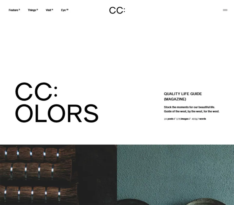
CC:OLORS pairs an unusually quiet interface with large editorial images. The opening screen places a two-line wordmark low on the left and a small publication statement far to the right, leaving most of the upper canvas empty. Small category labels, superscript counts, regular-weight typography, and almost invisible interface furniture let the publication feel like a carefully paced magazine.
The page continues as a long editorial sequence. Full-width story photographs lead into a two-column article index, large destination tiles, an inverted Eye section, and a footer that ends with another photograph. Color belongs primarily to the content: pale plaster, red architectural details, warm stone, portraits, and vivid event posters. The reusable identity is the relationship between restrained typography, generous spacing, and substantial image areas.
閉じる
CC:OLORS — Style Reference
A spacious monochrome magazine whose photographs supply the color.
Website / original URL: ccolors.jp Final URL: https://ccolors.jp/ Theme: predominantly white with black typography; a black Eye section and photographic surfaces provide contrast. Inspected: October 2, 2026, at 05:18:40.822 JST, corresponding to October 1, 2026, at 20:18:40.822 UTC. Viewports: 1440 × 1000 desktop and 390 × 844 mobile, in CSS pixels. Scope: the current magazine homepage, using the supplied browser captures and rendered DOM/computed-style evidence: persistent header, opening identity composition, six featured stories, Recent Posts, Visit, Eye, footer navigation, and the closing 1 WALL GALLERY photograph. Article pages, the opened menu, and destination pages were not inspected.
CC:OLORS pairs an unusually quiet interface with large editorial images. The opening screen places a two-line wordmark low on the left and a small publication statement far to the right, leaving most of the upper canvas empty. Small category labels, superscript counts, regular-weight typography, and almost invisible interface furniture let the publication feel like a carefully paced magazine.
The page continues as a long editorial sequence. Full-width story photographs lead into a two-column article index, large destination tiles, an inverted Eye section, and a footer that ends with another photograph. Color belongs primarily to the content: pale plaster, red architectural details, warm stone, portraits, and vivid event posters. The reusable identity is the relationship between restrained typography, generous spacing, and substantial image areas.
How to Read This Reference
- Measured values come from the supplied rendered element rectangles and computed styles. Decimal values are retained where useful for implementation.
- Visually observed details come from the current desktop and mobile captures. Screenshot estimates are labeled; they are not pixel samples or recovered source declarations.
- Calculated values express relationships between measured dimensions, such as an 81px column gutter or an 8% mobile inset.
- Recommended choices belong to the reusable implementation. The breakpoint, CSS selectors, accessibility treatments, and scaling clamps below are adaptations.
- Evidence coverage varies: the opening, desktop article grid, footer, and closing photograph have visual evidence. Visit geometry and the mobile Eye surface are established mainly by DOM measurements.
Two distinctions are especially important. First, several desktop elements compute to white text while appearing black in the screenshots. The evidence does not include enough compositing information to identify the mechanism. Describe the visible white-and-black result without assuming a particular blend mode. Second, the H1 has no extracted text and has a graphic-shaped rectangle. Its inherited 10px or 11.7188px font size does not describe the visible wordmark lettering.
Tokens — Colors
Default Palette
| Name | Value | Suggested token | Role and evidence |
|---|---|---|---|
| Canvas White | #ffffff |
--color-paper |
Exact computed HTML background; visible opening canvas, article surroundings, and footer |
| Ink Black | #000000 |
--color-ink |
Exact computed text color in the mobile opening and article index; visible primary interface color |
| Reverse White | #ffffff |
--color-reverse |
Exact computed foreground on the mobile Eye section and featured-story captions |
| Eye Black | #000000 |
--color-eye |
Exact computed mobile Eye background |
| Fine Rule | approximately #e3e3e3 |
--color-rule |
Visual estimate for the mobile footer divider; recommended approximation |
| Menu Gray | approximately #808080 |
--color-menu |
Visual estimate for the two short menu strokes; recommended approximation |
Black and white are the actual interface palette. The yellow, pink, red, turquoise, beige, and muted green visible in the captures belong to photographs or poster artwork. They should not become global category colors or button fills.
Color Behavior
The header sits over both white space and photography. It appears dark on the opening canvas and lighter or more muted over the closing photograph. Several computed desktop foregrounds also differ from their visible screenshot appearance. This establishes context-dependent rendering, but does not establish whether it uses blending, an overlay, state classes, or another technique.
For a new implementation, start with explicit dark and light foreground states. Verify contrast over each image before adding a compositing effect. Do not reproduce white computed declarations on a white background without reproducing the missing rendering context.
The black Eye section is a section-level surface change. No user-selectable theme system was demonstrated.
Tokens — Typography
Main Interface Family
- Declared stack:
neue-haas-grotesk-display, yu-gothic-pr6n, sans-serif. - Observed weight:
400throughout the sampled navigation, introductory copy, metadata, and section headings. - Character: restrained grotesque lettering, open spacing, modest heading sizes, and very little weight contrast.
- Evidence limit: the computed family declaration identifies the requested stack; it does not independently prove which font file rendered every glyph.
Use the named families only when appropriately available. A generic sans-serif fallback should preserve hierarchy and spacing, but will not reproduce the same letterforms exactly.
Article Titles and Tags
Article titles explicitly declare yu-gothic-pr6n, sans-serif, including titles containing Latin words. Their tracking is generally 0.09em, with a relaxed line height of 1.6 in Recent Posts and 1.75 over featured imagery.
Hashtags use the same Japanese family, but the sampled Recent Posts tags have normal tracking. They remain plain text links rather than capsules.
Read More Controls
The sampled featured-story Read More buttons compute to Arial, weight 400, at 13.5px desktop and 12.48px mobile. This is a specific exception to the main interface stack. The broader View all and View more links use the main stack.
Type Scale
All sizes below are measured unless marked as estimates. Desktop and mobile columns describe the two inspected viewports, not a recovered fluid formula.
| Role | Desktop | Mobile | Line height / tracking |
|---|---|---|---|
| Root font size | 10px | 11.7188px | Root line height matches size |
| Header category label | 13.5px | Hidden in the top header | 1; 0.04em |
| Introductory heading | 16px | 14.56px | 1.55; 0.07em |
| Introductory description | 12px | 11.44px | 1.55; 0.07em |
| Publication counters | 10px | 10.4px | 1; 0.07em |
| Section heading | 33.75px | 20.8px | 1; 0.02em |
| Japanese section subtitle | 13.5px | 10.4px | 1; 0.09em |
| Article date and category | 11.25px | 10.4px | 1; 0.07em |
| Recent Posts title | 15.75px | 14.56px | 1.6; 0.09em |
| Featured-story title | 15.75px | 14.56px | 1.75; 0.09em |
| Recent Posts hashtag | 11.25px | 10.4px | 1; normal tracking |
| Read More / View all | 13.5px | 12.48px | Control-specific; 0.07em |
| Section-ending View more | 20.25px | 18.72px | Approximately 1; 0.04em |
| Visit tile name | 13.5px | 12.48px | 1.6; 0.09em |
| Gallery title | About 30px | About 20px | Screenshot estimate |
| Gallery credit | About 14px | About 11px | Screenshot estimate |
Wordmark Geometry
| Mark | Desktop measured box | Mobile measured box | Composition |
|---|---|---|---|
| Header CC: mark | 78.75 × 34.875px | 46.266 × 20.484px | Centered on desktop; upper left on mobile |
| Opening CC:OLORS mark | 375 × 182px | 192.391 × 27.75px | Two lines on desktop; one line on mobile |
Use a suitable brand asset when available. A text approximation can establish layout, but should not be represented as the original graphic. Do not derive the wordmark's display size from the H1's inherited font size.
Tokens — Spacing & Shapes
Density: sparse at the page level, compact within metadata groups. Geometry: square image edges, unboxed links, fine rules, and large rectangular photographic areas.
The root font size changes between the supplied viewports, but the full scaling rules were not supplied. Many content values fit a calculated unit of 1.125px on desktop and 1.04px on mobile: metadata is ten units, article titles fourteen, and standard action text twelve. This is a useful adaptation model, not a confirmed source variable.
Spacing Scale
| Use | Desktop | Mobile | Evidence |
|---|---|---|---|
| Main article inset | 90px | 31.203px | Measured; equivalent to 6.25% and approximately 8% of viewport width |
| Article content width | 1260px total | 327.594px | Calculated from measured edges |
| Recent Posts column width | 589.5px | 327.594px | Measured |
| Recent Posts horizontal gutter | 81px | Not applicable | Calculated from column positions |
| Row clearance after the lowest tag links | 78.75px | About 72.8px | Calculated from sampled successive rows |
| Metadata line to article-title box | 13.5px | About 12.47px | Calculated vertical gap |
| Article-title box to tag hit area | 6.75px | About 6.23px | Calculated vertical gap |
| Hashtag link padding | 5.625px | 5.2px | Computed |
| Recent section start to heading top | 304.625px | 98.484px | Measured offset, not necessarily a single padding declaration |
| Recent heading bottom to first article top | 139.625px | 71.453px | Calculated; the mobile subtitle occupies part of this space |
| Intro heading to description | 15px | About 14.3px | Calculated |
| Intro description to counters | 20px | About 20.8px | Calculated |
Spacing changes by component. The desktop header label begins at x = 40px, while article content begins at x = 90px. On mobile, the header mark begins at x ≈ 20.8px, while editorial content begins at x ≈ 31.2px. Do not force these into one universal gutter.
Border Radius
| Element | Treatment |
|---|---|
| Article images and feature areas | Square corners |
| Text links and sampled controls | Computed radius 0px |
| Destination tiles | Rectangular, without visible rounded-card styling |
| Footer separator | Thin straight rule |
There is no visible general-purpose shadow or elevation system. Image boundaries, whitespace, and surface inversion provide separation.
Layout Measurements
| Element | Desktop: 1440 × 1000 | Mobile: 390 × 844 |
|---|---|---|
| Document height | 18824.484px | 14387.125px |
| Header home mark position | x = 680.625, y = 31px | x = 20.797, y = 16.625px |
| Menu target rectangle | 90 × 90px | 62.391 × 56.156px |
| Opening mark position | x = 95.625, y = 409px | x = 31.203, y = 167.469px |
| Intro copy column | x = 1068.75; width 286.875px | x = 31.203; width 327.594px |
| First feature begins | y = 716px | y = 488.563px |
| Each of six feature links | 1440 × 877.5px | 390 × 660.391px |
| Recent Posts begins | y = 5981px | y = 4450.906px |
| First Recent Posts article begins | y = 6459px | y = 4641.641px |
| Visit tile size | 720 × 675px | 390 × 390px |
| Mobile Eye section | Desktop rectangle not supplied | y = 12140.781px; height 1239.484px |
The header and opening section both have viewport-height rectangles in the DOM evidence. Those rectangles are not equivalent to an opaque viewport-height header or a full viewport of blank space before the first photograph. The first feature visibly starts much earlier: 716px desktop and about 489px mobile.
Components
Persistent Header
Role: keeps the publication identity and category access available during a long scroll.
On desktop, four category links sit at the upper left: Feature, Things, Visit, and Eye. Each has a small raised count. The current capture shows 13, 61, 100, and 89 respectively. These are content values, not permanent design tokens.
The CC: home mark is centered independently of the left navigation. A minimal two-stroke menu affordance sits at the far right. The first navigation anchor measures approximately 112.875 × 66.672px, with 25px 17px padding, even though its visible text is only 13.5px. Preserve that difference between a quiet visual control and a larger interaction area.
At 390px, the category links disappear from the top header. The home mark moves left and becomes smaller; the menu remains right aligned. The same header positions remain visible in the supplied scrolled captures, supporting persistent positioning. The exact source positioning declaration was not included.
The menu was not opened. Its panel layout, keyboard behavior, closing behavior, and transition must remain unverified.
Opening Identity Composition
Role: introduces the publication before its article sequence.
The desktop composition has two separated groups:
- A large CC:OLORS graphic on the left, broken after
CC:. - A narrow publication statement on the right:
QUALITY LIFE GUIDE,(MAGAZINE), a short English description, and publication counters.
The wordmark's measured bottom is y = 591px, almost exactly aligned with the bottom of the counters. This bottom alignment is more useful than treating the two groups as vertically centered independent blocks.
The current visible counters are 263 posts / 39194 images / 441859 words. Their numeric content appears in the screenshots even though the extracted paragraph strings omit those digits. Treat them as a captured content snapshot.
On mobile, the wordmark becomes one line at y ≈ 167.5px. The introductory heading starts at y ≈ 314.8px, with the description and counters below. The first image begins at y ≈ 488.6px. The large gap between the mark and description is deliberate in the captured composition.
A desktop mid-page capture also shows the large opening wordmark partially visible underneath article content. This is evidence of overlap or persistent layering in that captured state. The exact stacking and scroll logic were not supplied, so an adaptation should not manufacture parallax or reproduce the overlap by simply placing a logo over readable article text.
Full-Width Featured Story
Role: gives selected editorial stories a photographic opening sequence.
The DOM establishes six vertically arranged story links with equal dimensions at each inspected viewport. This is a vertical series; the supplied evidence does not establish a carousel.
Each story groups:
- A large visual area extending to both viewport edges.
- A publication date.
- A category label.
- A regular-weight article title.
- A small
Read Moretreatment.
The caption group starts at x = 90px on desktop and x ≈ 31.2px on mobile. A sampled desktop caption width is 371.25px; mobile captions use the 327.594px editorial width. Dates and categories are much smaller than the image, and titles remain approximately 16px rather than becoming marketing-sized headlines.
The first story is linked to NEPENTHES WOMAN OSAKA. Its visible image opening is a pale wall with a red architectural or mirror detail on desktop. The mobile crop shows predominantly the pale wall. This demonstrates responsive framing rather than a requirement to display the full photograph at every viewport.
The sampled source includes a button element inside the story anchor. For a new implementation, use one semantic story link and a non-interactive Read More span inside it, avoiding nested interactive elements.
Section Heading
Role: identifies an editorial category and offers access to its full index.
Desktop section headings form a wide horizontal arrangement: English title at the left, a smaller Japanese subtitle farther across the row, and View all aligned toward the right edge.
Observed pairings include:
Recent Postswithあたらしいこと.Visitwith行きたいところ.Eyewith眼.
On mobile, the subtitle moves below the English heading. View all stays on the right beside the heading area. The English title shrinks from 33.75px to 20.8px, a larger proportional change than the article body text.
Keep these headings light and unboxed. Their hierarchy comes from placement and whitespace rather than bold weight or a colored strip.
Recent Posts Article
Role: supports browsing the latest eight articles shown in the inspected homepage.
The desktop list has two equal-width columns. Both articles in each row begin at the same vertical position, while their image and caption heights vary. This creates uneven caption baselines within an orderly row grid. It should not be assumed to be masonry.
An article contains a large square-cornered image, a compact date/category line, a Japanese or mixed-language title, and separate hashtag links. A short vertical separator is visible between date and category. Text begins directly against the image's left alignment, without an inner card gutter.
The desktop middle capture shows a bright yellow event poster beside a portrait. Their bottoms occur at different heights, and the captions follow each image individually. The next pair begins on a shared row below. A pink artwork panel and a vivid event graphic appear in that next row.
On mobile, articles stack in one column at 327.594px width. Titles retain their editorial line breaks where they fit, and the metadata remains compact. Hashtags wrap as text links; they do not become colored filter chips.
Preserve each image's intended proportions. A common fixed crop would erase the distinction between a tall portrait, a poster, and a wide event graphic.
Plain Text Navigation Links
Role: supplies navigation without introducing button chrome.
View all, View more, Read More, category links, and social links are predominantly text. Section-ending View more is larger and centered, with a measured target around 153.5 × 63px desktop and 141.844 × 58.875px mobile.
Several extracted labels occur twice within a single control. This can support a layered text treatment, but the evidence does not demonstrate the movement or trigger. Render one visible label and one accessible name; do not display duplicated text because it appears twice in the extraction.
Visit Destination Tile
Role: gives places a larger, more immersive browsing format than ordinary article summaries.
The six observed entries include moyi store, 珈琲大雅, Lo-Fi USED CLOTHING, MISENOMA, KITO FOREST MARKET SHIMOICHI, and savi no niwa.
Desktop tiles form two edge-to-edge columns, each 720 × 675px. Mobile tiles stack at 390 × 390px. Each tile includes a city hashtag near the upper center, the place name below, and a centered View more toward the bottom.
Measured city-tag targets start about 73.1px below the desktop tile top and 34.3px below the mobile tile top. The text foreground alternates between white and black across the sampled entries. This is evidence of per-tile contrast choices, not proof of alternating solid background colors.
The actual tile imagery is not visible in the supplied screenshot selection. Retain the measured structure without inventing specific photographs or hover effects.
Eye Section
Role: presents a distinct photographic/editorial index within the homepage.
The mobile DOM explicitly gives this section a black background and white text. It retains the same section-heading anatomy, followed by repeated date/location entries and a View more link. Its measured bottom padding is 88.4px.
The desktop text extraction contains nine date/location pairs; the mobile extraction contains six. These counts describe the captured states. The evidence does not establish whether the difference is a responsive limit, loading state, or another display rule.
No supplied screenshot directly shows the Eye grid. Its precise image arrangement, any slide controls, and interaction behavior cannot be reconstructed from the available text and partial rectangles. The CSS starter implements the verified inverted surface, not an invented gallery mechanism.
Footer Navigation and Publication Signature
Role: closes the editorial sequence with broad navigation and publication identity.
The DOM places a publication signature before the footer navigation, including QUALITY LIFE, GUIDE, (MAGAZINE), and CC:OLORS. The mobile footer capture shows part of a wordmark-and-image arrangement at its upper edge. Its complete geometry and motion are not established.
Below this, the mobile navigation forms three columns and two rows:
Feature,Things,Visit.Eye,About,Contact.
Category counts remain raised beside their labels. A pale horizontal rule separates this grid from Instagram, Twitter, Privacy Policy, and © CC:OLORS.
The footer uses the same approximately 31px mobile side inset as the article content. In the supplied frame, the divider lies around y = 228px and the utility row around y = 282px. These are screenshot-relative positions, not document offsets.
Contact is a mail link in the rendered evidence. No contact-form interface was inspected.
1 WALL GALLERY
Role: provides a final editorial image after the navigation footer.
The closing photograph fills the desktop capture: warm stone blocks, a barred window, and a person passing with a bicycle. The photo's texture and large quiet wall area are central to its composition. On mobile, the crop gives the window a strong upper position and the person a lower position.
1 WALL GALLERY is centered near the lower portion of the image, with Photo by Taku Tsutsui below. The current original page directly supplies this photo credit and links the gallery label to the photographer's Instagram profile. This is a credit for the gallery photograph, not evidence of website design authorship.
A small upward chevron appears at the lower right. It suggests a return-up action, but activation and scrolling behavior were not tested. Approximately 487px of the gallery image is visible beneath the footer in the mobile capture; that visible extent alone does not establish the full source section height.
Tokens — Motion & Interaction
The computed styles provide several precise transition declarations. These establish available transitions, not a complete record of their activation or visual trajectory.
| Element | Observed declaration | Interpretation and limitation |
|---|---|---|
| Body | opacity 0.6s, background-color 0.25s |
Supports opacity and surface changes; triggering state not supplied |
| Opening wordmark | opacity 1.5s cubic-bezier(0.455, 0.03, 0.515, 0.955) |
Slow eased opacity transition; starting opacity and trigger unverified |
| Intro description | opacity 3.5s 0.8s |
Long delayed opacity transition; do not infer a perpetual animation |
| Posts counter group | transform 1.25s cubic-bezier(0.19, 1, 0.22, 1) 1.3s |
First staggered transform declaration |
| Images counter group | Same duration/easing; delay 1.62s |
Second group starts 320ms later |
| Words counter group | Same duration/easing; delay 1.94s |
Third group starts another 320ms later |
| Desktop category anchors | opacity 0.15s |
Short opacity feedback is declared; exact target opacity and trigger unverified |
| Many other sampled elements | transition: all; animation: none |
Insufficient to identify a nonzero transition or prove that the site has no motion |
Persistent header positions and multiple scroll locations are visually evidenced. Link destinations are present in the DOM. No supplied interaction trace demonstrates menu opening, article navigation, image zoom, automatic slides, counter arithmetic, or a back-to-top animation.
The capture process waited for finite motion and sampled layout stability, while temporarily pausing perpetual animations during readiness checks. This improves screenshot stability but does not prove that every delayed or interactive state was reached. Preserve the documented restraint; do not add scroll-jacking or dramatic motion as if it were observed.
Surfaces
| Surface | Appearance | Function |
|---|---|---|
| Opening canvas | White with black visible typography | Establishes identity through empty space |
| Header | Visually transparent over the page | Keeps navigation present without an opaque bar |
| Featured story | Full-width image area with small captions | Provides editorial scale and pacing |
| Recent Posts | Images and text directly on white | Supports browsing without card containers |
| Visit | Large rectangular destination areas | Changes the scale and rhythm of place content |
| Eye | Measured black background with white text on mobile | Creates a distinct editorial chapter |
| Footer | White with a faint divider | Separates main navigation from utility links |
| Closing gallery | Full-bleed natural-color photograph | Ends with an image rather than a conversion panel |
Avoid adding shadows, translucent glass panels, rounded image masks, or multiple tinted surface levels. The supplied design gains structure from proportion and sequence.
Imagery
The current visual evidence combines documentary photography and supplied editorial graphics. The first full-width story begins with pale plaster and a red vertical detail. A Recent Posts portrait shows a seated figure against a bright window and warm floor. Other article images include a yellow typographic poster, pink artwork framing, and a saturated event graphic. The closing gallery uses warm architectural stone and deep human shadows.
These images do not share one color grade or aspect ratio. Preserve their individual character while keeping the surrounding interface consistent. In particular, serif lettering inside an event poster is artwork typography; it is not evidence of a serif UI heading family.
Use full-width cropping for immersive story photographs where appropriate. Preserve the artwork's full composition in the article index, particularly when a poster contains text. Mobile art direction should retain a useful focal area rather than blindly centering every image.
Observed Asset References
Only two exact image URLs are present in the supplied custom-property evidence. Their variable names indicate loading-related usage; the provided captures do not establish when they appear or which visible image they correspond to.
| Source property | Observed URL | Evidence limit |
|---|---|---|
--loading-pc |
https://ccolors.jp/cms/wp-content/uploads/2022/04/takashi_load_11.jpg |
Declared desktop loading-image reference; display state unverified |
--loading-sp |
https://ccolors.jp/cms/wp-content/uploads/2022/04/takashi_load_10-750x1318.jpg |
Declared mobile loading-image reference; display state unverified |
The original logo asset paths, article-image URLs, and closing-gallery image URL were not supplied. Do not manufacture those paths or assume the loading references are the gallery photograph.
Layout & Responsive Behavior
The measured content sequence is opening identity, six featured stories, Recent Posts, Visit, Eye, publication signature/footer, and closing gallery. This sequence makes the homepage an editorial destination in its own right.
| Concern | Desktop observation | Mobile observation |
|---|---|---|
| Header | Left category navigation, centered home mark, right menu | Left home mark and right menu; top category navigation absent |
| Opening identity | Large two-line mark and distant right-hand copy | Single-line mark followed by vertically separated copy |
| Editorial inset | 90px / 6.25% | Approximately 31.2px / 8% |
| Featured stories | Wide 1440 × 877.5px panels | Tall 390 × 660.391px panels |
| Recent Posts | Two 589.5px columns with an 81px gutter | One 327.594px column |
| Article imagery | Different image heights within aligned rows | Each article follows the preceding one vertically |
| Section heading | Title, Japanese subtitle, and View all distributed horizontally | Subtitle beneath title; View all remains right aligned |
| Visit | Two 720 × 675px tiles per row | One square 390 × 390px tile per row |
| Footer | Full desktop arrangement not isolated in the supplied frames | Three-column navigation, rule, and compact utility row |
| Closing image | Broad architectural crop | Narrow crop emphasizing window above the passing figure |
Only the two endpoint widths were inspected. The original breakpoint, tablet behavior, maximum content width, landscape-phone behavior, and safe-area handling are unknown.
The Quick Start uses a recommended 760px breakpoint and explicit scaling limits. It preserves the measured endpoint relationships without claiming those rules came from the original stylesheet. Its opening section also uses normal document flow rather than reproducing the unresolved desktop wordmark overlap.
Do’s and Don’ts
Do
- Keep the interface fundamentally white and black.
- Let photographs and article artwork introduce the color.
- Preserve the independent desktop alignment of left navigation, centered CC: mark, and right menu.
- Maintain the opening composition's large unused upper area.
- Use a two-line desktop wordmark and a compact single-line mobile version.
- Keep typography predominantly regular weight with deliberate tracking.
- Preserve the two-column article grid and its 81px desktop gutter at the inspected width.
- Let article images retain different proportions while keeping row starts aligned.
- Keep metadata, hashtags, and reading links visually modest.
- Distinguish full-bleed story panels from the inset article index.
- Retain the black Eye section and the photographic ending.
- Check visible rendering when computed colors conflict with screenshots.
Don’t
- Do not replace the magazine sequence with a generic product pitch, feature-card section, and conversion form.
- Do not make every title bold or oversized.
- Do not turn category names or hashtags into colorful pills.
- Do not apply one fixed image ratio to the entire article index.
- Do not mistake poster lettering or poster colors for interface tokens.
- Do not add rounded cards, heavy borders, or soft shadows to create hierarchy.
- Do not reproduce the H1's inherited root font size as the wordmark size.
- Do not assume duplicated DOM labels should be visibly duplicated.
- Do not invent carousel, menu, parallax, or gallery interactions from static captures.
- Do not force a 100vh empty intro merely because the source section has a viewport-height rectangle.
- Do not reproduce the unresolved logo overlap at the expense of article readability.
Recommended Implementation Additions
These are recommendations for a new implementation, not verified features of the original page:
- Give graphical home marks and the opening H1 explicit accessible names. An empty text extraction alone does not establish whether the original accessible name is missing.
- Implement the menu affordance as a button with a clear name and accurate expanded state. If it opens an overlay, provide appropriate focus management and Escape behavior.
- Keep whole-story navigation in a single anchor; keep independent hashtag links outside that anchor.
- Provide visible keyboard focus without changing the quiet default appearance.
- Retain generous invisible interaction areas around small text and icons. Aim for approximately 44px touch targets where practical.
- Consider increasing 10–11px metadata to at least 12px in an accessibility-oriented adaptation, while preserving relative hierarchy.
- Reserve image space with intrinsic dimensions to reduce layout movement. Use responsive image sources and deliberate focal points for full-width photography.
- Keep meaningful content visible without an animation-ready script. Respect reduced-motion preferences for opacity and transform effects.
- Test contrast on each photographic caption area. Prefer a stable crop or a localized contrast treatment when white text crosses a pale region.
- Verify the unobserved menu, Eye layout, tablet range, and wordmark layering before claiming a faithful interactive reconstruction.
Agent Prompt Guide
Quick Color Reference
- Main page and article surroundings:
#ffffff. - Primary visible text:
#000000. - Eye surface: black with white text.
- Photographic captions: white where sufficient contrast exists.
- Footer divider: approximately
#e3e3e3, an implementation estimate. - Accent colors: supplied by photographs and editorial artwork, not interface controls.
Overall Prompt
“Create an editorial magazine homepage inspired by the current CC:OLORS page. Use a white canvas, black regular-weight grotesque typography, small tracked metadata, and substantial whitespace. On desktop, place four category links with superscript counts at the upper left, a centered compact home mark, and a two-line menu icon at the right. Build an opening identity composition with a large two-line wordmark low on the left and a narrow publication statement far to the right. Follow it with six full-width photographic stories, an inset two-column article index, large destination tiles, a black photographic-index section, footer navigation, and a closing architectural photograph. At 1440px, use 90px editorial margins, 589.5px article columns, and an 81px gutter. At 390px, use approximately 31.2px margins and one article column. Keep image proportions varied, links unboxed, and corners square. Treat any unverified animation or menu behavior as a separate design decision.”
Example Component Prompts
- Opening identity: “Create a white magazine introduction with a 375 × 182px two-line brand graphic at desktop scale. Align the bottom of its right-hand publication statement with the bottom of the graphic. Include a small uppercase heading, a two-sentence description, and a compact posts/images/words line. On mobile, use a single-line brand graphic and a large vertical gap before the description.”
- Article index: “Build two 589.5px editorial columns within a 1260px content area, separated by 81px. Keep row starts aligned but preserve each image's natural height. Below each image, show an 11.25px date/category line, a regular 15.75px Japanese title with 1.6 line height, and plain hashtag links. No card background, border radius, or shadow.”
- Section heading: “Place a light 33.75px English section title at left, a small Japanese subtitle farther across the row, and a plain View all link at right. On a 390px screen, reduce the title to 20.8px and move the subtitle below it while retaining the right-hand link.”
- Destination tiles: “Build six large linked destination tiles in two edge-to-edge columns. Use 720 × 675px desktop proportions and square full-width tiles on mobile. Center a small city hashtag and place name near the top, with a quiet View more near the bottom. Set caption color per image rather than by category.”
- Closing gallery: “End the page with a full-bleed documentary architectural photograph, natural warm stone colors, and a human subject low in the composition. Place a modest white gallery title and smaller photo credit near the lower center, plus a fine upward chevron at the lower right. Do not add a promotional CTA panel.”
Quick Start
CSS Custom Properties
This is a reusable adaptation, not recovered source code. It keeps a conventional root font size and uses --u to match many measured component sizes at the two supplied viewports. The clamps and 760px breakpoint are recommendations. Intro height proportions, image positioning, footer spacing, and hover opacity are implementation approximations.
The wordmark rules below provide a text fallback using two spans. Replace that fallback with authorized brand artwork for closer visual accuracy. Supply actual image assets separately; none of the selectors imply that unprovided asset URLs are known.
:root {
  /* Exact observed interface colors */
  --color-paper: #fff;
  --color-ink: #000;
  --color-reverse: #fff;
  --color-eye: #000;

  /* Visual estimates used by this adaptation */
  --color-rule: #e3e3e3;
  --color-menu: #808080;

  /* Declared source families, with usable fallbacks */
  --font-ui: neue-haas-grotesk-display, yu-gothic-pr6n, sans-serif;
  --font-article: yu-gothic-pr6n, sans-serif;
  --font-read-more: Arial, sans-serif;

  /* Recommended scaling: 1.125px at a 1440px viewport */
  --u: clamp(1px, calc(100vw / 1280), 1.25px);
  --text-meta: calc(10 * var(--u));
  --text-ui: calc(12 * var(--u));
  --text-article: calc(14 * var(--u));
  --text-section: calc(30 * var(--u));
  --text-more: calc(18 * var(--u));
  --tracking-ui: 0.07em;
  --tracking-title: 0.09em;

  --page-inset: 6.25vw;
  --post-gap: 5.625vw;
  --row-gap: calc(70 * var(--u));
  --section-space: calc(266.6667 * var(--u));
  --radius: 0px;

  /* Measured transition declarations, available for explicit states */
  --motion-link: 150ms;
  --motion-body: 600ms;
  --motion-surface: 250ms;
  --motion-mark: 1500ms cubic-bezier(0.455, 0.03, 0.515, 0.955);
  --motion-counter: 1250ms cubic-bezier(0.19, 1, 0.22, 1);
}

.cc-site,
.cc-site * {
  box-sizing: border-box;
}

.cc-site {
  margin: 0;
  color: var(--color-ink);
  background: var(--color-paper);
  font-family: var(--font-ui);
  font-weight: 400;
  line-height: 1.55;
}

.cc-site a {
  color: inherit;
  text-decoration: none;
}

.cc-site button {
  font: inherit;
}

.cc-site img {
  display: block;
  max-width: 100%;
}

.cc-site h1,
.cc-site h2,
.cc-site h3,
.cc-site p {
  margin: 0;
  font-weight: 400;
}

/* Persistent controls, without a full-screen pointer-blocking layer */
.cc-header {
  position: fixed;
  inset: 0 0 auto;
  z-index: 30;
  height: 90px;
  color: var(--header-ink, #000);
  pointer-events: none;
}

.cc-header a,
.cc-header button {
  pointer-events: auto;
}

.cc-nav {
  position: absolute;
  top: 15px;
  left: 23px;
  display: flex;
}

.cc-nav a {
  padding: 25px 17px;
  font-size: 13.5px;
  line-height: 1;
  letter-spacing: 0.04em;
  transition: opacity var(--motion-link);
}

.cc-nav sup,
.cc-footer-nav sup {
  margin-inline-start: 0.35em;
  font-size: 0.67em;
}

.cc-home {
  position: absolute;
  top: 31px;
  left: 50%;
  width: 78.75px;
  height: 34.875px;
  transform: translateX(-50%);
}

.cc-home img,
.cc-home svg {
  width: 100%;
  height: 100%;
}

.cc-menu {
  position: absolute;
  top: 0;
  right: 0;
  display: flex;
  flex-direction: column;
  align-items: center;
  justify-content: center;
  gap: 4px;
  width: 90px;
  height: 90px;
  padding: 0;
  border: 0;
  border-radius: 0;
  color: var(--color-menu);
  background: transparent;
  cursor: pointer;
}

.cc-menu span {
  width: 22px;
  height: 1px;
  background: currentColor;
}

/* Normal-flow approximation of the captured opening composition */
.cc-intro {
  display: flex;
  align-items: flex-end;
  justify-content: space-between;
  gap: 48px;
  min-height: 71.6svh;
  padding: 160px var(--page-inset) 125px;
}

.cc-wordmark {
  flex: 0 0 auto;
  width: 375px;
  height: 182px;
  font-size: 112px;
  line-height: 91px;
  letter-spacing: -0.04em;
}

.cc-wordmark span {
  display: block;
}

.cc-intro-copy {
  width: 286.875px;
  max-width: 100%;
  letter-spacing: 0.07em;
}

.cc-intro-copy h2 {
  margin-bottom: 15px;
  font-size: 16px;
  line-height: 1.55;
}

.cc-intro-copy .cc-deck {
  margin-bottom: 20px;
  font-size: 12px;
  line-height: 1.55;
}

.cc-counts {
  display: flex;
  flex-wrap: wrap;
  gap: 0.5em;
  font-size: 10px;
  line-height: 1;
}

/* Aspect ratios are calculated from captured link rectangles */
.cc-feature {
  position: relative;
  display: block;
  aspect-ratio: 64 / 39;
  color: var(--feature-ink, #fff);
  overflow: hidden;
}

.cc-feature > img,
.cc-visit-tile > img,
.cc-gallery > img {
  position: absolute;
  inset: 0;
  width: 100%;
  height: 100%;
  object-fit: cover;
  object-position: var(--image-position, 50% 50%);
}

.cc-feature-copy {
  position: absolute;
  left: var(--page-inset);
  bottom: calc(70 * var(--u));
  width: min(371.25px, 84%);
}

.cc-feature-date,
.cc-feature-category {
  font-size: var(--text-meta);
  line-height: 1;
  letter-spacing: var(--tracking-ui);
}

.cc-feature-date {
  margin-bottom: calc(43 * var(--u)) !important;
}

.cc-feature-category {
  margin-bottom: calc(13 * var(--u)) !important;
}

.cc-feature-title {
  font-family: var(--font-article);
  font-size: var(--text-article);
  line-height: 1.75;
  letter-spacing: var(--tracking-title);
}

.cc-read-more {
  display: inline-block;
  margin-top: calc(46 * var(--u));
  font-family: var(--font-read-more);
  font-size: var(--text-ui);
  letter-spacing: var(--tracking-ui);
}

.cc-section {
  padding-top: var(--section-space);
}

.cc-section-heading {
  display: grid;
  grid-template-columns: 29.83% 1fr auto;
  align-items: center;
  margin: 0 var(--page-inset) calc(120 * var(--u));
}

.cc-section-heading h2 {
  font-size: var(--text-section);
  line-height: 1;
  letter-spacing: 0.02em;
}

.cc-section-heading p {
  font-size: var(--text-ui);
  line-height: 1;
  letter-spacing: 0.09em;
}

.cc-section-all {
  padding: var(--text-ui);
  margin-inline-end: calc(-1 * var(--text-ui));
  font-size: var(--text-ui);
  line-height: 1.12;
  letter-spacing: var(--tracking-ui);
}

.cc-post-grid {
  display: grid;
  grid-template-columns: repeat(2, minmax(0, 1fr));
  column-gap: var(--post-gap);
  row-gap: var(--row-gap);
  margin-inline: var(--page-inset);
}

.cc-post {
  min-width: 0;
}

.cc-post-image {
  width: 100%;
  height: auto;
  border-radius: 0;
}

.cc-post-meta {
  display: flex;
  align-items: center;
  flex-wrap: wrap;
  gap: calc(18 * var(--u));
  margin-top: calc(26 * var(--u));
  font-size: var(--text-meta);
  line-height: 1;
  letter-spacing: var(--tracking-ui);
}

.cc-post-category {
  padding-left: calc(14 * var(--u));
  border-left: 1px solid currentColor;
}

.cc-post-title {
  margin-top: calc(12 * var(--u)) !important;
  font-family: var(--font-article);
  font-size: var(--text-article);
  line-height: 1.6;
  letter-spacing: var(--tracking-title);
  overflow-wrap: anywhere;
}

.cc-tags {
  display: flex;
  flex-wrap: wrap;
  gap: calc(3.3333 * var(--u));
  margin: calc(6 * var(--u)) 0 0 calc(-5 * var(--u));
  padding: 0;
  list-style: none;
}

.cc-tags a {
  display: block;
  padding: calc(5 * var(--u));
  font-family: var(--font-article);
  font-size: var(--text-meta);
  line-height: 1;
}

.cc-section-more {
  display: table;
  margin: calc(124 * var(--u)) auto 0;
  padding: var(--text-more);
  font-size: var(--text-more);
  line-height: 1.12;
  letter-spacing: 0.04em;
}

.cc-visits .cc-section-heading {
  margin-bottom: calc(60 * var(--u));
}

.cc-visit-grid {
  display: grid;
  grid-template-columns: repeat(2, minmax(0, 1fr));
}

.cc-visit-tile {
  position: relative;
  aspect-ratio: 16 / 15;
  color: var(--tile-ink, #fff);
  text-align: center;
  overflow: hidden;
}

.cc-visit-city,
.cc-visit-name,
.cc-visit-more {
  position: absolute;
  inset-inline: 20px;
  font-size: var(--text-ui);
  letter-spacing: var(--tracking-ui);
}

.cc-visit-city {
  top: calc(65 * var(--u));
}

.cc-visit-name {
  top: calc(95 * var(--u));
  font-family: var(--font-article);
  line-height: 1.6;
  letter-spacing: var(--tracking-title);
}

.cc-visit-more {
  bottom: calc(77 * var(--u));
}

/* Only the inverted surface is established for this section */
.cc-eye {
  padding-bottom: calc(85 * var(--u));
  color: var(--color-reverse);
  background: var(--color-eye);
}

.cc-footer {
  padding: 80px var(--page-inset) 64px;
}

.cc-footer-nav {
  display: grid;
  grid-template-columns: repeat(6, minmax(0, 1fr));
  gap: 28px 20px;
  font-size: 16px;
  letter-spacing: 0.04em;
}

.cc-footer-utility {
  display: flex;
  flex-wrap: wrap;
  align-items: center;
  justify-content: space-between;
  gap: 20px;
  margin-top: 44px;
  padding-top: 44px;
  border-top: 1px solid var(--color-rule);
  font-size: 12px;
}

.cc-gallery {
  position: relative;
  min-height: 100svh;
  color: #fff;
  overflow: hidden;
}

.cc-gallery-caption {
  position: absolute;
  right: 24px;
  bottom: 100px;
  left: 24px;
  text-align: center;
}

.cc-gallery-caption h2 {
  margin-bottom: 20px;
  font-size: 30px;
  line-height: 1.2;
}

.cc-gallery-caption p {
  font-size: 14px;
  letter-spacing: 0.04em;
}

/* Recommended return-up control; source activation was not tested */
.cc-return-up {
  position: absolute;
  right: 28px;
  bottom: 20px;
  display: grid;
  place-items: center;
  width: 44px;
  height: 44px;
}

.cc-return-up::before {
  content: '';
  width: 17px;
  height: 17px;
  border-top: 1px solid currentColor;
  border-left: 1px solid currentColor;
  transform: translateY(5px) rotate(45deg);
}

.cc-site :focus-visible {
  outline: 2px solid currentColor;
  outline-offset: 5px;
}

/* Recommended feedback, not an observed target opacity */
@media (hover: hover) {
  .cc-nav a:hover,
  .cc-section-all:hover,
  .cc-tags a:hover {
    opacity: 0.65;
  }
}

/* Recommended breakpoint; the source breakpoint is unknown */
@media (max-width: 760px) {
  :root {
    --u: clamp(1px, calc(100vw / 375), 1.15px);
    --page-inset: 8vw;
    --text-section: calc(20 * var(--u));
    --section-space: calc(86 * var(--u));
  }

  .cc-header {
    height: 56.156px;
  }

  .cc-nav {
    display: none;
  }

  .cc-home {
    top: 16.625px;
    left: 5.3333vw;
    width: 46.266px;
    height: 20.484px;
    transform: none;
  }

  .cc-menu {
    width: 62.391px;
    height: 56.156px;
  }

  .cc-intro {
    display: block;
    min-height: 0;
    padding: 167.469px var(--page-inset) 47.67px;
  }

  .cc-wordmark {
    width: 192.391px;
    height: 27.75px;
    font-size: 38px;
    line-height: 27.75px;
    white-space: nowrap;
  }

  .cc-wordmark span {
    display: inline;
  }

  .cc-intro-copy {
    width: 100%;
    margin-top: 119.609px;
  }

  .cc-intro-copy h2 {
    margin-bottom: 14.3px;
    font-size: calc(14 * var(--u));
  }

  .cc-intro-copy .cc-deck {
    margin-bottom: calc(20 * var(--u));
    font-size: calc(11 * var(--u));
  }

  .cc-counts {
    font-size: var(--text-meta);
  }

  .cc-feature {
    aspect-ratio: 390 / 660.390625;
  }

  .cc-feature-copy {
    right: var(--page-inset);
    bottom: calc(32 * var(--u));
    width: auto;
  }

  .cc-section-heading {
    grid-template-columns: 1fr auto;
    grid-template-areas: 'title all' 'subtitle .';
    row-gap: calc(2 * var(--u));
    margin-bottom: calc(48 * var(--u));
  }

  .cc-section-heading h2 {
    grid-area: title;
  }

  .cc-section-heading p {
    grid-area: subtitle;
    font-size: var(--text-meta);
  }

  .cc-section-all {
    grid-area: all;
  }

  .cc-post-grid,
  .cc-visit-grid {
    grid-template-columns: minmax(0, 1fr);
  }

  .cc-post-meta {
    margin-top: calc(20 * var(--u));
  }

  .cc-section-more {
    margin-top: calc(50 * var(--u));
  }

  .cc-visits .cc-section-heading {
    margin-bottom: calc(48 * var(--u));
  }

  .cc-visit-tile {
    aspect-ratio: 1;
  }

  .cc-visit-city {
    top: calc(33 * var(--u));
    font-size: var(--text-meta);
  }

  .cc-visit-name {
    top: calc(56 * var(--u));
  }

  .cc-visit-more {
    bottom: calc(32 * var(--u));
  }

  .cc-footer-nav {
    grid-template-columns: repeat(3, minmax(0, 1fr));
    column-gap: 12px;
  }

  .cc-footer-utility {
    gap: 12px;
    font-size: 11px;
  }

  /* Crop approximation based on the visible mobile gallery framing */
  .cc-gallery {
    min-height: 0;
    aspect-ratio: 4 / 5;
  }

  .cc-gallery-caption {
    bottom: 38px;
  }

  .cc-gallery-caption h2 {
    margin-bottom: 10px;
    font-size: 20px;
  }

  .cc-gallery-caption p {
    font-size: 11px;
  }

  .cc-return-up {
    right: 10px;
    bottom: 8px;
  }
}

@media (prefers-reduced-motion: reduce) {
  .cc-site *,
  .cc-site *::before,
  .cc-site *::after {
    animation: none !important;
    transition: none !important;
    scroll-behavior: auto !important;
  }
}
Use .cc-post as an article wrapper containing the main article link and a sibling .cc-tags list. Use .cc-visit-tile as a wrapper when its city hashtag and story destination are separate links. For the text wordmark fallback, keep the two spans adjacent in the markup so the mobile version reads CC:OLORS without an inserted space.
Set --header-ink, --feature-ink, --tile-ink, and --image-position explicitly for the content being displayed. The starter does not infer image contrast, implement the unobserved menu panel, or reproduce the unresolved scroll-layering behavior. Its content is visible by default; connect the measured transition tokens only after defining and testing explicit states.
Tailwind v4 Token Mapping
Optional mapping for an implementation that already uses Tailwind v4. These names are adaptation aliases; the original site's framework was not established. Define the custom properties above first.
@theme inline {
  --color-paper: #fff;
  --color-ink: #000;
  --color-eye: #000;
  --color-rule: #e3e3e3;

  --font-editorial: var(--font-ui);
  --font-japanese: var(--font-article);

  --text-meta: calc(10 * var(--u));
  --text-ui: calc(12 * var(--u));
  --text-article: calc(14 * var(--u));
  --text-heading: var(--text-section);
  --text-more: calc(18 * var(--u));

  --spacing-editorial: var(--page-inset);
  --spacing-column: var(--post-gap);
  --spacing-row: var(--row-gap);
  --radius-editorial: 0px;
}
Sources & Evidence
- Inspected original and final page: CC:OLORS. The supplied browser record reports HTTP 200 and no URL change.
- Capture timestamp:
2026-10-01T20:18:40.822Z, equivalent to October 2, 2026, at 05:18:40.822 JST. - Desktop evidence: 1440 × 1000 viewport; current opening, article-list, and closing-gallery captures; rendered text, links, computed styles, and element rectangles. Measured document height: 18824.484px.
- Mobile evidence: 390 × 844 viewport; current opening and footer/gallery captures; rendered text, links, computed styles, and element rectangles. Measured document height: 14387.125px.
- Original-page credit evidence: the homepage directly displays
1 WALL GALLERYandPhoto by Taku Tsutsui, with an outgoing photographer-profile link. No website-production credit is established by the supplied original-page evidence. - Inspection method: the provided browser process waited for document load, finite motion, sampled stability, and visible image decoding within stated time limits, and traversed intermediate scroll positions. SharedWorkers and service workers were disabled.
- Limits: this reference was prepared from the supplied evidence without additional browsing. Menu activation, hover results, article navigation, gallery controls, actual breakpoint rules, complete compositing styles, and unshown image layouts remain unverified. Computed transitions are documented separately from demonstrated interactions.
This reference describes the current homepage represented by those captures. Measurements belong to the inspected viewports; estimates and recommended implementation choices are identified throughout.
# CC:OLORS — Style Reference

> A spacious monochrome magazine whose photographs supply the color.

**Website / original URL:** [ccolors.jp](https://ccolors.jp/)
**Final URL:** [https://ccolors.jp/](https://ccolors.jp/)
**Theme:** predominantly white with black typography; a black Eye section and photographic surfaces provide contrast.
**Inspected:** October 2, 2026, at 05:18:40.822 JST, corresponding to October 1, 2026, at 20:18:40.822 UTC.
**Viewports:** 1440 × 1000 desktop and 390 × 844 mobile, in CSS pixels.
**Scope:** the current magazine homepage, using the supplied browser captures and rendered DOM/computed-style evidence: persistent header, opening identity composition, six featured stories, Recent Posts, Visit, Eye, footer navigation, and the closing 1 WALL GALLERY photograph. Article pages, the opened menu, and destination pages were not inspected.

CC:OLORS pairs an unusually quiet interface with large editorial images. The opening screen places a two-line wordmark low on the left and a small publication statement far to the right, leaving most of the upper canvas empty. Small category labels, superscript counts, regular-weight typography, and almost invisible interface furniture let the publication feel like a carefully paced magazine.

The page continues as a long editorial sequence. Full-width story photographs lead into a two-column article index, large destination tiles, an inverted Eye section, and a footer that ends with another photograph. Color belongs primarily to the content: pale plaster, red architectural details, warm stone, portraits, and vivid event posters. The reusable identity is the relationship between restrained typography, generous spacing, and substantial image areas.
閉じる
# CC:OLORS — Style Reference

> A spacious monochrome magazine whose photographs supply the color.

**Website / original URL:** [ccolors.jp](https://ccolors.jp/)
**Final URL:** [https://ccolors.jp/](https://ccolors.jp/)
**Theme:** predominantly white with black typography; a black Eye section and photographic surfaces provide contrast.
**Inspected:** October 2, 2026, at 05:18:40.822 JST, corresponding to October 1, 2026, at 20:18:40.822 UTC.
**Viewports:** 1440 × 1000 desktop and 390 × 844 mobile, in CSS pixels.
**Scope:** the current magazine homepage, using the supplied browser captures and rendered DOM/computed-style evidence: persistent header, opening identity composition, six featured stories, Recent Posts, Visit, Eye, footer navigation, and the closing 1 WALL GALLERY photograph. Article pages, the opened menu, and destination pages were not inspected.

CC:OLORS pairs an unusually quiet interface with large editorial images. The opening screen places a two-line wordmark low on the left and a small publication statement far to the right, leaving most of the upper canvas empty. Small category labels, superscript counts, regular-weight typography, and almost invisible interface furniture let the publication feel like a carefully paced magazine.

The page continues as a long editorial sequence. Full-width story photographs lead into a two-column article index, large destination tiles, an inverted Eye section, and a footer that ends with another photograph. Color belongs primarily to the content: pale plaster, red architectural details, warm stone, portraits, and vivid event posters. The reusable identity is the relationship between restrained typography, generous spacing, and substantial image areas.

## How to Read This Reference

- **Measured** values come from the supplied rendered element rectangles and computed styles. Decimal values are retained where useful for implementation.
- **Visually observed** details come from the current desktop and mobile captures. Screenshot estimates are labeled; they are not pixel samples or recovered source declarations.
- **Calculated** values express relationships between measured dimensions, such as an 81px column gutter or an 8% mobile inset.
- **Recommended** choices belong to the reusable implementation. The breakpoint, CSS selectors, accessibility treatments, and scaling clamps below are adaptations.
- **Evidence coverage varies:** the opening, desktop article grid, footer, and closing photograph have visual evidence. Visit geometry and the mobile Eye surface are established mainly by DOM measurements.

Two distinctions are especially important. First, several desktop elements compute to white text while appearing black in the screenshots. The evidence does not include enough compositing information to identify the mechanism. Describe the visible white-and-black result without assuming a particular blend mode. Second, the H1 has no extracted text and has a graphic-shaped rectangle. Its inherited 10px or 11.7188px font size does not describe the visible wordmark lettering.

## Tokens — Colors

### Default Palette

| Name | Value | Suggested token | Role and evidence |
| --- | --- | --- | --- |
| Canvas White | `#ffffff` | `--color-paper` | Exact computed HTML background; visible opening canvas, article surroundings, and footer |
| Ink Black | `#000000` | `--color-ink` | Exact computed text color in the mobile opening and article index; visible primary interface color |
| Reverse White | `#ffffff` | `--color-reverse` | Exact computed foreground on the mobile Eye section and featured-story captions |
| Eye Black | `#000000` | `--color-eye` | Exact computed mobile Eye background |
| Fine Rule | approximately `#e3e3e3` | `--color-rule` | Visual estimate for the mobile footer divider; recommended approximation |
| Menu Gray | approximately `#808080` | `--color-menu` | Visual estimate for the two short menu strokes; recommended approximation |

Black and white are the actual interface palette. The yellow, pink, red, turquoise, beige, and muted green visible in the captures belong to photographs or poster artwork. They should not become global category colors or button fills.

### Color Behavior

The header sits over both white space and photography. It appears dark on the opening canvas and lighter or more muted over the closing photograph. Several computed desktop foregrounds also differ from their visible screenshot appearance. This establishes context-dependent rendering, but does not establish whether it uses blending, an overlay, state classes, or another technique.

For a new implementation, start with explicit dark and light foreground states. Verify contrast over each image before adding a compositing effect. Do not reproduce white computed declarations on a white background without reproducing the missing rendering context.

The black Eye section is a section-level surface change. No user-selectable theme system was demonstrated.

## Tokens — Typography

### Main Interface Family

- **Declared stack:** `neue-haas-grotesk-display, yu-gothic-pr6n, sans-serif`.
- **Observed weight:** `400` throughout the sampled navigation, introductory copy, metadata, and section headings.
- **Character:** restrained grotesque lettering, open spacing, modest heading sizes, and very little weight contrast.
- **Evidence limit:** the computed family declaration identifies the requested stack; it does not independently prove which font file rendered every glyph.

Use the named families only when appropriately available. A generic sans-serif fallback should preserve hierarchy and spacing, but will not reproduce the same letterforms exactly.

### Article Titles and Tags

Article titles explicitly declare `yu-gothic-pr6n, sans-serif`, including titles containing Latin words. Their tracking is generally `0.09em`, with a relaxed line height of `1.6` in Recent Posts and `1.75` over featured imagery.

Hashtags use the same Japanese family, but the sampled Recent Posts tags have normal tracking. They remain plain text links rather than capsules.

### Read More Controls

The sampled featured-story `Read More` buttons compute to `Arial`, weight `400`, at 13.5px desktop and 12.48px mobile. This is a specific exception to the main interface stack. The broader `View all` and `View more` links use the main stack.

### Type Scale

All sizes below are measured unless marked as estimates. Desktop and mobile columns describe the two inspected viewports, not a recovered fluid formula.

| Role | Desktop | Mobile | Line height / tracking |
| --- | --- | --- | --- |
| Root font size | 10px | 11.7188px | Root line height matches size |
| Header category label | 13.5px | Hidden in the top header | `1`; `0.04em` |
| Introductory heading | 16px | 14.56px | `1.55`; `0.07em` |
| Introductory description | 12px | 11.44px | `1.55`; `0.07em` |
| Publication counters | 10px | 10.4px | `1`; `0.07em` |
| Section heading | 33.75px | 20.8px | `1`; `0.02em` |
| Japanese section subtitle | 13.5px | 10.4px | `1`; `0.09em` |
| Article date and category | 11.25px | 10.4px | `1`; `0.07em` |
| Recent Posts title | 15.75px | 14.56px | `1.6`; `0.09em` |
| Featured-story title | 15.75px | 14.56px | `1.75`; `0.09em` |
| Recent Posts hashtag | 11.25px | 10.4px | `1`; normal tracking |
| Read More / View all | 13.5px | 12.48px | Control-specific; `0.07em` |
| Section-ending View more | 20.25px | 18.72px | Approximately `1`; `0.04em` |
| Visit tile name | 13.5px | 12.48px | `1.6`; `0.09em` |
| Gallery title | About 30px | About 20px | Screenshot estimate |
| Gallery credit | About 14px | About 11px | Screenshot estimate |

### Wordmark Geometry

| Mark | Desktop measured box | Mobile measured box | Composition |
| --- | --- | --- | --- |
| Header CC: mark | 78.75 × 34.875px | 46.266 × 20.484px | Centered on desktop; upper left on mobile |
| Opening CC:OLORS mark | 375 × 182px | 192.391 × 27.75px | Two lines on desktop; one line on mobile |

Use a suitable brand asset when available. A text approximation can establish layout, but should not be represented as the original graphic. Do not derive the wordmark's display size from the H1's inherited font size.

## Tokens — Spacing & Shapes

**Density:** sparse at the page level, compact within metadata groups.
**Geometry:** square image edges, unboxed links, fine rules, and large rectangular photographic areas.

The root font size changes between the supplied viewports, but the full scaling rules were not supplied. Many content values fit a calculated unit of 1.125px on desktop and 1.04px on mobile: metadata is ten units, article titles fourteen, and standard action text twelve. This is a useful adaptation model, not a confirmed source variable.

### Spacing Scale

| Use | Desktop | Mobile | Evidence |
| --- | --- | --- | --- |
| Main article inset | 90px | 31.203px | Measured; equivalent to 6.25% and approximately 8% of viewport width |
| Article content width | 1260px total | 327.594px | Calculated from measured edges |
| Recent Posts column width | 589.5px | 327.594px | Measured |
| Recent Posts horizontal gutter | 81px | Not applicable | Calculated from column positions |
| Row clearance after the lowest tag links | 78.75px | About 72.8px | Calculated from sampled successive rows |
| Metadata line to article-title box | 13.5px | About 12.47px | Calculated vertical gap |
| Article-title box to tag hit area | 6.75px | About 6.23px | Calculated vertical gap |
| Hashtag link padding | 5.625px | 5.2px | Computed |
| Recent section start to heading top | 304.625px | 98.484px | Measured offset, not necessarily a single padding declaration |
| Recent heading bottom to first article top | 139.625px | 71.453px | Calculated; the mobile subtitle occupies part of this space |
| Intro heading to description | 15px | About 14.3px | Calculated |
| Intro description to counters | 20px | About 20.8px | Calculated |

Spacing changes by component. The desktop header label begins at x = 40px, while article content begins at x = 90px. On mobile, the header mark begins at x ≈ 20.8px, while editorial content begins at x ≈ 31.2px. Do not force these into one universal gutter.

### Border Radius

| Element | Treatment |
| --- | --- |
| Article images and feature areas | Square corners |
| Text links and sampled controls | Computed radius `0px` |
| Destination tiles | Rectangular, without visible rounded-card styling |
| Footer separator | Thin straight rule |

There is no visible general-purpose shadow or elevation system. Image boundaries, whitespace, and surface inversion provide separation.

### Layout Measurements

| Element | Desktop: 1440 × 1000 | Mobile: 390 × 844 |
| --- | --- | --- |
| Document height | 18824.484px | 14387.125px |
| Header home mark position | x = 680.625, y = 31px | x = 20.797, y = 16.625px |
| Menu target rectangle | 90 × 90px | 62.391 × 56.156px |
| Opening mark position | x = 95.625, y = 409px | x = 31.203, y = 167.469px |
| Intro copy column | x = 1068.75; width 286.875px | x = 31.203; width 327.594px |
| First feature begins | y = 716px | y = 488.563px |
| Each of six feature links | 1440 × 877.5px | 390 × 660.391px |
| Recent Posts begins | y = 5981px | y = 4450.906px |
| First Recent Posts article begins | y = 6459px | y = 4641.641px |
| Visit tile size | 720 × 675px | 390 × 390px |
| Mobile Eye section | Desktop rectangle not supplied | y = 12140.781px; height 1239.484px |

The header and opening section both have viewport-height rectangles in the DOM evidence. Those rectangles are not equivalent to an opaque viewport-height header or a full viewport of blank space before the first photograph. The first feature visibly starts much earlier: 716px desktop and about 489px mobile.

## Components

### Persistent Header

**Role:** keeps the publication identity and category access available during a long scroll.

On desktop, four category links sit at the upper left: `Feature`, `Things`, `Visit`, and `Eye`. Each has a small raised count. The current capture shows 13, 61, 100, and 89 respectively. These are content values, not permanent design tokens.

The CC: home mark is centered independently of the left navigation. A minimal two-stroke menu affordance sits at the far right. The first navigation anchor measures approximately 112.875 × 66.672px, with `25px 17px` padding, even though its visible text is only 13.5px. Preserve that difference between a quiet visual control and a larger interaction area.

At 390px, the category links disappear from the top header. The home mark moves left and becomes smaller; the menu remains right aligned. The same header positions remain visible in the supplied scrolled captures, supporting persistent positioning. The exact source positioning declaration was not included.

The menu was not opened. Its panel layout, keyboard behavior, closing behavior, and transition must remain unverified.

### Opening Identity Composition

**Role:** introduces the publication before its article sequence.

The desktop composition has two separated groups:

1. A large CC:OLORS graphic on the left, broken after `CC:`.
2. A narrow publication statement on the right: `QUALITY LIFE GUIDE`, `(MAGAZINE)`, a short English description, and publication counters.

The wordmark's measured bottom is y = 591px, almost exactly aligned with the bottom of the counters. This bottom alignment is more useful than treating the two groups as vertically centered independent blocks.

The current visible counters are `263 posts / 39194 images / 441859 words`. Their numeric content appears in the screenshots even though the extracted paragraph strings omit those digits. Treat them as a captured content snapshot.

On mobile, the wordmark becomes one line at y ≈ 167.5px. The introductory heading starts at y ≈ 314.8px, with the description and counters below. The first image begins at y ≈ 488.6px. The large gap between the mark and description is deliberate in the captured composition.

A desktop mid-page capture also shows the large opening wordmark partially visible underneath article content. This is evidence of overlap or persistent layering in that captured state. The exact stacking and scroll logic were not supplied, so an adaptation should not manufacture parallax or reproduce the overlap by simply placing a logo over readable article text.

### Full-Width Featured Story

**Role:** gives selected editorial stories a photographic opening sequence.

The DOM establishes six vertically arranged story links with equal dimensions at each inspected viewport. This is a vertical series; the supplied evidence does not establish a carousel.

Each story groups:

- A large visual area extending to both viewport edges.
- A publication date.
- A category label.
- A regular-weight article title.
- A small `Read More` treatment.

The caption group starts at x = 90px on desktop and x ≈ 31.2px on mobile. A sampled desktop caption width is 371.25px; mobile captions use the 327.594px editorial width. Dates and categories are much smaller than the image, and titles remain approximately 16px rather than becoming marketing-sized headlines.

The first story is linked to `NEPENTHES WOMAN OSAKA`. Its visible image opening is a pale wall with a red architectural or mirror detail on desktop. The mobile crop shows predominantly the pale wall. This demonstrates responsive framing rather than a requirement to display the full photograph at every viewport.

The sampled source includes a button element inside the story anchor. For a new implementation, use one semantic story link and a non-interactive `Read More` span inside it, avoiding nested interactive elements.

### Section Heading

**Role:** identifies an editorial category and offers access to its full index.

Desktop section headings form a wide horizontal arrangement: English title at the left, a smaller Japanese subtitle farther across the row, and `View all` aligned toward the right edge.

Observed pairings include:

- `Recent Posts` with `あたらしいこと`.
- `Visit` with `行きたいところ`.
- `Eye` with `眼`.

On mobile, the subtitle moves below the English heading. `View all` stays on the right beside the heading area. The English title shrinks from 33.75px to 20.8px, a larger proportional change than the article body text.

Keep these headings light and unboxed. Their hierarchy comes from placement and whitespace rather than bold weight or a colored strip.

### Recent Posts Article

**Role:** supports browsing the latest eight articles shown in the inspected homepage.

The desktop list has two equal-width columns. Both articles in each row begin at the same vertical position, while their image and caption heights vary. This creates uneven caption baselines within an orderly row grid. It should not be assumed to be masonry.

An article contains a large square-cornered image, a compact date/category line, a Japanese or mixed-language title, and separate hashtag links. A short vertical separator is visible between date and category. Text begins directly against the image's left alignment, without an inner card gutter.

The desktop middle capture shows a bright yellow event poster beside a portrait. Their bottoms occur at different heights, and the captions follow each image individually. The next pair begins on a shared row below. A pink artwork panel and a vivid event graphic appear in that next row.

On mobile, articles stack in one column at 327.594px width. Titles retain their editorial line breaks where they fit, and the metadata remains compact. Hashtags wrap as text links; they do not become colored filter chips.

Preserve each image's intended proportions. A common fixed crop would erase the distinction between a tall portrait, a poster, and a wide event graphic.

### Plain Text Navigation Links

**Role:** supplies navigation without introducing button chrome.

`View all`, `View more`, `Read More`, category links, and social links are predominantly text. Section-ending `View more` is larger and centered, with a measured target around 153.5 × 63px desktop and 141.844 × 58.875px mobile.

Several extracted labels occur twice within a single control. This can support a layered text treatment, but the evidence does not demonstrate the movement or trigger. Render one visible label and one accessible name; do not display duplicated text because it appears twice in the extraction.

### Visit Destination Tile

**Role:** gives places a larger, more immersive browsing format than ordinary article summaries.

The six observed entries include `moyi store`, `珈琲大雅`, `Lo-Fi USED CLOTHING`, `MISENOMA`, `KITO FOREST MARKET SHIMOICHI`, and `savi no niwa`.

Desktop tiles form two edge-to-edge columns, each 720 × 675px. Mobile tiles stack at 390 × 390px. Each tile includes a city hashtag near the upper center, the place name below, and a centered `View more` toward the bottom.

Measured city-tag targets start about 73.1px below the desktop tile top and 34.3px below the mobile tile top. The text foreground alternates between white and black across the sampled entries. This is evidence of per-tile contrast choices, not proof of alternating solid background colors.

The actual tile imagery is not visible in the supplied screenshot selection. Retain the measured structure without inventing specific photographs or hover effects.

### Eye Section

**Role:** presents a distinct photographic/editorial index within the homepage.

The mobile DOM explicitly gives this section a black background and white text. It retains the same section-heading anatomy, followed by repeated date/location entries and a `View more` link. Its measured bottom padding is 88.4px.

The desktop text extraction contains nine date/location pairs; the mobile extraction contains six. These counts describe the captured states. The evidence does not establish whether the difference is a responsive limit, loading state, or another display rule.

No supplied screenshot directly shows the Eye grid. Its precise image arrangement, any slide controls, and interaction behavior cannot be reconstructed from the available text and partial rectangles. The CSS starter implements the verified inverted surface, not an invented gallery mechanism.

### Footer Navigation and Publication Signature

**Role:** closes the editorial sequence with broad navigation and publication identity.

The DOM places a publication signature before the footer navigation, including `QUALITY LIFE`, `GUIDE`, `(MAGAZINE)`, and `CC:OLORS`. The mobile footer capture shows part of a wordmark-and-image arrangement at its upper edge. Its complete geometry and motion are not established.

Below this, the mobile navigation forms three columns and two rows:

- `Feature`, `Things`, `Visit`.
- `Eye`, `About`, `Contact`.

Category counts remain raised beside their labels. A pale horizontal rule separates this grid from `Instagram`, `Twitter`, `Privacy Policy`, and `© CC:OLORS`.

The footer uses the same approximately 31px mobile side inset as the article content. In the supplied frame, the divider lies around y = 228px and the utility row around y = 282px. These are screenshot-relative positions, not document offsets.

`Contact` is a mail link in the rendered evidence. No contact-form interface was inspected.

### 1 WALL GALLERY

**Role:** provides a final editorial image after the navigation footer.

The closing photograph fills the desktop capture: warm stone blocks, a barred window, and a person passing with a bicycle. The photo's texture and large quiet wall area are central to its composition. On mobile, the crop gives the window a strong upper position and the person a lower position.

`1 WALL GALLERY` is centered near the lower portion of the image, with `Photo by Taku Tsutsui` below. The current original page directly supplies this photo credit and links the gallery label to the photographer's Instagram profile. This is a credit for the gallery photograph, not evidence of website design authorship.

A small upward chevron appears at the lower right. It suggests a return-up action, but activation and scrolling behavior were not tested. Approximately 487px of the gallery image is visible beneath the footer in the mobile capture; that visible extent alone does not establish the full source section height.

## Tokens — Motion & Interaction

The computed styles provide several precise transition declarations. These establish available transitions, not a complete record of their activation or visual trajectory.

| Element | Observed declaration | Interpretation and limitation |
| --- | --- | --- |
| Body | `opacity 0.6s, background-color 0.25s` | Supports opacity and surface changes; triggering state not supplied |
| Opening wordmark | `opacity 1.5s cubic-bezier(0.455, 0.03, 0.515, 0.955)` | Slow eased opacity transition; starting opacity and trigger unverified |
| Intro description | `opacity 3.5s 0.8s` | Long delayed opacity transition; do not infer a perpetual animation |
| Posts counter group | `transform 1.25s cubic-bezier(0.19, 1, 0.22, 1) 1.3s` | First staggered transform declaration |
| Images counter group | Same duration/easing; delay `1.62s` | Second group starts 320ms later |
| Words counter group | Same duration/easing; delay `1.94s` | Third group starts another 320ms later |
| Desktop category anchors | `opacity 0.15s` | Short opacity feedback is declared; exact target opacity and trigger unverified |
| Many other sampled elements | `transition: all`; `animation: none` | Insufficient to identify a nonzero transition or prove that the site has no motion |

Persistent header positions and multiple scroll locations are visually evidenced. Link destinations are present in the DOM. No supplied interaction trace demonstrates menu opening, article navigation, image zoom, automatic slides, counter arithmetic, or a back-to-top animation.

The capture process waited for finite motion and sampled layout stability, while temporarily pausing perpetual animations during readiness checks. This improves screenshot stability but does not prove that every delayed or interactive state was reached. Preserve the documented restraint; do not add scroll-jacking or dramatic motion as if it were observed.

## Surfaces

| Surface | Appearance | Function |
| --- | --- | --- |
| Opening canvas | White with black visible typography | Establishes identity through empty space |
| Header | Visually transparent over the page | Keeps navigation present without an opaque bar |
| Featured story | Full-width image area with small captions | Provides editorial scale and pacing |
| Recent Posts | Images and text directly on white | Supports browsing without card containers |
| Visit | Large rectangular destination areas | Changes the scale and rhythm of place content |
| Eye | Measured black background with white text on mobile | Creates a distinct editorial chapter |
| Footer | White with a faint divider | Separates main navigation from utility links |
| Closing gallery | Full-bleed natural-color photograph | Ends with an image rather than a conversion panel |

Avoid adding shadows, translucent glass panels, rounded image masks, or multiple tinted surface levels. The supplied design gains structure from proportion and sequence.

## Imagery

The current visual evidence combines documentary photography and supplied editorial graphics. The first full-width story begins with pale plaster and a red vertical detail. A Recent Posts portrait shows a seated figure against a bright window and warm floor. Other article images include a yellow typographic poster, pink artwork framing, and a saturated event graphic. The closing gallery uses warm architectural stone and deep human shadows.

These images do not share one color grade or aspect ratio. Preserve their individual character while keeping the surrounding interface consistent. In particular, serif lettering inside an event poster is artwork typography; it is not evidence of a serif UI heading family.

Use full-width cropping for immersive story photographs where appropriate. Preserve the artwork's full composition in the article index, particularly when a poster contains text. Mobile art direction should retain a useful focal area rather than blindly centering every image.

### Observed Asset References

Only two exact image URLs are present in the supplied custom-property evidence. Their variable names indicate loading-related usage; the provided captures do not establish when they appear or which visible image they correspond to.

| Source property | Observed URL | Evidence limit |
| --- | --- | --- |
| `--loading-pc` | `https://ccolors.jp/cms/wp-content/uploads/2022/04/takashi_load_11.jpg` | Declared desktop loading-image reference; display state unverified |
| `--loading-sp` | `https://ccolors.jp/cms/wp-content/uploads/2022/04/takashi_load_10-750x1318.jpg` | Declared mobile loading-image reference; display state unverified |

The original logo asset paths, article-image URLs, and closing-gallery image URL were not supplied. Do not manufacture those paths or assume the loading references are the gallery photograph.

## Layout & Responsive Behavior

The measured content sequence is opening identity, six featured stories, Recent Posts, Visit, Eye, publication signature/footer, and closing gallery. This sequence makes the homepage an editorial destination in its own right.

| Concern | Desktop observation | Mobile observation |
| --- | --- | --- |
| Header | Left category navigation, centered home mark, right menu | Left home mark and right menu; top category navigation absent |
| Opening identity | Large two-line mark and distant right-hand copy | Single-line mark followed by vertically separated copy |
| Editorial inset | 90px / 6.25% | Approximately 31.2px / 8% |
| Featured stories | Wide 1440 × 877.5px panels | Tall 390 × 660.391px panels |
| Recent Posts | Two 589.5px columns with an 81px gutter | One 327.594px column |
| Article imagery | Different image heights within aligned rows | Each article follows the preceding one vertically |
| Section heading | Title, Japanese subtitle, and View all distributed horizontally | Subtitle beneath title; View all remains right aligned |
| Visit | Two 720 × 675px tiles per row | One square 390 × 390px tile per row |
| Footer | Full desktop arrangement not isolated in the supplied frames | Three-column navigation, rule, and compact utility row |
| Closing image | Broad architectural crop | Narrow crop emphasizing window above the passing figure |

Only the two endpoint widths were inspected. The original breakpoint, tablet behavior, maximum content width, landscape-phone behavior, and safe-area handling are unknown.

The Quick Start uses a recommended 760px breakpoint and explicit scaling limits. It preserves the measured endpoint relationships without claiming those rules came from the original stylesheet. Its opening section also uses normal document flow rather than reproducing the unresolved desktop wordmark overlap.

## Do’s and Don’ts

### Do

- Keep the interface fundamentally white and black.
- Let photographs and article artwork introduce the color.
- Preserve the independent desktop alignment of left navigation, centered CC: mark, and right menu.
- Maintain the opening composition's large unused upper area.
- Use a two-line desktop wordmark and a compact single-line mobile version.
- Keep typography predominantly regular weight with deliberate tracking.
- Preserve the two-column article grid and its 81px desktop gutter at the inspected width.
- Let article images retain different proportions while keeping row starts aligned.
- Keep metadata, hashtags, and reading links visually modest.
- Distinguish full-bleed story panels from the inset article index.
- Retain the black Eye section and the photographic ending.
- Check visible rendering when computed colors conflict with screenshots.

### Don’t

- Do not replace the magazine sequence with a generic product pitch, feature-card section, and conversion form.
- Do not make every title bold or oversized.
- Do not turn category names or hashtags into colorful pills.
- Do not apply one fixed image ratio to the entire article index.
- Do not mistake poster lettering or poster colors for interface tokens.
- Do not add rounded cards, heavy borders, or soft shadows to create hierarchy.
- Do not reproduce the H1's inherited root font size as the wordmark size.
- Do not assume duplicated DOM labels should be visibly duplicated.
- Do not invent carousel, menu, parallax, or gallery interactions from static captures.
- Do not force a 100vh empty intro merely because the source section has a viewport-height rectangle.
- Do not reproduce the unresolved logo overlap at the expense of article readability.

## Recommended Implementation Additions

These are recommendations for a new implementation, not verified features of the original page:

- Give graphical home marks and the opening H1 explicit accessible names. An empty text extraction alone does not establish whether the original accessible name is missing.
- Implement the menu affordance as a button with a clear name and accurate expanded state. If it opens an overlay, provide appropriate focus management and Escape behavior.
- Keep whole-story navigation in a single anchor; keep independent hashtag links outside that anchor.
- Provide visible keyboard focus without changing the quiet default appearance.
- Retain generous invisible interaction areas around small text and icons. Aim for approximately 44px touch targets where practical.
- Consider increasing 10–11px metadata to at least 12px in an accessibility-oriented adaptation, while preserving relative hierarchy.
- Reserve image space with intrinsic dimensions to reduce layout movement. Use responsive image sources and deliberate focal points for full-width photography.
- Keep meaningful content visible without an animation-ready script. Respect reduced-motion preferences for opacity and transform effects.
- Test contrast on each photographic caption area. Prefer a stable crop or a localized contrast treatment when white text crosses a pale region.
- Verify the unobserved menu, Eye layout, tablet range, and wordmark layering before claiming a faithful interactive reconstruction.

## Agent Prompt Guide

### Quick Color Reference

- Main page and article surroundings: `#ffffff`.
- Primary visible text: `#000000`.
- Eye surface: black with white text.
- Photographic captions: white where sufficient contrast exists.
- Footer divider: approximately `#e3e3e3`, an implementation estimate.
- Accent colors: supplied by photographs and editorial artwork, not interface controls.

### Overall Prompt

“Create an editorial magazine homepage inspired by the current CC:OLORS page. Use a white canvas, black regular-weight grotesque typography, small tracked metadata, and substantial whitespace. On desktop, place four category links with superscript counts at the upper left, a centered compact home mark, and a two-line menu icon at the right. Build an opening identity composition with a large two-line wordmark low on the left and a narrow publication statement far to the right. Follow it with six full-width photographic stories, an inset two-column article index, large destination tiles, a black photographic-index section, footer navigation, and a closing architectural photograph. At 1440px, use 90px editorial margins, 589.5px article columns, and an 81px gutter. At 390px, use approximately 31.2px margins and one article column. Keep image proportions varied, links unboxed, and corners square. Treat any unverified animation or menu behavior as a separate design decision.”

### Example Component Prompts

1. **Opening identity:** “Create a white magazine introduction with a 375 × 182px two-line brand graphic at desktop scale. Align the bottom of its right-hand publication statement with the bottom of the graphic. Include a small uppercase heading, a two-sentence description, and a compact posts/images/words line. On mobile, use a single-line brand graphic and a large vertical gap before the description.”
2. **Article index:** “Build two 589.5px editorial columns within a 1260px content area, separated by 81px. Keep row starts aligned but preserve each image's natural height. Below each image, show an 11.25px date/category line, a regular 15.75px Japanese title with 1.6 line height, and plain hashtag links. No card background, border radius, or shadow.”
3. **Section heading:** “Place a light 33.75px English section title at left, a small Japanese subtitle farther across the row, and a plain View all link at right. On a 390px screen, reduce the title to 20.8px and move the subtitle below it while retaining the right-hand link.”
4. **Destination tiles:** “Build six large linked destination tiles in two edge-to-edge columns. Use 720 × 675px desktop proportions and square full-width tiles on mobile. Center a small city hashtag and place name near the top, with a quiet View more near the bottom. Set caption color per image rather than by category.”
5. **Closing gallery:** “End the page with a full-bleed documentary architectural photograph, natural warm stone colors, and a human subject low in the composition. Place a modest white gallery title and smaller photo credit near the lower center, plus a fine upward chevron at the lower right. Do not add a promotional CTA panel.”

## Quick Start

### CSS Custom Properties

This is a reusable adaptation, not recovered source code. It keeps a conventional root font size and uses `--u` to match many measured component sizes at the two supplied viewports. The clamps and 760px breakpoint are recommendations. Intro height proportions, image positioning, footer spacing, and hover opacity are implementation approximations.

The wordmark rules below provide a text fallback using two spans. Replace that fallback with authorized brand artwork for closer visual accuracy. Supply actual image assets separately; none of the selectors imply that unprovided asset URLs are known.

```css
:root {
  /* Exact observed interface colors */
  --color-paper: #fff;
  --color-ink: #000;
  --color-reverse: #fff;
  --color-eye: #000;

  /* Visual estimates used by this adaptation */
  --color-rule: #e3e3e3;
  --color-menu: #808080;

  /* Declared source families, with usable fallbacks */
  --font-ui: neue-haas-grotesk-display, yu-gothic-pr6n, sans-serif;
  --font-article: yu-gothic-pr6n, sans-serif;
  --font-read-more: Arial, sans-serif;

  /* Recommended scaling: 1.125px at a 1440px viewport */
  --u: clamp(1px, calc(100vw / 1280), 1.25px);
  --text-meta: calc(10 * var(--u));
  --text-ui: calc(12 * var(--u));
  --text-article: calc(14 * var(--u));
  --text-section: calc(30 * var(--u));
  --text-more: calc(18 * var(--u));
  --tracking-ui: 0.07em;
  --tracking-title: 0.09em;

  --page-inset: 6.25vw;
  --post-gap: 5.625vw;
  --row-gap: calc(70 * var(--u));
  --section-space: calc(266.6667 * var(--u));
  --radius: 0px;

  /* Measured transition declarations, available for explicit states */
  --motion-link: 150ms;
  --motion-body: 600ms;
  --motion-surface: 250ms;
  --motion-mark: 1500ms cubic-bezier(0.455, 0.03, 0.515, 0.955);
  --motion-counter: 1250ms cubic-bezier(0.19, 1, 0.22, 1);
}

.cc-site,
.cc-site * {
  box-sizing: border-box;
}

.cc-site {
  margin: 0;
  color: var(--color-ink);
  background: var(--color-paper);
  font-family: var(--font-ui);
  font-weight: 400;
  line-height: 1.55;
}

.cc-site a {
  color: inherit;
  text-decoration: none;
}

.cc-site button {
  font: inherit;
}

.cc-site img {
  display: block;
  max-width: 100%;
}

.cc-site h1,
.cc-site h2,
.cc-site h3,
.cc-site p {
  margin: 0;
  font-weight: 400;
}

/* Persistent controls, without a full-screen pointer-blocking layer */
.cc-header {
  position: fixed;
  inset: 0 0 auto;
  z-index: 30;
  height: 90px;
  color: var(--header-ink, #000);
  pointer-events: none;
}

.cc-header a,
.cc-header button {
  pointer-events: auto;
}

.cc-nav {
  position: absolute;
  top: 15px;
  left: 23px;
  display: flex;
}

.cc-nav a {
  padding: 25px 17px;
  font-size: 13.5px;
  line-height: 1;
  letter-spacing: 0.04em;
  transition: opacity var(--motion-link);
}

.cc-nav sup,
.cc-footer-nav sup {
  margin-inline-start: 0.35em;
  font-size: 0.67em;
}

.cc-home {
  position: absolute;
  top: 31px;
  left: 50%;
  width: 78.75px;
  height: 34.875px;
  transform: translateX(-50%);
}

.cc-home img,
.cc-home svg {
  width: 100%;
  height: 100%;
}

.cc-menu {
  position: absolute;
  top: 0;
  right: 0;
  display: flex;
  flex-direction: column;
  align-items: center;
  justify-content: center;
  gap: 4px;
  width: 90px;
  height: 90px;
  padding: 0;
  border: 0;
  border-radius: 0;
  color: var(--color-menu);
  background: transparent;
  cursor: pointer;
}

.cc-menu span {
  width: 22px;
  height: 1px;
  background: currentColor;
}

/* Normal-flow approximation of the captured opening composition */
.cc-intro {
  display: flex;
  align-items: flex-end;
  justify-content: space-between;
  gap: 48px;
  min-height: 71.6svh;
  padding: 160px var(--page-inset) 125px;
}

.cc-wordmark {
  flex: 0 0 auto;
  width: 375px;
  height: 182px;
  font-size: 112px;
  line-height: 91px;
  letter-spacing: -0.04em;
}

.cc-wordmark span {
  display: block;
}

.cc-intro-copy {
  width: 286.875px;
  max-width: 100%;
  letter-spacing: 0.07em;
}

.cc-intro-copy h2 {
  margin-bottom: 15px;
  font-size: 16px;
  line-height: 1.55;
}

.cc-intro-copy .cc-deck {
  margin-bottom: 20px;
  font-size: 12px;
  line-height: 1.55;
}

.cc-counts {
  display: flex;
  flex-wrap: wrap;
  gap: 0.5em;
  font-size: 10px;
  line-height: 1;
}

/* Aspect ratios are calculated from captured link rectangles */
.cc-feature {
  position: relative;
  display: block;
  aspect-ratio: 64 / 39;
  color: var(--feature-ink, #fff);
  overflow: hidden;
}

.cc-feature > img,
.cc-visit-tile > img,
.cc-gallery > img {
  position: absolute;
  inset: 0;
  width: 100%;
  height: 100%;
  object-fit: cover;
  object-position: var(--image-position, 50% 50%);
}

.cc-feature-copy {
  position: absolute;
  left: var(--page-inset);
  bottom: calc(70 * var(--u));
  width: min(371.25px, 84%);
}

.cc-feature-date,
.cc-feature-category {
  font-size: var(--text-meta);
  line-height: 1;
  letter-spacing: var(--tracking-ui);
}

.cc-feature-date {
  margin-bottom: calc(43 * var(--u)) !important;
}

.cc-feature-category {
  margin-bottom: calc(13 * var(--u)) !important;
}

.cc-feature-title {
  font-family: var(--font-article);
  font-size: var(--text-article);
  line-height: 1.75;
  letter-spacing: var(--tracking-title);
}

.cc-read-more {
  display: inline-block;
  margin-top: calc(46 * var(--u));
  font-family: var(--font-read-more);
  font-size: var(--text-ui);
  letter-spacing: var(--tracking-ui);
}

.cc-section {
  padding-top: var(--section-space);
}

.cc-section-heading {
  display: grid;
  grid-template-columns: 29.83% 1fr auto;
  align-items: center;
  margin: 0 var(--page-inset) calc(120 * var(--u));
}

.cc-section-heading h2 {
  font-size: var(--text-section);
  line-height: 1;
  letter-spacing: 0.02em;
}

.cc-section-heading p {
  font-size: var(--text-ui);
  line-height: 1;
  letter-spacing: 0.09em;
}

.cc-section-all {
  padding: var(--text-ui);
  margin-inline-end: calc(-1 * var(--text-ui));
  font-size: var(--text-ui);
  line-height: 1.12;
  letter-spacing: var(--tracking-ui);
}

.cc-post-grid {
  display: grid;
  grid-template-columns: repeat(2, minmax(0, 1fr));
  column-gap: var(--post-gap);
  row-gap: var(--row-gap);
  margin-inline: var(--page-inset);
}

.cc-post {
  min-width: 0;
}

.cc-post-image {
  width: 100%;
  height: auto;
  border-radius: 0;
}

.cc-post-meta {
  display: flex;
  align-items: center;
  flex-wrap: wrap;
  gap: calc(18 * var(--u));
  margin-top: calc(26 * var(--u));
  font-size: var(--text-meta);
  line-height: 1;
  letter-spacing: var(--tracking-ui);
}

.cc-post-category {
  padding-left: calc(14 * var(--u));
  border-left: 1px solid currentColor;
}

.cc-post-title {
  margin-top: calc(12 * var(--u)) !important;
  font-family: var(--font-article);
  font-size: var(--text-article);
  line-height: 1.6;
  letter-spacing: var(--tracking-title);
  overflow-wrap: anywhere;
}

.cc-tags {
  display: flex;
  flex-wrap: wrap;
  gap: calc(3.3333 * var(--u));
  margin: calc(6 * var(--u)) 0 0 calc(-5 * var(--u));
  padding: 0;
  list-style: none;
}

.cc-tags a {
  display: block;
  padding: calc(5 * var(--u));
  font-family: var(--font-article);
  font-size: var(--text-meta);
  line-height: 1;
}

.cc-section-more {
  display: table;
  margin: calc(124 * var(--u)) auto 0;
  padding: var(--text-more);
  font-size: var(--text-more);
  line-height: 1.12;
  letter-spacing: 0.04em;
}

.cc-visits .cc-section-heading {
  margin-bottom: calc(60 * var(--u));
}

.cc-visit-grid {
  display: grid;
  grid-template-columns: repeat(2, minmax(0, 1fr));
}

.cc-visit-tile {
  position: relative;
  aspect-ratio: 16 / 15;
  color: var(--tile-ink, #fff);
  text-align: center;
  overflow: hidden;
}

.cc-visit-city,
.cc-visit-name,
.cc-visit-more {
  position: absolute;
  inset-inline: 20px;
  font-size: var(--text-ui);
  letter-spacing: var(--tracking-ui);
}

.cc-visit-city {
  top: calc(65 * var(--u));
}

.cc-visit-name {
  top: calc(95 * var(--u));
  font-family: var(--font-article);
  line-height: 1.6;
  letter-spacing: var(--tracking-title);
}

.cc-visit-more {
  bottom: calc(77 * var(--u));
}

/* Only the inverted surface is established for this section */
.cc-eye {
  padding-bottom: calc(85 * var(--u));
  color: var(--color-reverse);
  background: var(--color-eye);
}

.cc-footer {
  padding: 80px var(--page-inset) 64px;
}

.cc-footer-nav {
  display: grid;
  grid-template-columns: repeat(6, minmax(0, 1fr));
  gap: 28px 20px;
  font-size: 16px;
  letter-spacing: 0.04em;
}

.cc-footer-utility {
  display: flex;
  flex-wrap: wrap;
  align-items: center;
  justify-content: space-between;
  gap: 20px;
  margin-top: 44px;
  padding-top: 44px;
  border-top: 1px solid var(--color-rule);
  font-size: 12px;
}

.cc-gallery {
  position: relative;
  min-height: 100svh;
  color: #fff;
  overflow: hidden;
}

.cc-gallery-caption {
  position: absolute;
  right: 24px;
  bottom: 100px;
  left: 24px;
  text-align: center;
}

.cc-gallery-caption h2 {
  margin-bottom: 20px;
  font-size: 30px;
  line-height: 1.2;
}

.cc-gallery-caption p {
  font-size: 14px;
  letter-spacing: 0.04em;
}

/* Recommended return-up control; source activation was not tested */
.cc-return-up {
  position: absolute;
  right: 28px;
  bottom: 20px;
  display: grid;
  place-items: center;
  width: 44px;
  height: 44px;
}

.cc-return-up::before {
  content: '';
  width: 17px;
  height: 17px;
  border-top: 1px solid currentColor;
  border-left: 1px solid currentColor;
  transform: translateY(5px) rotate(45deg);
}

.cc-site :focus-visible {
  outline: 2px solid currentColor;
  outline-offset: 5px;
}

/* Recommended feedback, not an observed target opacity */
@media (hover: hover) {
  .cc-nav a:hover,
  .cc-section-all:hover,
  .cc-tags a:hover {
    opacity: 0.65;
  }
}

/* Recommended breakpoint; the source breakpoint is unknown */
@media (max-width: 760px) {
  :root {
    --u: clamp(1px, calc(100vw / 375), 1.15px);
    --page-inset: 8vw;
    --text-section: calc(20 * var(--u));
    --section-space: calc(86 * var(--u));
  }

  .cc-header {
    height: 56.156px;
  }

  .cc-nav {
    display: none;
  }

  .cc-home {
    top: 16.625px;
    left: 5.3333vw;
    width: 46.266px;
    height: 20.484px;
    transform: none;
  }

  .cc-menu {
    width: 62.391px;
    height: 56.156px;
  }

  .cc-intro {
    display: block;
    min-height: 0;
    padding: 167.469px var(--page-inset) 47.67px;
  }

  .cc-wordmark {
    width: 192.391px;
    height: 27.75px;
    font-size: 38px;
    line-height: 27.75px;
    white-space: nowrap;
  }

  .cc-wordmark span {
    display: inline;
  }

  .cc-intro-copy {
    width: 100%;
    margin-top: 119.609px;
  }

  .cc-intro-copy h2 {
    margin-bottom: 14.3px;
    font-size: calc(14 * var(--u));
  }

  .cc-intro-copy .cc-deck {
    margin-bottom: calc(20 * var(--u));
    font-size: calc(11 * var(--u));
  }

  .cc-counts {
    font-size: var(--text-meta);
  }

  .cc-feature {
    aspect-ratio: 390 / 660.390625;
  }

  .cc-feature-copy {
    right: var(--page-inset);
    bottom: calc(32 * var(--u));
    width: auto;
  }

  .cc-section-heading {
    grid-template-columns: 1fr auto;
    grid-template-areas: 'title all' 'subtitle .';
    row-gap: calc(2 * var(--u));
    margin-bottom: calc(48 * var(--u));
  }

  .cc-section-heading h2 {
    grid-area: title;
  }

  .cc-section-heading p {
    grid-area: subtitle;
    font-size: var(--text-meta);
  }

  .cc-section-all {
    grid-area: all;
  }

  .cc-post-grid,
  .cc-visit-grid {
    grid-template-columns: minmax(0, 1fr);
  }

  .cc-post-meta {
    margin-top: calc(20 * var(--u));
  }

  .cc-section-more {
    margin-top: calc(50 * var(--u));
  }

  .cc-visits .cc-section-heading {
    margin-bottom: calc(48 * var(--u));
  }

  .cc-visit-tile {
    aspect-ratio: 1;
  }

  .cc-visit-city {
    top: calc(33 * var(--u));
    font-size: var(--text-meta);
  }

  .cc-visit-name {
    top: calc(56 * var(--u));
  }

  .cc-visit-more {
    bottom: calc(32 * var(--u));
  }

  .cc-footer-nav {
    grid-template-columns: repeat(3, minmax(0, 1fr));
    column-gap: 12px;
  }

  .cc-footer-utility {
    gap: 12px;
    font-size: 11px;
  }

  /* Crop approximation based on the visible mobile gallery framing */
  .cc-gallery {
    min-height: 0;
    aspect-ratio: 4 / 5;
  }

  .cc-gallery-caption {
    bottom: 38px;
  }

  .cc-gallery-caption h2 {
    margin-bottom: 10px;
    font-size: 20px;
  }

  .cc-gallery-caption p {
    font-size: 11px;
  }

  .cc-return-up {
    right: 10px;
    bottom: 8px;
  }
}

@media (prefers-reduced-motion: reduce) {
  .cc-site *,
  .cc-site *::before,
  .cc-site *::after {
    animation: none !important;
    transition: none !important;
    scroll-behavior: auto !important;
  }
}
```

Use `.cc-post` as an article wrapper containing the main article link and a sibling `.cc-tags` list. Use `.cc-visit-tile` as a wrapper when its city hashtag and story destination are separate links. For the text wordmark fallback, keep the two spans adjacent in the markup so the mobile version reads `CC:OLORS` without an inserted space.

Set `--header-ink`, `--feature-ink`, `--tile-ink`, and `--image-position` explicitly for the content being displayed. The starter does not infer image contrast, implement the unobserved menu panel, or reproduce the unresolved scroll-layering behavior. Its content is visible by default; connect the measured transition tokens only after defining and testing explicit states.

### Tailwind v4 Token Mapping

Optional mapping for an implementation that already uses Tailwind v4. These names are adaptation aliases; the original site's framework was not established. Define the custom properties above first.

```css
@theme inline {
  --color-paper: #fff;
  --color-ink: #000;
  --color-eye: #000;
  --color-rule: #e3e3e3;

  --font-editorial: var(--font-ui);
  --font-japanese: var(--font-article);

  --text-meta: calc(10 * var(--u));
  --text-ui: calc(12 * var(--u));
  --text-article: calc(14 * var(--u));
  --text-heading: var(--text-section);
  --text-more: calc(18 * var(--u));

  --spacing-editorial: var(--page-inset);
  --spacing-column: var(--post-gap);
  --spacing-row: var(--row-gap);
  --radius-editorial: 0px;
}
```

## Sources & Evidence

- **Inspected original and final page:** [CC:OLORS](https://ccolors.jp/). The supplied browser record reports HTTP 200 and no URL change.
- **Capture timestamp:** `2026-10-01T20:18:40.822Z`, equivalent to October 2, 2026, at 05:18:40.822 JST.
- **Desktop evidence:** 1440 × 1000 viewport; current opening, article-list, and closing-gallery captures; rendered text, links, computed styles, and element rectangles. Measured document height: 18824.484px.
- **Mobile evidence:** 390 × 844 viewport; current opening and footer/gallery captures; rendered text, links, computed styles, and element rectangles. Measured document height: 14387.125px.
- **Original-page credit evidence:** the homepage directly displays `1 WALL GALLERY` and `Photo by Taku Tsutsui`, with an outgoing photographer-profile link. No website-production credit is established by the supplied original-page evidence.
- **Inspection method:** the provided browser process waited for document load, finite motion, sampled stability, and visible image decoding within stated time limits, and traversed intermediate scroll positions. SharedWorkers and service workers were disabled.
- **Limits:** this reference was prepared from the supplied evidence without additional browsing. Menu activation, hover results, article navigation, gallery controls, actual breakpoint rules, complete compositing styles, and unshown image layouts remain unverified. Computed transitions are documented separately from demonstrated interactions.

This reference describes the current homepage represented by those captures. Measurements belong to the inspected viewports; estimates and recommended implementation choices are identified throughout.関連するデザイン
スタイルやページの種類、ジャンルが近いデザインを集めました。