プレビュー準備中デザインリファレンスを見る
DESIGN REFERENCE
株式会社MIXI|コーポレートサイト
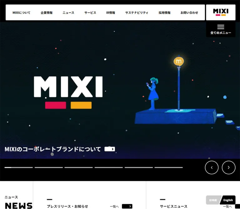
白黒の明快な構成にピンクとオレンジのアクセントを添えた企業サイト。独立した固定ナビゲーション、大型カルーセル、整然としたIRニュース、写真を使った採用導線が特徴。
MIXI — Corporate Website Style Reference
A monochrome corporate framework with small paired color marks, expansive imagery, and compact information controls.
Website: mixi.co.jp
Original URL: https://mixi.co.jp/
Final URL: https://mixi.co.jp/
Theme: predominantly white and pale gray, with a black desktop hero frame and black footer.
Inspected: supplied evidence captured October 2, 2026 at 01:46:38 JST; retrieval timestamp 2026-10-01T16:46:38.398Z.
Viewports: desktop 1440 × 1000 and mobile 390 × 844 CSS pixels.
Scope: the current Japanese corporate homepage: closed navigation, the visible AI-training carousel slide, the beginning of News, the desktop IR news list, recruitment imagery, footer, and persistent language controls. Additional homepage sections and navigation destinations are documented by rendered text and links, with limited visual coverage.
MIXI’s homepage combines a strict black-and-white interface with colorful editorial artwork. Its distinguishing feature is the detached navigation system: a white horizontal navigation block and white logo tile occupy the upper-right desktop corner, with a separate black menu tile immediately below the logo. On mobile, the logo moves to the upper left and the menu remains at the upper right.
The page serves several audiences through news, investor information, sustainability, and recruitment. Small Japanese labels and heavy uppercase English headings establish hierarchy. Thin rules organize information; compact arrow capsules identify destinations. Pink and orange appear together as small brand marks rather than filling every action. Large open areas and the black footer give the otherwise compact controls room to stand out.
The largest responsive change occurs in the hero. Desktop overlays the article caption and controls on the image stage. Mobile preserves the wide artwork above a separate pale-gray caption and control area. The footer retains a two-column identity-and-links composition even on the narrow capture.
閉じる
MIXI — Corporate Website Style Reference
A monochrome corporate framework with small paired color marks, expansive imagery, and compact information controls.
Website: mixi.co.jp
Original URL: https://mixi.co.jp/
Final URL: https://mixi.co.jp/
Theme: predominantly white and pale gray, with a black desktop hero frame and black footer.
Inspected: supplied evidence captured October 2, 2026 at 01:46:38 JST; retrieval timestamp 2026-10-01T16:46:38.398Z.
Viewports: desktop 1440 × 1000 and mobile 390 × 844 CSS pixels.
Scope: the current Japanese corporate homepage: closed navigation, the visible AI-training carousel slide, the beginning of News, the desktop IR news list, recruitment imagery, footer, and persistent language controls. Additional homepage sections and navigation destinations are documented by rendered text and links, with limited visual coverage.
MIXI’s homepage combines a strict black-and-white interface with colorful editorial artwork. Its distinguishing feature is the detached navigation system: a white horizontal navigation block and white logo tile occupy the upper-right desktop corner, with a separate black menu tile immediately below the logo. On mobile, the logo moves to the upper left and the menu remains at the upper right.
The page serves several audiences through news, investor information, sustainability, and recruitment. Small Japanese labels and heavy uppercase English headings establish hierarchy. Thin rules organize information; compact arrow capsules identify destinations. Pink and orange appear together as small brand marks rather than filling every action. Large open areas and the black footer give the otherwise compact controls room to stand out.
The largest responsive change occurs in the hero. Desktop overlays the article caption and controls on the image stage. Mobile preserves the wide artwork above a separate pale-gray caption and control area. The footer retains a two-column identity-and-links composition even on the narrow capture.
How to Read This Reference
- Measured means a value explicitly supplied by rendered DOM geometry, computed styles, or custom properties.
- Estimated means a visual approximation from the current screenshots. These values were not verified with pixel sampling or element-level computed styles.
- Recommended means a practical implementation choice, including the CSS adaptation below. It is not a claim about the original source.
- Token names beginning with
--mixi-are new descriptive aliases. Original custom properties are identified separately. - The five current-page screenshots show three desktop positions and two mobile positions. They do not provide continuous visual coverage of the entire document.
- The DOM includes navigation subtrees that are not visible in the screenshots. Their text and geometry do not establish an opened menu, a visible overlay, or an interaction result.
Tokens — Colors
Default Palette
| Name | Value | Evidence | Suggested token | Role |
|---|---|---|---|---|
| Interface Black | #000000 |
Measured on body text and menu background; visually present in footer | --mixi-ink |
Primary text, menu tile, arrow capsules, footer, desktop hero frame |
| Surface White | #ffffff |
Measured on logo tile; source --_color-white |
--mixi-paper |
Navigation, content surfaces, reversed text and controls |
| Pale Gray | #f7f7f7 |
Declared as --_lightest-color-gray; screenshot surfaces appear approximately this light |
--mixi-soft |
Approximation for the IR field and mobile hero surround |
| Light Gray | #cccccc |
Declared as --_light-color-gray; close to the visible current-language tile |
--mixi-muted-surface |
Subdued utility surfaces |
| Divider Gray | Approximately #dddddd |
Screenshot estimate | --mixi-rule |
Long horizontal IR dividers and light content boundaries |
| Metadata Gray | Approximately #808080 |
Screenshot estimate | --mixi-muted |
IR dates and format capsules |
| Brand Pink | Approximately #e6004f |
Screenshot estimate; exact asset color unavailable | --mixi-pink |
First bar beneath the wordmark and section labels |
| Brand Orange | Approximately #f5a000 |
Screenshot estimate; exact asset color unavailable | --mixi-orange |
Second bar paired with pink |
The brand-color approximations are suitable starting points for a reference implementation. Use verified brand artwork or official values when available.
Color Relationships
The ordinary interface depends on black, white, and gray. Pink and orange form a repeated pair: two short horizontal bars under the wordmark and between the Japanese and English portions of section headings. They are identification marks, not separate semantic colors for positive and negative actions.
The AI-training banner introduces larger red and orange forms, including dimensional lettering and illustrated people. Those colors belong to that story’s artwork. They should not become the default background treatment for unrelated homepage sections.
The recruitment panel uses white copy over a darkened photograph. The footer reverses the basic interface to white text on black, while preserving the two colored bars in its logo.
Declared Values That Should Not Be Promoted to Brand Tokens
The supplied custom properties also contain --_color-red: #e74c3c, --swiper-theme-color: #007aff, and --_color-black: #111. Their presence does not prove that these colors appear in the captured controls. In particular, the visible carousel is monochrome rather than blue.
Tokens — Typography
Japanese Interface Text
Measured body family:
'Noto Sans JP', 'Hiragino Kaku Gothic ProN', 'Hiragino Sans', meiryo, sans-serif
The desktop navigation explicitly uses this stack at 13px, weight 600, with a 14.95px line height and normal letter spacing. Its links and buttons occupy a 70px-high row and are vertically centered.
The computed family identifies the requested font stack, not which font file supplied every rendered glyph. Font loading and fallback selection were not independently inspected.
English Section Headings
NEWS and RECRUIT appear in heavy uppercase lettering with compact, geometric forms. Their specific family and rendering method are not identified by the supplied computed-style sample. Do not infer a display-font name from appearance alone.
For an adaptation, use a heavy sans-serif treatment and tune it against the screenshots. Exact reproduction may require the original heading assets or font configuration.
Wordmark and Banner Lettering
The MIXI wordmark is a brand graphic. Preserve its letterforms and paired bars with an authorized asset rather than recreating it as ordinary bold text.
The oversized AI lettering and Japanese typography within the hero should be treated as part of the supplied banner composition. The evidence does not provide separate live-text styles for that lettering. The smaller article caption outside the banner composition is a distinct interface element.
Type Scale
| Role | Size / line height | Weight | Evidence |
|---|---|---|---|
| HTML and body inherited baseline | 10px / 11.5px |
400 |
Measured; not the size of every visible child |
| Desktop primary navigation | 13px / 14.95px |
600 |
Measured |
| Menu caption | Approximately 14px / 17px |
Bold | Screenshot estimate; the button’s inherited 10px does not describe its visible child label |
| Desktop hero article caption | Approximately 24px / 34px |
Bold to extra bold | Screenshot estimate |
| Mobile hero article caption | Approximately 20px / 35px |
Bold | Screenshot estimate; three visible lines |
| Japanese section label | Approximately 14–16px / 20px |
Semibold to bold | Screenshot estimate |
| English section heading | Approximately 38–40px / 42px |
Heavy | Screenshot estimate from News and Recruit |
| Desktop recruitment headline | Approximately 36px / 45px |
Bold | Screenshot estimate |
| Recruitment supporting copy | Approximately 15px / 24px |
Medium to semibold | Screenshot estimate |
| IR article title | Approximately 14px / 22px |
Regular | Screenshot estimate |
| IR date | Approximately 12px / 18px |
Semibold | Screenshot estimate |
| Format capsule | Approximately 10px / 14px |
Regular to medium | Screenshot estimate |
| Footer policy link | Approximately 14px / 20px |
Medium | Screenshot estimate |
| Language label and copyright | Approximately 11–12px |
Bold for language, regular for copyright | Screenshot estimate |
The root is measured at 10px, even though generic custom properties include a nominal 16px base. Copying those nominal values as the active root would misrepresent the captured page. The Quick Start uses ordinary component dimensions and a conventional root instead.
Tokens — Spacing & Shapes
Density: small controls and compact text within large fields of space. Geometry: mostly straight edges, subtly rounded rectangles, circular carousel arrows, and diagonally cut language tabs.
Spacing Scale
| Use | Value | Evidence |
|---|---|---|
| Desktop separation between navigation and logo | Approximately 5px |
Screenshot estimate |
| Separation between desktop logo and menu | 5px |
Calculated from measured positions |
| Header distance from top and outer edge | 20px |
Measured on logo/menu tiles |
| Mobile ordinary content gutter | Approximately 20px |
Screenshot estimate, corroborated by several DOM widths |
| Desktop main content gutter | Approximately 80px at 1440px |
Screenshot estimate; consistent with a centered 1280px container |
| Small capsule width | Approximately 46px |
Screenshot estimate for article and section arrows |
| Footer arrow capsule width | Approximately 26px |
Screenshot estimate |
| Desktop IR row pitch | Approximately 110–111px |
Screenshot estimate |
| Mobile News top inset | Approximately 64px |
Screenshot estimate |
| White space before desktop footer | Approximately 150px in the supplied lower-page capture |
Screenshot estimate |
| White space before mobile footer | Approximately 190px in the supplied lower-page capture |
Screenshot estimate |
The source declares a 1280px maximum container width. Some generic spacing properties simplify to 6px, 12px, and 18px at the measured root, but they are not evidence that every visible gap follows that scale. The actual header inset is 20px.
Border Radius and Rules
| Element | Value | Evidence |
|---|---|---|
| Header logo tile | 3px radius |
Measured |
| Menu tile | 3px radius |
Measured |
| Navigation block | Approximately 3px radius |
Screenshot estimate |
| Outlined section link | Approximately 4–5px radius, 2px border |
Screenshot estimate |
| IR category label | Approximately 4px radius, 2px border |
Screenshot estimate |
| IR format badge | Fully rounded ends | Screenshot observation |
| Carousel previous/next | Circle; approximately 1–2px outline |
Screenshot estimate |
| News/IR separators | Approximately 1–2px |
Screenshot estimate |
| Large image regions | Square corners | Screenshot observation |
A generic source property declares a 6px radius. The measured header overrides it with 3px; use the component evidence rather than applying 6px everywhere.
Layout Measurements
| Element | Desktop: 1440 × 1000 | Mobile: 390 × 844 | Status |
|---|---|---|---|
| Document height | 5662.80px |
7504.34px |
Measured |
| Header wrapper height | 0px |
0px |
Measured; visible children are outside ordinary header flow |
| Logo tile | 130 × 70px, at (1290, 20) |
106 × 70px, at (20, 20) |
Measured |
| Menu tile | 130 × 70px, at (1290, 95) |
92 × 70px, at (278, 20) |
Measured |
| Desktop navigation surface | Approximately 792 × 70px, at (493, 20) |
Not visible | Screenshot estimate |
| Opening hero region | Approximately 866px tall |
Ends near y = 599px |
Screenshot estimate |
| Hero artwork | Approximately 1440 × 780px, beginning near y = 43px |
Approximately 390 × 212px, beginning near y = 130px |
Screenshot estimate |
| Carousel arrow | Approximately 60px diameter |
Approximately 40px diameter |
Screenshot estimate |
| Language switch | Approximately 130 × 40px; right/bottom 20px |
Approximately 130 × 40px; right/bottom 20px |
Screenshot estimate |
| Black footer field | Approximately 385px tall |
Approximately 476px tall |
Screenshot estimate |
| Footer utility strip | Approximately 80px tall |
Approximately 126px tall |
Screenshot estimate |
These are captured endpoint dimensions, not proof of the source’s breakpoint or viewport-height formulas.
Components
Application Header
Role: persistent corporate identity and access to the site’s main information areas.
Desktop anatomy has three separate surfaces:
- A white horizontal navigation block containing eight entries.
- A white logo tile immediately to its right.
- A black menu tile below the logo, separated by
5px.
The visible navigation labels are MIXIについて, 企業情報, ニュース, 事業, IR情報, サステナビリティ, 採用情報, and お問い合わせ. The DOM distinguishes direct links from buttons: several information categories are buttons, while About, recruitment, and contact are links.
The menu tile contains three white horizontal strokes above 全てのメニュー. On mobile, the caption becomes メニュー, the horizontal navigation disappears, and the logo and menu occupy opposite upper corners. Both tiles retain their 70px height.
The tiles remain at the same viewport coordinates in the scrolled screenshots, supporting a persistent viewport-anchored treatment. There is no visible full-width header background following them down the page.
Unverified: category-panel activation, full-menu appearance, dismissal, keyboard navigation, focus management, and scroll locking. Navigation subtree measurements alone cannot establish those behaviors.
Hero Carousel
Role: feature current company stories before the information index.
The visible story concerns 2026 graduate engineering training and AI collaboration. Its artwork pairs large Japanese lettering on the left with red/orange dimensional AI forms and people on stepped white platforms on the right. A small MIXI logo is included within the composition.
On desktop, the artwork fills the width within a black stage. A dark gradient develops toward its lower edge, supporting a white article caption. Four long, thin position tracks sit along the bottom left. Two outlined circular arrows sit at the bottom right.
The article caption is a link with a compact white arrow capsule at its end. It is visually separate from the larger lettering in the artwork. The visible title ends with an ellipsis; the supplied DOM also contains an ellipsis, so a specific CSS truncation mechanism cannot be established.
On mobile, the image begins below roughly 130px of header space and retains its wide composition. The caption moves into the pale-gray area below, becomes black, and wraps across three lines. Its arrow capsule becomes black with a white chevron. The four position tracks shorten to roughly 38px each; the second track is dark in the capture.
Content evidence: four story destinations are present in the current DOM. This supports the four visible indicators. It does not establish autoplay, swipe support, looping, or transition duration.
Section Heading
Role: distinguish the large information areas without introducing additional container chrome.
The visible pattern is a small Japanese label, two short horizontal color bars, and a heavy uppercase English title. In the mobile News capture, the bars are approximately 20 × 7px each with a 5px gap. The label, marks, and English title share the same left alignment.
On the recruitment photograph, the text switches to white while the colored bars remain colored. Longer English labels in the rendered content, such as INVESTOR RELATIONS, use deliberate multi-line wording, but their complete visual treatment is not shown in the current captures.
News Index
Role: separate company announcements from service and editorial news.
The rendered homepage contains three groups:
- Press releases and notices: four entries in the supplied text.
- Service news: two entries, with content-related hashtags.
- MEDIAMIXI news: two entries, also carrying their own category information.
Entries include category, date, headline, and occasionally NEW or hashtags. Each group has an 一覧へ link.
The desktop opening screenshot shows vertical section boundaries below the hero, around x = 400px and x = 909px, but not enough visible content to establish the entire news grid. Mobile shows the News heading after the hero; the article rows are below the pictured area.
Implementation recommendation: retain distinct editorial groups and use rules and alignment to organize their metadata. Exact column assignment, article typography, and mobile spacing require additional current-page visual evidence.
IR News Row
Role: make financial announcements easy to scan by topic, date, and document type.
The desktop list sits on a very light gray field within an approximately 1280px-wide area. Each row spans from about x = 80px to x = 1360px and ends with a pale horizontal divider.
Its visual anatomy is:
- An outlined category label at the upper left, such as
IRニュースor決算関連資料. - A gray date aligned to the upper right.
- A black announcement title beneath the category.
- A gray rounded format capsule at the right, containing
URL,PDF, orAUDIO, plus a small type-specific icon where visible.
Rows repeat at roughly 110px intervals. Their generous horizontal space contrasts with relatively small text. Document size is included in the format label when provided, for example PDF(209KB).
The date/title order in extracted text is not the visual order of every element. Model these as semantic fields and use layout to establish the desktop positions.
The mobile IR list is confirmed by rendered text but is not pictured. Any narrow-screen row arrangement in the Quick Start is explicitly a recommendation.
Outlined Section Link
Role: move from a homepage preview into a complete information section.
The visible IR情報トップへ link is approximately 284 × 60px, with a white fill, 2px black outline, and subtle corner rounding. The label sits toward the left; a small black rectangle with a white chevron sits at the right.
The link is aligned to the right below the IR list, with a substantial gap above it. Its visual weight comes from the outline and separated arrow rather than a colored fill or shadow.
Arrow Capsule
Role: provide a consistent directional cue across different link sizes.
A short rounded rectangle contains a small right-facing chevron. Common content links use a capsule around 46 × 20px. Footer policy links use a smaller version around 26 × 14px.
On pale surfaces, the capsule is black with a white chevron. Over dark imagery or in the footer, it reverses to white with a black chevron. External-destination links can use an overlapping-window symbol instead of the internal chevron, as visible in the recruitment link.
The capsule is a visual part of the larger link. It should not become a separate nested interactive target.
Investor and Sustainability Destinations
Role: expose important corporate information beyond recent announcements.
The rendered homepage includes investor destinations for top message, IR library, individual investors, financial highlights, calendar, and shareholder information. Sustainability follows with an English section title, explanatory copy, and a link to its main section.
Their presence and wording are established by the rendered evidence. Their full surface treatment, imagery, card proportions, and responsive arrangements are not visible in the supplied current-page screenshots. Do not fill that gap with an invented card system.
Recruitment Banner
Role: present an employment message with human imagery and a direct recruitment destination.
The desktop capture shows three people gathered around a laptop in a bright interior with plants. A neutral dark overlay allows the white text to remain legible. The screenshot begins within this section, so the pictured height is only its visible remainder, not a measured full banner height.
Content is left aligned at approximately 80px:
- Japanese section label and paired brand bars.
- Heavy
RECRUITtitle. - The headline
チャレンジする人にはチャンスがある. - A shorter supporting paragraph.
- A small recruitment-site link with a white external-link capsule.
The mobile rendered text breaks the headline after チャレンジする人には. Its full mobile composition is not pictured; only a narrow photograph strip appears at the top of the footer capture.
For an adaptation, start with a 40–55% black overlay and check the actual photograph’s contrast. This range is a recommendation, not a measured source opacity.
Page-Top Link
Role: offer a prominent return route at the end of a long corporate page.
A white outlined control overlaps the boundary between the white spacer and black footer. Desktop uses an approximately 104px square near the right edge, with an upward symbol above the small ページトップへ caption.
On mobile, it becomes a wide, approximately 84px-high horizontal control spanning most of the viewport. The symbol and caption sit together near its center. The observed destination is https://mixi.co.jp/#; smooth scrolling and its duration were not tested.
Footer
Role: conclude the page with corporate identity and policy navigation.
The black footer has two columns separated by a thin gray vertical rule. The white MIXI wordmark sits in the left column. Six policy links occupy the right column, each ending in a small white arrow capsule.
Desktop places the divider near x = 612px and begins link text near x = 726px. The links have a roughly 44px vertical pitch. The logo is vertically centered against the list.
Mobile preserves this side-by-side arrangement. The divider is near x = 165px; text begins around x = 198px. Narrow labels wrap to two lines while their arrow capsules remain aligned in a separate right-hand column. The footer becomes taller rather than collapsing into a single stacked list.
A white strip below contains ©MIXI at the left and YouTube, Facebook, and X icons toward the right. On mobile, the strip has additional lower space for the language switch.
Language Switch
Role: provide persistent Japanese and English destinations.
The two adjacent tabs occupy approximately 130 × 40px at a 20px right and bottom inset. 日本語 appears on light gray, and English appears on black. The meeting edges are diagonal, giving the compact group a distinctive silhouette.
Both destinations exist as links in the evidence. The gray Japanese tab represents the current-language presentation; it should not be interpreted as proof that the link is disabled.
Its repeated viewport position across top and bottom captures supports a persistent placement. Safe-area handling and overlap prevention were not inspected.
Tokens — Motion & Interaction
| Treatment | Supplied evidence | What can be concluded |
|---|---|---|
| Primary navigation text | color 0.3s cubic-bezier(0.25, 1, 0.5, 1) |
A color transition is defined; the triggering state and destination color were not captured |
| Menu tile background | background-color 0.6s cubic-bezier(0.25, 1, 0.5, 1) |
A slower background transition is defined; it does not establish menu-panel animation |
| Some category links in navigation subtrees | color 0.3s |
A transition declaration exists in unexercised navigation content |
| Generic transition properties | 0.2s, ease-out, delay 0s |
Available defaults; not a universal component timing |
| Carousel | Four indicators, previous/next controls, four story links | Carousel affordances are present; autoplay, swipe, looping, and timing remain unverified |
| Viewport-anchored controls | Consistent positions across scrolled captures | Header tiles and language controls persist while content changes underneath |
| Page-top link | Anchor destination ending in # |
A top destination exists; scrolling behavior remains unverified |
The capture process waited for settling and observed the initial page for at least five seconds. It also temporarily paused perpetual animations during readiness checks. These procedures do not establish the carousel’s actual playback policy or prove that no delayed animation exists.
Preserve the evidenced restrained color transitions when adapting the shell. Choose carousel movement only after separate interaction requirements are established. There is no supplied evidence for parallax, spring physics, animated counters, or a particular page-reveal sequence.
Surfaces
| Layer | Appearance | Purpose |
|---|---|---|
| Main canvas | White | Corporate information and section separation |
| Soft information field | Very pale gray | IR list and mobile hero surround |
| Detached navigation | Solid white with subtle corner rounding | Readable navigation over changing content |
| Menu tile | Solid black with white symbol and caption | Persistent global-navigation entry |
| Desktop hero | Large artwork with a dark lower gradient and black framing | Featured-story emphasis and caption contrast |
| Recruitment panel | Darkened full-width photograph | White employment message over human imagery |
| Footer | Solid black with a thin gray vertical divider | Identity and policy navigation |
| Utility strip | White | Copyright and social destinations |
No general shadow-based elevation system is visible. Separation is created through contrast, rules, independent blocks, and empty space. The hero gradient serves text contrast; it does not imply a gradient treatment for ordinary cards or buttons.
Imagery
The current hero is an editorial announcement graphic: white architectural platforms, dimensional red/orange AI letters, simplified people, and oversized Japanese lettering. The composition is deliberately wide, with typography on the left and illustration on the right.
The recruitment image supplies a different kind of evidence: a natural workplace scene with people, a laptop, and plants. It is cropped across the page width and darkened beneath white text. Keep the human context recognizable when choosing an equivalent photograph.
Use smooth image rendering. Nothing in the current captures calls for pixelation, halftone processing, or simulated paper texture. Avoid enlarging low-resolution banner lettering until it becomes visibly soft.
Observed Asset References
No direct image URLs, intrinsic file dimensions, or file formats were supplied. The links below are associated page destinations, not image downloads.
| Visual | Current evidence | Associated destination | Limitation |
|---|---|---|---|
| AI-training hero composition | Desktop opening and mobile opening captures | Featured article | Asset URL and source dimensions unavailable |
| MIXI logo, dark and reversed variants | Header and footer captures | Homepage | Asset format and exact color specifications unavailable |
| Recruitment photograph | Desktop lower-page capture; small mobile remnant | Recruitment site | Full mobile crop and original photograph unavailable |
| Social marks | Desktop and mobile footer captures | Destinations present in rendered links | Icon files and implementation method unavailable |
For a faithful implementation, supply authorized logo and editorial assets. For a related design, preserve their compositional roles while using appropriately licensed replacement imagery.
Layout & Responsive Behavior
Desktop Composition
At 1440px, the main information area aligns to an approximately 1280px container, leaving 80px on each side. The detached header is independently anchored to the upper-right viewport edge, so it does not align with every content column.
The hero occupies approximately the first 866px of the page. Artwork, caption, progress tracks, and circular arrows share one visual stage. Following content introduces white or pale-gray fields and fine rules. The IR list expands horizontally rather than becoming a collection of separate elevated cards.
The recruitment panel returns to full-width imagery. A large white spacer separates it from the black footer, and the page-top control crosses that boundary.
Mobile Composition
At 390px, ordinary content commonly leaves approximately 20px side gutters. The header uses a 106px logo tile at left and 92px menu tile at right. The full navigation row is absent.
The hero artwork remains wide and comparatively shallow. Its caption is moved beneath it, where black text can wrap at a readable size. Indicator tracks and previous/next arrows occupy a separate lower row. News begins near y = 599px, with its label around y = 664px.
The footer remains two columns. This is a meaningful design choice: longer policy names wrap within the right column while the logo retains its own space and vertical divider. The utility strip becomes taller, accommodating social icons above the persistent language tabs.
Responsive Limits
Only the two supplied widths were inspected. Tablet behavior, landscape phones, zoomed text, intermediate navigation breakpoints, and reduced-motion rendering are unverified.
The CSS below chooses 1024px as an adaptation breakpoint. That value is recommended, not recovered from the original stylesheet. The longer mobile document is consistent with additional wrapping and reflow, but the supplied captures do not establish the exact transformation of every middle-page section.
Do’s and Don’ts
Do
- Preserve the detached desktop navigation, logo, and menu surfaces.
- Move the logo to the upper-left corner on narrow screens while keeping the menu opposite it.
- Use black, white, and pale gray as the working interface palette.
- Keep pink and orange together as small identity marks.
- Separate the banner’s artwork lettering from the live article caption.
- Move the hero caption below the artwork on mobile.
- Use long rules, aligned metadata, and compact type labels for IR announcements.
- Repeat the small arrow-capsule motif across section links and footer links.
- Preserve the mobile footer’s side-by-side logo and policy-list relationship.
- Leave substantial space around major section transitions.
Don’t
- Don’t turn the corporate homepage into a single conversion funnel with repeated primary CTAs.
- Don’t replace the desktop header with a conventional full-width navigation bar.
- Don’t crop the mobile hero so aggressively that the announcement lettering disappears.
- Don’t use the hero’s red/orange illustration palette as the fill for every interface component.
- Don’t introduce large rounded cards or soft shadows into every information group.
- Don’t treat the source’s inherited
10pxbaseline as the visible size of all text. - Don’t identify a display font solely from the shape of
NEWSorRECRUIT. - Don’t infer an opened menu from hidden navigation text in the DOM.
- Don’t claim autoplay, swipe, hover results, or smooth scrolling without interaction evidence.
- Don’t invent asset URLs, production roles, or missing section layouts.
Recommended Implementation Additions
These are recommendations for a new implementation, not verified original-site features:
- Give the menu button
aria-expandedandaria-controls; support Escape and deliberate focus handling when its panel opens. - Keep inactive carousel slides out of the keyboard sequence. Name the previous/next buttons and expose the selected indicator programmatically.
- If autoplay is added, provide a pause control and stop automatic movement when appropriate for keyboard interaction or reduced-motion preferences.
- Preserve the full accessible article title when the visible caption is shortened.
- Extend the effective touch targets of the roughly
40pxmobile carousel controls to at least44pxwithout crowding adjacent controls. - Use dark text on the light-gray current-language tab to improve contrast. The captured tab uses white text; the Quick Start deliberately makes this small accessibility adjustment.
- Reserve space for fixed language tabs and account for bottom safe-area insets.
- Make each IR row one coherent link, with document type and file size available as text rather than conveyed only by an icon.
- Use
<time>for dates and meaningful alternative text for announcement graphics whose embedded lettering carries essential information. - Test the persistent header against anchor targets and large text so it does not conceal the beginning of a destination section.
Agent Prompt Guide
Quick Color Reference
- Interface text, menu, footer, and filled arrows:
#000000. - Navigation and ordinary surfaces:
#ffffff. - Soft background starting point:
#f7f7f7. - Dividers: approximately
#dddddd. - Secondary metadata: approximately
#808080. - Paired identity bars: approximately
#e6004fand#f5a000; verify against supplied brand assets. - Main action treatment: outlined rectangle or small arrow capsule, without a general colored-button system.
Overall Prompt
“Create a Japanese corporate homepage reference inspired by the current MIXI layout. Use a predominantly black-and-white interface with pale-gray information sections and paired pink/orange identity bars. On desktop, place an independent white navigation block at the upper right beside a white logo tile, with a separate black menu tile below the logo. Use a wide editorial hero with a white article caption over a dark lower gradient, four thin indicators, and circular previous/next controls. On mobile, put the logo and menu in opposite upper corners, preserve the complete wide banner, and move its black caption and controls into a pale-gray area below. Follow with distinct news groups, a ruled IR announcement list, recruitment photography, generous white spacing, and a black footer that keeps logo and policy links in two columns. Use the supplied Japanese font stack, compact arrow capsules, restrained borders, and minimal corner rounding. Treat unidentified fonts, menu behavior, and carousel timing as implementation decisions.”
Example Component Prompts
- Header: “At 1440px, position a 792 × 70px white navigation surface 155px from the right edge and 20px from the top. Put a 130 × 70px white logo tile to its right, and an equally sized black menu tile 5px below the logo. Use 13px semibold Japanese navigation text. At the narrow breakpoint, show a 106 × 70px logo tile at top left and a 92 × 70px menu tile at top right, both inset 20px.”
- Hero: “Create a wide announcement-artwork stage with a desktop lower gradient, bold white article caption, small white arrow capsule, four horizontal indicators, and two 60px outlined circular controls. On a 390px screen, keep the artwork above the caption, use approximately 20px bold black caption text with generous line spacing, shorten the indicators, and reduce the visible arrow circles to about 40px.”
- IR row: “Build a flat pale-gray announcement row with an outlined category stamp at upper left, muted date at upper right, title beneath, and a gray document-format pill at the far right. Separate rows using fine gray rules. At desktop width, target approximately 110px row spacing within a 1280px container. Choose and label a sensible mobile reflow because its exact source arrangement is unverified.”
- Recruitment panel: “Use a full-width workplace photograph with people and plants, darkened enough for white text. Align a small Japanese label, paired color bars, heavy RECRUIT heading, bold employment headline, supporting sentence, and small external-link capsule to one left edge.”
- Footer: “Create a black footer with a reversed logo at left, a thin vertical gray divider, and six white policy links at right. Add a small white arrow capsule to each link. Preserve two columns on mobile and allow the policy text to wrap. Overlap a white outlined page-top control at the upper boundary, then finish with a white copyright/social strip and diagonally cut language tabs.”
Quick Start
CSS Custom Properties
This is an adaptation of the observed shell, not extracted production CSS. Header measurements are reproduced directly; screenshot-based values are approximations. The 1024px breakpoint, mobile IR reflow, fallback display typography, focus treatment, and safe-area handling are recommendations.
Provide authorized logo, banner, and recruitment assets through markup. Carousel state and menu behavior require separate scripting. The hero rules below style one active slide; they do not implement autoplay.
:root {
  /* Measured interface colors and estimated supporting colors. */
  --mixi-ink: #000;
  --mixi-paper: #fff;
  --mixi-soft: #f7f7f7;
  --mixi-muted-surface: #ccc;
  --mixi-rule: #ddd;
  --mixi-muted: #808080;
  --mixi-pink: #e6004f;
  --mixi-orange: #f5a000;

  /* Observed body stack; display fallback is an approximation. */
  --mixi-font: 'Noto Sans JP', 'Hiragino Kaku Gothic ProN',
    'Hiragino Sans', meiryo, sans-serif;
  --mixi-display: var(--mixi-font);
  --mixi-content-max: 1280px;
  --mixi-gutter: 20px;
  --mixi-radius: 3px;
  --mixi-ease: cubic-bezier(0.25, 1, 0.5, 1);
  --mixi-link-motion: 300ms var(--mixi-ease);
  --mixi-menu-motion: 600ms var(--mixi-ease);
}

* { box-sizing: border-box; }
body {
  margin: 0;
  color: var(--mixi-ink);
  background: var(--mixi-paper);
  font-family: var(--mixi-font);
  font-size: 14px;
  line-height: 1.7;
}
button, a { -webkit-tap-highlight-color: transparent; }
button { font: inherit; cursor: pointer; }
a { color: inherit; text-decoration: none; }
img { display: block; max-width: 100%; }
[hidden] { display: none !important; }

.container {
  width: calc(100% - 2 * var(--mixi-gutter));
  max-width: var(--mixi-content-max);
  margin-inline: auto;
}

/* Detached, viewport-anchored navigation surfaces. */
.logo-tile, .menu-trigger, .main-nav {
  position: fixed;
  z-index: 50;
  border-radius: var(--mixi-radius);
}
.logo-tile {
  top: 20px;
  right: 20px;
  display: grid;
  place-items: center;
  width: 130px;
  height: 70px;
  background: var(--mixi-paper);
}
.logo-tile img { width: 70px; height: auto; }
.main-nav {
  top: 20px;
  right: 155px;
  display: flex;
  align-items: stretch;
  justify-content: space-between;
  width: 792px;
  height: 70px;
  padding-inline: 30px;
  background: var(--mixi-paper);
}
.main-nav > :is(a, button) {
  display: flex;
  align-items: center;
  padding: 0;
  border: 0;
  background: transparent;
  color: var(--mixi-ink);
  font-size: 13px;
  font-weight: 600;
  line-height: 1.15;
  white-space: nowrap;
  transition: color var(--mixi-link-motion);
}
.menu-trigger {
  top: 95px;
  right: 20px;
  display: flex;
  flex-direction: column;
  align-items: center;
  justify-content: center;
  gap: 8px;
  width: 130px;
  height: 70px;
  padding: 15px 0 9px;
  border: 0;
  color: var(--mixi-paper);
  background: var(--mixi-ink);
  font-size: 14px;
  font-weight: 700;
  line-height: 1.2;
  transition: background-color var(--mixi-menu-motion);
}
.hamburger {
  display: block;
  width: 30px;
  height: 20px;
  background: repeating-linear-gradient(
    to bottom, currentColor 0 3px, transparent 3px 8px
  );
}
.menu-label-mobile { display: none; }

/* Reusable link cue; place it inside the parent link. */
.arrow-capsule {
  display: inline-grid;
  place-items: center;
  flex: none;
  width: 46px;
  height: 20px;
  border-radius: 3px;
  color: var(--mixi-paper);
  background: var(--mixi-ink);
  font-size: 18px;
  font-weight: 700;
  line-height: 1;
}

/* Approximate geometry of the photographed opening state. */
.hero {
  position: relative;
  padding-block: 43px;
  color: var(--mixi-paper);
  background: var(--mixi-ink);
}
.hero-art {
  display: block;
  width: 100%;
  aspect-ratio: 24 / 13;
  overflow: hidden;
}
.hero-art img {
  width: 100%;
  height: 100%;
  object-fit: contain;
}
.hero::after {
  content: '';
  position: absolute;
  inset: 45% 0 43px;
  pointer-events: none;
  background: linear-gradient(transparent, rgb(0 0 0 / 70%));
}
.hero-caption {
  position: absolute;
  z-index: 1;
  left: max(20px, calc((100% - 1280px) / 2));
  bottom: 126px;
  display: grid;
  grid-template-columns: minmax(0, 1fr) auto;
  align-items: center;
  gap: 16px;
  width: min(972px, calc(100% - 300px));
  font-size: 24px;
  font-weight: 800;
  line-height: 1.4;
}
.hero-caption__text {
  overflow: hidden;
  white-space: nowrap;
  text-overflow: ellipsis;
}
.hero .arrow-capsule,
.recruit .arrow-capsule,
.site-footer .arrow-capsule {
  color: var(--mixi-ink);
  background: var(--mixi-paper);
}
.hero-controls {
  position: absolute;
  z-index: 1;
  right: 0;
  bottom: 30px;
  left: 0;
  display: flex;
  align-items: center;
  justify-content: space-between;
  gap: 30px;
}
.slide-index {
  display: flex;
  gap: 10px;
  width: min(72%, 923px);
}
.slide-index button {
  position: relative;
  flex: 1;
  height: 24px;
  padding: 0;
  border: 0;
  background: transparent;
}
.slide-index button::before,
.slide-index button::after {
  content: '';
  position: absolute;
  top: 10px;
  left: 0;
  height: 4px;
  border-radius: 2px;
}
.slide-index button::before {
  width: 100%;
  background: #999;
}
.slide-index button[aria-current='true']::after {
  width: var(--progress, 100%);
  background: currentColor;
}
.carousel-arrows { display: flex; gap: 15px; }
.carousel-arrow {
  display: grid;
  place-items: center;
  width: 60px;
  height: 60px;
  padding: 0;
  border: 2px solid currentColor;
  border-radius: 50%;
  color: inherit;
  background: transparent;
  font-size: 25px;
  line-height: 1;
}

/* Bilingual section identifier. */
.section-heading { margin: 0 0 40px; }
.section-heading__ja {
  display: block;
  font-size: 14px;
  font-weight: 700;
}
.brand-bars { display: flex; gap: 5px; margin-block: 8px; }
.brand-bars::before, .brand-bars::after {
  content: '';
  width: 20px;
  height: 7px;
  border-radius: 2px;
  background: var(--mixi-pink);
}
.brand-bars::after { background: var(--mixi-orange); }
.section-heading__en {
  display: block;
  font-family: var(--mixi-display);
  font-size: 38px;
  font-weight: 900;
  line-height: 1.1;
}
.content-section { padding-block: 80px; }
.ir-section { background: var(--mixi-soft); }
.ir-list { margin: 0; padding: 0; list-style: none; }
.ir-row {
  display: grid;
  grid-template-columns: minmax(0, 1fr) 110px;
  grid-template-areas: 'category date' 'title format';
  align-items: start;
  gap: 16px 24px;
  min-height: 110px;
  padding: 20px 0 24px;
  border-bottom: 2px solid var(--mixi-rule);
}
.ir-category {
  grid-area: category;
  justify-self: start;
  padding-inline: 14px;
  border: 2px solid var(--mixi-ink);
  border-radius: 4px;
  font-size: 13px;
  font-weight: 700;
  line-height: 18px;
}
.ir-date {
  grid-area: date;
  justify-self: end;
  color: var(--mixi-muted);
  font-size: 12px;
  font-weight: 600;
  white-space: nowrap;
}
.ir-title { grid-area: title; font-size: 14px; line-height: 1.6; }
.ir-format {
  grid-area: format;
  display: flex;
  align-items: center;
  justify-content: space-between;
  gap: 6px;
  min-height: 24px;
  padding: 3px 9px;
  border-radius: 999px;
  color: var(--mixi-paper);
  background: var(--mixi-muted);
  font-size: 10px;
  line-height: 1.4;
}
.section-link {
  display: flex;
  align-items: center;
  justify-content: space-between;
  gap: 20px;
  width: min(284px, 100%);
  min-height: 60px;
  margin: 78px 0 0 auto;
  padding: 16px 20px;
  border: 2px solid var(--mixi-ink);
  border-radius: 5px;
  background: var(--mixi-paper);
  font-size: 13px;
  font-weight: 600;
}

/* Supply the recruitment image as a child, not an invented URL. */
.recruit { position: relative; isolation: isolate; color: #fff; }
.recruit__image {
  position: absolute;
  inset: 0;
  z-index: -2;
  width: 100%;
  height: 100%;
  object-fit: cover;
}
.recruit::before {
  content: '';
  position: absolute;
  inset: 0;
  z-index: -1;
  background: rgb(0 0 0 / 48%);
}
.recruit__content { padding-block: 70px; }
.recruit__headline { margin: 48px 0 20px; font-size: 36px; line-height: 1.3; }
.recruit__copy { font-size: 15px; line-height: 1.7; }
.recruit__link { display: inline-flex; align-items: center; gap: 16px; margin-top: 55px; }

/* Footer proportions approximate the current captures. */
.footer-spacer { height: 150px; }
.site-footer {
  position: relative;
  padding-block: 72px;
  color: var(--mixi-paper);
  background: var(--mixi-ink);
}
.footer-grid { display: grid; grid-template-columns: 41.5% 58.5%; }
.footer-brand { display: flex; align-items: center; }
.footer-brand img { width: 70px; height: auto; }
.footer-links {
  display: grid;
  gap: 24px;
  margin: 0;
  padding: 0 0 0 114px;
  border-left: 1px solid #666;
  list-style: none;
}
.footer-links a {
  display: grid;
  grid-template-columns: minmax(0, 1fr) 26px;
  align-items: center;
  gap: 20px;
  font-size: 14px;
  font-weight: 500;
  line-height: 20px;
}
.footer-links .arrow-capsule { width: 26px; height: 14px; font-size: 14px; }
.page-top {
  position: absolute;
  top: -52px;
  right: 40px;
  display: flex;
  flex-direction: column;
  align-items: center;
  justify-content: center;
  gap: 12px;
  width: 104px;
  height: 104px;
  border: 2px solid var(--mixi-ink);
  border-radius: 4px;
  color: var(--mixi-ink);
  background: var(--mixi-paper);
  font-size: 10px;
  font-weight: 700;
}
.footer-utility {
  display: flex;
  align-items: center;
  justify-content: space-between;
  gap: 20px;
  min-height: 80px;
  padding: 20px 40px;
  font-size: 12px;
}
.social-links { display: flex; align-items: center; gap: 16px; margin-right: 130px; }
.social-links img, .social-links svg { display: block; width: 26px; height: 26px; }

.language-switch {
  position: fixed;
  z-index: 60;
  right: 20px;
  bottom: max(20px, env(safe-area-inset-bottom, 0px));
  display: flex;
  width: 130px;
  height: 40px;
}
.language-switch a {
  display: grid;
  place-items: center;
  flex: 0 0 70px;
  border-radius: 4px;
  color: var(--mixi-paper);
  background: var(--mixi-ink);
  font-size: 12px;
  font-weight: 700;
}
.language-switch a:first-child {
  clip-path: polygon(0 0, 100% 0, calc(100% - 12px) 100%, 0 100%);
  background: var(--mixi-muted-surface);
}
.language-switch a:last-child {
  margin-left: -10px;
  clip-path: polygon(12px 0, 100% 0, 100% 100%, 0 100%);
}
/* Recommended contrast improvement over the captured white label. */
.language-switch [aria-current='page'] { color: var(--mixi-ink); }

/* Recommended keyboard focus treatment. */
:where(a, button):focus-visible {
  outline: 3px solid currentColor;
  outline-offset: 4px;
}
/* Keep the focus indicator outside clipped language-tab shapes. */
.language-switch:focus-within {
  outline: 3px solid var(--mixi-ink);
  outline-offset: 4px;
}

@media (max-width: 1023px) {
  .main-nav { display: none; }
  .logo-tile { left: 20px; right: auto; width: 106px; }
  .menu-trigger { top: 20px; width: 92px; }
  .menu-label-desktop { display: none; }
  .menu-label-mobile { display: inline; }

  .hero { padding: 130px 0 22px; color: #000; background: var(--mixi-soft); }
  .hero::after { display: none; }
  .hero-caption {
    position: static;
    width: auto;
    margin-inline: 20px;
    padding-block: 52px 38px;
    gap: 10px;
    font-size: 20px;
    font-weight: 700;
    line-height: 1.75;
  }
  .hero-caption__text {
    display: -webkit-box;
    -webkit-box-orient: vertical;
    -webkit-line-clamp: 3;
    white-space: normal;
  }
  .hero .arrow-capsule { color: #fff; background: #000; }
  .hero-controls { position: static; gap: 20px; }
  .slide-index { width: 176px; max-width: 51%; gap: 8px; }
  .carousel-arrows { gap: 10px; }
  .carousel-arrow { width: 40px; height: 40px; border-width: 1px; font-size: 20px; }
  .content-section { padding-block: 64px; }

  /* Recommended mobile reflow; not visually verified on the source. */
  .ir-row {
    grid-template-columns: minmax(0, 1fr) auto;
    grid-template-areas: 'category date' 'title title' 'format format';
    gap: 12px;
  }
  .ir-format { justify-self: end; min-width: 110px; }
  .recruit__headline { font-size: 28px; }
  .recruit__content { padding-block: 60px; }

  .footer-spacer { height: 190px; }
  .site-footer { padding: 78px 0 60px; }
  .footer-links { padding-left: 32px; }
  .page-top {
    top: -42px;
    right: 20px;
    left: 28px;
    flex-direction: row;
    width: auto;
    height: 84px;
    gap: 8px;
  }
  .footer-utility {
    align-items: flex-start;
    min-height: 126px;
    padding: 24px 20px 70px;
  }
  .social-links { margin-right: 0; }
}

@media (prefers-reduced-motion: reduce) {
  .main-nav > :is(a, button), .menu-trigger { transition: none; }
  html { scroll-behavior: auto; }
}
Use .hero-controls.container to give the controls the same desktop alignment as the main content. Place actual accessible links or buttons inside the component classes; arrow capsules should be decorative children with aria-hidden='true'.
The recruitment padding, overlay opacity, and display-heading fallback are starting points because the supplied evidence does not identify their exact production values. Do not give the entire homepage a fixed height based on the recorded document dimensions.
Tailwind v4 Token Mapping
Optional aliases for a project already using Tailwind v4. This is not evidence that the original site uses Tailwind. Define the custom properties above first.
@theme inline {
  --color-ink: var(--mixi-ink);
  --color-paper: var(--mixi-paper);
  --color-soft: var(--mixi-soft);
  --color-rule: var(--mixi-rule);
  --color-brand-pink: var(--mixi-pink);
  --color-brand-orange: var(--mixi-orange);
  --font-interface: var(--mixi-font);
  --font-display: var(--mixi-display);
  --radius-control: 3px;
  --spacing-page-gutter: 20px;
  --spacing-header-tile: 70px;
  --text-navigation: 13px;
  --text-section-title: 38px;
}
Sources & Evidence
- Original and final website: https://mixi.co.jp/. The supplied retrieval reports HTTP
200and the page title株式会社MIXI; no redirect is reported. - Capture timestamp:
2026-10-01T16:46:38.398Z, equivalent to October 2, 2026 at 01:46:38.398 JST. - Desktop evidence: three current-page screenshots at
1440 × 1000, showing the opening hero, an IR-list position, and the recruitment/footer position. Measured document height: approximately5662.80px. - Mobile evidence: two current-page screenshots at
390 × 844, showing the opening hero/News transition and the footer. Measured document height: approximately7504.34px. - Rendered evidence: supplied homepage text, destination links, custom properties, and sampled element geometry/computed styles. The body font stack, primary-navigation typography, header tile dimensions, root size, and specified transitions are directly supported by this evidence.
- Observation limits: screenshots establish the visible closed-navigation states and scrolled positions. Menu activation, carousel control results, language switching, external destinations, keyboard behavior, and reduced-motion behavior were not exercised in the supplied record. No linked page or asset was independently opened for this reference.
- Capture limits: readiness checks waited for load, sampled stability, and visible image decoding, with finite time limits. Perpetual animations were temporarily paused during those checks and resumed afterward. SharedWorkers and service workers were disabled. Delayed content and unexercised interactions remain unverified.
This reference describes the current homepage documented by the supplied original-page evidence. CSS aliases, estimated dimensions, and recommended interaction safeguards are explicitly distinguished from measured source values.
# MIXI — Corporate Website Style Reference

> A monochrome corporate framework with small paired color marks, expansive imagery, and compact information controls.

**Website:** [mixi.co.jp](https://mixi.co.jp/)
**Original URL:** https://mixi.co.jp/
**Final URL:** https://mixi.co.jp/
**Theme:** predominantly white and pale gray, with a black desktop hero frame and black footer.
**Inspected:** supplied evidence captured October 2, 2026 at 01:46:38 JST; retrieval timestamp `2026-10-01T16:46:38.398Z`.
**Viewports:** desktop `1440 × 1000` and mobile `390 × 844` CSS pixels.
**Scope:** the current Japanese corporate homepage: closed navigation, the visible AI-training carousel slide, the beginning of News, the desktop IR news list, recruitment imagery, footer, and persistent language controls. Additional homepage sections and navigation destinations are documented by rendered text and links, with limited visual coverage.

MIXI’s homepage combines a strict black-and-white interface with colorful editorial artwork. Its distinguishing feature is the detached navigation system: a white horizontal navigation block and white logo tile occupy the upper-right desktop corner, with a separate black menu tile immediately below the logo. On mobile, the logo moves to the upper left and the menu remains at the upper right.

The page serves several audiences through news, investor information, sustainability, and recruitment. Small Japanese labels and heavy uppercase English headings establish hierarchy. Thin rules organize information; compact arrow capsules identify destinations. Pink and orange appear together as small brand marks rather than filling every action. Large open areas and the black footer give the otherwise compact controls room to stand out.

The largest responsive change occurs in the hero. Desktop overlays the article caption and controls on the image stage. Mobile preserves the wide artwork above a separate pale-gray caption and control area. The footer retains a two-column identity-and-links composition even on the narrow capture.
閉じる
# MIXI — Corporate Website Style Reference

> A monochrome corporate framework with small paired color marks, expansive imagery, and compact information controls.

**Website:** [mixi.co.jp](https://mixi.co.jp/)
**Original URL:** https://mixi.co.jp/
**Final URL:** https://mixi.co.jp/
**Theme:** predominantly white and pale gray, with a black desktop hero frame and black footer.
**Inspected:** supplied evidence captured October 2, 2026 at 01:46:38 JST; retrieval timestamp `2026-10-01T16:46:38.398Z`.
**Viewports:** desktop `1440 × 1000` and mobile `390 × 844` CSS pixels.
**Scope:** the current Japanese corporate homepage: closed navigation, the visible AI-training carousel slide, the beginning of News, the desktop IR news list, recruitment imagery, footer, and persistent language controls. Additional homepage sections and navigation destinations are documented by rendered text and links, with limited visual coverage.

MIXI’s homepage combines a strict black-and-white interface with colorful editorial artwork. Its distinguishing feature is the detached navigation system: a white horizontal navigation block and white logo tile occupy the upper-right desktop corner, with a separate black menu tile immediately below the logo. On mobile, the logo moves to the upper left and the menu remains at the upper right.

The page serves several audiences through news, investor information, sustainability, and recruitment. Small Japanese labels and heavy uppercase English headings establish hierarchy. Thin rules organize information; compact arrow capsules identify destinations. Pink and orange appear together as small brand marks rather than filling every action. Large open areas and the black footer give the otherwise compact controls room to stand out.

The largest responsive change occurs in the hero. Desktop overlays the article caption and controls on the image stage. Mobile preserves the wide artwork above a separate pale-gray caption and control area. The footer retains a two-column identity-and-links composition even on the narrow capture.

## How to Read This Reference

- **Measured** means a value explicitly supplied by rendered DOM geometry, computed styles, or custom properties.
- **Estimated** means a visual approximation from the current screenshots. These values were not verified with pixel sampling or element-level computed styles.
- **Recommended** means a practical implementation choice, including the CSS adaptation below. It is not a claim about the original source.
- Token names beginning with `--mixi-` are new descriptive aliases. Original custom properties are identified separately.
- The five current-page screenshots show three desktop positions and two mobile positions. They do not provide continuous visual coverage of the entire document.
- The DOM includes navigation subtrees that are not visible in the screenshots. Their text and geometry do not establish an opened menu, a visible overlay, or an interaction result.

## Tokens — Colors

### Default Palette

| Name | Value | Evidence | Suggested token | Role |
| --- | --- | --- | --- | --- |
| Interface Black | `#000000` | Measured on body text and menu background; visually present in footer | `--mixi-ink` | Primary text, menu tile, arrow capsules, footer, desktop hero frame |
| Surface White | `#ffffff` | Measured on logo tile; source `--_color-white` | `--mixi-paper` | Navigation, content surfaces, reversed text and controls |
| Pale Gray | `#f7f7f7` | Declared as `--_lightest-color-gray`; screenshot surfaces appear approximately this light | `--mixi-soft` | Approximation for the IR field and mobile hero surround |
| Light Gray | `#cccccc` | Declared as `--_light-color-gray`; close to the visible current-language tile | `--mixi-muted-surface` | Subdued utility surfaces |
| Divider Gray | Approximately `#dddddd` | Screenshot estimate | `--mixi-rule` | Long horizontal IR dividers and light content boundaries |
| Metadata Gray | Approximately `#808080` | Screenshot estimate | `--mixi-muted` | IR dates and format capsules |
| Brand Pink | Approximately `#e6004f` | Screenshot estimate; exact asset color unavailable | `--mixi-pink` | First bar beneath the wordmark and section labels |
| Brand Orange | Approximately `#f5a000` | Screenshot estimate; exact asset color unavailable | `--mixi-orange` | Second bar paired with pink |

The brand-color approximations are suitable starting points for a reference implementation. Use verified brand artwork or official values when available.

### Color Relationships

The ordinary interface depends on black, white, and gray. Pink and orange form a repeated pair: two short horizontal bars under the wordmark and between the Japanese and English portions of section headings. They are identification marks, not separate semantic colors for positive and negative actions.

The AI-training banner introduces larger red and orange forms, including dimensional lettering and illustrated people. Those colors belong to that story’s artwork. They should not become the default background treatment for unrelated homepage sections.

The recruitment panel uses white copy over a darkened photograph. The footer reverses the basic interface to white text on black, while preserving the two colored bars in its logo.

### Declared Values That Should Not Be Promoted to Brand Tokens

The supplied custom properties also contain `--_color-red: #e74c3c`, `--swiper-theme-color: #007aff`, and `--_color-black: #111`. Their presence does not prove that these colors appear in the captured controls. In particular, the visible carousel is monochrome rather than blue.

## Tokens — Typography

### Japanese Interface Text

**Measured body family:**

```css
'Noto Sans JP', 'Hiragino Kaku Gothic ProN', 'Hiragino Sans', meiryo, sans-serif
```

The desktop navigation explicitly uses this stack at `13px`, weight `600`, with a `14.95px` line height and normal letter spacing. Its links and buttons occupy a `70px`-high row and are vertically centered.

The computed family identifies the requested font stack, not which font file supplied every rendered glyph. Font loading and fallback selection were not independently inspected.

### English Section Headings

`NEWS` and `RECRUIT` appear in heavy uppercase lettering with compact, geometric forms. Their specific family and rendering method are not identified by the supplied computed-style sample. Do not infer a display-font name from appearance alone.

For an adaptation, use a heavy sans-serif treatment and tune it against the screenshots. Exact reproduction may require the original heading assets or font configuration.

### Wordmark and Banner Lettering

The MIXI wordmark is a brand graphic. Preserve its letterforms and paired bars with an authorized asset rather than recreating it as ordinary bold text.

The oversized AI lettering and Japanese typography within the hero should be treated as part of the supplied banner composition. The evidence does not provide separate live-text styles for that lettering. The smaller article caption outside the banner composition is a distinct interface element.

### Type Scale

| Role | Size / line height | Weight | Evidence |
| --- | --- | --- | --- |
| HTML and body inherited baseline | `10px / 11.5px` | `400` | Measured; not the size of every visible child |
| Desktop primary navigation | `13px / 14.95px` | `600` | Measured |
| Menu caption | Approximately `14px / 17px` | Bold | Screenshot estimate; the button’s inherited `10px` does not describe its visible child label |
| Desktop hero article caption | Approximately `24px / 34px` | Bold to extra bold | Screenshot estimate |
| Mobile hero article caption | Approximately `20px / 35px` | Bold | Screenshot estimate; three visible lines |
| Japanese section label | Approximately `14–16px / 20px` | Semibold to bold | Screenshot estimate |
| English section heading | Approximately `38–40px / 42px` | Heavy | Screenshot estimate from News and Recruit |
| Desktop recruitment headline | Approximately `36px / 45px` | Bold | Screenshot estimate |
| Recruitment supporting copy | Approximately `15px / 24px` | Medium to semibold | Screenshot estimate |
| IR article title | Approximately `14px / 22px` | Regular | Screenshot estimate |
| IR date | Approximately `12px / 18px` | Semibold | Screenshot estimate |
| Format capsule | Approximately `10px / 14px` | Regular to medium | Screenshot estimate |
| Footer policy link | Approximately `14px / 20px` | Medium | Screenshot estimate |
| Language label and copyright | Approximately `11–12px` | Bold for language, regular for copyright | Screenshot estimate |

The root is measured at `10px`, even though generic custom properties include a nominal `16px` base. Copying those nominal values as the active root would misrepresent the captured page. The Quick Start uses ordinary component dimensions and a conventional root instead.

## Tokens — Spacing & Shapes

**Density:** small controls and compact text within large fields of space.
**Geometry:** mostly straight edges, subtly rounded rectangles, circular carousel arrows, and diagonally cut language tabs.

### Spacing Scale

| Use | Value | Evidence |
| --- | --- | --- |
| Desktop separation between navigation and logo | Approximately `5px` | Screenshot estimate |
| Separation between desktop logo and menu | `5px` | Calculated from measured positions |
| Header distance from top and outer edge | `20px` | Measured on logo/menu tiles |
| Mobile ordinary content gutter | Approximately `20px` | Screenshot estimate, corroborated by several DOM widths |
| Desktop main content gutter | Approximately `80px` at 1440px | Screenshot estimate; consistent with a centered 1280px container |
| Small capsule width | Approximately `46px` | Screenshot estimate for article and section arrows |
| Footer arrow capsule width | Approximately `26px` | Screenshot estimate |
| Desktop IR row pitch | Approximately `110–111px` | Screenshot estimate |
| Mobile News top inset | Approximately `64px` | Screenshot estimate |
| White space before desktop footer | Approximately `150px` in the supplied lower-page capture | Screenshot estimate |
| White space before mobile footer | Approximately `190px` in the supplied lower-page capture | Screenshot estimate |

The source declares a `1280px` maximum container width. Some generic spacing properties simplify to `6px`, `12px`, and `18px` at the measured root, but they are not evidence that every visible gap follows that scale. The actual header inset is `20px`.

### Border Radius and Rules

| Element | Value | Evidence |
| --- | --- | --- |
| Header logo tile | `3px` radius | Measured |
| Menu tile | `3px` radius | Measured |
| Navigation block | Approximately `3px` radius | Screenshot estimate |
| Outlined section link | Approximately `4–5px` radius, `2px` border | Screenshot estimate |
| IR category label | Approximately `4px` radius, `2px` border | Screenshot estimate |
| IR format badge | Fully rounded ends | Screenshot observation |
| Carousel previous/next | Circle; approximately `1–2px` outline | Screenshot estimate |
| News/IR separators | Approximately `1–2px` | Screenshot estimate |
| Large image regions | Square corners | Screenshot observation |

A generic source property declares a `6px` radius. The measured header overrides it with `3px`; use the component evidence rather than applying `6px` everywhere.

### Layout Measurements

| Element | Desktop: 1440 × 1000 | Mobile: 390 × 844 | Status |
| --- | --- | --- | --- |
| Document height | `5662.80px` | `7504.34px` | Measured |
| Header wrapper height | `0px` | `0px` | Measured; visible children are outside ordinary header flow |
| Logo tile | `130 × 70px`, at `(1290, 20)` | `106 × 70px`, at `(20, 20)` | Measured |
| Menu tile | `130 × 70px`, at `(1290, 95)` | `92 × 70px`, at `(278, 20)` | Measured |
| Desktop navigation surface | Approximately `792 × 70px`, at `(493, 20)` | Not visible | Screenshot estimate |
| Opening hero region | Approximately `866px` tall | Ends near `y = 599px` | Screenshot estimate |
| Hero artwork | Approximately `1440 × 780px`, beginning near `y = 43px` | Approximately `390 × 212px`, beginning near `y = 130px` | Screenshot estimate |
| Carousel arrow | Approximately `60px` diameter | Approximately `40px` diameter | Screenshot estimate |
| Language switch | Approximately `130 × 40px`; right/bottom `20px` | Approximately `130 × 40px`; right/bottom `20px` | Screenshot estimate |
| Black footer field | Approximately `385px` tall | Approximately `476px` tall | Screenshot estimate |
| Footer utility strip | Approximately `80px` tall | Approximately `126px` tall | Screenshot estimate |

These are captured endpoint dimensions, not proof of the source’s breakpoint or viewport-height formulas.

## Components

### Application Header

**Role:** persistent corporate identity and access to the site’s main information areas.

Desktop anatomy has three separate surfaces:

1. A white horizontal navigation block containing eight entries.
2. A white logo tile immediately to its right.
3. A black menu tile below the logo, separated by `5px`.

The visible navigation labels are `MIXIについて`, `企業情報`, `ニュース`, `事業`, `IR情報`, `サステナビリティ`, `採用情報`, and `お問い合わせ`. The DOM distinguishes direct links from buttons: several information categories are buttons, while About, recruitment, and contact are links.

The menu tile contains three white horizontal strokes above `全てのメニュー`. On mobile, the caption becomes `メニュー`, the horizontal navigation disappears, and the logo and menu occupy opposite upper corners. Both tiles retain their `70px` height.

The tiles remain at the same viewport coordinates in the scrolled screenshots, supporting a persistent viewport-anchored treatment. There is no visible full-width header background following them down the page.

**Unverified:** category-panel activation, full-menu appearance, dismissal, keyboard navigation, focus management, and scroll locking. Navigation subtree measurements alone cannot establish those behaviors.

### Hero Carousel

**Role:** feature current company stories before the information index.

The visible story concerns 2026 graduate engineering training and AI collaboration. Its artwork pairs large Japanese lettering on the left with red/orange dimensional AI forms and people on stepped white platforms on the right. A small MIXI logo is included within the composition.

On desktop, the artwork fills the width within a black stage. A dark gradient develops toward its lower edge, supporting a white article caption. Four long, thin position tracks sit along the bottom left. Two outlined circular arrows sit at the bottom right.

The article caption is a link with a compact white arrow capsule at its end. It is visually separate from the larger lettering in the artwork. The visible title ends with an ellipsis; the supplied DOM also contains an ellipsis, so a specific CSS truncation mechanism cannot be established.

On mobile, the image begins below roughly `130px` of header space and retains its wide composition. The caption moves into the pale-gray area below, becomes black, and wraps across three lines. Its arrow capsule becomes black with a white chevron. The four position tracks shorten to roughly `38px` each; the second track is dark in the capture.

**Content evidence:** four story destinations are present in the current DOM. This supports the four visible indicators. It does not establish autoplay, swipe support, looping, or transition duration.

### Section Heading

**Role:** distinguish the large information areas without introducing additional container chrome.

The visible pattern is a small Japanese label, two short horizontal color bars, and a heavy uppercase English title. In the mobile News capture, the bars are approximately `20 × 7px` each with a `5px` gap. The label, marks, and English title share the same left alignment.

On the recruitment photograph, the text switches to white while the colored bars remain colored. Longer English labels in the rendered content, such as `INVESTOR RELATIONS`, use deliberate multi-line wording, but their complete visual treatment is not shown in the current captures.

### News Index

**Role:** separate company announcements from service and editorial news.

The rendered homepage contains three groups:

- Press releases and notices: four entries in the supplied text.
- Service news: two entries, with content-related hashtags.
- MEDIAMIXI news: two entries, also carrying their own category information.

Entries include category, date, headline, and occasionally `NEW` or hashtags. Each group has an `一覧へ` link.

The desktop opening screenshot shows vertical section boundaries below the hero, around `x = 400px` and `x = 909px`, but not enough visible content to establish the entire news grid. Mobile shows the News heading after the hero; the article rows are below the pictured area.

**Implementation recommendation:** retain distinct editorial groups and use rules and alignment to organize their metadata. Exact column assignment, article typography, and mobile spacing require additional current-page visual evidence.

### IR News Row

**Role:** make financial announcements easy to scan by topic, date, and document type.

The desktop list sits on a very light gray field within an approximately `1280px`-wide area. Each row spans from about `x = 80px` to `x = 1360px` and ends with a pale horizontal divider.

Its visual anatomy is:

- An outlined category label at the upper left, such as `IRニュース` or `決算関連資料`.
- A gray date aligned to the upper right.
- A black announcement title beneath the category.
- A gray rounded format capsule at the right, containing `URL`, `PDF`, or `AUDIO`, plus a small type-specific icon where visible.

Rows repeat at roughly `110px` intervals. Their generous horizontal space contrasts with relatively small text. Document size is included in the format label when provided, for example `PDF(209KB)`.

The date/title order in extracted text is not the visual order of every element. Model these as semantic fields and use layout to establish the desktop positions.

The mobile IR list is confirmed by rendered text but is not pictured. Any narrow-screen row arrangement in the Quick Start is explicitly a recommendation.

### Outlined Section Link

**Role:** move from a homepage preview into a complete information section.

The visible `IR情報トップへ` link is approximately `284 × 60px`, with a white fill, `2px` black outline, and subtle corner rounding. The label sits toward the left; a small black rectangle with a white chevron sits at the right.

The link is aligned to the right below the IR list, with a substantial gap above it. Its visual weight comes from the outline and separated arrow rather than a colored fill or shadow.

### Arrow Capsule

**Role:** provide a consistent directional cue across different link sizes.

A short rounded rectangle contains a small right-facing chevron. Common content links use a capsule around `46 × 20px`. Footer policy links use a smaller version around `26 × 14px`.

On pale surfaces, the capsule is black with a white chevron. Over dark imagery or in the footer, it reverses to white with a black chevron. External-destination links can use an overlapping-window symbol instead of the internal chevron, as visible in the recruitment link.

The capsule is a visual part of the larger link. It should not become a separate nested interactive target.

### Investor and Sustainability Destinations

**Role:** expose important corporate information beyond recent announcements.

The rendered homepage includes investor destinations for top message, IR library, individual investors, financial highlights, calendar, and shareholder information. Sustainability follows with an English section title, explanatory copy, and a link to its main section.

Their presence and wording are established by the rendered evidence. Their full surface treatment, imagery, card proportions, and responsive arrangements are not visible in the supplied current-page screenshots. Do not fill that gap with an invented card system.

### Recruitment Banner

**Role:** present an employment message with human imagery and a direct recruitment destination.

The desktop capture shows three people gathered around a laptop in a bright interior with plants. A neutral dark overlay allows the white text to remain legible. The screenshot begins within this section, so the pictured height is only its visible remainder, not a measured full banner height.

Content is left aligned at approximately `80px`:

- Japanese section label and paired brand bars.
- Heavy `RECRUIT` title.
- The headline `チャレンジする人にはチャンスがある`.
- A shorter supporting paragraph.
- A small recruitment-site link with a white external-link capsule.

The mobile rendered text breaks the headline after `チャレンジする人には`. Its full mobile composition is not pictured; only a narrow photograph strip appears at the top of the footer capture.

For an adaptation, start with a `40–55%` black overlay and check the actual photograph’s contrast. This range is a recommendation, not a measured source opacity.

### Page-Top Link

**Role:** offer a prominent return route at the end of a long corporate page.

A white outlined control overlaps the boundary between the white spacer and black footer. Desktop uses an approximately `104px` square near the right edge, with an upward symbol above the small `ページトップへ` caption.

On mobile, it becomes a wide, approximately `84px`-high horizontal control spanning most of the viewport. The symbol and caption sit together near its center. The observed destination is `https://mixi.co.jp/#`; smooth scrolling and its duration were not tested.

### Footer

**Role:** conclude the page with corporate identity and policy navigation.

The black footer has two columns separated by a thin gray vertical rule. The white MIXI wordmark sits in the left column. Six policy links occupy the right column, each ending in a small white arrow capsule.

Desktop places the divider near `x = 612px` and begins link text near `x = 726px`. The links have a roughly `44px` vertical pitch. The logo is vertically centered against the list.

Mobile preserves this side-by-side arrangement. The divider is near `x = 165px`; text begins around `x = 198px`. Narrow labels wrap to two lines while their arrow capsules remain aligned in a separate right-hand column. The footer becomes taller rather than collapsing into a single stacked list.

A white strip below contains `©MIXI` at the left and YouTube, Facebook, and X icons toward the right. On mobile, the strip has additional lower space for the language switch.

### Language Switch

**Role:** provide persistent Japanese and English destinations.

The two adjacent tabs occupy approximately `130 × 40px` at a `20px` right and bottom inset. `日本語` appears on light gray, and `English` appears on black. The meeting edges are diagonal, giving the compact group a distinctive silhouette.

Both destinations exist as links in the evidence. The gray Japanese tab represents the current-language presentation; it should not be interpreted as proof that the link is disabled.

Its repeated viewport position across top and bottom captures supports a persistent placement. Safe-area handling and overlap prevention were not inspected.

## Tokens — Motion & Interaction

| Treatment | Supplied evidence | What can be concluded |
| --- | --- | --- |
| Primary navigation text | `color 0.3s cubic-bezier(0.25, 1, 0.5, 1)` | A color transition is defined; the triggering state and destination color were not captured |
| Menu tile background | `background-color 0.6s cubic-bezier(0.25, 1, 0.5, 1)` | A slower background transition is defined; it does not establish menu-panel animation |
| Some category links in navigation subtrees | `color 0.3s` | A transition declaration exists in unexercised navigation content |
| Generic transition properties | `0.2s`, `ease-out`, delay `0s` | Available defaults; not a universal component timing |
| Carousel | Four indicators, previous/next controls, four story links | Carousel affordances are present; autoplay, swipe, looping, and timing remain unverified |
| Viewport-anchored controls | Consistent positions across scrolled captures | Header tiles and language controls persist while content changes underneath |
| Page-top link | Anchor destination ending in `#` | A top destination exists; scrolling behavior remains unverified |

The capture process waited for settling and observed the initial page for at least five seconds. It also temporarily paused perpetual animations during readiness checks. These procedures do not establish the carousel’s actual playback policy or prove that no delayed animation exists.

Preserve the evidenced restrained color transitions when adapting the shell. Choose carousel movement only after separate interaction requirements are established. There is no supplied evidence for parallax, spring physics, animated counters, or a particular page-reveal sequence.

## Surfaces

| Layer | Appearance | Purpose |
| --- | --- | --- |
| Main canvas | White | Corporate information and section separation |
| Soft information field | Very pale gray | IR list and mobile hero surround |
| Detached navigation | Solid white with subtle corner rounding | Readable navigation over changing content |
| Menu tile | Solid black with white symbol and caption | Persistent global-navigation entry |
| Desktop hero | Large artwork with a dark lower gradient and black framing | Featured-story emphasis and caption contrast |
| Recruitment panel | Darkened full-width photograph | White employment message over human imagery |
| Footer | Solid black with a thin gray vertical divider | Identity and policy navigation |
| Utility strip | White | Copyright and social destinations |

No general shadow-based elevation system is visible. Separation is created through contrast, rules, independent blocks, and empty space. The hero gradient serves text contrast; it does not imply a gradient treatment for ordinary cards or buttons.

## Imagery

The current hero is an editorial announcement graphic: white architectural platforms, dimensional red/orange AI letters, simplified people, and oversized Japanese lettering. The composition is deliberately wide, with typography on the left and illustration on the right.

The recruitment image supplies a different kind of evidence: a natural workplace scene with people, a laptop, and plants. It is cropped across the page width and darkened beneath white text. Keep the human context recognizable when choosing an equivalent photograph.

Use smooth image rendering. Nothing in the current captures calls for pixelation, halftone processing, or simulated paper texture. Avoid enlarging low-resolution banner lettering until it becomes visibly soft.

### Observed Asset References

No direct image URLs, intrinsic file dimensions, or file formats were supplied. The links below are associated page destinations, not image downloads.

| Visual | Current evidence | Associated destination | Limitation |
| --- | --- | --- | --- |
| AI-training hero composition | Desktop opening and mobile opening captures | [Featured article](https://mixi.co.jp/news/2026/0727/55293/) | Asset URL and source dimensions unavailable |
| MIXI logo, dark and reversed variants | Header and footer captures | [Homepage](https://mixi.co.jp/) | Asset format and exact color specifications unavailable |
| Recruitment photograph | Desktop lower-page capture; small mobile remnant | [Recruitment site](https://mixigroup-recruit.mixi.co.jp/) | Full mobile crop and original photograph unavailable |
| Social marks | Desktop and mobile footer captures | Destinations present in rendered links | Icon files and implementation method unavailable |

For a faithful implementation, supply authorized logo and editorial assets. For a related design, preserve their compositional roles while using appropriately licensed replacement imagery.

## Layout & Responsive Behavior

### Desktop Composition

At `1440px`, the main information area aligns to an approximately `1280px` container, leaving `80px` on each side. The detached header is independently anchored to the upper-right viewport edge, so it does not align with every content column.

The hero occupies approximately the first `866px` of the page. Artwork, caption, progress tracks, and circular arrows share one visual stage. Following content introduces white or pale-gray fields and fine rules. The IR list expands horizontally rather than becoming a collection of separate elevated cards.

The recruitment panel returns to full-width imagery. A large white spacer separates it from the black footer, and the page-top control crosses that boundary.

### Mobile Composition

At `390px`, ordinary content commonly leaves approximately `20px` side gutters. The header uses a `106px` logo tile at left and `92px` menu tile at right. The full navigation row is absent.

The hero artwork remains wide and comparatively shallow. Its caption is moved beneath it, where black text can wrap at a readable size. Indicator tracks and previous/next arrows occupy a separate lower row. News begins near `y = 599px`, with its label around `y = 664px`.

The footer remains two columns. This is a meaningful design choice: longer policy names wrap within the right column while the logo retains its own space and vertical divider. The utility strip becomes taller, accommodating social icons above the persistent language tabs.

### Responsive Limits

Only the two supplied widths were inspected. Tablet behavior, landscape phones, zoomed text, intermediate navigation breakpoints, and reduced-motion rendering are unverified.

The CSS below chooses `1024px` as an adaptation breakpoint. That value is recommended, not recovered from the original stylesheet. The longer mobile document is consistent with additional wrapping and reflow, but the supplied captures do not establish the exact transformation of every middle-page section.

## Do’s and Don’ts

### Do

- Preserve the detached desktop navigation, logo, and menu surfaces.
- Move the logo to the upper-left corner on narrow screens while keeping the menu opposite it.
- Use black, white, and pale gray as the working interface palette.
- Keep pink and orange together as small identity marks.
- Separate the banner’s artwork lettering from the live article caption.
- Move the hero caption below the artwork on mobile.
- Use long rules, aligned metadata, and compact type labels for IR announcements.
- Repeat the small arrow-capsule motif across section links and footer links.
- Preserve the mobile footer’s side-by-side logo and policy-list relationship.
- Leave substantial space around major section transitions.

### Don’t

- Don’t turn the corporate homepage into a single conversion funnel with repeated primary CTAs.
- Don’t replace the desktop header with a conventional full-width navigation bar.
- Don’t crop the mobile hero so aggressively that the announcement lettering disappears.
- Don’t use the hero’s red/orange illustration palette as the fill for every interface component.
- Don’t introduce large rounded cards or soft shadows into every information group.
- Don’t treat the source’s inherited `10px` baseline as the visible size of all text.
- Don’t identify a display font solely from the shape of `NEWS` or `RECRUIT`.
- Don’t infer an opened menu from hidden navigation text in the DOM.
- Don’t claim autoplay, swipe, hover results, or smooth scrolling without interaction evidence.
- Don’t invent asset URLs, production roles, or missing section layouts.

## Recommended Implementation Additions

These are recommendations for a new implementation, not verified original-site features:

- Give the menu button `aria-expanded` and `aria-controls`; support Escape and deliberate focus handling when its panel opens.
- Keep inactive carousel slides out of the keyboard sequence. Name the previous/next buttons and expose the selected indicator programmatically.
- If autoplay is added, provide a pause control and stop automatic movement when appropriate for keyboard interaction or reduced-motion preferences.
- Preserve the full accessible article title when the visible caption is shortened.
- Extend the effective touch targets of the roughly `40px` mobile carousel controls to at least `44px` without crowding adjacent controls.
- Use dark text on the light-gray current-language tab to improve contrast. The captured tab uses white text; the Quick Start deliberately makes this small accessibility adjustment.
- Reserve space for fixed language tabs and account for bottom safe-area insets.
- Make each IR row one coherent link, with document type and file size available as text rather than conveyed only by an icon.
- Use `<time>` for dates and meaningful alternative text for announcement graphics whose embedded lettering carries essential information.
- Test the persistent header against anchor targets and large text so it does not conceal the beginning of a destination section.

## Agent Prompt Guide

### Quick Color Reference

- Interface text, menu, footer, and filled arrows: `#000000`.
- Navigation and ordinary surfaces: `#ffffff`.
- Soft background starting point: `#f7f7f7`.
- Dividers: approximately `#dddddd`.
- Secondary metadata: approximately `#808080`.
- Paired identity bars: approximately `#e6004f` and `#f5a000`; verify against supplied brand assets.
- Main action treatment: outlined rectangle or small arrow capsule, without a general colored-button system.

### Overall Prompt

“Create a Japanese corporate homepage reference inspired by the current MIXI layout. Use a predominantly black-and-white interface with pale-gray information sections and paired pink/orange identity bars. On desktop, place an independent white navigation block at the upper right beside a white logo tile, with a separate black menu tile below the logo. Use a wide editorial hero with a white article caption over a dark lower gradient, four thin indicators, and circular previous/next controls. On mobile, put the logo and menu in opposite upper corners, preserve the complete wide banner, and move its black caption and controls into a pale-gray area below. Follow with distinct news groups, a ruled IR announcement list, recruitment photography, generous white spacing, and a black footer that keeps logo and policy links in two columns. Use the supplied Japanese font stack, compact arrow capsules, restrained borders, and minimal corner rounding. Treat unidentified fonts, menu behavior, and carousel timing as implementation decisions.”

### Example Component Prompts

1. **Header:** “At 1440px, position a 792 × 70px white navigation surface 155px from the right edge and 20px from the top. Put a 130 × 70px white logo tile to its right, and an equally sized black menu tile 5px below the logo. Use 13px semibold Japanese navigation text. At the narrow breakpoint, show a 106 × 70px logo tile at top left and a 92 × 70px menu tile at top right, both inset 20px.”
2. **Hero:** “Create a wide announcement-artwork stage with a desktop lower gradient, bold white article caption, small white arrow capsule, four horizontal indicators, and two 60px outlined circular controls. On a 390px screen, keep the artwork above the caption, use approximately 20px bold black caption text with generous line spacing, shorten the indicators, and reduce the visible arrow circles to about 40px.”
3. **IR row:** “Build a flat pale-gray announcement row with an outlined category stamp at upper left, muted date at upper right, title beneath, and a gray document-format pill at the far right. Separate rows using fine gray rules. At desktop width, target approximately 110px row spacing within a 1280px container. Choose and label a sensible mobile reflow because its exact source arrangement is unverified.”
4. **Recruitment panel:** “Use a full-width workplace photograph with people and plants, darkened enough for white text. Align a small Japanese label, paired color bars, heavy RECRUIT heading, bold employment headline, supporting sentence, and small external-link capsule to one left edge.”
5. **Footer:** “Create a black footer with a reversed logo at left, a thin vertical gray divider, and six white policy links at right. Add a small white arrow capsule to each link. Preserve two columns on mobile and allow the policy text to wrap. Overlap a white outlined page-top control at the upper boundary, then finish with a white copyright/social strip and diagonally cut language tabs.”

## Quick Start

### CSS Custom Properties

This is an adaptation of the observed shell, not extracted production CSS. Header measurements are reproduced directly; screenshot-based values are approximations. The `1024px` breakpoint, mobile IR reflow, fallback display typography, focus treatment, and safe-area handling are recommendations.

Provide authorized logo, banner, and recruitment assets through markup. Carousel state and menu behavior require separate scripting. The hero rules below style one active slide; they do not implement autoplay.

```css
:root {
  /* Measured interface colors and estimated supporting colors. */
  --mixi-ink: #000;
  --mixi-paper: #fff;
  --mixi-soft: #f7f7f7;
  --mixi-muted-surface: #ccc;
  --mixi-rule: #ddd;
  --mixi-muted: #808080;
  --mixi-pink: #e6004f;
  --mixi-orange: #f5a000;

  /* Observed body stack; display fallback is an approximation. */
  --mixi-font: 'Noto Sans JP', 'Hiragino Kaku Gothic ProN',
    'Hiragino Sans', meiryo, sans-serif;
  --mixi-display: var(--mixi-font);
  --mixi-content-max: 1280px;
  --mixi-gutter: 20px;
  --mixi-radius: 3px;
  --mixi-ease: cubic-bezier(0.25, 1, 0.5, 1);
  --mixi-link-motion: 300ms var(--mixi-ease);
  --mixi-menu-motion: 600ms var(--mixi-ease);
}

* { box-sizing: border-box; }
body {
  margin: 0;
  color: var(--mixi-ink);
  background: var(--mixi-paper);
  font-family: var(--mixi-font);
  font-size: 14px;
  line-height: 1.7;
}
button, a { -webkit-tap-highlight-color: transparent; }
button { font: inherit; cursor: pointer; }
a { color: inherit; text-decoration: none; }
img { display: block; max-width: 100%; }
[hidden] { display: none !important; }

.container {
  width: calc(100% - 2 * var(--mixi-gutter));
  max-width: var(--mixi-content-max);
  margin-inline: auto;
}

/* Detached, viewport-anchored navigation surfaces. */
.logo-tile, .menu-trigger, .main-nav {
  position: fixed;
  z-index: 50;
  border-radius: var(--mixi-radius);
}
.logo-tile {
  top: 20px;
  right: 20px;
  display: grid;
  place-items: center;
  width: 130px;
  height: 70px;
  background: var(--mixi-paper);
}
.logo-tile img { width: 70px; height: auto; }
.main-nav {
  top: 20px;
  right: 155px;
  display: flex;
  align-items: stretch;
  justify-content: space-between;
  width: 792px;
  height: 70px;
  padding-inline: 30px;
  background: var(--mixi-paper);
}
.main-nav > :is(a, button) {
  display: flex;
  align-items: center;
  padding: 0;
  border: 0;
  background: transparent;
  color: var(--mixi-ink);
  font-size: 13px;
  font-weight: 600;
  line-height: 1.15;
  white-space: nowrap;
  transition: color var(--mixi-link-motion);
}
.menu-trigger {
  top: 95px;
  right: 20px;
  display: flex;
  flex-direction: column;
  align-items: center;
  justify-content: center;
  gap: 8px;
  width: 130px;
  height: 70px;
  padding: 15px 0 9px;
  border: 0;
  color: var(--mixi-paper);
  background: var(--mixi-ink);
  font-size: 14px;
  font-weight: 700;
  line-height: 1.2;
  transition: background-color var(--mixi-menu-motion);
}
.hamburger {
  display: block;
  width: 30px;
  height: 20px;
  background: repeating-linear-gradient(
    to bottom, currentColor 0 3px, transparent 3px 8px
  );
}
.menu-label-mobile { display: none; }

/* Reusable link cue; place it inside the parent link. */
.arrow-capsule {
  display: inline-grid;
  place-items: center;
  flex: none;
  width: 46px;
  height: 20px;
  border-radius: 3px;
  color: var(--mixi-paper);
  background: var(--mixi-ink);
  font-size: 18px;
  font-weight: 700;
  line-height: 1;
}

/* Approximate geometry of the photographed opening state. */
.hero {
  position: relative;
  padding-block: 43px;
  color: var(--mixi-paper);
  background: var(--mixi-ink);
}
.hero-art {
  display: block;
  width: 100%;
  aspect-ratio: 24 / 13;
  overflow: hidden;
}
.hero-art img {
  width: 100%;
  height: 100%;
  object-fit: contain;
}
.hero::after {
  content: '';
  position: absolute;
  inset: 45% 0 43px;
  pointer-events: none;
  background: linear-gradient(transparent, rgb(0 0 0 / 70%));
}
.hero-caption {
  position: absolute;
  z-index: 1;
  left: max(20px, calc((100% - 1280px) / 2));
  bottom: 126px;
  display: grid;
  grid-template-columns: minmax(0, 1fr) auto;
  align-items: center;
  gap: 16px;
  width: min(972px, calc(100% - 300px));
  font-size: 24px;
  font-weight: 800;
  line-height: 1.4;
}
.hero-caption__text {
  overflow: hidden;
  white-space: nowrap;
  text-overflow: ellipsis;
}
.hero .arrow-capsule,
.recruit .arrow-capsule,
.site-footer .arrow-capsule {
  color: var(--mixi-ink);
  background: var(--mixi-paper);
}
.hero-controls {
  position: absolute;
  z-index: 1;
  right: 0;
  bottom: 30px;
  left: 0;
  display: flex;
  align-items: center;
  justify-content: space-between;
  gap: 30px;
}
.slide-index {
  display: flex;
  gap: 10px;
  width: min(72%, 923px);
}
.slide-index button {
  position: relative;
  flex: 1;
  height: 24px;
  padding: 0;
  border: 0;
  background: transparent;
}
.slide-index button::before,
.slide-index button::after {
  content: '';
  position: absolute;
  top: 10px;
  left: 0;
  height: 4px;
  border-radius: 2px;
}
.slide-index button::before {
  width: 100%;
  background: #999;
}
.slide-index button[aria-current='true']::after {
  width: var(--progress, 100%);
  background: currentColor;
}
.carousel-arrows { display: flex; gap: 15px; }
.carousel-arrow {
  display: grid;
  place-items: center;
  width: 60px;
  height: 60px;
  padding: 0;
  border: 2px solid currentColor;
  border-radius: 50%;
  color: inherit;
  background: transparent;
  font-size: 25px;
  line-height: 1;
}

/* Bilingual section identifier. */
.section-heading { margin: 0 0 40px; }
.section-heading__ja {
  display: block;
  font-size: 14px;
  font-weight: 700;
}
.brand-bars { display: flex; gap: 5px; margin-block: 8px; }
.brand-bars::before, .brand-bars::after {
  content: '';
  width: 20px;
  height: 7px;
  border-radius: 2px;
  background: var(--mixi-pink);
}
.brand-bars::after { background: var(--mixi-orange); }
.section-heading__en {
  display: block;
  font-family: var(--mixi-display);
  font-size: 38px;
  font-weight: 900;
  line-height: 1.1;
}
.content-section { padding-block: 80px; }
.ir-section { background: var(--mixi-soft); }
.ir-list { margin: 0; padding: 0; list-style: none; }
.ir-row {
  display: grid;
  grid-template-columns: minmax(0, 1fr) 110px;
  grid-template-areas: 'category date' 'title format';
  align-items: start;
  gap: 16px 24px;
  min-height: 110px;
  padding: 20px 0 24px;
  border-bottom: 2px solid var(--mixi-rule);
}
.ir-category {
  grid-area: category;
  justify-self: start;
  padding-inline: 14px;
  border: 2px solid var(--mixi-ink);
  border-radius: 4px;
  font-size: 13px;
  font-weight: 700;
  line-height: 18px;
}
.ir-date {
  grid-area: date;
  justify-self: end;
  color: var(--mixi-muted);
  font-size: 12px;
  font-weight: 600;
  white-space: nowrap;
}
.ir-title { grid-area: title; font-size: 14px; line-height: 1.6; }
.ir-format {
  grid-area: format;
  display: flex;
  align-items: center;
  justify-content: space-between;
  gap: 6px;
  min-height: 24px;
  padding: 3px 9px;
  border-radius: 999px;
  color: var(--mixi-paper);
  background: var(--mixi-muted);
  font-size: 10px;
  line-height: 1.4;
}
.section-link {
  display: flex;
  align-items: center;
  justify-content: space-between;
  gap: 20px;
  width: min(284px, 100%);
  min-height: 60px;
  margin: 78px 0 0 auto;
  padding: 16px 20px;
  border: 2px solid var(--mixi-ink);
  border-radius: 5px;
  background: var(--mixi-paper);
  font-size: 13px;
  font-weight: 600;
}

/* Supply the recruitment image as a child, not an invented URL. */
.recruit { position: relative; isolation: isolate; color: #fff; }
.recruit__image {
  position: absolute;
  inset: 0;
  z-index: -2;
  width: 100%;
  height: 100%;
  object-fit: cover;
}
.recruit::before {
  content: '';
  position: absolute;
  inset: 0;
  z-index: -1;
  background: rgb(0 0 0 / 48%);
}
.recruit__content { padding-block: 70px; }
.recruit__headline { margin: 48px 0 20px; font-size: 36px; line-height: 1.3; }
.recruit__copy { font-size: 15px; line-height: 1.7; }
.recruit__link { display: inline-flex; align-items: center; gap: 16px; margin-top: 55px; }

/* Footer proportions approximate the current captures. */
.footer-spacer { height: 150px; }
.site-footer {
  position: relative;
  padding-block: 72px;
  color: var(--mixi-paper);
  background: var(--mixi-ink);
}
.footer-grid { display: grid; grid-template-columns: 41.5% 58.5%; }
.footer-brand { display: flex; align-items: center; }
.footer-brand img { width: 70px; height: auto; }
.footer-links {
  display: grid;
  gap: 24px;
  margin: 0;
  padding: 0 0 0 114px;
  border-left: 1px solid #666;
  list-style: none;
}
.footer-links a {
  display: grid;
  grid-template-columns: minmax(0, 1fr) 26px;
  align-items: center;
  gap: 20px;
  font-size: 14px;
  font-weight: 500;
  line-height: 20px;
}
.footer-links .arrow-capsule { width: 26px; height: 14px; font-size: 14px; }
.page-top {
  position: absolute;
  top: -52px;
  right: 40px;
  display: flex;
  flex-direction: column;
  align-items: center;
  justify-content: center;
  gap: 12px;
  width: 104px;
  height: 104px;
  border: 2px solid var(--mixi-ink);
  border-radius: 4px;
  color: var(--mixi-ink);
  background: var(--mixi-paper);
  font-size: 10px;
  font-weight: 700;
}
.footer-utility {
  display: flex;
  align-items: center;
  justify-content: space-between;
  gap: 20px;
  min-height: 80px;
  padding: 20px 40px;
  font-size: 12px;
}
.social-links { display: flex; align-items: center; gap: 16px; margin-right: 130px; }
.social-links img, .social-links svg { display: block; width: 26px; height: 26px; }

.language-switch {
  position: fixed;
  z-index: 60;
  right: 20px;
  bottom: max(20px, env(safe-area-inset-bottom, 0px));
  display: flex;
  width: 130px;
  height: 40px;
}
.language-switch a {
  display: grid;
  place-items: center;
  flex: 0 0 70px;
  border-radius: 4px;
  color: var(--mixi-paper);
  background: var(--mixi-ink);
  font-size: 12px;
  font-weight: 700;
}
.language-switch a:first-child {
  clip-path: polygon(0 0, 100% 0, calc(100% - 12px) 100%, 0 100%);
  background: var(--mixi-muted-surface);
}
.language-switch a:last-child {
  margin-left: -10px;
  clip-path: polygon(12px 0, 100% 0, 100% 100%, 0 100%);
}
/* Recommended contrast improvement over the captured white label. */
.language-switch [aria-current='page'] { color: var(--mixi-ink); }

/* Recommended keyboard focus treatment. */
:where(a, button):focus-visible {
  outline: 3px solid currentColor;
  outline-offset: 4px;
}
/* Keep the focus indicator outside clipped language-tab shapes. */
.language-switch:focus-within {
  outline: 3px solid var(--mixi-ink);
  outline-offset: 4px;
}

@media (max-width: 1023px) {
  .main-nav { display: none; }
  .logo-tile { left: 20px; right: auto; width: 106px; }
  .menu-trigger { top: 20px; width: 92px; }
  .menu-label-desktop { display: none; }
  .menu-label-mobile { display: inline; }

  .hero { padding: 130px 0 22px; color: #000; background: var(--mixi-soft); }
  .hero::after { display: none; }
  .hero-caption {
    position: static;
    width: auto;
    margin-inline: 20px;
    padding-block: 52px 38px;
    gap: 10px;
    font-size: 20px;
    font-weight: 700;
    line-height: 1.75;
  }
  .hero-caption__text {
    display: -webkit-box;
    -webkit-box-orient: vertical;
    -webkit-line-clamp: 3;
    white-space: normal;
  }
  .hero .arrow-capsule { color: #fff; background: #000; }
  .hero-controls { position: static; gap: 20px; }
  .slide-index { width: 176px; max-width: 51%; gap: 8px; }
  .carousel-arrows { gap: 10px; }
  .carousel-arrow { width: 40px; height: 40px; border-width: 1px; font-size: 20px; }
  .content-section { padding-block: 64px; }

  /* Recommended mobile reflow; not visually verified on the source. */
  .ir-row {
    grid-template-columns: minmax(0, 1fr) auto;
    grid-template-areas: 'category date' 'title title' 'format format';
    gap: 12px;
  }
  .ir-format { justify-self: end; min-width: 110px; }
  .recruit__headline { font-size: 28px; }
  .recruit__content { padding-block: 60px; }

  .footer-spacer { height: 190px; }
  .site-footer { padding: 78px 0 60px; }
  .footer-links { padding-left: 32px; }
  .page-top {
    top: -42px;
    right: 20px;
    left: 28px;
    flex-direction: row;
    width: auto;
    height: 84px;
    gap: 8px;
  }
  .footer-utility {
    align-items: flex-start;
    min-height: 126px;
    padding: 24px 20px 70px;
  }
  .social-links { margin-right: 0; }
}

@media (prefers-reduced-motion: reduce) {
  .main-nav > :is(a, button), .menu-trigger { transition: none; }
  html { scroll-behavior: auto; }
}
```

Use `.hero-controls.container` to give the controls the same desktop alignment as the main content. Place actual accessible links or buttons inside the component classes; arrow capsules should be decorative children with `aria-hidden='true'`.

The recruitment padding, overlay opacity, and display-heading fallback are starting points because the supplied evidence does not identify their exact production values. Do not give the entire homepage a fixed height based on the recorded document dimensions.

### Tailwind v4 Token Mapping

Optional aliases for a project already using Tailwind v4. This is not evidence that the original site uses Tailwind. Define the custom properties above first.

```css
@theme inline {
  --color-ink: var(--mixi-ink);
  --color-paper: var(--mixi-paper);
  --color-soft: var(--mixi-soft);
  --color-rule: var(--mixi-rule);
  --color-brand-pink: var(--mixi-pink);
  --color-brand-orange: var(--mixi-orange);
  --font-interface: var(--mixi-font);
  --font-display: var(--mixi-display);
  --radius-control: 3px;
  --spacing-page-gutter: 20px;
  --spacing-header-tile: 70px;
  --text-navigation: 13px;
  --text-section-title: 38px;
}
```

## Sources & Evidence

- **Original and final website:** [https://mixi.co.jp/](https://mixi.co.jp/). The supplied retrieval reports HTTP `200` and the page title `株式会社MIXI`; no redirect is reported.
- **Capture timestamp:** `2026-10-01T16:46:38.398Z`, equivalent to October 2, 2026 at 01:46:38.398 JST.
- **Desktop evidence:** three current-page screenshots at `1440 × 1000`, showing the opening hero, an IR-list position, and the recruitment/footer position. Measured document height: approximately `5662.80px`.
- **Mobile evidence:** two current-page screenshots at `390 × 844`, showing the opening hero/News transition and the footer. Measured document height: approximately `7504.34px`.
- **Rendered evidence:** supplied homepage text, destination links, custom properties, and sampled element geometry/computed styles. The body font stack, primary-navigation typography, header tile dimensions, root size, and specified transitions are directly supported by this evidence.
- **Observation limits:** screenshots establish the visible closed-navigation states and scrolled positions. Menu activation, carousel control results, language switching, external destinations, keyboard behavior, and reduced-motion behavior were not exercised in the supplied record. No linked page or asset was independently opened for this reference.
- **Capture limits:** readiness checks waited for load, sampled stability, and visible image decoding, with finite time limits. Perpetual animations were temporarily paused during those checks and resumed afterward. SharedWorkers and service workers were disabled. Delayed content and unexercised interactions remain unverified.

This reference describes the current homepage documented by the supplied original-page evidence. CSS aliases, estimated dimensions, and recommended interaction safeguards are explicitly distinguished from measured source values.関連するデザイン
スタイルやページの種類、ジャンルが近いデザインを集めました。