プレビュー準備中デザインリファレンスを見る
DESIGN REFERENCE
渡辺ブルドーザ工事株式会社|富士山と重機、力強いタイポグラフィ
富士山と重機の写真、極太の欧文書体、広い余白が特徴の企業サイト。白黒の画面構成に現場写真の色彩を組み合わせ、事業・地域への姿勢・採用情報を伝えています。
WTBL / Watanabe Bulldozer — Style Reference
Monumental black lettering, open white space, and working machinery beneath Mount Fuji.
Website: wtbl.co.jp Original URL: https://wtbl.co.jp/ Final URL: https://wtbl.co.jp/ Theme: white canvas with charcoal typography and a dark recruitment section. Inspected: September 29, 2026, through the supplied browser evidence captured at 12:43:12 UTC / 21:43:12 JST. Viewports: desktop 1440 × 1000 CSS pixels; mobile 390 × 844 CSS pixels. Scope: the current corporate homepage: photographic opening, company introduction, three numbered statements, service introduction, recruitment links, and contact footer. Visual evidence includes three desktop captures and two mobile captures; rendered text and computed styles cover additional content between them. Linked pages and the expanded menu were not inspected.
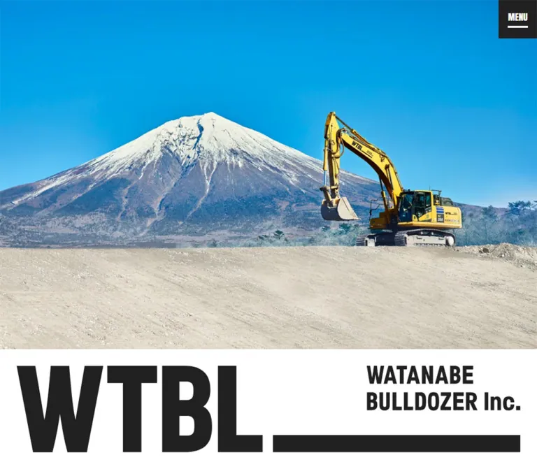
WTBL presents civil engineering through scale, weight, and place. A bright photograph of Mount Fuji and a yellow excavator occupies most of the opening screen. Immediately below it, an enormous horizontal brand composition combines the short WTBL name, a smaller English company name, and a thick baseline. The opening carries almost no interface clutter: one charcoal menu square sits at the upper-right corner.
The rest of the homepage alternates generous white space, narrow Japanese text columns, and large photographs of people and machinery. Condensed English labels and numbered chapter markers provide a firm editorial rhythm. Near the bottom, recruitment reverses the palette to white on charcoal, before a white footer gives the telephone number and contact link strong prominence.
This is a corporate homepage with several navigation destinations. Its reusable character comes from the relationship between industrial photography, typography, and space—not from a single conversion funnel.
閉じる
WTBL / Watanabe Bulldozer — Style Reference
Monumental black lettering, open white space, and working machinery beneath Mount Fuji.
Website: wtbl.co.jp Original URL: https://wtbl.co.jp/ Final URL: https://wtbl.co.jp/ Theme: white canvas with charcoal typography and a dark recruitment section. Inspected: September 29, 2026, through the supplied browser evidence captured at 12:43:12 UTC / 21:43:12 JST. Viewports: desktop 1440 × 1000 CSS pixels; mobile 390 × 844 CSS pixels. Scope: the current corporate homepage: photographic opening, company introduction, three numbered statements, service introduction, recruitment links, and contact footer. Visual evidence includes three desktop captures and two mobile captures; rendered text and computed styles cover additional content between them. Linked pages and the expanded menu were not inspected.
WTBL presents civil engineering through scale, weight, and place. A bright photograph of Mount Fuji and a yellow excavator occupies most of the opening screen. Immediately below it, an enormous horizontal brand composition combines the short WTBL name, a smaller English company name, and a thick baseline. The opening carries almost no interface clutter: one charcoal menu square sits at the upper-right corner.
The rest of the homepage alternates generous white space, narrow Japanese text columns, and large photographs of people and machinery. Condensed English labels and numbered chapter markers provide a firm editorial rhythm. Near the bottom, recruitment reverses the palette to white on charcoal, before a white footer gives the telephone number and contact link strong prominence.
This is a corporate homepage with several navigation destinations. Its reusable character comes from the relationship between industrial photography, typography, and space—not from a single conversion funnel.
How to Read This Reference
- Measured means a value is present in the supplied rendered DOM or computed-style evidence. Pixel values describe the inspected viewport; the original authored units are not necessarily known.
- Calculated means a dimension or gap was derived from supplied element bounds.
- Estimated means a visual measurement from the supplied original-page captures. Image boundaries, logo dimensions, and decorative rule thicknesses fall into this category when no matching DOM measurement was supplied.
- Recommended means an implementation choice for a new build. The CSS starter, its 900px breakpoint, accessibility additions, and hover treatments are adaptations rather than recovered source code.
- Token names in this document are descriptive aliases. Source custom-property names are identified separately where useful.
- No additional browsing, asset retrieval, interaction testing, or local file inspection was performed for this reference.
Tokens — Colors
Default Palette
| Name | Value | Suggested token | Evidence and role |
|---|---|---|---|
| White | #ffffff |
--color-paper |
Measured body and content-section background; measured text color in recruitment and the contact CTA |
| Charcoal | #212121 |
--color-ink |
Measured Japanese headings, body copy, chapter numbers, phone number, menu fill, and contact CTA fill |
| Utility Charcoal | #333333 |
--color-utility |
Measured company/service action labels and several structural wrappers |
| Secondary Gray | #555555 |
--color-muted |
Measured copyright and privacy-link text |
The visible recruitment field closely matches the charcoal controls. Its enclosing SECTION reports white in the supplied computed styles, so that wrapper alone does not identify the element painting the dark surface. Use the screenshot to establish the visible dark section; reusing #212121 is the practical adaptation.
Photographic Color
Cyan-blue sky, yellow machinery, navy workwear, pale soil, and snow provide almost all the saturated color. They are image content, not verified interface color tokens. Keep these colors inside photography rather than automatically introducing blue buttons or yellow navigation states.
The supplied custom properties also contain loading-related values #222 and #e5e5e5. Their presence does not establish a visible loading treatment in the captures. Likewise, transparent gradient variables do not demonstrate a visible gradient design.
No theme selector or alternate user-selectable palette is evidenced. The recruitment section is a local color inversion within the page.
Tokens — Typography
Japanese Gothic — Headings and Body
The measured Japanese type uses separate Gothic MB101 family names for different visual weights:
| Role | Measured family | Source custom property | Measured CSS weight |
|---|---|---|---|
| Main headings and strong Japanese labels | 'ゴシックMB101 DB JIS2004' |
--s-font-ec803165 |
400 |
| Paragraphs and ordinary footer text | 'ゴシックMB101 R JIS2004' |
--s-font-c3b3ab13 |
400 |
| Desktop service summary | 'ゴシックMB101 M JIS2004' |
--s-font-7ea02e02 |
400 |
The heavier Japanese appearance comes from the selected family face, not a measured font-weight: 700. Avoid adding synthetic bold to the DB face indiscriminately.
Japanese headings and most paragraphs use 0.03em tracking. The body text is relatively small, but generous leading and narrow columns keep it open. The introduction uses a desktop line height of 2; the numbered stories use 1.8. On mobile, both use 14px text with 28px leading.
Condensed Latin — Section Labels and Numbers
- Anton, weight 400:
MENU,WATABURU’S MIND,SERVICE,RECRUIT, and the telephone number. Source property:--s-font-9eb4c06a. - Oswald, weight 700: the chapter numbers
01,02, and03. Source property:--s-font-308810af. - Brand artwork: the large WTBL composition visually belongs to the same condensed, heavy world, but its lettering is not identified by a measured text node. Preserve the actual artwork when available; do not assume its font is Anton.
Other registered font variables include Open Sans, Lato, and additional MB101 faces. Registration alone does not establish their use in the inspected visible elements. The Times value on the HTML/body defaults is also not the editorial typeface of the displayed content.
Type Scale
All sizes and line heights below are measured. Desktop and mobile refer to the two inspected viewports.
| Role | Desktop size / leading | Mobile size / leading | Face | Tracking |
|---|---|---|---|---|
| Introduction H1 | 68 / 95.2px |
26 / 36.4px |
MB101 DB | 0.03em |
| Numbered-story heading | 43 / 60.2px |
26 / 36.4px |
MB101 DB | 0.03em |
| Service statement | 68 / 95.2px |
25 / 35px |
MB101 DB | 0.03em |
| Recruitment headline | 43 / 60.2px |
32 / 44.8px |
MB101 DB | 0.03em |
| Main English section labels | 55 / 77px |
24 / 24px |
Anton | Normal |
| Recruitment English label | 55 / 77px |
24 / 33.6px |
Anton | Normal |
| Chapter numbers | 73 / 73px |
24 / 24px |
Oswald 700 | Normal |
| Introduction paragraph | 15 / 30px |
14 / 28px |
MB101 R | 0.03em |
| Story paragraphs | 15 / 27px |
14 / 28px |
MB101 R | 0.03em |
| Service summary | 18 / 36px |
14 / 28px |
MB101 M → R | 0.03em |
| Recruitment paragraph | 15 / 30px |
14 / 23.8px |
MB101 R | 0.03em |
| Company/service action label | 15 / 21px |
15 / 21px |
MB101 DB | Normal |
| Recruitment link caption | 22 / 30.8px |
16 / 22.4px |
MB101 DB | 0.03em |
| Employment label | 24 / 33.6px |
12 / 16.8px |
MB101 DB | Normal |
| Telephone number | 48 / 67.2px |
36 / 50.4px |
Anton | 0.05em |
| Contact heading | 18 / 25.2px |
18 / 25.2px |
MB101 DB | 0.04em |
| Contact button text | 18 / 25.2px |
15 / 21px |
MB101 R | 0.04em |
| Footer navigation | 15 / 21px |
13 / 18.2px |
MB101 R | Normal |
| Copyright | 12 / 16.8px |
10 / 14px |
MB101 R | Normal |
The opening brand artwork should not become a CSS heading scaled to match the H1. The real H1 is the subsequent Japanese statement, 足元から生活をつくる。.
Tokens — Spacing & Shapes
There is no demonstrated universal spacing unit. The measured layout combines small text gaps with large, individually tuned section intervals. Preserve that contrast instead of forcing every distance onto one small grid.
Spacing Scale
| Use | Desktop | Mobile | Status |
|---|---|---|---|
| Main mobile content inset | Section-specific | 25px |
Measured |
| Introduction vertical padding | 180px top and bottom |
80px top, 120px bottom |
Measured |
| Introduction heading → paragraph | 35px |
11px |
Calculated |
| Introduction paragraph → action | 58px |
27px |
Calculated |
| Action label left inset | 24px |
24px |
Calculated |
| Story number → heading | 32px |
12–14px |
Calculated |
| Story heading → paragraph | 24px |
Approximately 11–12px |
Calculated |
| Numbered-story section bottom padding | 218px |
100px |
Measured |
| Service section bottom padding | 278px |
158px |
Measured |
| Recruitment link column gap | 48px |
Links stack with 53px between anchor boxes |
Calculated |
| Recruitment section ending clearance | 138px |
80px |
Calculated from last link and section bounds |
| Footer contact top inset | 86px |
50px |
Calculated |
| Contact CTA → footer navigation | 50px |
38px |
Calculated |
| Footer navigation horizontal gap | 30px |
14px |
Calculated |
Border Radius
| Element | Treatment | Evidence |
|---|---|---|
| Menu button | 0 |
Measured |
| Company, service, recruitment, and contact links | 0 |
Measured |
| Photographs | Square corners | Visible in captures |
| Brand field | Rectangular white strip | Visible in captures |
The main decorative shapes are horizontal bars: the long brand baseline, chapter-number underscores, recruitment link rules, and the footer divider. There is no visible rounded-card or shadow-elevation system.
Estimated desktop chapter rules are approximately 85px wide and 10px thick. Recruitment caption rules appear approximately 4px thick. These are screenshot estimates, not supplied border declarations.
Layout Measurements
| Element | Desktop 1440 × 1000 | Mobile 390 × 844 | Evidence |
|---|---|---|---|
| Document height | 8042.73px |
5477.52px |
Measured; summary rounds to 8043 / 5478 |
| Menu button | 76 × 76px |
52 × 52px |
Measured |
| Opening section before introduction | 1000px |
742.72px |
Measured flow boundary |
| Opening photograph | Approximately 1440 × 698px |
Approximately 390 × 641px |
Screenshot estimate |
| White brand strip | Approximately 302px high |
Approximately 102px high |
Screenshot estimate |
| Introduction paragraph | 530px wide |
340px wide |
Measured |
| Story paragraphs | Approximately 397–402px wide |
340px wide |
Measured |
| Company/service action | 248 × 57px |
340 × 57px |
Measured |
| Recruitment content span | 960px, starting at x = 240 |
340px, starting at x = 25 |
Calculated / measured bounds |
| Each recruitment link | 456 × 375.80px |
340 × 277.09px |
Measured |
| Recruitment section height | 823.98px |
993.77px |
Measured |
| Footer contact CTA | 580 × 58px |
340 × 58px |
Measured |
| Footer height | 552.56px |
542.45px |
Measured |
A mobile outer hero-related wrapper also measures 844px high. The introduction nevertheless starts at y = 742.72px. These overlapping wrapper measurements should not be added together or translated into a mandatory 844px opening block.
Components
Persistent Corner Menu
Role: the compact navigation entry point.
A charcoal square touches the top and right viewport edges. Its position remains visually consistent across the opening and lower-page captures. Desktop uses a white Anton MENU label at 18px / 25.2px, with a short white rule below. The desktop square begins at x = 1364.
Mobile reduces the square to 52px and replaces the visible word with two white horizontal strokes, approximately 30px wide. The supplied DOM still identifies a button with MENU text, but the screenshot establishes the icon-only appearance.
Use fixed positioning to reproduce the persistent placement. The menu's expanded appearance, close control, keyboard behavior, and animation are unverified; do not invent those details as original-site findings.
Photographic Opening and Brand Strip
Role: establish the company's place, machinery, and visual weight before explanatory copy.
The desktop photograph fills the width, placing the mountain summit left of center and the excavator to the right. Bright sky and pale ground give the composition large, simple color regions. No marketing headline or contact button is overlaid on this image in the supplied opening capture.
The white brand strip below is a second, distinct visual field. Its anatomy is:
- A very large WTBL wordmark occupying the left side.
- A smaller two-line
WATANABE / BULLDOZER Inc.descriptor at upper right. - A long, thick horizontal bar beneath the descriptor, aligned with the bottom of the large lettering.
The visible desktop artwork spans approximately x = 33 to 1407. On mobile it spans approximately x = 25 to 365. Keep the components of this artwork together; independently wrapping the descriptor would alter the identity.
Mobile uses a different portrait-oriented hero asset, evidenced by the background-image identifier. The image leaves substantial sky above the mountain, while keeping the excavator and ground visible. This is an art-directed mobile composition, not merely proof of a centered crop of the desktop asset.
Company Introduction
Role: explain the company's contribution and provide a route to company information.
The desktop introduction is a centered block approximately 770px wide, but its text aligns to the block's left edge. The H1 begins at x ≈ 334.77 and y = 1180. The paragraph shares that left edge and narrows to 530px. The company link sits below at the same x coordinate.
On mobile, all three elements align to x = 25. The headline drops from 68px to 26px; the paragraph uses the available 340px width; the action expands from 248px to 340px while retaining its 57px height.
The 会社案内 action points to /company. Its measured label begins 24px inside the anchor. Its background is transparent, and the text is followed by a right-arrow icon. Border styling for this action is not included in the supplied measurement fields.
English Section Labels
Role: establish major chapters in the long page.
WATABURU’S MIND and SERVICE use Anton at 55px on desktop and 24px on mobile. Their supplied bounding rectangles begin at x = 0, unlike the inset prose. This difference in alignment is part of the measured structure; avoid automatically centering every heading within the body-copy container.
RECRUIT instead belongs to the inset dark-section content. It is paired with the smaller Japanese employment label 正社員募集.
Numbered Story Block
Role: connect the company's work to its industry, Mount Fuji, and local people.
Each story combines a photograph with a narrow text group:
- A condensed two-digit number with a heavy horizontal underscore.
- A Japanese heading in MB101 DB.
- A compact explanatory paragraph in MB101 R.
The source labels are 土木業界のために, 富士山のために, and 人のために. Numbers are much larger than body text on desktop: 73px versus 15px. Mobile reduces the numbers to 24px while keeping the headings at 26px, changing the hierarchy rather than uniformly shrinking the entire composition.
The supplied middle desktop capture shows story 02 with its text starting at x ≈ 179 and a large operator photograph starting at x ≈ 633, extending to the right viewport edge. Its paragraph is approximately 397px wide. The photograph is approximately 807 × 390px in the capture.
The following story reverses the visual balance: a close photograph of a vehicle wheel extends from the left edge to approximately x = 665, while the text begins at x = 775. These are deliberately unequal editorial compositions, not three identical cards in a grid.
On mobile, all measured story text starts at x = 25 with 340px paragraph widths. The supplied mobile captures do not show these middle photographs, so their exact mobile crop and image/text order remain unverified.
Service Introduction
Role: introduce the service offering and route to its dedicated page.
The DOM establishes an English section label, a major Japanese statement, a short explanatory paragraph, and a 事業案内 link to /service. The desktop statement uses 68px type and begins at x ≈ 491.23; its paragraph is 391px wide. On mobile the statement becomes 25px and the content aligns to the 25px page inset.
土木一筋64年 is the captured headline. The number is recorded source copy, not a recalculation of company age for the inspection year.
The desktop section's aggregate DOM text additionally contains four service labels: 土木事業, 解体工事, 重量運搬, and 産業廃棄物中間処理, numbered SERVICE 01–04. Those items were not individually measured or shown in the supplied captures. Their precise arrangement, visibility, and any carousel-like behavior are not established.
Retain this limitation when implementing from the reference: the service typography and navigation are well supported; a detailed service gallery is not.
Recruitment Section
Role: give recruitment a distinct, high-contrast chapter with two clear destinations.
The visible surface is charcoal with white text and rules. Desktop content occupies a 960px span centered in the viewport, starting at x = 240. The English label and employment label share a row. Below them are a 43px Japanese headline, a short paragraph, and two photographic links.
The first link shows workers with equipment in the background and leads to /recruit. The second uses a montage of four narrow worker portraits and leads to /recruit#interview.
Each link combines:
- A landscape image with square corners.
- A substantial gap below the image.
- A bold Japanese caption aligned left.
- A small right-facing chevron near the right edge.
- A thick white rule across the full caption width.
The whole image-and-caption assembly is one anchor in the supplied DOM. There is no separate floating button or rounded panel. Image proportions appear close to 1.62:1; that ratio is an estimate.
Mobile places the links in one column at 340px wide, separated by 53px between anchor boxes. The recruitment headline remains relatively large at 32px, occupies a centered 245px-wide block, and spans two lines. The English label and Japanese employment label form a compact group above it. The caption size drops to 16px.
Contact Footer
Role: provide practical contact information, secondary navigation, and legal identity.
Desktop uses a broad white footer with two columns. The brand is on the left, beginning at x = 120. Contact information begins at x = 740 and occupies 580px. These bounds support a 1200px inner span with two 580px columns and a 40px gap.
The contact column contains:
お電話でのお問い合わせand weekday reception hours on the same row.- A prominent Anton telephone number,
TEL 0545-52-1960. - A full-width charcoal contact link labeled
WEBからのお問い合わせ. - Four navigation links, followed by a smaller privacy link.
- A thin divider, company name, and postal address.
The homepage identifies the operator as 渡辺ブルドーザ工事株式会社 and gives its Fuji City address in this footer. The logo and copyright form a separate group on the left.
Mobile changes the order visibly: contact information comes first, followed by navigation and address; a smaller centered brand mark and copyright close the page. The hours move onto a separate line beneath the contact heading. The brand artwork is approximately 224px wide in the mobile capture, compared with approximately 362px on desktop.
The mobile telephone number is an actual anchor with href='tel:0545521960'. The corresponding measured desktop element is a paragraph. Do not assume identical interaction semantics at both widths from the visual similarity alone.
Links and Arrow Treatment
The rendered link destinations are conventional corporate routes: /company, /service, /recruit, /recruit#interview, /contact, and /privacy.
The DOM exposes the icon string keyboard_arrow_right; the screenshots show a small chevron. Reproduce the visible arrow with an appropriate icon or CSS shape, not the literal ligature text. The exact icon font was not supplied.
Keep three action scales distinct: compact company/service links, large recruitment image links with bottom rules, and the solid full-width contact CTA.
Tokens — Motion & Interaction
Recorded Transition Values
| Target | Measured declaration | What it establishes |
|---|---|---|
| Many structural elements, menu, and links | 0.3s cubic-bezier(0.4, 0.4, 0, 1) |
A common transition timing is registered; trigger and changed properties are not demonstrated |
| Introduction H1 | 0.2s cubic-bezier(0.4, 0.4, 0, 1) |
A shorter timing on this heading |
| Body background | background 0.5s cubic-bezier(0.4, 0.4, 0, 1) |
Background changes can transition; no theme interaction was exercised |
| First desktop recruitment anchor | 0.6s cubic-bezier(0.39, 0.575, 0.565, 1) 0.2s |
A distinct longer transition and delay on that sampled element |
| Same recruitment anchor on mobile | 0.3s cubic-bezier(0.4, 0.4, 0, 1) |
The sampled mobile declaration differs |
| Sampled elements | animation: none |
No named CSS animation was reported on those elements at sampling time |
The repeated transition lists also include gradient-related custom properties. Those registrations are not evidence that users see animated gradients.
Observed Behavior and Limits
The capture process loaded the page, waited for layout and visible-image readiness, and scrolled through intermediate positions. The menu remains at the upper-right corner across the supplied views. Anchor targets and the mobile telephone link are directly evidenced.
There are no supplied before/after states for menu opening, hover, focus, or link activation. No reliable sequence establishes a hero slideshow, parallax, image zoom, scroll reveal, or menu animation. Settled screenshots and animation: none cannot prove that no earlier or script-driven motion exists.
For an adaptation, use restrained color or opacity feedback around 200–300ms. Treat that as a recommendation, and keep essential content visible without animation.
Surfaces
| Surface | Appearance | Purpose |
|---|---|---|
| Main canvas | White | Keeps typography and photography sharply separated |
| Brand strip | White with oversized dark artwork | Converts the opening image into a strong company identity |
| Story regions | White, mostly unboxed | Supports editorial image/text relationships and large pauses |
| Recruitment | Charcoal with white captions and rules | Marks a major change in subject and visual intensity |
| Contact CTA | Solid charcoal rectangle | Provides a clear destination within the white footer |
| Menu | Small charcoal square | Maintains a compact persistent navigation affordance |
| Dividers | Solid, straight rules | Organize content without shadows or decorative containers |
Use image edges, typography, and rules to create hierarchy. No visible surface requires glass effects, gradients, soft shadows, or rounded cards.
Imagery
Photography carries both the regional identity and the human evidence of the company's work. The opening contrasts Mount Fuji's snow and blue sky with a yellow excavator and pale earth. Interior views bring the scale closer: an operator in a cab, a heavy vehicle's wheel, workers standing together, and a four-person portrait montage.
Keep the material qualities legible: dirt, tires, metal, helmets, fabric, and weathered work surfaces. Preserve natural photographic detail and strong color contrast. The evidence does not establish any particular filter or color-grading formula.
Image placement varies deliberately. The opening fills the viewport width; some narrative images reach one edge; another visible strip is centered at approximately 1080px wide; recruitment images sit within a narrower 960px content span. Avoid applying a single image width to every section.
Observed Asset References
The rendered original-page evidence references assets under:
https://storage.googleapis.com/studio-design-asset-files/projects/1pqDwbz6Oj/
The supplied text truncates full filenames. The following are identification hints, not usable download URLs. Dimension-like strings are filename hints, not verified decoded intrinsic dimensions.
| Asset context | Observed filename prefix | Supported conclusion |
|---|---|---|
| Desktop opening | s-2400x875_v-frms_webp_b655a20f-… |
A wide background image is referenced |
| Mobile opening | s-750x1200_v-fms_webp_6650f719-… |
A distinct portrait-oriented asset is referenced |
| Numbered-story section | s-2326x922_v-frms_webp_c7b17eb3-… |
A wide photographic asset is associated with this section |
| Mobile service section | s-2400x1598_v-frms_webp_51f77144-… |
A service image reference exists; its exact visible composition is not supplied |
| Brand artwork and recruitment photographs | Full URLs not supplied | Appearance is supported by screenshots, not downloadable asset references |
Use authorized photography and the actual brand artwork when available. The CSS shell alone cannot reproduce the specificity of the mountain, machinery, and people.
Layout & Responsive Behavior
Desktop
The desktop page uses several independent widths rather than one universal centered container. The hero is full width. The introduction is centered as a roughly 770px text block. Narrative paragraphs narrow to about 400px and alternate sides against much larger photographs. Recruitment uses 960px. The footer widens to 1200px.
The resulting rhythm is expansive: large imagery, compact paragraphs, and substantial vertical pauses. The numbered-story section alone measures approximately 3230px tall at the inspected desktop width. Preserve the pacing through real content and spacing rather than hardcoding total document height.
Mobile
At 390px, ordinary content occupies a consistent 340px span with 25px side insets. Full-width hero imagery and the corner menu remain exceptions.
The layout changes are selective:
- The hero switches to a portrait-oriented asset and a much shorter brand strip.
- The introduction H1 reduces from 68px to 26px.
- Story numbers reduce from 73px to 24px, while story headings remain 26px.
- Company and service links become full content width.
- Recruitment links stack, increasing the recruitment section's overall height despite smaller images.
- The recruitment headline stays larger than ordinary story headings.
- Footer contact information moves above the brand group.
- Reception hours move below their heading, and the phone becomes a telephone link.
Only two viewport widths were supplied. The DOM excerpt shows a max-width: 1280px rule for responsive line breaks, but it does not establish the breakpoint for every layout change. Intermediate tablet behavior remains unverified. The Quick Start uses 900px as a recommended breakpoint to keep its two-column arrangements readable.
Do’s and Don’ts
Do
- Keep the interface centered on white, charcoal, and straight rules.
- Let photography supply the blue, yellow, navy, and earth colors.
- Keep the opening photograph and brand strip as separate visual fields.
- Preserve the complete WTBL lockup, including its long baseline.
- Pair Anton section labels with Oswald chapter numbers and the measured Japanese Gothic faces.
- Maintain narrow prose columns beside large photographs on desktop.
- Preserve different widths for introduction, stories, recruitment, and footer.
- Use a separate mobile hero composition that retains both the mountain and machinery.
- Keep recruitment links as image-plus-caption anchors with strong bottom rules.
- Preserve the mobile footer's contact-first order.
Don’t
- Don’t replace the photographic opening with a generic headline-and-button banner.
- Don’t assign the logo an unverified font or rebuild it from ordinary text without checking the artwork.
- Don’t turn the numbered stories into equal rounded cards.
- Don’t use yellow machinery paint as an assumed CTA color.
- Don’t shrink every mobile element by the same ratio.
- Don’t reproduce the desktop footer columns on a narrow phone.
- Don’t claim a slider, parallax effect, image zoom, or menu animation from transition declarations alone.
- Don’t infer the full service gallery from aggregate DOM text.
- Don’t treat registered but unused font variables as visible typography.
- Don’t use the measured document heights as fixed implementation heights.
Recommended Implementation Additions
These are recommendations for a new implementation, not verified original-site features:
- Give the mobile menu button an explicit accessible name, an accurate expanded state, and a clear keyboard focus indicator. Define focus management only after choosing and testing its actual navigation behavior.
- Add a skip link and keep heading levels meaningful. Preserve one semantic page H1 even when brand artwork dominates visually.
- Use a
<picture>element for desktop/mobile hero art direction. Provide explicit image dimensions and reserve space to prevent layout shifts. - Prioritize the opening photograph; lazy-load suitable below-the-fold photographs without delaying their layout boxes.
- Keep recruitment image and caption in a single accessible anchor. Hide decorative chevrons from assistive technology.
- Make the telephone number callable on all appropriate devices, while retaining selectable text.
- Consider increasing the observed 10px mobile legal/address text to at least 12px. Allow the footer to grow naturally if this changes wrapping.
- Provide reduced-motion behavior and visible content when scripts fail.
- Load the named Japanese fonts only when available under an appropriate license; identify replacement fonts as substitutions and recheck line wrapping.
Agent Prompt Guide
Quick Color Reference
- Main canvas:
#ffffff. - Primary text and solid controls:
#212121. - Utility action labels:
#333333. - Copyright and privacy text:
#555555. - Recruitment adaptation: charcoal background with white text and rules.
- Saturated color belongs primarily to photographs.
- Use square geometry and solid lines; no general elevation system.
Overall Prompt
“Create a Japanese corporate homepage for a regional civil engineering company using the visual principles of WTBL. Begin with a full-width photograph of local landscape and heavy machinery, followed by a white strip containing an oversized horizontal brand lockup. Use a small charcoal menu square fixed at the upper right. Combine Anton English section labels, Oswald chapter numbers, and substantial Japanese Gothic headings with narrow, generously led paragraphs. Alternate large edge-reaching photographs with asymmetric text blocks. Follow the service introduction with a charcoal recruitment section containing two image links with white captions, chevrons, and thick bottom rules. Finish with a spacious white contact footer. On mobile, use art-directed portrait imagery, 25px content insets, stacked recruitment links, and contact information above the footer logo. Keep motion restrained and do not invent unverified interactions.”
Example Component Prompts
- Opening: “A wide, vivid photograph with a mountain left of center and yellow construction machinery to the right. Place the brand artwork in a separate white strip below. Keep the image free of promotional overlays. Add a square charcoal menu control at the top right.”
- Numbered story: “An asymmetric corporate story on white: a large uncropped-looking rectangular worker photograph beside a roughly 400px text column. Use a 73px bold condensed chapter number with a thick underscore, a 43px Japanese Gothic heading, and 15px body text with 27px leading. Keep generous white space and no card frame.”
- Recruitment link: “A square-cornered landscape worker photograph above a white Japanese caption on a charcoal section. Place a small chevron near the right edge and a 4px white rule beneath the caption. The entire image-and-caption assembly is one link. Desktop links are 456px wide with a 48px gap; mobile links stack within 340px.”
- Contact footer: “A white corporate footer with a brand group at left and a 580px contact column at right. Use an oversized Anton telephone number above a 58px-high charcoal contact link, then simple navigation and a ruled address block. On mobile, use 25px side insets and place the smaller centered brand below the contact information.”
- Responsive adaptation: “Preserve the hierarchy selectively: ordinary Japanese headings become 26px, chapter numbers become 24px, recruitment headlines stay 32px, and the telephone number remains 36px. Recompose the imagery and reorder the footer instead of uniformly scaling the desktop page.”
Quick Start
CSS Custom Properties
This is an implementation adaptation, not the original stylesheet. Measured colors, type sizes, text spacing, and several container dimensions are retained. The 900px breakpoint, grid implementation, hero sizing formula, image aspect ratios, chapter-rule scaling, and hover treatments are recommendations fitted to the supplied views.
Load the actual fonts separately if available. The fallback stacks below are recommendations. No font files, photographs, or logo files are bundled with this reference.
Component structure: .hero__photo is a <picture> containing an image; .hero__brand wraps the authorized horizontal logo artwork. A .story contains .story__photo and .story__copy. Each .recruit-card is one anchor containing an image and .recruit-card__label. The footer has .footer-contact and .footer-brand groups. Menu behavior requires separate implementation; this CSS defines only its visible closed state.
:root {
  /* Measured interface colors */
  --color-paper: #fff;
  --color-ink: #212121;
  --color-utility: #333;
  --color-muted: #555;

  /* Measured primary faces; recommended fallback stacks */
  --font-jp-body: 'ゴシックMB101 R JIS2004', 'Yu Gothic', sans-serif;
  --font-jp-heading: 'ゴシックMB101 DB JIS2004', 'Yu Gothic', sans-serif;
  --font-jp-medium: 'ゴシックMB101 M JIS2004', 'Yu Gothic', sans-serif;
  --font-latin: 'Anton', Impact, sans-serif;
  --font-number: 'Oswald', 'Arial Narrow', sans-serif;

  /* Measured desktop type sizes */
  --size-body: 15px;
  --size-headline: 68px;
  --size-story: 43px;
  --size-section: 55px;
  --size-number: 73px;
  --tracking-copy: 0.03em;

  /* Measured or calculated layout anchors */
  --page-inset: 25px;
  --recruit-width: 960px;
  --footer-width: 1200px;
  --menu-size: 76px;
  --radius-sharp: 0;

  /* Recorded timing, used for recommended feedback below */
  --motion-ui: 300ms cubic-bezier(0.4, 0.4, 0, 1);
}

* { box-sizing: border-box; }
body {
  margin: 0;
  color: var(--color-ink);
  background: var(--color-paper);
  font-family: var(--font-jp-body);
  font-size: var(--size-body);
  font-weight: 400;
}
img { display: block; max-width: 100%; }
h1, h2, h3, p, figure { margin: 0; }
a { color: inherit; }

.menu-toggle {
  position: fixed;
  z-index: 50;
  inset: 0 0 auto auto;
  display: flex;
  flex-direction: column;
  align-items: center;
  justify-content: center;
  gap: 5px;
  width: var(--menu-size);
  height: var(--menu-size);
  padding: 0;
  border: 0;
  border-radius: 0;
  color: #fff;
  background: var(--color-ink);
  cursor: pointer;
}
.menu-toggle__label {
  font: 400 18px/1.4 var(--font-latin);
}
.menu-toggle::before,
.menu-toggle::after {
  content: '';
  width: 40px;
  height: 4px;
  background: currentColor;
}
.menu-toggle::before { display: none; }

/* Recommended sizing fitted to the opening captures */
.hero {
  height: 100svh;
  display: grid;
  grid-template-rows: minmax(0, 1fr) auto;
}
.hero__photo {
  display: block;
  min-height: 0;
}
.hero__photo img {
  width: 100%;
  height: 100%;
  object-fit: cover;
}
.hero__brand {
  padding: 32px clamp(25px, 2.3vw, 33px) 33px;
  background: var(--color-paper);
}
.hero__brand img {
  width: 100%;
  aspect-ratio: 5.8 / 1;
  object-fit: contain;
}

.intro { padding: 180px var(--page-inset); }
.intro__inner { max-width: 771px; margin-inline: auto; }
.intro h1 {
  font: 400 var(--size-headline)/1.4 var(--font-jp-heading);
  letter-spacing: var(--tracking-copy);
}
.intro__body {
  max-width: 530px;
  margin-top: 35px;
  line-height: 2;
  letter-spacing: var(--tracking-copy);
}
.text-action {
  display: flex;
  align-items: center;
  justify-content: space-between;
  width: 248px;
  min-height: 57px;
  padding-inline: 24px;
  color: var(--color-utility);
  background: transparent;
  font: 400 15px/1.4 var(--font-jp-heading);
  text-decoration: none;
}
.intro .text-action { margin-top: 58px; }
.section-label {
  font: 400 var(--size-section)/1.4 var(--font-latin);
}

/* Recommended grids preserve the observed asymmetry */
.mind { padding-bottom: 218px; }
.story {
  display: grid;
  grid-template-columns: 46.18% minmax(0, 1fr);
  column-gap: 7.64%;
  align-items: center;
  margin-block: 150px;
}
.story__photo { width: 100%; height: auto; }
.story__copy { width: 100%; max-width: 402px; }
.story--image-right {
  grid-template-columns: 44% 56%;
  column-gap: 0;
}
.story--image-right .story__photo {
  grid-column: 2;
  grid-row: 1;
}
.story--image-right .story__copy {
  grid-column: 1;
  grid-row: 1;
  justify-self: end;
  width: min(398px, calc(100% - 82px));
  margin-right: 57px;
}
.story__number {
  display: flex;
  align-items: flex-end;
  gap: 5px;
  font: 700 var(--size-number)/1 var(--font-number);
}
.story__number::after {
  content: '';
  width: 85px;
  height: 10px;
  margin-bottom: 3px;
  background: currentColor;
}
.story h3 {
  margin-top: 32px;
  font: 400 var(--size-story)/1.4 var(--font-jp-heading);
  letter-spacing: var(--tracking-copy);
}
.story__body {
  margin-top: 24px;
  line-height: 1.8;
  letter-spacing: var(--tracking-copy);
}

.service { padding-bottom: 278px; }
.service__copy {
  width: min(458px, calc(100% - 50px));
  margin-inline: auto;
}
.service__copy h2 {
  font: 400 var(--size-headline)/1.4 var(--font-jp-heading);
  letter-spacing: var(--tracking-copy);
}
.service__body {
  max-width: 391px;
  margin-top: 35px;
  font: 400 18px/2 var(--font-jp-medium);
  letter-spacing: var(--tracking-copy);
}
.service .text-action { margin-top: 58px; }

.recruit {
  padding: 65px var(--page-inset) 138px;
  color: #fff;
  background: var(--color-ink);
}
.recruit__inner {
  max-width: var(--recruit-width);
  margin-inline: auto;
}
.recruit__kicker {
  display: flex;
  align-items: center;
  gap: 49px;
}
.recruit__employment {
  font: 400 24px/1.4 var(--font-jp-heading);
}
.recruit h2 {
  margin-top: 38px;
  font: 400 43px/1.4 var(--font-jp-heading);
  letter-spacing: var(--tracking-copy);
}
.recruit__body {
  margin-top: 10px;
  line-height: 2;
  letter-spacing: var(--tracking-copy);
}
.recruit__links {
  display: grid;
  grid-template-columns: repeat(2, minmax(0, 1fr));
  gap: 48px;
  margin-top: 30px;
}
.recruit-card { display: block; text-decoration: none; }
.recruit-card img {
  width: 100%;
  aspect-ratio: 1.62 / 1;
  object-fit: cover;
}
.recruit-card__label {
  display: flex;
  align-items: center;
  justify-content: space-between;
  gap: 16px;
  margin-top: 50px;
  padding-bottom: 10px;
  border-bottom: 4px solid currentColor;
  font: 400 22px/1.4 var(--font-jp-heading);
  letter-spacing: var(--tracking-copy);
}
.chevron {
  flex: 0 0 auto;
  width: 8px;
  height: 8px;
  margin-right: 20px;
  border-top: 2px solid currentColor;
  border-right: 2px solid currentColor;
  transform: rotate(45deg);
}

.site-footer { padding: 86px var(--page-inset) 100px; }
.site-footer__inner {
  display: grid;
  grid-template-columns: repeat(2, minmax(0, 1fr));
  grid-template-areas: 'brand contact';
  gap: 40px;
  max-width: var(--footer-width);
  margin-inline: auto;
}
.footer-brand { grid-area: brand; }
.footer-contact { grid-area: contact; min-width: 0; }
.footer-brand img { width: 362px; height: auto; }
.footer-copyright {
  margin-top: 40px;
  color: var(--color-muted);
  font-size: 12px;
  line-height: 1.4;
}
.contact-heading {
  display: flex;
  align-items: baseline;
  flex-wrap: wrap;
  gap: 4px 12px;
}
.contact-heading__title {
  font: 400 18px/1.4 var(--font-jp-heading);
  letter-spacing: 0.04em;
}
.contact-hours { font-size: 13px; line-height: 1.4; letter-spacing: 0.04em; }
.contact-phone {
  display: block;
  width: fit-content;
  font: 400 48px/1.4 var(--font-latin);
  letter-spacing: 0.05em;
  text-decoration: none;
}
.contact-cta {
  display: flex;
  align-items: center;
  justify-content: center;
  min-height: 58px;
  padding: 12px;
  color: #fff;
  background: var(--color-ink);
  font-size: 18px;
  line-height: 1.4;
  letter-spacing: 0.04em;
  text-decoration: none;
  transition: background-color var(--motion-ui);
}
.footer-nav {
  display: flex;
  flex-wrap: wrap;
  gap: 10px 30px;
  margin-top: 50px;
  font-size: 15px;
  line-height: 1.4;
}
.footer-nav a, .footer-privacy { text-decoration: none; }
.footer-privacy {
  display: inline-block;
  margin-top: 10px;
  color: var(--color-muted);
  font-size: 13px;
  line-height: 1.4;
}
.footer-address {
  margin-top: 36px;
  padding-top: 28px;
  border-top: 1px solid var(--color-ink);
  font-size: 15px;
  line-height: 1.4;
  font-style: normal;
}
.footer-address__name { font-family: var(--font-jp-heading); }
.footer-address__location { margin-top: 10px; }

/* Recommended interaction feedback; original states are unverified */
:where(a, button):focus-visible {
  outline: 2px solid currentColor;
  outline-offset: 4px;
}
@media (hover: hover) {
  .text-action:hover, .footer-nav a:hover, .footer-privacy:hover {
    text-decoration: underline;
    text-underline-offset: 4px;
  }
  .contact-cta:hover { background: var(--color-utility); }
}

/* Recommended breakpoint; exact source layout breakpoint is unknown */
@media (max-width: 900px) {
  :root {
    --menu-size: 52px;
    --size-body: 14px;
    --size-headline: 26px;
    --size-story: 26px;
    --size-section: 24px;
    --size-number: 24px;
  }
  .menu-toggle { gap: 9px; }
  .menu-toggle__label { display: none; }
  .menu-toggle::before, .menu-toggle::after {
    display: block;
    width: 30px;
    height: 3px;
  }
  .hero { height: auto; }
  .hero__photo { height: 76svh; }
  .hero__brand { padding: 26px 25px 16px; }
  .intro { padding: 80px 25px 120px; }
  .intro__body { margin-top: 11px; }
  .intro .text-action { margin-top: 27px; }
  .text-action { width: 100%; }
  .section-label { line-height: 1; }
  .mind { padding-bottom: 100px; }
  .story { display: flex; flex-direction: column; gap: 32px; margin-block: 64px; }
  .story__copy, .story--image-right .story__copy {
    width: calc(100% - 50px);
    max-width: none;
    margin: 0;
  }
  .story__number::after { width: 28px; height: 3px; margin-bottom: 1px; }
  .story h3 { margin-top: 12px; }
  .story__body { margin-top: 11px; line-height: 2; }
  .service { padding-bottom: 158px; }
  .service__copy h2 { font-size: 25px; }
  .service__body {
    max-width: none;
    margin-top: 11px;
    font-family: var(--font-jp-body);
    font-size: 14px;
  }
  .service .text-action { margin-top: 27px; }
  .recruit { padding: 40px 25px 80px; }
  .recruit__kicker { justify-content: center; gap: 20px; }
  .recruit .section-label { line-height: 1.4; }
  .recruit__employment { font-size: 12px; }
  .recruit h2 {
    max-width: 245px;
    margin: 26px auto 0;
    font-size: 32px;
  }
  .recruit__body { margin-top: 20px; line-height: 1.7; }
  .recruit__links { grid-template-columns: 1fr; gap: 53px; margin-top: 26px; }
  .recruit-card__label { margin-top: 32px; font-size: 16px; }
  .site-footer { padding: 50px 25px 36px; }
  .site-footer__inner {
    grid-template-columns: 1fr;
    grid-template-areas: 'contact' 'brand';
    gap: 64px;
  }
  .contact-heading { display: block; }
  .contact-hours { margin-top: 4px; font-size: 11px; }
  .contact-phone { margin-top: 4px; font-size: clamp(28px, 9.23vw, 36px); }
  .contact-cta { margin-top: 4px; font-size: 15px; }
  .footer-nav { gap: 10px 14px; margin-top: 38px; font-size: 13px; }
  .footer-privacy { font-size: 10px; }
  .footer-address { margin-top: 18px; padding-top: 18px; font-size: 13px; }
  .footer-address__location { margin-top: 8px; font-size: 10px; }
  .footer-brand { text-align: center; }
  .footer-brand img { width: 224px; margin-inline: auto; }
  .footer-copyright { margin-top: 20px; font-size: 10px; }
}

@media (prefers-reduced-motion: reduce) {
  .menu-toggle, .text-action, .recruit-card, .contact-cta {
    transition: none;
    animation: none;
  }
}
The hero's 76svh mobile image height approximates the 641px photograph at the supplied 844px viewport; it is not a recovered source formula. Likewise, the story grid is a practical reconstruction of the visible desktop geometry. Use native image proportions and adjust crops against authorized assets. The service gallery and expanded navigation are intentionally left for further evidence or separate design decisions.
Tailwind v4 Token Mapping
Optional mapping for a project already using Tailwind v4. This does not imply the original site uses Tailwind. Define the custom properties above first.
@theme inline {
  --color-paper: var(--color-paper);
  --color-charcoal: var(--color-ink);
  --color-secondary: var(--color-muted);
  --font-body: var(--font-jp-body);
  --font-heading: var(--font-jp-heading);
  --font-display: var(--font-latin);
  --font-numeric: var(--font-number);
  --text-body: var(--size-body);
  --text-headline: var(--size-headline);
  --text-story: var(--size-story);
  --text-section: var(--size-section);
  --spacing-page: 25px;
  --radius-sharp: 0;
}
For the paper utility, use a direct value instead of a self-referencing declaration if your token pipeline retains the declaration literally: --color-paper: #ffffff;. All mappings are implementation aliases; verify generated CSS in the receiving project.
Sources & Evidence
- WTBL homepage: original and final URL are identical; the supplied browser record reports HTTP 200.
- Capture record: September 29, 2026, 12:43:12 UTC / 21:43:12 JST. Desktop viewport 1440 × 1000; mobile viewport 390 × 844.
- Original-page visual evidence: desktop opening, middle narrative section, and recruitment/footer boundary; mobile opening and recruitment/footer boundary.
- Rendered DOM and computed styles: page text, link destinations, font families, font sizes, line heights, tracking, colors, padding, element bounds, transition declarations, and partial background-image references.
- Observed inspection actions: initial load and scrolling through the document. The supplied process waited for finite motion, sampled layout/text stability, and visible image decoding within bounded time limits.
- Limitations: no menu-open state, hover/focus sequence, link activation, linked-page inspection, complete asset inventory, or tablet capture. The readiness process does not prove that delayed content or every interaction was exhausted. Service workers and SharedWorkers were disabled during the supplied inspection.
This reference describes the current homepage represented by the supplied evidence. The CSS is a reusable starting point and has not been executed or browser-tested in this task.
# WTBL / Watanabe Bulldozer — Style Reference

> Monumental black lettering, open white space, and working machinery beneath Mount Fuji.

**Website:** [wtbl.co.jp](https://wtbl.co.jp/)
**Original URL:** https://wtbl.co.jp/
**Final URL:** https://wtbl.co.jp/
**Theme:** white canvas with charcoal typography and a dark recruitment section.
**Inspected:** September 29, 2026, through the supplied browser evidence captured at 12:43:12 UTC / 21:43:12 JST.
**Viewports:** desktop 1440 × 1000 CSS pixels; mobile 390 × 844 CSS pixels.
**Scope:** the current corporate homepage: photographic opening, company introduction, three numbered statements, service introduction, recruitment links, and contact footer. Visual evidence includes three desktop captures and two mobile captures; rendered text and computed styles cover additional content between them. Linked pages and the expanded menu were not inspected.

WTBL presents civil engineering through scale, weight, and place. A bright photograph of Mount Fuji and a yellow excavator occupies most of the opening screen. Immediately below it, an enormous horizontal brand composition combines the short WTBL name, a smaller English company name, and a thick baseline. The opening carries almost no interface clutter: one charcoal menu square sits at the upper-right corner.

The rest of the homepage alternates generous white space, narrow Japanese text columns, and large photographs of people and machinery. Condensed English labels and numbered chapter markers provide a firm editorial rhythm. Near the bottom, recruitment reverses the palette to white on charcoal, before a white footer gives the telephone number and contact link strong prominence.

This is a corporate homepage with several navigation destinations. Its reusable character comes from the relationship between industrial photography, typography, and space—not from a single conversion funnel.
閉じる
# WTBL / Watanabe Bulldozer — Style Reference

> Monumental black lettering, open white space, and working machinery beneath Mount Fuji.

**Website:** [wtbl.co.jp](https://wtbl.co.jp/)
**Original URL:** https://wtbl.co.jp/
**Final URL:** https://wtbl.co.jp/
**Theme:** white canvas with charcoal typography and a dark recruitment section.
**Inspected:** September 29, 2026, through the supplied browser evidence captured at 12:43:12 UTC / 21:43:12 JST.
**Viewports:** desktop 1440 × 1000 CSS pixels; mobile 390 × 844 CSS pixels.
**Scope:** the current corporate homepage: photographic opening, company introduction, three numbered statements, service introduction, recruitment links, and contact footer. Visual evidence includes three desktop captures and two mobile captures; rendered text and computed styles cover additional content between them. Linked pages and the expanded menu were not inspected.

WTBL presents civil engineering through scale, weight, and place. A bright photograph of Mount Fuji and a yellow excavator occupies most of the opening screen. Immediately below it, an enormous horizontal brand composition combines the short WTBL name, a smaller English company name, and a thick baseline. The opening carries almost no interface clutter: one charcoal menu square sits at the upper-right corner.

The rest of the homepage alternates generous white space, narrow Japanese text columns, and large photographs of people and machinery. Condensed English labels and numbered chapter markers provide a firm editorial rhythm. Near the bottom, recruitment reverses the palette to white on charcoal, before a white footer gives the telephone number and contact link strong prominence.

This is a corporate homepage with several navigation destinations. Its reusable character comes from the relationship between industrial photography, typography, and space—not from a single conversion funnel.

## How to Read This Reference

- **Measured** means a value is present in the supplied rendered DOM or computed-style evidence. Pixel values describe the inspected viewport; the original authored units are not necessarily known.
- **Calculated** means a dimension or gap was derived from supplied element bounds.
- **Estimated** means a visual measurement from the supplied original-page captures. Image boundaries, logo dimensions, and decorative rule thicknesses fall into this category when no matching DOM measurement was supplied.
- **Recommended** means an implementation choice for a new build. The CSS starter, its 900px breakpoint, accessibility additions, and hover treatments are adaptations rather than recovered source code.
- Token names in this document are descriptive aliases. Source custom-property names are identified separately where useful.
- No additional browsing, asset retrieval, interaction testing, or local file inspection was performed for this reference.

## Tokens — Colors

### Default Palette

| Name | Value | Suggested token | Evidence and role |
| --- | --- | --- | --- |
| White | `#ffffff` | `--color-paper` | Measured body and content-section background; measured text color in recruitment and the contact CTA |
| Charcoal | `#212121` | `--color-ink` | Measured Japanese headings, body copy, chapter numbers, phone number, menu fill, and contact CTA fill |
| Utility Charcoal | `#333333` | `--color-utility` | Measured company/service action labels and several structural wrappers |
| Secondary Gray | `#555555` | `--color-muted` | Measured copyright and privacy-link text |

The visible recruitment field closely matches the charcoal controls. Its enclosing `SECTION` reports white in the supplied computed styles, so that wrapper alone does not identify the element painting the dark surface. Use the screenshot to establish the visible dark section; reusing `#212121` is the practical adaptation.

### Photographic Color

Cyan-blue sky, yellow machinery, navy workwear, pale soil, and snow provide almost all the saturated color. They are image content, not verified interface color tokens. Keep these colors inside photography rather than automatically introducing blue buttons or yellow navigation states.

The supplied custom properties also contain loading-related values `#222` and `#e5e5e5`. Their presence does not establish a visible loading treatment in the captures. Likewise, transparent gradient variables do not demonstrate a visible gradient design.

No theme selector or alternate user-selectable palette is evidenced. The recruitment section is a local color inversion within the page.

## Tokens — Typography

### Japanese Gothic — Headings and Body

The measured Japanese type uses separate Gothic MB101 family names for different visual weights:

| Role | Measured family | Source custom property | Measured CSS weight |
| --- | --- | --- | --- |
| Main headings and strong Japanese labels | `'ゴシックMB101 DB JIS2004'` | `--s-font-ec803165` | `400` |
| Paragraphs and ordinary footer text | `'ゴシックMB101 R JIS2004'` | `--s-font-c3b3ab13` | `400` |
| Desktop service summary | `'ゴシックMB101 M JIS2004'` | `--s-font-7ea02e02` | `400` |

The heavier Japanese appearance comes from the selected family face, not a measured `font-weight: 700`. Avoid adding synthetic bold to the DB face indiscriminately.

Japanese headings and most paragraphs use `0.03em` tracking. The body text is relatively small, but generous leading and narrow columns keep it open. The introduction uses a desktop line height of 2; the numbered stories use 1.8. On mobile, both use 14px text with 28px leading.

### Condensed Latin — Section Labels and Numbers

- **Anton, weight 400:** `MENU`, `WATABURU’S MIND`, `SERVICE`, `RECRUIT`, and the telephone number. Source property: `--s-font-9eb4c06a`.
- **Oswald, weight 700:** the chapter numbers `01`, `02`, and `03`. Source property: `--s-font-308810af`.
- **Brand artwork:** the large WTBL composition visually belongs to the same condensed, heavy world, but its lettering is not identified by a measured text node. Preserve the actual artwork when available; do not assume its font is Anton.

Other registered font variables include Open Sans, Lato, and additional MB101 faces. Registration alone does not establish their use in the inspected visible elements. The `Times` value on the HTML/body defaults is also not the editorial typeface of the displayed content.

### Type Scale

All sizes and line heights below are measured. Desktop and mobile refer to the two inspected viewports.

| Role | Desktop size / leading | Mobile size / leading | Face | Tracking |
| --- | --- | --- | --- | --- |
| Introduction H1 | `68 / 95.2px` | `26 / 36.4px` | MB101 DB | `0.03em` |
| Numbered-story heading | `43 / 60.2px` | `26 / 36.4px` | MB101 DB | `0.03em` |
| Service statement | `68 / 95.2px` | `25 / 35px` | MB101 DB | `0.03em` |
| Recruitment headline | `43 / 60.2px` | `32 / 44.8px` | MB101 DB | `0.03em` |
| Main English section labels | `55 / 77px` | `24 / 24px` | Anton | Normal |
| Recruitment English label | `55 / 77px` | `24 / 33.6px` | Anton | Normal |
| Chapter numbers | `73 / 73px` | `24 / 24px` | Oswald 700 | Normal |
| Introduction paragraph | `15 / 30px` | `14 / 28px` | MB101 R | `0.03em` |
| Story paragraphs | `15 / 27px` | `14 / 28px` | MB101 R | `0.03em` |
| Service summary | `18 / 36px` | `14 / 28px` | MB101 M → R | `0.03em` |
| Recruitment paragraph | `15 / 30px` | `14 / 23.8px` | MB101 R | `0.03em` |
| Company/service action label | `15 / 21px` | `15 / 21px` | MB101 DB | Normal |
| Recruitment link caption | `22 / 30.8px` | `16 / 22.4px` | MB101 DB | `0.03em` |
| Employment label | `24 / 33.6px` | `12 / 16.8px` | MB101 DB | Normal |
| Telephone number | `48 / 67.2px` | `36 / 50.4px` | Anton | `0.05em` |
| Contact heading | `18 / 25.2px` | `18 / 25.2px` | MB101 DB | `0.04em` |
| Contact button text | `18 / 25.2px` | `15 / 21px` | MB101 R | `0.04em` |
| Footer navigation | `15 / 21px` | `13 / 18.2px` | MB101 R | Normal |
| Copyright | `12 / 16.8px` | `10 / 14px` | MB101 R | Normal |

The opening brand artwork should not become a CSS heading scaled to match the H1. The real H1 is the subsequent Japanese statement, `足元から生活をつくる。`.

## Tokens — Spacing & Shapes

There is no demonstrated universal spacing unit. The measured layout combines small text gaps with large, individually tuned section intervals. Preserve that contrast instead of forcing every distance onto one small grid.

### Spacing Scale

| Use | Desktop | Mobile | Status |
| --- | --- | --- | --- |
| Main mobile content inset | Section-specific | `25px` | Measured |
| Introduction vertical padding | `180px` top and bottom | `80px` top, `120px` bottom | Measured |
| Introduction heading → paragraph | `35px` | `11px` | Calculated |
| Introduction paragraph → action | `58px` | `27px` | Calculated |
| Action label left inset | `24px` | `24px` | Calculated |
| Story number → heading | `32px` | `12–14px` | Calculated |
| Story heading → paragraph | `24px` | Approximately `11–12px` | Calculated |
| Numbered-story section bottom padding | `218px` | `100px` | Measured |
| Service section bottom padding | `278px` | `158px` | Measured |
| Recruitment link column gap | `48px` | Links stack with `53px` between anchor boxes | Calculated |
| Recruitment section ending clearance | `138px` | `80px` | Calculated from last link and section bounds |
| Footer contact top inset | `86px` | `50px` | Calculated |
| Contact CTA → footer navigation | `50px` | `38px` | Calculated |
| Footer navigation horizontal gap | `30px` | `14px` | Calculated |

### Border Radius

| Element | Treatment | Evidence |
| --- | --- | --- |
| Menu button | `0` | Measured |
| Company, service, recruitment, and contact links | `0` | Measured |
| Photographs | Square corners | Visible in captures |
| Brand field | Rectangular white strip | Visible in captures |

The main decorative shapes are horizontal bars: the long brand baseline, chapter-number underscores, recruitment link rules, and the footer divider. There is no visible rounded-card or shadow-elevation system.

Estimated desktop chapter rules are approximately 85px wide and 10px thick. Recruitment caption rules appear approximately 4px thick. These are screenshot estimates, not supplied border declarations.

### Layout Measurements

| Element | Desktop 1440 × 1000 | Mobile 390 × 844 | Evidence |
| --- | --- | --- | --- |
| Document height | `8042.73px` | `5477.52px` | Measured; summary rounds to 8043 / 5478 |
| Menu button | `76 × 76px` | `52 × 52px` | Measured |
| Opening section before introduction | `1000px` | `742.72px` | Measured flow boundary |
| Opening photograph | Approximately `1440 × 698px` | Approximately `390 × 641px` | Screenshot estimate |
| White brand strip | Approximately `302px` high | Approximately `102px` high | Screenshot estimate |
| Introduction paragraph | `530px` wide | `340px` wide | Measured |
| Story paragraphs | Approximately `397–402px` wide | `340px` wide | Measured |
| Company/service action | `248 × 57px` | `340 × 57px` | Measured |
| Recruitment content span | `960px`, starting at x = 240 | `340px`, starting at x = 25 | Calculated / measured bounds |
| Each recruitment link | `456 × 375.80px` | `340 × 277.09px` | Measured |
| Recruitment section height | `823.98px` | `993.77px` | Measured |
| Footer contact CTA | `580 × 58px` | `340 × 58px` | Measured |
| Footer height | `552.56px` | `542.45px` | Measured |

A mobile outer hero-related wrapper also measures 844px high. The introduction nevertheless starts at y = 742.72px. These overlapping wrapper measurements should not be added together or translated into a mandatory 844px opening block.

## Components

### Persistent Corner Menu

**Role:** the compact navigation entry point.

A charcoal square touches the top and right viewport edges. Its position remains visually consistent across the opening and lower-page captures. Desktop uses a white Anton `MENU` label at 18px / 25.2px, with a short white rule below. The desktop square begins at x = 1364.

Mobile reduces the square to 52px and replaces the visible word with two white horizontal strokes, approximately 30px wide. The supplied DOM still identifies a button with `MENU` text, but the screenshot establishes the icon-only appearance.

Use fixed positioning to reproduce the persistent placement. The menu's expanded appearance, close control, keyboard behavior, and animation are unverified; do not invent those details as original-site findings.

### Photographic Opening and Brand Strip

**Role:** establish the company's place, machinery, and visual weight before explanatory copy.

The desktop photograph fills the width, placing the mountain summit left of center and the excavator to the right. Bright sky and pale ground give the composition large, simple color regions. No marketing headline or contact button is overlaid on this image in the supplied opening capture.

The white brand strip below is a second, distinct visual field. Its anatomy is:

1. A very large WTBL wordmark occupying the left side.
2. A smaller two-line `WATANABE / BULLDOZER Inc.` descriptor at upper right.
3. A long, thick horizontal bar beneath the descriptor, aligned with the bottom of the large lettering.

The visible desktop artwork spans approximately x = 33 to 1407. On mobile it spans approximately x = 25 to 365. Keep the components of this artwork together; independently wrapping the descriptor would alter the identity.

Mobile uses a different portrait-oriented hero asset, evidenced by the background-image identifier. The image leaves substantial sky above the mountain, while keeping the excavator and ground visible. This is an art-directed mobile composition, not merely proof of a centered crop of the desktop asset.

### Company Introduction

**Role:** explain the company's contribution and provide a route to company information.

The desktop introduction is a centered block approximately 770px wide, but its text aligns to the block's left edge. The H1 begins at x ≈ 334.77 and y = 1180. The paragraph shares that left edge and narrows to 530px. The company link sits below at the same x coordinate.

On mobile, all three elements align to x = 25. The headline drops from 68px to 26px; the paragraph uses the available 340px width; the action expands from 248px to 340px while retaining its 57px height.

The `会社案内` action points to `/company`. Its measured label begins 24px inside the anchor. Its background is transparent, and the text is followed by a right-arrow icon. Border styling for this action is not included in the supplied measurement fields.

### English Section Labels

**Role:** establish major chapters in the long page.

`WATABURU’S MIND` and `SERVICE` use Anton at 55px on desktop and 24px on mobile. Their supplied bounding rectangles begin at x = 0, unlike the inset prose. This difference in alignment is part of the measured structure; avoid automatically centering every heading within the body-copy container.

`RECRUIT` instead belongs to the inset dark-section content. It is paired with the smaller Japanese employment label `正社員募集`.

### Numbered Story Block

**Role:** connect the company's work to its industry, Mount Fuji, and local people.

Each story combines a photograph with a narrow text group:

- A condensed two-digit number with a heavy horizontal underscore.
- A Japanese heading in MB101 DB.
- A compact explanatory paragraph in MB101 R.

The source labels are `土木業界のために`, `富士山のために`, and `人のために`. Numbers are much larger than body text on desktop: 73px versus 15px. Mobile reduces the numbers to 24px while keeping the headings at 26px, changing the hierarchy rather than uniformly shrinking the entire composition.

The supplied middle desktop capture shows story 02 with its text starting at x ≈ 179 and a large operator photograph starting at x ≈ 633, extending to the right viewport edge. Its paragraph is approximately 397px wide. The photograph is approximately 807 × 390px in the capture.

The following story reverses the visual balance: a close photograph of a vehicle wheel extends from the left edge to approximately x = 665, while the text begins at x = 775. These are deliberately unequal editorial compositions, not three identical cards in a grid.

On mobile, all measured story text starts at x = 25 with 340px paragraph widths. The supplied mobile captures do not show these middle photographs, so their exact mobile crop and image/text order remain unverified.

### Service Introduction

**Role:** introduce the service offering and route to its dedicated page.

The DOM establishes an English section label, a major Japanese statement, a short explanatory paragraph, and a `事業案内` link to `/service`. The desktop statement uses 68px type and begins at x ≈ 491.23; its paragraph is 391px wide. On mobile the statement becomes 25px and the content aligns to the 25px page inset.

`土木一筋64年` is the captured headline. The number is recorded source copy, not a recalculation of company age for the inspection year.

The desktop section's aggregate DOM text additionally contains four service labels: `土木事業`, `解体工事`, `重量運搬`, and `産業廃棄物中間処理`, numbered SERVICE 01–04. Those items were not individually measured or shown in the supplied captures. Their precise arrangement, visibility, and any carousel-like behavior are not established.

Retain this limitation when implementing from the reference: the service typography and navigation are well supported; a detailed service gallery is not.

### Recruitment Section

**Role:** give recruitment a distinct, high-contrast chapter with two clear destinations.

The visible surface is charcoal with white text and rules. Desktop content occupies a 960px span centered in the viewport, starting at x = 240. The English label and employment label share a row. Below them are a 43px Japanese headline, a short paragraph, and two photographic links.

The first link shows workers with equipment in the background and leads to `/recruit`. The second uses a montage of four narrow worker portraits and leads to `/recruit#interview`.

Each link combines:

1. A landscape image with square corners.
2. A substantial gap below the image.
3. A bold Japanese caption aligned left.
4. A small right-facing chevron near the right edge.
5. A thick white rule across the full caption width.

The whole image-and-caption assembly is one anchor in the supplied DOM. There is no separate floating button or rounded panel. Image proportions appear close to 1.62:1; that ratio is an estimate.

Mobile places the links in one column at 340px wide, separated by 53px between anchor boxes. The recruitment headline remains relatively large at 32px, occupies a centered 245px-wide block, and spans two lines. The English label and Japanese employment label form a compact group above it. The caption size drops to 16px.

### Contact Footer

**Role:** provide practical contact information, secondary navigation, and legal identity.

Desktop uses a broad white footer with two columns. The brand is on the left, beginning at x = 120. Contact information begins at x = 740 and occupies 580px. These bounds support a 1200px inner span with two 580px columns and a 40px gap.

The contact column contains:

1. `お電話でのお問い合わせ` and weekday reception hours on the same row.
2. A prominent Anton telephone number, `TEL 0545-52-1960`.
3. A full-width charcoal contact link labeled `WEBからのお問い合わせ`.
4. Four navigation links, followed by a smaller privacy link.
5. A thin divider, company name, and postal address.

The homepage identifies the operator as `渡辺ブルドーザ工事株式会社` and gives its Fuji City address in this footer. The logo and copyright form a separate group on the left.

Mobile changes the order visibly: contact information comes first, followed by navigation and address; a smaller centered brand mark and copyright close the page. The hours move onto a separate line beneath the contact heading. The brand artwork is approximately 224px wide in the mobile capture, compared with approximately 362px on desktop.

The mobile telephone number is an actual anchor with `href='tel:0545521960'`. The corresponding measured desktop element is a paragraph. Do not assume identical interaction semantics at both widths from the visual similarity alone.

### Links and Arrow Treatment

The rendered link destinations are conventional corporate routes: `/company`, `/service`, `/recruit`, `/recruit#interview`, `/contact`, and `/privacy`.

The DOM exposes the icon string `keyboard_arrow_right`; the screenshots show a small chevron. Reproduce the visible arrow with an appropriate icon or CSS shape, not the literal ligature text. The exact icon font was not supplied.

Keep three action scales distinct: compact company/service links, large recruitment image links with bottom rules, and the solid full-width contact CTA.

## Tokens — Motion & Interaction

### Recorded Transition Values

| Target | Measured declaration | What it establishes |
| --- | --- | --- |
| Many structural elements, menu, and links | `0.3s cubic-bezier(0.4, 0.4, 0, 1)` | A common transition timing is registered; trigger and changed properties are not demonstrated |
| Introduction H1 | `0.2s cubic-bezier(0.4, 0.4, 0, 1)` | A shorter timing on this heading |
| Body background | `background 0.5s cubic-bezier(0.4, 0.4, 0, 1)` | Background changes can transition; no theme interaction was exercised |
| First desktop recruitment anchor | `0.6s cubic-bezier(0.39, 0.575, 0.565, 1) 0.2s` | A distinct longer transition and delay on that sampled element |
| Same recruitment anchor on mobile | `0.3s cubic-bezier(0.4, 0.4, 0, 1)` | The sampled mobile declaration differs |
| Sampled elements | `animation: none` | No named CSS animation was reported on those elements at sampling time |

The repeated transition lists also include gradient-related custom properties. Those registrations are not evidence that users see animated gradients.

### Observed Behavior and Limits

The capture process loaded the page, waited for layout and visible-image readiness, and scrolled through intermediate positions. The menu remains at the upper-right corner across the supplied views. Anchor targets and the mobile telephone link are directly evidenced.

There are no supplied before/after states for menu opening, hover, focus, or link activation. No reliable sequence establishes a hero slideshow, parallax, image zoom, scroll reveal, or menu animation. Settled screenshots and `animation: none` cannot prove that no earlier or script-driven motion exists.

For an adaptation, use restrained color or opacity feedback around 200–300ms. Treat that as a recommendation, and keep essential content visible without animation.

## Surfaces

| Surface | Appearance | Purpose |
| --- | --- | --- |
| Main canvas | White | Keeps typography and photography sharply separated |
| Brand strip | White with oversized dark artwork | Converts the opening image into a strong company identity |
| Story regions | White, mostly unboxed | Supports editorial image/text relationships and large pauses |
| Recruitment | Charcoal with white captions and rules | Marks a major change in subject and visual intensity |
| Contact CTA | Solid charcoal rectangle | Provides a clear destination within the white footer |
| Menu | Small charcoal square | Maintains a compact persistent navigation affordance |
| Dividers | Solid, straight rules | Organize content without shadows or decorative containers |

Use image edges, typography, and rules to create hierarchy. No visible surface requires glass effects, gradients, soft shadows, or rounded cards.

## Imagery

Photography carries both the regional identity and the human evidence of the company's work. The opening contrasts Mount Fuji's snow and blue sky with a yellow excavator and pale earth. Interior views bring the scale closer: an operator in a cab, a heavy vehicle's wheel, workers standing together, and a four-person portrait montage.

Keep the material qualities legible: dirt, tires, metal, helmets, fabric, and weathered work surfaces. Preserve natural photographic detail and strong color contrast. The evidence does not establish any particular filter or color-grading formula.

Image placement varies deliberately. The opening fills the viewport width; some narrative images reach one edge; another visible strip is centered at approximately 1080px wide; recruitment images sit within a narrower 960px content span. Avoid applying a single image width to every section.

### Observed Asset References

The rendered original-page evidence references assets under:

`https://storage.googleapis.com/studio-design-asset-files/projects/1pqDwbz6Oj/`

The supplied text truncates full filenames. The following are identification hints, not usable download URLs. Dimension-like strings are filename hints, not verified decoded intrinsic dimensions.

| Asset context | Observed filename prefix | Supported conclusion |
| --- | --- | --- |
| Desktop opening | `s-2400x875_v-frms_webp_b655a20f-…` | A wide background image is referenced |
| Mobile opening | `s-750x1200_v-fms_webp_6650f719-…` | A distinct portrait-oriented asset is referenced |
| Numbered-story section | `s-2326x922_v-frms_webp_c7b17eb3-…` | A wide photographic asset is associated with this section |
| Mobile service section | `s-2400x1598_v-frms_webp_51f77144-…` | A service image reference exists; its exact visible composition is not supplied |
| Brand artwork and recruitment photographs | Full URLs not supplied | Appearance is supported by screenshots, not downloadable asset references |

Use authorized photography and the actual brand artwork when available. The CSS shell alone cannot reproduce the specificity of the mountain, machinery, and people.

## Layout & Responsive Behavior

### Desktop

The desktop page uses several independent widths rather than one universal centered container. The hero is full width. The introduction is centered as a roughly 770px text block. Narrative paragraphs narrow to about 400px and alternate sides against much larger photographs. Recruitment uses 960px. The footer widens to 1200px.

The resulting rhythm is expansive: large imagery, compact paragraphs, and substantial vertical pauses. The numbered-story section alone measures approximately 3230px tall at the inspected desktop width. Preserve the pacing through real content and spacing rather than hardcoding total document height.

### Mobile

At 390px, ordinary content occupies a consistent 340px span with 25px side insets. Full-width hero imagery and the corner menu remain exceptions.

The layout changes are selective:

- The hero switches to a portrait-oriented asset and a much shorter brand strip.
- The introduction H1 reduces from 68px to 26px.
- Story numbers reduce from 73px to 24px, while story headings remain 26px.
- Company and service links become full content width.
- Recruitment links stack, increasing the recruitment section's overall height despite smaller images.
- The recruitment headline stays larger than ordinary story headings.
- Footer contact information moves above the brand group.
- Reception hours move below their heading, and the phone becomes a telephone link.

Only two viewport widths were supplied. The DOM excerpt shows a `max-width: 1280px` rule for responsive line breaks, but it does not establish the breakpoint for every layout change. Intermediate tablet behavior remains unverified. The Quick Start uses 900px as a recommended breakpoint to keep its two-column arrangements readable.

## Do’s and Don’ts

### Do

- Keep the interface centered on white, charcoal, and straight rules.
- Let photography supply the blue, yellow, navy, and earth colors.
- Keep the opening photograph and brand strip as separate visual fields.
- Preserve the complete WTBL lockup, including its long baseline.
- Pair Anton section labels with Oswald chapter numbers and the measured Japanese Gothic faces.
- Maintain narrow prose columns beside large photographs on desktop.
- Preserve different widths for introduction, stories, recruitment, and footer.
- Use a separate mobile hero composition that retains both the mountain and machinery.
- Keep recruitment links as image-plus-caption anchors with strong bottom rules.
- Preserve the mobile footer's contact-first order.

### Don’t

- Don’t replace the photographic opening with a generic headline-and-button banner.
- Don’t assign the logo an unverified font or rebuild it from ordinary text without checking the artwork.
- Don’t turn the numbered stories into equal rounded cards.
- Don’t use yellow machinery paint as an assumed CTA color.
- Don’t shrink every mobile element by the same ratio.
- Don’t reproduce the desktop footer columns on a narrow phone.
- Don’t claim a slider, parallax effect, image zoom, or menu animation from transition declarations alone.
- Don’t infer the full service gallery from aggregate DOM text.
- Don’t treat registered but unused font variables as visible typography.
- Don’t use the measured document heights as fixed implementation heights.

## Recommended Implementation Additions

These are recommendations for a new implementation, not verified original-site features:

- Give the mobile menu button an explicit accessible name, an accurate expanded state, and a clear keyboard focus indicator. Define focus management only after choosing and testing its actual navigation behavior.
- Add a skip link and keep heading levels meaningful. Preserve one semantic page H1 even when brand artwork dominates visually.
- Use a `<picture>` element for desktop/mobile hero art direction. Provide explicit image dimensions and reserve space to prevent layout shifts.
- Prioritize the opening photograph; lazy-load suitable below-the-fold photographs without delaying their layout boxes.
- Keep recruitment image and caption in a single accessible anchor. Hide decorative chevrons from assistive technology.
- Make the telephone number callable on all appropriate devices, while retaining selectable text.
- Consider increasing the observed 10px mobile legal/address text to at least 12px. Allow the footer to grow naturally if this changes wrapping.
- Provide reduced-motion behavior and visible content when scripts fail.
- Load the named Japanese fonts only when available under an appropriate license; identify replacement fonts as substitutions and recheck line wrapping.

## Agent Prompt Guide

### Quick Color Reference

- Main canvas: `#ffffff`.
- Primary text and solid controls: `#212121`.
- Utility action labels: `#333333`.
- Copyright and privacy text: `#555555`.
- Recruitment adaptation: charcoal background with white text and rules.
- Saturated color belongs primarily to photographs.
- Use square geometry and solid lines; no general elevation system.

### Overall Prompt

“Create a Japanese corporate homepage for a regional civil engineering company using the visual principles of WTBL. Begin with a full-width photograph of local landscape and heavy machinery, followed by a white strip containing an oversized horizontal brand lockup. Use a small charcoal menu square fixed at the upper right. Combine Anton English section labels, Oswald chapter numbers, and substantial Japanese Gothic headings with narrow, generously led paragraphs. Alternate large edge-reaching photographs with asymmetric text blocks. Follow the service introduction with a charcoal recruitment section containing two image links with white captions, chevrons, and thick bottom rules. Finish with a spacious white contact footer. On mobile, use art-directed portrait imagery, 25px content insets, stacked recruitment links, and contact information above the footer logo. Keep motion restrained and do not invent unverified interactions.”

### Example Component Prompts

1. **Opening:** “A wide, vivid photograph with a mountain left of center and yellow construction machinery to the right. Place the brand artwork in a separate white strip below. Keep the image free of promotional overlays. Add a square charcoal menu control at the top right.”
2. **Numbered story:** “An asymmetric corporate story on white: a large uncropped-looking rectangular worker photograph beside a roughly 400px text column. Use a 73px bold condensed chapter number with a thick underscore, a 43px Japanese Gothic heading, and 15px body text with 27px leading. Keep generous white space and no card frame.”
3. **Recruitment link:** “A square-cornered landscape worker photograph above a white Japanese caption on a charcoal section. Place a small chevron near the right edge and a 4px white rule beneath the caption. The entire image-and-caption assembly is one link. Desktop links are 456px wide with a 48px gap; mobile links stack within 340px.”
4. **Contact footer:** “A white corporate footer with a brand group at left and a 580px contact column at right. Use an oversized Anton telephone number above a 58px-high charcoal contact link, then simple navigation and a ruled address block. On mobile, use 25px side insets and place the smaller centered brand below the contact information.”
5. **Responsive adaptation:** “Preserve the hierarchy selectively: ordinary Japanese headings become 26px, chapter numbers become 24px, recruitment headlines stay 32px, and the telephone number remains 36px. Recompose the imagery and reorder the footer instead of uniformly scaling the desktop page.”

## Quick Start

### CSS Custom Properties

This is an implementation adaptation, not the original stylesheet. Measured colors, type sizes, text spacing, and several container dimensions are retained. The 900px breakpoint, grid implementation, hero sizing formula, image aspect ratios, chapter-rule scaling, and hover treatments are recommendations fitted to the supplied views.

Load the actual fonts separately if available. The fallback stacks below are recommendations. No font files, photographs, or logo files are bundled with this reference.

Component structure: `.hero__photo` is a `<picture>` containing an image; `.hero__brand` wraps the authorized horizontal logo artwork. A `.story` contains `.story__photo` and `.story__copy`. Each `.recruit-card` is one anchor containing an image and `.recruit-card__label`. The footer has `.footer-contact` and `.footer-brand` groups. Menu behavior requires separate implementation; this CSS defines only its visible closed state.

```css
:root {
  /* Measured interface colors */
  --color-paper: #fff;
  --color-ink: #212121;
  --color-utility: #333;
  --color-muted: #555;

  /* Measured primary faces; recommended fallback stacks */
  --font-jp-body: 'ゴシックMB101 R JIS2004', 'Yu Gothic', sans-serif;
  --font-jp-heading: 'ゴシックMB101 DB JIS2004', 'Yu Gothic', sans-serif;
  --font-jp-medium: 'ゴシックMB101 M JIS2004', 'Yu Gothic', sans-serif;
  --font-latin: 'Anton', Impact, sans-serif;
  --font-number: 'Oswald', 'Arial Narrow', sans-serif;

  /* Measured desktop type sizes */
  --size-body: 15px;
  --size-headline: 68px;
  --size-story: 43px;
  --size-section: 55px;
  --size-number: 73px;
  --tracking-copy: 0.03em;

  /* Measured or calculated layout anchors */
  --page-inset: 25px;
  --recruit-width: 960px;
  --footer-width: 1200px;
  --menu-size: 76px;
  --radius-sharp: 0;

  /* Recorded timing, used for recommended feedback below */
  --motion-ui: 300ms cubic-bezier(0.4, 0.4, 0, 1);
}

* { box-sizing: border-box; }
body {
  margin: 0;
  color: var(--color-ink);
  background: var(--color-paper);
  font-family: var(--font-jp-body);
  font-size: var(--size-body);
  font-weight: 400;
}
img { display: block; max-width: 100%; }
h1, h2, h3, p, figure { margin: 0; }
a { color: inherit; }

.menu-toggle {
  position: fixed;
  z-index: 50;
  inset: 0 0 auto auto;
  display: flex;
  flex-direction: column;
  align-items: center;
  justify-content: center;
  gap: 5px;
  width: var(--menu-size);
  height: var(--menu-size);
  padding: 0;
  border: 0;
  border-radius: 0;
  color: #fff;
  background: var(--color-ink);
  cursor: pointer;
}
.menu-toggle__label {
  font: 400 18px/1.4 var(--font-latin);
}
.menu-toggle::before,
.menu-toggle::after {
  content: '';
  width: 40px;
  height: 4px;
  background: currentColor;
}
.menu-toggle::before { display: none; }

/* Recommended sizing fitted to the opening captures */
.hero {
  height: 100svh;
  display: grid;
  grid-template-rows: minmax(0, 1fr) auto;
}
.hero__photo {
  display: block;
  min-height: 0;
}
.hero__photo img {
  width: 100%;
  height: 100%;
  object-fit: cover;
}
.hero__brand {
  padding: 32px clamp(25px, 2.3vw, 33px) 33px;
  background: var(--color-paper);
}
.hero__brand img {
  width: 100%;
  aspect-ratio: 5.8 / 1;
  object-fit: contain;
}

.intro { padding: 180px var(--page-inset); }
.intro__inner { max-width: 771px; margin-inline: auto; }
.intro h1 {
  font: 400 var(--size-headline)/1.4 var(--font-jp-heading);
  letter-spacing: var(--tracking-copy);
}
.intro__body {
  max-width: 530px;
  margin-top: 35px;
  line-height: 2;
  letter-spacing: var(--tracking-copy);
}
.text-action {
  display: flex;
  align-items: center;
  justify-content: space-between;
  width: 248px;
  min-height: 57px;
  padding-inline: 24px;
  color: var(--color-utility);
  background: transparent;
  font: 400 15px/1.4 var(--font-jp-heading);
  text-decoration: none;
}
.intro .text-action { margin-top: 58px; }
.section-label {
  font: 400 var(--size-section)/1.4 var(--font-latin);
}

/* Recommended grids preserve the observed asymmetry */
.mind { padding-bottom: 218px; }
.story {
  display: grid;
  grid-template-columns: 46.18% minmax(0, 1fr);
  column-gap: 7.64%;
  align-items: center;
  margin-block: 150px;
}
.story__photo { width: 100%; height: auto; }
.story__copy { width: 100%; max-width: 402px; }
.story--image-right {
  grid-template-columns: 44% 56%;
  column-gap: 0;
}
.story--image-right .story__photo {
  grid-column: 2;
  grid-row: 1;
}
.story--image-right .story__copy {
  grid-column: 1;
  grid-row: 1;
  justify-self: end;
  width: min(398px, calc(100% - 82px));
  margin-right: 57px;
}
.story__number {
  display: flex;
  align-items: flex-end;
  gap: 5px;
  font: 700 var(--size-number)/1 var(--font-number);
}
.story__number::after {
  content: '';
  width: 85px;
  height: 10px;
  margin-bottom: 3px;
  background: currentColor;
}
.story h3 {
  margin-top: 32px;
  font: 400 var(--size-story)/1.4 var(--font-jp-heading);
  letter-spacing: var(--tracking-copy);
}
.story__body {
  margin-top: 24px;
  line-height: 1.8;
  letter-spacing: var(--tracking-copy);
}

.service { padding-bottom: 278px; }
.service__copy {
  width: min(458px, calc(100% - 50px));
  margin-inline: auto;
}
.service__copy h2 {
  font: 400 var(--size-headline)/1.4 var(--font-jp-heading);
  letter-spacing: var(--tracking-copy);
}
.service__body {
  max-width: 391px;
  margin-top: 35px;
  font: 400 18px/2 var(--font-jp-medium);
  letter-spacing: var(--tracking-copy);
}
.service .text-action { margin-top: 58px; }

.recruit {
  padding: 65px var(--page-inset) 138px;
  color: #fff;
  background: var(--color-ink);
}
.recruit__inner {
  max-width: var(--recruit-width);
  margin-inline: auto;
}
.recruit__kicker {
  display: flex;
  align-items: center;
  gap: 49px;
}
.recruit__employment {
  font: 400 24px/1.4 var(--font-jp-heading);
}
.recruit h2 {
  margin-top: 38px;
  font: 400 43px/1.4 var(--font-jp-heading);
  letter-spacing: var(--tracking-copy);
}
.recruit__body {
  margin-top: 10px;
  line-height: 2;
  letter-spacing: var(--tracking-copy);
}
.recruit__links {
  display: grid;
  grid-template-columns: repeat(2, minmax(0, 1fr));
  gap: 48px;
  margin-top: 30px;
}
.recruit-card { display: block; text-decoration: none; }
.recruit-card img {
  width: 100%;
  aspect-ratio: 1.62 / 1;
  object-fit: cover;
}
.recruit-card__label {
  display: flex;
  align-items: center;
  justify-content: space-between;
  gap: 16px;
  margin-top: 50px;
  padding-bottom: 10px;
  border-bottom: 4px solid currentColor;
  font: 400 22px/1.4 var(--font-jp-heading);
  letter-spacing: var(--tracking-copy);
}
.chevron {
  flex: 0 0 auto;
  width: 8px;
  height: 8px;
  margin-right: 20px;
  border-top: 2px solid currentColor;
  border-right: 2px solid currentColor;
  transform: rotate(45deg);
}

.site-footer { padding: 86px var(--page-inset) 100px; }
.site-footer__inner {
  display: grid;
  grid-template-columns: repeat(2, minmax(0, 1fr));
  grid-template-areas: 'brand contact';
  gap: 40px;
  max-width: var(--footer-width);
  margin-inline: auto;
}
.footer-brand { grid-area: brand; }
.footer-contact { grid-area: contact; min-width: 0; }
.footer-brand img { width: 362px; height: auto; }
.footer-copyright {
  margin-top: 40px;
  color: var(--color-muted);
  font-size: 12px;
  line-height: 1.4;
}
.contact-heading {
  display: flex;
  align-items: baseline;
  flex-wrap: wrap;
  gap: 4px 12px;
}
.contact-heading__title {
  font: 400 18px/1.4 var(--font-jp-heading);
  letter-spacing: 0.04em;
}
.contact-hours { font-size: 13px; line-height: 1.4; letter-spacing: 0.04em; }
.contact-phone {
  display: block;
  width: fit-content;
  font: 400 48px/1.4 var(--font-latin);
  letter-spacing: 0.05em;
  text-decoration: none;
}
.contact-cta {
  display: flex;
  align-items: center;
  justify-content: center;
  min-height: 58px;
  padding: 12px;
  color: #fff;
  background: var(--color-ink);
  font-size: 18px;
  line-height: 1.4;
  letter-spacing: 0.04em;
  text-decoration: none;
  transition: background-color var(--motion-ui);
}
.footer-nav {
  display: flex;
  flex-wrap: wrap;
  gap: 10px 30px;
  margin-top: 50px;
  font-size: 15px;
  line-height: 1.4;
}
.footer-nav a, .footer-privacy { text-decoration: none; }
.footer-privacy {
  display: inline-block;
  margin-top: 10px;
  color: var(--color-muted);
  font-size: 13px;
  line-height: 1.4;
}
.footer-address {
  margin-top: 36px;
  padding-top: 28px;
  border-top: 1px solid var(--color-ink);
  font-size: 15px;
  line-height: 1.4;
  font-style: normal;
}
.footer-address__name { font-family: var(--font-jp-heading); }
.footer-address__location { margin-top: 10px; }

/* Recommended interaction feedback; original states are unverified */
:where(a, button):focus-visible {
  outline: 2px solid currentColor;
  outline-offset: 4px;
}
@media (hover: hover) {
  .text-action:hover, .footer-nav a:hover, .footer-privacy:hover {
    text-decoration: underline;
    text-underline-offset: 4px;
  }
  .contact-cta:hover { background: var(--color-utility); }
}

/* Recommended breakpoint; exact source layout breakpoint is unknown */
@media (max-width: 900px) {
  :root {
    --menu-size: 52px;
    --size-body: 14px;
    --size-headline: 26px;
    --size-story: 26px;
    --size-section: 24px;
    --size-number: 24px;
  }
  .menu-toggle { gap: 9px; }
  .menu-toggle__label { display: none; }
  .menu-toggle::before, .menu-toggle::after {
    display: block;
    width: 30px;
    height: 3px;
  }
  .hero { height: auto; }
  .hero__photo { height: 76svh; }
  .hero__brand { padding: 26px 25px 16px; }
  .intro { padding: 80px 25px 120px; }
  .intro__body { margin-top: 11px; }
  .intro .text-action { margin-top: 27px; }
  .text-action { width: 100%; }
  .section-label { line-height: 1; }
  .mind { padding-bottom: 100px; }
  .story { display: flex; flex-direction: column; gap: 32px; margin-block: 64px; }
  .story__copy, .story--image-right .story__copy {
    width: calc(100% - 50px);
    max-width: none;
    margin: 0;
  }
  .story__number::after { width: 28px; height: 3px; margin-bottom: 1px; }
  .story h3 { margin-top: 12px; }
  .story__body { margin-top: 11px; line-height: 2; }
  .service { padding-bottom: 158px; }
  .service__copy h2 { font-size: 25px; }
  .service__body {
    max-width: none;
    margin-top: 11px;
    font-family: var(--font-jp-body);
    font-size: 14px;
  }
  .service .text-action { margin-top: 27px; }
  .recruit { padding: 40px 25px 80px; }
  .recruit__kicker { justify-content: center; gap: 20px; }
  .recruit .section-label { line-height: 1.4; }
  .recruit__employment { font-size: 12px; }
  .recruit h2 {
    max-width: 245px;
    margin: 26px auto 0;
    font-size: 32px;
  }
  .recruit__body { margin-top: 20px; line-height: 1.7; }
  .recruit__links { grid-template-columns: 1fr; gap: 53px; margin-top: 26px; }
  .recruit-card__label { margin-top: 32px; font-size: 16px; }
  .site-footer { padding: 50px 25px 36px; }
  .site-footer__inner {
    grid-template-columns: 1fr;
    grid-template-areas: 'contact' 'brand';
    gap: 64px;
  }
  .contact-heading { display: block; }
  .contact-hours { margin-top: 4px; font-size: 11px; }
  .contact-phone { margin-top: 4px; font-size: clamp(28px, 9.23vw, 36px); }
  .contact-cta { margin-top: 4px; font-size: 15px; }
  .footer-nav { gap: 10px 14px; margin-top: 38px; font-size: 13px; }
  .footer-privacy { font-size: 10px; }
  .footer-address { margin-top: 18px; padding-top: 18px; font-size: 13px; }
  .footer-address__location { margin-top: 8px; font-size: 10px; }
  .footer-brand { text-align: center; }
  .footer-brand img { width: 224px; margin-inline: auto; }
  .footer-copyright { margin-top: 20px; font-size: 10px; }
}

@media (prefers-reduced-motion: reduce) {
  .menu-toggle, .text-action, .recruit-card, .contact-cta {
    transition: none;
    animation: none;
  }
}
```

The hero's `76svh` mobile image height approximates the 641px photograph at the supplied 844px viewport; it is not a recovered source formula. Likewise, the story grid is a practical reconstruction of the visible desktop geometry. Use native image proportions and adjust crops against authorized assets. The service gallery and expanded navigation are intentionally left for further evidence or separate design decisions.

### Tailwind v4 Token Mapping

Optional mapping for a project already using Tailwind v4. This does not imply the original site uses Tailwind. Define the custom properties above first.

```css
@theme inline {
  --color-paper: var(--color-paper);
  --color-charcoal: var(--color-ink);
  --color-secondary: var(--color-muted);
  --font-body: var(--font-jp-body);
  --font-heading: var(--font-jp-heading);
  --font-display: var(--font-latin);
  --font-numeric: var(--font-number);
  --text-body: var(--size-body);
  --text-headline: var(--size-headline);
  --text-story: var(--size-story);
  --text-section: var(--size-section);
  --spacing-page: 25px;
  --radius-sharp: 0;
}
```

For the paper utility, use a direct value instead of a self-referencing declaration if your token pipeline retains the declaration literally: `--color-paper: #ffffff;`. All mappings are implementation aliases; verify generated CSS in the receiving project.

## Sources & Evidence

- [WTBL homepage](https://wtbl.co.jp/): original and final URL are identical; the supplied browser record reports HTTP 200.
- **Capture record:** September 29, 2026, 12:43:12 UTC / 21:43:12 JST. Desktop viewport 1440 × 1000; mobile viewport 390 × 844.
- **Original-page visual evidence:** desktop opening, middle narrative section, and recruitment/footer boundary; mobile opening and recruitment/footer boundary.
- **Rendered DOM and computed styles:** page text, link destinations, font families, font sizes, line heights, tracking, colors, padding, element bounds, transition declarations, and partial background-image references.
- **Observed inspection actions:** initial load and scrolling through the document. The supplied process waited for finite motion, sampled layout/text stability, and visible image decoding within bounded time limits.
- **Limitations:** no menu-open state, hover/focus sequence, link activation, linked-page inspection, complete asset inventory, or tablet capture. The readiness process does not prove that delayed content or every interaction was exhausted. Service workers and SharedWorkers were disabled during the supplied inspection.

This reference describes the current homepage represented by the supplied evidence. The CSS is a reusable starting point and has not been executed or browser-tested in this task.関連するデザイン
スタイルやページの種類、ジャンルが近いデザインを集めました。