プレビュー準備中デザインリファレンスを見る
日本のWebデザインを、AIの制作リファレンスに。
DESIGN REFERENCE
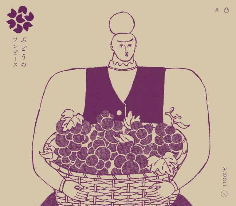
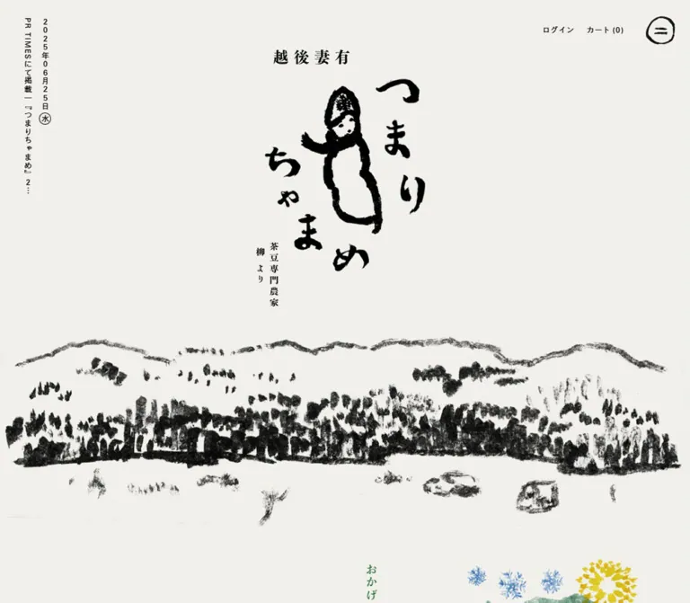
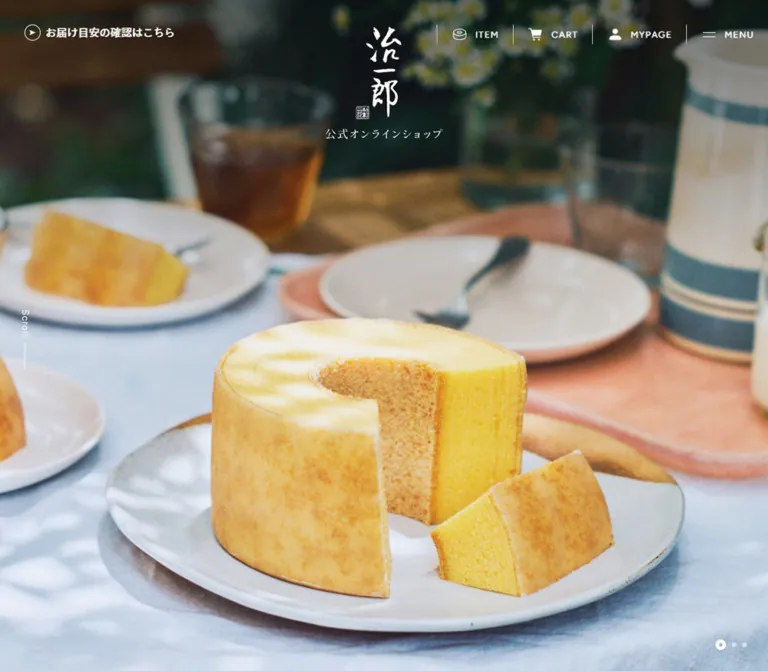
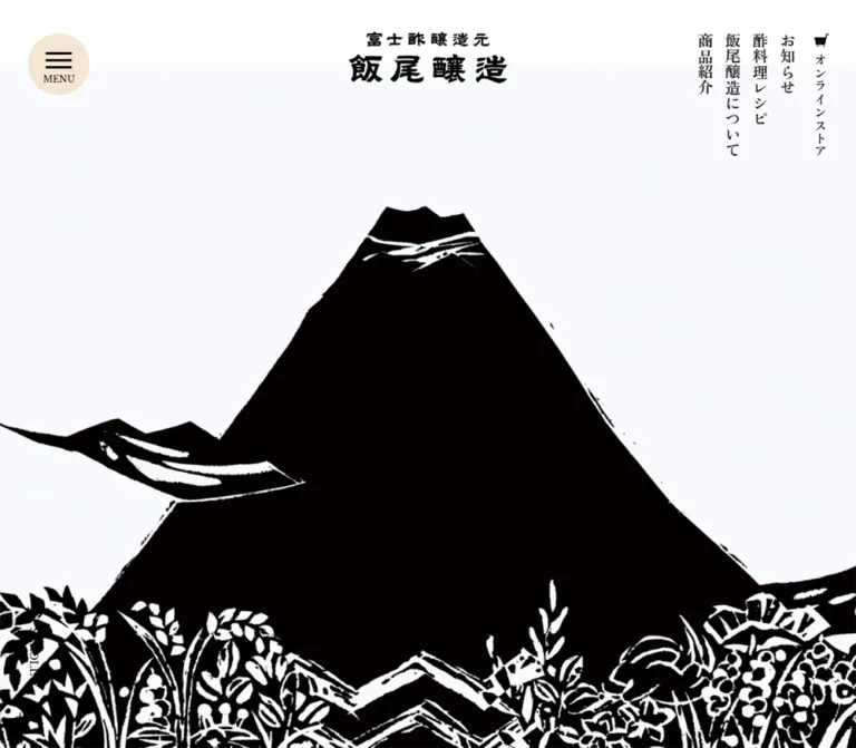
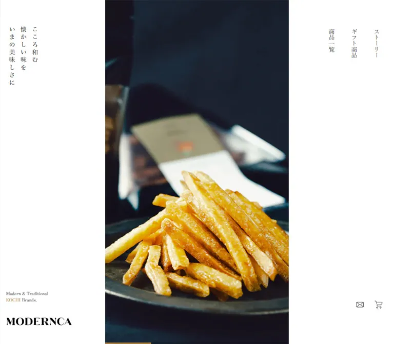
白い余白と明朝体、縦書きナビゲーション、大きな食品写真で構成するECサイト。デスクトップの三分割ファーストビューから、モバイルのブランド表示と正方形写真へ切り替わる設計が特徴。
オリジナルサイトを見るA quiet white storefront framing rich food photography with Mincho typography and the restraint of a Japanese product catalog.
Website: modernca-online.com
Original URL: https://modernca-online.com/
Final URL: https://modernca-online.com/
Theme: light; white canvas, charcoal text, pale-gray footer, and restrained bronze accents
Inspected: supplied browser session dated September 23, 2026, 02:32 JST / September 22, 2026, 17:32 UTC; retrieval timestamp 2026-09-22T17:32:20.193Z
Viewports: desktop 1440 × 1000 and mobile 390 × 844 CSS pixels
Scope: the current store homepage, including its opening composition, category presentation, product recommendations, story links, store information, and footer. Visual evidence consists of three desktop and two mobile captures. Additional content and measurements come from the supplied rendered DOM. Collection pages, product pages, an opened menu, cart, account, and checkout were not inspected.
MODERNCA presents regional confectionery and coffee through a deliberately spacious shopping experience. The interface stays mostly white and charcoal while photography supplies chocolate brown, coffee black, leafy green, and the golden color of sweet-potato confectionery. Japanese Mincho text, vertical opening navigation, fine outline icons, and a compact serif wordmark connect the brand's traditional subject matter with a contemporary editorial layout.
The defining desktop composition divides the opening screen into white side panels and a central photograph occupying half the viewport width. Mobile reorganizes this into a tall white brand masthead followed by a square photograph. Farther down, large photographic category panels lead into recommendations and stories. A pale-gray footer, generous rounded upper corners, and a final food photograph with an oversized white wordmark close the page.
This is a brand-led commerce homepage with several shopping and editorial routes. Its design depends on the relationship between photography, quiet typography, and unusually generous space—not on a large promotional headline or a dominant filled button.
A quiet white storefront framing rich food photography with Mincho typography and the restraint of a Japanese product catalog.
Website: modernca-online.com
Original URL: https://modernca-online.com/
Final URL: https://modernca-online.com/
Theme: light; white canvas, charcoal text, pale-gray footer, and restrained bronze accents
Inspected: supplied browser session dated September 23, 2026, 02:32 JST / September 22, 2026, 17:32 UTC; retrieval timestamp 2026-09-22T17:32:20.193Z
Viewports: desktop 1440 × 1000 and mobile 390 × 844 CSS pixels
Scope: the current store homepage, including its opening composition, category presentation, product recommendations, story links, store information, and footer. Visual evidence consists of three desktop and two mobile captures. Additional content and measurements come from the supplied rendered DOM. Collection pages, product pages, an opened menu, cart, account, and checkout were not inspected.
MODERNCA presents regional confectionery and coffee through a deliberately spacious shopping experience. The interface stays mostly white and charcoal while photography supplies chocolate brown, coffee black, leafy green, and the golden color of sweet-potato confectionery. Japanese Mincho text, vertical opening navigation, fine outline icons, and a compact serif wordmark connect the brand's traditional subject matter with a contemporary editorial layout.
The defining desktop composition divides the opening screen into white side panels and a central photograph occupying half the viewport width. Mobile reorganizes this into a tall white brand masthead followed by a square photograph. Farther down, large photographic category panels lead into recommendations and stories. A pale-gray footer, generous rounded upper corners, and a final food photograph with an oversized white wordmark close the page.
This is a brand-led commerce homepage with several shopping and editorial routes. Its design depends on the relationship between photography, quiet typography, and unusually generous space—not on a large promotional headline or a dominant filled button.
--mc- are new descriptive aliases. Original custom properties are explicitly identified where relevant.| Name | Value | Suggested token | Evidence and role |
|---|---|---|---|
| Canvas White | #FFFFFF |
--mc-canvas |
Measured body background; also used for category overlay text and the desktop header surface |
| Charcoal | #404040 |
--mc-ink |
Measured body, navigation, editorial headings, story links, and footer text |
| Footer Gray | #F4F4F4 |
--mc-footer |
Measured footer background on both viewports |
| Bronze | #A0793D |
--mc-accent |
Measured product category-link color; also supplied as source --swiper-theme-color |
| Secondary Gray | #777777 |
--mc-muted |
Measured footer category links and extracted mobile navigation links |
| Price Gray | #838383 |
--mc-price |
Measured recommendation prices, paired with bold type |
| Commerce Dark | #121212 |
--mc-commerce-dark |
Measured on selected heading/cart elements; also present in theme button and foreground variables |
| Fine Rule | Approximately #999999 |
--mc-rule |
Recommended approximation for the visually light rules; border color was not supplied |
The hex values marked measured are conversions of the supplied RGB values. The rule color is deliberately separated from those measurements.
White provides the dominant surface. Bronze is a small navigational or brand accent, visible in product metadata and the fine line beneath the opening image. The screenshots do not support treating bronze as a large button fill or a general background color.
The gray footer is a distinct final section rather than a repeating card surface. Warm browns, golds, and green tones belong primarily to photographs. Do not convert every photographic color into a UI token.
No alternate theme or theme selector is evidenced.
'Zen Old Mincho', serif.16px on both viewports.16px, weight 400, line height 32px.0.96px, equivalent to 0.06em at 16px. Many descendants explicitly use normal tracking.The source custom property --font-body-family contains Assistant, sans-serif, but the inspected elements compute to Zen Old Mincho. Use the computed element styles when describing the current page. The supplied evidence does not identify the font file or independently verify which font resource rendered every glyph.
The visible MODERNCA wordmark has a strong, high-contrast serif character. Its precise font or asset format was not supplied. Reuse an approved wordmark asset instead of identifying a typeface by appearance.
The opening wordmark is approximately 175px wide in both supplied opening captures. The smaller desktop header mark has a measured 120px layout width. The desktop H1 reports 64px type with a zero line height, despite a much smaller visible mark; this is not evidence for a 64px text logo.
Utility icons use thin outlines: envelope, cart, account, help, Instagram, and the small shipping/package symbol. Their visual artwork is approximately 18–30px depending on the icon. No icon library is identified.
| Role | Desktop | Mobile | Weight and tracking | Evidence |
|---|---|---|---|---|
| Body baseline | 16 / 32px |
16 / 32px |
400; body tracking 0.96px |
Computed |
| Horizontal header links | 16 / 32px |
Replaced by menu trigger | 400, normal tracking |
Computed desktop |
| Opening vertical links | 16 / 16px |
Not visible in opening capture | 400, normal tracking |
Computed desktop |
| Brand introduction paragraphs | 14 / 30px |
14 / 30px |
400, normal tracking |
Computed |
| Category H3 | 80 / 80px |
60 / 60px |
400, tracking 0.96px |
Computed; separate Japanese label size unavailable |
| Category descriptive copy | 16 / 32px |
Not present in mobile rendered text | 400, normal tracking |
Computed desktop |
| Recommend / Story headings | 32 / 32px |
32 / 32px |
400, tracking 0.96px |
Computed |
| Product category link | 14 / 14px |
14 / 14px |
400, bronze |
Computed |
| Product description link | 16 / 24px |
16 / 24px |
400, normal tracking on link |
Computed |
| Product price | 18 / 30px |
18 / 30px |
700, price gray |
Computed |
| Story article link | 20 / 40px |
20 / 40px |
Desktop 400; mobile 700 with -0.8px tracking |
Computed |
| Footer navigation heading | 18 / 19.2px |
18 / 19.2px |
700 |
Computed |
| Footer category link | 16 / 32px |
16 / 32px |
400, secondary gray |
Computed |
| Store address | 14 / 16px |
14 / 16px |
400 |
Computed |
| MAP label | 12 / 14.4px |
12 / 14.4px |
400 |
Computed |
| Footer policy links | 14 / 14px |
14 / 14px |
400 |
Computed; inline rectangles are about 20px tall |
| Opening English brand descriptor | Approximately 12px |
Approximately 12px |
Regular serif | Visual estimate |
The product description paragraph wrapper reports 1.6px tracking, but its nested anchor reports normal tracking. Do not apply 0.1em indiscriminately to all visible product text.
The page combines small, precise utility spacing with large editorial intervals. There is no evidence of a single universal spacing unit.
| Use | Value | Status |
|---|---|---|
| Mobile product column gap | 4px |
Calculated from 193px items spaced 197px apart |
| Mobile product text inset | 16px |
Calculated from media and text rectangles |
| Desktop product text inset | 28px |
Calculated from 280px media and 224px text widths |
| Intro paragraph separation | Approximately 23.8px |
Calculated from consecutive paragraph rectangles |
| Desktop policy-link gap | 30px |
Calculated from link positions and widths |
| Mobile footer horizontal inset | 40px |
Measured |
| Mobile category-heading left inset | 40px |
Measured |
| Desktop utility link box | 50 × 50px |
Measured for guide, account, and cart |
| Desktop category text inset | 60px |
Measured horizontal padding |
| Desktop header side margin | 80px |
Measured at 1440px viewport width |
| Desktop product media gap | 80px |
Calculated from a 360px pitch and 280px width |
| Desktop footer horizontal inset | 96px |
Measured |
| Footer top padding | 129.6px |
Measured on both viewports |
| Initial desktop category flow gap | 160px |
Calculated from recorded banner rectangles; scroll-state overlap also appears in the capture |
| Hero-image end to main-content start | 163px |
Calculated on both viewports; includes the intervening shipping region |
Source theme properties such as --spacing-sections-desktop: 0px do not describe the large spaces in the custom homepage composition. Likewise, --page-width: 120rem is not the measured width of either the header or category banners.
| Element | Value | Status |
|---|---|---|
| Category panels and main media | 0 |
Measured square geometry |
| General product/collection/blog treatment | Square, without visible elevation | Consistent with supplied zero-radius and disabled-shadow theme settings |
| Footer top corners, desktop | 80px 80px 0 0 |
Measured |
| Footer top corners, mobile | 49.92px 49.92px 0 0 |
Measured |
| MAP link | 100px radius |
Measured pill treatment |
| Desktop social capsule | Approximately 30px radius |
Visual estimate from its approximately 60px height |
| Extracted mobile cart link | 3px |
Computed in menu content; open-menu appearance unverified |
| Element | Desktop: 1440 × 1000 | Mobile: 390 × 844 |
|---|---|---|
| Reported document height | 7227px |
8225px |
| Opening image section | x: 360, y: 0, 720 × 1000px |
x: 0, y: 379.8, 390 × 390px |
| Opening side panels | 360px each, calculated |
Replaced by a brand area above the image |
| Main content start | y: 1163px |
y: 932.8px |
| Header inner rectangle | 1280 × 70.39px, starting at x: 80 |
Desktop header presentation replaced by mobile control |
| Category image/link rectangle | 1266 × 521.16px |
390 × 312px |
| Category starting x positions | 87, 137, 187px |
All 0px |
| Product media rectangle | 280 × 330px |
193 × 227.45px |
| Product text width | 224px |
161px paragraph wrapper |
| Footer rectangle | 1440 × 935.30px |
390 × 1158.41px |
| Footer navigation columns | 184px each |
155px each |
| Store information start | x: 720px |
x: 40px, below navigation |
| MAP link rectangle | Approximately 69.58 × 27px |
Approximately 69.58 × 24.41px |
The mobile brand area ends at 379.8px, which equals 45% of the inspected 844px viewport height. This is a calculated correspondence, not proof of the original CSS formula.
Role: introduce the brand through product imagery while keeping shopping routes immediately available.
Use three vertical zones in a 25% / 50% / 25% relationship at the inspected desktop size. The middle zone contains a photograph running from the top to the bottom of the viewport. The left and right zones remain white, without borders or shadows.
The left panel has two distant anchors: three short vertical lines of Japanese brand copy near the upper-left area, and an English descriptor plus the MODERNCA wordmark near the bottom. The supplied copy is “こころ和む / 懐かしい味を / いまの美味しさに”. The descriptor visually separates the word KOCHI with a bronze accent.
The right panel places three vertical navigation links at the top: “商品一覧”, “ギフト商品”, and “ストーリー”. Each measured link is approximately 60px wide and 200px tall, with 75.2px top padding. Envelope and cart icons sit near the lower-right corner.
The current desktop opening capture shows a close photograph of chocolate pieces, including a cut piece revealing a nut center. Keep the photograph as the dominant visual object; the copy remains deliberately small.
Role: keep catalog and service navigation available deeper in the page.
The middle and footer desktop captures show a white horizontal header at the viewport top. Its inner content spans 1280px with 80px side margins. A small wordmark sits left; product, gift, story, and contact navigation sit right, followed by help, account, and cart icons.
Text links use 16px Mincho type, a 32px line height, and measured 20px padding. Utility targets have 50px square layout boxes. No heavy separator or elevation shadow is visible.
In the opening DOM sample, the header rectangle begins at y: -70.39px, just above the viewport. Together with the later captures, this supports an offscreen opening state and a visible scrolled state. The exact trigger position and fixed-versus-sticky implementation were not supplied.
Role: preserve the opening's spacious identity when the desktop side panels no longer fit.
At 390px wide, the opening begins with approximately 380px of white space. The descriptor appears around 242px from the top, with the wordmark below it near 310px. Both align about 16px from the left edge. A full-width, square coffee photograph begins at 379.8px.
The desktop vertical navigation and opening vertical copy are not visible in this mobile capture. A persistent white menu control occupies approximately the upper-right 80px square. Its two fine horizontal lines are about 30px long, with a small “menu” caption below. The same control remains visible in the mobile footer capture.
The extracted DOM contains cart, collection, gift, story, contact, guide, login, company, and policy links associated with mobile navigation. However, no opened-menu capture or toggle interaction is supplied. Its layout, animation, scrolling, focus handling, and close state remain unverified.
Role: place a practical purchase condition between the visual opening and the brand narrative.
The DOM contains the shipping threshold “12,000円以上のお買物で全国送料無料” with an exclusion note for Hokkaido, Tohoku, and Okinawa. In the mobile opening capture, a small package icon sits between thin horizontal rules below the image.
Both viewport samples place the main element 163px after the end of the hero-image section. Treat the shipping information as part of this intervening region. The capture does not establish the exact layout of every line of the notice.
Role: explain the relationship between regional tradition and contemporary flavors before presenting the collections.
The source heading is “いいものを、よりいいものに。” Three short paragraphs follow with deliberate line breaks and substantial open space around them. Paragraphs use 14px type and a 30px line height on both viewports.
The desktop paragraph region begins at x: 553px and measures 779px wide, creating a composition weighted toward the right. On mobile, it begins at x: 40px and measures 334px wide. The asymmetric mobile inset is therefore evidenced: 40px on the left and approximately 16px on the right.
The DOM also contains repeated “Modern & Traditional Brands.” text. Repetition is confirmed; a marquee animation is not.
Role: provide large visual entry points into Imokenpi, Coffee, and Chocolate collections.
The desktop anchor rectangles measure approximately 1266 × 521px, a calculated aspect ratio of about 2.43:1. Their recorded left positions advance by 50px across the three categories. They have square corners and no visible card shell.
Each category combines a large white English title, an associated Japanese label, and desktop descriptive copy. The title computes to 80px / 80px; descriptive copy uses 16px / 32px. Both are positioned toward the lower part of the photographic panel, with 60px horizontal text padding. The description occupies a broad right-hand region.
On mobile, the panels measure 390 × 312px, or 5:4, and follow one another without the desktop flow gaps in the recorded geometry. Category titles reduce to 60px / 60px with a 40px left inset. Descriptive paragraphs do not appear in the mobile rendered text.
The middle desktop capture visibly shows the Chocolate panel covering part of the Coffee panel. Initial DOM rectangles, however, record separated vertical blocks. This is evidence of differing scroll or presentation states, not enough information to reconstruct a pinning algorithm. A static implementation should preserve the image hierarchy and staggered composition without permanently obscuring links or captions.
Role: move from brand browsing to individual products.
A 32px “Recommend” heading is accompanied by Japanese introductory text. The DOM contains ten product entries with separate media links, collection links, product descriptions, and prices. Observed prices include 500円, 640円, and 700円.
Desktop media rectangles form a horizontal sequence: 280px wide with a 360px pitch, leaving an 80px media gap. Some items sit beyond both viewport edges. This supports a horizontal rail arrangement, but dragging, autoplay, arrows, and exact starting position were not exercised.
Mobile measurements repeat two 193px columns separated by 4px across five rows. All sampled recommendation rectangles are shifted to negative x positions, including -585px and -388px. The organization and sizing are measurable, but visible placement and the cause of that translation are unresolved. Do not copy those offsets into a new implementation.
The mobile rendered text also includes “その他の商品も見る”, linking to the full collection. Its desktop visibility is not established.
Role: provide compact shopping information without competing with the large category photography.
28:33 ratio: 280 × 330px desktop and approximately 193 × 227.45px mobile.16px / 24px, usually wrapping over several lines.18px / 30px.Text is inset 28px on desktop and 16px on mobile. The measured paragraph width changes from 224px to 161px. The entries do not need rounded containers, colored category badges, or drop shadows.
Product photography itself is not visible in the supplied current-page captures. Media dimensions are evidenced; specific packshot composition, background, and cropping are not.
Role: connect the products with the brand's origin and flavor development.
The DOM contains a 32px “Story” heading and two article links: one about reinterpreting Kochi confectionery and one about the flavors of imokenpi. Article links compute to 20px / 40px, regular on desktop and bold with slightly negative tracking on mobile.
The measured desktop link regions are broad, with substantial internal padding. Mobile regions are narrower and have more wrapped lines. No direct story-section screenshot is supplied, so the exact illustration, rule, arrow, and overlapping-image anatomy cannot be confirmed. Preserve the editorial text hierarchy without inventing a thumbnail-card system as an observed feature.
Role: provide a quiet transition from the main content into footer information.
The desktop footer begins with a centered white capsule, visually about 520 × 60px, containing “公式SNSから最新情報をチェック” and an outlined Instagram symbol. The Instagram element measures 30 × 30px on desktop.
On mobile, the Instagram anchor computes to a 280px-wide block rather than the desktop inline-table. The footer's social area is above the visible crop of the supplied mobile footer image, so its complete mobile arrangement is not visually verified.
Role: combine shopping navigation, physical-store information, policies, and brand identification.
Use a pale-gray surface with large rounded upper corners: 80px on desktop and 49.92px on mobile. The measured top padding remains 129.6px at both sizes. Horizontal padding changes from 96px to 40px.
Desktop navigation occupies two compact 184px columns at the left. The first contains the product heading and three category links; the second contains gift and story links. Store information starts at the midpoint of the viewport, x: 720px, and lists two Kochi locations with small outlined MAP pills.
Policy links sit along a lower row, while the copyright line sits toward the right. The original footer reads “© 2023 MODERNCA produce by HARIMAYA.” and links HARIMAYA to its company website. That wording is a visible brand-producer attribution; it does not identify a web-design agency or technical production role.
Mobile keeps the two navigation columns, each 155px wide, then places store information beneath them. Addresses wrap, MAP links move below the addresses, and policy links become a vertical list. The copyright line is left aligned below the policies.
Role: end the page with the product and wordmark at a larger visual scale.
The gray information surface gives way to an edge-to-edge close photograph of golden imokenpi. An oversized white MODERNCA wordmark overlays the image and is cropped by the visible frame.
The bottom captures expose approximately 125px of this band on desktop and 100px on mobile. These are visual extents in the provided captures, not independently measured source heights. Preserve the food texture, large reversed mark, and deliberate crop rather than introducing another informational footer row.
| Treatment | Supplied evidence | Interpretation and limit |
|---|---|---|
| Desktop header state change | 0.5s ease-out; header above viewport initially and visible in later captures |
A transition is defined; exact activation threshold and animated properties are unverified |
| Opening vertical navigation | 0.5s ease-out |
Defined transition; no hover endpoint was supplied |
| Story links | 0.3s ease-out |
Defined transition; the changed property and hover appearance are unknown |
| Mobile Recommend heading | 0.6s cubic-bezier(0, 0, 0.3, 1) forwards slideIn |
Computed animation declaration; keyframe distance and replay behavior were not supplied |
| Skip link | transform 0.2s cubic-bezier(0, 0, 0.3, 1) |
Defined transform transition; keyboard activation was not tested |
| Theme fade token | fadeIn .6s cubic-bezier(0, 0, .3, 1) |
Available source variable; not proof that every section fades |
| General duration variables | .2s, .5s, 3s |
Source tokens only; the 3s value does not establish a hero autoplay interval |
| Hero photographs | Different subjects in desktop and mobile captures; multiple media links in DOM | Multiple media states exist; slideshow order, controls, autoplay, and transitions are unverified |
| Bronze line below hero | Visible in current opening captures | Appearance confirmed; progress behavior is not confirmed |
| Category overlap | Chocolate overlaps Coffee in the middle desktop capture | Overlap confirmed at that state; pinning, parallax, and scroll calculations are unknown |
| Recommendation movement | Offscreen horizontal item coordinates and a slider color variable | Rail-like geometry is supported; manual and automatic movement were not tested |
Many extracted elements simply report transition: all. Without a nonzero duration and a changed state, that is not useful evidence of animation.
For reuse, favor restrained transitions consistent with the evidenced 200–600ms range. Any specific hover fade, native horizontal scrolling, static-image fallback, or reduced-motion rule in a new implementation must be treated as an addition.
Observed links point to collections, products, stories, contact, guide, account, cart, Instagram, maps, and policies. Their destinations are evidenced by the DOM; their destination-page behavior is outside this inspection.
| Layer | Appearance | Purpose |
|---|---|---|
| Main canvas | Solid white | Provides generous space around imagery and copy |
| Opening side panels | Same white as canvas | Separates small navigation and brand details from the central photograph |
| Scrolled desktop header | White, visually flat | Maintains navigation without adding a heavy bar |
| Category entry | Edge-to-edge photograph within a square rectangle | Carries collection identity and white text |
| Recommendation entry | Unboxed media and text | Keeps commerce information quiet and legible |
| Footer | #F4F4F4, large upper corner radii |
Marks the final information region |
| Social capsule | White on footer gray | Groups the social invitation without strong elevation |
| MAP control | Fine outline, transparent interior, pill shape | Identifies a small external-navigation action |
| Footer signature | Food photograph with oversized white wordmark | Ends with product texture and identity |
The inspected main page does not use a general shadow-elevation system. Product, collection, blog, and media shadow settings are disabled in the supplied theme values. This observation does not establish the appearance of uninspected drawers or popups.
Photography provides the sensory detail that the interface intentionally withholds. The current desktop opening shows rounded chocolate pieces on a dark plate or surface, with a cut nut-filled piece in the foreground. Warm directional light emphasizes the chocolate shell, irregular filling, crumbs, and shallow focus.
The mobile opening and desktop Coffee category show a dark ceramic cup, a branded coffee bag, beans in a glass container, and a wooden tabletop. Soft green foreground or background blur introduces depth without becoming a separate interface color.
The footer photograph is much tighter and brighter: golden imokenpi fills the frame behind the reversed wordmark. Its gloss and irregular edges create the final visual contrast against the otherwise quiet footer.
Use natural food texture, believable lighting, and close compositions. Maintain enough subject separation to work in a tall desktop hero, a square mobile hero, and a wide category panel. Do not assume one center crop will preserve the same focal point across all three.
Original asset filenames and image URLs were not included in the supplied evidence. The following identifies visual roles, not invented file paths.
| Visual reference | Confirmed use | Implementation guidance |
|---|---|---|
| Chocolate with exposed nut center | Desktop opening; Chocolate category in middle capture | Preserve foreground detail and warm, shallow-focus treatment |
| Coffee cup, branded bag, and beans | Mobile opening; Coffee category in middle capture | Keep both product context and package identity within the crop |
| Golden imokenpi close-up | Footer signature on both viewports | Fill the band without flattening food texture |
| MODERNCA wordmark | Opening, desktop header, and footer signature | Use authorized artwork at the appropriate scale and color |
| Fine outline symbols | Navigation, shipping divider, Instagram, MAP context | Match the light stroke character; icon library is unknown |
| Product recommendation media | Dimensions and product links in DOM | Specific image content was not visually supplied |
The Imokenpi collection is confirmed by text and links. No separate current opening photograph for that collection was supplied for visual analysis.
The desktop layout is not simply reduced in size on mobile. Its opening composition, category density, product arrangement, and footer hierarchy change independently.
| Area | Desktop observation | Mobile observation |
|---|---|---|
| Opening | Central 720px photograph with two 360px white panels | Brand masthead above a full-width 390px square photograph |
| Primary navigation | Vertical opening links; horizontal header deeper in the page | Persistent upper-right menu control |
| Opening brand copy | Vertical Japanese text plus lower-left identity | Descriptor and identity remain; vertical copy is not visible |
| Introduction | Paragraph block weighted toward the right | Left inset of 40px, right inset of approximately 16px |
| Categories | Wide panels with 50px incremental horizontal offsets | Full-width 5:4 panels, no recorded gap between them |
| Category typography | 80px titles and descriptive copy | 60px titles; descriptive copy absent from rendered text |
| Recommendations | Horizontal 280px media sequence | Two-column 193px geometry, with unresolved offscreen translation |
| Story text | 20px regular text | 20px bold text with tighter tracking |
| Footer navigation | Two small columns beside store details | Two small columns above store details |
| Store links | MAP pills beside addresses | MAP pills below wrapped addresses |
| Policy links | Horizontal | Vertical |
| Footer radius | 80px | 49.92px |
The measured mobile document is approximately 998px taller than desktop, despite its more compact category panels. The repeated recommendation rows and stacked footer contribute to the longer vertical structure.
Only two viewport sizes were supplied. The original breakpoint, tablet behavior, landscape phone behavior, and text-zoom behavior are unknown. The Quick Start uses a recommended 48rem breakpoint and fluid limits to connect these observed endpoints; it does not claim to reproduce the original media queries.
The middle category capture and negative mobile recommendation coordinates deserve particular care. They are observations to document, not reliable instructions for permanent offsets. A reusable implementation should remain navigable before motion initializes and after motion is disabled.
These are recommendations for a new implementation, not verified features of the original:
aria-expanded, an associated panel, keyboard support, and appropriate focus management.object-position settings.#FFFFFF.#404040.#F4F4F4.#A0793D.#777777.#838383.“Create a Japanese confectionery and coffee storefront inspired by the supplied MODERNCA reference. Use a white canvas, charcoal Zen Old Mincho typography, small bronze accents, and rich natural food photography. At a wide desktop size, divide the opening into 25% white brand panel, 50% full-height photograph, and 25% white navigation panel. Place vertical Japanese copy at the upper left, a compact descriptor and approved wordmark near the lower left, vertical collection links at the upper right, and fine utility icons near the lower right. On mobile, place the brand identity within a tall white masthead above a square photograph and use an upper-right menu button. Continue with spacious editorial copy, large square-cornered category photographs, quiet product entries, story links, and a pale-gray footer with large rounded top corners. Use the measured values where available; keep unverified motion as a clearly labeled implementation choice.”
This is a reusable static foundation. It reproduces the strongest measured proportions and supplies a conventional product-rail fallback. It does not implement the original slideshow, category overlap, navigation activation threshold, or unverified menu state.
Load Zen Old Mincho through the project's approved font setup. Supply authorized photographs and wordmark assets through markup; no original asset URLs were provided. Use .hero-copy, .hero-media, and .hero-nav as the three children of .brand-hero. Product entries belong inside .product-rail; footer navigation and store information belong inside .footer-grid.
The 48rem breakpoint, native rail scrolling, local image scrim, and focus/reduced-motion treatments below are recommendations. Set data-visible='true' on the desktop header when appropriate, and coordinate its offscreen state with the HTML inert attribute. Menu behavior requires separate implementation.
:root {
  /* Measured colors */
  --mc-canvas: #ffffff;
  --mc-ink: #404040;
  --mc-footer: #f4f4f4;
  --mc-accent: #a0793d;
  --mc-muted: #777777;
  --mc-price: #838383;
  --mc-commerce-dark: #121212;

  /* Recommended rule-color approximation */
  --mc-rule: #999999;

  /* Observed computed font stack */
  --mc-font: 'Zen Old Mincho', serif;
  --mc-text-body: 16px;
  --mc-text-small: 14px;
  --mc-text-section: 32px;
  --mc-text-category: 80px;
  --mc-leading-body: 2;
  --mc-leading-product: 1.5;

  /* Endpoint measurements and responsive adaptations */
  --mc-header-height: 70.4px;
  --mc-edge: clamp(40px, 5.556vw, 80px);
  --mc-category-edge: clamp(40px, 6.042vw, 87px);
  --mc-footer-pad: 96px;
  --mc-footer-radius: 80px;
  --mc-product-width: 280px;
  --mc-product-gap: 80px;
  --mc-product-inset: 28px;

  /* Durations supported by supplied declarations */
  --mc-motion-fast: 200ms;
  --mc-motion-link: 300ms ease-out;
  --mc-motion-header: 500ms ease-out;
}

* { box-sizing: border-box; }
html { font-size: 16px; }
body {
  margin: 0;
  color: var(--mc-ink);
  background: var(--mc-canvas);
  font-family: var(--mc-font);
  font-size: var(--mc-text-body);
  line-height: var(--mc-leading-body);
}
img { display: block; max-inline-size: 100%; }
a { color: inherit; }
button { font: inherit; }

/* Desktop opening */
.brand-hero {
  display: grid;
  grid-template-columns: 1fr 2fr 1fr;
  min-block-size: 100svh;
}
.hero-copy,
.hero-nav { position: relative; }
.hero-motto {
  position: absolute;
  inset-block-start: 70px;
  inset-inline-start: var(--mc-edge);
  margin: 0;
  writing-mode: vertical-rl;
  text-orientation: mixed;
  font-size: 16px;
  line-height: 30px;
}
.hero-identity {
  position: absolute;
  inset-inline-start: var(--mc-edge);
  inset-block-end: 80px;
}
.hero-kicker {
  margin: 0 0 32px;
  font-size: 12px;
  line-height: 17px;
}
.hero-kicker .accent { color: var(--mc-accent); }
.hero-wordmark { inline-size: 175px; block-size: auto; }
.hero-media {
  position: relative;
  min-inline-size: 0;
  block-size: 100svh;
  overflow: hidden;
}
.hero-media > a {
  display: block;
  inline-size: 100%;
  block-size: 100%;
}
.hero-media img {
  inline-size: 100%;
  block-size: 100%;
  object-fit: cover;
  object-position: var(--focal-point, 50% 50%);
}
.hero-media::after {
  /* Static accent only; no inferred progress behavior */
  content: '';
  position: absolute;
  inset: auto 0 0;
  block-size: 4px;
  background: var(--mc-accent);
  pointer-events: none;
}
.hero-nav-links {
  position: absolute;
  inset-block-start: 0;
  inset-inline-end: var(--mc-edge);
  display: flex;
}
.hero-nav-links a {
  inline-size: 60px;
  block-size: 200px;
  padding: 75.2px 22px 0;
  writing-mode: vertical-rl;
  font-size: 16px;
  line-height: 16px;
  text-decoration: none;
}
.hero-utilities {
  position: absolute;
  inset-inline-end: var(--mc-edge);
  inset-block-end: 80px;
  display: flex;
}
.icon-link {
  display: grid;
  place-items: center;
  inline-size: 50px;
  min-block-size: 50px;
}

/* Header state is controlled by the application */
.site-header {
  position: fixed;
  inset: 0 0 auto;
  z-index: 30;
  display: flex;
  align-items: center;
  block-size: var(--mc-header-height);
  padding-inline: var(--mc-edge);
  background: var(--mc-canvas);
  transform: translateY(-100%);
  transition: transform var(--mc-motion-header);
}
.site-header[data-visible='true'] { transform: translateY(0); }
.site-header .wordmark { inline-size: 120px; }
.header-nav {
  display: flex;
  align-items: center;
  margin-inline-start: auto;
}
.header-nav > a:not(.icon-link) {
  padding: 20px;
  white-space: nowrap;
  text-decoration: none;
}
.menu-toggle { display: none; }

/* Editorial text */
.brand-intro { padding: 220px 7.5vw 160px; }
.intro-copy {
  max-inline-size: 779px;
  margin-inline-start: auto;
}
.intro-copy p {
  margin: 0 0 23.8px;
  font-size: 14px;
  line-height: 30px;
}
.section-title {
  margin: 0;
  font-size: var(--mc-text-section);
  font-weight: 400;
  line-height: 1;
  letter-spacing: 0.96px;
}

/* Static category fallback; original scroll overlap is not recreated */
.category-list { overflow: clip; }
.category-panel {
  --stagger: 0px;
  position: relative;
  display: block;
  inline-size: calc(100% - 2 * var(--mc-category-edge));
  aspect-ratio: 1266 / 521.15625;
  margin-inline-start: calc(var(--mc-category-edge) + var(--stagger));
  margin-block-end: 160px;
  overflow: hidden;
  color: #ffffff;
  text-decoration: none;
}
.category-panel:nth-child(2) { --stagger: 50px; }
.category-panel:nth-child(3) { --stagger: 100px; }
.category-panel > img {
  inline-size: 100%;
  block-size: 100%;
  object-fit: cover;
  object-position: var(--focal-point, 50% 50%);
}
.category-caption {
  position: absolute;
  inset: auto 60px 60px;
  display: grid;
  grid-template-columns: 40% 60%;
  align-items: end;
}
.category-title {
  margin: 0;
  font-size: var(--mc-text-category);
  font-weight: 400;
  line-height: 1;
  letter-spacing: 0.96px;
}
.category-label {
  /* Recommended secondary-label sizing; original size unavailable */
  display: block;
  margin-block-start: 8px;
  font-size: 14px;
  line-height: 1.4;
}
.category-description {
  margin: 0;
  font-size: 16px;
  line-height: 32px;
}
.category-panel.needs-scrim::before {
  /* Optional contrast support, not a verified original effect */
  content: '';
  position: absolute;
  inset: 45% 0 0;
  background: linear-gradient(transparent, rgb(0 0 0 / 35%));
}

/* Recommended native rail with measured card proportions */
.product-rail {
  display: flex;
  gap: var(--mc-product-gap);
  overflow-x: auto;
  padding-inline: var(--mc-edge);
  scroll-snap-type: x proximity;
}
.product-card {
  flex: 0 0 var(--mc-product-width);
  min-inline-size: 0;
  scroll-snap-align: start;
}
.product-media {
  display: block;
  aspect-ratio: 28 / 33;
}
.product-media img {
  inline-size: 100%;
  block-size: 100%;
  object-fit: contain;
}
.product-info { padding: 21px var(--mc-product-inset) 0; }
.product-category {
  color: var(--mc-accent);
  font-size: 14px;
  line-height: 14px;
  text-decoration: none;
}
.product-name {
  margin: 16px 0;
  font-size: 16px;
  font-weight: 400;
  line-height: 24px;
}
.product-name a { text-decoration: none; }
.product-price {
  margin: 0;
  color: var(--mc-price);
  font-size: 18px;
  font-weight: 700;
  line-height: 30px;
}

/* Footer */
.site-footer {
  padding: 129.6px var(--mc-footer-pad) 0;
  border-radius: var(--mc-footer-radius) var(--mc-footer-radius) 0 0;
  background: var(--mc-footer);
}
.footer-social {
  display: flex;
  align-items: center;
  justify-content: center;
  gap: 40px;
  inline-size: min(520px, 100%);
  min-block-size: 60px;
  margin: 0 auto 110px;
  padding: 12px 24px;
  border-radius: 100px;
  background: var(--mc-canvas);
  font-weight: 700;
}
.footer-grid {
  display: grid;
  grid-template-columns: 1fr 1fr;
}
.footer-links {
  display: grid;
  grid-template-columns: 184px 184px;
}
.footer-links h3 {
  margin: 0 0 32px;
  font-size: 18px;
  line-height: 19.2px;
}
.footer-links a { text-decoration: none; }
.footer-links .category-link {
  display: block;
  color: var(--mc-muted);
  font-size: 16px;
  line-height: 32px;
}
.footer-store h2 {
  /* Visual approximation for the Store heading */
  margin: 0 0 24px;
  font-size: 28px;
  font-weight: 400;
  line-height: 1;
}
.store-row {
  display: flex;
  align-items: center;
  gap: 16px;
  margin-block-end: 24px;
}
.store-row p {
  margin: 0;
  font-size: 14px;
  line-height: 16px;
}
.map-link {
  display: inline-flex;
  align-items: center;
  justify-content: center;
  flex: none;
  padding: 4px 20px;
  border: 1px solid var(--mc-rule);
  border-radius: 100px;
  font-size: 12px;
  line-height: 14.4px;
  text-decoration: none;
}
.footer-meta {
  display: flex;
  justify-content: space-between;
  gap: 32px;
  margin-block: 160px 185px;
  font-size: 14px;
  line-height: 20px;
}
.footer-legal { display: flex; gap: 30px; }
.footer-legal a { text-decoration: none; }
.footer-copyright { margin: 0; }
.footer-signature {
  position: relative;
  block-size: clamp(100px, 8.7vw, 160px);
  margin-inline: calc(-1 * var(--mc-footer-pad));
  overflow: hidden;
}
.footer-signature .signature-photo {
  inline-size: 100%;
  block-size: 100%;
  object-fit: cover;
}
.footer-signature .signature-logo {
  position: absolute;
  inset-inline-start: 8%;
  inset-block-end: -2%;
  inline-size: 84%;
  block-size: auto;
}

/* Recommended breakpoint between the two observed endpoints */
@media (max-width: 48rem) {
  :root {
    --mc-text-category: 60px;
    --mc-footer-pad: 40px;
    --mc-footer-radius: 49.92px;
    --mc-product-inset: 16px;
  }
  .brand-hero { display: block; min-block-size: 0; }
  .hero-copy { min-block-size: 45svh; }
  .hero-motto,
  .hero-nav,
  .site-header { display: none; }
  .hero-identity {
    inset-inline-start: 16px;
    inset-block-end: 50px;
  }
  .hero-media { block-size: auto; aspect-ratio: 1; }
  .menu-toggle {
    position: fixed;
    inset: 0 0 auto auto;
    z-index: 40;
    display: grid;
    place-content: center;
    gap: 12px;
    inline-size: 80px;
    block-size: 80px;
    padding: 0;
    border: 0;
    color: var(--mc-ink);
    background: var(--mc-canvas);
    font-size: 12px;
    line-height: 1;
  }
  .menu-lines {
    inline-size: 30px;
    block-size: 9px;
    border-block: 1px solid currentColor;
  }
  .brand-intro { padding: 160px 16px 120px 40px; }
  .category-panel {
    inline-size: 100%;
    aspect-ratio: 5 / 4;
    margin: 0;
  }
  .category-caption {
    inset: auto 24px 60px 40px;
    display: block;
  }
  .category-description { display: none; }
  .product-rail {
    display: grid;
    grid-template-columns: repeat(2, minmax(0, 1fr));
    gap: 60px 4px;
    padding-inline: 0;
    overflow: visible;
    scroll-snap-type: none;
  }
  .footer-social {
    /* Recommended mobile arrangement; complete source view unavailable */
    flex-direction: column;
    gap: 12px;
    padding: 16px;
    text-align: center;
  }
  .footer-grid { grid-template-columns: 1fr; gap: 64px; }
  .footer-links { grid-template-columns: repeat(2, minmax(0, 1fr)); }
  .store-row { display: block; }
  .store-row .map-link { margin-block-start: 14px; }
  .footer-meta { display: block; margin-block: 56px 104px; }
  .footer-legal { flex-direction: column; gap: 10px; }
  .footer-copyright { margin-block-start: 36px; }
  .footer-signature .signature-logo {
    inset-inline-start: 12px;
    inline-size: calc(100% - 24px);
  }
}

/* Recommended accessibility additions */
a:focus-visible,
button:focus-visible {
  outline: 2px solid var(--mc-ink);
  outline-offset: 4px;
}
@media (prefers-reduced-motion: reduce) {
  .site-header { transition: none; }
  .product-rail { scroll-behavior: auto; }
  .reveal { animation: none; opacity: 1; transform: none; }
}
Optional aliases for an implementation already using Tailwind v4. They are not evidence that the original site uses Tailwind. Define the custom properties above first.
@theme inline {
  --color-canvas: var(--mc-canvas);
  --color-ink: var(--mc-ink);
  --color-footer: var(--mc-footer);
  --color-bronze: var(--mc-accent);
  --color-muted: var(--mc-muted);
  --color-price: var(--mc-price);
  --font-editorial: var(--mc-font);
  --text-section: var(--mc-text-section);
  --text-category: var(--mc-text-category);
  --spacing-page-edge: var(--mc-edge);
  --spacing-product-inset: var(--mc-product-inset);
  --radius-footer: var(--mc-footer-radius);
}
2026-09-22T17:32:20.193Z, equivalent to September 23, 2026, 02:32 JST. This is the supplied retrieval timestamp, not a separate inspection performed while writing this document.1440 × 1000 viewport; opening, middle category presentation, and footer captures; reported document height 7227px.390 × 844 viewport; opening and lower-footer captures; reported document height 8225px.The supplied capture process waited for document load, sampled layout/text stability, finite animations, and visible image decoding within stated time limits. Repeating animations were paused during readiness checks and then resumed; shared workers and service workers were disabled. These precautions do not establish the completeness of delayed content or unexercised interactions.
No additional browsing, command execution, asset retrieval, or interaction testing was performed for this reference. Exact image URLs, original breakpoint rules, full animation keyframes, menu-open behavior, hero timing, recommendation controls, and the cause of offscreen mobile product coordinates remain unverified. The design observations describe the current supplied homepage; the CSS and agent prompts are explicitly reusable adaptations.
# MODERNCA ONLINE — Style Reference

> A quiet white storefront framing rich food photography with Mincho typography and the restraint of a Japanese product catalog.

**Website:** [modernca-online.com](https://modernca-online.com/)
**Original URL:** https://modernca-online.com/
**Final URL:** https://modernca-online.com/
**Theme:** light; white canvas, charcoal text, pale-gray footer, and restrained bronze accents
**Inspected:** supplied browser session dated September 23, 2026, 02:32 JST / September 22, 2026, 17:32 UTC; retrieval timestamp `2026-09-22T17:32:20.193Z`
**Viewports:** desktop `1440 × 1000` and mobile `390 × 844` CSS pixels
**Scope:** the current store homepage, including its opening composition, category presentation, product recommendations, story links, store information, and footer. Visual evidence consists of three desktop and two mobile captures. Additional content and measurements come from the supplied rendered DOM. Collection pages, product pages, an opened menu, cart, account, and checkout were not inspected.

MODERNCA presents regional confectionery and coffee through a deliberately spacious shopping experience. The interface stays mostly white and charcoal while photography supplies chocolate brown, coffee black, leafy green, and the golden color of sweet-potato confectionery. Japanese Mincho text, vertical opening navigation, fine outline icons, and a compact serif wordmark connect the brand's traditional subject matter with a contemporary editorial layout.

The defining desktop composition divides the opening screen into white side panels and a central photograph occupying half the viewport width. Mobile reorganizes this into a tall white brand masthead followed by a square photograph. Farther down, large photographic category panels lead into recommendations and stories. A pale-gray footer, generous rounded upper corners, and a final food photograph with an oversized white wordmark close the page.

This is a brand-led commerce homepage with several shopping and editorial routes. Its design depends on the relationship between photography, quiet typography, and unusually generous space—not on a large promotional headline or a dominant filled button.
# MODERNCA ONLINE — Style Reference

> A quiet white storefront framing rich food photography with Mincho typography and the restraint of a Japanese product catalog.

**Website:** [modernca-online.com](https://modernca-online.com/)
**Original URL:** https://modernca-online.com/
**Final URL:** https://modernca-online.com/
**Theme:** light; white canvas, charcoal text, pale-gray footer, and restrained bronze accents
**Inspected:** supplied browser session dated September 23, 2026, 02:32 JST / September 22, 2026, 17:32 UTC; retrieval timestamp `2026-09-22T17:32:20.193Z`
**Viewports:** desktop `1440 × 1000` and mobile `390 × 844` CSS pixels
**Scope:** the current store homepage, including its opening composition, category presentation, product recommendations, story links, store information, and footer. Visual evidence consists of three desktop and two mobile captures. Additional content and measurements come from the supplied rendered DOM. Collection pages, product pages, an opened menu, cart, account, and checkout were not inspected.

MODERNCA presents regional confectionery and coffee through a deliberately spacious shopping experience. The interface stays mostly white and charcoal while photography supplies chocolate brown, coffee black, leafy green, and the golden color of sweet-potato confectionery. Japanese Mincho text, vertical opening navigation, fine outline icons, and a compact serif wordmark connect the brand's traditional subject matter with a contemporary editorial layout.

The defining desktop composition divides the opening screen into white side panels and a central photograph occupying half the viewport width. Mobile reorganizes this into a tall white brand masthead followed by a square photograph. Farther down, large photographic category panels lead into recommendations and stories. A pale-gray footer, generous rounded upper corners, and a final food photograph with an oversized white wordmark close the page.

This is a brand-led commerce homepage with several shopping and editorial routes. Its design depends on the relationship between photography, quiet typography, and unusually generous space—not on a large promotional headline or a dominant filled button.

## How to Read This Reference

- **Measured** means a value reported in the supplied computed styles or element rectangles. Measurements use CSS pixels and describe the sampled state.
- **Visual estimate** means an approximation from an attached current-page capture. It is not a sampled color, computed value, or verified source rule.
- **Calculated** means arithmetic derived from reported measurements, such as column proportions or the gap between adjacent items.
- **Recommended** means an implementation choice for reuse. The CSS Quick Start is an adaptation, not recovered production CSS.
- Token names beginning with `--mc-` are new descriptive aliases. Original custom properties are explicitly identified where relevant.
- Offscreen rectangles and extracted menu content do not establish visibility. The mobile recommendation elements, in particular, have unresolved horizontal offsets in the supplied geometry.
- The supplied captures show different page positions and photographic states. They do not establish slideshow timing, hover behavior, or the complete sequence of scroll effects.

## Tokens — Colors

### Default Palette

| Name | Value | Suggested token | Evidence and role |
| --- | --- | --- | --- |
| Canvas White | `#FFFFFF` | `--mc-canvas` | Measured body background; also used for category overlay text and the desktop header surface |
| Charcoal | `#404040` | `--mc-ink` | Measured body, navigation, editorial headings, story links, and footer text |
| Footer Gray | `#F4F4F4` | `--mc-footer` | Measured footer background on both viewports |
| Bronze | `#A0793D` | `--mc-accent` | Measured product category-link color; also supplied as source `--swiper-theme-color` |
| Secondary Gray | `#777777` | `--mc-muted` | Measured footer category links and extracted mobile navigation links |
| Price Gray | `#838383` | `--mc-price` | Measured recommendation prices, paired with bold type |
| Commerce Dark | `#121212` | `--mc-commerce-dark` | Measured on selected heading/cart elements; also present in theme button and foreground variables |
| Fine Rule | Approximately `#999999` | `--mc-rule` | Recommended approximation for the visually light rules; border color was not supplied |

The hex values marked measured are conversions of the supplied RGB values. The rule color is deliberately separated from those measurements.

### Palette Behavior

White provides the dominant surface. Bronze is a small navigational or brand accent, visible in product metadata and the fine line beneath the opening image. The screenshots do not support treating bronze as a large button fill or a general background color.

The gray footer is a distinct final section rather than a repeating card surface. Warm browns, golds, and green tones belong primarily to photographs. Do not convert every photographic color into a UI token.

No alternate theme or theme selector is evidenced.

## Tokens — Typography

### Zen Old Mincho — Body, Navigation, and Editorial Titles

- **Measured computed family:** `'Zen Old Mincho', serif`.
- **Measured root size:** `16px` on both viewports.
- **Measured body:** `16px`, weight `400`, line height `32px`.
- **Measured body tracking:** `0.96px`, equivalent to `0.06em` at 16px. Many descendants explicitly use normal tracking.
- **Character:** fine, literary, and calm, with Japanese and Latin serif text working within one editorial system.

The source custom property `--font-body-family` contains `Assistant, sans-serif`, but the inspected elements compute to Zen Old Mincho. Use the computed element styles when describing the current page. The supplied evidence does not identify the font file or independently verify which font resource rendered every glyph.

### Wordmark and Icons

The visible MODERNCA wordmark has a strong, high-contrast serif character. Its precise font or asset format was not supplied. Reuse an approved wordmark asset instead of identifying a typeface by appearance.

The opening wordmark is approximately `175px` wide in both supplied opening captures. The smaller desktop header mark has a measured `120px` layout width. The desktop H1 reports `64px` type with a zero line height, despite a much smaller visible mark; this is not evidence for a 64px text logo.

Utility icons use thin outlines: envelope, cart, account, help, Instagram, and the small shipping/package symbol. Their visual artwork is approximately 18–30px depending on the icon. No icon library is identified.

### Type Scale

| Role | Desktop | Mobile | Weight and tracking | Evidence |
| --- | --- | --- | --- | --- |
| Body baseline | `16 / 32px` | `16 / 32px` | `400`; body tracking `0.96px` | Computed |
| Horizontal header links | `16 / 32px` | Replaced by menu trigger | `400`, normal tracking | Computed desktop |
| Opening vertical links | `16 / 16px` | Not visible in opening capture | `400`, normal tracking | Computed desktop |
| Brand introduction paragraphs | `14 / 30px` | `14 / 30px` | `400`, normal tracking | Computed |
| Category H3 | `80 / 80px` | `60 / 60px` | `400`, tracking `0.96px` | Computed; separate Japanese label size unavailable |
| Category descriptive copy | `16 / 32px` | Not present in mobile rendered text | `400`, normal tracking | Computed desktop |
| Recommend / Story headings | `32 / 32px` | `32 / 32px` | `400`, tracking `0.96px` | Computed |
| Product category link | `14 / 14px` | `14 / 14px` | `400`, bronze | Computed |
| Product description link | `16 / 24px` | `16 / 24px` | `400`, normal tracking on link | Computed |
| Product price | `18 / 30px` | `18 / 30px` | `700`, price gray | Computed |
| Story article link | `20 / 40px` | `20 / 40px` | Desktop `400`; mobile `700` with `-0.8px` tracking | Computed |
| Footer navigation heading | `18 / 19.2px` | `18 / 19.2px` | `700` | Computed |
| Footer category link | `16 / 32px` | `16 / 32px` | `400`, secondary gray | Computed |
| Store address | `14 / 16px` | `14 / 16px` | `400` | Computed |
| MAP label | `12 / 14.4px` | `12 / 14.4px` | `400` | Computed |
| Footer policy links | `14 / 14px` | `14 / 14px` | `400` | Computed; inline rectangles are about 20px tall |
| Opening English brand descriptor | Approximately `12px` | Approximately `12px` | Regular serif | Visual estimate |

The product description paragraph wrapper reports `1.6px` tracking, but its nested anchor reports normal tracking. Do not apply `0.1em` indiscriminately to all visible product text.

## Tokens — Spacing & Shapes

The page combines small, precise utility spacing with large editorial intervals. There is no evidence of a single universal spacing unit.

### Spacing Scale

| Use | Value | Status |
| --- | --- | --- |
| Mobile product column gap | `4px` | Calculated from 193px items spaced 197px apart |
| Mobile product text inset | `16px` | Calculated from media and text rectangles |
| Desktop product text inset | `28px` | Calculated from 280px media and 224px text widths |
| Intro paragraph separation | Approximately `23.8px` | Calculated from consecutive paragraph rectangles |
| Desktop policy-link gap | `30px` | Calculated from link positions and widths |
| Mobile footer horizontal inset | `40px` | Measured |
| Mobile category-heading left inset | `40px` | Measured |
| Desktop utility link box | `50 × 50px` | Measured for guide, account, and cart |
| Desktop category text inset | `60px` | Measured horizontal padding |
| Desktop header side margin | `80px` | Measured at 1440px viewport width |
| Desktop product media gap | `80px` | Calculated from a 360px pitch and 280px width |
| Desktop footer horizontal inset | `96px` | Measured |
| Footer top padding | `129.6px` | Measured on both viewports |
| Initial desktop category flow gap | `160px` | Calculated from recorded banner rectangles; scroll-state overlap also appears in the capture |
| Hero-image end to main-content start | `163px` | Calculated on both viewports; includes the intervening shipping region |

Source theme properties such as `--spacing-sections-desktop: 0px` do not describe the large spaces in the custom homepage composition. Likewise, `--page-width: 120rem` is not the measured width of either the header or category banners.

### Border Radius

| Element | Value | Status |
| --- | --- | --- |
| Category panels and main media | `0` | Measured square geometry |
| General product/collection/blog treatment | Square, without visible elevation | Consistent with supplied zero-radius and disabled-shadow theme settings |
| Footer top corners, desktop | `80px 80px 0 0` | Measured |
| Footer top corners, mobile | `49.92px 49.92px 0 0` | Measured |
| MAP link | `100px` radius | Measured pill treatment |
| Desktop social capsule | Approximately `30px` radius | Visual estimate from its approximately 60px height |
| Extracted mobile cart link | `3px` | Computed in menu content; open-menu appearance unverified |

### Layout Measurements

| Element | Desktop: 1440 × 1000 | Mobile: 390 × 844 |
| --- | --- | --- |
| Reported document height | `7227px` | `8225px` |
| Opening image section | `x: 360`, `y: 0`, `720 × 1000px` | `x: 0`, `y: 379.8`, `390 × 390px` |
| Opening side panels | `360px` each, calculated | Replaced by a brand area above the image |
| Main content start | `y: 1163px` | `y: 932.8px` |
| Header inner rectangle | `1280 × 70.39px`, starting at `x: 80` | Desktop header presentation replaced by mobile control |
| Category image/link rectangle | `1266 × 521.16px` | `390 × 312px` |
| Category starting x positions | `87`, `137`, `187px` | All `0px` |
| Product media rectangle | `280 × 330px` | `193 × 227.45px` |
| Product text width | `224px` | `161px` paragraph wrapper |
| Footer rectangle | `1440 × 935.30px` | `390 × 1158.41px` |
| Footer navigation columns | `184px` each | `155px` each |
| Store information start | `x: 720px` | `x: 40px`, below navigation |
| MAP link rectangle | Approximately `69.58 × 27px` | Approximately `69.58 × 24.41px` |

The mobile brand area ends at 379.8px, which equals 45% of the inspected 844px viewport height. This is a calculated correspondence, not proof of the original CSS formula.

## Components

### Desktop Opening Composition

**Role:** introduce the brand through product imagery while keeping shopping routes immediately available.

Use three vertical zones in a `25% / 50% / 25%` relationship at the inspected desktop size. The middle zone contains a photograph running from the top to the bottom of the viewport. The left and right zones remain white, without borders or shadows.

The left panel has two distant anchors: three short vertical lines of Japanese brand copy near the upper-left area, and an English descriptor plus the MODERNCA wordmark near the bottom. The supplied copy is “こころ和む / 懐かしい味を / いまの美味しさに”. The descriptor visually separates the word KOCHI with a bronze accent.

The right panel places three vertical navigation links at the top: “商品一覧”, “ギフト商品”, and “ストーリー”. Each measured link is approximately 60px wide and 200px tall, with 75.2px top padding. Envelope and cart icons sit near the lower-right corner.

The current desktop opening capture shows a close photograph of chocolate pieces, including a cut piece revealing a nut center. Keep the photograph as the dominant visual object; the copy remains deliberately small.

### Header After Scrolling

**Role:** keep catalog and service navigation available deeper in the page.

The middle and footer desktop captures show a white horizontal header at the viewport top. Its inner content spans 1280px with 80px side margins. A small wordmark sits left; product, gift, story, and contact navigation sit right, followed by help, account, and cart icons.

Text links use 16px Mincho type, a 32px line height, and measured 20px padding. Utility targets have 50px square layout boxes. No heavy separator or elevation shadow is visible.

In the opening DOM sample, the header rectangle begins at `y: -70.39px`, just above the viewport. Together with the later captures, this supports an offscreen opening state and a visible scrolled state. The exact trigger position and fixed-versus-sticky implementation were not supplied.

### Mobile Brand Masthead and Menu Trigger

**Role:** preserve the opening's spacious identity when the desktop side panels no longer fit.

At 390px wide, the opening begins with approximately 380px of white space. The descriptor appears around 242px from the top, with the wordmark below it near 310px. Both align about 16px from the left edge. A full-width, square coffee photograph begins at 379.8px.

The desktop vertical navigation and opening vertical copy are not visible in this mobile capture. A persistent white menu control occupies approximately the upper-right 80px square. Its two fine horizontal lines are about 30px long, with a small “menu” caption below. The same control remains visible in the mobile footer capture.

The extracted DOM contains cart, collection, gift, story, contact, guide, login, company, and policy links associated with mobile navigation. However, no opened-menu capture or toggle interaction is supplied. Its layout, animation, scrolling, focus handling, and close state remain unverified.

### Shipping Notice and Divider

**Role:** place a practical purchase condition between the visual opening and the brand narrative.

The DOM contains the shipping threshold “12,000円以上のお買物で全国送料無料” with an exclusion note for Hokkaido, Tohoku, and Okinawa. In the mobile opening capture, a small package icon sits between thin horizontal rules below the image.

Both viewport samples place the main element 163px after the end of the hero-image section. Treat the shipping information as part of this intervening region. The capture does not establish the exact layout of every line of the notice.

### Brand Introduction

**Role:** explain the relationship between regional tradition and contemporary flavors before presenting the collections.

The source heading is “いいものを、よりいいものに。” Three short paragraphs follow with deliberate line breaks and substantial open space around them. Paragraphs use 14px type and a 30px line height on both viewports.

The desktop paragraph region begins at `x: 553px` and measures 779px wide, creating a composition weighted toward the right. On mobile, it begins at `x: 40px` and measures 334px wide. The asymmetric mobile inset is therefore evidenced: 40px on the left and approximately 16px on the right.

The DOM also contains repeated “Modern & Traditional Brands.” text. Repetition is confirmed; a marquee animation is not.

### Photographic Category Panel

**Role:** provide large visual entry points into Imokenpi, Coffee, and Chocolate collections.

The desktop anchor rectangles measure approximately `1266 × 521px`, a calculated aspect ratio of about `2.43:1`. Their recorded left positions advance by 50px across the three categories. They have square corners and no visible card shell.

Each category combines a large white English title, an associated Japanese label, and desktop descriptive copy. The title computes to `80px / 80px`; descriptive copy uses `16px / 32px`. Both are positioned toward the lower part of the photographic panel, with 60px horizontal text padding. The description occupies a broad right-hand region.

On mobile, the panels measure `390 × 312px`, or `5:4`, and follow one another without the desktop flow gaps in the recorded geometry. Category titles reduce to `60px / 60px` with a 40px left inset. Descriptive paragraphs do not appear in the mobile rendered text.

The middle desktop capture visibly shows the Chocolate panel covering part of the Coffee panel. Initial DOM rectangles, however, record separated vertical blocks. This is evidence of differing scroll or presentation states, not enough information to reconstruct a pinning algorithm. A static implementation should preserve the image hierarchy and staggered composition without permanently obscuring links or captions.

### Recommendation Section

**Role:** move from brand browsing to individual products.

A 32px “Recommend” heading is accompanied by Japanese introductory text. The DOM contains ten product entries with separate media links, collection links, product descriptions, and prices. Observed prices include 500円, 640円, and 700円.

Desktop media rectangles form a horizontal sequence: 280px wide with a 360px pitch, leaving an 80px media gap. Some items sit beyond both viewport edges. This supports a horizontal rail arrangement, but dragging, autoplay, arrows, and exact starting position were not exercised.

Mobile measurements repeat two 193px columns separated by 4px across five rows. All sampled recommendation rectangles are shifted to negative x positions, including `-585px` and `-388px`. The organization and sizing are measurable, but visible placement and the cause of that translation are unresolved. Do not copy those offsets into a new implementation.

The mobile rendered text also includes “その他の商品も見る”, linking to the full collection. Its desktop visibility is not established.

### Product Entry Anatomy

**Role:** provide compact shopping information without competing with the large category photography.

1. A media/link area with a consistent `28:33` ratio: `280 × 330px` desktop and approximately `193 × 227.45px` mobile.
2. A bronze “全ての商品” collection link at 14px.
3. A descriptive product link at `16px / 24px`, usually wrapping over several lines.
4. A bold gray price at `18px / 30px`.

Text is inset 28px on desktop and 16px on mobile. The measured paragraph width changes from 224px to 161px. The entries do not need rounded containers, colored category badges, or drop shadows.

Product photography itself is not visible in the supplied current-page captures. Media dimensions are evidenced; specific packshot composition, background, and cropping are not.

### Story Links

**Role:** connect the products with the brand's origin and flavor development.

The DOM contains a 32px “Story” heading and two article links: one about reinterpreting Kochi confectionery and one about the flavors of imokenpi. Article links compute to `20px / 40px`, regular on desktop and bold with slightly negative tracking on mobile.

The measured desktop link regions are broad, with substantial internal padding. Mobile regions are narrower and have more wrapped lines. No direct story-section screenshot is supplied, so the exact illustration, rule, arrow, and overlapping-image anatomy cannot be confirmed. Preserve the editorial text hierarchy without inventing a thumbnail-card system as an observed feature.

### Social Capsule

**Role:** provide a quiet transition from the main content into footer information.

The desktop footer begins with a centered white capsule, visually about `520 × 60px`, containing “公式SNSから最新情報をチェック” and an outlined Instagram symbol. The Instagram element measures `30 × 30px` on desktop.

On mobile, the Instagram anchor computes to a 280px-wide block rather than the desktop inline-table. The footer's social area is above the visible crop of the supplied mobile footer image, so its complete mobile arrangement is not visually verified.

### Store and Utility Footer

**Role:** combine shopping navigation, physical-store information, policies, and brand identification.

Use a pale-gray surface with large rounded upper corners: 80px on desktop and 49.92px on mobile. The measured top padding remains 129.6px at both sizes. Horizontal padding changes from 96px to 40px.

Desktop navigation occupies two compact 184px columns at the left. The first contains the product heading and three category links; the second contains gift and story links. Store information starts at the midpoint of the viewport, `x: 720px`, and lists two Kochi locations with small outlined MAP pills.

Policy links sit along a lower row, while the copyright line sits toward the right. The original footer reads “© 2023 MODERNCA produce by HARIMAYA.” and links HARIMAYA to its company website. That wording is a visible brand-producer attribution; it does not identify a web-design agency or technical production role.

Mobile keeps the two navigation columns, each 155px wide, then places store information beneath them. Addresses wrap, MAP links move below the addresses, and policy links become a vertical list. The copyright line is left aligned below the policies.

### Photographic Footer Signature

**Role:** end the page with the product and wordmark at a larger visual scale.

The gray information surface gives way to an edge-to-edge close photograph of golden imokenpi. An oversized white MODERNCA wordmark overlays the image and is cropped by the visible frame.

The bottom captures expose approximately 125px of this band on desktop and 100px on mobile. These are visual extents in the provided captures, not independently measured source heights. Preserve the food texture, large reversed mark, and deliberate crop rather than introducing another informational footer row.

## Tokens — Motion & Interaction

| Treatment | Supplied evidence | Interpretation and limit |
| --- | --- | --- |
| Desktop header state change | `0.5s ease-out`; header above viewport initially and visible in later captures | A transition is defined; exact activation threshold and animated properties are unverified |
| Opening vertical navigation | `0.5s ease-out` | Defined transition; no hover endpoint was supplied |
| Story links | `0.3s ease-out` | Defined transition; the changed property and hover appearance are unknown |
| Mobile Recommend heading | `0.6s cubic-bezier(0, 0, 0.3, 1) forwards slideIn` | Computed animation declaration; keyframe distance and replay behavior were not supplied |
| Skip link | `transform 0.2s cubic-bezier(0, 0, 0.3, 1)` | Defined transform transition; keyboard activation was not tested |
| Theme fade token | `fadeIn .6s cubic-bezier(0, 0, .3, 1)` | Available source variable; not proof that every section fades |
| General duration variables | `.2s`, `.5s`, `3s` | Source tokens only; the 3s value does not establish a hero autoplay interval |
| Hero photographs | Different subjects in desktop and mobile captures; multiple media links in DOM | Multiple media states exist; slideshow order, controls, autoplay, and transitions are unverified |
| Bronze line below hero | Visible in current opening captures | Appearance confirmed; progress behavior is not confirmed |
| Category overlap | Chocolate overlaps Coffee in the middle desktop capture | Overlap confirmed at that state; pinning, parallax, and scroll calculations are unknown |
| Recommendation movement | Offscreen horizontal item coordinates and a slider color variable | Rail-like geometry is supported; manual and automatic movement were not tested |

Many extracted elements simply report `transition: all`. Without a nonzero duration and a changed state, that is not useful evidence of animation.

For reuse, favor restrained transitions consistent with the evidenced 200–600ms range. Any specific hover fade, native horizontal scrolling, static-image fallback, or reduced-motion rule in a new implementation must be treated as an addition.

Observed links point to collections, products, stories, contact, guide, account, cart, Instagram, maps, and policies. Their destinations are evidenced by the DOM; their destination-page behavior is outside this inspection.

## Surfaces

| Layer | Appearance | Purpose |
| --- | --- | --- |
| Main canvas | Solid white | Provides generous space around imagery and copy |
| Opening side panels | Same white as canvas | Separates small navigation and brand details from the central photograph |
| Scrolled desktop header | White, visually flat | Maintains navigation without adding a heavy bar |
| Category entry | Edge-to-edge photograph within a square rectangle | Carries collection identity and white text |
| Recommendation entry | Unboxed media and text | Keeps commerce information quiet and legible |
| Footer | `#F4F4F4`, large upper corner radii | Marks the final information region |
| Social capsule | White on footer gray | Groups the social invitation without strong elevation |
| MAP control | Fine outline, transparent interior, pill shape | Identifies a small external-navigation action |
| Footer signature | Food photograph with oversized white wordmark | Ends with product texture and identity |

The inspected main page does not use a general shadow-elevation system. Product, collection, blog, and media shadow settings are disabled in the supplied theme values. This observation does not establish the appearance of uninspected drawers or popups.

## Imagery

Photography provides the sensory detail that the interface intentionally withholds. The current desktop opening shows rounded chocolate pieces on a dark plate or surface, with a cut nut-filled piece in the foreground. Warm directional light emphasizes the chocolate shell, irregular filling, crumbs, and shallow focus.

The mobile opening and desktop Coffee category show a dark ceramic cup, a branded coffee bag, beans in a glass container, and a wooden tabletop. Soft green foreground or background blur introduces depth without becoming a separate interface color.

The footer photograph is much tighter and brighter: golden imokenpi fills the frame behind the reversed wordmark. Its gloss and irregular edges create the final visual contrast against the otherwise quiet footer.

Use natural food texture, believable lighting, and close compositions. Maintain enough subject separation to work in a tall desktop hero, a square mobile hero, and a wide category panel. Do not assume one center crop will preserve the same focal point across all three.

### Observed Asset References

Original asset filenames and image URLs were not included in the supplied evidence. The following identifies visual roles, not invented file paths.

| Visual reference | Confirmed use | Implementation guidance |
| --- | --- | --- |
| Chocolate with exposed nut center | Desktop opening; Chocolate category in middle capture | Preserve foreground detail and warm, shallow-focus treatment |
| Coffee cup, branded bag, and beans | Mobile opening; Coffee category in middle capture | Keep both product context and package identity within the crop |
| Golden imokenpi close-up | Footer signature on both viewports | Fill the band without flattening food texture |
| MODERNCA wordmark | Opening, desktop header, and footer signature | Use authorized artwork at the appropriate scale and color |
| Fine outline symbols | Navigation, shipping divider, Instagram, MAP context | Match the light stroke character; icon library is unknown |
| Product recommendation media | Dimensions and product links in DOM | Specific image content was not visually supplied |

The Imokenpi collection is confirmed by text and links. No separate current opening photograph for that collection was supplied for visual analysis.

## Layout & Responsive Behavior

The desktop layout is not simply reduced in size on mobile. Its opening composition, category density, product arrangement, and footer hierarchy change independently.

| Area | Desktop observation | Mobile observation |
| --- | --- | --- |
| Opening | Central 720px photograph with two 360px white panels | Brand masthead above a full-width 390px square photograph |
| Primary navigation | Vertical opening links; horizontal header deeper in the page | Persistent upper-right menu control |
| Opening brand copy | Vertical Japanese text plus lower-left identity | Descriptor and identity remain; vertical copy is not visible |
| Introduction | Paragraph block weighted toward the right | Left inset of 40px, right inset of approximately 16px |
| Categories | Wide panels with 50px incremental horizontal offsets | Full-width 5:4 panels, no recorded gap between them |
| Category typography | 80px titles and descriptive copy | 60px titles; descriptive copy absent from rendered text |
| Recommendations | Horizontal 280px media sequence | Two-column 193px geometry, with unresolved offscreen translation |
| Story text | 20px regular text | 20px bold text with tighter tracking |
| Footer navigation | Two small columns beside store details | Two small columns above store details |
| Store links | MAP pills beside addresses | MAP pills below wrapped addresses |
| Policy links | Horizontal | Vertical |
| Footer radius | 80px | 49.92px |

The measured mobile document is approximately 998px taller than desktop, despite its more compact category panels. The repeated recommendation rows and stacked footer contribute to the longer vertical structure.

Only two viewport sizes were supplied. The original breakpoint, tablet behavior, landscape phone behavior, and text-zoom behavior are unknown. The Quick Start uses a recommended 48rem breakpoint and fluid limits to connect these observed endpoints; it does not claim to reproduce the original media queries.

The middle category capture and negative mobile recommendation coordinates deserve particular care. They are observations to document, not reliable instructions for permanent offsets. A reusable implementation should remain navigable before motion initializes and after motion is disabled.

## Do’s and Don’ts

### Do

- Preserve the desktop opening's white / photograph / white proportions.
- Recompose the mobile opening into a spacious brand area above square photography.
- Use the measured Zen Old Mincho stack for editorial text and navigation.
- Keep the wordmark distinct from ordinary page typography.
- Let food photography carry most of the color, texture, and emotional emphasis.
- Use bronze sparingly for metadata and fine accents.
- Maintain the 80px desktop and 60px mobile category-title contrast with small body copy.
- Keep category media square-cornered and product entries visually unboxed.
- Preserve the footer's pale-gray field, large top radii, compact navigation, and small MAP pills.
- Use verified product and collection destinations with clear accessible names.
- Keep measurements, visual estimates, and proposed interaction behavior distinguishable.

### Don't

- Don't turn the store into a generic promotional page with a huge headline and a dominant filled CTA.
- Don't replace the white canvas with beige merely because the photographs feel warm.
- Don't interpret the unused Assistant font variable as the visible typeface.
- Don't give every product a rounded, elevated card.
- Don't turn bronze into a large-area theme color.
- Don't force desktop side-panel navigation onto a narrow phone layout.
- Don't shrink category titles to ordinary card-heading size.
- Don't infer autoplay timing from the source 3s duration variable.
- Don't claim a marquee, parallax system, or opened-menu interaction from static evidence alone.
- Don't reproduce negative product offsets or obscure category text as a permanent layout rule.
- Don't invent asset filenames, wordmark fonts, icon libraries, or agency responsibilities.

## Recommended Implementation Additions

These are recommendations for a new implementation, not verified features of the original:

- Give menu, cart, guide, account, contact, Instagram, and image-only links explicit accessible names. The supplied extraction does not include computed accessible names.
- Implement the mobile menu with a real button, `aria-expanded`, an associated panel, keyboard support, and appropriate focus management.
- Make an offscreen desktop header inert until visible so hidden links do not enter the keyboard sequence.
- Retain the skip link and provide a visible focus indicator throughout the store.
- If hero images rotate automatically, add a pause mechanism and a reduced-motion/static alternative. Do not assume the observed bronze rule already provides a usable control.
- Keep category captions readable across every crop; use a restrained local scrim only where image contrast requires it.
- Ensure recommendation items remain visible without animation or slider initialization. Native horizontal scrolling is a practical desktop fallback; a normal mobile grid avoids the unresolved sampled translation.
- Expand the interactive hit area of the small MAP pills without necessarily enlarging their visible outline.
- Check the contrast of small bronze and muted-gray text against its actual background.
- Load appropriate responsive images and preserve focal points with per-image `object-position` settings.
- Test 320px-wide screens, intermediate widths, keyboard use, text enlargement, and reduced motion before adopting the demonstrated large-title scale.

## Agent Prompt Guide

### Quick Color Reference

- Main canvas and header: `#FFFFFF`.
- Main text and outline artwork: `#404040`.
- Footer: `#F4F4F4`.
- Small collection links and accent details: `#A0793D`.
- Secondary category links: `#777777`.
- Bold prices: `#838383`.
- Rules: use a light neutral approximation and validate visually; exact border colors were not supplied.
- Brown, gold, black, and green should primarily come from food photography.

### Overall Prompt

“Create a Japanese confectionery and coffee storefront inspired by the supplied MODERNCA reference. Use a white canvas, charcoal Zen Old Mincho typography, small bronze accents, and rich natural food photography. At a wide desktop size, divide the opening into 25% white brand panel, 50% full-height photograph, and 25% white navigation panel. Place vertical Japanese copy at the upper left, a compact descriptor and approved wordmark near the lower left, vertical collection links at the upper right, and fine utility icons near the lower right. On mobile, place the brand identity within a tall white masthead above a square photograph and use an upper-right menu button. Continue with spacious editorial copy, large square-cornered category photographs, quiet product entries, story links, and a pale-gray footer with large rounded top corners. Use the measured values where available; keep unverified motion as a clearly labeled implementation choice.”

### Example Component Prompts

1. **Opening:** “Build a 1440px desktop opening with a 720px central food photograph and 360px white side panels. Keep vertical Mincho copy and links small. At 390px, replace the three columns with a roughly 380px white identity area and a 390px square photograph. Use an approved MODERNCA wordmark asset.”
2. **Category panel:** “Create a wide photographic collection link with an 80px white English serif title near the lower left, an associated Japanese label, and 16px descriptive copy toward the lower right. Use square corners and generous insets. On mobile, use a 5:4 image, a 60px title, and omit the desktop descriptive paragraph. Treat scroll overlap as optional and unverified.”
3. **Product entry:** “Use a 28:33 media area, a small bronze collection link, a 16px Mincho product description with 24px line height, and a bold 18px gray price. Give text 28px desktop and 16px mobile insets. Avoid a rounded card surface or shadow.”
4. **Footer:** “Create a #F4F4F4 footer with 80px upper corner radii on desktop and approximately 50px on mobile. Center a white social capsule above two compact navigation columns and two store addresses with tiny outlined MAP pills. Stack store details and policies on mobile. Finish with golden food photography and an oversized reversed wordmark.”
5. **Motion fallback:** “Use restrained 200–600ms transitions only where a clear interaction requires them. Keep all links and recommendation items visible without JavaScript. Do not invent autoplay timing, pinning distances, or a mobile menu animation from the static reference.”

## Quick Start

### CSS Custom Properties

This is a reusable static foundation. It reproduces the strongest measured proportions and supplies a conventional product-rail fallback. It does not implement the original slideshow, category overlap, navigation activation threshold, or unverified menu state.

Load Zen Old Mincho through the project's approved font setup. Supply authorized photographs and wordmark assets through markup; no original asset URLs were provided. Use `.hero-copy`, `.hero-media`, and `.hero-nav` as the three children of `.brand-hero`. Product entries belong inside `.product-rail`; footer navigation and store information belong inside `.footer-grid`.

The 48rem breakpoint, native rail scrolling, local image scrim, and focus/reduced-motion treatments below are recommendations. Set `data-visible='true'` on the desktop header when appropriate, and coordinate its offscreen state with the HTML `inert` attribute. Menu behavior requires separate implementation.

```css
:root {
  /* Measured colors */
  --mc-canvas: #ffffff;
  --mc-ink: #404040;
  --mc-footer: #f4f4f4;
  --mc-accent: #a0793d;
  --mc-muted: #777777;
  --mc-price: #838383;
  --mc-commerce-dark: #121212;

  /* Recommended rule-color approximation */
  --mc-rule: #999999;

  /* Observed computed font stack */
  --mc-font: 'Zen Old Mincho', serif;
  --mc-text-body: 16px;
  --mc-text-small: 14px;
  --mc-text-section: 32px;
  --mc-text-category: 80px;
  --mc-leading-body: 2;
  --mc-leading-product: 1.5;

  /* Endpoint measurements and responsive adaptations */
  --mc-header-height: 70.4px;
  --mc-edge: clamp(40px, 5.556vw, 80px);
  --mc-category-edge: clamp(40px, 6.042vw, 87px);
  --mc-footer-pad: 96px;
  --mc-footer-radius: 80px;
  --mc-product-width: 280px;
  --mc-product-gap: 80px;
  --mc-product-inset: 28px;

  /* Durations supported by supplied declarations */
  --mc-motion-fast: 200ms;
  --mc-motion-link: 300ms ease-out;
  --mc-motion-header: 500ms ease-out;
}

* { box-sizing: border-box; }
html { font-size: 16px; }
body {
  margin: 0;
  color: var(--mc-ink);
  background: var(--mc-canvas);
  font-family: var(--mc-font);
  font-size: var(--mc-text-body);
  line-height: var(--mc-leading-body);
}
img { display: block; max-inline-size: 100%; }
a { color: inherit; }
button { font: inherit; }

/* Desktop opening */
.brand-hero {
  display: grid;
  grid-template-columns: 1fr 2fr 1fr;
  min-block-size: 100svh;
}
.hero-copy,
.hero-nav { position: relative; }
.hero-motto {
  position: absolute;
  inset-block-start: 70px;
  inset-inline-start: var(--mc-edge);
  margin: 0;
  writing-mode: vertical-rl;
  text-orientation: mixed;
  font-size: 16px;
  line-height: 30px;
}
.hero-identity {
  position: absolute;
  inset-inline-start: var(--mc-edge);
  inset-block-end: 80px;
}
.hero-kicker {
  margin: 0 0 32px;
  font-size: 12px;
  line-height: 17px;
}
.hero-kicker .accent { color: var(--mc-accent); }
.hero-wordmark { inline-size: 175px; block-size: auto; }
.hero-media {
  position: relative;
  min-inline-size: 0;
  block-size: 100svh;
  overflow: hidden;
}
.hero-media > a {
  display: block;
  inline-size: 100%;
  block-size: 100%;
}
.hero-media img {
  inline-size: 100%;
  block-size: 100%;
  object-fit: cover;
  object-position: var(--focal-point, 50% 50%);
}
.hero-media::after {
  /* Static accent only; no inferred progress behavior */
  content: '';
  position: absolute;
  inset: auto 0 0;
  block-size: 4px;
  background: var(--mc-accent);
  pointer-events: none;
}
.hero-nav-links {
  position: absolute;
  inset-block-start: 0;
  inset-inline-end: var(--mc-edge);
  display: flex;
}
.hero-nav-links a {
  inline-size: 60px;
  block-size: 200px;
  padding: 75.2px 22px 0;
  writing-mode: vertical-rl;
  font-size: 16px;
  line-height: 16px;
  text-decoration: none;
}
.hero-utilities {
  position: absolute;
  inset-inline-end: var(--mc-edge);
  inset-block-end: 80px;
  display: flex;
}
.icon-link {
  display: grid;
  place-items: center;
  inline-size: 50px;
  min-block-size: 50px;
}

/* Header state is controlled by the application */
.site-header {
  position: fixed;
  inset: 0 0 auto;
  z-index: 30;
  display: flex;
  align-items: center;
  block-size: var(--mc-header-height);
  padding-inline: var(--mc-edge);
  background: var(--mc-canvas);
  transform: translateY(-100%);
  transition: transform var(--mc-motion-header);
}
.site-header[data-visible='true'] { transform: translateY(0); }
.site-header .wordmark { inline-size: 120px; }
.header-nav {
  display: flex;
  align-items: center;
  margin-inline-start: auto;
}
.header-nav > a:not(.icon-link) {
  padding: 20px;
  white-space: nowrap;
  text-decoration: none;
}
.menu-toggle { display: none; }

/* Editorial text */
.brand-intro { padding: 220px 7.5vw 160px; }
.intro-copy {
  max-inline-size: 779px;
  margin-inline-start: auto;
}
.intro-copy p {
  margin: 0 0 23.8px;
  font-size: 14px;
  line-height: 30px;
}
.section-title {
  margin: 0;
  font-size: var(--mc-text-section);
  font-weight: 400;
  line-height: 1;
  letter-spacing: 0.96px;
}

/* Static category fallback; original scroll overlap is not recreated */
.category-list { overflow: clip; }
.category-panel {
  --stagger: 0px;
  position: relative;
  display: block;
  inline-size: calc(100% - 2 * var(--mc-category-edge));
  aspect-ratio: 1266 / 521.15625;
  margin-inline-start: calc(var(--mc-category-edge) + var(--stagger));
  margin-block-end: 160px;
  overflow: hidden;
  color: #ffffff;
  text-decoration: none;
}
.category-panel:nth-child(2) { --stagger: 50px; }
.category-panel:nth-child(3) { --stagger: 100px; }
.category-panel > img {
  inline-size: 100%;
  block-size: 100%;
  object-fit: cover;
  object-position: var(--focal-point, 50% 50%);
}
.category-caption {
  position: absolute;
  inset: auto 60px 60px;
  display: grid;
  grid-template-columns: 40% 60%;
  align-items: end;
}
.category-title {
  margin: 0;
  font-size: var(--mc-text-category);
  font-weight: 400;
  line-height: 1;
  letter-spacing: 0.96px;
}
.category-label {
  /* Recommended secondary-label sizing; original size unavailable */
  display: block;
  margin-block-start: 8px;
  font-size: 14px;
  line-height: 1.4;
}
.category-description {
  margin: 0;
  font-size: 16px;
  line-height: 32px;
}
.category-panel.needs-scrim::before {
  /* Optional contrast support, not a verified original effect */
  content: '';
  position: absolute;
  inset: 45% 0 0;
  background: linear-gradient(transparent, rgb(0 0 0 / 35%));
}

/* Recommended native rail with measured card proportions */
.product-rail {
  display: flex;
  gap: var(--mc-product-gap);
  overflow-x: auto;
  padding-inline: var(--mc-edge);
  scroll-snap-type: x proximity;
}
.product-card {
  flex: 0 0 var(--mc-product-width);
  min-inline-size: 0;
  scroll-snap-align: start;
}
.product-media {
  display: block;
  aspect-ratio: 28 / 33;
}
.product-media img {
  inline-size: 100%;
  block-size: 100%;
  object-fit: contain;
}
.product-info { padding: 21px var(--mc-product-inset) 0; }
.product-category {
  color: var(--mc-accent);
  font-size: 14px;
  line-height: 14px;
  text-decoration: none;
}
.product-name {
  margin: 16px 0;
  font-size: 16px;
  font-weight: 400;
  line-height: 24px;
}
.product-name a { text-decoration: none; }
.product-price {
  margin: 0;
  color: var(--mc-price);
  font-size: 18px;
  font-weight: 700;
  line-height: 30px;
}

/* Footer */
.site-footer {
  padding: 129.6px var(--mc-footer-pad) 0;
  border-radius: var(--mc-footer-radius) var(--mc-footer-radius) 0 0;
  background: var(--mc-footer);
}
.footer-social {
  display: flex;
  align-items: center;
  justify-content: center;
  gap: 40px;
  inline-size: min(520px, 100%);
  min-block-size: 60px;
  margin: 0 auto 110px;
  padding: 12px 24px;
  border-radius: 100px;
  background: var(--mc-canvas);
  font-weight: 700;
}
.footer-grid {
  display: grid;
  grid-template-columns: 1fr 1fr;
}
.footer-links {
  display: grid;
  grid-template-columns: 184px 184px;
}
.footer-links h3 {
  margin: 0 0 32px;
  font-size: 18px;
  line-height: 19.2px;
}
.footer-links a { text-decoration: none; }
.footer-links .category-link {
  display: block;
  color: var(--mc-muted);
  font-size: 16px;
  line-height: 32px;
}
.footer-store h2 {
  /* Visual approximation for the Store heading */
  margin: 0 0 24px;
  font-size: 28px;
  font-weight: 400;
  line-height: 1;
}
.store-row {
  display: flex;
  align-items: center;
  gap: 16px;
  margin-block-end: 24px;
}
.store-row p {
  margin: 0;
  font-size: 14px;
  line-height: 16px;
}
.map-link {
  display: inline-flex;
  align-items: center;
  justify-content: center;
  flex: none;
  padding: 4px 20px;
  border: 1px solid var(--mc-rule);
  border-radius: 100px;
  font-size: 12px;
  line-height: 14.4px;
  text-decoration: none;
}
.footer-meta {
  display: flex;
  justify-content: space-between;
  gap: 32px;
  margin-block: 160px 185px;
  font-size: 14px;
  line-height: 20px;
}
.footer-legal { display: flex; gap: 30px; }
.footer-legal a { text-decoration: none; }
.footer-copyright { margin: 0; }
.footer-signature {
  position: relative;
  block-size: clamp(100px, 8.7vw, 160px);
  margin-inline: calc(-1 * var(--mc-footer-pad));
  overflow: hidden;
}
.footer-signature .signature-photo {
  inline-size: 100%;
  block-size: 100%;
  object-fit: cover;
}
.footer-signature .signature-logo {
  position: absolute;
  inset-inline-start: 8%;
  inset-block-end: -2%;
  inline-size: 84%;
  block-size: auto;
}

/* Recommended breakpoint between the two observed endpoints */
@media (max-width: 48rem) {
  :root {
    --mc-text-category: 60px;
    --mc-footer-pad: 40px;
    --mc-footer-radius: 49.92px;
    --mc-product-inset: 16px;
  }
  .brand-hero { display: block; min-block-size: 0; }
  .hero-copy { min-block-size: 45svh; }
  .hero-motto,
  .hero-nav,
  .site-header { display: none; }
  .hero-identity {
    inset-inline-start: 16px;
    inset-block-end: 50px;
  }
  .hero-media { block-size: auto; aspect-ratio: 1; }
  .menu-toggle {
    position: fixed;
    inset: 0 0 auto auto;
    z-index: 40;
    display: grid;
    place-content: center;
    gap: 12px;
    inline-size: 80px;
    block-size: 80px;
    padding: 0;
    border: 0;
    color: var(--mc-ink);
    background: var(--mc-canvas);
    font-size: 12px;
    line-height: 1;
  }
  .menu-lines {
    inline-size: 30px;
    block-size: 9px;
    border-block: 1px solid currentColor;
  }
  .brand-intro { padding: 160px 16px 120px 40px; }
  .category-panel {
    inline-size: 100%;
    aspect-ratio: 5 / 4;
    margin: 0;
  }
  .category-caption {
    inset: auto 24px 60px 40px;
    display: block;
  }
  .category-description { display: none; }
  .product-rail {
    display: grid;
    grid-template-columns: repeat(2, minmax(0, 1fr));
    gap: 60px 4px;
    padding-inline: 0;
    overflow: visible;
    scroll-snap-type: none;
  }
  .footer-social {
    /* Recommended mobile arrangement; complete source view unavailable */
    flex-direction: column;
    gap: 12px;
    padding: 16px;
    text-align: center;
  }
  .footer-grid { grid-template-columns: 1fr; gap: 64px; }
  .footer-links { grid-template-columns: repeat(2, minmax(0, 1fr)); }
  .store-row { display: block; }
  .store-row .map-link { margin-block-start: 14px; }
  .footer-meta { display: block; margin-block: 56px 104px; }
  .footer-legal { flex-direction: column; gap: 10px; }
  .footer-copyright { margin-block-start: 36px; }
  .footer-signature .signature-logo {
    inset-inline-start: 12px;
    inline-size: calc(100% - 24px);
  }
}

/* Recommended accessibility additions */
a:focus-visible,
button:focus-visible {
  outline: 2px solid var(--mc-ink);
  outline-offset: 4px;
}
@media (prefers-reduced-motion: reduce) {
  .site-header { transition: none; }
  .product-rail { scroll-behavior: auto; }
  .reveal { animation: none; opacity: 1; transform: none; }
}
```

### Tailwind v4 Token Mapping

Optional aliases for an implementation already using Tailwind v4. They are not evidence that the original site uses Tailwind. Define the custom properties above first.

```css
@theme inline {
  --color-canvas: var(--mc-canvas);
  --color-ink: var(--mc-ink);
  --color-footer: var(--mc-footer);
  --color-bronze: var(--mc-accent);
  --color-muted: var(--mc-muted);
  --color-price: var(--mc-price);
  --font-editorial: var(--mc-font);
  --text-section: var(--mc-text-section);
  --text-category: var(--mc-text-category);
  --spacing-page-edge: var(--mc-edge);
  --spacing-product-inset: var(--mc-product-inset);
  --radius-footer: var(--mc-footer-radius);
}
```

## Sources & Evidence

- [MODERNCA ONLINE homepage](https://modernca-online.com/): original and final inspected URL, reported HTTP status 200, supplied rendered text, links, element rectangles, computed styles, and custom properties.
- **Session timestamp:** `2026-09-22T17:32:20.193Z`, equivalent to September 23, 2026, 02:32 JST. This is the supplied retrieval timestamp, not a separate inspection performed while writing this document.
- **Desktop evidence:** `1440 × 1000` viewport; opening, middle category presentation, and footer captures; reported document height 7227px.
- **Mobile evidence:** `390 × 844` viewport; opening and lower-footer captures; reported document height 8225px.
- **Original-page destinations:** collection, product, story, cart, account, contact, policy, Instagram, and map URLs were extracted from the homepage. Destination pages were not opened for this reference.
- **Attribution visible on the original page:** the footer's HARIMAYA link points to [harimaya-co.com](https://www.harimaya-co.com/). The document preserves the footer wording without assigning unverified technical or design responsibilities.

The supplied capture process waited for document load, sampled layout/text stability, finite animations, and visible image decoding within stated time limits. Repeating animations were paused during readiness checks and then resumed; shared workers and service workers were disabled. These precautions do not establish the completeness of delayed content or unexercised interactions.

No additional browsing, command execution, asset retrieval, or interaction testing was performed for this reference. Exact image URLs, original breakpoint rules, full animation keyframes, menu-open behavior, hero timing, recommendation controls, and the cause of offscreen mobile product coordinates remain unverified. The design observations describe the current supplied homepage; the CSS and agent prompts are explicitly reusable adaptations.スタイルやページの種類、ジャンルが近いデザインを集めました。