プレビュー準備中デザインリファレンスを見る
DESIGN REFERENCE
延岡メンマ|森を育てるメンマ
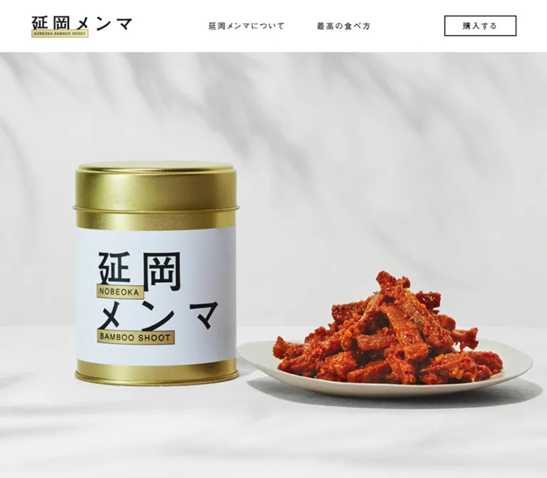
自然光の料理写真、太めのゴシック体、淡い金色の英文ラベルが特徴の食品ブランドサイト。余白の大きな白い紙面と、黒背景の代表者紹介を組み合わせている。
Nobeoka Menma — Style Reference
Sunlit food photography, bold Japanese lettering, and small gold caption strips on an expansive white page.
Website: nobeokamenma.com
Original URL: https://nobeokamenma.com/
Final URL: https://nobeokamenma.com/
Theme: white editorial sections followed by a charcoal profile and footer; no selectable theme is evidenced.
Inspected: October 6, 2026, at 01:22:40 JST, through the supplied browser evidence. The recorded retrieval timestamp is 2026-10-05T16:22:40.702Z.
Viewports: desktop 1440 × 1000 and mobile 390 × 844 CSS pixels.
Scope: the current Japanese brand homepage. Visual captures cover the desktop opening, a recipe excerpt, the profile/footer, the mobile opening, and the mobile terminal profile/footer. Rendered text and sampled computed styles also document the brand story, three explanatory sections, four recipes, and four product purchase sections. The English edition, external shop, news documents, stockist document, and inquiry destination were not inspected.
Nobeoka Menma presents a regional food product through appetite, place, and the people behind it. The page connects meals made with bamboo shoots to the management of abandoned bamboo groves. It combines brand storytelling, serving suggestions, product purchase links, and an operator profile in one long document.
Its character comes from a clear division of work. Photography provides texture, warmth, and color. Typography and thin rectangular outlines provide structure. Small pale-gold English strips connect the wordmark, the introductory graphic, and recipe titles. Large white intervals make the story feel deliberate, while the final charcoal section shifts attention to the representative and contact information.
閉じる
Nobeoka Menma — Style Reference
Sunlit food photography, bold Japanese lettering, and small gold caption strips on an expansive white page.
Website: nobeokamenma.com
Original URL: https://nobeokamenma.com/
Final URL: https://nobeokamenma.com/
Theme: white editorial sections followed by a charcoal profile and footer; no selectable theme is evidenced.
Inspected: October 6, 2026, at 01:22:40 JST, through the supplied browser evidence. The recorded retrieval timestamp is 2026-10-05T16:22:40.702Z.
Viewports: desktop 1440 × 1000 and mobile 390 × 844 CSS pixels.
Scope: the current Japanese brand homepage. Visual captures cover the desktop opening, a recipe excerpt, the profile/footer, the mobile opening, and the mobile terminal profile/footer. Rendered text and sampled computed styles also document the brand story, three explanatory sections, four recipes, and four product purchase sections. The English edition, external shop, news documents, stockist document, and inquiry destination were not inspected.
Nobeoka Menma presents a regional food product through appetite, place, and the people behind it. The page connects meals made with bamboo shoots to the management of abandoned bamboo groves. It combines brand storytelling, serving suggestions, product purchase links, and an operator profile in one long document.
Its character comes from a clear division of work. Photography provides texture, warmth, and color. Typography and thin rectangular outlines provide structure. Small pale-gold English strips connect the wordmark, the introductory graphic, and recipe titles. Large white intervals make the story feel deliberate, while the final charcoal section shifts attention to the representative and contact information.
How to Read This Reference
- Measured values come directly from the supplied rendered DOM rectangles and computed styles. These are snapshot measurements, not a complete stylesheet inspection.
- Calculated values are arithmetic derived from those measurements, such as the mobile content width being approximately
76%of the viewport. - Visual estimates describe features visible in the current-page captures whose exact CSS or image dimensions were not supplied. The pale-gold color and thin title borders belong to this category.
- Recommendations describe a reusable implementation. Proposed breakpoints, accessible states, and CSS selectors are not claims about the original source.
- Named tokens are aliases introduced here. The supplied custom-property collections were empty; no original token naming system was established.
- Several paragraphs appear twice in extracted text, while the screenshots show one readable presentation. Do not reproduce those duplicates as repeated editorial content. Their implementation purpose was not established.
- Empty heading text in the sampled DOM accompanies visible graphic lettering. The wrapper's computed font size does not measure lettering embedded in an image or another graphic treatment.
Tokens — Colors
Default Palette
| Name | Value | Suggested token | Role and evidence |
|---|---|---|---|
| Page White | #FFFFFF |
--color-paper |
Measured body and header background; also the background of light outlined links |
| Near Black | #111111 |
--color-ink |
Measured primary text and profile/footer background |
| Profile Silver | #BBBBBB |
--color-profile-text |
Measured profile text, contact link text, and copyright text |
| Product Gray | #ECECEF |
--color-product |
Measured background color of all four mobile product sections |
| Straw Gold | approximately #E9DFAC |
--color-label |
Visual estimate for the English caption strips; not a sampled or computed source color |
The principal UI palette is white and near black. Gold is a small labeling accent, not a general action color. The warm ivory, orange-red food, blue-gray ceramics, and green foliage belong to photography and should not become additional interface colors by default.
The caption strips show slight tonal variation in the captures. A flat straw-gold fill is a practical approximation; an exact gradient, texture, or source color cannot be recovered from the supplied computed styles.
Color Placement
- Keep the header and editorial canvas white, even when the food photograph has a warm cast.
- Use near black for text, fine frames, and light-section controls.
- Reserve the large near-black field for the closing profile and footer.
- Use silver text throughout that closing field, including the outlined contact action.
- Apply Product Gray only where supported: the mobile product-section backing. Desktop product sections report transparent background colors, and their image layers were not included in the evidence.
Tokens — Typography
Japanese Gothic — Main Interface and Editorial Copy
Measured source stack:
'Futo Go B101', 'Helvetica Neue', Arial,
'Hiragino Kaku Gothic ProN', 'Hiragino Sans', Meiryo, sans-serif
The supplied page fragment also contains an @font-face declaration naming Futo Go B101 with a Bold weight. Computed body paragraphs and many links nevertheless report font-weight: 400; principal text headings report 700. Preserve this distinction instead of assuming every visually heavy glyph is implemented with a 700 declaration.
The family name is directly evidenced. The exact font file, complete font-face rules, and font selected for each glyph were not independently verified. The CSS Quick Start names the observed family and fallbacks without supplying a font download.
The overall effect is substantial and legible: broad Japanese Gothic forms, moderately open tracking, and unusually generous paragraph leading. English words use the same declared stack in ordinary text; no separately named display family was established.
Graphic Lettering
The wordmark, introductory forest message, and recipe-title treatments have a graphic identity beyond ordinary text styling.
- The wordmark places the Japanese name above a miniature English strip.
- The mobile introductory graphic stacks
森を,育てる, andメンマ, with separate English strips readingBAMBOO SHOOTS,TO GROW, andTHE FOREST. - Recipe titles combine a large Japanese title in a thin rectangular frame with a gold English strip crossing its lower edge.
Several corresponding H1 elements have empty extracted text and generic 20px computed font sizes. Those numbers describe containers, not the visible letterforms. Asset formats and internal lettering fonts were not supplied.
Type Scale
All values below are measured unless labeled otherwise. Sizes and line heights are in CSS pixels.
| Role | Desktop size / line height | Mobile size / line height | Weight | Tracking |
|---|---|---|---|---|
| Root/body baseline | 10 / 18 on body |
10 / 18 on body |
400 |
2px on body |
| Main navigation | 15 / 40 |
23.01 / 40 in the measured menu subtree |
400 |
3px |
| Language link | 16 / 28.8 |
16.77 / 30.186 in the menu subtree |
400 |
3px |
| Introductory claim | 36 / 75.6 |
23.01 / 45.63 |
400 |
4px |
| Story and about paragraphs | 15 / 31.5 |
14.43 / 30.303 |
400 |
2px |
| About section heading | 40 / 72 |
23.01 / 41.418 |
700 |
4.65px |
| Recipe section heading | 40 / 64 |
23.01 / 36.816 |
700 |
4.65px |
| Recipe introduction | 16 / 32 |
14.43 / 28.86 |
400 |
2px |
| Recipe and profile body | 15 / 30 |
13.65 / 27.3 |
400 |
2px |
| Product title | 40 / 72 |
31.2 / 56.16 |
700 |
3px |
| Product quantity/price | 40 / 72 |
31.2 / 56.16 |
400 |
3px |
| Representative name | 40 / 40 |
31.2 / 31.2 |
700 |
3px |
| Representative role | 24 / 24 |
18.72 / 18.72 |
400 |
2px |
| Large purchase/news links | 24 / 76–80 |
24.96 / 62.4 |
400 |
2px |
| Contact link | 18 / 60 |
16.77 / 41.73 |
400 |
2px |
| Copyright | 15 / 27 |
13.65 / 24.57 |
400 |
2px |
The tiny root is not the reading size: content paragraphs have explicit overrides. A reusable implementation can retain a conventional root and use the measured pixel values directly.
Tracking is specified in pixels, so its relative effect increases on small mobile copy. For example, 2px is about 0.133em at 15px, and about 0.147em at 13.65px. Avoid replacing every tracking value with one shared em value if close correspondence matters.
Visual estimate: the English recipe strip appears to use approximately 16px lettering on desktop. The sampled heading containers do not establish its actual typographic CSS.
Tokens — Spacing & Shapes
The page uses several deliberate widths rather than one universal container: a narrow story column, a medium explanatory column, and a wider recipe/profile composition. Its geometry is square and flat.
Spacing Scale
| Use | Value | Evidence status |
|---|---|---|
| Title-strip border | approximately 1px |
Visual estimate |
| Outlined action border | approximately 2px |
Visible estimate, consistent with measured outer heights and line-height differences |
| Gap between desktop stockist and purchase links | 20px |
Calculated from link rectangles |
| Desktop header outside inset | 30px |
Measured logo position and right edge of navigation |
| Product price-to-button spacing | 34px |
Measured top padding of the purchase wrapper |
| Recipe introduction heading-to-paragraph interval | 35px |
Calculated from rectangles |
| Recipe title-wrapper-to-body interval | 50px |
Calculated; the graphic label can extend beyond its wrapper |
| Gap between the two desktop story navigation links | 60px |
Calculated from rectangles |
| Mobile about graphic-to-paragraph interval | approximately 62.4px |
Calculated from rectangles |
| About-row separation | 90px |
Calculated on both supplied viewports |
| Recipe image-to-copy separation | approximately 100px |
Supported by the desktop screenshot and column positions |
| Desktop recipe-row separation | 115px |
Calculated between successive 465px rows |
| Mobile recipe-row separation | approximately 83.06px |
Calculated between successive rows |
| Desktop profile top inset before name | 170px |
Calculated from section and heading rectangles |
Border Radius
| Element | Treatment |
|---|---|
| Navigation and purchase links | Square corners; sampled radius 0px |
| News and contact links | Square corners; sampled radius 0px |
| Recipe title frames and English strips | Visually square |
| Photographs | Rectangular, with no visible rounded treatment |
| Profile photograph | Square crop on desktop |
There is no visible card-shadow system. The supplied element list does not include box-shadow values, but the captures show flat surfaces without apparent elevation effects.
Layout Measurements
| Element | Desktop | Mobile | Status |
|---|---|---|---|
| Header | 1440 × 101.094px |
390 × 63.75px |
Measured |
| Logo/link layout box | 195 × 41.094px, at 30, 30 |
132.203 × 22.438px, at approximately 46.797, 20.656 |
Measured; not necessarily the complete visible graphic extent |
| Menu button | Not displayed in desktop capture | 36.25 × 28.844px |
Measured |
| Introductory graphic wrapper | 470 × 333px |
296.391 × 206.156px |
Measured |
| Main story width | 470px |
296.391px |
Measured |
| About row | 780px wide |
298.344px wide |
Measured |
| About paragraph | 380px wide |
298.344px wide |
Measured |
| Recipe row | 940 × 465px |
390px wide, variable height |
Measured |
| Recipe paragraph | 380px wide |
296.391px wide |
Measured |
| Recipe photograph | Approximately 460px square |
Individual image rectangles not supplied | Desktop visual estimate; row height is not image height |
| Profile composition | Approximately 300px portrait + 100px gap + 540px copy |
Copy width 296.391px |
Portrait/gap visually estimated; copy measured |
| Purchase link | 300 × 80px |
296.391 × 66.406px |
Measured |
| News/stockist link | 300 × 84px |
296.391 × 66.406px |
Measured |
| Contact link | 220 × 64px |
296.391 × 45.734px |
Measured |
| Footer | 165px high |
158.578px high |
Measured |
Some desktop paragraph rectangles begin 10px left of their associated structural container or heading. Transform transitions are present, but transform matrices were not supplied. Treat those as snapshot coordinates rather than inventing a second permanent alignment grid.
Components
Persistent Header
Role: brand identification, in-page navigation, purchase access, and language selection.
The desktop header is an uninterrupted white strip approximately 101px tall. The logo sits 30px from the top and left. Two unboxed links follow: 延岡メンマについて and 最高の食べ方. Farther right, two 140 × 40px outlined links provide 取り扱い店舗 and 購入する. The language controls occupy the far-right end, with JP visibly underlined as the current language.
The same header remains at the top in the supplied scrolled desktop captures. Persistent positioning is therefore visually supported, although the sampled properties do not reveal whether the original implementation uses fixed or sticky positioning.
On mobile, the header becomes approximately 63.75px tall. The logo moves to the shared content inset near 46.8px. An icon-only menu button appears at the right. Its three horizontal strokes have descending lengths in the capture, creating a small asymmetry without a enclosing box.
Unverified: the menu's open appearance, opening direction, focus behavior, and closing interaction. The hidden or inactive navigation subtree still has measurable links; those rectangles do not prove that the menu was opened.
Photographic Opening
Role: establish appetite and product versatility before presenting explanatory copy.
The desktop opening capture shows a rice bowl topped with menma and an egg, accompanied by a teapot, cup, chopsticks, and a vase. The image spans the viewport below the header. It contains no large marketing headline overlay.
The mobile opening shows a pasta dish in directional sunlight. Its visible photographic region extends from approximately y = 64px to y = 464px, making it about 400px high at 390px wide. The following story begins on a separate white surface.
Desktop and mobile captures show different food photographs. This establishes differing captured states, not a carousel mechanism or a responsive image-selection rule. Autoplay, transition style, slide order, and user controls are unverified.
For reuse, give each photograph a deliberate crop and preserve the food as the focal point. A single static image is sufficient unless image-changing behavior is separately specified.
News Link
Role: a strong but visually restrained route to current announcements.
On desktop, 最新ニュースはこちら appears in a white outlined rectangle measuring 300 × 84px, positioned at x = 1110px, y = 890px in the opening capture. That leaves 30px at the right and 26px below it. Its text is 24px, with 2px tracking.
On mobile, the same link appears in document flow after the opening story, at approximately y = 1191.5px. It fills the 296.391px text column and is 66.406px tall. Do not keep it floating over the mobile food photograph.
The recorded destination is an external Google Slides document. Its contents were not inspected.
Introductory Story
Role: connect eating the product with forest management.
The introductory graphic is followed by the two-line claim beginning こんなに美味しいものを、 and a compact supporting paragraph. On desktop the graphic occupies a 470 × 333px wrapper beginning at document y = 1160px. The claim begins at y = 1663px, creating a substantial pause after the graphic.
On mobile, the graphic begins near y = 540.922px, shortly after the photograph. Its wrapper is 296.391px wide, aligned with the logo and subsequent paragraphs. Large Japanese characters alternate with compact English strips rather than forming a conventional centered text heading.
The supporting copy has approximately double line spacing: 15 / 31.5px on desktop and 14.43 / 30.303px on mobile. Preserve the narrow measure and explicit rhetorical pauses.
About Section
Role: explain the product's origin, the bamboo-grove problem, and its flavor.
The rendered content contains three explanatory rows. On desktop each row is a flex layout within a 780px region. A graphic heading occupies a roughly 325px slot on the left; the paragraph is 380px wide on the right. Rows are separated by 90px.
On mobile the same rows stack. The graphic wrapper is approximately 298.344px wide and 193–195px high. The paragraph follows about 62.4px later, using the full row width. The 90px separation between rows remains.
The explanatory graphic artwork itself was not visible in the supplied screenshots. Its measured presence and layout are supported; its particular lettering, illustration, and colors should not be invented.
Recipe Introduction
Role: move from the product story to practical serving ideas.
The heading 延岡メンマの最高の食べ方 uses two lines, 40px text, 64px leading, and 4.65px tracking on desktop. Supporting copy uses 16 / 32px text in a 940px wrapper.
Mobile reduces the heading to 23.01 / 36.816px and places the paragraph in the standard 296.391px column. The copy introduces several pairings before the individual recipe presentations.
Alternating Recipe Row
Role: pair one serving idea with an appetizing photograph and a short explanation.
The desktop recipe sequence contains four 940 × 465px rows, with 115px between them. The first visible arrangement places copy on the left and photography on the right; the toast row reverses that arrangement. The pattern continues through the four recipe entries in the DOM.
The useful desktop anatomy is:
- A
380pxcopy region. - Approximately
100pxof separation. - A photograph approximately
460pxsquare. - A graphic recipe heading above a
15 / 30pxparagraph.
The compact heading wrappers are 64px high. The pasta heading wrapper is substantially taller at 183px; preserve room for title-specific artwork instead of forcing every title into an identical one-line slot.
Mobile rows become full-width vertical compositions. Title wrappers occur roughly 317–328px after the start of their rows, followed by the paragraph after a 50px interval. This supports a substantial leading media region and a stacked presentation, but the individual mobile recipe image rectangles were not supplied.
Mobile paragraphs return to the 296.391px inset column and use 13.65 / 27.3px text. Recipe-title wrappers can extend farther toward the right edge than the paragraphs. Do not assume all graphic titles share the body column's width.
Framed Recipe Title and English Strip
Role: provide a recognizable graphic signature for each serving idea.
In the visible toast example, メンマトースト sits inside a thin rectangular frame. A gold strip reading BAMBOO SHOOTS TOASTED BREAD overlaps the lower frame edge, begins slightly to the right of it, and extends beyond the frame's right edge.
The contrast is between a large, widely spaced Japanese title and a much smaller uppercase English caption. Both treatments remain rectangular and flat. The label is not a pill, sticker with rounded corners, or colored category badge.
Visual estimates: the Japanese frame is about 64px high; the English strip is about 30px high, offset approximately 20–22px to the right and overlapping the frame's bottom. The 64px heading-wrapper measurement supports the scale but does not establish the internal artwork construction.
Use the original title artwork when available. A live-text frame-and-strip component can reproduce the visual relationship, but its letterforms and dimensions are an adaptation.
Product Purchase Section
Role: connect the editorial experience to specific products in the external shop.
The DOM records four consecutive desktop sections, each 500px high. Their title, quantity/price, and purchase action form a 300px column beginning at x = 890px. Titles and prices are both 40px with 72px leading, while the title has the heavier computed weight.
The purchase wrapper adds 34px of space before a 300 × 80px outlined action. The visual emphasis remains on large text and a clear rectangular link, rather than an embedded cart widget.
| Captured product label | Captured quantity/price | Linked item path |
|---|---|---|
延岡メンマ |
100g・1500円 |
/items/35962706 |
延岡メンマ |
パウチ・1080円 |
/items/41837823 |
延岡メンマ 醤油 |
100g・980円 |
/items/60796914 |
延岡メンマ ラー油 |
100g・980円 |
/items/60796977 |
These are captured content values, not permanent design tokens. All four item paths belong to https://shop.nobeokamenma.com/.
Mobile sections have a measured #ECECEF background. The first two are approximately 411.922px high; the latter two are approximately 595.219px high. Text and actions occupy the shared 296.391px column. Product names and prices use 31.2 / 56.16px text.
No current product-area screenshot or image-asset inventory was supplied. Package appearance, image placement, and desktop photographic backgrounds remain unverified. Do not infer those details from the text rectangles alone.
Stockist Link
Role: offer a second buying route after the product sequence.
A centered 取り扱い店舗 link measures 300 × 84px on desktop. Its wrapper has 100px top and bottom padding. Mobile changes the link to 296.391 × 66.406px, with 62.4px vertical wrapper padding.
The destination is an external Google Slides document. Preserve it as a navigation link; an inline store locator or modal is not evidenced.
Representative Profile
Role: introduce the person and organization behind the product.
This is the major surface change: near-black background, silver text, and a documentary portrait. The desktop composition places an approximately 300px square photograph on the left and a 540px text column on the right, within the same approximately 940px span used by recipes.
The original page identifies 江原 太郎 / Taro Ebara as the representative of LOCAL BAMBOO INC.. The footer repeats the company name in its copyright line. These are original-page identity statements; no web-production role is established.
The copy column contains:
- The Japanese name and Romanized name on separate lines.
- The company/role line.
- A biography.
- Two labeled, underlined personal social links.
- An outlined
お問い合わせlink.
The desktop name uses 40px text; the role uses 24px; the biography uses 15 / 30px. The contact action is narrower than the copy column, measuring 220 × 64px.
The terminal mobile capture shows the text and contact action in a single 296.391px column. The name becomes 31.2px, the role 18.72px, and the biography 13.65 / 27.3px. The contact action expands to the column width.
Important crop limitation: the portrait is absent from the terminal mobile screenshot, but this does not prove that it is hidden on mobile. The profile heading begins approximately 476px below the section's document start, leaving substantial earlier content outside that screenshot. Its preceding mobile composition was not visually supplied.
Footer
Role: close the page with company identification and brand social links.
The footer continues the profile's near-black background without a contrasting divider. Desktop copyright sits at the left of the approximately 940px content span, with Twitter and Instagram symbols at the right. The sampled icon links occupy approximately 30px boxes; the capture shows a bird silhouette and an outlined camera symbol.
The mobile footer shows the copyright at the standard left inset. Brand social links are present in the mobile navigation subtree rather than in the supplied footer element list. Their menu presentation was not visually verified.
Tokens — Motion & Interaction
Recorded Transition Declarations
These values were returned as computed styles. They establish available transitions, not proof that every transition was triggered during capture.
| Element | Recorded transition | What can be concluded |
|---|---|---|
| Header | transform 0.6s cubic-bezier(0, 0.55, 0.45, 1) 0.3s |
A delayed transform transition exists; its trigger and displacement are unknown |
| Story/about paragraphs | transform 0.25s ease-out 0.1s |
Short text transform transition with a small delay |
| Section headings and several recipe/profile text blocks | transform 0.25s ease-out 0.2s |
Similar text transition with a longer delay |
| Mobile news link | clip-path 0.7s ease-out, transform 0.7s ease-out |
Clip and transform effects are declared; endpoints were not supplied |
| Contact wrapper | clip-path 0.9s ease-out, transform 0.9s ease-out |
Longer reveal-capable transition on the action wrapper |
| Brand social links | opacity 0.2s linear |
Short opacity transition is available; target opacity and trigger are unverified |
Prefixed clip-path declarations also appear in the supplied data. Most sampled elements report animation: none. Neither that result nor a bare transition: all proves the absence or presence of meaningful page motion.
Evidenced Navigation
| Control | Recorded target | Verification limit |
|---|---|---|
| About navigation | #about |
Target recorded; smooth scrolling and focus placement untested |
| Serving navigation | #recipe |
Target recorded; scrolling behavior untested |
| Header purchase | External shop homepage | Destination recorded; shop not inspected |
| Product purchase | Four external shop item URLs | Destinations recorded; checkout behavior untested |
| Language control | /en/ |
Destination recorded; English page not inspected |
| News and stockists | External documents | Destinations recorded; documents not inspected |
| Contact | External inquiry page | Destination recorded; form not inspected |
| Mobile menu | A button is present | Open/close behavior not exercised |
The supplied captures establish multiple scroll positions and a persistent header. They do not establish hero autoplay, hover inversion, parallax, scroll snapping, menu animation, or reduced-motion support.
Recommended motion direction: retain short, restrained text movement and optional clip reveals. Keep content visible by default and add motion only after enhancement code is ready. Do not introduce a slideshow simply because different food photographs appear in separate captures.
Surfaces
| Surface | Appearance | Purpose |
|---|---|---|
| Header | Solid white, near-black typography | Persistent navigation without a heavy visual boundary |
| Story/about/recipe canvas | Solid white with wide open intervals | Let typography and photographs establish hierarchy |
| Caption strip | Small pale-gold rectangle with fine dark edge | Graphic signature and English translation |
| Light action | White fill, dark rectangular outline | News, purchase, and stockist navigation |
| Mobile product backing | Measured light gray #ECECEF |
Distinguish the product portion of the page |
| Profile/footer | Near-black field with silver typography | Documentary identity and closing contact information |
| Dark contact action | Same near-black fill, silver outline | Maintain the closing palette while making the link explicit |
The natural cloth, ceramic, and plant textures remain inside photographs. There is no visible reason to apply a linen texture to the entire website background.
Imagery
Photography is central to the design. The current captures show carefully arranged food in natural light, with material detail kept visible: woven cloth, glazed ceramics, wooden chopsticks, glass, and foliage.
The desktop opening is softly lit and composed as a complete table setting. The toast image is closer and more graphic, with a dark plate contrasting against pale fabric. The mobile pasta image uses stronger directional shadows, including plant shadows on the background. These variations share restrained styling and generous breathing room around the food.
The representative portrait uses a different photographic register: an outdoor person holding a tall bamboo shoot, with vegetation and a working vehicle behind him. Its documentary quality supports the page's origin story. Do not turn it into a studio portrait merely to make all photography uniform.
Observed Asset References
Asset URLs, source filenames, intrinsic dimensions, and formats were not included in the supplied original-page evidence. These are observed asset roles, not invented paths.
| Asset role | Visible evidence | Reuse guidance |
|---|---|---|
| Brand wordmark | Desktop and mobile headers | Preserve the Japanese lettering and tiny English strip together |
| Forest-message graphic | Mobile opening | Preserve its stacked Japanese/English rhythm |
| Rice-bowl photograph | Desktop opening and recipe excerpt | Use an appropriate crop for each placement; the same scene appears at two scales |
| Toast photograph | Desktop recipe excerpt | Retain plate, cloth, and surrounding props rather than isolating the toast |
| Pasta photograph | Mobile opening | Preserve directional lighting and the food's central emphasis |
| Recipe title graphics | Desktop recipe excerpt | Maintain the overlapping frame-and-strip construction |
| Representative portrait | Desktop profile | Preserve its square documentary composition |
| Brand social symbols | Desktop footer | Match the simple silhouette/outline appearance |
The text evidence also describes an ice-cream serving suggestion, but its photograph was not shown in the supplied captures. About-section artwork and current product photography likewise remain visually unverified.
Layout & Responsive Behavior
Desktop Composition
At 1440px wide, the page uses several centered measures:
- The opening story is approximately
470pxwide. - About rows are
780pxwide. - Recipe rows are
940pxwide, beginning atx = 250px. - The profile uses approximately the same
940pxspan. - Product copy occupies a
300pxcolumn aligned to the right side of that wider span.
This creates a deliberate progression from an intimate reading column to larger photographic spreads. Do not make every section the same full-width text block.
The desktop document height is approximately 11,218.19px. About begins near document y = 2817.19px, recipes near 4641.19px, products near 7482.19px, and the profile near 10266.19px. These coordinates demonstrate the page's long rhythm; they are not recommended fixed placement rules.
Mobile Composition
At 390px, the main text left edge is approximately 46.797px, and the width is 296.391px. These correspond closely to 12vw side insets and a 76vw content width. About rows are slightly wider at approximately 76.5vw.
The mobile layout changes structurally:
- Desktop navigation is replaced visually by the compact logo/menu header.
- The hero photograph ends well before the bottom of the initial viewport, allowing the next graphic to appear below it.
- The news action moves into the story flow.
- About rows stack their graphic and paragraph.
- Recipe rows become vertical compositions with inset body text.
- Product actions fill the text column.
- Profile copy becomes a single column, with a full-width contact action.
The mobile document height is approximately 11,267.45px, close to the desktop total despite very different section proportions. This is not a uniformly scaled desktop page.
Calculated Mobile Ratios
These ratios reproduce the supplied 390px measurements. They do not prove the original CSS uses these units.
| Measured mobile value | Equivalent at 390px |
|---|---|
296.4px main content width |
76vw |
46.8px side inset |
12vw |
23.01px section title |
5.9vw |
14.43px story copy |
3.7vw |
13.65px recipe/profile copy |
3.5vw |
31.2px product/profile title |
8vw |
18.72px profile role |
4.8vw |
24.96px large action text |
6.4vw |
16.77px contact text |
4.3vw |
Only two viewport widths were supplied. Breakpoints, tablet behavior, landscape behavior, and safe-area handling were not established. A reusable implementation should cap viewport-derived text sizes and test intermediate widths.
Do’s and Don’ts
Do
- Keep the interface white and near black, with gold confined to small English strips.
- Let complete food photographs supply warmth and material texture.
- Preserve the substantial Japanese Gothic typography and open line spacing.
- Use different content widths for story, explanation, recipes, and product information.
- Alternate image and copy positions in desktop recipe rows.
- Keep controls rectangular, outlined, and clearly labeled.
- Preserve the dark profile/footer as a distinct closing section.
- Keep mobile body text inset even where photography uses more of the screen width.
- Treat graphic headings as artwork when their lettering is part of the asset.
- Preserve actual navigation destinations and distinguish them from inline interactions.
Don’t
- Do not recolor the white page to cream because the photography contains warm linen.
- Do not turn the recipes into a rounded-card grid with shadows.
- Do not replace the gold strips with oversized filled CTAs or pill badges.
- Do not use thin luxury serif typography in place of the evidenced Gothic character.
- Do not set all text to
10pxjust because the root uses that size. - Do not force all recipe titles into the same height; the pasta title has a taller wrapper.
- Do not reproduce duplicated extracted paragraphs as visible repeated copy.
- Do not invent hero autoplay, parallax, or an opened menu from static captures.
- Do not assume the profile portrait is hidden on mobile because it falls outside the terminal screenshot.
- Do not invent package photography or production credits for areas not visually documented.
Recommended Implementation Additions
These are recommendations for a new implementation, not verified original-site features:
- Give the menu button an accessible name, an expanded state, and a relationship to its navigation panel. Preserve keyboard access and restore focus when closing an overlay menu.
- Enlarge the menu's interaction area to at least
44 × 44pxwhile retaining the small visible strokes. The sampled button box is smaller than that. - Provide a visible focus indicator for outlined links and sufficient scroll margin for in-page targets beneath the persistent header.
- Supply meaningful text alternatives for the wordmark, graphic message, and recipe-title artwork. Avoid exposing both a decorative duplicate and an equivalent readable heading.
- Keep content visible when JavaScript or animation enhancement is unavailable. Respect reduced-motion preferences for transforms and clip reveals.
- Test mobile body text at larger user text settings. A production adaptation may increase
13.65pxcopy toward15–16px, accepting different wrapping. - Give food images explicit dimensions or aspect ratios, use responsive sources, and prioritize the initial visible hero image. Defer below-fold images where appropriate.
- Retain profile imagery in the mobile content model until its actual responsive behavior is verified.
- Keep external purchase links as links. A cart, checkout panel, or account interface would be an additional product feature.
Agent Prompt Guide
Quick Color Reference
- Main page and header:
#FFFFFF. - Primary text and light-section outlines:
#111111. - Profile/footer background:
#111111. - Profile text and contact outline:
#BBBBBB. - Mobile product backing:
#ECECEF. - English caption strip: approximately
#E9DFAC; visual estimate. - Colorful food and natural materials belong to images, not extra UI accents.
Overall Prompt
“Create a long Japanese regional-food brand homepage inspired by Nobeoka Menma. Use a white canvas, substantial Gothic typography, generous paragraph leading, square outlined links, and small pale-gold English caption strips. Open with a large natural-light food photograph and place the brand story on white below it. Use a narrow introductory story, a medium-width explanatory section, and alternating desktop recipe spreads with approximately 460px photographs and 380px copy columns. Follow with product purchase links and a near-black representative profile with silver text. On mobile, use approximately 12% side insets for text, stack editorial sections, and move the news action into the story flow. Treat unverified menu and hero motion as separate implementation decisions.”
Example Component Prompts
- Header: “A flat white desktop header about 101px tall. Place the Japanese wordmark at a 30px inset, two unboxed story links next, and outlined stockist/purchase links toward the right. Finish with compact JP/EN controls. At a narrow width, use a roughly 64px header with a smaller logo and an asymmetrical three-line menu symbol.”
- Recipe spread: “A 940px-wide white editorial row with a 380px copy column and an approximately 460px square food photograph separated by about 100px. Use a framed Japanese recipe title with a smaller gold English strip overlapping the lower edge. Set the paragraph at 15px with 30px leading. Reverse the next row.”
- Graphic title: “Build a square-cornered, thin black rectangular title frame on white. Place the Japanese label
メンマトーストinside it, and overlap the bottom edge with a pale-gold strip readingBAMBOO SHOOTS TOASTED BREAD. Offset the strip slightly right. Use no shadow or rounded corners. Treat live text as an approximation of the original artwork.” - Profile: “Create a near-black representative section with an approximately 300px square documentary portrait at left and 540px of silver text at right. Stack Japanese and Romanized names, the company role, biography, underlined social handles, and a narrow outlined contact link. On mobile, stack the content and expand the contact action to the text-column width.”
- Mobile story: “At 390px width, use a 296px text column starting about 47px from the left. Place a stacked Japanese forest message after the full-width food image, with small gold English caption strips. Keep generous vertical pauses and place the outlined news link after the supporting copy.”
Quick Start
CSS Custom Properties
This is a reusable approximation, not recovered source code. Colors and desktop typography use measured values where available. The gold, title construction, hero sizing rule, responsive breakpoints, image aspect ratio, and hover/focus behavior are explicitly adaptations.
The code keeps a conventional root size. It does not import font assets, implement menu logic, supply photographs, or reproduce an unverified hero slideshow. The 1200px header breakpoint and 1000px content breakpoint are recommended starting points for avoiding collisions between wide desktop components.
Expected structure: .site-header contains the brand and navigation; .opening contains .hero, .story, and .news-link; recipe rows contain .recipe-copy and .recipe-media; .profile-inner contains the portrait and copy. A reversed recipe uses .recipe-row--reverse.
:root {
  /* Measured colors, except the estimated caption gold. */
  --color-paper: #ffffff;
  --color-ink: #111111;
  --color-profile-text: #bbbbbb;
  --color-product: #ececef;
  --color-label: #e9dfac;

  --font-brand: 'Futo Go B101', 'Helvetica Neue', Arial,
    'Hiragino Kaku Gothic ProN', 'Hiragino Sans', Meiryo, sans-serif;
  --weight-body: 400;
  --weight-heading: 700;
  --text-body: 15px;
  --text-small: 15px;
  --text-section: 40px;
  --text-product: 40px;
  --text-action: 24px;
  --tracking-body: 2px;
  --tracking-nav: 3px;
  --tracking-heading: 4.65px;

  --width-story: 470px;
  --width-about: 780px;
  --width-editorial: 940px;
  --header-height: 101.094px;
  --space-row: 115px;
  --space-about: 90px;
  --rule-thin: 1px;
  --rule-action: 2px;

  /* Recorded durations; activation remains implementation-specific. */
  --motion-text: 250ms ease-out;
  --motion-header: 600ms cubic-bezier(0, 0.55, 0.45, 1) 300ms;
  --motion-social: 200ms linear;
}

* { box-sizing: border-box; }

.menma-site {
  margin: 0;
  color: var(--color-ink);
  background: var(--color-paper);
  font-family: var(--font-brand);
  font-size: var(--text-body);
  font-weight: var(--weight-body);
  line-height: 2;
  letter-spacing: var(--tracking-body);
}

.menma-site img { display: block; max-width: 100%; }
.menma-site h1,
.menma-site h2,
.menma-site h3,
.menma-site p { margin: 0; }
.menma-site a { color: inherit; }

.editorial-container {
  width: min(var(--width-editorial), calc(100% - 60px));
  margin-inline: auto;
}

/* Fixed positioning is an adaptation of the persistent captures. */
.site-header {
  position: fixed;
  inset: 0 0 auto;
  z-index: 40;
  display: flex;
  align-items: center;
  gap: 80px;
  height: var(--header-height);
  padding-inline: 30px;
  background: var(--color-paper);
  transition: transform var(--motion-header);
}

.brand { flex: 0 0 195px; }
.brand img { width: 100%; height: auto; }
.desktop-nav { display: flex; align-items: center; flex: 1; gap: 24px; }
.nav-story { display: flex; gap: 60px; }
.nav-actions { display: flex; gap: 20px; margin-inline-start: auto; }
.languages { display: flex; gap: 24px; margin-inline-start: 56px; }
.desktop-nav a { font-size: 15px; letter-spacing: 3px; text-decoration: none; }
.languages a { font-size: 16px; }
.languages [aria-current='page'] { text-decoration: underline; text-underline-offset: 5px; }
.menu-toggle { display: none; }
.site-main { padding-top: var(--header-height); }

.outline-link {
  display: flex;
  align-items: center;
  justify-content: center;
  width: 300px;
  min-height: 80px;
  padding: 8px 12px;
  border: var(--rule-action) solid currentColor;
  border-radius: 0;
  background: var(--color-paper);
  font-size: var(--text-action);
  line-height: 1.3;
  letter-spacing: 2px;
  text-align: center;
  text-decoration: none;
}

.nav-actions .outline-link {
  width: 140px;
  min-height: 40px;
  padding: 0 8px;
  font-size: 15px;
  letter-spacing: 3px;
}

/* Shared grid cell places desktop news over the photograph. */
.opening { display: grid; grid-template-areas: 'hero' 'story'; }
.hero { grid-area: hero; margin: 0; height: calc(100svh - var(--header-height)); }
.hero img { width: 100%; height: 100%; object-fit: cover; }
.news-link {
  grid-area: hero;
  align-self: end;
  justify-self: end;
  z-index: 1;
  min-height: 84px;
  margin: 0 30px 26px 0;
}

.story {
  grid-area: story;
  width: min(var(--width-story), calc(100% - 60px));
  margin-inline: auto;
  padding-block: 160px 170px;
}
.story-mark img { width: 100%; height: auto; }
.story .story-lead {
  margin-block: 170px 35px;
  font-size: 36px;
  line-height: 2.1;
  letter-spacing: 4px;
}
.story-copy, .about-copy { font-size: var(--text-body); line-height: 2.1; }

.section-title {
  font-size: var(--text-section);
  font-weight: var(--weight-heading);
  line-height: 1.8;
  letter-spacing: var(--tracking-heading);
}
.recipe-section-title { line-height: 1.6; }

.about-row {
  display: grid;
  grid-template-columns: 325px 380px;
  justify-content: space-between;
  align-items: start;
  width: min(var(--width-about), calc(100% - 60px));
  margin-inline: auto;
}
.about-row + .about-row { margin-top: var(--space-about); }

.recipe-row {
  display: grid;
  grid-template-columns: 380px 460px;
  gap: 100px;
  min-height: 465px;
}
.recipe-row + .recipe-row { margin-top: var(--space-row); }
.recipe-row--reverse { grid-template-columns: 460px 380px; }
.recipe-row--reverse .recipe-media { grid-column: 1; grid-row: 1; }
.recipe-row--reverse .recipe-copy { grid-column: 2; grid-row: 1; }
.recipe-copy { padding-top: 75px; }
.recipe-copy--long-title { padding-top: 0; }
.recipe-media { margin: 0; }
.recipe-media img { width: 100%; aspect-ratio: 1; object-fit: cover; }
.recipe-copy .recipe-description { margin-top: 50px; font-size: var(--text-small); line-height: 2; }

/* Optional live-text approximation of the graphic title artwork. */
.recipe-title {
  position: relative;
  display: table;
  max-width: 100%;
  padding: 4px 24px;
  border: var(--rule-thin) solid currentColor;
  font-size: 36px;
  line-height: 1.5;
  letter-spacing: 4px;
}
.recipe-title-en {
  position: absolute;
  inset-inline-start: 20px;
  bottom: -21px;
  width: max-content;
  padding: 3px 12px;
  border: var(--rule-thin) solid currentColor;
  background: var(--color-label);
  font-size: 16px;
  font-weight: 400;
  line-height: 22px;
  letter-spacing: 1.5px;
}

/* Product photography needs separately verified current assets. */
.product-row > .editorial-container {
  display: flex;
  justify-content: flex-end;
  align-items: center;
  min-height: 500px;
}
.product-copy { width: 300px; }
.product-title, .product-price {
  font-size: var(--text-product);
  line-height: 1.8;
  letter-spacing: 3px;
}
.product-title { font-weight: 700; }
.product-copy .outline-link { margin-top: 34px; }
.stockist { padding-block: 100px; }
.stockist .outline-link { min-height: 84px; margin-inline: auto; }

.profile { padding-block: 170px 130px; }
.profile, .site-footer {
  color: var(--color-profile-text);
  background: var(--color-ink);
}
.profile-inner {
  display: grid;
  grid-template-columns: 300px 540px;
  align-items: center;
  gap: 100px;
}
.profile-photo { width: 300px; aspect-ratio: 1; object-fit: cover; }
.profile-name { font-size: 40px; line-height: 1; letter-spacing: 3px; }
.profile-name span { display: block; margin-top: 15px; }
.profile-copy .profile-role { margin-top: 30px; font-size: 24px; line-height: 1; }
.profile-copy .profile-bio { margin-top: 30px; font-size: var(--text-small); line-height: 2; }
.profile-links { display: grid; gap: 12.5px; margin-top: 14px; font-size: var(--text-small); line-height: 1.3; }
.profile-links a { text-underline-offset: 4px; }
.profile-copy .contact-link {
  width: 220px;
  min-height: 64px;
  margin-top: 28px;
  background: transparent;
  font-size: 18px;
}
.site-footer { padding-block: 42px 96px; }
.footer-inner { display: flex; justify-content: space-between; align-items: center; }
.copyright { font-size: var(--text-small); line-height: 1.8; }
.brand-social { display: flex; align-items: center; gap: 28px; }
.brand-social a { width: 30px; transition: opacity var(--motion-social); }

/* Recommended interaction feedback; target opacity is not source-measured. */
@media (hover: hover) {
  .brand-social a:hover { opacity: 0.7; }
}
.menma-site :focus-visible { outline: 2px solid currentColor; outline-offset: 5px; }
.menma-site [id] { scroll-margin-top: calc(var(--header-height) + 24px); }

@media (max-width: 1200px) {
  :root { --header-height: 63.75px; }
  .site-header { justify-content: space-between; gap: 0; padding-inline: 12%; }
  .brand { flex-basis: 132.2px; }
  .desktop-nav { display: none; }
  .menu-toggle {
    display: grid;
    place-content: center;
    gap: 6px;
    width: 44px;
    height: 44px;
    padding: 8px;
    border: 0;
    color: inherit;
    background: transparent;
  }
  .menu-toggle span { display: block; width: 26px; height: 2px; background: currentColor; }
  .menu-toggle span:nth-child(2) { width: 20px; }
  .menu-toggle span:nth-child(3) { width: 14px; }
}

@media (max-width: 1000px) {
  :root {
    --text-body: clamp(14px, 3.7vw, 16px);
    --text-small: clamp(13.65px, 3.5vw, 15px);
    --text-section: clamp(23.01px, 5.9vw, 32px);
    --text-product: clamp(28px, 8vw, 40px);
    --text-action: clamp(20px, 6.4vw, 26px);
    --space-row: 83.06px;
  }
  .editorial-container { width: min(76%, 540px); }
  .opening { grid-template-areas: 'hero' 'story' 'news'; }
  .hero { height: clamp(320px, 102.56vw, 560px); }
  .story { width: min(76%, 470px); padding-block: 77.17px 83.06px; }
  .story .story-lead {
    margin-block: 72.92px 45.63px;
    font-size: var(--text-section);
    line-height: 1.983;
  }
  .outline-link { width: 100%; min-height: 66.406px; }
  .news-link { grid-area: news; width: min(76%, 470px); margin: 0 auto; justify-self: center; }
  .about-row { width: min(76.5%, 540px); grid-template-columns: minmax(0, 1fr); gap: 62.4px; }
  .recipes.editorial-container { width: 100%; }
  .recipe-row, .recipe-row--reverse { display: flex; flex-direction: column; gap: 0; }
  .recipe-media { order: -1; width: min(100%, 460px); margin-inline: auto; }
  .recipe-copy { width: min(76%, 380px); margin-inline: auto; padding-top: 40px; }
  .recipe-title { padding-inline: 12px; font-size: clamp(24px, 7vw, 32px); letter-spacing: 2px; }
  .recipe-title-en { inset-inline-start: 12px; font-size: clamp(10px, 3vw, 13px); letter-spacing: 1px; padding-inline: 8px; }
  .product-row { background: var(--color-product); }
  .product-row > .editorial-container { min-height: 412px; padding-block: 60px; }
  .product-copy { width: 100%; }
  .stockist { padding-block: 62.4px; }
  .stockist .outline-link { width: min(76%, 540px); min-height: 66.406px; }
  .profile { padding-block: 80px 58px; }
  .profile-inner { grid-template-columns: minmax(0, 1fr); gap: 100px; }
  .profile-photo { width: min(100%, 300px); margin-inline: auto; }
  .profile-name { font-size: var(--text-product); }
  .profile-name span { margin-top: 5.07px; }
  .profile-copy .profile-role { font-size: clamp(18px, 4.8vw, 24px); }
  .profile-copy .contact-link { width: 100%; min-height: 45.734px; font-size: clamp(16px, 4.3vw, 18px); }
  .site-footer { padding-block: 40px 94px; }
  .site-footer .brand-social { display: none; }
}

/* Optional enhancement: content remains visible without state-setting code. */
[data-reveal] { transition: transform var(--motion-text); }
[data-reveal='pending'] { transform: translateY(10px); }

@media (prefers-reduced-motion: reduce) {
  .site-header, [data-reveal], .brand-social a { transition: none; }
  [data-reveal='pending'] { transform: none; }
  html { scroll-behavior: auto; }
}
The mobile recipe media height, retained stacked portrait, and simplified product spacing above are recommendations for areas without complete visual evidence. The CSS deliberately does not fix the document to the captured total height. Supply the remaining editorial content, current assets, navigation behavior, and content-specific title graphics separately.
Tailwind v4 Token Mapping
Optional aliases for a project already using Tailwind v4. This does not imply the original website uses Tailwind. Define the custom properties above first.
@theme inline {
  --color-menma-paper: var(--color-paper);
  --color-menma-ink: var(--color-ink);
  --color-menma-silver: var(--color-profile-text);
  --color-menma-product: var(--color-product);
  --color-menma-gold: var(--color-label);
  --font-menma: var(--font-brand);
  --text-menma-body: var(--text-body);
  --text-menma-small: var(--text-small);
  --text-menma-section: var(--text-section);
  --text-menma-product: var(--text-product);
  --text-menma-action: var(--text-action);
  --spacing-menma-row: var(--space-row);
  --spacing-menma-about: var(--space-about);
}
Sources & Evidence
- Inspected original and final page: Nobeoka Menma. The supplied browser record reports HTTP
200and no URL change. - Capture timestamp:
2026-10-05T16:22:40.702Z, equivalent to October 6, 2026, 01:22:40.702 JST. Individual screenshot timestamps were not supplied separately. - Desktop evidence:
1440 × 1000viewport; opening food photograph/header/news action, recipe excerpt, and profile/footer captures; rendered text, link destinations, element rectangles, and selected computed properties. Measured document height: approximately11,218.19px. - Mobile evidence:
390 × 844viewport; opening and terminal profile/footer captures; rendered text, navigation subtree, link destinations, element rectangles, and selected computed properties. Measured document height: approximately11,267.45px. - Capture procedure: the supplied browser notes describe an initial observation lasting at least five seconds, readiness checks for layout/text stability and visible image decoding, finite-motion waits, and traversal through intermediate scroll positions. These checks do not establish the completeness of delayed content or unexercised states.
- Interaction coverage: scroll-position captures and recorded link targets. No menu-opening sequence, hover test, language navigation, shop interaction, inquiry submission, or hero timing sequence was supplied.
- Technical limits: no full stylesheet, image URL inventory, intrinsic image sizes, device-pixel ratio, complete visibility properties, transform matrices, or original media-query definitions were supplied. SharedWorkers and service workers were disabled during the browser inspection.
This reference describes the current page supported by those captures and measurements. Unpictured artwork, intermediate responsive behavior, animation triggers, and external destinations remain explicitly unverified.
# Nobeoka Menma — Style Reference

> Sunlit food photography, bold Japanese lettering, and small gold caption strips on an expansive white page.

**Website:** [nobeokamenma.com](https://nobeokamenma.com/)
**Original URL:** https://nobeokamenma.com/
**Final URL:** https://nobeokamenma.com/
**Theme:** white editorial sections followed by a charcoal profile and footer; no selectable theme is evidenced.
**Inspected:** October 6, 2026, at 01:22:40 JST, through the supplied browser evidence. The recorded retrieval timestamp is `2026-10-05T16:22:40.702Z`.
**Viewports:** desktop `1440 × 1000` and mobile `390 × 844` CSS pixels.
**Scope:** the current Japanese brand homepage. Visual captures cover the desktop opening, a recipe excerpt, the profile/footer, the mobile opening, and the mobile terminal profile/footer. Rendered text and sampled computed styles also document the brand story, three explanatory sections, four recipes, and four product purchase sections. The English edition, external shop, news documents, stockist document, and inquiry destination were not inspected.

Nobeoka Menma presents a regional food product through appetite, place, and the people behind it. The page connects meals made with bamboo shoots to the management of abandoned bamboo groves. It combines brand storytelling, serving suggestions, product purchase links, and an operator profile in one long document.

Its character comes from a clear division of work. Photography provides texture, warmth, and color. Typography and thin rectangular outlines provide structure. Small pale-gold English strips connect the wordmark, the introductory graphic, and recipe titles. Large white intervals make the story feel deliberate, while the final charcoal section shifts attention to the representative and contact information.
閉じる
# Nobeoka Menma — Style Reference

> Sunlit food photography, bold Japanese lettering, and small gold caption strips on an expansive white page.

**Website:** [nobeokamenma.com](https://nobeokamenma.com/)
**Original URL:** https://nobeokamenma.com/
**Final URL:** https://nobeokamenma.com/
**Theme:** white editorial sections followed by a charcoal profile and footer; no selectable theme is evidenced.
**Inspected:** October 6, 2026, at 01:22:40 JST, through the supplied browser evidence. The recorded retrieval timestamp is `2026-10-05T16:22:40.702Z`.
**Viewports:** desktop `1440 × 1000` and mobile `390 × 844` CSS pixels.
**Scope:** the current Japanese brand homepage. Visual captures cover the desktop opening, a recipe excerpt, the profile/footer, the mobile opening, and the mobile terminal profile/footer. Rendered text and sampled computed styles also document the brand story, three explanatory sections, four recipes, and four product purchase sections. The English edition, external shop, news documents, stockist document, and inquiry destination were not inspected.

Nobeoka Menma presents a regional food product through appetite, place, and the people behind it. The page connects meals made with bamboo shoots to the management of abandoned bamboo groves. It combines brand storytelling, serving suggestions, product purchase links, and an operator profile in one long document.

Its character comes from a clear division of work. Photography provides texture, warmth, and color. Typography and thin rectangular outlines provide structure. Small pale-gold English strips connect the wordmark, the introductory graphic, and recipe titles. Large white intervals make the story feel deliberate, while the final charcoal section shifts attention to the representative and contact information.

## How to Read This Reference

- **Measured** values come directly from the supplied rendered DOM rectangles and computed styles. These are snapshot measurements, not a complete stylesheet inspection.
- **Calculated** values are arithmetic derived from those measurements, such as the mobile content width being approximately `76%` of the viewport.
- **Visual estimates** describe features visible in the current-page captures whose exact CSS or image dimensions were not supplied. The pale-gold color and thin title borders belong to this category.
- **Recommendations** describe a reusable implementation. Proposed breakpoints, accessible states, and CSS selectors are not claims about the original source.
- **Named tokens** are aliases introduced here. The supplied custom-property collections were empty; no original token naming system was established.
- Several paragraphs appear twice in extracted text, while the screenshots show one readable presentation. Do not reproduce those duplicates as repeated editorial content. Their implementation purpose was not established.
- Empty heading text in the sampled DOM accompanies visible graphic lettering. The wrapper's computed font size does not measure lettering embedded in an image or another graphic treatment.

## Tokens — Colors

### Default Palette

| Name | Value | Suggested token | Role and evidence |
| --- | --- | --- | --- |
| Page White | `#FFFFFF` | `--color-paper` | Measured body and header background; also the background of light outlined links |
| Near Black | `#111111` | `--color-ink` | Measured primary text and profile/footer background |
| Profile Silver | `#BBBBBB` | `--color-profile-text` | Measured profile text, contact link text, and copyright text |
| Product Gray | `#ECECEF` | `--color-product` | Measured background color of all four mobile product sections |
| Straw Gold | approximately `#E9DFAC` | `--color-label` | Visual estimate for the English caption strips; not a sampled or computed source color |

The principal UI palette is white and near black. Gold is a small labeling accent, not a general action color. The warm ivory, orange-red food, blue-gray ceramics, and green foliage belong to photography and should not become additional interface colors by default.

The caption strips show slight tonal variation in the captures. A flat straw-gold fill is a practical approximation; an exact gradient, texture, or source color cannot be recovered from the supplied computed styles.

### Color Placement

- Keep the header and editorial canvas white, even when the food photograph has a warm cast.
- Use near black for text, fine frames, and light-section controls.
- Reserve the large near-black field for the closing profile and footer.
- Use silver text throughout that closing field, including the outlined contact action.
- Apply Product Gray only where supported: the mobile product-section backing. Desktop product sections report transparent background colors, and their image layers were not included in the evidence.

## Tokens — Typography

### Japanese Gothic — Main Interface and Editorial Copy

**Measured source stack:**

```css
'Futo Go B101', 'Helvetica Neue', Arial,
'Hiragino Kaku Gothic ProN', 'Hiragino Sans', Meiryo, sans-serif
```

The supplied page fragment also contains an `@font-face` declaration naming `Futo Go B101` with a Bold weight. Computed body paragraphs and many links nevertheless report `font-weight: 400`; principal text headings report `700`. Preserve this distinction instead of assuming every visually heavy glyph is implemented with a `700` declaration.

The family name is directly evidenced. The exact font file, complete font-face rules, and font selected for each glyph were not independently verified. The CSS Quick Start names the observed family and fallbacks without supplying a font download.

The overall effect is substantial and legible: broad Japanese Gothic forms, moderately open tracking, and unusually generous paragraph leading. English words use the same declared stack in ordinary text; no separately named display family was established.

### Graphic Lettering

The wordmark, introductory forest message, and recipe-title treatments have a graphic identity beyond ordinary text styling.

- The wordmark places the Japanese name above a miniature English strip.
- The mobile introductory graphic stacks `森を`, `育てる`, and `メンマ`, with separate English strips reading `BAMBOO SHOOTS`, `TO GROW`, and `THE FOREST`.
- Recipe titles combine a large Japanese title in a thin rectangular frame with a gold English strip crossing its lower edge.

Several corresponding `H1` elements have empty extracted text and generic `20px` computed font sizes. Those numbers describe containers, not the visible letterforms. Asset formats and internal lettering fonts were not supplied.

### Type Scale

All values below are measured unless labeled otherwise. Sizes and line heights are in CSS pixels.

| Role | Desktop size / line height | Mobile size / line height | Weight | Tracking |
| --- | --- | --- | --- | --- |
| Root/body baseline | `10 / 18` on body | `10 / 18` on body | `400` | `2px` on body |
| Main navigation | `15 / 40` | `23.01 / 40` in the measured menu subtree | `400` | `3px` |
| Language link | `16 / 28.8` | `16.77 / 30.186` in the menu subtree | `400` | `3px` |
| Introductory claim | `36 / 75.6` | `23.01 / 45.63` | `400` | `4px` |
| Story and about paragraphs | `15 / 31.5` | `14.43 / 30.303` | `400` | `2px` |
| About section heading | `40 / 72` | `23.01 / 41.418` | `700` | `4.65px` |
| Recipe section heading | `40 / 64` | `23.01 / 36.816` | `700` | `4.65px` |
| Recipe introduction | `16 / 32` | `14.43 / 28.86` | `400` | `2px` |
| Recipe and profile body | `15 / 30` | `13.65 / 27.3` | `400` | `2px` |
| Product title | `40 / 72` | `31.2 / 56.16` | `700` | `3px` |
| Product quantity/price | `40 / 72` | `31.2 / 56.16` | `400` | `3px` |
| Representative name | `40 / 40` | `31.2 / 31.2` | `700` | `3px` |
| Representative role | `24 / 24` | `18.72 / 18.72` | `400` | `2px` |
| Large purchase/news links | `24 / 76–80` | `24.96 / 62.4` | `400` | `2px` |
| Contact link | `18 / 60` | `16.77 / 41.73` | `400` | `2px` |
| Copyright | `15 / 27` | `13.65 / 24.57` | `400` | `2px` |

The tiny root is not the reading size: content paragraphs have explicit overrides. A reusable implementation can retain a conventional root and use the measured pixel values directly.

Tracking is specified in pixels, so its relative effect increases on small mobile copy. For example, `2px` is about `0.133em` at `15px`, and about `0.147em` at `13.65px`. Avoid replacing every tracking value with one shared `em` value if close correspondence matters.

**Visual estimate:** the English recipe strip appears to use approximately `16px` lettering on desktop. The sampled heading containers do not establish its actual typographic CSS.

## Tokens — Spacing & Shapes

The page uses several deliberate widths rather than one universal container: a narrow story column, a medium explanatory column, and a wider recipe/profile composition. Its geometry is square and flat.

### Spacing Scale

| Use | Value | Evidence status |
| --- | --- | --- |
| Title-strip border | approximately `1px` | Visual estimate |
| Outlined action border | approximately `2px` | Visible estimate, consistent with measured outer heights and line-height differences |
| Gap between desktop stockist and purchase links | `20px` | Calculated from link rectangles |
| Desktop header outside inset | `30px` | Measured logo position and right edge of navigation |
| Product price-to-button spacing | `34px` | Measured top padding of the purchase wrapper |
| Recipe introduction heading-to-paragraph interval | `35px` | Calculated from rectangles |
| Recipe title-wrapper-to-body interval | `50px` | Calculated; the graphic label can extend beyond its wrapper |
| Gap between the two desktop story navigation links | `60px` | Calculated from rectangles |
| Mobile about graphic-to-paragraph interval | approximately `62.4px` | Calculated from rectangles |
| About-row separation | `90px` | Calculated on both supplied viewports |
| Recipe image-to-copy separation | approximately `100px` | Supported by the desktop screenshot and column positions |
| Desktop recipe-row separation | `115px` | Calculated between successive `465px` rows |
| Mobile recipe-row separation | approximately `83.06px` | Calculated between successive rows |
| Desktop profile top inset before name | `170px` | Calculated from section and heading rectangles |

### Border Radius

| Element | Treatment |
| --- | --- |
| Navigation and purchase links | Square corners; sampled radius `0px` |
| News and contact links | Square corners; sampled radius `0px` |
| Recipe title frames and English strips | Visually square |
| Photographs | Rectangular, with no visible rounded treatment |
| Profile photograph | Square crop on desktop |

There is no visible card-shadow system. The supplied element list does not include box-shadow values, but the captures show flat surfaces without apparent elevation effects.

### Layout Measurements

| Element | Desktop | Mobile | Status |
| --- | --- | --- | --- |
| Header | `1440 × 101.094px` | `390 × 63.75px` | Measured |
| Logo/link layout box | `195 × 41.094px`, at `30, 30` | `132.203 × 22.438px`, at approximately `46.797, 20.656` | Measured; not necessarily the complete visible graphic extent |
| Menu button | Not displayed in desktop capture | `36.25 × 28.844px` | Measured |
| Introductory graphic wrapper | `470 × 333px` | `296.391 × 206.156px` | Measured |
| Main story width | `470px` | `296.391px` | Measured |
| About row | `780px` wide | `298.344px` wide | Measured |
| About paragraph | `380px` wide | `298.344px` wide | Measured |
| Recipe row | `940 × 465px` | `390px` wide, variable height | Measured |
| Recipe paragraph | `380px` wide | `296.391px` wide | Measured |
| Recipe photograph | Approximately `460px` square | Individual image rectangles not supplied | Desktop visual estimate; row height is not image height |
| Profile composition | Approximately `300px` portrait + `100px` gap + `540px` copy | Copy width `296.391px` | Portrait/gap visually estimated; copy measured |
| Purchase link | `300 × 80px` | `296.391 × 66.406px` | Measured |
| News/stockist link | `300 × 84px` | `296.391 × 66.406px` | Measured |
| Contact link | `220 × 64px` | `296.391 × 45.734px` | Measured |
| Footer | `165px` high | `158.578px` high | Measured |

Some desktop paragraph rectangles begin `10px` left of their associated structural container or heading. Transform transitions are present, but transform matrices were not supplied. Treat those as snapshot coordinates rather than inventing a second permanent alignment grid.

## Components

### Persistent Header

**Role:** brand identification, in-page navigation, purchase access, and language selection.

The desktop header is an uninterrupted white strip approximately `101px` tall. The logo sits `30px` from the top and left. Two unboxed links follow: `延岡メンマについて` and `最高の食べ方`. Farther right, two `140 × 40px` outlined links provide `取り扱い店舗` and `購入する`. The language controls occupy the far-right end, with `JP` visibly underlined as the current language.

The same header remains at the top in the supplied scrolled desktop captures. Persistent positioning is therefore visually supported, although the sampled properties do not reveal whether the original implementation uses fixed or sticky positioning.

On mobile, the header becomes approximately `63.75px` tall. The logo moves to the shared content inset near `46.8px`. An icon-only menu button appears at the right. Its three horizontal strokes have descending lengths in the capture, creating a small asymmetry without a enclosing box.

**Unverified:** the menu's open appearance, opening direction, focus behavior, and closing interaction. The hidden or inactive navigation subtree still has measurable links; those rectangles do not prove that the menu was opened.

### Photographic Opening

**Role:** establish appetite and product versatility before presenting explanatory copy.

The desktop opening capture shows a rice bowl topped with menma and an egg, accompanied by a teapot, cup, chopsticks, and a vase. The image spans the viewport below the header. It contains no large marketing headline overlay.

The mobile opening shows a pasta dish in directional sunlight. Its visible photographic region extends from approximately `y = 64px` to `y = 464px`, making it about `400px` high at `390px` wide. The following story begins on a separate white surface.

Desktop and mobile captures show different food photographs. This establishes differing captured states, not a carousel mechanism or a responsive image-selection rule. Autoplay, transition style, slide order, and user controls are unverified.

For reuse, give each photograph a deliberate crop and preserve the food as the focal point. A single static image is sufficient unless image-changing behavior is separately specified.

### News Link

**Role:** a strong but visually restrained route to current announcements.

On desktop, `最新ニュースはこちら` appears in a white outlined rectangle measuring `300 × 84px`, positioned at `x = 1110px`, `y = 890px` in the opening capture. That leaves `30px` at the right and `26px` below it. Its text is `24px`, with `2px` tracking.

On mobile, the same link appears in document flow after the opening story, at approximately `y = 1191.5px`. It fills the `296.391px` text column and is `66.406px` tall. Do not keep it floating over the mobile food photograph.

The recorded destination is an external Google Slides document. Its contents were not inspected.

### Introductory Story

**Role:** connect eating the product with forest management.

The introductory graphic is followed by the two-line claim beginning `こんなに美味しいものを、` and a compact supporting paragraph. On desktop the graphic occupies a `470 × 333px` wrapper beginning at document `y = 1160px`. The claim begins at `y = 1663px`, creating a substantial pause after the graphic.

On mobile, the graphic begins near `y = 540.922px`, shortly after the photograph. Its wrapper is `296.391px` wide, aligned with the logo and subsequent paragraphs. Large Japanese characters alternate with compact English strips rather than forming a conventional centered text heading.

The supporting copy has approximately double line spacing: `15 / 31.5px` on desktop and `14.43 / 30.303px` on mobile. Preserve the narrow measure and explicit rhetorical pauses.

### About Section

**Role:** explain the product's origin, the bamboo-grove problem, and its flavor.

The rendered content contains three explanatory rows. On desktop each row is a flex layout within a `780px` region. A graphic heading occupies a roughly `325px` slot on the left; the paragraph is `380px` wide on the right. Rows are separated by `90px`.

On mobile the same rows stack. The graphic wrapper is approximately `298.344px` wide and `193–195px` high. The paragraph follows about `62.4px` later, using the full row width. The `90px` separation between rows remains.

The explanatory graphic artwork itself was not visible in the supplied screenshots. Its measured presence and layout are supported; its particular lettering, illustration, and colors should not be invented.

### Recipe Introduction

**Role:** move from the product story to practical serving ideas.

The heading `延岡メンマの最高の食べ方` uses two lines, `40px` text, `64px` leading, and `4.65px` tracking on desktop. Supporting copy uses `16 / 32px` text in a `940px` wrapper.

Mobile reduces the heading to `23.01 / 36.816px` and places the paragraph in the standard `296.391px` column. The copy introduces several pairings before the individual recipe presentations.

### Alternating Recipe Row

**Role:** pair one serving idea with an appetizing photograph and a short explanation.

The desktop recipe sequence contains four `940 × 465px` rows, with `115px` between them. The first visible arrangement places copy on the left and photography on the right; the toast row reverses that arrangement. The pattern continues through the four recipe entries in the DOM.

The useful desktop anatomy is:

1. A `380px` copy region.
2. Approximately `100px` of separation.
3. A photograph approximately `460px` square.
4. A graphic recipe heading above a `15 / 30px` paragraph.

The compact heading wrappers are `64px` high. The pasta heading wrapper is substantially taller at `183px`; preserve room for title-specific artwork instead of forcing every title into an identical one-line slot.

Mobile rows become full-width vertical compositions. Title wrappers occur roughly `317–328px` after the start of their rows, followed by the paragraph after a `50px` interval. This supports a substantial leading media region and a stacked presentation, but the individual mobile recipe image rectangles were not supplied.

Mobile paragraphs return to the `296.391px` inset column and use `13.65 / 27.3px` text. Recipe-title wrappers can extend farther toward the right edge than the paragraphs. Do not assume all graphic titles share the body column's width.

### Framed Recipe Title and English Strip

**Role:** provide a recognizable graphic signature for each serving idea.

In the visible toast example, `メンマトースト` sits inside a thin rectangular frame. A gold strip reading `BAMBOO SHOOTS TOASTED BREAD` overlaps the lower frame edge, begins slightly to the right of it, and extends beyond the frame's right edge.

The contrast is between a large, widely spaced Japanese title and a much smaller uppercase English caption. Both treatments remain rectangular and flat. The label is not a pill, sticker with rounded corners, or colored category badge.

**Visual estimates:** the Japanese frame is about `64px` high; the English strip is about `30px` high, offset approximately `20–22px` to the right and overlapping the frame's bottom. The `64px` heading-wrapper measurement supports the scale but does not establish the internal artwork construction.

Use the original title artwork when available. A live-text frame-and-strip component can reproduce the visual relationship, but its letterforms and dimensions are an adaptation.

### Product Purchase Section

**Role:** connect the editorial experience to specific products in the external shop.

The DOM records four consecutive desktop sections, each `500px` high. Their title, quantity/price, and purchase action form a `300px` column beginning at `x = 890px`. Titles and prices are both `40px` with `72px` leading, while the title has the heavier computed weight.

The purchase wrapper adds `34px` of space before a `300 × 80px` outlined action. The visual emphasis remains on large text and a clear rectangular link, rather than an embedded cart widget.

| Captured product label | Captured quantity/price | Linked item path |
| --- | --- | --- |
| `延岡メンマ` | `100g・1500円` | `/items/35962706` |
| `延岡メンマ` | `パウチ・1080円` | `/items/41837823` |
| `延岡メンマ 醤油` | `100g・980円` | `/items/60796914` |
| `延岡メンマ ラー油` | `100g・980円` | `/items/60796977` |

These are captured content values, not permanent design tokens. All four item paths belong to `https://shop.nobeokamenma.com/`.

Mobile sections have a measured `#ECECEF` background. The first two are approximately `411.922px` high; the latter two are approximately `595.219px` high. Text and actions occupy the shared `296.391px` column. Product names and prices use `31.2 / 56.16px` text.

No current product-area screenshot or image-asset inventory was supplied. Package appearance, image placement, and desktop photographic backgrounds remain unverified. Do not infer those details from the text rectangles alone.

### Stockist Link

**Role:** offer a second buying route after the product sequence.

A centered `取り扱い店舗` link measures `300 × 84px` on desktop. Its wrapper has `100px` top and bottom padding. Mobile changes the link to `296.391 × 66.406px`, with `62.4px` vertical wrapper padding.

The destination is an external Google Slides document. Preserve it as a navigation link; an inline store locator or modal is not evidenced.

### Representative Profile

**Role:** introduce the person and organization behind the product.

This is the major surface change: near-black background, silver text, and a documentary portrait. The desktop composition places an approximately `300px` square photograph on the left and a `540px` text column on the right, within the same approximately `940px` span used by recipes.

The original page identifies `江原 太郎 / Taro Ebara` as the representative of `LOCAL BAMBOO INC.`. The footer repeats the company name in its copyright line. These are original-page identity statements; no web-production role is established.

The copy column contains:

1. The Japanese name and Romanized name on separate lines.
2. The company/role line.
3. A biography.
4. Two labeled, underlined personal social links.
5. An outlined `お問い合わせ` link.

The desktop name uses `40px` text; the role uses `24px`; the biography uses `15 / 30px`. The contact action is narrower than the copy column, measuring `220 × 64px`.

The terminal mobile capture shows the text and contact action in a single `296.391px` column. The name becomes `31.2px`, the role `18.72px`, and the biography `13.65 / 27.3px`. The contact action expands to the column width.

**Important crop limitation:** the portrait is absent from the terminal mobile screenshot, but this does not prove that it is hidden on mobile. The profile heading begins approximately `476px` below the section's document start, leaving substantial earlier content outside that screenshot. Its preceding mobile composition was not visually supplied.

### Footer

**Role:** close the page with company identification and brand social links.

The footer continues the profile's near-black background without a contrasting divider. Desktop copyright sits at the left of the approximately `940px` content span, with Twitter and Instagram symbols at the right. The sampled icon links occupy approximately `30px` boxes; the capture shows a bird silhouette and an outlined camera symbol.

The mobile footer shows the copyright at the standard left inset. Brand social links are present in the mobile navigation subtree rather than in the supplied footer element list. Their menu presentation was not visually verified.

## Tokens — Motion & Interaction

### Recorded Transition Declarations

These values were returned as computed styles. They establish available transitions, not proof that every transition was triggered during capture.

| Element | Recorded transition | What can be concluded |
| --- | --- | --- |
| Header | `transform 0.6s cubic-bezier(0, 0.55, 0.45, 1) 0.3s` | A delayed transform transition exists; its trigger and displacement are unknown |
| Story/about paragraphs | `transform 0.25s ease-out 0.1s` | Short text transform transition with a small delay |
| Section headings and several recipe/profile text blocks | `transform 0.25s ease-out 0.2s` | Similar text transition with a longer delay |
| Mobile news link | `clip-path 0.7s ease-out, transform 0.7s ease-out` | Clip and transform effects are declared; endpoints were not supplied |
| Contact wrapper | `clip-path 0.9s ease-out, transform 0.9s ease-out` | Longer reveal-capable transition on the action wrapper |
| Brand social links | `opacity 0.2s linear` | Short opacity transition is available; target opacity and trigger are unverified |

Prefixed clip-path declarations also appear in the supplied data. Most sampled elements report `animation: none`. Neither that result nor a bare `transition: all` proves the absence or presence of meaningful page motion.

### Evidenced Navigation

| Control | Recorded target | Verification limit |
| --- | --- | --- |
| About navigation | `#about` | Target recorded; smooth scrolling and focus placement untested |
| Serving navigation | `#recipe` | Target recorded; scrolling behavior untested |
| Header purchase | External shop homepage | Destination recorded; shop not inspected |
| Product purchase | Four external shop item URLs | Destinations recorded; checkout behavior untested |
| Language control | `/en/` | Destination recorded; English page not inspected |
| News and stockists | External documents | Destinations recorded; documents not inspected |
| Contact | External inquiry page | Destination recorded; form not inspected |
| Mobile menu | A button is present | Open/close behavior not exercised |

The supplied captures establish multiple scroll positions and a persistent header. They do not establish hero autoplay, hover inversion, parallax, scroll snapping, menu animation, or reduced-motion support.

**Recommended motion direction:** retain short, restrained text movement and optional clip reveals. Keep content visible by default and add motion only after enhancement code is ready. Do not introduce a slideshow simply because different food photographs appear in separate captures.

## Surfaces

| Surface | Appearance | Purpose |
| --- | --- | --- |
| Header | Solid white, near-black typography | Persistent navigation without a heavy visual boundary |
| Story/about/recipe canvas | Solid white with wide open intervals | Let typography and photographs establish hierarchy |
| Caption strip | Small pale-gold rectangle with fine dark edge | Graphic signature and English translation |
| Light action | White fill, dark rectangular outline | News, purchase, and stockist navigation |
| Mobile product backing | Measured light gray `#ECECEF` | Distinguish the product portion of the page |
| Profile/footer | Near-black field with silver typography | Documentary identity and closing contact information |
| Dark contact action | Same near-black fill, silver outline | Maintain the closing palette while making the link explicit |

The natural cloth, ceramic, and plant textures remain inside photographs. There is no visible reason to apply a linen texture to the entire website background.

## Imagery

Photography is central to the design. The current captures show carefully arranged food in natural light, with material detail kept visible: woven cloth, glazed ceramics, wooden chopsticks, glass, and foliage.

The desktop opening is softly lit and composed as a complete table setting. The toast image is closer and more graphic, with a dark plate contrasting against pale fabric. The mobile pasta image uses stronger directional shadows, including plant shadows on the background. These variations share restrained styling and generous breathing room around the food.

The representative portrait uses a different photographic register: an outdoor person holding a tall bamboo shoot, with vegetation and a working vehicle behind him. Its documentary quality supports the page's origin story. Do not turn it into a studio portrait merely to make all photography uniform.

### Observed Asset References

Asset URLs, source filenames, intrinsic dimensions, and formats were not included in the supplied original-page evidence. These are observed asset roles, not invented paths.

| Asset role | Visible evidence | Reuse guidance |
| --- | --- | --- |
| Brand wordmark | Desktop and mobile headers | Preserve the Japanese lettering and tiny English strip together |
| Forest-message graphic | Mobile opening | Preserve its stacked Japanese/English rhythm |
| Rice-bowl photograph | Desktop opening and recipe excerpt | Use an appropriate crop for each placement; the same scene appears at two scales |
| Toast photograph | Desktop recipe excerpt | Retain plate, cloth, and surrounding props rather than isolating the toast |
| Pasta photograph | Mobile opening | Preserve directional lighting and the food's central emphasis |
| Recipe title graphics | Desktop recipe excerpt | Maintain the overlapping frame-and-strip construction |
| Representative portrait | Desktop profile | Preserve its square documentary composition |
| Brand social symbols | Desktop footer | Match the simple silhouette/outline appearance |

The text evidence also describes an ice-cream serving suggestion, but its photograph was not shown in the supplied captures. About-section artwork and current product photography likewise remain visually unverified.

## Layout & Responsive Behavior

### Desktop Composition

At `1440px` wide, the page uses several centered measures:

- The opening story is approximately `470px` wide.
- About rows are `780px` wide.
- Recipe rows are `940px` wide, beginning at `x = 250px`.
- The profile uses approximately the same `940px` span.
- Product copy occupies a `300px` column aligned to the right side of that wider span.

This creates a deliberate progression from an intimate reading column to larger photographic spreads. Do not make every section the same full-width text block.

The desktop document height is approximately `11,218.19px`. About begins near document `y = 2817.19px`, recipes near `4641.19px`, products near `7482.19px`, and the profile near `10266.19px`. These coordinates demonstrate the page's long rhythm; they are not recommended fixed placement rules.

### Mobile Composition

At `390px`, the main text left edge is approximately `46.797px`, and the width is `296.391px`. These correspond closely to `12vw` side insets and a `76vw` content width. About rows are slightly wider at approximately `76.5vw`.

The mobile layout changes structurally:

- Desktop navigation is replaced visually by the compact logo/menu header.
- The hero photograph ends well before the bottom of the initial viewport, allowing the next graphic to appear below it.
- The news action moves into the story flow.
- About rows stack their graphic and paragraph.
- Recipe rows become vertical compositions with inset body text.
- Product actions fill the text column.
- Profile copy becomes a single column, with a full-width contact action.

The mobile document height is approximately `11,267.45px`, close to the desktop total despite very different section proportions. This is not a uniformly scaled desktop page.

### Calculated Mobile Ratios

These ratios reproduce the supplied `390px` measurements. They do not prove the original CSS uses these units.

| Measured mobile value | Equivalent at `390px` |
| --- | --- |
| `296.4px` main content width | `76vw` |
| `46.8px` side inset | `12vw` |
| `23.01px` section title | `5.9vw` |
| `14.43px` story copy | `3.7vw` |
| `13.65px` recipe/profile copy | `3.5vw` |
| `31.2px` product/profile title | `8vw` |
| `18.72px` profile role | `4.8vw` |
| `24.96px` large action text | `6.4vw` |
| `16.77px` contact text | `4.3vw` |

Only two viewport widths were supplied. Breakpoints, tablet behavior, landscape behavior, and safe-area handling were not established. A reusable implementation should cap viewport-derived text sizes and test intermediate widths.

## Do’s and Don’ts

### Do

- Keep the interface white and near black, with gold confined to small English strips.
- Let complete food photographs supply warmth and material texture.
- Preserve the substantial Japanese Gothic typography and open line spacing.
- Use different content widths for story, explanation, recipes, and product information.
- Alternate image and copy positions in desktop recipe rows.
- Keep controls rectangular, outlined, and clearly labeled.
- Preserve the dark profile/footer as a distinct closing section.
- Keep mobile body text inset even where photography uses more of the screen width.
- Treat graphic headings as artwork when their lettering is part of the asset.
- Preserve actual navigation destinations and distinguish them from inline interactions.

### Don’t

- Do not recolor the white page to cream because the photography contains warm linen.
- Do not turn the recipes into a rounded-card grid with shadows.
- Do not replace the gold strips with oversized filled CTAs or pill badges.
- Do not use thin luxury serif typography in place of the evidenced Gothic character.
- Do not set all text to `10px` just because the root uses that size.
- Do not force all recipe titles into the same height; the pasta title has a taller wrapper.
- Do not reproduce duplicated extracted paragraphs as visible repeated copy.
- Do not invent hero autoplay, parallax, or an opened menu from static captures.
- Do not assume the profile portrait is hidden on mobile because it falls outside the terminal screenshot.
- Do not invent package photography or production credits for areas not visually documented.

## Recommended Implementation Additions

These are recommendations for a new implementation, not verified original-site features:

- Give the menu button an accessible name, an expanded state, and a relationship to its navigation panel. Preserve keyboard access and restore focus when closing an overlay menu.
- Enlarge the menu's interaction area to at least `44 × 44px` while retaining the small visible strokes. The sampled button box is smaller than that.
- Provide a visible focus indicator for outlined links and sufficient scroll margin for in-page targets beneath the persistent header.
- Supply meaningful text alternatives for the wordmark, graphic message, and recipe-title artwork. Avoid exposing both a decorative duplicate and an equivalent readable heading.
- Keep content visible when JavaScript or animation enhancement is unavailable. Respect reduced-motion preferences for transforms and clip reveals.
- Test mobile body text at larger user text settings. A production adaptation may increase `13.65px` copy toward `15–16px`, accepting different wrapping.
- Give food images explicit dimensions or aspect ratios, use responsive sources, and prioritize the initial visible hero image. Defer below-fold images where appropriate.
- Retain profile imagery in the mobile content model until its actual responsive behavior is verified.
- Keep external purchase links as links. A cart, checkout panel, or account interface would be an additional product feature.

## Agent Prompt Guide

### Quick Color Reference

- Main page and header: `#FFFFFF`.
- Primary text and light-section outlines: `#111111`.
- Profile/footer background: `#111111`.
- Profile text and contact outline: `#BBBBBB`.
- Mobile product backing: `#ECECEF`.
- English caption strip: approximately `#E9DFAC`; visual estimate.
- Colorful food and natural materials belong to images, not extra UI accents.

### Overall Prompt

“Create a long Japanese regional-food brand homepage inspired by Nobeoka Menma. Use a white canvas, substantial Gothic typography, generous paragraph leading, square outlined links, and small pale-gold English caption strips. Open with a large natural-light food photograph and place the brand story on white below it. Use a narrow introductory story, a medium-width explanatory section, and alternating desktop recipe spreads with approximately 460px photographs and 380px copy columns. Follow with product purchase links and a near-black representative profile with silver text. On mobile, use approximately 12% side insets for text, stack editorial sections, and move the news action into the story flow. Treat unverified menu and hero motion as separate implementation decisions.”

### Example Component Prompts

1. **Header:** “A flat white desktop header about 101px tall. Place the Japanese wordmark at a 30px inset, two unboxed story links next, and outlined stockist/purchase links toward the right. Finish with compact JP/EN controls. At a narrow width, use a roughly 64px header with a smaller logo and an asymmetrical three-line menu symbol.”
2. **Recipe spread:** “A 940px-wide white editorial row with a 380px copy column and an approximately 460px square food photograph separated by about 100px. Use a framed Japanese recipe title with a smaller gold English strip overlapping the lower edge. Set the paragraph at 15px with 30px leading. Reverse the next row.”
3. **Graphic title:** “Build a square-cornered, thin black rectangular title frame on white. Place the Japanese label `メンマトースト` inside it, and overlap the bottom edge with a pale-gold strip reading `BAMBOO SHOOTS TOASTED BREAD`. Offset the strip slightly right. Use no shadow or rounded corners. Treat live text as an approximation of the original artwork.”
4. **Profile:** “Create a near-black representative section with an approximately 300px square documentary portrait at left and 540px of silver text at right. Stack Japanese and Romanized names, the company role, biography, underlined social handles, and a narrow outlined contact link. On mobile, stack the content and expand the contact action to the text-column width.”
5. **Mobile story:** “At 390px width, use a 296px text column starting about 47px from the left. Place a stacked Japanese forest message after the full-width food image, with small gold English caption strips. Keep generous vertical pauses and place the outlined news link after the supporting copy.”

## Quick Start

### CSS Custom Properties

This is a reusable approximation, not recovered source code. Colors and desktop typography use measured values where available. The gold, title construction, hero sizing rule, responsive breakpoints, image aspect ratio, and hover/focus behavior are explicitly adaptations.

The code keeps a conventional root size. It does not import font assets, implement menu logic, supply photographs, or reproduce an unverified hero slideshow. The `1200px` header breakpoint and `1000px` content breakpoint are recommended starting points for avoiding collisions between wide desktop components.

Expected structure: `.site-header` contains the brand and navigation; `.opening` contains `.hero`, `.story`, and `.news-link`; recipe rows contain `.recipe-copy` and `.recipe-media`; `.profile-inner` contains the portrait and copy. A reversed recipe uses `.recipe-row--reverse`.

```css
:root {
  /* Measured colors, except the estimated caption gold. */
  --color-paper: #ffffff;
  --color-ink: #111111;
  --color-profile-text: #bbbbbb;
  --color-product: #ececef;
  --color-label: #e9dfac;

  --font-brand: 'Futo Go B101', 'Helvetica Neue', Arial,
    'Hiragino Kaku Gothic ProN', 'Hiragino Sans', Meiryo, sans-serif;
  --weight-body: 400;
  --weight-heading: 700;
  --text-body: 15px;
  --text-small: 15px;
  --text-section: 40px;
  --text-product: 40px;
  --text-action: 24px;
  --tracking-body: 2px;
  --tracking-nav: 3px;
  --tracking-heading: 4.65px;

  --width-story: 470px;
  --width-about: 780px;
  --width-editorial: 940px;
  --header-height: 101.094px;
  --space-row: 115px;
  --space-about: 90px;
  --rule-thin: 1px;
  --rule-action: 2px;

  /* Recorded durations; activation remains implementation-specific. */
  --motion-text: 250ms ease-out;
  --motion-header: 600ms cubic-bezier(0, 0.55, 0.45, 1) 300ms;
  --motion-social: 200ms linear;
}

* { box-sizing: border-box; }

.menma-site {
  margin: 0;
  color: var(--color-ink);
  background: var(--color-paper);
  font-family: var(--font-brand);
  font-size: var(--text-body);
  font-weight: var(--weight-body);
  line-height: 2;
  letter-spacing: var(--tracking-body);
}

.menma-site img { display: block; max-width: 100%; }
.menma-site h1,
.menma-site h2,
.menma-site h3,
.menma-site p { margin: 0; }
.menma-site a { color: inherit; }

.editorial-container {
  width: min(var(--width-editorial), calc(100% - 60px));
  margin-inline: auto;
}

/* Fixed positioning is an adaptation of the persistent captures. */
.site-header {
  position: fixed;
  inset: 0 0 auto;
  z-index: 40;
  display: flex;
  align-items: center;
  gap: 80px;
  height: var(--header-height);
  padding-inline: 30px;
  background: var(--color-paper);
  transition: transform var(--motion-header);
}

.brand { flex: 0 0 195px; }
.brand img { width: 100%; height: auto; }
.desktop-nav { display: flex; align-items: center; flex: 1; gap: 24px; }
.nav-story { display: flex; gap: 60px; }
.nav-actions { display: flex; gap: 20px; margin-inline-start: auto; }
.languages { display: flex; gap: 24px; margin-inline-start: 56px; }
.desktop-nav a { font-size: 15px; letter-spacing: 3px; text-decoration: none; }
.languages a { font-size: 16px; }
.languages [aria-current='page'] { text-decoration: underline; text-underline-offset: 5px; }
.menu-toggle { display: none; }
.site-main { padding-top: var(--header-height); }

.outline-link {
  display: flex;
  align-items: center;
  justify-content: center;
  width: 300px;
  min-height: 80px;
  padding: 8px 12px;
  border: var(--rule-action) solid currentColor;
  border-radius: 0;
  background: var(--color-paper);
  font-size: var(--text-action);
  line-height: 1.3;
  letter-spacing: 2px;
  text-align: center;
  text-decoration: none;
}

.nav-actions .outline-link {
  width: 140px;
  min-height: 40px;
  padding: 0 8px;
  font-size: 15px;
  letter-spacing: 3px;
}

/* Shared grid cell places desktop news over the photograph. */
.opening { display: grid; grid-template-areas: 'hero' 'story'; }
.hero { grid-area: hero; margin: 0; height: calc(100svh - var(--header-height)); }
.hero img { width: 100%; height: 100%; object-fit: cover; }
.news-link {
  grid-area: hero;
  align-self: end;
  justify-self: end;
  z-index: 1;
  min-height: 84px;
  margin: 0 30px 26px 0;
}

.story {
  grid-area: story;
  width: min(var(--width-story), calc(100% - 60px));
  margin-inline: auto;
  padding-block: 160px 170px;
}
.story-mark img { width: 100%; height: auto; }
.story .story-lead {
  margin-block: 170px 35px;
  font-size: 36px;
  line-height: 2.1;
  letter-spacing: 4px;
}
.story-copy, .about-copy { font-size: var(--text-body); line-height: 2.1; }

.section-title {
  font-size: var(--text-section);
  font-weight: var(--weight-heading);
  line-height: 1.8;
  letter-spacing: var(--tracking-heading);
}
.recipe-section-title { line-height: 1.6; }

.about-row {
  display: grid;
  grid-template-columns: 325px 380px;
  justify-content: space-between;
  align-items: start;
  width: min(var(--width-about), calc(100% - 60px));
  margin-inline: auto;
}
.about-row + .about-row { margin-top: var(--space-about); }

.recipe-row {
  display: grid;
  grid-template-columns: 380px 460px;
  gap: 100px;
  min-height: 465px;
}
.recipe-row + .recipe-row { margin-top: var(--space-row); }
.recipe-row--reverse { grid-template-columns: 460px 380px; }
.recipe-row--reverse .recipe-media { grid-column: 1; grid-row: 1; }
.recipe-row--reverse .recipe-copy { grid-column: 2; grid-row: 1; }
.recipe-copy { padding-top: 75px; }
.recipe-copy--long-title { padding-top: 0; }
.recipe-media { margin: 0; }
.recipe-media img { width: 100%; aspect-ratio: 1; object-fit: cover; }
.recipe-copy .recipe-description { margin-top: 50px; font-size: var(--text-small); line-height: 2; }

/* Optional live-text approximation of the graphic title artwork. */
.recipe-title {
  position: relative;
  display: table;
  max-width: 100%;
  padding: 4px 24px;
  border: var(--rule-thin) solid currentColor;
  font-size: 36px;
  line-height: 1.5;
  letter-spacing: 4px;
}
.recipe-title-en {
  position: absolute;
  inset-inline-start: 20px;
  bottom: -21px;
  width: max-content;
  padding: 3px 12px;
  border: var(--rule-thin) solid currentColor;
  background: var(--color-label);
  font-size: 16px;
  font-weight: 400;
  line-height: 22px;
  letter-spacing: 1.5px;
}

/* Product photography needs separately verified current assets. */
.product-row > .editorial-container {
  display: flex;
  justify-content: flex-end;
  align-items: center;
  min-height: 500px;
}
.product-copy { width: 300px; }
.product-title, .product-price {
  font-size: var(--text-product);
  line-height: 1.8;
  letter-spacing: 3px;
}
.product-title { font-weight: 700; }
.product-copy .outline-link { margin-top: 34px; }
.stockist { padding-block: 100px; }
.stockist .outline-link { min-height: 84px; margin-inline: auto; }

.profile { padding-block: 170px 130px; }
.profile, .site-footer {
  color: var(--color-profile-text);
  background: var(--color-ink);
}
.profile-inner {
  display: grid;
  grid-template-columns: 300px 540px;
  align-items: center;
  gap: 100px;
}
.profile-photo { width: 300px; aspect-ratio: 1; object-fit: cover; }
.profile-name { font-size: 40px; line-height: 1; letter-spacing: 3px; }
.profile-name span { display: block; margin-top: 15px; }
.profile-copy .profile-role { margin-top: 30px; font-size: 24px; line-height: 1; }
.profile-copy .profile-bio { margin-top: 30px; font-size: var(--text-small); line-height: 2; }
.profile-links { display: grid; gap: 12.5px; margin-top: 14px; font-size: var(--text-small); line-height: 1.3; }
.profile-links a { text-underline-offset: 4px; }
.profile-copy .contact-link {
  width: 220px;
  min-height: 64px;
  margin-top: 28px;
  background: transparent;
  font-size: 18px;
}
.site-footer { padding-block: 42px 96px; }
.footer-inner { display: flex; justify-content: space-between; align-items: center; }
.copyright { font-size: var(--text-small); line-height: 1.8; }
.brand-social { display: flex; align-items: center; gap: 28px; }
.brand-social a { width: 30px; transition: opacity var(--motion-social); }

/* Recommended interaction feedback; target opacity is not source-measured. */
@media (hover: hover) {
  .brand-social a:hover { opacity: 0.7; }
}
.menma-site :focus-visible { outline: 2px solid currentColor; outline-offset: 5px; }
.menma-site [id] { scroll-margin-top: calc(var(--header-height) + 24px); }

@media (max-width: 1200px) {
  :root { --header-height: 63.75px; }
  .site-header { justify-content: space-between; gap: 0; padding-inline: 12%; }
  .brand { flex-basis: 132.2px; }
  .desktop-nav { display: none; }
  .menu-toggle {
    display: grid;
    place-content: center;
    gap: 6px;
    width: 44px;
    height: 44px;
    padding: 8px;
    border: 0;
    color: inherit;
    background: transparent;
  }
  .menu-toggle span { display: block; width: 26px; height: 2px; background: currentColor; }
  .menu-toggle span:nth-child(2) { width: 20px; }
  .menu-toggle span:nth-child(3) { width: 14px; }
}

@media (max-width: 1000px) {
  :root {
    --text-body: clamp(14px, 3.7vw, 16px);
    --text-small: clamp(13.65px, 3.5vw, 15px);
    --text-section: clamp(23.01px, 5.9vw, 32px);
    --text-product: clamp(28px, 8vw, 40px);
    --text-action: clamp(20px, 6.4vw, 26px);
    --space-row: 83.06px;
  }
  .editorial-container { width: min(76%, 540px); }
  .opening { grid-template-areas: 'hero' 'story' 'news'; }
  .hero { height: clamp(320px, 102.56vw, 560px); }
  .story { width: min(76%, 470px); padding-block: 77.17px 83.06px; }
  .story .story-lead {
    margin-block: 72.92px 45.63px;
    font-size: var(--text-section);
    line-height: 1.983;
  }
  .outline-link { width: 100%; min-height: 66.406px; }
  .news-link { grid-area: news; width: min(76%, 470px); margin: 0 auto; justify-self: center; }
  .about-row { width: min(76.5%, 540px); grid-template-columns: minmax(0, 1fr); gap: 62.4px; }
  .recipes.editorial-container { width: 100%; }
  .recipe-row, .recipe-row--reverse { display: flex; flex-direction: column; gap: 0; }
  .recipe-media { order: -1; width: min(100%, 460px); margin-inline: auto; }
  .recipe-copy { width: min(76%, 380px); margin-inline: auto; padding-top: 40px; }
  .recipe-title { padding-inline: 12px; font-size: clamp(24px, 7vw, 32px); letter-spacing: 2px; }
  .recipe-title-en { inset-inline-start: 12px; font-size: clamp(10px, 3vw, 13px); letter-spacing: 1px; padding-inline: 8px; }
  .product-row { background: var(--color-product); }
  .product-row > .editorial-container { min-height: 412px; padding-block: 60px; }
  .product-copy { width: 100%; }
  .stockist { padding-block: 62.4px; }
  .stockist .outline-link { width: min(76%, 540px); min-height: 66.406px; }
  .profile { padding-block: 80px 58px; }
  .profile-inner { grid-template-columns: minmax(0, 1fr); gap: 100px; }
  .profile-photo { width: min(100%, 300px); margin-inline: auto; }
  .profile-name { font-size: var(--text-product); }
  .profile-name span { margin-top: 5.07px; }
  .profile-copy .profile-role { font-size: clamp(18px, 4.8vw, 24px); }
  .profile-copy .contact-link { width: 100%; min-height: 45.734px; font-size: clamp(16px, 4.3vw, 18px); }
  .site-footer { padding-block: 40px 94px; }
  .site-footer .brand-social { display: none; }
}

/* Optional enhancement: content remains visible without state-setting code. */
[data-reveal] { transition: transform var(--motion-text); }
[data-reveal='pending'] { transform: translateY(10px); }

@media (prefers-reduced-motion: reduce) {
  .site-header, [data-reveal], .brand-social a { transition: none; }
  [data-reveal='pending'] { transform: none; }
  html { scroll-behavior: auto; }
}
```

The mobile recipe media height, retained stacked portrait, and simplified product spacing above are recommendations for areas without complete visual evidence. The CSS deliberately does not fix the document to the captured total height. Supply the remaining editorial content, current assets, navigation behavior, and content-specific title graphics separately.

### Tailwind v4 Token Mapping

Optional aliases for a project already using Tailwind v4. This does not imply the original website uses Tailwind. Define the custom properties above first.

```css
@theme inline {
  --color-menma-paper: var(--color-paper);
  --color-menma-ink: var(--color-ink);
  --color-menma-silver: var(--color-profile-text);
  --color-menma-product: var(--color-product);
  --color-menma-gold: var(--color-label);
  --font-menma: var(--font-brand);
  --text-menma-body: var(--text-body);
  --text-menma-small: var(--text-small);
  --text-menma-section: var(--text-section);
  --text-menma-product: var(--text-product);
  --text-menma-action: var(--text-action);
  --spacing-menma-row: var(--space-row);
  --spacing-menma-about: var(--space-about);
}
```

## Sources & Evidence

- **Inspected original and final page:** [Nobeoka Menma](https://nobeokamenma.com/). The supplied browser record reports HTTP `200` and no URL change.
- **Capture timestamp:** `2026-10-05T16:22:40.702Z`, equivalent to October 6, 2026, 01:22:40.702 JST. Individual screenshot timestamps were not supplied separately.
- **Desktop evidence:** `1440 × 1000` viewport; opening food photograph/header/news action, recipe excerpt, and profile/footer captures; rendered text, link destinations, element rectangles, and selected computed properties. Measured document height: approximately `11,218.19px`.
- **Mobile evidence:** `390 × 844` viewport; opening and terminal profile/footer captures; rendered text, navigation subtree, link destinations, element rectangles, and selected computed properties. Measured document height: approximately `11,267.45px`.
- **Capture procedure:** the supplied browser notes describe an initial observation lasting at least five seconds, readiness checks for layout/text stability and visible image decoding, finite-motion waits, and traversal through intermediate scroll positions. These checks do not establish the completeness of delayed content or unexercised states.
- **Interaction coverage:** scroll-position captures and recorded link targets. No menu-opening sequence, hover test, language navigation, shop interaction, inquiry submission, or hero timing sequence was supplied.
- **Technical limits:** no full stylesheet, image URL inventory, intrinsic image sizes, device-pixel ratio, complete visibility properties, transform matrices, or original media-query definitions were supplied. SharedWorkers and service workers were disabled during the browser inspection.

This reference describes the current page supported by those captures and measurements. Unpictured artwork, intermediate responsive behavior, animation triggers, and external destinations remain explicitly unverified.関連するデザイン
スタイルやページの種類、ジャンルが近いデザインを集めました。