プレビュー準備中デザインリファレンスを見る
DESIGN REFERENCE
サンアンドホープ|自然写真と緑が彩る企業サイト
白い余白、植物や工場の写真、緑のボタン、丸みのある形状で構成された園芸用品メーカーの企業サイト。スマートフォンでは写真と文章を分離し、固定ボトムナビゲーションを採用。
SUN&HOPE — Style Reference
An open, white corporate homepage shaped by fresh greenery, rounded photography, and practical routes into gardening products.
Website: www.sun-hope.co.jp Original URL: https://www.sun-hope.co.jp/ Final URL: https://www.sun-hope.co.jp/ Response: HTTP 200; no URL change recorded. Theme: light, with green action surfaces and a dark legal footer. Inspected: supplied browser capture dated September 23, 2026, 06:17:30.840 JST — September 22, 2026, 21:17:30.840 UTC. Viewports: desktop 1440 × 1000 CSS px; mobile 390 × 844 CSS px. Scope: the current corporate homepage, including its introduction, company story, product-search routes, gardening guide, About section, business introduction, news, recruitment, contact area, and footer. Current screenshots show the desktop hero, About section, desktop footer, mobile opening, and mobile footer. Additional sections are documented through supplied rendered DOM and computed styles. Internal destinations and open navigation states were not inspected.
SUN&HOPE uses white space and bright photographic color to make an industrial and horticultural business feel approachable. Its principal interface color is a medium green, supported by slate headings, warm dark body text, pale gray panels, and a vivid magenta logo. Large Japanese headlines have conspicuous tracking, while smaller English labels use a geometric sans-serif. Soft corners, circular controls, and the shallow curve below the desktop hero reinforce the organic theme.
This is a corporate information hub with several parallel journeys: product discovery, gardening education, company information, employment, and contact. The homepage alternates broad photographic presentation with readable text sections and practical navigation. On mobile, the opening changes composition substantially: dark text sits above a separate photograph, and a five-item bottom bar provides persistent access to key destinations.
閉じる
SUN&HOPE — Style Reference
An open, white corporate homepage shaped by fresh greenery, rounded photography, and practical routes into gardening products.
Website: www.sun-hope.co.jp Original URL: https://www.sun-hope.co.jp/ Final URL: https://www.sun-hope.co.jp/ Response: HTTP 200; no URL change recorded. Theme: light, with green action surfaces and a dark legal footer. Inspected: supplied browser capture dated September 23, 2026, 06:17:30.840 JST — September 22, 2026, 21:17:30.840 UTC. Viewports: desktop 1440 × 1000 CSS px; mobile 390 × 844 CSS px. Scope: the current corporate homepage, including its introduction, company story, product-search routes, gardening guide, About section, business introduction, news, recruitment, contact area, and footer. Current screenshots show the desktop hero, About section, desktop footer, mobile opening, and mobile footer. Additional sections are documented through supplied rendered DOM and computed styles. Internal destinations and open navigation states were not inspected.
SUN&HOPE uses white space and bright photographic color to make an industrial and horticultural business feel approachable. Its principal interface color is a medium green, supported by slate headings, warm dark body text, pale gray panels, and a vivid magenta logo. Large Japanese headlines have conspicuous tracking, while smaller English labels use a geometric sans-serif. Soft corners, circular controls, and the shallow curve below the desktop hero reinforce the organic theme.
This is a corporate information hub with several parallel journeys: product discovery, gardening education, company information, employment, and contact. The homepage alternates broad photographic presentation with readable text sections and practical navigation. On mobile, the opening changes composition substantially: dark text sits above a separate photograph, and a five-item bottom bar provides persistent access to key destinations.
How to Read This Reference
- Measured means a supplied computed style or rendered element rectangle. Values are CSS pixels unless stated otherwise; long decimal measurements are rounded for readability.
- Visual estimate means an approximation from the current-page screenshots. This applies to the magenta logo color, decorative lettering, hero curve, and some image geometry.
- Recommended means a proposed implementation choice, including the sample breakpoint, accessibility improvements, and CSS approximations.
- Font names below come from computed family stacks. The evidence does not independently identify the font file used for every glyph.
- All semantic token names are reference aliases. The supplied global properties contain general CMS presets and slider defaults, not a verified branded token system.
- Some menu and accordion descendants have computed rectangles despite being absent from the visible captures. Their presence establishes content and controls, not an observed open state.
Tokens — Colors
Default Palette
| Name | Value | Suggested token | Role and evidence |
|---|---|---|---|
| Garden Green | #44b45c |
--sh-green |
Measured contact fills, primary links, Scroll text, and Contact Us heading |
| White | #ffffff |
--sh-white |
Measured header and news-card surfaces; reversed text on green and photographic regions |
| Slate | #374453 |
--sh-ink |
Measured Japanese headings, desktop navigation, phone number, and footer headings |
| Warm Charcoal | #251e1c |
--sh-text |
Measured body text; the dark legal strip visually approximates this color, but its background style was not supplied |
| Soft Gray | #f4f4f4 |
--sh-soft |
Measured news-section background and telephone panel; also recruitment supporting text |
| Muted Gray | #999999 |
--sh-muted |
Measured Company eyebrow, certification copy, and map-link text |
| Quiet Copyright | rgba(153,153,153,.7) |
--sh-copyright |
Measured copyright text; its apparent color depends on the surface underneath |
| Brand Magenta | Approximately #e4007f |
--sh-magenta |
Visual estimate of logo artwork; use an approved logo asset for accurate reproduction |
| Fine Rule | Approximately #e5e5e5 |
--sh-rule |
Visual estimate of footer and certification dividers |
Green carries action and orientation. Magenta is concentrated in the logo rather than repeated across buttons, headings, or card badges. Photography supplies blue sky, leaf green, and other natural variation.
The About section has an extremely faint cool-colored wash and oversized pale lettering. These appear near white, with hints of blue, green, and lavender. Their exact colors, opacity, and rendering technique were not supplied; treat them as quiet atmospheric decoration rather than additional core brand colors.
Theme Presets
Only the light presentation is evidenced. No theme selector or alternate color theme was observed. The dark legal strip is a local surface within that presentation.
Do not treat the many global CMS gradient presets or the default slider blue as visible site colors. A defined custom property does not establish that a component uses it.
Tokens — Typography
Japanese Text — Noto Sans JP
Computed stack: 'Noto Sans JP', sans-serif.
Japanese headlines and navigation use weight 700; ordinary descriptions use 400. Major headings are broad and generously tracked. The opening headline uses 0.1em tracking, while most standard section headings and paragraphs use about 0.04em.
The first company story is more expressive than ordinary body copy: its desktop description is 19.125px, with 0.1em tracking. General section descriptions are typically 15.75px / 31.5px on desktop. Preserve this hierarchy rather than making every paragraph equally prominent.
English Labels — Poppins
Computed stack: Poppins, 'Noto Sans JP', sans-serif.
Poppins appears in Company, Scroll, product subtitles, Recruitment, Contact Us, and copyright text. Most section labels use weight 600; copyright uses 400. The large Recruitment and Contact Us titles use negative tracking of -0.05em, contrasting with the expanded Japanese headings.
The exact font of the large decorative About us lettering was not included in the supplied element styles. Its appearance is notably thin; assigning it Poppins in a new implementation is an approximation.
Numbers and Address Details — Roboto
Computed stack: Roboto, 'Noto Sans JP', sans-serif.
Roboto is declared for the phone number, postal address, map link, and group-membership statement. The phone number uses weight 700; smaller supporting information uses 400.
Type Scale
Values below are measured. Each size pair is font size / line height.
| Role | Desktop | Mobile | Weight and tracking |
|---|---|---|---|
| Hero headline | 56.25px / normal |
30.16px / normal |
700; 0.1em |
| Hero description | 20.25 / 35.8425px |
13.52 / 25.688px |
Desktop 700, mobile 400; 0.04em |
| Company story heading | 45 / 58.5px |
30.16 / 39.208px |
700; 0.1em |
| Company story description | 19.125 / 32.5125px |
14.56 / 24.752px |
400; 0.1em |
| Product and About headings | 51.75 / 67.275px |
30.16 / 36.192px |
700; 0.04em |
| Gardening-guide heading | 45 / 54px |
24.96 / 29.952px |
700; 0.04em |
| News heading | 39.375 / 45px |
24.96 / 30.16px |
700; desktop 0.07em, mobile 0.04em |
| General section description | 15.75 / 31.5px |
14.56 / 29.12px |
400; 0.04em |
| Product-card Japanese title | 31.5 / 40.95px |
22.88 / 29.744px |
700; 0.04em |
| Product-card English subtitle | 18 / 27px |
15.6 / 23.4px |
Poppins 600; 0.04em |
| Company eyebrow | 20.25 / 41.5125px |
18.72 / 38.376px |
Poppins 600 |
| Recruitment | 64.125 / 69.75px |
41.6 / 46.8px |
Poppins 600; -0.05em |
| Contact Us | 64.125 / 69.75px |
37.44 / 42.64px |
Poppins 600; -0.05em |
| Phone number | 27 / 40.5px |
20.8 / 31.2px |
Roboto 700; 0.04em |
| Desktop navigation | 13.5 / 20.25px |
Hidden in opening capture | 700; 0.5625px tracking |
| Footer category heading | 15.75 / approximately 27px |
12.48 / approximately 21.39px |
700; 0.04em |
| Copyright | 13.5 / 20.25px |
10.4 / 15.6px |
Poppins 400 |
The three-line hero headline occupies a 243px-high desktop box and a 132px-high mobile box. Dividing by three gives approximate line advances of 81px and 44px; these are calculated approximations, not extracted line-height declarations.
The root font sizes are 11.25px on desktop and 10.4px on mobile. These are implementation units, not the intended size of ordinary reading text. The Quick Start retains a conventional root size and expresses component dimensions directly.
Tokens — Spacing & Shapes
Density: generous editorial spacing around relatively compact navigation. Shape vocabulary: a broad hero curve, strongly rounded media and product links, smaller rounded information panels, pill buttons, and circular utility controls.
Spacing Scale
These are recurring measured examples, not proof of a complete underlying spacing scale.
| Use | Desktop | Mobile |
|---|---|---|
| Outer section inset | 45px in several sections |
20.8px |
| Standard central content inset | Approximately 159.75–162px |
Usually 20.8px |
| Additional product-area inset | Inner content begins at 162px |
31.2px inside the outer inset; total approximately 52px |
| Product-card gap | 20.25px |
Approximately 20.8px vertically |
| News-card gap | 36px horizontally |
Approximately 12.47px vertically |
| News-card padding | 39.375px 45px |
26px 31.2px 24.96px |
| News-section padding | 101.25px top; 112.5px bottom |
44.72px top; 72.8px bottom |
| Contact-section padding | 106.875px top; 50.625px bottom |
66.56px top; 47.84px bottom |
| Company-section bottom padding | 180px |
Not retained as the same padding |
Border Radius
| Element | Desktop | Mobile | Evidence |
|---|---|---|---|
| Product-search card | 45px |
31.2px |
Measured |
| News card | 22.5px |
20.8px |
Measured |
| Web-contact and telephone panels | 22.5px |
20.8px |
Measured |
| Standard View More link | Fully rounded | Fully rounded | Extremely large computed radii; normalize to a pill |
| Recruitment link | 100% |
100% |
Measured circular geometry |
| About factory photograph | Approximately 45px |
Not visually documented | Desktop visual estimate |
| Hero lower edge | Broad elliptical curve | No curve visible on the opening image | Visual observation; source clipping technique unknown |
Layout Measurements
| Element | Desktop 1440 × 1000 | Mobile 390 × 844 |
|---|---|---|
| Document height | 7208px |
7514px |
| Header | 112.5px high |
100.44px high |
| Header logo link | 150 × 69px |
114.39 × 52.61px |
| Header logo position | x 56.25px, y 22.31px |
x 20.80px, y 20.80px |
| Desktop contact tile | 142.875 × 112.5px |
Replaced by bottom navigation access |
| Common content width | 1116–1120.5px |
348.41px |
| Hero headline/copy column | 612.56px wide, starts at x 159.75px |
348.41px wide, starts at x 20.80px |
| Product-search card | 358.5 × 448.125px |
286.03 × 208.02px |
| About text column | 479.25px wide |
348.41px wide |
| About View More link | 205.875 × 67.56px |
244.39 × 55.98px |
| News card | 542.25 × 165.23px |
348.41px wide; approximately 150–151px high |
| Recruitment circular link | 322.875px diameter |
187.19px diameter |
| Web-contact panel | 1116 × 134.5px |
348.41 × 154.11px |
| Telephone panel | 540 × 135px |
348.41 × 106.06px |
| Footer logo link | 202.5 × 92.25px |
137.27 × 63.14px |
| Return-to-top link box | 83.25px square |
54.08px square |
| Bottom-navigation item | Not shown | 78 × 62.39px; five equal items |
The desktop hero extends from approximately y 112.5px to y 809px at its center. Its lower edge rises to approximately y 729px at the sides, giving an estimated 80px curve depth. This is screenshot geometry, not a measured CSS radius.
Components
Desktop Header and Primary Navigation
A white, full-width header holds the magenta logo at the left, six Japanese navigation labels toward the right, and a green contact tile flush against the right edge. The contact tile uses a thin white paper-plane symbol above its label.
The measured header grid columns are 206.25px 267.094px 966.656px. This describes the captured arrangement, not a portable responsive formula. The standard navigation links have 22.5px horizontal padding, bold 13.5px text, and slate coloring.
The header remains at the top in the supplied desktop opening, About, and footer captures. Persistence is visually supported; its exact fixed-versus-sticky implementation was not extracted.
Company, product, and guide submenu content exists in the DOM. No open desktop menu is pictured, so its visible surface, opening trigger, and dismissal behavior remain unverified.
Responsive Hero
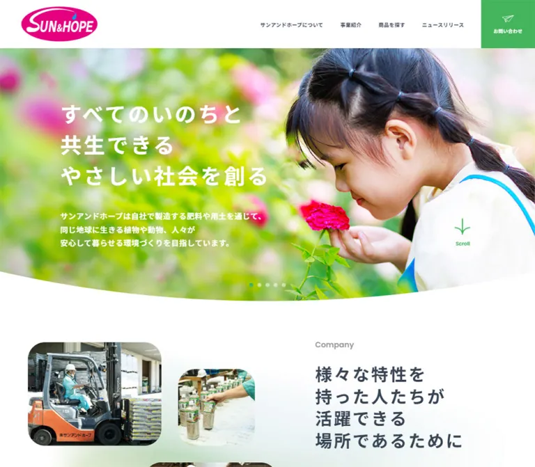
The desktop hero combines a full-width plant photograph with a large three-line white statement: “挑戦し続ける力で、すべてのいのちが輝く社会を拓く”. The photographed stem sits toward the right, leaving a quieter blue-green region behind the text at the left. The lower boundary forms a shallow, continuous curve into the white page.
The headline begins at x 159.75px, y 264.625px. Supporting copy begins at y 559.375px, leaving approximately 51.75px after the headline box. Both occupy the same 612.56px column.
Mobile separates text from imagery. The headline begins immediately below the logo header at y 100.44px, uses slate rather than white, and retains three lines. The supporting text is regular weight and wraps into five lines in the supplied state. A pale green-blue wash appears behind the lower part of this text area. A full-width factory photograph begins at approximately y 419px.
The desktop and mobile captures show different photographs. They do not establish whether this comes from responsive asset selection, slide timing, or another mechanism. Reproduce the observed compositions without inventing a source switching rule.
The visible hero statement is a paragraph in the extracted DOM; the header logo occupies an H1. A new implementation should deliberately choose an appropriate main heading structure.
Scroll Cue and Slide Indicators
The Scroll cue is a pale circular surface with a translucent outer halo, a green sprout symbol, and a small English caption. On desktop its inner region is approximately 135px across and its total visible diameter is approximately 158px. On mobile it is about 76px across including its halo and sits to the right of the lower introduction text.
Five small dots are visible near the desktop hero’s lower center. One is green, while the remaining dots are pale. This supports a slide-indicator treatment, but the supplied record does not verify automatic advance, clickable pagination, drag gestures, or timing.
The sprout cue is an observed affordance. Its click result and any animated sprout behavior were not demonstrated.
Company Story
The first section uses a muted English Company eyebrow and a large Japanese statement about a workplace where people with different characteristics can thrive. On desktop, the heading and description occupy a right-side column beginning at x 834.75px; the heading width is 474.75px.
The heading is 45px, weight 700, with 4.5px tracking. The description below is larger than ordinary body copy. Its final link leads to the disability-employment information page.
On mobile, the heading is inset to approximately x 53px, and the later description starts at approximately x 58px. These additional insets create a narrower editorial block than the hero. The supplied current screenshots do not sufficiently show the intervening media arrangement; do not prescribe particular worker photographs or a specific collage from this evidence.
Product-Search Cards
Three large links offer distinct browsing routes: “商品から探す”, “シーンから探す”, and “植物から探す”. Each combines a bold Japanese title, a smaller Poppins subtitle — Product type, Scene, or Plants — and View More text within the same destination link.
Desktop uses three 358.5 × 448.125px cards separated by 20.25px, giving each card a 4:5 proportion. Mobile stacks three much shallower 286.03 × 208.02px cards. The corner radius changes from 45px to 31.2px.
Desktop title blocks sit near the horizontal center of each card. On mobile they begin approximately 20.8px inside the left edge. The labels are measured as white. The supplied extract does not contain their image URLs or background layers, so exact imagery and overlay treatment remain unspecified.
The destinations are the product index and its ?search=scene and ?search=plants variants. These are navigation routes; no purchasing or checkout interaction was inspected. Keep each card a single link without nested interactive buttons.
Gardening Guide
The desktop guide places a 387px heading-and-description column at the left and a 625.5px list of three destination rows at the right. The categories cover fundamentals, growing different plants, and common questions.
On mobile, the introduction and rows share a 286.03px width and stack vertically. Each destination row is approximately 89px high. The general “もっと見る” link appears beneath the category rows in the measured mobile arrangement, rather than beside the introductory copy.
The evidence establishes this content hierarchy and geometry. It does not establish the exact illustrations, row icons, or hover surfaces.
About Section
The About section is the clearest example of the site’s editorial composition. Oversized, extremely pale About us lettering stretches behind the content near the top. A bold, two-line Japanese heading sits at the left, followed by a short green rule, restrained body copy, a certification row, and a green pill link.
The left text column is 479.25px wide. In the desktop screenshot, the factory photograph starts around x 729px, is approximately 551 × 429px, and has strongly rounded corners. Its bright sky balances the dark heading and gray certification text.
The green heading rule is visually about 67px wide and 6px high. A thin horizontal divider introduces the certification row, which places an emblem at the left and muted explanatory text at the right.
On mobile, the heading precedes an intervening media region and the description begins farther down the section. The View More link is centered and becomes wider but shorter: approximately 244.39 × 55.98px, compared with 205.875 × 67.56px on desktop.
View More Pill
The standard link uses a green fill, white label, and completely rounded ends. In the visible About capture, a small lighter-green circular marker sits near the right end, with a white point at its center. The image does not justify assigning it a particular arrow glyph.
The measured outer link padding is approximately 20.25px 31.5px 21.375px 27px on desktop and 15.86px 24.96px on mobile. The computed font size on the link wrapper is inherited; it should not be mistaken for a verified size of every nested label. A roughly 14px semibold label is a practical visual approximation for the starter CSS.
Business Introduction
The desktop business heading and supporting copy occupy a right-side column beginning at x 803.25px, with a width of 474.75px. A green View More link follows the brief description.
The mobile heading uses 30.16px text and returns to the standard 20.8px outer inset. The description appears after a substantial intervening region. The supplied screenshots do not identify the exact business-section imagery, so preserve the heading, media, description, and action hierarchy without specifying an unsupported photograph.
News Cards
A full-width #f4f4f4 section contains a slate heading, two white rounded link panels, and a centered View More pill. Desktop panels sit side by side with a 36px gap; mobile panels stack with approximately 12.47px between them.
Each panel groups a date and optional category above the article title. The supplied content has two entries, dated July 13 and May 29, 2026; only the latter displays the category “レポート”. A category label should therefore be optional rather than mandatory placeholder content.
Desktop padding is 39.375px 45px, with a 22.5px radius. Mobile uses approximately 26px vertical and 31.2px horizontal padding, with a 20.8px radius. The hierarchy is quiet and text-led; no news-thumbnail treatment is established by the supplied evidence.
Recruitment Feature
Recruitment is a large Poppins heading in white, followed by a short Japanese statement and a large circular destination link. Its section measures approximately 500.63px high on desktop and 551.16px on mobile.
The desktop circle is 322.875px across and sits to the right of the text. Mobile places a 187.19px circle below the copy. Its label wraps to three lines in the supplied mobile text.
The underlying background image or surface is not sufficiently documented. Preserve the measured reversed type and circular action, but choose the background only from verified or newly approved assets. The section and following footer rectangles overlap by 56.25px on desktop and 52px on mobile; these bounds alone do not establish the visible overlap shape.
Contact Area
A green Poppins Contact Us heading introduces a short description, a broad green web-contact link, and pale gray telephone and fax panels. The website’s actual phone link uses the tel: scheme; the fax number is separate information.
The web-contact link spans 1116px on desktop and 348.41px on mobile. Its content includes a primary inquiry label and secondary explanatory copy. The mobile box is taller because the text wraps.
The measured telephone panel is 540 × 135px on desktop and 348.41 × 106.06px on mobile. An icon region precedes the bold Roboto number. The mobile footer capture also shows the fax panel in the same pale-gray family. Small muted office-hour notes follow the contact controls.
Corporate Footer
The desktop footer separates identity from navigation. The left region contains a large logo, “株式会社サンアンドホープ”, postal address, and an underlined Google Map link. A vertical divider separates it from three navigation columns. Section labels have a short green segment followed by a longer light-gray rule.
A welzo logo and group-membership statement sit beneath the main footer region. The original page itself states that the company belongs to the welzo group. The final dark strip places legal links at the left and muted copyright text at the right.
On mobile, the logo and a slate circular return-to-top control share the upper region. The address and map link sit alongside each other. Six category headings form a two-column, three-row arrangement; some show plus symbols. Their child links are not visible in the screenshot, even though those descendants appear in the DOM extract. This supports a collapsed presentation, not a verified expansion interaction.
The legal links and copyright become centered, stacked rows. The mobile bottom navigation remains visible beneath them.
Mobile Bottom Navigation
Five equal 78px items form a fixed bar approximately 62.4px high at the bottom of the 390px viewport. Each item places a small symbol above a bold Japanese label:
- “トップ” — home symbol and green current-page treatment.
- “商品を探す” — product-container symbol.
- “事業紹介” — garden-tool symbol.
- “お問い合わせ” — paper-plane symbol.
- “メニュー” — white menu strokes on a solid green tile.
The first four items are links; the fifth is a button. The visible design uses fine separators and a white surface, without a floating rounded enclosure. The same bar appears in the opening and footer captures.
Menu content and a Close button exist in the DOM, but no open-menu screenshot or interaction result is supplied. Its entrance direction, backdrop, focus behavior, and scrolling policy remain unverified.
Tokens — Motion & Interaction
These are computed transition declarations, not recordings of completed interactions.
| Element | Measured declaration | What it establishes |
|---|---|---|
| Desktop navigation link | color 0.1s ease-out |
Short color transition; destination color not supplied |
| Header contact tile | background-color 0.4s ease-out |
Background feedback timing |
| Standard View More link | background-color 0.4s ease-out, border-color 0.4s ease-out |
Fill and border transition timing |
| Recruitment circle | border-color 0.6s cubic-bezier(0,0,0.5,1) |
Slower border feedback |
| Return-to-top link | transform 0.25s ease-out |
Transform feedback capability; not the page-scroll duration |
| Footer sublink | text-decoration-color 0.2s ease-out |
Underline-color feedback timing |
| Legal link | background-size 0.3s ease-out |
Background-size transition; exact visual effect unverified |
Many other sampled elements report transition: all without a nonzero duration. That alone does not demonstrate animation. Likewise, animation: none on sampled text elements does not prove that image layers, pseudo-elements, or script-driven components are static.
The collection procedure waited for visible finite motion and layout stability, and temporarily paused perpetual animations during readiness checks. It did not establish carousel intervals, easing between slides, parallax, reveal choreography, or user-triggered menu behavior. Keep those details explicitly unspecified when reproducing the observed style.
Surfaces
| Layer | Appearance | Purpose |
|---|---|---|
| Main page | White, spacious | Supports long corporate information and vivid photographs |
| Desktop hero | Full-width natural photograph with white text | Establishes the environmental theme |
| Mobile introduction | White with a faint cool-green wash | Gives dark headline and body text a separate reading surface |
| About decoration | Nearly white color wash and huge pale lettering | Adds depth without competing with the section heading |
| Action surface | Solid garden green with white content | Contact and section-entry links |
| News section | Soft gray containing white rounded panels | Separates dated updates from editorial sections |
| Telephone and fax | Soft gray rounded panels | Groups practical contact information |
| Footer navigation | White with fine rules | Organizes a dense sitemap without heavy boxes |
| Legal strip | Visually dark warm charcoal | Closes the page and separates legal information |
There is no visible general-purpose card elevation system in the supplied screenshots. Use background contrast, space, corner radius, and rules as the main separators. The Scroll cue’s translucent halo is a distinct control treatment, not a shadow to apply to every card.
Imagery
The current desktop opening uses a close view of a green plant against soft blue and green surroundings. Its asymmetrical crop places the stem at the right while retaining a broad, quiet area for text. The photograph remains bright and atmospheric; do not substitute a uniformly dark stock-image treatment.
The factory photograph appears in the mobile opening and desktop About section. It shows a low industrial building, packaged materials, pale-green exterior signage, blue sky, clouds, and a tall tower. This grounds the environmental message in an actual manufacturing setting. The About version is framed as rounded media; the mobile opening presents an edge-to-edge crop.
The logo is distinctive magenta artwork with white lettering and a small blue accent. Preserve its aspect ratio and supplied artwork. Do not recreate it with ordinary text or recolor it green. The certification emblem and welzo mark also need appropriate source assets.
Interface symbols are lightweight and simple: a sprout, paper plane, upward arrow, home, product container, garden tool, and menu strokes. Their exact file format and icon library were not provided.
Observed Asset References
No image source URLs or downloadable asset paths were included in the supplied original-page evidence.
| Asset role | Current evidence | Reuse guidance |
|---|---|---|
| SUN&HOPE logo | Header and footer screenshots at both widths | Use an approved original asset; retain magenta and proportions |
| Plant hero photograph | Current desktop opening | Preserve right-side subject placement and quiet left-side space |
| Factory photograph | Current mobile opening and desktop About screenshot | Prepare separate crops for edge-to-edge mobile and rounded desktop framing |
| Certification emblem | Current desktop About screenshot | Keep as an identifiable emblem beside its explanatory copy |
| welzo mark | Current desktop and mobile footers | Keep subordinate to the main corporate identity |
| Utility symbols | Current header, Scroll cue, footer, and mobile bar | Use consistent fine linework; exact source assets remain unspecified |
Product-card, first-company-section, business-section, and recruitment imagery cannot be reliably specified from the supplied current screenshots and element extract.
Layout & Responsive Behavior
The page sequence stays broadly consistent across the two measured widths: introduction, company story, products, guide, About, business, news, recruitment, contact, and corporate footer. The composition within these sections changes substantially.
| Area | Desktop observation | Mobile observation |
|---|---|---|
| Primary navigation | Persistent top header with visible links and contact tile | Logo header plus persistent bottom navigation |
| Hero copy | White over photography | Slate on a separate light surface |
| Hero photograph | Full-width curved region | Separate full-width factory crop below the copy |
| Main gutter | Approximately 160px for central content |
20.8px, with selected editorial blocks inset farther |
| Product routes | Three portrait cards in one row | Three landscape cards stacked vertically |
| Guide | Introduction left, destination rows right | Introduction and rows stacked; general link follows |
| About | Copy left and rounded photograph right | Heading, intervening media, description, certification, and centered action |
| News | Two columns | One column |
| Recruitment action | Large circle beside text | Smaller circle below text |
| Footer sitemap | Three navigation columns beside identity | Two columns below identity, with collapsed category presentation |
| Legal information | Left/right alignment | Centered stacked alignment |
Mobile is not a proportional reduction of desktop. The hero changes text color and weight; product cards change aspect ratio; navigation moves to the bottom; and the View More link becomes wider despite the smaller viewport.
The source root sizes and recurring dimensions suggest a scaled unit system, but the CSS formula and breakpoints were not supplied. Do not derive a continuous viewport formula from two samples. The Quick Start uses an explicitly recommended 75rem navigation/layout switch and should be tested at intermediate widths.
Only the upper part of the mobile opening photograph is visible above the bottom bar. Its full media height is not measured. The square mobile image in the starter is a practical approximation, not a source value.
Do’s and Don’ts
Do
- Keep white as the dominant page surface and
#44b45cas the primary interface accent. - Preserve the magenta logo as a separate identity color.
- Use Noto Sans JP for Japanese text, Poppins for the evidenced English labels, and Roboto for the evidenced numerical details.
- Retain wide tracking on the hero and first company statement.
- Pair bright natural imagery with an authentic manufacturing photograph.
- Recompose the hero on mobile with dark text above its image.
- Change product cards from portrait desktop links to shallow stacked mobile links.
- Use substantial radii for media and product cards, smaller radii for information panels, and full pills for View More.
- Preserve multiple journeys into products, education, company information, recruitment, and contact.
- Keep mobile navigation flat, full-width, and divided into five equal targets.
Don’t
- Don’t compress the site into a single conversion path or remove its corporate sitemap.
- Don’t use magenta as the default button color merely because it appears in the logo.
- Don’t apply a heavy dark overlay to every photograph as a stylistic default.
- Don’t retain white desktop hero text directly over the mobile factory image.
- Don’t give every section the same card grid or the same corner radius.
- Don’t equate hidden menu descendants with an observed open navigation state.
- Don’t invent carousel timing, scroll-triggered motion, menu choreography, or hover endpoint colors.
- Don’t populate missing media regions with supposedly original photographs whose subjects are not evidenced.
- Don’t copy the small root font size into ordinary body text.
- Don’t let the fixed mobile bar cover legal links, contact information, or keyboard focus.
Recommended Implementation Additions
These are recommendations for a new implementation, not verified features of the original page.
- Use a meaningful main H1 and a consistent section-heading hierarchy; keep decorative About us lettering hidden from assistive technology.
- Check small white labels on green, gray supporting text, and text over photography against the intended contrast requirements. Introduce a darker control color or local image treatment where needed while retaining the brand palette.
- Give Scroll, return-to-top, menu, and accordion controls explicit accessible names. Provide
aria-expandedandaria-controlsfor disclosure controls. - Make a menu operable with a keyboard and Escape. If implemented as a modal, manage focus and restore it to the opening control.
- If a carousel is implemented, provide a pause mechanism and accessible slide controls. Do not assume dots alone explain the interaction.
- Respect reduced-motion preferences for added transitions and scrolling behavior.
- Reserve bottom space for the mobile navigation and device safe area. Keep focused elements clear of the bar.
- Use descriptive alternatives for meaningful factory and company imagery; decorative botanical backgrounds can use empty alternatives.
- Keep images responsive with explicit dimensions or aspect ratios. Load below-fold media progressively without moving already-visible content.
- Test Japanese wrapping, long navigation labels, and enlarged text at widths between the two captured viewports.
Agent Prompt Guide
Quick Color Reference
- Main action green:
#44b45c. - Main canvas and header:
#ffffff. - Headings and navigation:
#374453. - Ordinary body text:
#251e1c. - News-section and contact-panel gray:
#f4f4f4. - Supporting gray:
#999999. - Logo magenta: approximately
#e4007f; rely on the approved logo asset. - Fine rules: approximately
#e5e5e5.
Overall Prompt
“Create a Japanese corporate homepage for a horticultural manufacturer using the current SUN&HOPE visual language. Use a white canvas, garden-green actions, slate Japanese headings, warm dark body text, and a magenta identity mark. Build a broad desktop photographic hero with a shallow curved lower edge, widely tracked white Japanese copy, a circular sprout Scroll cue, and small slide indicators. Continue with generous company storytelling, three product-search routes, gardening guidance, a pale oversized About us word treatment, rounded factory photography, restrained news cards, recruitment, contact details, and a complete corporate footer. Use Noto Sans JP, Poppins for English labels, and Roboto for numerical details. On mobile, put dark hero text above a separate full-width photograph, stack the product cards as shallow landscape links, and add a flat five-item bottom navigation bar. Use only approved imagery and implement interaction details explicitly rather than assuming them from appearance.”
Example Component Prompts
- Desktop header: “Create a 112.5px white header with a 150px-wide logo at the left, compact bold slate Japanese links toward the right, and a 142.875px-wide green contact tile against the right edge. Place a fine white paper-plane symbol above its label.”
- Responsive hero: “At 1440px, place a 56.25px bold, widely tracked Japanese statement in a roughly 613px column over a bright plant image. Keep the subject to the right and form an approximately 80px-deep lower curve. At 390px, switch to a 30.16px slate statement and regular 13.52px copy above a separate factory photograph.”
- Product routes: “Build three rounded whole-card links for product type, scene, and plant. Use 358.5 × 448.125px cards with 45px corners on desktop. At 390px, stack 286 × 208px cards with 31.2px corners. Pair bold white Japanese titles with smaller Poppins subtitles; use verified media behind them.”
- About section: “Place a two-line slate Japanese heading, a short green rule, body copy, a certification row, and a green View More pill in a left column. Balance it with a bright factory photograph in a strongly rounded frame. Add very pale oversized About us lettering behind the upper composition.”
- News: “Create a light-gray section with two white rounded text panels, each containing a date, optional category, and article title. Use a 36px desktop gap and a compact vertical gap on mobile. Finish with a centered green pill link.”
- Mobile navigation: “Create a fixed, full-width white bottom bar with five equal 78px targets at a 390px viewport. Put small line symbols above bold labels. Mark Home in green and make the Menu item a solid green tile with white content. Reserve layout space beneath the page for the bar and safe area.”
Quick Start
CSS Custom Properties
This is an implementation adaptation, not extracted site CSS. It uses measured endpoint dimensions where available, visual approximations for the hero curve and decorative lettering, and a recommended 75rem breakpoint. It retains a conventional root font size.
Use .hero with a .hero-media picture, a .hero-intro containing a .container, and optional .scroll-cue and .hero-pagination controls. For the About layout, use .section-heading, .about-media, and .about-copy as grid children so the mobile order can differ from desktop. Supply approved images and load the declared fonts separately; no original asset URLs were provided.
:root {
  /* Measured interface colors */
  --sh-green: #44b45c;
  --sh-white: #ffffff;
  --sh-ink: #374453;
  --sh-text: #251e1c;
  --sh-soft: #f4f4f4;
  --sh-muted: #999999;
  --sh-copyright: rgb(153 153 153 / 70%);

  /* Visual estimates */
  --sh-magenta: #e4007f;
  --sh-rule: #e5e5e5;

  /* Computed family stacks */
  --sh-font-jp: 'Noto Sans JP', sans-serif;
  --sh-font-en: Poppins, 'Noto Sans JP', sans-serif;
  --sh-font-number: Roboto, 'Noto Sans JP', sans-serif;

  /* Desktop reference dimensions */
  --sh-content: 1120.5px;
  --sh-gutter: 45px;
  --sh-header: 112.5px;
  --sh-body-size: 15.75px;
  --sh-body-leading: 31.5px;
  --sh-heading-size: 51.75px;
  --sh-heading-leading: 67.275px;
  --sh-hero-size: 56.25px;
  --sh-hero-leading: 81px;
  --sh-radius-panel: 22.5px;
  --sh-radius-media: 45px;
  --sh-bottom-nav: 62.4px;
  --sh-safe-bottom: env(safe-area-inset-bottom, 0px);

  /* Measured transition timings */
  --sh-motion-link: 100ms ease-out;
  --sh-motion-action: 400ms ease-out;
  --sh-motion-top: 250ms ease-out;
}

* { box-sizing: border-box; }

body {
  margin: 0;
  padding-top: var(--sh-header);
  color: var(--sh-text);
  background: var(--sh-white);
  font-family: var(--sh-font-jp);
  font-size: var(--sh-body-size);
  line-height: var(--sh-body-leading);
}

img { display: block; max-width: 100%; }
button, input, select, textarea { font: inherit; }
a { color: inherit; }

.container {
  width: min(
    var(--sh-content),
    calc(100% - 2 * var(--sh-gutter))
  );
  margin-inline: auto;
}

/* Fixed positioning reproduces the persistent desktop captures. */
.site-header {
  position: fixed;
  inset: 0 0 auto;
  z-index: 30;
  display: grid;
  grid-template-columns: 206.25px minmax(0, 1fr) 142.875px;
  align-items: center;
  min-height: var(--sh-header);
  background: var(--sh-white);
}

.site-brand {
  display: block;
  width: 150px;
  margin-left: 56.25px;
}

.site-brand img { width: 100%; height: auto; }

.primary-nav {
  display: flex;
  justify-content: flex-end;
  align-items: center;
}

.primary-nav a {
  padding: 2.25px 22.5px 0;
  color: var(--sh-ink);
  font-size: 13.5px;
  font-weight: 700;
  line-height: 20.25px;
  letter-spacing: .5625px;
  text-decoration: none;
  white-space: nowrap;
  transition: color var(--sh-motion-link);
}

.header-contact {
  display: grid;
  place-content: center;
  justify-items: center;
  gap: 10px;
  align-self: stretch;
  color: var(--sh-white);
  background: var(--sh-green);
  font-size: 13px;
  font-weight: 700;
  text-decoration: none;
  transition: background-color var(--sh-motion-action);
}

.hero {
  position: relative;
  isolation: isolate;
  min-height: 697px;
  overflow: hidden;
  color: var(--sh-white);
  /* Approximation of the photographed lower boundary. */
  border-radius: 0 0 50% 50% / 0 0 80px 80px;
}

.hero-media {
  position: absolute;
  inset: 0;
  z-index: -1;
  display: block;
  background: var(--sh-ink);
}

.hero-media img {
  width: 100%;
  height: 100%;
  object-fit: cover;
}

.hero-intro { padding-top: 152.125px; }

.hero-title {
  max-width: 612.56px;
  margin: 0;
  font-size: var(--sh-hero-size);
  font-weight: 700;
  line-height: var(--sh-hero-leading);
  letter-spacing: .1em;
}

.hero-copy {
  max-width: 612.56px;
  margin: 51.75px 0 0;
  font-size: 20.25px;
  font-weight: 700;
  line-height: 35.8425px;
  letter-spacing: .04em;
}

.scroll-cue {
  position: absolute;
  right: 8.59375%;
  bottom: 122px;
  display: grid;
  place-content: center;
  justify-items: center;
  gap: 28px;
  width: 135px;
  height: 135px;
  padding: 0;
  border: 0;
  border-radius: 50%;
  color: var(--sh-green);
  background: rgb(255 255 255 / 70%);
  box-shadow: 0 0 0 11.25px rgb(255 255 255 / 25%);
  font: 600 13.5px/1 var(--sh-font-en);
  text-decoration: none;
}

.hero-pagination {
  position: absolute;
  bottom: 38px;
  left: 50%;
  display: flex;
  gap: 8px;
  transform: translateX(-50%);
}

.hero-dot {
  width: 8px;
  height: 8px;
  border-radius: 50%;
  background: rgb(255 255 255 / 65%);
}

.hero-dot[aria-current='true'] { background: var(--sh-green); }

.section-title {
  margin: 0;
  color: var(--sh-ink);
  font-size: var(--sh-heading-size);
  font-weight: 700;
  line-height: var(--sh-heading-leading);
  letter-spacing: .04em;
}

.section-heading::after {
  content: '';
  display: block;
  width: 67.5px;
  height: 6px;
  margin-top: 35px;
  border-radius: 3px;
  background: var(--sh-green);
}

.section-copy { letter-spacing: .04em; }

.eyebrow {
  color: var(--sh-muted);
  font: 600 20.25px/41.5125px var(--sh-font-en);
}

.company-title {
  color: var(--sh-ink);
  font-size: 45px;
  line-height: 58.5px;
  letter-spacing: .1em;
}

.pill {
  display: inline-flex;
  align-items: center;
  justify-content: center;
  gap: 22px;
  width: 205.875px;
  min-height: 67.56px;
  padding: 20.25px 27px;
  border: 1px solid transparent;
  border-radius: 999px;
  color: var(--sh-white);
  background: var(--sh-green);
  font-size: 14px;
  font-weight: 700;
  line-height: 1.5;
  text-decoration: none;
  transition:
    background-color var(--sh-motion-action),
    border-color var(--sh-motion-action);
}

.pill-marker {
  display: grid;
  place-items: center;
  flex: 0 0 25px;
  width: 25px;
  height: 25px;
  border-radius: 50%;
  background: rgb(255 255 255 / 20%);
}

.pill-marker::before {
  content: '';
  width: 5px;
  height: 5px;
  border-radius: 50%;
  background: currentColor;
}

.product-area {
  width: min(1116px, calc(100% - 2 * var(--sh-gutter)));
  margin-inline: auto;
}

.product-grid {
  display: grid;
  grid-template-columns: repeat(3, minmax(0, 1fr));
  gap: 20.25px;
}

.product-card {
  position: relative;
  display: grid;
  align-content: center;
  justify-items: center;
  aspect-ratio: 4 / 5;
  padding: 37.125px 20px 0;
  overflow: hidden;
  border-radius: var(--sh-radius-media);
  color: var(--sh-white);
  /* Readable fallback until an approved background is supplied. */
  background: var(--sh-ink);
  text-decoration: none;
}

.product-card img {
  position: absolute;
  inset: 0;
  width: 100%;
  height: 100%;
  object-fit: cover;
}

.product-card-content { position: relative; z-index: 1; }
.product-card-title {
  margin: 0;
  font-size: 31.5px;
  font-weight: 700;
  line-height: 40.95px;
  letter-spacing: .04em;
}
.product-card-subtitle {
  margin: 2.25px 0 0;
  font: 600 18px/27px var(--sh-font-en);
  letter-spacing: .04em;
}

.guide-grid {
  display: grid;
  grid-template-columns: 387px minmax(0, 1fr);
  gap: 103.5px;
  padding-block: 63px;
}

.about-section { position: relative; padding-block: 150px 90px; }
.section-watermark {
  position: absolute;
  inset: 0 auto auto 0;
  margin: 0;
  color: #edf4f5;
  font-family: var(--sh-font-en);
  font-size: clamp(90px, 21vw, 300px);
  font-weight: 200;
  line-height: 1;
  letter-spacing: -.06em;
  pointer-events: none;
}

.about-grid {
  position: relative;
  display: grid;
  grid-template-columns: 479.25px minmax(0, 1fr);
  grid-template-areas: 'heading media' 'copy media';
  column-gap: 90px;
}

.about-grid .section-heading { grid-area: heading; }
.about-copy { grid-area: copy; }
.about-media {
  grid-area: media;
  align-self: center;
  overflow: hidden;
  aspect-ratio: 551 / 429;
  border-radius: var(--sh-radius-media);
}
.about-media img { width: 100%; height: 100%; object-fit: cover; }

.certification {
  display: grid;
  grid-template-columns: 108px minmax(0, 1fr);
  gap: 27px;
  margin-block: 30px 45px;
  padding-top: 35px;
  border-top: 1px solid var(--sh-rule);
  color: var(--sh-muted);
  font-size: 14.625px;
  line-height: 29.25px;
}

.news-section {
  padding-block: 101.25px 112.5px;
  background: var(--sh-soft);
}
.news-grid {
  display: grid;
  grid-template-columns: repeat(2, minmax(0, 1fr));
  gap: 36px;
  margin-block: 51.75px 56.25px;
}
.news-card {
  display: block;
  min-height: 165.23px;
  padding: 39.375px 45px;
  border-radius: var(--sh-radius-panel);
  background: var(--sh-white);
  text-decoration: none;
}
.news-meta { display: flex; flex-wrap: wrap; gap: 20px; font-size: 13.5px; }
.news-card-title { margin: 28px 0 0; font-size: 15.75px; line-height: 28.11px; }
.section-action { text-align: center; }

.contact-section { padding-block: 106.875px 50.625px; }
.contact-title {
  margin: 0;
  color: var(--sh-green);
  font: 600 64.125px/69.75px var(--sh-font-en);
  letter-spacing: -.05em;
}
.contact-web {
  display: grid;
  place-content: center;
  min-height: 134.5px;
  margin-top: 45px;
  padding: 30px;
  border-radius: var(--sh-radius-panel);
  color: var(--sh-white);
  background: var(--sh-green);
  text-align: center;
  text-decoration: none;
}
.contact-methods {
  display: grid;
  grid-template-columns: repeat(2, minmax(0, 1fr));
  gap: 36px;
  margin-top: 36px;
}
.contact-method {
  display: flex;
  align-items: center;
  justify-content: center;
  gap: 22.5px;
  min-height: 135px;
  padding: 22.5px;
  border-radius: var(--sh-radius-panel);
  background: var(--sh-soft);
  text-decoration: none;
}
.contact-number {
  color: var(--sh-ink);
  font: 700 27px/40.5px var(--sh-font-number);
  letter-spacing: .04em;
}

.footer-layout {
  display: grid;
  grid-template-columns: 36% minmax(0, 1fr);
  gap: 90px;
  padding-block: 56px 70px;
  border-top: 1px solid var(--sh-rule);
}
.footer-identity { border-right: 1px solid var(--sh-rule); }
.footer-groups { display: grid; grid-template-columns: repeat(3, minmax(0, 1fr)); gap: 45px; }
.footer-group-title {
  position: relative;
  padding-bottom: 10px;
  border-bottom: 2px solid var(--sh-rule);
  color: var(--sh-ink);
  font-size: 15.75px;
  font-weight: 700;
}
.footer-group-title::after {
  content: '';
  position: absolute;
  bottom: -2px;
  left: 0;
  width: 18px;
  height: 2px;
  background: var(--sh-green);
}
.legal-strip { padding-block: 65px; color: var(--sh-white); background: var(--sh-text); }
.legal-inner { display: flex; justify-content: space-between; align-items: center; gap: 24px; }
.copyright { color: var(--sh-copyright); font: 400 13.5px/20.25px var(--sh-font-en); }
.mobile-nav { display: none; }

/* Recommended focus and anchor clearance. */
:where(a, button, summary):focus-visible {
  outline: 3px solid var(--sh-ink);
  outline-offset: 4px;
}
[id] { scroll-margin-top: calc(var(--sh-header) + 24px); }

/* Recommended breakpoint; the original threshold was not supplied. */
@media (max-width: 74.999rem) {
  :root {
    --sh-gutter: 20.8px;
    --sh-header: 100.44px;
    --sh-body-size: 14.56px;
    --sh-body-leading: 29.12px;
    --sh-heading-size: 30.16px;
    --sh-heading-leading: 36.192px;
    --sh-hero-size: 30.16px;
    --sh-hero-leading: 44px;
    --sh-radius-panel: 20.8px;
    --sh-radius-media: 31.2px;
  }

  body {
    padding-top: 0;
    padding-bottom: calc(var(--sh-bottom-nav) + var(--sh-safe-bottom));
  }
  .site-header { position: relative; display: block; min-height: var(--sh-header); }
  .site-brand { width: 114.39px; margin-left: 20.8px; padding-top: 20.8px; }
  .primary-nav, .header-contact { display: none; }

  .hero { display: flex; flex-direction: column; min-height: 0; border-radius: 0; color: var(--sh-ink); }
  .hero-intro {
    padding: 0 0 42.6px;
    /* Atmospheric approximation, not an extracted gradient. */
    background: radial-gradient(ellipse at 65% 110%, #d5e8d8, transparent 70%);
  }
  .hero-copy { margin-top: 15.6px; font-size: 13.52px; font-weight: 400; line-height: 25.688px; }
  .hero-media { position: relative; inset: auto; z-index: auto; order: 1; aspect-ratio: 1; }
  .hero-pagination { display: none; }
  .scroll-cue {
    top: 212px;
    right: 25px;
    bottom: auto;
    width: 72px;
    height: 72px;
    gap: 12px;
    background: var(--sh-white);
    box-shadow: 0 0 0 5px rgb(255 255 255 / 35%);
    font-size: 10.4px;
  }

  .company-title { font-size: 30.16px; line-height: 39.208px; }
  .eyebrow { font-size: 18.72px; line-height: 38.376px; }
  .pill { width: min(244.39px, 100%); min-height: 55.98px; padding: 15.86px 24.96px; }
  .section-heading::after { margin-top: 25px; }

  .product-area { width: calc(100% - 104px); }
  .product-grid { grid-template-columns: 1fr; gap: 20.8px; }
  .product-card { aspect-ratio: 286.03 / 208.02; justify-items: start; padding: 16.64px 20.8px 0; }
  .product-card-title { font-size: 22.88px; line-height: 29.744px; }
  .product-card-subtitle { margin-top: 6.24px; font-size: 15.6px; line-height: 23.4px; }
  .guide-grid { grid-template-columns: 1fr; gap: 24px; padding-block: 55.12px 93.6px; }

  .about-section { padding-block: 100px 62.4px; }
  .about-grid { grid-template-columns: 1fr; grid-template-areas: 'heading' 'media' 'copy'; gap: 30px; }
  .about-copy > .pill { display: flex; margin-inline: auto; }
  .certification { grid-template-columns: 95px minmax(0, 1fr); gap: 27px; font-size: 13.52px; line-height: 27.04px; }

  .news-section { padding-block: 44.72px 72.8px; }
  .news-grid { grid-template-columns: 1fr; gap: 12.47px; margin-block: 37.44px 41.6px; }
  .news-card { min-height: 149.75px; padding: 26px 31.2px 24.96px; }
  .news-card-title { font-size: 13.52px; line-height: 25.9584px; }

  .contact-section { padding-block: 66.56px 47.84px; }
  .contact-title { font-size: 37.44px; line-height: 42.64px; }
  .contact-web { min-height: 154.11px; margin-top: 33.28px; padding: 30px 20px; }
  .contact-methods { grid-template-columns: 1fr; gap: 12.48px; margin-top: 12.48px; }
  .contact-method { min-height: 106.06px; gap: 20.8px; padding: 20.8px; }
  .contact-number { font-size: 20.8px; line-height: 31.2px; }

  .footer-layout { grid-template-columns: 1fr; gap: 40px; }
  .footer-identity { border-right: 0; }
  .footer-groups { grid-template-columns: repeat(2, minmax(0, 1fr)); gap: 20px 10px; }
  .footer-group-title { font-size: 12.48px; }
  .legal-strip { padding-block: 32px; }
  .legal-inner { flex-direction: column; gap: 12px; text-align: center; }
  .copyright { font-size: 10.4px; line-height: 15.6px; }

  .mobile-nav {
    position: fixed;
    inset: auto 0 0;
    z-index: 40;
    display: grid;
    grid-template-columns: repeat(5, minmax(0, 1fr));
    padding-bottom: var(--sh-safe-bottom);
    background: var(--sh-white);
  }
  .mobile-nav-item {
    display: flex;
    flex-direction: column;
    align-items: center;
    justify-content: center;
    gap: 4px;
    min-width: 0;
    min-height: var(--sh-bottom-nav);
    padding: 8px 2px;
    border: 0;
    border-right: 1px solid var(--sh-rule);
    color: var(--sh-text);
    background: transparent;
    font-size: 10.4px;
    font-weight: 700;
    line-height: 14.56px;
    text-decoration: none;
  }
  .mobile-nav-item[aria-current='page'] { color: var(--sh-green); }
  .mobile-nav-item--menu { border-right: 0; color: var(--sh-white); background: var(--sh-green); }
  [id] { scroll-margin-top: 24px; }
}

/* Recommended fallback for any added motion. */
@media (prefers-reduced-motion: reduce) {
  html { scroll-behavior: auto; }
  *, *::before, *::after { transition: none !important; animation: none !important; }
}
The CSS does not implement carousel playback, menu state, accordion expansion, or scroll actions. Those require semantic controls and explicit behavior. Keep footer links available until a working disclosure controller is attached. The small visual slide dots should receive larger hit areas if they become interactive.
Tailwind v4 Token Mapping
Optional aliases for a project already using Tailwind v4. This does not imply that the original website uses Tailwind. Define the custom properties above first.
@theme inline {
  --color-garden: var(--sh-green);
  --color-canvas: var(--sh-white);
  --color-slate: var(--sh-ink);
  --color-body: var(--sh-text);
  --color-soft: var(--sh-soft);
  --color-muted: var(--sh-muted);
  --color-rule: var(--sh-rule);

  --font-japanese: var(--sh-font-jp);
  --font-english: var(--sh-font-en);
  --font-number: var(--sh-font-number);

  --text-body: var(--sh-body-size);
  --text-body--line-height: var(--sh-body-leading);
  --text-section: var(--sh-heading-size);
  --text-section--line-height: var(--sh-heading-leading);
  --text-hero: var(--sh-hero-size);
  --text-hero--line-height: var(--sh-hero-leading);

  --radius-panel: var(--sh-radius-panel);
  --radius-media: var(--sh-radius-media);
  --radius-pill: 999px;
  --spacing-gutter: var(--sh-gutter);
  --spacing-bottom-nav: var(--sh-bottom-nav);
  --container-site: var(--sh-content);
}
Sources & Evidence
- Original and final website: https://www.sun-hope.co.jp/. The supplied browser record reports HTTP 200 and the title “株式会社サンアンドホープ”. No additional browsing was performed for this reference.
- Capture timestamp: September 22, 2026,
21:17:30.840 UTC, equivalent to September 23, 2026,06:17:30.840 JST. - Desktop evidence:
1440 × 1000CSS-pixel viewport,7208pxdocument height, and current opening, About-section, and footer screenshots. - Mobile evidence:
390 × 844CSS-pixel viewport,7514pxdocument height, and current opening and footer screenshots. - Rendered evidence: supplied page text, destination URLs, element rectangles, computed font stacks, colors, spacing, radii, and transition declarations. These support measurements for sections beyond the pictured positions.
- Collection behavior: initial observation lasted at least five seconds; capture readiness checked document load, finite motion, sampled layout/text stability, and visible image decoding within bounded waits. Scrolling traversed intermediate positions. Shared workers and service workers were disabled.
- Interaction limits: no demonstrated menu opening, footer expansion, carousel control, link activation, return-to-top action, or hover endpoint. Readiness checks do not establish complete delayed content or motion behavior.
- Asset and responsive limits: original image paths, font-file URLs, intermediate viewport layouts, breakpoint rules, and complete source stylesheets were not supplied. Visual estimates and implementation recommendations are labeled accordingly.
This reference describes the current homepage evidenced by the supplied captures and DOM. It does not extend visual findings to uninspected internal pages or claim production authorship from the original-page evidence.
# SUN&HOPE — Style Reference

> An open, white corporate homepage shaped by fresh greenery, rounded photography, and practical routes into gardening products.

**Website:** [www.sun-hope.co.jp](https://www.sun-hope.co.jp/)
**Original URL:** https://www.sun-hope.co.jp/
**Final URL:** https://www.sun-hope.co.jp/
**Response:** HTTP 200; no URL change recorded.
**Theme:** light, with green action surfaces and a dark legal footer.
**Inspected:** supplied browser capture dated September 23, 2026, 06:17:30.840 JST — September 22, 2026, 21:17:30.840 UTC.
**Viewports:** desktop 1440 × 1000 CSS px; mobile 390 × 844 CSS px.
**Scope:** the current corporate homepage, including its introduction, company story, product-search routes, gardening guide, About section, business introduction, news, recruitment, contact area, and footer. Current screenshots show the desktop hero, About section, desktop footer, mobile opening, and mobile footer. Additional sections are documented through supplied rendered DOM and computed styles. Internal destinations and open navigation states were not inspected.

SUN&HOPE uses white space and bright photographic color to make an industrial and horticultural business feel approachable. Its principal interface color is a medium green, supported by slate headings, warm dark body text, pale gray panels, and a vivid magenta logo. Large Japanese headlines have conspicuous tracking, while smaller English labels use a geometric sans-serif. Soft corners, circular controls, and the shallow curve below the desktop hero reinforce the organic theme.

This is a corporate information hub with several parallel journeys: product discovery, gardening education, company information, employment, and contact. The homepage alternates broad photographic presentation with readable text sections and practical navigation. On mobile, the opening changes composition substantially: dark text sits above a separate photograph, and a five-item bottom bar provides persistent access to key destinations.
閉じる
# SUN&HOPE — Style Reference

> An open, white corporate homepage shaped by fresh greenery, rounded photography, and practical routes into gardening products.

**Website:** [www.sun-hope.co.jp](https://www.sun-hope.co.jp/)
**Original URL:** https://www.sun-hope.co.jp/
**Final URL:** https://www.sun-hope.co.jp/
**Response:** HTTP 200; no URL change recorded.
**Theme:** light, with green action surfaces and a dark legal footer.
**Inspected:** supplied browser capture dated September 23, 2026, 06:17:30.840 JST — September 22, 2026, 21:17:30.840 UTC.
**Viewports:** desktop 1440 × 1000 CSS px; mobile 390 × 844 CSS px.
**Scope:** the current corporate homepage, including its introduction, company story, product-search routes, gardening guide, About section, business introduction, news, recruitment, contact area, and footer. Current screenshots show the desktop hero, About section, desktop footer, mobile opening, and mobile footer. Additional sections are documented through supplied rendered DOM and computed styles. Internal destinations and open navigation states were not inspected.

SUN&HOPE uses white space and bright photographic color to make an industrial and horticultural business feel approachable. Its principal interface color is a medium green, supported by slate headings, warm dark body text, pale gray panels, and a vivid magenta logo. Large Japanese headlines have conspicuous tracking, while smaller English labels use a geometric sans-serif. Soft corners, circular controls, and the shallow curve below the desktop hero reinforce the organic theme.

This is a corporate information hub with several parallel journeys: product discovery, gardening education, company information, employment, and contact. The homepage alternates broad photographic presentation with readable text sections and practical navigation. On mobile, the opening changes composition substantially: dark text sits above a separate photograph, and a five-item bottom bar provides persistent access to key destinations.

## How to Read This Reference

- **Measured** means a supplied computed style or rendered element rectangle. Values are CSS pixels unless stated otherwise; long decimal measurements are rounded for readability.
- **Visual estimate** means an approximation from the current-page screenshots. This applies to the magenta logo color, decorative lettering, hero curve, and some image geometry.
- **Recommended** means a proposed implementation choice, including the sample breakpoint, accessibility improvements, and CSS approximations.
- Font names below come from computed family stacks. The evidence does not independently identify the font file used for every glyph.
- All semantic token names are reference aliases. The supplied global properties contain general CMS presets and slider defaults, not a verified branded token system.
- Some menu and accordion descendants have computed rectangles despite being absent from the visible captures. Their presence establishes content and controls, not an observed open state.

## Tokens — Colors

### Default Palette

| Name | Value | Suggested token | Role and evidence |
| --- | --- | --- | --- |
| Garden Green | `#44b45c` | `--sh-green` | Measured contact fills, primary links, Scroll text, and Contact Us heading |
| White | `#ffffff` | `--sh-white` | Measured header and news-card surfaces; reversed text on green and photographic regions |
| Slate | `#374453` | `--sh-ink` | Measured Japanese headings, desktop navigation, phone number, and footer headings |
| Warm Charcoal | `#251e1c` | `--sh-text` | Measured body text; the dark legal strip visually approximates this color, but its background style was not supplied |
| Soft Gray | `#f4f4f4` | `--sh-soft` | Measured news-section background and telephone panel; also recruitment supporting text |
| Muted Gray | `#999999` | `--sh-muted` | Measured Company eyebrow, certification copy, and map-link text |
| Quiet Copyright | `rgba(153,153,153,.7)` | `--sh-copyright` | Measured copyright text; its apparent color depends on the surface underneath |
| Brand Magenta | Approximately `#e4007f` | `--sh-magenta` | Visual estimate of logo artwork; use an approved logo asset for accurate reproduction |
| Fine Rule | Approximately `#e5e5e5` | `--sh-rule` | Visual estimate of footer and certification dividers |

Green carries action and orientation. Magenta is concentrated in the logo rather than repeated across buttons, headings, or card badges. Photography supplies blue sky, leaf green, and other natural variation.

The About section has an extremely faint cool-colored wash and oversized pale lettering. These appear near white, with hints of blue, green, and lavender. Their exact colors, opacity, and rendering technique were not supplied; treat them as quiet atmospheric decoration rather than additional core brand colors.

### Theme Presets

Only the light presentation is evidenced. No theme selector or alternate color theme was observed. The dark legal strip is a local surface within that presentation.

Do not treat the many global CMS gradient presets or the default slider blue as visible site colors. A defined custom property does not establish that a component uses it.

## Tokens — Typography

### Japanese Text — Noto Sans JP

**Computed stack:** `'Noto Sans JP', sans-serif`.

Japanese headlines and navigation use weight `700`; ordinary descriptions use `400`. Major headings are broad and generously tracked. The opening headline uses `0.1em` tracking, while most standard section headings and paragraphs use about `0.04em`.

The first company story is more expressive than ordinary body copy: its desktop description is `19.125px`, with `0.1em` tracking. General section descriptions are typically `15.75px / 31.5px` on desktop. Preserve this hierarchy rather than making every paragraph equally prominent.

### English Labels — Poppins

**Computed stack:** `Poppins, 'Noto Sans JP', sans-serif`.

Poppins appears in Company, Scroll, product subtitles, Recruitment, Contact Us, and copyright text. Most section labels use weight `600`; copyright uses `400`. The large Recruitment and Contact Us titles use negative tracking of `-0.05em`, contrasting with the expanded Japanese headings.

The exact font of the large decorative About us lettering was not included in the supplied element styles. Its appearance is notably thin; assigning it Poppins in a new implementation is an approximation.

### Numbers and Address Details — Roboto

**Computed stack:** `Roboto, 'Noto Sans JP', sans-serif`.

Roboto is declared for the phone number, postal address, map link, and group-membership statement. The phone number uses weight `700`; smaller supporting information uses `400`.

### Type Scale

Values below are measured. Each size pair is **font size / line height**.

| Role | Desktop | Mobile | Weight and tracking |
| --- | --- | --- | --- |
| Hero headline | `56.25px / normal` | `30.16px / normal` | 700; `0.1em` |
| Hero description | `20.25 / 35.8425px` | `13.52 / 25.688px` | Desktop 700, mobile 400; `0.04em` |
| Company story heading | `45 / 58.5px` | `30.16 / 39.208px` | 700; `0.1em` |
| Company story description | `19.125 / 32.5125px` | `14.56 / 24.752px` | 400; `0.1em` |
| Product and About headings | `51.75 / 67.275px` | `30.16 / 36.192px` | 700; `0.04em` |
| Gardening-guide heading | `45 / 54px` | `24.96 / 29.952px` | 700; `0.04em` |
| News heading | `39.375 / 45px` | `24.96 / 30.16px` | 700; desktop `0.07em`, mobile `0.04em` |
| General section description | `15.75 / 31.5px` | `14.56 / 29.12px` | 400; `0.04em` |
| Product-card Japanese title | `31.5 / 40.95px` | `22.88 / 29.744px` | 700; `0.04em` |
| Product-card English subtitle | `18 / 27px` | `15.6 / 23.4px` | Poppins 600; `0.04em` |
| Company eyebrow | `20.25 / 41.5125px` | `18.72 / 38.376px` | Poppins 600 |
| Recruitment | `64.125 / 69.75px` | `41.6 / 46.8px` | Poppins 600; `-0.05em` |
| Contact Us | `64.125 / 69.75px` | `37.44 / 42.64px` | Poppins 600; `-0.05em` |
| Phone number | `27 / 40.5px` | `20.8 / 31.2px` | Roboto 700; `0.04em` |
| Desktop navigation | `13.5 / 20.25px` | Hidden in opening capture | 700; `0.5625px` tracking |
| Footer category heading | `15.75 / approximately 27px` | `12.48 / approximately 21.39px` | 700; `0.04em` |
| Copyright | `13.5 / 20.25px` | `10.4 / 15.6px` | Poppins 400 |

The three-line hero headline occupies a `243px`-high desktop box and a `132px`-high mobile box. Dividing by three gives approximate line advances of `81px` and `44px`; these are calculated approximations, not extracted line-height declarations.

The root font sizes are `11.25px` on desktop and `10.4px` on mobile. These are implementation units, not the intended size of ordinary reading text. The Quick Start retains a conventional root size and expresses component dimensions directly.

## Tokens — Spacing & Shapes

**Density:** generous editorial spacing around relatively compact navigation.
**Shape vocabulary:** a broad hero curve, strongly rounded media and product links, smaller rounded information panels, pill buttons, and circular utility controls.

### Spacing Scale

These are recurring measured examples, not proof of a complete underlying spacing scale.

| Use | Desktop | Mobile |
| --- | --- | --- |
| Outer section inset | `45px` in several sections | `20.8px` |
| Standard central content inset | Approximately `159.75–162px` | Usually `20.8px` |
| Additional product-area inset | Inner content begins at `162px` | `31.2px` inside the outer inset; total approximately `52px` |
| Product-card gap | `20.25px` | Approximately `20.8px` vertically |
| News-card gap | `36px` horizontally | Approximately `12.47px` vertically |
| News-card padding | `39.375px 45px` | `26px 31.2px 24.96px` |
| News-section padding | `101.25px` top; `112.5px` bottom | `44.72px` top; `72.8px` bottom |
| Contact-section padding | `106.875px` top; `50.625px` bottom | `66.56px` top; `47.84px` bottom |
| Company-section bottom padding | `180px` | Not retained as the same padding |

### Border Radius

| Element | Desktop | Mobile | Evidence |
| --- | --- | --- | --- |
| Product-search card | `45px` | `31.2px` | Measured |
| News card | `22.5px` | `20.8px` | Measured |
| Web-contact and telephone panels | `22.5px` | `20.8px` | Measured |
| Standard View More link | Fully rounded | Fully rounded | Extremely large computed radii; normalize to a pill |
| Recruitment link | `100%` | `100%` | Measured circular geometry |
| About factory photograph | Approximately `45px` | Not visually documented | Desktop visual estimate |
| Hero lower edge | Broad elliptical curve | No curve visible on the opening image | Visual observation; source clipping technique unknown |

### Layout Measurements

| Element | Desktop 1440 × 1000 | Mobile 390 × 844 |
| --- | --- | --- |
| Document height | `7208px` | `7514px` |
| Header | `112.5px` high | `100.44px` high |
| Header logo link | `150 × 69px` | `114.39 × 52.61px` |
| Header logo position | `x 56.25px`, `y 22.31px` | `x 20.80px`, `y 20.80px` |
| Desktop contact tile | `142.875 × 112.5px` | Replaced by bottom navigation access |
| Common content width | `1116–1120.5px` | `348.41px` |
| Hero headline/copy column | `612.56px` wide, starts at `x 159.75px` | `348.41px` wide, starts at `x 20.80px` |
| Product-search card | `358.5 × 448.125px` | `286.03 × 208.02px` |
| About text column | `479.25px` wide | `348.41px` wide |
| About View More link | `205.875 × 67.56px` | `244.39 × 55.98px` |
| News card | `542.25 × 165.23px` | `348.41px` wide; approximately `150–151px` high |
| Recruitment circular link | `322.875px` diameter | `187.19px` diameter |
| Web-contact panel | `1116 × 134.5px` | `348.41 × 154.11px` |
| Telephone panel | `540 × 135px` | `348.41 × 106.06px` |
| Footer logo link | `202.5 × 92.25px` | `137.27 × 63.14px` |
| Return-to-top link box | `83.25px` square | `54.08px` square |
| Bottom-navigation item | Not shown | `78 × 62.39px`; five equal items |

The desktop hero extends from approximately `y 112.5px` to `y 809px` at its center. Its lower edge rises to approximately `y 729px` at the sides, giving an estimated `80px` curve depth. This is screenshot geometry, not a measured CSS radius.

## Components

### Desktop Header and Primary Navigation

A white, full-width header holds the magenta logo at the left, six Japanese navigation labels toward the right, and a green contact tile flush against the right edge. The contact tile uses a thin white paper-plane symbol above its label.

The measured header grid columns are `206.25px 267.094px 966.656px`. This describes the captured arrangement, not a portable responsive formula. The standard navigation links have `22.5px` horizontal padding, bold `13.5px` text, and slate coloring.

The header remains at the top in the supplied desktop opening, About, and footer captures. Persistence is visually supported; its exact fixed-versus-sticky implementation was not extracted.

Company, product, and guide submenu content exists in the DOM. No open desktop menu is pictured, so its visible surface, opening trigger, and dismissal behavior remain unverified.

### Responsive Hero

The desktop hero combines a full-width plant photograph with a large three-line white statement: “挑戦し続ける力で、すべてのいのちが輝く社会を拓く”. The photographed stem sits toward the right, leaving a quieter blue-green region behind the text at the left. The lower boundary forms a shallow, continuous curve into the white page.

The headline begins at `x 159.75px`, `y 264.625px`. Supporting copy begins at `y 559.375px`, leaving approximately `51.75px` after the headline box. Both occupy the same `612.56px` column.

Mobile separates text from imagery. The headline begins immediately below the logo header at `y 100.44px`, uses slate rather than white, and retains three lines. The supporting text is regular weight and wraps into five lines in the supplied state. A pale green-blue wash appears behind the lower part of this text area. A full-width factory photograph begins at approximately `y 419px`.

The desktop and mobile captures show different photographs. They do not establish whether this comes from responsive asset selection, slide timing, or another mechanism. Reproduce the observed compositions without inventing a source switching rule.

The visible hero statement is a paragraph in the extracted DOM; the header logo occupies an H1. A new implementation should deliberately choose an appropriate main heading structure.

### Scroll Cue and Slide Indicators

The Scroll cue is a pale circular surface with a translucent outer halo, a green sprout symbol, and a small English caption. On desktop its inner region is approximately `135px` across and its total visible diameter is approximately `158px`. On mobile it is about `76px` across including its halo and sits to the right of the lower introduction text.

Five small dots are visible near the desktop hero’s lower center. One is green, while the remaining dots are pale. This supports a slide-indicator treatment, but the supplied record does not verify automatic advance, clickable pagination, drag gestures, or timing.

The sprout cue is an observed affordance. Its click result and any animated sprout behavior were not demonstrated.

### Company Story

The first section uses a muted English Company eyebrow and a large Japanese statement about a workplace where people with different characteristics can thrive. On desktop, the heading and description occupy a right-side column beginning at `x 834.75px`; the heading width is `474.75px`.

The heading is `45px`, weight `700`, with `4.5px` tracking. The description below is larger than ordinary body copy. Its final link leads to the disability-employment information page.

On mobile, the heading is inset to approximately `x 53px`, and the later description starts at approximately `x 58px`. These additional insets create a narrower editorial block than the hero. The supplied current screenshots do not sufficiently show the intervening media arrangement; do not prescribe particular worker photographs or a specific collage from this evidence.

### Product-Search Cards

Three large links offer distinct browsing routes: “商品から探す”, “シーンから探す”, and “植物から探す”. Each combines a bold Japanese title, a smaller Poppins subtitle — Product type, Scene, or Plants — and View More text within the same destination link.

Desktop uses three `358.5 × 448.125px` cards separated by `20.25px`, giving each card a `4:5` proportion. Mobile stacks three much shallower `286.03 × 208.02px` cards. The corner radius changes from `45px` to `31.2px`.

Desktop title blocks sit near the horizontal center of each card. On mobile they begin approximately `20.8px` inside the left edge. The labels are measured as white. The supplied extract does not contain their image URLs or background layers, so exact imagery and overlay treatment remain unspecified.

The destinations are the product index and its `?search=scene` and `?search=plants` variants. These are navigation routes; no purchasing or checkout interaction was inspected. Keep each card a single link without nested interactive buttons.

### Gardening Guide

The desktop guide places a `387px` heading-and-description column at the left and a `625.5px` list of three destination rows at the right. The categories cover fundamentals, growing different plants, and common questions.

On mobile, the introduction and rows share a `286.03px` width and stack vertically. Each destination row is approximately `89px` high. The general “もっと見る” link appears beneath the category rows in the measured mobile arrangement, rather than beside the introductory copy.

The evidence establishes this content hierarchy and geometry. It does not establish the exact illustrations, row icons, or hover surfaces.

### About Section

The About section is the clearest example of the site’s editorial composition. Oversized, extremely pale About us lettering stretches behind the content near the top. A bold, two-line Japanese heading sits at the left, followed by a short green rule, restrained body copy, a certification row, and a green pill link.

The left text column is `479.25px` wide. In the desktop screenshot, the factory photograph starts around `x 729px`, is approximately `551 × 429px`, and has strongly rounded corners. Its bright sky balances the dark heading and gray certification text.

The green heading rule is visually about `67px` wide and `6px` high. A thin horizontal divider introduces the certification row, which places an emblem at the left and muted explanatory text at the right.

On mobile, the heading precedes an intervening media region and the description begins farther down the section. The View More link is centered and becomes wider but shorter: approximately `244.39 × 55.98px`, compared with `205.875 × 67.56px` on desktop.

### View More Pill

The standard link uses a green fill, white label, and completely rounded ends. In the visible About capture, a small lighter-green circular marker sits near the right end, with a white point at its center. The image does not justify assigning it a particular arrow glyph.

The measured outer link padding is approximately `20.25px 31.5px 21.375px 27px` on desktop and `15.86px 24.96px` on mobile. The computed font size on the link wrapper is inherited; it should not be mistaken for a verified size of every nested label. A roughly `14px` semibold label is a practical visual approximation for the starter CSS.

### Business Introduction

The desktop business heading and supporting copy occupy a right-side column beginning at `x 803.25px`, with a width of `474.75px`. A green View More link follows the brief description.

The mobile heading uses `30.16px` text and returns to the standard `20.8px` outer inset. The description appears after a substantial intervening region. The supplied screenshots do not identify the exact business-section imagery, so preserve the heading, media, description, and action hierarchy without specifying an unsupported photograph.

### News Cards

A full-width `#f4f4f4` section contains a slate heading, two white rounded link panels, and a centered View More pill. Desktop panels sit side by side with a `36px` gap; mobile panels stack with approximately `12.47px` between them.

Each panel groups a date and optional category above the article title. The supplied content has two entries, dated July 13 and May 29, 2026; only the latter displays the category “レポート”. A category label should therefore be optional rather than mandatory placeholder content.

Desktop padding is `39.375px 45px`, with a `22.5px` radius. Mobile uses approximately `26px` vertical and `31.2px` horizontal padding, with a `20.8px` radius. The hierarchy is quiet and text-led; no news-thumbnail treatment is established by the supplied evidence.

### Recruitment Feature

Recruitment is a large Poppins heading in white, followed by a short Japanese statement and a large circular destination link. Its section measures approximately `500.63px` high on desktop and `551.16px` on mobile.

The desktop circle is `322.875px` across and sits to the right of the text. Mobile places a `187.19px` circle below the copy. Its label wraps to three lines in the supplied mobile text.

The underlying background image or surface is not sufficiently documented. Preserve the measured reversed type and circular action, but choose the background only from verified or newly approved assets. The section and following footer rectangles overlap by `56.25px` on desktop and `52px` on mobile; these bounds alone do not establish the visible overlap shape.

### Contact Area

A green Poppins Contact Us heading introduces a short description, a broad green web-contact link, and pale gray telephone and fax panels. The website’s actual phone link uses the `tel:` scheme; the fax number is separate information.

The web-contact link spans `1116px` on desktop and `348.41px` on mobile. Its content includes a primary inquiry label and secondary explanatory copy. The mobile box is taller because the text wraps.

The measured telephone panel is `540 × 135px` on desktop and `348.41 × 106.06px` on mobile. An icon region precedes the bold Roboto number. The mobile footer capture also shows the fax panel in the same pale-gray family. Small muted office-hour notes follow the contact controls.

### Corporate Footer

The desktop footer separates identity from navigation. The left region contains a large logo, “株式会社サンアンドホープ”, postal address, and an underlined Google Map link. A vertical divider separates it from three navigation columns. Section labels have a short green segment followed by a longer light-gray rule.

A welzo logo and group-membership statement sit beneath the main footer region. The original page itself states that the company belongs to the welzo group. The final dark strip places legal links at the left and muted copyright text at the right.

On mobile, the logo and a slate circular return-to-top control share the upper region. The address and map link sit alongside each other. Six category headings form a two-column, three-row arrangement; some show plus symbols. Their child links are not visible in the screenshot, even though those descendants appear in the DOM extract. This supports a collapsed presentation, not a verified expansion interaction.

The legal links and copyright become centered, stacked rows. The mobile bottom navigation remains visible beneath them.

### Mobile Bottom Navigation

Five equal `78px` items form a fixed bar approximately `62.4px` high at the bottom of the `390px` viewport. Each item places a small symbol above a bold Japanese label:

- “トップ” — home symbol and green current-page treatment.
- “商品を探す” — product-container symbol.
- “事業紹介” — garden-tool symbol.
- “お問い合わせ” — paper-plane symbol.
- “メニュー” — white menu strokes on a solid green tile.

The first four items are links; the fifth is a button. The visible design uses fine separators and a white surface, without a floating rounded enclosure. The same bar appears in the opening and footer captures.

Menu content and a Close button exist in the DOM, but no open-menu screenshot or interaction result is supplied. Its entrance direction, backdrop, focus behavior, and scrolling policy remain unverified.

## Tokens — Motion & Interaction

These are computed transition declarations, not recordings of completed interactions.

| Element | Measured declaration | What it establishes |
| --- | --- | --- |
| Desktop navigation link | `color 0.1s ease-out` | Short color transition; destination color not supplied |
| Header contact tile | `background-color 0.4s ease-out` | Background feedback timing |
| Standard View More link | `background-color 0.4s ease-out, border-color 0.4s ease-out` | Fill and border transition timing |
| Recruitment circle | `border-color 0.6s cubic-bezier(0,0,0.5,1)` | Slower border feedback |
| Return-to-top link | `transform 0.25s ease-out` | Transform feedback capability; not the page-scroll duration |
| Footer sublink | `text-decoration-color 0.2s ease-out` | Underline-color feedback timing |
| Legal link | `background-size 0.3s ease-out` | Background-size transition; exact visual effect unverified |

Many other sampled elements report `transition: all` without a nonzero duration. That alone does not demonstrate animation. Likewise, `animation: none` on sampled text elements does not prove that image layers, pseudo-elements, or script-driven components are static.

The collection procedure waited for visible finite motion and layout stability, and temporarily paused perpetual animations during readiness checks. It did not establish carousel intervals, easing between slides, parallax, reveal choreography, or user-triggered menu behavior. Keep those details explicitly unspecified when reproducing the observed style.

## Surfaces

| Layer | Appearance | Purpose |
| --- | --- | --- |
| Main page | White, spacious | Supports long corporate information and vivid photographs |
| Desktop hero | Full-width natural photograph with white text | Establishes the environmental theme |
| Mobile introduction | White with a faint cool-green wash | Gives dark headline and body text a separate reading surface |
| About decoration | Nearly white color wash and huge pale lettering | Adds depth without competing with the section heading |
| Action surface | Solid garden green with white content | Contact and section-entry links |
| News section | Soft gray containing white rounded panels | Separates dated updates from editorial sections |
| Telephone and fax | Soft gray rounded panels | Groups practical contact information |
| Footer navigation | White with fine rules | Organizes a dense sitemap without heavy boxes |
| Legal strip | Visually dark warm charcoal | Closes the page and separates legal information |

There is no visible general-purpose card elevation system in the supplied screenshots. Use background contrast, space, corner radius, and rules as the main separators. The Scroll cue’s translucent halo is a distinct control treatment, not a shadow to apply to every card.

## Imagery

The current desktop opening uses a close view of a green plant against soft blue and green surroundings. Its asymmetrical crop places the stem at the right while retaining a broad, quiet area for text. The photograph remains bright and atmospheric; do not substitute a uniformly dark stock-image treatment.

The factory photograph appears in the mobile opening and desktop About section. It shows a low industrial building, packaged materials, pale-green exterior signage, blue sky, clouds, and a tall tower. This grounds the environmental message in an actual manufacturing setting. The About version is framed as rounded media; the mobile opening presents an edge-to-edge crop.

The logo is distinctive magenta artwork with white lettering and a small blue accent. Preserve its aspect ratio and supplied artwork. Do not recreate it with ordinary text or recolor it green. The certification emblem and welzo mark also need appropriate source assets.

Interface symbols are lightweight and simple: a sprout, paper plane, upward arrow, home, product container, garden tool, and menu strokes. Their exact file format and icon library were not provided.

### Observed Asset References

No image source URLs or downloadable asset paths were included in the supplied original-page evidence.

| Asset role | Current evidence | Reuse guidance |
| --- | --- | --- |
| SUN&HOPE logo | Header and footer screenshots at both widths | Use an approved original asset; retain magenta and proportions |
| Plant hero photograph | Current desktop opening | Preserve right-side subject placement and quiet left-side space |
| Factory photograph | Current mobile opening and desktop About screenshot | Prepare separate crops for edge-to-edge mobile and rounded desktop framing |
| Certification emblem | Current desktop About screenshot | Keep as an identifiable emblem beside its explanatory copy |
| welzo mark | Current desktop and mobile footers | Keep subordinate to the main corporate identity |
| Utility symbols | Current header, Scroll cue, footer, and mobile bar | Use consistent fine linework; exact source assets remain unspecified |

Product-card, first-company-section, business-section, and recruitment imagery cannot be reliably specified from the supplied current screenshots and element extract.

## Layout & Responsive Behavior

The page sequence stays broadly consistent across the two measured widths: introduction, company story, products, guide, About, business, news, recruitment, contact, and corporate footer. The composition within these sections changes substantially.

| Area | Desktop observation | Mobile observation |
| --- | --- | --- |
| Primary navigation | Persistent top header with visible links and contact tile | Logo header plus persistent bottom navigation |
| Hero copy | White over photography | Slate on a separate light surface |
| Hero photograph | Full-width curved region | Separate full-width factory crop below the copy |
| Main gutter | Approximately `160px` for central content | `20.8px`, with selected editorial blocks inset farther |
| Product routes | Three portrait cards in one row | Three landscape cards stacked vertically |
| Guide | Introduction left, destination rows right | Introduction and rows stacked; general link follows |
| About | Copy left and rounded photograph right | Heading, intervening media, description, certification, and centered action |
| News | Two columns | One column |
| Recruitment action | Large circle beside text | Smaller circle below text |
| Footer sitemap | Three navigation columns beside identity | Two columns below identity, with collapsed category presentation |
| Legal information | Left/right alignment | Centered stacked alignment |

Mobile is not a proportional reduction of desktop. The hero changes text color and weight; product cards change aspect ratio; navigation moves to the bottom; and the View More link becomes wider despite the smaller viewport.

The source root sizes and recurring dimensions suggest a scaled unit system, but the CSS formula and breakpoints were not supplied. Do not derive a continuous viewport formula from two samples. The Quick Start uses an explicitly recommended `75rem` navigation/layout switch and should be tested at intermediate widths.

Only the upper part of the mobile opening photograph is visible above the bottom bar. Its full media height is not measured. The square mobile image in the starter is a practical approximation, not a source value.

## Do’s and Don’ts

### Do

- Keep white as the dominant page surface and `#44b45c` as the primary interface accent.
- Preserve the magenta logo as a separate identity color.
- Use Noto Sans JP for Japanese text, Poppins for the evidenced English labels, and Roboto for the evidenced numerical details.
- Retain wide tracking on the hero and first company statement.
- Pair bright natural imagery with an authentic manufacturing photograph.
- Recompose the hero on mobile with dark text above its image.
- Change product cards from portrait desktop links to shallow stacked mobile links.
- Use substantial radii for media and product cards, smaller radii for information panels, and full pills for View More.
- Preserve multiple journeys into products, education, company information, recruitment, and contact.
- Keep mobile navigation flat, full-width, and divided into five equal targets.

### Don’t

- Don’t compress the site into a single conversion path or remove its corporate sitemap.
- Don’t use magenta as the default button color merely because it appears in the logo.
- Don’t apply a heavy dark overlay to every photograph as a stylistic default.
- Don’t retain white desktop hero text directly over the mobile factory image.
- Don’t give every section the same card grid or the same corner radius.
- Don’t equate hidden menu descendants with an observed open navigation state.
- Don’t invent carousel timing, scroll-triggered motion, menu choreography, or hover endpoint colors.
- Don’t populate missing media regions with supposedly original photographs whose subjects are not evidenced.
- Don’t copy the small root font size into ordinary body text.
- Don’t let the fixed mobile bar cover legal links, contact information, or keyboard focus.

## Recommended Implementation Additions

These are recommendations for a new implementation, not verified features of the original page.

- Use a meaningful main H1 and a consistent section-heading hierarchy; keep decorative About us lettering hidden from assistive technology.
- Check small white labels on green, gray supporting text, and text over photography against the intended contrast requirements. Introduce a darker control color or local image treatment where needed while retaining the brand palette.
- Give Scroll, return-to-top, menu, and accordion controls explicit accessible names. Provide `aria-expanded` and `aria-controls` for disclosure controls.
- Make a menu operable with a keyboard and Escape. If implemented as a modal, manage focus and restore it to the opening control.
- If a carousel is implemented, provide a pause mechanism and accessible slide controls. Do not assume dots alone explain the interaction.
- Respect reduced-motion preferences for added transitions and scrolling behavior.
- Reserve bottom space for the mobile navigation and device safe area. Keep focused elements clear of the bar.
- Use descriptive alternatives for meaningful factory and company imagery; decorative botanical backgrounds can use empty alternatives.
- Keep images responsive with explicit dimensions or aspect ratios. Load below-fold media progressively without moving already-visible content.
- Test Japanese wrapping, long navigation labels, and enlarged text at widths between the two captured viewports.

## Agent Prompt Guide

### Quick Color Reference

- Main action green: `#44b45c`.
- Main canvas and header: `#ffffff`.
- Headings and navigation: `#374453`.
- Ordinary body text: `#251e1c`.
- News-section and contact-panel gray: `#f4f4f4`.
- Supporting gray: `#999999`.
- Logo magenta: approximately `#e4007f`; rely on the approved logo asset.
- Fine rules: approximately `#e5e5e5`.

### Overall Prompt

“Create a Japanese corporate homepage for a horticultural manufacturer using the current SUN&HOPE visual language. Use a white canvas, garden-green actions, slate Japanese headings, warm dark body text, and a magenta identity mark. Build a broad desktop photographic hero with a shallow curved lower edge, widely tracked white Japanese copy, a circular sprout Scroll cue, and small slide indicators. Continue with generous company storytelling, three product-search routes, gardening guidance, a pale oversized About us word treatment, rounded factory photography, restrained news cards, recruitment, contact details, and a complete corporate footer. Use Noto Sans JP, Poppins for English labels, and Roboto for numerical details. On mobile, put dark hero text above a separate full-width photograph, stack the product cards as shallow landscape links, and add a flat five-item bottom navigation bar. Use only approved imagery and implement interaction details explicitly rather than assuming them from appearance.”

### Example Component Prompts

1. **Desktop header:** “Create a 112.5px white header with a 150px-wide logo at the left, compact bold slate Japanese links toward the right, and a 142.875px-wide green contact tile against the right edge. Place a fine white paper-plane symbol above its label.”
2. **Responsive hero:** “At 1440px, place a 56.25px bold, widely tracked Japanese statement in a roughly 613px column over a bright plant image. Keep the subject to the right and form an approximately 80px-deep lower curve. At 390px, switch to a 30.16px slate statement and regular 13.52px copy above a separate factory photograph.”
3. **Product routes:** “Build three rounded whole-card links for product type, scene, and plant. Use 358.5 × 448.125px cards with 45px corners on desktop. At 390px, stack 286 × 208px cards with 31.2px corners. Pair bold white Japanese titles with smaller Poppins subtitles; use verified media behind them.”
4. **About section:** “Place a two-line slate Japanese heading, a short green rule, body copy, a certification row, and a green View More pill in a left column. Balance it with a bright factory photograph in a strongly rounded frame. Add very pale oversized About us lettering behind the upper composition.”
5. **News:** “Create a light-gray section with two white rounded text panels, each containing a date, optional category, and article title. Use a 36px desktop gap and a compact vertical gap on mobile. Finish with a centered green pill link.”
6. **Mobile navigation:** “Create a fixed, full-width white bottom bar with five equal 78px targets at a 390px viewport. Put small line symbols above bold labels. Mark Home in green and make the Menu item a solid green tile with white content. Reserve layout space beneath the page for the bar and safe area.”

## Quick Start

### CSS Custom Properties

This is an implementation adaptation, not extracted site CSS. It uses measured endpoint dimensions where available, visual approximations for the hero curve and decorative lettering, and a recommended `75rem` breakpoint. It retains a conventional root font size.

Use `.hero` with a `.hero-media` picture, a `.hero-intro` containing a `.container`, and optional `.scroll-cue` and `.hero-pagination` controls. For the About layout, use `.section-heading`, `.about-media`, and `.about-copy` as grid children so the mobile order can differ from desktop. Supply approved images and load the declared fonts separately; no original asset URLs were provided.

```css
:root {
  /* Measured interface colors */
  --sh-green: #44b45c;
  --sh-white: #ffffff;
  --sh-ink: #374453;
  --sh-text: #251e1c;
  --sh-soft: #f4f4f4;
  --sh-muted: #999999;
  --sh-copyright: rgb(153 153 153 / 70%);

  /* Visual estimates */
  --sh-magenta: #e4007f;
  --sh-rule: #e5e5e5;

  /* Computed family stacks */
  --sh-font-jp: 'Noto Sans JP', sans-serif;
  --sh-font-en: Poppins, 'Noto Sans JP', sans-serif;
  --sh-font-number: Roboto, 'Noto Sans JP', sans-serif;

  /* Desktop reference dimensions */
  --sh-content: 1120.5px;
  --sh-gutter: 45px;
  --sh-header: 112.5px;
  --sh-body-size: 15.75px;
  --sh-body-leading: 31.5px;
  --sh-heading-size: 51.75px;
  --sh-heading-leading: 67.275px;
  --sh-hero-size: 56.25px;
  --sh-hero-leading: 81px;
  --sh-radius-panel: 22.5px;
  --sh-radius-media: 45px;
  --sh-bottom-nav: 62.4px;
  --sh-safe-bottom: env(safe-area-inset-bottom, 0px);

  /* Measured transition timings */
  --sh-motion-link: 100ms ease-out;
  --sh-motion-action: 400ms ease-out;
  --sh-motion-top: 250ms ease-out;
}

* { box-sizing: border-box; }

body {
  margin: 0;
  padding-top: var(--sh-header);
  color: var(--sh-text);
  background: var(--sh-white);
  font-family: var(--sh-font-jp);
  font-size: var(--sh-body-size);
  line-height: var(--sh-body-leading);
}

img { display: block; max-width: 100%; }
button, input, select, textarea { font: inherit; }
a { color: inherit; }

.container {
  width: min(
    var(--sh-content),
    calc(100% - 2 * var(--sh-gutter))
  );
  margin-inline: auto;
}

/* Fixed positioning reproduces the persistent desktop captures. */
.site-header {
  position: fixed;
  inset: 0 0 auto;
  z-index: 30;
  display: grid;
  grid-template-columns: 206.25px minmax(0, 1fr) 142.875px;
  align-items: center;
  min-height: var(--sh-header);
  background: var(--sh-white);
}

.site-brand {
  display: block;
  width: 150px;
  margin-left: 56.25px;
}

.site-brand img { width: 100%; height: auto; }

.primary-nav {
  display: flex;
  justify-content: flex-end;
  align-items: center;
}

.primary-nav a {
  padding: 2.25px 22.5px 0;
  color: var(--sh-ink);
  font-size: 13.5px;
  font-weight: 700;
  line-height: 20.25px;
  letter-spacing: .5625px;
  text-decoration: none;
  white-space: nowrap;
  transition: color var(--sh-motion-link);
}

.header-contact {
  display: grid;
  place-content: center;
  justify-items: center;
  gap: 10px;
  align-self: stretch;
  color: var(--sh-white);
  background: var(--sh-green);
  font-size: 13px;
  font-weight: 700;
  text-decoration: none;
  transition: background-color var(--sh-motion-action);
}

.hero {
  position: relative;
  isolation: isolate;
  min-height: 697px;
  overflow: hidden;
  color: var(--sh-white);
  /* Approximation of the photographed lower boundary. */
  border-radius: 0 0 50% 50% / 0 0 80px 80px;
}

.hero-media {
  position: absolute;
  inset: 0;
  z-index: -1;
  display: block;
  background: var(--sh-ink);
}

.hero-media img {
  width: 100%;
  height: 100%;
  object-fit: cover;
}

.hero-intro { padding-top: 152.125px; }

.hero-title {
  max-width: 612.56px;
  margin: 0;
  font-size: var(--sh-hero-size);
  font-weight: 700;
  line-height: var(--sh-hero-leading);
  letter-spacing: .1em;
}

.hero-copy {
  max-width: 612.56px;
  margin: 51.75px 0 0;
  font-size: 20.25px;
  font-weight: 700;
  line-height: 35.8425px;
  letter-spacing: .04em;
}

.scroll-cue {
  position: absolute;
  right: 8.59375%;
  bottom: 122px;
  display: grid;
  place-content: center;
  justify-items: center;
  gap: 28px;
  width: 135px;
  height: 135px;
  padding: 0;
  border: 0;
  border-radius: 50%;
  color: var(--sh-green);
  background: rgb(255 255 255 / 70%);
  box-shadow: 0 0 0 11.25px rgb(255 255 255 / 25%);
  font: 600 13.5px/1 var(--sh-font-en);
  text-decoration: none;
}

.hero-pagination {
  position: absolute;
  bottom: 38px;
  left: 50%;
  display: flex;
  gap: 8px;
  transform: translateX(-50%);
}

.hero-dot {
  width: 8px;
  height: 8px;
  border-radius: 50%;
  background: rgb(255 255 255 / 65%);
}

.hero-dot[aria-current='true'] { background: var(--sh-green); }

.section-title {
  margin: 0;
  color: var(--sh-ink);
  font-size: var(--sh-heading-size);
  font-weight: 700;
  line-height: var(--sh-heading-leading);
  letter-spacing: .04em;
}

.section-heading::after {
  content: '';
  display: block;
  width: 67.5px;
  height: 6px;
  margin-top: 35px;
  border-radius: 3px;
  background: var(--sh-green);
}

.section-copy { letter-spacing: .04em; }

.eyebrow {
  color: var(--sh-muted);
  font: 600 20.25px/41.5125px var(--sh-font-en);
}

.company-title {
  color: var(--sh-ink);
  font-size: 45px;
  line-height: 58.5px;
  letter-spacing: .1em;
}

.pill {
  display: inline-flex;
  align-items: center;
  justify-content: center;
  gap: 22px;
  width: 205.875px;
  min-height: 67.56px;
  padding: 20.25px 27px;
  border: 1px solid transparent;
  border-radius: 999px;
  color: var(--sh-white);
  background: var(--sh-green);
  font-size: 14px;
  font-weight: 700;
  line-height: 1.5;
  text-decoration: none;
  transition:
    background-color var(--sh-motion-action),
    border-color var(--sh-motion-action);
}

.pill-marker {
  display: grid;
  place-items: center;
  flex: 0 0 25px;
  width: 25px;
  height: 25px;
  border-radius: 50%;
  background: rgb(255 255 255 / 20%);
}

.pill-marker::before {
  content: '';
  width: 5px;
  height: 5px;
  border-radius: 50%;
  background: currentColor;
}

.product-area {
  width: min(1116px, calc(100% - 2 * var(--sh-gutter)));
  margin-inline: auto;
}

.product-grid {
  display: grid;
  grid-template-columns: repeat(3, minmax(0, 1fr));
  gap: 20.25px;
}

.product-card {
  position: relative;
  display: grid;
  align-content: center;
  justify-items: center;
  aspect-ratio: 4 / 5;
  padding: 37.125px 20px 0;
  overflow: hidden;
  border-radius: var(--sh-radius-media);
  color: var(--sh-white);
  /* Readable fallback until an approved background is supplied. */
  background: var(--sh-ink);
  text-decoration: none;
}

.product-card img {
  position: absolute;
  inset: 0;
  width: 100%;
  height: 100%;
  object-fit: cover;
}

.product-card-content { position: relative; z-index: 1; }
.product-card-title {
  margin: 0;
  font-size: 31.5px;
  font-weight: 700;
  line-height: 40.95px;
  letter-spacing: .04em;
}
.product-card-subtitle {
  margin: 2.25px 0 0;
  font: 600 18px/27px var(--sh-font-en);
  letter-spacing: .04em;
}

.guide-grid {
  display: grid;
  grid-template-columns: 387px minmax(0, 1fr);
  gap: 103.5px;
  padding-block: 63px;
}

.about-section { position: relative; padding-block: 150px 90px; }
.section-watermark {
  position: absolute;
  inset: 0 auto auto 0;
  margin: 0;
  color: #edf4f5;
  font-family: var(--sh-font-en);
  font-size: clamp(90px, 21vw, 300px);
  font-weight: 200;
  line-height: 1;
  letter-spacing: -.06em;
  pointer-events: none;
}

.about-grid {
  position: relative;
  display: grid;
  grid-template-columns: 479.25px minmax(0, 1fr);
  grid-template-areas: 'heading media' 'copy media';
  column-gap: 90px;
}

.about-grid .section-heading { grid-area: heading; }
.about-copy { grid-area: copy; }
.about-media {
  grid-area: media;
  align-self: center;
  overflow: hidden;
  aspect-ratio: 551 / 429;
  border-radius: var(--sh-radius-media);
}
.about-media img { width: 100%; height: 100%; object-fit: cover; }

.certification {
  display: grid;
  grid-template-columns: 108px minmax(0, 1fr);
  gap: 27px;
  margin-block: 30px 45px;
  padding-top: 35px;
  border-top: 1px solid var(--sh-rule);
  color: var(--sh-muted);
  font-size: 14.625px;
  line-height: 29.25px;
}

.news-section {
  padding-block: 101.25px 112.5px;
  background: var(--sh-soft);
}
.news-grid {
  display: grid;
  grid-template-columns: repeat(2, minmax(0, 1fr));
  gap: 36px;
  margin-block: 51.75px 56.25px;
}
.news-card {
  display: block;
  min-height: 165.23px;
  padding: 39.375px 45px;
  border-radius: var(--sh-radius-panel);
  background: var(--sh-white);
  text-decoration: none;
}
.news-meta { display: flex; flex-wrap: wrap; gap: 20px; font-size: 13.5px; }
.news-card-title { margin: 28px 0 0; font-size: 15.75px; line-height: 28.11px; }
.section-action { text-align: center; }

.contact-section { padding-block: 106.875px 50.625px; }
.contact-title {
  margin: 0;
  color: var(--sh-green);
  font: 600 64.125px/69.75px var(--sh-font-en);
  letter-spacing: -.05em;
}
.contact-web {
  display: grid;
  place-content: center;
  min-height: 134.5px;
  margin-top: 45px;
  padding: 30px;
  border-radius: var(--sh-radius-panel);
  color: var(--sh-white);
  background: var(--sh-green);
  text-align: center;
  text-decoration: none;
}
.contact-methods {
  display: grid;
  grid-template-columns: repeat(2, minmax(0, 1fr));
  gap: 36px;
  margin-top: 36px;
}
.contact-method {
  display: flex;
  align-items: center;
  justify-content: center;
  gap: 22.5px;
  min-height: 135px;
  padding: 22.5px;
  border-radius: var(--sh-radius-panel);
  background: var(--sh-soft);
  text-decoration: none;
}
.contact-number {
  color: var(--sh-ink);
  font: 700 27px/40.5px var(--sh-font-number);
  letter-spacing: .04em;
}

.footer-layout {
  display: grid;
  grid-template-columns: 36% minmax(0, 1fr);
  gap: 90px;
  padding-block: 56px 70px;
  border-top: 1px solid var(--sh-rule);
}
.footer-identity { border-right: 1px solid var(--sh-rule); }
.footer-groups { display: grid; grid-template-columns: repeat(3, minmax(0, 1fr)); gap: 45px; }
.footer-group-title {
  position: relative;
  padding-bottom: 10px;
  border-bottom: 2px solid var(--sh-rule);
  color: var(--sh-ink);
  font-size: 15.75px;
  font-weight: 700;
}
.footer-group-title::after {
  content: '';
  position: absolute;
  bottom: -2px;
  left: 0;
  width: 18px;
  height: 2px;
  background: var(--sh-green);
}
.legal-strip { padding-block: 65px; color: var(--sh-white); background: var(--sh-text); }
.legal-inner { display: flex; justify-content: space-between; align-items: center; gap: 24px; }
.copyright { color: var(--sh-copyright); font: 400 13.5px/20.25px var(--sh-font-en); }
.mobile-nav { display: none; }

/* Recommended focus and anchor clearance. */
:where(a, button, summary):focus-visible {
  outline: 3px solid var(--sh-ink);
  outline-offset: 4px;
}
[id] { scroll-margin-top: calc(var(--sh-header) + 24px); }

/* Recommended breakpoint; the original threshold was not supplied. */
@media (max-width: 74.999rem) {
  :root {
    --sh-gutter: 20.8px;
    --sh-header: 100.44px;
    --sh-body-size: 14.56px;
    --sh-body-leading: 29.12px;
    --sh-heading-size: 30.16px;
    --sh-heading-leading: 36.192px;
    --sh-hero-size: 30.16px;
    --sh-hero-leading: 44px;
    --sh-radius-panel: 20.8px;
    --sh-radius-media: 31.2px;
  }

  body {
    padding-top: 0;
    padding-bottom: calc(var(--sh-bottom-nav) + var(--sh-safe-bottom));
  }
  .site-header { position: relative; display: block; min-height: var(--sh-header); }
  .site-brand { width: 114.39px; margin-left: 20.8px; padding-top: 20.8px; }
  .primary-nav, .header-contact { display: none; }

  .hero { display: flex; flex-direction: column; min-height: 0; border-radius: 0; color: var(--sh-ink); }
  .hero-intro {
    padding: 0 0 42.6px;
    /* Atmospheric approximation, not an extracted gradient. */
    background: radial-gradient(ellipse at 65% 110%, #d5e8d8, transparent 70%);
  }
  .hero-copy { margin-top: 15.6px; font-size: 13.52px; font-weight: 400; line-height: 25.688px; }
  .hero-media { position: relative; inset: auto; z-index: auto; order: 1; aspect-ratio: 1; }
  .hero-pagination { display: none; }
  .scroll-cue {
    top: 212px;
    right: 25px;
    bottom: auto;
    width: 72px;
    height: 72px;
    gap: 12px;
    background: var(--sh-white);
    box-shadow: 0 0 0 5px rgb(255 255 255 / 35%);
    font-size: 10.4px;
  }

  .company-title { font-size: 30.16px; line-height: 39.208px; }
  .eyebrow { font-size: 18.72px; line-height: 38.376px; }
  .pill { width: min(244.39px, 100%); min-height: 55.98px; padding: 15.86px 24.96px; }
  .section-heading::after { margin-top: 25px; }

  .product-area { width: calc(100% - 104px); }
  .product-grid { grid-template-columns: 1fr; gap: 20.8px; }
  .product-card { aspect-ratio: 286.03 / 208.02; justify-items: start; padding: 16.64px 20.8px 0; }
  .product-card-title { font-size: 22.88px; line-height: 29.744px; }
  .product-card-subtitle { margin-top: 6.24px; font-size: 15.6px; line-height: 23.4px; }
  .guide-grid { grid-template-columns: 1fr; gap: 24px; padding-block: 55.12px 93.6px; }

  .about-section { padding-block: 100px 62.4px; }
  .about-grid { grid-template-columns: 1fr; grid-template-areas: 'heading' 'media' 'copy'; gap: 30px; }
  .about-copy > .pill { display: flex; margin-inline: auto; }
  .certification { grid-template-columns: 95px minmax(0, 1fr); gap: 27px; font-size: 13.52px; line-height: 27.04px; }

  .news-section { padding-block: 44.72px 72.8px; }
  .news-grid { grid-template-columns: 1fr; gap: 12.47px; margin-block: 37.44px 41.6px; }
  .news-card { min-height: 149.75px; padding: 26px 31.2px 24.96px; }
  .news-card-title { font-size: 13.52px; line-height: 25.9584px; }

  .contact-section { padding-block: 66.56px 47.84px; }
  .contact-title { font-size: 37.44px; line-height: 42.64px; }
  .contact-web { min-height: 154.11px; margin-top: 33.28px; padding: 30px 20px; }
  .contact-methods { grid-template-columns: 1fr; gap: 12.48px; margin-top: 12.48px; }
  .contact-method { min-height: 106.06px; gap: 20.8px; padding: 20.8px; }
  .contact-number { font-size: 20.8px; line-height: 31.2px; }

  .footer-layout { grid-template-columns: 1fr; gap: 40px; }
  .footer-identity { border-right: 0; }
  .footer-groups { grid-template-columns: repeat(2, minmax(0, 1fr)); gap: 20px 10px; }
  .footer-group-title { font-size: 12.48px; }
  .legal-strip { padding-block: 32px; }
  .legal-inner { flex-direction: column; gap: 12px; text-align: center; }
  .copyright { font-size: 10.4px; line-height: 15.6px; }

  .mobile-nav {
    position: fixed;
    inset: auto 0 0;
    z-index: 40;
    display: grid;
    grid-template-columns: repeat(5, minmax(0, 1fr));
    padding-bottom: var(--sh-safe-bottom);
    background: var(--sh-white);
  }
  .mobile-nav-item {
    display: flex;
    flex-direction: column;
    align-items: center;
    justify-content: center;
    gap: 4px;
    min-width: 0;
    min-height: var(--sh-bottom-nav);
    padding: 8px 2px;
    border: 0;
    border-right: 1px solid var(--sh-rule);
    color: var(--sh-text);
    background: transparent;
    font-size: 10.4px;
    font-weight: 700;
    line-height: 14.56px;
    text-decoration: none;
  }
  .mobile-nav-item[aria-current='page'] { color: var(--sh-green); }
  .mobile-nav-item--menu { border-right: 0; color: var(--sh-white); background: var(--sh-green); }
  [id] { scroll-margin-top: 24px; }
}

/* Recommended fallback for any added motion. */
@media (prefers-reduced-motion: reduce) {
  html { scroll-behavior: auto; }
  *, *::before, *::after { transition: none !important; animation: none !important; }
}
```

The CSS does not implement carousel playback, menu state, accordion expansion, or scroll actions. Those require semantic controls and explicit behavior. Keep footer links available until a working disclosure controller is attached. The small visual slide dots should receive larger hit areas if they become interactive.

### Tailwind v4 Token Mapping

Optional aliases for a project already using Tailwind v4. This does not imply that the original website uses Tailwind. Define the custom properties above first.

```css
@theme inline {
  --color-garden: var(--sh-green);
  --color-canvas: var(--sh-white);
  --color-slate: var(--sh-ink);
  --color-body: var(--sh-text);
  --color-soft: var(--sh-soft);
  --color-muted: var(--sh-muted);
  --color-rule: var(--sh-rule);

  --font-japanese: var(--sh-font-jp);
  --font-english: var(--sh-font-en);
  --font-number: var(--sh-font-number);

  --text-body: var(--sh-body-size);
  --text-body--line-height: var(--sh-body-leading);
  --text-section: var(--sh-heading-size);
  --text-section--line-height: var(--sh-heading-leading);
  --text-hero: var(--sh-hero-size);
  --text-hero--line-height: var(--sh-hero-leading);

  --radius-panel: var(--sh-radius-panel);
  --radius-media: var(--sh-radius-media);
  --radius-pill: 999px;
  --spacing-gutter: var(--sh-gutter);
  --spacing-bottom-nav: var(--sh-bottom-nav);
  --container-site: var(--sh-content);
}
```

## Sources & Evidence

- **Original and final website:** [https://www.sun-hope.co.jp/](https://www.sun-hope.co.jp/). The supplied browser record reports HTTP 200 and the title “株式会社サンアンドホープ”. No additional browsing was performed for this reference.
- **Capture timestamp:** September 22, 2026, `21:17:30.840 UTC`, equivalent to September 23, 2026, `06:17:30.840 JST`.
- **Desktop evidence:** `1440 × 1000` CSS-pixel viewport, `7208px` document height, and current opening, About-section, and footer screenshots.
- **Mobile evidence:** `390 × 844` CSS-pixel viewport, `7514px` document height, and current opening and footer screenshots.
- **Rendered evidence:** supplied page text, destination URLs, element rectangles, computed font stacks, colors, spacing, radii, and transition declarations. These support measurements for sections beyond the pictured positions.
- **Collection behavior:** initial observation lasted at least five seconds; capture readiness checked document load, finite motion, sampled layout/text stability, and visible image decoding within bounded waits. Scrolling traversed intermediate positions. Shared workers and service workers were disabled.
- **Interaction limits:** no demonstrated menu opening, footer expansion, carousel control, link activation, return-to-top action, or hover endpoint. Readiness checks do not establish complete delayed content or motion behavior.
- **Asset and responsive limits:** original image paths, font-file URLs, intermediate viewport layouts, breakpoint rules, and complete source stylesheets were not supplied. Visual estimates and implementation recommendations are labeled accordingly.

This reference describes the current homepage evidenced by the supplied captures and DOM. It does not extend visual findings to uninspected internal pages or claim production authorship from the original-page evidence.関連するデザイン
スタイルやページの種類、ジャンルが近いデザインを集めました。