プレビュー準備中デザインリファレンスを見る
DESIGN REFERENCE
mushi labo|昆虫標本レンタル・販売
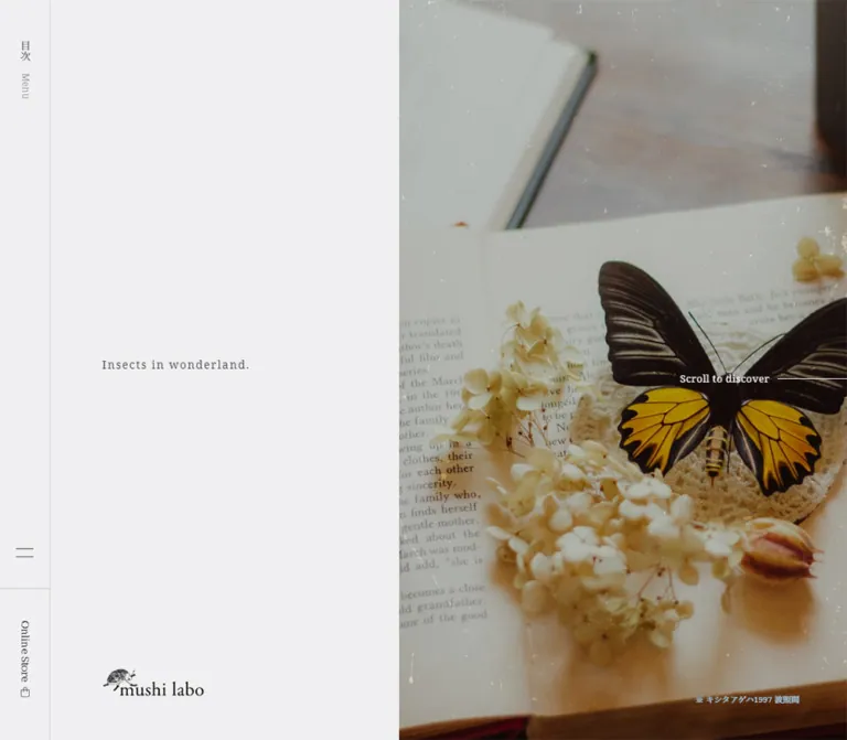
昆虫標本の写真と小さな明朝体、広い余白で構成されたブランドサイト。PCでは章を横方向に配置し、スマートフォンでは縦書きの導入と左右にずらした商品紹介を縦に展開します。
mushi labo — Style Reference
A natural-history collection presented with the quiet spacing of an art book.
Original URL: https://mushilabo.jp/ Final URL: https://mushilabo.jp/ Theme: pale gray editorial surfaces alternating with charcoal chapters; warm color comes primarily from photography. Inspected: supplied capture dated October 2, 2026, 04:09:59.799 JST / October 1, 2026, 19:09:59.799 UTC. Viewports: 1440 × 1000 desktop and 390 × 844 mobile, in CSS pixels. Scope: the current homepage, including its opening composition, chapter structure, product and editorial links, company overview, contact section, and footer. Visual evidence covers the desktop opening, mobile opening, and mobile page ending. Other chapter descriptions rely on the supplied rendered DOM and computed element measurements. Linked pages and the external store were not inspected.
mushi labo introduces an insect-specimen rental and sales business through photography, personal writing, exhibitions, products, and editorial updates. Its homepage behaves visually like a sequence of exhibition chapters. Small serif labels and abundant empty space keep attention on the specimens rather than on interface decoration.
The opening pairs a cool, nearly white field with a warm photograph of a black-and-yellow butterfly specimen arranged on an open book with pale dried flowers. A fine insect illustration accompanies the wordmark. Hairline dividers, restrained arrows, numbered chapters, and occasional vertical English text reinforce the feeling of a carefully composed natural-history publication.
The strongest structural distinction is responsive. Desktop chapter bounds extend horizontally beyond the viewport, with a narrow navigation rail at the left. Mobile becomes a long vertical document beneath a compact persistent header. Preserve this change in reading direction, the small typography, and the asymmetrical placement of content when adapting the design.
閉じる
mushi labo — Style Reference
A natural-history collection presented with the quiet spacing of an art book.
Original URL: https://mushilabo.jp/ Final URL: https://mushilabo.jp/ Theme: pale gray editorial surfaces alternating with charcoal chapters; warm color comes primarily from photography. Inspected: supplied capture dated October 2, 2026, 04:09:59.799 JST / October 1, 2026, 19:09:59.799 UTC. Viewports: 1440 × 1000 desktop and 390 × 844 mobile, in CSS pixels. Scope: the current homepage, including its opening composition, chapter structure, product and editorial links, company overview, contact section, and footer. Visual evidence covers the desktop opening, mobile opening, and mobile page ending. Other chapter descriptions rely on the supplied rendered DOM and computed element measurements. Linked pages and the external store were not inspected.
mushi labo introduces an insect-specimen rental and sales business through photography, personal writing, exhibitions, products, and editorial updates. Its homepage behaves visually like a sequence of exhibition chapters. Small serif labels and abundant empty space keep attention on the specimens rather than on interface decoration.
The opening pairs a cool, nearly white field with a warm photograph of a black-and-yellow butterfly specimen arranged on an open book with pale dried flowers. A fine insect illustration accompanies the wordmark. Hairline dividers, restrained arrows, numbered chapters, and occasional vertical English text reinforce the feeling of a carefully composed natural-history publication.
The strongest structural distinction is responsive. Desktop chapter bounds extend horizontally beyond the viewport, with a narrow navigation rail at the left. Mobile becomes a long vertical document beneath a compact persistent header. Preserve this change in reading direction, the small typography, and the asymmetrical placement of content when adapting the design.
How to Read This Reference
- Measured means a value appears in the supplied computed styles or element bounds. Measurements describe the captured state, including offscreen elements.
- Calculated means a value is derived directly from those measurements, such as a gap or proportion.
- Estimated means a visual approximation from an original-page screenshot, or an inference about an unsampled image slot.
- Recommended means implementation guidance for a new project, not a verified feature of the original.
- Token names beginning with
--ml-are implementation aliases created for this reference. They are not original source variables. - A declared font stack does not establish which font file rendered every glyph. A transition declaration does not establish that its trigger was exercised.
- The desktop captures all show the opening composition. Horizontal chapter placement is measured; wheel handling, snapping, and successful movement between desktop chapters are unverified.
Tokens — Colors
Core Palette
| Name | Value | Suggested token | Evidence and role |
|---|---|---|---|
| Pale Paper | #f0f0f1 |
--ml-paper |
Measured mobile store-button background and reversed text color. The broad light canvas visually matches this value, but its responsible background layer was not sampled. |
| Charcoal Ink | #24242e |
--ml-ink |
Measured body text and the backgrounds of Feature, Events, About Us, and the footer. |
| Soft Ink | #4c4c54 |
--ml-soft-ink |
Measured color of “Insects in wonderland.” |
| Muted Gray | #9d9da2 |
--ml-muted |
Measured on the mobile Concept chapter's vertical English text. Suitable as an adaptation token for secondary numbering. |
| Fine Rule | Approximately #c6c6c9 |
--ml-rule |
Estimated from the navigation and contact dividers. Border colors were not included in the computed-style extract. |
| Underlying White | #ffffff |
No primary surface alias needed | Measured body background. It does not explain every visible surface because other layers sit above it. |
| Utility Blue | #3e82ff |
Do not promote to a brand accent | Measured on the clipped skip link and some image-containing anchors; also present in generic custom properties. It is not a visible primary CTA color in the supplied captures. |
The charcoal and paper pair is structural: entire chapters reverse their text and background together. This is section-level art direction, not evidence of a user-selectable dark theme.
Photographic Color
The hero supplies cream, tobacco brown, faded olive-gray, deep black, and saturated butterfly yellow. These are image colors rather than measured interface tokens. Keep the shell restrained so the specimen remains the dominant source of color.
Do not derive a yellow button system from the butterfly. Likewise, the many generic color, gradient, and shadow variables in the DOM do not establish a visible rainbow palette or elevation system.
Tokens — Typography
Shared Editorial Serif
The measured body and sampled controls declare this stack:
font-family:
  'Noto Serif',
  'Noto Serif JP',
  'ヒラギノ明朝  Pro W3',
  'Hiragino Mincho Pro',
  游明朝体,
  YuMincho,
  'Yu Mincho',
  'MS  P明朝',
  'MS PMincho',
  serif;
English navigation, Japanese prose, section headings, and utility links share this serif direction. Body copy is weight 400; most sampled headings are 600. The resulting hierarchy is intentionally narrow. Photography, placement, background changes, and whitespace provide more emphasis than dramatic type-size changes.
The wordmark is artwork inside an otherwise empty-text heading/link. Its parent heading's 24.48px font size does not identify the lettering in the logo. Use an authorized logo asset rather than rebuilding it from a guessed font.
Type Scale
All values below are measured at the supplied viewports unless explicitly qualified.
| Role | Desktop size / line height | Mobile size / line height | Weight | Tracking |
|---|---|---|---|---|
| Root element | 13.6px / 15.64px |
13.6px / 15.64px |
400 | Normal |
| Body prose | 12.92px / 21.318px |
11.56px / 19.074px |
400 | Normal |
| Numbered chapter heading | 12.24px / 14.688px |
Same | 600 | Normal |
| Hero statement | 13.6px / 16.32px |
Same | 600 | 1.7px |
| Concept / Feature / Service heading | 17.68px / 21.216px |
Same | 600 | Normal |
| Product title | 13.6px / 16.32px |
Same | 600 | Normal |
| Event title | 14.96px / 22.44px |
Same | 600 | Normal |
| Information / Blog title | 12.92px / 15.504px |
12.24px / 14.688px |
600 | Normal |
| Overview heading | 14.28px / 17.136px |
Same | 600 | Normal |
| Scroll link | 12.92px / 21.318px |
11.56px / 19.074px |
400 | 0.34px |
| Store link | 12.92px / 21.318px |
11.56px / 19.074px |
700 desktop; 400 mobile | Mobile: 0.68px |
| Mobile Concept English aside | Not separately sampled | 12.24px / 14.688px |
600 | 0.816px |
Calculated relationships: body line height is 1.65 at both sizes. The hero's 1.7px tracking equals 0.125em at its measured font size. Several heading sizes are simple multiples of the measured 13.6px root, but the original sizing formulas were not supplied.
Caption and copyright measurements belong to sampled parent elements. Smaller descendants may affect the final visible lettering; avoid treating the parent's font size as a verified leaf-text measurement.
Orientation and Hierarchy
On desktop, the hero statement is horizontal and sits within the light field. On mobile, the same statement runs vertically down the narrow left gutter without changing its measured font size. The scroll invitation changes orientation as well.
The Concept chapter also contains a separate vertical English passage on mobile, measured at approximately 29.34 × 434.41px. Treat this as an editorial aside, not a second large headline.
For an accessibility-oriented adaptation, increasing sustained reading copy to 14–16px is recommended. That would be an intentional departure from the small measured source sizes and should be accompanied by renewed wrapping and spacing checks.
Tokens — Spacing & Shapes
Spacing Vocabulary
The evidence supports a mixture of compact typographic gaps and large architectural distances rather than a single universal spacing grid.
| Use | Value | Status |
|---|---|---|
| Contact-link vertical padding | 10px |
Measured |
| Gap between the two contact links | 10px |
Calculated from bounds |
| Paragraph separation in sampled prose | Approximately 13.6px |
Calculated |
| Mobile content side inset | 15px |
Measured repeatedly |
| Mobile service-row gap | 30px |
Calculated |
| News / Blog row gap | 30px |
Calculated at both viewports |
| Mobile chapter top inset | 50px |
Calculated from heading bounds |
| Mobile chapter-heading-to-content gap | Commonly 50px |
Calculated; content-specific exceptions exist |
| Desktop service / product / event horizontal gap | 50px |
Calculated from entry bounds |
| Desktop navigation rail | 62px |
Measured |
| Desktop chapter-heading top position | 100px |
Measured |
| Desktop product and event stagger | 125px |
Calculated |
| Bottom clearance under several desktop entries | 130px |
Calculated |
| Common desktop chapter content inset | 165px |
Calculated; not universal |
| Desktop store area height | 190px |
Measured |
| Product entry width | 250px |
Measured at both viewports |
Concept uses a different desktop inset of approximately 170px; About Us and Information use larger offsets. Do not apply 165px indiscriminately to every chapter.
Shapes and Dividers
- Sampled buttons, links, sections, and other containers report
border-radius: 0px. - Visible interface rules are approximately
1pxthick. Their thickness is visually estimated because border declarations were not supplied. - The mobile store CTA is a flat rectangle with square corners.
- Contact links are full-width text rows with a fine bottom rule and a small right-pointing arrow.
- The menu symbol uses two short horizontal strokes, approximately
22pxwide in the captures. - No card shadows or raised surfaces are visible in the supplied states.
Opening Geometry
| Element | Desktop: 1440 × 1000 | Mobile: 390 × 844 | Evidence |
|---|---|---|---|
| Navigation | 62 × 1000px left rail |
390 × 50px top header |
Measured |
| Menu button target | 62 × 810px |
100 × 50px, starting at x = 290 |
Measured |
| Desktop rail store target | 62 × 190px, y = 810 |
Replaced visually by hero CTA | Measured / visual |
| Broad pale opening field | x = 0–500 | Hero gutter x = 0–60 | Estimated from screenshot edges |
| Hero photograph | Approximately 940 × 1000px |
Approximately 330 × 794px, below the header |
Calculated from visible edges |
| Hero text | Text begins x = 128; heading y ≈ 485.05 | x ≈ 21.84, y = 80; vertical box ≈ 16.31 × 185.39px |
Measured |
| Brand placement | Heading box x = 125, y ≈ 905.06, width = 130 | Logo link x = 15, y ≈ 7.09, 100 × 31.81px |
Measured |
| Mobile store CTA | Not applicable | x = 195, y ≈ 777.92, 180 × 51.08px |
Measured |
| Scroll invitation | x ≈ 1124.84, y = 501 | x ≈ 22.08, y ≈ 593.17; vertical | Measured |
The desktop photograph occupies approximately 65.3% of the viewport width. On mobile, it occupies approximately 84.6%, with the editorial gutter retained beside it. These are capture-specific proportions, not verified CSS formulas.
Components
Persistent Navigation
Role: provide a quiet index and direct access to the store.
The desktop header is a 62px strip along the left edge, separated from the opening field by a fine vertical rule. The upper 810px is the measured menu-button area. Its visible content is much smaller: the Japanese label 目次, a secondary English “Menu,” and a two-line menu symbol toward the bottom. A ruled division introduces the 190px store area beneath it, containing a vertical “Online Store” label and a small bag icon.
On mobile, navigation becomes a 50px horizontal header. The illustrated wordmark sits 15px from the left edge; the rightmost 100px is the menu target. The header appears at the same screen position in both the opening and page-ending captures, supporting persistent positioning. The supplied styles do not identify the exact fixed/sticky declaration.
The menu button includes the accessible text メニューを開閉する. Menu and close wording exist in the DOM, but the opened menu was not captured. Do not prescribe an observed overlay size, backdrop, focus trap, or opening trajectory.
Opening Hero
Role: introduce the specimens as objects of wonder and visual culture.
The desktop hero is dominated by two unequal fields. The left field contains the small statement “Insects in wonderland.” near mid-height and the wordmark near the lower edge. The right field contains the specimen photograph. A pale “Scroll to discover” link sits over the photograph, followed by a thin line extending toward the right edge. A small specimen caption occupies the lower-right corner.
The mobile hero changes the composition substantially. The wordmark moves into the header. The statement and scroll link rotate into a 60px side gutter, while the photograph fills the remaining width below the header. The store becomes a 180px rectangular CTA, inset 15px from the right and bottom of the initial viewport.
Both captures show the same still-life subject, but the phone crop is much tighter. A separate mobile image file is not established. Use art-directed cropping and protect the butterfly's body and yellow wings when reproducing this composition.
The store link points to https://mushilabo64.thebase.in/. The scroll link points to #p-index__concept. These destinations are verified as link targets; their activated behavior was not inspected.
Numbered Chapter Header
Role: organize the homepage like a catalog or exhibition sequence.
Use a small uppercase English label paired with a two-digit chapter number. The visible mobile Contact header places “CONTACT” at the left and a subdued dash-plus-number treatment at the right. Its heading container spans 360px inside 15px page insets.
The chapter sequence is Concept 01, Feature 02, Service 03, Products 04, Events 05, Information 06, About Us 07, and Contact 08. Blog is grouped with Information and has its own heading without an additional numbered chapter in the supplied text.
Keep these headings compact: 12.24px, weight 600, line height 14.688px. They establish navigation rhythm rather than functioning as oversized section banners.
Concept Chapter
Role: introduce the emotional relationship between childhood, insects, and collecting.
The content consists of a Japanese lead heading, several short prose groups, and English supporting text. The desktop section is measured at 1450 × 1000px, initially positioned beyond the opening viewport. Its heading begins 100px below the top; the main lead and prose sit considerably lower.
On mobile, the chapter begins immediately after the 844px opening and measures approximately 910.03px tall. The Japanese lead and paragraphs use the standard 360px content width. A separate vertical English passage occupies a tall narrow area lower in the chapter, creating an editorial counterpoint to the horizontal Japanese text.
Its full imagery arrangement is not visible in the supplied screenshots. Preserve the measured text organization without inventing a specific illustration placement.
Feature Pair
Role: distinguish art specimens from the broader insect-specimen collection.
Two successive charcoal sections carry “SPECIMEN × ART” and “DEAL WITH SPECIMENS,” each with a Japanese subheading and explanatory prose. The first carries the Feature 02 chapter marker. Both compute paper-colored text over #24242e.
Desktop bounds are 1250 × 1000px per section, with sampled text columns approximately 450px wide. Their captured bounds overlap horizontally by 100px; this is a property of the captured layout state, not sufficient evidence for a reusable overlap rule.
Mobile renders the two sections consecutively at approximately 410.31px and 374.72px tall. Text spans 360px. Their dark background provides a sustained tonal interruption between the pale Concept and Service chapters.
Service Entries
Role: route visitors to rental and sale information.
Each entry is a single large link containing an English service name, a Japanese label, descriptive copy, and “More.” Desktop presents two 480 × 395.80px link regions with a 50px horizontal gap. Their title groups begin approximately 260px below the top of each entry, suggesting substantial media space above; image dimensions were not directly supplied.
On mobile, the entries stack with a 30px gap. Each measured link is approximately 359 × 300px. The text column is approximately 240.28px wide and begins 118.72px inside the entry. This is an asymmetrical side-by-side composition within each stacked entry, not a simple full-width paragraph card.
The rental and sale links target distinct sections of the service page. Preserve the entire entry as one coherent link rather than nesting separate clickable controls inside it.
Product Sequence
Role: show collectible specimens with names, prices, and category information.
Four product links are present. Each contains a Japanese specimen name, a yen price with tax wording, and one or more category labels. The measured desktop entry size is 250 × 338.94px; mobile retains the 250px width with a slightly shorter 335.59px height.
Desktop entries advance in 300px horizontal steps, yielding 50px gaps. Alternate entries sit 125px higher. This deliberate low/high rhythm gives the collection an exhibition-like arrangement rather than a uniform grid.
Mobile preserves asymmetry in a different direction. The first and third entries begin near x = 32.94px; the second and fourth begin at x = 124px. They form one vertical sequence with alternating horizontal alignment. The gaps between consecutive bounds are 40px, 30px, and 40px.
Product titles begin 260px below their link's top edge at both viewports. A 250px square media area plus 10px separation is a reasonable reconstruction, but it is inferred rather than measured from an image element.
The section ends with “View more products.” Its desktop target is a 249 × 1000px trailing region. On mobile it becomes a nearly full-width 59px-high strip. Keep this change in component shape when adapting the layout.
Event Entries
Role: introduce exhibitions as part of the same visual and cultural world.
Events use a charcoal section and paper-colored type. Two desktop entries measure 500 × 198px, are separated horizontally by 50px, and repeat the 125px vertical stagger. Their title regions begin 220px inside each entry and are 280px wide. This supports a leading media area with adjacent text, although the actual image bounds are absent.
On mobile, each entry becomes a block approximately 360 × 426.52px. The title begins 344px below the entry top, indicating a large upper media allocation. The entries are separated by 50px.
“View more events” repeats the product section's transformation from a tall desktop end panel to a 59px mobile strip. The supplied captures do not show the exhibition artwork itself, so its typography, colors, and crops should not be invented.
Information and Blog
Role: provide current updates and longer editorial content in a compact reading rhythm.
Desktop places Information and Blog in adjacent 550px columns with a 100px gap between their measured column bounds. Information contains two dated links; Blog contains three. Rows measure 550 × 120px, with 30px between them. The article title begins 210px inside each row, reserving substantial leading space for the other row content.
Mobile stacks the two groups. Each row measures 360 × 80px; its title begins 95px inside the row. The date appears as a compact line in the supplied mobile text extraction. Keep dates subordinate to titles and maintain the large clickable row.
The exact division of the leading area into imagery and metadata cannot be established from the supplied element subset. Preserve the measured relationship without treating an assumed thumbnail size as a source value.
About Us and Overview
Role: connect the collection to a personal philosophy and identify the business.
About Us returns to a charcoal surface. It combines several short reflective paragraphs with an “Overview” heading and business information. Desktop prose is approximately 400px wide; mobile expands to the standard 360px content column.
The Overview contains trade name, representative, establishment year, and address fields. The original page identifies the business as mushi labo. A linked address is present. A definition list or an accessible two-column table is an appropriate implementation recommendation for this label/value content.
Do not turn these details into bright statistics or promotional badges. The measured hierarchy remains modest: the Overview heading is 14.28px, and ordinary details retain the body scale.
Contact Section
Role: offer a clear, quiet route to help and direct inquiry.
This is the best visually documented lower-page component. On mobile, Contact spans the full 390px page width and approximately 576.97px in height. Its internal width is 360px, with 15px side insets. The chapter label sits 50px below the section top, followed by another 50px gap after its line box before the explanatory paragraph.
Two rows follow the prose:
- “FAQ” at left, with “More” and an arrow at right.
- “Contact” at left, with “Get in touch” and an arrow at right.
Each mobile row measures approximately 360 × 40.08px, has 10px vertical padding, and ends with a thin gray rule. The rows have a 10px gap. Desktop versions are 400px wide and approximately 42.31px high.
A large gray butterfly illustration enters from the lower-left edge below the links. It is cropped by the section boundary and remains secondary to the text. The provided image makes the motif visible, but its source path and exact opacity are unknown.
The homepage provides links to FAQ and Contact pages; no inline contact form is present in the supplied evidence.
Footer and Index Content
The visible mobile footer consists of a charcoal wordmark band followed by a pale copyright strip. The complete footer measures approximately 191.89px high. The screenshot places the dark band at about 132px and the copyright strip at about 60px.
The desktop footer DOM includes a bilingual index with Japanese labels and English counterparts, followed by Instagram and Privacy Policy links. Its final visual arrangement is not shown in the desktop captures. Some descendant link colors differ from the footer's inherited color, so the dark parent background alone is insufficient to reconstruct all internal surfaces.
The index links remain in mobile text content but are absent from the visible mobile footer and its visible link extraction. Do not force the desktop index into the photographed mobile footer.
The displayed copyright is “© 2022 mushi labo.” It is page content, not evidence of when the current design was released.
Tokens — Motion & Interaction
Declared Transitions
These values are measured computed declarations. They describe available transitions, not independently verified interaction sequences.
| Target | Measured declaration | Interpretation and limit |
|---|---|---|
| Menu button | transform 0.4s cubic-bezier(1, 0, 0, 1) |
A transform transition is defined. Open/close movement and distance were not captured. |
| Desktop prose and selected headings | opacity 0.8s cubic-bezier(0.175, 0.885, 0.32, 1.275) and the same timing for transform |
Supports reveal-style movement with an overshooting easing curve. Trigger and start transform are unknown. |
| Mobile prose and selected headings | opacity 0.8s cubic-bezier(0.645, 0.045, 0.355, 1) 0.35s and the same timing for transform |
A different easing curve and explicit 350ms delay are measured on mobile. |
| Desktop store link | color 0.3s cubic-bezier(0.19, 1, 0.22, 1) |
Color change is declared; the resulting hover color is unknown. |
| Many article, contact, and continuation links | 0.4s cubic-bezier(0.19, 1, 0.22, 1) |
Transition timing is available; a specific changed property or visual endpoint is not established. |
| Information / Blog “More” links | 0.4s cubic-bezier(1, 0, 0, 1) |
Distinct timing from ordinary row links. Activated appearance remains unverified. |
Many sampled elements report animation: none. Other entries report only transition: all without a meaningful nonzero duration in the supplied shorthand. Neither is proof that the complete site lacks JavaScript motion or animated pseudo-elements.
Verified Affordances and Limits
The DOM establishes a menu button, a skip link, same-page chapter anchors, linked service entries, product entries, event entries, editorial rows, and external store access. The mobile end capture establishes that lower content is reachable through vertical traversal.
The three desktop images do not establish a successful chapter transition. The horizontally arranged DOM supports a horizontal reading architecture, but not a claim about mouse-wheel remapping, momentum, drag gestures, scroll snapping, or keyboard navigation.
Dust and scratches are visible over the hero photograph. A moving grain overlay, slideshow, video, or parallax effect is not established by these static captures.
Recommended adaptation: preserve the restrained timing vocabulary, keep content visible before enhancement, and offer reduced-motion behavior. Do not add perpetual movement merely to make the page feel animated.
Surfaces
| Surface | Appearance | Function |
|---|---|---|
| Opening pale field | Cool near-white surface with extensive empty space | Frames the statement, identity, and desktop navigation |
| Hero photograph | Warm still life with distressed photographic texture | Primary atmosphere and visual focus |
| Light chapters | Paper-like canvas with charcoal text | Concept, services, products, updates, and contact |
| Dark chapters | #24242e field with #f0f0f1 text |
Feature, Events, and About Us |
| Utility rows | Same surface as their section, divided by thin rules | FAQ, contact, and continuation actions |
| Mobile store CTA | Flat pale rectangle over the photograph | Clear store access without a new accent color |
| Mobile footer | Dark logo band followed by pale copyright strip | A quiet ending to the vertical document |
The visible system relies on contrast, cropping, whitespace, and rules. It does not need rounded containers, translucent panels, or elevated cards to establish hierarchy.
Imagery
Photographic Direction
The opening image brings together an insect specimen, an open English-language book, pale dried flowers, a cream textile detail, and a small brown organic form. Its warm, subdued grade contrasts with the cool gray interface. The black-and-yellow butterfly provides the strongest local contrast.
The photograph contains visible scratches, speckles, and faded areas. Their technical origin is unknown: they could be part of the image or a separate layer. Inspect the actual asset before adding another distress treatment, or the texture may become unnecessarily heavy.
Keep organic detail sharp enough to read while preserving the soft ambient light. For new photography, choose restrained still-life staging, neutral textiles, aged printed matter, and botanical materials. Avoid glossy catalog cutouts as a replacement for the hero's atmosphere.
Illustration and Icons
The wordmark includes a detailed small insect drawing. The mobile contact area uses a much larger butterfly illustration in muted gray, partly outside the frame. These two scales make the same natural-history vocabulary work as both identity and decoration.
The visible utility symbols are sparse: two menu strokes, a shopping bag, fine arrows, and line extensions. Their small scale and thin strokes matter more than adopting a large icon library. No particular icon font or asset format is established.
Observed Asset References
No original image asset URLs were supplied. The following references identify visual roles, not fabricated filenames.
| Asset role | Evidence | Reuse guidance |
|---|---|---|
| Butterfly-and-book hero | Desktop opening captures and mobile opening capture | Use a licensed high-resolution still life; tune crops separately for the two compositions. |
| Insect wordmark | Desktop lower-left opening, mobile header, mobile footer | Preserve as artwork. Do not infer its lettering from surrounding CSS fonts. |
| Large butterfly illustration | Mobile contact-ending capture | Use as a cropped decorative element with a text-free area above it. |
| Product and event media | Space inferred from link and title bounds | Exact images, asset dimensions, and crops are not available in the supplied screenshots. |
Layout & Responsive Behavior
Desktop Architecture
The desktop HTML, body, and main bounds are 1440 × 1000px, and the reported document height is 1000px. Later sections sit along the horizontal axis. Concept begins at x = 1828px; Products begins at x = 7369px; Contact begins at x = 14361px.
This explains why a viewport-height desktop document can still contain substantial additional content. Do not interpret the 1000px document height as evidence that the homepage ends at the hero.
Most section heights equal the viewport height, but widths vary substantially. They are not a uniform sequence of 100vw slides. Offscreen bounds may also include reveal transforms, so small child offsets should not automatically become permanent padding values.
| Chapter | Desktop measured width | Mobile measured height | Surface |
|---|---|---|---|
| Concept | 1450px |
910.03px |
Light |
| Feature: art specimens | 1250px |
410.31px |
Dark |
| Feature: specimen handling | 1250px |
374.72px |
Dark |
| Service | 1391px |
824.67px |
Light |
| Products | 1800px |
1678.05px |
Light |
| Events | 1700px |
1147.70px |
Dark |
| Information and Blog | 1800px |
919.50px |
Light |
| About Us | 1700px |
920.28px |
Dark |
| Contact | 1080px |
576.97px |
Light |
These are captured bounds, not recommended fixed mobile heights. Let mobile content determine height when implementing new copy.
Mobile Architecture
At 390 × 844px, the document height is approximately 8798.13px. Chapters become ordinary vertically stacked blocks. The opening occupies one viewport; Concept starts at y = 844px.
The hero's 60px gutter is local to the opening. Below it, most sections return to a 360px inner width with 15px side insets. Do not carry the hero gutter through every chapter.
Several components are redesigned rather than proportionally shrunk:
| Component | Desktop | Mobile |
|---|---|---|
| Navigation | Left rail | Top header |
| Brand | Lower-left opening field | Header and footer |
| Hero statement | Horizontal | Vertical |
| Store access | Vertical rail segment | Rectangular overlay CTA |
| Chapters | Horizontal, usually viewport-height | Vertical, content-height |
| Products | Four horizontal entries, alternating height | One sequence, alternating left/right alignment |
| Events | Media/text rows with vertical stagger | Stacked blocks |
| Information and Blog | Adjacent columns | Successive groups |
| Continuation link | Tall trailing panel | Full-width strip |
| Footer | Larger index content in DOM | Visible logo band and copyright strip |
Breakpoint Limits
Generic breakpoint custom properties exist at 576, 768, 992, and 1200px, but the evidence does not identify which controls this layout change. No intermediate-width or landscape capture was supplied.
The Quick Start uses 64rem as a recommended adaptation breakpoint. This is not a recovered source breakpoint. Validate it with the intended content, image crops, browser zoom, and available height.
Do’s and Don’ts
Do
- Preserve the cool paper and charcoal pair while allowing photographs to carry warm color.
- Keep headings small and use position, whitespace, and chapter contrast for emphasis.
- Retain the numbered editorial sequence and bilingual label vocabulary where appropriate.
- Treat the wordmark and insect illustrations as artwork.
- Keep the desktop rail narrow and the mobile header compact.
- Recompose the hero for mobile, including its vertical side text and closer photo crop.
- Preserve the product sequence's intentional stagger across both reading directions.
- Use square image regions, flat actions, fine rules, and restrained arrows.
- Keep product names, prices, and category text subordinate to specimen imagery.
- Distinguish declared motion from interactions actually observed.
Don’t
- Don't replace the homepage with a generic oversized headline and feature-card layout.
- Don't introduce bright yellow interface accents merely because the butterfly is yellow.
- Don't replace the serif system with an unrelated geometric sans-serif.
- Don't infer the logo font from the empty-text heading's computed size.
- Don't turn every content link into a filled button.
- Don't make all desktop chapters equally wide.
- Don't flatten the product sequence into a perfectly aligned card grid.
- Don't keep horizontal page overflow on narrow phones.
- Don't invent a menu overlay, carousel, animated grain layer, or scroll engine from static screenshots.
- Don't treat generic CSS presets as evidence of the page's visible design language.
- Don't hardcode sampled mobile section heights around new content.
- Don't add another distressed overlay before checking whether the photography already includes one.
Recommended Implementation Additions
These are recommendations for a new implementation, not verified original behavior:
- Give the menu button
aria-expandedandaria-controls, support Escape, and manage focus appropriately if the menu becomes a modal overlay. - Preserve the existing skip-link concept and make it visibly usable on keyboard focus.
- Ensure every chapter remains reachable without gesture-specific horizontal scrolling. Native overflow, direct anchors, and visible navigation are useful foundations.
- Let focused content scroll into view and account for the mobile header with
scroll-margin-top. - Increase long-form mobile text to
14–16pxwhen readability takes priority over an exact size match. Recheck the layout instead of scaling the whole page. - Expand the approximately
40pxcontact-link targets to at least44pxwhere possible, while retaining their thin-rule appearance. - Keep reveal content visible if JavaScript fails. Reduced-motion mode should remove movement and waiting delays.
- Use meaningful image alternatives for specimens and functional logos; mark purely decorative butterfly artwork as decorative.
- Preserve relevant specimen details when cropping product images. The atmospheric hero can tolerate a closer crop than identification imagery.
- Test shorter desktop windows, phone landscape, enlarged text, and safe-area insets before fixing any section to viewport height.
Agent Prompt Guide
Quick Color Reference
- Primary pale surface:
#f0f0f1, matching the measured mobile CTA and reversed text. - Primary text and dark chapter surfaces:
#24242e. - Hero statement:
#4c4c54. - Secondary editorial text:
#9d9da2. - Fine dividers: approximately
#c6c6c9; an estimated implementation value. - Accent strategy: rely on warm specimen photography rather than adding a saturated interface color.
Overall Prompt
“Create an editorial homepage for an insect-specimen rental and sales business inspired by mushi labo. Use pale gray #f0f0f1, charcoal #24242e, small Japanese and Latin serif typography, generous whitespace, thin rules, and square geometry. On desktop, place a 62px navigation rail beside an opening split between a quiet pale field and a large warm still-life photograph of a butterfly specimen on an old book. Continue through varied-width horizontal chapters with numbered labels and alternating light/dark surfaces. On mobile, use a 50px header, a 60px hero gutter with vertical English text, a tightly cropped photograph, and a flat store CTA. Convert the chapters to vertical flow and stagger 250px product entries left and right. Treat image texture as artwork and keep unverified interactions out of the specification.”
Example Component Prompts
- Desktop opening: “At 1440 × 1000, compose a 62px pale navigation rail, a pale field extending to x = 500, and a photograph filling the remaining width. Place a small tracked serif statement near x = 128 at mid-height, an illustrated wordmark near the lower-left, and a pale scroll invitation with a fine horizontal line over the photograph.”
- Mobile opening: “At 390 × 844, use a persistent 50px pale header with a 100px-wide wordmark and a right-aligned menu target. Below it, retain a 60px pale gutter carrying vertical English text. Fill the remaining width with a close butterfly-specimen crop. Place a 180 × 51px pale store link 15px from the lower-right edge.”
- Product sequence: “Use four unboxed specimen entries, each 250px wide, with a square media area, a small serif product title, yen price, and quiet category labels. Desktop alternates entry height by 125px with 50px gaps. Mobile stacks entries and alternates their left/right placement. The square media area is a reconstruction assumption, not a measured image dimension.”
- Contact chapter: “Create a pale section with 15px mobile side insets, a small CONTACT label, a muted right-aligned chapter number, compact Japanese serif prose, and two thin-rule links. Put FAQ / More and Contact / Get in touch at opposing ends, with fine arrows. Add a large muted butterfly illustration cropped from the lower-left below the links.”
- Dark editorial chapter: “Use a flat charcoal field with pale serif text, a tiny numbered chapter heading, a restrained bilingual title, and short prose groups. Keep the text column compact and allow generous open space around specimen imagery. Do not add cards, shadows, or unrelated badges.”
Quick Start
CSS Custom Properties
This is an adaptation stylesheet, not recovered source code. It keeps a conventional root font size while using measured pixel tokens. The source font names are retained as a stack; loading those fonts is a separate task.
The opening, contact rows, chapter surfaces, and product rhythm are represented below. Desktop uses native horizontal overflow as a recommended implementation foundation. The original scroll engine, inter-panel overlaps, menu state management, and complete footer index are not reproduced.
Use .site-header outside .chapter-track. Inside the track, place .hero followed by .chapter sections. The hero contains .hero-photo, .hero-title, .hero-brand, .hero-store, and .hero-scroll. Supply licensed image and logo assets; no image URLs are implied by these class names.
:root {
  /* Measured colors, with an estimated divider color. */
  --ml-paper: #f0f0f1;
  --ml-ink: #24242e;
  --ml-soft-ink: #4c4c54;
  --ml-muted: #9d9da2;
  --ml-rule: #c6c6c9;

  /* Declared source families; availability must be configured. */
  --ml-serif: 'Noto Serif', 'Noto Serif JP',
    'ヒラギノ明朝  Pro W3', 'Hiragino Mincho Pro',
    游明朝体, YuMincho, 'Yu Mincho',
    'MS  P明朝', 'MS PMincho', serif;

  --ml-body: 11.56px;
  --ml-label: 12.24px;
  --ml-hero-type: 13.6px;
  --ml-heading: 17.68px;
  --ml-product-title: 13.6px;
  --ml-event-title: 14.96px;
  --ml-leading: 1.65;

  --ml-inset: 15px;
  --ml-header: 50px;
  --ml-rail: 62px;
  --ml-hero-gutter: 60px;
  --ml-product-width: 250px;
  --ml-rule-width: 1px;

  --ml-ease-link: cubic-bezier(0.19, 1, 0.22, 1);
  --ml-ease-menu: cubic-bezier(1, 0, 0, 1);
  --ml-ease-reveal: cubic-bezier(0.645, 0.045, 0.355, 1);
  --ml-reveal-delay: 350ms;
}

* { box-sizing: border-box; }

.mushi-page {
  margin: 0;
  color: var(--ml-ink);
  background: var(--ml-paper);
  font-family: var(--ml-serif);
  font-size: var(--ml-body);
  line-height: var(--ml-leading);
}

.mushi-page a {
  color: inherit;
  text-decoration: none;
}

.site-header {
  position: fixed;
  z-index: 20;
  inset: 0 0 auto;
  display: flex;
  align-items: center;
  justify-content: space-between;
  height: var(--ml-header);
  padding-left: var(--ml-inset);
  background: var(--ml-paper);
  border-bottom: var(--ml-rule-width) solid var(--ml-rule);
}

.mobile-brand img {
  display: block;
  width: 100px;
  height: auto;
}

.menu-toggle {
  display: flex;
  align-items: center;
  justify-content: center;
  gap: 12px;
  width: 100px;
  height: 50px;
  padding: 0;
  border: 0;
  border-radius: 0;
  background: transparent;
  color: inherit;
  font: inherit;
  cursor: pointer;
  transition: transform 400ms var(--ml-ease-menu);
}

.menu-lines {
  position: relative;
  display: block;
  width: 22px;
  height: 12px;
}

.menu-lines::before,
.menu-lines::after {
  content: '';
  position: absolute;
  inset-inline: 0;
  height: 1px;
  background: currentColor;
}

.menu-lines::before { top: 0; }
.menu-lines::after { bottom: 0; }
.rail-store { display: none; }

.hero {
  position: relative;
  height: 100vh;
  height: 100svh;
  overflow: hidden;
  background: var(--ml-paper);
}

.hero-photo {
  position: absolute;
  inset: var(--ml-header) 0 0 var(--ml-hero-gutter);
  margin: 0;
  overflow: hidden;
}

.hero-photo img {
  display: block;
  width: 100%;
  height: 100%;
  object-fit: cover;
  /* Recommended starting crop; tune against the actual asset. */
  object-position: var(--hero-focus, 70% 50%);
}

.hero-title {
  position: absolute;
  top: 80px;
  left: 21.84px;
  margin: 0;
  color: var(--ml-soft-ink);
  font-size: var(--ml-hero-type);
  font-weight: 600;
  line-height: 1.2;
  letter-spacing: 1.7px;
  writing-mode: vertical-rl;
}

.hero-brand { display: none; }

.hero-store {
  position: absolute;
  right: 15px;
  bottom: 15px;
  display: flex;
  align-items: center;
  justify-content: center;
  gap: 6px;
  width: 180px;
  min-height: 51px;
  padding: 15px 35px;
  background: var(--ml-paper);
  letter-spacing: 0.68px;
}

.hero-scroll {
  position: absolute;
  left: 22px;
  bottom: 150px;
  letter-spacing: 0.34px;
  writing-mode: vertical-rl;
}

.hero-scroll::after {
  content: '';
  position: absolute;
  top: 0;
  left: -7px;
  width: 1px;
  height: calc(100% + 150px);
  background: currentColor;
}

.chapter {
  padding: 50px var(--ml-inset) 80px;
  scroll-margin-top: calc(var(--ml-header) + 15px);
}

.chapter--dark {
  color: var(--ml-paper);
  background: var(--ml-ink);
}

.chapter-heading {
  display: flex;
  justify-content: space-between;
  gap: 20px;
  margin: 0 0 50px;
  font-size: var(--ml-label);
  font-weight: 600;
  line-height: 1.2;
  text-transform: uppercase;
}

.chapter-number { color: var(--ml-muted); }

.chapter-title {
  margin: 0 0 20px;
  font-size: var(--ml-heading);
  font-weight: 600;
  line-height: 1.2;
}

.chapter p { margin: 0 0 13.6px; }

.products {
  display: flex;
  flex-direction: column;
  gap: 30px;
  margin: 0;
  padding: 0;
  list-style: none;
}

.product {
  width: var(--ml-product-width);
  max-width: 100%;
}

.product:nth-child(odd) {
  margin-inline-start: 5%;
  margin-bottom: 10px;
}

.product:nth-child(even) { align-self: flex-end; }

.product-media {
  display: block;
  width: 100%;
  /* Inferred media geometry; the image bounds were not supplied. */
  aspect-ratio: 1;
  object-fit: contain;
}

.product-title {
  margin: 10px 0 8px;
  font-size: var(--ml-product-title);
  font-weight: 600;
  line-height: 1.2;
  overflow-wrap: anywhere;
}

.contact-copy { max-width: 400px; }

.link-row {
  display: flex;
  align-items: center;
  justify-content: space-between;
  gap: 20px;
  padding: 10px 0;
  border-bottom: 1px solid var(--ml-rule);
}

.link-row + .link-row { margin-top: 10px; }

.link-row-action {
  display: inline-flex;
  align-items: center;
  gap: 10px;
}

.link-row-action::after { content: '→'; }

.footer-brand {
  padding: 50px 15px;
  color: var(--ml-paper);
  background: var(--ml-ink);
}

.footer-brand img {
  display: block;
  width: 100px;
  height: auto;
  margin-inline: auto;
}

.footer-copyright {
  padding: 20px;
  color: var(--ml-ink);
  background: var(--ml-paper);
  text-align: center;
}

.reveal {
  /* Content remains visible unless an enhancement controls state. */
  transition:
    opacity 800ms var(--ml-ease-reveal) var(--ml-reveal-delay),
    transform 800ms var(--ml-ease-reveal) var(--ml-reveal-delay);
}

/* Recommended breakpoint, not a recovered source media query. */
@media (min-width: 64rem) {
  :root {
    --ml-body: 12.92px;
    --ml-ease-reveal: cubic-bezier(0.175, 0.885, 0.32, 1.275);
    --ml-reveal-delay: 0ms;
  }

  .site-header {
    inset: 0 auto 0 0;
    display: block;
    width: var(--ml-rail);
    height: 100vh;
    height: 100svh;
    padding: 0;
    border-bottom: 0;
    border-right: 1px solid var(--ml-rule);
  }

  .mobile-brand { display: none; }

  .menu-toggle {
    position: relative;
    display: block;
    width: 100%;
    height: calc(100% - 190px);
  }

  .menu-copy {
    position: absolute;
    top: 50px;
    left: 24px;
    writing-mode: vertical-rl;
  }

  .menu-lines {
    position: absolute;
    left: 20px;
    bottom: 40px;
  }

  .rail-store {
    position: absolute;
    inset: auto 0 0;
    display: grid;
    place-items: center;
    height: 190px;
    border-top: 1px solid var(--ml-rule);
    font-weight: 700;
  }

  .rail-store span { writing-mode: vertical-rl; }

  .chapter-track {
    display: flex;
    align-items: stretch;
    height: 100vh;
    height: 100svh;
    overflow: auto;
    /* Native overflow is an adaptation, not the verified source engine. */
  }

  .hero {
    flex: 0 0 100vw;
    --hero-focus: 50% 50%;
  }

  .hero-photo { inset: 0 0 0 500px; }

  .hero-title {
    top: 48.5%;
    left: 128px;
    writing-mode: horizontal-tb;
  }

  .hero-brand {
    position: absolute;
    left: 125px;
    bottom: 54px;
    display: block;
    width: 130px;
  }

  .hero-brand img {
    display: block;
    width: 100%;
    height: auto;
  }

  .hero-store { display: none; }

  .hero-scroll {
    inset: 50.1% 0 auto 78.114%;
    display: flex;
    align-items: center;
    gap: 12px;
    color: var(--ml-paper);
    white-space: nowrap;
    writing-mode: horizontal-tb;
  }

  .hero-scroll::after {
    position: static;
    flex: 1;
    width: auto;
    height: 1px;
  }

  .chapter {
    flex: 0 0 var(--panel-width, 1450px);
    display: flex;
    flex-direction: column;
    min-height: 100%;
    padding: 100px 165px 130px;
    scroll-margin-left: var(--ml-rail);
  }

  .chapter-body {
    margin-top: auto;
    padding-top: 50px;
  }

  .chapter--feature { --panel-width: 1250px; }
  .chapter--service { --panel-width: 1391px; }
  .chapter--products { --panel-width: 1800px; }
  .chapter--events { --panel-width: 1700px; }
  .chapter--information { --panel-width: 1800px; }
  .chapter--about { --panel-width: 1700px; }
  .chapter--contact { --panel-width: 1080px; }

  .products {
    flex-direction: row;
    align-items: flex-end;
    gap: 50px;
    padding-top: 125px;
  }

  .product { flex: 0 0 var(--ml-product-width); }
  .product:nth-child(odd) { margin: 0; }

  .product:nth-child(even) {
    align-self: auto;
    transform: translateY(-125px);
  }
}

/* Recommended keyboard treatment. */
.mushi-page :focus-visible {
  outline: 2px solid currentColor;
  outline-offset: 4px;
}

.skip-link {
  position: fixed;
  z-index: 100;
  top: 8px;
  left: 8px;
  padding: 10px 15px;
  color: var(--ml-paper);
  background: var(--ml-ink);
  transform: translateY(-200%);
}

.skip-link:focus { transform: none; }

/* Recommended reduced-motion treatment. */
@media (prefers-reduced-motion: reduce) {
  .mushi-page .reveal {
    opacity: 1;
    transform: none;
    transition: none;
  }

  .mushi-page .menu-toggle { transition: none; }
  .chapter-track { scroll-behavior: auto; }
}
The native track above begins the next chapter immediately after the hero. The captured Concept section begins 388px beyond the initial 1440px viewport; reproducing that exact interval requires an explicit desktop lead-in gap. Its responsive formula and the later overlaps are unknown, so they are not hardcoded into this reusable foundation.
For short desktop windows, test content overflow before using the horizontal mode. A vertical fallback is preferable to clipping long prose or interactive targets. The decorative contact butterfly should be added from an actual asset and cropped within a dedicated decorative region; no guessed source filename is needed.
Tailwind v4 Token Mapping
Optional aliases for a project that already uses Tailwind v4. This is not evidence that the original website uses Tailwind. Define the custom properties above first.
@theme inline {
  --color-paper: var(--ml-paper);
  --color-ink: var(--ml-ink);
  --color-soft-ink: var(--ml-soft-ink);
  --color-muted: var(--ml-muted);
  --color-rule: var(--ml-rule);

  --font-editorial: var(--ml-serif);
  --text-body: var(--ml-body);
  --text-chapter: var(--ml-label);
  --text-editorial: var(--ml-heading);
  --text-product: var(--ml-product-title);

  --spacing-page-inset: var(--ml-inset);
  --spacing-navigation-rail: var(--ml-rail);
  --spacing-product: var(--ml-product-width);
}
Sources & Evidence
- Original and final website: mushi labo. Both supplied URLs are identical; the reported response status is
200. - Capture timestamp:
2026-10-01T19:09:59.799Z, equivalent to October 2, 2026, 04:09:59.799 JST. - Desktop evidence: three original-page opening captures at
1440 × 1000, plus rendered text, link destinations, computed styles, and element bounds. All three images show the opening; later desktop chapters are documented through DOM evidence rather than visible chapter screenshots. - Mobile evidence: original-page opening and page-ending captures at
390 × 844, plus rendered DOM and computed styles. The reported document height is approximately8798.13px. - Measurement scope: sampled foreground/background colors, declared font stacks, type sizes, weights, line heights, tracking, padding, display modes, transition declarations, and element rectangles. Complete stylesheets, image URLs, border declarations, and resolved font files were not supplied.
- Capture procedure: the supplied process waited for document load, image decoding, finite animation checks, and sampled layout/text stability. Perpetual animations were temporarily paused during readiness checks and then resumed. This does not establish every delayed or interactive state.
- Interaction limits: menu opening, hover endpoints, focus behavior, desktop scroll mechanics, and linked-page behavior were not exercised in the provided evidence. No additional browsing, command execution, or file inspection was performed for this reference.
This reference describes the current page in the supplied capture. Measured geometry, visual estimates, and implementation recommendations are distinguished throughout; it does not reconstruct an earlier version.
# mushi labo — Style Reference

> A natural-history collection presented with the quiet spacing of an art book.

**Original URL:** [https://mushilabo.jp/](https://mushilabo.jp/)
**Final URL:** [https://mushilabo.jp/](https://mushilabo.jp/)
**Theme:** pale gray editorial surfaces alternating with charcoal chapters; warm color comes primarily from photography.
**Inspected:** supplied capture dated October 2, 2026, 04:09:59.799 JST / October 1, 2026, 19:09:59.799 UTC.
**Viewports:** 1440 × 1000 desktop and 390 × 844 mobile, in CSS pixels.
**Scope:** the current homepage, including its opening composition, chapter structure, product and editorial links, company overview, contact section, and footer. Visual evidence covers the desktop opening, mobile opening, and mobile page ending. Other chapter descriptions rely on the supplied rendered DOM and computed element measurements. Linked pages and the external store were not inspected.

mushi labo introduces an insect-specimen rental and sales business through photography, personal writing, exhibitions, products, and editorial updates. Its homepage behaves visually like a sequence of exhibition chapters. Small serif labels and abundant empty space keep attention on the specimens rather than on interface decoration.

The opening pairs a cool, nearly white field with a warm photograph of a black-and-yellow butterfly specimen arranged on an open book with pale dried flowers. A fine insect illustration accompanies the wordmark. Hairline dividers, restrained arrows, numbered chapters, and occasional vertical English text reinforce the feeling of a carefully composed natural-history publication.

The strongest structural distinction is responsive. Desktop chapter bounds extend horizontally beyond the viewport, with a narrow navigation rail at the left. Mobile becomes a long vertical document beneath a compact persistent header. Preserve this change in reading direction, the small typography, and the asymmetrical placement of content when adapting the design.
閉じる
# mushi labo — Style Reference

> A natural-history collection presented with the quiet spacing of an art book.

**Original URL:** [https://mushilabo.jp/](https://mushilabo.jp/)
**Final URL:** [https://mushilabo.jp/](https://mushilabo.jp/)
**Theme:** pale gray editorial surfaces alternating with charcoal chapters; warm color comes primarily from photography.
**Inspected:** supplied capture dated October 2, 2026, 04:09:59.799 JST / October 1, 2026, 19:09:59.799 UTC.
**Viewports:** 1440 × 1000 desktop and 390 × 844 mobile, in CSS pixels.
**Scope:** the current homepage, including its opening composition, chapter structure, product and editorial links, company overview, contact section, and footer. Visual evidence covers the desktop opening, mobile opening, and mobile page ending. Other chapter descriptions rely on the supplied rendered DOM and computed element measurements. Linked pages and the external store were not inspected.

mushi labo introduces an insect-specimen rental and sales business through photography, personal writing, exhibitions, products, and editorial updates. Its homepage behaves visually like a sequence of exhibition chapters. Small serif labels and abundant empty space keep attention on the specimens rather than on interface decoration.

The opening pairs a cool, nearly white field with a warm photograph of a black-and-yellow butterfly specimen arranged on an open book with pale dried flowers. A fine insect illustration accompanies the wordmark. Hairline dividers, restrained arrows, numbered chapters, and occasional vertical English text reinforce the feeling of a carefully composed natural-history publication.

The strongest structural distinction is responsive. Desktop chapter bounds extend horizontally beyond the viewport, with a narrow navigation rail at the left. Mobile becomes a long vertical document beneath a compact persistent header. Preserve this change in reading direction, the small typography, and the asymmetrical placement of content when adapting the design.

## How to Read This Reference

- **Measured** means a value appears in the supplied computed styles or element bounds. Measurements describe the captured state, including offscreen elements.
- **Calculated** means a value is derived directly from those measurements, such as a gap or proportion.
- **Estimated** means a visual approximation from an original-page screenshot, or an inference about an unsampled image slot.
- **Recommended** means implementation guidance for a new project, not a verified feature of the original.
- Token names beginning with `--ml-` are implementation aliases created for this reference. They are not original source variables.
- A declared font stack does not establish which font file rendered every glyph. A transition declaration does not establish that its trigger was exercised.
- The desktop captures all show the opening composition. Horizontal chapter placement is measured; wheel handling, snapping, and successful movement between desktop chapters are unverified.

## Tokens — Colors

### Core Palette

| Name | Value | Suggested token | Evidence and role |
| --- | --- | --- | --- |
| Pale Paper | `#f0f0f1` | `--ml-paper` | Measured mobile store-button background and reversed text color. The broad light canvas visually matches this value, but its responsible background layer was not sampled. |
| Charcoal Ink | `#24242e` | `--ml-ink` | Measured body text and the backgrounds of Feature, Events, About Us, and the footer. |
| Soft Ink | `#4c4c54` | `--ml-soft-ink` | Measured color of “Insects in wonderland.” |
| Muted Gray | `#9d9da2` | `--ml-muted` | Measured on the mobile Concept chapter's vertical English text. Suitable as an adaptation token for secondary numbering. |
| Fine Rule | Approximately `#c6c6c9` | `--ml-rule` | Estimated from the navigation and contact dividers. Border colors were not included in the computed-style extract. |
| Underlying White | `#ffffff` | No primary surface alias needed | Measured body background. It does not explain every visible surface because other layers sit above it. |
| Utility Blue | `#3e82ff` | Do not promote to a brand accent | Measured on the clipped skip link and some image-containing anchors; also present in generic custom properties. It is not a visible primary CTA color in the supplied captures. |

The charcoal and paper pair is structural: entire chapters reverse their text and background together. This is section-level art direction, not evidence of a user-selectable dark theme.

### Photographic Color

The hero supplies cream, tobacco brown, faded olive-gray, deep black, and saturated butterfly yellow. These are image colors rather than measured interface tokens. Keep the shell restrained so the specimen remains the dominant source of color.

Do not derive a yellow button system from the butterfly. Likewise, the many generic color, gradient, and shadow variables in the DOM do not establish a visible rainbow palette or elevation system.

## Tokens — Typography

### Shared Editorial Serif

The measured body and sampled controls declare this stack:

```css
font-family:
  'Noto Serif',
  'Noto Serif JP',
  'ヒラギノ明朝  Pro W3',
  'Hiragino Mincho Pro',
  游明朝体,
  YuMincho,
  'Yu Mincho',
  'MS  P明朝',
  'MS PMincho',
  serif;
```

English navigation, Japanese prose, section headings, and utility links share this serif direction. Body copy is weight `400`; most sampled headings are `600`. The resulting hierarchy is intentionally narrow. Photography, placement, background changes, and whitespace provide more emphasis than dramatic type-size changes.

The wordmark is artwork inside an otherwise empty-text heading/link. Its parent heading's `24.48px` font size does not identify the lettering in the logo. Use an authorized logo asset rather than rebuilding it from a guessed font.

### Type Scale

All values below are measured at the supplied viewports unless explicitly qualified.

| Role | Desktop size / line height | Mobile size / line height | Weight | Tracking |
| --- | --- | --- | --- | --- |
| Root element | `13.6px / 15.64px` | `13.6px / 15.64px` | 400 | Normal |
| Body prose | `12.92px / 21.318px` | `11.56px / 19.074px` | 400 | Normal |
| Numbered chapter heading | `12.24px / 14.688px` | Same | 600 | Normal |
| Hero statement | `13.6px / 16.32px` | Same | 600 | `1.7px` |
| Concept / Feature / Service heading | `17.68px / 21.216px` | Same | 600 | Normal |
| Product title | `13.6px / 16.32px` | Same | 600 | Normal |
| Event title | `14.96px / 22.44px` | Same | 600 | Normal |
| Information / Blog title | `12.92px / 15.504px` | `12.24px / 14.688px` | 600 | Normal |
| Overview heading | `14.28px / 17.136px` | Same | 600 | Normal |
| Scroll link | `12.92px / 21.318px` | `11.56px / 19.074px` | 400 | `0.34px` |
| Store link | `12.92px / 21.318px` | `11.56px / 19.074px` | 700 desktop; 400 mobile | Mobile: `0.68px` |
| Mobile Concept English aside | Not separately sampled | `12.24px / 14.688px` | 600 | `0.816px` |

**Calculated relationships:** body line height is `1.65` at both sizes. The hero's `1.7px` tracking equals `0.125em` at its measured font size. Several heading sizes are simple multiples of the measured `13.6px` root, but the original sizing formulas were not supplied.

Caption and copyright measurements belong to sampled parent elements. Smaller descendants may affect the final visible lettering; avoid treating the parent's font size as a verified leaf-text measurement.

### Orientation and Hierarchy

On desktop, the hero statement is horizontal and sits within the light field. On mobile, the same statement runs vertically down the narrow left gutter without changing its measured font size. The scroll invitation changes orientation as well.

The Concept chapter also contains a separate vertical English passage on mobile, measured at approximately `29.34 × 434.41px`. Treat this as an editorial aside, not a second large headline.

For an accessibility-oriented adaptation, increasing sustained reading copy to `14–16px` is recommended. That would be an intentional departure from the small measured source sizes and should be accompanied by renewed wrapping and spacing checks.

## Tokens — Spacing & Shapes

### Spacing Vocabulary

The evidence supports a mixture of compact typographic gaps and large architectural distances rather than a single universal spacing grid.

| Use | Value | Status |
| --- | --- | --- |
| Contact-link vertical padding | `10px` | Measured |
| Gap between the two contact links | `10px` | Calculated from bounds |
| Paragraph separation in sampled prose | Approximately `13.6px` | Calculated |
| Mobile content side inset | `15px` | Measured repeatedly |
| Mobile service-row gap | `30px` | Calculated |
| News / Blog row gap | `30px` | Calculated at both viewports |
| Mobile chapter top inset | `50px` | Calculated from heading bounds |
| Mobile chapter-heading-to-content gap | Commonly `50px` | Calculated; content-specific exceptions exist |
| Desktop service / product / event horizontal gap | `50px` | Calculated from entry bounds |
| Desktop navigation rail | `62px` | Measured |
| Desktop chapter-heading top position | `100px` | Measured |
| Desktop product and event stagger | `125px` | Calculated |
| Bottom clearance under several desktop entries | `130px` | Calculated |
| Common desktop chapter content inset | `165px` | Calculated; not universal |
| Desktop store area height | `190px` | Measured |
| Product entry width | `250px` | Measured at both viewports |

Concept uses a different desktop inset of approximately `170px`; About Us and Information use larger offsets. Do not apply `165px` indiscriminately to every chapter.

### Shapes and Dividers

- Sampled buttons, links, sections, and other containers report `border-radius: 0px`.
- Visible interface rules are approximately `1px` thick. Their thickness is visually estimated because border declarations were not supplied.
- The mobile store CTA is a flat rectangle with square corners.
- Contact links are full-width text rows with a fine bottom rule and a small right-pointing arrow.
- The menu symbol uses two short horizontal strokes, approximately `22px` wide in the captures.
- No card shadows or raised surfaces are visible in the supplied states.

### Opening Geometry

| Element | Desktop: 1440 × 1000 | Mobile: 390 × 844 | Evidence |
| --- | --- | --- | --- |
| Navigation | `62 × 1000px` left rail | `390 × 50px` top header | Measured |
| Menu button target | `62 × 810px` | `100 × 50px`, starting at x = 290 | Measured |
| Desktop rail store target | `62 × 190px`, y = 810 | Replaced visually by hero CTA | Measured / visual |
| Broad pale opening field | x = 0–500 | Hero gutter x = 0–60 | Estimated from screenshot edges |
| Hero photograph | Approximately `940 × 1000px` | Approximately `330 × 794px`, below the header | Calculated from visible edges |
| Hero text | Text begins x = 128; heading y ≈ 485.05 | x ≈ 21.84, y = 80; vertical box ≈ `16.31 × 185.39px` | Measured |
| Brand placement | Heading box x = 125, y ≈ 905.06, width = 130 | Logo link x = 15, y ≈ 7.09, `100 × 31.81px` | Measured |
| Mobile store CTA | Not applicable | x = 195, y ≈ 777.92, `180 × 51.08px` | Measured |
| Scroll invitation | x ≈ 1124.84, y = 501 | x ≈ 22.08, y ≈ 593.17; vertical | Measured |

The desktop photograph occupies approximately `65.3%` of the viewport width. On mobile, it occupies approximately `84.6%`, with the editorial gutter retained beside it. These are capture-specific proportions, not verified CSS formulas.

## Components

### Persistent Navigation

**Role:** provide a quiet index and direct access to the store.

The desktop header is a `62px` strip along the left edge, separated from the opening field by a fine vertical rule. The upper `810px` is the measured menu-button area. Its visible content is much smaller: the Japanese label `目次`, a secondary English “Menu,” and a two-line menu symbol toward the bottom. A ruled division introduces the `190px` store area beneath it, containing a vertical “Online Store” label and a small bag icon.

On mobile, navigation becomes a `50px` horizontal header. The illustrated wordmark sits `15px` from the left edge; the rightmost `100px` is the menu target. The header appears at the same screen position in both the opening and page-ending captures, supporting persistent positioning. The supplied styles do not identify the exact fixed/sticky declaration.

The menu button includes the accessible text `メニューを開閉する`. Menu and close wording exist in the DOM, but the opened menu was not captured. Do not prescribe an observed overlay size, backdrop, focus trap, or opening trajectory.

### Opening Hero

**Role:** introduce the specimens as objects of wonder and visual culture.

The desktop hero is dominated by two unequal fields. The left field contains the small statement “Insects in wonderland.” near mid-height and the wordmark near the lower edge. The right field contains the specimen photograph. A pale “Scroll to discover” link sits over the photograph, followed by a thin line extending toward the right edge. A small specimen caption occupies the lower-right corner.

The mobile hero changes the composition substantially. The wordmark moves into the header. The statement and scroll link rotate into a `60px` side gutter, while the photograph fills the remaining width below the header. The store becomes a `180px` rectangular CTA, inset `15px` from the right and bottom of the initial viewport.

Both captures show the same still-life subject, but the phone crop is much tighter. A separate mobile image file is not established. Use art-directed cropping and protect the butterfly's body and yellow wings when reproducing this composition.

The store link points to `https://mushilabo64.thebase.in/`. The scroll link points to `#p-index__concept`. These destinations are verified as link targets; their activated behavior was not inspected.

### Numbered Chapter Header

**Role:** organize the homepage like a catalog or exhibition sequence.

Use a small uppercase English label paired with a two-digit chapter number. The visible mobile Contact header places “CONTACT” at the left and a subdued dash-plus-number treatment at the right. Its heading container spans `360px` inside `15px` page insets.

The chapter sequence is Concept 01, Feature 02, Service 03, Products 04, Events 05, Information 06, About Us 07, and Contact 08. Blog is grouped with Information and has its own heading without an additional numbered chapter in the supplied text.

Keep these headings compact: `12.24px`, weight `600`, line height `14.688px`. They establish navigation rhythm rather than functioning as oversized section banners.

### Concept Chapter

**Role:** introduce the emotional relationship between childhood, insects, and collecting.

The content consists of a Japanese lead heading, several short prose groups, and English supporting text. The desktop section is measured at `1450 × 1000px`, initially positioned beyond the opening viewport. Its heading begins `100px` below the top; the main lead and prose sit considerably lower.

On mobile, the chapter begins immediately after the `844px` opening and measures approximately `910.03px` tall. The Japanese lead and paragraphs use the standard `360px` content width. A separate vertical English passage occupies a tall narrow area lower in the chapter, creating an editorial counterpoint to the horizontal Japanese text.

Its full imagery arrangement is not visible in the supplied screenshots. Preserve the measured text organization without inventing a specific illustration placement.

### Feature Pair

**Role:** distinguish art specimens from the broader insect-specimen collection.

Two successive charcoal sections carry “SPECIMEN × ART” and “DEAL WITH SPECIMENS,” each with a Japanese subheading and explanatory prose. The first carries the Feature 02 chapter marker. Both compute paper-colored text over `#24242e`.

Desktop bounds are `1250 × 1000px` per section, with sampled text columns approximately `450px` wide. Their captured bounds overlap horizontally by `100px`; this is a property of the captured layout state, not sufficient evidence for a reusable overlap rule.

Mobile renders the two sections consecutively at approximately `410.31px` and `374.72px` tall. Text spans `360px`. Their dark background provides a sustained tonal interruption between the pale Concept and Service chapters.

### Service Entries

**Role:** route visitors to rental and sale information.

Each entry is a single large link containing an English service name, a Japanese label, descriptive copy, and “More.” Desktop presents two `480 × 395.80px` link regions with a `50px` horizontal gap. Their title groups begin approximately `260px` below the top of each entry, suggesting substantial media space above; image dimensions were not directly supplied.

On mobile, the entries stack with a `30px` gap. Each measured link is approximately `359 × 300px`. The text column is approximately `240.28px` wide and begins `118.72px` inside the entry. This is an asymmetrical side-by-side composition within each stacked entry, not a simple full-width paragraph card.

The rental and sale links target distinct sections of the service page. Preserve the entire entry as one coherent link rather than nesting separate clickable controls inside it.

### Product Sequence

**Role:** show collectible specimens with names, prices, and category information.

Four product links are present. Each contains a Japanese specimen name, a yen price with tax wording, and one or more category labels. The measured desktop entry size is `250 × 338.94px`; mobile retains the `250px` width with a slightly shorter `335.59px` height.

Desktop entries advance in `300px` horizontal steps, yielding `50px` gaps. Alternate entries sit `125px` higher. This deliberate low/high rhythm gives the collection an exhibition-like arrangement rather than a uniform grid.

Mobile preserves asymmetry in a different direction. The first and third entries begin near x = `32.94px`; the second and fourth begin at x = `124px`. They form one vertical sequence with alternating horizontal alignment. The gaps between consecutive bounds are `40px`, `30px`, and `40px`.

Product titles begin `260px` below their link's top edge at both viewports. A `250px` square media area plus `10px` separation is a reasonable reconstruction, but it is inferred rather than measured from an image element.

The section ends with “View more products.” Its desktop target is a `249 × 1000px` trailing region. On mobile it becomes a nearly full-width `59px`-high strip. Keep this change in component shape when adapting the layout.

### Event Entries

**Role:** introduce exhibitions as part of the same visual and cultural world.

Events use a charcoal section and paper-colored type. Two desktop entries measure `500 × 198px`, are separated horizontally by `50px`, and repeat the `125px` vertical stagger. Their title regions begin `220px` inside each entry and are `280px` wide. This supports a leading media area with adjacent text, although the actual image bounds are absent.

On mobile, each entry becomes a block approximately `360 × 426.52px`. The title begins `344px` below the entry top, indicating a large upper media allocation. The entries are separated by `50px`.

“View more events” repeats the product section's transformation from a tall desktop end panel to a `59px` mobile strip. The supplied captures do not show the exhibition artwork itself, so its typography, colors, and crops should not be invented.

### Information and Blog

**Role:** provide current updates and longer editorial content in a compact reading rhythm.

Desktop places Information and Blog in adjacent `550px` columns with a `100px` gap between their measured column bounds. Information contains two dated links; Blog contains three. Rows measure `550 × 120px`, with `30px` between them. The article title begins `210px` inside each row, reserving substantial leading space for the other row content.

Mobile stacks the two groups. Each row measures `360 × 80px`; its title begins `95px` inside the row. The date appears as a compact line in the supplied mobile text extraction. Keep dates subordinate to titles and maintain the large clickable row.

The exact division of the leading area into imagery and metadata cannot be established from the supplied element subset. Preserve the measured relationship without treating an assumed thumbnail size as a source value.

### About Us and Overview

**Role:** connect the collection to a personal philosophy and identify the business.

About Us returns to a charcoal surface. It combines several short reflective paragraphs with an “Overview” heading and business information. Desktop prose is approximately `400px` wide; mobile expands to the standard `360px` content column.

The Overview contains trade name, representative, establishment year, and address fields. The original page identifies the business as mushi labo. A linked address is present. A definition list or an accessible two-column table is an appropriate implementation recommendation for this label/value content.

Do not turn these details into bright statistics or promotional badges. The measured hierarchy remains modest: the Overview heading is `14.28px`, and ordinary details retain the body scale.

### Contact Section

**Role:** offer a clear, quiet route to help and direct inquiry.

This is the best visually documented lower-page component. On mobile, Contact spans the full `390px` page width and approximately `576.97px` in height. Its internal width is `360px`, with `15px` side insets. The chapter label sits `50px` below the section top, followed by another `50px` gap after its line box before the explanatory paragraph.

Two rows follow the prose:

- “FAQ” at left, with “More” and an arrow at right.
- “Contact” at left, with “Get in touch” and an arrow at right.

Each mobile row measures approximately `360 × 40.08px`, has `10px` vertical padding, and ends with a thin gray rule. The rows have a `10px` gap. Desktop versions are `400px` wide and approximately `42.31px` high.

A large gray butterfly illustration enters from the lower-left edge below the links. It is cropped by the section boundary and remains secondary to the text. The provided image makes the motif visible, but its source path and exact opacity are unknown.

The homepage provides links to FAQ and Contact pages; no inline contact form is present in the supplied evidence.

### Footer and Index Content

The visible mobile footer consists of a charcoal wordmark band followed by a pale copyright strip. The complete footer measures approximately `191.89px` high. The screenshot places the dark band at about `132px` and the copyright strip at about `60px`.

The desktop footer DOM includes a bilingual index with Japanese labels and English counterparts, followed by Instagram and Privacy Policy links. Its final visual arrangement is not shown in the desktop captures. Some descendant link colors differ from the footer's inherited color, so the dark parent background alone is insufficient to reconstruct all internal surfaces.

The index links remain in mobile text content but are absent from the visible mobile footer and its visible link extraction. Do not force the desktop index into the photographed mobile footer.

The displayed copyright is “© 2022 mushi labo.” It is page content, not evidence of when the current design was released.

## Tokens — Motion & Interaction

### Declared Transitions

These values are measured computed declarations. They describe available transitions, not independently verified interaction sequences.

| Target | Measured declaration | Interpretation and limit |
| --- | --- | --- |
| Menu button | `transform 0.4s cubic-bezier(1, 0, 0, 1)` | A transform transition is defined. Open/close movement and distance were not captured. |
| Desktop prose and selected headings | `opacity 0.8s cubic-bezier(0.175, 0.885, 0.32, 1.275)` and the same timing for `transform` | Supports reveal-style movement with an overshooting easing curve. Trigger and start transform are unknown. |
| Mobile prose and selected headings | `opacity 0.8s cubic-bezier(0.645, 0.045, 0.355, 1) 0.35s` and the same timing for `transform` | A different easing curve and explicit `350ms` delay are measured on mobile. |
| Desktop store link | `color 0.3s cubic-bezier(0.19, 1, 0.22, 1)` | Color change is declared; the resulting hover color is unknown. |
| Many article, contact, and continuation links | `0.4s cubic-bezier(0.19, 1, 0.22, 1)` | Transition timing is available; a specific changed property or visual endpoint is not established. |
| Information / Blog “More” links | `0.4s cubic-bezier(1, 0, 0, 1)` | Distinct timing from ordinary row links. Activated appearance remains unverified. |

Many sampled elements report `animation: none`. Other entries report only `transition: all` without a meaningful nonzero duration in the supplied shorthand. Neither is proof that the complete site lacks JavaScript motion or animated pseudo-elements.

### Verified Affordances and Limits

The DOM establishes a menu button, a skip link, same-page chapter anchors, linked service entries, product entries, event entries, editorial rows, and external store access. The mobile end capture establishes that lower content is reachable through vertical traversal.

The three desktop images do not establish a successful chapter transition. The horizontally arranged DOM supports a horizontal reading architecture, but not a claim about mouse-wheel remapping, momentum, drag gestures, scroll snapping, or keyboard navigation.

Dust and scratches are visible over the hero photograph. A moving grain overlay, slideshow, video, or parallax effect is not established by these static captures.

**Recommended adaptation:** preserve the restrained timing vocabulary, keep content visible before enhancement, and offer reduced-motion behavior. Do not add perpetual movement merely to make the page feel animated.

## Surfaces

| Surface | Appearance | Function |
| --- | --- | --- |
| Opening pale field | Cool near-white surface with extensive empty space | Frames the statement, identity, and desktop navigation |
| Hero photograph | Warm still life with distressed photographic texture | Primary atmosphere and visual focus |
| Light chapters | Paper-like canvas with charcoal text | Concept, services, products, updates, and contact |
| Dark chapters | `#24242e` field with `#f0f0f1` text | Feature, Events, and About Us |
| Utility rows | Same surface as their section, divided by thin rules | FAQ, contact, and continuation actions |
| Mobile store CTA | Flat pale rectangle over the photograph | Clear store access without a new accent color |
| Mobile footer | Dark logo band followed by pale copyright strip | A quiet ending to the vertical document |

The visible system relies on contrast, cropping, whitespace, and rules. It does not need rounded containers, translucent panels, or elevated cards to establish hierarchy.

## Imagery

### Photographic Direction

The opening image brings together an insect specimen, an open English-language book, pale dried flowers, a cream textile detail, and a small brown organic form. Its warm, subdued grade contrasts with the cool gray interface. The black-and-yellow butterfly provides the strongest local contrast.

The photograph contains visible scratches, speckles, and faded areas. Their technical origin is unknown: they could be part of the image or a separate layer. Inspect the actual asset before adding another distress treatment, or the texture may become unnecessarily heavy.

Keep organic detail sharp enough to read while preserving the soft ambient light. For new photography, choose restrained still-life staging, neutral textiles, aged printed matter, and botanical materials. Avoid glossy catalog cutouts as a replacement for the hero's atmosphere.

### Illustration and Icons

The wordmark includes a detailed small insect drawing. The mobile contact area uses a much larger butterfly illustration in muted gray, partly outside the frame. These two scales make the same natural-history vocabulary work as both identity and decoration.

The visible utility symbols are sparse: two menu strokes, a shopping bag, fine arrows, and line extensions. Their small scale and thin strokes matter more than adopting a large icon library. No particular icon font or asset format is established.

### Observed Asset References

No original image asset URLs were supplied. The following references identify visual roles, not fabricated filenames.

| Asset role | Evidence | Reuse guidance |
| --- | --- | --- |
| Butterfly-and-book hero | Desktop opening captures and mobile opening capture | Use a licensed high-resolution still life; tune crops separately for the two compositions. |
| Insect wordmark | Desktop lower-left opening, mobile header, mobile footer | Preserve as artwork. Do not infer its lettering from surrounding CSS fonts. |
| Large butterfly illustration | Mobile contact-ending capture | Use as a cropped decorative element with a text-free area above it. |
| Product and event media | Space inferred from link and title bounds | Exact images, asset dimensions, and crops are not available in the supplied screenshots. |

## Layout & Responsive Behavior

### Desktop Architecture

The desktop HTML, body, and main bounds are `1440 × 1000px`, and the reported document height is `1000px`. Later sections sit along the horizontal axis. Concept begins at x = `1828px`; Products begins at x = `7369px`; Contact begins at x = `14361px`.

This explains why a viewport-height desktop document can still contain substantial additional content. Do not interpret the `1000px` document height as evidence that the homepage ends at the hero.

Most section heights equal the viewport height, but widths vary substantially. They are not a uniform sequence of `100vw` slides. Offscreen bounds may also include reveal transforms, so small child offsets should not automatically become permanent padding values.

| Chapter | Desktop measured width | Mobile measured height | Surface |
| --- | --- | --- | --- |
| Concept | `1450px` | `910.03px` | Light |
| Feature: art specimens | `1250px` | `410.31px` | Dark |
| Feature: specimen handling | `1250px` | `374.72px` | Dark |
| Service | `1391px` | `824.67px` | Light |
| Products | `1800px` | `1678.05px` | Light |
| Events | `1700px` | `1147.70px` | Dark |
| Information and Blog | `1800px` | `919.50px` | Light |
| About Us | `1700px` | `920.28px` | Dark |
| Contact | `1080px` | `576.97px` | Light |

These are captured bounds, not recommended fixed mobile heights. Let mobile content determine height when implementing new copy.

### Mobile Architecture

At `390 × 844px`, the document height is approximately `8798.13px`. Chapters become ordinary vertically stacked blocks. The opening occupies one viewport; Concept starts at y = `844px`.

The hero's `60px` gutter is local to the opening. Below it, most sections return to a `360px` inner width with `15px` side insets. Do not carry the hero gutter through every chapter.

Several components are redesigned rather than proportionally shrunk:

| Component | Desktop | Mobile |
| --- | --- | --- |
| Navigation | Left rail | Top header |
| Brand | Lower-left opening field | Header and footer |
| Hero statement | Horizontal | Vertical |
| Store access | Vertical rail segment | Rectangular overlay CTA |
| Chapters | Horizontal, usually viewport-height | Vertical, content-height |
| Products | Four horizontal entries, alternating height | One sequence, alternating left/right alignment |
| Events | Media/text rows with vertical stagger | Stacked blocks |
| Information and Blog | Adjacent columns | Successive groups |
| Continuation link | Tall trailing panel | Full-width strip |
| Footer | Larger index content in DOM | Visible logo band and copyright strip |

### Breakpoint Limits

Generic breakpoint custom properties exist at `576`, `768`, `992`, and `1200px`, but the evidence does not identify which controls this layout change. No intermediate-width or landscape capture was supplied.

The Quick Start uses `64rem` as a recommended adaptation breakpoint. This is not a recovered source breakpoint. Validate it with the intended content, image crops, browser zoom, and available height.

## Do’s and Don’ts

### Do

- Preserve the cool paper and charcoal pair while allowing photographs to carry warm color.
- Keep headings small and use position, whitespace, and chapter contrast for emphasis.
- Retain the numbered editorial sequence and bilingual label vocabulary where appropriate.
- Treat the wordmark and insect illustrations as artwork.
- Keep the desktop rail narrow and the mobile header compact.
- Recompose the hero for mobile, including its vertical side text and closer photo crop.
- Preserve the product sequence's intentional stagger across both reading directions.
- Use square image regions, flat actions, fine rules, and restrained arrows.
- Keep product names, prices, and category text subordinate to specimen imagery.
- Distinguish declared motion from interactions actually observed.

### Don’t

- Don't replace the homepage with a generic oversized headline and feature-card layout.
- Don't introduce bright yellow interface accents merely because the butterfly is yellow.
- Don't replace the serif system with an unrelated geometric sans-serif.
- Don't infer the logo font from the empty-text heading's computed size.
- Don't turn every content link into a filled button.
- Don't make all desktop chapters equally wide.
- Don't flatten the product sequence into a perfectly aligned card grid.
- Don't keep horizontal page overflow on narrow phones.
- Don't invent a menu overlay, carousel, animated grain layer, or scroll engine from static screenshots.
- Don't treat generic CSS presets as evidence of the page's visible design language.
- Don't hardcode sampled mobile section heights around new content.
- Don't add another distressed overlay before checking whether the photography already includes one.

## Recommended Implementation Additions

These are recommendations for a new implementation, not verified original behavior:

- Give the menu button `aria-expanded` and `aria-controls`, support Escape, and manage focus appropriately if the menu becomes a modal overlay.
- Preserve the existing skip-link concept and make it visibly usable on keyboard focus.
- Ensure every chapter remains reachable without gesture-specific horizontal scrolling. Native overflow, direct anchors, and visible navigation are useful foundations.
- Let focused content scroll into view and account for the mobile header with `scroll-margin-top`.
- Increase long-form mobile text to `14–16px` when readability takes priority over an exact size match. Recheck the layout instead of scaling the whole page.
- Expand the approximately `40px` contact-link targets to at least `44px` where possible, while retaining their thin-rule appearance.
- Keep reveal content visible if JavaScript fails. Reduced-motion mode should remove movement and waiting delays.
- Use meaningful image alternatives for specimens and functional logos; mark purely decorative butterfly artwork as decorative.
- Preserve relevant specimen details when cropping product images. The atmospheric hero can tolerate a closer crop than identification imagery.
- Test shorter desktop windows, phone landscape, enlarged text, and safe-area insets before fixing any section to viewport height.

## Agent Prompt Guide

### Quick Color Reference

- Primary pale surface: `#f0f0f1`, matching the measured mobile CTA and reversed text.
- Primary text and dark chapter surfaces: `#24242e`.
- Hero statement: `#4c4c54`.
- Secondary editorial text: `#9d9da2`.
- Fine dividers: approximately `#c6c6c9`; an estimated implementation value.
- Accent strategy: rely on warm specimen photography rather than adding a saturated interface color.

### Overall Prompt

“Create an editorial homepage for an insect-specimen rental and sales business inspired by mushi labo. Use pale gray `#f0f0f1`, charcoal `#24242e`, small Japanese and Latin serif typography, generous whitespace, thin rules, and square geometry. On desktop, place a 62px navigation rail beside an opening split between a quiet pale field and a large warm still-life photograph of a butterfly specimen on an old book. Continue through varied-width horizontal chapters with numbered labels and alternating light/dark surfaces. On mobile, use a 50px header, a 60px hero gutter with vertical English text, a tightly cropped photograph, and a flat store CTA. Convert the chapters to vertical flow and stagger 250px product entries left and right. Treat image texture as artwork and keep unverified interactions out of the specification.”

### Example Component Prompts

1. **Desktop opening:** “At 1440 × 1000, compose a 62px pale navigation rail, a pale field extending to x = 500, and a photograph filling the remaining width. Place a small tracked serif statement near x = 128 at mid-height, an illustrated wordmark near the lower-left, and a pale scroll invitation with a fine horizontal line over the photograph.”
2. **Mobile opening:** “At 390 × 844, use a persistent 50px pale header with a 100px-wide wordmark and a right-aligned menu target. Below it, retain a 60px pale gutter carrying vertical English text. Fill the remaining width with a close butterfly-specimen crop. Place a 180 × 51px pale store link 15px from the lower-right edge.”
3. **Product sequence:** “Use four unboxed specimen entries, each 250px wide, with a square media area, a small serif product title, yen price, and quiet category labels. Desktop alternates entry height by 125px with 50px gaps. Mobile stacks entries and alternates their left/right placement. The square media area is a reconstruction assumption, not a measured image dimension.”
4. **Contact chapter:** “Create a pale section with 15px mobile side insets, a small CONTACT label, a muted right-aligned chapter number, compact Japanese serif prose, and two thin-rule links. Put FAQ / More and Contact / Get in touch at opposing ends, with fine arrows. Add a large muted butterfly illustration cropped from the lower-left below the links.”
5. **Dark editorial chapter:** “Use a flat charcoal field with pale serif text, a tiny numbered chapter heading, a restrained bilingual title, and short prose groups. Keep the text column compact and allow generous open space around specimen imagery. Do not add cards, shadows, or unrelated badges.”

## Quick Start

### CSS Custom Properties

This is an adaptation stylesheet, not recovered source code. It keeps a conventional root font size while using measured pixel tokens. The source font names are retained as a stack; loading those fonts is a separate task.

The opening, contact rows, chapter surfaces, and product rhythm are represented below. Desktop uses native horizontal overflow as a recommended implementation foundation. The original scroll engine, inter-panel overlaps, menu state management, and complete footer index are not reproduced.

Use `.site-header` outside `.chapter-track`. Inside the track, place `.hero` followed by `.chapter` sections. The hero contains `.hero-photo`, `.hero-title`, `.hero-brand`, `.hero-store`, and `.hero-scroll`. Supply licensed image and logo assets; no image URLs are implied by these class names.

```css
:root {
  /* Measured colors, with an estimated divider color. */
  --ml-paper: #f0f0f1;
  --ml-ink: #24242e;
  --ml-soft-ink: #4c4c54;
  --ml-muted: #9d9da2;
  --ml-rule: #c6c6c9;

  /* Declared source families; availability must be configured. */
  --ml-serif: 'Noto Serif', 'Noto Serif JP',
    'ヒラギノ明朝  Pro W3', 'Hiragino Mincho Pro',
    游明朝体, YuMincho, 'Yu Mincho',
    'MS  P明朝', 'MS PMincho', serif;

  --ml-body: 11.56px;
  --ml-label: 12.24px;
  --ml-hero-type: 13.6px;
  --ml-heading: 17.68px;
  --ml-product-title: 13.6px;
  --ml-event-title: 14.96px;
  --ml-leading: 1.65;

  --ml-inset: 15px;
  --ml-header: 50px;
  --ml-rail: 62px;
  --ml-hero-gutter: 60px;
  --ml-product-width: 250px;
  --ml-rule-width: 1px;

  --ml-ease-link: cubic-bezier(0.19, 1, 0.22, 1);
  --ml-ease-menu: cubic-bezier(1, 0, 0, 1);
  --ml-ease-reveal: cubic-bezier(0.645, 0.045, 0.355, 1);
  --ml-reveal-delay: 350ms;
}

* { box-sizing: border-box; }

.mushi-page {
  margin: 0;
  color: var(--ml-ink);
  background: var(--ml-paper);
  font-family: var(--ml-serif);
  font-size: var(--ml-body);
  line-height: var(--ml-leading);
}

.mushi-page a {
  color: inherit;
  text-decoration: none;
}

.site-header {
  position: fixed;
  z-index: 20;
  inset: 0 0 auto;
  display: flex;
  align-items: center;
  justify-content: space-between;
  height: var(--ml-header);
  padding-left: var(--ml-inset);
  background: var(--ml-paper);
  border-bottom: var(--ml-rule-width) solid var(--ml-rule);
}

.mobile-brand img {
  display: block;
  width: 100px;
  height: auto;
}

.menu-toggle {
  display: flex;
  align-items: center;
  justify-content: center;
  gap: 12px;
  width: 100px;
  height: 50px;
  padding: 0;
  border: 0;
  border-radius: 0;
  background: transparent;
  color: inherit;
  font: inherit;
  cursor: pointer;
  transition: transform 400ms var(--ml-ease-menu);
}

.menu-lines {
  position: relative;
  display: block;
  width: 22px;
  height: 12px;
}

.menu-lines::before,
.menu-lines::after {
  content: '';
  position: absolute;
  inset-inline: 0;
  height: 1px;
  background: currentColor;
}

.menu-lines::before { top: 0; }
.menu-lines::after { bottom: 0; }
.rail-store { display: none; }

.hero {
  position: relative;
  height: 100vh;
  height: 100svh;
  overflow: hidden;
  background: var(--ml-paper);
}

.hero-photo {
  position: absolute;
  inset: var(--ml-header) 0 0 var(--ml-hero-gutter);
  margin: 0;
  overflow: hidden;
}

.hero-photo img {
  display: block;
  width: 100%;
  height: 100%;
  object-fit: cover;
  /* Recommended starting crop; tune against the actual asset. */
  object-position: var(--hero-focus, 70% 50%);
}

.hero-title {
  position: absolute;
  top: 80px;
  left: 21.84px;
  margin: 0;
  color: var(--ml-soft-ink);
  font-size: var(--ml-hero-type);
  font-weight: 600;
  line-height: 1.2;
  letter-spacing: 1.7px;
  writing-mode: vertical-rl;
}

.hero-brand { display: none; }

.hero-store {
  position: absolute;
  right: 15px;
  bottom: 15px;
  display: flex;
  align-items: center;
  justify-content: center;
  gap: 6px;
  width: 180px;
  min-height: 51px;
  padding: 15px 35px;
  background: var(--ml-paper);
  letter-spacing: 0.68px;
}

.hero-scroll {
  position: absolute;
  left: 22px;
  bottom: 150px;
  letter-spacing: 0.34px;
  writing-mode: vertical-rl;
}

.hero-scroll::after {
  content: '';
  position: absolute;
  top: 0;
  left: -7px;
  width: 1px;
  height: calc(100% + 150px);
  background: currentColor;
}

.chapter {
  padding: 50px var(--ml-inset) 80px;
  scroll-margin-top: calc(var(--ml-header) + 15px);
}

.chapter--dark {
  color: var(--ml-paper);
  background: var(--ml-ink);
}

.chapter-heading {
  display: flex;
  justify-content: space-between;
  gap: 20px;
  margin: 0 0 50px;
  font-size: var(--ml-label);
  font-weight: 600;
  line-height: 1.2;
  text-transform: uppercase;
}

.chapter-number { color: var(--ml-muted); }

.chapter-title {
  margin: 0 0 20px;
  font-size: var(--ml-heading);
  font-weight: 600;
  line-height: 1.2;
}

.chapter p { margin: 0 0 13.6px; }

.products {
  display: flex;
  flex-direction: column;
  gap: 30px;
  margin: 0;
  padding: 0;
  list-style: none;
}

.product {
  width: var(--ml-product-width);
  max-width: 100%;
}

.product:nth-child(odd) {
  margin-inline-start: 5%;
  margin-bottom: 10px;
}

.product:nth-child(even) { align-self: flex-end; }

.product-media {
  display: block;
  width: 100%;
  /* Inferred media geometry; the image bounds were not supplied. */
  aspect-ratio: 1;
  object-fit: contain;
}

.product-title {
  margin: 10px 0 8px;
  font-size: var(--ml-product-title);
  font-weight: 600;
  line-height: 1.2;
  overflow-wrap: anywhere;
}

.contact-copy { max-width: 400px; }

.link-row {
  display: flex;
  align-items: center;
  justify-content: space-between;
  gap: 20px;
  padding: 10px 0;
  border-bottom: 1px solid var(--ml-rule);
}

.link-row + .link-row { margin-top: 10px; }

.link-row-action {
  display: inline-flex;
  align-items: center;
  gap: 10px;
}

.link-row-action::after { content: '→'; }

.footer-brand {
  padding: 50px 15px;
  color: var(--ml-paper);
  background: var(--ml-ink);
}

.footer-brand img {
  display: block;
  width: 100px;
  height: auto;
  margin-inline: auto;
}

.footer-copyright {
  padding: 20px;
  color: var(--ml-ink);
  background: var(--ml-paper);
  text-align: center;
}

.reveal {
  /* Content remains visible unless an enhancement controls state. */
  transition:
    opacity 800ms var(--ml-ease-reveal) var(--ml-reveal-delay),
    transform 800ms var(--ml-ease-reveal) var(--ml-reveal-delay);
}

/* Recommended breakpoint, not a recovered source media query. */
@media (min-width: 64rem) {
  :root {
    --ml-body: 12.92px;
    --ml-ease-reveal: cubic-bezier(0.175, 0.885, 0.32, 1.275);
    --ml-reveal-delay: 0ms;
  }

  .site-header {
    inset: 0 auto 0 0;
    display: block;
    width: var(--ml-rail);
    height: 100vh;
    height: 100svh;
    padding: 0;
    border-bottom: 0;
    border-right: 1px solid var(--ml-rule);
  }

  .mobile-brand { display: none; }

  .menu-toggle {
    position: relative;
    display: block;
    width: 100%;
    height: calc(100% - 190px);
  }

  .menu-copy {
    position: absolute;
    top: 50px;
    left: 24px;
    writing-mode: vertical-rl;
  }

  .menu-lines {
    position: absolute;
    left: 20px;
    bottom: 40px;
  }

  .rail-store {
    position: absolute;
    inset: auto 0 0;
    display: grid;
    place-items: center;
    height: 190px;
    border-top: 1px solid var(--ml-rule);
    font-weight: 700;
  }

  .rail-store span { writing-mode: vertical-rl; }

  .chapter-track {
    display: flex;
    align-items: stretch;
    height: 100vh;
    height: 100svh;
    overflow: auto;
    /* Native overflow is an adaptation, not the verified source engine. */
  }

  .hero {
    flex: 0 0 100vw;
    --hero-focus: 50% 50%;
  }

  .hero-photo { inset: 0 0 0 500px; }

  .hero-title {
    top: 48.5%;
    left: 128px;
    writing-mode: horizontal-tb;
  }

  .hero-brand {
    position: absolute;
    left: 125px;
    bottom: 54px;
    display: block;
    width: 130px;
  }

  .hero-brand img {
    display: block;
    width: 100%;
    height: auto;
  }

  .hero-store { display: none; }

  .hero-scroll {
    inset: 50.1% 0 auto 78.114%;
    display: flex;
    align-items: center;
    gap: 12px;
    color: var(--ml-paper);
    white-space: nowrap;
    writing-mode: horizontal-tb;
  }

  .hero-scroll::after {
    position: static;
    flex: 1;
    width: auto;
    height: 1px;
  }

  .chapter {
    flex: 0 0 var(--panel-width, 1450px);
    display: flex;
    flex-direction: column;
    min-height: 100%;
    padding: 100px 165px 130px;
    scroll-margin-left: var(--ml-rail);
  }

  .chapter-body {
    margin-top: auto;
    padding-top: 50px;
  }

  .chapter--feature { --panel-width: 1250px; }
  .chapter--service { --panel-width: 1391px; }
  .chapter--products { --panel-width: 1800px; }
  .chapter--events { --panel-width: 1700px; }
  .chapter--information { --panel-width: 1800px; }
  .chapter--about { --panel-width: 1700px; }
  .chapter--contact { --panel-width: 1080px; }

  .products {
    flex-direction: row;
    align-items: flex-end;
    gap: 50px;
    padding-top: 125px;
  }

  .product { flex: 0 0 var(--ml-product-width); }
  .product:nth-child(odd) { margin: 0; }

  .product:nth-child(even) {
    align-self: auto;
    transform: translateY(-125px);
  }
}

/* Recommended keyboard treatment. */
.mushi-page :focus-visible {
  outline: 2px solid currentColor;
  outline-offset: 4px;
}

.skip-link {
  position: fixed;
  z-index: 100;
  top: 8px;
  left: 8px;
  padding: 10px 15px;
  color: var(--ml-paper);
  background: var(--ml-ink);
  transform: translateY(-200%);
}

.skip-link:focus { transform: none; }

/* Recommended reduced-motion treatment. */
@media (prefers-reduced-motion: reduce) {
  .mushi-page .reveal {
    opacity: 1;
    transform: none;
    transition: none;
  }

  .mushi-page .menu-toggle { transition: none; }
  .chapter-track { scroll-behavior: auto; }
}
```

The native track above begins the next chapter immediately after the hero. The captured Concept section begins `388px` beyond the initial `1440px` viewport; reproducing that exact interval requires an explicit desktop lead-in gap. Its responsive formula and the later overlaps are unknown, so they are not hardcoded into this reusable foundation.

For short desktop windows, test content overflow before using the horizontal mode. A vertical fallback is preferable to clipping long prose or interactive targets. The decorative contact butterfly should be added from an actual asset and cropped within a dedicated decorative region; no guessed source filename is needed.

### Tailwind v4 Token Mapping

Optional aliases for a project that already uses Tailwind v4. This is not evidence that the original website uses Tailwind. Define the custom properties above first.

```css
@theme inline {
  --color-paper: var(--ml-paper);
  --color-ink: var(--ml-ink);
  --color-soft-ink: var(--ml-soft-ink);
  --color-muted: var(--ml-muted);
  --color-rule: var(--ml-rule);

  --font-editorial: var(--ml-serif);
  --text-body: var(--ml-body);
  --text-chapter: var(--ml-label);
  --text-editorial: var(--ml-heading);
  --text-product: var(--ml-product-title);

  --spacing-page-inset: var(--ml-inset);
  --spacing-navigation-rail: var(--ml-rail);
  --spacing-product: var(--ml-product-width);
}
```

## Sources & Evidence

- **Original and final website:** [mushi labo](https://mushilabo.jp/). Both supplied URLs are identical; the reported response status is `200`.
- **Capture timestamp:** `2026-10-01T19:09:59.799Z`, equivalent to October 2, 2026, 04:09:59.799 JST.
- **Desktop evidence:** three original-page opening captures at `1440 × 1000`, plus rendered text, link destinations, computed styles, and element bounds. All three images show the opening; later desktop chapters are documented through DOM evidence rather than visible chapter screenshots.
- **Mobile evidence:** original-page opening and page-ending captures at `390 × 844`, plus rendered DOM and computed styles. The reported document height is approximately `8798.13px`.
- **Measurement scope:** sampled foreground/background colors, declared font stacks, type sizes, weights, line heights, tracking, padding, display modes, transition declarations, and element rectangles. Complete stylesheets, image URLs, border declarations, and resolved font files were not supplied.
- **Capture procedure:** the supplied process waited for document load, image decoding, finite animation checks, and sampled layout/text stability. Perpetual animations were temporarily paused during readiness checks and then resumed. This does not establish every delayed or interactive state.
- **Interaction limits:** menu opening, hover endpoints, focus behavior, desktop scroll mechanics, and linked-page behavior were not exercised in the provided evidence. No additional browsing, command execution, or file inspection was performed for this reference.

This reference describes the current page in the supplied capture. Measured geometry, visual estimates, and implementation recommendations are distinguished throughout; it does not reconstruct an earlier version.関連するデザイン
スタイルやページの種類、ジャンルが近いデザインを集めました。