プレビュー準備中デザインリファレンスを見る
PlaWave — Style Reference
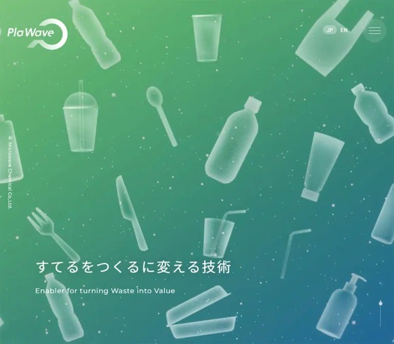
Translucent everyday materials suspended in a green-to-blue atmosphere, followed by a spacious explanation of circular manufacturing.
Website: PlaWave
Original URL: https://mwcc.jp/plawave/
Final URL: https://mwcc.jp/plawave/
Theme: white typography over atmospheric color and imagery, ending in a solid navy footer; no theme selector was observed.
Inspected: September 24, 2026, at 05:47 JST. Supplied retrieval timestamp: 2026-09-23T20:47:10.895Z.
Viewports: desktop 1440 × 1000 and mobile 390 × 844 CSS pixels.
Scope: the current Japanese technology microsite homepage. Visual evidence covers the desktop opening, a photographic narrative section, the desktop footer, and the mobile opening and footer. Rendered DOM evidence additionally covers the recycling-model presentation and technology-benefit sections. Linked pages, the opened mobile menu, and interactive carousel behavior were not inspected.
PlaWave introduces a chemical-recycling technology through a long visual narrative. The page belongs to a larger microsite: its primary navigation leads to recycling context, capabilities, Spider, facilities, and projects. The homepage combines this information architecture with an immersive opening, several viewport-scale story passages, technical explanations, and large Contact and Recruit destinations.
The defining relationship is between soft imagery and precise typography. Green, teal, and blue form an environmental atmosphere; translucent objects suggest material transformation. White Japanese text stays relatively restrained, while Montserrat provides geometric English labels and exceptionally light footer headings. The lower page resolves into a quiet navy field with generous spacing and almost no visible framing.
閉じる
PlaWave — Style Reference
Translucent everyday materials suspended in a green-to-blue atmosphere, followed by a spacious explanation of circular manufacturing.
Website: PlaWave
Original URL: https://mwcc.jp/plawave/
Final URL: https://mwcc.jp/plawave/
Theme: white typography over atmospheric color and imagery, ending in a solid navy footer; no theme selector was observed.
Inspected: September 24, 2026, at 05:47 JST. Supplied retrieval timestamp: 2026-09-23T20:47:10.895Z.
Viewports: desktop 1440 × 1000 and mobile 390 × 844 CSS pixels.
Scope: the current Japanese technology microsite homepage. Visual evidence covers the desktop opening, a photographic narrative section, the desktop footer, and the mobile opening and footer. Rendered DOM evidence additionally covers the recycling-model presentation and technology-benefit sections. Linked pages, the opened mobile menu, and interactive carousel behavior were not inspected.
PlaWave introduces a chemical-recycling technology through a long visual narrative. The page belongs to a larger microsite: its primary navigation leads to recycling context, capabilities, Spider, facilities, and projects. The homepage combines this information architecture with an immersive opening, several viewport-scale story passages, technical explanations, and large Contact and Recruit destinations.
The defining relationship is between soft imagery and precise typography. Green, teal, and blue form an environmental atmosphere; translucent objects suggest material transformation. White Japanese text stays relatively restrained, while Montserrat provides geometric English labels and exceptionally light footer headings. The lower page resolves into a quiet navy field with generous spacing and almost no visible framing.
How to Read This Reference
- Measured values come from the supplied rendered element rectangles and computed styles. They describe the two captured viewport states, not every possible width.
- Derived values are calculations from those measurements, such as column gaps or approximate line spacing.
- Estimated values come from visual inspection of the supplied original-page captures. Gradient stops, unmeasured icons, and image geometry fall into this category.
- Recommended values and behaviors are proposals for a new implementation. The CSS below uses descriptive aliases and selected approximations; it is not the original stylesheet.
- DOM text can include offscreen navigation and duplicated carousel entries. Presence in the text extraction does not establish simultaneous visibility.
- The captures are still images. They establish appearance at particular moments, but do not establish media format, animation sequence, autoplay timing, or rendering technology.
Tokens — Colors
Default Palette
| Name | Value | Suggested token | Evidence and role |
|---|---|---|---|
| White | #ffffff |
--color-white |
Measured: main text, navigation, footer text, and pill backgrounds |
| Action Blue | #005db0 |
--color-action |
Measured: desktop contact-pill text, Read More text, and the offscreen mobile contact strip |
| Footer Navy | #1f3243 |
--color-navy |
Measured footer background at both viewports |
| Selected Language | rgba(255,255,255,0.3) |
--color-selected |
Measured background of the active JP capsule |
| Muted White | rgba(255,255,255,0.6) |
--color-muted |
Measured footer copyright color |
| Atmospheric Green | Approximately #79bf78 |
--color-green-est |
Visual estimate for the brighter green region of the opening |
| Atmospheric Teal | Approximately #328d82 |
--color-teal-est |
Visual estimate for the middle of the opening atmosphere |
| Atmospheric Blue | Approximately #226693 |
--color-blue-est |
Visual estimate for the darker blue region of the opening |
| Drawer Text | #222222 |
--color-drawer-text |
Measured on offscreen mobile navigation links; the opened panel was not captured |
The three atmospheric colors are reconstruction aids, not sampled pixels or recovered source stops. Their apparent colors change with the translucent objects, background imagery, and capture state. Use a continuous field rather than three visibly separated bands.
The HTML and body samples report a white background, while the main element is transparent. These underlying declarations do not describe the dominant visible canvas: the screenshots show full-width color and imagery behind the text.
The supplied custom properties include --swiper-theme-color: #007aff and --swiper-navigation-size: 44px. These establish that Swiper-related styles are present. They do not establish that this blue or this navigation size is visibly used. The confirmed action color is #005db0.
Color Relationships
Keep white as the primary interface color over the atmosphere. Reserve saturated Action Blue for text inside white pills and the measured mobile navigation contact strip. The navy footer provides a substantial tonal change without introducing a new accent family.
The pale hero objects belong to the imagery layer. Their translucency should not become a general glass-panel treatment for every piece of content.
Tokens — Typography
Japanese Text — Noto Sans JP Stack
The measured family stack is:
"Noto Sans JP", "Hiragino Kaku Gothic ProN", メイリオ, Meiryo, Arial, Verdana, "MS Pゴシック", sans-serif
The sampled Japanese headings, paragraphs, and navigation use weight 400. White lettering can appear heavier against the imagery, but the evidence does not support replacing it with a generally bold type system.
Tracking separates the roles:
- Hero Japanese heading:
0.1em. - Narrative parent elements:
0.1emin the supplied samples. - General section prose and benefit descriptions:
0.06em. - Desktop navigation and recycling-model copy:
0.03em. - Mobile main section headings: normal tracking in the measured samples.
Latin Text — Montserrat
Montserrat, sans-serif is explicitly measured on Read More links, model numbers, Contact and Recruit headings, corporate links, and copyright text.
Most of these roles use weight 400. Contact and Recruit use weight 300, creating a lighter, more expansive endpoint to the page. Their scale matters more than decorative effects.
The English hero subtitle visually belongs to the same geometric language, but its own computed child style was not supplied. Its approximate visual sizes are 22px on desktop and 14px on mobile. Using Montserrat for that role is a supported design recommendation, not a separately measured child-font declaration.
Type Scale
Values below are computed font-size / line-height unless marked as estimates.
| Role | Desktop | Mobile | Weight | Tracking / qualification |
|---|---|---|---|---|
| Japanese hero heading | 41.968 / 50.3616px |
28.213 / 33.8556px |
400 | 0.1em |
| English hero subtitle | Approximately 22px |
Approximately 14px |
Not independently measured | Visual estimate |
| Narrative paragraph parent | 17.696 / 21.2352px |
16.016 / 19.2192px |
400 | 0.1em; see line-spacing note |
| Recycling-model section heading | 30.752 / 55.3536px |
22.142 / 39.8556px |
400 | Desktop 0.03em; mobile normal |
| Technology section heading | 30.752 / 55.3536px |
21 / 37.8px |
400 | Desktop 0.03em; mobile normal |
| General section prose | 17.536 / 35.072px |
15.016 / 30.032px |
400 | 0.06em |
| Model title | 34.128 / 40.9536px |
22.158 / 26.5896px |
400 | 0.03em |
| Model description | 15.84 / 29.7px |
15.008 / 24.0128px |
400 | 0.03em |
| Model numbers | 27.28 / 32.736px |
16.15 / 19.38px |
400 | Montserrat; 0.03em |
| Benefit label | 20 / 24px |
20 / 24px |
400 | 0.06em |
| Benefit description | 16 / 32px |
15 / 30px |
400 | 0.06em |
| Primary navigation | 15 / 18px |
15 / 18px offscreen |
400 | 0.03em |
| Language links | 14 / 16.8px |
Same | 400 | 0.03em |
| Read More | 18 / 21.6px |
Same | 400 | Montserrat; normal tracking |
| Footer Japanese label and description | 15.696 / 31.392px |
14.016 / 28.032px |
400 | 0.06em |
| Contact / Recruit | 60.4 / 72.48px |
36.355 / 43.626px |
300 | Montserrat; normal tracking |
| Corporate footer links | 16 / 19.2px |
Same | 400 | Montserrat; 0.03em |
| Copyright | 12 / 14.4px |
Same | 400 | Montserrat; 0.03em |
Narrative line-spacing limitation: the sampled paragraph parents report a 1.2 line height, but their multiline rectangles indicate a looser rendered rhythm. A desktop three-line paragraph occupies about 106.22px, consistent with approximately 35.4px per line; a mobile four-line paragraph occupies about 128.13px, consistent with approximately 32px per line. Descendant styling was not supplied. For a reconstruction, line-height: 2 is a closer visual starting point than copying the parent’s 1.2 value.
The introductory narrative h2 also has a much taller box than its sampled parent font size alone explains. Do not treat that inherited sample as a confirmed visible heading size.
Tokens — Spacing & Shapes
There is no verified global spacing unit or responsive formula. The measurements support a vocabulary of small control insets, moderate text gaps, and unusually large section breathing room.
Spacing Scale
| Use | Measured or derived value | Interpretation |
|---|---|---|
| Outer header edge | 20px |
Both inspected widths |
| Mobile ordinary content inset | 20px |
Produces a 350px content width |
| Footer destination inner horizontal padding | 8px |
Measured on the full-card links |
| Language-link padding | 2px 10px |
Computed declaration |
| Desktop navigation gaps | Approximately 33px |
Derived from successive link rectangles |
| Footer label-to-English-heading gap | 16px |
Derived at both widths |
| Footer heading-to-description gap | 24px |
Derived at both widths |
| Mobile footer destination gap | 40px |
Derived between the two link rectangles |
| Desktop footer destination gap | Approximately 46.41px |
Derived inside the 1160px container |
| Main section heading-to-prose gap | 50px |
Derived for the recycling-model introduction |
| Narrative paragraph gaps | Approximately 53px |
Repeated in the supplied rectangles |
| Footer destination vertical padding | Desktop 100px; mobile 30px |
Measured |
| Footer outer padding | Desktop 150px 0 100px; mobile 65px 0 0 |
Measured on the footer element; descendants provide further mobile spacing |
Border Radius
| Element | Observed value |
|---|---|
| Read More pill | 32px on a 64px high link |
| Desktop contact pill | 43px on a 52px high link |
| Selected JP capsule | 16px |
| Footer destination links | Desktop 24px; mobile 16px |
| Mobile menu control | Circular, approximately 64 × 64px from the capture |
The oversized contact radius simply produces a pill. It is not evidence of a separate large-radius surface system.
Layout Measurements
| Element | Desktop | Mobile |
|---|---|---|
| Document height | Approximately 7584px |
Approximately 8022px |
| Header sampled height | 134.25px |
81.25px |
| Brand link rectangle | (20, 50), 162 × 84.25px |
(20, 23), 112 × 58.25px |
| Hero h1 rectangle | (126.5, 750), 598.38 × 117.17px |
(34.25, 548.59), 286.72 × 120.91px |
| General content container | 1160px, left edge 140px |
350px, left edge 20px |
| Narrative left edge | 126.5px |
20px |
| Main introductory prose width | 970px, left edge 235px |
350px |
| Read More link | 196 × 64px |
196 × 64px |
| Footer destination link | 556.80 × 406.69px |
350 × 227.72px |
| Footer height | Approximately 905.58px |
Approximately 934.09px |
The hero’s left inset is approximately 8.785vw at both widths. Its heading starts at 75% of the desktop viewport height and approximately 65% of the mobile viewport height. These are derived relationships between the supplied samples, not recovered source formulas.
The 1160px desktop content width is measured. Treating it as a reusable maximum width is a recommendation; the actual source behavior at intermediate and larger widths is unknown.
Components
Primary Header
Role: establish the PlaWave identity and provide direct access to the microsite’s subject areas.
The desktop header is transparent over the atmosphere. The white brand artwork sits at the far left. Five Japanese navigation links occupy a single horizontal row, followed by JP/EN and a white contact pill. Link text is 15px, weight 400, with approximately 33px between the primary destinations.
The observed navigation is:
- “プラスチックリサイクルの今と未来” →
/plawave/now-and-future - “PlaWaveでできること” →
/plawave/can-do - “Spiderについて” →
/plawave/spider - “設備紹介” →
/plawave/facility - “プロジェクト” →
/plawave/project
The contact pill measures 170 × 52px, with blue Japanese text centered on white. It leads to https://mwcc.jp/contact/.
The lower desktop captures do not show the opening header. Avoid assuming that the complete desktop header remains fixed throughout the page.
Language Selector and Mobile Menu Control
Role: keep language choice and compact navigation readily available on narrow screens.
JP and EN remain visible on mobile. The active JP item is a translucent white capsule; EN remains unfilled. Both use 14px text. The JP rectangle is approximately 37.2 × 24px.
The mobile capture replaces the desktop navigation and contact pill with a translucent circular menu control at approximately (306, 20), measuring 64 × 64px. Three thin horizontal white lines form its icon.
Language and menu controls appear at the same viewport location in both mobile opening and footer captures. This supports persistent positioning for those utilities, although their computed positioning rules were not supplied. The logo is visible in the opening and absent from the footer capture; do not automatically fix the entire mobile header as one unit.
The DOM contains offscreen menu links starting at x = 430px, each approximately 350 × 60px, plus an offscreen 390 × 80px blue contact strip. These measurements establish a prepared mobile navigation structure. They do not establish its opened background, entrance animation, focus handling, or closing behavior.
Atmospheric Hero
Role: introduce the material-transformation idea before presenting technical detail.
The opening is effectively a full-screen visual field. In the supplied desktop state, a large translucent sphere occupies the center. Its apparent diameter is approximately 700px, estimated from the capture. The mobile state instead shows translucent bottles, cups, cutlery, tubing, and small particles across a tall crop.
Both states use the same essential treatment: pale, softly lit material against a green-to-teal-to-blue field. The supplied images do not establish whether the differing compositions result from responsive assets, media timing, or another mechanism.
The main Japanese copy is “すてるをつくるに変える技術”. It stays on one line on desktop and breaks after “すてるをつくるに” on mobile. The English line reads “Enabler for turning Waste into Value”. Together they occupy the measured h1 rectangle near the lower left.
The desktop also shows a small vertical copyright rail near the left edge and a fine vertical line with a dot near the lower-right corner. The latter reads as a scroll cue, but its interaction was not tested. The opening mobile capture omits both visible edge details.
Keep the hero image dominant. The heading should anchor the lower-left area without becoming a large centered promotional block.
Narrative Story Passages
Role: move from familiar plastic products to environmental questions and the PlaWave proposition.
The DOM records several large story stages. Their starting text positions advance by approximately one viewport height: desktop narrative starts occur around document y positions 1453, 2453, and 3453; mobile equivalents occur around 1234.59, 2078.59, and 2922.59.
Text is left aligned and relatively narrow on desktop, leaving a large image field to the right. The mobile text uses the ordinary 20px page inset and almost the full available width. Generous paragraph gaps maintain a deliberate reading pace.
The photographed desktop passage shows a river through an urban landscape, with environmental and infrastructure symbols enclosed in translucent hexagons. White copy sits over a subdued upper-left part of the scene. The image contains bright sky, green riverbanks, buildings, and blue water; a restrained tonal treatment keeps text readable without an opaque text card.
Only this photographic narrative state is visually supplied. Other story-stage imagery should not be invented from the text alone.
Read More Pill
Role: connect a narrative or technical summary to a deeper microsite page.
The link has a fixed observed size of 196 × 64px at both viewports, a white background, 32px radius, and blue Montserrat text at 18px. A small blue dot sits toward the right; its approximate diameter is 8px from the screenshot.
The measured padding is 0 20px 0 0, leaving additional space for the right-side detail. This is a quiet horizontal capsule, without a visible shadow or oversized arrow.
Three destinations are recorded: the recycling context page, Spider, and capabilities. The narrative pill is left aligned at both widths. The capabilities pill moves to a centered location after the three benefit items on mobile.
Computed transitions cover border color, background, and text color over 0.4s. The actual hovered colors were not supplied.
Recycling-Model Presentation
Role: explain three related models: combined centralized/distributed recycling, centralized recycling, and distributed recycling.
A main heading introduces the relationship between the models, followed by a broad explanatory paragraph. On desktop the heading spans the 1160px container, while the paragraph occupies a centered 970px region.
Below this introduction, the supplied DOM contains horizontally displaced model panels and duplicate entries. Desktop panel offsets repeat at 1160px; mobile offsets repeat at 350px. Together with the Swiper-related variables, this supports a horizontal carousel-like presentation with three unique content states.
The visible desktop model description is at x = 836px, with a 464px text width: the rightmost 40% of the main container. The complementary left region is not described by the supplied image-element measurements, so its exact visual content cannot be specified here.
Each model includes the numbers 01, 02, and 03, a Japanese title, and a description. Desktop numbers run horizontally; mobile numbers are vertically arranged near the right side of the panel’s upper region. On mobile, the title and description occupy the 350px content width beneath that region.
The sampled number elements are paragraphs. Their clickability was not established. Do not turn the duplicate DOM entries into five independent content cards, or assume that autoplay, dragging, keyboard navigation, or number selection was verified.
Technology Introduction
Role: connect the platform’s microwave process to its claimed technical benefits.
The desktop introduction is asymmetric: a 556.8px heading region begins at x = 140px, while a 498.8px paragraph region begins at x = 801.2px. The heading is approximately 30.75px, with a generous 1.8 line height; the paragraph uses approximately 17.54px / 35.07px.
On mobile these become a single column: a 21px / 37.8px heading, then 15.016px / 30.032px explanatory text. The capabilities link appears after all benefit items rather than alongside the introduction.
Some desktop rectangles overlap vertically between the paragraph and link. Because this section has transform transitions and incomplete wrapper measurements, do not reproduce that apparent overlap as an intentional static layout requirement.
Three Benefit Items
Role: explain selectivity, efficiency, and space savings.
The source labels are “高選択性”, “高効率”, and “省スペース”. All three use 20px type at both inspected widths.
Desktop labels and descriptions form three columns. Their inner text widths are approximately 279.59px, starting at x = 180, 580.20, and 980.41px. Mobile items stack vertically, with 310px text widths starting at x = 40px.
There is a substantial region between each label and its description. Its height equals approximately the inner column width: 279.59px on desktop and 310px on mobile. This is consistent with a square visual slot. That geometry is a useful inference, but the artwork itself was not included in the supplied visual captures.
A practical adaptation can use a label, a square media region, and explanatory text. Do not invent specific diagrams, icons, card fills, or illustrations and describe them as observed assets.
Contact and Recruit Destinations
Role: offer collaboration and employment routes at the end of the narrative.
Each destination is one large anchor containing:
- A small white dot and Japanese label.
- A light Montserrat English title with an overlapping-square link icon.
- Two lines of Japanese explanatory copy at the inspected widths.
Desktop anchors sit side by side and measure approximately 556.8 × 406.69px. Their computed padding is 100px 8px; the large height comes from spacing rather than a heavy card frame.
On mobile they stack as 350 × 227.72px anchors with 30px 8px padding and a 40px gap. The English titles shrink from 60.4px to 36.355px. The mobile screenshot shows faint tonal shaping within the rounded destinations, but the anchor’s measured background is transparent. Any such treatment may come from another layer; its exact declaration is unavailable.
The destinations lead to /contact/ and /recruit/. The overlapping-square icon visually signals an outward link, but a new-tab behavior was not verified.
Corporate Footer Row
Role: reconnect the microsite to its parent organization.
The desktop row places the Microwave Chemical logo at the left, followed by Corporate Site and the source label “IR Infomation”. A thin horizontal rule occupies spare space before the muted copyright text on the right.
The mobile arrangement becomes a centered vertical stack: logo, the two corporate links, then copyright near the bottom. The corporate links retain their 16px Montserrat size; the copyright remains 12px at 60% white opacity.
The document title identifies マイクロ波化学株式会社, and the footer independently displays the Microwave Chemical identity and copyright. Production credits were not established by the inspected original-page evidence.
Tokens — Motion & Interaction
| Treatment | Supplied evidence | What can be concluded |
|---|---|---|
| Hero and narrative text color | color 0.4s |
Text has a defined color transition; its trigger and alternate colors were not captured |
| Read More appearance | border-color 0.4s, background 0.4s, color 0.4s |
Short color-based feedback is defined; hover endpoint is unknown |
| Language links | 0.4s transition |
A transition is defined; the supplied shorthand does not establish the changed property |
| Main section heading and paragraph reveals | opacity 1.2s, transform 1.2s |
Fade/transform transitions are present; initial transforms and triggers were not supplied |
| Mobile recycling introduction | opacity 1.2s 0.9s, transform 1.2s 0.9s |
A 0.9s delay is measured for this sampled group, not every section |
| Recycling-model track | Offscreen duplicates and regular horizontal offsets | A multi-state horizontal presentation is supported; control behavior and timing remain unverified |
| Hero objects and sphere | Different still compositions at the two viewports | Media treatment is visible; sequence, looping, frame rate, and renderer are unknown |
Most sampled text elements report animation: none. This does not prove that the visual background is static: media, descendants, pseudo-elements, and script-driven rendering are outside these particular measurements.
The supplied inspection waited at least five seconds initially and performed finite-animation and layout-readiness checks. Perpetual animations were paused during readiness checks and resumed afterward. These procedures improve capture stability; they are not an interaction test or a recording of the full motion system.
For a new implementation, preserve the separation between quick 400ms interface feedback and slower 1.2s content transitions. Any decorative drifting or looping motion should be explicitly authored as an adaptation, with a static alternative.
Surfaces
| Layer | Appearance | Evidence level |
|---|---|---|
| Opening atmosphere | Continuous green, teal, and blue field | Visually observed; exact gradient declarations unavailable |
| Hero material | Pale translucent sphere or plastic objects | Visually observed; rendering method unknown |
| Narrative image | Full-width photography with environmental symbols and readable white copy | Visually observed in one desktop passage |
| Main text regions | White text with substantial unboxed space | Screenshots and computed styles |
| Primary pills | Solid white with blue lettering | Measured |
| Language selection | White at 30% opacity | Measured |
| Mobile menu circle | Subtle translucent circular surface | Visually observed; alpha estimated |
| Footer | Solid #1f3243 |
Measured |
| Footer destination surfaces | Mostly merge with the footer; faint shaping on mobile | Visual observation; anchor background measured transparent |
There is no evidence of a general shadow-based elevation system. Separation comes from scale, color fields, image changes, and spacing.
Imagery
The opening treats plastic as a material with softness, light transmission, and volume. Familiar products remain recognizable, but their pale surfaces and suspended arrangement make them feel detached from ordinary product photography. Small particles reinforce the atmospheric setting.
The desktop sphere provides a different scale of abstraction: one large rounded form replaces the many recognizable objects in the supplied mobile state. Preserve both observations without inventing a confirmed transformation between them.
The photographed narrative passage connects material science to everyday infrastructure. A river and city establish a broad societal setting; environmental symbols within hexagons suggest energy, transport, recycling, and resource systems. These symbols are part of the visual composition, not demonstrated interactive controls.
Observed Asset References
No image, video, logo-file, or background-asset URLs were included in the supplied evidence. The following identifies visible asset roles without inventing filenames.
| Asset role | Evidence | Practical handling |
|---|---|---|
| PlaWave brand artwork | Desktop and mobile opening captures | Use approved artwork; do not rebuild the mark as ordinary text |
| Translucent sphere | Desktop opening capture | Preserve soft edges and large scale; exact media type unknown |
| Plastic-object composition | Mobile opening capture | Preserve tall cropping and readable lower-left text space |
| River/city environmental composition | Desktop narrative capture | Use a sufficiently large image with controlled contrast behind copy |
| Microwave Chemical logo | Desktop and mobile footer captures | Preserve proportions and white treatment |
| Benefit visuals | Square-sized gaps inferred from DOM geometry | Obtain actual assets before claiming visual fidelity |
Do not use a still capture to infer WebGL, video, canvas, or a particular 3D production pipeline. CSS can reproduce the layout and color relationships; it does not replace the identity carried by the imagery.
Layout & Responsive Behavior
Desktop Structure
The opening fills the first viewport, with the brand and navigation above a lower-left bilingual heading. The narrative continues through several tall stages before moving into a more conventional 1160px technical content region.
The story’s 126.5px left inset is slightly outside the later 140px content edge. Keep this distinction if matching the inspected desktop composition; one universal container would erase it.
The model section presents horizontally displaced panels. The technology introduction uses two unequal text regions, followed by three benefit columns. The footer uses two large destination links and a horizontal corporate row.
Mobile Changes
- The brand artwork shrinks to
112pxwide. - Full primary navigation gives way to a circular menu control; JP/EN remain visible.
- The hero heading uses two Japanese lines, starts around
65vh, and retains a proportional left inset of approximately8.785vw. - Ordinary narrative and technical text use
20pxside insets. - Long desktop narrative line breaks relax into mobile wrapping.
- Model descriptions use the full
350pxcontent width; model numbers become a vertical group. - The technology heading and description stack, followed by three vertically arranged benefits.
- The capabilities Read More link moves below the benefits and is centered.
- Contact and Recruit stack, while the corporate row becomes centered and vertical.
- Footer display typography scales down substantially; button dimensions and benefit-label sizes remain unchanged.
The document is longer on mobile despite the smaller type because technical sections and footer content stack. Its measured height increases from approximately 7584px to 8022px.
Breakpoints and Capture Limits
The original breakpoint values were not supplied. A new implementation can begin with a conservative compact-header breakpoint near 84rem and a content-stacking breakpoint near 48rem, then validate with the actual fonts and translations. These are recommendations, not recovered media queries.
The mobile footer capture shows persistent utilities near the Contact heading. Preserve the availability of navigation, but provide enough clearance to avoid text/control collisions in a new implementation. The supplied evidence does not establish the original overlap-management logic.
No tablet, landscape-phone, zoomed-text, or safe-area behavior was inspected.
Do’s and Don’ts
Do
- Preserve the relationship between atmospheric imagery, white text, and spacious section pacing.
- Use the exact measured action blue
#005db0and footer navy#1f3243. - Treat the green-to-blue gradient values in this document as visual approximations.
- Keep the Japanese type primarily regular weight, with tracked hero text and comfortable paragraph leading.
- Use Montserrat for the measured Latin roles, including weight 300 for Contact and Recruit.
- Keep Read More links at the observed
196 × 64pxproportions when matching these viewports. - Distinguish the hero/narrative inset from the later desktop content container.
- Retain the three unique recycling-model states without duplicating carousel clones as content.
- Make the complete Contact and Recruit blocks usable links.
- Preserve the pronounced mobile reordering of the capabilities link and benefits.
Don’t
- Don’t flatten the microsite into a single conversion panel with one repeated call to action.
- Don’t replace the atmospheric artwork with generic sustainability icons scattered over a flat green background.
- Don’t make every text region a frosted-glass card because the hero materials are translucent.
- Don’t introduce heavy shadows, thick borders, or unrelated bright accent colors.
- Don’t make every Japanese heading bold or enlarge the hero until it dominates the visual field.
- Don’t use Swiper’s exposed default blue as the brand action color.
- Don’t infer the opened menu, carousel controls, hover endpoints, or hero renderer from still screenshots.
- Don’t copy offscreen coordinates or transition-affected overlap into a static layout.
- Don’t describe inferred square media slots as verified illustrations.
- Don’t use fixed desktop line breaks throughout the mobile prose.
Recommended Implementation Additions
These are recommendations for a new implementation, not verified original features:
- Give the mobile menu a real button, an accessible name,
aria-expanded, and a relationship to its panel. Remove closed navigation from keyboard focus and restore focus when it closes. - Mark the active language semantically, and expand the language controls’ touch targets without enlarging their visible capsules.
- If the model presentation is interactive, provide keyboard-operable controls, a current-state announcement, and non-duplicated accessible content. Do not make unverified paragraph-like numbers silently behave as controls.
- Provide a static hero poster and reduced-motion behavior. Keep meaningful copy available when media or JavaScript fails.
- Evaluate white-text contrast against every hero and narrative media state, using localized tonal adjustment where needed.
- Keep decorative imagery and duplicate visual icons out of the accessibility tree; provide descriptions for technical graphics that carry information.
- Keep focus indicators visible over both the gradient and navy surfaces.
- Reserve space for persistent mobile utilities, especially near the end-of-page destination headings.
- Load the required font weights deliberately and test fallback wrapping before the web fonts arrive.
Agent Prompt Guide
Quick Color Reference
- Main text and pill surfaces:
#ffffff. - Action text:
#005db0. - Footer:
#1f3243. - Active language capsule: white at 30% opacity.
- Footer copyright: white at 60% opacity.
- Approximate atmospheric field:
#79bf78→#328d82→#226693. - Surface strategy: imagery and open spacing, with restrained pills and rounded footer targets.
Overall Prompt
“Create a Japanese technology microsite homepage inspired by PlaWave’s inspected visual system. Use a full-width green-to-teal-to-blue atmosphere with pale translucent material imagery and white typography. Place a compact white brand mark at the upper left, a restrained desktop navigation row, JP/EN controls, and a white contact pill. Anchor a regularly weighted, tracked Japanese headline near the lower left, with a smaller geometric English subtitle. Continue through spacious narrative passages, then a structured three-model explanation and three technical benefits. Finish with a solid navy #1f3243 footer containing oversized, light Montserrat Contact and Recruit links. On mobile, use a circular menu control, stack the technical content, preserve generous line spacing, and center the corporate footer links. Treat hero motion and carousel behavior as separate implementation decisions unless actual assets and interaction specifications are provided.”
Example Component Prompts
- Header: “A transparent header over green-blue imagery, with a white PlaWave-style brand asset on the left, five Japanese navigation items in regular 15px sans-serif, a translucent selected-language capsule, and a 170 × 52px white contact pill with blue text. On narrow screens, retain language controls and use a subtle 64px circular three-line menu button.”
- Hero: “An immersive environmental-material visual with soft translucent objects and ample negative space. Position a white Japanese headline near the lower left, approximately 42px on desktop and 28px on mobile, with 0.1em tracking. Use a smaller English subtitle and preserve the mobile two-line Japanese composition.”
- Narrative passage: “A full-width urban river photograph with translucent environmental symbols, subdued enough for white Japanese paragraphs in a narrow left column. Use approximately 18px desktop text with loose two-times leading and generous paragraph spacing. Add a 196 × 64px white Read More pill with blue text and a small blue dot.”
- Model explanation: “A three-state technical presentation with 01/02/03 labels, regular Japanese model headings, and readable explanatory text. Use a broad desktop composition with a right-side prose region, then stack text on mobile. Do not invent unseen source illustrations or claim untested navigation behavior.”
- Footer: “A spacious navy footer with two large clickable destinations. Each contains a small dot and Japanese label, a light Montserrat English heading, an overlapping-square link symbol, and two lines of Japanese copy. Use 60px English headings on desktop and 36px on mobile; stack the destinations and center the corporate logo and links on small screens.”
Quick Start
CSS Custom Properties
This is a reusable adaptation, not extracted source code. It uses measured endpoints for key type sizes, approximate atmospheric colors, and recommended breakpoints. The fluid clamp() formulas are fitted between the two inspected widths; the original formulas are unknown.
Provide approved logo and media assets separately. The stylesheet does not implement a media renderer, open a menu, or provide carousel logic. Content remains visible by default rather than depending on an unimplemented reveal script.
:root {
  /* Measured colors */
  --color-white: #ffffff;
  --color-action: #005db0;
  --color-navy: #1f3243;
  --color-selected: rgb(255 255 255 / 30%);
  --color-muted: rgb(255 255 255 / 60%);

  /* Estimated atmospheric colors */
  --color-green-est: #79bf78;
  --color-teal-est: #328d82;
  --color-blue-est: #226693;

  /* Observed family declarations; load font files separately */
  --font-jp: 'Noto Sans JP', 'Hiragino Kaku Gothic ProN',
    'メイリオ', Meiryo, Arial, Verdana, 'MS Pゴシック', sans-serif;
  --font-latin: Montserrat, sans-serif;

  /* Recommended interpolation through measured endpoints */
  --text-hero: clamp(28.213px, calc(23.104px + 1.31vw), 41.968px);
  --text-section: clamp(22.142px, calc(18.944px + 0.82vw), 30.752px);
  --text-body: clamp(15.016px, calc(14.08px + 0.24vw), 17.536px);
  --text-story: clamp(16.016px, calc(15.392px + 0.16vw), 17.696px);
  --text-footer-display: clamp(36.355px, calc(27.424px + 2.29vw), 60.4px);
  --text-footer-body: clamp(14.016px, calc(13.392px + 0.16vw), 15.696px);

  --content-max: 1160px;
  --page-inset: 20px;
  --hero-inset: 8.785vw;
  --radius-pill: 999px;
  --radius-destination: 24px;
  --duration-ui: 400ms;
  --duration-reveal: 1.2s;
}

* { box-sizing: border-box; }

body {
  margin: 0;
  color: var(--color-white);
  background: var(--color-navy);
  font-family: var(--font-jp);
  font-weight: 400;
}

img { max-inline-size: 100%; }
button, a { -webkit-tap-highlight-color: transparent; }
button { font: inherit; }

.container {
  inline-size: min(
    calc(100% - 2 * var(--page-inset)),
    var(--content-max)
  );
  margin-inline: auto;
}

.atmosphere {
  background: linear-gradient(
    135deg,
    var(--color-green-est),
    var(--color-teal-est) 53%,
    var(--color-blue-est)
  );
}

.site-header {
  position: absolute;
  inset: 0 0 auto;
  z-index: 10;
  display: flex;
  align-items: center;
  gap: 32px;
  padding: 50px 20px 0;
}

.brand {
  display: block;
  flex: 0 0 162px;
  inline-size: 162px;
}

.brand img { display: block; inline-size: 100%; }

.primary-nav {
  display: flex;
  align-items: center;
  gap: 33px;
  margin-inline-start: auto;
  white-space: nowrap;
}

.primary-nav a,
.header-contact {
  font-size: 15px;
  line-height: 1.2;
  letter-spacing: 0.03em;
  text-decoration: none;
}

.primary-nav a { color: inherit; }

.header-actions {
  display: flex;
  align-items: center;
  gap: 15px;
  margin-inline-start: 13px;
}

.language { display: flex; }

.language a {
  display: inline-flex;
  align-items: center;
  justify-content: center;
  min-block-size: 24px;
  padding: 2px 10px;
  color: inherit;
  font-size: 14px;
  line-height: 1.2;
  letter-spacing: 0.03em;
  text-decoration: none;
  border-radius: 16px;
  transition: background-color var(--duration-ui);
}

.language [aria-current='page'] {
  background: var(--color-selected);
}

.header-contact {
  display: grid;
  place-items: center;
  inline-size: 170px;
  block-size: 52px;
  color: var(--color-action);
  background: var(--color-white);
  border-radius: var(--radius-pill);
}

.menu-button {
  display: none;
  place-items: center;
  inline-size: 64px;
  block-size: 64px;
  padding: 0;
  border: 0;
  border-radius: 50%;
  color: inherit;
  background: rgb(255 255 255 / 10%);
  cursor: pointer;
}

.menu-button::before {
  content: '';
  inline-size: 32px;
  block-size: 17px;
  border-block: 1px solid currentColor;
  background: linear-gradient(currentColor, currentColor)
    center / 100% 1px no-repeat;
}

.hero {
  position: relative;
  isolation: isolate;
  min-block-size: 100vh;
  min-block-size: 100svh;
  padding: 75vh var(--hero-inset) 120px;
  padding-block-start: 75svh;
  overflow: hidden;
}

.hero-media,
.story-media {
  position: absolute;
  inset: 0;
  z-index: -1;
  inline-size: 100%;
  block-size: 100%;
  object-fit: cover;
  pointer-events: none;
}

.hero-title {
  margin: 0;
  font-size: var(--text-hero);
  font-weight: 400;
  line-height: 1.2;
  letter-spacing: 0.1em;
}

.hero-subtitle {
  display: block;
  margin-block-start: 30px;
  font-family: var(--font-latin);
  font-size: 22px;
  line-height: 1.5;
  letter-spacing: 0.03em;
}

.mobile-break { display: none; }

.hero-copyright {
  position: absolute;
  inset-inline-start: 20px;
  inset-block-start: 50%;
  margin: 0;
  transform: translateY(-50%);
  writing-mode: vertical-rl;
  font: 400 12px / 1.2 var(--font-latin);
  letter-spacing: 0.03em;
}

.story {
  position: relative;
  isolation: isolate;
  display: flex;
  align-items: center;
  min-block-size: 100svh;
  padding-block: 100px;
}

.story-copy {
  inline-size: min(535px, calc(100% - 40px));
  margin-inline-start: var(--hero-inset);
  font-size: var(--text-story);
  line-height: 2;
  letter-spacing: 0.1em;
}

.story-copy p { margin: 0 0 53px; }

.read-more {
  position: relative;
  display: inline-flex;
  align-items: center;
  justify-content: center;
  inline-size: 196px;
  block-size: 64px;
  padding-inline-end: 20px;
  border: 1px solid transparent;
  border-radius: 32px;
  color: var(--color-action);
  background: var(--color-white);
  font: 400 18px / 1.2 var(--font-latin);
  letter-spacing: normal;
  text-decoration: none;
  transition: border-color var(--duration-ui),
    background-color var(--duration-ui),
    color var(--duration-ui);
}

.read-more::after {
  content: '';
  position: absolute;
  inset-inline-end: 26px;
  inline-size: 8px;
  block-size: 8px;
  border-radius: 50%;
  background: currentColor;
}

.section-title {
  margin: 0;
  font-size: var(--text-section);
  font-weight: 400;
  line-height: 1.8;
  letter-spacing: 0.03em;
}

.section-copy {
  margin: 0;
  font-size: var(--text-body);
  line-height: 2;
  letter-spacing: 0.06em;
}

.model-intro .section-copy {
  max-inline-size: 970px;
  margin: 50px auto 0;
}

.technology-intro {
  display: grid;
  grid-template-columns: 48% 43%;
  justify-content: space-between;
  align-items: start;
}

/* Recommended structural adaptation for the inferred media slots */
.benefit-grid {
  display: grid;
  grid-template-columns: repeat(3, minmax(0, 1fr));
  gap: 40px;
  margin-block-start: 90px;
}

.benefit { padding: 40px; }

.benefit-title {
  margin: 0;
  font-size: 20px;
  font-weight: 400;
  line-height: 24px;
  letter-spacing: 0.06em;
}

.benefit-visual {
  display: block;
  inline-size: 100%;
  aspect-ratio: 1;
  object-fit: contain;
}

.benefit-copy {
  margin: 0;
  font-size: 16px;
  line-height: 2;
  letter-spacing: 0.06em;
}

.site-footer {
  padding: 150px 0 100px;
  background: var(--color-navy);
}

.destination-grid {
  display: grid;
  grid-template-columns: 48% 48%;
  justify-content: space-between;
}

.destination {
  display: block;
  min-inline-size: 0;
  padding: 100px 8px;
  border-radius: var(--radius-destination);
  color: inherit;
  text-decoration: none;
}

.destination-label,
.destination-copy {
  margin: 0;
  font-size: var(--text-footer-body);
  line-height: 2;
  letter-spacing: 0.06em;
}

.destination-label {
  display: flex;
  align-items: center;
  gap: 8px;
}

.destination-label::before {
  content: '';
  flex: 0 0 10px;
  block-size: 10px;
  border-radius: 50%;
  background: currentColor;
}

.destination-title {
  display: flex;
  align-items: center;
  gap: 16px;
  margin: 16px 0 24px;
  font-family: var(--font-latin);
  font-size: var(--text-footer-display);
  font-weight: 300;
  line-height: 1.2;
  letter-spacing: normal;
}

.footer-meta {
  display: flex;
  align-items: center;
  gap: 54px;
  margin-block-start: 160px;
}

.footer-logo { inline-size: 140px; }

.footer-links {
  display: flex;
  align-items: center;
  gap: 54px;
}

.footer-links a {
  color: inherit;
  font: 400 16px / 1.2 var(--font-latin);
  letter-spacing: 0.03em;
  text-decoration: none;
  white-space: nowrap;
}

.footer-copyright {
  display: flex;
  flex: 1;
  align-items: center;
  gap: 38px;
  margin: 0;
  color: var(--color-muted);
  font: 400 12px / 1.2 var(--font-latin);
  letter-spacing: 0.03em;
  white-space: nowrap;
}

.footer-copyright::before {
  content: '';
  flex: 1;
  block-size: 1px;
  background: rgb(255 255 255 / 20%);
}

/* Recommended focus treatment; hover endpoints were not measured */
a:focus-visible,
button:focus-visible {
  outline: 2px solid currentColor;
  outline-offset: 5px;
}

.reveal {
  transition: opacity var(--duration-reveal),
    transform var(--duration-reveal);
}

/* Recommended compact-header breakpoint */
@media (max-width: 84rem) {
  .site-header { padding: 23px 20px 0; }
  .brand { flex-basis: 112px; inline-size: 112px; }
  .primary-nav, .header-contact { display: none; }
  .header-actions {
    position: fixed;
    inset: 20px 20px auto auto;
    gap: 21px;
    margin: 0;
  }
  .menu-button { display: grid; }
  .footer-meta { flex-wrap: wrap; }
}

/* Recommended content-stacking breakpoint */
@media (max-width: 48rem) {
  :root { --radius-destination: 16px; }

  .hero {
    padding-block: 65vh 160px;
    padding-block-start: 65svh;
  }
  .hero-subtitle { font-size: 14px; }
  .mobile-break { display: initial; }
  .hero-copyright { display: none; }

  .story-copy {
    margin-inline: 20px;
    inline-size: calc(100% - 40px);
  }
  .section-title { letter-spacing: normal; }
  .technology-intro { grid-template-columns: 1fr; gap: 45px; }
  .technology-intro .section-title { font-size: 21px; }

  .benefit-grid {
    grid-template-columns: 1fr;
    gap: 70px;
    margin-block-start: 75px;
  }
  .benefit { padding: 20px; }
  .benefit-copy { font-size: 15px; }
  .capabilities-link { display: block; margin: 36px auto 0; }

  .site-footer { padding: 65px 0 20px; }
  .destination-grid { grid-template-columns: 1fr; gap: 40px; }
  .destination {
    padding: 30px 8px;
    /* Approximation of the faint mobile tonal shaping */
    background: linear-gradient(145deg, rgb(255 255 255 / 4%), transparent);
  }
  .footer-meta {
    flex-direction: column;
    gap: 49px;
    margin-block-start: 90px;
  }
  .footer-links { flex-direction: column; gap: 22px; }
  .footer-copyright { flex: none; margin-block-start: 21px; }
  .footer-copyright::before { display: none; }
}

@media (prefers-reduced-motion: reduce) {
  .reveal,
  .read-more,
  .language a {
    transition: none;
    transform: none;
  }
  /* Pause decorative media in the media controller as well. */
}
Use the hero subtitle as a block-level span within the h1 if matching the supplied heading grouping. A mobile-only break can divide the Japanese copy without splitting the accessible heading into separate elements. The menu button still requires an accessible name and functioning panel logic before release.
The technical model track is intentionally left to a separate implementation: the evidence is sufficient to describe its structure, but insufficient to reproduce its controls faithfully.
Tailwind v4 Token Mapping
Optional aliases for a project already using Tailwind v4. These are implementation conveniences, not evidence that the original site uses Tailwind.
@theme inline {
  --color-plawave-action: var(--color-action);
  --color-plawave-navy: var(--color-navy);
  --color-plawave-green: var(--color-green-est);
  --color-plawave-teal: var(--color-teal-est);
  --color-plawave-blue: var(--color-blue-est);

  --font-sans: var(--font-jp);
  --font-display: var(--font-latin);

  --text-plawave-hero: var(--text-hero);
  --text-plawave-section: var(--text-section);
  --text-plawave-body: var(--text-body);
  --text-plawave-footer: var(--text-footer-display);

  --spacing-page: 20px;
  --radius-plawave-pill: 999px;
  --radius-plawave-destination: var(--radius-destination);
}
Sources & Evidence
- PlaWave — inspected original and final homepage: supplied HTTP status
200, rendered title, page text, link destinations, element rectangles, computed styles, and custom properties. Original and final URLs are identical. - Capture time: supplied retrieval timestamp
2026-09-23T20:47:10.895Z, corresponding to September 24, 2026, at 05:47 JST. Separate per-image timestamps were not provided. - Desktop:
1440 × 1000CSS pixels; approximately7584pxdocument height. Supplied original-page captures show the opening, a photographic narrative passage, and the footer. - Mobile:
390 × 844CSS pixels; approximately8022pxdocument height. Supplied original-page captures show the opening and footer. Rendered DOM measurements cover the additional homepage sections. - Inspection process: the supplied browser record describes initial observation, image decoding and layout checks, animation-readiness handling, and scrolling through intermediate positions. It does not provide clicked-menu, hovered-link, or exercised-carousel results.
- Limits: full asset URLs, source stylesheets, media implementation, opened mobile navigation, carousel behavior, intermediate breakpoints, technical-section artwork, and linked destination pages were not independently available. This reference analyzes the supplied evidence without additional browsing, command execution, or file access.
Measured declarations, derived geometry, visual estimates, and recommended implementation choices are identified separately throughout this document.
# PlaWave — Style Reference

> Translucent everyday materials suspended in a green-to-blue atmosphere, followed by a spacious explanation of circular manufacturing.

**Website:** [PlaWave](https://mwcc.jp/plawave/)
**Original URL:** https://mwcc.jp/plawave/
**Final URL:** https://mwcc.jp/plawave/
**Theme:** white typography over atmospheric color and imagery, ending in a solid navy footer; no theme selector was observed.
**Inspected:** September 24, 2026, at 05:47 JST. Supplied retrieval timestamp: `2026-09-23T20:47:10.895Z`.
**Viewports:** desktop `1440 × 1000` and mobile `390 × 844` CSS pixels.
**Scope:** the current Japanese technology microsite homepage. Visual evidence covers the desktop opening, a photographic narrative section, the desktop footer, and the mobile opening and footer. Rendered DOM evidence additionally covers the recycling-model presentation and technology-benefit sections. Linked pages, the opened mobile menu, and interactive carousel behavior were not inspected.

PlaWave introduces a chemical-recycling technology through a long visual narrative. The page belongs to a larger microsite: its primary navigation leads to recycling context, capabilities, Spider, facilities, and projects. The homepage combines this information architecture with an immersive opening, several viewport-scale story passages, technical explanations, and large Contact and Recruit destinations.

The defining relationship is between soft imagery and precise typography. Green, teal, and blue form an environmental atmosphere; translucent objects suggest material transformation. White Japanese text stays relatively restrained, while Montserrat provides geometric English labels and exceptionally light footer headings. The lower page resolves into a quiet navy field with generous spacing and almost no visible framing.
閉じる
# PlaWave — Style Reference

> Translucent everyday materials suspended in a green-to-blue atmosphere, followed by a spacious explanation of circular manufacturing.

**Website:** [PlaWave](https://mwcc.jp/plawave/)
**Original URL:** https://mwcc.jp/plawave/
**Final URL:** https://mwcc.jp/plawave/
**Theme:** white typography over atmospheric color and imagery, ending in a solid navy footer; no theme selector was observed.
**Inspected:** September 24, 2026, at 05:47 JST. Supplied retrieval timestamp: `2026-09-23T20:47:10.895Z`.
**Viewports:** desktop `1440 × 1000` and mobile `390 × 844` CSS pixels.
**Scope:** the current Japanese technology microsite homepage. Visual evidence covers the desktop opening, a photographic narrative section, the desktop footer, and the mobile opening and footer. Rendered DOM evidence additionally covers the recycling-model presentation and technology-benefit sections. Linked pages, the opened mobile menu, and interactive carousel behavior were not inspected.

PlaWave introduces a chemical-recycling technology through a long visual narrative. The page belongs to a larger microsite: its primary navigation leads to recycling context, capabilities, Spider, facilities, and projects. The homepage combines this information architecture with an immersive opening, several viewport-scale story passages, technical explanations, and large Contact and Recruit destinations.

The defining relationship is between soft imagery and precise typography. Green, teal, and blue form an environmental atmosphere; translucent objects suggest material transformation. White Japanese text stays relatively restrained, while Montserrat provides geometric English labels and exceptionally light footer headings. The lower page resolves into a quiet navy field with generous spacing and almost no visible framing.

## How to Read This Reference

- **Measured** values come from the supplied rendered element rectangles and computed styles. They describe the two captured viewport states, not every possible width.
- **Derived** values are calculations from those measurements, such as column gaps or approximate line spacing.
- **Estimated** values come from visual inspection of the supplied original-page captures. Gradient stops, unmeasured icons, and image geometry fall into this category.
- **Recommended** values and behaviors are proposals for a new implementation. The CSS below uses descriptive aliases and selected approximations; it is not the original stylesheet.
- DOM text can include offscreen navigation and duplicated carousel entries. Presence in the text extraction does not establish simultaneous visibility.
- The captures are still images. They establish appearance at particular moments, but do not establish media format, animation sequence, autoplay timing, or rendering technology.

## Tokens — Colors

### Default Palette

| Name | Value | Suggested token | Evidence and role |
| --- | --- | --- | --- |
| White | `#ffffff` | `--color-white` | Measured: main text, navigation, footer text, and pill backgrounds |
| Action Blue | `#005db0` | `--color-action` | Measured: desktop contact-pill text, Read More text, and the offscreen mobile contact strip |
| Footer Navy | `#1f3243` | `--color-navy` | Measured footer background at both viewports |
| Selected Language | `rgba(255,255,255,0.3)` | `--color-selected` | Measured background of the active JP capsule |
| Muted White | `rgba(255,255,255,0.6)` | `--color-muted` | Measured footer copyright color |
| Atmospheric Green | Approximately `#79bf78` | `--color-green-est` | Visual estimate for the brighter green region of the opening |
| Atmospheric Teal | Approximately `#328d82` | `--color-teal-est` | Visual estimate for the middle of the opening atmosphere |
| Atmospheric Blue | Approximately `#226693` | `--color-blue-est` | Visual estimate for the darker blue region of the opening |
| Drawer Text | `#222222` | `--color-drawer-text` | Measured on offscreen mobile navigation links; the opened panel was not captured |

The three atmospheric colors are reconstruction aids, not sampled pixels or recovered source stops. Their apparent colors change with the translucent objects, background imagery, and capture state. Use a continuous field rather than three visibly separated bands.

The HTML and body samples report a white background, while the main element is transparent. These underlying declarations do not describe the dominant visible canvas: the screenshots show full-width color and imagery behind the text.

The supplied custom properties include `--swiper-theme-color: #007aff` and `--swiper-navigation-size: 44px`. These establish that Swiper-related styles are present. They do not establish that this blue or this navigation size is visibly used. The confirmed action color is `#005db0`.

### Color Relationships

Keep white as the primary interface color over the atmosphere. Reserve saturated Action Blue for text inside white pills and the measured mobile navigation contact strip. The navy footer provides a substantial tonal change without introducing a new accent family.

The pale hero objects belong to the imagery layer. Their translucency should not become a general glass-panel treatment for every piece of content.

## Tokens — Typography

### Japanese Text — Noto Sans JP Stack

The measured family stack is:

`"Noto Sans JP", "Hiragino Kaku Gothic ProN", メイリオ, Meiryo, Arial, Verdana, "MS Pゴシック", sans-serif`

The sampled Japanese headings, paragraphs, and navigation use weight `400`. White lettering can appear heavier against the imagery, but the evidence does not support replacing it with a generally bold type system.

Tracking separates the roles:

- Hero Japanese heading: `0.1em`.
- Narrative parent elements: `0.1em` in the supplied samples.
- General section prose and benefit descriptions: `0.06em`.
- Desktop navigation and recycling-model copy: `0.03em`.
- Mobile main section headings: normal tracking in the measured samples.

### Latin Text — Montserrat

`Montserrat, sans-serif` is explicitly measured on Read More links, model numbers, Contact and Recruit headings, corporate links, and copyright text.

Most of these roles use weight `400`. Contact and Recruit use weight `300`, creating a lighter, more expansive endpoint to the page. Their scale matters more than decorative effects.

The English hero subtitle visually belongs to the same geometric language, but its own computed child style was not supplied. Its approximate visual sizes are `22px` on desktop and `14px` on mobile. Using Montserrat for that role is a supported design recommendation, not a separately measured child-font declaration.

### Type Scale

Values below are computed `font-size / line-height` unless marked as estimates.

| Role | Desktop | Mobile | Weight | Tracking / qualification |
| --- | --- | --- | --- | --- |
| Japanese hero heading | `41.968 / 50.3616px` | `28.213 / 33.8556px` | 400 | `0.1em` |
| English hero subtitle | Approximately `22px` | Approximately `14px` | Not independently measured | Visual estimate |
| Narrative paragraph parent | `17.696 / 21.2352px` | `16.016 / 19.2192px` | 400 | `0.1em`; see line-spacing note |
| Recycling-model section heading | `30.752 / 55.3536px` | `22.142 / 39.8556px` | 400 | Desktop `0.03em`; mobile normal |
| Technology section heading | `30.752 / 55.3536px` | `21 / 37.8px` | 400 | Desktop `0.03em`; mobile normal |
| General section prose | `17.536 / 35.072px` | `15.016 / 30.032px` | 400 | `0.06em` |
| Model title | `34.128 / 40.9536px` | `22.158 / 26.5896px` | 400 | `0.03em` |
| Model description | `15.84 / 29.7px` | `15.008 / 24.0128px` | 400 | `0.03em` |
| Model numbers | `27.28 / 32.736px` | `16.15 / 19.38px` | 400 | Montserrat; `0.03em` |
| Benefit label | `20 / 24px` | `20 / 24px` | 400 | `0.06em` |
| Benefit description | `16 / 32px` | `15 / 30px` | 400 | `0.06em` |
| Primary navigation | `15 / 18px` | `15 / 18px` offscreen | 400 | `0.03em` |
| Language links | `14 / 16.8px` | Same | 400 | `0.03em` |
| Read More | `18 / 21.6px` | Same | 400 | Montserrat; normal tracking |
| Footer Japanese label and description | `15.696 / 31.392px` | `14.016 / 28.032px` | 400 | `0.06em` |
| Contact / Recruit | `60.4 / 72.48px` | `36.355 / 43.626px` | 300 | Montserrat; normal tracking |
| Corporate footer links | `16 / 19.2px` | Same | 400 | Montserrat; `0.03em` |
| Copyright | `12 / 14.4px` | Same | 400 | Montserrat; `0.03em` |

**Narrative line-spacing limitation:** the sampled paragraph parents report a `1.2` line height, but their multiline rectangles indicate a looser rendered rhythm. A desktop three-line paragraph occupies about `106.22px`, consistent with approximately `35.4px` per line; a mobile four-line paragraph occupies about `128.13px`, consistent with approximately `32px` per line. Descendant styling was not supplied. For a reconstruction, `line-height: 2` is a closer visual starting point than copying the parent’s `1.2` value.

The introductory narrative h2 also has a much taller box than its sampled parent font size alone explains. Do not treat that inherited sample as a confirmed visible heading size.

## Tokens — Spacing & Shapes

There is no verified global spacing unit or responsive formula. The measurements support a vocabulary of small control insets, moderate text gaps, and unusually large section breathing room.

### Spacing Scale

| Use | Measured or derived value | Interpretation |
| --- | --- | --- |
| Outer header edge | `20px` | Both inspected widths |
| Mobile ordinary content inset | `20px` | Produces a `350px` content width |
| Footer destination inner horizontal padding | `8px` | Measured on the full-card links |
| Language-link padding | `2px 10px` | Computed declaration |
| Desktop navigation gaps | Approximately `33px` | Derived from successive link rectangles |
| Footer label-to-English-heading gap | `16px` | Derived at both widths |
| Footer heading-to-description gap | `24px` | Derived at both widths |
| Mobile footer destination gap | `40px` | Derived between the two link rectangles |
| Desktop footer destination gap | Approximately `46.41px` | Derived inside the `1160px` container |
| Main section heading-to-prose gap | `50px` | Derived for the recycling-model introduction |
| Narrative paragraph gaps | Approximately `53px` | Repeated in the supplied rectangles |
| Footer destination vertical padding | Desktop `100px`; mobile `30px` | Measured |
| Footer outer padding | Desktop `150px 0 100px`; mobile `65px 0 0` | Measured on the footer element; descendants provide further mobile spacing |

### Border Radius

| Element | Observed value |
| --- | --- |
| Read More pill | `32px` on a `64px` high link |
| Desktop contact pill | `43px` on a `52px` high link |
| Selected JP capsule | `16px` |
| Footer destination links | Desktop `24px`; mobile `16px` |
| Mobile menu control | Circular, approximately `64 × 64px` from the capture |

The oversized contact radius simply produces a pill. It is not evidence of a separate large-radius surface system.

### Layout Measurements

| Element | Desktop | Mobile |
| --- | --- | --- |
| Document height | Approximately `7584px` | Approximately `8022px` |
| Header sampled height | `134.25px` | `81.25px` |
| Brand link rectangle | `(20, 50)`, `162 × 84.25px` | `(20, 23)`, `112 × 58.25px` |
| Hero h1 rectangle | `(126.5, 750)`, `598.38 × 117.17px` | `(34.25, 548.59)`, `286.72 × 120.91px` |
| General content container | `1160px`, left edge `140px` | `350px`, left edge `20px` |
| Narrative left edge | `126.5px` | `20px` |
| Main introductory prose width | `970px`, left edge `235px` | `350px` |
| Read More link | `196 × 64px` | `196 × 64px` |
| Footer destination link | `556.80 × 406.69px` | `350 × 227.72px` |
| Footer height | Approximately `905.58px` | Approximately `934.09px` |

The hero’s left inset is approximately `8.785vw` at both widths. Its heading starts at `75%` of the desktop viewport height and approximately `65%` of the mobile viewport height. These are derived relationships between the supplied samples, not recovered source formulas.

The `1160px` desktop content width is measured. Treating it as a reusable maximum width is a recommendation; the actual source behavior at intermediate and larger widths is unknown.

## Components

### Primary Header

**Role:** establish the PlaWave identity and provide direct access to the microsite’s subject areas.

The desktop header is transparent over the atmosphere. The white brand artwork sits at the far left. Five Japanese navigation links occupy a single horizontal row, followed by JP/EN and a white contact pill. Link text is `15px`, weight `400`, with approximately `33px` between the primary destinations.

The observed navigation is:

- “プラスチックリサイクルの今と未来” → `/plawave/now-and-future`
- “PlaWaveでできること” → `/plawave/can-do`
- “Spiderについて” → `/plawave/spider`
- “設備紹介” → `/plawave/facility`
- “プロジェクト” → `/plawave/project`

The contact pill measures `170 × 52px`, with blue Japanese text centered on white. It leads to `https://mwcc.jp/contact/`.

The lower desktop captures do not show the opening header. Avoid assuming that the complete desktop header remains fixed throughout the page.

### Language Selector and Mobile Menu Control

**Role:** keep language choice and compact navigation readily available on narrow screens.

JP and EN remain visible on mobile. The active JP item is a translucent white capsule; EN remains unfilled. Both use `14px` text. The JP rectangle is approximately `37.2 × 24px`.

The mobile capture replaces the desktop navigation and contact pill with a translucent circular menu control at approximately `(306, 20)`, measuring `64 × 64px`. Three thin horizontal white lines form its icon.

Language and menu controls appear at the same viewport location in both mobile opening and footer captures. This supports persistent positioning for those utilities, although their computed positioning rules were not supplied. The logo is visible in the opening and absent from the footer capture; do not automatically fix the entire mobile header as one unit.

The DOM contains offscreen menu links starting at `x = 430px`, each approximately `350 × 60px`, plus an offscreen `390 × 80px` blue contact strip. These measurements establish a prepared mobile navigation structure. They do not establish its opened background, entrance animation, focus handling, or closing behavior.

### Atmospheric Hero

**Role:** introduce the material-transformation idea before presenting technical detail.

The opening is effectively a full-screen visual field. In the supplied desktop state, a large translucent sphere occupies the center. Its apparent diameter is approximately `700px`, estimated from the capture. The mobile state instead shows translucent bottles, cups, cutlery, tubing, and small particles across a tall crop.

Both states use the same essential treatment: pale, softly lit material against a green-to-teal-to-blue field. The supplied images do not establish whether the differing compositions result from responsive assets, media timing, or another mechanism.

The main Japanese copy is “すてるをつくるに変える技術”. It stays on one line on desktop and breaks after “すてるをつくるに” on mobile. The English line reads “Enabler for turning Waste into Value”. Together they occupy the measured h1 rectangle near the lower left.

The desktop also shows a small vertical copyright rail near the left edge and a fine vertical line with a dot near the lower-right corner. The latter reads as a scroll cue, but its interaction was not tested. The opening mobile capture omits both visible edge details.

Keep the hero image dominant. The heading should anchor the lower-left area without becoming a large centered promotional block.

### Narrative Story Passages

**Role:** move from familiar plastic products to environmental questions and the PlaWave proposition.

The DOM records several large story stages. Their starting text positions advance by approximately one viewport height: desktop narrative starts occur around document y positions `1453`, `2453`, and `3453`; mobile equivalents occur around `1234.59`, `2078.59`, and `2922.59`.

Text is left aligned and relatively narrow on desktop, leaving a large image field to the right. The mobile text uses the ordinary `20px` page inset and almost the full available width. Generous paragraph gaps maintain a deliberate reading pace.

The photographed desktop passage shows a river through an urban landscape, with environmental and infrastructure symbols enclosed in translucent hexagons. White copy sits over a subdued upper-left part of the scene. The image contains bright sky, green riverbanks, buildings, and blue water; a restrained tonal treatment keeps text readable without an opaque text card.

Only this photographic narrative state is visually supplied. Other story-stage imagery should not be invented from the text alone.

### Read More Pill

**Role:** connect a narrative or technical summary to a deeper microsite page.

The link has a fixed observed size of `196 × 64px` at both viewports, a white background, `32px` radius, and blue Montserrat text at `18px`. A small blue dot sits toward the right; its approximate diameter is `8px` from the screenshot.

The measured padding is `0 20px 0 0`, leaving additional space for the right-side detail. This is a quiet horizontal capsule, without a visible shadow or oversized arrow.

Three destinations are recorded: the recycling context page, Spider, and capabilities. The narrative pill is left aligned at both widths. The capabilities pill moves to a centered location after the three benefit items on mobile.

Computed transitions cover border color, background, and text color over `0.4s`. The actual hovered colors were not supplied.

### Recycling-Model Presentation

**Role:** explain three related models: combined centralized/distributed recycling, centralized recycling, and distributed recycling.

A main heading introduces the relationship between the models, followed by a broad explanatory paragraph. On desktop the heading spans the `1160px` container, while the paragraph occupies a centered `970px` region.

Below this introduction, the supplied DOM contains horizontally displaced model panels and duplicate entries. Desktop panel offsets repeat at `1160px`; mobile offsets repeat at `350px`. Together with the Swiper-related variables, this supports a horizontal carousel-like presentation with three unique content states.

The visible desktop model description is at `x = 836px`, with a `464px` text width: the rightmost 40% of the main container. The complementary left region is not described by the supplied image-element measurements, so its exact visual content cannot be specified here.

Each model includes the numbers 01, 02, and 03, a Japanese title, and a description. Desktop numbers run horizontally; mobile numbers are vertically arranged near the right side of the panel’s upper region. On mobile, the title and description occupy the `350px` content width beneath that region.

The sampled number elements are paragraphs. Their clickability was not established. Do not turn the duplicate DOM entries into five independent content cards, or assume that autoplay, dragging, keyboard navigation, or number selection was verified.

### Technology Introduction

**Role:** connect the platform’s microwave process to its claimed technical benefits.

The desktop introduction is asymmetric: a `556.8px` heading region begins at `x = 140px`, while a `498.8px` paragraph region begins at `x = 801.2px`. The heading is approximately `30.75px`, with a generous `1.8` line height; the paragraph uses approximately `17.54px / 35.07px`.

On mobile these become a single column: a `21px / 37.8px` heading, then `15.016px / 30.032px` explanatory text. The capabilities link appears after all benefit items rather than alongside the introduction.

Some desktop rectangles overlap vertically between the paragraph and link. Because this section has transform transitions and incomplete wrapper measurements, do not reproduce that apparent overlap as an intentional static layout requirement.

### Three Benefit Items

**Role:** explain selectivity, efficiency, and space savings.

The source labels are “高選択性”, “高効率”, and “省スペース”. All three use `20px` type at both inspected widths.

Desktop labels and descriptions form three columns. Their inner text widths are approximately `279.59px`, starting at `x = 180`, `580.20`, and `980.41px`. Mobile items stack vertically, with `310px` text widths starting at `x = 40px`.

There is a substantial region between each label and its description. Its height equals approximately the inner column width: `279.59px` on desktop and `310px` on mobile. This is consistent with a square visual slot. That geometry is a useful inference, but the artwork itself was not included in the supplied visual captures.

A practical adaptation can use a label, a square media region, and explanatory text. Do not invent specific diagrams, icons, card fills, or illustrations and describe them as observed assets.

### Contact and Recruit Destinations

**Role:** offer collaboration and employment routes at the end of the narrative.

Each destination is one large anchor containing:

1. A small white dot and Japanese label.
2. A light Montserrat English title with an overlapping-square link icon.
3. Two lines of Japanese explanatory copy at the inspected widths.

Desktop anchors sit side by side and measure approximately `556.8 × 406.69px`. Their computed padding is `100px 8px`; the large height comes from spacing rather than a heavy card frame.

On mobile they stack as `350 × 227.72px` anchors with `30px 8px` padding and a `40px` gap. The English titles shrink from `60.4px` to `36.355px`. The mobile screenshot shows faint tonal shaping within the rounded destinations, but the anchor’s measured background is transparent. Any such treatment may come from another layer; its exact declaration is unavailable.

The destinations lead to `/contact/` and `/recruit/`. The overlapping-square icon visually signals an outward link, but a new-tab behavior was not verified.

### Corporate Footer Row

**Role:** reconnect the microsite to its parent organization.

The desktop row places the Microwave Chemical logo at the left, followed by Corporate Site and the source label “IR Infomation”. A thin horizontal rule occupies spare space before the muted copyright text on the right.

The mobile arrangement becomes a centered vertical stack: logo, the two corporate links, then copyright near the bottom. The corporate links retain their `16px` Montserrat size; the copyright remains `12px` at 60% white opacity.

The document title identifies マイクロ波化学株式会社, and the footer independently displays the Microwave Chemical identity and copyright. Production credits were not established by the inspected original-page evidence.

## Tokens — Motion & Interaction

| Treatment | Supplied evidence | What can be concluded |
| --- | --- | --- |
| Hero and narrative text color | `color 0.4s` | Text has a defined color transition; its trigger and alternate colors were not captured |
| Read More appearance | `border-color 0.4s, background 0.4s, color 0.4s` | Short color-based feedback is defined; hover endpoint is unknown |
| Language links | `0.4s` transition | A transition is defined; the supplied shorthand does not establish the changed property |
| Main section heading and paragraph reveals | `opacity 1.2s, transform 1.2s` | Fade/transform transitions are present; initial transforms and triggers were not supplied |
| Mobile recycling introduction | `opacity 1.2s 0.9s, transform 1.2s 0.9s` | A `0.9s` delay is measured for this sampled group, not every section |
| Recycling-model track | Offscreen duplicates and regular horizontal offsets | A multi-state horizontal presentation is supported; control behavior and timing remain unverified |
| Hero objects and sphere | Different still compositions at the two viewports | Media treatment is visible; sequence, looping, frame rate, and renderer are unknown |

Most sampled text elements report `animation: none`. This does not prove that the visual background is static: media, descendants, pseudo-elements, and script-driven rendering are outside these particular measurements.

The supplied inspection waited at least five seconds initially and performed finite-animation and layout-readiness checks. Perpetual animations were paused during readiness checks and resumed afterward. These procedures improve capture stability; they are not an interaction test or a recording of the full motion system.

For a new implementation, preserve the separation between quick `400ms` interface feedback and slower `1.2s` content transitions. Any decorative drifting or looping motion should be explicitly authored as an adaptation, with a static alternative.

## Surfaces

| Layer | Appearance | Evidence level |
| --- | --- | --- |
| Opening atmosphere | Continuous green, teal, and blue field | Visually observed; exact gradient declarations unavailable |
| Hero material | Pale translucent sphere or plastic objects | Visually observed; rendering method unknown |
| Narrative image | Full-width photography with environmental symbols and readable white copy | Visually observed in one desktop passage |
| Main text regions | White text with substantial unboxed space | Screenshots and computed styles |
| Primary pills | Solid white with blue lettering | Measured |
| Language selection | White at 30% opacity | Measured |
| Mobile menu circle | Subtle translucent circular surface | Visually observed; alpha estimated |
| Footer | Solid `#1f3243` | Measured |
| Footer destination surfaces | Mostly merge with the footer; faint shaping on mobile | Visual observation; anchor background measured transparent |

There is no evidence of a general shadow-based elevation system. Separation comes from scale, color fields, image changes, and spacing.

## Imagery

The opening treats plastic as a material with softness, light transmission, and volume. Familiar products remain recognizable, but their pale surfaces and suspended arrangement make them feel detached from ordinary product photography. Small particles reinforce the atmospheric setting.

The desktop sphere provides a different scale of abstraction: one large rounded form replaces the many recognizable objects in the supplied mobile state. Preserve both observations without inventing a confirmed transformation between them.

The photographed narrative passage connects material science to everyday infrastructure. A river and city establish a broad societal setting; environmental symbols within hexagons suggest energy, transport, recycling, and resource systems. These symbols are part of the visual composition, not demonstrated interactive controls.

### Observed Asset References

No image, video, logo-file, or background-asset URLs were included in the supplied evidence. The following identifies visible asset roles without inventing filenames.

| Asset role | Evidence | Practical handling |
| --- | --- | --- |
| PlaWave brand artwork | Desktop and mobile opening captures | Use approved artwork; do not rebuild the mark as ordinary text |
| Translucent sphere | Desktop opening capture | Preserve soft edges and large scale; exact media type unknown |
| Plastic-object composition | Mobile opening capture | Preserve tall cropping and readable lower-left text space |
| River/city environmental composition | Desktop narrative capture | Use a sufficiently large image with controlled contrast behind copy |
| Microwave Chemical logo | Desktop and mobile footer captures | Preserve proportions and white treatment |
| Benefit visuals | Square-sized gaps inferred from DOM geometry | Obtain actual assets before claiming visual fidelity |

Do not use a still capture to infer WebGL, video, canvas, or a particular 3D production pipeline. CSS can reproduce the layout and color relationships; it does not replace the identity carried by the imagery.

## Layout & Responsive Behavior

### Desktop Structure

The opening fills the first viewport, with the brand and navigation above a lower-left bilingual heading. The narrative continues through several tall stages before moving into a more conventional `1160px` technical content region.

The story’s `126.5px` left inset is slightly outside the later `140px` content edge. Keep this distinction if matching the inspected desktop composition; one universal container would erase it.

The model section presents horizontally displaced panels. The technology introduction uses two unequal text regions, followed by three benefit columns. The footer uses two large destination links and a horizontal corporate row.

### Mobile Changes

- The brand artwork shrinks to `112px` wide.
- Full primary navigation gives way to a circular menu control; JP/EN remain visible.
- The hero heading uses two Japanese lines, starts around `65vh`, and retains a proportional left inset of approximately `8.785vw`.
- Ordinary narrative and technical text use `20px` side insets.
- Long desktop narrative line breaks relax into mobile wrapping.
- Model descriptions use the full `350px` content width; model numbers become a vertical group.
- The technology heading and description stack, followed by three vertically arranged benefits.
- The capabilities Read More link moves below the benefits and is centered.
- Contact and Recruit stack, while the corporate row becomes centered and vertical.
- Footer display typography scales down substantially; button dimensions and benefit-label sizes remain unchanged.

The document is longer on mobile despite the smaller type because technical sections and footer content stack. Its measured height increases from approximately `7584px` to `8022px`.

### Breakpoints and Capture Limits

The original breakpoint values were not supplied. A new implementation can begin with a conservative compact-header breakpoint near `84rem` and a content-stacking breakpoint near `48rem`, then validate with the actual fonts and translations. These are recommendations, not recovered media queries.

The mobile footer capture shows persistent utilities near the Contact heading. Preserve the availability of navigation, but provide enough clearance to avoid text/control collisions in a new implementation. The supplied evidence does not establish the original overlap-management logic.

No tablet, landscape-phone, zoomed-text, or safe-area behavior was inspected.

## Do’s and Don’ts

### Do

- Preserve the relationship between atmospheric imagery, white text, and spacious section pacing.
- Use the exact measured action blue `#005db0` and footer navy `#1f3243`.
- Treat the green-to-blue gradient values in this document as visual approximations.
- Keep the Japanese type primarily regular weight, with tracked hero text and comfortable paragraph leading.
- Use Montserrat for the measured Latin roles, including weight 300 for Contact and Recruit.
- Keep Read More links at the observed `196 × 64px` proportions when matching these viewports.
- Distinguish the hero/narrative inset from the later desktop content container.
- Retain the three unique recycling-model states without duplicating carousel clones as content.
- Make the complete Contact and Recruit blocks usable links.
- Preserve the pronounced mobile reordering of the capabilities link and benefits.

### Don’t

- Don’t flatten the microsite into a single conversion panel with one repeated call to action.
- Don’t replace the atmospheric artwork with generic sustainability icons scattered over a flat green background.
- Don’t make every text region a frosted-glass card because the hero materials are translucent.
- Don’t introduce heavy shadows, thick borders, or unrelated bright accent colors.
- Don’t make every Japanese heading bold or enlarge the hero until it dominates the visual field.
- Don’t use Swiper’s exposed default blue as the brand action color.
- Don’t infer the opened menu, carousel controls, hover endpoints, or hero renderer from still screenshots.
- Don’t copy offscreen coordinates or transition-affected overlap into a static layout.
- Don’t describe inferred square media slots as verified illustrations.
- Don’t use fixed desktop line breaks throughout the mobile prose.

## Recommended Implementation Additions

These are recommendations for a new implementation, not verified original features:

- Give the mobile menu a real button, an accessible name, `aria-expanded`, and a relationship to its panel. Remove closed navigation from keyboard focus and restore focus when it closes.
- Mark the active language semantically, and expand the language controls’ touch targets without enlarging their visible capsules.
- If the model presentation is interactive, provide keyboard-operable controls, a current-state announcement, and non-duplicated accessible content. Do not make unverified paragraph-like numbers silently behave as controls.
- Provide a static hero poster and reduced-motion behavior. Keep meaningful copy available when media or JavaScript fails.
- Evaluate white-text contrast against every hero and narrative media state, using localized tonal adjustment where needed.
- Keep decorative imagery and duplicate visual icons out of the accessibility tree; provide descriptions for technical graphics that carry information.
- Keep focus indicators visible over both the gradient and navy surfaces.
- Reserve space for persistent mobile utilities, especially near the end-of-page destination headings.
- Load the required font weights deliberately and test fallback wrapping before the web fonts arrive.

## Agent Prompt Guide

### Quick Color Reference

- Main text and pill surfaces: `#ffffff`.
- Action text: `#005db0`.
- Footer: `#1f3243`.
- Active language capsule: white at 30% opacity.
- Footer copyright: white at 60% opacity.
- Approximate atmospheric field: `#79bf78` → `#328d82` → `#226693`.
- Surface strategy: imagery and open spacing, with restrained pills and rounded footer targets.

### Overall Prompt

“Create a Japanese technology microsite homepage inspired by PlaWave’s inspected visual system. Use a full-width green-to-teal-to-blue atmosphere with pale translucent material imagery and white typography. Place a compact white brand mark at the upper left, a restrained desktop navigation row, JP/EN controls, and a white contact pill. Anchor a regularly weighted, tracked Japanese headline near the lower left, with a smaller geometric English subtitle. Continue through spacious narrative passages, then a structured three-model explanation and three technical benefits. Finish with a solid navy `#1f3243` footer containing oversized, light Montserrat Contact and Recruit links. On mobile, use a circular menu control, stack the technical content, preserve generous line spacing, and center the corporate footer links. Treat hero motion and carousel behavior as separate implementation decisions unless actual assets and interaction specifications are provided.”

### Example Component Prompts

1. **Header:** “A transparent header over green-blue imagery, with a white PlaWave-style brand asset on the left, five Japanese navigation items in regular 15px sans-serif, a translucent selected-language capsule, and a 170 × 52px white contact pill with blue text. On narrow screens, retain language controls and use a subtle 64px circular three-line menu button.”
2. **Hero:** “An immersive environmental-material visual with soft translucent objects and ample negative space. Position a white Japanese headline near the lower left, approximately 42px on desktop and 28px on mobile, with 0.1em tracking. Use a smaller English subtitle and preserve the mobile two-line Japanese composition.”
3. **Narrative passage:** “A full-width urban river photograph with translucent environmental symbols, subdued enough for white Japanese paragraphs in a narrow left column. Use approximately 18px desktop text with loose two-times leading and generous paragraph spacing. Add a 196 × 64px white Read More pill with blue text and a small blue dot.”
4. **Model explanation:** “A three-state technical presentation with 01/02/03 labels, regular Japanese model headings, and readable explanatory text. Use a broad desktop composition with a right-side prose region, then stack text on mobile. Do not invent unseen source illustrations or claim untested navigation behavior.”
5. **Footer:** “A spacious navy footer with two large clickable destinations. Each contains a small dot and Japanese label, a light Montserrat English heading, an overlapping-square link symbol, and two lines of Japanese copy. Use 60px English headings on desktop and 36px on mobile; stack the destinations and center the corporate logo and links on small screens.”

## Quick Start

### CSS Custom Properties

This is a reusable adaptation, not extracted source code. It uses measured endpoints for key type sizes, approximate atmospheric colors, and recommended breakpoints. The fluid `clamp()` formulas are fitted between the two inspected widths; the original formulas are unknown.

Provide approved logo and media assets separately. The stylesheet does not implement a media renderer, open a menu, or provide carousel logic. Content remains visible by default rather than depending on an unimplemented reveal script.

```css
:root {
  /* Measured colors */
  --color-white: #ffffff;
  --color-action: #005db0;
  --color-navy: #1f3243;
  --color-selected: rgb(255 255 255 / 30%);
  --color-muted: rgb(255 255 255 / 60%);

  /* Estimated atmospheric colors */
  --color-green-est: #79bf78;
  --color-teal-est: #328d82;
  --color-blue-est: #226693;

  /* Observed family declarations; load font files separately */
  --font-jp: 'Noto Sans JP', 'Hiragino Kaku Gothic ProN',
    'メイリオ', Meiryo, Arial, Verdana, 'MS Pゴシック', sans-serif;
  --font-latin: Montserrat, sans-serif;

  /* Recommended interpolation through measured endpoints */
  --text-hero: clamp(28.213px, calc(23.104px + 1.31vw), 41.968px);
  --text-section: clamp(22.142px, calc(18.944px + 0.82vw), 30.752px);
  --text-body: clamp(15.016px, calc(14.08px + 0.24vw), 17.536px);
  --text-story: clamp(16.016px, calc(15.392px + 0.16vw), 17.696px);
  --text-footer-display: clamp(36.355px, calc(27.424px + 2.29vw), 60.4px);
  --text-footer-body: clamp(14.016px, calc(13.392px + 0.16vw), 15.696px);

  --content-max: 1160px;
  --page-inset: 20px;
  --hero-inset: 8.785vw;
  --radius-pill: 999px;
  --radius-destination: 24px;
  --duration-ui: 400ms;
  --duration-reveal: 1.2s;
}

* { box-sizing: border-box; }

body {
  margin: 0;
  color: var(--color-white);
  background: var(--color-navy);
  font-family: var(--font-jp);
  font-weight: 400;
}

img { max-inline-size: 100%; }
button, a { -webkit-tap-highlight-color: transparent; }
button { font: inherit; }

.container {
  inline-size: min(
    calc(100% - 2 * var(--page-inset)),
    var(--content-max)
  );
  margin-inline: auto;
}

.atmosphere {
  background: linear-gradient(
    135deg,
    var(--color-green-est),
    var(--color-teal-est) 53%,
    var(--color-blue-est)
  );
}

.site-header {
  position: absolute;
  inset: 0 0 auto;
  z-index: 10;
  display: flex;
  align-items: center;
  gap: 32px;
  padding: 50px 20px 0;
}

.brand {
  display: block;
  flex: 0 0 162px;
  inline-size: 162px;
}

.brand img { display: block; inline-size: 100%; }

.primary-nav {
  display: flex;
  align-items: center;
  gap: 33px;
  margin-inline-start: auto;
  white-space: nowrap;
}

.primary-nav a,
.header-contact {
  font-size: 15px;
  line-height: 1.2;
  letter-spacing: 0.03em;
  text-decoration: none;
}

.primary-nav a { color: inherit; }

.header-actions {
  display: flex;
  align-items: center;
  gap: 15px;
  margin-inline-start: 13px;
}

.language { display: flex; }

.language a {
  display: inline-flex;
  align-items: center;
  justify-content: center;
  min-block-size: 24px;
  padding: 2px 10px;
  color: inherit;
  font-size: 14px;
  line-height: 1.2;
  letter-spacing: 0.03em;
  text-decoration: none;
  border-radius: 16px;
  transition: background-color var(--duration-ui);
}

.language [aria-current='page'] {
  background: var(--color-selected);
}

.header-contact {
  display: grid;
  place-items: center;
  inline-size: 170px;
  block-size: 52px;
  color: var(--color-action);
  background: var(--color-white);
  border-radius: var(--radius-pill);
}

.menu-button {
  display: none;
  place-items: center;
  inline-size: 64px;
  block-size: 64px;
  padding: 0;
  border: 0;
  border-radius: 50%;
  color: inherit;
  background: rgb(255 255 255 / 10%);
  cursor: pointer;
}

.menu-button::before {
  content: '';
  inline-size: 32px;
  block-size: 17px;
  border-block: 1px solid currentColor;
  background: linear-gradient(currentColor, currentColor)
    center / 100% 1px no-repeat;
}

.hero {
  position: relative;
  isolation: isolate;
  min-block-size: 100vh;
  min-block-size: 100svh;
  padding: 75vh var(--hero-inset) 120px;
  padding-block-start: 75svh;
  overflow: hidden;
}

.hero-media,
.story-media {
  position: absolute;
  inset: 0;
  z-index: -1;
  inline-size: 100%;
  block-size: 100%;
  object-fit: cover;
  pointer-events: none;
}

.hero-title {
  margin: 0;
  font-size: var(--text-hero);
  font-weight: 400;
  line-height: 1.2;
  letter-spacing: 0.1em;
}

.hero-subtitle {
  display: block;
  margin-block-start: 30px;
  font-family: var(--font-latin);
  font-size: 22px;
  line-height: 1.5;
  letter-spacing: 0.03em;
}

.mobile-break { display: none; }

.hero-copyright {
  position: absolute;
  inset-inline-start: 20px;
  inset-block-start: 50%;
  margin: 0;
  transform: translateY(-50%);
  writing-mode: vertical-rl;
  font: 400 12px / 1.2 var(--font-latin);
  letter-spacing: 0.03em;
}

.story {
  position: relative;
  isolation: isolate;
  display: flex;
  align-items: center;
  min-block-size: 100svh;
  padding-block: 100px;
}

.story-copy {
  inline-size: min(535px, calc(100% - 40px));
  margin-inline-start: var(--hero-inset);
  font-size: var(--text-story);
  line-height: 2;
  letter-spacing: 0.1em;
}

.story-copy p { margin: 0 0 53px; }

.read-more {
  position: relative;
  display: inline-flex;
  align-items: center;
  justify-content: center;
  inline-size: 196px;
  block-size: 64px;
  padding-inline-end: 20px;
  border: 1px solid transparent;
  border-radius: 32px;
  color: var(--color-action);
  background: var(--color-white);
  font: 400 18px / 1.2 var(--font-latin);
  letter-spacing: normal;
  text-decoration: none;
  transition: border-color var(--duration-ui),
    background-color var(--duration-ui),
    color var(--duration-ui);
}

.read-more::after {
  content: '';
  position: absolute;
  inset-inline-end: 26px;
  inline-size: 8px;
  block-size: 8px;
  border-radius: 50%;
  background: currentColor;
}

.section-title {
  margin: 0;
  font-size: var(--text-section);
  font-weight: 400;
  line-height: 1.8;
  letter-spacing: 0.03em;
}

.section-copy {
  margin: 0;
  font-size: var(--text-body);
  line-height: 2;
  letter-spacing: 0.06em;
}

.model-intro .section-copy {
  max-inline-size: 970px;
  margin: 50px auto 0;
}

.technology-intro {
  display: grid;
  grid-template-columns: 48% 43%;
  justify-content: space-between;
  align-items: start;
}

/* Recommended structural adaptation for the inferred media slots */
.benefit-grid {
  display: grid;
  grid-template-columns: repeat(3, minmax(0, 1fr));
  gap: 40px;
  margin-block-start: 90px;
}

.benefit { padding: 40px; }

.benefit-title {
  margin: 0;
  font-size: 20px;
  font-weight: 400;
  line-height: 24px;
  letter-spacing: 0.06em;
}

.benefit-visual {
  display: block;
  inline-size: 100%;
  aspect-ratio: 1;
  object-fit: contain;
}

.benefit-copy {
  margin: 0;
  font-size: 16px;
  line-height: 2;
  letter-spacing: 0.06em;
}

.site-footer {
  padding: 150px 0 100px;
  background: var(--color-navy);
}

.destination-grid {
  display: grid;
  grid-template-columns: 48% 48%;
  justify-content: space-between;
}

.destination {
  display: block;
  min-inline-size: 0;
  padding: 100px 8px;
  border-radius: var(--radius-destination);
  color: inherit;
  text-decoration: none;
}

.destination-label,
.destination-copy {
  margin: 0;
  font-size: var(--text-footer-body);
  line-height: 2;
  letter-spacing: 0.06em;
}

.destination-label {
  display: flex;
  align-items: center;
  gap: 8px;
}

.destination-label::before {
  content: '';
  flex: 0 0 10px;
  block-size: 10px;
  border-radius: 50%;
  background: currentColor;
}

.destination-title {
  display: flex;
  align-items: center;
  gap: 16px;
  margin: 16px 0 24px;
  font-family: var(--font-latin);
  font-size: var(--text-footer-display);
  font-weight: 300;
  line-height: 1.2;
  letter-spacing: normal;
}

.footer-meta {
  display: flex;
  align-items: center;
  gap: 54px;
  margin-block-start: 160px;
}

.footer-logo { inline-size: 140px; }

.footer-links {
  display: flex;
  align-items: center;
  gap: 54px;
}

.footer-links a {
  color: inherit;
  font: 400 16px / 1.2 var(--font-latin);
  letter-spacing: 0.03em;
  text-decoration: none;
  white-space: nowrap;
}

.footer-copyright {
  display: flex;
  flex: 1;
  align-items: center;
  gap: 38px;
  margin: 0;
  color: var(--color-muted);
  font: 400 12px / 1.2 var(--font-latin);
  letter-spacing: 0.03em;
  white-space: nowrap;
}

.footer-copyright::before {
  content: '';
  flex: 1;
  block-size: 1px;
  background: rgb(255 255 255 / 20%);
}

/* Recommended focus treatment; hover endpoints were not measured */
a:focus-visible,
button:focus-visible {
  outline: 2px solid currentColor;
  outline-offset: 5px;
}

.reveal {
  transition: opacity var(--duration-reveal),
    transform var(--duration-reveal);
}

/* Recommended compact-header breakpoint */
@media (max-width: 84rem) {
  .site-header { padding: 23px 20px 0; }
  .brand { flex-basis: 112px; inline-size: 112px; }
  .primary-nav, .header-contact { display: none; }
  .header-actions {
    position: fixed;
    inset: 20px 20px auto auto;
    gap: 21px;
    margin: 0;
  }
  .menu-button { display: grid; }
  .footer-meta { flex-wrap: wrap; }
}

/* Recommended content-stacking breakpoint */
@media (max-width: 48rem) {
  :root { --radius-destination: 16px; }

  .hero {
    padding-block: 65vh 160px;
    padding-block-start: 65svh;
  }
  .hero-subtitle { font-size: 14px; }
  .mobile-break { display: initial; }
  .hero-copyright { display: none; }

  .story-copy {
    margin-inline: 20px;
    inline-size: calc(100% - 40px);
  }
  .section-title { letter-spacing: normal; }
  .technology-intro { grid-template-columns: 1fr; gap: 45px; }
  .technology-intro .section-title { font-size: 21px; }

  .benefit-grid {
    grid-template-columns: 1fr;
    gap: 70px;
    margin-block-start: 75px;
  }
  .benefit { padding: 20px; }
  .benefit-copy { font-size: 15px; }
  .capabilities-link { display: block; margin: 36px auto 0; }

  .site-footer { padding: 65px 0 20px; }
  .destination-grid { grid-template-columns: 1fr; gap: 40px; }
  .destination {
    padding: 30px 8px;
    /* Approximation of the faint mobile tonal shaping */
    background: linear-gradient(145deg, rgb(255 255 255 / 4%), transparent);
  }
  .footer-meta {
    flex-direction: column;
    gap: 49px;
    margin-block-start: 90px;
  }
  .footer-links { flex-direction: column; gap: 22px; }
  .footer-copyright { flex: none; margin-block-start: 21px; }
  .footer-copyright::before { display: none; }
}

@media (prefers-reduced-motion: reduce) {
  .reveal,
  .read-more,
  .language a {
    transition: none;
    transform: none;
  }
  /* Pause decorative media in the media controller as well. */
}
```

Use the hero subtitle as a block-level span within the h1 if matching the supplied heading grouping. A mobile-only break can divide the Japanese copy without splitting the accessible heading into separate elements. The menu button still requires an accessible name and functioning panel logic before release.

The technical model track is intentionally left to a separate implementation: the evidence is sufficient to describe its structure, but insufficient to reproduce its controls faithfully.

### Tailwind v4 Token Mapping

Optional aliases for a project already using Tailwind v4. These are implementation conveniences, not evidence that the original site uses Tailwind.

```css
@theme inline {
  --color-plawave-action: var(--color-action);
  --color-plawave-navy: var(--color-navy);
  --color-plawave-green: var(--color-green-est);
  --color-plawave-teal: var(--color-teal-est);
  --color-plawave-blue: var(--color-blue-est);

  --font-sans: var(--font-jp);
  --font-display: var(--font-latin);

  --text-plawave-hero: var(--text-hero);
  --text-plawave-section: var(--text-section);
  --text-plawave-body: var(--text-body);
  --text-plawave-footer: var(--text-footer-display);

  --spacing-page: 20px;
  --radius-plawave-pill: 999px;
  --radius-plawave-destination: var(--radius-destination);
}
```

## Sources & Evidence

- [PlaWave — inspected original and final homepage](https://mwcc.jp/plawave/): supplied HTTP status `200`, rendered title, page text, link destinations, element rectangles, computed styles, and custom properties. Original and final URLs are identical.
- **Capture time:** supplied retrieval timestamp `2026-09-23T20:47:10.895Z`, corresponding to September 24, 2026, at 05:47 JST. Separate per-image timestamps were not provided.
- **Desktop:** `1440 × 1000` CSS pixels; approximately `7584px` document height. Supplied original-page captures show the opening, a photographic narrative passage, and the footer.
- **Mobile:** `390 × 844` CSS pixels; approximately `8022px` document height. Supplied original-page captures show the opening and footer. Rendered DOM measurements cover the additional homepage sections.
- **Inspection process:** the supplied browser record describes initial observation, image decoding and layout checks, animation-readiness handling, and scrolling through intermediate positions. It does not provide clicked-menu, hovered-link, or exercised-carousel results.
- **Limits:** full asset URLs, source stylesheets, media implementation, opened mobile navigation, carousel behavior, intermediate breakpoints, technical-section artwork, and linked destination pages were not independently available. This reference analyzes the supplied evidence without additional browsing, command execution, or file access.

Measured declarations, derived geometry, visual estimates, and recommended implementation choices are identified separately throughout this document.関連するデザイン
スタイルやページの種類、ジャンルが近いデザインを集めました。