プレビュー準備中デザインリファレンスを見る
日本のWebデザインを、AIの制作リファレンスに。
DESIGN REFERENCE
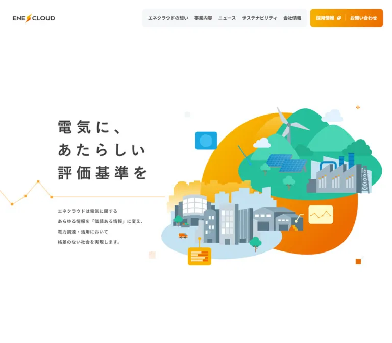
白地と淡いブルーグレーに、オレンジのグラデーションを配した企業サイト。街と再生可能エネルギーのイラスト、字間の広いコピー、ゆとりある情報配置が特徴。
オリジナルサイトを見るAn open white canvas connecting electricity, business, and society through a colorful illustrated landscape.
Website: enecloud.co.jp
Original URL: https://enecloud.co.jp/
Final URL: https://enecloud.co.jp/
Response: HTTP 200
Theme: light in the supplied captures
Inspected: September 17, 2026, 04:03 JST; supplied retrieval timestamp: 2026-09-16T19:03:00.239Z.
Viewports: desktop 1440 × 1000 CSS pixels; mobile 390 × 844 CSS pixels.
Scope: the current corporate homepage, using supplied desktop hero, news/sustainability, and footer captures; mobile hero and lower-footer captures; and rendered DOM/computed-style evidence covering the full homepage. Linked destination pages and menu-open states were not inspected.
ENECLOUD combines a restrained corporate information structure with approachable energy illustration. White dominates the opening screen. Charcoal Japanese lettering provides a calm visual anchor, while yellow-to-orange controls repeat the lightning accent in the wordmark. Turquoise hills, blue solar panels, wind generation, factories, and a pale blue city turn an abstract electricity service into a recognizable system of places and activities.
The page is a long corporate homepage with several destinations: company purpose, services, customer examples, news, sustainability, company information, recruitment, downloads, and contact. Its identity depends on generous space, asymmetric desktop compositions, compact navigation panels, widely tracked brand copy, and tiny square accents. Mobile reorganizes this material into a vertical sequence while retaining the illustration and substantial spacing.
An open white canvas connecting electricity, business, and society through a colorful illustrated landscape.
Website: enecloud.co.jp
Original URL: https://enecloud.co.jp/
Final URL: https://enecloud.co.jp/
Response: HTTP 200
Theme: light in the supplied captures
Inspected: September 17, 2026, 04:03 JST; supplied retrieval timestamp: 2026-09-16T19:03:00.239Z.
Viewports: desktop 1440 × 1000 CSS pixels; mobile 390 × 844 CSS pixels.
Scope: the current corporate homepage, using supplied desktop hero, news/sustainability, and footer captures; mobile hero and lower-footer captures; and rendered DOM/computed-style evidence covering the full homepage. Linked destination pages and menu-open states were not inspected.
ENECLOUD combines a restrained corporate information structure with approachable energy illustration. White dominates the opening screen. Charcoal Japanese lettering provides a calm visual anchor, while yellow-to-orange controls repeat the lightning accent in the wordmark. Turquoise hills, blue solar panels, wind generation, factories, and a pale blue city turn an abstract electricity service into a recognizable system of places and activities.
The page is a long corporate homepage with several destinations: company purpose, services, customer examples, news, sustainability, company information, recruitment, downloads, and contact. Its identity depends on generous space, asymmetric desktop compositions, compact navigation panels, widely tracked brand copy, and tiny square accents. Mobile reorganizes this material into a vertical sequence while retaining the illustration and substantial spacing.
The visible hero typography requires particular care: the sampled H1 is transparent and only 10px. It is not the large slogan visible in the screenshots. The hero’s visible type sizes below are estimates; the footer’s matching brand typography has directly measured declarations.
| Name | Value | Alias / source token | Evidence and role |
|---|---|---|---|
| Canvas White | #ffffff |
--color-canvas |
Measured body background; visible hero and editorial sections |
| Charcoal | #404040 |
--color-ink |
Measured section statements, body copy, news titles, and footer navigation |
| Brand Orange | #ec6c00 |
--color-brand; source --s-color-a28ab4ff |
Declared token and measured section-label/secondary-action text |
| Service Orange | #f48612 |
--color-service-orange |
Measured highlighted benefit text for Denki-io Agent |
| Service Blue | #0b88c5 |
--color-service-blue |
Measured highlighted benefit text for the electricity management service |
| Deep Blue | #0972a6 |
--color-blue-deep; source --s-color-df8eac94: #0972a6ff |
Declared token; exact visible usage is not established by the sampled nodes |
| Service Background | #ebf0f3 |
--color-service-surface |
Measured full-width service-section background |
| Footer Background | #f1f5f7 |
--color-footer-surface |
Measured sitemap/footer background on both viewports |
| Muted Text | #808282 |
--color-muted |
Measured news dates and copyright text |
| Address Text | #6a6c6c |
--color-secondary |
Measured company name and address in the footer identity block |
| Source Soft Neutral | #f7f8f7 |
source --s-color-eea9aeb4 |
Declared token; do not automatically assign it to every pale panel |
| Reversed White | #ffffff |
--color-on-brand |
Measured action labels and text in promotional areas |
| Name | Suggested value | Observed appearance |
|---|---|---|
| Golden Yellow | approximately #f9b300 |
Left side of action gradients and the hero’s large warm shape |
| Vivid Orange | approximately #f46c00 |
Right side of action gradients and the lower hero shape |
| Navigation Surface | approximately #f5f7f8 |
Very pale gray navigation panel |
| Sustainability Surface | approximately #f7f9fa |
Pale inset panel, visually lighter than the service section |
| Landscape Teal | approximately #20bda0 |
Main hills and green land mass in the illustration |
| Light Teal | approximately #44d2b1 |
Foreground hills and foliage |
| City Blue | approximately #c3e3f0 |
City platform and distant architectural forms |
| Architectural Blue-gray | approximately #73909f |
Building faces and industrial structures |
| Divider Gray | approximately #d0d0d0 |
Fine rules separating news entries |
Gradient treatment: the header priority group, mobile menu button, and news-list button visibly run from yellow at the left toward orange at the right. A reusable approximation is linear-gradient(90deg, #f9b300, #f46c00). The exact original stops and angle were not supplied.
Keep the interface palette narrower than the illustration palette. Greens and pale blues primarily describe the landscape. Orange identifies corporate navigation and actions; the two service benefit colors distinguish the products.
Several anchors report transparent backgrounds, and desktop navigation anchors report transparent text colors despite visible dark labels. Their sampled outer styles do not establish the complete paint mechanism. The Quick Start uses ordinary foreground colors and explicit backgrounds to reproduce the visible result.
Observed computed family: "Noto Sans JP", also declared through --s-font-3bbdf3a6.
This is the principal family for navigation, section labels, editorial statements, descriptions, news entries, buttons, and footer links. Weight 700 establishes hierarchy; weight 500 keeps body text substantial without making every paragraph look bold. Long line heights and restrained tracking give Japanese text room to breathe.
Font-file loading and fallback resolution were not independently audited. The family names here come from supplied declarations, not visual identification alone.
Observed computed family: "こぶりなゴシック W6 JIS2004", declared through --s-font-9295593f.
The footer’s three-line slogan uses this family at weight 600. Its defining feature is 0.24em letter spacing: 10.08px at 42px desktop size and 5.76px at 24px mobile size. Each line is a separate text block.
The visible hero has a related widely spaced character, but its exact visible font declaration is not exposed by the sampled transparent H1. Use the footer family as a supported brand reference, and treat applying it to a reconstructed text hero as a recommendation.
Values are measured unless explicitly labeled estimated.
| Role | Desktop | Mobile | Weight / tracking |
|---|---|---|---|
| Visible hero slogan | Estimated 54–56px; approximately 84–86px line pitch |
Estimated 36px; approximately 54px line pitch |
Visually bold; wide tracking, approximately 0.24em |
| Visible hero introduction | Estimated 16px, approximately 38px line pitch |
Estimated 12–13px, approximately 27px line pitch |
Medium appearance; exact declaration unavailable |
| Desktop primary navigation | 16px / 28.8px |
Replaced by menu button | 700; 0.8px tracking |
| Section eyebrow | 16px / 24px |
14px / 24px |
700; 0.02em tracking |
| Main section statement | 32px / 51.2px |
24px / 38.4px |
700; usually 0.03em desktop, normal mobile |
| Purpose-section body | 16px / 38.4px |
14px / 28px |
500; normal tracking |
| Standard descriptive body | 16px / 32px |
14px / 25.2px |
500; normal tracking |
| Service introductory line | 18px / 48px |
16px / 28.8px |
700; 0.02em tracking |
| Colored service benefit | 28px / 48px |
24px / 43.2px |
700; 0.02em tracking |
| News title | 20px / 36px |
16px / 25.6px |
500; normal tracking |
| News category text | 12px / 21.6px |
10px / 18px |
700; inside a 24px-high badge |
| News date | 14px / 25.2px |
12px / 21.6px |
500; muted gray |
| Standard action label | 16px / 28.8px |
16px / 28.8px |
700; generally normal tracking |
| Customer-example statement | 32px / 51.2px |
20px / 28px |
700; 0.04em tracking |
| Recruitment statement | 32px / 51.2px |
24px / 38.4px |
700; 0.04em tracking |
| Download/contact heading | 40px / 72px |
24px / 43.2px |
700 |
| Footer slogan, each line | 42px / 42px |
24px / 24px |
600; 0.24em tracking |
| Footer group heading | 18px / 25.2px |
16px / 22.4px |
700 |
| Footer ordinary link | 16px / 32px |
14px / 25.2px |
500 |
| Footer legal link / copyright | 14px / 25.2px |
14px / 25.2px |
500 |
The legal text retains its size on mobile while many other roles shrink. Buttons also preserve their 16px labels. Responsive typography is selective rather than a uniform scale applied to the entire page.
The visible brand statement is deliberately arranged as:
電気に、
あたらしい
評価基準を
Keep these three lines as a composed unit. Elsewhere, allow descriptive text to wrap naturally within its column. The desktop purpose paragraph is only 392px wide; mobile gives it 342px, so smaller type compensates for a narrower reading measure.
The transparent hero H1 uses different wording from the visible slogan. The introduction also differs between the extracted transparent text and the screenshot. A new implementation should establish one canonical accessible message rather than reproduce these discrepancies.
The page uses familiar spacing increments, but the evidence does not establish a universal source spacing variable. Most reusable distances cluster around 8, 12, 16, 24, 32, 40, 48, and 80px, with much larger section gaps.
| Use | Desktop | Mobile | Evidence |
|---|---|---|---|
| Header outer inset | 48px |
16px |
Measured logo/control coordinates |
| Primary navigation link padding | 12px horizontally |
Not applicable | Measured |
| Header priority-link padding | 16px horizontally |
Not applicable | Measured |
| Common content edge | 108px from viewport edge |
24px |
Measured repeated content coordinates |
| Label indentation from section edge | 18px |
18px |
Derived from heading and label coordinates |
| Standard action text inset | Usually 24px |
Usually 22–24px |
Derived from link and label rectangles |
| Label-to-statement gap | Usually 24px |
Usually 24px |
Derived; sustainability mobile uses a smaller gap |
| Statement-to-body gap | Often 40px |
Often 32px |
Derived from purpose/company text rectangles |
| News content stack gap | 16px |
8px |
Derived from badge, title, and date coordinates |
| News row top/bottom padding | Approximately 24px each |
Approximately 24px each |
Derived from repeated row positions and visible rules |
| Footer child-link indentation | Approximately 15–16px |
Approximately 15–16px |
Derived |
| Footer legal-link gap | 24px horizontally |
12px vertically between line boxes |
Derived |
| Element | Value / treatment | Evidence |
|---|---|---|
| Mobile menu button | 12px |
Measured |
| Desktop navigation panel | Approximately 8px |
Estimated from screenshot |
| Desktop priority-action group | Approximately 8px |
Estimated from screenshot |
| News-list button | Fully rounded ends; approximately 24px radius |
Estimated; measured height 48.8px |
| News category badge | Pill shape; approximately 12px radius |
Estimated; measured height 24px |
| Sustainability panel | Approximately 12px |
Estimated |
| Footer identity card | Approximately 12px |
Estimated |
| News photograph | Square corners | Visible in screenshot |
| Decorative squares | Square corners | Visible throughout supplied captures |
Outer anchor nodes commonly report a zero radius even where a rounded colored layer is visible. Do not treat the outer anchor radius as the final component radius.
| Element | Desktop at 1440px | Mobile at 390px | Evidence |
|---|---|---|---|
| Document height | 8318.97px |
9281.28px |
Measured |
| Header rectangle | 1440 × 112px |
390 × 79.64px |
Measured initial state |
| Logo link | 186 × 64px at (48, 48) |
185 × 63.64px at (16, 16) |
Measured; visible logo occupies less than its link box |
| Main content span | 1224px, from x 108 to 1332 |
342px, from x 24 to 366 |
Derived from repeated measured edges |
| Desktop navigation panel | Approximately 653 × 64px |
Hidden from initial mobile view | Estimated visible panel bounds |
| Desktop priority group | Approximately 289 × 64px |
Replaced in header by menu button | Estimated visible panel bounds |
| Mobile menu button | Not shown | 104 × 56px at (270, 16) |
Measured |
| News title column | 640px |
294px |
Measured |
| News trailing link box | 24px wide |
24px wide |
Measured; visible square mark is much smaller |
| News list overall width | 704px |
342px |
Derived |
| News-list button | 159.19 × 48.8px |
155.14 × 48.8px |
Measured |
| Recruitment link block | 1224 × 432.56px |
342 × 523.8px |
Measured |
| Footer identity card | Approximately 496 × 721px |
Full card not included in mobile screenshot | Estimated desktop bounds |
A maximum content width of 1224px is a useful implementation recommendation. Only its resulting width at the supplied viewport is established; the original maximum-width rule was not provided.
Role: identity, corporate navigation, and priority destinations.
The desktop header contains three visible groups: the wordmark at the far left, five corporate links inside a pale rounded rectangle, and a separate yellow-to-orange priority group for 採用情報 and お問い合わせ. The priority links share a background and are separated by a thin light divider. Small overlapping-window symbols follow their labels.
At the inspected width, all link boxes are 64px high. Primary navigation uses 16px bold Noto Sans JP with 0.05em tracking. The pale panel has approximately 24px of additional space before and after its padded links. About 22px separates it from the priority group.
The header remains in the same viewport position across the supplied scroll captures. This supports persistent positioning, although the exact fixed versus sticky implementation was not included in the evidence. Its overall background is transparent, leaving each navigation group as an independent surface.
The window symbols do not establish new-tab behavior: some corresponding URLs are on the same domain, and target attributes were not supplied.
Role: compact navigation access.
The mobile header retains nearly the same logo-link size but moves the outer inset to 16px. A 104 × 56px gradient button sits at the upper right, with a measured 12px radius and 24px horizontal padding.
Inside it, two horizontal bars are aligned toward the right. The upper bar appears approximately 40px long and the lower approximately 56px, with contrasting warm tones. Their dimensions are visual estimates.
Only the closed control is documented. Menu contents, opening direction, focus handling, dismissal, and animation are unverified. The lower mobile screenshot is a scrolled footer view.
Role: establish the company’s promise and make its energy domain tangible.
On desktop, the three-line slogan occupies the left portion of the screen, beginning around x 212, y 310. A four-line introduction sits below a thin orange graph motif. The large illustration occupies roughly x 592–1404, y 269–846, excluding some detached decorative squares. These bounds are visual estimates.
The illustration is the dominant color area. A large irregular warm shape supports two overlapping environments: a pale blue urban foreground and a green landscape with renewable and industrial infrastructure. Small chart panels and connection lines reinforce information exchange.
There is no prominent hero CTA in the supplied initial captures. Navigation and later section buttons provide the entry points. Preserve the opening’s emphasis on the statement and artwork.
On mobile, the composition becomes slogan, graph line, introduction, then illustration. The visible slogan begins around x 54, y 104; the illustration spans nearly the full width around y 463–733. This is a rearrangement of the composition, not a uniformly reduced desktop screen.
Role: a recurring visual connection between electricity, data, and navigation.
A fine orange line enters from the left viewport edge, rises and falls through several square points, then becomes horizontal. It separates the hero statement from the supporting text. It is approximately a one-pixel visual stroke, not a chart with axes or data labels.
Other decorations include isolated orange squares, pale gray squares, small diagonal-hatch squares, and tiny cross-shaped clusters. They are sparse and asymmetrical. Keep them near the edges of content or illustration; their small scale is essential.
No graph interaction or live-data behavior is established. For reuse, a decorative SVG is an appropriate implementation, with the path excluded from the accessibility tree.
Role: a repeatable hierarchy for corporate topics.
The recurring anatomy is a tiny square accent, an orange eyebrow such as 事業内容, a charcoal statement, an optional paragraph, and a compact action link. The eyebrow is 16px on desktop and 14px on mobile. Main statements are 32px / 1.6 and 24px / 1.6 respectively.
The sampled source often uses an H2 for the small topic label and a paragraph for the visually larger statement. A new implementation can preserve the visual order while choosing a logical heading hierarchy for its own content.
Paragraphs generally use 16px / 2 on desktop and 14px / 1.8 on mobile. The purpose section is more open, with line heights of 2.4 and 2.
Role: explain the service mission with a human context.
The desktop text group begins at x 836, with an orange eyebrow indented to x 854. Its main statement spans two lines. The supporting paragraph has a measured width of 392px, followed by the エネクラウドの想い action.
The DOM includes a staff photograph whose alternative text describes a smiling employee conducting an online business meeting. That establishes the image subject; its complete composition and crop are not visible in the supplied screenshots.
Mobile moves the text group to the common x 24 edge with a 342px paragraph width. Retain a generous gap before the button instead of collapsing this into a compact feature card.
Role: introduce two distinct electricity services.
The service section has the measured background #ebf0f3. Desktop presents the two service text groups side by side: their introductory lines share y 2759.28, at x 199.5 and x 800.5.
Each group contains an introductory line, a larger colored benefit, descriptive copy, and a service action. Denki-io Agent uses #f48612 for its benefit; the electricity management service uses #0b88c5. Both retain charcoal supporting copy.
Mobile stacks the groups in order. Text begins at x 24 and uses the available 342px column. The first colored benefit wraps over two lines; the second fits one line in the supplied measurements. Allow natural content height instead of enforcing equal-height benefit blocks.
The complete service media regions are outside the supplied screenshot coverage. Their dimensions, asset identities, and detailed surface treatment should not be invented from the text rectangles.
Role: move from a homepage summary to a dedicated destination.
The visible news-list action is a compact gradient pill with a white bold label and a tiny white square at the right. It is approximately 49px high, with a 24px left text inset on desktop. Other measured section actions share this height and white 16px labels, although their full visible shells are not all captured.
Content determines width: measured examples range from 160px for short labels to 214px for the purpose link. Keep the right-side marker subordinate to the label. Avoid turning the small square into a large circular arrow badge.
Some promotional actions use orange text, measured at 16px / 24px with 0.05em tracking. Their full background layers are not established by the sampled transparent anchor wrappers.
Role: provide current company updates through a quiet editorial list.
Desktop uses a left introduction and square entrance photograph beside a wider list. The photograph is approximately 198 × 198px in the screenshot. The list begins at x 628 and ends at x 1332, giving a derived width of 704px.
Each entry contains a small orange ニュース badge, a charcoal title, a muted date, and a tiny warm square at the far right. Fine gray horizontal rules divide the entries. There are no enclosing cards or visible shadows.
The measured title width is 640px, followed by a 40px gap and a 24px trailing link box. Badge-to-title and title-to-date gaps are each 16px. The repeated desktop row pitch is approximately 166.19px, consistent with 24px top and bottom padding plus a one-pixel divider.
On mobile, the title column becomes 294px, the gap to the trailing box becomes 24px, and the content-stack gaps reduce to 8px. Titles use 16px / 25.6px, and longer entries wrap naturally. The archive button aligns to the right on desktop and starts at x 24 on mobile.
The source exposes separate category, title, and trailing-marker anchors. Do not describe the entire original row as a verified single click target. A recommended adaptation can put the title and its marker in one accessible link while leaving the category link separate.
Role: a calm inset statement about the company’s broader responsibilities.
The desktop screenshot shows a pale rounded panel aligned to the common 1224px content span. Its left text begins at x 188, approximately 80px inside the panel; the supporting paragraph begins at x 804. An orange eyebrow introduces a bold two-line charcoal statement.
On mobile, the statement and body stack. The text edge moves to x 48, with a 294px body width. This is an additional 24px inset beyond the normal page gutter. The description appears before the action in the mobile measurements.
The full lower edge is not visible in the desktop screenshot. The measured section includes 360px bottom padding on desktop and 80px on mobile; these values describe the section wrapper, not necessarily the panel’s internal padding.
Role: offer deeper corporate information and a distinct recruiting destination.
The company section uses the standard orange-label, bold-statement, paragraph, and action sequence. Its desktop paragraph is 392px wide at x 108; mobile uses 342px at x 24. Measured outer padding changes from 190px 0 170px to 100px 0.
The recruitment block is a large link measuring 1224 × 432.56px on desktop and 342 × 523.8px on mobile. Its desktop copy sits on the right, while mobile copy appears below the opening media area. The measured statement is white, and the action text is orange.
The DOM identifies a recruitment image, but the complete banner is not shown in the supplied captures. Exact image cropping, background construction, and hover behavior remain unverified.
Role: give visitors two practical next steps before the sitemap.
The DOM places download and contact blocks side by side on desktop and sequentially on mobile. Desktop headings are white 40px / 72px; supporting text is white 18px / 32.4px. Mobile reduces them to 24px / 43.2px and 14px / 25.2px.
The download action measures 495 × 56px on desktop and 342 × 48px on mobile. The contact action is similarly wide. This area uses broader controls than the compact section pills.
The desktop footer screenshot reveals an orange band and cropped illustrated staff immediately above the sitemap. It does not reveal the complete preceding banner. Preserve the documented typography and responsive arrangement without inventing its unseen top boundary or illustration layout.
Role: repeat the brand promise and provide company identification.
A large white rounded card occupies the left side of the desktop footer. It contains an enlarged wordmark, the three-line tracked slogan, the company name エネクラウド株式会社, a compact three-line address, and a building illustration clipped at the lower right.
The card is approximately 496px wide and overlaps the orange-to-pale-footer boundary by about 50px in the screenshot. The measured text edge is x 155, roughly 47px inside the card. The building, trees, and cloud repeat the hero’s flat geometry and cool architectural colors.
The slogan uses separate 42px line boxes with a derived 21px gap between them. Mobile uses 24px line boxes with a derived 13px gap. Its text edge is x 52, distinct from the sitemap’s x 24 edge.
Role: a comprehensive route map, including specific contact purposes.
The desktop sitemap occupies two columns to the right of the identity card. Group headings are bold 18px text with small orange square bullets. Child links are 16px, indented approximately 15–16px, with small gray window symbols on selected destinations.
The contact group has another level for prospective and existing customers. Preserve that hierarchy through indentation and smaller text rather than creating a separate card for each link.
Mobile places the groups in a single column. Group headings become 16px; ordinary links become 14px. The five legal links stack near the bottom, followed by copyright text. The mobile screenshot shows the persistent logo overlapping footer content near the top edge; document this as an observed layering issue, not a desirable spacing rule.
| Treatment | Supplied evidence | What can be concluded |
|---|---|---|
| Common element transitions | 0.3s cubic-bezier(0.4, 0.4, 0, 1) on many sampled elements |
A shared 300ms easing is declared; the affected visible states were not exercised |
| Gradient-related properties | The same transition references --g-angle, --g-color-*, and --g-position-* |
Gradient parameters are included in transition declarations; a specific animated gradient effect is not proven |
| Body background | background 0.5s cubic-bezier(0.4, 0.4, 0, 1) |
A 500ms background transition is declared; its trigger is unknown |
| Persistent header | Same visible placement in scrolled captures | Header remains available during the documented scrolling |
| Navigation and section actions | Rendered anchor destinations are supplied | Destination URLs are known; destination-page behavior is not inspected |
| Mobile menu | A button and its closed appearance are supplied | Opening, closing, and overlay behavior are unverified |
| Hero illustration | Still captures only; sampled elements report animation: none |
Windmill rotation, chart drawing, floating ornaments, and other illustration motion cannot be asserted |
| Hover, keyboard, and focus states | No exercised-state evidence | Exact state colors, transforms, and focus behavior remain unverified |
The inspection process waited for document loading, visible image decoding, and sampled layout/text stability. It also accounted for finite animations and temporarily paused perpetual animations during readiness checks. This increases confidence in the settled captures but does not establish an animation storyboard.
Recommended reuse: use the measured 300ms easing for modest color or opacity feedback. Keep any added decorative motion optional, avoid moving essential text, and provide reduced-motion behavior. Do not add windmill rotation or line-drawing animation under the claim that it was observed here.
| Surface | Appearance | Function |
|---|---|---|
| Main canvas | Solid white | Keeps the hero and editorial content open |
| Primary navigation | Very pale rounded rectangle | Groups corporate destinations without a full-width header bar |
| Priority navigation / primary action | Warm horizontal gradient | Concentrates action emphasis |
| Service section | Measured #ebf0f3 field |
Separates the product overview from white sections |
| News list | White, fine gray dividers | Supports scanning through typography and spacing |
| Sustainability panel | Very pale inset rounded panel | Groups a broad corporate statement |
| Footer field | Measured #f1f5f7 |
Holds a dense sitemap without becoming visually dark |
| Footer identity card | White rounded surface | Separates the brand and address from navigation |
No prominent elevation shadows appear in the supplied views. Separation comes from fill changes, whitespace, rules, and a small number of rounded containers. Keep illustration highlights inside the artwork rather than extending a glossy treatment to the interface.
The main artwork uses flat geometric shapes with mild architectural perspective. Rounded hills contrast with rectangular windows, factory rooflines, solar-panel grids, and chart modules. Objects are recognizable but simplified; there are no photographic textures or realistic lighting effects in the hero.
Its composition has several defining relationships:
Use uncropped artwork with transparent or white surroundings. On mobile, retain the complete recognizable scene and move it below the introduction. Do not crop it into a generic rectangular hero photograph.
Photography supplies corporate reality alongside the illustrative opening. The news section visibly uses a square entrance photograph with plants and the company logo. The DOM additionally identifies a staff-meeting photograph and recruitment imagery.
The footer’s building illustration repeats the hero language at a smaller scale. The cropped staff visible above the footer also use simplified flat shapes. Preserve this relationship between large narrative artwork and small supporting illustrations.
These URLs are present in the supplied original-page DOM evidence. They were not separately opened, and no files are bundled with this reference.
| Asset | Observed URL | Evidence scope |
|---|---|---|
| Staff-meeting photograph | https://storage.googleapis.com/studio-design-asset-files/projects/JgqeAoNwqk/s-760x760_v-fs_webp_8a03d206-70f0-4b8b-a272-edd7e7d3eb5b_small.webp | Subject identified by DOM alternative text; complete crop not shown |
| Company entrance photograph | https://storage.googleapis.com/studio-design-asset-files/projects/JgqeAoNwqk/s-600x600_v-fs_webp_ea77f690-c233-44ab-b502-73a82bff6471_small.webp | DOM reference and visible news-section photograph |
| Recruitment image | https://storage.googleapis.com/studio-design-asset-files/projects/JgqeAoNwqk/s-1344x832_v-fms_webp_9f38e459-65c6-4b6f-9fc8-a442511d01a8_small.webp | DOM reference; full banner not shown |
No complete hero-artwork or logo asset URL was supplied. Do not manufacture a filename or assume the hero is a single SVG, canvas, or raster asset. The CSS starter expects appropriate artwork to be supplied separately.
The sequence below comes from the rendered document. Heights include each section’s own spacing and are not suggested fixed heights for a new site.
| Region | Desktop height | Mobile height | Responsive consequence |
|---|---|---|---|
| Opening region before purpose section | 1000px |
819.67px |
Hero changes from side-by-side to vertically ordered content |
| Corporate purpose | 991.30px |
870.42px |
Text moves to the main mobile gutter and uses smaller type |
| Services, including customer-example promotion | 1581.16px |
2052.69px |
Service groups stack and descriptions wrap |
| News | 849.36px |
989.33px |
List moves below its introduction |
| Sustainability | 756.17px |
520.70px |
Text stacks and large desktop trailing space reduces |
| Company information | 979.98px |
894.27px |
Smaller type and reduced outer padding |
| Recruitment section | 512.56px |
643.80px |
Banner becomes taller and narrower |
| Download/contact area | 736.81px |
874.70px |
Two actions stack |
| Sitemap/footer field | 911.63px |
1615.70px |
Identity, navigation groups, and legal links become a vertical sequence |
Most lower-page content shares x 108 and x 1332 edges. The hero deliberately departs from this alignment: its text begins farther inward, and the illustration extends closer to the right viewport edge.
The news geometry supports a useful derived layout: 496px for the left introduction, 24px between columns, and 704px for the list. Centering a 198px photograph within that left area places it at x 257, matching the screenshot.
The footer uses a different division: an approximately 496px identity card, an 80px separation, and a roughly 648px sitemap area. Preserve these distinct compositions rather than forcing every section into the same equal-column grid.
The common content gutter is 24px, yielding 342px of space. Header controls use 16px insets. The hero statement uses an approximately 54px left inset, and inset panel content uses x 48.
Desktop navigation disappears from the initial mobile view. Services stack in their original order. News titles wrap inside a 294px column while preserving a trailing marker region. Sustainability moves its description between the statement and action. The footer becomes a complete single-column route map, retaining nested contact links.
The mobile hero’s next section begins at y 819.67, close to the bottom of the 844px viewport. This is an observed result, not evidence of a universal 100vh rule. Use content-driven height to avoid clipping translated or enlarged text.
Only two viewport widths were supplied. The exact original breakpoints and tablet behavior are unknown. The Quick Start recommends an 80rem header collapse and a 48rem content-stack breakpoint; validate those choices with real text and loaded fonts.
Avoid interpolating every property fluidly. The evidence shows discrete changes in layout, body sizes, heading sizes, and action alignment, while button typography and some legal text stay constant.
10px H1 as the visible hero type specification.販売終了 service label as evidence that the corporate website is discontinued.These are recommendations for a new implementation, not verified original features:
aria-expanded state, keyboard dismissal, and focus restoration.10px to at least 12px when readability takes priority over exact visual matching.#ffffff.#404040.#ec6c00.#ebf0f3.#f1f5f7.#f48612 and #0b88c5.#f9b300 → #f46c00.“Create a Japanese corporate homepage for an electricity-information and optimization company using the current ENECLOUD visual principles. Use an open white canvas, charcoal text, pale blue-gray service and footer regions, and compact yellow-to-orange action controls. Place a three-line, widely tracked Japanese brand statement at the left of a large flat geometric illustration connecting a city, factories, wind generation, and solar power. Add a thin orange graph line with square points between the statement and introduction. Use bold Noto Sans JP section statements, small orange topic labels, generous paragraph line heights, editorial news rows with fine dividers, and a detailed sitemap footer with a white brand card. On mobile, retain the full illustration below the copy and stack the corporate content. Treat menu states and animation as implementation requirements to design explicitly.”
“Treat computed values as measured only for the corresponding visible element. Preserve the distinction between transparent semantic hero text and the visible slogan. Use estimated hero sizes and gradient colors as adjustable tokens. Do not invent artwork URLs, hover transformations, menu-open layouts, or continuous illustration motion. Validate the result at 1440 × 1000 and 390 × 844, then test intermediate widths and enlarged text.”
This is a recommended implementation scaffold, not extracted source CSS. It uses measured colors and ordinary text roles, estimated visible hero proportions and gradient colors, and explicit responsive rules. It keeps a conventional root font size.
Load Noto Sans JP and the supported display family separately when available. The hero and logo artwork must also be supplied separately; no asset path is invented here.
:root {
  /* Measured colors */
  --color-canvas: #ffffff;
  --color-ink: #404040;
  --color-brand: #ec6c00;
  --color-service-orange: #f48612;
  --color-service-blue: #0b88c5;
  --color-blue-deep: #0972a6;
  --color-service-surface: #ebf0f3;
  --color-footer-surface: #f1f5f7;
  --color-muted: #808282;
  --color-secondary: #6a6c6c;

  /* Visual approximations */
  --color-gold: #f9b300;
  --color-action-orange: #f46c00;
  --color-nav-surface: #f5f7f8;
  --color-panel: #f7f9fa;
  --color-rule: #d0d0d0;
  --gradient-action: linear-gradient(
    90deg,
    var(--color-gold),
    var(--color-action-orange)
  );

  /* Source families with recommended fallbacks */
  --font-body: 'Noto Sans JP', sans-serif;
  --font-brand: 'こぶりなゴシック W6 JIS2004',
    'Noto Sans JP', sans-serif;
  --weight-medium: 500;
  --weight-bold: 700;

  /* Desktop typography */
  --text-body: 1rem;
  --text-label: 1rem;
  --text-section: 2rem;
  --text-news: 1.25rem;
  --text-date: 0.875rem;
  --text-badge: 0.75rem;
  --text-hero: 3.375rem;
  --leading-body: 2;
  --leading-section: 1.6;
  --tracking-brand: 0.24em;

  /* Recommended layout aliases */
  --content-max: 1224px;
  --page-gutter: 24px;
  --header-inset: clamp(16px, 3.333333vw, 48px);
  --hero-inset: clamp(54px, 14.722222vw, 212px);
  --radius-panel: 12px;
  --radius-nav: 8px;
  --radius-pill: 999px;
  --space-8: 8px;
  --space-16: 16px;
  --space-24: 24px;
  --space-32: 32px;
  --space-40: 40px;
  --space-48: 48px;
  --space-80: 80px;

  /* Measured transition timing; application is recommended */
  --ease-site: cubic-bezier(0.4, 0.4, 0, 1);
  --duration-ui: 300ms;
}

* {
  box-sizing: border-box;
}

body {
  margin: 0;
  color: var(--color-ink);
  background: var(--color-canvas);
  font-family: var(--font-body);
  font-weight: var(--weight-medium);
  line-height: var(--leading-body);
}

img,
svg {
  display: block;
  max-inline-size: 100%;
}

img {
  block-size: auto;
}

a {
  color: inherit;
}

button {
  font: inherit;
}

.page-width {
  inline-size: min(
    var(--content-max),
    calc(100% - 2 * var(--page-gutter))
  );
  margin-inline: auto;
}

/* Recommended persistent-header implementation */
.site-header {
  position: fixed;
  inset: 0 0 auto;
  z-index: 20;
  display: flex;
  align-items: flex-start;
  gap: 22px;
  padding: var(--header-inset) var(--header-inset) 0;
  pointer-events: none;
}

.site-header > * {
  pointer-events: auto;
}

.site-brand {
  display: grid;
  place-items: center;
  flex: 0 0 186px;
  inline-size: 186px;
  block-size: 64px;
}

.site-brand img {
  inline-size: 160px;
}

.desktop-nav {
  display: flex;
  align-items: center;
  min-block-size: 64px;
  margin-inline-start: auto;
  padding-inline: 24px;
  border-radius: var(--radius-nav);
  background: var(--color-nav-surface);
}

.desktop-nav a {
  display: flex;
  align-items: center;
  min-block-size: 64px;
  padding-inline: 12px;
  font-size: 16px;
  font-weight: 700;
  line-height: 1.8;
  letter-spacing: 0.05em;
  white-space: nowrap;
  text-decoration: none;
}

.priority-links {
  display: flex;
  align-items: center;
  padding-inline: 8px;
  border-radius: var(--radius-nav);
  color: #ffffff;
  background: var(--gradient-action);
}

.priority-links a {
  display: flex;
  align-items: center;
  gap: 10px;
  min-block-size: 64px;
  padding-inline: 16px;
  font-size: 16px;
  font-weight: 700;
  line-height: 1.8;
  white-space: nowrap;
  text-decoration: none;
}

.priority-divider {
  inline-size: 1px;
  block-size: 16px;
  background: rgb(255 255 255 / 65%);
}

.menu-button {
  display: none;
  place-items: center;
  flex: 0 0 104px;
  inline-size: 104px;
  block-size: 56px;
  padding: 0 24px;
  border: 0;
  border-radius: 12px;
  background: var(--gradient-action);
  cursor: pointer;
}

.menu-glyph {
  display: grid;
  justify-items: end;
  gap: 9px;
  inline-size: 56px;
}

.menu-glyph span {
  inline-size: 56px;
  block-size: 3px;
  background: var(--color-brand);
}

.menu-glyph span:first-child {
  inline-size: 40px;
  background: #ffd267;
}

/* Suggested class for an opaque scrolled header state */
.site-header.is-scrolled {
  background: var(--color-canvas);
}

/* Hero measurements are visual adaptations */
.hero {
  display: grid;
  grid-template-columns: minmax(0, 360px) minmax(0, 1fr);
  align-items: center;
  gap: 20px;
  min-block-size: 100svh;
  padding: 232px 36px 100px var(--hero-inset);
}

.hero-message,
.hero-art {
  min-inline-size: 0;
}

.hero-title {
  margin: 0;
  font-family: var(--font-brand);
  font-size: var(--text-hero);
  font-weight: 600;
  line-height: 1.55;
  letter-spacing: var(--tracking-brand);
}

.hero-title span {
  display: block;
}

.hero-plot {
  inline-size: calc(100% + var(--hero-inset) + 36px);
  max-inline-size: none;
  block-size: 96px;
  margin-inline-start: calc(-1 * var(--hero-inset));
  color: var(--color-action-orange);
  pointer-events: none;
}

.hero-description {
  margin: 0;
  font-size: 16px;
  line-height: 2.4;
}

.hero-art img {
  inline-size: 100%;
  object-fit: contain;
}

.section-label {
  display: flex;
  align-items: center;
  gap: 12px;
  margin: 0 0 24px;
  color: var(--color-brand);
  font-size: var(--text-label);
  font-weight: 700;
  line-height: 24px;
  letter-spacing: 0.02em;
}

.section-label::before {
  content: '';
  flex: 0 0 6px;
  inline-size: 6px;
  block-size: 6px;
  background: var(--color-gold);
}

.section-title {
  margin: 0;
  font-size: var(--text-section);
  font-weight: 700;
  line-height: var(--leading-section);
  letter-spacing: 0.03em;
}

.body-copy {
  margin: 32px 0 0;
  font-size: var(--text-body);
  line-height: var(--leading-body);
}

.purpose-copy {
  line-height: 2.4;
}

.action-link {
  display: inline-flex;
  align-items: center;
  justify-content: space-between;
  gap: 16px;
  min-block-size: 48.8px;
  max-inline-size: 100%;
  padding: 10px 24px;
  border-radius: var(--radius-pill);
  color: #ffffff;
  background: var(--gradient-action);
  font-size: 16px;
  font-weight: 700;
  line-height: 1.8;
  text-decoration: none;
}

.action-mark {
  flex: 0 0 6px;
  inline-size: 6px;
  block-size: 6px;
  background: currentColor;
}

.service-section {
  padding-block: 80px;
  background: var(--color-service-surface);
}

.service-grid {
  display: grid;
  grid-template-columns: repeat(2, minmax(0, 1fr));
  gap: 80px;
  margin-block-start: 64px;
}

.service-intro {
  margin: 0;
  font-size: 18px;
  font-weight: 700;
  line-height: 48px;
  letter-spacing: 0.02em;
}

.service-benefit {
  margin: 0;
  color: var(--color-service-orange);
  font-size: 28px;
  font-weight: 700;
  line-height: 48px;
  letter-spacing: 0.02em;
}

.service-benefit.is-blue {
  color: var(--color-service-blue);
}

.news-section {
  padding-block: 150px 120px;
}

.news-layout {
  display: grid;
  grid-template-columns: minmax(0, 496px) minmax(0, 1fr);
  gap: 24px;
}

.news-photo {
  inline-size: 198px;
  aspect-ratio: 1;
  margin: 80px auto 0;
  object-fit: cover;
}

/* Category link, title link, and time remain separate elements */
.news-row {
  position: relative;
  display: grid;
  gap: 16px;
  padding: 24px 64px 24px 0;
  border-block-end: 1px solid var(--color-rule);
}

.news-badge {
  justify-self: start;
  display: inline-flex;
  align-items: center;
  min-block-size: 24px;
  padding-inline: 12px;
  border-radius: var(--radius-pill);
  color: #ffffff;
  background: var(--color-action-orange);
  font-size: var(--text-badge);
  font-weight: 700;
  line-height: 1.8;
  text-decoration: none;
}

.news-title-link {
  font-size: var(--text-news);
  font-weight: 500;
  line-height: 1.8;
  text-decoration: none;
}

/* Place this decorative span inside the title link */
.news-marker {
  position: absolute;
  inset-inline-end: 0;
  inset-block-start: calc(50% - 4px);
  inline-size: 8px;
  block-size: 8px;
  background: var(--gradient-action);
}

.news-date {
  color: var(--color-muted);
  font-size: var(--text-date);
  line-height: 1.8;
}

.news-actions {
  display: flex;
  justify-content: flex-end;
  margin-block-start: 32px;
}

.sustainability-panel {
  display: grid;
  grid-template-columns: minmax(0, 1fr) minmax(0, 461px);
  align-items: center;
  gap: 80px;
  padding: 80px;
  border-radius: var(--radius-panel);
  background: var(--color-panel);
}

.company-section {
  padding-block: 190px 170px;
}

.site-footer {
  padding-block: 0 96px;
  background: var(--color-footer-surface);
}

.footer-main {
  display: grid;
  grid-template-columns: minmax(0, 496px) minmax(0, 1fr);
  gap: 80px;
}

.footer-identity {
  position: relative;
  padding: 48px;
  border-radius: var(--radius-panel);
  background: var(--color-canvas);
  overflow: hidden;
}

.footer-slogan {
  display: grid;
  gap: 21px;
  margin-block: 56px 124px;
  font-family: var(--font-brand);
  font-size: 42px;
  font-weight: 600;
  line-height: 1;
  letter-spacing: var(--tracking-brand);
}

.footer-address {
  position: relative;
  z-index: 1;
  color: var(--color-secondary);
  font-size: 14px;
  font-style: normal;
  line-height: 1.8;
}

.footer-art {
  position: absolute;
  inset: auto 0 0 auto;
  inline-size: 34%;
  pointer-events: none;
}

.footer-links {
  display: grid;
  grid-template-columns: repeat(2, minmax(0, 1fr));
  align-content: start;
  gap: 32px 24px;
  padding-block-start: 80px;
}

.footer-group-title {
  display: flex;
  align-items: center;
  gap: 8px;
  margin: 0 0 12px;
  font-size: 18px;
  font-weight: 700;
  line-height: 1.4;
}

.footer-group-title::before {
  content: '';
  inline-size: 8px;
  block-size: 8px;
  flex: 0 0 8px;
  background: var(--color-brand);
}

.footer-group-links {
  display: grid;
  gap: 4px;
  margin-inline-start: 16px;
}

.footer-group-links a {
  font-size: 16px;
  line-height: 2;
  text-decoration: none;
}

.footer-bottom {
  display: flex;
  align-items: flex-start;
  justify-content: space-between;
  gap: 32px;
  margin-block-start: 80px;
  font-size: 14px;
  line-height: 1.8;
}

.footer-legal {
  display: flex;
  flex-wrap: wrap;
  gap: 12px 24px;
}

.footer-legal a {
  text-decoration: none;
}

.footer-copyright {
  margin: 0;
  color: var(--color-muted);
}

/* Recommended feedback, not an observed hover specification */
a,
button {
  transition: opacity var(--duration-ui) var(--ease-site);
}

@media (hover: hover) {
  .action-link:hover {
    opacity: 0.88;
  }

  .news-title-link:hover,
  .footer-group-links a:hover,
  .footer-legal a:hover {
    text-decoration: underline;
    text-underline-offset: 0.2em;
  }
}

:where(a, button):focus-visible {
  outline: 3px solid var(--color-blue-deep);
  outline-offset: 4px;
}

/* Recommended breakpoint; original breakpoint is unknown */
@media (max-width: 80rem) {
  .site-header {
    padding: 16px 16px 0;
  }

  .desktop-nav,
  .priority-links {
    display: none;
  }

  .menu-button {
    display: grid;
    margin-inline-start: auto;
  }
}

/* Recommended breakpoint implementing documented mobile changes */
@media (max-width: 48rem) {
  :root {
    --text-body: 0.875rem;
    --text-label: 0.875rem;
    --text-section: 1.5rem;
    --text-news: 1rem;
    --text-date: 0.75rem;
    --text-badge: 0.625rem;
    --text-hero: clamp(30px, 9.23vw, 36px);
    --leading-body: 1.8;
    --hero-inset: clamp(24px, 13.846vw, 54px);
  }

  .hero {
    grid-template-columns: minmax(0, 1fr);
    gap: 24px;
    min-block-size: auto;
    padding: 96px 0 56px;
  }

  .hero-message {
    padding-inline: var(--hero-inset) 24px;
  }

  .hero-title {
    line-height: 1.5;
  }

  .hero-plot {
    inline-size: calc(100% + var(--hero-inset) + 24px);
    block-size: 48px;
    margin-block: 8px 24px;
  }

  .hero-description {
    font-size: 13px;
    line-height: 2.08;
  }

  .hero-art {
    padding-inline: 10px;
  }

  .section-title {
    letter-spacing: normal;
  }

  .purpose-copy {
    line-height: 2;
  }

  .service-section {
    padding-block: 60px 55px;
  }

  .service-grid,
  .news-layout,
  .sustainability-panel,
  .footer-main,
  .footer-links {
    grid-template-columns: minmax(0, 1fr);
  }

  .service-grid {
    gap: 64px;
  }

  .service-intro {
    font-size: 16px;
    line-height: 1.8;
  }

  .service-benefit {
    font-size: 24px;
    line-height: 1.8;
  }

  .news-section {
    padding-block: 80px 36px;
  }

  .news-layout {
    gap: 32px;
  }

  /* Optional editorial image treatment; mobile crop is unverified */
  .news-photo {
    inline-size: 148px;
    margin-block-start: 32px;
  }

  .news-row {
    gap: 8px;
    padding-inline-end: 48px;
  }

  .news-title-link {
    line-height: 1.6;
  }

  .news-actions {
    justify-content: flex-start;
    margin-block-start: 24px;
  }

  .sustainability-panel {
    gap: 32px;
    padding: 28px 24px;
  }

  .company-section {
    padding-block: 100px;
  }

  .site-footer {
    padding-block-end: 40px;
  }

  .footer-main {
    gap: 40px;
  }

  .footer-identity {
    padding: 28px;
  }

  .footer-slogan {
    gap: 13px;
    margin-block: 40px 56px;
    font-size: 24px;
  }

  .footer-address {
    font-size: 12px;
  }

  .footer-links {
    gap: 24px;
    padding-block-start: 0;
  }

  .footer-group-title {
    font-size: 16px;
  }

  .footer-group-links a {
    font-size: 14px;
    line-height: 1.8;
  }

  .footer-bottom,
  .footer-legal {
    flex-direction: column;
    align-items: flex-start;
  }

  .footer-bottom {
    margin-block-start: 96px;
  }
}

@media (prefers-reduced-motion: reduce) {
  a,
  button {
    transition: none;
  }
}
Markup contract: .hero contains .hero-message followed by .hero-art; the message contains a heading with three spans, a decorative .hero-plot SVG, and a paragraph. A .news-row contains a category link, a title link with a decorative .news-marker, and a time element. Footer groups use headings and lists of links. Set decorative SVGs and marker spans to aria-hidden="true".
The header CSS provides appearance only. Implement the menu disclosure before exposing the button as an active control. The optional .is-scrolled class also requires application logic. The artwork, exact panel layering, and original motion cannot be recreated by these declarations alone.
Optional mapping for a project already using Tailwind v4. This does not imply that the inspected site uses Tailwind. Define the custom properties above first.
@theme inline {
  --color-canvas: #ffffff;
  --color-ink: #404040;
  --color-brand: #ec6c00;
  --color-service-orange: #f48612;
  --color-service-blue: #0b88c5;
  --color-service-surface: #ebf0f3;
  --color-footer-surface: #f1f5f7;
  --color-muted: #808282;

  --font-sans: 'Noto Sans JP', sans-serif;
  --font-brand: 'こぶりなゴシック W6 JIS2004',
    'Noto Sans JP', sans-serif;

  --text-body: var(--text-body);
  --text-section-title: var(--text-section);
  --text-news-title: var(--text-news);
  --text-news-date: var(--text-date);
  --text-hero-title: var(--text-hero);

  --spacing-page-gutter: 24px;
  --spacing-section-gap: 80px;
  --radius-panel: 12px;
  --radius-navigation: 8px;
  --radius-action: 999px;
  --ease-site: cubic-bezier(0.4, 0.4, 0, 1);
}
Use the ordinary CSS variables for the action gradient and responsive component rules. Utility aliases do not replace the site-specific composition.
2026-09-16T19:03:00.239Z, equivalent to September 17, 2026, 04:03 JST. The desktop viewport was 1440 × 1000; the mobile viewport was 390 × 844.2026.1.27 in the desktop screenshot and 2026.1.26 in the supplied DOM. Dates are used here only to establish the metadata treatment. Transparent and duplicated extracted text is not treated as additional visible content.This reference describes the current homepage represented by the supplied inspection. Measured values, visual estimates, and implementation recommendations remain explicitly distinguished.
# ENECLOUD — Corporate Website Style Reference

> An open white canvas connecting electricity, business, and society through a colorful illustrated landscape.

**Website:** [enecloud.co.jp](https://enecloud.co.jp/)
**Original URL:** https://enecloud.co.jp/
**Final URL:** https://enecloud.co.jp/
**Response:** HTTP 200
**Theme:** light in the supplied captures
**Inspected:** September 17, 2026, 04:03 JST; supplied retrieval timestamp: `2026-09-16T19:03:00.239Z`.
**Viewports:** desktop `1440 × 1000` CSS pixels; mobile `390 × 844` CSS pixels.
**Scope:** the current corporate homepage, using supplied desktop hero, news/sustainability, and footer captures; mobile hero and lower-footer captures; and rendered DOM/computed-style evidence covering the full homepage. Linked destination pages and menu-open states were not inspected.

ENECLOUD combines a restrained corporate information structure with approachable energy illustration. White dominates the opening screen. Charcoal Japanese lettering provides a calm visual anchor, while yellow-to-orange controls repeat the lightning accent in the wordmark. Turquoise hills, blue solar panels, wind generation, factories, and a pale blue city turn an abstract electricity service into a recognizable system of places and activities.

The page is a long corporate homepage with several destinations: company purpose, services, customer examples, news, sustainability, company information, recruitment, downloads, and contact. Its identity depends on generous space, asymmetric desktop compositions, compact navigation panels, widely tracked brand copy, and tiny square accents. Mobile reorganizes this material into a vertical sequence while retaining the illustration and substantial spacing.
# ENECLOUD — Corporate Website Style Reference

> An open white canvas connecting electricity, business, and society through a colorful illustrated landscape.

**Website:** [enecloud.co.jp](https://enecloud.co.jp/)
**Original URL:** https://enecloud.co.jp/
**Final URL:** https://enecloud.co.jp/
**Response:** HTTP 200
**Theme:** light in the supplied captures
**Inspected:** September 17, 2026, 04:03 JST; supplied retrieval timestamp: `2026-09-16T19:03:00.239Z`.
**Viewports:** desktop `1440 × 1000` CSS pixels; mobile `390 × 844` CSS pixels.
**Scope:** the current corporate homepage, using supplied desktop hero, news/sustainability, and footer captures; mobile hero and lower-footer captures; and rendered DOM/computed-style evidence covering the full homepage. Linked destination pages and menu-open states were not inspected.

ENECLOUD combines a restrained corporate information structure with approachable energy illustration. White dominates the opening screen. Charcoal Japanese lettering provides a calm visual anchor, while yellow-to-orange controls repeat the lightning accent in the wordmark. Turquoise hills, blue solar panels, wind generation, factories, and a pale blue city turn an abstract electricity service into a recognizable system of places and activities.

The page is a long corporate homepage with several destinations: company purpose, services, customer examples, news, sustainability, company information, recruitment, downloads, and contact. Its identity depends on generous space, asymmetric desktop compositions, compact navigation panels, widely tracked brand copy, and tiny square accents. Mobile reorganizes this material into a vertical sequence while retaining the illustration and substantial spacing.

## How to Read This Reference

- **Measured** means a value supplied by the rendered DOM or computed-style record. Decimal dimensions are rounded where that improves readability.
- **Derived** means arithmetic from measured rectangles, such as column widths, indentation, or spacing between adjacent elements.
- **Estimated** means a visual approximation from the current-page captures. Estimated hex colors are implementation approximations, not sampled original values.
- **Recommended** means a proposed implementation choice. Breakpoints, accessibility additions, and the Quick Start class system belong to this category.
- Token names introduced here are descriptive aliases. Original custom-property names are identified explicitly.
- The DOM sample includes transparent text and outer wrappers that do not describe the final visible treatment. Use screenshots to establish appearance and computed styles to establish values only where those layers correspond.

The visible hero typography requires particular care: the sampled H1 is transparent and only `10px`. It is not the large slogan visible in the screenshots. The hero’s visible type sizes below are estimates; the footer’s matching brand typography has directly measured declarations.

## Tokens — Colors

### Default Palette

| Name | Value | Alias / source token | Evidence and role |
| --- | --- | --- | --- |
| Canvas White | `#ffffff` | `--color-canvas` | Measured body background; visible hero and editorial sections |
| Charcoal | `#404040` | `--color-ink` | Measured section statements, body copy, news titles, and footer navigation |
| Brand Orange | `#ec6c00` | `--color-brand`; source `--s-color-a28ab4ff` | Declared token and measured section-label/secondary-action text |
| Service Orange | `#f48612` | `--color-service-orange` | Measured highlighted benefit text for Denki-io Agent |
| Service Blue | `#0b88c5` | `--color-service-blue` | Measured highlighted benefit text for the electricity management service |
| Deep Blue | `#0972a6` | `--color-blue-deep`; source `--s-color-df8eac94: #0972a6ff` | Declared token; exact visible usage is not established by the sampled nodes |
| Service Background | `#ebf0f3` | `--color-service-surface` | Measured full-width service-section background |
| Footer Background | `#f1f5f7` | `--color-footer-surface` | Measured sitemap/footer background on both viewports |
| Muted Text | `#808282` | `--color-muted` | Measured news dates and copyright text |
| Address Text | `#6a6c6c` | `--color-secondary` | Measured company name and address in the footer identity block |
| Source Soft Neutral | `#f7f8f7` | source `--s-color-eea9aeb4` | Declared token; do not automatically assign it to every pale panel |
| Reversed White | `#ffffff` | `--color-on-brand` | Measured action labels and text in promotional areas |

### Visual Approximations

| Name | Suggested value | Observed appearance |
| --- | --- | --- |
| Golden Yellow | approximately `#f9b300` | Left side of action gradients and the hero’s large warm shape |
| Vivid Orange | approximately `#f46c00` | Right side of action gradients and the lower hero shape |
| Navigation Surface | approximately `#f5f7f8` | Very pale gray navigation panel |
| Sustainability Surface | approximately `#f7f9fa` | Pale inset panel, visually lighter than the service section |
| Landscape Teal | approximately `#20bda0` | Main hills and green land mass in the illustration |
| Light Teal | approximately `#44d2b1` | Foreground hills and foliage |
| City Blue | approximately `#c3e3f0` | City platform and distant architectural forms |
| Architectural Blue-gray | approximately `#73909f` | Building faces and industrial structures |
| Divider Gray | approximately `#d0d0d0` | Fine rules separating news entries |

**Gradient treatment:** the header priority group, mobile menu button, and news-list button visibly run from yellow at the left toward orange at the right. A reusable approximation is `linear-gradient(90deg, #f9b300, #f46c00)`. The exact original stops and angle were not supplied.

Keep the interface palette narrower than the illustration palette. Greens and pale blues primarily describe the landscape. Orange identifies corporate navigation and actions; the two service benefit colors distinguish the products.

Several anchors report transparent backgrounds, and desktop navigation anchors report transparent text colors despite visible dark labels. Their sampled outer styles do not establish the complete paint mechanism. The Quick Start uses ordinary foreground colors and explicit backgrounds to reproduce the visible result.

## Tokens — Typography

### Noto Sans JP — Information and Navigation

**Observed computed family:** `"Noto Sans JP"`, also declared through `--s-font-3bbdf3a6`.

This is the principal family for navigation, section labels, editorial statements, descriptions, news entries, buttons, and footer links. Weight `700` establishes hierarchy; weight `500` keeps body text substantial without making every paragraph look bold. Long line heights and restrained tracking give Japanese text room to breathe.

Font-file loading and fallback resolution were not independently audited. The family names here come from supplied declarations, not visual identification alone.

### Koburina Gothic — Brand Statement

**Observed computed family:** `"こぶりなゴシック W6 JIS2004"`, declared through `--s-font-9295593f`.

The footer’s three-line slogan uses this family at weight `600`. Its defining feature is `0.24em` letter spacing: `10.08px` at `42px` desktop size and `5.76px` at `24px` mobile size. Each line is a separate text block.

The visible hero has a related widely spaced character, but its exact visible font declaration is not exposed by the sampled transparent H1. Use the footer family as a supported brand reference, and treat applying it to a reconstructed text hero as a recommendation.

### Type Scale

Values are measured unless explicitly labeled estimated.

| Role | Desktop | Mobile | Weight / tracking |
| --- | --- | --- | --- |
| Visible hero slogan | Estimated `54–56px`; approximately `84–86px` line pitch | Estimated `36px`; approximately `54px` line pitch | Visually bold; wide tracking, approximately `0.24em` |
| Visible hero introduction | Estimated `16px`, approximately `38px` line pitch | Estimated `12–13px`, approximately `27px` line pitch | Medium appearance; exact declaration unavailable |
| Desktop primary navigation | `16px / 28.8px` | Replaced by menu button | `700`; `0.8px` tracking |
| Section eyebrow | `16px / 24px` | `14px / 24px` | `700`; `0.02em` tracking |
| Main section statement | `32px / 51.2px` | `24px / 38.4px` | `700`; usually `0.03em` desktop, normal mobile |
| Purpose-section body | `16px / 38.4px` | `14px / 28px` | `500`; normal tracking |
| Standard descriptive body | `16px / 32px` | `14px / 25.2px` | `500`; normal tracking |
| Service introductory line | `18px / 48px` | `16px / 28.8px` | `700`; `0.02em` tracking |
| Colored service benefit | `28px / 48px` | `24px / 43.2px` | `700`; `0.02em` tracking |
| News title | `20px / 36px` | `16px / 25.6px` | `500`; normal tracking |
| News category text | `12px / 21.6px` | `10px / 18px` | `700`; inside a `24px`-high badge |
| News date | `14px / 25.2px` | `12px / 21.6px` | `500`; muted gray |
| Standard action label | `16px / 28.8px` | `16px / 28.8px` | `700`; generally normal tracking |
| Customer-example statement | `32px / 51.2px` | `20px / 28px` | `700`; `0.04em` tracking |
| Recruitment statement | `32px / 51.2px` | `24px / 38.4px` | `700`; `0.04em` tracking |
| Download/contact heading | `40px / 72px` | `24px / 43.2px` | `700` |
| Footer slogan, each line | `42px / 42px` | `24px / 24px` | `600`; `0.24em` tracking |
| Footer group heading | `18px / 25.2px` | `16px / 22.4px` | `700` |
| Footer ordinary link | `16px / 32px` | `14px / 25.2px` | `500` |
| Footer legal link / copyright | `14px / 25.2px` | `14px / 25.2px` | `500` |

The legal text retains its size on mobile while many other roles shrink. Buttons also preserve their `16px` labels. Responsive typography is selective rather than a uniform scale applied to the entire page.

### Copy and Line Breaking

The visible brand statement is deliberately arranged as:

> 電気に、
> あたらしい
> 評価基準を

Keep these three lines as a composed unit. Elsewhere, allow descriptive text to wrap naturally within its column. The desktop purpose paragraph is only `392px` wide; mobile gives it `342px`, so smaller type compensates for a narrower reading measure.

The transparent hero H1 uses different wording from the visible slogan. The introduction also differs between the extracted transparent text and the screenshot. A new implementation should establish one canonical accessible message rather than reproduce these discrepancies.

## Tokens — Spacing & Shapes

The page uses familiar spacing increments, but the evidence does not establish a universal source spacing variable. Most reusable distances cluster around `8`, `12`, `16`, `24`, `32`, `40`, `48`, and `80px`, with much larger section gaps.

### Spacing Scale

| Use | Desktop | Mobile | Evidence |
| --- | --- | --- | --- |
| Header outer inset | `48px` | `16px` | Measured logo/control coordinates |
| Primary navigation link padding | `12px` horizontally | Not applicable | Measured |
| Header priority-link padding | `16px` horizontally | Not applicable | Measured |
| Common content edge | `108px` from viewport edge | `24px` | Measured repeated content coordinates |
| Label indentation from section edge | `18px` | `18px` | Derived from heading and label coordinates |
| Standard action text inset | Usually `24px` | Usually `22–24px` | Derived from link and label rectangles |
| Label-to-statement gap | Usually `24px` | Usually `24px` | Derived; sustainability mobile uses a smaller gap |
| Statement-to-body gap | Often `40px` | Often `32px` | Derived from purpose/company text rectangles |
| News content stack gap | `16px` | `8px` | Derived from badge, title, and date coordinates |
| News row top/bottom padding | Approximately `24px` each | Approximately `24px` each | Derived from repeated row positions and visible rules |
| Footer child-link indentation | Approximately `15–16px` | Approximately `15–16px` | Derived |
| Footer legal-link gap | `24px` horizontally | `12px` vertically between line boxes | Derived |

### Border Radius

| Element | Value / treatment | Evidence |
| --- | --- | --- |
| Mobile menu button | `12px` | Measured |
| Desktop navigation panel | Approximately `8px` | Estimated from screenshot |
| Desktop priority-action group | Approximately `8px` | Estimated from screenshot |
| News-list button | Fully rounded ends; approximately `24px` radius | Estimated; measured height `48.8px` |
| News category badge | Pill shape; approximately `12px` radius | Estimated; measured height `24px` |
| Sustainability panel | Approximately `12px` | Estimated |
| Footer identity card | Approximately `12px` | Estimated |
| News photograph | Square corners | Visible in screenshot |
| Decorative squares | Square corners | Visible throughout supplied captures |

Outer anchor nodes commonly report a zero radius even where a rounded colored layer is visible. Do not treat the outer anchor radius as the final component radius.

### Layout Measurements

| Element | Desktop at 1440px | Mobile at 390px | Evidence |
| --- | --- | --- | --- |
| Document height | `8318.97px` | `9281.28px` | Measured |
| Header rectangle | `1440 × 112px` | `390 × 79.64px` | Measured initial state |
| Logo link | `186 × 64px` at `(48, 48)` | `185 × 63.64px` at `(16, 16)` | Measured; visible logo occupies less than its link box |
| Main content span | `1224px`, from x `108` to `1332` | `342px`, from x `24` to `366` | Derived from repeated measured edges |
| Desktop navigation panel | Approximately `653 × 64px` | Hidden from initial mobile view | Estimated visible panel bounds |
| Desktop priority group | Approximately `289 × 64px` | Replaced in header by menu button | Estimated visible panel bounds |
| Mobile menu button | Not shown | `104 × 56px` at `(270, 16)` | Measured |
| News title column | `640px` | `294px` | Measured |
| News trailing link box | `24px` wide | `24px` wide | Measured; visible square mark is much smaller |
| News list overall width | `704px` | `342px` | Derived |
| News-list button | `159.19 × 48.8px` | `155.14 × 48.8px` | Measured |
| Recruitment link block | `1224 × 432.56px` | `342 × 523.8px` | Measured |
| Footer identity card | Approximately `496 × 721px` | Full card not included in mobile screenshot | Estimated desktop bounds |

A maximum content width of `1224px` is a useful implementation recommendation. Only its resulting width at the supplied viewport is established; the original maximum-width rule was not provided.

## Components

### Persistent Corporate Header

**Role:** identity, corporate navigation, and priority destinations.

The desktop header contains three visible groups: the wordmark at the far left, five corporate links inside a pale rounded rectangle, and a separate yellow-to-orange priority group for `採用情報` and `お問い合わせ`. The priority links share a background and are separated by a thin light divider. Small overlapping-window symbols follow their labels.

At the inspected width, all link boxes are `64px` high. Primary navigation uses `16px` bold Noto Sans JP with `0.05em` tracking. The pale panel has approximately `24px` of additional space before and after its padded links. About `22px` separates it from the priority group.

The header remains in the same viewport position across the supplied scroll captures. This supports persistent positioning, although the exact `fixed` versus `sticky` implementation was not included in the evidence. Its overall background is transparent, leaving each navigation group as an independent surface.

The window symbols do not establish new-tab behavior: some corresponding URLs are on the same domain, and target attributes were not supplied.

### Mobile Menu Button

**Role:** compact navigation access.

The mobile header retains nearly the same logo-link size but moves the outer inset to `16px`. A `104 × 56px` gradient button sits at the upper right, with a measured `12px` radius and `24px` horizontal padding.

Inside it, two horizontal bars are aligned toward the right. The upper bar appears approximately `40px` long and the lower approximately `56px`, with contrasting warm tones. Their dimensions are visual estimates.

Only the closed control is documented. Menu contents, opening direction, focus handling, dismissal, and animation are unverified. The lower mobile screenshot is a scrolled footer view.

### Illustrated Brand Hero

**Role:** establish the company’s promise and make its energy domain tangible.

On desktop, the three-line slogan occupies the left portion of the screen, beginning around x `212`, y `310`. A four-line introduction sits below a thin orange graph motif. The large illustration occupies roughly x `592–1404`, y `269–846`, excluding some detached decorative squares. These bounds are visual estimates.

The illustration is the dominant color area. A large irregular warm shape supports two overlapping environments: a pale blue urban foreground and a green landscape with renewable and industrial infrastructure. Small chart panels and connection lines reinforce information exchange.

There is no prominent hero CTA in the supplied initial captures. Navigation and later section buttons provide the entry points. Preserve the opening’s emphasis on the statement and artwork.

On mobile, the composition becomes slogan, graph line, introduction, then illustration. The visible slogan begins around x `54`, y `104`; the illustration spans nearly the full width around y `463–733`. This is a rearrangement of the composition, not a uniformly reduced desktop screen.

### Energy Graph and Square Accents

**Role:** a recurring visual connection between electricity, data, and navigation.

A fine orange line enters from the left viewport edge, rises and falls through several square points, then becomes horizontal. It separates the hero statement from the supporting text. It is approximately a one-pixel visual stroke, not a chart with axes or data labels.

Other decorations include isolated orange squares, pale gray squares, small diagonal-hatch squares, and tiny cross-shaped clusters. They are sparse and asymmetrical. Keep them near the edges of content or illustration; their small scale is essential.

No graph interaction or live-data behavior is established. For reuse, a decorative SVG is an appropriate implementation, with the path excluded from the accessibility tree.

### Section Introduction

**Role:** a repeatable hierarchy for corporate topics.

The recurring anatomy is a tiny square accent, an orange eyebrow such as `事業内容`, a charcoal statement, an optional paragraph, and a compact action link. The eyebrow is `16px` on desktop and `14px` on mobile. Main statements are `32px / 1.6` and `24px / 1.6` respectively.

The sampled source often uses an H2 for the small topic label and a paragraph for the visually larger statement. A new implementation can preserve the visual order while choosing a logical heading hierarchy for its own content.

Paragraphs generally use `16px / 2` on desktop and `14px / 1.8` on mobile. The purpose section is more open, with line heights of `2.4` and `2`.

### Corporate Purpose Section

**Role:** explain the service mission with a human context.

The desktop text group begins at x `836`, with an orange eyebrow indented to x `854`. Its main statement spans two lines. The supporting paragraph has a measured width of `392px`, followed by the `エネクラウドの想い` action.

The DOM includes a staff photograph whose alternative text describes a smiling employee conducting an online business meeting. That establishes the image subject; its complete composition and crop are not visible in the supplied screenshots.

Mobile moves the text group to the common x `24` edge with a `342px` paragraph width. Retain a generous gap before the button instead of collapsing this into a compact feature card.

### Service Overview and Paired Service Groups

**Role:** introduce two distinct electricity services.

The service section has the measured background `#ebf0f3`. Desktop presents the two service text groups side by side: their introductory lines share y `2759.28`, at x `199.5` and x `800.5`.

Each group contains an introductory line, a larger colored benefit, descriptive copy, and a service action. Denki-io Agent uses `#f48612` for its benefit; the electricity management service uses `#0b88c5`. Both retain charcoal supporting copy.

Mobile stacks the groups in order. Text begins at x `24` and uses the available `342px` column. The first colored benefit wraps over two lines; the second fits one line in the supplied measurements. Allow natural content height instead of enforcing equal-height benefit blocks.

The complete service media regions are outside the supplied screenshot coverage. Their dimensions, asset identities, and detailed surface treatment should not be invented from the text rectangles.

### Rounded Action Link

**Role:** move from a homepage summary to a dedicated destination.

The visible news-list action is a compact gradient pill with a white bold label and a tiny white square at the right. It is approximately `49px` high, with a `24px` left text inset on desktop. Other measured section actions share this height and white `16px` labels, although their full visible shells are not all captured.

Content determines width: measured examples range from `160px` for short labels to `214px` for the purpose link. Keep the right-side marker subordinate to the label. Avoid turning the small square into a large circular arrow badge.

Some promotional actions use orange text, measured at `16px / 24px` with `0.05em` tracking. Their full background layers are not established by the sampled transparent anchor wrappers.

### News Section and News Entry

**Role:** provide current company updates through a quiet editorial list.

Desktop uses a left introduction and square entrance photograph beside a wider list. The photograph is approximately `198 × 198px` in the screenshot. The list begins at x `628` and ends at x `1332`, giving a derived width of `704px`.

Each entry contains a small orange `ニュース` badge, a charcoal title, a muted date, and a tiny warm square at the far right. Fine gray horizontal rules divide the entries. There are no enclosing cards or visible shadows.

The measured title width is `640px`, followed by a `40px` gap and a `24px` trailing link box. Badge-to-title and title-to-date gaps are each `16px`. The repeated desktop row pitch is approximately `166.19px`, consistent with `24px` top and bottom padding plus a one-pixel divider.

On mobile, the title column becomes `294px`, the gap to the trailing box becomes `24px`, and the content-stack gaps reduce to `8px`. Titles use `16px / 25.6px`, and longer entries wrap naturally. The archive button aligns to the right on desktop and starts at x `24` on mobile.

The source exposes separate category, title, and trailing-marker anchors. Do not describe the entire original row as a verified single click target. A recommended adaptation can put the title and its marker in one accessible link while leaving the category link separate.

### Sustainability Panel

**Role:** a calm inset statement about the company’s broader responsibilities.

The desktop screenshot shows a pale rounded panel aligned to the common `1224px` content span. Its left text begins at x `188`, approximately `80px` inside the panel; the supporting paragraph begins at x `804`. An orange eyebrow introduces a bold two-line charcoal statement.

On mobile, the statement and body stack. The text edge moves to x `48`, with a `294px` body width. This is an additional `24px` inset beyond the normal page gutter. The description appears before the action in the mobile measurements.

The full lower edge is not visible in the desktop screenshot. The measured section includes `360px` bottom padding on desktop and `80px` on mobile; these values describe the section wrapper, not necessarily the panel’s internal padding.

### Company and Recruitment Blocks

**Role:** offer deeper corporate information and a distinct recruiting destination.

The company section uses the standard orange-label, bold-statement, paragraph, and action sequence. Its desktop paragraph is `392px` wide at x `108`; mobile uses `342px` at x `24`. Measured outer padding changes from `190px 0 170px` to `100px 0`.

The recruitment block is a large link measuring `1224 × 432.56px` on desktop and `342 × 523.8px` on mobile. Its desktop copy sits on the right, while mobile copy appears below the opening media area. The measured statement is white, and the action text is orange.

The DOM identifies a recruitment image, but the complete banner is not shown in the supplied captures. Exact image cropping, background construction, and hover behavior remain unverified.

### Download and Contact Area

**Role:** give visitors two practical next steps before the sitemap.

The DOM places download and contact blocks side by side on desktop and sequentially on mobile. Desktop headings are white `40px / 72px`; supporting text is white `18px / 32.4px`. Mobile reduces them to `24px / 43.2px` and `14px / 25.2px`.

The download action measures `495 × 56px` on desktop and `342 × 48px` on mobile. The contact action is similarly wide. This area uses broader controls than the compact section pills.

The desktop footer screenshot reveals an orange band and cropped illustrated staff immediately above the sitemap. It does not reveal the complete preceding banner. Preserve the documented typography and responsive arrangement without inventing its unseen top boundary or illustration layout.

### Footer Identity Card

**Role:** repeat the brand promise and provide company identification.

A large white rounded card occupies the left side of the desktop footer. It contains an enlarged wordmark, the three-line tracked slogan, the company name `エネクラウド株式会社`, a compact three-line address, and a building illustration clipped at the lower right.

The card is approximately `496px` wide and overlaps the orange-to-pale-footer boundary by about `50px` in the screenshot. The measured text edge is x `155`, roughly `47px` inside the card. The building, trees, and cloud repeat the hero’s flat geometry and cool architectural colors.

The slogan uses separate `42px` line boxes with a derived `21px` gap between them. Mobile uses `24px` line boxes with a derived `13px` gap. Its text edge is x `52`, distinct from the sitemap’s x `24` edge.

### Footer Sitemap and Legal Links

**Role:** a comprehensive route map, including specific contact purposes.

The desktop sitemap occupies two columns to the right of the identity card. Group headings are bold `18px` text with small orange square bullets. Child links are `16px`, indented approximately `15–16px`, with small gray window symbols on selected destinations.

The contact group has another level for prospective and existing customers. Preserve that hierarchy through indentation and smaller text rather than creating a separate card for each link.

Mobile places the groups in a single column. Group headings become `16px`; ordinary links become `14px`. The five legal links stack near the bottom, followed by copyright text. The mobile screenshot shows the persistent logo overlapping footer content near the top edge; document this as an observed layering issue, not a desirable spacing rule.

## Tokens — Motion & Interaction

| Treatment | Supplied evidence | What can be concluded |
| --- | --- | --- |
| Common element transitions | `0.3s cubic-bezier(0.4, 0.4, 0, 1)` on many sampled elements | A shared 300ms easing is declared; the affected visible states were not exercised |
| Gradient-related properties | The same transition references `--g-angle`, `--g-color-*`, and `--g-position-*` | Gradient parameters are included in transition declarations; a specific animated gradient effect is not proven |
| Body background | `background 0.5s cubic-bezier(0.4, 0.4, 0, 1)` | A 500ms background transition is declared; its trigger is unknown |
| Persistent header | Same visible placement in scrolled captures | Header remains available during the documented scrolling |
| Navigation and section actions | Rendered anchor destinations are supplied | Destination URLs are known; destination-page behavior is not inspected |
| Mobile menu | A button and its closed appearance are supplied | Opening, closing, and overlay behavior are unverified |
| Hero illustration | Still captures only; sampled elements report `animation: none` | Windmill rotation, chart drawing, floating ornaments, and other illustration motion cannot be asserted |
| Hover, keyboard, and focus states | No exercised-state evidence | Exact state colors, transforms, and focus behavior remain unverified |

The inspection process waited for document loading, visible image decoding, and sampled layout/text stability. It also accounted for finite animations and temporarily paused perpetual animations during readiness checks. This increases confidence in the settled captures but does not establish an animation storyboard.

**Recommended reuse:** use the measured 300ms easing for modest color or opacity feedback. Keep any added decorative motion optional, avoid moving essential text, and provide reduced-motion behavior. Do not add windmill rotation or line-drawing animation under the claim that it was observed here.

## Surfaces

| Surface | Appearance | Function |
| --- | --- | --- |
| Main canvas | Solid white | Keeps the hero and editorial content open |
| Primary navigation | Very pale rounded rectangle | Groups corporate destinations without a full-width header bar |
| Priority navigation / primary action | Warm horizontal gradient | Concentrates action emphasis |
| Service section | Measured `#ebf0f3` field | Separates the product overview from white sections |
| News list | White, fine gray dividers | Supports scanning through typography and spacing |
| Sustainability panel | Very pale inset rounded panel | Groups a broad corporate statement |
| Footer field | Measured `#f1f5f7` | Holds a dense sitemap without becoming visually dark |
| Footer identity card | White rounded surface | Separates the brand and address from navigation |

No prominent elevation shadows appear in the supplied views. Separation comes from fill changes, whitespace, rules, and a small number of rounded containers. Keep illustration highlights inside the artwork rather than extending a glossy treatment to the interface.

## Imagery

### Energy Landscape

The main artwork uses flat geometric shapes with mild architectural perspective. Rounded hills contrast with rectangular windows, factory rooflines, solar-panel grids, and chart modules. Objects are recognizable but simplified; there are no photographic textures or realistic lighting effects in the hero.

Its composition has several defining relationships:

- A large yellow/orange shape sits behind the scene as a warm unifying field.
- The green landscape occupies the upper right, with wind and solar generation.
- Cool blue-gray buildings occupy the lower left, grounded by a pale blue oval.
- Industry and nature overlap within one connected system.
- Thin connector lines and small chart panels bridge infrastructure and information.
- Sparse squares and hatch marks continue outside the main scene.

Use uncropped artwork with transparent or white surroundings. On mobile, retain the complete recognizable scene and move it below the introduction. Do not crop it into a generic rectangular hero photograph.

### Photography and Supporting Illustrations

Photography supplies corporate reality alongside the illustrative opening. The news section visibly uses a square entrance photograph with plants and the company logo. The DOM additionally identifies a staff-meeting photograph and recruitment imagery.

The footer’s building illustration repeats the hero language at a smaller scale. The cropped staff visible above the footer also use simplified flat shapes. Preserve this relationship between large narrative artwork and small supporting illustrations.

### Observed Asset References

These URLs are present in the supplied original-page DOM evidence. They were not separately opened, and no files are bundled with this reference.

| Asset | Observed URL | Evidence scope |
| --- | --- | --- |
| Staff-meeting photograph | https://storage.googleapis.com/studio-design-asset-files/projects/JgqeAoNwqk/s-760x760_v-fs_webp_8a03d206-70f0-4b8b-a272-edd7e7d3eb5b_small.webp | Subject identified by DOM alternative text; complete crop not shown |
| Company entrance photograph | https://storage.googleapis.com/studio-design-asset-files/projects/JgqeAoNwqk/s-600x600_v-fs_webp_ea77f690-c233-44ab-b502-73a82bff6471_small.webp | DOM reference and visible news-section photograph |
| Recruitment image | https://storage.googleapis.com/studio-design-asset-files/projects/JgqeAoNwqk/s-1344x832_v-fms_webp_9f38e459-65c6-4b6f-9fc8-a442511d01a8_small.webp | DOM reference; full banner not shown |

No complete hero-artwork or logo asset URL was supplied. Do not manufacture a filename or assume the hero is a single SVG, canvas, or raster asset. The CSS starter expects appropriate artwork to be supplied separately.

## Layout & Responsive Behavior

### Page Sequence

The sequence below comes from the rendered document. Heights include each section’s own spacing and are not suggested fixed heights for a new site.

| Region | Desktop height | Mobile height | Responsive consequence |
| --- | --- | --- | --- |
| Opening region before purpose section | `1000px` | `819.67px` | Hero changes from side-by-side to vertically ordered content |
| Corporate purpose | `991.30px` | `870.42px` | Text moves to the main mobile gutter and uses smaller type |
| Services, including customer-example promotion | `1581.16px` | `2052.69px` | Service groups stack and descriptions wrap |
| News | `849.36px` | `989.33px` | List moves below its introduction |
| Sustainability | `756.17px` | `520.70px` | Text stacks and large desktop trailing space reduces |
| Company information | `979.98px` | `894.27px` | Smaller type and reduced outer padding |
| Recruitment section | `512.56px` | `643.80px` | Banner becomes taller and narrower |
| Download/contact area | `736.81px` | `874.70px` | Two actions stack |
| Sitemap/footer field | `911.63px` | `1615.70px` | Identity, navigation groups, and legal links become a vertical sequence |

### Desktop Composition

Most lower-page content shares x `108` and x `1332` edges. The hero deliberately departs from this alignment: its text begins farther inward, and the illustration extends closer to the right viewport edge.

The news geometry supports a useful derived layout: `496px` for the left introduction, `24px` between columns, and `704px` for the list. Centering a `198px` photograph within that left area places it at x `257`, matching the screenshot.

The footer uses a different division: an approximately `496px` identity card, an `80px` separation, and a roughly `648px` sitemap area. Preserve these distinct compositions rather than forcing every section into the same equal-column grid.

### Mobile Composition

The common content gutter is `24px`, yielding `342px` of space. Header controls use `16px` insets. The hero statement uses an approximately `54px` left inset, and inset panel content uses x `48`.

Desktop navigation disappears from the initial mobile view. Services stack in their original order. News titles wrap inside a `294px` column while preserving a trailing marker region. Sustainability moves its description between the statement and action. The footer becomes a complete single-column route map, retaining nested contact links.

The mobile hero’s next section begins at y `819.67`, close to the bottom of the `844px` viewport. This is an observed result, not evidence of a universal `100vh` rule. Use content-driven height to avoid clipping translated or enlarged text.

### Breakpoint Limits

Only two viewport widths were supplied. The exact original breakpoints and tablet behavior are unknown. The Quick Start recommends an `80rem` header collapse and a `48rem` content-stack breakpoint; validate those choices with real text and loaded fonts.

Avoid interpolating every property fluidly. The evidence shows discrete changes in layout, body sizes, heading sizes, and action alignment, while button typography and some legal text stay constant.

## Do’s and Don’ts

### Do

- Build the corporate page around white, charcoal, warm orange, and pale blue-gray fields.
- Give the energy illustration enough area to remain the opening screen’s main color mass.
- Preserve the three-line brand statement and its unusually generous tracking.
- Use measured Noto Sans JP roles for the ordinary information hierarchy.
- Keep eyebrow labels small and orange, with restrained square accents.
- Distinguish the orange and blue service benefits without extending those colors to every paragraph.
- Use thin rules for news entries and compact pill actions for section exits.
- Retain different column proportions for the hero, news, and footer.
- Stack mobile content in a readable order while preserving substantial space around illustration.
- Keep a comprehensive footer with clear grouping and indentation.

### Don’t

- Do not use the transparent `10px` H1 as the visible hero type specification.
- Do not rebuild the wordmark with ordinary text and an improvised lightning glyph.
- Do not reduce the homepage to a single service pitch or remove its corporate destinations.
- Do not replace the complete hero scene with a stock photograph or a tightly cropped fragment.
- Do not give every section a rounded card and drop shadow.
- Do not enlarge the tiny square markers into dominant decorative buttons.
- Do not treat the footer’s `販売終了` service label as evidence that the corporate website is discontinued.
- Do not infer a menu overlay or illustration animation from still captures.
- Do not copy transparent wrapper backgrounds as the visible CTA appearance.
- Do not preserve header/content collisions as intentional design behavior.

## Recommended Implementation Additions

These are recommendations for a new implementation, not verified original features:

- Make the visible brand statement a real accessible heading, or provide one equivalent text alternative if approved artwork contains the lettering. Avoid conflicting duplicate copy.
- Give the logo link and mobile menu button accessible names. Connect the menu button to a real disclosure panel with synchronized `aria-expanded` state, keyboard dismissal, and focus restoration.
- Add a visible charcoal or deep-blue focus outline to links and buttons.
- Test white action text against the entire gradient, especially its yellow end. Adjust text or background colors where necessary.
- Consider raising the mobile news-category text from the observed `10px` to at least `12px` when readability takes priority over exact visual matching.
- Keep small decorative squares within adequately sized link targets. Avoid separate unnamed marker links.
- Reserve space for the persistent header and use an opaque scrolled surface where needed to prevent the overlap seen in the footer captures.
- Use descriptive alternatives for informative photographs and hide purely decorative graph lines and ornaments from assistive technology.
- Supply image dimensions and responsive variants to preserve composition while assets load.
- Add reduced-motion handling to any new motion, without withholding essential content behind entrance effects.

## Agent Prompt Guide

### Quick Color Reference

- Main canvas: measured `#ffffff`.
- Primary text: measured `#404040`.
- Corporate orange: measured `#ec6c00`.
- Service section: measured `#ebf0f3`.
- Footer field: measured `#f1f5f7`.
- Service benefit colors: measured `#f48612` and `#0b88c5`.
- Action gradient approximation: `#f9b300 → #f46c00`.
- Illustration: teal hills, blue solar equipment, pale blue city ground, muted blue-gray buildings.

### Overall Prompt

“Create a Japanese corporate homepage for an electricity-information and optimization company using the current ENECLOUD visual principles. Use an open white canvas, charcoal text, pale blue-gray service and footer regions, and compact yellow-to-orange action controls. Place a three-line, widely tracked Japanese brand statement at the left of a large flat geometric illustration connecting a city, factories, wind generation, and solar power. Add a thin orange graph line with square points between the statement and introduction. Use bold Noto Sans JP section statements, small orange topic labels, generous paragraph line heights, editorial news rows with fine dividers, and a detailed sitemap footer with a white brand card. On mobile, retain the full illustration below the copy and stack the corporate content. Treat menu states and animation as implementation requirements to design explicitly.”

### Example Component Prompts

1. **Desktop header:** “Create three independent header groups on white: an ENECLOUD wordmark link at the left, five bold Japanese navigation links inside a very pale rounded rectangle, and a separate orange-gradient group containing recruitment and contact links. Use 64px control height, 16px labels, restrained window symbols, and no shadow.”
2. **Hero:** “Compose the source phrase ‘電気に、 / あたらしい / 評価基準を’ as three widely tracked charcoal lines. Pair it with a complete flat energy landscape, keeping the illustration larger than the text block. Use a fine orange graph motif beneath the slogan and preserve generous white space above the composition.”
3. **Service groups:** “Place two service summaries on a pale blue-gray field. Each has a smaller introductory line, a colored bold benefit, a measured-width paragraph, and a compact action. Use orange for the first service benefit and blue for the second. Stack these groups on mobile with 24px page gutters.”
4. **News entry:** “Build a white editorial entry with a small orange category pill, a medium-weight charcoal title, a gray date, a tiny warm square at the right, and a one-pixel bottom divider. Use 20px desktop titles and 16px mobile titles. Keep the category separate from the article link.”
5. **Sustainability panel:** “Create a very pale rounded inset panel with an orange square eyebrow, a bold two-line statement, supporting copy, and a compact orange action. Use two text columns on desktop and a single reading sequence on mobile, with an extra internal gutter.”
6. **Footer:** “Use a pale blue-gray footer with a large white identity card at the left and two sitemap columns at the right. The card repeats the wordmark, a widely tracked three-line slogan, company address, and a clipped building illustration. Use orange square bullets for navigation groups and smaller gray symbols for selected child links. Stack the groups and legal links on mobile.”

### Evidence-Aware Implementation Prompt

“Treat computed values as measured only for the corresponding visible element. Preserve the distinction between transparent semantic hero text and the visible slogan. Use estimated hero sizes and gradient colors as adjustable tokens. Do not invent artwork URLs, hover transformations, menu-open layouts, or continuous illustration motion. Validate the result at 1440 × 1000 and 390 × 844, then test intermediate widths and enlarged text.”

## Quick Start

### CSS Custom Properties

This is a recommended implementation scaffold, not extracted source CSS. It uses measured colors and ordinary text roles, estimated visible hero proportions and gradient colors, and explicit responsive rules. It keeps a conventional root font size.

Load Noto Sans JP and the supported display family separately when available. The hero and logo artwork must also be supplied separately; no asset path is invented here.

```css
:root {
  /* Measured colors */
  --color-canvas: #ffffff;
  --color-ink: #404040;
  --color-brand: #ec6c00;
  --color-service-orange: #f48612;
  --color-service-blue: #0b88c5;
  --color-blue-deep: #0972a6;
  --color-service-surface: #ebf0f3;
  --color-footer-surface: #f1f5f7;
  --color-muted: #808282;
  --color-secondary: #6a6c6c;

  /* Visual approximations */
  --color-gold: #f9b300;
  --color-action-orange: #f46c00;
  --color-nav-surface: #f5f7f8;
  --color-panel: #f7f9fa;
  --color-rule: #d0d0d0;
  --gradient-action: linear-gradient(
    90deg,
    var(--color-gold),
    var(--color-action-orange)
  );

  /* Source families with recommended fallbacks */
  --font-body: 'Noto Sans JP', sans-serif;
  --font-brand: 'こぶりなゴシック W6 JIS2004',
    'Noto Sans JP', sans-serif;
  --weight-medium: 500;
  --weight-bold: 700;

  /* Desktop typography */
  --text-body: 1rem;
  --text-label: 1rem;
  --text-section: 2rem;
  --text-news: 1.25rem;
  --text-date: 0.875rem;
  --text-badge: 0.75rem;
  --text-hero: 3.375rem;
  --leading-body: 2;
  --leading-section: 1.6;
  --tracking-brand: 0.24em;

  /* Recommended layout aliases */
  --content-max: 1224px;
  --page-gutter: 24px;
  --header-inset: clamp(16px, 3.333333vw, 48px);
  --hero-inset: clamp(54px, 14.722222vw, 212px);
  --radius-panel: 12px;
  --radius-nav: 8px;
  --radius-pill: 999px;
  --space-8: 8px;
  --space-16: 16px;
  --space-24: 24px;
  --space-32: 32px;
  --space-40: 40px;
  --space-48: 48px;
  --space-80: 80px;

  /* Measured transition timing; application is recommended */
  --ease-site: cubic-bezier(0.4, 0.4, 0, 1);
  --duration-ui: 300ms;
}

* {
  box-sizing: border-box;
}

body {
  margin: 0;
  color: var(--color-ink);
  background: var(--color-canvas);
  font-family: var(--font-body);
  font-weight: var(--weight-medium);
  line-height: var(--leading-body);
}

img,
svg {
  display: block;
  max-inline-size: 100%;
}

img {
  block-size: auto;
}

a {
  color: inherit;
}

button {
  font: inherit;
}

.page-width {
  inline-size: min(
    var(--content-max),
    calc(100% - 2 * var(--page-gutter))
  );
  margin-inline: auto;
}

/* Recommended persistent-header implementation */
.site-header {
  position: fixed;
  inset: 0 0 auto;
  z-index: 20;
  display: flex;
  align-items: flex-start;
  gap: 22px;
  padding: var(--header-inset) var(--header-inset) 0;
  pointer-events: none;
}

.site-header > * {
  pointer-events: auto;
}

.site-brand {
  display: grid;
  place-items: center;
  flex: 0 0 186px;
  inline-size: 186px;
  block-size: 64px;
}

.site-brand img {
  inline-size: 160px;
}

.desktop-nav {
  display: flex;
  align-items: center;
  min-block-size: 64px;
  margin-inline-start: auto;
  padding-inline: 24px;
  border-radius: var(--radius-nav);
  background: var(--color-nav-surface);
}

.desktop-nav a {
  display: flex;
  align-items: center;
  min-block-size: 64px;
  padding-inline: 12px;
  font-size: 16px;
  font-weight: 700;
  line-height: 1.8;
  letter-spacing: 0.05em;
  white-space: nowrap;
  text-decoration: none;
}

.priority-links {
  display: flex;
  align-items: center;
  padding-inline: 8px;
  border-radius: var(--radius-nav);
  color: #ffffff;
  background: var(--gradient-action);
}

.priority-links a {
  display: flex;
  align-items: center;
  gap: 10px;
  min-block-size: 64px;
  padding-inline: 16px;
  font-size: 16px;
  font-weight: 700;
  line-height: 1.8;
  white-space: nowrap;
  text-decoration: none;
}

.priority-divider {
  inline-size: 1px;
  block-size: 16px;
  background: rgb(255 255 255 / 65%);
}

.menu-button {
  display: none;
  place-items: center;
  flex: 0 0 104px;
  inline-size: 104px;
  block-size: 56px;
  padding: 0 24px;
  border: 0;
  border-radius: 12px;
  background: var(--gradient-action);
  cursor: pointer;
}

.menu-glyph {
  display: grid;
  justify-items: end;
  gap: 9px;
  inline-size: 56px;
}

.menu-glyph span {
  inline-size: 56px;
  block-size: 3px;
  background: var(--color-brand);
}

.menu-glyph span:first-child {
  inline-size: 40px;
  background: #ffd267;
}

/* Suggested class for an opaque scrolled header state */
.site-header.is-scrolled {
  background: var(--color-canvas);
}

/* Hero measurements are visual adaptations */
.hero {
  display: grid;
  grid-template-columns: minmax(0, 360px) minmax(0, 1fr);
  align-items: center;
  gap: 20px;
  min-block-size: 100svh;
  padding: 232px 36px 100px var(--hero-inset);
}

.hero-message,
.hero-art {
  min-inline-size: 0;
}

.hero-title {
  margin: 0;
  font-family: var(--font-brand);
  font-size: var(--text-hero);
  font-weight: 600;
  line-height: 1.55;
  letter-spacing: var(--tracking-brand);
}

.hero-title span {
  display: block;
}

.hero-plot {
  inline-size: calc(100% + var(--hero-inset) + 36px);
  max-inline-size: none;
  block-size: 96px;
  margin-inline-start: calc(-1 * var(--hero-inset));
  color: var(--color-action-orange);
  pointer-events: none;
}

.hero-description {
  margin: 0;
  font-size: 16px;
  line-height: 2.4;
}

.hero-art img {
  inline-size: 100%;
  object-fit: contain;
}

.section-label {
  display: flex;
  align-items: center;
  gap: 12px;
  margin: 0 0 24px;
  color: var(--color-brand);
  font-size: var(--text-label);
  font-weight: 700;
  line-height: 24px;
  letter-spacing: 0.02em;
}

.section-label::before {
  content: '';
  flex: 0 0 6px;
  inline-size: 6px;
  block-size: 6px;
  background: var(--color-gold);
}

.section-title {
  margin: 0;
  font-size: var(--text-section);
  font-weight: 700;
  line-height: var(--leading-section);
  letter-spacing: 0.03em;
}

.body-copy {
  margin: 32px 0 0;
  font-size: var(--text-body);
  line-height: var(--leading-body);
}

.purpose-copy {
  line-height: 2.4;
}

.action-link {
  display: inline-flex;
  align-items: center;
  justify-content: space-between;
  gap: 16px;
  min-block-size: 48.8px;
  max-inline-size: 100%;
  padding: 10px 24px;
  border-radius: var(--radius-pill);
  color: #ffffff;
  background: var(--gradient-action);
  font-size: 16px;
  font-weight: 700;
  line-height: 1.8;
  text-decoration: none;
}

.action-mark {
  flex: 0 0 6px;
  inline-size: 6px;
  block-size: 6px;
  background: currentColor;
}

.service-section {
  padding-block: 80px;
  background: var(--color-service-surface);
}

.service-grid {
  display: grid;
  grid-template-columns: repeat(2, minmax(0, 1fr));
  gap: 80px;
  margin-block-start: 64px;
}

.service-intro {
  margin: 0;
  font-size: 18px;
  font-weight: 700;
  line-height: 48px;
  letter-spacing: 0.02em;
}

.service-benefit {
  margin: 0;
  color: var(--color-service-orange);
  font-size: 28px;
  font-weight: 700;
  line-height: 48px;
  letter-spacing: 0.02em;
}

.service-benefit.is-blue {
  color: var(--color-service-blue);
}

.news-section {
  padding-block: 150px 120px;
}

.news-layout {
  display: grid;
  grid-template-columns: minmax(0, 496px) minmax(0, 1fr);
  gap: 24px;
}

.news-photo {
  inline-size: 198px;
  aspect-ratio: 1;
  margin: 80px auto 0;
  object-fit: cover;
}

/* Category link, title link, and time remain separate elements */
.news-row {
  position: relative;
  display: grid;
  gap: 16px;
  padding: 24px 64px 24px 0;
  border-block-end: 1px solid var(--color-rule);
}

.news-badge {
  justify-self: start;
  display: inline-flex;
  align-items: center;
  min-block-size: 24px;
  padding-inline: 12px;
  border-radius: var(--radius-pill);
  color: #ffffff;
  background: var(--color-action-orange);
  font-size: var(--text-badge);
  font-weight: 700;
  line-height: 1.8;
  text-decoration: none;
}

.news-title-link {
  font-size: var(--text-news);
  font-weight: 500;
  line-height: 1.8;
  text-decoration: none;
}

/* Place this decorative span inside the title link */
.news-marker {
  position: absolute;
  inset-inline-end: 0;
  inset-block-start: calc(50% - 4px);
  inline-size: 8px;
  block-size: 8px;
  background: var(--gradient-action);
}

.news-date {
  color: var(--color-muted);
  font-size: var(--text-date);
  line-height: 1.8;
}

.news-actions {
  display: flex;
  justify-content: flex-end;
  margin-block-start: 32px;
}

.sustainability-panel {
  display: grid;
  grid-template-columns: minmax(0, 1fr) minmax(0, 461px);
  align-items: center;
  gap: 80px;
  padding: 80px;
  border-radius: var(--radius-panel);
  background: var(--color-panel);
}

.company-section {
  padding-block: 190px 170px;
}

.site-footer {
  padding-block: 0 96px;
  background: var(--color-footer-surface);
}

.footer-main {
  display: grid;
  grid-template-columns: minmax(0, 496px) minmax(0, 1fr);
  gap: 80px;
}

.footer-identity {
  position: relative;
  padding: 48px;
  border-radius: var(--radius-panel);
  background: var(--color-canvas);
  overflow: hidden;
}

.footer-slogan {
  display: grid;
  gap: 21px;
  margin-block: 56px 124px;
  font-family: var(--font-brand);
  font-size: 42px;
  font-weight: 600;
  line-height: 1;
  letter-spacing: var(--tracking-brand);
}

.footer-address {
  position: relative;
  z-index: 1;
  color: var(--color-secondary);
  font-size: 14px;
  font-style: normal;
  line-height: 1.8;
}

.footer-art {
  position: absolute;
  inset: auto 0 0 auto;
  inline-size: 34%;
  pointer-events: none;
}

.footer-links {
  display: grid;
  grid-template-columns: repeat(2, minmax(0, 1fr));
  align-content: start;
  gap: 32px 24px;
  padding-block-start: 80px;
}

.footer-group-title {
  display: flex;
  align-items: center;
  gap: 8px;
  margin: 0 0 12px;
  font-size: 18px;
  font-weight: 700;
  line-height: 1.4;
}

.footer-group-title::before {
  content: '';
  inline-size: 8px;
  block-size: 8px;
  flex: 0 0 8px;
  background: var(--color-brand);
}

.footer-group-links {
  display: grid;
  gap: 4px;
  margin-inline-start: 16px;
}

.footer-group-links a {
  font-size: 16px;
  line-height: 2;
  text-decoration: none;
}

.footer-bottom {
  display: flex;
  align-items: flex-start;
  justify-content: space-between;
  gap: 32px;
  margin-block-start: 80px;
  font-size: 14px;
  line-height: 1.8;
}

.footer-legal {
  display: flex;
  flex-wrap: wrap;
  gap: 12px 24px;
}

.footer-legal a {
  text-decoration: none;
}

.footer-copyright {
  margin: 0;
  color: var(--color-muted);
}

/* Recommended feedback, not an observed hover specification */
a,
button {
  transition: opacity var(--duration-ui) var(--ease-site);
}

@media (hover: hover) {
  .action-link:hover {
    opacity: 0.88;
  }

  .news-title-link:hover,
  .footer-group-links a:hover,
  .footer-legal a:hover {
    text-decoration: underline;
    text-underline-offset: 0.2em;
  }
}

:where(a, button):focus-visible {
  outline: 3px solid var(--color-blue-deep);
  outline-offset: 4px;
}

/* Recommended breakpoint; original breakpoint is unknown */
@media (max-width: 80rem) {
  .site-header {
    padding: 16px 16px 0;
  }

  .desktop-nav,
  .priority-links {
    display: none;
  }

  .menu-button {
    display: grid;
    margin-inline-start: auto;
  }
}

/* Recommended breakpoint implementing documented mobile changes */
@media (max-width: 48rem) {
  :root {
    --text-body: 0.875rem;
    --text-label: 0.875rem;
    --text-section: 1.5rem;
    --text-news: 1rem;
    --text-date: 0.75rem;
    --text-badge: 0.625rem;
    --text-hero: clamp(30px, 9.23vw, 36px);
    --leading-body: 1.8;
    --hero-inset: clamp(24px, 13.846vw, 54px);
  }

  .hero {
    grid-template-columns: minmax(0, 1fr);
    gap: 24px;
    min-block-size: auto;
    padding: 96px 0 56px;
  }

  .hero-message {
    padding-inline: var(--hero-inset) 24px;
  }

  .hero-title {
    line-height: 1.5;
  }

  .hero-plot {
    inline-size: calc(100% + var(--hero-inset) + 24px);
    block-size: 48px;
    margin-block: 8px 24px;
  }

  .hero-description {
    font-size: 13px;
    line-height: 2.08;
  }

  .hero-art {
    padding-inline: 10px;
  }

  .section-title {
    letter-spacing: normal;
  }

  .purpose-copy {
    line-height: 2;
  }

  .service-section {
    padding-block: 60px 55px;
  }

  .service-grid,
  .news-layout,
  .sustainability-panel,
  .footer-main,
  .footer-links {
    grid-template-columns: minmax(0, 1fr);
  }

  .service-grid {
    gap: 64px;
  }

  .service-intro {
    font-size: 16px;
    line-height: 1.8;
  }

  .service-benefit {
    font-size: 24px;
    line-height: 1.8;
  }

  .news-section {
    padding-block: 80px 36px;
  }

  .news-layout {
    gap: 32px;
  }

  /* Optional editorial image treatment; mobile crop is unverified */
  .news-photo {
    inline-size: 148px;
    margin-block-start: 32px;
  }

  .news-row {
    gap: 8px;
    padding-inline-end: 48px;
  }

  .news-title-link {
    line-height: 1.6;
  }

  .news-actions {
    justify-content: flex-start;
    margin-block-start: 24px;
  }

  .sustainability-panel {
    gap: 32px;
    padding: 28px 24px;
  }

  .company-section {
    padding-block: 100px;
  }

  .site-footer {
    padding-block-end: 40px;
  }

  .footer-main {
    gap: 40px;
  }

  .footer-identity {
    padding: 28px;
  }

  .footer-slogan {
    gap: 13px;
    margin-block: 40px 56px;
    font-size: 24px;
  }

  .footer-address {
    font-size: 12px;
  }

  .footer-links {
    gap: 24px;
    padding-block-start: 0;
  }

  .footer-group-title {
    font-size: 16px;
  }

  .footer-group-links a {
    font-size: 14px;
    line-height: 1.8;
  }

  .footer-bottom,
  .footer-legal {
    flex-direction: column;
    align-items: flex-start;
  }

  .footer-bottom {
    margin-block-start: 96px;
  }
}

@media (prefers-reduced-motion: reduce) {
  a,
  button {
    transition: none;
  }
}
```

**Markup contract:** `.hero` contains `.hero-message` followed by `.hero-art`; the message contains a heading with three spans, a decorative `.hero-plot` SVG, and a paragraph. A `.news-row` contains a category link, a title link with a decorative `.news-marker`, and a `time` element. Footer groups use headings and lists of links. Set decorative SVGs and marker spans to `aria-hidden="true"`.

The header CSS provides appearance only. Implement the menu disclosure before exposing the button as an active control. The optional `.is-scrolled` class also requires application logic. The artwork, exact panel layering, and original motion cannot be recreated by these declarations alone.

### Tailwind v4 Token Mapping

Optional mapping for a project already using Tailwind v4. This does not imply that the inspected site uses Tailwind. Define the custom properties above first.

```css
@theme inline {
  --color-canvas: #ffffff;
  --color-ink: #404040;
  --color-brand: #ec6c00;
  --color-service-orange: #f48612;
  --color-service-blue: #0b88c5;
  --color-service-surface: #ebf0f3;
  --color-footer-surface: #f1f5f7;
  --color-muted: #808282;

  --font-sans: 'Noto Sans JP', sans-serif;
  --font-brand: 'こぶりなゴシック W6 JIS2004',
    'Noto Sans JP', sans-serif;

  --text-body: var(--text-body);
  --text-section-title: var(--text-section);
  --text-news-title: var(--text-news);
  --text-news-date: var(--text-date);
  --text-hero-title: var(--text-hero);

  --spacing-page-gutter: 24px;
  --spacing-section-gap: 80px;
  --radius-panel: 12px;
  --radius-navigation: 8px;
  --radius-action: 999px;
  --ease-site: cubic-bezier(0.4, 0.4, 0, 1);
}
```

Use the ordinary CSS variables for the action gradient and responsive component rules. Utility aliases do not replace the site-specific composition.

## Sources & Evidence

- [ENECLOUD corporate homepage](https://enecloud.co.jp/): original and final inspected URL, HTTP 200, supplied rendered-page title, homepage text, links, element rectangles, computed styles, and custom properties.
- **Capture record:** `2026-09-16T19:03:00.239Z`, equivalent to September 17, 2026, 04:03 JST. The desktop viewport was `1440 × 1000`; the mobile viewport was `390 × 844`.
- **Desktop visual coverage:** initial hero; a scrolled news section with the beginning of sustainability; and the lower footer with identity card, sitemap, legal links, and the edge of the preceding orange band.
- **Mobile visual coverage:** initial hero and lower footer. The supplied mobile DOM additionally establishes dimensions and text ordering throughout the page.
- **Computed evidence:** Noto Sans JP information typography; the footer’s Koburina Gothic slogan; section and footer colors; control dimensions; responsive text sizes; section padding; and declared transition timing.
- **Interaction coverage:** initial settling and scrolling are documented. Menu opening, pointer hover, keyboard operation, click results, and destination-page states are not documented.
- **Limitations:** the hero’s visible text layer and artwork implementation are not exposed by the sampled H1. Complete middle-page media compositions and several promotional backgrounds are outside screenshot coverage. Exact breakpoints, gradient stops, and animation sequences are unverified.
- **Evidence discrepancy:** the internship news date appears as `2026.1.27` in the desktop screenshot and `2026.1.26` in the supplied DOM. Dates are used here only to establish the metadata treatment. Transparent and duplicated extracted text is not treated as additional visible content.

This reference describes the current homepage represented by the supplied inspection. Measured values, visual estimates, and implementation recommendations remain explicitly distinguished.スタイルやページの種類、ジャンルが近いデザインを集めました。