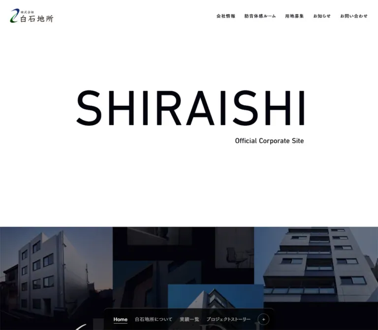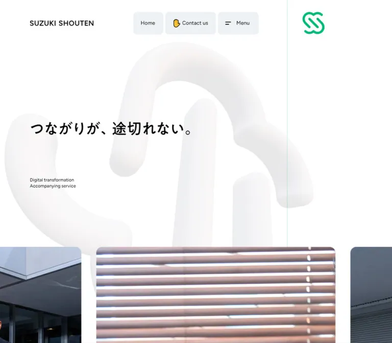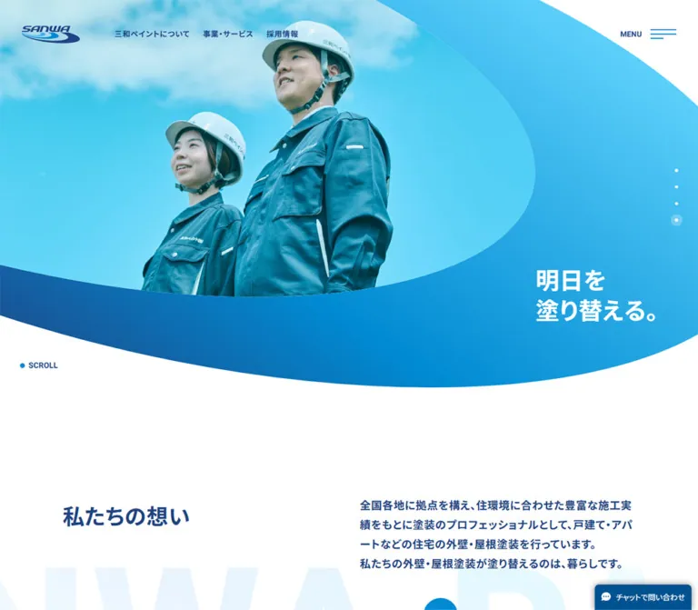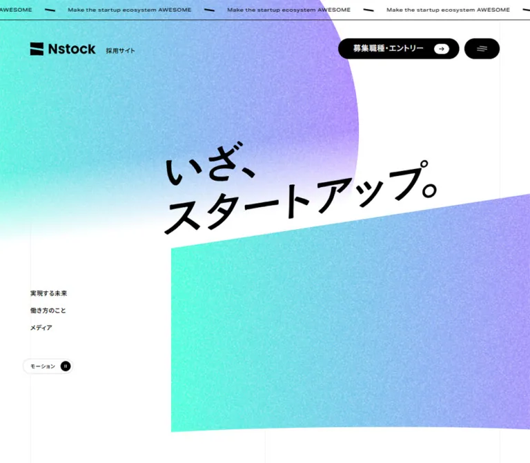
プレビュー準備中デザインリファレンスを見る
その他
日本のWebデザインを、AIの制作リファレンスに。
DESIGN REFERENCE
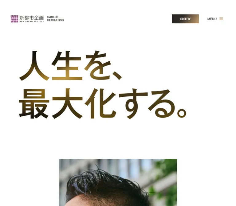
大きな和文コピーと白い余白、チャコールとゴールドのグラデーションが印象的な採用サイト。社員のポートレート、建築写真、角型の導線、モバイル下部のENTRY/MENUで構成されています。
オリジナルサイトを見るExpansive white space, metallic display lettering, and portraits framed with architectural precision.
Original URL: https://www.n-up.co.jp/career/ Final URL: https://www.n-up.co.jp/career/ Inspected: September 17, 2026, 04:46 JST; supplied retrieval timestamp September 16, 2026, 19:46:02.873 UTC. Viewports: 1440 × 1000 and 390 × 844 CSS pixels. Theme: white content canvas with charcoal, restrained gold gradients, and a dark footer. No theme switch is evidenced. Scope: the current career-site homepage, including its opening statement, portrait/message area, business introduction, employee carousel structure, culture links, requirements summary, entry banner, and footer. Visual captures cover desktop opening, middle, and footer regions, plus mobile opening and footer regions. Rendered DOM and computed styles provide additional evidence for the intervening content. Linked pages and forms were not inspected.
This is the index of a larger recruitment website. It introduces the company and its people, then routes visitors to message, business, employee, workstyle, company-figure, requirements, and application pages. Its identity comes from the contrast between enormous opening lettering and compact navigation, with generous white intervals holding the composition together.
Gold is concentrated in lettering, actions, and geometry. Employee photography gives the page a human focus; the warm architectural interior connects the career story to the company's business. Sharp corners, small chevrons, thin rules, and a charcoal footer keep the treatment controlled rather than ornamental.
Expansive white space, metallic display lettering, and portraits framed with architectural precision.
Original URL: https://www.n-up.co.jp/career/ Final URL: https://www.n-up.co.jp/career/ Inspected: September 17, 2026, 04:46 JST; supplied retrieval timestamp September 16, 2026, 19:46:02.873 UTC. Viewports: 1440 × 1000 and 390 × 844 CSS pixels. Theme: white content canvas with charcoal, restrained gold gradients, and a dark footer. No theme switch is evidenced. Scope: the current career-site homepage, including its opening statement, portrait/message area, business introduction, employee carousel structure, culture links, requirements summary, entry banner, and footer. Visual captures cover desktop opening, middle, and footer regions, plus mobile opening and footer regions. Rendered DOM and computed styles provide additional evidence for the intervening content. Linked pages and forms were not inspected.
This is the index of a larger recruitment website. It introduces the company and its people, then routes visitors to message, business, employee, workstyle, company-figure, requirements, and application pages. Its identity comes from the contrast between enormous opening lettering and compact navigation, with generous white intervals holding the composition together.
Gold is concentrated in lettering, actions, and geometry. Employee photography gives the page a human focus; the warm architectural interior connects the career story to the company's business. Sharp corners, small chevrons, thin rules, and a charcoal footer keep the treatment controlled rather than ornamental.
| Name | Value | Source token | Role and evidence |
|---|---|---|---|
| White | #FFFFFF |
--White |
Visible page canvas; measured employee-caption background; reversed action and footer text |
| Charcoal Ink | #2C2826 |
--Black |
Measured body text and mobile MENU fill; dominant dark tone throughout the interface |
| Gold | #B99568 |
--Gold |
Measured mobile ENTRY fill; warm endpoint in both declared gradients |
| Brand Purple | #9A5C8B |
--Purple01 |
Declared brand color, visually consistent with the purple grid symbol in the header logo |
| Pale Gray | #F3F3F3 |
--Gray01 |
Declared neutral, visually consistent with the pale carousel-arrow squares |
| Light Gray | #E3E3E3 |
--Gray02 |
Measured footer secondary-link and copyright text |
| Warm Gray | #635D58 |
--Charcoal01 |
Measured secondary navigation text in the mobile header DOM; useful muted structural tone |
| Deep Gray | #3D3B3B |
--Charcoal02 |
Declared; a specific visible assignment is not established |
| Soft Gray | #CBC5C0 |
--Gray03 |
Declared; a specific divider assignment is not established |
| Pale Purple | #FFF2FC |
--Purple02 |
Declared, but not prominent in the supplied visual captures |
The primary relationship is white, charcoal, and gold. Purple belongs mainly to the identity mark in the visible opening. Do not distribute it across the interface merely because a purple token exists.
The source also declares --swiper-theme-color: #007aff. No blue carousel treatment is visible in the captures; this library token is not evidence of a blue brand accent.
Both recipes below are directly supplied source variables:
--Grade01: linear-gradient(123deg, #2C2826 36.16%, #B99568 93.47%);
--Grade02: linear-gradient(128deg, #2C2826 39.88%, #B99568 144.74%);
The desktop ENTRY button visibly moves from charcoal toward warm gold. The footer remains predominantly charcoal, with brown-gold illumination toward the lower right. These appearances are consistent with the declared gradient family, although selector-level assignments were not supplied.
The second recipe places its final gold stop beyond the gradient box. Retaining 144.74% produces a more subdued field than moving that stop to 100%.
The hero lettering has darker and brighter metallic-looking regions. Its exact fill, masking technique, and color stops are unverified. Do not assume the hero is simply text filled with --Grade01.
Measured computed family: 'Noto Sans JP', sans-serif.
Paragraphs use medium weight, while navigation, message copy, and detail links use bold weight. Most Japanese running text has tracking equivalent to 0.05em. The result is firm and legible without relying on decorative body typography.
The body's computed 16px / 16px, weight 400, is a reset-level value. Content paragraphs explicitly use more generous line height; copying the body reset into all text would misrepresent the page.
Declared source stack: 'Helvetica Neue', 'Arial', sans-serif through --font-en.
The small ENTRY controls use this stack at 14px, weight 500. The large entry-banner heading reports 'Helvetica Neue', weight 500. Copyright text uses the English stack at 10px / 11px.
The evidence identifies computed families, not the exact font file used for every rendered glyph.
The visible hero reads 人生を、 followed by 最大化する。. It is much larger than the H1 wrapper's recorded 16px style. The supplied evidence does not establish whether the visible shapes come from artwork, outlined SVG, or separately styled descendants.
Preserve an authorized original display asset when available. For a new implementation without that asset, use a clearly labeled typographic approximation; do not claim a particular display-font family was recovered. The company logo should likewise remain supplied artwork rather than a recreation using ordinary text.
| Role | Desktop | Mobile | Weight / tracking | Evidence |
|---|---|---|---|---|
| Hero display | Roughly 145–150px apparent character scale | Roughly 60–64px apparent character scale | Heavy visual treatment; font unknown | Visual estimate, not computed font size |
| Bilingual section-heading wrapper | 74.59px total height | 61px total height | Child styles not supplied | Measured bounds |
| Japanese section title | Approximately 32px | 24px suggested starting point | Visually bold on desktop | Desktop estimate; mobile recommendation |
| English section eyebrow | Approximately 14px | 12px suggested starting point | Compact sans serif | Desktop estimate; mobile recommendation |
| Editorial paragraph | 16px / 27.2px |
13px / 22.1px |
500, 0.05em |
Measured |
| Portrait message | 20px / 34px |
16px / 27.2px |
700, 0.05em |
Measured |
| Detail-link label | 16px / 16px |
13px / 13px |
700; desktop 0.05em, mobile normal |
Measured |
| Desktop navigation | 14px / 14px |
Not displayed as a top row | 700, 0.05em |
Measured and visually observed |
| Mobile menu-link DOM / footer primary links | — | 16px / 16px |
700, 0.05em |
Measured; menu opening not tested |
| ENTRY / MENU controls | 14px / 14px |
14px / 14px |
English stack, 500 |
Measured |
| Active employee caption | 13px / 22.1px |
10px / 17px |
400, 0.65px tracking |
Measured |
| Entry-banner heading | 42px / 42px |
34px / 34px |
English family, 500 |
Measured |
| Entry-banner subtitle | 16px / 16px |
13px / 13px |
700, 0.05em |
Measured |
| Footer secondary links | 12px / 15.6px |
12px / 15.6px |
400, 0.6px tracking |
Measured for culture sublinks |
| Copyright | 10px / 11px |
10px / 11px |
English stack, 500 |
Measured |
Use the distinction between giant statement, medium section title, and small utility text. Increasing every label to the same comfortable size would flatten the observed hierarchy.
There is no supplied global spacing formula. Repeated dimensions include 16, 24, 32, 40, 48, 80, and 120px, but several component-specific gaps do not follow a strict base unit.
| Use | Desktop | Mobile | Status |
|---|---|---|---|
| Main horizontal inset | 80px | 24px | Measured; footer mobile left inset is 25px |
| Header top inset | 64px | 34px on the brand link | Measured |
| Header brand-to-English-label gap | 16px | 16px | Measured |
| Hero-heading padding | 120px 80px 84px |
160px 24px 80px |
Measured |
| Heading-to-business-copy gap | 32px | 20px | Calculated from bounds |
| Business-copy-to-detail-link gap | 42px | 26px | Calculated from bounds |
| Detail arrow-to-label gap | 24px | 16px | Measured |
| Member detail-link-to-card-row gap | 64px | 48px | Calculated from bounds |
| Culture-panel padding | 48px 48px 40px |
33px 24px 27px |
Measured |
| Footer padding | 120px 80px 112px |
80px 24px 80px 25px |
Measured |
| Footer desktop column gap | 40px | Stacked layout | Calculated from column positions |
0px border radius.| Element | 1440 × 1000 | 390 × 844 | Notes |
|---|---|---|---|
| Document height | 6340.52px | 5874.69px | Recorded state, not a sizing rule |
| Header bounds | 1440 × 104px | 390 × 58.92px | Desktop body has 105px top padding |
| Brand-link bounds | 235.36 × 32px | 239.23 × 58.19px | Mobile dimensions include 34px 24px 0 padding |
| Hero H1 wrapper | 1440 × 511.17px | 390 × 370.27px | Includes the large padding above and below lettering |
| Hero inner content height | 307.17px | 130.27px | Calculated by subtracting vertical padding |
| Initial portrait frame | About 720px wide, centered | 390px wide, full bleed | Screenshot observation; media element bounds not supplied |
| Business-copy width | 510px | 342px | Measured |
| Active member link | 400 × 481px | 253 × 304px | Measured anchor bounds |
| Inactive member link | 290 × 349px | 180 × 217px | Measured anchor bounds |
| Culture destination panel | 720 × 436px each | 390 × 224px each | Two columns become two rows |
| Entry banner | 1440 × 320px | 390 × 299px | Measured |
| Footer | 1440 × 632px | 390 × 883.19px | Measured |
| Mobile bottom actions | — | Two 195 × 64px controls | Located at y = 780 in the initial capture |
Large document-space gaps around the opening story do not prove scroll pinning or parallax. Preserve the spacious composition, but do not turn the recorded document heights into fixed page heights.
Role: establish the company and provide access to the recruitment site's primary sections.
At desktop, the brand starts at x = 80px, with the navigation aligned to the right. The brand combines a purple gridded symbol, Japanese wordmark, small English company name, and a separate two-line CAREER / RECRUITING label. The measured brand link uses an inline-flex layout with a 16px gap.
The navigation begins around x = 728px. Its labels are compact, bold, and evenly separated. The culture item has a visible plus sign. Related workstyle and company-figure links exist in the DOM, but their recorded desktop height is zero; the supplied state does not demonstrate an expanded submenu.
The final desktop action is a sharp 120 × 40px ENTRY rectangle at x = 1240px. Its white English label sits over a charcoal-to-gold appearance. The header has a declared top transition, but its scroll-triggered behavior is not established.
Role: keep application access and navigation within reach on a narrow screen.
The opening mobile capture shows a full-width bottom bar split equally into two 195 × 64px areas. ENTRY is an anchor with gold fill. MENU is a button with charcoal fill, white text, and a small gold three-line icon. Both use the English type stack at 14px, weight 500.
The top of the mobile page retains the identity lockup at x = 24px and y = 34px, without the desktop navigation row. The DOM contains mobile navigation links, but that does not establish their visibility or the appearance of an open menu.
The bottom bar is absent from the supplied mobile footer capture. Its hide condition is unverified. The dark screen with navigation, company identity, and copyright is the page footer, not evidence of an opened menu.
Role: make the career proposition the dominant first impression.
The opening statement is deliberately split into two lines: 人生を、 and 最大化する。. It is left aligned, with no surrounding panel, badge, or supporting paragraph competing inside the white headline area.
On desktop, visible lettering begins around x = 80px and y = 225px. The H1 wrapper ends at y = 616.17px; the screenshot's centered portrait frame begins around y = 716px, leaving about 100px of additional white space. The frame spans roughly half the viewport width.
On mobile, the lettering begins near x = 24px and y = 219px. The portrait starts at y = 429.19px, immediately after the heading wrapper, and extends edge to edge. This is a substantial composition change, not just a smaller desktop image.
The portrait carries white message text. Its measured block is approximately 386px wide on desktop and 309px on mobile, followed by a detail link to /career/message/. Preserve text alternatives and use a suitable image crop; the exact media sequence and overlay contrast treatment are not supplied.
Role: pair a small English category label with a stronger Japanese title.
Observed pairs include:
| English label | Japanese title |
|---|---|
| OUR BUSINESS | 事業紹介 |
| MEMBER | 新都市企画で働く人々 |
| ENVIRONMENT / CULTURE | 働く環境・カルチャー |
| REQUIREMENT | 募集要項・選考フロー |
The desktop titles visibly move from dark charcoal toward gold across selected portions of the lettering. Keep that effect restrained and preserve a solid-color fallback. The combined heading wrapper measures about 74.6px high on desktop and 61px on mobile; individual child font sizes remain unmeasured.
Role: provide a consistent secondary navigation pattern.
An arrow square precedes the label 詳しくみる. The square is dark on white sections, and the label remains directly on the page canvas. There is no rounded outer button or card container.
The desktop link row is 48px high, with a 24px arrow-to-label gap and bold 16px type. On mobile it is 40px high, with a 16px gap and bold 13px type. The link's clickable bounds may span the copy column even though the visible treatment occupies only its beginning.
Use one semantic anchor containing both the icon and label. Do not make the arrow and label separate destinations. The portrait-message version uses white text against the photograph.
Role: connect recruitment messaging to the company's actual work.
The desktop layout places a 510px copy column at x = 80px and a large interior photograph beginning around x = 740px. The screenshot shows the photo extending to the viewport's right edge, approximately 700 × 414px. The broad separation between text and image is part of the composition.
The text column contains the bilingual heading, a medium-weight Japanese paragraph, and the directional detail link to /career/business/. Its paragraph uses 16px / 27.2px, weight 500, and 0.8px tracking.
The image shows a warm brick-lined architectural interior with dark ceiling, stone floor, and a central stone volume. Use the actual architectural subject when authorized; a generic office desk would weaken the connection to the observed business identity.
Mobile copy uses the 342px content width and 13px / 22.1px typography. The supplied mobile captures do not directly show the business photograph's placement or crop, so its exact stacking order remains unverified.
Role: offer entry points to five employee stories.
The introduction repeats the section-heading, paragraph, and detail-link pattern. A horizontal carousel follows, with a larger active profile and smaller adjacent profiles. The desktop capture shows a compact 01 - 05 counter and pale previous/next squares near the right edge of the introduction area.
Measured active links are 400 × 481px on desktop and 253 × 304px on mobile. Inactive links are 290 × 349px and 180 × 217px respectively. These are anchor bounds; separate image bounds were not supplied.
The active caption is a white block attached near the lower-left edge. It contains department, role, and joining year across three lines. On desktop its sample bounds are approximately 208 × 90px, with 24px 32px 0 1px padding. The mobile sample is approximately 162 × 69px, with 18px 24px 0 1px padding.
Inactive captions report zero height in the recorded state. Five distinct profile URLs appear in three repeated sets of DOM links: /career/member/05/, /04/, /03/, /06/, and /08/. This is consistent with a looping carousel implementation, but looping, autoplay, drag gestures, and control results were not exercised.
The desktop active-to-next gap is 40px. The recorded mobile gap between those anchor bounds is approximately 118px; this may include slider-slot geometry. Do not infer a conventional 24px carousel gap from the page gutter.
Role: divide workplace information into two broad routes.
The desktop section places its bilingual heading at x = 80px and explanatory copy toward the right. Below it, two full-width halves link to /career/workstyle/ and /career/numbers/. Each link measures 720 × 436px and uses 48px 48px 40px padding.
At mobile, these destinations stack vertically and each measures 390 × 224px, with 33px 24px 27px padding. This reflow is directly established by the DOM.
The supplied visual captures do not show the panel interiors. Their background imagery, exact label positions, and image-hover behavior must not be invented from the transparent background values on the anchor wrappers.
Role: route interested visitors to application conditions and selection information.
The section contains the bilingual REQUIREMENT heading, one short paragraph, and a detail link to /career/requirements/.
At desktop, the paragraph sits left while the detail link is aligned near the right content edge at x ≈ 1211px. On mobile, the heading, paragraph, and full-column detail-link row stack within 24px side margins. Retain the relatively quiet treatment; the larger entry banner immediately below supplies the stronger application cue.
Role: provide a large, unmistakable application destination before the footer.
The entire banner is an anchor to /career/entry/. It is 320px tall on desktop and 299px on mobile. Desktop imagery appears pale, cloudy, and softly defocused. A fine gold diamond outline crosses the field and is clipped by its top and bottom edges.
Center ENTRY above エントリーはこちら. The desktop heading is 42px and the subtitle 16px, separated by 8px. Mobile sizes are 34px and 13px; their measured positions also leave 8px between line boxes.
The banner achieves emphasis through scale, whitespace, and geometry. It does not need a second pill-shaped button inside the already-clickable surface.
Role: provide a complete secondary navigation map and company identity.
The desktop footer is a 632px charcoal field with a warm lower-right gradient and a large, thin diagonal diamond outline. Its content begins 120px below the top edge and 80px from the left.
The upper row comprises five 180px columns separated by 40px: brand, home link, message/business/people links, culture links, and requirements. Fine rules precede primary navigation groups. The current home link appears visually muted, while other primary labels are white. Culture sublinks use smaller light-gray text.
Corporate-site and privacy links sit near the lower left with external-link glyphs. Copyright sits near the lower right. The visible copyright is ©2024 NEW URBAN PROJECT CO.,LTD.; that year is footer content, not the inspection date.
Mobile reorders the composition into stacked navigation first, external links next, then a centered white brand lockup and copyright. The footer measures about 883px high and uses approximately 24px side insets. The logo's placement near the bottom is an intentional responsive hierarchy change.
The following values are declared or computed evidence. They do not establish that each interaction was executed during inspection.
| Treatment | Supplied value | What is established |
|---|---|---|
| Header movement | top 0.5s cubic-bezier(0.215, 0.61, 0.355, 1) |
A positional transition exists; trigger and sticky policy are unknown |
| Desktop navigation feedback | color 0.15s linear |
Color-change transition is defined |
| Footer link feedback | opacity 0.15s linear |
Opacity transition is defined; target opacity was not supplied |
| Mobile bottom actions | transform 0.35s cubic-bezier(0.215, 0.61, 0.355, 1) |
Transform transition is defined; visibility trigger is unknown |
| Message detail-link reveal | Opacity and transform, 0.6s, same cubic-bezier, 1s delay |
Reveal-style declaration exists; starting transform and trigger are unknown |
| Member link transition | 0.45s |
Duration is recorded; full animated-property behavior is not established |
| Active member caption | transform 0.3s 0.3s |
A 300ms transition with 300ms delay is defined |
| Shared hover tokens | --hover-duration: 0.6s; --hover-scale: scale(1.06) |
Shared values exist; affected selectors were not supplied |
| Arrow animation tokens | arrow-anim, 0.4s, ease, forwards |
Animation configuration exists; keyframes were not supplied |
The observed state contains visible carousel controls and navigation anchors, but no click-result or hover-result capture. Do not describe a verified automatic slideshow, animated gold shimmer, portrait crossfade, parallax effect, or open-menu transition.
For a new implementation, keep feedback restrained and consistent with these durations. Use the 6% image scale only where an appropriate clipped image container exists. Do not apply it to text or entire page sections simply because it is a declared token.
| Surface | Appearance | Function |
|---|---|---|
| Main canvas | White, unboxed, broad vertical intervals | Gives typography and imagery room |
| Detail-arrow square | Charcoal with a white chevron | Compact, repeated navigation cue |
| Carousel controls | Pale square fields with dark chevrons | Secondary directional controls |
| Active profile caption | White rectangular panel overlapping the portrait region | Separates employee metadata from the image |
| Portrait message | White text over photography | Connects the proposition to a person |
| Entry banner | Pale cloudy field, centered labels, fine gold geometry | Broad application destination |
| Footer | Charcoal-to-brown field, white/light-gray text, thin diagonal outline | Closes the page with a complete navigation map |
Transparent computed backgrounds on wrapper elements are not proof of an empty surface. Visible fills may come from descendants, pseudo-elements, images, or other background layers.
Photography is specific and material: a closely cropped employee portrait against an urban backdrop, and a warm architectural interior with brick, stone, and controlled lighting. Keep the portraits natural and the building photography precise. Avoid unrelated lifestyle collages, abstract technology renders, or generic icon illustrations.
The opening media changes composition between inspected widths. Desktop leaves substantial white margins around an approximately half-width frame; mobile uses a full-width crop with the person's face occupying much more of the visible area. Crop by subject, not merely by preserving the desktop image center.
The entry banner supplies an intentionally low-detail photographic field. Its pale appearance lets the label and thin geometry remain prominent. The footer's angular outline echoes that banner without introducing a second decorative language.
No image URLs, asset filenames, or font-file URLs were supplied. The following are visual references, not downloadable asset paths.
| Asset role | Evidence | Reuse guidance |
|---|---|---|
| Header identity | Desktop and mobile opening captures | Use an authorized logo asset with its existing proportions |
| Reversed identity | Desktop and mobile footer captures | Preserve the white logo treatment and responsive lockup arrangement |
| Opening display lettering | Desktop and mobile opening captures | Preserve the two-line composition; exact font/rendering method is unknown |
| Opening portrait | Desktop and mobile opening captures | Prepare responsive crops; source media sequence is unverified |
| Business interior | Desktop middle capture | Keep warm architectural materials and the wide crop |
| Entry background | Desktop footer-region capture | Use a licensed pale photographic field; exact source is unavailable |
| Employee portraits | Carousel link and caption structure in DOM | Individual image appearances are not shown in the supplied carousel capture |
Use original media only when authorized and available. The CSS below reproduces the surrounding design language; it cannot supply the original lettering or photography.
| Relationship | Desktop observation | Mobile observation |
|---|---|---|
| Main content inset | 80px | 24px, with a 25px footer left inset |
| Navigation | Full top row and 120 × 40px ENTRY action | Top brand plus a two-part bottom action bar in the opening state |
| Hero whitespace | 120px heading top padding after the header offset | 160px top padding after the compact header |
| Initial portrait | Approximately 50% viewport width, centered | Full viewport width |
| Editorial paragraphs | Usually 16px, 1.7 line height | 13px, 1.7 line height |
| Active profile | 400 × 481px | 253 × 304px |
| Culture destinations | Two equal-width columns | Two full-width rows |
| Requirements action | Right aligned beside the lower text area | Stacked below the paragraph |
| Footer | Brand first, horizontal navigation columns | Navigation first, brand near the bottom |
The two supplied widths establish endpoint behavior, not exact CSS breakpoints. Intermediate tablet layouts, landscape behavior, and safe-area handling were not inspected. The breakpoint in the Quick Start is a recommendation.
At 390px, the normal 24px inset leaves 342px of copy width. Full-bleed media and culture panels intentionally escape this measure. Do not apply one global padded wrapper to every section.
The initial mobile action bar covers part of the portrait-message region at the bottom of the captured viewport. In an adaptation, reserve enough scroll clearance for focused links and content. The original footer capture does not show the bar, but the mechanism that removes it is unknown.
These are recommendations for a new implementation, not verified original-site features:
aria-expanded, and aria-controls. Choose keyboard and focus behavior appropriate to the implemented menu pattern.#B99568 has approximately 2.8:1 contrast, calculated from the color values. For small action text, use charcoal text or darken the fill in an accessible adaptation.#FFFFFF.#2C2826.#B99568.#9A5C8B.#F3F3F3.#E3E3E3.linear-gradient(123deg, #2C2826 36.16%, #B99568 93.47%).linear-gradient(128deg, #2C2826 39.88%, #B99568 144.74%).“Create a Japanese career-site homepage with expansive white space, charcoal text, and restrained gold gradients. Open with an exceptionally large, left-aligned two-line statement such as 人生を、最大化する。, using approved display artwork when available. Follow it with employee photography that is centered and approximately half-width on desktop but full bleed on mobile. Use Noto Sans JP for measured interface and paragraph roles, and Helvetica Neue with Arial fallback for English utilities. Build bilingual section headings, square-arrow detail links, a wide architectural business image, a horizontal employee-story rail with an enlarged active profile, two broad culture destinations, a requirements summary, and a pale entry banner with clipped diamond linework. Finish with a charcoal footer that reorders into stacked navigation and a lower brand lockup on mobile. Treat all unavailable imagery and interaction behavior as implementation decisions.”
This is an implementation scaffold, not extracted source CSS. Exact source colors, typography measurements, and selected dimensions are retained. The 75rem breakpoint, section-title child sizes, display-asset sizing, decorative geometry, and accessible focus behavior are recommendations.
Supply authorized media separately. The hero selectors expect an image or SVG with an accessible equivalent of the opening statement. Carousel state, menu behavior, and footer-related dock visibility require separate logic.
:root {
  /* Measured source palette, exposed through semantic aliases. */
  --color-paper: #fff;
  --color-ink: #2c2826;
  --color-gold: #b99568;
  --color-brand: #9a5c8b;
  --color-control: #f3f3f3;
  --color-footer-copy: #e3e3e3;
  --color-muted: #635d58;
  --gradient-primary: linear-gradient(
    123deg, #2c2826 36.16%, #b99568 93.47%
  );
  --gradient-subdued: linear-gradient(
    128deg, #2c2826 39.88%, #b99568 144.74%
  );

  --font-body: 'Noto Sans JP', sans-serif;
  --font-en: 'Helvetica Neue', 'Arial', sans-serif;
  --text-body: 16px;
  --text-detail: 16px;
  --leading-body: 1.7;
  --tracking-body: 0.05em;
  --gutter: 80px;
  --detail-size: 48px;
  --detail-gap: 24px;
  --dock-height: 64px;
  --safe-bottom: env(safe-area-inset-bottom, 0px);

  --ease-out: cubic-bezier(0.215, 0.61, 0.355, 1);
  --motion-feedback: 150ms linear;
  --motion-image: 600ms var(--ease-out);
}

* { box-sizing: border-box; }
body {
  margin: 0;
  color: var(--color-ink);
  background: var(--color-paper);
  font-family: var(--font-body);
}
img { display: block; max-width: 100%; }
a { color: inherit; }
button { font: inherit; }
.page-inset { padding-inline: var(--gutter); }

.career-header {
  display: flex;
  align-items: center;
  justify-content: space-between;
  gap: 24px;
  padding: 64px var(--gutter) 0;
  margin-bottom: 1px;
}
.brand {
  display: inline-flex;
  align-items: center;
  gap: 16px;
  text-decoration: none;
}
.brand__mark { width: 146px; height: auto; }
.brand__career {
  font: 500 12px / 1 var(--font-en);
}
.desktop-nav {
  display: flex;
  align-items: center;
  gap: 24px;
}
.desktop-nav > a {
  display: flex;
  align-items: center;
  min-height: 40px;
  font-size: 14px;
  font-weight: 700;
  letter-spacing: 0.05em;
  text-decoration: none;
  transition: color var(--motion-feedback);
}
.desktop-nav > .header-entry {
  justify-content: center;
  width: 120px;
  color: #fff;
  background: var(--gradient-primary);
  font: 500 14px / 1 var(--font-en);
  letter-spacing: normal;
}

.hero-title {
  margin: 0;
  padding: 120px var(--gutter) 84px;
}
/* Recommended asset width; preserve the supplied asset's ratio. */
.hero-title > img,
.hero-title > svg {
  display: block;
  width: min(100%, 760px);
  height: auto;
}
.hero-media {
  position: relative;
  width: 50%;
  margin: 100px auto 0;
  overflow: hidden;
}
.hero-media > img {
  width: 100%;
  height: auto;
}
/* Optional overlay positioning must be tuned to the chosen portrait. */
.hero-message {
  width: min(386px, 80%);
  color: #fff;
  font-size: 20px;
  font-weight: 700;
  line-height: 1.7;
  letter-spacing: 0.05em;
}

.section-heading { margin: 0; font-weight: 700; }
.section-heading__en {
  display: block;
  margin-bottom: 16px;
  font: 500 14px / 1 var(--font-en);
}
/* Recommended child styles; source child measurements are unavailable. */
.section-heading__ja {
  display: inline-block;
  font-size: 32px;
  line-height: 1.4;
}
.gradient-label { color: var(--color-ink); }
@supports ((background-clip: text) or (-webkit-background-clip: text)) {
  .gradient-label {
    background: var(--gradient-primary);
    background-clip: text;
    -webkit-background-clip: text;
    color: transparent;
  }
}
.editorial-copy {
  font-size: var(--text-body);
  font-weight: 500;
  line-height: var(--leading-body);
  letter-spacing: var(--tracking-body);
}
.detail-link {
  display: flex;
  align-items: center;
  gap: var(--detail-gap);
  min-height: var(--detail-size);
  font-size: var(--text-detail);
  font-weight: 700;
  line-height: 1;
  letter-spacing: 0.05em;
  text-decoration: none;
}
.detail-link__icon {
  display: grid;
  place-items: center;
  flex: 0 0 var(--detail-size);
  width: var(--detail-size);
  height: var(--detail-size);
  color: #fff;
  background: var(--color-ink);
}
.detail-link__icon::before {
  content: '';
  width: 7px;
  height: 7px;
  border-top: 2px solid currentColor;
  border-right: 2px solid currentColor;
  transform: rotate(45deg);
}
.business {
  display: grid;
  grid-template-columns: minmax(0, 510px) minmax(0, 1fr);
  gap: clamp(48px, 10.4167vw, 150px);
  padding-left: var(--gutter);
}
.business__copy > .editorial-copy { margin: 32px 0 42px; }
.business__image {
  width: 100%;
  aspect-ratio: 700 / 414;
  object-fit: cover;
}

/* Static scrolling fallback; active-state changes need separate logic. */
.member-rail {
  display: flex;
  align-items: flex-start;
  gap: 40px;
  padding: 0 var(--gutter) 8px;
  overflow-x: auto;
  scroll-padding-inline: var(--gutter);
}
.member-card {
  position: relative;
  flex: 0 0 290px;
  text-decoration: none;
}
.member-card[data-active='true'] { flex-basis: 400px; }
.member-card__image {
  width: 100%;
  aspect-ratio: 400 / 481;
  object-fit: cover;
}
.member-card__caption {
  position: relative;
  width: fit-content;
  max-width: 100%;
  margin: -86px 0 0 -1px;
  padding: 24px 32px 0 1px;
  background: #fff;
  font-size: 13px;
  line-height: 1.7;
  letter-spacing: 0.65px;
}
/* This accessible fallback keeps every caption available. */
.culture-panels { display: grid; grid-template-columns: 1fr 1fr; }
.culture-panel {
  display: flex;
  min-height: 436px;
  padding: 48px 48px 40px;
  text-decoration: none;
}
/* Supply panel media separately; its appearance was not captured. */
.requirements__bottom {
  display: flex;
  align-items: end;
  justify-content: space-between;
  gap: 40px;
}

.entry-banner {
  position: relative;
  display: grid;
  place-content: center;
  gap: 8px;
  min-height: 320px;
  overflow: hidden;
  text-align: center;
  text-decoration: none;
  background: #f3f3f3;
}
.entry-banner__background {
  position: absolute;
  inset: 0;
  width: 100%;
  height: 100%;
  object-fit: cover;
}
.entry-banner::before {
  content: '';
  position: absolute;
  top: 50%;
  left: 50%;
  width: 520px;
  height: 520px;
  border: 1px solid var(--color-gold);
  transform: translate(-50%, -50%) rotate(45deg);
  pointer-events: none;
  z-index: 1;
}
.entry-banner__title,
.entry-banner__subtitle { position: relative; z-index: 2; margin: 0; }
.entry-banner__title { font: 500 42px / 1 var(--font-en); }
.entry-banner__subtitle {
  font-size: 16px;
  font-weight: 700;
  line-height: 1;
  letter-spacing: 0.05em;
}

.site-footer {
  position: relative;
  padding: 120px var(--gutter) 112px;
  overflow: hidden;
  color: #fff;
  background: var(--gradient-subdued);
}
.site-footer::before {
  content: '';
  position: absolute;
  right: 18px;
  bottom: -240px;
  width: 480px;
  height: 480px;
  border: 1px solid var(--color-muted);
  transform: rotate(45deg);
  pointer-events: none;
}
.footer-grid {
  position: relative;
  display: grid;
  grid-template-columns: repeat(5, minmax(0, 180px));
  gap: 40px;
}
.footer-link {
  display: block;
  padding-top: 16px;
  border-top: 1px solid var(--color-muted);
  font-size: 14px;
  font-weight: 700;
  line-height: 1;
  letter-spacing: 0.05em;
  text-decoration: none;
}
.footer-stack { display: grid; align-content: start; gap: 40px; }
.footer-bottom {
  position: relative;
  display: flex;
  justify-content: space-between;
  align-items: center;
  gap: 24px;
  margin-top: 210px;
  color: var(--color-footer-copy);
}
.footer-copyright { font: 500 10px / 1.1 var(--font-en); }
.mobile-dock { display: none; }

:where(a, button):focus-visible {
  outline: 2px solid var(--color-ink);
  outline-offset: 4px;
}
.site-footer :focus-visible { outline-color: #fff; }

/* Recommended breakpoint, not recovered from source media queries. */
@media (max-width: 75rem) {
  :root {
    --gutter: 24px;
    --text-body: 13px;
    --text-detail: 13px;
    --detail-size: 40px;
    --detail-gap: 16px;
  }
  html {
    scroll-padding-bottom: calc(var(--dock-height) + var(--safe-bottom) + 16px);
  }
  .career-header {
    display: block;
    min-height: 59px;
    padding: 34px var(--gutter) 0;
    margin-bottom: 0;
  }
  .brand__mark { width: 110px; }
  .desktop-nav { display: none; }
  .hero-title { padding: 160px var(--gutter) 80px; }
  .hero-title > img,
  .hero-title > svg { width: min(100%, 322px); }
  .hero-media { width: 100%; margin-top: 0; }
  .hero-message { width: min(309px, 80%); font-size: 16px; }
  .section-heading__en { font-size: 12px; }
  .section-heading__ja { font-size: 24px; }
  .detail-link { letter-spacing: normal; }
  .business {
    grid-template-columns: 1fr;
    gap: 40px;
    padding-inline: var(--gutter);
  }
  /* Recommended mobile image order follows markup order. */
  .business__copy > .editorial-copy { margin: 20px 0 26px; }
  .member-rail { gap: 118px; }
  .member-card { flex-basis: 180px; }
  .member-card[data-active='true'] { flex-basis: 253px; }
  .member-card__caption {
    margin-top: -65px;
    padding: 18px 24px 0 1px;
    font-size: 10px;
  }
  .culture-panels { grid-template-columns: 1fr; }
  .culture-panel { min-height: 224px; padding: 33px 24px 27px; }
  .requirements__bottom { display: grid; gap: 40px; }
  .entry-banner { min-height: 299px; }
  .entry-banner__title { font-size: 34px; }
  .entry-banner__subtitle { font-size: 13px; }
  .site-footer { padding: 80px 24px 80px 25px; }
  .site-footer::before { right: -190px; }
  .footer-grid { display: flex; flex-direction: column; gap: 40px; }
  .footer-link { font-size: 16px; }
  /* Place the brand and copyright after navigation in mobile markup/order. */
  .footer-brand { order: 10; align-self: center; }
  .footer-bottom {
    flex-direction: column;
    align-items: flex-start;
    margin-top: 64px;
  }
  .footer-copyright { align-self: center; }
  .mobile-dock {
    position: fixed;
    inset: auto 0 0;
    z-index: 20;
    display: grid;
    grid-template-columns: 1fr 1fr;
    transition: transform 350ms var(--ease-out);
  }
  .mobile-dock > a,
  .mobile-dock > button {
    display: flex;
    align-items: center;
    justify-content: center;
    gap: 12px;
    min-height: calc(var(--dock-height) + var(--safe-bottom));
    padding: 0 0 var(--safe-bottom);
    border: 0;
    border-radius: 0;
    color: #fff;
    font: 500 14px / 1 var(--font-en);
    text-decoration: none;
  }
  .mobile-dock__entry { background: var(--color-gold); }
  .mobile-dock__menu { background: var(--color-ink); }
  /* Recommended contrast override; captured ENTRY text is white. */
  .mobile-dock--accessible > .mobile-dock__entry { color: var(--color-ink); }
  /* The application must also remove hidden controls from focus order. */
  .mobile-dock[data-hidden='true'] { transform: translateY(100%); }
}

@media (hover: hover) {
  .desktop-nav > a:not(.header-entry):hover { color: var(--color-gold); }
  .footer-link:hover { opacity: 0.7; }
}

@media (prefers-reduced-motion: reduce) {
  .mobile-dock,
  .desktop-nav > a,
  .footer-link { transition: none; }
}

@media (forced-colors: active) {
  .gradient-label { background: none; color: CanvasText; }
}
A minimal detail-link structure using the observed business destination:
<a class='detail-link' href='https://www.n-up.co.jp/career/business/'>
  <span class='detail-link__icon' aria-hidden='true'></span>
  <span lang='ja'>詳しくみる</span>
</a>
The starter keeps all employee captions available as a progressive fallback, whereas the captured carousel collapses inactive captions. Its footer classes provide layout primitives; assemble mobile external links before the lower brand lockup to match the observed order. Do not add an always-visible dock over the footer without deciding how that behavior should work.
Optional aliases for a project already using Tailwind v4. This is not evidence that the original website uses Tailwind. Define the custom properties above first.
@theme inline {
  --color-paper: #ffffff;
  --color-ink: #2c2826;
  --color-gold: #b99568;
  --color-brand: #9a5c8b;
  --color-control: #f3f3f3;
  --color-footer-copy: #e3e3e3;

  --font-body: 'Noto Sans JP', sans-serif;
  --font-en: 'Helvetica Neue', 'Arial', sans-serif;

  --text-editorial: var(--text-body);
  --text-detail-link: var(--text-detail);
  --spacing-page: var(--gutter);
  --spacing-detail-control: var(--detail-size);
  --spacing-detail-gap: var(--detail-gap);
  --radius-square: 0px;
}
2026-09-16T19:46:02.873Z, equivalent to September 17, 2026, 04:46:02.873 JST.This reference describes the supplied current homepage. Measurements apply to the recorded states; screenshot estimates, recommended additions, and implementation scaffolding are identified separately.
# New Urban Project / Career Recruiting — Style Reference

> Expansive white space, metallic display lettering, and portraits framed with architectural precision.

**Original URL:** [https://www.n-up.co.jp/career/](https://www.n-up.co.jp/career/)
**Final URL:** [https://www.n-up.co.jp/career/](https://www.n-up.co.jp/career/)
**Inspected:** September 17, 2026, 04:46 JST; supplied retrieval timestamp September 16, 2026, 19:46:02.873 UTC.
**Viewports:** 1440 × 1000 and 390 × 844 CSS pixels.
**Theme:** white content canvas with charcoal, restrained gold gradients, and a dark footer. No theme switch is evidenced.
**Scope:** the current career-site homepage, including its opening statement, portrait/message area, business introduction, employee carousel structure, culture links, requirements summary, entry banner, and footer. Visual captures cover desktop opening, middle, and footer regions, plus mobile opening and footer regions. Rendered DOM and computed styles provide additional evidence for the intervening content. Linked pages and forms were not inspected.

This is the index of a larger recruitment website. It introduces the company and its people, then routes visitors to message, business, employee, workstyle, company-figure, requirements, and application pages. Its identity comes from the contrast between enormous opening lettering and compact navigation, with generous white intervals holding the composition together.

Gold is concentrated in lettering, actions, and geometry. Employee photography gives the page a human focus; the warm architectural interior connects the career story to the company's business. Sharp corners, small chevrons, thin rules, and a charcoal footer keep the treatment controlled rather than ornamental.
# New Urban Project / Career Recruiting — Style Reference

> Expansive white space, metallic display lettering, and portraits framed with architectural precision.

**Original URL:** [https://www.n-up.co.jp/career/](https://www.n-up.co.jp/career/)
**Final URL:** [https://www.n-up.co.jp/career/](https://www.n-up.co.jp/career/)
**Inspected:** September 17, 2026, 04:46 JST; supplied retrieval timestamp September 16, 2026, 19:46:02.873 UTC.
**Viewports:** 1440 × 1000 and 390 × 844 CSS pixels.
**Theme:** white content canvas with charcoal, restrained gold gradients, and a dark footer. No theme switch is evidenced.
**Scope:** the current career-site homepage, including its opening statement, portrait/message area, business introduction, employee carousel structure, culture links, requirements summary, entry banner, and footer. Visual captures cover desktop opening, middle, and footer regions, plus mobile opening and footer regions. Rendered DOM and computed styles provide additional evidence for the intervening content. Linked pages and forms were not inspected.

This is the index of a larger recruitment website. It introduces the company and its people, then routes visitors to message, business, employee, workstyle, company-figure, requirements, and application pages. Its identity comes from the contrast between enormous opening lettering and compact navigation, with generous white intervals holding the composition together.

Gold is concentrated in lettering, actions, and geometry. Employee photography gives the page a human focus; the warm architectural interior connects the career story to the company's business. Sharp corners, small chevrons, thin rules, and a charcoal footer keep the treatment controlled rather than ornamental.

## How to Read This Reference

- **Measured** means supplied DOM bounds, computed styles, or declared custom properties. Bounds are rounded where appropriate and describe the recorded state.
- **Visual estimate** means a reading of the supplied current-site screenshots. It is not a recovered CSS declaration.
- **Calculated** means arithmetic from measured values, such as available content width or gaps between recorded elements.
- **Recommended** means implementation guidance for a new project. Breakpoints, missing asset treatments, accessibility changes, and starter-code behavior are explicitly adaptations.
- Source custom-property names are preserved where available. Other token names are reusable aliases.
- Parent heading styles do not necessarily describe visible lettering. The hero and section-heading descendants were not individually measured.

## Tokens — Colors

### Default Palette

| Name | Value | Source token | Role and evidence |
| --- | --- | --- | --- |
| White | `#FFFFFF` | `--White` | Visible page canvas; measured employee-caption background; reversed action and footer text |
| Charcoal Ink | `#2C2826` | `--Black` | Measured body text and mobile MENU fill; dominant dark tone throughout the interface |
| Gold | `#B99568` | `--Gold` | Measured mobile ENTRY fill; warm endpoint in both declared gradients |
| Brand Purple | `#9A5C8B` | `--Purple01` | Declared brand color, visually consistent with the purple grid symbol in the header logo |
| Pale Gray | `#F3F3F3` | `--Gray01` | Declared neutral, visually consistent with the pale carousel-arrow squares |
| Light Gray | `#E3E3E3` | `--Gray02` | Measured footer secondary-link and copyright text |
| Warm Gray | `#635D58` | `--Charcoal01` | Measured secondary navigation text in the mobile header DOM; useful muted structural tone |
| Deep Gray | `#3D3B3B` | `--Charcoal02` | Declared; a specific visible assignment is not established |
| Soft Gray | `#CBC5C0` | `--Gray03` | Declared; a specific divider assignment is not established |
| Pale Purple | `#FFF2FC` | `--Purple02` | Declared, but not prominent in the supplied visual captures |

The primary relationship is white, charcoal, and gold. Purple belongs mainly to the identity mark in the visible opening. Do not distribute it across the interface merely because a purple token exists.

The source also declares `--swiper-theme-color: #007aff`. No blue carousel treatment is visible in the captures; this library token is not evidence of a blue brand accent.

### Gradient Recipes

Both recipes below are directly supplied source variables:

```css
--Grade01: linear-gradient(123deg, #2C2826 36.16%, #B99568 93.47%);
--Grade02: linear-gradient(128deg, #2C2826 39.88%, #B99568 144.74%);
```

The desktop ENTRY button visibly moves from charcoal toward warm gold. The footer remains predominantly charcoal, with brown-gold illumination toward the lower right. These appearances are consistent with the declared gradient family, although selector-level assignments were not supplied.

The second recipe places its final gold stop beyond the gradient box. Retaining `144.74%` produces a more subdued field than moving that stop to `100%`.

The hero lettering has darker and brighter metallic-looking regions. Its exact fill, masking technique, and color stops are unverified. Do not assume the hero is simply text filled with `--Grade01`.

## Tokens — Typography

### Japanese Interface and Editorial Copy

**Measured computed family:** `'Noto Sans JP', sans-serif`.

Paragraphs use medium weight, while navigation, message copy, and detail links use bold weight. Most Japanese running text has tracking equivalent to `0.05em`. The result is firm and legible without relying on decorative body typography.

The body's computed `16px / 16px`, weight `400`, is a reset-level value. Content paragraphs explicitly use more generous line height; copying the body reset into all text would misrepresent the page.

### English Utility Typography

**Declared source stack:** `'Helvetica Neue', 'Arial', sans-serif` through `--font-en`.

The small ENTRY controls use this stack at `14px`, weight `500`. The large entry-banner heading reports `'Helvetica Neue'`, weight `500`. Copyright text uses the English stack at `10px / 11px`.

The evidence identifies computed families, not the exact font file used for every rendered glyph.

### Hero Lettering and Brand Artwork

The visible hero reads `人生を、` followed by `最大化する。`. It is much larger than the H1 wrapper's recorded `16px` style. The supplied evidence does not establish whether the visible shapes come from artwork, outlined SVG, or separately styled descendants.

Preserve an authorized original display asset when available. For a new implementation without that asset, use a clearly labeled typographic approximation; do not claim a particular display-font family was recovered. The company logo should likewise remain supplied artwork rather than a recreation using ordinary text.

### Type Scale

| Role | Desktop | Mobile | Weight / tracking | Evidence |
| --- | --- | --- | --- | --- |
| Hero display | Roughly 145–150px apparent character scale | Roughly 60–64px apparent character scale | Heavy visual treatment; font unknown | Visual estimate, not computed font size |
| Bilingual section-heading wrapper | 74.59px total height | 61px total height | Child styles not supplied | Measured bounds |
| Japanese section title | Approximately 32px | 24px suggested starting point | Visually bold on desktop | Desktop estimate; mobile recommendation |
| English section eyebrow | Approximately 14px | 12px suggested starting point | Compact sans serif | Desktop estimate; mobile recommendation |
| Editorial paragraph | `16px / 27.2px` | `13px / 22.1px` | `500`, `0.05em` | Measured |
| Portrait message | `20px / 34px` | `16px / 27.2px` | `700`, `0.05em` | Measured |
| Detail-link label | `16px / 16px` | `13px / 13px` | `700`; desktop `0.05em`, mobile normal | Measured |
| Desktop navigation | `14px / 14px` | Not displayed as a top row | `700`, `0.05em` | Measured and visually observed |
| Mobile menu-link DOM / footer primary links | — | `16px / 16px` | `700`, `0.05em` | Measured; menu opening not tested |
| ENTRY / MENU controls | `14px / 14px` | `14px / 14px` | English stack, `500` | Measured |
| Active employee caption | `13px / 22.1px` | `10px / 17px` | `400`, `0.65px` tracking | Measured |
| Entry-banner heading | `42px / 42px` | `34px / 34px` | English family, `500` | Measured |
| Entry-banner subtitle | `16px / 16px` | `13px / 13px` | `700`, `0.05em` | Measured |
| Footer secondary links | `12px / 15.6px` | `12px / 15.6px` | `400`, `0.6px` tracking | Measured for culture sublinks |
| Copyright | `10px / 11px` | `10px / 11px` | English stack, `500` | Measured |

Use the distinction between giant statement, medium section title, and small utility text. Increasing every label to the same comfortable size would flatten the observed hierarchy.

## Tokens — Spacing & Shapes

There is no supplied global spacing formula. Repeated dimensions include 16, 24, 32, 40, 48, 80, and 120px, but several component-specific gaps do not follow a strict base unit.

### Spacing Scale

| Use | Desktop | Mobile | Status |
| --- | --- | --- | --- |
| Main horizontal inset | 80px | 24px | Measured; footer mobile left inset is 25px |
| Header top inset | 64px | 34px on the brand link | Measured |
| Header brand-to-English-label gap | 16px | 16px | Measured |
| Hero-heading padding | `120px 80px 84px` | `160px 24px 80px` | Measured |
| Heading-to-business-copy gap | 32px | 20px | Calculated from bounds |
| Business-copy-to-detail-link gap | 42px | 26px | Calculated from bounds |
| Detail arrow-to-label gap | 24px | 16px | Measured |
| Member detail-link-to-card-row gap | 64px | 48px | Calculated from bounds |
| Culture-panel padding | `48px 48px 40px` | `33px 24px 27px` | Measured |
| Footer padding | `120px 80px 112px` | `80px 24px 80px 25px` | Measured |
| Footer desktop column gap | 40px | Stacked layout | Calculated from column positions |

### Border Radius and Linework

- **Measured:** sampled links, panels, caption blocks, and navigation controls have `0px` border radius.
- **Visible:** the detail arrow sits in a solid square; carousel arrows sit in pale squares.
- **Visual estimate:** footer rules and decorative diamond outlines are approximately 1px.
- **Visible:** external destinations have small external-link glyphs; direction controls use simple chevrons.
- No general shadow or floating-card elevation system is visible.

### Layout Measurements

| Element | 1440 × 1000 | 390 × 844 | Notes |
| --- | --- | --- | --- |
| Document height | 6340.52px | 5874.69px | Recorded state, not a sizing rule |
| Header bounds | 1440 × 104px | 390 × 58.92px | Desktop body has 105px top padding |
| Brand-link bounds | 235.36 × 32px | 239.23 × 58.19px | Mobile dimensions include `34px 24px 0` padding |
| Hero H1 wrapper | 1440 × 511.17px | 390 × 370.27px | Includes the large padding above and below lettering |
| Hero inner content height | 307.17px | 130.27px | Calculated by subtracting vertical padding |
| Initial portrait frame | About 720px wide, centered | 390px wide, full bleed | Screenshot observation; media element bounds not supplied |
| Business-copy width | 510px | 342px | Measured |
| Active member link | 400 × 481px | 253 × 304px | Measured anchor bounds |
| Inactive member link | 290 × 349px | 180 × 217px | Measured anchor bounds |
| Culture destination panel | 720 × 436px each | 390 × 224px each | Two columns become two rows |
| Entry banner | 1440 × 320px | 390 × 299px | Measured |
| Footer | 1440 × 632px | 390 × 883.19px | Measured |
| Mobile bottom actions | — | Two 195 × 64px controls | Located at y = 780 in the initial capture |

Large document-space gaps around the opening story do not prove scroll pinning or parallax. Preserve the spacious composition, but do not turn the recorded document heights into fixed page heights.

## Components

### Header and Identity Lockup

**Role:** establish the company and provide access to the recruitment site's primary sections.

At desktop, the brand starts at x = 80px, with the navigation aligned to the right. The brand combines a purple gridded symbol, Japanese wordmark, small English company name, and a separate two-line CAREER / RECRUITING label. The measured brand link uses an inline-flex layout with a 16px gap.

The navigation begins around x = 728px. Its labels are compact, bold, and evenly separated. The culture item has a visible plus sign. Related workstyle and company-figure links exist in the DOM, but their recorded desktop height is zero; the supplied state does not demonstrate an expanded submenu.

The final desktop action is a sharp 120 × 40px ENTRY rectangle at x = 1240px. Its white English label sits over a charcoal-to-gold appearance. The header has a declared `top` transition, but its scroll-triggered behavior is not established.

### Mobile ENTRY / MENU Bar

**Role:** keep application access and navigation within reach on a narrow screen.

The opening mobile capture shows a full-width bottom bar split equally into two 195 × 64px areas. ENTRY is an anchor with gold fill. MENU is a button with charcoal fill, white text, and a small gold three-line icon. Both use the English type stack at 14px, weight 500.

The top of the mobile page retains the identity lockup at x = 24px and y = 34px, without the desktop navigation row. The DOM contains mobile navigation links, but that does not establish their visibility or the appearance of an open menu.

The bottom bar is absent from the supplied mobile footer capture. Its hide condition is unverified. The dark screen with navigation, company identity, and copyright is the page footer, not evidence of an opened menu.

### Opening Statement and Portrait Message

**Role:** make the career proposition the dominant first impression.

The opening statement is deliberately split into two lines: `人生を、` and `最大化する。`. It is left aligned, with no surrounding panel, badge, or supporting paragraph competing inside the white headline area.

On desktop, visible lettering begins around x = 80px and y = 225px. The H1 wrapper ends at y = 616.17px; the screenshot's centered portrait frame begins around y = 716px, leaving about 100px of additional white space. The frame spans roughly half the viewport width.

On mobile, the lettering begins near x = 24px and y = 219px. The portrait starts at y = 429.19px, immediately after the heading wrapper, and extends edge to edge. This is a substantial composition change, not just a smaller desktop image.

The portrait carries white message text. Its measured block is approximately 386px wide on desktop and 309px on mobile, followed by a detail link to `/career/message/`. Preserve text alternatives and use a suitable image crop; the exact media sequence and overlay contrast treatment are not supplied.

### Bilingual Section Heading

**Role:** pair a small English category label with a stronger Japanese title.

Observed pairs include:

| English label | Japanese title |
| --- | --- |
| OUR BUSINESS | `事業紹介` |
| MEMBER | `新都市企画で働く人々` |
| ENVIRONMENT / CULTURE | `働く環境・カルチャー` |
| REQUIREMENT | `募集要項・選考フロー` |

The desktop titles visibly move from dark charcoal toward gold across selected portions of the lettering. Keep that effect restrained and preserve a solid-color fallback. The combined heading wrapper measures about 74.6px high on desktop and 61px on mobile; individual child font sizes remain unmeasured.

### Directional Detail Link

**Role:** provide a consistent secondary navigation pattern.

An arrow square precedes the label `詳しくみる`. The square is dark on white sections, and the label remains directly on the page canvas. There is no rounded outer button or card container.

The desktop link row is 48px high, with a 24px arrow-to-label gap and bold 16px type. On mobile it is 40px high, with a 16px gap and bold 13px type. The link's clickable bounds may span the copy column even though the visible treatment occupies only its beginning.

Use one semantic anchor containing both the icon and label. Do not make the arrow and label separate destinations. The portrait-message version uses white text against the photograph.

### Business Introduction

**Role:** connect recruitment messaging to the company's actual work.

The desktop layout places a 510px copy column at x = 80px and a large interior photograph beginning around x = 740px. The screenshot shows the photo extending to the viewport's right edge, approximately 700 × 414px. The broad separation between text and image is part of the composition.

The text column contains the bilingual heading, a medium-weight Japanese paragraph, and the directional detail link to `/career/business/`. Its paragraph uses `16px / 27.2px`, weight 500, and 0.8px tracking.

The image shows a warm brick-lined architectural interior with dark ceiling, stone floor, and a central stone volume. Use the actual architectural subject when authorized; a generic office desk would weaken the connection to the observed business identity.

Mobile copy uses the 342px content width and `13px / 22.1px` typography. The supplied mobile captures do not directly show the business photograph's placement or crop, so its exact stacking order remains unverified.

### Employee Carousel

**Role:** offer entry points to five employee stories.

The introduction repeats the section-heading, paragraph, and detail-link pattern. A horizontal carousel follows, with a larger active profile and smaller adjacent profiles. The desktop capture shows a compact `01 - 05` counter and pale previous/next squares near the right edge of the introduction area.

Measured active links are 400 × 481px on desktop and 253 × 304px on mobile. Inactive links are 290 × 349px and 180 × 217px respectively. These are anchor bounds; separate image bounds were not supplied.

The active caption is a white block attached near the lower-left edge. It contains department, role, and joining year across three lines. On desktop its sample bounds are approximately 208 × 90px, with `24px 32px 0 1px` padding. The mobile sample is approximately 162 × 69px, with `18px 24px 0 1px` padding.

Inactive captions report zero height in the recorded state. Five distinct profile URLs appear in three repeated sets of DOM links: `/career/member/05/`, `/04/`, `/03/`, `/06/`, and `/08/`. This is consistent with a looping carousel implementation, but looping, autoplay, drag gestures, and control results were not exercised.

The desktop active-to-next gap is 40px. The recorded mobile gap between those anchor bounds is approximately 118px; this may include slider-slot geometry. Do not infer a conventional 24px carousel gap from the page gutter.

### Environment / Culture Destinations

**Role:** divide workplace information into two broad routes.

The desktop section places its bilingual heading at x = 80px and explanatory copy toward the right. Below it, two full-width halves link to `/career/workstyle/` and `/career/numbers/`. Each link measures 720 × 436px and uses `48px 48px 40px` padding.

At mobile, these destinations stack vertically and each measures 390 × 224px, with `33px 24px 27px` padding. This reflow is directly established by the DOM.

The supplied visual captures do not show the panel interiors. Their background imagery, exact label positions, and image-hover behavior must not be invented from the transparent background values on the anchor wrappers.

### Requirements Summary

**Role:** route interested visitors to application conditions and selection information.

The section contains the bilingual REQUIREMENT heading, one short paragraph, and a detail link to `/career/requirements/`.

At desktop, the paragraph sits left while the detail link is aligned near the right content edge at x ≈ 1211px. On mobile, the heading, paragraph, and full-column detail-link row stack within 24px side margins. Retain the relatively quiet treatment; the larger entry banner immediately below supplies the stronger application cue.

### Entry Banner

**Role:** provide a large, unmistakable application destination before the footer.

The entire banner is an anchor to `/career/entry/`. It is 320px tall on desktop and 299px on mobile. Desktop imagery appears pale, cloudy, and softly defocused. A fine gold diamond outline crosses the field and is clipped by its top and bottom edges.

Center ENTRY above `エントリーはこちら`. The desktop heading is 42px and the subtitle 16px, separated by 8px. Mobile sizes are 34px and 13px; their measured positions also leave 8px between line boxes.

The banner achieves emphasis through scale, whitespace, and geometry. It does not need a second pill-shaped button inside the already-clickable surface.

### Footer

**Role:** provide a complete secondary navigation map and company identity.

The desktop footer is a 632px charcoal field with a warm lower-right gradient and a large, thin diagonal diamond outline. Its content begins 120px below the top edge and 80px from the left.

The upper row comprises five 180px columns separated by 40px: brand, home link, message/business/people links, culture links, and requirements. Fine rules precede primary navigation groups. The current home link appears visually muted, while other primary labels are white. Culture sublinks use smaller light-gray text.

Corporate-site and privacy links sit near the lower left with external-link glyphs. Copyright sits near the lower right. The visible copyright is `©2024 NEW URBAN PROJECT CO.,LTD.`; that year is footer content, not the inspection date.

Mobile reorders the composition into stacked navigation first, external links next, then a centered white brand lockup and copyright. The footer measures about 883px high and uses approximately 24px side insets. The logo's placement near the bottom is an intentional responsive hierarchy change.

## Tokens — Motion & Interaction

The following values are declared or computed evidence. They do not establish that each interaction was executed during inspection.

| Treatment | Supplied value | What is established |
| --- | --- | --- |
| Header movement | `top 0.5s cubic-bezier(0.215, 0.61, 0.355, 1)` | A positional transition exists; trigger and sticky policy are unknown |
| Desktop navigation feedback | `color 0.15s linear` | Color-change transition is defined |
| Footer link feedback | `opacity 0.15s linear` | Opacity transition is defined; target opacity was not supplied |
| Mobile bottom actions | `transform 0.35s cubic-bezier(0.215, 0.61, 0.355, 1)` | Transform transition is defined; visibility trigger is unknown |
| Message detail-link reveal | Opacity and transform, `0.6s`, same cubic-bezier, `1s` delay | Reveal-style declaration exists; starting transform and trigger are unknown |
| Member link transition | `0.45s` | Duration is recorded; full animated-property behavior is not established |
| Active member caption | `transform 0.3s 0.3s` | A 300ms transition with 300ms delay is defined |
| Shared hover tokens | `--hover-duration: 0.6s`; `--hover-scale: scale(1.06)` | Shared values exist; affected selectors were not supplied |
| Arrow animation tokens | `arrow-anim`, `0.4s`, `ease`, `forwards` | Animation configuration exists; keyframes were not supplied |

The observed state contains visible carousel controls and navigation anchors, but no click-result or hover-result capture. Do not describe a verified automatic slideshow, animated gold shimmer, portrait crossfade, parallax effect, or open-menu transition.

For a new implementation, keep feedback restrained and consistent with these durations. Use the 6% image scale only where an appropriate clipped image container exists. Do not apply it to text or entire page sections simply because it is a declared token.

## Surfaces

| Surface | Appearance | Function |
| --- | --- | --- |
| Main canvas | White, unboxed, broad vertical intervals | Gives typography and imagery room |
| Detail-arrow square | Charcoal with a white chevron | Compact, repeated navigation cue |
| Carousel controls | Pale square fields with dark chevrons | Secondary directional controls |
| Active profile caption | White rectangular panel overlapping the portrait region | Separates employee metadata from the image |
| Portrait message | White text over photography | Connects the proposition to a person |
| Entry banner | Pale cloudy field, centered labels, fine gold geometry | Broad application destination |
| Footer | Charcoal-to-brown field, white/light-gray text, thin diagonal outline | Closes the page with a complete navigation map |

Transparent computed backgrounds on wrapper elements are not proof of an empty surface. Visible fills may come from descendants, pseudo-elements, images, or other background layers.

## Imagery

Photography is specific and material: a closely cropped employee portrait against an urban backdrop, and a warm architectural interior with brick, stone, and controlled lighting. Keep the portraits natural and the building photography precise. Avoid unrelated lifestyle collages, abstract technology renders, or generic icon illustrations.

The opening media changes composition between inspected widths. Desktop leaves substantial white margins around an approximately half-width frame; mobile uses a full-width crop with the person's face occupying much more of the visible area. Crop by subject, not merely by preserving the desktop image center.

The entry banner supplies an intentionally low-detail photographic field. Its pale appearance lets the label and thin geometry remain prominent. The footer's angular outline echoes that banner without introducing a second decorative language.

### Observed Asset References

No image URLs, asset filenames, or font-file URLs were supplied. The following are visual references, not downloadable asset paths.

| Asset role | Evidence | Reuse guidance |
| --- | --- | --- |
| Header identity | Desktop and mobile opening captures | Use an authorized logo asset with its existing proportions |
| Reversed identity | Desktop and mobile footer captures | Preserve the white logo treatment and responsive lockup arrangement |
| Opening display lettering | Desktop and mobile opening captures | Preserve the two-line composition; exact font/rendering method is unknown |
| Opening portrait | Desktop and mobile opening captures | Prepare responsive crops; source media sequence is unverified |
| Business interior | Desktop middle capture | Keep warm architectural materials and the wide crop |
| Entry background | Desktop footer-region capture | Use a licensed pale photographic field; exact source is unavailable |
| Employee portraits | Carousel link and caption structure in DOM | Individual image appearances are not shown in the supplied carousel capture |

Use original media only when authorized and available. The CSS below reproduces the surrounding design language; it cannot supply the original lettering or photography.

## Layout & Responsive Behavior

| Relationship | Desktop observation | Mobile observation |
| --- | --- | --- |
| Main content inset | 80px | 24px, with a 25px footer left inset |
| Navigation | Full top row and 120 × 40px ENTRY action | Top brand plus a two-part bottom action bar in the opening state |
| Hero whitespace | 120px heading top padding after the header offset | 160px top padding after the compact header |
| Initial portrait | Approximately 50% viewport width, centered | Full viewport width |
| Editorial paragraphs | Usually 16px, 1.7 line height | 13px, 1.7 line height |
| Active profile | 400 × 481px | 253 × 304px |
| Culture destinations | Two equal-width columns | Two full-width rows |
| Requirements action | Right aligned beside the lower text area | Stacked below the paragraph |
| Footer | Brand first, horizontal navigation columns | Navigation first, brand near the bottom |

The two supplied widths establish endpoint behavior, not exact CSS breakpoints. Intermediate tablet layouts, landscape behavior, and safe-area handling were not inspected. The breakpoint in the Quick Start is a recommendation.

At 390px, the normal 24px inset leaves 342px of copy width. Full-bleed media and culture panels intentionally escape this measure. Do not apply one global padded wrapper to every section.

The initial mobile action bar covers part of the portrait-message region at the bottom of the captured viewport. In an adaptation, reserve enough scroll clearance for focused links and content. The original footer capture does not show the bar, but the mechanism that removes it is unknown.

## Do’s and Don’ts

### Do

- Preserve the large difference between opening lettering and compact utility text.
- Keep the opening statement on its two deliberate lines at the inspected widths.
- Use white as the dominant surface, with charcoal and restrained gold accents.
- Preserve the 80px desktop and 24px mobile content relationships where practical.
- Let selected photographs and destination panels run beyond the normal text gutter.
- Keep links, photographs, captions, and controls square-cornered.
- Pair small English category labels with stronger Japanese section titles.
- Use the repeated square-arrow detail link across editorial sections.
- Retain the larger active profile and attached white caption treatment.
- Reorder the footer on mobile instead of merely shrinking its desktop columns.

### Don't

- Don't turn the career homepage into a collection of rounded feature cards.
- Don't fill the large white intervals with decorative badges or extra copy.
- Don't treat the hero wrapper's 16px font size as the visible headline size.
- Don't replace the metallic-looking headline with a confidently named font unsupported by evidence.
- Don't spread the purple logo accent across every button and heading.
- Don't introduce blue controls from an unused slider-library variable.
- Don't infer an open menu from the mobile footer screenshot.
- Don't interpret repeated carousel DOM links as fifteen distinct employees.
- Don't invent autoplay, parallax, menu triggers, or animation keyframes.
- Don't use fixed document heights to imitate the recorded scroll positions.

## Recommended Implementation Additions

These are recommendations for a new implementation, not verified original-site features:

- Use one primary page heading. Keep header and footer logos as appropriately named home links rather than additional H1 elements.
- Preserve the actual headline text in the accessibility tree when using graphic lettering. Decorative gradient layers and geometry should be hidden from assistive technology.
- Give MENU an accessible name, `aria-expanded`, and `aria-controls`. Choose keyboard and focus behavior appropriate to the implemented menu pattern.
- Give carousel arrows meaningful names, keep all five stories reachable without autoplay, and remove duplicate clones from keyboard and assistive-technology navigation.
- Review the small caption scale. The measured 10px mobile profile metadata can be increased when readability takes priority over exact reproduction.
- White on the declared opaque gold `#B99568` has approximately 2.8:1 contrast, calculated from the color values. For small action text, use charcoal text or darken the fill in an accessible adaptation.
- Support reduced motion and render essential content without delayed reveals when motion is reduced or scripts fail.
- Add focus indicators, mobile safe-area padding, and enough bottom scroll clearance for any persistent controls.

## Agent Prompt Guide

### Quick Color Reference

- Main page: `#FFFFFF`.
- Text and solid arrow controls: `#2C2826`.
- Gold: `#B99568`.
- Header logo accent: `#9A5C8B`.
- Pale carousel controls: approximately the declared `#F3F3F3`.
- Secondary footer text: `#E3E3E3`.
- Main gradient: `linear-gradient(123deg, #2C2826 36.16%, #B99568 93.47%)`.
- Subdued gradient: `linear-gradient(128deg, #2C2826 39.88%, #B99568 144.74%)`.
- Geometry: thin angular outlines, square controls, no general shadow system.

### Overall Prompt

“Create a Japanese career-site homepage with expansive white space, charcoal text, and restrained gold gradients. Open with an exceptionally large, left-aligned two-line statement such as `人生を、最大化する。`, using approved display artwork when available. Follow it with employee photography that is centered and approximately half-width on desktop but full bleed on mobile. Use Noto Sans JP for measured interface and paragraph roles, and Helvetica Neue with Arial fallback for English utilities. Build bilingual section headings, square-arrow detail links, a wide architectural business image, a horizontal employee-story rail with an enlarged active profile, two broad culture destinations, a requirements summary, and a pale entry banner with clipped diamond linework. Finish with a charcoal footer that reorders into stacked navigation and a lower brand lockup on mobile. Treat all unavailable imagery and interaction behavior as implementation decisions.”

### Example Component Prompts

1. **Business section:** “At a 1440px viewport, place a 510px text column 80px from the left. Stack a small OUR BUSINESS label, a bold Japanese title, medium-weight 16px copy at 1.7 line height, and a 48px square-arrow link. Place a warm architectural interior photograph toward the right edge with generous separation from the copy. Use sharp corners and no card shadow.”
2. **Opening mobile view:** “At 390px, place the company lockup 24px from the left and 34px from the top. Leave a large white interval before a two-line display statement beginning around y = 219px. Begin a full-width employee portrait around y = 429px. Add 64px bottom ENTRY and MENU controls split into equal halves; provide accessible text contrast and scroll clearance.”
3. **Employee rail:** “Create five employee-story destinations with one larger active portrait link. Use 400 × 481px active and 290 × 349px inactive desktop bounds as reference dimensions. Attach a white department/role/joining-year caption near the active card's lower-left edge. Add a small counter and pale square arrow controls. Implement keyboard access without assuming autoplay.”
4. **Entry banner:** “Make the complete 320px-tall desktop banner clickable. Center a 42px ENTRY label above a bold 16px Japanese subtitle, over a pale cloudy image. Clip a thin gold diamond outline at the banner edges. Keep the background quiet and the geometry sharp.”
5. **Footer:** “Use a predominantly charcoal gradient field with a subtle brown-gold lower-right area. On desktop, place five compact columns with fine top rules, followed by corporate/privacy links and copyright. On mobile, stack the navigation first and move the white logo lockup near the bottom. Add a large, faint diagonal outline without shadows or rounded panels.”

## Quick Start

### CSS Custom Properties

This is an implementation scaffold, not extracted source CSS. Exact source colors, typography measurements, and selected dimensions are retained. The 75rem breakpoint, section-title child sizes, display-asset sizing, decorative geometry, and accessible focus behavior are recommendations.

Supply authorized media separately. The hero selectors expect an image or SVG with an accessible equivalent of the opening statement. Carousel state, menu behavior, and footer-related dock visibility require separate logic.

```css
:root {
  /* Measured source palette, exposed through semantic aliases. */
  --color-paper: #fff;
  --color-ink: #2c2826;
  --color-gold: #b99568;
  --color-brand: #9a5c8b;
  --color-control: #f3f3f3;
  --color-footer-copy: #e3e3e3;
  --color-muted: #635d58;
  --gradient-primary: linear-gradient(
    123deg, #2c2826 36.16%, #b99568 93.47%
  );
  --gradient-subdued: linear-gradient(
    128deg, #2c2826 39.88%, #b99568 144.74%
  );

  --font-body: 'Noto Sans JP', sans-serif;
  --font-en: 'Helvetica Neue', 'Arial', sans-serif;
  --text-body: 16px;
  --text-detail: 16px;
  --leading-body: 1.7;
  --tracking-body: 0.05em;
  --gutter: 80px;
  --detail-size: 48px;
  --detail-gap: 24px;
  --dock-height: 64px;
  --safe-bottom: env(safe-area-inset-bottom, 0px);

  --ease-out: cubic-bezier(0.215, 0.61, 0.355, 1);
  --motion-feedback: 150ms linear;
  --motion-image: 600ms var(--ease-out);
}

* { box-sizing: border-box; }
body {
  margin: 0;
  color: var(--color-ink);
  background: var(--color-paper);
  font-family: var(--font-body);
}
img { display: block; max-width: 100%; }
a { color: inherit; }
button { font: inherit; }
.page-inset { padding-inline: var(--gutter); }

.career-header {
  display: flex;
  align-items: center;
  justify-content: space-between;
  gap: 24px;
  padding: 64px var(--gutter) 0;
  margin-bottom: 1px;
}
.brand {
  display: inline-flex;
  align-items: center;
  gap: 16px;
  text-decoration: none;
}
.brand__mark { width: 146px; height: auto; }
.brand__career {
  font: 500 12px / 1 var(--font-en);
}
.desktop-nav {
  display: flex;
  align-items: center;
  gap: 24px;
}
.desktop-nav > a {
  display: flex;
  align-items: center;
  min-height: 40px;
  font-size: 14px;
  font-weight: 700;
  letter-spacing: 0.05em;
  text-decoration: none;
  transition: color var(--motion-feedback);
}
.desktop-nav > .header-entry {
  justify-content: center;
  width: 120px;
  color: #fff;
  background: var(--gradient-primary);
  font: 500 14px / 1 var(--font-en);
  letter-spacing: normal;
}

.hero-title {
  margin: 0;
  padding: 120px var(--gutter) 84px;
}
/* Recommended asset width; preserve the supplied asset's ratio. */
.hero-title > img,
.hero-title > svg {
  display: block;
  width: min(100%, 760px);
  height: auto;
}
.hero-media {
  position: relative;
  width: 50%;
  margin: 100px auto 0;
  overflow: hidden;
}
.hero-media > img {
  width: 100%;
  height: auto;
}
/* Optional overlay positioning must be tuned to the chosen portrait. */
.hero-message {
  width: min(386px, 80%);
  color: #fff;
  font-size: 20px;
  font-weight: 700;
  line-height: 1.7;
  letter-spacing: 0.05em;
}

.section-heading { margin: 0; font-weight: 700; }
.section-heading__en {
  display: block;
  margin-bottom: 16px;
  font: 500 14px / 1 var(--font-en);
}
/* Recommended child styles; source child measurements are unavailable. */
.section-heading__ja {
  display: inline-block;
  font-size: 32px;
  line-height: 1.4;
}
.gradient-label { color: var(--color-ink); }
@supports ((background-clip: text) or (-webkit-background-clip: text)) {
  .gradient-label {
    background: var(--gradient-primary);
    background-clip: text;
    -webkit-background-clip: text;
    color: transparent;
  }
}
.editorial-copy {
  font-size: var(--text-body);
  font-weight: 500;
  line-height: var(--leading-body);
  letter-spacing: var(--tracking-body);
}
.detail-link {
  display: flex;
  align-items: center;
  gap: var(--detail-gap);
  min-height: var(--detail-size);
  font-size: var(--text-detail);
  font-weight: 700;
  line-height: 1;
  letter-spacing: 0.05em;
  text-decoration: none;
}
.detail-link__icon {
  display: grid;
  place-items: center;
  flex: 0 0 var(--detail-size);
  width: var(--detail-size);
  height: var(--detail-size);
  color: #fff;
  background: var(--color-ink);
}
.detail-link__icon::before {
  content: '';
  width: 7px;
  height: 7px;
  border-top: 2px solid currentColor;
  border-right: 2px solid currentColor;
  transform: rotate(45deg);
}
.business {
  display: grid;
  grid-template-columns: minmax(0, 510px) minmax(0, 1fr);
  gap: clamp(48px, 10.4167vw, 150px);
  padding-left: var(--gutter);
}
.business__copy > .editorial-copy { margin: 32px 0 42px; }
.business__image {
  width: 100%;
  aspect-ratio: 700 / 414;
  object-fit: cover;
}

/* Static scrolling fallback; active-state changes need separate logic. */
.member-rail {
  display: flex;
  align-items: flex-start;
  gap: 40px;
  padding: 0 var(--gutter) 8px;
  overflow-x: auto;
  scroll-padding-inline: var(--gutter);
}
.member-card {
  position: relative;
  flex: 0 0 290px;
  text-decoration: none;
}
.member-card[data-active='true'] { flex-basis: 400px; }
.member-card__image {
  width: 100%;
  aspect-ratio: 400 / 481;
  object-fit: cover;
}
.member-card__caption {
  position: relative;
  width: fit-content;
  max-width: 100%;
  margin: -86px 0 0 -1px;
  padding: 24px 32px 0 1px;
  background: #fff;
  font-size: 13px;
  line-height: 1.7;
  letter-spacing: 0.65px;
}
/* This accessible fallback keeps every caption available. */
.culture-panels { display: grid; grid-template-columns: 1fr 1fr; }
.culture-panel {
  display: flex;
  min-height: 436px;
  padding: 48px 48px 40px;
  text-decoration: none;
}
/* Supply panel media separately; its appearance was not captured. */
.requirements__bottom {
  display: flex;
  align-items: end;
  justify-content: space-between;
  gap: 40px;
}

.entry-banner {
  position: relative;
  display: grid;
  place-content: center;
  gap: 8px;
  min-height: 320px;
  overflow: hidden;
  text-align: center;
  text-decoration: none;
  background: #f3f3f3;
}
.entry-banner__background {
  position: absolute;
  inset: 0;
  width: 100%;
  height: 100%;
  object-fit: cover;
}
.entry-banner::before {
  content: '';
  position: absolute;
  top: 50%;
  left: 50%;
  width: 520px;
  height: 520px;
  border: 1px solid var(--color-gold);
  transform: translate(-50%, -50%) rotate(45deg);
  pointer-events: none;
  z-index: 1;
}
.entry-banner__title,
.entry-banner__subtitle { position: relative; z-index: 2; margin: 0; }
.entry-banner__title { font: 500 42px / 1 var(--font-en); }
.entry-banner__subtitle {
  font-size: 16px;
  font-weight: 700;
  line-height: 1;
  letter-spacing: 0.05em;
}

.site-footer {
  position: relative;
  padding: 120px var(--gutter) 112px;
  overflow: hidden;
  color: #fff;
  background: var(--gradient-subdued);
}
.site-footer::before {
  content: '';
  position: absolute;
  right: 18px;
  bottom: -240px;
  width: 480px;
  height: 480px;
  border: 1px solid var(--color-muted);
  transform: rotate(45deg);
  pointer-events: none;
}
.footer-grid {
  position: relative;
  display: grid;
  grid-template-columns: repeat(5, minmax(0, 180px));
  gap: 40px;
}
.footer-link {
  display: block;
  padding-top: 16px;
  border-top: 1px solid var(--color-muted);
  font-size: 14px;
  font-weight: 700;
  line-height: 1;
  letter-spacing: 0.05em;
  text-decoration: none;
}
.footer-stack { display: grid; align-content: start; gap: 40px; }
.footer-bottom {
  position: relative;
  display: flex;
  justify-content: space-between;
  align-items: center;
  gap: 24px;
  margin-top: 210px;
  color: var(--color-footer-copy);
}
.footer-copyright { font: 500 10px / 1.1 var(--font-en); }
.mobile-dock { display: none; }

:where(a, button):focus-visible {
  outline: 2px solid var(--color-ink);
  outline-offset: 4px;
}
.site-footer :focus-visible { outline-color: #fff; }

/* Recommended breakpoint, not recovered from source media queries. */
@media (max-width: 75rem) {
  :root {
    --gutter: 24px;
    --text-body: 13px;
    --text-detail: 13px;
    --detail-size: 40px;
    --detail-gap: 16px;
  }
  html {
    scroll-padding-bottom: calc(var(--dock-height) + var(--safe-bottom) + 16px);
  }
  .career-header {
    display: block;
    min-height: 59px;
    padding: 34px var(--gutter) 0;
    margin-bottom: 0;
  }
  .brand__mark { width: 110px; }
  .desktop-nav { display: none; }
  .hero-title { padding: 160px var(--gutter) 80px; }
  .hero-title > img,
  .hero-title > svg { width: min(100%, 322px); }
  .hero-media { width: 100%; margin-top: 0; }
  .hero-message { width: min(309px, 80%); font-size: 16px; }
  .section-heading__en { font-size: 12px; }
  .section-heading__ja { font-size: 24px; }
  .detail-link { letter-spacing: normal; }
  .business {
    grid-template-columns: 1fr;
    gap: 40px;
    padding-inline: var(--gutter);
  }
  /* Recommended mobile image order follows markup order. */
  .business__copy > .editorial-copy { margin: 20px 0 26px; }
  .member-rail { gap: 118px; }
  .member-card { flex-basis: 180px; }
  .member-card[data-active='true'] { flex-basis: 253px; }
  .member-card__caption {
    margin-top: -65px;
    padding: 18px 24px 0 1px;
    font-size: 10px;
  }
  .culture-panels { grid-template-columns: 1fr; }
  .culture-panel { min-height: 224px; padding: 33px 24px 27px; }
  .requirements__bottom { display: grid; gap: 40px; }
  .entry-banner { min-height: 299px; }
  .entry-banner__title { font-size: 34px; }
  .entry-banner__subtitle { font-size: 13px; }
  .site-footer { padding: 80px 24px 80px 25px; }
  .site-footer::before { right: -190px; }
  .footer-grid { display: flex; flex-direction: column; gap: 40px; }
  .footer-link { font-size: 16px; }
  /* Place the brand and copyright after navigation in mobile markup/order. */
  .footer-brand { order: 10; align-self: center; }
  .footer-bottom {
    flex-direction: column;
    align-items: flex-start;
    margin-top: 64px;
  }
  .footer-copyright { align-self: center; }
  .mobile-dock {
    position: fixed;
    inset: auto 0 0;
    z-index: 20;
    display: grid;
    grid-template-columns: 1fr 1fr;
    transition: transform 350ms var(--ease-out);
  }
  .mobile-dock > a,
  .mobile-dock > button {
    display: flex;
    align-items: center;
    justify-content: center;
    gap: 12px;
    min-height: calc(var(--dock-height) + var(--safe-bottom));
    padding: 0 0 var(--safe-bottom);
    border: 0;
    border-radius: 0;
    color: #fff;
    font: 500 14px / 1 var(--font-en);
    text-decoration: none;
  }
  .mobile-dock__entry { background: var(--color-gold); }
  .mobile-dock__menu { background: var(--color-ink); }
  /* Recommended contrast override; captured ENTRY text is white. */
  .mobile-dock--accessible > .mobile-dock__entry { color: var(--color-ink); }
  /* The application must also remove hidden controls from focus order. */
  .mobile-dock[data-hidden='true'] { transform: translateY(100%); }
}

@media (hover: hover) {
  .desktop-nav > a:not(.header-entry):hover { color: var(--color-gold); }
  .footer-link:hover { opacity: 0.7; }
}

@media (prefers-reduced-motion: reduce) {
  .mobile-dock,
  .desktop-nav > a,
  .footer-link { transition: none; }
}

@media (forced-colors: active) {
  .gradient-label { background: none; color: CanvasText; }
}
```

A minimal detail-link structure using the observed business destination:

```html
<a class='detail-link' href='https://www.n-up.co.jp/career/business/'>
  <span class='detail-link__icon' aria-hidden='true'></span>
  <span lang='ja'>詳しくみる</span>
</a>
```

The starter keeps all employee captions available as a progressive fallback, whereas the captured carousel collapses inactive captions. Its footer classes provide layout primitives; assemble mobile external links before the lower brand lockup to match the observed order. Do not add an always-visible dock over the footer without deciding how that behavior should work.

### Tailwind v4 Token Mapping

Optional aliases for a project already using Tailwind v4. This is not evidence that the original website uses Tailwind. Define the custom properties above first.

```css
@theme inline {
  --color-paper: #ffffff;
  --color-ink: #2c2826;
  --color-gold: #b99568;
  --color-brand: #9a5c8b;
  --color-control: #f3f3f3;
  --color-footer-copy: #e3e3e3;

  --font-body: 'Noto Sans JP', sans-serif;
  --font-en: 'Helvetica Neue', 'Arial', sans-serif;

  --text-editorial: var(--text-body);
  --text-detail-link: var(--text-detail);
  --spacing-page: var(--gutter);
  --spacing-detail-control: var(--detail-size);
  --spacing-detail-gap: var(--detail-gap);
  --radius-square: 0px;
}
```

## Sources & Evidence

- **Inspected original and final page:** [New Urban Project career homepage](https://www.n-up.co.jp/career/). The supplied response status is 200, and original and final URLs are identical.
- **Capture time:** supplied retrieval timestamp `2026-09-16T19:46:02.873Z`, equivalent to September 17, 2026, 04:46:02.873 JST.
- **Desktop evidence:** 1440 × 1000 CSS-pixel captures of the opening, business/member introduction, and entry/footer region; rendered document height approximately 6341px.
- **Mobile evidence:** 390 × 844 CSS-pixel captures of the opening and footer; rendered document height approximately 5875px.
- **DOM and computed-style evidence:** text, anchor destinations, element bounds, padding, typography, caption states, transition declarations, and the listed root custom properties. Heading-child styles, image URLs, pseudo-element rules, and full stylesheets were not supplied.
- **Inspection procedure reported with the evidence:** an initial observation of at least five seconds, bounded readiness checks for layout and images, and scrolling through intermediate positions. Perpetual animations were temporarily paused for readiness checks and then resumed. SharedWorkers and service workers were disabled.
- **Interaction limits:** no menu-open, hover-result, carousel-control, application-form, or linked-page test is supplied. Readiness checks do not prove that every delayed section or interaction was fully exercised.

This reference describes the supplied current homepage. Measurements apply to the recorded states; screenshot estimates, recommended additions, and implementation scaffolding are identified separately.スタイルやページの種類、ジャンルが近いデザインを集めました。