プレビュー準備中デザインリファレンスを見る
DESIGN REFERENCE
ななつやステイ
暮らしの写真を大きく見せ、縦書きの案内と丸い予約導線を組み合わせた宿泊・ワーケーション施設のサイト。白い余白、和紙調の背景、手描きのロゴが穏やかな滞在を伝える。
NANATSUYA STAY — Style Reference
A rural stay presented through a shared table, handwritten identity, and generous breathing room.
Website: nanatsuya-stay.com Original URL: https://nanatsuya-stay.com/ Final URL: https://nanatsuya-stay.com/ Theme: light canvas, monochrome interface, natural photographic color, and a medium-gray footer. Inspected: September 29, 2026, at 13:23:48 UTC / 22:23:48 JST, using the supplied browser inspection. Viewports: desktop 1440 × 1000 CSS px; mobile 390 × 844 CSS px. Scope: the current accommodation and workation homepage: opening photograph, navigation, latest announcement, introductory copy, Stay/Work/Meet links, local articles, calendar fallback link, reservation links, FAQ/contact entrances, mobile map, and footer. Destination pages and the opened mobile menu were not inspected.
NANATSUYA STAY builds its identity around ordinary hospitality: people gathered at a wooden table, shelves of crockery, daylight, and informal conversation. A large photograph supplies the opening impact. The surrounding interface is restrained: narrow vertical Japanese navigation, small tracked English labels, fine outlines, circular links, and generously rounded image corners.
The page moves between three visual registers. The opening uses clean white margins around photography. Local articles sit on a pale, fibrous paper texture. The footer settles into a flat gray field with white identity artwork and a large reservation capsule. The handwritten logo connects these surfaces without requiring an additional accent color.
This is a long homepage with several useful destinations. Its hierarchy supports choosing a type of visit, discovering the surrounding area, checking practical information, and making a reservation.
閉じる
NANATSUYA STAY — Style Reference
A rural stay presented through a shared table, handwritten identity, and generous breathing room.
Website: nanatsuya-stay.com Original URL: https://nanatsuya-stay.com/ Final URL: https://nanatsuya-stay.com/ Theme: light canvas, monochrome interface, natural photographic color, and a medium-gray footer. Inspected: September 29, 2026, at 13:23:48 UTC / 22:23:48 JST, using the supplied browser inspection. Viewports: desktop 1440 × 1000 CSS px; mobile 390 × 844 CSS px. Scope: the current accommodation and workation homepage: opening photograph, navigation, latest announcement, introductory copy, Stay/Work/Meet links, local articles, calendar fallback link, reservation links, FAQ/contact entrances, mobile map, and footer. Destination pages and the opened mobile menu were not inspected.
NANATSUYA STAY builds its identity around ordinary hospitality: people gathered at a wooden table, shelves of crockery, daylight, and informal conversation. A large photograph supplies the opening impact. The surrounding interface is restrained: narrow vertical Japanese navigation, small tracked English labels, fine outlines, circular links, and generously rounded image corners.
The page moves between three visual registers. The opening uses clean white margins around photography. Local articles sit on a pale, fibrous paper texture. The footer settles into a flat gray field with white identity artwork and a large reservation capsule. The handwritten logo connects these surfaces without requiring an additional accent color.
This is a long homepage with several useful destinations. Its hierarchy supports choosing a type of visit, discovering the surrounding area, checking practical information, and making a reservation.
How to Read This Reference
- Measured values come from the supplied rendered DOM, element rectangles, and computed styles. They describe the recorded viewport and state, rather than universal source rules.
- Calculated values are arithmetic derived from those measurements, such as gaps between adjacent elements.
- Estimated values come from visual inspection of the supplied original-page captures. They are labeled and were not obtained through pixel sampling.
- Recommended values and behaviors belong to a reusable implementation. They are not claims about the original website.
- Named tokens are descriptive aliases unless explicitly identified as source custom properties.
- Visual evidence covers the desktop opening, article area, and footer, plus the mobile opening and map/footer. The DOM supplies additional measurements for sections outside those screenshots.
The supplied captures contain partially blank article images and pale FAQ/contact panels. Their incomplete appearance is recorded below; missing artwork is not reconstructed. Computed styles also omit some ancestor and pseudo-element properties, so they cannot explain every compositing effect visible in the screenshots.
Tokens — Colors
Default Palette
| Name | Value | Suggested token | Role and evidence |
|---|---|---|---|
| Canvas White | #ffffff |
--color-canvas |
Measured body background, desktop announcement fill, and footer reservation fill |
| Interface Black | #000000 |
--color-ink |
Measured article text, dates, section titles, mobile menu, and main reservation fill |
| Container Charcoal | #333333 |
--color-text |
Measured inherited color on many layout containers; explicit child colors often override it |
| Quiet Gray | #666666 |
--color-muted |
Measured vertical announcement category label |
| Footer Gray | #979797 |
--color-footer |
Measured footer background and text inside its white reservation button |
| Pale Panel | #eeeeee |
--color-panel |
Measured FAQ/contact backgrounds; also a useful approximation of the visible mobile announcement surface |
| Paper Base | approximately #e8e5d9 |
--color-paper |
Visual estimate of the article section's textured background; not a recovered solid source color |
| Reversed White | #ffffff |
--color-on-dark |
Measured service text and footer content; visibly used for logo artwork and mobile hero reservation |
The warm browns, soft greens, blue sky, and ceramic tones belong primarily to photographs. They do not establish a separate colored-button or category-badge system. Keep functional controls monochrome and allow imagery to provide variation.
Rendered Color Versus Computed Color
Desktop navigation, social icons, and the vertical copyright line look dark against the white margins. Their sampled computed text colors are white. An ancestor or compositing treatment may account for this, but the supplied properties do not identify the mechanism.
For a reusable implementation, reproduce the visible result with dark text on light rails and white text on dark imagery. Do not copy the white declarations onto a white background or claim that a particular blend mode was verified.
The many transparent --g-color-* properties in the evidence do not demonstrate a visible gradient. The observed interface is predominantly flat and photographic. No user-selectable color theme was observed.
Tokens — Typography
Japanese Text
Measured family: 'A1ゴシック R JIS2004'.
The source exposes this through --s-font-f0ab9012. It appears on navigation, introductory copy, service descriptions, article titles, category chips, reservation labels, and footer information.
Most Japanese text uses weight 400. Article titles and the latest announcement title declare 900; footer copyright text declares 300. These are computed CSS weights, not proof that separate font files for every weight were loaded.
The character is approachable and lightly irregular, with substantial tracking. Preserve that combination of quiet weight and open spacing. A generic heavy geometric heading system would change the page's tone.
Latin Utilities
Measured family: Montserrat, exposed through --s-font-77867f7b.
Dates use weight 400. Labels such as Reserve, Column, FAQ, Contact, and View more use 500. Tracking is commonly 0.1em, rising to 0.15em on the desktop rail copyright.
The sampled root reports Times, but the visible branded text has explicit font declarations. Times is not the page's editorial typeface.
Brand Lettering and Icons
The Japanese logo and irregular Roman wordmark are graphic identity artwork. Their appearance should not be attributed to A1 Gothic or Montserrat. The desktop hero uses a white horizontal logo; mobile uses a tall white lockup near the photograph's lower-left corner and a separate black Roman wordmark at the top.
Social links declare FontAwesome: 24px in the desktop rail and 28px in the footer. The mobile menu declares Material Icons, with a 36px font size and a measured 36 × 36px button box. These icon fonts are distinct from the handwritten brand artwork.
Type Scale
All values below are measured unless otherwise stated. Tracking values expressed in em are calculated from the recorded pixels.
| Role | Desktop size / line height | Mobile size / line height | Weight | Tracking |
|---|---|---|---|---|
| Desktop vertical navigation | 15 / 15px |
Replaced by menu control | 400 |
0.1em |
| Rail copyright | 10 / 10px |
Not present in mobile rail | 400 |
0.15em |
| Reserve, English | 13 / 13px |
12 / 12px |
500 |
0.1em |
| Hero reservation, Japanese | Computed 14 / 21px; not visibly readable in the captured desktop state |
18 / 27px |
400 |
Desktop 0.05em; mobile 0.1em |
| Announcement category | 12 / 12px |
13 / 13px |
400 |
0.1em |
| Announcement date | 14 / 14px |
12 / 12px |
400 |
0.1em |
| Announcement title | 16 / 19.2px |
15 / 21px |
900 |
0.1em |
| Vertical introductory copy | 24 / 67.2px |
16 / 32px |
400 |
0.25em |
| Service introduction, first sentence | 32 / 64px |
16 / 32px |
400 |
0.2em |
| Service introduction, following lines | 32 / 64px |
24 / 48px |
400 |
0.2em |
Service character: 泊, 働, 集 |
64 / 64px |
48 / 48px |
400 |
0.05em |
| Service description | 14 / 25.2px |
13 / 23.4px |
400 |
0.05em |
| Service destination label | 12 / 12px |
Same | 400 |
0.05em |
| Section title, Japanese | 24 / 24px |
Same | 400 |
0.1em |
| Section label, English | 15 / 16.5px |
Same | 500 |
0.1em |
| Article date | 14 / 14px |
12 / 12px |
400 |
0.1em |
| Category chip | 13 / 13px |
12 / 12px |
400 |
0.05em |
| Article title | 18 / 27px |
16 / 24px |
900 |
0.1em |
| View more | 18 / 19.8px |
Same | 500 |
0.1em |
| Large reservation label | 24 / 24px |
Same | 400 |
0.1em |
| Footer address | 14 / 14px |
13 / 13px |
400 |
0.1em |
| Footer copyright | 10 / 10px |
Same | 300 |
Desktop 0.15em; mobile normal |
For vertical copy, line height separates text columns. Do not interpret the desktop 67.2px value as unusually loose horizontal paragraph leading.
Tokens — Spacing & Shapes
The page combines very compact metadata spacing with large section intervals. There is no evidence of a single universal spacing unit.
Spacing Scale
| Use | Value | Status |
|---|---|---|
| Gaps between category chips | 5px |
Calculated from adjacent chip rectangles |
| Date-to-chip spacing | 7px |
Calculated on both viewports |
| Chip-to-article-title spacing | 5px |
Calculated on both viewports |
| Desktop navigation item gap | 24px |
Calculated |
| Desktop rail social-icon gap | 18px |
Calculated |
| Gaps between right-rail groups | 50px |
Calculated |
| Desktop service-circle gap | 40px |
Calculated |
| Mobile service-circle gap | 15px |
Calculated |
| Desktop article-column gap | approximately 49.9px |
Calculated |
| Mobile article-row gap | 30px |
Calculated |
| Section heading to article cards | 35px |
Calculated on both viewports |
| Articles to View more | Desktop 50px; mobile 30px |
Calculated |
| Introductory section padding | Desktop 200px 0; mobile 80px 15px |
Measured |
| Service section padding | Desktop 180px 0 200px; mobile 100px 15px |
Measured |
| Footer padding | Desktop 100px; mobile 50px 15px 80px |
Measured |
Border Radius
| Element | Value | Status |
|---|---|---|
| Desktop hero photograph | approximately 50px |
Screenshot estimate |
| Mobile hero photograph | Square, full bleed | Screenshot observation |
| Article image windows | approximately 32px |
Screenshot estimate |
| News capsule, chips, and large buttons | 128px |
Measured; produces a pill at the observed heights |
| Reservation circle and service links | 50% |
Measured |
| FAQ/contact panels and footer | 0 |
Measured |
| Small platform badge | 4px |
Measured |
Thin outlines are visible around reservation circles, category chips, and View more. Approximately 1px is a suitable reproduction value; border-width properties were not included in the supplied element records.
Layout Measurements
| Element | Desktop | Mobile | Evidence |
|---|---|---|---|
| Document height | 8495.34px |
7193.03px |
DOM rectangles |
| Opening header | 1440 × 1000px |
390 × 759.59px |
DOM rectangles |
| Visible hero photo | Approximately 1120 × 900px, at 160, 50 |
Approximately 390 × 760px, at 0, 0 |
Screenshot estimates |
| Announcement | 378.09 × 102.81px |
Section 390 × 112.20px |
DOM rectangles |
| Hero/rail reservation circle | 90 × 90px |
90 × 90px |
DOM rectangles |
| Service links | Three 350 × 350px circles |
Three stacked 270 × 270px circles |
DOM rectangles |
| Article cards | Three 299.39 × 337px cards |
Three stacked 320 × 331px cards |
DOM rectangles |
| Article image height | Approximately 250px |
Approximately 250px, inferred from matching metadata offset |
Visual estimate and DOM relationship |
| View more | 197.30 × 61.80px |
Same | DOM rectangles |
| Main reservation button | 373.39 × 90px |
330 × 90px |
DOM rectangles |
| Footer reservation button | 373.39 × 90px |
330 × 80px |
DOM rectangles |
| FAQ/contact entrance | Each 720 × 523px |
Each 390 × 200px |
DOM rectangles |
| Footer | 1440 × 577px |
390 × 509.86px |
DOM rectangles |
Components
Desktop Navigation Rails
Role: keep the main destinations and reservation route available while the homepage scrolls.
The opening and article captures retain a narrow navigation column centered around x = 80px. Six Japanese links are written vertically, with 24px between their measured boxes. The group extends from approximately y = 184px to 816px in the 1000px-high viewport.
The labels are ホーム, お知らせ, お部屋について, 小川の魅力, よくある質問, and お問い合わせ. Their destinations are real page links, not verified homepage scroll anchors.
The opposite rail is centered around x = 1360px. Its anatomy is two stacked social icons, a long vertical copyright line, and a 90px outlined reservation circle. The social group starts near y = 201px; the circle starts at y = 708.78px.
The rails remain in the same visible positions across the opening and article screenshots, supporting a persistent presentation. They are absent from the final footer capture. The exact hiding condition or implementation was not supplied.
Mobile Header
Role: preserve identity and provide compact navigation above a full-width photograph.
A black handwritten Roman wordmark sits near the top-left, approximately 15px from the edge. A three-line menu glyph occupies the top-right. The measured menu box is at x = 339px, y = 15px, with 36px sides.
The wordmark and menu remain visible over the map in the mobile bottom capture, supporting a persistent mobile header. Its observed surface is transparent, allowing the underlying photograph or map to remain visible.
Only the closed menu state is available. The menu's contents, opening direction, overlay appearance, focus handling, and close behavior are unverified.
Opening Photograph and Brand Lockup
Role: establish the social, domestic character of the stay.
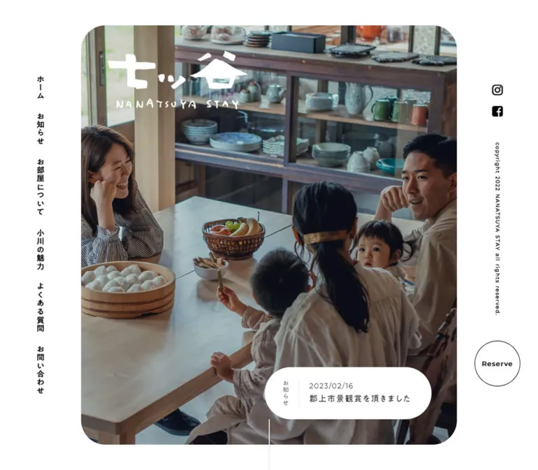
Desktop places a large rounded photograph inside white margins of approximately 160px horizontally and 50px vertically. The photograph shows adults and children around a wooden table, with fruit, food, and ceramic storage behind them. The white horizontal logo sits near the photograph's upper-left corner, approximately 50px inside its frame.
A fine vertical white line extends down from the lower center of the photograph toward the next section. It is visible as a scroll cue; motion was not established.
Mobile removes the surrounding white frame and rounded corners. The same scene fills a tall 390 × 759.59px opening area, with a much tighter crop. A tall white Japanese logo and small Roman lettering occupy the lower-left. The reservation circle moves onto the photograph at the lower-right, 15px from the viewport edge and 30px above the photo's bottom.
The mobile height equals 90% of the inspected viewport height. This establishes the observed proportion, not the exact source viewport-unit declaration. Image crop, focal point, and any darkening layer were not extracted.
Latest Announcement
Role: introduce a current update without competing with the photograph.
Desktop uses a white capsule inside the photograph's lower-right area. Its measured position is x = 851.91px, y = 797.19px, and its bottom/right edges sit approximately 50px inside the photo frame.
Its anatomy is a small vertical お知らせ label, a fine vertical divider, and a horizontal date/title stack. The category uses quiet gray; the date uses Montserrat; the title uses the heavier Japanese declaration. The current item is dated 2025/04/17 and reads 【ななつやステイカフェ】やります!.
The outer capsule measures 378.09 × 102.81px with 128px radius. The label begins 35px from its left edge and 25px from its top. The date-to-title gap is 10px.
Mobile moves the announcement below the photograph into a full-width rectangular strip. The measured section is 112.20px high; its text anchor is 346px wide with 25px 20px 30px padding, followed by a right-pointing arrow area. The title becomes 15px, and the date becomes 12px. For reuse, make the entire row—including the decorative arrow—a single accessible link.
Introductory Story
Role: describe the location and the pace of a visit.
Two short passages introduce the remote community and the balance between convenience and rural life. One begins 人口250人、; another ends ようこそ、小川の里へ.
The DOM records narrow, tall text blocks consistent with vertical Japanese composition. On desktop they occupy widely separated left and right positions within a 1630px-high section. On mobile, the section becomes 710px high and the passages reduce from 24px to 16px while retaining strong tracking.
Use short vertical passages and surrounding space as the transferable pattern. Exact neighboring image compositions are not visible in the supplied screenshots, and complete background-image references were not provided.
Stay / Work / Meet Links
Role: explain three ways to use the facility and route visitors to the relevant room information.
Each whole circular link contains an English category, a large Japanese character, a short three-line description, and a small destination label. The measured circles are transparent containers with white child text; their complete background treatment is not visible in the supplied screenshots.
| Entry | Main character | Destination label | Observed href |
|---|---|---|---|
| Stay | 泊 |
宿泊利用 |
/aboutroom#guestroom01 |
| Work | 働 |
ワーキング利用 |
/aboutroom#workingspace |
| Meet | 集 |
部屋貸し利用 |
/aboutroom#sharedspace |
Desktop places the 350px circles in one row at x = 155, 545, and 935px, with 40px gaps. Each has 50px 60px padding. The main character is 64px; body text is 14px with 1.8 line height.
Mobile centers three 270px circles at x = 60px, separated vertically by 15px. Padding becomes 30px 0; the main character becomes 48px and body text becomes 13px.
The section's introductory heading also changes hierarchy: its first sentence is 16px on mobile, while the following lines remain more prominent at 24px. The English category's individual font styling was not sampled.
Local Article Cards
Role: connect a stay with nearby places, activities, and seasonal information.
The section combines a Japanese heading, 小川の魅力, with the smaller English label Column. These sit on one line with a calculated 20px gap. Their measured styles remain the same on desktop and mobile.
Desktop uses a centered row approximately 998px wide. Each article is one unboxed link containing a rounded image window, date, outlined category chips, and title. Text sits directly on the paper texture; there is no separate raised card surface.
The three current entries concern spring in the area, MARUTA TERRACE, and a fishing destination. Their dates are in 2023. The visible MARUTA TERRACE image combines outdoor timber construction with white lettering. The first image window is partly blank, and the third is blank in the supplied desktop capture. Do not infer what those missing portions should contain.
Mobile stacks the same three entries into 320px-wide cards with 35px side margins and 30px vertical gaps. This is a DOM-confirmed single column, not a verified swipe carousel.
Category Chips
Role: summarize article topics within each card.
The chips have transparent fill, dark text, a thin dark outline, and a measured 128px radius. Desktop type is 13px, with 2px 10px 3px padding and a measured 20px total height. Mobile type reduces to 12px and total height to 19px.
Recorded labels include 周辺情報, スポット, 食, and アクティビティ. They are paragraph elements inside the larger article link. No independent category-filter interaction was verified. Implement them as metadata unless a new product explicitly adds filtering.
View More
Role: open the full local-article index.
A centered outlined capsule links to /column. It measures 197.30 × 61.80px on both viewports, with 20px 40px padding and 128px radius. The Montserrat label uses 18px, weight 500, and 0.1em tracking.
The surrounding spacing changes: 50px after the desktop cards, 30px after the mobile stack. Retain its modest scale and monochrome outline.
Calendar Fallback and Main Reservation Links
Role: support practical planning and provide a larger booking entrance farther down the page.
The rendered text includes Googleカレンダーが表示されない方はこちら, linked to an external Google Calendar embed URL. Its text is 12px on both viewports. The actual calendar interface, events, loading state, and interactions are not shown in the supplied screenshots.
Farther down, two large capsules link to reservations and room information. Desktop places them side by side with a calculated 20px gap. Their heights are 90px; the reservation link has black fill and white 24px text, while the room link has a transparent background and black text.
Mobile stacks the two links at 330px wide and 90px high, with 30px side margins and a 15px gap. These links provide a second reservation scale alongside the small hero circle.
FAQ and Contact Entrances
Role: provide broad, easy-to-find routes to support information.
Desktop places two 720 × 523px rectangular links side by side. Each centers a 24px Japanese label above a 15px English label, with 15px between their measured line boxes.
In the captured desktop state, both surfaces appear pale gray with white text and a soft text shadow. The source includes background-image declarations, but the image subjects and fully rendered appearance are unavailable. Record the pale state without supplying imaginary photography.
Mobile changes these to stacked 390 × 200px links. For an adaptation that retains a pale fallback, use dark text until a sufficiently dark image is available; the captured white-on-pale treatment has weak contrast.
Map and Footer
Role: finish with location, contact information, policies, social links, and another reservation entrance.
The mobile bottom screenshot shows a map immediately before the footer. The DOM interval between the Contact panel and footer is 500px, consistent with that map region, although the map element's own rectangle was not supplied. The desktop footer screenshot does not establish the map's desktop placement.
The footer is a flat #979797 field. Desktop uses 100px padding, with a white horizontal logo and large white reservation capsule at left, and a right-aligned vertical navigation list at right. Address and telephone sit together near the lower center, followed by small copyright text.
Mobile centers the composition. The reservation capsule becomes 330 × 80px; the general footer navigation disappears from the visible layout, while the two policy links remain in one row. Social icons form a centered pair. Address and telephone stack with a calculated 10px gap.
The visible 2022 belongs to copyright content, not the inspection date. A small fixed platform badge also appears at the lower-left of the captures; it is platform infrastructure rather than part of the facility's brand system.
Tokens — Motion & Interaction
The evidence contains transition declarations but no interaction recording that establishes their full visual effects.
| Treatment | Recorded value | What can be concluded |
|---|---|---|
| Most links, text, and containers | 0.3s cubic-bezier(0.4, 0.4, 0, 1) |
A common transition timing is declared; exact hover/state changes are not supplied |
| Body background | 0.5s cubic-bezier(0.4, 0.4, 0, 1) |
Background transition exists; no user-controlled theme change was observed |
| Selected desktop service headings, service links, article links, and lower CTAs | 2s cubic-bezier(0.4, 0.4, 0, 1) 0.2s |
Longer transitions with a 200ms delay are declared; trigger and changed properties are unverified |
| Corresponding sampled mobile cards and service links | Generally 0.3s with the same easing |
Recorded mobile timing differs from several desktop elements |
| Platform badge | 0.4s cubic-bezier(0.4, 0.4, 0, 1) |
Platform-specific transition |
| Sampled elements' animation property | none |
No keyframe animation was reported on those elements at sampling time |
The inspection traversed the page and waited for layout, text, visible images, and finite motion to settle within stated limits. This supports the captured states, but does not prove that all delayed content completed.
Do not infer parallax, an autoplay slideshow, image zoom on hover, menu choreography, or scroll-triggered fades from the static captures. Likewise, repeated transition declarations for transparent gradient properties do not establish a visible gradient animation.
Recommended adaptation: use the measured 300ms easing for restrained opacity or color feedback. Keep longer entrance effects optional and content visible without animation. Respect reduced-motion preferences. Reservation and article destinations should remain ordinary links.
Surfaces
| Surface | Appearance | Structural purpose |
|---|---|---|
| Page canvas | Solid white | Frames photography and separates large sections |
| Opening photograph | Natural color, rounded on desktop | Main emotional and visual anchor |
| Desktop announcement | White capsule, compact dark typography | Separates current information from the photograph |
| Article section | Pale fibrous texture | Gives local editorial content a tactile, informal character |
| Article cards | Transparent text area beneath rounded media | Keeps the layout open and avoids redundant boxes |
| Outlined controls | Transparent fill, fine monochrome edge | Provides quiet navigation affordances |
| Main reservation | Black capsule with white text | Strongest conventional action contrast |
| FAQ/contact, captured state | Flat pale gray, white labels | Large support entrances; background completion is uncertain |
| Footer | Solid medium gray with white content | A calm, full-width closing field |
The visible design has no general card-elevation or glass-blur system. Separation comes from image edges, whitespace, texture, thin rules, and contrasting fills. The soft shadow visible behind FAQ/contact labels is a localized text treatment.
Imagery
Photographic Direction
The opening scene communicates shared daily life through people, food, furniture, and household objects. Its materials matter: a broad wooden tabletop, woven basket, ceramic dishes, timber window frames, and a dark display cabinet. Daylight and muted clothing keep the scene believable and calm.
For new imagery, favor documentary hospitality: conversation, preparing food, working quietly, and nearby outdoor places. Compose enough usable image area for both a broad desktop crop and a tall mobile crop. Avoid placing every important face near the outer edges, where mobile cropping will remove it.
The existing opening photograph looks subdued enough to carry white artwork. Its exact grading and overlay opacity are unknown. Evaluate a replacement image directly before adding any darkening treatment.
Identity and Texture
The brush-like Japanese logo and uneven Roman lettering supply the handmade character. Preserve their proportions and use separate horizontal and vertical arrangements where needed. These should be supplied artwork, not approximations made from an unrelated display font.
The article background resembles lightly mottled paper with fine fibers. Use a low-contrast texture beneath the whole section, rather than adding noisy texture to every component. The estimated paper-base color alone will not reproduce the material effect.
Observed Asset References
| Asset | Original-page evidence | Limitation |
|---|---|---|
| Dining-room hero photograph | Desktop/mobile opening captures and a header pseudo-element background declaration | Complete asset URL and crop rules are absent from the excerpt |
| Horizontal and vertical logo arrangements | Desktop hero/footer and mobile hero/footer captures | Asset paths were not supplied |
| Paper texture | Desktop article capture and a section background declaration | Complete texture URL is unavailable |
| Article media | Rounded desktop image windows and CMS background declarations | Some media is blank or partial; filenames are truncated |
| FAQ/contact backgrounds | Pseudo-element background declarations | Subjects and completed visual appearance are unverified |
| Social/menu icons | FontAwesome and Material Icons computed families | Accessible labels and interaction behavior were not inspected |
No complete reusable photo, logo, or texture asset URL can be recovered safely from the supplied excerpts. The Quick Start therefore expects project-provided images and does not invent filenames.
Layout & Responsive Behavior
Observed Changes
| Area | Desktop: 1440 × 1000 | Mobile: 390 × 844 |
|---|---|---|
| Primary navigation | Vertical left rail | Top-right menu button |
| Persistent identity | Logo within opening photograph | Black Roman wordmark remains at the top |
| Hero | Inset photo with large rounded corners | Full-width, square-edged, tall photo |
| Hero logo | Horizontal, upper-left | Vertical, lower-left |
| Small reservation | Right rail, dark outline in captured state | White outline over lower-right photograph |
| Latest announcement | Floating white capsule | Rectangular strip below the photograph |
| Introductory copy | Large vertical passages with wide separation | Smaller vertical passages and reduced section height |
| Services | Three circles in one row | Three circles in one column |
| Articles | Three columns | One column, 320px cards |
| Large action pair | Horizontal | Vertical |
| FAQ/contact entrances | Two columns, 523px high | Stacked, 200px high |
| Footer | Left identity and right navigation | Centered identity, policies, socials, and stacked contact details |
The design repositions important elements instead of simply shrinking the desktop layout. The mobile announcement moves into document flow, the reservation action changes context, and the brand receives a dedicated vertical lockup.
The source excerpt includes a max-width: 840px rule for conditional line breaks. This does not prove that every component switches at 840px. The Quick Start uses 840px as a recommended shell breakpoint and an additional 1200px service-grid adjustment to keep intermediate widths usable.
Vertical Rhythm
Measured desktop sections include a 1630px introductory region, a 908px service region, and a 907.80px article region. On mobile these become 710px, 1220px, and 1403.80px respectively. The story compresses, while repeated service and article content becomes taller through stacking.
Within the article section, the heading begins 150px below its desktop section start and 100px below its mobile start. The measured bottom clearance after View more is 250px on desktop and 100px on mobile. These large intervals contribute strongly to the page's unhurried pace.
The total page is shorter on mobile despite stacked cards, because other regions compress considerably. Do not derive a global mobile spacing multiplier from one section.
Do’s and Don’ts
Do
- Let a candid, inhabited photograph carry the opening impression.
- Preserve the desktop relationship between broad white margins and a rounded central photo.
- Use vertical Japanese text selectively for navigation, announcement labels, and short story passages.
- Pair A1 Gothic's declared Japanese styles with tracked Montserrat utilities.
- Preserve the handwritten logo as identity artwork.
- Repeat circles and capsules at distinct scales: reservation, service choice, category, and large action.
- Keep article metadata directly on the textured section background.
- Recompose the hero, news, services, and footer for mobile.
- Distinguish photo-derived colors from interface tokens.
- Keep uncertain background imagery and untested interactions explicitly unresolved.
Don’t
- Do not turn every section into a raised, rounded card.
- Do not add a saturated booking color unsupported by the current interface.
- Do not treat the handwritten wordmark as ordinary Montserrat text.
- Do not scale the complete desktop hero down to fit a phone.
- Do not leave the desktop news capsule floating over mobile content.
- Do not implement category chips as filters based only on their pill shape.
- Do not replace the measured service circles with generic rectangular feature tiles.
- Do not present partially blank images as an intentional artistic treatment.
- Do not invent hover effects, menu layouts, parallax, or a slideshow.
- Do not copy white computed rail colors without reproducing a readable visible result.
Recommended Implementation Additions
These are recommendations for a new implementation, not verified original-site features:
- Use a meaningful main heading near the start of the page. The sampled
h1is a tiny footer brand fragment; visual hierarchy need not dictate that semantic structure. - Give the mobile menu an accessible name, expanded state, and a minimum 44px target while retaining a 36px visual glyph.
- Provide visible keyboard focus for navigation, article cards, reservation links, and social controls.
- Keep a readable dark-text fallback for pale FAQ/contact panels. Recheck footer text and button contrast when adapting the gray palette.
- Supply real image dimensions and reserve media space. Use an explicit fallback when an image fails, rather than leaving unexplained partial content.
- Make the mobile announcement one continuous link and prevent platform overlays from covering essential text.
- Preserve a direct calendar link alongside any embed, and provide an accessible map title and a textual location alternative.
- Use licensed font resources when available. The fallback stacks in the CSS are recommendations, not recovered source stacks.
- Test the persistent header over photography, the map, and the footer; provide a readable surface when the underlying content becomes busy.
- Keep content visible by default and disable optional movement under reduced-motion preferences.
Agent Prompt Guide
Quick Color Reference
- Canvas and white capsules:
#ffffff. - Main visible text and outlines:
#000000. - Quiet announcement label:
#666666. - Footer: measured
#979797. - Pale support-panel background: measured
#eeeeee. - Paper background: approximately
#e8e5d9, combined with a subtle fibrous texture. - Photographic browns and greens remain in imagery rather than becoming action colors.
Overall Prompt
“Create a rural accommodation and workation homepage inspired by NANATSUYA STAY's current visual system. Lead with candid photography of people sharing an everyday interior. At desktop size, frame the photo with generous white margins, approximately 50px corners, vertical Japanese navigation at left, and social links, a vertical copyright line, and a small outlined reservation circle at right. Use supplied handwritten identity artwork, A1 Gothic-style Japanese typography, and tracked Montserrat utilities. Continue with short vertical story passages, circular Stay/Work/Meet links, local articles on pale textured paper, practical reservation links, and a flat gray footer. On mobile, make the hero full bleed, use a vertical logo near its lower-left, place reservation over the lower-right, move the announcement below the image, and stack repeated content. Keep unverified interactions and missing assets separate from the observed design.”
Example Component Prompts
- Desktop opening: “Create a 1440 × 1000 composition with an approximately 1120 × 900 rounded dining-room photo at x160/y50. Place white supplied logo artwork near its upper-left and a compact white news capsule near its lower-right. Use narrow monochrome navigation rails outside the photo.”
- Mobile opening: “For a 390px-wide screen, use a roughly 760px-tall full-bleed photo, black handwritten wordmark at the top, and a menu icon at top-right. Place a tall white logo at lower-left and a 90px white outlined reservation circle at lower-right. Put the announcement in a separate rectangular strip immediately afterward.”
- Article card: “Build a transparent editorial link with a roughly 250px-high rounded image, tracked date, small outlined Japanese metadata chips, and an 18px title on desktop or 16px on mobile. Place three cards across a pale paper texture on desktop and stack 320px-wide cards on mobile. Use no card shadow.”
- Service choices: “Create three whole-link circles for Stay/Work/Meet. Use 350px circles with 40px gaps on desktop and 270px stacked circles with 15px gaps on mobile. Center a large Japanese character, a short three-line description, and a small destination label. Supply a readable background separately because the inspected background imagery is unverified.”
- Footer: “Use a flat gray field with white handwritten identity, a broad white reservation capsule, small policy links, social icons, address, and telephone. Arrange identity left and navigation right on desktop; center and stack the content on mobile. Offer a darker contrast variant for small white text.”
Quick Start
CSS Custom Properties
This is a reusable adaptation, not extracted source code. It combines measured colors and typography with explicitly estimated image geometry. The hero viewport formulas, intermediate breakpoint, direct rail colors, hover feedback, and readable fallback surfaces are recommendations.
Suggested structure: .opening contains a .hero and a sibling .news link. The hero contains the photograph, supplied logo variants, and mobile reservation link. Desktop rails and the mobile header sit outside that wrapper. Each .article-card is one anchor containing its image, date, metadata, and title. Provide images through actual image elements; optionally set --paper-texture to an authorized texture URL.
:root {
  /* Measured colors, except the estimated paper base. */
  --color-canvas: #fff;
  --color-ink: #000;
  --color-text: #333;
  --color-muted: #666;
  --color-footer: #979797;
  --color-panel: #eee;
  --color-paper: #e8e5d9;
  --color-on-dark: #fff;

  /* Observed families with recommended fallbacks. */
  --font-jp: 'A1ゴシック R JIS2004', 'Yu Gothic', sans-serif;
  --font-latin: 'Montserrat', sans-serif;
  --weight-regular: 400;
  --weight-medium: 500;
  --weight-title: 900;
  --tracking-body: 0.05em;
  --tracking-label: 0.1em;
  --tracking-story: 0.25em;

  /* Geometry adapted to the inspected desktop composition. */
  --rail-width: 160px;
  --hero-inset: 50px;
  --content-width: 998px;
  --radius-hero: 50px;
  --radius-image: 32px;
  --radius-pill: 128px;
  --rule: 1px;
  --hero-focal-point: 50% 50%;

  /* Recorded timing; specific feedback below is recommended. */
  --ease-site: cubic-bezier(0.4, 0.4, 0, 1);
  --duration-ui: 300ms;
  --duration-background: 500ms;
  --duration-long: 2s;
  --delay-long: 200ms;
}

* { box-sizing: border-box; }
body {
  margin: 0;
  color: var(--color-ink);
  background: var(--color-canvas);
  font-family: var(--font-jp);
  font-weight: var(--weight-regular);
}
a { color: inherit; }
button { font: inherit; }
img { display: block; max-width: 100%; }

.content {
  width: min(var(--content-width), calc(100% - 70px));
  margin-inline: auto;
}

/* Direct dark rail colors reproduce the visible light-canvas state. */
.desktop-nav,
.utility-rail {
  position: fixed;
  top: 50%;
  z-index: 20;
  width: var(--rail-width);
  transform: translateY(-50%);
  color: var(--color-ink);
}
.desktop-nav {
  left: 0;
  display: flex;
  flex-direction: column;
  align-items: center;
  gap: 24px;
}
.desktop-nav a {
  writing-mode: vertical-rl;
  font-size: 15px;
  line-height: 1;
  letter-spacing: 0.1em;
  text-decoration: none;
}
.utility-rail {
  right: 0;
  display: flex;
  flex-direction: column;
  align-items: center;
  gap: 50px;
}
.rail-social {
  display: flex;
  flex-direction: column;
  gap: 18px;
}
.rail-social a { display: block; width: 24px; height: 24px; }
.rail-copyright {
  margin: 0;
  writing-mode: vertical-rl;
  font: 400 10px/1 var(--font-latin);
  letter-spacing: 0.15em;
}
.mobile-header { display: none; }

.opening {
  position: relative;
  height: 100vh;
  height: 100svh;
  padding: var(--hero-inset) var(--rail-width);
}
.hero {
  position: relative;
  height: 100%;
  overflow: hidden;
  border-radius: var(--radius-hero);
  background: var(--color-text);
}
.hero-photo {
  width: 100%;
  height: 100%;
  object-fit: cover;
  object-position: var(--hero-focal-point);
}
.hero-brand {
  position: absolute;
  top: 50px;
  left: 50px;
  width: 280px;
}
.hero-brand--mobile,
.hero-reserve { display: none; }

.reserve-circle {
  display: grid;
  place-content: center;
  width: 90px;
  height: 90px;
  border: var(--rule) solid currentColor;
  border-radius: 50%;
  text-align: center;
  text-decoration: none;
}
.reserve-circle .latin {
  font: 500 13px/1 var(--font-latin);
  letter-spacing: 0.1em;
}

.news {
  position: absolute;
  right: calc(var(--rail-width) + 50px);
  bottom: 100px;
  display: flex;
  align-items: center;
  gap: 20px;
  max-width: calc(100% - 2 * var(--rail-width) - 100px);
  padding: 25px 40px 25px 35px;
  border-radius: var(--radius-pill);
  background: var(--color-canvas);
  text-decoration: none;
}
.news-label {
  flex: none;
  writing-mode: vertical-rl;
  padding-right: 20px;
  border-right: 1px solid #eee;
  color: var(--color-muted);
  font-size: 12px;
  line-height: 1;
  letter-spacing: 0.1em;
}
.news-copy { min-width: 0; }
.news-date {
  display: block;
  font: 400 14px/1 var(--font-latin);
  letter-spacing: 0.1em;
}
.news-title {
  margin: 10px 0 0;
  font-size: 16px;
  line-height: 1.2;
  font-weight: var(--weight-title);
  letter-spacing: 0.1em;
}
.news-arrow { display: none; }

.story { padding-block: 200px; }
.story-copy {
  writing-mode: vertical-rl;
  font-size: 24px;
  line-height: 2.8;
  letter-spacing: var(--tracking-story);
}

/* Dark fallback is recommended; the original imagery is unverified. */
.modes {
  padding: 180px 15px 200px;
  color: var(--color-on-dark);
  background: var(--color-text);
}
.modes-intro {
  margin: 0 0 50px;
  text-align: center;
  font-size: 32px;
  line-height: 2;
  letter-spacing: 0.2em;
}
.mode-grid {
  display: grid;
  grid-template-columns: repeat(3, minmax(0, 1fr));
  gap: 40px;
  width: min(1130px, 100%);
  margin-inline: auto;
}
.mode-link {
  display: flex;
  flex-direction: column;
  justify-content: space-between;
  align-items: center;
  width: 100%;
  min-height: 350px;
  aspect-ratio: 1;
  padding: 50px 60px;
  border: 1px solid currentColor;
  border-radius: 50%;
  text-align: center;
  text-decoration: none;
}
.mode-name {
  /* Recommended styling; the category label was not individually sampled. */
  font: 500 15px/1.1 var(--font-latin);
  letter-spacing: 0.1em;
}
.mode-character {
  margin: 0;
  font-size: 64px;
  line-height: 1;
  font-weight: 400;
  letter-spacing: 0.05em;
}
.mode-description {
  margin: 0;
  font-size: 14px;
  line-height: 1.8;
  letter-spacing: 0.05em;
}
.mode-caption {
  font-size: 12px;
  line-height: 1;
  letter-spacing: 0.05em;
}

.column-section {
  padding: 150px 0 250px;
  background-color: var(--color-paper);
  background-image: var(--paper-texture, none);
}
.section-heading {
  display: flex;
  align-items: baseline;
  justify-content: center;
  gap: 20px;
  margin: 0 0 35px;
  font-weight: 400;
}
.section-heading .jp {
  font-size: 24px;
  line-height: 1;
  letter-spacing: 0.1em;
}
.section-heading .latin {
  font: 500 15px/1.1 var(--font-latin);
  letter-spacing: 0.1em;
}
.article-grid {
  display: grid;
  grid-template-columns: repeat(3, minmax(0, 1fr));
  gap: 50px;
}
.article-card { min-width: 0; text-decoration: none; }
.article-image {
  width: 100%;
  height: 250px;
  object-fit: cover;
  border-radius: var(--radius-image);
  background: var(--color-canvas);
}
.article-date {
  display: block;
  margin-top: 14px;
  font: 400 14px/1 var(--font-latin);
  letter-spacing: 0.1em;
}
.article-tags {
  display: flex;
  flex-wrap: wrap;
  gap: 5px;
  margin-top: 7px;
}
.tag {
  padding: 2px 10px 3px;
  border: var(--rule) solid currentColor;
  border-radius: var(--radius-pill);
  font-size: 13px;
  line-height: 1;
  letter-spacing: 0.05em;
}
.article-title {
  margin: 5px 0 0;
  font-size: 18px;
  line-height: 1.5;
  font-weight: var(--weight-title);
  letter-spacing: 0.1em;
}
.view-more {
  display: table;
  margin: 50px auto 0;
  padding: 20px 40px;
  border: var(--rule) solid currentColor;
  border-radius: var(--radius-pill);
  font: 500 18px/1.1 var(--font-latin);
  letter-spacing: 0.1em;
  text-decoration: none;
}

.action-pair {
  display: flex;
  justify-content: center;
  gap: 20px;
}
.pill-link {
  display: flex;
  align-items: center;
  justify-content: center;
  min-height: 90px;
  padding-inline: 100px;
  border: 1px solid currentColor;
  border-radius: var(--radius-pill);
  font-size: 24px;
  line-height: 1.2;
  letter-spacing: 0.1em;
  text-align: center;
  text-decoration: none;
}
.pill-link--primary {
  color: var(--color-on-dark);
  background: var(--color-ink);
  border-color: var(--color-ink);
}

.help-grid { display: grid; grid-template-columns: 1fr 1fr; }
.help-link {
  display: grid;
  align-content: center;
  justify-items: center;
  gap: 15px;
  min-height: 523px;
  background: var(--color-panel);
  color: var(--color-ink);
  text-decoration: none;
  /* Dark text is a recommended readable fallback for the pale panels. */
}
.help-link .jp { font-size: 24px; line-height: 1; letter-spacing: 0.1em; }
.help-link .latin {
  font: 500 15px/1.1 var(--font-latin);
  letter-spacing: 0.1em;
}

.site-footer {
  padding: 100px;
  color: var(--color-on-dark);
  background: var(--color-footer);
}
.footer-grid {
  display: grid;
  grid-template-columns: minmax(0, 1fr) auto;
  gap: 40px;
}
.footer-brand { width: min(373px, 100%); }
.footer-reserve {
  width: min(373.4px, 100%);
  margin-top: 40px;
  padding-inline: 20px;
  color: var(--color-footer);
  background: var(--color-canvas);
  border-color: var(--color-canvas);
}
.footer-nav {
  display: flex;
  flex-direction: column;
  align-items: flex-end;
  gap: 18px;
}
.footer-nav a,
.footer-policies a {
  font-size: 15px;
  line-height: 1;
  letter-spacing: 0.1em;
  text-decoration: none;
}
.footer-policies { display: flex; gap: 20px; }
.footer-social { display: flex; gap: 17px; }
.footer-contact {
  display: flex;
  justify-content: center;
  gap: 20px;
  margin: 36px 0 25px;
  font-size: 14px;
  line-height: 1.4;
  letter-spacing: 0.1em;
  font-style: normal;
}
.footer-copyright {
  margin: 0;
  font-size: 10px;
  line-height: 1.4;
  font-weight: 300;
  letter-spacing: 0.15em;
  text-align: center;
}

/* Optional contrast improvement; not the original footer color. */
.site-footer[data-contrast='enhanced'] { background: #666; }
.site-footer[data-contrast='enhanced'] .footer-reserve { color: #333; }

/* Recommended intermediate layout, not a recovered source breakpoint. */
@media (max-width: 1200px) {
  .mode-grid { grid-template-columns: 1fr; max-width: 350px; }
  .action-pair { flex-wrap: wrap; }
}

@media (max-width: 840px) {
  .desktop-nav, .utility-rail { display: none; }
  .mobile-header {
    position: fixed;
    top: calc(11px + env(safe-area-inset-top, 0px));
    right: 11px;
    left: 15px;
    z-index: 30;
    display: flex;
    align-items: center;
    justify-content: space-between;
  }
  .mobile-wordmark { width: 210px; max-width: calc(100% - 60px); }
  .menu-button {
    display: grid;
    place-items: center;
    width: 44px;
    height: 44px;
    padding: 0;
    border: 0;
    color: #000;
    background: transparent;
  }
  .menu-button svg { width: 36px; height: 36px; }

  .opening { height: auto; padding: 0; }
  .hero { height: 90vh; height: 90svh; border-radius: 0; }
  .hero-brand--desktop { display: none; }
  .hero-brand--mobile {
    display: block;
    top: auto;
    bottom: 30px;
    left: 20px;
    width: 110px;
  }
  .hero-reserve {
    position: absolute;
    right: 15px;
    bottom: 30px;
    display: grid;
    color: #fff;
  }
  .hero-reserve .jp { font-size: 18px; line-height: 1.5; letter-spacing: 0.1em; }
  .hero-reserve .latin { font-size: 12px; }

  .news {
    position: static;
    display: grid;
    grid-template-columns: auto minmax(0, 1fr) 24px;
    gap: 15px;
    width: 100%;
    max-width: none;
    min-height: 112px;
    padding: 25px 20px 30px;
    border-radius: 0;
    background: var(--color-panel);
  }
  .news-label { font-size: 13px; padding-right: 15px; border-color: #aaa; }
  .news-date { font-size: 12px; }
  .news-title { margin-top: 5px; font-size: 15px; line-height: 1.4; }
  .news-arrow { display: block; color: var(--color-muted); }

  .story { padding: 80px 15px; }
  .story-copy { font-size: 16px; line-height: 2; }
  .modes { padding: 100px 15px; }
  .modes-intro { margin-bottom: 45px; font-size: 24px; }
  .modes-intro .lead { font-size: 16px; }
  .mode-grid { max-width: 270px; gap: 15px; }
  .mode-link { min-height: 270px; padding: 30px 15px; }
  .mode-character { font-size: 48px; }
  .mode-description { font-size: 13px; }

  .column-section { padding: 100px 0; }
  .article-grid {
    grid-template-columns: 1fr;
    gap: 30px;
    max-width: 320px;
    margin-inline: auto;
  }
  .article-date { font-size: 12px; }
  .tag { font-size: 12px; }
  .article-title { font-size: 16px; }
  .view-more { margin-top: 30px; }
  .action-pair { flex-direction: column; align-items: center; gap: 15px; }
  .action-pair .pill-link { width: calc(100% - 60px); padding-inline: 20px; }
  .help-grid { grid-template-columns: 1fr; }
  .help-link { min-height: 200px; }

  .site-footer { padding: 50px 15px 80px; }
  .footer-grid { grid-template-columns: 1fr; justify-items: center; gap: 25px; }
  .footer-brand { width: min(330px, 100%); margin-inline: auto; }
  .footer-reserve { width: min(330px, 100%); min-height: 80px; }
  .footer-nav { align-items: center; gap: 25px; }
  .footer-primary { display: none; }
  .footer-policies { flex-wrap: wrap; justify-content: center; }
  .footer-social { justify-content: center; }
  .footer-contact { flex-direction: column; align-items: center; gap: 10px; }
  .footer-address { font-size: 13px; text-align: center; }
  .footer-copyright { letter-spacing: normal; }
}

/* Recommended focus and feedback, not verified original hover states. */
a:focus-visible, button:focus-visible {
  outline: 2px solid currentColor;
  outline-offset: 5px;
}
.news, .article-card, .pill-link, .reserve-circle, .view-more {
  transition: opacity var(--duration-ui) var(--ease-site);
}
@media (hover: hover) {
  .news:hover, .article-card:hover, .pill-link:hover,
  .reserve-circle:hover, .view-more:hover { opacity: 0.8; }
}
@media (prefers-reduced-motion: reduce) {
  *, *::before, *::after {
    animation: none !important;
    transition: none !important;
    scroll-behavior: auto !important;
  }
}
The service-circle outline, dark service fallback, and pale-panel dark labels are explicit adaptation choices where visual evidence is incomplete or contrast needs improvement. The CSS does not implement the uninspected menu, calendar, map, destination pages, or rail-hiding behavior. Those require separate functional implementation.
Tailwind v4 Token Mapping
Optional aliases for a project already using Tailwind v4. This is not a claim about the original site's framework. Define the custom properties above first.
@theme inline {
  --color-canvas: var(--color-canvas);
  --color-ink: var(--color-ink);
  --color-paper: var(--color-paper);
  --color-panel: var(--color-panel);
  --color-footer: var(--color-footer);

  --font-japanese: var(--font-jp);
  --font-utility: var(--font-latin);

  --text-caption: 12px;
  --text-meta: 14px;
  --text-card-title: 18px;
  --text-section: 24px;
  --text-service: 64px;

  --spacing-rail: 160px;
  --spacing-hero-inset: 50px;
  --spacing-mobile-inset: 15px;
  --spacing-mobile-card-gap: 30px;

  --radius-photo: 50px;
  --radius-card-image: 32px;
  --radius-capsule: 128px;
  --ease-site: cubic-bezier(0.4, 0.4, 0, 1);
}
When adapting this mapping, use distinct alias names if a build tool expands theme variables into the same root namespace; avoid self-referencing custom-property declarations.
Sources & Evidence
- Original and final website: https://nanatsuya-stay.com/. The supplied inspection records HTTP
200, with no URL change. - Capture timestamp:
2026-09-29T13:23:48.561Z, corresponding to September 29, 2026 at 22:23:48 JST. - Desktop evidence: 1440 × 1000 CSS-pixel viewport; original-page opening, article-area, and footer captures; rendered text, link destinations, custom properties, element rectangles, and sampled computed styles. Recorded document height: approximately 8495.34px.
- Mobile evidence: 390 × 844 CSS-pixel viewport; original-page opening and map/footer captures, plus corresponding rendered DOM and computed styles. Recorded document height: approximately 7193.03px.
- Observed navigation structure: homepage links to news, room information, local articles, reservation, FAQ, contact, policies, social profiles, and a calendar fallback. Link destinations were recorded but not opened for this reference.
- Inspection behavior: the supplied browser process waited for document load, finite motion, sampled stability, and visible image decoding within bounded timeouts. It traversed intermediate scroll positions. SharedWorkers and service workers were disabled during inspection.
Limitations include partially rendered media, truncated asset references, missing ancestor/pseudo-element style details, no opened menu, no tested hover/focus states, no reservation flow, and no intermediate-width screenshots. The reference describes the supplied current page evidence. Estimated tokens and implementation recommendations are labeled separately from measured findings.
# NANATSUYA STAY — Style Reference

> A rural stay presented through a shared table, handwritten identity, and generous breathing room.

**Website:** [nanatsuya-stay.com](https://nanatsuya-stay.com/)
**Original URL:** https://nanatsuya-stay.com/
**Final URL:** https://nanatsuya-stay.com/
**Theme:** light canvas, monochrome interface, natural photographic color, and a medium-gray footer.
**Inspected:** September 29, 2026, at 13:23:48 UTC / 22:23:48 JST, using the supplied browser inspection.
**Viewports:** desktop **1440 × 1000 CSS px**; mobile **390 × 844 CSS px**.
**Scope:** the current accommodation and workation homepage: opening photograph, navigation, latest announcement, introductory copy, Stay/Work/Meet links, local articles, calendar fallback link, reservation links, FAQ/contact entrances, mobile map, and footer. Destination pages and the opened mobile menu were not inspected.

NANATSUYA STAY builds its identity around ordinary hospitality: people gathered at a wooden table, shelves of crockery, daylight, and informal conversation. A large photograph supplies the opening impact. The surrounding interface is restrained: narrow vertical Japanese navigation, small tracked English labels, fine outlines, circular links, and generously rounded image corners.

The page moves between three visual registers. The opening uses clean white margins around photography. Local articles sit on a pale, fibrous paper texture. The footer settles into a flat gray field with white identity artwork and a large reservation capsule. The handwritten logo connects these surfaces without requiring an additional accent color.

This is a long homepage with several useful destinations. Its hierarchy supports choosing a type of visit, discovering the surrounding area, checking practical information, and making a reservation.
閉じる
# NANATSUYA STAY — Style Reference

> A rural stay presented through a shared table, handwritten identity, and generous breathing room.

**Website:** [nanatsuya-stay.com](https://nanatsuya-stay.com/)
**Original URL:** https://nanatsuya-stay.com/
**Final URL:** https://nanatsuya-stay.com/
**Theme:** light canvas, monochrome interface, natural photographic color, and a medium-gray footer.
**Inspected:** September 29, 2026, at 13:23:48 UTC / 22:23:48 JST, using the supplied browser inspection.
**Viewports:** desktop **1440 × 1000 CSS px**; mobile **390 × 844 CSS px**.
**Scope:** the current accommodation and workation homepage: opening photograph, navigation, latest announcement, introductory copy, Stay/Work/Meet links, local articles, calendar fallback link, reservation links, FAQ/contact entrances, mobile map, and footer. Destination pages and the opened mobile menu were not inspected.

NANATSUYA STAY builds its identity around ordinary hospitality: people gathered at a wooden table, shelves of crockery, daylight, and informal conversation. A large photograph supplies the opening impact. The surrounding interface is restrained: narrow vertical Japanese navigation, small tracked English labels, fine outlines, circular links, and generously rounded image corners.

The page moves between three visual registers. The opening uses clean white margins around photography. Local articles sit on a pale, fibrous paper texture. The footer settles into a flat gray field with white identity artwork and a large reservation capsule. The handwritten logo connects these surfaces without requiring an additional accent color.

This is a long homepage with several useful destinations. Its hierarchy supports choosing a type of visit, discovering the surrounding area, checking practical information, and making a reservation.

## How to Read This Reference

- **Measured** values come from the supplied rendered DOM, element rectangles, and computed styles. They describe the recorded viewport and state, rather than universal source rules.
- **Calculated** values are arithmetic derived from those measurements, such as gaps between adjacent elements.
- **Estimated** values come from visual inspection of the supplied original-page captures. They are labeled and were not obtained through pixel sampling.
- **Recommended** values and behaviors belong to a reusable implementation. They are not claims about the original website.
- **Named tokens** are descriptive aliases unless explicitly identified as source custom properties.
- Visual evidence covers the desktop opening, article area, and footer, plus the mobile opening and map/footer. The DOM supplies additional measurements for sections outside those screenshots.

The supplied captures contain partially blank article images and pale FAQ/contact panels. Their incomplete appearance is recorded below; missing artwork is not reconstructed. Computed styles also omit some ancestor and pseudo-element properties, so they cannot explain every compositing effect visible in the screenshots.

## Tokens — Colors

### Default Palette

| Name | Value | Suggested token | Role and evidence |
| --- | --- | --- | --- |
| Canvas White | `#ffffff` | `--color-canvas` | Measured body background, desktop announcement fill, and footer reservation fill |
| Interface Black | `#000000` | `--color-ink` | Measured article text, dates, section titles, mobile menu, and main reservation fill |
| Container Charcoal | `#333333` | `--color-text` | Measured inherited color on many layout containers; explicit child colors often override it |
| Quiet Gray | `#666666` | `--color-muted` | Measured vertical announcement category label |
| Footer Gray | `#979797` | `--color-footer` | Measured footer background and text inside its white reservation button |
| Pale Panel | `#eeeeee` | `--color-panel` | Measured FAQ/contact backgrounds; also a useful approximation of the visible mobile announcement surface |
| Paper Base | approximately `#e8e5d9` | `--color-paper` | Visual estimate of the article section's textured background; not a recovered solid source color |
| Reversed White | `#ffffff` | `--color-on-dark` | Measured service text and footer content; visibly used for logo artwork and mobile hero reservation |

The warm browns, soft greens, blue sky, and ceramic tones belong primarily to photographs. They do not establish a separate colored-button or category-badge system. Keep functional controls monochrome and allow imagery to provide variation.

### Rendered Color Versus Computed Color

Desktop navigation, social icons, and the vertical copyright line look dark against the white margins. Their sampled computed text colors are white. An ancestor or compositing treatment may account for this, but the supplied properties do not identify the mechanism.

For a reusable implementation, reproduce the visible result with dark text on light rails and white text on dark imagery. Do not copy the white declarations onto a white background or claim that a particular blend mode was verified.

The many transparent `--g-color-*` properties in the evidence do not demonstrate a visible gradient. The observed interface is predominantly flat and photographic. No user-selectable color theme was observed.

## Tokens — Typography

### Japanese Text

**Measured family:** `'A1ゴシック R JIS2004'`.

The source exposes this through `--s-font-f0ab9012`. It appears on navigation, introductory copy, service descriptions, article titles, category chips, reservation labels, and footer information.

Most Japanese text uses weight `400`. Article titles and the latest announcement title declare `900`; footer copyright text declares `300`. These are computed CSS weights, not proof that separate font files for every weight were loaded.

The character is approachable and lightly irregular, with substantial tracking. Preserve that combination of quiet weight and open spacing. A generic heavy geometric heading system would change the page's tone.

### Latin Utilities

**Measured family:** `Montserrat`, exposed through `--s-font-77867f7b`.

Dates use weight `400`. Labels such as `Reserve`, `Column`, `FAQ`, `Contact`, and `View more` use `500`. Tracking is commonly `0.1em`, rising to `0.15em` on the desktop rail copyright.

The sampled root reports Times, but the visible branded text has explicit font declarations. Times is not the page's editorial typeface.

### Brand Lettering and Icons

The Japanese logo and irregular Roman wordmark are graphic identity artwork. Their appearance should not be attributed to A1 Gothic or Montserrat. The desktop hero uses a white horizontal logo; mobile uses a tall white lockup near the photograph's lower-left corner and a separate black Roman wordmark at the top.

Social links declare `FontAwesome`: `24px` in the desktop rail and `28px` in the footer. The mobile menu declares `Material Icons`, with a `36px` font size and a measured `36 × 36px` button box. These icon fonts are distinct from the handwritten brand artwork.

### Type Scale

All values below are measured unless otherwise stated. Tracking values expressed in em are calculated from the recorded pixels.

| Role | Desktop size / line height | Mobile size / line height | Weight | Tracking |
| --- | --- | --- | --- | --- |
| Desktop vertical navigation | `15 / 15px` | Replaced by menu control | `400` | `0.1em` |
| Rail copyright | `10 / 10px` | Not present in mobile rail | `400` | `0.15em` |
| Reserve, English | `13 / 13px` | `12 / 12px` | `500` | `0.1em` |
| Hero reservation, Japanese | Computed `14 / 21px`; not visibly readable in the captured desktop state | `18 / 27px` | `400` | Desktop `0.05em`; mobile `0.1em` |
| Announcement category | `12 / 12px` | `13 / 13px` | `400` | `0.1em` |
| Announcement date | `14 / 14px` | `12 / 12px` | `400` | `0.1em` |
| Announcement title | `16 / 19.2px` | `15 / 21px` | `900` | `0.1em` |
| Vertical introductory copy | `24 / 67.2px` | `16 / 32px` | `400` | `0.25em` |
| Service introduction, first sentence | `32 / 64px` | `16 / 32px` | `400` | `0.2em` |
| Service introduction, following lines | `32 / 64px` | `24 / 48px` | `400` | `0.2em` |
| Service character: `泊`, `働`, `集` | `64 / 64px` | `48 / 48px` | `400` | `0.05em` |
| Service description | `14 / 25.2px` | `13 / 23.4px` | `400` | `0.05em` |
| Service destination label | `12 / 12px` | Same | `400` | `0.05em` |
| Section title, Japanese | `24 / 24px` | Same | `400` | `0.1em` |
| Section label, English | `15 / 16.5px` | Same | `500` | `0.1em` |
| Article date | `14 / 14px` | `12 / 12px` | `400` | `0.1em` |
| Category chip | `13 / 13px` | `12 / 12px` | `400` | `0.05em` |
| Article title | `18 / 27px` | `16 / 24px` | `900` | `0.1em` |
| View more | `18 / 19.8px` | Same | `500` | `0.1em` |
| Large reservation label | `24 / 24px` | Same | `400` | `0.1em` |
| Footer address | `14 / 14px` | `13 / 13px` | `400` | `0.1em` |
| Footer copyright | `10 / 10px` | Same | `300` | Desktop `0.15em`; mobile normal |

For vertical copy, line height separates text columns. Do not interpret the desktop `67.2px` value as unusually loose horizontal paragraph leading.

## Tokens — Spacing & Shapes

The page combines very compact metadata spacing with large section intervals. There is no evidence of a single universal spacing unit.

### Spacing Scale

| Use | Value | Status |
| --- | --- | --- |
| Gaps between category chips | `5px` | Calculated from adjacent chip rectangles |
| Date-to-chip spacing | `7px` | Calculated on both viewports |
| Chip-to-article-title spacing | `5px` | Calculated on both viewports |
| Desktop navigation item gap | `24px` | Calculated |
| Desktop rail social-icon gap | `18px` | Calculated |
| Gaps between right-rail groups | `50px` | Calculated |
| Desktop service-circle gap | `40px` | Calculated |
| Mobile service-circle gap | `15px` | Calculated |
| Desktop article-column gap | approximately `49.9px` | Calculated |
| Mobile article-row gap | `30px` | Calculated |
| Section heading to article cards | `35px` | Calculated on both viewports |
| Articles to View more | Desktop `50px`; mobile `30px` | Calculated |
| Introductory section padding | Desktop `200px 0`; mobile `80px 15px` | Measured |
| Service section padding | Desktop `180px 0 200px`; mobile `100px 15px` | Measured |
| Footer padding | Desktop `100px`; mobile `50px 15px 80px` | Measured |

### Border Radius

| Element | Value | Status |
| --- | --- | --- |
| Desktop hero photograph | approximately `50px` | Screenshot estimate |
| Mobile hero photograph | Square, full bleed | Screenshot observation |
| Article image windows | approximately `32px` | Screenshot estimate |
| News capsule, chips, and large buttons | `128px` | Measured; produces a pill at the observed heights |
| Reservation circle and service links | `50%` | Measured |
| FAQ/contact panels and footer | `0` | Measured |
| Small platform badge | `4px` | Measured |

Thin outlines are visible around reservation circles, category chips, and View more. Approximately `1px` is a suitable reproduction value; border-width properties were not included in the supplied element records.

### Layout Measurements

| Element | Desktop | Mobile | Evidence |
| --- | --- | --- | --- |
| Document height | `8495.34px` | `7193.03px` | DOM rectangles |
| Opening header | `1440 × 1000px` | `390 × 759.59px` | DOM rectangles |
| Visible hero photo | Approximately `1120 × 900px`, at `160, 50` | Approximately `390 × 760px`, at `0, 0` | Screenshot estimates |
| Announcement | `378.09 × 102.81px` | Section `390 × 112.20px` | DOM rectangles |
| Hero/rail reservation circle | `90 × 90px` | `90 × 90px` | DOM rectangles |
| Service links | Three `350 × 350px` circles | Three stacked `270 × 270px` circles | DOM rectangles |
| Article cards | Three `299.39 × 337px` cards | Three stacked `320 × 331px` cards | DOM rectangles |
| Article image height | Approximately `250px` | Approximately `250px`, inferred from matching metadata offset | Visual estimate and DOM relationship |
| View more | `197.30 × 61.80px` | Same | DOM rectangles |
| Main reservation button | `373.39 × 90px` | `330 × 90px` | DOM rectangles |
| Footer reservation button | `373.39 × 90px` | `330 × 80px` | DOM rectangles |
| FAQ/contact entrance | Each `720 × 523px` | Each `390 × 200px` | DOM rectangles |
| Footer | `1440 × 577px` | `390 × 509.86px` | DOM rectangles |

## Components

### Desktop Navigation Rails

**Role:** keep the main destinations and reservation route available while the homepage scrolls.

The opening and article captures retain a narrow navigation column centered around `x = 80px`. Six Japanese links are written vertically, with `24px` between their measured boxes. The group extends from approximately `y = 184px` to `816px` in the 1000px-high viewport.

The labels are `ホーム`, `お知らせ`, `お部屋について`, `小川の魅力`, `よくある質問`, and `お問い合わせ`. Their destinations are real page links, not verified homepage scroll anchors.

The opposite rail is centered around `x = 1360px`. Its anatomy is two stacked social icons, a long vertical copyright line, and a `90px` outlined reservation circle. The social group starts near `y = 201px`; the circle starts at `y = 708.78px`.

The rails remain in the same visible positions across the opening and article screenshots, supporting a persistent presentation. They are absent from the final footer capture. The exact hiding condition or implementation was not supplied.

### Mobile Header

**Role:** preserve identity and provide compact navigation above a full-width photograph.

A black handwritten Roman wordmark sits near the top-left, approximately `15px` from the edge. A three-line menu glyph occupies the top-right. The measured menu box is at `x = 339px`, `y = 15px`, with `36px` sides.

The wordmark and menu remain visible over the map in the mobile bottom capture, supporting a persistent mobile header. Its observed surface is transparent, allowing the underlying photograph or map to remain visible.

Only the closed menu state is available. The menu's contents, opening direction, overlay appearance, focus handling, and close behavior are unverified.

### Opening Photograph and Brand Lockup

**Role:** establish the social, domestic character of the stay.

Desktop places a large rounded photograph inside white margins of approximately `160px` horizontally and `50px` vertically. The photograph shows adults and children around a wooden table, with fruit, food, and ceramic storage behind them. The white horizontal logo sits near the photograph's upper-left corner, approximately `50px` inside its frame.

A fine vertical white line extends down from the lower center of the photograph toward the next section. It is visible as a scroll cue; motion was not established.

Mobile removes the surrounding white frame and rounded corners. The same scene fills a tall `390 × 759.59px` opening area, with a much tighter crop. A tall white Japanese logo and small Roman lettering occupy the lower-left. The reservation circle moves onto the photograph at the lower-right, `15px` from the viewport edge and `30px` above the photo's bottom.

The mobile height equals 90% of the inspected viewport height. This establishes the observed proportion, not the exact source viewport-unit declaration. Image crop, focal point, and any darkening layer were not extracted.

### Latest Announcement

**Role:** introduce a current update without competing with the photograph.

Desktop uses a white capsule inside the photograph's lower-right area. Its measured position is `x = 851.91px`, `y = 797.19px`, and its bottom/right edges sit approximately `50px` inside the photo frame.

Its anatomy is a small vertical `お知らせ` label, a fine vertical divider, and a horizontal date/title stack. The category uses quiet gray; the date uses Montserrat; the title uses the heavier Japanese declaration. The current item is dated `2025/04/17` and reads `【ななつやステイカフェ】やります!`.

The outer capsule measures `378.09 × 102.81px` with `128px` radius. The label begins `35px` from its left edge and `25px` from its top. The date-to-title gap is `10px`.

Mobile moves the announcement below the photograph into a full-width rectangular strip. The measured section is `112.20px` high; its text anchor is `346px` wide with `25px 20px 30px` padding, followed by a right-pointing arrow area. The title becomes `15px`, and the date becomes `12px`. For reuse, make the entire row—including the decorative arrow—a single accessible link.

### Introductory Story

**Role:** describe the location and the pace of a visit.

Two short passages introduce the remote community and the balance between convenience and rural life. One begins `人口250人、`; another ends `ようこそ、小川の里へ`.

The DOM records narrow, tall text blocks consistent with vertical Japanese composition. On desktop they occupy widely separated left and right positions within a `1630px`-high section. On mobile, the section becomes `710px` high and the passages reduce from `24px` to `16px` while retaining strong tracking.

Use short vertical passages and surrounding space as the transferable pattern. Exact neighboring image compositions are not visible in the supplied screenshots, and complete background-image references were not provided.

### Stay / Work / Meet Links

**Role:** explain three ways to use the facility and route visitors to the relevant room information.

Each whole circular link contains an English category, a large Japanese character, a short three-line description, and a small destination label. The measured circles are transparent containers with white child text; their complete background treatment is not visible in the supplied screenshots.

| Entry | Main character | Destination label | Observed href |
| --- | --- | --- | --- |
| Stay | `泊` | `宿泊利用` | `/aboutroom#guestroom01` |
| Work | `働` | `ワーキング利用` | `/aboutroom#workingspace` |
| Meet | `集` | `部屋貸し利用` | `/aboutroom#sharedspace` |

Desktop places the `350px` circles in one row at `x = 155`, `545`, and `935px`, with `40px` gaps. Each has `50px 60px` padding. The main character is `64px`; body text is `14px` with `1.8` line height.

Mobile centers three `270px` circles at `x = 60px`, separated vertically by `15px`. Padding becomes `30px 0`; the main character becomes `48px` and body text becomes `13px`.

The section's introductory heading also changes hierarchy: its first sentence is `16px` on mobile, while the following lines remain more prominent at `24px`. The English category's individual font styling was not sampled.

### Local Article Cards

**Role:** connect a stay with nearby places, activities, and seasonal information.

The section combines a Japanese heading, `小川の魅力`, with the smaller English label `Column`. These sit on one line with a calculated `20px` gap. Their measured styles remain the same on desktop and mobile.

Desktop uses a centered row approximately `998px` wide. Each article is one unboxed link containing a rounded image window, date, outlined category chips, and title. Text sits directly on the paper texture; there is no separate raised card surface.

The three current entries concern spring in the area, MARUTA TERRACE, and a fishing destination. Their dates are in 2023. The visible MARUTA TERRACE image combines outdoor timber construction with white lettering. The first image window is partly blank, and the third is blank in the supplied desktop capture. Do not infer what those missing portions should contain.

Mobile stacks the same three entries into `320px`-wide cards with `35px` side margins and `30px` vertical gaps. This is a DOM-confirmed single column, not a verified swipe carousel.

### Category Chips

**Role:** summarize article topics within each card.

The chips have transparent fill, dark text, a thin dark outline, and a measured `128px` radius. Desktop type is `13px`, with `2px 10px 3px` padding and a measured `20px` total height. Mobile type reduces to `12px` and total height to `19px`.

Recorded labels include `周辺情報`, `スポット`, `食`, and `アクティビティ`. They are paragraph elements inside the larger article link. No independent category-filter interaction was verified. Implement them as metadata unless a new product explicitly adds filtering.

### View More

**Role:** open the full local-article index.

A centered outlined capsule links to `/column`. It measures `197.30 × 61.80px` on both viewports, with `20px 40px` padding and `128px` radius. The Montserrat label uses `18px`, weight `500`, and `0.1em` tracking.

The surrounding spacing changes: `50px` after the desktop cards, `30px` after the mobile stack. Retain its modest scale and monochrome outline.

### Calendar Fallback and Main Reservation Links

**Role:** support practical planning and provide a larger booking entrance farther down the page.

The rendered text includes `Googleカレンダーが表示されない方はこちら`, linked to an external Google Calendar embed URL. Its text is `12px` on both viewports. The actual calendar interface, events, loading state, and interactions are not shown in the supplied screenshots.

Farther down, two large capsules link to reservations and room information. Desktop places them side by side with a calculated `20px` gap. Their heights are `90px`; the reservation link has black fill and white `24px` text, while the room link has a transparent background and black text.

Mobile stacks the two links at `330px` wide and `90px` high, with `30px` side margins and a `15px` gap. These links provide a second reservation scale alongside the small hero circle.

### FAQ and Contact Entrances

**Role:** provide broad, easy-to-find routes to support information.

Desktop places two `720 × 523px` rectangular links side by side. Each centers a `24px` Japanese label above a `15px` English label, with `15px` between their measured line boxes.

In the captured desktop state, both surfaces appear pale gray with white text and a soft text shadow. The source includes background-image declarations, but the image subjects and fully rendered appearance are unavailable. Record the pale state without supplying imaginary photography.

Mobile changes these to stacked `390 × 200px` links. For an adaptation that retains a pale fallback, use dark text until a sufficiently dark image is available; the captured white-on-pale treatment has weak contrast.

### Map and Footer

**Role:** finish with location, contact information, policies, social links, and another reservation entrance.

The mobile bottom screenshot shows a map immediately before the footer. The DOM interval between the Contact panel and footer is `500px`, consistent with that map region, although the map element's own rectangle was not supplied. The desktop footer screenshot does not establish the map's desktop placement.

The footer is a flat `#979797` field. Desktop uses `100px` padding, with a white horizontal logo and large white reservation capsule at left, and a right-aligned vertical navigation list at right. Address and telephone sit together near the lower center, followed by small copyright text.

Mobile centers the composition. The reservation capsule becomes `330 × 80px`; the general footer navigation disappears from the visible layout, while the two policy links remain in one row. Social icons form a centered pair. Address and telephone stack with a calculated `10px` gap.

The visible `2022` belongs to copyright content, not the inspection date. A small fixed platform badge also appears at the lower-left of the captures; it is platform infrastructure rather than part of the facility's brand system.

## Tokens — Motion & Interaction

The evidence contains transition declarations but no interaction recording that establishes their full visual effects.

| Treatment | Recorded value | What can be concluded |
| --- | --- | --- |
| Most links, text, and containers | `0.3s cubic-bezier(0.4, 0.4, 0, 1)` | A common transition timing is declared; exact hover/state changes are not supplied |
| Body background | `0.5s cubic-bezier(0.4, 0.4, 0, 1)` | Background transition exists; no user-controlled theme change was observed |
| Selected desktop service headings, service links, article links, and lower CTAs | `2s cubic-bezier(0.4, 0.4, 0, 1) 0.2s` | Longer transitions with a 200ms delay are declared; trigger and changed properties are unverified |
| Corresponding sampled mobile cards and service links | Generally `0.3s` with the same easing | Recorded mobile timing differs from several desktop elements |
| Platform badge | `0.4s cubic-bezier(0.4, 0.4, 0, 1)` | Platform-specific transition |
| Sampled elements' animation property | `none` | No keyframe animation was reported on those elements at sampling time |

The inspection traversed the page and waited for layout, text, visible images, and finite motion to settle within stated limits. This supports the captured states, but does not prove that all delayed content completed.

Do not infer parallax, an autoplay slideshow, image zoom on hover, menu choreography, or scroll-triggered fades from the static captures. Likewise, repeated transition declarations for transparent gradient properties do not establish a visible gradient animation.

**Recommended adaptation:** use the measured 300ms easing for restrained opacity or color feedback. Keep longer entrance effects optional and content visible without animation. Respect reduced-motion preferences. Reservation and article destinations should remain ordinary links.

## Surfaces

| Surface | Appearance | Structural purpose |
| --- | --- | --- |
| Page canvas | Solid white | Frames photography and separates large sections |
| Opening photograph | Natural color, rounded on desktop | Main emotional and visual anchor |
| Desktop announcement | White capsule, compact dark typography | Separates current information from the photograph |
| Article section | Pale fibrous texture | Gives local editorial content a tactile, informal character |
| Article cards | Transparent text area beneath rounded media | Keeps the layout open and avoids redundant boxes |
| Outlined controls | Transparent fill, fine monochrome edge | Provides quiet navigation affordances |
| Main reservation | Black capsule with white text | Strongest conventional action contrast |
| FAQ/contact, captured state | Flat pale gray, white labels | Large support entrances; background completion is uncertain |
| Footer | Solid medium gray with white content | A calm, full-width closing field |

The visible design has no general card-elevation or glass-blur system. Separation comes from image edges, whitespace, texture, thin rules, and contrasting fills. The soft shadow visible behind FAQ/contact labels is a localized text treatment.

## Imagery

### Photographic Direction

The opening scene communicates shared daily life through people, food, furniture, and household objects. Its materials matter: a broad wooden tabletop, woven basket, ceramic dishes, timber window frames, and a dark display cabinet. Daylight and muted clothing keep the scene believable and calm.

For new imagery, favor documentary hospitality: conversation, preparing food, working quietly, and nearby outdoor places. Compose enough usable image area for both a broad desktop crop and a tall mobile crop. Avoid placing every important face near the outer edges, where mobile cropping will remove it.

The existing opening photograph looks subdued enough to carry white artwork. Its exact grading and overlay opacity are unknown. Evaluate a replacement image directly before adding any darkening treatment.

### Identity and Texture

The brush-like Japanese logo and uneven Roman lettering supply the handmade character. Preserve their proportions and use separate horizontal and vertical arrangements where needed. These should be supplied artwork, not approximations made from an unrelated display font.

The article background resembles lightly mottled paper with fine fibers. Use a low-contrast texture beneath the whole section, rather than adding noisy texture to every component. The estimated paper-base color alone will not reproduce the material effect.

### Observed Asset References

| Asset | Original-page evidence | Limitation |
| --- | --- | --- |
| Dining-room hero photograph | Desktop/mobile opening captures and a header pseudo-element background declaration | Complete asset URL and crop rules are absent from the excerpt |
| Horizontal and vertical logo arrangements | Desktop hero/footer and mobile hero/footer captures | Asset paths were not supplied |
| Paper texture | Desktop article capture and a section background declaration | Complete texture URL is unavailable |
| Article media | Rounded desktop image windows and CMS background declarations | Some media is blank or partial; filenames are truncated |
| FAQ/contact backgrounds | Pseudo-element background declarations | Subjects and completed visual appearance are unverified |
| Social/menu icons | FontAwesome and Material Icons computed families | Accessible labels and interaction behavior were not inspected |

No complete reusable photo, logo, or texture asset URL can be recovered safely from the supplied excerpts. The Quick Start therefore expects project-provided images and does not invent filenames.

## Layout & Responsive Behavior

### Observed Changes

| Area | Desktop: 1440 × 1000 | Mobile: 390 × 844 |
| --- | --- | --- |
| Primary navigation | Vertical left rail | Top-right menu button |
| Persistent identity | Logo within opening photograph | Black Roman wordmark remains at the top |
| Hero | Inset photo with large rounded corners | Full-width, square-edged, tall photo |
| Hero logo | Horizontal, upper-left | Vertical, lower-left |
| Small reservation | Right rail, dark outline in captured state | White outline over lower-right photograph |
| Latest announcement | Floating white capsule | Rectangular strip below the photograph |
| Introductory copy | Large vertical passages with wide separation | Smaller vertical passages and reduced section height |
| Services | Three circles in one row | Three circles in one column |
| Articles | Three columns | One column, 320px cards |
| Large action pair | Horizontal | Vertical |
| FAQ/contact entrances | Two columns, 523px high | Stacked, 200px high |
| Footer | Left identity and right navigation | Centered identity, policies, socials, and stacked contact details |

The design repositions important elements instead of simply shrinking the desktop layout. The mobile announcement moves into document flow, the reservation action changes context, and the brand receives a dedicated vertical lockup.

The source excerpt includes a `max-width: 840px` rule for conditional line breaks. This does **not** prove that every component switches at 840px. The Quick Start uses 840px as a recommended shell breakpoint and an additional 1200px service-grid adjustment to keep intermediate widths usable.

### Vertical Rhythm

Measured desktop sections include a `1630px` introductory region, a `908px` service region, and a `907.80px` article region. On mobile these become `710px`, `1220px`, and `1403.80px` respectively. The story compresses, while repeated service and article content becomes taller through stacking.

Within the article section, the heading begins `150px` below its desktop section start and `100px` below its mobile start. The measured bottom clearance after View more is `250px` on desktop and `100px` on mobile. These large intervals contribute strongly to the page's unhurried pace.

The total page is shorter on mobile despite stacked cards, because other regions compress considerably. Do not derive a global mobile spacing multiplier from one section.

## Do’s and Don’ts

### Do

- Let a candid, inhabited photograph carry the opening impression.
- Preserve the desktop relationship between broad white margins and a rounded central photo.
- Use vertical Japanese text selectively for navigation, announcement labels, and short story passages.
- Pair A1 Gothic's declared Japanese styles with tracked Montserrat utilities.
- Preserve the handwritten logo as identity artwork.
- Repeat circles and capsules at distinct scales: reservation, service choice, category, and large action.
- Keep article metadata directly on the textured section background.
- Recompose the hero, news, services, and footer for mobile.
- Distinguish photo-derived colors from interface tokens.
- Keep uncertain background imagery and untested interactions explicitly unresolved.

### Don’t

- Do not turn every section into a raised, rounded card.
- Do not add a saturated booking color unsupported by the current interface.
- Do not treat the handwritten wordmark as ordinary Montserrat text.
- Do not scale the complete desktop hero down to fit a phone.
- Do not leave the desktop news capsule floating over mobile content.
- Do not implement category chips as filters based only on their pill shape.
- Do not replace the measured service circles with generic rectangular feature tiles.
- Do not present partially blank images as an intentional artistic treatment.
- Do not invent hover effects, menu layouts, parallax, or a slideshow.
- Do not copy white computed rail colors without reproducing a readable visible result.

## Recommended Implementation Additions

These are recommendations for a new implementation, not verified original-site features:

- Use a meaningful main heading near the start of the page. The sampled `h1` is a tiny footer brand fragment; visual hierarchy need not dictate that semantic structure.
- Give the mobile menu an accessible name, expanded state, and a minimum 44px target while retaining a 36px visual glyph.
- Provide visible keyboard focus for navigation, article cards, reservation links, and social controls.
- Keep a readable dark-text fallback for pale FAQ/contact panels. Recheck footer text and button contrast when adapting the gray palette.
- Supply real image dimensions and reserve media space. Use an explicit fallback when an image fails, rather than leaving unexplained partial content.
- Make the mobile announcement one continuous link and prevent platform overlays from covering essential text.
- Preserve a direct calendar link alongside any embed, and provide an accessible map title and a textual location alternative.
- Use licensed font resources when available. The fallback stacks in the CSS are recommendations, not recovered source stacks.
- Test the persistent header over photography, the map, and the footer; provide a readable surface when the underlying content becomes busy.
- Keep content visible by default and disable optional movement under reduced-motion preferences.

## Agent Prompt Guide

### Quick Color Reference

- Canvas and white capsules: `#ffffff`.
- Main visible text and outlines: `#000000`.
- Quiet announcement label: `#666666`.
- Footer: measured `#979797`.
- Pale support-panel background: measured `#eeeeee`.
- Paper background: approximately `#e8e5d9`, combined with a subtle fibrous texture.
- Photographic browns and greens remain in imagery rather than becoming action colors.

### Overall Prompt

“Create a rural accommodation and workation homepage inspired by NANATSUYA STAY's current visual system. Lead with candid photography of people sharing an everyday interior. At desktop size, frame the photo with generous white margins, approximately 50px corners, vertical Japanese navigation at left, and social links, a vertical copyright line, and a small outlined reservation circle at right. Use supplied handwritten identity artwork, A1 Gothic-style Japanese typography, and tracked Montserrat utilities. Continue with short vertical story passages, circular Stay/Work/Meet links, local articles on pale textured paper, practical reservation links, and a flat gray footer. On mobile, make the hero full bleed, use a vertical logo near its lower-left, place reservation over the lower-right, move the announcement below the image, and stack repeated content. Keep unverified interactions and missing assets separate from the observed design.”

### Example Component Prompts

1. **Desktop opening:** “Create a 1440 × 1000 composition with an approximately 1120 × 900 rounded dining-room photo at x160/y50. Place white supplied logo artwork near its upper-left and a compact white news capsule near its lower-right. Use narrow monochrome navigation rails outside the photo.”
2. **Mobile opening:** “For a 390px-wide screen, use a roughly 760px-tall full-bleed photo, black handwritten wordmark at the top, and a menu icon at top-right. Place a tall white logo at lower-left and a 90px white outlined reservation circle at lower-right. Put the announcement in a separate rectangular strip immediately afterward.”
3. **Article card:** “Build a transparent editorial link with a roughly 250px-high rounded image, tracked date, small outlined Japanese metadata chips, and an 18px title on desktop or 16px on mobile. Place three cards across a pale paper texture on desktop and stack 320px-wide cards on mobile. Use no card shadow.”
4. **Service choices:** “Create three whole-link circles for Stay/Work/Meet. Use 350px circles with 40px gaps on desktop and 270px stacked circles with 15px gaps on mobile. Center a large Japanese character, a short three-line description, and a small destination label. Supply a readable background separately because the inspected background imagery is unverified.”
5. **Footer:** “Use a flat gray field with white handwritten identity, a broad white reservation capsule, small policy links, social icons, address, and telephone. Arrange identity left and navigation right on desktop; center and stack the content on mobile. Offer a darker contrast variant for small white text.”

## Quick Start

### CSS Custom Properties

This is a reusable adaptation, not extracted source code. It combines measured colors and typography with explicitly estimated image geometry. The hero viewport formulas, intermediate breakpoint, direct rail colors, hover feedback, and readable fallback surfaces are recommendations.

Suggested structure: `.opening` contains a `.hero` and a sibling `.news` link. The hero contains the photograph, supplied logo variants, and mobile reservation link. Desktop rails and the mobile header sit outside that wrapper. Each `.article-card` is one anchor containing its image, date, metadata, and title. Provide images through actual image elements; optionally set `--paper-texture` to an authorized texture URL.

```css
:root {
  /* Measured colors, except the estimated paper base. */
  --color-canvas: #fff;
  --color-ink: #000;
  --color-text: #333;
  --color-muted: #666;
  --color-footer: #979797;
  --color-panel: #eee;
  --color-paper: #e8e5d9;
  --color-on-dark: #fff;

  /* Observed families with recommended fallbacks. */
  --font-jp: 'A1ゴシック R JIS2004', 'Yu Gothic', sans-serif;
  --font-latin: 'Montserrat', sans-serif;
  --weight-regular: 400;
  --weight-medium: 500;
  --weight-title: 900;
  --tracking-body: 0.05em;
  --tracking-label: 0.1em;
  --tracking-story: 0.25em;

  /* Geometry adapted to the inspected desktop composition. */
  --rail-width: 160px;
  --hero-inset: 50px;
  --content-width: 998px;
  --radius-hero: 50px;
  --radius-image: 32px;
  --radius-pill: 128px;
  --rule: 1px;
  --hero-focal-point: 50% 50%;

  /* Recorded timing; specific feedback below is recommended. */
  --ease-site: cubic-bezier(0.4, 0.4, 0, 1);
  --duration-ui: 300ms;
  --duration-background: 500ms;
  --duration-long: 2s;
  --delay-long: 200ms;
}

* { box-sizing: border-box; }
body {
  margin: 0;
  color: var(--color-ink);
  background: var(--color-canvas);
  font-family: var(--font-jp);
  font-weight: var(--weight-regular);
}
a { color: inherit; }
button { font: inherit; }
img { display: block; max-width: 100%; }

.content {
  width: min(var(--content-width), calc(100% - 70px));
  margin-inline: auto;
}

/* Direct dark rail colors reproduce the visible light-canvas state. */
.desktop-nav,
.utility-rail {
  position: fixed;
  top: 50%;
  z-index: 20;
  width: var(--rail-width);
  transform: translateY(-50%);
  color: var(--color-ink);
}
.desktop-nav {
  left: 0;
  display: flex;
  flex-direction: column;
  align-items: center;
  gap: 24px;
}
.desktop-nav a {
  writing-mode: vertical-rl;
  font-size: 15px;
  line-height: 1;
  letter-spacing: 0.1em;
  text-decoration: none;
}
.utility-rail {
  right: 0;
  display: flex;
  flex-direction: column;
  align-items: center;
  gap: 50px;
}
.rail-social {
  display: flex;
  flex-direction: column;
  gap: 18px;
}
.rail-social a { display: block; width: 24px; height: 24px; }
.rail-copyright {
  margin: 0;
  writing-mode: vertical-rl;
  font: 400 10px/1 var(--font-latin);
  letter-spacing: 0.15em;
}
.mobile-header { display: none; }

.opening {
  position: relative;
  height: 100vh;
  height: 100svh;
  padding: var(--hero-inset) var(--rail-width);
}
.hero {
  position: relative;
  height: 100%;
  overflow: hidden;
  border-radius: var(--radius-hero);
  background: var(--color-text);
}
.hero-photo {
  width: 100%;
  height: 100%;
  object-fit: cover;
  object-position: var(--hero-focal-point);
}
.hero-brand {
  position: absolute;
  top: 50px;
  left: 50px;
  width: 280px;
}
.hero-brand--mobile,
.hero-reserve { display: none; }

.reserve-circle {
  display: grid;
  place-content: center;
  width: 90px;
  height: 90px;
  border: var(--rule) solid currentColor;
  border-radius: 50%;
  text-align: center;
  text-decoration: none;
}
.reserve-circle .latin {
  font: 500 13px/1 var(--font-latin);
  letter-spacing: 0.1em;
}

.news {
  position: absolute;
  right: calc(var(--rail-width) + 50px);
  bottom: 100px;
  display: flex;
  align-items: center;
  gap: 20px;
  max-width: calc(100% - 2 * var(--rail-width) - 100px);
  padding: 25px 40px 25px 35px;
  border-radius: var(--radius-pill);
  background: var(--color-canvas);
  text-decoration: none;
}
.news-label {
  flex: none;
  writing-mode: vertical-rl;
  padding-right: 20px;
  border-right: 1px solid #eee;
  color: var(--color-muted);
  font-size: 12px;
  line-height: 1;
  letter-spacing: 0.1em;
}
.news-copy { min-width: 0; }
.news-date {
  display: block;
  font: 400 14px/1 var(--font-latin);
  letter-spacing: 0.1em;
}
.news-title {
  margin: 10px 0 0;
  font-size: 16px;
  line-height: 1.2;
  font-weight: var(--weight-title);
  letter-spacing: 0.1em;
}
.news-arrow { display: none; }

.story { padding-block: 200px; }
.story-copy {
  writing-mode: vertical-rl;
  font-size: 24px;
  line-height: 2.8;
  letter-spacing: var(--tracking-story);
}

/* Dark fallback is recommended; the original imagery is unverified. */
.modes {
  padding: 180px 15px 200px;
  color: var(--color-on-dark);
  background: var(--color-text);
}
.modes-intro {
  margin: 0 0 50px;
  text-align: center;
  font-size: 32px;
  line-height: 2;
  letter-spacing: 0.2em;
}
.mode-grid {
  display: grid;
  grid-template-columns: repeat(3, minmax(0, 1fr));
  gap: 40px;
  width: min(1130px, 100%);
  margin-inline: auto;
}
.mode-link {
  display: flex;
  flex-direction: column;
  justify-content: space-between;
  align-items: center;
  width: 100%;
  min-height: 350px;
  aspect-ratio: 1;
  padding: 50px 60px;
  border: 1px solid currentColor;
  border-radius: 50%;
  text-align: center;
  text-decoration: none;
}
.mode-name {
  /* Recommended styling; the category label was not individually sampled. */
  font: 500 15px/1.1 var(--font-latin);
  letter-spacing: 0.1em;
}
.mode-character {
  margin: 0;
  font-size: 64px;
  line-height: 1;
  font-weight: 400;
  letter-spacing: 0.05em;
}
.mode-description {
  margin: 0;
  font-size: 14px;
  line-height: 1.8;
  letter-spacing: 0.05em;
}
.mode-caption {
  font-size: 12px;
  line-height: 1;
  letter-spacing: 0.05em;
}

.column-section {
  padding: 150px 0 250px;
  background-color: var(--color-paper);
  background-image: var(--paper-texture, none);
}
.section-heading {
  display: flex;
  align-items: baseline;
  justify-content: center;
  gap: 20px;
  margin: 0 0 35px;
  font-weight: 400;
}
.section-heading .jp {
  font-size: 24px;
  line-height: 1;
  letter-spacing: 0.1em;
}
.section-heading .latin {
  font: 500 15px/1.1 var(--font-latin);
  letter-spacing: 0.1em;
}
.article-grid {
  display: grid;
  grid-template-columns: repeat(3, minmax(0, 1fr));
  gap: 50px;
}
.article-card { min-width: 0; text-decoration: none; }
.article-image {
  width: 100%;
  height: 250px;
  object-fit: cover;
  border-radius: var(--radius-image);
  background: var(--color-canvas);
}
.article-date {
  display: block;
  margin-top: 14px;
  font: 400 14px/1 var(--font-latin);
  letter-spacing: 0.1em;
}
.article-tags {
  display: flex;
  flex-wrap: wrap;
  gap: 5px;
  margin-top: 7px;
}
.tag {
  padding: 2px 10px 3px;
  border: var(--rule) solid currentColor;
  border-radius: var(--radius-pill);
  font-size: 13px;
  line-height: 1;
  letter-spacing: 0.05em;
}
.article-title {
  margin: 5px 0 0;
  font-size: 18px;
  line-height: 1.5;
  font-weight: var(--weight-title);
  letter-spacing: 0.1em;
}
.view-more {
  display: table;
  margin: 50px auto 0;
  padding: 20px 40px;
  border: var(--rule) solid currentColor;
  border-radius: var(--radius-pill);
  font: 500 18px/1.1 var(--font-latin);
  letter-spacing: 0.1em;
  text-decoration: none;
}

.action-pair {
  display: flex;
  justify-content: center;
  gap: 20px;
}
.pill-link {
  display: flex;
  align-items: center;
  justify-content: center;
  min-height: 90px;
  padding-inline: 100px;
  border: 1px solid currentColor;
  border-radius: var(--radius-pill);
  font-size: 24px;
  line-height: 1.2;
  letter-spacing: 0.1em;
  text-align: center;
  text-decoration: none;
}
.pill-link--primary {
  color: var(--color-on-dark);
  background: var(--color-ink);
  border-color: var(--color-ink);
}

.help-grid { display: grid; grid-template-columns: 1fr 1fr; }
.help-link {
  display: grid;
  align-content: center;
  justify-items: center;
  gap: 15px;
  min-height: 523px;
  background: var(--color-panel);
  color: var(--color-ink);
  text-decoration: none;
  /* Dark text is a recommended readable fallback for the pale panels. */
}
.help-link .jp { font-size: 24px; line-height: 1; letter-spacing: 0.1em; }
.help-link .latin {
  font: 500 15px/1.1 var(--font-latin);
  letter-spacing: 0.1em;
}

.site-footer {
  padding: 100px;
  color: var(--color-on-dark);
  background: var(--color-footer);
}
.footer-grid {
  display: grid;
  grid-template-columns: minmax(0, 1fr) auto;
  gap: 40px;
}
.footer-brand { width: min(373px, 100%); }
.footer-reserve {
  width: min(373.4px, 100%);
  margin-top: 40px;
  padding-inline: 20px;
  color: var(--color-footer);
  background: var(--color-canvas);
  border-color: var(--color-canvas);
}
.footer-nav {
  display: flex;
  flex-direction: column;
  align-items: flex-end;
  gap: 18px;
}
.footer-nav a,
.footer-policies a {
  font-size: 15px;
  line-height: 1;
  letter-spacing: 0.1em;
  text-decoration: none;
}
.footer-policies { display: flex; gap: 20px; }
.footer-social { display: flex; gap: 17px; }
.footer-contact {
  display: flex;
  justify-content: center;
  gap: 20px;
  margin: 36px 0 25px;
  font-size: 14px;
  line-height: 1.4;
  letter-spacing: 0.1em;
  font-style: normal;
}
.footer-copyright {
  margin: 0;
  font-size: 10px;
  line-height: 1.4;
  font-weight: 300;
  letter-spacing: 0.15em;
  text-align: center;
}

/* Optional contrast improvement; not the original footer color. */
.site-footer[data-contrast='enhanced'] { background: #666; }
.site-footer[data-contrast='enhanced'] .footer-reserve { color: #333; }

/* Recommended intermediate layout, not a recovered source breakpoint. */
@media (max-width: 1200px) {
  .mode-grid { grid-template-columns: 1fr; max-width: 350px; }
  .action-pair { flex-wrap: wrap; }
}

@media (max-width: 840px) {
  .desktop-nav, .utility-rail { display: none; }
  .mobile-header {
    position: fixed;
    top: calc(11px + env(safe-area-inset-top, 0px));
    right: 11px;
    left: 15px;
    z-index: 30;
    display: flex;
    align-items: center;
    justify-content: space-between;
  }
  .mobile-wordmark { width: 210px; max-width: calc(100% - 60px); }
  .menu-button {
    display: grid;
    place-items: center;
    width: 44px;
    height: 44px;
    padding: 0;
    border: 0;
    color: #000;
    background: transparent;
  }
  .menu-button svg { width: 36px; height: 36px; }

  .opening { height: auto; padding: 0; }
  .hero { height: 90vh; height: 90svh; border-radius: 0; }
  .hero-brand--desktop { display: none; }
  .hero-brand--mobile {
    display: block;
    top: auto;
    bottom: 30px;
    left: 20px;
    width: 110px;
  }
  .hero-reserve {
    position: absolute;
    right: 15px;
    bottom: 30px;
    display: grid;
    color: #fff;
  }
  .hero-reserve .jp { font-size: 18px; line-height: 1.5; letter-spacing: 0.1em; }
  .hero-reserve .latin { font-size: 12px; }

  .news {
    position: static;
    display: grid;
    grid-template-columns: auto minmax(0, 1fr) 24px;
    gap: 15px;
    width: 100%;
    max-width: none;
    min-height: 112px;
    padding: 25px 20px 30px;
    border-radius: 0;
    background: var(--color-panel);
  }
  .news-label { font-size: 13px; padding-right: 15px; border-color: #aaa; }
  .news-date { font-size: 12px; }
  .news-title { margin-top: 5px; font-size: 15px; line-height: 1.4; }
  .news-arrow { display: block; color: var(--color-muted); }

  .story { padding: 80px 15px; }
  .story-copy { font-size: 16px; line-height: 2; }
  .modes { padding: 100px 15px; }
  .modes-intro { margin-bottom: 45px; font-size: 24px; }
  .modes-intro .lead { font-size: 16px; }
  .mode-grid { max-width: 270px; gap: 15px; }
  .mode-link { min-height: 270px; padding: 30px 15px; }
  .mode-character { font-size: 48px; }
  .mode-description { font-size: 13px; }

  .column-section { padding: 100px 0; }
  .article-grid {
    grid-template-columns: 1fr;
    gap: 30px;
    max-width: 320px;
    margin-inline: auto;
  }
  .article-date { font-size: 12px; }
  .tag { font-size: 12px; }
  .article-title { font-size: 16px; }
  .view-more { margin-top: 30px; }
  .action-pair { flex-direction: column; align-items: center; gap: 15px; }
  .action-pair .pill-link { width: calc(100% - 60px); padding-inline: 20px; }
  .help-grid { grid-template-columns: 1fr; }
  .help-link { min-height: 200px; }

  .site-footer { padding: 50px 15px 80px; }
  .footer-grid { grid-template-columns: 1fr; justify-items: center; gap: 25px; }
  .footer-brand { width: min(330px, 100%); margin-inline: auto; }
  .footer-reserve { width: min(330px, 100%); min-height: 80px; }
  .footer-nav { align-items: center; gap: 25px; }
  .footer-primary { display: none; }
  .footer-policies { flex-wrap: wrap; justify-content: center; }
  .footer-social { justify-content: center; }
  .footer-contact { flex-direction: column; align-items: center; gap: 10px; }
  .footer-address { font-size: 13px; text-align: center; }
  .footer-copyright { letter-spacing: normal; }
}

/* Recommended focus and feedback, not verified original hover states. */
a:focus-visible, button:focus-visible {
  outline: 2px solid currentColor;
  outline-offset: 5px;
}
.news, .article-card, .pill-link, .reserve-circle, .view-more {
  transition: opacity var(--duration-ui) var(--ease-site);
}
@media (hover: hover) {
  .news:hover, .article-card:hover, .pill-link:hover,
  .reserve-circle:hover, .view-more:hover { opacity: 0.8; }
}
@media (prefers-reduced-motion: reduce) {
  *, *::before, *::after {
    animation: none !important;
    transition: none !important;
    scroll-behavior: auto !important;
  }
}
```

The service-circle outline, dark service fallback, and pale-panel dark labels are explicit adaptation choices where visual evidence is incomplete or contrast needs improvement. The CSS does not implement the uninspected menu, calendar, map, destination pages, or rail-hiding behavior. Those require separate functional implementation.

### Tailwind v4 Token Mapping

Optional aliases for a project already using Tailwind v4. This is not a claim about the original site's framework. Define the custom properties above first.

```css
@theme inline {
  --color-canvas: var(--color-canvas);
  --color-ink: var(--color-ink);
  --color-paper: var(--color-paper);
  --color-panel: var(--color-panel);
  --color-footer: var(--color-footer);

  --font-japanese: var(--font-jp);
  --font-utility: var(--font-latin);

  --text-caption: 12px;
  --text-meta: 14px;
  --text-card-title: 18px;
  --text-section: 24px;
  --text-service: 64px;

  --spacing-rail: 160px;
  --spacing-hero-inset: 50px;
  --spacing-mobile-inset: 15px;
  --spacing-mobile-card-gap: 30px;

  --radius-photo: 50px;
  --radius-card-image: 32px;
  --radius-capsule: 128px;
  --ease-site: cubic-bezier(0.4, 0.4, 0, 1);
}
```

When adapting this mapping, use distinct alias names if a build tool expands theme variables into the same root namespace; avoid self-referencing custom-property declarations.

## Sources & Evidence

- **Original and final website:** [https://nanatsuya-stay.com/](https://nanatsuya-stay.com/). The supplied inspection records HTTP `200`, with no URL change.
- **Capture timestamp:** `2026-09-29T13:23:48.561Z`, corresponding to September 29, 2026 at 22:23:48 JST.
- **Desktop evidence:** 1440 × 1000 CSS-pixel viewport; original-page opening, article-area, and footer captures; rendered text, link destinations, custom properties, element rectangles, and sampled computed styles. Recorded document height: approximately 8495.34px.
- **Mobile evidence:** 390 × 844 CSS-pixel viewport; original-page opening and map/footer captures, plus corresponding rendered DOM and computed styles. Recorded document height: approximately 7193.03px.
- **Observed navigation structure:** homepage links to news, room information, local articles, reservation, FAQ, contact, policies, social profiles, and a calendar fallback. Link destinations were recorded but not opened for this reference.
- **Inspection behavior:** the supplied browser process waited for document load, finite motion, sampled stability, and visible image decoding within bounded timeouts. It traversed intermediate scroll positions. SharedWorkers and service workers were disabled during inspection.

Limitations include partially rendered media, truncated asset references, missing ancestor/pseudo-element style details, no opened menu, no tested hover/focus states, no reservation flow, and no intermediate-width screenshots. The reference describes the supplied current page evidence. Estimated tokens and implementation recommendations are labeled separately from measured findings.関連するデザイン
スタイルやページの種類、ジャンルが近いデザインを集めました。