プレビュー準備中デザインリファレンスを見る
DESIGN REFERENCE
asoha|南阿蘇の景観と余白を生かすプライベートヴィラサイト
白と淡い水色、縦書きナビ、非対称な写真配置で滞在の魅力を伝える宿泊施設サイト。モバイルではヒーローを再構成し、アクセスと宿泊予約を画面下部に配置しています。
asoha / Minamiaso Private Villa — Style Reference
An architectural stay presented through open white space, pale mountain blue, and photographs of shared time.
Original URL: toa-estate.co.jp/asoha
Final URL: toa-estate.co.jp/asoha
Theme: light editorial canvas, with a dark photographic contact and reservation footer.
Inspected: September 23, 2026, Japan time. Supplied browser evidence was retrieved at 2026-09-22T20:28:17.627Z, equivalent to September 23 at 05:28:17.627 JST.
Viewports: desktop 1440 × 1000 and mobile 390 × 844 CSS pixels.
Scope: the current accommodation website: opening composition, introductory photo story, facilities gallery, furnishings, equipment and amenities, access map, contact area, footer, and reservation navigation. Visual evidence includes three desktop captures and two mobile captures, supplemented by rendered DOM measurements across the page.
asoha presents a private villa in Minamiaso through the relationship between architecture, landscape, and people. White space carries much of the composition. Warm interior photography sits against cool, pale blue mountain layers; delicate Japanese display lettering pairs with small, widely spaced English captions. Rectangular photographs remain largely unframed. There is little ornamental interface chrome.
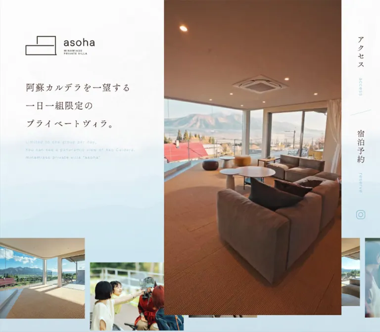
The desktop opening has three unequal regions: a quiet identity and statement area at left, a tall photograph through the center-right, and a narrow vertical navigation rail at the far right. A staggered photographic strip passes behind the principal image. Mobile changes this composition substantially: the logo becomes a white stacked mark over photography, the statement sits across a fade to white, and the navigation rail becomes a compact white panel. Later in the page, reservation access remains available through photographic controls attached to the viewport edge.
This is a long accommodation guide with room, equipment, location, and booking information. Its reusable structure should preserve that content depth and the specific differences between desktop and mobile.
閉じる
asoha / Minamiaso Private Villa — Style Reference
An architectural stay presented through open white space, pale mountain blue, and photographs of shared time.
Original URL: toa-estate.co.jp/asoha
Final URL: toa-estate.co.jp/asoha
Theme: light editorial canvas, with a dark photographic contact and reservation footer.
Inspected: September 23, 2026, Japan time. Supplied browser evidence was retrieved at 2026-09-22T20:28:17.627Z, equivalent to September 23 at 05:28:17.627 JST.
Viewports: desktop 1440 × 1000 and mobile 390 × 844 CSS pixels.
Scope: the current accommodation website: opening composition, introductory photo story, facilities gallery, furnishings, equipment and amenities, access map, contact area, footer, and reservation navigation. Visual evidence includes three desktop captures and two mobile captures, supplemented by rendered DOM measurements across the page.
asoha presents a private villa in Minamiaso through the relationship between architecture, landscape, and people. White space carries much of the composition. Warm interior photography sits against cool, pale blue mountain layers; delicate Japanese display lettering pairs with small, widely spaced English captions. Rectangular photographs remain largely unframed. There is little ornamental interface chrome.
The desktop opening has three unequal regions: a quiet identity and statement area at left, a tall photograph through the center-right, and a narrow vertical navigation rail at the far right. A staggered photographic strip passes behind the principal image. Mobile changes this composition substantially: the logo becomes a white stacked mark over photography, the statement sits across a fade to white, and the navigation rail becomes a compact white panel. Later in the page, reservation access remains available through photographic controls attached to the viewport edge.
This is a long accommodation guide with room, equipment, location, and booking information. Its reusable structure should preserve that content depth and the specific differences between desktop and mobile.
How to Read This Reference
- Measured means a value supplied by the rendered DOM or computed-style evidence. Measurements are rounded where useful and expressed in CSS pixels.
- Visual estimate means an approximation from the original-page captures. Estimated hexadecimal colors are implementation approximations, not sampled source declarations.
- Derived means arithmetic based on measured dimensions. A percentage that fits a capture does not establish the original CSS formula.
- Recommended means guidance for a new implementation. The CSS, semantic markup suggestions, accessibility changes, and breakpoint below are adaptations.
- Display artwork needs special care. Many visible headings, navigation labels, and logo elements have empty extracted text and inherit a
10pxsans-serif style on their containing elements. Those values do not describe the visible lettering inside the artwork. The precise display typeface and asset format are unverified. - Coverage has limits. The supplied browser traversed the page, but no click, hover, keyboard, gallery-opening, booking, or map interaction result was supplied. Static captures and computed transitions do not establish complete motion behavior.
Tokens — Colors
Default Palette
| Name | Value | Suggested token | Evidence and role |
|---|---|---|---|
| White canvas | #ffffff |
--color-paper |
Visually observed main canvas; also the measured footer text color. Root and body backgrounds themselves were transparent in the supplied styles. |
| Body charcoal | #3e3e3e |
--color-text |
Measured rgb(62, 62, 62) on body copy, furnishing links, and equipment descriptions. |
| Muted gray | #7e7e7e |
--color-muted |
Measured rgb(126, 126, 126) on desktop amenity category labels. |
| Mountain blue | #6fb0c6 |
--color-blue |
Measured rgb(111, 176, 198) on mobile amenity category labels. This is an exact observed accent, not proof that every blue asset uses the same color. |
| Pale caption blue | Approximately #a7d3e4 |
--color-blue-pale |
Visual estimate for light English lettering, navigation details, and introductory accents. |
| Mountain mist | Approximately #d5e9f1 |
--color-mist |
Visual estimate for the pale blue landscape layers near the bottom of the desktop opening. |
| Display ink | Approximately #302322 |
--color-display |
Visual estimate for the warm, very dark display lettering and desktop logo. |
| Footer shade | Approximately #20343c |
--color-footer |
Suggested fallback for the dark, cool photographic footer; the original is an image-dependent composite. |
The interface palette is restrained, while the photographs retain natural greens, sky blues, wood tones, and clothing colors. The Instagram icon and embedded map introduce their own colors. Those third-party colors should not become a general button or category palette.
Computed Variable Caveat
The supplied custom-property collection reports #000 for --c_accent, --c_text_r, --c_base, --c_text, --c_blue_l, --c_key2, --c_key1, and --c_accent2. These values do not explain the visible white and blue design or the measured charcoal body text. Do not treat those variable names as an authoritative semantic color system. The aliases in this reference are newly defined implementation tokens.
Color Use
Keep large surfaces white. Use pale blue for atmospheric layers and secondary lettering, with dark text carrying practical information. Reserve white-on-photography treatments for the mobile logo, contact area, and photographic action tiles.
Recommended accessibility adjustment: #6fb0c6 against white has an approximately 2.4:1 calculated contrast ratio. For essential small text, a darker related color such as #39798d provides approximately 4.9:1. Preserve the lighter blue in decorative artwork and nonessential accents where appropriate.
Tokens — Typography
Measured Body Family
The supplied computed family is:
'Zen Kaku Gothic New', 'Noto Sans JP', 'Hiragino Kaku Gothic Pro', 'ヒラギノ角ゴ Pro W3', 'MS PGothic', 'MS Pゴシック', sans-serif
This is the declared computed stack; it does not prove which font file supplied every rendered glyph. Regular copy uses weight 400. Furnishing product links use weight 500.
The body typography is calm and lightly tracked. Introductory prose has unusually generous leading, while product information is more compact. This difference creates a transition from an atmospheric introduction to practical accommodation details.
Display Lettering and Identity
The Japanese statement and section titles have a fine serif or Mincho-like appearance. The exact font is not established by the containing elements' computed styles. The geometric logo is also artwork, not a word set in the measured body family.
For faithful use, retain authorized display and logo assets. For an editable adaptation, use a suitable Japanese serif fallback and label that choice as a replacement. Do not attribute a specific serif family to the original page.
The desktop wordmark is a horizontal composition with the outlined architectural symbol at left. The mobile opening uses a tall, stacked white composition. The footer returns to a small horizontal white mark.
Measured Type Scale
| Role | Desktop size / line height | Mobile size / line height | Weight | Tracking |
|---|---|---|---|---|
| Root and inherited wrapper text | 10 / normal at root; body 10 / 10 |
Same | 400 |
Normal |
| Introductory prose | 18 / 49.86px |
15 / 31.95px |
400 |
0.9px / 0.75px |
| Furnishing category | 13 / 13px |
13 / 13px |
400 |
0.65px |
| Furnishing product link | 16 / 16px |
15 / 15px |
500 |
0.8px / 0.75px |
| Equipment description | 15 / 27.9px |
14 / 24.92px |
400 |
0.75px / 0.7px |
| Amenity category | 16 / 34px |
15 / 15px |
400 |
0.8px / 0.65px |
| Amenity content | 16 / 34px |
14 / 24.92px |
400 |
0.8px / 0.65px |
| Footer address | 14 / 28px |
10 / 20px |
400 |
2.24px / 1.6px |
The introductory leading is approximately 2.77 on desktop and 2.13 on mobile. Equipment copy uses approximately 1.86 and 1.78, respectively. These are derived ratios from measured values.
Do not turn the inherited 10px value into the size of every visible heading or caption. Several of those elements contain visual content not represented by the extracted text styles.
Visual Display Scale
| Role | Visual estimate | Practical interpretation |
|---|---|---|
| Desktop Japanese opening statement | Approximately 32–34px, with roughly 68px between lines |
Three deliberate lines, generous spacing, no bold marketing treatment. |
| Mobile Japanese opening statement | Approximately 20–22px, with roughly 40px between lines |
Pale blue lettering over the transition from image to white. |
| Desktop facilities and access titles | Approximately 38–40px |
Fine dark serif lettering with open tracking. |
| Desktop room name | Approximately 20px |
Japanese label followed by a smaller blue English caption. |
| Desktop English utility text | Approximately 12–14px |
Light, widely tracked, subordinate to Japanese display text. |
| Mobile footer telephone number | Approximately 34–36px |
Thin white numerals with ample horizontal space. |
These estimates describe visual scale, not verified CSS font declarations.
Tokens — Spacing & Shapes
Density: spacious editorial composition, with compact utility navigation. Shape language: square photographic edges, thin rules, an outlined architectural logo, and almost no general card framing. Spacing system: repeated viewport-related dimensions are evident, but a single original spacing formula was not supplied.
Measured Layout Dimensions
| Element | Desktop 1440 × 1000 |
Mobile 390 × 844 |
Interpretation |
|---|---|---|---|
| Header wrapper | 1440 × 1195.66px |
390 × 903.33px |
The opening extends beyond one captured viewport. |
| Opening logo | At (96, 134.39), 257.27 × 71.03px |
At (34.13, 39), 85 × 114.31px |
Different horizontal and stacked compositions. |
| Opening statement block | At (96, 311.02), 406.08 × 285.11px |
At (34.13, 457.78), 295.42 × 156.97px |
Dimensions describe the full visual block, not a font box. |
| Access rail link | 60 × 181px |
55 × 134px |
Narrow visual rail with substantial vertical target area. |
| Reservation rail link | 60 × 192px |
55 × 142px |
Paired with access, separated by a slanted fine rule. |
| Introductory prose width | 529.20px |
292.5px |
About 36.75% of desktop width and 75% of mobile width. |
| Facility image | 422.36 × 287.97px |
First: 360.75 × 245.95px; others: 179.88 × 122.64px |
Approximately 1.467:1 image ratio throughout. |
| Facility grid side margin | 85.44px |
14.63px |
Wide images with smaller outer margins than the desktop section title. |
| Adjacent facility-image gap | Approximately 1px |
1px |
Nearly continuous photographic rows. |
| Persistent reservation tile | 240 × 100px |
Two tiles, each 194.25 × 73.13px |
One desktop action becomes two mobile actions. |
| Mobile body bottom allowance | Not applicable | 73.125px |
Matches the measured bottom action height. |
Spacing Rhythm
| Relationship | Measured or derived value | Use |
|---|---|---|
| Desktop opening left alignment | 96px, or 6.667vw at the capture |
Logo and opening statement share an axis. |
| Mobile opening left alignment | 34.125px, or 8.75vw |
Logo and statement retain a common inset. |
| Desktop header-to-main wrapper separation | 240px |
A substantial pause before the photo story. |
| Desktop photo-strip gap | Approximately 19.19px |
Separates irregularly sized images. |
| Mobile photo-strip gap | 9.75px |
Retains the same close photographic cadence. |
| Desktop facilities title to gallery | Approximately 160px after the title block |
Large breathing space before the image grid. |
| Desktop image-to-caption inset | 67.20px |
Captions sit well below the image edge. |
| Desktop caption left inset | 19.20px |
Text is slightly inset from its photograph. |
| Desktop gap after a facility card row | 96px |
Prevents the five-row gallery from becoming visually dense. |
| Mobile first image-to-caption inset | 39px |
Gives the featured living room more space. |
| Mobile other image-to-caption inset | 26px |
More compact secondary room labels. |
| Mobile gap between small room-card rows | 30px |
Derived from the supplied card positions. |
Borders, Corners, and Elevation
The sampled content wrappers have 0px border radius. Photographs read as crisp rectangles, without independent white card shells or broad shadows. Fine rules appear in navigation and the footer. The reservation button is almost square-cornered in the mobile capture.
The embedded map has its own control cards and shadows. Those belong to the map interface and should not be generalized into the website's component system.
Components
Opening Composition
Role: introduce the place, brand, and promise before practical details.
The desktop visual divides near x = 624px and x = 1296px: approximately 43.33% for the left region, 46.67% for the principal photographic column, and 10% for the right rail. These divisions are estimated from the capture, not measured grid tracks.
The left region contains the horizontal logo, a three-line Japanese statement, and a small English translation. The statement reads:
阿蘇カルデラを一望する / 一日一組限定の / プライベートヴィラ。
The photograph emphasizes the experience of being in the villa, with people, glazing, and the landscape beyond. The lower-left canvas becomes pale blue with subtle mountain silhouettes. The central photograph overlaps the staggered strip below; it should remain the dominant vertical shape.
Mobile removes the separate left text panel. The main photograph fills the opening background, the stacked white logo sits near the upper left, and the image fades into white behind the blue statement. The right rail remains distinct. Do not reduce the desktop three-column arrangement proportionally and call it the mobile design.
The exact principal media format is unverified. Different captured scenes do not establish whether the original uses video, a slideshow, or another changing media source.
Vertical Access and Reservation Rail
Role: expose the two primary practical destinations immediately.
The rail contains アクセス, 宿泊予約, and the Instagram icon. Japanese labels run vertically; English access and reserve captions follow the vertical axis in pale blue. A short, slanted blue line separates access and reservation.
On desktop, the access anchor begins at approximately (1338, 124.80) and is 60px wide. The reservation anchor begins around y = 382.80. The Instagram anchor is 60 × 68px, with a visibly smaller icon centered inside.
On mobile, the white panel occupies the rightmost 55px and extends visually to about 432px from the top. Access begins at y = 33px, reservation at y = 200px, and the social anchor at y = 356px.
Observed destinations are the page's #access anchor, the external reservation URL https://owners-inn.com/?p=11163, and https://www.instagram.com/asohakumamoto/. The rail's persistence beyond the opening was not established; later captures instead show the bottom action controls.
Staggered Photo Strip
Role: preview the range of spaces and social experiences.
A horizontal sequence mixes broad landscape, shorter landscape, portrait, and nearly square photographs. Their bottom edges align while their top edges vary. The strip extends beyond both viewport edges and includes repeated image-sized records in the DOM.
At desktop size, representative wrappers measure 412.80 × 345.59, 349.44 × 254.39, and 254.39 × 345.59px. On mobile, corresponding sizes include 209.63 × 174.02, 177.44 × 129.17, and 129.19 × 174.02px.
Keep the changing proportions and partial edge crops. A uniform row of identical thumbnails loses this component's character. Repetition and offscreen positioning suggest a sequence suitable for movement, but animation direction, speed, autoplay, and drag behavior were not supplied.
Introductory Photo Story
Role: explain the setting and character of the stay through a paced editorial sequence.
Large and small photographs alternate between left and right edges. Some are flush with the viewport; others are inset. A broad landscape image, a portrait image, display artwork, and a narrow prose column create an intentionally irregular rhythm.
The measured first desktop image wrapper is about 1036.80 × 633.59px, aligned to the left edge. A later right-aligned wrapper measures 748.80 × 479.98px. On mobile, these become approximately 331.5 × 202.58px and 204.75 × 131.25px, respectively. A portrait wrapper changes from 460.80 × 614.39px to 214.5 × 286px.
The display heading block also changes shape: approximately 656.63 × 197.75px on desktop versus 282.75 × 338.81px on mobile. This supports responsive art direction rather than simple uniform scaling.
The prose describes an unmanned, whole-building accommodation for one group per day, with views of Aso Caldera and access to surrounding food and leisure activities. Keep that explanatory copy as readable text in a new implementation. Its measured width, generous leading, and paragraph separation matter more than a rigid repeated feature-card structure.
Facilities Overview and Heading
Role: transition from the story of the stay to a room inventory.
A full-width architectural image precedes the facilities heading. Three overlapping desktop media wrappers share a measured size of 1440 × 864px and an opacity transition. Their mobile equivalents are 390 × 390px, establishing a square crop at that viewport.
Below this image, 施設の紹介 sits toward the left. On desktop, a separate small brand line and Our facilities. caption sit far to the right. The title begins around x = 134.39px, farther inward than the room grid's 85.44px edge. Keep that deliberate offset.
The title region and the first room row are separated by substantial white space. There is no colored section container, heavy divider, or enclosing card.
Room Gallery
Role: let visitors inspect the spaces available in the villa.
The desktop gallery contains thirteen room entries in three equal columns: living room, dining, kitchen, bedroom, bedroom A, bedroom B, powder room, bathroom, terrace, open-air bath, rooftop, toilet A, and toilet B. The final desktop row contains one entry.
Each card consists of a rectangular photograph and a caption well below it. Japanese display lettering carries the room name, with small blue English text such as / living room beside it in the desktop capture. Images meet across very narrow, approximately 1px gutters; row spacing is much larger.
Mobile features the living room across the full 360.75px content width. The remaining twelve rooms occupy six two-column rows. The small images are approximately 179.88 × 122.64px, retaining the same image ratio as desktop.
The mobile aggregate text extraction retains / living room, while the individual element records also contain the other English caption strings. This does not prove that every secondary English caption is visually displayed on mobile. Preserve the room labels, but verify secondary-caption visibility before reproducing it exactly.
Several image anchors point to #. No activation result was supplied. Do not describe them as verified lightboxes, modals, or room-detail navigation. A new implementation should use real destinations or explicit buttons only when the corresponding behavior exists.
Furnishings List
Role: make the quality of the interior tangible through specific products.
Measured text includes Serta bedding, the arflex OMNIO sofa, and BoConcept tables and stools. These are furnishing references, not website production credits.
Each entry has a small category line and a slightly larger medium-weight product link. Desktop places bedroom and living-room entries in separate columns. On mobile, the measured positions place the bedroom group before the living-room group, even though the raw extraction order interleaves them.
This is a quiet typographic inventory. Preserve the distinction between category and linked product name; avoid turning each manufacturer into a promotional logo card. Original-page evidence supplies outbound product URLs, but those destinations were not inspected.
Equipment Features and Amenities
Role: explain what guests can use and what is provided.
Three descriptive features cover bicycles, a terrace grill, and a telescope. Desktop descriptions occupy three columns, with text around 384px wide. Mobile stacks the features and uses approximately 312px description columns with 14px type and 24.92px leading.
The equipment list below has categories for kitchen utensils, equipment, and amenities. Desktop uses a label/value arrangement: approximately 249.59px for the category and 1017.58px for the contents. Category text is gray. Mobile stacks each category over its content and changes the category color to measured mountain blue, #6fb0c6.
Retain text lists for practical details such as appliances, towels, toiletries, and cooking utensils. The visual hierarchy should support scanning without introducing unrelated icons for every item.
Some lower desktop image wrappers were recorded at only 1–10px high. Their final visual dimensions cannot be established from those records. Do not reproduce those collapsed heights as intentional design tokens.
Access Section and Map
Role: connect the aspirational photography to a usable location.
The desktop section begins with アクセス情報, followed nearby by a small brand line and Access information.. Unlike the facilities heading, the supporting English content is grouped closer to the left title instead of being pushed to the far-right edge.
A large Google map sits below with approximately 58px side margins in the desktop capture, giving a visible width near 1325px. The map extends below the captured viewport, so its full desktop height is not established. Mobile shows approximately 20px side margins and a width near 350px.
Keep the map's native controls, attribution, and interface colors separate from the brand system. The visible place label identifies asoha. The footer supplies the address 〒869-1411 熊本県阿蘇郡南阿蘇村河陰 371-30.
The map visually overlaps the beginning of the photographic footer. Do not assume that overlap implies a fixed background or parallax effect; neither was verified.
Contact and Reservation Area
Role: provide a clear final route to enquiries and booking.
The mobile capture shows white lettering over a dark, visibly defocused interior-and-landscape photograph. The blur may be part of the source image or an applied effect; its implementation is unknown.
The contact group contains お問い合わせ / contact, the telephone number 096-344-4011, and the explicit note ※電話でのご予約はできません. The supplied anchor uses tel:096-344-4011.
The reservation group contains 予約・空室確認 / reserve and a pale rectangular button labeled 予約サイトへ, with an external-link symbol. It leads to the observed external reservation URL. Telephone enquiries and online reservations serve different purposes; preserve the no-telephone-booking note near the number.
Desktop measurements place the contact and reservation links in separate horizontal regions. Mobile stacks them, with a fine horizontal rule between the groups. The mobile reservation anchor's full visual block is approximately 273 × 105.30px; the visible pale button itself is about 273 × 59px. Do not mistake the full anchor height for the button height.
Footer Identity Row
Role: close the page with navigation, identity, and address.
The mobile footer places access, reservation, and Instagram links above a compact horizontal logo-and-address row. A thin translucent rule separates this area from the larger contact region. The white logo is approximately 126 × 35px; the address is measured at 10px / 20px with 1.6px tracking.
On desktop, the logo measures approximately 207.36 × 57.59px, with the address alongside and utility links toward the right. Keep the footer compact relative to the spacious photographic sections above it.
Viewport-Edge Action Tiles
Role: keep practical navigation available during a long scroll.
Later desktop captures show a 240 × 100px reservation tile at the bottom right. It uses an interior photograph under a dark overlay, white Japanese lettering, and a small English caption.
The later mobile capture shows two equal photographic tiles across the bottom: access at left and reservation at right. Their measured positions are x = 0.5px and 195.75px, each 194.25px wide and 73.125px high, with a narrow dividing rule.
These controls are absent from the supplied opening screenshots and present in later captures. Their exact reveal threshold and transition are unverified. The mobile body includes a matching 73.125px bottom allowance, demonstrating that content clearance is part of the layout.
Tokens — Motion & Interaction
| Treatment | Supplied computed value or evidence | Supported conclusion and limitation |
|---|---|---|
| Header, introductory media, several headings, footer | 0.8s cubic-bezier(0.37, 0, 0.63, 1) |
An eased transition is defined. The exact changing properties and trigger were not supplied. |
| Introductory prose and equipment heading | Same 0.8s transition with 0.22s delay |
Supports a staggered timing vocabulary, but does not establish a particular reveal direction. |
| One introductory image | Same 0.8s transition with 0.46s delay |
A second measured delay exists. |
| Navigation and other anchors | 0.4s |
A link transition duration is defined; hover appearance was not exercised. |
| Overlapping desktop facilities media | opacity 2s |
Opacity blending is supported by the styles. Slide interval and controls are unknown. |
| Some overlapping desktop equipment media | opacity 1.5s |
Another opacity-transition duration is present; sampled geometry is incomplete. |
| Mobile facilities and equipment counterparts | No nonzero duration in the supplied shorthand | Do not carry desktop fade timing over as a verified mobile feature. |
| Staggered opening strip | Repeated records and offscreen positions | Movement, speed, direction, and drag support remain unverified. |
| Hero scene changes across captures | Different photographic scenes | Insufficient to identify video, slideshow, or playback settings. |
| Bottom action appearance | Absent in opening captures; present later | Visibility changes with page state, but the threshold is unknown. |
| Access, booking, telephone, social links | Destination URLs supplied | Destination intent is established; activation results are not. |
A computed animation: none on sampled wrappers does not rule out animation on descendants, parent containers, media, or scripts. Likewise, a shorthand of transition: all without a nonzero duration is not evidence of visible animation.
Recommended motion language: use restrained opacity changes and gentle, short displacement if reveal motion is needed. Reuse the measured 800ms easing and 220ms or 460ms stagger only as an informed adaptation. Keep content visible without JavaScript, and disable nonessential movement for reduced-motion preferences. Do not introduce parallax, scroll hijacking, or automatic media playback as claims about this page.
Surfaces
| Surface | Appearance | Purpose |
|---|---|---|
| Main page | White, largely unboxed | Gives photography and fine lettering room. |
| Desktop opening atmosphere | White transitioning into pale blue mountain layers | Connects the page to the surrounding landscape. |
| Mobile navigation panel | Narrow white rectangle over photography | Keeps vertical links clear against the image. |
| Facility entries | Photographs directly on the page | Builds an architectural inventory without card chrome. |
| Map | Native embedded-map surface | Provides practical geographic context. |
| Contact footer | Dark, defocused photograph with white text | Creates a distinct final information zone. |
| Reservation button | Pale solid rectangle | Supplies contrast within the photographic footer. |
| Persistent actions | Darkened photographic tiles | Repeats the visual identity while keeping access and booking visible. |
There is no broad elevation scale. Hierarchy comes from whitespace, photograph size, alignment, and changes between light and dark image fields.
Imagery
Photography combines two complementary subjects: architectural documentation and shared experience. Wide room views show glazing, furniture, circulation, and the mountain outlook. Lifestyle scenes show friends gathering, drinks, and outdoor activity. Keep both; architecture explains the property while people make the stay understandable.
The interior palette is warm and natural, with wood, upholstered seating, restrained gray surfaces, and daylight. Outside views add the blue-green landscape. Crops often retain large quiet areas of ceiling, window, or sky, rather than filling every frame with a single close subject.
Observed Asset Roles
| Asset role | Observed treatment | Implementation guidance |
|---|---|---|
| Desktop identity | Dark horizontal symbol-and-wordmark composition | Use an authorized logo asset with its original proportions. |
| Mobile opening identity | White stacked logo | Supply a dedicated mobile variant rather than squeezing the desktop mark. |
| Main hero media | Tall architectural and lifestyle scene | Art-direct the crop around both people and the surrounding space. |
| Mountain atmosphere | Very pale layered landscape shapes | Use suitable original artwork if available; a gradient alone is only a simplification. |
| Opening photo strip | Mixed aspect ratios and clipped edge images | Preserve varied dimensions and bottom alignment. |
| Story images | Alternating large landscapes and smaller portraits | Keep asymmetric placement and broad intervening space. |
| Facilities overview | Full-width desktop image, square mobile crop | Use responsive crops. |
| Room gallery | Consistent approximately 22:15 ratio |
Keep room geometry legible; avoid excessive zoom. |
| Contact background | Dark, softened room-and-landscape view | Use an appropriate image and maintain contrast behind text. |
| Action tiles | Architectural photographs with dark overlays | Keep their labels visible at compact sizes. |
No original image, SVG, video, or font-file URLs were included in the supplied evidence. Do not invent asset filenames or treat element dimensions as native image sizes. The CSS below expects authorized assets to be provided separately.
Layout & Responsive Behavior
Desktop
The opening uses unequal regions, an oversized vertical image, and a photograph strip that continues offscreen. The introduction then moves through asymmetric image placements into a narrow prose column. The facilities gallery settles into three equal columns, followed by more compact furnishings and equipment information.
The reported desktop document height is approximately 11656px. This establishes a long scrolling website, not a full-screen application. It is a capture-specific extent rather than a height to hardcode.
The facilities title is inset farther than its photographs. The access heading uses a different supporting-caption arrangement. Preserve these local decisions instead of forcing every section into one identical header component without variants.
Mobile
The principal responsive changes are substantive:
- The opening becomes photography behind a white stacked logo, with a fade to white behind blue display copy.
- The right navigation rail narrows to a
55pxpanel. - The staggered photo strip remains horizontally clipped and irregular in size.
- Introductory images retain asymmetry at smaller dimensions; the prose becomes a centered
75%-width column. - The facilities overview becomes square.
- The living room spans the gallery width; the other rooms form two columns.
- Furnishing groups stack, and equipment features become a vertical sequence.
- Amenity labels move above their content and change from gray to blue.
- Contact and reservation groups stack over the photographic footer.
- The desktop reservation tile becomes a two-part access/reservation bar with reserved space below the document content.
The reported mobile document height is approximately 10734px. More content stacking does not necessarily make this page taller than desktop because the photographs, gaps, and gallery arrangement also change.
Coordinate and Breakpoint Limits
The mobile main wrapper begins before the measured header wrapper ends, while its first section contains 433.875px of top padding. This reflects overlapping layout wrappers, not evidence that readable content collides. Preserve the visual arrangement rather than copying wrapper coordinates indiscriminately.
Only two viewport sizes were supplied. The actual breakpoint, behavior at tablet widths, landscape-phone treatment, and very wide desktop layout are unknown. The 900px breakpoint in the Quick Start is a recommendation, not a recovered source value.
Do’s and Don’ts
Do
- Build the visual hierarchy around white space, architecture, landscape, and people.
- Preserve the desktop opening's unequal regions and overlapping photograph strip.
- Use the dedicated stacked white logo treatment for the mobile opening.
- Separate fine display lettering from the measured sans-serif body typography.
- Keep the introductory prose's generous leading and restrained tracking.
- Retain square photographic edges and very narrow horizontal gallery gutters.
- Give the living room a full-width mobile feature before the smaller room pairs.
- Preserve the distinction between telephone enquiries and online reservations.
- Keep pale blue accents subordinate to essential readable information.
- Reserve mobile space for the bottom action bar, including device safe areas in a new implementation.
- Treat native map controls and social branding as separate visual systems.
Don’t
- Don’t replace the accommodation guide with a short generic hero-and-feature template.
- Don’t scale the desktop hero down unchanged for mobile.
- Don’t infer the visible heading font from a
10pxinherited wrapper style. - Don’t convert the facilities gallery into rounded, shadowed cards with wide gutters.
- Don’t make every section heading and image share one rigid left edge.
- Don’t replace the mixed photo strip with identical thumbnail boxes.
- Don’t use bright blue filled buttons throughout the light sections.
- Don’t assume the
#image links open a gallery dialog. - Don’t claim autoplay, parallax, hover opacity, or swipe behavior without interaction evidence.
- Don’t reproduce collapsed offscreen media-wrapper measurements as final image heights.
- Don’t make the telephone number appear to accept reservations when the visible note says otherwise.
Recommended Implementation Additions
These are improvements for a new implementation, not verified features of the original page:
- Provide real text headings or meaningful alternatives for display artwork. Empty text extraction is not a full accessibility audit, so inspect accessible names before deciding whether an original element is unnamed.
- Give access, reservation, social, telephone, and any image controls clear accessible names and visible keyboard focus.
- Keep essential mobile captions and the footer address at a readable size; the Quick Start raises selected small text to
12px. - Use a darker blue for essential small text on white, while preserving pale blue for atmosphere.
- Add safe-area padding to the bottom action bar and enough document clearance that its last content remains reachable.
- Keep text visible when scripts fail. Reduced-motion mode should remove decorative movement without hiding images or copy.
- If changing hero media is implemented, provide suitable reduced-motion and pause behavior. Playback properties must be a deliberate new decision.
- Use responsive image sources, explicit image dimensions, and appropriate loading priorities. Load the opening visual promptly and defer distant gallery images without collapsing their layout space.
- Give the map a descriptive title and provide the address as ordinary text alongside it.
- Replace placeholder image links with real destinations or implement an accessible dialog only if expanded-image viewing is required.
- Test the selected breakpoint with long Japanese labels, landscape phones, and intermediate tablet widths.
Agent Prompt Guide
Quick Color Reference
- Canvas: white
#ffffff. - Measured body text:
#3e3e3e. - Measured desktop muted labels:
#7e7e7e. - Measured mobile category accent:
#6fb0c6. - Approximate pale landscape field:
#d5e9f1. - Approximate warm display ink:
#302322. - Recommended accessible blue for small text:
#39798d. - Contact and persistent actions: darkened photography with white lettering.
Overall Prompt
“Create an editorial accommodation website inspired by asoha in Minamiaso. Use a white canvas, pale mountain-blue atmosphere, delicate Japanese serif-style display lettering, and Zen Kaku Gothic New with suitable sans-serif fallbacks for practical copy. On desktop, compose the opening from a spacious left identity area, a tall center-right photograph, and a narrow vertical access/reservation rail. Let a staggered strip of mixed-size photographs pass behind the principal image. Continue with asymmetric architectural and lifestyle photography, generous prose leading, a three-column room gallery, furnishings, amenities, an access map, and a dark photographic contact footer. Recompose the mobile opening around a stacked white logo over photography and a fade to white. Feature the living room across the mobile gallery width, then use two columns. Provide photographic access and reservation controls at the bottom after the opening. Keep all unverified motion and media behavior explicit implementation choices.”
Example Component Prompts
- Desktop opening: “At a 1440px reference width, place a horizontal architectural logo near x96/y134 and the three-line villa statement below it. Keep the left region about 43% wide, a tall image about 47% wide, and a navigation rail about 10% wide. Add very pale mountain layers and a lower strip of unequal photographs. Use square edges and no card shadows.”
- Mobile opening: “At 390px wide, place a white stacked logo near x34/y39 over a full-width lifestyle photograph. Add a 55px white vertical navigation panel at the right. Fade the image into white behind pale blue Japanese statement text near y458. Keep the lower photo strip clipped and staggered.”
- Room gallery: “Use three approximately 22:15 photographs per desktop row with 1px horizontal gaps, large caption clearance, Japanese room names, and small blue English annotations. On mobile, make the living room full width and the remaining twelve rooms a two-column grid. Keep labels readable without enclosing cards.”
- Amenities: “Build a restrained label/value list in charcoal sans-serif type. Use gray category labels beside the contents on desktop; stack blue category labels above the contents on mobile. Use generous line spacing and simple slash-separated item lists.”
- Contact footer: “Set white enquiry information over a dark, softened photograph of the villa and landscape. Show the telephone number prominently, retain the note that telephone reservations are unavailable, and provide a separate pale external-booking button. Stack these groups on mobile with a fine divider.”
- Persistent actions: “Create a photographic reservation tile at the lower-right desktop edge. On mobile, use equal access and reservation tiles across the bottom with a fine divider and document clearance. Make the visibility trigger configurable because the original threshold is unverified.”
Quick Start
CSS Custom Properties
This is an implementation adaptation calibrated to the supplied captures, not extracted source CSS. It keeps a conventional root font size and expresses measured dimensions directly or through derived viewport proportions. The source's actual breakpoint and scaling formulas are unknown.
Use .asoha-page on the page body. The opening expects .hero-media, .hero-brand, .hero-copy, .hero-rail, and .photo-strip children. Supply horizontal and stacked logo images through the two logo classes. Gallery cards contain an image and a caption. Set --contact-image and each tile's --action-image to authorized image URLs in the consuming project; no original asset paths are assumed here.
The adaptation uses live text for display copy, enlarges selected mobile utility text, and hides English captions on the small mobile room tiles as an implementation choice. Exact original display artwork and secondary-caption visibility require separate verification.
:root {
  /* Measured colors */
  --color-paper: #ffffff;
  --color-text: #3e3e3e;
  --color-muted: #7e7e7e;
  --color-blue: #6fb0c6;

  /* Visual approximations and a recommended readable accent */
  --color-blue-pale: #a7d3e4;
  --color-mist: #d5e9f1;
  --color-display: #302322;
  --color-footer: #20343c;
  --color-link: #39798d;

  /* The display fallback is an adaptation, not an identified source font */
  --font-body: 'Zen Kaku Gothic New', 'Noto Sans JP',
    'Hiragino Kaku Gothic Pro', 'MS PGothic', sans-serif;
  --font-display: serif;
  --tracking-body: 0.05em;
  --tracking-utility: 0.16em;

  --gallery-inset: 5.9347vw;
  --gallery-gap: 1px;
  --gallery-row-gap: 6.6667vw;
  --gallery-caption-top: 4.6667vw;
  --action-height: 100px;
  --rule: 1px;
  --safe-bottom: env(safe-area-inset-bottom, 0px);

  /* Durations from supplied computed styles; triggers remain implementation choices */
  --duration-link: 400ms;
  --duration-reveal: 800ms;
  --ease-reveal: cubic-bezier(0.37, 0, 0.63, 1);
  --delay-copy: 220ms;
  --delay-image: 460ms;
}

* { box-sizing: border-box; }

.asoha-page {
  margin: 0;
  overflow-x: clip;
  color: var(--color-text);
  background: var(--color-paper);
  font-family: var(--font-body);
  font-size: 16px;
  font-weight: 400;
  line-height: 1.9;
  letter-spacing: var(--tracking-body);
}

.asoha-page img { display: block; max-width: 100%; }
.asoha-page a { color: inherit; }
.asoha-page [hidden] { display: none !important; }

.asoha-hero {
  position: relative;
  isolation: isolate;
  height: 83.032vw;
  overflow: hidden;
  background: linear-gradient(
    180deg, #fff 38%, #f7fbfc 52%, var(--color-mist) 100%
  );
}

/* Gradient is a simplification; it does not recreate the mountain artwork. */
.hero-media {
  position: absolute;
  inset: 0 10% 0 43.333%;
  z-index: 2;
}
.hero-media img { width: 100%; height: 100%; object-fit: cover; }

.hero-brand {
  position: absolute;
  top: 9.333vw;
  left: 6.667vw;
  z-index: 3;
  width: 17.865vw;
}
.hero-brand img { width: 100%; height: auto; }
.logo-mobile { display: none !important; }

.hero-copy {
  position: absolute;
  top: 21.598vw;
  left: 6.667vw;
  z-index: 3;
  width: 28.2vw;
  color: var(--color-display);
}
.hero-copy :is(h1, h2) {
  margin: 0;
  font-family: var(--font-display);
  font-size: clamp(25px, 2.3vw, 34px);
  font-weight: 400;
  line-height: 2;
  letter-spacing: 0.12em;
}
.hero-copy .english {
  margin-top: 24px;
  color: var(--color-link);
  font-size: 13px;
  line-height: 2.1;
  letter-spacing: var(--tracking-utility);
}

.hero-rail {
  position: absolute;
  top: 0;
  right: 0;
  z-index: 4;
  display: flex;
  flex-direction: column;
  align-items: center;
  width: 10%;
  padding-top: 8.667vw;
}
.rail-link {
  display: flex;
  flex-direction: column;
  align-items: center;
  gap: 24px;
  width: 60px;
  min-height: 181px;
  padding: 9px 0;
  text-decoration: none;
}
.rail-link--reserve { min-height: 192px; }
.rail-link .jp,
.rail-link .english { writing-mode: vertical-rl; }
.rail-link .jp {
  font-family: var(--font-display);
  font-size: 20px;
  line-height: 1;
}
.rail-link .english {
  color: var(--color-link);
  font-size: 12px;
  line-height: 1;
  letter-spacing: 0.14em;
}
.rail-divider {
  width: 60px;
  margin: 38px 0;
  border: 0;
  border-top: 1px solid var(--color-blue-pale);
  transform: rotate(-15deg);
}
.rail-social {
  display: grid;
  place-items: center;
  width: 60px;
  height: 68px;
  margin-top: 22px;
}
.rail-social img { width: 32px; height: 32px; }

/* Static arrangement only; no unverified marquee behavior is introduced. */
.photo-strip {
  position: absolute;
  top: 54.6667vw;
  left: 0;
  z-index: 1;
  display: flex;
  align-items: flex-end;
  gap: 1.333vw;
  height: 24vw;
  transform: translateX(-6.1384vw);
}
.photo-strip img {
  flex: 0 0 auto;
  max-width: none;
  width: 28.667vw;
  height: 24vw;
  object-fit: cover;
}
.photo-strip .strip-landscape { width: 24.267vw; height: 17.667vw; }
.photo-strip .strip-portrait { width: 17.667vw; }
.photo-strip .strip-wide { width: 25.333vw; }

.story-copy {
  width: 36.75%;
  margin-inline-start: 9.333%;
  font-size: 18px;
  line-height: 2.77;
  letter-spacing: 0.05em;
}

.section-heading {
  display: flex;
  align-items: center;
  justify-content: space-between;
  gap: 40px;
  margin: 149px 9.333% 159px;
}
.section-heading h2 {
  margin: 0;
  color: var(--color-display);
  font-family: var(--font-display);
  font-size: 40px;
  font-weight: 400;
  line-height: 1.3;
  letter-spacing: 0.12em;
}
.section-heading .english {
  color: var(--color-link);
  font-size: 13px;
  letter-spacing: 0.2em;
}
.section-heading--access {
  justify-content: flex-start;
  margin-inline: 6.667%;
}

.room-grid {
  display: grid;
  grid-template-columns: repeat(3, minmax(0, 1fr));
  gap: var(--gallery-row-gap) var(--gallery-gap);
  margin-inline: var(--gallery-inset);
}
.room-card { min-width: 0; margin: 0; }
.room-card > img {
  width: 100%;
  aspect-ratio: 22 / 15;
  object-fit: cover;
}
.room-caption {
  display: flex;
  align-items: baseline;
  flex-wrap: wrap;
  gap: 12px 28px;
  padding: var(--gallery-caption-top) 0 0 1.333vw;
  color: var(--color-display);
  font-family: var(--font-display);
  font-size: 20px;
  line-height: 1.05;
  letter-spacing: 0.12em;
}
.room-caption .english {
  color: var(--color-link);
  font-family: var(--font-body);
  font-size: 12px;
  letter-spacing: 0.1em;
}

.amenities { width: 88%; margin: 96px auto; }
.amenity-row {
  display: grid;
  grid-template-columns: 19.7% minmax(0, 1fr);
  padding-block: 39.36px;
  font-size: 16px;
  line-height: 2.125;
}
.amenity-row dt { color: var(--color-muted); }
.amenity-row dd { margin: 0; }

.contact-footer {
  color: #fff;
  background-color: var(--color-footer);
  background-image: linear-gradient(
    rgb(15 35 44 / 45%), rgb(10 20 26 / 72%)
  ), var(--contact-image, none);
  background-position: center;
  background-size: cover;
}
.contact-grid {
  display: grid;
  grid-template-columns: repeat(2, minmax(0, 1fr));
  gap: 96px;
  align-items: center;
  width: min(88%, 1100px);
  margin-inline: auto;
  padding-block: 120px;
  text-align: center;
}
.contact-grid h2,
.contact-grid h3 {
  margin: 0 0 24px;
  font-family: var(--font-display);
  font-size: 22px;
  font-weight: 400;
}
.contact-phone {
  display: inline-block;
  font-size: 42px;
  font-weight: 300;
  line-height: 1.4;
  letter-spacing: 0.05em;
  text-decoration: none;
}
.contact-note { font-size: 14px; }
.booking-button {
  display: inline-flex;
  align-items: center;
  justify-content: center;
  gap: 10px;
  width: min(100%, 400px);
  min-height: 100px;
  padding: 16px;
  color: var(--color-text) !important;
  background: #f3f5f5;
  border-radius: 2px;
  text-decoration: none;
}
.footer-identity {
  display: flex;
  align-items: center;
  gap: 38px;
  padding: 48px 6.667% 72px;
  border-top: 1px solid rgb(255 255 255 / 40%);
}
.footer-identity img { width: 207px; height: auto; }
.footer-address { font-size: 14px; line-height: 2; letter-spacing: 0.16em; }

/* Toggle the hidden attribute through an explicitly chosen visibility rule. */
.page-actions {
  position: fixed;
  right: 0;
  bottom: 0;
  z-index: 20;
  display: grid;
  grid-template-columns: 1fr;
  width: 240px;
  height: var(--action-height);
}
.action-access { display: none; }
.action-tile {
  display: flex;
  flex-direction: column;
  align-items: center;
  justify-content: center;
  gap: 4px;
  color: #fff !important;
  background-color: var(--color-footer);
  background-image: linear-gradient(rgb(0 20 28 / 52%), rgb(0 20 28 / 52%)),
    var(--action-image, none);
  background-position: center;
  background-size: cover;
  font-family: var(--font-display);
  font-size: 22px;
  line-height: 1.3;
  text-decoration: none;
}
.action-tile .english {
  font-family: var(--font-body);
  font-size: 12px;
  letter-spacing: 0.16em;
}

/* Recommended feedback; the original hover appearance was not verified. */
.asoha-page a { transition: opacity var(--duration-link); }
@media (hover: hover) {
  .asoha-page a:hover { opacity: 0.8; }
}
.asoha-page :focus-visible {
  outline: 2px solid var(--color-link);
  outline-offset: 5px;
}
.contact-footer :focus-visible,
.page-actions :focus-visible { outline-color: #fff; }

/* Recommended breakpoint, not recovered source CSS. */
@media (max-width: 900px) {
  :root {
    --gallery-inset: 3.75vw;
    --gallery-row-gap: 30px;
    --action-height: 18.75vw;
  }
  .asoha-page {
    padding-bottom: calc(var(--action-height) + var(--safe-bottom));
  }
  .asoha-hero { height: 231.623vw; background: #fff; }
  .hero-media {
    inset: 0 0 auto;
    height: 160vw;
    mask-image: linear-gradient(#000 55%, transparent 100%);
  }
  .hero-brand { top: 10vw; left: 8.75vw; width: 85px; }
  .logo-desktop { display: none !important; }
  .logo-mobile { display: block !important; }
  .hero-copy { top: 117.38vw; left: 8.75vw; width: 75.75vw; }
  .hero-copy :is(h1, h2) {
    color: var(--color-blue);
    font-size: clamp(20px, 5.4vw, 24px);
    line-height: 1.86;
  }
  .hero-copy .english { margin-top: 14px; font-size: 12px; line-height: 1.8; }
  .hero-rail { width: 55px; min-height: 432px; padding-top: 33px; background: #fff; }
  .rail-link { width: 55px; min-height: 134px; gap: 13px; padding: 10px 0; }
  .rail-link--reserve { min-height: 142px; }
  .rail-link .jp { font-size: 14px; }
  .rail-divider { width: 25px; margin: 16px 0; }
  .rail-social { width: 55px; height: 40px; margin-top: 14px; }
  .rail-social img { width: 20px; height: 20px; }
  .photo-strip {
    top: 187.003vw;
    gap: 2.5vw;
    height: 44.62vw;
    transform: translateX(-39.125vw);
  }
  .photo-strip img { width: 53.75vw; height: 44.62vw; }
  .photo-strip .strip-landscape { width: 45.497vw; height: 33.121vw; }
  .photo-strip .strip-portrait { width: 33.125vw; }
  .photo-strip .strip-wide { width: 47.5vw; }
  .story-copy { width: 75%; margin-inline: auto; font-size: 15px; line-height: 2.13; }
  .section-heading {
    flex-direction: column;
    align-items: flex-start;
    gap: 16px;
    margin: 97.5px 10% 73px;
  }
  .section-heading h2 { font-size: 26px; }
  .room-grid { grid-template-columns: repeat(2, minmax(0, 1fr)); }
  .room-card:first-child { grid-column: 1 / -1; margin-bottom: 9px; }
  .room-caption { justify-content: center; gap: 10px; padding: 26px 0 0; font-size: 14px; line-height: 1; }
  .room-card:first-child .room-caption { padding-top: 39px; font-size: 16px; }
  .room-card:not(:first-child) .room-caption .english { display: none; }
  .amenities { width: 86.25%; margin-block: 90px; }
  .amenity-row { display: block; padding: 0 0 75px; font-size: 14px; line-height: 1.78; }
  .amenity-row dt { margin-bottom: 18px; color: var(--color-link); font-size: 15px; line-height: 1; }
  .contact-grid { grid-template-columns: 1fr; gap: 0; width: 70%; padding-block: 70px; }
  .contact-enquiry { margin-bottom: 56px; padding-bottom: 50px; border-bottom: 1px solid rgb(255 255 255 / 65%); }
  .contact-phone { font-size: 36px; white-space: nowrap; }
  .booking-button { min-height: 59px; }
  .footer-identity { gap: 22px; padding: 48px 8% 48px; }
  .footer-identity img { width: 126px; }
  .footer-address { font-size: 12px; line-height: 2; }
  .page-actions {
    grid-template-columns: repeat(2, minmax(0, 1fr));
    gap: 1px;
    width: 100%;
    height: calc(var(--action-height) + var(--safe-bottom));
    padding-bottom: var(--safe-bottom);
    background: var(--color-footer);
  }
  .action-access { display: flex; }
  .action-tile { font-size: 18px; }
}

@media (prefers-reduced-motion: reduce) {
  .asoha-page *,
  .asoha-page *::before,
  .asoha-page *::after {
    animation: none !important;
    transition: none !important;
    scroll-behavior: auto !important;
  }
}
The CSS covers the main visual relationships, room grid, amenities, and action surfaces. It does not reproduce the complete asymmetric story sequence, supply a map embed, implement reservation services, or establish a gallery interaction. Integrate those with real content and verified requirements. The principal desktop image height and the live-text display metrics remain approximations because their exact source rules were not supplied.
Tailwind v4 Token Mapping
Optional aliases for a project already using Tailwind v4. This is not evidence that the original website uses Tailwind. Define the properties above first.
@theme inline {
  --color-paper: #ffffff;
  --color-body-ink: #3e3e3e;
  --color-muted-ink: #7e7e7e;
  --color-mountain-blue: #6fb0c6;
  --color-mountain-mist: #d5e9f1;
  --color-display-ink: #302322;
  --color-readable-blue: #39798d;
  --color-footer-shade: #20343c;

  --font-body: 'Zen Kaku Gothic New', 'Noto Sans JP', sans-serif;
  --font-editorial: serif;

  --text-story: 18px;
  --text-story-mobile: 15px;
  --text-detail: 14px;
  --text-utility: 12px;

  --spacing-gallery-inset: var(--gallery-inset);
  --spacing-gallery-row: var(--gallery-row-gap);
  --spacing-action-height: var(--action-height);
  --radius-photo: 0px;
  --radius-booking: 2px;
}
Sources & Evidence
- Original and final page: https://www.toa-estate.co.jp/asoha/. The supplied report records HTTP
200and no change between original and final URL. - Capture date: evidence retrieved at
2026-09-22T20:28:17.627Z, or September 23, 2026, 05:28:17.627 JST. Individual screenshot timestamps were not separately supplied. - Desktop evidence:
1440 × 1000viewport; opening, facilities, and access captures; rendered element rectangles, text, destinations, and computed styles. Reported document height approximately11656px. - Mobile evidence:
390 × 844viewport; opening and lower map/contact/footer captures; rendered measurements across the page. Reported document height approximately10734px. - Observed navigation evidence: original-page links to
#access, an external reservation service, Instagram, telephone enquiries, furnishing product pages, and several#image anchors. Link destinations are evidence of intended routing, not proof of successful activation or a particular interaction. - Readiness procedure: the supplied browser report describes an initial observation of at least five seconds, bounded waits for loading and finite animation, sampled text and layout stability, visible-image decoding, and intermediate scroll traversal. Perpetual animations were temporarily paused during readiness checks and resumed afterward. This does not establish every delayed state or interaction.
- Inspection limits: no original asset URLs, complete stylesheet source, accessibility-tree audit, runtime event handlers, or click/hover/keyboard outcomes were supplied. Some lower desktop media measurements were incomplete. SharedWorkers and service workers were disabled during inspection. Tablet widths, external booking flow, gallery behavior, and motion sequences remain unverified.
This reference describes the current page represented by the supplied original-site evidence. No additional browsing or file access was performed. The implementation snippets are untested adaptations, with measured values, visual estimates, and recommended changes distinguished above.
# asoha / Minamiaso Private Villa — Style Reference

> An architectural stay presented through open white space, pale mountain blue, and photographs of shared time.

**Original URL:** [toa-estate.co.jp/asoha](https://www.toa-estate.co.jp/asoha/)
**Final URL:** [toa-estate.co.jp/asoha](https://www.toa-estate.co.jp/asoha/)
**Theme:** light editorial canvas, with a dark photographic contact and reservation footer.
**Inspected:** September 23, 2026, Japan time. Supplied browser evidence was retrieved at `2026-09-22T20:28:17.627Z`, equivalent to September 23 at 05:28:17.627 JST.
**Viewports:** desktop `1440 × 1000` and mobile `390 × 844` CSS pixels.
**Scope:** the current accommodation website: opening composition, introductory photo story, facilities gallery, furnishings, equipment and amenities, access map, contact area, footer, and reservation navigation. Visual evidence includes three desktop captures and two mobile captures, supplemented by rendered DOM measurements across the page.

asoha presents a private villa in Minamiaso through the relationship between architecture, landscape, and people. White space carries much of the composition. Warm interior photography sits against cool, pale blue mountain layers; delicate Japanese display lettering pairs with small, widely spaced English captions. Rectangular photographs remain largely unframed. There is little ornamental interface chrome.

The desktop opening has three unequal regions: a quiet identity and statement area at left, a tall photograph through the center-right, and a narrow vertical navigation rail at the far right. A staggered photographic strip passes behind the principal image. Mobile changes this composition substantially: the logo becomes a white stacked mark over photography, the statement sits across a fade to white, and the navigation rail becomes a compact white panel. Later in the page, reservation access remains available through photographic controls attached to the viewport edge.

This is a long accommodation guide with room, equipment, location, and booking information. Its reusable structure should preserve that content depth and the specific differences between desktop and mobile.
閉じる
# asoha / Minamiaso Private Villa — Style Reference

> An architectural stay presented through open white space, pale mountain blue, and photographs of shared time.

**Original URL:** [toa-estate.co.jp/asoha](https://www.toa-estate.co.jp/asoha/)
**Final URL:** [toa-estate.co.jp/asoha](https://www.toa-estate.co.jp/asoha/)
**Theme:** light editorial canvas, with a dark photographic contact and reservation footer.
**Inspected:** September 23, 2026, Japan time. Supplied browser evidence was retrieved at `2026-09-22T20:28:17.627Z`, equivalent to September 23 at 05:28:17.627 JST.
**Viewports:** desktop `1440 × 1000` and mobile `390 × 844` CSS pixels.
**Scope:** the current accommodation website: opening composition, introductory photo story, facilities gallery, furnishings, equipment and amenities, access map, contact area, footer, and reservation navigation. Visual evidence includes three desktop captures and two mobile captures, supplemented by rendered DOM measurements across the page.

asoha presents a private villa in Minamiaso through the relationship between architecture, landscape, and people. White space carries much of the composition. Warm interior photography sits against cool, pale blue mountain layers; delicate Japanese display lettering pairs with small, widely spaced English captions. Rectangular photographs remain largely unframed. There is little ornamental interface chrome.

The desktop opening has three unequal regions: a quiet identity and statement area at left, a tall photograph through the center-right, and a narrow vertical navigation rail at the far right. A staggered photographic strip passes behind the principal image. Mobile changes this composition substantially: the logo becomes a white stacked mark over photography, the statement sits across a fade to white, and the navigation rail becomes a compact white panel. Later in the page, reservation access remains available through photographic controls attached to the viewport edge.

This is a long accommodation guide with room, equipment, location, and booking information. Its reusable structure should preserve that content depth and the specific differences between desktop and mobile.

## How to Read This Reference

- **Measured** means a value supplied by the rendered DOM or computed-style evidence. Measurements are rounded where useful and expressed in CSS pixels.
- **Visual estimate** means an approximation from the original-page captures. Estimated hexadecimal colors are implementation approximations, not sampled source declarations.
- **Derived** means arithmetic based on measured dimensions. A percentage that fits a capture does not establish the original CSS formula.
- **Recommended** means guidance for a new implementation. The CSS, semantic markup suggestions, accessibility changes, and breakpoint below are adaptations.
- **Display artwork needs special care.** Many visible headings, navigation labels, and logo elements have empty extracted text and inherit a `10px` sans-serif style on their containing elements. Those values do not describe the visible lettering inside the artwork. The precise display typeface and asset format are unverified.
- **Coverage has limits.** The supplied browser traversed the page, but no click, hover, keyboard, gallery-opening, booking, or map interaction result was supplied. Static captures and computed transitions do not establish complete motion behavior.

## Tokens — Colors

### Default Palette

| Name | Value | Suggested token | Evidence and role |
| --- | --- | --- | --- |
| White canvas | `#ffffff` | `--color-paper` | Visually observed main canvas; also the measured footer text color. Root and body backgrounds themselves were transparent in the supplied styles. |
| Body charcoal | `#3e3e3e` | `--color-text` | Measured `rgb(62, 62, 62)` on body copy, furnishing links, and equipment descriptions. |
| Muted gray | `#7e7e7e` | `--color-muted` | Measured `rgb(126, 126, 126)` on desktop amenity category labels. |
| Mountain blue | `#6fb0c6` | `--color-blue` | Measured `rgb(111, 176, 198)` on mobile amenity category labels. This is an exact observed accent, not proof that every blue asset uses the same color. |
| Pale caption blue | Approximately `#a7d3e4` | `--color-blue-pale` | Visual estimate for light English lettering, navigation details, and introductory accents. |
| Mountain mist | Approximately `#d5e9f1` | `--color-mist` | Visual estimate for the pale blue landscape layers near the bottom of the desktop opening. |
| Display ink | Approximately `#302322` | `--color-display` | Visual estimate for the warm, very dark display lettering and desktop logo. |
| Footer shade | Approximately `#20343c` | `--color-footer` | Suggested fallback for the dark, cool photographic footer; the original is an image-dependent composite. |

The interface palette is restrained, while the photographs retain natural greens, sky blues, wood tones, and clothing colors. The Instagram icon and embedded map introduce their own colors. Those third-party colors should not become a general button or category palette.

### Computed Variable Caveat

The supplied custom-property collection reports `#000` for `--c_accent`, `--c_text_r`, `--c_base`, `--c_text`, `--c_blue_l`, `--c_key2`, `--c_key1`, and `--c_accent2`. These values do not explain the visible white and blue design or the measured charcoal body text. Do not treat those variable names as an authoritative semantic color system. The aliases in this reference are newly defined implementation tokens.

### Color Use

Keep large surfaces white. Use pale blue for atmospheric layers and secondary lettering, with dark text carrying practical information. Reserve white-on-photography treatments for the mobile logo, contact area, and photographic action tiles.

**Recommended accessibility adjustment:** `#6fb0c6` against white has an approximately `2.4:1` calculated contrast ratio. For essential small text, a darker related color such as `#39798d` provides approximately `4.9:1`. Preserve the lighter blue in decorative artwork and nonessential accents where appropriate.

## Tokens — Typography

### Measured Body Family

The supplied computed family is:

`'Zen Kaku Gothic New', 'Noto Sans JP', 'Hiragino Kaku Gothic Pro', 'ヒラギノ角ゴ Pro W3', 'MS PGothic', 'MS Pゴシック', sans-serif`

This is the declared computed stack; it does not prove which font file supplied every rendered glyph. Regular copy uses weight `400`. Furnishing product links use weight `500`.

The body typography is calm and lightly tracked. Introductory prose has unusually generous leading, while product information is more compact. This difference creates a transition from an atmospheric introduction to practical accommodation details.

### Display Lettering and Identity

The Japanese statement and section titles have a fine serif or Mincho-like appearance. The exact font is not established by the containing elements' computed styles. The geometric logo is also artwork, not a word set in the measured body family.

For faithful use, retain authorized display and logo assets. For an editable adaptation, use a suitable Japanese serif fallback and label that choice as a replacement. Do not attribute a specific serif family to the original page.

The desktop wordmark is a horizontal composition with the outlined architectural symbol at left. The mobile opening uses a tall, stacked white composition. The footer returns to a small horizontal white mark.

### Measured Type Scale

| Role | Desktop size / line height | Mobile size / line height | Weight | Tracking |
| --- | --- | --- | --- | --- |
| Root and inherited wrapper text | `10 / normal` at root; body `10 / 10` | Same | `400` | Normal |
| Introductory prose | `18 / 49.86px` | `15 / 31.95px` | `400` | `0.9px` / `0.75px` |
| Furnishing category | `13 / 13px` | `13 / 13px` | `400` | `0.65px` |
| Furnishing product link | `16 / 16px` | `15 / 15px` | `500` | `0.8px` / `0.75px` |
| Equipment description | `15 / 27.9px` | `14 / 24.92px` | `400` | `0.75px` / `0.7px` |
| Amenity category | `16 / 34px` | `15 / 15px` | `400` | `0.8px` / `0.65px` |
| Amenity content | `16 / 34px` | `14 / 24.92px` | `400` | `0.8px` / `0.65px` |
| Footer address | `14 / 28px` | `10 / 20px` | `400` | `2.24px` / `1.6px` |

The introductory leading is approximately `2.77` on desktop and `2.13` on mobile. Equipment copy uses approximately `1.86` and `1.78`, respectively. These are derived ratios from measured values.

Do not turn the inherited `10px` value into the size of every visible heading or caption. Several of those elements contain visual content not represented by the extracted text styles.

### Visual Display Scale

| Role | Visual estimate | Practical interpretation |
| --- | --- | --- |
| Desktop Japanese opening statement | Approximately `32–34px`, with roughly `68px` between lines | Three deliberate lines, generous spacing, no bold marketing treatment. |
| Mobile Japanese opening statement | Approximately `20–22px`, with roughly `40px` between lines | Pale blue lettering over the transition from image to white. |
| Desktop facilities and access titles | Approximately `38–40px` | Fine dark serif lettering with open tracking. |
| Desktop room name | Approximately `20px` | Japanese label followed by a smaller blue English caption. |
| Desktop English utility text | Approximately `12–14px` | Light, widely tracked, subordinate to Japanese display text. |
| Mobile footer telephone number | Approximately `34–36px` | Thin white numerals with ample horizontal space. |

These estimates describe visual scale, not verified CSS font declarations.

## Tokens — Spacing & Shapes

**Density:** spacious editorial composition, with compact utility navigation.
**Shape language:** square photographic edges, thin rules, an outlined architectural logo, and almost no general card framing.
**Spacing system:** repeated viewport-related dimensions are evident, but a single original spacing formula was not supplied.

### Measured Layout Dimensions

| Element | Desktop `1440 × 1000` | Mobile `390 × 844` | Interpretation |
| --- | --- | --- | --- |
| Header wrapper | `1440 × 1195.66px` | `390 × 903.33px` | The opening extends beyond one captured viewport. |
| Opening logo | At `(96, 134.39)`, `257.27 × 71.03px` | At `(34.13, 39)`, `85 × 114.31px` | Different horizontal and stacked compositions. |
| Opening statement block | At `(96, 311.02)`, `406.08 × 285.11px` | At `(34.13, 457.78)`, `295.42 × 156.97px` | Dimensions describe the full visual block, not a font box. |
| Access rail link | `60 × 181px` | `55 × 134px` | Narrow visual rail with substantial vertical target area. |
| Reservation rail link | `60 × 192px` | `55 × 142px` | Paired with access, separated by a slanted fine rule. |
| Introductory prose width | `529.20px` | `292.5px` | About `36.75%` of desktop width and `75%` of mobile width. |
| Facility image | `422.36 × 287.97px` | First: `360.75 × 245.95px`; others: `179.88 × 122.64px` | Approximately `1.467:1` image ratio throughout. |
| Facility grid side margin | `85.44px` | `14.63px` | Wide images with smaller outer margins than the desktop section title. |
| Adjacent facility-image gap | Approximately `1px` | `1px` | Nearly continuous photographic rows. |
| Persistent reservation tile | `240 × 100px` | Two tiles, each `194.25 × 73.13px` | One desktop action becomes two mobile actions. |
| Mobile body bottom allowance | Not applicable | `73.125px` | Matches the measured bottom action height. |

### Spacing Rhythm

| Relationship | Measured or derived value | Use |
| --- | --- | --- |
| Desktop opening left alignment | `96px`, or `6.667vw` at the capture | Logo and opening statement share an axis. |
| Mobile opening left alignment | `34.125px`, or `8.75vw` | Logo and statement retain a common inset. |
| Desktop header-to-main wrapper separation | `240px` | A substantial pause before the photo story. |
| Desktop photo-strip gap | Approximately `19.19px` | Separates irregularly sized images. |
| Mobile photo-strip gap | `9.75px` | Retains the same close photographic cadence. |
| Desktop facilities title to gallery | Approximately `160px` after the title block | Large breathing space before the image grid. |
| Desktop image-to-caption inset | `67.20px` | Captions sit well below the image edge. |
| Desktop caption left inset | `19.20px` | Text is slightly inset from its photograph. |
| Desktop gap after a facility card row | `96px` | Prevents the five-row gallery from becoming visually dense. |
| Mobile first image-to-caption inset | `39px` | Gives the featured living room more space. |
| Mobile other image-to-caption inset | `26px` | More compact secondary room labels. |
| Mobile gap between small room-card rows | `30px` | Derived from the supplied card positions. |

### Borders, Corners, and Elevation

The sampled content wrappers have `0px` border radius. Photographs read as crisp rectangles, without independent white card shells or broad shadows. Fine rules appear in navigation and the footer. The reservation button is almost square-cornered in the mobile capture.

The embedded map has its own control cards and shadows. Those belong to the map interface and should not be generalized into the website's component system.

## Components

### Opening Composition

**Role:** introduce the place, brand, and promise before practical details.

The desktop visual divides near `x = 624px` and `x = 1296px`: approximately `43.33%` for the left region, `46.67%` for the principal photographic column, and `10%` for the right rail. These divisions are estimated from the capture, not measured grid tracks.

The left region contains the horizontal logo, a three-line Japanese statement, and a small English translation. The statement reads:

`阿蘇カルデラを一望する / 一日一組限定の / プライベートヴィラ。`

The photograph emphasizes the experience of being in the villa, with people, glazing, and the landscape beyond. The lower-left canvas becomes pale blue with subtle mountain silhouettes. The central photograph overlaps the staggered strip below; it should remain the dominant vertical shape.

Mobile removes the separate left text panel. The main photograph fills the opening background, the stacked white logo sits near the upper left, and the image fades into white behind the blue statement. The right rail remains distinct. Do not reduce the desktop three-column arrangement proportionally and call it the mobile design.

The exact principal media format is unverified. Different captured scenes do not establish whether the original uses video, a slideshow, or another changing media source.

### Vertical Access and Reservation Rail

**Role:** expose the two primary practical destinations immediately.

The rail contains `アクセス`, `宿泊予約`, and the Instagram icon. Japanese labels run vertically; English `access` and `reserve` captions follow the vertical axis in pale blue. A short, slanted blue line separates access and reservation.

On desktop, the access anchor begins at approximately `(1338, 124.80)` and is `60px` wide. The reservation anchor begins around `y = 382.80`. The Instagram anchor is `60 × 68px`, with a visibly smaller icon centered inside.

On mobile, the white panel occupies the rightmost `55px` and extends visually to about `432px` from the top. Access begins at `y = 33px`, reservation at `y = 200px`, and the social anchor at `y = 356px`.

Observed destinations are the page's `#access` anchor, the external reservation URL `https://owners-inn.com/?p=11163`, and `https://www.instagram.com/asohakumamoto/`. The rail's persistence beyond the opening was not established; later captures instead show the bottom action controls.

### Staggered Photo Strip

**Role:** preview the range of spaces and social experiences.

A horizontal sequence mixes broad landscape, shorter landscape, portrait, and nearly square photographs. Their bottom edges align while their top edges vary. The strip extends beyond both viewport edges and includes repeated image-sized records in the DOM.

At desktop size, representative wrappers measure `412.80 × 345.59`, `349.44 × 254.39`, and `254.39 × 345.59px`. On mobile, corresponding sizes include `209.63 × 174.02`, `177.44 × 129.17`, and `129.19 × 174.02px`.

Keep the changing proportions and partial edge crops. A uniform row of identical thumbnails loses this component's character. Repetition and offscreen positioning suggest a sequence suitable for movement, but animation direction, speed, autoplay, and drag behavior were not supplied.

### Introductory Photo Story

**Role:** explain the setting and character of the stay through a paced editorial sequence.

Large and small photographs alternate between left and right edges. Some are flush with the viewport; others are inset. A broad landscape image, a portrait image, display artwork, and a narrow prose column create an intentionally irregular rhythm.

The measured first desktop image wrapper is about `1036.80 × 633.59px`, aligned to the left edge. A later right-aligned wrapper measures `748.80 × 479.98px`. On mobile, these become approximately `331.5 × 202.58px` and `204.75 × 131.25px`, respectively. A portrait wrapper changes from `460.80 × 614.39px` to `214.5 × 286px`.

The display heading block also changes shape: approximately `656.63 × 197.75px` on desktop versus `282.75 × 338.81px` on mobile. This supports responsive art direction rather than simple uniform scaling.

The prose describes an unmanned, whole-building accommodation for one group per day, with views of Aso Caldera and access to surrounding food and leisure activities. Keep that explanatory copy as readable text in a new implementation. Its measured width, generous leading, and paragraph separation matter more than a rigid repeated feature-card structure.

### Facilities Overview and Heading

**Role:** transition from the story of the stay to a room inventory.

A full-width architectural image precedes the facilities heading. Three overlapping desktop media wrappers share a measured size of `1440 × 864px` and an opacity transition. Their mobile equivalents are `390 × 390px`, establishing a square crop at that viewport.

Below this image, `施設の紹介` sits toward the left. On desktop, a separate small brand line and `Our facilities.` caption sit far to the right. The title begins around `x = 134.39px`, farther inward than the room grid's `85.44px` edge. Keep that deliberate offset.

The title region and the first room row are separated by substantial white space. There is no colored section container, heavy divider, or enclosing card.

### Room Gallery

**Role:** let visitors inspect the spaces available in the villa.

The desktop gallery contains thirteen room entries in three equal columns: living room, dining, kitchen, bedroom, bedroom A, bedroom B, powder room, bathroom, terrace, open-air bath, rooftop, toilet A, and toilet B. The final desktop row contains one entry.

Each card consists of a rectangular photograph and a caption well below it. Japanese display lettering carries the room name, with small blue English text such as `/ living room` beside it in the desktop capture. Images meet across very narrow, approximately `1px` gutters; row spacing is much larger.

Mobile features the living room across the full `360.75px` content width. The remaining twelve rooms occupy six two-column rows. The small images are approximately `179.88 × 122.64px`, retaining the same image ratio as desktop.

The mobile aggregate text extraction retains `/ living room`, while the individual element records also contain the other English caption strings. This does not prove that every secondary English caption is visually displayed on mobile. Preserve the room labels, but verify secondary-caption visibility before reproducing it exactly.

Several image anchors point to `#`. No activation result was supplied. Do not describe them as verified lightboxes, modals, or room-detail navigation. A new implementation should use real destinations or explicit buttons only when the corresponding behavior exists.

### Furnishings List

**Role:** make the quality of the interior tangible through specific products.

Measured text includes Serta bedding, the arflex OMNIO sofa, and BoConcept tables and stools. These are furnishing references, not website production credits.

Each entry has a small category line and a slightly larger medium-weight product link. Desktop places bedroom and living-room entries in separate columns. On mobile, the measured positions place the bedroom group before the living-room group, even though the raw extraction order interleaves them.

This is a quiet typographic inventory. Preserve the distinction between category and linked product name; avoid turning each manufacturer into a promotional logo card. Original-page evidence supplies outbound product URLs, but those destinations were not inspected.

### Equipment Features and Amenities

**Role:** explain what guests can use and what is provided.

Three descriptive features cover bicycles, a terrace grill, and a telescope. Desktop descriptions occupy three columns, with text around `384px` wide. Mobile stacks the features and uses approximately `312px` description columns with `14px` type and `24.92px` leading.

The equipment list below has categories for kitchen utensils, equipment, and amenities. Desktop uses a label/value arrangement: approximately `249.59px` for the category and `1017.58px` for the contents. Category text is gray. Mobile stacks each category over its content and changes the category color to measured mountain blue, `#6fb0c6`.

Retain text lists for practical details such as appliances, towels, toiletries, and cooking utensils. The visual hierarchy should support scanning without introducing unrelated icons for every item.

Some lower desktop image wrappers were recorded at only `1–10px` high. Their final visual dimensions cannot be established from those records. Do not reproduce those collapsed heights as intentional design tokens.

### Access Section and Map

**Role:** connect the aspirational photography to a usable location.

The desktop section begins with `アクセス情報`, followed nearby by a small brand line and `Access information.`. Unlike the facilities heading, the supporting English content is grouped closer to the left title instead of being pushed to the far-right edge.

A large Google map sits below with approximately `58px` side margins in the desktop capture, giving a visible width near `1325px`. The map extends below the captured viewport, so its full desktop height is not established. Mobile shows approximately `20px` side margins and a width near `350px`.

Keep the map's native controls, attribution, and interface colors separate from the brand system. The visible place label identifies asoha. The footer supplies the address `〒869-1411 熊本県阿蘇郡南阿蘇村河陰 371-30`.

The map visually overlaps the beginning of the photographic footer. Do not assume that overlap implies a fixed background or parallax effect; neither was verified.

### Contact and Reservation Area

**Role:** provide a clear final route to enquiries and booking.

The mobile capture shows white lettering over a dark, visibly defocused interior-and-landscape photograph. The blur may be part of the source image or an applied effect; its implementation is unknown.

The contact group contains `お問い合わせ / contact`, the telephone number `096-344-4011`, and the explicit note `※電話でのご予約はできません`. The supplied anchor uses `tel:096-344-4011`.

The reservation group contains `予約・空室確認 / reserve` and a pale rectangular button labeled `予約サイトへ`, with an external-link symbol. It leads to the observed external reservation URL. Telephone enquiries and online reservations serve different purposes; preserve the no-telephone-booking note near the number.

Desktop measurements place the contact and reservation links in separate horizontal regions. Mobile stacks them, with a fine horizontal rule between the groups. The mobile reservation anchor's full visual block is approximately `273 × 105.30px`; the visible pale button itself is about `273 × 59px`. Do not mistake the full anchor height for the button height.

### Footer Identity Row

**Role:** close the page with navigation, identity, and address.

The mobile footer places access, reservation, and Instagram links above a compact horizontal logo-and-address row. A thin translucent rule separates this area from the larger contact region. The white logo is approximately `126 × 35px`; the address is measured at `10px / 20px` with `1.6px` tracking.

On desktop, the logo measures approximately `207.36 × 57.59px`, with the address alongside and utility links toward the right. Keep the footer compact relative to the spacious photographic sections above it.

### Viewport-Edge Action Tiles

**Role:** keep practical navigation available during a long scroll.

Later desktop captures show a `240 × 100px` reservation tile at the bottom right. It uses an interior photograph under a dark overlay, white Japanese lettering, and a small English caption.

The later mobile capture shows two equal photographic tiles across the bottom: access at left and reservation at right. Their measured positions are `x = 0.5px` and `195.75px`, each `194.25px` wide and `73.125px` high, with a narrow dividing rule.

These controls are absent from the supplied opening screenshots and present in later captures. Their exact reveal threshold and transition are unverified. The mobile body includes a matching `73.125px` bottom allowance, demonstrating that content clearance is part of the layout.

## Tokens — Motion & Interaction

| Treatment | Supplied computed value or evidence | Supported conclusion and limitation |
| --- | --- | --- |
| Header, introductory media, several headings, footer | `0.8s cubic-bezier(0.37, 0, 0.63, 1)` | An eased transition is defined. The exact changing properties and trigger were not supplied. |
| Introductory prose and equipment heading | Same `0.8s` transition with `0.22s` delay | Supports a staggered timing vocabulary, but does not establish a particular reveal direction. |
| One introductory image | Same `0.8s` transition with `0.46s` delay | A second measured delay exists. |
| Navigation and other anchors | `0.4s` | A link transition duration is defined; hover appearance was not exercised. |
| Overlapping desktop facilities media | `opacity 2s` | Opacity blending is supported by the styles. Slide interval and controls are unknown. |
| Some overlapping desktop equipment media | `opacity 1.5s` | Another opacity-transition duration is present; sampled geometry is incomplete. |
| Mobile facilities and equipment counterparts | No nonzero duration in the supplied shorthand | Do not carry desktop fade timing over as a verified mobile feature. |
| Staggered opening strip | Repeated records and offscreen positions | Movement, speed, direction, and drag support remain unverified. |
| Hero scene changes across captures | Different photographic scenes | Insufficient to identify video, slideshow, or playback settings. |
| Bottom action appearance | Absent in opening captures; present later | Visibility changes with page state, but the threshold is unknown. |
| Access, booking, telephone, social links | Destination URLs supplied | Destination intent is established; activation results are not. |

A computed `animation: none` on sampled wrappers does not rule out animation on descendants, parent containers, media, or scripts. Likewise, a shorthand of `transition: all` without a nonzero duration is not evidence of visible animation.

**Recommended motion language:** use restrained opacity changes and gentle, short displacement if reveal motion is needed. Reuse the measured `800ms` easing and `220ms` or `460ms` stagger only as an informed adaptation. Keep content visible without JavaScript, and disable nonessential movement for reduced-motion preferences. Do not introduce parallax, scroll hijacking, or automatic media playback as claims about this page.

## Surfaces

| Surface | Appearance | Purpose |
| --- | --- | --- |
| Main page | White, largely unboxed | Gives photography and fine lettering room. |
| Desktop opening atmosphere | White transitioning into pale blue mountain layers | Connects the page to the surrounding landscape. |
| Mobile navigation panel | Narrow white rectangle over photography | Keeps vertical links clear against the image. |
| Facility entries | Photographs directly on the page | Builds an architectural inventory without card chrome. |
| Map | Native embedded-map surface | Provides practical geographic context. |
| Contact footer | Dark, defocused photograph with white text | Creates a distinct final information zone. |
| Reservation button | Pale solid rectangle | Supplies contrast within the photographic footer. |
| Persistent actions | Darkened photographic tiles | Repeats the visual identity while keeping access and booking visible. |

There is no broad elevation scale. Hierarchy comes from whitespace, photograph size, alignment, and changes between light and dark image fields.

## Imagery

Photography combines two complementary subjects: architectural documentation and shared experience. Wide room views show glazing, furniture, circulation, and the mountain outlook. Lifestyle scenes show friends gathering, drinks, and outdoor activity. Keep both; architecture explains the property while people make the stay understandable.

The interior palette is warm and natural, with wood, upholstered seating, restrained gray surfaces, and daylight. Outside views add the blue-green landscape. Crops often retain large quiet areas of ceiling, window, or sky, rather than filling every frame with a single close subject.

### Observed Asset Roles

| Asset role | Observed treatment | Implementation guidance |
| --- | --- | --- |
| Desktop identity | Dark horizontal symbol-and-wordmark composition | Use an authorized logo asset with its original proportions. |
| Mobile opening identity | White stacked logo | Supply a dedicated mobile variant rather than squeezing the desktop mark. |
| Main hero media | Tall architectural and lifestyle scene | Art-direct the crop around both people and the surrounding space. |
| Mountain atmosphere | Very pale layered landscape shapes | Use suitable original artwork if available; a gradient alone is only a simplification. |
| Opening photo strip | Mixed aspect ratios and clipped edge images | Preserve varied dimensions and bottom alignment. |
| Story images | Alternating large landscapes and smaller portraits | Keep asymmetric placement and broad intervening space. |
| Facilities overview | Full-width desktop image, square mobile crop | Use responsive crops. |
| Room gallery | Consistent approximately `22:15` ratio | Keep room geometry legible; avoid excessive zoom. |
| Contact background | Dark, softened room-and-landscape view | Use an appropriate image and maintain contrast behind text. |
| Action tiles | Architectural photographs with dark overlays | Keep their labels visible at compact sizes. |

No original image, SVG, video, or font-file URLs were included in the supplied evidence. Do not invent asset filenames or treat element dimensions as native image sizes. The CSS below expects authorized assets to be provided separately.

## Layout & Responsive Behavior

### Desktop

The opening uses unequal regions, an oversized vertical image, and a photograph strip that continues offscreen. The introduction then moves through asymmetric image placements into a narrow prose column. The facilities gallery settles into three equal columns, followed by more compact furnishings and equipment information.

The reported desktop document height is approximately `11656px`. This establishes a long scrolling website, not a full-screen application. It is a capture-specific extent rather than a height to hardcode.

The facilities title is inset farther than its photographs. The access heading uses a different supporting-caption arrangement. Preserve these local decisions instead of forcing every section into one identical header component without variants.

### Mobile

The principal responsive changes are substantive:

- The opening becomes photography behind a white stacked logo, with a fade to white behind blue display copy.
- The right navigation rail narrows to a `55px` panel.
- The staggered photo strip remains horizontally clipped and irregular in size.
- Introductory images retain asymmetry at smaller dimensions; the prose becomes a centered `75%`-width column.
- The facilities overview becomes square.
- The living room spans the gallery width; the other rooms form two columns.
- Furnishing groups stack, and equipment features become a vertical sequence.
- Amenity labels move above their content and change from gray to blue.
- Contact and reservation groups stack over the photographic footer.
- The desktop reservation tile becomes a two-part access/reservation bar with reserved space below the document content.

The reported mobile document height is approximately `10734px`. More content stacking does not necessarily make this page taller than desktop because the photographs, gaps, and gallery arrangement also change.

### Coordinate and Breakpoint Limits

The mobile main wrapper begins before the measured header wrapper ends, while its first section contains `433.875px` of top padding. This reflects overlapping layout wrappers, not evidence that readable content collides. Preserve the visual arrangement rather than copying wrapper coordinates indiscriminately.

Only two viewport sizes were supplied. The actual breakpoint, behavior at tablet widths, landscape-phone treatment, and very wide desktop layout are unknown. The `900px` breakpoint in the Quick Start is a recommendation, not a recovered source value.

## Do’s and Don’ts

### Do

- Build the visual hierarchy around white space, architecture, landscape, and people.
- Preserve the desktop opening's unequal regions and overlapping photograph strip.
- Use the dedicated stacked white logo treatment for the mobile opening.
- Separate fine display lettering from the measured sans-serif body typography.
- Keep the introductory prose's generous leading and restrained tracking.
- Retain square photographic edges and very narrow horizontal gallery gutters.
- Give the living room a full-width mobile feature before the smaller room pairs.
- Preserve the distinction between telephone enquiries and online reservations.
- Keep pale blue accents subordinate to essential readable information.
- Reserve mobile space for the bottom action bar, including device safe areas in a new implementation.
- Treat native map controls and social branding as separate visual systems.

### Don’t

- Don’t replace the accommodation guide with a short generic hero-and-feature template.
- Don’t scale the desktop hero down unchanged for mobile.
- Don’t infer the visible heading font from a `10px` inherited wrapper style.
- Don’t convert the facilities gallery into rounded, shadowed cards with wide gutters.
- Don’t make every section heading and image share one rigid left edge.
- Don’t replace the mixed photo strip with identical thumbnail boxes.
- Don’t use bright blue filled buttons throughout the light sections.
- Don’t assume the `#` image links open a gallery dialog.
- Don’t claim autoplay, parallax, hover opacity, or swipe behavior without interaction evidence.
- Don’t reproduce collapsed offscreen media-wrapper measurements as final image heights.
- Don’t make the telephone number appear to accept reservations when the visible note says otherwise.

## Recommended Implementation Additions

These are improvements for a new implementation, not verified features of the original page:

- Provide real text headings or meaningful alternatives for display artwork. Empty text extraction is not a full accessibility audit, so inspect accessible names before deciding whether an original element is unnamed.
- Give access, reservation, social, telephone, and any image controls clear accessible names and visible keyboard focus.
- Keep essential mobile captions and the footer address at a readable size; the Quick Start raises selected small text to `12px`.
- Use a darker blue for essential small text on white, while preserving pale blue for atmosphere.
- Add safe-area padding to the bottom action bar and enough document clearance that its last content remains reachable.
- Keep text visible when scripts fail. Reduced-motion mode should remove decorative movement without hiding images or copy.
- If changing hero media is implemented, provide suitable reduced-motion and pause behavior. Playback properties must be a deliberate new decision.
- Use responsive image sources, explicit image dimensions, and appropriate loading priorities. Load the opening visual promptly and defer distant gallery images without collapsing their layout space.
- Give the map a descriptive title and provide the address as ordinary text alongside it.
- Replace placeholder image links with real destinations or implement an accessible dialog only if expanded-image viewing is required.
- Test the selected breakpoint with long Japanese labels, landscape phones, and intermediate tablet widths.

## Agent Prompt Guide

### Quick Color Reference

- Canvas: white `#ffffff`.
- Measured body text: `#3e3e3e`.
- Measured desktop muted labels: `#7e7e7e`.
- Measured mobile category accent: `#6fb0c6`.
- Approximate pale landscape field: `#d5e9f1`.
- Approximate warm display ink: `#302322`.
- Recommended accessible blue for small text: `#39798d`.
- Contact and persistent actions: darkened photography with white lettering.

### Overall Prompt

“Create an editorial accommodation website inspired by asoha in Minamiaso. Use a white canvas, pale mountain-blue atmosphere, delicate Japanese serif-style display lettering, and Zen Kaku Gothic New with suitable sans-serif fallbacks for practical copy. On desktop, compose the opening from a spacious left identity area, a tall center-right photograph, and a narrow vertical access/reservation rail. Let a staggered strip of mixed-size photographs pass behind the principal image. Continue with asymmetric architectural and lifestyle photography, generous prose leading, a three-column room gallery, furnishings, amenities, an access map, and a dark photographic contact footer. Recompose the mobile opening around a stacked white logo over photography and a fade to white. Feature the living room across the mobile gallery width, then use two columns. Provide photographic access and reservation controls at the bottom after the opening. Keep all unverified motion and media behavior explicit implementation choices.”

### Example Component Prompts

1. **Desktop opening:** “At a 1440px reference width, place a horizontal architectural logo near x96/y134 and the three-line villa statement below it. Keep the left region about 43% wide, a tall image about 47% wide, and a navigation rail about 10% wide. Add very pale mountain layers and a lower strip of unequal photographs. Use square edges and no card shadows.”
2. **Mobile opening:** “At 390px wide, place a white stacked logo near x34/y39 over a full-width lifestyle photograph. Add a 55px white vertical navigation panel at the right. Fade the image into white behind pale blue Japanese statement text near y458. Keep the lower photo strip clipped and staggered.”
3. **Room gallery:** “Use three approximately 22:15 photographs per desktop row with 1px horizontal gaps, large caption clearance, Japanese room names, and small blue English annotations. On mobile, make the living room full width and the remaining twelve rooms a two-column grid. Keep labels readable without enclosing cards.”
4. **Amenities:** “Build a restrained label/value list in charcoal sans-serif type. Use gray category labels beside the contents on desktop; stack blue category labels above the contents on mobile. Use generous line spacing and simple slash-separated item lists.”
5. **Contact footer:** “Set white enquiry information over a dark, softened photograph of the villa and landscape. Show the telephone number prominently, retain the note that telephone reservations are unavailable, and provide a separate pale external-booking button. Stack these groups on mobile with a fine divider.”
6. **Persistent actions:** “Create a photographic reservation tile at the lower-right desktop edge. On mobile, use equal access and reservation tiles across the bottom with a fine divider and document clearance. Make the visibility trigger configurable because the original threshold is unverified.”

## Quick Start

### CSS Custom Properties

This is an implementation adaptation calibrated to the supplied captures, not extracted source CSS. It keeps a conventional root font size and expresses measured dimensions directly or through derived viewport proportions. The source's actual breakpoint and scaling formulas are unknown.

Use `.asoha-page` on the page body. The opening expects `.hero-media`, `.hero-brand`, `.hero-copy`, `.hero-rail`, and `.photo-strip` children. Supply horizontal and stacked logo images through the two logo classes. Gallery cards contain an image and a caption. Set `--contact-image` and each tile's `--action-image` to authorized image URLs in the consuming project; no original asset paths are assumed here.

The adaptation uses live text for display copy, enlarges selected mobile utility text, and hides English captions on the small mobile room tiles as an implementation choice. Exact original display artwork and secondary-caption visibility require separate verification.

```css
:root {
  /* Measured colors */
  --color-paper: #ffffff;
  --color-text: #3e3e3e;
  --color-muted: #7e7e7e;
  --color-blue: #6fb0c6;

  /* Visual approximations and a recommended readable accent */
  --color-blue-pale: #a7d3e4;
  --color-mist: #d5e9f1;
  --color-display: #302322;
  --color-footer: #20343c;
  --color-link: #39798d;

  /* The display fallback is an adaptation, not an identified source font */
  --font-body: 'Zen Kaku Gothic New', 'Noto Sans JP',
    'Hiragino Kaku Gothic Pro', 'MS PGothic', sans-serif;
  --font-display: serif;
  --tracking-body: 0.05em;
  --tracking-utility: 0.16em;

  --gallery-inset: 5.9347vw;
  --gallery-gap: 1px;
  --gallery-row-gap: 6.6667vw;
  --gallery-caption-top: 4.6667vw;
  --action-height: 100px;
  --rule: 1px;
  --safe-bottom: env(safe-area-inset-bottom, 0px);

  /* Durations from supplied computed styles; triggers remain implementation choices */
  --duration-link: 400ms;
  --duration-reveal: 800ms;
  --ease-reveal: cubic-bezier(0.37, 0, 0.63, 1);
  --delay-copy: 220ms;
  --delay-image: 460ms;
}

* { box-sizing: border-box; }

.asoha-page {
  margin: 0;
  overflow-x: clip;
  color: var(--color-text);
  background: var(--color-paper);
  font-family: var(--font-body);
  font-size: 16px;
  font-weight: 400;
  line-height: 1.9;
  letter-spacing: var(--tracking-body);
}

.asoha-page img { display: block; max-width: 100%; }
.asoha-page a { color: inherit; }
.asoha-page [hidden] { display: none !important; }

.asoha-hero {
  position: relative;
  isolation: isolate;
  height: 83.032vw;
  overflow: hidden;
  background: linear-gradient(
    180deg, #fff 38%, #f7fbfc 52%, var(--color-mist) 100%
  );
}

/* Gradient is a simplification; it does not recreate the mountain artwork. */
.hero-media {
  position: absolute;
  inset: 0 10% 0 43.333%;
  z-index: 2;
}
.hero-media img { width: 100%; height: 100%; object-fit: cover; }

.hero-brand {
  position: absolute;
  top: 9.333vw;
  left: 6.667vw;
  z-index: 3;
  width: 17.865vw;
}
.hero-brand img { width: 100%; height: auto; }
.logo-mobile { display: none !important; }

.hero-copy {
  position: absolute;
  top: 21.598vw;
  left: 6.667vw;
  z-index: 3;
  width: 28.2vw;
  color: var(--color-display);
}
.hero-copy :is(h1, h2) {
  margin: 0;
  font-family: var(--font-display);
  font-size: clamp(25px, 2.3vw, 34px);
  font-weight: 400;
  line-height: 2;
  letter-spacing: 0.12em;
}
.hero-copy .english {
  margin-top: 24px;
  color: var(--color-link);
  font-size: 13px;
  line-height: 2.1;
  letter-spacing: var(--tracking-utility);
}

.hero-rail {
  position: absolute;
  top: 0;
  right: 0;
  z-index: 4;
  display: flex;
  flex-direction: column;
  align-items: center;
  width: 10%;
  padding-top: 8.667vw;
}
.rail-link {
  display: flex;
  flex-direction: column;
  align-items: center;
  gap: 24px;
  width: 60px;
  min-height: 181px;
  padding: 9px 0;
  text-decoration: none;
}
.rail-link--reserve { min-height: 192px; }
.rail-link .jp,
.rail-link .english { writing-mode: vertical-rl; }
.rail-link .jp {
  font-family: var(--font-display);
  font-size: 20px;
  line-height: 1;
}
.rail-link .english {
  color: var(--color-link);
  font-size: 12px;
  line-height: 1;
  letter-spacing: 0.14em;
}
.rail-divider {
  width: 60px;
  margin: 38px 0;
  border: 0;
  border-top: 1px solid var(--color-blue-pale);
  transform: rotate(-15deg);
}
.rail-social {
  display: grid;
  place-items: center;
  width: 60px;
  height: 68px;
  margin-top: 22px;
}
.rail-social img { width: 32px; height: 32px; }

/* Static arrangement only; no unverified marquee behavior is introduced. */
.photo-strip {
  position: absolute;
  top: 54.6667vw;
  left: 0;
  z-index: 1;
  display: flex;
  align-items: flex-end;
  gap: 1.333vw;
  height: 24vw;
  transform: translateX(-6.1384vw);
}
.photo-strip img {
  flex: 0 0 auto;
  max-width: none;
  width: 28.667vw;
  height: 24vw;
  object-fit: cover;
}
.photo-strip .strip-landscape { width: 24.267vw; height: 17.667vw; }
.photo-strip .strip-portrait { width: 17.667vw; }
.photo-strip .strip-wide { width: 25.333vw; }

.story-copy {
  width: 36.75%;
  margin-inline-start: 9.333%;
  font-size: 18px;
  line-height: 2.77;
  letter-spacing: 0.05em;
}

.section-heading {
  display: flex;
  align-items: center;
  justify-content: space-between;
  gap: 40px;
  margin: 149px 9.333% 159px;
}
.section-heading h2 {
  margin: 0;
  color: var(--color-display);
  font-family: var(--font-display);
  font-size: 40px;
  font-weight: 400;
  line-height: 1.3;
  letter-spacing: 0.12em;
}
.section-heading .english {
  color: var(--color-link);
  font-size: 13px;
  letter-spacing: 0.2em;
}
.section-heading--access {
  justify-content: flex-start;
  margin-inline: 6.667%;
}

.room-grid {
  display: grid;
  grid-template-columns: repeat(3, minmax(0, 1fr));
  gap: var(--gallery-row-gap) var(--gallery-gap);
  margin-inline: var(--gallery-inset);
}
.room-card { min-width: 0; margin: 0; }
.room-card > img {
  width: 100%;
  aspect-ratio: 22 / 15;
  object-fit: cover;
}
.room-caption {
  display: flex;
  align-items: baseline;
  flex-wrap: wrap;
  gap: 12px 28px;
  padding: var(--gallery-caption-top) 0 0 1.333vw;
  color: var(--color-display);
  font-family: var(--font-display);
  font-size: 20px;
  line-height: 1.05;
  letter-spacing: 0.12em;
}
.room-caption .english {
  color: var(--color-link);
  font-family: var(--font-body);
  font-size: 12px;
  letter-spacing: 0.1em;
}

.amenities { width: 88%; margin: 96px auto; }
.amenity-row {
  display: grid;
  grid-template-columns: 19.7% minmax(0, 1fr);
  padding-block: 39.36px;
  font-size: 16px;
  line-height: 2.125;
}
.amenity-row dt { color: var(--color-muted); }
.amenity-row dd { margin: 0; }

.contact-footer {
  color: #fff;
  background-color: var(--color-footer);
  background-image: linear-gradient(
    rgb(15 35 44 / 45%), rgb(10 20 26 / 72%)
  ), var(--contact-image, none);
  background-position: center;
  background-size: cover;
}
.contact-grid {
  display: grid;
  grid-template-columns: repeat(2, minmax(0, 1fr));
  gap: 96px;
  align-items: center;
  width: min(88%, 1100px);
  margin-inline: auto;
  padding-block: 120px;
  text-align: center;
}
.contact-grid h2,
.contact-grid h3 {
  margin: 0 0 24px;
  font-family: var(--font-display);
  font-size: 22px;
  font-weight: 400;
}
.contact-phone {
  display: inline-block;
  font-size: 42px;
  font-weight: 300;
  line-height: 1.4;
  letter-spacing: 0.05em;
  text-decoration: none;
}
.contact-note { font-size: 14px; }
.booking-button {
  display: inline-flex;
  align-items: center;
  justify-content: center;
  gap: 10px;
  width: min(100%, 400px);
  min-height: 100px;
  padding: 16px;
  color: var(--color-text) !important;
  background: #f3f5f5;
  border-radius: 2px;
  text-decoration: none;
}
.footer-identity {
  display: flex;
  align-items: center;
  gap: 38px;
  padding: 48px 6.667% 72px;
  border-top: 1px solid rgb(255 255 255 / 40%);
}
.footer-identity img { width: 207px; height: auto; }
.footer-address { font-size: 14px; line-height: 2; letter-spacing: 0.16em; }

/* Toggle the hidden attribute through an explicitly chosen visibility rule. */
.page-actions {
  position: fixed;
  right: 0;
  bottom: 0;
  z-index: 20;
  display: grid;
  grid-template-columns: 1fr;
  width: 240px;
  height: var(--action-height);
}
.action-access { display: none; }
.action-tile {
  display: flex;
  flex-direction: column;
  align-items: center;
  justify-content: center;
  gap: 4px;
  color: #fff !important;
  background-color: var(--color-footer);
  background-image: linear-gradient(rgb(0 20 28 / 52%), rgb(0 20 28 / 52%)),
    var(--action-image, none);
  background-position: center;
  background-size: cover;
  font-family: var(--font-display);
  font-size: 22px;
  line-height: 1.3;
  text-decoration: none;
}
.action-tile .english {
  font-family: var(--font-body);
  font-size: 12px;
  letter-spacing: 0.16em;
}

/* Recommended feedback; the original hover appearance was not verified. */
.asoha-page a { transition: opacity var(--duration-link); }
@media (hover: hover) {
  .asoha-page a:hover { opacity: 0.8; }
}
.asoha-page :focus-visible {
  outline: 2px solid var(--color-link);
  outline-offset: 5px;
}
.contact-footer :focus-visible,
.page-actions :focus-visible { outline-color: #fff; }

/* Recommended breakpoint, not recovered source CSS. */
@media (max-width: 900px) {
  :root {
    --gallery-inset: 3.75vw;
    --gallery-row-gap: 30px;
    --action-height: 18.75vw;
  }
  .asoha-page {
    padding-bottom: calc(var(--action-height) + var(--safe-bottom));
  }
  .asoha-hero { height: 231.623vw; background: #fff; }
  .hero-media {
    inset: 0 0 auto;
    height: 160vw;
    mask-image: linear-gradient(#000 55%, transparent 100%);
  }
  .hero-brand { top: 10vw; left: 8.75vw; width: 85px; }
  .logo-desktop { display: none !important; }
  .logo-mobile { display: block !important; }
  .hero-copy { top: 117.38vw; left: 8.75vw; width: 75.75vw; }
  .hero-copy :is(h1, h2) {
    color: var(--color-blue);
    font-size: clamp(20px, 5.4vw, 24px);
    line-height: 1.86;
  }
  .hero-copy .english { margin-top: 14px; font-size: 12px; line-height: 1.8; }
  .hero-rail { width: 55px; min-height: 432px; padding-top: 33px; background: #fff; }
  .rail-link { width: 55px; min-height: 134px; gap: 13px; padding: 10px 0; }
  .rail-link--reserve { min-height: 142px; }
  .rail-link .jp { font-size: 14px; }
  .rail-divider { width: 25px; margin: 16px 0; }
  .rail-social { width: 55px; height: 40px; margin-top: 14px; }
  .rail-social img { width: 20px; height: 20px; }
  .photo-strip {
    top: 187.003vw;
    gap: 2.5vw;
    height: 44.62vw;
    transform: translateX(-39.125vw);
  }
  .photo-strip img { width: 53.75vw; height: 44.62vw; }
  .photo-strip .strip-landscape { width: 45.497vw; height: 33.121vw; }
  .photo-strip .strip-portrait { width: 33.125vw; }
  .photo-strip .strip-wide { width: 47.5vw; }
  .story-copy { width: 75%; margin-inline: auto; font-size: 15px; line-height: 2.13; }
  .section-heading {
    flex-direction: column;
    align-items: flex-start;
    gap: 16px;
    margin: 97.5px 10% 73px;
  }
  .section-heading h2 { font-size: 26px; }
  .room-grid { grid-template-columns: repeat(2, minmax(0, 1fr)); }
  .room-card:first-child { grid-column: 1 / -1; margin-bottom: 9px; }
  .room-caption { justify-content: center; gap: 10px; padding: 26px 0 0; font-size: 14px; line-height: 1; }
  .room-card:first-child .room-caption { padding-top: 39px; font-size: 16px; }
  .room-card:not(:first-child) .room-caption .english { display: none; }
  .amenities { width: 86.25%; margin-block: 90px; }
  .amenity-row { display: block; padding: 0 0 75px; font-size: 14px; line-height: 1.78; }
  .amenity-row dt { margin-bottom: 18px; color: var(--color-link); font-size: 15px; line-height: 1; }
  .contact-grid { grid-template-columns: 1fr; gap: 0; width: 70%; padding-block: 70px; }
  .contact-enquiry { margin-bottom: 56px; padding-bottom: 50px; border-bottom: 1px solid rgb(255 255 255 / 65%); }
  .contact-phone { font-size: 36px; white-space: nowrap; }
  .booking-button { min-height: 59px; }
  .footer-identity { gap: 22px; padding: 48px 8% 48px; }
  .footer-identity img { width: 126px; }
  .footer-address { font-size: 12px; line-height: 2; }
  .page-actions {
    grid-template-columns: repeat(2, minmax(0, 1fr));
    gap: 1px;
    width: 100%;
    height: calc(var(--action-height) + var(--safe-bottom));
    padding-bottom: var(--safe-bottom);
    background: var(--color-footer);
  }
  .action-access { display: flex; }
  .action-tile { font-size: 18px; }
}

@media (prefers-reduced-motion: reduce) {
  .asoha-page *,
  .asoha-page *::before,
  .asoha-page *::after {
    animation: none !important;
    transition: none !important;
    scroll-behavior: auto !important;
  }
}
```

The CSS covers the main visual relationships, room grid, amenities, and action surfaces. It does not reproduce the complete asymmetric story sequence, supply a map embed, implement reservation services, or establish a gallery interaction. Integrate those with real content and verified requirements. The principal desktop image height and the live-text display metrics remain approximations because their exact source rules were not supplied.

### Tailwind v4 Token Mapping

Optional aliases for a project already using Tailwind v4. This is not evidence that the original website uses Tailwind. Define the properties above first.

```css
@theme inline {
  --color-paper: #ffffff;
  --color-body-ink: #3e3e3e;
  --color-muted-ink: #7e7e7e;
  --color-mountain-blue: #6fb0c6;
  --color-mountain-mist: #d5e9f1;
  --color-display-ink: #302322;
  --color-readable-blue: #39798d;
  --color-footer-shade: #20343c;

  --font-body: 'Zen Kaku Gothic New', 'Noto Sans JP', sans-serif;
  --font-editorial: serif;

  --text-story: 18px;
  --text-story-mobile: 15px;
  --text-detail: 14px;
  --text-utility: 12px;

  --spacing-gallery-inset: var(--gallery-inset);
  --spacing-gallery-row: var(--gallery-row-gap);
  --spacing-action-height: var(--action-height);
  --radius-photo: 0px;
  --radius-booking: 2px;
}
```

## Sources & Evidence

- **Original and final page:** [https://www.toa-estate.co.jp/asoha/](https://www.toa-estate.co.jp/asoha/). The supplied report records HTTP `200` and no change between original and final URL.
- **Capture date:** evidence retrieved at `2026-09-22T20:28:17.627Z`, or September 23, 2026, 05:28:17.627 JST. Individual screenshot timestamps were not separately supplied.
- **Desktop evidence:** `1440 × 1000` viewport; opening, facilities, and access captures; rendered element rectangles, text, destinations, and computed styles. Reported document height approximately `11656px`.
- **Mobile evidence:** `390 × 844` viewport; opening and lower map/contact/footer captures; rendered measurements across the page. Reported document height approximately `10734px`.
- **Observed navigation evidence:** original-page links to `#access`, an external reservation service, Instagram, telephone enquiries, furnishing product pages, and several `#` image anchors. Link destinations are evidence of intended routing, not proof of successful activation or a particular interaction.
- **Readiness procedure:** the supplied browser report describes an initial observation of at least five seconds, bounded waits for loading and finite animation, sampled text and layout stability, visible-image decoding, and intermediate scroll traversal. Perpetual animations were temporarily paused during readiness checks and resumed afterward. This does not establish every delayed state or interaction.
- **Inspection limits:** no original asset URLs, complete stylesheet source, accessibility-tree audit, runtime event handlers, or click/hover/keyboard outcomes were supplied. Some lower desktop media measurements were incomplete. SharedWorkers and service workers were disabled during inspection. Tablet widths, external booking flow, gallery behavior, and motion sequences remain unverified.

This reference describes the current page represented by the supplied original-site evidence. No additional browsing or file access was performed. The implementation snippets are untested adaptations, with measured values, visual estimates, and recommended changes distinguished above.関連するデザイン
スタイルやページの種類、ジャンルが近いデザインを集めました。