プレビュー準備中デザインリファレンスを見る
DESIGN REFERENCE
【公式】OGIYA WEDDING SALON|株式会社扇屋
砂丘のブライダル写真と繊細なセリフ体を主役に、温かな白、控えめなトープ、広い余白で構成した姫路の婚礼衣裳サロン公式サイト。
OGIYA WEDDING SALON — Style Reference
A bridal lookbook arranged across warm white space, with fine serif lettering and photographs of sand, sky, and flowing fabric.
Website: ogiya-wedding.jp
Original URL: https://ogiya-wedding.jp/
Final URL: https://ogiya-wedding.jp/
Theme: light, with warm neutral surfaces and a dark photographic closing strip
Inspected: October 2, 2026, 00:57 JST; supplied retrieval timestamp: October 1, 2026, 15:57:12 UTC
Viewports: desktop 1440 × 1000 and mobile 390 × 844 CSS pixels
Scope: the current homepage, using supplied opening, collection, and closing screenshots together with rendered text, links, element bounds, and computed styles. Linked pages and opened navigation states were not inspected.
OGIYA presents a wedding salon through editorial photography, understated navigation, and generous space. The homepage connects the salon concept, dress and kimono collections, related attire, FAQ, news, location information, and contact. Its structure supports both brand discovery and practical browsing across a larger website.
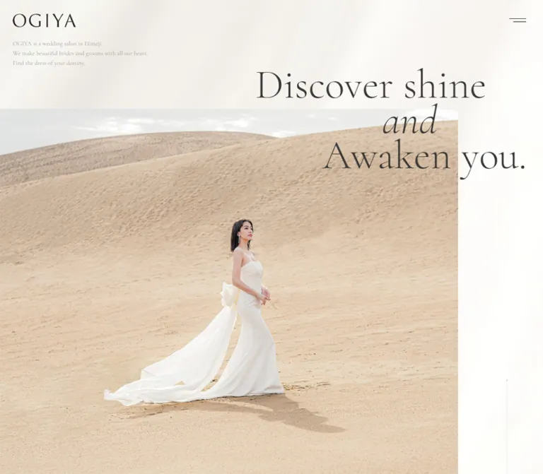
The strongest visual relationship is between large photographs and delicate typography. On desktop, the opening photograph occupies the left portion of the viewport while the headline crosses its upper edge and extends into the white space on the right. On mobile, the photograph fills the opening composition and the headline sits over the sky. Small links, restrained taupe accents, faint oversized lettering, and a curved footer boundary maintain continuity through the page.
閉じる
OGIYA WEDDING SALON — Style Reference
A bridal lookbook arranged across warm white space, with fine serif lettering and photographs of sand, sky, and flowing fabric.
Website: ogiya-wedding.jp
Original URL: https://ogiya-wedding.jp/
Final URL: https://ogiya-wedding.jp/
Theme: light, with warm neutral surfaces and a dark photographic closing strip
Inspected: October 2, 2026, 00:57 JST; supplied retrieval timestamp: October 1, 2026, 15:57:12 UTC
Viewports: desktop 1440 × 1000 and mobile 390 × 844 CSS pixels
Scope: the current homepage, using supplied opening, collection, and closing screenshots together with rendered text, links, element bounds, and computed styles. Linked pages and opened navigation states were not inspected.
OGIYA presents a wedding salon through editorial photography, understated navigation, and generous space. The homepage connects the salon concept, dress and kimono collections, related attire, FAQ, news, location information, and contact. Its structure supports both brand discovery and practical browsing across a larger website.
The strongest visual relationship is between large photographs and delicate typography. On desktop, the opening photograph occupies the left portion of the viewport while the headline crosses its upper edge and extends into the white space on the right. On mobile, the photograph fills the opening composition and the headline sits over the sky. Small links, restrained taupe accents, faint oversized lettering, and a curved footer boundary maintain continuity through the page.
How to Read This Reference
- Measured values come from the supplied rendered DOM, computed styles, and element rectangles. They describe the captured state, not necessarily every state of the site.
- Estimated values come from visual reading of the supplied original-page screenshots. Headline sizes, photographic boundaries, decorative strokes, and background washes fall into this category unless explicitly marked otherwise.
- Recommended values are implementation choices for a reusable adaptation. The CSS below is an adaptation, not recovered source code.
- Named tokens are descriptive aliases unless an original custom property is identified.
- Element bounds require interpretation. Several image links have a measured inline anchor height of
20pxdespite containing much taller visible images. The contact link reports an inherited16pxfont size, while its displayed lettering is clearly larger. These ancestor measurements do not establish image heights or descendant text sizes. - Evidence coverage varies. The opening, desktop Dress presentation, and closing areas have visual evidence. Other sections have stronger structural evidence than visual coverage.
Tokens — Colors
Default Palette
| Name | Value | Suggested token | Evidence and role |
|---|---|---|---|
| Base White | #ffffff |
--color-white |
Measured body background; the underlying page canvas |
| Warm Ink | #2b2824 |
--color-ink |
Measured body, navigation, news-link, and telephone text color |
| Salon Taupe | #988263 |
--color-accent |
Measured source --primary and --swiper-theme-color; also computed on many links |
| Muted Stone | #726e69 |
--color-muted |
Measured on desktop footer collection links |
| Faint Stone | #bfbbb6 |
--color-faint |
Measured copyright text color |
| Warm Wash | approximately #f3f0eb |
--color-wash |
Visual estimate for the diffuse warm areas behind content; not the computed body background |
| Pale Rule | approximately #dedbd6 |
--color-rule |
Recommended approximation for faint outlines and decorative boundaries |
The screenshots contain a warm, softly mottled surface rather than a uniformly beige page. White remains prominent, especially around the right side of the desktop hero. Broad warm gray areas soften the background without creating obvious cards. The supplied evidence does not identify whether this treatment comes from an image, gradients, pseudo-elements, or a combination.
Taupe is an accent for section identity and navigation, not a large filled-button color. Some link ancestors compute to taupe while their visible child lettering appears gray or charcoal. Apply component-specific colors instead of assuming that every descendant of an anchor uses its parent color.
The exposed custom properties also contain many generic framework and editor colors. Bright blue, purple, yellow, and green presets are not evidence of the visible brand palette. Likewise, the dark closing photograph is not evidence of a selectable dark theme.
Photographic Color
Sand supplies the broad beige field, bridal fabric supplies ivory highlights, and the sky contributes pale gray. Dress thumbnails add controlled variation, including a muted blue gown. These colors belong to imagery; they should not automatically become interface tokens.
Tokens — Typography
Declared Serif Stack
The measured body font stack begins:
font-family: 'Libre Caslon Display', Cormorant, 'Shippori Mincho',
  -apple-system, 'system-ui', 'Helvetica Neue', 'Hiragino Sans',
  'ヒラギノ角ゴ  ProN W3', 'Hiragino Kaku Gothic ProN',
  'Yu Gothic', YuGothic, Verdana, Meiryo, 'M+ 1p', sans-serif;
These family names are directly supported by the supplied computed styles. The evidence does not include font resource URLs or per-glyph font resolution, so it does not prove which family rendered every English or Japanese character.
The visible English lettering has fine strokes, pronounced serif contrast, and generous proportions. Japanese copy visually maintains a restrained editorial character. Keep both scripts quiet enough for the photographs to lead.
Display Lettering
The opening statement uses three deliberately composed lines:
Discover shineandAwaken you.
The middle line is italic and offset relative to the other lines. Treat these as independently aligned lines, not ordinary paragraph wrapping. The supplied element sample does not expose their actual font sizes or individual family declarations.
The OGIYA wordmark should be treated as identity artwork. Its surrounding heading and anchor measurements do not establish the font used to draw the logo.
Type Scale
| Role | Desktop | Mobile | Evidence and application |
|---|---|---|---|
| Body baseline | 16px / 28.8px, weight 400 |
Same | Measured; line-height ratio 1.8 |
| Primary navigation | 16px / 28.8px, weight 700, tracking 1px |
Not displayed in the captured header | Measured; visible letterforms remain delicate despite the requested weight |
| Generic View All anchor | 16px / 28.8px, weight 400 |
Same | Measured ancestor values; inner label styling is not fully sampled |
| Telephone links | 14px / 25.2px |
Same | Measured |
| FAQ question and link | 28px / 50.4px |
18px / 32.4px |
Measured |
| Footer primary links | 18px / 20.8px |
Not visibly listed | Measured desktop values |
| Footer collection links | 16px / 20.8px |
Not visibly listed | Measured desktop values |
| Privacy link | 14px / 25.2px |
Not in the captured visible link list | Measured desktop values |
| Copyright | 14px / 19.6px, tracking 1px |
11px / 15.4px, tracking 1px |
Measured |
| Hero headline | approximately 96–104px |
approximately 38–40px |
Screenshot estimate |
| Visible Dress heading | approximately 46–50px |
Not visually captured | Screenshot estimate |
| Visible mobile Salon heading | Not established here | approximately 36–40px |
Screenshot estimate |
| Get in touch. lettering | approximately 60–65px |
approximately 42–45px |
Screenshot estimate; larger than the sampled anchor's inherited font size |
| Introductory English copy | approximately 11–12px |
approximately 10–11px |
Screenshot estimate; very subdued in the captures |
Avoid mechanically applying navigation weight 700 to the display headings. The hierarchy comes primarily from size, position, and space rather than pervasive boldness.
Tokens — Spacing & Shapes
Density: sparse overall, with compact navigation and utility text.
Geometry: square photographic edges, fine rules, broad curves, and almost no visible box treatment.
Spacing system: no single source spacing unit was established. Measurements show repeated 15, 20, 25, 30, 80, 100, and 150px values, alongside viewport-dependent composition.
Spacing Scale
| Use | Desktop | Mobile | Status |
|---|---|---|---|
| Header height | 80px |
55px |
Measured |
| Menu button box | 100 × 80px |
60 × 55px |
Measured |
| Main navigation horizontal link padding | 20px each side |
Not displayed | Measured |
| Visible logo left inset | approximately 25px |
approximately 15px |
Desktop DOM and screenshot; mobile screenshot |
| Collection item gap | 20px |
20px |
Calculated from adjacent measured anchor positions |
| FAQ-region top padding | 280px |
90px |
Measured |
| News-region top padding | 130px |
80px |
Measured |
| News row vertical padding | 30px top and bottom |
20px top, 25px bottom |
Measured |
| Salon-region padding | 150px top, 100px bottom |
100px top and bottom |
Measured |
| Gap after Concept section | 150px |
100px |
Calculated from measured section boundaries |
Shapes and Edges
| Element | Treatment | Evidence |
|---|---|---|
| Hero and product photography | Square corners | Visible screenshots |
| Sampled structural elements and links | border-radius: 0 |
Measured on supplied elements |
| Menu icon | Two thin, unequal horizontal strokes | Visible; approximately 33px and 25px wide |
| View All indicator | Small pointed, pinched diamond/arrow shape | Visible; exact vector path unavailable |
| Contact link | Fine underline beneath large lettering | Visible |
| Footer boundary | Very broad upward arch | Visible; exact geometry unavailable |
| Decorative OGIYA lettering | Large, extremely light outline | Visible; asset construction unavailable |
There is no visible general-purpose rounded-card or shadow-elevation system in the supplied frames.
Layout Measurements
| Element | Desktop | Mobile | Interpretation |
|---|---|---|---|
| Opening section | 1440 × 1000px |
390 × 793.36px |
Measured section bounds |
| Opening image field | Begins around y=230px; right edge around x=1195px |
Fills the opening composition | Screenshot observation; desktop image occupies roughly 83% of viewport width |
| Desktop hero right whitespace | Approximately 245px wide beside the photograph |
Removed | Screenshot estimate |
| Collection-link width | 226.05px |
159.53px |
Measured anchor width; not its image height |
| Collection-item stride | 246.05px |
179.53px |
Calculated width plus 20px gap |
| Visible desktop collection image | Approximately 226 × 310px |
Height not established | Screenshot estimate |
| News link row | 615px wide; about 86–87px tall |
300px wide; about 96–97px tall |
Measured |
| Contact anchor box | 333.81 × 117px |
231.09 × 81px |
Measured wrapper, not glyph bounds |
| Entire footer | 1202.72px tall |
456.36px tall |
Measured, including decorative closing content |
Components
Persistent Identity and Header Navigation
Role: identify the salon and expose its main destinations without competing with the hero.
The initial desktop header is transparent and 80px high. The OGIYA mark sits at the upper left. Eight text links occupy the right portion: Concept, Service, Dress Lineup, Salon, Gallery, FAQ, Recruit, and Contact. A separate menu button occupies the final 100px at the right edge.
The menu symbol uses two fine horizontal lines, with the lower line shorter and right aligned. Its visible strokes are small, but its measured button box is substantial.
At 390px, the header measures 55px high and the menu button becomes 60 × 55px. The horizontal navigation is absent from the visible state. The logo remains prominent, with an approximately 15px visible left inset.
The logo stays at the upper left in supplied scrolled captures. Desktop scrolled frames retain the compact identity/menu treatment while the initial horizontal navigation is no longer visible. This supports a persistent identity treatment, but the exact positioning rule and scroll threshold are not included in the evidence.
The button contains the source label メニューを開閉する. A skip link labeled 本文までスキップする targets #content and measures 1 × 1px at (-1, -1) in the resting state. An opened menu, focus behavior, and skip-link activation were not captured.
Editorial Opening Composition
Role: establish the salon's visual identity before the collection and practical information.
The desktop composition has four layers:
- A warm white background with subtle diffuse tonal variation.
- A tiny three-line English introduction below the logo.
- A large rectangular photograph, flush to the left and starting approximately
230pxbelow the viewport top. - A three-line serif statement crossing the photograph's upper-right boundary.
The photograph shows a bride in a white gown against sand dunes. The trailing fabric, the subject's silhouette, and the long shadow all remain visible. The headline extends beyond the image into the right-hand white field, creating depth without shadows or a containing panel.
On mobile, sky and sand fill the opening section from the top. The introduction sits below the logo, while the headline begins around y=160px and aligns toward the right. The bride appears lower in the frame, with her gown and train extending toward the left edge.
Implementation guidance: use art direction through a picture element or separately tuned crops. A desktop image placed in an unchanged narrow container is unlikely to preserve the mobile sky, subject, and train simultaneously. Keep the three headline lines independently alignable.
Concept Narrative
Role: explain the salon's approach to choosing attire and supporting the customer.
The rendered content includes Concept, the Japanese heading あなたの輝きを 目覚めさせる, a short multi-line narrative, and a View All link to /concept/.
The measured Concept section is unusually tall: 3328px on desktop and 2888px on mobile. Its link appears much earlier within that span. These bounds establish a long section, but they do not establish pinning, parallax, or the reason for the remaining scroll space.
Retain the deliberate narrative pacing when adapting the page. Do not reproduce those heights as arbitrary blank spacers without the corresponding content or verified scroll treatment.
Dress Collection Presentation
Role: connect editorial imagery with individual dress entries and the complete collection.
The desktop Dress capture combines a large left photograph with a right-hand content field. The left image occupies approximately 40% of the viewport width and shows the back of a white gown, including its oversized bow and trailing fabric.
The right side contains:
- A taupe Dress heading and two short lines of Japanese description.
- A horizontal row of portrait photographs beneath generous vertical space.
- Three complete tiles and part of a fourth at the right viewport edge.
- A small right-aligned View All link beneath the image row.
The visible row begins near x=648px. Its tiles are approximately 226px wide, with 20px gaps. The description begins farther inward, around x=728px, so heading alignment and image-track alignment are intentionally different.
A huge, pale Wedding Dress label sits behind the lower part of the composition. It behaves visually as atmosphere rather than another reading heading. Keep its contrast low and exclude purely decorative duplication from the accessibility tree in a new implementation.
The DOM contains repeated links to the same dress entries and offscreen items, consistent with a loop-capable slider structure. It does not prove autoplay, dragging, keyboard controls, or timing.
Kimono Collection and Other Categories
Role: broaden the collection beyond wedding dresses.
Kimono follows Dress in the rendered content and has its own description, repeated item links, and View All destination. Its measured item widths match the Dress track at both viewports.
The desktop Kimono View All anchor is near the left edge at x=75px, whereas the Dress equivalent is near the right edge. On mobile, both end at approximately x=375px. This supports a desktop alignment change followed by a shared mobile right alignment. A complete mirrored Kimono image composition is not visually established by the supplied frames.
The Others area contains Accessory, Tuxedo, and Guest links. Their measured anchor boxes are 65px high on desktop and 55px on mobile, with left padding changing from 130px to 80px. The supplied element sample does not establish the exact internal decoration or displayed child-font size.
Underlined Text Link
Role: provide a consistent secondary action without introducing a heavy button style.
The visible View All treatment pairs a small pointed symbol with a restrained serif label and a fine underline. It has no filled background, enclosing pill, or shadow.
The generic anchor computes to 16px text with a 0.8s transition. Typical measured anchor widths are about 94.45px on desktop and 87.59px on mobile. Differences in visible label styling may occur inside the sampled anchor.
Preserve the visual lightness while enlarging the actual interactive area when necessary. Do not substitute a large taupe rectangle for this recurring link treatment.
FAQ Interlude
Role: move visitors from visual exploration toward practical questions.
The rendered section contains Encounter with attractive, followed by Do you have any questions ? and View FAQ. The question and FAQ text scale from 28px / 50.4px on desktop to 18px / 32.4px on mobile.
The question's measured container is 1110px wide at x=165px on desktop and 360px wide at x=15px on mobile. The question and link positions support a centered composition.
The actual anchor in the supplied text is FAQ within the View FAQ line. A new implementation may make the entire phrase clickable as an accessibility improvement; that would be an adaptation.
News List
Role: expose recent updates within the same quiet editorial system.
Three dated article links are present. The captured dates are 2026.09.13, 2026.05.21, and 2026.05.18; these are content at inspection time, not permanent design labels.
On desktop, the rows are 615px wide at x=540px and use display: flex with 30px vertical padding. On mobile, they become 300px wide at x=45px, switch to display: block, and use 20px top and 25px bottom padding. This creates a clear change from horizontal date/title organization to a stacked reading pattern.
Keep dates subordinate to article titles. Exact divider and heading decoration are not established by the supplied news screenshots, because that region was not visually captured.
Salon Information
Role: provide location, reservation contact, opening hours, and a route to further salon information.
The source content lists the address 〒670-0901 兵庫県姫路市西二階町117, reservation number 0120-38-3488, main number 079-289-0100, and hours 10:00 - 18:00 with the closure note 火曜/水曜定休日.
Both numbers are actual tel: links. Their measured text remains 14px / 25.2px across desktop and mobile.
The mobile closing capture shows the Salon heading and details at the left, a cropped view of a bright interior photograph at the upper right, and View All aligned toward the right edge below the details. Preserve the distinction between editorial salon imagery and easily scanned operational information.
Contact and Footer Navigation
Role: end the main content with a clear contact route and, on desktop, a broad directory of the website.
The contact area is introduced by a small taupe Contact label. Get in touch. appears below in large dark serif lettering with a thin underline. The desktop anchor wrapper measures roughly 334 × 117px; the mobile wrapper measures 231 × 81px and is centered horizontally.
Desktop navigation is arranged in four groups beside the contact block:
- Concept, Service, and Salon.
- Dress Lineup with Dress, Kimono, Accessory, Tuxedo, and Guest beneath it.
- Photo Plan, Movie, Gallery, Wedding Hall, and Furisode.
- News, FAQ, Recruit, Contact, and a small Instagram symbol.
Collection sublinks are muted, smaller than primary links, and indented 20px with short dash-like markers visible in the screenshot. The four link groups begin at approximately x=640, 806, 973, and 1139px.
The mobile capture retains Contact, Get in touch., the decorative wordmark, and copyright. The desktop directory and Privacy Policy are absent from the visible mobile content and rendered link list. Their availability through an opened menu was not tested.
Decorative Closing Composition
Role: give the page a recognizable visual ending without adding another dense content section.
A faint curved boundary leads into the contact region. Below the contact and navigation content, a very large outlined OGIYA mark occupies the left side. Privacy Policy and copyright sit toward the lower right on desktop. Mobile compresses the outlined mark and wraps the copyright into a narrow right-hand block.
The final strip returns to the dune photograph in a dark, desaturated treatment. A delicate radial fan-like motif overlays its lower portion. Neither rotation nor other animation of that motif is established.
This is photographic closure, not a generic dark footer panel. Keep the tonal shift tied to the recurring scene and avoid filling it with unrelated widgets.
Tokens — Motion & Interaction
| Treatment | Supplied evidence | What can be concluded |
|---|---|---|
| General links | 0.8s cubic-bezier(0.165, 0.84, 0.44, 1) |
A long eased transition is declared; individual changed properties are not always specified |
| Header navigation | color 0.8s cubic-bezier(0.165, 0.84, 0.44, 1) |
Color transition is explicitly declared; hover end color was not captured |
| Footer navigation and privacy | 0.5s cubic-bezier(0.165, 0.84, 0.44, 1) |
Shorter link transition is declared |
| FAQ anchor | 0.5s cubic-bezier(0.165, 0.84, 0.44, 1) |
Transition timing is supported; a specific hover animation is not |
| Concept section | opacity 0.5s |
An opacity transition exists; trigger, delay, and scroll relationship are unverified |
| Collection tracks | Repeated destinations and offscreen item coordinates | Slider-like structure is supported; controls, autoplay, loop timing, and gestures remain unverified |
| Persistent identity | Logo appears in supplied scrolled frames | Persistence is visible; exact fixed/sticky implementation is unavailable |
| Menu control | Button text and resting screenshots | Toggle intent is supported; opening motion and panel anatomy are unverified |
| Telephone and navigation links | Actual href values | Destinations are defined; activation was not exercised |
Most sampled elements report animation: none. This does not exclude animation on descendants, pseudo-elements, or through JavaScript. Conversely, a default transition: all entry without a meaningful duration does not demonstrate motion.
The capture process waited for settling and image decoding, and could temporarily pause perpetual animation during readiness checks. Those procedures are not evidence of a particular animation on this page.
Recommended adaptation: use the observed easing for restrained color changes and, if needed, short opacity transitions. Keep content visible by default. Add scroll choreography only after defining and testing the intended behavior; do not infer parallax or autoplay from static compositions.
Surfaces
| Layer | Appearance | Purpose |
|---|---|---|
| Base canvas | White | Keeps the page bright and photographs prominent |
| Atmospheric background | Very soft warm gray patches | Adds depth to large areas of whitespace |
| Editorial imagery | Unboxed photographs with square edges | Carries brand character and product detail |
| Functional text | Warm charcoal with taupe accents | Establishes hierarchy without heavy controls |
| Decorative typography | Pale oversized words and outlined branding | Connects sections through scale rather than color blocks |
| Closing photograph | Dark and desaturated | Creates a visual ending using the same photographic world |
Separate content through alignment, image edges, space, and occasional fine rules. The observed page does not require a conventional stack of elevated cards.
Imagery
The primary imagery combines a solitary bridal figure with a broad natural setting. The dunes provide texture without visual clutter. White fabric remains detailed and luminous, while the subject's pose and long train create a clear silhouette against the sand.
The opening and Dress feature use different views of a bride in a visually consistent dune setting. The first emphasizes the full silhouette and train; the collection image emphasizes the gown's back and bow. Preserve those distinct purposes when selecting replacement photography.
The collection thumbnails introduce closer product study: ruffles, beading, lace, and different dress silhouettes. They remain rectangular photographs without visible badges, price ribbons, or card chrome in the supplied Dress frame.
The mobile salon image shows a bright, pale interior with reflective and architectural details. The final image returns to the dunes under a dark monochrome treatment. This repetition ties the beginning and ending together.
Observed Asset References
No actual image src, srcset, background-image URLs, logo files, or font-file URLs were supplied. The references below identify visual roles, not downloadable asset paths.
| Asset role | Evidence | Implementation guidance |
|---|---|---|
| Opening bridal photograph | Desktop and mobile opening captures | Preserve the bride, gown train, sky, and dune horizon through art-directed crops |
| Dress feature photograph | Desktop Dress capture | Use a larger editorial view distinct from the product thumbnails |
| Dress portraits | Desktop Dress capture and entry links | Preserve garment detail and natural portrait proportions |
| Salon interior photograph | Mobile closing capture | Use a pale interior image without inventing unseen full-image framing |
| OGIYA marks | Opening and closing captures | Prefer authorized brand artwork; do not infer its font from surrounding DOM text |
| Closing dune image and radial motif | Desktop and mobile closing captures | Reproduce tone and placement separately; no animation is established |
| Kimono imagery | Linked entries in the DOM only | Exact photographs, crops, and composition remain visually unverified here |
Use authorized photography and brand assets when available. CSS can reproduce layout and tone, but the gown silhouette, fabric detail, and photographic direction carry much of this design's identity.
Layout & Responsive Behavior
Observed Page Structure
The following values are document coordinates from the supplied element measurements, rounded to two decimals. They are not the local coordinates of the scrolled screenshots.
| Region | Desktop top / height | Mobile top / height |
|---|---|---|
| Opening | 0 / 1000px |
0 / 793.36px |
| Concept | 1000 / 3328px |
793.36 / 2888px |
| Collections and Others | 4478 / 2149.84px |
3781.36 / 2345.70px |
| Encounter / FAQ | 6627.84 / 941.67px |
6127.06 / 491.97px |
| News | 7569.52 / 629.56px |
6619.03 / 560.13px |
| Salon information | 8199.08 / 780px |
7179.16 / 635.38px |
| Footer | 8979.08 / 1202.72px |
7814.53 / 456.36px |
| Total document | 10181.80px |
8270.89px |
The page is not a uniform centered column. The desktop hero bleeds left, the Dress feature and image track follow different alignment lines, utility text uses narrower containers, and the footer shifts to a directory layout.
Desktop to Mobile Changes
- Header:
80pxbecomes55px; the horizontal navigation disappears from the visible state while the compact menu remains. - Hero: the left image/right whitespace arrangement becomes a full-width photographic composition. The headline shrinks substantially but keeps its three-line rhythm and italic middle line.
- Opening height: the measured mobile height is numerically
94%of the supplied844pxviewport. This equality does not establish the original CSS formula. - Collection track: item width changes from approximately
226pxto160px, while the20pxgap remains. Mobile coordinates accommodate two complete items and a narrow portion of a third. - Collection actions: Dress and Kimono use different desktop alignments but share a right-edge alignment on mobile.
- FAQ: text reduces from
28pxto18px, and top padding reduces substantially. - News: date/title rows change from flex layout to block layout, and the list uses
45pxmobile side insets. - Footer: the contact link centers, the large directory is no longer visibly listed, and copyright reduces to
11pxand wraps.
The mobile collection links have differing vertical coordinates. Inline baselines, image proportions, transforms, or nested layout can explain this; the evidence does not establish a deliberate stagger animation.
Breakpoint Evidence
The page exposes breakpoint custom properties at 375, 576, 768, 992, 1200, and 1400px, plus a zero baseline. Their presence does not identify which media query controls each observed change. Only the 390px and 1440px states are verified here.
For an adaptation, 768px is a reasonable starting breakpoint for major stacking, with an earlier navigation collapse around 1200px to avoid crowding. These are recommendations and must be tested at intermediate widths.
Do’s and Don’ts
Do
- Build the visual system around white, warm charcoal, muted taupe, and photography.
- Preserve the desktop hero's overlap between headline, photograph, and empty space.
- Compose the three headline lines independently and retain the italic middle line.
- Art-direct mobile photography around the subject and trailing gown.
- Keep product photographs square-cornered and minimally framed.
- Use separate alignment lines for feature images, collection introductions, and image tracks.
- Retain small underlined links as the recurring action language.
- Use oversized pale lettering as decoration, with functional headings remaining readable.
- Keep address, hours, and telephone numbers clear and easy to scan.
- Preserve a strong contact ending and the recurring dune scene.
- Distinguish observed font declarations from confirmed font loading.
Don’t
- Don't recast the homepage as a short campaign page with repeated sales buttons.
- Don't replace the photographic composition with a grid of rounded cards.
- Don't turn taupe into a large, saturated action surface throughout the page.
- Don't add heavy shadows, glass panels, or conspicuous gradient borders.
- Don't center every section on the same narrow content axis.
- Don't shrink the desktop image indiscriminately and lose the mobile subject or train.
- Don't interpret
20pxinline anchor heights as product-image heights. - Don't copy the very tall Concept bounds as unexplained blank space.
- Don't claim autoplay, parallax, dragging, or menu choreography from static captures.
- Don't use the generic framework color presets as the brand palette.
- Don't assume hidden desktop footer links are reachable on mobile without testing navigation.
Recommended Implementation Additions
These are recommendations for a new implementation, not verified features of the original page:
- Make menu state explicit with
aria-expandedand an associated navigation region. Test Escape, focus restoration, and keyboard traversal. - Preserve the skip link and reveal it clearly on keyboard focus. Use meaningful heading structure even if the visible identity is an image.
- Give linked collection images useful accessible names. If a looping slider duplicates entries, prevent its clones from creating repeated keyboard stops.
- Provide manual collection navigation and a reduced-motion mode before considering automatic movement. Keep every product reachable without animation.
- Make text links comfortably clickable while preserving their small visible lettering. Use a visible focus indicator independent of hover.
- Retain a reachable Privacy Policy on mobile. Its absence from the captured visible footer should not become an accessibility requirement.
- Review contrast for small introductory copy and copyright. Keep extremely faint colors for decoration where possible.
- Use responsive image sources, explicit dimensions, and delayed loading below the opening area. Avoid delaying the primary hero image unnecessarily.
- Validate category routes. The supplied body links for Accessory, Tuxedo, and Guest end in
/%22, while desktop footer equivalents use clean paths. Their destination responses were not tested. - Keep text visible when JavaScript or animation initialization fails. Decorative reveal effects should progressively enhance readable content.
Agent Prompt Guide
Quick Color Reference
- Base canvas:
#ffffff. - Main text:
#2b2824. - Taupe accent:
#988263. - Muted secondary links:
#726e69. - Measured faint copyright:
#bfbbb6. - Approximate background wash:
#f3f0eb. - Recommended decorative rule:
#dedbd6. - Closing surface: a dark, desaturated photograph, not a separate dark UI theme.
Overall Prompt
“Create an editorial homepage for a wedding salon inspired by the observed OGIYA composition. Use a white canvas with diffuse warm neutral washes, warm charcoal text, and restrained taupe accents. Use the declared serif families Libre Caslon Display, Cormorant, and Shippori Mincho where available. Place a small identity mark at the upper left and quiet text navigation at the upper right. On desktop, let a large bridal photograph bleed from the left while a three-line serif statement overlaps its upper-right edge and continues into whitespace; make the middle line italic. On mobile, art-direct the photograph to fill the opening with sky, dunes, the bride, and her train. Build collection previews from large editorial photographs, unboxed portrait tracks, faint oversized category words, and underlined View All links. Include concept copy, FAQ, dated news, salon details, and a prominent Get in touch. ending. Use square image edges, fine rules, a broad curved footer boundary, outlined branding, and a dark photographic closing strip.”
Example Component Prompts
- Opening: “At 1440px, place the photo flush left, beginning around 230px down and ending near 83% of the viewport width. Compose the headline across three large serif lines above and over its right edge. At 390px, use a full-width crop and approximately 40px headline lettering over the sky. Preserve the bride and gown train.”
- Collection: “Create a Dress section with a large photograph occupying roughly 40% of the desktop width. Offset the heading and description inside the right region, then place a portrait track below. Use approximately 226px items and 20px gaps on desktop, approximately 160px items on mobile, and a subtle Wedding Dress word layer behind the lower edge.”
- Text action: “Create a small serif View All link with a fine underline and a tiny pointed symbol to its left. Use muted warm gray or taupe, no enclosing shape, and a larger invisible interaction area. Add a clear keyboard focus state.”
- News: “Create three dated news rows with restrained serif typography. On desktop, align date and title horizontally in a 615px-wide list. On a 390px phone, stack the date above the title in a 300px-wide list with generous row padding.”
- Footer: “Introduce a contact region with a very broad faint arc. Place a small taupe Contact label above large underlined Get in touch. lettering. Add four quiet navigation groups on desktop, a pale oversized outlined wordmark below, and a dark monochrome dune photograph at the end. Keep legal navigation reachable on mobile.”
Quick Start
CSS Custom Properties
This CSS supplies a usable visual shell. Exact measured colors, body metrics, header dimensions, and track gaps are retained where practical. Display sizes, the warm wash, crops, curves, and responsive formulas are explicitly adaptations.
Load appropriately licensed font files separately; the supplied evidence does not provide font URLs. Add authorized images through actual image elements. Expected structure: a header containing brand, navigation, and menu button; a hero containing a picture, introductory text, and a heading with three spans; collection sections containing feature media, introduction, image track, and text action; news rows; and a footer containing contact, navigation, identity, and closing media.
The CSS does not implement a menu, a slider controller, or scroll-state detection. The data-compact attribute is an optional integration hook, not a claim about the original implementation. Horizontal native scrolling is the recommended baseline for the collection track.
:root {
  /* Measured palette */
  --color-white: #ffffff;
  --color-ink: #2b2824;
  --color-accent: #988263;
  --color-muted: #726e69;
  --color-faint: #bfbbb6;

  /* Estimated or recommended decorative colors */
  --color-wash: #f3f0eb;
  --color-rule: #dedbd6;

  /* Source family names; serif is an adaptation fallback */
  --font-editorial: 'Libre Caslon Display', Cormorant,
    'Shippori Mincho', serif;
  --text-body: 16px;
  --text-detail: 14px;
  --leading-body: 1.8;
  --text-hero: clamp(48px, 7.22vw, 104px);
  --text-section: clamp(36px, 3.47vw, 50px);
  --text-contact: clamp(45px, 4.51vw, 65px);

  /* Measured anchors and recommended composition */
  --header-height: 80px;
  --page-inset: 25px;
  --content-width: 1110px;
  --track-gap: 20px;
  --tile-width: 226.05px;
  --section-space: clamp(90px, 10.42vw, 150px);
  --rule-width: 1px;

  /* Measured transition timing */
  --ease-editorial: cubic-bezier(0.165, 0.84, 0.44, 1);
  --motion-link: 800ms;
  --motion-short: 500ms;
}

* { box-sizing: border-box; }

body {
  margin: 0;
  color: var(--color-ink);
  background: var(--color-white);
  font: 400 var(--text-body) / var(--leading-body)
    var(--font-editorial);
}

img { display: block; max-width: 100%; }
a { color: inherit; }
button { font: inherit; }

.page {
  /* Approximation of the observed diffuse tonal variation */
  background:
    radial-gradient(ellipse at 8% 12%, #e9e5dd88, transparent 48%),
    radial-gradient(ellipse at 55% 65%, #f3efea88, transparent 52%),
    var(--color-white);
}

.content-width {
  width: min(calc(100% - 30px), var(--content-width));
  margin-inline: auto;
}

.site-header {
  position: fixed;
  inset: 0 0 auto;
  z-index: 50;
  display: flex;
  align-items: center;
  height: var(--header-height);
  pointer-events: none;
}

.site-header > * { pointer-events: auto; }

.brand { margin-left: var(--page-inset); }
.brand img { width: 123px; height: auto; }

.header-nav {
  display: flex;
  margin-left: auto;
  margin-right: 100px;
}

.header-nav a {
  padding-inline: 20px;
  font-size: 16px;
  font-weight: 700;
  letter-spacing: 1px;
  text-decoration: none;
  transition: color var(--motion-link) var(--ease-editorial);
}

.site-header[data-compact='true'] .header-nav {
  visibility: hidden;
}

.menu-toggle {
  position: absolute;
  top: 0;
  right: 0;
  width: 100px;
  height: 80px;
  padding: 0;
  border: 0;
  color: var(--color-ink);
  background: transparent;
  cursor: pointer;
}

.menu-toggle::before,
.menu-toggle::after {
  content: '';
  position: absolute;
  right: 33px;
  height: 1px;
  background: currentColor;
}

.menu-toggle::before { top: 37px; width: 33px; }
.menu-toggle::after { top: 43px; width: 25px; }

.hero {
  position: relative;
  height: 100vh;
  height: 100svh;
  min-height: 680px;
}

.hero__media {
  position: absolute;
  inset: 23% 17% 0 0;
}

.hero__media img {
  width: 100%;
  height: 100%;
  object-fit: cover;
  object-position: center;
}

.hero__intro {
  position: absolute;
  top: 76px;
  left: var(--page-inset);
  z-index: 1;
  margin: 0;
  color: var(--color-muted);
  font-size: 12px;
  line-height: 1.6;
}

.hero__title {
  position: absolute;
  z-index: 2;
  top: 14%;
  right: 3.125%;
  width: 50%;
  margin: 0;
  font-size: var(--text-hero);
  font-weight: 400;
  line-height: 1.04;
}

.hero__title span { display: block; }
.hero__title span:first-child { text-align: left; }
.hero__title span:last-child { text-align: right; }

.hero__title .hero__and {
  padding-right: 31%;
  font-style: italic;
  text-align: right;
}

.editorial-section { padding-block: var(--section-space); }

.section-title {
  margin: 0 0 30px;
  color: var(--color-accent);
  font-size: var(--text-section);
  font-weight: 400;
  line-height: 1.15;
}

.lookbook {
  position: relative;
  isolation: isolate;
  display: grid;
  grid-template-columns: 40% minmax(0, 1fr);
  gap: 5vw;
  padding-bottom: 100px;
}

.lookbook__feature,
.lookbook__content { position: relative; z-index: 1; }
.lookbook__content { min-width: 0; }

.lookbook__feature img {
  width: 100%;
  aspect-ratio: 4 / 5;
  object-fit: cover;
}

.lookbook__intro { padding-inline: min(5.56vw, 80px); }
.lookbook__intro p { margin: 0; font-size: 14px; }

.lookbook__track {
  display: flex;
  gap: var(--track-gap);
  overflow-x: auto;
  padding-block: 128px 20px;
  scroll-snap-type: x proximity;
  overscroll-behavior-inline: contain;
}

.lookbook__item {
  flex: 0 0 var(--tile-width);
  scroll-snap-align: start;
}

.lookbook__item img {
  width: 100%;
  /* Approximation of the visible desktop thumbnail shape */
  aspect-ratio: 226 / 310;
  object-fit: cover;
}

.lookbook__label {
  position: absolute;
  z-index: 0;
  left: 5%;
  bottom: 25px;
  margin: 0;
  color: rgb(43 40 36 / 6%);
  font-size: clamp(70px, 10vw, 144px);
  line-height: 1;
  white-space: nowrap;
  pointer-events: none;
}

.lookbook__action {
  display: flex;
  justify-content: flex-end;
  padding-right: clamp(15px, 5.21vw, 75px);
}

.text-link {
  display: inline-flex;
  align-items: center;
  gap: 22px;
  min-height: 44px;
  color: var(--color-muted);
  font-size: 18px;
  text-decoration: none;
  transition: color var(--motion-link) var(--ease-editorial);
}

.text-link::before {
  content: '';
  width: 11px;
  height: 14px;
  background: currentColor;
  /* Recommended approximation, not the original vector */
  clip-path: polygon(0 50%, 45% 0, 65% 32%, 100% 50%,
    65% 68%, 45% 100%);
}

.text-link__label {
  text-decoration: underline;
  text-decoration-thickness: 1px;
  text-underline-offset: 6px;
}

.faq-prompt {
  text-align: center;
  font-size: 28px;
  line-height: 1.8;
}

.news-list { width: min(100%, 615px); }

.news-row {
  display: flex;
  gap: 30px;
  padding-block: 30px;
  color: var(--color-ink);
  text-decoration: none;
}

.news-row time { flex: 0 0 100px; }
.news-row p { margin: 0; }

.salon-details {
  font-size: 14px;
  line-height: 1.8;
  font-style: normal;
}

.salon-details a { text-decoration: none; }

.site-footer {
  position: relative;
  isolation: isolate;
  overflow: clip;
  padding-top: 130px;
}

.site-footer::before {
  content: '';
  position: absolute;
  z-index: -1;
  top: 0;
  left: -30%;
  width: 160%;
  height: 280px;
  border-top: 1px solid var(--color-rule);
  border-radius: 50%;
}

.footer-grid {
  display: grid;
  grid-template-columns: 420px minmax(0, 1fr);
  gap: 55px;
}

.contact-block { padding-left: 55px; }
.contact-block p { margin: 0 0 20px; color: var(--color-accent); }

.contact-link {
  display: inline-block;
  color: var(--color-ink);
  font-size: var(--text-contact);
  line-height: 1.25;
  text-decoration-thickness: 1px;
  text-underline-offset: 14px;
}

.footer-nav {
  display: grid;
  grid-template-columns: repeat(4, minmax(0, 1fr));
  gap: 25px;
}

.footer-nav a {
  display: block;
  margin-bottom: 16px;
  font-size: 18px;
  line-height: 1.2;
  text-decoration: none;
  transition: color var(--motion-short) var(--ease-editorial);
}

.footer-nav .sub-link {
  padding-left: 20px;
  color: var(--color-muted);
  font-size: 16px;
}

.footer-signature {
  display: flex;
  align-items: flex-end;
  justify-content: space-between;
  gap: 30px;
  padding-block: 90px 50px;
}

.footer-outline {
  /* Use authorized outline artwork for an exact brand match */
  margin: 0;
  color: transparent;
  -webkit-text-stroke: 1px var(--color-rule);
  font-size: clamp(70px, 16vw, 230px);
  line-height: 1;
  letter-spacing: 0.08em;
}

.footer-legal { text-align: right; }
.footer-legal a { color: var(--color-accent); font-size: 14px; }

.copyright {
  margin: 16px 0 0;
  color: var(--color-faint);
  font-size: 14px;
  line-height: 1.4;
  letter-spacing: 1px;
}

.footer-image img {
  width: 100%;
  aspect-ratio: 3.35 / 1;
  object-fit: cover;
  /* Visual approximation; original processing is unknown */
  filter: grayscale(1) brightness(0.45);
}

:where(a, button):focus-visible {
  outline: 2px solid var(--color-ink);
  outline-offset: 5px;
}

.skip-link {
  position: fixed;
  z-index: 100;
  top: 10px;
  left: 10px;
  padding: 10px 16px;
  background: var(--color-white);
  transform: translateY(-200%);
}

.skip-link:focus { transform: none; }

@media (hover: hover) {
  .header-nav a:hover,
  .footer-nav a:hover,
  .text-link:hover { color: var(--color-accent); }
}

/* Recommended navigation collapse; exact source threshold unknown */
@media (max-width: 1199px) {
  .header-nav { display: none; }
  .footer-grid { grid-template-columns: 1fr; }
  .contact-block { padding-left: 0; }
}

@media (max-width: 767px) {
  :root {
    --header-height: 55px;
    --page-inset: 15px;
    --tile-width: 159.53px;
    --text-hero: 40px;
    --text-contact: 45px;
  }

  .brand img { width: 96px; }
  .menu-toggle { width: 60px; height: 55px; }
  .menu-toggle::before { top: 25px; right: 14px; }
  .menu-toggle::after { top: 31px; right: 14px; }

  .hero {
    /* Matches the captured proportion; not a recovered source rule */
    height: 94vh;
    height: 94svh;
    min-height: 700px;
  }

  .hero__media { inset: 0; }
  .hero__media img { object-position: 55% center; }
  .hero__intro { top: 57px; font-size: 11px; }

  .hero__title {
    top: 154px;
    right: 20px;
    width: 230px;
    max-width: calc(100% - 40px);
    line-height: 1.075;
  }

  .hero__title .hero__and { padding-right: 50px; }

  .lookbook {
    grid-template-columns: 1fr;
    gap: 35px;
    padding-bottom: 80px;
  }

  .lookbook__feature { width: 85%; }
  .lookbook__intro { padding-inline: 15px; }
  .lookbook__track { padding: 45px 15px 20px; }
  .lookbook__label { font-size: 70px; }
  .faq-prompt { font-size: 18px; }

  .news-list {
    width: calc(100% - 90px);
    margin-inline: auto;
  }

  .news-row { display: block; padding: 20px 0 25px; }
  .news-row time { display: block; margin-bottom: 4px; }

  .site-footer { padding-top: 80px; }
  .contact-block { justify-self: center; }
  .footer-nav { display: none; }
  .footer-signature { gap: 15px; padding-block: 60px 25px; }
  .footer-outline { font-size: 70px; }
  .footer-legal { width: 102px; flex-shrink: 0; }
  .copyright { font-size: 11px; }
  .footer-image img { aspect-ratio: 2.36 / 1; }
  /* Keep a separate legal link available on mobile */
  .footer-legal a { display: inline-block; min-height: 44px; }
}

@media (prefers-reduced-motion: reduce) {
  .page *, .page *::before, .page *::after {
    animation: none !important;
    transition: none !important;
    scroll-behavior: auto !important;
  }
}
The mobile collection feature width, thumbnail aspect ratio, footer curve, and image filters above are recommended starting points. They should be adjusted against authorized assets. The introductory text uses a more legible muted color than the very faint captured appearance. The separate mobile legal link is an intentional improvement.
Tailwind v4 Token Mapping
Optional mapping for a project already using Tailwind v4. These aliases do not imply that the original site uses Tailwind. Define the custom properties above first.
@theme inline {
  --color-canvas: var(--color-white);
  --color-ink: #2b2824;
  --color-taupe: #988263;
  --color-stone: #726e69;
  --color-faint: #bfbbb6;
  --color-wash: #f3f0eb;
  --color-rule: #dedbd6;

  --font-editorial: 'Libre Caslon Display', Cormorant,
    'Shippori Mincho', serif;

  --text-body: 16px;
  --text-detail: 14px;
  --text-hero: clamp(40px, 7.22vw, 104px);
  --text-section: clamp(36px, 3.47vw, 50px);
  --text-contact: clamp(45px, 4.51vw, 65px);

  --spacing-track: 20px;
  --spacing-inset: var(--page-inset);
  --spacing-editorial: var(--section-space);
  --radius-photo: 0px;
  --ease-editorial: cubic-bezier(0.165, 0.84, 0.44, 1);
}
Sources & Evidence
- OGIYA WEDDING SALON: original and final URL are identical; supplied response status is
200. The page title identifies the site as the official OGIYA WEDDING SALON website and names 株式会社扇屋. - Capture date: supplied retrieval timestamp
2026-10-01T15:57:12.270Z, equivalent to October 2, 2026, 00:57:12 JST. - Desktop evidence:
1440 × 1000viewport; opening, Dress collection, and closing screenshots; rendered document height approximately10181.80px. - Mobile evidence:
390 × 844viewport; opening and salon/footer screenshots; rendered document height approximately8270.89px. - Computed evidence: body and link colors, declared font stack, sampled typography, header and section rectangles, link destinations, transition declarations, and exposed custom properties supplied with the original-page observations.
- Inspection limits: no additional browsing or file inspection was performed for this reference. Linked destination pages, menu-open states, hover endpoints, focus behavior, collection gestures, autoplay, and scroll-animation mechanisms were not exercised in the supplied evidence. No image-source or font-file paths were provided.
This reference describes the current supplied homepage. Measurements, screenshot estimates, and implementation recommendations are identified separately so that the visual system can be reused without treating uncertain behavior as established source code.
# OGIYA WEDDING SALON — Style Reference

> A bridal lookbook arranged across warm white space, with fine serif lettering and photographs of sand, sky, and flowing fabric.

**Website:** [ogiya-wedding.jp](https://ogiya-wedding.jp/)
**Original URL:** https://ogiya-wedding.jp/
**Final URL:** https://ogiya-wedding.jp/
**Theme:** light, with warm neutral surfaces and a dark photographic closing strip
**Inspected:** October 2, 2026, 00:57 JST; supplied retrieval timestamp: October 1, 2026, 15:57:12 UTC
**Viewports:** desktop `1440 × 1000` and mobile `390 × 844` CSS pixels
**Scope:** the current homepage, using supplied opening, collection, and closing screenshots together with rendered text, links, element bounds, and computed styles. Linked pages and opened navigation states were not inspected.

OGIYA presents a wedding salon through editorial photography, understated navigation, and generous space. The homepage connects the salon concept, dress and kimono collections, related attire, FAQ, news, location information, and contact. Its structure supports both brand discovery and practical browsing across a larger website.

The strongest visual relationship is between large photographs and delicate typography. On desktop, the opening photograph occupies the left portion of the viewport while the headline crosses its upper edge and extends into the white space on the right. On mobile, the photograph fills the opening composition and the headline sits over the sky. Small links, restrained taupe accents, faint oversized lettering, and a curved footer boundary maintain continuity through the page.
閉じる
# OGIYA WEDDING SALON — Style Reference

> A bridal lookbook arranged across warm white space, with fine serif lettering and photographs of sand, sky, and flowing fabric.

**Website:** [ogiya-wedding.jp](https://ogiya-wedding.jp/)
**Original URL:** https://ogiya-wedding.jp/
**Final URL:** https://ogiya-wedding.jp/
**Theme:** light, with warm neutral surfaces and a dark photographic closing strip
**Inspected:** October 2, 2026, 00:57 JST; supplied retrieval timestamp: October 1, 2026, 15:57:12 UTC
**Viewports:** desktop `1440 × 1000` and mobile `390 × 844` CSS pixels
**Scope:** the current homepage, using supplied opening, collection, and closing screenshots together with rendered text, links, element bounds, and computed styles. Linked pages and opened navigation states were not inspected.

OGIYA presents a wedding salon through editorial photography, understated navigation, and generous space. The homepage connects the salon concept, dress and kimono collections, related attire, FAQ, news, location information, and contact. Its structure supports both brand discovery and practical browsing across a larger website.

The strongest visual relationship is between large photographs and delicate typography. On desktop, the opening photograph occupies the left portion of the viewport while the headline crosses its upper edge and extends into the white space on the right. On mobile, the photograph fills the opening composition and the headline sits over the sky. Small links, restrained taupe accents, faint oversized lettering, and a curved footer boundary maintain continuity through the page.

## How to Read This Reference

- **Measured** values come from the supplied rendered DOM, computed styles, and element rectangles. They describe the captured state, not necessarily every state of the site.
- **Estimated** values come from visual reading of the supplied original-page screenshots. Headline sizes, photographic boundaries, decorative strokes, and background washes fall into this category unless explicitly marked otherwise.
- **Recommended** values are implementation choices for a reusable adaptation. The CSS below is an adaptation, not recovered source code.
- **Named tokens** are descriptive aliases unless an original custom property is identified.
- **Element bounds require interpretation.** Several image links have a measured inline anchor height of `20px` despite containing much taller visible images. The contact link reports an inherited `16px` font size, while its displayed lettering is clearly larger. These ancestor measurements do not establish image heights or descendant text sizes.
- **Evidence coverage varies.** The opening, desktop Dress presentation, and closing areas have visual evidence. Other sections have stronger structural evidence than visual coverage.

## Tokens — Colors

### Default Palette

| Name | Value | Suggested token | Evidence and role |
| --- | --- | --- | --- |
| Base White | `#ffffff` | `--color-white` | Measured body background; the underlying page canvas |
| Warm Ink | `#2b2824` | `--color-ink` | Measured body, navigation, news-link, and telephone text color |
| Salon Taupe | `#988263` | `--color-accent` | Measured source `--primary` and `--swiper-theme-color`; also computed on many links |
| Muted Stone | `#726e69` | `--color-muted` | Measured on desktop footer collection links |
| Faint Stone | `#bfbbb6` | `--color-faint` | Measured copyright text color |
| Warm Wash | approximately `#f3f0eb` | `--color-wash` | Visual estimate for the diffuse warm areas behind content; not the computed body background |
| Pale Rule | approximately `#dedbd6` | `--color-rule` | Recommended approximation for faint outlines and decorative boundaries |

The screenshots contain a warm, softly mottled surface rather than a uniformly beige page. White remains prominent, especially around the right side of the desktop hero. Broad warm gray areas soften the background without creating obvious cards. The supplied evidence does not identify whether this treatment comes from an image, gradients, pseudo-elements, or a combination.

Taupe is an accent for section identity and navigation, not a large filled-button color. Some link ancestors compute to taupe while their visible child lettering appears gray or charcoal. Apply component-specific colors instead of assuming that every descendant of an anchor uses its parent color.

The exposed custom properties also contain many generic framework and editor colors. Bright blue, purple, yellow, and green presets are not evidence of the visible brand palette. Likewise, the dark closing photograph is not evidence of a selectable dark theme.

### Photographic Color

Sand supplies the broad beige field, bridal fabric supplies ivory highlights, and the sky contributes pale gray. Dress thumbnails add controlled variation, including a muted blue gown. These colors belong to imagery; they should not automatically become interface tokens.

## Tokens — Typography

### Declared Serif Stack

The measured body font stack begins:

```css
font-family: 'Libre Caslon Display', Cormorant, 'Shippori Mincho',
  -apple-system, 'system-ui', 'Helvetica Neue', 'Hiragino Sans',
  'ヒラギノ角ゴ  ProN W3', 'Hiragino Kaku Gothic ProN',
  'Yu Gothic', YuGothic, Verdana, Meiryo, 'M+ 1p', sans-serif;
```

These family names are directly supported by the supplied computed styles. The evidence does not include font resource URLs or per-glyph font resolution, so it does not prove which family rendered every English or Japanese character.

The visible English lettering has fine strokes, pronounced serif contrast, and generous proportions. Japanese copy visually maintains a restrained editorial character. Keep both scripts quiet enough for the photographs to lead.

### Display Lettering

The opening statement uses three deliberately composed lines:

- `Discover shine`
- `and`
- `Awaken you.`

The middle line is italic and offset relative to the other lines. Treat these as independently aligned lines, not ordinary paragraph wrapping. The supplied element sample does not expose their actual font sizes or individual family declarations.

The OGIYA wordmark should be treated as identity artwork. Its surrounding heading and anchor measurements do not establish the font used to draw the logo.

### Type Scale

| Role | Desktop | Mobile | Evidence and application |
| --- | --- | --- | --- |
| Body baseline | `16px / 28.8px`, weight `400` | Same | Measured; line-height ratio `1.8` |
| Primary navigation | `16px / 28.8px`, weight `700`, tracking `1px` | Not displayed in the captured header | Measured; visible letterforms remain delicate despite the requested weight |
| Generic View All anchor | `16px / 28.8px`, weight `400` | Same | Measured ancestor values; inner label styling is not fully sampled |
| Telephone links | `14px / 25.2px` | Same | Measured |
| FAQ question and link | `28px / 50.4px` | `18px / 32.4px` | Measured |
| Footer primary links | `18px / 20.8px` | Not visibly listed | Measured desktop values |
| Footer collection links | `16px / 20.8px` | Not visibly listed | Measured desktop values |
| Privacy link | `14px / 25.2px` | Not in the captured visible link list | Measured desktop values |
| Copyright | `14px / 19.6px`, tracking `1px` | `11px / 15.4px`, tracking `1px` | Measured |
| Hero headline | approximately `96–104px` | approximately `38–40px` | Screenshot estimate |
| Visible Dress heading | approximately `46–50px` | Not visually captured | Screenshot estimate |
| Visible mobile Salon heading | Not established here | approximately `36–40px` | Screenshot estimate |
| Get in touch. lettering | approximately `60–65px` | approximately `42–45px` | Screenshot estimate; larger than the sampled anchor's inherited font size |
| Introductory English copy | approximately `11–12px` | approximately `10–11px` | Screenshot estimate; very subdued in the captures |

Avoid mechanically applying navigation weight `700` to the display headings. The hierarchy comes primarily from size, position, and space rather than pervasive boldness.

## Tokens — Spacing & Shapes

**Density:** sparse overall, with compact navigation and utility text.
**Geometry:** square photographic edges, fine rules, broad curves, and almost no visible box treatment.
**Spacing system:** no single source spacing unit was established. Measurements show repeated `15`, `20`, `25`, `30`, `80`, `100`, and `150px` values, alongside viewport-dependent composition.

### Spacing Scale

| Use | Desktop | Mobile | Status |
| --- | --- | --- | --- |
| Header height | `80px` | `55px` | Measured |
| Menu button box | `100 × 80px` | `60 × 55px` | Measured |
| Main navigation horizontal link padding | `20px` each side | Not displayed | Measured |
| Visible logo left inset | approximately `25px` | approximately `15px` | Desktop DOM and screenshot; mobile screenshot |
| Collection item gap | `20px` | `20px` | Calculated from adjacent measured anchor positions |
| FAQ-region top padding | `280px` | `90px` | Measured |
| News-region top padding | `130px` | `80px` | Measured |
| News row vertical padding | `30px` top and bottom | `20px` top, `25px` bottom | Measured |
| Salon-region padding | `150px` top, `100px` bottom | `100px` top and bottom | Measured |
| Gap after Concept section | `150px` | `100px` | Calculated from measured section boundaries |

### Shapes and Edges

| Element | Treatment | Evidence |
| --- | --- | --- |
| Hero and product photography | Square corners | Visible screenshots |
| Sampled structural elements and links | `border-radius: 0` | Measured on supplied elements |
| Menu icon | Two thin, unequal horizontal strokes | Visible; approximately `33px` and `25px` wide |
| View All indicator | Small pointed, pinched diamond/arrow shape | Visible; exact vector path unavailable |
| Contact link | Fine underline beneath large lettering | Visible |
| Footer boundary | Very broad upward arch | Visible; exact geometry unavailable |
| Decorative OGIYA lettering | Large, extremely light outline | Visible; asset construction unavailable |

There is no visible general-purpose rounded-card or shadow-elevation system in the supplied frames.

### Layout Measurements

| Element | Desktop | Mobile | Interpretation |
| --- | --- | --- | --- |
| Opening section | `1440 × 1000px` | `390 × 793.36px` | Measured section bounds |
| Opening image field | Begins around `y=230px`; right edge around `x=1195px` | Fills the opening composition | Screenshot observation; desktop image occupies roughly `83%` of viewport width |
| Desktop hero right whitespace | Approximately `245px` wide beside the photograph | Removed | Screenshot estimate |
| Collection-link width | `226.05px` | `159.53px` | Measured anchor width; not its image height |
| Collection-item stride | `246.05px` | `179.53px` | Calculated width plus `20px` gap |
| Visible desktop collection image | Approximately `226 × 310px` | Height not established | Screenshot estimate |
| News link row | `615px` wide; about `86–87px` tall | `300px` wide; about `96–97px` tall | Measured |
| Contact anchor box | `333.81 × 117px` | `231.09 × 81px` | Measured wrapper, not glyph bounds |
| Entire footer | `1202.72px` tall | `456.36px` tall | Measured, including decorative closing content |

## Components

### Persistent Identity and Header Navigation

**Role:** identify the salon and expose its main destinations without competing with the hero.

The initial desktop header is transparent and `80px` high. The OGIYA mark sits at the upper left. Eight text links occupy the right portion: Concept, Service, Dress Lineup, Salon, Gallery, FAQ, Recruit, and Contact. A separate menu button occupies the final `100px` at the right edge.

The menu symbol uses two fine horizontal lines, with the lower line shorter and right aligned. Its visible strokes are small, but its measured button box is substantial.

At `390px`, the header measures `55px` high and the menu button becomes `60 × 55px`. The horizontal navigation is absent from the visible state. The logo remains prominent, with an approximately `15px` visible left inset.

The logo stays at the upper left in supplied scrolled captures. Desktop scrolled frames retain the compact identity/menu treatment while the initial horizontal navigation is no longer visible. This supports a persistent identity treatment, but the exact positioning rule and scroll threshold are not included in the evidence.

The button contains the source label `メニューを開閉する`. A skip link labeled `本文までスキップする` targets `#content` and measures `1 × 1px` at `(-1, -1)` in the resting state. An opened menu, focus behavior, and skip-link activation were not captured.

### Editorial Opening Composition

**Role:** establish the salon's visual identity before the collection and practical information.

The desktop composition has four layers:

1. A warm white background with subtle diffuse tonal variation.
2. A tiny three-line English introduction below the logo.
3. A large rectangular photograph, flush to the left and starting approximately `230px` below the viewport top.
4. A three-line serif statement crossing the photograph's upper-right boundary.

The photograph shows a bride in a white gown against sand dunes. The trailing fabric, the subject's silhouette, and the long shadow all remain visible. The headline extends beyond the image into the right-hand white field, creating depth without shadows or a containing panel.

On mobile, sky and sand fill the opening section from the top. The introduction sits below the logo, while the headline begins around `y=160px` and aligns toward the right. The bride appears lower in the frame, with her gown and train extending toward the left edge.

**Implementation guidance:** use art direction through a picture element or separately tuned crops. A desktop image placed in an unchanged narrow container is unlikely to preserve the mobile sky, subject, and train simultaneously. Keep the three headline lines independently alignable.

### Concept Narrative

**Role:** explain the salon's approach to choosing attire and supporting the customer.

The rendered content includes Concept, the Japanese heading `あなたの輝きを 目覚めさせる`, a short multi-line narrative, and a View All link to `/concept/`.

The measured Concept section is unusually tall: `3328px` on desktop and `2888px` on mobile. Its link appears much earlier within that span. These bounds establish a long section, but they do not establish pinning, parallax, or the reason for the remaining scroll space.

Retain the deliberate narrative pacing when adapting the page. Do not reproduce those heights as arbitrary blank spacers without the corresponding content or verified scroll treatment.

### Dress Collection Presentation

**Role:** connect editorial imagery with individual dress entries and the complete collection.

The desktop Dress capture combines a large left photograph with a right-hand content field. The left image occupies approximately `40%` of the viewport width and shows the back of a white gown, including its oversized bow and trailing fabric.

The right side contains:

- A taupe Dress heading and two short lines of Japanese description.
- A horizontal row of portrait photographs beneath generous vertical space.
- Three complete tiles and part of a fourth at the right viewport edge.
- A small right-aligned View All link beneath the image row.

The visible row begins near `x=648px`. Its tiles are approximately `226px` wide, with `20px` gaps. The description begins farther inward, around `x=728px`, so heading alignment and image-track alignment are intentionally different.

A huge, pale Wedding Dress label sits behind the lower part of the composition. It behaves visually as atmosphere rather than another reading heading. Keep its contrast low and exclude purely decorative duplication from the accessibility tree in a new implementation.

The DOM contains repeated links to the same dress entries and offscreen items, consistent with a loop-capable slider structure. It does not prove autoplay, dragging, keyboard controls, or timing.

### Kimono Collection and Other Categories

**Role:** broaden the collection beyond wedding dresses.

Kimono follows Dress in the rendered content and has its own description, repeated item links, and View All destination. Its measured item widths match the Dress track at both viewports.

The desktop Kimono View All anchor is near the left edge at `x=75px`, whereas the Dress equivalent is near the right edge. On mobile, both end at approximately `x=375px`. This supports a desktop alignment change followed by a shared mobile right alignment. A complete mirrored Kimono image composition is not visually established by the supplied frames.

The Others area contains Accessory, Tuxedo, and Guest links. Their measured anchor boxes are `65px` high on desktop and `55px` on mobile, with left padding changing from `130px` to `80px`. The supplied element sample does not establish the exact internal decoration or displayed child-font size.

### Underlined Text Link

**Role:** provide a consistent secondary action without introducing a heavy button style.

The visible View All treatment pairs a small pointed symbol with a restrained serif label and a fine underline. It has no filled background, enclosing pill, or shadow.

The generic anchor computes to `16px` text with a `0.8s` transition. Typical measured anchor widths are about `94.45px` on desktop and `87.59px` on mobile. Differences in visible label styling may occur inside the sampled anchor.

Preserve the visual lightness while enlarging the actual interactive area when necessary. Do not substitute a large taupe rectangle for this recurring link treatment.

### FAQ Interlude

**Role:** move visitors from visual exploration toward practical questions.

The rendered section contains Encounter with attractive, followed by Do you have any questions ? and View FAQ. The question and FAQ text scale from `28px / 50.4px` on desktop to `18px / 32.4px` on mobile.

The question's measured container is `1110px` wide at `x=165px` on desktop and `360px` wide at `x=15px` on mobile. The question and link positions support a centered composition.

The actual anchor in the supplied text is FAQ within the View FAQ line. A new implementation may make the entire phrase clickable as an accessibility improvement; that would be an adaptation.

### News List

**Role:** expose recent updates within the same quiet editorial system.

Three dated article links are present. The captured dates are `2026.09.13`, `2026.05.21`, and `2026.05.18`; these are content at inspection time, not permanent design labels.

On desktop, the rows are `615px` wide at `x=540px` and use `display: flex` with `30px` vertical padding. On mobile, they become `300px` wide at `x=45px`, switch to `display: block`, and use `20px` top and `25px` bottom padding. This creates a clear change from horizontal date/title organization to a stacked reading pattern.

Keep dates subordinate to article titles. Exact divider and heading decoration are not established by the supplied news screenshots, because that region was not visually captured.

### Salon Information

**Role:** provide location, reservation contact, opening hours, and a route to further salon information.

The source content lists the address `〒670-0901 兵庫県姫路市西二階町117`, reservation number `0120-38-3488`, main number `079-289-0100`, and hours `10:00 - 18:00` with the closure note `火曜/水曜定休日`.

Both numbers are actual `tel:` links. Their measured text remains `14px / 25.2px` across desktop and mobile.

The mobile closing capture shows the Salon heading and details at the left, a cropped view of a bright interior photograph at the upper right, and View All aligned toward the right edge below the details. Preserve the distinction between editorial salon imagery and easily scanned operational information.

### Contact and Footer Navigation

**Role:** end the main content with a clear contact route and, on desktop, a broad directory of the website.

The contact area is introduced by a small taupe Contact label. Get in touch. appears below in large dark serif lettering with a thin underline. The desktop anchor wrapper measures roughly `334 × 117px`; the mobile wrapper measures `231 × 81px` and is centered horizontally.

Desktop navigation is arranged in four groups beside the contact block:

- Concept, Service, and Salon.
- Dress Lineup with Dress, Kimono, Accessory, Tuxedo, and Guest beneath it.
- Photo Plan, Movie, Gallery, Wedding Hall, and Furisode.
- News, FAQ, Recruit, Contact, and a small Instagram symbol.

Collection sublinks are muted, smaller than primary links, and indented `20px` with short dash-like markers visible in the screenshot. The four link groups begin at approximately `x=640`, `806`, `973`, and `1139px`.

The mobile capture retains Contact, Get in touch., the decorative wordmark, and copyright. The desktop directory and Privacy Policy are absent from the visible mobile content and rendered link list. Their availability through an opened menu was not tested.

### Decorative Closing Composition

**Role:** give the page a recognizable visual ending without adding another dense content section.

A faint curved boundary leads into the contact region. Below the contact and navigation content, a very large outlined OGIYA mark occupies the left side. Privacy Policy and copyright sit toward the lower right on desktop. Mobile compresses the outlined mark and wraps the copyright into a narrow right-hand block.

The final strip returns to the dune photograph in a dark, desaturated treatment. A delicate radial fan-like motif overlays its lower portion. Neither rotation nor other animation of that motif is established.

This is photographic closure, not a generic dark footer panel. Keep the tonal shift tied to the recurring scene and avoid filling it with unrelated widgets.

## Tokens — Motion & Interaction

| Treatment | Supplied evidence | What can be concluded |
| --- | --- | --- |
| General links | `0.8s cubic-bezier(0.165, 0.84, 0.44, 1)` | A long eased transition is declared; individual changed properties are not always specified |
| Header navigation | `color 0.8s cubic-bezier(0.165, 0.84, 0.44, 1)` | Color transition is explicitly declared; hover end color was not captured |
| Footer navigation and privacy | `0.5s cubic-bezier(0.165, 0.84, 0.44, 1)` | Shorter link transition is declared |
| FAQ anchor | `0.5s cubic-bezier(0.165, 0.84, 0.44, 1)` | Transition timing is supported; a specific hover animation is not |
| Concept section | `opacity 0.5s` | An opacity transition exists; trigger, delay, and scroll relationship are unverified |
| Collection tracks | Repeated destinations and offscreen item coordinates | Slider-like structure is supported; controls, autoplay, loop timing, and gestures remain unverified |
| Persistent identity | Logo appears in supplied scrolled frames | Persistence is visible; exact fixed/sticky implementation is unavailable |
| Menu control | Button text and resting screenshots | Toggle intent is supported; opening motion and panel anatomy are unverified |
| Telephone and navigation links | Actual href values | Destinations are defined; activation was not exercised |

Most sampled elements report `animation: none`. This does not exclude animation on descendants, pseudo-elements, or through JavaScript. Conversely, a default `transition: all` entry without a meaningful duration does not demonstrate motion.

The capture process waited for settling and image decoding, and could temporarily pause perpetual animation during readiness checks. Those procedures are not evidence of a particular animation on this page.

**Recommended adaptation:** use the observed easing for restrained color changes and, if needed, short opacity transitions. Keep content visible by default. Add scroll choreography only after defining and testing the intended behavior; do not infer parallax or autoplay from static compositions.

## Surfaces

| Layer | Appearance | Purpose |
| --- | --- | --- |
| Base canvas | White | Keeps the page bright and photographs prominent |
| Atmospheric background | Very soft warm gray patches | Adds depth to large areas of whitespace |
| Editorial imagery | Unboxed photographs with square edges | Carries brand character and product detail |
| Functional text | Warm charcoal with taupe accents | Establishes hierarchy without heavy controls |
| Decorative typography | Pale oversized words and outlined branding | Connects sections through scale rather than color blocks |
| Closing photograph | Dark and desaturated | Creates a visual ending using the same photographic world |

Separate content through alignment, image edges, space, and occasional fine rules. The observed page does not require a conventional stack of elevated cards.

## Imagery

The primary imagery combines a solitary bridal figure with a broad natural setting. The dunes provide texture without visual clutter. White fabric remains detailed and luminous, while the subject's pose and long train create a clear silhouette against the sand.

The opening and Dress feature use different views of a bride in a visually consistent dune setting. The first emphasizes the full silhouette and train; the collection image emphasizes the gown's back and bow. Preserve those distinct purposes when selecting replacement photography.

The collection thumbnails introduce closer product study: ruffles, beading, lace, and different dress silhouettes. They remain rectangular photographs without visible badges, price ribbons, or card chrome in the supplied Dress frame.

The mobile salon image shows a bright, pale interior with reflective and architectural details. The final image returns to the dunes under a dark monochrome treatment. This repetition ties the beginning and ending together.

### Observed Asset References

No actual image `src`, `srcset`, background-image URLs, logo files, or font-file URLs were supplied. The references below identify visual roles, not downloadable asset paths.

| Asset role | Evidence | Implementation guidance |
| --- | --- | --- |
| Opening bridal photograph | Desktop and mobile opening captures | Preserve the bride, gown train, sky, and dune horizon through art-directed crops |
| Dress feature photograph | Desktop Dress capture | Use a larger editorial view distinct from the product thumbnails |
| Dress portraits | Desktop Dress capture and entry links | Preserve garment detail and natural portrait proportions |
| Salon interior photograph | Mobile closing capture | Use a pale interior image without inventing unseen full-image framing |
| OGIYA marks | Opening and closing captures | Prefer authorized brand artwork; do not infer its font from surrounding DOM text |
| Closing dune image and radial motif | Desktop and mobile closing captures | Reproduce tone and placement separately; no animation is established |
| Kimono imagery | Linked entries in the DOM only | Exact photographs, crops, and composition remain visually unverified here |

Use authorized photography and brand assets when available. CSS can reproduce layout and tone, but the gown silhouette, fabric detail, and photographic direction carry much of this design's identity.

## Layout & Responsive Behavior

### Observed Page Structure

The following values are document coordinates from the supplied element measurements, rounded to two decimals. They are not the local coordinates of the scrolled screenshots.

| Region | Desktop top / height | Mobile top / height |
| --- | --- | --- |
| Opening | `0 / 1000px` | `0 / 793.36px` |
| Concept | `1000 / 3328px` | `793.36 / 2888px` |
| Collections and Others | `4478 / 2149.84px` | `3781.36 / 2345.70px` |
| Encounter / FAQ | `6627.84 / 941.67px` | `6127.06 / 491.97px` |
| News | `7569.52 / 629.56px` | `6619.03 / 560.13px` |
| Salon information | `8199.08 / 780px` | `7179.16 / 635.38px` |
| Footer | `8979.08 / 1202.72px` | `7814.53 / 456.36px` |
| Total document | `10181.80px` | `8270.89px` |

The page is not a uniform centered column. The desktop hero bleeds left, the Dress feature and image track follow different alignment lines, utility text uses narrower containers, and the footer shifts to a directory layout.

### Desktop to Mobile Changes

- **Header:** `80px` becomes `55px`; the horizontal navigation disappears from the visible state while the compact menu remains.
- **Hero:** the left image/right whitespace arrangement becomes a full-width photographic composition. The headline shrinks substantially but keeps its three-line rhythm and italic middle line.
- **Opening height:** the measured mobile height is numerically `94%` of the supplied `844px` viewport. This equality does not establish the original CSS formula.
- **Collection track:** item width changes from approximately `226px` to `160px`, while the `20px` gap remains. Mobile coordinates accommodate two complete items and a narrow portion of a third.
- **Collection actions:** Dress and Kimono use different desktop alignments but share a right-edge alignment on mobile.
- **FAQ:** text reduces from `28px` to `18px`, and top padding reduces substantially.
- **News:** date/title rows change from flex layout to block layout, and the list uses `45px` mobile side insets.
- **Footer:** the contact link centers, the large directory is no longer visibly listed, and copyright reduces to `11px` and wraps.

The mobile collection links have differing vertical coordinates. Inline baselines, image proportions, transforms, or nested layout can explain this; the evidence does not establish a deliberate stagger animation.

### Breakpoint Evidence

The page exposes breakpoint custom properties at `375`, `576`, `768`, `992`, `1200`, and `1400px`, plus a zero baseline. Their presence does not identify which media query controls each observed change. Only the `390px` and `1440px` states are verified here.

For an adaptation, `768px` is a reasonable starting breakpoint for major stacking, with an earlier navigation collapse around `1200px` to avoid crowding. These are recommendations and must be tested at intermediate widths.

## Do’s and Don’ts

### Do

- Build the visual system around white, warm charcoal, muted taupe, and photography.
- Preserve the desktop hero's overlap between headline, photograph, and empty space.
- Compose the three headline lines independently and retain the italic middle line.
- Art-direct mobile photography around the subject and trailing gown.
- Keep product photographs square-cornered and minimally framed.
- Use separate alignment lines for feature images, collection introductions, and image tracks.
- Retain small underlined links as the recurring action language.
- Use oversized pale lettering as decoration, with functional headings remaining readable.
- Keep address, hours, and telephone numbers clear and easy to scan.
- Preserve a strong contact ending and the recurring dune scene.
- Distinguish observed font declarations from confirmed font loading.

### Don’t

- Don't recast the homepage as a short campaign page with repeated sales buttons.
- Don't replace the photographic composition with a grid of rounded cards.
- Don't turn taupe into a large, saturated action surface throughout the page.
- Don't add heavy shadows, glass panels, or conspicuous gradient borders.
- Don't center every section on the same narrow content axis.
- Don't shrink the desktop image indiscriminately and lose the mobile subject or train.
- Don't interpret `20px` inline anchor heights as product-image heights.
- Don't copy the very tall Concept bounds as unexplained blank space.
- Don't claim autoplay, parallax, dragging, or menu choreography from static captures.
- Don't use the generic framework color presets as the brand palette.
- Don't assume hidden desktop footer links are reachable on mobile without testing navigation.

## Recommended Implementation Additions

These are recommendations for a new implementation, not verified features of the original page:

- Make menu state explicit with `aria-expanded` and an associated navigation region. Test Escape, focus restoration, and keyboard traversal.
- Preserve the skip link and reveal it clearly on keyboard focus. Use meaningful heading structure even if the visible identity is an image.
- Give linked collection images useful accessible names. If a looping slider duplicates entries, prevent its clones from creating repeated keyboard stops.
- Provide manual collection navigation and a reduced-motion mode before considering automatic movement. Keep every product reachable without animation.
- Make text links comfortably clickable while preserving their small visible lettering. Use a visible focus indicator independent of hover.
- Retain a reachable Privacy Policy on mobile. Its absence from the captured visible footer should not become an accessibility requirement.
- Review contrast for small introductory copy and copyright. Keep extremely faint colors for decoration where possible.
- Use responsive image sources, explicit dimensions, and delayed loading below the opening area. Avoid delaying the primary hero image unnecessarily.
- Validate category routes. The supplied body links for Accessory, Tuxedo, and Guest end in `/%22`, while desktop footer equivalents use clean paths. Their destination responses were not tested.
- Keep text visible when JavaScript or animation initialization fails. Decorative reveal effects should progressively enhance readable content.

## Agent Prompt Guide

### Quick Color Reference

- Base canvas: `#ffffff`.
- Main text: `#2b2824`.
- Taupe accent: `#988263`.
- Muted secondary links: `#726e69`.
- Measured faint copyright: `#bfbbb6`.
- Approximate background wash: `#f3f0eb`.
- Recommended decorative rule: `#dedbd6`.
- Closing surface: a dark, desaturated photograph, not a separate dark UI theme.

### Overall Prompt

“Create an editorial homepage for a wedding salon inspired by the observed OGIYA composition. Use a white canvas with diffuse warm neutral washes, warm charcoal text, and restrained taupe accents. Use the declared serif families Libre Caslon Display, Cormorant, and Shippori Mincho where available. Place a small identity mark at the upper left and quiet text navigation at the upper right. On desktop, let a large bridal photograph bleed from the left while a three-line serif statement overlaps its upper-right edge and continues into whitespace; make the middle line italic. On mobile, art-direct the photograph to fill the opening with sky, dunes, the bride, and her train. Build collection previews from large editorial photographs, unboxed portrait tracks, faint oversized category words, and underlined View All links. Include concept copy, FAQ, dated news, salon details, and a prominent Get in touch. ending. Use square image edges, fine rules, a broad curved footer boundary, outlined branding, and a dark photographic closing strip.”

### Example Component Prompts

1. **Opening:** “At 1440px, place the photo flush left, beginning around 230px down and ending near 83% of the viewport width. Compose the headline across three large serif lines above and over its right edge. At 390px, use a full-width crop and approximately 40px headline lettering over the sky. Preserve the bride and gown train.”
2. **Collection:** “Create a Dress section with a large photograph occupying roughly 40% of the desktop width. Offset the heading and description inside the right region, then place a portrait track below. Use approximately 226px items and 20px gaps on desktop, approximately 160px items on mobile, and a subtle Wedding Dress word layer behind the lower edge.”
3. **Text action:** “Create a small serif View All link with a fine underline and a tiny pointed symbol to its left. Use muted warm gray or taupe, no enclosing shape, and a larger invisible interaction area. Add a clear keyboard focus state.”
4. **News:** “Create three dated news rows with restrained serif typography. On desktop, align date and title horizontally in a 615px-wide list. On a 390px phone, stack the date above the title in a 300px-wide list with generous row padding.”
5. **Footer:** “Introduce a contact region with a very broad faint arc. Place a small taupe Contact label above large underlined Get in touch. lettering. Add four quiet navigation groups on desktop, a pale oversized outlined wordmark below, and a dark monochrome dune photograph at the end. Keep legal navigation reachable on mobile.”

## Quick Start

### CSS Custom Properties

This CSS supplies a usable visual shell. Exact measured colors, body metrics, header dimensions, and track gaps are retained where practical. Display sizes, the warm wash, crops, curves, and responsive formulas are explicitly adaptations.

Load appropriately licensed font files separately; the supplied evidence does not provide font URLs. Add authorized images through actual image elements. Expected structure: a header containing brand, navigation, and menu button; a hero containing a picture, introductory text, and a heading with three spans; collection sections containing feature media, introduction, image track, and text action; news rows; and a footer containing contact, navigation, identity, and closing media.

The CSS does not implement a menu, a slider controller, or scroll-state detection. The `data-compact` attribute is an optional integration hook, not a claim about the original implementation. Horizontal native scrolling is the recommended baseline for the collection track.

```css
:root {
  /* Measured palette */
  --color-white: #ffffff;
  --color-ink: #2b2824;
  --color-accent: #988263;
  --color-muted: #726e69;
  --color-faint: #bfbbb6;

  /* Estimated or recommended decorative colors */
  --color-wash: #f3f0eb;
  --color-rule: #dedbd6;

  /* Source family names; serif is an adaptation fallback */
  --font-editorial: 'Libre Caslon Display', Cormorant,
    'Shippori Mincho', serif;
  --text-body: 16px;
  --text-detail: 14px;
  --leading-body: 1.8;
  --text-hero: clamp(48px, 7.22vw, 104px);
  --text-section: clamp(36px, 3.47vw, 50px);
  --text-contact: clamp(45px, 4.51vw, 65px);

  /* Measured anchors and recommended composition */
  --header-height: 80px;
  --page-inset: 25px;
  --content-width: 1110px;
  --track-gap: 20px;
  --tile-width: 226.05px;
  --section-space: clamp(90px, 10.42vw, 150px);
  --rule-width: 1px;

  /* Measured transition timing */
  --ease-editorial: cubic-bezier(0.165, 0.84, 0.44, 1);
  --motion-link: 800ms;
  --motion-short: 500ms;
}

* { box-sizing: border-box; }

body {
  margin: 0;
  color: var(--color-ink);
  background: var(--color-white);
  font: 400 var(--text-body) / var(--leading-body)
    var(--font-editorial);
}

img { display: block; max-width: 100%; }
a { color: inherit; }
button { font: inherit; }

.page {
  /* Approximation of the observed diffuse tonal variation */
  background:
    radial-gradient(ellipse at 8% 12%, #e9e5dd88, transparent 48%),
    radial-gradient(ellipse at 55% 65%, #f3efea88, transparent 52%),
    var(--color-white);
}

.content-width {
  width: min(calc(100% - 30px), var(--content-width));
  margin-inline: auto;
}

.site-header {
  position: fixed;
  inset: 0 0 auto;
  z-index: 50;
  display: flex;
  align-items: center;
  height: var(--header-height);
  pointer-events: none;
}

.site-header > * { pointer-events: auto; }

.brand { margin-left: var(--page-inset); }
.brand img { width: 123px; height: auto; }

.header-nav {
  display: flex;
  margin-left: auto;
  margin-right: 100px;
}

.header-nav a {
  padding-inline: 20px;
  font-size: 16px;
  font-weight: 700;
  letter-spacing: 1px;
  text-decoration: none;
  transition: color var(--motion-link) var(--ease-editorial);
}

.site-header[data-compact='true'] .header-nav {
  visibility: hidden;
}

.menu-toggle {
  position: absolute;
  top: 0;
  right: 0;
  width: 100px;
  height: 80px;
  padding: 0;
  border: 0;
  color: var(--color-ink);
  background: transparent;
  cursor: pointer;
}

.menu-toggle::before,
.menu-toggle::after {
  content: '';
  position: absolute;
  right: 33px;
  height: 1px;
  background: currentColor;
}

.menu-toggle::before { top: 37px; width: 33px; }
.menu-toggle::after { top: 43px; width: 25px; }

.hero {
  position: relative;
  height: 100vh;
  height: 100svh;
  min-height: 680px;
}

.hero__media {
  position: absolute;
  inset: 23% 17% 0 0;
}

.hero__media img {
  width: 100%;
  height: 100%;
  object-fit: cover;
  object-position: center;
}

.hero__intro {
  position: absolute;
  top: 76px;
  left: var(--page-inset);
  z-index: 1;
  margin: 0;
  color: var(--color-muted);
  font-size: 12px;
  line-height: 1.6;
}

.hero__title {
  position: absolute;
  z-index: 2;
  top: 14%;
  right: 3.125%;
  width: 50%;
  margin: 0;
  font-size: var(--text-hero);
  font-weight: 400;
  line-height: 1.04;
}

.hero__title span { display: block; }
.hero__title span:first-child { text-align: left; }
.hero__title span:last-child { text-align: right; }

.hero__title .hero__and {
  padding-right: 31%;
  font-style: italic;
  text-align: right;
}

.editorial-section { padding-block: var(--section-space); }

.section-title {
  margin: 0 0 30px;
  color: var(--color-accent);
  font-size: var(--text-section);
  font-weight: 400;
  line-height: 1.15;
}

.lookbook {
  position: relative;
  isolation: isolate;
  display: grid;
  grid-template-columns: 40% minmax(0, 1fr);
  gap: 5vw;
  padding-bottom: 100px;
}

.lookbook__feature,
.lookbook__content { position: relative; z-index: 1; }
.lookbook__content { min-width: 0; }

.lookbook__feature img {
  width: 100%;
  aspect-ratio: 4 / 5;
  object-fit: cover;
}

.lookbook__intro { padding-inline: min(5.56vw, 80px); }
.lookbook__intro p { margin: 0; font-size: 14px; }

.lookbook__track {
  display: flex;
  gap: var(--track-gap);
  overflow-x: auto;
  padding-block: 128px 20px;
  scroll-snap-type: x proximity;
  overscroll-behavior-inline: contain;
}

.lookbook__item {
  flex: 0 0 var(--tile-width);
  scroll-snap-align: start;
}

.lookbook__item img {
  width: 100%;
  /* Approximation of the visible desktop thumbnail shape */
  aspect-ratio: 226 / 310;
  object-fit: cover;
}

.lookbook__label {
  position: absolute;
  z-index: 0;
  left: 5%;
  bottom: 25px;
  margin: 0;
  color: rgb(43 40 36 / 6%);
  font-size: clamp(70px, 10vw, 144px);
  line-height: 1;
  white-space: nowrap;
  pointer-events: none;
}

.lookbook__action {
  display: flex;
  justify-content: flex-end;
  padding-right: clamp(15px, 5.21vw, 75px);
}

.text-link {
  display: inline-flex;
  align-items: center;
  gap: 22px;
  min-height: 44px;
  color: var(--color-muted);
  font-size: 18px;
  text-decoration: none;
  transition: color var(--motion-link) var(--ease-editorial);
}

.text-link::before {
  content: '';
  width: 11px;
  height: 14px;
  background: currentColor;
  /* Recommended approximation, not the original vector */
  clip-path: polygon(0 50%, 45% 0, 65% 32%, 100% 50%,
    65% 68%, 45% 100%);
}

.text-link__label {
  text-decoration: underline;
  text-decoration-thickness: 1px;
  text-underline-offset: 6px;
}

.faq-prompt {
  text-align: center;
  font-size: 28px;
  line-height: 1.8;
}

.news-list { width: min(100%, 615px); }

.news-row {
  display: flex;
  gap: 30px;
  padding-block: 30px;
  color: var(--color-ink);
  text-decoration: none;
}

.news-row time { flex: 0 0 100px; }
.news-row p { margin: 0; }

.salon-details {
  font-size: 14px;
  line-height: 1.8;
  font-style: normal;
}

.salon-details a { text-decoration: none; }

.site-footer {
  position: relative;
  isolation: isolate;
  overflow: clip;
  padding-top: 130px;
}

.site-footer::before {
  content: '';
  position: absolute;
  z-index: -1;
  top: 0;
  left: -30%;
  width: 160%;
  height: 280px;
  border-top: 1px solid var(--color-rule);
  border-radius: 50%;
}

.footer-grid {
  display: grid;
  grid-template-columns: 420px minmax(0, 1fr);
  gap: 55px;
}

.contact-block { padding-left: 55px; }
.contact-block p { margin: 0 0 20px; color: var(--color-accent); }

.contact-link {
  display: inline-block;
  color: var(--color-ink);
  font-size: var(--text-contact);
  line-height: 1.25;
  text-decoration-thickness: 1px;
  text-underline-offset: 14px;
}

.footer-nav {
  display: grid;
  grid-template-columns: repeat(4, minmax(0, 1fr));
  gap: 25px;
}

.footer-nav a {
  display: block;
  margin-bottom: 16px;
  font-size: 18px;
  line-height: 1.2;
  text-decoration: none;
  transition: color var(--motion-short) var(--ease-editorial);
}

.footer-nav .sub-link {
  padding-left: 20px;
  color: var(--color-muted);
  font-size: 16px;
}

.footer-signature {
  display: flex;
  align-items: flex-end;
  justify-content: space-between;
  gap: 30px;
  padding-block: 90px 50px;
}

.footer-outline {
  /* Use authorized outline artwork for an exact brand match */
  margin: 0;
  color: transparent;
  -webkit-text-stroke: 1px var(--color-rule);
  font-size: clamp(70px, 16vw, 230px);
  line-height: 1;
  letter-spacing: 0.08em;
}

.footer-legal { text-align: right; }
.footer-legal a { color: var(--color-accent); font-size: 14px; }

.copyright {
  margin: 16px 0 0;
  color: var(--color-faint);
  font-size: 14px;
  line-height: 1.4;
  letter-spacing: 1px;
}

.footer-image img {
  width: 100%;
  aspect-ratio: 3.35 / 1;
  object-fit: cover;
  /* Visual approximation; original processing is unknown */
  filter: grayscale(1) brightness(0.45);
}

:where(a, button):focus-visible {
  outline: 2px solid var(--color-ink);
  outline-offset: 5px;
}

.skip-link {
  position: fixed;
  z-index: 100;
  top: 10px;
  left: 10px;
  padding: 10px 16px;
  background: var(--color-white);
  transform: translateY(-200%);
}

.skip-link:focus { transform: none; }

@media (hover: hover) {
  .header-nav a:hover,
  .footer-nav a:hover,
  .text-link:hover { color: var(--color-accent); }
}

/* Recommended navigation collapse; exact source threshold unknown */
@media (max-width: 1199px) {
  .header-nav { display: none; }
  .footer-grid { grid-template-columns: 1fr; }
  .contact-block { padding-left: 0; }
}

@media (max-width: 767px) {
  :root {
    --header-height: 55px;
    --page-inset: 15px;
    --tile-width: 159.53px;
    --text-hero: 40px;
    --text-contact: 45px;
  }

  .brand img { width: 96px; }
  .menu-toggle { width: 60px; height: 55px; }
  .menu-toggle::before { top: 25px; right: 14px; }
  .menu-toggle::after { top: 31px; right: 14px; }

  .hero {
    /* Matches the captured proportion; not a recovered source rule */
    height: 94vh;
    height: 94svh;
    min-height: 700px;
  }

  .hero__media { inset: 0; }
  .hero__media img { object-position: 55% center; }
  .hero__intro { top: 57px; font-size: 11px; }

  .hero__title {
    top: 154px;
    right: 20px;
    width: 230px;
    max-width: calc(100% - 40px);
    line-height: 1.075;
  }

  .hero__title .hero__and { padding-right: 50px; }

  .lookbook {
    grid-template-columns: 1fr;
    gap: 35px;
    padding-bottom: 80px;
  }

  .lookbook__feature { width: 85%; }
  .lookbook__intro { padding-inline: 15px; }
  .lookbook__track { padding: 45px 15px 20px; }
  .lookbook__label { font-size: 70px; }
  .faq-prompt { font-size: 18px; }

  .news-list {
    width: calc(100% - 90px);
    margin-inline: auto;
  }

  .news-row { display: block; padding: 20px 0 25px; }
  .news-row time { display: block; margin-bottom: 4px; }

  .site-footer { padding-top: 80px; }
  .contact-block { justify-self: center; }
  .footer-nav { display: none; }
  .footer-signature { gap: 15px; padding-block: 60px 25px; }
  .footer-outline { font-size: 70px; }
  .footer-legal { width: 102px; flex-shrink: 0; }
  .copyright { font-size: 11px; }
  .footer-image img { aspect-ratio: 2.36 / 1; }
  /* Keep a separate legal link available on mobile */
  .footer-legal a { display: inline-block; min-height: 44px; }
}

@media (prefers-reduced-motion: reduce) {
  .page *, .page *::before, .page *::after {
    animation: none !important;
    transition: none !important;
    scroll-behavior: auto !important;
  }
}
```

The mobile collection feature width, thumbnail aspect ratio, footer curve, and image filters above are recommended starting points. They should be adjusted against authorized assets. The introductory text uses a more legible muted color than the very faint captured appearance. The separate mobile legal link is an intentional improvement.

### Tailwind v4 Token Mapping

Optional mapping for a project already using Tailwind v4. These aliases do not imply that the original site uses Tailwind. Define the custom properties above first.

```css
@theme inline {
  --color-canvas: var(--color-white);
  --color-ink: #2b2824;
  --color-taupe: #988263;
  --color-stone: #726e69;
  --color-faint: #bfbbb6;
  --color-wash: #f3f0eb;
  --color-rule: #dedbd6;

  --font-editorial: 'Libre Caslon Display', Cormorant,
    'Shippori Mincho', serif;

  --text-body: 16px;
  --text-detail: 14px;
  --text-hero: clamp(40px, 7.22vw, 104px);
  --text-section: clamp(36px, 3.47vw, 50px);
  --text-contact: clamp(45px, 4.51vw, 65px);

  --spacing-track: 20px;
  --spacing-inset: var(--page-inset);
  --spacing-editorial: var(--section-space);
  --radius-photo: 0px;
  --ease-editorial: cubic-bezier(0.165, 0.84, 0.44, 1);
}
```

## Sources & Evidence

- [OGIYA WEDDING SALON](https://ogiya-wedding.jp/): original and final URL are identical; supplied response status is `200`. The page title identifies the site as the official OGIYA WEDDING SALON website and names 株式会社扇屋.
- **Capture date:** supplied retrieval timestamp `2026-10-01T15:57:12.270Z`, equivalent to October 2, 2026, 00:57:12 JST.
- **Desktop evidence:** `1440 × 1000` viewport; opening, Dress collection, and closing screenshots; rendered document height approximately `10181.80px`.
- **Mobile evidence:** `390 × 844` viewport; opening and salon/footer screenshots; rendered document height approximately `8270.89px`.
- **Computed evidence:** body and link colors, declared font stack, sampled typography, header and section rectangles, link destinations, transition declarations, and exposed custom properties supplied with the original-page observations.
- **Inspection limits:** no additional browsing or file inspection was performed for this reference. Linked destination pages, menu-open states, hover endpoints, focus behavior, collection gestures, autoplay, and scroll-animation mechanisms were not exercised in the supplied evidence. No image-source or font-file paths were provided.

This reference describes the current supplied homepage. Measurements, screenshot estimates, and implementation recommendations are identified separately so that the visual system can be reused without treating uncertain behavior as established source code.関連するデザイン
スタイルやページの種類、ジャンルが近いデザインを集めました。