プレビュー準備中デザインリファレンスを見る
DESIGN REFERENCE
リライル税理士法人 — 大きなキャラクターと極細文字の企業サイト
鮮やかな黄色のキャラクター、円形の人物写真、極細の英字見出しが印象的な税理士法人サイト。非対称のレイアウトと縦書きを使い、モバイルでは要素の順序やボタン形状まで組み替えています。
RELYL — Style Reference
A cloud-accounting corporate website where a giant yellow character meets precise hairline lettering.
Website: relyl.com
Original URL: https://relyl.com/
Final URL: https://relyl.com/
Theme: light gray and white content areas, amber accents, and a black contact footer; no selectable theme was evidenced.
Inspected: October 5, 2026, 05:53 JST / October 4, 2026, 20:53 UTC. Supplied retrieval timestamp: 2026-10-04T20:53:40.579Z.
Viewports: desktop 1440 × 1000 and mobile 390 × 844 CSS pixels.
Scope: the current corporate homepage of リライル税理士法人. Visual evidence covers the desktop hero, service section, and footer, plus the mobile hero and footer. Rendered DOM evidence additionally covers the introduction, About, recruitment, and Topics sections. Linked pages and opened menus, media players, or forms were not inspected.
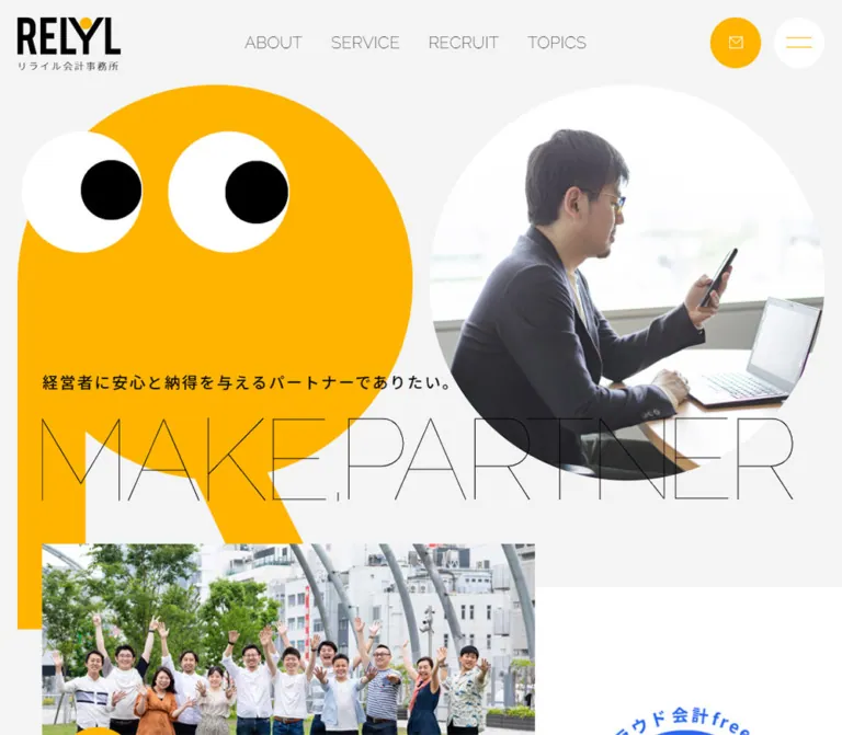
RELYL pairs a friendly, oversized character with an unusually light typographic voice. The opening composition places a yellow R-shaped mascot beside a circular workplace photograph. Thin geometric lettering stretches across both, while the Japanese statement supplies the readable business message. The contrast between the heavy condensed logo, enormous solid character, and almost weightless display lettering is central to the identity.
Below the hero, a long corporate homepage connects services, company values, recruitment, and news. Broad white curves sit against a pale gray canvas. Desktop content alternates between left and right alignment, with vertical Japanese section descriptions occupying the opposite margin. Small orange, yellow, and turquoise characters appear around these boundaries. The black footer changes the atmosphere decisively while retaining the same fine lettering, amber arrows, circular eyes, and generous spacing.
閉じる
RELYL — Style Reference
A cloud-accounting corporate website where a giant yellow character meets precise hairline lettering.
Website: relyl.com
Original URL: https://relyl.com/
Final URL: https://relyl.com/
Theme: light gray and white content areas, amber accents, and a black contact footer; no selectable theme was evidenced.
Inspected: October 5, 2026, 05:53 JST / October 4, 2026, 20:53 UTC. Supplied retrieval timestamp: 2026-10-04T20:53:40.579Z.
Viewports: desktop 1440 × 1000 and mobile 390 × 844 CSS pixels.
Scope: the current corporate homepage of リライル税理士法人. Visual evidence covers the desktop hero, service section, and footer, plus the mobile hero and footer. Rendered DOM evidence additionally covers the introduction, About, recruitment, and Topics sections. Linked pages and opened menus, media players, or forms were not inspected.
RELYL pairs a friendly, oversized character with an unusually light typographic voice. The opening composition places a yellow R-shaped mascot beside a circular workplace photograph. Thin geometric lettering stretches across both, while the Japanese statement supplies the readable business message. The contrast between the heavy condensed logo, enormous solid character, and almost weightless display lettering is central to the identity.
Below the hero, a long corporate homepage connects services, company values, recruitment, and news. Broad white curves sit against a pale gray canvas. Desktop content alternates between left and right alignment, with vertical Japanese section descriptions occupying the opposite margin. Small orange, yellow, and turquoise characters appear around these boundaries. The black footer changes the atmosphere decisively while retaining the same fine lettering, amber arrows, circular eyes, and generous spacing.
How to Read This Reference
- Measured means a value appears in the supplied computed styles or element rectangles. Dimensions are CSS pixels unless stated otherwise.
- Calculated means a relationship is derived from measured values, such as a column proportion or gap between rows.
- Estimated means a visual approximation from an original-page capture. These values are not stylesheet declarations or precise pixel samples.
- Recommended means implementation guidance for a new build. Suggested breakpoints, accessibility changes, and fallback lettering are not claims about the original.
- Token names in this document are descriptive implementation aliases. The supplied custom-property list does not establish a semantic brand-token system.
- The DOM samples mostly describe parent elements. A parent heading reporting
16pxdoes not explain the giant lettering rendered inside it. Decorative lettering, icons, and illustrations must be evaluated separately. - Only the supplied original-page evidence informs this design reference. No additional browsing or local-file inspection was performed.
Tokens — Colors
Default Palette
| Name | Value | Suggested token | Evidence and role |
|---|---|---|---|
| Page Gray | #f3f4f4 |
--color-page |
Measured body background at both viewports; surrounds imagery and broad white section shapes |
| RELYL Amber | #ffb400 |
--color-accent |
Measured header contact fill and footer link color; visually shared by the principal mascot and arrow details |
| White | #ffffff |
--color-surface |
Measured menu-button and desktop Read More backgrounds; visible in section panels and character eyes |
| Black | #000000 |
--color-ink |
Measured main text and footer background; also visible in pupils and logo lettering |
| Footer White | #ffffff |
--color-on-dark |
Measured footer body text |
| Quiet Charcoal | #333333 |
--color-muted-dark |
Measured vertical copyright text on the black footer; intentionally subdued visually |
The measured amber is #ffb400. The generic preset --wp--preset--color--luminous-vivid-amber: #fcb900 also exists in the supplied variable list, but it is not the measured contact-button color. Do not substitute platform presets for the visible brand palette.
Supporting Accents
| Name | Approximate value | Evidence and use |
|---|---|---|
| Companion Orange | approximately #ea9440 |
Visual estimate for the smaller orange character in the service and footer-transition captures |
| Companion Turquoise | approximately #20bdbf |
Visual estimate for the turquoise character; secondary illustration color |
| Decorative Footer Lettering | approximately #303030 |
Visual estimate for the very dark CONTACT lettering; its actual painted color is not provided by the parent heading style |
| Software-brand blues | Asset-dependent | Present in the freee and Money Forward service image; not a general interface accent |
Amber carries both identity and navigation. Orange and turquoise belong primarily to the character family. The blue software marks remain contained within their image rather than establishing another button color.
Tokens — Typography
Japanese Body and Content Headings
- Measured family:
"Noto sans JP", sans-serif. - Body weight:
300. - Content-heading weight:
400. - Desktop body:
16px,28.8pxline height,0.32pxtracking. - Mobile body:
12.8px,23.04pxline height,0.256pxtracking. - Character: light, orderly, and spacious. Paragraphs do not compete with the surrounding illustration and lettering.
The introduction uses slightly tighter paragraph leading: 28px on desktop and 22.4px on mobile. Topics use more generous leading: 32px and 25.6px respectively.
English Utility Text
Raleway is directly evidenced on Read More links, footer labels, the telephone number, and the contact-form link. The Read More stack includes "Noto sans JP" as a fallback; several footer elements use Raleway, sans-serif.
Weights vary by function:
300for Read More and utility links.400for OFFICE, TEL, and SNS.100for the telephone number, CONTACT FORM, and copyright.
The visible header navigation also has a fine geometric appearance, but its sampled anchor reports inherited Noto Sans JP. Child lettering styles were not supplied, so its exact rendered face is unverified.
Large Display Lettering and Logo
The hero phrase and section names use very thin geometric letterforms. Their visual effect is closer to line drawing than to a bold font with its fill removed. Preserve the narrow stroke, open spacing, and unusually large scale.
The supplied evidence does not identify the exact font or construction of this decorative lettering. The sampled H1 and H2 styles retain ordinary body-scale font sizes despite much larger visible letterforms. Do not claim those inherited values describe the artwork.
The RELYL logo is a separate heavy, condensed identity mark with a small amber detail. Replacing it with the display-lettering treatment would remove an important contrast.
Recommended fallback: use a verified light face, such as the evidenced Raleway at weight 100, while approved display artwork is unavailable. Treat this as an approximation. Avoid simulating the effect by outlining a heavy font.
Type Scale
| Role | Desktop | Mobile | Evidence notes |
|---|---|---|---|
| Root and body size | 16px |
12.8px |
Measured; mobile is 80% of desktop at these two samples |
| Body leading | 28.8px |
23.04px |
Measured; ratio 1.8 |
| Intro heading | 24px / 42px |
19.2px / 33.6px |
Measured size and leading |
| Service and recruitment heading | 24px, weight 400 |
19.2px, weight 400 |
Measured; computed line heights are 28.8px and 23.04px, while element rectangles are taller |
| Section description | 20px / 50px |
16px / 32px |
Measured; vertical desktop composition changes to horizontal mobile copy |
| Read More | 16px, weight 300 |
12.8px, weight 300 |
Measured Raleway; tracking 0.01em |
| Topics text | 16px / 32px |
12.8px / 25.6px |
Measured |
| Footer utility heading | 20px, weight 400 |
16px, weight 400 |
Measured Raleway |
| Telephone | 32px, weight 100 |
25.6px, weight 100 |
Measured; tracking 0.05em |
| Contact Form | 26px, weight 100 |
19.2px, weight 100 |
Measured; not a uniform 80% reduction |
| Policy links | 14.4px |
11.52px |
Measured; weight 300 |
| Copyright | 13.4px |
10.24px |
Measured; weight 100, tracking 0.06em |
| Main section lettering allocation | approximately 151–152px high |
58.5px high |
Calculated heading-box height after removing bottom padding; not a font size |
| Footer CONTACT artwork box | 150.5px high |
54.31px high |
Measured heading rectangle; actual letter construction unverified |
The large decorative text and small business text operate on different scales. A single fluid font-size rule is insufficient to reproduce the hierarchy.
Tokens — Spacing & Shapes
Density: broad section spacing and large visual shapes, with compact arrows and light text inside each content group.
Spacing Scale
| Use | Desktop measurement | Mobile measurement | Interpretation |
|---|---|---|---|
| Header left inset | 28.8px |
19.5px |
Equals 2vw and 5vw at the sampled widths |
| Header top inset | 28.8px |
11.7px |
Equals 2vw and 3vw at the sampled widths |
| Main section horizontal margin | 72px |
39px |
Desktop content spans 90% of viewport; mobile content spans 80% |
| Section top padding | 144px |
78px |
Repeated on About, Service, Recruit, and Topics |
| Section-heading bottom padding | 72px |
19.5px |
Measured |
| Content-region bottom padding | 144px |
39px |
Repeated section-body values |
| Service-row separation | 64px |
39px |
Calculated from adjacent row rectangles |
| Arrow-and-gap text indent | 64px |
51.2px |
Calculated for service text and recruitment links |
| Desktop Read More padding | 16px 40px 16px 16px |
— | Measured asymmetric pill padding |
| Mobile Read More padding | — | 19.5px 0 |
Measured; full-width ruled link |
| Topic-link padding | 50px 32px |
25.6px |
Measured |
| Footer detail-area top padding | 80px |
0px |
Measured; mobile groups use their own spacing |
These values establish several systems rather than a single rigid spacing grid: viewport-related section spacing, type-related control dimensions, and content-specific row gaps.
Border Radius
| Element | Observed value or shape | Evidence |
|---|---|---|
| Header contact link | 32px desktop, 25.6px mobile |
Measured; pill becomes a circle |
| Menu button | 50% |
Measured |
| Desktop Read More | 48px |
Measured |
| Mobile Read More | 0 |
Measured |
| Footer Contact Form | 52px desktop, 38.4px mobile |
Measured; visible outline has a downward speech-bubble pointer |
| Hero portrait | Circle | Visible; exact clipping declaration not supplied |
| Service images | Square corners | Visible |
| White section field | Very broad curved boundary | Visible; exact radius or path unknown |
| Video invitation | Approximately 16px corner radius |
Visual estimate |
Layout Measurements
| Element | At 1440 × 1000 | At 390 × 844 |
|---|---|---|
| Document height | 7441.33px |
7384.33px |
| Header box | 1440 × 132.39px |
390 × 82.92px |
| Logo-link box | 129 × 74.80px |
100 × 59.55px |
| Header contact link | 217.44 × 64px |
approximately 51.19 × 51.19px |
| Menu control | 64 × 64px |
approximately 51.19 × 51.19px |
| Hero top | 121.59px |
66.80px |
| Hero section height | 933.22px |
801.22px |
| Main heading container | 1296 × 210.39px |
351 × 471.61px |
| Standard section heading width | 1296px |
312px |
| Service content region | 933.11px |
312px |
| Service text width | 542.52px |
260.81px |
| Read More link | 206.23 × 72px |
312 × 79.41px |
| Contact Form link | 427.67 × 72.39px |
312 × 44.23px |
The desktop hero circles are approximately 677px in diameter. Their positions are consistent with two equal columns, 2vw outer padding, and a 2vw gap. The mobile circles are approximately 337px across, with the portrait centered above the mascot. These circle dimensions are visual estimates supported by the layout, not sampled image-element rectangles.
Components
Header and Persistent Menu Control
Role: corporate identity, primary page navigation, and direct contact access.
The desktop header is transparent against the page gray. The logo sits at the upper left; ABOUT, SERVICE, RECRUIT, and TOPICS form a horizontal navigation group. An amber CONTACT pill sits near the right edge, followed by a separate white circular menu button containing two fine amber lines.
The contact pill measures 217.44 × 64px, with 32px horizontal padding. The menu is a true 64px circle. The screenshot shows light contact lettering and an envelope mark, although the anchor itself reports black text; child artwork controls the visible result.
On mobile, the navigation labels disappear from the visible header. The contact link becomes an envelope-only amber circle, approximately 51.2px across. The white menu circle uses the same size. The logo-link width reduces from 129px to 100px.
The menu stays at the upper-right viewport location in the supplied scrolled captures. The complete header is not shown persisting there. Do not treat the whole logo-and-navigation assembly as a verified sticky header.
Menu opening, submenu presentation, focus behavior, and hover transformations were not exercised. Repeated navigation labels in the DOM do not by themselves establish a particular animation.
Hero Composition
Role: immediately expresses partnership, approachability, and the corporate identity.
The desktop hero consists of three overlapping layers:
- An enormous amber R-shaped character on the left, with white eye discs and black pupils.
- A circular photograph on the right, showing a person using a phone beside an open laptop in a bright workplace.
- The Japanese statement and hairline
MAKE, PARTNERlettering crossing the foreground.
The character is more than a round head. Its vertical stem and diagonal leg extend below the circular region and lead into the next content area. Preserve the whole silhouette rather than replacing it with an emoji-like circular face.
The H1 begins at approximately x:72px, y:628.42px on desktop. Its container is 1296px wide, allowing the English lettering to bridge the two visual columns. The Japanese statement, 経営者に安心と納得を与えるパートナーでありたい。, sits above the large lettering.
On mobile, the portrait comes first and the mascot follows directly beneath. The Japanese statement becomes a narrow vertical line near the right edge, accompanied by a fine vertical rule. The English phrase breaks across lines near the lower portion of the mascot. This is a deliberate recomposition, not a scaled desktop screenshot.
Introduction and Media Area
Role: follows the identity statement with a concrete cloud-accounting proposition.
The next section begins before the hero section’s measured bottom: a 144px overlap on desktop and a 39px overlap on mobile. These values are calculated from the section rectangles. The screenshot shows the beginning of a rectangular promotional image entering below the hero lettering.
The introduction contains a media area, a short Japanese heading, a supporting paragraph, and a Read More link to the cloud-accounting service page. On desktop the text column begins at x:100.80px and is 651.20px wide. On mobile it becomes the standard 312px column at x:39px.
An amber circular button is measured within the media area: 96px on desktop and 76.8px on mobile. Its action and icon are not established by the supplied element sample. Do not assign slider, playback, or next-item behavior without additional evidence.
Oversized Section Heading and Side Description
Role: organizes the long homepage while maintaining a graphic rhythm.
ABOUT, SERVICE, RECRUIT, and TOPICS are large, light geometric labels. Each section begins with substantial top space. The heading spans the main content width rather than fitting into a small title column.
On desktop, Japanese section descriptions occupy the opposite side from the primary content:
- About and recruitment content sit to the left, with their descriptions toward the right.
- Service and Topics content sit to the right, with descriptions toward the left.
The ordinary single-column description uses a 50px-wide box with 20px text and 50px line height. Recruitment has a wider 200px description box accommodating multiple vertical lines.
On mobile these descriptions become horizontal blocks below the display heading, using 16px / 32px text within the 312px content width. The hero caption remains a separate vertical-writing treatment.
About Feature Links
Role: presents three aspects of the firm’s positioning.
The DOM contains three stacked links: MAKE EASY, MAKE RELY, and MAKE FUTURE, each followed by a short Japanese explanation. Their destinations point to corresponding feature anchors on the About page.
On desktop, the content region starts at x:72px, while the feature text starts at x:200px. The display-label containers are 74px high. On mobile, links align to x:39px, with label containers approximately 38.39px high and supporting copy wrapping beneath them.
No complete screenshot of this section was supplied. Its link sequence and spacing are evidenced; exact decorative treatment and hover states are not.
Service Row
Role: provides a readable, image-supported route to each service.
Each service is one linked row with three visual parts: a rectangular image, a small amber circular arrow, and a text group. The visible entries are クラウド会計税務顧問, 融資・補助金, and 監査.
At desktop size:
- Row width is
933.11px, positioned atx:434.89px. - Images are approximately
280 × 187px, visually close to3:2. - Text begins at
x:825.48pxand spans542.52px. - Titles use
24px, weight400; descriptions use16px / 28.8px. - Consecutive rows have a calculated
64pxgap. - The circular arrow is approximately
40pxacross, estimated from the capture.
A useful calculated anatomy is a 30% image column, a 5% inter-column gap, and a flexible text region with a 64px leading allowance for the arrow and its gap. This reproduces the measured text position closely.
The service rows sit over a large white curved field. The field groups the section as a whole; each service does not receive its own raised card. Small colored characters appear near the outer boundary.
On mobile, each image precedes its text group. The link remains 312px wide, while the text is indented 51.2px to reserve the arrow position. The first title begins about 227.84px below its row top, consistent with a roughly 208px image plus 19.5px spacing. Image dimensions here are inferred from the text offset; image-node measurements were not supplied. Row gaps reduce to 39px.
Read More Link
Role: offers a consistent section-level continuation.
Desktop anatomy is a white pill containing an outlined amber arrow circle followed by a small Raleway label. The measured box is 206.23 × 72px, with 16px 40px 16px 16px padding and a 48px radius. The circle is approximately 40px across.
The control alternates sides with the section composition: About and recruitment place it toward the right, while Service and Topics place it toward the left.
On mobile, the same continuation becomes a full-width transparent row, 312 × 79.41px, with square corners and a fine horizontal rule visible in the footer-transition capture. The arrow remains near the left and the label is centered across the row. This change is part of the responsive identity; do not retain a small desktop pill everywhere.
Recruitment Links
Role: separates learning about the workplace, checking requirements, and submitting an entry.
Three linked text groups appear in the DOM: 採用情報, 採用条件を見る, and エントリー. Each contains a heading and explanatory paragraph. The desktop text starts at x:136px, a 64px indent within the left-aligned content region. Mobile uses the same visual pattern with a 51.2px indent.
The measured typography matches service text: 24px desktop headings and 19.2px mobile headings, with light body copy underneath. The mobile requirements paragraph expands to three lines.
The supplied evidence establishes a text-led link list. It does not establish a recruitment image-card grid or a job-filter interface.
Topics Links
Role: supplies current news without competing with the larger brand elements.
Six dated items appear in the supplied DOM. Desktop positions form two columns within the right-aligned 933.11px content region. Individual link rectangles are approximately 467.55px wide, with content-dependent heights of 177px or 209px. Each contains a date followed by its title, using 50px 32px padding and 32px text leading.
Mobile changes to a single column. Link boxes are approximately 313px wide against a 312px region, with 25.6px padding and 25.6px leading. That extra pixel should not be interpreted as intentional page-wide overflow.
Small right-angle line details are visible at the trailing edge of the desktop panel. The complete news-grid border treatment is not captured, so a full cell-border pattern cannot be specified as measured.
Floating Recruitment Video Invitation
Role: draws attention to a workplace video from the hero area.
The desktop capture shows a rounded photographic panel at the lower right, approximately 320 × 146px, with a dark translucent treatment, a large white outlined play circle, and the label リライルでの働き方を動画で見る. A white circular close control protrudes from the upper-right corner.
The mobile version is approximately 240 × 108px and overlaps the lower hero lettering. Its play ring is smaller, and the caption remains at the right of the panel. The desktop and mobile captures show different imagery within the invitation; this alone does not establish autoplay or a looping preview.
Only its hero presentation is directly evidenced. Persistence throughout scrolling, playback behavior, close behavior, audio policy, and the opened player layout are unverified.
Contact Footer
Role: combines inquiries, office details, telephone, social links, and legal navigation into a strong final destination.
The background changes to solid black. A huge, very dark CONTACT wordmark sits behind the contact introduction. White copy supplies the readable message; amber policy links form a horizontal row beneath it.
Desktop details form three visual regions:
- OFFICE and the address at the left.
- A wide CONTACT FORM speech-bubble outline in the center, with a yellow character emerging beneath it.
- TEL, the telephone link, and Instagram/X icons at the right.
The contact-form link measures 427.67 × 72.39px. Its outline and downward pointer connect visually to the character below. The phone number uses Raleway 100 at 32px, with 1.6px tracking. The copyright runs vertically near the right edge in subdued charcoal.
On mobile, the footer becomes centered and sequential: CONTACT lettering, stacked policy links, OFFICE, MAP, TEL, SNS, and CONTACT FORM, followed by the character. The desktop explanatory contact paragraph is absent from the mobile visible-text evidence. The form link is 312 × 44.23px, and the telephone reduces to 25.6px.
The supplied footer rectangles use a different coordinate relationship from the long page-flow sections, especially on mobile. The black area is also partly covered by the preceding light section in the capture. This is insufficient to specify a fixed-footer or reveal-animation mechanism.
Tokens — Motion & Interaction
| Element | Measured declaration | What is established |
|---|---|---|
| Header contact link | background 0.1s |
A short background transition is defined; endpoint colors were not captured |
| Read More links | background 0.1s |
Same short transition family |
| Topics links | background 0.1s |
Background feedback is defined; exact hover appearance is unknown |
| Footer Contact Form | background 0.1s |
Defined transition, untested activation state |
| Menu control | 0.1s transition serialization |
A short transition exists; property and visual transformation are not established |
| Intro media-area button | background 0.3s, border-color 0.3s |
A slower color/border treatment is defined |
| Mobile section descriptions | 0.5s 0.5s transition serialization |
A 500ms duration and 500ms delay are evidenced; trigger and changing property are unverified |
| Sampled element animations | none |
No keyframe animation appears on those sampled nodes; descendants and other nodes may differ |
The capture process waited for document readiness, image decoding, and finite visible motion, and traversed intermediate scroll positions. It also paused and resumed perpetual animations during readiness checks. These collection procedures do not establish which animations the page actually contains.
Do not infer eye tracking from the characters’ pupil positions, a navigation flip from duplicated labels, or parallax from overlapping shapes. Hover, menu expansion, video playback, dismissal, and form submission were not exercised.
Recommended motion for a new implementation: retain brief color feedback and use restrained movement only where a tested interaction needs it. Keep decorative motion optional. Do not make content visibility depend on an entrance animation completing.
Surfaces
| Layer | Appearance | Purpose |
|---|---|---|
| Page canvas | Flat #f3f4f4 |
Neutral field behind the saturated character and fine lettering |
| Section field | Large white curved shape | Groups content at section scale |
| Service content | Unboxed image-and-text rows | Keeps business information readable without card clutter |
| Utility controls | White or amber circles and pills | Small, consistent navigation landmarks |
| Hero photograph | Circular crop with no visible frame | Balances the mascot with a human workplace scene |
| Video invitation | Rounded, darkened photograph with a soft visible shadow | Separates a media invitation from the hero beneath it |
| Contact footer | Solid black, white information, amber links | Strong ending and contact destination |
There is no evidence for a site-wide raised-card system. The video invitation is a local exception. Generic gradients and shadows in the custom-property list do not demonstrate their use in the visible design.
Imagery
The imagery combines ordinary workplace activity with deliberately simple character design. Photography is bright, natural, and task-oriented: a phone and laptop in the hero, paperwork for funding support, and a person working at a monitor for audit services. The circular hero crop gives the photograph the same visual weight as the mascot’s rounded head.
The main mascot is a large amber R form with oversized white eyes and black pupils. Smaller companions use orange and turquoise, sometimes rotated or positioned partly beyond a section boundary. Facial details are minimal. Flat fills and crisp edges keep these characters legible at very different sizes.
The footer character has a small round mouth and looks upward toward the contact bubble. The two small companions at the transition above the footer provide continuity between the pale content canvas and the dark ending.
Observed Asset References
Asset URLs were not supplied. The following are visual identifiers, not invented file paths.
| Asset | Directly evidenced use | Implementation guidance |
|---|---|---|
| RELYL logo with Japanese subtitle | Header at both viewports | Preserve the approved mark and current subtitle |
| Large yellow R character | Hero and a smaller footer variant | Preserve the complete silhouette and eye proportions |
| Orange and turquoise companions | Service boundary and footer transition | Use as occasional section accents |
| Circular workplace portrait | Hero | Keep the phone, face, and laptop readable within the crop |
| freee / Money Forward image | First service row | Keep brand marks legible with their white surrounding space |
| Paperwork photograph | Funding service row | Rectangular crop, approximately 3:2 on desktop |
| Monitor-work photograph | Audit service row | Match the same rectangular image rhythm |
| Recruitment video imagery | Floating hero invitation | Keep overlay copy readable and the play affordance distinct |
| Hairline heading artwork | Hero and major section labels | Use approved artwork when available; exact source construction is unverified |
Do not apply pixelated image rendering. The observed photographs and illustration edges are smooth. Do not introduce unrelated stock-finance imagery that displaces the human workplace character of the page.
Layout & Responsive Behavior
Desktop Structure
The standard section frame is 1296px wide at a 1440px viewport, leaving 72px margins. The principal content regions are approximately 72% of that frame: 933.11px. Their left or right alignment alternates by section.
This creates an intentional asymmetry. Service and Topics leave a broad left zone for vertical descriptions and decorative space. About and recruitment place their content toward the left and use the right side for accompanying copy and continuation links.
The service screenshot directly confirms a large white curved panel behind the rows. The footer-transition screenshot confirms another broad curved white edge. Exact shapes in uncaptured sections remain unverified.
Mobile Recomposition
At 390px, the standard content column is 312px, leaving 39px side margins. The hero uses a wider visual composition and a separate 351px heading container. Do not force the whole page into one universal gutter.
| Desktop arrangement | Mobile arrangement |
|---|---|
| Mascot left, portrait right | Portrait above mascot |
| Horizontal Japanese hero statement | Vertical statement near the right edge |
| English hero phrase spans the composition | Phrase breaks across lines |
| Four visible primary-navigation labels | Labels hidden; contact and menu circles remain |
| Vertical section descriptions | Horizontal descriptions below headings |
| Service image beside text | Image above an indented text group |
| Small white Read More pill | Full-width transparent ruled link |
| Two-column Topics grid | Single-column list |
| Three-region contact layout | Centered vertical sequence |
| Inline policy links | Stacked policy links |
The mobile service section becomes approximately 1534.36px tall, compared with 1344.14px on desktop. The entire page remains long at both widths. Responsive behavior reduces some spacing while allowing images and copy to stack; it does not compress the content into short cards.
Limits of the Responsive Evidence
Only two viewport widths were supplied. Their measurements do not establish the original breakpoint, tablet behavior, landscape treatment, or interpolation rules. The consistent 80% reduction in many type and control dimensions is real at these samples, but it is not universal.
A breakpoint near 48rem is a reasonable implementation starting point, not a recovered source value. Test the navigation, vertical hero caption, long Japanese titles, and floating video invitation between the two observed sizes.
Do’s and Don’ts
Do
- Preserve the measured amber
#ffb400and page gray#f3f4f4. - Build the hero around the relationship between the R character and circular workplace portrait.
- Maintain the contrast between the heavy logo and hairline display lettering.
- Use light Japanese body text with generous leading.
- Keep service images rectangular and content rows largely unboxed.
- Alternate desktop content alignment and side-description placement.
- Use small circular arrow motifs consistently across service links and continuation controls.
- Recompose the hero on mobile rather than simply shrinking it.
- Change mobile Read More links into full-width ruled rows.
- Retain the black footer, amber contact outline, and character beneath its speech-bubble pointer.
- Keep source measurements, visual estimates, and new implementation choices explicitly separate.
Don’t
- Don’t treat the homepage as a single-purpose campaign page; its company, service, recruitment, and news routes all matter.
- Don’t replace the character with an unrelated illustration or a generic round face.
- Don’t turn every content group into a rounded, shadowed card.
- Don’t replace the display lettering with bold outlined capitals.
- Don’t assume the sampled
16pxH2 style is the size of its visible artwork. - Don’t use the generic amber preset in place of the measured brand color.
- Don’t make software-brand blue a competing global action color.
- Don’t preserve desktop vertical section descriptions on narrow screens.
- Don’t infer autoplay, cursor-following eyes, parallax, or menu effects from static captures.
- Don’t reproduce the mobile video overlap without testing whether important content remains reachable.
Recommended Implementation Additions
These are recommendations for a new implementation, not verified features of the original:
- Give icon-only contact, menu, play, close, and social controls explicit accessible names. Connect the menu button to its controlled region and expose its expanded state.
- Keep semantic headings and link names available when the visible display lettering is artwork. Mark purely decorative duplicate lettering and characters as hidden from assistive technology.
- Use black text or icons on amber for important controls where the observed light-on-amber treatment provides insufficient contrast. Keep the dark CONTACT artwork decorative rather than relying on it as the only label.
- Consider a
14–16pxminimum mobile paragraph size in a new build. The original measured12.8pxis a fidelity reference, not an accessibility target. - Provide clearly visible keyboard focus on light and dark surfaces. A service row should be one coherent link rather than several duplicated tab stops.
- Keep all footer content in a reachable document flow unless a separately tested reveal treatment is required. Avoid deriving fixed positioning from the mixed footer rectangles.
- Give the video invitation a sufficiently large close target, avoid unsolicited audio, and ensure it does not block the only route to essential content. Test zoom and short-height screens.
- Reserve image dimensions to prevent layout shifts. Load the hero portrait promptly and defer noncritical images where appropriate.
- Respect reduced-motion preferences and keep important content visible if motion is disabled.
Agent Prompt Guide
Quick Color Reference
- Canvas:
#f3f4f4. - Main white fields and desktop continuation pills:
#ffffff. - Primary text and footer background:
#000000. - Brand character, arrows, and contact accents:
#ffb400. - Supporting character colors: orange around
#ea9440and turquoise around#20bdbf; these are visual estimates. - Footer information: white, with amber links and very subdued decorative lettering.
- Use flat fills. Restrict shadows to an intentionally floating media invitation.
Overall Prompt
“Create a Japanese accounting-firm corporate homepage inspired by RELYL’s current visual system. Use a pale gray canvas, bright amber #ffb400, white curved section fields, and a black contact footer. Pair a huge flat R-shaped character with oversized eyes and a circular workplace portrait. Overlay extremely light geometric display lettering while keeping Japanese business copy clear and restrained. Alternate wide desktop content regions with vertical section descriptions. Present services as rectangular images beside arrow-led text, recruitment as a short linked list, and dated news in two columns. On mobile, place the portrait above the character, turn the hero statement vertical, return section descriptions to horizontal text, stack service images above their descriptions, and replace Read More pills with full-width ruled links. Do not invent interaction effects that are absent from the specification.”
Example Component Prompts
- Hero: “Compose two equally prominent circular forms across a light gray desktop canvas: an amber R mascot on the left and a bright workplace portrait on the right. Preserve the character’s extended stem and diagonal leg. Place a readable Japanese statement above an oversized hairline MAKE, PARTNER graphic that crosses both forms. On a phone, reorder the portrait above the mascot and place the Japanese statement vertically at the right.”
- Service row: “Create an unboxed linked row with a square-cornered 3:2 photograph, an approximately 40px amber outlined arrow circle, a 24px regular Japanese title, and 16px light body text. Use a 933px desktop region with generous row gaps. On mobile, stack the image over the text and retain a small arrow column beside the heading.”
- Section continuation: “On desktop, use a white 72px-high pill with an amber circular arrow at the left and a light Raleway READ MORE label. On mobile, transform it into an approximately 79px-high transparent full-width row with a thin lower rule and centered label.”
- Contact footer: “Use solid black with a huge charcoal hairline CONTACT graphic, white office and telephone information, and amber policy links. Center an amber outlined CONTACT FORM speech bubble above a yellow character. Stack the information on mobile while retaining the vertical copyright detail at the edge.”
- Media invitation: “Create a compact rounded workplace-video invitation over the lower-right hero area. Darken the image enough for a white play ring and two-line Japanese label. Add a separate circular close button. Treat opening and dismissal as explicit interactions, and keep the panel clear of essential controls.”
Quick Start
CSS Custom Properties
This is an implementation adaptation, not extracted production CSS. It reproduces the measured palette, typography, controls, service-row proportions, and key mobile changes. It uses a conventional root size and explicit component tokens. The 48rem breakpoint, fallback display lettering, footer flow, and contrast adjustments are recommendations.
Use this class structure: .site-header contains .brand, .primary-nav, and .contact-link; .menu-toggle is a separate viewport control. .hero-visuals contains .hero-mascot and .hero-photo. Each .section-frame contains a .section-title, .section-description, and .section-body. A .service-link contains .service-image and .service-copy; the copy contains .arrow-circle, a heading, and a paragraph. A .read-more contains .arrow-circle and a label span. Footer groups use .footer-office, .footer-social, and .footer-action.
Font files and approved artwork must be supplied separately. The CSS does not identify source asset filenames or implement menu and video behavior.
:root {
  /* Measured core palette */
  --color-page: #f3f4f4;
  --color-surface: #ffffff;
  --color-ink: #000000;
  --color-accent: #ffb400;
  --color-on-dark: #ffffff;
  --color-muted-dark: #333333;

  /* Visual estimates for optional companion artwork */
  --color-orange: #ea9440;
  --color-turquoise: #20bdbf;

  /* Verified families; the display assignment is a fallback */
  --font-body: 'Noto Sans JP', sans-serif;
  --font-latin: Raleway, 'Noto Sans JP', sans-serif;
  --text-body: 16px;
  --text-heading: 24px;
  --text-section-description: 20px;
  --text-control: 16px;
  --leading-body: 1.8;
  --tracking-body: 0.02em;

  /* Desktop geometry */
  --frame-width: 90%;
  --section-space: 10vw;
  --section-bottom: 10vw;
  --row-gap: 64px;
  --text-indent: 64px;
  --arrow-size: 40px;
  --utility-size: 64px;
  --rule: 1px;
  --motion-color: 100ms;
}

* { box-sizing: border-box; }

body {
  margin: 0;
  color: var(--color-ink);
  background: var(--color-page);
  font: 300 var(--text-body) / var(--leading-body) var(--font-body);
  letter-spacing: var(--tracking-body);
}

img { display: block; max-width: 100%; }
button, a { -webkit-tap-highlight-color: transparent; }
button { font: inherit; cursor: pointer; }
a { color: inherit; }

.site-header {
  display: flex;
  align-items: flex-start;
  gap: 32px;
  padding: 2vw calc(2vw + 80px) 2vw 2vw;
}

.brand { flex: 0 0 129px; }
.brand img { width: 100%; height: auto; }

.primary-nav {
  display: flex;
  align-items: center;
  gap: 3.7vw;
  margin: 12px auto 0;
}

.primary-nav a {
  font-family: var(--font-latin);
  font-size: 24px;
  font-weight: 300;
  text-decoration: none;
}

.contact-link {
  display: inline-flex;
  align-items: center;
  justify-content: center;
  gap: 16px;
  min-height: var(--utility-size);
  padding-inline: 32px;
  border-radius: 32px;
  background: var(--color-accent);
  color: var(--color-ink); /* Recommended contrast adjustment */
  text-decoration: none;
}

.menu-toggle {
  position: fixed;
  z-index: 50;
  inset: 2vw 2vw auto auto;
  display: grid;
  place-content: center;
  gap: 10px;
  width: var(--utility-size);
  height: var(--utility-size);
  padding: 0;
  border: 0;
  border-radius: 50%;
  background: var(--color-surface);
}

.menu-toggle::before,
.menu-toggle::after {
  content: '';
  width: 32px;
  height: 1px;
  background: var(--color-accent);
}

/* Structural hero starting point; use approved character artwork. */
.hero { position: relative; }
.hero-visuals {
  display: grid;
  grid-template-columns: repeat(2, minmax(0, 1fr));
  align-items: start;
  gap: 2vw;
  padding-inline: 2vw;
}

.hero-mascot { width: 100%; height: auto; }
.hero-photo {
  width: 100%;
  aspect-ratio: 1;
  object-fit: cover;
  border-radius: 50%;
}

.hero-copy {
  position: absolute;
  inset: 35.2vw 5vw auto;
}

.hero-kicker { margin: 0 0 30px; font-size: 20px; }
.hero-wordmark {
  margin: 0;
  font-family: var(--font-latin);
  font-size: 12vw;
  font-weight: 100;
  line-height: 1;
  letter-spacing: -0.04em;
}

/* Prefer actual display artwork to this approximate text fallback. */
.display-art { display: block; width: 100%; height: auto; }

.section-frame {
  position: relative;
  isolation: isolate;
  width: var(--frame-width);
  margin-inline: auto;
  padding-top: var(--section-space);
}

.section-title {
  margin: 0 0 5vw;
  font-family: var(--font-latin);
  font-size: clamp(64px, 10.5vw, 152px);
  font-weight: 100;
  line-height: 1;
}

.section-description {
  position: absolute;
  inset-inline-start: 0;
  margin: 0;
  writing-mode: vertical-rl;
  font-size: var(--text-section-description);
  line-height: 50px;
}

.section-body {
  width: 72%;
  margin-left: auto;
  padding-block: 5vw var(--section-bottom);
}

.section-frame--left .section-body {
  margin-left: 0;
  margin-right: auto;
}

.section-frame--left .section-description {
  inset-inline-start: auto;
  inset-inline-end: 0;
}

/* Recommended approximation of the visible broad white field. */
.section-field {
  position: absolute;
  z-index: -1;
  inset: 20vw -5vw 0 15%;
  border-radius: 50% 0 0 50%;
  background: var(--color-surface);
  pointer-events: none;
}

.service-list { display: grid; gap: var(--row-gap); }
.service-link {
  display: grid;
  grid-template-columns: 30% minmax(0, 1fr);
  align-items: center;
  column-gap: 5%;
  text-decoration: none;
}

.service-image {
  width: 100%;
  aspect-ratio: 3 / 2;
  object-fit: cover;
}

.service-copy,
.recruit-link {
  position: relative;
  min-width: 0;
  padding-inline-start: var(--text-indent);
}

.service-copy h3,
.recruit-link h3 {
  margin: 0 0 12px;
  font-size: var(--text-heading);
  font-weight: 400;
  line-height: 1.6;
}

.service-copy p,
.recruit-link p { margin: 0; }

.arrow-circle {
  display: inline-grid;
  place-items: center;
  flex: none;
  width: var(--arrow-size);
  height: var(--arrow-size);
  border: var(--rule) solid var(--color-accent);
  border-radius: 50%;
  color: var(--color-accent);
  line-height: 1;
}

.service-copy > .arrow-circle,
.recruit-link > .arrow-circle {
  position: absolute;
  inset: 0 auto auto 0;
}

.recruit-list { display: grid; gap: var(--row-gap); }
.recruit-link { display: block; text-decoration: none; }

.read-more {
  display: inline-flex;
  align-items: center;
  gap: 16px;
  min-height: 72px;
  padding: 16px 40px 16px 16px;
  border-radius: 48px;
  background: var(--color-surface);
  font: 300 var(--text-control) / 1.8 var(--font-latin);
  letter-spacing: 0.01em;
  text-decoration: none;
}

.topics-grid {
  display: grid;
  grid-template-columns: repeat(2, minmax(0, 1fr));
}

.topic-link {
  min-width: 0;
  padding: 50px 32px;
  text-decoration: none;
  line-height: 2;
}

.topic-link time { display: block; margin-bottom: 8px; }
.topic-link p { margin: 0; overflow-wrap: anywhere; }

.contact-footer {
  position: relative;
  overflow: hidden;
  padding: 140px 5vw 0;
  color: var(--color-on-dark);
  background: var(--color-ink);
}

.footer-heading {
  margin: 0;
  color: var(--color-muted-dark);
  font: 100 clamp(54px, 10.5vw, 152px) / 1 var(--font-latin);
  text-align: center;
}

.footer-intro { text-align: center; }
.footer-policies {
  display: flex;
  justify-content: center;
  flex-wrap: wrap;
  gap: 30px;
  color: var(--color-accent);
  font-size: 14.4px;
}

.footer-grid {
  display: grid;
  grid-template-columns: repeat(3, minmax(0, 1fr));
  gap: 8px;
  padding-top: 80px;
}

.footer-office { grid-column: 1; grid-row: 1; }
.footer-action { grid-column: 2; grid-row: 1; }
.footer-social { grid-column: 3; grid-row: 1; justify-self: end; }

.footer-phone {
  font: 100 32px / 1.2 var(--font-latin);
  letter-spacing: 0.05em;
  text-decoration: none;
}

.contact-form-link {
  position: relative;
  display: block;
  padding: 20.8px;
  border: 1px solid var(--color-accent);
  border-radius: 52px;
  color: var(--color-accent);
  font: 100 26px / 28.8px var(--font-latin);
  text-align: center;
  text-decoration: none;
}

.contact-form-link::after {
  content: '';
  position: absolute;
  left: 50%;
  bottom: -12px;
  width: 24px;
  height: 24px;
  border-right: 1px solid var(--color-accent);
  border-bottom: 1px solid var(--color-accent);
  background: var(--color-ink);
  transform: translateX(-50%) rotate(45deg);
}

.footer-character {
  width: 48%;
  margin: 48px auto 0;
}

.read-more,
.contact-link,
.topic-link,
.contact-form-link {
  transition: background-color var(--motion-color);
}

/* Recommended feedback; original endpoint colors were not captured. */
@media (hover: hover) {
  .read-more:hover,
  .topic-link:hover { background-color: #e8eaea; }
  .contact-form-link:hover { background-color: #242424; }
}

:where(a, button):focus-visible {
  outline: 2px solid var(--color-ink);
  outline-offset: 5px;
}

.contact-footer :where(a, button):focus-visible {
  outline-color: var(--color-accent);
}

/* Recommended breakpoint, calibrated to the supplied mobile sample. */
@media (max-width: 48rem) {
  :root {
    --text-body: 12.8px;
    --text-heading: 19.2px;
    --text-section-description: 16px;
    --text-control: 12.8px;
    --frame-width: 80%;
    --section-space: 20vw;
    --section-bottom: 10vw;
    --row-gap: 10vw;
    --text-indent: 51.2px;
    --arrow-size: 32px;
    --utility-size: 51.2px;
  }

  .site-header {
    align-items: flex-start;
    justify-content: space-between;
    padding: 3vw calc(3vw + 64px) 3vw 5vw;
  }
  .brand { flex-basis: 100px; }
  .primary-nav { display: none; }
  .contact-link {
    width: var(--utility-size);
    min-width: var(--utility-size);
    padding: 0;
    border-radius: 50%;
  }
  .contact-link__label { display: none; }
  .menu-toggle { top: 3vw; right: 3vw; }
  .menu-toggle::before,
  .menu-toggle::after { width: 26px; }

  .hero-visuals {
    display: flex;
    flex-direction: column;
    gap: 0;
    padding-inline: 6.8vw;
  }
  .hero-photo { order: -1; }
  .hero-copy { inset: 69.5vw 5vw auto; }
  .hero-kicker {
    position: absolute;
    top: 0;
    right: 0;
    height: 345px;
    margin: 0;
    padding-right: 3px;
    border-right: 1px solid currentColor;
    writing-mode: vertical-rl;
    font-size: 12.8px;
    line-height: 1.4;
  }
  .hero-wordmark {
    padding-top: 82vw;
    font-size: 23vw;
    line-height: 0.95;
  }
  .hero-wordmark > span { display: block; }

  .section-title { margin-bottom: 5vw; font-size: 15vw; }
  .section-description {
    position: static;
    writing-mode: horizontal-tb;
    line-height: 2;
  }
  .section-body {
    width: 100%;
    margin: 0;
    padding-top: 10vw;
  }
  .section-field {
    inset: 140px -10vw 0 0;
    border-radius: 160px 0 0 160px;
  }

  .service-link { grid-template-columns: 1fr; row-gap: 5vw; }
  .service-copy h3,
  .recruit-link h3 { margin-bottom: 9.6px; }

  .read-more {
    position: relative;
    display: flex;
    justify-content: center;
    width: 100%;
    min-height: 79.4px;
    padding: 5vw 0;
    border-bottom: 1px solid var(--color-ink);
    border-radius: 0;
    background: transparent;
    line-height: 38.4px;
  }
  .read-more > .arrow-circle { position: absolute; left: 3px; }
  .topics-grid { grid-template-columns: 1fr; }
  .topic-link { padding: 25.6px; }

  .contact-footer { padding: 39px 10vw 0; }
  .footer-heading { font-size: 14vw; }
  .footer-intro { display: none; }
  .footer-policies {
    display: grid;
    gap: 0;
    text-align: center;
    font-size: 11.52px;
  }
  .footer-grid {
    display: flex;
    flex-direction: column;
    gap: 24px;
    padding-top: 20px;
    text-align: center;
  }
  .footer-office { order: 0; }
  .footer-social { order: 1; }
  .footer-action { order: 2; margin-top: 20px; }
  .footer-phone { font-size: 25.6px; }
  .contact-form-link {
    min-height: 44px;
    padding: 9.6px;
    border-radius: 38.4px;
    font-size: 19.2px;
    line-height: 23.04px;
  }
  .footer-character { width: 34%; margin-top: 32px; }
}

@media (prefers-reduced-motion: reduce) {
  .read-more,
  .contact-link,
  .topic-link,
  .contact-form-link { transition: none; }
}
The hero positioning above is a starting point for the two evidenced compositions, not a substitute for testing the actual artwork’s dimensions. Keep the foreground phrase inside its section at intermediate widths. If using inline vector lettering, give it a responsive view box and preserve a semantic text equivalent.
For a more readable mobile adaptation, override --text-body to 14px or 16px and allow paragraph blocks to grow. Recheck the service descriptions, Topics heights, and footer rather than keeping screenshot-derived fixed heights.
Tailwind v4 Token Mapping
Optional aliases for an existing Tailwind v4 project. This does not imply the original website uses Tailwind. Define the custom properties above first.
@theme inline {
  --color-page: #f3f4f4;
  --color-surface: #ffffff;
  --color-ink: #000000;
  --color-accent: #ffb400;
  --color-on-dark: #ffffff;
  --color-muted-dark: #333333;

  --font-japanese: 'Noto Sans JP', sans-serif;
  --font-english: Raleway, 'Noto Sans JP', sans-serif;

  --text-copy: var(--text-body);
  --text-item-heading: var(--text-heading);
  --text-utility: var(--text-control);

  --spacing-section: var(--section-space);
  --spacing-row: var(--row-gap);
  --spacing-arrow: var(--arrow-size);
  --spacing-control: var(--utility-size);

  --radius-more: 48px;
  --radius-contact: 52px;
}
Sources & Evidence
- Inspected original and final page: RELYL. The supplied browser record reports HTTP
200, matching original and final URLs, and the current title identifying リライル税理士法人. - Capture date:
2026-10-04T20:53:40.579Z, equivalent to October 5, 2026, 05:53:40.579 JST. This is the supplied retrieval time, not a separate live visit by the author of this reference. - Desktop visual evidence: three original-page captures at
1440 × 1000, covering the hero/header, service content, and footer transition/contact area. - Mobile visual evidence: two original-page captures at
390 × 844, covering the hero/header and footer transition/contact area. - Rendered evidence: page text, link destinations, computed typography and colors, element rectangles, padding, radius, transition declarations, and document heights at both viewports. About, recruitment, and the complete Topics sequence are supported principally by this DOM evidence.
- Observed navigation scope: the collection traversed scroll positions. The supplied record does not establish clicked menu states, hover endpoints, video playback, dismissal, linked-page layouts, or contact-form behavior.
- Capture limitations: readiness checks used bounded waits and cannot guarantee that all delayed content was present. Service workers and SharedWorkers were disabled during collection. Only two responsive widths were supplied. Full stylesheets, image URLs, font loading records, and the construction of the decorative lettering were not provided.
This reference documents the current homepage represented by the supplied original-page captures and rendered evidence. Estimated artwork colors, inferred proportions, suggested breakpoints, and implementation additions are labeled separately from measured values.
# RELYL — Style Reference

> A cloud-accounting corporate website where a giant yellow character meets precise hairline lettering.

**Website:** [relyl.com](https://relyl.com/)
**Original URL:** https://relyl.com/
**Final URL:** https://relyl.com/
**Theme:** light gray and white content areas, amber accents, and a black contact footer; no selectable theme was evidenced.
**Inspected:** October 5, 2026, 05:53 JST / October 4, 2026, 20:53 UTC. Supplied retrieval timestamp: `2026-10-04T20:53:40.579Z`.
**Viewports:** desktop `1440 × 1000` and mobile `390 × 844` CSS pixels.
**Scope:** the current corporate homepage of リライル税理士法人. Visual evidence covers the desktop hero, service section, and footer, plus the mobile hero and footer. Rendered DOM evidence additionally covers the introduction, About, recruitment, and Topics sections. Linked pages and opened menus, media players, or forms were not inspected.

RELYL pairs a friendly, oversized character with an unusually light typographic voice. The opening composition places a yellow R-shaped mascot beside a circular workplace photograph. Thin geometric lettering stretches across both, while the Japanese statement supplies the readable business message. The contrast between the heavy condensed logo, enormous solid character, and almost weightless display lettering is central to the identity.

Below the hero, a long corporate homepage connects services, company values, recruitment, and news. Broad white curves sit against a pale gray canvas. Desktop content alternates between left and right alignment, with vertical Japanese section descriptions occupying the opposite margin. Small orange, yellow, and turquoise characters appear around these boundaries. The black footer changes the atmosphere decisively while retaining the same fine lettering, amber arrows, circular eyes, and generous spacing.
閉じる
# RELYL — Style Reference

> A cloud-accounting corporate website where a giant yellow character meets precise hairline lettering.

**Website:** [relyl.com](https://relyl.com/)
**Original URL:** https://relyl.com/
**Final URL:** https://relyl.com/
**Theme:** light gray and white content areas, amber accents, and a black contact footer; no selectable theme was evidenced.
**Inspected:** October 5, 2026, 05:53 JST / October 4, 2026, 20:53 UTC. Supplied retrieval timestamp: `2026-10-04T20:53:40.579Z`.
**Viewports:** desktop `1440 × 1000` and mobile `390 × 844` CSS pixels.
**Scope:** the current corporate homepage of リライル税理士法人. Visual evidence covers the desktop hero, service section, and footer, plus the mobile hero and footer. Rendered DOM evidence additionally covers the introduction, About, recruitment, and Topics sections. Linked pages and opened menus, media players, or forms were not inspected.

RELYL pairs a friendly, oversized character with an unusually light typographic voice. The opening composition places a yellow R-shaped mascot beside a circular workplace photograph. Thin geometric lettering stretches across both, while the Japanese statement supplies the readable business message. The contrast between the heavy condensed logo, enormous solid character, and almost weightless display lettering is central to the identity.

Below the hero, a long corporate homepage connects services, company values, recruitment, and news. Broad white curves sit against a pale gray canvas. Desktop content alternates between left and right alignment, with vertical Japanese section descriptions occupying the opposite margin. Small orange, yellow, and turquoise characters appear around these boundaries. The black footer changes the atmosphere decisively while retaining the same fine lettering, amber arrows, circular eyes, and generous spacing.

## How to Read This Reference

- **Measured** means a value appears in the supplied computed styles or element rectangles. Dimensions are CSS pixels unless stated otherwise.
- **Calculated** means a relationship is derived from measured values, such as a column proportion or gap between rows.
- **Estimated** means a visual approximation from an original-page capture. These values are not stylesheet declarations or precise pixel samples.
- **Recommended** means implementation guidance for a new build. Suggested breakpoints, accessibility changes, and fallback lettering are not claims about the original.
- Token names in this document are descriptive implementation aliases. The supplied custom-property list does not establish a semantic brand-token system.
- The DOM samples mostly describe parent elements. A parent heading reporting `16px` does not explain the giant lettering rendered inside it. Decorative lettering, icons, and illustrations must be evaluated separately.
- Only the supplied original-page evidence informs this design reference. No additional browsing or local-file inspection was performed.

## Tokens — Colors

### Default Palette

| Name | Value | Suggested token | Evidence and role |
| --- | --- | --- | --- |
| Page Gray | `#f3f4f4` | `--color-page` | Measured body background at both viewports; surrounds imagery and broad white section shapes |
| RELYL Amber | `#ffb400` | `--color-accent` | Measured header contact fill and footer link color; visually shared by the principal mascot and arrow details |
| White | `#ffffff` | `--color-surface` | Measured menu-button and desktop Read More backgrounds; visible in section panels and character eyes |
| Black | `#000000` | `--color-ink` | Measured main text and footer background; also visible in pupils and logo lettering |
| Footer White | `#ffffff` | `--color-on-dark` | Measured footer body text |
| Quiet Charcoal | `#333333` | `--color-muted-dark` | Measured vertical copyright text on the black footer; intentionally subdued visually |

The measured amber is `#ffb400`. The generic preset `--wp--preset--color--luminous-vivid-amber: #fcb900` also exists in the supplied variable list, but it is not the measured contact-button color. Do not substitute platform presets for the visible brand palette.

### Supporting Accents

| Name | Approximate value | Evidence and use |
| --- | --- | --- |
| Companion Orange | approximately `#ea9440` | Visual estimate for the smaller orange character in the service and footer-transition captures |
| Companion Turquoise | approximately `#20bdbf` | Visual estimate for the turquoise character; secondary illustration color |
| Decorative Footer Lettering | approximately `#303030` | Visual estimate for the very dark CONTACT lettering; its actual painted color is not provided by the parent heading style |
| Software-brand blues | Asset-dependent | Present in the freee and Money Forward service image; not a general interface accent |

Amber carries both identity and navigation. Orange and turquoise belong primarily to the character family. The blue software marks remain contained within their image rather than establishing another button color.

## Tokens — Typography

### Japanese Body and Content Headings

- **Measured family:** `"Noto sans JP", sans-serif`.
- **Body weight:** `300`.
- **Content-heading weight:** `400`.
- **Desktop body:** `16px`, `28.8px` line height, `0.32px` tracking.
- **Mobile body:** `12.8px`, `23.04px` line height, `0.256px` tracking.
- **Character:** light, orderly, and spacious. Paragraphs do not compete with the surrounding illustration and lettering.

The introduction uses slightly tighter paragraph leading: `28px` on desktop and `22.4px` on mobile. Topics use more generous leading: `32px` and `25.6px` respectively.

### English Utility Text

**Raleway is directly evidenced** on Read More links, footer labels, the telephone number, and the contact-form link. The Read More stack includes `"Noto sans JP"` as a fallback; several footer elements use `Raleway, sans-serif`.

Weights vary by function:

- `300` for Read More and utility links.
- `400` for OFFICE, TEL, and SNS.
- `100` for the telephone number, CONTACT FORM, and copyright.

The visible header navigation also has a fine geometric appearance, but its sampled anchor reports inherited Noto Sans JP. Child lettering styles were not supplied, so its exact rendered face is unverified.

### Large Display Lettering and Logo

The hero phrase and section names use very thin geometric letterforms. Their visual effect is closer to line drawing than to a bold font with its fill removed. Preserve the narrow stroke, open spacing, and unusually large scale.

The supplied evidence does not identify the exact font or construction of this decorative lettering. The sampled H1 and H2 styles retain ordinary body-scale font sizes despite much larger visible letterforms. Do not claim those inherited values describe the artwork.

The RELYL logo is a separate heavy, condensed identity mark with a small amber detail. Replacing it with the display-lettering treatment would remove an important contrast.

**Recommended fallback:** use a verified light face, such as the evidenced Raleway at weight `100`, while approved display artwork is unavailable. Treat this as an approximation. Avoid simulating the effect by outlining a heavy font.

### Type Scale

| Role | Desktop | Mobile | Evidence notes |
| --- | --- | --- | --- |
| Root and body size | `16px` | `12.8px` | Measured; mobile is 80% of desktop at these two samples |
| Body leading | `28.8px` | `23.04px` | Measured; ratio `1.8` |
| Intro heading | `24px / 42px` | `19.2px / 33.6px` | Measured size and leading |
| Service and recruitment heading | `24px`, weight `400` | `19.2px`, weight `400` | Measured; computed line heights are `28.8px` and `23.04px`, while element rectangles are taller |
| Section description | `20px / 50px` | `16px / 32px` | Measured; vertical desktop composition changes to horizontal mobile copy |
| Read More | `16px`, weight `300` | `12.8px`, weight `300` | Measured Raleway; tracking `0.01em` |
| Topics text | `16px / 32px` | `12.8px / 25.6px` | Measured |
| Footer utility heading | `20px`, weight `400` | `16px`, weight `400` | Measured Raleway |
| Telephone | `32px`, weight `100` | `25.6px`, weight `100` | Measured; tracking `0.05em` |
| Contact Form | `26px`, weight `100` | `19.2px`, weight `100` | Measured; not a uniform 80% reduction |
| Policy links | `14.4px` | `11.52px` | Measured; weight `300` |
| Copyright | `13.4px` | `10.24px` | Measured; weight `100`, tracking `0.06em` |
| Main section lettering allocation | approximately `151–152px` high | `58.5px` high | Calculated heading-box height after removing bottom padding; not a font size |
| Footer CONTACT artwork box | `150.5px` high | `54.31px` high | Measured heading rectangle; actual letter construction unverified |

The large decorative text and small business text operate on different scales. A single fluid font-size rule is insufficient to reproduce the hierarchy.

## Tokens — Spacing & Shapes

**Density:** broad section spacing and large visual shapes, with compact arrows and light text inside each content group.

### Spacing Scale

| Use | Desktop measurement | Mobile measurement | Interpretation |
| --- | --- | --- | --- |
| Header left inset | `28.8px` | `19.5px` | Equals `2vw` and `5vw` at the sampled widths |
| Header top inset | `28.8px` | `11.7px` | Equals `2vw` and `3vw` at the sampled widths |
| Main section horizontal margin | `72px` | `39px` | Desktop content spans 90% of viewport; mobile content spans 80% |
| Section top padding | `144px` | `78px` | Repeated on About, Service, Recruit, and Topics |
| Section-heading bottom padding | `72px` | `19.5px` | Measured |
| Content-region bottom padding | `144px` | `39px` | Repeated section-body values |
| Service-row separation | `64px` | `39px` | Calculated from adjacent row rectangles |
| Arrow-and-gap text indent | `64px` | `51.2px` | Calculated for service text and recruitment links |
| Desktop Read More padding | `16px 40px 16px 16px` | — | Measured asymmetric pill padding |
| Mobile Read More padding | — | `19.5px 0` | Measured; full-width ruled link |
| Topic-link padding | `50px 32px` | `25.6px` | Measured |
| Footer detail-area top padding | `80px` | `0px` | Measured; mobile groups use their own spacing |

These values establish several systems rather than a single rigid spacing grid: viewport-related section spacing, type-related control dimensions, and content-specific row gaps.

### Border Radius

| Element | Observed value or shape | Evidence |
| --- | --- | --- |
| Header contact link | `32px` desktop, `25.6px` mobile | Measured; pill becomes a circle |
| Menu button | `50%` | Measured |
| Desktop Read More | `48px` | Measured |
| Mobile Read More | `0` | Measured |
| Footer Contact Form | `52px` desktop, `38.4px` mobile | Measured; visible outline has a downward speech-bubble pointer |
| Hero portrait | Circle | Visible; exact clipping declaration not supplied |
| Service images | Square corners | Visible |
| White section field | Very broad curved boundary | Visible; exact radius or path unknown |
| Video invitation | Approximately `16px` corner radius | Visual estimate |

### Layout Measurements

| Element | At 1440 × 1000 | At 390 × 844 |
| --- | --- | --- |
| Document height | `7441.33px` | `7384.33px` |
| Header box | `1440 × 132.39px` | `390 × 82.92px` |
| Logo-link box | `129 × 74.80px` | `100 × 59.55px` |
| Header contact link | `217.44 × 64px` | approximately `51.19 × 51.19px` |
| Menu control | `64 × 64px` | approximately `51.19 × 51.19px` |
| Hero top | `121.59px` | `66.80px` |
| Hero section height | `933.22px` | `801.22px` |
| Main heading container | `1296 × 210.39px` | `351 × 471.61px` |
| Standard section heading width | `1296px` | `312px` |
| Service content region | `933.11px` | `312px` |
| Service text width | `542.52px` | `260.81px` |
| Read More link | `206.23 × 72px` | `312 × 79.41px` |
| Contact Form link | `427.67 × 72.39px` | `312 × 44.23px` |

The desktop hero circles are approximately `677px` in diameter. Their positions are consistent with two equal columns, `2vw` outer padding, and a `2vw` gap. The mobile circles are approximately `337px` across, with the portrait centered above the mascot. These circle dimensions are visual estimates supported by the layout, not sampled image-element rectangles.

## Components

### Header and Persistent Menu Control

**Role:** corporate identity, primary page navigation, and direct contact access.

The desktop header is transparent against the page gray. The logo sits at the upper left; ABOUT, SERVICE, RECRUIT, and TOPICS form a horizontal navigation group. An amber CONTACT pill sits near the right edge, followed by a separate white circular menu button containing two fine amber lines.

The contact pill measures `217.44 × 64px`, with `32px` horizontal padding. The menu is a true `64px` circle. The screenshot shows light contact lettering and an envelope mark, although the anchor itself reports black text; child artwork controls the visible result.

On mobile, the navigation labels disappear from the visible header. The contact link becomes an envelope-only amber circle, approximately `51.2px` across. The white menu circle uses the same size. The logo-link width reduces from `129px` to `100px`.

The menu stays at the upper-right viewport location in the supplied scrolled captures. The complete header is not shown persisting there. Do not treat the whole logo-and-navigation assembly as a verified sticky header.

Menu opening, submenu presentation, focus behavior, and hover transformations were not exercised. Repeated navigation labels in the DOM do not by themselves establish a particular animation.

### Hero Composition

**Role:** immediately expresses partnership, approachability, and the corporate identity.

The desktop hero consists of three overlapping layers:

1. An enormous amber R-shaped character on the left, with white eye discs and black pupils.
2. A circular photograph on the right, showing a person using a phone beside an open laptop in a bright workplace.
3. The Japanese statement and hairline `MAKE, PARTNER` lettering crossing the foreground.

The character is more than a round head. Its vertical stem and diagonal leg extend below the circular region and lead into the next content area. Preserve the whole silhouette rather than replacing it with an emoji-like circular face.

The H1 begins at approximately `x:72px, y:628.42px` on desktop. Its container is `1296px` wide, allowing the English lettering to bridge the two visual columns. The Japanese statement, `経営者に安心と納得を与えるパートナーでありたい。`, sits above the large lettering.

On mobile, the portrait comes first and the mascot follows directly beneath. The Japanese statement becomes a narrow vertical line near the right edge, accompanied by a fine vertical rule. The English phrase breaks across lines near the lower portion of the mascot. This is a deliberate recomposition, not a scaled desktop screenshot.

### Introduction and Media Area

**Role:** follows the identity statement with a concrete cloud-accounting proposition.

The next section begins before the hero section’s measured bottom: a `144px` overlap on desktop and a `39px` overlap on mobile. These values are calculated from the section rectangles. The screenshot shows the beginning of a rectangular promotional image entering below the hero lettering.

The introduction contains a media area, a short Japanese heading, a supporting paragraph, and a Read More link to the cloud-accounting service page. On desktop the text column begins at `x:100.80px` and is `651.20px` wide. On mobile it becomes the standard `312px` column at `x:39px`.

An amber circular button is measured within the media area: `96px` on desktop and `76.8px` on mobile. Its action and icon are not established by the supplied element sample. Do not assign slider, playback, or next-item behavior without additional evidence.

### Oversized Section Heading and Side Description

**Role:** organizes the long homepage while maintaining a graphic rhythm.

ABOUT, SERVICE, RECRUIT, and TOPICS are large, light geometric labels. Each section begins with substantial top space. The heading spans the main content width rather than fitting into a small title column.

On desktop, Japanese section descriptions occupy the opposite side from the primary content:

- About and recruitment content sit to the left, with their descriptions toward the right.
- Service and Topics content sit to the right, with descriptions toward the left.

The ordinary single-column description uses a `50px`-wide box with `20px` text and `50px` line height. Recruitment has a wider `200px` description box accommodating multiple vertical lines.

On mobile these descriptions become horizontal blocks below the display heading, using `16px / 32px` text within the `312px` content width. The hero caption remains a separate vertical-writing treatment.

### About Feature Links

**Role:** presents three aspects of the firm’s positioning.

The DOM contains three stacked links: MAKE EASY, MAKE RELY, and MAKE FUTURE, each followed by a short Japanese explanation. Their destinations point to corresponding feature anchors on the About page.

On desktop, the content region starts at `x:72px`, while the feature text starts at `x:200px`. The display-label containers are `74px` high. On mobile, links align to `x:39px`, with label containers approximately `38.39px` high and supporting copy wrapping beneath them.

No complete screenshot of this section was supplied. Its link sequence and spacing are evidenced; exact decorative treatment and hover states are not.

### Service Row

**Role:** provides a readable, image-supported route to each service.

Each service is one linked row with three visual parts: a rectangular image, a small amber circular arrow, and a text group. The visible entries are `クラウド会計税務顧問`, `融資・補助金`, and `監査`.

At desktop size:

- Row width is `933.11px`, positioned at `x:434.89px`.
- Images are approximately `280 × 187px`, visually close to `3:2`.
- Text begins at `x:825.48px` and spans `542.52px`.
- Titles use `24px`, weight `400`; descriptions use `16px / 28.8px`.
- Consecutive rows have a calculated `64px` gap.
- The circular arrow is approximately `40px` across, estimated from the capture.

A useful calculated anatomy is a 30% image column, a 5% inter-column gap, and a flexible text region with a `64px` leading allowance for the arrow and its gap. This reproduces the measured text position closely.

The service rows sit over a large white curved field. The field groups the section as a whole; each service does not receive its own raised card. Small colored characters appear near the outer boundary.

On mobile, each image precedes its text group. The link remains `312px` wide, while the text is indented `51.2px` to reserve the arrow position. The first title begins about `227.84px` below its row top, consistent with a roughly `208px` image plus `19.5px` spacing. Image dimensions here are inferred from the text offset; image-node measurements were not supplied. Row gaps reduce to `39px`.

### Read More Link

**Role:** offers a consistent section-level continuation.

Desktop anatomy is a white pill containing an outlined amber arrow circle followed by a small Raleway label. The measured box is `206.23 × 72px`, with `16px 40px 16px 16px` padding and a `48px` radius. The circle is approximately `40px` across.

The control alternates sides with the section composition: About and recruitment place it toward the right, while Service and Topics place it toward the left.

On mobile, the same continuation becomes a full-width transparent row, `312 × 79.41px`, with square corners and a fine horizontal rule visible in the footer-transition capture. The arrow remains near the left and the label is centered across the row. This change is part of the responsive identity; do not retain a small desktop pill everywhere.

### Recruitment Links

**Role:** separates learning about the workplace, checking requirements, and submitting an entry.

Three linked text groups appear in the DOM: `採用情報`, `採用条件を見る`, and `エントリー`. Each contains a heading and explanatory paragraph. The desktop text starts at `x:136px`, a `64px` indent within the left-aligned content region. Mobile uses the same visual pattern with a `51.2px` indent.

The measured typography matches service text: `24px` desktop headings and `19.2px` mobile headings, with light body copy underneath. The mobile requirements paragraph expands to three lines.

The supplied evidence establishes a text-led link list. It does not establish a recruitment image-card grid or a job-filter interface.

### Topics Links

**Role:** supplies current news without competing with the larger brand elements.

Six dated items appear in the supplied DOM. Desktop positions form two columns within the right-aligned `933.11px` content region. Individual link rectangles are approximately `467.55px` wide, with content-dependent heights of `177px` or `209px`. Each contains a date followed by its title, using `50px 32px` padding and `32px` text leading.

Mobile changes to a single column. Link boxes are approximately `313px` wide against a `312px` region, with `25.6px` padding and `25.6px` leading. That extra pixel should not be interpreted as intentional page-wide overflow.

Small right-angle line details are visible at the trailing edge of the desktop panel. The complete news-grid border treatment is not captured, so a full cell-border pattern cannot be specified as measured.

### Floating Recruitment Video Invitation

**Role:** draws attention to a workplace video from the hero area.

The desktop capture shows a rounded photographic panel at the lower right, approximately `320 × 146px`, with a dark translucent treatment, a large white outlined play circle, and the label `リライルでの働き方を動画で見る`. A white circular close control protrudes from the upper-right corner.

The mobile version is approximately `240 × 108px` and overlaps the lower hero lettering. Its play ring is smaller, and the caption remains at the right of the panel. The desktop and mobile captures show different imagery within the invitation; this alone does not establish autoplay or a looping preview.

Only its hero presentation is directly evidenced. Persistence throughout scrolling, playback behavior, close behavior, audio policy, and the opened player layout are unverified.

### Contact Footer

**Role:** combines inquiries, office details, telephone, social links, and legal navigation into a strong final destination.

The background changes to solid black. A huge, very dark CONTACT wordmark sits behind the contact introduction. White copy supplies the readable message; amber policy links form a horizontal row beneath it.

Desktop details form three visual regions:

- OFFICE and the address at the left.
- A wide CONTACT FORM speech-bubble outline in the center, with a yellow character emerging beneath it.
- TEL, the telephone link, and Instagram/X icons at the right.

The contact-form link measures `427.67 × 72.39px`. Its outline and downward pointer connect visually to the character below. The phone number uses Raleway `100` at `32px`, with `1.6px` tracking. The copyright runs vertically near the right edge in subdued charcoal.

On mobile, the footer becomes centered and sequential: CONTACT lettering, stacked policy links, OFFICE, MAP, TEL, SNS, and CONTACT FORM, followed by the character. The desktop explanatory contact paragraph is absent from the mobile visible-text evidence. The form link is `312 × 44.23px`, and the telephone reduces to `25.6px`.

The supplied footer rectangles use a different coordinate relationship from the long page-flow sections, especially on mobile. The black area is also partly covered by the preceding light section in the capture. This is insufficient to specify a fixed-footer or reveal-animation mechanism.

## Tokens — Motion & Interaction

| Element | Measured declaration | What is established |
| --- | --- | --- |
| Header contact link | `background 0.1s` | A short background transition is defined; endpoint colors were not captured |
| Read More links | `background 0.1s` | Same short transition family |
| Topics links | `background 0.1s` | Background feedback is defined; exact hover appearance is unknown |
| Footer Contact Form | `background 0.1s` | Defined transition, untested activation state |
| Menu control | `0.1s` transition serialization | A short transition exists; property and visual transformation are not established |
| Intro media-area button | `background 0.3s, border-color 0.3s` | A slower color/border treatment is defined |
| Mobile section descriptions | `0.5s 0.5s` transition serialization | A 500ms duration and 500ms delay are evidenced; trigger and changing property are unverified |
| Sampled element animations | `none` | No keyframe animation appears on those sampled nodes; descendants and other nodes may differ |

The capture process waited for document readiness, image decoding, and finite visible motion, and traversed intermediate scroll positions. It also paused and resumed perpetual animations during readiness checks. These collection procedures do not establish which animations the page actually contains.

Do not infer eye tracking from the characters’ pupil positions, a navigation flip from duplicated labels, or parallax from overlapping shapes. Hover, menu expansion, video playback, dismissal, and form submission were not exercised.

**Recommended motion for a new implementation:** retain brief color feedback and use restrained movement only where a tested interaction needs it. Keep decorative motion optional. Do not make content visibility depend on an entrance animation completing.

## Surfaces

| Layer | Appearance | Purpose |
| --- | --- | --- |
| Page canvas | Flat `#f3f4f4` | Neutral field behind the saturated character and fine lettering |
| Section field | Large white curved shape | Groups content at section scale |
| Service content | Unboxed image-and-text rows | Keeps business information readable without card clutter |
| Utility controls | White or amber circles and pills | Small, consistent navigation landmarks |
| Hero photograph | Circular crop with no visible frame | Balances the mascot with a human workplace scene |
| Video invitation | Rounded, darkened photograph with a soft visible shadow | Separates a media invitation from the hero beneath it |
| Contact footer | Solid black, white information, amber links | Strong ending and contact destination |

There is no evidence for a site-wide raised-card system. The video invitation is a local exception. Generic gradients and shadows in the custom-property list do not demonstrate their use in the visible design.

## Imagery

The imagery combines ordinary workplace activity with deliberately simple character design. Photography is bright, natural, and task-oriented: a phone and laptop in the hero, paperwork for funding support, and a person working at a monitor for audit services. The circular hero crop gives the photograph the same visual weight as the mascot’s rounded head.

The main mascot is a large amber R form with oversized white eyes and black pupils. Smaller companions use orange and turquoise, sometimes rotated or positioned partly beyond a section boundary. Facial details are minimal. Flat fills and crisp edges keep these characters legible at very different sizes.

The footer character has a small round mouth and looks upward toward the contact bubble. The two small companions at the transition above the footer provide continuity between the pale content canvas and the dark ending.

### Observed Asset References

Asset URLs were not supplied. The following are visual identifiers, not invented file paths.

| Asset | Directly evidenced use | Implementation guidance |
| --- | --- | --- |
| RELYL logo with Japanese subtitle | Header at both viewports | Preserve the approved mark and current subtitle |
| Large yellow R character | Hero and a smaller footer variant | Preserve the complete silhouette and eye proportions |
| Orange and turquoise companions | Service boundary and footer transition | Use as occasional section accents |
| Circular workplace portrait | Hero | Keep the phone, face, and laptop readable within the crop |
| freee / Money Forward image | First service row | Keep brand marks legible with their white surrounding space |
| Paperwork photograph | Funding service row | Rectangular crop, approximately `3:2` on desktop |
| Monitor-work photograph | Audit service row | Match the same rectangular image rhythm |
| Recruitment video imagery | Floating hero invitation | Keep overlay copy readable and the play affordance distinct |
| Hairline heading artwork | Hero and major section labels | Use approved artwork when available; exact source construction is unverified |

Do not apply pixelated image rendering. The observed photographs and illustration edges are smooth. Do not introduce unrelated stock-finance imagery that displaces the human workplace character of the page.

## Layout & Responsive Behavior

### Desktop Structure

The standard section frame is `1296px` wide at a `1440px` viewport, leaving `72px` margins. The principal content regions are approximately 72% of that frame: `933.11px`. Their left or right alignment alternates by section.

This creates an intentional asymmetry. Service and Topics leave a broad left zone for vertical descriptions and decorative space. About and recruitment place their content toward the left and use the right side for accompanying copy and continuation links.

The service screenshot directly confirms a large white curved panel behind the rows. The footer-transition screenshot confirms another broad curved white edge. Exact shapes in uncaptured sections remain unverified.

### Mobile Recomposition

At `390px`, the standard content column is `312px`, leaving `39px` side margins. The hero uses a wider visual composition and a separate `351px` heading container. Do not force the whole page into one universal gutter.

| Desktop arrangement | Mobile arrangement |
| --- | --- |
| Mascot left, portrait right | Portrait above mascot |
| Horizontal Japanese hero statement | Vertical statement near the right edge |
| English hero phrase spans the composition | Phrase breaks across lines |
| Four visible primary-navigation labels | Labels hidden; contact and menu circles remain |
| Vertical section descriptions | Horizontal descriptions below headings |
| Service image beside text | Image above an indented text group |
| Small white Read More pill | Full-width transparent ruled link |
| Two-column Topics grid | Single-column list |
| Three-region contact layout | Centered vertical sequence |
| Inline policy links | Stacked policy links |

The mobile service section becomes approximately `1534.36px` tall, compared with `1344.14px` on desktop. The entire page remains long at both widths. Responsive behavior reduces some spacing while allowing images and copy to stack; it does not compress the content into short cards.

### Limits of the Responsive Evidence

Only two viewport widths were supplied. Their measurements do not establish the original breakpoint, tablet behavior, landscape treatment, or interpolation rules. The consistent 80% reduction in many type and control dimensions is real at these samples, but it is not universal.

A breakpoint near `48rem` is a reasonable implementation starting point, not a recovered source value. Test the navigation, vertical hero caption, long Japanese titles, and floating video invitation between the two observed sizes.

## Do’s and Don’ts

### Do

- Preserve the measured amber `#ffb400` and page gray `#f3f4f4`.
- Build the hero around the relationship between the R character and circular workplace portrait.
- Maintain the contrast between the heavy logo and hairline display lettering.
- Use light Japanese body text with generous leading.
- Keep service images rectangular and content rows largely unboxed.
- Alternate desktop content alignment and side-description placement.
- Use small circular arrow motifs consistently across service links and continuation controls.
- Recompose the hero on mobile rather than simply shrinking it.
- Change mobile Read More links into full-width ruled rows.
- Retain the black footer, amber contact outline, and character beneath its speech-bubble pointer.
- Keep source measurements, visual estimates, and new implementation choices explicitly separate.

### Don’t

- Don’t treat the homepage as a single-purpose campaign page; its company, service, recruitment, and news routes all matter.
- Don’t replace the character with an unrelated illustration or a generic round face.
- Don’t turn every content group into a rounded, shadowed card.
- Don’t replace the display lettering with bold outlined capitals.
- Don’t assume the sampled `16px` H2 style is the size of its visible artwork.
- Don’t use the generic amber preset in place of the measured brand color.
- Don’t make software-brand blue a competing global action color.
- Don’t preserve desktop vertical section descriptions on narrow screens.
- Don’t infer autoplay, cursor-following eyes, parallax, or menu effects from static captures.
- Don’t reproduce the mobile video overlap without testing whether important content remains reachable.

## Recommended Implementation Additions

These are recommendations for a new implementation, not verified features of the original:

- Give icon-only contact, menu, play, close, and social controls explicit accessible names. Connect the menu button to its controlled region and expose its expanded state.
- Keep semantic headings and link names available when the visible display lettering is artwork. Mark purely decorative duplicate lettering and characters as hidden from assistive technology.
- Use black text or icons on amber for important controls where the observed light-on-amber treatment provides insufficient contrast. Keep the dark CONTACT artwork decorative rather than relying on it as the only label.
- Consider a `14–16px` minimum mobile paragraph size in a new build. The original measured `12.8px` is a fidelity reference, not an accessibility target.
- Provide clearly visible keyboard focus on light and dark surfaces. A service row should be one coherent link rather than several duplicated tab stops.
- Keep all footer content in a reachable document flow unless a separately tested reveal treatment is required. Avoid deriving fixed positioning from the mixed footer rectangles.
- Give the video invitation a sufficiently large close target, avoid unsolicited audio, and ensure it does not block the only route to essential content. Test zoom and short-height screens.
- Reserve image dimensions to prevent layout shifts. Load the hero portrait promptly and defer noncritical images where appropriate.
- Respect reduced-motion preferences and keep important content visible if motion is disabled.

## Agent Prompt Guide

### Quick Color Reference

- Canvas: `#f3f4f4`.
- Main white fields and desktop continuation pills: `#ffffff`.
- Primary text and footer background: `#000000`.
- Brand character, arrows, and contact accents: `#ffb400`.
- Supporting character colors: orange around `#ea9440` and turquoise around `#20bdbf`; these are visual estimates.
- Footer information: white, with amber links and very subdued decorative lettering.
- Use flat fills. Restrict shadows to an intentionally floating media invitation.

### Overall Prompt

“Create a Japanese accounting-firm corporate homepage inspired by RELYL’s current visual system. Use a pale gray canvas, bright amber `#ffb400`, white curved section fields, and a black contact footer. Pair a huge flat R-shaped character with oversized eyes and a circular workplace portrait. Overlay extremely light geometric display lettering while keeping Japanese business copy clear and restrained. Alternate wide desktop content regions with vertical section descriptions. Present services as rectangular images beside arrow-led text, recruitment as a short linked list, and dated news in two columns. On mobile, place the portrait above the character, turn the hero statement vertical, return section descriptions to horizontal text, stack service images above their descriptions, and replace Read More pills with full-width ruled links. Do not invent interaction effects that are absent from the specification.”

### Example Component Prompts

1. **Hero:** “Compose two equally prominent circular forms across a light gray desktop canvas: an amber R mascot on the left and a bright workplace portrait on the right. Preserve the character’s extended stem and diagonal leg. Place a readable Japanese statement above an oversized hairline MAKE, PARTNER graphic that crosses both forms. On a phone, reorder the portrait above the mascot and place the Japanese statement vertically at the right.”
2. **Service row:** “Create an unboxed linked row with a square-cornered 3:2 photograph, an approximately 40px amber outlined arrow circle, a 24px regular Japanese title, and 16px light body text. Use a 933px desktop region with generous row gaps. On mobile, stack the image over the text and retain a small arrow column beside the heading.”
3. **Section continuation:** “On desktop, use a white 72px-high pill with an amber circular arrow at the left and a light Raleway READ MORE label. On mobile, transform it into an approximately 79px-high transparent full-width row with a thin lower rule and centered label.”
4. **Contact footer:** “Use solid black with a huge charcoal hairline CONTACT graphic, white office and telephone information, and amber policy links. Center an amber outlined CONTACT FORM speech bubble above a yellow character. Stack the information on mobile while retaining the vertical copyright detail at the edge.”
5. **Media invitation:** “Create a compact rounded workplace-video invitation over the lower-right hero area. Darken the image enough for a white play ring and two-line Japanese label. Add a separate circular close button. Treat opening and dismissal as explicit interactions, and keep the panel clear of essential controls.”

## Quick Start

### CSS Custom Properties

This is an implementation adaptation, not extracted production CSS. It reproduces the measured palette, typography, controls, service-row proportions, and key mobile changes. It uses a conventional root size and explicit component tokens. The `48rem` breakpoint, fallback display lettering, footer flow, and contrast adjustments are recommendations.

Use this class structure: `.site-header` contains `.brand`, `.primary-nav`, and `.contact-link`; `.menu-toggle` is a separate viewport control. `.hero-visuals` contains `.hero-mascot` and `.hero-photo`. Each `.section-frame` contains a `.section-title`, `.section-description`, and `.section-body`. A `.service-link` contains `.service-image` and `.service-copy`; the copy contains `.arrow-circle`, a heading, and a paragraph. A `.read-more` contains `.arrow-circle` and a label span. Footer groups use `.footer-office`, `.footer-social`, and `.footer-action`.

Font files and approved artwork must be supplied separately. The CSS does not identify source asset filenames or implement menu and video behavior.

```css
:root {
  /* Measured core palette */
  --color-page: #f3f4f4;
  --color-surface: #ffffff;
  --color-ink: #000000;
  --color-accent: #ffb400;
  --color-on-dark: #ffffff;
  --color-muted-dark: #333333;

  /* Visual estimates for optional companion artwork */
  --color-orange: #ea9440;
  --color-turquoise: #20bdbf;

  /* Verified families; the display assignment is a fallback */
  --font-body: 'Noto Sans JP', sans-serif;
  --font-latin: Raleway, 'Noto Sans JP', sans-serif;
  --text-body: 16px;
  --text-heading: 24px;
  --text-section-description: 20px;
  --text-control: 16px;
  --leading-body: 1.8;
  --tracking-body: 0.02em;

  /* Desktop geometry */
  --frame-width: 90%;
  --section-space: 10vw;
  --section-bottom: 10vw;
  --row-gap: 64px;
  --text-indent: 64px;
  --arrow-size: 40px;
  --utility-size: 64px;
  --rule: 1px;
  --motion-color: 100ms;
}

* { box-sizing: border-box; }

body {
  margin: 0;
  color: var(--color-ink);
  background: var(--color-page);
  font: 300 var(--text-body) / var(--leading-body) var(--font-body);
  letter-spacing: var(--tracking-body);
}

img { display: block; max-width: 100%; }
button, a { -webkit-tap-highlight-color: transparent; }
button { font: inherit; cursor: pointer; }
a { color: inherit; }

.site-header {
  display: flex;
  align-items: flex-start;
  gap: 32px;
  padding: 2vw calc(2vw + 80px) 2vw 2vw;
}

.brand { flex: 0 0 129px; }
.brand img { width: 100%; height: auto; }

.primary-nav {
  display: flex;
  align-items: center;
  gap: 3.7vw;
  margin: 12px auto 0;
}

.primary-nav a {
  font-family: var(--font-latin);
  font-size: 24px;
  font-weight: 300;
  text-decoration: none;
}

.contact-link {
  display: inline-flex;
  align-items: center;
  justify-content: center;
  gap: 16px;
  min-height: var(--utility-size);
  padding-inline: 32px;
  border-radius: 32px;
  background: var(--color-accent);
  color: var(--color-ink); /* Recommended contrast adjustment */
  text-decoration: none;
}

.menu-toggle {
  position: fixed;
  z-index: 50;
  inset: 2vw 2vw auto auto;
  display: grid;
  place-content: center;
  gap: 10px;
  width: var(--utility-size);
  height: var(--utility-size);
  padding: 0;
  border: 0;
  border-radius: 50%;
  background: var(--color-surface);
}

.menu-toggle::before,
.menu-toggle::after {
  content: '';
  width: 32px;
  height: 1px;
  background: var(--color-accent);
}

/* Structural hero starting point; use approved character artwork. */
.hero { position: relative; }
.hero-visuals {
  display: grid;
  grid-template-columns: repeat(2, minmax(0, 1fr));
  align-items: start;
  gap: 2vw;
  padding-inline: 2vw;
}

.hero-mascot { width: 100%; height: auto; }
.hero-photo {
  width: 100%;
  aspect-ratio: 1;
  object-fit: cover;
  border-radius: 50%;
}

.hero-copy {
  position: absolute;
  inset: 35.2vw 5vw auto;
}

.hero-kicker { margin: 0 0 30px; font-size: 20px; }
.hero-wordmark {
  margin: 0;
  font-family: var(--font-latin);
  font-size: 12vw;
  font-weight: 100;
  line-height: 1;
  letter-spacing: -0.04em;
}

/* Prefer actual display artwork to this approximate text fallback. */
.display-art { display: block; width: 100%; height: auto; }

.section-frame {
  position: relative;
  isolation: isolate;
  width: var(--frame-width);
  margin-inline: auto;
  padding-top: var(--section-space);
}

.section-title {
  margin: 0 0 5vw;
  font-family: var(--font-latin);
  font-size: clamp(64px, 10.5vw, 152px);
  font-weight: 100;
  line-height: 1;
}

.section-description {
  position: absolute;
  inset-inline-start: 0;
  margin: 0;
  writing-mode: vertical-rl;
  font-size: var(--text-section-description);
  line-height: 50px;
}

.section-body {
  width: 72%;
  margin-left: auto;
  padding-block: 5vw var(--section-bottom);
}

.section-frame--left .section-body {
  margin-left: 0;
  margin-right: auto;
}

.section-frame--left .section-description {
  inset-inline-start: auto;
  inset-inline-end: 0;
}

/* Recommended approximation of the visible broad white field. */
.section-field {
  position: absolute;
  z-index: -1;
  inset: 20vw -5vw 0 15%;
  border-radius: 50% 0 0 50%;
  background: var(--color-surface);
  pointer-events: none;
}

.service-list { display: grid; gap: var(--row-gap); }
.service-link {
  display: grid;
  grid-template-columns: 30% minmax(0, 1fr);
  align-items: center;
  column-gap: 5%;
  text-decoration: none;
}

.service-image {
  width: 100%;
  aspect-ratio: 3 / 2;
  object-fit: cover;
}

.service-copy,
.recruit-link {
  position: relative;
  min-width: 0;
  padding-inline-start: var(--text-indent);
}

.service-copy h3,
.recruit-link h3 {
  margin: 0 0 12px;
  font-size: var(--text-heading);
  font-weight: 400;
  line-height: 1.6;
}

.service-copy p,
.recruit-link p { margin: 0; }

.arrow-circle {
  display: inline-grid;
  place-items: center;
  flex: none;
  width: var(--arrow-size);
  height: var(--arrow-size);
  border: var(--rule) solid var(--color-accent);
  border-radius: 50%;
  color: var(--color-accent);
  line-height: 1;
}

.service-copy > .arrow-circle,
.recruit-link > .arrow-circle {
  position: absolute;
  inset: 0 auto auto 0;
}

.recruit-list { display: grid; gap: var(--row-gap); }
.recruit-link { display: block; text-decoration: none; }

.read-more {
  display: inline-flex;
  align-items: center;
  gap: 16px;
  min-height: 72px;
  padding: 16px 40px 16px 16px;
  border-radius: 48px;
  background: var(--color-surface);
  font: 300 var(--text-control) / 1.8 var(--font-latin);
  letter-spacing: 0.01em;
  text-decoration: none;
}

.topics-grid {
  display: grid;
  grid-template-columns: repeat(2, minmax(0, 1fr));
}

.topic-link {
  min-width: 0;
  padding: 50px 32px;
  text-decoration: none;
  line-height: 2;
}

.topic-link time { display: block; margin-bottom: 8px; }
.topic-link p { margin: 0; overflow-wrap: anywhere; }

.contact-footer {
  position: relative;
  overflow: hidden;
  padding: 140px 5vw 0;
  color: var(--color-on-dark);
  background: var(--color-ink);
}

.footer-heading {
  margin: 0;
  color: var(--color-muted-dark);
  font: 100 clamp(54px, 10.5vw, 152px) / 1 var(--font-latin);
  text-align: center;
}

.footer-intro { text-align: center; }
.footer-policies {
  display: flex;
  justify-content: center;
  flex-wrap: wrap;
  gap: 30px;
  color: var(--color-accent);
  font-size: 14.4px;
}

.footer-grid {
  display: grid;
  grid-template-columns: repeat(3, minmax(0, 1fr));
  gap: 8px;
  padding-top: 80px;
}

.footer-office { grid-column: 1; grid-row: 1; }
.footer-action { grid-column: 2; grid-row: 1; }
.footer-social { grid-column: 3; grid-row: 1; justify-self: end; }

.footer-phone {
  font: 100 32px / 1.2 var(--font-latin);
  letter-spacing: 0.05em;
  text-decoration: none;
}

.contact-form-link {
  position: relative;
  display: block;
  padding: 20.8px;
  border: 1px solid var(--color-accent);
  border-radius: 52px;
  color: var(--color-accent);
  font: 100 26px / 28.8px var(--font-latin);
  text-align: center;
  text-decoration: none;
}

.contact-form-link::after {
  content: '';
  position: absolute;
  left: 50%;
  bottom: -12px;
  width: 24px;
  height: 24px;
  border-right: 1px solid var(--color-accent);
  border-bottom: 1px solid var(--color-accent);
  background: var(--color-ink);
  transform: translateX(-50%) rotate(45deg);
}

.footer-character {
  width: 48%;
  margin: 48px auto 0;
}

.read-more,
.contact-link,
.topic-link,
.contact-form-link {
  transition: background-color var(--motion-color);
}

/* Recommended feedback; original endpoint colors were not captured. */
@media (hover: hover) {
  .read-more:hover,
  .topic-link:hover { background-color: #e8eaea; }
  .contact-form-link:hover { background-color: #242424; }
}

:where(a, button):focus-visible {
  outline: 2px solid var(--color-ink);
  outline-offset: 5px;
}

.contact-footer :where(a, button):focus-visible {
  outline-color: var(--color-accent);
}

/* Recommended breakpoint, calibrated to the supplied mobile sample. */
@media (max-width: 48rem) {
  :root {
    --text-body: 12.8px;
    --text-heading: 19.2px;
    --text-section-description: 16px;
    --text-control: 12.8px;
    --frame-width: 80%;
    --section-space: 20vw;
    --section-bottom: 10vw;
    --row-gap: 10vw;
    --text-indent: 51.2px;
    --arrow-size: 32px;
    --utility-size: 51.2px;
  }

  .site-header {
    align-items: flex-start;
    justify-content: space-between;
    padding: 3vw calc(3vw + 64px) 3vw 5vw;
  }
  .brand { flex-basis: 100px; }
  .primary-nav { display: none; }
  .contact-link {
    width: var(--utility-size);
    min-width: var(--utility-size);
    padding: 0;
    border-radius: 50%;
  }
  .contact-link__label { display: none; }
  .menu-toggle { top: 3vw; right: 3vw; }
  .menu-toggle::before,
  .menu-toggle::after { width: 26px; }

  .hero-visuals {
    display: flex;
    flex-direction: column;
    gap: 0;
    padding-inline: 6.8vw;
  }
  .hero-photo { order: -1; }
  .hero-copy { inset: 69.5vw 5vw auto; }
  .hero-kicker {
    position: absolute;
    top: 0;
    right: 0;
    height: 345px;
    margin: 0;
    padding-right: 3px;
    border-right: 1px solid currentColor;
    writing-mode: vertical-rl;
    font-size: 12.8px;
    line-height: 1.4;
  }
  .hero-wordmark {
    padding-top: 82vw;
    font-size: 23vw;
    line-height: 0.95;
  }
  .hero-wordmark > span { display: block; }

  .section-title { margin-bottom: 5vw; font-size: 15vw; }
  .section-description {
    position: static;
    writing-mode: horizontal-tb;
    line-height: 2;
  }
  .section-body {
    width: 100%;
    margin: 0;
    padding-top: 10vw;
  }
  .section-field {
    inset: 140px -10vw 0 0;
    border-radius: 160px 0 0 160px;
  }

  .service-link { grid-template-columns: 1fr; row-gap: 5vw; }
  .service-copy h3,
  .recruit-link h3 { margin-bottom: 9.6px; }

  .read-more {
    position: relative;
    display: flex;
    justify-content: center;
    width: 100%;
    min-height: 79.4px;
    padding: 5vw 0;
    border-bottom: 1px solid var(--color-ink);
    border-radius: 0;
    background: transparent;
    line-height: 38.4px;
  }
  .read-more > .arrow-circle { position: absolute; left: 3px; }
  .topics-grid { grid-template-columns: 1fr; }
  .topic-link { padding: 25.6px; }

  .contact-footer { padding: 39px 10vw 0; }
  .footer-heading { font-size: 14vw; }
  .footer-intro { display: none; }
  .footer-policies {
    display: grid;
    gap: 0;
    text-align: center;
    font-size: 11.52px;
  }
  .footer-grid {
    display: flex;
    flex-direction: column;
    gap: 24px;
    padding-top: 20px;
    text-align: center;
  }
  .footer-office { order: 0; }
  .footer-social { order: 1; }
  .footer-action { order: 2; margin-top: 20px; }
  .footer-phone { font-size: 25.6px; }
  .contact-form-link {
    min-height: 44px;
    padding: 9.6px;
    border-radius: 38.4px;
    font-size: 19.2px;
    line-height: 23.04px;
  }
  .footer-character { width: 34%; margin-top: 32px; }
}

@media (prefers-reduced-motion: reduce) {
  .read-more,
  .contact-link,
  .topic-link,
  .contact-form-link { transition: none; }
}
```

The hero positioning above is a starting point for the two evidenced compositions, not a substitute for testing the actual artwork’s dimensions. Keep the foreground phrase inside its section at intermediate widths. If using inline vector lettering, give it a responsive view box and preserve a semantic text equivalent.

For a more readable mobile adaptation, override `--text-body` to `14px` or `16px` and allow paragraph blocks to grow. Recheck the service descriptions, Topics heights, and footer rather than keeping screenshot-derived fixed heights.

### Tailwind v4 Token Mapping

Optional aliases for an existing Tailwind v4 project. This does not imply the original website uses Tailwind. Define the custom properties above first.

```css
@theme inline {
  --color-page: #f3f4f4;
  --color-surface: #ffffff;
  --color-ink: #000000;
  --color-accent: #ffb400;
  --color-on-dark: #ffffff;
  --color-muted-dark: #333333;

  --font-japanese: 'Noto Sans JP', sans-serif;
  --font-english: Raleway, 'Noto Sans JP', sans-serif;

  --text-copy: var(--text-body);
  --text-item-heading: var(--text-heading);
  --text-utility: var(--text-control);

  --spacing-section: var(--section-space);
  --spacing-row: var(--row-gap);
  --spacing-arrow: var(--arrow-size);
  --spacing-control: var(--utility-size);

  --radius-more: 48px;
  --radius-contact: 52px;
}
```

## Sources & Evidence

- **Inspected original and final page:** [RELYL](https://relyl.com/). The supplied browser record reports HTTP `200`, matching original and final URLs, and the current title identifying リライル税理士法人.
- **Capture date:** `2026-10-04T20:53:40.579Z`, equivalent to October 5, 2026, 05:53:40.579 JST. This is the supplied retrieval time, not a separate live visit by the author of this reference.
- **Desktop visual evidence:** three original-page captures at `1440 × 1000`, covering the hero/header, service content, and footer transition/contact area.
- **Mobile visual evidence:** two original-page captures at `390 × 844`, covering the hero/header and footer transition/contact area.
- **Rendered evidence:** page text, link destinations, computed typography and colors, element rectangles, padding, radius, transition declarations, and document heights at both viewports. About, recruitment, and the complete Topics sequence are supported principally by this DOM evidence.
- **Observed navigation scope:** the collection traversed scroll positions. The supplied record does not establish clicked menu states, hover endpoints, video playback, dismissal, linked-page layouts, or contact-form behavior.
- **Capture limitations:** readiness checks used bounded waits and cannot guarantee that all delayed content was present. Service workers and SharedWorkers were disabled during collection. Only two responsive widths were supplied. Full stylesheets, image URLs, font loading records, and the construction of the decorative lettering were not provided.

This reference documents the current homepage represented by the supplied original-page captures and rendered evidence. Estimated artwork colors, inferred proportions, suggested breakpoints, and implementation additions are labeled separately from measured values.関連するデザイン
スタイルやページの種類、ジャンルが近いデザインを集めました。