プレビュー準備中デザインリファレンスを見る
DESIGN REFERENCE
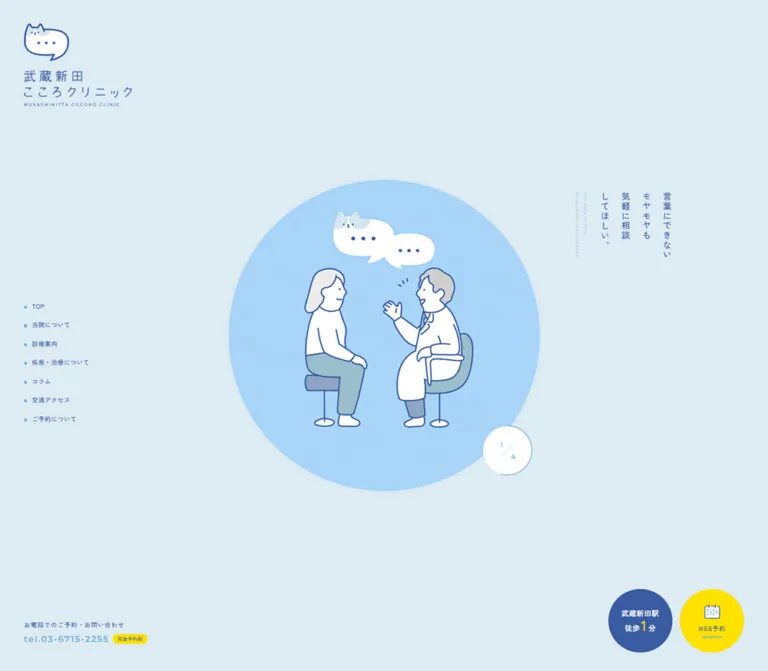
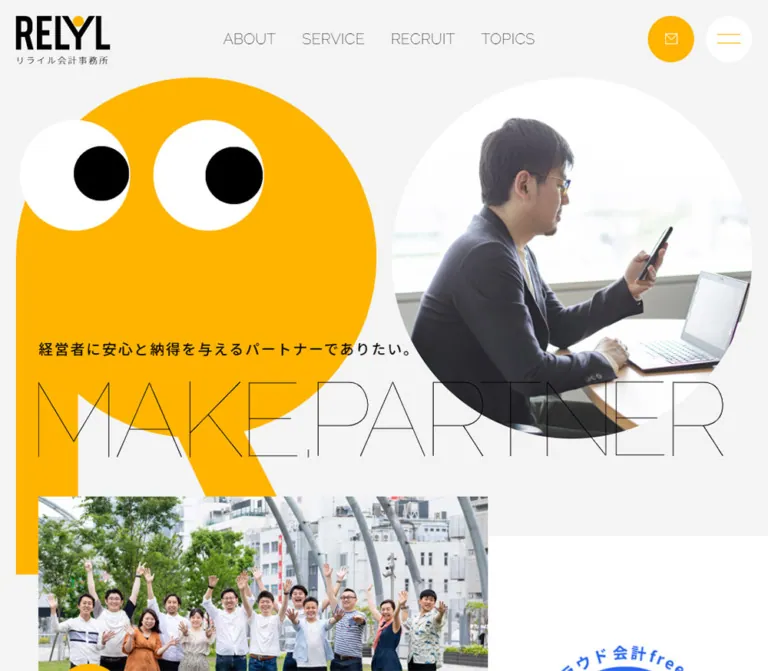
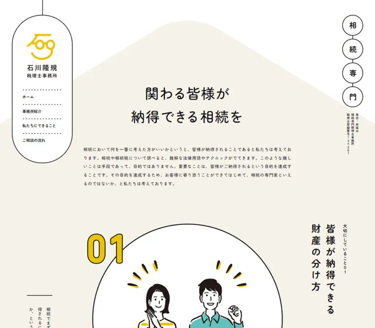
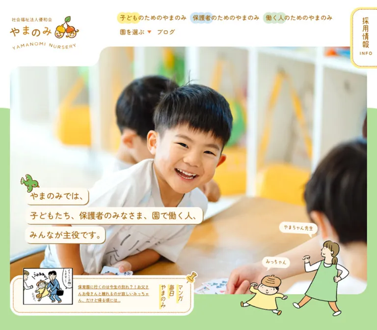
こどもさんかく歯科
淡い黄色と白を基調に、三色の三角形キャラクターと診療風景の写真を組み合わせた小児歯科サイト。丸みのある文字、縦書き見出し、親子に向けた予約・アクセス導線が特徴です。
Kodomo Sankaku Dental Clinic — Style Reference
A sunny pediatric clinic website where a child, a family, and a dentist become three friendly triangles.
Original URL: https://kodomo-sankaku.jp/ Final URL: https://kodomo-sankaku.jp/ Theme: light; white and pale yellow foundations with orange, blue, and yellow accents. Inspected: October 5, 2026, at 06:17:23 JST; supplied retrieval timestamp: October 4, 2026, at 21:17:23.196 UTC. Viewports: desktop 1440 × 1000 CSS pixels; mobile 390 × 844 CSS pixels. Scope: the current clinic homepage, including its captured opening presentation, mobile photographic hero, navigation, appointment and injury links, philosophy, service introductions, news and blog entries, clinic information, map area, and footer. Linked pages and external appointment flows were not inspected.
Kodomo Sankaku uses warmth and character to introduce a specialist medical practice. Rounded Japanese typography, generous line spacing, softly rounded panels, and warm brown text make substantial information feel approachable. Photography shows the physical clinic and relationships between children, caregivers, and staff. Three triangle characters repeat that relationship in an immediately recognizable visual shorthand: orange for the child, blue for the family, and yellow for the dentist.
The homepage is a long institutional and editorial page with several practical entry points. Its desktop document measures approximately 8365px high; the mobile document approximately 8151px. Philosophy, treatment information, announcements, booking, opening hours, and directions coexist. Preserve that balance between reassurance, explanation, and useful navigation.
閉じる
Kodomo Sankaku Dental Clinic — Style Reference
A sunny pediatric clinic website where a child, a family, and a dentist become three friendly triangles.
Original URL: https://kodomo-sankaku.jp/ Final URL: https://kodomo-sankaku.jp/ Theme: light; white and pale yellow foundations with orange, blue, and yellow accents. Inspected: October 5, 2026, at 06:17:23 JST; supplied retrieval timestamp: October 4, 2026, at 21:17:23.196 UTC. Viewports: desktop 1440 × 1000 CSS pixels; mobile 390 × 844 CSS pixels. Scope: the current clinic homepage, including its captured opening presentation, mobile photographic hero, navigation, appointment and injury links, philosophy, service introductions, news and blog entries, clinic information, map area, and footer. Linked pages and external appointment flows were not inspected.
Kodomo Sankaku uses warmth and character to introduce a specialist medical practice. Rounded Japanese typography, generous line spacing, softly rounded panels, and warm brown text make substantial information feel approachable. Photography shows the physical clinic and relationships between children, caregivers, and staff. Three triangle characters repeat that relationship in an immediately recognizable visual shorthand: orange for the child, blue for the family, and yellow for the dentist.
The homepage is a long institutional and editorial page with several practical entry points. Its desktop document measures approximately 8365px high; the mobile document approximately 8151px. Philosophy, treatment information, announcements, booking, opening hours, and directions coexist. Preserve that balance between reassurance, explanation, and useful navigation.
How to Read This Reference
- Measured means a value is present in the supplied rendered DOM or computed-style evidence. Measurements describe the captured viewport and state.
- Calculated means a relationship is derived from measured coordinates, such as column gaps or percentage widths.
- Visual estimate means a dimension or treatment is inferred from the supplied original-page screenshots. It is not a recovered CSS declaration or pixel sample.
- Recommended means guidance for a new implementation. Breakpoints, accessible enhancements, and the Quick Start are adaptations unless explicitly identified as measured.
- Token names are implementation aliases. The supplied custom-property inventories were empty; these names are not recovered source variables.
- Several prominent labels appear as graphic lettering, while their DOM heading wrappers contain no extracted text and inherit a 10px font size. Those wrapper styles do not measure the visible lettering.
- Desktop opening and mobile hero captures show different presentation states. Their relationship, transition timing, and dismissal mechanism were not established.
Tokens — Colors
Core Palette
| Name | Value | Suggested token | Evidence and role |
|---|---|---|---|
| Pale Lemon | #ffee9c |
--color-lemon |
Measured rgb(255, 238, 156) on philosophy, blog, and footer wrappers; large reassuring background fields |
| Direction Yellow | #ffe200 |
--color-yellow |
Measured rgb(255, 226, 0) on access, philosophy, and booking links; bright utility emphasis |
| Clinic Orange | #ea5413 |
--color-orange |
Measured rgb(234, 84, 19) on links and the mobile injury action bar |
| Orange Detail | #ea5514 |
--color-orange-detail |
Measured rgb(234, 85, 20) on the telephone number and positive schedule symbols; a small source variation |
| Family Blue | #0d6fb8 |
--color-blue |
Measured rgb(13, 111, 184) on the mobile appointment action bar and closed-day schedule symbols |
| Warm Brown | #643e2f |
--color-ink |
Measured rgb(100, 62, 47) on body copy and footer navigation |
| White | #ffffff |
--color-white |
Measured body and panel background; also visible in character details and reversed labels |
Character artwork uses related saturated colors. Its exact pigments were not separately sampled and should not be assumed to equal every CSS accent value.
Color Assignment
Use white and pale lemon for the largest areas. Brown carries explanatory text. Orange supplies brand lettering and many links; blue distinguishes selected navigation roles; bright yellow highlights directions and broad utility links.
Color semantics depend on placement. In the desktop side rail, booking is orange and questions are blue. In the mobile action pair, booking is blue and tooth injury is orange. A universal rule such as 'all booking buttons are orange' would lose this observed distinction.
The gray desktop map area is not a brand surface token. Its information card and surrounding controls render while the map tiles remain largely blank; the mobile capture includes street-map tiles. The cause of that difference is unverified.
Tokens — Typography
Rounded Japanese Text
Measured family stack:
'M PLUS Rounded 1c', 'Noto Sans Japanese',
'ヒラギノ角ゴ Pro', 'Hiragino Kaku Gothic Pro',
'メイリオ', Meiryo, Osaka, 'MS PGothic', sans-serif
The computed styles declare this stack. They do not independently establish which font file rendered every glyph.
Long-form copy generally uses weight 600, with generous line height. The result is friendly but substantial, appropriate for explaining a specialist service to parents. The page's root and body inherit 10px / 10px; that is a source sizing baseline, not its normal reading size.
Rounded Latin Numerals and Utilities
Comfortaa, cursive is explicitly measured on telephone links and the mobile menu-caption wrapper. Telephone numbers use regular weight at 27–28px. Do not extend this evidence into a claim that all English headings use Comfortaa.
Graphic Lettering
The logo, opening slogan, several Japanese navigation labels, vertical service labels, and section headings have a distinctive drawn appearance. Their visual forms include uneven handwritten strokes and outlined English lettering.
Preserve authorized graphic assets when available. A generic cursive font is not an established substitute. For a new project without those assets, use live rounded text and describe any custom lettering as a new design decision.
Measured Type Scale
| Role | Desktop | Mobile | Weight | Notes |
|---|---|---|---|---|
| Philosophy paragraphs | 18px / 40px |
16px / 28px |
600 |
Main explanatory reading text |
| Service explanatory paragraphs | 16px / 34px |
Not present in captured mobile visible text | 600 |
Desktop descriptions beneath the two service introductions |
| Blog titles | 20px / 30px |
17px / 28px |
600 |
Measured live headings |
| Blog excerpts | 15px / 28px |
Omitted from captured mobile visible text | 600 |
Text remains in the extracted link content |
| Lower news titles | 18px / 27px |
17px / 24px |
600 |
Separate from the upper announcement panel |
| Footer navigation | 16px / 16px |
14px / 14px |
600 |
Some mobile labels wrap across two lines |
| Footer editorial links | 16px / 16px |
15px / 15px |
600 |
News, questions, and blog links |
| Telephone number | 28px / 28px |
28px / 28px in footer |
400 |
Comfortaa; another mobile subtree measures 27px |
| Schedule day labels | 16px / 16px |
13px / 13px |
400 |
White text; parent header fill was not sampled |
| Schedule symbols | 20px / 20px |
14px / 14px |
600 |
Orange open/special symbols and blue closed symbols |
| Saturday schedule note | 15px / 15px |
14px / 14px |
600 |
Preserve the explanatory note with the table |
Most sampled text has normal letter spacing. Do not introduce broad tracking throughout the Japanese body copy.
Graphic Box Measurements
These are element bounds, not font sizes:
| Graphic role | Desktop bounds | Mobile bounds |
|---|---|---|
| Opening slogan heading | 512 × 103px |
Not captured |
| Main brand heading | 234 × 224px |
Approximately 167 × 159.9px |
| Philosophy heading | 476 × 33px |
176 × 76px |
| Promise statement heading | 552 × 92px |
307 × 50px |
| Vertical service heading | 38 × 280px |
28 × 195px |
| Blog section heading | 232 × 36px |
Approximately 190 × 29.5px |
The changed philosophy-heading proportions suggest a substantially different mobile presentation. The supplied evidence does not identify whether this uses alternate assets or another layout technique.
Tokens — Spacing & Shapes
The spacing system combines broad desktop sections with smaller inset reading areas. It is not a uniform small-card grid.
Layout Measurements
| Element | Desktop at 1440px | Mobile at 390px | Status |
|---|---|---|---|
| Document height | Approximately 8365px |
Approximately 8151px |
Measured |
| Main opening/hero block | 1440 × 1000px |
Approximately 390 × 491.4px |
Measured |
| Main header/base band | 215px high, starting at y=785 |
83px high, starting at y≈408.4 |
Measured |
| Wide content region | 1300px, 70px side margins |
Often 351px, 19.5px side margins |
Measured examples |
| Reading/blog region | 1200px, 120px side margins |
Usually 351px |
Measured examples |
| Philosophy paragraph width | 1200px |
Approximately 287.8px |
Measured; mobile inset is wider than ordinary content |
| Service columns | Approximately 640px each, 20px gap |
Stacked | Desktop visual estimate; mobile DOM positions |
| Blog columns | 372px each, 42px gaps |
351px featured entry, then two 168.5px entries |
Measured and calculated |
| Mobile action pair | Not this layout | Two 168.5 × 160px cards with approximately 14.1px gap |
Measured and calculated |
| Mobile access strip | Different desktop placement | 351 × 40px |
Measured |
| Directions link near map | 270 × 30px |
Approximately 370.5 × 94.1px |
Measured |
The common mobile content width is 90% of the viewport. The philosophy text is approximately 73.8% of the viewport, producing a calmer, narrower reading column.
Spacing Examples
| Use | Value | Evidence |
|---|---|---|
| Desktop wide-section margin | 70px |
Measured announcement and injury-link positions |
| Desktop reading-region margin | 120px |
Measured philosophy paragraphs and blog entries |
| Mobile standard horizontal inset | 19.5px |
Measured; 5% of 390px |
| Mobile action-card gap | Approximately 14.1px |
Calculated from card positions |
| Gap after mobile access strip | 35px |
Calculated from strip bottom to action-card top |
| Desktop service-copy inset | Approximately 32px |
Calculated from screenshot card edge and measured paragraph start |
| Desktop blog column gap | 42px |
Calculated from entry positions |
| Middle desktop blog offset | 50px downward |
Measured difference in entry top positions |
| Lower news-section padding | 75px top, 45px bottom |
Measured desktop |
| Lower news-section padding | 40px top and bottom |
Measured mobile |
Shape Vocabulary
| Element | Treatment | Evidence |
|---|---|---|
| Desktop announcement panel | 10px radius |
Measured |
| Desktop broad utility links | Usually 10px radius |
Measured |
| Mobile access and category links | Usually 5px radius |
Measured |
| Mobile action-card lower bars | 0 0 10px 10px |
Measured |
| Desktop rail's upper white panel | 30px 0 0 0 |
Measured initial-state wrapper |
| Opening white panel | Approximately 30px radius, 30px outer inset |
Visual estimate |
| Mobile menu corner | White corner panel with a large rounded lower-left corner | Observed; approximately 100 × 95px overall |
| Hero/footer boundaries | Broad white curves rather than straight section rules | Observed |
| Mobile bottom ending panel | Rounded lower corners above an orange outer strip | Observed; radius not measured |
Most content is flat. Small bottom-edge shadows are visible beneath some mobile controls, but no exact shadow declaration was supplied.
Components
Captured Opening Presentation
Role: introduces the clinic's central idea before the photographic and informational content visible elsewhere.
The desktop capture shows a white rounded rectangle inset approximately 30px into a pale-yellow viewport. Three characters form a broad triangle around the slogan: the orange child above, blue family character at lower left, and yellow dentist at lower right. Small rotated English role labels accompany them.
The measured slogan wrapper is centered at x=464, y=459.5, with a 512 × 103px box. The graphic combines an English line with the Japanese source slogan, ‘さいしょは、さんかく!’.
Leave substantial empty white space between these elements. The relationship between the three characters is more important than filling the panel with additional copy.
Limitation: this is an observed opening state. Its duration, dismissal trigger, and implementation as an overlay or section are unverified. Do not add an invented loading percentage or mandatory delay.
Photographic Hero and Overlapping Brand
Role: makes the clinic and its staff feel familiar before the visitor reads detailed information.
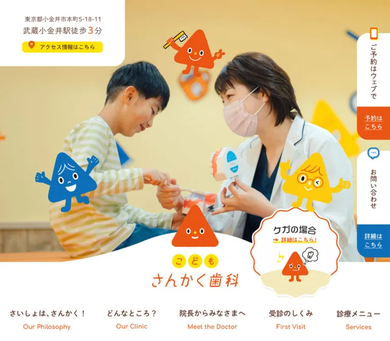
The mobile capture shows a caregiver and child speaking with a clinician in a bright yellow interior. Separate character illustrations sit over the photograph. A white curved lower boundary supports the orange triangle logo and the clinic wordmark.
At 390px wide, the main block is approximately 491.4px high. The white base begins at approximately 408.4px. The brand heading starts at y≈316.4, so the logo visibly overlaps the photographic region and the white base.
Desktop DOM geometry records a 1000px main block, a lower 215px header band, and a centered 234 × 224px brand box. The opening presentation obscures the desktop hero in the supplied original-page capture; its exact photographic frame should not be inferred.
Implementation recommendation: use a responsive image crop that retains the people and their interaction. Position mascots independently of the photo, and reserve the brand's overlap space to prevent layout shifts.
Desktop Primary Navigation
Role: distributes visitors across the clinic's main information areas.
Five links occupy the lower desktop header: philosophy, clinic information, doctor introduction, first visit, and services. Their measured boxes are 56px high and sit on one horizontal line beginning at y=915.
The rendered text exposes the English labels ‘Our Philosophy’, ‘Our Clinic’, ‘Meet the Doctor’, ‘First Visit’, and ‘Services’. Several Japanese labels elsewhere are graphic rather than extracted text.
Use a white background and ample horizontal separation. The navigation belongs below the hero composition, not in a dense dark bar at the very top.
Desktop Side Action Rail
Role: keeps booking and questions available while the visitor reads.
The scrolled desktop screenshots show two tabs attached to the right edge: an orange booking tab and a blue questions tab. Each has a white perimeter and a small icon that projects above the tab. Labels are short and stacked.
The initial DOM state measures two 90 × 290px anchors at x=1350, beginning at y=90 and y=410. Each includes a 200px white introductory region. The midpage and footer captures show compact tabs approximately 120px high near the top-right edge instead.
These are different evidenced states. Their persistent screen placement is consistent with a fixed rail, but the source position declaration and compaction threshold were not supplied.
| Action | Observed destination |
|---|---|
| Booking | https://plus.dentamap.jp/apl/netuser/?id=5542 |
| Questions/contact | https://kodomo-sankaku.jp/contact/ |
The destinations were observed as links, not exercised.
Mobile Menu Control
Role: replaces the desktop navigation presentation on the narrow viewport.
A white corner panel remains at the upper right in both the top and bottom mobile captures. Its icon uses blue, orange, and yellow strokes above the orange ‘Menu’ label. Preserve this small three-color signature.
The mobile DOM contains a navigation subtree with pale-yellow backing and white rounded entries: two half-width entries for first visit and services, followed by wider entries for philosophy, clinic, questions, and doctor introduction. Measured entry boxes include approximately 170.6 × 90px and 351 × 80px.
Limitation: the open menu was not captured or explicitly exercised. Nonzero DOM bounds do not establish visibility. Opening motion, close behavior, focus management, and scrolling within the menu remain unverified.
Mobile Access and Action Pair
Role: gives parents immediate access to directions, booking, and tooth-injury information.
The sequence directly beneath the brand is:
- A bright-yellow access strip,
351 × 40px, with an orange location icon and brown label. - A 35px vertical gap.
- Two equal cards, each approximately
168.5 × 160px.
Each card contains a Japanese title at the upper border, an English subtitle, a character illustration, and a 50px-high colored action bar. The measured upper area is approximately 110px high. The visible title sits in a white break in the colored outline, similar to a fieldset legend.
The appointment card uses blue and shows the family character with a phone. The injury card uses orange and shows a child character with a tooth-related callout. Keep the action labels, illustrations, and colors grouped within their respective cards.
The access link targets #map_area; the injury link targets /service/#kega.
Upper Announcement Panel
Role: introduces recent operational news before the longer clinic explanation.
Desktop uses a white 1300 × 317px rounded panel. Its measured padding is 33px 60px 18px 290px, leaving a substantial left region for the section identity. Three linked rows are approximately 86px high.
Mobile changes the composition: the panel is approximately 368.2px wide and 485px high, the heading sits beside a character, and dates and titles stack within each row. Row heights vary with title wrapping, including measured examples of 107px and 135px.
The current entries include a July 2026 staffing announcement, an April 2026 anniversary announcement, and a reservation-method update. These are dated editorial entries, not rotating promotional slides.
Philosophy Narrative
Role: explains why the clinic specializes in children and why the three-character relationship matters.
A pale-yellow section contains graphic headings, generous illustrated intervals, and brown explanatory paragraphs. The source copy explicitly describes the relationship among child, caregiver, and dentist.
Desktop paragraphs use 18px / 40px, weight 600, inside 1200px-wide boxes. Mobile uses 16px / 28px and an approximately 287.8px-wide column. Its narrower measure distinguishes the reflective narrative from the wider practical controls.
A bright-yellow philosophy link concludes the sequence. It measures 600 × 68px on desktop and approximately 280.8 × 78px on mobile. The taller mobile form accommodates a different label arrangement.
Preserve generous spacing around the illustrated explanations. Avoid forcing desktop line breaks into the mobile text.
Promise Introduction
Role: bridges the clinic's philosophy and its practical service routes.
The desktop capture combines outlined orange ‘Our Promises’ lettering, a small white label, a two-line brown promise statement, and the three characters grouped to the right.
The white label is measured at 220 × 36px with a 5px radius. The main statement's graphic wrapper is 552 × 92px. Its text sits above the paired service cards and gives the section a shared introduction.
Mobile separates and compresses these elements. The main statement wrapper becomes 307 × 50px; do not simply scale the entire desktop row down.
First Visit and Services Cards
Role: routes visitors to two major information areas while providing reassurance.
Desktop anatomy:
- A broad top composition combining a clinic photograph and a white vertical-label area.
- A mascot overlapping the image edge.
- A centered, underlined summary in the card's accent color.
- A brown explanatory paragraph.
- A pale-yellow destination link.
The two top compositions are visually approximately 640 × 340px, separated by 20px. The photo occupies roughly 69% of each width; the remainder holds the vertical Japanese title and smaller rotated English label. These proportions are visual estimates.
The first-visit photograph shows a caregiver and child entering the clinic. The services photograph shows a clinician treating a child. The two summaries use orange and blue respectively.
Desktop explanatory copy is measured at 16px / 34px, weight 600, in approximately 576px-wide boxes. The lower links are approximately 576 × 52px with 10px radii.
On mobile, the cards stack. Vertical heading boxes remain vertical but reduce from 38 × 280px to 28 × 195px. Summary text wraps into shorter lines, destination links become approximately 333.4 × 47.1px, and the desktop explanatory paragraphs are absent from the captured visible text.
Tooth-Injury Banner
Role: provides another entry to urgent injury guidance after the service introductions.
The linked region measures 1300 × 255px on desktop and approximately 390 × 318.8px on mobile. It targets /service/#kega.
The proportion change is substantial: mobile uses a taller, full-width composition. The detailed banner artwork was not visible in the supplied screenshots, so its layout should not be reconstructed from an unrelated image or assumed to be a cropped desktop banner.
Blog Entries and Category Links
Role: shows ongoing clinic activity and routes visitors into editorial content.
Desktop uses three linked entries, each 372px wide, separated by 42px. The middle entry begins 50px lower than the outer two. This modest stagger adds movement without changing the reading order.
Titles use orange 20px / 30px text; excerpts use brown 15px / 28px text. Dates and categories follow. The supplied DOM positions indicate a substantial leading region before each title, but the actual blog imagery is not visible in the provided screenshots and its exact crop is unverified.
Mobile creates one featured 351px-wide entry followed by two approximately 168.5px-wide entries. Titles use 17px / 28px. Excerpts are omitted from the visible mobile text, although they remain in the extracted anchor content.
Category links are white rounded rectangles. Desktop shows three 372 × 70px links in one row. Mobile uses two columns of approximately 168.5 × 45.5px, with the third link on the next row.
Lower News List
Role: repeats access to current notices near the clinic-information footer.
This is a separate list below the blog region. Desktop places its section identity to the left of three wide date/title rows. Mobile places the heading above stacked rows and uses 17px / 24px title text.
Keep the repeated content purposeful and consistent. Do not interpret the repeated article titles across sections as evidence of a carousel or duplicate-loading error.
Clinic Information and Schedule
Role: answers practical questions about booking, telephone contact, and opening hours.
The footer wrapper is pale yellow. Desktop distributes identity/contact information and a seven-day schedule across the width. Mobile stacks those regions and enlarges the booking link to approximately 301.9 × 58px.
The schedule includes two time rows, open/closed symbols, and a Saturday exception note. In the captured content, the standard rows read 9:30 - 13:00 and 14:00 - 18:00; Saturday is explained separately as 9:00-14:00.
Use a real table in an adaptation, with day and time headers. Preserve the relationship between special symbols and their explanatory note. The telephone link is live text in Comfortaa and points to tel:0423161813.
Map and Directions
Role: connects the clinic's identity to a recognizable place and arrival route.
The desktop screenshot shows a broad map region, visually approximately 1368px wide with 36px side margins and about 600px high. A clinic information card sits at its upper left. A framed facade photograph and yellow directions link sit at its upper right.
A white curved rise overlaps the map's lower edge, with the three characters holding hands at the center. Dental-tool illustrations decorate the outer edges.
On mobile, the map contains visible street tiles, the character trio remains at its lower boundary, and the facade/directions unit moves below it. That directions unit is measured at approximately 370.5 × 94.1px, with a 5px radius and 5px padding. Its facade image is visually about 140px wide.
The destination is /blog/139/. No embedded-map interaction was tested.
Footer Sitemap and Ending
Role: provides a final, complete navigation route after the practical information.
Desktop uses several link groups across the width. Orange circular arrow markers introduce the main navigation; blue, yellow, and orange pencil icons distinguish news, questions, and blog links.
Mobile uses two columns, with first-visit and service/injury entries spanning the full row. The three editorial links form a separate horizontal band bounded by thin brown rules. Copyright is centered with ample breathing room.
The mobile capture ends with a white panel whose lower corners are rounded above an orange strip. This is a nested surface treatment: the measured footer wrapper itself remains pale yellow.
Tokens — Motion & Interaction
| Treatment | Supplied evidence | Interpretation |
|---|---|---|
| General links | Computed transition of 0.3s |
Duration is measured; exact changing properties and end states are not consistently supplied |
| Upper news-title wrapper | color 0.2s |
A short color transition is declared; hover color was not captured |
| Blog excerpt text | color 0.3s |
A color transition is declared on desktop excerpt text |
| Lower news-title wrapper | Transition of 0.2s |
Duration measured; complete state behavior unverified |
| Sampled content wrappers | animation: none |
Applies only to those sampled elements |
| Desktop side rail | Tall initial DOM boxes and compact scrolled screenshots | Two states evidenced; threshold, mechanism, and transition timing unknown |
| Mobile menu | Closed control visible; navigation subtree present | Opening and closing interactions unverified |
| Opening character presentation | Static captured frame | Duration, dismissal, and character animation unverified |
| Hero photography | One current mobile frame supplied | Slideshow or image-change behavior not established |
| Access and service links | Href targets supplied | Destinations known; smooth scrolling and destination behavior not tested |
The capture process waited for load, image decoding, sampled layout stability, and finite animation readiness within bounded time limits. Perpetual animations were temporarily paused during readiness checks and resumed. This protocol does not prove the absence of delayed content, JavaScript motion, animated assets, or pseudo-element animation.
For an adaptation, restrained 200–300ms color or opacity feedback is appropriate. Treat that as a recommendation, not a recovered hover specification. No evidence supports adding continuous mascot bouncing, parallax, or an automatic photo carousel.
Surfaces
| Layer | Appearance | Purpose |
|---|---|---|
| Main canvas | White | Keeps photographs, lettering, and mascots clear |
| Narrative fields | Pale lemon | Groups philosophy, promises, editorial content, and clinic information |
| Inset panels | White with modest rounded corners | Announcements, utility groups, and graphic breathing space |
| Utility emphasis | Bright yellow | Access, directions, booking, and broad information links |
| Action bars | Blue or orange with light labels | Compact, visually distinct task routes |
| Image boundaries | Rounded corners and overlapping characters | Connects photography to the illustrated identity |
| Section seams | Broad white curves | Softens transitions around the hero and map |
| Mobile ending frame | White over an orange outer region | Gives the long page a deliberate visual finish |
There is no visible general-purpose glass, gradient, or heavy elevation system. Photography supplies natural tonal variation; the surrounding interface remains mostly flat.
Imagery
Character System
The three rounded triangle characters are structural brand assets, not interchangeable decorative icons.
- Orange child: small, energetic, smiling; appears with a toothbrush and in injury-related contexts.
- Blue family character: a larger triangular figure with hair-like white lines; appears welcoming and holding a phone in the appointment card.
- Yellow dentist: glasses and hair details; appears with a dental mirror or other dental tools.
Expressions and poses vary by context. White facial details and occasional dark outlines keep the figures readable on photographs and colored backgrounds. Characters overlap card edges and section boundaries rather than always sitting inside separate illustration boxes.
The opening panel arranges them as three points of a triangle. The footer brings them together holding hands. This change from separate roles to a connected group reinforces the source copy's relationship model.
Photography
Observed original-page photography includes:
- A mobile hero conversation among a caregiver, child, and clinician.
- A caregiver and child entering the clinic.
- A clinician treating a child.
- The yellow-fronted clinic exterior in the directions module.
Use bright, warm, natural-looking photographs with enough environmental context to establish the clinic. Preserve faces, gestures, and the parent–child–clinician relationship when cropping.
Supporting Illustration
Toothbrushes, mirrors, a book, and tooth-themed cups appear around section seams. These objects use simple saturated fills and drawn outlines. They extend the character world without competing with the main navigation.
Observed Asset References
Exact image URLs, filenames, formats, and native dimensions were not included in the supplied evidence. No asset paths are asserted here.
| Asset role | Verified placement | Implementation guidance |
|---|---|---|
| Main logo and wordmark | Hero overlap and footer identity | Preserve proportions; provide an accessible name |
| Opening slogan | Center of the desktop brand presentation | Treat visible lettering separately from inherited wrapper font size |
| Character pose variants | Opening, mobile hero, service cards, map/footer | Use separate transparent assets when authorized |
| Entry photograph | First-visit card | Retain the doorway and caregiver/child interaction |
| Treatment photograph | Services card | Keep clinician and child visible |
| Facade photograph | Directions unit | Use as a recognizable arrival landmark |
| Dental-tool decorations | Hero/footer seams | Keep decorative and outside important text areas |
CSS can reproduce the geometry and color system. It cannot reproduce the character identity or custom lettering without suitable artwork.
Layout & Responsive Behavior
Observed Recomposition
| Area | Desktop | Mobile |
|---|---|---|
| Opening viewport | Captured illustrated brand panel | Captured photographic hero and immediate utility actions |
| Main navigation | Five links across the lower header | Persistent upper-right Menu control |
| Task shortcuts | Right-edge booking/contact rail | Access strip plus booking/injury cards |
| Philosophy | Wide paragraph boxes and large illustrated intervals | Narrower reading column and shorter line height |
| Service introductions | Two columns | Stacked cards; vertical labels retained |
| Service descriptions | Long paragraphs visible | Paragraphs omitted from captured visible text |
| Injury route | Wide, shallow banner | Full-width, taller linked region |
| Blog | Three equal columns; center lowered 50px | One full-width entry above two smaller entries |
| Blog excerpts | Visible | Omitted from captured visible text |
| Category links | Three across | Two columns with a wrapped third link |
| Directions | Facade and link positioned over the map | Wide image-and-label unit beneath the map |
| Footer navigation | Multiple horizontal groups | Two columns with selected full-width rows |
No original media-query breakpoint was supplied. The Quick Start uses 768px as a recommended breakpoint, not a measured source value. Tablet and landscape behavior were not inspected.
The desktop document is only slightly taller than the mobile document despite substantial stacking. Mobile also reduces section heights, omits some explanatory text, and changes editorial hierarchy. A simple column collapse with all desktop spacing retained would produce a materially different result.
Retain logical source order when recreating the staggered desktop blog. Do not use visual positioning that changes keyboard or screen-reader reading order.
Do’s and Don’ts
Do
- Build the page around white, pale lemon, warm brown, and the three saturated character colors.
- Preserve the relationship among child, family, and dentist in illustration placement.
- Combine real clinic photography with independently positioned character artwork.
- Use rounded Japanese text with comfortable line height for substantial explanations.
- Keep the vertical title strips in the service introductions.
- Maintain separate visual treatments for narrative content, news, and practical actions.
- Recompose mobile priorities around access, booking, and injury information.
- Use the observed one-large-plus-two-small mobile blog hierarchy.
- Preserve the facade photograph as a useful arrival cue.
- Distinguish DOM measurements from the visible size of graphic lettering.
Don’t
- Don’t turn the homepage into an undifferentiated grid of identical cards.
- Don’t replace the three-character system with arbitrary colorful mascots.
- Don’t assume every orange element has the same functional meaning.
- Don’t assign the inherited 10px wrapper size to visible graphic headings.
- Don’t shrink the desktop navigation into an unreadable phone layout.
- Don’t crop people out of the photographs to preserve a rigid desktop ratio.
- Don’t interpret the blank desktop map tiles as an intentional gray design panel.
- Don’t invent an opening delay, carousel, menu animation, or mascot motion.
- Don’t give every surface a large shadow or glossy gradient.
- Don’t infer production details from the visual style alone.
Recommended Implementation Additions
These are recommendations for a new implementation, not verified original-site features:
- Give graphic headings and image-based links useful accessible text. The empty text fields in the extract are not a complete accessibility audit, but they make explicit naming important.
- Implement Menu as a button with
aria-expandedandaria-controls; support keyboard closing and return focus to the trigger. - Give mobile footer links and small utility controls comfortable touch targets, preferably at least 44px high.
- Check text contrast, particularly small white labels on orange and small orange text on white. Retain the palette while choosing an accessible text or fill treatment where needed.
- Keep a visible address and directions link available if the embedded map does not render.
- Use table headers and textual explanations for schedule symbols rather than relying only on color.
- Reserve image dimensions to keep the logo overlap, service cards, and news positions stable during loading.
- Provide reduced-motion behavior for any newly implemented opening or decorative animation. Essential content should remain available without waiting for motion.
- Ensure desktop side tabs and the mobile menu do not cover focused controls or important text.
Agent Prompt Guide
Quick Color Reference
- Main surface: white
#ffffff. - Narrative background: pale lemon
#ffee9c. - Main text: warm brown
#643e2f. - Brand/link orange:
#ea5413. - Blue accent:
#0d6fb8. - Access/directions yellow:
#ffe200. - Small measured orange variation:
#ea5514. - Use flat color fields; let photography supply tonal complexity.
Overall Prompt
“Create a responsive pediatric dental clinic homepage with the warmth of a children's picture book and the clarity of a practical local service website. Use white and pale lemon #ffee9c backgrounds, warm brown #643e2f body text, orange #ea5413, blue #0d6fb8, and bright yellow #ffe200. Pair rounded Japanese typography with authorized custom lettering and three friendly triangle characters representing a child, family, and dentist. Use warm clinic photography, white curved section seams, modest rounded corners, and character overlaps. Include philosophy, paired first-visit and services introductions with vertical labels, dated news, editorial entries, booking, opening hours, and directions. On mobile, prioritize a yellow access strip and two booking/injury cards; use one featured blog entry above two smaller entries. Keep unverified animation optional.”
Example Component Prompts
- Mobile action pair: “Inside a 351px-wide region, place a yellow 40px access strip above two approximately 168px-wide cards. Each card has a Japanese title interrupting the top outline, a small English subtitle, a triangle character, and a 50px action bar. Use blue for appointment and orange for tooth injury. Keep the controls readable and keyboard accessible.”
- Service introduction: “Create a desktop pair of broad clinic cards. Each top area combines a warm photograph at left with a white vertical Japanese title strip at right, plus a smaller rotated English label. Overlap a character at the photograph edge. Follow with an accent-colored underlined summary, brown 16px/34px copy, and a pale-yellow link. Stack the cards on mobile while retaining the vertical title.”
- Philosophy section: “Use a pale-yellow field, generous illustrated pauses, and brown rounded Japanese text. Set desktop paragraphs at 18px/40px and mobile paragraphs at 16px/28px. On a 390px phone, keep the reading column approximately 288px wide. Explain the relationship among child, caregiver, and dentist without crowding the illustration.”
- Blog hierarchy: “At desktop, arrange three 372px editorial entries with 42px gaps and lower the middle entry by 50px. Use orange titles and brown excerpts. On mobile, promote the first entry to full width and place the next two in equal smaller columns. Keep reading order unchanged.”
- Map ending: “Place a broad map above a white curved footer boundary, with three triangle characters holding hands across the seam. Include a real facade photograph and yellow directions link. On mobile, move the image-and-directions module below the map, then show a compact two-column sitemap and a separate editorial-link band.”
Quick Start
CSS Custom Properties
This is a reusable adaptation, not recovered source CSS. It uses a conventional root size, measured palette values, explicit reading sizes, and responsive relationships drawn from the two supplied viewports. The 768px breakpoint, hover feedback, focus styling, and selected intermediate layouts are recommendations.
Load the named fonts separately if authorized and available. Supply real image assets in the markup; this CSS does not invent asset URLs. Menu behavior, map embedding, and any opening presentation require separate implementation.
:root {
  /* Measured palette; names are implementation aliases. */
  --color-white: #ffffff;
  --color-lemon: #ffee9c;
  --color-yellow: #ffe200;
  --color-orange: #ea5413;
  --color-orange-detail: #ea5514;
  --color-blue: #0d6fb8;
  --color-ink: #643e2f;

  /* Declared source families; font loading is separate. */
  --font-jp: 'M PLUS Rounded 1c', 'Noto Sans Japanese',
    'ヒラギノ角ゴ Pro', 'Hiragino Kaku Gothic Pro',
    'メイリオ', Meiryo, Osaka, 'MS PGothic', sans-serif;
  --font-latin: Comfortaa, cursive;

  --content-wide: 1300px;
  --content-reading: 1200px;
  --gutter: clamp(20px, 4.8611vw, 70px);
  --radius-card: 10px;
  --radius-small: 5px;
  --radius-display: 30px;
  --motion-link: 300ms;
  --motion-text: 200ms;
}

* {
  box-sizing: border-box;
}

body {
  margin: 0;
  color: var(--color-ink);
  background: var(--color-white);
  font-family: var(--font-jp);
  font-size: 16px;
  font-weight: 600;
  line-height: 1.75;
}

img {
  display: block;
  max-width: 100%;
  height: auto;
}

button,
input {
  font: inherit;
}

a {
  color: var(--color-orange);
  text-underline-offset: 0.2em;
  transition: color var(--motion-text);
}

.container,
.container-wide {
  width: calc(100% - 2 * var(--gutter));
  margin-inline: auto;
}

.container {
  max-width: var(--content-reading);
}

.container-wide {
  max-width: var(--content-wide);
}

.lemon-section {
  background: var(--color-lemon);
}

/* Optional styling for the separately captured brand state. */
.brand-stage {
  padding: 30px;
  background: var(--color-lemon);
}

.brand-stage__panel {
  position: relative;
  min-height: calc(100svh - 60px);
  border-radius: var(--radius-display);
  background: var(--color-white);
}

.brand-stage__title {
  position: absolute;
  inset: 50% auto auto 50%;
  width: min(512px, 75%);
  margin: 0;
  transform: translate(-50%, -50%);
}

/* Photographs and decorative assets remain separate elements. */
.photo-scene {
  position: relative;
  isolation: isolate;
}

.photo-scene__photo {
  width: 100%;
  height: 100%;
  object-fit: cover;
}

.photo-scene__decoration {
  position: absolute;
  pointer-events: none;
}

/* Recommended approximation of the observed white curve. */
.curved-white-edge {
  position: relative;
  background: var(--color-white);
}

.curved-white-edge::before {
  content: '';
  position: absolute;
  inset: -55px 0 auto;
  height: 56px;
  border-radius: 50% 50% 0 0 / 100% 100% 0 0;
  background: var(--color-white);
  pointer-events: none;
}

.desktop-nav {
  display: flex;
  justify-content: space-between;
  align-items: center;
  gap: 24px;
}

.desktop-nav a {
  display: grid;
  min-height: 56px;
  align-content: center;
  text-align: center;
  text-decoration: none;
}

.menu-toggle,
.mobile-actions {
  display: none;
}

.access-link {
  display: flex;
  min-height: 40px;
  align-items: center;
  justify-content: center;
  gap: 8px;
  padding: 8px 15px;
  border-radius: var(--radius-card);
  color: var(--color-ink);
  background: var(--color-yellow);
  text-decoration: none;
}

.action-pair {
  display: grid;
  grid-template-columns: repeat(2, minmax(0, 1fr));
  gap: 4%;
  margin-top: 35px;
}

.action-card {
  --action-color: var(--color-blue);
  position: relative;
  display: grid;
  grid-template-rows: 110px 50px;
  color: var(--color-ink);
  text-align: center;
  text-decoration: none;
}

.action-card--injury {
  --action-color: var(--color-orange);
}

.action-card__body {
  position: relative;
  padding: 10px 8px 0;
  border: 3px solid var(--action-color);
  border-bottom: 0;
  border-radius: 10px 10px 0 0;
  background: var(--color-white);
}

.action-card__title {
  position: absolute;
  top: -10px;
  left: 50%;
  margin: 0;
  padding-inline: 8px;
  background: var(--color-white);
  font-size: 16px;
  line-height: 20px;
  white-space: nowrap;
  transform: translateX(-50%);
}

.action-card__subtitle {
  display: block;
  font-size: 14px;
  font-weight: 400;
  line-height: 20px;
}

.action-card__mascot {
  width: auto;
  max-width: 75%;
  height: 68px;
  margin: 8px auto 0;
  object-fit: contain;
}

.action-card__bar {
  display: grid;
  place-items: center;
  padding-inline: 8px;
  border-radius: 0 0 10px 10px;
  color: var(--color-white);
  background: var(--action-color);
  font-size: 16px;
}

.philosophy {
  padding-block: 70px 80px;
  background: var(--color-lemon);
}

.philosophy__copy {
  max-width: 1200px;
  margin-inline: auto;
  font-size: 18px;
  line-height: 40px;
}

.philosophy__copy p {
  margin: 0 0 15px;
}

.service-grid {
  display: grid;
  grid-template-columns: repeat(2, minmax(0, 1fr));
  gap: 20px;
}

.service-card {
  --service-accent: var(--color-orange);
  min-width: 0;
}

.service-card--blue {
  --service-accent: var(--color-blue);
}

.service-card__visual {
  position: relative;
  display: grid;
  grid-template-columns: 69% 31%;
  min-height: 340px;
  border-radius: var(--radius-card);
  background: var(--color-white);
}

.service-card__photo {
  width: 100%;
  height: 340px;
  object-fit: cover;
  border-radius: 10px 0 30px 10px;
}

.service-card__label {
  display: flex;
  align-items: center;
  justify-content: center;
  gap: 12px;
  padding: 20px 12px;
  color: var(--service-accent);
}

/* Live-text substitute, not a claim about original artwork. */
.service-card__title {
  margin: 0;
  writing-mode: vertical-rl;
  font-size: 36px;
  font-weight: 400;
  line-height: 1.2;
}

.service-card__english {
  writing-mode: vertical-rl;
  font-size: 16px;
  line-height: 1;
}

.service-card__copy {
  padding: 36px 32px 0;
}

.service-card__summary {
  margin: 0 0 24px;
  color: var(--service-accent);
  font-size: 22px;
  line-height: 1.5;
  text-align: center;
  text-decoration: underline;
  text-underline-offset: 0.25em;
}

.service-card__description {
  margin: 0;
  font-size: 16px;
  line-height: 34px;
}

.service-card__link {
  display: grid;
  min-height: 52px;
  place-items: center;
  margin-top: 28px;
  padding: 12px 16px;
  border-radius: 10px;
  background: var(--color-lemon);
  text-decoration: none;
}

.blog-grid {
  display: grid;
  grid-template-columns: repeat(3, minmax(0, 1fr));
  gap: 42px;
  align-items: start;
}

.blog-card {
  min-width: 0;
  text-decoration: none;
}

.blog-card:nth-child(2) {
  margin-top: 50px;
}

.blog-card__title {
  margin: 20px 0 10px;
  font-size: 20px;
  font-weight: 600;
  line-height: 30px;
}

.blog-card__excerpt {
  margin: 0;
  color: var(--color-ink);
  font-size: 15px;
  line-height: 28px;
}

.blog-card__meta {
  margin-top: 20px;
  font-size: 14px;
}

.news-row {
  display: grid;
  grid-template-columns: 105px minmax(0, 1fr);
  gap: 20px;
  padding-block: 25px;
  text-decoration: none;
}

.news-row__title {
  margin: 0;
  font-size: 18px;
  line-height: 27px;
}

.clinic-phone {
  color: var(--color-orange-detail);
  font-family: var(--font-latin);
  font-size: 28px;
  font-weight: 400;
  line-height: 1;
}

.directions-card {
  display: flex;
  align-items: center;
  gap: 15px;
  padding: 5px;
  border-radius: 5px;
  color: var(--color-ink);
  background: var(--color-yellow);
}

.directions-card img {
  width: 140px;
  border: 3px solid var(--color-white);
  border-radius: 5px;
}

.footer-nav {
  display: grid;
  grid-template-columns: repeat(3, minmax(0, 1fr));
  gap: 12px 30px;
}

.footer-nav a {
  display: flex;
  min-height: 44px;
  align-items: center;
  gap: 10px;
  color: var(--color-ink);
  font-size: 16px;
  text-decoration: none;
}

/* Recommended focus and pointer feedback. */
:where(a, button):focus-visible {
  outline: 3px solid var(--color-blue);
  outline-offset: 4px;
}

@media (hover: hover) {
  .desktop-nav a:hover,
  .footer-nav a:hover {
    color: var(--color-orange);
    text-decoration: underline;
  }
}

@media (max-width: 767px) {
  :root {
    --gutter: 5vw;
    --radius-card: 5px;
  }

  .desktop-nav {
    display: none;
  }

  .menu-toggle {
    position: fixed;
    z-index: 20;
    inset: 0 0 auto auto;
    display: grid;
    width: 100px;
    height: 95px;
    place-content: center;
    gap: 8px;
    border: 0;
    border-radius: 0 0 0 30px;
    color: var(--color-orange);
    background: var(--color-white);
    font-family: var(--font-latin);
  }

  .mobile-actions {
    display: block;
    padding-top: 15px;
  }

  .access-link {
    border-radius: 5px;
  }

  .philosophy {
    padding-block: 20px 40px;
  }

  .philosophy__copy {
    width: min(100%, 73.8vw);
    font-size: 16px;
    line-height: 28px;
  }

  .philosophy__copy p {
    margin-bottom: 10px;
  }

  .service-grid {
    grid-template-columns: minmax(0, 1fr);
    gap: 50px;
  }

  .service-card__visual {
    min-height: 250px;
  }

  .service-card__photo {
    height: 250px;
  }

  .service-card__label {
    gap: 7px;
    padding-inline: 8px;
  }

  .service-card__title {
    font-size: 28px;
  }

  .service-card__english {
    font-size: 13px;
  }

  .service-card__copy {
    padding: 25px 9px 0;
  }

  .service-card__summary {
    font-size: 18px;
    line-height: 28px;
  }

  .service-card__description,
  .blog-card__excerpt {
    display: none;
  }

  .service-card__link {
    min-height: 47px;
    border-radius: 5px;
  }

  .blog-grid {
    grid-template-columns: repeat(2, minmax(0, 1fr));
    gap: 30px 4%;
  }

  .blog-card:first-child {
    grid-column: 1 / -1;
  }

  .blog-card:nth-child(2) {
    margin-top: 0;
  }

  .blog-card__title {
    font-size: 17px;
    line-height: 28px;
  }

  .news-row {
    grid-template-columns: minmax(0, 1fr);
    gap: 12px;
    padding: 30px 14px 25px;
  }

  .news-row__title {
    font-size: 17px;
    line-height: 24px;
  }

  .footer-nav {
    grid-template-columns: repeat(2, minmax(0, 1fr));
    gap: 6px 12px;
  }

  .footer-nav a {
    font-size: 14px;
    line-height: 1.4;
  }

  .footer-nav__wide {
    grid-column: 1 / -1;
  }
}

@media (prefers-reduced-motion: reduce) {
  a,
  button {
    transition: none;
  }
}
The service-photo heights, live-text graphic substitutes, and intermediate spacing in this code are recommended approximations. The original mobile service-photo bounds were not supplied. The footer's 44px link targets deliberately improve on the compact measured text boxes and may increase total page height.
Tailwind v4 Token Mapping
Optional aliases for a project already using Tailwind v4. This does not imply that the original website uses Tailwind. Define the custom properties above first.
@theme inline {
  --color-clinic-white: var(--color-white);
  --color-clinic-lemon: var(--color-lemon);
  --color-clinic-yellow: var(--color-yellow);
  --color-clinic-orange: var(--color-orange);
  --color-clinic-blue: var(--color-blue);
  --color-clinic-ink: var(--color-ink);

  --font-rounded-jp: var(--font-jp);
  --font-rounded-latin: var(--font-latin);

  --text-clinic-body: 16px;
  --text-clinic-editorial: 20px;
  --text-clinic-phone: 28px;

  --spacing-clinic-gutter: var(--gutter);
  --radius-clinic-card: var(--radius-card);
  --radius-clinic-display: var(--radius-display);
}
Sources & Evidence
- Inspected original and final page: https://kodomo-sankaku.jp/. The supplied record reports HTTP 200 and the same original/final URL.
- Capture timestamp:
2026-10-04T21:17:23.196Z, equivalent to October 5, 2026, 06:17:23.196 JST. - Desktop evidence: 1440 × 1000 viewport; opening presentation, promises/service region, and map/footer screenshots; rendered element bounds, text, destinations, and computed styles across the homepage.
- Mobile evidence: 390 × 844 viewport; photographic hero/action area and map/footer screenshots; rendered element bounds, text, destinations, and computed styles across the homepage.
- Measured document extents: approximately 8364.55px desktop and 8150.94px mobile.
- Interaction scope: supplied scroll captures and observed link targets. No verified menu opening, hover endpoint, booking submission, telephone activation, or embedded-map interaction.
- Limitations: no complete stylesheet, asset manifest, native image dimensions, original breakpoint declarations, or full animation timeline was supplied. Graphic-wrapper font sizes do not establish visible lettering sizes. Some DOM subtrees have bounds without being visible in the supplied state. Desktop map tiles are incomplete in the capture, while mobile tiles are visible.
This reference describes the current homepage evidenced by those captures and rendered records. Recommended CSS, accessibility changes, and responsive interpolation are explicitly separated from observed original-page behavior.
# Kodomo Sankaku Dental Clinic — Style Reference

> A sunny pediatric clinic website where a child, a family, and a dentist become three friendly triangles.

**Original URL:** [https://kodomo-sankaku.jp/](https://kodomo-sankaku.jp/)
**Final URL:** [https://kodomo-sankaku.jp/](https://kodomo-sankaku.jp/)
**Theme:** light; white and pale yellow foundations with orange, blue, and yellow accents.
**Inspected:** October 5, 2026, at 06:17:23 JST; supplied retrieval timestamp: October 4, 2026, at 21:17:23.196 UTC.
**Viewports:** desktop 1440 × 1000 CSS pixels; mobile 390 × 844 CSS pixels.
**Scope:** the current clinic homepage, including its captured opening presentation, mobile photographic hero, navigation, appointment and injury links, philosophy, service introductions, news and blog entries, clinic information, map area, and footer. Linked pages and external appointment flows were not inspected.

Kodomo Sankaku uses warmth and character to introduce a specialist medical practice. Rounded Japanese typography, generous line spacing, softly rounded panels, and warm brown text make substantial information feel approachable. Photography shows the physical clinic and relationships between children, caregivers, and staff. Three triangle characters repeat that relationship in an immediately recognizable visual shorthand: orange for the child, blue for the family, and yellow for the dentist.

The homepage is a long institutional and editorial page with several practical entry points. Its desktop document measures approximately 8365px high; the mobile document approximately 8151px. Philosophy, treatment information, announcements, booking, opening hours, and directions coexist. Preserve that balance between reassurance, explanation, and useful navigation.
閉じる
# Kodomo Sankaku Dental Clinic — Style Reference

> A sunny pediatric clinic website where a child, a family, and a dentist become three friendly triangles.

**Original URL:** [https://kodomo-sankaku.jp/](https://kodomo-sankaku.jp/)
**Final URL:** [https://kodomo-sankaku.jp/](https://kodomo-sankaku.jp/)
**Theme:** light; white and pale yellow foundations with orange, blue, and yellow accents.
**Inspected:** October 5, 2026, at 06:17:23 JST; supplied retrieval timestamp: October 4, 2026, at 21:17:23.196 UTC.
**Viewports:** desktop 1440 × 1000 CSS pixels; mobile 390 × 844 CSS pixels.
**Scope:** the current clinic homepage, including its captured opening presentation, mobile photographic hero, navigation, appointment and injury links, philosophy, service introductions, news and blog entries, clinic information, map area, and footer. Linked pages and external appointment flows were not inspected.

Kodomo Sankaku uses warmth and character to introduce a specialist medical practice. Rounded Japanese typography, generous line spacing, softly rounded panels, and warm brown text make substantial information feel approachable. Photography shows the physical clinic and relationships between children, caregivers, and staff. Three triangle characters repeat that relationship in an immediately recognizable visual shorthand: orange for the child, blue for the family, and yellow for the dentist.

The homepage is a long institutional and editorial page with several practical entry points. Its desktop document measures approximately 8365px high; the mobile document approximately 8151px. Philosophy, treatment information, announcements, booking, opening hours, and directions coexist. Preserve that balance between reassurance, explanation, and useful navigation.

## How to Read This Reference

- **Measured** means a value is present in the supplied rendered DOM or computed-style evidence. Measurements describe the captured viewport and state.
- **Calculated** means a relationship is derived from measured coordinates, such as column gaps or percentage widths.
- **Visual estimate** means a dimension or treatment is inferred from the supplied original-page screenshots. It is not a recovered CSS declaration or pixel sample.
- **Recommended** means guidance for a new implementation. Breakpoints, accessible enhancements, and the Quick Start are adaptations unless explicitly identified as measured.
- Token names are implementation aliases. The supplied custom-property inventories were empty; these names are not recovered source variables.
- Several prominent labels appear as graphic lettering, while their DOM heading wrappers contain no extracted text and inherit a 10px font size. Those wrapper styles do not measure the visible lettering.
- Desktop opening and mobile hero captures show different presentation states. Their relationship, transition timing, and dismissal mechanism were not established.

## Tokens — Colors

### Core Palette

| Name | Value | Suggested token | Evidence and role |
| --- | --- | --- | --- |
| Pale Lemon | `#ffee9c` | `--color-lemon` | Measured `rgb(255, 238, 156)` on philosophy, blog, and footer wrappers; large reassuring background fields |
| Direction Yellow | `#ffe200` | `--color-yellow` | Measured `rgb(255, 226, 0)` on access, philosophy, and booking links; bright utility emphasis |
| Clinic Orange | `#ea5413` | `--color-orange` | Measured `rgb(234, 84, 19)` on links and the mobile injury action bar |
| Orange Detail | `#ea5514` | `--color-orange-detail` | Measured `rgb(234, 85, 20)` on the telephone number and positive schedule symbols; a small source variation |
| Family Blue | `#0d6fb8` | `--color-blue` | Measured `rgb(13, 111, 184)` on the mobile appointment action bar and closed-day schedule symbols |
| Warm Brown | `#643e2f` | `--color-ink` | Measured `rgb(100, 62, 47)` on body copy and footer navigation |
| White | `#ffffff` | `--color-white` | Measured body and panel background; also visible in character details and reversed labels |

Character artwork uses related saturated colors. Its exact pigments were not separately sampled and should not be assumed to equal every CSS accent value.

### Color Assignment

Use white and pale lemon for the largest areas. Brown carries explanatory text. Orange supplies brand lettering and many links; blue distinguishes selected navigation roles; bright yellow highlights directions and broad utility links.

Color semantics depend on placement. In the desktop side rail, booking is orange and questions are blue. In the mobile action pair, booking is blue and tooth injury is orange. A universal rule such as 'all booking buttons are orange' would lose this observed distinction.

The gray desktop map area is not a brand surface token. Its information card and surrounding controls render while the map tiles remain largely blank; the mobile capture includes street-map tiles. The cause of that difference is unverified.

## Tokens — Typography

### Rounded Japanese Text

**Measured family stack:**

```css
'M PLUS Rounded 1c', 'Noto Sans Japanese',
'ヒラギノ角ゴ Pro', 'Hiragino Kaku Gothic Pro',
'メイリオ', Meiryo, Osaka, 'MS PGothic', sans-serif
```

The computed styles declare this stack. They do not independently establish which font file rendered every glyph.

Long-form copy generally uses weight `600`, with generous line height. The result is friendly but substantial, appropriate for explaining a specialist service to parents. The page's root and body inherit `10px / 10px`; that is a source sizing baseline, not its normal reading size.

### Rounded Latin Numerals and Utilities

`Comfortaa, cursive` is explicitly measured on telephone links and the mobile menu-caption wrapper. Telephone numbers use regular weight at 27–28px. Do not extend this evidence into a claim that all English headings use Comfortaa.

### Graphic Lettering

The logo, opening slogan, several Japanese navigation labels, vertical service labels, and section headings have a distinctive drawn appearance. Their visual forms include uneven handwritten strokes and outlined English lettering.

Preserve authorized graphic assets when available. A generic cursive font is not an established substitute. For a new project without those assets, use live rounded text and describe any custom lettering as a new design decision.

### Measured Type Scale

| Role | Desktop | Mobile | Weight | Notes |
| --- | --- | --- | --- | --- |
| Philosophy paragraphs | `18px / 40px` | `16px / 28px` | `600` | Main explanatory reading text |
| Service explanatory paragraphs | `16px / 34px` | Not present in captured mobile visible text | `600` | Desktop descriptions beneath the two service introductions |
| Blog titles | `20px / 30px` | `17px / 28px` | `600` | Measured live headings |
| Blog excerpts | `15px / 28px` | Omitted from captured mobile visible text | `600` | Text remains in the extracted link content |
| Lower news titles | `18px / 27px` | `17px / 24px` | `600` | Separate from the upper announcement panel |
| Footer navigation | `16px / 16px` | `14px / 14px` | `600` | Some mobile labels wrap across two lines |
| Footer editorial links | `16px / 16px` | `15px / 15px` | `600` | News, questions, and blog links |
| Telephone number | `28px / 28px` | `28px / 28px` in footer | `400` | Comfortaa; another mobile subtree measures 27px |
| Schedule day labels | `16px / 16px` | `13px / 13px` | `400` | White text; parent header fill was not sampled |
| Schedule symbols | `20px / 20px` | `14px / 14px` | `600` | Orange open/special symbols and blue closed symbols |
| Saturday schedule note | `15px / 15px` | `14px / 14px` | `600` | Preserve the explanatory note with the table |

Most sampled text has normal letter spacing. Do not introduce broad tracking throughout the Japanese body copy.

### Graphic Box Measurements

These are element bounds, not font sizes:

| Graphic role | Desktop bounds | Mobile bounds |
| --- | --- | --- |
| Opening slogan heading | `512 × 103px` | Not captured |
| Main brand heading | `234 × 224px` | Approximately `167 × 159.9px` |
| Philosophy heading | `476 × 33px` | `176 × 76px` |
| Promise statement heading | `552 × 92px` | `307 × 50px` |
| Vertical service heading | `38 × 280px` | `28 × 195px` |
| Blog section heading | `232 × 36px` | Approximately `190 × 29.5px` |

The changed philosophy-heading proportions suggest a substantially different mobile presentation. The supplied evidence does not identify whether this uses alternate assets or another layout technique.

## Tokens — Spacing & Shapes

The spacing system combines broad desktop sections with smaller inset reading areas. It is not a uniform small-card grid.

### Layout Measurements

| Element | Desktop at 1440px | Mobile at 390px | Status |
| --- | --- | --- | --- |
| Document height | Approximately `8365px` | Approximately `8151px` | Measured |
| Main opening/hero block | `1440 × 1000px` | Approximately `390 × 491.4px` | Measured |
| Main header/base band | `215px` high, starting at `y=785` | `83px` high, starting at `y≈408.4` | Measured |
| Wide content region | `1300px`, `70px` side margins | Often `351px`, `19.5px` side margins | Measured examples |
| Reading/blog region | `1200px`, `120px` side margins | Usually `351px` | Measured examples |
| Philosophy paragraph width | `1200px` | Approximately `287.8px` | Measured; mobile inset is wider than ordinary content |
| Service columns | Approximately `640px` each, `20px` gap | Stacked | Desktop visual estimate; mobile DOM positions |
| Blog columns | `372px` each, `42px` gaps | `351px` featured entry, then two `168.5px` entries | Measured and calculated |
| Mobile action pair | Not this layout | Two `168.5 × 160px` cards with approximately `14.1px` gap | Measured and calculated |
| Mobile access strip | Different desktop placement | `351 × 40px` | Measured |
| Directions link near map | `270 × 30px` | Approximately `370.5 × 94.1px` | Measured |

The common mobile content width is 90% of the viewport. The philosophy text is approximately 73.8% of the viewport, producing a calmer, narrower reading column.

### Spacing Examples

| Use | Value | Evidence |
| --- | --- | --- |
| Desktop wide-section margin | `70px` | Measured announcement and injury-link positions |
| Desktop reading-region margin | `120px` | Measured philosophy paragraphs and blog entries |
| Mobile standard horizontal inset | `19.5px` | Measured; 5% of 390px |
| Mobile action-card gap | Approximately `14.1px` | Calculated from card positions |
| Gap after mobile access strip | `35px` | Calculated from strip bottom to action-card top |
| Desktop service-copy inset | Approximately `32px` | Calculated from screenshot card edge and measured paragraph start |
| Desktop blog column gap | `42px` | Calculated from entry positions |
| Middle desktop blog offset | `50px` downward | Measured difference in entry top positions |
| Lower news-section padding | `75px` top, `45px` bottom | Measured desktop |
| Lower news-section padding | `40px` top and bottom | Measured mobile |

### Shape Vocabulary

| Element | Treatment | Evidence |
| --- | --- | --- |
| Desktop announcement panel | `10px` radius | Measured |
| Desktop broad utility links | Usually `10px` radius | Measured |
| Mobile access and category links | Usually `5px` radius | Measured |
| Mobile action-card lower bars | `0 0 10px 10px` | Measured |
| Desktop rail's upper white panel | `30px 0 0 0` | Measured initial-state wrapper |
| Opening white panel | Approximately `30px` radius, `30px` outer inset | Visual estimate |
| Mobile menu corner | White corner panel with a large rounded lower-left corner | Observed; approximately `100 × 95px` overall |
| Hero/footer boundaries | Broad white curves rather than straight section rules | Observed |
| Mobile bottom ending panel | Rounded lower corners above an orange outer strip | Observed; radius not measured |

Most content is flat. Small bottom-edge shadows are visible beneath some mobile controls, but no exact shadow declaration was supplied.

## Components

### Captured Opening Presentation

**Role:** introduces the clinic's central idea before the photographic and informational content visible elsewhere.

The desktop capture shows a white rounded rectangle inset approximately 30px into a pale-yellow viewport. Three characters form a broad triangle around the slogan: the orange child above, blue family character at lower left, and yellow dentist at lower right. Small rotated English role labels accompany them.

The measured slogan wrapper is centered at `x=464`, `y=459.5`, with a `512 × 103px` box. The graphic combines an English line with the Japanese source slogan, ‘さいしょは、さんかく!’.

Leave substantial empty white space between these elements. The relationship between the three characters is more important than filling the panel with additional copy.

**Limitation:** this is an observed opening state. Its duration, dismissal trigger, and implementation as an overlay or section are unverified. Do not add an invented loading percentage or mandatory delay.

### Photographic Hero and Overlapping Brand

**Role:** makes the clinic and its staff feel familiar before the visitor reads detailed information.

The mobile capture shows a caregiver and child speaking with a clinician in a bright yellow interior. Separate character illustrations sit over the photograph. A white curved lower boundary supports the orange triangle logo and the clinic wordmark.

At 390px wide, the main block is approximately 491.4px high. The white base begins at approximately 408.4px. The brand heading starts at `y≈316.4`, so the logo visibly overlaps the photographic region and the white base.

Desktop DOM geometry records a 1000px main block, a lower 215px header band, and a centered `234 × 224px` brand box. The opening presentation obscures the desktop hero in the supplied original-page capture; its exact photographic frame should not be inferred.

**Implementation recommendation:** use a responsive image crop that retains the people and their interaction. Position mascots independently of the photo, and reserve the brand's overlap space to prevent layout shifts.

### Desktop Primary Navigation

**Role:** distributes visitors across the clinic's main information areas.

Five links occupy the lower desktop header: philosophy, clinic information, doctor introduction, first visit, and services. Their measured boxes are 56px high and sit on one horizontal line beginning at `y=915`.

The rendered text exposes the English labels ‘Our Philosophy’, ‘Our Clinic’, ‘Meet the Doctor’, ‘First Visit’, and ‘Services’. Several Japanese labels elsewhere are graphic rather than extracted text.

Use a white background and ample horizontal separation. The navigation belongs below the hero composition, not in a dense dark bar at the very top.

### Desktop Side Action Rail

**Role:** keeps booking and questions available while the visitor reads.

The scrolled desktop screenshots show two tabs attached to the right edge: an orange booking tab and a blue questions tab. Each has a white perimeter and a small icon that projects above the tab. Labels are short and stacked.

The initial DOM state measures two `90 × 290px` anchors at `x=1350`, beginning at `y=90` and `y=410`. Each includes a 200px white introductory region. The midpage and footer captures show compact tabs approximately 120px high near the top-right edge instead.

These are different evidenced states. Their persistent screen placement is consistent with a fixed rail, but the source position declaration and compaction threshold were not supplied.

| Action | Observed destination |
| --- | --- |
| Booking | `https://plus.dentamap.jp/apl/netuser/?id=5542` |
| Questions/contact | `https://kodomo-sankaku.jp/contact/` |

The destinations were observed as links, not exercised.

### Mobile Menu Control

**Role:** replaces the desktop navigation presentation on the narrow viewport.

A white corner panel remains at the upper right in both the top and bottom mobile captures. Its icon uses blue, orange, and yellow strokes above the orange ‘Menu’ label. Preserve this small three-color signature.

The mobile DOM contains a navigation subtree with pale-yellow backing and white rounded entries: two half-width entries for first visit and services, followed by wider entries for philosophy, clinic, questions, and doctor introduction. Measured entry boxes include approximately `170.6 × 90px` and `351 × 80px`.

**Limitation:** the open menu was not captured or explicitly exercised. Nonzero DOM bounds do not establish visibility. Opening motion, close behavior, focus management, and scrolling within the menu remain unverified.

### Mobile Access and Action Pair

**Role:** gives parents immediate access to directions, booking, and tooth-injury information.

The sequence directly beneath the brand is:

1. A bright-yellow access strip, `351 × 40px`, with an orange location icon and brown label.
2. A 35px vertical gap.
3. Two equal cards, each approximately `168.5 × 160px`.

Each card contains a Japanese title at the upper border, an English subtitle, a character illustration, and a 50px-high colored action bar. The measured upper area is approximately 110px high. The visible title sits in a white break in the colored outline, similar to a fieldset legend.

The appointment card uses blue and shows the family character with a phone. The injury card uses orange and shows a child character with a tooth-related callout. Keep the action labels, illustrations, and colors grouped within their respective cards.

The access link targets `#map_area`; the injury link targets `/service/#kega`.

### Upper Announcement Panel

**Role:** introduces recent operational news before the longer clinic explanation.

Desktop uses a white `1300 × 317px` rounded panel. Its measured padding is `33px 60px 18px 290px`, leaving a substantial left region for the section identity. Three linked rows are approximately 86px high.

Mobile changes the composition: the panel is approximately 368.2px wide and 485px high, the heading sits beside a character, and dates and titles stack within each row. Row heights vary with title wrapping, including measured examples of 107px and 135px.

The current entries include a July 2026 staffing announcement, an April 2026 anniversary announcement, and a reservation-method update. These are dated editorial entries, not rotating promotional slides.

### Philosophy Narrative

**Role:** explains why the clinic specializes in children and why the three-character relationship matters.

A pale-yellow section contains graphic headings, generous illustrated intervals, and brown explanatory paragraphs. The source copy explicitly describes the relationship among child, caregiver, and dentist.

Desktop paragraphs use `18px / 40px`, weight 600, inside 1200px-wide boxes. Mobile uses `16px / 28px` and an approximately 287.8px-wide column. Its narrower measure distinguishes the reflective narrative from the wider practical controls.

A bright-yellow philosophy link concludes the sequence. It measures `600 × 68px` on desktop and approximately `280.8 × 78px` on mobile. The taller mobile form accommodates a different label arrangement.

Preserve generous spacing around the illustrated explanations. Avoid forcing desktop line breaks into the mobile text.

### Promise Introduction

**Role:** bridges the clinic's philosophy and its practical service routes.

The desktop capture combines outlined orange ‘Our Promises’ lettering, a small white label, a two-line brown promise statement, and the three characters grouped to the right.

The white label is measured at `220 × 36px` with a 5px radius. The main statement's graphic wrapper is `552 × 92px`. Its text sits above the paired service cards and gives the section a shared introduction.

Mobile separates and compresses these elements. The main statement wrapper becomes `307 × 50px`; do not simply scale the entire desktop row down.

### First Visit and Services Cards

**Role:** routes visitors to two major information areas while providing reassurance.

Desktop anatomy:

1. A broad top composition combining a clinic photograph and a white vertical-label area.
2. A mascot overlapping the image edge.
3. A centered, underlined summary in the card's accent color.
4. A brown explanatory paragraph.
5. A pale-yellow destination link.

The two top compositions are visually approximately `640 × 340px`, separated by 20px. The photo occupies roughly 69% of each width; the remainder holds the vertical Japanese title and smaller rotated English label. These proportions are visual estimates.

The first-visit photograph shows a caregiver and child entering the clinic. The services photograph shows a clinician treating a child. The two summaries use orange and blue respectively.

Desktop explanatory copy is measured at `16px / 34px`, weight 600, in approximately 576px-wide boxes. The lower links are approximately `576 × 52px` with 10px radii.

On mobile, the cards stack. Vertical heading boxes remain vertical but reduce from `38 × 280px` to `28 × 195px`. Summary text wraps into shorter lines, destination links become approximately `333.4 × 47.1px`, and the desktop explanatory paragraphs are absent from the captured visible text.

### Tooth-Injury Banner

**Role:** provides another entry to urgent injury guidance after the service introductions.

The linked region measures `1300 × 255px` on desktop and approximately `390 × 318.8px` on mobile. It targets `/service/#kega`.

The proportion change is substantial: mobile uses a taller, full-width composition. The detailed banner artwork was not visible in the supplied screenshots, so its layout should not be reconstructed from an unrelated image or assumed to be a cropped desktop banner.

### Blog Entries and Category Links

**Role:** shows ongoing clinic activity and routes visitors into editorial content.

Desktop uses three linked entries, each 372px wide, separated by 42px. The middle entry begins 50px lower than the outer two. This modest stagger adds movement without changing the reading order.

Titles use orange `20px / 30px` text; excerpts use brown `15px / 28px` text. Dates and categories follow. The supplied DOM positions indicate a substantial leading region before each title, but the actual blog imagery is not visible in the provided screenshots and its exact crop is unverified.

Mobile creates one featured 351px-wide entry followed by two approximately 168.5px-wide entries. Titles use `17px / 28px`. Excerpts are omitted from the visible mobile text, although they remain in the extracted anchor content.

Category links are white rounded rectangles. Desktop shows three `372 × 70px` links in one row. Mobile uses two columns of approximately `168.5 × 45.5px`, with the third link on the next row.

### Lower News List

**Role:** repeats access to current notices near the clinic-information footer.

This is a separate list below the blog region. Desktop places its section identity to the left of three wide date/title rows. Mobile places the heading above stacked rows and uses `17px / 24px` title text.

Keep the repeated content purposeful and consistent. Do not interpret the repeated article titles across sections as evidence of a carousel or duplicate-loading error.

### Clinic Information and Schedule

**Role:** answers practical questions about booking, telephone contact, and opening hours.

The footer wrapper is pale yellow. Desktop distributes identity/contact information and a seven-day schedule across the width. Mobile stacks those regions and enlarges the booking link to approximately `301.9 × 58px`.

The schedule includes two time rows, open/closed symbols, and a Saturday exception note. In the captured content, the standard rows read `9:30 - 13:00` and `14:00 - 18:00`; Saturday is explained separately as `9:00-14:00`.

Use a real table in an adaptation, with day and time headers. Preserve the relationship between special symbols and their explanatory note. The telephone link is live text in Comfortaa and points to `tel:0423161813`.

### Map and Directions

**Role:** connects the clinic's identity to a recognizable place and arrival route.

The desktop screenshot shows a broad map region, visually approximately 1368px wide with 36px side margins and about 600px high. A clinic information card sits at its upper left. A framed facade photograph and yellow directions link sit at its upper right.

A white curved rise overlaps the map's lower edge, with the three characters holding hands at the center. Dental-tool illustrations decorate the outer edges.

On mobile, the map contains visible street tiles, the character trio remains at its lower boundary, and the facade/directions unit moves below it. That directions unit is measured at approximately `370.5 × 94.1px`, with a 5px radius and 5px padding. Its facade image is visually about 140px wide.

The destination is `/blog/139/`. No embedded-map interaction was tested.

### Footer Sitemap and Ending

**Role:** provides a final, complete navigation route after the practical information.

Desktop uses several link groups across the width. Orange circular arrow markers introduce the main navigation; blue, yellow, and orange pencil icons distinguish news, questions, and blog links.

Mobile uses two columns, with first-visit and service/injury entries spanning the full row. The three editorial links form a separate horizontal band bounded by thin brown rules. Copyright is centered with ample breathing room.

The mobile capture ends with a white panel whose lower corners are rounded above an orange strip. This is a nested surface treatment: the measured footer wrapper itself remains pale yellow.

## Tokens — Motion & Interaction

| Treatment | Supplied evidence | Interpretation |
| --- | --- | --- |
| General links | Computed transition of `0.3s` | Duration is measured; exact changing properties and end states are not consistently supplied |
| Upper news-title wrapper | `color 0.2s` | A short color transition is declared; hover color was not captured |
| Blog excerpt text | `color 0.3s` | A color transition is declared on desktop excerpt text |
| Lower news-title wrapper | Transition of `0.2s` | Duration measured; complete state behavior unverified |
| Sampled content wrappers | `animation: none` | Applies only to those sampled elements |
| Desktop side rail | Tall initial DOM boxes and compact scrolled screenshots | Two states evidenced; threshold, mechanism, and transition timing unknown |
| Mobile menu | Closed control visible; navigation subtree present | Opening and closing interactions unverified |
| Opening character presentation | Static captured frame | Duration, dismissal, and character animation unverified |
| Hero photography | One current mobile frame supplied | Slideshow or image-change behavior not established |
| Access and service links | Href targets supplied | Destinations known; smooth scrolling and destination behavior not tested |

The capture process waited for load, image decoding, sampled layout stability, and finite animation readiness within bounded time limits. Perpetual animations were temporarily paused during readiness checks and resumed. This protocol does not prove the absence of delayed content, JavaScript motion, animated assets, or pseudo-element animation.

For an adaptation, restrained 200–300ms color or opacity feedback is appropriate. Treat that as a recommendation, not a recovered hover specification. No evidence supports adding continuous mascot bouncing, parallax, or an automatic photo carousel.

## Surfaces

| Layer | Appearance | Purpose |
| --- | --- | --- |
| Main canvas | White | Keeps photographs, lettering, and mascots clear |
| Narrative fields | Pale lemon | Groups philosophy, promises, editorial content, and clinic information |
| Inset panels | White with modest rounded corners | Announcements, utility groups, and graphic breathing space |
| Utility emphasis | Bright yellow | Access, directions, booking, and broad information links |
| Action bars | Blue or orange with light labels | Compact, visually distinct task routes |
| Image boundaries | Rounded corners and overlapping characters | Connects photography to the illustrated identity |
| Section seams | Broad white curves | Softens transitions around the hero and map |
| Mobile ending frame | White over an orange outer region | Gives the long page a deliberate visual finish |

There is no visible general-purpose glass, gradient, or heavy elevation system. Photography supplies natural tonal variation; the surrounding interface remains mostly flat.

## Imagery

### Character System

The three rounded triangle characters are structural brand assets, not interchangeable decorative icons.

- **Orange child:** small, energetic, smiling; appears with a toothbrush and in injury-related contexts.
- **Blue family character:** a larger triangular figure with hair-like white lines; appears welcoming and holding a phone in the appointment card.
- **Yellow dentist:** glasses and hair details; appears with a dental mirror or other dental tools.

Expressions and poses vary by context. White facial details and occasional dark outlines keep the figures readable on photographs and colored backgrounds. Characters overlap card edges and section boundaries rather than always sitting inside separate illustration boxes.

The opening panel arranges them as three points of a triangle. The footer brings them together holding hands. This change from separate roles to a connected group reinforces the source copy's relationship model.

### Photography

Observed original-page photography includes:

- A mobile hero conversation among a caregiver, child, and clinician.
- A caregiver and child entering the clinic.
- A clinician treating a child.
- The yellow-fronted clinic exterior in the directions module.

Use bright, warm, natural-looking photographs with enough environmental context to establish the clinic. Preserve faces, gestures, and the parent–child–clinician relationship when cropping.

### Supporting Illustration

Toothbrushes, mirrors, a book, and tooth-themed cups appear around section seams. These objects use simple saturated fills and drawn outlines. They extend the character world without competing with the main navigation.

### Observed Asset References

Exact image URLs, filenames, formats, and native dimensions were not included in the supplied evidence. No asset paths are asserted here.

| Asset role | Verified placement | Implementation guidance |
| --- | --- | --- |
| Main logo and wordmark | Hero overlap and footer identity | Preserve proportions; provide an accessible name |
| Opening slogan | Center of the desktop brand presentation | Treat visible lettering separately from inherited wrapper font size |
| Character pose variants | Opening, mobile hero, service cards, map/footer | Use separate transparent assets when authorized |
| Entry photograph | First-visit card | Retain the doorway and caregiver/child interaction |
| Treatment photograph | Services card | Keep clinician and child visible |
| Facade photograph | Directions unit | Use as a recognizable arrival landmark |
| Dental-tool decorations | Hero/footer seams | Keep decorative and outside important text areas |

CSS can reproduce the geometry and color system. It cannot reproduce the character identity or custom lettering without suitable artwork.

## Layout & Responsive Behavior

### Observed Recomposition

| Area | Desktop | Mobile |
| --- | --- | --- |
| Opening viewport | Captured illustrated brand panel | Captured photographic hero and immediate utility actions |
| Main navigation | Five links across the lower header | Persistent upper-right Menu control |
| Task shortcuts | Right-edge booking/contact rail | Access strip plus booking/injury cards |
| Philosophy | Wide paragraph boxes and large illustrated intervals | Narrower reading column and shorter line height |
| Service introductions | Two columns | Stacked cards; vertical labels retained |
| Service descriptions | Long paragraphs visible | Paragraphs omitted from captured visible text |
| Injury route | Wide, shallow banner | Full-width, taller linked region |
| Blog | Three equal columns; center lowered 50px | One full-width entry above two smaller entries |
| Blog excerpts | Visible | Omitted from captured visible text |
| Category links | Three across | Two columns with a wrapped third link |
| Directions | Facade and link positioned over the map | Wide image-and-label unit beneath the map |
| Footer navigation | Multiple horizontal groups | Two columns with selected full-width rows |

No original media-query breakpoint was supplied. The Quick Start uses 768px as a recommended breakpoint, not a measured source value. Tablet and landscape behavior were not inspected.

The desktop document is only slightly taller than the mobile document despite substantial stacking. Mobile also reduces section heights, omits some explanatory text, and changes editorial hierarchy. A simple column collapse with all desktop spacing retained would produce a materially different result.

Retain logical source order when recreating the staggered desktop blog. Do not use visual positioning that changes keyboard or screen-reader reading order.

## Do’s and Don’ts

### Do

- Build the page around white, pale lemon, warm brown, and the three saturated character colors.
- Preserve the relationship among child, family, and dentist in illustration placement.
- Combine real clinic photography with independently positioned character artwork.
- Use rounded Japanese text with comfortable line height for substantial explanations.
- Keep the vertical title strips in the service introductions.
- Maintain separate visual treatments for narrative content, news, and practical actions.
- Recompose mobile priorities around access, booking, and injury information.
- Use the observed one-large-plus-two-small mobile blog hierarchy.
- Preserve the facade photograph as a useful arrival cue.
- Distinguish DOM measurements from the visible size of graphic lettering.

### Don’t

- Don’t turn the homepage into an undifferentiated grid of identical cards.
- Don’t replace the three-character system with arbitrary colorful mascots.
- Don’t assume every orange element has the same functional meaning.
- Don’t assign the inherited 10px wrapper size to visible graphic headings.
- Don’t shrink the desktop navigation into an unreadable phone layout.
- Don’t crop people out of the photographs to preserve a rigid desktop ratio.
- Don’t interpret the blank desktop map tiles as an intentional gray design panel.
- Don’t invent an opening delay, carousel, menu animation, or mascot motion.
- Don’t give every surface a large shadow or glossy gradient.
- Don’t infer production details from the visual style alone.

## Recommended Implementation Additions

These are recommendations for a new implementation, not verified original-site features:

- Give graphic headings and image-based links useful accessible text. The empty text fields in the extract are not a complete accessibility audit, but they make explicit naming important.
- Implement Menu as a button with `aria-expanded` and `aria-controls`; support keyboard closing and return focus to the trigger.
- Give mobile footer links and small utility controls comfortable touch targets, preferably at least 44px high.
- Check text contrast, particularly small white labels on orange and small orange text on white. Retain the palette while choosing an accessible text or fill treatment where needed.
- Keep a visible address and directions link available if the embedded map does not render.
- Use table headers and textual explanations for schedule symbols rather than relying only on color.
- Reserve image dimensions to keep the logo overlap, service cards, and news positions stable during loading.
- Provide reduced-motion behavior for any newly implemented opening or decorative animation. Essential content should remain available without waiting for motion.
- Ensure desktop side tabs and the mobile menu do not cover focused controls or important text.

## Agent Prompt Guide

### Quick Color Reference

- Main surface: white `#ffffff`.
- Narrative background: pale lemon `#ffee9c`.
- Main text: warm brown `#643e2f`.
- Brand/link orange: `#ea5413`.
- Blue accent: `#0d6fb8`.
- Access/directions yellow: `#ffe200`.
- Small measured orange variation: `#ea5514`.
- Use flat color fields; let photography supply tonal complexity.

### Overall Prompt

“Create a responsive pediatric dental clinic homepage with the warmth of a children's picture book and the clarity of a practical local service website. Use white and pale lemon #ffee9c backgrounds, warm brown #643e2f body text, orange #ea5413, blue #0d6fb8, and bright yellow #ffe200. Pair rounded Japanese typography with authorized custom lettering and three friendly triangle characters representing a child, family, and dentist. Use warm clinic photography, white curved section seams, modest rounded corners, and character overlaps. Include philosophy, paired first-visit and services introductions with vertical labels, dated news, editorial entries, booking, opening hours, and directions. On mobile, prioritize a yellow access strip and two booking/injury cards; use one featured blog entry above two smaller entries. Keep unverified animation optional.”

### Example Component Prompts

1. **Mobile action pair:** “Inside a 351px-wide region, place a yellow 40px access strip above two approximately 168px-wide cards. Each card has a Japanese title interrupting the top outline, a small English subtitle, a triangle character, and a 50px action bar. Use blue for appointment and orange for tooth injury. Keep the controls readable and keyboard accessible.”
2. **Service introduction:** “Create a desktop pair of broad clinic cards. Each top area combines a warm photograph at left with a white vertical Japanese title strip at right, plus a smaller rotated English label. Overlap a character at the photograph edge. Follow with an accent-colored underlined summary, brown 16px/34px copy, and a pale-yellow link. Stack the cards on mobile while retaining the vertical title.”
3. **Philosophy section:** “Use a pale-yellow field, generous illustrated pauses, and brown rounded Japanese text. Set desktop paragraphs at 18px/40px and mobile paragraphs at 16px/28px. On a 390px phone, keep the reading column approximately 288px wide. Explain the relationship among child, caregiver, and dentist without crowding the illustration.”
4. **Blog hierarchy:** “At desktop, arrange three 372px editorial entries with 42px gaps and lower the middle entry by 50px. Use orange titles and brown excerpts. On mobile, promote the first entry to full width and place the next two in equal smaller columns. Keep reading order unchanged.”
5. **Map ending:** “Place a broad map above a white curved footer boundary, with three triangle characters holding hands across the seam. Include a real facade photograph and yellow directions link. On mobile, move the image-and-directions module below the map, then show a compact two-column sitemap and a separate editorial-link band.”

## Quick Start

### CSS Custom Properties

This is a reusable adaptation, not recovered source CSS. It uses a conventional root size, measured palette values, explicit reading sizes, and responsive relationships drawn from the two supplied viewports. The 768px breakpoint, hover feedback, focus styling, and selected intermediate layouts are recommendations.

Load the named fonts separately if authorized and available. Supply real image assets in the markup; this CSS does not invent asset URLs. Menu behavior, map embedding, and any opening presentation require separate implementation.

```css
:root {
  /* Measured palette; names are implementation aliases. */
  --color-white: #ffffff;
  --color-lemon: #ffee9c;
  --color-yellow: #ffe200;
  --color-orange: #ea5413;
  --color-orange-detail: #ea5514;
  --color-blue: #0d6fb8;
  --color-ink: #643e2f;

  /* Declared source families; font loading is separate. */
  --font-jp: 'M PLUS Rounded 1c', 'Noto Sans Japanese',
    'ヒラギノ角ゴ Pro', 'Hiragino Kaku Gothic Pro',
    'メイリオ', Meiryo, Osaka, 'MS PGothic', sans-serif;
  --font-latin: Comfortaa, cursive;

  --content-wide: 1300px;
  --content-reading: 1200px;
  --gutter: clamp(20px, 4.8611vw, 70px);
  --radius-card: 10px;
  --radius-small: 5px;
  --radius-display: 30px;
  --motion-link: 300ms;
  --motion-text: 200ms;
}

* {
  box-sizing: border-box;
}

body {
  margin: 0;
  color: var(--color-ink);
  background: var(--color-white);
  font-family: var(--font-jp);
  font-size: 16px;
  font-weight: 600;
  line-height: 1.75;
}

img {
  display: block;
  max-width: 100%;
  height: auto;
}

button,
input {
  font: inherit;
}

a {
  color: var(--color-orange);
  text-underline-offset: 0.2em;
  transition: color var(--motion-text);
}

.container,
.container-wide {
  width: calc(100% - 2 * var(--gutter));
  margin-inline: auto;
}

.container {
  max-width: var(--content-reading);
}

.container-wide {
  max-width: var(--content-wide);
}

.lemon-section {
  background: var(--color-lemon);
}

/* Optional styling for the separately captured brand state. */
.brand-stage {
  padding: 30px;
  background: var(--color-lemon);
}

.brand-stage__panel {
  position: relative;
  min-height: calc(100svh - 60px);
  border-radius: var(--radius-display);
  background: var(--color-white);
}

.brand-stage__title {
  position: absolute;
  inset: 50% auto auto 50%;
  width: min(512px, 75%);
  margin: 0;
  transform: translate(-50%, -50%);
}

/* Photographs and decorative assets remain separate elements. */
.photo-scene {
  position: relative;
  isolation: isolate;
}

.photo-scene__photo {
  width: 100%;
  height: 100%;
  object-fit: cover;
}

.photo-scene__decoration {
  position: absolute;
  pointer-events: none;
}

/* Recommended approximation of the observed white curve. */
.curved-white-edge {
  position: relative;
  background: var(--color-white);
}

.curved-white-edge::before {
  content: '';
  position: absolute;
  inset: -55px 0 auto;
  height: 56px;
  border-radius: 50% 50% 0 0 / 100% 100% 0 0;
  background: var(--color-white);
  pointer-events: none;
}

.desktop-nav {
  display: flex;
  justify-content: space-between;
  align-items: center;
  gap: 24px;
}

.desktop-nav a {
  display: grid;
  min-height: 56px;
  align-content: center;
  text-align: center;
  text-decoration: none;
}

.menu-toggle,
.mobile-actions {
  display: none;
}

.access-link {
  display: flex;
  min-height: 40px;
  align-items: center;
  justify-content: center;
  gap: 8px;
  padding: 8px 15px;
  border-radius: var(--radius-card);
  color: var(--color-ink);
  background: var(--color-yellow);
  text-decoration: none;
}

.action-pair {
  display: grid;
  grid-template-columns: repeat(2, minmax(0, 1fr));
  gap: 4%;
  margin-top: 35px;
}

.action-card {
  --action-color: var(--color-blue);
  position: relative;
  display: grid;
  grid-template-rows: 110px 50px;
  color: var(--color-ink);
  text-align: center;
  text-decoration: none;
}

.action-card--injury {
  --action-color: var(--color-orange);
}

.action-card__body {
  position: relative;
  padding: 10px 8px 0;
  border: 3px solid var(--action-color);
  border-bottom: 0;
  border-radius: 10px 10px 0 0;
  background: var(--color-white);
}

.action-card__title {
  position: absolute;
  top: -10px;
  left: 50%;
  margin: 0;
  padding-inline: 8px;
  background: var(--color-white);
  font-size: 16px;
  line-height: 20px;
  white-space: nowrap;
  transform: translateX(-50%);
}

.action-card__subtitle {
  display: block;
  font-size: 14px;
  font-weight: 400;
  line-height: 20px;
}

.action-card__mascot {
  width: auto;
  max-width: 75%;
  height: 68px;
  margin: 8px auto 0;
  object-fit: contain;
}

.action-card__bar {
  display: grid;
  place-items: center;
  padding-inline: 8px;
  border-radius: 0 0 10px 10px;
  color: var(--color-white);
  background: var(--action-color);
  font-size: 16px;
}

.philosophy {
  padding-block: 70px 80px;
  background: var(--color-lemon);
}

.philosophy__copy {
  max-width: 1200px;
  margin-inline: auto;
  font-size: 18px;
  line-height: 40px;
}

.philosophy__copy p {
  margin: 0 0 15px;
}

.service-grid {
  display: grid;
  grid-template-columns: repeat(2, minmax(0, 1fr));
  gap: 20px;
}

.service-card {
  --service-accent: var(--color-orange);
  min-width: 0;
}

.service-card--blue {
  --service-accent: var(--color-blue);
}

.service-card__visual {
  position: relative;
  display: grid;
  grid-template-columns: 69% 31%;
  min-height: 340px;
  border-radius: var(--radius-card);
  background: var(--color-white);
}

.service-card__photo {
  width: 100%;
  height: 340px;
  object-fit: cover;
  border-radius: 10px 0 30px 10px;
}

.service-card__label {
  display: flex;
  align-items: center;
  justify-content: center;
  gap: 12px;
  padding: 20px 12px;
  color: var(--service-accent);
}

/* Live-text substitute, not a claim about original artwork. */
.service-card__title {
  margin: 0;
  writing-mode: vertical-rl;
  font-size: 36px;
  font-weight: 400;
  line-height: 1.2;
}

.service-card__english {
  writing-mode: vertical-rl;
  font-size: 16px;
  line-height: 1;
}

.service-card__copy {
  padding: 36px 32px 0;
}

.service-card__summary {
  margin: 0 0 24px;
  color: var(--service-accent);
  font-size: 22px;
  line-height: 1.5;
  text-align: center;
  text-decoration: underline;
  text-underline-offset: 0.25em;
}

.service-card__description {
  margin: 0;
  font-size: 16px;
  line-height: 34px;
}

.service-card__link {
  display: grid;
  min-height: 52px;
  place-items: center;
  margin-top: 28px;
  padding: 12px 16px;
  border-radius: 10px;
  background: var(--color-lemon);
  text-decoration: none;
}

.blog-grid {
  display: grid;
  grid-template-columns: repeat(3, minmax(0, 1fr));
  gap: 42px;
  align-items: start;
}

.blog-card {
  min-width: 0;
  text-decoration: none;
}

.blog-card:nth-child(2) {
  margin-top: 50px;
}

.blog-card__title {
  margin: 20px 0 10px;
  font-size: 20px;
  font-weight: 600;
  line-height: 30px;
}

.blog-card__excerpt {
  margin: 0;
  color: var(--color-ink);
  font-size: 15px;
  line-height: 28px;
}

.blog-card__meta {
  margin-top: 20px;
  font-size: 14px;
}

.news-row {
  display: grid;
  grid-template-columns: 105px minmax(0, 1fr);
  gap: 20px;
  padding-block: 25px;
  text-decoration: none;
}

.news-row__title {
  margin: 0;
  font-size: 18px;
  line-height: 27px;
}

.clinic-phone {
  color: var(--color-orange-detail);
  font-family: var(--font-latin);
  font-size: 28px;
  font-weight: 400;
  line-height: 1;
}

.directions-card {
  display: flex;
  align-items: center;
  gap: 15px;
  padding: 5px;
  border-radius: 5px;
  color: var(--color-ink);
  background: var(--color-yellow);
}

.directions-card img {
  width: 140px;
  border: 3px solid var(--color-white);
  border-radius: 5px;
}

.footer-nav {
  display: grid;
  grid-template-columns: repeat(3, minmax(0, 1fr));
  gap: 12px 30px;
}

.footer-nav a {
  display: flex;
  min-height: 44px;
  align-items: center;
  gap: 10px;
  color: var(--color-ink);
  font-size: 16px;
  text-decoration: none;
}

/* Recommended focus and pointer feedback. */
:where(a, button):focus-visible {
  outline: 3px solid var(--color-blue);
  outline-offset: 4px;
}

@media (hover: hover) {
  .desktop-nav a:hover,
  .footer-nav a:hover {
    color: var(--color-orange);
    text-decoration: underline;
  }
}

@media (max-width: 767px) {
  :root {
    --gutter: 5vw;
    --radius-card: 5px;
  }

  .desktop-nav {
    display: none;
  }

  .menu-toggle {
    position: fixed;
    z-index: 20;
    inset: 0 0 auto auto;
    display: grid;
    width: 100px;
    height: 95px;
    place-content: center;
    gap: 8px;
    border: 0;
    border-radius: 0 0 0 30px;
    color: var(--color-orange);
    background: var(--color-white);
    font-family: var(--font-latin);
  }

  .mobile-actions {
    display: block;
    padding-top: 15px;
  }

  .access-link {
    border-radius: 5px;
  }

  .philosophy {
    padding-block: 20px 40px;
  }

  .philosophy__copy {
    width: min(100%, 73.8vw);
    font-size: 16px;
    line-height: 28px;
  }

  .philosophy__copy p {
    margin-bottom: 10px;
  }

  .service-grid {
    grid-template-columns: minmax(0, 1fr);
    gap: 50px;
  }

  .service-card__visual {
    min-height: 250px;
  }

  .service-card__photo {
    height: 250px;
  }

  .service-card__label {
    gap: 7px;
    padding-inline: 8px;
  }

  .service-card__title {
    font-size: 28px;
  }

  .service-card__english {
    font-size: 13px;
  }

  .service-card__copy {
    padding: 25px 9px 0;
  }

  .service-card__summary {
    font-size: 18px;
    line-height: 28px;
  }

  .service-card__description,
  .blog-card__excerpt {
    display: none;
  }

  .service-card__link {
    min-height: 47px;
    border-radius: 5px;
  }

  .blog-grid {
    grid-template-columns: repeat(2, minmax(0, 1fr));
    gap: 30px 4%;
  }

  .blog-card:first-child {
    grid-column: 1 / -1;
  }

  .blog-card:nth-child(2) {
    margin-top: 0;
  }

  .blog-card__title {
    font-size: 17px;
    line-height: 28px;
  }

  .news-row {
    grid-template-columns: minmax(0, 1fr);
    gap: 12px;
    padding: 30px 14px 25px;
  }

  .news-row__title {
    font-size: 17px;
    line-height: 24px;
  }

  .footer-nav {
    grid-template-columns: repeat(2, minmax(0, 1fr));
    gap: 6px 12px;
  }

  .footer-nav a {
    font-size: 14px;
    line-height: 1.4;
  }

  .footer-nav__wide {
    grid-column: 1 / -1;
  }
}

@media (prefers-reduced-motion: reduce) {
  a,
  button {
    transition: none;
  }
}
```

The service-photo heights, live-text graphic substitutes, and intermediate spacing in this code are recommended approximations. The original mobile service-photo bounds were not supplied. The footer's 44px link targets deliberately improve on the compact measured text boxes and may increase total page height.

### Tailwind v4 Token Mapping

Optional aliases for a project already using Tailwind v4. This does not imply that the original website uses Tailwind. Define the custom properties above first.

```css
@theme inline {
  --color-clinic-white: var(--color-white);
  --color-clinic-lemon: var(--color-lemon);
  --color-clinic-yellow: var(--color-yellow);
  --color-clinic-orange: var(--color-orange);
  --color-clinic-blue: var(--color-blue);
  --color-clinic-ink: var(--color-ink);

  --font-rounded-jp: var(--font-jp);
  --font-rounded-latin: var(--font-latin);

  --text-clinic-body: 16px;
  --text-clinic-editorial: 20px;
  --text-clinic-phone: 28px;

  --spacing-clinic-gutter: var(--gutter);
  --radius-clinic-card: var(--radius-card);
  --radius-clinic-display: var(--radius-display);
}
```

## Sources & Evidence

- **Inspected original and final page:** [https://kodomo-sankaku.jp/](https://kodomo-sankaku.jp/). The supplied record reports HTTP 200 and the same original/final URL.
- **Capture timestamp:** `2026-10-04T21:17:23.196Z`, equivalent to October 5, 2026, 06:17:23.196 JST.
- **Desktop evidence:** 1440 × 1000 viewport; opening presentation, promises/service region, and map/footer screenshots; rendered element bounds, text, destinations, and computed styles across the homepage.
- **Mobile evidence:** 390 × 844 viewport; photographic hero/action area and map/footer screenshots; rendered element bounds, text, destinations, and computed styles across the homepage.
- **Measured document extents:** approximately 8364.55px desktop and 8150.94px mobile.
- **Interaction scope:** supplied scroll captures and observed link targets. No verified menu opening, hover endpoint, booking submission, telephone activation, or embedded-map interaction.
- **Limitations:** no complete stylesheet, asset manifest, native image dimensions, original breakpoint declarations, or full animation timeline was supplied. Graphic-wrapper font sizes do not establish visible lettering sizes. Some DOM subtrees have bounds without being visible in the supplied state. Desktop map tiles are incomplete in the capture, while mobile tiles are visible.

This reference describes the current homepage evidenced by those captures and rendered records. Recommended CSS, accessibility changes, and responsive interpolation are explicitly separated from observed original-page behavior.関連するデザイン
スタイルやページの種類、ジャンルが近いデザインを集めました。