プレビュー準備中デザインリファレンスを見る
DESIGN REFERENCE
PKSHA Technology|大きなタイポグラフィと非対称レイアウトの企業サイト
淡いグレーと白を基調に、大きな英字見出し、日本語コピー、細いライン、立体的な映像表現を組み合わせたAI企業のコーポレートサイト。余白を活かした非対称構成と、スマートフォン向けの情報再配置が特徴。
PKSHA Technology — Style Reference
Large, precise typography and quiet gray space frame a corporate story about people and software.
Website: PKSHA Technology Original URL: https://www.pkshatech.com/ Final URL: https://www.pkshatech.com/ Theme: light gray and white, with a muted globe-backed business section Inspected: October 2, 2026, 03:45:57 JST; supplied retrieval timestamp: October 1, 2026, 18:45:57.078 UTC Viewports: desktop 1440 × 1000 CSS pixels; mobile 390 × 844 CSS pixels Scope: the current Japanese corporate homepage. Supplied screenshots show the desktop opening, business metrics, and footer, plus the mobile opening and footer. Rendered DOM and computed-style evidence cover the homepage’s vision, business, metrics, news, investor information, recruitment, and sitemap sections. Linked pages and expanded navigation states were not inspected.
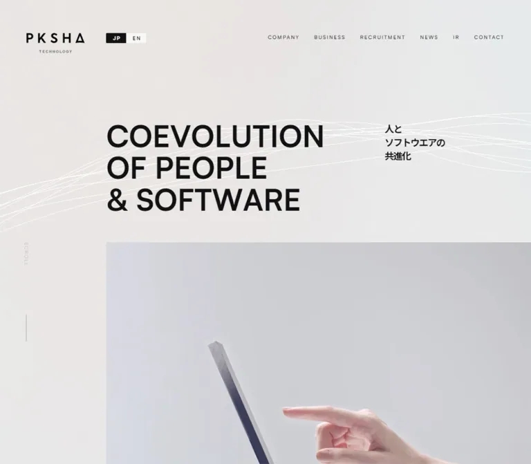
PKSHA’s homepage uses a restrained palette and a strong contrast in scale. Small, widely tracked navigation sits above the bold statement “COEVOLUTION / OF PEOPLE / & SOFTWARE.” Japanese copy supplies a second reading layer. Fine white curves and pale dimensional imagery soften the otherwise exact geometry. Further down, a large globe supports white enterprise metrics before the page returns to information lists and an extensive white sitemap.
The organizing principle is deliberate asymmetry. The desktop hero starts around one fifth of the viewport width; explanatory copy often starts at the midpoint; the footer directory starts even farther right than the hero. These changing alignments create rhythm across a long corporate homepage. Business, research, investors, news, and recruitment remain distinct destinations within that structure.
The opening desktop and mobile captures contain large opaque black regions that obscure parts of the header and hero. Their cause is not established. The reference uses unobscured imagery and computed text measurements without treating these regions as an intentional black surface or a verified opening animation.
閉じる
PKSHA Technology — Style Reference
Large, precise typography and quiet gray space frame a corporate story about people and software.
Website: PKSHA Technology Original URL: https://www.pkshatech.com/ Final URL: https://www.pkshatech.com/ Theme: light gray and white, with a muted globe-backed business section Inspected: October 2, 2026, 03:45:57 JST; supplied retrieval timestamp: October 1, 2026, 18:45:57.078 UTC Viewports: desktop 1440 × 1000 CSS pixels; mobile 390 × 844 CSS pixels Scope: the current Japanese corporate homepage. Supplied screenshots show the desktop opening, business metrics, and footer, plus the mobile opening and footer. Rendered DOM and computed-style evidence cover the homepage’s vision, business, metrics, news, investor information, recruitment, and sitemap sections. Linked pages and expanded navigation states were not inspected.
PKSHA’s homepage uses a restrained palette and a strong contrast in scale. Small, widely tracked navigation sits above the bold statement “COEVOLUTION / OF PEOPLE / & SOFTWARE.” Japanese copy supplies a second reading layer. Fine white curves and pale dimensional imagery soften the otherwise exact geometry. Further down, a large globe supports white enterprise metrics before the page returns to information lists and an extensive white sitemap.
The organizing principle is deliberate asymmetry. The desktop hero starts around one fifth of the viewport width; explanatory copy often starts at the midpoint; the footer directory starts even farther right than the hero. These changing alignments create rhythm across a long corporate homepage. Business, research, investors, news, and recruitment remain distinct destinations within that structure.
The opening desktop and mobile captures contain large opaque black regions that obscure parts of the header and hero. Their cause is not established. The reference uses unobscured imagery and computed text measurements without treating these regions as an intentional black surface or a verified opening animation.
How to Read This Reference
- Measured values come from the supplied rendered element rectangles, computed styles, and custom properties. Values are CSS pixels unless stated otherwise; tables round some measurements for readability.
- Observed appearance comes from the supplied current-page screenshots. Approximate image positions, colors, and visible surface boundaries are labeled as visual estimates.
- Calculated ratios, such as tracking expressed in em, are derived from measured values. They do not establish the original stylesheet’s formulas.
- Recommended values and code are adaptations for a new implementation. The supplied evidence does not expose the complete stylesheet, responsive breakpoints, or asset inventory.
- A DOM entry can have a rectangle while remaining visually concealed. Navigation-panel text in the extraction does not prove that its panel was open.
- Declared transitions establish available CSS behavior. They do not establish which interaction triggered it, the complete animation sequence, or its final visual state.
- Desktop document height was approximately 8575.31px; mobile document height was approximately 7819.50px. These measurements describe the captured content and state, not fixed design requirements.
Tokens — Colors
Default Palette
| Name | Value | Evidence / token | Role |
|---|---|---|---|
| Canvas Gray | #e9e9e9 |
Measured body background at both viewports | Main page foundation; the visible scrolled header band also appears this gray |
| Primary Ink | #121213 |
Source --color-black; measured body and heading color |
Main text, large statements, navigation, and structural contrast |
| White | #ffffff |
Source --color-white; measured footer background and business text |
Footer surface, reversed business text, and fine light details |
| Secondary Gray | #828282 |
Source --color-gray; measured captions and inactive language link |
Japanese section labels, secondary information, and subdued utilities |
| Light Gray | #cccccc |
Source --color-light-gray |
Available supporting neutral; precise visible applications are not established by the sampled elements |
| Absolute Black | #000000 |
Measured CONTACT text |
A local text value; most page text uses Primary Ink |
| Globe Field | Approximately #a0abb4 |
Visual estimate from the desktop metrics capture | Muted blue-gray atmosphere behind white metrics |
| Globe Mass | Approximately #596066 |
Visual estimate from the same capture | Darker continental sphere and network structure |
The body’s flat computed gray does not describe every visible pixel. The hero media contains warmer and cooler pale tones, and the globe image introduces a blue-gray cast. Preserve these differences through imagery rather than making the entire page a single flat gray.
Declared but Unverified Accents
The source declares --color-orange: #eb805e. The supplied visible captures do not establish orange as an active homepage accent. Do not promote it to a primary action color on the strength of the variable alone.
The numerous --tw-* properties are implementation-level defaults. A ring-color variable, for example, is not evidence of a visible blue design accent. No theme selector or alternate palette was demonstrated.
Tokens — Typography
Satoshi and Japanese Sans-Serif Fallbacks
Measured primary stack:
'Satoshi', YuGothic, 'Yu Gothic', 'Hiragino Kaku Gothic ProN',
'Hiragino Sans', Meiryo, sans-serif
The supplied stylesheet text includes a Satoshi import requesting weights 400, 500, and 700. Computed styles consistently declare this stack. Per-glyph font selection and successful delivery of every font resource were not independently verified.
English headings use broad sans-serif forms with a strong distinction between regular utility text, medium editorial headings, and bold statements. Japanese body text uses generous leading, often with deliberate tracking. Preserve these different rhythms rather than applying the hero’s tight spacing to every paragraph.
The source also declares:
--font-win, with Satoshi followed by Noto Sans JP and Japanese system fallbacks. Its declaration does not establish that this alternate stack was active in the supplied browser.--font-cursive: 'Hurricane', cursive. No inspected visible component establishes a cursive treatment, so it is not part of the recommended core typography.
Type Scale
Values below are measured, with line heights rounded. Tracking ratios are calculated from the supplied pixel values.
| Role | Desktop size / line height | Mobile size / line height | Weight | Tracking |
|---|---|---|---|---|
| Hero English H1 | 77.76 / 83.20px |
40.74 / 46.04px |
700 | Normal desktop; -0.05em mobile |
| Hero Japanese statement | 24.84 / 34.78px |
16.30 / 27.70px |
700 | -0.10em desktop; 0.02em mobile |
| Enterprise statement | 78.84 / 70.96px |
32.59 / 29.33px |
700 | -0.05em |
| Metric values | 75.60 / 75.60px |
32.59 / 32.59px |
700 | -0.05em |
| Vision paragraphs | 21.60 / 43.20px |
16.30 / 32.59px |
500 desktop; 400 mobile | 0.10em |
| Business introduction body | 15.12 / 24.19px |
12.22 / 19.56px |
500 desktop; 400 mobile | 0.10em desktop; 0.14em mobile |
| Detailed service descriptions | 15.12 / 24.19px |
14.26 / 22.81px |
500 | 0.05em |
| News heading | 56.16 / 56.16px |
48.89 / 48.89px |
500 | 0.02em |
| News article titles | 15.12 / 21.17px |
14.26 / 19.96px |
700 | 0.05em |
| IR heading | 56.16 / 56.16px |
52.96 / 52.96px |
500 | Normal |
| Join Us heading | 120.96 / 120.96px |
48.89 / 48.89px |
500 | Normal |
| Japanese section captions | 14.04 / 14.04px |
13.24 / 13.24px |
700 | 0.10em |
| Section action labels | 17.28 / 17.28px |
14.26 / 14.26px |
500 | 0.05em |
| Footer destination links | 12.96 / 12.96px |
12.22 / 12.22px |
400 | 0.05em |
Navigation and Utility Type
Desktop primary navigation uses 12.96px, weight 500, with 2.592px tracking: a calculated 0.20em. Recruitment and contact use the same font size with a quieter 0.05em tracking. The JP / EN links use weight 700 and 0.20em tracking; EN is gray in the Japanese-page state.
Mobile navigation entries present in the DOM include primary labels at 16.30px / 1, weight 500, with 0.20em tracking, and secondary links at 12.22px, weight 500, with 0.05em tracking. Their expanded appearance was not captured.
Measurement Caveat for Numbered Chapter Titles
The sampled Our Vision and Our Business H2 elements are containers holding section numbers and title content. Their computed sizes of 16.20px desktop and 15.28px mobile do not establish the size of every nested title fragment. Do not use these wrapper values as the display-title font size without inspecting the children.
Tokens — Spacing & Shapes
Source Scale
The measured root font size is 10.8px desktop and 10.1849px mobile. The complete formula that produces these sizes is unavailable.
Several values have clear relationships to that root: the desktop H1 is 7.2 times the measured root, while the mobile H1 is 4 times its root. These are calculated relationships, not recovered CSS declarations. Copying these numbers into a conventional 16px rem system would produce the wrong scale.
The Quick Start retains a conventional document root and uses explicit reference tokens instead.
Spacing and Alignment Anchors
| Use | Desktop measurement | Mobile measurement | Interpretation |
|---|---|---|---|
| Numbered chapter outer inset | 54px |
22.41px |
Broad chapter heading frame |
| Header logo left edge | 69.11px |
22.41px |
Brand alignment |
| Hero title left edge | 305.28px |
22.41px |
Major responsive alignment change |
| Vision prose left edge | 720px |
67.22px |
Half-page desktop column; indented mobile prose |
| Vision prose width | 518.39px |
300.38px |
Controlled Japanese reading measure |
| Metrics outer inset | 120.95px |
22.41px |
Large desktop frame becomes a phone gutter |
| News tab gap | 54px |
23.42px |
Calculated from button rectangles |
| Vision paragraph gap | Approximately 21.6px |
Approximately 16.3px |
Calculated between consecutive paragraph boxes |
| Footer top padding | 70.2px |
62.13px |
Measured footer padding |
| Footer bottom padding | 128.52px |
108.98px |
Measured footer padding |
These anchors form several related grids. A universal centered container would lose the distinction between the hero, explanatory copy, metrics, and sitemap.
Shapes and Rules
| Element | Evidence | Treatment |
|---|---|---|
| Desktop contact control | 159.83 × 38.88px; radius 0 |
Thin rectangular outline visible in scrolled captures |
| Mobile menu button | 67.22 × 67.22px; radius 50% |
Large pale circle with a small three-line icon |
| Secondary mobile navigation buttons | 31.56 × 31.56px; radius 50% |
DOM geometry only; expanded state unverified |
| General section actions | Approximately 311.03 × 64.78px desktop |
Wide, square-cornered anchor boxes; inner decoration incompletely sampled |
| Mobile section actions | Usually 225.08 × 44.80px |
Compact, left-aligned anchor boxes |
| Sitemap separators | Approximately 1px, visual estimate |
Straight ink rules across the directory column |
| Metric separators | Approximately 1px, visual estimate |
White rules across the metrics column |
No general rounded-card or shadow-elevation system is established by the visible captures. The circular mobile menu control is a deliberate exception to otherwise rectilinear interface geometry.
Components
Global Header
Role: persistent brand identity, language access, primary destinations, recruitment, and contact.
On desktop, the brand sits at approximately x 69.11, y 97.19, in a 151.19 × 56.16px link box. The language selector follows to its right. Recruitment and the outlined contact link occupy the upper-right utility row. Primary navigation runs beneath them, beginning around x 760.30, y 146.86.
The visible primary destinations are COMPANY, AI SOLUTION, AI SAAS, AI RESEARCH, IR, and NEWS. Use restrained uppercase labels and wide tracking; the contact outline supplies enough emphasis without a saturated fill.
The scrolled screenshots retain the header at the top over a pale gray band approximately 167px high. The sampled HEADER element itself has viewport-sized bounds, 1440 × 1000px, so that rectangle describes a larger header envelope, not the visible bar’s height. Similarly, the desktop --sh-height: 5.2rem property must not be treated as the entire visible band height.
On mobile, the closed header shows a 97.77 × 36.66px brand link at x 22.41, y 40.73, and a 67.22px circular menu button at x 302.42, y 20.36. The scrolled gray band is approximately 108px high. The source mobile --sh-height: 10.6rem calculates to approximately 107.96px at the observed root size.
The DOM includes extensive grouped navigation and circular secondary buttons. It does not establish the appearance of an opened menu, the activation gesture, focus behavior, or whether groups expand independently.
Bilingual Hero
Role: communicate the company’s central proposition before introducing its business areas.
The English H1 has three intentional lines:
COEVOLUTION
OF PEOPLE
& SOFTWARE
At desktop, its measured box begins at 305.28 × 312.09px and measures 569.06 × 249.61px. The Japanese statement, 人と / ソフトウエアの / 共進化, sits separately to the right at approximately x 1030.06, y 319.64. This is a paired composition with substantial space between the languages.
A pale media region starts around x 305, y 631 in the desktop screenshot and continues to the right edge. Thin white curves cross the surrounding hero. A small vertical SCROLL label and a fine vertical line sit in the left margin.
Mobile changes the order and alignment. The Japanese statement appears first, at approximately x 208.52, y 151.73, above the English title. The H1 begins at x 22.41, y 287.80, measures 302.42 × 138.05px, and retains the three-line statement with tighter tracking. Media starts around x 22, y 452, extending to the right edge. The vertical scroll cue is not visible in the supplied mobile capture.
The black regions in both opening screenshots must remain an inspection limitation. Do not reproduce them as a designed overlay or infer an entrance effect from their shape.
Numbered Chapter and Vision Copy
Role: separate the brand proposition from the longer corporate narrative.
The first chapter combines 01, Our Vision, a small Japanese caption, several short paragraphs, and a Mission/Vision/Value destination. The second repeats the numbered structure for 02 and Our Business.
Desktop vision copy occupies a right-side wrapper beginning at x 720px. The actual paragraphs use a narrower 518.39px measure within that wrapper. At 21.6px / 2, the text reads as a measured statement rather than a dense corporate introduction.
On mobile, the Japanese caption starts at the standard 22.41px gutter, while prose and its action link are indented to 67.22px. The resulting 44.81px secondary indent preserves asymmetry on a narrow screen. Paragraphs use 16.30px / 2, with explicit line breaks adapted to the viewport.
The mobile concluding paragraph also uses PKSHA Technology where the desktop text uses パークシャテクノロジー. The supplied evidence therefore shows some viewport-specific content composition in addition to wrapping.
Business Ecosystem
Role: explain the relationship between AI Solution, AI SaaS, and AI Research.
The desktop DOM groups the two software businesses side by side, followed by a wider research region. Each detailed business group contains a heading or graphic-title region, a Japanese category label, explanatory text, and a destination link. Two intermediate labels describe implementation and feedback.
Measured desktop group boxes are:
- AI Solution: 432 × 449.27px, beginning at approximately x 195.13.
- AI SaaS: 432 × 449.27px, beginning at approximately x 812.88.
- AI Research: 1049.75 × 449.27px, beginning at approximately x 195.13 below the paired groups.
These boxes overlap vertically in the sampled geometry. The available crops do not show the complete diagram, so the rectangles do not justify inventing circular cards, connecting arrows, or specific borders.
Mobile uses a compact relationship diagram followed by three separate detailed descriptions. The two upper diagram groups are approximately 152.77 × 159.89px each; the research group spans the viewport. The detailed blocks beneath are approximately 306.48px wide and include their own links.
This is a useful responsive pattern: retain an overview of relationships, then move longer explanations into a readable sequence. Do not compress all desktop prose into miniature diagram nodes.
Enterprise Metrics
Role: show the scale of deployment through three concrete metrics.
The desktop capture shows a muted globe with network-like lines and points behind white type. A three-line statement, “This is / Enterprise AI / in Japan,” occupies the left half. Three metric records form a right-hand column separated by thin white rules.
The measured metrics section is 1198.09px wide, starting at x 120.95. Both major columns are approximately 599.05px wide, with the metrics column beginning at x 720.
Each record follows this anatomy:
- Small uppercase category label.
- Large numeric value.
- Bold Japanese explanation of the value.
- Short supporting paragraph.
- Small dated qualification.
| Source label | Displayed value | Meaning in the supplied page | Source qualification |
|---|---|---|---|
| CLIENTS | 4400 |
More than 4,400 adopting companies | October 2025 |
| ALGORITHM WORKING | 165 |
165 deployed algorithms | October 2021 |
| USERS | 9300K |
More than 9.3 million daily users | October 2021 |
These are the page’s displayed figures, with mixed reference dates. They should not be presented as independently verified October 2026 statistics.
On mobile, the section headline moves above the records and aligns toward the right at x 156.84, with a 210.75px box. Each record uses a left value region of approximately 136.47px and a right explanatory region of 208.72px. The value scales down to 32.59px. The result retains a two-part information hierarchy rather than stacking every item into a centered card.
Globe rotation, metric count-up animation, and a sticky section headline were not demonstrated.
News List and Category Controls
Role: expose recent announcements and an investor-news category from the homepage.
Desktop places the News heading and Japanese caption in a left rail beginning at x 120.95. The list begins at x 380.14 and is approximately 829.44px wide. Article titles start farther right at x 589.64, leaving about 209.50px for row metadata.
The DOM exposes real NEWS and IR NEWS buttons, each approximately 155.52 × 42.02px on desktop. Category switching and active-state decoration were not exercised.
Five dated article rows are present. Their measured heights vary from approximately 70.83px to 92px, reflecting title length. Titles use bold 15.12px / 1.4 text. Read All sits beneath the list, aligned toward its right side.
On mobile, the heading and Japanese caption share a horizontal heading area. The two category buttons remain side by side, approximately 156.84 × 39.69px each. Article rows use the full 345.19px content width, with metadata above the title. Heights increase to approximately 110.14–130.11px. The archive action moves to the left edge.
The provided crops do not show this section’s complete surface decoration. A fine-rule list is a suitable adaptation, but exact news-row border values were not included in the evidence.
Investor Information
Role: provide direct routes to financial and corporate information.
The IR section has an English heading, a small Japanese caption, four destination links, and a See More action. The four links cover financial results, disclosures, presentation materials, and management information.
Desktop uses a two-column, two-row arrangement with link boxes approximately 394.19 × 100.34px. Mobile preserves two columns, reducing the boxes to approximately 158.88 × 68.20px. This is a compact navigation matrix rather than a set of data cards.
The Japanese caption sits below the IR heading on desktop and beside it on mobile. Exact icon and hover treatments are not established.
Recruitment Section
Role: create a substantial final entry point into careers content.
The desktop Join Us heading reaches 120.96px, substantially larger than the News and IR headings. A lower content row combines a small recruitment caption, a two-line Japanese invitation, and a wide destination link.
Mobile reduces Join Us to 48.89px and places the caption, invitation, and action in a vertical sequence. A large intervening region remains between the heading and text in the measured layout. The supplied crops do not establish the imagery occupying this section, so no recruitment photograph or art direction is asserted here.
Section Action Links
Role: provide consistent onward navigation from editorial sections.
The DOM identifies destinations for Mission/Vision/Value, AI Solution, AI SaaS, AI Research, Read All, and See More. General desktop action boxes are approximately 311.03 × 64.78px; the paired software-business actions are narrower at approximately 212.75px. Most mobile actions are approximately 225.08 × 44.80px, with small context-specific width differences.
Keep the measured medium-weight type, modest tracking, square geometry, and comfortable target height. The evidence does not fully expose their internal graphics. An arrow or underline in a new implementation should be identified as an adaptation rather than a recovered detail.
Some text appears duplicated in the extraction, including See More. This alone does not prove a rolling-text interaction or an accessible-name problem.
Footer Sitemap
Role: offer comprehensive navigation and a calm ending to the long homepage.
The footer changes to measured white. On desktop, its directory starts around x 512.64, while individual destinations begin around x 769.67. Visible rules span approximately 829px, leaving a broad open region to the left.
Each category combines an English heading, a small gray Japanese descriptor, and grouped links. Categories include company information, AI Solution, AI SaaS, AI Research, recruitment, and IR. Utility links and policies sit beneath the directory. The visible recruitment destinations include small external-link glyphs; their implementation source is unknown.
Desktop copyright is placed in the lower-left area. The current page explicitly displays © PKSHA Technology Inc. All Rights Reserved.
On mobile, category headings begin around x 23.42px, with their Japanese descriptions alongside them. Destination rows extend horizontally beyond the viewport: the DOM places one company link at x 395.53px, and the footer capture visibly clips the IR row at the right edge. Whether these rows support touch scrolling was not tested.
The lower mobile footer places utility links on the left, policies on the right, then substantial white space, a centered PKSHA logo, and a centered two-line copyright. The centered logo is approximately 148px wide, a visual estimate. Preserve this quiet ending while ensuring every horizontally extended link remains reachable.
Tokens — Motion & Interaction
Declared Transitions
| Target | Supplied computed transition | Evidence boundary |
|---|---|---|
| Header envelope | opacity 0.5s 0.6s |
A delayed opacity transition is declared; trigger unverified |
| Brand link | opacity 0.4s cubic-bezier(0.26, 0.06, 0, 1) |
Target opacity state not supplied |
| Contact link | opacity 0.4s cubic-bezier(0.26, 0.06, 0, 1) |
Hover appearance not tested |
| Many navigation links | color 0.4s cubic-bezier(0.26, 0.06, 0, 1) |
Destination color not supplied |
| Hero Japanese statement | opacity 0.6s ease-out 1.5s, filter 0.6s ease-out 1.5s |
Filter type and initial value unknown |
| Vision caption | opacity 0.6s ease-out 0.6s |
Reveal trigger unverified |
| Business introduction | opacity 0.6s ease-out 0.6s, transform 0.6s ease-out 0.6s |
Transform distance and direction unknown |
| Business headings and descriptions | opacity 0.8s ease-out |
Group sequencing not established |
These declarations suggest restrained opacity, color, and transform changes. They do not support invented spring effects, parallax distances, or scroll-scrub timelines.
Many sampled elements report animation: none. This does not rule out JavaScript, video, canvas, or animations on unsampled descendants. Likewise, transition: all without a supplied positive duration does not establish a visible transition.
Observed and Unverified Behavior
- The supplied collection traversed the page and captured lower sections. The header remains visible at the top of the lower desktop and mobile screenshots.
- Navigation destinations and a
PAGE TOPlink are present. Smooth scrolling and actual navigation results were not tested. - The mobile menu button and news-category buttons are present. Their activation results, keyboard handling, and focus states remain unverified.
- Static captures cannot establish motion in the white filaments, device imagery, or globe.
- Capture readiness temporarily paused perpetual animation checks and resumed them afterward. The resulting images are individual states, not a temporal recording.
- The capture process waited for several readiness conditions but does not prove that all delayed content had appeared.
For a new implementation, use short color/opacity transitions and optional restrained reveals. Keep content visible without animation, and provide a reduced-motion path.
Surfaces
| Surface | Appearance | Structural purpose |
|---|---|---|
| Main canvas | Measured #e9e9e9 |
Quiet foundation for large typography and offset content |
| Hero media | Pale, low-saturation dimensional image with fine light curves | Introduces a tactile relationship between people and technology |
| Scrolled header | Visually pale gray; approximately 167px desktop and 108px mobile | Persistent orientation above long content |
| Enterprise field | Muted blue-gray globe image with white typography | Changes atmosphere for the business-scale narrative |
| Footer | Measured #ffffff, dark rules, gray supporting labels |
Dense navigation with substantial open space |
| Contact control | Transparent surface, thin dark rectangular outline | Local emphasis within the utility navigation |
| Mobile menu control | Pale circular surface with dark line icon | Distinct touch target without a general rounded-card system |
The sampled header wrapper is transparent; its child or pseudo-element painting mechanism was not supplied. The visible band should therefore be described by appearance without attributing its fill to that wrapper.
Imagery
The current hero imagery is pale and dimensional. The desktop crop reveals part of a thin device-like slab, a hand at the lower edge, and several fine white curves. The mobile crop emphasizes a diagonal slab against a nearly white field. The hand’s absence from the phone crop does not establish that it is absent from the mobile asset or from later frames.
The enterprise image is more atmospheric: a dark globe sits within a muted blue-gray field, with faint connecting lines and points. The sphere is large enough to cross behind both text regions. Preserve its scale and low-saturation treatment; a small decorative globe icon would serve a different purpose.
The PKSHA wordmark has widely spaced capitals, a distinctive triangular A, and a smaller TECHNOLOGY line. Use an authorized original mark where available. Ordinary text with added letter spacing will not reproduce the logo geometry.
Observed Asset References
No media asset URLs or filenames were included in the supplied element inventory.
| Asset | Evidence | Reuse guidance |
|---|---|---|
| PKSHA wordmark | Desktop/mobile headers and mobile footer | Preserve the original mark and proportions |
| Pale hero media | Current opening captures | Use authorized media; match crop and tonal restraint |
| Fine white curves | Visible in and around current hero imagery | Keep them thin, sparse, and subordinate to the headline |
| Globe and network imagery | Current desktop metrics capture | Retain large scale and sufficient text contrast |
| Recruitment media | Not established by the provided crops | Select separately; do not attribute a proposed image to the source |
Do not invent file paths, media formats, native aspect ratios, or a video implementation. The evidence supports the visible subject matter, not the asset pipeline.
Layout & Responsive Behavior
Desktop Composition
The page uses several horizontal reference lines rather than one universal container:
- 3.75% of viewport width: numbered chapter outer edge, measured at 54px.
- 4.8%: approximate header logo inset, measured at 69.11px.
- 8.4%: metrics and news heading frame, measured at 120.95px.
- 21.2%: hero headline and media edge, measured at 305.28px.
- 35.6%: footer category column, measured at 512.64px.
- 50%: vision prose wrapper and enterprise metrics column, measured at 720px.
These percentages are calculated from the 1440px sample. They are useful implementation anchors, but their continuation at other desktop widths was not verified.
Mobile Recomposition
| Region | Desktop | Observed mobile change |
|---|---|---|
| Header | Two rows of visible links with language and utility controls | Closed state shows brand and circular menu control |
| Hero | English statement left; Japanese statement to the right | Japanese statement moves above and right of the English title |
| Vision | Prose begins at viewport midpoint | Prose retains a secondary indent within the phone gutter |
| Business | Explanations integrated into a large relationship composition | Compact overview followed by separate detailed blocks |
| Metrics | Large left headline and right stacked records | Headline above; value and explanation remain split inside each record |
| News | Left heading rail, metadata column, title column | Heading area above tabs; metadata above each full-width title |
| IR | Two-by-two destination matrix | Two columns retained at smaller dimensions |
| Recruitment | Very large display title and horizontal lower content | Smaller title and vertically arranged information |
| Footer | Directory shifted right with large left whitespace | Category headings above extended link rows; centered closing identity |
Only 1440px and 390px widths were supplied. No tablet viewport, landscape phone, exact breakpoint, or browser zoom test was available. The Quick Start’s 960px breakpoint is a recommendation, not a recovered source rule.
The shorter mobile document does not mean the desktop was simply scaled down. Headline sizes, line breaks, diagram detail placement, and directory behavior change independently.
Do’s and Don’ts
Do
- Build the core palette from measured gray
#e9e9e9, ink#121213, and white. - Use Satoshi with the documented Japanese fallback stack, keeping 400, 500, and 700 roles distinct.
- Preserve the three-line English hero statement and the separate Japanese statement.
- Maintain multiple alignment anchors across the desktop page.
- Retain the secondary mobile indent in the vision narrative.
- Pair large metrics with explanatory text and dated qualifications.
- Use thin rules and typography to organize dense information.
- Keep the desktop contact control rectangular and the mobile menu control circular.
- Recompose business explanations for mobile while retaining the relationship overview.
- Give the footer enough space to function as a complete corporate directory.
Don't
- Don’t reproduce the obscuring black capture regions as a deliberate hero treatment.
- Don’t convert the entire page into centered sections with identical widths.
- Don’t replace corporate navigation and information architecture with a single conversion funnel.
- Don’t apply pill corners, floating shadows, or colorful badges to every component.
- Don’t turn the declared orange variable into a dominant CTA color without visible evidence.
- Don’t assume that every measured element box represents a visible card boundary.
- Don’t infer globe rotation, number counting, menu animation, or parallax from static images.
- Don’t make the mobile business overview carry unreadably small desktop descriptions.
- Don’t copy horizontally clipped footer links without providing a usable access mechanism.
- Don’t remove the metric reference dates or present them as current independently verified figures.
Recommended Implementation Additions
These are recommendations for a new implementation, not verified features of the inspected page:
- Provide an accessible name,
aria-expanded, and an associated navigation region for the mobile menu control. If the menu behaves as a modal, implement appropriate focus management and Escape handling. - Give category controls semantic tab behavior only if they actually switch panels; otherwise use the semantics appropriate to their behavior.
- Keep links and buttons visibly focusable. Increase the desktop contact hit area to at least 44px high while retaining its restrained visual outline if desired.
- Check small gray captions and white text against their final surfaces. A darker neutral may be needed for small secondary text, and globe media may need a controlled scrim.
- Consider increasing the measured 12.22px mobile business introduction for readability, especially with longer copy or increased text size.
- Make extended footer rows explicitly scrollable with a discoverable cue, or allow wrapping. Keep all destinations reachable by keyboard and touch.
- Provide reduced-motion behavior and a static media fallback. Essential text should remain available if animation initialization fails.
- Use responsive media with a stable reserved area to limit layout shifts. Avoid forcing headline and navigation visibility to depend on media readiness.
- Treat decorative filaments and network lines as decorative for assistive technology; provide useful alternatives for meaningful imagery.
- Account for safe areas and persistent-header offsets when linking to page sections.
Agent Prompt Guide
Quick Color Reference
- Main canvas: measured
#e9e9e9. - Primary typography: measured
#121213. - Footer and reversed text: measured
#ffffff. - Supporting captions: measured
#828282; check small-text contrast. - Supporting neutral variable:
#cccccc. - Globe field: approximately
#a0abb4, an image-derived visual estimate. - Core action language: thin outlines and text, with no established saturated CTA color.
Overall Prompt
“Create a Japanese corporate homepage inspired by the current PKSHA Technology visual system. Use a light gray #e9e9e9 canvas, near-black #121213 text, white footer, Satoshi headings, and Japanese sans-serif fallbacks. Establish a three-line bold English hero with a separate Japanese statement, a pale dimensional media region, and fine white curves. Use an asymmetric desktop composition: hero content around 21% from the left, narrative copy beginning at the midpoint, and a sitemap shifted to the right. Include numbered vision and business chapters, an AI business relationship overview, a globe-backed metrics section, news, investor links, and recruitment. On mobile, move the Japanese hero statement above the English headline, keep the vision prose indented, separate business explanations from their overview, and retain value/description columns inside metrics. Use precise type, thin rules, square controls, and one circular menu button.”
Example Component Prompts
- Header: “Build a pale gray corporate header with a 151px-wide brand on desktop, a small language selector, recruitment and outlined contact utilities, and a second row of widely tracked uppercase destinations. At phone width, use a 98px-wide brand and a roughly 67px circular menu button. Expanded navigation behavior must be implemented and tested separately.”
- Hero: “Set the English statement on three lines at approximately 77.76px / 1.07 on a 1440px desktop. Start it near x 305px and place the Japanese statement separately at the right. On a 390px phone, use approximately 40.74px / 1.13 with tight tracking, start at a 22px gutter, and position the Japanese statement above it. Add pale media below with a right-edge bleed.”
- Enterprise metrics: “Create a large muted globe field with white typography. Use a bold three-line editorial statement in the left half and three rule-separated records in the right half. Each record contains a small category, a large value, a Japanese explanation, supporting copy, and an as-of date. On mobile, keep values in a left column and descriptions in a right column.”
- News: “Create a restrained corporate news list with a left heading rail on desktop, two category buttons, and rows divided into metadata and bold Japanese titles. On mobile, place metadata above each title and keep two category buttons side by side. Preserve actual button and link semantics.”
- Footer: “Create a white sitemap with a large empty left region on desktop, thin dark horizontal rules, English category headings, gray Japanese descriptors, and grouped destination links. On mobile, bring categories to the left gutter, ensure long link rows remain accessible, and finish with generous whitespace, a centered logo, and two-line copyright.”
Quick Start
CSS Custom Properties
This is an implementation scaffold, not a recovered stylesheet. It uses measured reference values where available, calculated desktop alignment percentages, and a recommended 960px breakpoint. Intermediate scaling, media aspect ratios, action decoration, and the exact vertical placement of the metrics headline are adaptations.
Load Satoshi weights 400, 500, and 700 separately. No font files, logos, or media are bundled. The globe color is an estimated fallback; an authorized image and a contrast check are still required. Content is visible by default, with no dependency on reveal JavaScript.
:root {
  /* Measured core colors */
  --pksha-canvas: #e9e9e9;
  --pksha-ink: #121213;
  --pksha-white: #ffffff;
  --pksha-muted: #828282;
  --pksha-line: #cccccc;

  /* Visual estimates for media fallbacks */
  --pksha-globe: #a0abb4;
  --pksha-media: #cdd0d4;

  --pksha-font: 'Satoshi', YuGothic, 'Yu Gothic',
    'Hiragino Kaku Gothic ProN', 'Hiragino Sans', Meiryo, sans-serif;

  /* Measured desktop endpoints; fluid interpolation is recommended */
  --pksha-hero-size: clamp(44px, 5.4vw, 77.76px);
  --pksha-display-size: clamp(44px, 5.475vw, 78.84px);
  --pksha-value-size: 75.6px;
  --pksha-section-size: 56.16px;
  --pksha-body-size: 15.12px;
  --pksha-caption-size: 14.04px;
  --pksha-action-size: 17.28px;

  /* Calculated from the 1440px reference */
  --pksha-header-inset: 4.8vw;
  --pksha-page-inset: 8.4vw;
  --pksha-hero-inset: 21.2vw;
  --pksha-header-height: 167px;

  --pksha-ease: cubic-bezier(0.26, 0.06, 0, 1);
  --pksha-link-motion: 400ms var(--pksha-ease);
}

* {
  box-sizing: border-box;
}

body {
  margin: 0;
  color: var(--pksha-ink);
  background: var(--pksha-canvas);
  font-family: var(--pksha-font);
}

button,
input,
select,
textarea {
  font: inherit;
}

a {
  color: inherit;
  text-decoration: none;
}

button {
  color: inherit;
}

img,
video {
  display: block;
  max-width: 100%;
}

.page-frame {
  margin-inline: var(--pksha-page-inset);
}

/* Persistent header adaptation */
.site-header {
  position: sticky;
  top: 0;
  z-index: 30;
  height: var(--pksha-header-height);
  background: var(--pksha-canvas);
}

.brand {
  position: absolute;
  top: 97.19px;
  left: var(--pksha-header-inset);
  width: 151.19px;
  transition: opacity var(--pksha-link-motion);
}

.brand img {
  width: 100%;
  height: auto;
}

.language-links {
  position: absolute;
  top: 90.7px;
  left: calc(var(--pksha-header-inset) + 199.78px);
  display: flex;
  align-items: center;
  gap: 10px;
  min-height: 25.91px;
  font-size: 12.96px;
  font-weight: 700;
  letter-spacing: 0.2em;
}

.language-links [aria-current='page'] {
  color: var(--pksha-ink);
}

.language-links a:not([aria-current='page']) {
  color: var(--pksha-muted);
}

.header-utilities {
  position: absolute;
  top: 86.39px;
  right: var(--pksha-header-inset);
  display: flex;
  align-items: center;
  gap: 23.75px;
  font-size: 12.96px;
  font-weight: 500;
  letter-spacing: 0.05em;
}

.contact-link {
  display: grid;
  place-items: center;
  width: 159.83px;
  min-height: 38.88px;
  border: 1px solid currentColor;
  border-radius: 0;
}

.primary-nav {
  position: absolute;
  right: var(--pksha-header-inset);
  bottom: 4px;
  display: flex;
  gap: 35.62px;
  font-size: 12.96px;
  font-weight: 500;
  line-height: 16px;
  letter-spacing: 0.2em;
}

.primary-nav a,
.footer-links a {
  transition: color var(--pksha-link-motion);
}

.menu-toggle {
  display: none;
}

/* Hero coordinates approximate the observed desktop composition */
.hero-heading {
  display: grid;
  grid-template-columns: minmax(0, 569.06px) 156.5px;
  justify-content: space-between;
  align-items: start;
  margin-left: var(--pksha-hero-inset);
  margin-right: 17.6vw;
  padding-top: 145.09px;
}

.hero-title {
  margin: 0;
  font-size: var(--pksha-hero-size);
  font-weight: 700;
  line-height: 1.07;
  letter-spacing: normal;
}

.hero-title span {
  display: block;
  white-space: nowrap;
}

.hero-statement {
  margin: 7.55px 0 0;
  font-size: 24.84px;
  font-weight: 700;
  line-height: 1.4;
  letter-spacing: -0.1em;
}

.hero-media {
  margin: 69.3px 0 0 var(--pksha-hero-inset);
  overflow: hidden;
  background: var(--pksha-media);
  aspect-ratio: 16 / 10; /* Recommended placeholder ratio */
}

.hero-media > img,
.hero-media > video {
  width: 100%;
  height: 100%;
  object-fit: cover;
}

/* Narrative typography */
.section-caption {
  margin: 0 0 40px;
  color: var(--pksha-muted);
  font-size: var(--pksha-caption-size);
  font-weight: 700;
  line-height: 1;
  letter-spacing: 0.1em;
}

.vision-copy {
  width: min(36vw, 518.39px);
  margin-left: 50%;
}

.vision-copy p {
  margin: 0 0 21.6px;
  font-size: 21.6px;
  font-weight: 500;
  line-height: 2;
  letter-spacing: 0.1em;
}

.section-action {
  display: flex;
  align-items: center;
  width: min(100%, 311.03px);
  min-height: 64.78px;
  border-bottom: 1px solid currentColor; /* Recommended decoration */
  border-radius: 0;
  font-size: var(--pksha-action-size);
  font-weight: 500;
  line-height: 1;
  letter-spacing: 0.05em;
}

/* Add authorized globe media behind this structural layer */
.enterprise {
  padding-block: 96px;
  color: var(--pksha-white);
  background: var(--pksha-globe);
}

.metrics-layout {
  display: grid;
  grid-template-columns: minmax(0, 1fr) minmax(0, 1fr);
}

.metrics-title {
  align-self: center;
  margin: 0;
  font-size: var(--pksha-display-size);
  font-weight: 700;
  line-height: 0.9;
  letter-spacing: -0.05em;
}

.metric {
  min-height: 312.61px;
  padding: 18.36px 0 21.6px;
  border-bottom: 1px solid currentColor;
}

.metric + .metric {
  margin-top: 12.96px;
}

.metric-label {
  margin: 0;
  font-size: 14px; /* Approximation; label size was not sampled */
  font-weight: 500;
}

.metric-value {
  margin: 32px 0;
  font-size: var(--pksha-value-size);
  font-weight: 700;
  line-height: 1;
  letter-spacing: -0.05em;
}

.metric-detail h3 {
  margin: 0 0 12px;
  font-size: 23px; /* Visual approximation */
  line-height: 1.4;
}

.metric-detail p {
  max-width: 539.14px;
  margin: 0;
  font-size: var(--pksha-body-size);
  line-height: 1.6;
  letter-spacing: 0.05em;
}

.metric-detail small {
  display: block;
  margin-top: 10px;
  font-size: 12px;
}

/* Editorial news layout */
.news-layout {
  display: grid;
  grid-template-columns: 21.63% minmax(0, 69.23%);
  padding-block: 86.4px;
}

.section-title {
  margin: 0 0 25.9px;
  font-size: var(--pksha-section-size);
  font-weight: 500;
  line-height: 1;
}

.news-tabs {
  display: flex;
  gap: 54px;
  margin-bottom: 70px;
}

.news-tabs button {
  width: 155.52px;
  min-height: 42.02px;
  padding: 10px 0;
  border: 0;
  border-bottom: 1px solid currentColor;
  border-radius: 0;
  background: transparent;
  cursor: pointer;
}

.news-row {
  display: grid;
  grid-template-columns: 25.26% minmax(0, 1fr);
  padding-block: 24.83px;
  border-bottom: 1px solid var(--pksha-line);
}

.news-meta {
  font-size: 12.96px;
  line-height: 1.6;
}

.news-title {
  margin: 0;
  font-size: 15.12px;
  font-weight: 700;
  line-height: 1.4;
  letter-spacing: 0.05em;
}

/* Sitemap columns follow the desktop reference */
.site-footer {
  padding-block: 70.2px 128.52px;
  background: var(--pksha-white);
}

.footer-map {
  width: 57.6%;
  margin-left: 35.6%;
}

.footer-row {
  display: grid;
  grid-template-columns: 31% minmax(0, 1fr);
  padding-block: 26px;
  border-top: 1px solid var(--pksha-ink);
}

.footer-category {
  margin: 0;
  font-size: 15px;
  font-weight: 500;
}

.footer-category small {
  display: block;
  margin-top: 6px;
  color: var(--pksha-muted);
  font-size: 12px;
  font-weight: 400;
}

.footer-links {
  display: flex;
  flex-wrap: wrap;
  align-content: start;
  gap: 24px 34.55px;
  font-size: 12.96px;
  line-height: 1.4;
  letter-spacing: 0.05em;
}

.footer-closing {
  margin: 64px 6.8vw 0;
  color: var(--pksha-muted);
  font-size: 12.96px;
}

/* Recommended focus treatment */
:where(a, button):focus-visible {
  outline: 2px solid currentColor;
  outline-offset: 5px;
}

/* Recommended breakpoint; only the 390px endpoint was inspected */
@media (max-width: 960px) {
  :root {
    --pksha-header-height: 108px;
    --pksha-page-inset: 22.40625px;
    --pksha-header-inset: 22.40625px;
    --pksha-hero-inset: 22.40625px;
    --pksha-hero-size: clamp(30px, 10.446vw, 40.7397px);
    --pksha-display-size: 32.5917px;
    --pksha-value-size: 32.5917px;
    --pksha-section-size: 48.8876px;
    --pksha-body-size: 12.2219px;
    --pksha-caption-size: 13.2404px;
    --pksha-action-size: 14.2589px;
  }

  .brand {
    top: 40.73px;
    width: 97.77px;
  }

  .language-links,
  .header-utilities,
  .primary-nav {
    display: none;
  }

  .menu-toggle {
    position: absolute;
    top: 20.36px;
    right: 20.36px;
    display: grid;
    place-content: center;
    gap: 5px;
    width: 67.22px;
    height: 67.22px;
    padding: 0;
    border: 0;
    border-radius: 50%;
    background: #efefef;
    cursor: pointer;
  }

  .menu-toggle span {
    display: block;
    width: 16px;
    height: 1px;
    background: currentColor;
  }

  .hero-heading {
    grid-template-columns: minmax(0, 1fr);
    margin-inline: var(--pksha-page-inset);
    padding-top: 43.73px;
  }

  .hero-statement {
    grid-row: 1;
    justify-self: end;
    width: 116.31px;
    margin: 0 42.77px 52.96px 0;
    font-size: 16.2959px;
    line-height: 1.7;
    letter-spacing: 0.02em;
  }

  .hero-title {
    grid-row: 2;
    line-height: 1.13;
    letter-spacing: -0.05em;
  }

  .hero-media {
    margin-top: 26.16px;
    aspect-ratio: 3 / 4; /* Recommended mobile placeholder ratio */
  }

  .vision-copy {
    width: auto;
    margin-left: 67.22px;
    margin-right: var(--pksha-page-inset);
  }

  .vision-copy p {
    margin-bottom: 16.3px;
    font-size: 16.2959px;
    font-weight: 400;
  }

  .section-action {
    width: min(100%, 225.08px);
    min-height: 44.8px;
  }

  .metrics-layout {
    display: block;
  }

  .metrics-title {
    width: 61.05%;
    margin: 0 0 67.22px auto;
  }

  .metric {
    display: grid;
    grid-template-columns: 39.53% minmax(0, 1fr);
    min-height: 176.09px;
    padding: 23.43px 0 10.18px;
  }

  .metric-label {
    font-size: 11px;
  }

  .metric-value {
    margin: 14px 0 0;
  }

  .metric-detail h3 {
    font-size: 16.3px;
  }

  .metric-detail small {
    font-size: 10.5px;
  }

  .news-layout {
    display: block;
    padding-block: 58px;
  }

  .news-tabs {
    gap: 23.42px;
    margin-bottom: 15.27px;
  }

  .news-tabs button {
    flex: 1;
    min-width: 0;
    min-height: 39.69px;
  }

  .news-row {
    display: block;
    padding-block: 18.33px;
  }

  .news-meta {
    margin-bottom: 18px;
    font-size: 12.22px;
  }

  .news-title {
    font-size: 14.2589px;
  }

  .site-footer {
    padding-block: 62.13px 108.98px;
  }

  .footer-map {
    width: auto;
    margin-left: 23.42px;
  }

  .footer-row {
    display: block;
  }

  .footer-category {
    display: flex;
    align-items: baseline;
    gap: 14px;
    margin-bottom: 24px;
  }

  .footer-category small {
    margin: 0;
  }

  /* Recommended access mechanism for extended mobile link rows */
  .footer-links {
    flex-wrap: nowrap;
    gap: 32.58px;
    overflow-x: auto;
    padding: 5px 23.42px 14px 5px;
    font-size: 12.2219px;
  }

  .footer-links a {
    flex: 0 0 auto;
  }

  .footer-closing {
    margin: 160px 23.42px 0;
    text-align: center;
  }

  .footer-closing img {
    width: 148px;
    margin: 0 auto 120px;
  }
}

@media (prefers-reduced-motion: reduce) {
  .brand,
  .primary-nav a,
  .footer-links a {
    transition: none;
  }
}
Minimal Component Markup
The hero markup keeps both languages as live text. The metric example demonstrates the two internal regions used by the mobile CSS. Supply real media separately; menu and category behavior require their own implementation.
<section class='hero' aria-labelledby='hero-title'>
<div class='hero-heading'>
<h1 class='hero-title' id='hero-title' lang='en'>
<span>COEVOLUTION</span>
<span>OF PEOPLE</span>
<span>& SOFTWARE</span>
</h1>
<p class='hero-statement' lang='ja'>
人と<br>ソフトウエアの<br>共進化
</p>
</div>
<!-- Insert authorized image or video media in this container. -->
<div class='hero-media'></div>
</section>
<section class='metric' aria-labelledby='clients-title'>
<div class='metric-summary'>
<p class='metric-label'>CLIENTS</p>
<p class='metric-value'>4400</p>
</div>
<div class='metric-detail' lang='ja'>
<h3 id='clients-title'>4400社以上の導入企業数</h3>
<p>研究開発したアルゴリズムを、多くの企業のソフトウエア・オペレーションに導入しています。</p>
<small>※2025年10月時点</small>
</div>
</section>
Tailwind v4 Token Mapping
Optional mapping for a project already using Tailwind v4. This maps the adaptation’s semantic tokens; it does not reproduce the original build configuration.
@theme inline {
  --color-canvas: var(--pksha-canvas);
  --color-ink: var(--pksha-ink);
  --color-paper: var(--pksha-white);
  --color-muted: var(--pksha-muted);
  --color-rule: var(--pksha-line);
  --color-globe: var(--pksha-globe);

  --font-sans: var(--pksha-font);

  --text-hero: var(--pksha-hero-size);
  --text-display: var(--pksha-display-size);
  --text-metric: var(--pksha-value-size);
  --text-section: var(--pksha-section-size);
  --text-body: var(--pksha-body-size);
  --text-caption: var(--pksha-caption-size);
  --text-action: var(--pksha-action-size);

  --spacing-page: var(--pksha-page-inset);
  --spacing-hero-inset: var(--pksha-hero-inset);
  --spacing-header: var(--pksha-header-height);

  --radius-control: 0px;
  --ease-site: var(--pksha-ease);
}
Sources & Evidence
- Inspected original and final page: https://www.pkshatech.com/. The supplied observation reports HTTP 200 with no URL change and the page title
PKSHA Technology Inc. - Capture timestamp:
2026-10-01T18:45:57.078Z, equivalent to October 2, 2026, 03:45:57.078 JST. - Desktop evidence: 1440 × 1000 CSS-pixel viewport; opening, enterprise-metrics, and lower-footer captures; rendered DOM, custom properties, element rectangles, typography, colors, and transition declarations.
- Mobile evidence: 390 × 844 CSS-pixel viewport; opening and lower-footer captures; rendered DOM and computed styles documenting substantial layout changes elsewhere on the homepage.
- Collection method: the supplied process waited for document load, image decoding, sampled layout/text stability, and finite animation readiness within bounded time limits. It traversed intermediate scroll positions. SharedWorkers and service workers were disabled.
- Inspection limits: no additional browsing, commands, or file access was performed for this reference. No navigation panel, news-category switch, hover state, keyboard sequence, or linked destination was exercised here. Asset URLs, full responsive formulas, and JavaScript motion behavior were not supplied.
- Capture limitation: large black regions obscure portions of both opening captures. Their source and intended behavior remain unknown. Unobscured current-page regions and supplied computed styles support the reference’s hero geometry and typography.
This document describes the supplied current corporate homepage. Measured values, visual estimates, and implementation recommendations are explicitly separated; proposed CSS behavior should not be read as proof of the original implementation.
# PKSHA Technology — Style Reference

> Large, precise typography and quiet gray space frame a corporate story about people and software.

**Website:** [PKSHA Technology](https://www.pkshatech.com/)
**Original URL:** https://www.pkshatech.com/
**Final URL:** https://www.pkshatech.com/
**Theme:** light gray and white, with a muted globe-backed business section
**Inspected:** October 2, 2026, 03:45:57 JST; supplied retrieval timestamp: October 1, 2026, 18:45:57.078 UTC
**Viewports:** desktop 1440 × 1000 CSS pixels; mobile 390 × 844 CSS pixels
**Scope:** the current Japanese corporate homepage. Supplied screenshots show the desktop opening, business metrics, and footer, plus the mobile opening and footer. Rendered DOM and computed-style evidence cover the homepage’s vision, business, metrics, news, investor information, recruitment, and sitemap sections. Linked pages and expanded navigation states were not inspected.

PKSHA’s homepage uses a restrained palette and a strong contrast in scale. Small, widely tracked navigation sits above the bold statement “COEVOLUTION / OF PEOPLE / & SOFTWARE.” Japanese copy supplies a second reading layer. Fine white curves and pale dimensional imagery soften the otherwise exact geometry. Further down, a large globe supports white enterprise metrics before the page returns to information lists and an extensive white sitemap.

The organizing principle is deliberate asymmetry. The desktop hero starts around one fifth of the viewport width; explanatory copy often starts at the midpoint; the footer directory starts even farther right than the hero. These changing alignments create rhythm across a long corporate homepage. Business, research, investors, news, and recruitment remain distinct destinations within that structure.

The opening desktop and mobile captures contain large opaque black regions that obscure parts of the header and hero. Their cause is not established. The reference uses unobscured imagery and computed text measurements without treating these regions as an intentional black surface or a verified opening animation.
閉じる
# PKSHA Technology — Style Reference
> Large, precise typography and quiet gray space frame a corporate story about people and software.
**Website:** [PKSHA Technology](https://www.pkshatech.com/)
**Original URL:** https://www.pkshatech.com/
**Final URL:** https://www.pkshatech.com/
**Theme:** light gray and white, with a muted globe-backed business section
**Inspected:** October 2, 2026, 03:45:57 JST; supplied retrieval timestamp: October 1, 2026, 18:45:57.078 UTC
**Viewports:** desktop 1440 × 1000 CSS pixels; mobile 390 × 844 CSS pixels
**Scope:** the current Japanese corporate homepage. Supplied screenshots show the desktop opening, business metrics, and footer, plus the mobile opening and footer. Rendered DOM and computed-style evidence cover the homepage’s vision, business, metrics, news, investor information, recruitment, and sitemap sections. Linked pages and expanded navigation states were not inspected.
PKSHA’s homepage uses a restrained palette and a strong contrast in scale. Small, widely tracked navigation sits above the bold statement “COEVOLUTION / OF PEOPLE / & SOFTWARE.” Japanese copy supplies a second reading layer. Fine white curves and pale dimensional imagery soften the otherwise exact geometry. Further down, a large globe supports white enterprise metrics before the page returns to information lists and an extensive white sitemap.
The organizing principle is deliberate asymmetry. The desktop hero starts around one fifth of the viewport width; explanatory copy often starts at the midpoint; the footer directory starts even farther right than the hero. These changing alignments create rhythm across a long corporate homepage. Business, research, investors, news, and recruitment remain distinct destinations within that structure.
The opening desktop and mobile captures contain large opaque black regions that obscure parts of the header and hero. Their cause is not established. The reference uses unobscured imagery and computed text measurements without treating these regions as an intentional black surface or a verified opening animation.
## How to Read This Reference
- **Measured** values come from the supplied rendered element rectangles, computed styles, and custom properties. Values are CSS pixels unless stated otherwise; tables round some measurements for readability.
- **Observed** appearance comes from the supplied current-page screenshots. Approximate image positions, colors, and visible surface boundaries are labeled as visual estimates.
- **Calculated** ratios, such as tracking expressed in em, are derived from measured values. They do not establish the original stylesheet’s formulas.
- **Recommended** values and code are adaptations for a new implementation. The supplied evidence does not expose the complete stylesheet, responsive breakpoints, or asset inventory.
- A DOM entry can have a rectangle while remaining visually concealed. Navigation-panel text in the extraction does not prove that its panel was open.
- Declared transitions establish available CSS behavior. They do not establish which interaction triggered it, the complete animation sequence, or its final visual state.
- Desktop document height was approximately **8575.31px**; mobile document height was approximately **7819.50px**. These measurements describe the captured content and state, not fixed design requirements.
## Tokens — Colors
### Default Palette
| Name | Value | Evidence / token | Role |
| --- | --- | --- | --- |
| Canvas Gray | `#e9e9e9` | Measured body background at both viewports | Main page foundation; the visible scrolled header band also appears this gray |
| Primary Ink | `#121213` | Source `--color-black`; measured body and heading color | Main text, large statements, navigation, and structural contrast |
| White | `#ffffff` | Source `--color-white`; measured footer background and business text | Footer surface, reversed business text, and fine light details |
| Secondary Gray | `#828282` | Source `--color-gray`; measured captions and inactive language link | Japanese section labels, secondary information, and subdued utilities |
| Light Gray | `#cccccc` | Source `--color-light-gray` | Available supporting neutral; precise visible applications are not established by the sampled elements |
| Absolute Black | `#000000` | Measured `CONTACT` text | A local text value; most page text uses Primary Ink |
| Globe Field | Approximately `#a0abb4` | Visual estimate from the desktop metrics capture | Muted blue-gray atmosphere behind white metrics |
| Globe Mass | Approximately `#596066` | Visual estimate from the same capture | Darker continental sphere and network structure |
The body’s flat computed gray does not describe every visible pixel. The hero media contains warmer and cooler pale tones, and the globe image introduces a blue-gray cast. Preserve these differences through imagery rather than making the entire page a single flat gray.
### Declared but Unverified Accents
The source declares `--color-orange: #eb805e`. The supplied visible captures do not establish orange as an active homepage accent. Do not promote it to a primary action color on the strength of the variable alone.
The numerous `--tw-*` properties are implementation-level defaults. A ring-color variable, for example, is not evidence of a visible blue design accent. No theme selector or alternate palette was demonstrated.
## Tokens — Typography
### Satoshi and Japanese Sans-Serif Fallbacks
**Measured primary stack:**
```css
'Satoshi', YuGothic, 'Yu Gothic', 'Hiragino Kaku Gothic ProN',
'Hiragino Sans', Meiryo, sans-serif
```
The supplied stylesheet text includes a Satoshi import requesting weights **400, 500, and 700**. Computed styles consistently declare this stack. Per-glyph font selection and successful delivery of every font resource were not independently verified.
English headings use broad sans-serif forms with a strong distinction between regular utility text, medium editorial headings, and bold statements. Japanese body text uses generous leading, often with deliberate tracking. Preserve these different rhythms rather than applying the hero’s tight spacing to every paragraph.
The source also declares:
- `--font-win`, with Satoshi followed by Noto Sans JP and Japanese system fallbacks. Its declaration does not establish that this alternate stack was active in the supplied browser.
- `--font-cursive: 'Hurricane', cursive`. No inspected visible component establishes a cursive treatment, so it is not part of the recommended core typography.
### Type Scale
Values below are measured, with line heights rounded. Tracking ratios are calculated from the supplied pixel values.
| Role | Desktop size / line height | Mobile size / line height | Weight | Tracking |
| --- | --- | --- | --- | --- |
| Hero English H1 | `77.76 / 83.20px` | `40.74 / 46.04px` | 700 | Normal desktop; `-0.05em` mobile |
| Hero Japanese statement | `24.84 / 34.78px` | `16.30 / 27.70px` | 700 | `-0.10em` desktop; `0.02em` mobile |
| Enterprise statement | `78.84 / 70.96px` | `32.59 / 29.33px` | 700 | `-0.05em` |
| Metric values | `75.60 / 75.60px` | `32.59 / 32.59px` | 700 | `-0.05em` |
| Vision paragraphs | `21.60 / 43.20px` | `16.30 / 32.59px` | 500 desktop; 400 mobile | `0.10em` |
| Business introduction body | `15.12 / 24.19px` | `12.22 / 19.56px` | 500 desktop; 400 mobile | `0.10em` desktop; `0.14em` mobile |
| Detailed service descriptions | `15.12 / 24.19px` | `14.26 / 22.81px` | 500 | `0.05em` |
| News heading | `56.16 / 56.16px` | `48.89 / 48.89px` | 500 | `0.02em` |
| News article titles | `15.12 / 21.17px` | `14.26 / 19.96px` | 700 | `0.05em` |
| IR heading | `56.16 / 56.16px` | `52.96 / 52.96px` | 500 | Normal |
| Join Us heading | `120.96 / 120.96px` | `48.89 / 48.89px` | 500 | Normal |
| Japanese section captions | `14.04 / 14.04px` | `13.24 / 13.24px` | 700 | `0.10em` |
| Section action labels | `17.28 / 17.28px` | `14.26 / 14.26px` | 500 | `0.05em` |
| Footer destination links | `12.96 / 12.96px` | `12.22 / 12.22px` | 400 | `0.05em` |
### Navigation and Utility Type
Desktop primary navigation uses **12.96px**, weight **500**, with **2.592px** tracking: a calculated **0.20em**. Recruitment and contact use the same font size with a quieter **0.05em** tracking. The `JP / EN` links use weight **700** and **0.20em** tracking; `EN` is gray in the Japanese-page state.
Mobile navigation entries present in the DOM include primary labels at **16.30px / 1**, weight 500, with **0.20em** tracking, and secondary links at **12.22px**, weight 500, with **0.05em** tracking. Their expanded appearance was not captured.
### Measurement Caveat for Numbered Chapter Titles
The sampled `Our Vision` and `Our Business` H2 elements are containers holding section numbers and title content. Their computed sizes of 16.20px desktop and 15.28px mobile do not establish the size of every nested title fragment. Do not use these wrapper values as the display-title font size without inspecting the children.
## Tokens — Spacing & Shapes
### Source Scale
The measured root font size is **10.8px desktop** and **10.1849px mobile**. The complete formula that produces these sizes is unavailable.
Several values have clear relationships to that root: the desktop H1 is 7.2 times the measured root, while the mobile H1 is 4 times its root. These are calculated relationships, not recovered CSS declarations. Copying these numbers into a conventional 16px rem system would produce the wrong scale.
The Quick Start retains a conventional document root and uses explicit reference tokens instead.
### Spacing and Alignment Anchors
| Use | Desktop measurement | Mobile measurement | Interpretation |
| --- | --- | --- | --- |
| Numbered chapter outer inset | `54px` | `22.41px` | Broad chapter heading frame |
| Header logo left edge | `69.11px` | `22.41px` | Brand alignment |
| Hero title left edge | `305.28px` | `22.41px` | Major responsive alignment change |
| Vision prose left edge | `720px` | `67.22px` | Half-page desktop column; indented mobile prose |
| Vision prose width | `518.39px` | `300.38px` | Controlled Japanese reading measure |
| Metrics outer inset | `120.95px` | `22.41px` | Large desktop frame becomes a phone gutter |
| News tab gap | `54px` | `23.42px` | Calculated from button rectangles |
| Vision paragraph gap | Approximately `21.6px` | Approximately `16.3px` | Calculated between consecutive paragraph boxes |
| Footer top padding | `70.2px` | `62.13px` | Measured footer padding |
| Footer bottom padding | `128.52px` | `108.98px` | Measured footer padding |
These anchors form several related grids. A universal centered container would lose the distinction between the hero, explanatory copy, metrics, and sitemap.
### Shapes and Rules
| Element | Evidence | Treatment |
| --- | --- | --- |
| Desktop contact control | `159.83 × 38.88px`; radius `0` | Thin rectangular outline visible in scrolled captures |
| Mobile menu button | `67.22 × 67.22px`; radius `50%` | Large pale circle with a small three-line icon |
| Secondary mobile navigation buttons | `31.56 × 31.56px`; radius `50%` | DOM geometry only; expanded state unverified |
| General section actions | Approximately `311.03 × 64.78px` desktop | Wide, square-cornered anchor boxes; inner decoration incompletely sampled |
| Mobile section actions | Usually `225.08 × 44.80px` | Compact, left-aligned anchor boxes |
| Sitemap separators | Approximately `1px`, visual estimate | Straight ink rules across the directory column |
| Metric separators | Approximately `1px`, visual estimate | White rules across the metrics column |
No general rounded-card or shadow-elevation system is established by the visible captures. The circular mobile menu control is a deliberate exception to otherwise rectilinear interface geometry.
## Components
### Global Header
**Role:** persistent brand identity, language access, primary destinations, recruitment, and contact.
On desktop, the brand sits at approximately **x 69.11, y 97.19**, in a **151.19 × 56.16px** link box. The language selector follows to its right. Recruitment and the outlined contact link occupy the upper-right utility row. Primary navigation runs beneath them, beginning around **x 760.30, y 146.86**.
The visible primary destinations are `COMPANY`, `AI SOLUTION`, `AI SAAS`, `AI RESEARCH`, `IR`, and `NEWS`. Use restrained uppercase labels and wide tracking; the contact outline supplies enough emphasis without a saturated fill.
The scrolled screenshots retain the header at the top over a pale gray band approximately **167px high**. The sampled HEADER element itself has viewport-sized bounds, **1440 × 1000px**, so that rectangle describes a larger header envelope, not the visible bar’s height. Similarly, the desktop `--sh-height: 5.2rem` property must not be treated as the entire visible band height.
On mobile, the closed header shows a **97.77 × 36.66px** brand link at **x 22.41, y 40.73**, and a **67.22px** circular menu button at **x 302.42, y 20.36**. The scrolled gray band is approximately **108px high**. The source mobile `--sh-height: 10.6rem` calculates to approximately 107.96px at the observed root size.
The DOM includes extensive grouped navigation and circular secondary buttons. It does not establish the appearance of an opened menu, the activation gesture, focus behavior, or whether groups expand independently.
### Bilingual Hero
**Role:** communicate the company’s central proposition before introducing its business areas.
The English H1 has three intentional lines:
```text
COEVOLUTION
OF PEOPLE
& SOFTWARE
```
At desktop, its measured box begins at **305.28 × 312.09px** and measures **569.06 × 249.61px**. The Japanese statement, `人と / ソフトウエアの / 共進化`, sits separately to the right at approximately **x 1030.06, y 319.64**. This is a paired composition with substantial space between the languages.
A pale media region starts around **x 305, y 631** in the desktop screenshot and continues to the right edge. Thin white curves cross the surrounding hero. A small vertical `SCROLL` label and a fine vertical line sit in the left margin.
Mobile changes the order and alignment. The Japanese statement appears first, at approximately **x 208.52, y 151.73**, above the English title. The H1 begins at **x 22.41, y 287.80**, measures **302.42 × 138.05px**, and retains the three-line statement with tighter tracking. Media starts around **x 22, y 452**, extending to the right edge. The vertical scroll cue is not visible in the supplied mobile capture.
The black regions in both opening screenshots must remain an inspection limitation. Do not reproduce them as a designed overlay or infer an entrance effect from their shape.
### Numbered Chapter and Vision Copy
**Role:** separate the brand proposition from the longer corporate narrative.
The first chapter combines `01`, `Our Vision`, a small Japanese caption, several short paragraphs, and a `Mission/Vision/Value` destination. The second repeats the numbered structure for `02` and `Our Business`.
Desktop vision copy occupies a right-side wrapper beginning at **x 720px**. The actual paragraphs use a narrower **518.39px** measure within that wrapper. At **21.6px / 2**, the text reads as a measured statement rather than a dense corporate introduction.
On mobile, the Japanese caption starts at the standard **22.41px** gutter, while prose and its action link are indented to **67.22px**. The resulting **44.81px** secondary indent preserves asymmetry on a narrow screen. Paragraphs use **16.30px / 2**, with explicit line breaks adapted to the viewport.
The mobile concluding paragraph also uses `PKSHA Technology` where the desktop text uses `パークシャテクノロジー`. The supplied evidence therefore shows some viewport-specific content composition in addition to wrapping.
### Business Ecosystem
**Role:** explain the relationship between AI Solution, AI SaaS, and AI Research.
The desktop DOM groups the two software businesses side by side, followed by a wider research region. Each detailed business group contains a heading or graphic-title region, a Japanese category label, explanatory text, and a destination link. Two intermediate labels describe implementation and feedback.
Measured desktop group boxes are:
- AI Solution: **432 × 449.27px**, beginning at approximately **x 195.13**.
- AI SaaS: **432 × 449.27px**, beginning at approximately **x 812.88**.
- AI Research: **1049.75 × 449.27px**, beginning at approximately **x 195.13** below the paired groups.
These boxes overlap vertically in the sampled geometry. The available crops do not show the complete diagram, so the rectangles do not justify inventing circular cards, connecting arrows, or specific borders.
Mobile uses a compact relationship diagram followed by three separate detailed descriptions. The two upper diagram groups are approximately **152.77 × 159.89px** each; the research group spans the viewport. The detailed blocks beneath are approximately **306.48px wide** and include their own links.
This is a useful responsive pattern: retain an overview of relationships, then move longer explanations into a readable sequence. Do not compress all desktop prose into miniature diagram nodes.
### Enterprise Metrics
**Role:** show the scale of deployment through three concrete metrics.
The desktop capture shows a muted globe with network-like lines and points behind white type. A three-line statement, “This is / Enterprise AI / in Japan,” occupies the left half. Three metric records form a right-hand column separated by thin white rules.
The measured metrics section is **1198.09px wide**, starting at **x 120.95**. Both major columns are approximately **599.05px** wide, with the metrics column beginning at **x 720**.
Each record follows this anatomy:
1. Small uppercase category label.
2. Large numeric value.
3. Bold Japanese explanation of the value.
4. Short supporting paragraph.
5. Small dated qualification.
| Source label | Displayed value | Meaning in the supplied page | Source qualification |
| --- | --- | --- | --- |
| CLIENTS | `4400` | More than 4,400 adopting companies | October 2025 |
| ALGORITHM WORKING | `165` | 165 deployed algorithms | October 2021 |
| USERS | `9300K` | More than 9.3 million daily users | October 2021 |
These are the page’s displayed figures, with mixed reference dates. They should not be presented as independently verified October 2026 statistics.
On mobile, the section headline moves above the records and aligns toward the right at **x 156.84**, with a **210.75px** box. Each record uses a left value region of approximately **136.47px** and a right explanatory region of **208.72px**. The value scales down to **32.59px**. The result retains a two-part information hierarchy rather than stacking every item into a centered card.
Globe rotation, metric count-up animation, and a sticky section headline were not demonstrated.
### News List and Category Controls
**Role:** expose recent announcements and an investor-news category from the homepage.
Desktop places the `News` heading and Japanese caption in a left rail beginning at **x 120.95**. The list begins at **x 380.14** and is approximately **829.44px wide**. Article titles start farther right at **x 589.64**, leaving about **209.50px** for row metadata.
The DOM exposes real `NEWS` and `IR NEWS` buttons, each approximately **155.52 × 42.02px** on desktop. Category switching and active-state decoration were not exercised.
Five dated article rows are present. Their measured heights vary from approximately **70.83px to 92px**, reflecting title length. Titles use bold **15.12px / 1.4** text. `Read All` sits beneath the list, aligned toward its right side.
On mobile, the heading and Japanese caption share a horizontal heading area. The two category buttons remain side by side, approximately **156.84 × 39.69px** each. Article rows use the full **345.19px** content width, with metadata above the title. Heights increase to approximately **110.14–130.11px**. The archive action moves to the left edge.
The provided crops do not show this section’s complete surface decoration. A fine-rule list is a suitable adaptation, but exact news-row border values were not included in the evidence.
### Investor Information
**Role:** provide direct routes to financial and corporate information.
The IR section has an English heading, a small Japanese caption, four destination links, and a `See More` action. The four links cover financial results, disclosures, presentation materials, and management information.
Desktop uses a two-column, two-row arrangement with link boxes approximately **394.19 × 100.34px**. Mobile preserves two columns, reducing the boxes to approximately **158.88 × 68.20px**. This is a compact navigation matrix rather than a set of data cards.
The Japanese caption sits below the IR heading on desktop and beside it on mobile. Exact icon and hover treatments are not established.
### Recruitment Section
**Role:** create a substantial final entry point into careers content.
The desktop `Join Us` heading reaches **120.96px**, substantially larger than the News and IR headings. A lower content row combines a small recruitment caption, a two-line Japanese invitation, and a wide destination link.
Mobile reduces `Join Us` to **48.89px** and places the caption, invitation, and action in a vertical sequence. A large intervening region remains between the heading and text in the measured layout. The supplied crops do not establish the imagery occupying this section, so no recruitment photograph or art direction is asserted here.
### Section Action Links
**Role:** provide consistent onward navigation from editorial sections.
The DOM identifies destinations for `Mission/Vision/Value`, `AI Solution`, `AI SaaS`, `AI Research`, `Read All`, and `See More`. General desktop action boxes are approximately **311.03 × 64.78px**; the paired software-business actions are narrower at approximately **212.75px**. Most mobile actions are approximately **225.08 × 44.80px**, with small context-specific width differences.
Keep the measured medium-weight type, modest tracking, square geometry, and comfortable target height. The evidence does not fully expose their internal graphics. An arrow or underline in a new implementation should be identified as an adaptation rather than a recovered detail.
Some text appears duplicated in the extraction, including `See More`. This alone does not prove a rolling-text interaction or an accessible-name problem.
### Footer Sitemap
**Role:** offer comprehensive navigation and a calm ending to the long homepage.
The footer changes to measured **white**. On desktop, its directory starts around **x 512.64**, while individual destinations begin around **x 769.67**. Visible rules span approximately **829px**, leaving a broad open region to the left.
Each category combines an English heading, a small gray Japanese descriptor, and grouped links. Categories include company information, AI Solution, AI SaaS, AI Research, recruitment, and IR. Utility links and policies sit beneath the directory. The visible recruitment destinations include small external-link glyphs; their implementation source is unknown.
Desktop copyright is placed in the lower-left area. The current page explicitly displays `© PKSHA Technology Inc. All Rights Reserved.`
On mobile, category headings begin around **x 23.42px**, with their Japanese descriptions alongside them. Destination rows extend horizontally beyond the viewport: the DOM places one company link at **x 395.53px**, and the footer capture visibly clips the IR row at the right edge. Whether these rows support touch scrolling was not tested.
The lower mobile footer places utility links on the left, policies on the right, then substantial white space, a centered PKSHA logo, and a centered two-line copyright. The centered logo is approximately **148px wide**, a visual estimate. Preserve this quiet ending while ensuring every horizontally extended link remains reachable.
## Tokens — Motion & Interaction
### Declared Transitions
| Target | Supplied computed transition | Evidence boundary |
| --- | --- | --- |
| Header envelope | `opacity 0.5s 0.6s` | A delayed opacity transition is declared; trigger unverified |
| Brand link | `opacity 0.4s cubic-bezier(0.26, 0.06, 0, 1)` | Target opacity state not supplied |
| Contact link | `opacity 0.4s cubic-bezier(0.26, 0.06, 0, 1)` | Hover appearance not tested |
| Many navigation links | `color 0.4s cubic-bezier(0.26, 0.06, 0, 1)` | Destination color not supplied |
| Hero Japanese statement | `opacity 0.6s ease-out 1.5s, filter 0.6s ease-out 1.5s` | Filter type and initial value unknown |
| Vision caption | `opacity 0.6s ease-out 0.6s` | Reveal trigger unverified |
| Business introduction | `opacity 0.6s ease-out 0.6s, transform 0.6s ease-out 0.6s` | Transform distance and direction unknown |
| Business headings and descriptions | `opacity 0.8s ease-out` | Group sequencing not established |
These declarations suggest restrained opacity, color, and transform changes. They do not support invented spring effects, parallax distances, or scroll-scrub timelines.
Many sampled elements report `animation: none`. This does not rule out JavaScript, video, canvas, or animations on unsampled descendants. Likewise, `transition: all` without a supplied positive duration does not establish a visible transition.
### Observed and Unverified Behavior
- The supplied collection traversed the page and captured lower sections. The header remains visible at the top of the lower desktop and mobile screenshots.
- Navigation destinations and a `PAGE TOP` link are present. Smooth scrolling and actual navigation results were not tested.
- The mobile menu button and news-category buttons are present. Their activation results, keyboard handling, and focus states remain unverified.
- Static captures cannot establish motion in the white filaments, device imagery, or globe.
- Capture readiness temporarily paused perpetual animation checks and resumed them afterward. The resulting images are individual states, not a temporal recording.
- The capture process waited for several readiness conditions but does not prove that all delayed content had appeared.
For a new implementation, use short color/opacity transitions and optional restrained reveals. Keep content visible without animation, and provide a reduced-motion path.
## Surfaces
| Surface | Appearance | Structural purpose |
| --- | --- | --- |
| Main canvas | Measured `#e9e9e9` | Quiet foundation for large typography and offset content |
| Hero media | Pale, low-saturation dimensional image with fine light curves | Introduces a tactile relationship between people and technology |
| Scrolled header | Visually pale gray; approximately 167px desktop and 108px mobile | Persistent orientation above long content |
| Enterprise field | Muted blue-gray globe image with white typography | Changes atmosphere for the business-scale narrative |
| Footer | Measured `#ffffff`, dark rules, gray supporting labels | Dense navigation with substantial open space |
| Contact control | Transparent surface, thin dark rectangular outline | Local emphasis within the utility navigation |
| Mobile menu control | Pale circular surface with dark line icon | Distinct touch target without a general rounded-card system |
The sampled header wrapper is transparent; its child or pseudo-element painting mechanism was not supplied. The visible band should therefore be described by appearance without attributing its fill to that wrapper.
## Imagery
The current hero imagery is pale and dimensional. The desktop crop reveals part of a thin device-like slab, a hand at the lower edge, and several fine white curves. The mobile crop emphasizes a diagonal slab against a nearly white field. The hand’s absence from the phone crop does not establish that it is absent from the mobile asset or from later frames.
The enterprise image is more atmospheric: a dark globe sits within a muted blue-gray field, with faint connecting lines and points. The sphere is large enough to cross behind both text regions. Preserve its scale and low-saturation treatment; a small decorative globe icon would serve a different purpose.
The PKSHA wordmark has widely spaced capitals, a distinctive triangular A, and a smaller `TECHNOLOGY` line. Use an authorized original mark where available. Ordinary text with added letter spacing will not reproduce the logo geometry.
### Observed Asset References
No media asset URLs or filenames were included in the supplied element inventory.
| Asset | Evidence | Reuse guidance |
| --- | --- | --- |
| PKSHA wordmark | Desktop/mobile headers and mobile footer | Preserve the original mark and proportions |
| Pale hero media | Current opening captures | Use authorized media; match crop and tonal restraint |
| Fine white curves | Visible in and around current hero imagery | Keep them thin, sparse, and subordinate to the headline |
| Globe and network imagery | Current desktop metrics capture | Retain large scale and sufficient text contrast |
| Recruitment media | Not established by the provided crops | Select separately; do not attribute a proposed image to the source |
Do not invent file paths, media formats, native aspect ratios, or a video implementation. The evidence supports the visible subject matter, not the asset pipeline.
## Layout & Responsive Behavior
### Desktop Composition
The page uses several horizontal reference lines rather than one universal container:
- **3.75% of viewport width:** numbered chapter outer edge, measured at 54px.
- **4.8%:** approximate header logo inset, measured at 69.11px.
- **8.4%:** metrics and news heading frame, measured at 120.95px.
- **21.2%:** hero headline and media edge, measured at 305.28px.
- **35.6%:** footer category column, measured at 512.64px.
- **50%:** vision prose wrapper and enterprise metrics column, measured at 720px.
These percentages are calculated from the 1440px sample. They are useful implementation anchors, but their continuation at other desktop widths was not verified.
### Mobile Recomposition
| Region | Desktop | Observed mobile change |
| --- | --- | --- |
| Header | Two rows of visible links with language and utility controls | Closed state shows brand and circular menu control |
| Hero | English statement left; Japanese statement to the right | Japanese statement moves above and right of the English title |
| Vision | Prose begins at viewport midpoint | Prose retains a secondary indent within the phone gutter |
| Business | Explanations integrated into a large relationship composition | Compact overview followed by separate detailed blocks |
| Metrics | Large left headline and right stacked records | Headline above; value and explanation remain split inside each record |
| News | Left heading rail, metadata column, title column | Heading area above tabs; metadata above each full-width title |
| IR | Two-by-two destination matrix | Two columns retained at smaller dimensions |
| Recruitment | Very large display title and horizontal lower content | Smaller title and vertically arranged information |
| Footer | Directory shifted right with large left whitespace | Category headings above extended link rows; centered closing identity |
Only 1440px and 390px widths were supplied. No tablet viewport, landscape phone, exact breakpoint, or browser zoom test was available. The Quick Start’s **960px breakpoint is a recommendation**, not a recovered source rule.
The shorter mobile document does not mean the desktop was simply scaled down. Headline sizes, line breaks, diagram detail placement, and directory behavior change independently.
## Do’s and Don’ts
### Do
- Build the core palette from measured gray `#e9e9e9`, ink `#121213`, and white.
- Use Satoshi with the documented Japanese fallback stack, keeping 400, 500, and 700 roles distinct.
- Preserve the three-line English hero statement and the separate Japanese statement.
- Maintain multiple alignment anchors across the desktop page.
- Retain the secondary mobile indent in the vision narrative.
- Pair large metrics with explanatory text and dated qualifications.
- Use thin rules and typography to organize dense information.
- Keep the desktop contact control rectangular and the mobile menu control circular.
- Recompose business explanations for mobile while retaining the relationship overview.
- Give the footer enough space to function as a complete corporate directory.
### Don't
- Don’t reproduce the obscuring black capture regions as a deliberate hero treatment.
- Don’t convert the entire page into centered sections with identical widths.
- Don’t replace corporate navigation and information architecture with a single conversion funnel.
- Don’t apply pill corners, floating shadows, or colorful badges to every component.
- Don’t turn the declared orange variable into a dominant CTA color without visible evidence.
- Don’t assume that every measured element box represents a visible card boundary.
- Don’t infer globe rotation, number counting, menu animation, or parallax from static images.
- Don’t make the mobile business overview carry unreadably small desktop descriptions.
- Don’t copy horizontally clipped footer links without providing a usable access mechanism.
- Don’t remove the metric reference dates or present them as current independently verified figures.
## Recommended Implementation Additions
These are recommendations for a new implementation, not verified features of the inspected page:
- Provide an accessible name, `aria-expanded`, and an associated navigation region for the mobile menu control. If the menu behaves as a modal, implement appropriate focus management and Escape handling.
- Give category controls semantic tab behavior only if they actually switch panels; otherwise use the semantics appropriate to their behavior.
- Keep links and buttons visibly focusable. Increase the desktop contact hit area to at least 44px high while retaining its restrained visual outline if desired.
- Check small gray captions and white text against their final surfaces. A darker neutral may be needed for small secondary text, and globe media may need a controlled scrim.
- Consider increasing the measured 12.22px mobile business introduction for readability, especially with longer copy or increased text size.
- Make extended footer rows explicitly scrollable with a discoverable cue, or allow wrapping. Keep all destinations reachable by keyboard and touch.
- Provide reduced-motion behavior and a static media fallback. Essential text should remain available if animation initialization fails.
- Use responsive media with a stable reserved area to limit layout shifts. Avoid forcing headline and navigation visibility to depend on media readiness.
- Treat decorative filaments and network lines as decorative for assistive technology; provide useful alternatives for meaningful imagery.
- Account for safe areas and persistent-header offsets when linking to page sections.
## Agent Prompt Guide
### Quick Color Reference
- Main canvas: measured `#e9e9e9`.
- Primary typography: measured `#121213`.
- Footer and reversed text: measured `#ffffff`.
- Supporting captions: measured `#828282`; check small-text contrast.
- Supporting neutral variable: `#cccccc`.
- Globe field: approximately `#a0abb4`, an image-derived visual estimate.
- Core action language: thin outlines and text, with no established saturated CTA color.
### Overall Prompt
“Create a Japanese corporate homepage inspired by the current PKSHA Technology visual system. Use a light gray `#e9e9e9` canvas, near-black `#121213` text, white footer, Satoshi headings, and Japanese sans-serif fallbacks. Establish a three-line bold English hero with a separate Japanese statement, a pale dimensional media region, and fine white curves. Use an asymmetric desktop composition: hero content around 21% from the left, narrative copy beginning at the midpoint, and a sitemap shifted to the right. Include numbered vision and business chapters, an AI business relationship overview, a globe-backed metrics section, news, investor links, and recruitment. On mobile, move the Japanese hero statement above the English headline, keep the vision prose indented, separate business explanations from their overview, and retain value/description columns inside metrics. Use precise type, thin rules, square controls, and one circular menu button.”
### Example Component Prompts
1. **Header:** “Build a pale gray corporate header with a 151px-wide brand on desktop, a small language selector, recruitment and outlined contact utilities, and a second row of widely tracked uppercase destinations. At phone width, use a 98px-wide brand and a roughly 67px circular menu button. Expanded navigation behavior must be implemented and tested separately.”
2. **Hero:** “Set the English statement on three lines at approximately 77.76px / 1.07 on a 1440px desktop. Start it near x 305px and place the Japanese statement separately at the right. On a 390px phone, use approximately 40.74px / 1.13 with tight tracking, start at a 22px gutter, and position the Japanese statement above it. Add pale media below with a right-edge bleed.”
3. **Enterprise metrics:** “Create a large muted globe field with white typography. Use a bold three-line editorial statement in the left half and three rule-separated records in the right half. Each record contains a small category, a large value, a Japanese explanation, supporting copy, and an as-of date. On mobile, keep values in a left column and descriptions in a right column.”
4. **News:** “Create a restrained corporate news list with a left heading rail on desktop, two category buttons, and rows divided into metadata and bold Japanese titles. On mobile, place metadata above each title and keep two category buttons side by side. Preserve actual button and link semantics.”
5. **Footer:** “Create a white sitemap with a large empty left region on desktop, thin dark horizontal rules, English category headings, gray Japanese descriptors, and grouped destination links. On mobile, bring categories to the left gutter, ensure long link rows remain accessible, and finish with generous whitespace, a centered logo, and two-line copyright.”
## Quick Start
### CSS Custom Properties
This is an implementation scaffold, not a recovered stylesheet. It uses measured reference values where available, calculated desktop alignment percentages, and a recommended 960px breakpoint. Intermediate scaling, media aspect ratios, action decoration, and the exact vertical placement of the metrics headline are adaptations.
Load Satoshi weights 400, 500, and 700 separately. No font files, logos, or media are bundled. The globe color is an estimated fallback; an authorized image and a contrast check are still required. Content is visible by default, with no dependency on reveal JavaScript.
```css
:root {
/* Measured core colors */
--pksha-canvas: #e9e9e9;
--pksha-ink: #121213;
--pksha-white: #ffffff;
--pksha-muted: #828282;
--pksha-line: #cccccc;
/* Visual estimates for media fallbacks */
--pksha-globe: #a0abb4;
--pksha-media: #cdd0d4;
--pksha-font: 'Satoshi', YuGothic, 'Yu Gothic',
'Hiragino Kaku Gothic ProN', 'Hiragino Sans', Meiryo, sans-serif;
/* Measured desktop endpoints; fluid interpolation is recommended */
--pksha-hero-size: clamp(44px, 5.4vw, 77.76px);
--pksha-display-size: clamp(44px, 5.475vw, 78.84px);
--pksha-value-size: 75.6px;
--pksha-section-size: 56.16px;
--pksha-body-size: 15.12px;
--pksha-caption-size: 14.04px;
--pksha-action-size: 17.28px;
/* Calculated from the 1440px reference */
--pksha-header-inset: 4.8vw;
--pksha-page-inset: 8.4vw;
--pksha-hero-inset: 21.2vw;
--pksha-header-height: 167px;
--pksha-ease: cubic-bezier(0.26, 0.06, 0, 1);
--pksha-link-motion: 400ms var(--pksha-ease);
}
* {
box-sizing: border-box;
}
body {
margin: 0;
color: var(--pksha-ink);
background: var(--pksha-canvas);
font-family: var(--pksha-font);
}
button,
input,
select,
textarea {
font: inherit;
}
a {
color: inherit;
text-decoration: none;
}
button {
color: inherit;
}
img,
video {
display: block;
max-width: 100%;
}
.page-frame {
margin-inline: var(--pksha-page-inset);
}
/* Persistent header adaptation */
.site-header {
position: sticky;
top: 0;
z-index: 30;
height: var(--pksha-header-height);
background: var(--pksha-canvas);
}
.brand {
position: absolute;
top: 97.19px;
left: var(--pksha-header-inset);
width: 151.19px;
transition: opacity var(--pksha-link-motion);
}
.brand img {
width: 100%;
height: auto;
}
.language-links {
position: absolute;
top: 90.7px;
left: calc(var(--pksha-header-inset) + 199.78px);
display: flex;
align-items: center;
gap: 10px;
min-height: 25.91px;
font-size: 12.96px;
font-weight: 700;
letter-spacing: 0.2em;
}
.language-links [aria-current='page'] {
color: var(--pksha-ink);
}
.language-links a:not([aria-current='page']) {
color: var(--pksha-muted);
}
.header-utilities {
position: absolute;
top: 86.39px;
right: var(--pksha-header-inset);
display: flex;
align-items: center;
gap: 23.75px;
font-size: 12.96px;
font-weight: 500;
letter-spacing: 0.05em;
}
.contact-link {
display: grid;
place-items: center;
width: 159.83px;
min-height: 38.88px;
border: 1px solid currentColor;
border-radius: 0;
}
.primary-nav {
position: absolute;
right: var(--pksha-header-inset);
bottom: 4px;
display: flex;
gap: 35.62px;
font-size: 12.96px;
font-weight: 500;
line-height: 16px;
letter-spacing: 0.2em;
}
.primary-nav a,
.footer-links a {
transition: color var(--pksha-link-motion);
}
.menu-toggle {
display: none;
}
/* Hero coordinates approximate the observed desktop composition */
.hero-heading {
display: grid;
grid-template-columns: minmax(0, 569.06px) 156.5px;
justify-content: space-between;
align-items: start;
margin-left: var(--pksha-hero-inset);
margin-right: 17.6vw;
padding-top: 145.09px;
}
.hero-title {
margin: 0;
font-size: var(--pksha-hero-size);
font-weight: 700;
line-height: 1.07;
letter-spacing: normal;
}
.hero-title span {
display: block;
white-space: nowrap;
}
.hero-statement {
margin: 7.55px 0 0;
font-size: 24.84px;
font-weight: 700;
line-height: 1.4;
letter-spacing: -0.1em;
}
.hero-media {
margin: 69.3px 0 0 var(--pksha-hero-inset);
overflow: hidden;
background: var(--pksha-media);
aspect-ratio: 16 / 10; /* Recommended placeholder ratio */
}
.hero-media > img,
.hero-media > video {
width: 100%;
height: 100%;
object-fit: cover;
}
/* Narrative typography */
.section-caption {
margin: 0 0 40px;
color: var(--pksha-muted);
font-size: var(--pksha-caption-size);
font-weight: 700;
line-height: 1;
letter-spacing: 0.1em;
}
.vision-copy {
width: min(36vw, 518.39px);
margin-left: 50%;
}
.vision-copy p {
margin: 0 0 21.6px;
font-size: 21.6px;
font-weight: 500;
line-height: 2;
letter-spacing: 0.1em;
}
.section-action {
display: flex;
align-items: center;
width: min(100%, 311.03px);
min-height: 64.78px;
border-bottom: 1px solid currentColor; /* Recommended decoration */
border-radius: 0;
font-size: var(--pksha-action-size);
font-weight: 500;
line-height: 1;
letter-spacing: 0.05em;
}
/* Add authorized globe media behind this structural layer */
.enterprise {
padding-block: 96px;
color: var(--pksha-white);
background: var(--pksha-globe);
}
.metrics-layout {
display: grid;
grid-template-columns: minmax(0, 1fr) minmax(0, 1fr);
}
.metrics-title {
align-self: center;
margin: 0;
font-size: var(--pksha-display-size);
font-weight: 700;
line-height: 0.9;
letter-spacing: -0.05em;
}
.metric {
min-height: 312.61px;
padding: 18.36px 0 21.6px;
border-bottom: 1px solid currentColor;
}
.metric + .metric {
margin-top: 12.96px;
}
.metric-label {
margin: 0;
font-size: 14px; /* Approximation; label size was not sampled */
font-weight: 500;
}
.metric-value {
margin: 32px 0;
font-size: var(--pksha-value-size);
font-weight: 700;
line-height: 1;
letter-spacing: -0.05em;
}
.metric-detail h3 {
margin: 0 0 12px;
font-size: 23px; /* Visual approximation */
line-height: 1.4;
}
.metric-detail p {
max-width: 539.14px;
margin: 0;
font-size: var(--pksha-body-size);
line-height: 1.6;
letter-spacing: 0.05em;
}
.metric-detail small {
display: block;
margin-top: 10px;
font-size: 12px;
}
/* Editorial news layout */
.news-layout {
display: grid;
grid-template-columns: 21.63% minmax(0, 69.23%);
padding-block: 86.4px;
}
.section-title {
margin: 0 0 25.9px;
font-size: var(--pksha-section-size);
font-weight: 500;
line-height: 1;
}
.news-tabs {
display: flex;
gap: 54px;
margin-bottom: 70px;
}
.news-tabs button {
width: 155.52px;
min-height: 42.02px;
padding: 10px 0;
border: 0;
border-bottom: 1px solid currentColor;
border-radius: 0;
background: transparent;
cursor: pointer;
}
.news-row {
display: grid;
grid-template-columns: 25.26% minmax(0, 1fr);
padding-block: 24.83px;
border-bottom: 1px solid var(--pksha-line);
}
.news-meta {
font-size: 12.96px;
line-height: 1.6;
}
.news-title {
margin: 0;
font-size: 15.12px;
font-weight: 700;
line-height: 1.4;
letter-spacing: 0.05em;
}
/* Sitemap columns follow the desktop reference */
.site-footer {
padding-block: 70.2px 128.52px;
background: var(--pksha-white);
}
.footer-map {
width: 57.6%;
margin-left: 35.6%;
}
.footer-row {
display: grid;
grid-template-columns: 31% minmax(0, 1fr);
padding-block: 26px;
border-top: 1px solid var(--pksha-ink);
}
.footer-category {
margin: 0;
font-size: 15px;
font-weight: 500;
}
.footer-category small {
display: block;
margin-top: 6px;
color: var(--pksha-muted);
font-size: 12px;
font-weight: 400;
}
.footer-links {
display: flex;
flex-wrap: wrap;
align-content: start;
gap: 24px 34.55px;
font-size: 12.96px;
line-height: 1.4;
letter-spacing: 0.05em;
}
.footer-closing {
margin: 64px 6.8vw 0;
color: var(--pksha-muted);
font-size: 12.96px;
}
/* Recommended focus treatment */
:where(a, button):focus-visible {
outline: 2px solid currentColor;
outline-offset: 5px;
}
/* Recommended breakpoint; only the 390px endpoint was inspected */
@media (max-width: 960px) {
:root {
--pksha-header-height: 108px;
--pksha-page-inset: 22.40625px;
--pksha-header-inset: 22.40625px;
--pksha-hero-inset: 22.40625px;
--pksha-hero-size: clamp(30px, 10.446vw, 40.7397px);
--pksha-display-size: 32.5917px;
--pksha-value-size: 32.5917px;
--pksha-section-size: 48.8876px;
--pksha-body-size: 12.2219px;
--pksha-caption-size: 13.2404px;
--pksha-action-size: 14.2589px;
}
.brand {
top: 40.73px;
width: 97.77px;
}
.language-links,
.header-utilities,
.primary-nav {
display: none;
}
.menu-toggle {
position: absolute;
top: 20.36px;
right: 20.36px;
display: grid;
place-content: center;
gap: 5px;
width: 67.22px;
height: 67.22px;
padding: 0;
border: 0;
border-radius: 50%;
background: #efefef;
cursor: pointer;
}
.menu-toggle span {
display: block;
width: 16px;
height: 1px;
background: currentColor;
}
.hero-heading {
grid-template-columns: minmax(0, 1fr);
margin-inline: var(--pksha-page-inset);
padding-top: 43.73px;
}
.hero-statement {
grid-row: 1;
justify-self: end;
width: 116.31px;
margin: 0 42.77px 52.96px 0;
font-size: 16.2959px;
line-height: 1.7;
letter-spacing: 0.02em;
}
.hero-title {
grid-row: 2;
line-height: 1.13;
letter-spacing: -0.05em;
}
.hero-media {
margin-top: 26.16px;
aspect-ratio: 3 / 4; /* Recommended mobile placeholder ratio */
}
.vision-copy {
width: auto;
margin-left: 67.22px;
margin-right: var(--pksha-page-inset);
}
.vision-copy p {
margin-bottom: 16.3px;
font-size: 16.2959px;
font-weight: 400;
}
.section-action {
width: min(100%, 225.08px);
min-height: 44.8px;
}
.metrics-layout {
display: block;
}
.metrics-title {
width: 61.05%;
margin: 0 0 67.22px auto;
}
.metric {
display: grid;
grid-template-columns: 39.53% minmax(0, 1fr);
min-height: 176.09px;
padding: 23.43px 0 10.18px;
}
.metric-label {
font-size: 11px;
}
.metric-value {
margin: 14px 0 0;
}
.metric-detail h3 {
font-size: 16.3px;
}
.metric-detail small {
font-size: 10.5px;
}
.news-layout {
display: block;
padding-block: 58px;
}
.news-tabs {
gap: 23.42px;
margin-bottom: 15.27px;
}
.news-tabs button {
flex: 1;
min-width: 0;
min-height: 39.69px;
}
.news-row {
display: block;
padding-block: 18.33px;
}
.news-meta {
margin-bottom: 18px;
font-size: 12.22px;
}
.news-title {
font-size: 14.2589px;
}
.site-footer {
padding-block: 62.13px 108.98px;
}
.footer-map {
width: auto;
margin-left: 23.42px;
}
.footer-row {
display: block;
}
.footer-category {
display: flex;
align-items: baseline;
gap: 14px;
margin-bottom: 24px;
}
.footer-category small {
margin: 0;
}
/* Recommended access mechanism for extended mobile link rows */
.footer-links {
flex-wrap: nowrap;
gap: 32.58px;
overflow-x: auto;
padding: 5px 23.42px 14px 5px;
font-size: 12.2219px;
}
.footer-links a {
flex: 0 0 auto;
}
.footer-closing {
margin: 160px 23.42px 0;
text-align: center;
}
.footer-closing img {
width: 148px;
margin: 0 auto 120px;
}
}
@media (prefers-reduced-motion: reduce) {
.brand,
.primary-nav a,
.footer-links a {
transition: none;
}
}
```
### Minimal Component Markup
The hero markup keeps both languages as live text. The metric example demonstrates the two internal regions used by the mobile CSS. Supply real media separately; menu and category behavior require their own implementation.
```html
<section class='hero' aria-labelledby='hero-title'>
<div class='hero-heading'>
<h1 class='hero-title' id='hero-title' lang='en'>
<span>COEVOLUTION</span>
<span>OF PEOPLE</span>
<span>& SOFTWARE</span>
</h1>
<p class='hero-statement' lang='ja'>
人と<br>ソフトウエアの<br>共進化
</p>
</div>
<!-- Insert authorized image or video media in this container. -->
<div class='hero-media'></div>
</section>
<section class='metric' aria-labelledby='clients-title'>
<div class='metric-summary'>
<p class='metric-label'>CLIENTS</p>
<p class='metric-value'>4400</p>
</div>
<div class='metric-detail' lang='ja'>
<h3 id='clients-title'>4400社以上の導入企業数</h3>
<p>研究開発したアルゴリズムを、多くの企業のソフトウエア・オペレーションに導入しています。</p>
<small>※2025年10月時点</small>
</div>
</section>
```
### Tailwind v4 Token Mapping
Optional mapping for a project already using Tailwind v4. This maps the adaptation’s semantic tokens; it does not reproduce the original build configuration.
```css
@theme inline {
--color-canvas: var(--pksha-canvas);
--color-ink: var(--pksha-ink);
--color-paper: var(--pksha-white);
--color-muted: var(--pksha-muted);
--color-rule: var(--pksha-line);
--color-globe: var(--pksha-globe);
--font-sans: var(--pksha-font);
--text-hero: var(--pksha-hero-size);
--text-display: var(--pksha-display-size);
--text-metric: var(--pksha-value-size);
--text-section: var(--pksha-section-size);
--text-body: var(--pksha-body-size);
--text-caption: var(--pksha-caption-size);
--text-action: var(--pksha-action-size);
--spacing-page: var(--pksha-page-inset);
--spacing-hero-inset: var(--pksha-hero-inset);
--spacing-header: var(--pksha-header-height);
--radius-control: 0px;
--ease-site: var(--pksha-ease);
}
```
## Sources & Evidence
- **Inspected original and final page:** [https://www.pkshatech.com/](https://www.pkshatech.com/). The supplied observation reports HTTP 200 with no URL change and the page title `PKSHA Technology Inc.`
- **Capture timestamp:** `2026-10-01T18:45:57.078Z`, equivalent to October 2, 2026, 03:45:57.078 JST.
- **Desktop evidence:** 1440 × 1000 CSS-pixel viewport; opening, enterprise-metrics, and lower-footer captures; rendered DOM, custom properties, element rectangles, typography, colors, and transition declarations.
- **Mobile evidence:** 390 × 844 CSS-pixel viewport; opening and lower-footer captures; rendered DOM and computed styles documenting substantial layout changes elsewhere on the homepage.
- **Collection method:** the supplied process waited for document load, image decoding, sampled layout/text stability, and finite animation readiness within bounded time limits. It traversed intermediate scroll positions. SharedWorkers and service workers were disabled.
- **Inspection limits:** no additional browsing, commands, or file access was performed for this reference. No navigation panel, news-category switch, hover state, keyboard sequence, or linked destination was exercised here. Asset URLs, full responsive formulas, and JavaScript motion behavior were not supplied.
- **Capture limitation:** large black regions obscure portions of both opening captures. Their source and intended behavior remain unknown. Unobscured current-page regions and supplied computed styles support the reference’s hero geometry and typography.
This document describes the supplied current corporate homepage. Measured values, visual estimates, and implementation recommendations are explicitly separated; proposed CSS behavior should not be read as proof of the original implementation.関連するデザイン
スタイルやページの種類、ジャンルが近いデザインを集めました。