プレビュー準備中デザインリファレンスを見る
DESIGN REFERENCE
franky, Inc.|大きなセリフ体と余白が印象的な企業サイト
淡いグレーの質感、巨大なワードマーク、番号付きナビゲーションが特徴。非対称のブランド紹介からニュース一覧、問い合わせフォームへ続く企業サイトのデザイン資料。
franky, Inc. — Style Reference
A monumental serif signature on pale paper, organized by a quiet numbered grid.
Original URL: franky.inc Final URL: franky.inc/en/ Theme: light in the supplied captures; no theme selector was verified. Inspected: October 2, 2026, at 10:28:52.122 UTC / 19:28:52.122 JST, using the supplied browser evidence. Viewports: desktop 1440 × 1000 CSS pixels; mobile 390 × 844 CSS pixels. Scope: the current English-language corporate page reached from the original URL. Visual captures cover the desktop opening, a desktop news-list position, the desktop contact/footer ending, the mobile opening, and the mobile contact/footer ending. Rendered DOM evidence additionally covers the introduction, brands, members, news, company information, and contact content. Open menus, hover states, form submission, and linked websites were not inspected.
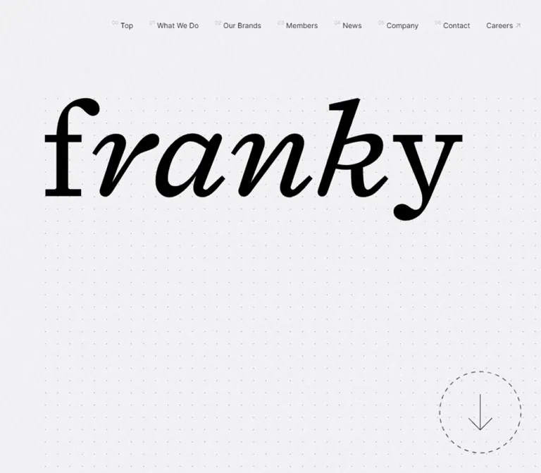
franky presents its company through an unusually spacious, continuous document. The opening is dominated by a black serif wordmark, a faint dot lattice, fine background grain, and a large downward arrow inside a dashed circle. Compact navigation sits toward the upper right. The relationship between enormous identity lettering and small functional text establishes the page's visual hierarchy.
Below the opening, six numbered chapters organize the company story: What We Do, Our Brands, Members, News, Company, and Contact. A precise grid supports alternating brand presentations, staggered member biographies, a long chronological news archive, and a narrow contact column. Most interface text remains regular-weight sans serif. Decoration comes from scale, texture, thin linework, and empty space rather than colored badges or elevated cards.
閉じる
franky, Inc. — Style Reference
A monumental serif signature on pale paper, organized by a quiet numbered grid.
Original URL: franky.inc Final URL: franky.inc/en/ Theme: light in the supplied captures; no theme selector was verified. Inspected: October 2, 2026, at 10:28:52.122 UTC / 19:28:52.122 JST, using the supplied browser evidence. Viewports: desktop 1440 × 1000 CSS pixels; mobile 390 × 844 CSS pixels. Scope: the current English-language corporate page reached from the original URL. Visual captures cover the desktop opening, a desktop news-list position, the desktop contact/footer ending, the mobile opening, and the mobile contact/footer ending. Rendered DOM evidence additionally covers the introduction, brands, members, news, company information, and contact content. Open menus, hover states, form submission, and linked websites were not inspected.
franky presents its company through an unusually spacious, continuous document. The opening is dominated by a black serif wordmark, a faint dot lattice, fine background grain, and a large downward arrow inside a dashed circle. Compact navigation sits toward the upper right. The relationship between enormous identity lettering and small functional text establishes the page's visual hierarchy.
Below the opening, six numbered chapters organize the company story: What We Do, Our Brands, Members, News, Company, and Contact. A precise grid supports alternating brand presentations, staggered member biographies, a long chronological news archive, and a narrow contact column. Most interface text remains regular-weight sans serif. Decoration comes from scale, texture, thin linework, and empty space rather than colored badges or elevated cards.
How to Read This Reference
- Measured means explicitly recorded in the supplied rendered DOM or computed styles. Dimensions are CSS pixels unless stated otherwise.
- Derived means calculated from recorded geometry, such as the content-grid fractions or space between two measured boxes.
- Estimated means visually assessed from the supplied original-page screenshots. These are not pixel samples or recovered CSS declarations.
- Recommended means a proposed implementation choice. Breakpoints, accessibility improvements, procedural grain, and interaction timings in the Quick Start belong to this category.
- Token names are new implementation aliases, not recovered source variables. The supplied custom-property list contains utility initialization values rather than a complete semantic design-token system.
- Font-family declarations establish the requested CSS stack, not which font supplied every rendered glyph. Nested artwork and child typography are not fully represented by the sampled heading wrappers.
- The final comparison image is excluded from all design measurements and component analysis.
Tokens — Colors
Default Palette
| Name | Value | Suggested token | Evidence and role |
|---|---|---|---|
| Pale Canvas | #f5f6f7 |
--color-paper |
Measured body background at both viewports; a very light, slightly cool gray |
| Black Ink | #000000 |
--color-ink |
Measured body text, links, and brand headings; also visually dominant in the opening wordmark |
| Quiet Ink | rgba(0, 0, 0, 0.3) |
--color-muted |
Measured inactive desktop JP link and introductory section-label wrapper |
| Quiet Ink on Canvas | approximately #acacad |
--color-muted-flat |
Calculated, rounded composite of 30% black over the untextured canvas; not a separate sampled source color |
| Tinted Panel | rgba(0, 0, 0, 0.1) |
--color-panel |
Measured recruitment-banner background at both viewports |
| White Field | approximately #ffffff |
--color-field |
Visually estimated for form interiors and the desktop news reading plane; their supplying background layers were not sampled |
| Fine Rule | approximately #e0e0e0 |
--color-rule |
Visual approximation for news dividers and input edges |
| Dot Ink | suggested rgba(0, 0, 0, 0.14) |
--color-dot |
Recommended starting opacity for the visible hero lattice; exact source opacity is unavailable |
| Ghost Outline | suggested rgba(0, 0, 0, 0.08) |
--color-ghost |
Recommended approximation for the very faint outlined footer wordmark |
The background grain changes the apparent lightness locally. Preserve the measured body color as the base instead of replacing it with a single gray inferred from a textured screenshot.
The news crop shows a cleaner white reading plane against the pale outer strip. Its sampled section and link backgrounds are transparent, so the white appearance must not be attributed to those elements specifically. An ancestor, sibling, or decorative layer may supply it.
No chromatic interface accent is established by the supplied original-page crops. The unseen brand-media assets may contain color; the monochrome shell does not prove that all site imagery is monochrome.
Tokens — Typography
Interface and Body Copy
Measured stack: Inter, YakuHanJPs, YakuHanJP, 'Kinto Sans', system-ui, sans-serif.
The interface relies on regular 400 weight and normal letter spacing. Navigation, news titles, biographies, and utility links are compact. Brand and member descriptions use a generous 28px line height with 14px text, giving long passages an open rhythm without increasing the font size.
The root remains a conventional 16px; there is no evidence of an unusual rem scaling system. The body itself is 14px / 22.75px.
Brand Headings
Measured family: 'Triptych Italick', serif.
Brand headings use 24px / 39px on desktop and 20px / 32.5px on mobile, with weight 400. Preserve the exact family spelling when loading an authorized font. The serif character separates brand identities from the surrounding practical sans-serif descriptions.
Opening and Footer Wordmarks
The opening lettering is a large, high-contrast serif identity with pronounced sloping forms. The footer repeats the identity as an enormous, faint outline.
The supplied evidence does not identify the wordmark's font declaration, vector source, or image path. Do not assume that its lettering is simply the measured brand-heading font. An authorized wordmark asset is the appropriate implementation input; a generic italic serif is only a placeholder.
Type Scale
| Role | Desktop | Mobile | Evidence |
|---|---|---|---|
| Root | 16px / 24px |
16px / 24px |
Measured |
| Body and news titles | 14px / 22.75px |
14px / 22.75px |
Measured |
| Brand descriptions and biographies | 14px / 28px |
14px / 28px |
Measured |
| Introductory supporting paragraph | 16px / 26px |
16px / 32px |
Measured |
| Brand heading | 24px / 39px |
20px / 32.5px |
Measured; Triptych Italick |
| Desktop navigation labels | 14px / 22.75px |
Replaced by closed menu control | Measured desktop; visually observed mobile replacement |
| Desktop locale links | 12px / 19.5px |
Not visible in the closed header | Measured desktop |
| Member social links | 14px / 22.75px |
12px / 19.5px |
Measured |
| Member reference/article links | 12px / 19.5px |
12px / 19.5px |
Measured |
| Introductory section-label wrapper | 12px / 19.5px |
12px / 19.5px |
Measured; child presentation is not fully sampled |
| Navigation numbers | approximately 10px |
Not visible in the closed header | Screenshot estimate |
| Contact labels | Not established | approximately 12px |
Mobile screenshot estimate |
| Footer copyright | approximately 14px |
approximately 12px |
Screenshot estimates |
Ordinary section-heading wrappers report 14px while their boxes are about 55.5px high on desktop and 51.5px on mobile. These wrapper values do not establish the size or rendering method of their decorative children. Avoid applying 14px indiscriminately to every visible section title.
The mobile DOM also contains menu-related links with 20px / 32.5px type and white text. They are not visible in the supplied closed-menu screenshots. Their presence does not verify an open-menu background, transition, or complete composition.
Tokens — Spacing & Shapes
Structural Grid
The full-width sections use a measured 24-column grid on desktop and 12-column grid on mobile.
| Grid property | Desktop at 1440px | Mobile at 390px | Status |
|---|---|---|---|
| Number of full-page tracks | 24 | 12 | Measured |
| Track width | 60px |
32.5px |
Measured |
| Track width as viewport fraction | 100vw / 24 |
100vw / 12 |
Derived for the inspected widths |
| Common outer content inset | 120px, two tracks |
32.5px, one track |
Measured |
| Common content width | 1200px |
325px |
Measured |
| Common content width as fraction | 83.3333% |
83.3333% |
Derived |
| Brand-copy width | 360px, six tracks |
292.5px, nine tracks |
Measured |
| News-list width | 960px, sixteen tracks |
325px, ten tracks |
Measured |
These fractions reproduce the supplied endpoints. The evidence does not establish a maximum container width or the exact intermediate breakpoint.
The hero's decorative dot lattice is a separate rhythm. Its estimated pitch is about 24px on desktop and 12–13px on mobile; it is not the structural column grid.
Spacing Scale
| Use | Desktop | Mobile | Evidence |
|---|---|---|---|
| Initial header top inset | 32px |
24px |
Measured padding |
| Initial header side inset | 40px |
24px |
Measured padding |
| Major section lead-in | commonly 192px |
commonly 128px |
Derived from Members and News heading positions |
| Brands heading to first media slot | 128px |
64px |
Derived |
| Between successive desktop brand media boxes | 128px |
Not applicable after stacking | Derived |
| Brand image to copy heading | Side-by-side composition | 24px vertically |
Derived |
| Brand heading to paragraph | 24px |
20px |
Derived |
| Brand paragraph to official-site link | 24px |
20px |
Derived |
| Mobile brand link to next media slot | Not applicable | 64px |
Derived |
| News heading inset within a row | 48px from row top |
67.5px from row top, after metadata |
Derived |
| News row separation | approximately 1px |
approximately 1px |
Geometry and visible desktop rules |
| Textarea to Submit | approximately 64px |
approximately 40px |
Screenshot estimates |
The measured news anchors themselves have zero padding. The visible insets may be supplied by their children. The Quick Start uses parent padding to reproduce the same spacing more simply.
Border Radius and Linework
Sampled sections, link wrappers, and recruitment banners have 0px border radius. Visible form controls are square. The major exception is the circular hero scroll cue.
Use fine rules and narrow arrow strokes, generally around 1px as a visual approximation. The hero ring is dashed, while news separators are continuous. There is no visible general-purpose card-shadow system in the supplied crops.
Key Visual Bounds
| Element | Desktop | Mobile | Status |
|---|---|---|---|
| Opening region height | 1000px |
844px |
Derived from the next section's measured start; one viewport in both captures |
| Opening wordmark ink bounds | roughly 820 × 240px, starting near (120, 192) |
starts near (65, 128) and extends to or beyond the right edge |
Screenshot estimates; not font sizes |
| Dot-field origin | near (120, 193) |
near (65, 130) |
Screenshot estimates |
| Scroll circle | approximately 160 × 160px |
approximately 96 × 96px |
Screenshot estimates |
| Scroll-circle edge clearance | approximately 40px right and bottom |
approximately 24px right and bottom |
Screenshot estimates |
| Brand media link | 660 × 440px |
325 × 216.66px |
Measured; approximately 3:2 |
| Official Website link | approximately 167.70 × 48px |
approximately 167.70 × 48px |
Measured |
| Recruitment banner | 1200 × 192px |
325 × 160px |
Measured |
| Contact lower-field column | approximately 720px, beginning at x=600 |
approximately 325px, beginning at x=32.5 |
Screenshot estimates |
| Mobile Subject input | Not established | approximately 325 × 52px |
Screenshot estimate |
| Mobile inquiry textarea | Total height not visible in desktop crop | approximately 325 × 285px |
Screenshot estimate |
| Submit surface | approximately 720 × 93px |
approximately 325 × 74px |
Screenshot estimates |
Components
Persistent Navigation
Role: access to the numbered company chapters, recruitment, and language versions.
The desktop header is transparent and spans the page, with its content grouped toward the right. The initial measured header box is 1440 × 68px, with 32px 40px 0 padding. Navigation presents small pale indices next to regular black labels: 00 Top, 01 What We Do, 02 Our Brands, 03 Members, 04 News, 05 Company, and 06 Contact.
Careers follows with a small northeast arrow. The locale selector uses JP / EN; EN is black and JP is 30% black in the captured English version. The header's left side remains open rather than containing a second compact logo.
Navigation remains visible in the supplied scrolled desktop crops, supporting a persistent-header interpretation. Its vertical placement appears slightly more compact there, but the corresponding scrolled styles and activation threshold were not sampled.
Mobile Menu Control
Role: compact access to navigation on the narrow viewport.
The full desktop navigation is absent from the mobile opening. A thin, asymmetric three-line mark occupies the upper-right corner. Its estimated visible width is 24px, with a shorter upper line aligned right, a full middle line, and a shorter lower line aligned left.
The measured mobile header is 390 × 52px, padded 24px 24px 0. The same control remains visible over the lower form capture. The opened menu was not supplied or exercised; neither a drawer direction nor an overlay color can be established.
For reuse, keep the visual mark small while providing a larger interactive target. An accessible disclosure implementation is a recommendation, not an observation of the original behavior.
Opening Wordmark and Dot Field
Role: establish identity before the company content begins.
A single large black wordmark sits high and left inside a full-viewport field. It is neither vertically centered nor paired with a visible opening paragraph. Below it, the remaining viewport is mostly textured negative space.
The dot lattice begins around the wordmark's upper-left region and continues toward the lower and right edges. Background grain extends beyond the dotted area. Keep those two textures distinct: a fine irregular grain across the canvas and a sparse regular point pattern inside the hero.
At 390px wide, the wordmark begins about 65px from the left edge and reaches beyond the visible right boundary. This is a captured composition, not proof of an intentional overflow rule. If reproducing it, clip only the decorative hero layer and keep the rest of the document free of horizontal scrolling.
Circular Downward Cue
Role: indicate continuation below the opening.
A long, thin downward arrow is centered inside a large dashed circle at the lower right. The desktop ring is about 160px across; mobile reduces it to roughly 96px. Neither version uses a solid fill, label, or shadow.
The circle supplies scale and visual weight while the arrow remains delicate. Preserve the long shaft and open arrowhead instead of replacing it with a heavy chevron.
The visual affordance suggests scrolling to the next section. Its actual click target, destination, and scroll animation were not tested.
What We Do Introduction
Role: connect the identity to the company's purpose.
The DOM contains the statement “It's not just stuff, it's your life.” followed by a paragraph describing franky as a lifestyle company handling brands and services. This material belongs to the next chapter, after the full-height opening.
On desktop, the measured section is 924px tall and its supporting content begins at x=240. On mobile, it is about 724.30px tall, with content at x=32.5 and a 325px width. The supporting paragraph changes from 16px / 26px to 16px / 32px.
The slogan's exact type size and visual treatment are not established by the supplied crops. Retain its content hierarchy without inventing a display-font measurement.
Alternating Brand Presentation
Role: introduce the current brand selection and provide access to each official website.
The measured current brand modules are WIND AND SEA, moln, PERVERZE, and Mori Journaling AI. Each has a large linked media slot, serif heading, sans-serif description, and Official Website link. Other names in historical news items should not automatically be added to this current brand sequence.
Desktop modules alternate across the 24-column grid. For the first and third modules, the media slot begins at x=240, spans 660px, and the copy begins at x=960 with a 360px width. For the second and fourth, the copy begins at x=180, and the media begins at x=600. The 60px gap between media and copy is one structural track.
On mobile, every media slot begins at x=32.5 and spans 325px. Copy starts below it at x=65, producing a deliberate extra one-column inset, with a width of 292.5px. The heading follows the image by 24px; subsequent copy gaps are 20px.
The Official Website anchor is a transparent inline-flex element about 167.7 × 48px at both sizes. Its nested decorative treatment was not sampled. The media content, image cropping, and hover behavior are unverified.
Member Biography
Role: present the people associated with the company and their supporting references.
Each member entry contains an English name, a Japanese name, a role, a substantial biography, and social links. Some also include Link and Article groups. Use real content length to determine the module height.
Desktop text columns are 420px wide: the left column starts at x=300, and the right at x=900. Yu Akasaka occupies the first left position; Ryota Shirakami's heading begins about 80px lower on the right; Jun Nishikawa appears farther down on the left. This is a staggered composition rather than three equal cards.
The mobile sequence is Yu Akasaka, Ryota Shirakami, then Jun Nishikawa. Text uses the same inset as brand descriptions: x=65, width 292.5px. Name wrappers grow from 39px to 56px high as the name presentation stacks. Biographies remain 14px / 28px, while social links reduce from 14px to 12px.
No supplied screenshot shows member imagery. Portrait subject, crop, color treatment, and image dimensions cannot be established from the text boxes alone.
Recruitment Banner
Role: provide a broad transition into recruitment.
The measured banner links to the careers website and contains Join Our Team! with supporting recruitment text. It spans the common content width: 1200 × 192px on desktop and 325 × 160px on mobile.
Its background is measured as 10% black, with square corners and black inherited text. A second recruitment link occurs later in the document after company information. The child typography and precise alignment are not separately measured.
Keep this as a generous flat panel integrated into the grid. Its measured treatment does not support a colorful, rounded application button or an elevated promotional card.
News Archive Row
Role: provide chronological access to company and brand announcements.
The desktop news list begins at x=360 and spans 960px, leaving a substantial open region to its left. A row contains date and category metadata, a regular-weight title, and a small northeast arrow near the right edge. Thin horizontal rules separate rows.
The title begins at x=600, allocating 240px to the metadata region. Its measured width is 660px; the remaining 60px provides the arrow region. A single-line anchor measures 118.75px high, with a row pitch of about 119.75px after separation. Two-line titles increase the anchor height to 141.5px. The design preserves full titles rather than forcing every row to the same height.
On mobile, the list occupies the full 325px content width. Metadata moves above the title, whose box also spans 325px. Representative row heights are 122.25px, 145px, and 167.75px for one, two, and three title lines. The heading's top inset is consistently 67.5px.
Each sampled row is an actual anchor to an external article or announcement. New-tab behavior and hover feedback were not verified. Preserve the single chronological list and understated metadata instead of introducing image cards unsupported by the current evidence.
Company Information
Role: provide concise legal and organizational facts.
The mobile rendered text identifies label/value content for Company Name, Established, Location, and Affiliated Company. The company value includes franky Co., Ltd. (franky, Inc.), consistent with the page title and copyright identity.
No supplied screenshot or sampled element geometry establishes this component's exact columns, borders, or row heights. A semantic description list is an appropriate implementation recommendation, but its visual details must remain provisional.
Contact Form
Role: collect an inquiry through a compact sequence of labeled fields.
The rendered text lists Name, Organization, Email Address, Inquiry Type, Subject, and Inquiry Content, each marked Required. Inquiry Type includes the placeholder Please select and options covering publicity, sales/service introductions, M&A, and other inquiries.
The visible lower form uses white square fields with faint borders. On desktop, the textarea and Submit surface occupy a right-offset column beginning around x=600 and ending at x=1320. On mobile, controls span the common 325px content width, with roughly 32.5px side margins.
The mobile Subject input is about 52px tall. The inquiry textarea is approximately 285px tall and shows a resize grip. Submit appears as a broad light-gray rectangle with centered white text, about 74px high on mobile and 93px on desktop.
This is a disabled-looking visual state. The supplied evidence does not include its disabled attribute, enablement conditions, validation messages, loading state, or successful submission behavior. Do not present any of those as verified features.
Footer and Upward Cue
Role: close the document with identity and a route back toward the opening.
The footer repeats the wordmark at a much larger scale as an almost invisible outline. On desktop, it spreads across the viewport and occupies much of the lower crop. On mobile, it extends beyond the narrow frame near the bottom edge.
A small black copyright line sits over this outline, centered in both screenshots. The visible text is ALL RIGHTS RESERVED ©franky, Inc. An unboxed, thin upward arrow sits at the lower right; it is also visible in the desktop news crop.
The arrow's persistence and direction suggest a return-to-top control, but its behavior and appearance threshold were not tested. Its visible stroke should remain delicate even if its accessible hit area is enlarged.
Tokens — Motion & Interaction
| Treatment | Available evidence | Implementation conclusion |
|---|---|---|
| Header persistence | Header remains visible at opening, news, and footer capture positions | Preserve persistent access; exact fixed/sticky rules and scrolled offsets are unverified |
| Mobile navigation | Closed control is visible; menu-related DOM exists | Opening behavior, focus management, backdrop, and transition are unverified |
| Downward and upward arrows | Directional graphics visible in screenshots | Their intended direction is clear; actual click behavior was not exercised |
| Brand and news navigation | Destination URLs are present on anchors | Links are established; hover effects and new-tab behavior are not |
| Sampled CSS animations | Recorded elements report animation: none |
No animation token can be recovered for those elements; descendants and script-driven effects remain possible |
| Sampled transitions | Evidence records transition: all without useful duration or easing details |
Do not assign a source duration or infer a visible transition from this alone |
| Form interaction | Empty lower fields and pale Submit surface are shown | Validation, submission, success, and error states remain unverified |
The collection process waited for document readiness, finite visible animation, layout/text stability, and image decoding within bounded time windows. Perpetual animations were paused during readiness checks and resumed. These procedures do not identify a particular animation or prove the absence of delayed content.
Recommended motion: keep the static composition complete before adding animation. For new hover or focus feedback, a restrained 150ms ease-out color or opacity change is sufficient. Any optional scrolling animation should respect reduced-motion preferences. Continuous ring rotation, grain flicker, cursor followers, and parallax are not supported by the supplied evidence.
Surfaces
| Layer | Appearance | Evidence and purpose |
|---|---|---|
| Main canvas | Very pale cool gray with fine grain | Measured base color plus visible texture; carries the opening and lower contact/footer region |
| Hero dot field | Sparse gray points over the canvas | Visually observed decorative structure |
| Brand/member wrappers | Transparent sampled containers | Content is arranged through spacing and alignment; media appearance is unverified |
| News reading plane | Visually white with thin gray dividers | Observed desktop crop; supplying background element is unknown |
| Recruitment panel | 10% black tint, square corners | Measured full-width banner surface |
| Form fields | White fill and faint square edge | Observed mobile and desktop lower form |
| Submit at capture | Pale gray rectangle with white label | Observed state; actual disabled semantics unknown |
| Footer identity | Faint outline over textured canvas | Decorative scale without a heavy footer panel |
Use surfaces sparingly. The strongest hierarchy comes from differences in scale and placement, not from stacking many shades of raised containers.
Imagery
The supplied original-page screenshots establish typographic identity and surface texture more strongly than photographic direction. The hero contains no visible photograph or product image. Its identity is carried by the wordmark, grain, dots, and line arrows.
The DOM establishes four linked brand-media regions with a consistent 3:2 ratio, but no media source URLs or original-page crops of those regions were supplied. Do not invent their subjects, dominant colors, saturation, focal points, or image effects. Member imagery is similarly unverified.
Observed Asset References
No asset-file paths are recoverable from the provided evidence. The following inventory identifies what is visible or structurally established without inventing filenames.
| Asset or region | Evidence | Reuse guidance |
|---|---|---|
| Opening wordmark | Visible on desktop and mobile | Supply an authorized identity asset; preserve proportions and sharp edges |
| Footer outline wordmark | Visible on desktop and mobile | Prefer an outline version of the same authorized artwork |
| Fine grain | Visible across the pale opening and contact/footer canvas | A subtle static procedural texture is an approximation, not the recovered asset |
| Dot lattice | Visible in the opening | CSS radial gradients can approximate the rhythm; exact source rendering is unknown |
| Directional arrows | Visible down, up, and northeast forms | Thin SVG strokes are a practical reconstruction method; original implementation is unknown |
| Brand media regions | Four measured linked 3:2 boxes | Preserve the measured slots; select or verify actual media separately |
| Member media | Not shown in the supplied crops | Do not infer portraits or treatment from whitespace preceding names |
Avoid making the texture so strong that it competes with body text. Keep wordmark edges crisp against the soft grain. Do not apply pixelated rendering to the identity or arrows.
Layout & Responsive Behavior
Measured Changes
| Feature | Desktop 1440 × 1000 | Mobile 390 × 844 |
|---|---|---|
| Structural grid | 24 tracks of 60px |
12 tracks of 32.5px |
| Primary outer margin | 120px |
32.5px |
| Navigation | Horizontal numbered controls, Careers, locale links | Closed asymmetric menu mark |
| Opening height | One viewport | One viewport |
| Hero left alignment | Wordmark and dots near 120px |
Wordmark and dots near 65px, farther inset than normal content |
| Brand presentation | Alternating media/copy placement | Image first; copy below and one track farther right |
| Brand heading | 24px |
20px |
| Brand description | 14px / 28px |
14px / 28px |
| Members | Staggered text columns of 420px |
One sequence with 292.5px text width |
| News | 960px list, metadata and title side by side |
325px list, metadata above title |
| Contact lower controls | Approximately 720px, offset right |
Approximately 325px, aligned to primary margins |
| Recruitment banner height | 192px |
160px |
| Total document height | 17,475.45px |
18,150.14px |
The shared 83.3333% content width should not be mistaken for a centered layout applied to every component. The introduction, brand media, brand copy, member text, news list, and form each use different starts within the underlying grid. Those offsets give the page its editorial character.
The brand modules stack on mobile, but their copy retains an extra inset. The news list behaves differently: title and metadata return to the full common width. Do not carry the narrow brand-copy width into every mobile component.
The archive remains long at both sizes. Its measured section height grows from approximately 6271px to 7467px, while the Members section grows from approximately 3027px to 3648px. These are content outcomes, not recommended fixed heights. News alone occupies roughly 36% of the desktop document and 41% of the mobile document.
Only two viewport widths were supplied. The exact navigation breakpoint, tablet composition, landscape behavior, maximum-width policy, and behavior under text zoom are unverified. The Quick Start uses a recommended 64rem breakpoint and requires intermediate-width testing.
Do’s and Don’ts
Do
- Preserve the contrast between the huge wordmark and small regular-weight interface text.
- Start from the measured
#f5f6f7canvas and black ink. - Keep grain and dots as separate, restrained layers.
- Use the 24-column desktop and 12-column mobile relationships to organize offsets.
- Retain the alternating desktop brand modules and inset mobile descriptions.
- Keep descriptive copy at a generous line height; measured brand and biography text uses
14px / 28px. - Let news titles wrap and increase row height naturally.
- Use fine line arrows, square fields, flat surfaces, and thin dividers.
- Preserve the six numbered company chapters and the archive's chronological structure.
- Treat unknown assets and interactions as inputs to verify, not opportunities to invent source details.
Don’t
- Don't replace the opening's empty space with unsupported promotional copy or large colored buttons.
- Don't center every section inside one uniform text column.
- Don't turn the brand and member areas into equal rounded cards.
- Don't mistake the dot lattice for the structural layout grid.
- Don't identify the wordmark font from the brand-heading declaration alone.
- Don't force the long news archive into fixed-height, truncated rows.
- Don't assume unseen brand imagery is grayscale because the interface is monochrome.
- Don't introduce heavy shadows, glossy gradients, or thick icon strokes.
- Don't infer a dark mobile menu merely from white text found in an unshown menu subtree.
- Don't report the pale Submit state as functionally disabled without checking its semantics.
- Don't hardcode captured document or section heights as layout requirements.
Recommended Implementation Additions
These are improvements for a new implementation, not verified original-site features:
- Give the mobile menu, downward cue, and upward cue explicit accessible names and at least a
44pxinteractive target. - Implement chapter navigation with meaningful section destinations and enough scroll offset for the persistent header.
- Keep menu controls keyboard-operable and ensure closed menu content cannot receive focus. Provide Escape handling if using a custom overlay.
- Increase contrast for essential metadata and Required labels. Preserve the original pale treatment for decoration without making necessary information difficult to read.
- Associate every form label with its control, expose required states programmatically, and provide clear validation, loading, success, and error feedback.
- Use at least
16pxtext in mobile form controls where appropriate to avoid unwanted input zoom; this is a recommendation, not a measured source value. - Hide decorative dots, grain, duplicate footer lettering, and arrow artwork from assistive technology where their parent controls already have names.
- Keep the complete page usable without animation. Respect reduced-motion settings if adding smooth scrolling or reveals.
- Test mobile wordmark clipping and the fixed controls at text zoom, intermediate widths, and device safe areas.
Agent Prompt Guide
Quick Color Reference
- Base canvas: measured
#f5f6f7. - Main text and identity: measured
#000000. - Quiet source text: measured
rgba(0, 0, 0, 0.3)in specified elements. - Recruitment panel: measured
rgba(0, 0, 0, 0.1). - Form interiors and news reading plane: visually near white.
- Fine rules: start near
#e0e0e0as an approximation. - Dot and footer-outline opacity: tune gently; no exact source values were supplied.
- Essential secondary text in a new implementation should use a darker accessible gray than the palest source labels.
Overall Prompt
“Create a long corporate website inspired by the current franky page. Use a pale cool-gray canvas, fine static grain, black typography, a monumental serif identity asset, and compact numbered navigation. Start with a full-viewport opening containing the large wordmark near the upper left, a sparse dot lattice, and a thin downward arrow inside a dashed circle at the lower right. Organize six company chapters on a 24-column desktop grid. Alternate 3:2 brand media with narrow descriptions, stagger member biographies, and present news as a long ruled list. Switch to 12 columns on mobile, stacking brand media above copy with an extra copy inset. Finish with square white form controls and an oversized faint outline wordmark. Use the supplied measurements; keep unknown imagery and interactions explicitly provisional.”
Example Component Prompts
- Opening: “At 1440 × 1000, place an authorized black wordmark approximately 120px from the left and 192px from the top, with about 820px of visible width. Add faint 24px-pitch dots behind it and very subtle canvas grain. Keep the remaining space open. Put a 160px dashed circle with a slender downward arrow 40px from the right and bottom. These visual positions are screenshot approximations.”
- Brand module: “Use a full-width 24-column grid. Place a 660 × 440 media slot at x=240 and a 360px copy column at x=960. Use the declared Triptych Italick family at 24px for the brand heading, regular 14px/28px body copy, and an unfilled Official Website link. Reverse the next module using the documented offsets. At 390px, use a 325px media slot and a 292.5px copy block inset to x=65.”
- News row: “Build a thinly ruled anchor row in a 960px desktop list. Allocate 240px to muted date/category metadata, 660px to the 14px title, and 60px to a delicate northeast arrow. Use approximately 48px above and below the title. On mobile, move metadata above the full-width title and let longer headlines increase the row height.”
- Member profile: “Create an open biography module with English and Japanese names, a role, 14px/28px biography text, social links, and optional reference groups. Use staggered 420px desktop text columns and a single 292.5px mobile text column. Do not invent portrait styling or equalize profile heights.”
- Contact and footer: “Use a 720px desktop form column beginning around x=600; on a 390px phone, use 325px-wide fields with 32.5px margins. Keep fields square and white, labels small, and the textarea tall. Reproduce the pale captured Submit appearance only as an explicitly modeled state. Add a faint oversized outline wordmark behind a small centered copyright and a thin upward control at the lower right.”
Quick Start
CSS Custom Properties
This is an adaptation, not recovered source CSS. It reproduces the measured grid relationships and selected visual approximations with conventional rem units. The breakpoint, readable secondary gray, grain generator, focus treatment, active Submit state, and optional disclosure panel are recommendations.
Load authorized fonts separately. The named families below do not download font files. Supply the wordmark as an authorized image or inline SVG; no original asset path is known.
Suggested markup structure:
- Put
franky-siteon the page body. Use asite-headercontainingsite-navand, for the recommended mobile implementation, a nativedetails.mobile-menudisclosure. - Place an image or SVG with class
hero-wordmarkand an anchor with classhero-scrollinsidehero. - Each
brand-rowcontainsbrand-mediaandbrand-copy. Addbrand-row--reverseto alternate desktop placement. - Each
news-rowanchor containsnews-meta,news-title, andnews-arrow. Keep dates and categories inside the metadata wrapper. - Put
contact-forminsidecontact-section. Eachform-fieldcontains a real label and its associated control. Only apply the disabled Submit styling when the application actually disables the button.
:root {
  /* Measured source colors */
  --color-paper: #f5f6f7;
  --color-ink: #000;
  --color-muted: rgb(0 0 0 / 30%);
  --color-panel: rgb(0 0 0 / 10%);

  /* Visual approximations and recommended additions */
  --color-field: #fff;
  --color-rule: #e0e0e0;
  --color-dot: rgb(0 0 0 / 14%);
  --color-ghost: rgb(0 0 0 / 8%);
  --color-readable-muted: #626466;

  /* Source-declared stacks; font files are not included */
  --font-ui: Inter, YakuHanJPs, YakuHanJP,
    'Kinto Sans', system-ui, sans-serif;
  --font-brand: 'Triptych Italick', serif;
  --text-body: 0.875rem;
  --text-small: 0.75rem;
  --text-brand: 1.5rem;
  --leading-ui: 1.625;
  --leading-copy: 2;

  /* Desktop relationships measured at 1440px */
  --columns: 24;
  --column: calc(100vw / 24);
  --section-space: 12rem;
  --brand-gap: 8rem;
  --brand-copy-gap: 1.5rem;
  --dot-pitch: 24px;
  --scroll-size: 10rem;
  --edge-space: 2.5rem;
  --rule: 1px;

  /* Recommended timing, not a source measurement */
  --motion-feedback: 150ms ease-out;

  /* Procedural grain approximation, not an original asset */
  --grain: url("data:image/svg+xml,%3Csvg xmlns='http://www.w3.org/2000/svg' width='160' height='160'%3E%3Cfilter id='n'%3E%3CfeTurbulence type='fractalNoise' baseFrequency='.9' numOctaves='3' stitchTiles='stitch'/%3E%3CfeColorMatrix type='saturate' values='0'/%3E%3C/filter%3E%3Crect width='100%25' height='100%25' filter='url(%23n)' opacity='.035'/%3E%3C/svg%3E");
}

* {
  box-sizing: border-box;
}

html {
  font-size: 16px;
  scroll-padding-top: 6rem;
}

.franky-site {
  margin: 0;
  color: var(--color-ink);
  background-color: var(--color-paper);
  background-image: var(--grain);
  font-family: var(--font-ui);
  font-size: var(--text-body);
  font-weight: 400;
  line-height: var(--leading-ui);
}

a {
  color: inherit;
}

button,
input,
select,
textarea {
  font: inherit;
}

img {
  display: block;
  max-width: 100%;
}

.site-header {
  position: fixed;
  inset: 0 0 auto;
  z-index: 50;
  display: flex;
  justify-content: flex-end;
  padding: 2rem 2.5rem 0;
}

.site-nav {
  display: flex;
  align-items: center;
  gap: 2rem;
}

.site-nav a {
  display: inline-flex;
  align-items: baseline;
  gap: 0.25rem;
  text-decoration: none;
}

.nav-index {
  color: var(--color-muted);
  font-size: 0.625rem;
  transform: translateY(-0.4em);
}

.locale {
  font-size: var(--text-small);
}

.locale-inactive {
  color: var(--color-muted);
}

.mobile-menu {
  display: none;
}

.hero {
  position: relative;
  min-height: 100vh;
  min-height: 100svh;
  overflow: clip;
}

.hero::before {
  content: '';
  position: absolute;
  inset: 19.2vh 0 var(--edge-space) calc(2 * var(--column));
  pointer-events: none;
  background-image: radial-gradient(
    circle,
    var(--color-dot) 0.7px,
    transparent 0.9px
  );
  background-size: var(--dot-pitch) var(--dot-pitch);
  background-position: calc(var(--dot-pitch) / -2)
    calc(var(--dot-pitch) / -2);
}

.hero-wordmark {
  position: absolute;
  top: 19.2vh;
  left: calc(2 * var(--column));
  width: 57vw;
  max-width: none;
  height: auto;
}

.hero-scroll {
  position: absolute;
  right: var(--edge-space);
  bottom: var(--edge-space);
  display: grid;
  place-items: center;
  width: var(--scroll-size);
  height: var(--scroll-size);
  border: 1px dashed rgb(0 0 0 / 45%);
  border-radius: 50%;
  color: var(--color-ink);
  text-decoration: none;
}

.hero-scroll svg {
  width: 3rem;
  height: 4.5rem;
  fill: none;
  stroke: currentColor;
  stroke-width: 1;
}

.section-grid,
.brand-row,
.contact-section,
.news-section {
  display: grid;
  grid-template-columns: repeat(var(--columns), minmax(0, 1fr));
}

.section-heading {
  grid-column: 3 / span 20;
  margin: 0;
  padding-top: var(--section-space);
}

.brand-list {
  display: grid;
  gap: var(--brand-gap);
  padding-block: var(--brand-gap) var(--section-space);
}

.brand-row {
  align-items: center;
}

.brand-media {
  grid-column: 5 / span 11;
  grid-row: 1;
  display: block;
  aspect-ratio: 3 / 2;
}

.brand-media img {
  width: 100%;
  height: 100%;
  object-fit: cover;
}

.brand-copy {
  grid-column: 17 / span 6;
  grid-row: 1;
  min-width: 0;
}

.brand-row--reverse .brand-media {
  grid-column: 11 / span 11;
}

.brand-row--reverse .brand-copy {
  grid-column: 4 / span 6;
}

.brand-title {
  margin: 0 0 var(--brand-copy-gap);
  font-family: var(--font-brand);
  font-size: var(--text-brand);
  font-weight: 400;
  line-height: var(--leading-ui);
}

.brand-description {
  margin: 0 0 var(--brand-copy-gap);
  line-height: var(--leading-copy);
}

.official-link {
  display: inline-flex;
  align-items: center;
  min-height: 3rem;
  text-decoration: none;
}

.member-copy {
  line-height: var(--leading-copy);
}

.recruitment-banner {
  display: flex;
  align-items: center;
  justify-content: center;
  min-height: 12rem;
  margin-inline: calc(2 * var(--column));
  padding: 2rem;
  background: var(--color-panel);
  text-align: center;
  text-decoration: none;
}

/* The white plane is a visual approximation of the captured news area. */
.news-section {
  position: relative;
  isolation: isolate;
  padding-bottom: var(--section-space);
}

.news-section::before {
  content: '';
  position: absolute;
  z-index: -1;
  inset: 0 0 0 var(--column);
  background: var(--color-field);
}

.news-list {
  grid-column: 7 / span 16;
  margin-top: 4rem;
  border-top: var(--rule) solid var(--color-rule);
}

.news-row {
  display: grid;
  grid-template-columns: 4fr 11fr 1fr;
  align-items: start;
  padding-block: 3rem;
  border-bottom: var(--rule) solid var(--color-rule);
  text-decoration: none;
}

.news-meta {
  display: flex;
  flex-wrap: wrap;
  gap: 0.75rem;
  color: var(--color-readable-muted);
}

.news-title {
  min-width: 0;
  margin: 0;
  font-size: var(--text-body);
  font-weight: 400;
  line-height: var(--leading-ui);
  overflow-wrap: anywhere;
}

.news-arrow {
  justify-self: end;
  color: var(--color-muted);
}

.contact-section {
  padding-block: var(--section-space);
}

.contact-form {
  grid-column: 11 / span 12;
  display: grid;
  gap: 1.75rem;
}

.form-field label {
  display: block;
  margin-bottom: 0.875rem;
  font-size: var(--text-small);
}

.required {
  color: var(--color-readable-muted);
}

.form-field :is(input, select, textarea) {
  display: block;
  width: 100%;
  border: var(--rule) solid var(--color-rule);
  border-radius: 0;
  padding: 0.875rem 1rem;
  color: var(--color-ink);
  background: var(--color-field);
  font-size: 1rem;
}

.form-field :is(input, select) {
  min-height: 3.25rem;
}

.form-field textarea {
  min-height: 17.875rem;
  resize: vertical;
}

/* Active appearance is recommended; only the pale state was captured. */
.submit-button {
  width: 100%;
  min-height: 5.875rem;
  margin-top: 2.25rem;
  border: 0;
  border-radius: 0;
  color: #fff;
  background: var(--color-ink);
  font-size: 1.125rem;
  cursor: pointer;
}

.submit-button:disabled {
  color: #fff;
  background: var(--color-panel);
  cursor: not-allowed;
}

.site-footer {
  position: relative;
  display: grid;
  place-items: center;
  min-height: 32rem;
  overflow: clip;
}

.footer-wordmark {
  position: absolute;
  width: 100%;
  max-width: none;
  color: var(--color-ghost);
  pointer-events: none;
}

/* Supply outline artwork; this rule is for an inline SVG version. */
.footer-wordmark path {
  fill: none;
  stroke: currentColor;
  stroke-width: 1px;
  vector-effect: non-scaling-stroke;
}

.footer-copyright {
  position: relative;
  margin: 0;
  font-size: var(--text-body);
}

.back-to-top {
  position: fixed;
  right: var(--edge-space);
  bottom: var(--edge-space);
  z-index: 40;
  display: grid;
  place-items: center;
  width: 44px;
  min-height: 64px;
  color: inherit;
}

.back-to-top svg {
  width: 38px;
  height: 56px;
  fill: none;
  stroke: currentColor;
  stroke-width: 1;
}

:where(a, button, summary, input, select, textarea):focus-visible {
  outline: 2px solid var(--color-ink);
  outline-offset: 4px;
}

@media (hover: hover) {
  .official-link:hover,
  .site-nav a:hover,
  .news-row:hover .news-title {
    text-decoration: underline;
    text-underline-offset: 0.2em;
  }
}

/* Recommended breakpoint; the original breakpoint is unknown. */
@media (max-width: 64rem) {
  :root {
    --columns: 12;
    --column: calc(100vw / 12);
    --section-space: 8rem;
    --brand-gap: 4rem;
    --brand-copy-gap: 1.25rem;
    --text-brand: 1.25rem;
    --dot-pitch: 12.5px;
    --scroll-size: 6rem;
    --edge-space: 1.5rem;
  }

  .site-header {
    padding: 1.5rem 1.5rem 0;
  }

  .site-nav {
    display: none;
  }

  /* Native disclosure fallback; its open design is a recommendation. */
  .mobile-menu {
    display: block;
  }

  .mobile-menu summary {
    display: grid;
    place-items: center;
    width: 44px;
    height: 44px;
    margin: -10px;
    list-style: none;
    cursor: pointer;
  }

  .mobile-menu summary::-webkit-details-marker {
    display: none;
  }

  .mobile-menu-panel {
    position: fixed;
    inset: 4.75rem 1.5rem auto;
    max-height: calc(100svh - 6.25rem);
    overflow-y: auto;
    padding: 1.5rem;
    border: 1px solid var(--color-rule);
    background-color: var(--color-paper);
    background-image: var(--grain);
  }

  .mobile-menu-panel a {
    display: block;
    padding-block: 0.625rem;
  }

  .hero::before {
    top: 15.2vh;
  }

  .hero-wordmark {
    top: 15.2vh;
    width: 87.2vw;
  }

  .hero-scroll svg {
    width: 2rem;
    height: 3rem;
  }

  .section-heading {
    grid-column: 2 / span 10;
  }

  .brand-media,
  .brand-row--reverse .brand-media {
    grid-column: 2 / span 10;
    grid-row: 1;
  }

  .brand-copy,
  .brand-row--reverse .brand-copy {
    grid-column: 3 / span 9;
    grid-row: 2;
    margin-top: 1.5rem;
  }

  .recruitment-banner {
    min-height: 10rem;
    margin-inline: var(--column);
  }

  .news-section::before {
    inset-inline: var(--column);
  }

  .news-list {
    grid-column: 2 / span 10;
  }

  .news-row {
    position: relative;
    grid-template-columns: minmax(0, 1fr);
    gap: 1rem;
    padding-block: 2rem;
  }

  .news-meta {
    padding-right: 1.5rem;
    font-size: var(--text-small);
  }

  .news-arrow {
    position: absolute;
    top: 2rem;
    right: 0;
  }

  .contact-form {
    grid-column: 2 / span 10;
  }

  .submit-button {
    min-height: 4.625rem;
    margin-top: 0.75rem;
    font-size: 1rem;
  }

  .site-footer {
    min-height: 15rem;
  }

  .footer-wordmark {
    width: 110%;
  }

  .footer-copyright {
    font-size: var(--text-small);
  }

  .back-to-top svg {
    width: 28px;
    height: 44px;
  }
}

@media (prefers-reduced-motion: no-preference) {
  .official-link,
  .site-nav a {
    transition: opacity var(--motion-feedback);
  }
}
The media rule's object-fit: cover is a recommendation for filling the measured slots. Verify each actual asset before choosing its crop. The mobile news-plane extent, menu panel, footer height, and hover underlines are also adaptation choices, not recovered original styles.
For the suggested native disclosure, give the summary an accessible Menu label and include actual navigation links inside mobile-menu-panel. If using a custom overlay instead, implement its keyboard and focus behavior separately. Likewise, connect the directional controls to meaningful section targets and decide when the upward control appears; no source threshold was established.
Tailwind v4 Token Mapping
Optional mapping for a new project already using Tailwind v4. This is not a claim about the original site's framework or version. Define the custom properties above first.
@theme inline {
  --color-paper: #f5f6f7;
  --color-ink: #000;
  --color-field: #fff;
  --color-rule: #e0e0e0;
  --color-quiet: rgb(0 0 0 / 30%);
  --color-panel: rgb(0 0 0 / 10%);
  --color-readable-muted: #626466;

  --font-ui: Inter, YakuHanJPs, YakuHanJP,
    'Kinto Sans', system-ui, sans-serif;
  --font-brand: 'Triptych Italick', serif;

  --text-caption: 0.75rem;
  --text-body: 0.875rem;
  --spacing-column: var(--column);
  --spacing-section: var(--section-space);
  --spacing-brand-gap: var(--brand-gap);
}
Sources & Evidence
- Original website URL: supplied browser observation records navigation to the same brand's English-language route.
- Inspected final page: HTTP
200, page title franky, Inc., company text, footer identity, rendered links, computed styles, and element geometry supplied by the user. - Capture timestamp: October 2, 2026,
2026-10-02T10:28:52.122Z. No separate timestamp was supplied for each screenshot. - Desktop evidence:
1440 × 1000viewport; opening, news-list, and contact/footer screenshots; measured document height approximately17,475.45px. - Mobile evidence:
390 × 844viewport; opening and lower contact/footer screenshots; measured document height approximately18,150.14px. - Rendered-style evidence: body color, declared font stacks, type sizes, line heights, grid tracks, selected link and section dimensions, banner background, and sampled transition/animation summaries.
- Interaction evidence: supplied scroll-position captures and rendered anchor destinations. No recorded menu opening, hover test, form submission, locale switch, or activation of the directional controls was available.
- Inspection limitations: no source asset manifest, complete stylesheet, verified wordmark font, intermediate-width capture, brand/member screenshot, or animation timeline was supplied. The collector used bounded readiness checks and disabled SharedWorkers and service workers; delayed or unexercised states remain unverified. No additional browsing or file inspection was performed for this reference.
This document describes the current page represented by the supplied captures and DOM evidence. Measurements, visual estimates, and proposed implementation choices are identified separately throughout.
# franky, Inc. — Style Reference

> A monumental serif signature on pale paper, organized by a quiet numbered grid.

**Original URL:** [franky.inc](https://franky.inc/)
**Final URL:** [franky.inc/en/](https://franky.inc/en/)
**Theme:** light in the supplied captures; no theme selector was verified.
**Inspected:** October 2, 2026, at 10:28:52.122 UTC / 19:28:52.122 JST, using the supplied browser evidence.
**Viewports:** desktop 1440 × 1000 CSS pixels; mobile 390 × 844 CSS pixels.
**Scope:** the current English-language corporate page reached from the original URL. Visual captures cover the desktop opening, a desktop news-list position, the desktop contact/footer ending, the mobile opening, and the mobile contact/footer ending. Rendered DOM evidence additionally covers the introduction, brands, members, news, company information, and contact content. Open menus, hover states, form submission, and linked websites were not inspected.

franky presents its company through an unusually spacious, continuous document. The opening is dominated by a black serif wordmark, a faint dot lattice, fine background grain, and a large downward arrow inside a dashed circle. Compact navigation sits toward the upper right. The relationship between enormous identity lettering and small functional text establishes the page's visual hierarchy.

Below the opening, six numbered chapters organize the company story: What We Do, Our Brands, Members, News, Company, and Contact. A precise grid supports alternating brand presentations, staggered member biographies, a long chronological news archive, and a narrow contact column. Most interface text remains regular-weight sans serif. Decoration comes from scale, texture, thin linework, and empty space rather than colored badges or elevated cards.
閉じる
# franky, Inc. — Style Reference

> A monumental serif signature on pale paper, organized by a quiet numbered grid.

**Original URL:** [franky.inc](https://franky.inc/)
**Final URL:** [franky.inc/en/](https://franky.inc/en/)
**Theme:** light in the supplied captures; no theme selector was verified.
**Inspected:** October 2, 2026, at 10:28:52.122 UTC / 19:28:52.122 JST, using the supplied browser evidence.
**Viewports:** desktop 1440 × 1000 CSS pixels; mobile 390 × 844 CSS pixels.
**Scope:** the current English-language corporate page reached from the original URL. Visual captures cover the desktop opening, a desktop news-list position, the desktop contact/footer ending, the mobile opening, and the mobile contact/footer ending. Rendered DOM evidence additionally covers the introduction, brands, members, news, company information, and contact content. Open menus, hover states, form submission, and linked websites were not inspected.

franky presents its company through an unusually spacious, continuous document. The opening is dominated by a black serif wordmark, a faint dot lattice, fine background grain, and a large downward arrow inside a dashed circle. Compact navigation sits toward the upper right. The relationship between enormous identity lettering and small functional text establishes the page's visual hierarchy.

Below the opening, six numbered chapters organize the company story: What We Do, Our Brands, Members, News, Company, and Contact. A precise grid supports alternating brand presentations, staggered member biographies, a long chronological news archive, and a narrow contact column. Most interface text remains regular-weight sans serif. Decoration comes from scale, texture, thin linework, and empty space rather than colored badges or elevated cards.

## How to Read This Reference

- **Measured** means explicitly recorded in the supplied rendered DOM or computed styles. Dimensions are CSS pixels unless stated otherwise.
- **Derived** means calculated from recorded geometry, such as the content-grid fractions or space between two measured boxes.
- **Estimated** means visually assessed from the supplied original-page screenshots. These are not pixel samples or recovered CSS declarations.
- **Recommended** means a proposed implementation choice. Breakpoints, accessibility improvements, procedural grain, and interaction timings in the Quick Start belong to this category.
- Token names are new implementation aliases, not recovered source variables. The supplied custom-property list contains utility initialization values rather than a complete semantic design-token system.
- Font-family declarations establish the requested CSS stack, not which font supplied every rendered glyph. Nested artwork and child typography are not fully represented by the sampled heading wrappers.
- The final comparison image is excluded from all design measurements and component analysis.

## Tokens — Colors

### Default Palette

| Name | Value | Suggested token | Evidence and role |
| --- | --- | --- | --- |
| Pale Canvas | `#f5f6f7` | `--color-paper` | Measured body background at both viewports; a very light, slightly cool gray |
| Black Ink | `#000000` | `--color-ink` | Measured body text, links, and brand headings; also visually dominant in the opening wordmark |
| Quiet Ink | `rgba(0, 0, 0, 0.3)` | `--color-muted` | Measured inactive desktop JP link and introductory section-label wrapper |
| Quiet Ink on Canvas | approximately `#acacad` | `--color-muted-flat` | Calculated, rounded composite of 30% black over the untextured canvas; not a separate sampled source color |
| Tinted Panel | `rgba(0, 0, 0, 0.1)` | `--color-panel` | Measured recruitment-banner background at both viewports |
| White Field | approximately `#ffffff` | `--color-field` | Visually estimated for form interiors and the desktop news reading plane; their supplying background layers were not sampled |
| Fine Rule | approximately `#e0e0e0` | `--color-rule` | Visual approximation for news dividers and input edges |
| Dot Ink | suggested `rgba(0, 0, 0, 0.14)` | `--color-dot` | Recommended starting opacity for the visible hero lattice; exact source opacity is unavailable |
| Ghost Outline | suggested `rgba(0, 0, 0, 0.08)` | `--color-ghost` | Recommended approximation for the very faint outlined footer wordmark |

The background grain changes the apparent lightness locally. Preserve the measured body color as the base instead of replacing it with a single gray inferred from a textured screenshot.

The news crop shows a cleaner white reading plane against the pale outer strip. Its sampled section and link backgrounds are transparent, so the white appearance must not be attributed to those elements specifically. An ancestor, sibling, or decorative layer may supply it.

No chromatic interface accent is established by the supplied original-page crops. The unseen brand-media assets may contain color; the monochrome shell does not prove that all site imagery is monochrome.

## Tokens — Typography

### Interface and Body Copy

**Measured stack:** `Inter, YakuHanJPs, YakuHanJP, 'Kinto Sans', system-ui, sans-serif`.

The interface relies on regular `400` weight and normal letter spacing. Navigation, news titles, biographies, and utility links are compact. Brand and member descriptions use a generous `28px` line height with `14px` text, giving long passages an open rhythm without increasing the font size.

The root remains a conventional `16px`; there is no evidence of an unusual rem scaling system. The body itself is `14px / 22.75px`.

### Brand Headings

**Measured family:** `'Triptych Italick', serif`.

Brand headings use `24px / 39px` on desktop and `20px / 32.5px` on mobile, with weight `400`. Preserve the exact family spelling when loading an authorized font. The serif character separates brand identities from the surrounding practical sans-serif descriptions.

### Opening and Footer Wordmarks

The opening lettering is a large, high-contrast serif identity with pronounced sloping forms. The footer repeats the identity as an enormous, faint outline.

The supplied evidence does not identify the wordmark's font declaration, vector source, or image path. Do not assume that its lettering is simply the measured brand-heading font. An authorized wordmark asset is the appropriate implementation input; a generic italic serif is only a placeholder.

### Type Scale

| Role | Desktop | Mobile | Evidence |
| --- | --- | --- | --- |
| Root | `16px / 24px` | `16px / 24px` | Measured |
| Body and news titles | `14px / 22.75px` | `14px / 22.75px` | Measured |
| Brand descriptions and biographies | `14px / 28px` | `14px / 28px` | Measured |
| Introductory supporting paragraph | `16px / 26px` | `16px / 32px` | Measured |
| Brand heading | `24px / 39px` | `20px / 32.5px` | Measured; Triptych Italick |
| Desktop navigation labels | `14px / 22.75px` | Replaced by closed menu control | Measured desktop; visually observed mobile replacement |
| Desktop locale links | `12px / 19.5px` | Not visible in the closed header | Measured desktop |
| Member social links | `14px / 22.75px` | `12px / 19.5px` | Measured |
| Member reference/article links | `12px / 19.5px` | `12px / 19.5px` | Measured |
| Introductory section-label wrapper | `12px / 19.5px` | `12px / 19.5px` | Measured; child presentation is not fully sampled |
| Navigation numbers | approximately `10px` | Not visible in the closed header | Screenshot estimate |
| Contact labels | Not established | approximately `12px` | Mobile screenshot estimate |
| Footer copyright | approximately `14px` | approximately `12px` | Screenshot estimates |

Ordinary section-heading wrappers report `14px` while their boxes are about `55.5px` high on desktop and `51.5px` on mobile. These wrapper values do not establish the size or rendering method of their decorative children. Avoid applying `14px` indiscriminately to every visible section title.

The mobile DOM also contains menu-related links with `20px / 32.5px` type and white text. They are not visible in the supplied closed-menu screenshots. Their presence does not verify an open-menu background, transition, or complete composition.

## Tokens — Spacing & Shapes

### Structural Grid

The full-width sections use a measured **24-column grid on desktop** and **12-column grid on mobile**.

| Grid property | Desktop at 1440px | Mobile at 390px | Status |
| --- | --- | --- | --- |
| Number of full-page tracks | 24 | 12 | Measured |
| Track width | `60px` | `32.5px` | Measured |
| Track width as viewport fraction | `100vw / 24` | `100vw / 12` | Derived for the inspected widths |
| Common outer content inset | `120px`, two tracks | `32.5px`, one track | Measured |
| Common content width | `1200px` | `325px` | Measured |
| Common content width as fraction | `83.3333%` | `83.3333%` | Derived |
| Brand-copy width | `360px`, six tracks | `292.5px`, nine tracks | Measured |
| News-list width | `960px`, sixteen tracks | `325px`, ten tracks | Measured |

These fractions reproduce the supplied endpoints. The evidence does not establish a maximum container width or the exact intermediate breakpoint.

The hero's decorative dot lattice is a separate rhythm. Its estimated pitch is about `24px` on desktop and `12–13px` on mobile; it is not the structural column grid.

### Spacing Scale

| Use | Desktop | Mobile | Evidence |
| --- | --- | --- | --- |
| Initial header top inset | `32px` | `24px` | Measured padding |
| Initial header side inset | `40px` | `24px` | Measured padding |
| Major section lead-in | commonly `192px` | commonly `128px` | Derived from Members and News heading positions |
| Brands heading to first media slot | `128px` | `64px` | Derived |
| Between successive desktop brand media boxes | `128px` | Not applicable after stacking | Derived |
| Brand image to copy heading | Side-by-side composition | `24px` vertically | Derived |
| Brand heading to paragraph | `24px` | `20px` | Derived |
| Brand paragraph to official-site link | `24px` | `20px` | Derived |
| Mobile brand link to next media slot | Not applicable | `64px` | Derived |
| News heading inset within a row | `48px` from row top | `67.5px` from row top, after metadata | Derived |
| News row separation | approximately `1px` | approximately `1px` | Geometry and visible desktop rules |
| Textarea to Submit | approximately `64px` | approximately `40px` | Screenshot estimates |

The measured news anchors themselves have zero padding. The visible insets may be supplied by their children. The Quick Start uses parent padding to reproduce the same spacing more simply.

### Border Radius and Linework

Sampled sections, link wrappers, and recruitment banners have `0px` border radius. Visible form controls are square. The major exception is the circular hero scroll cue.

Use fine rules and narrow arrow strokes, generally around `1px` as a visual approximation. The hero ring is dashed, while news separators are continuous. There is no visible general-purpose card-shadow system in the supplied crops.

### Key Visual Bounds

| Element | Desktop | Mobile | Status |
| --- | --- | --- | --- |
| Opening region height | `1000px` | `844px` | Derived from the next section's measured start; one viewport in both captures |
| Opening wordmark ink bounds | roughly `820 × 240px`, starting near `(120, 192)` | starts near `(65, 128)` and extends to or beyond the right edge | Screenshot estimates; not font sizes |
| Dot-field origin | near `(120, 193)` | near `(65, 130)` | Screenshot estimates |
| Scroll circle | approximately `160 × 160px` | approximately `96 × 96px` | Screenshot estimates |
| Scroll-circle edge clearance | approximately `40px` right and bottom | approximately `24px` right and bottom | Screenshot estimates |
| Brand media link | `660 × 440px` | `325 × 216.66px` | Measured; approximately 3:2 |
| Official Website link | approximately `167.70 × 48px` | approximately `167.70 × 48px` | Measured |
| Recruitment banner | `1200 × 192px` | `325 × 160px` | Measured |
| Contact lower-field column | approximately `720px`, beginning at `x=600` | approximately `325px`, beginning at `x=32.5` | Screenshot estimates |
| Mobile Subject input | Not established | approximately `325 × 52px` | Screenshot estimate |
| Mobile inquiry textarea | Total height not visible in desktop crop | approximately `325 × 285px` | Screenshot estimate |
| Submit surface | approximately `720 × 93px` | approximately `325 × 74px` | Screenshot estimates |

## Components

### Persistent Navigation

**Role:** access to the numbered company chapters, recruitment, and language versions.

The desktop header is transparent and spans the page, with its content grouped toward the right. The initial measured header box is `1440 × 68px`, with `32px 40px 0` padding. Navigation presents small pale indices next to regular black labels: `00 Top`, `01 What We Do`, `02 Our Brands`, `03 Members`, `04 News`, `05 Company`, and `06 Contact`.

Careers follows with a small northeast arrow. The locale selector uses `JP / EN`; EN is black and JP is 30% black in the captured English version. The header's left side remains open rather than containing a second compact logo.

Navigation remains visible in the supplied scrolled desktop crops, supporting a persistent-header interpretation. Its vertical placement appears slightly more compact there, but the corresponding scrolled styles and activation threshold were not sampled.

### Mobile Menu Control

**Role:** compact access to navigation on the narrow viewport.

The full desktop navigation is absent from the mobile opening. A thin, asymmetric three-line mark occupies the upper-right corner. Its estimated visible width is `24px`, with a shorter upper line aligned right, a full middle line, and a shorter lower line aligned left.

The measured mobile header is `390 × 52px`, padded `24px 24px 0`. The same control remains visible over the lower form capture. The opened menu was not supplied or exercised; neither a drawer direction nor an overlay color can be established.

For reuse, keep the visual mark small while providing a larger interactive target. An accessible disclosure implementation is a recommendation, not an observation of the original behavior.

### Opening Wordmark and Dot Field

**Role:** establish identity before the company content begins.

A single large black wordmark sits high and left inside a full-viewport field. It is neither vertically centered nor paired with a visible opening paragraph. Below it, the remaining viewport is mostly textured negative space.

The dot lattice begins around the wordmark's upper-left region and continues toward the lower and right edges. Background grain extends beyond the dotted area. Keep those two textures distinct: a fine irregular grain across the canvas and a sparse regular point pattern inside the hero.

At 390px wide, the wordmark begins about `65px` from the left edge and reaches beyond the visible right boundary. This is a captured composition, not proof of an intentional overflow rule. If reproducing it, clip only the decorative hero layer and keep the rest of the document free of horizontal scrolling.

### Circular Downward Cue

**Role:** indicate continuation below the opening.

A long, thin downward arrow is centered inside a large dashed circle at the lower right. The desktop ring is about `160px` across; mobile reduces it to roughly `96px`. Neither version uses a solid fill, label, or shadow.

The circle supplies scale and visual weight while the arrow remains delicate. Preserve the long shaft and open arrowhead instead of replacing it with a heavy chevron.

The visual affordance suggests scrolling to the next section. Its actual click target, destination, and scroll animation were not tested.

### What We Do Introduction

**Role:** connect the identity to the company's purpose.

The DOM contains the statement “It's not just stuff, it's your life.” followed by a paragraph describing franky as a lifestyle company handling brands and services. This material belongs to the next chapter, after the full-height opening.

On desktop, the measured section is `924px` tall and its supporting content begins at `x=240`. On mobile, it is about `724.30px` tall, with content at `x=32.5` and a `325px` width. The supporting paragraph changes from `16px / 26px` to `16px / 32px`.

The slogan's exact type size and visual treatment are not established by the supplied crops. Retain its content hierarchy without inventing a display-font measurement.

### Alternating Brand Presentation

**Role:** introduce the current brand selection and provide access to each official website.

The measured current brand modules are WIND AND SEA, moln, PERVERZE, and Mori Journaling AI. Each has a large linked media slot, serif heading, sans-serif description, and Official Website link. Other names in historical news items should not automatically be added to this current brand sequence.

Desktop modules alternate across the 24-column grid. For the first and third modules, the media slot begins at `x=240`, spans `660px`, and the copy begins at `x=960` with a `360px` width. For the second and fourth, the copy begins at `x=180`, and the media begins at `x=600`. The `60px` gap between media and copy is one structural track.

On mobile, every media slot begins at `x=32.5` and spans `325px`. Copy starts below it at `x=65`, producing a deliberate extra one-column inset, with a width of `292.5px`. The heading follows the image by `24px`; subsequent copy gaps are `20px`.

The Official Website anchor is a transparent `inline-flex` element about `167.7 × 48px` at both sizes. Its nested decorative treatment was not sampled. The media content, image cropping, and hover behavior are unverified.

### Member Biography

**Role:** present the people associated with the company and their supporting references.

Each member entry contains an English name, a Japanese name, a role, a substantial biography, and social links. Some also include Link and Article groups. Use real content length to determine the module height.

Desktop text columns are `420px` wide: the left column starts at `x=300`, and the right at `x=900`. Yu Akasaka occupies the first left position; Ryota Shirakami's heading begins about `80px` lower on the right; Jun Nishikawa appears farther down on the left. This is a staggered composition rather than three equal cards.

The mobile sequence is Yu Akasaka, Ryota Shirakami, then Jun Nishikawa. Text uses the same inset as brand descriptions: `x=65`, width `292.5px`. Name wrappers grow from `39px` to `56px` high as the name presentation stacks. Biographies remain `14px / 28px`, while social links reduce from `14px` to `12px`.

No supplied screenshot shows member imagery. Portrait subject, crop, color treatment, and image dimensions cannot be established from the text boxes alone.

### Recruitment Banner

**Role:** provide a broad transition into recruitment.

The measured banner links to the careers website and contains Join Our Team! with supporting recruitment text. It spans the common content width: `1200 × 192px` on desktop and `325 × 160px` on mobile.

Its background is measured as 10% black, with square corners and black inherited text. A second recruitment link occurs later in the document after company information. The child typography and precise alignment are not separately measured.

Keep this as a generous flat panel integrated into the grid. Its measured treatment does not support a colorful, rounded application button or an elevated promotional card.

### News Archive Row

**Role:** provide chronological access to company and brand announcements.

The desktop news list begins at `x=360` and spans `960px`, leaving a substantial open region to its left. A row contains date and category metadata, a regular-weight title, and a small northeast arrow near the right edge. Thin horizontal rules separate rows.

The title begins at `x=600`, allocating `240px` to the metadata region. Its measured width is `660px`; the remaining `60px` provides the arrow region. A single-line anchor measures `118.75px` high, with a row pitch of about `119.75px` after separation. Two-line titles increase the anchor height to `141.5px`. The design preserves full titles rather than forcing every row to the same height.

On mobile, the list occupies the full `325px` content width. Metadata moves above the title, whose box also spans `325px`. Representative row heights are `122.25px`, `145px`, and `167.75px` for one, two, and three title lines. The heading's top inset is consistently `67.5px`.

Each sampled row is an actual anchor to an external article or announcement. New-tab behavior and hover feedback were not verified. Preserve the single chronological list and understated metadata instead of introducing image cards unsupported by the current evidence.

### Company Information

**Role:** provide concise legal and organizational facts.

The mobile rendered text identifies label/value content for Company Name, Established, Location, and Affiliated Company. The company value includes franky Co., Ltd. (franky, Inc.), consistent with the page title and copyright identity.

No supplied screenshot or sampled element geometry establishes this component's exact columns, borders, or row heights. A semantic description list is an appropriate implementation recommendation, but its visual details must remain provisional.

### Contact Form

**Role:** collect an inquiry through a compact sequence of labeled fields.

The rendered text lists Name, Organization, Email Address, Inquiry Type, Subject, and Inquiry Content, each marked Required. Inquiry Type includes the placeholder Please select and options covering publicity, sales/service introductions, M&A, and other inquiries.

The visible lower form uses white square fields with faint borders. On desktop, the textarea and Submit surface occupy a right-offset column beginning around `x=600` and ending at `x=1320`. On mobile, controls span the common `325px` content width, with roughly `32.5px` side margins.

The mobile Subject input is about `52px` tall. The inquiry textarea is approximately `285px` tall and shows a resize grip. Submit appears as a broad light-gray rectangle with centered white text, about `74px` high on mobile and `93px` on desktop.

This is a disabled-looking visual state. The supplied evidence does not include its disabled attribute, enablement conditions, validation messages, loading state, or successful submission behavior. Do not present any of those as verified features.

### Footer and Upward Cue

**Role:** close the document with identity and a route back toward the opening.

The footer repeats the wordmark at a much larger scale as an almost invisible outline. On desktop, it spreads across the viewport and occupies much of the lower crop. On mobile, it extends beyond the narrow frame near the bottom edge.

A small black copyright line sits over this outline, centered in both screenshots. The visible text is ALL RIGHTS RESERVED ©franky, Inc. An unboxed, thin upward arrow sits at the lower right; it is also visible in the desktop news crop.

The arrow's persistence and direction suggest a return-to-top control, but its behavior and appearance threshold were not tested. Its visible stroke should remain delicate even if its accessible hit area is enlarged.

## Tokens — Motion & Interaction

| Treatment | Available evidence | Implementation conclusion |
| --- | --- | --- |
| Header persistence | Header remains visible at opening, news, and footer capture positions | Preserve persistent access; exact fixed/sticky rules and scrolled offsets are unverified |
| Mobile navigation | Closed control is visible; menu-related DOM exists | Opening behavior, focus management, backdrop, and transition are unverified |
| Downward and upward arrows | Directional graphics visible in screenshots | Their intended direction is clear; actual click behavior was not exercised |
| Brand and news navigation | Destination URLs are present on anchors | Links are established; hover effects and new-tab behavior are not |
| Sampled CSS animations | Recorded elements report `animation: none` | No animation token can be recovered for those elements; descendants and script-driven effects remain possible |
| Sampled transitions | Evidence records `transition: all` without useful duration or easing details | Do not assign a source duration or infer a visible transition from this alone |
| Form interaction | Empty lower fields and pale Submit surface are shown | Validation, submission, success, and error states remain unverified |

The collection process waited for document readiness, finite visible animation, layout/text stability, and image decoding within bounded time windows. Perpetual animations were paused during readiness checks and resumed. These procedures do not identify a particular animation or prove the absence of delayed content.

**Recommended motion:** keep the static composition complete before adding animation. For new hover or focus feedback, a restrained `150ms ease-out` color or opacity change is sufficient. Any optional scrolling animation should respect reduced-motion preferences. Continuous ring rotation, grain flicker, cursor followers, and parallax are not supported by the supplied evidence.

## Surfaces

| Layer | Appearance | Evidence and purpose |
| --- | --- | --- |
| Main canvas | Very pale cool gray with fine grain | Measured base color plus visible texture; carries the opening and lower contact/footer region |
| Hero dot field | Sparse gray points over the canvas | Visually observed decorative structure |
| Brand/member wrappers | Transparent sampled containers | Content is arranged through spacing and alignment; media appearance is unverified |
| News reading plane | Visually white with thin gray dividers | Observed desktop crop; supplying background element is unknown |
| Recruitment panel | 10% black tint, square corners | Measured full-width banner surface |
| Form fields | White fill and faint square edge | Observed mobile and desktop lower form |
| Submit at capture | Pale gray rectangle with white label | Observed state; actual disabled semantics unknown |
| Footer identity | Faint outline over textured canvas | Decorative scale without a heavy footer panel |

Use surfaces sparingly. The strongest hierarchy comes from differences in scale and placement, not from stacking many shades of raised containers.

## Imagery

The supplied original-page screenshots establish typographic identity and surface texture more strongly than photographic direction. The hero contains no visible photograph or product image. Its identity is carried by the wordmark, grain, dots, and line arrows.

The DOM establishes four linked brand-media regions with a consistent 3:2 ratio, but no media source URLs or original-page crops of those regions were supplied. Do not invent their subjects, dominant colors, saturation, focal points, or image effects. Member imagery is similarly unverified.

### Observed Asset References

No asset-file paths are recoverable from the provided evidence. The following inventory identifies what is visible or structurally established without inventing filenames.

| Asset or region | Evidence | Reuse guidance |
| --- | --- | --- |
| Opening wordmark | Visible on desktop and mobile | Supply an authorized identity asset; preserve proportions and sharp edges |
| Footer outline wordmark | Visible on desktop and mobile | Prefer an outline version of the same authorized artwork |
| Fine grain | Visible across the pale opening and contact/footer canvas | A subtle static procedural texture is an approximation, not the recovered asset |
| Dot lattice | Visible in the opening | CSS radial gradients can approximate the rhythm; exact source rendering is unknown |
| Directional arrows | Visible down, up, and northeast forms | Thin SVG strokes are a practical reconstruction method; original implementation is unknown |
| Brand media regions | Four measured linked 3:2 boxes | Preserve the measured slots; select or verify actual media separately |
| Member media | Not shown in the supplied crops | Do not infer portraits or treatment from whitespace preceding names |

Avoid making the texture so strong that it competes with body text. Keep wordmark edges crisp against the soft grain. Do not apply pixelated rendering to the identity or arrows.

## Layout & Responsive Behavior

### Measured Changes

| Feature | Desktop 1440 × 1000 | Mobile 390 × 844 |
| --- | --- | --- |
| Structural grid | 24 tracks of `60px` | 12 tracks of `32.5px` |
| Primary outer margin | `120px` | `32.5px` |
| Navigation | Horizontal numbered controls, Careers, locale links | Closed asymmetric menu mark |
| Opening height | One viewport | One viewport |
| Hero left alignment | Wordmark and dots near `120px` | Wordmark and dots near `65px`, farther inset than normal content |
| Brand presentation | Alternating media/copy placement | Image first; copy below and one track farther right |
| Brand heading | `24px` | `20px` |
| Brand description | `14px / 28px` | `14px / 28px` |
| Members | Staggered text columns of `420px` | One sequence with `292.5px` text width |
| News | `960px` list, metadata and title side by side | `325px` list, metadata above title |
| Contact lower controls | Approximately `720px`, offset right | Approximately `325px`, aligned to primary margins |
| Recruitment banner height | `192px` | `160px` |
| Total document height | `17,475.45px` | `18,150.14px` |

The shared `83.3333%` content width should not be mistaken for a centered layout applied to every component. The introduction, brand media, brand copy, member text, news list, and form each use different starts within the underlying grid. Those offsets give the page its editorial character.

The brand modules stack on mobile, but their copy retains an extra inset. The news list behaves differently: title and metadata return to the full common width. Do not carry the narrow brand-copy width into every mobile component.

The archive remains long at both sizes. Its measured section height grows from approximately `6271px` to `7467px`, while the Members section grows from approximately `3027px` to `3648px`. These are content outcomes, not recommended fixed heights. News alone occupies roughly 36% of the desktop document and 41% of the mobile document.

Only two viewport widths were supplied. The exact navigation breakpoint, tablet composition, landscape behavior, maximum-width policy, and behavior under text zoom are unverified. The Quick Start uses a recommended `64rem` breakpoint and requires intermediate-width testing.

## Do’s and Don’ts

### Do

- Preserve the contrast between the huge wordmark and small regular-weight interface text.
- Start from the measured `#f5f6f7` canvas and black ink.
- Keep grain and dots as separate, restrained layers.
- Use the 24-column desktop and 12-column mobile relationships to organize offsets.
- Retain the alternating desktop brand modules and inset mobile descriptions.
- Keep descriptive copy at a generous line height; measured brand and biography text uses `14px / 28px`.
- Let news titles wrap and increase row height naturally.
- Use fine line arrows, square fields, flat surfaces, and thin dividers.
- Preserve the six numbered company chapters and the archive's chronological structure.
- Treat unknown assets and interactions as inputs to verify, not opportunities to invent source details.

### Don’t

- Don't replace the opening's empty space with unsupported promotional copy or large colored buttons.
- Don't center every section inside one uniform text column.
- Don't turn the brand and member areas into equal rounded cards.
- Don't mistake the dot lattice for the structural layout grid.
- Don't identify the wordmark font from the brand-heading declaration alone.
- Don't force the long news archive into fixed-height, truncated rows.
- Don't assume unseen brand imagery is grayscale because the interface is monochrome.
- Don't introduce heavy shadows, glossy gradients, or thick icon strokes.
- Don't infer a dark mobile menu merely from white text found in an unshown menu subtree.
- Don't report the pale Submit state as functionally disabled without checking its semantics.
- Don't hardcode captured document or section heights as layout requirements.

## Recommended Implementation Additions

These are improvements for a new implementation, not verified original-site features:

- Give the mobile menu, downward cue, and upward cue explicit accessible names and at least a `44px` interactive target.
- Implement chapter navigation with meaningful section destinations and enough scroll offset for the persistent header.
- Keep menu controls keyboard-operable and ensure closed menu content cannot receive focus. Provide Escape handling if using a custom overlay.
- Increase contrast for essential metadata and Required labels. Preserve the original pale treatment for decoration without making necessary information difficult to read.
- Associate every form label with its control, expose required states programmatically, and provide clear validation, loading, success, and error feedback.
- Use at least `16px` text in mobile form controls where appropriate to avoid unwanted input zoom; this is a recommendation, not a measured source value.
- Hide decorative dots, grain, duplicate footer lettering, and arrow artwork from assistive technology where their parent controls already have names.
- Keep the complete page usable without animation. Respect reduced-motion settings if adding smooth scrolling or reveals.
- Test mobile wordmark clipping and the fixed controls at text zoom, intermediate widths, and device safe areas.

## Agent Prompt Guide

### Quick Color Reference

- Base canvas: measured `#f5f6f7`.
- Main text and identity: measured `#000000`.
- Quiet source text: measured `rgba(0, 0, 0, 0.3)` in specified elements.
- Recruitment panel: measured `rgba(0, 0, 0, 0.1)`.
- Form interiors and news reading plane: visually near white.
- Fine rules: start near `#e0e0e0` as an approximation.
- Dot and footer-outline opacity: tune gently; no exact source values were supplied.
- Essential secondary text in a new implementation should use a darker accessible gray than the palest source labels.

### Overall Prompt

“Create a long corporate website inspired by the current franky page. Use a pale cool-gray canvas, fine static grain, black typography, a monumental serif identity asset, and compact numbered navigation. Start with a full-viewport opening containing the large wordmark near the upper left, a sparse dot lattice, and a thin downward arrow inside a dashed circle at the lower right. Organize six company chapters on a 24-column desktop grid. Alternate 3:2 brand media with narrow descriptions, stagger member biographies, and present news as a long ruled list. Switch to 12 columns on mobile, stacking brand media above copy with an extra copy inset. Finish with square white form controls and an oversized faint outline wordmark. Use the supplied measurements; keep unknown imagery and interactions explicitly provisional.”

### Example Component Prompts

1. **Opening:** “At 1440 × 1000, place an authorized black wordmark approximately 120px from the left and 192px from the top, with about 820px of visible width. Add faint 24px-pitch dots behind it and very subtle canvas grain. Keep the remaining space open. Put a 160px dashed circle with a slender downward arrow 40px from the right and bottom. These visual positions are screenshot approximations.”
2. **Brand module:** “Use a full-width 24-column grid. Place a 660 × 440 media slot at x=240 and a 360px copy column at x=960. Use the declared Triptych Italick family at 24px for the brand heading, regular 14px/28px body copy, and an unfilled Official Website link. Reverse the next module using the documented offsets. At 390px, use a 325px media slot and a 292.5px copy block inset to x=65.”
3. **News row:** “Build a thinly ruled anchor row in a 960px desktop list. Allocate 240px to muted date/category metadata, 660px to the 14px title, and 60px to a delicate northeast arrow. Use approximately 48px above and below the title. On mobile, move metadata above the full-width title and let longer headlines increase the row height.”
4. **Member profile:** “Create an open biography module with English and Japanese names, a role, 14px/28px biography text, social links, and optional reference groups. Use staggered 420px desktop text columns and a single 292.5px mobile text column. Do not invent portrait styling or equalize profile heights.”
5. **Contact and footer:** “Use a 720px desktop form column beginning around x=600; on a 390px phone, use 325px-wide fields with 32.5px margins. Keep fields square and white, labels small, and the textarea tall. Reproduce the pale captured Submit appearance only as an explicitly modeled state. Add a faint oversized outline wordmark behind a small centered copyright and a thin upward control at the lower right.”

## Quick Start

### CSS Custom Properties

This is an adaptation, not recovered source CSS. It reproduces the measured grid relationships and selected visual approximations with conventional rem units. The breakpoint, readable secondary gray, grain generator, focus treatment, active Submit state, and optional disclosure panel are recommendations.

Load authorized fonts separately. The named families below do not download font files. Supply the wordmark as an authorized image or inline SVG; no original asset path is known.

Suggested markup structure:

- Put `franky-site` on the page body. Use a `site-header` containing `site-nav` and, for the recommended mobile implementation, a native `details.mobile-menu` disclosure.
- Place an image or SVG with class `hero-wordmark` and an anchor with class `hero-scroll` inside `hero`.
- Each `brand-row` contains `brand-media` and `brand-copy`. Add `brand-row--reverse` to alternate desktop placement.
- Each `news-row` anchor contains `news-meta`, `news-title`, and `news-arrow`. Keep dates and categories inside the metadata wrapper.
- Put `contact-form` inside `contact-section`. Each `form-field` contains a real label and its associated control. Only apply the disabled Submit styling when the application actually disables the button.

```css
:root {
  /* Measured source colors */
  --color-paper: #f5f6f7;
  --color-ink: #000;
  --color-muted: rgb(0 0 0 / 30%);
  --color-panel: rgb(0 0 0 / 10%);

  /* Visual approximations and recommended additions */
  --color-field: #fff;
  --color-rule: #e0e0e0;
  --color-dot: rgb(0 0 0 / 14%);
  --color-ghost: rgb(0 0 0 / 8%);
  --color-readable-muted: #626466;

  /* Source-declared stacks; font files are not included */
  --font-ui: Inter, YakuHanJPs, YakuHanJP,
    'Kinto Sans', system-ui, sans-serif;
  --font-brand: 'Triptych Italick', serif;
  --text-body: 0.875rem;
  --text-small: 0.75rem;
  --text-brand: 1.5rem;
  --leading-ui: 1.625;
  --leading-copy: 2;

  /* Desktop relationships measured at 1440px */
  --columns: 24;
  --column: calc(100vw / 24);
  --section-space: 12rem;
  --brand-gap: 8rem;
  --brand-copy-gap: 1.5rem;
  --dot-pitch: 24px;
  --scroll-size: 10rem;
  --edge-space: 2.5rem;
  --rule: 1px;

  /* Recommended timing, not a source measurement */
  --motion-feedback: 150ms ease-out;

  /* Procedural grain approximation, not an original asset */
  --grain: url("data:image/svg+xml,%3Csvg xmlns='http://www.w3.org/2000/svg' width='160' height='160'%3E%3Cfilter id='n'%3E%3CfeTurbulence type='fractalNoise' baseFrequency='.9' numOctaves='3' stitchTiles='stitch'/%3E%3CfeColorMatrix type='saturate' values='0'/%3E%3C/filter%3E%3Crect width='100%25' height='100%25' filter='url(%23n)' opacity='.035'/%3E%3C/svg%3E");
}

* {
  box-sizing: border-box;
}

html {
  font-size: 16px;
  scroll-padding-top: 6rem;
}

.franky-site {
  margin: 0;
  color: var(--color-ink);
  background-color: var(--color-paper);
  background-image: var(--grain);
  font-family: var(--font-ui);
  font-size: var(--text-body);
  font-weight: 400;
  line-height: var(--leading-ui);
}

a {
  color: inherit;
}

button,
input,
select,
textarea {
  font: inherit;
}

img {
  display: block;
  max-width: 100%;
}

.site-header {
  position: fixed;
  inset: 0 0 auto;
  z-index: 50;
  display: flex;
  justify-content: flex-end;
  padding: 2rem 2.5rem 0;
}

.site-nav {
  display: flex;
  align-items: center;
  gap: 2rem;
}

.site-nav a {
  display: inline-flex;
  align-items: baseline;
  gap: 0.25rem;
  text-decoration: none;
}

.nav-index {
  color: var(--color-muted);
  font-size: 0.625rem;
  transform: translateY(-0.4em);
}

.locale {
  font-size: var(--text-small);
}

.locale-inactive {
  color: var(--color-muted);
}

.mobile-menu {
  display: none;
}

.hero {
  position: relative;
  min-height: 100vh;
  min-height: 100svh;
  overflow: clip;
}

.hero::before {
  content: '';
  position: absolute;
  inset: 19.2vh 0 var(--edge-space) calc(2 * var(--column));
  pointer-events: none;
  background-image: radial-gradient(
    circle,
    var(--color-dot) 0.7px,
    transparent 0.9px
  );
  background-size: var(--dot-pitch) var(--dot-pitch);
  background-position: calc(var(--dot-pitch) / -2)
    calc(var(--dot-pitch) / -2);
}

.hero-wordmark {
  position: absolute;
  top: 19.2vh;
  left: calc(2 * var(--column));
  width: 57vw;
  max-width: none;
  height: auto;
}

.hero-scroll {
  position: absolute;
  right: var(--edge-space);
  bottom: var(--edge-space);
  display: grid;
  place-items: center;
  width: var(--scroll-size);
  height: var(--scroll-size);
  border: 1px dashed rgb(0 0 0 / 45%);
  border-radius: 50%;
  color: var(--color-ink);
  text-decoration: none;
}

.hero-scroll svg {
  width: 3rem;
  height: 4.5rem;
  fill: none;
  stroke: currentColor;
  stroke-width: 1;
}

.section-grid,
.brand-row,
.contact-section,
.news-section {
  display: grid;
  grid-template-columns: repeat(var(--columns), minmax(0, 1fr));
}

.section-heading {
  grid-column: 3 / span 20;
  margin: 0;
  padding-top: var(--section-space);
}

.brand-list {
  display: grid;
  gap: var(--brand-gap);
  padding-block: var(--brand-gap) var(--section-space);
}

.brand-row {
  align-items: center;
}

.brand-media {
  grid-column: 5 / span 11;
  grid-row: 1;
  display: block;
  aspect-ratio: 3 / 2;
}

.brand-media img {
  width: 100%;
  height: 100%;
  object-fit: cover;
}

.brand-copy {
  grid-column: 17 / span 6;
  grid-row: 1;
  min-width: 0;
}

.brand-row--reverse .brand-media {
  grid-column: 11 / span 11;
}

.brand-row--reverse .brand-copy {
  grid-column: 4 / span 6;
}

.brand-title {
  margin: 0 0 var(--brand-copy-gap);
  font-family: var(--font-brand);
  font-size: var(--text-brand);
  font-weight: 400;
  line-height: var(--leading-ui);
}

.brand-description {
  margin: 0 0 var(--brand-copy-gap);
  line-height: var(--leading-copy);
}

.official-link {
  display: inline-flex;
  align-items: center;
  min-height: 3rem;
  text-decoration: none;
}

.member-copy {
  line-height: var(--leading-copy);
}

.recruitment-banner {
  display: flex;
  align-items: center;
  justify-content: center;
  min-height: 12rem;
  margin-inline: calc(2 * var(--column));
  padding: 2rem;
  background: var(--color-panel);
  text-align: center;
  text-decoration: none;
}

/* The white plane is a visual approximation of the captured news area. */
.news-section {
  position: relative;
  isolation: isolate;
  padding-bottom: var(--section-space);
}

.news-section::before {
  content: '';
  position: absolute;
  z-index: -1;
  inset: 0 0 0 var(--column);
  background: var(--color-field);
}

.news-list {
  grid-column: 7 / span 16;
  margin-top: 4rem;
  border-top: var(--rule) solid var(--color-rule);
}

.news-row {
  display: grid;
  grid-template-columns: 4fr 11fr 1fr;
  align-items: start;
  padding-block: 3rem;
  border-bottom: var(--rule) solid var(--color-rule);
  text-decoration: none;
}

.news-meta {
  display: flex;
  flex-wrap: wrap;
  gap: 0.75rem;
  color: var(--color-readable-muted);
}

.news-title {
  min-width: 0;
  margin: 0;
  font-size: var(--text-body);
  font-weight: 400;
  line-height: var(--leading-ui);
  overflow-wrap: anywhere;
}

.news-arrow {
  justify-self: end;
  color: var(--color-muted);
}

.contact-section {
  padding-block: var(--section-space);
}

.contact-form {
  grid-column: 11 / span 12;
  display: grid;
  gap: 1.75rem;
}

.form-field label {
  display: block;
  margin-bottom: 0.875rem;
  font-size: var(--text-small);
}

.required {
  color: var(--color-readable-muted);
}

.form-field :is(input, select, textarea) {
  display: block;
  width: 100%;
  border: var(--rule) solid var(--color-rule);
  border-radius: 0;
  padding: 0.875rem 1rem;
  color: var(--color-ink);
  background: var(--color-field);
  font-size: 1rem;
}

.form-field :is(input, select) {
  min-height: 3.25rem;
}

.form-field textarea {
  min-height: 17.875rem;
  resize: vertical;
}

/* Active appearance is recommended; only the pale state was captured. */
.submit-button {
  width: 100%;
  min-height: 5.875rem;
  margin-top: 2.25rem;
  border: 0;
  border-radius: 0;
  color: #fff;
  background: var(--color-ink);
  font-size: 1.125rem;
  cursor: pointer;
}

.submit-button:disabled {
  color: #fff;
  background: var(--color-panel);
  cursor: not-allowed;
}

.site-footer {
  position: relative;
  display: grid;
  place-items: center;
  min-height: 32rem;
  overflow: clip;
}

.footer-wordmark {
  position: absolute;
  width: 100%;
  max-width: none;
  color: var(--color-ghost);
  pointer-events: none;
}

/* Supply outline artwork; this rule is for an inline SVG version. */
.footer-wordmark path {
  fill: none;
  stroke: currentColor;
  stroke-width: 1px;
  vector-effect: non-scaling-stroke;
}

.footer-copyright {
  position: relative;
  margin: 0;
  font-size: var(--text-body);
}

.back-to-top {
  position: fixed;
  right: var(--edge-space);
  bottom: var(--edge-space);
  z-index: 40;
  display: grid;
  place-items: center;
  width: 44px;
  min-height: 64px;
  color: inherit;
}

.back-to-top svg {
  width: 38px;
  height: 56px;
  fill: none;
  stroke: currentColor;
  stroke-width: 1;
}

:where(a, button, summary, input, select, textarea):focus-visible {
  outline: 2px solid var(--color-ink);
  outline-offset: 4px;
}

@media (hover: hover) {
  .official-link:hover,
  .site-nav a:hover,
  .news-row:hover .news-title {
    text-decoration: underline;
    text-underline-offset: 0.2em;
  }
}

/* Recommended breakpoint; the original breakpoint is unknown. */
@media (max-width: 64rem) {
  :root {
    --columns: 12;
    --column: calc(100vw / 12);
    --section-space: 8rem;
    --brand-gap: 4rem;
    --brand-copy-gap: 1.25rem;
    --text-brand: 1.25rem;
    --dot-pitch: 12.5px;
    --scroll-size: 6rem;
    --edge-space: 1.5rem;
  }

  .site-header {
    padding: 1.5rem 1.5rem 0;
  }

  .site-nav {
    display: none;
  }

  /* Native disclosure fallback; its open design is a recommendation. */
  .mobile-menu {
    display: block;
  }

  .mobile-menu summary {
    display: grid;
    place-items: center;
    width: 44px;
    height: 44px;
    margin: -10px;
    list-style: none;
    cursor: pointer;
  }

  .mobile-menu summary::-webkit-details-marker {
    display: none;
  }

  .mobile-menu-panel {
    position: fixed;
    inset: 4.75rem 1.5rem auto;
    max-height: calc(100svh - 6.25rem);
    overflow-y: auto;
    padding: 1.5rem;
    border: 1px solid var(--color-rule);
    background-color: var(--color-paper);
    background-image: var(--grain);
  }

  .mobile-menu-panel a {
    display: block;
    padding-block: 0.625rem;
  }

  .hero::before {
    top: 15.2vh;
  }

  .hero-wordmark {
    top: 15.2vh;
    width: 87.2vw;
  }

  .hero-scroll svg {
    width: 2rem;
    height: 3rem;
  }

  .section-heading {
    grid-column: 2 / span 10;
  }

  .brand-media,
  .brand-row--reverse .brand-media {
    grid-column: 2 / span 10;
    grid-row: 1;
  }

  .brand-copy,
  .brand-row--reverse .brand-copy {
    grid-column: 3 / span 9;
    grid-row: 2;
    margin-top: 1.5rem;
  }

  .recruitment-banner {
    min-height: 10rem;
    margin-inline: var(--column);
  }

  .news-section::before {
    inset-inline: var(--column);
  }

  .news-list {
    grid-column: 2 / span 10;
  }

  .news-row {
    position: relative;
    grid-template-columns: minmax(0, 1fr);
    gap: 1rem;
    padding-block: 2rem;
  }

  .news-meta {
    padding-right: 1.5rem;
    font-size: var(--text-small);
  }

  .news-arrow {
    position: absolute;
    top: 2rem;
    right: 0;
  }

  .contact-form {
    grid-column: 2 / span 10;
  }

  .submit-button {
    min-height: 4.625rem;
    margin-top: 0.75rem;
    font-size: 1rem;
  }

  .site-footer {
    min-height: 15rem;
  }

  .footer-wordmark {
    width: 110%;
  }

  .footer-copyright {
    font-size: var(--text-small);
  }

  .back-to-top svg {
    width: 28px;
    height: 44px;
  }
}

@media (prefers-reduced-motion: no-preference) {
  .official-link,
  .site-nav a {
    transition: opacity var(--motion-feedback);
  }
}
```

The media rule's `object-fit: cover` is a recommendation for filling the measured slots. Verify each actual asset before choosing its crop. The mobile news-plane extent, menu panel, footer height, and hover underlines are also adaptation choices, not recovered original styles.

For the suggested native disclosure, give the summary an accessible Menu label and include actual navigation links inside `mobile-menu-panel`. If using a custom overlay instead, implement its keyboard and focus behavior separately. Likewise, connect the directional controls to meaningful section targets and decide when the upward control appears; no source threshold was established.

### Tailwind v4 Token Mapping

Optional mapping for a new project already using Tailwind v4. This is not a claim about the original site's framework or version. Define the custom properties above first.

```css
@theme inline {
  --color-paper: #f5f6f7;
  --color-ink: #000;
  --color-field: #fff;
  --color-rule: #e0e0e0;
  --color-quiet: rgb(0 0 0 / 30%);
  --color-panel: rgb(0 0 0 / 10%);
  --color-readable-muted: #626466;

  --font-ui: Inter, YakuHanJPs, YakuHanJP,
    'Kinto Sans', system-ui, sans-serif;
  --font-brand: 'Triptych Italick', serif;

  --text-caption: 0.75rem;
  --text-body: 0.875rem;
  --spacing-column: var(--column);
  --spacing-section: var(--section-space);
  --spacing-brand-gap: var(--brand-gap);
}
```

## Sources & Evidence

- [Original website URL](https://franky.inc/): supplied browser observation records navigation to the same brand's English-language route.
- [Inspected final page](https://franky.inc/en/): HTTP `200`, page title franky, Inc., company text, footer identity, rendered links, computed styles, and element geometry supplied by the user.
- **Capture timestamp:** October 2, 2026, `2026-10-02T10:28:52.122Z`. No separate timestamp was supplied for each screenshot.
- **Desktop evidence:** `1440 × 1000` viewport; opening, news-list, and contact/footer screenshots; measured document height approximately `17,475.45px`.
- **Mobile evidence:** `390 × 844` viewport; opening and lower contact/footer screenshots; measured document height approximately `18,150.14px`.
- **Rendered-style evidence:** body color, declared font stacks, type sizes, line heights, grid tracks, selected link and section dimensions, banner background, and sampled transition/animation summaries.
- **Interaction evidence:** supplied scroll-position captures and rendered anchor destinations. No recorded menu opening, hover test, form submission, locale switch, or activation of the directional controls was available.
- **Inspection limitations:** no source asset manifest, complete stylesheet, verified wordmark font, intermediate-width capture, brand/member screenshot, or animation timeline was supplied. The collector used bounded readiness checks and disabled SharedWorkers and service workers; delayed or unexercised states remain unverified. No additional browsing or file inspection was performed for this reference.

This document describes the current page represented by the supplied captures and DOM evidence. Measurements, visual estimates, and proposed implementation choices are identified separately throughout.関連するデザイン
スタイルやページの種類、ジャンルが近いデザインを集めました。