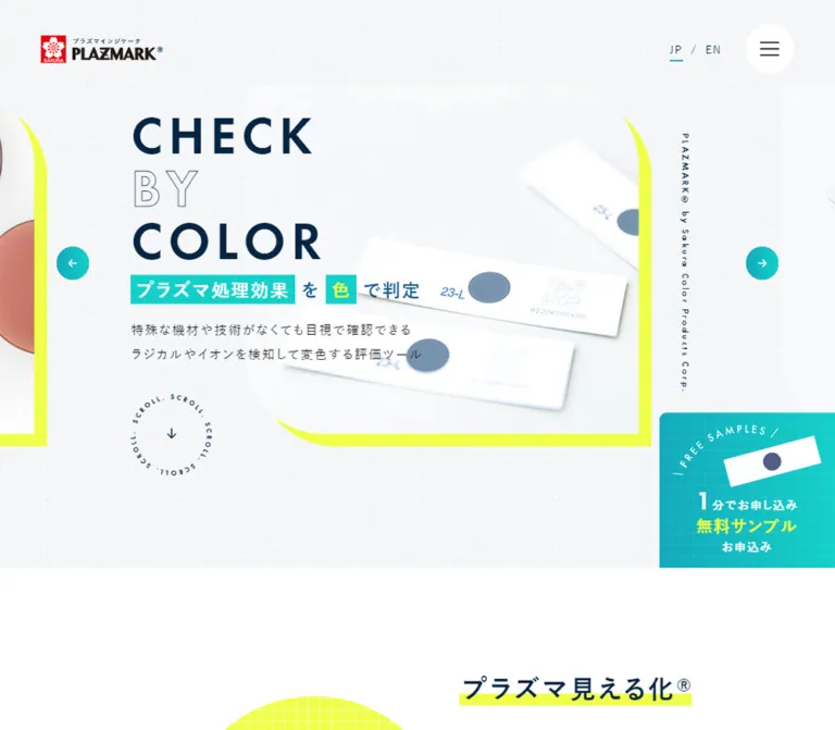
プレビュー準備中デザインリファレンスを見る
DESIGN REFERENCE
PLAZMARK|サクラクレパスのプラズマ評価製品サイト
白とネイビーを基調に、ターコイズと蛍光イエローを効かせた製品サイト。大きな英字、製品写真、格子柄の円、段差のある商品配置が特徴。
PLAZMARK — Style Reference
Industrial evaluation presented through white product photography, navy typography, turquoise controls, and fluorescent yellow grids.
Website / original URL: plazmark.craypas.co.jp Final URL: https://plazmark.craypas.co.jp/ Theme: light in the supplied evidence; no alternate theme verified. Inspected evidence: retrieved October 2, 2026, at 02:39:29.810 JST / October 1, 2026, at 17:39:29.810 UTC. Viewports: 1440 × 1000 and 390 × 844 CSS pixels. Scope: the current Japanese homepage, including the opening hero, product presentation, technical-content and news structures, contact routes, footer, and visible document-download panel. Three desktop and two mobile screenshots supplement rendered text, link destinations, element rectangles, and computed styles. Linked pages were not inspected.
PLAZMARK is a product and technical-information website with several routes into a specialist industrial offering. The homepage introduces the evaluation material, separates end-user and equipment-manufacturer needs, presents applications and products, and provides technical articles, news, samples, quotations, and general contact. Its design should support this breadth rather than compressing everything into a single campaign funnel.
The visual identity combines a restrained scientific setting with bright graphic accents. White and very pale gray leave room around photographed strips, labels, and silver packages. Deep navy carries the large English headline and product names. Turquoise identifies navigation and actions, while fluorescent yellow appears as a frame, grid-patterned circle, or concentrated highlight. Offset product positions and asymmetric image corners keep the page from becoming a rigid catalog.
A separate document-download panel materially affects the captured experience. It overlays the lower-right desktop content and half the mobile screen. This reference records that condition, but recommends a more readable mobile implementation.
閉じる
PLAZMARK — Style Reference
Industrial evaluation presented through white product photography, navy typography, turquoise controls, and fluorescent yellow grids.
Website / original URL: plazmark.craypas.co.jp Final URL: https://plazmark.craypas.co.jp/ Theme: light in the supplied evidence; no alternate theme verified. Inspected evidence: retrieved October 2, 2026, at 02:39:29.810 JST / October 1, 2026, at 17:39:29.810 UTC. Viewports: 1440 × 1000 and 390 × 844 CSS pixels. Scope: the current Japanese homepage, including the opening hero, product presentation, technical-content and news structures, contact routes, footer, and visible document-download panel. Three desktop and two mobile screenshots supplement rendered text, link destinations, element rectangles, and computed styles. Linked pages were not inspected.
PLAZMARK is a product and technical-information website with several routes into a specialist industrial offering. The homepage introduces the evaluation material, separates end-user and equipment-manufacturer needs, presents applications and products, and provides technical articles, news, samples, quotations, and general contact. Its design should support this breadth rather than compressing everything into a single campaign funnel.
The visual identity combines a restrained scientific setting with bright graphic accents. White and very pale gray leave room around photographed strips, labels, and silver packages. Deep navy carries the large English headline and product names. Turquoise identifies navigation and actions, while fluorescent yellow appears as a frame, grid-patterned circle, or concentrated highlight. Offset product positions and asymmetric image corners keep the page from becoming a rigid catalog.
A separate document-download panel materially affects the captured experience. It overlays the lower-right desktop content and half the mobile screen. This reference records that condition, but recommends a more readable mobile implementation.
How to Read This Reference
- Measured means a value appears in the supplied computed styles or element rectangles. Values are rounded for readability where appropriate.
- Calculated means a relationship was derived from those measurements, such as column gaps or offsets.
- Estimated means a dimension, color relationship, or shape was assessed from a screenshot without its corresponding CSS declaration.
- Recommended means an implementation choice proposed here. Breakpoints, accessible adjustments, and the Quick Start interpolation formulas are recommendations rather than recovered source code.
- Token names below are descriptive aliases. The supplied custom properties do not expose a complete semantic design-token system.
- Screenshots directly establish the hero, the first three product presentations, the desktop contact/footer area, and the mobile footer and overlay. Other sections have detailed DOM evidence but less visual coverage.
- The supplied evidence records scrolling and settled page states. It does not establish menu behavior, hover endpoints, carousel timing, form validation, or successful submission.
Tokens — Colors
Default Palette
| Name | Value | Suggested token | Role and evidence |
|---|---|---|---|
| White | #ffffff |
--color-white |
Measured body background and desktop header; visible footer and panel surfaces |
| Technical Mist | #f4f6f8 |
--color-mist |
Measured Technology section and news-row background; the hero uses a visually similar pale field, whose exact background declaration was not supplied |
| Navy Ink | #062542 |
--color-ink |
Measured header text, filled hero words, product headings, and selected inline artwork |
| Body Ink | #111111 |
--color-body |
Measured main text color |
| Technical Blue | #0e578a |
--color-blue |
Measured manufacturer route, seminar tile, contact link, and highlighted customer statement text |
| Action Turquoise | #12aabc |
--color-teal |
Measured sample pill, end-user route, company tile, benefit headings, and footer utility links |
| Illustration Aqua | #14d0c9 |
--color-aqua |
Explicit inline SVG fill; related bright aqua appears in the hero emphasis and contact artwork, but their exact fills were not individually extracted |
| Fluorescent Highlight | #f0ff49 |
--color-lime |
Measured desktop customer-statement background; a useful approximation for the similarly colored hero frame and product circles |
| FAQ Slate | #525d83 |
--color-slate |
Measured FAQ tile background and inline artwork fill |
| Form Mint | #50c8a7 |
--color-form |
Measured download-panel privacy-link color; the panel rule, required badges, and submit button appear consistent with this family |
| Quiet Gray | #a7a7a7 |
--color-muted |
Measured footer copyright and privacy-link color |
The fluorescent frame, turquoise controls, and navy lettering establish the main relationship. Lime is a supporting marker rather than a large reading surface. The download panel introduces a softer mint that should remain a local form treatment.
The red Sakura mark belongs to the supplied identity artwork. Its exact color was not extracted; preserve the logo asset instead of approximating it with a newly drawn red badge. Small coral and gray fills also occur inside illustrations and should not become general interface accents.
Color Application
- Keep long-form reading on white or Technical Mist with Body Ink.
- Use Navy Ink for the strongest typographic anchors.
- Use Action Turquoise for compact controls and selected navigation surfaces.
- Place fluorescent accents behind objects or short phrases, leaving the product itself legible.
- Treat the contact region as a photograph with a turquoise wash. Exact overlay opacity and gradient stops are unverified.
- Do not derive the visible palette from unrelated global defaults such as the exposed WordPress colors or
--swiper-theme-color: #007aff.
Tokens — Typography
Japanese Body and Navigation
The measured source stack is:
font-family: '游ゴシック', YuGothic, 'Hiragino Kaku Gothic ProN',
  'Hiragino Sans', 'Noto Sans JP', 'BIZ UDPGothic', Meiryo,
  'Helvetica Neue', Arial, sans-serif;
This is a declared fallback sequence, not proof that every family was downloaded or used. Body weight is 400; the main content generally inherits 500, with many headings at 600.
The main text uses generous tracking and leading. Body tracking is approximately 0.1em: 1.56082px on desktop and 1.30367px on mobile. Many child elements inherit that computed spacing instead of recalculating it against their own font size.
English Display and Utility Type
The hero words and measured View all links declare futura, sans-serif. The hero uses weight 500 and tracking of 0.1em. Font-file availability and the actual resolved face were not supplied.
The outline word BY has a transparent computed text color and a visible fine outline in the screenshots. Its stroke declaration was not included. An approximately 1px text stroke is an implementation estimate.
Download-Panel Typography
The mobile privacy paragraph declares Meiryo UI, weight 400, at only 8.4px with 15.12px leading. This is evidence of the panel's unusually small mobile typography, not an appropriate default for the wider website. A new implementation should enlarge its text and controls.
Type Scale
| Role | Desktop size / leading | Mobile size / leading | Weight | Notes |
|---|---|---|---|---|
| Main body | 15.6082 / 28.0947px | 13.0367 / 23.4661px | 500 in main | Leading ratio 1.8 |
| Header navigation | 13.7222 / 13.7222px | 11.8993 / 11.8993px | 500 | Mobile measurement applies to visible language navigation |
| Hero words | 76.0816 / 28.0947px | 50.3673 / 23.4661px | 500 | Raw paragraph line boxes are much shorter than the glyphs |
| Hero supporting copy | 17.4775 / 33.2073px | 14.049 / 26.693px | 500 | Two visible lines in the measured state |
| Introductory heading | 34.9551 / 28.0947px | 28.098 / 23.4661px | 600 | Measured label: プラズマ見える化® |
| Introductory paragraph | 15.6082 / 42.9224px | 13.0367 / 35.851px | 500 | Particularly open leading, approximately 2.75 |
| Benefit headings | 21.2164 / 21.2164px | 16.0735 / 16.0735px | 600 | Turquoise |
| Product titles | 21.2164 / 30.7638px | 16.0735 / 23.3066px | 600 | Navy; leading approximately 1.45 |
| Technical article titles | 17.7389 / 28.0947px | 16.0246 / 23.4661px | 600 | Titles wrap according to the card width |
View all |
15.6082 / 15.6082px | 13.0367 / 13.0367px | 500 | Futura declaration |
| Contact audience captions | 11.7388 / 28.0947px | 10.0245 / 23.4661px | 500 | White text above illustrations |
| Footer legal paragraph | 12 / 21.6px | 12 / 21.6px | 500 | Same size at both viewports |
| Footer navigation | 13.7389 / 19.2344px | 12.0246 / 16.8344px | 500 | Desktop columns become a mobile list |
| Copyright | 13.4775 / 28.0947px | 10.049 / 23.4661px | 500 | Quiet Gray |
| Panel privacy paragraph | Not extracted | 8.4 / 15.12px | 400 | Meiryo UI; local form styling |
Do not copy the hero's raw line height into an ordinary multiline heading. The desktop paragraph origins are about 73.73px apart despite their 28.09px line boxes. The mobile first and second lines are about 53.69px apart. Separate word wrappers and deliberately controlled spacing are needed.
Likewise, the section-heading wrappers inherit body-sized type, but their composed English/Japanese contents occupy about 66.86px of height on desktop and 67.13px on mobile. Child display sizes were not extracted, so the wrapper's font size is not a reliable measurement of the large English word.
Tokens — Spacing & Shapes
The source root font size is 10px at both inspected widths. Fractional component sizes indicate responsive sizing, but the underlying formulas are unavailable. There is no evidence for a universal 4px or 8px spacing scale.
Spacing Scale
| Use | Desktop | Mobile | Status |
|---|---|---|---|
| Main content width | 1087.03px | 349.53px | Measured |
| Main content left inset | 176.48px | 20.23px | Measured |
| Standard section padding used in several regions | 112.16px | 60.73px | Measured |
| About section top padding | 168.25px | 91.10px | Measured |
| About section bottom padding | 221.71px | 101.71px | Measured |
| Product horizontal gap | 54.75px | 20.47px | Calculated from item rectangles |
| Technology card gap | 52.16px | 40px | Calculated |
| Audience-route internal horizontal padding | 30px | 15.18px | Measured |
| News-row horizontal padding | 36.73px | 15.31px | Measured |
| News-row top / bottom padding | 25 / 20px | 25 / 20px | Measured |
| Footer top padding | 56.08px | 30.37px | Measured |
| Footer bottom padding | 20px | 20px | Measured |
Border Radius and Decorative Geometry
| Element | Value or appearance | Evidence |
|---|---|---|
| Audience routes, utility tiles, sample banner, comic banner | 10px radius | Measured |
| Header sample action | 9999px radius | Measured |
| Hero previous/next controls | Circular, approximately 48px diameter | Screenshot estimate |
| Hero photo frame | Large asymmetric corners, roughly 80–110px on desktop | Screenshot estimate; individual corner declarations unavailable |
| Fluorescent photo backing | Offset approximately 19px right/down on desktop and 10px on mobile | Screenshot estimate |
| Product backdrop | Circular lime field with fine white square grid | Visually observed |
| Product text divider | Approximately 30 × 3px navy rule | Screenshot estimate |
| Footer utility icon rings | Approximately 40px diameter | Screenshot and 40px measured link height |
| Download panel | Mostly square corners, fine input borders, mint top rule | Visually observed |
Layout Measurements
| Element | Desktop | Mobile |
|---|---|---|
| Document height | 8718.42px | 10059.80px |
| Initial header rectangle | 1440 × 128.41px at y = 0 | 390 × 50.23px at y = 20 |
| Header identity box | 155 × 35.25px at x = 86.13 | 155 × 35.25px at x = 15.78 |
| Hero-to-next-section boundary | y = 1000px | y = 662.94px |
| Hero copy width | 396.75px | 349.53px |
| Hero copy left edge | 254.72px | 20.23px |
| Product item width | 325.84px | 164.53px |
| Sample banner | 1087.03 × 200px | 349.53 × 180px |
| Technology item width | 310.19px | 272px |
| Footer height | 484.06px | 896.73px |
Document heights describe these particular rendered states. They are not recommended fixed heights.
Components
Global Header
Role: brand identity, site navigation, language selection, search, and sample access.
The desktop header uses two visual levels. Search sits at the upper right; the main row places the 155px-wide logo at the left, a long navigation sequence in the center, then language selection, contact, and a turquoise sample pill.
The sample link measures approximately 121.94 × 48.06px. It combines two lines of white Japanese text, a faint grid treatment, and a fluorescent circular arrow at the right. The contact route uses a small envelope above its label. JP has a short turquoise underline in the captured state.
The header remains visible in scrolled screenshots. Its visible desktop height appears closer to 108px there, compared with the initial measured 128.41px. The evidence establishes persistence and a changed visual state, but does not reveal the exact fixed/sticky rule or scroll trigger.
On mobile, the visible shell contains the logo, JP / EN, and a hamburger in a white circular surface. Full navigation, search, and the desktop sample pill are absent from the captured header. Nested navigation text exists in the DOM, but no opened menu or submenu was supplied.
Hero Composition
Role: connect the product's color-change principle to tangible materials.
The hero has several independent layers:
- A pale field with a regular pattern of tiny white dots.
- A horizontal photographic presentation with neighboring slides partially visible at the viewport edges.
- A fluorescent backing shape offset behind the central photograph.
- The navy
CHECK, outlinedBY, and navyCOLORheadline. - Japanese emphasis bands and two lines of explanatory text.
- A vertical brand caption, circular arrow controls, and a desktop circular scroll cue.
In the desktop capture, the central photo occupies approximately x = 464–1089 and y = 165–717. The copy begins around x = 255, deliberately overlapping the composition's left side. Broad empty space remains below the main hero elements until the next section begins at y = 1000.
The phrase プラズマ処理効果 is reversed out of an aqua band. A separate small band highlights 色 in fluorescent yellow. Keep these as compact text accents rather than stretching them into full-width banners.
The desktop screenshot shows silver O₂-cleaning packages. The mobile screenshot shows metal tins and orange indicator labels. Together with the visible neighboring slides and arrows, this supports a multi-image presentation. It does not establish autoplay, slide order, or whether image selection differs by viewport.
On mobile, the photograph comes first near y = 90. The headline follows beneath it: CHECK occupies the first line, while BY COLOR shares the second. The desktop scroll ring is not present in the mobile capture or visible-link inventory.
Introductory Explanation and Audience Routes
Role: explain the material and direct two professional audiences to relevant information.
The desktop introduction places its measured text column at x = 798.36 with a width of 404.31px. The heading, unusually open paragraph leading, and full-width explanatory link create a calm reading area alongside the section's illustrated content.
The audience links are substantial 10px-radius rectangles. On desktop, For End Users is turquoise and For Manufacturers is blue; each measures approximately 515 × 95.28px. They sit beside one another.
On mobile, both occupy the 349.53px content width and remain about 95.56px high. Their measured positions place the manufacturer route above the end-user route, despite the opposite order in the extracted text sequence. Preserve this observed distinction when documenting order; do not infer visual order from text extraction alone.
Benefits and Customer Evidence
Role: organize the value proposition and provide a compact trust layer.
Three numbered benefit groups cover visual assessment, cost reduction, and productivity. Desktop headings occupy three 321.78px-wide columns. Mobile groups use the full content width and appear at separate vertical positions approximately 350px apart, including their surrounding content.
Headings are turquoise, numbered, and semibold. Body copy uses a more open 2.0 line-height ratio than the general page body.
A statement claiming use by more than 150 companies appears beneath the benefits. Its desktop paragraph has an explicit fluorescent background and blue text. The mobile paragraph's measured background is transparent, so an identical whole-paragraph fill should not be assumed.
Customer-logo links form a compact desktop strip and a three-column arrangement on mobile. Their image files and full intrinsic dimensions were not supplied.
Section Heading and Archive Link
Role: introduce major information groups without adding boxed navigation chrome.
Sections pair an English label such as Case, Products, Technology, or News with a Japanese descriptor. Desktop heading wrappers use flex layout, and View all sits separately toward the right. Measured desktop archive links are approximately 134.66 × 48.69px.
On mobile, the heading wrapper becomes block layout and the archive link occupies a separate full-width row, approximately 40.11px high. Keep the archive destination visible rather than reducing it to an unlabeled arrow.
Application Rows
Role: offer recognizable manufacturing problems as entry points.
Six linked rows combine a case number with a short issue title. Desktop rows span approximately 989.45px; mobile rows span 333.38px. The first row has less top padding than the following rows.
Descriptions are present in the DOM but measured at zero height in both snapshots. Their computed transition is 0.7s. This supports a concealed-description state, but not a verified accordion or hover-expansion interaction. Each row also has a real destination such as /case/#case01; do not replace that navigation with an invented interaction.
Product Presentation
Role: show the physical product format before the detailed product name.
These are open product compositions rather than filled cards. Each visible item combines:
- A photographed strip, package, or indicator label on white.
- A fluorescent circular backdrop with a fine white grid.
- A vertically oriented
Products 01-style index. - A short navy rule.
- A smaller process/application label.
- A navy semibold product title, often on two lines.
Desktop columns begin at x = 176.48, 557.08, and 937.67. Their top positions are staggered by approximately 0, 86.94, and 186.94px. The large amount of unboxed white space and this descending rhythm are essential to the composition.
Mobile uses two columns, each 164.53px wide, with a 20.47px gap. The first right-hand item begins about 50.61px below the first left-hand item. Later pairs retain a stagger, with offsets varying according to content.
The rendered product indices are 01, 02, 03, 05, and 06. Do not invent a missing 04 entry. Product destinations cover atmospheric plasma, O₂ cleaning, Ar cleaning, heat-resistant labels, and wafer formats.
Sample Banner
Role: provide a sample-request route after product exploration.
The banner spans the desktop content width at 1087.03 × 200px and measures 349.53 × 180px on mobile. It has a measured 10px radius and includes a short registration message, a trial invitation, a sample-request label, and inline sample artwork.
The mobile text explicitly breaks the invitation across additional lines. The supplied screenshots do not expose the entire banner, so its complete illustration placement should not be reconstructed from its DOM text alone.
Technology Articles
Role: connect the product to technical evidence and practical knowledge.
The Technology section uses the measured #f4f6f8 background and contains category labels for technical data, seminars, and consultation. Their selected states and switching behavior were not exercised.
Desktop presents three measured article links, each about 310.19px wide. Each entry contains a date, title, and topic hashtags. Title widths are narrower than their containing links, establishing an inset information area.
Mobile uses a horizontal rail. Items are 272px wide with 40px gaps; one begins at x = 20.23 and the next at x = 332.23, leaving a partial neighboring entry within the viewport. Repeated URLs and offscreen copies are consistent with a looping carousel implementation. They should not be interpreted as seven distinct articles. Swipe, keyboard navigation, and autoplay remain unverified.
News Rows
Role: offer an efficient chronological index.
News entries use pale rectangular backgrounds with square corners. Desktop rows arrange date/category information beside the headline. Their measured width is 998.14px, with 25px top padding, 20px bottom padding, and approximately 36.73px horizontal padding. A single-line entry is about 73.09px high; longer headlines increase the row height.
Mobile rows switch from flex to block layout, placing metadata above the headline. Their width is 333.5px and horizontal padding reduces to 15.31px. The visible content order remains chronological as supplied. Avoid forcing equal heights or truncating the long technical titles merely to regularize the list.
Utility Tiles and Comic Feature
Role: expose supporting information beyond the product catalog.
Three desktop utility tiles link to seminars, company information, and FAQ. Each is approximately 339.17 × 113.98px with a 10px radius. Their respective backgrounds are Technical Blue, Action Turquoise, and FAQ Slate; computed link text is white.
On mobile, they stack at the full content width. Heights vary from approximately 87 to 103px rather than remaining artificially equal.
A wider comic feature follows, with a 10px radius and the label CAPTAIN PLASMA. That small English caption uses the Futura declaration and unusually wide tracking: approximately 0.7em on desktop and 0.5em on mobile. Inline desktop and mobile title artwork exists, but the complete banner imagery was not visually supplied.
Contact Route Selector
Role: distinguish four different visitor intentions.
The desktop contact area is a full-width photograph under a turquoise wash. Four columns present document requests, free samples, quotations, and general inquiries. Each column contains a short white audience caption, a large flat illustration, a small fluorescent grid circle, and a white pill-shaped link.
The illustrations depict an open booklet, sample packages, a calculator, and an envelope. Navy and blue details connect them to the surrounding interface. Fine dotted white vertical dividers separate the desktop columns.
The measured link groups are roughly 235–239px wide and 224.05px high. The visible white action pills are approximately 44px high by screenshot estimate.
Mobile stacks all four groups at 349.53px wide. Each group measures about 225.13px high, with approximately 50.61px between groups. This significantly lengthens the lower page; a two-column mobile contact layout is not supported by the supplied measurements.
Footer
Role: retain corporate context and expose the full information architecture.
The white desktop footer places the logo and a 415.20px-wide legal paragraph on the left. Three navigation columns sit to the right. The footer logo box is 205px wide; the mobile version is 180px wide.
Below the main footer content, document, contact, and quotation links pair turquoise labels with thin circular icon outlines. Copyright is centered near the desktop bottom, while the privacy link sits at the right.
Mobile places the legal paragraph above one long navigation list. Link origins are approximately 36.39px apart vertically. Copyright moves to the left; the privacy link remains toward the right.
At the captured mobile footer position, the persistent header overlaps the footer identity and legal text. This is an observed layering collision, not a separate two-logo component. An opaque scrolled header and better content clearance are recommended.
The original page title and copyright identify 株式会社サクラクレパス. No production credit is established by the inspected original-page evidence.
Document-Download Panel
Role: collect details for a product-information download.
The panel is visible in the later desktop captures and both mobile captures, but absent from the initial desktop screenshot. Its appearance trigger and timing are unknown.
Its anatomy is consistent across the visible states:
- A mint top rule and a small close tab protruding above the upper-right corner.
- A bold download-oriented heading.
- A small product thumbnail beside explanatory copy.
- Company name, family name, given name, and email fields.
- Mint required badges.
- A privacy-policy link, consent checkbox, and mint submit button.
On desktop, the white panel is approximately 360px wide, beginning at x = 1080 and y = 465 in the 1440 × 1000 capture. Its close tab is approximately 25px square. A soft shadow separates it from the page without a dimmed backdrop.
On mobile, it occupies x = 195–390: exactly half the screenshot width. Its top is near y = 208, with the close tab above at approximately y = 188. The narrow two-column thumbnail/copy region creates a long vertical text column. The measured 8.4px privacy text and visually tiny field labels compound the problem.
The panel obscures hero text, product information, and footer links. This is substantial occlusion, not a small floating action. Closing, validation, consent handling, and submission were not tested. For reuse, retain the content hierarchy and mint identity while using a full-width, explicitly opened or in-flow mobile form.
Tokens — Motion & Interaction
| Element | Supplied computed declaration | What it establishes |
|---|---|---|
| Header | Transform and top: 0.5s with cubic-bezier(0.215, 0.61, 0.355, 1); background color: 0.5s |
A defined transition system; exact scroll thresholds and directions are unknown |
| Language and contact links | color 0.25s |
Color changes can transition; hover colors were not captured |
| Header sample pill | background-color 0.25s |
Defined fill transition; endpoint unverified |
| Hero supporting copy | 0.5s 1.2s |
500ms transition with 1.2s delay; initial state and trigger unavailable |
| Desktop scroll cue | 0.5s 1s |
500ms transition with 1s delay; rotation is not established |
| Introductory paragraph | 0.5s 0.5s |
A delayed transition declaration |
| Audience routes | Background image and color: 0.5s | Defined background changes; visual endpoint unverified |
| Concealed case descriptions | 0.7s |
Transition declared while captured height is zero; expansion behavior untested |
View all links |
color 0.3s |
Defined text-color transition |
| Technical titles and news rows | 0.5s |
Transition duration present; complete effect not supplied |
| Customer-logo links | box-shadow 0.5s |
Shadow transition declared; no inspected hover shadow |
Many sampled elements report animation: none. That does not rule out motion on children, pseudo-elements, or JavaScript-controlled sliders.
The capture procedure waited for finite motion and sampled layout stability, temporarily paused perpetual animations during readiness checks, and resumed them afterward. Still screenshots therefore cannot establish complete motion behavior. Do not assign a carousel interval, automatic form delay, rotating scroll ring, or parallax effect as an observed feature.
For a new implementation, short 250–500ms control transitions fit the recorded timing vocabulary. Any new reveal or carousel behavior should be explicitly documented as an addition and should support reduced motion.
Surfaces
| Layer | Appearance | Purpose |
|---|---|---|
| Main canvas | White | Clear product and technical reading environment |
| Hero field | Pale gray with tiny white dots | Subtle technical texture behind large typography |
| Hero backing | Offset fluorescent shape | Separates pale product photography from the pale canvas |
| Product backdrop | Fluorescent circle with white grid | Repeated geometric identity behind cutout products |
| Editorial region | #f4f6f8 |
Distinguishes technical content and news entries |
| Audience and utility routes | Solid blue, turquoise, or slate; 10px radius | Strong navigation surfaces |
| Contact region | Photograph with turquoise wash | Groups four high-intent contact routes |
| Footer | White, mostly unboxed | Dense but calm site navigation |
| Download panel | White, mint rule, soft shadow | Local floating form layer |
There is no pervasive card-elevation system. Product compositions remain unboxed; news rows are flat; rounded solid surfaces identify selected navigation groups. The download panel is the most obvious shadowed surface in the supplied screenshots.
Imagery
Product photography is central. Silver pouches, white strips, indicator cards, and orange labels are shown with their real packaging and printed markings. Lighting is bright and neutral, with soft photographic shadows. The pale objects blend with the page until fluorescent geometric backings establish their boundaries.
Use complete product cutouts for catalog items. Cropping a strip or removing a label's identifying area would weaken the product-oriented presentation. Hero photography can use a composed crop, but should retain enough packaging detail to establish scale and material.
The grid circles and dot field are decorative interface graphics, not scientific data visualizations. Keep their marks fine and regular. Illustrations use flat white, gray, blue, and navy shapes with restrained colored details. They make the contact routes easier to recognize without changing the page into a cartoon environment.
Observed Asset References
The evidence does not expose hero-image, product-image, or logo file URLs. Do not invent filenames for them.
| Asset or artwork | Evidence reference | Use |
|---|---|---|
| PLAZMARK/Sakura identity | Visible header and footer artwork; file URL unavailable | Corporate and product identity |
| Hero product photographs | Desktop and mobile opening captures; file URLs unavailable | Multi-image product presentation |
| Product cutouts | Desktop product capture; file URLs unavailable | Atmospheric-plasma strips, O₂ packages, Ar indicator cards |
| Document illustration | Inline SVG identifier document-ico |
Document-request route |
| Package illustration | Inline SVG identifier o2cleaning-ico |
Sample-request route |
| Calculator illustration | Inline SVG identifier calculator-ico |
Quotation route |
| Envelope illustration | Inline SVG identifier email-ico |
General contact route |
| Sample artwork | Inline SVG identifier sample-ico |
Sample banner |
| Utility illustrations | Inline SVG identifiers seminor-ico, company-ico, faq-ico |
Supporting navigation tiles |
| Comic title artwork | Inline SVG identifiers plasma_title, plasma_title_sp |
Desktop/mobile comic feature |
| Marker information banner | Link target /img/products/plasma/PLAZMARK_marker.pdf |
Product document destination; the file was not inspected |
Inline SVG identifiers are DOM references, not downloadable asset paths. Use authorized original assets where available; CSS can reproduce the frames and grids, but not the precise product labeling.
Layout & Responsive Behavior
The responsive design changes composition and information density rather than simply shrinking a desktop layout.
| Region | At 1440 × 1000 | At 390 × 844 |
|---|---|---|
| Header | Full navigation, search, contact, sample action | Logo, language selector, hamburger |
| Hero | Copy overlaps left side of large photo; three headline lines | Photo above copy; BY COLOR shares one line |
| Hero extent | Next section starts at 1000px | Next section starts at 662.94px, shorter than the viewport |
| Introduction | Narrow right-side text column | Full-width text near the left content inset |
| Audience routes | Two columns | Stacked; manufacturer route above end-user route |
| Benefits | Three columns | Three vertically separated groups |
| Customer logos | Horizontal strip | Three-column groups |
| Section headings | English/Japanese pair in flex wrapper; archive link to right | Block wrapper; archive link on its own row |
| Products | Three staggered columns | Two staggered columns |
| Technology | Three article links across | 272px-wide horizontal rail with neighboring content visible |
| News | Metadata and title side by side | Metadata above title |
| Utility tiles | Three across | Stacked |
| Contact routes | Four columns | Four full-width stacked groups |
| Footer navigation | Three columns beside legal content | Single long list beneath legal content |
| Download panel | Approximately 360px-wide lower-right overlay | Approximately 195px-wide right-side overlay |
Only these two viewport sizes were measured. Tablet behavior and exact breakpoints are unknown. The source exposes --vh: 10px on desktop and --vh: 8.44px on mobile, but the mobile hero is not a full 100 × --vh tall. Do not infer its sizing formula from that variable alone.
The overall desktop content width is about 75.49% of the viewport. Mobile content uses approximately 20.23px gutters. A capped container with those mobile gutters is a practical adaptation, but it is not proof of the original width formula between the measured endpoints.
Do’s and Don’ts
Do
- Preserve the relationship between white space, navy text, turquoise controls, and small fluorescent accents.
- Keep product photography recognizable, with real labels and complete physical formats.
- Use the outlined middle word and deliberate line arrangement in the hero.
- Repeat the grid-circle motif selectively across products and contact illustrations.
- Retain the descending product rhythm on desktop and the two-column stagger on mobile.
- Give technical articles and news enough room for long Japanese titles.
- Keep product, technical, audience, and contact routes distinct within the information architecture.
- Use measured font stacks without claiming that every fallback is an installed webfont.
- Record the download panel's mobile obstruction as an observed condition.
- Separate declared transition timings from interactions that were actually verified.
Don’t
- Don’t flatten the homepage into a single-purpose landing page.
- Don’t replace the open product compositions with identical shadowed cards.
- Don’t turn every section into a fluorescent background.
- Don’t use the form's mint as a replacement for the main turquoise brand accent.
- Don’t assume all mobile grids become single-column; products retain two columns.
- Don’t count repeated mobile article copies as additional content.
- Don’t infer an accordion solely from zero-height case descriptions.
- Don’t copy the hero's unusually small raw line height into normal paragraphs.
- Don’t make the half-width mobile form and 8.4px privacy text the recommended implementation.
- Don’t invent image URLs, production credits, autoplay settings, or unseen menu states.
Recommended Implementation Additions
These are improvements for a new implementation, not verified original features:
- Replace the narrow mobile overlay with an explicitly opened full-width panel or an in-flow form. Keep its dismissal control visible and all form content reachable.
- Use at least 14px for general mobile reading text and 16px for form inputs. Provide approximately 44px interactive targets.
- Give the persistent mobile header an opaque scrolled state and account for its height when navigating to anchors.
- Give search, menu, carousel arrows, and the panel close control accessible names and clear focus indicators.
- If a menu expands, expose its expanded state and support keyboard dismissal. If a panel is modal, implement dialog focus management; do not trap focus in a nonmodal panel.
- If the article rail uses cloned slides, prevent duplicate copies from becoming redundant keyboard and screen-reader destinations.
- Verify contrast for small white captions over the contact photograph and for mint required badges. Match the actual composited background rather than testing a flat approximation alone.
- Make case descriptions accessible through an explicit control if expansion is added; retain the case-detail links.
- Reserve image dimensions to reduce layout shifts and provide informative alternatives for meaningful product images.
- Respect reduced-motion preferences and provide a pause mechanism if automatic carousel movement is introduced.
Agent Prompt Guide
Quick Color Reference
- Main page:
#ffffff. - Technical/news surface:
#f4f6f8. - Display text and product names:
#062542. - Body text:
#111111. - Main turquoise action family:
#12aabc. - Secondary technical blue:
#0e578a. - Fluorescent accent: measured highlight
#f0ff49; use as a declared approximation for unmeasured frames and circles. - FAQ tile:
#525d83. - Local form accent:
#50c8a7.
Overall Prompt
“Create a Japanese industrial product and technical-information homepage inspired by the current PLAZMARK composition. Use white space, pale gray technical surfaces, navy #062542 typography, turquoise #12aabc controls, and restrained fluorescent yellow accents. Pair a Japanese Gothic fallback stack with Futura-declared English display text. Build an opening product-photo composition with an offset asymmetric fluorescent frame, large filled and outlined English words, compact Japanese highlight bands, and a faint dot field. Continue into audience routes, numbered benefits, linked application rows, staggered open product compositions, technical articles, news, and four distinct contact routes. On mobile, move the hero image above the copy, retain two product columns, and turn technical articles into a horizontal rail. Keep forms readable and prevent floating panels from obscuring the content.”
Example Component Prompts
- Hero: “Compose
CHECK / BY / COLORin large navy English type, with the middle word outlined. Place bright, neutral product photography behind the right side of the copy, with an offset fluorescent backing and large asymmetric corners. Add a pale dotted field and compact Japanese emphasis bands. On mobile, put the image first and arrangeBY COLORon one line.” - Product group: “Build three open product compositions on white with descending vertical offsets. Each uses an authorized product cutout over a fluorescent circle with a fine white grid, a vertical index, a short navy rule, an application caption, and a navy product title. Reflow to two staggered columns on narrow screens.”
- Technical content: “Use a pale gray section with paired English/Japanese labels and a visible archive link. Present dated article entries with long titles and topic hashtags. On mobile, show a 272px-wide horizontal rail with 40px gaps and a partial next entry; add accessible controls without assuming autoplay.”
- Contact selector: “Create a turquoise-washed photographic band with four routes: document request, samples, quotation, and general contact. Each has a short audience caption, a flat white/blue illustration, a small fluorescent grid circle, and a white pill action. Separate desktop columns with dotted rules; stack the routes on mobile.”
- Download panel adaptation: “Retain a white surface, mint top rule, concise heading, product thumbnail, required fields, consent checkbox, and submit action. Use a compact lower-right panel only where space permits. On mobile, use a readable full-width form with 16px inputs and an accessible close control rather than a half-screen strip.”
Quick Start
CSS Custom Properties
This CSS is an adaptation, not recovered source. It preserves measured colors, the desktop content width, product-column relationships, and headline endpoints. It uses a recommended 14px mobile body floor, larger form controls, and an in-flow mobile form. The 1100px and 700px breakpoints are authored recommendations. Decorative radii, dot/grid spacing, and contact-overlay opacity are visual approximations.
Use .plazmark on the page root. The hero title expects three direct spans in the order CHECK, BY, COLOR, with .outline on BY. Product markup should group .product-visual and .product-copy inside a linked .product-card. Supply real images through markup; set --contact-photo to an authorized image only when available.
:root {
  /* Measured colors, with lime reused for approximate decoration. */
  --color-white: #ffffff;
  --color-mist: #f4f6f8;
  --color-ink: #062542;
  --color-body: #111111;
  --color-blue: #0e578a;
  --color-teal: #12aabc;
  --color-aqua: #14d0c9;
  --color-lime: #f0ff49;
  --color-slate: #525d83;
  --color-form: #50c8a7;
  --color-muted: #a7a7a7;

  --font-body: '游ゴシック', YuGothic, 'Hiragino Kaku Gothic ProN',
    'Hiragino Sans', 'Noto Sans JP', 'BIZ UDPGothic', Meiryo,
    'Helvetica Neue', Arial, sans-serif;
  --font-display: futura, sans-serif;
  --font-form: 'Meiryo UI', sans-serif;

  /* Endpoint fits are recommendations, not source formulas. */
  --text-body: clamp(14px, calc(12.08px + 0.245vw), 15.61px);
  --text-hero: clamp(50.37px, calc(40.82px + 2.449vw), 76.08px);
  --text-product: clamp(16.07px, calc(14.16px + 0.49vw), 21.22px);
  --text-lead: clamp(14.05px, calc(12.78px + 0.327vw), 17.48px);
  --content-width: 1087.03px;
  --gutter: 20.24px;
  --space-section: clamp(60.73px, calc(41.63px + 4.898vw), 112.16px);
  --radius-card: 10px;
  --radius-pill: 9999px;
  --duration-control: 250ms;
  --duration-standard: 500ms;
  --ease-header: cubic-bezier(0.215, 0.61, 0.355, 1);
}

.plazmark,
.plazmark * {
  box-sizing: border-box;
}

.plazmark {
  margin: 0;
  color: var(--color-body);
  background: var(--color-white);
  font-family: var(--font-body);
  font-size: var(--text-body);
  font-weight: 500;
  line-height: 1.8;
  letter-spacing: 0.1em;
}

.plazmark img {
  display: block;
  max-width: 100%;
}

.plazmark a {
  color: inherit;
}

.plazmark button,
.plazmark input {
  font: inherit;
}

.wrap {
  width: min(var(--content-width), calc(100% - 2 * var(--gutter)));
  margin-inline: auto;
}

.section {
  padding-block: var(--space-section);
  scroll-margin-top: 140px;
}

.site-header {
  position: fixed;
  inset: 0 0 auto;
  z-index: 30;
  min-height: 128.41px;
  color: var(--color-ink);
  background: var(--color-white);
  transition: background-color var(--duration-standard),
    transform var(--duration-standard) var(--ease-header);
}

.header-inner {
  min-height: inherit;
  margin-inline: 6%;
  display: flex;
  align-items: center;
  gap: 24px;
}

.brand {
  flex: 0 0 155px;
  width: 155px;
}

.desktop-nav,
.header-tools {
  display: flex;
  align-items: center;
  gap: 24px;
  font-size: 13.72px;
  line-height: 1;
}

.desktop-nav {
  margin-left: auto;
}

.menu-toggle {
  display: none;
  width: 50px;
  height: 50px;
  border: 0;
  border-radius: 50%;
  background: var(--color-white);
  color: var(--color-ink);
}

.pill {
  display: inline-flex;
  align-items: center;
  justify-content: center;
  gap: 12px;
  min-height: 48px;
  padding: 8px 20px;
  border: 0;
  border-radius: var(--radius-pill);
  background: var(--color-teal);
  color: var(--color-white);
  text-decoration: none;
  font-weight: 600;
  line-height: 1.2;
  transition: background-color var(--duration-control);
}

.plazmark .pill {
  color: var(--color-white);
}

.pill-arrow {
  display: grid;
  place-items: center;
  width: 36px;
  height: 36px;
  flex: 0 0 36px;
  border-radius: 50%;
  background: var(--color-lime);
  color: var(--color-teal);
}

.hero {
  position: relative;
  min-height: 100svh;
  padding-top: 165px;
  overflow: hidden;
  background-color: var(--color-mist);
  background-image: radial-gradient(circle, #fff 1.2px, transparent 1.6px);
  background-size: 13px 13px;
}

.hero-stage {
  position: relative;
  min-height: 590px;
}

.hero-art {
  position: relative;
  isolation: isolate;
  width: 625px;
  max-width: 72%;
  height: 552px;
  margin: 0 0 0 26.4%;
}

.hero-art::before {
  content: '';
  position: absolute;
  z-index: -1;
  inset: 19px -19px -19px 19px;
  border-radius: 0 110px 0 110px;
  background: var(--color-lime);
}

.hero-art img {
  width: 100%;
  height: 100%;
  object-fit: cover;
  border-radius: 0 100px 0 100px;
}

.hero-copy {
  position: absolute;
  z-index: 2;
  top: 65px;
  left: 7.2%;
  width: 396.75px;
}

.hero-title {
  display: flex;
  flex-wrap: wrap;
  margin: 0 0 18px;
  color: var(--color-ink);
  font-family: var(--font-display);
  font-size: var(--text-hero);
  font-weight: 500;
  line-height: 0.97;
  letter-spacing: 0.1em;
}

.hero-title > span {
  flex-basis: 100%;
}

.hero-title .outline {
  color: transparent;
  -webkit-text-stroke: 0.8px var(--color-ink);
}

.hero-claim {
  margin-block: 20px;
  color: var(--color-blue);
  font-size: clamp(18px, 1.8vw, 26px);
  font-weight: 600;
  line-height: 1.5;
}

.hero-claim mark {
  padding-inline: 0.25em;
  color: var(--color-white);
  background: var(--color-aqua);
  box-decoration-break: clone;
  -webkit-box-decoration-break: clone;
}

.hero-claim .key {
  color: var(--color-lime);
}

.hero-copy p:last-child {
  font-size: var(--text-lead);
  line-height: 1.9;
}

.section-heading {
  display: flex;
  align-items: center;
  justify-content: space-between;
  gap: 30px;
  margin-bottom: 50px;
}

.section-heading h2 {
  margin: 0;
  color: var(--color-ink);
}

/* Display-child sizing is recommended; the source size was not extracted. */
.section-heading .english {
  font-family: var(--font-display);
  font-size: clamp(40px, 4vw, 56px);
  font-weight: 500;
  line-height: 1.1;
}

.product-grid {
  display: grid;
  grid-template-columns: repeat(3, minmax(0, 1fr));
  column-gap: 54.75px;
  row-gap: 60px;
  align-items: start;
}

.product-card {
  min-width: 0;
  text-decoration: none;
}

.product-card:nth-child(3n + 2) {
  margin-top: 86.94px;
}

.product-card:nth-child(3n + 3) {
  margin-top: 186.94px;
}

.product-visual {
  position: relative;
  isolation: isolate;
  aspect-ratio: 1.4;
}

.product-visual::before {
  content: '';
  position: absolute;
  z-index: -1;
  left: -8%;
  top: 10%;
  width: 58%;
  aspect-ratio: 1;
  border-radius: 50%;
  background-color: var(--color-lime);
  background-image:
    linear-gradient(#fff 1px, transparent 1px),
    linear-gradient(90deg, #fff 1px, transparent 1px);
  background-size: 15px 15px;
}

.product-visual img {
  width: 100%;
  height: 100%;
  object-fit: contain;
}

.product-index {
  position: absolute;
  left: 0;
  bottom: 10px;
  writing-mode: vertical-rl;
  font-family: var(--font-display);
  font-size: 11px;
  letter-spacing: 0.2em;
}

.product-copy::before {
  content: '';
  display: block;
  width: 30px;
  height: 3px;
  margin: 20px 0 24px;
  background: var(--color-ink);
}

.product-copy h3 {
  margin: 6px 0 0;
  color: var(--color-ink);
  font-size: var(--text-product);
  font-weight: 600;
  line-height: 1.45;
}

.technology {
  background: var(--color-mist);
}

.article-rail {
  display: grid;
  grid-template-columns: repeat(3, minmax(0, 1fr));
  gap: 52.16px;
}

.news-row {
  display: grid;
  grid-template-columns: 225px minmax(0, 1fr);
  gap: 24px;
  margin-bottom: 5px;
  padding: 25px 36.73px 20px;
  background: var(--color-mist);
  text-decoration: none;
}

.contact-band {
  padding-block: var(--space-section);
  color: var(--color-white);
  background-color: var(--color-teal);
  background-image:
    linear-gradient(100deg, rgb(18 170 188 / 86%), rgb(20 208 201 / 86%)),
    var(--contact-photo, none);
  background-position: center;
  background-size: cover;
}

.contact-grid {
  display: grid;
  grid-template-columns: repeat(4, minmax(0, 1fr));
  gap: 44px;
}

.contact-item {
  display: grid;
  align-content: space-between;
  justify-items: center;
  min-height: 225px;
  text-align: center;
}

.contact-item .pill {
  width: 100%;
  background: var(--color-white);
  color: var(--color-blue);
}

/* Recommended readable panel; display it through an explicit open action. */
.lead-panel {
  position: fixed;
  z-index: 50;
  right: 0;
  bottom: 0;
  width: min(360px, 100%);
  max-height: calc(100dvh - 100px);
  overflow-y: auto;
  padding: 20px;
  border-top: 5px solid var(--color-form);
  background: var(--color-white);
  box-shadow: 0 0 18px rgb(0 0 0 / 15%);
  font-family: var(--font-form);
  font-size: 14px;
  line-height: 1.6;
  letter-spacing: normal;
}

.lead-panel[hidden] {
  display: none;
}

.lead-panel input:not([type='checkbox']) {
  width: 100%;
  min-height: 44px;
  padding: 8px 10px;
  border: 1px solid #a7a7a7;
  background: #f4f6f8;
  font-size: 16px;
}

.lead-panel .name-fields {
  display: grid;
  grid-template-columns: repeat(2, minmax(0, 1fr));
  gap: 16px;
}

.lead-panel button {
  min-height: 44px;
}

.footer-main {
  display: grid;
  grid-template-columns: minmax(0, 415px) minmax(0, 1fr);
  gap: 12%;
  padding-block: 56px 30px;
}

.footer-nav {
  display: grid;
  grid-template-columns: repeat(3, minmax(0, 1fr));
  gap: 40px;
}

.footer-nav a {
  display: block;
  margin-bottom: 16px;
  font-size: 13.74px;
  text-decoration: none;
}

.plazmark :focus-visible {
  outline: 3px solid var(--color-ink);
  outline-offset: 4px;
}

@media (max-width: 1100px) {
  .site-header {
    min-height: 90px;
  }

  .header-inner {
    margin-inline: 16px;
    gap: 12px;
  }

  .desktop-nav,
  .header-search,
  .header-contact,
  .header-sample {
    display: none;
  }

  .header-tools {
    margin-left: auto;
    gap: 12px;
  }

  .menu-toggle {
    display: grid;
    place-items: center;
  }
}

@media (max-width: 700px) {
  .section {
    scroll-margin-top: 100px;
  }

  .hero {
    min-height: 663px;
    padding-top: 90px;
    padding-bottom: 60px;
  }

  .hero-stage {
    width: 100%;
    min-height: 0;
  }

  .hero-art {
    width: 276px;
    max-width: calc(100% - 70px);
    height: 245px;
    margin-left: 12px;
  }

  .hero-art::before {
    inset: 10px -10px -10px 10px;
    border-radius: 0 60px 0 60px;
  }

  .hero-art img {
    border-radius: 0 60px 0 60px;
  }

  .hero-copy {
    position: relative;
    inset: auto;
    width: auto;
    margin: 24px var(--gutter) 0;
  }

  .hero-title {
    line-height: 1.06;
  }

  .hero-title > span:not(:first-child) {
    flex-basis: auto;
  }

  .hero-title > span:last-child {
    margin-left: 6px;
  }

  .section-heading {
    display: block;
    margin-bottom: 30px;
  }

  .section-heading .archive-link {
    display: flex;
    align-items: center;
    min-height: 44px;
    margin-top: 20px;
  }

  .product-grid {
    grid-template-columns: repeat(2, minmax(0, 1fr));
    column-gap: 20.47px;
    row-gap: 30px;
  }

  .product-card:nth-child(n) {
    margin-top: 0;
  }

  .product-card:nth-child(even) {
    margin-top: 50.61px;
  }

  .article-rail {
    display: flex;
    gap: 40px;
    overflow-x: auto;
    padding-bottom: 20px;
    scroll-snap-type: x proximity;
  }

  .article-rail > * {
    flex: 0 0 272px;
    scroll-snap-align: start;
  }

  .news-row {
    display: block;
    padding-inline: 15.31px;
  }

  .contact-grid {
    grid-template-columns: 1fr;
    gap: 50.61px;
  }

  .lead-panel {
    position: relative;
    inset: auto;
    width: auto;
    max-height: none;
    margin: 30px var(--gutter);
  }

  .footer-main,
  .footer-nav {
    display: block;
  }

  .footer-main {
    padding-top: 30px;
  }

  .footer-nav a {
    display: flex;
    align-items: center;
    min-height: 44px;
    margin: 0;
    font-size: 14px;
  }
}

@media (prefers-reduced-motion: reduce) {
  .plazmark *,
  .plazmark *::before,
  .plazmark *::after {
    animation: none !important;
    transition: none !important;
    scroll-behavior: auto !important;
  }
}
The CSS does not implement carousel state, menu expansion, search, form submission, or panel opening/closing. Add those behaviors with semantic controls and test their states. Decorative neighboring hero slides, the scroll ring, and precise inline illustrations require additional markup or supplied artwork.
Tailwind v4 Token Mapping
Optional aliases for a project already using Tailwind v4. This is not evidence that the original website uses Tailwind. Define the properties above before using these mappings.
@theme inline {
  --color-plazmark-ink: var(--color-ink);
  --color-plazmark-body: var(--color-body);
  --color-plazmark-mist: var(--color-mist);
  --color-plazmark-blue: var(--color-blue);
  --color-plazmark-teal: var(--color-teal);
  --color-plazmark-aqua: var(--color-aqua);
  --color-plazmark-lime: var(--color-lime);
  --color-plazmark-form: var(--color-form);

  --font-technical: var(--font-body);
  --font-plazmark-display: var(--font-display);

  --text-plazmark-body: var(--text-body);
  --text-plazmark-hero: var(--text-hero);
  --text-plazmark-product: var(--text-product);

  --spacing-section: var(--space-section);
  --spacing-page-gutter: var(--gutter);
  --radius-portal: var(--radius-card);
  --container-plazmark: var(--content-width);
}
Sources & Evidence
- Inspected original website: https://plazmark.craypas.co.jp/.
- Reported final URL: https://plazmark.craypas.co.jp/, unchanged from the original; reported HTTP status 200.
- Evidence retrieval timestamp:
2026-10-01T17:39:29.810Z, equivalent to October 2, 2026, 02:39:29.810 JST. Separate timestamps for each screenshot were not supplied. - Desktop evidence: 1440 × 1000 CSS pixels; opening hero, product-region capture, and contact/footer capture; measured document height approximately 8718.42px.
- Mobile evidence: 390 × 844 CSS pixels; opening and footer captures with the document-download panel visible; measured document height approximately 10059.80px.
- Rendered evidence: page title and text, original-page link destinations, inline SVG fragments, custom properties, element rectangles, computed font stacks, sizes, weights, colors, padding, radii, layout modes, and transition declarations.
- Observed navigation scope: the supplied collection traversed page scroll positions and recorded settled states. No menu opening, hover testing, carousel control activation, search execution, panel dismissal, or form submission is documented.
- Capture limitations: readiness checks waited for load, finite motion, layout/text stability, and visible image decoding within bounded time limits. Perpetual animations were temporarily paused during readiness checks. SharedWorkers and service workers were disabled. These measures do not establish semantic completeness or verify delayed behavior.
- Analysis limitations: no additional browsing, commands, asset retrieval, linked-page inspection, or interaction testing was performed. Screenshot estimates, DOM measurements, and implementation recommendations are distinguished throughout this reference.
# PLAZMARK — Style Reference

> Industrial evaluation presented through white product photography, navy typography, turquoise controls, and fluorescent yellow grids.

**Website / original URL:** [plazmark.craypas.co.jp](https://plazmark.craypas.co.jp/)
**Final URL:** [https://plazmark.craypas.co.jp/](https://plazmark.craypas.co.jp/)
**Theme:** light in the supplied evidence; no alternate theme verified.
**Inspected evidence:** retrieved October 2, 2026, at 02:39:29.810 JST / October 1, 2026, at 17:39:29.810 UTC.
**Viewports:** 1440 × 1000 and 390 × 844 CSS pixels.
**Scope:** the current Japanese homepage, including the opening hero, product presentation, technical-content and news structures, contact routes, footer, and visible document-download panel. Three desktop and two mobile screenshots supplement rendered text, link destinations, element rectangles, and computed styles. Linked pages were not inspected.

PLAZMARK is a product and technical-information website with several routes into a specialist industrial offering. The homepage introduces the evaluation material, separates end-user and equipment-manufacturer needs, presents applications and products, and provides technical articles, news, samples, quotations, and general contact. Its design should support this breadth rather than compressing everything into a single campaign funnel.

The visual identity combines a restrained scientific setting with bright graphic accents. White and very pale gray leave room around photographed strips, labels, and silver packages. Deep navy carries the large English headline and product names. Turquoise identifies navigation and actions, while fluorescent yellow appears as a frame, grid-patterned circle, or concentrated highlight. Offset product positions and asymmetric image corners keep the page from becoming a rigid catalog.

A separate document-download panel materially affects the captured experience. It overlays the lower-right desktop content and half the mobile screen. This reference records that condition, but recommends a more readable mobile implementation.
閉じる
# PLAZMARK — Style Reference

> Industrial evaluation presented through white product photography, navy typography, turquoise controls, and fluorescent yellow grids.

**Website / original URL:** [plazmark.craypas.co.jp](https://plazmark.craypas.co.jp/)
**Final URL:** [https://plazmark.craypas.co.jp/](https://plazmark.craypas.co.jp/)
**Theme:** light in the supplied evidence; no alternate theme verified.
**Inspected evidence:** retrieved October 2, 2026, at 02:39:29.810 JST / October 1, 2026, at 17:39:29.810 UTC.
**Viewports:** 1440 × 1000 and 390 × 844 CSS pixels.
**Scope:** the current Japanese homepage, including the opening hero, product presentation, technical-content and news structures, contact routes, footer, and visible document-download panel. Three desktop and two mobile screenshots supplement rendered text, link destinations, element rectangles, and computed styles. Linked pages were not inspected.

PLAZMARK is a product and technical-information website with several routes into a specialist industrial offering. The homepage introduces the evaluation material, separates end-user and equipment-manufacturer needs, presents applications and products, and provides technical articles, news, samples, quotations, and general contact. Its design should support this breadth rather than compressing everything into a single campaign funnel.

The visual identity combines a restrained scientific setting with bright graphic accents. White and very pale gray leave room around photographed strips, labels, and silver packages. Deep navy carries the large English headline and product names. Turquoise identifies navigation and actions, while fluorescent yellow appears as a frame, grid-patterned circle, or concentrated highlight. Offset product positions and asymmetric image corners keep the page from becoming a rigid catalog.

A separate document-download panel materially affects the captured experience. It overlays the lower-right desktop content and half the mobile screen. This reference records that condition, but recommends a more readable mobile implementation.

## How to Read This Reference

- **Measured** means a value appears in the supplied computed styles or element rectangles. Values are rounded for readability where appropriate.
- **Calculated** means a relationship was derived from those measurements, such as column gaps or offsets.
- **Estimated** means a dimension, color relationship, or shape was assessed from a screenshot without its corresponding CSS declaration.
- **Recommended** means an implementation choice proposed here. Breakpoints, accessible adjustments, and the Quick Start interpolation formulas are recommendations rather than recovered source code.
- Token names below are descriptive aliases. The supplied custom properties do not expose a complete semantic design-token system.
- Screenshots directly establish the hero, the first three product presentations, the desktop contact/footer area, and the mobile footer and overlay. Other sections have detailed DOM evidence but less visual coverage.
- The supplied evidence records scrolling and settled page states. It does not establish menu behavior, hover endpoints, carousel timing, form validation, or successful submission.

## Tokens — Colors

### Default Palette

| Name | Value | Suggested token | Role and evidence |
| --- | --- | --- | --- |
| White | `#ffffff` | `--color-white` | Measured body background and desktop header; visible footer and panel surfaces |
| Technical Mist | `#f4f6f8` | `--color-mist` | Measured Technology section and news-row background; the hero uses a visually similar pale field, whose exact background declaration was not supplied |
| Navy Ink | `#062542` | `--color-ink` | Measured header text, filled hero words, product headings, and selected inline artwork |
| Body Ink | `#111111` | `--color-body` | Measured main text color |
| Technical Blue | `#0e578a` | `--color-blue` | Measured manufacturer route, seminar tile, contact link, and highlighted customer statement text |
| Action Turquoise | `#12aabc` | `--color-teal` | Measured sample pill, end-user route, company tile, benefit headings, and footer utility links |
| Illustration Aqua | `#14d0c9` | `--color-aqua` | Explicit inline SVG fill; related bright aqua appears in the hero emphasis and contact artwork, but their exact fills were not individually extracted |
| Fluorescent Highlight | `#f0ff49` | `--color-lime` | Measured desktop customer-statement background; a useful approximation for the similarly colored hero frame and product circles |
| FAQ Slate | `#525d83` | `--color-slate` | Measured FAQ tile background and inline artwork fill |
| Form Mint | `#50c8a7` | `--color-form` | Measured download-panel privacy-link color; the panel rule, required badges, and submit button appear consistent with this family |
| Quiet Gray | `#a7a7a7` | `--color-muted` | Measured footer copyright and privacy-link color |

The fluorescent frame, turquoise controls, and navy lettering establish the main relationship. Lime is a supporting marker rather than a large reading surface. The download panel introduces a softer mint that should remain a local form treatment.

The red Sakura mark belongs to the supplied identity artwork. Its exact color was not extracted; preserve the logo asset instead of approximating it with a newly drawn red badge. Small coral and gray fills also occur inside illustrations and should not become general interface accents.

### Color Application

- Keep long-form reading on white or Technical Mist with Body Ink.
- Use Navy Ink for the strongest typographic anchors.
- Use Action Turquoise for compact controls and selected navigation surfaces.
- Place fluorescent accents behind objects or short phrases, leaving the product itself legible.
- Treat the contact region as a photograph with a turquoise wash. Exact overlay opacity and gradient stops are unverified.
- Do not derive the visible palette from unrelated global defaults such as the exposed WordPress colors or `--swiper-theme-color: #007aff`.

## Tokens — Typography

### Japanese Body and Navigation

The measured source stack is:

```css
font-family: '游ゴシック', YuGothic, 'Hiragino Kaku Gothic ProN',
  'Hiragino Sans', 'Noto Sans JP', 'BIZ UDPGothic', Meiryo,
  'Helvetica Neue', Arial, sans-serif;
```

This is a declared fallback sequence, not proof that every family was downloaded or used. Body weight is `400`; the main content generally inherits `500`, with many headings at `600`.

The main text uses generous tracking and leading. Body tracking is approximately `0.1em`: 1.56082px on desktop and 1.30367px on mobile. Many child elements inherit that computed spacing instead of recalculating it against their own font size.

### English Display and Utility Type

The hero words and measured `View all` links declare `futura, sans-serif`. The hero uses weight `500` and tracking of `0.1em`. Font-file availability and the actual resolved face were not supplied.

The outline word `BY` has a transparent computed text color and a visible fine outline in the screenshots. Its stroke declaration was not included. An approximately 1px text stroke is an implementation estimate.

### Download-Panel Typography

The mobile privacy paragraph declares `Meiryo UI`, weight `400`, at only 8.4px with 15.12px leading. This is evidence of the panel's unusually small mobile typography, not an appropriate default for the wider website. A new implementation should enlarge its text and controls.

### Type Scale

| Role | Desktop size / leading | Mobile size / leading | Weight | Notes |
| --- | --- | --- | --- | --- |
| Main body | 15.6082 / 28.0947px | 13.0367 / 23.4661px | 500 in main | Leading ratio 1.8 |
| Header navigation | 13.7222 / 13.7222px | 11.8993 / 11.8993px | 500 | Mobile measurement applies to visible language navigation |
| Hero words | 76.0816 / 28.0947px | 50.3673 / 23.4661px | 500 | Raw paragraph line boxes are much shorter than the glyphs |
| Hero supporting copy | 17.4775 / 33.2073px | 14.049 / 26.693px | 500 | Two visible lines in the measured state |
| Introductory heading | 34.9551 / 28.0947px | 28.098 / 23.4661px | 600 | Measured label: `プラズマ見える化®` |
| Introductory paragraph | 15.6082 / 42.9224px | 13.0367 / 35.851px | 500 | Particularly open leading, approximately 2.75 |
| Benefit headings | 21.2164 / 21.2164px | 16.0735 / 16.0735px | 600 | Turquoise |
| Product titles | 21.2164 / 30.7638px | 16.0735 / 23.3066px | 600 | Navy; leading approximately 1.45 |
| Technical article titles | 17.7389 / 28.0947px | 16.0246 / 23.4661px | 600 | Titles wrap according to the card width |
| `View all` | 15.6082 / 15.6082px | 13.0367 / 13.0367px | 500 | Futura declaration |
| Contact audience captions | 11.7388 / 28.0947px | 10.0245 / 23.4661px | 500 | White text above illustrations |
| Footer legal paragraph | 12 / 21.6px | 12 / 21.6px | 500 | Same size at both viewports |
| Footer navigation | 13.7389 / 19.2344px | 12.0246 / 16.8344px | 500 | Desktop columns become a mobile list |
| Copyright | 13.4775 / 28.0947px | 10.049 / 23.4661px | 500 | Quiet Gray |
| Panel privacy paragraph | Not extracted | 8.4 / 15.12px | 400 | `Meiryo UI`; local form styling |

**Do not copy the hero's raw line height into an ordinary multiline heading.** The desktop paragraph origins are about 73.73px apart despite their 28.09px line boxes. The mobile first and second lines are about 53.69px apart. Separate word wrappers and deliberately controlled spacing are needed.

Likewise, the section-heading wrappers inherit body-sized type, but their composed English/Japanese contents occupy about 66.86px of height on desktop and 67.13px on mobile. Child display sizes were not extracted, so the wrapper's font size is not a reliable measurement of the large English word.

## Tokens — Spacing & Shapes

The source root font size is 10px at both inspected widths. Fractional component sizes indicate responsive sizing, but the underlying formulas are unavailable. There is no evidence for a universal 4px or 8px spacing scale.

### Spacing Scale

| Use | Desktop | Mobile | Status |
| --- | --- | --- | --- |
| Main content width | 1087.03px | 349.53px | Measured |
| Main content left inset | 176.48px | 20.23px | Measured |
| Standard section padding used in several regions | 112.16px | 60.73px | Measured |
| About section top padding | 168.25px | 91.10px | Measured |
| About section bottom padding | 221.71px | 101.71px | Measured |
| Product horizontal gap | 54.75px | 20.47px | Calculated from item rectangles |
| Technology card gap | 52.16px | 40px | Calculated |
| Audience-route internal horizontal padding | 30px | 15.18px | Measured |
| News-row horizontal padding | 36.73px | 15.31px | Measured |
| News-row top / bottom padding | 25 / 20px | 25 / 20px | Measured |
| Footer top padding | 56.08px | 30.37px | Measured |
| Footer bottom padding | 20px | 20px | Measured |

### Border Radius and Decorative Geometry

| Element | Value or appearance | Evidence |
| --- | --- | --- |
| Audience routes, utility tiles, sample banner, comic banner | 10px radius | Measured |
| Header sample action | 9999px radius | Measured |
| Hero previous/next controls | Circular, approximately 48px diameter | Screenshot estimate |
| Hero photo frame | Large asymmetric corners, roughly 80–110px on desktop | Screenshot estimate; individual corner declarations unavailable |
| Fluorescent photo backing | Offset approximately 19px right/down on desktop and 10px on mobile | Screenshot estimate |
| Product backdrop | Circular lime field with fine white square grid | Visually observed |
| Product text divider | Approximately 30 × 3px navy rule | Screenshot estimate |
| Footer utility icon rings | Approximately 40px diameter | Screenshot and 40px measured link height |
| Download panel | Mostly square corners, fine input borders, mint top rule | Visually observed |

### Layout Measurements

| Element | Desktop | Mobile |
| --- | --- | --- |
| Document height | 8718.42px | 10059.80px |
| Initial header rectangle | 1440 × 128.41px at y = 0 | 390 × 50.23px at y = 20 |
| Header identity box | 155 × 35.25px at x = 86.13 | 155 × 35.25px at x = 15.78 |
| Hero-to-next-section boundary | y = 1000px | y = 662.94px |
| Hero copy width | 396.75px | 349.53px |
| Hero copy left edge | 254.72px | 20.23px |
| Product item width | 325.84px | 164.53px |
| Sample banner | 1087.03 × 200px | 349.53 × 180px |
| Technology item width | 310.19px | 272px |
| Footer height | 484.06px | 896.73px |

Document heights describe these particular rendered states. They are not recommended fixed heights.

## Components

### Global Header

**Role:** brand identity, site navigation, language selection, search, and sample access.

The desktop header uses two visual levels. Search sits at the upper right; the main row places the 155px-wide logo at the left, a long navigation sequence in the center, then language selection, contact, and a turquoise sample pill.

The sample link measures approximately 121.94 × 48.06px. It combines two lines of white Japanese text, a faint grid treatment, and a fluorescent circular arrow at the right. The contact route uses a small envelope above its label. `JP` has a short turquoise underline in the captured state.

The header remains visible in scrolled screenshots. Its visible desktop height appears closer to 108px there, compared with the initial measured 128.41px. The evidence establishes persistence and a changed visual state, but does not reveal the exact fixed/sticky rule or scroll trigger.

On mobile, the visible shell contains the logo, `JP / EN`, and a hamburger in a white circular surface. Full navigation, search, and the desktop sample pill are absent from the captured header. Nested navigation text exists in the DOM, but no opened menu or submenu was supplied.

### Hero Composition

**Role:** connect the product's color-change principle to tangible materials.

The hero has several independent layers:

1. A pale field with a regular pattern of tiny white dots.
2. A horizontal photographic presentation with neighboring slides partially visible at the viewport edges.
3. A fluorescent backing shape offset behind the central photograph.
4. The navy `CHECK`, outlined `BY`, and navy `COLOR` headline.
5. Japanese emphasis bands and two lines of explanatory text.
6. A vertical brand caption, circular arrow controls, and a desktop circular scroll cue.

In the desktop capture, the central photo occupies approximately x = 464–1089 and y = 165–717. The copy begins around x = 255, deliberately overlapping the composition's left side. Broad empty space remains below the main hero elements until the next section begins at y = 1000.

The phrase `プラズマ処理効果` is reversed out of an aqua band. A separate small band highlights `色` in fluorescent yellow. Keep these as compact text accents rather than stretching them into full-width banners.

The desktop screenshot shows silver O₂-cleaning packages. The mobile screenshot shows metal tins and orange indicator labels. Together with the visible neighboring slides and arrows, this supports a multi-image presentation. It does not establish autoplay, slide order, or whether image selection differs by viewport.

On mobile, the photograph comes first near y = 90. The headline follows beneath it: `CHECK` occupies the first line, while `BY COLOR` shares the second. The desktop scroll ring is not present in the mobile capture or visible-link inventory.

### Introductory Explanation and Audience Routes

**Role:** explain the material and direct two professional audiences to relevant information.

The desktop introduction places its measured text column at x = 798.36 with a width of 404.31px. The heading, unusually open paragraph leading, and full-width explanatory link create a calm reading area alongside the section's illustrated content.

The audience links are substantial 10px-radius rectangles. On desktop, `For End Users` is turquoise and `For Manufacturers` is blue; each measures approximately 515 × 95.28px. They sit beside one another.

On mobile, both occupy the 349.53px content width and remain about 95.56px high. Their measured positions place the manufacturer route above the end-user route, despite the opposite order in the extracted text sequence. Preserve this observed distinction when documenting order; do not infer visual order from text extraction alone.

### Benefits and Customer Evidence

**Role:** organize the value proposition and provide a compact trust layer.

Three numbered benefit groups cover visual assessment, cost reduction, and productivity. Desktop headings occupy three 321.78px-wide columns. Mobile groups use the full content width and appear at separate vertical positions approximately 350px apart, including their surrounding content.

Headings are turquoise, numbered, and semibold. Body copy uses a more open 2.0 line-height ratio than the general page body.

A statement claiming use by more than 150 companies appears beneath the benefits. Its desktop paragraph has an explicit fluorescent background and blue text. The mobile paragraph's measured background is transparent, so an identical whole-paragraph fill should not be assumed.

Customer-logo links form a compact desktop strip and a three-column arrangement on mobile. Their image files and full intrinsic dimensions were not supplied.

### Section Heading and Archive Link

**Role:** introduce major information groups without adding boxed navigation chrome.

Sections pair an English label such as `Case`, `Products`, `Technology`, or `News` with a Japanese descriptor. Desktop heading wrappers use flex layout, and `View all` sits separately toward the right. Measured desktop archive links are approximately 134.66 × 48.69px.

On mobile, the heading wrapper becomes block layout and the archive link occupies a separate full-width row, approximately 40.11px high. Keep the archive destination visible rather than reducing it to an unlabeled arrow.

### Application Rows

**Role:** offer recognizable manufacturing problems as entry points.

Six linked rows combine a case number with a short issue title. Desktop rows span approximately 989.45px; mobile rows span 333.38px. The first row has less top padding than the following rows.

Descriptions are present in the DOM but measured at zero height in both snapshots. Their computed transition is 0.7s. This supports a concealed-description state, but not a verified accordion or hover-expansion interaction. Each row also has a real destination such as `/case/#case01`; do not replace that navigation with an invented interaction.

### Product Presentation

**Role:** show the physical product format before the detailed product name.

These are open product compositions rather than filled cards. Each visible item combines:

- A photographed strip, package, or indicator label on white.
- A fluorescent circular backdrop with a fine white grid.
- A vertically oriented `Products 01`-style index.
- A short navy rule.
- A smaller process/application label.
- A navy semibold product title, often on two lines.

Desktop columns begin at x = 176.48, 557.08, and 937.67. Their top positions are staggered by approximately 0, 86.94, and 186.94px. The large amount of unboxed white space and this descending rhythm are essential to the composition.

Mobile uses two columns, each 164.53px wide, with a 20.47px gap. The first right-hand item begins about 50.61px below the first left-hand item. Later pairs retain a stagger, with offsets varying according to content.

The rendered product indices are `01`, `02`, `03`, `05`, and `06`. Do not invent a missing `04` entry. Product destinations cover atmospheric plasma, O₂ cleaning, Ar cleaning, heat-resistant labels, and wafer formats.

### Sample Banner

**Role:** provide a sample-request route after product exploration.

The banner spans the desktop content width at 1087.03 × 200px and measures 349.53 × 180px on mobile. It has a measured 10px radius and includes a short registration message, a trial invitation, a sample-request label, and inline sample artwork.

The mobile text explicitly breaks the invitation across additional lines. The supplied screenshots do not expose the entire banner, so its complete illustration placement should not be reconstructed from its DOM text alone.

### Technology Articles

**Role:** connect the product to technical evidence and practical knowledge.

The Technology section uses the measured `#f4f6f8` background and contains category labels for technical data, seminars, and consultation. Their selected states and switching behavior were not exercised.

Desktop presents three measured article links, each about 310.19px wide. Each entry contains a date, title, and topic hashtags. Title widths are narrower than their containing links, establishing an inset information area.

Mobile uses a horizontal rail. Items are 272px wide with 40px gaps; one begins at x = 20.23 and the next at x = 332.23, leaving a partial neighboring entry within the viewport. Repeated URLs and offscreen copies are consistent with a looping carousel implementation. They should not be interpreted as seven distinct articles. Swipe, keyboard navigation, and autoplay remain unverified.

### News Rows

**Role:** offer an efficient chronological index.

News entries use pale rectangular backgrounds with square corners. Desktop rows arrange date/category information beside the headline. Their measured width is 998.14px, with 25px top padding, 20px bottom padding, and approximately 36.73px horizontal padding. A single-line entry is about 73.09px high; longer headlines increase the row height.

Mobile rows switch from flex to block layout, placing metadata above the headline. Their width is 333.5px and horizontal padding reduces to 15.31px. The visible content order remains chronological as supplied. Avoid forcing equal heights or truncating the long technical titles merely to regularize the list.

### Utility Tiles and Comic Feature

**Role:** expose supporting information beyond the product catalog.

Three desktop utility tiles link to seminars, company information, and FAQ. Each is approximately 339.17 × 113.98px with a 10px radius. Their respective backgrounds are Technical Blue, Action Turquoise, and FAQ Slate; computed link text is white.

On mobile, they stack at the full content width. Heights vary from approximately 87 to 103px rather than remaining artificially equal.

A wider comic feature follows, with a 10px radius and the label `CAPTAIN PLASMA`. That small English caption uses the Futura declaration and unusually wide tracking: approximately 0.7em on desktop and 0.5em on mobile. Inline desktop and mobile title artwork exists, but the complete banner imagery was not visually supplied.

### Contact Route Selector

**Role:** distinguish four different visitor intentions.

The desktop contact area is a full-width photograph under a turquoise wash. Four columns present document requests, free samples, quotations, and general inquiries. Each column contains a short white audience caption, a large flat illustration, a small fluorescent grid circle, and a white pill-shaped link.

The illustrations depict an open booklet, sample packages, a calculator, and an envelope. Navy and blue details connect them to the surrounding interface. Fine dotted white vertical dividers separate the desktop columns.

The measured link groups are roughly 235–239px wide and 224.05px high. The visible white action pills are approximately 44px high by screenshot estimate.

Mobile stacks all four groups at 349.53px wide. Each group measures about 225.13px high, with approximately 50.61px between groups. This significantly lengthens the lower page; a two-column mobile contact layout is not supported by the supplied measurements.

### Footer

**Role:** retain corporate context and expose the full information architecture.

The white desktop footer places the logo and a 415.20px-wide legal paragraph on the left. Three navigation columns sit to the right. The footer logo box is 205px wide; the mobile version is 180px wide.

Below the main footer content, document, contact, and quotation links pair turquoise labels with thin circular icon outlines. Copyright is centered near the desktop bottom, while the privacy link sits at the right.

Mobile places the legal paragraph above one long navigation list. Link origins are approximately 36.39px apart vertically. Copyright moves to the left; the privacy link remains toward the right.

At the captured mobile footer position, the persistent header overlaps the footer identity and legal text. This is an observed layering collision, not a separate two-logo component. An opaque scrolled header and better content clearance are recommended.

The original page title and copyright identify 株式会社サクラクレパス. No production credit is established by the inspected original-page evidence.

### Document-Download Panel

**Role:** collect details for a product-information download.

The panel is visible in the later desktop captures and both mobile captures, but absent from the initial desktop screenshot. Its appearance trigger and timing are unknown.

Its anatomy is consistent across the visible states:

1. A mint top rule and a small close tab protruding above the upper-right corner.
2. A bold download-oriented heading.
3. A small product thumbnail beside explanatory copy.
4. Company name, family name, given name, and email fields.
5. Mint required badges.
6. A privacy-policy link, consent checkbox, and mint submit button.

On desktop, the white panel is approximately 360px wide, beginning at x = 1080 and y = 465 in the 1440 × 1000 capture. Its close tab is approximately 25px square. A soft shadow separates it from the page without a dimmed backdrop.

On mobile, it occupies x = 195–390: exactly half the screenshot width. Its top is near y = 208, with the close tab above at approximately y = 188. The narrow two-column thumbnail/copy region creates a long vertical text column. The measured 8.4px privacy text and visually tiny field labels compound the problem.

The panel obscures hero text, product information, and footer links. This is substantial occlusion, not a small floating action. Closing, validation, consent handling, and submission were not tested. For reuse, retain the content hierarchy and mint identity while using a full-width, explicitly opened or in-flow mobile form.

## Tokens — Motion & Interaction

| Element | Supplied computed declaration | What it establishes |
| --- | --- | --- |
| Header | Transform and top: 0.5s with `cubic-bezier(0.215, 0.61, 0.355, 1)`; background color: 0.5s | A defined transition system; exact scroll thresholds and directions are unknown |
| Language and contact links | `color 0.25s` | Color changes can transition; hover colors were not captured |
| Header sample pill | `background-color 0.25s` | Defined fill transition; endpoint unverified |
| Hero supporting copy | `0.5s 1.2s` | 500ms transition with 1.2s delay; initial state and trigger unavailable |
| Desktop scroll cue | `0.5s 1s` | 500ms transition with 1s delay; rotation is not established |
| Introductory paragraph | `0.5s 0.5s` | A delayed transition declaration |
| Audience routes | Background image and color: 0.5s | Defined background changes; visual endpoint unverified |
| Concealed case descriptions | `0.7s` | Transition declared while captured height is zero; expansion behavior untested |
| `View all` links | `color 0.3s` | Defined text-color transition |
| Technical titles and news rows | `0.5s` | Transition duration present; complete effect not supplied |
| Customer-logo links | `box-shadow 0.5s` | Shadow transition declared; no inspected hover shadow |

Many sampled elements report `animation: none`. That does not rule out motion on children, pseudo-elements, or JavaScript-controlled sliders.

The capture procedure waited for finite motion and sampled layout stability, temporarily paused perpetual animations during readiness checks, and resumed them afterward. Still screenshots therefore cannot establish complete motion behavior. Do not assign a carousel interval, automatic form delay, rotating scroll ring, or parallax effect as an observed feature.

For a new implementation, short 250–500ms control transitions fit the recorded timing vocabulary. Any new reveal or carousel behavior should be explicitly documented as an addition and should support reduced motion.

## Surfaces

| Layer | Appearance | Purpose |
| --- | --- | --- |
| Main canvas | White | Clear product and technical reading environment |
| Hero field | Pale gray with tiny white dots | Subtle technical texture behind large typography |
| Hero backing | Offset fluorescent shape | Separates pale product photography from the pale canvas |
| Product backdrop | Fluorescent circle with white grid | Repeated geometric identity behind cutout products |
| Editorial region | `#f4f6f8` | Distinguishes technical content and news entries |
| Audience and utility routes | Solid blue, turquoise, or slate; 10px radius | Strong navigation surfaces |
| Contact region | Photograph with turquoise wash | Groups four high-intent contact routes |
| Footer | White, mostly unboxed | Dense but calm site navigation |
| Download panel | White, mint rule, soft shadow | Local floating form layer |

There is no pervasive card-elevation system. Product compositions remain unboxed; news rows are flat; rounded solid surfaces identify selected navigation groups. The download panel is the most obvious shadowed surface in the supplied screenshots.

## Imagery

Product photography is central. Silver pouches, white strips, indicator cards, and orange labels are shown with their real packaging and printed markings. Lighting is bright and neutral, with soft photographic shadows. The pale objects blend with the page until fluorescent geometric backings establish their boundaries.

Use complete product cutouts for catalog items. Cropping a strip or removing a label's identifying area would weaken the product-oriented presentation. Hero photography can use a composed crop, but should retain enough packaging detail to establish scale and material.

The grid circles and dot field are decorative interface graphics, not scientific data visualizations. Keep their marks fine and regular. Illustrations use flat white, gray, blue, and navy shapes with restrained colored details. They make the contact routes easier to recognize without changing the page into a cartoon environment.

### Observed Asset References

The evidence does not expose hero-image, product-image, or logo file URLs. Do not invent filenames for them.

| Asset or artwork | Evidence reference | Use |
| --- | --- | --- |
| PLAZMARK/Sakura identity | Visible header and footer artwork; file URL unavailable | Corporate and product identity |
| Hero product photographs | Desktop and mobile opening captures; file URLs unavailable | Multi-image product presentation |
| Product cutouts | Desktop product capture; file URLs unavailable | Atmospheric-plasma strips, O₂ packages, Ar indicator cards |
| Document illustration | Inline SVG identifier `document-ico` | Document-request route |
| Package illustration | Inline SVG identifier `o2cleaning-ico` | Sample-request route |
| Calculator illustration | Inline SVG identifier `calculator-ico` | Quotation route |
| Envelope illustration | Inline SVG identifier `email-ico` | General contact route |
| Sample artwork | Inline SVG identifier `sample-ico` | Sample banner |
| Utility illustrations | Inline SVG identifiers `seminor-ico`, `company-ico`, `faq-ico` | Supporting navigation tiles |
| Comic title artwork | Inline SVG identifiers `plasma_title`, `plasma_title_sp` | Desktop/mobile comic feature |
| Marker information banner | Link target `/img/products/plasma/PLAZMARK_marker.pdf` | Product document destination; the file was not inspected |

Inline SVG identifiers are DOM references, not downloadable asset paths. Use authorized original assets where available; CSS can reproduce the frames and grids, but not the precise product labeling.

## Layout & Responsive Behavior

The responsive design changes composition and information density rather than simply shrinking a desktop layout.

| Region | At 1440 × 1000 | At 390 × 844 |
| --- | --- | --- |
| Header | Full navigation, search, contact, sample action | Logo, language selector, hamburger |
| Hero | Copy overlaps left side of large photo; three headline lines | Photo above copy; `BY COLOR` shares one line |
| Hero extent | Next section starts at 1000px | Next section starts at 662.94px, shorter than the viewport |
| Introduction | Narrow right-side text column | Full-width text near the left content inset |
| Audience routes | Two columns | Stacked; manufacturer route above end-user route |
| Benefits | Three columns | Three vertically separated groups |
| Customer logos | Horizontal strip | Three-column groups |
| Section headings | English/Japanese pair in flex wrapper; archive link to right | Block wrapper; archive link on its own row |
| Products | Three staggered columns | Two staggered columns |
| Technology | Three article links across | 272px-wide horizontal rail with neighboring content visible |
| News | Metadata and title side by side | Metadata above title |
| Utility tiles | Three across | Stacked |
| Contact routes | Four columns | Four full-width stacked groups |
| Footer navigation | Three columns beside legal content | Single long list beneath legal content |
| Download panel | Approximately 360px-wide lower-right overlay | Approximately 195px-wide right-side overlay |

Only these two viewport sizes were measured. Tablet behavior and exact breakpoints are unknown. The source exposes `--vh: 10px` on desktop and `--vh: 8.44px` on mobile, but the mobile hero is not a full 100 × `--vh` tall. Do not infer its sizing formula from that variable alone.

The overall desktop content width is about 75.49% of the viewport. Mobile content uses approximately 20.23px gutters. A capped container with those mobile gutters is a practical adaptation, but it is not proof of the original width formula between the measured endpoints.

## Do’s and Don’ts

### Do

- Preserve the relationship between white space, navy text, turquoise controls, and small fluorescent accents.
- Keep product photography recognizable, with real labels and complete physical formats.
- Use the outlined middle word and deliberate line arrangement in the hero.
- Repeat the grid-circle motif selectively across products and contact illustrations.
- Retain the descending product rhythm on desktop and the two-column stagger on mobile.
- Give technical articles and news enough room for long Japanese titles.
- Keep product, technical, audience, and contact routes distinct within the information architecture.
- Use measured font stacks without claiming that every fallback is an installed webfont.
- Record the download panel's mobile obstruction as an observed condition.
- Separate declared transition timings from interactions that were actually verified.

### Don’t

- Don’t flatten the homepage into a single-purpose landing page.
- Don’t replace the open product compositions with identical shadowed cards.
- Don’t turn every section into a fluorescent background.
- Don’t use the form's mint as a replacement for the main turquoise brand accent.
- Don’t assume all mobile grids become single-column; products retain two columns.
- Don’t count repeated mobile article copies as additional content.
- Don’t infer an accordion solely from zero-height case descriptions.
- Don’t copy the hero's unusually small raw line height into normal paragraphs.
- Don’t make the half-width mobile form and 8.4px privacy text the recommended implementation.
- Don’t invent image URLs, production credits, autoplay settings, or unseen menu states.

## Recommended Implementation Additions

These are improvements for a new implementation, not verified original features:

- Replace the narrow mobile overlay with an explicitly opened full-width panel or an in-flow form. Keep its dismissal control visible and all form content reachable.
- Use at least 14px for general mobile reading text and 16px for form inputs. Provide approximately 44px interactive targets.
- Give the persistent mobile header an opaque scrolled state and account for its height when navigating to anchors.
- Give search, menu, carousel arrows, and the panel close control accessible names and clear focus indicators.
- If a menu expands, expose its expanded state and support keyboard dismissal. If a panel is modal, implement dialog focus management; do not trap focus in a nonmodal panel.
- If the article rail uses cloned slides, prevent duplicate copies from becoming redundant keyboard and screen-reader destinations.
- Verify contrast for small white captions over the contact photograph and for mint required badges. Match the actual composited background rather than testing a flat approximation alone.
- Make case descriptions accessible through an explicit control if expansion is added; retain the case-detail links.
- Reserve image dimensions to reduce layout shifts and provide informative alternatives for meaningful product images.
- Respect reduced-motion preferences and provide a pause mechanism if automatic carousel movement is introduced.

## Agent Prompt Guide

### Quick Color Reference

- Main page: `#ffffff`.
- Technical/news surface: `#f4f6f8`.
- Display text and product names: `#062542`.
- Body text: `#111111`.
- Main turquoise action family: `#12aabc`.
- Secondary technical blue: `#0e578a`.
- Fluorescent accent: measured highlight `#f0ff49`; use as a declared approximation for unmeasured frames and circles.
- FAQ tile: `#525d83`.
- Local form accent: `#50c8a7`.

### Overall Prompt

“Create a Japanese industrial product and technical-information homepage inspired by the current PLAZMARK composition. Use white space, pale gray technical surfaces, navy `#062542` typography, turquoise `#12aabc` controls, and restrained fluorescent yellow accents. Pair a Japanese Gothic fallback stack with Futura-declared English display text. Build an opening product-photo composition with an offset asymmetric fluorescent frame, large filled and outlined English words, compact Japanese highlight bands, and a faint dot field. Continue into audience routes, numbered benefits, linked application rows, staggered open product compositions, technical articles, news, and four distinct contact routes. On mobile, move the hero image above the copy, retain two product columns, and turn technical articles into a horizontal rail. Keep forms readable and prevent floating panels from obscuring the content.”

### Example Component Prompts

1. **Hero:** “Compose `CHECK / BY / COLOR` in large navy English type, with the middle word outlined. Place bright, neutral product photography behind the right side of the copy, with an offset fluorescent backing and large asymmetric corners. Add a pale dotted field and compact Japanese emphasis bands. On mobile, put the image first and arrange `BY COLOR` on one line.”
2. **Product group:** “Build three open product compositions on white with descending vertical offsets. Each uses an authorized product cutout over a fluorescent circle with a fine white grid, a vertical index, a short navy rule, an application caption, and a navy product title. Reflow to two staggered columns on narrow screens.”
3. **Technical content:** “Use a pale gray section with paired English/Japanese labels and a visible archive link. Present dated article entries with long titles and topic hashtags. On mobile, show a 272px-wide horizontal rail with 40px gaps and a partial next entry; add accessible controls without assuming autoplay.”
4. **Contact selector:** “Create a turquoise-washed photographic band with four routes: document request, samples, quotation, and general contact. Each has a short audience caption, a flat white/blue illustration, a small fluorescent grid circle, and a white pill action. Separate desktop columns with dotted rules; stack the routes on mobile.”
5. **Download panel adaptation:** “Retain a white surface, mint top rule, concise heading, product thumbnail, required fields, consent checkbox, and submit action. Use a compact lower-right panel only where space permits. On mobile, use a readable full-width form with 16px inputs and an accessible close control rather than a half-screen strip.”

## Quick Start

### CSS Custom Properties

This CSS is an adaptation, not recovered source. It preserves measured colors, the desktop content width, product-column relationships, and headline endpoints. It uses a recommended 14px mobile body floor, larger form controls, and an in-flow mobile form. The 1100px and 700px breakpoints are authored recommendations. Decorative radii, dot/grid spacing, and contact-overlay opacity are visual approximations.

Use `.plazmark` on the page root. The hero title expects three direct spans in the order `CHECK`, `BY`, `COLOR`, with `.outline` on `BY`. Product markup should group `.product-visual` and `.product-copy` inside a linked `.product-card`. Supply real images through markup; set `--contact-photo` to an authorized image only when available.

```css
:root {
  /* Measured colors, with lime reused for approximate decoration. */
  --color-white: #ffffff;
  --color-mist: #f4f6f8;
  --color-ink: #062542;
  --color-body: #111111;
  --color-blue: #0e578a;
  --color-teal: #12aabc;
  --color-aqua: #14d0c9;
  --color-lime: #f0ff49;
  --color-slate: #525d83;
  --color-form: #50c8a7;
  --color-muted: #a7a7a7;

  --font-body: '游ゴシック', YuGothic, 'Hiragino Kaku Gothic ProN',
    'Hiragino Sans', 'Noto Sans JP', 'BIZ UDPGothic', Meiryo,
    'Helvetica Neue', Arial, sans-serif;
  --font-display: futura, sans-serif;
  --font-form: 'Meiryo UI', sans-serif;

  /* Endpoint fits are recommendations, not source formulas. */
  --text-body: clamp(14px, calc(12.08px + 0.245vw), 15.61px);
  --text-hero: clamp(50.37px, calc(40.82px + 2.449vw), 76.08px);
  --text-product: clamp(16.07px, calc(14.16px + 0.49vw), 21.22px);
  --text-lead: clamp(14.05px, calc(12.78px + 0.327vw), 17.48px);
  --content-width: 1087.03px;
  --gutter: 20.24px;
  --space-section: clamp(60.73px, calc(41.63px + 4.898vw), 112.16px);
  --radius-card: 10px;
  --radius-pill: 9999px;
  --duration-control: 250ms;
  --duration-standard: 500ms;
  --ease-header: cubic-bezier(0.215, 0.61, 0.355, 1);
}

.plazmark,
.plazmark * {
  box-sizing: border-box;
}

.plazmark {
  margin: 0;
  color: var(--color-body);
  background: var(--color-white);
  font-family: var(--font-body);
  font-size: var(--text-body);
  font-weight: 500;
  line-height: 1.8;
  letter-spacing: 0.1em;
}

.plazmark img {
  display: block;
  max-width: 100%;
}

.plazmark a {
  color: inherit;
}

.plazmark button,
.plazmark input {
  font: inherit;
}

.wrap {
  width: min(var(--content-width), calc(100% - 2 * var(--gutter)));
  margin-inline: auto;
}

.section {
  padding-block: var(--space-section);
  scroll-margin-top: 140px;
}

.site-header {
  position: fixed;
  inset: 0 0 auto;
  z-index: 30;
  min-height: 128.41px;
  color: var(--color-ink);
  background: var(--color-white);
  transition: background-color var(--duration-standard),
    transform var(--duration-standard) var(--ease-header);
}

.header-inner {
  min-height: inherit;
  margin-inline: 6%;
  display: flex;
  align-items: center;
  gap: 24px;
}

.brand {
  flex: 0 0 155px;
  width: 155px;
}

.desktop-nav,
.header-tools {
  display: flex;
  align-items: center;
  gap: 24px;
  font-size: 13.72px;
  line-height: 1;
}

.desktop-nav {
  margin-left: auto;
}

.menu-toggle {
  display: none;
  width: 50px;
  height: 50px;
  border: 0;
  border-radius: 50%;
  background: var(--color-white);
  color: var(--color-ink);
}

.pill {
  display: inline-flex;
  align-items: center;
  justify-content: center;
  gap: 12px;
  min-height: 48px;
  padding: 8px 20px;
  border: 0;
  border-radius: var(--radius-pill);
  background: var(--color-teal);
  color: var(--color-white);
  text-decoration: none;
  font-weight: 600;
  line-height: 1.2;
  transition: background-color var(--duration-control);
}

.plazmark .pill {
  color: var(--color-white);
}

.pill-arrow {
  display: grid;
  place-items: center;
  width: 36px;
  height: 36px;
  flex: 0 0 36px;
  border-radius: 50%;
  background: var(--color-lime);
  color: var(--color-teal);
}

.hero {
  position: relative;
  min-height: 100svh;
  padding-top: 165px;
  overflow: hidden;
  background-color: var(--color-mist);
  background-image: radial-gradient(circle, #fff 1.2px, transparent 1.6px);
  background-size: 13px 13px;
}

.hero-stage {
  position: relative;
  min-height: 590px;
}

.hero-art {
  position: relative;
  isolation: isolate;
  width: 625px;
  max-width: 72%;
  height: 552px;
  margin: 0 0 0 26.4%;
}

.hero-art::before {
  content: '';
  position: absolute;
  z-index: -1;
  inset: 19px -19px -19px 19px;
  border-radius: 0 110px 0 110px;
  background: var(--color-lime);
}

.hero-art img {
  width: 100%;
  height: 100%;
  object-fit: cover;
  border-radius: 0 100px 0 100px;
}

.hero-copy {
  position: absolute;
  z-index: 2;
  top: 65px;
  left: 7.2%;
  width: 396.75px;
}

.hero-title {
  display: flex;
  flex-wrap: wrap;
  margin: 0 0 18px;
  color: var(--color-ink);
  font-family: var(--font-display);
  font-size: var(--text-hero);
  font-weight: 500;
  line-height: 0.97;
  letter-spacing: 0.1em;
}

.hero-title > span {
  flex-basis: 100%;
}

.hero-title .outline {
  color: transparent;
  -webkit-text-stroke: 0.8px var(--color-ink);
}

.hero-claim {
  margin-block: 20px;
  color: var(--color-blue);
  font-size: clamp(18px, 1.8vw, 26px);
  font-weight: 600;
  line-height: 1.5;
}

.hero-claim mark {
  padding-inline: 0.25em;
  color: var(--color-white);
  background: var(--color-aqua);
  box-decoration-break: clone;
  -webkit-box-decoration-break: clone;
}

.hero-claim .key {
  color: var(--color-lime);
}

.hero-copy p:last-child {
  font-size: var(--text-lead);
  line-height: 1.9;
}

.section-heading {
  display: flex;
  align-items: center;
  justify-content: space-between;
  gap: 30px;
  margin-bottom: 50px;
}

.section-heading h2 {
  margin: 0;
  color: var(--color-ink);
}

/* Display-child sizing is recommended; the source size was not extracted. */
.section-heading .english {
  font-family: var(--font-display);
  font-size: clamp(40px, 4vw, 56px);
  font-weight: 500;
  line-height: 1.1;
}

.product-grid {
  display: grid;
  grid-template-columns: repeat(3, minmax(0, 1fr));
  column-gap: 54.75px;
  row-gap: 60px;
  align-items: start;
}

.product-card {
  min-width: 0;
  text-decoration: none;
}

.product-card:nth-child(3n + 2) {
  margin-top: 86.94px;
}

.product-card:nth-child(3n + 3) {
  margin-top: 186.94px;
}

.product-visual {
  position: relative;
  isolation: isolate;
  aspect-ratio: 1.4;
}

.product-visual::before {
  content: '';
  position: absolute;
  z-index: -1;
  left: -8%;
  top: 10%;
  width: 58%;
  aspect-ratio: 1;
  border-radius: 50%;
  background-color: var(--color-lime);
  background-image:
    linear-gradient(#fff 1px, transparent 1px),
    linear-gradient(90deg, #fff 1px, transparent 1px);
  background-size: 15px 15px;
}

.product-visual img {
  width: 100%;
  height: 100%;
  object-fit: contain;
}

.product-index {
  position: absolute;
  left: 0;
  bottom: 10px;
  writing-mode: vertical-rl;
  font-family: var(--font-display);
  font-size: 11px;
  letter-spacing: 0.2em;
}

.product-copy::before {
  content: '';
  display: block;
  width: 30px;
  height: 3px;
  margin: 20px 0 24px;
  background: var(--color-ink);
}

.product-copy h3 {
  margin: 6px 0 0;
  color: var(--color-ink);
  font-size: var(--text-product);
  font-weight: 600;
  line-height: 1.45;
}

.technology {
  background: var(--color-mist);
}

.article-rail {
  display: grid;
  grid-template-columns: repeat(3, minmax(0, 1fr));
  gap: 52.16px;
}

.news-row {
  display: grid;
  grid-template-columns: 225px minmax(0, 1fr);
  gap: 24px;
  margin-bottom: 5px;
  padding: 25px 36.73px 20px;
  background: var(--color-mist);
  text-decoration: none;
}

.contact-band {
  padding-block: var(--space-section);
  color: var(--color-white);
  background-color: var(--color-teal);
  background-image:
    linear-gradient(100deg, rgb(18 170 188 / 86%), rgb(20 208 201 / 86%)),
    var(--contact-photo, none);
  background-position: center;
  background-size: cover;
}

.contact-grid {
  display: grid;
  grid-template-columns: repeat(4, minmax(0, 1fr));
  gap: 44px;
}

.contact-item {
  display: grid;
  align-content: space-between;
  justify-items: center;
  min-height: 225px;
  text-align: center;
}

.contact-item .pill {
  width: 100%;
  background: var(--color-white);
  color: var(--color-blue);
}

/* Recommended readable panel; display it through an explicit open action. */
.lead-panel {
  position: fixed;
  z-index: 50;
  right: 0;
  bottom: 0;
  width: min(360px, 100%);
  max-height: calc(100dvh - 100px);
  overflow-y: auto;
  padding: 20px;
  border-top: 5px solid var(--color-form);
  background: var(--color-white);
  box-shadow: 0 0 18px rgb(0 0 0 / 15%);
  font-family: var(--font-form);
  font-size: 14px;
  line-height: 1.6;
  letter-spacing: normal;
}

.lead-panel[hidden] {
  display: none;
}

.lead-panel input:not([type='checkbox']) {
  width: 100%;
  min-height: 44px;
  padding: 8px 10px;
  border: 1px solid #a7a7a7;
  background: #f4f6f8;
  font-size: 16px;
}

.lead-panel .name-fields {
  display: grid;
  grid-template-columns: repeat(2, minmax(0, 1fr));
  gap: 16px;
}

.lead-panel button {
  min-height: 44px;
}

.footer-main {
  display: grid;
  grid-template-columns: minmax(0, 415px) minmax(0, 1fr);
  gap: 12%;
  padding-block: 56px 30px;
}

.footer-nav {
  display: grid;
  grid-template-columns: repeat(3, minmax(0, 1fr));
  gap: 40px;
}

.footer-nav a {
  display: block;
  margin-bottom: 16px;
  font-size: 13.74px;
  text-decoration: none;
}

.plazmark :focus-visible {
  outline: 3px solid var(--color-ink);
  outline-offset: 4px;
}

@media (max-width: 1100px) {
  .site-header {
    min-height: 90px;
  }

  .header-inner {
    margin-inline: 16px;
    gap: 12px;
  }

  .desktop-nav,
  .header-search,
  .header-contact,
  .header-sample {
    display: none;
  }

  .header-tools {
    margin-left: auto;
    gap: 12px;
  }

  .menu-toggle {
    display: grid;
    place-items: center;
  }
}

@media (max-width: 700px) {
  .section {
    scroll-margin-top: 100px;
  }

  .hero {
    min-height: 663px;
    padding-top: 90px;
    padding-bottom: 60px;
  }

  .hero-stage {
    width: 100%;
    min-height: 0;
  }

  .hero-art {
    width: 276px;
    max-width: calc(100% - 70px);
    height: 245px;
    margin-left: 12px;
  }

  .hero-art::before {
    inset: 10px -10px -10px 10px;
    border-radius: 0 60px 0 60px;
  }

  .hero-art img {
    border-radius: 0 60px 0 60px;
  }

  .hero-copy {
    position: relative;
    inset: auto;
    width: auto;
    margin: 24px var(--gutter) 0;
  }

  .hero-title {
    line-height: 1.06;
  }

  .hero-title > span:not(:first-child) {
    flex-basis: auto;
  }

  .hero-title > span:last-child {
    margin-left: 6px;
  }

  .section-heading {
    display: block;
    margin-bottom: 30px;
  }

  .section-heading .archive-link {
    display: flex;
    align-items: center;
    min-height: 44px;
    margin-top: 20px;
  }

  .product-grid {
    grid-template-columns: repeat(2, minmax(0, 1fr));
    column-gap: 20.47px;
    row-gap: 30px;
  }

  .product-card:nth-child(n) {
    margin-top: 0;
  }

  .product-card:nth-child(even) {
    margin-top: 50.61px;
  }

  .article-rail {
    display: flex;
    gap: 40px;
    overflow-x: auto;
    padding-bottom: 20px;
    scroll-snap-type: x proximity;
  }

  .article-rail > * {
    flex: 0 0 272px;
    scroll-snap-align: start;
  }

  .news-row {
    display: block;
    padding-inline: 15.31px;
  }

  .contact-grid {
    grid-template-columns: 1fr;
    gap: 50.61px;
  }

  .lead-panel {
    position: relative;
    inset: auto;
    width: auto;
    max-height: none;
    margin: 30px var(--gutter);
  }

  .footer-main,
  .footer-nav {
    display: block;
  }

  .footer-main {
    padding-top: 30px;
  }

  .footer-nav a {
    display: flex;
    align-items: center;
    min-height: 44px;
    margin: 0;
    font-size: 14px;
  }
}

@media (prefers-reduced-motion: reduce) {
  .plazmark *,
  .plazmark *::before,
  .plazmark *::after {
    animation: none !important;
    transition: none !important;
    scroll-behavior: auto !important;
  }
}
```

The CSS does not implement carousel state, menu expansion, search, form submission, or panel opening/closing. Add those behaviors with semantic controls and test their states. Decorative neighboring hero slides, the scroll ring, and precise inline illustrations require additional markup or supplied artwork.

### Tailwind v4 Token Mapping

Optional aliases for a project already using Tailwind v4. This is not evidence that the original website uses Tailwind. Define the properties above before using these mappings.

```css
@theme inline {
  --color-plazmark-ink: var(--color-ink);
  --color-plazmark-body: var(--color-body);
  --color-plazmark-mist: var(--color-mist);
  --color-plazmark-blue: var(--color-blue);
  --color-plazmark-teal: var(--color-teal);
  --color-plazmark-aqua: var(--color-aqua);
  --color-plazmark-lime: var(--color-lime);
  --color-plazmark-form: var(--color-form);

  --font-technical: var(--font-body);
  --font-plazmark-display: var(--font-display);

  --text-plazmark-body: var(--text-body);
  --text-plazmark-hero: var(--text-hero);
  --text-plazmark-product: var(--text-product);

  --spacing-section: var(--space-section);
  --spacing-page-gutter: var(--gutter);
  --radius-portal: var(--radius-card);
  --container-plazmark: var(--content-width);
}
```

## Sources & Evidence

- **Inspected original website:** [https://plazmark.craypas.co.jp/](https://plazmark.craypas.co.jp/).
- **Reported final URL:** [https://plazmark.craypas.co.jp/](https://plazmark.craypas.co.jp/), unchanged from the original; reported HTTP status 200.
- **Evidence retrieval timestamp:** `2026-10-01T17:39:29.810Z`, equivalent to October 2, 2026, 02:39:29.810 JST. Separate timestamps for each screenshot were not supplied.
- **Desktop evidence:** 1440 × 1000 CSS pixels; opening hero, product-region capture, and contact/footer capture; measured document height approximately 8718.42px.
- **Mobile evidence:** 390 × 844 CSS pixels; opening and footer captures with the document-download panel visible; measured document height approximately 10059.80px.
- **Rendered evidence:** page title and text, original-page link destinations, inline SVG fragments, custom properties, element rectangles, computed font stacks, sizes, weights, colors, padding, radii, layout modes, and transition declarations.
- **Observed navigation scope:** the supplied collection traversed page scroll positions and recorded settled states. No menu opening, hover testing, carousel control activation, search execution, panel dismissal, or form submission is documented.
- **Capture limitations:** readiness checks waited for load, finite motion, layout/text stability, and visible image decoding within bounded time limits. Perpetual animations were temporarily paused during readiness checks. SharedWorkers and service workers were disabled. These measures do not establish semantic completeness or verify delayed behavior.
- **Analysis limitations:** no additional browsing, commands, asset retrieval, linked-page inspection, or interaction testing was performed. Screenshot estimates, DOM measurements, and implementation recommendations are distinguished throughout this reference.
関連するデザイン
スタイルやページの種類、ジャンルが近いデザインを集めました。