プレビュー準備中デザインリファレンスを見る
DESIGN REFERENCE
ワイヤーハーネス製造・加工・販売|日本テクネス株式会社
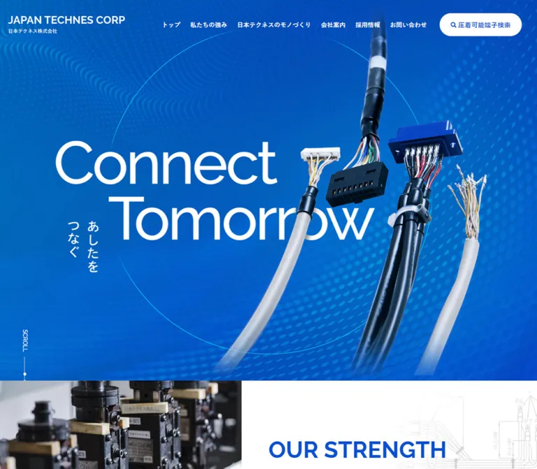
鮮やかな青の背景にワイヤーハーネス写真と大きな英字を重ねた企業サイト。白い余白、円形の矢印、端子検索、問い合わせ導線を組み合わせています。
JAPAN TECHNES CORP / 日本テクネス株式会社 — Style Reference
Precision wiring suspended in a vivid blue field, followed by spacious white product storytelling.
Original URL: https://www.nihontechness.co.jp/ Final URL: https://www.nihontechness.co.jp/ Theme: white content surfaces with saturated blue identity sections and cyan accents; no selectable theme was evidenced. Inspected: supplied browser capture retrieved October 1, 2026, at 16:11:25.010 UTC — October 2, 2026, at 01:11:25.010 JST. Viewports: 1440 × 1000 and 390 × 844 CSS pixels. Scope: the current corporate homepage. Visual evidence covers the desktop opening, craftsmanship feature, contact/footer, and mobile opening/footer. Rendered text and element measurements cover the broader homepage, including strengths, terminal search, company, and recruitment links. Interior pages, search results, the open mobile menu, and destination-site behavior were not inspected.
The homepage presents a wire-harness manufacturer through an unusually large product composition. Real connectors and bundled wires cross in front of oversized white English lettering. A blue field of flowing dots and a fine cyan circle supply depth without enclosing the products in cards. The smaller vertical Japanese phrase, “あしたをつなぐ,” adds a second reading direction beside the two-line “Connect Tomorrow” message.
Below the opening, the visual rhythm alternates spacious white content with stronger blue utility and contact treatments. English section titles provide scale; Japanese labels and concise paragraphs provide practical information. The site is a corporate navigation hub with manufacturing information, terminal search, company information, recruitment, and two direct contact channels. Its reusable character comes from the relationship between technical photography, generous spacing, bilingual hierarchy, and simple circular or pill-shaped controls.
閉じる
JAPAN TECHNES CORP / 日本テクネス株式会社 — Style Reference
Precision wiring suspended in a vivid blue field, followed by spacious white product storytelling.
Original URL: https://www.nihontechness.co.jp/ Final URL: https://www.nihontechness.co.jp/ Theme: white content surfaces with saturated blue identity sections and cyan accents; no selectable theme was evidenced. Inspected: supplied browser capture retrieved October 1, 2026, at 16:11:25.010 UTC — October 2, 2026, at 01:11:25.010 JST. Viewports: 1440 × 1000 and 390 × 844 CSS pixels. Scope: the current corporate homepage. Visual evidence covers the desktop opening, craftsmanship feature, contact/footer, and mobile opening/footer. Rendered text and element measurements cover the broader homepage, including strengths, terminal search, company, and recruitment links. Interior pages, search results, the open mobile menu, and destination-site behavior were not inspected.
The homepage presents a wire-harness manufacturer through an unusually large product composition. Real connectors and bundled wires cross in front of oversized white English lettering. A blue field of flowing dots and a fine cyan circle supply depth without enclosing the products in cards. The smaller vertical Japanese phrase, “あしたをつなぐ,” adds a second reading direction beside the two-line “Connect Tomorrow” message.
Below the opening, the visual rhythm alternates spacious white content with stronger blue utility and contact treatments. English section titles provide scale; Japanese labels and concise paragraphs provide practical information. The site is a corporate navigation hub with manufacturing information, terminal search, company information, recruitment, and two direct contact channels. Its reusable character comes from the relationship between technical photography, generous spacing, bilingual hierarchy, and simple circular or pill-shaped controls.
How to Read This Reference
- Measured — M: values supplied by rendered DOM rectangles or computed styles. These are measurements at the two recorded viewports, not necessarily the original responsive formulas.
- Visual estimate — V: proportions or colors inferred from the supplied current-page screenshots. These were not programmatically sampled.
- Recommendation — R: implementation choices for a reusable adaptation. These are not claims about the original source.
- Derived — D: arithmetic based on measured values, such as column gaps and image-link aspect ratios.
- Token names in this document are descriptive aliases. The supplied custom properties do not expose a complete semantic design-token system.
- Element rectangles can include transformations and inline line-box behavior. Parent typography does not reliably describe an image, pseudo-element, or styled child inside that parent.
- Static captures establish appearance. Computed transitions establish configured timing, but neither proves that every transition was exercised.
Tokens — Colors
Default Palette
| Name | Value | Suggested token | Evidence and role |
|---|---|---|---|
| Brand Blue | #0b50cf |
--color-blue |
M: search button background, header search-link text, contact labels, telephone link, and detail links |
| White | #ffffff |
--color-white |
M: desktop navigation text and header search surface; V: main white canvas and contact panel |
| Body Ink | #101112 |
--color-ink |
M: body copy, footer information, and ordinary text |
| Muted Ink | rgba(16, 17, 18, 0.5) |
--color-muted |
M: copyright text; this is an alpha color, not an independently measured gray hex |
| Gradient Cyan | approximately #00a6ce |
--color-cyan |
V: cyan end of contact and CTA gradients; exact stops were not supplied |
| Orbit Cyan | approximately #00d9df |
--color-orbit |
V: fine circular outline in the hero |
| Pale Blue Rule | approximately #c8d4ed |
--color-rule |
V: footer divider and contact-column separation |
| Product Mist | approximately #f7f8fa |
--color-mist |
V: nearly white haze and subdued background lettering around craftsmanship imagery |
Color Behavior
The hero contains many photographic blues. Brand Blue is an exact interface token, but applying it as one flat hero background would lose the visible depth. Preserve the dotted wave texture, darker blue regions, cyan highlights, and product photography as distinct visual contributions.
The contact region uses a cyan-to-blue treatment over a technical drawing or document photograph. Its white panel creates a clean reading surface for the form and telephone options. The form CTA repeats the cyan-to-blue gradient at a smaller scale.
The footer logo introduces a small yellow accent within its multicolor symbol. No general yellow action or status system is evidenced. Keep this accent inside the supplied identity artwork.
The supplied --swiper-theme-color: #007aff is an implementation preset. It is not sufficient evidence to promote that value into the visible brand palette.
Tokens — Typography
Japanese Body and Interface Text
The measured body stack is:
YakuHanJP, 游ゴシック, "Yu Gothic", 游ゴシック体, YuGothic, "Noto Sans JP", "Hiragino Sans", ヒラギノ角ゴシック, "Hiragino Kaku Gothic Pro", "ヒラギノ角ゴ Pro W3", メイリオ, Meiryo, "MS Pゴシック", Osaka, Verdana, sans-serif
This is a declared fallback sequence. The evidence does not identify which font supplied every rendered glyph or include font files. Preserve the Japanese sans-serif character and the measured weight hierarchy without assuming that every listed family was downloaded.
The inherited body size changes from 14px / 25.2px on desktop to 12px / 18px on mobile. Important introductory paragraphs remain 16px / 32px at both widths. Consequently, the small mobile body default should not be applied indiscriminately to all content.
Telephone Display
The telephone number explicitly declares Oswald, sans-serif, weight 500. Its condensed proportions distinguish operational contact information from ordinary Japanese text.
- Desktop contact number:
50px,50pxline height,5pxtracking. - Mobile contact number:
40px,40pxline height,2pxtracking. - Mobile menu telephone record:
40px / 60pxwith4pxtracking. That menu was not visually opened, so this is a DOM-only configuration.
English Display Lettering
“Connect Tomorrow” appears in very large, light-to-regular sans-serif lettering. The extracted hero heading has empty text despite the visible words. This supports treating the lettering as artwork or another rendering not represented by the extracted text; its asset format and font family are not supplied.
The hero heading wrapper reports 21px on desktop and 18px on mobile. Those values do not describe the visible headline. The wrapper is measured at 648 × 242px on desktop and approximately 334.84 × 130.48px on mobile, but artwork may overflow its box.
“Craftsmanship” is a bold blue English heading, visually around 54–56px in the desktop screenshot. Its child-level font declaration is absent. Do not attribute a named display family from appearance alone.
Type Scale
| Role | Desktop | Mobile | Status |
|---|---|---|---|
| Inherited body | 14px / 25.2px, 400 |
12px / 18px, 400 |
M |
| Main introductory paragraphs | 16px / 32px, 400 |
16px / 32px, 400 |
M |
| Desktop header navigation | 15px / 27px, 700 |
Replaced visually by compact controls | M |
| Mobile menu link records | Not applicable | 18px / 27px, 500 |
M; open state unverified |
| Header search label | 16px / 28.8px, 700 |
Icon-only in the captured header | M and screenshot |
| Strength descriptions | 15px / 27px, 400 |
15px / 22.5px, 400 |
M |
| Contact option heading | 18px / 32.4px, 700 |
16px / 24px, 700 |
M |
| Contact CTA label | 16px / 28.8px, 700 |
16px / 24px, 700 |
M |
| Contact telephone | 50px / 50px, 500; 5px tracking |
40px / 40px, 500; 2px tracking |
M |
| Footer navigation | 16px / 28.8px, 700 |
16px / 24px, 700 |
M |
| Footer company name | 16px / 28.8px, 700 |
18px / 27px, 700 |
M |
| Footer address | 16px / 28.8px, 500 |
15px / 22.5px, 500 |
M |
| Copyright | 12px / 12px, 500 |
10px / 10px, 500 |
M |
| Hero live-text substitute | Approximately 140–150px |
Approximately 72–78px |
V; recommended substitute only |
| Craftsmanship English title | Approximately 54–56px, bold |
Not visually measured | V |
The page uses normal letter spacing for most Japanese interface text. Wide tracking is a deliberate telephone treatment, not a global typography rule.
Tokens — Spacing & Shapes
Spacing Scale
The source does not establish a single universal spacing unit. Several recurring measurements provide a useful working vocabulary.
| Use | Value | Status |
|---|---|---|
| Header horizontal edge inset | 20px at both recorded widths |
M |
| Main desktop side margins | 120px at 1440px viewport width |
M |
| Main mobile side margins | 20px at 390px viewport width |
M |
| Desktop header navigation gaps | 24px between measured links |
D |
| Desktop footer navigation gaps | 20px |
D |
| Mobile strengths card gaps | 20px |
D |
| Desktop company/recruitment gap | 24px |
D |
| Mobile company/recruitment separation | Approximately 1px |
D |
| Strength row vertical padding | 30px desktop |
M |
| Footer top padding | 120px desktop; 80px mobile |
M |
| Main bottom padding | 180px desktop; 100px mobile |
M |
| Copyright padding | 20px 0 55px desktop; 25px 0 35px mobile |
M |
Border Radius
| Element | Value | Status |
|---|---|---|
| Header search pill | 30px |
M |
| Contact form pill | 32px |
M |
| Mobile search control | 50% |
M |
| Detail-arrow outline | Circle; approximately 70px diameter on desktop | V |
| Page-top icon background | Circle; approximately 50px diameter | V |
| Search submit button | 0 |
M |
| Strength links and destination-link boxes | 0 on sampled elements |
M |
| Contact panel | Square corners in the supplied capture | V |
Roundness identifies actions. The broader content system remains rectangular and open.
Layout Measurements
| Element | Desktop: 1440 × 1000 | Mobile: 390 × 844 | Evidence |
|---|---|---|---|
| Document height | Approximately 5017.77px |
Approximately 5023.97px |
M |
| Header | 1440 × 120px |
390 × 65px |
M |
| Header logo wrapper | 284 × 31.36px, x = 20 |
176 × 24px, x = 20 |
M |
| Main content width | 1200px, x = 120 |
350px, x = 20 |
M |
| Header terminal search | 200 × 56px |
40 × 40px |
M |
| Hero heading wrapper | x = 201.6, y = 379; 648 × 242px |
x = 33.14, y = 259.80; 334.84 × 130.48px |
M |
| Hero Japanese caption wrapper | 74 × 125px |
Approximately 49.91 × 84.30px |
M |
| Desktop strengths link | 600 × 120px |
Replaced by horizontal cards | M |
| Mobile strengths card | Not the desktop arrangement | 272.5 × 487.14px |
M |
| Terminal search heading region | 880px wide, x = 280 |
Approximately 308.72px wide, x = 40.64 |
M |
| Search submit button | Approximately 113.59 × 58px |
Approximately 72.92 × 48px |
M |
| Company/recruitment link | Each 588 × 335.16px |
Each 390 × 222.28px |
M |
| Contact option column | 600px wide |
350px wide |
M |
| Contact form CTA | 330 × 64px |
275 × 64px |
M |
| Footer logo wrapper | 136 × 93.08px |
Same dimensions | M |
| Page-top link wrapper | Approximately 64.23 × 77px |
Approximately 64.23 × 72.5px |
M |
A reusable 1200px maximum-width container with a 20px minimum gutter reproduces the two recorded content widths. That formula is a recommendation, not a recovered source rule.
Components
Site Header
Role: company identity, primary navigation, and immediate access to terminal search.
On desktop, the transparent header overlays the blue opening. The horizontal white company logo sits at x = 20. Six navigation links occupy one row, followed by the white 200 × 56px terminal-search pill. Links are bold, 15px, with 24px gaps. The search pill uses blue text, a small magnifier, and the source label “圧着可能端子検索.”
On mobile, the header becomes 65px high. A smaller horizontal white logo sits at the left, a white circular search control appears near x = 282, and a thin three-line menu icon sits at the right. Desktop navigation is not visible in the captured opening.
The DOM still contains mobile menu links and a telephone block. Their nonzero rectangles do not prove that the menu was open or visible. Menu entry, focus management, dismissal, background color, and scroll locking remain unverified.
Hero Composition
Role: communicates the company's work through a product-led identity statement.
The opening consists of five visual layers:
- A full-width, richly blue background.
- Flowing bands of cyan-blue dots that suggest a technical field or signal flow.
- A fine circular cyan outline, approximately 800px across on desktop.
- The large two-line white headline and small vertical Japanese phrase.
- Photographic wire-harness cutouts crossing the lettering in the foreground.
The desktop headline starts around 14% of viewport width. “Tomorrow” is indented relative to “Connect.” The cables occupy the center-right and extend vertically, with visible connector housings, bundled conductors, black insulation, and pale cables fading toward the lower edge.
The phone composition is deliberately rearranged. Both English lines begin near the same left edge, around x = 33. The cable group shifts downward and crosses the lower headline and vertical caption. Product edges are cropped by the viewport. The circle is smaller and partially clipped on the right.
A vertical “SCROLL” label and fine line appear near the lower-left desktop edge. In the mobile DOM, this cue is below the initial 844px capture. Do not force it into the visible phone screenshot.
Strengths Overview
Role: organizes four manufacturing capabilities into direct links.
The recorded order is equipment, flexibility, speed, and management. Each entry combines a two-digit number, a Japanese capability label, an English label, and a short explanatory sentence. The links target specific anchors under /ourstrength/.
At desktop width, the heading and four linked rows occupy a 600px column beginning at x = 720. Rows are 120px high and separated by approximately 1px in their recorded positions. Each row uses a horizontal composition with the number preceding the title/description group. Description text is white at 15px / 27px.
At mobile width, the entries become a horizontal sequence. Their left positions are 20, 312.5, 605, and 897.5px; each card is 272.5px wide with a 20px gap. The next card therefore begins within the viewport and supplies a partial continuation cue. Text near the lower part of each card is white.
The measurements support a horizontal card presentation. They do not establish swipe behavior, automatic advancement, pagination, or which photograph appears in a card. The current supplied screenshots do not show this block in detail, so its media and background construction remain unspecified.
Bilingual Section Heading
Role: creates a consistent bridge between expressive English typography and practical Japanese navigation.
The craftsmanship example places a large blue English title above a smaller bold Japanese label, followed by a brief Japanese paragraph. The English line carries most of the visual scale; the Japanese line confirms the subject immediately.
The source also uses an uppercase “OUR STRENGTH” treatment and title-case “Company,” “Recruit,” and “Contact.” Preserve these distinct text treatments when reproducing the observed content. Do not force every heading into uppercase.
Detail Link with Circular Arrow
Role: a light secondary navigation treatment.
The visible desktop craftsmanship link pairs “詳しく見る” with a separate outlined circle containing a right arrow. The text and arrow share the brand blue. The circle is approximately 70px across, and the whole treatment occupies about 180px horizontally.
The measured link box is only 180 × 28.8px, with 100px right padding. The circle therefore extends beyond the text line box through an unrecorded child or decorative layer. For a new implementation, a flex link with a real circular child is easier to make keyboard accessible and gives the entire visible control an explicit hit area.
Mobile detail links measure 160 × 24px, with 80px right padding. Their arrow diameter is not visually verified.
Craftsmanship Feature
Role: turns the product range into a spacious editorial illustration.
The desktop feature places the heading, two-line paragraph, and detail link at the left of a 1200px content alignment. A large composition of wire harnesses fills the right side and bleeds toward the viewport edge. The products arc around the space, with small connectors, exposed colored conductors, and bundled black cables remaining legible.
The imagery dissolves into white along its left and upper edges. Extremely pale “Wire Harness” lettering sits behind the composition near the lower area. It behaves as environmental typography, not a high-contrast heading.
This section needs substantial empty space around the text. Avoid placing the photography in a bordered product card. On mobile, the measured heading and paragraph use the 350px content width, but the exact image crop is not visible in the supplied mobile captures.
Terminal Search
Role: provides a practical lookup tool within the corporate homepage.
The rendered evidence includes the bilingual “端子検索 / Search” heading, a blue “検索” submit button, and an explanatory sentence about searchable manufacturing terminals. The desktop inner heading region is 880px wide; the mobile equivalent is approximately 309px.
The submit button is rectangular: approximately 114 × 58px on desktop and 73 × 48px on mobile. The introductory text remains 16px, with a mobile line-height reduction from 28.8px to 24px.
The supplied element sample does not expose input fields, placeholders, filters, query parameters, form method, or result behavior. A labeled single-field search is included only as a recommended starting structure in the CSS adaptation. Its actual request behavior must be connected to a verified implementation.
Company and Recruitment Links
Role: gives two large onward routes after the product and search content.
At desktop width, these links form two 588px columns separated by 24px. At mobile width, they stack edge to edge across the full 390px viewport with approximately 1px between them. Both maintain a measured width-to-height ratio of approximately 1.754:1.
Each link contains English and Japanese labels in white. The sampled DOM does not identify its background media, so do not invent a specific office or employee photograph.
The company link points to /company/. Recruitment links point to the external jtc-870707.com domain; the navigation and large destination link use slightly different URL paths. These are recorded destinations, not inspected pages.
Contact Band
Role: offers form and telephone contact with equal prominence.
A full-width cyan-to-blue photographic band contains a centered bilingual heading and supporting sentence. Inside it, a square white panel spans the main content width.
Desktop anatomy:
- Two equal 600px columns separated by a fine pale vertical rule.
- A blue bold option heading in each column.
- A
330 × 64pxgradient form button on the left, with centered white text and a small right arrow near its trailing edge. - A large blue Oswald telephone link on the right, followed by compact business hours.
The contact number is 078-975-0521; the observed hours are “(平日9:00~17:00).” The telephone anchor uses tel:078-975-0521, and the form link points to /contact/.
On mobile, the options stack inside a 350px-wide white region. The form button narrows to 275px while retaining its 64px height. The telephone changes to 40px type with tighter tracking. The final mobile capture shows the lower telephone option and approximately 60px of blue space before the footer.
Corporate Footer
Role: repeats identity, navigation, location, and policy information.
The desktop footer begins with 120px of top padding. A colored vertical logo lockup occupies 136 × 93px at the left. The six navigation links form one row to the right. Company information appears below, followed by the privacy-policy link and a fine full-width divider above the copyright.
The mobile footer begins with 80px of top padding. The logo retains its desktop dimensions. Navigation becomes two columns and three rows, with the second column beginning near x = 240.5. The long craftsmanship label fits in the wider left column. Company information follows with a larger 18px bold company name and a two-line postal address.
The source copyright reads “©2022 JAPAN TECHNES CORP.” This is displayed page content, not evidence of the current capture date or of a redesign date.
Page-Top Control
Role: offers a persistent-looking route back to the beginning in scrolled views.
The control combines an approximately 50px blue circle, a white upward arrow, and the blue “Page top” caption below. It appears near the right edge in the supplied desktop middle/footer views and mobile footer view.
The desktop presentation sits roughly 150px above the viewport bottom; the mobile presentation sits roughly 90px above it. These are screenshot estimates. Its exact positioning rule and visibility threshold are not supplied.
The anchor targets /#wrapper. A configured transform transition is evidenced, but smooth scrolling and click behavior were not tested.
Tokens — Motion & Interaction
| Treatment | Supplied computed value | What is established |
|---|---|---|
| Header changes | background-color 0.4s, box-shadow 0.4s, height 0.4s |
These properties have configured transitions; their triggering states are not shown |
| Desktop header search | 0.3s |
A transition duration is declared; changed properties and hover appearance are unspecified |
| Search submit button | 0.3s |
Same limitation |
| Company/recruitment links | 0.3s |
Same limitation |
| Footer links and page-top anchor | 0.3s |
Same limitation |
| Page-top wrapper | transform 0.4s |
Transform changes are configured; travel distance is not supplied |
| Mobile strengths heading | opacity 0.6s ease-in-out, transform 1s cubic-bezier(0.075, 0.82, 0.165, 1) |
Reveal-style transition configuration |
| Mobile strengths introduction | Same transitions, 0.2s delay |
Configured stagger |
| Mobile strengths detail link wrapper | Same transitions, 0.6s delay |
Configured stagger |
| Mobile craftsmanship heading/body/link | Same transitions, delays of 0.4s, 0.6s, and 0.8s |
Configured sequence |
These declarations suggest gentle opacity and position reveals with a longer settling movement. Initial offsets, trigger thresholds, repeat behavior, and actual playback were not supplied. The desktop sample does not expose the same reveal declarations on all corresponding elements.
Most sampled elements report animation: none. This does not exclude animation on unsampled children, pseudo-elements, media, or script-controlled transforms. There is no sufficient evidence to claim rotating rings, moving background dots, cable parallax, hero video, or an autoplaying strengths slider.
The capture process waited for image decoding and finite motion where possible. Perpetual animations were temporarily paused during readiness checks and resumed afterward. Static screenshots therefore cannot establish a complete motion sequence.
Surfaces
| Surface | Appearance | Function |
|---|---|---|
| Hero | Saturated blue photographic/graphic field | Identity and product scale |
| General content | White with dark text and blue headings | Readable corporate information |
| Craftsmanship | White product haze with nearly invisible large lettering | Integrates photography into open space |
| Header search | White pill or white circle | Strong utility contrast against the hero |
| Terminal submit | Solid blue, square corners | Compact form action |
| Contact background | Cyan-to-blue overlay with faint technical imagery | Groups the contact choices |
| Contact panel | Flat white, square corners, fine divider | Separates information from the photographic background |
| Footer | White, fine pale rule, dark text | Quiet corporate close |
No general elevated-card or heavy-shadow system is visible in the supplied screenshots. The header has a box-shadow transition declaration, but the shadow's appearance and activation state are not established.
Imagery
The defining assets are real manufacturing products: connectors, insulated bundles, exposed multicolored wires, and pale cable sleeves. Retain their photographic texture and precise edges. The visible products supply specificity that generic circuitry illustrations cannot reproduce.
The hero composition overlaps text and imagery. Its wire cutouts are large enough to function as the main illustration, and their lower edges blend into the blue environment. The craftsmanship image uses a different treatment: multiple products sweep across a white field and fade into it, leaving room for copy on the left.
Use selective edge fading around product groups rather than reducing the opacity of the entire image. Connector housings and conductors should remain crisp where the image is intended to be read.
The contact background includes a faint technical drawing/document scene. Its low contrast is part of the hierarchy: the white contact panel and blue telephone number remain dominant.
Observed Asset References
Actual asset URLs and file formats were not included in the supplied evidence. The following identifies visible asset roles without inventing file paths.
| Asset role | Current-page evidence | Implementation guidance |
|---|---|---|
| White horizontal company identity | Desktop and mobile header captures | Use the approved logo artwork; preserve its proportions |
| Colored vertical company identity | Desktop and mobile footer captures | Keep the same 136px display width at the recorded sizes |
| Hero wire-harness composition | Desktop and mobile opening captures | Support separate positioning or an art-directed mobile crop |
| Blue flowing dot field | Desktop and mobile opening captures | Use an appropriate background asset; a plain gradient is incomplete |
| Hero English and Japanese lettering | Visible in both openings; extracted heading/caption text is empty | Reuse verified artwork or explicitly choose a live-text adaptation |
| Craftsmanship product arrangement | Desktop middle capture | Preserve the white edge fade and broad composition |
| Contact technical background | Desktop contact/footer capture | Keep it subordinate to the gradient and white panel |
Assets for the strengths block and company/recruitment links are not visually established by the supplied current-page screenshots. Do not choose their subject matter solely from their section labels.
Layout & Responsive Behavior
| Area | Desktop observation | Mobile observation |
|---|---|---|
| Header | 120px tall, horizontal navigation, labeled search pill | 65px tall, smaller logo, circular search, menu icon |
| Hero headline | Left of center; second line indented | Both lines aligned near x = 33 |
| Hero product group | Center-right, tall composition | Lower placement, wider crop, viewport-edge clipping |
| Content alignment | 1200px region with 120px side margins | 350px region with 20px side margins |
| Strengths | Four vertically arranged 600px rows | Horizontal 272.5px cards with 20px gaps |
| Craftsmanship text | Left-aligned within wide photographic feature | Full 350px content width; mobile image crop unverified |
| Detail links | Approximately 180px wide | Approximately 160px wide, centered in sampled wrappers |
| Company/recruitment | Two columns, 24px gap | Full-width stack with approximately 1px separation |
| Contact | Form and phone side by side | Form and phone stacked |
| Footer navigation | One horizontal row | Two columns and three rows |
| Footer address | Single address line | Postal code and street address wrap onto separate lines |
| Copyright | Right aligned in desktop capture | Centered in mobile capture |
Hero Height Caveat
The desktop opening fills the supplied 1000px-tall screenshot. The mobile screenshot shows only its first 844px: the mobile DOM places the scroll cue at y = 890 with a 110px box, and the strengths heading begins at y = 1120.
Both snapshots report --vh: 10px, but the rule consuming that variable was not provided. The evidence therefore does not support calling the mobile hero exactly 100vh or 844px high. A reconstruction should preserve the observed longer opening when matching this capture, then separately test a modern viewport-height policy for real devices.
Breakpoints and Intermediate Widths
Only 1440px and 390px widths were inspected. The exact breakpoint for the compact header, horizontal strengths cards, stacked contact panel, or destination links is unknown. Use content-driven breakpoints in a new implementation and verify intermediate widths explicitly.
The similar overall document heights do not mean the two layouts are scaled copies. The phone's horizontal strengths strip and stacked lower sections redistribute height in different ways.
Do’s and Don’ts
Do
- Use exact
#0b50cffor verified interface blue and clearly label approximate gradient colors. - Preserve large, detailed wire-harness photography as the dominant identity asset.
- Keep the desktop hero headline indented and the mobile headline more closely left aligned.
- Retain the foreground overlap between the cables and headline.
- Combine prominent English headings with compact Japanese labels and readable 16px introductory copy.
- Use pills for the main contact action, circles for directional controls, and square geometry for larger content areas.
- Preserve the horizontal strengths arrangement and stacked destination links on mobile.
- Keep form and telephone contact equally easy to locate.
- Retain the footer's generous top spacing and distinct horizontal/vertical logo treatments.
- Separate measured typography from lettering embedded in artwork.
Don’t
- Don’t turn the cable compositions into generic electronics icons or small catalog thumbnails.
- Don’t assign an invented font family to the hero or English section headings.
- Don’t use the hero wrapper's 21px computed size as the visible headline size.
- Don’t treat the mobile menu's DOM rectangles as proof of a visually open menu.
- Don’t claim carousel autoplay, parallax, smooth scrolling, or rotating circles without interaction evidence.
- Don’t flatten the hero into a uniform blue rectangle and omit its dot field and fine orbit.
- Don’t cover the craftsmanship section with borders, dense cards, or heavy shadows.
- Don’t spread the logo's yellow accent into unrelated buttons.
- Don’t shrink all mobile prose to the inherited 12px body default.
- Don’t force the mobile opening to end at 844px when matching the supplied capture.
Recommended Implementation Additions
These are recommendations for a new implementation, not verified original-site features:
- Give the search icon, menu control, and page-top link explicit accessible names. Keep decorative arrow and magnifier graphics hidden from assistive technology.
- Provide at least a 44px effective touch area around the visually 40px mobile search circle.
- Use real heading text or meaningful alternatives for the hero message. Empty extracted heading text does not by itself establish whether the original asset has a usable alternative.
- Keep hero text alternatives separate from decorative product photography to avoid repeated announcements.
- Make a horizontal strengths strip operable by keyboard and touch. If implemented as a carousel, provide clear controls and avoid automatic advancement by default.
- Label the terminal search input and preserve entered queries through results and validation states. Confirm its endpoint and parameter format before implementation.
- Support reduced motion and keep content visible if reveal scripts fail to initialize.
- Maintain sufficient contrast through the full CTA gradient, particularly its brighter cyan end.
- Preserve a visible focus ring on white, blue, and photographic surfaces.
- Test narrow phones, landscape viewports, text enlargement, and long navigation labels. The two supplied captures cannot establish behavior across those conditions.
Agent Prompt Guide
Quick Color Reference
- Verified interface blue:
#0b50cf. - Main white surfaces and reversed labels:
#ffffff. - Body text:
#101112. - Muted copyright:
rgba(16, 17, 18, 0.5). - Approximate cyan gradient start:
#00a6ce. - Approximate hero orbit:
#00d9df. - Approximate fine divider:
#c8d4ed. - Use photographic blue variation in the hero; the exact interface blue is only one part of that field.
Overall Prompt
“Create a Japanese wire-harness manufacturer's corporate homepage using saturated blue identity sections, broad white content areas, and precise product photography. Build an opening with a flowing blue dot field, a fine cyan circle, oversized white ‘Connect Tomorrow’ lettering, a small vertical Japanese phrase, and real cable assemblies overlapping the typography. Use a transparent desktop header with white navigation and a white terminal-search pill. Below it, provide manufacturing strengths, an airy craftsmanship composition, terminal search, company and recruitment routes, a split white contact panel over a cyan-to-blue technical background, and a spacious corporate footer. Use #0b50cf for interface blue, Japanese sans-serif body text, and Oswald for the telephone number. Treat unspecified display fonts, media, breakpoints, and interactions as implementation decisions.”
Example Component Prompts
- Desktop hero: “At 1440px width, place the white logo 20px from the left in a 120px transparent header. Set a large two-line white message left of center, indent the second line, and overlap it with detailed wire-harness photography from the right. Add a thin cyan orbit and flowing blue dot texture. Preserve readable product edges and generous scale.”
- Mobile opening: “At 390px width, use a 65px header with a compact white logo, white circular search control, and thin menu icon. Begin the two-line headline around x = 33 and y = 260. Reposition the cable composition below and across the text. Preserve the tall opening suggested by the capture; do not assume it ends at the first screen boundary.”
- Craftsmanship feature: “Create a white editorial section with a large blue English title, a smaller bold Japanese label, a short 16px paragraph with 32px leading, and a blue outlined circular-arrow detail link. Let a wide arrangement of real wire harnesses fill the right side and fade into white. Add extremely pale ‘Wire Harness’ lettering behind the products.”
- Contact panel: “Place two equal white contact columns inside a 1200px container over a cyan-to-blue technical-image band. Use blue option labels, a 330 × 64px gradient form pill, and a blue 50px Oswald telephone number with 5px tracking. On mobile, stack the options, narrow the button to 275px, and use a 40px telephone number with 2px tracking.”
- Footer: “Use a white footer with generous top padding, a 136px-wide vertical color logo, six bold navigation links, company details, a privacy link, and a pale divider. On mobile, retain the logo size, arrange navigation in two unequal columns, wrap the address naturally, and center the small copyright.”
Quick Start
CSS Custom Properties
The following is a reusable adaptation, not recovered source CSS. It reproduces the measured container, control, telephone, and destination-link proportions. Cyan, orbit, and rule colors are approximations. Display type, responsive breakpoints, media placement, and unobserved strengths surfaces are recommendations.
Supply approved image assets through the image elements and the --hero-texture and --contact-photo properties. Those properties accept a CSS image value such as url(...); no asset paths were provided by the evidence. The plain fallback backgrounds are incomplete without the imagery.
The class anatomy assumes a header, layered hero, strengths introduction/list, craftsmanship copy/media, terminal-search form, destination grid, contact options, and footer. Menu logic, search submission, and optional reveal triggers require separate implementation.
:root {
  /* Measured interface colors */
  --color-blue: #0b50cf;
  --color-white: #ffffff;
  --color-ink: #101112;
  --color-muted: rgba(16, 17, 18, 0.5);

  /* Visual approximations */
  --color-cyan: #00a6ce;
  --color-orbit: #00d9df;
  --color-rule: #c8d4ed;
  --color-mist: #f7f8fa;

  /* Shortened source body stack; display fallback is a recommendation */
  --font-body: YakuHanJP, 'Yu Gothic', YuGothic, 'Noto Sans JP',
    'Hiragino Sans', Meiryo, Verdana, sans-serif;
  --font-display: sans-serif;
  --font-phone: Oswald, sans-serif;

  --content-max: 1200px;
  --gutter: 20px;
  --header-height: 120px;
  --radius-search: 30px;
  --radius-contact: 32px;
  --motion-control: 300ms;
  --motion-header: 400ms;
  --reveal-easing: cubic-bezier(0.075, 0.82, 0.165, 1);

  /* Set these to approved background image values */
  --hero-texture: none;
  --contact-photo: none;
}

* { box-sizing: border-box; }
body {
  margin: 0;
  color: var(--color-ink);
  background: var(--color-white);
  font: 400 14px/1.8 var(--font-body);
}
img { display: block; max-width: 100%; }
a { color: inherit; }
button, input { font: inherit; }
button { cursor: pointer; }
[hidden] { display: none !important; }
.container {
  width: min(var(--content-max), calc(100% - 2 * var(--gutter)));
  margin-inline: auto;
}
.lead { font-size: 16px; line-height: 2; }

/* Overlay placement matches the opening; sticky behavior is not assumed. */
.site-header {
  position: absolute;
  inset: 0 0 auto;
  z-index: 10;
  display: flex;
  align-items: center;
  gap: 31px;
  height: var(--header-height);
  padding-inline: 20px;
  color: white;
  transition: background-color var(--motion-header),
    box-shadow var(--motion-header), height var(--motion-header);
}
.header-logo { flex: 0 0 284px; }
.header-logo img { width: 100%; height: auto; }
.header-nav {
  display: flex;
  align-items: center;
  gap: 24px;
  margin-left: auto;
}
.header-nav a {
  padding-block: 10px;
  font-size: 15px;
  line-height: 27px;
  font-weight: 700;
  text-decoration: none;
  white-space: nowrap;
}
.header-search {
  display: flex;
  flex: 0 0 200px;
  align-items: center;
  justify-content: center;
  gap: 7px;
  height: 56px;
  border-radius: var(--radius-search);
  color: var(--color-blue);
  background: white;
  font-size: 16px;
  font-weight: 700;
  text-decoration: none;
  transition: opacity var(--motion-control);
}
.menu-button { display: none; }

/* Snapshot-oriented height; test a separate viewport policy on real devices. */
.hero {
  position: relative;
  isolation: isolate;
  min-height: 1000px;
  height: 100svh;
  overflow: hidden;
  color: white;
  background-color: var(--color-blue);
  background-image: var(--hero-texture);
  background-size: cover;
  background-position: center;
}
.hero__orbit {
  position: absolute;
  z-index: 0;
  left: 50%;
  top: 50%;
  width: min(800px, 70vw);
  aspect-ratio: 1;
  border: 1px solid var(--color-orbit);
  border-radius: 50%;
  transform: translate(-50%, -50%);
}
/* Live-text alternative; the original display font is unverified. */
.hero__title {
  position: absolute;
  z-index: 1;
  left: 14%;
  top: 37.9%;
  margin: 0;
  font: 400 clamp(90px, 9.8vw, 142px)/0.96 var(--font-display);
  letter-spacing: -0.045em;
}
.hero__title span { display: block; }
.hero__title span + span { margin-left: 0.9em; }
.hero__caption {
  position: absolute;
  z-index: 1;
  left: 16%;
  top: 58%;
  margin: 0;
  writing-mode: vertical-rl;
  font-size: 28px;
  font-weight: 700;
  line-height: 1.7;
}
.hero__product {
  position: absolute;
  z-index: 2;
  right: 10%;
  bottom: 4%;
  width: 54%;
  height: 95%;
  object-fit: contain;
  pointer-events: none;
}

.section-title { margin: 0 0 28px; }
.section-title__en {
  display: block;
  color: var(--color-blue);
  font-family: var(--font-display);
  font-size: clamp(36px, 3.9vw, 56px);
  font-weight: 700;
  line-height: 1.15;
}
.section-title__ja {
  display: block;
  margin-top: 16px;
  font-size: 16px;
  font-weight: 700;
}
.detail-link {
  display: inline-flex;
  align-items: center;
  gap: 30px;
  color: var(--color-blue);
  font-size: 16px;
  font-weight: 700;
  text-decoration: none;
}
.detail-link__circle {
  display: grid;
  flex: 0 0 70px;
  place-items: center;
  width: 70px;
  height: 70px;
  border: 1px solid currentColor;
  border-radius: 50%;
}

/* Media content is intentionally unspecified. */
.strength-layout {
  display: grid;
  grid-template-columns: 1fr 1fr;
  padding-block: 120px;
}
.strength-intro, .strength-list { grid-column: 2; }
.strength-list { display: grid; gap: 1px; }
.strength-card {
  display: flex;
  align-items: center;
  gap: 30px;
  min-height: 120px;
  padding: 30px 40px;
  color: white;
  background: var(--color-blue);
  text-decoration: none;
}
.strength-card__description {
  margin: 0;
  font-size: 15px;
  line-height: 1.8;
}

.craftsmanship {
  position: relative;
  isolation: isolate;
  min-height: 800px;
  padding-block: 120px;
  overflow: hidden;
}
.craftsmanship__copy { position: relative; z-index: 2; }
.craftsmanship__copy .lead { max-width: 470px; }
.craftsmanship__copy .detail-link { margin-top: 36px; }
.craftsmanship__image {
  position: absolute;
  z-index: 0;
  inset: 0 0 0 auto;
  width: 68%;
  height: 100%;
  object-fit: contain;
  object-position: right center;
  mask-image: linear-gradient(to right, transparent, black 28%);
}
.craftsmanship__watermark {
  position: absolute;
  z-index: 1;
  right: -2%;
  bottom: 15%;
  margin: 0;
  color: var(--color-mist);
  font: 400 clamp(70px, 11vw, 160px)/1 var(--font-display);
  white-space: nowrap;
  pointer-events: none;
}

/* Single-input form is a recommended structure, not verified source anatomy. */
.terminal-search { padding-block: 70px; }
.terminal-search__inner {
  width: min(880px, calc(100% - 40px));
  margin-inline: auto;
}
.terminal-search__form {
  display: flex;
  max-width: 600px;
  margin-inline: auto;
}
.terminal-search input {
  flex: 1 1 auto;
  min-width: 0;
  height: 58px;
  padding-inline: 16px;
  border: 1px solid var(--color-rule);
  border-radius: 0;
  background: white;
  font-size: 16px;
}
.terminal-search button {
  flex: 0 0 114px;
  height: 58px;
  border: 0;
  border-radius: 0;
  color: white;
  background: var(--color-blue);
  transition: opacity var(--motion-control);
}

.destination-grid {
  display: grid;
  grid-template-columns: 1fr 1fr;
  gap: 24px;
}
.destination-link {
  position: relative;
  display: flex;
  align-items: center;
  aspect-ratio: 100 / 57;
  padding: 10%;
  color: white;
  background: var(--color-blue);
  text-decoration: none;
}

.contact-band {
  margin-top: 100px;
  padding: 120px 0 100px;
  color: white;
  text-align: center;
  background-color: var(--color-blue);
  background-image: linear-gradient(110deg,
    rgba(0, 166, 206, 0.88), rgba(11, 80, 207, 0.9)),
    var(--contact-photo);
  background-position: center;
  background-size: cover;
}
.contact-panel {
  display: grid;
  grid-template-columns: 1fr 1fr;
  margin-top: 46px;
  color: var(--color-ink);
  background: white;
}
.contact-option {
  display: flex;
  flex-direction: column;
  align-items: center;
  justify-content: center;
  min-width: 0;
  min-height: 269px;
  padding: 48px 24px;
}
.contact-option + .contact-option {
  border-left: 1px solid var(--color-rule);
}
.contact-option__label {
  margin: 0 0 20px;
  color: var(--color-blue);
  font-size: 18px;
  font-weight: 700;
  line-height: 1.8;
}
.contact-button {
  position: relative;
  display: flex;
  align-items: center;
  justify-content: center;
  width: min(330px, 100%);
  min-height: 64px;
  padding-inline: 32px;
  border-radius: var(--radius-contact);
  color: white;
  background: linear-gradient(115deg, var(--color-cyan), var(--color-blue));
  font-size: 16px;
  font-weight: 700;
  text-decoration: none;
}
.contact-button__arrow { position: absolute; right: 24px; }
.contact-phone {
  color: var(--color-blue);
  font: 500 50px/1 var(--font-phone);
  letter-spacing: 5px;
  text-decoration: none;
  white-space: nowrap;
}
.contact-hours { margin: 10px 0 0; font-size: 16px; }

.site-footer { padding-top: 120px; }
.footer-top {
  display: flex;
  align-items: center;
  justify-content: space-between;
  gap: 40px;
}
.footer-logo { width: 136px; height: auto; }
.footer-nav { display: flex; gap: 20px; }
.footer-nav a {
  font-size: 16px;
  font-weight: 700;
  text-decoration: none;
}
.footer-info { margin-top: 56px; font-size: 16px; }
.footer-info p { margin: 0; }
.footer-name { font-weight: 700; }
.footer-privacy { display: inline-block; margin-top: 25px; }
.footer-copyright {
  margin: 25px 0 0;
  padding: 20px 0 55px;
  border-top: 1px solid var(--color-rule);
  color: var(--color-muted);
  font-size: 12px;
  line-height: 12px;
  text-align: right;
}
.page-top {
  position: fixed;
  z-index: 20;
  right: max(20px, calc((100vw - 1200px) / 2));
  bottom: 150px;
  display: grid;
  justify-items: center;
  gap: 5px;
  color: var(--color-blue);
  font-size: 14px;
  text-decoration: none;
}
.page-top__circle {
  display: grid;
  place-items: center;
  width: 50px;
  height: 50px;
  border-radius: 50%;
  color: white;
  background: var(--color-blue);
}

/* Recommended breakpoints; original thresholds were not supplied. */
@media (max-width: 1240px) {
  :root { --header-height: 65px; }
  .site-header { gap: 12px; }
  .header-logo { flex-basis: 176px; }
  .header-nav { display: none; }
  .header-search {
    flex-basis: 40px;
    height: 40px;
    margin-left: auto;
    border-radius: 50%;
  }
  .header-search__label { display: none; }
  .menu-button {
    display: grid;
    place-items: center;
    width: 44px;
    height: 44px;
    padding: 0;
    border: 0;
    color: white;
    background: transparent;
  }
  .footer-top { align-items: flex-start; flex-wrap: wrap; }
  .footer-nav { flex-wrap: wrap; }
}

@media (max-width: 767px) {
  body { font-size: 12px; line-height: 1.5; }
  .hero__title {
    left: 8.5%;
    top: 26%;
    font-size: clamp(52px, 19.5vw, 76px);
    line-height: 0.98;
  }
  .hero__title span + span { margin-left: 0; }
  .hero__caption { left: 8.5%; top: 47.9%; font-size: 20px; }
  .hero__orbit { left: 71%; top: 52%; width: 380px; }
  .hero__product {
    top: 290px;
    right: -5%;
    bottom: auto;
    width: 128%;
    max-width: none;
    height: 560px;
  }
  .strength-layout { display: block; padding-block: 120px 80px; }
  .strength-list {
    display: flex;
    gap: 20px;
    overflow-x: auto;
    padding-bottom: 12px;
    scroll-snap-type: x proximity;
  }
  .strength-card {
    flex: 0 0 min(272.5px, calc(100vw - 60px));
    min-height: 487px;
    flex-direction: column;
    justify-content: flex-end;
    align-items: flex-start;
    padding: 15px;
    scroll-snap-align: start;
  }
  .strength-card__description { line-height: 1.5; }
  .craftsmanship { min-height: 720px; padding-top: 400px; padding-bottom: 80px; }
  .craftsmanship__image {
    inset: 0 0 auto;
    width: 100%;
    height: 380px;
    mask-image: linear-gradient(to bottom, black 70%, transparent);
  }
  .craftsmanship__watermark { top: 300px; bottom: auto; }
  .detail-link__circle { flex-basis: 60px; width: 60px; height: 60px; }
  .terminal-search input { height: 48px; }
  .terminal-search button { flex-basis: 73px; height: 48px; }
  .destination-grid { width: 100%; grid-template-columns: 1fr; gap: 1px; }
  .destination-link { padding: 20px; }
  .contact-band { padding: 80px 0 60px; }
  .contact-panel { grid-template-columns: 1fr; }
  .contact-option { min-height: 186px; padding: 36px 20px; }
  .contact-option + .contact-option { border-left: 0; }
  .contact-option__label { font-size: 16px; line-height: 24px; }
  .contact-button { width: min(275px, 100%); }
  .contact-phone { font-size: 40px; letter-spacing: 2px; }
  .contact-hours { font-size: 15px; }
  .site-footer { padding-top: 80px; }
  .footer-top { display: block; }
  .footer-nav {
    display: grid;
    grid-template-columns: minmax(0, 1.7fr) minmax(0, 1fr);
    gap: 16px 20px;
    margin-top: 30px;
  }
  .footer-nav a { line-height: 24px; }
  .footer-info { margin-top: 60px; font-size: 15px; line-height: 1.5; }
  .footer-name { margin-bottom: 10px !important; font-size: 18px; }
  .footer-privacy { margin-top: 50px; font-size: 14px; }
  .footer-copyright { padding: 25px 0 35px; font-size: 10px; text-align: center; }
  .page-top { right: 24px; bottom: 90px; }
}

/* Source timing, with a recommended script-controlled state and offset. */
.reveal {
  opacity: 1;
  transform: none;
  transition: opacity 600ms ease-in-out var(--reveal-delay, 0ms),
    transform 1s var(--reveal-easing) var(--reveal-delay, 0ms);
}
.reveal[data-reveal-state='pending'] { opacity: 0; transform: translateY(24px); }

/* Recommended accessibility treatments */
:where(a, button, input):focus-visible {
  outline: 3px solid currentColor;
  outline-offset: 4px;
}
@media (prefers-reduced-motion: reduce) {
  .site-header, .header-search, .reveal, .terminal-search button {
    transition: none;
  }
  .reveal[data-reveal-state='pending'] { opacity: 1; transform: none; }
}
Only set a reveal element to pending after its observer or equivalent trigger is installed. Content remains visible by default. The mobile craftsmanship media arrangement, blue strengths backgrounds, native scroll snapping, and fixed page-top implementation are recommended adaptations where source behavior or imagery was not fully supplied.
Oswald must be loaded from an approved font source to reproduce the measured telephone appearance. If it is unavailable, the declared sans-serif fallback will alter the number's width.
Tailwind v4 Token Mapping
Optional aliases for a project already using Tailwind v4. This does not identify the original site's framework. Define the variables above first.
@theme inline {
  --color-brand: var(--color-blue);
  --color-paper: var(--color-white);
  --color-body: var(--color-ink);
  --color-subtle: var(--color-muted);
  --color-accent-cyan: var(--color-cyan);
  --color-divider: var(--color-rule);

  --font-sans: var(--font-body);
  --font-telephone: var(--font-phone);

  --text-copy: 16px;
  --text-nav: 15px;
  --text-telephone: 50px;

  --spacing-page-gutter: var(--gutter);
  --radius-search-pill: var(--radius-search);
  --radius-contact-pill: var(--radius-contact);
}
Sources & Evidence
- Original and final page: https://www.nihontechness.co.jp/. The supplied browser record reports HTTP 200 and identical original/final URLs.
- Capture time: October 1, 2026, 16:11:25.010 UTC; October 2, 2026, 01:11:25.010 JST. The evidence was supplied for analysis; no additional browsing was performed.
- Desktop evidence: 1440 × 1000 CSS-pixel viewport; current opening, craftsmanship, and contact/footer screenshots; rendered text, link destinations, element rectangles, computed styles, and a document height of approximately 5018px.
- Mobile evidence: 390 × 844 CSS-pixel viewport; current opening and lower contact/footer screenshots; rendered text, link destinations, element rectangles, computed styles, and a document height of approximately 5024px.
- Recorded navigation: the original-page DOM supplies strength anchors, craftsmanship, terminal-index, company, contact, privacy-policy, telephone, page-top, and external recruitment destinations. Their presence establishes links, not successful interaction or inspection of the destination pages.
- Readiness limits: the supplied capture process waited for document loading, image decoding, finite motion, and sampled layout/text stability within stated time limits. It traversed intermediate scroll positions. Delayed content, unexercised interactions, and complete motion sequences remain unverified.
- Inspection limits: no complete stylesheet, image-source inventory, display-font declaration, open-menu capture, search-result capture, hover-state comparison, or continuous interaction recording was supplied. Some middle-page components are documented from DOM evidence only.
This reference describes the current homepage represented by those captures. Exact values, visual estimates, and implementation recommendations remain explicitly separated throughout.
# JAPAN TECHNES CORP / 日本テクネス株式会社 — Style Reference

> Precision wiring suspended in a vivid blue field, followed by spacious white product storytelling.

**Original URL:** [https://www.nihontechness.co.jp/](https://www.nihontechness.co.jp/)
**Final URL:** [https://www.nihontechness.co.jp/](https://www.nihontechness.co.jp/)
**Theme:** white content surfaces with saturated blue identity sections and cyan accents; no selectable theme was evidenced.
**Inspected:** supplied browser capture retrieved October 1, 2026, at 16:11:25.010 UTC — October 2, 2026, at 01:11:25.010 JST.
**Viewports:** 1440 × 1000 and 390 × 844 CSS pixels.
**Scope:** the current corporate homepage. Visual evidence covers the desktop opening, craftsmanship feature, contact/footer, and mobile opening/footer. Rendered text and element measurements cover the broader homepage, including strengths, terminal search, company, and recruitment links. Interior pages, search results, the open mobile menu, and destination-site behavior were not inspected.

The homepage presents a wire-harness manufacturer through an unusually large product composition. Real connectors and bundled wires cross in front of oversized white English lettering. A blue field of flowing dots and a fine cyan circle supply depth without enclosing the products in cards. The smaller vertical Japanese phrase, “あしたをつなぐ,” adds a second reading direction beside the two-line “Connect Tomorrow” message.

Below the opening, the visual rhythm alternates spacious white content with stronger blue utility and contact treatments. English section titles provide scale; Japanese labels and concise paragraphs provide practical information. The site is a corporate navigation hub with manufacturing information, terminal search, company information, recruitment, and two direct contact channels. Its reusable character comes from the relationship between technical photography, generous spacing, bilingual hierarchy, and simple circular or pill-shaped controls.
閉じる
# JAPAN TECHNES CORP / 日本テクネス株式会社 — Style Reference

> Precision wiring suspended in a vivid blue field, followed by spacious white product storytelling.

**Original URL:** [https://www.nihontechness.co.jp/](https://www.nihontechness.co.jp/)
**Final URL:** [https://www.nihontechness.co.jp/](https://www.nihontechness.co.jp/)
**Theme:** white content surfaces with saturated blue identity sections and cyan accents; no selectable theme was evidenced.
**Inspected:** supplied browser capture retrieved October 1, 2026, at 16:11:25.010 UTC — October 2, 2026, at 01:11:25.010 JST.
**Viewports:** 1440 × 1000 and 390 × 844 CSS pixels.
**Scope:** the current corporate homepage. Visual evidence covers the desktop opening, craftsmanship feature, contact/footer, and mobile opening/footer. Rendered text and element measurements cover the broader homepage, including strengths, terminal search, company, and recruitment links. Interior pages, search results, the open mobile menu, and destination-site behavior were not inspected.

The homepage presents a wire-harness manufacturer through an unusually large product composition. Real connectors and bundled wires cross in front of oversized white English lettering. A blue field of flowing dots and a fine cyan circle supply depth without enclosing the products in cards. The smaller vertical Japanese phrase, “あしたをつなぐ,” adds a second reading direction beside the two-line “Connect Tomorrow” message.

Below the opening, the visual rhythm alternates spacious white content with stronger blue utility and contact treatments. English section titles provide scale; Japanese labels and concise paragraphs provide practical information. The site is a corporate navigation hub with manufacturing information, terminal search, company information, recruitment, and two direct contact channels. Its reusable character comes from the relationship between technical photography, generous spacing, bilingual hierarchy, and simple circular or pill-shaped controls.

## How to Read This Reference

- **Measured — M:** values supplied by rendered DOM rectangles or computed styles. These are measurements at the two recorded viewports, not necessarily the original responsive formulas.
- **Visual estimate — V:** proportions or colors inferred from the supplied current-page screenshots. These were not programmatically sampled.
- **Recommendation — R:** implementation choices for a reusable adaptation. These are not claims about the original source.
- **Derived — D:** arithmetic based on measured values, such as column gaps and image-link aspect ratios.
- Token names in this document are descriptive aliases. The supplied custom properties do not expose a complete semantic design-token system.
- Element rectangles can include transformations and inline line-box behavior. Parent typography does not reliably describe an image, pseudo-element, or styled child inside that parent.
- Static captures establish appearance. Computed transitions establish configured timing, but neither proves that every transition was exercised.

## Tokens — Colors

### Default Palette

| Name | Value | Suggested token | Evidence and role |
| --- | --- | --- | --- |
| Brand Blue | `#0b50cf` | `--color-blue` | M: search button background, header search-link text, contact labels, telephone link, and detail links |
| White | `#ffffff` | `--color-white` | M: desktop navigation text and header search surface; V: main white canvas and contact panel |
| Body Ink | `#101112` | `--color-ink` | M: body copy, footer information, and ordinary text |
| Muted Ink | `rgba(16, 17, 18, 0.5)` | `--color-muted` | M: copyright text; this is an alpha color, not an independently measured gray hex |
| Gradient Cyan | approximately `#00a6ce` | `--color-cyan` | V: cyan end of contact and CTA gradients; exact stops were not supplied |
| Orbit Cyan | approximately `#00d9df` | `--color-orbit` | V: fine circular outline in the hero |
| Pale Blue Rule | approximately `#c8d4ed` | `--color-rule` | V: footer divider and contact-column separation |
| Product Mist | approximately `#f7f8fa` | `--color-mist` | V: nearly white haze and subdued background lettering around craftsmanship imagery |

### Color Behavior

The hero contains many photographic blues. Brand Blue is an exact interface token, but applying it as one flat hero background would lose the visible depth. Preserve the dotted wave texture, darker blue regions, cyan highlights, and product photography as distinct visual contributions.

The contact region uses a cyan-to-blue treatment over a technical drawing or document photograph. Its white panel creates a clean reading surface for the form and telephone options. The form CTA repeats the cyan-to-blue gradient at a smaller scale.

The footer logo introduces a small yellow accent within its multicolor symbol. No general yellow action or status system is evidenced. Keep this accent inside the supplied identity artwork.

The supplied `--swiper-theme-color: #007aff` is an implementation preset. It is not sufficient evidence to promote that value into the visible brand palette.

## Tokens — Typography

### Japanese Body and Interface Text

The measured body stack is:

`YakuHanJP, 游ゴシック, "Yu Gothic", 游ゴシック体, YuGothic, "Noto Sans JP", "Hiragino Sans", ヒラギノ角ゴシック, "Hiragino Kaku Gothic Pro", "ヒラギノ角ゴ Pro W3", メイリオ, Meiryo, "MS Pゴシック", Osaka, Verdana, sans-serif`

This is a declared fallback sequence. The evidence does not identify which font supplied every rendered glyph or include font files. Preserve the Japanese sans-serif character and the measured weight hierarchy without assuming that every listed family was downloaded.

The inherited body size changes from `14px / 25.2px` on desktop to `12px / 18px` on mobile. Important introductory paragraphs remain `16px / 32px` at both widths. Consequently, the small mobile body default should not be applied indiscriminately to all content.

### Telephone Display

The telephone number explicitly declares `Oswald, sans-serif`, weight `500`. Its condensed proportions distinguish operational contact information from ordinary Japanese text.

- Desktop contact number: `50px`, `50px` line height, `5px` tracking.
- Mobile contact number: `40px`, `40px` line height, `2px` tracking.
- Mobile menu telephone record: `40px / 60px` with `4px` tracking. That menu was not visually opened, so this is a DOM-only configuration.

### English Display Lettering

“Connect Tomorrow” appears in very large, light-to-regular sans-serif lettering. The extracted hero heading has empty text despite the visible words. This supports treating the lettering as artwork or another rendering not represented by the extracted text; its asset format and font family are not supplied.

The hero heading wrapper reports `21px` on desktop and `18px` on mobile. Those values do **not** describe the visible headline. The wrapper is measured at `648 × 242px` on desktop and approximately `334.84 × 130.48px` on mobile, but artwork may overflow its box.

“Craftsmanship” is a bold blue English heading, visually around `54–56px` in the desktop screenshot. Its child-level font declaration is absent. Do not attribute a named display family from appearance alone.

### Type Scale

| Role | Desktop | Mobile | Status |
| --- | --- | --- | --- |
| Inherited body | `14px / 25.2px`, 400 | `12px / 18px`, 400 | M |
| Main introductory paragraphs | `16px / 32px`, 400 | `16px / 32px`, 400 | M |
| Desktop header navigation | `15px / 27px`, 700 | Replaced visually by compact controls | M |
| Mobile menu link records | Not applicable | `18px / 27px`, 500 | M; open state unverified |
| Header search label | `16px / 28.8px`, 700 | Icon-only in the captured header | M and screenshot |
| Strength descriptions | `15px / 27px`, 400 | `15px / 22.5px`, 400 | M |
| Contact option heading | `18px / 32.4px`, 700 | `16px / 24px`, 700 | M |
| Contact CTA label | `16px / 28.8px`, 700 | `16px / 24px`, 700 | M |
| Contact telephone | `50px / 50px`, 500; `5px` tracking | `40px / 40px`, 500; `2px` tracking | M |
| Footer navigation | `16px / 28.8px`, 700 | `16px / 24px`, 700 | M |
| Footer company name | `16px / 28.8px`, 700 | `18px / 27px`, 700 | M |
| Footer address | `16px / 28.8px`, 500 | `15px / 22.5px`, 500 | M |
| Copyright | `12px / 12px`, 500 | `10px / 10px`, 500 | M |
| Hero live-text substitute | Approximately `140–150px` | Approximately `72–78px` | V; recommended substitute only |
| Craftsmanship English title | Approximately `54–56px`, bold | Not visually measured | V |

The page uses normal letter spacing for most Japanese interface text. Wide tracking is a deliberate telephone treatment, not a global typography rule.

## Tokens — Spacing & Shapes

### Spacing Scale

The source does not establish a single universal spacing unit. Several recurring measurements provide a useful working vocabulary.

| Use | Value | Status |
| --- | --- | --- |
| Header horizontal edge inset | `20px` at both recorded widths | M |
| Main desktop side margins | `120px` at 1440px viewport width | M |
| Main mobile side margins | `20px` at 390px viewport width | M |
| Desktop header navigation gaps | `24px` between measured links | D |
| Desktop footer navigation gaps | `20px` | D |
| Mobile strengths card gaps | `20px` | D |
| Desktop company/recruitment gap | `24px` | D |
| Mobile company/recruitment separation | Approximately `1px` | D |
| Strength row vertical padding | `30px` desktop | M |
| Footer top padding | `120px` desktop; `80px` mobile | M |
| Main bottom padding | `180px` desktop; `100px` mobile | M |
| Copyright padding | `20px 0 55px` desktop; `25px 0 35px` mobile | M |

### Border Radius

| Element | Value | Status |
| --- | --- | --- |
| Header search pill | `30px` | M |
| Contact form pill | `32px` | M |
| Mobile search control | `50%` | M |
| Detail-arrow outline | Circle; approximately 70px diameter on desktop | V |
| Page-top icon background | Circle; approximately 50px diameter | V |
| Search submit button | `0` | M |
| Strength links and destination-link boxes | `0` on sampled elements | M |
| Contact panel | Square corners in the supplied capture | V |

Roundness identifies actions. The broader content system remains rectangular and open.

### Layout Measurements

| Element | Desktop: 1440 × 1000 | Mobile: 390 × 844 | Evidence |
| --- | --- | --- | --- |
| Document height | Approximately `5017.77px` | Approximately `5023.97px` | M |
| Header | `1440 × 120px` | `390 × 65px` | M |
| Header logo wrapper | `284 × 31.36px`, x = 20 | `176 × 24px`, x = 20 | M |
| Main content width | `1200px`, x = 120 | `350px`, x = 20 | M |
| Header terminal search | `200 × 56px` | `40 × 40px` | M |
| Hero heading wrapper | x = 201.6, y = 379; `648 × 242px` | x = 33.14, y = 259.80; `334.84 × 130.48px` | M |
| Hero Japanese caption wrapper | `74 × 125px` | Approximately `49.91 × 84.30px` | M |
| Desktop strengths link | `600 × 120px` | Replaced by horizontal cards | M |
| Mobile strengths card | Not the desktop arrangement | `272.5 × 487.14px` | M |
| Terminal search heading region | `880px` wide, x = 280 | Approximately `308.72px` wide, x = 40.64 | M |
| Search submit button | Approximately `113.59 × 58px` | Approximately `72.92 × 48px` | M |
| Company/recruitment link | Each `588 × 335.16px` | Each `390 × 222.28px` | M |
| Contact option column | `600px` wide | `350px` wide | M |
| Contact form CTA | `330 × 64px` | `275 × 64px` | M |
| Footer logo wrapper | `136 × 93.08px` | Same dimensions | M |
| Page-top link wrapper | Approximately `64.23 × 77px` | Approximately `64.23 × 72.5px` | M |

A reusable `1200px` maximum-width container with a `20px` minimum gutter reproduces the two recorded content widths. That formula is a recommendation, not a recovered source rule.

## Components

### Site Header

**Role:** company identity, primary navigation, and immediate access to terminal search.

On desktop, the transparent header overlays the blue opening. The horizontal white company logo sits at x = 20. Six navigation links occupy one row, followed by the white `200 × 56px` terminal-search pill. Links are bold, `15px`, with `24px` gaps. The search pill uses blue text, a small magnifier, and the source label “圧着可能端子検索.”

On mobile, the header becomes `65px` high. A smaller horizontal white logo sits at the left, a white circular search control appears near x = 282, and a thin three-line menu icon sits at the right. Desktop navigation is not visible in the captured opening.

The DOM still contains mobile menu links and a telephone block. Their nonzero rectangles do not prove that the menu was open or visible. Menu entry, focus management, dismissal, background color, and scroll locking remain unverified.

### Hero Composition

**Role:** communicates the company's work through a product-led identity statement.

The opening consists of five visual layers:

1. A full-width, richly blue background.
2. Flowing bands of cyan-blue dots that suggest a technical field or signal flow.
3. A fine circular cyan outline, approximately 800px across on desktop.
4. The large two-line white headline and small vertical Japanese phrase.
5. Photographic wire-harness cutouts crossing the lettering in the foreground.

The desktop headline starts around 14% of viewport width. “Tomorrow” is indented relative to “Connect.” The cables occupy the center-right and extend vertically, with visible connector housings, bundled conductors, black insulation, and pale cables fading toward the lower edge.

The phone composition is deliberately rearranged. Both English lines begin near the same left edge, around x = 33. The cable group shifts downward and crosses the lower headline and vertical caption. Product edges are cropped by the viewport. The circle is smaller and partially clipped on the right.

A vertical “SCROLL” label and fine line appear near the lower-left desktop edge. In the mobile DOM, this cue is below the initial 844px capture. Do not force it into the visible phone screenshot.

### Strengths Overview

**Role:** organizes four manufacturing capabilities into direct links.

The recorded order is equipment, flexibility, speed, and management. Each entry combines a two-digit number, a Japanese capability label, an English label, and a short explanatory sentence. The links target specific anchors under `/ourstrength/`.

At desktop width, the heading and four linked rows occupy a `600px` column beginning at x = 720. Rows are `120px` high and separated by approximately 1px in their recorded positions. Each row uses a horizontal composition with the number preceding the title/description group. Description text is white at `15px / 27px`.

At mobile width, the entries become a horizontal sequence. Their left positions are 20, 312.5, 605, and 897.5px; each card is `272.5px` wide with a `20px` gap. The next card therefore begins within the viewport and supplies a partial continuation cue. Text near the lower part of each card is white.

The measurements support a horizontal card presentation. They do not establish swipe behavior, automatic advancement, pagination, or which photograph appears in a card. The current supplied screenshots do not show this block in detail, so its media and background construction remain unspecified.

### Bilingual Section Heading

**Role:** creates a consistent bridge between expressive English typography and practical Japanese navigation.

The craftsmanship example places a large blue English title above a smaller bold Japanese label, followed by a brief Japanese paragraph. The English line carries most of the visual scale; the Japanese line confirms the subject immediately.

The source also uses an uppercase “OUR STRENGTH” treatment and title-case “Company,” “Recruit,” and “Contact.” Preserve these distinct text treatments when reproducing the observed content. Do not force every heading into uppercase.

### Detail Link with Circular Arrow

**Role:** a light secondary navigation treatment.

The visible desktop craftsmanship link pairs “詳しく見る” with a separate outlined circle containing a right arrow. The text and arrow share the brand blue. The circle is approximately 70px across, and the whole treatment occupies about 180px horizontally.

The measured link box is only `180 × 28.8px`, with `100px` right padding. The circle therefore extends beyond the text line box through an unrecorded child or decorative layer. For a new implementation, a flex link with a real circular child is easier to make keyboard accessible and gives the entire visible control an explicit hit area.

Mobile detail links measure `160 × 24px`, with `80px` right padding. Their arrow diameter is not visually verified.

### Craftsmanship Feature

**Role:** turns the product range into a spacious editorial illustration.

The desktop feature places the heading, two-line paragraph, and detail link at the left of a 1200px content alignment. A large composition of wire harnesses fills the right side and bleeds toward the viewport edge. The products arc around the space, with small connectors, exposed colored conductors, and bundled black cables remaining legible.

The imagery dissolves into white along its left and upper edges. Extremely pale “Wire Harness” lettering sits behind the composition near the lower area. It behaves as environmental typography, not a high-contrast heading.

This section needs substantial empty space around the text. Avoid placing the photography in a bordered product card. On mobile, the measured heading and paragraph use the 350px content width, but the exact image crop is not visible in the supplied mobile captures.

### Terminal Search

**Role:** provides a practical lookup tool within the corporate homepage.

The rendered evidence includes the bilingual “端子検索 / Search” heading, a blue “検索” submit button, and an explanatory sentence about searchable manufacturing terminals. The desktop inner heading region is 880px wide; the mobile equivalent is approximately 309px.

The submit button is rectangular: approximately `114 × 58px` on desktop and `73 × 48px` on mobile. The introductory text remains 16px, with a mobile line-height reduction from 28.8px to 24px.

The supplied element sample does not expose input fields, placeholders, filters, query parameters, form method, or result behavior. A labeled single-field search is included only as a recommended starting structure in the CSS adaptation. Its actual request behavior must be connected to a verified implementation.

### Company and Recruitment Links

**Role:** gives two large onward routes after the product and search content.

At desktop width, these links form two `588px` columns separated by `24px`. At mobile width, they stack edge to edge across the full 390px viewport with approximately 1px between them. Both maintain a measured width-to-height ratio of approximately `1.754:1`.

Each link contains English and Japanese labels in white. The sampled DOM does not identify its background media, so do not invent a specific office or employee photograph.

The company link points to `/company/`. Recruitment links point to the external `jtc-870707.com` domain; the navigation and large destination link use slightly different URL paths. These are recorded destinations, not inspected pages.

### Contact Band

**Role:** offers form and telephone contact with equal prominence.

A full-width cyan-to-blue photographic band contains a centered bilingual heading and supporting sentence. Inside it, a square white panel spans the main content width.

Desktop anatomy:

- Two equal 600px columns separated by a fine pale vertical rule.
- A blue bold option heading in each column.
- A `330 × 64px` gradient form button on the left, with centered white text and a small right arrow near its trailing edge.
- A large blue Oswald telephone link on the right, followed by compact business hours.

The contact number is `078-975-0521`; the observed hours are “(平日9:00~17:00).” The telephone anchor uses `tel:078-975-0521`, and the form link points to `/contact/`.

On mobile, the options stack inside a 350px-wide white region. The form button narrows to 275px while retaining its 64px height. The telephone changes to 40px type with tighter tracking. The final mobile capture shows the lower telephone option and approximately 60px of blue space before the footer.

### Corporate Footer

**Role:** repeats identity, navigation, location, and policy information.

The desktop footer begins with 120px of top padding. A colored vertical logo lockup occupies `136 × 93px` at the left. The six navigation links form one row to the right. Company information appears below, followed by the privacy-policy link and a fine full-width divider above the copyright.

The mobile footer begins with 80px of top padding. The logo retains its desktop dimensions. Navigation becomes two columns and three rows, with the second column beginning near x = 240.5. The long craftsmanship label fits in the wider left column. Company information follows with a larger 18px bold company name and a two-line postal address.

The source copyright reads “©2022 JAPAN TECHNES CORP.” This is displayed page content, not evidence of the current capture date or of a redesign date.

### Page-Top Control

**Role:** offers a persistent-looking route back to the beginning in scrolled views.

The control combines an approximately 50px blue circle, a white upward arrow, and the blue “Page top” caption below. It appears near the right edge in the supplied desktop middle/footer views and mobile footer view.

The desktop presentation sits roughly 150px above the viewport bottom; the mobile presentation sits roughly 90px above it. These are screenshot estimates. Its exact positioning rule and visibility threshold are not supplied.

The anchor targets `/#wrapper`. A configured transform transition is evidenced, but smooth scrolling and click behavior were not tested.

## Tokens — Motion & Interaction

| Treatment | Supplied computed value | What is established |
| --- | --- | --- |
| Header changes | `background-color 0.4s, box-shadow 0.4s, height 0.4s` | These properties have configured transitions; their triggering states are not shown |
| Desktop header search | `0.3s` | A transition duration is declared; changed properties and hover appearance are unspecified |
| Search submit button | `0.3s` | Same limitation |
| Company/recruitment links | `0.3s` | Same limitation |
| Footer links and page-top anchor | `0.3s` | Same limitation |
| Page-top wrapper | `transform 0.4s` | Transform changes are configured; travel distance is not supplied |
| Mobile strengths heading | `opacity 0.6s ease-in-out, transform 1s cubic-bezier(0.075, 0.82, 0.165, 1)` | Reveal-style transition configuration |
| Mobile strengths introduction | Same transitions, `0.2s` delay | Configured stagger |
| Mobile strengths detail link wrapper | Same transitions, `0.6s` delay | Configured stagger |
| Mobile craftsmanship heading/body/link | Same transitions, delays of `0.4s`, `0.6s`, and `0.8s` | Configured sequence |

These declarations suggest gentle opacity and position reveals with a longer settling movement. Initial offsets, trigger thresholds, repeat behavior, and actual playback were not supplied. The desktop sample does not expose the same reveal declarations on all corresponding elements.

Most sampled elements report `animation: none`. This does not exclude animation on unsampled children, pseudo-elements, media, or script-controlled transforms. There is no sufficient evidence to claim rotating rings, moving background dots, cable parallax, hero video, or an autoplaying strengths slider.

The capture process waited for image decoding and finite motion where possible. Perpetual animations were temporarily paused during readiness checks and resumed afterward. Static screenshots therefore cannot establish a complete motion sequence.

## Surfaces

| Surface | Appearance | Function |
| --- | --- | --- |
| Hero | Saturated blue photographic/graphic field | Identity and product scale |
| General content | White with dark text and blue headings | Readable corporate information |
| Craftsmanship | White product haze with nearly invisible large lettering | Integrates photography into open space |
| Header search | White pill or white circle | Strong utility contrast against the hero |
| Terminal submit | Solid blue, square corners | Compact form action |
| Contact background | Cyan-to-blue overlay with faint technical imagery | Groups the contact choices |
| Contact panel | Flat white, square corners, fine divider | Separates information from the photographic background |
| Footer | White, fine pale rule, dark text | Quiet corporate close |

No general elevated-card or heavy-shadow system is visible in the supplied screenshots. The header has a box-shadow transition declaration, but the shadow's appearance and activation state are not established.

## Imagery

The defining assets are real manufacturing products: connectors, insulated bundles, exposed multicolored wires, and pale cable sleeves. Retain their photographic texture and precise edges. The visible products supply specificity that generic circuitry illustrations cannot reproduce.

The hero composition overlaps text and imagery. Its wire cutouts are large enough to function as the main illustration, and their lower edges blend into the blue environment. The craftsmanship image uses a different treatment: multiple products sweep across a white field and fade into it, leaving room for copy on the left.

Use selective edge fading around product groups rather than reducing the opacity of the entire image. Connector housings and conductors should remain crisp where the image is intended to be read.

The contact background includes a faint technical drawing/document scene. Its low contrast is part of the hierarchy: the white contact panel and blue telephone number remain dominant.

### Observed Asset References

Actual asset URLs and file formats were not included in the supplied evidence. The following identifies visible asset roles without inventing file paths.

| Asset role | Current-page evidence | Implementation guidance |
| --- | --- | --- |
| White horizontal company identity | Desktop and mobile header captures | Use the approved logo artwork; preserve its proportions |
| Colored vertical company identity | Desktop and mobile footer captures | Keep the same 136px display width at the recorded sizes |
| Hero wire-harness composition | Desktop and mobile opening captures | Support separate positioning or an art-directed mobile crop |
| Blue flowing dot field | Desktop and mobile opening captures | Use an appropriate background asset; a plain gradient is incomplete |
| Hero English and Japanese lettering | Visible in both openings; extracted heading/caption text is empty | Reuse verified artwork or explicitly choose a live-text adaptation |
| Craftsmanship product arrangement | Desktop middle capture | Preserve the white edge fade and broad composition |
| Contact technical background | Desktop contact/footer capture | Keep it subordinate to the gradient and white panel |

Assets for the strengths block and company/recruitment links are not visually established by the supplied current-page screenshots. Do not choose their subject matter solely from their section labels.

## Layout & Responsive Behavior

| Area | Desktop observation | Mobile observation |
| --- | --- | --- |
| Header | 120px tall, horizontal navigation, labeled search pill | 65px tall, smaller logo, circular search, menu icon |
| Hero headline | Left of center; second line indented | Both lines aligned near x = 33 |
| Hero product group | Center-right, tall composition | Lower placement, wider crop, viewport-edge clipping |
| Content alignment | 1200px region with 120px side margins | 350px region with 20px side margins |
| Strengths | Four vertically arranged 600px rows | Horizontal 272.5px cards with 20px gaps |
| Craftsmanship text | Left-aligned within wide photographic feature | Full 350px content width; mobile image crop unverified |
| Detail links | Approximately 180px wide | Approximately 160px wide, centered in sampled wrappers |
| Company/recruitment | Two columns, 24px gap | Full-width stack with approximately 1px separation |
| Contact | Form and phone side by side | Form and phone stacked |
| Footer navigation | One horizontal row | Two columns and three rows |
| Footer address | Single address line | Postal code and street address wrap onto separate lines |
| Copyright | Right aligned in desktop capture | Centered in mobile capture |

### Hero Height Caveat

The desktop opening fills the supplied 1000px-tall screenshot. The mobile screenshot shows only its first 844px: the mobile DOM places the scroll cue at y = 890 with a 110px box, and the strengths heading begins at y = 1120.

Both snapshots report `--vh: 10px`, but the rule consuming that variable was not provided. The evidence therefore does not support calling the mobile hero exactly `100vh` or 844px high. A reconstruction should preserve the observed longer opening when matching this capture, then separately test a modern viewport-height policy for real devices.

### Breakpoints and Intermediate Widths

Only 1440px and 390px widths were inspected. The exact breakpoint for the compact header, horizontal strengths cards, stacked contact panel, or destination links is unknown. Use content-driven breakpoints in a new implementation and verify intermediate widths explicitly.

The similar overall document heights do not mean the two layouts are scaled copies. The phone's horizontal strengths strip and stacked lower sections redistribute height in different ways.

## Do’s and Don’ts

### Do

- Use exact `#0b50cf` for verified interface blue and clearly label approximate gradient colors.
- Preserve large, detailed wire-harness photography as the dominant identity asset.
- Keep the desktop hero headline indented and the mobile headline more closely left aligned.
- Retain the foreground overlap between the cables and headline.
- Combine prominent English headings with compact Japanese labels and readable 16px introductory copy.
- Use pills for the main contact action, circles for directional controls, and square geometry for larger content areas.
- Preserve the horizontal strengths arrangement and stacked destination links on mobile.
- Keep form and telephone contact equally easy to locate.
- Retain the footer's generous top spacing and distinct horizontal/vertical logo treatments.
- Separate measured typography from lettering embedded in artwork.

### Don’t

- Don’t turn the cable compositions into generic electronics icons or small catalog thumbnails.
- Don’t assign an invented font family to the hero or English section headings.
- Don’t use the hero wrapper's 21px computed size as the visible headline size.
- Don’t treat the mobile menu's DOM rectangles as proof of a visually open menu.
- Don’t claim carousel autoplay, parallax, smooth scrolling, or rotating circles without interaction evidence.
- Don’t flatten the hero into a uniform blue rectangle and omit its dot field and fine orbit.
- Don’t cover the craftsmanship section with borders, dense cards, or heavy shadows.
- Don’t spread the logo's yellow accent into unrelated buttons.
- Don’t shrink all mobile prose to the inherited 12px body default.
- Don’t force the mobile opening to end at 844px when matching the supplied capture.

## Recommended Implementation Additions

These are recommendations for a new implementation, not verified original-site features:

- Give the search icon, menu control, and page-top link explicit accessible names. Keep decorative arrow and magnifier graphics hidden from assistive technology.
- Provide at least a 44px effective touch area around the visually 40px mobile search circle.
- Use real heading text or meaningful alternatives for the hero message. Empty extracted heading text does not by itself establish whether the original asset has a usable alternative.
- Keep hero text alternatives separate from decorative product photography to avoid repeated announcements.
- Make a horizontal strengths strip operable by keyboard and touch. If implemented as a carousel, provide clear controls and avoid automatic advancement by default.
- Label the terminal search input and preserve entered queries through results and validation states. Confirm its endpoint and parameter format before implementation.
- Support reduced motion and keep content visible if reveal scripts fail to initialize.
- Maintain sufficient contrast through the full CTA gradient, particularly its brighter cyan end.
- Preserve a visible focus ring on white, blue, and photographic surfaces.
- Test narrow phones, landscape viewports, text enlargement, and long navigation labels. The two supplied captures cannot establish behavior across those conditions.

## Agent Prompt Guide

### Quick Color Reference

- Verified interface blue: `#0b50cf`.
- Main white surfaces and reversed labels: `#ffffff`.
- Body text: `#101112`.
- Muted copyright: `rgba(16, 17, 18, 0.5)`.
- Approximate cyan gradient start: `#00a6ce`.
- Approximate hero orbit: `#00d9df`.
- Approximate fine divider: `#c8d4ed`.
- Use photographic blue variation in the hero; the exact interface blue is only one part of that field.

### Overall Prompt

“Create a Japanese wire-harness manufacturer's corporate homepage using saturated blue identity sections, broad white content areas, and precise product photography. Build an opening with a flowing blue dot field, a fine cyan circle, oversized white ‘Connect Tomorrow’ lettering, a small vertical Japanese phrase, and real cable assemblies overlapping the typography. Use a transparent desktop header with white navigation and a white terminal-search pill. Below it, provide manufacturing strengths, an airy craftsmanship composition, terminal search, company and recruitment routes, a split white contact panel over a cyan-to-blue technical background, and a spacious corporate footer. Use `#0b50cf` for interface blue, Japanese sans-serif body text, and Oswald for the telephone number. Treat unspecified display fonts, media, breakpoints, and interactions as implementation decisions.”

### Example Component Prompts

1. **Desktop hero:** “At 1440px width, place the white logo 20px from the left in a 120px transparent header. Set a large two-line white message left of center, indent the second line, and overlap it with detailed wire-harness photography from the right. Add a thin cyan orbit and flowing blue dot texture. Preserve readable product edges and generous scale.”
2. **Mobile opening:** “At 390px width, use a 65px header with a compact white logo, white circular search control, and thin menu icon. Begin the two-line headline around x = 33 and y = 260. Reposition the cable composition below and across the text. Preserve the tall opening suggested by the capture; do not assume it ends at the first screen boundary.”
3. **Craftsmanship feature:** “Create a white editorial section with a large blue English title, a smaller bold Japanese label, a short 16px paragraph with 32px leading, and a blue outlined circular-arrow detail link. Let a wide arrangement of real wire harnesses fill the right side and fade into white. Add extremely pale ‘Wire Harness’ lettering behind the products.”
4. **Contact panel:** “Place two equal white contact columns inside a 1200px container over a cyan-to-blue technical-image band. Use blue option labels, a 330 × 64px gradient form pill, and a blue 50px Oswald telephone number with 5px tracking. On mobile, stack the options, narrow the button to 275px, and use a 40px telephone number with 2px tracking.”
5. **Footer:** “Use a white footer with generous top padding, a 136px-wide vertical color logo, six bold navigation links, company details, a privacy link, and a pale divider. On mobile, retain the logo size, arrange navigation in two unequal columns, wrap the address naturally, and center the small copyright.”

## Quick Start

### CSS Custom Properties

The following is a reusable adaptation, not recovered source CSS. It reproduces the measured container, control, telephone, and destination-link proportions. Cyan, orbit, and rule colors are approximations. Display type, responsive breakpoints, media placement, and unobserved strengths surfaces are recommendations.

Supply approved image assets through the image elements and the `--hero-texture` and `--contact-photo` properties. Those properties accept a CSS image value such as `url(...)`; no asset paths were provided by the evidence. The plain fallback backgrounds are incomplete without the imagery.

The class anatomy assumes a header, layered hero, strengths introduction/list, craftsmanship copy/media, terminal-search form, destination grid, contact options, and footer. Menu logic, search submission, and optional reveal triggers require separate implementation.

```css
:root {
  /* Measured interface colors */
  --color-blue: #0b50cf;
  --color-white: #ffffff;
  --color-ink: #101112;
  --color-muted: rgba(16, 17, 18, 0.5);

  /* Visual approximations */
  --color-cyan: #00a6ce;
  --color-orbit: #00d9df;
  --color-rule: #c8d4ed;
  --color-mist: #f7f8fa;

  /* Shortened source body stack; display fallback is a recommendation */
  --font-body: YakuHanJP, 'Yu Gothic', YuGothic, 'Noto Sans JP',
    'Hiragino Sans', Meiryo, Verdana, sans-serif;
  --font-display: sans-serif;
  --font-phone: Oswald, sans-serif;

  --content-max: 1200px;
  --gutter: 20px;
  --header-height: 120px;
  --radius-search: 30px;
  --radius-contact: 32px;
  --motion-control: 300ms;
  --motion-header: 400ms;
  --reveal-easing: cubic-bezier(0.075, 0.82, 0.165, 1);

  /* Set these to approved background image values */
  --hero-texture: none;
  --contact-photo: none;
}

* { box-sizing: border-box; }
body {
  margin: 0;
  color: var(--color-ink);
  background: var(--color-white);
  font: 400 14px/1.8 var(--font-body);
}
img { display: block; max-width: 100%; }
a { color: inherit; }
button, input { font: inherit; }
button { cursor: pointer; }
[hidden] { display: none !important; }
.container {
  width: min(var(--content-max), calc(100% - 2 * var(--gutter)));
  margin-inline: auto;
}
.lead { font-size: 16px; line-height: 2; }

/* Overlay placement matches the opening; sticky behavior is not assumed. */
.site-header {
  position: absolute;
  inset: 0 0 auto;
  z-index: 10;
  display: flex;
  align-items: center;
  gap: 31px;
  height: var(--header-height);
  padding-inline: 20px;
  color: white;
  transition: background-color var(--motion-header),
    box-shadow var(--motion-header), height var(--motion-header);
}
.header-logo { flex: 0 0 284px; }
.header-logo img { width: 100%; height: auto; }
.header-nav {
  display: flex;
  align-items: center;
  gap: 24px;
  margin-left: auto;
}
.header-nav a {
  padding-block: 10px;
  font-size: 15px;
  line-height: 27px;
  font-weight: 700;
  text-decoration: none;
  white-space: nowrap;
}
.header-search {
  display: flex;
  flex: 0 0 200px;
  align-items: center;
  justify-content: center;
  gap: 7px;
  height: 56px;
  border-radius: var(--radius-search);
  color: var(--color-blue);
  background: white;
  font-size: 16px;
  font-weight: 700;
  text-decoration: none;
  transition: opacity var(--motion-control);
}
.menu-button { display: none; }

/* Snapshot-oriented height; test a separate viewport policy on real devices. */
.hero {
  position: relative;
  isolation: isolate;
  min-height: 1000px;
  height: 100svh;
  overflow: hidden;
  color: white;
  background-color: var(--color-blue);
  background-image: var(--hero-texture);
  background-size: cover;
  background-position: center;
}
.hero__orbit {
  position: absolute;
  z-index: 0;
  left: 50%;
  top: 50%;
  width: min(800px, 70vw);
  aspect-ratio: 1;
  border: 1px solid var(--color-orbit);
  border-radius: 50%;
  transform: translate(-50%, -50%);
}
/* Live-text alternative; the original display font is unverified. */
.hero__title {
  position: absolute;
  z-index: 1;
  left: 14%;
  top: 37.9%;
  margin: 0;
  font: 400 clamp(90px, 9.8vw, 142px)/0.96 var(--font-display);
  letter-spacing: -0.045em;
}
.hero__title span { display: block; }
.hero__title span + span { margin-left: 0.9em; }
.hero__caption {
  position: absolute;
  z-index: 1;
  left: 16%;
  top: 58%;
  margin: 0;
  writing-mode: vertical-rl;
  font-size: 28px;
  font-weight: 700;
  line-height: 1.7;
}
.hero__product {
  position: absolute;
  z-index: 2;
  right: 10%;
  bottom: 4%;
  width: 54%;
  height: 95%;
  object-fit: contain;
  pointer-events: none;
}

.section-title { margin: 0 0 28px; }
.section-title__en {
  display: block;
  color: var(--color-blue);
  font-family: var(--font-display);
  font-size: clamp(36px, 3.9vw, 56px);
  font-weight: 700;
  line-height: 1.15;
}
.section-title__ja {
  display: block;
  margin-top: 16px;
  font-size: 16px;
  font-weight: 700;
}
.detail-link {
  display: inline-flex;
  align-items: center;
  gap: 30px;
  color: var(--color-blue);
  font-size: 16px;
  font-weight: 700;
  text-decoration: none;
}
.detail-link__circle {
  display: grid;
  flex: 0 0 70px;
  place-items: center;
  width: 70px;
  height: 70px;
  border: 1px solid currentColor;
  border-radius: 50%;
}

/* Media content is intentionally unspecified. */
.strength-layout {
  display: grid;
  grid-template-columns: 1fr 1fr;
  padding-block: 120px;
}
.strength-intro, .strength-list { grid-column: 2; }
.strength-list { display: grid; gap: 1px; }
.strength-card {
  display: flex;
  align-items: center;
  gap: 30px;
  min-height: 120px;
  padding: 30px 40px;
  color: white;
  background: var(--color-blue);
  text-decoration: none;
}
.strength-card__description {
  margin: 0;
  font-size: 15px;
  line-height: 1.8;
}

.craftsmanship {
  position: relative;
  isolation: isolate;
  min-height: 800px;
  padding-block: 120px;
  overflow: hidden;
}
.craftsmanship__copy { position: relative; z-index: 2; }
.craftsmanship__copy .lead { max-width: 470px; }
.craftsmanship__copy .detail-link { margin-top: 36px; }
.craftsmanship__image {
  position: absolute;
  z-index: 0;
  inset: 0 0 0 auto;
  width: 68%;
  height: 100%;
  object-fit: contain;
  object-position: right center;
  mask-image: linear-gradient(to right, transparent, black 28%);
}
.craftsmanship__watermark {
  position: absolute;
  z-index: 1;
  right: -2%;
  bottom: 15%;
  margin: 0;
  color: var(--color-mist);
  font: 400 clamp(70px, 11vw, 160px)/1 var(--font-display);
  white-space: nowrap;
  pointer-events: none;
}

/* Single-input form is a recommended structure, not verified source anatomy. */
.terminal-search { padding-block: 70px; }
.terminal-search__inner {
  width: min(880px, calc(100% - 40px));
  margin-inline: auto;
}
.terminal-search__form {
  display: flex;
  max-width: 600px;
  margin-inline: auto;
}
.terminal-search input {
  flex: 1 1 auto;
  min-width: 0;
  height: 58px;
  padding-inline: 16px;
  border: 1px solid var(--color-rule);
  border-radius: 0;
  background: white;
  font-size: 16px;
}
.terminal-search button {
  flex: 0 0 114px;
  height: 58px;
  border: 0;
  border-radius: 0;
  color: white;
  background: var(--color-blue);
  transition: opacity var(--motion-control);
}

.destination-grid {
  display: grid;
  grid-template-columns: 1fr 1fr;
  gap: 24px;
}
.destination-link {
  position: relative;
  display: flex;
  align-items: center;
  aspect-ratio: 100 / 57;
  padding: 10%;
  color: white;
  background: var(--color-blue);
  text-decoration: none;
}

.contact-band {
  margin-top: 100px;
  padding: 120px 0 100px;
  color: white;
  text-align: center;
  background-color: var(--color-blue);
  background-image: linear-gradient(110deg,
    rgba(0, 166, 206, 0.88), rgba(11, 80, 207, 0.9)),
    var(--contact-photo);
  background-position: center;
  background-size: cover;
}
.contact-panel {
  display: grid;
  grid-template-columns: 1fr 1fr;
  margin-top: 46px;
  color: var(--color-ink);
  background: white;
}
.contact-option {
  display: flex;
  flex-direction: column;
  align-items: center;
  justify-content: center;
  min-width: 0;
  min-height: 269px;
  padding: 48px 24px;
}
.contact-option + .contact-option {
  border-left: 1px solid var(--color-rule);
}
.contact-option__label {
  margin: 0 0 20px;
  color: var(--color-blue);
  font-size: 18px;
  font-weight: 700;
  line-height: 1.8;
}
.contact-button {
  position: relative;
  display: flex;
  align-items: center;
  justify-content: center;
  width: min(330px, 100%);
  min-height: 64px;
  padding-inline: 32px;
  border-radius: var(--radius-contact);
  color: white;
  background: linear-gradient(115deg, var(--color-cyan), var(--color-blue));
  font-size: 16px;
  font-weight: 700;
  text-decoration: none;
}
.contact-button__arrow { position: absolute; right: 24px; }
.contact-phone {
  color: var(--color-blue);
  font: 500 50px/1 var(--font-phone);
  letter-spacing: 5px;
  text-decoration: none;
  white-space: nowrap;
}
.contact-hours { margin: 10px 0 0; font-size: 16px; }

.site-footer { padding-top: 120px; }
.footer-top {
  display: flex;
  align-items: center;
  justify-content: space-between;
  gap: 40px;
}
.footer-logo { width: 136px; height: auto; }
.footer-nav { display: flex; gap: 20px; }
.footer-nav a {
  font-size: 16px;
  font-weight: 700;
  text-decoration: none;
}
.footer-info { margin-top: 56px; font-size: 16px; }
.footer-info p { margin: 0; }
.footer-name { font-weight: 700; }
.footer-privacy { display: inline-block; margin-top: 25px; }
.footer-copyright {
  margin: 25px 0 0;
  padding: 20px 0 55px;
  border-top: 1px solid var(--color-rule);
  color: var(--color-muted);
  font-size: 12px;
  line-height: 12px;
  text-align: right;
}
.page-top {
  position: fixed;
  z-index: 20;
  right: max(20px, calc((100vw - 1200px) / 2));
  bottom: 150px;
  display: grid;
  justify-items: center;
  gap: 5px;
  color: var(--color-blue);
  font-size: 14px;
  text-decoration: none;
}
.page-top__circle {
  display: grid;
  place-items: center;
  width: 50px;
  height: 50px;
  border-radius: 50%;
  color: white;
  background: var(--color-blue);
}

/* Recommended breakpoints; original thresholds were not supplied. */
@media (max-width: 1240px) {
  :root { --header-height: 65px; }
  .site-header { gap: 12px; }
  .header-logo { flex-basis: 176px; }
  .header-nav { display: none; }
  .header-search {
    flex-basis: 40px;
    height: 40px;
    margin-left: auto;
    border-radius: 50%;
  }
  .header-search__label { display: none; }
  .menu-button {
    display: grid;
    place-items: center;
    width: 44px;
    height: 44px;
    padding: 0;
    border: 0;
    color: white;
    background: transparent;
  }
  .footer-top { align-items: flex-start; flex-wrap: wrap; }
  .footer-nav { flex-wrap: wrap; }
}

@media (max-width: 767px) {
  body { font-size: 12px; line-height: 1.5; }
  .hero__title {
    left: 8.5%;
    top: 26%;
    font-size: clamp(52px, 19.5vw, 76px);
    line-height: 0.98;
  }
  .hero__title span + span { margin-left: 0; }
  .hero__caption { left: 8.5%; top: 47.9%; font-size: 20px; }
  .hero__orbit { left: 71%; top: 52%; width: 380px; }
  .hero__product {
    top: 290px;
    right: -5%;
    bottom: auto;
    width: 128%;
    max-width: none;
    height: 560px;
  }
  .strength-layout { display: block; padding-block: 120px 80px; }
  .strength-list {
    display: flex;
    gap: 20px;
    overflow-x: auto;
    padding-bottom: 12px;
    scroll-snap-type: x proximity;
  }
  .strength-card {
    flex: 0 0 min(272.5px, calc(100vw - 60px));
    min-height: 487px;
    flex-direction: column;
    justify-content: flex-end;
    align-items: flex-start;
    padding: 15px;
    scroll-snap-align: start;
  }
  .strength-card__description { line-height: 1.5; }
  .craftsmanship { min-height: 720px; padding-top: 400px; padding-bottom: 80px; }
  .craftsmanship__image {
    inset: 0 0 auto;
    width: 100%;
    height: 380px;
    mask-image: linear-gradient(to bottom, black 70%, transparent);
  }
  .craftsmanship__watermark { top: 300px; bottom: auto; }
  .detail-link__circle { flex-basis: 60px; width: 60px; height: 60px; }
  .terminal-search input { height: 48px; }
  .terminal-search button { flex-basis: 73px; height: 48px; }
  .destination-grid { width: 100%; grid-template-columns: 1fr; gap: 1px; }
  .destination-link { padding: 20px; }
  .contact-band { padding: 80px 0 60px; }
  .contact-panel { grid-template-columns: 1fr; }
  .contact-option { min-height: 186px; padding: 36px 20px; }
  .contact-option + .contact-option { border-left: 0; }
  .contact-option__label { font-size: 16px; line-height: 24px; }
  .contact-button { width: min(275px, 100%); }
  .contact-phone { font-size: 40px; letter-spacing: 2px; }
  .contact-hours { font-size: 15px; }
  .site-footer { padding-top: 80px; }
  .footer-top { display: block; }
  .footer-nav {
    display: grid;
    grid-template-columns: minmax(0, 1.7fr) minmax(0, 1fr);
    gap: 16px 20px;
    margin-top: 30px;
  }
  .footer-nav a { line-height: 24px; }
  .footer-info { margin-top: 60px; font-size: 15px; line-height: 1.5; }
  .footer-name { margin-bottom: 10px !important; font-size: 18px; }
  .footer-privacy { margin-top: 50px; font-size: 14px; }
  .footer-copyright { padding: 25px 0 35px; font-size: 10px; text-align: center; }
  .page-top { right: 24px; bottom: 90px; }
}

/* Source timing, with a recommended script-controlled state and offset. */
.reveal {
  opacity: 1;
  transform: none;
  transition: opacity 600ms ease-in-out var(--reveal-delay, 0ms),
    transform 1s var(--reveal-easing) var(--reveal-delay, 0ms);
}
.reveal[data-reveal-state='pending'] { opacity: 0; transform: translateY(24px); }

/* Recommended accessibility treatments */
:where(a, button, input):focus-visible {
  outline: 3px solid currentColor;
  outline-offset: 4px;
}
@media (prefers-reduced-motion: reduce) {
  .site-header, .header-search, .reveal, .terminal-search button {
    transition: none;
  }
  .reveal[data-reveal-state='pending'] { opacity: 1; transform: none; }
}
```

Only set a reveal element to `pending` after its observer or equivalent trigger is installed. Content remains visible by default. The mobile craftsmanship media arrangement, blue strengths backgrounds, native scroll snapping, and fixed page-top implementation are recommended adaptations where source behavior or imagery was not fully supplied.

Oswald must be loaded from an approved font source to reproduce the measured telephone appearance. If it is unavailable, the declared sans-serif fallback will alter the number's width.

### Tailwind v4 Token Mapping

Optional aliases for a project already using Tailwind v4. This does not identify the original site's framework. Define the variables above first.

```css
@theme inline {
  --color-brand: var(--color-blue);
  --color-paper: var(--color-white);
  --color-body: var(--color-ink);
  --color-subtle: var(--color-muted);
  --color-accent-cyan: var(--color-cyan);
  --color-divider: var(--color-rule);

  --font-sans: var(--font-body);
  --font-telephone: var(--font-phone);

  --text-copy: 16px;
  --text-nav: 15px;
  --text-telephone: 50px;

  --spacing-page-gutter: var(--gutter);
  --radius-search-pill: var(--radius-search);
  --radius-contact-pill: var(--radius-contact);
}
```

## Sources & Evidence

- **Original and final page:** [https://www.nihontechness.co.jp/](https://www.nihontechness.co.jp/). The supplied browser record reports HTTP 200 and identical original/final URLs.
- **Capture time:** October 1, 2026, 16:11:25.010 UTC; October 2, 2026, 01:11:25.010 JST. The evidence was supplied for analysis; no additional browsing was performed.
- **Desktop evidence:** 1440 × 1000 CSS-pixel viewport; current opening, craftsmanship, and contact/footer screenshots; rendered text, link destinations, element rectangles, computed styles, and a document height of approximately 5018px.
- **Mobile evidence:** 390 × 844 CSS-pixel viewport; current opening and lower contact/footer screenshots; rendered text, link destinations, element rectangles, computed styles, and a document height of approximately 5024px.
- **Recorded navigation:** the original-page DOM supplies strength anchors, craftsmanship, terminal-index, company, contact, privacy-policy, telephone, page-top, and external recruitment destinations. Their presence establishes links, not successful interaction or inspection of the destination pages.
- **Readiness limits:** the supplied capture process waited for document loading, image decoding, finite motion, and sampled layout/text stability within stated time limits. It traversed intermediate scroll positions. Delayed content, unexercised interactions, and complete motion sequences remain unverified.
- **Inspection limits:** no complete stylesheet, image-source inventory, display-font declaration, open-menu capture, search-result capture, hover-state comparison, or continuous interaction recording was supplied. Some middle-page components are documented from DOM evidence only.

This reference describes the current homepage represented by those captures. Exact values, visual estimates, and implementation recommendations remain explicitly separated throughout.関連するデザイン
スタイルやページの種類、ジャンルが近いデザインを集めました。