プレビュー準備中デザインリファレンスを見る
DESIGN REFERENCE
プライムナンバーズ|グレーと黄、斜線が印象的な企業サイト
淡いグレーと黒を基調に、黄色のCTA、斜線と円、白い帯の見出しを組み合わせた広告代理店サイト。広い余白と情報量のある事例・ブログ・フッターを両立しています。
PrimeNumbers — Style Reference
A spacious gray canvas, a decisive black slash, and yellow invitations to talk.
Website: primenumbers.co.jp
Original URL: https://primenumbers.co.jp/
Final URL: https://primenumbers.co.jp/
Theme: a light gray main canvas with charcoal footer surfaces and selective yellow actions; no theme selector was evidenced.
Inspected: October 2, 2026, 04:16:39 JST, from the supplied browser inspection. The recorded retrieval timestamp is 2026-10-01T19:16:39.263Z.
Viewports: desktop 1440 × 1000 and mobile 390 × 844 CSS pixels.
Scope: the current corporate homepage: navigation, hero, feature statement, service directory, case studies, blog, news, recruitment link, contact block, footer, and visible floating promotions. Supplied screenshots cover the desktop opening, case-study/blog boundary, and footer, plus the mobile opening and footer. Other section measurements come from the supplied DOM evidence.
PrimeNumbers presents an advertising and web marketing business through a restrained geometric identity. Pale gray replaces pure white as the main background. Near-black text, a thin wordmark, diagonal strokes, circles, and white text ribbons establish the visual system. Yellow is concentrated in contact actions. Broad empty areas alternate with substantial paragraphs, service links, editorial imagery, and a dense sitemap.
This is a corporate homepage with several purposes: explaining services, showing client work, publishing practical information, recruiting staff, and generating inquiries. Its distinctive rhythm comes from changes in density and alignment. The hero copy begins at the viewport edge, the feature statement occupies a narrower central column, and later sections use a wider content frame. On mobile, the content is reorganized: case studies and blog posts form horizontal sequences, service details are absent from the captured initial state, and the footer becomes a long vertical directory.
閉じる
PrimeNumbers — Style Reference
A spacious gray canvas, a decisive black slash, and yellow invitations to talk.
Website: primenumbers.co.jp
Original URL: https://primenumbers.co.jp/
Final URL: https://primenumbers.co.jp/
Theme: a light gray main canvas with charcoal footer surfaces and selective yellow actions; no theme selector was evidenced.
Inspected: October 2, 2026, 04:16:39 JST, from the supplied browser inspection. The recorded retrieval timestamp is 2026-10-01T19:16:39.263Z.
Viewports: desktop 1440 × 1000 and mobile 390 × 844 CSS pixels.
Scope: the current corporate homepage: navigation, hero, feature statement, service directory, case studies, blog, news, recruitment link, contact block, footer, and visible floating promotions. Supplied screenshots cover the desktop opening, case-study/blog boundary, and footer, plus the mobile opening and footer. Other section measurements come from the supplied DOM evidence.
PrimeNumbers presents an advertising and web marketing business through a restrained geometric identity. Pale gray replaces pure white as the main background. Near-black text, a thin wordmark, diagonal strokes, circles, and white text ribbons establish the visual system. Yellow is concentrated in contact actions. Broad empty areas alternate with substantial paragraphs, service links, editorial imagery, and a dense sitemap.
This is a corporate homepage with several purposes: explaining services, showing client work, publishing practical information, recruiting staff, and generating inquiries. Its distinctive rhythm comes from changes in density and alignment. The hero copy begins at the viewport edge, the feature statement occupies a narrower central column, and later sections use a wider content frame. On mobile, the content is reorganized: case studies and blog posts form horizontal sequences, service details are absent from the captured initial state, and the footer becomes a long vertical directory.
How to Read This Reference
- Measured means a value supplied by the rendered DOM or computed-style evidence. Measurements are CSS pixels unless stated otherwise.
- Calculated means arithmetic based on those measurements, such as a gutter, inter-card gap, or rem conversion.
- Estimated means a visual approximation from one of the current-page screenshots. Such values are not sampled color readings or recovered stylesheet declarations.
- Recommended means implementation guidance for a new build. The Quick Start uses this category even where it closely follows measured dimensions.
- Token names beginning with
--pn-are implementation aliases. Original custom properties are identified separately. - A computed font stack identifies configured families; it does not independently establish which font file rendered every glyph.
- Extracted menu content includes elements that are not visible in the closed-menu screenshots. Their bounds do not establish an opened menu state.
- Links, menu opening, service expansion, carousel controls, banner dismissal, hover endpoints, and keyboard behavior were not exercised in the supplied evidence.
Tokens — Colors
Default Palette
| Name | Value | Suggested token | Evidence and role |
|---|---|---|---|
| Canvas Gray | #efefef |
--pn-canvas |
Measured body background at both viewports; visible across the hero and blog area |
| Near Black | #131311 |
--pn-ink |
Measured body text, black hero CTA, service-link text, and mobile footer utility fills |
| Contact Yellow | #f7e844 |
--pn-yellow |
Measured header contact button and hero consultation CTA |
| White | #ffffff |
--pn-white |
Measured service-pill and contact-button fills; visually observed hero ribbons and scrolled header |
| Resource Gray | #949391 |
--pn-muted |
Measured header resource-download button fill, paired with white text |
| Reverse Text | #e2e2e2 |
--pn-reverse |
Measured service text, footer links, and supporting contact-card text |
| Footer Charcoal | #242424 |
--pn-footer |
Measured footer background at both viewports |
| Literal Black | #000000 |
--pn-black |
Measured hero copy, desktop navigation text, and light-section English markers |
| Translucent Ink | rgba(19,19,17,0.8) |
--pn-overlay |
Measured download and seminar card fills inside the contact area |
Palette Boundaries
The certification strip appears slightly darker than the main footer. A starting approximation is #20201e, but its actual computed background was not supplied. Fine gray rules and the floating contact halo are also visually evident without complete style measurements.
The promotional banner introduces pale cream, orange lettering, and small blue/yellow illustrations. Blog artwork uses purple, pink, blue, gradients, and white panels. These colors belong to individual content assets; they do not establish additional global action colors.
The extracted --swiper-theme-color: #007aff is not evidence of a blue brand accent. No visible blue carousel control establishes that role.
Compositing limitation: the service and contact section elements themselves report transparent backgrounds. Their light foreground colors establish reverse-text styling, but not the exact background layer behind each section. A charcoal backing in a new implementation is a recommendation, not a recovered source declaration.
Tokens — Typography
Japanese Text
Computed primary family: heisei-kaku-gothic-std.
The supplied stack continues through Hiragino Kaku Gothic ProN, Hiragino Kaku Gothic Pro, Meiryo, and generic sans-serif, including Japanese-name aliases in the original declaration.
Use weight 300 for explanatory paragraphs, 500 for footer navigation and selected utility text, and 700 for navigation, prominent headlines, and editorial titles. Long paragraphs use generous leading, usually twice their font size. Many Japanese headings use 0.1em tracking, which is a major contributor to the measured widths.
English Section Markers
Computed primary family: aktiv-grotesk-extended, followed by the Japanese stack.
Labels such as Feature, Service, Case study, Blog, and News use weight 500. Their extended proportions contrast with the compact Japanese labels beside them. They are section identifiers rather than oversized display headlines.
The footer copyright also specifies this extended family. The thin PrimeNumbers wordmark should be treated as brand artwork; the surrounding link's computed font does not identify the wordmark's letterform source.
Type Scale
Values below are measured. Sizes are shown as font size / line height.
| Role | Desktop | Mobile | Weight | Tracking |
|---|---|---|---|---|
| Base body | 16 / 24px |
16.64 / 24.96px |
300 |
Normal |
| Long explanatory paragraph | 16 / 32px |
16.64 / 33.28px |
300 |
0.04em |
| Hero headline | 45 / 67.5px |
32.24 / 48.36px |
700 |
0.1em |
| Hero supporting copy | 19.8 / 29.7px |
14.56 / 21.84px |
700 desktop; 300 mobile |
Normal desktop; -0.02em mobile |
| Hero CTA | 18 / 27px |
18.72 / 28.08px |
700 |
Normal |
| Desktop navigation | 16 / 24px |
Replaced by menu button | 700 |
Normal |
| English section marker | 22 / 22px |
16.64 / 16.64px |
500 |
Normal |
| Japanese section label | 16 / 16px |
12.48 / 12.48px |
700 |
0.1em |
| Feature statement | 48 / 86.4px |
29.12 / 46.592px |
700 |
0.1em |
| Service introduction heading | 38 / 69px |
29.12 / 46.592px |
700 |
0.1em |
| Service category heading | 28 / 42px |
20.8 / 31.2px |
700 |
0.1em |
| Case-study description | 18 / 30px |
18.72 / 31.2px |
700 |
0.1em |
| Featured blog title | 24 / 38.4px |
16.64 / 26.624px |
700 |
0.1em |
| Secondary blog title | 16 / 25.6px |
16.64 / 26.624px |
700 |
0.1em |
| News title | 16 / 28.8px |
16.64 / 26.624px |
700 |
0.1em |
| Contact statement | 25 / 46.875px |
16.64 / 31.2px |
300 |
-0.02em |
| Footer child link | 14 / 21px |
14.56 / 21.84px |
500 |
Normal |
The supporting hero copy changes both size and weight on mobile. Simply scaling the desktop typography would miss this distinction.
Root Sizing
The root measures 16px on desktop and 16.64px at the supplied phone viewport. Many mobile values therefore have a 1.04 multiplier relative to familiar desktop units. The complete responsive root-size formula is not included in the evidence; do not extrapolate an exact formula from these two endpoints.
The root element's reported Times family does not describe the visible page typography. The body and relevant components override it with the sans-serif stacks above.
Tokens — Spacing & Shapes
Source Custom Properties
| Original property | Desktop declaration | Desktop equivalent | Mobile declaration | Mobile equivalent |
|---|---|---|---|---|
--header-height |
150px |
150px |
72px |
72px |
--padding-block |
4.125rem |
66px |
2.5rem |
41.6px |
--padding-section |
7.5rem |
120px |
3.4375rem |
57.2px |
--padding-page |
12.5rem |
200px |
7.5rem |
124.8px |
--border |
1px solid #131311 |
Same | Same | Same |
--swiper-navigation-size |
44px |
Same | 44px |
Same |
Rem equivalents are calculated from each measured root size. These variables are not universal layout rules: the visible desktop content gutter is 100px, and the feature section has 180px top padding. Do not substitute a variable's value for a separately measured element dimension.
Spacing Scale
| Relationship | Desktop | Mobile | Evidence |
|---|---|---|---|
| Main content side inset | 100px |
24.95px |
Measured section-content positions |
| Hero copy and CTA left inset | 36px |
24.96px |
Measured padding and positions |
| Hero CTA separation | 15px horizontally |
15px vertically |
Calculated from rectangles |
| Case-study card gap | 24px |
24px |
Calculated from successive card positions |
| Service-pill gap | 22px in both directions |
Not visible in captured state | Calculated desktop positions |
| Blog column gap | 32px |
Replaced by 24px card gaps |
Calculated |
| Secondary blog row gap | 42px |
Not applicable | 147px row pitch minus 105px row height |
| Case-to-blog section gap | 180px |
104px |
Calculated section rectangles |
| Blog-to-news section gap | 180px |
104px |
Calculated section rectangles |
| Feature section top/bottom padding | 180 / 162px |
83.2 / 249.6px |
Measured |
| Service section top/bottom padding | 150 / 180px |
93.6 / 93.6px |
Measured |
Large vertical intervals are intentional. Keep the difference between dense information inside a section and generous space between sections.
Border Radius
| Element | Desktop | Mobile | Status |
|---|---|---|---|
| Header action | 4px |
Not shown in closed header | Measured |
| Hero CTA | 8px |
8.32px |
Measured |
| Service link | 40px |
Not visible | Measured; forms a pill around a 60px height |
| Main contact CTA | 42.5px |
33.28px |
Measured; half the button height |
| Contact supporting card | 14px |
8.32px |
Measured |
| Mobile footer utility button | Not fully sampled | 14.56px |
Measured |
| Hero ribbon end | Fully rounded right end | Fully rounded right end | Visual observation; exact radius unavailable |
| Case/client emblem and arrow disc | Circle | Arrow discs remain circular | Visual observation |
| Editorial image corners | Square | Asset geometry not separately sampled | Desktop visual observation |
Layout Measurements
| Element | Desktop 1440 × 1000 |
Mobile 390 × 844 |
|---|---|---|
| Document height | 8665px reported |
8240px reported |
| Initial header | 1440 × 150px |
390 × 72px |
| Wordmark wrapper | 220 × 23.63px, near x71, y60 |
138.31 × 16.83px, near x24.95, y29.11 |
| Hero section | 1440 × 810px |
390 × 844.05px |
| Hero headline top | 553.5px |
532px |
| Hero CTA | 312 × 68px |
291.33 × 62.39px |
| Standard content width | 1240px, calculated from 100px side insets |
340.09px measured |
| Feature statement width | 816px, starting at x312 |
340.09px |
| Feature paragraph width | 523px |
340.09px |
| Case-study card width | 569.03px |
292.52px |
| Blog featured card width | 710px |
292.52px |
| Secondary blog row | 498 × 105px |
Becomes a full card in a horizontal row |
| Recruitment link block | 1296 × 673.19px |
340.09 × 436.81px |
| Main contact CTA | 392 × 85px |
340.08 × 66.55px |
| Contact supporting card | 498 × 184px |
340.09 × 177.70px |
| Footer total height | 917px |
1912.64px |
These are captured-state dimensions, not mandatory fixed heights for translated or edited content.
Components
Persistent Header
Anatomy: thin wordmark at left, seven text navigation links, gray resource button, and yellow contact button.
The opening desktop header is transparent over the gray hero and measures 150px high. Navigation begins around x448. Text links use 16px, weight 700, with approximately 30px gaps. The two filled actions each measure 125 × 44px with 4px corners.
In the scrolled desktop screenshots, the header remains at the top on white and appears approximately 64px high. This compact height is a screenshot estimate, not a supplied scrolled-state computed value. The relationship between the thin wordmark and heavy navigation remains consistent.
The mobile header measures 72px high. The wordmark sits approximately 25px from the left. A two-line menu glyph sits at the right inside a measured 74.88 × 74.88px button. Its touch box is much larger than its visible strokes.
The extraction includes service, company, case-study, and recruitment menu groups. They are not visible in the supplied closed-menu captures. Opening triggers, panel geometry, focus behavior, and animation remain unverified.
Hero and White Text Ribbons
Anatomy: gray open field, geometric brand graphic where visible, white-backed headline, supporting ribbon text, paired CTAs, and a desktop social rail.
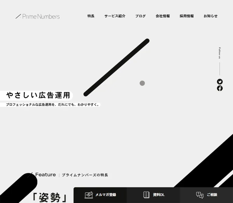
The desktop headline is やさしい広告運用. Its element starts at the left viewport edge, with 36px internal left padding. A white ribbon follows the text and ends in a rounded cap. A thin white horizontal line extends to the right at headline level. The headline's measured top is 553.5px, so most of the initial viewport is intentionally quiet.
The supporting line is プロフェッショナルな広告運用を、だれにでも、わかりやすく。. Desktop uses one bold line. Mobile uses two lighter lines, each on its own short white ribbon. Keep those separate line treatments; a large white text box would lose the composition.
The current mobile screenshot shows a thick black diagonal with rounded ends and a small gray dot. Its visible bounds are approximately x67–324, y206–432; the dot is approximately 20px across. These are visual estimates. The supplied current desktop opening does not show that central graphic. Its absence cannot establish whether the difference is responsive, temporal, or rendering-related.
At the lower-right edge of the desktop opening, a large black diagonal form begins around the transition into the feature area. It reinforces the slash motif without requiring a background photograph.
Paired Hero CTAs
Anatomy: rounded rectangle, bold left-aligned label, and a separate white circular arrow disc at right.
The resource action, サービス資料DLはこちら, uses near-black with white text. The consultation action, 無料相談はこちら, uses yellow with dark text. Both are 312 × 68px on desktop, with 14px 12px padding, an internal 20px gap, and 8px corners. Arrow discs appear about 40px in diameter.
The desktop row starts at x36, y684, with 15px between buttons. On mobile the buttons stack at x24.95, with tops at approximately 682.8px and 760.2px. Both remain in the DOM even though the fixed promotional banner obscures much of the lower button in the supplied screenshot.
The destinations are directly evidenced: the resource action links to /download/primenumbers-service/, and consultation links to /contact/.
Social Rail and Floating Contact Control
The desktop hero's right edge contains a vertically oriented Follow us label, a fine rule, and black circular X and Facebook icons. The social link boxes measure approximately 26 × 26.58px. This rail is absent from the supplied mobile opening.
A separate contact control appears near the lower-right corner in the desktop opening and middle screenshots. Its measured anchor is 157 × 157px, positioned 30px from the right and bottom of the 1440 × 1000 viewport. Visually, it has a near-black disc, white envelope outline, small Japanese label, and gray outer halo.
The halo extends beyond the anchor in the middle screenshot, so the anchor rectangle is not the full painted bound. No pulse timing was supplied. The control is not visible in the supplied footer or mobile captures; its appearance rules are unknown.
Bilingual Section Marker
Anatomy: diagonal slash, extended English label, short vertical separator, and smaller bold Japanese label.
Desktop English text is 22px, weight 500. Japanese text is 16px, weight 700, with 0.1em tracking. The English element includes 38px left padding for the slash treatment. Mobile reduces these to 16.64px and 12.48px, with 18.72px left padding on the English element.
Use this marker consistently for Feature, Service, Case study, Blog, and News. It identifies the section without competing with the larger statement beneath it.
Feature Statement
The feature area introduces the relationship between attitude and strategy through the source headline 「姿勢」×「戦略」でお客様に寄りそう広告運用.
On desktop, the section's content begins at x312, not the later 100px page gutter. The 816px headline block uses 48px bold text with 86.4px leading. A narrower 523px paragraph follows with 16px / 32px text. This nested width hierarchy creates an editorial reading area inside the broad page.
The Read more anchor has a measured 64 × 64px box on desktop and approximately 49.91px square on mobile. The full appearance of its text and decoration is not covered by the supplied screenshots, so its anchor box should not be mistaken for the entire visual treatment.
On mobile, the headline and paragraph share the 340.09px content width. The measured headline occupies three lines. The section retains substantial bottom space: 249.6px of measured padding.
Service Directory
Anatomy: section marker, introductory heading and paragraph, then advertising and creative-service groups.
Desktop introductory content spans the 1240px frame. The heading occupies a 636px region at left; the paragraph starts at x736 and occupies 604px at right. The lower category groups each measure 583px wide, separated by 74px.
Advertising links form two columns of white pills. Each measured pill is 280.5 × 60px, has 40px corners, 15px horizontal padding, and 16px weight-300 text. The grid gap is 22px. Categories include search advertising, platform-specific advertising, data feeds, collaboration, and in-house support. Creative production provides two corresponding links for landing-page work and website production.
At 390px, the introduction stacks. Only the advertising and creative category headings appear in the supplied service-state text and element list; their detailed paragraphs and link grids do not. This is compatible with a compact or collapsed presentation, but expansion behavior was not tested. Do not claim a working accordion based only on this difference.
Case-Study Rail
Anatomy: large rectangular image, client identity, bold summary, rail controls, and a View all link.
Desktop cards measure 569.03px wide with 24px gaps. Their left edges are approximately 100, 693.03, and 1286.06px, leaving the third card partially visible. This continuation beyond the viewport is part of the composition.
The visible lower card area places a white circular client emblem at left and text at right. Emblems appear approximately 96px in diameter. Text starts 123px after the card's left edge. The client name is 16px regular/light text; the summary is 18px / 30px, bold, with 0.1em tracking.
Below the rail, the desktop screenshot shows a long thin gray line, a white circular control containing paired chevrons at the left, and View all with a nine-dot grid icon at the right. Their interaction was not exercised.
Mobile cards measure 292.52px, still separated by 24px, with the next card beginning at x341.47. Client names and descriptions begin at the card's own left edge. Do not retain the desktop 123px text offset on a phone. The case-study View all link is centered below the row.
Blog Feature and Article List
Desktop uses a deliberately unequal two-column arrangement: a 710px featured item, 32px gap, and 498px latest-article list.
The featured thumbnail dominates the left side. On the right, each item is 105px tall, with an approximately 200 × 105px thumbnail, 12px gap, and 286px text region. Rows are spaced at 147px intervals. Small status and category capsules precede the title: a dark filled status such as 新着記事, then a light outlined category such as SNS広告. Titles appear limited to two lines in the desktop screenshot.
The artwork is much more colorful than the surrounding interface. The visible featured image combines a pale ground, purple/pink shapes, a blue-purple title block, and large Japanese lettering. Preserve the distinction between editorial artwork and the restrained site shell.
On mobile, the featured item and latest items become equal-width 292.52px cards in one horizontal sequence with 24px gaps. They share the same y3622.88px starting position in the measured document. This is not a simple vertical stack of the desktop sidebar. The mobile text extraction also exposes topic tags for several items.
News Rows
Desktop places the section marker at the left and a 922px news list starting at x418. Each measured row is 114px tall with 24px vertical padding. Dates are split into year and month/day in the extracted text. The title region begins at x524, leaving a 106px date-and-gap region.
Mobile puts the list below the marker. Each row spans 340.09px and measures about 108.14px high. Titles begin approximately 72.78px after the row's left edge and use 16.64px / 26.624px bold text. Preserve this date/title structure while allowing longer accessible text to remain available beyond visual truncation.
Recruitment and Contact Blocks
The recruitment block is a large linked region: 1296 × 673.19px on desktop and 340.09 × 436.81px on mobile. Its label is Recruit, followed by a Japanese recruitment invitation. The supplied crops do not establish the block's full image composition or text positioning; avoid inventing a particular photograph.
The following contact section centers an English marker, a multiline statement, phone information, business hours, and a broad white pill linking to /contact/. The pill is 392 × 85px on desktop and 340.08 × 66.55px on mobile.
Two supporting links follow for downloads and seminars. Desktop cards are 498 × 184px, arranged side by side with a 32px gap. Their fill is measured as rgba(19,19,17,0.8), with 14px corners. Mobile stacks them at 340.09 × 177.70px, separated by about 16.63px, with 8.32px corners. Their heading/body scale changes to 18.72px and 14.56px respectively.
Footer Sitemap and Trust Strip
The desktop footer is a substantial charcoal directory. It presents four main groups, with the service group internally split into two columns, producing five visible text columns. The rightmost group contains consultation links, three social icons, and three dark outlined utility buttons.
The utility labels are 無料診断実施中, Webマーケティング用語集, and よくある質問. Each combines left-aligned text with a white circular arrow disc. The first uses an outward-pointing arrow symbol; the others use right arrows. This icon difference does not establish a new-tab behavior.
Below the sitemap, four certification/partner graphics sit in a darker band. The visible artwork includes Google Partner, Yahoo marketing solutions, and two JICDAQ marks. Treat these as observed graphics; their presence does not independently verify the current validity of any certification.
The desktop legal row places the privacy link and copyright toward the right. Mobile centers the privacy link, wordmark, and copyright vertically. Its partner graphics reflow into two columns and two rows, maintaining their different intrinsic widths.
The measured footer grows from 917px on desktop to 1912.64px on mobile. Mobile top-level links have approximately 51.98px rows; child links use about 42.63px rows. The detailed advertising-service list is absent from the mobile footer extraction, so the phone footer is not merely the complete desktop directory stacked unchanged.
Promotional Banner
The current middle and footer desktop screenshots and both mobile screenshots show a banner advertising website-production services. It has a white rounded outer frame, dark inner border, pale cream artwork, small illustrated people, prominent orange lettering, and a close glyph at the upper-right.
Estimated outer dimensions are about 477 × 120px on desktop and 370 × 96px on mobile, with roughly 10px clearance from the left and bottom edges. A soft shadow separates this overlay from the page; comparable shadows are not a general card treatment elsewhere.
It is absent from the supplied initial desktop capture. The evidence does not establish whether its appearance is delayed, scroll-triggered, or controlled by another condition. Its destination and dismissal behavior were not supplied. On the phone it visibly overlaps the hero actions and lower footer content, which is important to address in a new implementation.
Tokens — Motion & Interaction
| Treatment | Supplied evidence | What can be concluded |
|---|---|---|
| Standard links | Color, background, border, and box-shadow transitions at 0.3s ease-out |
Short visual transitions are configured; hover endpoints are unknown |
| Body background | background 0.3s ease-out |
Background changes can transition; no scroll threshold or color sequence was supplied |
| Header | 0.3s ease-out; large transparent opening and compact white scrolled screenshots |
A changing header presentation is supported; exact trigger and property set are unverified |
| Wordmark position | top 0.3s ease-out |
A vertical-position transition is configured |
| Service links and selected navigation | 0.3s ease-out |
Transition timing is measured; state behavior is not |
| Case-study/blog rails | Horizontal card positions; visible desktop case controls | A rail layout is established; autoplay, dragging, looping, and slide timing are unverified |
| Hero geometric mark | Visible in the current mobile opening | Geometry is established; animation sequence and duration are not |
| Contact halo | Different visible painted extent from the anchor box | A halo exists; a pulsing animation cannot be asserted |
| Promotional banner | Present in later desktop and mobile captures | Presence varies; entrance timing and close behavior are unverified |
Many sampled elements report animation: none. This does not prove the entire page is static: pseudo-elements, nested graphics, scripts, and unsampled nodes may behave differently.
The collection process waited for document loading, image decoding, finite motion, and sampled layout/text stability, with bounded time limits. Perpetual animations were paused during readiness checks and resumed. These procedures do not establish a complete motion timeline.
Recommended adaptation: retain restrained 300ms ease-out color and header changes. Start with a static geometric hero mark and user-controlled horizontal browsing. Add animation only when separately specified, with a reduced-motion alternative.
Surfaces
| Layer | Appearance | Purpose |
|---|---|---|
| Main canvas | Flat #efefef |
Quiet field connecting the opening and editorial content |
| Hero ribbons | White, flush left, rounded right caps | Isolate concise black copy without a full card |
| Primary action | Yellow or near-black rectangle with modest corners | Distinguish consultation and resource actions |
| Service link | White pill with dark text | Make a dense service directory approachable |
| Editorial card | Image and text directly on the canvas | Let content establish its own boundaries |
| Footer | Solid #242424 with light text |
Support dense navigation and utilities |
| Contact supporting card | Translucent near-black | Separate secondary actions within a reverse-text area |
| Floating contact | Dark circle and gray halo | Maintain a recognizable inquiry affordance where shown |
| Promotional banner | Framed cream artwork with a shadow | An independent promotional overlay |
There is no evidence of a universal elevated-card system, glass blur, or gradient background treatment for the interface. Gradients appear inside editorial artwork.
Imagery
The site uses several distinct image roles rather than one uniform illustration style.
The brand layer is geometric: thin wordmark strokes, a thick rounded diagonal, a small dot, section-marker slashes, and circular arrows. These marks work because they are surrounded by open space.
Case studies use photographic imagery with separate circular client logos. The supplied middle screenshot shows only lower portions of the photographs, so detailed subject direction and original crop ratios are not fully established.
Blog images are designed information graphics with large Japanese type and bright platform-oriented colors. Preserve their full legibility; decorative crops can remove the topic itself. The visible secondary thumbnails have an approximately 40:21 aspect ratio.
The promotional banner uses small outlined human illustrations and a cream/orange palette. Footer partner marks retain their own colors and white image backgrounds. Do not recolor these marks into the site's yellow/black palette.
Observed Asset References
No image-source URLs or asset filenames were supplied. The references below describe the visible assets without inventing paths.
| Asset | Current-page evidence | Implementation guidance |
|---|---|---|
| PrimeNumbers wordmark | Desktop and mobile headers; mobile footer | Use authorized brand artwork; do not infer a logo font from the surrounding link |
| Rounded slash and dot | Mobile opening capture | A static SVG/CSS approximation is practical; source implementation unknown |
| Client emblems | Desktop case-study/blog-boundary capture | Contain logos inside white circles rather than cropping them |
| Case-study photographs | Partial images above client metadata | Preserve meaningful subject matter; exact source dimensions unavailable |
| Blog thumbnail graphics | Desktop middle capture | Keep embedded Japanese lettering legible and avoid unnecessary cropping |
| Website-production promotion | Desktop middle/footer and mobile captures | Treat as separate campaign artwork |
| Partner/certification graphics | Desktop and mobile footer captures | Preserve aspect ratios and individual clear space |
| Arrow, envelope, and social symbols | CTAs, floating control, rail, and footer | Match the visible stroke/fill treatment; no icon-library attribution is established |
Layout & Responsive Behavior
Desktop Composition
The opening uses viewport-edge typography and a large empty field. The header has its own approximately 70px side inset, the hero copy starts at 36px, the feature statement starts at 312px, and most later content starts at 100px. These multiple alignments are intentional and should not be collapsed into one universal container.
The case-study row extends beyond the right viewport edge. The blog switches to a 710 / 498px feature/sidebar split. News pairs a left section label with a right list. Recruitment occupies a wider frame with 72px side insets. The footer then returns to a dense, broadly aligned directory.
Mobile Recomposition
At 390px, the standard readable region is approximately 340px wide with 25px side insets. The compact header replaces desktop navigation with a menu button. The opening remains approximately one viewport tall and retains substantial space above the text.
The hero headline becomes 32.24px, supporting copy separates into two ribbons, and CTAs stack. The feature statement and paragraph use the same column width. Service category details are absent in the captured state.
Both case studies and blog posts use 292.52px cards with 24px gaps. This leaves a visible portion of the following card. Blog content therefore changes its hierarchy from a featured item plus sidebar into a consistent horizontal sequence.
News retains date/title rows. Contact cards stack. Footer navigation becomes vertical, while the partner marks use a two-by-two arrangement. The floating desktop social rail and contact disc are not present in the supplied phone captures.
Responsive Limits
Only the two stated viewport sizes were inspected. Exact breakpoints, tablet layouts, landscape behavior, zoom behavior, and the root-font scaling formula are unknown. The desktop hero happens to measure a 16:9 rectangle, but that single observation does not prove an aspect-ratio: 16 / 9 source rule.
A new build should introduce breakpoints when its content stops fitting. The Quick Start proposes 85rem for replacing the wide navigation and 48rem for changing content layouts. These are recommended thresholds, not recovered source values.
Do’s and Don’ts
Do
- Preserve the pale gray canvas and the distinction between near-black text and the charcoal footer.
- Concentrate yellow in contact actions.
- Keep the hero headline on a white ribbon that starts at the viewport edge.
- Pair extended English section markers with smaller, tracked Japanese labels.
- Use generous paragraph leading and strong differences between heading and body weight.
- Preserve the narrow feature column and wider editorial frame.
- Keep case studies as a horizontal sequence with a partial next card.
- Recompose the mobile blog into equal-width horizontal cards.
- Use circular arrow discs within rectangular and pill-shaped controls.
- Allow editorial artwork and client logos to retain their own colors.
- Treat the promotional overlay as a separate layer with its own behavior and artwork.
Don’t
- Do not compress the entire corporate homepage into a single-purpose conversion layout.
- Do not fill the hero's empty field with unrelated stock photography.
- Do not infer the missing desktop hero graphic from another version of the page.
- Do not turn every content group into a rounded white card with a shadow.
- Do not use yellow for every heading, category badge, or section background.
- Do not apply the desktop blog sidebar layout unchanged on mobile.
- Do not assume hidden menu DOM means the menu was visually inspected open.
- Do not invent carousel autoplay, parallax, accordion behavior, or contact-halo timing.
- Do not treat the blue Swiper variable as a global brand token.
- Do not let a fixed promotion permanently obstruct the main inquiry action.
Recommended Implementation Additions
These are recommendations for a new implementation, not verified features of the original.
- Use a real
h1for the hero statement. The sampled source hero text is a paragraph, so semantic heading improvements should be deliberate. - Give the menu, social icons, rail controls, banner close button, and envelope link accessible names. Preserve the large mobile menu hit area.
- Implement menu state with
aria-expanded, predictable focus handling, Escape support where appropriate, and complete removal of closed navigation from keyboard traversal. - If service groups become accordions, use real buttons or native disclosure elements and keep every service destination reachable.
- Provide keyboard-operable horizontal browsing and a clear focus indicator on cards. Do not require dragging alone.
- Preserve complete article titles in the accessible text even where the visual layout clamps them.
- Check the white-on-gray resource action against normal-text contrast requirements; its measured
16pxlabel is not large text. - Increase social-icon hit areas without enlarging the visible
26pxsymbols unnecessarily. - Make the promotional banner dismissible and reserve sufficient scrolling clearance. A compact in-flow mobile promotion is another option.
- Respect reduced-motion preferences and retain the content hierarchy without animation.
- Load the configured fonts only when available and properly licensed. Test the fallback stack because its widths affect the tracked Japanese headings.
Agent Prompt Guide
Quick Color Reference
- Main canvas:
#efefef. - Primary text and dark CTA:
#131311. - Contact CTA:
#f7e844with dark text. - White ribbons, service pills, and arrow discs:
#ffffff. - Header resource action:
#949391with white text. - Footer:
#242424, with#e2e2e2links. - Contact supporting cards:
rgba(19,19,17,0.8). - Colorful blog artwork and promotional illustrations remain content assets.
Overall Prompt
“Create a Japanese corporate homepage for an advertising and web marketing company using the current PrimeNumbers visual language. Build a pale gray #efefef canvas with near-black #131311 typography, white text ribbons, rounded diagonal strokes, small dots, and restrained yellow #f7e844 contact actions. Use the configured Heisei Kaku Gothic stack for Japanese text and Aktiv Grotesk Extended for compact English section markers when those fonts are available. Keep a spacious opening, a narrow feature statement, a service directory, a horizontal case-study rail, a featured blog plus article list, dated news rows, recruitment and contact areas, and a dense charcoal footer. At phone width, use approximately 25px gutters, stacked hero CTAs, 292.5px horizontal case and blog cards, and a vertical sitemap. Treat unverified menu and motion behavior as explicit implementation decisions.”
Example Component Prompts
- Hero: “Use a gray full-width opening with the Japanese headline
やさしい広告運用on a white ribbon extending from the left edge. At 1440px, use 45px bold type with 0.1em tracking and position the text low in the opening. Place black and yellow 312 × 68px CTAs beneath it, each with a white circular arrow. On mobile, use two separate supporting-copy ribbons and stack the buttons. A static rounded slash and gray dot may reproduce the supplied mobile graphic; do not invent a desktop animation.” - Section marker: “Create a small diagonal slash, a 22px extended English section name, a fine vertical divider, and a 16px bold Japanese subtitle with 0.1em tracking. Reduce them to 16.64px and 12.48px at the phone reference size.”
- Case study: “Create an unboxed photographic case-study card approximately 569px wide on desktop, with a circular white client emblem and Japanese metadata underneath. Place cards 24px apart and reveal part of the next item. Use approximately 292.5px cards on mobile and align metadata to the card's left edge.”
- Blog: “Use a 710px featured article and a 498px secondary list separated by 32px. Secondary rows have 200 × 105px thumbnails, compact monochrome badges, and two-line bold titles. On mobile, flatten all five articles into a horizontal row of equal-width cards.”
- Footer: “Build a charcoal sitemap with light gray text, a service group split into two columns, company and recruitment groups, and a wider consultation column. Add outlined dark utility buttons with white circular arrows. Place partner graphics in a darker band, in one row on desktop and a two-by-two arrangement on mobile. Preserve each graphic's aspect ratio.”
Quick Start
CSS Custom Properties
This is a recommended implementation scaffold calibrated to the supplied dimensions. It is not recovered source CSS. It keeps a conventional root size, uses explicit mobile component sizes, and does not assume the original root-sizing formula.
The data-scrolled header state must be connected to application logic. The proposed breakpoints, native scroll snapping, focus treatment, dark service backing, and reduced-motion rules are recommendations. The estimated certification-strip color is labeled. Artwork and full menu/disclosure behavior require separate integration.
:root {
  --pn-canvas: #efefef;
  --pn-ink: #131311;
  --pn-black: #000000;
  --pn-yellow: #f7e844;
  --pn-white: #ffffff;
  --pn-muted: #949391;
  --pn-reverse: #e2e2e2;
  --pn-footer: #242424;
  --pn-overlay: rgba(19, 19, 17, 0.8);
  --pn-trust: #20201e; /* Visual estimate, not a measured source color. */

  --pn-font-jp: heisei-kaku-gothic-std,
    'Hiragino Kaku Gothic ProN', 'Hiragino Kaku Gothic Pro',
    Meiryo, sans-serif;
  --pn-font-en: aktiv-grotesk-extended, var(--pn-font-jp);
  --pn-body-size: 16px;
  --pn-gutter: 100px;
  --pn-content-width: 1240px;
  --pn-section-gap: 180px;
  --pn-header-height: 150px;
  --pn-card-gap: 24px;
  --pn-radius-action: 8px;
  --pn-motion: 300ms ease-out;
}

* { box-sizing: border-box; }
html { scroll-padding-top: 90px; }
body {
  margin: 0;
  color: var(--pn-ink);
  background: var(--pn-canvas);
  font-family: var(--pn-font-jp);
  font-size: var(--pn-body-size);
  font-weight: 300;
  line-height: 1.5;
}
img { display: block; max-width: 100%; height: auto; }
a { color: inherit; }
button { font: inherit; }
[hidden] { display: none !important; }

.pn-container {
  width: min(var(--pn-content-width), calc(100% - 2 * var(--pn-gutter)));
  margin-inline: auto;
}
.pn-section + .pn-section { margin-top: var(--pn-section-gap); }
.pn-copy { line-height: 2; letter-spacing: 0.04em; }

.pn-header {
  position: fixed;
  inset: 0 0 auto;
  z-index: 40;
  height: var(--pn-header-height);
  background: transparent;
  transition: height var(--pn-motion), background var(--pn-motion);
}
.pn-header__inner {
  display: flex;
  align-items: center;
  justify-content: space-between;
  height: 100%;
  padding-inline: 70px;
  gap: 40px;
}
.pn-logo { display: block; width: 220px; flex: 0 0 auto; }
.pn-nav { display: flex; align-items: center; gap: 30px; }
.pn-nav a {
  white-space: nowrap;
  text-decoration: none;
  font-size: 16px;
  font-weight: 700;
}
.pn-nav__action {
  display: inline-flex;
  align-items: center;
  justify-content: center;
  width: 125px;
  min-height: 44px;
  border-radius: 4px;
  background: var(--pn-muted);
  color: var(--pn-white);
}
.pn-nav__action--contact {
  background: var(--pn-yellow);
  color: var(--pn-ink);
}
.pn-menu-button { display: none; }
.pn-header[data-scrolled='true'] {
  height: 64px; /* Approximation of the supplied scrolled screenshot. */
  background: var(--pn-white);
}

/* Opening dimensions are calibrated to the inspected desktop frame. */
.pn-hero {
  position: relative;
  min-height: 810px;
  padding-block: 553.5px 58px;
  background: var(--pn-canvas);
}
.pn-hero__title {
  position: relative;
  margin: 0;
  color: var(--pn-black);
  font-size: 45px;
  font-weight: 700;
  line-height: 1.5;
  letter-spacing: 0.1em;
}
.pn-ribbon {
  display: table;
  padding: 0 0.5em 0 36px;
  border-radius: 0 999px 999px 0;
  background: var(--pn-white);
}
.pn-hero__subtitle {
  margin: 5.4px 0 0;
  font-size: 19.8px;
  font-weight: 700;
  line-height: 1.5;
}
.pn-hero__subtitle--mobile { display: none; }
.pn-hero__actions {
  display: flex;
  gap: 15px;
  margin: 28px 0 0 36px;
}
.pn-button {
  display: inline-flex;
  align-items: center;
  justify-content: space-between;
  gap: 20px;
  width: 312px;
  min-height: 68px;
  padding: 14px 12px;
  border-radius: var(--pn-radius-action);
  background: var(--pn-ink);
  color: var(--pn-white);
  font-size: 18px;
  font-weight: 700;
  line-height: 1.5;
  text-decoration: none;
  transition: color var(--pn-motion), background var(--pn-motion);
}
.pn-button--yellow {
  background: var(--pn-yellow);
  color: var(--pn-ink);
}
.pn-arrow {
  display: grid;
  place-items: center;
  flex: 0 0 40px;
  width: 40px;
  height: 40px;
  border-radius: 50%;
  background: var(--pn-white);
  color: var(--pn-ink);
  font: 700 24px/1 sans-serif;
}
.pn-hero__mark { display: none; }

.pn-kicker { display: flex; align-items: baseline; margin: 0; }
.pn-kicker__en {
  position: relative;
  padding-left: 38px;
  font: 500 22px/1 var(--pn-font-en);
}
.pn-kicker__en::before {
  content: '';
  position: absolute;
  left: 0;
  top: 50%;
  width: 32px;
  height: 2px;
  background: currentColor;
  transform: translateY(-50%) rotate(-45deg);
}
.pn-kicker__jp {
  margin-left: 13px;
  padding-left: 13px;
  border-left: 1px solid var(--pn-muted);
  font-size: 16px;
  font-weight: 700;
  line-height: 1;
  letter-spacing: 0.1em;
}
.pn-feature { padding-block: 180px 162px; }
.pn-feature__inner { max-width: 816px; margin-inline: auto; }
.pn-feature__title {
  margin: 56px 0 76px;
  font-size: 48px;
  font-weight: 700;
  line-height: 1.8;
  letter-spacing: 0.1em;
}
.pn-feature__copy { max-width: 523px; }

/* The source section is transparent; this backing is a recommendation. */
.pn-service {
  padding-block: 150px 180px;
  color: var(--pn-reverse);
  background: var(--pn-footer);
}
.pn-service-groups {
  display: grid;
  grid-template-columns: repeat(2, minmax(0, 1fr));
  gap: 74px;
}
.pn-service-links {
  display: grid;
  grid-template-columns: repeat(2, minmax(0, 1fr));
  gap: 22px;
}
.pn-service-link {
  display: flex;
  align-items: center;
  min-height: 60px;
  padding-inline: 15px;
  border-radius: 40px;
  background: var(--pn-white);
  color: var(--pn-ink);
  text-decoration: none;
}

/* Native scrolling and snapping are recommended substitutes for untested controls. */
.pn-case-rail {
  display: flex;
  gap: var(--pn-card-gap);
  overflow-x: auto;
  padding: 8px var(--pn-gutter) 16px;
  scroll-padding-inline: var(--pn-gutter);
  scroll-snap-type: x proximity;
}
.pn-case {
  flex: 0 0 569.03px;
  min-width: 0;
  scroll-snap-align: start;
  text-decoration: none;
}
.pn-case__image { width: 100%; }
.pn-case__meta {
  display: grid;
  grid-template-columns: 96px minmax(0, 1fr);
  gap: 27px;
  margin-top: 24px;
}
.pn-case__logo {
  display: grid;
  place-items: center;
  width: 96px;
  height: 96px;
  padding: 8px;
  border-radius: 50%;
  background: var(--pn-white);
}
.pn-case__logo img { max-height: 100%; object-fit: contain; }
.pn-case__name { margin: 8px 0 10px; letter-spacing: 0.04em; }
.pn-case__title {
  margin: 0;
  font-size: 18px;
  font-weight: 700;
  line-height: 30px;
  letter-spacing: 0.1em;
}

.pn-blog-grid {
  display: grid;
  grid-template-columns: minmax(0, 710fr) minmax(0, 498fr);
  gap: 32px;
}
.pn-blog-latest { display: grid; gap: 42px; align-content: start; }
.pn-blog-card { min-width: 0; text-decoration: none; }
.pn-blog-card--small {
  display: grid;
  grid-template-columns: 200px minmax(0, 1fr);
  gap: 12px;
}
.pn-blog-image { width: 100%; aspect-ratio: 40 / 21; object-fit: contain; }
.pn-blog-title {
  margin: 12px 0 0;
  font-size: 24px;
  font-weight: 700;
  line-height: 1.6;
  letter-spacing: 0.1em;
}
.pn-blog-card--small .pn-blog-title { font-size: 16px; }
.pn-badges { display: flex; flex-wrap: wrap; gap: 8px; }
.pn-badge {
  padding: 2px 7px;
  border: 1px solid #d6d6d6;
  border-radius: 999px;
  font-size: 12px; /* Visual approximation of the small capsules. */
  line-height: 1.3;
}
.pn-badge--dark { color: white; background: var(--pn-ink); border-color: var(--pn-ink); }

.pn-footer { color: var(--pn-reverse); background: var(--pn-footer); }
.pn-footer-grid {
  display: grid;
  grid-template-columns: 2.18fr 1fr 1fr 2.18fr;
  gap: 32px;
  padding-block: 110px 48px;
}
.pn-footer a { text-decoration: none; }
.pn-footer-children { font-size: 14px; font-weight: 500; line-height: 1.5; }
.pn-footer-utility {
  display: flex;
  align-items: center;
  justify-content: space-between;
  gap: 16px;
  min-height: 80px;
  margin-top: 15px;
  padding-inline: 22px;
  border: 1px solid #70706e; /* Visual approximation. */
  border-radius: 14px;
  background: var(--pn-ink);
  font-size: 18px;
  font-weight: 700;
}
.pn-trust {
  display: flex;
  flex-wrap: wrap;
  justify-content: center;
  align-items: center;
  gap: 48px 64px;
  padding: 50px var(--pn-gutter);
  background: var(--pn-trust);
}
.pn-trust img { width: auto; max-height: 74px; object-fit: contain; }
.pn-footer-legal {
  display: flex;
  align-items: center;
  justify-content: flex-end;
  gap: 72px;
  padding-block: 48px;
}

/* Recommended navigation breakpoint, not a recovered source breakpoint. */
@media (max-width: 85rem) {
  .pn-header, .pn-header[data-scrolled='true'] { height: 72px; }
  .pn-header__inner { padding-inline: 24.96px; }
  .pn-logo { width: 138.31px; }
  .pn-nav { display: none; }
  .pn-menu-button {
    position: absolute;
    inset: 0 0 auto auto;
    display: grid;
    place-content: center;
    gap: 6px;
    width: 74.88px;
    height: 74.88px;
    padding: 0;
    border: 0;
    background: transparent;
    color: var(--pn-ink);
  }
  .pn-menu-button::before, .pn-menu-button::after {
    content: '';
    width: 25px;
    height: 1px;
    background: currentColor;
  }
}

/* Recommended content breakpoint; mobile values match the 390px reference. */
@media (max-width: 48rem) {
  :root {
    --pn-body-size: 16.64px;
    --pn-gutter: 24.96px;
    --pn-section-gap: 104px;
  }
  .pn-hero { min-height: 100svh; padding-block: 532px 22px; }
  .pn-hero__title { font-size: 32.24px; }
  .pn-ribbon { padding-left: var(--pn-gutter); }
  .pn-hero__subtitle--desktop { display: none; }
  .pn-hero__subtitle--mobile {
    display: grid;
    justify-items: start;
    gap: 9.36px;
    margin-top: 19.25px;
    font-size: 14.56px;
    font-weight: 300;
    letter-spacing: -0.02em;
  }
  .pn-hero__actions {
    flex-direction: column;
    align-items: flex-start;
    margin: 30.16px var(--pn-gutter) 0;
  }
  .pn-button {
    width: min(291.33px, 100%);
    min-height: 62.4px;
    padding: 14.56px 12.48px;
    border-radius: 8.32px;
    font-size: 18.72px;
  }
  .pn-button .pn-arrow {
    flex-basis: 33.28px;
    width: 33.28px;
    height: 33.28px;
    font-size: 22px;
  }
  /* Static approximation of the visible mobile brand geometry. */
  .pn-hero__mark {
    display: block;
    position: absolute;
    top: 206px;
    left: 50%;
    width: 256px;
    height: 226px;
    transform: translateX(-50%);
    pointer-events: none;
  }
  .pn-hero__mark::before {
    content: '';
    position: absolute;
    left: 8px;
    bottom: 0;
    width: 320px;
    height: 16px;
    border-radius: 999px;
    background: var(--pn-ink);
    transform-origin: left center;
    transform: rotate(-41deg);
  }
  .pn-hero__mark::after {
    content: '';
    position: absolute;
    right: 18px;
    bottom: 41px;
    width: 20px;
    height: 20px;
    border-radius: 50%;
    background: var(--pn-muted);
  }
  .pn-kicker__en { padding-left: 18.72px; font-size: 16.64px; }
  .pn-kicker__en::before { width: 16px; height: 1px; }
  .pn-kicker__jp { margin-left: 8px; padding-left: 8px; font-size: 12.48px; }
  .pn-feature { padding-block: 83.2px 249.6px; }
  .pn-feature__inner { width: calc(100% - 2 * var(--pn-gutter)); }
  .pn-feature__title { margin: 37.44px 0 41.6px; font-size: 29.12px; line-height: 1.6; }
  .pn-service { padding-block: 93.6px; }
  .pn-service-groups, .pn-service-links { grid-template-columns: 1fr; }
  /* Keep service links accessible until a complete disclosure is implemented. */
  .pn-case { flex-basis: min(292.52px, calc(100vw - 2 * var(--pn-gutter))); }
  .pn-case__meta { display: block; }
  .pn-case__logo { display: none; }
  .pn-case__name { margin-top: 0; }
  .pn-case__title { font-size: 18.72px; line-height: 31.2px; }
  .pn-blog-grid {
    display: flex;
    gap: 24px;
    width: calc(100% + var(--pn-gutter));
    overflow-x: auto;
    padding: 8px var(--pn-gutter) 16px 0;
    scroll-snap-type: x proximity;
  }
  .pn-blog-latest { display: contents; }
  .pn-blog-card, .pn-blog-card--small {
    display: block;
    flex: 0 0 min(292.52px, calc(100vw - 2 * var(--pn-gutter)));
    scroll-snap-align: start;
  }
  .pn-blog-title, .pn-blog-card--small .pn-blog-title { font-size: 16.64px; }
  .pn-footer-grid { grid-template-columns: 1fr; gap: 24px; padding-top: 31.2px; }
  .pn-footer-children { font-size: 14.56px; }
  .pn-footer-utility { min-height: 83.2px; border-radius: 14.56px; font-size: 18.72px; }
  .pn-trust { display: grid; grid-template-columns: repeat(2, minmax(0, 1fr)); gap: 18px 40px; }
  .pn-trust img { justify-self: center; max-width: 100%; }
  .pn-footer-legal { flex-direction: column; gap: 24px; text-align: center; }
}

/* Recommended focus and reduced-motion behavior. */
a:focus-visible, button:focus-visible, summary:focus-visible {
  outline: 3px solid currentColor;
  outline-offset: 5px;
}
@media (prefers-reduced-motion: reduce) {
  .pn-header, .pn-button { transition: none; }
  .pn-case-rail, .pn-blog-grid { scroll-behavior: auto; }
}
Minimal Component Markup
This example establishes the ribbon and CTA anatomy. The arrow character is a scaffold substitute for a matching icon asset. The decorative mark is hidden from assistive technology. A full implementation should insert the site header, navigation behavior, and subsequent content sections separately.
<section class='pn-hero' aria-labelledby='home-title'>
  <div class='pn-hero__mark' aria-hidden='true'></div>

  <h1 class='pn-hero__title' id='home-title'>
    <span class='pn-ribbon'>やさしい広告運用</span>
  </h1>

  <p class='pn-hero__subtitle pn-hero__subtitle--desktop'>
    <span class='pn-ribbon'>プロフェッショナルな広告運用を、だれにでも、わかりやすく。</span>
  </p>
  <p class='pn-hero__subtitle pn-hero__subtitle--mobile'>
    <span class='pn-ribbon'>プロフェッショナルな広告運用を、</span>
    <span class='pn-ribbon'>だれにでも、わかりやすく。</span>
  </p>

  <div class='pn-hero__actions'>
    <a class='pn-button' href='/download/primenumbers-service/'>
      <span>サービス資料DLはこちら</span>
      <span class='pn-arrow' aria-hidden='true'>→</span>
    </a>
    <a class='pn-button pn-button--yellow' href='/contact/'>
      <span>無料相談はこちら</span>
      <span class='pn-arrow' aria-hidden='true'>→</span>
    </a>
  </div>
</section>

<h2 class='pn-kicker'>
  <span class='pn-kicker__en' lang='en'>Blog</span>
  <span class='pn-kicker__jp'>お役立ち情報</span>
</h2>
For shorter or narrower phones, reduce decorative space before shrinking the text. The example's fixed 532px mobile top padding reproduces the inspected opening, but should be tested against content changes, small screens, and text zoom.
Tailwind v4 Token Mapping
Optional aliases for a project already using Tailwind v4. This does not imply the inspected site uses Tailwind.
@theme inline {
  --color-canvas: var(--pn-canvas);
  --color-ink: var(--pn-ink);
  --color-contact: var(--pn-yellow);
  --color-resource: var(--pn-muted);
  --color-reverse: var(--pn-reverse);
  --color-footer: var(--pn-footer);

  --font-japanese: var(--pn-font-jp);
  --font-section: var(--pn-font-en);

  --spacing-page: var(--pn-gutter);
  --spacing-section: var(--pn-section-gap);
  --spacing-card: var(--pn-card-gap);

  --radius-action: var(--pn-radius-action);
  --radius-resource: 4px;
  --radius-service: 40px;
}
Sources & Evidence
- PrimeNumbers current homepage: original and final URL are identical; the supplied browser record reports HTTP
200and the titleプライムナンバーズ株式会社|東京のWeb広告戦略運用代理店. - Capture timestamp:
2026-10-01T19:16:39.263Z, equivalent to October 2, 2026, 04:16:39 JST. - Desktop evidence:
1440 × 1000viewport; opening, case-study/blog-boundary, and footer screenshots; rendered text, link destinations, element rectangles, computed styles, and custom properties. Reported document height:8665px. - Mobile evidence:
390 × 844viewport; opening and footer screenshots; rendered text, link destinations, element rectangles, computed styles, and custom properties. Reported document height:8240px. - The supplied process traversed the page and waited for bounded loading, image, animation, and layout readiness. SharedWorkers and service workers were disabled during collection.
- Internal destination paths mentioned in this reference come from homepage link attributes. Their destination pages were not independently inspected for this analysis.
- No additional browsing, command execution, asset retrieval, or interaction testing was performed. Exact image URLs, font-file loading, responsive breakpoints, opened menus, expanded service groups, hover endpoints, carousel behavior, and animation sequences remain unverified.
This reference describes the supplied current homepage evidence. Computed measurements, screenshot estimates, and recommended implementation choices are kept distinct throughout.
# PrimeNumbers — Style Reference

> A spacious gray canvas, a decisive black slash, and yellow invitations to talk.

**Website:** [primenumbers.co.jp](https://primenumbers.co.jp/)
**Original URL:** https://primenumbers.co.jp/
**Final URL:** https://primenumbers.co.jp/
**Theme:** a light gray main canvas with charcoal footer surfaces and selective yellow actions; no theme selector was evidenced.
**Inspected:** October 2, 2026, 04:16:39 JST, from the supplied browser inspection. The recorded retrieval timestamp is `2026-10-01T19:16:39.263Z`.
**Viewports:** desktop `1440 × 1000` and mobile `390 × 844` CSS pixels.
**Scope:** the current corporate homepage: navigation, hero, feature statement, service directory, case studies, blog, news, recruitment link, contact block, footer, and visible floating promotions. Supplied screenshots cover the desktop opening, case-study/blog boundary, and footer, plus the mobile opening and footer. Other section measurements come from the supplied DOM evidence.

PrimeNumbers presents an advertising and web marketing business through a restrained geometric identity. Pale gray replaces pure white as the main background. Near-black text, a thin wordmark, diagonal strokes, circles, and white text ribbons establish the visual system. Yellow is concentrated in contact actions. Broad empty areas alternate with substantial paragraphs, service links, editorial imagery, and a dense sitemap.

This is a corporate homepage with several purposes: explaining services, showing client work, publishing practical information, recruiting staff, and generating inquiries. Its distinctive rhythm comes from changes in density and alignment. The hero copy begins at the viewport edge, the feature statement occupies a narrower central column, and later sections use a wider content frame. On mobile, the content is reorganized: case studies and blog posts form horizontal sequences, service details are absent from the captured initial state, and the footer becomes a long vertical directory.
閉じる
# PrimeNumbers — Style Reference

> A spacious gray canvas, a decisive black slash, and yellow invitations to talk.

**Website:** [primenumbers.co.jp](https://primenumbers.co.jp/)
**Original URL:** https://primenumbers.co.jp/
**Final URL:** https://primenumbers.co.jp/
**Theme:** a light gray main canvas with charcoal footer surfaces and selective yellow actions; no theme selector was evidenced.
**Inspected:** October 2, 2026, 04:16:39 JST, from the supplied browser inspection. The recorded retrieval timestamp is `2026-10-01T19:16:39.263Z`.
**Viewports:** desktop `1440 × 1000` and mobile `390 × 844` CSS pixels.
**Scope:** the current corporate homepage: navigation, hero, feature statement, service directory, case studies, blog, news, recruitment link, contact block, footer, and visible floating promotions. Supplied screenshots cover the desktop opening, case-study/blog boundary, and footer, plus the mobile opening and footer. Other section measurements come from the supplied DOM evidence.

PrimeNumbers presents an advertising and web marketing business through a restrained geometric identity. Pale gray replaces pure white as the main background. Near-black text, a thin wordmark, diagonal strokes, circles, and white text ribbons establish the visual system. Yellow is concentrated in contact actions. Broad empty areas alternate with substantial paragraphs, service links, editorial imagery, and a dense sitemap.

This is a corporate homepage with several purposes: explaining services, showing client work, publishing practical information, recruiting staff, and generating inquiries. Its distinctive rhythm comes from changes in density and alignment. The hero copy begins at the viewport edge, the feature statement occupies a narrower central column, and later sections use a wider content frame. On mobile, the content is reorganized: case studies and blog posts form horizontal sequences, service details are absent from the captured initial state, and the footer becomes a long vertical directory.

## How to Read This Reference

- **Measured** means a value supplied by the rendered DOM or computed-style evidence. Measurements are CSS pixels unless stated otherwise.
- **Calculated** means arithmetic based on those measurements, such as a gutter, inter-card gap, or rem conversion.
- **Estimated** means a visual approximation from one of the current-page screenshots. Such values are not sampled color readings or recovered stylesheet declarations.
- **Recommended** means implementation guidance for a new build. The Quick Start uses this category even where it closely follows measured dimensions.
- Token names beginning with `--pn-` are implementation aliases. Original custom properties are identified separately.
- A computed font stack identifies configured families; it does not independently establish which font file rendered every glyph.
- Extracted menu content includes elements that are not visible in the closed-menu screenshots. Their bounds do not establish an opened menu state.
- Links, menu opening, service expansion, carousel controls, banner dismissal, hover endpoints, and keyboard behavior were not exercised in the supplied evidence.

## Tokens — Colors

### Default Palette

| Name | Value | Suggested token | Evidence and role |
| --- | --- | --- | --- |
| Canvas Gray | `#efefef` | `--pn-canvas` | Measured body background at both viewports; visible across the hero and blog area |
| Near Black | `#131311` | `--pn-ink` | Measured body text, black hero CTA, service-link text, and mobile footer utility fills |
| Contact Yellow | `#f7e844` | `--pn-yellow` | Measured header contact button and hero consultation CTA |
| White | `#ffffff` | `--pn-white` | Measured service-pill and contact-button fills; visually observed hero ribbons and scrolled header |
| Resource Gray | `#949391` | `--pn-muted` | Measured header resource-download button fill, paired with white text |
| Reverse Text | `#e2e2e2` | `--pn-reverse` | Measured service text, footer links, and supporting contact-card text |
| Footer Charcoal | `#242424` | `--pn-footer` | Measured footer background at both viewports |
| Literal Black | `#000000` | `--pn-black` | Measured hero copy, desktop navigation text, and light-section English markers |
| Translucent Ink | `rgba(19,19,17,0.8)` | `--pn-overlay` | Measured download and seminar card fills inside the contact area |

### Palette Boundaries

The certification strip appears slightly darker than the main footer. A starting approximation is `#20201e`, but its actual computed background was not supplied. Fine gray rules and the floating contact halo are also visually evident without complete style measurements.

The promotional banner introduces pale cream, orange lettering, and small blue/yellow illustrations. Blog artwork uses purple, pink, blue, gradients, and white panels. These colors belong to individual content assets; they do not establish additional global action colors.

The extracted `--swiper-theme-color: #007aff` is not evidence of a blue brand accent. No visible blue carousel control establishes that role.

**Compositing limitation:** the service and contact section elements themselves report transparent backgrounds. Their light foreground colors establish reverse-text styling, but not the exact background layer behind each section. A charcoal backing in a new implementation is a recommendation, not a recovered source declaration.

## Tokens — Typography

### Japanese Text

**Computed primary family:** `heisei-kaku-gothic-std`.

The supplied stack continues through Hiragino Kaku Gothic ProN, Hiragino Kaku Gothic Pro, Meiryo, and generic sans-serif, including Japanese-name aliases in the original declaration.

Use weight `300` for explanatory paragraphs, `500` for footer navigation and selected utility text, and `700` for navigation, prominent headlines, and editorial titles. Long paragraphs use generous leading, usually twice their font size. Many Japanese headings use `0.1em` tracking, which is a major contributor to the measured widths.

### English Section Markers

**Computed primary family:** `aktiv-grotesk-extended`, followed by the Japanese stack.

Labels such as `Feature`, `Service`, `Case study`, `Blog`, and `News` use weight `500`. Their extended proportions contrast with the compact Japanese labels beside them. They are section identifiers rather than oversized display headlines.

The footer copyright also specifies this extended family. The thin PrimeNumbers wordmark should be treated as brand artwork; the surrounding link's computed font does not identify the wordmark's letterform source.

### Type Scale

Values below are measured. Sizes are shown as `font size / line height`.

| Role | Desktop | Mobile | Weight | Tracking |
| --- | --- | --- | --- | --- |
| Base body | `16 / 24px` | `16.64 / 24.96px` | `300` | Normal |
| Long explanatory paragraph | `16 / 32px` | `16.64 / 33.28px` | `300` | `0.04em` |
| Hero headline | `45 / 67.5px` | `32.24 / 48.36px` | `700` | `0.1em` |
| Hero supporting copy | `19.8 / 29.7px` | `14.56 / 21.84px` | `700` desktop; `300` mobile | Normal desktop; `-0.02em` mobile |
| Hero CTA | `18 / 27px` | `18.72 / 28.08px` | `700` | Normal |
| Desktop navigation | `16 / 24px` | Replaced by menu button | `700` | Normal |
| English section marker | `22 / 22px` | `16.64 / 16.64px` | `500` | Normal |
| Japanese section label | `16 / 16px` | `12.48 / 12.48px` | `700` | `0.1em` |
| Feature statement | `48 / 86.4px` | `29.12 / 46.592px` | `700` | `0.1em` |
| Service introduction heading | `38 / 69px` | `29.12 / 46.592px` | `700` | `0.1em` |
| Service category heading | `28 / 42px` | `20.8 / 31.2px` | `700` | `0.1em` |
| Case-study description | `18 / 30px` | `18.72 / 31.2px` | `700` | `0.1em` |
| Featured blog title | `24 / 38.4px` | `16.64 / 26.624px` | `700` | `0.1em` |
| Secondary blog title | `16 / 25.6px` | `16.64 / 26.624px` | `700` | `0.1em` |
| News title | `16 / 28.8px` | `16.64 / 26.624px` | `700` | `0.1em` |
| Contact statement | `25 / 46.875px` | `16.64 / 31.2px` | `300` | `-0.02em` |
| Footer child link | `14 / 21px` | `14.56 / 21.84px` | `500` | Normal |

The supporting hero copy changes both size and weight on mobile. Simply scaling the desktop typography would miss this distinction.

### Root Sizing

The root measures `16px` on desktop and `16.64px` at the supplied phone viewport. Many mobile values therefore have a `1.04` multiplier relative to familiar desktop units. The complete responsive root-size formula is not included in the evidence; do not extrapolate an exact formula from these two endpoints.

The root element's reported `Times` family does not describe the visible page typography. The body and relevant components override it with the sans-serif stacks above.

## Tokens — Spacing & Shapes

### Source Custom Properties

| Original property | Desktop declaration | Desktop equivalent | Mobile declaration | Mobile equivalent |
| --- | --- | --- | --- | --- |
| `--header-height` | `150px` | `150px` | `72px` | `72px` |
| `--padding-block` | `4.125rem` | `66px` | `2.5rem` | `41.6px` |
| `--padding-section` | `7.5rem` | `120px` | `3.4375rem` | `57.2px` |
| `--padding-page` | `12.5rem` | `200px` | `7.5rem` | `124.8px` |
| `--border` | `1px solid #131311` | Same | Same | Same |
| `--swiper-navigation-size` | `44px` | Same | `44px` | Same |

Rem equivalents are calculated from each measured root size. These variables are not universal layout rules: the visible desktop content gutter is `100px`, and the feature section has `180px` top padding. Do not substitute a variable's value for a separately measured element dimension.

### Spacing Scale

| Relationship | Desktop | Mobile | Evidence |
| --- | --- | --- | --- |
| Main content side inset | `100px` | `24.95px` | Measured section-content positions |
| Hero copy and CTA left inset | `36px` | `24.96px` | Measured padding and positions |
| Hero CTA separation | `15px` horizontally | `15px` vertically | Calculated from rectangles |
| Case-study card gap | `24px` | `24px` | Calculated from successive card positions |
| Service-pill gap | `22px` in both directions | Not visible in captured state | Calculated desktop positions |
| Blog column gap | `32px` | Replaced by `24px` card gaps | Calculated |
| Secondary blog row gap | `42px` | Not applicable | `147px` row pitch minus `105px` row height |
| Case-to-blog section gap | `180px` | `104px` | Calculated section rectangles |
| Blog-to-news section gap | `180px` | `104px` | Calculated section rectangles |
| Feature section top/bottom padding | `180 / 162px` | `83.2 / 249.6px` | Measured |
| Service section top/bottom padding | `150 / 180px` | `93.6 / 93.6px` | Measured |

Large vertical intervals are intentional. Keep the difference between dense information inside a section and generous space between sections.

### Border Radius

| Element | Desktop | Mobile | Status |
| --- | --- | --- | --- |
| Header action | `4px` | Not shown in closed header | Measured |
| Hero CTA | `8px` | `8.32px` | Measured |
| Service link | `40px` | Not visible | Measured; forms a pill around a `60px` height |
| Main contact CTA | `42.5px` | `33.28px` | Measured; half the button height |
| Contact supporting card | `14px` | `8.32px` | Measured |
| Mobile footer utility button | Not fully sampled | `14.56px` | Measured |
| Hero ribbon end | Fully rounded right end | Fully rounded right end | Visual observation; exact radius unavailable |
| Case/client emblem and arrow disc | Circle | Arrow discs remain circular | Visual observation |
| Editorial image corners | Square | Asset geometry not separately sampled | Desktop visual observation |

### Layout Measurements

| Element | Desktop `1440 × 1000` | Mobile `390 × 844` |
| --- | --- | --- |
| Document height | `8665px` reported | `8240px` reported |
| Initial header | `1440 × 150px` | `390 × 72px` |
| Wordmark wrapper | `220 × 23.63px`, near `x71, y60` | `138.31 × 16.83px`, near `x24.95, y29.11` |
| Hero section | `1440 × 810px` | `390 × 844.05px` |
| Hero headline top | `553.5px` | `532px` |
| Hero CTA | `312 × 68px` | `291.33 × 62.39px` |
| Standard content width | `1240px`, calculated from `100px` side insets | `340.09px` measured |
| Feature statement width | `816px`, starting at `x312` | `340.09px` |
| Feature paragraph width | `523px` | `340.09px` |
| Case-study card width | `569.03px` | `292.52px` |
| Blog featured card width | `710px` | `292.52px` |
| Secondary blog row | `498 × 105px` | Becomes a full card in a horizontal row |
| Recruitment link block | `1296 × 673.19px` | `340.09 × 436.81px` |
| Main contact CTA | `392 × 85px` | `340.08 × 66.55px` |
| Contact supporting card | `498 × 184px` | `340.09 × 177.70px` |
| Footer total height | `917px` | `1912.64px` |

These are captured-state dimensions, not mandatory fixed heights for translated or edited content.

## Components

### Persistent Header

**Anatomy:** thin wordmark at left, seven text navigation links, gray resource button, and yellow contact button.

The opening desktop header is transparent over the gray hero and measures `150px` high. Navigation begins around `x448`. Text links use `16px`, weight `700`, with approximately `30px` gaps. The two filled actions each measure `125 × 44px` with `4px` corners.

In the scrolled desktop screenshots, the header remains at the top on white and appears approximately `64px` high. This compact height is a screenshot estimate, not a supplied scrolled-state computed value. The relationship between the thin wordmark and heavy navigation remains consistent.

The mobile header measures `72px` high. The wordmark sits approximately `25px` from the left. A two-line menu glyph sits at the right inside a measured `74.88 × 74.88px` button. Its touch box is much larger than its visible strokes.

The extraction includes service, company, case-study, and recruitment menu groups. They are not visible in the supplied closed-menu captures. Opening triggers, panel geometry, focus behavior, and animation remain unverified.

### Hero and White Text Ribbons

**Anatomy:** gray open field, geometric brand graphic where visible, white-backed headline, supporting ribbon text, paired CTAs, and a desktop social rail.

The desktop headline is `やさしい広告運用`. Its element starts at the left viewport edge, with `36px` internal left padding. A white ribbon follows the text and ends in a rounded cap. A thin white horizontal line extends to the right at headline level. The headline's measured top is `553.5px`, so most of the initial viewport is intentionally quiet.

The supporting line is `プロフェッショナルな広告運用を、だれにでも、わかりやすく。`. Desktop uses one bold line. Mobile uses two lighter lines, each on its own short white ribbon. Keep those separate line treatments; a large white text box would lose the composition.

The current mobile screenshot shows a thick black diagonal with rounded ends and a small gray dot. Its visible bounds are approximately `x67–324, y206–432`; the dot is approximately `20px` across. These are visual estimates. The supplied current desktop opening does not show that central graphic. Its absence cannot establish whether the difference is responsive, temporal, or rendering-related.

At the lower-right edge of the desktop opening, a large black diagonal form begins around the transition into the feature area. It reinforces the slash motif without requiring a background photograph.

### Paired Hero CTAs

**Anatomy:** rounded rectangle, bold left-aligned label, and a separate white circular arrow disc at right.

The resource action, `サービス資料DLはこちら`, uses near-black with white text. The consultation action, `無料相談はこちら`, uses yellow with dark text. Both are `312 × 68px` on desktop, with `14px 12px` padding, an internal `20px` gap, and `8px` corners. Arrow discs appear about `40px` in diameter.

The desktop row starts at `x36, y684`, with `15px` between buttons. On mobile the buttons stack at `x24.95`, with tops at approximately `682.8px` and `760.2px`. Both remain in the DOM even though the fixed promotional banner obscures much of the lower button in the supplied screenshot.

The destinations are directly evidenced: the resource action links to `/download/primenumbers-service/`, and consultation links to `/contact/`.

### Social Rail and Floating Contact Control

The desktop hero's right edge contains a vertically oriented `Follow us` label, a fine rule, and black circular X and Facebook icons. The social link boxes measure approximately `26 × 26.58px`. This rail is absent from the supplied mobile opening.

A separate contact control appears near the lower-right corner in the desktop opening and middle screenshots. Its measured anchor is `157 × 157px`, positioned `30px` from the right and bottom of the `1440 × 1000` viewport. Visually, it has a near-black disc, white envelope outline, small Japanese label, and gray outer halo.

The halo extends beyond the anchor in the middle screenshot, so the anchor rectangle is not the full painted bound. No pulse timing was supplied. The control is not visible in the supplied footer or mobile captures; its appearance rules are unknown.

### Bilingual Section Marker

**Anatomy:** diagonal slash, extended English label, short vertical separator, and smaller bold Japanese label.

Desktop English text is `22px`, weight `500`. Japanese text is `16px`, weight `700`, with `0.1em` tracking. The English element includes `38px` left padding for the slash treatment. Mobile reduces these to `16.64px` and `12.48px`, with `18.72px` left padding on the English element.

Use this marker consistently for Feature, Service, Case study, Blog, and News. It identifies the section without competing with the larger statement beneath it.

### Feature Statement

The feature area introduces the relationship between attitude and strategy through the source headline `「姿勢」×「戦略」でお客様に寄りそう広告運用`.

On desktop, the section's content begins at `x312`, not the later `100px` page gutter. The `816px` headline block uses `48px` bold text with `86.4px` leading. A narrower `523px` paragraph follows with `16px / 32px` text. This nested width hierarchy creates an editorial reading area inside the broad page.

The `Read more` anchor has a measured `64 × 64px` box on desktop and approximately `49.91px` square on mobile. The full appearance of its text and decoration is not covered by the supplied screenshots, so its anchor box should not be mistaken for the entire visual treatment.

On mobile, the headline and paragraph share the `340.09px` content width. The measured headline occupies three lines. The section retains substantial bottom space: `249.6px` of measured padding.

### Service Directory

**Anatomy:** section marker, introductory heading and paragraph, then advertising and creative-service groups.

Desktop introductory content spans the `1240px` frame. The heading occupies a `636px` region at left; the paragraph starts at `x736` and occupies `604px` at right. The lower category groups each measure `583px` wide, separated by `74px`.

Advertising links form two columns of white pills. Each measured pill is `280.5 × 60px`, has `40px` corners, `15px` horizontal padding, and `16px` weight-300 text. The grid gap is `22px`. Categories include search advertising, platform-specific advertising, data feeds, collaboration, and in-house support. Creative production provides two corresponding links for landing-page work and website production.

At `390px`, the introduction stacks. Only the advertising and creative category headings appear in the supplied service-state text and element list; their detailed paragraphs and link grids do not. This is compatible with a compact or collapsed presentation, but expansion behavior was not tested. Do not claim a working accordion based only on this difference.

### Case-Study Rail

**Anatomy:** large rectangular image, client identity, bold summary, rail controls, and a `View all` link.

Desktop cards measure `569.03px` wide with `24px` gaps. Their left edges are approximately `100`, `693.03`, and `1286.06px`, leaving the third card partially visible. This continuation beyond the viewport is part of the composition.

The visible lower card area places a white circular client emblem at left and text at right. Emblems appear approximately `96px` in diameter. Text starts `123px` after the card's left edge. The client name is `16px` regular/light text; the summary is `18px / 30px`, bold, with `0.1em` tracking.

Below the rail, the desktop screenshot shows a long thin gray line, a white circular control containing paired chevrons at the left, and `View all` with a nine-dot grid icon at the right. Their interaction was not exercised.

Mobile cards measure `292.52px`, still separated by `24px`, with the next card beginning at `x341.47`. Client names and descriptions begin at the card's own left edge. Do not retain the desktop `123px` text offset on a phone. The case-study `View all` link is centered below the row.

### Blog Feature and Article List

Desktop uses a deliberately unequal two-column arrangement: a `710px` featured item, `32px` gap, and `498px` latest-article list.

The featured thumbnail dominates the left side. On the right, each item is `105px` tall, with an approximately `200 × 105px` thumbnail, `12px` gap, and `286px` text region. Rows are spaced at `147px` intervals. Small status and category capsules precede the title: a dark filled status such as `新着記事`, then a light outlined category such as `SNS広告`. Titles appear limited to two lines in the desktop screenshot.

The artwork is much more colorful than the surrounding interface. The visible featured image combines a pale ground, purple/pink shapes, a blue-purple title block, and large Japanese lettering. Preserve the distinction between editorial artwork and the restrained site shell.

On mobile, the featured item and latest items become equal-width `292.52px` cards in one horizontal sequence with `24px` gaps. They share the same `y3622.88px` starting position in the measured document. This is not a simple vertical stack of the desktop sidebar. The mobile text extraction also exposes topic tags for several items.

### News Rows

Desktop places the section marker at the left and a `922px` news list starting at `x418`. Each measured row is `114px` tall with `24px` vertical padding. Dates are split into year and month/day in the extracted text. The title region begins at `x524`, leaving a `106px` date-and-gap region.

Mobile puts the list below the marker. Each row spans `340.09px` and measures about `108.14px` high. Titles begin approximately `72.78px` after the row's left edge and use `16.64px / 26.624px` bold text. Preserve this date/title structure while allowing longer accessible text to remain available beyond visual truncation.

### Recruitment and Contact Blocks

The recruitment block is a large linked region: `1296 × 673.19px` on desktop and `340.09 × 436.81px` on mobile. Its label is `Recruit`, followed by a Japanese recruitment invitation. The supplied crops do not establish the block's full image composition or text positioning; avoid inventing a particular photograph.

The following contact section centers an English marker, a multiline statement, phone information, business hours, and a broad white pill linking to `/contact/`. The pill is `392 × 85px` on desktop and `340.08 × 66.55px` on mobile.

Two supporting links follow for downloads and seminars. Desktop cards are `498 × 184px`, arranged side by side with a `32px` gap. Their fill is measured as `rgba(19,19,17,0.8)`, with `14px` corners. Mobile stacks them at `340.09 × 177.70px`, separated by about `16.63px`, with `8.32px` corners. Their heading/body scale changes to `18.72px` and `14.56px` respectively.

### Footer Sitemap and Trust Strip

The desktop footer is a substantial charcoal directory. It presents four main groups, with the service group internally split into two columns, producing five visible text columns. The rightmost group contains consultation links, three social icons, and three dark outlined utility buttons.

The utility labels are `無料診断実施中`, `Webマーケティング用語集`, and `よくある質問`. Each combines left-aligned text with a white circular arrow disc. The first uses an outward-pointing arrow symbol; the others use right arrows. This icon difference does not establish a new-tab behavior.

Below the sitemap, four certification/partner graphics sit in a darker band. The visible artwork includes Google Partner, Yahoo marketing solutions, and two JICDAQ marks. Treat these as observed graphics; their presence does not independently verify the current validity of any certification.

The desktop legal row places the privacy link and copyright toward the right. Mobile centers the privacy link, wordmark, and copyright vertically. Its partner graphics reflow into two columns and two rows, maintaining their different intrinsic widths.

The measured footer grows from `917px` on desktop to `1912.64px` on mobile. Mobile top-level links have approximately `51.98px` rows; child links use about `42.63px` rows. The detailed advertising-service list is absent from the mobile footer extraction, so the phone footer is not merely the complete desktop directory stacked unchanged.

### Promotional Banner

The current middle and footer desktop screenshots and both mobile screenshots show a banner advertising website-production services. It has a white rounded outer frame, dark inner border, pale cream artwork, small illustrated people, prominent orange lettering, and a close glyph at the upper-right.

Estimated outer dimensions are about `477 × 120px` on desktop and `370 × 96px` on mobile, with roughly `10px` clearance from the left and bottom edges. A soft shadow separates this overlay from the page; comparable shadows are not a general card treatment elsewhere.

It is absent from the supplied initial desktop capture. The evidence does not establish whether its appearance is delayed, scroll-triggered, or controlled by another condition. Its destination and dismissal behavior were not supplied. On the phone it visibly overlaps the hero actions and lower footer content, which is important to address in a new implementation.

## Tokens — Motion & Interaction

| Treatment | Supplied evidence | What can be concluded |
| --- | --- | --- |
| Standard links | Color, background, border, and box-shadow transitions at `0.3s ease-out` | Short visual transitions are configured; hover endpoints are unknown |
| Body background | `background 0.3s ease-out` | Background changes can transition; no scroll threshold or color sequence was supplied |
| Header | `0.3s ease-out`; large transparent opening and compact white scrolled screenshots | A changing header presentation is supported; exact trigger and property set are unverified |
| Wordmark position | `top 0.3s ease-out` | A vertical-position transition is configured |
| Service links and selected navigation | `0.3s ease-out` | Transition timing is measured; state behavior is not |
| Case-study/blog rails | Horizontal card positions; visible desktop case controls | A rail layout is established; autoplay, dragging, looping, and slide timing are unverified |
| Hero geometric mark | Visible in the current mobile opening | Geometry is established; animation sequence and duration are not |
| Contact halo | Different visible painted extent from the anchor box | A halo exists; a pulsing animation cannot be asserted |
| Promotional banner | Present in later desktop and mobile captures | Presence varies; entrance timing and close behavior are unverified |

Many sampled elements report `animation: none`. This does not prove the entire page is static: pseudo-elements, nested graphics, scripts, and unsampled nodes may behave differently.

The collection process waited for document loading, image decoding, finite motion, and sampled layout/text stability, with bounded time limits. Perpetual animations were paused during readiness checks and resumed. These procedures do not establish a complete motion timeline.

**Recommended adaptation:** retain restrained `300ms ease-out` color and header changes. Start with a static geometric hero mark and user-controlled horizontal browsing. Add animation only when separately specified, with a reduced-motion alternative.

## Surfaces

| Layer | Appearance | Purpose |
| --- | --- | --- |
| Main canvas | Flat `#efefef` | Quiet field connecting the opening and editorial content |
| Hero ribbons | White, flush left, rounded right caps | Isolate concise black copy without a full card |
| Primary action | Yellow or near-black rectangle with modest corners | Distinguish consultation and resource actions |
| Service link | White pill with dark text | Make a dense service directory approachable |
| Editorial card | Image and text directly on the canvas | Let content establish its own boundaries |
| Footer | Solid `#242424` with light text | Support dense navigation and utilities |
| Contact supporting card | Translucent near-black | Separate secondary actions within a reverse-text area |
| Floating contact | Dark circle and gray halo | Maintain a recognizable inquiry affordance where shown |
| Promotional banner | Framed cream artwork with a shadow | An independent promotional overlay |

There is no evidence of a universal elevated-card system, glass blur, or gradient background treatment for the interface. Gradients appear inside editorial artwork.

## Imagery

The site uses several distinct image roles rather than one uniform illustration style.

The brand layer is geometric: thin wordmark strokes, a thick rounded diagonal, a small dot, section-marker slashes, and circular arrows. These marks work because they are surrounded by open space.

Case studies use photographic imagery with separate circular client logos. The supplied middle screenshot shows only lower portions of the photographs, so detailed subject direction and original crop ratios are not fully established.

Blog images are designed information graphics with large Japanese type and bright platform-oriented colors. Preserve their full legibility; decorative crops can remove the topic itself. The visible secondary thumbnails have an approximately `40:21` aspect ratio.

The promotional banner uses small outlined human illustrations and a cream/orange palette. Footer partner marks retain their own colors and white image backgrounds. Do not recolor these marks into the site's yellow/black palette.

### Observed Asset References

No image-source URLs or asset filenames were supplied. The references below describe the visible assets without inventing paths.

| Asset | Current-page evidence | Implementation guidance |
| --- | --- | --- |
| PrimeNumbers wordmark | Desktop and mobile headers; mobile footer | Use authorized brand artwork; do not infer a logo font from the surrounding link |
| Rounded slash and dot | Mobile opening capture | A static SVG/CSS approximation is practical; source implementation unknown |
| Client emblems | Desktop case-study/blog-boundary capture | Contain logos inside white circles rather than cropping them |
| Case-study photographs | Partial images above client metadata | Preserve meaningful subject matter; exact source dimensions unavailable |
| Blog thumbnail graphics | Desktop middle capture | Keep embedded Japanese lettering legible and avoid unnecessary cropping |
| Website-production promotion | Desktop middle/footer and mobile captures | Treat as separate campaign artwork |
| Partner/certification graphics | Desktop and mobile footer captures | Preserve aspect ratios and individual clear space |
| Arrow, envelope, and social symbols | CTAs, floating control, rail, and footer | Match the visible stroke/fill treatment; no icon-library attribution is established |

## Layout & Responsive Behavior

### Desktop Composition

The opening uses viewport-edge typography and a large empty field. The header has its own approximately `70px` side inset, the hero copy starts at `36px`, the feature statement starts at `312px`, and most later content starts at `100px`. These multiple alignments are intentional and should not be collapsed into one universal container.

The case-study row extends beyond the right viewport edge. The blog switches to a `710 / 498px` feature/sidebar split. News pairs a left section label with a right list. Recruitment occupies a wider frame with `72px` side insets. The footer then returns to a dense, broadly aligned directory.

### Mobile Recomposition

At `390px`, the standard readable region is approximately `340px` wide with `25px` side insets. The compact header replaces desktop navigation with a menu button. The opening remains approximately one viewport tall and retains substantial space above the text.

The hero headline becomes `32.24px`, supporting copy separates into two ribbons, and CTAs stack. The feature statement and paragraph use the same column width. Service category details are absent in the captured state.

Both case studies and blog posts use `292.52px` cards with `24px` gaps. This leaves a visible portion of the following card. Blog content therefore changes its hierarchy from a featured item plus sidebar into a consistent horizontal sequence.

News retains date/title rows. Contact cards stack. Footer navigation becomes vertical, while the partner marks use a two-by-two arrangement. The floating desktop social rail and contact disc are not present in the supplied phone captures.

### Responsive Limits

Only the two stated viewport sizes were inspected. Exact breakpoints, tablet layouts, landscape behavior, zoom behavior, and the root-font scaling formula are unknown. The desktop hero happens to measure a `16:9` rectangle, but that single observation does not prove an `aspect-ratio: 16 / 9` source rule.

A new build should introduce breakpoints when its content stops fitting. The Quick Start proposes `85rem` for replacing the wide navigation and `48rem` for changing content layouts. These are recommended thresholds, not recovered source values.

## Do’s and Don’ts

### Do

- Preserve the pale gray canvas and the distinction between near-black text and the charcoal footer.
- Concentrate yellow in contact actions.
- Keep the hero headline on a white ribbon that starts at the viewport edge.
- Pair extended English section markers with smaller, tracked Japanese labels.
- Use generous paragraph leading and strong differences between heading and body weight.
- Preserve the narrow feature column and wider editorial frame.
- Keep case studies as a horizontal sequence with a partial next card.
- Recompose the mobile blog into equal-width horizontal cards.
- Use circular arrow discs within rectangular and pill-shaped controls.
- Allow editorial artwork and client logos to retain their own colors.
- Treat the promotional overlay as a separate layer with its own behavior and artwork.

### Don’t

- Do not compress the entire corporate homepage into a single-purpose conversion layout.
- Do not fill the hero's empty field with unrelated stock photography.
- Do not infer the missing desktop hero graphic from another version of the page.
- Do not turn every content group into a rounded white card with a shadow.
- Do not use yellow for every heading, category badge, or section background.
- Do not apply the desktop blog sidebar layout unchanged on mobile.
- Do not assume hidden menu DOM means the menu was visually inspected open.
- Do not invent carousel autoplay, parallax, accordion behavior, or contact-halo timing.
- Do not treat the blue Swiper variable as a global brand token.
- Do not let a fixed promotion permanently obstruct the main inquiry action.

## Recommended Implementation Additions

These are recommendations for a new implementation, not verified features of the original.

- Use a real `h1` for the hero statement. The sampled source hero text is a paragraph, so semantic heading improvements should be deliberate.
- Give the menu, social icons, rail controls, banner close button, and envelope link accessible names. Preserve the large mobile menu hit area.
- Implement menu state with `aria-expanded`, predictable focus handling, Escape support where appropriate, and complete removal of closed navigation from keyboard traversal.
- If service groups become accordions, use real buttons or native disclosure elements and keep every service destination reachable.
- Provide keyboard-operable horizontal browsing and a clear focus indicator on cards. Do not require dragging alone.
- Preserve complete article titles in the accessible text even where the visual layout clamps them.
- Check the white-on-gray resource action against normal-text contrast requirements; its measured `16px` label is not large text.
- Increase social-icon hit areas without enlarging the visible `26px` symbols unnecessarily.
- Make the promotional banner dismissible and reserve sufficient scrolling clearance. A compact in-flow mobile promotion is another option.
- Respect reduced-motion preferences and retain the content hierarchy without animation.
- Load the configured fonts only when available and properly licensed. Test the fallback stack because its widths affect the tracked Japanese headings.

## Agent Prompt Guide

### Quick Color Reference

- Main canvas: `#efefef`.
- Primary text and dark CTA: `#131311`.
- Contact CTA: `#f7e844` with dark text.
- White ribbons, service pills, and arrow discs: `#ffffff`.
- Header resource action: `#949391` with white text.
- Footer: `#242424`, with `#e2e2e2` links.
- Contact supporting cards: `rgba(19,19,17,0.8)`.
- Colorful blog artwork and promotional illustrations remain content assets.

### Overall Prompt

“Create a Japanese corporate homepage for an advertising and web marketing company using the current PrimeNumbers visual language. Build a pale gray `#efefef` canvas with near-black `#131311` typography, white text ribbons, rounded diagonal strokes, small dots, and restrained yellow `#f7e844` contact actions. Use the configured Heisei Kaku Gothic stack for Japanese text and Aktiv Grotesk Extended for compact English section markers when those fonts are available. Keep a spacious opening, a narrow feature statement, a service directory, a horizontal case-study rail, a featured blog plus article list, dated news rows, recruitment and contact areas, and a dense charcoal footer. At phone width, use approximately 25px gutters, stacked hero CTAs, 292.5px horizontal case and blog cards, and a vertical sitemap. Treat unverified menu and motion behavior as explicit implementation decisions.”

### Example Component Prompts

1. **Hero:** “Use a gray full-width opening with the Japanese headline `やさしい広告運用` on a white ribbon extending from the left edge. At 1440px, use 45px bold type with 0.1em tracking and position the text low in the opening. Place black and yellow 312 × 68px CTAs beneath it, each with a white circular arrow. On mobile, use two separate supporting-copy ribbons and stack the buttons. A static rounded slash and gray dot may reproduce the supplied mobile graphic; do not invent a desktop animation.”
2. **Section marker:** “Create a small diagonal slash, a 22px extended English section name, a fine vertical divider, and a 16px bold Japanese subtitle with 0.1em tracking. Reduce them to 16.64px and 12.48px at the phone reference size.”
3. **Case study:** “Create an unboxed photographic case-study card approximately 569px wide on desktop, with a circular white client emblem and Japanese metadata underneath. Place cards 24px apart and reveal part of the next item. Use approximately 292.5px cards on mobile and align metadata to the card's left edge.”
4. **Blog:** “Use a 710px featured article and a 498px secondary list separated by 32px. Secondary rows have 200 × 105px thumbnails, compact monochrome badges, and two-line bold titles. On mobile, flatten all five articles into a horizontal row of equal-width cards.”
5. **Footer:** “Build a charcoal sitemap with light gray text, a service group split into two columns, company and recruitment groups, and a wider consultation column. Add outlined dark utility buttons with white circular arrows. Place partner graphics in a darker band, in one row on desktop and a two-by-two arrangement on mobile. Preserve each graphic's aspect ratio.”

## Quick Start

### CSS Custom Properties

This is a recommended implementation scaffold calibrated to the supplied dimensions. It is not recovered source CSS. It keeps a conventional root size, uses explicit mobile component sizes, and does not assume the original root-sizing formula.

The `data-scrolled` header state must be connected to application logic. The proposed breakpoints, native scroll snapping, focus treatment, dark service backing, and reduced-motion rules are recommendations. The estimated certification-strip color is labeled. Artwork and full menu/disclosure behavior require separate integration.

```css
:root {
  --pn-canvas: #efefef;
  --pn-ink: #131311;
  --pn-black: #000000;
  --pn-yellow: #f7e844;
  --pn-white: #ffffff;
  --pn-muted: #949391;
  --pn-reverse: #e2e2e2;
  --pn-footer: #242424;
  --pn-overlay: rgba(19, 19, 17, 0.8);
  --pn-trust: #20201e; /* Visual estimate, not a measured source color. */

  --pn-font-jp: heisei-kaku-gothic-std,
    'Hiragino Kaku Gothic ProN', 'Hiragino Kaku Gothic Pro',
    Meiryo, sans-serif;
  --pn-font-en: aktiv-grotesk-extended, var(--pn-font-jp);
  --pn-body-size: 16px;
  --pn-gutter: 100px;
  --pn-content-width: 1240px;
  --pn-section-gap: 180px;
  --pn-header-height: 150px;
  --pn-card-gap: 24px;
  --pn-radius-action: 8px;
  --pn-motion: 300ms ease-out;
}

* { box-sizing: border-box; }
html { scroll-padding-top: 90px; }
body {
  margin: 0;
  color: var(--pn-ink);
  background: var(--pn-canvas);
  font-family: var(--pn-font-jp);
  font-size: var(--pn-body-size);
  font-weight: 300;
  line-height: 1.5;
}
img { display: block; max-width: 100%; height: auto; }
a { color: inherit; }
button { font: inherit; }
[hidden] { display: none !important; }

.pn-container {
  width: min(var(--pn-content-width), calc(100% - 2 * var(--pn-gutter)));
  margin-inline: auto;
}
.pn-section + .pn-section { margin-top: var(--pn-section-gap); }
.pn-copy { line-height: 2; letter-spacing: 0.04em; }

.pn-header {
  position: fixed;
  inset: 0 0 auto;
  z-index: 40;
  height: var(--pn-header-height);
  background: transparent;
  transition: height var(--pn-motion), background var(--pn-motion);
}
.pn-header__inner {
  display: flex;
  align-items: center;
  justify-content: space-between;
  height: 100%;
  padding-inline: 70px;
  gap: 40px;
}
.pn-logo { display: block; width: 220px; flex: 0 0 auto; }
.pn-nav { display: flex; align-items: center; gap: 30px; }
.pn-nav a {
  white-space: nowrap;
  text-decoration: none;
  font-size: 16px;
  font-weight: 700;
}
.pn-nav__action {
  display: inline-flex;
  align-items: center;
  justify-content: center;
  width: 125px;
  min-height: 44px;
  border-radius: 4px;
  background: var(--pn-muted);
  color: var(--pn-white);
}
.pn-nav__action--contact {
  background: var(--pn-yellow);
  color: var(--pn-ink);
}
.pn-menu-button { display: none; }
.pn-header[data-scrolled='true'] {
  height: 64px; /* Approximation of the supplied scrolled screenshot. */
  background: var(--pn-white);
}

/* Opening dimensions are calibrated to the inspected desktop frame. */
.pn-hero {
  position: relative;
  min-height: 810px;
  padding-block: 553.5px 58px;
  background: var(--pn-canvas);
}
.pn-hero__title {
  position: relative;
  margin: 0;
  color: var(--pn-black);
  font-size: 45px;
  font-weight: 700;
  line-height: 1.5;
  letter-spacing: 0.1em;
}
.pn-ribbon {
  display: table;
  padding: 0 0.5em 0 36px;
  border-radius: 0 999px 999px 0;
  background: var(--pn-white);
}
.pn-hero__subtitle {
  margin: 5.4px 0 0;
  font-size: 19.8px;
  font-weight: 700;
  line-height: 1.5;
}
.pn-hero__subtitle--mobile { display: none; }
.pn-hero__actions {
  display: flex;
  gap: 15px;
  margin: 28px 0 0 36px;
}
.pn-button {
  display: inline-flex;
  align-items: center;
  justify-content: space-between;
  gap: 20px;
  width: 312px;
  min-height: 68px;
  padding: 14px 12px;
  border-radius: var(--pn-radius-action);
  background: var(--pn-ink);
  color: var(--pn-white);
  font-size: 18px;
  font-weight: 700;
  line-height: 1.5;
  text-decoration: none;
  transition: color var(--pn-motion), background var(--pn-motion);
}
.pn-button--yellow {
  background: var(--pn-yellow);
  color: var(--pn-ink);
}
.pn-arrow {
  display: grid;
  place-items: center;
  flex: 0 0 40px;
  width: 40px;
  height: 40px;
  border-radius: 50%;
  background: var(--pn-white);
  color: var(--pn-ink);
  font: 700 24px/1 sans-serif;
}
.pn-hero__mark { display: none; }

.pn-kicker { display: flex; align-items: baseline; margin: 0; }
.pn-kicker__en {
  position: relative;
  padding-left: 38px;
  font: 500 22px/1 var(--pn-font-en);
}
.pn-kicker__en::before {
  content: '';
  position: absolute;
  left: 0;
  top: 50%;
  width: 32px;
  height: 2px;
  background: currentColor;
  transform: translateY(-50%) rotate(-45deg);
}
.pn-kicker__jp {
  margin-left: 13px;
  padding-left: 13px;
  border-left: 1px solid var(--pn-muted);
  font-size: 16px;
  font-weight: 700;
  line-height: 1;
  letter-spacing: 0.1em;
}
.pn-feature { padding-block: 180px 162px; }
.pn-feature__inner { max-width: 816px; margin-inline: auto; }
.pn-feature__title {
  margin: 56px 0 76px;
  font-size: 48px;
  font-weight: 700;
  line-height: 1.8;
  letter-spacing: 0.1em;
}
.pn-feature__copy { max-width: 523px; }

/* The source section is transparent; this backing is a recommendation. */
.pn-service {
  padding-block: 150px 180px;
  color: var(--pn-reverse);
  background: var(--pn-footer);
}
.pn-service-groups {
  display: grid;
  grid-template-columns: repeat(2, minmax(0, 1fr));
  gap: 74px;
}
.pn-service-links {
  display: grid;
  grid-template-columns: repeat(2, minmax(0, 1fr));
  gap: 22px;
}
.pn-service-link {
  display: flex;
  align-items: center;
  min-height: 60px;
  padding-inline: 15px;
  border-radius: 40px;
  background: var(--pn-white);
  color: var(--pn-ink);
  text-decoration: none;
}

/* Native scrolling and snapping are recommended substitutes for untested controls. */
.pn-case-rail {
  display: flex;
  gap: var(--pn-card-gap);
  overflow-x: auto;
  padding: 8px var(--pn-gutter) 16px;
  scroll-padding-inline: var(--pn-gutter);
  scroll-snap-type: x proximity;
}
.pn-case {
  flex: 0 0 569.03px;
  min-width: 0;
  scroll-snap-align: start;
  text-decoration: none;
}
.pn-case__image { width: 100%; }
.pn-case__meta {
  display: grid;
  grid-template-columns: 96px minmax(0, 1fr);
  gap: 27px;
  margin-top: 24px;
}
.pn-case__logo {
  display: grid;
  place-items: center;
  width: 96px;
  height: 96px;
  padding: 8px;
  border-radius: 50%;
  background: var(--pn-white);
}
.pn-case__logo img { max-height: 100%; object-fit: contain; }
.pn-case__name { margin: 8px 0 10px; letter-spacing: 0.04em; }
.pn-case__title {
  margin: 0;
  font-size: 18px;
  font-weight: 700;
  line-height: 30px;
  letter-spacing: 0.1em;
}

.pn-blog-grid {
  display: grid;
  grid-template-columns: minmax(0, 710fr) minmax(0, 498fr);
  gap: 32px;
}
.pn-blog-latest { display: grid; gap: 42px; align-content: start; }
.pn-blog-card { min-width: 0; text-decoration: none; }
.pn-blog-card--small {
  display: grid;
  grid-template-columns: 200px minmax(0, 1fr);
  gap: 12px;
}
.pn-blog-image { width: 100%; aspect-ratio: 40 / 21; object-fit: contain; }
.pn-blog-title {
  margin: 12px 0 0;
  font-size: 24px;
  font-weight: 700;
  line-height: 1.6;
  letter-spacing: 0.1em;
}
.pn-blog-card--small .pn-blog-title { font-size: 16px; }
.pn-badges { display: flex; flex-wrap: wrap; gap: 8px; }
.pn-badge {
  padding: 2px 7px;
  border: 1px solid #d6d6d6;
  border-radius: 999px;
  font-size: 12px; /* Visual approximation of the small capsules. */
  line-height: 1.3;
}
.pn-badge--dark { color: white; background: var(--pn-ink); border-color: var(--pn-ink); }

.pn-footer { color: var(--pn-reverse); background: var(--pn-footer); }
.pn-footer-grid {
  display: grid;
  grid-template-columns: 2.18fr 1fr 1fr 2.18fr;
  gap: 32px;
  padding-block: 110px 48px;
}
.pn-footer a { text-decoration: none; }
.pn-footer-children { font-size: 14px; font-weight: 500; line-height: 1.5; }
.pn-footer-utility {
  display: flex;
  align-items: center;
  justify-content: space-between;
  gap: 16px;
  min-height: 80px;
  margin-top: 15px;
  padding-inline: 22px;
  border: 1px solid #70706e; /* Visual approximation. */
  border-radius: 14px;
  background: var(--pn-ink);
  font-size: 18px;
  font-weight: 700;
}
.pn-trust {
  display: flex;
  flex-wrap: wrap;
  justify-content: center;
  align-items: center;
  gap: 48px 64px;
  padding: 50px var(--pn-gutter);
  background: var(--pn-trust);
}
.pn-trust img { width: auto; max-height: 74px; object-fit: contain; }
.pn-footer-legal {
  display: flex;
  align-items: center;
  justify-content: flex-end;
  gap: 72px;
  padding-block: 48px;
}

/* Recommended navigation breakpoint, not a recovered source breakpoint. */
@media (max-width: 85rem) {
  .pn-header, .pn-header[data-scrolled='true'] { height: 72px; }
  .pn-header__inner { padding-inline: 24.96px; }
  .pn-logo { width: 138.31px; }
  .pn-nav { display: none; }
  .pn-menu-button {
    position: absolute;
    inset: 0 0 auto auto;
    display: grid;
    place-content: center;
    gap: 6px;
    width: 74.88px;
    height: 74.88px;
    padding: 0;
    border: 0;
    background: transparent;
    color: var(--pn-ink);
  }
  .pn-menu-button::before, .pn-menu-button::after {
    content: '';
    width: 25px;
    height: 1px;
    background: currentColor;
  }
}

/* Recommended content breakpoint; mobile values match the 390px reference. */
@media (max-width: 48rem) {
  :root {
    --pn-body-size: 16.64px;
    --pn-gutter: 24.96px;
    --pn-section-gap: 104px;
  }
  .pn-hero { min-height: 100svh; padding-block: 532px 22px; }
  .pn-hero__title { font-size: 32.24px; }
  .pn-ribbon { padding-left: var(--pn-gutter); }
  .pn-hero__subtitle--desktop { display: none; }
  .pn-hero__subtitle--mobile {
    display: grid;
    justify-items: start;
    gap: 9.36px;
    margin-top: 19.25px;
    font-size: 14.56px;
    font-weight: 300;
    letter-spacing: -0.02em;
  }
  .pn-hero__actions {
    flex-direction: column;
    align-items: flex-start;
    margin: 30.16px var(--pn-gutter) 0;
  }
  .pn-button {
    width: min(291.33px, 100%);
    min-height: 62.4px;
    padding: 14.56px 12.48px;
    border-radius: 8.32px;
    font-size: 18.72px;
  }
  .pn-button .pn-arrow {
    flex-basis: 33.28px;
    width: 33.28px;
    height: 33.28px;
    font-size: 22px;
  }
  /* Static approximation of the visible mobile brand geometry. */
  .pn-hero__mark {
    display: block;
    position: absolute;
    top: 206px;
    left: 50%;
    width: 256px;
    height: 226px;
    transform: translateX(-50%);
    pointer-events: none;
  }
  .pn-hero__mark::before {
    content: '';
    position: absolute;
    left: 8px;
    bottom: 0;
    width: 320px;
    height: 16px;
    border-radius: 999px;
    background: var(--pn-ink);
    transform-origin: left center;
    transform: rotate(-41deg);
  }
  .pn-hero__mark::after {
    content: '';
    position: absolute;
    right: 18px;
    bottom: 41px;
    width: 20px;
    height: 20px;
    border-radius: 50%;
    background: var(--pn-muted);
  }
  .pn-kicker__en { padding-left: 18.72px; font-size: 16.64px; }
  .pn-kicker__en::before { width: 16px; height: 1px; }
  .pn-kicker__jp { margin-left: 8px; padding-left: 8px; font-size: 12.48px; }
  .pn-feature { padding-block: 83.2px 249.6px; }
  .pn-feature__inner { width: calc(100% - 2 * var(--pn-gutter)); }
  .pn-feature__title { margin: 37.44px 0 41.6px; font-size: 29.12px; line-height: 1.6; }
  .pn-service { padding-block: 93.6px; }
  .pn-service-groups, .pn-service-links { grid-template-columns: 1fr; }
  /* Keep service links accessible until a complete disclosure is implemented. */
  .pn-case { flex-basis: min(292.52px, calc(100vw - 2 * var(--pn-gutter))); }
  .pn-case__meta { display: block; }
  .pn-case__logo { display: none; }
  .pn-case__name { margin-top: 0; }
  .pn-case__title { font-size: 18.72px; line-height: 31.2px; }
  .pn-blog-grid {
    display: flex;
    gap: 24px;
    width: calc(100% + var(--pn-gutter));
    overflow-x: auto;
    padding: 8px var(--pn-gutter) 16px 0;
    scroll-snap-type: x proximity;
  }
  .pn-blog-latest { display: contents; }
  .pn-blog-card, .pn-blog-card--small {
    display: block;
    flex: 0 0 min(292.52px, calc(100vw - 2 * var(--pn-gutter)));
    scroll-snap-align: start;
  }
  .pn-blog-title, .pn-blog-card--small .pn-blog-title { font-size: 16.64px; }
  .pn-footer-grid { grid-template-columns: 1fr; gap: 24px; padding-top: 31.2px; }
  .pn-footer-children { font-size: 14.56px; }
  .pn-footer-utility { min-height: 83.2px; border-radius: 14.56px; font-size: 18.72px; }
  .pn-trust { display: grid; grid-template-columns: repeat(2, minmax(0, 1fr)); gap: 18px 40px; }
  .pn-trust img { justify-self: center; max-width: 100%; }
  .pn-footer-legal { flex-direction: column; gap: 24px; text-align: center; }
}

/* Recommended focus and reduced-motion behavior. */
a:focus-visible, button:focus-visible, summary:focus-visible {
  outline: 3px solid currentColor;
  outline-offset: 5px;
}
@media (prefers-reduced-motion: reduce) {
  .pn-header, .pn-button { transition: none; }
  .pn-case-rail, .pn-blog-grid { scroll-behavior: auto; }
}
```

### Minimal Component Markup

This example establishes the ribbon and CTA anatomy. The arrow character is a scaffold substitute for a matching icon asset. The decorative mark is hidden from assistive technology. A full implementation should insert the site header, navigation behavior, and subsequent content sections separately.

```html
<section class='pn-hero' aria-labelledby='home-title'>
  <div class='pn-hero__mark' aria-hidden='true'></div>

  <h1 class='pn-hero__title' id='home-title'>
    <span class='pn-ribbon'>やさしい広告運用</span>
  </h1>

  <p class='pn-hero__subtitle pn-hero__subtitle--desktop'>
    <span class='pn-ribbon'>プロフェッショナルな広告運用を、だれにでも、わかりやすく。</span>
  </p>
  <p class='pn-hero__subtitle pn-hero__subtitle--mobile'>
    <span class='pn-ribbon'>プロフェッショナルな広告運用を、</span>
    <span class='pn-ribbon'>だれにでも、わかりやすく。</span>
  </p>

  <div class='pn-hero__actions'>
    <a class='pn-button' href='/download/primenumbers-service/'>
      <span>サービス資料DLはこちら</span>
      <span class='pn-arrow' aria-hidden='true'>→</span>
    </a>
    <a class='pn-button pn-button--yellow' href='/contact/'>
      <span>無料相談はこちら</span>
      <span class='pn-arrow' aria-hidden='true'>→</span>
    </a>
  </div>
</section>

<h2 class='pn-kicker'>
  <span class='pn-kicker__en' lang='en'>Blog</span>
  <span class='pn-kicker__jp'>お役立ち情報</span>
</h2>
```

For shorter or narrower phones, reduce decorative space before shrinking the text. The example's fixed `532px` mobile top padding reproduces the inspected opening, but should be tested against content changes, small screens, and text zoom.

### Tailwind v4 Token Mapping

Optional aliases for a project already using Tailwind v4. This does not imply the inspected site uses Tailwind.

```css
@theme inline {
  --color-canvas: var(--pn-canvas);
  --color-ink: var(--pn-ink);
  --color-contact: var(--pn-yellow);
  --color-resource: var(--pn-muted);
  --color-reverse: var(--pn-reverse);
  --color-footer: var(--pn-footer);

  --font-japanese: var(--pn-font-jp);
  --font-section: var(--pn-font-en);

  --spacing-page: var(--pn-gutter);
  --spacing-section: var(--pn-section-gap);
  --spacing-card: var(--pn-card-gap);

  --radius-action: var(--pn-radius-action);
  --radius-resource: 4px;
  --radius-service: 40px;
}
```

## Sources & Evidence

- [PrimeNumbers current homepage](https://primenumbers.co.jp/): original and final URL are identical; the supplied browser record reports HTTP `200` and the title `プライムナンバーズ株式会社|東京のWeb広告戦略運用代理店`.
- Capture timestamp: `2026-10-01T19:16:39.263Z`, equivalent to October 2, 2026, 04:16:39 JST.
- Desktop evidence: `1440 × 1000` viewport; opening, case-study/blog-boundary, and footer screenshots; rendered text, link destinations, element rectangles, computed styles, and custom properties. Reported document height: `8665px`.
- Mobile evidence: `390 × 844` viewport; opening and footer screenshots; rendered text, link destinations, element rectangles, computed styles, and custom properties. Reported document height: `8240px`.
- The supplied process traversed the page and waited for bounded loading, image, animation, and layout readiness. SharedWorkers and service workers were disabled during collection.
- Internal destination paths mentioned in this reference come from homepage link attributes. Their destination pages were not independently inspected for this analysis.
- No additional browsing, command execution, asset retrieval, or interaction testing was performed. Exact image URLs, font-file loading, responsive breakpoints, opened menus, expanded service groups, hover endpoints, carousel behavior, and animation sequences remain unverified.

This reference describes the supplied current homepage evidence. Computed measurements, screenshot estimates, and recommended implementation choices are kept distinct throughout.関連するデザイン
スタイルやページの種類、ジャンルが近いデザインを集めました。