プレビュー準備中デザインリファレンスを見る
日本のWebデザインを、AIの制作リファレンスに。
DESIGN REFERENCE
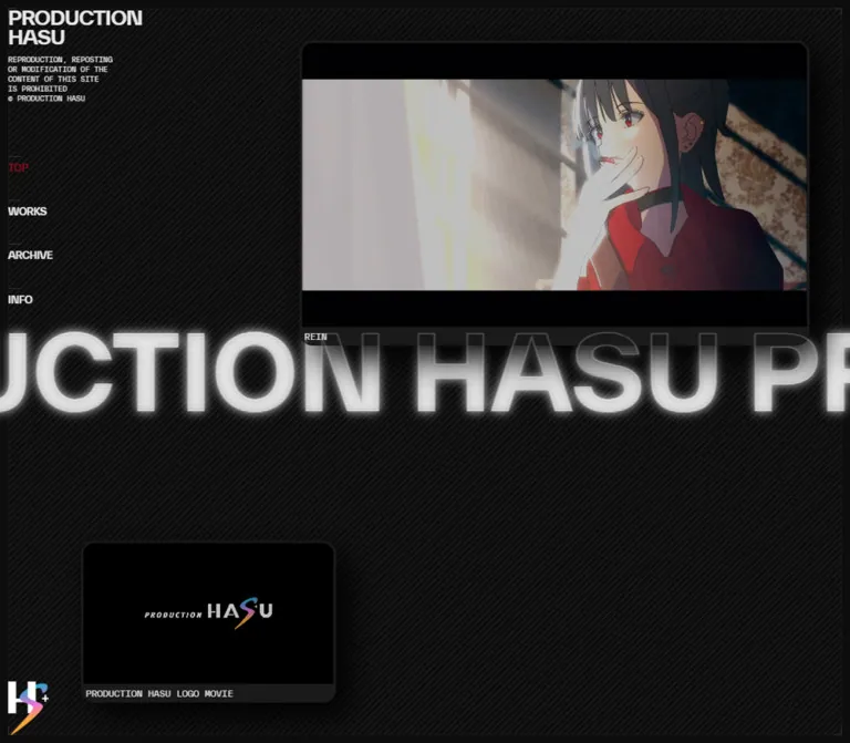
黒い斜線背景に大小の映像パネルと巨大な発光文字を重ねたポートフォリオ。極小の等幅キャプション、非対称の配置、モバイルで細いレールとして残るサイドナビゲーションが特徴。
オリジナルサイトを見るA dark screening room with floating film windows and an oversized luminous wordmark.
Original URL: production-hasu.work Final URL: production-hasu.work Theme: dark in both inspected viewport states; no theme selector was observed. Inspected: September 17, 2026, Japan Standard Time. The supplied capture set is timestamped September 16, 2026, at 19:30:29.762 UTC, equivalent to September 17 at 04:30:29.762 JST. Viewports: desktop 1440 × 1000 CSS pixels; mobile 390 × 844 CSS pixels. Scope: the current homepage, including its initial desktop and mobile compositions, changing media frames, navigation rail, scrolling wordmark, and DOM-present work links. Linked pages, the expanded mobile navigation, and any alternate work-index presentation were not visually inspected.
PRODUCTION HASU presents its work as a moving-image portfolio occupying a single viewport. A restrained interface surrounds two very different media sizes: a large featured work at the upper right and a smaller identity film near the lower left. Between them, repeated brand lettering crosses the screen at an almost architectural scale. Tiny captions and legal copy make the moving images and oversized lettering feel even larger.
The interface combines near-black surfaces, diagonal hatching, dark rounded media frames, white scanline-like lettering, and one deep red navigation accent. Color comes primarily from the animation footage and the small multicolored emblem. The desktop composition depends on empty space and deliberate overlap; mobile preserves that staging while compressing navigation into a narrow strip.
A dark screening room with floating film windows and an oversized luminous wordmark.
Original URL: production-hasu.work Final URL: production-hasu.work Theme: dark in both inspected viewport states; no theme selector was observed. Inspected: September 17, 2026, Japan Standard Time. The supplied capture set is timestamped September 16, 2026, at 19:30:29.762 UTC, equivalent to September 17 at 04:30:29.762 JST. Viewports: desktop 1440 × 1000 CSS pixels; mobile 390 × 844 CSS pixels. Scope: the current homepage, including its initial desktop and mobile compositions, changing media frames, navigation rail, scrolling wordmark, and DOM-present work links. Linked pages, the expanded mobile navigation, and any alternate work-index presentation were not visually inspected.
PRODUCTION HASU presents its work as a moving-image portfolio occupying a single viewport. A restrained interface surrounds two very different media sizes: a large featured work at the upper right and a smaller identity film near the lower left. Between them, repeated brand lettering crosses the screen at an almost architectural scale. Tiny captions and legal copy make the moving images and oversized lettering feel even larger.
The interface combines near-black surfaces, diagonal hatching, dark rounded media frames, white scanline-like lettering, and one deep red navigation accent. Color comes primarily from the animation footage and the small multicolored emblem. The desktop composition depends on empty space and deliberate overlap; mobile preserves that staging while compressing navigation into a narrow strip.
The source uses a small neutral palette with one interface accent. Hex values below are rounded conversions of the supplied HSL declarations; the computed body and navigation colors independently support the principal conversions.
| Name | Source value | Rounded hex | Source token | Role and evidence |
|---|---|---|---|---|
| Near Black | hsl(0deg 0% 5%) |
#0d0d0d |
--c-bg |
Computed body background; mobile header background |
| Soft White | hsl(0deg 0% 90%) |
#e6e6e6 |
--c-white |
Computed body, brand, navigation, and caption text |
| Dark Surface | hsl(0deg 0% 10%) |
#1a1a1a |
--c-dark-gray |
Computed caption-strip background |
| Dark Border | hsl(0deg 0% 10%) |
#1a1a1a |
--c-border |
Available border token; the media edges visually fit this low-contrast family |
| Rule Gray | hsl(0deg 0% 20%) |
#333333 |
--c-gray |
Available neutral token; exact assignment to individual visible rules is not supplied |
| Mid Gray | hsl(0deg 0% 50%) |
#808080 |
--c-light-gray |
Available neutral token; no specific visible element is conclusively assigned to it |
| Deep Red | hsl(350deg 90% 30%) |
#91081f |
--c-red |
Computed color of the active TOP link |
The media interiors include areas that appear black. Those pixels belong to the media or its framing; they do not replace the measured #0d0d0d page token.
Keep the distinction between interface and artwork colors. The featured footage changes between dark red, cream, cyan, and black compositions. Those are content-dependent colors, not evidence of multiple interface themes. Likewise, the colored emblem does not establish a general gradient palette for buttons or surfaces.
The interface establishes hierarchy through relatively small neutral differences: page at 5% lightness, captions at 10%, and available rules at 20%. Bright text and the luminous wordmark provide the strongest contrast.
Desktop hatching is fine and quiet, visible throughout the open background. On mobile, it is most evident in the left rail; the main stage appears substantially flatter. Exact gradient declarations, opacity, and stripe spacing are unavailable. A 4–6px repeat with a very faint one-pixel line is a reasonable reconstruction estimate, not a measured token.
"TWK Everett".700 for body text, the brand, navigation links, and the scrolling wordmark.-0.96px at 24px, equivalent to -0.04em.-0.48px at 12px, also -0.04em.The close tracking belongs to the small brand and navigation, not automatically to the large moving text. Preserve that distinction.
"TWK Everett Mono".400.The supplied evidence names these computed font families but does not include font-file URLs or font-loading results. A reconstruction should use properly available font resources; the fallback stacks in the Quick Start are recommendations.
The DOM-present work titles declare "Zen Old Mincho", serif, weight 600, at 12px / 12px. This is evidence for those title elements only. The work index is not visible in the supplied homepage captures, so its rendered typography should not be generalized to the opening media stage.
| Role | Desktop | Mobile | Weight | Tracking | Evidence |
|---|---|---|---|---|---|
| Two-line brand | 24px / 24px |
24px / 24px |
700 |
-0.04em |
Computed H1 |
| Legal notice | 10px / 15px |
10px / 15px |
400 |
Normal | Computed paragraph |
| Primary navigation | 12px / 12px |
12px / 12px |
700 |
-0.04em |
Computed links |
| Media captions | 10px / 10px |
10px / 10px |
400 |
Normal | Computed H2 elements |
| Moving wordmark | 172.8px / 155.52px |
46.8px / 42.12px |
700 |
Normal | Computed H1 |
| Work-index titles | 12px / 12px |
12px / 12px |
600 |
Normal | DOM-only H3 evidence |
| TAP TO OPEN | Approximately 10px |
Approximately 10px |
Not measured | Visually compact | Mobile screenshot estimate; not visibly presented on desktop |
The moving wordmark follows an exact relationship at both sampled widths:
/* Calculated from both inspected viewport measurements */
font-size: 12vw;
line-height: 0.9;
The source token --fs-title remains 24px at both widths. --fs-heading changes from 24px to 12px, but the visible brand H1 stays at 24px. Do not interpret that token change as a universal halving of all headings.
Spacing character: ten-pixel interface insets combined with much larger spatial offsets. Shape character: thin straight rules and rounded media windows; no general pill-button system.
| Token | Desktop | Mobile | Interpretation |
|---|---|---|---|
--margin |
10px |
10px |
Small layout inset token |
--gutter |
10px |
10px |
Small spacing token |
--offset |
50px |
50px |
Large offset token; also numerically matches the exposed mobile rail |
--headerWidth |
200px |
200px |
Header width, independently confirmed by its rectangle |
--column |
92.5px |
17.5px |
Available layout token; its underlying grid formula was not supplied |
--vw |
14.4px |
3.9px |
One percent of viewport width |
--vh |
10px |
8.44px |
One percent of viewport height |
--vmin |
10px |
3.9px |
One percent of the smaller viewport dimension |
--vmax |
14.4px |
8.44px |
One percent of the larger viewport dimension |
These variables do not establish a conventional visible column grid. The opening composition reads as independently positioned elements.
| Element | Desktop | Mobile |
|---|---|---|
| Main stage | x: 0, 1440 × 1000px |
x: 50, 340 × 844px |
| Header | x: 0, 200 × 1000px |
x: -150, 200 × 844px |
| Header padding | 10px |
10px |
| Brand box | x: 10, y: 10, 180 × 48px |
x: -140, y: 10, 179 × 48px |
| Legal notice | x: 10, y: 68, 144 × 60px |
x: -104.2, y: 68, approximately 143.2 × 60px |
| Navigation text top positions | 202, 256.19, 310.38, 364.56px |
Same measured vertical positions |
| Featured caption | x: 529, y: 535.625, 858 × 20px |
x: 63, y: 189.625, 314 × 20px |
| Logo-film caption | x: 103, y: 927, 426 × 20px |
x: 63, y: 811, 232 × 20px |
| Moving text line box | y: 422.23, height 155.52px |
y: 400.94, height 42.11px |
The moving text's line box is centered at approximately 50vh in both states. Its glow extends beyond that box.
The following outer-card sizes combine screenshot estimates with caption bounds. A roughly 3px frame and 16:9 inner image area explain the measurements closely; the outer card elements themselves were not included in the computed-style sample.
| Element | Desktop estimate | Mobile estimate |
|---|---|---|
| Featured window | x: 526, y: 50, approximately 864 × 509px |
x: 60, y: 10, approximately 320 × 203px |
| Logo window | x: 100, y: 684, approximately 432 × 266px |
x: 60, y: 678, approximately 238 × 157px |
| Media border | Approximately 3px |
Approximately 3px |
| Outer corner radius | Approximately 16px |
Approximately 16px |
| Caption height | Measured 20px |
Measured 20px |
| Caption padding | Measured 3px 0 0 3px |
Measured 3px 0 0 3px |
The desktop estimates correspond to a featured width of 60vw and a logo-window width of 30vw. On mobile, the featured width fits the stage minus two 10px insets, while the logo window is approximately 70% of the stage width. These are useful reconstruction rules, not verified source formulas.
Role: hold the portfolio as a single spatial composition.
The measured main element occupies the full desktop viewport. The 200px header does not subtract 200px from the desktop stage width. This matters: centering everything within a conventional sidebar/content grid would move the wordmark and media away from their observed positions.
A fine rectangular perimeter sits about 10px inside the desktop viewport. Diagonal hatching fills the open surface. The media windows and wordmark have independent placement, leaving a large dark region between the featured work and the identity film.
On mobile, the main region begins at x: 50px, leaving a persistent navigation strip. The desktop perimeter treatment is not clearly reproduced around the mobile stage.
Role: compact, persistent site identity and section access.
The desktop header is 200px wide with 10px padding. Its anatomy is:
The first navigation label starts at y: 202px. Subsequent labels are approximately 54.19px apart. Short horizontal rules above the links are visible; their roughly 16px length is a screenshot estimate.
TOP is deep red in the inspected state. Other labels are soft white. The links point to /, /works/, /archive/, and /info/; their destination pages were not inspected.
The emblem appears to combine a pale letterform with a blue, purple, and orange ribbon-like shape and a small plus. Its exact asset and construction are unknown. Preserve an authorized graphic rather than substituting a generic icon.
Role: preserve navigation access while giving most of the phone width to the media stage.
The header remains 200px wide but moves to x: -150px. Only its rightmost 50px remain onscreen. This is a translated desktop-width panel, not a newly compressed 50px menu layout.
The brand and notice retain their small desktop scale and become partly clipped. The navigation links end around x: 40px, which is consistent with right alignment inside the displaced panel. The visible content is dimmer than the main stage, although the supplied text-color declarations remain unchanged; the exact dimming mechanism is not available.
A bright vertical TAP TO OPEN label sits around the viewport midpoint. Its wording indicates an opening affordance. The expanded state, activation target bounds, overlay behavior, and dismissal sequence were not tested. A header transform transition is defined, but this alone does not prove the complete interaction.
Role: show a substantial sample of the current featured work.
The visible caption reads Houshou Marine A Horny Money World. The window contains changing anime footage, a dark rounded perimeter, and a shallow caption strip below the picture.
Its anatomy is:
On desktop it sits near the upper-right corner, about 50px from both edges. On mobile it moves to a 10px top inset and fills nearly the entire available stage width.
The footage carries detailed typography, character art, and small copyright text within the picture. Treat these as media content, not separate interface elements or website-production attribution.
No transport controls, audio state, click destination, or hover treatment were demonstrated for this window. The existence of a related work-detail link elsewhere in the DOM does not establish that clicking the window opens that link.
Role: provide a smaller moving identity element that balances the featured work.
The caption reads PRODUCTION HASU LOGO MOVIE. The framing matches the featured window: rounded dark border, black media area, and a 20px monospaced caption strip.
The desktop placement is approximately 100px from the left and 50px from the bottom. On mobile it aligns with the featured window's left edge and sits about 10px above the bottom of the viewport, but remains substantially narrower.
The logo appears at different stages across the captures, including a largely black frame. This supports changing media content; a dark frame alone is not evidence of an asset-loading failure.
Role: bind the entire composition into a continuous branded surface.
The text repeats PRODUCTION HASU across a line far wider than the viewport. Its measured font size is 12vw, with 0.9 line height and a 12s linear infinite scroll-text animation.
The desktop appearance combines two treatments:
The sampled H1 has a transparent computed text color. That is compatible with an effect involving strokes, clipping, additional layers, or pseudo-elements; it does not mean the lettering is visually absent.
The precise rendering method is not supplied. A practical reconstruction is to place a luminous text copy behind the opaque media windows and a thin outline copy above them. Both copies must use identical dimensions and synchronized movement. This is an implementation recommendation, not a confirmed source technique.
The wordmark should remain decorative and should not intercept interaction with underlying content. Its changing horizontal position is part of the composition; no single screenshot offset should become a permanent layout value.
Role: expose individual work destinations in the page's rendered structure.
The supplied main-element text includes Works, 9 Items, and nine numbered work links. The links include the featured work and other music-video or animation projects. Their titles use the separately declared Zen Old Mincho face.
The sampled desktop link rectangles are 389px wide at x: 210px; mobile rectangles are 319px wide at x: 61px. Items begin at y: 10px and repeat at 244px intervals. Individual sampled link rectangles are 144px high.
These elements are not visible as a work list in the attached TOP captures. Their positions extend below the viewport even though the reported document height equals the viewport height. They may belong to a clipped, covered, or alternate presentation, but the supplied evidence does not determine which.
Do not reconstruct a visible homepage grid, scrolling index, thumbnail treatment, or opening transition from these rectangles alone. The arrow glyphs and Close text found in the DOM likewise do not establish an inspected modal or pointer interaction.
| Treatment | Supplied evidence | Interpretation and limits |
|---|---|---|
| Moving wordmark | 12s linear infinite scroll-text |
Continuous horizontal branding; keyframe offsets were not supplied |
| Header transform | 0.3s cubic-bezier(0.3, 0.1, 0.1, 1) |
A short eased transform is defined; expanded mobile state was not exercised |
| Legal-notice transform | 0.3s cubic-bezier(0.3, 0.1, 0.1, 1) |
A transform transition is declared; trigger and resulting state are unknown |
| Navigation color | 0.2s cubic-bezier(0.3, 0.1, 0.1, 1) |
Color transitions are defined; hover and focus colors were not captured |
| Work-title color | 0.2s cubic-bezier(0.3, 0.1, 0.1, 1) |
Defined on DOM-present work titles; visible interaction unverified |
| Featured footage | Different image frames across captures | Moving media is supported; duration, looping, audio, and playback configuration are unknown |
| Logo film | Different logo stages and a dark frame | Moving identity content is supported; its timing and control model are unknown |
Other sampled elements report a generic transition: all without a useful positive duration. Those entries are not evidence of additional timed animations.
The capture process observed the initial page for at least five seconds and resumed perpetual animations after readiness checks. This supports the presence of sustained motion but does not reveal complete media cycles or every interface state.
Recommended motion hierarchy: retain the steady wordmark movement and short navigation easing. Let the films provide complex motion. Avoid adding independent floating, scaling, or parallax effects to every component.
| Layer | Appearance | Function |
|---|---|---|
| Page canvas | Near-black field | Establishes the screening-room atmosphere |
| Desktop texture | Fine diagonal hatching | Gives otherwise empty space a subtle physical texture |
| Desktop perimeter | Thin inset rectangle | Frames the entire viewport |
| Navigation | Transparent over desktop texture; dark mobile panel | Keeps small identity and navigation details present |
| Media frame | Very dark rounded edge | Separates imagery without bright chrome |
| Caption strip | #1a1a1a, 20px high |
Provides a stable technical label under changing imagery |
| Media shadow | Broad black falloff, visually observed | Suggests floating windows without colored elevation effects |
| Wordmark | Luminous textured fill and fine outline | Creates depth through overlap with the media |
The page is not entirely flat, but its depth comes from black shadows, luminous text, and overlapping layers. There is no observed general system of colored cards, translucent glass panels, or large filled action buttons.
The featured media is detailed anime footage with a red-haired performer, dark theatrical backgrounds, circular light or moon shapes, contrasting silhouettes, and changing red or cyan scenes. Those specific subjects belong to the current work. They should not become mandatory motifs for every future project shown in the same shell.
The logo film uses much more black space, with the identity appearing at a relatively small scale inside the frame. The difference in media density is important: the large window carries narrative detail while the smaller one behaves like an identity monitor.
Keep footage proportionate and use normal image interpolation. The diagonal background and scanline-like wordmark are interface textures; they are not a reason to pixelate the animation artwork or apply a global distressed filter.
| Visible item | Confirmed reference | Asset limitation |
|---|---|---|
| Featured media | Caption: Houshou Marine A Horny Money World | No video, poster, or image-file URL was supplied |
| Related featured work | A Horny Money World伝説の夜 appears as a DOM link | Destination was not opened; it is not an asset URL |
| Identity film | Caption: PRODUCTION HASU LOGO MOVIE | Media-file URL and playback settings are unknown |
| Lower-corner emblem | Visible in current desktop and mobile captures | No SVG or raster asset path was supplied |
Use authorized artwork and identity assets where available. Do not invent filenames, replace the emblem with an unrelated stock mark, or assume the media frames are ordinary static thumbnail cards.
At 1440 × 1000, the main stage spans the complete viewport. The sidebar sits above that coordinate system. The featured work occupies the upper right, while the smaller logo film sits low and left. The marquee's line box is centered vertically at about 500px and intersects the lower portion of the featured window.
The smaller window is about half the width of the larger one. Maintaining that imbalance is more important than making both windows align to a conventional card grid. The open lower-right area and the gap between the windows are intentional parts of the composition.
At 390 × 844, the left rail consumes 50px and the stage consumes 340px. The featured window begins at approximately (60, 10), leaving 10px inside the stage on both sides. The smaller window begins at approximately (60, 678) and remains narrower.
The marquee's line box is centered at about 422px. It no longer crosses the featured media because that window ends near 213px. Instead, the lettering passes through the large empty middle region. This is a real compositional change, not simply a scaled screenshot of desktop.
Small interface typography does not shrink between the measured viewports. The moving wordmark changes from 172.8px to 46.8px because it follows viewport width. The 24px brand stays the same size and is displaced offscreen with its panel.
A reconstruction should test intermediate sizes and provide a reachable layout when media windows would overlap. The Quick Start uses a clearly labeled, chosen breakpoint rather than presenting an unsupported source value.
These are recommendations for a new implementation, not verified features of the inspected site:
aria-expanded, and aria-controls. Support keyboard activation and Escape to close.#0d0d0d.#e6e6e6.#1a1a1a.#333333.#91081f.“Create a full-viewport moving-image portfolio inspired by the observed PRODUCTION HASU homepage. Use a near-black canvas, very faint diagonal hatching, a thin inset desktop perimeter, and a 200px identity sidebar with compact uppercase sans-serif text and tiny monospaced utility copy. Place a large rounded media window in the upper right and a smaller logo-film window near the lower left. Give both dark 20px caption strips. Across the vertical midpoint, scroll repeated oversized branding at 12vw with luminous scanline-like fill behind the media and a thin outline over it. Use a steady 12-second linear cycle. On a 390px-wide phone, translate the sidebar left so a 50px rail remains, place the main film at the top of the remaining stage, and keep the smaller film near the bottom. Preserve the empty middle region. Use authorized media and identify unverified interactions as implementation choices.”
This adaptation combines measured colors, typography, caption dimensions, and motion durations with estimated media geometry. The 16px radius, shadow, hatch pattern, two-copy wordmark technique, and 900px breakpoint are reconstruction choices.
Use .site-nav__content to wrap the brand, notice, links, and emblem. Keep .nav-toggle outside that wrapper. Inside .stage, place two .media-card figures, each containing .media-frame and .media-caption. Add matching .marquee--fill and .marquee--outline layers; each .marquee__track contains two identical text spans. Mark both decorative layers aria-hidden='true'.
:root {
  /* Measured source palette */
  --c-bg: hsl(0deg 0% 5%);
  --c-white: hsl(0deg 0% 90%);
  --c-dark-gray: hsl(0deg 0% 10%);
  --c-border: hsl(0deg 0% 10%);
  --c-gray: hsl(0deg 0% 20%);
  --c-light-gray: hsl(0deg 0% 50%);
  --c-red: hsl(350deg 90% 30%);

  /* Observed families with recommended fallbacks */
  --font-interface: 'TWK Everett', Arial, sans-serif;
  --font-utility: 'TWK Everett Mono', ui-monospace, monospace;
  --font-work: 'Zen Old Mincho', serif;

  /* Measured dimensions */
  --margin: 10px;
  --gutter: 10px;
  --offset: 50px;
  --header-width: 200px;
  --rail-width: 50px;
  --text-title: 24px;
  --text-interface: 12px;
  --text-caption: 10px;
  --caption-height: 20px;
  --text-marquee: 12vw;

  /* Estimated visual reconstruction */
  --media-border: 3px;
  --media-radius: 16px;
  --media-shadow: 0 22px 34px rgb(0 0 0 / 0.65);

  /* Measured motion timing */
  --ease-interface: cubic-bezier(0.3, 0.1, 0.1, 1);
  --duration-panel: 300ms;
  --duration-color: 200ms;
  --duration-marquee: 12s;
}

* {
  box-sizing: border-box;
}

body {
  margin: 0;
  color: var(--c-white);
  background: var(--c-bg);
  font: 700 var(--text-interface) / 1 var(--font-interface);
}

/* Estimated desktop perimeter and hatching */
body::before {
  content: '';
  position: fixed;
  inset: var(--margin);
  border: 1px solid var(--c-gray);
  background: repeating-linear-gradient(
    135deg,
    transparent 0 4px,
    rgb(230 230 230 / 0.035) 4px 5px
  );
  pointer-events: none;
}

.site-nav {
  position: fixed;
  inset: 0 auto 0 0;
  z-index: 10;
  width: var(--header-width);
  padding: var(--margin);
  transition: transform var(--duration-panel) var(--ease-interface);
}

.site-nav__brand {
  margin: 0;
  font-size: var(--text-title);
  line-height: 1;
  letter-spacing: -0.04em;
  text-transform: uppercase;
}

.site-nav__notice {
  width: 80%;
  margin: 10px 0 0;
  font: 400 10px / 15px var(--font-utility);
  text-transform: uppercase;
}

.site-nav__links {
  position: absolute;
  top: 202px;
  inset-inline: 10px;
  display: grid;
  justify-items: start;
  gap: 42.1875px;
}

.site-nav__links a {
  position: relative;
  display: block;
  color: var(--c-white);
  font-size: 12px;
  line-height: 12px;
  letter-spacing: -0.04em;
  text-decoration: none;
  text-transform: uppercase;
  transition: color var(--duration-color) var(--ease-interface);
}

.site-nav__links a::before {
  content: '';
  position: absolute;
  top: -10px;
  left: 0;
  width: 16px;
  height: 1px;
  background: var(--c-gray);
}

.site-nav__links a[aria-current='page'] {
  color: var(--c-red);
}

.site-nav__emblem {
  position: absolute;
  left: 10px;
  bottom: 10px;
  display: block;
  width: 50px;
  height: auto;
}

.nav-toggle {
  display: none;
}

.stage {
  position: fixed;
  inset: 0;
  isolation: isolate;
}

.media-card {
  position: absolute;
  z-index: 2;
  margin: 0;
  overflow: hidden;
  border: var(--media-border) solid var(--c-border);
  border-radius: var(--media-radius);
  background: #000;
  box-shadow: var(--media-shadow);
}

/* Width and position rules reconstructed from the captures */
.media-card--feature {
  top: var(--offset);
  right: var(--offset);
  width: 60vw;
}

.media-card--logo {
  left: calc(2 * var(--offset));
  bottom: var(--offset);
  width: 30vw;
}

.media-frame {
  aspect-ratio: 16 / 9;
  background: #000;
}

.media-frame > :is(img, video) {
  display: block;
  width: 100%;
  height: 100%;
  object-fit: contain;
}

.media-caption {
  display: flex;
  height: var(--caption-height);
  margin: 0;
  padding: 3px 0 0 3px;
  overflow: hidden;
  color: var(--c-white);
  background: var(--c-dark-gray);
  font: 400 var(--text-caption) / 10px var(--font-utility);
  letter-spacing: normal;
  white-space: nowrap;
}

.marquee {
  position: absolute;
  top: 50%;
  inset-inline: 0;
  transform: translateY(-50%);
  overflow: hidden;
  font: 700 var(--text-marquee) / 0.9 var(--font-interface);
  letter-spacing: normal;
  white-space: nowrap;
  pointer-events: none;
  user-select: none;
}

.marquee__track {
  display: flex;
  width: max-content;
  animation: hasu-scroll var(--duration-marquee) linear infinite;
}

.marquee__track > span {
  flex: none;
  padding-inline-end: 0.25em;
}

/* Suggested reconstruction of the visible layered treatment */
.marquee--fill {
  z-index: 1;
  color: var(--c-white);
  text-shadow:
    0 0 4px rgb(230 230 230 / 0.8),
    0 0 14px rgb(230 230 230 / 0.6);
}

.marquee--fill .marquee__track {
  mask-image: repeating-linear-gradient(
    to bottom,
    #000 0 1px,
    rgb(0 0 0 / 0.55) 1px 2px
  );
}

.marquee--outline {
  z-index: 3;
  color: transparent;
  -webkit-text-stroke: 1px rgb(230 230 230 / 0.22);
}

@keyframes hasu-scroll {
  to { transform: translateX(-50%); }
}

/* Recommended focus appearance; not an observed source state */
a:focus-visible,
button:focus-visible {
  outline: 2px solid var(--c-white);
  outline-offset: 5px;
}

/* Chosen adaptation breakpoint; the source breakpoint is unknown */
@media (max-width: 900px) {
  body::before {
    display: none;
  }

  .site-nav {
    transform: translateX(calc(var(--rail-width) - var(--header-width)));
    border-right: 1px solid var(--c-border);
    background: repeating-linear-gradient(
      135deg,
      transparent 0 4px,
      rgb(230 230 230 / 0.035) 4px 5px
    ), var(--c-bg);
  }

  .site-nav__content {
    opacity: 0.25;
    pointer-events: none;
  }

  .site-nav__brand,
  .site-nav__notice {
    text-align: right;
  }

  .site-nav__notice {
    margin-left: auto;
  }

  .site-nav__links {
    justify-items: end;
  }

  .site-nav__links a::before {
    right: 0;
    left: auto;
  }

  .site-nav__emblem {
    right: 10px;
    left: auto;
  }

  .nav-toggle {
    position: absolute;
    top: 50%;
    right: 0;
    display: grid;
    place-items: center;
    width: var(--rail-width);
    height: 120px;
    padding: 0;
    border: 0;
    color: var(--c-white);
    background: transparent;
    font: 400 10px / 1 var(--font-utility);
    text-transform: uppercase;
    writing-mode: vertical-rl;
    transform: translateY(-50%) rotate(180deg);
    cursor: pointer;
  }

  /* Suggested state hook, controlled by application logic */
  .site-nav[data-open='true'] {
    transform: translateX(0);
  }

  .site-nav[data-open='true'] .site-nav__content {
    opacity: 1;
    pointer-events: auto;
  }

  .stage {
    left: var(--rail-width);
    background: var(--c-bg);
  }

  .media-card--feature {
    top: 10px;
    right: auto;
    left: 10px;
    width: calc(100% - 20px);
  }

  .media-card--logo {
    bottom: 10px;
    left: 10px;
    width: 70%;
  }
}

/* Recommended reduced-motion behavior */
@media (prefers-reduced-motion: reduce) {
  .marquee__track {
    animation: none;
  }

  .site-nav,
  .site-nav__links a {
    transition: none;
  }
}
The two marquee tracks must contain equal repeated segments and start together to keep fill and outline aligned. This code reproduces the observed visual relationship rather than the unknown original keyframes.
Application logic must synchronize the mobile panel's data-open state, button text, aria-expanded, concealed-content focusability, and focus restoration. It must also handle video playback separately. Media URLs, font loading, the emblem asset, and the uninspected work-index presentation are intentionally not fabricated here.
Optional aliases for a project already using Tailwind v4. This does not imply that the original website uses Tailwind. Define the custom properties above first.
@theme inline {
  --color-canvas: var(--c-bg);
  --color-foreground: var(--c-white);
  --color-caption: var(--c-dark-gray);
  --color-frame: var(--c-border);
  --color-rule: var(--c-gray);
  --color-active: var(--c-red);

  --font-sans: var(--font-interface);
  --font-mono: var(--font-utility);
  --font-editorial: var(--font-work);

  --text-micro: 10px;
  --text-interface: 12px;
  --text-brand: 24px;
  --text-marquee: 12vw;

  --spacing-inset: 10px;
  --spacing-rail: 50px;
  --spacing-sidebar: 200px;
  --radius-media: var(--media-radius);
}
12s linear infinite scroll-text declaration. Header and link transitions are declared but their triggered states were not exercised.This reference describes the supplied current homepage evidence. Screenshot estimates and reconstruction choices are distinguished from measured source values; no additional browsing, command execution, or local-file inspection was used.
# PRODUCTION HASU — Style Reference

> A dark screening room with floating film windows and an oversized luminous wordmark.

**Original URL:** [production-hasu.work](https://production-hasu.work/)
**Final URL:** [production-hasu.work](https://production-hasu.work/)
**Theme:** dark in both inspected viewport states; no theme selector was observed.
**Inspected:** September 17, 2026, Japan Standard Time. The supplied capture set is timestamped September 16, 2026, at 19:30:29.762 UTC, equivalent to September 17 at 04:30:29.762 JST.
**Viewports:** desktop 1440 × 1000 CSS pixels; mobile 390 × 844 CSS pixels.
**Scope:** the current homepage, including its initial desktop and mobile compositions, changing media frames, navigation rail, scrolling wordmark, and DOM-present work links. Linked pages, the expanded mobile navigation, and any alternate work-index presentation were not visually inspected.

PRODUCTION HASU presents its work as a moving-image portfolio occupying a single viewport. A restrained interface surrounds two very different media sizes: a large featured work at the upper right and a smaller identity film near the lower left. Between them, repeated brand lettering crosses the screen at an almost architectural scale. Tiny captions and legal copy make the moving images and oversized lettering feel even larger.

The interface combines near-black surfaces, diagonal hatching, dark rounded media frames, white scanline-like lettering, and one deep red navigation accent. Color comes primarily from the animation footage and the small multicolored emblem. The desktop composition depends on empty space and deliberate overlap; mobile preserves that staging while compressing navigation into a narrow strip.
# PRODUCTION HASU — Style Reference

> A dark screening room with floating film windows and an oversized luminous wordmark.

**Original URL:** [production-hasu.work](https://production-hasu.work/)
**Final URL:** [production-hasu.work](https://production-hasu.work/)
**Theme:** dark in both inspected viewport states; no theme selector was observed.
**Inspected:** September 17, 2026, Japan Standard Time. The supplied capture set is timestamped September 16, 2026, at 19:30:29.762 UTC, equivalent to September 17 at 04:30:29.762 JST.
**Viewports:** desktop 1440 × 1000 CSS pixels; mobile 390 × 844 CSS pixels.
**Scope:** the current homepage, including its initial desktop and mobile compositions, changing media frames, navigation rail, scrolling wordmark, and DOM-present work links. Linked pages, the expanded mobile navigation, and any alternate work-index presentation were not visually inspected.

PRODUCTION HASU presents its work as a moving-image portfolio occupying a single viewport. A restrained interface surrounds two very different media sizes: a large featured work at the upper right and a smaller identity film near the lower left. Between them, repeated brand lettering crosses the screen at an almost architectural scale. Tiny captions and legal copy make the moving images and oversized lettering feel even larger.

The interface combines near-black surfaces, diagonal hatching, dark rounded media frames, white scanline-like lettering, and one deep red navigation accent. Color comes primarily from the animation footage and the small multicolored emblem. The desktop composition depends on empty space and deliberate overlap; mobile preserves that staging while compressing navigation into a narrow strip.

## How to Read This Reference

- **Measured values** come from the supplied rendered DOM, computed styles, custom properties, and element rectangles. They are not measurements from a new browsing session.
- **Visual observations** come from three current desktop captures and two current mobile captures. Shadows, texture pitch, and media-frame radii are visible but lack corresponding computed declarations.
- **Calculated values** include color conversions, the wordmark's viewport relationship, and dimensions reconstructed from caption bounds. Calculations are identified where used.
- **Estimates** describe screenshot geometry or appearance where complete element measurements are unavailable.
- **Recommendations** and the Quick Start are implementation guidance. They do not establish untested interactions, source breakpoints, or the original layering technique.
- **DOM presence is not visibility.** The work links have computed rectangles, but their index is not visible in the supplied TOP screenshots.

## Tokens — Colors

### Default Palette

The source uses a small neutral palette with one interface accent. Hex values below are rounded conversions of the supplied HSL declarations; the computed body and navigation colors independently support the principal conversions.

| Name | Source value | Rounded hex | Source token | Role and evidence |
| --- | --- | --- | --- | --- |
| Near Black | `hsl(0deg 0% 5%)` | `#0d0d0d` | `--c-bg` | Computed body background; mobile header background |
| Soft White | `hsl(0deg 0% 90%)` | `#e6e6e6` | `--c-white` | Computed body, brand, navigation, and caption text |
| Dark Surface | `hsl(0deg 0% 10%)` | `#1a1a1a` | `--c-dark-gray` | Computed caption-strip background |
| Dark Border | `hsl(0deg 0% 10%)` | `#1a1a1a` | `--c-border` | Available border token; the media edges visually fit this low-contrast family |
| Rule Gray | `hsl(0deg 0% 20%)` | `#333333` | `--c-gray` | Available neutral token; exact assignment to individual visible rules is not supplied |
| Mid Gray | `hsl(0deg 0% 50%)` | `#808080` | `--c-light-gray` | Available neutral token; no specific visible element is conclusively assigned to it |
| Deep Red | `hsl(350deg 90% 30%)` | `#91081f` | `--c-red` | Computed color of the active TOP link |

The media interiors include areas that appear black. Those pixels belong to the media or its framing; they do not replace the measured `#0d0d0d` page token.

Keep the distinction between interface and artwork colors. The featured footage changes between dark red, cream, cyan, and black compositions. Those are content-dependent colors, not evidence of multiple interface themes. Likewise, the colored emblem does not establish a general gradient palette for buttons or surfaces.

### Contrast and Texture

The interface establishes hierarchy through relatively small neutral differences: page at 5% lightness, captions at 10%, and available rules at 20%. Bright text and the luminous wordmark provide the strongest contrast.

Desktop hatching is fine and quiet, visible throughout the open background. On mobile, it is most evident in the left rail; the main stage appears substantially flatter. Exact gradient declarations, opacity, and stripe spacing are unavailable. A 4–6px repeat with a very faint one-pixel line is a reasonable reconstruction estimate, not a measured token.

## Tokens — Typography

### Interface Sans — TWK Everett

- **Computed family:** `"TWK Everett"`.
- **Computed weight:** `700` for body text, the brand, navigation links, and the scrolling wordmark.
- **Role:** compact interface labels at one extreme and enormous repeated branding at the other.
- **Brand tracking:** `-0.96px` at `24px`, equivalent to `-0.04em`.
- **Navigation tracking:** `-0.48px` at `12px`, also `-0.04em`.
- **Wordmark tracking:** normal in the supplied computed style.

The close tracking belongs to the small brand and navigation, not automatically to the large moving text. Preserve that distinction.

### Utility Mono — TWK Everett Mono

- **Computed family:** `"TWK Everett Mono"`.
- **Computed weight:** `400`.
- **Role:** legal notice and media captions.
- **Caption treatment:** extremely small text in a shallow dark strip, resembling a technical media label.

The supplied evidence names these computed font families but does not include font-file URLs or font-loading results. A reconstruction should use properly available font resources; the fallback stacks in the Quick Start are recommendations.

### Work Titles — Zen Old Mincho

The DOM-present work titles declare `"Zen Old Mincho", serif`, weight `600`, at `12px / 12px`. This is evidence for those title elements only. The work index is not visible in the supplied homepage captures, so its rendered typography should not be generalized to the opening media stage.

### Type Scale

| Role | Desktop | Mobile | Weight | Tracking | Evidence |
| --- | --- | --- | --- | --- | --- |
| Two-line brand | `24px / 24px` | `24px / 24px` | `700` | `-0.04em` | Computed H1 |
| Legal notice | `10px / 15px` | `10px / 15px` | `400` | Normal | Computed paragraph |
| Primary navigation | `12px / 12px` | `12px / 12px` | `700` | `-0.04em` | Computed links |
| Media captions | `10px / 10px` | `10px / 10px` | `400` | Normal | Computed H2 elements |
| Moving wordmark | `172.8px / 155.52px` | `46.8px / 42.12px` | `700` | Normal | Computed H1 |
| Work-index titles | `12px / 12px` | `12px / 12px` | `600` | Normal | DOM-only H3 evidence |
| TAP TO OPEN | Approximately `10px` | Approximately `10px` | Not measured | Visually compact | Mobile screenshot estimate; not visibly presented on desktop |

The moving wordmark follows an exact relationship at both sampled widths:

```css
/* Calculated from both inspected viewport measurements */
font-size: 12vw;
line-height: 0.9;
```

The source token `--fs-title` remains `24px` at both widths. `--fs-heading` changes from `24px` to `12px`, but the visible brand H1 stays at `24px`. Do not interpret that token change as a universal halving of all headings.

## Tokens — Spacing & Shapes

**Spacing character:** ten-pixel interface insets combined with much larger spatial offsets.
**Shape character:** thin straight rules and rounded media windows; no general pill-button system.

### Source Tokens

| Token | Desktop | Mobile | Interpretation |
| --- | --- | --- | --- |
| `--margin` | `10px` | `10px` | Small layout inset token |
| `--gutter` | `10px` | `10px` | Small spacing token |
| `--offset` | `50px` | `50px` | Large offset token; also numerically matches the exposed mobile rail |
| `--headerWidth` | `200px` | `200px` | Header width, independently confirmed by its rectangle |
| `--column` | `92.5px` | `17.5px` | Available layout token; its underlying grid formula was not supplied |
| `--vw` | `14.4px` | `3.9px` | One percent of viewport width |
| `--vh` | `10px` | `8.44px` | One percent of viewport height |
| `--vmin` | `10px` | `3.9px` | One percent of the smaller viewport dimension |
| `--vmax` | `14.4px` | `8.44px` | One percent of the larger viewport dimension |

These variables do not establish a conventional visible column grid. The opening composition reads as independently positioned elements.

### Measured Interface Geometry

| Element | Desktop | Mobile |
| --- | --- | --- |
| Main stage | `x: 0`, `1440 × 1000px` | `x: 50`, `340 × 844px` |
| Header | `x: 0`, `200 × 1000px` | `x: -150`, `200 × 844px` |
| Header padding | `10px` | `10px` |
| Brand box | `x: 10, y: 10`, `180 × 48px` | `x: -140, y: 10`, `179 × 48px` |
| Legal notice | `x: 10, y: 68`, `144 × 60px` | `x: -104.2, y: 68`, approximately `143.2 × 60px` |
| Navigation text top positions | `202`, `256.19`, `310.38`, `364.56px` | Same measured vertical positions |
| Featured caption | `x: 529, y: 535.625`, `858 × 20px` | `x: 63, y: 189.625`, `314 × 20px` |
| Logo-film caption | `x: 103, y: 927`, `426 × 20px` | `x: 63, y: 811`, `232 × 20px` |
| Moving text line box | `y: 422.23`, height `155.52px` | `y: 400.94`, height `42.11px` |

The moving text's line box is centered at approximately `50vh` in both states. Its glow extends beyond that box.

### Reconstructed Media Geometry

The following outer-card sizes combine screenshot estimates with caption bounds. A roughly 3px frame and 16:9 inner image area explain the measurements closely; the outer card elements themselves were not included in the computed-style sample.

| Element | Desktop estimate | Mobile estimate |
| --- | --- | --- |
| Featured window | `x: 526, y: 50`, approximately `864 × 509px` | `x: 60, y: 10`, approximately `320 × 203px` |
| Logo window | `x: 100, y: 684`, approximately `432 × 266px` | `x: 60, y: 678`, approximately `238 × 157px` |
| Media border | Approximately `3px` | Approximately `3px` |
| Outer corner radius | Approximately `16px` | Approximately `16px` |
| Caption height | Measured `20px` | Measured `20px` |
| Caption padding | Measured `3px 0 0 3px` | Measured `3px 0 0 3px` |

The desktop estimates correspond to a featured width of `60vw` and a logo-window width of `30vw`. On mobile, the featured width fits the stage minus two 10px insets, while the logo window is approximately 70% of the stage width. These are useful reconstruction rules, not verified source formulas.

## Components

### Viewport Stage

**Role:** hold the portfolio as a single spatial composition.

The measured main element occupies the full desktop viewport. The 200px header does not subtract 200px from the desktop stage width. This matters: centering everything within a conventional sidebar/content grid would move the wordmark and media away from their observed positions.

A fine rectangular perimeter sits about 10px inside the desktop viewport. Diagonal hatching fills the open surface. The media windows and wordmark have independent placement, leaving a large dark region between the featured work and the identity film.

On mobile, the main region begins at `x: 50px`, leaving a persistent navigation strip. The desktop perimeter treatment is not clearly reproduced around the mobile stage.

### Identity and Navigation Rail

**Role:** compact, persistent site identity and section access.

The desktop header is 200px wide with 10px padding. Its anatomy is:

1. A two-line, uppercase PRODUCTION / HASU wordmark at the upper left.
2. A small monospaced reproduction notice and copyright statement below it.
3. Four vertically spaced links: TOP, WORKS, ARCHIVE, and INFO.
4. A small multicolored emblem near the lower-left corner.

The first navigation label starts at `y: 202px`. Subsequent labels are approximately 54.19px apart. Short horizontal rules above the links are visible; their roughly 16px length is a screenshot estimate.

TOP is deep red in the inspected state. Other labels are soft white. The links point to `/`, `/works/`, `/archive/`, and `/info/`; their destination pages were not inspected.

The emblem appears to combine a pale letterform with a blue, purple, and orange ribbon-like shape and a small plus. Its exact asset and construction are unknown. Preserve an authorized graphic rather than substituting a generic icon.

### Collapsed Mobile Rail

**Role:** preserve navigation access while giving most of the phone width to the media stage.

The header remains 200px wide but moves to `x: -150px`. Only its rightmost 50px remain onscreen. This is a translated desktop-width panel, not a newly compressed 50px menu layout.

The brand and notice retain their small desktop scale and become partly clipped. The navigation links end around `x: 40px`, which is consistent with right alignment inside the displaced panel. The visible content is dimmer than the main stage, although the supplied text-color declarations remain unchanged; the exact dimming mechanism is not available.

A bright vertical TAP TO OPEN label sits around the viewport midpoint. Its wording indicates an opening affordance. The expanded state, activation target bounds, overlay behavior, and dismissal sequence were not tested. A header transform transition is defined, but this alone does not prove the complete interaction.

### Featured Media Window

**Role:** show a substantial sample of the current featured work.

The visible caption reads **Houshou Marine A Horny Money World**. The window contains changing anime footage, a dark rounded perimeter, and a shallow caption strip below the picture.

Its anatomy is:

1. A low-contrast outer frame, approximately 3px thick.
2. A wide image area consistent with 16:9 proportions.
3. A 20px charcoal caption strip.
4. A small monospaced title aligned near the strip's upper-left corner.
5. A broad dark shadow, most apparent against the mobile stage.

On desktop it sits near the upper-right corner, about 50px from both edges. On mobile it moves to a 10px top inset and fills nearly the entire available stage width.

The footage carries detailed typography, character art, and small copyright text within the picture. Treat these as media content, not separate interface elements or website-production attribution.

No transport controls, audio state, click destination, or hover treatment were demonstrated for this window. The existence of a related work-detail link elsewhere in the DOM does not establish that clicking the window opens that link.

### Logo-Film Window

**Role:** provide a smaller moving identity element that balances the featured work.

The caption reads **PRODUCTION HASU LOGO MOVIE**. The framing matches the featured window: rounded dark border, black media area, and a 20px monospaced caption strip.

The desktop placement is approximately 100px from the left and 50px from the bottom. On mobile it aligns with the featured window's left edge and sits about 10px above the bottom of the viewport, but remains substantially narrower.

The logo appears at different stages across the captures, including a largely black frame. This supports changing media content; a dark frame alone is not evidence of an asset-loading failure.

### Oversized Moving Wordmark

**Role:** bind the entire composition into a continuous branded surface.

The text repeats PRODUCTION HASU across a line far wider than the viewport. Its measured font size is `12vw`, with `0.9` line height and a `12s linear infinite scroll-text` animation.

The desktop appearance combines two treatments:

- Bright white, horizontally textured lettering with a soft luminous edge over the open background.
- Fine outline lettering that remains visible across the featured media.

The sampled H1 has a transparent computed text color. That is compatible with an effect involving strokes, clipping, additional layers, or pseudo-elements; it does not mean the lettering is visually absent.

The precise rendering method is not supplied. A practical reconstruction is to place a luminous text copy behind the opaque media windows and a thin outline copy above them. Both copies must use identical dimensions and synchronized movement. This is an implementation recommendation, not a confirmed source technique.

The wordmark should remain decorative and should not intercept interaction with underlying content. Its changing horizontal position is part of the composition; no single screenshot offset should become a permanent layout value.

### Work Index — DOM Evidence Only

**Role:** expose individual work destinations in the page's rendered structure.

The supplied main-element text includes Works, 9 Items, and nine numbered work links. The links include the featured work and other music-video or animation projects. Their titles use the separately declared Zen Old Mincho face.

The sampled desktop link rectangles are 389px wide at `x: 210px`; mobile rectangles are 319px wide at `x: 61px`. Items begin at `y: 10px` and repeat at 244px intervals. Individual sampled link rectangles are 144px high.

These elements are not visible as a work list in the attached TOP captures. Their positions extend below the viewport even though the reported document height equals the viewport height. They may belong to a clipped, covered, or alternate presentation, but the supplied evidence does not determine which.

Do not reconstruct a visible homepage grid, scrolling index, thumbnail treatment, or opening transition from these rectangles alone. The arrow glyphs and Close text found in the DOM likewise do not establish an inspected modal or pointer interaction.

## Tokens — Motion & Interaction

| Treatment | Supplied evidence | Interpretation and limits |
| --- | --- | --- |
| Moving wordmark | `12s linear infinite scroll-text` | Continuous horizontal branding; keyframe offsets were not supplied |
| Header transform | `0.3s cubic-bezier(0.3, 0.1, 0.1, 1)` | A short eased transform is defined; expanded mobile state was not exercised |
| Legal-notice transform | `0.3s cubic-bezier(0.3, 0.1, 0.1, 1)` | A transform transition is declared; trigger and resulting state are unknown |
| Navigation color | `0.2s cubic-bezier(0.3, 0.1, 0.1, 1)` | Color transitions are defined; hover and focus colors were not captured |
| Work-title color | `0.2s cubic-bezier(0.3, 0.1, 0.1, 1)` | Defined on DOM-present work titles; visible interaction unverified |
| Featured footage | Different image frames across captures | Moving media is supported; duration, looping, audio, and playback configuration are unknown |
| Logo film | Different logo stages and a dark frame | Moving identity content is supported; its timing and control model are unknown |

Other sampled elements report a generic `transition: all` without a useful positive duration. Those entries are not evidence of additional timed animations.

The capture process observed the initial page for at least five seconds and resumed perpetual animations after readiness checks. This supports the presence of sustained motion but does not reveal complete media cycles or every interface state.

**Recommended motion hierarchy:** retain the steady wordmark movement and short navigation easing. Let the films provide complex motion. Avoid adding independent floating, scaling, or parallax effects to every component.

## Surfaces

| Layer | Appearance | Function |
| --- | --- | --- |
| Page canvas | Near-black field | Establishes the screening-room atmosphere |
| Desktop texture | Fine diagonal hatching | Gives otherwise empty space a subtle physical texture |
| Desktop perimeter | Thin inset rectangle | Frames the entire viewport |
| Navigation | Transparent over desktop texture; dark mobile panel | Keeps small identity and navigation details present |
| Media frame | Very dark rounded edge | Separates imagery without bright chrome |
| Caption strip | `#1a1a1a`, 20px high | Provides a stable technical label under changing imagery |
| Media shadow | Broad black falloff, visually observed | Suggests floating windows without colored elevation effects |
| Wordmark | Luminous textured fill and fine outline | Creates depth through overlap with the media |

The page is not entirely flat, but its depth comes from black shadows, luminous text, and overlapping layers. There is no observed general system of colored cards, translucent glass panels, or large filled action buttons.

## Imagery

The featured media is detailed anime footage with a red-haired performer, dark theatrical backgrounds, circular light or moon shapes, contrasting silhouettes, and changing red or cyan scenes. Those specific subjects belong to the current work. They should not become mandatory motifs for every future project shown in the same shell.

The logo film uses much more black space, with the identity appearing at a relatively small scale inside the frame. The difference in media density is important: the large window carries narrative detail while the smaller one behaves like an identity monitor.

Keep footage proportionate and use normal image interpolation. The diagonal background and scanline-like wordmark are interface textures; they are not a reason to pixelate the animation artwork or apply a global distressed filter.

### Observed Media References

| Visible item | Confirmed reference | Asset limitation |
| --- | --- | --- |
| Featured media | Caption: Houshou Marine A Horny Money World | No video, poster, or image-file URL was supplied |
| Related featured work | [A Horny Money World~伝説の夜~](https://production-hasu.work/works/a-horny-money-world/) appears as a DOM link | Destination was not opened; it is not an asset URL |
| Identity film | Caption: PRODUCTION HASU LOGO MOVIE | Media-file URL and playback settings are unknown |
| Lower-corner emblem | Visible in current desktop and mobile captures | No SVG or raster asset path was supplied |

Use authorized artwork and identity assets where available. Do not invent filenames, replace the emblem with an unrelated stock mark, or assume the media frames are ordinary static thumbnail cards.

## Layout & Responsive Behavior

### Desktop: Overlapping Full-Viewport Composition

At 1440 × 1000, the main stage spans the complete viewport. The sidebar sits above that coordinate system. The featured work occupies the upper right, while the smaller logo film sits low and left. The marquee's line box is centered vertically at about 500px and intersects the lower portion of the featured window.

The smaller window is about half the width of the larger one. Maintaining that imbalance is more important than making both windows align to a conventional card grid. The open lower-right area and the gap between the windows are intentional parts of the composition.

### Mobile: Narrow Rail and Vertical Separation

At 390 × 844, the left rail consumes 50px and the stage consumes 340px. The featured window begins at approximately `(60, 10)`, leaving 10px inside the stage on both sides. The smaller window begins at approximately `(60, 678)` and remains narrower.

The marquee's line box is centered at about 422px. It no longer crosses the featured media because that window ends near 213px. Instead, the lettering passes through the large empty middle region. This is a real compositional change, not simply a scaled screenshot of desktop.

Small interface typography does not shrink between the measured viewports. The moving wordmark changes from 172.8px to 46.8px because it follows viewport width. The 24px brand stays the same size and is displaced offscreen with its panel.

### What the Evidence Does Not Establish

- The exact breakpoint between the two layouts.
- Behavior at tablet widths, landscape phone sizes, or unusually short windows.
- Safe-area handling and browser-toolbar resizing.
- The expanded mobile drawer's coverage or its effect on the stage.
- Whether the work index uses internal scrolling, a separate state, or another mechanism.
- A conventional vertically scrolling homepage: reported document heights are exactly 1000px and 844px for the inspected states.

A reconstruction should test intermediate sizes and provide a reachable layout when media windows would overlap. The Quick Start uses a clearly labeled, chosen breakpoint rather than presenting an unsupported source value.

## Do’s and Don’ts

### Do

- Preserve the near-black canvas, soft white text, and deep red active-navigation accent.
- Keep one dominant media window and one noticeably smaller identity window.
- Retain the 20px dark caption strips and small regular-weight monospaced labels.
- Use compact, tightly tracked interface branding alongside enormous moving lettering.
- Center the marquee vertically and size it from viewport width.
- Preserve the apparent filled-behind / outlined-in-front relationship over desktop media.
- Leave substantial empty space around the media windows.
- Keep the mobile rail at 50px in the inspected-size reconstruction.
- Distinguish interface texture from textures already present in the artwork.
- Treat media frames as changing content rather than freezing their exact captured subjects into the design system.

### Don’t

- Don’t convert the homepage into a standard marketing hero with feature sections and a large conversion button.
- Don’t replace the asymmetric stage with an equal-size card grid.
- Don’t subtract the full 200px sidebar width from the desktop stage.
- Don’t shrink all mobile text in proportion to the viewport.
- Don’t turn the deep red accent into large background areas or numerous badges.
- Don’t apply glow to every label, border, or media window.
- Don’t apply pixelated rendering to the animation footage.
- Don’t assume invisible work-index elements are visible homepage content.
- Don’t invent video controls, hover previews, audio behavior, or drawer interactions from static captures.
- Don’t treat an individual dark video frame as proof of failed loading.

## Recommended Implementation Additions

These are recommendations for a new implementation, not verified features of the inspected site:

- Make the rail opener a real button with an accessible name, `aria-expanded`, and `aria-controls`. Support keyboard activation and Escape to close.
- Keep translated, concealed navigation out of the tab order while closed. Restore access when expanded, and return focus to the opener on dismissal.
- Enlarge effective navigation targets without changing the compact visual type. The approximately 54px row interval leaves room for usable target height.
- Add a visible focus treatment and a non-color current-page indicator. Check the deep red link's contrast against the dark background.
- Provide a pause option for sustained motion. Reduced-motion handling should stop the marquee and pause or replace moving media where appropriate.
- Do not rely on CSS animation settings to pause video elements; media playback requires its own control logic.
- Consider 12px or larger captions where readability matters more than exact visual matching. The measured original uses 10px.
- Keep only one meaningful accessible page heading and hide duplicated decorative marquee text from assistive technology.
- Reserve media aspect ratios before loading, use suitable posters, and avoid initiating audible playback without a user action.
- Test short viewports, increased text size, and mobile safe areas. Provide scrolling or an alternate flow when the staged layout cannot fit.

## Agent Prompt Guide

### Quick Color Reference

- Canvas: `#0d0d0d`.
- Main text: `#e6e6e6`.
- Caption surfaces and dark media edges: `#1a1a1a`.
- Available rule gray: `#333333`.
- Active navigation: `#91081f`.
- Artwork colors remain content-dependent; keep them out of the general UI token set.

### Overall Prompt

“Create a full-viewport moving-image portfolio inspired by the observed PRODUCTION HASU homepage. Use a near-black canvas, very faint diagonal hatching, a thin inset desktop perimeter, and a 200px identity sidebar with compact uppercase sans-serif text and tiny monospaced utility copy. Place a large rounded media window in the upper right and a smaller logo-film window near the lower left. Give both dark 20px caption strips. Across the vertical midpoint, scroll repeated oversized branding at 12vw with luminous scanline-like fill behind the media and a thin outline over it. Use a steady 12-second linear cycle. On a 390px-wide phone, translate the sidebar left so a 50px rail remains, place the main film at the top of the remaining stage, and keep the smaller film near the bottom. Preserve the empty middle region. Use authorized media and identify unverified interactions as implementation choices.”

### Example Component Prompts

1. **Media window:** “Build a dark rounded film window with an approximately 3px charcoal border, 16:9 media area, broad black shadow, and a 20px caption strip. Use 10px regular monospaced text with 3px top and left inset. Keep the artwork proportional and avoid decorative playback chrome unless it serves a real control.”
2. **Desktop navigation:** “Create a 200px transparent sidebar over a faintly hatched dark background. Place a two-line 24px bold wordmark at a 10px inset, a tiny monospaced notice below, and four 12px uppercase links beginning around y=202px at roughly 54px intervals. Use deep red only for the current section.”
3. **Moving wordmark:** “Create synchronized decorative text layers at the viewport midpoint, set in a bold sans-serif at 12vw with 0.9 line height. Scroll two identical repetitions continuously over 12 seconds. Put luminous textured fill behind the film windows and a low-contrast one-pixel outline above them. Keep the text non-interactive and provide reduced-motion behavior.”
4. **Mobile rail:** “Keep the navigation panel 200px wide and translate it left by 150px, leaving a 50px exposed strip. Show a vertical TAP TO OPEN control at mid-height. Begin the content stage after that strip. Implement opening, focus behavior, and dismissal accessibly; these are new implementation details rather than verified source behavior.”

## Quick Start

### CSS Custom Properties

This adaptation combines measured colors, typography, caption dimensions, and motion durations with estimated media geometry. The 16px radius, shadow, hatch pattern, two-copy wordmark technique, and 900px breakpoint are reconstruction choices.

Use `.site-nav__content` to wrap the brand, notice, links, and emblem. Keep `.nav-toggle` outside that wrapper. Inside `.stage`, place two `.media-card` figures, each containing `.media-frame` and `.media-caption`. Add matching `.marquee--fill` and `.marquee--outline` layers; each `.marquee__track` contains two identical text spans. Mark both decorative layers `aria-hidden='true'`.

```css
:root {
  /* Measured source palette */
  --c-bg: hsl(0deg 0% 5%);
  --c-white: hsl(0deg 0% 90%);
  --c-dark-gray: hsl(0deg 0% 10%);
  --c-border: hsl(0deg 0% 10%);
  --c-gray: hsl(0deg 0% 20%);
  --c-light-gray: hsl(0deg 0% 50%);
  --c-red: hsl(350deg 90% 30%);

  /* Observed families with recommended fallbacks */
  --font-interface: 'TWK Everett', Arial, sans-serif;
  --font-utility: 'TWK Everett Mono', ui-monospace, monospace;
  --font-work: 'Zen Old Mincho', serif;

  /* Measured dimensions */
  --margin: 10px;
  --gutter: 10px;
  --offset: 50px;
  --header-width: 200px;
  --rail-width: 50px;
  --text-title: 24px;
  --text-interface: 12px;
  --text-caption: 10px;
  --caption-height: 20px;
  --text-marquee: 12vw;

  /* Estimated visual reconstruction */
  --media-border: 3px;
  --media-radius: 16px;
  --media-shadow: 0 22px 34px rgb(0 0 0 / 0.65);

  /* Measured motion timing */
  --ease-interface: cubic-bezier(0.3, 0.1, 0.1, 1);
  --duration-panel: 300ms;
  --duration-color: 200ms;
  --duration-marquee: 12s;
}

* {
  box-sizing: border-box;
}

body {
  margin: 0;
  color: var(--c-white);
  background: var(--c-bg);
  font: 700 var(--text-interface) / 1 var(--font-interface);
}

/* Estimated desktop perimeter and hatching */
body::before {
  content: '';
  position: fixed;
  inset: var(--margin);
  border: 1px solid var(--c-gray);
  background: repeating-linear-gradient(
    135deg,
    transparent 0 4px,
    rgb(230 230 230 / 0.035) 4px 5px
  );
  pointer-events: none;
}

.site-nav {
  position: fixed;
  inset: 0 auto 0 0;
  z-index: 10;
  width: var(--header-width);
  padding: var(--margin);
  transition: transform var(--duration-panel) var(--ease-interface);
}

.site-nav__brand {
  margin: 0;
  font-size: var(--text-title);
  line-height: 1;
  letter-spacing: -0.04em;
  text-transform: uppercase;
}

.site-nav__notice {
  width: 80%;
  margin: 10px 0 0;
  font: 400 10px / 15px var(--font-utility);
  text-transform: uppercase;
}

.site-nav__links {
  position: absolute;
  top: 202px;
  inset-inline: 10px;
  display: grid;
  justify-items: start;
  gap: 42.1875px;
}

.site-nav__links a {
  position: relative;
  display: block;
  color: var(--c-white);
  font-size: 12px;
  line-height: 12px;
  letter-spacing: -0.04em;
  text-decoration: none;
  text-transform: uppercase;
  transition: color var(--duration-color) var(--ease-interface);
}

.site-nav__links a::before {
  content: '';
  position: absolute;
  top: -10px;
  left: 0;
  width: 16px;
  height: 1px;
  background: var(--c-gray);
}

.site-nav__links a[aria-current='page'] {
  color: var(--c-red);
}

.site-nav__emblem {
  position: absolute;
  left: 10px;
  bottom: 10px;
  display: block;
  width: 50px;
  height: auto;
}

.nav-toggle {
  display: none;
}

.stage {
  position: fixed;
  inset: 0;
  isolation: isolate;
}

.media-card {
  position: absolute;
  z-index: 2;
  margin: 0;
  overflow: hidden;
  border: var(--media-border) solid var(--c-border);
  border-radius: var(--media-radius);
  background: #000;
  box-shadow: var(--media-shadow);
}

/* Width and position rules reconstructed from the captures */
.media-card--feature {
  top: var(--offset);
  right: var(--offset);
  width: 60vw;
}

.media-card--logo {
  left: calc(2 * var(--offset));
  bottom: var(--offset);
  width: 30vw;
}

.media-frame {
  aspect-ratio: 16 / 9;
  background: #000;
}

.media-frame > :is(img, video) {
  display: block;
  width: 100%;
  height: 100%;
  object-fit: contain;
}

.media-caption {
  display: flex;
  height: var(--caption-height);
  margin: 0;
  padding: 3px 0 0 3px;
  overflow: hidden;
  color: var(--c-white);
  background: var(--c-dark-gray);
  font: 400 var(--text-caption) / 10px var(--font-utility);
  letter-spacing: normal;
  white-space: nowrap;
}

.marquee {
  position: absolute;
  top: 50%;
  inset-inline: 0;
  transform: translateY(-50%);
  overflow: hidden;
  font: 700 var(--text-marquee) / 0.9 var(--font-interface);
  letter-spacing: normal;
  white-space: nowrap;
  pointer-events: none;
  user-select: none;
}

.marquee__track {
  display: flex;
  width: max-content;
  animation: hasu-scroll var(--duration-marquee) linear infinite;
}

.marquee__track > span {
  flex: none;
  padding-inline-end: 0.25em;
}

/* Suggested reconstruction of the visible layered treatment */
.marquee--fill {
  z-index: 1;
  color: var(--c-white);
  text-shadow:
    0 0 4px rgb(230 230 230 / 0.8),
    0 0 14px rgb(230 230 230 / 0.6);
}

.marquee--fill .marquee__track {
  mask-image: repeating-linear-gradient(
    to bottom,
    #000 0 1px,
    rgb(0 0 0 / 0.55) 1px 2px
  );
}

.marquee--outline {
  z-index: 3;
  color: transparent;
  -webkit-text-stroke: 1px rgb(230 230 230 / 0.22);
}

@keyframes hasu-scroll {
  to { transform: translateX(-50%); }
}

/* Recommended focus appearance; not an observed source state */
a:focus-visible,
button:focus-visible {
  outline: 2px solid var(--c-white);
  outline-offset: 5px;
}

/* Chosen adaptation breakpoint; the source breakpoint is unknown */
@media (max-width: 900px) {
  body::before {
    display: none;
  }

  .site-nav {
    transform: translateX(calc(var(--rail-width) - var(--header-width)));
    border-right: 1px solid var(--c-border);
    background: repeating-linear-gradient(
      135deg,
      transparent 0 4px,
      rgb(230 230 230 / 0.035) 4px 5px
    ), var(--c-bg);
  }

  .site-nav__content {
    opacity: 0.25;
    pointer-events: none;
  }

  .site-nav__brand,
  .site-nav__notice {
    text-align: right;
  }

  .site-nav__notice {
    margin-left: auto;
  }

  .site-nav__links {
    justify-items: end;
  }

  .site-nav__links a::before {
    right: 0;
    left: auto;
  }

  .site-nav__emblem {
    right: 10px;
    left: auto;
  }

  .nav-toggle {
    position: absolute;
    top: 50%;
    right: 0;
    display: grid;
    place-items: center;
    width: var(--rail-width);
    height: 120px;
    padding: 0;
    border: 0;
    color: var(--c-white);
    background: transparent;
    font: 400 10px / 1 var(--font-utility);
    text-transform: uppercase;
    writing-mode: vertical-rl;
    transform: translateY(-50%) rotate(180deg);
    cursor: pointer;
  }

  /* Suggested state hook, controlled by application logic */
  .site-nav[data-open='true'] {
    transform: translateX(0);
  }

  .site-nav[data-open='true'] .site-nav__content {
    opacity: 1;
    pointer-events: auto;
  }

  .stage {
    left: var(--rail-width);
    background: var(--c-bg);
  }

  .media-card--feature {
    top: 10px;
    right: auto;
    left: 10px;
    width: calc(100% - 20px);
  }

  .media-card--logo {
    bottom: 10px;
    left: 10px;
    width: 70%;
  }
}

/* Recommended reduced-motion behavior */
@media (prefers-reduced-motion: reduce) {
  .marquee__track {
    animation: none;
  }

  .site-nav,
  .site-nav__links a {
    transition: none;
  }
}
```

The two marquee tracks must contain equal repeated segments and start together to keep fill and outline aligned. This code reproduces the observed visual relationship rather than the unknown original keyframes.

Application logic must synchronize the mobile panel's `data-open` state, button text, `aria-expanded`, concealed-content focusability, and focus restoration. It must also handle video playback separately. Media URLs, font loading, the emblem asset, and the uninspected work-index presentation are intentionally not fabricated here.

### Tailwind v4 Token Mapping

Optional aliases for a project already using Tailwind v4. This does not imply that the original website uses Tailwind. Define the custom properties above first.

```css
@theme inline {
  --color-canvas: var(--c-bg);
  --color-foreground: var(--c-white);
  --color-caption: var(--c-dark-gray);
  --color-frame: var(--c-border);
  --color-rule: var(--c-gray);
  --color-active: var(--c-red);

  --font-sans: var(--font-interface);
  --font-mono: var(--font-utility);
  --font-editorial: var(--font-work);

  --text-micro: 10px;
  --text-interface: 12px;
  --text-brand: 24px;
  --text-marquee: 12vw;

  --spacing-inset: 10px;
  --spacing-rail: 50px;
  --spacing-sidebar: 200px;
  --radius-media: var(--media-radius);
}
```

## Sources & Evidence

- **Original and final website:** [https://production-hasu.work/](https://production-hasu.work/). The supplied browser report records HTTP 200 and the same original and final URL.
- **Capture timestamp:** September 16, 2026, 19:30:29.762 UTC; September 17, 2026, 04:30:29.762 JST. This is the supplied capture-set timestamp, not a claim of a separate inspection performed while writing this document.
- **Desktop evidence:** three current captures at 1440 × 1000 CSS pixels, plus rendered text, link destinations, custom properties, computed styles, and element rectangles. Reported document height: 1000px.
- **Mobile evidence:** two current captures at 390 × 844 CSS pixels, plus the corresponding rendered DOM and style measurements. Reported document height: 844px.
- **Motion evidence:** changing featured and logo-film frames, changing wordmark positions, and the explicit `12s linear infinite scroll-text` declaration. Header and link transitions are declared but their triggered states were not exercised.
- **Inspection limits:** supplied readiness checks awaited loading and finite visible motion within time limits; perpetual animations were resumed after checks. Delayed content, complete media cycles, audio, hover, keyboard behavior, drawer opening, linked routes, and the visibility mechanism of the work index remain unverified. SharedWorkers and service workers were disabled during capture.

This reference describes the supplied current homepage evidence. Screenshot estimates and reconstruction choices are distinguished from measured source values; no additional browsing, command execution, or local-file inspection was used.スタイルやページの種類、ジャンルが近いデザインを集めました。