プレビュー準備中デザインリファレンスを見る
DESIGN REFERENCE
アールイコール|青と赤の幾何学が彩るリユース企業サイト
鮮やかな幾何学グラフィックと広い余白を組み合わせた企業サイト。太い日本語見出し、横長の欧文書体、仕事風景の写真、濃灰色の大型フッターが特徴。
REqual — Style Reference
Bright modular geometry introduces a reuse business; generous space and workplace photography make it approachable.
Website: r-equal.com Original URL: https://r-equal.com/ Final URL: https://r-equal.com/ Theme: light main content with saturated blue and red accents, followed by a charcoal contact and information footer. Inspected: supplied browser collection dated October 2, 2026, 01:38:25 JST — October 1, 2026, 16:38:25.041 UTC. Viewports: desktop 1440 × 1000 CSS pixels; mobile 390 × 844 CSS pixels. Scope: the current corporate homepage, including its opening hero, Philosophy and Business content, photographic interlude, contact area, navigation links, linked brand banners, company details, and return-to-top control. Screenshots show the desktop hero, gallery, and footer, plus the mobile hero and lower footer. Other section measurements come from the supplied rendered DOM. Linked pages and the expanded menu were not inspected.
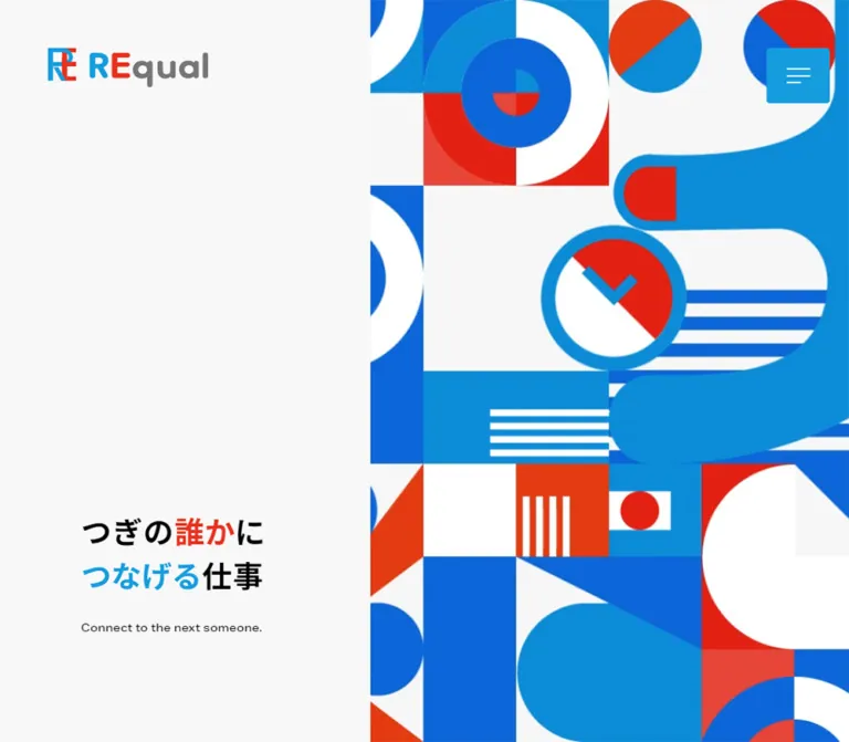
REqual combines a very quiet page canvas with a highly active graphic language. The desktop opening places the brand and a short Japanese statement in a broad pale left column. A dense arrangement of circles, arcs, stripes, triangles, and object-like silhouettes fills the right side. Blue and red repeat inside both the illustration and selected words in the headline. The result feels optimistic and graphic without making the corporate message visually complicated.
Below the opening, large blue English labels introduce Japanese statements and spacious body copy. A staggered collection of photographs shows appraisal work, clothing, bags, office interiors, and employees. The page ends in a substantial charcoal footer where contact methods are given the scale of a major content section. Mobile changes the composition: artwork comes first, copy follows, and footer content becomes a long single-column sequence.
閉じる
REqual — Style Reference
Bright modular geometry introduces a reuse business; generous space and workplace photography make it approachable.
Website: r-equal.com Original URL: https://r-equal.com/ Final URL: https://r-equal.com/ Theme: light main content with saturated blue and red accents, followed by a charcoal contact and information footer. Inspected: supplied browser collection dated October 2, 2026, 01:38:25 JST — October 1, 2026, 16:38:25.041 UTC. Viewports: desktop 1440 × 1000 CSS pixels; mobile 390 × 844 CSS pixels. Scope: the current corporate homepage, including its opening hero, Philosophy and Business content, photographic interlude, contact area, navigation links, linked brand banners, company details, and return-to-top control. Screenshots show the desktop hero, gallery, and footer, plus the mobile hero and lower footer. Other section measurements come from the supplied rendered DOM. Linked pages and the expanded menu were not inspected.
REqual combines a very quiet page canvas with a highly active graphic language. The desktop opening places the brand and a short Japanese statement in a broad pale left column. A dense arrangement of circles, arcs, stripes, triangles, and object-like silhouettes fills the right side. Blue and red repeat inside both the illustration and selected words in the headline. The result feels optimistic and graphic without making the corporate message visually complicated.
Below the opening, large blue English labels introduce Japanese statements and spacious body copy. A staggered collection of photographs shows appraisal work, clothing, bags, office interiors, and employees. The page ends in a substantial charcoal footer where contact methods are given the scale of a major content section. Mobile changes the composition: artwork comes first, copy follows, and footer content becomes a long single-column sequence.
How to Read This Reference
- Measured means a value appears in the supplied computed styles or element rectangles. Coordinates refer to document space unless explicitly described as screenshot positions.
- Visual estimate means a proportion, color, radius, or treatment is inferred from the supplied current-page screenshots. Estimated hex values were not extracted with a pixel sampler.
- Calculated means a value is derived from measured rectangles, such as a gap or percentage inset.
- Recommendation means guidance for a new implementation. The CSS, class names, responsive breakpoints, and optional accessibility treatments are adaptations rather than recovered source code.
- Font names below are observed computed family declarations. The evidence does not independently identify which font file rendered every glyph.
- The supplied text-element sample is not a complete inventory of image elements, pseudo-elements, stylesheets, or scripts. An omitted property is not proof that a feature is absent.
Tokens — Colors
Default Palette
All reusable token names in this table are reference aliases.
| Name | Value | Token | Role and evidence |
|---|---|---|---|
| Interface Blue | #159cde |
--color-blue |
Measured: English section labels and return-to-top fill. Visually consistent with the desktop menu button and blue pill treatments. |
| Heading Black | #000000 |
--color-ink |
Measured: Japanese hero, statements, and body copy. |
| Navigation Ink | #1a1a1a |
--color-nav |
Measured: desktop navigation links. |
| Footer Charcoal | #333333 |
--color-footer |
Measured: footer background. |
| White | #ffffff |
--color-white |
Measured: root/body background and footer text. Also visible in the navigation surface and illustration. |
| Pale Canvas | approximately #f7f7f7 |
--color-canvas |
Visual estimate: the apparent main-page and hero surface. The responsible wrapper or artwork layer was not included in the sampled styles. |
| Graphic Royal Blue | approximately #1063cc |
--color-graphic-blue |
Visual estimate: deeper blue blocks, rings, and camera-like shapes in the hero artwork. |
| Graphic Cyan Blue | approximately #0c8dcc |
--color-graphic-cyan |
Visual estimate: large blue shapes and contrasting portions of the modular artwork. |
| Graphic Red | approximately #ed2114 |
--color-red |
Visual estimate: red graphic modules and the highlighted word in the headline. |
| Graphic Orange Red | approximately #eb3815 |
--color-red-warm |
Visual estimate: warmer red portions of the illustration. |
The pale appearance of the page should not be confused with the computed white background of HTML and BODY. Transparent section backgrounds can reveal a different wrapper, image, or painted layer. Use the pale token as a screenshot-matching approximation, not as a recovered source declaration.
Blue has two roles: a consistent interface accent and a family of illustration colors. Red mainly belongs to the artwork, the logo, the active navigation underline, and selected headline text. It is not a general-purpose action color.
The supplied custom properties include --swiper-theme-color: #007aff and --swiper-navigation-size: 44px. These library-level values do not establish the visible brand palette or prove the presence of a particular carousel interaction.
Theme Presets
No theme selector or alternate color theme was demonstrated. The charcoal footer is part of the page hierarchy, not evidence of a user-selectable dark mode.
Tokens — Typography
Japanese Sans — Headlines and Body
Observed stack: source-han-sans-japanese, "Hiragino Kaku Gothic ProN", メイリオ, Meiryo, Arial, Verdana, "MS Pゴシック", sans-serif.
Japanese headings use weight 700, with compact, substantial strokes. The hero sets two deliberate lines and colors individual phrases: red for だれか and blue for つなげる. The surrounding text remains black. Body copy is regular weight with unusually generous line spacing, allowing short statements to carry the corporate story without dense paragraphs.
The desktop navigation uses weight 500. Footer information and navigation use 700, helping the smaller white text hold its shape against charcoal.
Extended Latin Sans — Labels and Contact
Observed stack: aktiv-grotesk-extended, sans-serif.
This family is declared for the hero's English translation, the Philosophy and Business labels, the CONTACT heading, the telephone number, and copyright. Its broad proportions are a defining feature: CONTACT occupies substantial horizontal space, while the small English hero line remains visibly extended rather than condensed.
Use licensed font resources when available. A generic sans-serif fallback is functional, but it will not preserve the exact line lengths or broad letterforms. Font loading and licensing configuration were not supplied.
Type Scale
| Role | Desktop | Mobile | Weight | Leading and tracking |
|---|---|---|---|---|
| Japanese hero | 50.4px |
28px |
700 |
Source leading normal; tracking 1.512px / 0.84px, equivalent to 0.03em. |
| English hero line | 18px |
10px |
500 |
Source leading normal; measured boxes 23px / 13px high. |
| English section label | 50px |
32px |
500 |
Source leading normal; boxes 64px / 40px high. |
| Japanese section statement | 40px |
26px |
700 |
Source leading normal; wrapping changes with available width. |
| Main explanatory copy | 18px |
16px |
400 |
37.8px / 32px line height; tracking 0.02em. |
| Desktop top navigation | 15px |
Not displayed | 500 |
Vertically centered within 69px link boxes. |
| Section link label | 16px |
16px |
400 |
Computed line height 68px in both samples; mobile link height is only 56px. |
| CONTACT | 88.2px |
48px |
700 |
Source leading normal; boxes 112px / 61px high. |
| Contact introduction | 16.2px |
16px |
700 |
Source leading normal. |
| Contact form label | 32px |
18px |
700 |
Source leading normal. |
| Telephone number | 45px |
28px |
700 |
Source leading normal. |
| Footer navigation | 16px |
16px |
700 |
Computed line height 16px; inline rectangles can be taller. |
| Company information | 16px |
16px |
700 |
32px line height. |
| Copyright | 16px |
11px |
500 |
Source leading normal; boxes 20px / 14px high. |
Do not treat element height as an explicit CSS line-height declaration. For example, the desktop hero's two-line heading occupies a 146px box, but its computed line height is reported as normal. The Quick Start uses an explicit approximation for predictable implementation.
Tokens — Spacing & Shapes
Density: broad section spacing, sparse copy, concentrated graphic and photographic areas.
Spacing system: no authored spacing scale was supplied. The measurements show several alignment systems rather than one universal container.
Spacing Scale
| Use | Desktop | Mobile | Evidence |
|---|---|---|---|
| Hero and Philosophy left inset | 135.36px |
19.5px |
Measured; calculated as approximately 9.4vw and 5vw. |
| Business left inset | 120px |
19.5px |
Measured. |
| Footer side inset | 72px |
19.5px |
Measured; both equal 5vw. |
| Header logo left inset | 60px |
24px |
Measured anchor position. |
| Desktop navigation text gaps | About 64px |
Not applicable | Calculated between consecutive link rectangles. |
| Hero heading to English line | 40.5px |
15px |
Calculated between element boxes. |
| Philosophy top padding | 256px |
0px |
Measured section padding. |
| Section label to statement | 62px |
41.5px |
Calculated in Philosophy and Business. |
| Philosophy statement to body | 38px |
32px |
Calculated. |
| Footer top padding | 160px |
115px |
Measured. |
| Footer bottom padding | 148px |
90px |
Measured. |
| Footer navigation row rhythm | 46px |
46px |
Calculated from repeated link positions. |
| Linked brand banner gap | 42px horizontally |
20px vertically |
Calculated. |
Border Radius
| Element | Radius or shape | Evidence |
|---|---|---|
| Modular hero art | Squares, circles, arcs, triangles, stripes | Visual; geometry belongs to the artwork. |
| Section links | 34px |
Measured on both desktop and mobile anchors. |
| Gallery photographs | Approximately 16px |
Visual estimate. |
| Linked brand banners | 8px |
Measured. |
| Desktop menu button | Nearly square with subtly softened corners | Visual estimate; exact radius unavailable. |
| Contact icon disks | Circular | Visual; desktop diameter approximately 68px. |
| Return-to-top tab | 51px 0 0 desktop; 40px 0 0 mobile |
Measured; only the upper-left corner is rounded. |
The shape language is selective. Photos are gently rounded, section links are pills, and the bottom corner control has a large asymmetric curve. The site does not place every content block inside a rounded card.
Layout Measurements
| Element | Desktop 1440 × 1000 | Mobile 390 × 844 |
|---|---|---|
| Document height | 4818px |
Approximately 4739px |
| Main content height | 3876px |
Approximately 2954.30px, including 104px top padding |
| Hero section | 1440 × 1000px, starting at document top |
390 × 670px, starting at y=104px |
| Hero artwork | Begins near x=627px; fills the right edge |
Approximately 390 × 390px, from y=104px to 494px |
| Hero heading box | 491.03 × 146px at 135.36, 655.5 |
351 × 80px at 19.5, 530 |
| Philosophy section | Starts at y=1000px; height 976.20px |
Starts at y=774px; height 512.5px |
| Philosophy text column | 563.03px wide |
351px wide |
| Section link | 268 × 68px |
230 × 56px |
| Business section | Starts at y=3002px; height 874px |
Starts at y=2195.30px; height 759px |
| Footer | Starts at y=3876px; height 942px |
Starts at y=2954.30px; height 1784.73px |
| Contact link row | 600 × 128px |
351 × 106px |
| Linked brand banner | 258 × 129px |
351 × 175.5px |
| Return-to-top tab | 124 × 88px |
80 × 60px |
Artwork bounds are visual estimates; the other principal boxes in this table come from the DOM. The almost equal total page heights conceal a major redistribution: mobile shortens the main presentation while substantially lengthening the footer.
Components
Brand Header and Desktop Navigation
Role: identify the company and expose the main corporate destinations.
The desktop logo sits independently near the upper-left corner. Its anchor measures 200px wide at x=60px; the screenshot shows a colored monogram and gray wordmark. The anchor's reported 24px height is an inline text-box measurement, not a reliable measurement of the complete visible logo.
A white navigation strip floats over the upper-right portion of the hero. It begins around x=402px, sits at y=60px, and is approximately 69px high. Six Japanese links run across it with wide gaps: トップ, 理念・メッセージ, 事業案内, 会社概要, 採用情報, and お問い合わせ. A short red rule marks the active home link. A faint shadow separates this strip from the artwork.
The blue menu button terminates the strip at the right. Its screenshot footprint is approximately 79 × 69px, with 60px clearance from the viewport's right edge. The desktop logo and horizontal navigation are absent in the supplied scrolled captures, while the menu button remains in the same upper-right area. The exact scroll threshold and hide/show mechanism are unverified.
Mobile Header and Persistent Menu Control
Role: keep the brand visible on arrival and retain compact navigation access.
The mobile layout reserves 104px before the hero. The logo anchor is 115px wide and begins at x=24px. The menu uses thin blue horizontal strokes on the pale background, without the desktop blue rectangular fill. It is also visible over the charcoal lower-footer capture.
This supports persistent placement of the menu control, but the provided style sample does not include its positioning rule. A fixed icon button is a reasonable implementation recommendation. Give its interactive area more space than the visible strokes.
The DOM includes bilingual destination text such as Top, Philosophy & Message, and Business, along with policy links. Their presence suggests additional navigation content. It does not establish the expanded menu's layout, animation, focus behavior, or overlay surface.
Split Hero
Role: introduce the company through a short relationship-focused statement and distinctive graphic artwork.
On desktop, the pale left region occupies approximately 43.5% of the viewport width. The artwork starts around x=627px and fills the remaining right side to the screen edges. The heading sits low in the left region rather than being vertically centered.
The actual message is つぎのだれかに followed by つなげるしごと. Keep the two-line structure and selective red/blue emphasis. Beneath it, the English line reads Connect to the next someone. There is no visible hero action button in the supplied capture.
On mobile, the artwork becomes a full-width square-like opening block. It is followed by a 36px calculated gap before the heading box. The headline becomes 28px; the English line becomes 10px. A further 136px separates the bottom of the English line from the beginning of Philosophy.
The mobile graphic arrangement differs from desktop. Preserve an intentional mobile crop or composition; do not assume the complete desktop panel simply scales down intact. The evidence does not establish whether this difference comes from responsive assets, cropping, animation state, or a combination.
Philosophy Content Block
Role: explain the company's purpose before presenting service details.
A blue extended-sans Philosophy label leads into a bold Japanese statement, two short body passages, and the 企業理念について link. The measured desktop text column is approximately 563px wide and aligns with the hero copy.
The English label is large but relatively light at weight 500. The Japanese statement is weight 700; body text switches to 400 with 2.1 line height on desktop and 2 on mobile. This combination creates a clear hierarchy without separators or surrounding cards.
The source uses paragraph elements for the English label and Japanese statement. In a new implementation, retain the appearance while assigning an appropriate semantic section heading.
Only the top of Philosophy appears in the mobile screenshot. Its full copy, dimensions, typography, and link are documented by the supplied DOM; any unsupplied illustration or decoration alongside it remains unverified.
Rounded Section Link
Role: lead to the Philosophy or Business detail page.
Both links use the same measured desktop box, 268 × 68px, with a 34px radius and white 16px text. Mobile reduces the box to 230 × 56px. The gallery screenshot partially reveals a blue pill and a white circular leading element at the top edge.
The anchor itself has a transparent computed background. Its visible blue fill may belong to a nested element or pseudo-element; the supplied sample does not resolve that construction. Treat a solid blue pill with a circular leading device as an implementation approximation, not recovered DOM anatomy.
Do not reproduce the mobile anchor's 68px text line height inside a 56px box blindly. Flex alignment is a clearer way to preserve the observed centering in a new component.
Staggered Photo Gallery
Role: give the abstract reuse message a concrete human and material context.
The desktop capture shows two loose rows of rounded photographs extending beyond both horizontal edges. The cards have varied widths and slightly staggered vertical positions. There are no visible captions or general card backgrounds.
Examples within the captured viewport include:
- A narrow watch-appraisal image, approximately
216 × 347px. - A wide office seating image, approximately
480 × 347px. - An employee image, approximately
347 × 348px, set lower than the office image. - Lower-row images of hanging jackets, a jewelry appraisal, and employees outdoors.
- Partially clipped bag photographs at the left and right edges.
These are screenshot estimates, not source image dimensions. Nearby horizontal gaps are roughly 34–40px, with vertical staggering around 40–50px in some places.
The measured interval between the end of Philosophy and the start of Business is approximately 1025.8px on desktop. The photographs visually occupy the intervening portion of the page, but their exact container rectangle is not included in the DOM sample.
The composition can be reproduced as a static, overflow-clipped collage. A moving marquee or draggable slider would require additional behavioral evidence. Mobile gallery composition was not supplied.
Business Content Block
Role: introduce the core purchase service and lead to its detail page.
The block repeats the blue English label and bold Japanese statement pattern. Its copy describes visiting customers' homes to buy items they no longer use. On desktop the content begins at x=120px, using a different alignment from the Philosophy column.
The explanatory paragraph begins at x=120px, while the 事業内容について link begins near x=753.6px at the same vertical position. This establishes a horizontal text/action relationship on desktop. On mobile, the link moves beneath the paragraph and shares its 19.5px left inset.
A narrow blue-tinted photographic strip is visible immediately before the footer in the desktop bottom capture. The full Business image treatment and its overlay construction are not documented; do not infer an entire section background from that strip alone.
Contact Area
Role: make two direct contact routes highly visible at the end of the homepage.
The footer opens with a large white CONTACT heading and a short Japanese invitation on the left. On desktop, two broad links occupy the right column. The first is お問い合わせフォーム; the second displays 0120-290-526.
Each desktop row measures 600 × 128px, with 30px vertical padding. A white circular icon disk sits at the left; the form row has a mail symbol and a right-pointing arrow, while the telephone row has a handset symbol. A subtle horizontal divider separates the two rows. The form label begins 98px after the row's left edge, consistent with an approximately 68px disk and 30px gap.
On mobile, the introduction comes first, followed by the two links. Rows are 351 × 106px, with 25px vertical padding. The label offset becomes 74px, consistent with a 56px icon region and 18px gap; this is calculated anatomy rather than a directly measured icon rectangle.
The form link targets /contact/. The telephone link uses tel:0120-290-526. Destination behavior was not exercised.
Footer Navigation and Linked Brand Banners
Role: provide secondary navigation and expose two linked services.
Desktop footer links are arranged in grouped horizontal rows on the right, below the contact methods. The text is white, bold, and 16px. Repeated row positions are 46px apart. Corporate links are followed by privacy, terms, and cooling-off information.
Two banner links sit beneath the navigation: げんえきや and てきせい屋. Each desktop banner measures 258 × 129px, preserving a 2:1 ratio, with an 8px radius. The first has a pale cool surface; the second is white. Their logos remain visually centered within generous internal space.
Mobile stacks the navigation links, then stacks the two banners at 351 × 175.5px, separated by 20px. The last legal link wraps within a narrower measured text box even though the banners occupy the full content width.
These are linked brand graphics, not ordinary text buttons. Preserve the complete artwork rather than trying to typeset the marks with a substitute font.
Company Identity and Trust Mark
Role: close the page with corporate identity and address information.
The original footer identifies the company as 株式会社アールイコール and gives an Osaka address. A smaller version of the colored logo sits above the information. A separate square privacy-related mark appears beside the address block.
On desktop this identity area sits in the footer's left column, alongside the navigation and brand links. On mobile it follows the two large brand banners. The address text remains 16px with 32px line height and wraps onto more lines; the square mark sits to its right.
The presence of the mark is visible evidence of a displayed badge. Its current certification status was not independently verified.
Return-to-Top Tab
Role: provide a final route back to the page opening.
A blue tab sits at the bottom-right corner of the footer. Its upper-left corner is rounded deeply, while its other corners meet the page edges. It contains an upward arrow and the label TOPに戻る.
The measured size changes from 124 × 88px on desktop to 80 × 60px on mobile. Its link targets https://r-equal.com/#wrapper. The supplied rectangles place it at the document's lower edge; they do not establish a viewport-fixed control or smooth-scroll behavior.
Tokens — Motion & Interaction
| Treatment | Evidence | What can be concluded |
|---|---|---|
| Section links | Computed transition value 0.4s |
A transition is declared; changed properties and hover appearance were not demonstrated. |
| Contact links | Computed transition value 0.4s |
Transition timing is available, but activation and hover states were not captured. |
| Footer navigation and brand links | Computed transition value 0.4s |
Consistent link timing is suggested. No particular fade or transform is established. |
| Return-to-top control | 0.4s transition and a #wrapper destination |
Anchor intent is verified; scrolling duration and easing are not. |
| Menu persistence | Control appears in top, middle, and bottom captures | Persistent availability is visible. Opening, closing, and scroll thresholds are unverified. |
| Hero graphic | Different arrangements appear across desktop and mobile | Responsive composition or different states are visible; animation cannot be inferred from stills alone. |
| Photo gallery | Staggered, edge-clipped images | Horizontal overflow is visible; autoplay, dragging, looping, and direction are unverified. |
| Sampled text elements | animation: none |
Applies only to the supplied elements; does not rule out animated artwork or pseudo-elements. |
The collection waited for initial loading, image decoding, and sampled layout stability, with bounded waits. Perpetual animations were paused during readiness checks and resumed afterward. This procedure supports settled visual inspection, but it does not document motion paths, frame sequences, or complete interaction behavior.
Recommended adaptation: use restrained 400ms transitions for link feedback if appropriate, and provide reduced-motion handling. Keep the artwork and gallery fully understandable in a static state. Any additional reveal, marquee, or menu animation should be explicitly designed rather than presented as an observed source feature.
Surfaces
| Layer | Appearance | Purpose |
|---|---|---|
| Main canvas | Very pale neutral field | Carries open typography and whitespace. |
| Hero artwork | Flat, saturated blue/red/white modules | Supplies the opening's visual energy and recognition. |
| Desktop navigation | White strip with a faint shadow | Keeps navigation legible over the illustration. |
| Section content | Unboxed text on the canvas | Gives corporate statements room to breathe. |
| Photography | Rounded image crops without captions in the captured gallery | Adds human and material context. |
| Footer | Solid #333333 with white type |
Separates the final contact and information zone. |
| Brand banners | Pale or white rectangular graphics with 8px corners |
Holds secondary brand identities. |
| Utility accents | Blue menu fill on desktop, pills, and corner tab | Connects navigation and actions to the brand color. |
The navigation shadow is a local treatment. There is no evidence of a general raised-card system, glass blur, or gradient-based interface styling.
Imagery
The hero is a tightly packed geometric composition. Circles and partial circles become rings, clock-like faces, camera-like objects, jewelry-like forms, and clothing-like silhouettes. Parallel stripes and triangular cuts create variation within a square-module rhythm. Most edges remain crisp, with no visible photographic texture or simulated depth.
Photography supplies a different register: bright interiors, employees at work, hands handling watches or jewelry, bags, and clothing. Crops focus on objects and ordinary work activity. Their softer natural tones contrast with the artwork's primary-color intensity. A specific photographic filter or production method is not established.
Keep these two image systems distinct but related: geometric artwork introduces the brand, while photographs explain the people and objects involved in reuse.
Observed Asset References
The supplied evidence does not expose image asset URLs or filenames. The following is a role inventory, not a downloadable asset manifest.
| Asset role | Observed content | Reuse guidance |
|---|---|---|
| Main logo | Colored monogram and REqual wordmark | Use an authorized supplied logo; preserve its proportions and gray lettering. |
| Hero graphic | Blue/red/white modular geometric artwork | Prepare deliberate desktop and mobile compositions or crops. |
| Gallery images | Appraisal, office, staff, bags, watches, jewelry, and clothing | Use varied crop ratios and consistent rounded corners. |
| Business-adjacent image | Small blue-tinted photographic band visible above the footer | Full extent and source treatment are unknown. |
| Footer banners | Two linked service marks | Preserve each complete 2:1 banner artwork. |
| Privacy-related mark | Square badge beside company details | Use the legitimate supplied asset only when applicable. |
| Utility symbols | Menu strokes, mail, handset, directional arrows | Simple vector or CSS icons can reproduce the general anatomy; the original icon library is unknown. |
For implementation, use vector artwork where authorized and available, or sufficiently large raster exports. Do not use pixelated image rendering: the current visual language depends on clean graphic edges and conventional photographic rendering.
Layout & Responsive Behavior
Desktop
The first section matches the inspected viewport height of 1000px. A pale copy region and a dense right-side illustration form an asymmetric split. The hero and Philosophy copy share a left inset near 9.4vw, while Business uses a centered 1200px-wide measured area and the footer uses 5vw side gutters.
The page rhythm alternates between sparse statements and dense imagery. Philosophy has 256px of top padding. The photographic interlude stretches across the page and clips images at the viewport edges. Business pairs explanatory copy with a detail link horizontally. Contact and footer information return to a structured two-column arrangement.
Mobile
At 390px wide, the main content begins below a 104px header allowance. The hero artwork occupies an approximately square full-width area, followed by left-aligned copy within a 351px content width.
Philosophy begins at document y=774px, so its blue label is already visible near the bottom of the initial 844px screenshot. The desktop's large Philosophy top padding disappears. Body copy becomes 16px with 32px leading, while section statements become 26px.
Business places its action under its paragraph. The footer follows this measured order:
- CONTACT heading and introduction.
- Contact form and telephone links.
- Corporate and legal navigation.
- Two stacked brand banners.
- Company logo, name, address, and adjacent mark.
- Copyright and the bottom-right return-to-top tab.
The mobile footer is approximately 1785px tall. Preserve this hierarchy rather than compressing all its content into a crowded final screen.
Responsive Limits
Only the two supplied viewport sizes were inspected. Exact breakpoints, intermediate tablet layouts, gallery behavior on mobile, landscape behavior, and safe-area handling are unknown. The Quick Start uses 1100px and 767px breakpoints as recommendations. They are not source measurements.
Do’s and Don’ts
Do
- Preserve the asymmetric desktop hero and artwork-first mobile order.
- Keep the Japanese headline in two deliberate lines with selective red and blue emphasis.
- Pair bold Japanese statements with broad Latin section labels.
- Retain generous body leading and substantial space between content groups.
- Use
#159cdefor the documented interface accent and#333333for the footer. - Treat deeper blues and reds as part of a coordinated illustration palette.
- Give the gallery varied widths, staggered positions, and gently rounded corners.
- Keep contact methods prominent, with clear icon/text anatomy and a visible telephone number.
- Preserve the footer banners'
2:1ratio and their mobile stacking order. - Distinguish measured styles from screenshot estimates when extending the system.
Don’t
- Do not turn the corporate homepage into a generic product landing page with an invented hero CTA.
- Do not center every desktop section or force all content into one identical container.
- Do not shrink the complete desktop hero into a narrow mobile split view.
- Do not replace the modular artwork with gradients, glossy objects, or unrelated abstract blobs.
- Do not turn the photographic interlude into uniform captioned cards without a content reason.
- Do not introduce red buttons simply because the illustration contains red.
- Do not flatten the large contact area into a small conventional footer link list.
- Do not infer autoplay, hover transforms, or menu transitions from static captures.
- Do not treat the two exposed library variables as a complete design-token system.
- Do not invent asset paths, font-loading details, or production credits from appearance alone.
Recommended Implementation Additions
These are recommendations for a new implementation, not verified features of the original:
- Give the menu button an accessible name, an expanded state, and a comfortably sized touch target. If it opens a modal menu, implement focus management and Escape-to-close behavior.
- Use meaningful section headings in the document outline while retaining the observed English-label/Japanese-statement hierarchy.
- Provide visible focus styles on navigation, contact methods, banner links, and return-to-top controls.
- Check small white text on bright blue.
#159cdeagainst white is approximately3.1:1, below the usual4.5:1target for normal-sized text. A darker action blue such as#0876acis an optional accessibility adaptation. - Consider increasing the mobile English subtitle above the observed
10pxwhen readability takes priority over exact matching. - Treat purely decorative hero geometry as decorative. Give meaningful photographs and linked logo banners suitable text alternatives.
- Provide intrinsic image dimensions or aspect ratios to reduce layout shifts. Load the opening artwork promptly and defer lower-page photographs where appropriate.
- Support reduced motion for any newly implemented artwork, menu, or gallery animation.
- Preserve normal vertical page scrolling while containing horizontal gallery overflow.
Agent Prompt Guide
Quick Color Reference
- Interface blue:
#159cde, measured. - Footer charcoal:
#333333, measured. - Main text:
#000000; top navigation:#1a1a1a, measured. - White text and surfaces:
#ffffff, measured where documented. - Main pale canvas: approximately
#f7f7f7, visual estimate. - Illustration royal blue: approximately
#1063cc, visual estimate. - Illustration cyan blue: approximately
#0c8dcc, visual estimate. - Illustration reds: approximately
#ed2114and#eb3815, visual estimates. - Optional darker blue for small white action labels:
#0876ac, recommendation.
Overall Prompt
“Create a Japanese reuse-company homepage inspired by REqual's current composition. Use a very pale canvas, black Japanese sans-serif headings, broad Latin labels, interface blue #159cde, and a charcoal #333333 footer. On desktop, place the logo at the upper left, a floating white navigation strip at the upper right, and a low-positioned two-line Japanese statement in the left 43.5% of the opening. Fill the right side with crisp modular blue, red, and white geometric artwork. Follow with spacious Philosophy and Business sections, a staggered full-bleed photo collage, and a large two-column contact footer. On mobile, show the geometric artwork as a full-width square above the headline and stack the footer in a clear reading sequence. Treat unverified animation as optional.”
Example Component Prompts
- Hero: “Design a 1440px desktop hero with a pale left region ending near x=627px. Position a bold two-line Japanese message near x=135px in the lower third. Color one phrase red and another blue; add a small extended-sans English translation below. Fill the right region with flat circles, arcs, stripes, triangles, and object-like modular forms. On a 390px phone, move the artwork above the copy.”
- Section introduction: “Use a large blue extended-sans English label, a heavy black Japanese statement, and regular Japanese body copy with roughly double line spacing. Keep the content unboxed and left aligned. Finish with a blue rounded detail link featuring a white circular leading device.”
- Photo band: “Create a static, edge-clipped photographic collage with staggered rows, varied image widths, and approximately 16px corner radii. Include appraisal work, a bright office, clothing, and employees. Avoid captions, card shadows, or an assumed autoplay behavior.”
- Contact footer: “Build a charcoal footer with a large white CONTACT heading at left and two broad contact rows at right. Use white circular mail and phone icon disks, a large telephone number, and a subtle dividing rule. Below, place company information at left and grouped navigation plus two 2:1 brand banners at right. Stack these groups on mobile.”
- Corner utility: “Create a blue return-to-top tab anchored to the footer's lower-right corner, with only its upper-left corner deeply rounded. Use a white upward arrow and a short label. Size it at 124 by 88px on desktop and 80 by 60px on mobile.”
Quick Start
CSS Custom Properties
This is a recommended implementation scaffold. It uses measured colors and type sizes where available, estimated artwork colors, and explicit approximations for normal line heights. The breakpoints, hover treatment, and class structure are new implementation choices. It does not include original assets, font delivery, menu JavaScript, gallery motion, or undisclosed section decoration.
Expected structure: .hero contains .hero-art and .hero-copy; .hero-copy contains a two-line h1 and .hero-subtitle. Footer areas use .footer-intro, .footer-actions, .footer-company, .footer-navigation, and .footer-copyright. Supply authorized image assets to the corresponding image elements.
:root {
  /* Measured interface colors */
  --color-blue: #159cde;
  --color-ink: #000;
  --color-nav: #1a1a1a;
  --color-white: #fff;
  --color-footer: #333;

  /* Screenshot approximations */
  --color-canvas: #f7f7f7;
  --color-graphic-blue: #1063cc;
  --color-graphic-cyan: #0c8dcc;
  --color-red: #ed2114;
  --color-red-warm: #eb3815;

  /* Optional accessible action variant */
  --color-action-strong: #0876ac;

  /* Observed family declarations; font delivery is separate */
  --font-jp: source-han-sans-japanese,
    'Hiragino Kaku Gothic ProN', Meiryo, Arial, Verdana, sans-serif;
  --font-en: aktiv-grotesk-extended, sans-serif;

  --text-hero: clamp(28px, 3.5vw, 60px);
  --text-kicker: 50px;
  --text-statement: 40px;
  --text-body: 18px;
  --text-contact: 88.2px;
  --leading-body: 2.1;

  --gutter: 5vw;
  --hero-inset: 9.4vw;
  --radius-photo: 16px;
  --radius-banner: 8px;
  --radius-pill: 34px;
  --link-duration: 400ms;
}

* { box-sizing: border-box; }

body {
  margin: 0;
  color: var(--color-ink);
  background: var(--color-canvas);
  font-family: var(--font-jp);
}

img { display: block; max-width: 100%; }
button, input { font: inherit; }
a { color: inherit; }

/* Positioning approximates the supplied opening capture. */
.site-header {
  position: absolute;
  inset: 0 0 auto;
  z-index: 20;
}

.site-logo {
  position: absolute;
  top: 60px;
  left: 60px;
  width: 200px;
}

.desktop-nav {
  position: absolute;
  top: 60px;
  right: 139px;
  display: flex;
  align-items: center;
  gap: 64px;
  height: 69px;
  padding-inline: 72px;
  background: var(--color-white);
  box-shadow: 0 2px 18px rgb(0 0 0 / 6%);
}

.desktop-nav a {
  position: relative;
  display: flex;
  align-items: center;
  height: 100%;
  white-space: nowrap;
  color: var(--color-nav);
  font-size: 15px;
  font-weight: 500;
  text-decoration: none;
}

.desktop-nav a[aria-current='page']::after {
  position: absolute;
  right: 0;
  bottom: 0;
  left: 0;
  height: 4px;
  background: var(--color-red);
  content: '';
}

/* Fixed placement is an adaptation of the persistent control. */
.menu-toggle {
  position: fixed;
  z-index: 30;
  top: 60px;
  right: 60px;
  display: grid;
  place-content: center;
  gap: 7px;
  width: 79px;
  height: 69px;
  border: 0;
  border-radius: 3px;
  color: var(--color-white);
  background: var(--color-blue);
  cursor: pointer;
}

.menu-toggle span {
  display: block;
  width: 30px;
  height: 2px;
  background: currentColor;
}

.menu-toggle span:last-child { width: 18px; }

.hero {
  position: relative;
  min-height: 720px;
  height: 100vh;
  height: 100svh;
  overflow: hidden;
}

.hero-art {
  position: absolute;
  inset: 0 0 0 43.5%;
  margin: 0;
}

.hero-art img {
  width: 100%;
  height: 100%;
  object-fit: cover;
}

.hero-copy {
  position: absolute;
  left: var(--hero-inset);
  bottom: 13.5vh;
  width: 34.1%;
}

.hero h1 {
  margin: 0;
  font-size: var(--text-hero);
  font-weight: 700;
  line-height: 1.45;
  letter-spacing: .03em;
}

.ink-red { color: var(--color-red); }
.ink-blue { color: var(--color-blue); }

.hero-subtitle {
  margin: 40px 0 0;
  font-family: var(--font-en);
  font-size: 18px;
  font-weight: 500;
  line-height: 23px;
}

.philosophy { padding: 256px 0 50px; }
.philosophy-inner { margin-inline: var(--hero-inset); }
.text-column { max-width: 563px; }

.section-kicker {
  margin: 0;
  color: var(--color-blue);
  font-family: var(--font-en);
  font-size: var(--text-kicker);
  font-weight: 500;
  line-height: 1.28;
}

.section-statement {
  margin: 62px 0 38px;
  font-size: var(--text-statement);
  font-weight: 700;
  line-height: 1.45;
}

.body-copy {
  margin: 0;
  font-size: var(--text-body);
  font-weight: 400;
  line-height: var(--leading-body);
  letter-spacing: .02em;
}

.body-copy + .body-copy { margin-top: 20px; }

.pill-link {
  display: inline-flex;
  align-items: center;
  gap: 16px;
  width: 268px;
  min-height: 68px;
  margin-top: 54px;
  padding: 4px;
  border-radius: var(--radius-pill);
  color: var(--color-white);
  background: var(--color-blue);
  font-size: 16px;
  line-height: 1.4;
  text-decoration: none;
  transition: background-color var(--link-duration) ease;
}

.pill-icon {
  display: grid;
  flex: 0 0 60px;
  place-items: center;
  height: 60px;
  border-radius: 50%;
  color: var(--color-blue);
  background: var(--color-white);
}

.pill-link[data-contrast='strong'] {
  background: var(--color-action-strong);
}

/* Static gallery scaffold; dimensions and motion are adaptable. */
.photo-band { overflow: hidden; padding-block: 160px; }
.photo-row {
  display: flex;
  align-items: flex-start;
  gap: 34px;
  width: max-content;
}
.photo-row + .photo-row { margin-top: 32px; }
.photo-tile {
  flex: none;
  width: 330px;
  height: 347px;
  margin: 0;
  overflow: hidden;
  border-radius: var(--radius-photo);
}
.photo-tile img { width: 100%; height: 100%; object-fit: cover; }
.photo-tile--narrow { width: 216px; }
.photo-tile--wide { width: 480px; }
.photo-tile--offset { transform: translateY(40px); }

.business { padding: 250px 0 276px; }
.business-inner { width: min(1200px, 90%); margin-inline: auto; }
.business .section-statement { max-width: 600px; }
.business-row {
  display: grid;
  grid-template-columns: minmax(0, 542px) auto;
  align-items: start;
  gap: clamp(40px, 6.36vw, 92px);
}
.business-row .pill-link { margin-top: 0; }

.site-footer {
  position: relative;
  padding: 160px var(--gutter) 148px;
  color: var(--color-white);
  background: var(--color-footer);
}

.footer-grid {
  display: grid;
  grid-template-columns: minmax(0, 1fr) minmax(0, 600px);
  grid-template-areas:
    'intro actions'
    'company navigation'
    'copyright copyright';
  column-gap: 96px;
}

.footer-intro { grid-area: intro; }
.footer-actions { grid-area: actions; }
.footer-company { grid-area: company; margin-top: 66px; }
.footer-navigation { grid-area: navigation; margin-top: 66px; }
.footer-copyright { grid-area: copyright; }

.contact-title {
  margin: 0;
  font-family: var(--font-en);
  font-size: var(--text-contact);
  font-weight: 700;
  line-height: 1.27;
}

.contact-intro { margin: 18px 0 0; font-weight: 700; }

.contact-row {
  display: flex;
  align-items: center;
  gap: 30px;
  min-height: 128px;
  padding: 30px 40px 30px 0;
  text-decoration: none;
}

.contact-row + .contact-row { border-top: 1px solid rgb(255 255 255 / 12%); }
.contact-icon {
  display: grid;
  flex: 0 0 68px;
  place-items: center;
  height: 68px;
  border-radius: 50%;
  color: var(--color-footer);
  background: var(--color-white);
}
.contact-icon svg { width: 32px; height: 32px; }
.contact-label { font-size: 32px; font-weight: 700; }
.contact-number {
  font-family: var(--font-en);
  font-size: 45px;
  font-weight: 700;
  white-space: nowrap;
}
.contact-arrow { margin-left: auto; }

.footer-links { display: grid; gap: 22px; }
.footer-link-row { display: flex; flex-wrap: wrap; gap: 22px 40px; }
.footer-links a { font-size: 16px; font-weight: 700; text-decoration: none; }

.brand-links {
  display: grid;
  grid-template-columns: repeat(2, minmax(0, 258px));
  gap: 42px;
  margin-top: 46px;
}
.brand-banner {
  display: block;
  aspect-ratio: 2 / 1;
  overflow: hidden;
  border-radius: var(--radius-banner);
  background: var(--color-white);
}
.brand-banner img { width: 100%; height: 100%; object-fit: contain; }

.company-logo { width: 130px; }
.company-details { font-size: 16px; font-weight: 700; line-height: 2; }
.footer-copyright {
  margin: 0;
  font-family: var(--font-en);
  font-size: 16px;
  font-weight: 500;
}

.back-top {
  position: absolute;
  right: 0;
  bottom: 0;
  display: flex;
  flex-direction: column;
  align-items: center;
  justify-content: center;
  gap: 4px;
  width: 124px;
  height: 88px;
  border-radius: 51px 0 0;
  color: var(--color-white);
  background: var(--color-blue);
  font-size: 12px;
  font-weight: 700;
  text-decoration: none;
}

/* Recommended focus and hover feedback, not observed states. */
:where(a, button):focus-visible {
  outline: 3px solid currentColor;
  outline-offset: 5px;
}
@media (hover: hover) {
  .pill-link:hover { background: var(--color-action-strong); }
  .footer-links a:hover { text-decoration: underline; }
}

/* Recommended intermediate breakpoint. */
@media (max-width: 1100px) {
  .desktop-nav { display: none; }
  .footer-grid { column-gap: 40px; }
  .contact-title { font-size: 64px; }
  .contact-label { font-size: 24px; }
  .contact-number { font-size: 32px; }
  .business-row { grid-template-columns: 1fr; }
}

/* Recommended mobile breakpoint; values target the 390px capture. */
@media (max-width: 767px) {
  :root {
    --text-hero: 28px;
    --text-kicker: 32px;
    --text-statement: 26px;
    --text-body: 16px;
    --text-contact: 48px;
    --leading-body: 2;
  }

  .site-main { padding-top: 104px; }
  .site-logo { top: 38px; left: 24px; width: 115px; }
  .menu-toggle {
    top: 27px;
    right: 14px;
    width: 44px;
    height: 44px;
    color: var(--color-blue);
    background: transparent;
  }

  .hero { height: auto; min-height: 0; }
  .hero-art { position: relative; inset: auto; width: 100%; aspect-ratio: 1; }
  .hero-copy {
    position: static;
    width: auto;
    padding: 36px var(--gutter) 136px;
  }
  .hero h1 { line-height: 40px; }
  .hero-subtitle { margin-top: 15px; font-size: 10px; line-height: 13px; }

  .philosophy { padding: 0; }
  .philosophy-inner { margin-inline: var(--gutter); }
  .section-kicker { line-height: 40px; }
  .section-statement { margin: 41.5px 0 32px; }
  .body-copy + .body-copy { margin-top: 14px; }
  .pill-link { width: 230px; min-height: 56px; margin-top: 56px; }
  .pill-icon { flex-basis: 48px; height: 48px; }

  /* Mobile gallery presentation is a recommendation. */
  .photo-band { padding-block: 100px; }
  .photo-row { gap: 20px; }
  .photo-tile { width: 64vw; height: 72vw; }
  .photo-tile--wide { width: 88vw; }
  .photo-tile--narrow { width: 46vw; }

  .business { padding: 160px 0 222px; }
  .business-row { gap: 52px; }

  .site-footer { padding: 115px var(--gutter) 90px; }
  .footer-grid {
    grid-template-columns: minmax(0, 1fr);
    grid-template-areas: 'intro' 'actions' 'navigation' 'company' 'copyright';
    gap: 0;
  }
  .contact-title { font-size: var(--text-contact); }
  .contact-intro { font-size: 16px; }
  .footer-actions { margin-top: 15px; }
  .contact-row { gap: 18px; min-height: 106px; padding: 25px 0; }
  .contact-icon { flex-basis: 56px; height: 56px; }
  .contact-label { font-size: 18px; }
  .contact-number { font-size: 28px; }

  .footer-navigation { margin-top: 31px; }
  .footer-link-row { flex-direction: column; align-items: flex-start; }
  .brand-links { grid-template-columns: 1fr; gap: 20px; }
  .footer-company { margin-top: 85px; }
  .footer-copyright { margin-top: 72px; font-size: 11px; }
  .back-top { width: 80px; height: 60px; border-top-left-radius: 40px; }
}

@media (prefers-reduced-motion: reduce) {
  .pill-link { transition: none; }
  html { scroll-behavior: auto; }
}
This scaffold reproduces the principal hierarchy and proportions. Exact document height will depend on the supplied fonts, text wrapping, image crops, and gallery composition. Build the square company badge and its address relationship within .footer-company using the actual authorized asset dimensions.
Tailwind v4 Token Mapping
Optional mapping for a project already using Tailwind v4. This is not evidence that the original site uses Tailwind. Define the properties above first; retain the component CSS for the asymmetric layout.
@theme inline {
  --color-brand: var(--color-blue);
  --color-canvas: var(--color-canvas);
  --color-ink: var(--color-ink);
  --color-charcoal: var(--color-footer);
  --color-graphic-royal: var(--color-graphic-blue);
  --color-graphic-red: var(--color-red);
  --color-action-strong: #0876ac;

  --font-japanese: var(--font-jp);
  --font-extended: var(--font-en);

  --text-hero: var(--text-hero);
  --text-section-label: var(--text-kicker);
  --text-section-statement: var(--text-statement);
  --text-body-copy: var(--text-body);
  --text-contact-heading: var(--text-contact);

  --radius-gallery: var(--radius-photo);
  --radius-brand-banner: var(--radius-banner);
  --radius-action-pill: var(--radius-pill);

  --spacing-page-gutter: var(--gutter);
  --spacing-hero-inset: var(--hero-inset);
}
When integrating this optional mapping, avoid redefining a custom property in terms of itself. If the build tool emits the same token names into the same scope, rename the base properties with a project prefix and point the Tailwind aliases to those prefixed properties.
Sources & Evidence
- Inspected original and final page: REqual corporate homepage. The supplied browser result reports HTTP
200with no URL change. - Collection timestamp:
2026-10-01T16:38:25.041Z, equivalent to October 2, 2026, 01:38:25.041 JST. This is the supplied collection timestamp; separate timestamps for each screenshot were not provided. - Desktop evidence: 1440 × 1000 viewport; hero, photographic interlude, and bottom-footer screenshots; rendered page text, links, computed styles, and element rectangles; document height
4818px. - Mobile evidence: 390 × 844 viewport; opening and lower-footer screenshots; rendered page text, links, computed styles, and element rectangles; document height approximately
4739px. - Observed navigation evidence: homepage detail links, contact URL, telephone URI, linked brand destinations, legal-page links, and the
#wrapperreturn target were present. The collection traversed scroll positions, but supplied evidence does not show menu activation, hover states, form interaction, or link destination inspection. - Inspection limitations: only two viewport sizes; incomplete image and pseudo-element style coverage; no image asset paths; no complete stylesheets or animation timelines; no verified expanded menu or mobile gallery; no independent font-file confirmation. SharedWorkers and service workers were disabled during collection. Bounded readiness checks do not prove the absence of delayed content.
This reference describes the current homepage represented by the supplied original-page evidence. Measured values, visual estimates, and implementation recommendations are distinguished throughout.
# REqual — Style Reference

> Bright modular geometry introduces a reuse business; generous space and workplace photography make it approachable.

**Website:** [r-equal.com](https://r-equal.com/)
**Original URL:** https://r-equal.com/
**Final URL:** https://r-equal.com/
**Theme:** light main content with saturated blue and red accents, followed by a charcoal contact and information footer.
**Inspected:** supplied browser collection dated October 2, 2026, 01:38:25 JST — October 1, 2026, 16:38:25.041 UTC.
**Viewports:** desktop 1440 × 1000 CSS pixels; mobile 390 × 844 CSS pixels.
**Scope:** the current corporate homepage, including its opening hero, Philosophy and Business content, photographic interlude, contact area, navigation links, linked brand banners, company details, and return-to-top control. Screenshots show the desktop hero, gallery, and footer, plus the mobile hero and lower footer. Other section measurements come from the supplied rendered DOM. Linked pages and the expanded menu were not inspected.

REqual combines a very quiet page canvas with a highly active graphic language. The desktop opening places the brand and a short Japanese statement in a broad pale left column. A dense arrangement of circles, arcs, stripes, triangles, and object-like silhouettes fills the right side. Blue and red repeat inside both the illustration and selected words in the headline. The result feels optimistic and graphic without making the corporate message visually complicated.

Below the opening, large blue English labels introduce Japanese statements and spacious body copy. A staggered collection of photographs shows appraisal work, clothing, bags, office interiors, and employees. The page ends in a substantial charcoal footer where contact methods are given the scale of a major content section. Mobile changes the composition: artwork comes first, copy follows, and footer content becomes a long single-column sequence.
閉じる
# REqual — Style Reference

> Bright modular geometry introduces a reuse business; generous space and workplace photography make it approachable.

**Website:** [r-equal.com](https://r-equal.com/)
**Original URL:** https://r-equal.com/
**Final URL:** https://r-equal.com/
**Theme:** light main content with saturated blue and red accents, followed by a charcoal contact and information footer.
**Inspected:** supplied browser collection dated October 2, 2026, 01:38:25 JST — October 1, 2026, 16:38:25.041 UTC.
**Viewports:** desktop 1440 × 1000 CSS pixels; mobile 390 × 844 CSS pixels.
**Scope:** the current corporate homepage, including its opening hero, Philosophy and Business content, photographic interlude, contact area, navigation links, linked brand banners, company details, and return-to-top control. Screenshots show the desktop hero, gallery, and footer, plus the mobile hero and lower footer. Other section measurements come from the supplied rendered DOM. Linked pages and the expanded menu were not inspected.

REqual combines a very quiet page canvas with a highly active graphic language. The desktop opening places the brand and a short Japanese statement in a broad pale left column. A dense arrangement of circles, arcs, stripes, triangles, and object-like silhouettes fills the right side. Blue and red repeat inside both the illustration and selected words in the headline. The result feels optimistic and graphic without making the corporate message visually complicated.

Below the opening, large blue English labels introduce Japanese statements and spacious body copy. A staggered collection of photographs shows appraisal work, clothing, bags, office interiors, and employees. The page ends in a substantial charcoal footer where contact methods are given the scale of a major content section. Mobile changes the composition: artwork comes first, copy follows, and footer content becomes a long single-column sequence.

## How to Read This Reference

- **Measured** means a value appears in the supplied computed styles or element rectangles. Coordinates refer to document space unless explicitly described as screenshot positions.
- **Visual estimate** means a proportion, color, radius, or treatment is inferred from the supplied current-page screenshots. Estimated hex values were not extracted with a pixel sampler.
- **Calculated** means a value is derived from measured rectangles, such as a gap or percentage inset.
- **Recommendation** means guidance for a new implementation. The CSS, class names, responsive breakpoints, and optional accessibility treatments are adaptations rather than recovered source code.
- Font names below are observed computed family declarations. The evidence does not independently identify which font file rendered every glyph.
- The supplied text-element sample is not a complete inventory of image elements, pseudo-elements, stylesheets, or scripts. An omitted property is not proof that a feature is absent.

## Tokens — Colors

### Default Palette

All reusable token names in this table are reference aliases.

| Name | Value | Token | Role and evidence |
| --- | --- | --- | --- |
| Interface Blue | `#159cde` | `--color-blue` | **Measured:** English section labels and return-to-top fill. Visually consistent with the desktop menu button and blue pill treatments. |
| Heading Black | `#000000` | `--color-ink` | **Measured:** Japanese hero, statements, and body copy. |
| Navigation Ink | `#1a1a1a` | `--color-nav` | **Measured:** desktop navigation links. |
| Footer Charcoal | `#333333` | `--color-footer` | **Measured:** footer background. |
| White | `#ffffff` | `--color-white` | **Measured:** root/body background and footer text. Also visible in the navigation surface and illustration. |
| Pale Canvas | approximately `#f7f7f7` | `--color-canvas` | **Visual estimate:** the apparent main-page and hero surface. The responsible wrapper or artwork layer was not included in the sampled styles. |
| Graphic Royal Blue | approximately `#1063cc` | `--color-graphic-blue` | **Visual estimate:** deeper blue blocks, rings, and camera-like shapes in the hero artwork. |
| Graphic Cyan Blue | approximately `#0c8dcc` | `--color-graphic-cyan` | **Visual estimate:** large blue shapes and contrasting portions of the modular artwork. |
| Graphic Red | approximately `#ed2114` | `--color-red` | **Visual estimate:** red graphic modules and the highlighted word in the headline. |
| Graphic Orange Red | approximately `#eb3815` | `--color-red-warm` | **Visual estimate:** warmer red portions of the illustration. |

The pale appearance of the page should not be confused with the computed white background of `HTML` and `BODY`. Transparent section backgrounds can reveal a different wrapper, image, or painted layer. Use the pale token as a screenshot-matching approximation, not as a recovered source declaration.

Blue has two roles: a consistent interface accent and a family of illustration colors. Red mainly belongs to the artwork, the logo, the active navigation underline, and selected headline text. It is not a general-purpose action color.

The supplied custom properties include `--swiper-theme-color: #007aff` and `--swiper-navigation-size: 44px`. These library-level values do not establish the visible brand palette or prove the presence of a particular carousel interaction.

### Theme Presets

No theme selector or alternate color theme was demonstrated. The charcoal footer is part of the page hierarchy, not evidence of a user-selectable dark mode.

## Tokens — Typography

### Japanese Sans — Headlines and Body

**Observed stack:** `source-han-sans-japanese, "Hiragino Kaku Gothic ProN", メイリオ, Meiryo, Arial, Verdana, "MS Pゴシック", sans-serif`.

Japanese headings use weight `700`, with compact, substantial strokes. The hero sets two deliberate lines and colors individual phrases: red for `だれか` and blue for `つなげる`. The surrounding text remains black. Body copy is regular weight with unusually generous line spacing, allowing short statements to carry the corporate story without dense paragraphs.

The desktop navigation uses weight `500`. Footer information and navigation use `700`, helping the smaller white text hold its shape against charcoal.

### Extended Latin Sans — Labels and Contact

**Observed stack:** `aktiv-grotesk-extended, sans-serif`.

This family is declared for the hero's English translation, the Philosophy and Business labels, the CONTACT heading, the telephone number, and copyright. Its broad proportions are a defining feature: CONTACT occupies substantial horizontal space, while the small English hero line remains visibly extended rather than condensed.

Use licensed font resources when available. A generic sans-serif fallback is functional, but it will not preserve the exact line lengths or broad letterforms. Font loading and licensing configuration were not supplied.

### Type Scale

| Role | Desktop | Mobile | Weight | Leading and tracking |
| --- | --- | --- | --- | --- |
| Japanese hero | `50.4px` | `28px` | `700` | Source leading `normal`; tracking `1.512px` / `0.84px`, equivalent to `0.03em`. |
| English hero line | `18px` | `10px` | `500` | Source leading `normal`; measured boxes `23px` / `13px` high. |
| English section label | `50px` | `32px` | `500` | Source leading `normal`; boxes `64px` / `40px` high. |
| Japanese section statement | `40px` | `26px` | `700` | Source leading `normal`; wrapping changes with available width. |
| Main explanatory copy | `18px` | `16px` | `400` | `37.8px` / `32px` line height; tracking `0.02em`. |
| Desktop top navigation | `15px` | Not displayed | `500` | Vertically centered within `69px` link boxes. |
| Section link label | `16px` | `16px` | `400` | Computed line height `68px` in both samples; mobile link height is only `56px`. |
| CONTACT | `88.2px` | `48px` | `700` | Source leading `normal`; boxes `112px` / `61px` high. |
| Contact introduction | `16.2px` | `16px` | `700` | Source leading `normal`. |
| Contact form label | `32px` | `18px` | `700` | Source leading `normal`. |
| Telephone number | `45px` | `28px` | `700` | Source leading `normal`. |
| Footer navigation | `16px` | `16px` | `700` | Computed line height `16px`; inline rectangles can be taller. |
| Company information | `16px` | `16px` | `700` | `32px` line height. |
| Copyright | `16px` | `11px` | `500` | Source leading `normal`; boxes `20px` / `14px` high. |

Do not treat element height as an explicit CSS line-height declaration. For example, the desktop hero's two-line heading occupies a `146px` box, but its computed line height is reported as `normal`. The Quick Start uses an explicit approximation for predictable implementation.

## Tokens — Spacing & Shapes

**Density:** broad section spacing, sparse copy, concentrated graphic and photographic areas.

**Spacing system:** no authored spacing scale was supplied. The measurements show several alignment systems rather than one universal container.

### Spacing Scale

| Use | Desktop | Mobile | Evidence |
| --- | --- | --- | --- |
| Hero and Philosophy left inset | `135.36px` | `19.5px` | Measured; calculated as approximately `9.4vw` and `5vw`. |
| Business left inset | `120px` | `19.5px` | Measured. |
| Footer side inset | `72px` | `19.5px` | Measured; both equal `5vw`. |
| Header logo left inset | `60px` | `24px` | Measured anchor position. |
| Desktop navigation text gaps | About `64px` | Not applicable | Calculated between consecutive link rectangles. |
| Hero heading to English line | `40.5px` | `15px` | Calculated between element boxes. |
| Philosophy top padding | `256px` | `0px` | Measured section padding. |
| Section label to statement | `62px` | `41.5px` | Calculated in Philosophy and Business. |
| Philosophy statement to body | `38px` | `32px` | Calculated. |
| Footer top padding | `160px` | `115px` | Measured. |
| Footer bottom padding | `148px` | `90px` | Measured. |
| Footer navigation row rhythm | `46px` | `46px` | Calculated from repeated link positions. |
| Linked brand banner gap | `42px` horizontally | `20px` vertically | Calculated. |

### Border Radius

| Element | Radius or shape | Evidence |
| --- | --- | --- |
| Modular hero art | Squares, circles, arcs, triangles, stripes | Visual; geometry belongs to the artwork. |
| Section links | `34px` | Measured on both desktop and mobile anchors. |
| Gallery photographs | Approximately `16px` | Visual estimate. |
| Linked brand banners | `8px` | Measured. |
| Desktop menu button | Nearly square with subtly softened corners | Visual estimate; exact radius unavailable. |
| Contact icon disks | Circular | Visual; desktop diameter approximately `68px`. |
| Return-to-top tab | `51px 0 0` desktop; `40px 0 0` mobile | Measured; only the upper-left corner is rounded. |

The shape language is selective. Photos are gently rounded, section links are pills, and the bottom corner control has a large asymmetric curve. The site does not place every content block inside a rounded card.

### Layout Measurements

| Element | Desktop 1440 × 1000 | Mobile 390 × 844 |
| --- | --- | --- |
| Document height | `4818px` | Approximately `4739px` |
| Main content height | `3876px` | Approximately `2954.30px`, including `104px` top padding |
| Hero section | `1440 × 1000px`, starting at document top | `390 × 670px`, starting at `y=104px` |
| Hero artwork | Begins near `x=627px`; fills the right edge | Approximately `390 × 390px`, from `y=104px` to `494px` |
| Hero heading box | `491.03 × 146px` at `135.36, 655.5` | `351 × 80px` at `19.5, 530` |
| Philosophy section | Starts at `y=1000px`; height `976.20px` | Starts at `y=774px`; height `512.5px` |
| Philosophy text column | `563.03px` wide | `351px` wide |
| Section link | `268 × 68px` | `230 × 56px` |
| Business section | Starts at `y=3002px`; height `874px` | Starts at `y=2195.30px`; height `759px` |
| Footer | Starts at `y=3876px`; height `942px` | Starts at `y=2954.30px`; height `1784.73px` |
| Contact link row | `600 × 128px` | `351 × 106px` |
| Linked brand banner | `258 × 129px` | `351 × 175.5px` |
| Return-to-top tab | `124 × 88px` | `80 × 60px` |

Artwork bounds are visual estimates; the other principal boxes in this table come from the DOM. The almost equal total page heights conceal a major redistribution: mobile shortens the main presentation while substantially lengthening the footer.

## Components

### Brand Header and Desktop Navigation

**Role:** identify the company and expose the main corporate destinations.

The desktop logo sits independently near the upper-left corner. Its anchor measures `200px` wide at `x=60px`; the screenshot shows a colored monogram and gray wordmark. The anchor's reported `24px` height is an inline text-box measurement, not a reliable measurement of the complete visible logo.

A white navigation strip floats over the upper-right portion of the hero. It begins around `x=402px`, sits at `y=60px`, and is approximately `69px` high. Six Japanese links run across it with wide gaps: `トップ`, `理念・メッセージ`, `事業案内`, `会社概要`, `採用情報`, and `お問い合わせ`. A short red rule marks the active home link. A faint shadow separates this strip from the artwork.

The blue menu button terminates the strip at the right. Its screenshot footprint is approximately `79 × 69px`, with `60px` clearance from the viewport's right edge. The desktop logo and horizontal navigation are absent in the supplied scrolled captures, while the menu button remains in the same upper-right area. The exact scroll threshold and hide/show mechanism are unverified.

### Mobile Header and Persistent Menu Control

**Role:** keep the brand visible on arrival and retain compact navigation access.

The mobile layout reserves `104px` before the hero. The logo anchor is `115px` wide and begins at `x=24px`. The menu uses thin blue horizontal strokes on the pale background, without the desktop blue rectangular fill. It is also visible over the charcoal lower-footer capture.

This supports persistent placement of the menu control, but the provided style sample does not include its positioning rule. A fixed icon button is a reasonable implementation recommendation. Give its interactive area more space than the visible strokes.

The DOM includes bilingual destination text such as `Top`, `Philosophy & Message`, and `Business`, along with policy links. Their presence suggests additional navigation content. It does not establish the expanded menu's layout, animation, focus behavior, or overlay surface.

### Split Hero

**Role:** introduce the company through a short relationship-focused statement and distinctive graphic artwork.

On desktop, the pale left region occupies approximately `43.5%` of the viewport width. The artwork starts around `x=627px` and fills the remaining right side to the screen edges. The heading sits low in the left region rather than being vertically centered.

The actual message is `つぎのだれかに` followed by `つなげるしごと`. Keep the two-line structure and selective red/blue emphasis. Beneath it, the English line reads `Connect to the next someone.` There is no visible hero action button in the supplied capture.

On mobile, the artwork becomes a full-width square-like opening block. It is followed by a `36px` calculated gap before the heading box. The headline becomes `28px`; the English line becomes `10px`. A further `136px` separates the bottom of the English line from the beginning of Philosophy.

The mobile graphic arrangement differs from desktop. Preserve an intentional mobile crop or composition; do not assume the complete desktop panel simply scales down intact. The evidence does not establish whether this difference comes from responsive assets, cropping, animation state, or a combination.

### Philosophy Content Block

**Role:** explain the company's purpose before presenting service details.

A blue extended-sans `Philosophy` label leads into a bold Japanese statement, two short body passages, and the `企業理念について` link. The measured desktop text column is approximately `563px` wide and aligns with the hero copy.

The English label is large but relatively light at weight `500`. The Japanese statement is weight `700`; body text switches to `400` with `2.1` line height on desktop and `2` on mobile. This combination creates a clear hierarchy without separators or surrounding cards.

The source uses paragraph elements for the English label and Japanese statement. In a new implementation, retain the appearance while assigning an appropriate semantic section heading.

Only the top of Philosophy appears in the mobile screenshot. Its full copy, dimensions, typography, and link are documented by the supplied DOM; any unsupplied illustration or decoration alongside it remains unverified.

### Rounded Section Link

**Role:** lead to the Philosophy or Business detail page.

Both links use the same measured desktop box, `268 × 68px`, with a `34px` radius and white `16px` text. Mobile reduces the box to `230 × 56px`. The gallery screenshot partially reveals a blue pill and a white circular leading element at the top edge.

The anchor itself has a transparent computed background. Its visible blue fill may belong to a nested element or pseudo-element; the supplied sample does not resolve that construction. Treat a solid blue pill with a circular leading device as an implementation approximation, not recovered DOM anatomy.

Do not reproduce the mobile anchor's `68px` text line height inside a `56px` box blindly. Flex alignment is a clearer way to preserve the observed centering in a new component.

### Staggered Photo Gallery

**Role:** give the abstract reuse message a concrete human and material context.

The desktop capture shows two loose rows of rounded photographs extending beyond both horizontal edges. The cards have varied widths and slightly staggered vertical positions. There are no visible captions or general card backgrounds.

Examples within the captured viewport include:

- A narrow watch-appraisal image, approximately `216 × 347px`.
- A wide office seating image, approximately `480 × 347px`.
- An employee image, approximately `347 × 348px`, set lower than the office image.
- Lower-row images of hanging jackets, a jewelry appraisal, and employees outdoors.
- Partially clipped bag photographs at the left and right edges.

These are screenshot estimates, not source image dimensions. Nearby horizontal gaps are roughly `34–40px`, with vertical staggering around `40–50px` in some places.

The measured interval between the end of Philosophy and the start of Business is approximately `1025.8px` on desktop. The photographs visually occupy the intervening portion of the page, but their exact container rectangle is not included in the DOM sample.

The composition can be reproduced as a static, overflow-clipped collage. A moving marquee or draggable slider would require additional behavioral evidence. Mobile gallery composition was not supplied.

### Business Content Block

**Role:** introduce the core purchase service and lead to its detail page.

The block repeats the blue English label and bold Japanese statement pattern. Its copy describes visiting customers' homes to buy items they no longer use. On desktop the content begins at `x=120px`, using a different alignment from the Philosophy column.

The explanatory paragraph begins at `x=120px`, while the `事業内容について` link begins near `x=753.6px` at the same vertical position. This establishes a horizontal text/action relationship on desktop. On mobile, the link moves beneath the paragraph and shares its `19.5px` left inset.

A narrow blue-tinted photographic strip is visible immediately before the footer in the desktop bottom capture. The full Business image treatment and its overlay construction are not documented; do not infer an entire section background from that strip alone.

### Contact Area

**Role:** make two direct contact routes highly visible at the end of the homepage.

The footer opens with a large white CONTACT heading and a short Japanese invitation on the left. On desktop, two broad links occupy the right column. The first is `お問い合わせフォーム`; the second displays `0120-290-526`.

Each desktop row measures `600 × 128px`, with `30px` vertical padding. A white circular icon disk sits at the left; the form row has a mail symbol and a right-pointing arrow, while the telephone row has a handset symbol. A subtle horizontal divider separates the two rows. The form label begins `98px` after the row's left edge, consistent with an approximately `68px` disk and `30px` gap.

On mobile, the introduction comes first, followed by the two links. Rows are `351 × 106px`, with `25px` vertical padding. The label offset becomes `74px`, consistent with a `56px` icon region and `18px` gap; this is calculated anatomy rather than a directly measured icon rectangle.

The form link targets `/contact/`. The telephone link uses `tel:0120-290-526`. Destination behavior was not exercised.

### Footer Navigation and Linked Brand Banners

**Role:** provide secondary navigation and expose two linked services.

Desktop footer links are arranged in grouped horizontal rows on the right, below the contact methods. The text is white, bold, and `16px`. Repeated row positions are `46px` apart. Corporate links are followed by privacy, terms, and cooling-off information.

Two banner links sit beneath the navigation: `げんえきや` and `てきせい屋`. Each desktop banner measures `258 × 129px`, preserving a `2:1` ratio, with an `8px` radius. The first has a pale cool surface; the second is white. Their logos remain visually centered within generous internal space.

Mobile stacks the navigation links, then stacks the two banners at `351 × 175.5px`, separated by `20px`. The last legal link wraps within a narrower measured text box even though the banners occupy the full content width.

These are linked brand graphics, not ordinary text buttons. Preserve the complete artwork rather than trying to typeset the marks with a substitute font.

### Company Identity and Trust Mark

**Role:** close the page with corporate identity and address information.

The original footer identifies the company as `株式会社アールイコール` and gives an Osaka address. A smaller version of the colored logo sits above the information. A separate square privacy-related mark appears beside the address block.

On desktop this identity area sits in the footer's left column, alongside the navigation and brand links. On mobile it follows the two large brand banners. The address text remains `16px` with `32px` line height and wraps onto more lines; the square mark sits to its right.

The presence of the mark is visible evidence of a displayed badge. Its current certification status was not independently verified.

### Return-to-Top Tab

**Role:** provide a final route back to the page opening.

A blue tab sits at the bottom-right corner of the footer. Its upper-left corner is rounded deeply, while its other corners meet the page edges. It contains an upward arrow and the label `TOPに戻る`.

The measured size changes from `124 × 88px` on desktop to `80 × 60px` on mobile. Its link targets `https://r-equal.com/#wrapper`. The supplied rectangles place it at the document's lower edge; they do not establish a viewport-fixed control or smooth-scroll behavior.

## Tokens — Motion & Interaction

| Treatment | Evidence | What can be concluded |
| --- | --- | --- |
| Section links | Computed transition value `0.4s` | A transition is declared; changed properties and hover appearance were not demonstrated. |
| Contact links | Computed transition value `0.4s` | Transition timing is available, but activation and hover states were not captured. |
| Footer navigation and brand links | Computed transition value `0.4s` | Consistent link timing is suggested. No particular fade or transform is established. |
| Return-to-top control | `0.4s` transition and a `#wrapper` destination | Anchor intent is verified; scrolling duration and easing are not. |
| Menu persistence | Control appears in top, middle, and bottom captures | Persistent availability is visible. Opening, closing, and scroll thresholds are unverified. |
| Hero graphic | Different arrangements appear across desktop and mobile | Responsive composition or different states are visible; animation cannot be inferred from stills alone. |
| Photo gallery | Staggered, edge-clipped images | Horizontal overflow is visible; autoplay, dragging, looping, and direction are unverified. |
| Sampled text elements | `animation: none` | Applies only to the supplied elements; does not rule out animated artwork or pseudo-elements. |

The collection waited for initial loading, image decoding, and sampled layout stability, with bounded waits. Perpetual animations were paused during readiness checks and resumed afterward. This procedure supports settled visual inspection, but it does not document motion paths, frame sequences, or complete interaction behavior.

**Recommended adaptation:** use restrained `400ms` transitions for link feedback if appropriate, and provide reduced-motion handling. Keep the artwork and gallery fully understandable in a static state. Any additional reveal, marquee, or menu animation should be explicitly designed rather than presented as an observed source feature.

## Surfaces

| Layer | Appearance | Purpose |
| --- | --- | --- |
| Main canvas | Very pale neutral field | Carries open typography and whitespace. |
| Hero artwork | Flat, saturated blue/red/white modules | Supplies the opening's visual energy and recognition. |
| Desktop navigation | White strip with a faint shadow | Keeps navigation legible over the illustration. |
| Section content | Unboxed text on the canvas | Gives corporate statements room to breathe. |
| Photography | Rounded image crops without captions in the captured gallery | Adds human and material context. |
| Footer | Solid `#333333` with white type | Separates the final contact and information zone. |
| Brand banners | Pale or white rectangular graphics with `8px` corners | Holds secondary brand identities. |
| Utility accents | Blue menu fill on desktop, pills, and corner tab | Connects navigation and actions to the brand color. |

The navigation shadow is a local treatment. There is no evidence of a general raised-card system, glass blur, or gradient-based interface styling.

## Imagery

The hero is a tightly packed geometric composition. Circles and partial circles become rings, clock-like faces, camera-like objects, jewelry-like forms, and clothing-like silhouettes. Parallel stripes and triangular cuts create variation within a square-module rhythm. Most edges remain crisp, with no visible photographic texture or simulated depth.

Photography supplies a different register: bright interiors, employees at work, hands handling watches or jewelry, bags, and clothing. Crops focus on objects and ordinary work activity. Their softer natural tones contrast with the artwork's primary-color intensity. A specific photographic filter or production method is not established.

Keep these two image systems distinct but related: geometric artwork introduces the brand, while photographs explain the people and objects involved in reuse.

### Observed Asset References

The supplied evidence does not expose image asset URLs or filenames. The following is a role inventory, not a downloadable asset manifest.

| Asset role | Observed content | Reuse guidance |
| --- | --- | --- |
| Main logo | Colored monogram and REqual wordmark | Use an authorized supplied logo; preserve its proportions and gray lettering. |
| Hero graphic | Blue/red/white modular geometric artwork | Prepare deliberate desktop and mobile compositions or crops. |
| Gallery images | Appraisal, office, staff, bags, watches, jewelry, and clothing | Use varied crop ratios and consistent rounded corners. |
| Business-adjacent image | Small blue-tinted photographic band visible above the footer | Full extent and source treatment are unknown. |
| Footer banners | Two linked service marks | Preserve each complete `2:1` banner artwork. |
| Privacy-related mark | Square badge beside company details | Use the legitimate supplied asset only when applicable. |
| Utility symbols | Menu strokes, mail, handset, directional arrows | Simple vector or CSS icons can reproduce the general anatomy; the original icon library is unknown. |

For implementation, use vector artwork where authorized and available, or sufficiently large raster exports. Do not use pixelated image rendering: the current visual language depends on clean graphic edges and conventional photographic rendering.

## Layout & Responsive Behavior

### Desktop

The first section matches the inspected viewport height of `1000px`. A pale copy region and a dense right-side illustration form an asymmetric split. The hero and Philosophy copy share a left inset near `9.4vw`, while Business uses a centered `1200px`-wide measured area and the footer uses `5vw` side gutters.

The page rhythm alternates between sparse statements and dense imagery. Philosophy has `256px` of top padding. The photographic interlude stretches across the page and clips images at the viewport edges. Business pairs explanatory copy with a detail link horizontally. Contact and footer information return to a structured two-column arrangement.

### Mobile

At `390px` wide, the main content begins below a `104px` header allowance. The hero artwork occupies an approximately square full-width area, followed by left-aligned copy within a `351px` content width.

Philosophy begins at document `y=774px`, so its blue label is already visible near the bottom of the initial `844px` screenshot. The desktop's large Philosophy top padding disappears. Body copy becomes `16px` with `32px` leading, while section statements become `26px`.

Business places its action under its paragraph. The footer follows this measured order:

1. CONTACT heading and introduction.
2. Contact form and telephone links.
3. Corporate and legal navigation.
4. Two stacked brand banners.
5. Company logo, name, address, and adjacent mark.
6. Copyright and the bottom-right return-to-top tab.

The mobile footer is approximately `1785px` tall. Preserve this hierarchy rather than compressing all its content into a crowded final screen.

### Responsive Limits

Only the two supplied viewport sizes were inspected. Exact breakpoints, intermediate tablet layouts, gallery behavior on mobile, landscape behavior, and safe-area handling are unknown. The Quick Start uses `1100px` and `767px` breakpoints as recommendations. They are not source measurements.

## Do’s and Don’ts

### Do

- Preserve the asymmetric desktop hero and artwork-first mobile order.
- Keep the Japanese headline in two deliberate lines with selective red and blue emphasis.
- Pair bold Japanese statements with broad Latin section labels.
- Retain generous body leading and substantial space between content groups.
- Use `#159cde` for the documented interface accent and `#333333` for the footer.
- Treat deeper blues and reds as part of a coordinated illustration palette.
- Give the gallery varied widths, staggered positions, and gently rounded corners.
- Keep contact methods prominent, with clear icon/text anatomy and a visible telephone number.
- Preserve the footer banners' `2:1` ratio and their mobile stacking order.
- Distinguish measured styles from screenshot estimates when extending the system.

### Don’t

- Do not turn the corporate homepage into a generic product landing page with an invented hero CTA.
- Do not center every desktop section or force all content into one identical container.
- Do not shrink the complete desktop hero into a narrow mobile split view.
- Do not replace the modular artwork with gradients, glossy objects, or unrelated abstract blobs.
- Do not turn the photographic interlude into uniform captioned cards without a content reason.
- Do not introduce red buttons simply because the illustration contains red.
- Do not flatten the large contact area into a small conventional footer link list.
- Do not infer autoplay, hover transforms, or menu transitions from static captures.
- Do not treat the two exposed library variables as a complete design-token system.
- Do not invent asset paths, font-loading details, or production credits from appearance alone.

## Recommended Implementation Additions

These are recommendations for a new implementation, not verified features of the original:

- Give the menu button an accessible name, an expanded state, and a comfortably sized touch target. If it opens a modal menu, implement focus management and Escape-to-close behavior.
- Use meaningful section headings in the document outline while retaining the observed English-label/Japanese-statement hierarchy.
- Provide visible focus styles on navigation, contact methods, banner links, and return-to-top controls.
- Check small white text on bright blue. `#159cde` against white is approximately `3.1:1`, below the usual `4.5:1` target for normal-sized text. A darker action blue such as `#0876ac` is an optional accessibility adaptation.
- Consider increasing the mobile English subtitle above the observed `10px` when readability takes priority over exact matching.
- Treat purely decorative hero geometry as decorative. Give meaningful photographs and linked logo banners suitable text alternatives.
- Provide intrinsic image dimensions or aspect ratios to reduce layout shifts. Load the opening artwork promptly and defer lower-page photographs where appropriate.
- Support reduced motion for any newly implemented artwork, menu, or gallery animation.
- Preserve normal vertical page scrolling while containing horizontal gallery overflow.

## Agent Prompt Guide

### Quick Color Reference

- Interface blue: `#159cde`, measured.
- Footer charcoal: `#333333`, measured.
- Main text: `#000000`; top navigation: `#1a1a1a`, measured.
- White text and surfaces: `#ffffff`, measured where documented.
- Main pale canvas: approximately `#f7f7f7`, visual estimate.
- Illustration royal blue: approximately `#1063cc`, visual estimate.
- Illustration cyan blue: approximately `#0c8dcc`, visual estimate.
- Illustration reds: approximately `#ed2114` and `#eb3815`, visual estimates.
- Optional darker blue for small white action labels: `#0876ac`, recommendation.

### Overall Prompt

“Create a Japanese reuse-company homepage inspired by REqual's current composition. Use a very pale canvas, black Japanese sans-serif headings, broad Latin labels, interface blue `#159cde`, and a charcoal `#333333` footer. On desktop, place the logo at the upper left, a floating white navigation strip at the upper right, and a low-positioned two-line Japanese statement in the left 43.5% of the opening. Fill the right side with crisp modular blue, red, and white geometric artwork. Follow with spacious Philosophy and Business sections, a staggered full-bleed photo collage, and a large two-column contact footer. On mobile, show the geometric artwork as a full-width square above the headline and stack the footer in a clear reading sequence. Treat unverified animation as optional.”

### Example Component Prompts

1. **Hero:** “Design a 1440px desktop hero with a pale left region ending near x=627px. Position a bold two-line Japanese message near x=135px in the lower third. Color one phrase red and another blue; add a small extended-sans English translation below. Fill the right region with flat circles, arcs, stripes, triangles, and object-like modular forms. On a 390px phone, move the artwork above the copy.”
2. **Section introduction:** “Use a large blue extended-sans English label, a heavy black Japanese statement, and regular Japanese body copy with roughly double line spacing. Keep the content unboxed and left aligned. Finish with a blue rounded detail link featuring a white circular leading device.”
3. **Photo band:** “Create a static, edge-clipped photographic collage with staggered rows, varied image widths, and approximately 16px corner radii. Include appraisal work, a bright office, clothing, and employees. Avoid captions, card shadows, or an assumed autoplay behavior.”
4. **Contact footer:** “Build a charcoal footer with a large white CONTACT heading at left and two broad contact rows at right. Use white circular mail and phone icon disks, a large telephone number, and a subtle dividing rule. Below, place company information at left and grouped navigation plus two 2:1 brand banners at right. Stack these groups on mobile.”
5. **Corner utility:** “Create a blue return-to-top tab anchored to the footer's lower-right corner, with only its upper-left corner deeply rounded. Use a white upward arrow and a short label. Size it at 124 by 88px on desktop and 80 by 60px on mobile.”

## Quick Start

### CSS Custom Properties

This is a recommended implementation scaffold. It uses measured colors and type sizes where available, estimated artwork colors, and explicit approximations for normal line heights. The breakpoints, hover treatment, and class structure are new implementation choices. It does not include original assets, font delivery, menu JavaScript, gallery motion, or undisclosed section decoration.

Expected structure: `.hero` contains `.hero-art` and `.hero-copy`; `.hero-copy` contains a two-line `h1` and `.hero-subtitle`. Footer areas use `.footer-intro`, `.footer-actions`, `.footer-company`, `.footer-navigation`, and `.footer-copyright`. Supply authorized image assets to the corresponding image elements.

```css
:root {
  /* Measured interface colors */
  --color-blue: #159cde;
  --color-ink: #000;
  --color-nav: #1a1a1a;
  --color-white: #fff;
  --color-footer: #333;

  /* Screenshot approximations */
  --color-canvas: #f7f7f7;
  --color-graphic-blue: #1063cc;
  --color-graphic-cyan: #0c8dcc;
  --color-red: #ed2114;
  --color-red-warm: #eb3815;

  /* Optional accessible action variant */
  --color-action-strong: #0876ac;

  /* Observed family declarations; font delivery is separate */
  --font-jp: source-han-sans-japanese,
    'Hiragino Kaku Gothic ProN', Meiryo, Arial, Verdana, sans-serif;
  --font-en: aktiv-grotesk-extended, sans-serif;

  --text-hero: clamp(28px, 3.5vw, 60px);
  --text-kicker: 50px;
  --text-statement: 40px;
  --text-body: 18px;
  --text-contact: 88.2px;
  --leading-body: 2.1;

  --gutter: 5vw;
  --hero-inset: 9.4vw;
  --radius-photo: 16px;
  --radius-banner: 8px;
  --radius-pill: 34px;
  --link-duration: 400ms;
}

* { box-sizing: border-box; }

body {
  margin: 0;
  color: var(--color-ink);
  background: var(--color-canvas);
  font-family: var(--font-jp);
}

img { display: block; max-width: 100%; }
button, input { font: inherit; }
a { color: inherit; }

/* Positioning approximates the supplied opening capture. */
.site-header {
  position: absolute;
  inset: 0 0 auto;
  z-index: 20;
}

.site-logo {
  position: absolute;
  top: 60px;
  left: 60px;
  width: 200px;
}

.desktop-nav {
  position: absolute;
  top: 60px;
  right: 139px;
  display: flex;
  align-items: center;
  gap: 64px;
  height: 69px;
  padding-inline: 72px;
  background: var(--color-white);
  box-shadow: 0 2px 18px rgb(0 0 0 / 6%);
}

.desktop-nav a {
  position: relative;
  display: flex;
  align-items: center;
  height: 100%;
  white-space: nowrap;
  color: var(--color-nav);
  font-size: 15px;
  font-weight: 500;
  text-decoration: none;
}

.desktop-nav a[aria-current='page']::after {
  position: absolute;
  right: 0;
  bottom: 0;
  left: 0;
  height: 4px;
  background: var(--color-red);
  content: '';
}

/* Fixed placement is an adaptation of the persistent control. */
.menu-toggle {
  position: fixed;
  z-index: 30;
  top: 60px;
  right: 60px;
  display: grid;
  place-content: center;
  gap: 7px;
  width: 79px;
  height: 69px;
  border: 0;
  border-radius: 3px;
  color: var(--color-white);
  background: var(--color-blue);
  cursor: pointer;
}

.menu-toggle span {
  display: block;
  width: 30px;
  height: 2px;
  background: currentColor;
}

.menu-toggle span:last-child { width: 18px; }

.hero {
  position: relative;
  min-height: 720px;
  height: 100vh;
  height: 100svh;
  overflow: hidden;
}

.hero-art {
  position: absolute;
  inset: 0 0 0 43.5%;
  margin: 0;
}

.hero-art img {
  width: 100%;
  height: 100%;
  object-fit: cover;
}

.hero-copy {
  position: absolute;
  left: var(--hero-inset);
  bottom: 13.5vh;
  width: 34.1%;
}

.hero h1 {
  margin: 0;
  font-size: var(--text-hero);
  font-weight: 700;
  line-height: 1.45;
  letter-spacing: .03em;
}

.ink-red { color: var(--color-red); }
.ink-blue { color: var(--color-blue); }

.hero-subtitle {
  margin: 40px 0 0;
  font-family: var(--font-en);
  font-size: 18px;
  font-weight: 500;
  line-height: 23px;
}

.philosophy { padding: 256px 0 50px; }
.philosophy-inner { margin-inline: var(--hero-inset); }
.text-column { max-width: 563px; }

.section-kicker {
  margin: 0;
  color: var(--color-blue);
  font-family: var(--font-en);
  font-size: var(--text-kicker);
  font-weight: 500;
  line-height: 1.28;
}

.section-statement {
  margin: 62px 0 38px;
  font-size: var(--text-statement);
  font-weight: 700;
  line-height: 1.45;
}

.body-copy {
  margin: 0;
  font-size: var(--text-body);
  font-weight: 400;
  line-height: var(--leading-body);
  letter-spacing: .02em;
}

.body-copy + .body-copy { margin-top: 20px; }

.pill-link {
  display: inline-flex;
  align-items: center;
  gap: 16px;
  width: 268px;
  min-height: 68px;
  margin-top: 54px;
  padding: 4px;
  border-radius: var(--radius-pill);
  color: var(--color-white);
  background: var(--color-blue);
  font-size: 16px;
  line-height: 1.4;
  text-decoration: none;
  transition: background-color var(--link-duration) ease;
}

.pill-icon {
  display: grid;
  flex: 0 0 60px;
  place-items: center;
  height: 60px;
  border-radius: 50%;
  color: var(--color-blue);
  background: var(--color-white);
}

.pill-link[data-contrast='strong'] {
  background: var(--color-action-strong);
}

/* Static gallery scaffold; dimensions and motion are adaptable. */
.photo-band { overflow: hidden; padding-block: 160px; }
.photo-row {
  display: flex;
  align-items: flex-start;
  gap: 34px;
  width: max-content;
}
.photo-row + .photo-row { margin-top: 32px; }
.photo-tile {
  flex: none;
  width: 330px;
  height: 347px;
  margin: 0;
  overflow: hidden;
  border-radius: var(--radius-photo);
}
.photo-tile img { width: 100%; height: 100%; object-fit: cover; }
.photo-tile--narrow { width: 216px; }
.photo-tile--wide { width: 480px; }
.photo-tile--offset { transform: translateY(40px); }

.business { padding: 250px 0 276px; }
.business-inner { width: min(1200px, 90%); margin-inline: auto; }
.business .section-statement { max-width: 600px; }
.business-row {
  display: grid;
  grid-template-columns: minmax(0, 542px) auto;
  align-items: start;
  gap: clamp(40px, 6.36vw, 92px);
}
.business-row .pill-link { margin-top: 0; }

.site-footer {
  position: relative;
  padding: 160px var(--gutter) 148px;
  color: var(--color-white);
  background: var(--color-footer);
}

.footer-grid {
  display: grid;
  grid-template-columns: minmax(0, 1fr) minmax(0, 600px);
  grid-template-areas:
    'intro actions'
    'company navigation'
    'copyright copyright';
  column-gap: 96px;
}

.footer-intro { grid-area: intro; }
.footer-actions { grid-area: actions; }
.footer-company { grid-area: company; margin-top: 66px; }
.footer-navigation { grid-area: navigation; margin-top: 66px; }
.footer-copyright { grid-area: copyright; }

.contact-title {
  margin: 0;
  font-family: var(--font-en);
  font-size: var(--text-contact);
  font-weight: 700;
  line-height: 1.27;
}

.contact-intro { margin: 18px 0 0; font-weight: 700; }

.contact-row {
  display: flex;
  align-items: center;
  gap: 30px;
  min-height: 128px;
  padding: 30px 40px 30px 0;
  text-decoration: none;
}

.contact-row + .contact-row { border-top: 1px solid rgb(255 255 255 / 12%); }
.contact-icon {
  display: grid;
  flex: 0 0 68px;
  place-items: center;
  height: 68px;
  border-radius: 50%;
  color: var(--color-footer);
  background: var(--color-white);
}
.contact-icon svg { width: 32px; height: 32px; }
.contact-label { font-size: 32px; font-weight: 700; }
.contact-number {
  font-family: var(--font-en);
  font-size: 45px;
  font-weight: 700;
  white-space: nowrap;
}
.contact-arrow { margin-left: auto; }

.footer-links { display: grid; gap: 22px; }
.footer-link-row { display: flex; flex-wrap: wrap; gap: 22px 40px; }
.footer-links a { font-size: 16px; font-weight: 700; text-decoration: none; }

.brand-links {
  display: grid;
  grid-template-columns: repeat(2, minmax(0, 258px));
  gap: 42px;
  margin-top: 46px;
}
.brand-banner {
  display: block;
  aspect-ratio: 2 / 1;
  overflow: hidden;
  border-radius: var(--radius-banner);
  background: var(--color-white);
}
.brand-banner img { width: 100%; height: 100%; object-fit: contain; }

.company-logo { width: 130px; }
.company-details { font-size: 16px; font-weight: 700; line-height: 2; }
.footer-copyright {
  margin: 0;
  font-family: var(--font-en);
  font-size: 16px;
  font-weight: 500;
}

.back-top {
  position: absolute;
  right: 0;
  bottom: 0;
  display: flex;
  flex-direction: column;
  align-items: center;
  justify-content: center;
  gap: 4px;
  width: 124px;
  height: 88px;
  border-radius: 51px 0 0;
  color: var(--color-white);
  background: var(--color-blue);
  font-size: 12px;
  font-weight: 700;
  text-decoration: none;
}

/* Recommended focus and hover feedback, not observed states. */
:where(a, button):focus-visible {
  outline: 3px solid currentColor;
  outline-offset: 5px;
}
@media (hover: hover) {
  .pill-link:hover { background: var(--color-action-strong); }
  .footer-links a:hover { text-decoration: underline; }
}

/* Recommended intermediate breakpoint. */
@media (max-width: 1100px) {
  .desktop-nav { display: none; }
  .footer-grid { column-gap: 40px; }
  .contact-title { font-size: 64px; }
  .contact-label { font-size: 24px; }
  .contact-number { font-size: 32px; }
  .business-row { grid-template-columns: 1fr; }
}

/* Recommended mobile breakpoint; values target the 390px capture. */
@media (max-width: 767px) {
  :root {
    --text-hero: 28px;
    --text-kicker: 32px;
    --text-statement: 26px;
    --text-body: 16px;
    --text-contact: 48px;
    --leading-body: 2;
  }

  .site-main { padding-top: 104px; }
  .site-logo { top: 38px; left: 24px; width: 115px; }
  .menu-toggle {
    top: 27px;
    right: 14px;
    width: 44px;
    height: 44px;
    color: var(--color-blue);
    background: transparent;
  }

  .hero { height: auto; min-height: 0; }
  .hero-art { position: relative; inset: auto; width: 100%; aspect-ratio: 1; }
  .hero-copy {
    position: static;
    width: auto;
    padding: 36px var(--gutter) 136px;
  }
  .hero h1 { line-height: 40px; }
  .hero-subtitle { margin-top: 15px; font-size: 10px; line-height: 13px; }

  .philosophy { padding: 0; }
  .philosophy-inner { margin-inline: var(--gutter); }
  .section-kicker { line-height: 40px; }
  .section-statement { margin: 41.5px 0 32px; }
  .body-copy + .body-copy { margin-top: 14px; }
  .pill-link { width: 230px; min-height: 56px; margin-top: 56px; }
  .pill-icon { flex-basis: 48px; height: 48px; }

  /* Mobile gallery presentation is a recommendation. */
  .photo-band { padding-block: 100px; }
  .photo-row { gap: 20px; }
  .photo-tile { width: 64vw; height: 72vw; }
  .photo-tile--wide { width: 88vw; }
  .photo-tile--narrow { width: 46vw; }

  .business { padding: 160px 0 222px; }
  .business-row { gap: 52px; }

  .site-footer { padding: 115px var(--gutter) 90px; }
  .footer-grid {
    grid-template-columns: minmax(0, 1fr);
    grid-template-areas: 'intro' 'actions' 'navigation' 'company' 'copyright';
    gap: 0;
  }
  .contact-title { font-size: var(--text-contact); }
  .contact-intro { font-size: 16px; }
  .footer-actions { margin-top: 15px; }
  .contact-row { gap: 18px; min-height: 106px; padding: 25px 0; }
  .contact-icon { flex-basis: 56px; height: 56px; }
  .contact-label { font-size: 18px; }
  .contact-number { font-size: 28px; }

  .footer-navigation { margin-top: 31px; }
  .footer-link-row { flex-direction: column; align-items: flex-start; }
  .brand-links { grid-template-columns: 1fr; gap: 20px; }
  .footer-company { margin-top: 85px; }
  .footer-copyright { margin-top: 72px; font-size: 11px; }
  .back-top { width: 80px; height: 60px; border-top-left-radius: 40px; }
}

@media (prefers-reduced-motion: reduce) {
  .pill-link { transition: none; }
  html { scroll-behavior: auto; }
}
```

This scaffold reproduces the principal hierarchy and proportions. Exact document height will depend on the supplied fonts, text wrapping, image crops, and gallery composition. Build the square company badge and its address relationship within `.footer-company` using the actual authorized asset dimensions.

### Tailwind v4 Token Mapping

Optional mapping for a project already using Tailwind v4. This is not evidence that the original site uses Tailwind. Define the properties above first; retain the component CSS for the asymmetric layout.

```css
@theme inline {
  --color-brand: var(--color-blue);
  --color-canvas: var(--color-canvas);
  --color-ink: var(--color-ink);
  --color-charcoal: var(--color-footer);
  --color-graphic-royal: var(--color-graphic-blue);
  --color-graphic-red: var(--color-red);
  --color-action-strong: #0876ac;

  --font-japanese: var(--font-jp);
  --font-extended: var(--font-en);

  --text-hero: var(--text-hero);
  --text-section-label: var(--text-kicker);
  --text-section-statement: var(--text-statement);
  --text-body-copy: var(--text-body);
  --text-contact-heading: var(--text-contact);

  --radius-gallery: var(--radius-photo);
  --radius-brand-banner: var(--radius-banner);
  --radius-action-pill: var(--radius-pill);

  --spacing-page-gutter: var(--gutter);
  --spacing-hero-inset: var(--hero-inset);
}
```

When integrating this optional mapping, avoid redefining a custom property in terms of itself. If the build tool emits the same token names into the same scope, rename the base properties with a project prefix and point the Tailwind aliases to those prefixed properties.

## Sources & Evidence

- **Inspected original and final page:** [REqual corporate homepage](https://r-equal.com/). The supplied browser result reports HTTP `200` with no URL change.
- **Collection timestamp:** `2026-10-01T16:38:25.041Z`, equivalent to October 2, 2026, 01:38:25.041 JST. This is the supplied collection timestamp; separate timestamps for each screenshot were not provided.
- **Desktop evidence:** 1440 × 1000 viewport; hero, photographic interlude, and bottom-footer screenshots; rendered page text, links, computed styles, and element rectangles; document height `4818px`.
- **Mobile evidence:** 390 × 844 viewport; opening and lower-footer screenshots; rendered page text, links, computed styles, and element rectangles; document height approximately `4739px`.
- **Observed navigation evidence:** homepage detail links, contact URL, telephone URI, linked brand destinations, legal-page links, and the `#wrapper` return target were present. The collection traversed scroll positions, but supplied evidence does not show menu activation, hover states, form interaction, or link destination inspection.
- **Inspection limitations:** only two viewport sizes; incomplete image and pseudo-element style coverage; no image asset paths; no complete stylesheets or animation timelines; no verified expanded menu or mobile gallery; no independent font-file confirmation. SharedWorkers and service workers were disabled during collection. Bounded readiness checks do not prove the absence of delayed content.

This reference describes the current homepage represented by the supplied original-page evidence. Measured values, visual estimates, and implementation recommendations are distinguished throughout.関連するデザイン
スタイルやページの種類、ジャンルが近いデザインを集めました。